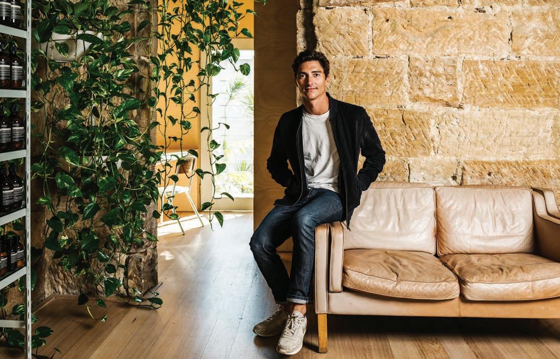
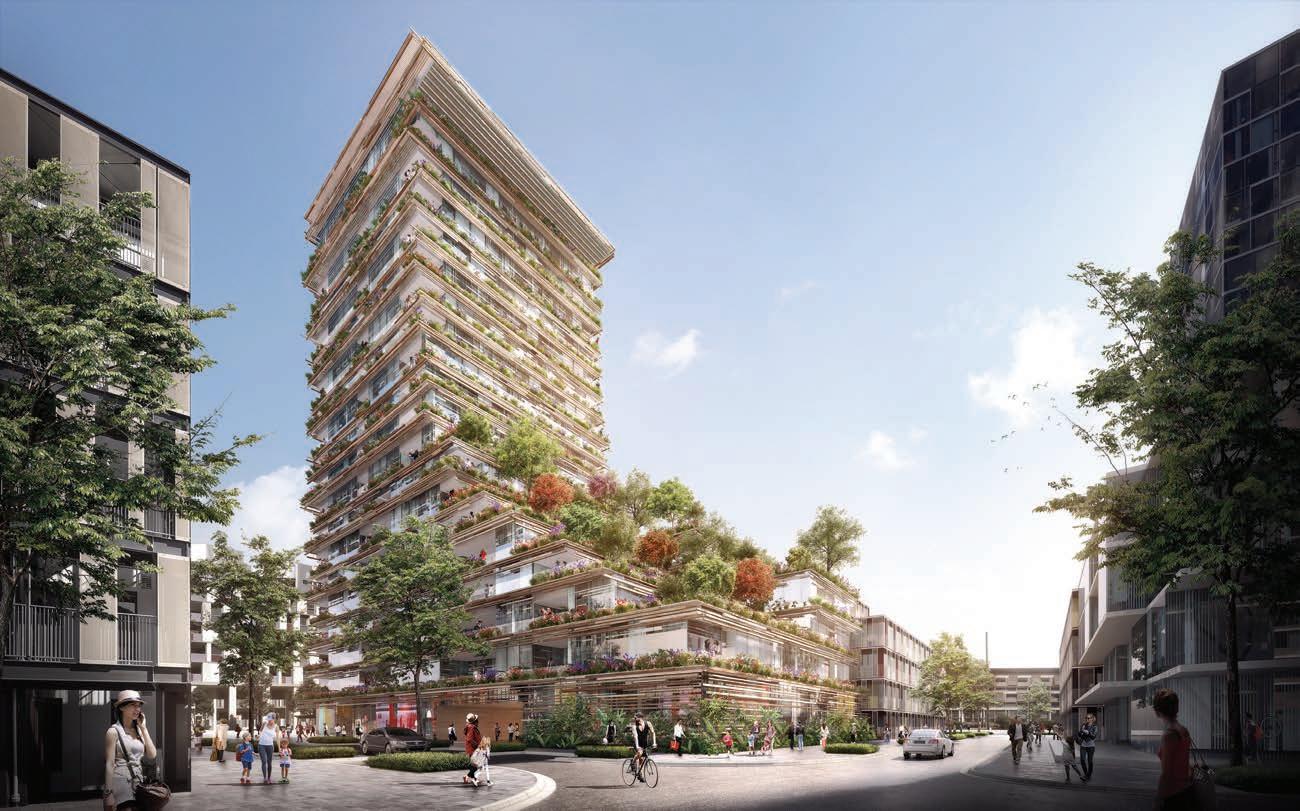
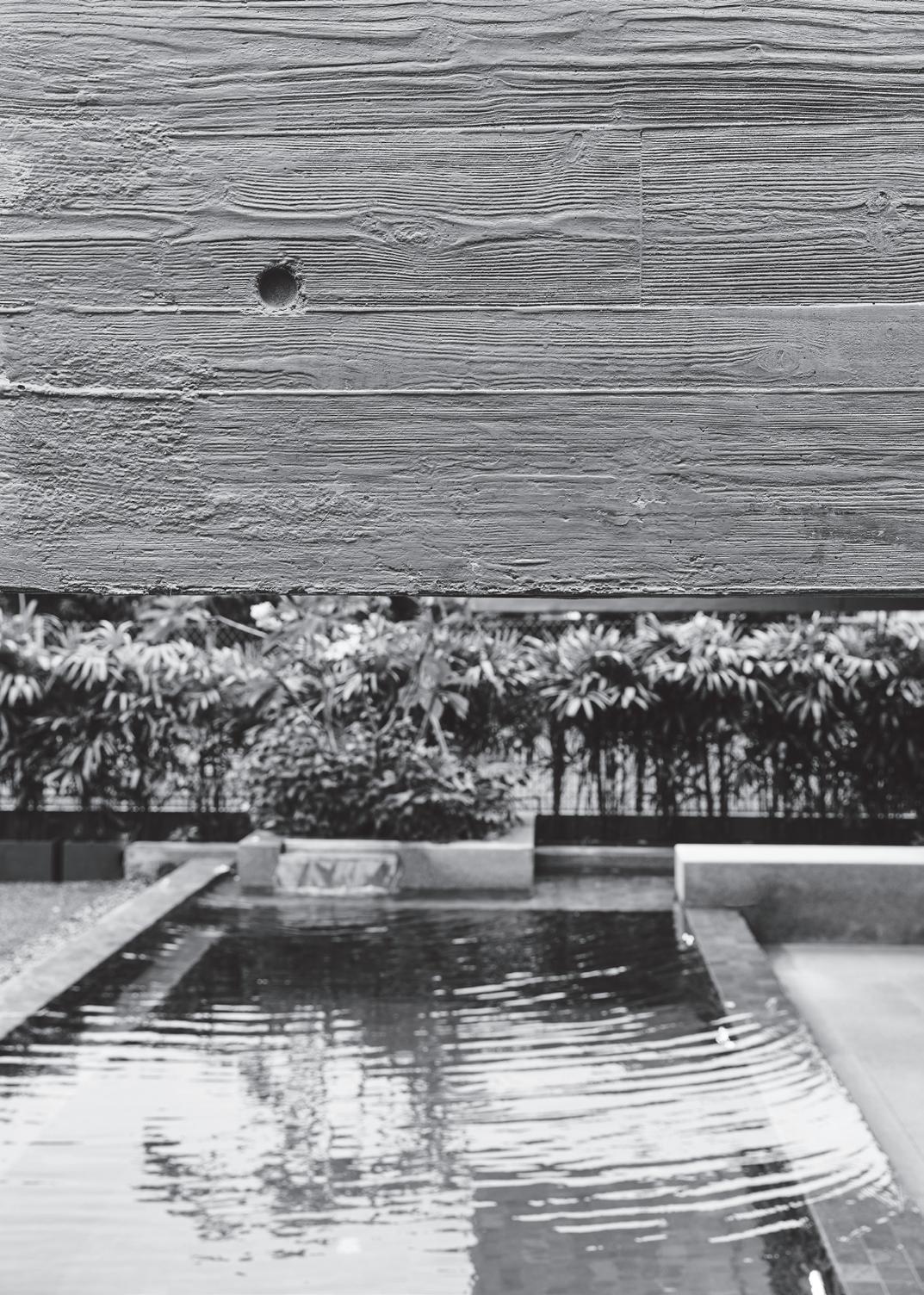
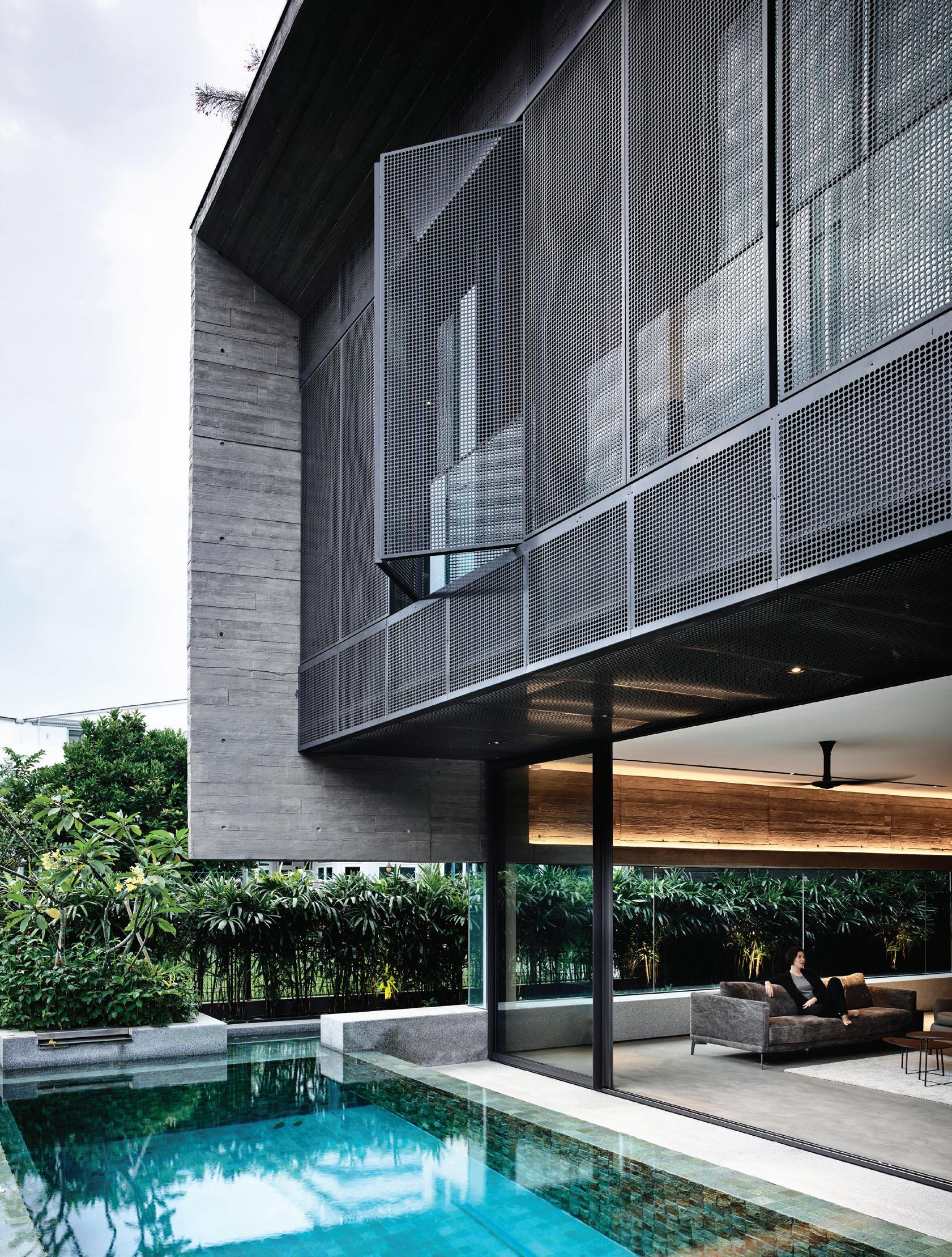
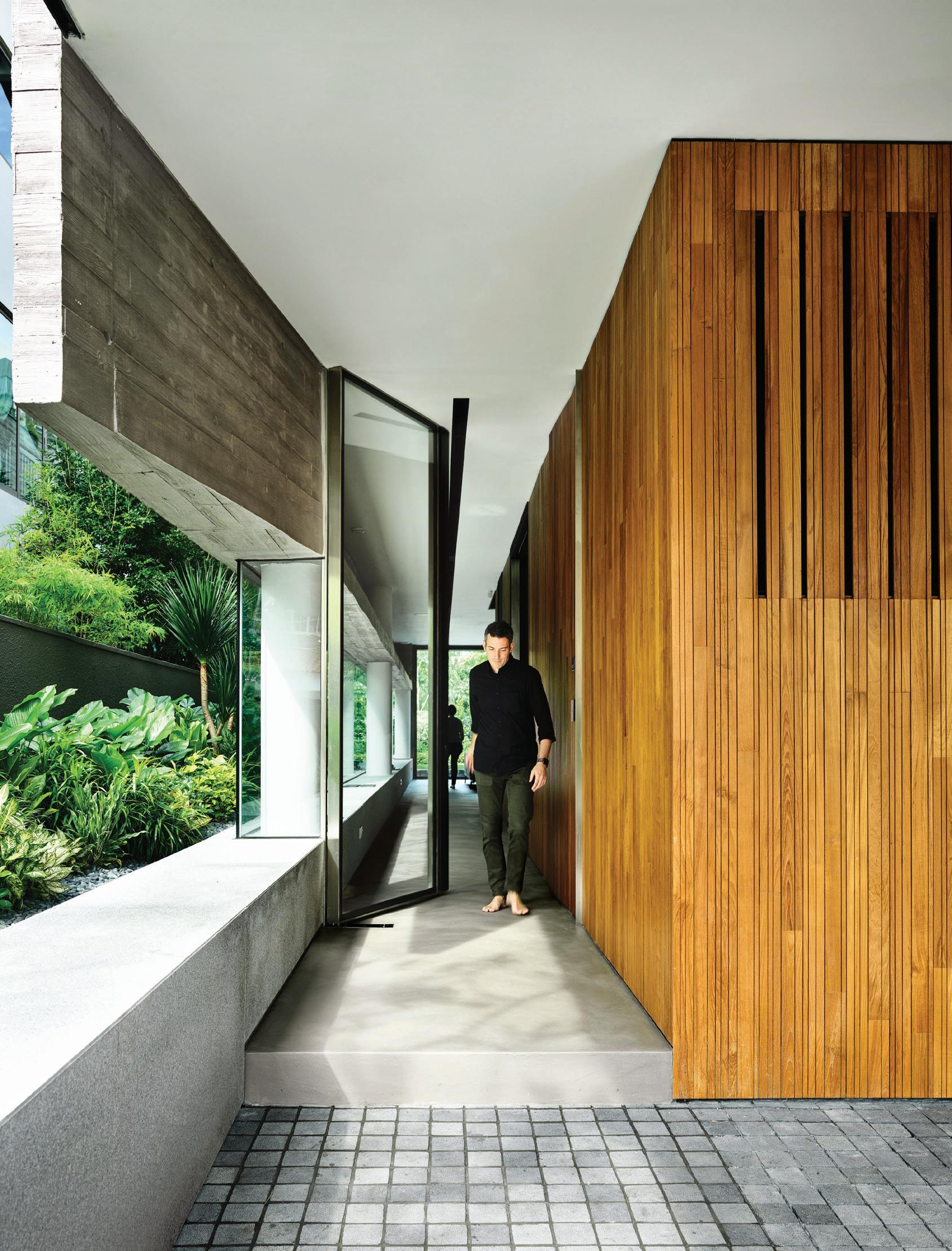
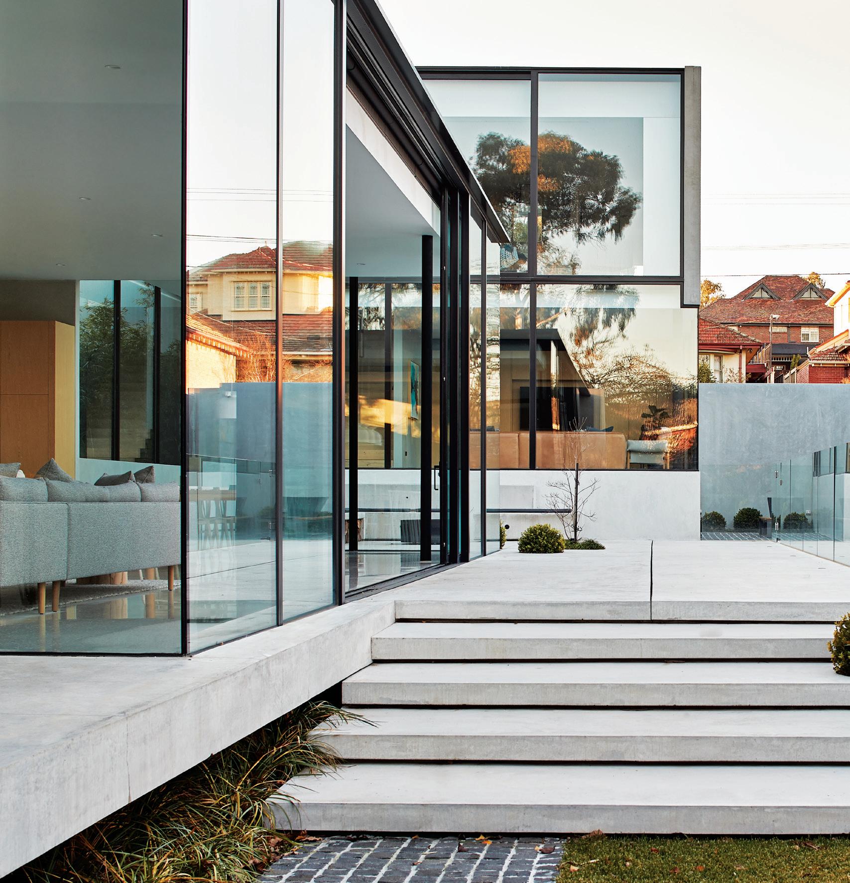
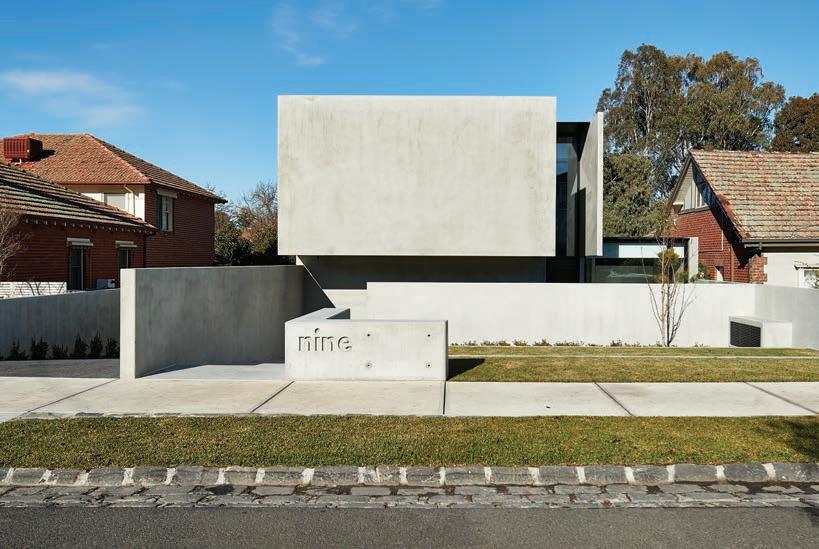
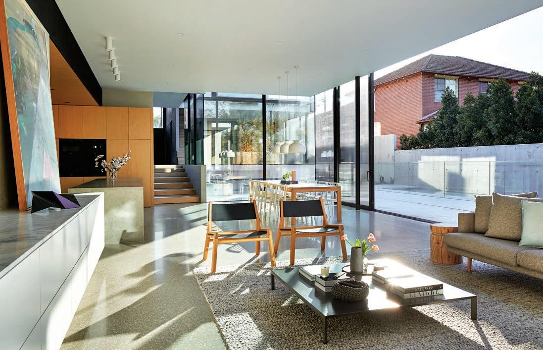
Architect Jeremy McLeod leads and learns from his team. A residence in Melbourne honours the past despite modern forms, and a Singaporean dwelling amidst a curated nature.
DECEMBER – FEBRUARY | 2019 AUD$17.95 | NZ$17.95 | SGD$13.95
#42 9 > 771836055007 42
Culinary art starts with the first course.
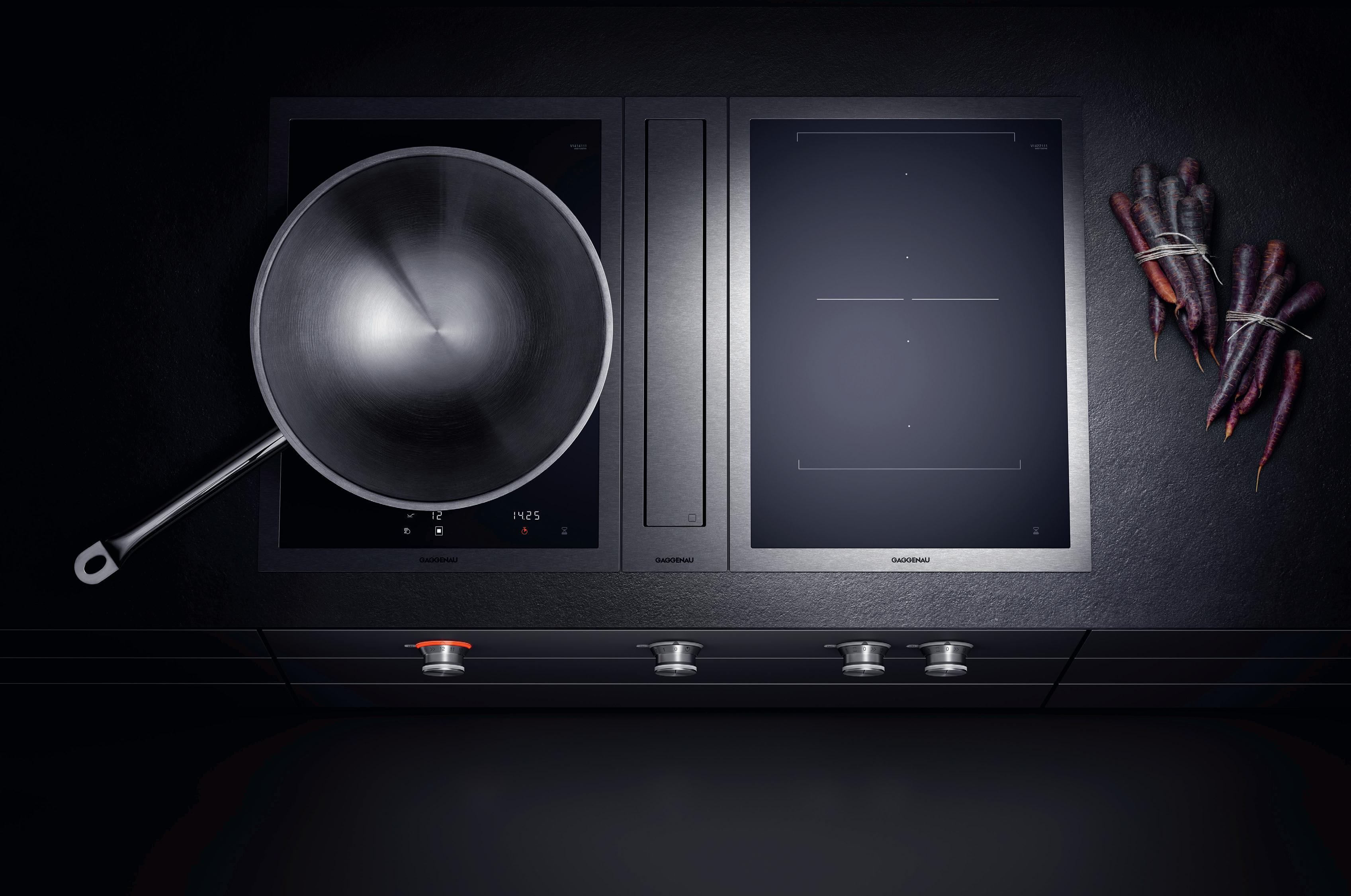
Culinary culture starts sooner than that.
The difference is Gaggenau.
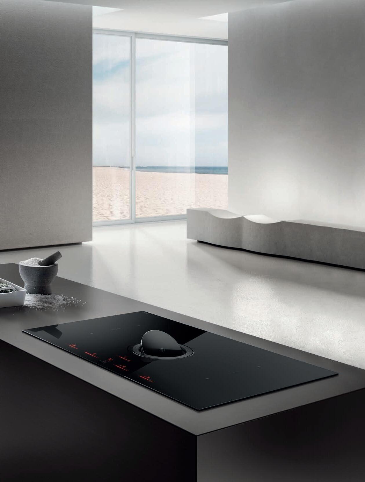
The ambitious kitchen is a place of exacting demands for equipment, ingredients and techniques. The Vario cooktops 400 series have been meeting these demands from the beginning, with appliances developed to meet any challenge. Energy efficient, our steel-framed induction cooktops direct heat quickly to the pan with the power to sear as well as the control for long, gentle simmering. These cooktops free the imagination; a tribute to boundless cuisine. Whatever combination you choose, you can look forward to exceptional freedom for decades to come.
For more information, please visit www.gaggenau.com.au

Scholten & Baijings – Studio for Design
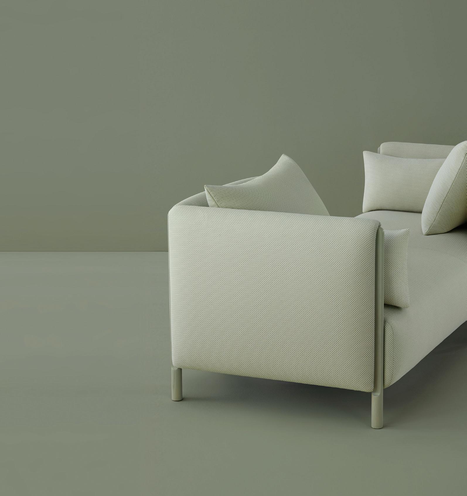

Diving deep into art and design history for inspiration, while always looking ahead to invent new ways of living, working, and making in the world.
livingedge.com.au
Herman Miller ColourForm TM Sofa Group
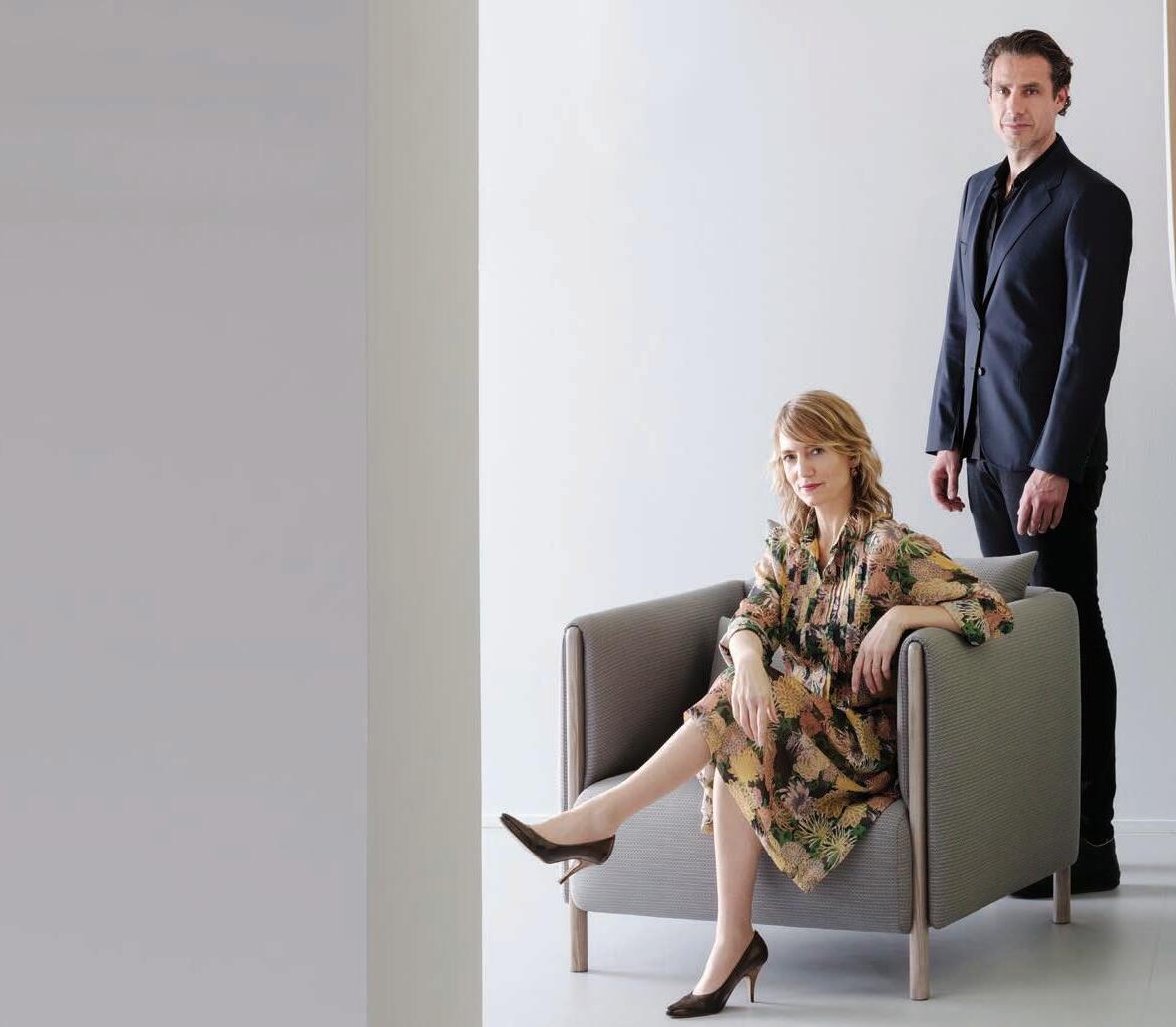


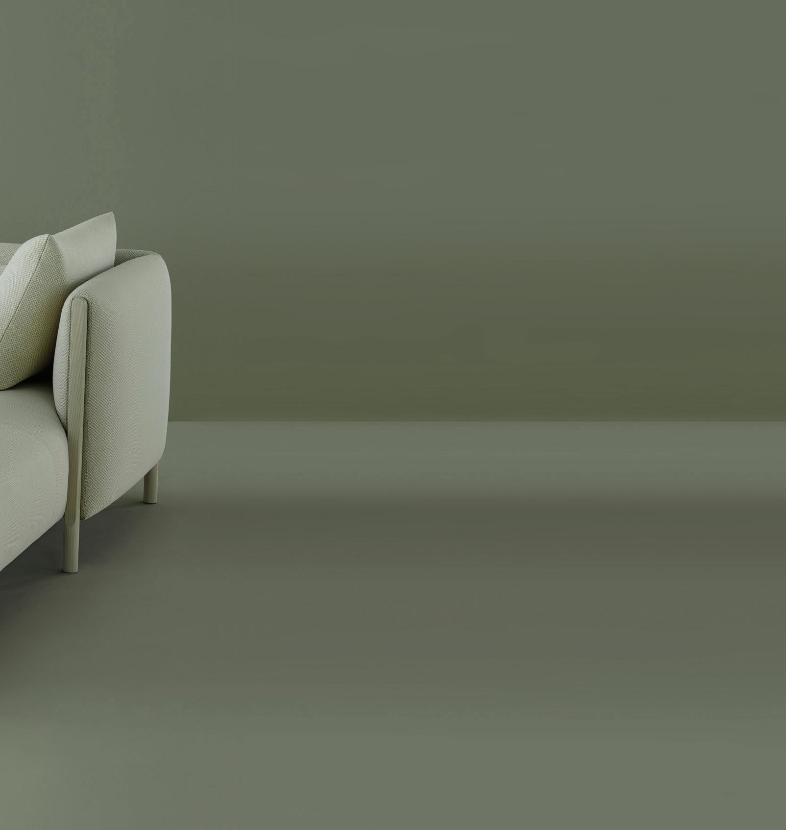
Scholten & Baijings Furniture for Creative
16
life.
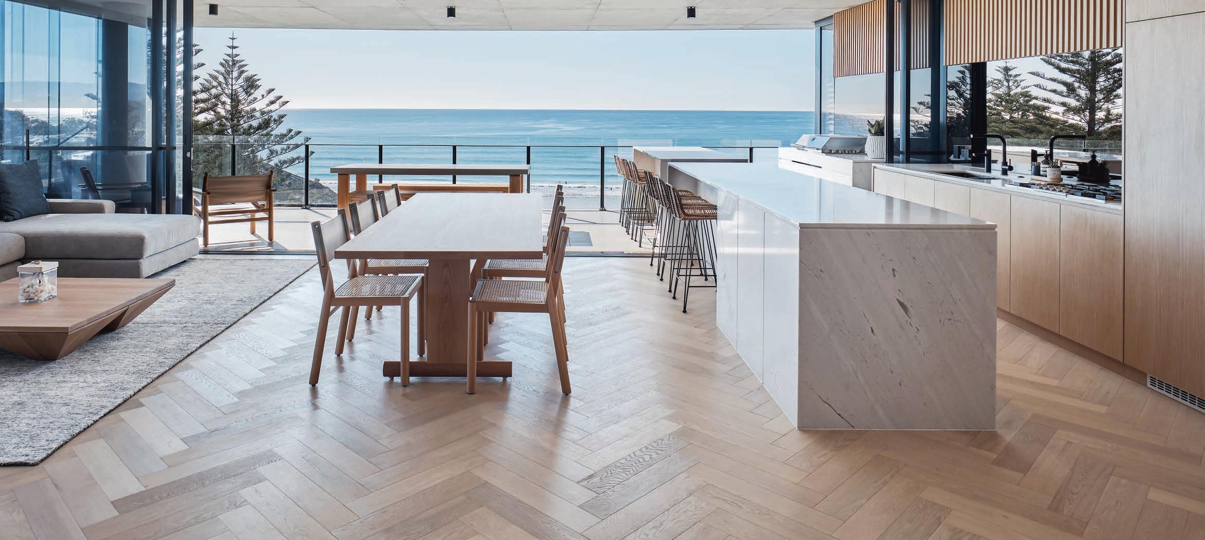
 North Burleigh Residences
Interior Designer: Alexandra Macmillan Photographer: Andy Macpherson
stylecraftHOME.com.au Mon - Fri: 8:30am - 5:00pm, Sat: 10:00am - 4:00pm info@stylecraftHOME.com.au Melbourne 145 Flinders Lane, Melbourne CBD Sydney 100 William Street, Woolloomooloo
Gas Office
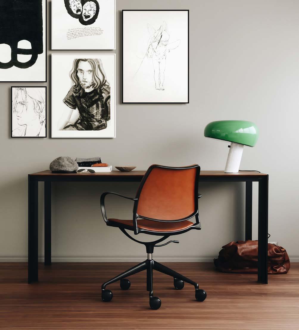
Chair designed by Jesús & Jon Gasca Deneb Table designed by Jesús Gasca for Stua
There is often a story that has informed the design process, a method to the madness if you will. Here, we divulge.
Across the Region, Habitus has access to the lastest and greatest objects of design large and small. Each issue we share our insights with our loyal republic of Design Hunters in the highly curated Design News pages.
Learn the stories of three creatives across the Indo Pacific that continue to provoke thought and inspire their contemporaries.
Last year Pan Yi Cheng was shortlisted in the inaugural INDE.Awards within the Prodigy category. This year he continues to impress the industy as much with his retrospective work as with his upcoming projects and direction.
The powerhouse that founded Breathe Architecture in 2001, Jeremy McLeod is known as much for his all-inclusive, mentoring approach to running an architecture studio as he is his work that puts the community first.
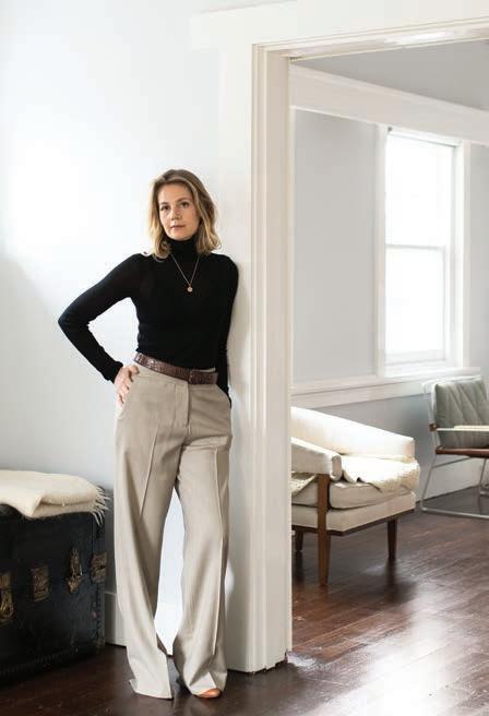
Disillusioned by the malpractice of the global fashion community, Jade Sarita Arnott put a pause on her successful Australian label Arnsdorf for a few years – motherhood was a welcome redistribution of energy. But recently, the ability to incite change leading by example drew her back to the drawing board.
#42
40 PAN YI CHENG
52 JEREMY MCLEOD
66 JADE SARITA ARNOTT
66 26
26 DESIGN NEWS
82 THE ARMADILLO & CO FOUNDATION
The Armadillo & Co Foundation was established to further support weavers in India and the education of their children.
90 THE NEW SHOWROOM
Design showrooms across the globe are much more than simply retail spaces.
96 SALA SAMUI CHAWENG BEACH RESORT
It’s never good practice to rest on your laurels and no one knows this better than the architecture and design community.
109 AĒ SOP x STUDIO HENRY WILSON
For their first foray into product design, Aēsop has engaged Studio Henry Wilson – and not for first time.
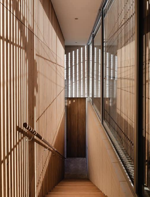
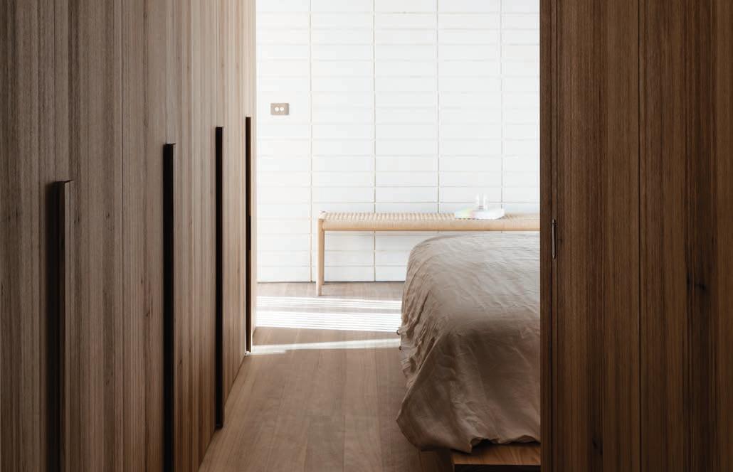
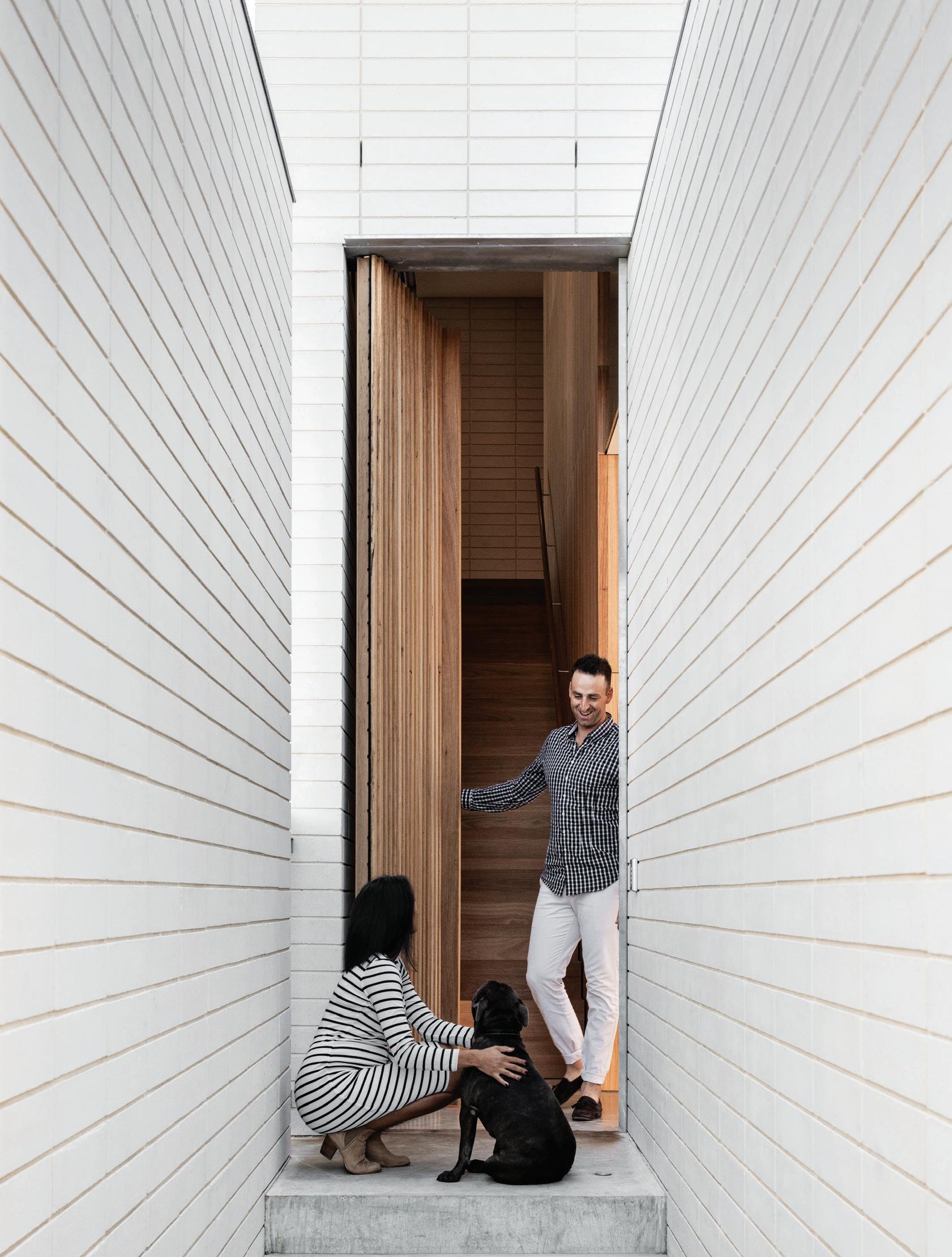
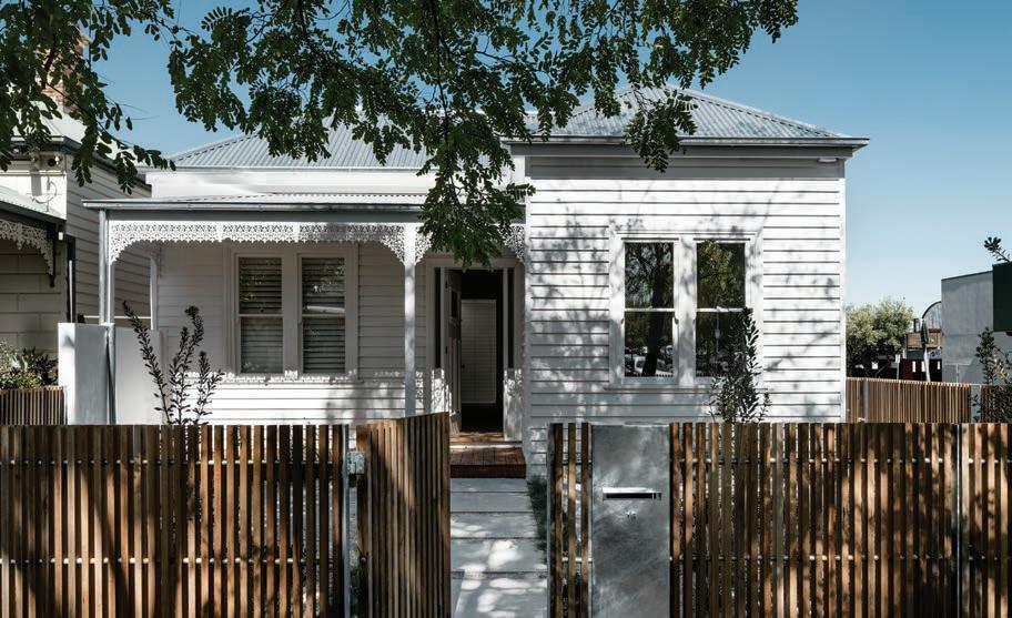
These seven residential projects, dotted across the Region, demonstrate the power of architecture as a means to enhance everyday life.
114 FABER HOUSE
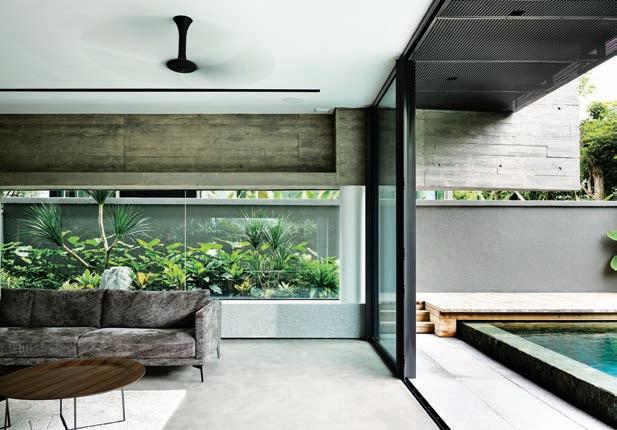
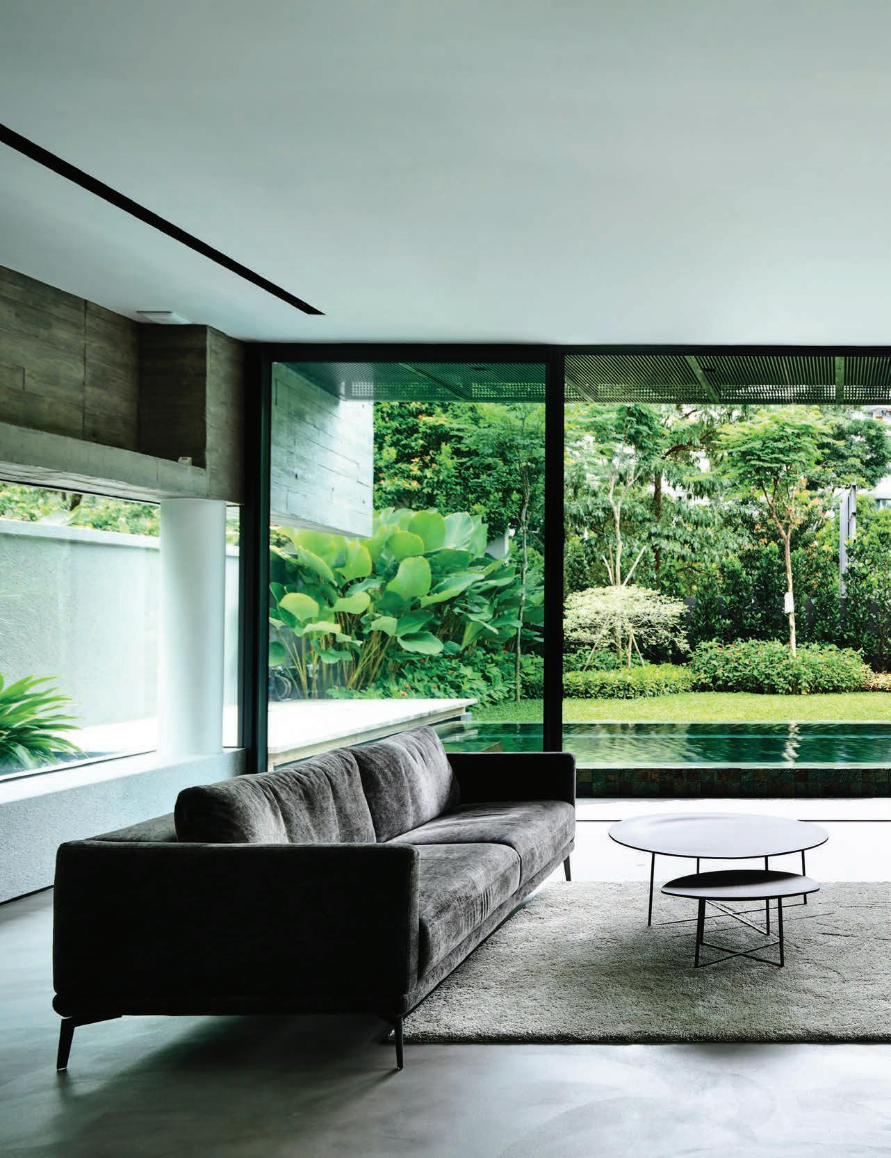
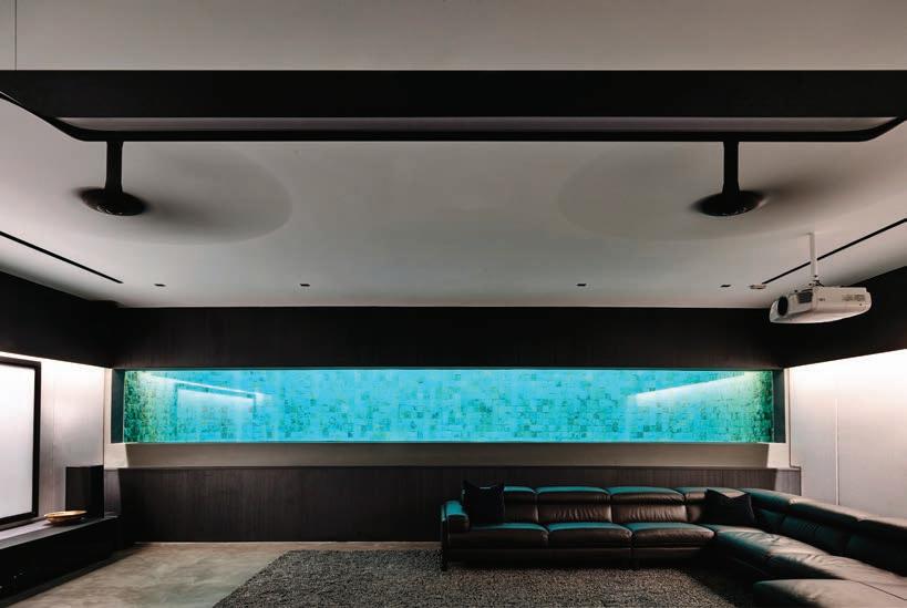
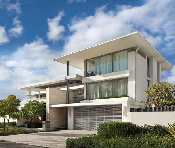
The clients of this house is Singapore inherited the site from their parents who had owned it since the 70s. Local architects ONG&ONG were engaged to redevelop the site to its full potential.
126 EDSALL STREET
A classic tale of old meets new turns out to be anything but what you’d expect in this Alterations and Additions project by Ritz&Ghougassian.
138 BONECA APARTMENT
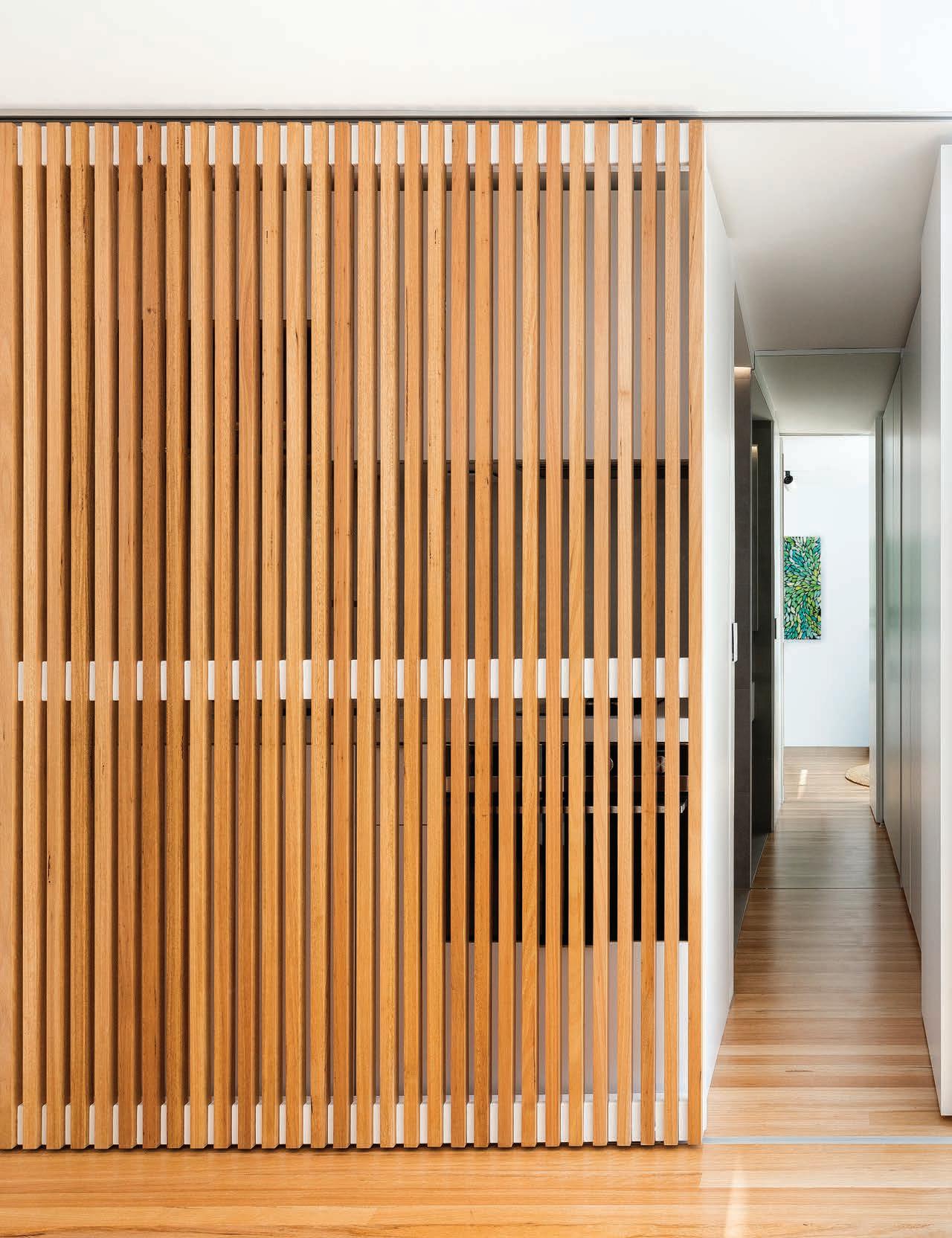
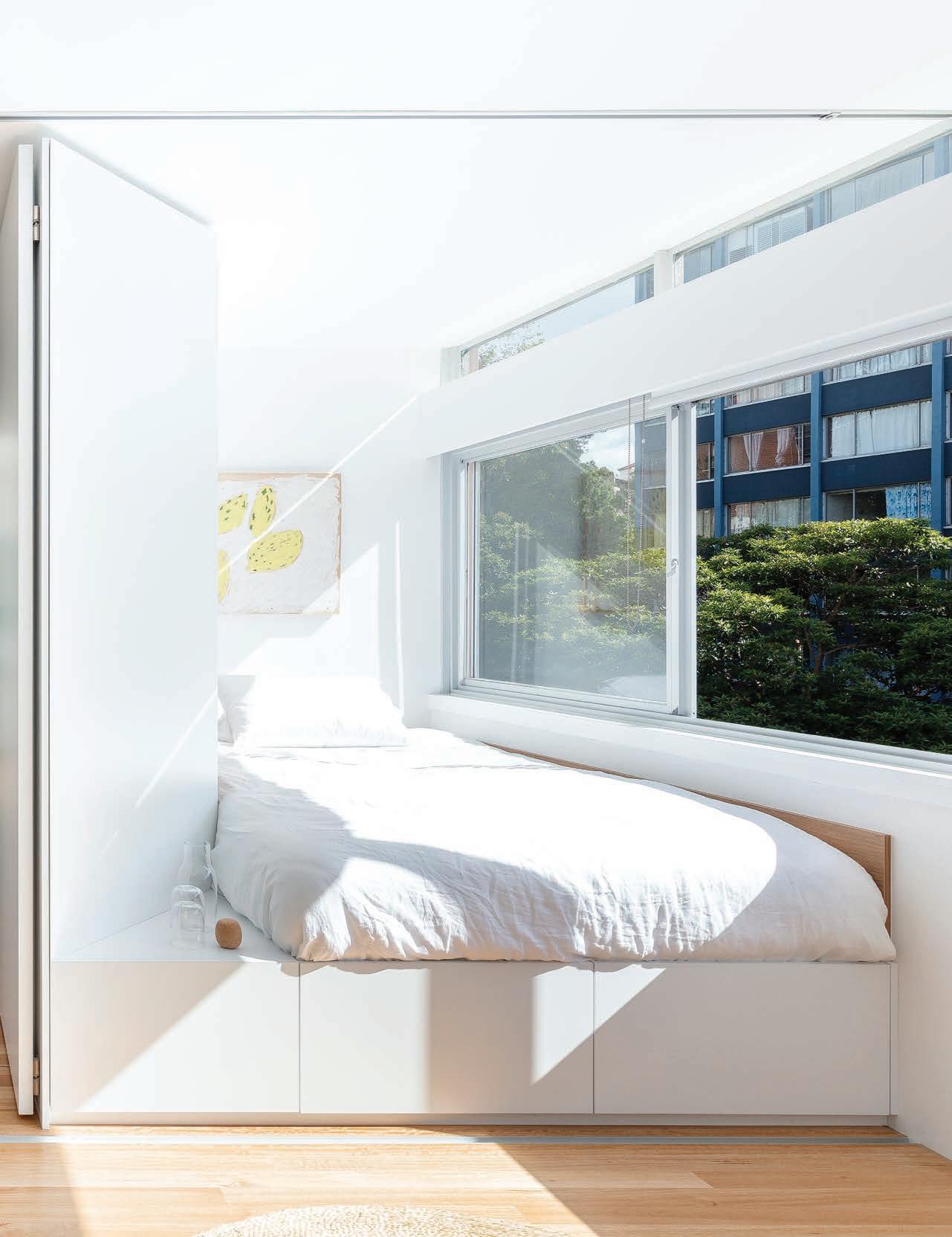
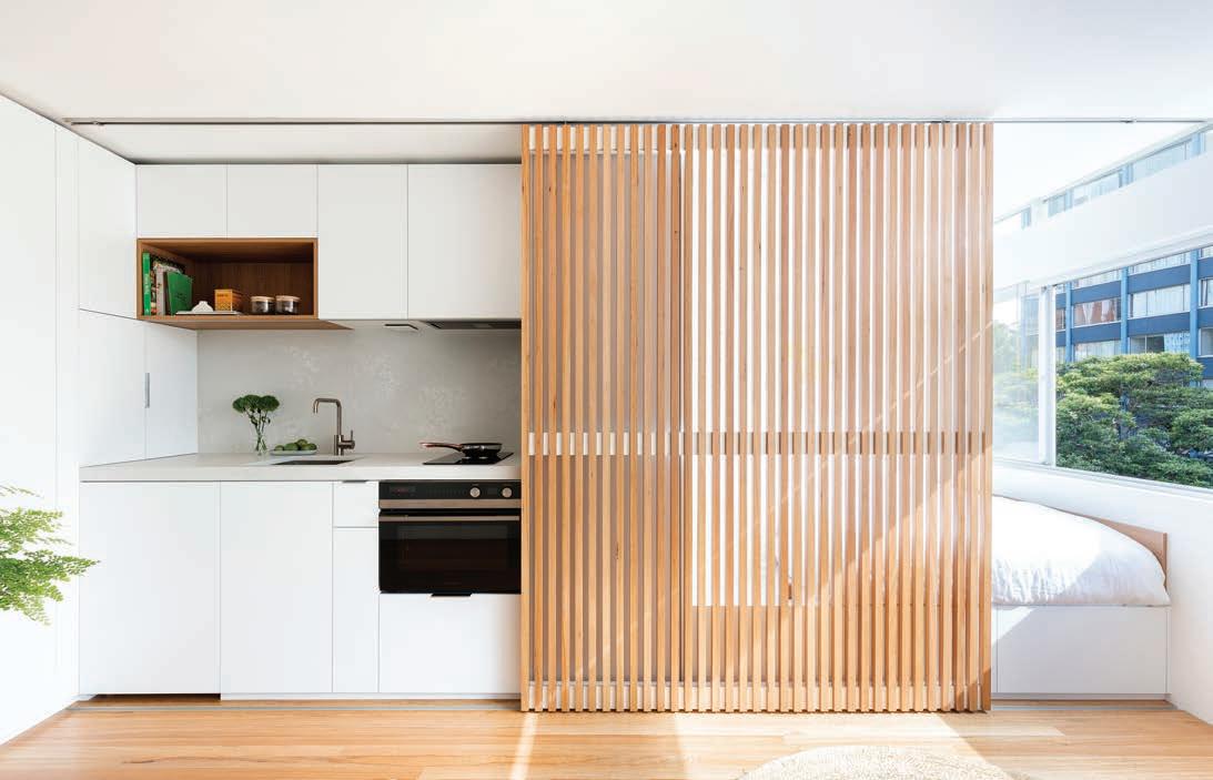
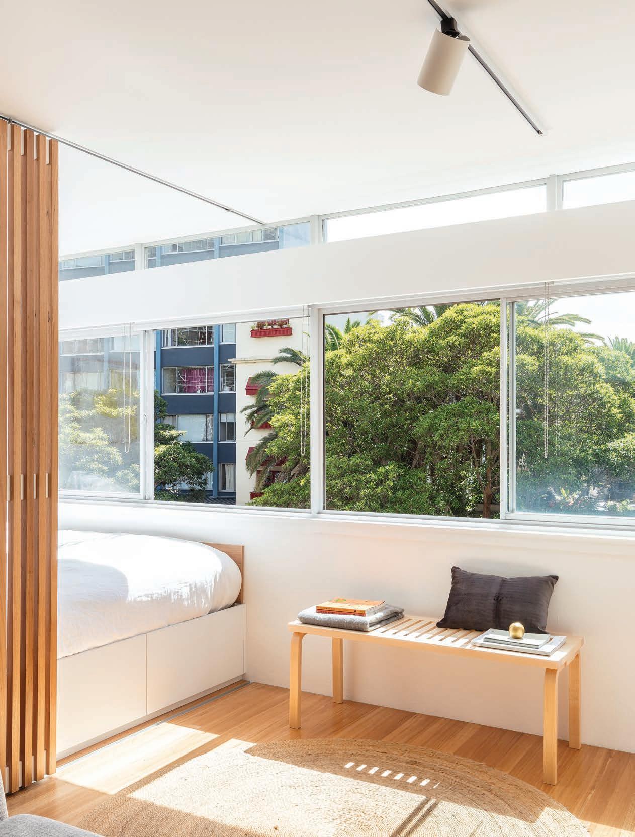
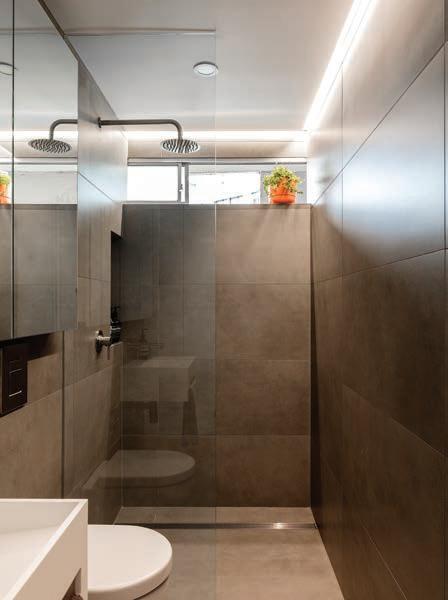
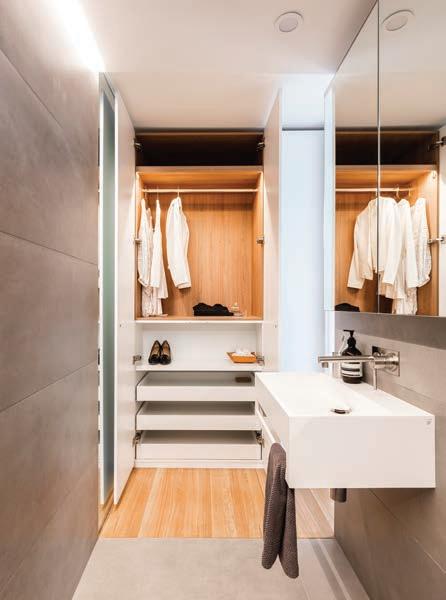
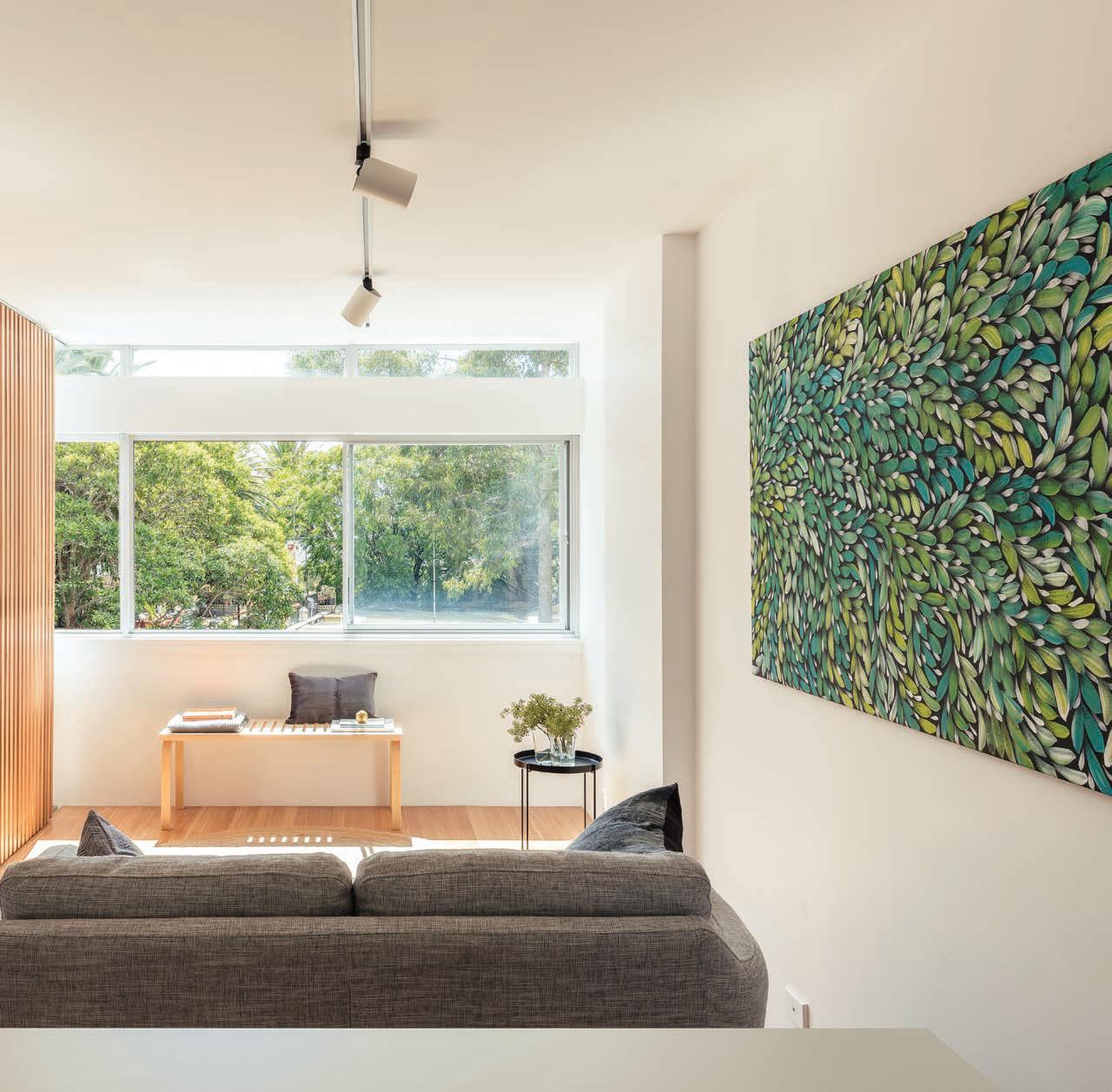
Brad Swartz Architects expertly crafts a small studio apartment in the inner parts of Sydney, one of just 24 square metres, into one that defies spatial contraints.
148 HASTINGS VAN NUNEN HOUSE
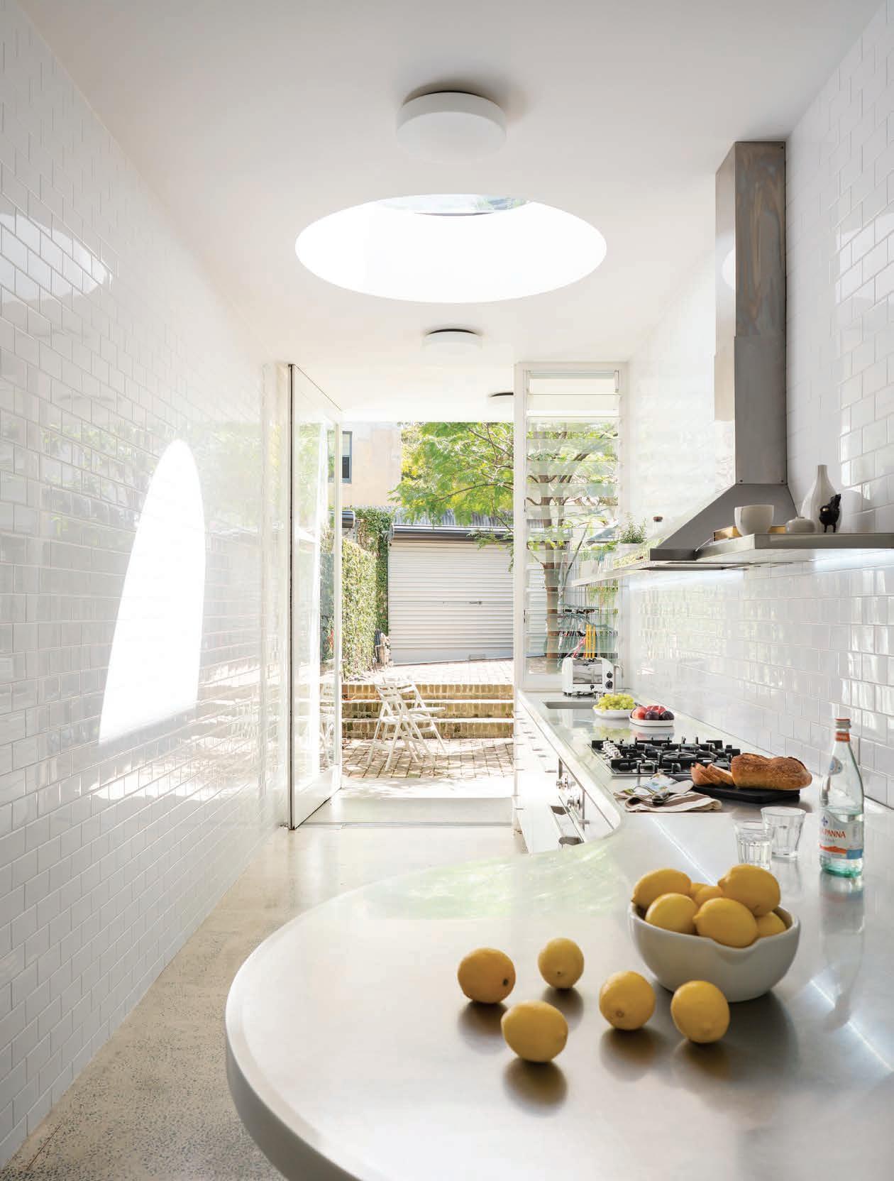
Architect Ian Moore turns a 19th century butcher shop into a contemporary home full of natural light despite a long and narrow site.
158 SALMON AVENUE
Appreciators of architecture; art lovers; and parents, a married couple engage FGR Architects to design a space that answers all their needs.
170 HOUSE BURCH
Those Architects have taken a decidedly pragmatic approach to architecture that connects indoors with out.

180 AGRINESTURE
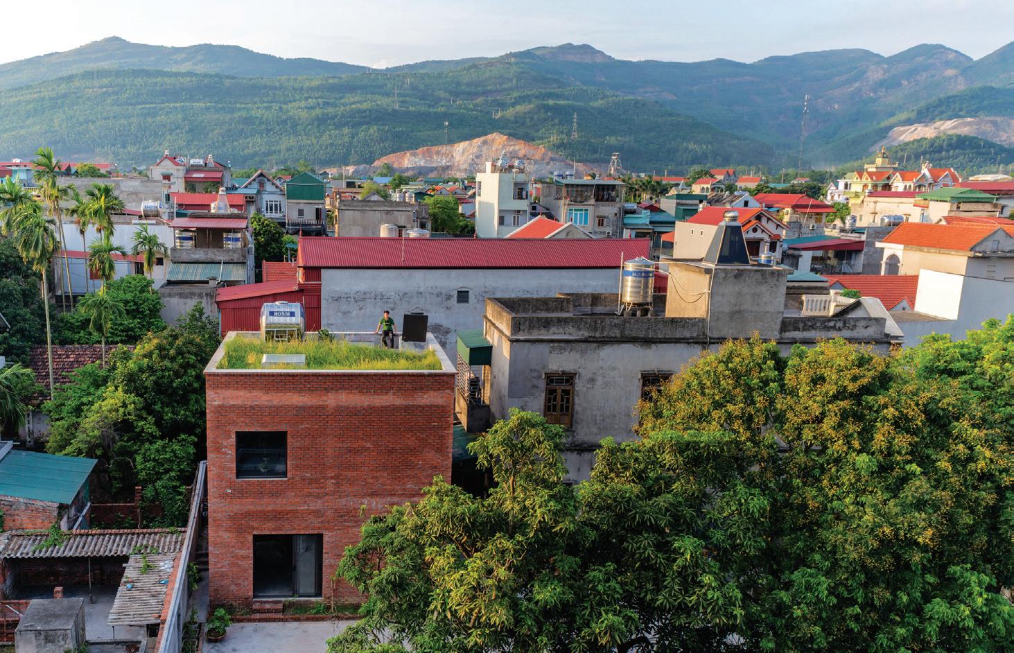
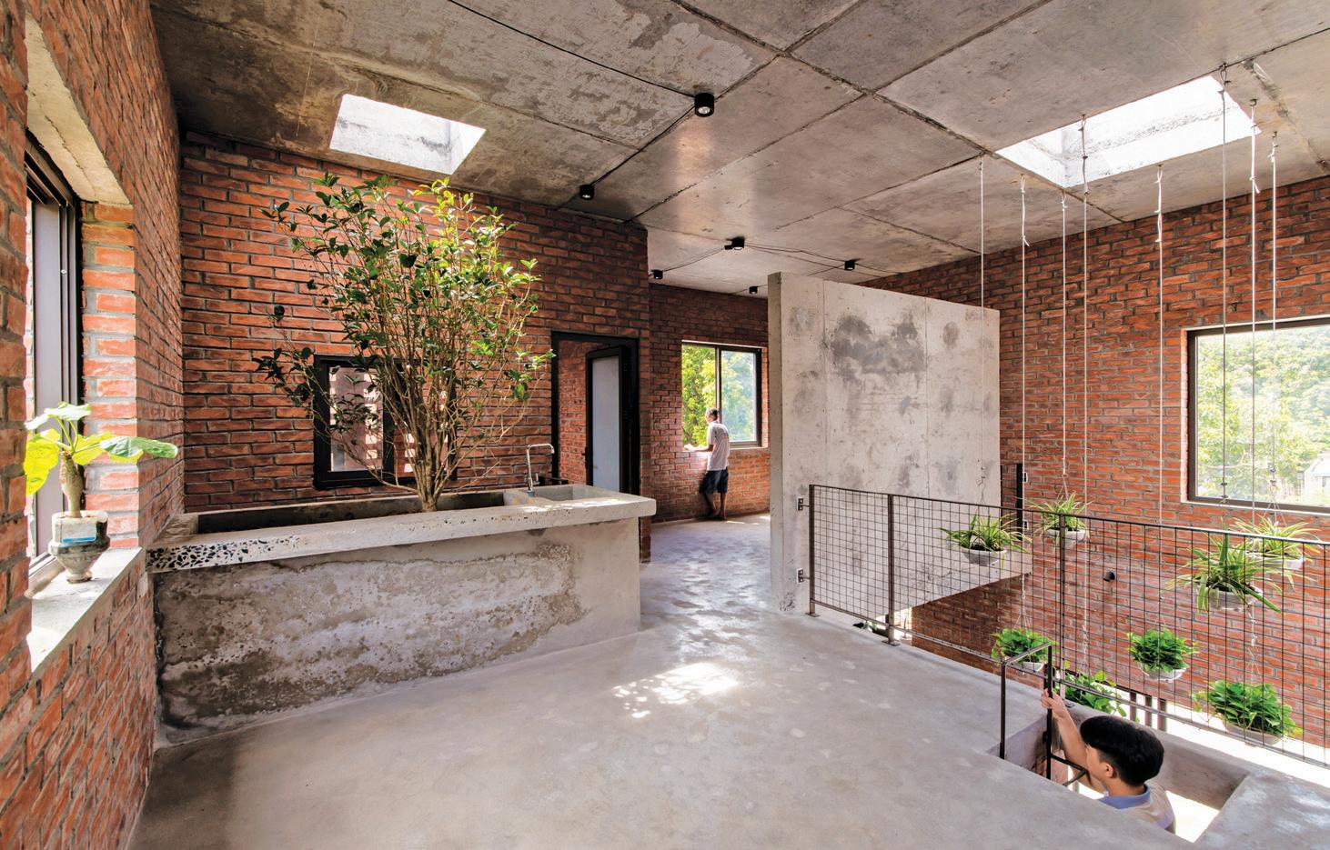
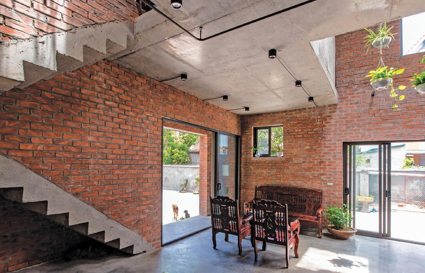
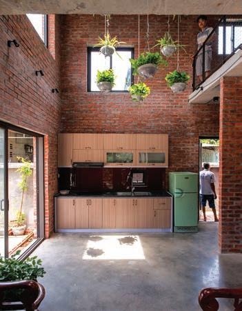
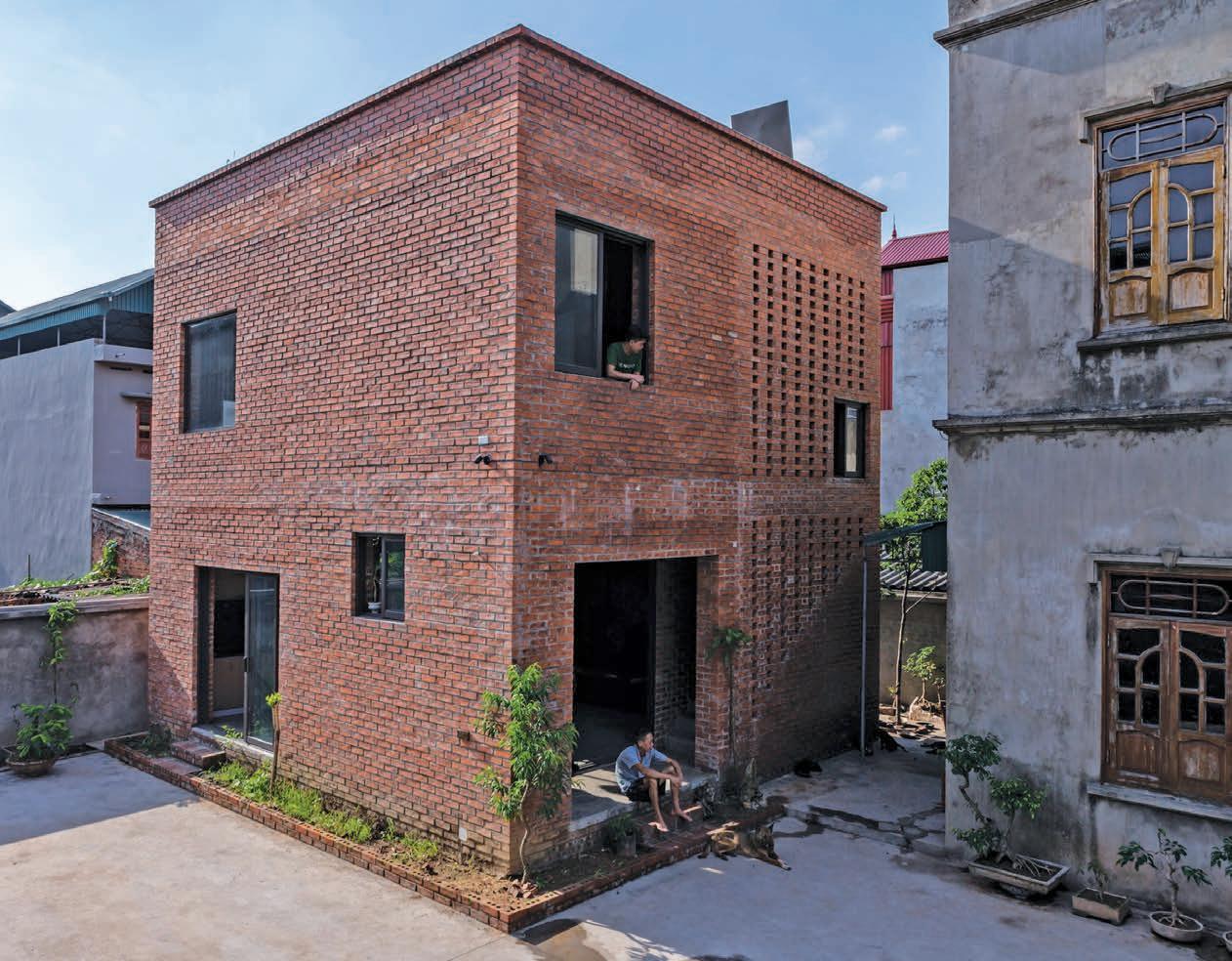
Cubism takes on a new, architectural meaning in Vietnam at the hands of H&P Architects.
#42
170 90
Trailblazers
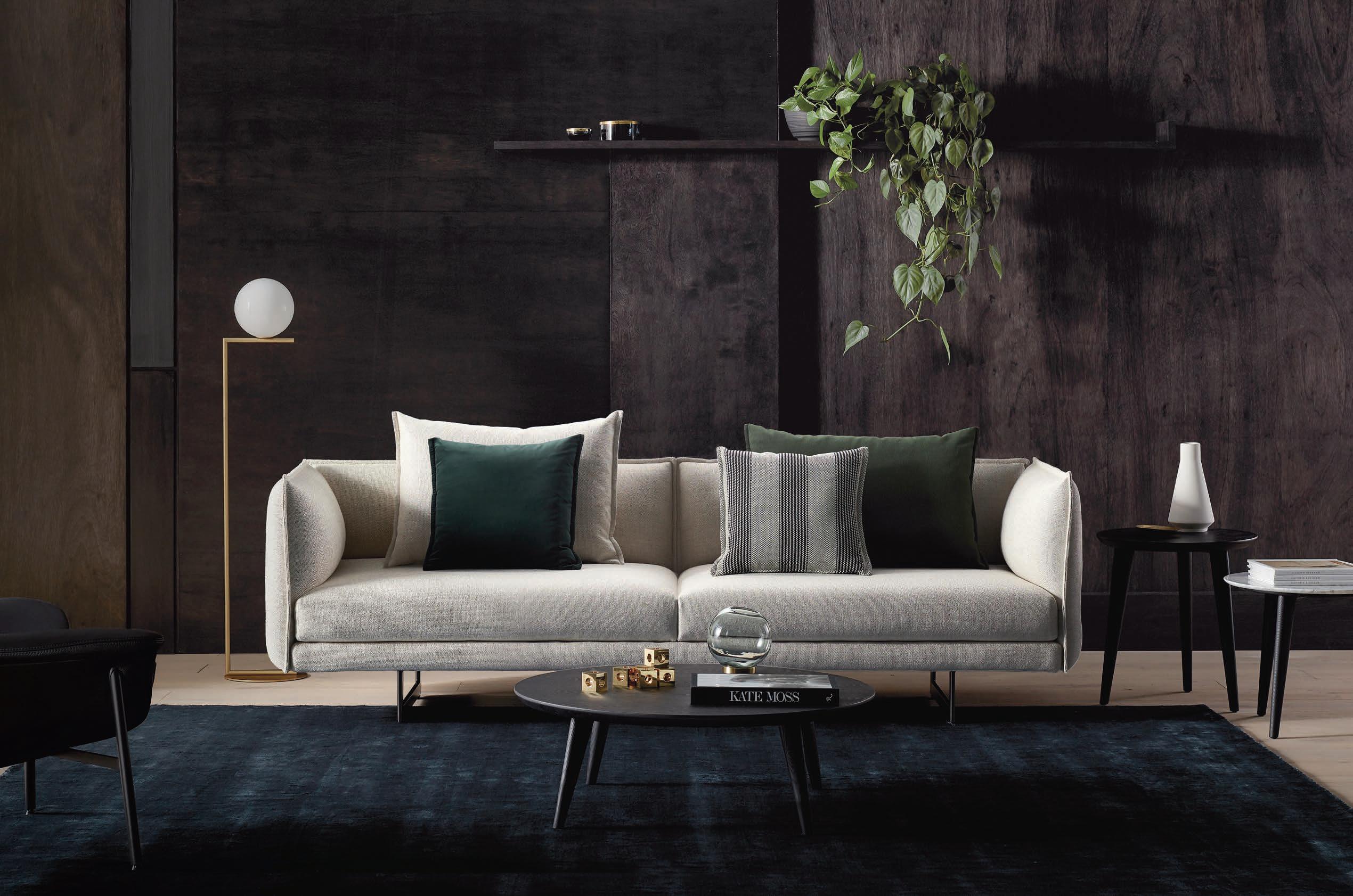
Zaza. 2018 Good Design Award Winner.
The award-winning Zaza is a collaboration with Australian designer Charles Wilson for King Living. Raising the benchmark in contemporary style and luxury, enticing deep seats and a relaxed feel add supreme comfort to the beautiful lines. Resting on elegant slender steel legs, Zaza’s exquisite organic design features adjustable arms and backs that allow you to personalise your comfort. That’s King Living. Where living is King.
If you are a Professional Interior Designer, Architect or Stylist, we encourage you to join the King Living Member Trade Program which offers you savings year-round on King Living designs. Apply online today.
KINGLIVING.COM







Make your mark
The INDE.Awards celebrates the Indo-Pacifc region’s most progressive design and architecture. Establish your place among the region’s leading names.

Entries open 29 November indeawards.com.au

“A revelatory experience of landscape and culture.”

– INDE.Awards Office Jury 2018
Winner | The Building & Best of the Best krakani-lumi, Taylor and Hinds Architects

the first word
What makes us so Special ?
In the spirit of this issue’s theme, Trailblazers, I invite you to consider the following: As architects, designers and creatives, how can we position ourselves to stand out from the crowd? Anyway, should we want to?
I would suggest: Yes. Human kind is by nature creative – whether it’s our passion or profession –so it makes sense to pursue a point of difference. But I would caution against doing so at the cost of a purpose.
The work of those featured in this issue, varied and spread across the Indo Pacific, was chosen for its unique approach to architecture and design as much as for its honest and responsive qualities. The architects and designers Habitus speaks to in the pages that ensue have caught our eye and held our attention over the years with their innovation and bespoke approach to each and every brief they receive.
Whether it is an architect in Singapore who is governing his practice by a “design and make” approach or a designer in Melbourne who has re-entered the fashion industry after a fouryear hiatus with a fiery and renewed passion to highlight the importance of Fair Trade practices and sustainability.
There are architects across the Region who have taken briefs too difficult for some, like turning a 24 square-foot studio apartment in the middle of the city into a spacious abode, for example, and with persistence and dedication found success.
I hope you enjoy the issue and are inspired to determine your own point of difference, in life and in work.
HOLLY CUNNEEN | EDITOR
habitus takes the conversation to our contributors discovering their inspiration and design hunter® journeys
CHU LIK REN
SERIAL FOUNDER #40

Lik Ren is a practising architect with a multidisciplinary firm based in Singapore. He appreciates craftsmanship and the finer details that imbue each design with its unique identity. With age, Lik Ren began to prioritise nature in the design of living spaces. He admires people who have made biophilic designs a part of the main agenda today. He finds great pleasure in forest bathing.

LUC R ÉMOND
EXPLORING CLIMATE AND CONTEXT #170
Specialising in interiors, lifestyle, architecture and portraits, photographer Luc Rémond has been capturing the raw and manicured of Sydney’s urban-meets-natural landscape for 15 years. His deep love of nature combined with a keen eye for design has helped him create a signature style of sincerity and vibrant escapism, treating each varied job with the same level of care and respect.
MARNIE HAWSON
BRIDGING INEFFICIENCIES #52
Lifestyle and interiors photographer Marnie Hawson has a passion and keen eye for the way sustainability and nature work with design. “Operating a purpose-driven business as a photographer, my values and philosophies around sustainability, ethics and community are entwined with everything I do - including my professional work,” says Marnie.
SUSAN MULDOWNEY
TAKE A MOMENT TO MAKE A MOMENT #126
Susan Muldowney is a Melbourne-based freelance writer specialising in business, architecture and design. She has worked as a magazine editor in Australia and Singapore and is a former editor of Australian architecture magazine, Monument. She is about to embark on her first home renovation, with inspiration from the architects she spoke to for her article in this issue of Habitus


TOM BLACHFORD
TAKE A MOMENT TO MAKE A MOMENT #126
Working at the intersection of long exposure photography and an exploration of the built environment, Tom Blachford’s photographic work looks to transform predictable and known environments into unique dreamlike worlds. Tom “tries wherever possible to embrace mystery, abstraction and darkness and blur lines between my fine art and commercial work.”
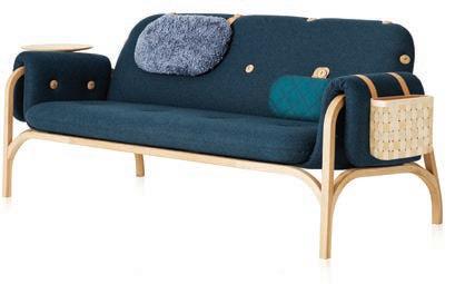
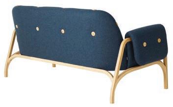
BUTTON by FRONT
“Furniture of the Year I Stockholm Furniture & Light Fair”

TOM FERGUSON
LESS IS MORE #138
Through his photography work, Tom Ferguson seeks to showcase the beauty of the designed world. “My goal is to be able to show buildings through photography in simultaneously heroic and intimate ways –both as built forms, shapes, structures and volumes, and places of human habitation, softness and detail” he says.

G2/197 Young Street Waterloo NSW 2017 02 7900 9431 I trade@cubencircle.com.au cubencircle.com.au
Made in Sweden I Product of Swedese
ARE YOU DRINKING ENOUGH WATER?
CHAIRMAN & FOUNDER
Raj Nandan raj@indesign.com.au
CONSULTING EDITOR
Paul McGillick EDITOR
Holly Cunneen holly@indesign.com.au
SE ASIA CO-EDITORS
Janice Seow janice@indesign.com.sg
Narelle Yabuka narelle@indesign.com.sg
EDITORIAL ASSISTANT
Andrew McDonald andrew@indesign.com.au
CONTENT EDITOR & CLIENT MANAGER
David Congram david@indesign.com.au
ASSOCIATE ART DIRECTOR

Betty Wong betty@indesign.com.sg
CONTRIBUTING WRITERS
Alice Blackwood, Chu Lik Ren, Rebecca Gross, Marg Hearn, Luo Jingmei, Paul McGillick, Susan Muldowney, Dr Nguyen Tri Tranh, Kirsty Sier
CONTRIBUTING PHOTOGRAPHERS
Peter Bennetts, Tom Blachford, Darren Centofanti, Alana Dimou, Marnie Hawson, Benjamin Hosking, Khoo Guo Jie, Daniel Mayne, Luc Remond, Derek Swalwell, Wison Tungthunya
MANAGING DIRECTOR
Kavita Lala kavita@indesign.com.au
BRAND DIRECTOR
Colleen Black colleen@indesign.com.au
(61) 422 169 218
ACCOUNTS
Ting Zhang ting@indesign.com.au

Anita Arbita anita@indesign.com.au
ONLINE MANAGER
Radu Enache radu@indesign.com.au
WEB DEVELOPER Ryan Sumners ryan@indesign.com.au
BUSINESS DEVELOPMENT MANAGERS
Kim Hider kim@indesign.com.au
Danielle Nichols danielle@indesign.com.au
Laura Hicks laura@indesign.com.au
CLIENT LIASON
Dana Ciaccia dana@indesign.com.au
CAMPAIGN SUCCESS EXECUTIVE Brydie Shephard brydie@indesign.com.au
COVER IMAGE Faber House (p.114)
Photography by Derek Swalwell
HEAD OFFICE
Level 1, 50 Marshall Street, Surry Hills NSW 2010 (61 2) 9368 0150 | (61 2) 9368 0289 (fax)
MELBOURNE
1/200 Smith St, Collingwood, VIC, 3066 SINGAPORE
4 Leng Kee Road, #06–08 SIS Building, Singapore 159088 (65) 6475 5228 | (65) 6475 5238 (fax)
HONG KONG
Unit 12, 21st Floor, Wayson Commercial Building, 28 Connaught Road West, Sheung Wan, Hong Kong indesign.com.au
issue #42 habitusliving.com
Printed in Singapore. All rights reserved. No part of this publication may be reproduced, stored in a retrieval system, transmitted in any form or by any other means, electronic, mechanical, photocopying, recording or otherwise. While every effort has been made to ensure the accuracy of the information in this publication, the publishers assume no responsibility for errors or omissions or any consequences of reliance on this publication. The opinions expressed in this publication do not necessarily represent the views of the editor, the publisher or the publication. Contributions are submitted at the sender’s risk, and Indesign Media Asia Pacific cannot accept any loss or damage. Please retain duplicates of text and images. Habitus magazine is a wholly owned Australian publication, which is designed and published in Australia. Habitus is published quarterly and is available through subscription, at major newsagencies and bookshops throughout Australia, New Zealand, South-East Asia and the United States of America. This issue of Habitus magazine may contain offers or surveys which may require you to provide information about yourself.
Nilesh Nandan (61 2) 9368 0150, (61 2) 9368 0289 (fax), info@indesign.com.au. Habitus magazine is published under licence by Indesign Media Asia Pacific. ISSN 1836-0556
If you provide such information to us we may use the information to provide you with products or services we have. We may also provide this information to parties who provide the products or services on our behalf (such as fulfilment organisations). We do not sell your information to third parties under any circumstances, however, these parties may retain the information we provide for future activities of their own, including direct marketing. We may retain your information and use it to inform you of other promotions and publications from time to time. If you would like to know what information Indesign Media Asia Pacific holds about you please contact
ZIP0491 HAB HPV 226.75x90.7 v03.indd 1 9/7/18 9:50 am
80% OF ZIP HYDROTAP OWNERS DRINK MORE WATER*


We are all aware of the benefi ts associated with drinking enough water, but despite this, many of us go about our daily lives dehydrated to some degree.


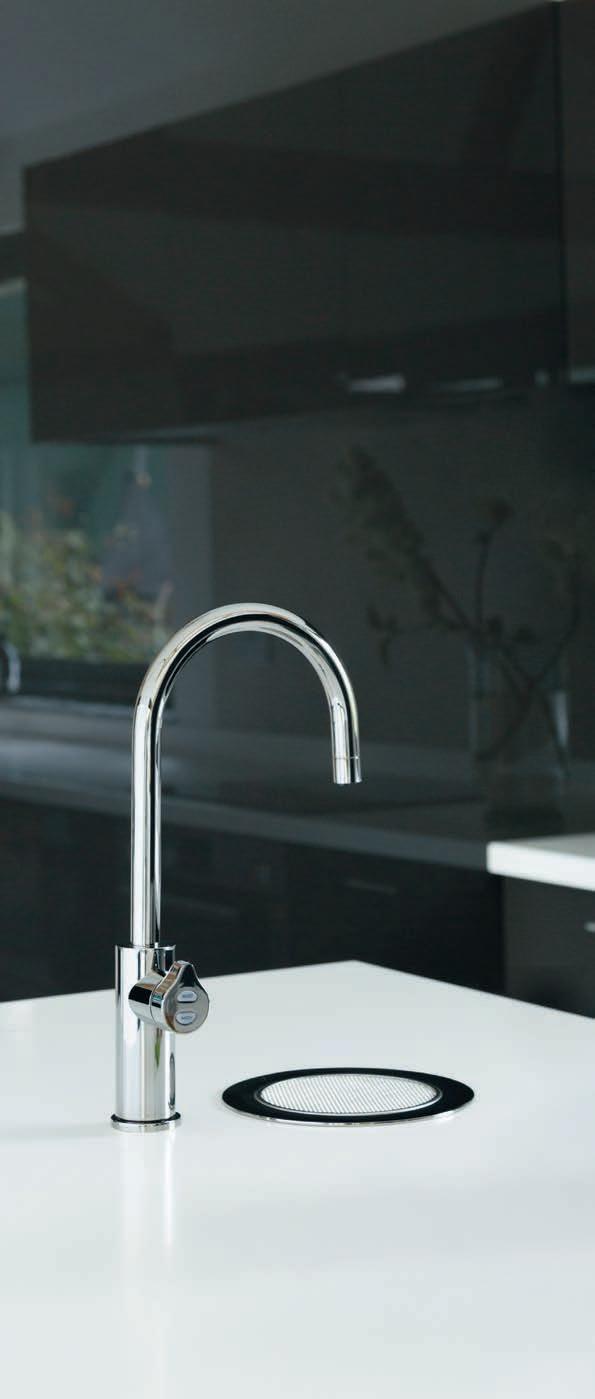
As world leaders in instant drinking water systems, Zip invented the innovative HydroTap, the smart and essential addition for every kitchen. Our integrated Australian-made system combines patented PowerPulse™ boiling and Direct DryChilling with MicroPurity filtration technologies to create pure-tasting boiling, chilled and sparkling water you will love in an instant.

When water is this convenient and irresistible you’ll love drinking more of it. To improve your hydration and your family’s well-being, discover more at zipwater.com
Zip HydroTap. Now available in 8 new premium finishes.


THE WORLD’S MOST ADVANCED DRINKING WATER SYSTEM ZIP HYDROTAP | PURE TASTING | INSTANT | BOILING | CHILLED | SPARKLING
*Statistic based on a survey of 354 owners of residential-installed Zip HydroTaps.
For over a decade Habitus has remained at the forefront of residential architecture, interior and product design.
Each quarter we present to our loyal republic of Design Hunters a snapshot of the design industry and the themes that compel it.
Chairman & Founder, Indesign Media
Raj Nandan


O’RAMA Collection parisi.com.au
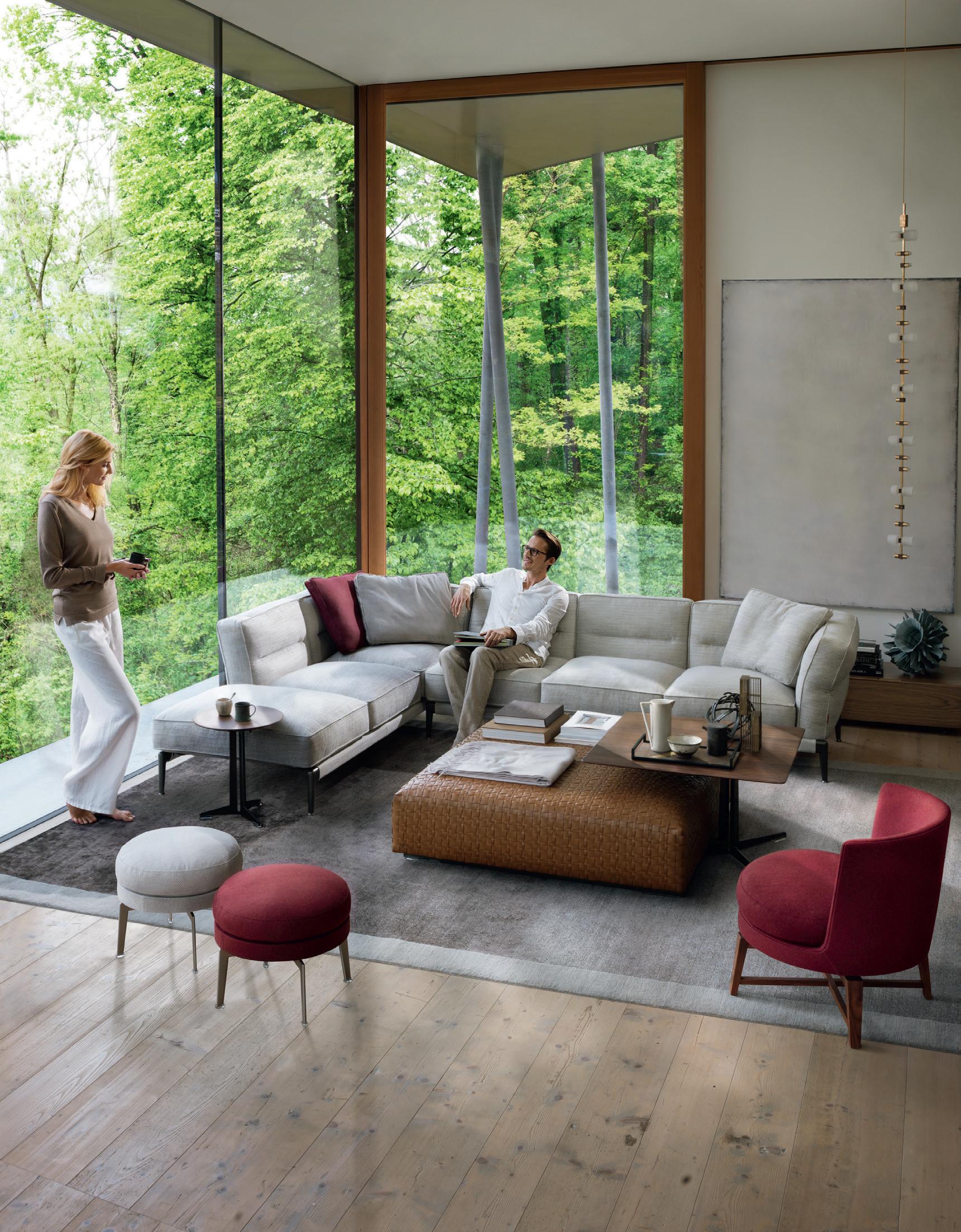



ADDA SECTIONAL SOFA SYDNEY 269 Military Road Cremorne 2090 Tel . 02 9908 2660 MELBOURNE 681 Chapel Street S outh Yarra 3141 Tel . 03 9826 8777 PERTH I nnerspace 08 Tel . 08 9322 6664 info@fanuli.com.au FF0918h
A step above the rest

Gather round
The LINEA AKADEMIA chair by Kaksikko for Finland’s Nikari exudes Nordic charm. The result of research into American Shaker style, new life is brought into the classic form of the chair creating a design conversation between Nordic and American style.

nikari.fi
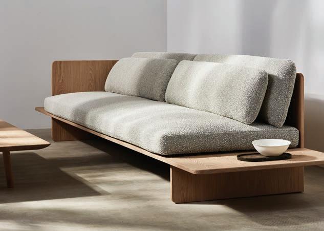
Inspired by radical and minimalist style, the new MUSE Sofa from Space Copenhagen features natural timber combined with feather topped cushions and tactile fabrics giving it a cosy and laid back aesthetic. Playing with proportions and softer details, the new piece meets new demands in both domestic and hospitality design, and can be adapted into both L and U shapes.
spacecph.dk
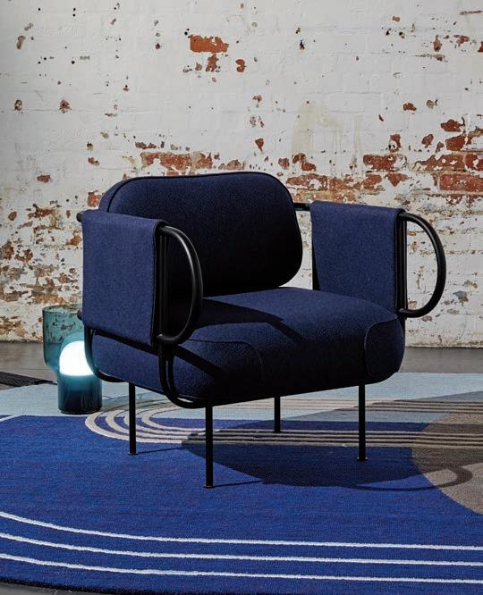
 Designed by Canberra-based Tom Skeehan of Skeehan Studio, the NAVE chair’s frame is refined to essential structural elements. Constructed with tubular steel whose tactile firmness is offset by unique upholstery details, Nave is a comfortable chair ideal for contemporary design friendly living spaces. stylecraft.com.au
issue #42 habitusliving.com
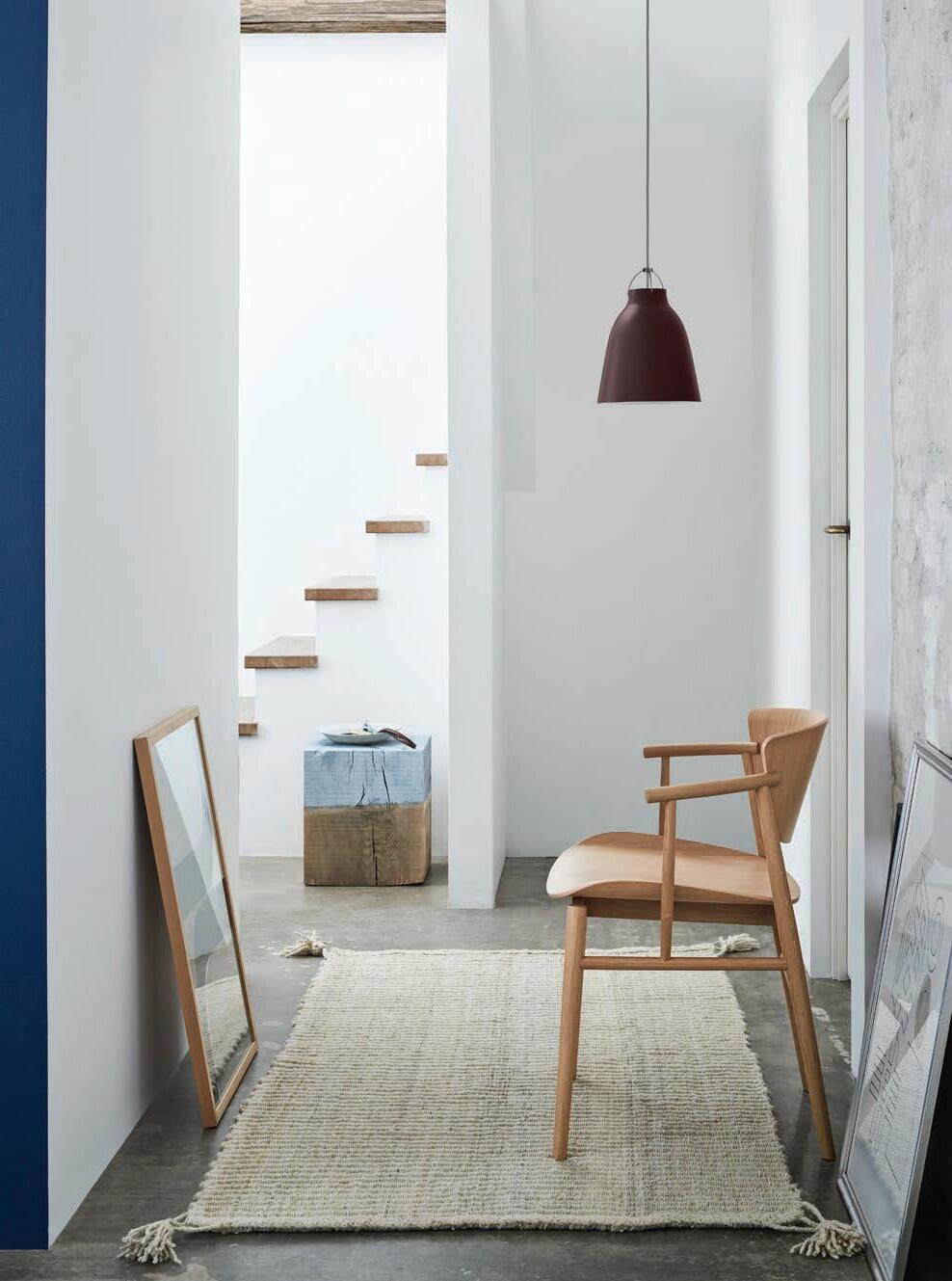
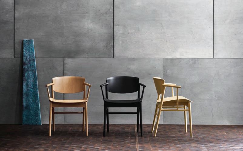
Introducing the N01 chair by Japanese design studio nendo for the Republic of Fritz Hansen. A new wooden chair for the modern home and quality-conscious individual, the minimalist design belies the fine design details in the the build. nendo’s design is available now from Cult cultdesign.com.au
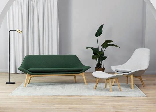
Furniture retailer Castlery has teamed up with Australian designer Charles Wilson to create the GABLE range. Inspired by the irimoya gable forms in traditional Japanese and Asian architectural styles, the collection reflects the gentle sloping lines of the roof and comes in three bold fabric choices of forest green, canary yellow and dove grey.
castlery.com.au
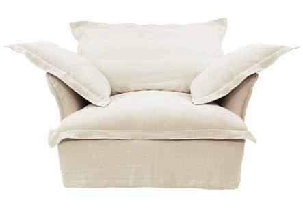
Maker&Son has launched into the local market with plans to shake-up the industry. One of the first truly digitally native homewares brands, Maker&Son spent two years developing their entirely natural product which uses wool and cotton padding, ethically-sourced feathers, and natural latex, to create an armchair, sofa and footstool that is designer-friendly and uniquely positioned digitally.
makerandson.com.au
1 . lightbox # 27
Fluid forms
The latest creation by Sebastian Herkner for Sancal , VESPER is a functional table family with heights to suit every project. Vesper is German for a cold dinner, reflecting the table’s use as a low occasional table or a dining table. Stylish and practical, the table tops use stone and resin to simulate the irregular edges formed by erosion.

kezu.com.au
The CHARLOTTE chair for DANTE Goods and Bads is newly available in Australia from DOMO
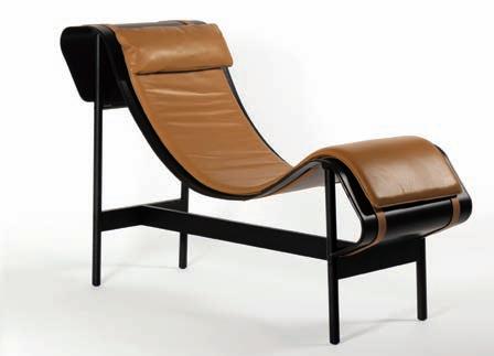
The Aluminium chaise longue with removable leather mattress and adjustable headrest is a striking design. The construction-free mattress has a free flow, adjusting its form to the body’s natural position.
domo.com.au
The COLOURFORM sofa collection offers a fresh, inspired take on colour and form for sofas. Designed by Scholten & Baijings in collaboration with Herman Miller, ColourForm is a comfortable and timeless design for home and office environments - available in Australia through Living Edge.
livingedge.com.au

#42 habitusliving.com
issue
The ATOLLO bath from Sydney’s Gallaria channels the iconic beauty of marble. Handcrafted and available in five stunning finishes, the bath represents the ultimate luxury in freestanding bath design to bring next level elegance and relaxation into your home.
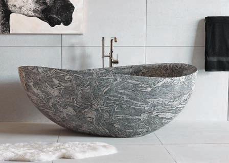
gallaria.com.au
New Australian brand United Products is driven by quality and aesthetics in bathroom products. The inaugural collection sees a combination of Australian designers presenting their varied and unique visions of modern bathroom style.

united-products.co
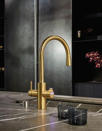
Zip Water ’s beautifully designed HYDROTAP CELSIUS ALL-IN-ONE ARC is the ultimate in functionality, delivering all drinking water and working water needs from a single tap, with smart innovative technology.
zipwater.com
1 . lightbox # 29
Enhance nature’s elements
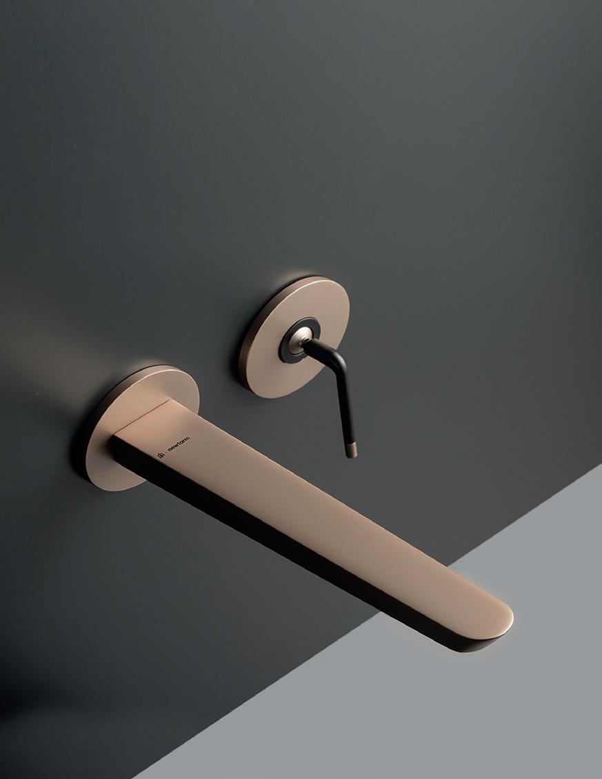
From Phoenix Taps comes ORTHO. A notable release for the designer and design enthusiast market, its form is keenly inspired by modernist design principles. Working within the constraints of minimalism and using the language and geometry in aethetics, Ortho is a perfect statement of design love in the bathroom.
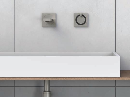
phoenixtapware.com.au
Sussex Taps has a history of exquisite tapware and passion for local design. The company has recently been selected to be part of a government-backed Victoria-wide campaign aiming to drive awareness and appreciation for local manufacturing and craftsmanship.
sussextaps.com.au

issue #42 habitusliving.com
Specialists in ergonomic IT products, CBS presents LOLLY, a personal desk light that gives power to the user through integrated USB ports. Lolly breaks new territory with USB-C charging capabilities, providing 50,000 hours of illumination. The lamp head can be angled to illuminate areas of focus, with a four-stage dimmer enabling variation in brightness.
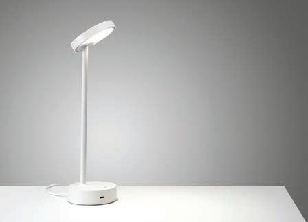
colebrookbossonsaunders.com
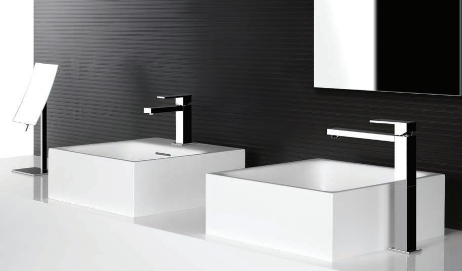
Over 15 years ago, Gessi became the first tapware company to design and produce a square shaped tap. This range called RETTANGOLO became an icon for the industry. Proudly available in Australia though Abey, the minimalist, linear design simplicity and iconic style has made the Gessi Rettangolo range a treasure in modern bathroom design. It adds a dramatic sense of elegance and sophistication to the bathroom.
abey.com.au
1 . lightbox # 31
Design deconstructed

Internationally recognized by The Red Dot Award for Product Design 2018 and the Australian Good Design Best in Class, the TUROA VJET shower from Methven is the designer shower for the modern bathroom. Crafted from high-grade stainless steel for its durable properties as well as lack of environmentally harmful chrome-plating. While you’re showering in supreme style and comfort you can relax easy, knowing Methven designed the Turoa with material that can, in future, be collected, reused and repurposed into new products. Showering has never been so relaxing.
methven.com/au
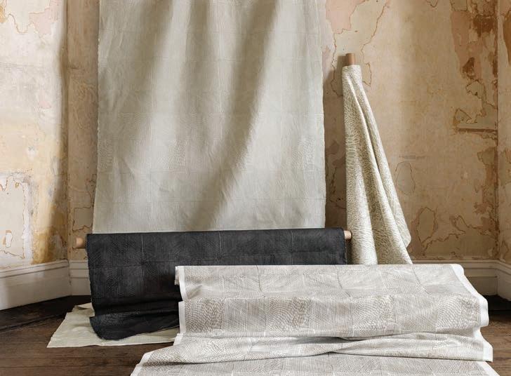
Willie Weston ’s latest collection of fabric and wallpaper honours the legacy of Indigenous design. Partnering with artists fromManingrida in Central Arnhem Land, the BÁBBARRA collection features original artwork resulting in a collection with a contemporary aesthetic and regionallyspecific iconography.
willieweston.com
issue #42 habitusliving.com





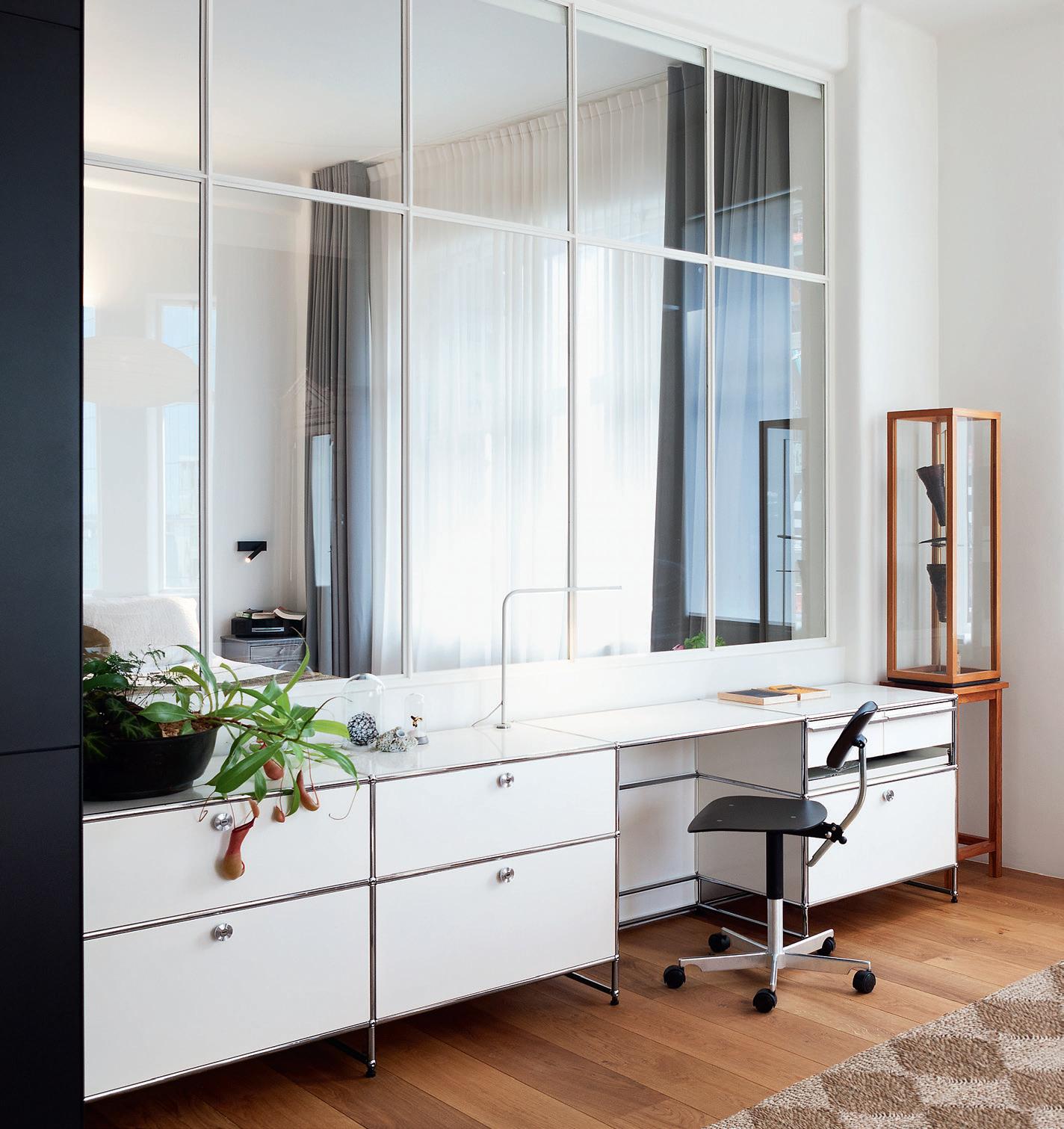
Make it yours ! USM brings simplicity to your life: clear structures, sustainable design – creating a pure space. www.usm.com Available at Anibou – www.anibou.com.au Sydney 726 Bourke St. Redfern NSW 2016, 02 9319 0655 Melbourne 32 Glasgow St. Collingwood VIC 3066, 03 9416 3671 info@anibou.com.au
Accent pieces
Designed in collaboration with bernabeifreeman , the new Designer Rugs collection is comprised of four irregular-shaped, hand-tufted wool rugs displaying a highly sophisticated use of colour. The range, EUROPEAN LIGHT, as you might expect is very European in its sensibility, yet highly accessible. Suited to minimal interiors serving as a warming presence in residential settings.

designerrugs.com.au
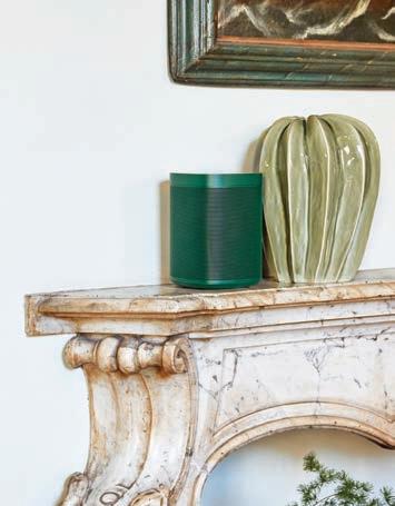
HAY has teamed up with Sonos to offer a new edition of the SONOS ONE speaker. Driven by a mutual commitment to creating contemporary products with an eye for modern living and sophisticated industrial manufacturing, the new speaker is available in a range of colours that match perfectly with the HAY palette.
sonos.com
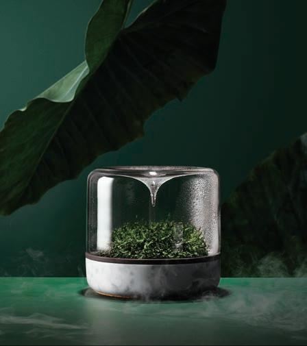
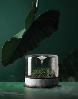
The SANCTUARY S from Botanica is a vessel that captures the beauty of the rainforest in a miniature world of moss. Ideal for adding a touch of nature to desktops, bench tops, side tables and wet areas, the smartly designed conical profile funnels condensation to rain down and hydrate the foliage.
botanica.boutique
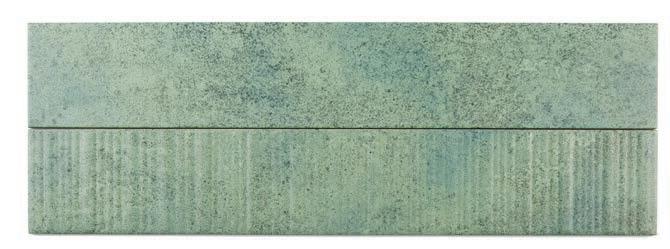
Beaumont Tiles PIER 17 collection is a plank tile range that draws inspiration from the ways that water can affect the elements of an ocean pier. A celebration of aqueous hues and a reminder of the changing organic nature of the world we live in, Pier 17 is suitable for floor and wall options alike. Delicate and proud, yet incredibly robust, it is ideal to unite elements within a space, to produce timeless and cohesive styles.
beaumont-tiles.com.au
issue #42 habitusliving.com


Timeless design Ultimate flexibility T39
Celebrating 50 years and beyond Watch our original stories at vola.com VOLA Design Pty. Ltd. - 94 Wellington Street - Collingwood, VIC 3066 Tel.: +61 402 372 480 - sales@vola.com.au - www.vola.com
Modular heated towel warmer
Swing time
Concentrating on iconic Mid-Century Modernist designs in the harsh desert climate of Palm Springs, Capra Designs’ BACK TO NATURE collection is a perfect melding of nature and design; of arid deserts and green life. The Etch Pots are hand carved with indentations before being moulded; the irregularities evidence of a hand-made process.
capradesigns.com
The Blackened Brass finish from ADesignStudio is available on the entire range of boutique considered lighting. The finish was carefully developed through a series of in-studio testing and has been finessed to create a finish that is fresh, refined, understated and grounded in a natural palette.

adesignstudio.com.au

issue #42 habitusliving.com
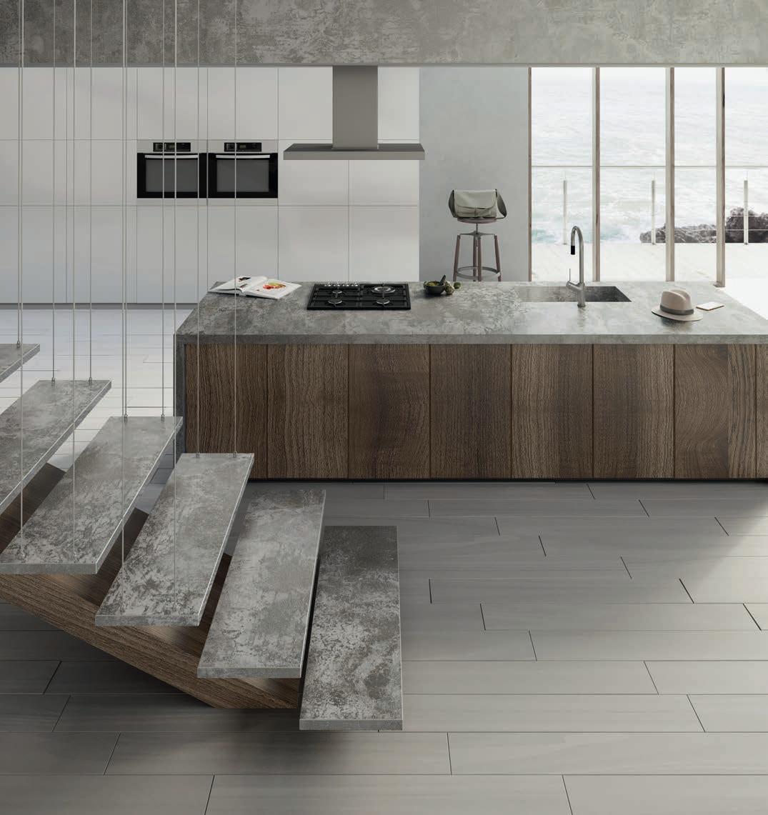
DEKTON UNLIMITED
COLLECTION
It is composed of four colors reflecting both urban style and ecological character – these rustic materials add power, depth and personality to any architectural and decorative project.
An exercise in technological innovation and sustainability for a more demanding world.
DEKTON UNLIMITED
COSENTINO AUSTRALIA & NEW ZEALAND
Adelaide | Brisbane | Melbourne | Perth | Sydney | Auckland
Discover more at www.dekton.com
Follow Us F T ò
Ultra Thickness (0.8, 1.2, 2, 3 cm) Ultra Thickness (0.8, 1.2, 2 cm )


ORIX - INDUSTRIAL Collection
NEW INDUSTRIAL
DEKTON presents the new INDUSTRIAL series, the result of a collaboration with Daniel Germani Designs.
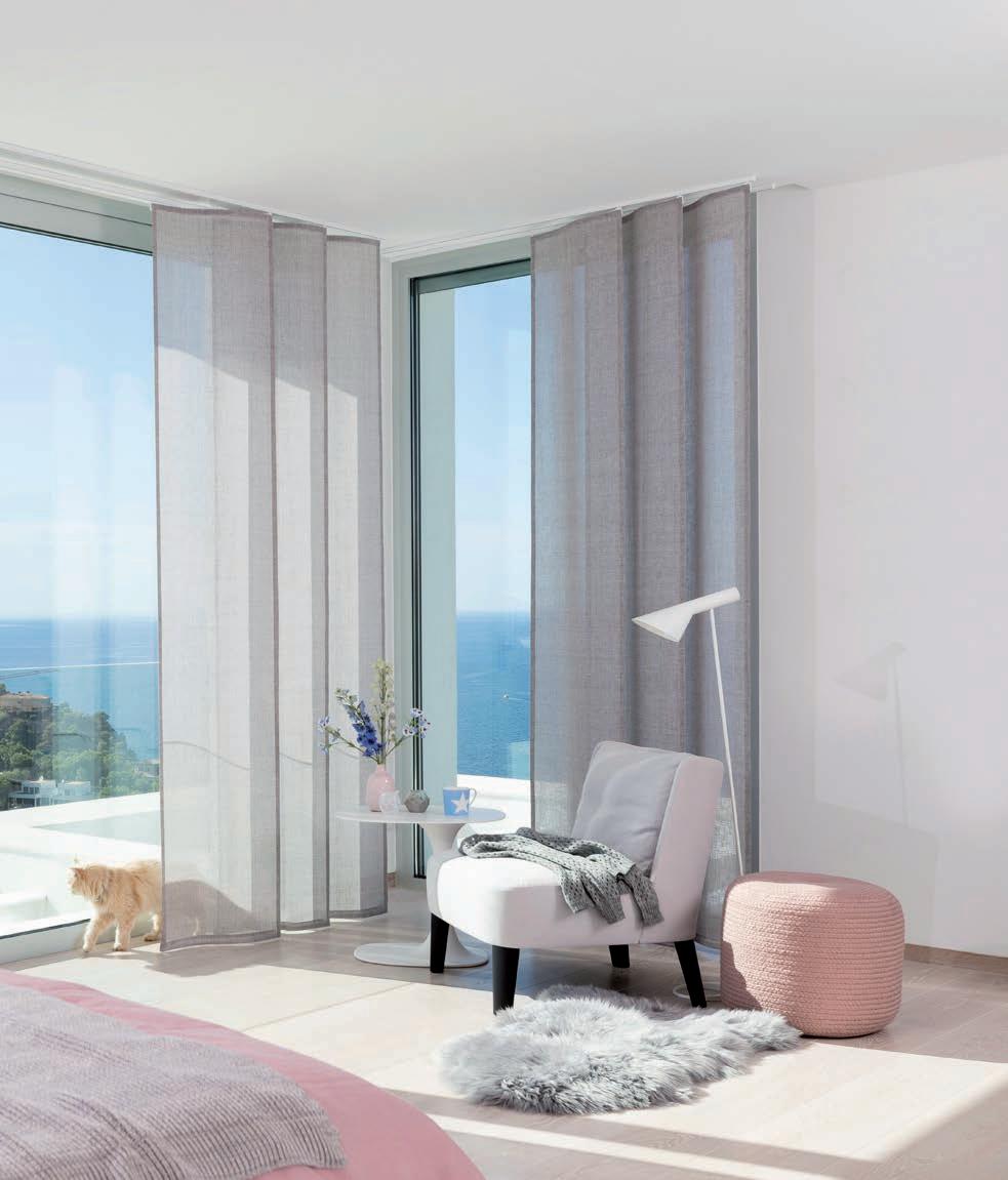
WAVES OF SHADE.
– Introducing the all-new Wave Panel Glide System
The Wave Panel Glide System from Silent Gliss creates the perfect blend of light and shade. The clear, elegant wave forms allow natural light to enhance your room space and give you the freedom to explore an array of visual and shading effects.
silentgliss.com.au
Unexpected outcomes
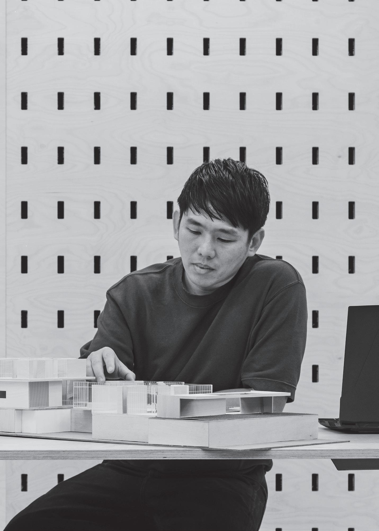
Founder Serial
Graduating top of his class at The Architectural Association’s School of Architecture (AA), Pan Yi Cheng is very much a product of his generation. His career has taken on many guises, as he’s worked around the world, collecting essential experiences and skills, to prepare him for his ultimate endeavour: building his own design business.
Time spent with tutors Chris Lee and TP Bennett early on was followed by a stint at UNStudio in Amsterdam.
In 2010, four years after finishing his studies, he moved back to Singapore to start his own consultancy company with a school friend from AA, naming it PAC to service masterplans for one developer in China. “They were the scale of townships, had long lead times and were, oftentimes, speculative works. After three years I felt it wasn’t going to evolve into anything physical so I decided to come out of that partnership and start Produce,” says Yi Cheng. “At the end of my time at PAC we had just one project in Singapore, a Herman Miller showroom in Xtra, the premium furniture retailer at Park Mall.” With a “shop-in-shop” concept, the project won the Best Retail Building award at the World Architectural Festival of 2012, and represented a breakthrough for Yi Cheng in many ways.
“It was during this project that I realised that as an industry in Singapore, we are unable to do customised fittings or customized product easily and there’s not enough competition.”
From the big picture of massive visionary urban designs to the minute scale of physical product making, the exceedingly versatile Pan Yi Cheng recounts the genesis of Produce.
issue #42 habitusliving.com
TEXT CHU LIK REN | PHOTOGRAPHY KHOO GUO JIE
2 . portrait # 41

issue #42 habitusliving.com
2 . portrait # 43
“We started Produce with the idea of ‘design and make’. This is in opposition to the convention of having designs out-sourced to different groups of contractors or fabricators.”
OPENER |
| A
A
TO
| A SCALE
OF ONE OF
issue #42 habitusliving.com
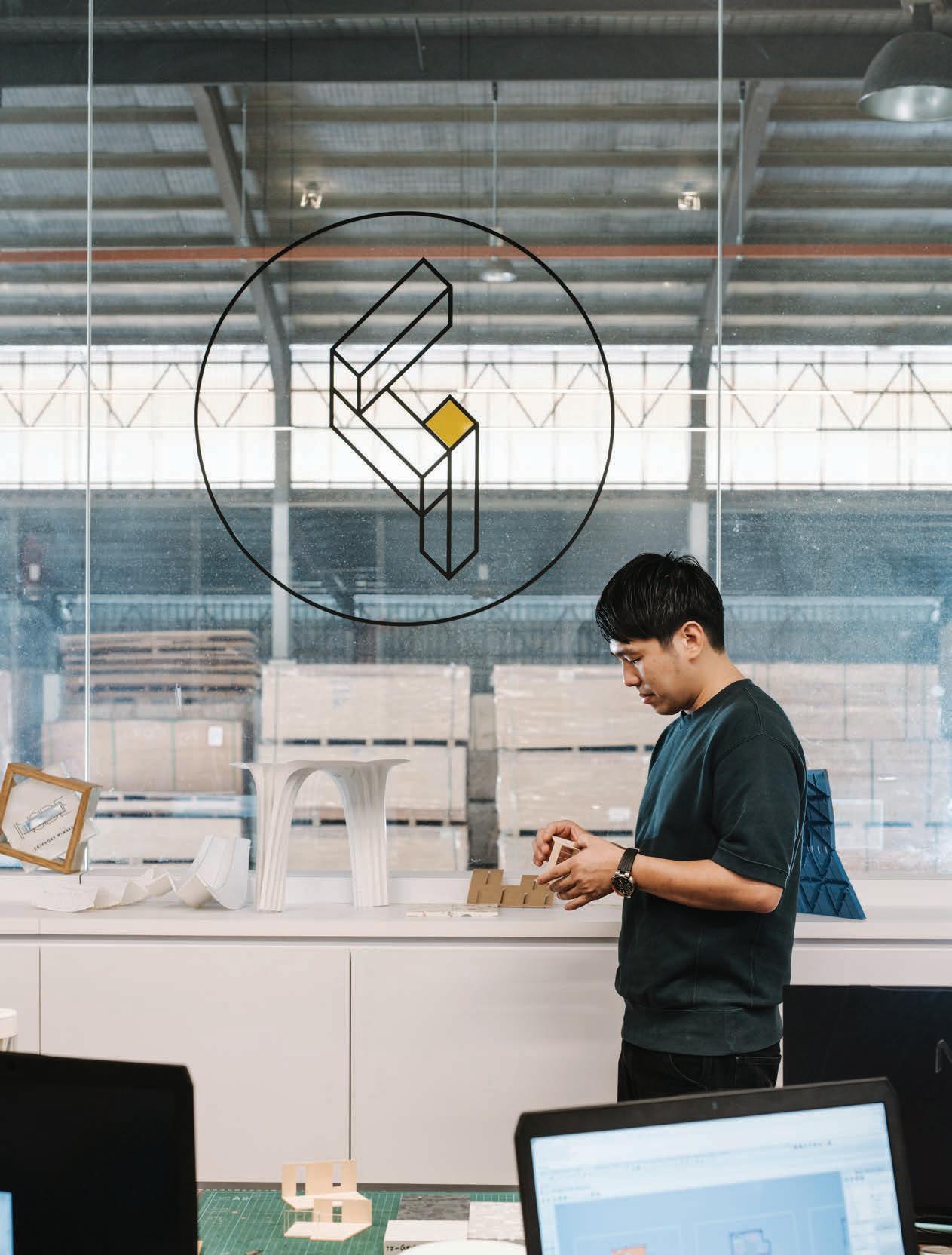
PAN YI CHENG LEADS WITH A HANDS-ON APPROACH IN THE STUDIO. PREVIOUS | THE TEAM OPERATE THEIR OWN THREE-AXIS CNC MACHINES. ABOVE
HINT OF
PROJECT
COME. OPPOSITE
MODEL
PRODUCE’S RESIDENTIAL PROJECTS.
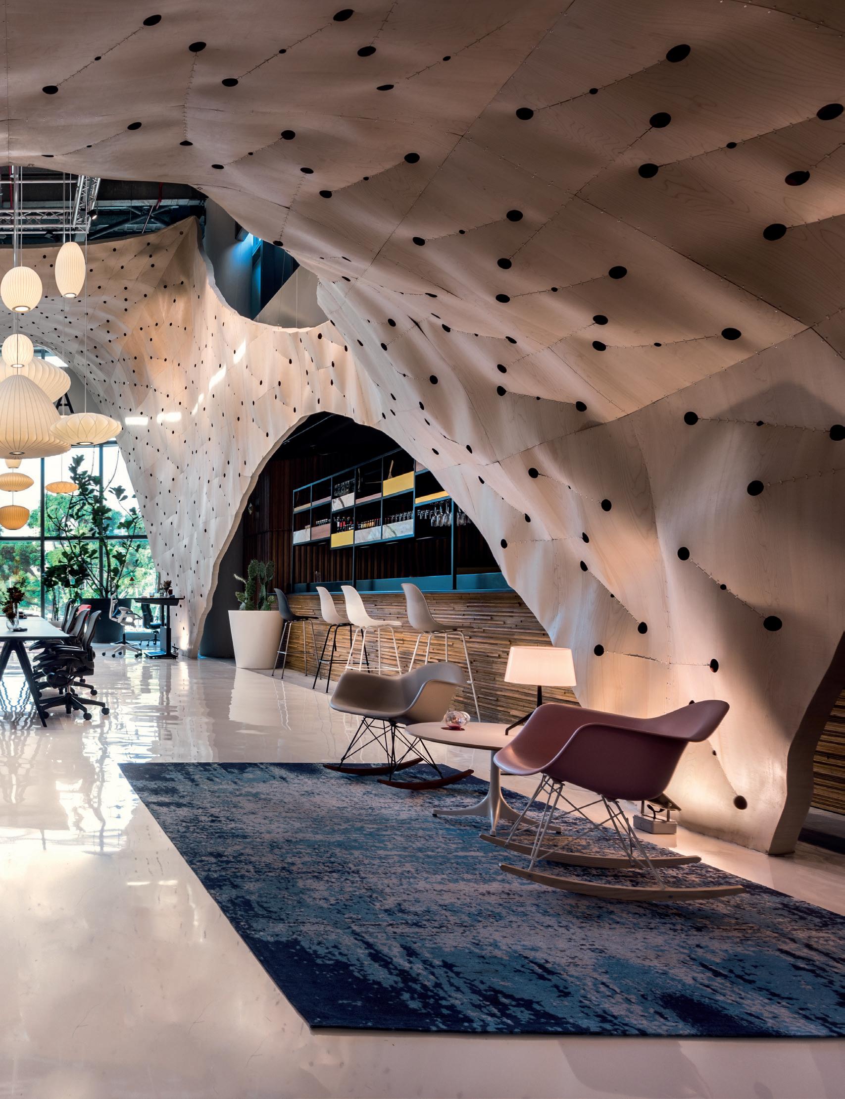
Installed as a continuous skin of undulating lattice made up of triangular plywood panels, the design involved complex geometries “hooked” together with “interlocking lapping joints”. Its design process was hampered by the lack of facilities to test out 1:1 scale mockups using the actual material so designs were initially tested on scaled down versions made of cardboard.
“It was slow and dogged by inaccuracies. The design was eventually tested at 1:3 scale with birch ply but out-sourced to London for its cheaper pricing. Only when we started to assemble it did we find areas we could have trimmed off, so we learnt from accumulated mistakes,” Yi Cheng recalls.

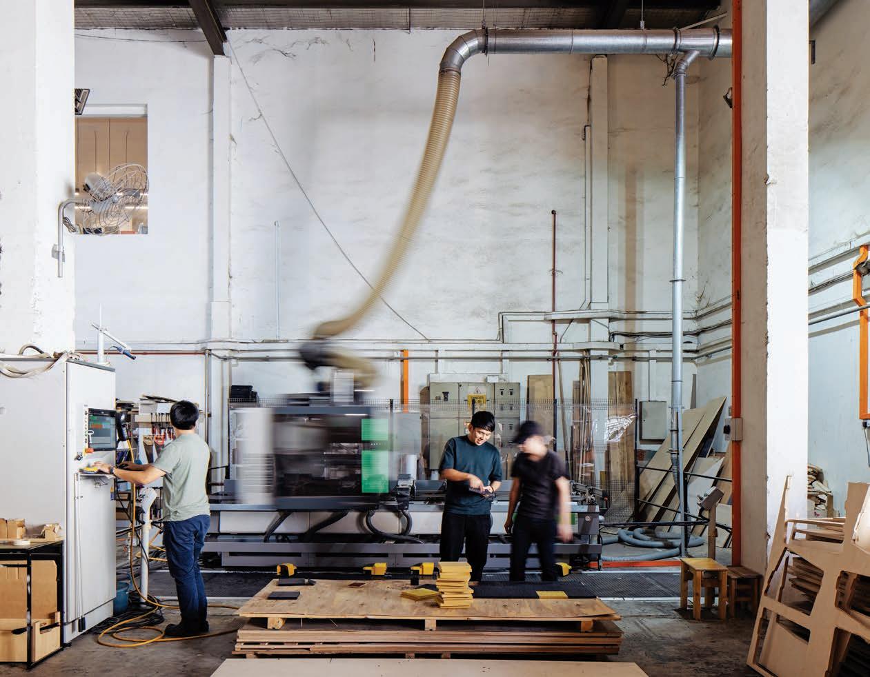
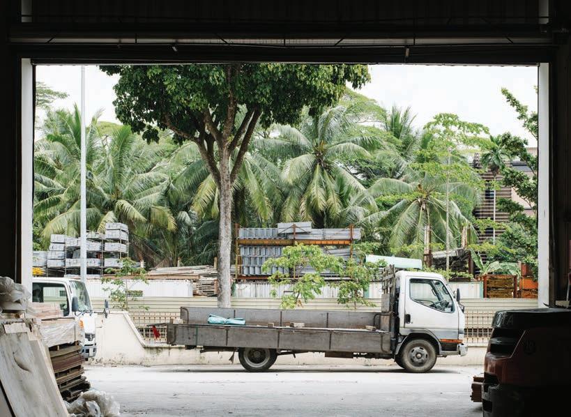
The final fabrication as carried out by a firm in China presented other challenges – materials not done to specifications and batches with upside-down cuttings – but its eventual success encouraged Yi Cheng and another AA alumni friend to pioneer an equipped facility where they could do their own experimentation and to demonstrate the potential of doing bespoke works. “So we started Produce with the idea of ‘design and make’,” Yi Cheng continues. “This is in opposition to the convention of having designs out-sourced to different groups of contractors or fabricators who then have to figure out how to make your design intention come to life, because in my experience, they tend to overprice complex designs and these then get value-engineered out. Our idea was to incorporate the fabrication and construction stage into the design stage. We decided to have our own prototyping facility. Together with two other partners, the four of us pulled our resources, took out a factory space and bought two machines: a laser cutting- and a three-axis CNC (Computer Numerical Control) milling machine. We started with small objects like furniture and products and sought to build our portfolio upwards from there.”
The efficacy of this investment is best appreciated in the second version of the showroom Produce designed and manufactured
Other interior works moulded by the Produce prototyping capabilities include the inventive structure for Wild Rocket restaurant, which simulates a cascade of disintegrating timber pieces.
2 . portrait # 45
issue #42 habitusliving.com
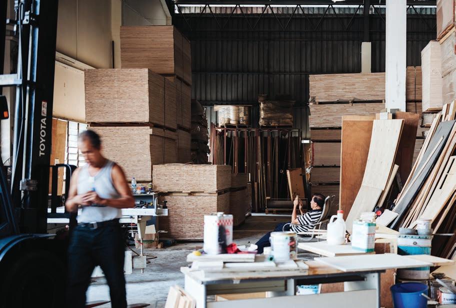
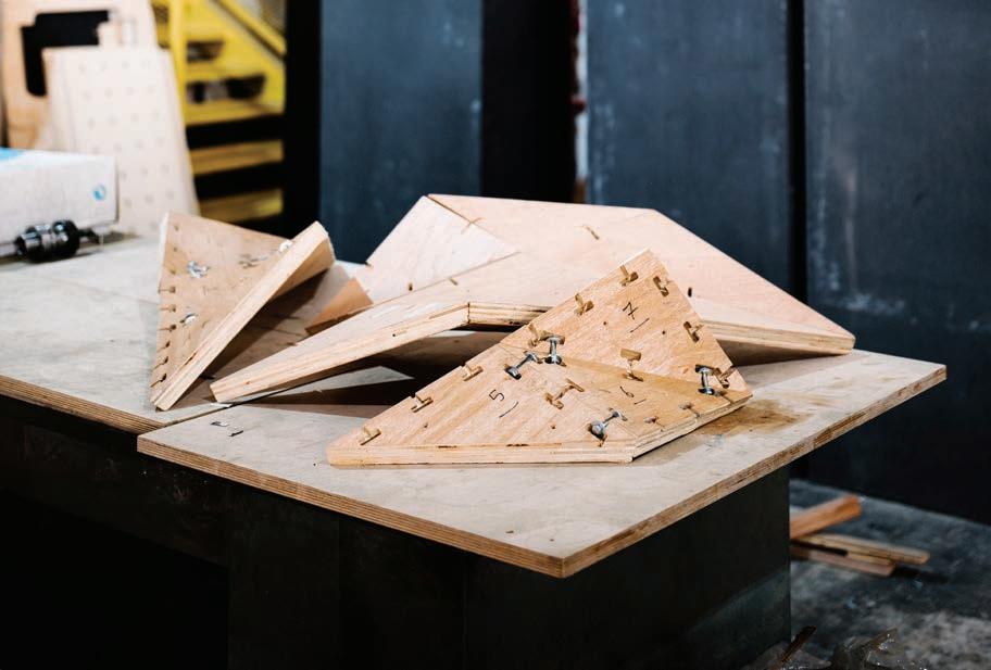
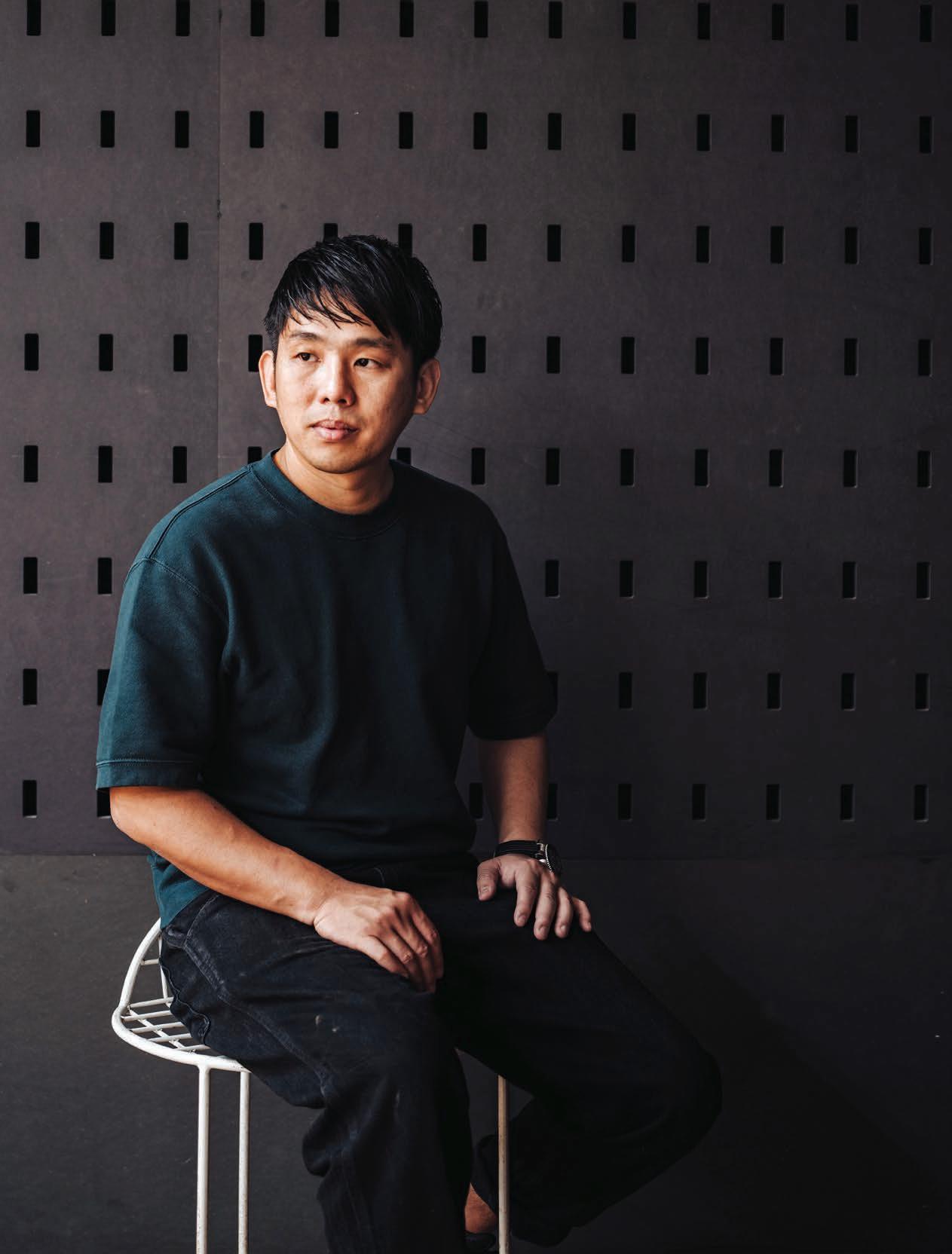
OPPOSITE | THE PORTRAIT OF A TRAILBLAZER. ABOVE | THE PROTOTYPE OF A FACETED ACOUSTIC STRUCTURE FOR AN OFFICE. BELOW | YI CHENG’S TEAM IN THE WAREHOUSE, TAKING A BREAK AS COMPONENTS ARE DIGITALLY PROCESSED BY THE CNC MACHINE. 2 . portrait # 47
issue #42 habitusliving.com
2 . portrait # 49
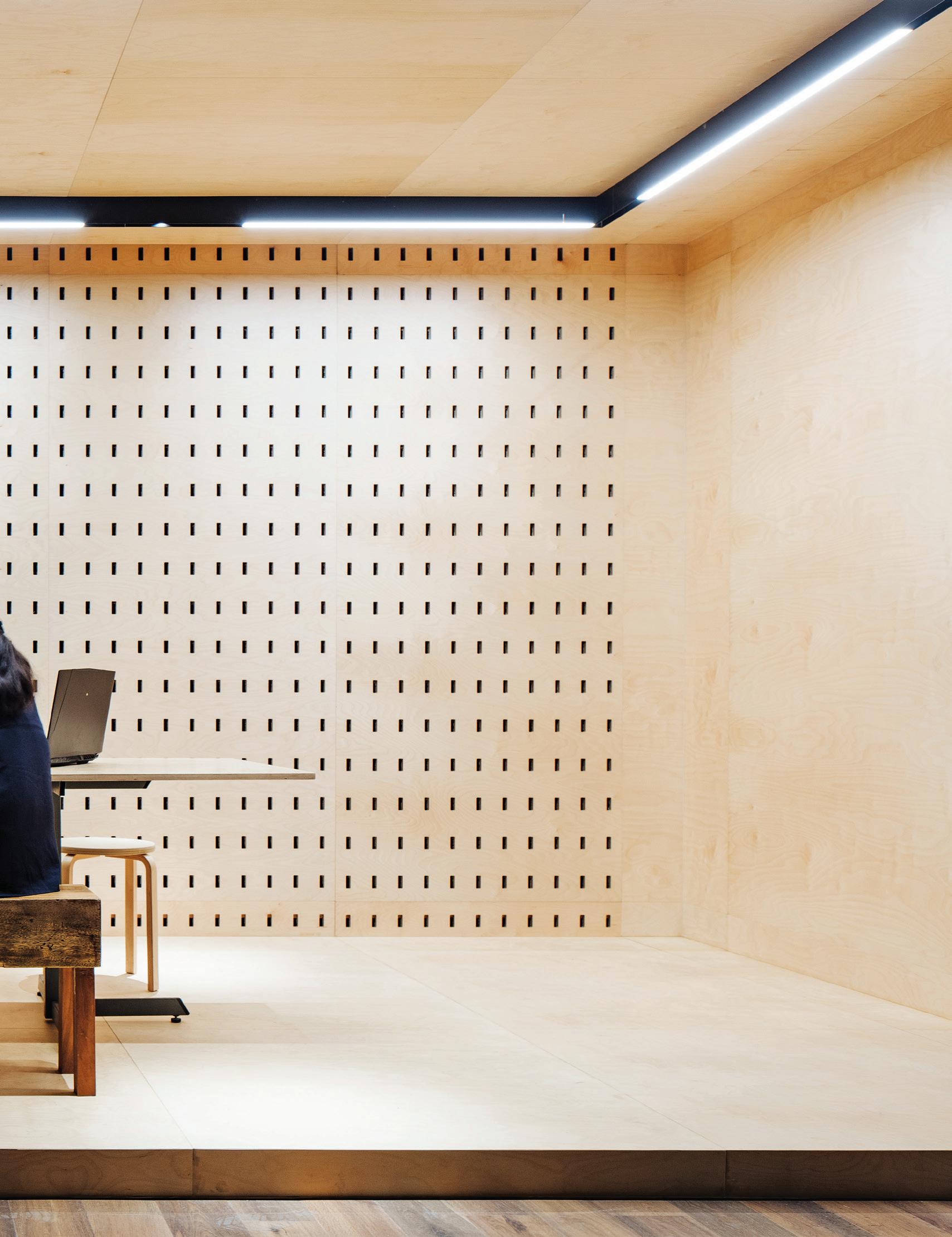
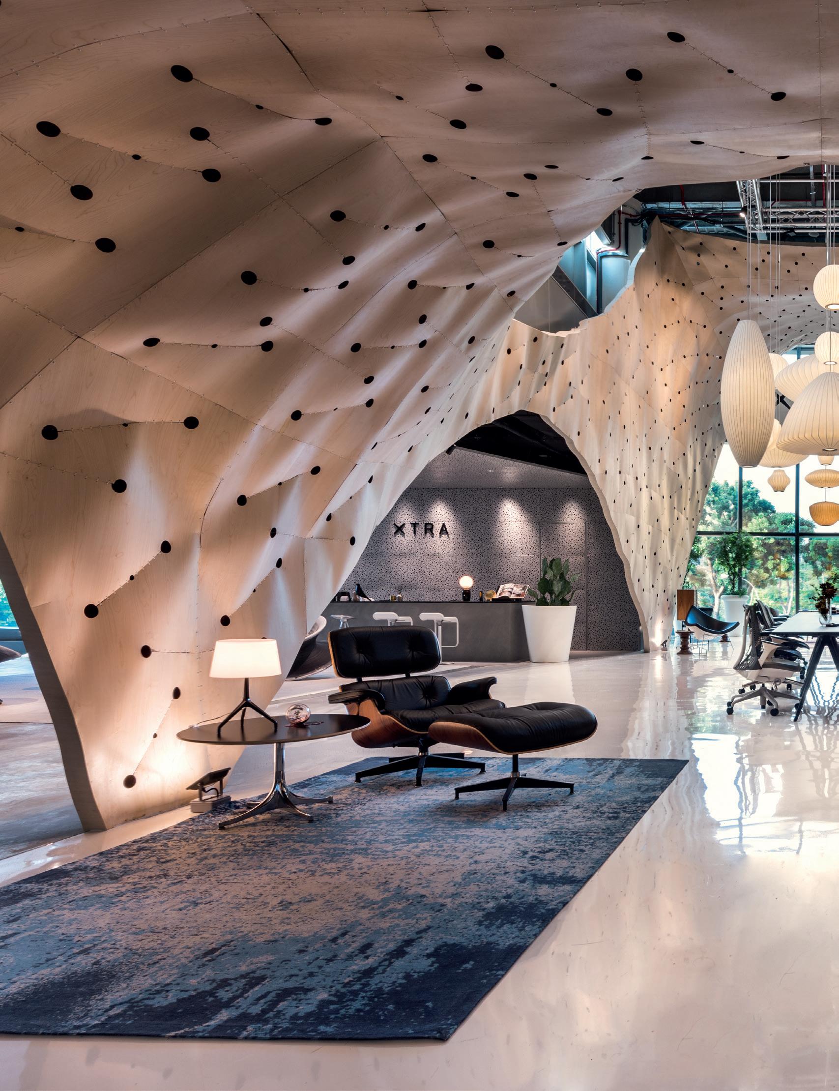
for Xtra in 2016, at their new premise of Marina Square, Singapore. Once again inspired by how the Eames chair had innovated the use of plywood ergonomically, Yi Cheng challenged himself to manipulate the material with new geometries. “We started to see the space as a body where we could wrap a new skin around,” he explains. “The only requirement from the owner was to have less number of parts. The first store had 4000 over parts which was arduous to assemble.”
For the second iteration, Yi Cheng used larger panels of plywood and found ways to distort them to the required geometries without breaking them down into triangles. This was achieved by puncturing wedge slits over thin slices of ply and closing them up with stitches of plastic loops, much like how darts are used in sewing to shape the contours of a garment. The resultant conglomeration of doublecurved parts resembled the rippling folds of loosely draped fabric, a design Yi Cheng calls “Fabricwood”. This time, only 400 parts were used to encapsulate a larger area. The work garnered multiple awards, including the Gold Medal for Retail in 2016 from the Singapore Interior Design Award.
Other interior works moulded by the Produce prototyping capabilities include the inventive structure for Wild Rocket restaurant which simulates a cascade of disintegrating timber pieces, and the cheerful Kki Sweets and The Little Dröm Store, Winner of Best Retail Interior 2015 INSIDE Festival. Today, Yi Cheng is 38 and has achieved licensed architect status earlier in the year. He is seeking to start a new sole proprietorship practice, as none of the other three partners of Produce are qualified professionals. He has applied for his firm to be named “Type 0”, an allusion to going back to the origin, a resetting of all typologies to tabula rasa. Concurrently, he has also initiated the formation of another entity called Superstructure to capitalise on the use of his facilities for digital fabrication to other companies. While very much a deep-thinking man who knows the world and his place in it, he still retains a hurried hunger to remake both.
Produce | produce.com.sg PREVIOUS | THE
FROM AMPLE
issue #42 habitusliving.com
XTRA SHOWROOM AT MARINA SQUARE, SINGAPORE, DESIGNED BY PRODUCE. PHOTOGRAPHY BY EDWARD HENDRICKS. ABOVE | THE INDUSTRIAL WORKSPACE BENEFITS
GREENERY.

FOOD IS ART. PRESERVE IT. su b zer o -wolf.com.au Superior food preservation. Professional cooking performance. Craftsmanship and technology without equal.
issue #42 habitusliving.com
Inefficiencies Bridging
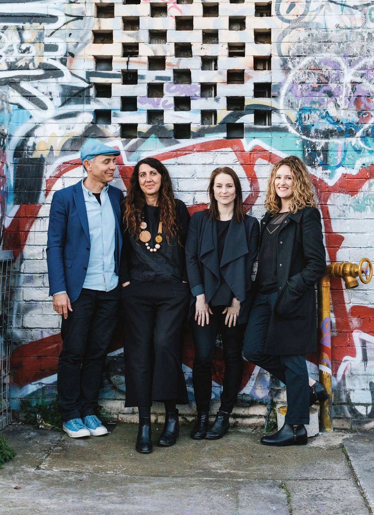
Jeremy McLeod is adamant that this portrait not be about himself. According to the founding director of Melbourne design practice, Breathe Architecture, the industry feels like “a really tough team sport”, and the things that his practice has achieved to date would not have been possible without his “team of A players”.
To put this humility into context, Breathe has arguably had the most impact on the Australian design landscape out of any firm born of this generation. Since foundation in 2001, its mission has always been clear – and more than slightly ahead of its time. When it was first launched, Breathe was one of just a handful of architectural practices that identified as sustainable. “When we built our first website we listed ourselves as sustainable architects. We were one of six architects when you searched ‘sustainable architects’,” says Jeremy. “It seemed obvious to us that there was a lack of understanding about sustainability and a lack of understanding about how to approach sustainability holistically. I think if you search ‘sustainable architecture’ now, Google never finishes. Everyone’s sustainable now…apparently.”
From a minority base, Breathe has gone on to design high-profile and wide-reaching developments such as the now legendary Nightingale housing project, and reimagine the role architects can play in property development and financing.
It can seem like post-rationalising, to point back to someone’s childhood and pick out a pattern in their path. But in Jeremy’s case it does seem like this relentless pursuit of better outcomes runs in the blood. Growing up with two activist parents, whose peripatetic tendencies gave a young Jeremy many towns to call home, the would-be trailblazer recalls memories of pitching a tent embassy on the lawn of Old Parliament House with his father to lobby for more public housing in Melbourne.
All of this protesting and pushing for change instilled a sense of the potential for good that design has within society – but it was another type of design that Jeremy originally had his sights set on.
“It’s very funny, I actually never wanted to be an architect,” he says. “I had a thing for steel bridges. Some of my happiest memories as a child were of driving back to our home – a small town in New South Wales – and of lying
Growing up, Jeremy McLeod always wanted to build bridges. Instead, as founding director of Breathe Architecture, he is bridging gaps in the Australian design industry.
TEXT KIRSTY SIER | PHOTOGRAPHY MARNIE HAWSON
2 . portrait # 53
in the back seat of my parents’ Holden looking up through the rear windscreen and seeing the steel-frame bridge above and hearing the click clack of the bridge as we went across. So in high school, I spoke to my careers teacher, and she said, ‘Oh yeah, to design a bridge you need to be an architect’. I got into architecture school, and halfway through first semester I asked, ‘When do we start working on the bridges?’ And they said, ‘That’s not this department, you need to be a structural engineer to do bridges. That’s the next department over. You’re in the wrong course.’ But by that stage, of course, I was hooked.”
After graduating, Jeremy went to work for one of his design idols, the inimitable Nonda Katsalidis of Fender Katsalidis. “I remember vividly when Nonda completed Melbourne Terrace, and seeing that new housing typology and finding out that was led by an architect,” says Jeremy. “It showed me how much impact architects could have, and that architecture was so much more than the building itself.” But as Fender Katsalidis grew bigger – from eight architects when Jeremy first started to 50 when he left – and Jeremy started to feel smaller, he realised he needed to create his own firm if he was to deliver the kind of architecture that was important to him. Cut to Breathe, which ever since has abided by a mission statement to maintain a small team of like-minded and dedicated individuals.
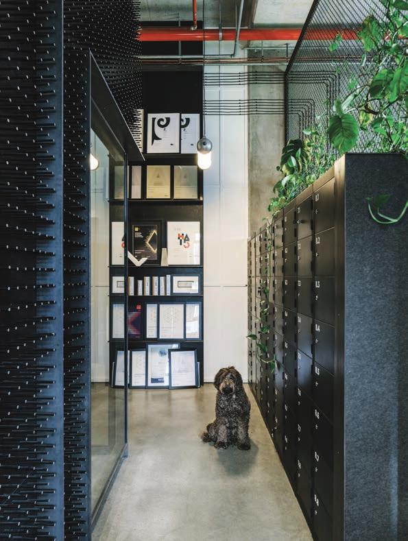
“The reason it was called Breathe was because we wanted every room to have a window; we wanted every room to be able to breathe,” he explains. “It was also never going to be called Jeremy McLeod Architecture because I knew it was never going to be about

OPENER
BELOW | BREATHE
HAS 16
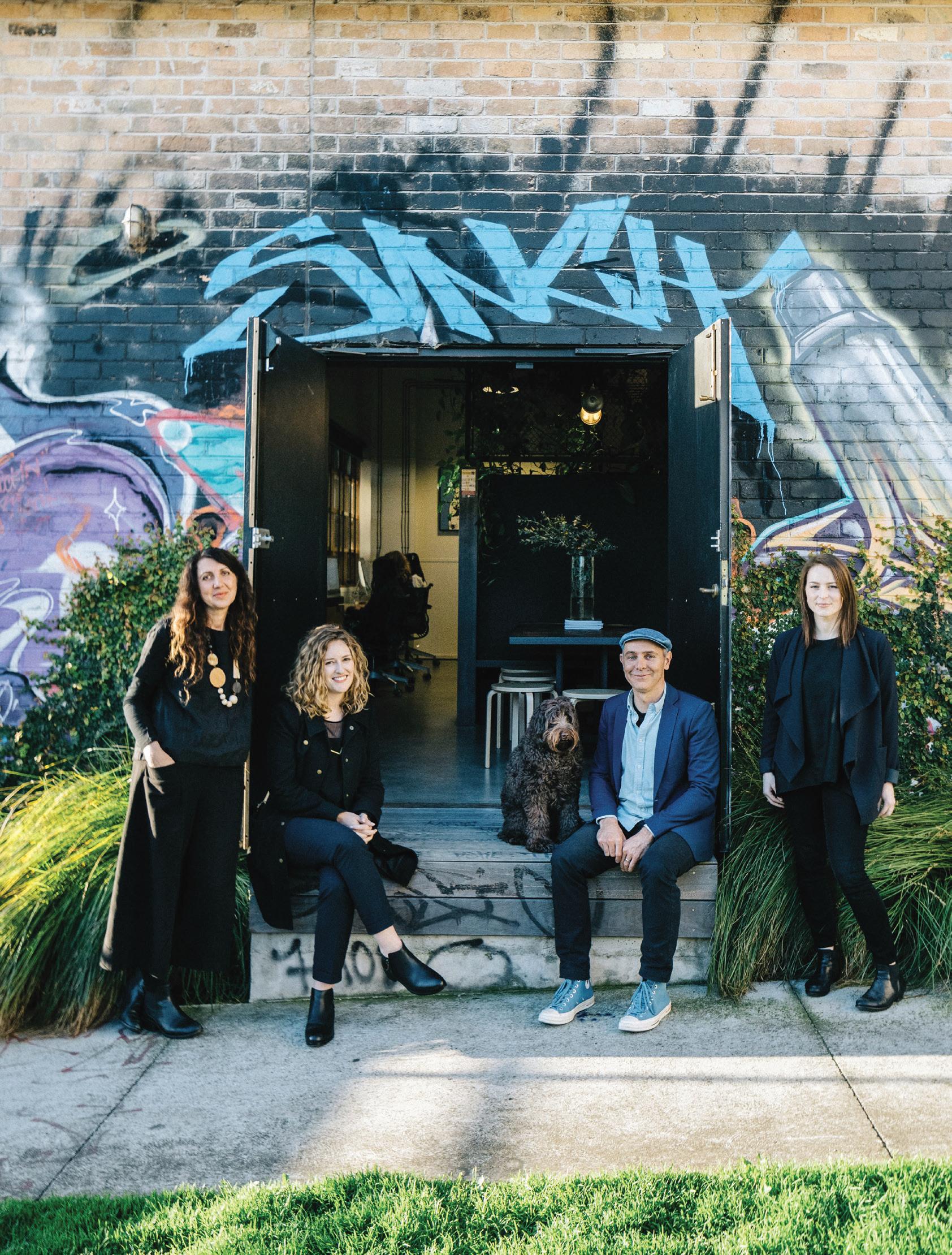
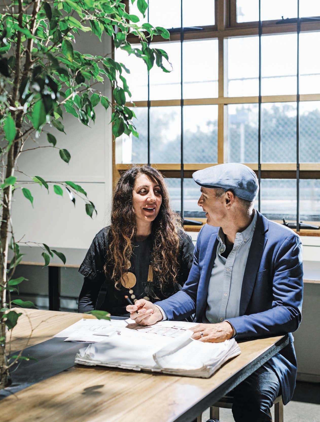
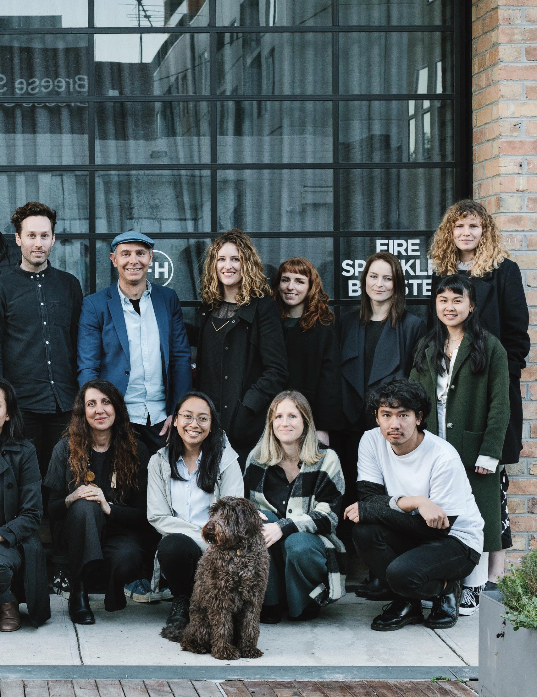
| JEREMY MCLEOD WITH MEMBERS OF THE BREATHE ARCHITECTURE TEAM. ACCORDING TO JEREMY, ARCHITECTURE IS “A REALLY TOUGH TEAM SPORT”. ABOVE | AFTER WORKING FOR FENDER KATSALIDIS AS A GRADUATE ARCHITECT, JEREMY DECIDED HE NEEDED TO OPEN HIS OWN PRACTICE IF HE WAS GOING TO DELIVER THE ARCHITECTURE THAT WAS IMPORTANT TO HIM.
ARCHITECTURE
ARCHITECTS UNDER ITS ROOF – PLUS WINTER, THE OFFICE DOG. OPPOSITE | JEREMY AND BREATHE CO-FOUNDER, TAMARA VELTRE.
issue #42 habitusliving.com
2 . portrait # 55

issue #42 habitusliving.com
“I’d like to keep working with our incredibly talented young architects to share with them what I know and to continue learning from them. The more I share with them, the more powerful we become as an organisation.”
2 . portrait # 57
me. I’m surrounded by incredibly talented individuals who all come together and play really collaboratively.”
The values-driven approach that leads Breathe’s hiring practice and general operations has led to projects such as The Commons, the medium-density residential development in Melbourne’s inner-north that went on to spawn Nightingale – which in turn has led to a whole new development model for Australia’s property industry.
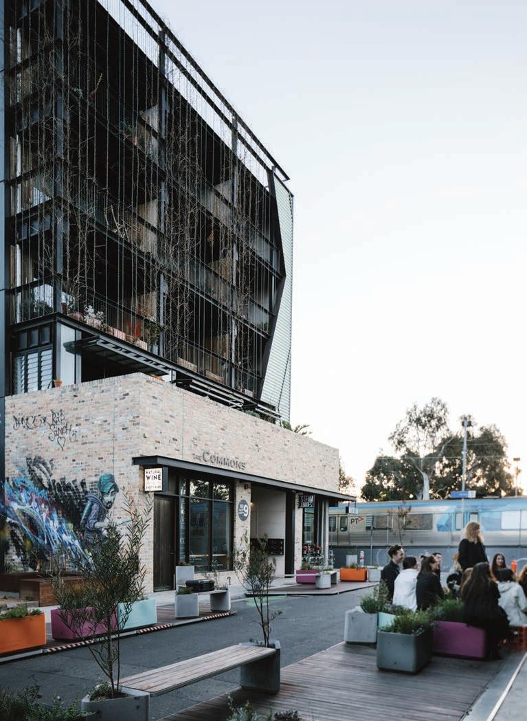
According to Jeremy, The Commons was a project borne out of necessity. At that point, Breathe had worked on a number of award-winning, multi-residential projects, and what they’d found in the existing property development mandate was quite simple: it didn’t work.
“We found that the entire property development system is designed for housing failure,” he says. “It is built around building investor stock to sell to investors to rent back to Australians at the highest possible profit margin. It’s about building cheaply, selling at a high price and renting out at a higher price with no care about the comfort of that building.”
More than a project, The Commons has now become a movement. Its continuation, Nightingale Housing, is soon to have presence in six different locations around Australia. The model is based on eschewing the traditional development model by putting architects back in control of financing, using their own learnings around social design and sustainability to
PREVIOUS
PROJECTS FEATURES A STRONG COMMUNITY ASPECT. OPPOSITE RIGHT | THE NIGHTINGALE
CREATING HIGH-PERFORMING,
RESIDENCES.
|
BREATHE’S APPROACH TO HIRING HAS ALWAYS BEEN BASED AROUND FINDING EMERGING ARCHITECTS WITH STRONG VALUES AROUND SUSTAINABILITY. ABOVE | THE COMMONS
IN MELBOURNE HAS SPAWNED A NATION-WIDE MOVEMENT ESCHEWING TRADITIONAL DEVELOPMENT MODELS. OPPOSITE LEFT | EACH OF BREATHE’S MULTI-RESIDENTIAL
HOUSING MODEL IS ABOUT
TRANSPARENT, AFFORDABLE
issue #42 habitusliving.com
More than a project, The Commons has now become a movement. Its continuation, Nightingale Housing, is soon to have presence in six different locations around Australia.


2 . portrait # 59
ABOVE | COMMUNITY GARDEN SPACES ARE A TYPICAL FEATURE OF BREATHE’S ÜBER-SUSTAINABLE ARCHITECTURE. OPPOSITE | ACCORDING TO JEREMY, EACH MEMBER OF THE TEAM HELPS TO DISTIL THEIR MEANING AS A PRACTICE.
issue #42 habitusliving.com
“It was never going to be called Jeremy McLeod Architecture because I knew it was never going to be about me.”
2 . portrait # 61
deliver outcomes that are high-performing, transparent, affordable and that facilitate community connections. From the first Breathe-designed project in 2014, Nightingale has since grown to encompass accomplice firms Six Degrees, Austin Maynard Architects, Architecture Architecture, Clare Cousins Architects, MRTN Architects and Wolveridge Architects – yet another iteration on the theme of team work.
These days, Breathe has 16 architects working under its roof. Rather than to grow for the sake of growing, Jeremy says the practice wants to continue to avoid “hero architecture” in favour of projects that create meaning.
“I’d like to keep working with our incredibly talented young architects to share with them what I know and to continue learning from them. The more I share with them, the more powerful we become as an organisation,” summarises Jeremy. “Each year as we grow and as we start getting these incredible people joining our team, it helps us distil who we are as a practice and who we want to be. Over time, our message has gotten clearer. For us, we need to be incisive about what projects we take on; they need to be projects that make the city a better place for all of humanity.”
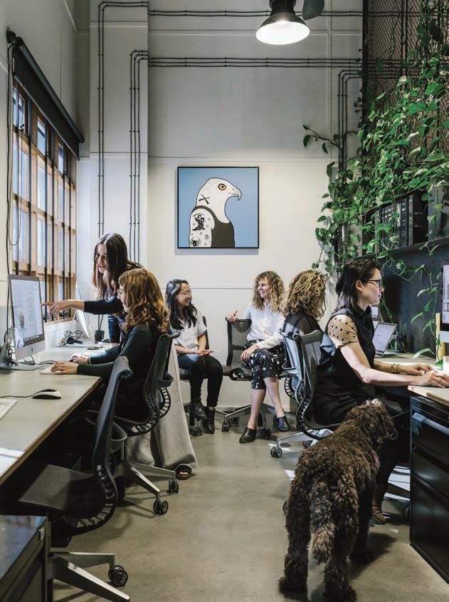
ABOVE | A COLLABORATIVE, NON-HIERARCHICAL APPROACH TO DESIGN RULES AT BREATHE
HEADQUARTERS.
issue #42 habitusliving.com
Breathe Architecture | breathe.com.au
DISCOVER THE AUSTRALASIAN COMPANY LEADING THE WAY WITH INNOVATIVE, EXCLUSIVE, INSPIRING AND BEAUTIFUL HARD SURFACE SOLUTIONS.
Over 20 years of supplying exclusive and luxurious porcelain stoneware
Bespoke hard surface materials for custom layouts and design
Highest quality Italian and Spanish ceramic tiles and slabs
Supplying major residential, commercial and infrastructure projects throughout Australia & South Pacific
Providing floor and wall solutions to complex projects for both interiors and landscaping
Our wide range of tiles and slabs can be precision cut into many formats including mosaics to create new designs and features
Supplying the most diverse glass mosaics, using transparent, iridescent, mirrored and textured materials Respected by leading architects, designers and builders throughout Australasia for supplying materials that maintain the integrity of their projects
Rocks On www.rockson.com.au | 02 8303 0100
Visit our showroom 32‑33/110 Bourke Road, Alexandria NSW 2015
VALCUCINE KITCHEN EXCLUSIVE TO ROGERSELLER | HOMEPAGE


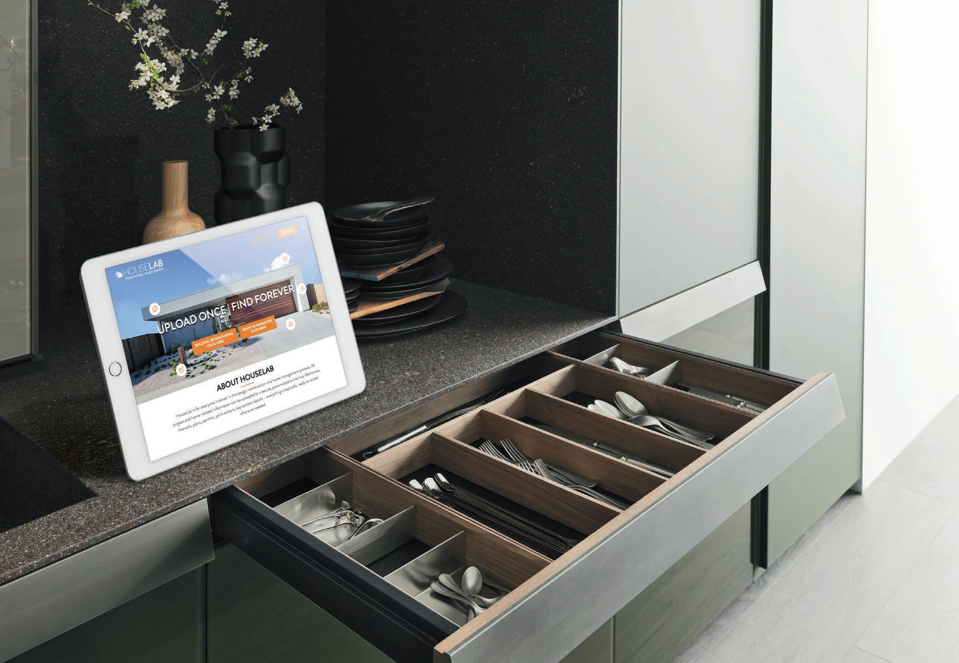
Paper trails belong online, not in kitchen drawers
PROUDLY PARTNERED WITH





 PHOTOGRAPHY BY ANDY MACPHERSON
Introducing HouseLab. The online repository for all your build and project information, making handovers and home maintenance simple and easy.
HouseLab is for everyone involved in the design, construction and home management process.


Say goodbye to folders stu ed with documents. Now all project and home-related information can be uploaded to a secure, personalised online hub.

WARRANTIES MANUALS


PLANS
PAINT COLOURS


CONTACTS
DEFECTS
REMINDERS
See how simple it can be at HOUSELAB.COM.AU

 POWERING PAPERLESS HOMES STRATEGIC PARTNERS
Break the model
Jade Sarita Arnott believes we should question the origins of our garments as rigorously as we question the origins of our food. Her label Arnsdorf is an awakening of creative endeavours and ethical entrepreneurship.
issue #42 habitusliving.com
TEXT ALICE BLACKWOOD | PHOTOGRAPHY BENJAMIN HOSKING
2 . portrait # 67
issue #42 habitusliving.com
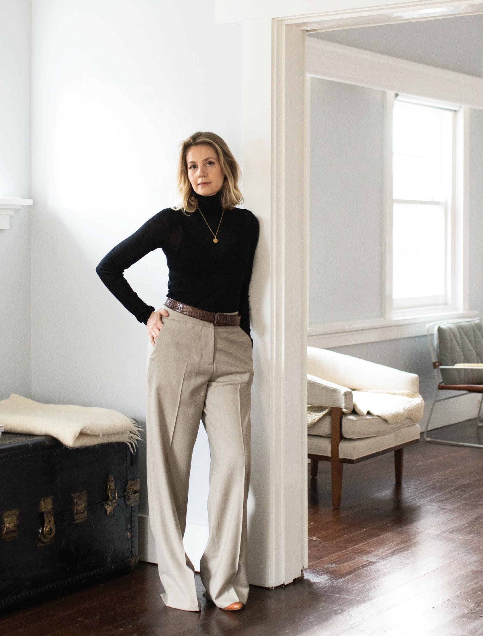
When the Rana Plaza factory complex collapsed in 2013, killing over 1000 Bangladeshi garment workers, Jade Sarita Arnott felt devastated. It had not been her relatives who’d perished in the disaster, but the event confirmed that she’d made the right choice in disbanding her fashion label, Arnsdorf, the year before.
A trained artist and fashion designer, Jade had stepped away from her business, disillusioned by the endless cycle of seasonal garment releases and the punishing pressure to constantly reinvent and re-launch. She couldn’t see how the fashion industry’s traditional working model could sustain itself. There was some measure of relief there, too, in not being involved in an industry that could so easily ignore human rights.
“While I’d never manufactured in Bangladesh,” says Jade, “I’d just had children and had so much maternal grief for these people, the lives that were lost. I felt I could not be part of that,” she says.
The question that hung in the balance was this: could she be part of the change?
A multidisciplinary creative with natural entrepreneurial nous, Jade studied creative arts at the Victorian College of the Arts in Melbourne, before pursuing the infamously tough fashion design degree at RMIT University.
Business success fell upon her, in many ways, and the launch of Arnsdorf in 2006 taught Jade many things. The enduring influence of art and sculpture shaped many of her design ideas. The everyday archetypal garments that fill our wardrobes – suit trousers, jeans, t-shirts, jackets and coats – became a feast for the imagination. She reinterpreted and subverted: a trench coat came with an attached trench coat scarf, a leather jacket with a leather jacket scarf. “It was built around the respect for those items that have survived in people’s wardrobes for decades, even centuries,” she says.
Arnsdorf took off, touted by media as ‘the new one to watch’. Growth was exponential but as Jade points out, success can also be disillusioning. In 2012 she found herself
The enduring influence of art and sculpture shaped many of her design ideas. The everyday archetypal garments that fill our wardrobes became a feast for the imagination.
MEMENTOS – A FAMILY
2 . portrait # 69
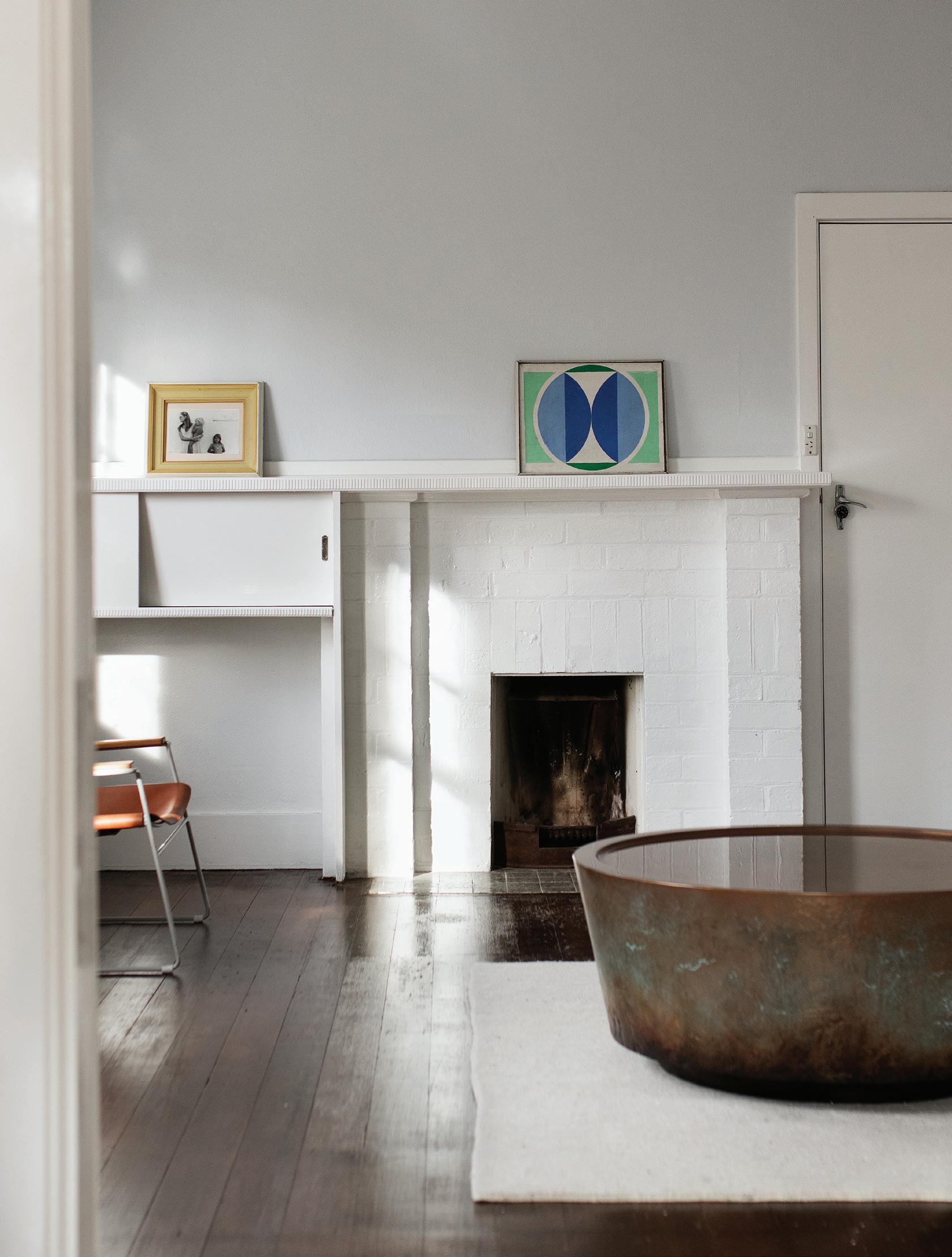
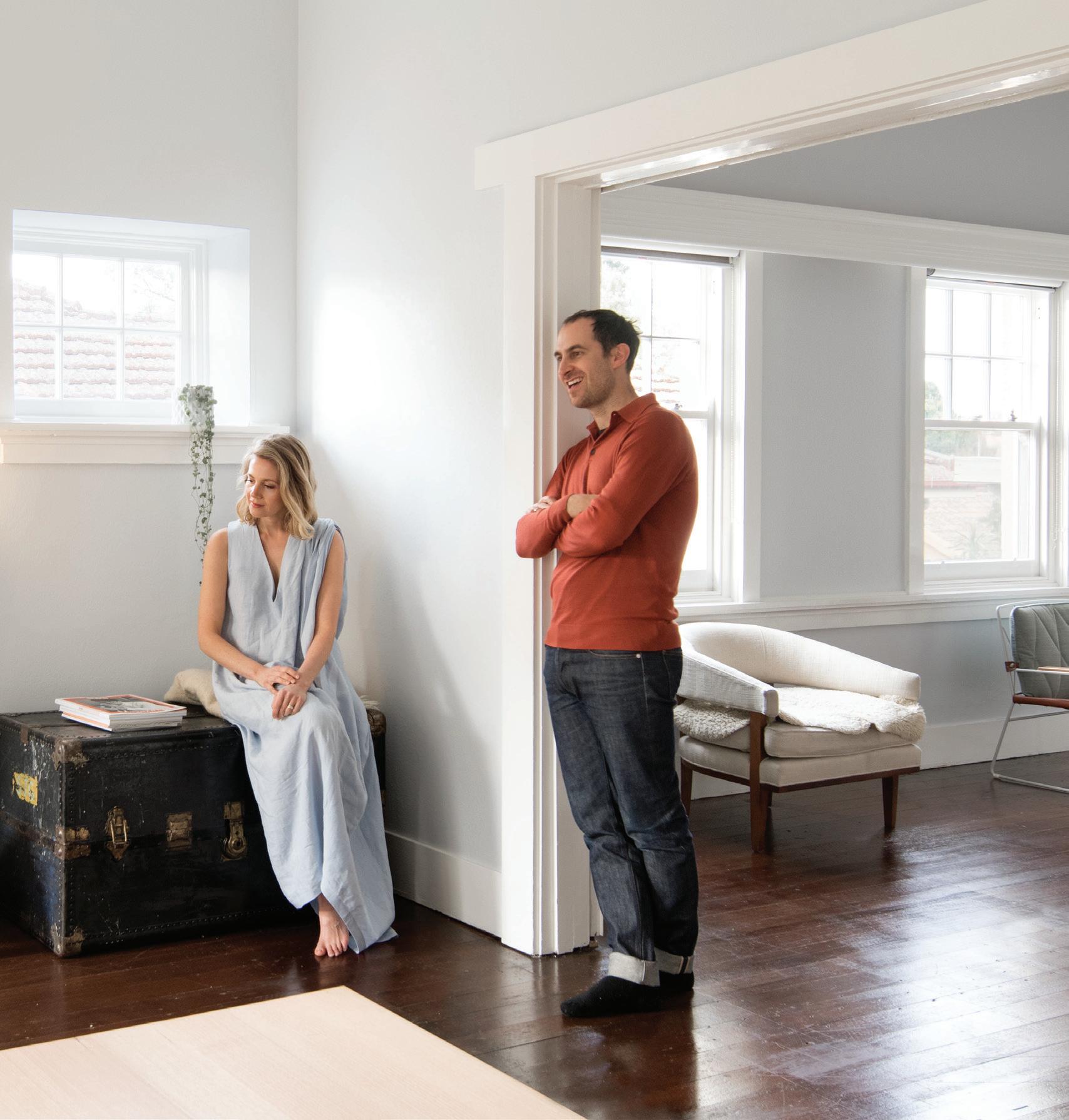
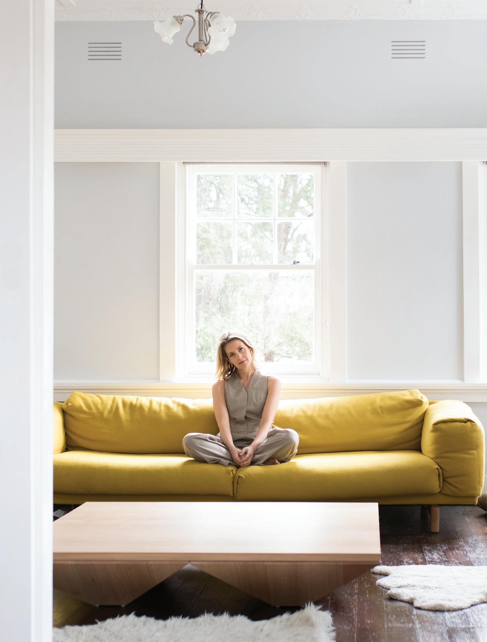
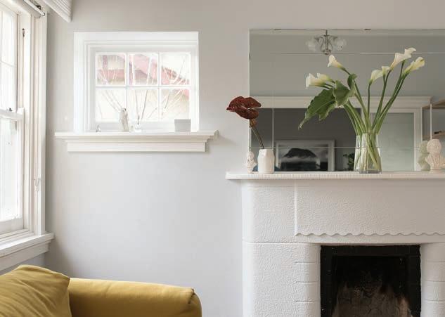
OPENER | JADE SARITA ARNOTT IN ARNSDORF’S MERINO WOOL FUNNEL NECK SKIVVY AND CASHMERE WOOL SUIT TROUSER. OPPOSITE | JADE’S HOME IS FILLED WITH A CONSIDERED COLLECTION OF FURNITURE AND ARTWORK. A PINCH NIM COFFEE TABLE IN COPPER TAKES CENTRE STAGE, COMPLEMENTED BY A JARDAN ARMCHAIR. THE MANTELPIECE HOLDS INTIMATE
PORTRAIT TAKEN BY JADE’S FATHER, AND A PAINTING FOUND WHILE LIVING IN NEW YORK.
issue #42 habitusliving.com
“The mission is to create greater transparency, so we educate the wider public of how much it costs to make a garment ethically and sustainably.”
2 . portrait # 71
at a crossroads. The label was gaining international momentum, but “it felt like I was caught up in a never-ending cycle of rushing for the next deadline”, she says. “The pace of each fashion cycle, marking down three months of every season – things completely lost their value. It just didn’t make sense any more.”
She quietly wound down her Arnsdorf operations and took a four-year hiatus from fashion. This coincided with time spent living in New York with her boyfriend (now husband), Andrew. A myriad of new vocations emerged, with studies in furniture design and photography, a home renovation and parenthood. She spent some time working with creative enterprises and had the opportunity to contemplate alternative business models and imaginative approaches to customer engagement.
In 2015 Jade found herself back in Melbourne with a new-found sense of perspective and maturity. She looked beyond
what she’d perceived as the limitations of the fashion industry and sought to “break the model” with the relaunch of Arnsdorf in 2016.
Vertically integrating her business, Jade fashioned a one-stop-shop, setting up her own factory of cutters and machinists. “The foundation and structure of the business came first. We set up sustainable and ethical production, sourcing certified organic fabrics and dead stock fabrics.”
Consumers were similarly undergoing an “awakening”, Jade says, increasingly aware of what they were putting into and onto their bodies. Their demand for transparency, and strong sense of social responsibility resonated with Jade’s own vision for Arnsdorf. A brand was reborn.
Today, Jade maintains tight control over her supply chain, embedding meaning and purpose into her work through a fluid and iterative working process. She is supported by her Collingwood-located studio and home base in Kew.

PREVIOUS
BACKGROUND A PHOTOGRAPH BY
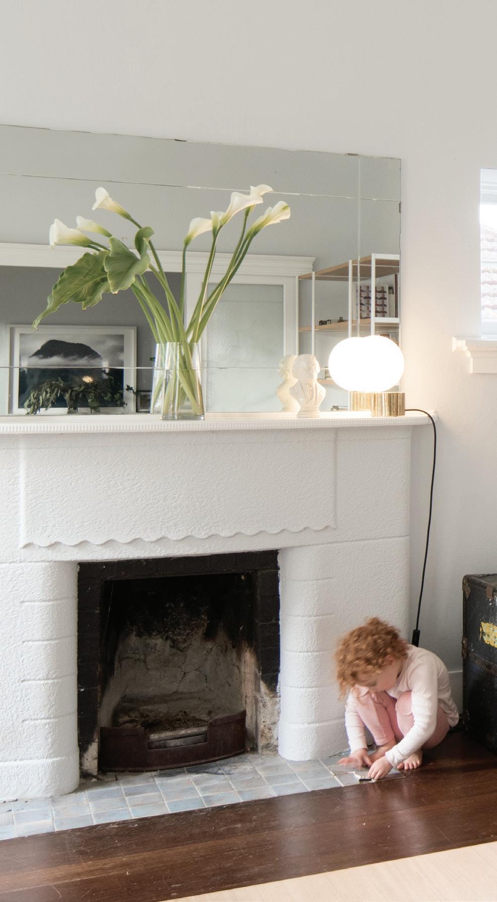
| JADE, DRESSED IN AN ARNSDORF MARIE DRESS, WITH HUSBAND ANDREW APOSTOLA AND DAUGHTER, SILVER. A VINTAGE CHEST AND ARMCHAIR ARE SENTIMENTAL REMINDERS OF THE MANY YEARS THEY SPENT IN NEW YORK. ABOVE | SILVER PERCHES ON A KARTELL PILASTRO SIDE/TABLE STOOL, ALONGSIDE A PAPIER-MÂCHÉ HORSE HEAD CHESS PIECE. IN THE
CASEY
MOORE DEPICTS
NEW
ZEALAND MOUNTAIN VIEWS. OPPOSITE | IN HER ELEMENT, JADE IN AN ARNSDORF WINONA JUMPSUIT.
issue #42 habitusliving.com
2 . portrait # 73
“In the initial design stage, I’ll work from home to get away from the hustle of the factory and find some peaceful time to concentrate and get inspired.”
The studio is the epicentre of her working operation, a hive of activity where design, sampling and production happen in tandem. Home, away from the working chaos, is where the seeds of new ideas are planted. “I do a lot of sketching,” she says. “And sometimes in the initial design stage, I’ll work from home to get away from the hustle of the factory and find some peaceful time to concentrate and get inspired.”

From home she moves back into the studio to cut out toiles and samples. Her arts studies are ever-present, manifesting through sculptural processes, like “draping fabrics on mannequins and embodying the toiles, turning them inside out and pushing the ideas further”.
The meditative to-and-fro between home and work is vital to her creative process. “It’s the balance of a solitary practice, of getting in the flow and generating ideas in an almost meditative state,” she says. “Then taking those ideas and working collaboratively with the team on fabrications, talking through construction.” A jigsaw puzzle of ideas and ingenuity coming together piece by piece.
The vision of that time-transcendent piece still looms large for Jade, who continues her exploration of modern archetypal garments. But now, with renewed clarity. “The mission is to create greater transparency, so we educate the wider public of how much it costs to make a garment ethically and sustainably.” Once armed with that knowledge, Jade says, fashionconscious customers will be better able to navigate the retail landscape, and question the origins of what they put onto their body.
ABOVE | A JARDAN BOOKCASE HOLDS THE MEMORABILIA OF EVERYDAY LIFE. BELOW |
A
HERSELF
BEAUTIFUL, LIVEABLE DESIGNS – LIKE HER MUUTO SOFA, AND CONCEPTUALISE NEW IDEAS FOR ARNSDORF’S FUTURE COLLECTIONS. issue #42 habitusliving.com
Arnsdorf | arnsdorf.com.au
FOR JADE, HOME IS WHERE THE HEAD SPACE IS:
PLACE WHERE SHE CAN SURROUND
WITH
Double the experience and expertise


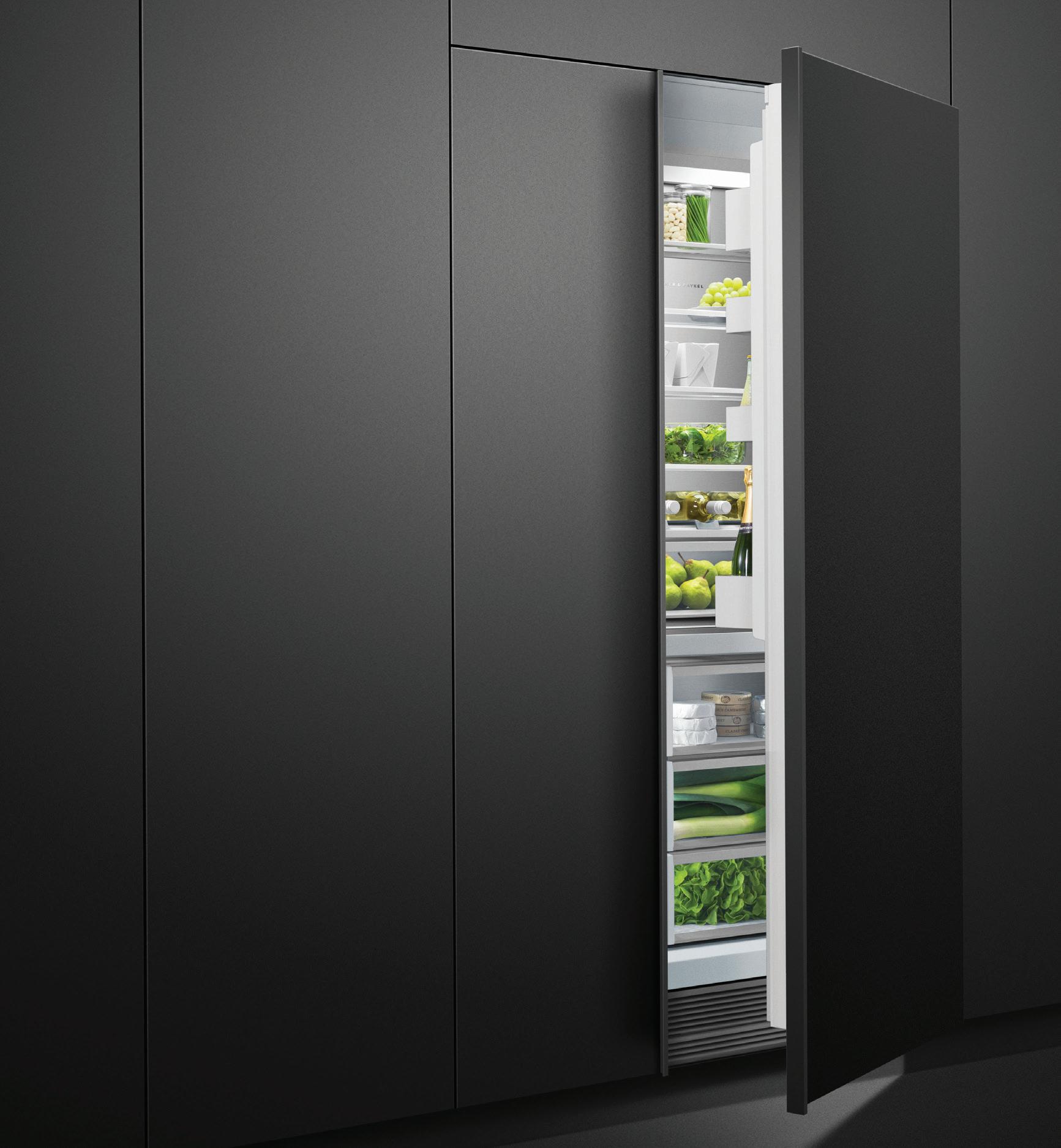
Winning Commercial is proud to join with Fisher & Paykel to provide cutting-edge kitchen solutions for residential developments. This collaboration brings the dedicated full project support that is the hallmark of Winning’s approach together with the brilliant innovation and manufacturing that has made Fisher & Paykel an iconic brand. With extensive combined experience in the commercial sector, this is a partnership with remarkable expertise working with Australian architects, developers, builders and designers. As a result, you can rely on them to deliver an exceptional outcome for your project.
Welcome To The Beyond
Magnetic. Galvanizing. Charismatic. Sui Generis. At this point I had to exercise self-restraint. Such a litany of descriptors! I could go on and on. In fact, I could probably go on for an eternity. Such is the difficulty of trying to capture the challenging and yet truly gratifying nature of EDITION.
From Living Edge, one of Australia’s premier destinations for design, EDITION 2018 has arrived and, with its arrival, the brand reaffirms its position at the frictional vanguard of fine arts and conceptual industrial design. Lending credence to the creative spirit and celebrating the visionaries who design beyond – beyond the common, beyond the known, beyond boundaries – this second coming for EDITION, following an inaugural release last year, represents a real coup for our local design community... and those ancillary communities beyond the ambit of the design world. Perhaps this is part of the reason why I had to wrest myself from cataloguing even more adjectives to describe EDITION. After all, occupying the ‘beyond’ space, EDITION suggests that mere words fail to convey the total sensory profusion created by these inspirational practitioners. They fail to capture the paradigmshifting aspect of each and every work within EDITION’s exhaustive embrace. And, what’s more, they fail to capture the ‘inner voice’ of excellent design – that invitation to impulsivity –that says, in the plainest of terms, ‘enjoy this life’.
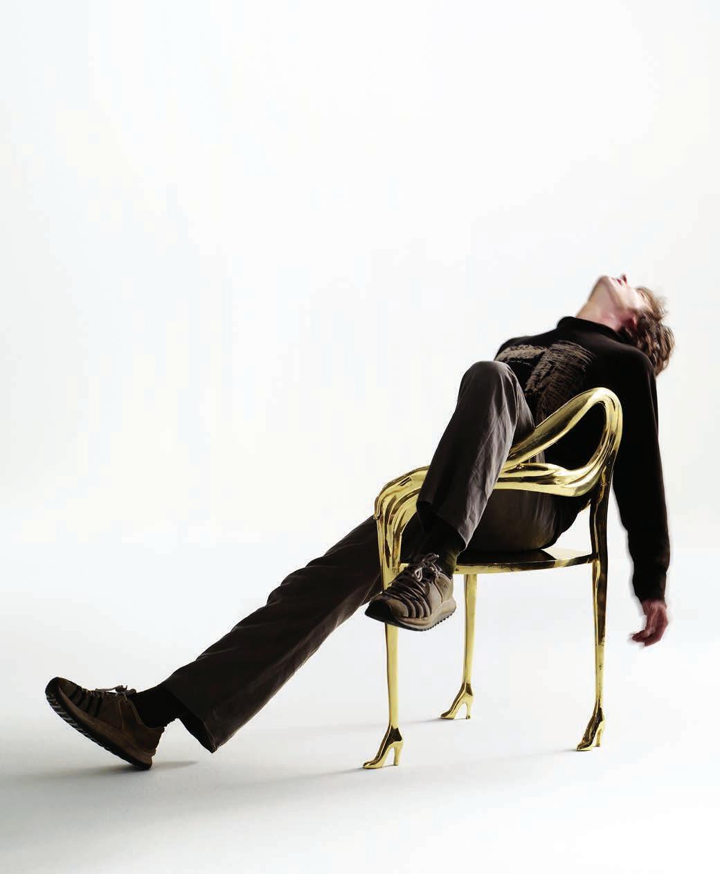
This is art for everyday pleasure. Art for life. And from the studios of trailblazers across the world, I would expect nothing less. For 2018, EDITION corrals watershed pieces from icons as diverse as Salvador Dali, Zaha Hadid, Vernor Panton, Valerio Berruti, TOILETPAPER, Gianni Ruffi, Barnard and Woodgate, Drocco/Mello, Jaime Hayon and Maarten Baas. Comprising a super edit of eighteen pieces, each individually handpicked from the portfolios of the latter greats, EDITION 2018 allows design enthusiasts to transform any residential or commercial interior into something truly unique. A surrealist fidget here, a postmodern wink there, EDITION razes the divide between art and design, raising interiors to the level of museum-worthiness.
Expertly crafted in Europe, EDITION’s collection of furniture, lighting and objets d’art create visceral talking points surrounding the evolving taxonomy of form-meeting-function, the primacy of expert craftsmanship, and the need to preserve individuality and creative self-expression through material culture.
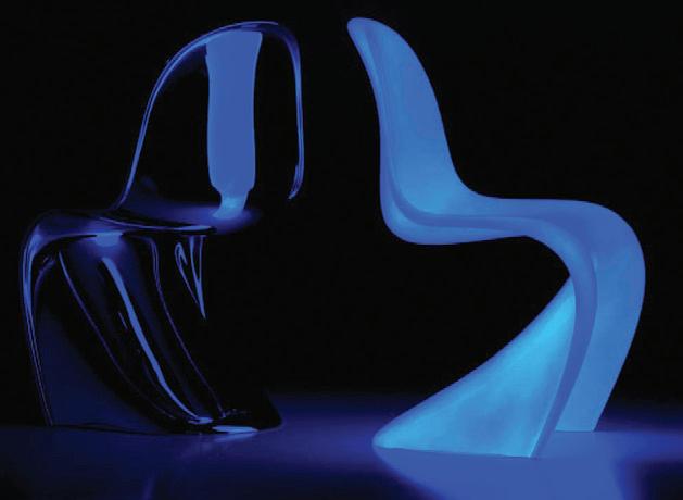
issue #42 habitusliving.com ABOVE | EDITION 2018 PANTON CHAIR BY VERNOR PANTON IN PHOSPHORESCENT FINISH. OPPOSITE | EDITION 2018 LEDA ARMCHAIR BY BD BARCELONA, AFTER SALVADOR DALI.
A world wherein the challenging and contradictory collide. Where allure enjoins surprise. Where beauty beckons the uncommon.
#77 habitus promotion › Living Edge EDITION 2018 | editioncollection.com
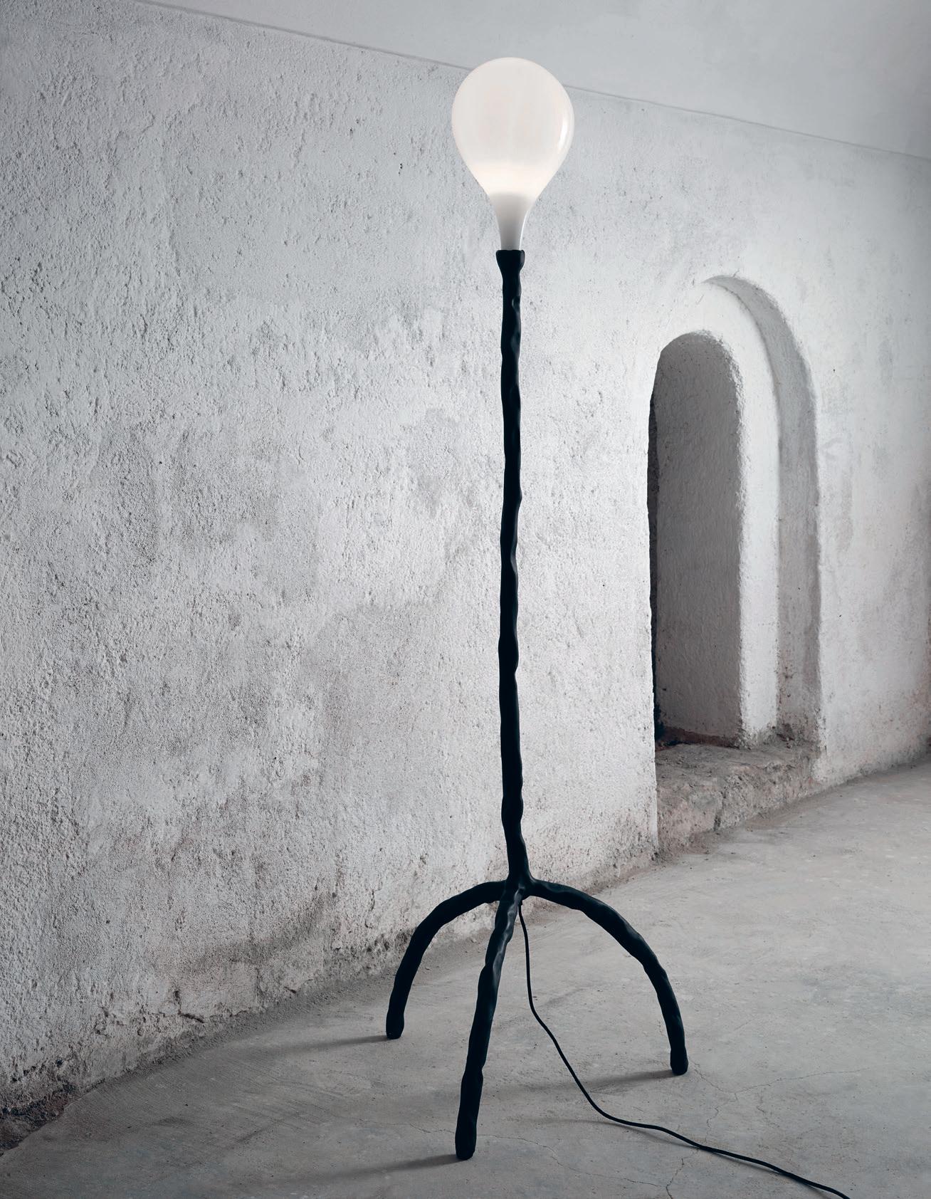
issue #42 habitusliving.com ABOVE | EDITION 2018 DAS POP LAMPS BY MAARTEN BAAS FOR LASVIT. OPPOSITE | EDITION 2018 LEDA TABLE BY BD BARCELONA, AFTER SALVADOR DALI
Manufactured by the likes of brands including Established & Sons, BD Barcelona, Gufram and more, EDITION represents the very first time that many of these previously inaccessible pieces of high-end design will arrive on Australian shores. Having already launched at Sydney Contemporary earlier this year, each valuable piece in EDITION 2018 has been carefully chosen by the Living Edge design team for cultural impact, an ingenious concept or bold expression of a cultural ideal. The individual products are numbered or marked by the manufacturer to reflect this exclusivity.
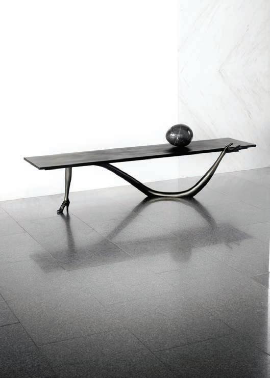
Highlights include the sculptural eponymous chair by Verner Panton. Considered to be one of the most influential designers of the mid-century, Panton’s renowned works are still in production today. For its EDITION iteration, the Panton Chair has evolved to include five layers of meticulously applied phosphorescent varnish, lending the form a mesmeric blue glow when lights go down.
Other standout pieces include The Gufram Cactus by Drocco / Mello that first cemented its status as a ground-breaking piece all the way back in 1972. Originally designed as a 1.7-metre coat stand by artist duo Guido Drocco and Franco Mello, the Gufram Cactus continues to be celebrated by aficionadi worldwide, with early prototypes gracing the permanent collections of the Museum of Modern Art in New York and Tate Modern in London.
More recently, EDITION’s representation of glass manufacturers,Lasvit, reflects that brand’s growing profile on the international stage. Founded in the Czech Republic in 2007, Lasvit recently collaborated with Dutch artist Maarten Baas to create Das Pop, a playful lighting series that combines Baas’ clay-clad bases with Lasvit’s hand-blown shades for a modern and comical twist.
With its focus and dedication to serving the needs of local and international design collectors, Living Edge has built a lasting legacy as the foremost design destination for architects, interior designers, design enthusiasts and those who share discerning taste. With EDITION 2018, designers, architects, stylists, specifiers and design-lovers alike can create a new layer of architectural delight to breathe new life into spaces that can be enjoyed for a lifetime.
habitus promotion › Living Edge #79
editioncollection.com
EDITION 2018 |
Enjoy your quarterly dose of Habitus delivered straight to your door. Each issue celebrates the outstanding work architects and designers within the Indo Pacific, both emerging and established, are producing. Don't miss out on the latest in architecture and design. includes shipping within Australia only


PAYMENT METHOD Cheque / money order AUD$ Charge my credit card AUD$ Name on Card Card Type Card Number Expiry Date Signature IT’S EASY TO ORDER Fill in your response below, overleaf or subscribe securely online at habitusliving.com/subscribe. FOR A GIFT – RECIPIENT DETAILS: FOR MYSELF
SELECT BELOW Mrs/Ms/Miss/Mr First Name Surname Address State Postcode Country Email Phone Mrs/Ms/Miss/Mr First Name Surname Address State Postcode Country Email Phone ONLINE: habitusliving.com/subscribe PHONE: (61 2) 9368 0150 MAIL TO: EMAIL: subscriptions@indesign.com.au FAX: (61 2) 9368 0289 Indesign Media Asia Pacific Level 1, 50 Marshall Street, Surry Hills NSW 2010 WHERE’S YOUR FAVOURITE PLACE TO ESCAPE/EXPLORE AND WHY?
PLEASE
Subscribe to Habitus magazine
Habitus AUSTRALIA INTERNATIONAL (AUD$) 12 ISSUES SAVE 8 ISSUES SAVE 4 ISSUES SAVE 12 ISSUES SAVE 8 ISSUES SAVE 4 ISSUES INDESIGN $155 $43 $105 $27 $55 $11 $240 $39 $200 $21 $110 HABITUS $132 $59.40 $93 $34.6 $49 $14.80 $240 $42 $180 $22 $102 THE COLLECTION Vol. 2 Australia $29.90 (1 ISSUE) International $49.95 (1 ISSUE)
Subscribe to
TRAILBLAZERS
Across the region designers are challenging the patterns and behaviours of the wider community ensuring we, as an industry, are constantly moving forward.
trailblazers # 81
On a Mission
Armadillo & Co has always been about Fair Trade, sustainability, and the support of the local Indian community of weavers. The Armadillo & Co Foundation is simply an extension of this.
TEXT HOLLY CUNNEEN | PHOTOGRAPHY DARREN CENTOFANTI issue #42 habitusliving.com

trailblazers # 83

issue #42 habitusliving.com
In 2009 Jodie Fried and Sally Pottharst established Armadillo & Co; a brand for the design conscious and design responsible among us; a brand who’s DNA is firmly founded on the combination of “aesthetics with ethics”. Since day dot each of their rugs has each been carefully crafted – by hand – from natural fibres and recycled materials. They have been staunch supporters of Fair Trade practices and go above and beyond supporting not only the weavers but their children and local schools, too.
In particular, Kantilal Vidya Mandir School in Uttar Pradesh. Located in the Carpet Belt region of India the school is attended by many of Armadillo & Co’s weavers’ children. Naturally, their involvement and support started off slowly, and grew organically. Simple things, like giving the students new uniforms, saw the relationship bloom. “I know that sounds superficial,” says Jodie Fried, cautiously, “but with all these little changes you notice a greater sense of pride in the children. It’s about them wanting to go to school and inspiring other kids in the community to come to school.”
For 12 years Jodie has been working in the philanthropic sector. The first not-for-profit organisation supporting a small school in India she founded was the Anganwadi Project and Sally Pottharst was a board member. Evidently, the two women shared a passion and Armadillo & Co’s support continued to grow. In early 2018 it was decided upon to define and distinguish the two organisations.
“We decided to chanel the philanthropic work that we were doing with our weavers and their children into the Armadillo & Co Foundation, which became a separate entity from the business and meant more people could be involved. It had its own identity in a way,” says Jodie. “We had the passion, the purpose, and the problems were there.”

OPENER | SALLY POTTHARST AND JODIE FRIED. OPPOSITE | JODIE SPEAKS TO THE MOTHER OF CHILDREN ATTENDING KANTILAL VIDYA MANDIR SCHOOL IN UTTAR PRADESH.
“We decided to channel the philanthropic work that we were doing with our weavers and their children into the Armadillo & Co Foundation, which became a separate entity from the business and meant more people could be involved.”
trailblazers # 85
The first four girls to be offered scholarships started in June 2018 and each year a further four with join the program.
Setting the school up to be an effective place of education and a supportive environment has been the main focus of the Foundation with sustainable practices remaining integral to the process. This can be seen in the recently installed solar panels and a medical centre with a full time doctor available to the students and their family during school hours. Additionally, the Foundation is building a small library for the school while repainting the buildings are next on the agenda – once monsoon season has passed.
It’s important to note that there is a board member of the Armadillo & Co Foundation based in India who has a “very close eye on the operations of the school”. He has been with Armadillo & Co for 12 years and acts as an advisor-slashcultural correspondant to ensure the Foundation’s efforts are suitable and answer the community’s needs; to ensure good intentions don’t manifest as a cultural imposition. “We take his lead on a lot of what we need to be doing there and what is culturally appropriate,” says Jodie. “We really rely on him to be able to say this is what we need, this is appropriate, this is enough, or this is too much.”
For example, the board of the Foundation might have an idea to put in new tables and chairs while he could come back and advise against it as it may show too much wealth. Similalry, the idea to carpet the school is actually immpractical as the school is susceptible to flooding during monsoon season – so pavers and an effective drainage system are a far better investment.

issue #42 habitusliving.com

OPPOSITE | THE ARMADILLO & CO FOUNDATION NOT ONLY SUPPORTS THE SCHOOL ENSURING THE BUILDING IS SAFE, SUSTAINABLE AND FULLY FUNCTIONING, BUT ALSO PROVIDES STUDENTS WITH READING, WRITING AND LEARNING INSTRUMENTS. ABOVE | BEFORE FOLLOWING THROUGH WITH ANY MAJOR DECISION REGARDING THE FOUNDATION’S ASSISTANCE TO THE SCHOOL, THE BOARD CONSULTS WITH THE COMMUNITY. trailblazers # 87
Not only does the Foundation support the school and its operations, but it also supports the children in their ability to attend. Specifically, through a recently launched scholarship program. “A very exciting part of the project which Sally and I launched earlier this year was setting up scholarships for the top four performing girls to go on to continue their education for nine years,” says Jodie.
It is slightly unorthadox, as traditionally speaking girls will leave school once they get to the 5th grade to remain at home and support the family domestically. Before the scholarships were put in place the princial and cultural advisor were intreagued by the notion and suggested calling a meeting with the mothers of the school to gauge the level of interest and how it would be received. Only the mothers were invited to ensure they were able to speak openly and honestly.
“It was so overwhelming,” says Jodie. “All these women turned up. All illiterate. So committed, so passionate about wanting their girls to be able to speak English and to be able to have a career: to be able to go further than they had been able to go.” They were all for the scholarship program.
The first four girls to be offered scholarships started in June 2018 and each year a further four with join the program; all supported in school fees, uniforms, text books and transportation.

Funding for the Armadillo & Co Foundation is found through various sources. A big portion is realised in Armadillo & Co sales with a set percentage of net profits going directly to the Foundation. There’s also the option for online customers to donate directly with automatic prompts at the checkout. And the internal team gets involved with company fundraising, too.
It seems like a new chapter for Jodie Fried, Sally Pottharst and the Armadillo & Co team. But in some ways it’s not. “It feels really timely that the Foundation was incorporated because it was always there. For seven years we’ve been working with this particular school it’s just now being highlighted because it has been separated.” says Jodie.
With the formalisation of their philanthropic work the hope is that awareness and a diaglogue will increase. And with more dialogue around the Foundation increased support will hopefully ensue.
ABOVE | SEEMINGLY LITTLE THINGS LIKE REDESIGNING THE SCHOOL UNIFORM
THE
issue #42 habitusliving.com
AND ENSURING EACH CHILD IS ABLE TO WEAR THE FULL UNIFORM EVERYDAY CREATES
A GREATER SENSE OF PRIDE AMONGST
CHILDREN.
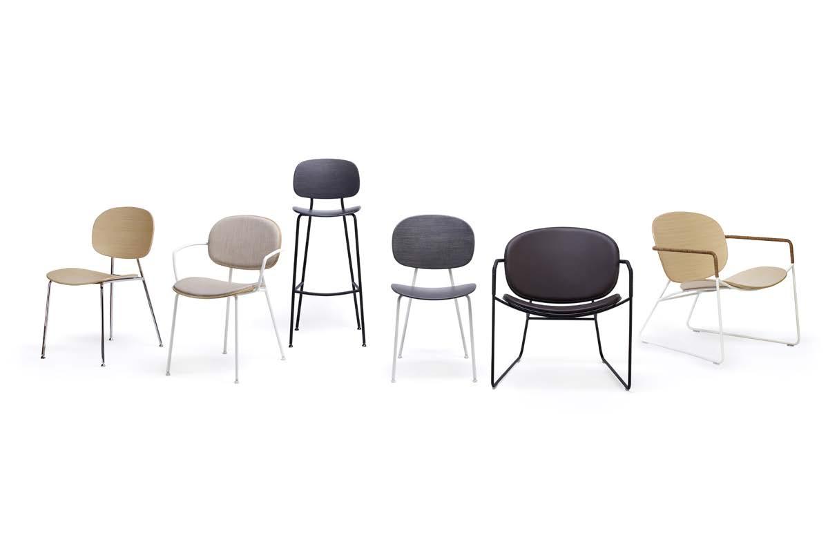
WWW.INFINITIDESIGN.IT INFO@INFINITI-DESIGN.COM.AU TONDINA DESIGNED BY FAVARETTO & PARTNERS FOR INFINITI DESIGN.
The New
Showroom
The new showroom is no longer a shop, but a journey and a destination. Paul McGillick enjoyed the experience in Copenhagen.
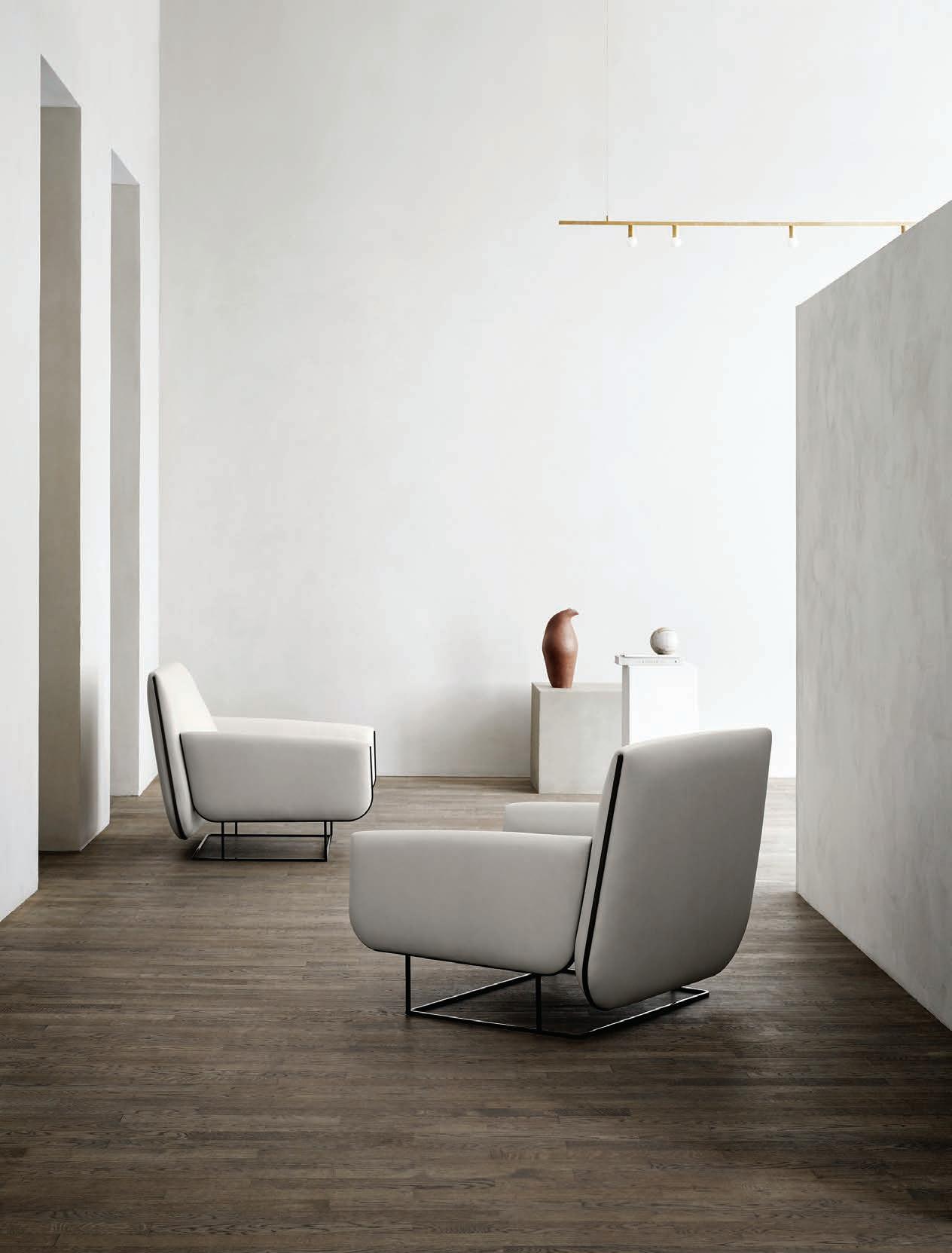 TEXT PAUL MCGILLICK
issue #42 habitusliving.com
Ashop is a place where goods are prominently displayed and then sold to interested customers. The traditional furniture showroom, like private art galleries, is really only a glorified shop. Any extra caché it has derives from the quality and selective nature of the products.
But the showroom is undergoing a metamorphosis. No more is it simply about display and point of sale. Instead, it has become an opportunity to experience the products in a space specifically designed to elicit the inherent values of the products and their meanings. The new display space also aligns the products more intimately with the brands that design and manufacture them. And, crucially, because of this experiential quality, the new showroom offers the customer the opportunity to enjoy an emotional response to the product and a sense of what it might be like to live with it.
Yes, it is a bit like a marriage and part of the experience is to see the product not in isolation, but as part of a family of objects, each with its own personality.
At Copenhagen’s Bredgade 76 you can get two for the price of one. Here Eric Jørgensen and Montana share a building where each has recently celebrated completely re-conceived showrooms (on the ground and first floors respectively) while launching innovative new products.
Downstairs in the Eric Jørgensen showroom, design stylist, Pernille Vest, has created “a holistic experience that is both down-to-earth and artistic”. It is a continuous

trailblazers # 91
Products like Montana System and READ also act as space dividers. Or are they space creators, each “shaping the space around it”?

OPENER LEFT | THE OVO CHAIR IN THE NEW ERIC JØERGENSEN SHOWROOM. OPENER RIGHT | AN ARTWORK SUPPLYING CONTEXT TO THE FURNISHINGS. ABOVE | MONTANA FREE IN CHINA RED. OPPOSITE | THE MONTANA SYSTEM. issue #42 habitusliving.com

trailblazers # 93
experience leading from one room to the next, linked by complementary earth colours – the colours of the earth’s various layers of clay and stone – where the furniture is clustered into small art installations. “Through the colour tones of the furniture,” says Pernille Vest, “we have tried to embrace and substantiate their mood with naive objects formed in clay and stone. It’s the details and nuances that make the difference, and the overall experience is calm, sensual and down-to-earth.”
The new showroom saw the launch of the Ovo chair by British designer, Damian Williamson – inspired, he says, by a huge sheet of fresh egg pasta draped over an extra-large wooden rolling pin. It is the fluid, soft folds of the pasta that have been translated into an invitingly curved object – an easy chair whose fluid forms sit easily on a rigid squared steel frame. Generous and comfortable, the chair is equally at home in a domestic or commercial setting.
Montana has a tradition of designing things, often modular in character, which are beautiful but which work in the everyday world. Their new showroom flows over nine rooms each themed – Fold in, Fold Out; Reflections; The Labyrinth; Repetition; Liquid Object; Fluorescence; Senses; The Ruins. These pivot around a central space with
three large sculptures assembled from Montana’s modular shelving system and space dividers, Montana System (designed by Peter Lassen) and the Montana Free System (designed by Jakob Wagner).
Each room is an installation and each highlights a particular product while also featuring complementary products. Products like Montana System and READ also act as space dividers. Or are they space creators, each “shaping the space around it”?
These are stylishly modern products that respond to a growing demand for furnishings that are flexible and able to adapt to smaller living spaces, changing needs and shifting moods.

With both these showrooms we see products not in isolation, but as part of a curated space that delivers an experience, allowing customers to form a relationship with the products and imagine a future life together.
Welcome to the New Showroom, where the showroom is both a destination and a journey and where the products become our compagnons de route.
ABOVE | THE SHOWROOM CONTEXTUALISES THE FURNISHINGS WITH COMPLEMENTARY COLOURS AND ARTWORKS.
issue #42 habitusliving.com

Shaping water naturally since 1968. Celebrating 50 years and beyond. Watch our original stories at vola.com FS1 Free-standing bath mixer with hand shower VOLA Design Pty. Ltd. - Tel.: +61 402 372 480 - sales@vola.com.au - www.vola.com
Reinventing
resort architecture
Resort architecture takes a curvilinear route in the sculpted Sala Samui Chaweng Beach Resort, courtesy of Thai design studio Onion. The result is a tempered yet inspiring series of spaces that allows visitors to both rest and dream.

TEXT LUO JINGMEI | PHOTOGRAPHY WISON TUNGTHUNYA
issue #42 habitusliving.com

trailblazers # 97

OPENER | SCREENING ELEMENTS ABOVE THE GUESTROOM POOLS CONTINUE THE MOTIF OF CURVES. ABOVE | CUSTOM FURNITURE IN THE PUBLIC AREAS FEATURE ROTUND FORMS TO COMPLEMENT THE CURVES AND WAVES IN THE ARCHITECTURE. OPPOSITE ABOVE | BANGKOK-BASED DESIGN STUDIO ONION WERE RESPONSIBLE FOR THE ENTIRE DESIGN, INCLUDING LIGHTING AND FURNITURE OPPOSITE BELOW | EVERY AREA OF SALA SAMUI CHAWENG BOASTS ARCHITECTURAL INTEREST, INCLUDING THE CORRIDORS.
issue #42 habitusliving.com
“From the lobby, one can see the sea right away. This is how we perceive luxury. Luxury is not about what we build; rather, it is about the space that we decide not to build.”


trailblazers # 99
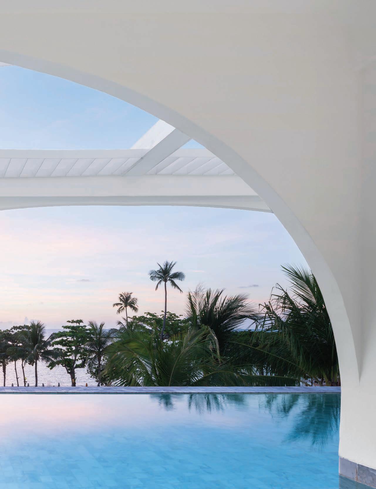
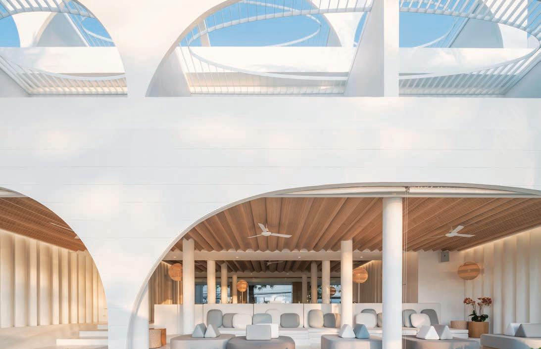
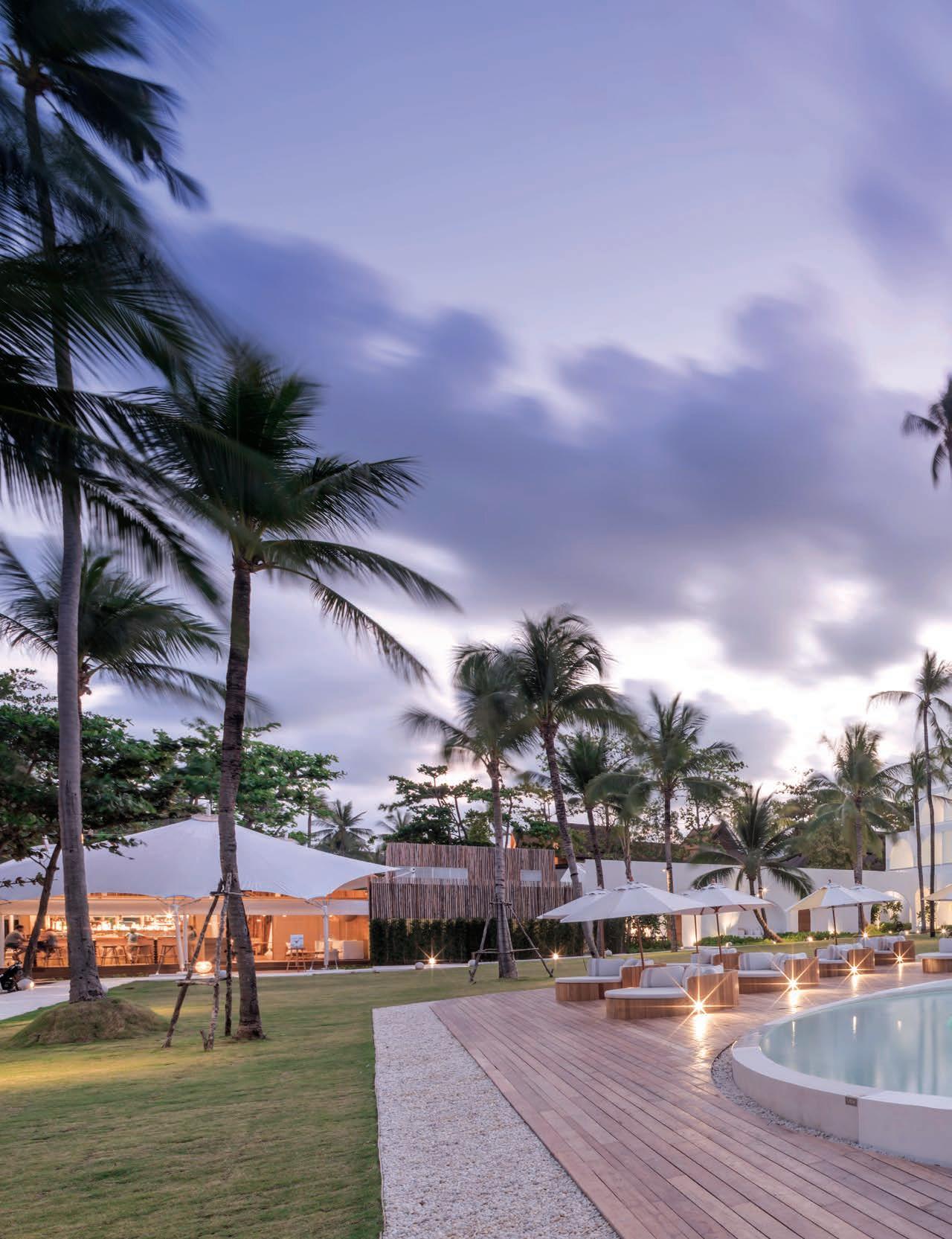
In Sala Samui Chaweng Beach Resort on the Thai island of Koh Samui, there is none of the tropes of traditional resort architecture. Replacing sloped roofs and ornamented timber posts is an architecture rooted in the changing forms of the moon and the corresponding effects. “Everything at Sala Samui Chaweng Beach Resort is designed to enhance a sequence of light, shade and shadow,” says Arisara Chaktranon, co-founder of Bangkok-based design studio Onion who oversaw the entire design of the resort right down to the design of the furniture and lighting.
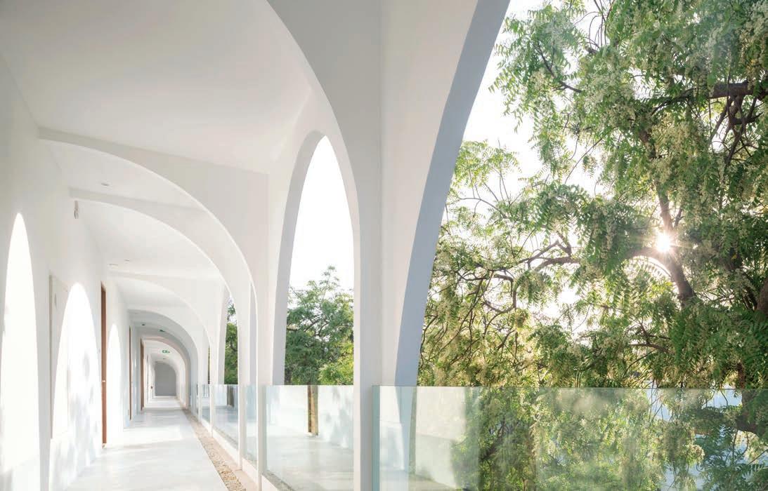
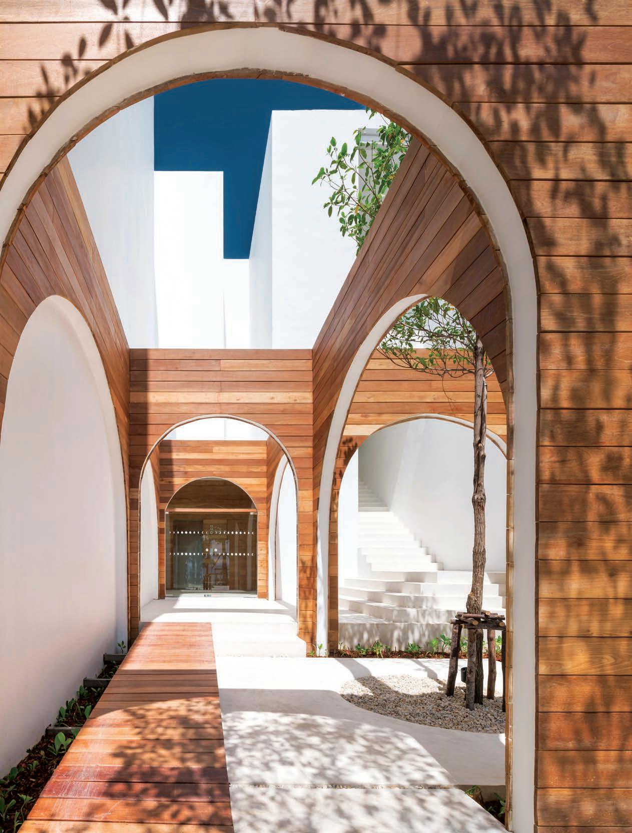
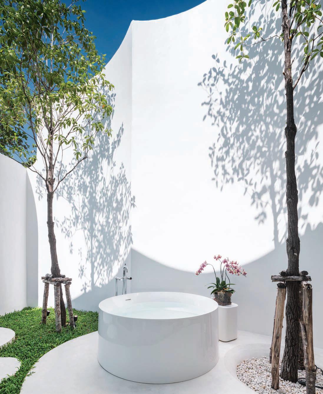
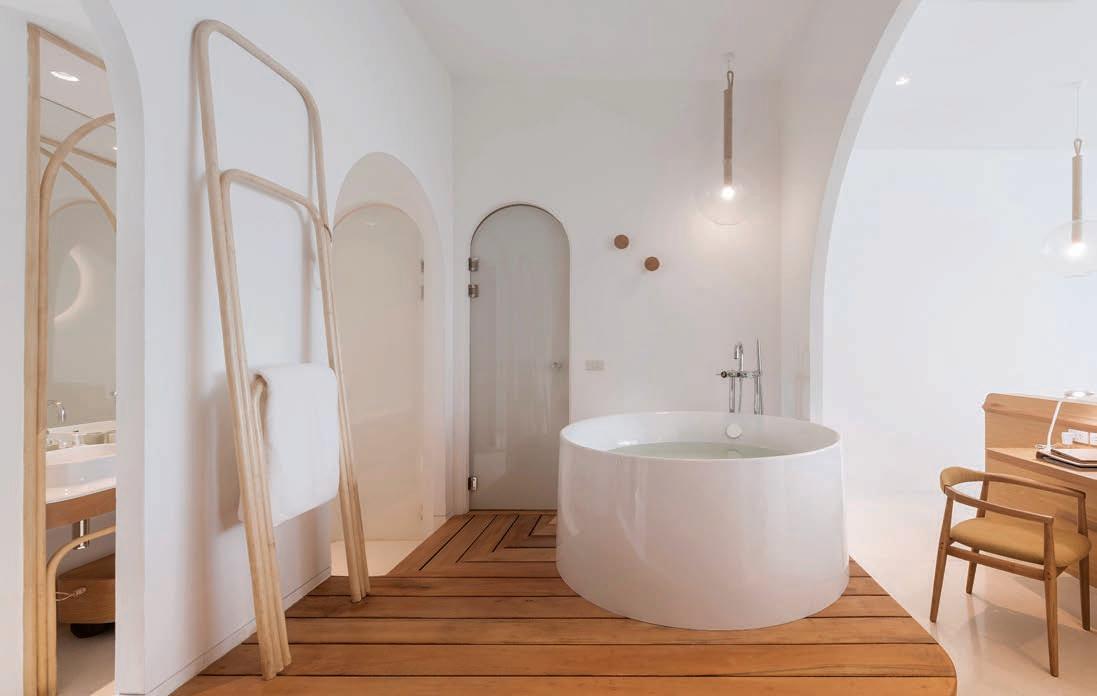
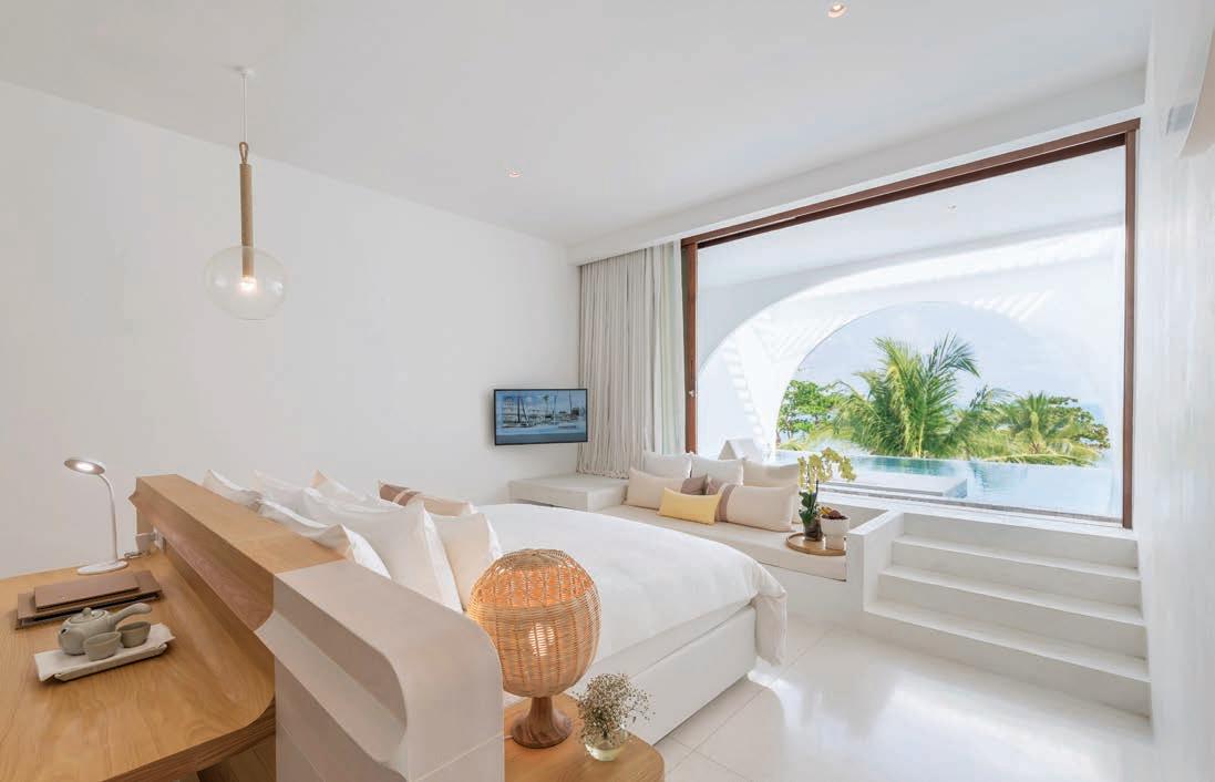
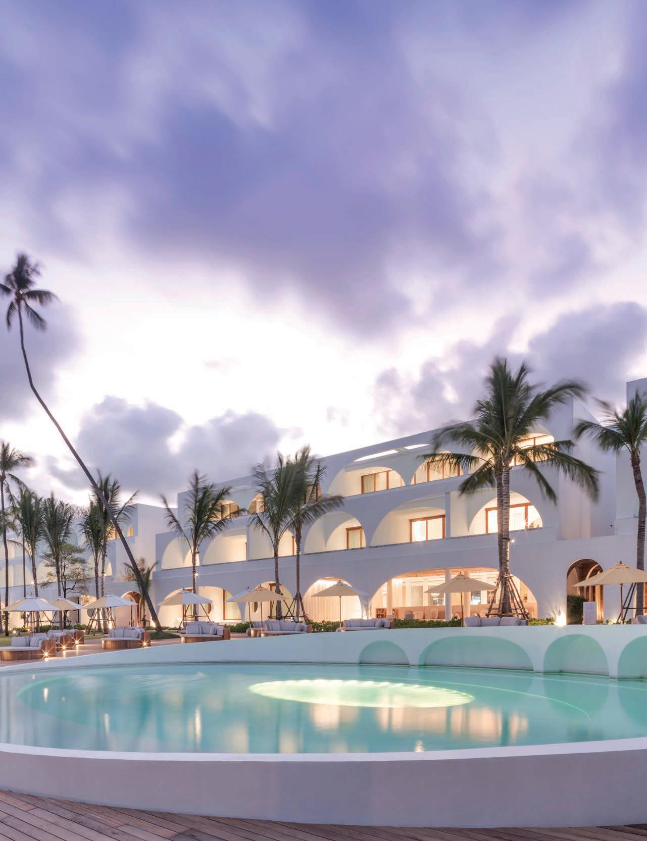
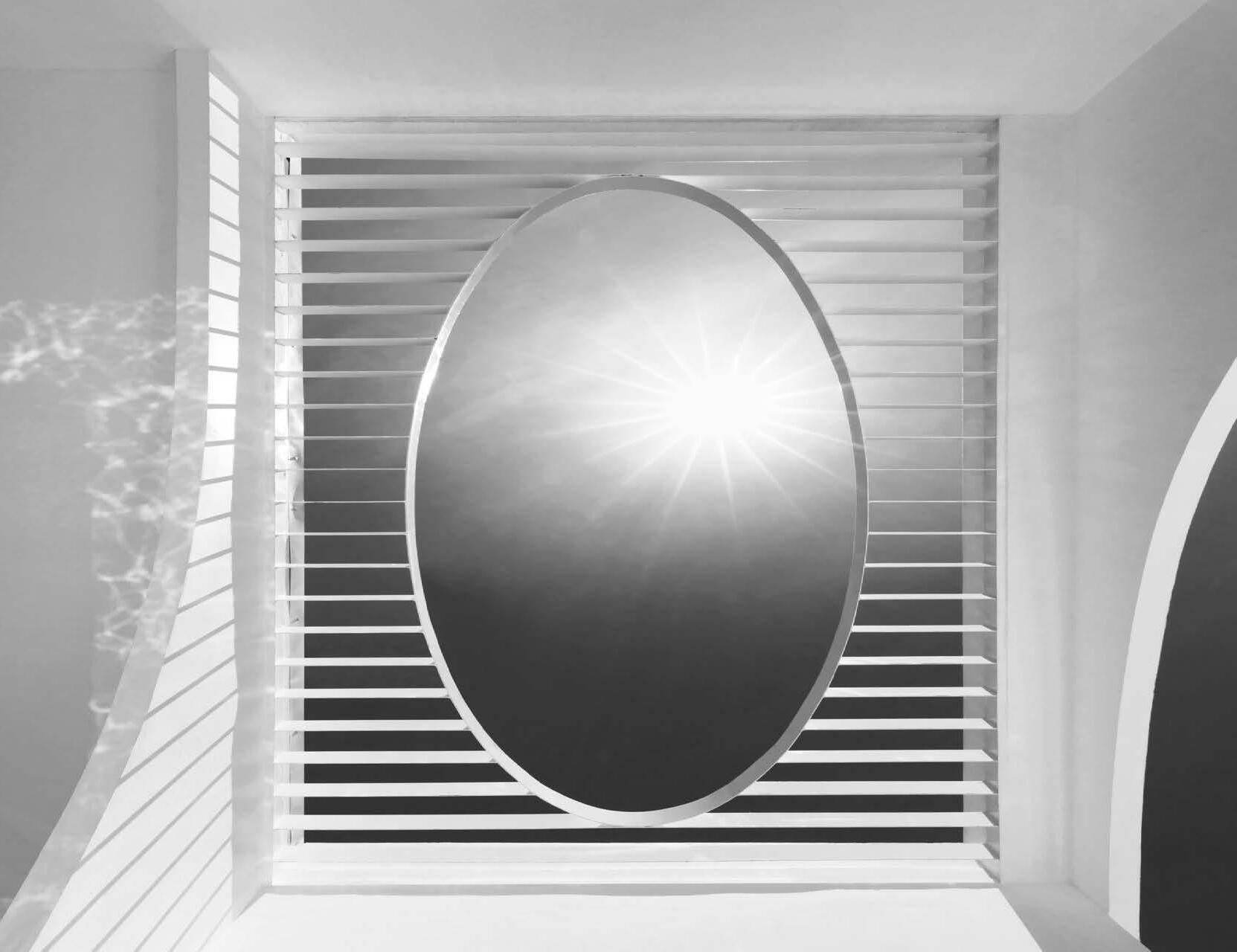
And so, orbs, crescents and curves define the building – from the circular pool in the courtyard that encourages carefree ambling around it, to the repeated arches in the elevations each articulating a guestroom. The overall image is reminiscent of Roman aqueducts but streamlined and whitewashed to reflect the iridescence of the strong tropical sunlight, different proportions offering a playful demeanour. In the guestrooms, elliptical cut outs in the verandah sunscreens overhead frame views of the sky and the circle motif take their place in bath tubs, lighting fixtures and doorways.
“At least seven different curves are layered from the building envelope to the interior spaces. Each curved wall separates each activity such as swimming, bathing and sleeping. Moving shadows make each room different,” says Arisara.
Against the alabaster foil, warm timber clads columns and walls, with bamboo continuing the curved motif in rolls on the public area ceiling and framing elements at the guestroom vanity that ingeniously turn downwards to loop into towel hangers.
Each of the 138 guestrooms has the luxury of a swimming pool and also the view of the sea’s glistening azure waters. Fifty-eight of the guestrooms were opened in January this year, with the rest in the roadside block to be completed at the end of this year.
“Even from the lobby, one can see the sea right away. This is how we perceive luxury. Luxury is not about what we build; rather, it is about the space that we decide not to build,” says Arisara, pointing out the expansive 2,800-square-metre beachfront courtyard bordered by the guestrooms that they incorporated into the resort’s planning.
OPPOSITE | ARCHED THRESHOLDS IN THE PUBLIC PASSAGEWAYS CREATE A STRONG GRAPHIC IMAGE. issue #42 habitusliving.com

trailblazers # 101

ABOVE | A MOMENT OF RESPITE FOUND IN THE PRIVACY OF A FREESTANDING, OUTDOOR BATHTUB. OPPOSITE ABOVE | EACH GUESTROOM FEATURES A SWIMMING POOL, WHICH THE FULL-HEIGHT WINDOWS FRAME PERFECTLY. OPPOSITE BELOW | BAMBOO AND TEAK PROVIDE A CONTRASTING WARMTH TO THE OVERACHING MINIMALIST INTERIORS. issue #42 habitusliving.com


trailblazers # 103

issue #42 habitusliving.com
Replacing sloped roofs and ornamented timber posts is an architecture rooted in the changing forms of the moon and the corresponding effects.

trailblazers # 105
Curves in the architecture project a sense of harmony in their continuity. Here, Onion has employed it well to craft sensual and calming ambiences. The anodyne environment of the resort is matched with moments of wonder, heightening the awareness of one to his or her surroundings as the tactility of surfaces are nuanced by shadows in the curved profiles, and arches romantically frame sceneries and thresholds.

This makes the Sala Samui Chaweng Beach Resort an ideal destination for rest and reverie – and a perfect stopover for partygoers who wish for a respite before heading over to the popular full moon party on Ko Pha Ngan.
The individualistic resort design is in keeping with the philosophy of the firm to push boundaries. With a unique name like Onion, the firm decidedly goes against convention. In a former project, the Sala Ayutthaya hotel, brick walls ebb and flow and are laid into pavements with their side profiles facing upwards to create unpredictable rugged patterns. Here, they experiment with a single geometrical form to create a layered experience jolted with surprises for guests.
PREVIOUS | THE HOTEL’S RECESSING FAÇADE SOFTENS ITS RELATIONSHIP WITH THE COURTYARD. ABOVE | THE PLAY OF SUN AND SHADOW; CURVES AND LINES CREATE AN ENCOUNTER THAT INSPIRES AS MUCH AS IT IS MEDITATIVE.
issue #42 habitusliving.com
ICONIC® STYL. Irresistibly beautiful.

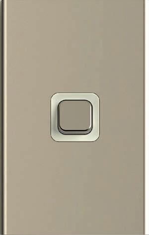
Introducing Iconic Styl, the irresistibly beautiful new skins for the Iconic platform, delivering clever efficiency to the home. Based on a slim and sleek design, Iconic Styl perfectly complements any interior. These stylish skins are designed to clip directly onto standard Iconic grids so once professionally installed by an electrician, new skins can be changed safely at any time by your client. Setting a new benchmark for quality and style in residential products, Iconic Styl gives a clean look with clever home-enhancing features your clients will love.

clipsal.com/stylforinteriors

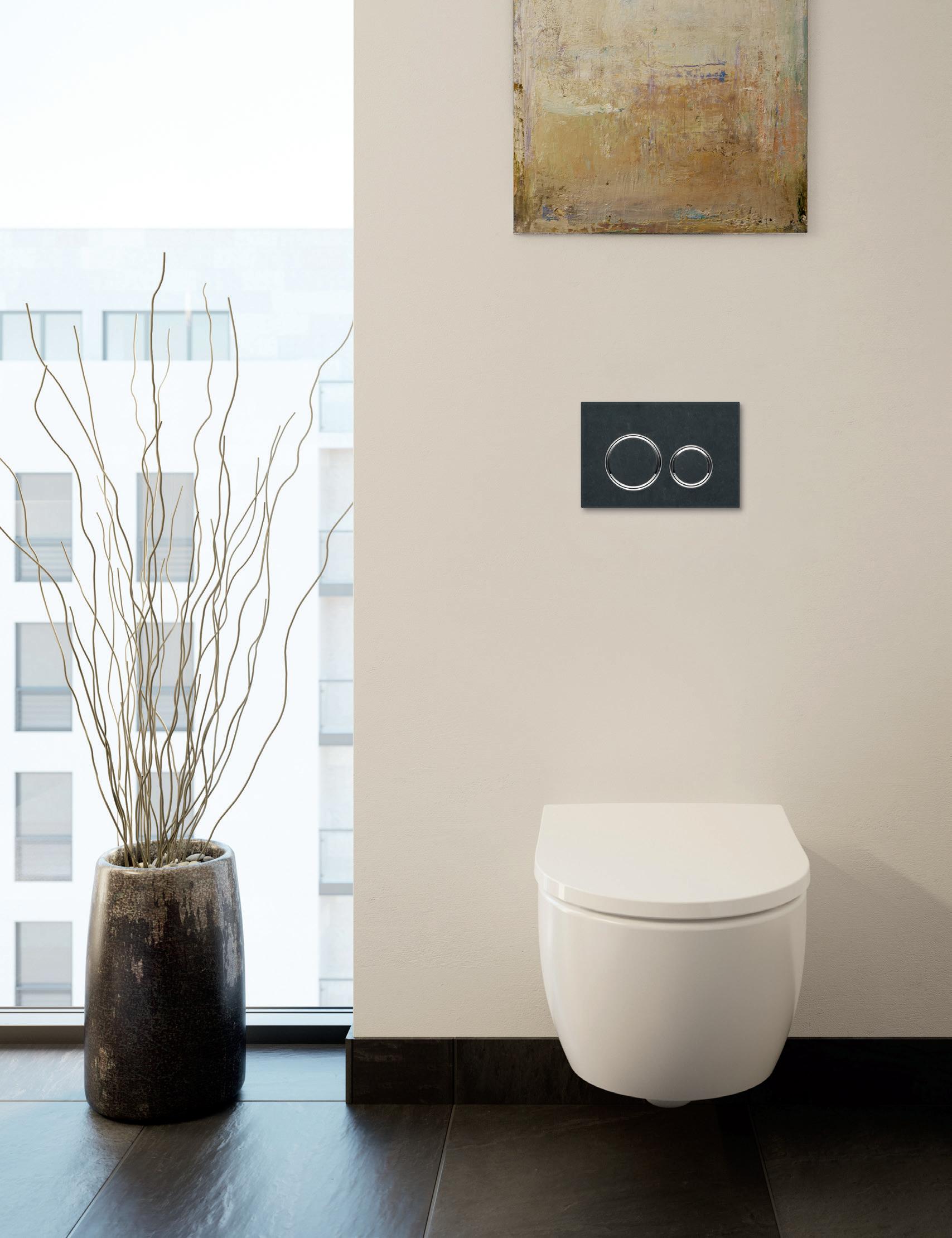
geberit.com.au
SIMPLE YET SOPHISTICATED DESIGN BRINGS A SUBTLE, YET STRIKING ACCENT TO ANY BATHROOM
Intentionally
intriguing
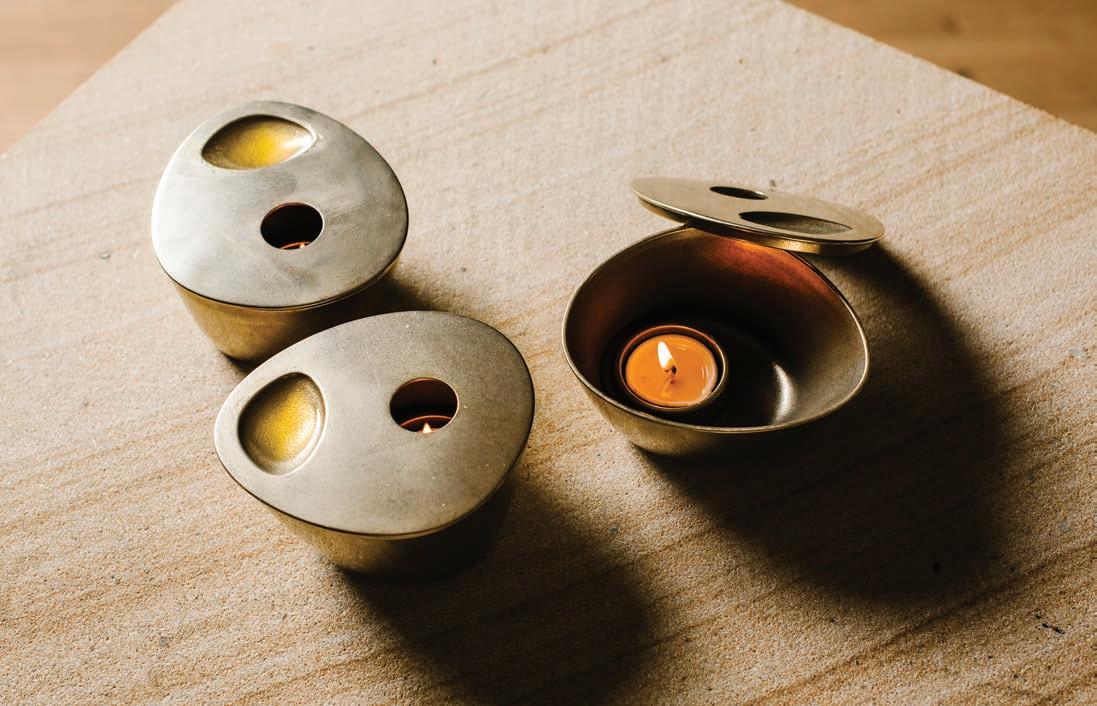
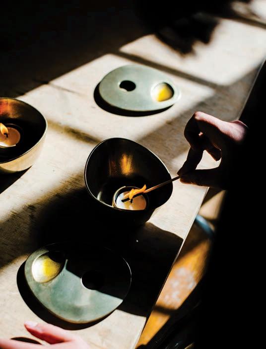
Studio Henry Wilson’s collaboration with Aēsop on its first foray into product design was realised as a carefully considered brass oil burner.

TEXT HOLLY CUNNEEN | PHOTOGRAPHY ALANA DIMOU
trailblazers # 109
It’s been more than three decades since Aesop was launched in Australia. Renowned for its distinctive store interiors and moreish skin, hair and bodycare products, the company has left it a good 30 years before it stepped into the realm of product design.
The conversation came about following continuing requests – from its global customer base – for recommendations on what to use to diffuse the brand’s oil blends. Without something existing on the market that aligned exactly with Aēsop’s values, it seemed only natural that they create that missing piece. In lieu of such expertise in house, the design of a product was something they recognised as a venture they’d need to collaborate on.
Four years ago, when this conversation had just begun, Australian industrial designer Henry Wilson had recently worked on the design of Aēsop’s store in Balmain, Sydney.
“We were keen to work with an Australian designer close to us, so we could work collaboratively on the process,” says Dr Kate Forbes, general manager, product and research and development at Aēsop. “Henry has previous experience in designing the sort of objects that we were after, so it seemed like the right connection. We really respect his approach to design after working with him on the store and knew that we had a way of working collaboratively together so it seemed the obvious choice.”
Henry Wilson was quickly brought on board. “Obviously they have a passion for design,” he says. “We see it in their stores and everything they do.”
The brass oil burner of today, as you might expect, looks very different to the initial prototypes. In fact, it’s a different object completely. “We always knew we wanted a way to disperse scent, but very early on it was actually something a little bit different,” says Kate. Discussions and designs began around the idea of an olive candle infused with the scent and dispersed into the space. Turns out, that isn’t the
most effective way to disperse scent. Anything but dissuaded by a roadblock, Henry and the Aēsop team went back to the drawing board. “Which is the great thing about design: you’ve always got to be open to totally throwing everything out and starting again,” says Henry.
That’s when the idea of an oil burner started to take form.
Asymmetry was a driving force in the updated design brief, giving it a sculptural, objet d’art-like visual appeal. But every design decision was informed as much by aesthetics as by functionality.
“On first glance, it has an artistic naiveté to it. But there are actually reasons for all those choices. The way the lid had to fit; the certain depth of the reservoir on top; where it’s placed; the size of the vent hole; and even size of the vessel is important. You’ve got to heat the air inside for the whole thing to get warm to be able to disperse scent. You have to find that optimal temperature of keeping the oil warm. So lots of little things had to fall into place,” says Henry.
It’s materiality – brass – was quickly and unanimously decided upon. Brass “made sense” for a number of reasons. Not least for the fact that it is a great conductor of heat. Aēsop has also used brass in many of its stores globally, suggesting a genuine affinity to the material.
Henry Wilson speaks with an appreciation of Aēsop’s willingness to let the design process unfold naturally, and Dr Kate Forbes, on behalf of Aēsop, likewise speaks highly of Henry. Collaboration, particularly in the design industry, isn’t always an easy process but in this instance it’s hard to imagine it was anything but absolutely enjoyable.
OPENER
IN
SYDNEY. OPPOSITE ABOVE | CREATING AN ASYMMETRICAL OBJECT IS ACTUALLY VERY CHALLENGING ACCORDING TO HENRY WILSON. OPPOSITE BELOW RIGHT | NOT ONLY DOES BRASS HAVE A NATURAL AFFINITY TO CANDLELIGHT, BUT IT ESTABLISHES A GRACEFUL PATINA WITH AGE. OPPOSITE BELOW LEFT | ALMOST 30 PROTOTYPES WERE PRINTED IN THE PROCESS, POTENTIALLY MORE. “YOU CAN’T LOOK AT IT ON A COMPUTER. YOU HAVE YOU LOOK AT IT AS A PHYSICAL MODEL,” SAYS HENRY.
| HENRY WILSON REVISITS THE AĒSOP STORE HE WORKED
ON
BALMAIN,
issue #42 habitusliving.com
“On first glance, it has a sort of artistic naiveté to it. But there are actually reasons for all those choices.”


trailblazers # 111

A MASTERPIECE IS COMING MASTERY BY CROWN GROUP OFFERS NEW LEVELS OF LUXURY IN WATERLOO, WITH 1, 2 AND 3 BEDROOM APARTMENTS AND PENTHOUSES BY LEGENDARY ARCHITECTS KENGO KUMA AND KOICHI TAKADA. 48 O’DEA AVENUE, WATERLOO ENQUIRE NOW 1800 319 550 CROWNGROUP.COM.AU/MASTERY
MASTERPIECE BY KENGO KUMA Artist impression.
What informs an architect's brief?

Nature tamed and framed
ONG&ONG's latest residential project places materials in their natural state amidst a curated nature.

TEXT CHU LIK REN | PHOTOGRAPHY
DEREK SWALWELL
issue #42 habitusliving.com

3 . on location # 115

issue #42 habitusliving.com
Distillation is an art. To distill a web of conflicting challenges to an essential but integrated design is to work towards the highest form of poetry. Masters would appear to have produced an outcome almost effortlessly, when in truth, much thought and experience have preceded a deceptively simple solution. Within the Faber Hill estate in Singapore resides the latest house completed by design team Tomas Jaramillo, Diego Molina and Maria Arango of ONG&ONG. It is their fourth house in this neighbourhood and one of their most elegantly resolved works.
“Our first challenge,” says Diego during a tour of the house with Shanti its owner, “was to turn what was originally a semi-detached house into a detached one. The land size allows for this conversion and this was one of the first request from the owners.” The clients’ parents have lived at this Singapore property from its inception in the 1970s, having purchased it directly from the developer, but they themselves have lived in Jakarta for over 20 years.
When they relocated back to Singapore, they decided to redevelop the house to its full potential. After exploring several semi-detached options in the initial design, the decision was made to proceed, even if it meant surrendering a 2-metre strip of built floors and the prospect of overlooking the neighbour’s party wall. But the advantages of air, light and independence proved irresistible. The solution adopted was to reclaim floor areas to the maximum line allowed on both sides of the boundary, thus giving the house a perfectly rectangular floor plate with a strong symmetry along a central axis. Indeed, symmetry became an operating influence on the overall design. The neighbour’s wall is painted with the same grey that themes the interiors of the residence.

“Our second constraint was having to deal with the noise from the Ayer Rajah Expressway (AYE),” adds Tomas Jaramillo, the senior

OPENERS |
THE
A GENEROUS CONNECTION TO THE OUTDOORS. OPPOSITE | THE GLASS-FRAMED
DOOR. ABOVE | THE ENTRY VISTA EXTENDS TO THE REAR GARDEN. BELOW | THE STAIRCASE CAN BECOME A SOCIAL HUB. 3 . on location # 117
VIEWS OF
REAR GARDEN HIGHLIGHT
MAIN

issue #42 habitusliving.com
The garden became an exemplification of the Chinese design practice of jiejing or “borrowed scenery” – water in the foreground, lawn and shrubbery in mid-ground, trees in the background.

3 . on location # 119
designer in charge of the project, in reference to one of the country’s major arterial highway. As the back of the house faces this expressway, placing the living room directly in front of this noise source was certainly a considered one. Not only due to the noise factor but also becasue it is at odds with conventional practice to place living areas in front of an internal road entrance.
The reason for subverting this convention is compelling too. Setbacks from the highway meant there is more garden area at the back, whilst mature trees planted beside it provided a ready-made verdant backdrop. The fact that the rear 12-metre building setback line did not apply to basement structures also meant that a pool could be built along the back garden and its bottom could be appreciated from the basement via the use of acrylic panel.
“Naturally, the back garden then became the focal point of the house,” says Tomas “but we had to be careful with the noise.” On the ground floor, the only effective solution was fixed double-glazing and a limitation to the opening panels. But this limitation simplified the design. The garden became a panoramic framed view, the concise exemplification of the Chinese design practice of jiejing or “borrowed scenery” – water in the foreground, lawn and shrubbery in mid-ground, trees in the background. In a
choreography of framed views, much as in a lyrical Japanese movie by Ozu, a visitor enters the house via a passage that skirts through the kitchen and lift lobby, led on by a low-running band of bay window before the culminating scene at the living space, where the hard edges of cut materials dissolve into the green beyond. The serenity of this space is now so prized that the clients’ forbade their parents to clutter the concrete ledges with collectibles and various forms of art, even though this was what they have been designed for.
Should the living room doors be kept opened, the other place of quiet respite would be the subterranean floor directly below. Here, one is effectively transposed to a realm of pool-filtered light complete with the soothing sound of rising bubbles propelled from a row of jets along the acrylic plane. This space can be further contained by a track of acoustic curtains next to the stairwell. Otherwise the stairwell, which rises over four floors, becomes a socialising shaft; a vertical ‘hearth’ that connects all floors visually and centrally. Crowned with a skylight and bedded with a dry rock garden, one can imagine everyday conversations floating up and down its teak panels; voices from faces rather than from the intercom.

PREVIOUS | NATURE TAMED AND FRAMED. ABOVE | THE ENTERTAINMENT ROOM IN THE BASEMENT IS NATURALLY LIT FROM THE SWIMMING POOL. OPPOSITE | MINIMALIST DETAILS MARK THE ULTRA-MODERN STAIRWELL.
issue #42 habitusliving.com
The stairwell, which rises over four floors, becomes a socialising shaft; a vertical ‘hearth’ that connects all floors visually.

3 . on location # 121
CAR PORCH ENTRY DINING LIVING POOL POWDER ROOM DRY KITCHEN WET KITCHEN SERVICE QUARTERS LIFT BEDROOM ENSUITE STUDY MASTER BEDROOM MASTER BEDROOM FAMILY ROOM ROOFTOP TERRACE WATER FEATURE ENTERTAINMENT ROOM H.S SHELTER 1 2 3 4 5 6 7 8 9 0 q w e r t y u i o p BASEMENT SECOND STOREY FIRST STOREY ATTIC 0 0 p 5 5 2 8 0 7 3 e 0 issue #42 habitusliving.com


OPPOSITE | PLANS. ABOVE | THE MASTER BEDROOM OFFERS VIEWS OUT TO THE STREETSCAPE AND BEYOND. BELOW RIGHT | THE ELEVATED SIDE PLANTERS. BELOW LEFT | THE PERFORATED SCREENS THAT WRAP AROUND THE REAR OF THE HOUSE SHIELD THE RESIDENTS FROM THE AFTERNOON SUN. 3 . on location # 123
Another example of a gentle subversion of convention is the master bedroom designed without a walk-in wardrobe. Instead, all the side walls of the bedroom are lined with contiguous, streamlined cabinetry that is then flush with – and visually extended to – the external projecting walls. These cantilevered wedges are joined across the top to form a tapered eave that is in turn, a part of the ledge-cum-parapet for the water feature on the roof terrace above. The aesthetic composition is thereby part and parcel of the practical elements and one is hardpressed to decipher which design consideration had preceded the others.

Perhaps this survey could end where it started, back to the threshold of the house. Here, the vertical teak strips that line the walls have continued from the outside into the stairwell at the heart of the house. Beside the front door, it conceals the shoe cabinets. Opposite the shoe cabinets are granite plinths that look right as an anchoring base to the row of free-standing columns. But they are here also appropriately used as benches for sitting on as one puts on the shoes. Next to these plinths, the planted soil level is raised to almost the same level. The plants are then seen even when one is seated in the living room sofa. Colours are understated so that the leafy greens and the woody paneling become the natural highlights, with the Indonesian furniture from the owners’ collection serving as accents. Together, they form a gracious, harmonious entity and the very essence of distilled design.

ABOVE | BASIC GEOMETRY AND A RESTRAINED PALETTE CHARACTERISE THE EXTERIOR FAÇADES. BELOW | ELEVATED BENCHES DEFINE THE SPATIAL BOUNDARIES.
ONG&ONG | ong-ong.com
issue #42 habitusliving.com
Colours are understated so that the leafy greens and the woody paneling become the natural highlights.

Life Tastes Better With a Liebherr Your Elegant Solution for Preserving Wine & Food home.liebherr.com.au
EWTdf 3553

issue #42 habitusliving.com
Take a Moment to make a Moment
How do you create singular spaces within a home that is largely open plan? The answer can be found in the Edsall Street residence by Ritz&Ghougassian.
TEXT SUSAN MULDOWNEY | PHOTOGRAPHY TOM BLACHFORD
3 . on location # 127
If you want to give an architect the dream brief, make it as open as possible. That’s exactly what the residents of Edsall Street in the Melbourne suburb of Malvern presented to architects Gilad Ritz and Jean-Paul Ghougassian, shortly after buying their Victorian cottage in 2015. A skylight in the bathroom was one of their few design stipulations. Apart from that, Ritz&Ghougassian were free to create what they describe as their “essay on architecture” –a harmonious layering of four distinct spaces, each flowing seamlessly into the next.
Trust between architect and client was vital to the success of this renovation. Owners Julien and Kristy-Lea, who share the home with their Staffordshire terrier, Zeus, had previously worked with Ritz&Ghougassian on the design of their hospitality projects, including Bentwood café in Fitzroy and Penta in Elsternwick. There were no other architects they would entrust with their home. “We always look for architects who are passionate about their work,” explains
Julien. “We know Ritz&Ghougassian and we love their taste. We understood their vision and had total trust in them.”
However the open brief was not without its challenges. The house sits on a 375-metresquared sloping block at the boundary of a commercial zone and the architects needed to balance the desire for natural light with the lessthan-desirable view of a neighbouring liquor store. The residence also has a heritage overlay and the local council took close to nine months to approve the final plans.
It was worth the wait. Since forming their studio in 2015, Ritz&Ghougassian have forged a distinct reputation for architectural rigour and design finesse. This is perhaps a consequence of their complementary backgrounds – Gilad leads the studio’s architectural projects and Jean-Paul specialises in interior architecture. They have brought the best of both worlds to Edsall Street.
Early design conversations centred around creating singular spaces within a home that is largely open plan. “We wanted there to be a
FURNITURE SUCH AS THE BLACKBUTT DINING TABLE THAT
OPENER
| “MASONRY WAS CHOSEN FOR THE EDSALL STREET EXTENSION TO EMPHASISE A SENSE OF PROTECTION FROM THE ELEMENTS WHILE THE TIMBER BATTONS FILTER THE VIEW OF COMMERCIAL BUILDINGS AND FORM A SCREEN TO PREVENT OVERLOOKING.” OPPOSITE | “OWNERS JULIEN AND KRISTI-LEA GAVE RITZ&GHOUGASSIAN AN OPEN BRIEF, INCLUDING DESIGN OF THE
REFERENCES MATERIALS USED IN THE FRONT SECTION OF THE HOUSE.
issue #42 habitusliving.com
Since forming their studio in 2015, Ritz&Ghougassian have forged a distinct reputation for architectural rigour and design finesse.

3 . on location # 129

issue #42 habitusliving.com
“I think of light as another material,” says Gilad. “It creates shadow and texture.”
sense of one activity for each space,” says JeanPaul. “We didn’t want it to feel like just one big open space at the back.”
The solution, he goes on to explain, was to dislocate the envelope vertically so one part of the house looks on to the other. The first part –the original front section of the residence – was restumped, reroofed and its decaying walls were repaired. The rest of house was flattened and replaced by three spaces: a kitchen and dining area, a sunken living room and a master bedroom upstairs.
Much of the heritage details in the front of the house, which now consists of three bedrooms and a bathroom, have been preserved or overlaid with contemporary touches, such as black steel shrouds around existing fireplaces. The floors feature smooth blackbutt timber boards with a matte finish to celebrate their natural characteristics. “We like to keep timber in its natural state,” says Gilad. “We like the fiddleback effect.”
The junction between the old house and the new is characterised by what Gilad describes as a ‘Ma’ moment – a Japanese term often applied by architect Isozaki Arata to signify the space between objects or structural elements.
“It’s like a moment of pause,” says Gilad. “In this case, it marks the transition from the old to the new section and, in this moment, you can look out the windows to the garden of native plants. We wanted to create connections between the exterior and interior.”


JOINERY BALANCES
OPPOSITE | SOARING GLASS WINDOWS FLOOD THE BACK OF THE HOUSE WITH LIGHT, WHICH GILAD RITZ REGARDS AS AN ADDITIONAL MATERIAL. LEFT | A SMALL GLASS ALCOVE FLOODS THE LIVING AREA WITH NORTHERN LIGHT AND ADDS FURTHER WIDTH TO THE BACK OF THE HOME. RIGHT | THE WARMTH OF THE SOLID BLACKBUTT TIMBER IN THE KITCHEN AND DINING
THE COOL QUALITIES OF CONCRETE AND
STONE.
3 . on location # 131
GROUND
MASTER
GATE PORCH ENTRY BEDROOM BATHROOM KITCHEN DINING LIVING POWDER ROOM CAR PORCH
ENSUITE 1 2 3 4 5 6 7 8 9 0 q w
BEDROOM
SECTION
#42 habitusliving.com
FLOOR FIRST FLOOR
issue


3 . on location # 133
OPPOSITE | PLANS AND SECTION. ABOVE LEFT | THE ENSUITE UPSTAIRS FEATURES A MATERIAL PALETTE OF MASONRY, STONE AND BLACKBUTT. ABOVE RIGHT | BLACKBUTT TIMBER BATTONS ON THE EXTERIOR WALLS CAST EVOCATIVE SHADOWS IN THE STAIRCASE. BELOW | BLACKBUTT JOINERY IN THE MASTER BEDROOM COMPLEMENTS THE BLACKBUTT BED, ALSO DESIGNED BY RITZ&GHOUGASSIAN.
The movement from old to new is also delineated by a change from weatherboard to masonry walls. “We chose masonry because it suggests the idea of protection from the elements and it also allowed us to wrap the material from outside to inside so we could bury windows in between,” says Gilad.

This is achieved through a cavity between the internal and external masonry walls. “Glass doors in the kitchen and living area that lead to the courtyard slide inside the cavities when they’re opened,” adds Gilad. “It’s like they disappear.”
The cavities are not the only clever nooks within the home. A small glass alcove near the back of the house, for example, adds more width to the living area and brings more northern light into the space. “I think of light as another material,” says Gilad. “It creates shadow and texture.”
Concrete is also a material favoured by Ritz&Ghougassian and they have incorporated it to the flooring of the kitchen and living areas. The blackbutt floor in front of the house is referenced through joinery in the kitchen, master bedroom and staircase. “We’ve worked with joiner Adrian Hall on other projects and we love that he is a perfectionist,” says Gilad. “We purposely sat the joinery off the masonry walls in the bedroom so that it looks like a piece of furniture.
ABOVE | THE EASTERN SIDE OF EDSALL HOUSE IS SHIELDED FROM NEIGHBOURING COMMERCIAL BUILDINGS THROUGH SOLID MASONRY WALLS AND TIMBER BATTONS. OPPOSITE | THIS RESIDENCE IS A WELCOMING RETREAT FOR JULIEN, KRISTI-LEA AND THEIR STAFFORDSHIRE TERRIER ZEUS.
issue #42 habitusliving.com
The movement from old to new is delineated by a change from weatherboard to masonry walls.

3 . on location # 135
No design detail within Edsall Street has been overlooked. The vertical air grills carved into the timber joinery, for example, reference a series of soaring blackbutt battens on the exterior walls. They are designed to help slice up the view of commercial buildings to the west and to create a screen to prevent overlooking to the east.

The battens also created an unexpected issue for the owners shortly after moving back into their home. “The tannins from the blackbutt bled down onto the masonry bricks on the west wall,” says Julien. “I called The Graffiti Eaters to remove it and they did an amazing job. It’s all sorted now.
“What we love most about the house is the way that every space flows into the next one so naturally,” adds Julien. “We recently got back from an overseas holiday and when we walked in the front door, we felt exactly the same way as we when we first moved in after the renovation. The only difference was that it was winter when we got back, so I had a new appreciation of the under-floor heating.”
Ritz&Ghougassian | ritzghougassian.com
ABOVE | THE FRONT OF SECTION OF EDSALL STREET HAS BEEN RESTUMPED AND REPAIRED BUT ITS HERITAGE DETAILS HAVE BEEN WELL PRESERVED. THE BLACKBUTT PICKET FENCE REFERENCES THE TIMBER BATTONS ON THE SIDE AND, JUST LIKE MUCH OF THE FURNITURE INDOORS, RITZ&GHOUGASSIAN PLAYED A KEY ROLE IN THE DESIGN OF THE GARDEN.
Much of the heritage details in the front of the house have been preserved or overlaid with contemporary touches.
issue #42 habitusliving.com
Home Design. Inside and Out.

Leon House is a design master when it comes to modernist style, and minimalist aesthetics with just a splash of the luxurious. House has pushed the boundaries of interior and exterior design through to bold new places, never forgoing the sense of respect for the modernist design principals of space, thoughtful shapes, and smart lines. The Leonhouse designs reinterpret shapes, textures and liveable spaces in inspiring and unique ways.

More than just simply interiors, Leonhouse offers complete house design for the considered design lover. With a masterful eye and expertise for minimalism inside and out, the Leonhouse team channels style and modernist grace into every detail of every design. The recent Canning Beach Road project reflects this passion for iconic modernist design, with House’s specialised kitchen design and interior architecture passion in full, resplendent form. Bold floating rooftops meet an iconic 20th Century modernist exterior, housing a smart and contemporary considered interior.
Leon House | leonhouse.net
habitus promotion › Leon House #137 issue #42 habitusliving.com ABOVE LEFT | THE PERTH HOUSE WAS DESIGNED TO CAPTURE VIEWS AND SUMMER BREEZE. ABOVE RIGHT | OLYMPIA HONED STONE TILES, AND IVORY STONE BENCHTOP FROM BERNINI
Residential design needs to be a holistic process – with care taken in every step of the design, from exterior build to interior flourishes.

issue #42 habitusliving.com
Less is More
With just 24 square metres to work with, architect Brad Swartz has turned this Sydney apartment into a flexible and highly liveable home.

TEXT
HOLLY CUNNEEN | PHOTOGRAPHY TOM FERGUSON
3 . on location # 139
Contrary to popular belief, it isn’t always the client who dictates the brief to an architect. Oftentimes, it’s the site and space. A large site may afford the client any amount of bedrooms, multiple living zones, a study space and perhaps formal and informal dining areas. A steep or slanted site would encourage multiple levels; a rural site might suggest making a feature of the surrounding environment; while a coastal site would heavily influence material choices and site orientation.
For small-scale projects, however, “the brief is often just to make it liveable”. So says architect Brad Swartz. Under the guise of his eponymous architecture and interior design studio, Brad has recently completed the reconfiguration of Boneca Apartment, a 24-square-metre studio apartment in the inner Sydney suburb of Rushcutters Bay.
The resident and client bought the apartment with the idea of engaging an architect to design a make-over. But there was no strict brief per se – simply to take the shell of the apartment and site orientation as the [only] two absolutes and go from there: nothing was off the table.
Previously, to enter the apartment was to enter the kitchen, which had been separated from the rest of the studio by a dividing wall. Through the kitchen was a bedroom that doubled as the living room and the bathroom. No space was dedicated to dining.
What stands out now about this apartment is how the considered assessment of layout and a resulting relocation of interior walls – all of them, in fact – and plumbing has reinvigorated an apartment that was well designed for its time (the middle of last century) but which had since dated.
Brad has propelled the apartment into the 21st century. “There has been a shift in thinking,” he says. “Going home you want the bedroom to be separate now, and the kitchen to be part of your living space so you can entertain.”
The new space is more or less split in two. As you enter, the kitchen lines the left wall before the inbuilt double bed featuring hidden storage care of custom joinery. Between the kitchen and bed is a short corridor leading to the bathroom, in a new, subtler location. A table for dining, studying or socialising sits in front of the door behind a two-seater sofa and the windows that line the facing wall.
OPENER
A
FLOORBOARDS IN A BID TO MAKE THE SPACE FEEL BIG. OPPOSITE BELOW | NATURAL LIGHT FLOODS INTO THE APARTMENT THROUGH THE WINDOW AND
TIMBER
A relocation of interior walls and plumbing has reinvigorated an apartment that was well designed for its time but which had since dated.
| A FLOOR-TO-CEILING MIRROR AT THE END OF THE CORRIDOR LEADING TO THE BATHROOM MAKES A NARROW WALKWAY FEEL LONG AND SPACIOUS. OPPOSITE ABOVE |
DESPITE
CURRENT TREND TOWARDS WIDE FLOORBOARDS, ARCHITECT BRAD SWARTZ HAS OPTED FOR NARROW
SLATTED
SCREEN.
issue #42 habitusliving.com


3 . on location # 141

issue #42 habitusliving.com
The key to the interior layout is a bespoke sliding screen. While the final iteration is slatted timber custom designed by Brad and built by feather edge – a fabrication company that habitually works on art projects and run by Brad’s brother, Mark Swartz – many other designs were explored first. It began as two sliding doors that then morphed into glass panels, followed by a completely solid timber version.
More than creating visual interest, the final version also provides solutions to a number of different design constraints. One of which, is the filtration of light: due to the window-to-depth ratio, the apartment can get quite bright in the middle of the day, sliding the door to cover the bed filters the lighting streaming in.
The sliding slatted timber screen not only filters light but also helps to retain a sense of openness; it defines the room without dividing the space; and allows ventilation.
The screen, depending on which side it rests, determines the feel of the space. Concealing the bed affords the resident a space conducive to entertaining: complete with kitchen, dining and living zones. Alternatively, sliding the screen to hide the kitchen affords a bedroom atmosphere, meaning the resident it able to enjoy two large rooms in a studio apartment of just 24-square-metre.
“You still get a sense of openness because it’s not a solid piece, but you can’t really see what is beyond,” notes Brad.
The seamless and hidden nature of lighting likewise characterises the project. There is recessed lighting and back lighting in the living spaces while strip lighting lines the edges within the bathroom and along the kitchen wall. “We like to hide a lot of the lighting, so you don’t have a busyness of down lights on the ceiling,” says Brad. This aligned perfectly with the client’s sensibilities as she had been staying in nice hotels for work and was quite taken with the concept of hidden lighting. “It ends up with really beautiful results, there are all these little light boxes that are almost light features in themselves,” he adds.


OPPOSITE | THE NORTH-FACING END OF THE APARTMENT IS LINED WITH WINDOWS. ABOVE | FACING THE BATHROOM IS AN-INBUILT WARDROBE COMPLETE WITH SLICK BACK LIGHTING. BELOW | LARGE FORMAT WALL AND FLOOR TILES IN STEEL GREY GIVE A HOTEL-ESQUE FEEL TO THE BATHROOM.
3 . on location # 143

ENTRY DINING LIVING INBUILT BED CONCEALED STORAGE BATHROOM KITCHEN 1
7 BEFORE AFTER AXONOMETRIC issue #42 habitusliving.com
2 3 4 5 6

OPPOSITE
3 . on location # 145
| PLANS AND AN AXONOMETRIC DIAGRAM. ABOVE | WITH THE SCREEN CLOSED AND THE BED CONCEALED, THE STUDIO APARTMENT TAKES THE FORM OF A SPACIOUS LIVING AND ENTERTAINING AREA.
There might be a perception in the wider community that architecture is unaffordable and a luxury rather than necessity – and perhaps in some [read: many] cases that is wellfounded. Boneca Apartment, however, makes a strong case for an alternative opinion.

Given the vast improvement of this space and the liveability for its occupant – and knowing that there were numerous conceptual layouts explored architecturally before the final concept was arrived at – there is no denying the value of an architect. “Using a designer or an architect to really go through the design process can add a lot,” says Brad. It will be an added expense, but the value one gets out of using an architect will far outweigh the cost.
Brad Swartz Architects | bradswartz.com.au

ABOVE | OPEN AND RECESSED, THE TIMBER SHELF ABOVE THE KITCHEN SPEAKS NICELY TO THE SLIDING SCREEN AND WOODEN FLOORBOARDS. BELOW | THE BUILDING IN WHICH BONECA APARTMENT RESIDES.
issue #42 habitusliving.com
Illuminating the Subject
When lighting fine art or museum artifacts, the colour, level, shadow, texture and transparency of the light all play a crucial role in the experience. Only the correct lighting can create the proper situation for appreciation.
One of the more popular selections for designing this appreciation of art is the ELS Iconic series. The Iconic series provides the highest quality, natural colour representation in lighting, offering perfect saturation across all colours, including difficult reds, pink and pale skin tones that often appear dull and lifeless under poor lighting conditions. Ease of use, installation and customisation of luminaires is also paramount in gallery and museum lighting and all of these factors have to be priorities during the design phase of these luminaires. Efficient Lighting Systems has been able to achieve extremely high levels of quality in their gallery and museum lighting range by focusing their attention on superior luminaire design and the use of Xicato’s new XIM Gen4 BLE smart LED module.

habitus promotion › Wyalla #147 issue #42 habitusliving.com ABOVE | ICONIC TRACK LIGHT – HIGH TECH WITH SIMPLICITY
Wyalla Studio | wayallastudio.com.au
In galleries and museums depth of visual experience is paramount, with the right lighting allowing people to step into the mind and world of the artist.
Simple as black and white
TEXT PAUL MCGILLICK | PHOTOGRAPHY DANIEL MAYNE
Ian Moore is an architect known for his black and white palette and glass louvres, but his aesthetic is, as he says, basically about “keeping it as clean and simple as possible”. In the case of the alterations and additions to this inner suburban Sydney house, the interventions are so subtle that it is not immediately apparent that anything has been done at all. But the house quickly reveals that he has achieved a highly refined and understated relationship between old and new, respecting the past without indulging it.
Sydney’s Surry Hills may these days be Trendy Central, but it has a past which its new generation of residents value as much as those who were born and raised there. It has always been a quirky suburb, mixing lowincome residential with the rag trade, diverse lifestyles and maintaining itself as a connection with Sydney’s 19th century past as well as being a hub of contemporary innovation and experiment. Ian Moore points out that the shops always tended to be randomly distributed rather than forming strips. This property was a case in point – a butcher’s shop dating from 1898 and the only shop in a street of terrace houses and some low-rise commercial buildings.
How a 19th century butcher shop became a contemporary home without losing its original character.
issue #42 habitusliving.com

3 . on location # 149

OPENER
issue #42 habitusliving.com
| THE NEW KITCHEN WITH THE HOCKEY STICK BENCH AND OCCULUS CASTING AN INTRIGUING SHADOW ON THE WHITE-TILED WALL. ABOVE | THE FRONT LIVING ROOM WITH THE ORIGINAL BUTCHER SHOP TILES AND THE LUMINOUS DOORWAY THROUGH TO THE KITCHEN.

3 . on location # 151
The original butcher shop tiles are still on the walls of what is now the living room.
As a shop it fronted straight on to the street with no setback. It was one-room deep with a cool room out the back. The butcher lived in the nextdoor terrace with doorways linking the two properties at ground level and on the first floor. Over time, the shop became a self-contained residence with a new façade and windows for the front and rear walls – windows which are still there. The original butcher shop tiles are still on the walls of what is now the living room, while the original floor tiles are also still there, but now hidden beneath a raised timber floor introduced by a previous owner to match the level of the back yard.
This project consisted of two stages – or three if you include the fact that Ian Moore and his wife (who live close by) are friends of the clients and actually found the house and urged them to attend the auction which, says Ian, they won by 11 cents! Otherwise, Stage 1 involved a new kitchen and some work on the rear courtyard.
But Ian Moore had done a master plan which indicated what could be done further down the track. In this he was helped by the existing height regulations in the street which enabled him to add a new level as part of Stage 2 and still remain lower than the highest buildings in the street.
“It was important to make something that was so simple and contemporary that it didn’t compete with the original building,” says Ian. “So, up there we have put a white aluminium box. You don’t really notice it. And it’s set back from the original parapet with a little roof terrace inside (behind the parapet). That’s the main bedroom.” This discreet, private and light-filled little pavilion on top of the original building – along with a sinuous new spiral stairway like a tower linking all three levels of the house – represents Stage 2. The glass louvres for the rear elevation and the handrail for the stairway to be installed.


TOP LEFT | THE ROOFTOP TERRACE. BOTTOM LEFT | AN ARTWORK BY THE CLIENT. OPPOSITE | THE MASTER BEDROOM LOOKING OUT TO THE ROOFTOP TERRACE AND PROTECTING PARAPET.
issue #42 habitusliving.com

3 . on location # 153
“It was important to make something that was so simple and contemporary that it didn’t compete with the original building.”
GROUND FLOOR
1 2 3 4 5
ENTRY
LIVING
FORMAL DINING
STORAGE
BATHROOM
FIRST FLOOR
6 7 8 9 0
CASUAL DINING
KITCHEN
VERANDAH
COURTYARD
PARKING
q w e r
BEDROOM
STUDY
MAIN BEDROOM
ENSUITE
r
SECOND FLOOR
issue #42 habitusliving.com


LEFT |
|
| THE NEW SPIRAL STAIRCASE WHICH
ITS WAY UP FROM THE KITCHEN AND PAST AN ORIGINAL WINDOW. 3 . on location # 155
PLANS. RIGHT TOP LEFT
THE MASTER BEDROOM WARDROBE UNIT WHICH DOES NOT GO FULL HEIGHT. RIGHT TOP RIGHT | MASTER BEDROOM EN SUITE. RIGHT BOTTOM
MAKES
But, as always with Ian Moore, the magic lies in the details. One enters the house straight from the street with the door on the left. Once inside the circulation continues to range left. A wonderfully luminous – and beautifully proportioned – doorway leads into the kitchen. This luminosity comes from the reflected light of the kitchen tiles, themselves illuminated by an oculus in the kitchen ceiling which, with the passage of the sun during the day, projects constantly changing shapes on to the wall. In turn, the kitchen leads out to the rear courtyard through another superbly scaled glass door.
But there had been circulation issues with the kitchen, the existing bathroom and the tight return of the stairway. These were resolved by Ian with an elegant, long dining and preparation bench in the shape of a hockey stick – which Moore calls “the big gesture” because it is both directional and a sculptural device helping to make the kitchen the “hub” of the home and the link to the rear courtyard. The circularity of the ‘hockey stick’ echoes the round oculus, while the hard-wearing black lino flooring sets up Ian’s typical conversation with the allwhite finishes.
The clients’ two young boys have their bedrooms (with some Ian Moore-designed mobile cupboards) on the first floor along with an ingenious study nook on the landing. The master bedroom above continues the black–white conversation. Up here, you are amongst the trees, enjoying dappled sunlight from the west as it makes its way through some handsome established trees. Bathed in light from the little roof terrace, its privacy protected by the restored original parapet, the bedroom is separated from the ensuite by a wardrobe unit with a gap between the top and the ceiling which helps to sustain a sense of space and flow. Meanwhile the bed features customised, Ian-Moore-designed fitted aluminium side tables in the quest to keep it simple by avoiding additional freestanding furnishings. From the outside, the rooftop addition can scarcely be seen, confirming Ian’s agenda to create a functional contemporary addition without compromising the historic character of the building or the integrity of its neighbours.
Ian Moore Architects | ianmoorearchitects.com

LEFT | THE STREET ELEVATION SHOWING THE ORIGINAL BUILDING AND THE WHITE BOX ROOFTOP ADDITION.
issue #42 habitusliving.com
The Habitus Collection Online gives Australian Design Hunters instant access to the best design products for residential environments. We take the hard work out of product selection, hand-picking the best design products available in the region. All in a single, comprehensive digital touch-point.


Discover the best design products for home and living.
habitusliving.com/collection

issue #42 habitusliving.com
Next level Minimalism
Although discreetly nestled in its streetscape, this concrete home is an unexpected find in Melbourne's middle ring suburb Essendon, where red brick period dwellings dominate.
When the residents of Salmon Avenue, Steven and Ainsley, decided their “forever house” was to be a new residence made from concrete, their research led them to architect Feras Raffoul, director of FGR Architects, who had designed and built his own concrete and glass house.

Feeling they were on “the same wave length” kept the brief simple. “We pretty much asked for a concrete home that’s light and bright – then we were happy to let Feras do his thing,” says Ainsley.
“My home is an example of experimenting with concrete and seeing where the whole idea of a peeled back palette takes things. This is a more evolved version – it’s series two,” Feras says. One key design ambition was to give the clients privacy from the street. Set foot inside and the emphasis turns to visual connectivity, light and acoustic privacy for the occupants, explains Feras.
Structurally, 80 per cent of the couple’s new home is concrete and glazing softened by timber cabinetry and greenery, much of which will mature over time. Gallery-like in feel and
TEXT MARG HEARN | PHOTOGRAPHY PETER BENNETTS
3 . on location # 159
generosity, Salmon Avenue is pragmatically designed and built around the needs of the family of four.
According to Feras, a house should “mould itself around” the respective living and entertaining requirements of the kids growing up and of the parents. And it does. “The house works perfectly for our family,” says Ainsley. “When the kids are little – being able to see them from wherever you are is important.”
The home exploits the 55-metre long site, running from the north edge to the parklands on the southern boundary. Living quarters are housed in the front square element with a downstairs guest room and three bedrooms upstairs, each with a personal bathroom.

A walkway links the private spaces to a rear linear element, the entertaining quarters. “This is where we live, it’s the heart of the home,” says Steven. Overcoming the 3-metre drop (almost one full floor level), from one end of the block to the other, was one of the project’s biggest design challenges. That was in part resolved using a transition space with a second lounge/rumpus room to one side and a laundry with its own service yard tucked away on the other.
The expansive entertaining area, which flows freely between the kitchen (the home’s “epicenter”), meals, living and alfresco areas,
opens directly onto the pool and garden. In contrast to the new residence the family had previously been living in a small house. “The kids were ecstatic and would literally run laps from the front door and down to the dining table,” recalls Ainsley.
“Having 180 degree visual connection from the kitchen to all spaces means I can organise dinner while the kids are in the pool or the rumpus room and take comfort that I can see them.” As the consummate entertaining spaces for hosting large gatherings with extended family, the 4.5-metre long island bench, makes a ready grazing station on one half and bar station on the other.
Low maintenance was a must. “I don’t want to be home cooking and cleaning all day, I wanted the house to be easy to live in – so that when people come over, this is the way it is,” says Ainsley. Delivering that aspiration is the self-cleaning oven, an integrated fridge, day-to-day appliances concealed in a galleystyle pantry (stage left off the kitchen), copious storage for “bits and bobs” and having all the bedrooms upstairs.
Not only robust and family friendly, the home offers many opportunities for sanctuary. Steven loves watching TV from the beanbag by the pool or hanging out by the fire pit of
SOFT IN TONE, THE CONCRETE DWELLING OFFERS EXCEPTIONAL PRIVACY FOR ITS RESIDENTS. OPPOSITE | THE VOLUMINOUS DOUBLE HEIGHT ENTRY IS COMPOSED OF FOUR PRECAST CONCRETE PANELS – MAKING AN EASY READ OF THE HOME’S TWO DISTINCT LEVELS.
OPENER |
THE LAYOUT OF THE HOUSE TAKES FULL ADVANTAGE OF ITS LINEAR SITE AND NEIGHBOURING PARKLANDS AND ALSO RELATES TO USABILITY. LOW
MAINTENANCE VEGETATION
WILL
EVOLVE OVER TIME. ABOVE | STRONG YET UNDERSTATED IN FORM, SET BACK FROM THE STREET AND
issue #42 habitusliving.com

3 . on location # 161
Gallery-like in feel and generosity, Salmon Avenue is pragmatically designed and built around the needs of the family of four.

issue #42 habitusliving.com

3 . on location # 163

PREVIOUS | VISUALLY AND PHYSICALLY INTERCONNECTED, THE ENTERTAINING AREA LINKS DIRECTLY TO THE POOL AND REAR GARDEN. AINSLEY SAYS “THE KITCHEN IS A COOKS AND ENTERTAINERS KITCHEN THAT HAS ALL THE BELLS AND WHISTLES.” ABOVE | GLAZING, TIMBER AND GREENERY COUNTERBALANCE THE CONCRETE. OPPOSITE ABOVE | RESONANT OF WOODEN BLOCKS, EACH STEP OF THE CUSTOM-MADE OAK TIMBER STAIRCASE IS CLEARLY DEFINED COURTESY OF THEIR SHADOW LINE DETAILING. OPPOSITE BELOW | SURELY THE ULTIMATE IN GUEST PAD ACCOMMODATION IS THE SPARE ROOM OVERLOOKING A NORTH-FACING, JAPANESE INSPIRED GARDEN POND.
issue #42 habitusliving.com
Overcoming the 3-metre drop, from one end of the block to the other, was one of the project’s biggest design challenges.
a summer’s evening. For Ainsley, it’s a tie between retreating to the master bedroom’s mesmerising views on a weekend or enjoying the entertaining spaces.
Perceptions around concrete being cold to live with are dismissed here. “Visitors to the house see the concrete façade and they’re not sure what to expect, but with the windows, timber and soft furnishings it’s surprising how warm the house is,” says Ainsley.

Past experience as a fashion retail manager has instilled conviction in her tastes and preferences. “I have a strong sense of knowing what I like and what I don’t like,” she continues.
“While some people might be overwhelmed by all of the concrete, for us, it was like, give us a concrete jungle, the more concrete the merrier. I think concrete is very organic – you can pare it back with beautiful more refined elements to balance each other out.”
A printer by trade, Steven is a stickler for quality materials and perfect finishes. The build was a collaboration between AMPM Projects and with Steven and Ainsley heavily involved in all aspects of the construction and finishes.
Building a concrete home is not for overthinkers, cautions Feras. “Concrete is an unforgiving product, you don’t get to procrastinate – you have to make decisions early, be comfortable about it and move on.”
Four custom made, oversized, precast concrete panels for the passage walls run horizontally, a method that eliminated extraneous lines. “That’s the intention of the alchemist – to allow you to enjoy the surface area and have less items intruding on your eye space,” points out Feras.
Another prime example of the fastidious detailing was ensuring all electrical conduit had been allowed for within the precast walls prior to installation which resulted in recessed power

3 . on location # 165
GROUND FLOOR FIRST FLOOR
DRIVEWAY
FRONT YARD
ENTRY
BEDROOM
BATHROOM
LAUNDRY
KID ’S LIVING
KITCHEN
DINING
LOUNGE
OUTDOOR KITCHEN & DINING
BACKYARD
POOL
POOL DECK
OUTDOOR CHANGEROOM
GARAGE
MASTER BEDROOM
ENSUITE
qt
1 2 3 4 5 6 7 8 9 0
issue #42 habitusliving.com
w e r y u i

OPPOSITE |
ABOVE |
INTO
ENTERTAINING
A
GARAGE BELOW, WHILE THE BACK HALF OFFERS DUAL LIVING AND ENTERTAINING
PLANS.
SIMPLY ARRANGED
PRIVATE AND
ZONES, THE HOUSE’S FRONT SQUARE ELEMENT CONTAINS 4 BEDROOMS WITH ENSUITES AND
DOUBLE
SPACES.
3 . on location # 167
“Having 180-degree visual connection from the kitchen to all spaces means I can organise dinner while the kids are in the pool or the rumpus room and take comfort that I can see them.”
points and light switches without visible cables. “It’s a lot of work to get there, but once you execute you get a really clean result,” says Feras.
Consistent with FGR Architects’ ethos, the home explores the application of one material like concrete to the nth degree – from a wall, floor and even a ceiling application – and then infilling the gaps in between with glazing, joinery and blinds.
Fundamentally, the occupants are provided with a base palette to create their own tone within the space. “In 10 years time, you could take all the furniture out and put a new infill here for a totally different feel,” says Feras. If desired.
While Steven and Ainsley have built houses with a modern slant before, they admit their experiment with concrete has taken their love of minimalist style to the next level.

ABOVE | FGR ARCHITECTS CONCEIVED THE HOUSE AS A BASE PALETTE AND A GALLERY SPACE ALLOWING THEIR CLIENTS TO FURNISH AND ESTABLISH A UNIQUE TONE WITHIN THE SPACE.
issue #42 habitusliving.com
FGR Architects | fgrarchitects.com.au


issue #42 habitusliving.com
Exploring Climate and Context
THOSE Architects’ specific response to climate and site challenges the Byron Bay vernacular.

TEXT REBECCA GROSS | PHOTOGRAPHY LUC R ÉMOND | STYLING ALEX BENNETT
3 . on location # 171

issue #42 habitusliving.com
Architecture in Byron Bay is often designed with expansive glass doors that open interior spaces up to large balconies and decks, blurring the boundaries between inside and out. But while it’s a popular solution, it’s not always a practical one. The coastal town in northern New South Wales contends with heat, humidity and harsh sunlight; winter chills and salt air; and high rainfall, winds and storms at the tail end of the cyclone season. Opening up a house means heat gets trapped inside in summer and lost through the windows in winter. Those Architects have therefore taken a distinctly different approach by restricting openings to keep their latest house cooler in summer and warmer in winter.
“Byron Bay is an idyllic place to live but climatic factors can be quite brutal. Closing the house down in parts greatly improves the way it functions,” says Simon Addinall, co-director of Those Architects. He and co-director Ben Mitchell liken their approach to a “cave” rather than a “nest”. Buildings have openings carved out of solid volumes that are anchored to the
ground, rather than sitting elevated, open and unconnected to the earth. “You don’t want to have spaces you can’t use at certain times of the year because it is too hot or cold. You need covered all-weather rooms, not just pretty balconies. And it’s okay to have walls,” says Simon.
The clients engaged Those Architects to renovate and extend their single-storey, nondescript 1980s brick house. “Its aesthetics, siting and layout were poor, showing no respect for location, site, geography or local micro-climates. However, it was well built, with double brick walls and an on-ground slab,” Ben explains.
The clients wanted a forever home that would withstand growing children and the coastal environment, and with six bedrooms, four bathrooms and a choice of outdoor spaces that could be used throughout the year. Simon and Ben designed an L-shaped house with a two-storey rear addition and north-facing garden and courtyard. All interior spaces are open and light with a direct connection outside, and considered, restrained openings help keep the house temperate year-round.

OPENER | A
THE REAR. ABOVE | LIGHT AND TEXTURED MATERIALS
SECOND-STOREY
ADDITION IS BARELY VISIBLE FROM THE STREET, FITTING THE SCALE OF THE PREDOMINANTLY SINGLE-STOREY STREETSCAPE AND MINIMISING OVERSHADOWING OF THE NEIGHBOURING PROPERTY. OPPOSITE
| AN
EXISTING ARCH FRAMES THE ENTRANCE AND HALLWAY, WITH CHILDREN'S BEDROOMS AT THE FRONT OF THE HOUSE AND THE LIVING AREA
AT
VISUALLY SOFTEN THE OTHERWISE COOL, ROBUST PALETTE.
3 . on location # 173
The clients wanted a forever home that would withstand growing children and the coastal environment.
GROUND FLOOR
1 2 3 4 5
DRIVEWAY
GARAGE
ENTRY
BEDROOM
BATHROOM
6 7 8 9 0
WC
KITCHEN
BUTLER'S PANTRY
DINING
LIVING
q w e r t
GARDEN
POOL
COURTYARD
RUMPUS
LAUNDRY
FIRST FLOOR
y u i
ENSUITE
MASTER BEDROOM
ROBE
issue #42 habitusliving.com


OPPOSITE |
THE
|
| THE LIVING
OPENS TO THE COURTYARD TO THE NORTH AND SWIMMING POOL TO THE WEST. 3 . on location # 175
PLANS. ABOVE LEFT | THE STAIRCASE TO THE MASTER BEDROOM RECEIVES NATURAL LIGHT THROUGH A VOID ABOVE. ABOVE RIGHT | BEDROOMS HAVE SUNLIGHT, CROSS VENTILATION AND ACCESS TO
GARDEN OR COURTYARD. BELOW RIGHT
THE EXPOSED CEILING STRUCTURE ENHANCES THE SENSE OF HEIGHT. BELOW LEFT
AREA
The new volume is barely visible from the street. Its pitch is derived from the front roof profile and council control setbacks to minimise overshadowing of the neighbouring property and fit the scale of the predominantly singlestorey street. Its double-brick walls are in keeping with the original house and provide thermal mass and a robust, low-maintenance structure that endures corrosive salt air. The crisp white exterior accentuates the sculptural, cubic forms of the one and two-storey volumes, while surface treatments differ between old and new with rough, textured render on the original home and face brick painted white on the addition.

Three existing arches frame the garage entrances and front door. The children’s bedrooms are in the original house: two bedrooms, a bathroom and laundry to the right, and a garage, three bedrooms, two bathrooms and storage to the left. Operable skylights provide natural light and fresh air in the internal bathrooms, and sliding glass doors open the passageway to the garden, providing cross ventilation and direct access to the garden and courtyard. This outdoor space provides a sense of connection and separation between the front and rear of the house. “It means the kids and parents can be in separate parts of the house, allowing for independence and privacy, yet still be connected and close,” says Ben.
The single-storey house transitions into the new two-storey volume with living, dining and kitchen downstairs and the parents’ suite upstairs. Spaces are light and open with warmth and texture. The exposed ceiling structure enhances the sense of height over the dining and living areas, and sandy-coloured limestone paving both indoors and out references the beach and is soft underfoot. Birch timber joinery, linen curtains and neutral and naturalcoloured furnishings visually soften the otherwise cool, robust palette.
ABOVE | THE CRISP WHITE EXTERIOR ACCENTUATES THE SCULPTURAL, CUBIC FORMS OF THE ONE AND TWO-STOREY VOLUMES, WHILE SURFACE TREATMENTS DIFFER BETWEEN OLD AND NEW.
issue #42 habitusliving.com
The single-storey house transitions into the new twostorey volume with living, dining and kitchen downstairs and the parents’ suite upstairs.

3 . on location # 177
The living area has sliding glass doors that open to the north and west, and recessed openings provide extended eaves to block the summer sun while allowing the low winter sun to filter deeper inside. The rear garden is protected from the western sun, while the swimming pool soaks up the morning sun and is shaded in the afternoon so the kids can use it throughout summer. “We created these various outdoor areas so the family can be outside in the sun or the shade at any time of the year,” says Ben.
A void over the staircase provides a lightfilled entrance to the master bedroom with ensuite and walk-in robe. The windows are positioned for sunlight and ventilation and offer views of the surrounding trees. A fixed east-facing window receives morning light, and a series of north-facing casement windows can be opened as desired to capture and regulate the northeast sea breeze. “Summer gets strong northerly winds, so they can be closed or one opened to get the breeze through the house. On calmer days they can all be opened up for fresh air,” explains Simon.
Differing in form and function to much of the architecture in Byron Bay, this house is a specific response to the climate and site and provides the family with an efficient, comfortable and enjoyable home. “It’s an example of what else you can do in a subtropical coastal environment,” Simon says. “People only know what is possible when someone else does it and they see there are more solutions to the problem.”
Those Architects | thosearchitects.com.au

ABOVE | "YOU NEED COVERED ALL-WEATHER ROOMS, NOT JUST PRETTY BALCONIES, AND IT’S OKAY TO HAVE WALLS,” SAYS SIMON.
All interior spaces are open and light with a direct connection outside, and considered, restrained openings help keep the house temperate year-round.
issue #42 habitusliving.com
House in the Hills
This sight of contemporary architectural masterpiece of the Maleny House is one that impresses those discerning few with eyes for sincere architectural expertise. Its quality, craftsmanship and the attention to detail paid by Bark Architects.
For the award-winning Bark Design Architects, the brief was simple. Their expatriate Australian clients yearned for wide-open spaces, an abundance of natural light and environmental sustainability. The result is iconic.

Frank Lloyd Wright’s once famous quote reads, “No house should ever be on a hill or on anything. It should be ‘of’ the
hill. Belonging to it. Hill and house should live together each the happier for the other”.
Delivering on this approach to design, Maleny House celebrates its site on the Sunshine Coast, with minimal impact on its local environment and taking advantage of the views of the National Park, Brisbane and beyond. Finished in walls of glass, the indoor space is as impressive as the outside; absorbing the surrounds and inviting nature into view.
Currently on the market and seeking a lucky new owner, the Maleny House currently being marketed by Linda ShorePerez fromVilla Prestige Properties (0427 378 687).
habitus promotion › Villa Prestige #179 issue #42 habitusliving.com ABOVE | WITH PANORAMIC VIEWS AND INSPIRED DESIGN, THE MALENY HOUSE IS AN ICON OF AUSTRALIAN DESIGN
Villa Prestige Properties | villarealestate.com.au/properties/barkhouse
A rare opportunity to own a piece of iconic Australian architecture, the Maleny House is now on sale via Villa Prestige Properties, exemplifying all that’s unique and special about our local culture’s design community.
Life within the Void
AgriNesture is like a cube cut out from the rice field – H&P Architects’ idea – but it also reflects the Mao Khe Coal Mine, to become the nest of the miner.

TEXT DR NGUYEN TRI THANH | PHOTOGRAPHY NGUYEN TIENTHANH
issue #42 habitusliving.com

3 . on location # 181
AgriNesture is a two-storey house on the edge of Mao Khe Coal Mine, 120 kilometres from Hanoi. The owner is the eldest son in the family: 40 years of age and a bachelor who has recently left his occupation as a miner. With an appreciation for the simple life, he spends the majority of his time at home in the company of his pets, chickens and bonsai plants. The previous, onestorey, fibrocement-roof house was dilapidated, so his brothers pitched in to have a new house designed and built for him. H&P Architects was chosen because they had designed architecture in Mao Khe that was appreciated by the family: BES pavilion, for example.
The brief set for H&P was very basic: convenience for living and worshipping; ventilation and heat isolation because the house is orientated east-west; and cost-effectiveness. In response H&P has taken this set of fairly standard requirements to do something simple yet testing of the unusual.
The two-storey house is quite literally a cube – 7mx7mx7m – with voids inside that can be rearranged later as needs arise. The outside looks simple but unusual: a non-plastered brick wall with neither details nor balcony. The structure and covering are fixed from the beginning but allow further development
inward. A double-layered brick wall with buffer space enables the atmosphere to be cooled down in the summer but kept warm in the winter. Pre-installed windows in all directions, at different locations and in various sizes help maximize ventilation. H&P has paid close attention to the “new” daily life of the resident: trees are arranged in the voids (with skylights above), and the roof is designed as a vegetable garden because a garden on the ground could be destroyed by the chickens.
Microclimate effects of the house are more or less confirmed over the eight months in use, including cold winter, humid spring, and hot summer. Furniture from the orginal house remains in the new house. More importantly, the resident has quickly adapted to the house and found excitement to live with it, to begin a “new life”.
In conversation, he excitedly said that every day he was moving up and down stairs numerous times in different ways, using different stairs – “such movement is nothing compared to working in the mine”. Because slag, coal, mud and soil were all too familiar materials, it is the roughness that brings the house closer to a home. Furthermore, the ventilation and lighting features of the house are not just pleasant design cues, but also play
The roof is designed as a vegetable garden because a garden on the ground could be destroyed by the chickens.
WELL
THE
THE NEW RESIDENCE. OPPOSITE BELOW | SKYLIGHTS ABOVE THE VOIDS SHED LIGHT ON THE BONSAI PLANTS HANGING
OPENER LEFT | VIEW FROM THE SOUTH. UNDERNEATH THE MOUTAINS THE COAL MINE OF MAO KHE IS LOCATED. OPENER RIGHT | THE VOID ABOVE THE KITCHEN WITH A LADDER (LIKE IN THE MINES) LEADING TO THE SECOND FLOOR. OPPOSITE ABOVE | OLD FURNITURE FROM THE PREVIOUS HOUSE WORKS
WITH
ROUGHNESS OF
FROM THE ROOF.
issue #42 habitusliving.com


3 . on location # 183
a large part in ensuring the resident’s comfort, a welcome contrast against a career spent in underground, enclosed mines. AgriNesture – whether accidentally or deliberately – has helped the resident to be both physically and mentally healthy.


H&P want to experiment with using AgriNesture House as a standardised module with simplified structure – yet diversified forms and flexible spaces depending on a future client’s needs. AgriNesture is the idea of redeveloping rural communities based on the mix of housing and farming. In fact, the studio had originally planned to create a group of three modules (for three brothers), but only one was constructed this time around because the two other brothers did not yet need new residences.
For better practical application of the house, H&P has some improvements to make; such as minimizing the skylight to maximize the roof garden area, making the double-skin brick walls “breathable”, sun-screening and rain-proofing for windows.
All in all, the house has shown a truth: If the architecture is designed with the heart – it will be received by the heart.

& DINING KITCHEN SLEEPING
WASH CHICKEN COOP COURTYARD
1 2 3 4 5 6 7 8 9 0 q w e GROUND FLOOR FIRST FLOOR ROOF TOP issue #42 habitusliving.com
H&P Architects | hpa.vn
LIVING
TOILET
VOID WORSHIP & YOGA ROOF TERRACE DOOR GLASS ROOF VEGETABLE GARDEN WATER TANK
A double-layered brick wall with buffer space enables the atmosphere to be cooled down in the summer but kept warm in the winter.

FAR LEFT |
DEVELOPMENT INWARD IF
PLANS. OPPOSITE | VIEW TO THE KITCHEN FROM THE ENTRANCE. ABOVE | THE BRICK CUBE THAT FORMS AGRINESTURE IS FIXED FROM THE OUTSIDE, BUT ALLOWS
NECESSARY WITHOUT AFFECTING THE NEIGHBOURS.
3 . on location # 185
issue #42 habitusliving.com
Boneca ApartmentHastings van Nunen House Faber House
ARCHITECT ONG&ONG
PROJECT ARCHITECTS Tomas Jaramillo, Maria Arango, Diego Molina
INTERIOR DESIGN AND DECORATION ONG&ONG

BUILDER Sinwah-APAC Construction
JOINERY KHL Interior & Construction
LANDSCAPING Nyee Phoe Flower Garden
ONG&ONG (65) 6258 8666 ong-ong.com
FINISHES
First storey flooring Monju Marmolino. Bedroom flooring Burmese teak. Bathroom flooring black granite with bush hammer finish. Service area flooring homogeneous ceramic tiles from Rice Fields. Staircase steps and wall cladding solid Burmese teak. Walls in fair faced natural concrete with SKK clear coat finish. Bathroom walls Bianco Carrara marble and white rice granite in bush hammer finish. Bedroom walls plaster finish. FENIX laminate and spray paint plywood.
FURNITURE
Angel dining chairs by Bonaldo. Genius Loci sofa by Calia Italia. Febo Armchair by Antonio Citterio for Maxalto at B&B Italia. Trevi small tables by Molteni. Romeo Relax sofa by Calia Italia.
LIGHTING
Sky Fall pendant lights by Studio Italia. Troag suspension light by Foscarini. All LED recessed downlights, custom recessed downlights, spotlights, wall mounted lights and aluminum adjustable spotlights by Lightcraft.
FIXED & FITTED
Master bathroom and powder room fittings by CEA Design. Shared bathrooms fittings from Hansgrohe. Duravit Me by Starck wall hung WC. Custom made sinks in Bianco Carrara marble. Schindler home lift in zurich stainless steel. Haiku ceiling fans from Big Ass Fans. Custom made kitchen by Furnistyle with Caesarstone quartz countertop and solid Burmese teak table.
Edsall Street
ARCHITECT RITZ&GHOUGASSIAN
PROJECT ARCHITECTS Gilad Ritz, Jean-Paul Ghougassian BUILDER UWood Projects
STRUCTURE Residential Structures
RITZ&GHOUGASSIAN (61 3) 9988 6160 ritzghougassian.com
FINISHES
Solid Blackout floors in matte natural finish with custom timber floor grills. Burnished Concrete floors. Limestone cut to measure from G-Lux. Blackbutt veneer joinery with 0% gloss finish from Timberwood Panels. Concrete Blocks from Austral Masonry.
FURNITURE
412 Cab Chair by Mario Bellini for Cassina and Extrasoft Sofa by Piero Lissoni for Living Divani from Space Furniture. Flag Halyard Chair by Hans J. Wegner and Moller Bench #63 from Great Dane. PK80 daybed by Fritz Hansen from CULT. Dining table and bed custom designed by Ritz&Ghougassian
LIGHTING Downlights from Euroluce.
FIXED & FITTED
Cooktop, oven, steam oven and fully integrated dishwasher from Gaggenau. Fully integrated refrigerator from Fisher & Paykel. Astra Walker Icon+ Kitchen Mixer with pull out; Hob Spout and Hob Mixer; and Lever Toilet Roll Holder.
Astra Walker Shower Arm & 250mm Shower Rose and Pura Floor Mount Pan & Slim Soft Close Seat. Kaldewei Classic Duo Rectangle Bath with Satin Chrome Overflow.
ARCHITECT Brad Swartz Architects
LEAD ARCHITECT Brad Swartz
BRAD SWARTZ ARCHITECTS (61 4) 21 444 338 bradswartz.com.au
FINISHES
60mm Solid Blackbutt flooring. Vivid White paint from Dulux on walls and ceiling. White laminate from Laminex. Tasmanian Oak, Woodmatt Melamine from Polytec. Cloud burst concrete Caesarstone bench top. Dark grey porcelain tiles from Bettertiles.
FURNITURE
Sofa from Freedom. CM05 Habibi Tray Table by E15 from Living Edge. Zinnia Rug from Armadillo & Co. Custom table by client. Bench 153 by Artek from Anibou.
LIGHTING
T900 H Curve ceiling track lights from Brightgreen. Warm recessed LED strip lights with diffuser.
FIXED & FITTED
Pure 600 Solid Surface basin from Cibo. Titan Range tapware from Caroma. Sanitary ware from Madinoz.
ARCHITECT Ian Moore Architects


PROJECT ARCHITECTS Ian Moore, Maria Gutierrez
BUILDER Jamison Building

STRUCTURE Cantilever Engineers
IAN MOORE ARCHITECTS (61 2) 8354 1887 ianmoorearchitects.com
FINISHES
Polished concrete flooring. Forbo Marmoleum Walton flooring from Bass Flooring. Pendulum R10 ceramic floor tiles from Calibre Concepts. Ceramic wall tiles from Bisanna Tiles. Aluminium exterior wall cladding panels from Symonite Australia. White powder coated aluminium windows and sliding doors from Alspec. Glass louvre windows from Breezeway. Vivid White paint from Dulux. Vivid White polyurethane finish to joinery. Stainless steel kitchen bench top.
FURNITURE
Naoto Fukasawa Deja-vu stools by Magis from CULT. Jasper Morrison Air folding chair by Magis from CULT. Bertoia Plastic Side chair by Knoll from Dedece. Borge Mogensen 3050 Soborg dining chair by Fredericia from Great Dane. Tray table by Hay from CULT. AG Fronzoni 64 bed by Cappellini from CULT.
Vintage Borge Mogensen 2213 Stouby sofa from CULT.
LIGHTING
Eileen Grey Tube light by ClassiCon from Anibou. Brightgreen LED downlights. One-liner 60 Profile recessed strip lighting from Inlite. Klus-micro-alu LED strip light from Inlite. 3162 ceiling light by Bega from Zumtobel.
FIXED & FITTED
Hunter Pacific Concept 2 ceiling fans. Caroma Cube wall hung toilet pan with Invisi II in-wall cistern. Caroma Teo 600 hand basin. Caroma Titan stainless steel tap ware. KV1 stainless steel kitchen mixer tap from Vola. Stormtech stainless steel linear drains. Ilve 700 wide oven. Ilve 700 wide gas cooktop. Ilve 700 wide canopy hood. Smeg fully integrated dishwasher. Fisher & Paykel fully integrated 600 wide refrigerator/freezer.
AgriNesture House Burch Salmon Avenue
ARCHITECT FGR Architects
LANDSCAPE DESIGN BLAC. Design
BUILDER AMPM Projects
FGR ARCHITECTS

(61 3) 1300 025 976 fgrarchitects.com.au


FINISHES
HiperFloor Polished concrete by UltraGrind. Double Glazed Thermally broken windows supplied by Euro Windows. Precast Panels from Otway Precast. Engineered oak flooring supplied by Woodcut. Insitu concrete island bench by Hungry Wolf Studio. Elba marble used on kitchen benchtops and in lounge room, guest bathroom, master ensuite and kid’s bathroom supplied by Artedomus. Bathroom benchtops custom made corian supplied by A Series. Bespoke joinery by GenX. Custom made front door in Charred Timber by EcoTimber. External Cobblestones supplied by Granite Works. External paving and insitu steps from CONCRETE by Keenan Harris.
FURNITURE
Nook sofa and Harvest armchairs from Jardan. Rugs from Halcyon Lake. Sidetables from Mark Tuckey. Mono coffee table from Meizai. Leather sofa from Dare Gallery; Wilfred armchair and Alby ottoman from Jardan; and rug from Armadillo & Co in kid’s lounge. Custom made dining table from Green Cathedral. Kitchen stools from Green Cathedral. Master bed from Heatherly Design. Sidetables from Ethnicraft. Linen from Cultiver, Kip&Co and Adairs. Leather bed from Heatherly Design and rug from Armadillo & Co in guest bedroom.
LIGHTING
Naco pendant from About Space. Gubi Ronde pendants from Surrondings. Mega Bulb pendants from Great Dane. All bathroom lighting, internal and external floor lighting supplied by Lights Lights Lights.
FIXED & FITTED
Integrated Ovens, microwave and dishwashers from Miele. Integrated refrigerators from Liebherr. Custom tumbled brass and black tapware from Sussex Taps. Stone bathtub from ACS bathrooms. BBQ from Electrolux. Blinds supplied by Alessi Blinds. Leviton Home automation supplied by Digital Home Automation.
ARCHITECT Those Architects
PROJECT TEAM Simon Addinall, Ben Mitchell, Annie Edwards, Luke Hallaways
BUILDER Todd Knaus Constructions
STRUCTURAL ENGINEER Westera Partners
HYDRAULIC ENGINEER Compass Consulting Group
THOSE ARCHITECTS (61 4) 14 494 837 (61 4) 16 235 661 thosearchitects.com.au
FINISHES
Limestone paving from Sareen Stone. Terrazo floor tiles from Byron Bay Tile Merchants. Ceramic wall tiles from Byron Bay Tiles. Wall and ceiling paint supplied by Dulux. Birch timber veneers custom designed by Those Architects and made by Wood Rabbit. Honed Elba Marble bench tops from Stone Inspirations.
FURNITURE
Furniture from Pop&Scott. Rugs from Pampa.
LIGHTING
Dreanweaver pendant from Pop&Scott. Wall lights from Anchor Ceramics. General lighting supplied by ALMA Lighting.
FIXED & FITTED
Brass tapwear from Sussex Taps. Concrete sinks and vanities from Concrete Nation. Internal and external door hardware from Halliday + Baillie. Joinery handles, Radius, Envelope, from Auhaus Architecture.
ARCHITECT H&P Architects
H&P ARCHITECTS (84) 24 3354 5203 hpa.vn
FINISHES
Concrete floors and ceiling. Bricks and glass supplied by Viglacera.
LIGHTING
Supplied by SV light.
It’s all in the Details
Dress it up or play it down, here are the pieces that turned these houses into homes.
3 . on location # 187
habitus on the ground...
Habitus House of the Year Launch Party
A new annual undertaking, each year Habitus will appoint 25 of the best, recently completed examples of residential architecture within the Indo Pacific Region. The selection will be announced in the the September issue.
Celebrating the success of the Region and the launch of the special issue, Tongue N Groove hosted an evening of good food, great coversation and free-flowing champagne amongst architects, designers, architecture writers, photographers and industry enthusiasts.


Habitus Living habitusliving.com
Tongue N Groove tonguengrooveflooring.com.au
issue #42 habitusliving.com
PHOTOGRAPHY BY TIM DA RIN


# 189
issue #42 habitusliving.com
Discover beautiful products
Meet inspiring people
Indulge in architecture and design
Across Australia, New Zealand, South and South-East Asia
The online community for the Design Hunter®
Website | habitusliving.com

Facebook | habitusliving


Pinterest | habitusliving
Instagram | @habitusliving
Twitter | @habitusliving
Edsall Street Residence
Photography by Tom Blachford
THE TEAM AT HABITUS MAGAZINE THANKS OUR ADVERTISERS FOR THEIR SUPPORT. USE THE DIRECTORY TO SEE WHAT PAGE A SPECIFIC BRAND IS FEATURED ON, AND VISIT THEIR WEBSITE TO LEARN ABOUT THE PRODUCTS AND SERVICES THEY PROVIDE.
Habitus magazine is available at newsagents and bookstores across Australasia, South-East Asia, the USA, Canada, Europe, South America and the Middle East. Habitus is published quarterly in March, June, September and December. To subscribe securely online visit habitusliving.com/magazine or email subscriptions@indesign.com.au to subscribe or request a full list of locations where Habitus magazine is available.

# 191 Abey 016 abey.com.au Bosch 193 bosch.com.au Cantilever 169 cantileverinteriors.com Clipsal 107 clipsal.com/stylforinteriors Crown Group 112 crowngroup.com.au/mastery Cube + Circle 019 cubencircle.com.au Cult 009 cultdesign.com.au Dekton 037 dekton.com Fanuli 024 flexform.it Gaggenau IFC-001 gaggenau.com.au Geberit 108 geberit.com.au Habitus Collection 157 habitusliving.com/collection Habitus Subscriptions 080 habitusliving.com/subscribe House Lab 064-065 houselab.com.au INDE.Awards 014-015 indeawards.com Infiniti 089 infinitidesign.it King Living 010-011 kingliving.com Leon House 137 leonhouse.net Liebherr 125 home.liebherr.com.au Living Edge 002-003, 076-079 livingedge.com.au Parisi 023 parisi.com.au Residentia 012-013 residentia.group Rocks On 063 rockson.com.au SilentGliss 038 silentgliss.com.au StylecraftHOME 006 stylecraftHOME.com.au Sub-Zero & Wolf 051 subzero-wolf.com.au Sunbrella OBC sunbrella.com Tongue n Groove 004-005 tngflooring.com.au USM 033 usm.com Villa Prestige 179 villarealestate.com.au/properties/barkhouse Vola 035,095 vola.com Winning Commercial 075 winningcommercial.com.au Wyalla Studio 147 wyallastudio.com.au Zip 020, 021 zipwater.com
Your map to where the stories in this issue come from where is available
Thailand #96
Vietnam #180
Singapore #114
world
issue #42 habitusliving.com
“Even a brick wants to be something.”
LOUIS KAHN
Melbourne #126
Sydney #138
Byron Bay #170
Bosch Design: setting the standards

300 international Design Awards in the past 5 years


LEGENDARY PERFORMANCE FABRICS FADE PROOF / EASY CARE / BLEACH CLEANABLE SUNBRELLA.COM Design + Performance and Legendary Performance Fabrics are trademarks and Sunbrella is a registered trademark of Glen Raven, Inc.


 North Burleigh Residences
Interior Designer: Alexandra Macmillan Photographer: Andy Macpherson


 Designed by Canberra-based Tom Skeehan of Skeehan Studio, the NAVE chair’s frame is refined to essential structural elements. Constructed with tubular steel whose tactile firmness is offset by unique upholstery details, Nave is a comfortable chair ideal for contemporary design friendly living spaces. stylecraft.com.au


 PHOTOGRAPHY BY ANDY MACPHERSON


 POWERING PAPERLESS HOMES STRATEGIC PARTNERS


 TEXT PAUL MCGILLICK
