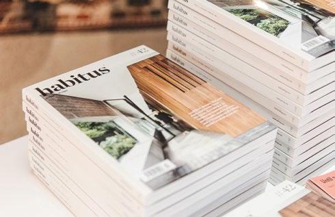
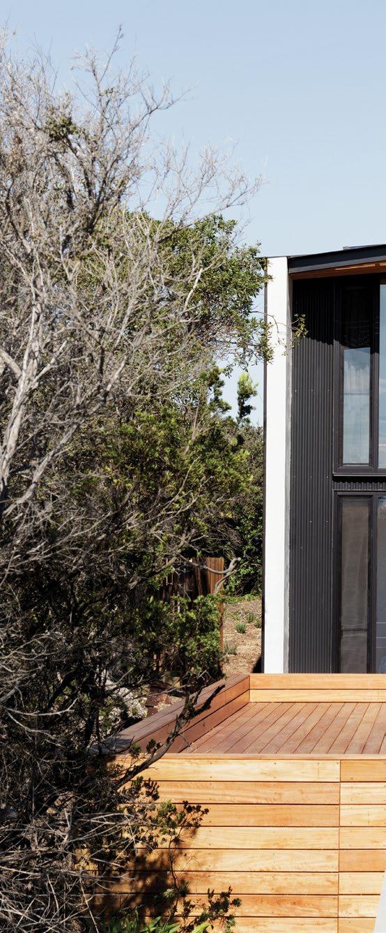
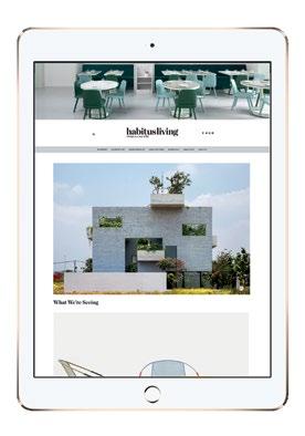
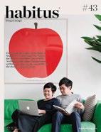
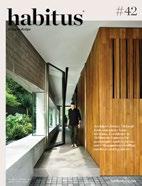
Everything has a place in the home of Singapore’s Studio Juju. The Nissen hut makes a comeback care of MPG Architects, and Tobias Partners pare architecture down to the essentials, in the Design Conscious issue.

MARCH – MAY | 2019 AUD$17.95 | NZ$17.95 | SGD$13.95
#43
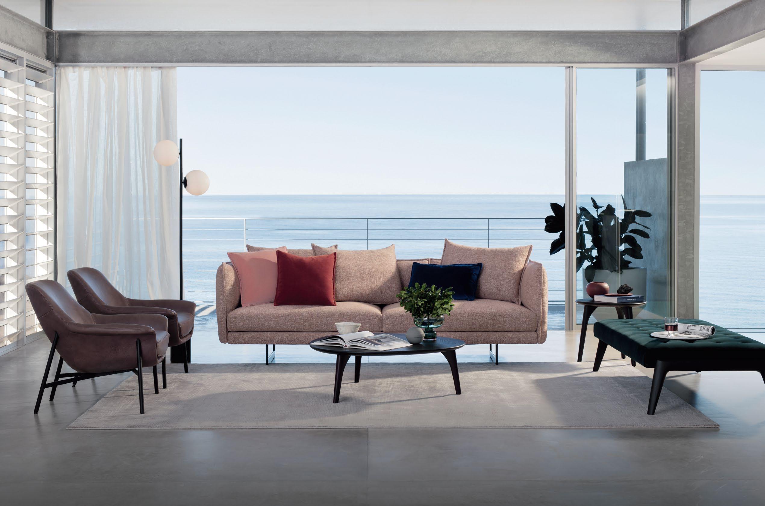
Polder sofa evokes its designer’s native landscape; a patchwork of fields cleft by dykes and canals. Fusing craft and industry with her unique affinity for colour, Hella’s designs are authentically timeless.
livingedge.com.au
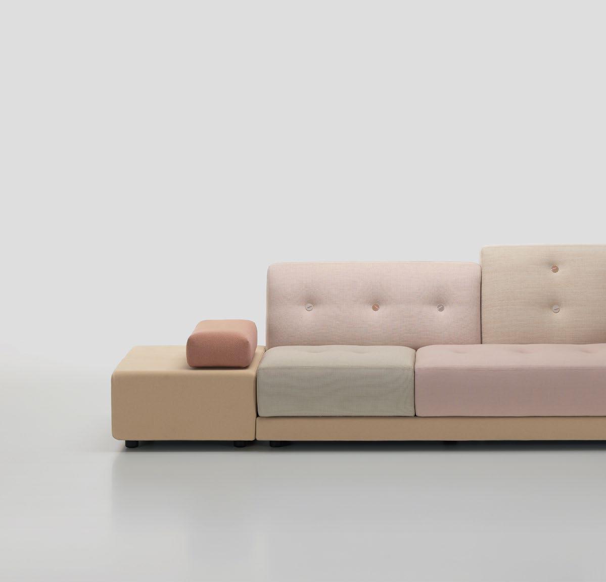
Polder Sofa
Hella Jongerius, Designer – Vitra










JOIN THE WORLD OF THE

Redefining Surfaces. Redefining Limits.
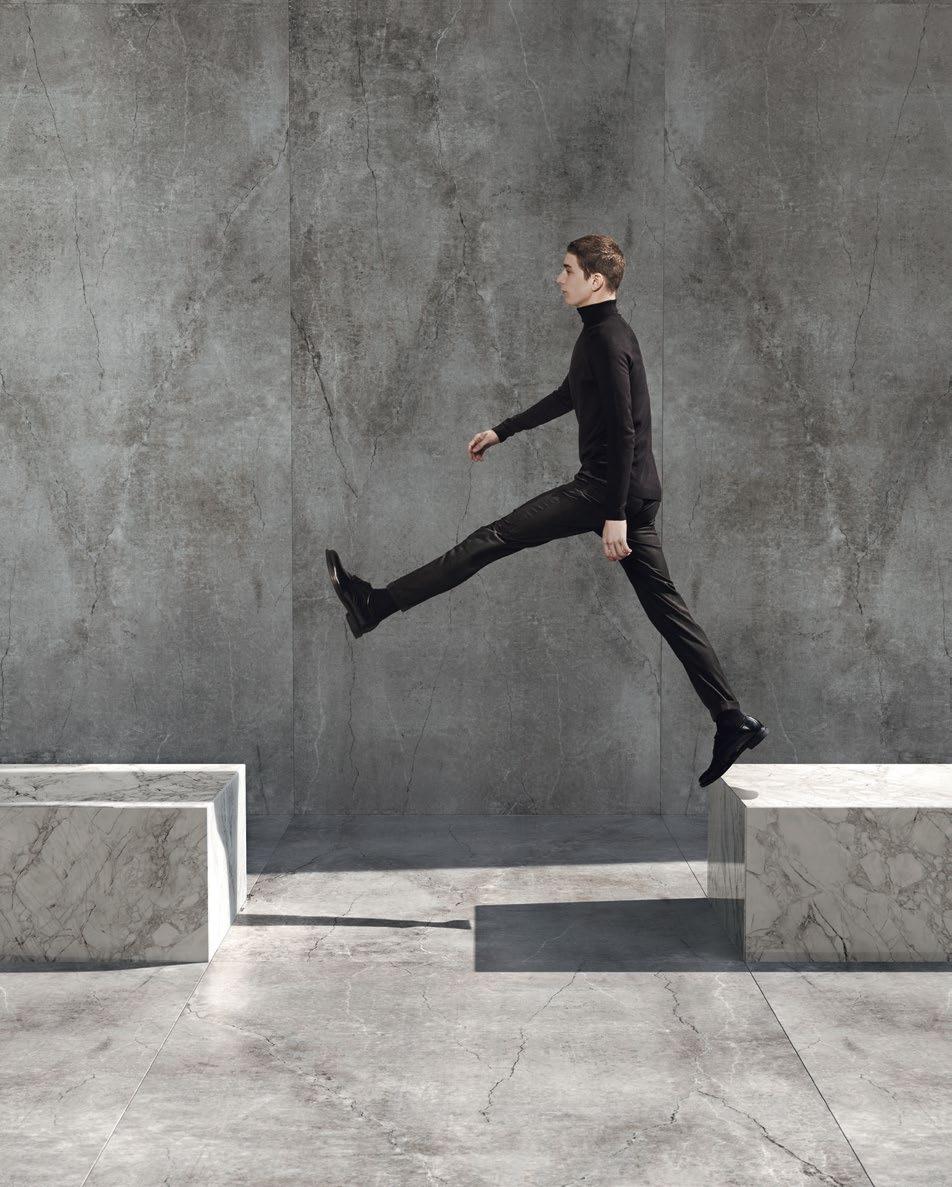
Dekton Ultracompact breaks down architectural boundaries and reimagines spaces to become infinite.
We have redefined concepts to create a revolutionary and versatile material with a unique design, format and resistance.
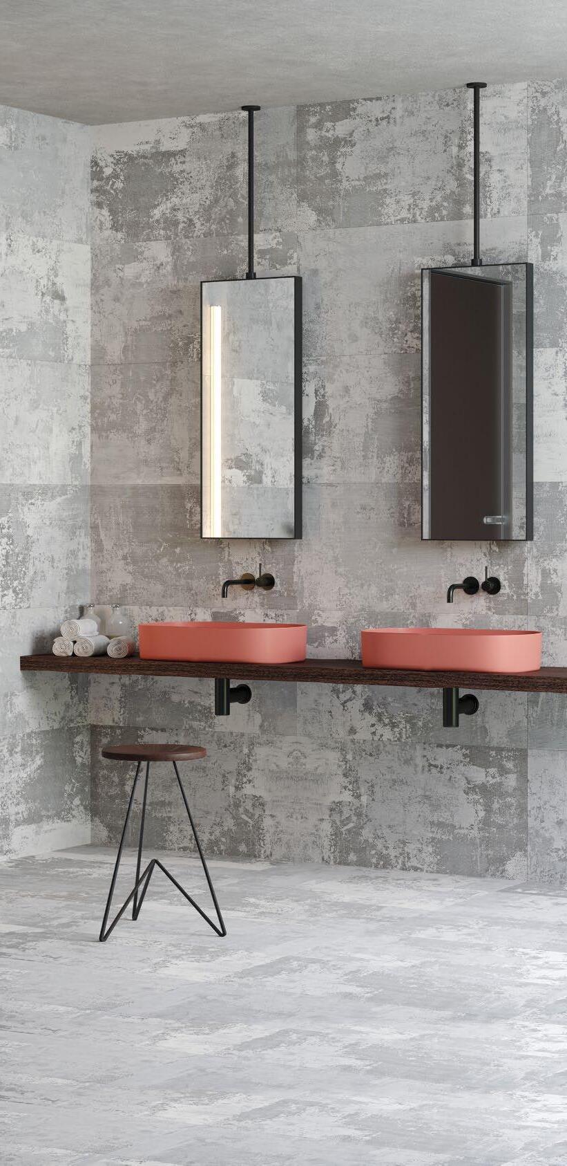
Wall/flooring colour Dekton Industrial Soke NEW Modules colour Dekton Stonika Bergen NEW
Find out more about the 25 year Dekton warranty, look out inspiration and find resources at www.cosentino.com
COSENTINO AUSTRALIA & NEW ZEALAND Adelaide | Brisbane | Melbourne | Perth | Sydney | Auckland / Follow Us: F T
Function, form and purpose find their place in the selection of products that mark our regular Design News pages.
26 DESIGN NEWS
This issue, Habitus had collated a selection of design objects that clearly embody considered design. On the pages that follow expect to see receptive product designs that truly consider the user. This issue we are celebrating the thought process behind design.
How does one set themselves a part in an industry that is constantly creating and pushing the boundaries of what is possible? Learn how three creative have done just that.
40 STUDIO -GRAM
Dave Bickmore and Graham Charbonneau began their Adelaidebased architecture studio, Studio -Gram five years ago and in the years since have been dedicated – and decidedly successful – in reinvigorating South Autralia’s design landscape.
50 STUDIO JUJU
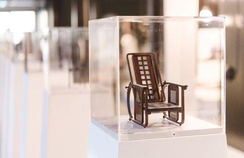
A fascination, one that is encroaching on obsession, with iconic, designer chairs and a penchant for playful, colour-blocked design marks the home of Studio Juju founders and co-directors Timo Wong and Priscilla Lui.
64 ANNA ROSS
New Zealand-born, Melbourne-based entrepreneur and founder of Kester Black, Anna Ross, has established her company with a design-led approach to cosmetics that gently educates consumers and proves ethics-based businesses can extend beyond viable to truly successful.
#43
50 26
Design Conscious
82 MATERIALITY EXPOSÉ: BAMBOO
Sustainable and structural, bamboo need no longer be seen as simply a decorative material.
94 THE PAVILION FRENZY
Is the fandom of the temporary architectural pavilion turning into folly?
102 SHADOW AN ARCHITECT
We see and celebrate finished architecture on a daily basis, but when do we discuss it from the point of view of an architect who is running multiple projects and processes at any one time? In the first of a new series, Habitus visits Koichi Takada Architects to uncover the above.
109 TRE MEZZO COLLECTION
Multidisciplinary design studio, Biasol Design, has found a new way to serve the design inclined.
Human nature is to desire to be closer to nature, but nature can be unforgiving. These residential projects use architecture to balance connection and protection.
114 HAXSTEAD GARDEN HOUSE
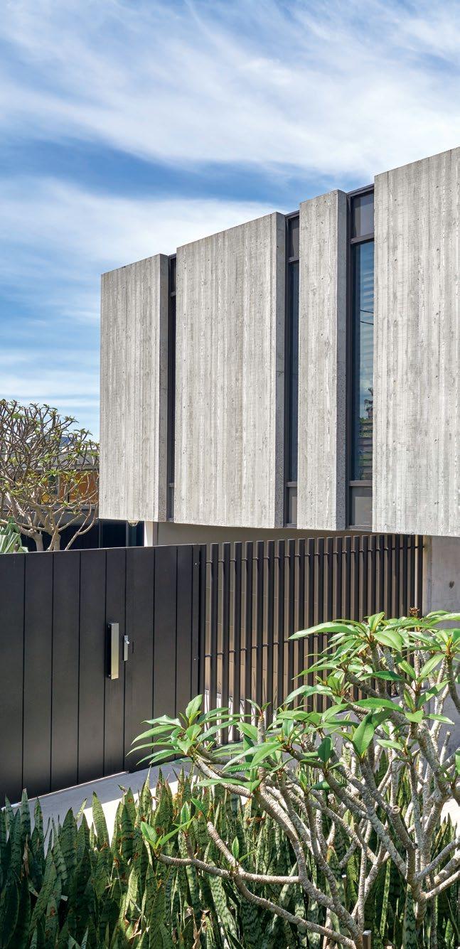
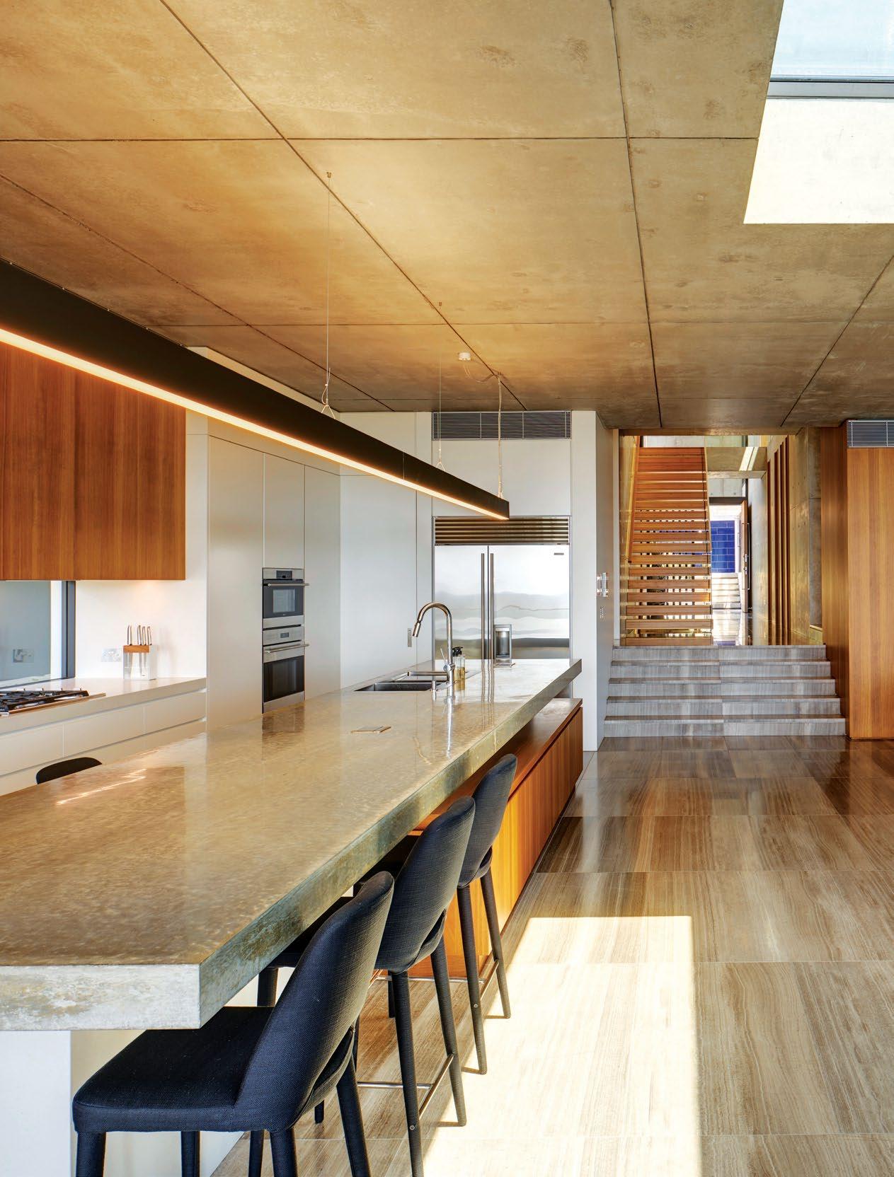
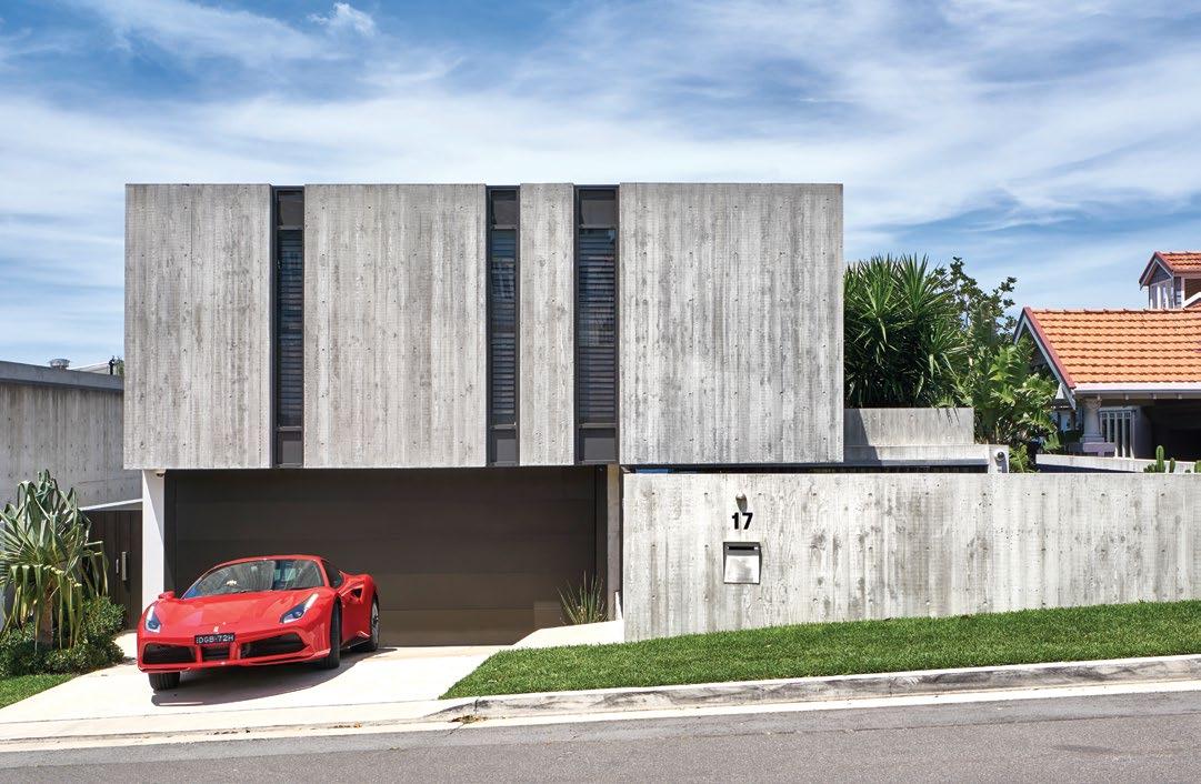
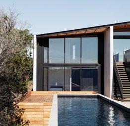
Less is considerably more when it comes to this residence by Tobias Partners. A simple palette of concrete, glass and steel allows the surrounding topography to shine.
128 BOOMER BEACH HOUSE
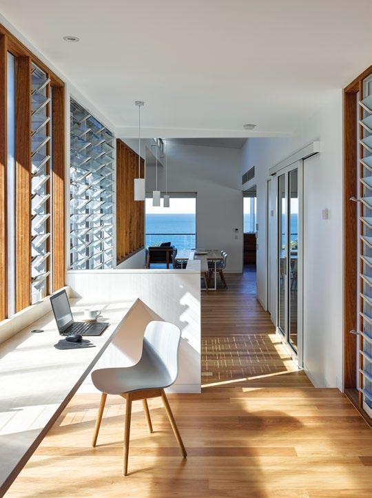
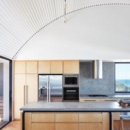
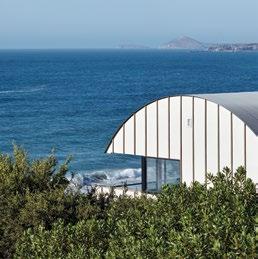
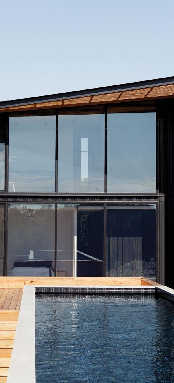
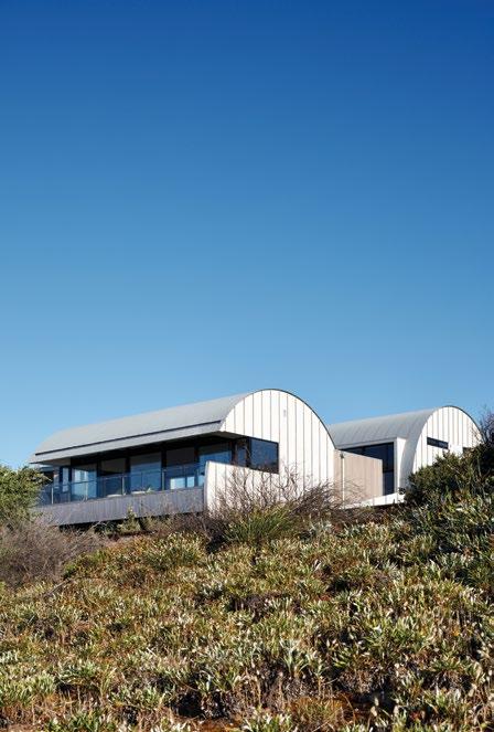
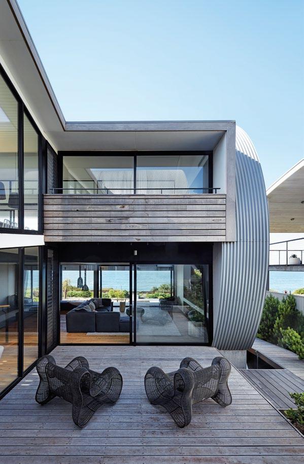
The iconic barrel-like forms of the Nissen hut characterise Boomer Beach House by Max Pritchard Gunner Architects, sitting lightly on the land in South Australia.
142 CLOISTER HOUSE
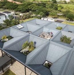
Situated in the tropics of Malaysia, Cloister House by Formwerkz takes the form of one large, single storey square demarcated inside by a series of rectangles and courtyards.
154 BARWON HEADS HOUSE
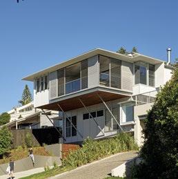
Lovell Burton has designed a residence for a couple nearing retirement in rural Victoria that can be partially and efficiently shut down or opened up according to need.
164 SUNSHINE BEACH HOUSE
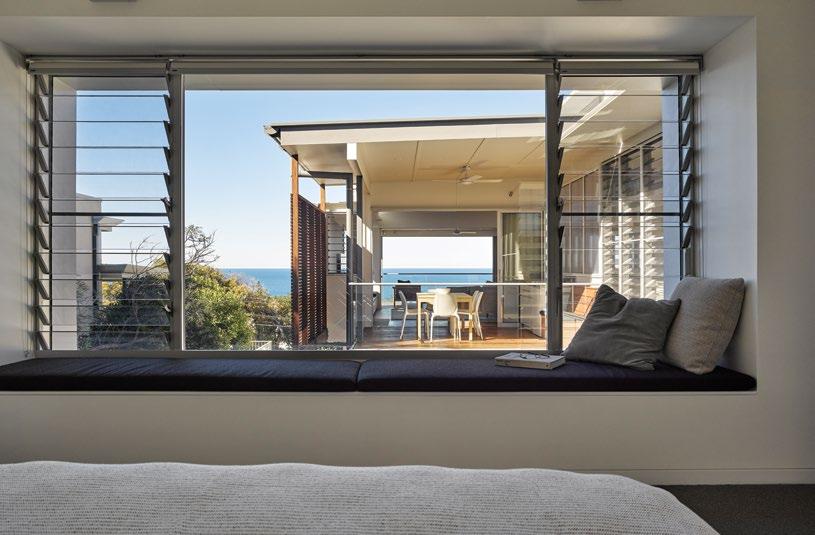
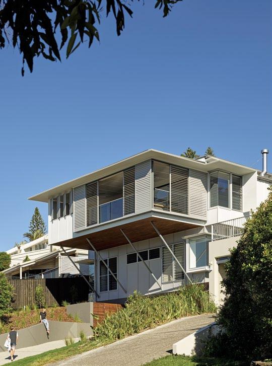
The London-based clients of Bark Architects for this holiday house skyped with the studio an estimated three times, happily leaving the architects to do what they do best.
176 GORDONS BAY HOUSE
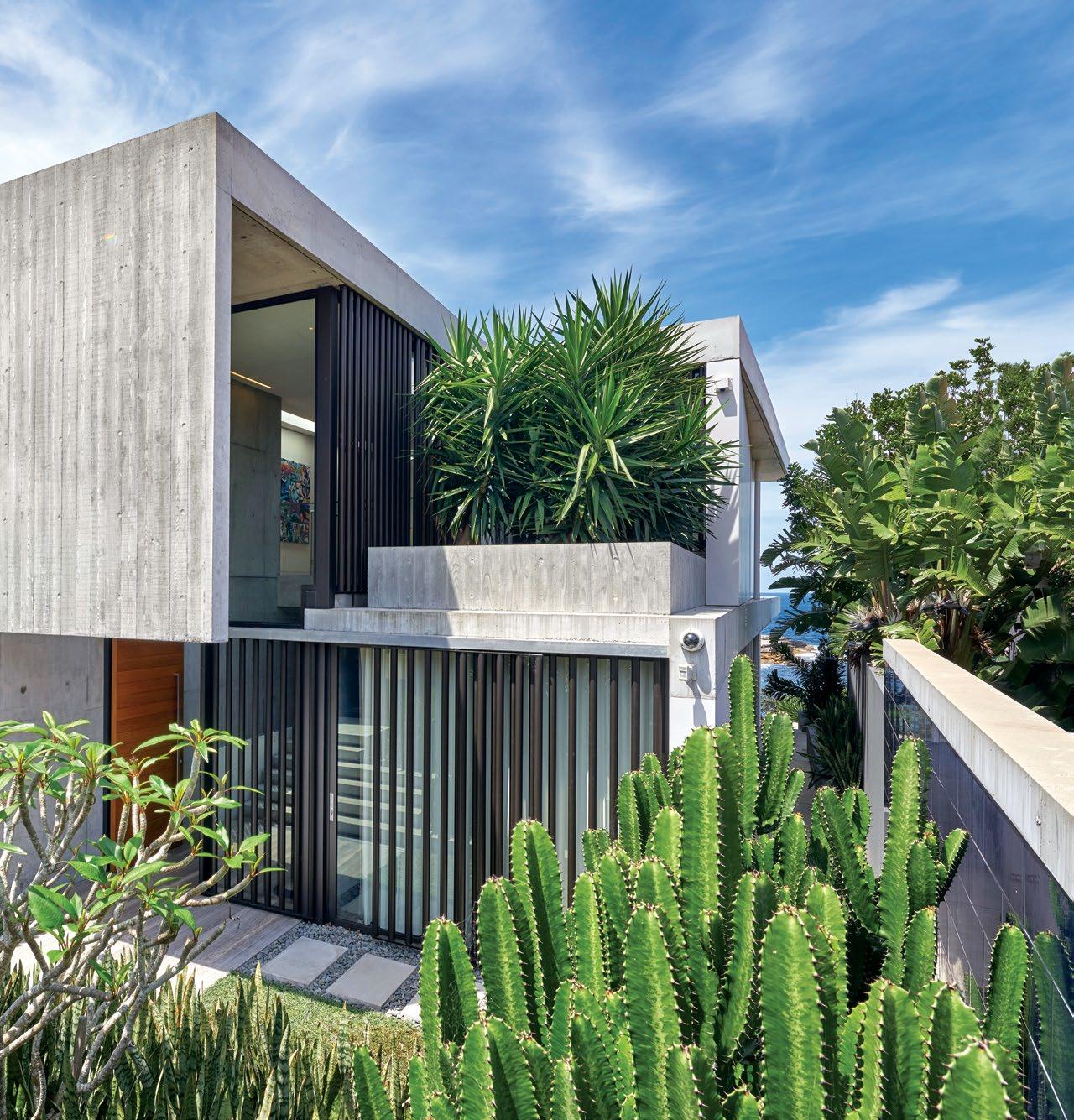
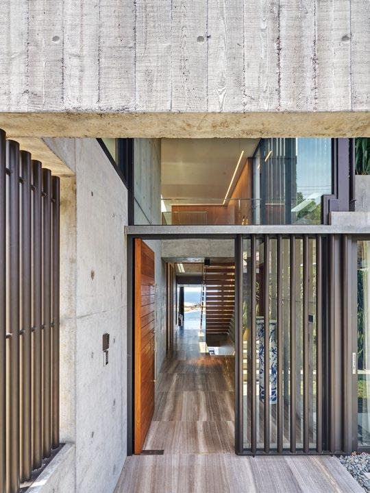
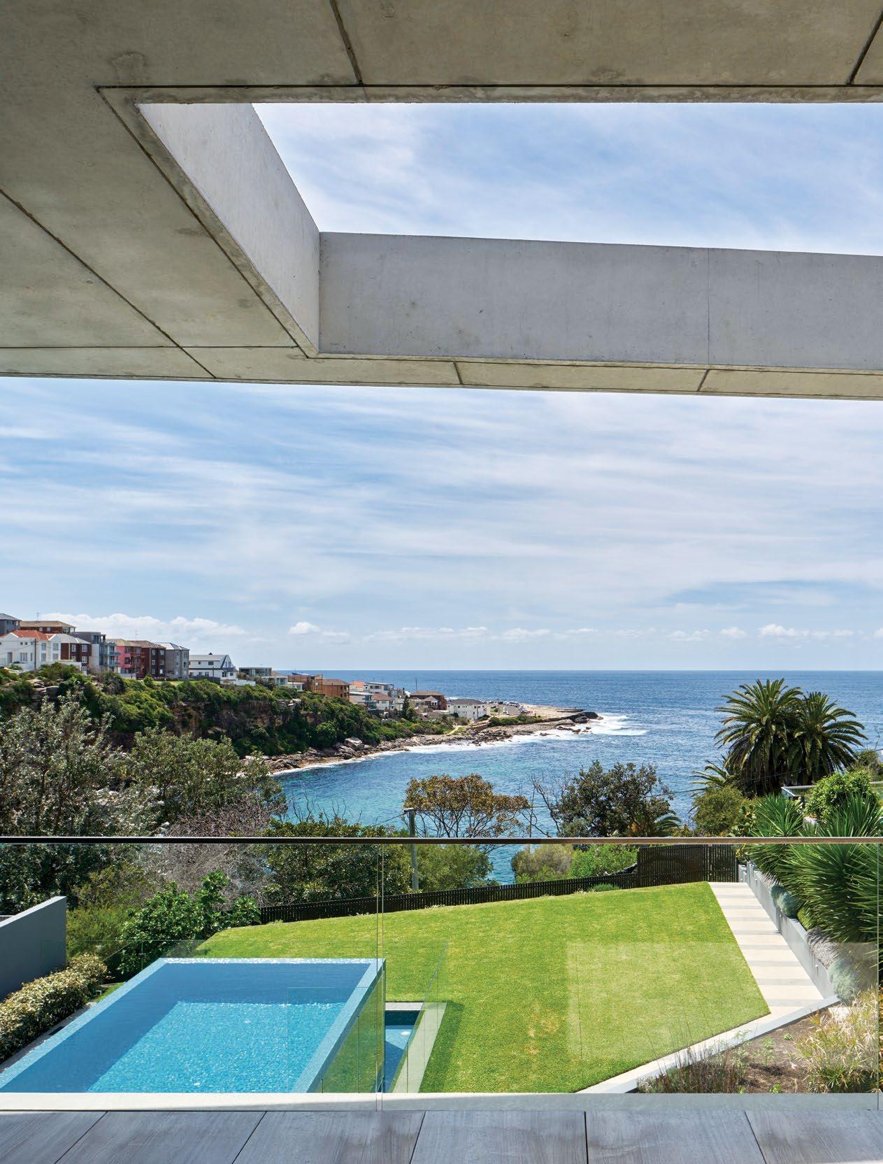
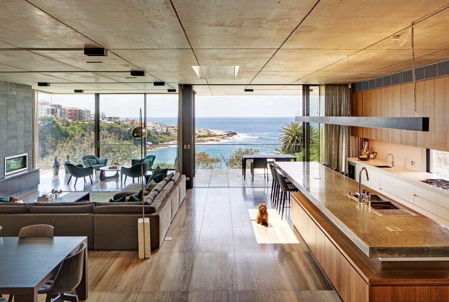
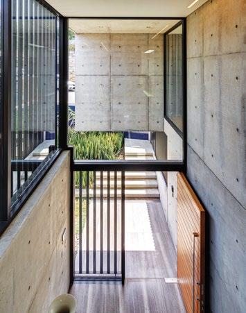
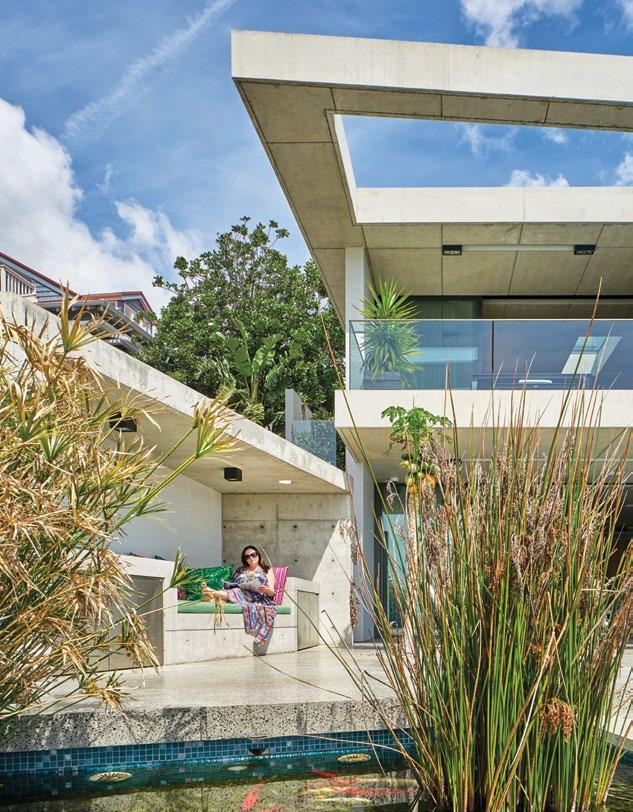
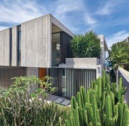
A concrete structure by PopovBass is characterised by hard lines along the coastline of Sydney’s Gordons Bay and gives little away to pedestrians passing by.
#43
128 94

DESIGNER RUGS - THE HOME OF LUXURY HANDKNOTS VISIT OUR SHOWROOMS TO EXPERIENCE OUR COLLECTION OF READY-MADE AND CUSTOM DESIGNER RUGS
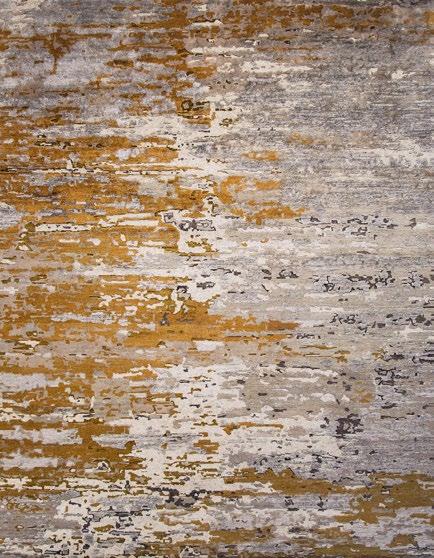
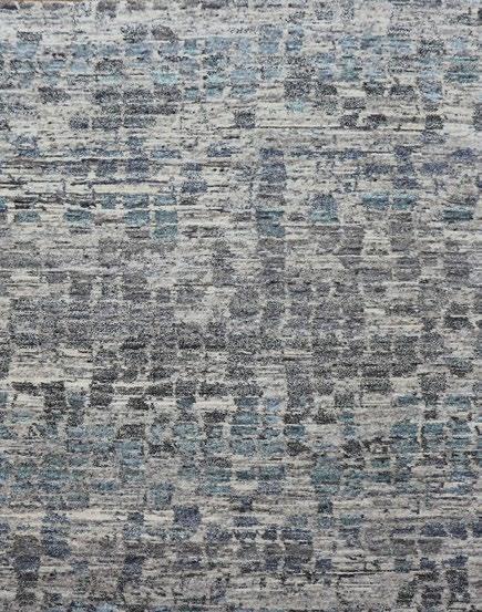
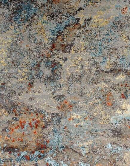
SYDNEY | MELBOURNE | BRISBANE | AUCKLAND
1300 802 561 | DESIGNERRUGS.COM.AU/HABITUS
Venus Chess
Amadeus
Aegean
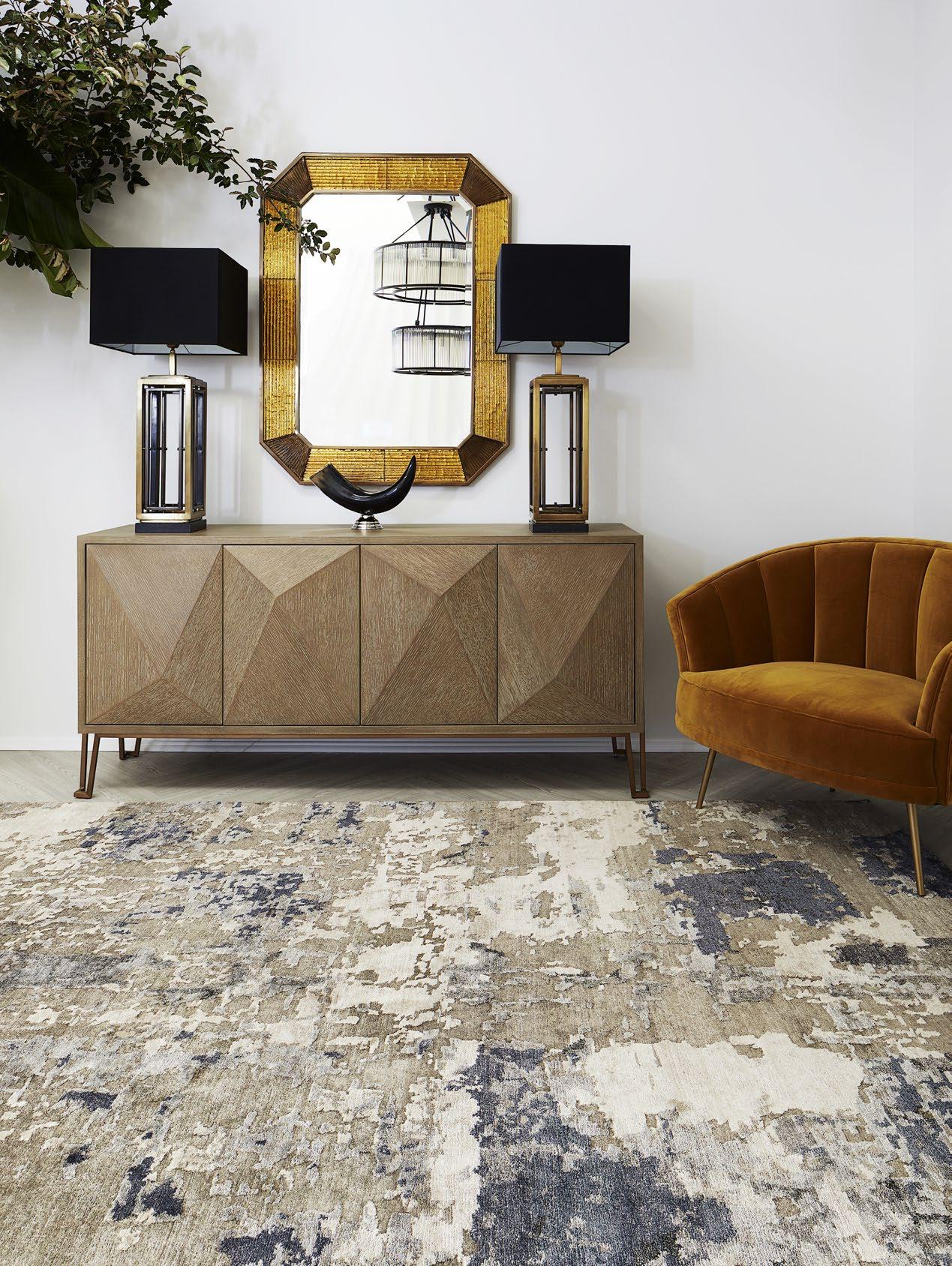
NIMBUS


PROUDLY PARTNERED WITH


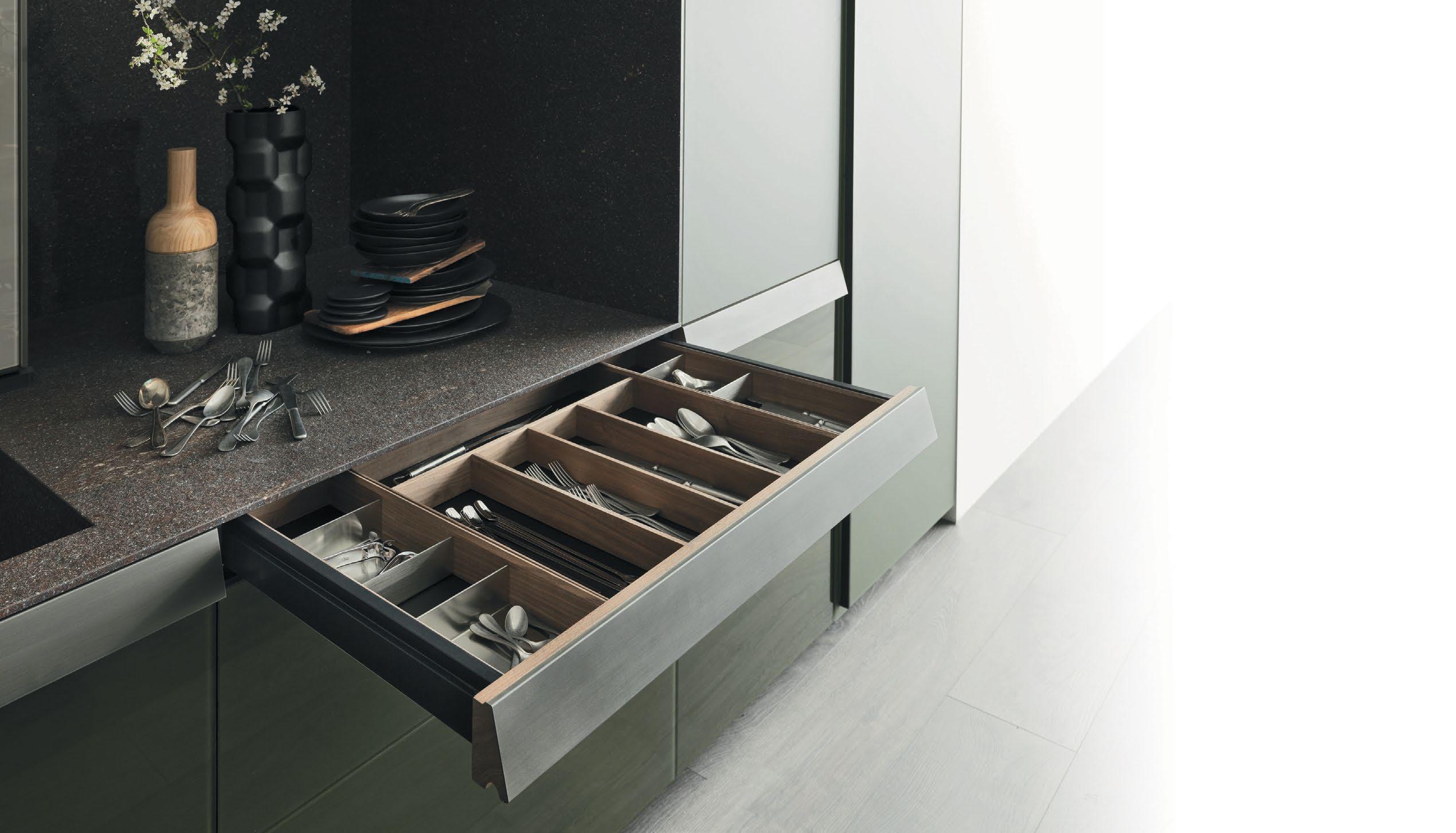 VALCUCINE KITCHEN EXCLUSIVE TO ROGERSELLER | HOMEPAGE PHOTOGRAPHY BY ANDY MACPHERSON
Kitchen drawers are for cutlery, not paper trails.

Say goodbye to folders stu ed with documents. Now all project and home-related information can be uploaded to a secure, personalised online hub.

MAKE HANDOVERS, RENOVATIONS AND HOME MANAGEMENT EASY.


See how simple it can be at HOUSELAB.COM.AU


 POWERING PAPERLESS HOMES STRATEGIC PARTNERS

Be immersed. Abey Australia’s diverse range of sinks provides you with a selection from around the world. Visit an Abey Selection Gallery to immerse yourself in the collection. Barazza Cubo Double Bowl VICTORIA Selection Gallery 335 Ferrars St Albert Park Ph: 03 8696 4000 WESTERN AUSTRALIA Selection Gallery 12 Sundercombe St Osborne Park Ph: 08 9208 4500 NEW SOUTH WALES Selection Gallery 1E Danks St Waterloo Ph: 02 8572 8500 QUEENSLAND Selection Gallery 94 Petrie Tce Brisbane Ph: 07 3369 4777
the first word
Get carried away holding tight to your sense of purpose
What pushes us to create? Is it our natural inclination to design, craft and construct? Perhaps a desire to exist for a moment in the realms of our imagination – a desire championed by infancy and youth yet cast aside as time passes and responsibility rolls in. Or maybe it’s the utter thrill of solving a user-driven puzzle in which design often results. Maybe a combination of all three.
This issue, the Design Conscious issue, we chose to look at how architects and designers reconcile the desire and ability to create – and the ideas that snowball in the process – with the need to promote function and avoid the superfluous.
The apartment of Singapore-based Timo Wong and Priscilla Lui of Studio Juju is on the cosy end of the spectrum, so there’s no room for excess. Instead, it’s filled with design pieces that matter and make a difference.
Stephen Todd looks at the ever-escalating scale and popularity of the temporary architecture pavilion: what can an impermanent structure offer to the design community? Or is it folly and simply another outlet promoting starchitecture?
We see the malleability of a site in rural Victoria that once was a holiday destination and now, at the hands of Lovell Burton Architecture, a primary residence that can expand and contract efficiently according to need. While Formwerkz has completed a single-storey residence in Malaysia dotted with internal glass courtyards that offer intriguing sightlines from countless positions throughout the house.
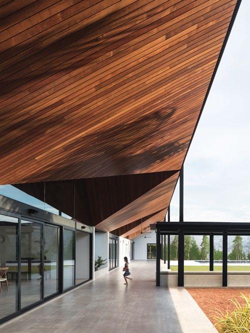
As you thumb through the pages that follow, we hope your imagination is fuelled by the endless array of what is possible in solution-driven design.
HOLLY CUNNEEN | EDITOR
habitus takes the conversation to our contributors discovering their inspiration and design hunter® journeys
LEANNE AMODEO

WORTH THEIR WEIGHT #40
As an Australian content and media strategist, Leanne is constantly contributing to various architecture and design publications. She believes that designers can shape the world, especially since the role of design entails the power to “change and benefit any end-user”.


ALICE BLACKWOOD
GENTLE ACTIVISM #64
As the editor of Indesign magazine, Alice is a passionate supporter of the Australian design industry. With over 10 years’ experience, she has come to appreciate the power of design as a tool for social and environmental consciousness. She believes building longevity, versatility and flexibility into objects and built environments is key to making design accessible and cultivating a positive ‘ripple’ effect that reaches beyond the individual.
KHOO GUO JIE

SIT BACK AND ENJOY #50
Curious about architectural forms, space and objects, Khoo Guo Jie’s role as one half of Studio Periphery leads to an eclectic portfolio. Constantly challenging his perspectives, to stray away from becoming complacent, he believes that it allows him to “break-free from the chain of ignorance and seek for progression”.
MARGIE FRASER
WHALE WATCH #164
Based in Brisbane, Margie is a freelance writer for all things related to design. With more than 20 years of experience, she believes the notion of Design Conscious to embrace an understanding of how design can improve, with nuance, the physical environment that inculcate emotional well being.

OLHA ROMANIUK
TROPIC WONDER #82
“It is important not to underestimate the power that good design can have to shape our behavior and the environment around us,” says Olha as she discusses the capabilities of design. Architect by training and writer at heart, Olha’s diverse portfolio reflects how Design Conscious can go beyond pure aesthetics and trends to address design’s meaning and purpose.
PAUL MCGILLICK CONCRETE POETRY #176
As Habitus ’ founding editor, Paul explains: “design is not a four-letter word, but often it sounds like one because people so often forget that design is an inevitable part of life, not an optional luxury. What about designing your life, for example? Not an option, but an imperative. Design is not an accident. Conscious or otherwise, design shapes our world.”


RORY GARDINER THE PERFECT PLAYGROUND #154
An Australian-born, and for a time London-based, photographer, Rory constantly takes photos of people and places. What separates him from the rest is his ability to bring reflexivity to his work as a conscious way of being sensitive to broader contexts. He believes that the potential for progress is truly dependant on challenging “what has come before”.
SAM NOONAN CURVED DELIGHT #128
As an architectural photographer, Sam always sees design in a new light. Interested in the ways that shadows can shape – or frame – certain experiences, he believes that designers have a powerful role of contributing positively to society, and adding beauty along the way. “We all see the world through our own lenses,” thus, Sam believes that in order to confirm whether we are on the right track, it is important to challenge perspectives.
Discover the best design products for home and living.
The Habitus Collection Online gives Australian Design Hunters instant access to the best design products for residential environments. We take the hard work out of product selection, hand-picking the best design products available in the region. All in a single, comprehensive digital touch-point.
habitusliving.com/collection
CHAIRMAN & FOUNDER
Raj Nandan raj@indesign.com.au
CONSULTING EDITOR
Paul McGillick
EDITOR
Holly Cunneen holly@indesign.com.au
SE ASIA CO-EDITORS
Janice Seow janice@indesign.com.sg
Narelle Yabuka narelle@indesign.com.sg
EDITORIAL ASSISTANTS
Andrew McDonald andrew@indesign.com.au
Thida Sachathep thida@indesign.com.au
ASSOCIATE ART DIRECTOR
Betty Wong betty@indesign.com.sg
CONTRIBUTING WRITERS
Leanne Amodeo, Alice Blackwood, Chu Lik Ren, Stephen Crafti, Margie Fraser, Susan Muldowney, Olha Romaniuk, Stephen Todd
CONTRIBUTING PHOTOGRAPHERS
Justin Alexander, Rory Gardiner, Benjamin Hosking, Christopher Frederick Jones, Khoo Guo Jie, James Morgan, Michael Nicholson, Sam Noonan, Fabian Ong, Ethan Rohloff, David Sievers
MANAGING DIRECTOR
Kavita Lala kavita@indesign.com.au
BRAND DIRECTOR
Colleen Black colleen@indesign.com.au
(61) 422 169 218
ACCOUNTS
Ting Zhang ting@indesign.com.au
Anita Arbita anita@indesign.com.au
ONLINE MANAGER
Radu Enache radu@indesign.com.au
WEB DEVELOPER Ryan Sumners ryan@indesign.com.au
BUSINESS DEVELOPMENT MANAGERS

Kim Hider kim@indesign.com.au
Danielle Nichols danielle@indesign.com.au
Laura Hicks laura@indesign.com.au
CLIENT LIASON
Dana Ciaccia dana@indesign.com.au
CAMPAIGN SUCCESS EXECUTIVE Brydie Shephard brydie@indesign.com.au
COVER IMAGE
Studio Juju (p.50)
Photography by Khoo Guo Jie
HEAD OFFICE
Level 1, 50 Marshall Street, Surry Hills NSW 2010 (61 2) 9368 0150 | (61 2) 9368 0289 (fax)
MELBOURNE
1/200 Smith St, Collingwood, VIC, 3066 SINGAPORE
4 Leng Kee Road, #06–08 SIS Building, Singapore 159088 (65) 6475 5228 | (65) 6475 5238 (fax)
HONG KONG
Unit 12, 21st Floor, Wayson Commercial Building, 28 Connaught Road West, Sheung Wan, Hong Kong indesign.com.au
have. We may also provide this information to parties who provide the products or services on our behalf (such as fulfilment organisations). We do not sell your information to third parties under any circumstances, however, these parties may retain the information we provide for future activities of their own, including direct marketing. We may retain your information and use it to inform you of other promotions and publications from time to time. If you would like to know what information Indesign Media Asia Pacific holds about you please contact Nilesh Nandan (61 2) 9368 0150, (61 2) 9368 0289 (fax), info@indesign.com.au. Habitus magazine is published under licence by Indesign Media Asia Pacific. ISSN 1836-0556
issue #43 habitusliving.com
Printed in Singapore. All rights reserved. No part of this publication may be reproduced, stored in a retrieval system, transmitted in any form or by any other means, electronic, mechanical, photocopying, recording or otherwise. While every effort has been made to ensure the accuracy of the information in this publication, the publishers assume no responsibility for errors or omissions or any consequences of reliance on this publication. The opinions expressed in this publication do not necessarily represent the views of the editor, the publisher or the publication. Contributions are submitted at the sender’s risk, and Indesign Media Asia Pacific cannot accept any loss or damage. Please retain duplicates of text and images. Habitus magazine is a wholly owned Australian publication, which is designed and published in Australia. Habitus is published quarterly and is available through subscription, at major newsagencies and bookshops throughout Australia, New Zealand, South-East Asia and the United States of America. This issue of Habitus magazine may contain offers or surveys which may require you to provide information about yourself. If you provide such information to us we may use the information to provide you with products or services we
THE NEW KITCHEN ESSENTIAL
All your drinking water needs, All-in-One beautifully designed system. Remove the need for multiple taps in your kitchen with a single, beautifully designed system that delivers boiling, chilled and sparkling filtered drinking water, as well as hot and cold unfiltered water for your sink.
The Zip HydroTap All-in-One offers every water option you need from one multi-functional tap and a single intelligent compact under-bench system. That’s why the Zip HydroTap will be the one and only hydration solution for your kitchen.
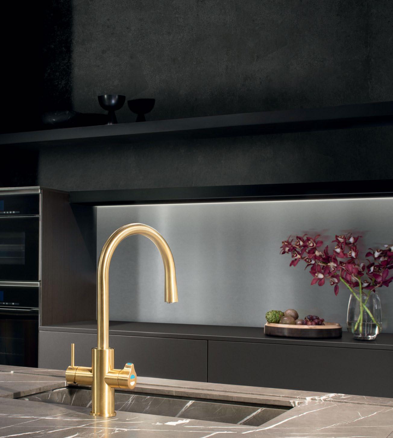
Discover more at zipwater.com


THE WORLD’S MOST ADVANCED DRINKING WATER SYSTEM
ZIP HYDROTAP | PURE TASTING | INSTANT | BOILING | CHILLED | SPARKLING
Habitus is your authority on the very best, residential architecture and design across the Indo Pacific.
We stop at nothing to obtain and share the story behind the story.
Chairman & Founder, Indesign Media
Raj Nandan
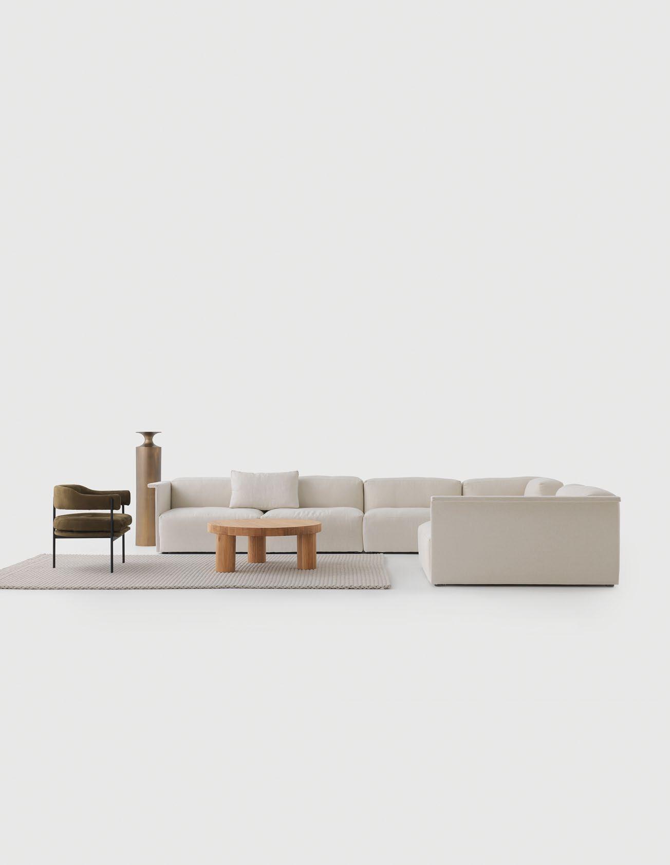
district.com.au @district_au Introducing Arcade by Resident
Your voice, your region, your awards Tickets on sale now Celebrating the most progressive architecture and design in the Indo-Pacific region. Book your seat at the INDE.Awards Gala 21 June, Melbourne indeawards.com
Design all the way through
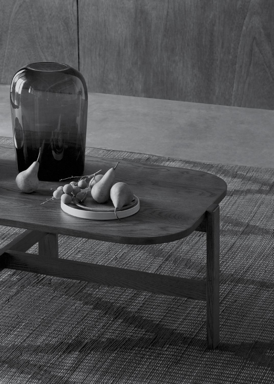
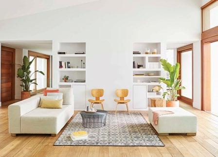
Make a house a Home
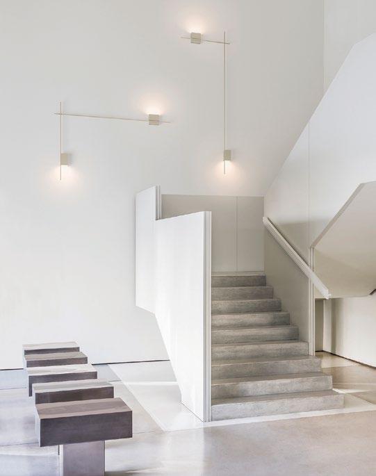
With the design of the STRUCTURAL lighting series, designer Arik Levy created an innovative system where light, architecture and sculptural form come together. Structural traces existing spatial design, connecting points of light and joining planes that underline its architectonic character.
vibia.com
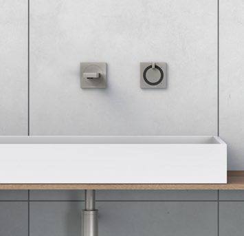
In 2014 and 2017, Phoenix Tapware claimed recognition at the iF Design Awards and the German reddot awards respectively for the ORTHO Collection. Upon examining the features of Ortho, it’s easy to see why. Its modern yet stylishly minimalist design and efficient energysaving features have marked it out as a revolutionary addition to contemporary washroom design. Classic, geometric shapes meet simple stylish finishes.
phoenixtapware.com.au
The present day HIDRAULIC rug from Gan features delicate geometric patterns in an elegant rug that recreates the hydraulic flooring design of early 20th century buildings.
gan-rugs.com
issue #43 habitusliving.com
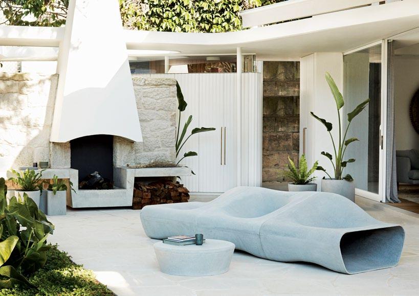
The latest product collection from Robert Plumb is a catered offering from Swiss design company Swisspearl , which includes the iconic WILLY GUHL designs. Made from a unique blend of cement, powdered limestone, cellulose and synthetic fibres, water and air, the range is light, strong and is resistant to outdoor elements.
robertplumb.com.au
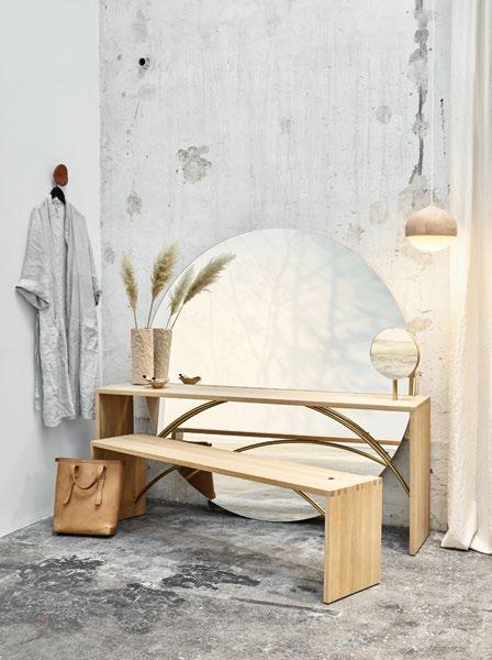
From Eva Harlous for Mater, GRACE is an elegant mirrored vanity named after Grace Kelly. A modern interpretation of the classic dressing table or the French poudreuse, Grace is a stylish nod to the classic Hollywood films of the 1920s and 1930s that often depicted the femme fatale sitting at her elegant vanity table in the bedroom or dressing room.
materdesign.com
1 . lightbox # 27
Textural elements
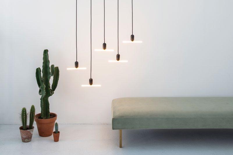
A new voice in lighting design, BEEM is a collaboration between Samuel Wilkinson and LED specialists Chris Stimson and Bujar Shkodra . BEEM offers playfully designed luminaires with soft-filament LED technology, offering light for up to 25,000 hours.
beemlamps.com
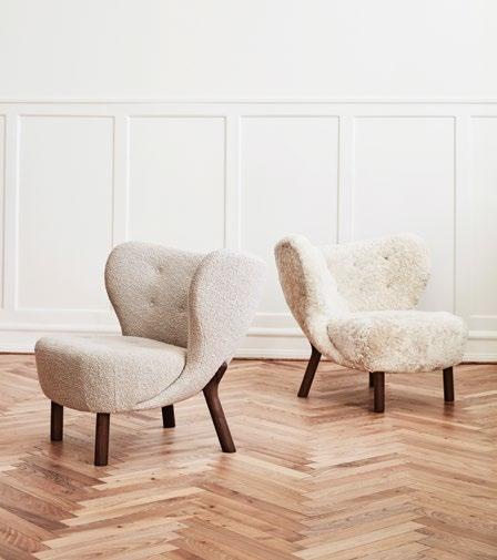
Young in age but mature in values, &tradition was launched in Denmark in 2010 with the desire to bridge the ideals of Nordic tradition to contemporary design. Available in Australia through Cult , &tradition initially operated as a lighting brand, but now offers a collection that spans an array of world-class furniture from established and emerging designers.
cultdesign.com.au

issue #43 habitusliving.com
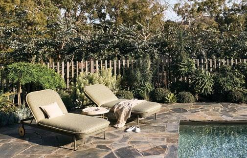
Natural curves meet plump upholstery in the latest addition to Tait ’s TRACE collection by Adam Goodrum . Trace demonstrates a finesse for organic form. The sunlounge evokes poolside indulgence and effortless summer afternoons with the sound of water lapping and the cool relief of the sea breeze.
madebytait.com.au
The NANOLEAF CANVAS is the world’s first ever touch controlled smart light with built in music synchronisation. The light reacts to your unique gestures, allowing you to turn it on and off, adjust brightness, switch animations and activate music visualisation at a mere touch.
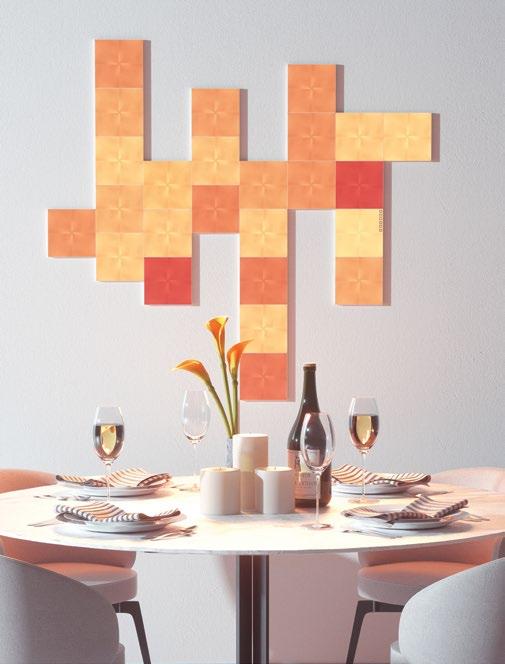
nanoleaf.me
The OFFSET dining table from New Zealand’s Resident is the result of a fortunate accident. When designer Philippe Malouin was trying to align table base to table, the alignment was never perfect –ironically creating a perfect contemporary table design. The offset alignment of the dining table is a charming and eye-catching functional result.
district.com.au

1 . lightbox # 29
Atmosphere enhancing
From Ross Gardam comes the NEBULAE Collection. Inspired by the diffusion of natural and LED lights, the geometric machined forms work with the fluid glass discs to create a unique balance. The chandelier can be composed in a variety of hanging configurations of various lighting amounts. Currently one, two, three and five hanging options are available, with more to come.
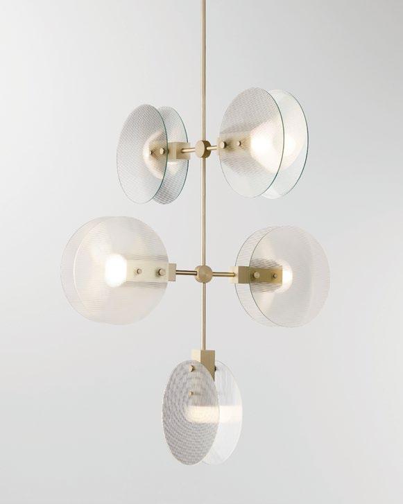
stylecrafthome.com.au
Schock invented the quartz composite sink and has been constantly reinventing it ever since. The newly released WEMBLEY range showcases this. Made from the Premium Cristadur material, the range sets extraordinary standards in terms of surface feel, practicality and aesthetics including a curvaceous bowl.
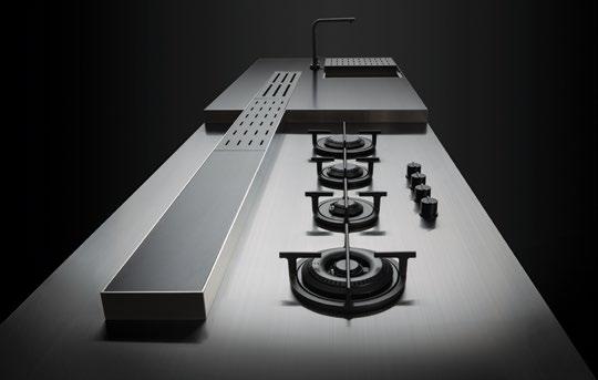
abey.com.au
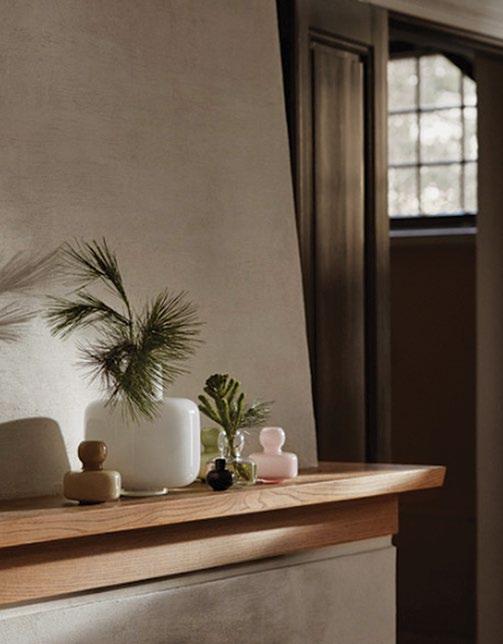
When designing the URNA , MING , and FLOWER vases, Carina Seth Andersson drew inspiration from geometric forms. The subtle colours and timeless lines of the mouth-blown vases are designed for life. As minimalistic table centrepieces or functional vases, the trio leave plenty of room for creativity.
marimekko.com
issue #43 habitusliving.com
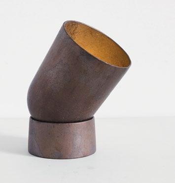
SPOT LIGHT is a direct, sculptural light cast in two parts from solid gunmetal bronze. Manufactured in small batches from Studio Henry Wilson , slight variations will leave you with a unique product to cherish as it lights up your space.
henrywilson.com.au
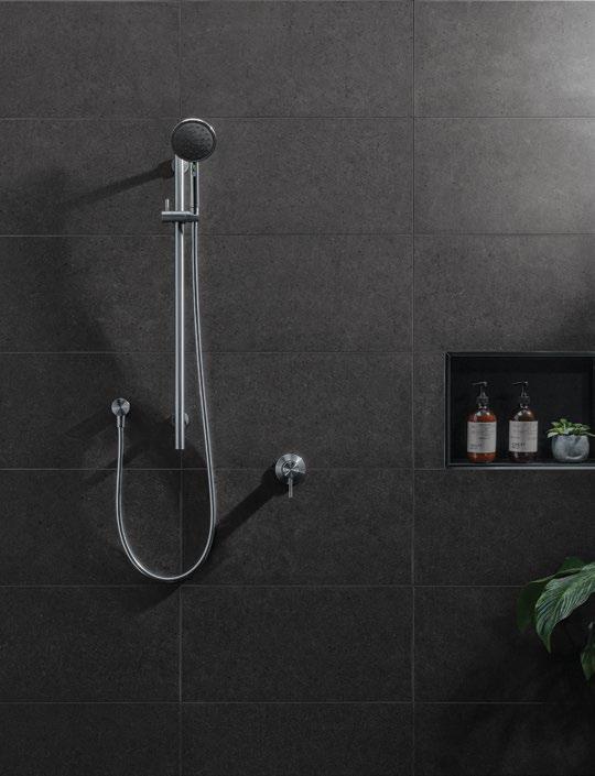
For the New Zealand design and engineering team at Methven , the VJET TŪROA was a personal project. Inspired by the familiar forms of New Zealand, the shower offers an intuitive, precisely balanced and distinct design. With VJet technology, the result is a simple, easy to use unit that provides a unique tailored showering experience like no other. The VJet’s cleverly hidden channels create spirals of water released through individual nozzles, personalised by you.
methven.com
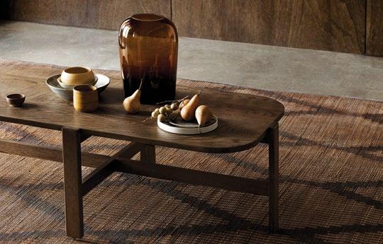
Designed by Anne-Claire Petre , founder of Anaca Studio, the new ANACA collection exudes a sense of relaxed sophistication and evocative curves, while introducing a fresh, subtly masculine appeal.
anacastudio.com.au
1 . lightbox # 31
Mixing materials
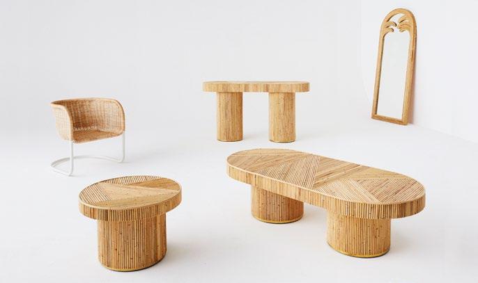
Continuing Sarah Ellison’s coastal design aesthetic, the GOLDEN collection of furniture was inspired by the Golden era of post-mid century furniture design of the late 1960s and 1970s. Images of long Australian summers come to mind in the aesthetically charming, yet utterly functional collection, which explores new means of employing rattan in furntiure design.
sarahellison.com.au
Caesarstone is known for its creative and innovative quartz surface finishes, including several terrazzo designs that cleverly meld contemporary sophistication with industrial textural aesthetics. Terrazzo finishes can make any wall, floor, benchtop or vanity an artisanal surface that’s practical and stylish.
caesarstone.com.au
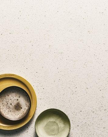
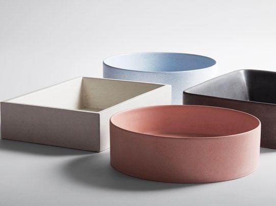
The NUECRETE basin range from Studio Bagno, available at Candana , sees three versatile shapes that can suit multiple benchtops and bathrooms. Hand-crafted and moulded from fibre-reinforced concrete, all basins are sealed with a non-porous finish that’s durable, maintainable and easy to clean, ensuring the charm of concrete remains for years.
candana.com.au
issue #43 habitusliving.com
Redefining the bespoke worktop.
The difference is Gaggenau.
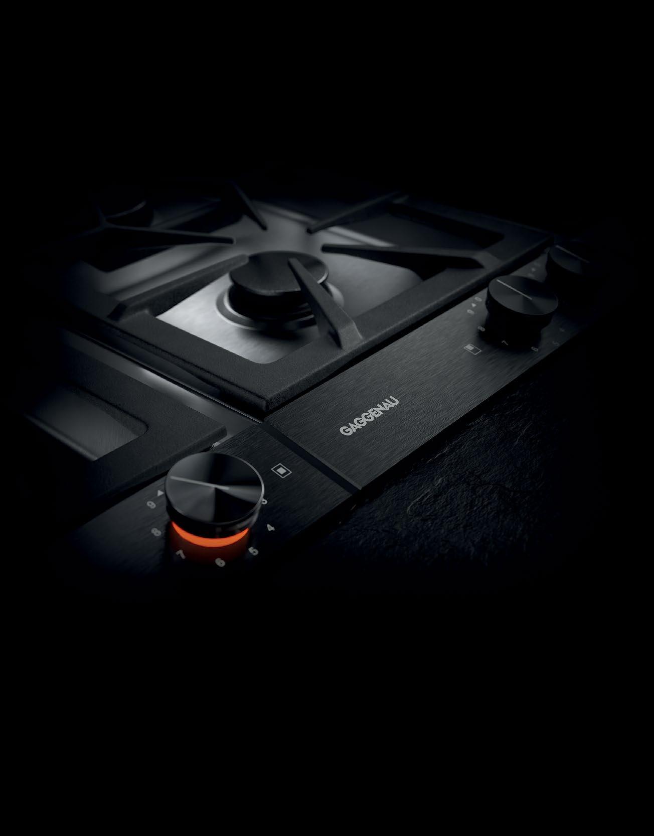
A product of European engineering and the highest quality materials, the modular 200 series vario cooktop range has been extensively redesigned. Iconic in form and essential in function, the cooktops include the addition of the quintessential Gaggenau control knob in black, anodized aluminium finish. Synonymous with the brand’s minimalist, pure design, the control panel has also been re-created to complement the 200 series ovens and steam ovens. Make a statement: gaggenau.com.au
Let your personality shine pieces
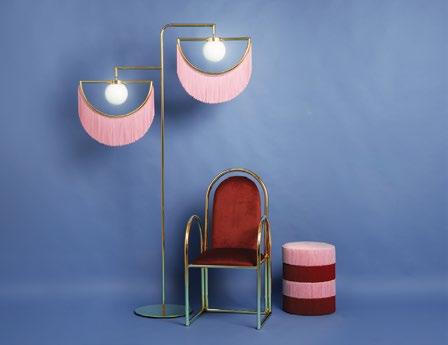
Spain’s Masquespacio and Houtique have established a new long-term design partnership, and marked this occasion with a new suite of products. The MAMBO armchair has been designed to bring the past to the future and reinvent traditional ideas, and is paired well with the playful CHACHACHÁ PILL pouf. A highlight of the range is the almost sculptural WINK standing lamp, which winks to us from the heights, while the wall edition makes the perfect complement for any wall in search of a designer flourish.
houtique.es
COMPOSITE is a collection born of collaboration between leading carpet designer, Brintons , and jewellery designer, Studio Elke . The range of wall-to-wall carpet designs reference Studio Elke’s decade-long archive of jewellery collections, translated into two dimensioal designs that are plush and soft to the touch. brintons.com.au
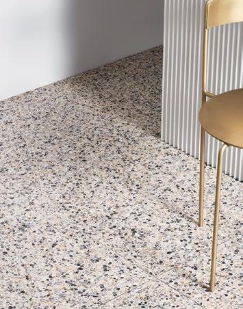
Fibonacci Stone ’s new ANKLE DEEP Collection is inspired by the raw beauty of the Australian landscape, and is steeped in the colours and the spirit of Australia Felix. Our unique Antipodean light, lifestyle and landscape calls for products that work within our own design vernacular where the elements are involved with each other and not just mixed together.
fibonaccistone.com.au

issue #43 habitusliving.com
The difference is Gaggenau.
Combining so-called contradictory elements is an art we have perfectly mastered. Our iconic design exudes an irresistible charisma even in its uncompromising minimalism. Demonstrated by our 200 series above, the stunning composition in Gaggenau Anthracite or Metallic elegantly blends into every interior design. Far from being opposites, statement and understatement are united in perfect harmony. Make a statement: gaggenau.com.au
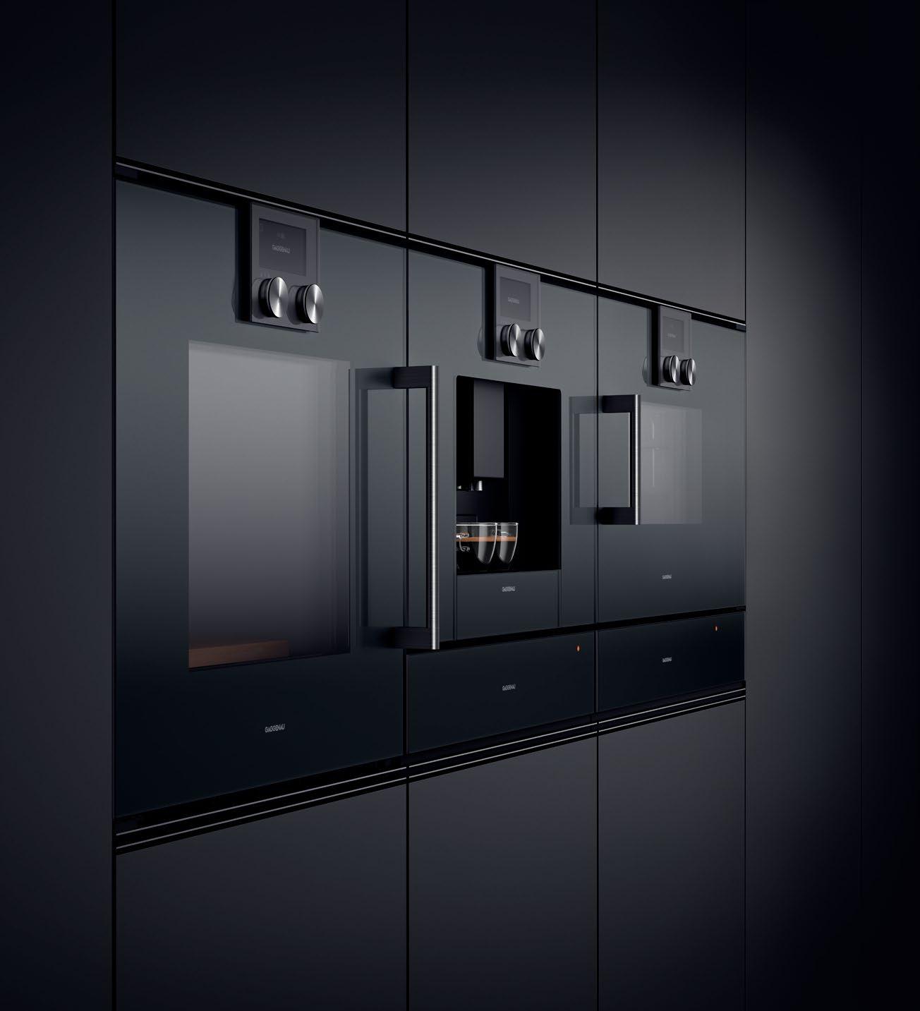
Mastering the art of understatement.
Understated essentials
Savage Design ’s ADAMAS wall light is a bold wall light for the home. The compact sconce is machined from solid materials and is available in four finishes – raw brass, stainless steel, aged bronze and black nickel. The knurled outside leaves a pattern from which the pendant gets its name Adamas, ancient Greek for diamond.

savagedesign.com.au
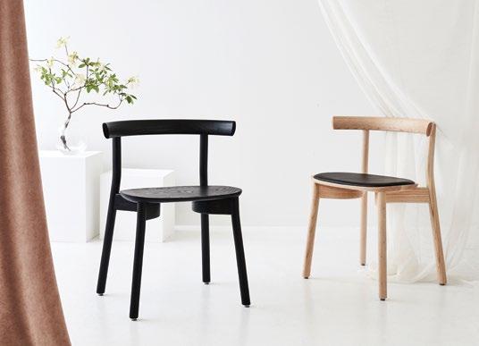
From Dessein and furniture designer Chris Nicholson comes the TORII CHAIR . Named for its ability to transition from the mundane to the sacred, the design has transformed an essential and everyday piece of furniture – the chair– into an inspired and worthy solution for architects, designers and end-users alike.
dessein.com.au
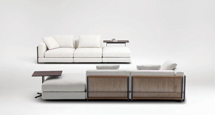
Everyone is born with a heart for tenderness and nature. This idea drove Camerich when designing the NATURE sofa, whose leather knitted design reduces the stiff feel of traditional sofa edges, while the components can be freely rearranged. The ultimate soft, easy seating comfort draw heart and body closer to the nature.
camerich.com.au
issue #43 habitusliving.com
❙ Over 20 years of supplying exclusive and luxurious porcelain stoneware
❙ Bespoke hard surface materials for custom layouts and design
❙ Highest quality Italian and Spanish ceramic tiles and slabs
❙ Supplying major residential, commercial and infrastructure projects throughout Australia & South Pacific
❙ Providing floor and wall solutions to complex projects for both interiors and landscaping
❙ Our wide range of tiles and slabs can be precision cut into many formats including mosaics to create new designs and features
❙ Supplying the most diverse glass mosaics, using transparent, iridescent, mirrored and textured materials
❙ Respected by leading architects, designers and builders throughout Australasia for supplying materials that maintain the integrity of their projects
Discover the Australasian company that’s leading the way in innovative, hard surface solutions. HARD SURF ACE SOLUTIONS VISIT OUR SHOWROOM OR REQUEST AN APPOINTMENT Phone: 02 8303 0100 or email: reception@rockson.com.au 32-33/110 Bourke Road, Alexandria NSW 2015 www.rockson.com.au
exclusive beautiful inspiring
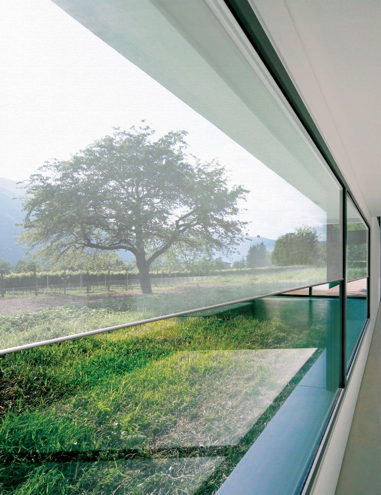
The one and only SilverScreen
The Global leaders in metallised performance fabrics and solar control solutions, Verosol use Nano type technology to create a product that no one else can match. The best in the market at reflecting solar radiation without affecting your view to the outdoors. Blinds with Verosol’s SilverScreen is not a cost it’s an investment.
1800 011 176 info@verosol.com.au verosol.com.au
Welcome into heart & home
issue #43 habitusliving.com
weight Worth their
TEXT LEANNE AMODEO | PHOTOGRAPHY DAVID SIEVERS
Two of Australia’s most exciting young architects, Graham Charbonneau and Dave Bickmore are creating narrativerich spatial experiences as directors of Studio -Gram.
Six months after establishing Studio -Gram with Dave Bickmore, Graham Charbonneau was browsing an architecture blog when he came across a post titled “25 Things Not To Do When Starting Your Own Architecture Practice”. Laughing, “We’d already done 23,” he recalls. “And to this day, I don’t know if it was a bad article or if we just got lucky.” Five years later and it’s pretty obvious luck has nothing to do with the small, Adelaide-based architecture practice’s success. Yes, their timing couldn’t have been better and they were certainly in the right place to make the kind of impact they did. But the friends and business partners – who met while studying architecture at the University of South Australia after Graham relocated from a small town near Montreal – simply produce outstanding work, with a freshness that has reinvigorated Adelaide’s design landscape and contributed to the broader dialogue on Australia’s national design identity.
They decided very early on in the friendship they were going to do something postgraduation and began working together before that date. In fourth year, they developed a series of units for a local caravan park under the name Grad and also designed Norwood House. In 2014 when Graham was engaged to renovate
2 . portrait # 41
Hotel Harry in Sydney’s Surry Hills he asked Dave (who was working at HASSELL at the time) to join him. That was the turning point that made it official.
Their practice is defined by a desire to avoid a one-size-fits-all design approach and they pride themselves on being able to elaborate on a client’s ideas and deliver them with clear resolve. The thought of cultivating a signature style doesn’t appeal to either of them because it’s all about giving people what they want, rather than being prescriptive. “This particularly reassures our Adelaide commercial sector clients in that we’re not repeating the same aesthetic over and over,” says Dave, who grew up in South Australia’s Riverland. “We’re not delivering another Osteria Oggi or Abbots & Kinney and it’s important for them to know that, for the sake of the studio’s longevity.”
In many ways these two projects are the perfect example of what Studio -Gram does. The two eateries sit side-by-side on Pirie Street in the heart of Adelaide’s CBD and their fit-outs could not be more different. The former is an elegantly refined interpretation of the classic Italian piazza, while the latter is all angles, lines and dynamic configuration. But what’s apparent in both is a high level of craftsmanship and exquisite detailing and this can be found in the studio’s residential work too.
The practice’s first official residential project as Studio -Gram was a three-year labour of love completed in 2017. It resulted in the Millswood House extension, a bold volume distinct for the ‘cat’s ears’ profile of its roof and a robust material palette comprising timber, concrete and blackened steel. This project also stands as a punctuation mark in the studio’s portfolio;
“Adelaide is a good place for a young studio like us because it’s allowed us to build our brand quickly.”
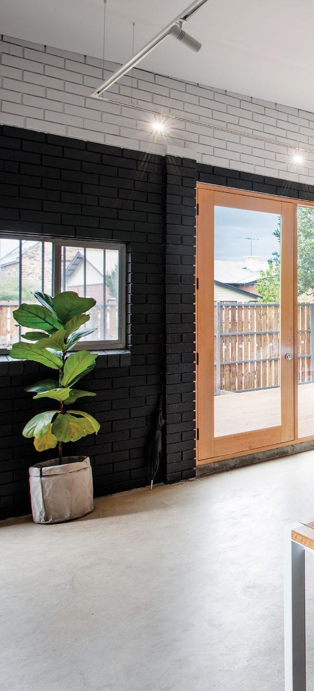
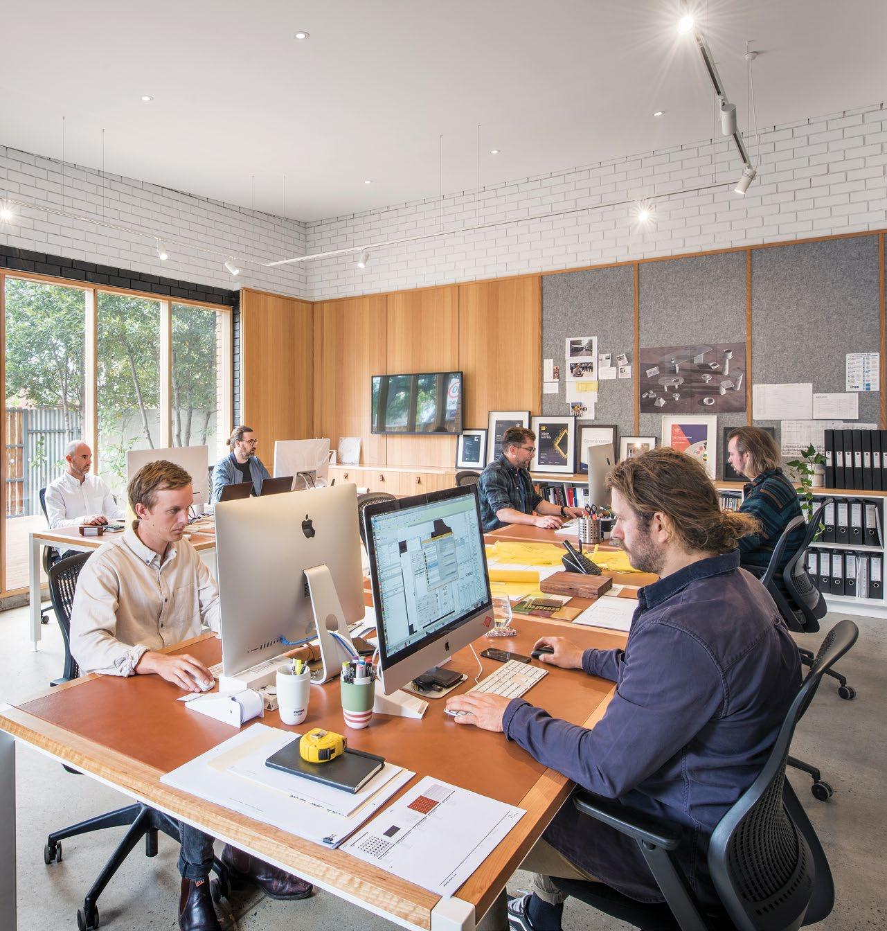
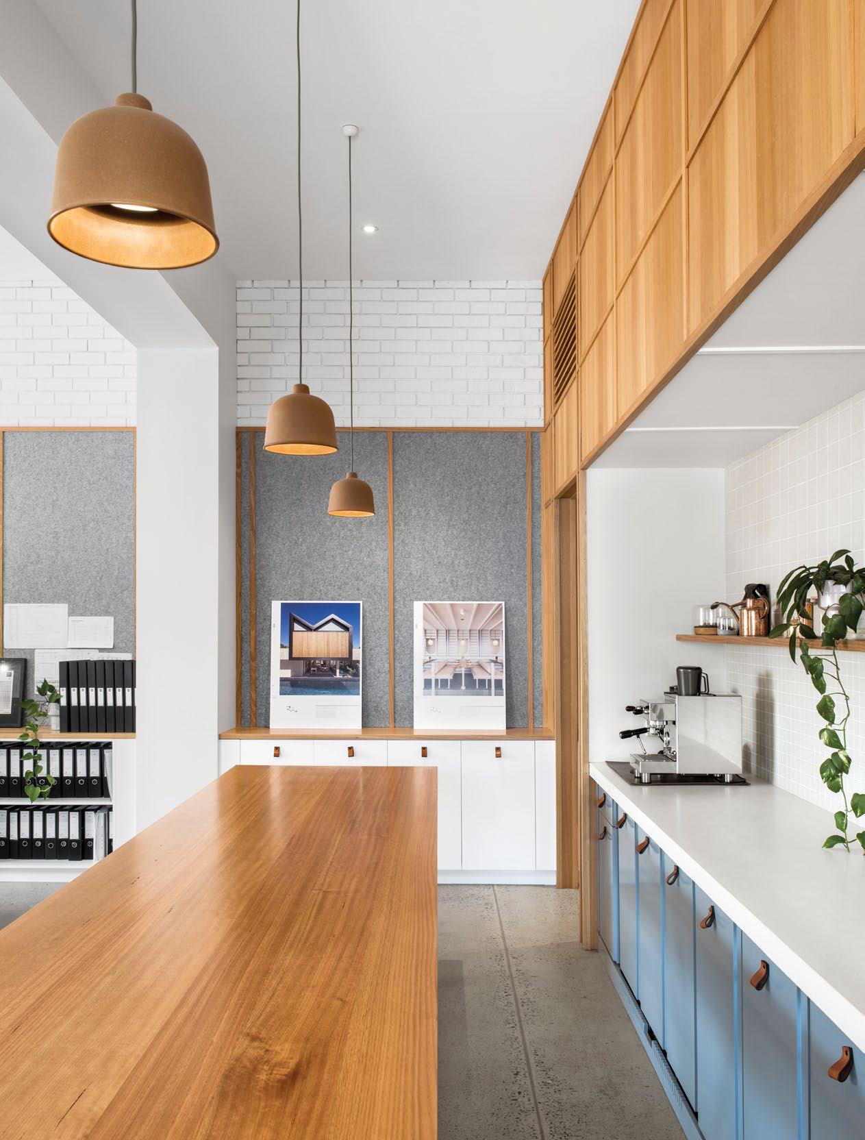
HOME OF OZ HARVEST (AND A COOKING SCHOOL BEFORE THAT), AND IS NOW AN OPEN PLAN OFFICE THAT CURRENTLY ACCOMMODATES A TEAM OF SIX,
HAS CAPACITY FOR TEN. issue #43 habitusliving.com
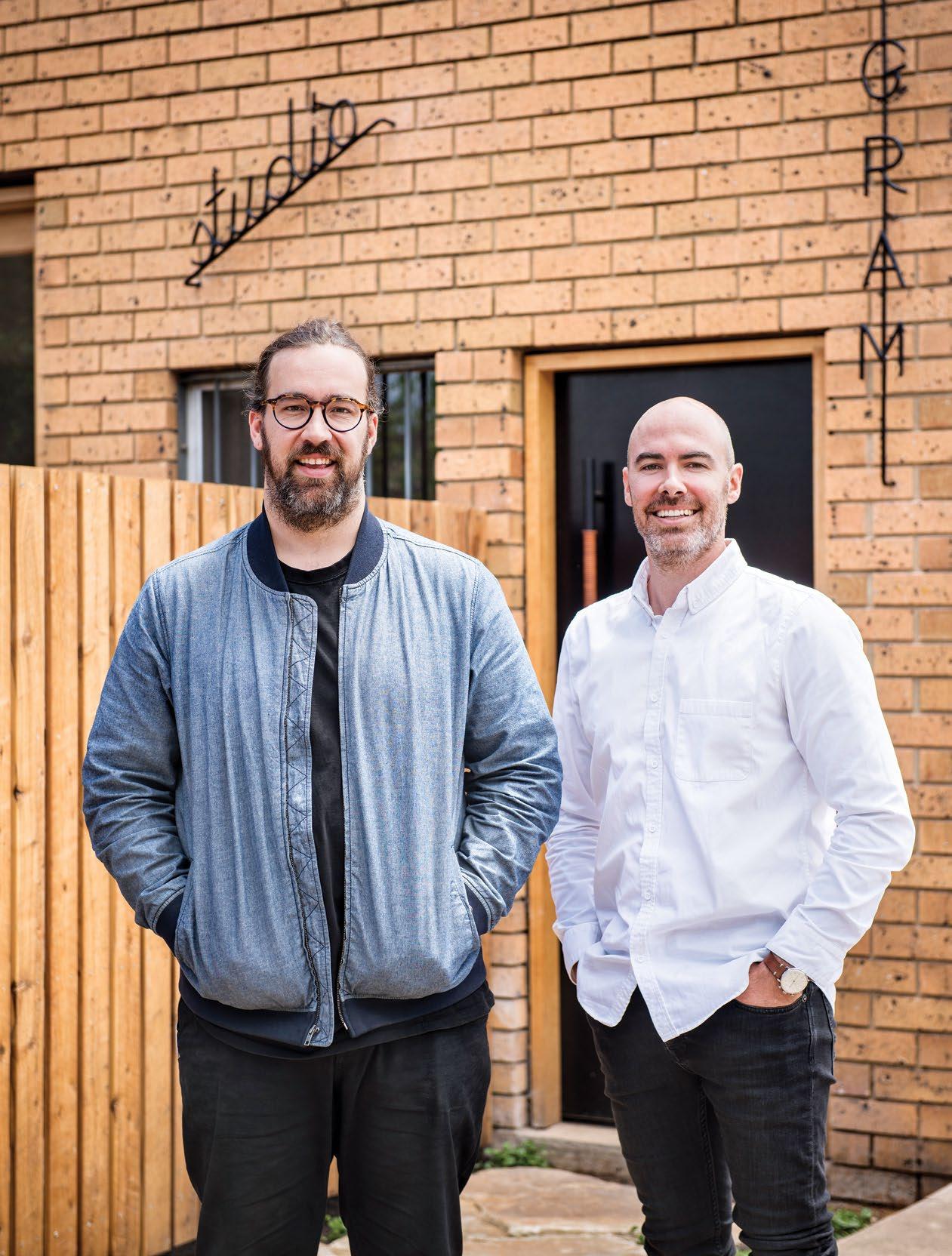
OPENER | STUDIO -GRAM CO-FOUNDERS AND DIRECTORS GRAHAM CHARBONNEAU (L) AND DAVE BICKMORE (R). ABOVE | THE NEW STUDIO -GRAM STUDIO IN GOODWOOD, ADELAIDE, WAS THE FORMER
BUT
2 . portrait # 43
ABOVE
STUDIO’S
A STUDIO
RECENTLY EXPANDED INTO FURNITURE DESIGN. OPPOSITE | THE KITCHEN IS LOCATED AT THE CORE OF THE SPACE AND EXEMPLIFIES THE STUDIO’S ATTENTION TO DETAIL, FROM THE CUSTOM LEATHER DOOR HANDLES BY INDEX AND CO TO THE FINE TIMBER JOINERY. issue #43 habitusliving.com
Graham and Dave believe in using narrative to deliver design that simultaneously engages and compels.
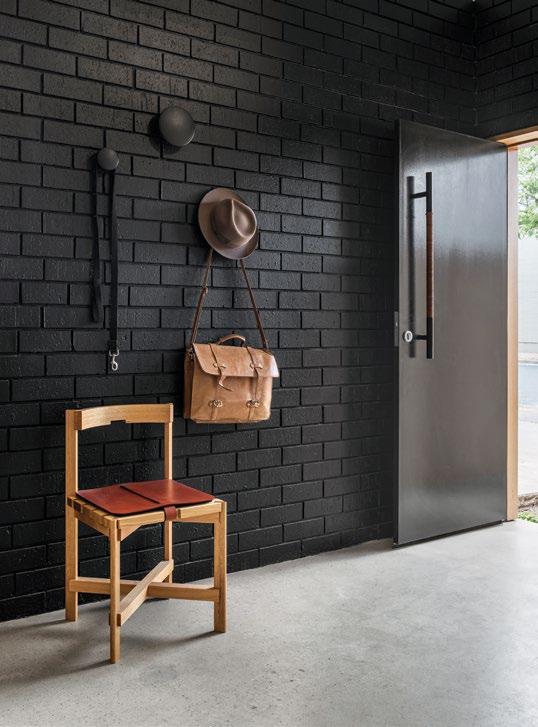
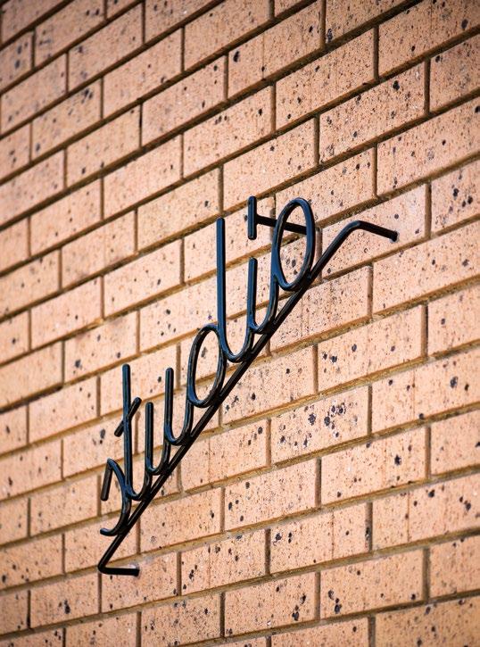
LEFT | THE
SIGNAGE WAS DESIGNED BY PECULIA FAMILIA (WHICH HAS DESIGNED ALL STUDIO -GRAM BRANDING) AND MANUFACTURED BY CHRIS FULLER FROM ARTISTIC BLACKSMITH STUDIO. ABOVE RIGHT |
-GRAM-DESIGNED CHAIR, THE PRACTICE HAVING
2 . portrait # 45
issue #43 habitusliving.com
a quietly confident reminder of the diversity of their œuvre. As Graham explains, “I think Millswood House changed people’s perception of our practice because up until that point, we were largely recognised for our hospitality interiors. So this has been an opportunity for us to put our hand up and say we’re architects and these are our capabilities in this space.” They’ve also recently completed the restoration of a 1971 Woods Bagot house in Stonyfell, which allowed them to address a local example of Modernism with both sensitivity and playfulness. And an ambitious new build on a ruggedly challenging site at Port Willunga is currently in progress.
Both Graham and Dave believe in using narrative to deliver design that simultaneously engages and compels. In their hospitality work, they tell stories reflective of the experience they want the end user to have. While their residential work is almost exclusively informed by the narrative of the clients themselves. Shobosho (which translates as fire house) in Adelaide’s West End is characteristic of their storytelling in the way they took inspiration from elsewhere and used it as the conceptual framework upon which the aesthetic hangs. In this instance it finds expression through the use of the ancient Japanese technique of shou sugi ban (charring timber with fire), a direct reference to the restaurant’s offering of Asianinspired ‘fire cooking’.
Indeed, materiality is just as important to Graham and Dave as narrative. Each tends to favour materials they’ve had a longstanding affinity with; Graham has been building things with timber since he was little and Dave’s father was a panel beater as well as an equestrian
Studio -Gram has a freshness that has reinvigorated Adelaide’s design landscape and contributed to the broader dialogue on a national design identity.
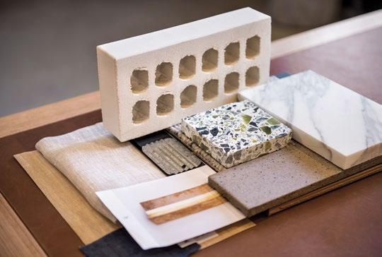
OPPOSITE |
A
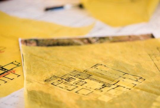
FOR AN UPCOMING RESIDENTIAL PROJECT. BELOW | SKETCH PLANNING ON A RESIDENTIAL PROJECT. 2 . portrait # 47
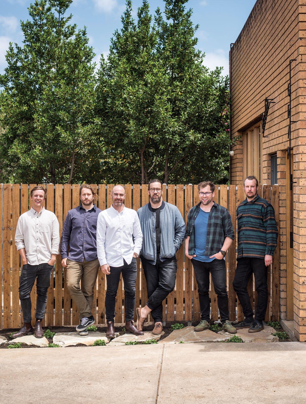
ALISTAIR REEVE, OLIVIER MARTIN, DAVE BICKMORE, GRAHAM CHARBONNEAU, SAM BROADBRIDGE, AND RENÉ MAJEWSKI OF STUDIO -GRAM. ABOVE |
MATERIAL PALETTE
showjumper, so steel and leather structures and details are recurring. But at the core of Studio -Gram’s DNA is a vision to create spatial experiences rather than just creating spaces. To this end, their work is evocative, immersive and so tightly resolved there’s a feeling their next project couldn’t get any better (though it invariably does).
There’s nothing forced about any of their projects though and this could have something to do with their laidback personalities or perhaps the practice’s relaxed positioning within the context of a national design industry. “Adelaide is a good place for a young studio like us because it’s allowed us to build our brand quickly,” reflects Dave. “We operate nationally and internationally and we’re able to celebrate the fact our studio is from South Australia.”

Certainly, Studio -Gram’s rise has been swift, aided in part by the state’s introduction of the small venue license in late 2012, and their output prodigious, with some 40 projects completed in the five years since establishment.
The practice is one of a number defining the very best in Australian architecture today and Graham and Dave are quick to acknowledge their peers. Both have great respect for Kennedy Nolan’s portfolio and admire the recent residential work coming out of Queensland. Their own studio is currently a team of six, and while they don’t have any plans to grow much bigger (so as to allow each team member to have a hand in each project), one day they’d like to one day set up shop in New York. But, for now, they’re quite content where they are.
ABOVE | THE TEAM TAKES ITSELF SERIOUSLY WHEN THE SITUATION CALLS FOR IT, BUT A TYPICAL DAY AT THE STUDIO -GRAM OFFICE INVOLVES HAVING FUN, TOO. issue #43 habitusliving.com
Studio -Gram | studio-gram.com.au
LEON HOUSE IS THE MAN BEHIND THE DESIGN STUDIO BASED IN PERTH, WESTERN AUSTRALIA.
LEON HOUSE’S PRACTICE SPECIALISES IN SIMPLE, RESPECTFUL COMPLETE HOUSE & INTERIOR DESIGN. REIMAGINING ELITE RESIDENTIAL ENVIRONMENTS THROUGH CONTEMPORARY DESIGN.
LEONHOUSE.NET
Sit back and enjoy
The home of Timo Wong and Priscilla Lui, co-founders of Singapore’s Studio Juju, is filled with their favourite things – including a rather impressive collection of chairs.
issue #43 habitusliving.com
TEXT SUSAN MULDOWNEY | PHOTOGRAPHY KHOO GUO JIE
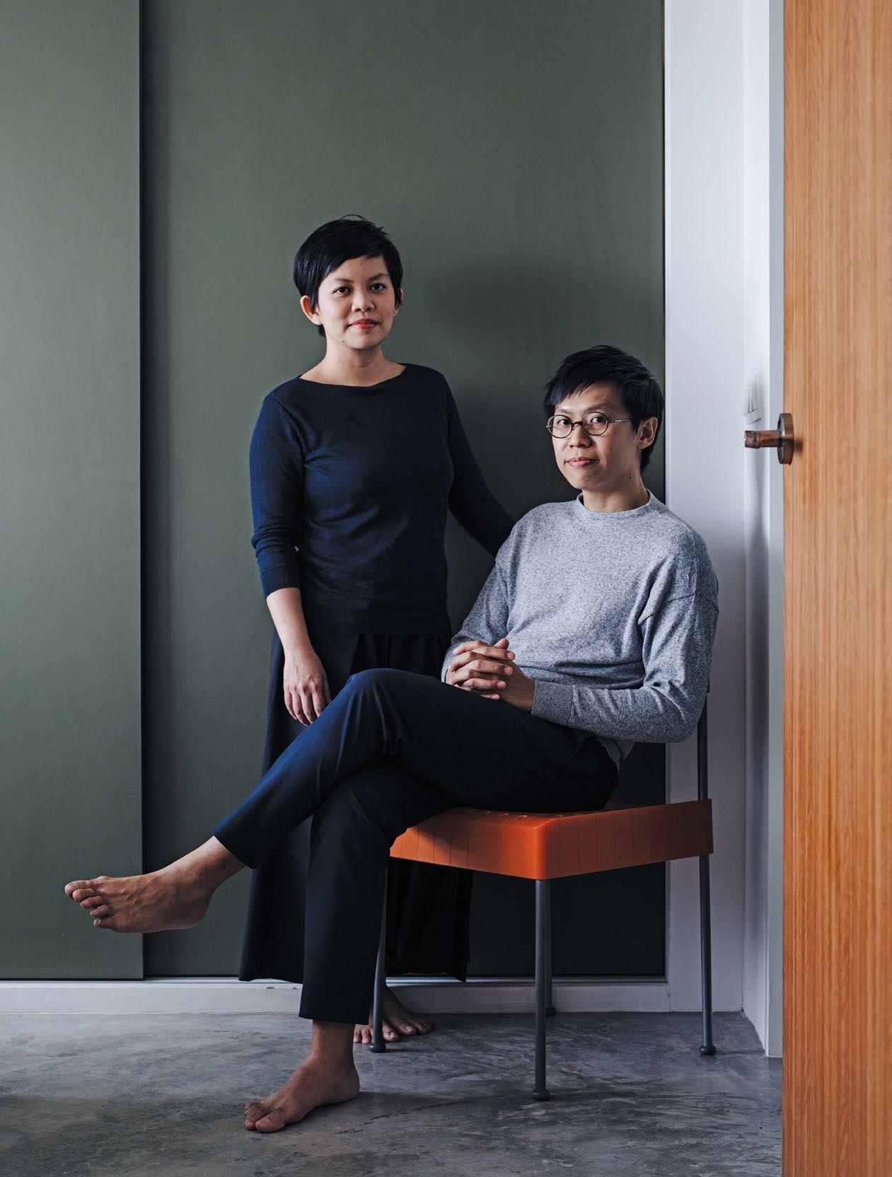
2 . portrait # 51
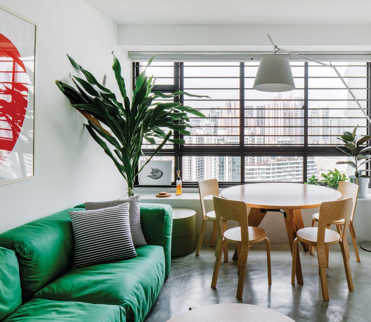
OPENER | THE HOME OF TIMO WONG AND PRISCILLA LUI, CO-FOUNDERS OF SINGAPORE DESIGN PRACTICE STUDIO JUJU, IS FILLED WITH TREASURED AND ICONIC FURNITURE, INCLUDING THEIR PERSONAL FAVOURITE – ORANGE BOX CHAIRS BY ENZO MARI. ABOVE | WIDE VIEWS OF SINGAPORE’S SKYLINE HELPED SEAL THE DEAL FOR TIMO AND PRISCILLA – ALONG WITH A VISTA OF THE SINGAPORE RIVER. BARE CONCRETE FLOORS, WHICH REPLACED WHITE TILES, REMIND THE DESIGN DUO OF OLD-STYLE SINGAPORE FLATS. issue #43 habitusliving.com
If you’re invited to take a seat in the home of Timo Wong and Priscilla Lui, prepare to feel overwhelmed by choice. Their living room alone features a roll call of iconic pews – Jasper Morrison’s Superoblong sofa for Capellinni, Box chairs by Enzo Mari, a Mattiazzi Medici lounge seat by Konstantin Grcic – yet there’s still plenty of room to move. “Chairs are our weakness,” says Timo, co-founder with Priscilla of Singapore’s design practice Studio Juju. “We have so many that we’ve started rotating them between our home and our studio. It’s very useful having two spaces.”
Timo and Priscilla met while working at the National University of Singapore’s Design Incubation Centre, a research hub for industrial design. A shared desire to create furniture and objects that consumers can ‘experience’, rather than simply use, prompted them to launch Studio Juju in 2009.
International acclaim was swift to follow. They received the Design Report Award during Milan Design Week in 2011 and were named “Designers of the Future” at Design Miami the same year. The duo was recently commissioned to create large-scale public art installations at Singapore’s Tampines MRT Train Station and they are currently working on some pieces for a Danish design brand. “It’s very exciting, but it’s still at prototype stage,” says Priscilla. “We can’t say who the brand is, but we’re due to launch in Milan next year.”
2 . portrait # 53
issue #43 habitusliving.com
2 . portrait # 55
Timo and Priscilla are known for their whimsical take on design typologies. The sinuous forms of their playful ‘Rabbit and the Tortoise’ collection of coffee tables recalls their childhood days cutting out paper shapes and drawing animals. Their Lulu collection of chairs and stools, produced for Singapore-based design and manufacturing company Industry Plus, is characterised by a sculptural form that twists and folds in a continuous curve. Their shapely Cleansing Plinth, made for Wallpaper* Handmade at the 2018 Milan Design Week is composed of two perfect circles carved from Alexandrian marble and brings an element of sophistication to rudimentary cleansing rituals.
“We’re very interested in form,” says Timo. “When we design something, the first thing that we think about is the experience of the person using it. It needs to be more than functional –people should also enjoy it. We like to design furniture and products that have a certain softness, friendliness and approachability.”
The same may be said of Timo and Priscilla’s home. Chosen for its location by the Singapore River and sweeping views of the cityscape, the 72-square-metre apartment is modest
in size and generous in character. “In a lot of apartments in Singapore, the layout doesn’t vary too much,” says Priscilla. “Our priority was to fill our home with our favourite things. That’s what we want our home to be.”
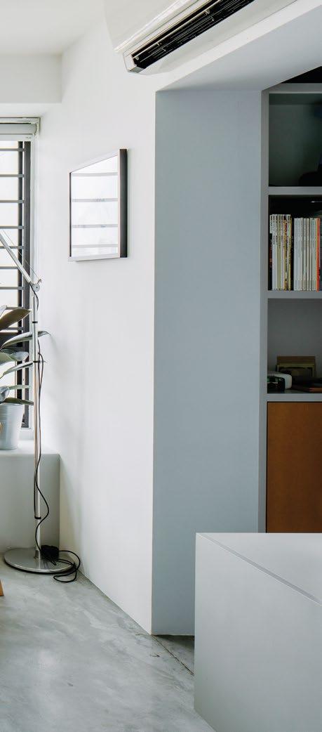
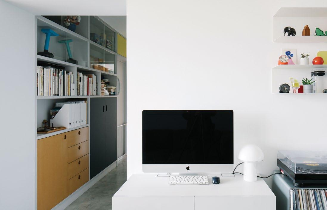
These favourite things include iconic international furniture pieces and quirky figurines on the shelving that lines the hallway. Some of their own designs, such as their Luxury Tower collection of glass jewellery vessels, have also made the cut.
When the couple moved into the apartment six years ago, they replaced the white floor tiles with polished concrete. “Bare concrete floors remind us of old-style Singapore flats,” says Timo. “This area has lots of mature estates, which we like. There are lots of new developments in the outskirts of the city centre, but they feel quite urbanised and there’s not a lot of greenery.”
The apartment originally had two bedrooms, but they knocked down one of the walls shortly after moving in to add more space to the living area. The wall was reinstated just before their son, Oliver, was born at the beginning of 2018: so the floorplan is now back to its previous state.
PREVIOUS
SOME
THE COUPLE’S OWN
INCLUDING TIMO’S PORTRAIT OF THEIR 6-YEAR-OLD DOG,
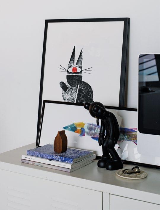
OPPOSITE RIGHT | THE HOME ALSO FEATURES WORKS BY OTHER LOCAL ARTISTS, SUCH AS ODD CREATURES BY AIRA LIM (AGAINST WALL) AND SADDLE WRASSE BY WU YANRONG
OPPOSITE BELOW | JOINERY LINES THE HALLWAY WALL.
The 72-square-metre apartment is modest in size and generous in character.
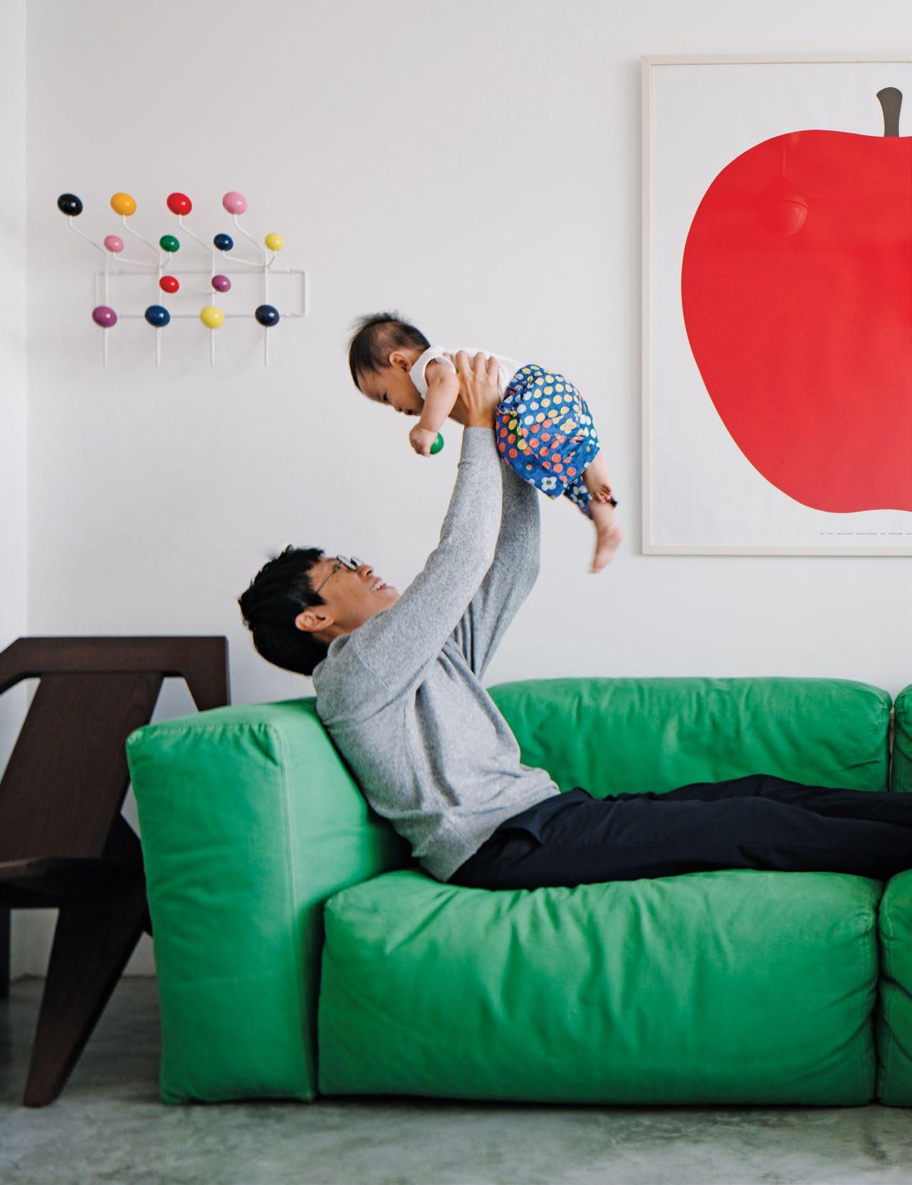
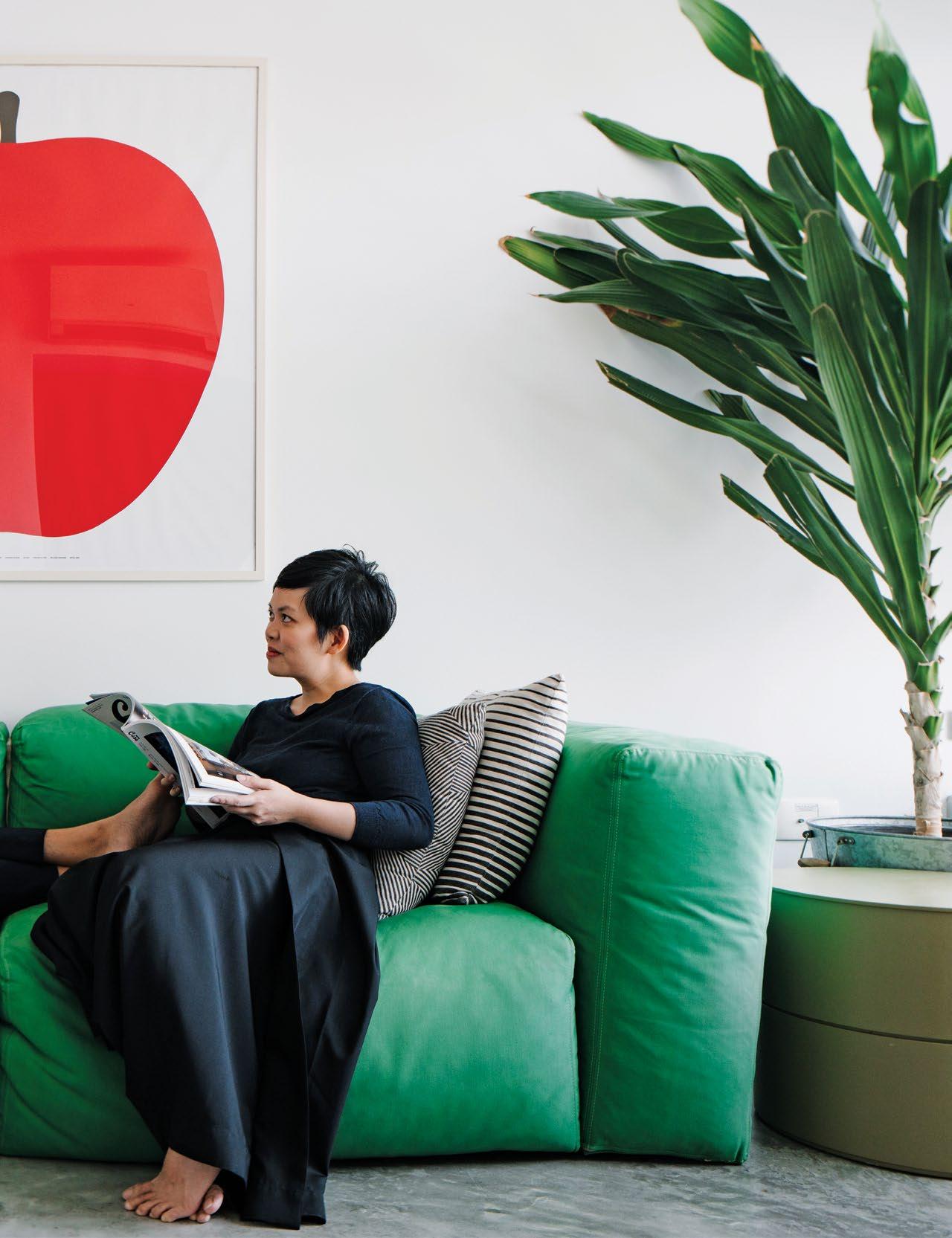
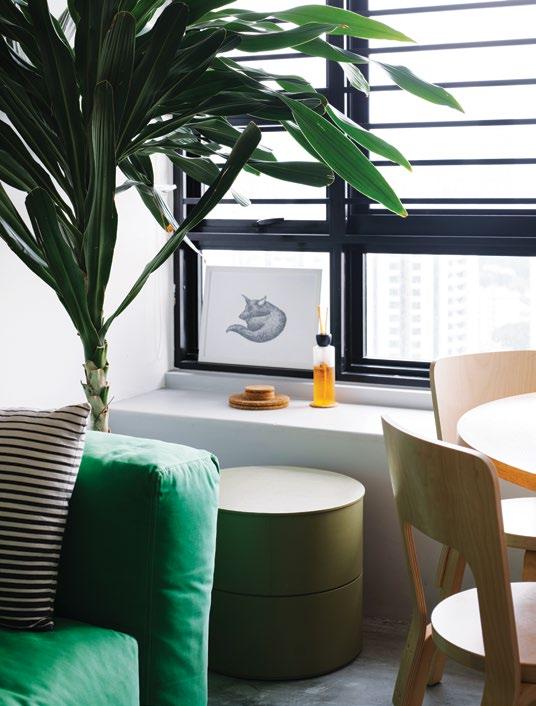
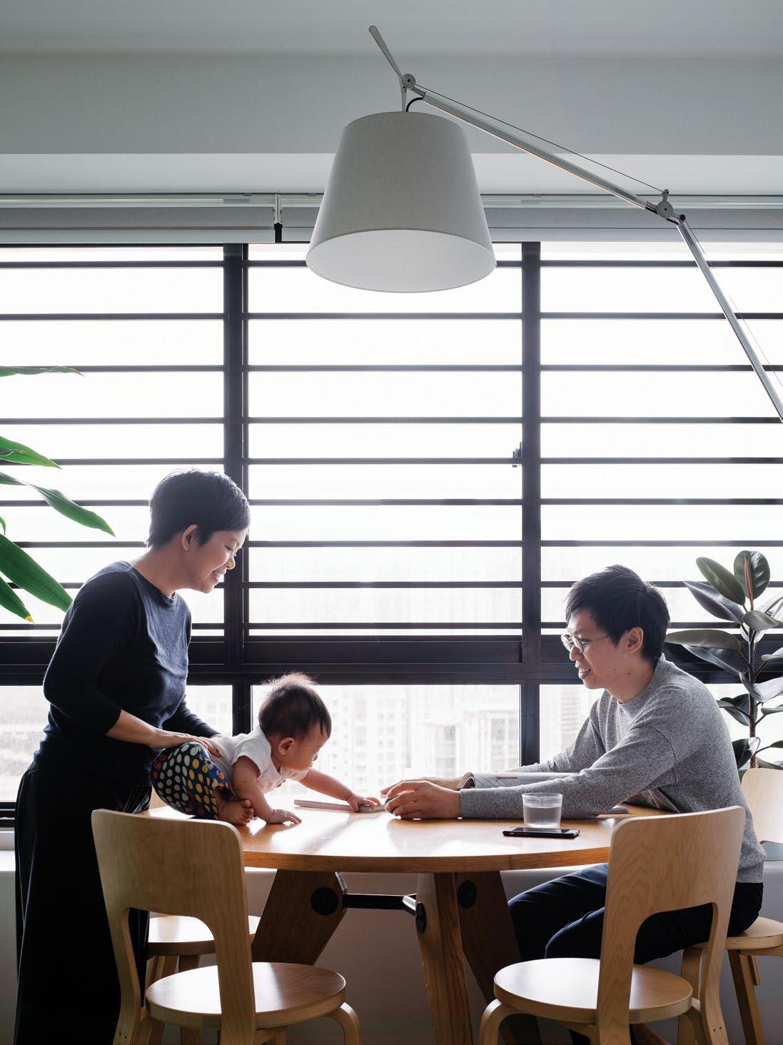
| BABY OLIVER ENJOYS PLAY TIME IN HIS COLOURFUL HOME, WHICH INCLUDES A BRIGHT GREEN SUPEROBLONG SOFA BY JASPER MORRISON FOR CAPELLINNI, ENZO MARI’S ‘LA MELA’ PRINT AND THE EAMES HANG-IT-ALL CLASSIC ON THE WALL. OPPOSITE LEFT | THE APARTMENT FEATURES
OF
WORKS,
OSCAR.
(FRONT).
issue #43 habitusliving.com
2 . portrait # 57
issue #43 habitusliving.com
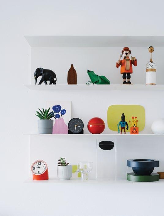
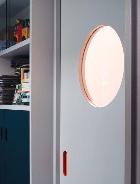
OPPOSITE | TIMO AND PRISCILLA PLAY WITH OLIVER. ABOVE LEFT | QUIRKY FIGURINES LINE THE SHELVES OF THIS CHARACTERFUL HOME. STUDIO JUJU’S ‘LUXURY TOWER’ VESSEL ALSO MAKES AN APPEARANCE, SECOND FROM RIGHT ON THE BOTTOM SHELF. ABOVE RIGHT | A PORTHOLE WINDOW IN OLIVER’S BEDROOM DOOR ALLOWS HIM TO BE SEEN BUT NOT DISTURBED. 2 . portrait # 59
“When we design something, the first thing that we think about is the experience of the person using it. It needs to be more than functional – people should also enjoy it.”
A glass porthole window was added to Oliver’s bedroom door so that he can been seen but not disturbed during his afternoon naps. “We like the idea that when he wakes up he can see our faces smiling at him through the porthole,” says Timo. “It’s a bit of fun.”
Timo and Priscilla select their furniture based on its character and the regard they have for its designer. “We are big fans of Konstantin Grcic,” says Timo. “We even have a door stopper that is signed by him. I love his attitude towards creating. It’s important that a designer has their own voice and I think he breaks the mould constantly.”
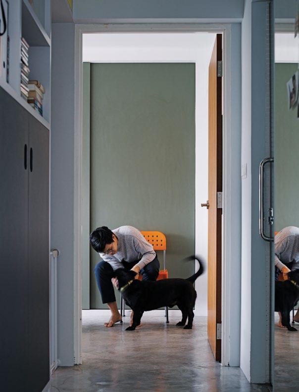
Konstantin Grcic may be admired for his originality, but Timo and Priscilla cite Enzo Mari as their greatest inspiration.
“We were inspired by Enzo Mari from the day we opened our studio,” says Timo. “We love his approach to design – he believes that it should be available to all. His designs are so well resolved and are so simplistic and efficient.”
Timo and Priscilla recently bought four of Enzo Mari’s flaming orange Box chairs to add an extra pop of colour to their apartment. “Unfortunately, in the process of shipping, two of them broke,” says Timo. “They’re still part of our chair collection, but we keep those two in our studio.”
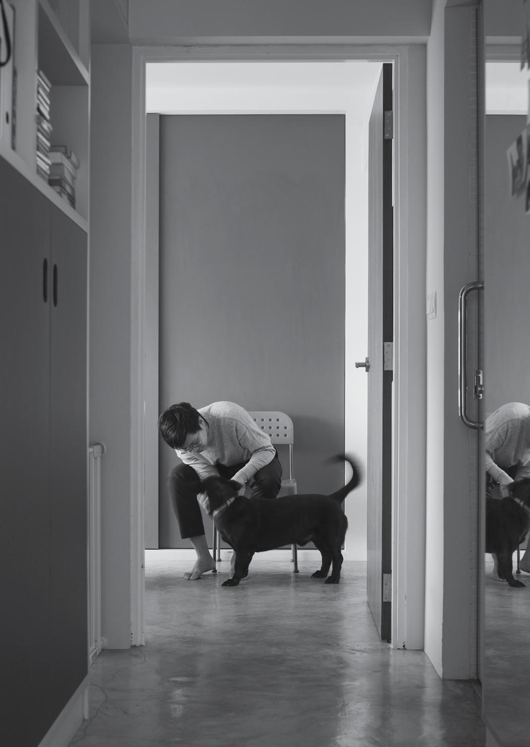
ABOVE | OSCAR, WHO TIMO DESCRIBES AS “CROSS BETWEEN A DACHSHUND AND A STREET DOG”, IS THE FOURTH RESIDENT OF THIS SIMPLE, STYLISH SINGAPORE APARTMENT. issue #43 habitusliving.com
Studio Juju | studio-juju.com
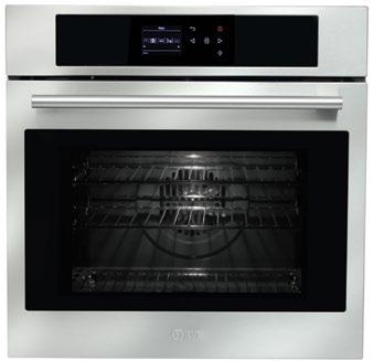
Let the oven do the thinking for you.
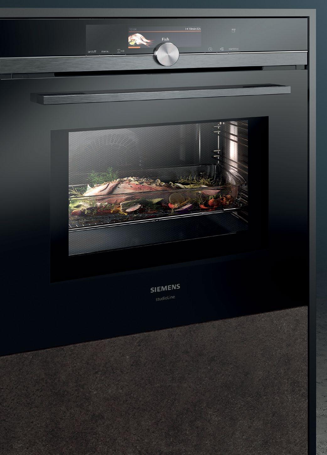

The Siemens studioLine range offers a truly flexible cooking experience that gives you choice like never before. Select from pre-loaded options that automatically apply the ideal settings, speed up meal preparation by up to 50%, or add steam for tastier dishes at the touch of a finger. It even features roasting and baking sensors that let you know when your meat and baked dishes are perfectly cooked. Discover Siemens home appliances today.
The future moving in.
HOME APPLIANCES BRAND IN GERMANY* BSH Group is a Trademark Licensee of Siemens AG.
Siemens Home Appliances

Activism Gentle
Anna Ross, founder of Kester Black, has pioneered a design-led approach to cosmetics, underpinned by ethical ‘common sense’.
issue #43 habitusliving.com
TEXT ALICE BLACKWOOD | PHOTOGRAPHY BENJAMIN HOSKING
Veganism hasn’t always been the gentle, all-embracing, ethical lifestyle movement that it is today. Many curious would-be vegans were put off by the strong rhetoric surrounding veganism, and alienated by the seemingly purist approach to living. You were either all-in, or not.
Today we visit all-vegan restaurants as a matter-of-course, because they feel fashionable and vibe-y, their food is enticing. We wear beautifully crafted vegan apparel and use quality-made vegan cosmetics. And it’s easy to invite a little bit of veganism into our daily lives because it represents a set of lifestyle values that resonates with our inner guru: health conscious, environmentally concerned, worldly.
When Anna Ross launched her nail polish brand, Kester Black, she was looking for a distinct foothold within a highly competitive and saturated international market. “I wondered how I could possibly compete with the likes of OPI,” she says. “But then, as I looked into it, I realised there were no ethical options, and ethical to me is just common sense.”
Anna came to cosmetics through design. She studied design in her home country of New Zealand before moving to Melbourne, Australia, to build her professional experience. In doing this, she also established a jewellery design label, “to keep my portfolio ticking over”.
As is the way with any entrepreneurial venture, your business tends to morph and evolve with shifting market demands. Anna’s jewellery enterprise had peaked, riding the wave of highly marketable New Zealand-designed and made fashion brands. But her relocation to Australia had shifted the goal posts; she was now an Australian-based jeweller heading in a different direction.
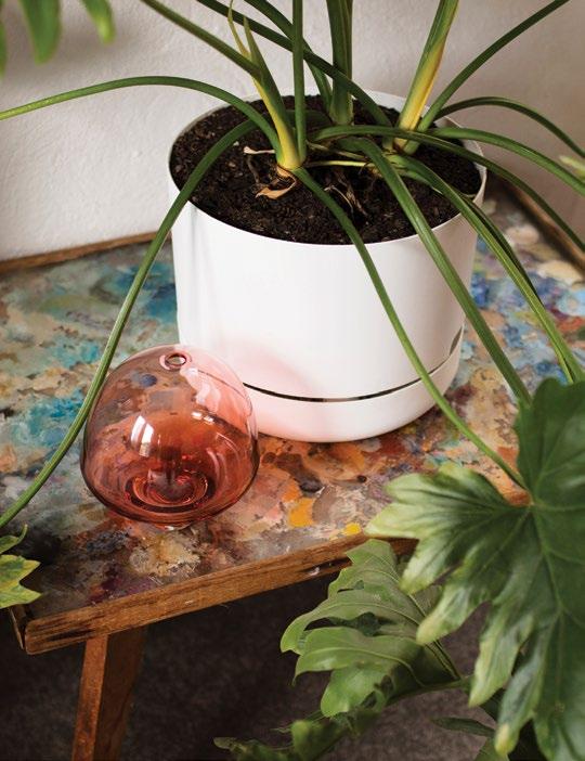
2 . portrait # 65
Experimentations in colour (painting her sterling silver pieces) led to investigations into nail polish, (essentially a metal paint). It was serendipitous – a moment when she acted on a hunch. She could see the market was already filled with well-established brands that had earned their international cred’. But there was no one brand offering customers an ethical alternative for nail painting.
For Anna, the concept was a no-brainer, borne from simple common sense. “I grew up in the country near a farming community surrounded by clean, green rolling hills. It was always about animals for us – as kids we had lambs, a pet possum, rabbits, cats, dogs, fish and mice.” It provided the solid foundations for what would become a design-led nail polish label with vegan, cruelty-free products.
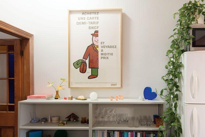
But, Anna stresses, the fact of Kester Black’s veganist approach isn’t representative of its alignment with any particular vegan movement. If anything it’s about accessibility. “I feel Kester Black made it accessible for everybody. We’re a design-led brand that won’t comprimise on ethics.
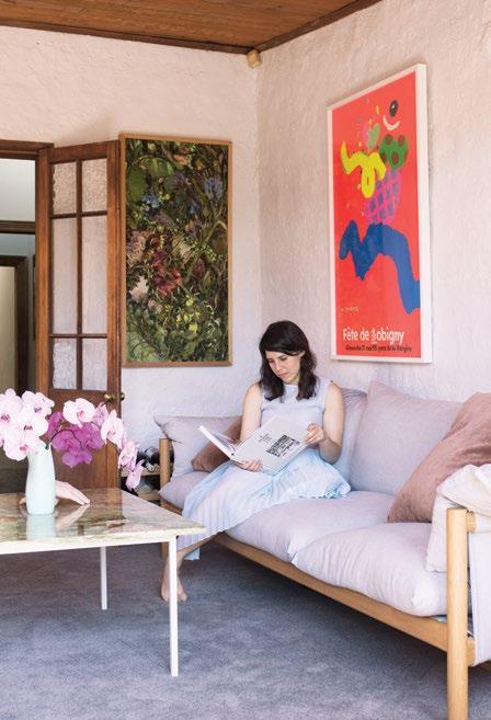
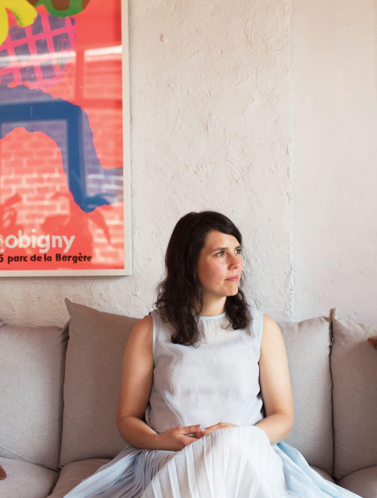
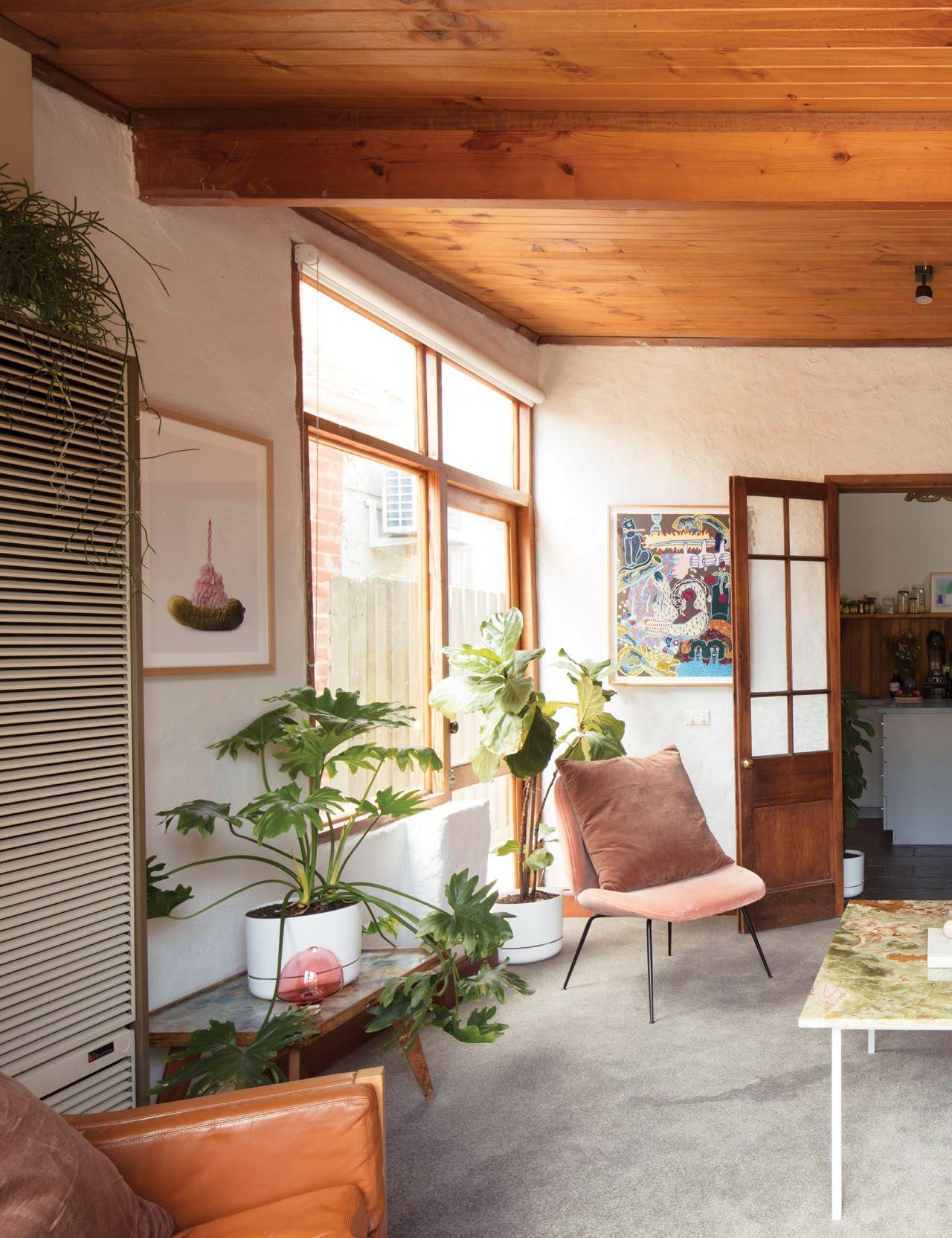
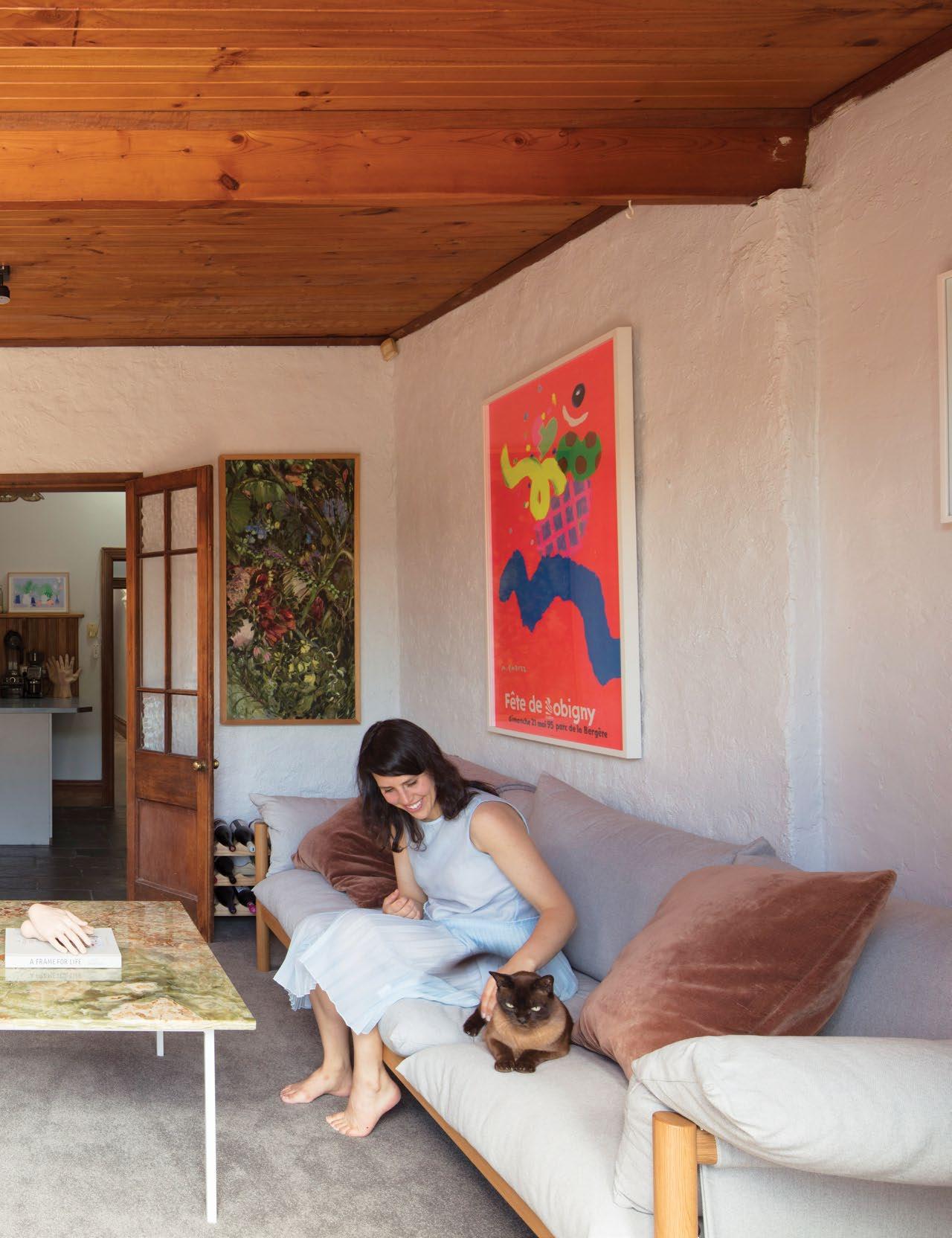
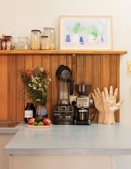 OPENER | ANNA SITTING IN HER LIVING ROOM NEXT TO A BRIGHT, POP-PY QUAREZ VINTAGE POSTER; A GLASS SCULPTURE BY AMANDA DZIEDZIC. ABOVE | “AS I MAKE NAIL POLISH I HAVE FOR THE PAST SIX YEARS BEEN COLLECTING ODD HAND ORNAMENTS,” SAYS ANNA. BELOW | IN THE KITCHEN A HAY BOOKCASE FILLED WITH BOOKS AND GLASSWARE SITS BENEATH A SAVINAC VINTAGE POSTER. OPPOSITE | KING GEORGE VON WHISKERS, THE CAT, PROWLS DOWN THE HALL LINED WITH ART BY LAURA JONES.
issue #43 habitusliving.com
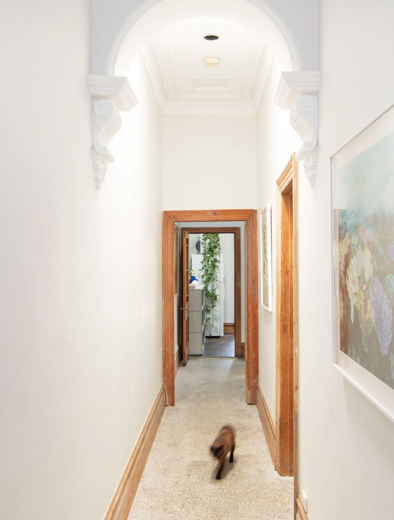
2 . portrait # 67
issue #43 habitusliving.com
Anna’s passion for colour and design manifests through a layering of bright, fun artworks, oaken timbers and breezy textures.
2 . portrait # 69
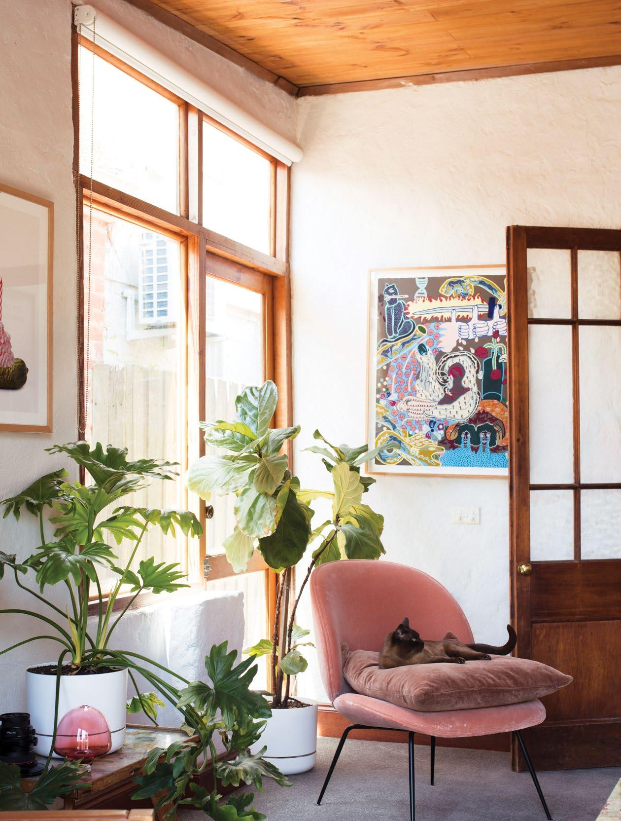
THE CAT, SITS UPON A GUBI CHAIR. ABOVE HIM
AN
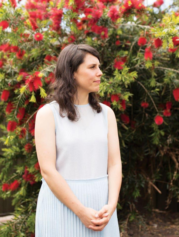
PREVIOUS | THE LIVING ROOM IS FILLED WITH LOVELY DETAILS – A GREEN ONYX TABLE WITH POWDER COATED STEEL LEGS (MADE BY ANNA), FROM THE LEFT A GHERKIN PRINT BY ALEX PROBA, AN ESTHER OLSSON WORK, A PIECE FOUND AT CAMBERWELL MARKETS, AND A QUAREZ VINTAGE POSTER. ABOVE | ANNA IN HER GARDEN. OPPOSITE | KING GEORGE VON WHISKERS,
HANGS
ESTHER OLSSON WORK.
issue #43 habitusliving.com
With all the energy and vigour of a natural-born entrepreneur, Anna has global plans for Kester Black.
2 . portrait # 71
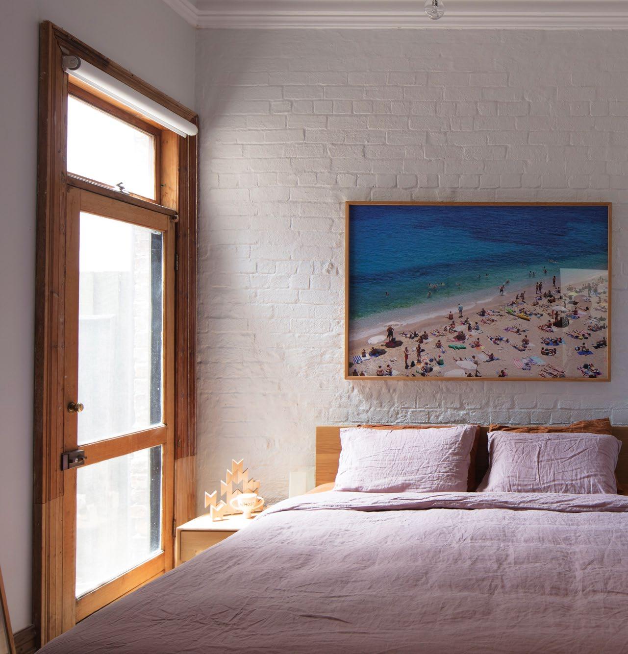
ABOVE | IN ANNA’S BEDROOM HER MARK TUCKEY KING-SIZE BED RULES THE ROOST. SHE TEAMS THIS WITH CULTIVER BED LINEN AND AN ETHNICRAFT BEDSIDE TABLE. ABOVE THE BED SITS A BEACH SCENE, PHOTOGRAPHED BY ANNA, TO THE RIGHT A PICTURE BY SEAN FENNESSEY.
issue #43 habitusliving.com
Anna has amassed a collection of beautiful, cherished pieces intended to stand the test of time and future moves.
“As a vegan cosmetic brands, I wanted Kester Black to be accessible to everybody who did believe in veganism, and then I wanted to ‘slightly and quietly’ educate.” Together with its considered yet minimalist approach to packaging (which has seen it rise to number two in the Scandinavian market), the brand’s cruelty-free accreditation has elevated it into a niche that has, for many years, gone unchallenged. “Our accreditation raises the industry standard and gives consumers a much wider choice,” reflects Anna.
There’s a constancy and rigour to Anna’s design and ethical values that filter into every aspect of her life. As she says, she’s considered the vegan equation from every angle and made an ethical, sustainable and health-based choice that informs what she eats and the cosmetics she uses and produces.
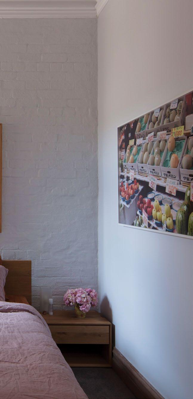
At home, design is the source of personal expression while ethical considerations play out through conscious, enduring furniture choices. “I used to buy a lot of [affordable, flat pack] furniture, but after having two pieces snap in the middle I said, ‘no more’. I put my savings towards furniture items I really loved.” In this way Anna has amassed a collection of beautiful, cherished pieces intended to stand the test of time and future moves.
Her passion for colour and design manifests through a layering of bright, fun artworks, oaken timbers and breezy textures. These jostle for attention in a happy clash before being curated into peaceful existence. “I’m always trying to add more to my spaces before then
2 . portrait # 73
paring it all back. I want all the colours but the clash forces me to take it all the way back to pure simplicity,” says Anna.
Home is ultimately a sanctuary where office-life is busy, noisy and action-packed. Anna craves the quietness here, and works from home often, where she can cultivate clean, tidy spaces. “I like that I can open the back door and there’s a lush, green garden. Lighting, too, is really important.” Sunny spaces are a must.
Her ultimate haven is the bedroom – a hangover from house-sharing days when her sleeping quarters served as office, studio, chill zone and everything in between. Taking pride of place here is a king-sized Mark Tuckey bed – both liberating in its generosity, and limiting due to being so large, (finding the perfect house to fit the bed, says Anna, has been no small task). Lashings of pure linen soften the bed’s solid oak base and headboard.
With all the energy and vigour of a naturalborn entrepreneur, Anna has global plans for Kester Black – she’s already established its presence in the European market and intends on living there to grow the business. But she also dreams of the pristine countryside of Wanaka, back home. She has a big block of land waiting for her at Lake Hawea, and architectural plans already drawn up. There’s just a few (big) things she needs to do first, before she comes full circle.
Kester Black | kesterblack.com
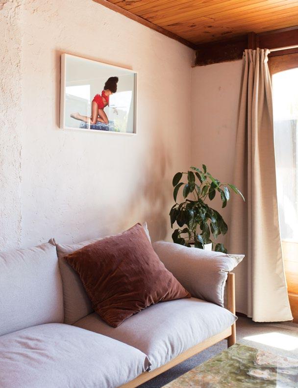
ABOVE | ANNA LOVES HER JARDAN WILFRED COUCH, A COMING-OF-AGE PIECE THAT SYMBOLISES FOR HER THE BEGINNING OF MINDFUL FURNITURE INVESTMENTS. ABOVE THE COUCH HANGS A JO DUCK PHOTO. issue #43 habitusliving.com








Ad_Habitus - Tableau.indd 1 20/12/2018 3:21:22 PM
FOOD IS ART.
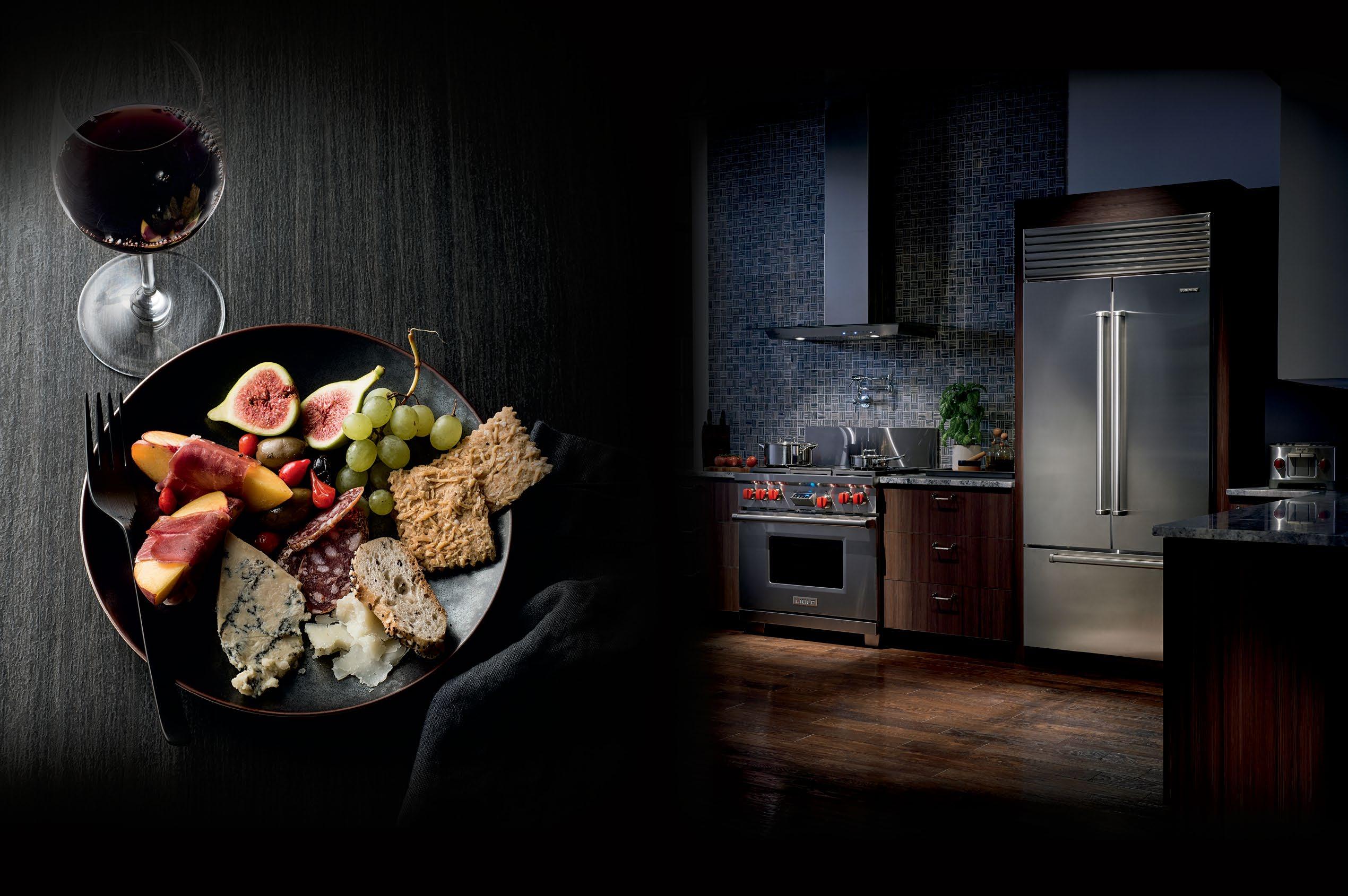
Superior food preservation. Professional cooking performance. Craftsmanship and technology without equal. su

b zer o -wolf.com.au
RESPECT IT.
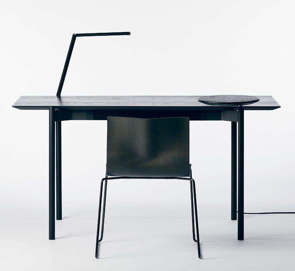
issue #43 habitusliving.com ABOVE | THE SLEEK AND STYLISH ETO TABLE WORKS AS BOTH A DESIGNER OBJECT FOR THE HOME OFFICE, AS WELL AS A HIGH TECH FUNCTIONAL WORKSPACE
Tom Fereday’s Royal Collaboration
Award-winning furniture designer Tom Fereday has teamed up with King Living for the first design collaboration.

Honest design that is true to its materials and its process. This is the philosophy that designer Tom Fereday channels into his furniture designs. And this honouring of the design process inside and out is what led him to collaborate with the design experts at King Living.
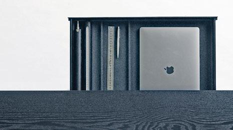
The result is the ETO Table – a sleek and stylish modern office table whose style belies its technical prowess. With integrated power, wireless charging and lighting features seamlessly designed into the sophisticated minimalist design, the desk works as a practical workspace, but also as a customisable design product for each user to tailor to their needs.
The concealed power and cable management as the slim integrated drawer unit offer a clean and distraction free work space, with storage for both everyday desk items as well as the charging table and light accessories.
Available in a range of finishes that will suit any space, the ETO table is the first collection to be launched by Tom Fereday in collaboration with King Living.
habitus promotion › King Living #79
King Living | kingliving.com.au
ABOVE | DESIGNER TOM FEREDAY
PAYMENT METHOD Cheque / money order AUD$ Charge my credit card AUD$ Name on Card Card Type Card Number Expiry Date Signature IT’S EASY TO ORDER Fill in your response below, overleaf or subscribe securely online at habitusliving.com/subscribe. FOR A GIFT – RECIPIENT DETAILS: FOR MYSELF PLEASE SELECT BELOW Mrs/Ms/Miss/Mr First Name Surname Address State Postcode Country Email Phone Mrs/Ms/Miss/Mr First Name Surname Address State Postcode Country Email Phone ONLINE: habitusliving.com/subscribe PHONE: (61 2) 9368 0150 MAIL TO: EMAIL: subscriptions@indesign.com.au FAX: (61 2) 9368 0289 Indesign Media Asia Pacific Level 1, 50 Marshall Street, Surry Hills NSW 2010 WHERE’S YOUR FAVOURITE PLACE TO ESCAPE/EXPLORE AND WHY?
Subscribe to Habitus magazine
Habitus AUSTRALIA INTERNATIONAL (AUD$) 12 ISSUES SAVE 8 ISSUES SAVE 4 ISSUES SAVE 12 ISSUES SAVE 8 ISSUES SAVE 4 ISSUES INDESIGN $155 $43 $105 $27 $55 $11 $240 $39 $200 $21 $110 HABITUS $132 $59.40 $93 $34.6 $49 $14.80 $240 $42 $180 $22 $102 THE COLLECTION Vol. 2 Australia $29.90 (1 ISSUE) International $49.95 (1 ISSUE)
Enjoy your quarterly dose of Habitus delivered straight to your door. Each issue celebrates the outstanding work architects and designers within the Indo Pacific, both emerging and established, are producing. Don't miss out on the latest in architecture and design. includes shipping within Australia only
Subscribe to
DESIGN CONSCIOUS
This issue Habitus explores the work of architects and designers across the Region who exemplify what it means to create with an overarching sense of social responsibility.
trailblazers # 81
issue #43 habitusliving.com
Tropic wonder
The new age of bamboo construction is ushering in the transformation of the humble tropical plant from a decorative element to a sustainable structural material of the future.
—
design conscious # 83
TEXT OLHA ROMANIUK
Although to the mass market the use of bamboo in construction may seem like a relatively new concept, the versatile and resilient plant has long been utilised extensively in many countries in Asia and South America, where the plant grows natively. As the popularity of bamboo as a structural material spreads to the global construction industry, bamboo’s reputation as a versatile and eco-conscious choice is propelling its usage beyond small-scale projects to more ambitious and long-term undertakings worldwide.
“Bamboo is plentiful; it grows quickly and easily and is uniquely versatile,” says Elora Hardy, founder of the Bali-based architecture and design studio IBUKU, in her response to why she prefers to use bamboo in her projects. For Elora, who has been one of the early pioneers in utilising bamboo as a primary construction material, the plant is the source of inspiration for exploration of the untapped possibilities as the eco-friendly alternative to more conventional construction materials.
With a three-year growing cycle and very little care needed during the growing period, bamboo is a compelling, low-maintenance, low environmental impact choice for planting and building. It has a higher comprehensive strength than timber or concrete, with its tensility rivalling that of steel. As a material for foundation piling, bamboo surpasses steel in its practical applications in coastal areas, where steel tends to rust overtime in a saline environment.
OPENER |
AT
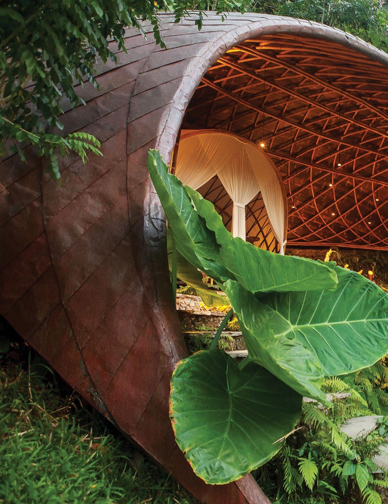
COPPER HOUSE IS THE
THE CLOSEST POSSIBLE CONNECTION TO NATURE
THE
design conscious # 85
MOON HOUSE
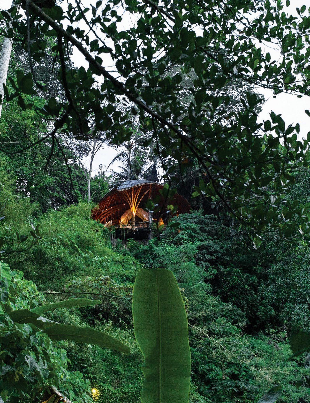
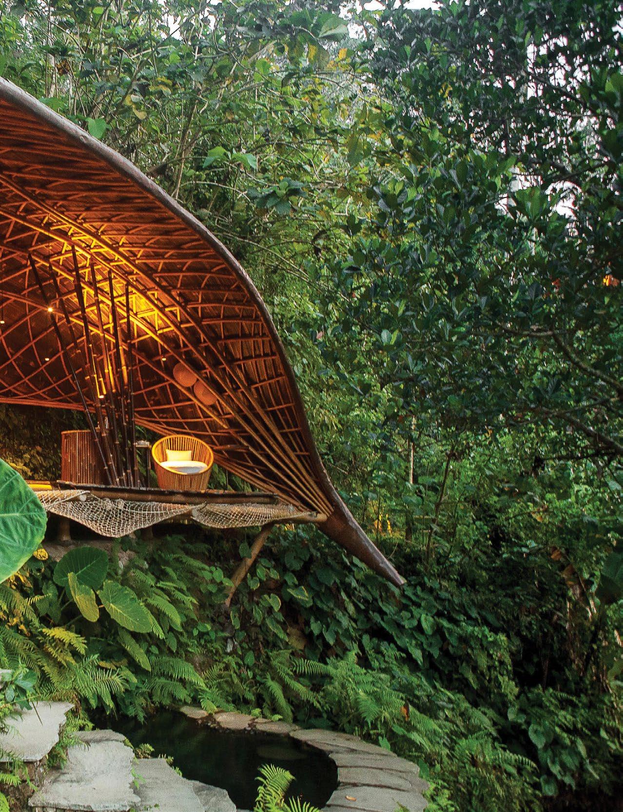
BAMBU INDAH MAINTAINS OPENNESS TO ITS LOCATION BY EMPLOYING A GRID SHELL STRUCTURE MADE OF BAMBOO THAT OPENS UP TO ITS CONTEXT. OPPOSITE
|
LATEST ADDITION TO BAMBU INDAH, AN ECO-RESORT IN SARYAN, BALI. ABOVE | CHARACTERISED BY A CURVING BAMBOO ROOF, COPPER HOUSE ALLOWS ITS GUESTS
WHILE MAINTAINING
FEELING OF ENCLOSURE.
With a three-year growing cycle and very little care needed during the growing period, bamboo is a compelling, low-maintenance, low environmental impact choice for planting and building.
issue #43 habitusliving.com
design conscious # 87
Amidst bamboo’s increasing popularisation and obvious structural opportunities, its usage in construction does not come unchallenged, however. One of the fastest growing and resilient plants in the world, bamboo has nevertheless faced several inhibiting factors limiting its use in building design. As only some of bamboo’s 1450 species are suitable for construction, quality control of bamboo remains to be an immediate challenge and a deterrent to many architects who have been mildly curious about its use in construction. If untreated, bamboo is also highly flammable and susceptible to fungi and insect attacks, limiting its usage to short-term projects in the past.
For bamboo experts like Elora, however, the plant’s opportunities far outweigh the weaknesses; leading her and her team to explore mitigating solutions in-house through research and implementation. Case in point, IBUKU’s seminal project in Bali – Green School – is a collaborative effort with Joerg Stamm, a German builder specialising in bamboo, that led to many innovations in bamboo architecture and engineering, such as the concept of creating central towers to hold up larger buildings, used by IBUKU today.
To increase the longevity and resilience of bamboo, Elora and her IBUKU team utilise boron mixture to render bamboo indigestible to insects and lab test the material to further confirm its integrity and durability. To protect bamboo from the rain and the sun, Elora resorts to designing building enclosures with dramatic overhanging roofs and tilted columns, further reinforcing structural elements with steel and concrete and securing them several metres deep into the ground. Every new project in Bali or overseas becomes an opportunity to test new engineering solutions. “One of our new projects at the moment involves engineering a 20-metre diameter dome and technical challenges focusing on how to prepare something for assembly overseas,” divulges the creative director of IBUKU. “We are always seeking to innovate and listen to the bamboo itself for unique ways it can be used.”
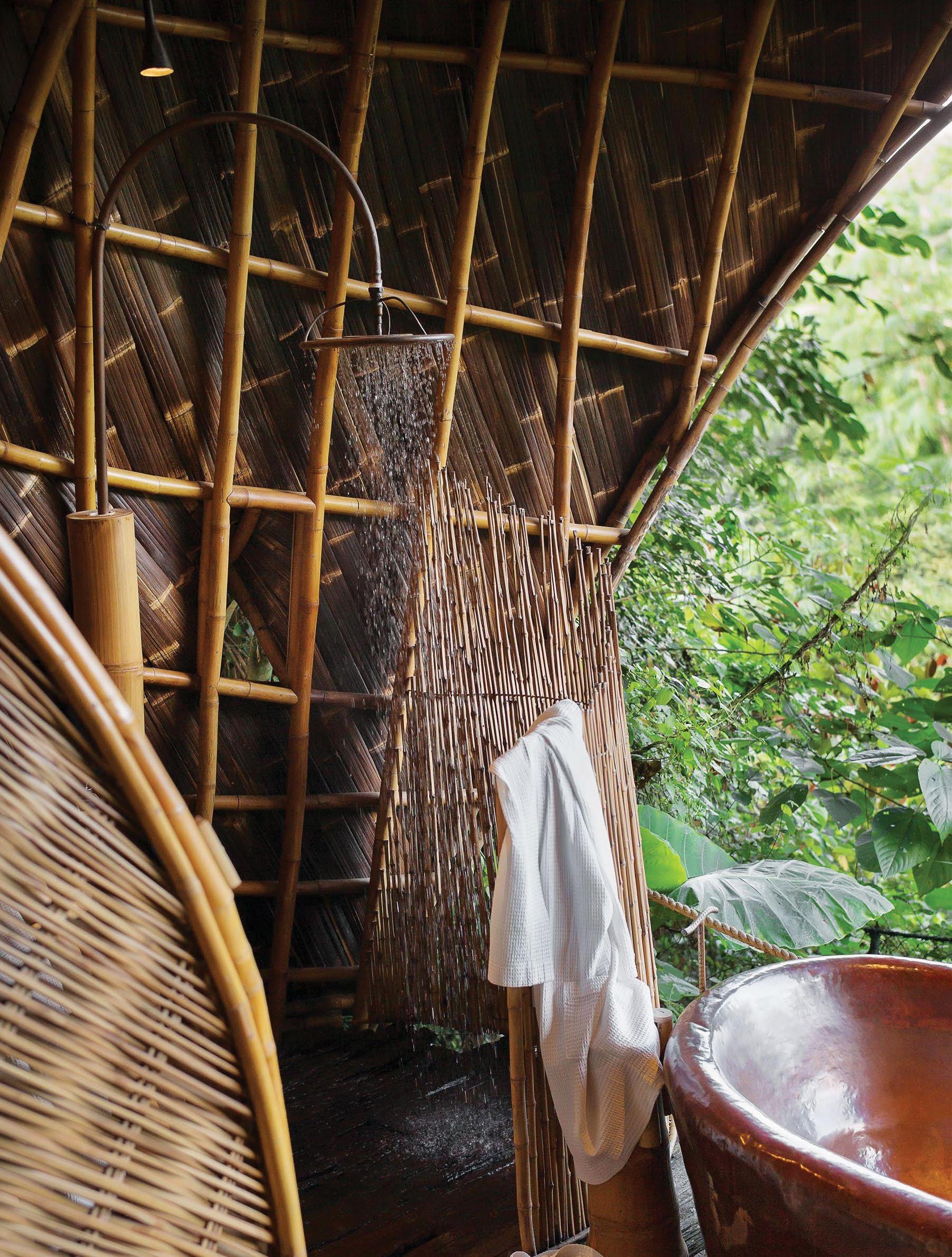
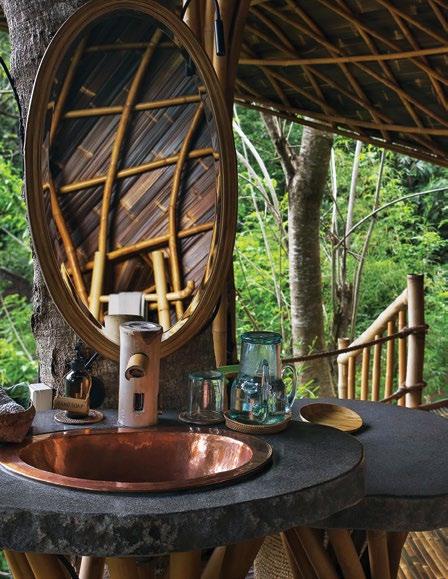
In projects like IBUKU’s Copper House and Moon House in Bali’s eco-resort Bambu Indah and Sokasi Cooking School at Four Seasons Sayan, intricate columns and roof supports incorporate structural lessons from local structures used for shading. “For Sokasi we put the spotlight onto bambu tali (gigantochloa apus) as the structural material
issue #43 habitusliving.com
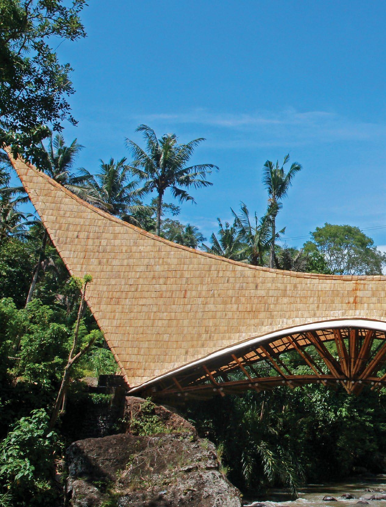
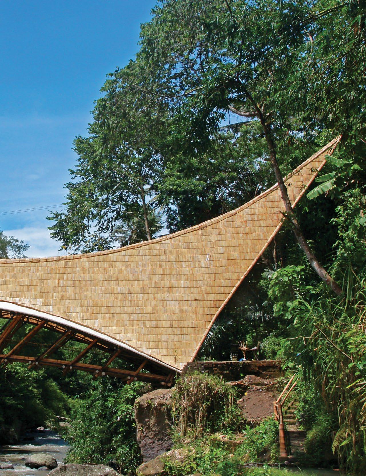
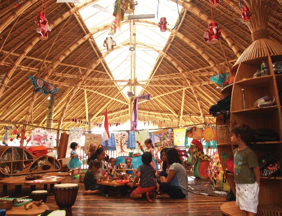
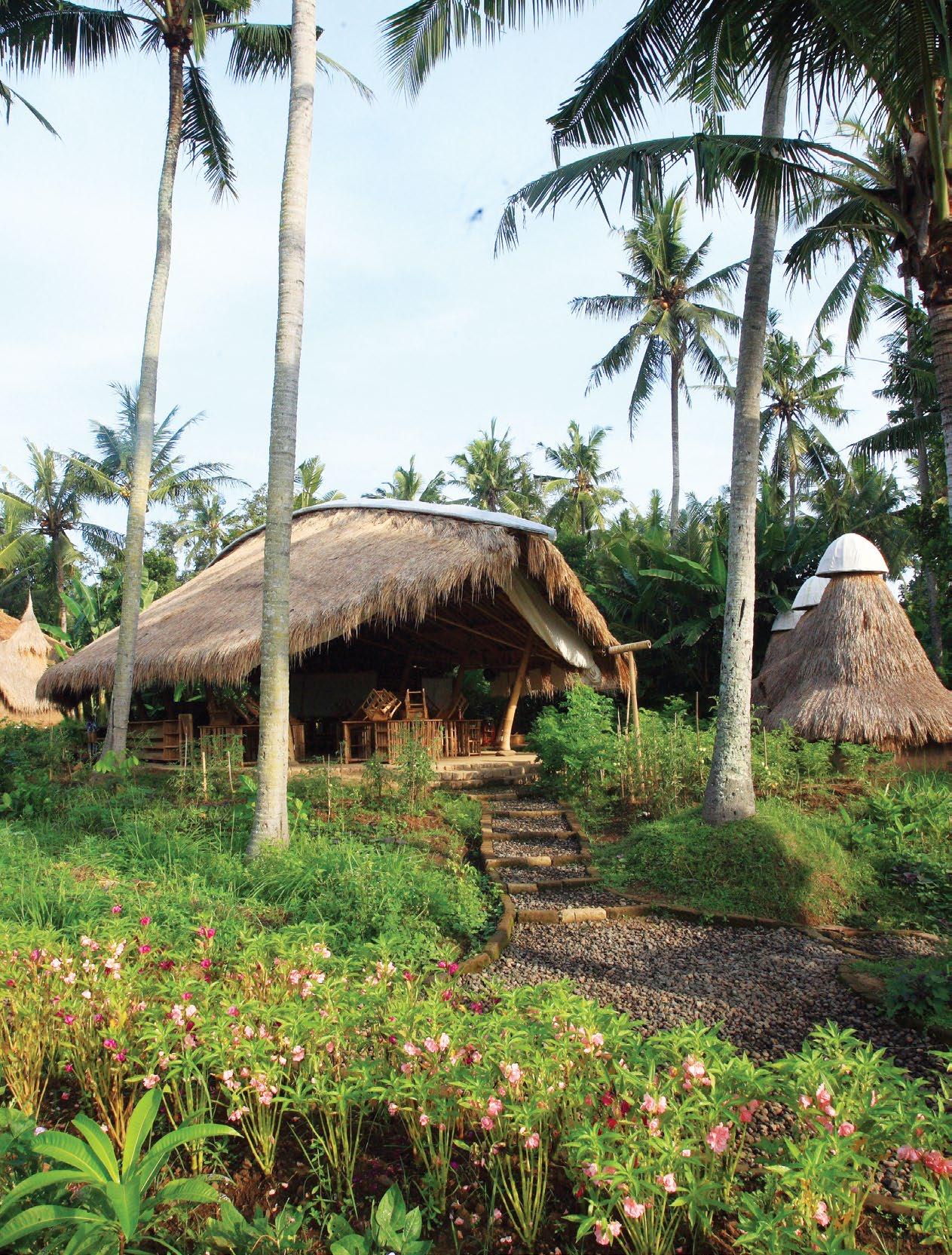
PREVIOUS | A BAMBOO BRIDGE CONNECTS TWO SIDES OF THE RIVER VALLEY CAMPUS AT THE GREEN SCHOOL AND STANDS TESTAMENT TO THE STRUCTURAL POTENTIAL OF THE MATERIAL. ABOVE | IBUKU’S GREEN SCHOOL IS AN OFF-THE-GRID CAMPUS THAT TEACHES CHILDREN HOW TO BUILD, GARDEN AND CREATE IN HARMONY WITH NATURE. OPPOSITE | JONH AND CYNTHIA HARDY FOUNDED THE SCHOOL WITH A VISION TO CREATE BEAUTIFUL ARCHITECTURE AND BUILD IT OUT OF THE MOST ENVIRONMENTALLY FRIENDLY MATERIALS POSSIBLE.
design conscious # 89
issue #43 habitusliving.com
Factors that have previously inhibited the use of bamboo are leading innovators to challenge the engineering limitations of the material.
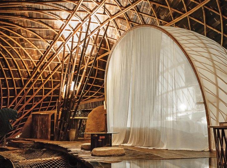
AND SHELTER FROM THE ELEMENTS. design conscious # 91
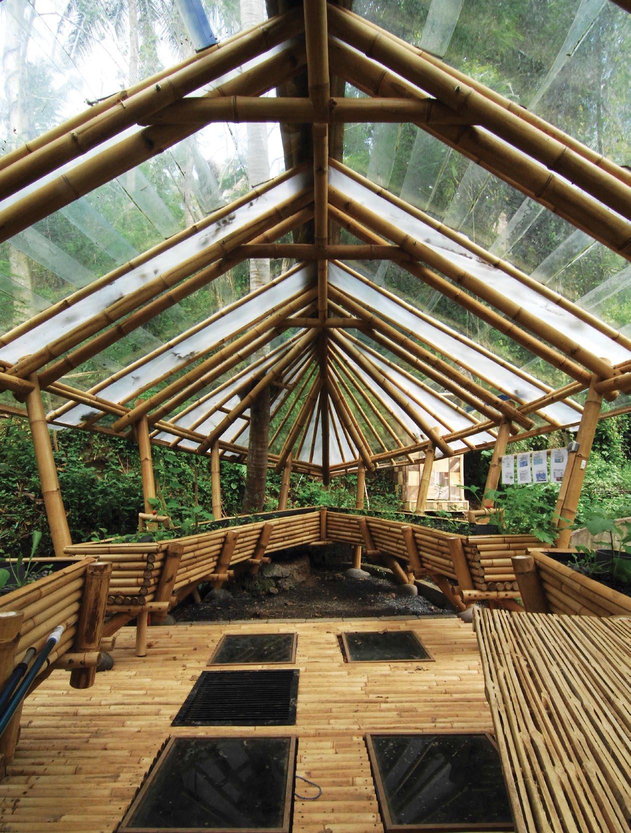
OPPOSITE | THE GARDEN AND FARMING AQUAPONIC SYSTEM AT THE GREEN SCHOOL IS ONE OF THE LATER ADDITIONS TO ITS GROWING CAMPUS, WITH NEW STRUCTURES INSPIRED BY GREEN DESIGN PRINCIPLES AND LATEST BAMBOO CONSTRUCTION TECHNIQUES. ABOVE | THE ORGANIC SHAPE OF THE MOON HOUSE AT BAMBU INDAH, BALI PROVIDES OPENNESS TO NATURE, NATURAL
VENTILATION
because this species of bamboo is crucial to every Balinese ceremony or event and is used for shade structures, as a rope material, to create satay sticks and rice baskets,” says project architect Eka Wiradana.
As bamboo construction methods and treatment techniques continue to be improved by the material’s early adaptors like IBUKU, the popularisation of bamboo usage beyond its decorative qualities is pushing the potential of its structural capabilities to new heights. Factors that have previously inhibited the use of bamboo are leading innovators to challenge the engineering limitations of the material, sending a message that the unassuming plant is well on its way to secure a firm place in building construction of a sustainable tomorrow.
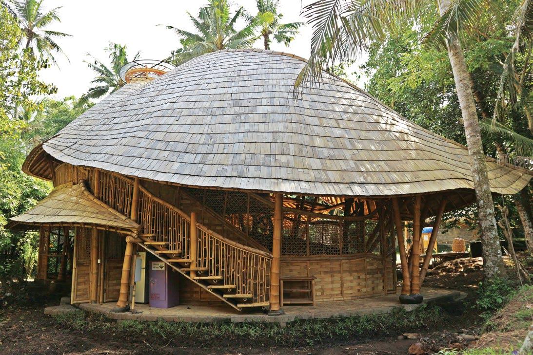
ABOVE | THE NEW SCIENCE LAB WAS DESIGNED USING MATERIALS FROM THE OLD LAB, LIKE DRUM SHEET ROOFING AS A MATERIAL FOR STORAGE WALL, PAYING HOMAGE TO ITS PREDECESSOR.
issue #43 habitusliving.com
To increase the longevity and resilience of bamboo, Elora and her IBUKU team utilise boron mixture to render bamboo indigestible to insects.
Innovation Meets Style and Sustainability
Through revolutionary design, Zip Water is changing our water consumption habits for good.
In an age where conscious consumerism and the desire to buy better is gaining more ground, collectively we’re valuing design that places importance on form, functionality, longevity and sustainability; purchasing those items that we’ll use for years to come and won’t leave a negative impact when we’re gone.
When it comes to appliances, sustainability isn’t exactly the first thing that springs to mind but there are many brands that claim to be pioneers in this space. There are few that live up to such statements, however Zip Water is one such brand. The Australian manufacturer of instant water systems has gained worldwide recognition and is now considered by many as the leader in its field.
Zip Water has been changing the way the world consumes water since 1947 – initially with its over-sink boiling water heaters in the 1960s, and then with the world’s first instant boiling water tap in the 70s. Throughout the decades, Zip has continued to push the boundaries through continuous research and development, and the HydroTap – the tap that provides boiling, chilled or sparkling water instantly – first released in 2012, is the latest embodiment of that.
For the first time, a single tap offered choice when it came to consuming water, it eliminated the need for waiting for chilled or boiling water, and it did so in a way that was modern and stylish – just a single, sleek, streamlined tap that gave as much attention to aesthetics as it did practicality. And with its NSF-certified filter that incorporates innovative silver ion antimicrobial technology, the revolutionary HydroTap provided healthier, pure tasting water that could easily be enjoyed every day.
Perhaps one of the most innovative aspects of the HydroTap was (and still is) its sustainable elements. Featuring Power-Pulse technology that maintains stored boiling water to within 0.2°C of your set temperature, no energy is wasted waiting for water to boil, while that crisp, chilled water is all thanks to a unique air-cooling technology. Opposed to traditional water cooling which wastes litres of water each time the system is used, this air-cooled refrigeration system requires no water at all.
In 2017, Zip released an internationally recognised and independently verified Environmental Product Declaration (EPD) for its innovative HydroTap: the first EPD for an electrical product in Australasia.
Convenient, healthy and environmentally-friendly, Zip Water is changing our water consumption habits for good, one HydroTap at a time.
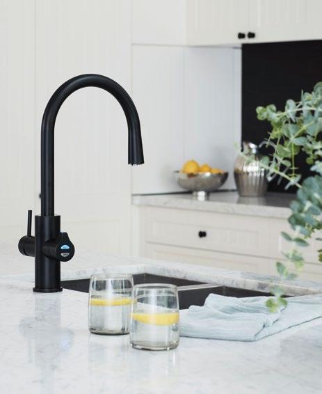
habitus promotion › Zip Water #93 issue #43 habitusliving.com ABOVE | THE ZIP HYDROTAP ALL-IN-ONE CELSIUS ARC IN MATTE BLACK.
zip water | zipwater.com
issue #43 habitusliving.com
Build it, they will come
Spectacular architectural pavilions are big crowd-pleasers, but critics claim they’re running out of control.
design conscious # 95
TEXT STEPHEN TODD
Temporary architectural pavilions are spawning with increasing frequency and flamboyance around the world. In the past few months alone we’ve seen an origami-like structure engulf the statue of the Holy Roman Emperor in Munich, then disappear. Another, conjured in Los Angles as a kind of towering funnel attempts to harness the ephemeral energy of lightening. Earlier, in Harbin, China, the world’s tallest ice pavilion was built in the shape of a flamenco dress. Happily, it’s since thawed.
“What’s interesting is how much the typology has exploded,” says University of Queensland professor John Macarthur, co-author of the book, Pavilion Propositions “When London’s Serpentine Gallery launched its summer pavilion program in 2000 with an installation by Zaha Hadid it marked the revival of an almost forgotten form. By 2010 there were something like 45 temporary pavilions happening around the world and in 2015 there were, by our calculation, 170!” Since then they have multiplied almost promiscuously.
Hadid’s pavilion was intended as “a structure, a marquee, a tent” recalls former director of the Serpentine, Julia Peyton-Jones; a one-night party venue for the gallery’s 30th birthday celebrations. But so successful was it, so ‘wow’ the factor, that the minister of culture in the New Labour government agreed to extend its run, turning it into a de facto temple to Cool Britannia – and setting in train a phenomenon critics reckon is now veering out of control.
Over the past 18 years the Serpentine summer program has seen temporary structures by illuminati including Oscar Niemeyer, Rem Koolhaas, Frank Gehry and Jean Nouvel occupy the elegantly groomed grounds of Kensington Gardens, Hyde Park, and Central London. The 2016 iteration by Danish It-boy architect Bjarke Ingels, unidentifiable lying objects of no fixed function but with a lot of pizazz, clocked up close to two million visitors. Last year, the Serpentine gallery successfully exported its pavilion franchise to Beijing, with a steel beam and cable construction by JIAKUN Architects outside WF Central, a shopping and hotel complex in the Dongcheng District. It lived for four months, and was then disassembled.
“We have enormous affection for things that are temporary,” says Sydney architect Camilla Block, of Durbach Block Jaggers. She’s quoting environmental artist Jeanne-Claude – who with her late-husband Christo – spent some 60 years dramatically wrapping major architectural structures like the Reichstag in Berlin and the Point Neuf bridge, Paris, in lengths of fabric and rope. (Their plan to wrap the Sydney Opera House never eventuated, although they did shroud two kilometres of the rocky shoreline of Little Bay in some 93,000 square metres of erosion-control fabric and 56 kilometres of polypropylene rope, back in 1969.)
“As architects, we’re used to dealing with the idea of longevity, so doing something that is meant to be ephemeral seems quite scary,” admits Camilla, who has designed the
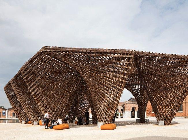
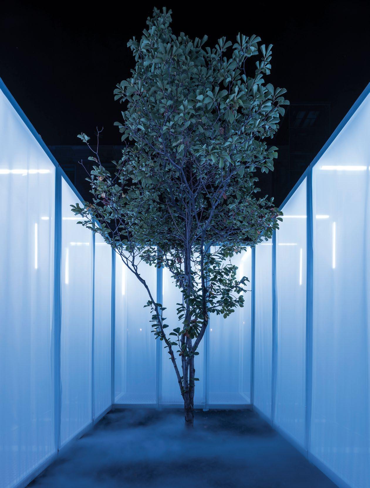
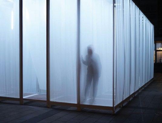
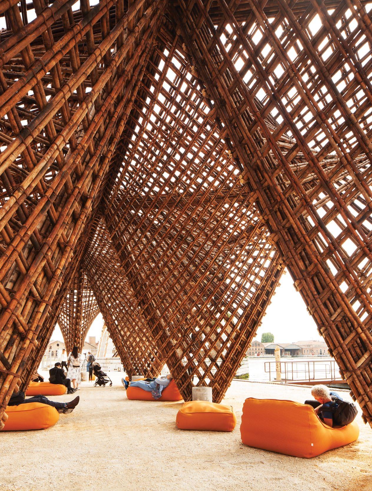
OPENER LEFT | DUTCH-CHINESE PRACTICE SUPERIMPOSE DEVISED THE CO2 PAVILION FOR BEIJING DESIGN WEEK LAST OCTOBER. OPENER RIGHT | IT WAS COMPOSED OF LAYERS OF TRANSLUCENT FABRIC PANELS FILLED WITH THEATRICAL SMOKE TO SUGGEST SMOG. OPPOSITE | VO TRONG NGHIA’S BAMBOO STALACTITE PAVILION AT THE 2018 VENICE ARCHITECTURE BIENNALE.
issue #43 habitusliving.com
design conscious # 97
issue #43 habitusliving.com
“As architects, we’re used to dealing with the idea of longevity, so doing something that is meant to be ephemeral seems quite scary.” – Camilla Block
design conscious # 99
inaugural Barangaroo Structure in collaboration with the Sherman Centre for Contemporary Ideas, to be unveiled in the Barangaroo headlands park, Sydney, in October 2019. Titled Coil, it entails fabric mounted on a spiraling frame that wraps around a group of standing stones, various openings framing views out to Goat Island and the Harbour Bridge.
“Pavilions have a lot of uses but strictly speaking there is no use at all. Yet I feel this embodies some of the best aspects of architecture: narrative, light and space,” says Camilla.
A similar reframing technique was deployed by Beijing practice Superimpose to create the CO2 Pavilion as part of Beijing Design Week last October. A rectangular assemblage of translucent fabric panels erected on a banal city carpark, it was designed to contain two of the existing four trees, and by isolating them imbuing them with new meaning. “As a studio we always look at context first, then try to add something to an already existing layer,” says Ruben Bergambagt, onethird of Superimpose along with Carolyn Leung and Ben de Lange. “In the case of this pavilion, by re-contextualising some of the trees we’ve emphasised them, creating something almost like a Zen garden.”
An interior skin creates a cavity which the architects have infused with non-toxic theatrical smoke to mimic smog, drawing attention to the city’s notorious pollution problem. The inner courtyard evokes the traditional Beijing hutong; open to the sky, it reframes nature in a very urban setting.
“It was originally designed for Burning Man,” explains Carolyn, “but since we missed that deadline we repurposed it for Beijing Design Week.”
Much of the rising critique of the temporary pavilion phenomenon hinges on the smudging of the lines between architecture and art; the blatantly sculptural, obliquely performative, ostensibly purposeless aspect of the structures. The Burning Manification of the profession, if you like.
And yet, if they didn’t exist we’d be deprived of the pleasure of contemplation they inspire, the shelter for community activities they may house, the material research they can enable. We’d have no Bamboo Stalactite Pavilion by Vo Trong Nghia at the Venice Architecture Biennale, its “green steel” structure fanning out poetically amid the docks of the Arsenale. No University of Stuttgart ICD/ ITKE research pavilion that each year seeks to replicate a particular biological process. No “woven tapestry” of concrete roofing tiles by Mexican architect Frida Escobedo to offset the red brick Serpentine Gallery designed in the 1930s by James Grey West, originally a garden folly; a tea pavilion for London’s aristocracy.
Architectural follies for the 21st century, maybe we should just enjoy them while they last.
Much of the rising critique of the temporary pavilion phenomenon hinges on the smudging of the lines between architecture and art; the blatantly sculptural, obliquely performative, ostensibly purposeless aspect of the structures.
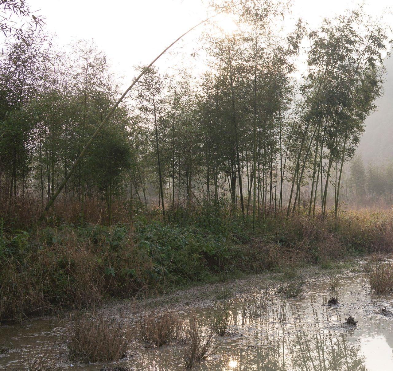
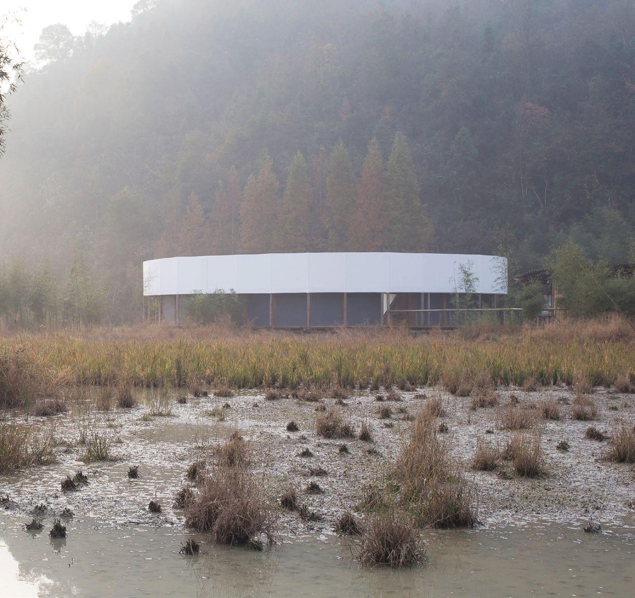
PREVIOUS | SUPERIMPOSE CREATED A RING-SHAPED PAVILION IN RURAL HANGZHOU, CHINA, AS A SPACE IN WHICH TO TEACH CITY CHILDREN ABOUT FARMING. issue #43 habitusliving.com
Design For All Seasons
Designer Bodil Kjær has always worked to create a sense of harmony between architecture and design, and in 1959 this lead to the creation of a series of elegant outdoor furniture. Almost six decades later, Carl Hansen & Son is now adding this series to its collection of design classics.
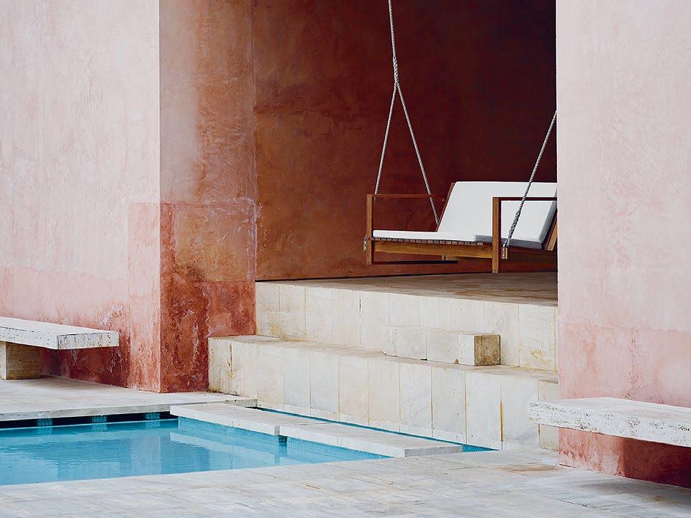
The Indoor-Outdoor series consists of a lounge chair, a small table, a dining table, a dining chair, a two-seater lounge sofa, a swing sofa, and a sunbed – all inspired by the iconic Cubist form.
“Indoor-Outdoor was designed for modernist spaces and for weather conditions that are very similar to those in Denmark,” says Carl Hansen & Son CEO Knud Erik Hansen “At the same time, the designs bring together the best of Scandinavian and international design traditions. The furniture has a clear identity, an evident simplicity, and is based on high-quality materials and superior craftsmanship.”
The clear, precise forms of the Indoor-Outdoor collection are available in Australia thanks to the keen eyed design experts at Cult.
habitus promotion › Cult #101 issue #43 habitusliving.com ABOVE | THE INDOOR-OUTDOOR COLLECTION IS DESIGNED TO SUIT CONTEMPORARY AESTHETICS INDOORS OR MATCH THE HARMONY OF THE NATURAL WORK OUTSIDE
Cult | cultdesign.com.au
With warmth and precision, the Indoor-Outdoor furniture series showcases design to weather any situation.
issue #43 habitusliving.com
Even better than the render
Koichi Takada Architects is known for luxury high-rise apartments, rich materiality and expensive finishes. But we find there is much, much more substance to this story than just good looks.
TEXT HOLLY CUNNEEN
—
design conscious # 103
issue #43 habitusliving.com
We are living in a day and age where food looks better than it tastes; people and places look better on Instagram than they do in real life; tourism is largely motived by the need to be seen rather than desire to do or experience; and technology is outshining its own creators. Sadly – scarily – this extends to architecture, too. The capability of rendered drawings in not only expressing an architect’s vision but also communicating a proposed building’s impact can sometimes have greater effect than the final built product.
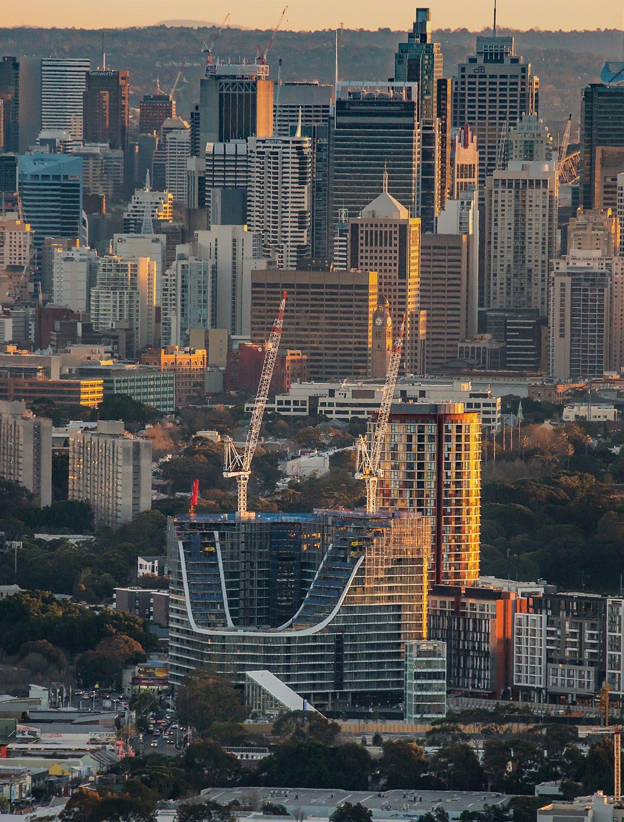
This however, is certainly not a fate becoming the Tokyo-raised, New York and London-trained, Sydneybased architect Koichi Takada. Koichi has been running his eponymous architecture practice, Koichi Takada Architects, since 2008 and in the years since developed a reputation for luxury high-rise, high density and (increasingly) mixed-use developments. The buildings he produces are impressive feats of architecture in form as much as function. Works such as East Village (2014), Skye by Crown Group (2016), Calibre (design development), The Waterfall (design development), and Infinity by Crown Group (under construction) are testament to this.
So what does a day in the life of this architect, director, thought leader and industry disruptor look like? Habitus shadowed Koichi for a day, visiting the studio and tagging along on site to gain insight into his daily regimen.
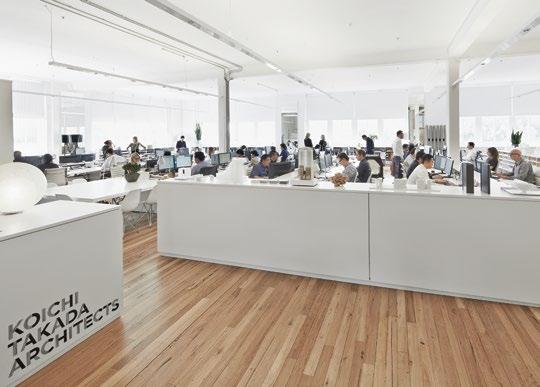
OPENER | A
ARCHITECTS IN
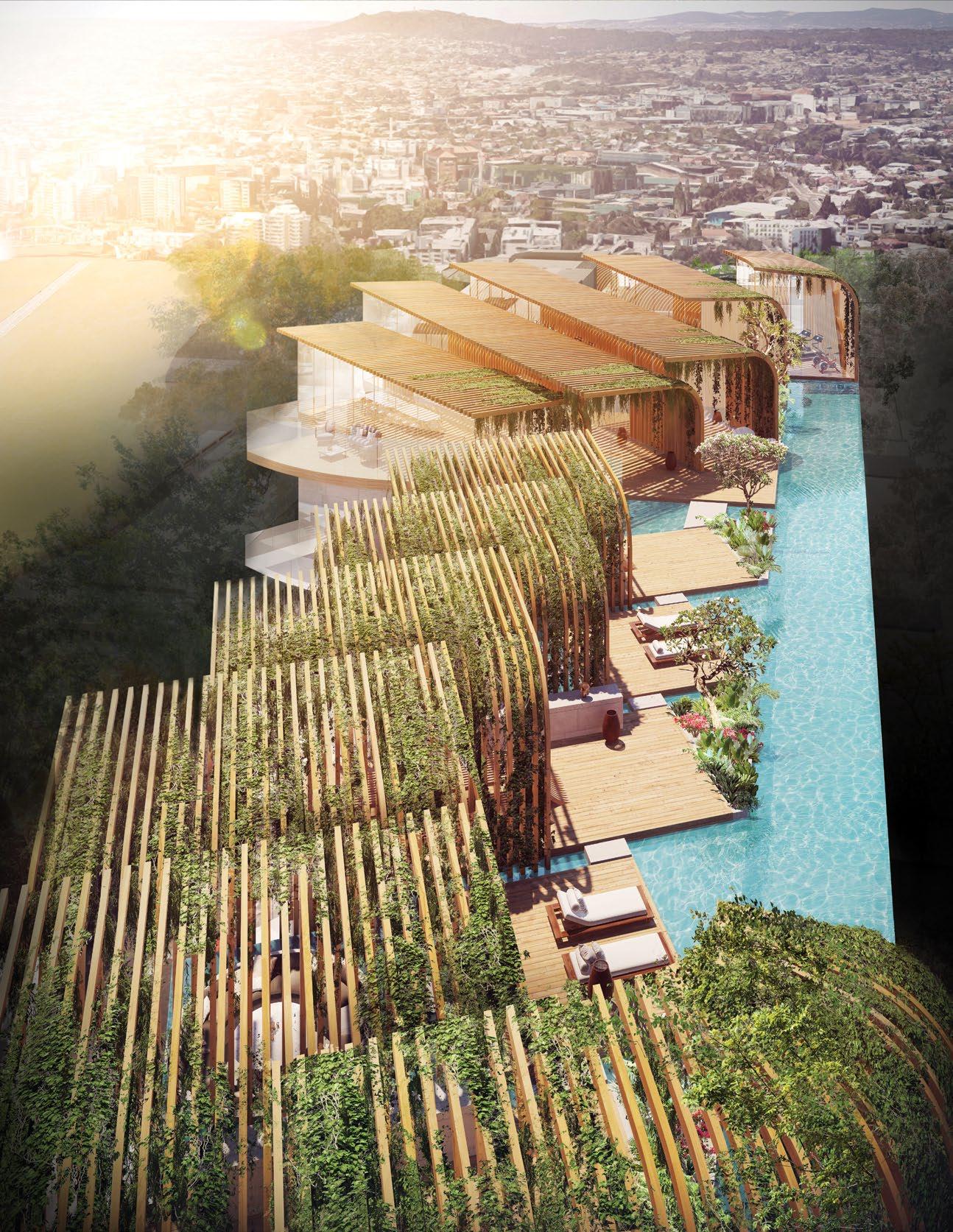
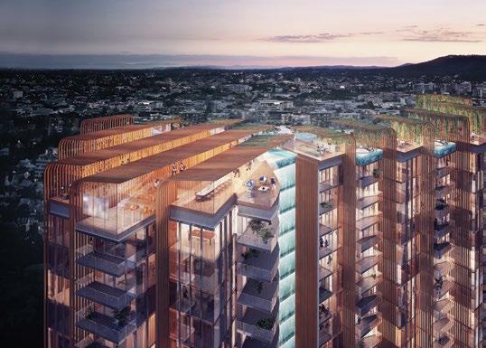
PHOTOGRAPH OF INFINITY BY CROWN GROUP UNDER CONSTRUCTION BEGINS TO REVEAL THE IMPRESSIVE ARCHITECTURAL DESIGN BY KOICHI TAKADA. PHOTOGRAPHY BY EATHN ROHLOFF. OPPOSITE & BELOW | RENDERS OF THE WATERFALL IN BRISBANE DEPICTING THE 118-METRE WATERFALL SPANNING THE HEIGHT OF THE BUILDING. ABOVE | THE STUDIO OF KOICHI TAKADA
SURRY HILLS, SYDNEY.
design conscious # 105
In the Studio
Koichi’s studio is contained to just one floor and the first thing you notice is the fact that upon entry you can see it all at once. The sole office within the space – Koichi’s – is barely demarcated with glass walls that don’t quite extend to the adjacent perimeter wall leaving an always-open access point in place of a formal door. The majority of the open-plan office is wide aisles housing the work stations of his 50 or so staff, next to Koichi’s office is an open boardroom/meeting area.
Within the barely-there confines of said meeting area the project team on The Waterfall, a residential high-rise development to be built in Brisbane, present to Koichi their progress. The design is comprised of 216 apartments and a 118-metre-high waterfall to run the full length of the western elevation of the tower. The waterfall is more than visually impressive; it contributes natural cooling and aids irrigation of the green walls. “We talk about nature more so than architecture, and we see nature as our teacher if you like, a source of inspiration,” notes Koichi. Renders, moodboards, plans, aerial site photographs and more are at the ready to be critiqued, annotated and ultimately improved upon.
It’s evident almost immediately that Koichi has an approach that empowers his employees to work autonomously and develop their skillset. The mentorship

senior architects offer to junior staff is mutually beneficial as the former can explore and develop skills in management and training while the later are able to work closely with and learn from experienced architects.
And experienced architects they absolutely are: nothing less would see the design, development and built form of Infinity by Crown Group – a mixed-used building located in Green Square, Sydney – as “even better than the render”. Ten years in practise and Koichi still gets nervous when the scaffolding concealing his buildings come down, a modest sign of his personal investment. But each an every time he continues to impress.
On Site
Infinity by Crown Group is characterised by its futuristic façade and gaping ‘0’, or doughnut hole, in the centre of the building. Without context, one could criticise it as a gimmick but in truth it is a carefully considered architectural response to site. Fundamentally, the aerodynamic form tames the wind as well as drawing light into the public square and internal balconies. Having visited the site personally, the exceptionally strong wind that only fortifies the higher you rise, absolutely needs taming. The fluid form of the 20-storey building references the undulating topography of Sydney. “Nature and the city are beautifully balanced in Sydney so we want to reflect that in the architecture,” says Koichi.
From the outset, Koichi Takada has been not only open to working on high-rise developments (an area that a lot of other practices avoid for various reasons) but also determined to do so. Without seeming overly sentimental you could view it somewhat as a noble pursuit: everincreasing portions of the Australian population are living in high density buildings, therefore there is opportunity to enhance many people’s lives with architecture by way of a single project.
“I personally took that challenge,” says Koichi, strongly influenced by his surprising aversion to Manhattan and the feeling it gave him of “living in-between buildings”. Working with developers and on high-density residential buildings: “there can be criticism, so either you choose not to look at [the issues] and ignore [them], or you take that as a challenge to change the world. So, I said I’d do that instead.
“I don’t think one action could change everything, but at least that approach to it can open up new possibilities and show the next generation not to be afraid, there is a way we can contribute.”
Koichi Takada Architects | koichitakada.com
ABOVE | ARCHITECT KOICHI TAKADA. OPPOSITE | THE “DOUGHNUT-SHAPED HOLE” THAT ICONIZES INFINITY BY CROWN GROUP TAMES THE STRONG WINDS THE AREA IS KNOWN FOR.
issue #43 habitusliving.com
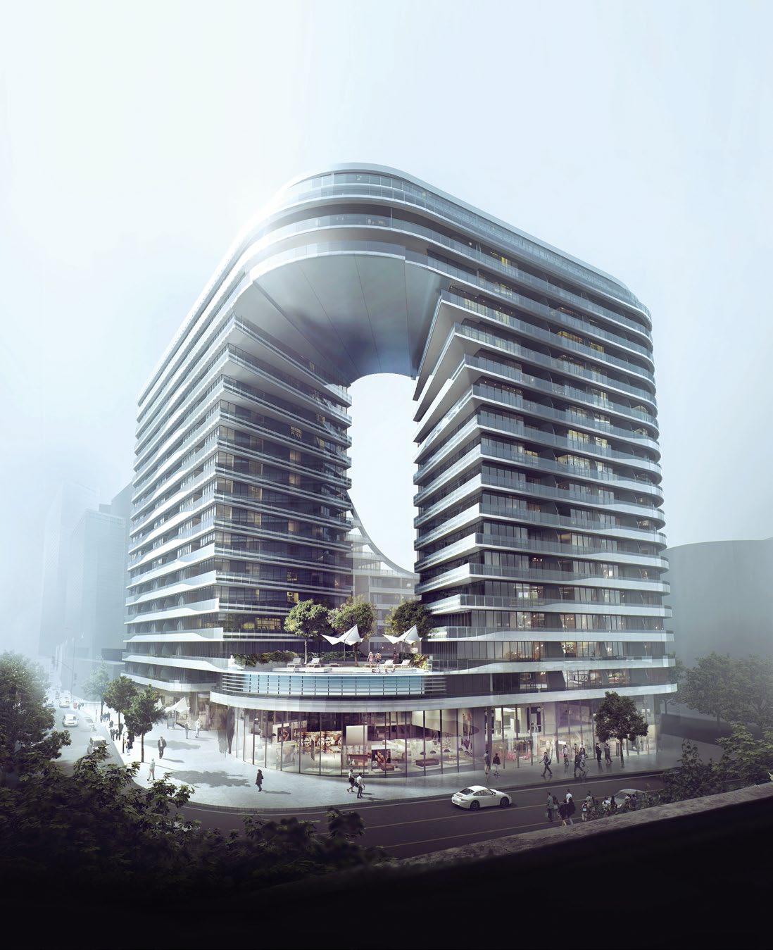
design conscious # 107
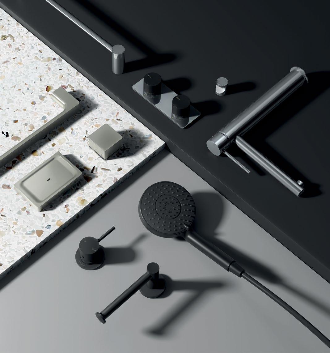
When an Architect goes rogue
Jean-Pierre Biasol has taken it upon himself to design a suite of stools exactly the way he would like to use, and specify, for his clients.
design conscious # 109
TEXT HOLLY CUNNEEN | PHOTOGRAPHY JAMES MORGAN
If you’ve ever heard the saying ‘too much choice is just as bad as not enough’, don’t share it with JeanPierre Biasol, architect, founder and director of his eponymous mutli-disciplinary design studio, Biasol Design. It flies in the face of his newest design venture.
In the truest sense of the term ‘multi-disciplinary’ the studio’s work covers architecture and design in the residential, commercial and food and beverage sectors. It extends to graphic design and branded environments to round out a full service.
Today, that service is fuller still as Biasol Design relaunches into furniture design. Jean-Pierre has been working away – with his team in toe – on the Tre Mezzo Collection: terrazzo stone bar stools for indoor and outdoor use in residential and commercial settings alike. Originally launched in 2015, it has since evolved in conjunction with the studio.
The stools are available in three heights (for dining, counter and bar use), and are also available in almost 700 possible colour and material combinations.
“Having a furniture range that can easily adapt to indoor and outdoor use with a magnitude of colours and finishes made sense to us as designers and specifiers,” says JeanPierre. “We often come across a great product however production lead-times or range of colours and finishes are often limiting.”
The Tre Mezzo Collection is manufactured locally in Melbourne by people that Biasol Design has pre-exisiting relationships with. This cuts down on lead times, supports the local industry and economy, and facilitates a greater ability to customise.
It was also important to the team that the collection mirror their playful approach to design, love of colour and appreciation of inter-materiality in a way that was accessible to a conservative audience as much as an outlandish one.
The materials chosen for the initial release were identified and recognised for their durability and timelessness. They include natural timber, terrazzo and stone with the option to upholster in fabric, velvet and leather. If this sounds a bit safe to you don’t worry, it sounded a bit safe to Jean-Pierre, too. “The intention is to update the range with the seasons and trends we see in the industry. Limited runs on specific materials and finishes is also something we’re excited to share in the near future,” he adds, before leaving us with one parting piece of advice: “Expect the range to constantly evolve as our studio grows and draws inspiration from near and far.” We wouldn’t expect anything less.
OPENER | A DETAIL OF THE TERRAZZO STONE USED IN BIASOL’S NEWLY RELAUNCHED COLLECTION OF FURNITURE; THE TRE MEZZO COLLECTION. OPPOSITE | TIMBER AND LEATHER ARE ALSO ABLE TO BE USED FOR THE SEAT OF THE STOOLS, AND THERE ARE THREE HEIGHTS AVAILABLE.
issue #43 habitusliving.com
Biasol Design | biasol.com.au
The stools are available in three heights, and are also available in almost 700 possible colour and material combinations.
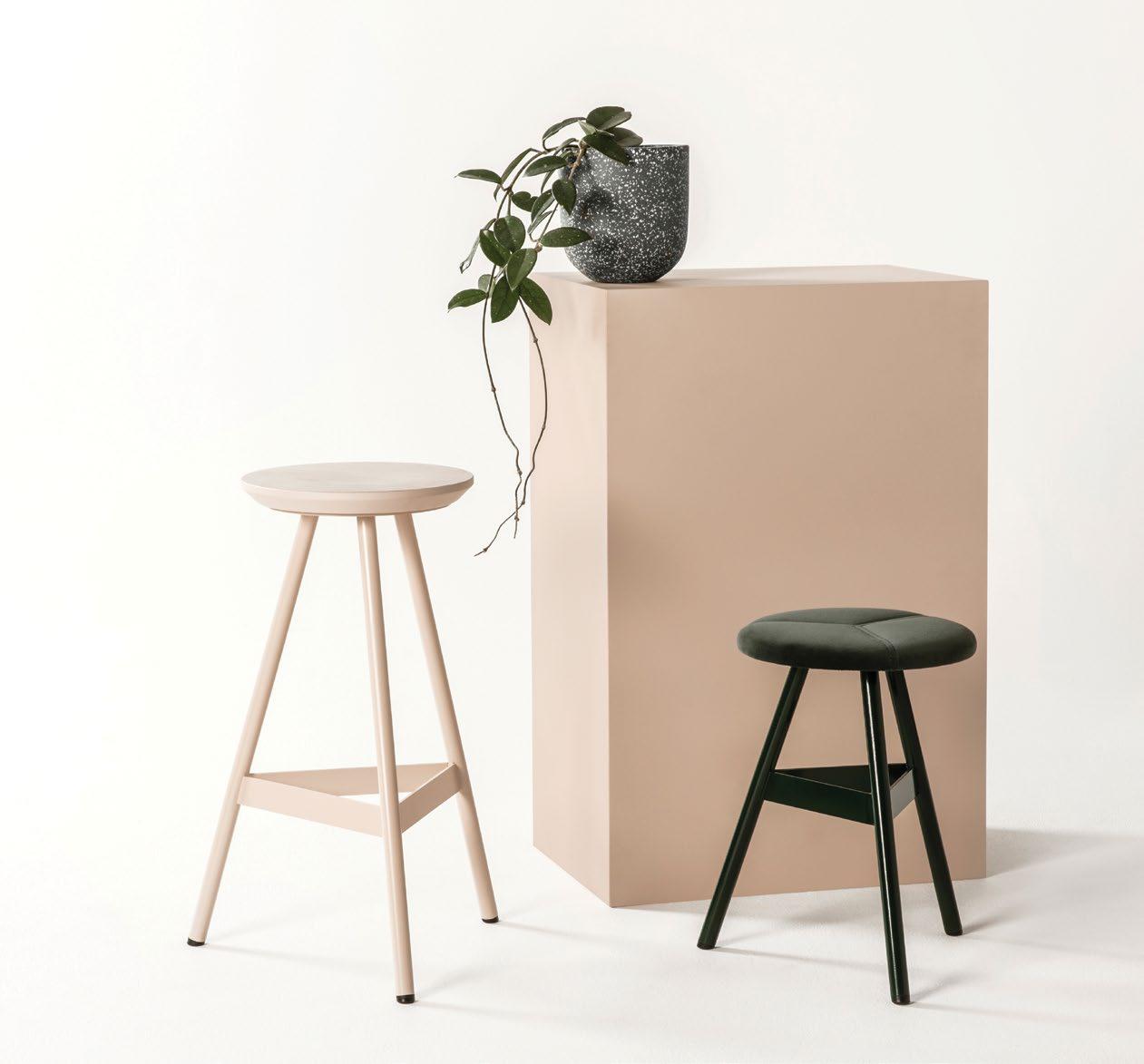
design conscious # 111
The Habitus Collection Online gives Australian Design Hunters instant access to the best design products for residential environments. We take the hard work out of product selection, hand-picking the best design products available in the region. All in a single, comprehensive digital touch-point.
habitusliving.com/collection

Discover the best design products for home and living.
Protection from the elements
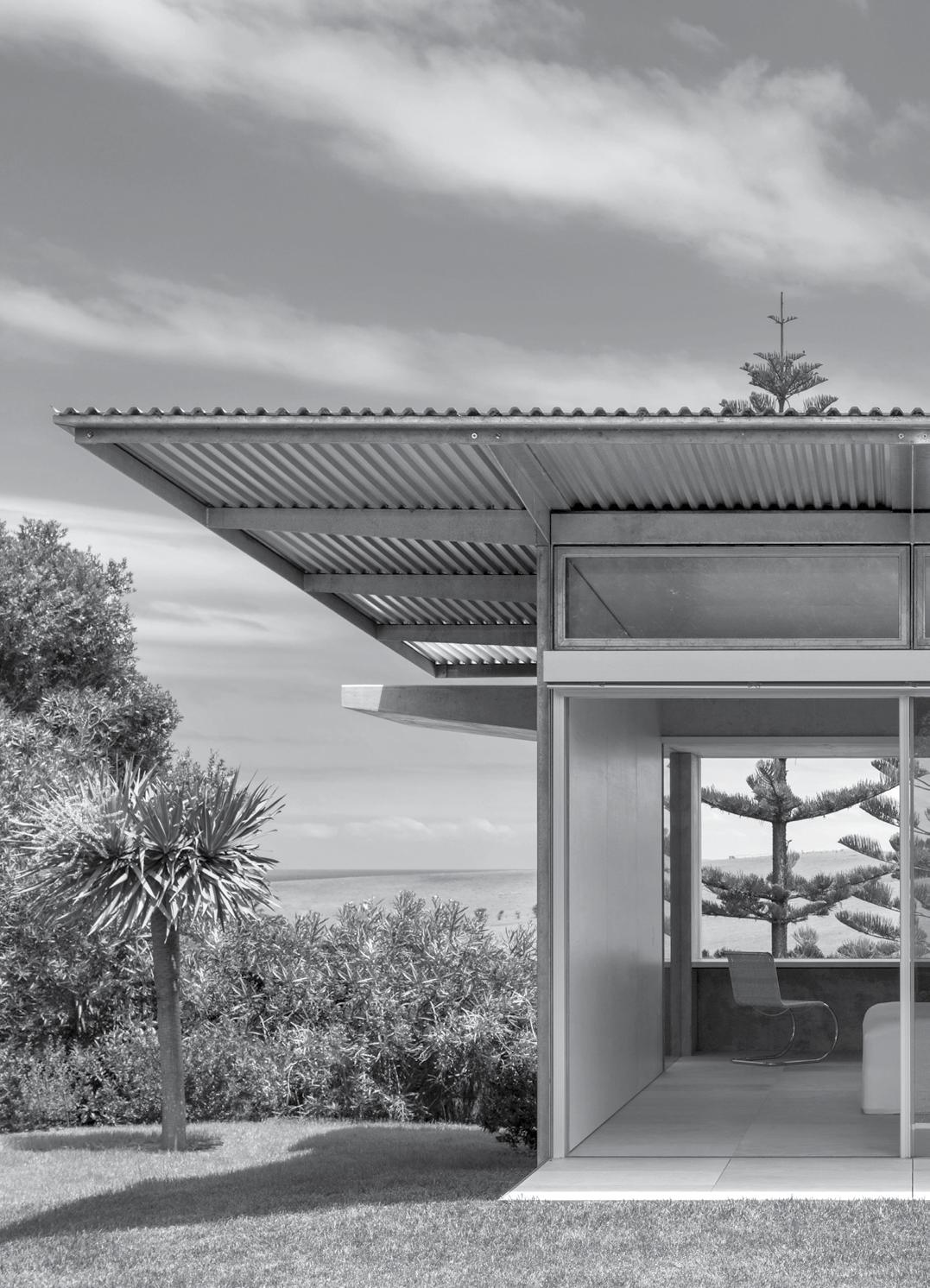
A modest insertion in the Landscape
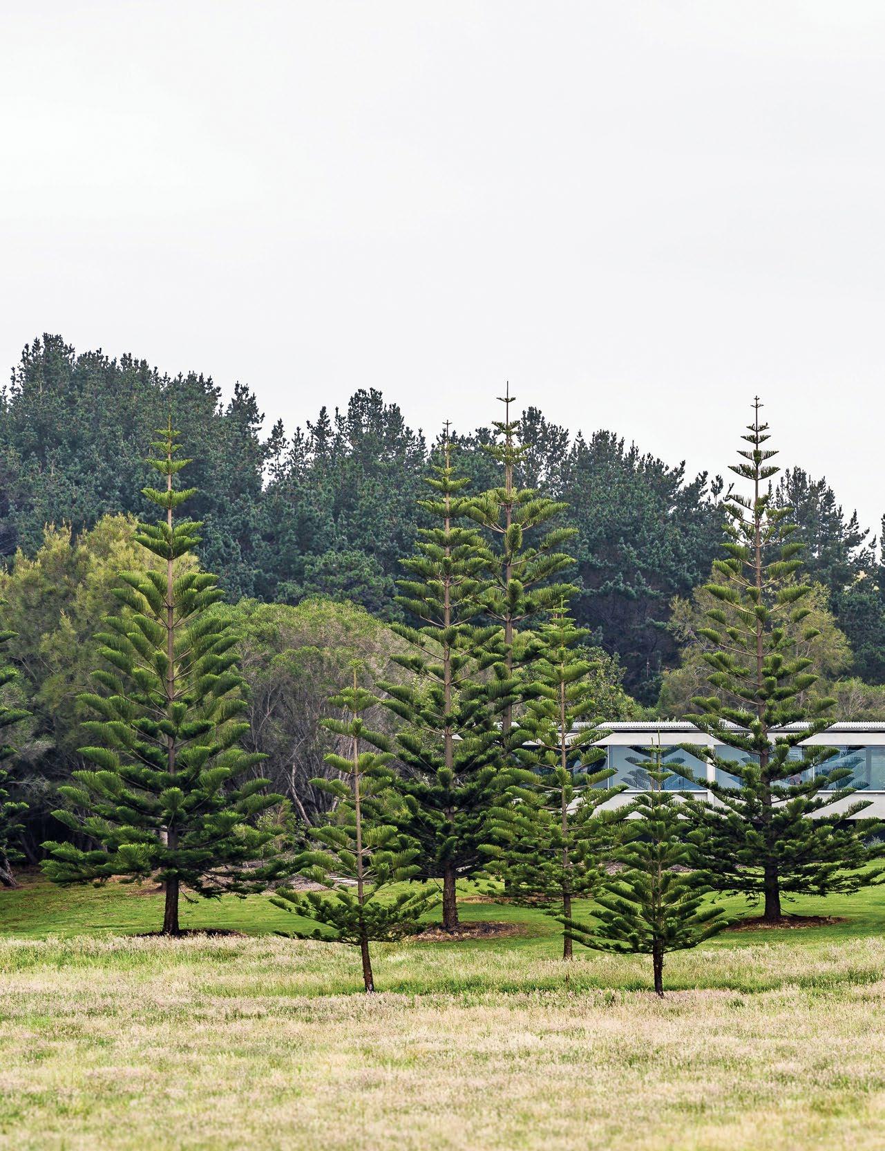
issue #43 habitusliving.com
Haxstead Garden House by Tobias Partners is a fine architectural example of less being considerably more. Pared down to its essentials, this weekender on the southern coast of New South Wales allows the landscape, including the ocean, to take centre stage.
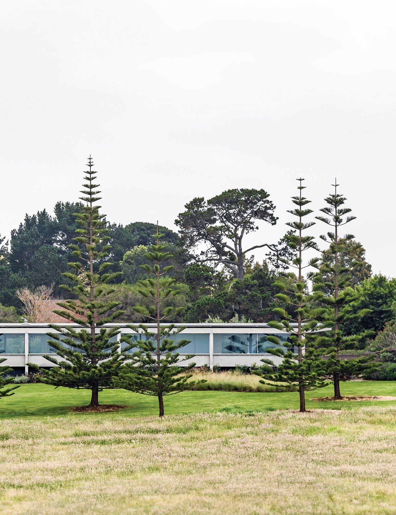 TEXT STEPHEN CRAFTI | PHOTOGRAPHY JUSTIN ALEXANDER
3 . on location # 115
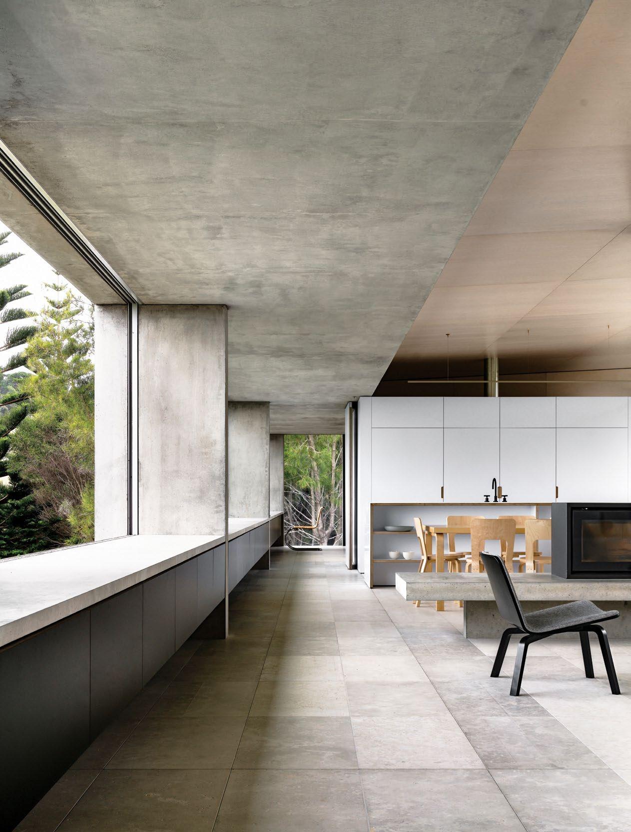
issue #43 habitusliving.com
Located in Central Tilba, a five-hour’s drive from Sydney on the southern coast of New South Wales, sits this garden-style weekender. One of several dotted on the substantial property, this latest offering from Tobias Partners sums up the great Mies Van der Rohe’s approach of ‘less is more’. A simple palette of materials, including glass, concrete and steel, allows this extruded low slung coastal house to sit quietly in a landscape by designer Myles Baldwin. This landholding, including the heritage-listed period home ‘Haxstead’, has been in the family for many years. Now it was time to create a contemporary weekender for the couple’s son, his wife and their two young children, a stone’s throw from the original homestead.
Tobias Partners initially introduced a more contemporary style of architecture with a yoga pavilion on the property, as well as making a number of sensitive modifications to Haxstead. “The brief for the Garden House, as it’s referred to, came from both the parents and the next generation: the son and his family. Both were interested in maintaining the views of the Pacific Ocean and these beautiful gardens, some more intimate and pocket-like, others more expansive,” says Richard Peters, project principal.
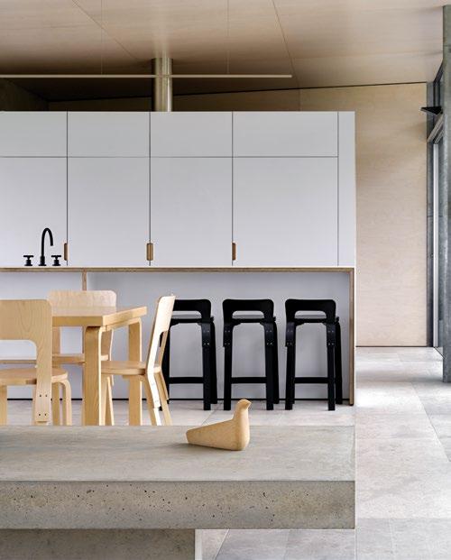
OPENER
DELINEATED
| HAXSTEAD GARDEN HOUSE SITS SEAMLESSLY IN AMONGST THE NATURAL LANDSCAPE. OPPOSITE | THE CONCRETE GUTTER’S ‘UNDERBELLY’ EXTENDS FROM ONE END OF THE HOUSE TO THE OTHER, CREATING A MEANS OF ACCOMMODATING THE HEAVY RAINFALL, BUT A FINE ARCHITECTURAL DETAIL IN THE PROCESS. ABOVE | THE OPEN PLAN LIVING SPACES ARE LOOSELY
BY STRATEGICALLY
PLACED BUILT-IN JOINERY, PULLED BACK FROM THE CEILING TO ALLOW FOR CROSS-VENTILATION.
3 . on location # 117
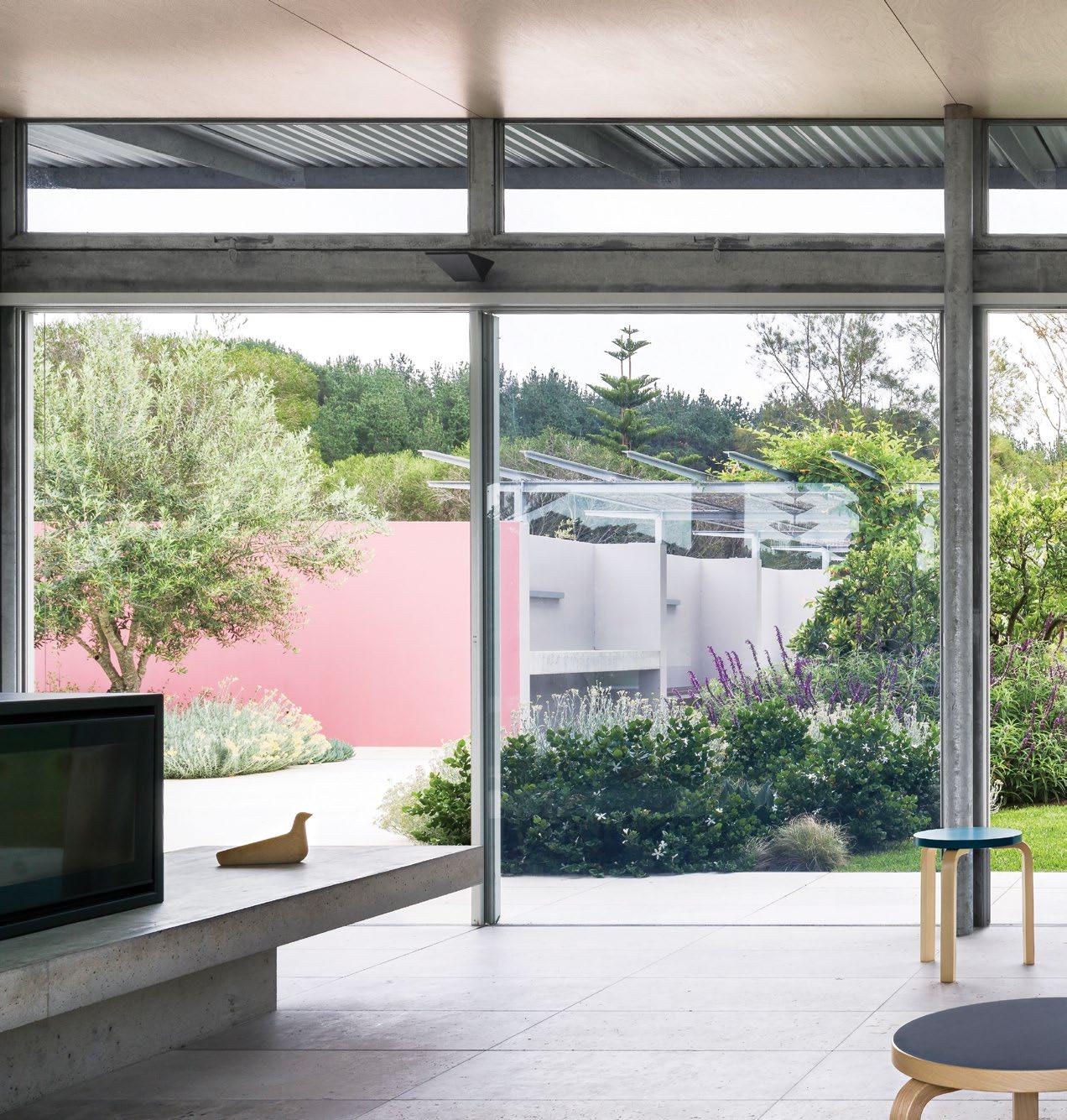
ABOVE | THE MAIN LIVING AREA IS FRAMED NOT ONLY BY LANDSCAPED GARDEN BEDS, BUT AS IMPORTANTLY, FINELY CRAFTED STEEL MULLIONS AND LINTELS. issue #43 habitusliving.com
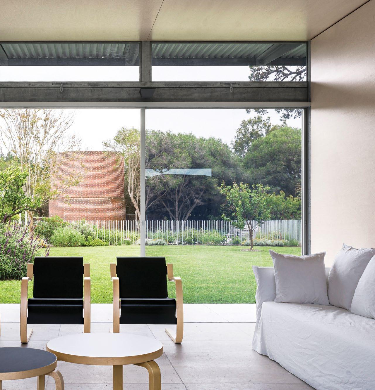
3 . on location # 119
“When you actually step inside, you really feel as though you’re still in the garden.”
Richard worked closely with architect Julia Cumines, who assisted with the design and development of this unique project. “This specific location on the property was perfect for the new house. It has sweeping views to the south-east and would engage perfectly with the surrounding landscape,” says Nick Tobias, the practice’s founder and director, pointing out the majestic pine trees that frame the southern lawns.
Given the differing climatic conditions between the north and south, where the southeast winds blowing up from the ocean can be severe, Tobias Partners conceived one long pavilion-style house (36-metres long by approximately six metres in width), with a slightly raked steel roof to allow the northern sun to penetrate with automated, external louvred blinds to eliminate the harsher sunlight on the northern elevation. “The house is effectively one room wide making it a long pavilion. This allows a sense of transparency through the house where both conditions, from the north or from the south, can be appreciated at the same time,” says Nick, who was keen from the outset that the broader landscape, surrounded by national park, wasn’t sacrificed in the process. “The architecture is a continuation of that,” he adds.
To the north, the house features large sliding glass doors, while to the south, the treatment is more bunker-like with concrete columns supporting an overscaled concrete gutter designed to collect the rainwater (this part of the coast is well endowed with heavy rainfall).
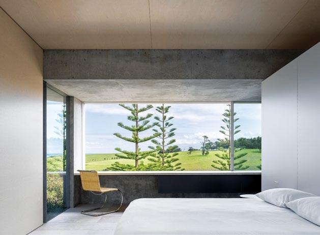
“We could have concealed the gutter, but we decided to make a feature of this instead,” says Richard, who juxtaposed the gutter’s concrete ‘underbelly’ with birch plywood for the ceilings and large format limestone format tiles for the floor. There is an economy of material used in this house. “We wanted to create a ‘quiet’ backdrop for the views and this special site, rather than making things overly fussy or too complicated,” he continues.
Although appearing pared back and relatively simple, the detail of Haxstead Garden House is exceptional. Even the simplest materials, such as birch plywood or the powdercoated aluminium sheets used for the bathroom walls, were treated as though they were ebony or marble. “It’s a beach house after all, where the family can come back from the beach, a five minute stroll away, and not feel precious about dragging sand into the home,” says Richard. “The house had to be low maintenance, robust and extremely durable, particularly with two young children.”
issue #43 habitusliving.com
ABOVE | THE MAIN BEDROOM BENEFITS FROM SWEEPING VIEWS OF THE COASTAL TERRAIN, INCLUDING THE PROPERTY’S DISTINCTIVE PINE TREES THAT ALSO ACT AS WINDBREAKERS DURING THE MORE INCLEMENT WEATHER. OPPOSITE | LESS IS DEFINITELY MUCH MORE IN THIS RESIDENCE, WITH THE DESIGN OF THE KITCHEN REDUCED TO ITS FUNCTIONAL CORE ELEMENTS, A SINK AND ISLAND BENCH, WITH A BANK OF JOINERY THAT CONCEALS MANY OF THE KITCHEN’S APPLIANCES.

3 . on location # 121
Given the differing climatic conditions between the north and south, Tobias Partners conceived one long pavilion-style house.
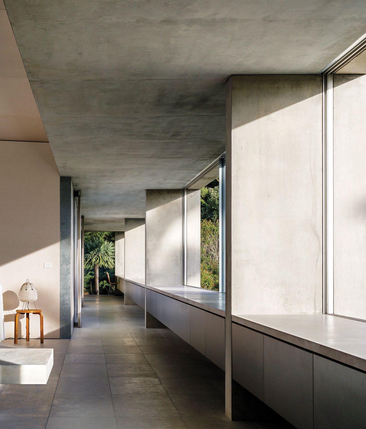
ABOVE | DEEP WINDOW REVEALS ARE NOT ONLY FOR BUILT-IN SEATING FOR FAMILY AND FRIENDS, BUT ALSO FOR STORAGE FROM EVERYTHING FROM BEACH TOWELS TO BEACH UMBRELLAS.
issue #43 habitusliving.com
Only one room wide, to allow for cross ventilation as well as maximising the winter sun, the house is simply planned. At one end of the residence (west), is the guest bedroom, bathroom and laundry. And at the other end, to the east, is the main bedroom and ensuite, together with the children’s bedrooms and a shared bathroom. At the core of the floor plan is the open plan living, dining and kitchen area, loosely delineated by the slow combustion fireplace and raised concrete hearth. The beautifully executed birch walls at either end add texture and warmth. “It’s not overly luxurious if you associate luxury with expensive materials and lavish embellishments. But you could say there is a sense of luxury in its honesty and in the way materials have been crafted,” says Richard, who saw the design as being recessive to the site. “The young family also wanted a sense of independence from the main homestead,” says Nick.
To complement the architecture, Haxstead Garden House features loose birch Artek furniture sourced from Anibou and extensive built-in joinery along the residence’s entire southern spine to accommodate drawers. Everything from the children’s toys to beach gear can be stored away to ensure the space remains relatively uncluttered, allowing the surrounds to be fully embraced.
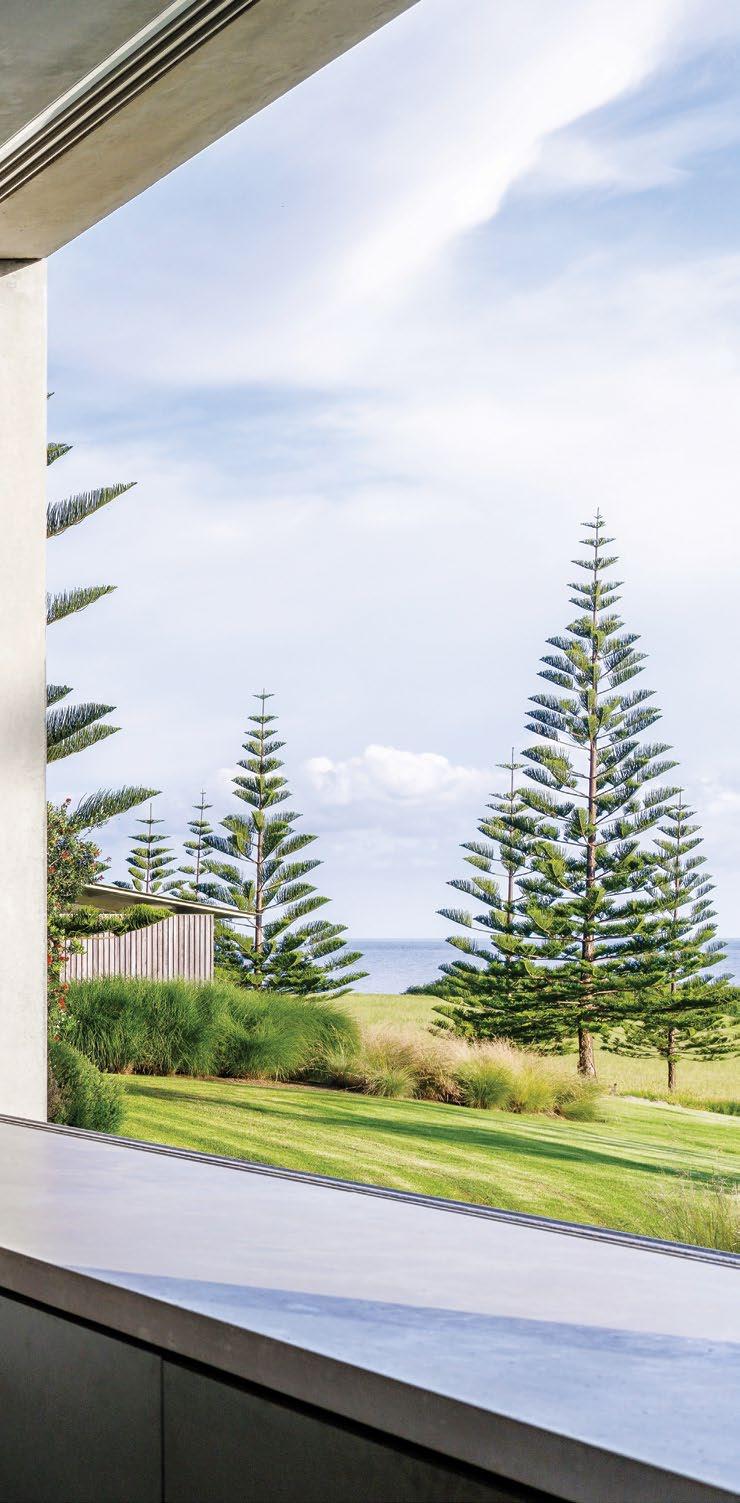
3 . on location # 123
ENTRY
COURTYARD
PERGOLA & OUTDOOR DINING ENTRY KITCHEN DINING FIREPLACE LIVING BATHROOM BEDROOM MASTER BEDROOM ENSUITE GUEST BEDROOM LAUNDRY DRESSING POOL GARAGE 1 2 3 4 5 6 7 8 9 0 q w e r t y
GROUND FLOOR #43 habitusliving.com
issue
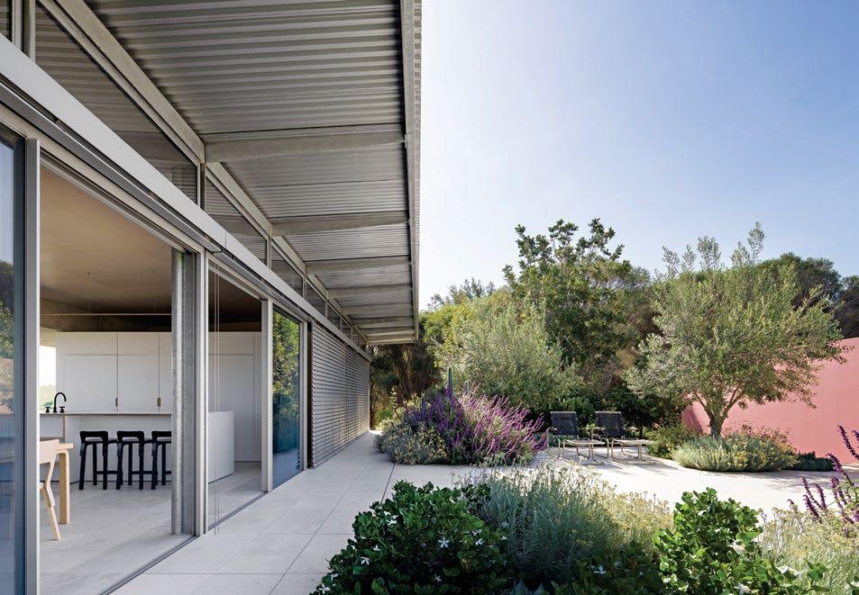
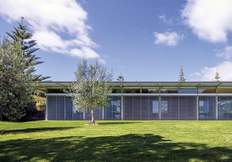
OPPOSITE | PLANS. ABOVE | EXTERNAL LOUVRES ON THE HOME’S NORTHERN ELEVATION KEEP THE PLACE COOL DURING THE WARMER MONTHS. BELOW | DEEP EAVES TO THE NORTH FURTHER REDUCE THE AMOUNT OF HEAT ENTERING THE HOME, WITH LARGE SLIDING GLASS DOORS ALLOWING THE BREEZE TO COOL DOWN THE PLACE WITHIN MOMENTS. 3 . on location # 125
“[It] appears like a rudimentary shelter when seen from the main house, protected from the often inclement weather on the southern coast. But when you actually step inside, you really feel as though you’re still in the garden. I think we’ve got the balance right,” says Richard, who was mindful of including exactly what was needed and nothing more.
“This shelter is like a microclimate, in a sense, creating a windbreak or buffer against those southeast winds,” he adds. Even on windy days, the family can enjoy being around the swimming pool located on the protected northern side of the house. The native bush, the Norfolk Island pines that punctuate the lawn, together with the strategically placed succulents in courtyards, further create a unique microclimate in this very special part of the world. “It’s simply a nice place to be,” says Nick, who regularly spends time along this part of the coast. “You never lose sight of Mount Gulaga, looming behind us.”
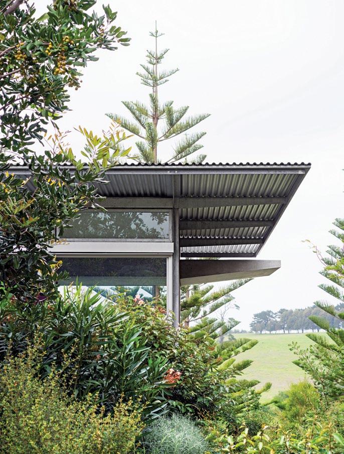 Tobias Partners | tobiaspartners.com
ABOVE | THE HOUSE TOUCHES THE EARTH LIGHTLY, FEELING MORE LIKE A SHELTER THAN A TRADITIONAL RESIDENCE.
issue #43 habitusliving.com
Local Design, International Flair
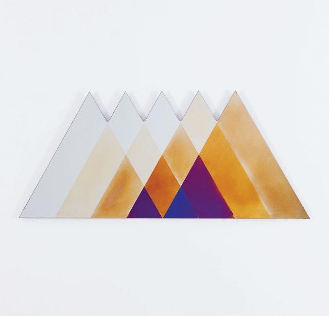
Founded with the desire to offer a designer curated collection of exceptional products to enhance our everyday lives, it’s little surprise VELA is a favourite in the design world. With a range of furniture, lighting and products developed in collaboration with some of the world’s leading craftspeople and artisans, VELA elevate the prosaic into the poetic.
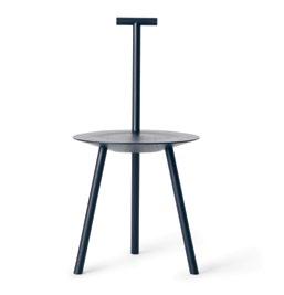
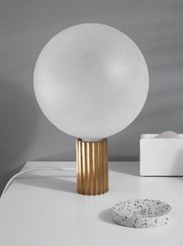
When it comes to the design and style of their carefully curated collections, VELA products are characterised by streamlined, antipodean aesthetics, yet retain a highly international appeal and expression. Beyond simply being visually appealing, all VELA products offer durability and a sense of timelessness. The team is driven by the philosophy that handcrafted objects are designed to be loved, and enjoyed over a lifetime – even generations.
Just as the brand’s namesake of the sail symbolises a voyage and sense of adventure, so too is each VELA product is imbued with inspiration, wonder and a sense of discovery.
habitus promotion › VELA #127 issue #43 habitusliving.com ABOVE | THE TRANSIENCE MIRROR EXEMPLIFIES THE VELA APPROACH TO DESIGN – WITH A BOLD YET INVITING STYLE AND FUNCTIONAL CHARM
VELA | vela.life
VELA – the latin word for sail –is an Australian lifestyle brand that celebrates world class design and superlative craftsmanship.
Curved delight
In this beachside holiday house, Max Pritchard Gunner Architects showcases the beauty of understated, simple, environmentally responsive design.
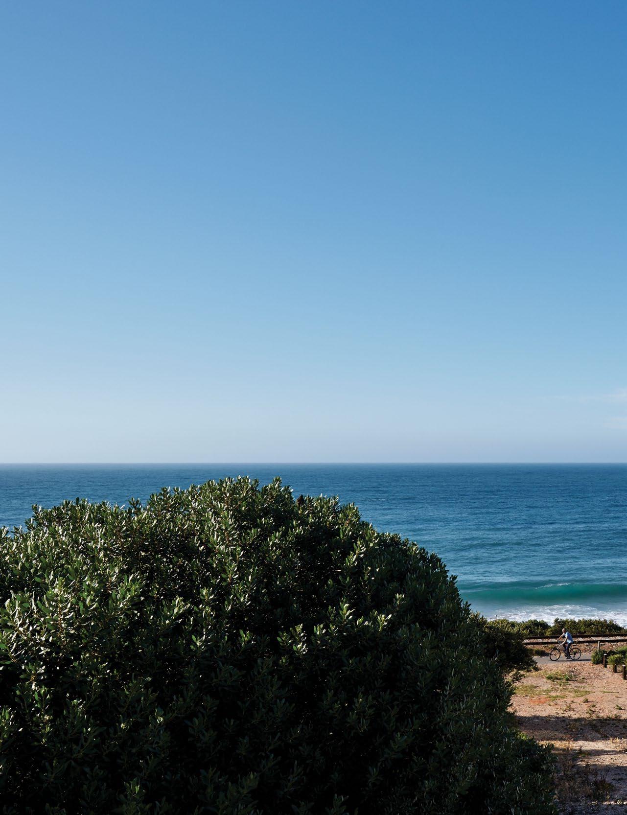
TEXT LEANNE
| PHOTOGRAPHY SAM NOONAN
AMODEO
issue #43 habitusliving.com
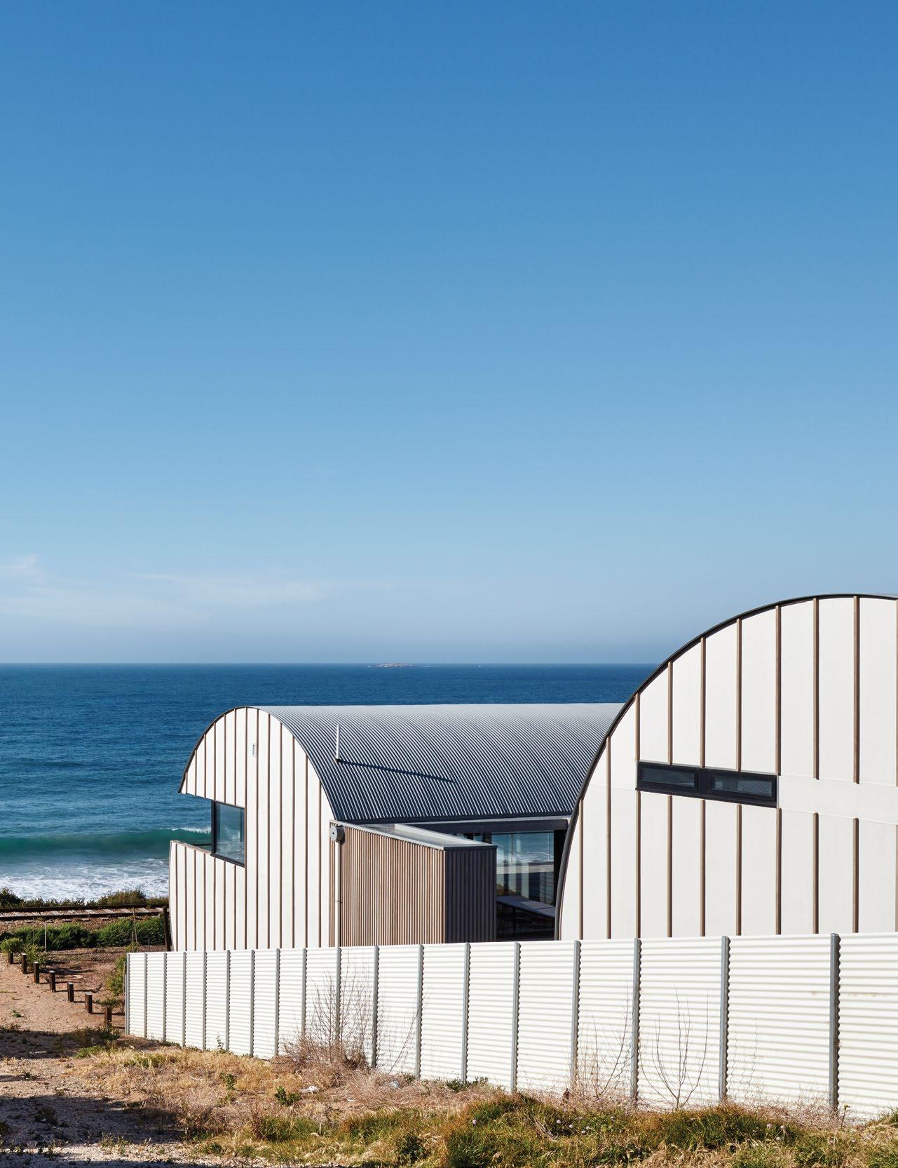
3 . on location # 129
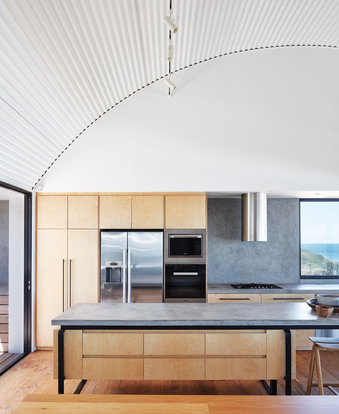
OPENER | THE
issue #43 habitusliving.com
OCEAN VIEW FROM THE BEACH HOUSE IS SIMPLY BREATHTAKING. ABOVE | POLISHED CONCRETE BENCHTOPS AND TIMBER JOINERY CONTRAST AGAINST THE WHITE CURVED CORRUGATED IRON CEILING IN THE KITCHEN.
There’s quite possibly no other architect working in South Australia today who responds to site with the degree of mindfulness that Max Pritchard does. Of course, it would be remiss of him not to, considering the extreme environments in which the majority of his residential projects are situated. His portfolio spans coastal, rural and hills locations and his designs are architecturally rigorous without being ostentatious, sympathetic without resorting to cliché. It’s what he’s built his reputation on and after more than 30 years in business (daughter Tess Pritchard and Andrew Gunner joined him as Directors of Max Pritchard Gunner Architects in 2015) and multiple awards later, he’s producing his best work yet, in some of the state’s most remote settings.
Unsurprisingly, his most recent clients, who live in Adelaide, contacted him after seeing the home he had designed for their friends in Victor Harbor. The professional couple with two teenage children had recently purchased a block of land on a stretch of Boomer Beach in neighbouring Port Elliot, another of South Australia’s popular beachside Fleurieu Peninsula towns, with a view to building a holiday home.
They wanted a beach shack; something relaxed and not at all pretentious and when Max showed them his initial concept they were very excited about it. “We didn’t need
to go through a number of design iterations, partly because I like to think things through before I put something down on paper,” says Max. “But mostly because this particular design seemed to be so appropriate for the site and the brief that I didn’t feel the need to present any alternatives.” Port Elliot is an eclectic mix of late 1960s beach houses, oversized slick getaways built in the 1990s and bespoke retreats no more than two or three years old and Max’s design stands distinct amongst them all.
The new build comprises two large twostorey cylinders on a steeply sloping site overlooking the ocean. They sit parallel to each other (the one at street level is positioned higher than the other) and are connected by a central glazed link. First time passers-by stop and stare, a mix of curiosity and awe on their faces, because there’s nothing else quite like it in the area. Both cylinders’ curved forms echo the rolling sea – with waves as big as you’re likely to get in South Australia – and their outward appearance also pays homage to the Nissen hut, originally used for storage and as accommodation during WWII. Max admires the simple structure for its humble materiality and this was a definite source of inspiration when deciding to wrap the cylinders in corrugated iron. The economical material is what predominantly lends the holiday home its raw natural expression, downplaying its scale in the process.
3 . on location # 131

issue #43 habitusliving.com
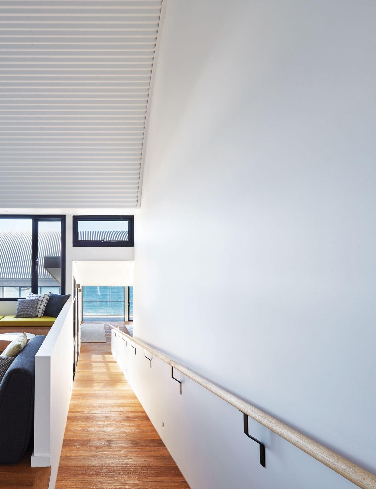
3 . on location # 133
An added benefit of having two freestanding structures is that zoning is clearly demarcated.
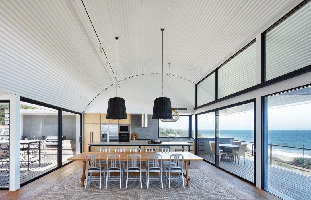
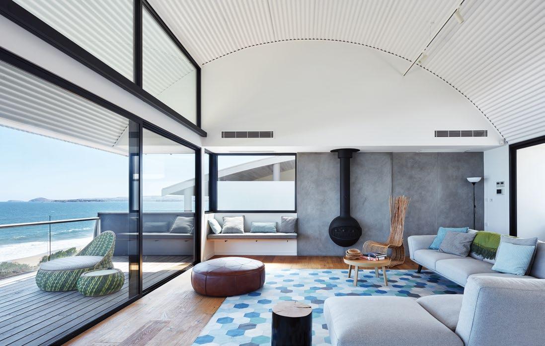
issue #43 habitusliving.com
Splitting the house in two also diminishes its size by enabling it to better hug the site, minimising the degree of visual obstruction to the homes that overlook it from the street. In this regard, the design is sympathetic to its neighbours, with curved forms providing a softer roofline than any number of angled ones would. But the key reason behind the unlikely configuration is orientation. As Max explains, “The starting point for all our projects is to find a sensible environmental solution, which in Australia’s climate means maximising the amount of winter sun for natural heating, and ventilation for summer cooling to reduce dependence on artificial heating and cooling.” While the courtyards on either side of the glazed link provide a connection to the outdoors that is sheltered from the strong winds, they also allow for north-facing windows in the cylinder closest to the ocean. This structure accommodates the open plan main living areas that are the heart of the holiday home, so it was important they receive an abundance of natural light without compromising the view of the sea. The lower level’s main bedroom, study and ensuite similarly serve up stunning views while getting plenty of winter sun. And both levels receive passive cooling when the front and rear glass doors are opened. It’s an outcome that simply would not have been possible if the floorplan was contracted – omitting the glazed
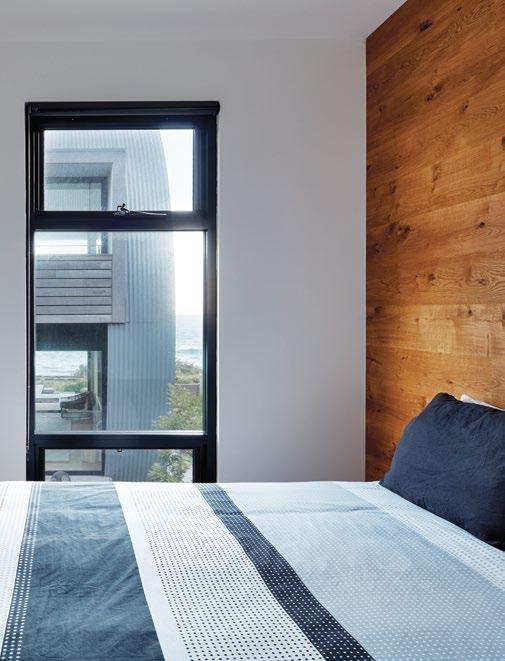
TO
DETRACT
TIMBER USED FOR THE FLOORING IS USED AS THE FEATURE
3 . on location # 135
PREVIOUS
| THE STREET LEVEL ENTRY OPENS UP INTO THE RUMPUS ROOM, A FAVOURITE SPACE FOR THE CHILDREN TO HANG OUT IN. OPPOSITE ABOVE | FURNITURE IS KEPT MINIMAL SO AS
NOT
FROM THE
VIEW.
OPPOSITE BELOW | IN THE LOUNGE ROOM, THE VIEW TAKES IN THE BLUFF, A VICTOR HARBOR HEADLAND POPULAR WITH TOURISTS. ABOVE |
THE SAME RAW
WALL IN EACH OF THE FOUR BEDROOMS.
link and courtyards – and the interior spaces had to rely solely on natural light from the northfacing street entry.
Incidentally, the added benefit of having two freestanding structures is that zoning is clearly demarcated. In this case, the cylinder at street level, with its upper level rumpus room and four lower level bedrooms, all with their own ensuite, is the domain of the clients’ teenage children and their friends when the family comes to stay.
The most impressive aspect of the interior’s architecture is that although the house totals four different levels, there’s not one stair between any of them. Max’s aesthetic may be one of understated elegance and simplicity, but the ramps that run between each floor within the glazed link definitely bring an element of drama to the scheme. They also add to the home’s sculptural qualities, not to mention providing the perfect ocean reveal when walking towards the main living areas from the entry.
“To be able to move through a substantially sized building like this one without going up or down a step is unique, especially in the way it slows you down,” says Max. “People often say that corridors are a waste of space, however they’re not a waste of space if it’s a nice experience. If you’re regularly moving slowly through architecture and there’s a certain rhythm to that movement, then it can be very enjoyable.”
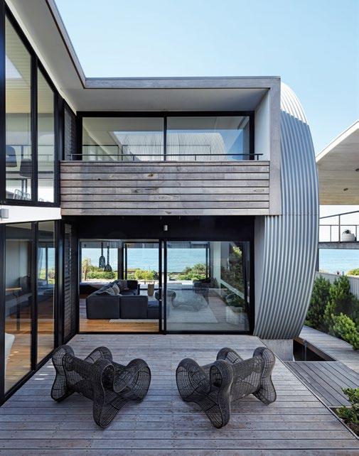
ABOVE | THE OUTDOOR LIVING AREAS ON EITHER SIDE OF THE GLAZED LINK ARE SHELTERED FROM THE STRONG WINDS. OPPOSITE | A RAMP CONNECTS ALL FOUR LEVELS, ADDING TO THE HOME’S SCULPTURAL QUALITIES. issue #43 habitusliving.com
Although the house totals four different levels, there’s not one stair between any of them.
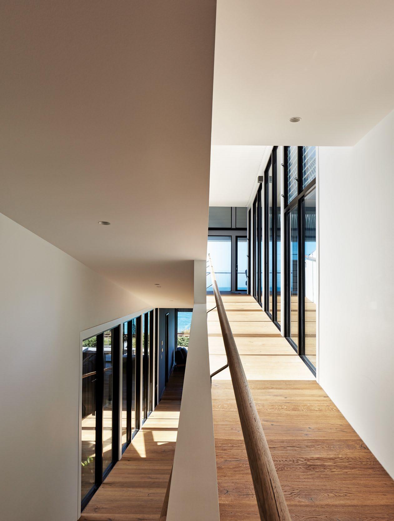
3 . on location # 137
FIRST FLOOR
GROUND FLOOR
1 2 3 4 5 6 7 8
ENTRY
GARAGE
RUMPUS ROOM
BATHROOM
RAMP
KITCHEN
DINING
LIVING
9 0 q w e r t y
BALCONY BEDROOM
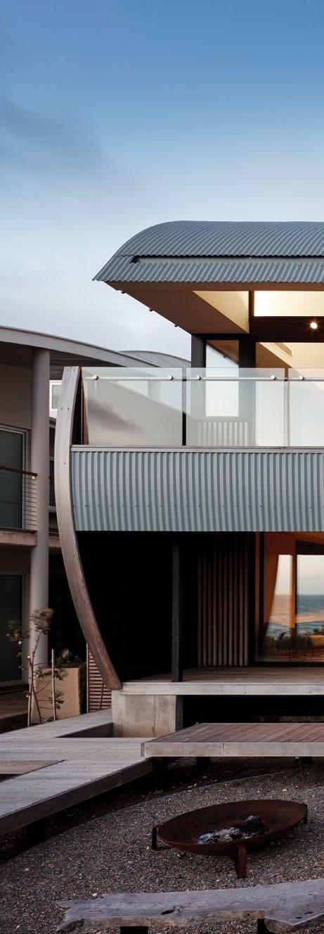
ENSUITE
LAUNDRY STORAGE
MASTER BEDROOM
STUDY
DECK
issue #43 habitusliving.com
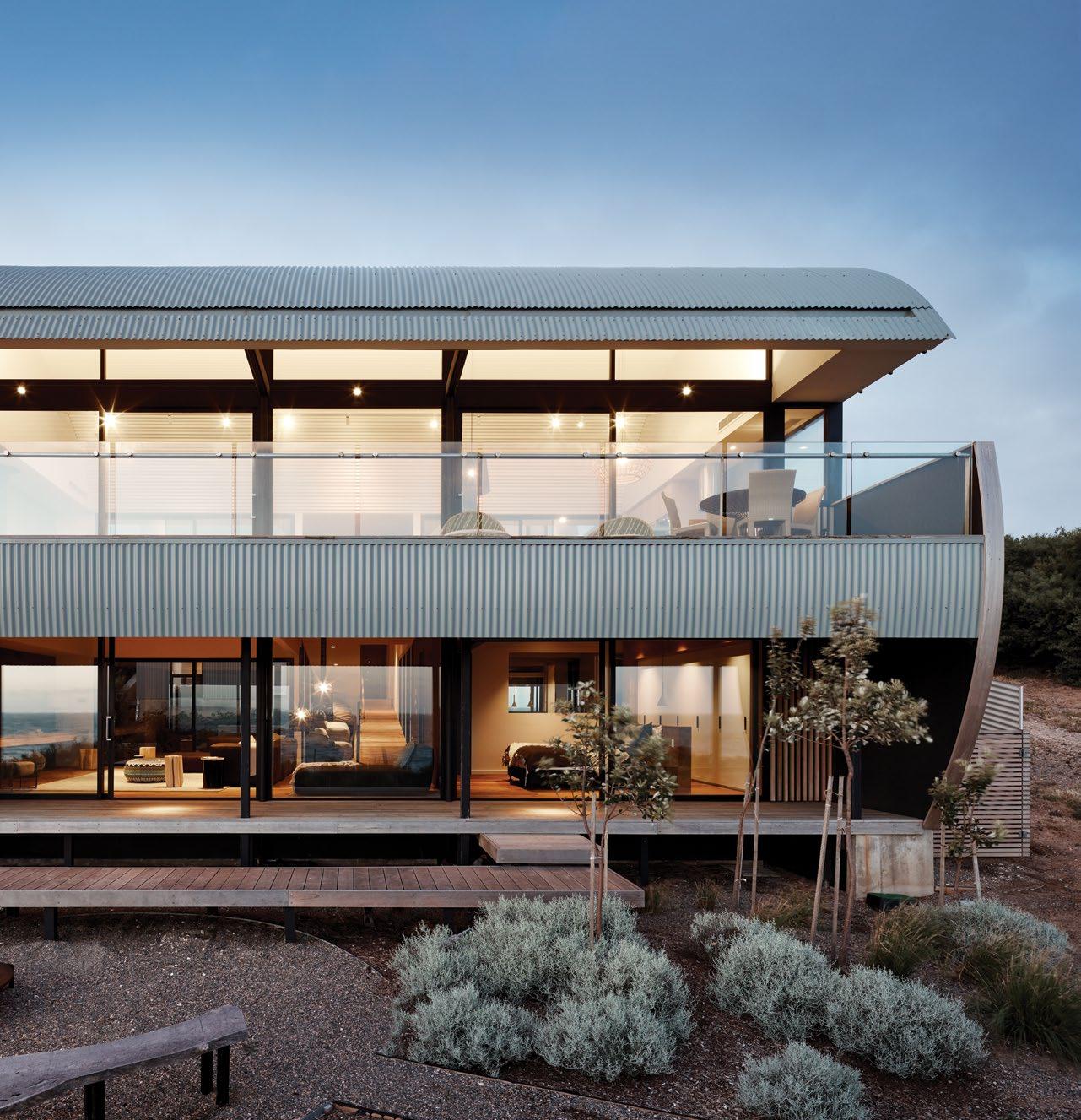
OPPOSITE | PLANS. ABOVE | A BOARDWALK LEADS DOWN TO THE REAR YARD AND FIRE PIT, WHICH IS PUT TO GOOD USE ON COLD, STILL NIGHTS. 3 . on location # 139
The ramps’ raw timber flooring extends throughout the house (except in the four bedrooms, which feature jute floors, and the bathrooms) and together with the kitchen’s timber joinery and polished concrete benchtops and curved white corrugated iron ceiling, lends the overall design that laidback beach shack vibe the clients so desired. While the material palette may be rustic, it is complemented by fine detailing and high-end furniture selections made by the clients in consultation with the home’s interior designer, Enoki Design. But absolutely nothing beats that panoramic view from the main living spaces and the full-height glazed doors that ensure the ocean feels within arm’s reach at all times. This is a beach house designed to bring relaxation and joy and therein lies its ultimate success.
Max Pritchard Gunner Architects | maxpritchardarchitect.com.au
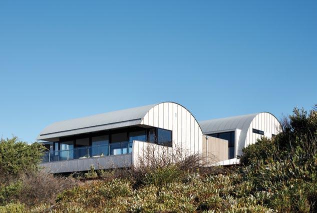
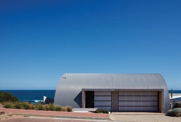
ABOVE | THE NORTH-FACING STREET ENTRY IS SIMPLE AND UNDERSTATED. BELOW | LOOKING UP TOWARDS THE STREET, THE HOME’S TWO CYLINDERS ARE IN FULL VIEW.
Both cylinders’ curved forms echo the rolling sea and their outward appearance also pays homage to the Nissen hut.
issue #43 habitusliving.com
Taking it back to where it all began, Saturday Indesign is returning to Melbourne in 2019. Inspired by our past but focused on our future, the new look event is back to its cutting-edge best.

MELBOURNE | 22 JUNE 2019 WWW.SATURDAYINDESIGN.COM APPLY
NOW TO EXHIBIT
motion
design in
Cloister redux
Learning from architects Alan Tay and Seetoh Kum
Loon of Formwerkz on their design of Cloister House in Malaysia, discover a refreshingly modern take on the idioms of classical architecture.
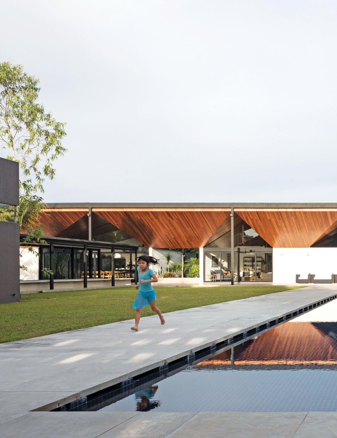
TEXT CHU LIK REN | PHOTOGRAPHY FABIAN ONG
issue #43 habitusliving.com
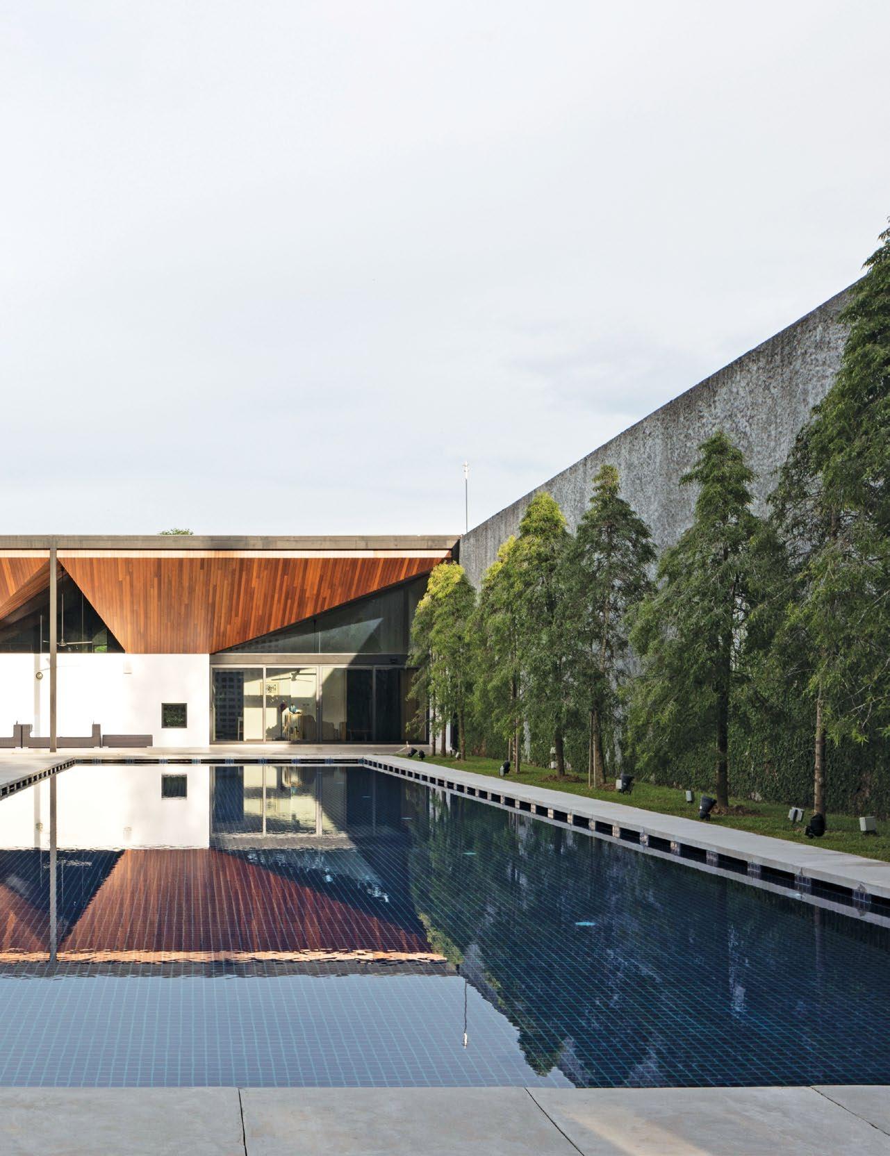
3 . on location # 143
There appears to be two ways to build a house on untouched landscape; one is for it to be a natural outgrowth of its surroundings and the other is to be fortified against the land it occupies. The binary is not absolute as there are social and intellectual considerations that differentiate a native hut or the rustic weekend houses from walled examples such as Roman villas or the Chinese courtyard houses.
With the latter civilisations, it is an established view of the order and hierarchy of the cosmos that determined the erection and placements of walls. The Chinese word for wall, cheng, for instance, could also stand for a city. The Chinese house could be set amidst the most gorgeous landscape and yet be barricaded, confining its rooms to a single-storey spread over re-created gardens. Similarly, the Romans enriched the English language with spatial concepts distilled into words such as atrium, portico, peristyle, colonnade, loggia and indeed, “cloister”, which is the term Formwerkz has chosen to name their latest house built in the Leisure Farm precinct of Johor Bahru, Malaysia.
Engaged by a Malaysian financier, Alan Tay of Formwerkz explained that the design had been prompted by the client who ranked privacy and security as the top requirements. “We also had to take into account the views of the feng-shui master,” says Alan, “who would sketch out on a 2D diagram what rooms should be placed next to each other according to the cardinal points of the compass.” This led to the strategy of keeping the house entirely to a single story which realised multiple benefits: it adheres to geomancy principles, keeps the building cost low, is elderly friendly, and sets it apart from the multi-storey houses in the neighbourhood where some have been swelled by facilities such as bowling alleys and indoor badminton halls. There is both discipline and purity to the architectural geometry. Five-metre-high concrete walls are set back approximately four metres from the property lines to the sides and back. The client also harboured a hunch that ring fencing the compound with a five-metre high wall would be an effective deterrent against mosquitoes and as it turns out, it proved to be largely true.
OPENER | THE OWNERS
IN
THEIR
OPPOSITE ABOVE | THE IMMEDIATE FAMILY OF THE OWNERS ENJOYS ANOTHER LAYER OF SECLUSION IN A DETACHED ANNEX. OPPOSITE BELOW | ONE OF THE NINE COURTYARDS THAT PUNCTUATE THE MAIN HOUSE, EACH WITH ITS OWN CHARACTER. issue #43 habitusliving.com
Space is pulled apart within the house, both vertically and horizontally.
RELOCATED FROM A 3,000 SQUARE FOOT HOUSE IN SINGAPORE TO 49,000 SQUARE FOOT OF LAND
MALAYSIA TO GIVE
CHILDREN SPACE TO ROAM.
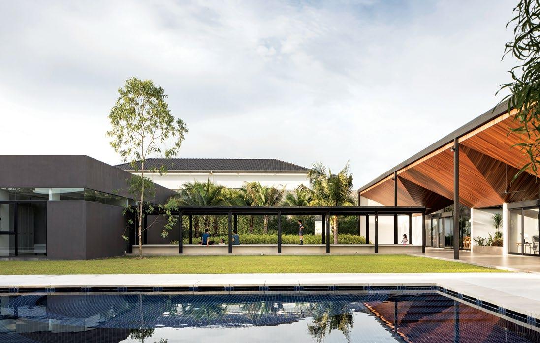
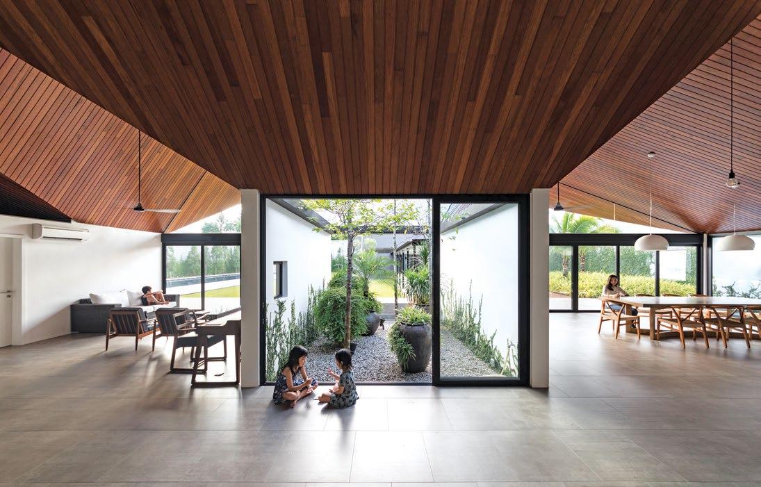
3 . on location # 145
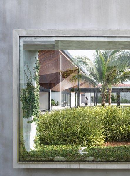
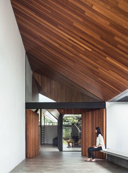
ABOVE LEFT | THE NATURAL TEAK CEILING GIVES THE HOUSE ITS DISTINCTIVE WARM TONE. ABOVE RIGHT | SECURITY IS THE DRIVING CONSIDERATION ALONG THE PERIMETER WALL, WITH A RARE WINDOW SEALED BY SOLID FIXED GLASS. OPPOSITE | THE CENTRAL COURTYARD FEATURES AN ACCESSIBLE ROOF TERRACE.
issue #43 habitusliving.com
The matrix of rectangles through the main house imprints a strong sense of governance to the design – almost like the microcosm of a city within the house.
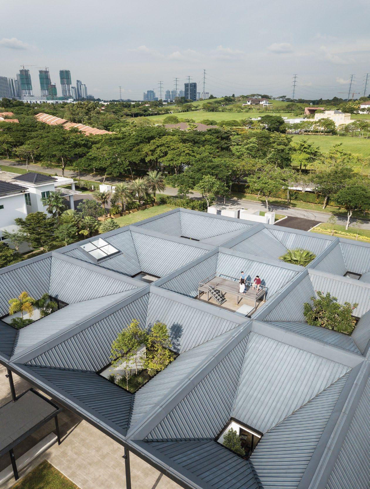
3 . on location # 147
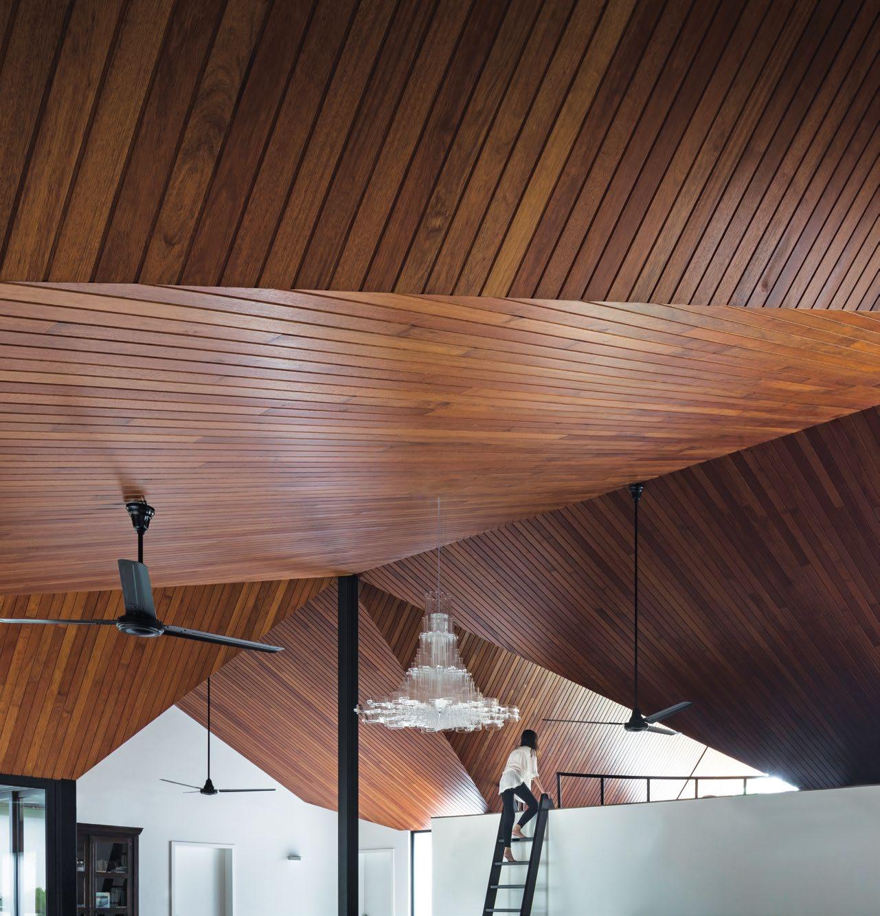
ABOVE | BY INVERTING THE ROOF, THE FAÇADES ACQUIRE GABLED FANLIGHTS FROM EAVES THAT SLOPE UPWARDS, DIRECTING MORE DAYLIGHT INSIDE. issue #43 habitusliving.com
“We realised that we could flip the entire roof upside down and convert the skylights into open air-wells to facilitate natural ventilation.”
The front façade is set back from the road to give the house a clean planar presence on approach, with no concession to transitional porches. A 2.4-metre high line dictates the heights of all external and internal walls, dividing like a seamline, the visual schema between white walls and wooden ceiling in equal halves. Space is pulled apart within the house, both vertically and horizontally, and this segregation allows a degree of autonomy to each room.
“The only way for such a deep plan to work in the tropics is if we had a series of courtyards,” Alan explains. For their initial design, Formwerkz built a model with the roofs assembled as pyramidal pavilions so that each peak was capped with a skylight. “But we then realised that we could flip the entire roof upside down and convert the skylights into open airwells instead to facilitate natural ventilation.” Natural light would then stream in from the perimeter walls when their upper halves are sealed with glass clerestory. In the evening, the glow of light within the house is bounced off the inclined ceilings outward, showcasing the house with cheerful warmth.
Each air-well is rectilinear yet acquires a different character based on its size and whether it houses a water pond or a gravelled garden with different plants at the base. Some are almost wholly enclosed with brick walls while others are screened with sliding glass panels. They were all planned to be closable for the possibility that the house will need to be airconditioned, but having lived in the house for over a year, the owners report they rarely resort to switching on the installed system.
The matrix of the 12 rectangles through the main house imprints a strong sense of governance to the design – almost like the microcosm of a city within the house. And yet, monotony is avoided by distorting the grid based on where the courtyards are positioned.
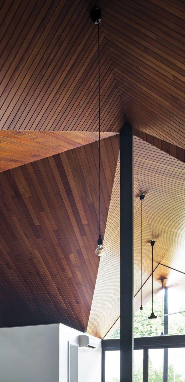
3 . on location # 149
GROUND FLOOR
1 2 3 4 5 6 7 8 9 0 q w e r t y u i o p a s
ENTRY
INTERNAL COURTYARD
BEDROOM
ENSUITE
LIVING
STUDY
PLAY ROOM
ENTERTAINMENT ROOM
DRY KITCHEN
DINING
WET KITCHEN
GARAGE
W.C.
OUTDOOR LIVING
POOL
LINKWAY
ANNEX
ENTRY
BEDROOM
ENSUITE
STUDY
LIVING
READING ROOM
issue #43 habitusliving.com
In fact, an exception is built around the enclosed entertainment room where an accessible roof terrace is created instead of a grounded courtyard. Orientation is intuitive and suggested by ceiling ridges. The private rooms are flanked at the sides while the circulation along the central zone from entry to rear garden is choreographed as a series of meandering detours that multiply the number of interesting viewpoints along the way.
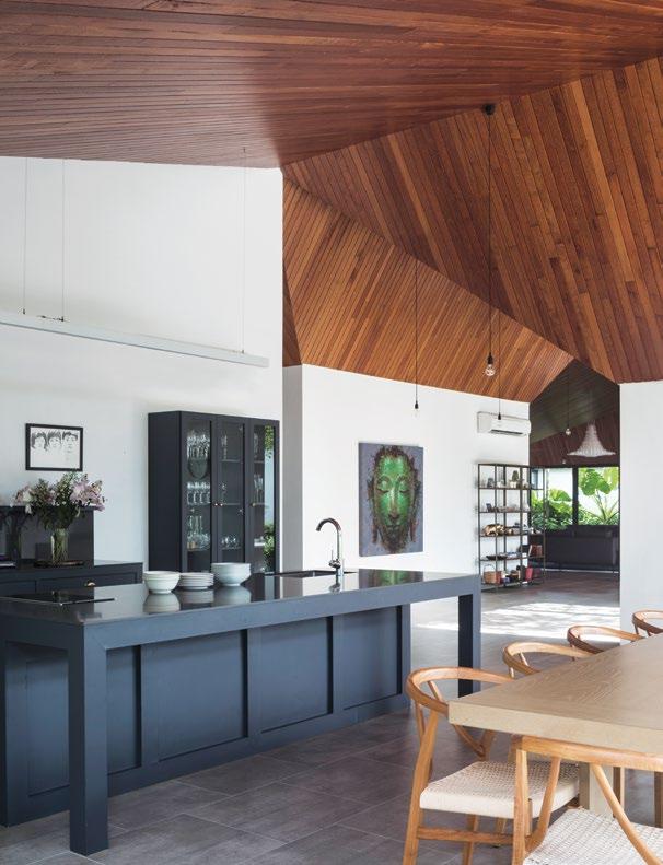
Compacting the bulk of the house over a third of the plot size also meant that the house could enjoy two frontages; a formal one to the outside world and a sociable one to its own back garden. The latter is crowned by an expansive sheltered loggia, delineated by a row of five slender columns. It is on this internal compound that another independent building is configured as an annex block, as distinct in its placement as that of an imperial palace within a walled city. This is the block for the client and his family. “As we entertain frequently for small groups of 10, and from time to time 40-50pax, the private family bedroom annex block is important to ensure we maintain family intimacy in a large plot,” he said. “It also ensures that the kids are not disturbed when the adults are entertaining.”
OPPOSITE | PLANS. ABOVE | A LONE FRANGIPANI TERMINATES THE VISTA FROM THE LOUNGE. BELOW | THE DRY KITCHEN AND FORMAL DINING AREAS ENJOY EXPANSIVE VAULTED SPACES AND ABUNDANT LIGHT.
3 . on location # 151
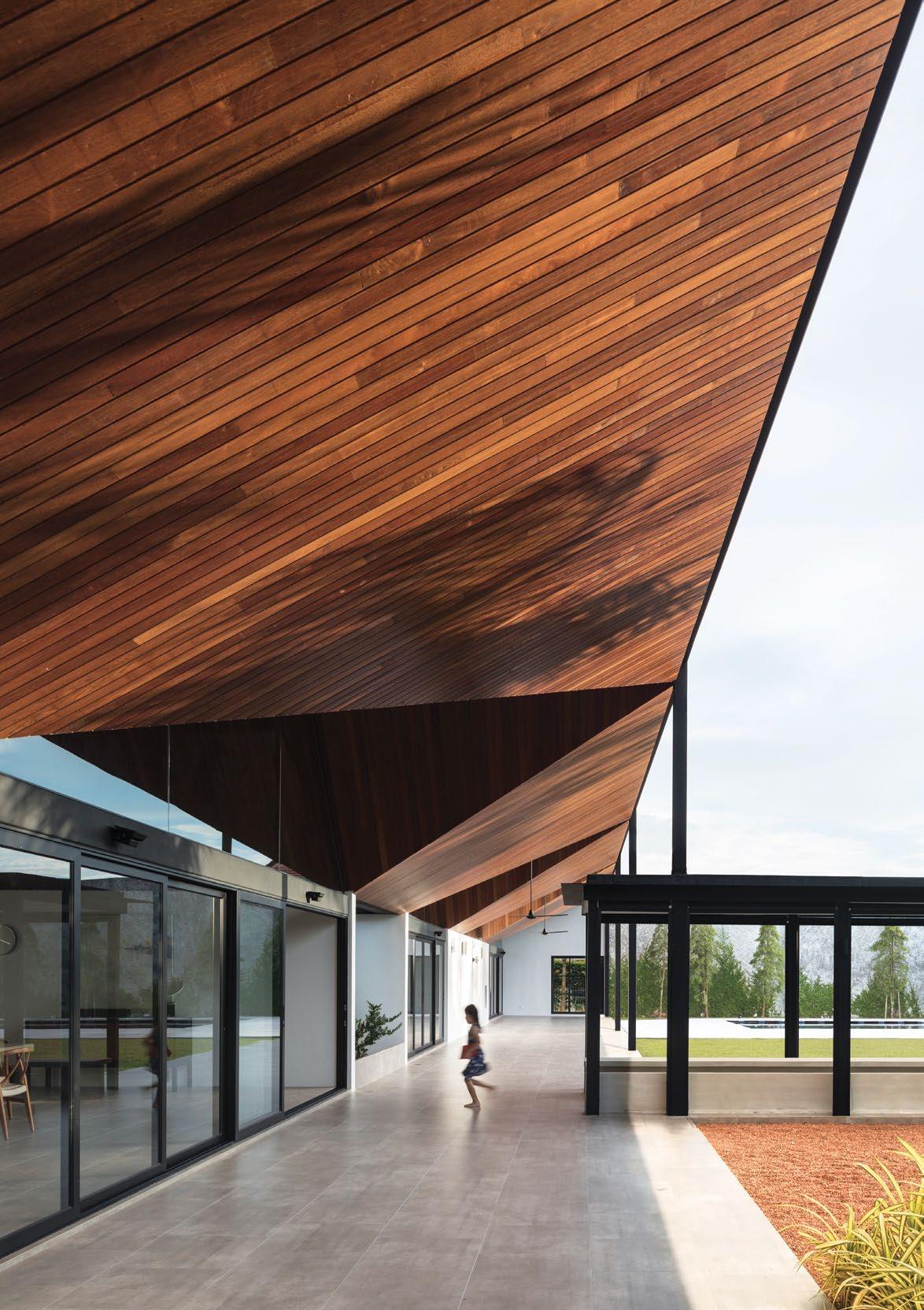
issue #43 habitusliving.com
In contrast to the vaulted ceiling of the main house, the ceiling design in the annex block is gridded like upsized square coffer ceilings of an ancient Greek temple. And just like the Greeks etching the memory of timber beams onto the façade in the form of triglyphs on the entablature, Formwerkz has expressed the ceiling beams on the façades through glazed clerestory.
Which brings us back to the name of the project, Cloister House. The Latin root claustrum referrs to a “locked, enclosed place”. It alludes to the world of a higher realm, a retreat from commercial cares to the seclusion and serenity of an enclosed gardens framed over vaulted ceilings. In harking back to an older, protected world, the word could not have been more aptly chosen.
Formwerkz | formwerkz.com
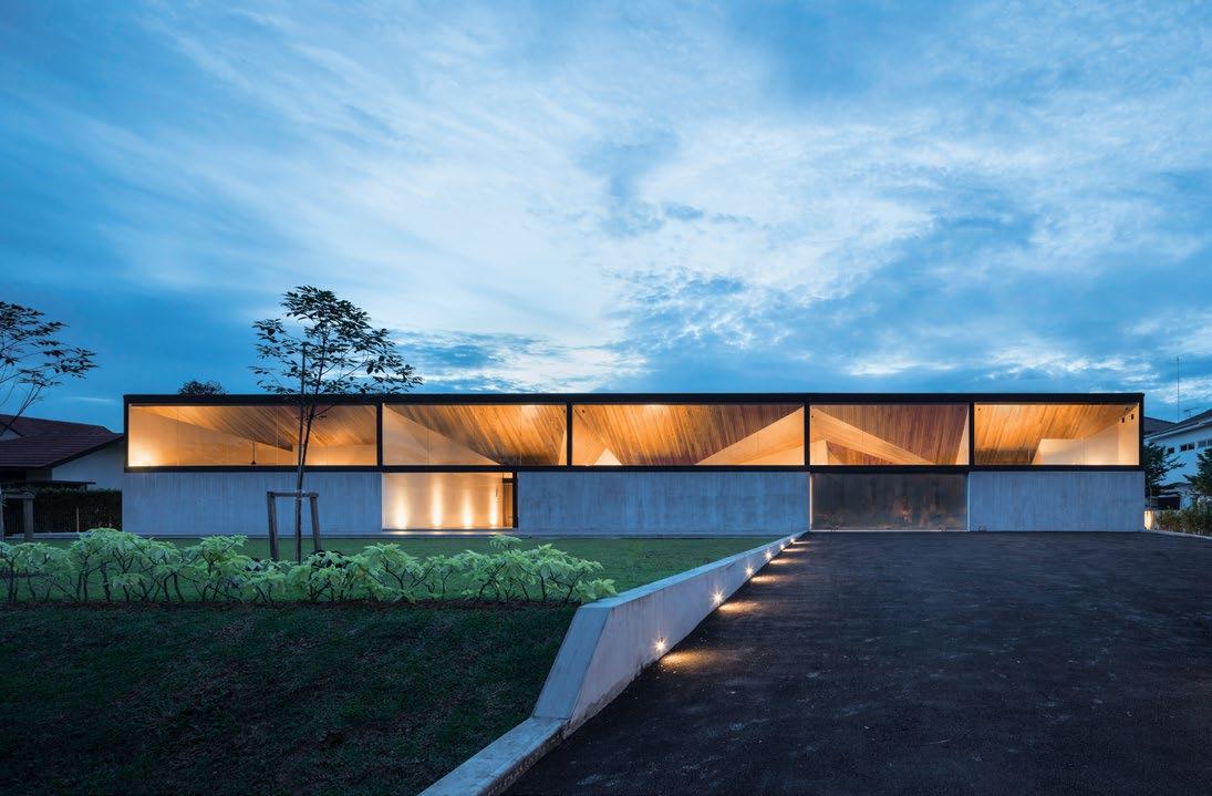
OPPOSITE | AN EXPANSIVE SITE MEANS THERE IS PLENTY OF ROOM FOR YOUNGER MEMBERS OF THE FAMILY TO RUN AND PLAY. ABOVE | THE CLOISTER HOUSE BRILLIANTLY COMBINES PRAGMATIC CONSIDERATIONS OF PRIVACY, SECURITY AND BUDGET WITH THE ELEGANCE OF AN AESTHETIC THAT ALLOWS THE NATURAL BEAUTY OF MATERIALS AND NATURE TO SHINE THROUGH. 3 . on location # 153
The perfect Playground
Once a holiday home, now a primary residence, the outlook, shelter and performance of Barwon Heads House were the formative factors in the design of this residence by Lovell Burton Architecture.
TEXT HOLLY CUNNEEN | PHOTOGRAPHY RORY GARDINER
issue #43 habitusliving.com
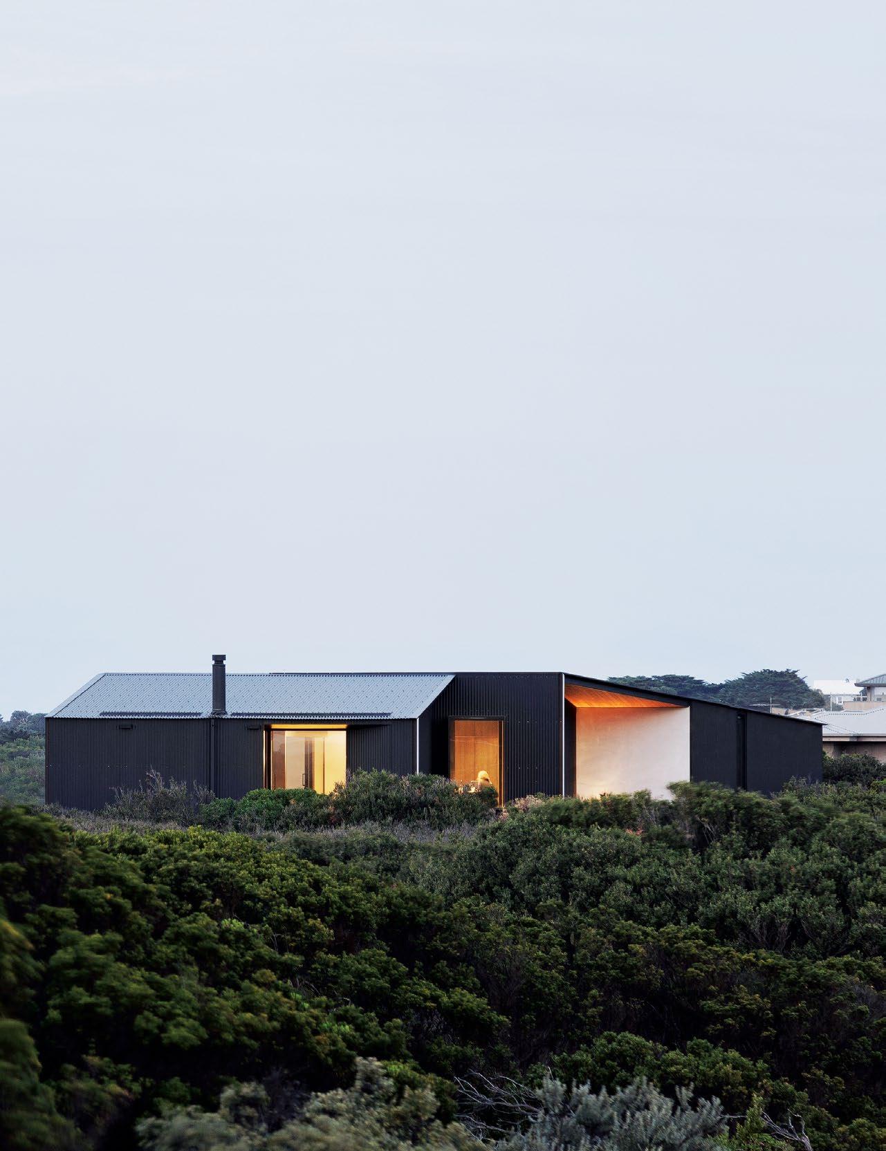
3 . on location # 155
Have you ever enjoyed a holiday so much you thought you just might move there one day? I’d hazard a guess to say we all have. I’d hazard a second guess and suggest not many of us have actually followed through. That, however, was simply not the case for Alan and Toni, residents of Barwon Heads House and clients of Lovell Burton Architecture.
Admittedly, it may have taken them some time. They’d been living and working nearby in Geelong, Victoria, for 25 years and for the last ten holidaying with their children (who have since grown up and moved out) on this piece of land in coastal Barwon Heads; not far from the Bass Strait and the mouth of the Barwon River. Up until recently they would stay in a small cabin that existed on site.
Three years ago they engaged the newly established architectural practice of Stephanie Burton (their daughter) and Joseph Lovell, Lovell Burton, to design a residence that allowed them to relocate full time and see them eventually into retirement. One year ago, Alan and Toni moved in.
The brief to Lovell Burton was multi-fold. They wanted a house that could expand to comfortably accommodate their children and their children’s children when they came to visit, and efficiently contract back when it was just the two of them; a residence that allowed them to feel connected to the surrounding landscape without being subjected to it; a home that reflected and facilitated their hobbies, interests and life experiences; and finally a home that allowed them to age in place.
One of the biggest challenges for Lovell Burton – but also one of the practice’s most notable successes – was marrying a harsh, protective shell of an exterior to warm, soft interior architecture. The project is situated in amongst thick natural vegetation: Moonah, Tea Tree, Boobialla and general dune scrub. It’s also very close to a very windy beach, so the architecture had to – and does – balance connection and protection from the outdoors. “That is one of the more interesting tensions in its design,” says Stephanie. “You’ve got really beautiful views out to the southwest, but that’s where the [dominant] weather comes from. You want an outdoor lifestyle but it needs to protect because it’s extremely exposed.”
The outer shell protects the building from natural climatic conditions such as strong southwesterly winds. Not to mention the reality of being located in a bushfire zone and extreme temperatures (by Australian standards) on both ends of the spectrum.
Steel was avoided where possible (because of its corrosive tendencies when used in coastal conditions) and corrugated aluminium cladding was celebrated. “We used corrugated [aluminium cladding] because it reduced any sub-framing or sub-structure to the metal clip,” says Joseph. Reverse-lock veneer walls regulate the thermal performance of the building and save for the depths of winter the hydronic underfloor heating is rarely used. Stephanie points out that the winter performance of Barwon Heads House has exceeded the expectations of clients and architects alike.
THE GROUND FLOOR IS COMPLETELY CLOSED OFF.
OPENER | BARWON HEADS HOUSE BY LOVELL BURTON ARCHITECTURE WAS DESIGNED TO SIT UNASSUMING IN THE SURROUNDING LANDSCAPE. OPPOSITE ABOVE | BY EXPANSIVE TERRACES OR FLOOR-TO-CEILING WINDOWS, VIEWS ARE CAPITALISED AT EVERY OPPORTUNITY. OPPOSITE BELOW | AN EXTERIOR STAIRCASE MEANS THAT THE FIRST FLOOR CAN BE ACCESSED AT TIMES WHEN
“There was a desire from Alan and Toni to frame the view quite panoramically. We tried to do that a little bit more dynamically.”
issue #43 habitusliving.com
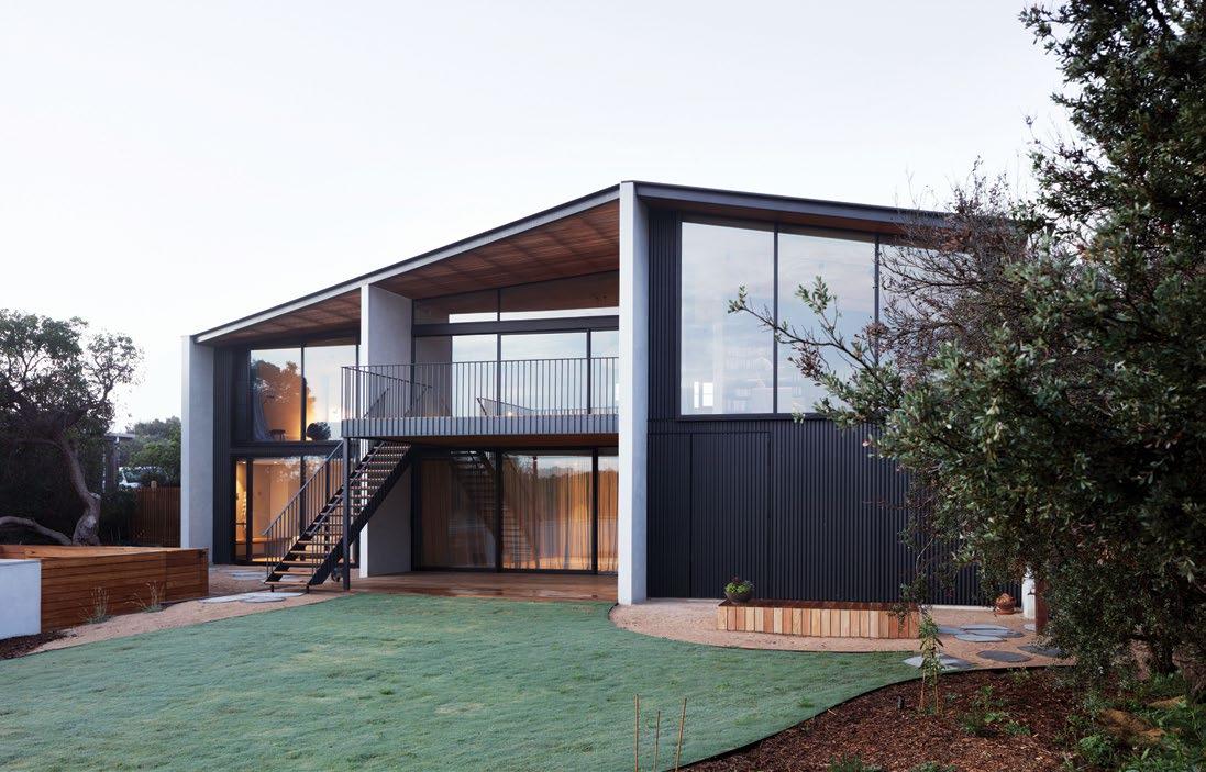
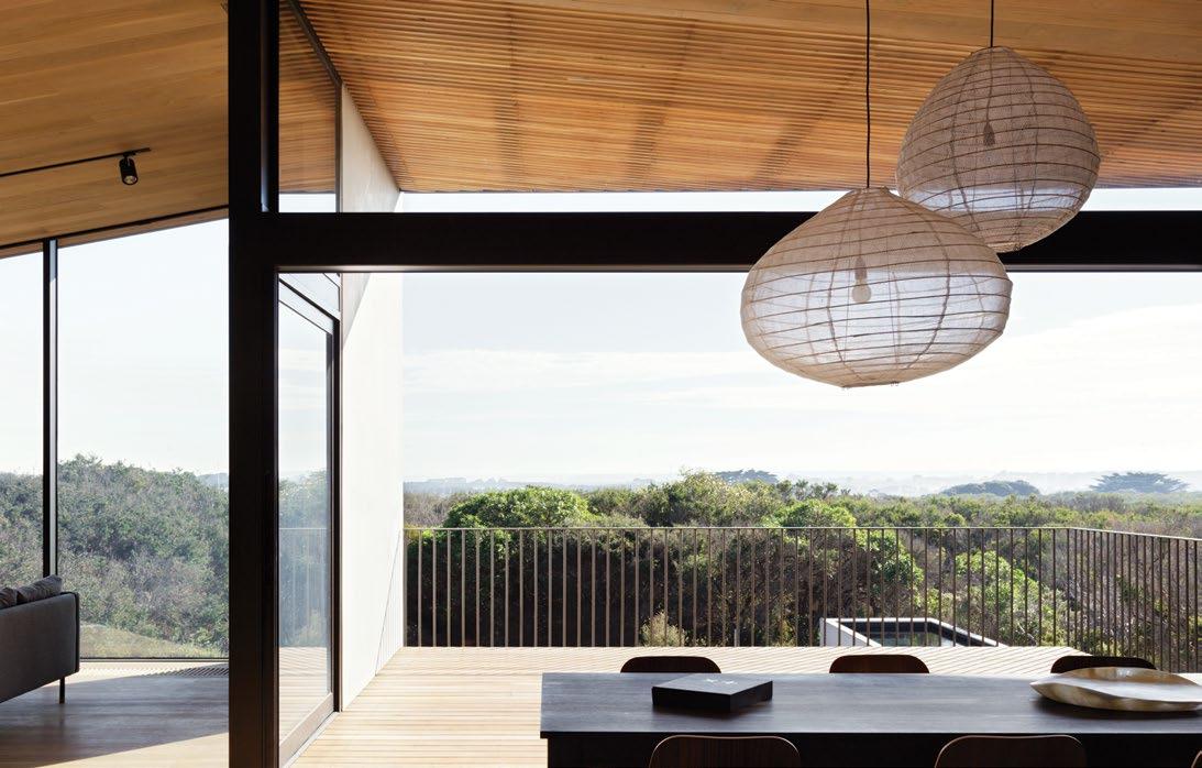
3 . on location # 157
Inside, Alan and Toni enjoy a warm and textural interior from where they can voyeuristically enjoy and observe wild weather. Dark staining on the vertical timber boards inside was chosen for its ability to frame and pronounce the views outwards. This contrasts with lighter Cedar wood boards used on the horizontal planes which are recycled from the old cabin.
“From the client’s perspective, that was the main component of the brief: celebrating the view out of the building,” says Joseph. “We tried to implement the two different colours to accentuate that view and aspect.”
Equally important was configuration of site and its ability to shut down areas when they aren’t in use. The house is split between the ground and first floors, with both levels able to run independently of the other. Alan and Toni live on the upper floor year-round with the ground floor completely closed off: neither a drain on resources nor a burden of maintenance.
During the summer months when the extended family is most likely to come and visit, they are able to self-sufficiently inhabit the ground floor. More than anything, it was
important that the residence not feel vast and empty whenever it wasn’t fully occupied. “It needs that kind of ad-hoc feature,” says Stephanie. “We’ve tried to divide it to cater to those two competing needs.”
“There are distinct access points between the upper and the lower floor: the kids [the adult kids] can drift in and out as they want, and the parents can live upstairs predominantly. Then they meet out in the garden together,” adds Joseph.
It was integral that Alan and Toni feel connected to the outdoors, despite living on the first floor. As such, the dining and living area have thus been arranged fluidly around a first floor deck that, despite being raised and at risk of being exposed to the elements, is in a protected, northeasterly nook of the building.
“There was a desire from Alan and Toni to frame the view quite panoramically. We tried to do that a little bit more dynamically,” says Stephanie. “We staggered the form down the site in a way that defends against the southwesterly wind. Then we opened up to the north and the east so there is a protected outdoor deck on both the upper and lower levels.”
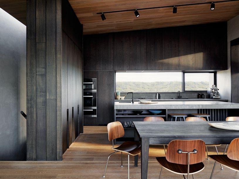
ABOVE | EAMES MOLDED PLYWOOD DINING CHAIRS WITH A METAL BASE MARK THE DINING AREA. OPPOSITE | A PALETTE OF DIVERSELY STAINED TIMBER AND SPLASHINGS OF CONCRETE GIVE BARWON HEADS HOUSE THE UNIQUE FEELING OF PARED-BACK LUXURY.
issue #43 habitusliving.com
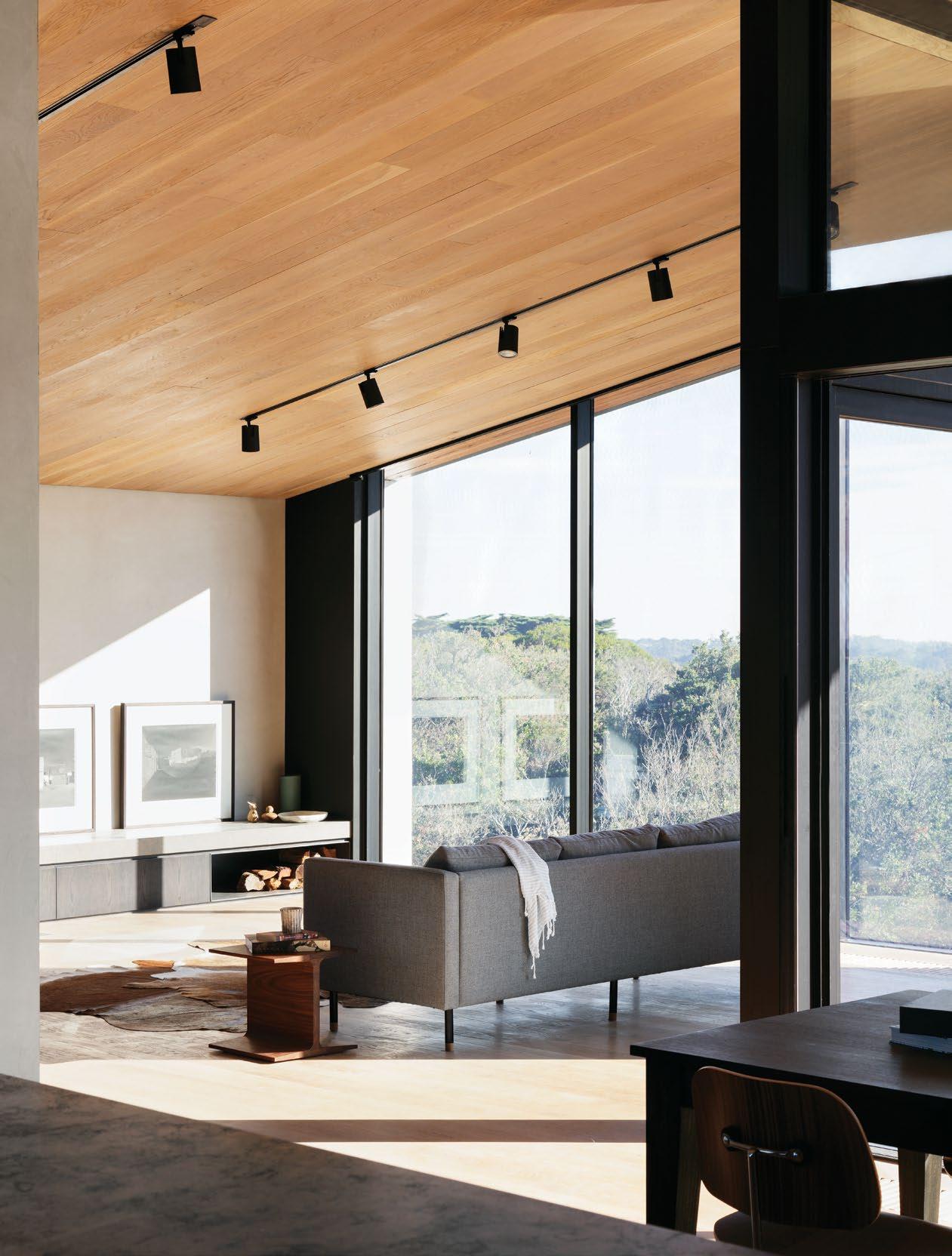
3 . on location # 159
GROUND FLOOR
DECK & STAIRWAY TO ENTRY ENTRY RUMPUS LAUNDRY DECK BEDROOM BATHROOM W.C. GARAGE KITCHEN DINING STUDY LIVING STORAGE MASTER BEDROOM
ENSUITE 1 2 3 4 5 6 7 8 9 0 q w e r t y u
FLOOR
WALK-IN-ROBE
FIRST
issue #43 habitusliving.com
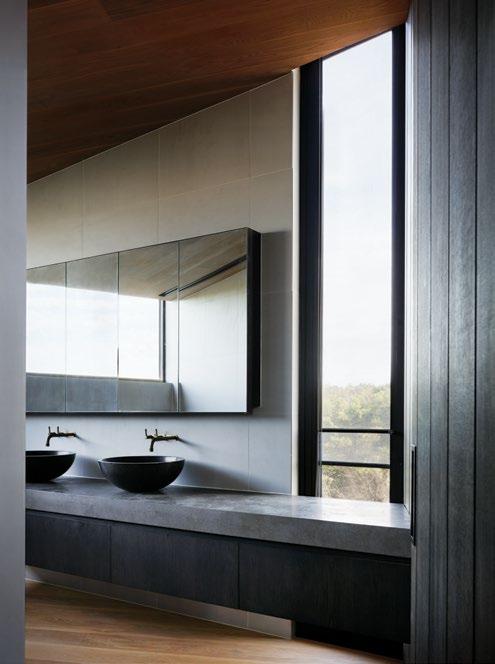

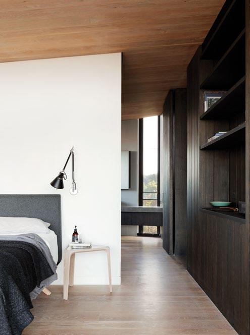
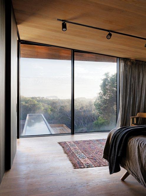
ABOVE
PARTIAL
WITHIN
ALAN’S MASTER BEDROOM, IS THEIR MASTER ENSUITE AS SHOWN IN MORE DETAIL DIRECTLY ABOVE. 3 . on location # 161
| PLANS. ABOVE LEFT | NARROW WINDOWS IN THE MASTER ENSUITE HINT AT THE BUSHLAND BEYOND. ABOVE RIGHT | SUBTLE AND RECESSED, THIS SPACE AT THE ENTRANCE DRAWS FORTH THE NOSTALGIA OF A COAT OR MUDROOM. BELOW RIGHT | VIEWS OUT TOWARDS THE NORTH. BELOW LEFT | TUCKED BEHIND A
WALL
TONI AND
Ultimately, the clients are able to enjoy a connection to the surrounding landscape and topography without being at its mercy.
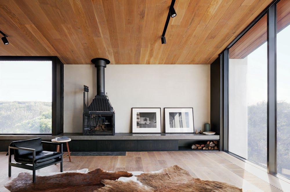
A year since the project was complete and it’s natural for all parties involved to forget the challenges encountered along the way: namely, the re-navigation of a parent–child relationship to that of professional and client. Depending which way – even which day – you look at it, working with family could be a blessing or a curse. Luckily for Lovell Burton, it was predominately positive. The familial nature of the relationship meant Stephanie and Joseph were comfortable enough to push and challenge their clients and their pre-existing notions of what it meant to live on that site.
“As a young practice, the majority of your first commissions come out of friends and family. In some ways, I think they’re the most challenging jobs. It’s emotionally cloudy,” says Stephanie. “At the same time, that is the nature of building a house: it’s quite intimate.”
Lovell Burton | lovellburton.com
ABOVE | WHEN THE WEATHER IS BITTERLY COLD THE FIREPLACE AND UNDERFLOOR HEATING AFFORD THE RESIDENTS COMPLETE COMFORT. issue #43 habitusliving.com
Inside, Alan and Toni enjoy a warm and textural interior from where they can voyeuristically enjoy and observe wild weather.
For the (design) lovers
Have you heard?
The best event on the design calendar is making a comeback.
Taking it back to where it all began, Saturday Indesign is returning to Melbourne in 2019. Inspired by our past but focused on our future, the new look event is back to its cutting-edge best. Saturday Indesign will focus on the experiential and zero in on a targeted footprint, transforming one of Melbourne’s central design districts into a hub for creativity and innovation.
Don’t miss your chance to get involved in this communitydriven and design-led event. Expect to see some of the biggest names joining forces with the likes of Cult, Café Culture + Insitu, Living Edge, Herman Miller, Jardan, Arthur G, Gaggenau, Own World, Zenith, Euroluce, District, Stylecraft, Wilkhahn, Cosentino, Precision Flooring, P4, Smeg and Zip.
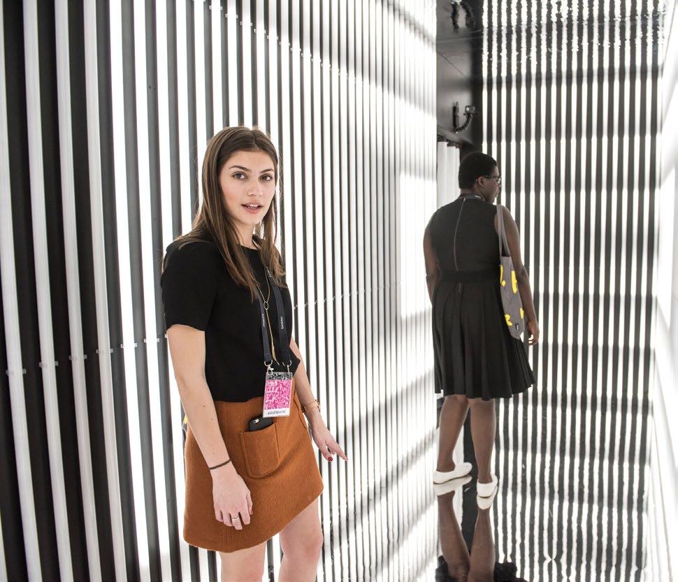
habitus promotion › Saturday Indesign #163 issue #43 habitusliving.com ABOVE | FROM THE EXPERIENTIAL TO THE EPHEMERAL, SATURDAY INDESIGN IS A UNIQUELY ENGAGING EVENT.
SATURDAY INDESIGN | saturdayindesign.com
Whale watch
Celebrating the prodigious beauty of its location, this beach house embraces nature and champions passive design to establish a simple but bountiful life for family and friends.
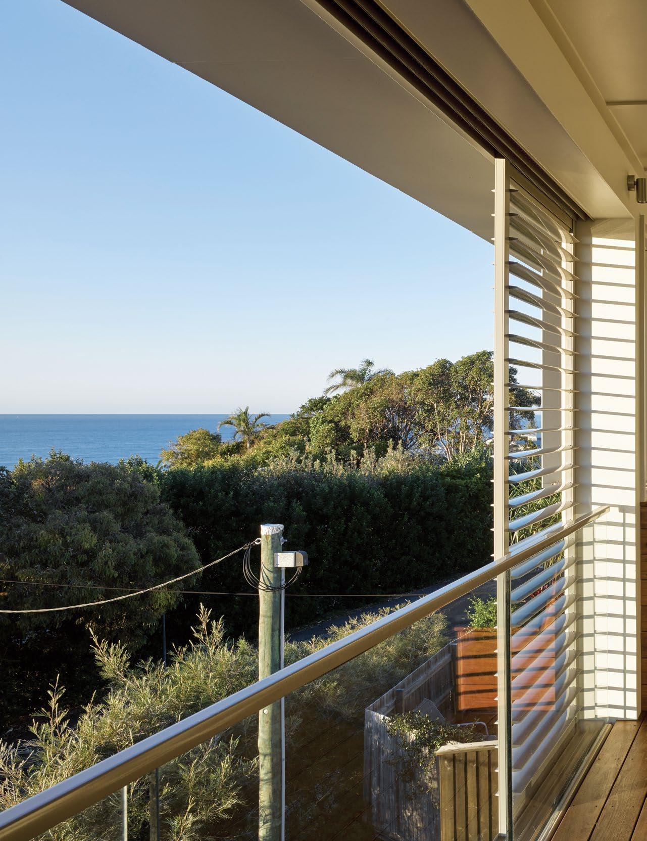 TEXT MARGIE FRASER | PHOTOGRAPHY CHRISTOPHER FREDERICK JONES
issue #43 habitusliving.com

3 . on location # 165
The runway of golden sand that announces Queensland’s Sunshine Beach has an operatic relationship with the Pacific Ocean that laps at its edge. Both beach and sea share in a wildness and grandiosity, enhanced by their uninterrupted vastness. A prevailing southeasterly breeze often whips at the surfaces of sand and water, and sends a shiver up into the adjacent bushland.
A steeply sloping hillside plunges towards the beach, forming an amphitheatre auditorium from which to watch the waves and the cruising whales. To the north, a crouching headland divides Sunshine Beach from the Noosa National Park, where a string of gloriously picturesque stony bays punctuate the coastline, each fringed with dense rainforest. Beyond this reserve, the township of Noosa Heads has become a busy haven of upmarket stores and eateries. Sunshine Beach, its southern sibling, retains something of the simpler life, or what many locals might see as a more authentic beach existence that champions the pleasures of sand, surf and sun – albeit with a handful of desirable restaurants. The milieu here is casual comfort rather than branded glamour, thongs and sarongs are de rigueur any time day or night.
Above the golden band of the beach, a series of bushy terraces clings to the steep hillside, affording many wonderful opportunities to view the ocean from on high. When Bark Architects’ Lindy Atkin and Steve Guthrie were commissioned to design Sunshine Beach House for a young family of London-based ex-pats, they knew exactly how to channel the site’s best aspects.
One of the clients had a strong connection with the place, having spent happy childhood holidays with family and friends in the area.
“I grew up spending many summers at Noosa,” she recalls. “We used to stay at Paramount Towers on Hastings Street and camp on the North Shore. My best friend had a beach house at Sunshine and we spent many happy days there too.”
Lindy and Steve are old hands at designing in this coastal region that has been both their home and muse for multiple decades.
“We design from the inside out,” says Lindy, commenting on a modus operandi that begins with a detailed examination of the site’s attributes. The site, according to Steve, was probably the last available in the area, and had been ignored to date because of its steepness and the assumed difficulty for construction.

OPENER | THE VERANDAH WHICH EXTENDS THE LIVING SPACES ON THE UPPER FLOOR CAN BE AS ENCLOSED OR OPEN AS WEATHER AND SOCIAL ARRANGEMENTS REQUIRE. SOLID CASEMENT FINS ON THE EAST ESTABLISH PRIVACY FROM NEIGHBOURS. ABOVE | A SEAMLESS FLOW FROM INSIDE TO OUT IS ENHANCED BY THE MATERIAL PALETTE. OPPOSITE | THE STACKED LIVING SPACES, VIEWED FROM THE CENTRAL COURTYARD, SHOW CHILDREN’S AREAS BELOW AND COMMUNAL FAMILY SPACES ABOVE.
issue #43 habitusliving.com

3 . on location # 167


ABOVE | CLERESTORY WINDOWS BRING EXTRA LIGHT INTO THE LOUNGE AND DINING AREA WHILE GIVING GLIMPSES OF THE SKY. OPPOSITE | THE INDOOR/OUTDOOR ROOM ENJOYS A SPLENDID VIEW OF THE OCEAN, WITH BUSHLAND IN THE FOREGROUND. issue #43 habitusliving.com

3 . on location # 169
A favourite moment is watching the sunrise “when the whales are in town”.

issue #43 habitusliving.com
Drawing on the typology of earlier coastal beach shacks, both the material palette and scale were kept humble.


OPPOSITE | THE CENTRAL COURTYARD WITH A RAISED POOL IS THE HOME’S HEARTH AND PRIVATE ENTRY POINT. IT CREATES A MICROCLIMATE IN THE HOME’S CENTRE, WHERE HOT SUMMER AIR IS COOLED BY THE BAND OF SHADED WATER, AND WINTER SUN IS TRAPPED IN THE BUILT SURFACES AND REFLECTED INSIDE. ABOVE LEFT & RIGHT | THE STAIRWELL BRIDGE THAT CONNECTS THE HOME'S EAST AND WEST PAVILIONS IS A MULTIFUNCTIONAL SPACE THAT EMBRACES AN OFFICE DESK WHILE ALSO ACTING AS A VENTILATION CHIMNEY.
3 . on location # 171
FIRST FLOOR
GROUND FLOOR
STAIRS TO ENTRY
GARAGE
STORAGE
ENTRY
RUMPUS & MEDIA ROOM
BEDROOM
W.C.
BATHROOM
LAUNDRY
COVERED TERRACE
UNCOVERED TERRACE
POOL
BEACH SHOWER
KITCHEN
PANTRY
DINING
LIVING
OUTDOOR LIVING
OUTDOOR DINING
MEDIA & STORAGE ROOM
STUDY
MASTER BEDROOM
ENSUITE
OUTDOOR SHOWER
1 2 3 4 5 6 7 8 9 0 q w e r t y u i o p a s d f BASEMENT
issue #43 habitusliving.com
The elevated site has views across the Pacific Ocean to the east, and northeast to the headland. Directly below to the east, a swatch of council bushland provides a wall of native foliage and a luscious green base to the blue panorama of sky and sea beyond. Bark’s early watercolour sketch plans detail the prevailing breezes and solar angles. The plans soon led to a breathable house with an exoskeleton of operable fins, louvres and walls that could open and close to accommodate various weather conditions and seasons.
The clients’ brief was to capture a view of the sea, and to design a light and open house that was “not too polished but very much a beach house”. Drawing on the typology of earlier coastal beach shacks, both the material palette and scale were kept humble. Fibrous cement sheeting with cover strips receives a crisp, modern interpretation with their coats of white paint.
Sunshine Beach House hunkers into the steep slope on the west, and generously retains neighbours’ views from above and behind. A two-storey pavilion on the east houses children’s rooms downstairs and a communal kitchen, living and verandah rooms above. The western pavilion houses the master bedroom and guest bedroom, divided by respective bathrooms. A bridge connects the two pavilions. The linking

bridge that incorporates a connecting stair, bathroom and spare room, is wrapped in a thin skin of opalescent polycarbonate sheeting attached to a raw timber stud frame. At night it creates a giant lantern in the landscape. It overlooks the central pool and entry courtyard that forms the breathing lung and focal point in the heart of Sunshine Beach House.
While the eastern verandah can be battened down when the southeasterly winds pick up pace, the central courtyard is bound and protected by the surrounding home and landscape. The waters of the shaded raised pool cool the home in summer, while the sun reaches into the court and surrounding rooms to warm the spaces in winter.
“The pool provides a wonderful focus for the house and bounces light into the rooms,” say the owners. The process of designing and collaborating between London and the Sunshine Coast was surprisingly easy, they continue.
“We knew Bark had done work for overseas clients before. We used Dropbox for plans and had regular conference calls. We visited the site only three times while it was being built – before, during and after it was finished. We suspect this not only made it easier for Bark, but probably stopped us fiddling and adding to the cost. It also made it more exciting when we saw the finished article.”
OPPOSITE |
ADD TO THE
PLANS. ABOVE
|
THE VIEW SEAWARD FROM THE MAIN BEDROOM SHOOTS STRAIGHT THROUGH THE HOUSE. A SERIES OF DAY BEDS SCATTERED AROUND THE
HOME
SENSE OF RELAXATION.
3 . on location # 173
The rigour of the plan allows for crossventilation in each room and peripheral space. Thermal trapping and heat release is also integral to the design which responds to the sun’s penetration angles through the seasons. A large fireplace is available for colder winter nights.
The compact plan is deceptive. The separation of spaces is clearly considered and nicely choreographed. “[Sunshine Beach House] brings everyone together but allows us to spend precious time together without feeling on top of each other,” say the residents.
Extended family groups and all sorts of occasions have been happily accommodated. “We have already had family birthdays, a boys’ weekend and romantic weekends there and the house ticks the box for all occasions,” says the owner. A favourite moment of theirs is watching the sunrise “when the whales are in town”. Watching the migration of the majestic Humpbacks from the protected verandah or the master bedroom perch must seem a dreamily long way from busy London life.

ABOVE | THE NORTHEAST ELEVATION. THE OUTDOOR LIVING SPACE PROJECTS OVER A STEEP DRIVEWAY ENTRY. THE USE OF HUMBLE MATERIALS AND LEGIBLE ARTICULATION CONTINUE THE LANGUAGE OF THE QUEENSLAND BEACH HOUSE.
Bark Architects | barkdesign.com.au
issue #43 habitusliving.com
The site was probably the last available in the area, and had been ignored to date because of its steepness and the assumed difficulty for construction.
Produced by

RETURNING TO CARRIAGEWORKS, SYDNEY
AUGUST 2019
to exhibit now www.front.design
29-30
Apply
Concrete poetry
A classic exercise in refuge and prospect, this house on a stunning coastal site by PopovBass is a celebration of concrete's domestic potential.

issue #43 habitusliving.com
TEXT PAUL MCGILLICK | PHOTOGRAPHY MICHAEL NICHOLSON

3 . on location # 177
Gordons Bay is a delightful bay and sandy beach carved out from Sydney’s characteristic coastal sandstone cliffs. It lies between Bondi and Coogee and the walking trail which links those beaches lies unseen below this PopovBass-designed house.
The new build replaces what the client, Paul, describes as “the worst house in the best street – with a tennis court”. The tennis court proved crucial on a steeply sloping site because it provided a “useable backyard”, unlike the neighbouring terraces. But it also acts like a Ha-ha, providing an abrupt termination with its precipitous fall to the reserve and walkway below. “Although there may be a truckload of people walking past,” says architect, Brian Bass, “you can’t see them.”
Hence, the rear garden offers an uninterrupted and sensational view of the bay and Pacific Ocean beyond. It also boasts a raised infinity-edge swimming pool, a vegetable garden, fish pond and impressive papaya tree. In addition, there is a telling view back up to the house that sits on its own terrace with its slightly angled roof framing the balcony and the view while adding an element of privacy from the neighbours.
Although the house enjoys its own gateway and path down to the walkway, it is of course entered from the street. PopovBass has always cherished the marriage of privacy and prospect, the studio’s houses giving little away to the public domain, but opening up to the views on entry.

issue #43 habitusliving.com
OPENER | TYPICALLY FOR POPOVBASS, THE HOUSE GIVES LITTLE AWAY STREETSIDE WITH ITS ENTRY SET A LITTLE BELOW STREET LEVEL. ABOVE | THE ARRIVAL SEQUENCE OF GORDONS BAY HOUSE IS BENEATH A CONCRETE LINTEL, THROUGH A TALLOWOOD DOOR AND DOWN A CORRIDOR WHERE THE VIEW BECKONS. OPPOSITE | THE LONG POLISHED CONCRETE ISLAND BENCH IN THE KITCHEN IS ONE OF MANY BESPOKE CONCRETE FEATURES.
The beautifully detailed ceiling in the main living/dining space elegantly complements the cross-cut marble floor.

3 . on location # 179

issue #43 habitusliving.com
The rear garden offers an uninterrupted and sensational view of the bay and Pacific Ocean beyond.
So it is here where they were able to take advantage of the drop from street level to entry. But there is also an ‘eyelid’ concrete panel which folds down for privacy while also screening the upstairs bedrooms. Stepping down from the street, it really is a grand arrival through a Tallowwood door framed by off-form concrete walls. But it is only when one enters – looking down the polished concrete stairs through the main living/dining area – that the panorama of rocks, cliffs and sea is revealed. This is a strategy wholly in keeping with the clients’ dream. As the client, Katya, remarks: “My husband [Paul] always wanted something where you could turn your back to the street.”
This is a concrete house, softened by the use of Tallowwood throughout. In fact, Paul calls it a “concrete bunker” – and herein lies the fascinating backstory to the house.
Paul comes from three generations of builders and points out he has worked in concrete all his life. They lived in Sydney’s
western suburbs, but always wanted to live near the water and spent numerous years looking for the right site before this 900-square-metre opportunity turned up. It was always the intention to build his own house, but it meant a long gestation period – more than four years in total – with Paul “slotting it in” between his other construction jobs.
Apart from being a concrete structure, the house had to have four bedrooms. The layout has then been spread over three levels with the bedrooms on the top, everyday living in the middle and an entertainment area with a second kitchen and swimming pool at the bottom.
“Everything is solid and rendered,” says Paul. “I didn’t want to put any gyprock in the house.” This is a clue to just how hands-on he was during the construction process. In fact, he personally did a lot of the detailed work in situ including the polished concrete island bench in the main kitchen, concrete benches throughout, and the downstairs concrete vanity.

OPPOSITE | THE VIEW FROM THE MID-LEVEL LIVING SPACE OUT TO GORDONS BAY. ABOVE | THE KITCHEN/LIVING/DINING SPACE OPENS UP COMLETELY TO THE OUTSIDE.
3 . on location # 181
GROUND FLOOR
LOWER GROUND FLOOR
ENTRY OFFICE LAUNDRY BATHROOM KITCHEN PANTRY DINING LIVING OUTDOOR DINING GARAGE W.C. BEDROOM ENSUITE BALCONY MASTER BEDROOM WALK-IN-ROBE TERRACE POOL POND PLANT STORAGE 1 2 3 4 5 6 7 8 9 0 q w e r t y u i o p a
FIRST
issue #43 habitusliving.com
FLOOR
This focus on concrete detailing extended to the concrete ceilings with their square channeling. “A concrete ceiling in a concrete home is not an easy thing,” Paul observes, “because these slabs are 450-millimetres thick and there’s a lot of steel in the slabs, especially for these spans. When it rains it rusts and all the rust settles on the plywood. I couldn’t take the risk, so I galvanised all the steel, avoiding rust marks on the ceiling.”

The beautifully detailed ceiling in the main living/dining space elegantly complements the cross-cut marble floor – cut with the grain to highlight the lines producing a lovely softness –and the polished concrete steps down from the entry. This palette is softened by the judicious use of Tallowwood detailing from the front door and frames of the vertical slot windows looking in to the garage, to the stairs leading to the upper level, the kitchen cabinetry and the rear dining area wall.

OPPOSITE
| PLANS. ABOVE | LOOKING BACK FROM THE GARDEN THERE IS A CONCRETE CABANA ON THE LEFT, WHILE THE SLIGHTLY SPLAYED FORM OF THE HOUSE CREATES A DYNAMIC EFFECT. BELOW | LOOKING BACK TOWARDS THE ENTRY FROM THE UPPER LEVEL.
3 . on location # 183
Not surprisingly, the house on the eastern ocean side is fully glazed to celebrate the astonishing views. The living space has large sliding doors out on to a terrace with a slice cut out of the canopy for extra light, while downstairs in the entertainment area a polished concrete floor leads straight out to the backyard.
Upstairs, the master bedroom ensuite is similarly open to the view while its white, textured ceramic Japanese tiles (also in the downstairs bathroom) lend another subtle touch of elegance to the house.
So, in an important sense this house is the result of a collaboration between the architects and the owner-builder. Sensitively detailed, it is a testament to how well concrete can serve a domestic purpose and produce a highly liveable, functional – yet elegant – home.
“It was a very nice experience,” says Brian Bass, “because it’s not often you get to work with builders when it’s their own home – and to have someone who actually wants to craft things is a rare treat.”

ABOVE | GORDONS BAY HOUSE AS SEEN FROM THE STREET.
PopovBass | popovbass.com.au
issue #43 habitusliving.com
PopovBass has always cherished the marriage of privacy and prospect, its houses giving little away to the public domain.
Haxstead Garden House
ARCHITECT Tobias Partners

LEAD ARCHITECT Richard Peters, Julia Cumines, and Nicholas Tobias
BUILDER Pat Waddel
STRUCTURAL ENGINEER Partridge Structural
LANDSCAPING Myles Baldwin
TOBIAS PARTNERS (61 2) 9361 4800 tobiaspartners.com
FINISHES
Concrete supplied by Boral. Raw sawn limestone flooring supplied by Aren Blanco. White laminated plywood, interior wall and ceiling linings from DMK Forest Products and WISA. Sliding doors and windows from Vitrocsa. Steel awning windows from Skyrange. External aluminum louvers and blinds from Horiso. Interior window furnishings by Simple Studio. Structural steel and roof sheeting from Bluescope Steel.
LIGHTING
Lighting from Viabizzuno and Bega.
FIXED & FITTED
Pivot door hardware from FritsJurgens. Sanitary fittings and fixtures from Astra Walker and Duravit. Stovax freestanding fireplace supplied by Riva Studio.
Boomer Beach House Cloister House
ARCHITECT Max Pritchard Gunner Architects

LEAD ARCHITECTS Max Pritchard and Tess Pritchard


INTERIOR DESIGN AND DECORATION Enoki
BUILDER Fairweather Davies
STRUCTURAL ENGINEER PT Design
LANDSCAPING David Baptiste Garden Design
MAX PRITCHARD GUNNER
ARCHITECTS (61 8) 8376 2314 mpgarchitects.com.au
FINISHES
Wild Oak timber flooring and timber walls in Lyon by First Choice Flooring. Cyclone Sisal carpets from Natural Floors. Basalt tiles from Taylored Stone. White birch multiply supplied by Cabinetwork. Vivid White internal walls from Dulux. TrueOak external roofing sheets in Windspray by Revolution.
FURNITURE
Milo Modular sofa and Alby large round floor cushion by Jardan. Frank & Ernest round floor cushion from Donna Wilson. Lace coffee table from Zuster. Around Coffee Table from Muuto. Sierra rug from Armadillo & Co. Bloom rug from Fenton & Fenton. Copenhague stool from Hay. Doughwood dining table and Fig bench from Agostino & Brown. Jak Barstool and linear custom Drybar from Tait. Neo deluxe B1 supplied by King Furniture. Perch white and birch bunk beds from Ouef. Armchair from Crossaint. Modular sofa by Mags Soft. Pigalle outdoor chairs and Yoda chair from Kenneth Cobonpue.
LIGHTING
Lighting by Inlite. Bamboo Cloche pendant and Black Wicker pendant from Koskela. Cement wood suspension from KE-ZU. Jellyfish pendant lights and Bonita pendant from Darcy Clarke.
FIXED & FITTED
Benchtops and splashbacks by Concrete House. Blinds from Baily Blinds and Curtains. Leather cabinet pulls supplied by MadeMeasure. ErgoFocus fireplace from Oblica. Fridge and freezer from Siemens. Oven, cooktop and dishwasher from Miele. Black cylinder rangehood from Qasair.
ARCHITECT Formwerkz Architects
LEAD ARCHITECT Alan Tay
INTERIOR DESIGN AND DECORATION Formwerkz
Architects
BUILDER Telford Signature
JOINERY Jack Wood Construction
LANDSCAPE CONTRACTOR Uniscape
FORMWERKZ ARCHITECTS (65) 6440 0551 formwerkz.com
FURNITURE
Furniture from Crate & Barrel, Oriental Living, Quattro Design, Innovation Living, Castlery, CMYK, Tropical Living Asia, Commune, and Interline Design & Furnishing.
LIGHTING
Lighting fromNemo Lighting, Tom Dixon, Kartel, Marset and Flos.
FIXED & FITTED
Hardware and fittings fromHansgrohe, Arto, Duravit and Geberit.
Dress it up or play it down, here are the pieces that turned these houses into homes.
It’s all in the Details
3 . on location # 185
Sunshine Beach House Barwon Heads House

ARCHITECT Lovell Burton Architecture


BUILDER Project Group
STRUCTURAL ENGINEER Meyer Consulting
ESD CONSULTANT Ark Resources
PLANTING Sophie Maclean
LOVELL BURTON ARCHITECTURE lovellburton.com
FINISHES
Solid American Oak Danish White hardwax oil ceiling and floor finish by WOCA. External cladding and roofing in black anodized corrugated aluminum supplied by Archclad. Andorra Limestone benchtops supplied by Eco Outdoor. Mosa ceramic tiles from Design Republic.
FURNITURE
Dining table from Thonet. Eames molded plywood dining, Hiroshima sofa and Hepburn bed from Luke Furniture.
LIGHTING
Paris Au Mois pendant lights from Hub Furniture. Tolomeo wall lights from Artemide.
FIXED & FITTED
Wall tapware, shower and bath mixers supplied by Brodware Yokata. Aged brass from Mary Noall. Franke Oxygene black kitchen mixer with pullout from E&S Trading. Globe Bench basin and Soka freestanding bath with Mercury finish from Apaiser.
ARCHITECT Bark Design Architects
PROJECT TEAM Lindy Atkin, Jo-Anne Bourke, Stephen Guthrie, Annie Ha, Meg Ryan, Tim Stoklosa and Phil Tillotson
BUILDER GV Emanuel Constructions
STRUCTURAL ENGINEER SCG Consulting Engineers
BARK DESIGN ARCHITECTS (61 7) 5470 0340 barkdesign.com.au
FINISHES
Snowdrift polished concrete from Boral. Blackbutt hardwood flooring by Queensland Timber Floors. Organic white reconstituted stone benchtops from Ceasarstone. Blackbutt and matt limewash Hoop Pine veneer plywood joinery fabricated by Minka Joinery. Silver anodized aluminium windows from AWS Vantage. Altair Powerlouvre galleries and doors from Breezeway supplied by Horizon. Powder-coated sliding plantation shutters in Dulux Stone Grey by IQ Shutters. Compressed Fibre Cement cladding, awnings, window boxes and casement fins in Double Sea Fog from Resene. Twinwall polycarbonate cladding by Palram. Spotted Gum hardwood framing, screens and linings in CD50 Walnut from Cutek.
FURNITURE
Pyrmont industrial dining table and Balmain entertainment unit from Urban Couture. Shuttle counter stools by Nomi. Hay About a Chair and About a Lounge from Cult. Mars coffee table, Venus coffee table, Neo Lounge and King Cove Lounge from King Living. Marle Tuck floor rug from Armadillo & Co. Outdoor dining table supplied by Furniture by Marx. Pure sofa teak outdoor lounge from Cosh Living. Butterfly chair from Bohobleu. Hindra Chairs from Stylecraft.
LIGHTING
Unios Titanium pendants and lights from Noosa Lighting. Pure floor lamp from Urban Lighting.
FIXED & FITTED
Heatmaster Box natural wood fireplace Series A900. Cooktop, oven, rangehood, washing machine, clothes dryer from Bosch. Fisher & Paykel bar fridge and refrigerator. Dishwasher from Miele. BSL156SA Singature Proline BBQ from BeefEater. Undermounted sinks from Abey. Rogerseller sink and tapware. Undercounter washbasin, Roggerseller Minimax Basin Mixer, Flow Handshower/Rail and Ram tapware from Villeroy & Boch, Loop and Friends. Shower rose from Evolve.
Gordons Bay Residence

ARCHITECT PopovBass
BUILDER Zonie Constructions
STRUCTURAL ENGINEER Australian Consulting Engineers
HYDRAULIC ENGINEER ITM Design
LANDSCAPING Spirit Level Designs
POPOVBASS (61 2) 9955 5604 popovbass.com.au
FINISHES
Cement composite cladding panels in Carat Onyx from Swisspearl. Torino granite pavers with etch finish from Eco Outdoor. Rendered brick masonry in Dieskau, matt finish from Dulux. Niebla and Iris Jade glass mosaic pool tiles from Ezarri. 25mm Tallowood timber decking from Nash Timbers. Polished Cesar White marble floor tiles from Worldstone. Natural white paint finishes from Dulux. Nera bathroom floor tiles from Casamood. White classic matt bathroom wall tiles from Skheme. Yohen Border 102 & 103, Yuki Border 1 mosaic bathroom tiles, Elba bathroom marble floor tiles with honed finish from Artedomus. Triangle 76764 bathroom wall tiles, Terremoto marble feature tiles from Academy Tiles.
FURNITURE
Flow dining chair from MDF Italia. Rumpus Room cushions and bathroom towels by Missoni. Jacqueline bed from Poliform.
LIGHTING
Arco LivinRoom floor lamp and Easy Kap recessed downlights from Flos Lighting. Prologe in line 145 double recessed downlights and Prologe in line 80 Ligna surface mounted downlights from Kreon.
FIXED & FITTED
Mier curtains from Jim Thompson. Goccia ceiling mounted spout and Goccia black basin from Gessi.
issue #43 habitusliving.com
habitus on the ground...
The Trailblazers issue launch

In December, Habitus celebrated the release of issue #42 alongside Vitra Design Museum’s Miniatures Exhibition hosted for the first time in Australia by Living Edge.


The exhibition showcased 100 iconic Vitra chair designs released between 1850 and 1990 – a testament to the legendary Swiss company’s ability to push the boundaries of creativity and design. Which is exactly what we strived to achieve within the Trailblazers issue.

Habitus Living habitusliving.com
Living Edge livingedge.com.au
PHOTOGRAPHY BY DEREK BOGART
# 187
habitus on the ground...
Habitus House of the Year Judging Day
There were many elements within the inaugural, 2018 Habitus House of the Year initiative and while last issue we shared images from the launch event, this issue we look back at the Judging Day and Cocktail Party that ensued.
On 19 October the jury came together in the boardroom of the Stylecraft Sydney showroom and offices – amongst sweeping, near panoramic, views of the city – to discuss in detail the initial selection of residential projects spread out through the Indo Pacific.


Robust debate between jurors Howard Tanner, Karen McCartney, Narelle Yabuka, Neil Burley, Raj Nandan, Paul McGillick (convenor) and Holly Cunneen (editor) led to a unanimous decision for the overall winner and commendations. A beautiful spread for lunch concluded official proceedings.

issue #43 habitusliving.com
PHOTOGRAPHY BY DEREK BOGART
Habitus House of the Year Cocktail

Evening
Four weeks later and nearly 900 kilometres southwest, we celebrated the overall winner and project commendations at the StylecraftHOME showroom in Melbourne.


Habitus would like to congratulate John Wardle Architects as the overall winner of Habitus House of the Year 2018 for Boneo House; Cavill Architects and Palinda Kannangara Architects as joint winners of Interior and Exterior Connection for Gibbon Street and Artists’ Retreat respectively; B.E Architecture as winner of Interiors for St Vincents Place; Boondesign and Attaporn Kobkongsanti for winning Architecture and Landscape for Rabbit Residence; and ARO Studio for taking out the People’s Choice for D-House.
Habitus Living habitusliving.com
StylecraftHOME stylecrafthome.com.au
# 189
PHOTOGRAPHY BY ELLENI TOUMPAS
issue #43 habitusliving.com
Discover beautiful products
Meet inspiring people
Indulge in architecture and design

Across Australia, New Zealand, South and South-East Asia
The online community for the Design Hunter®
Website | habitusliving.com

Facebook | habitusliving
Pinterest | habitusliving

Instagram | @habitusliving
Twitter | @habitusliving
Barwon Heads House
Photography by Rory Gardiner
THE TEAM AT HABITUS MAGAZINE THANKS OUR ADVERTISERS FOR THEIR SUPPORT. USE THE DIRECTORY TO SEE WHAT PAGE A SPECIFIC BRAND IS FEATURED ON, AND VISIT THEIR WEBSITE TO LEARN ABOUT THE PRODUCTS AND SERVICES THEY PROVIDE.
Habitus magazine is available at newsagents and bookstores across Australasia, South-East Asia, the USA, Canada, Europe, South America and the Middle East. Habitus is published quarterly in March, June, September and December. To subscribe securely online visit habitusliving.com/magazine or email subscriptions@indesign.com.au to subscribe or request a full list of locations where Habitus magazine is available.

# 191 Abey 16 abey.com.au Cantilever 075 cantileverinteriors.com Cult 009, 101 cultdesign.com.au Dekton 006 cosentino.com Designer Rugs 010-011 designerrugs.com.au/habitus District 023 district.com.au FRONT 175 front.design Gaggenau 033, 035 gaggenau.com.au Habitus Subscriptions 080 habitusliving.com/subscribe Harvey Norman @ Domayne 012-013 harveynorman.com.au House Lab 014-015 houselab.com.au Ilve 004-005 ilve.com.au INDE.Awards 024 indeawards.com King Living 062-063, 078-079 kingliving.com Laminex 193 laminex.com.au Leon House 049 leonhouse.net Living Edge IFC-001 livingedge.com.au Phoenix Tapware 108 phoenixtapware.com.au Rocks On 037 rockson.com.au Saturday in Design 141, 163 saturdayindesign.com Siemens 061 siemens.com/au StylecraftHOME OBC stylecraftHOME.com.au Sub-Zero & Wolf 076-077 subzero-wolf.com.au The Habitus Collection 020, 112 habitusliving.com/collection Tongue n Groove 002-003 tngflooring.com.au Vela 127 vela.life Verosol 038 verosol.com.au Wyalla Studio 019 wyallastudio.com.au Zip 021, 093 zipwater.com
Your map to where the stories in this issue come from where is available
Malaysia #142
Indonesia #82
Sunshine Beach #164
Sydney #177
Port Elliot #128
FRANK GEHRY
world
issue #43 habitusliving.com
“Architecture should speak of its time and place, but yearn for timelessness”


stylecraftHOME.com.au Mon - Fri: 8:30am - 5:00pm, Sat: 10:00am - 4:00pm info@stylecraftHOME.com.au Melbourne 145 Flinders Lane,
Sydney 100 William
Jabara Sideboard, OS Tables & Rivage Lounge Chairs designed by Shinsaku Miyamoto for Ritzwell
Melbourne CBD
Street, Woolloomooloo


 VALCUCINE KITCHEN EXCLUSIVE TO ROGERSELLER | HOMEPAGE PHOTOGRAPHY BY ANDY MACPHERSON


 OPENER | ANNA SITTING IN HER LIVING ROOM NEXT TO A BRIGHT, POP-PY QUAREZ VINTAGE POSTER; A GLASS SCULPTURE BY AMANDA DZIEDZIC. ABOVE | “AS I MAKE NAIL POLISH I HAVE FOR THE PAST SIX YEARS BEEN COLLECTING ODD HAND ORNAMENTS,” SAYS ANNA. BELOW | IN THE KITCHEN A HAY BOOKCASE FILLED WITH BOOKS AND GLASSWARE SITS BENEATH A SAVINAC VINTAGE POSTER. OPPOSITE | KING GEORGE VON WHISKERS, THE CAT, PROWLS DOWN THE HALL LINED WITH ART BY LAURA JONES.


 TEXT STEPHEN CRAFTI | PHOTOGRAPHY JUSTIN ALEXANDER


 Tobias Partners | tobiaspartners.com


 TEXT MARGIE FRASER | PHOTOGRAPHY CHRISTOPHER FREDERICK JONES
