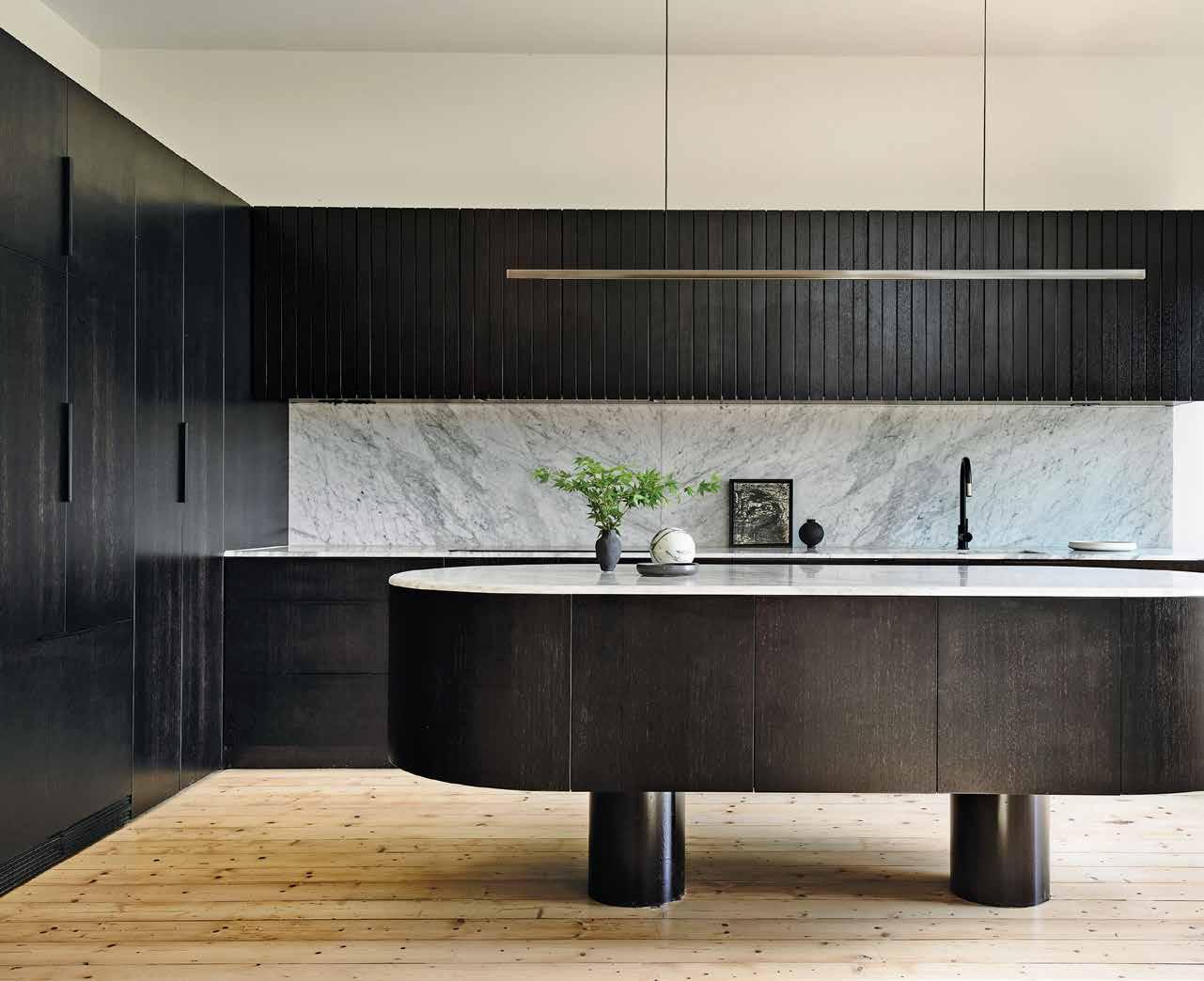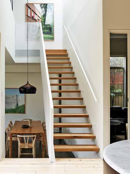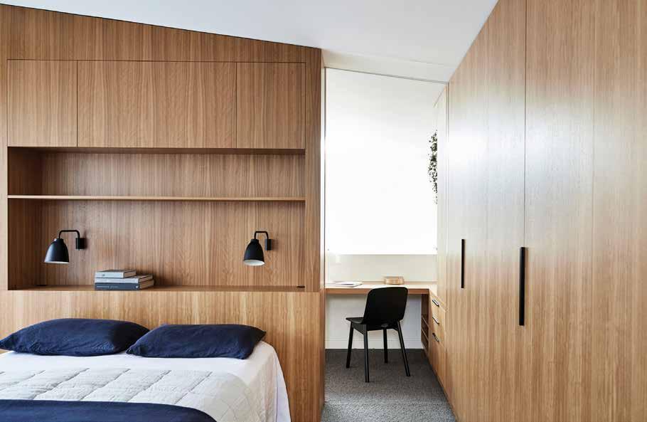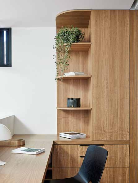
at
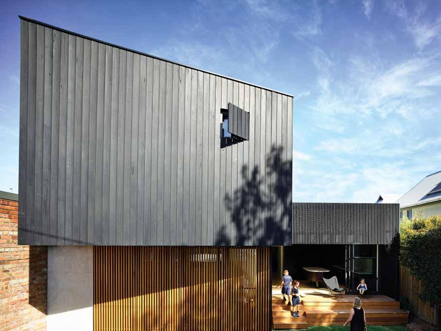
Benn on the spaces they’ve created for family. Hightech, modern bathrooms and a New Zealand residence that reconfigures the isolated suburban model in the annual Kitchen & Bathroom issue. 9 > 771836 055007 44 JUNE – AUGUST | 2019 AUD$17.95 | NZ$17.95 | SGD$13.95 #44
Architects
home: Luigi Rosselli and Andrew
Culinary art starts with the first course.
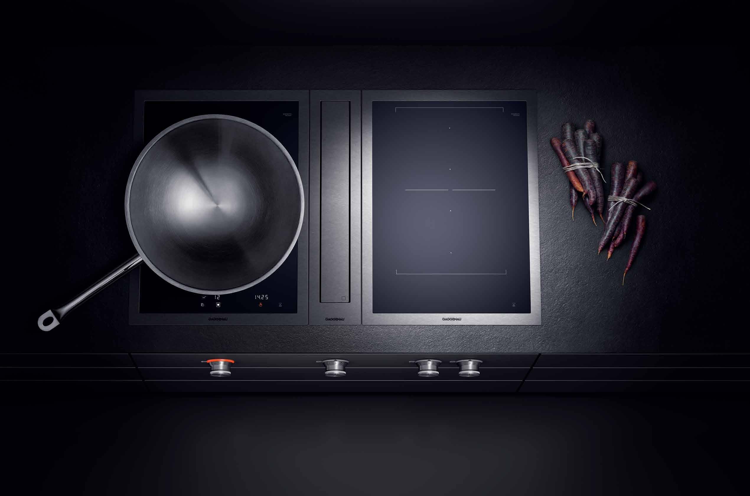
Culinary culture starts sooner than that.
The difference is Gaggenau.
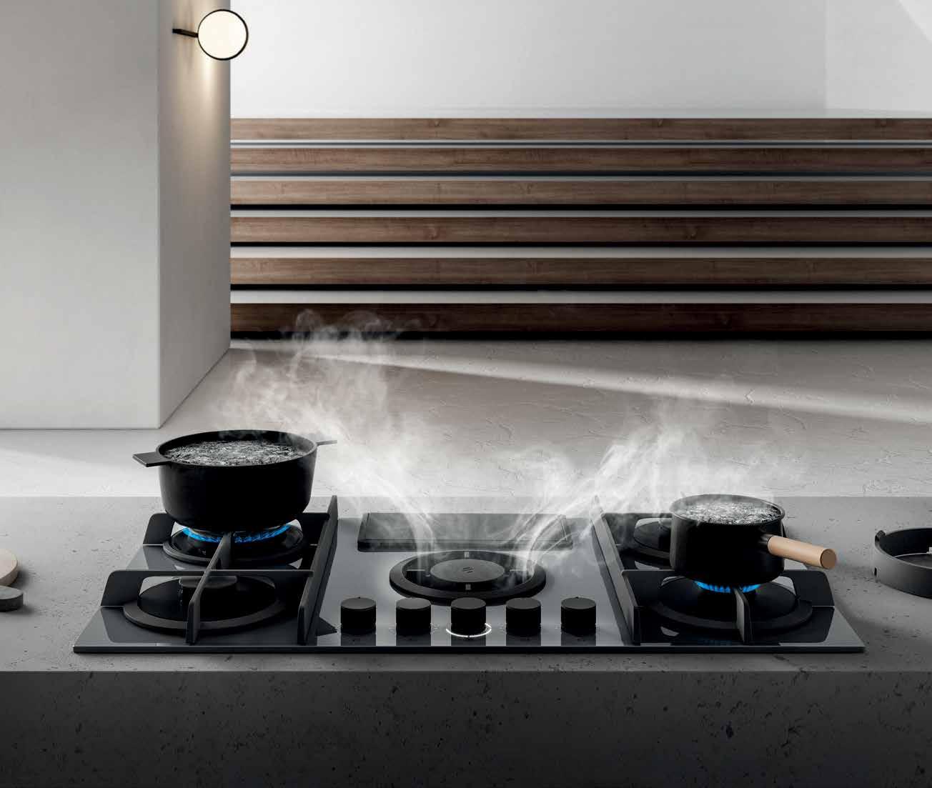
The ambitious kitchen is a place of exacting demands for equipment, ingredients and techniques. The Vario cooktops 400 series have been meeting these demands from the beginning, with appliances developed to meet any challenge. Energy efficient, our steel-framed induction cooktops direct heat quickly to the pan with the power to sear as well as the control for long, gentle simmering. These cooktops free the imagination; a tribute to boundless cuisine. Whatever combination you choose, you can look forward to exceptional freedom for decades to come.
Make a statement: gaggenau.com.au

Scholten & Baijings – Studio for Design
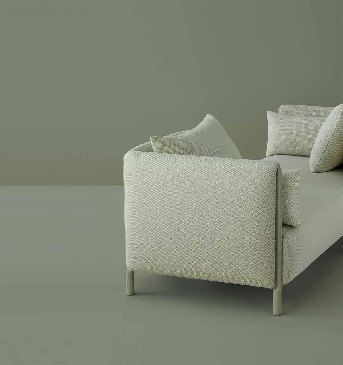

Diving deep into art and design history for inspiration, while always looking ahead to invent new ways of living, working, and making in the world.
livingedge.com.au
Herman Miller ColourForm TM Sofa Group
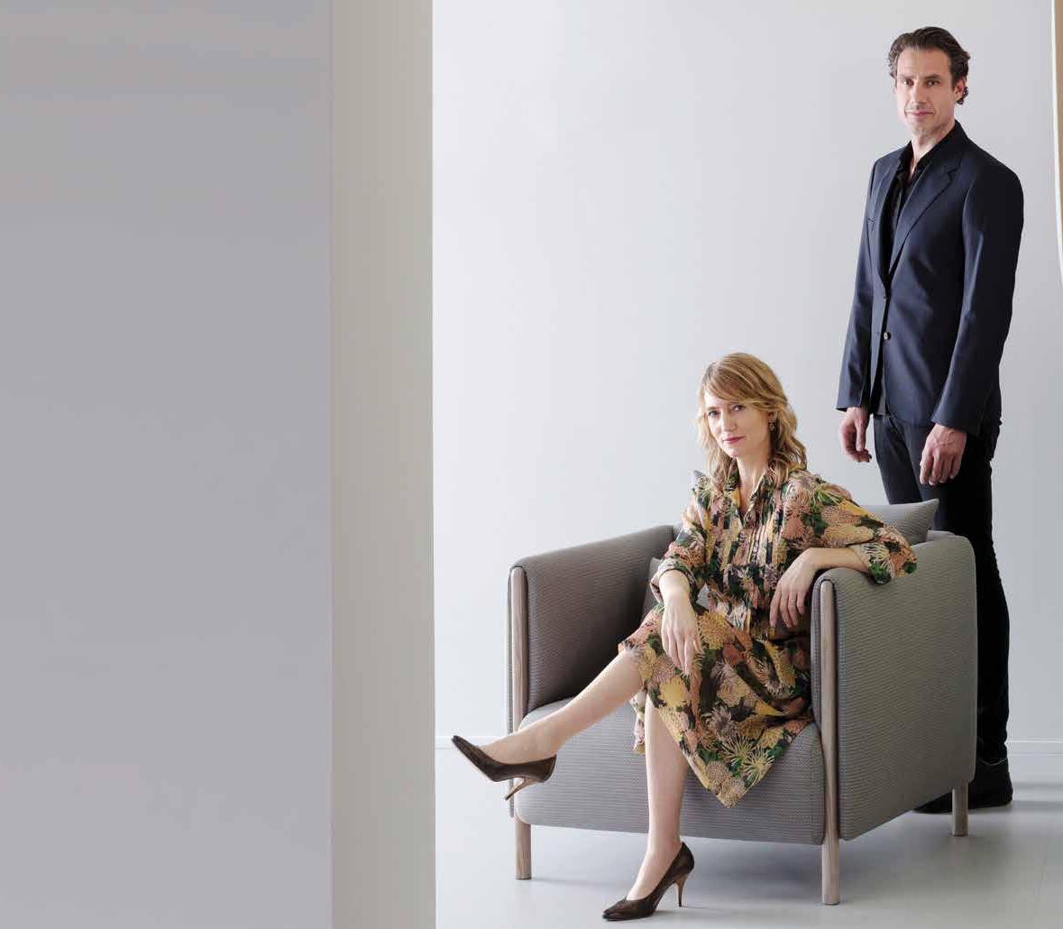


Scholten & Baijings Furniture for Creative
16
life.



Ensure your design decisions are truly informed. Leafing through the Design News pages will help you do just that.
24 DESIGN NEWS
Technology abounds in the kitchen and bathroom, however aptly placed furniture and objects of design also have a unique ability to lift the design, and feel, of these spaces. We have curated the latest pieces – and iconic favourites – for your reading pleasure.
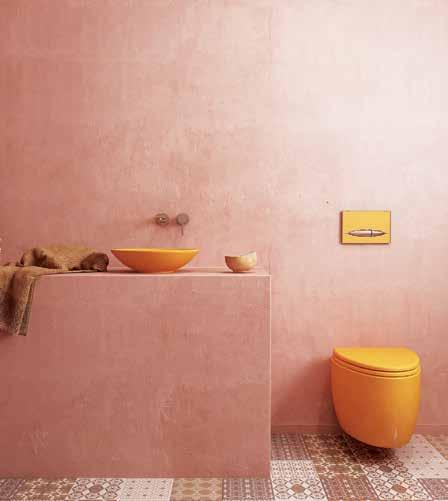
Chefs, foodies, architects and designers share their stories and insights with Habitus for the annual Kitchen & Bathroom issue.
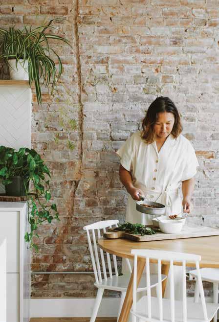
38 TONY NICOLINI
Restaurateur and chef Tony Nicolini has always utilised architecture to enhance his patrons’ experience. At home, he enhances his own.
46 HETTY MCKINNON
50 ANDREW BENN
Having spent time studying and working in the Netherlands, architect Andrew Benn has grown to admire the Dutch way of designing with logic and rationality.
62 KATE BERRY
82 JESSICA SEPEL
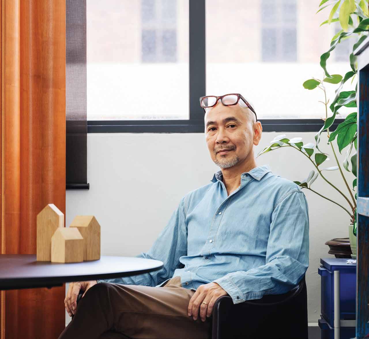
90 YIP YUEN HONG
101 ALENA SMITH
110 PHILIP STEJSKAL
126 MICHAEL HOGG & GREG LAMB
#44
46 24
Nourish
66 DESIGN HUNTER: LUIGI ROSSELLI
Habitus visits Italian-born, Sydney-based architect Luigi Rosselli at his home in Clovelly. It is a truly eclectic space that showcases his various passions: art, architecture and travel.
74 CONNECTED TO THE OUDOORS
Blurring the line between inside and outside isn’t just desirable in the living areas, but in the bathroom, too.
84 BIOPHILIA, COMFORT AND WELLBEING
How are designers using biophilic principles to provide a sense of wellness and what technology is available to make the kitchen and bathroom cleaner, safer and healthier?
93 SMARTER BATHROOMS
The smallest room in the house is often the site of many of the home’s high-tech gadgetry.
We’re often asked to sacrifice form for function or vice versa. These residences across the Indo Pacific Region show architecture in its ability to facilitate both.
97 KITCHENS
No longer a single-purpose room, kitchens are now multifunctional spaces that meet various needs.
113 BATHROOMS
Regardless of size, a thoughtfully designed bathroom can be an opportunity to offer residents a place to relax and rejuvenate.
130 IH RESIDENCE
The time was right for this client of Andra Matin’s, who has lived in Bandung, Indonesia, since childhood, to move to a bigger house on a quieter piece of land.
142 NULLA VALE HOUSE + SHED
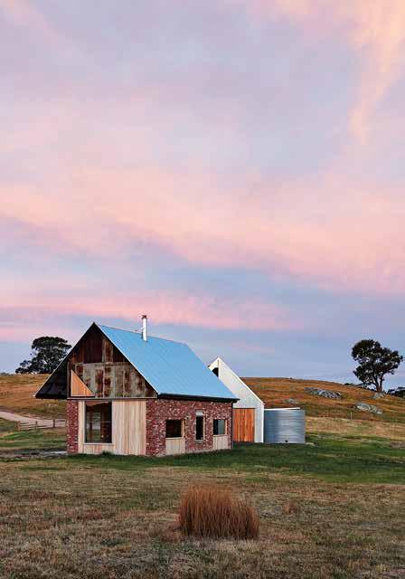
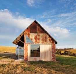
A young couple happened upon a piece of land in rural Victoria that they fell in love with immediately. MRTN Architects designed them a small house and shed for weekends that is flexible in nature – if and when they decide to move there full time.
154 FITZROY LANE HOUSE
One of Australia’s favourite design bloggers was well versed on the array of local architects when she and her husband engaged Kennedy Nolan to design their house in Melbourne.
164 HOUSE IN TOWN
From the hustle and bustle of Auckland to a quieter set up in Cambridge, this family didn’t want to lose feeling part of a community.
176 THE RIDGEWAY HOUSE
The residents of The Ridgeway House engaged Ha Architecture to extend the house they’d bought in 2011, creating more space for them to enjoy with their children.
#44
142 84
FOOD IS ART.

RESPECT IT. su b zer o -wolf.com.au Superior food preservation. Professional cooking performance. Craftsmanship and technology without equal.
info@cattelanitalia.com
cattelanitalia.com

table SKORPIO KERAMIKchairs NORMA COUTURE Hlamp CELLINIbookcases AIRPORT

Melbourne Showroom +61 3 9387 5421 www.cantileverinteriors.com A Tailored Kitchen System For a Modern Australia
the first word
Finding meaning in the work we do, and the way we live
What gives architects a sense of purpose? What is the ideal brief, client and commission that makes them feel like their work is a contribution to society? Those that come back with the most meaningful answers tend to be the ones whose work you see in the pages of the magazine and on the homepage of habitusliving.com.
But this issue, we go down a different route. This issue, for the annual Kitchen & Bathroom edition, we are asking architects and designers how they can nourish themselves and their clients through architecture. And it has been interesting to see how their interpretation of nourishment varies.
For Michael Hogg and Greg Lamb of Brisbane-based studio Hogg & Lamb, the kitchen is one of the most important rooms within a residence, so it’s important to them that the architectural concept for an entire house is clearly evident here, too. Yip Yuen Hong of ipli Architects in Singapore takes a decidedly restrained approach. He works with his clients to refine complex requirements to basic needs. In this way, the architecture is not a thinly spread canvas trying to do as much as possible, but nourishing clients with greater poignancy.
Across the ditch, architect Christopher Beer has worked with a family relocating back to rural New Zealand from the fast pace and high culture of Auckland. The parents, an artist and a teacher, needed a home that spoke to their creative personalities and fostered community inclusion. The resulting residence combines private living quarters with a public gallery and café that warmly welcomes in the town.
What does nourishment mean to you? And how do you look to find it through architecture and design? As always, we have put together the pages that follow to inspire, spark debate, challenge conventions, and celebrate architectural successes across the Region.
HOLLY CUNNEEN | EDITOR
Ever-evolving architecture in the kitchen & bathroom
As trends in kitchens and bathrooms come and go, one thing remains constant. We will forever continue to be genuinely interested in the newest designs, regardless of personal style. These domestic spaces are often the two that can make or break a home buyer or renter’s interest in a property. And as far as architects and designers are concerned, they’re pivotal to achieving the best design outcome possible.
It’s my pleasure to be invited to contribute a series of articles to this year’s Kitchens & Bathrooms issue. In covering bathrooms that connect to the outdoors, I couldn’t overlook the breathtaking Planchonella House by Jesse Bennett Studio in north Queensland, which sets a high standard for environmentally responsive architecture. At the other end of the spectrum is Kawakawa House in New Zealand by Herbst Architects that lets the outside in via a subtler design approach. This focus on the outdoors underlines the emphasis in Kitchen Comforts on biophilic design, an increasingly popular strategy strongly related to the end user’s wellbeing. While Clever Days looks at the ways in which contemporary bathrooms have become smarter.
Finally, I’m honoured to have interviewed Luigi Rosselli, one of this country’s finest architects. I’ve written on a number of his residential projects in the past and to talk to him about his own home was a privilege. He’s a wonderful story-teller and his warmth, generosity and passion not only informs every aspect of his practice, it’s also evident in each corner of his house. The concept of eclecticism runs through the article, exemplifying this issue’s content, which is deliciously diverse and richly varied.
LEANNE AMODEO | GUEST FEATURE EDITOR

eggersmannaustralia.com SilverTouch – exclusively by
Habitus is your authority on the very best residential architecture and design across the Indo Pacific Region.
Chairman & Founder, Indesign Media
Raj Nandan
THE NEW KITCHEN ESSENTIAL
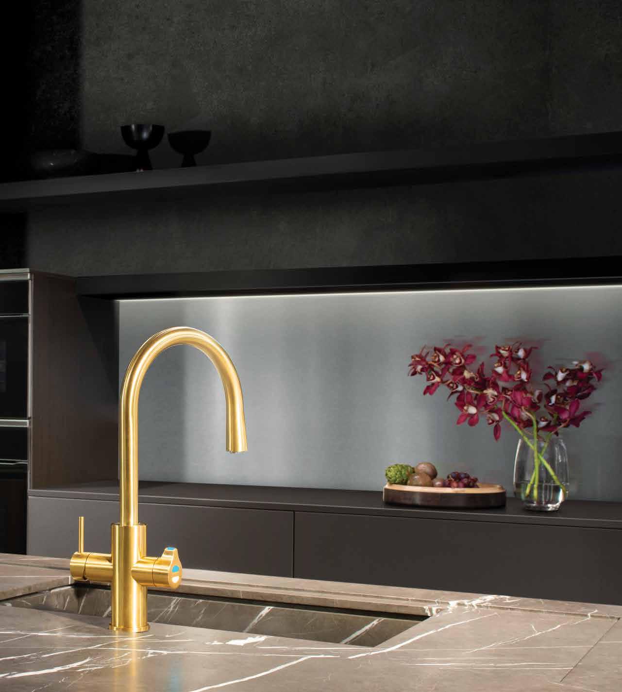
All your drinking water needs, All-in-One beautifully designed system. Remove the need for multiple taps in your kitchen with a single, beautifully designed system that delivers boiling, chilled and sparkling filtered drinking water, as well as hot and cold unfiltered water for your sink.
The Zip HydroTap All-in-One offers every water option you need from one multi-functional tap and a single intelligent compact under-bench system. That’s why the Zip HydroTap will be the one and only hydration solution for your kitchen. Discover more at zipwater.com

THE WORLD’S MOST ADVANCED DRINKING WATER SYSTEM ZIP HYDROTAP | PURE TASTING | INSTANT | BOILING | CHILLED | SPAR KLING
CHAIRMAN & FOUNDER
Raj Nandan raj@indesign.com.au
CONSULTING EDITOR
Paul McGillick
EDITOR
Holly Cunneen holly@indesign.com.au
GUEST FEATURE EDITOR
Leanne Amodeo
SE ASIA CO-EDITORS
Janice Seow janice@indesign.com.sg
Narelle Yabuka narelle@indesign.com.sg
EDITORIAL ASSISTANTS
Andrew McDonald andrew@indesign.com.au
Thida Sachathep thida@indesign.com.au
ASSOCIATE ART DIRECTOR

Betty Wong betty@indesign.com.sg
CONTRIBUTING WRITERS
Rachael Bernstone, Aleesha Callahan, Elana Castle, Stephen Crafti, Rebecca Gross, Annie Reid, Olha Romaniuk, Andrea Stevens, Danny Wicaksono
CONTRIBUTING PHOTOGRAPHERS
Peter Bennetts Luisa Brimble, Quang Dam, Sean Fennessy, Tom Ferguson, Holly Graham, Khoo Guo Jie, Marnie Hawson, Benjamin Hosking, Veronique Jenkins, Michael Kai, Tess Kelly, Patrick Reynolds, Tim da Rin, Anson Smart, Catherine Sutherland, Derek Swalwell, Nicholas Watt, Tzechen Wei, David Wheeler, Mario Wibowo, Bo Wong, Norihito Yamauchi
COVER IMAGE
Nulla Vale House and Shed (p.142)
Photography by Peter Bennetts
MANAGING DIRECTOR
Kavita Lala kavita@indesign.com.au
BRAND DIRECTOR Colleen Black colleen@indesign.com.au (61) 422 169 218
ACCOUNTS
Ting Zhang ting@indesign.com.au
Anita Arbita anita@indesign.com.au
ONLINE MANAGER
Radu Enache radu@indesign.com.au
WEB DEVELOPER
Ryan Sumners ryan@indesign.com.au
BUSINESS DEVELOPMENT MANAGERS
Kim Hider kim@indesign.com.au Brunetta Stocco brunetta@indesign.com.au
Valeria Valera valeria@indesign.com.au
CLIENT LIASON
Dana Ciaccia dana@indesign.com.au
CAMPAIGN SUCCESS EXECUTIVE Brydie Shephard brydie@indesign.com.au
HEAD OFFICE
Level 1, 50 Marshall Street, Surry Hills NSW 2010 (61 2) 9368 0150 | (61 2) 9368 0289 (fax)
MELBOURNE
1/200 Smith St, Collingwood, VIC, 3066
SINGAPORE
4 Leng Kee Road, #06–08 SIS Building, Singapore 159088 (65) 6475 5228 | (65) 6475 5238 (fax)
HONG KONG
Unit 12, 21st Floor, Wayson Commercial Building, 28 Connaught Road West, Sheung Wan, Hong Kong indesign.com.au
Printed in Singapore. All rights reserved. No part of this publication may be reproduced, stored in a retrieval system, transmitted in any form or by any other means, electronic, mechanical, photocopying, recording or otherwise. While every effort has been made to ensure the accuracy of the information in this publication, the publishers assume no responsibility for errors or omissions or any consequences of reliance on this publication. The opinions expressed in this publication do not necessarily represent the views of the editor, the publisher or the publication. Contributions are submitted at the sender’s risk, and Indesign Media Asia Pacific cannot accept any loss or damage. Please retain duplicates of text and images. Habitus magazine is a wholly owned Australian publication, which is designed and published in Australia. Habitus is published quarterly and is available through subscription, at major newsagencies
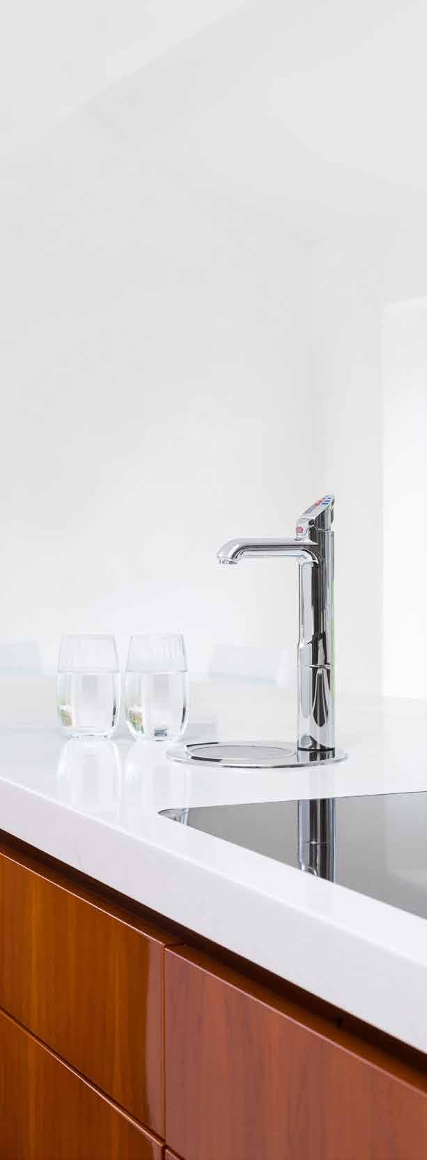
and bookshops throughout Australia, New Zealand, South-East Asia and the United States of America. This issue of Habitus magazine may contain offers or surveys which may require you to provide information about yourself. If you provide such information to us we may use the information to provide you with products or services we have. We may also provide this information to parties who provide the products or services on our behalf (such as fulfilment organisations). We do not sell your information to third parties under any circumstances, however, these parties may retain the information we provide for future activities of their own, including direct marketing. We may retain your information and use it to inform you of other promotions and publications from time to time. If you would like to know what information Indesign Media Asia Pacific holds about you please contact Nilesh Nandan (61 2) 9368 0150, (61 2) 9368 0289 (fax), info@indesign.com.au. Habitus magazine is published under licence by Indesign Media Asia Pacific. ISSN 1836-0556 INSTANT CONVENIENCE Zip HydroTap provides pure tasting filtered water with instant boiling, chilled and sparkling water. Discover more at zipwater.com
Series 2 – Coming Soon habitusliving.com/houseoftheyear REC FOUNDING PARTNERS TELEVISION PARTNERS
Statement, style and substance
New neutrals
Taking cues from a honey dipper’s soft curves, the HONEY lighting collection by Coco Flip has an art deco sensibility that has been handmade by Melbourne’s finest local artisans.

cocoflip.com.au
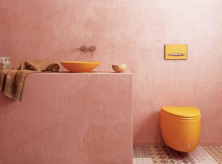
The charm of Moroccan design has well and truly made its appearance in many homes around Australia. With an earthy and bold tone, the latest BOCCHI MANDALINA collection from Paco Jaanson is ideal for a Moroccan interior design palette.
pacojaanson.com.au
issue #44 habitusliving.com
Smeg , an Italian brand renowned for its award-winning design and technology, has recently introduced Australia’s first ever domestic BLAST CHILLER smeg.com.au

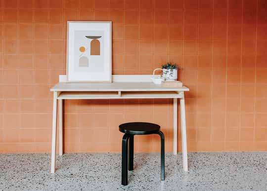
Perfect for the office and the home, Plyroom’s latest offering, the SCRIVETTE DESK , has a clear, modern minimalist design that subtly nods to the old school desk. Available in a mix of birch and oak, the Scrivette Desk is a pleasing balance between modern form and solid construction.
plyroom.com.au
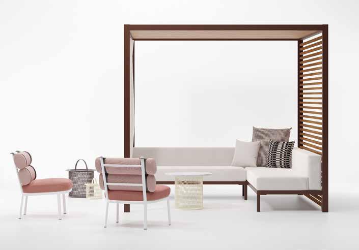
Designed to integrate seamlessly into the environment, the LOUNGE PAVILION by Kettal is an ideal seating arrangement for the outdoors. The Lounge Pavilion also comes with the option of specifying different ceiling and side panel heights as well as a selection of spotlights.
kettal.com
1 . lightbox # 25
Tonal textures
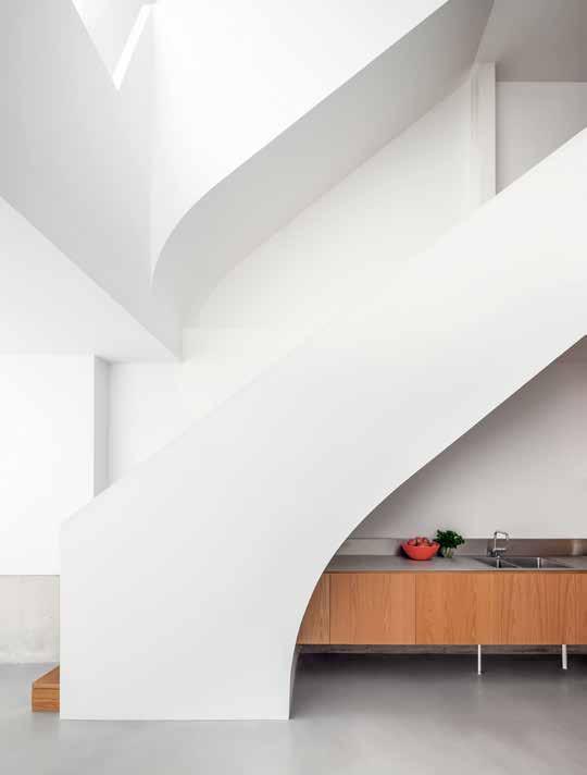
Understanding the traditional kitchen has not only evolved but has shifted in function, Fisher & Paykel ’s list of 2019 kitchen design trends embraces the blurred line between kitchen, dining and lounge areas.
fisherpaykel.com
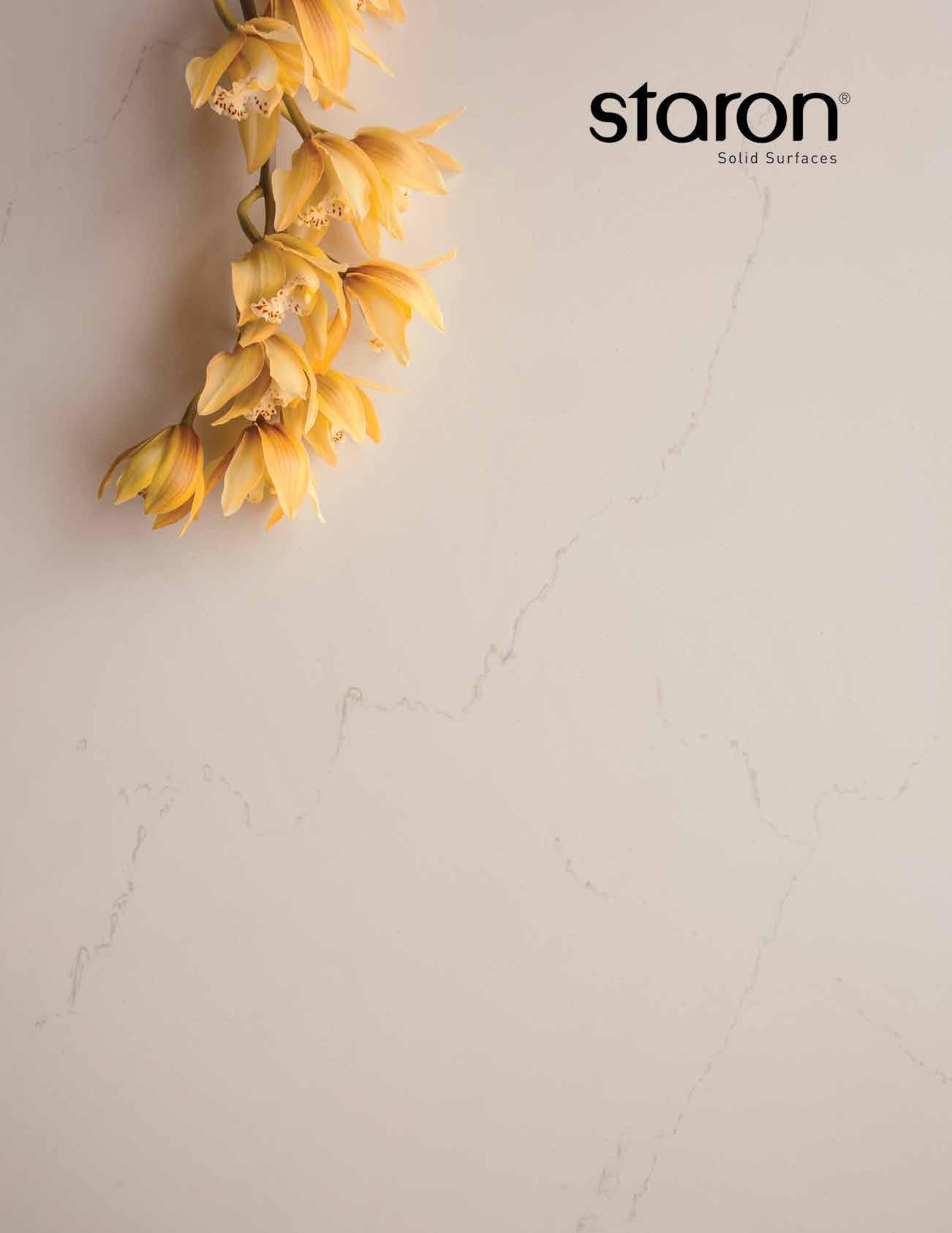
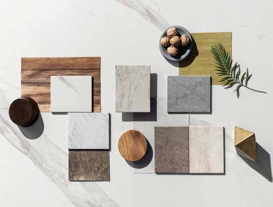
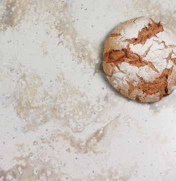
The Staron SOLID SURFACES SUPREME collection adopts the look and beauty of natural stone, with the advantage of easy maintenance and joining capabilities of solid surface. A collection of whites, naturals, earthy dark tones with soft elegant veining.
staron.com.au
The DEKTON STONIKA range from Cosentino consists of seven new surface colours with an ultra-realistic beauty and appeal of natural stone. Apart from being an exceptionally durable indoor and outdoor surface material, it is also scratch, stain, UV ray, fire and heat resistant.
cosentino.com
issue #44 habitusliving.com
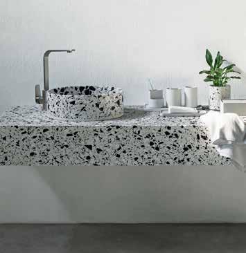
Characterised by a refined tapered edge detail and curved geometry, the HUI BATHROOM ACCESSORIES range is available in either grey or dark grey and due to the inherent nature of concrete, natural variances in texture and colour are to be expected and celebrated.
remodern.com.au
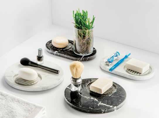
MARMO, the new collection of marble accessories from Paco Jaanson is a testament to the luxury feel that marble brings into the home. With either the classic white Carrara or a moody black Marquina marble, Marmo adds an opulent touch to any bathroom.
pacojaanson.com.au
The FILA outdoor lamp collection by Michel Charlot is available in three sizes and seven colour combinations. Projecting a colourful shadow display when the sun goes down, the fitted fabric covers a simple aluminum structure.
michelcharlot.com
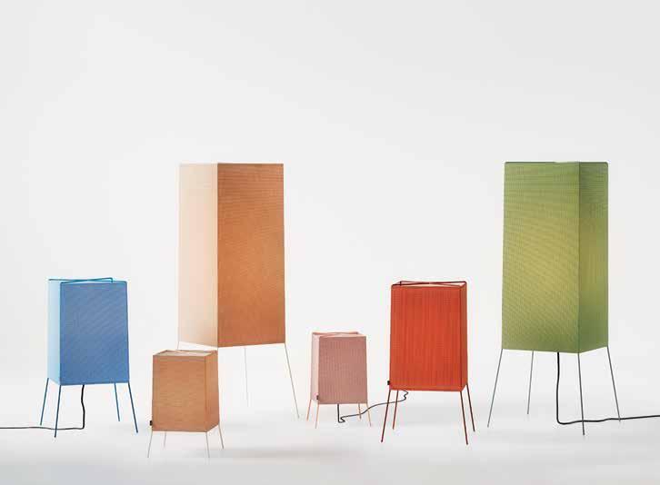
1 . lightbox # 27
Evergreen luxe
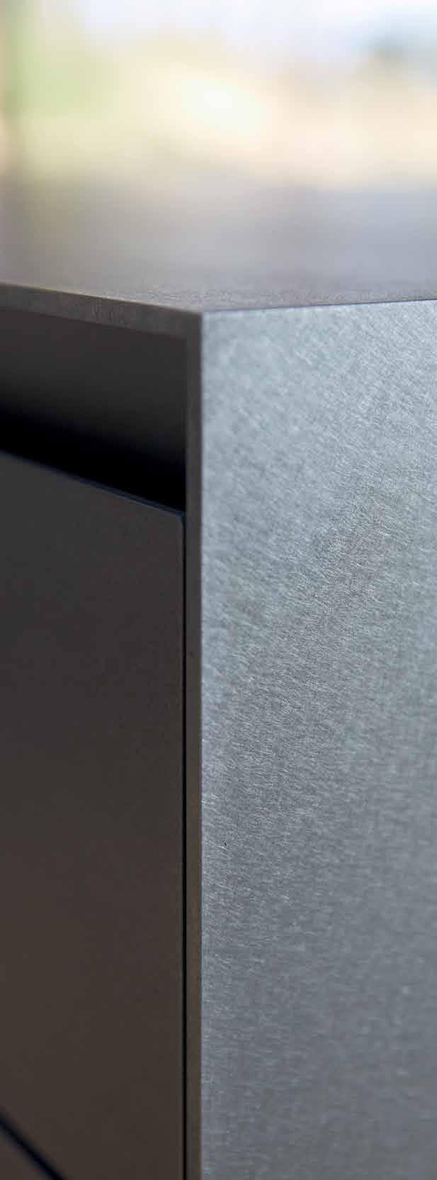
Developed by Eggersmann Australia, SILVER TOUCH is a hot rolled stainless steel material that looks warm and organic. With a worktop that is 5mm thick and a drawer front that is 3mm thick, Silver Touch has all the hygienic properties of stainless steel without the scratch sensitivity. eggersmannaustralia.com

The VOLA 2471 is a single-handle built-in shower mixer with diverter. It is available in 26 finishes and colours to suit any bathroom. vola.com

issue #44 habitusliving.com
LOOK BACK , the new Rocks On collection, combines the subtle sheen of metals with a nod of industrialism to its aesthetics. In three fascinating tones of green, black or white, this slip resistant porcelain creates an ambience like no other.
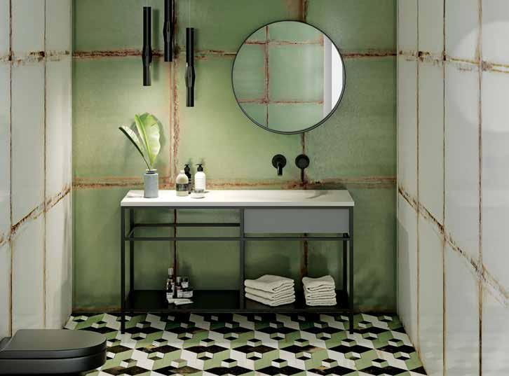
rockson.com.au
Eight decades ago when it was designed for a hair salon, the VIPP BIN marked the beginning of the future for the Danish design brand with an unparalleled aesthetic, materiality and quality.
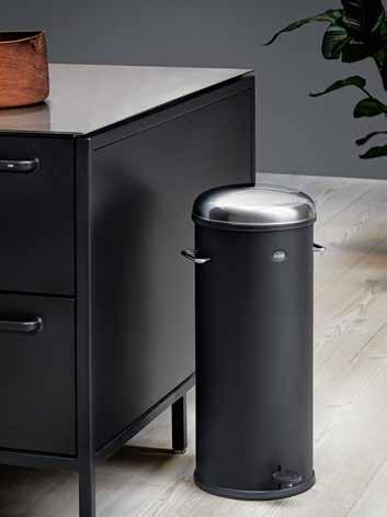
cultdesign.com.au
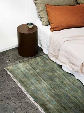
A Quiet Luxury defines the new EGYPTIAN COLLECTION from Armadillo & Co that unites a sense of calm with one of luxury. To launch the new range of handmade rugs, Armadillo & Co collaborated with Portuguese architect Manuel Aires Mateus , stylist Louisa Grey and photographer Rory Gardiner on a series of stills.
armadillo-co.com
1 . lightbox # 29
Collaborative success
Expanding its product offering from commercial and hospitality to private and residential, Fredericia Furniture have recently launched a selected number of products inspired by the true Scandinavian sensibilities found in Jens Risom ’s designs.
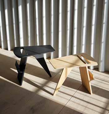
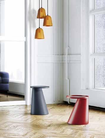
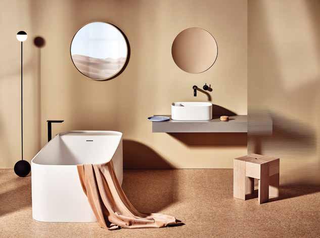
fredericia.com
LEHENGA is a distinctive and elegant side and coffee table designed by Melbourne-based Helen Kontouris for Len . It was inspired by Indian dancing and, taking cues from the traditional dress, it translates the movement of the Indian Garba dance into a functional, contemporary furniture collection.
stylecrafthome.com.au
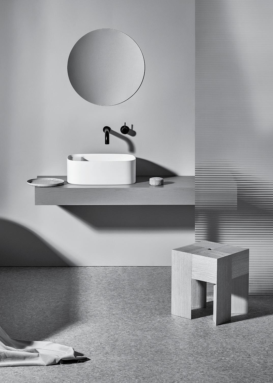
The ORLO Collection from United Products was designed by Nick Rennie with the intention of producing a range of bathroom products that are suitable for contemporary and classic spaces. united-products.co
issue #44 habitusliving.com
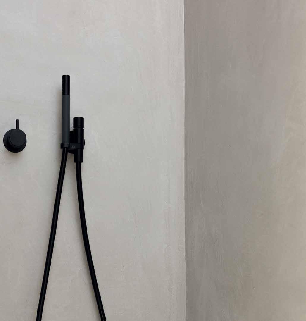








The original Bringing colour to life since 1968 vola.com 2471 mixer and hand shower Product shown in matt black. 26 other finishes available. Project: JUMA Architects VOLA Design Pty. Ltd. | 94 Wellington Street | VIC 3066 Collingwood Phone: +61 402 372 480 | sales@vola.com.au
Essential elements
An elegant and slender tapware collection, TEEL by Phoenix Tapware is all about a proportion and form that is timeless. Available in four finishes, Teel has qualities that allows it to easily integrate into many bathroom and kitchen interiors.
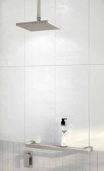
phoenixtapware.com.au
Embracing the latest design trends from Italy, the new sleek GRIGIOLUSSO SERIE from ILVE has seductive lines and refined grey tones. If you are as passionate about the look of your kitchen as you are about your food, then this range serves up the perfect recipe.
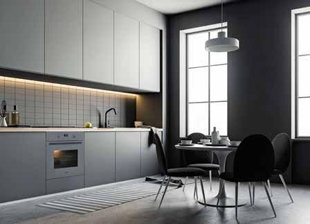
grigiolusso.com.au
The secure digital platform by HouseLab makes renovating and building a kitchen, bathroom or home simple. Removing the need for a messy drawer, the platform allows you to store documents, manuals, warranties and paint colours, making the digital handover even easier. houselab.com.au

issue #44 habitusliving.com
The new Laminex Colour Collection captures the organic beauty of nature, with laminates taking on the life, colour and texture of timber, stone and metal. To create this sophisticated hotel space, Chris Connell designed wardrobes in Laminex Fox Teakwood, bolster in Lava Grey and concertina wall in Aries. Explore the range and order free samples at laminex.com.au


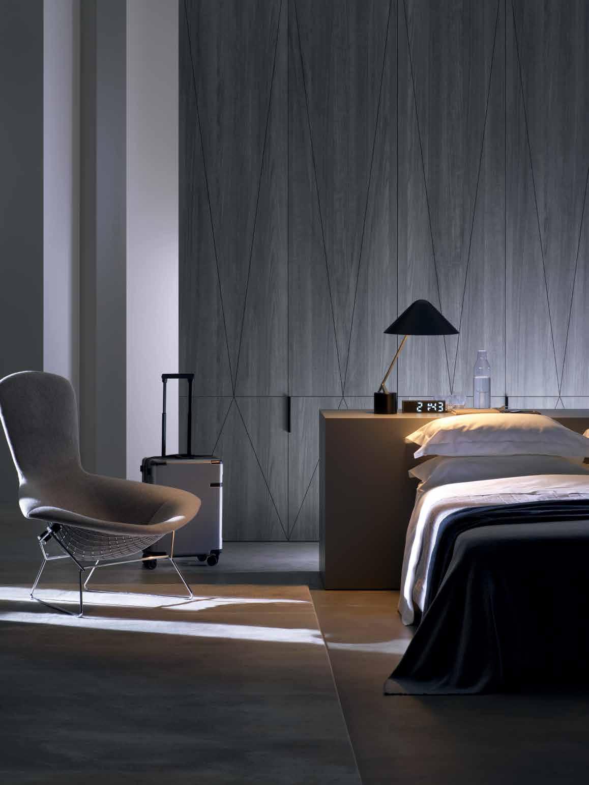 CHRIS CONNELL, CHRIS CONNELL DESIGN
Tailor-made entertaining
Designed for timeless appeal, Wolf brings substance to luxury with the powerful combination of performance, design and dependability. With four striking designs, there is a Wolf M SERIES oven to suit any kitchen aesthetic.
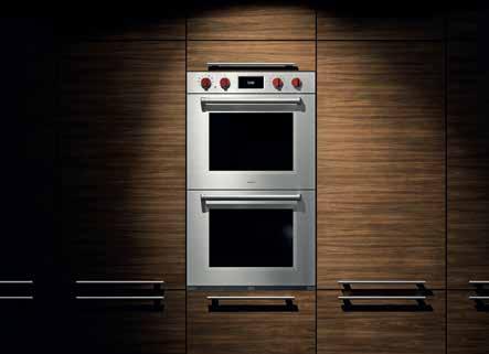
subzero-wolf.com.au
Your art collection will get jealous. Your wine climate cabinet, much like your collection, speaks to who you are. Every Gaggenau piece is distinctively designed, crafted from exceptional materials, offers professional performance, and has done so since 1683.
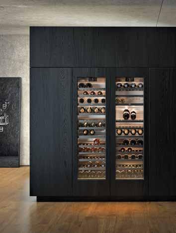
gaggenau.com.au
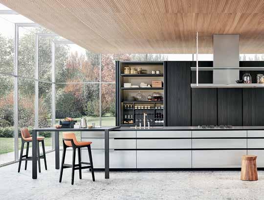
Loaded with the most innovative and high-quality features from Poliform , the PHOENIX KITCHEN is an example of functionality and form working in perfect harmony. Synonymous to the brand, the myriad of finishes and product variations means that a Poliform kitchen can be customised perfectly to each project.
poliformaustralia.com.au
issue #44 habitusliving.com
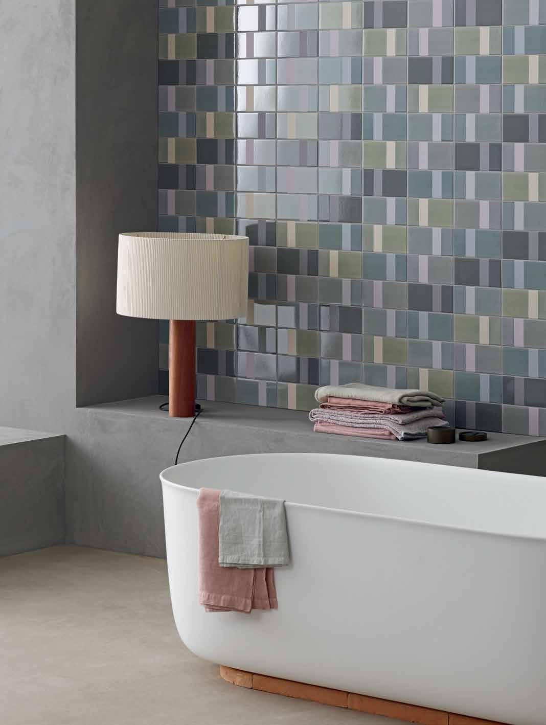
DI LORENZO TILES Pty Ltd Tile Merchants | www.dilorenzo.com.au V85860
DIARAMA BY MUTINA — Glazed chromatic porcelain designed by Hella Jongerius
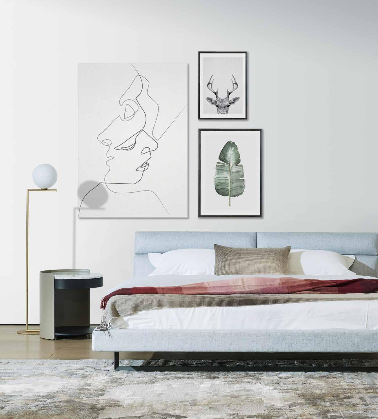
AMOR BED, HARMON TABLE CAMERICH.COM.AU DESIGN FOR DESIRE SYDNEY | ADELAIDE | CANBERRA | PERTH 0 2 9 6 9 9 1 0 8 8 0 8 9 3 8 9 6 6 6 9 0 2 6 2 8 0 5 4 3 4 0 8 8 3 3 2 1 5 2 4 For our interior design service contact your local showroom. www.camerich.com.au
Private lives of professional people
The Italian touch
TEXT STEPHEN CRAFTI | PHOTOGRAPHY CATHERINE SUTHERLAND
Restaurateur Tony Nicolini not only breathes food, but also architecture and design. His house in Princess Hill, which he shares with his wife Marcella and their two daughters Simona and Mara, beautifully complements his exacting standards.
Tony Nicolini has a long history in the restaurant business. His late father opened a pizzeria on the Gold Coast in the late 1960s, after arriving from Italy. Tony would soon follow in his father’s footsteps, working for some of Melbourne’s finest restaurants including Society, Pellegrini’s and Florentino, before eventually opening up his own pizza restaurant, Italian Artisans. Tony has always utilised architecture in it’s ability to enhance his customers’ experience of his restaurant, and in his private life this sentiment remains.
The family home concealed behind a curved 1930s façade is slightly the odd one out in the heritage-listed streetscape. The bands of exposed bricks previously concealed a roaming house with three separate units. But there was something Italian about the feel of the original home, built by an Italian and formerly lived in by an Italian family for well over 50 years. Tony’s family was instrumental in bringing Italian fare to Melbourne, creating the sensibilities of the Abruzzo region in southern Italy from where the family originates. “Creating a home or a restaurant isn’t vastly that different. It’s about creating an ambience within a space that makes you feel comfortable and want to return to, repeatedly,” says Tony. He engaged architect Domenic (Dom) Ridolfi to
transform the 1930s art deco home into a family abode. Although Tony and Dom did not grow up together, Dom’s family also came from the same region in Italy.
Between the two, it’s understandable that the renovation has a strong Italian touch. Polished concrete floors, raw plaster-finished walls and selective use of marble is combined with expansive glass windows and sliding doors to strengthen the connection to the outdoors. “Our brief to Dom was that the kitchen had to be beautiful but also highly functional, not dissimilar to a well-planned restaurant,” says Tony.
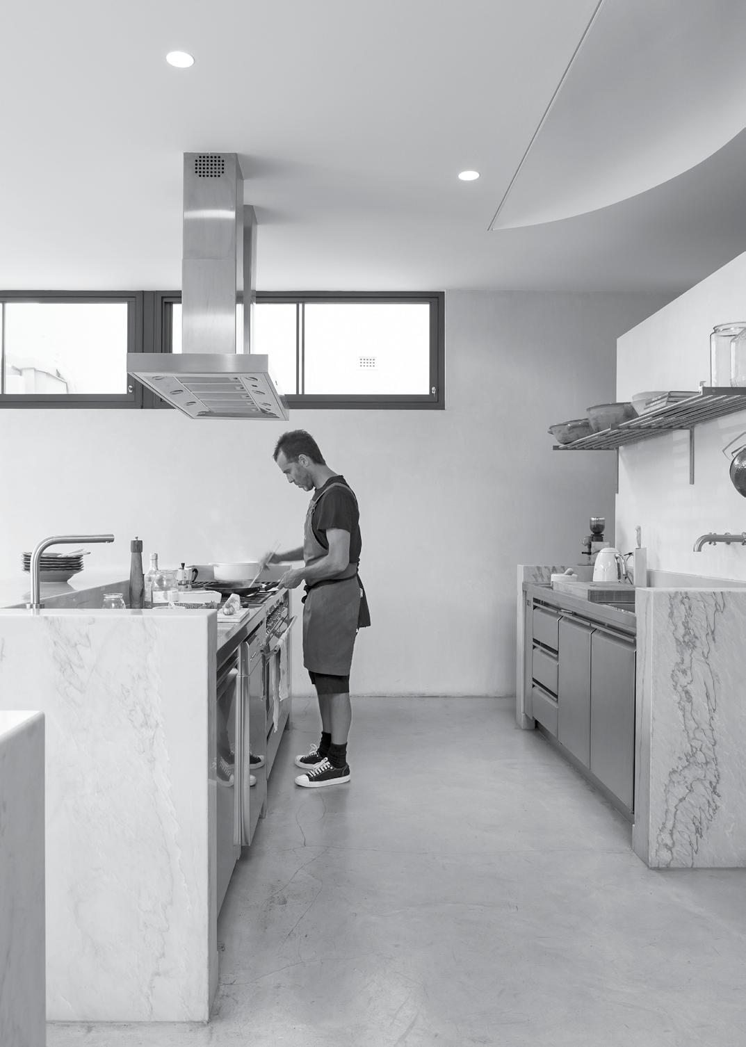
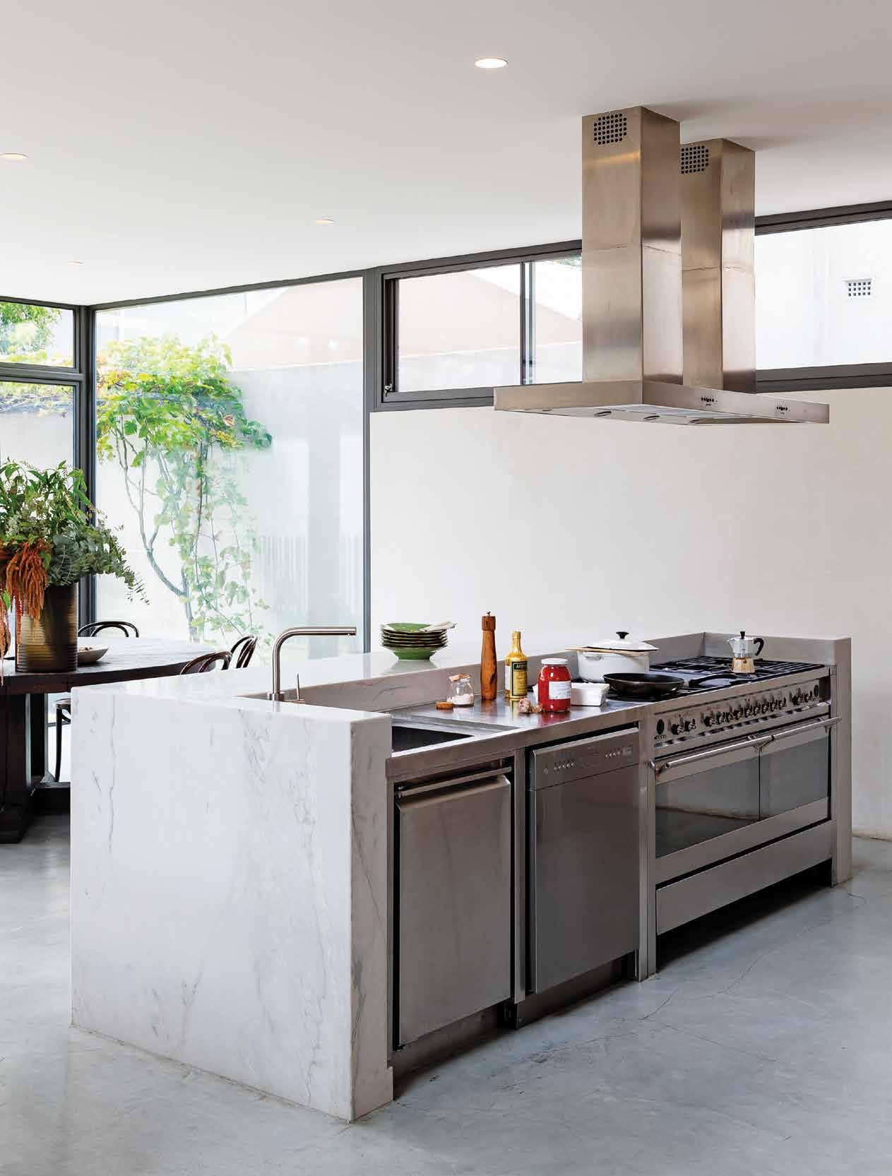
Rather than one traditional island bench in an open-plan kitchen and living area, the contemporary extension includes three separate island benches, two of which are expressed as marble blocks. One comprises the bar and concealed fridge, with a 1967 Italian E61 Taema espresso machine for servicing coffee, drinks and aperitifs proudly on show. The second unit, used for the main preparation, includes two commercial 1.5-metre-long Smeg ovens and hot plates together with a commercial dishwasher. The third station is geared towards preparing vegetables and seafood with refrigerator drawers below. “The girls often prepare their morning smoothies on this bench,” he adds.
issue #44 habitusliving.com
2 . portrait # 39
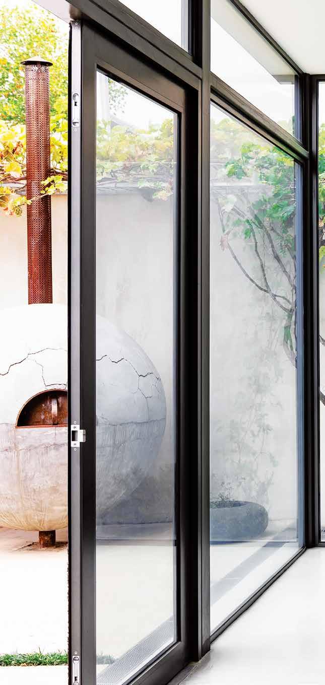
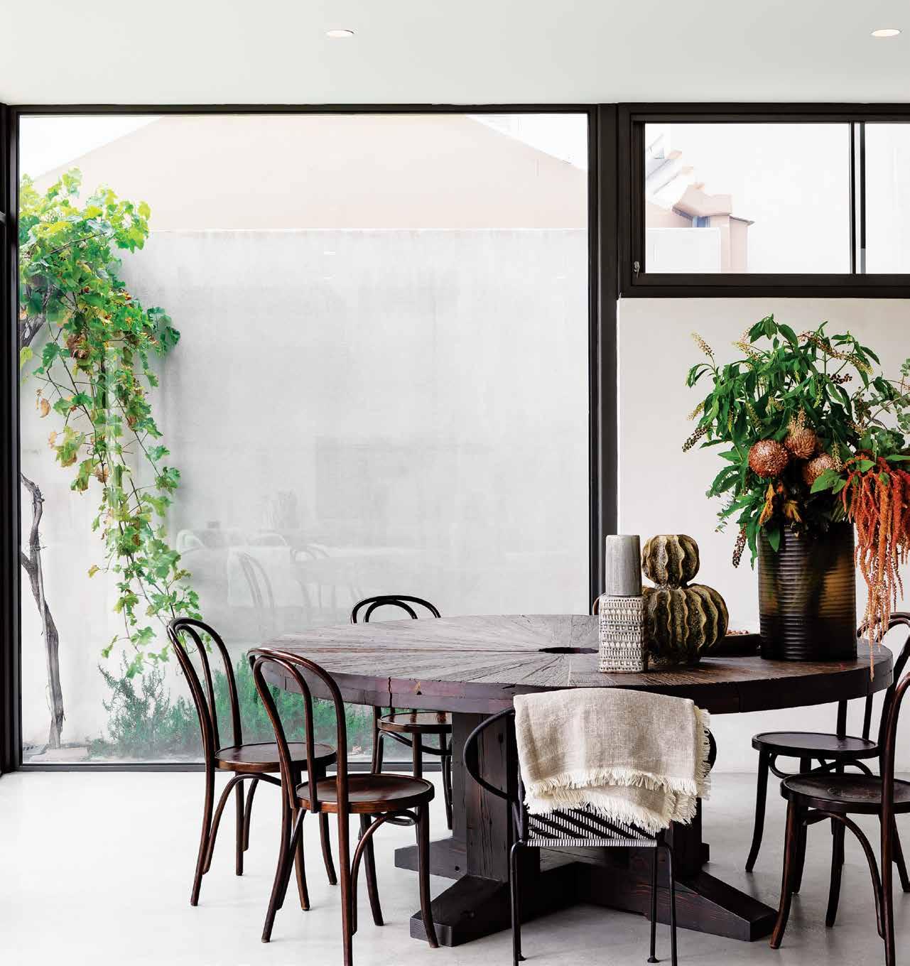
Most, if not all, of the joinery, crockery or furniture in the Nicolini household is Italian. Local Italian artisans Arteveneta, for example, produced the hand-made timber shelves in the butler’s pantry. Filled with vintage crockery collected by Marcella, the shelves are also lined with jars of handmade produce. There’s also enough room for a wine fridge (stocking 130 bottles) to complement any meal. “Marcella and I love entertaining and being surrounded by food, whether it’s ready to be prepared or still waiting to be picked,” says Tony, pointing out the tomato vines and herb garden in the highwalled and protected back garden. “We wanted the sense of being ‘nourished’, not dissimilar to the feel we get when stay in farm-style accommodation when we visit southern Italy,” he says. Fine cracks appear in the concrete floor in the family home and are well ‘read’ in the large pot belly-style pizza oven that stands proudly in the courtyard. Created in the late 1980s by Tony’s father, the oven is still regularly used today when entertaining family and friends. The dining table made from recycled timber, which seats up to 14 people, exudes a similar patina.
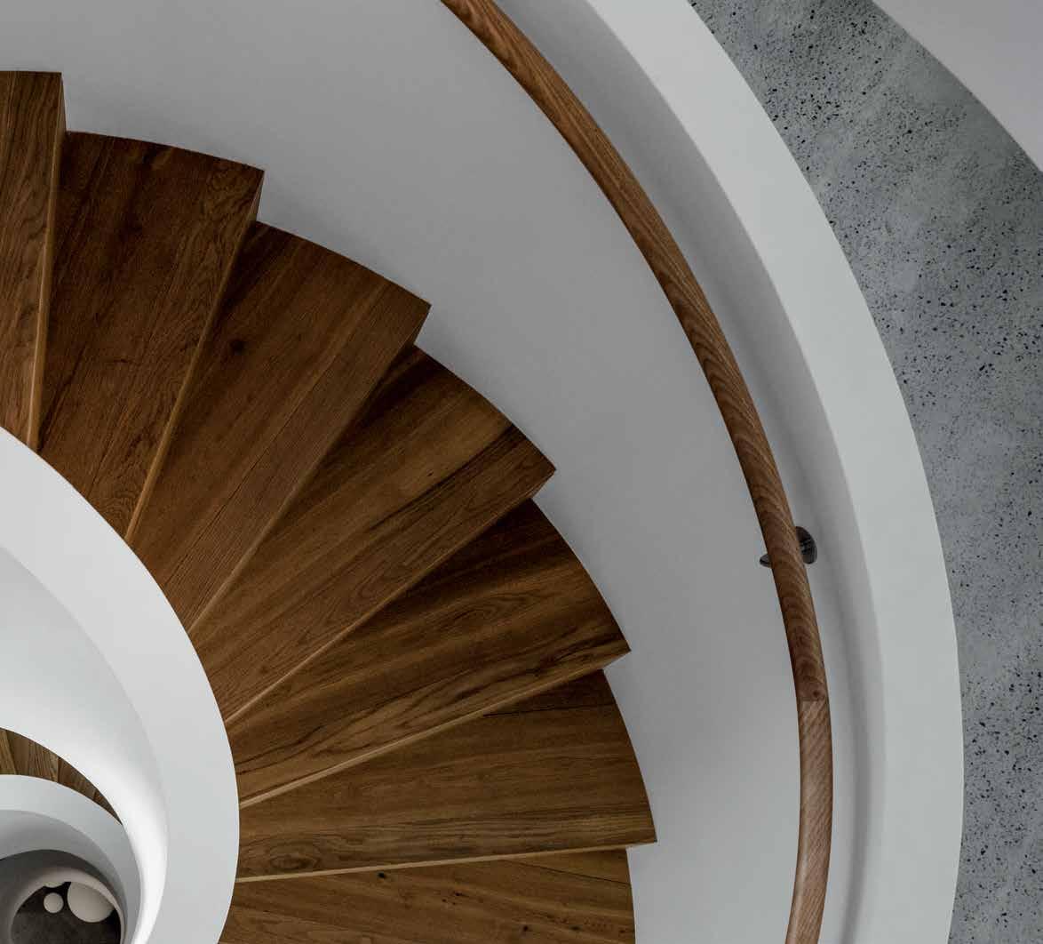
“Our initial discussions for this renovation started by browsing through images of Italian farmhouses featured in books, many with a raw and honest sensibility,” says Dom, who was not only in tune with the couple’s Italian aesthetics, but as importantly, how they wanted to use the spaces. Other images came into the conservation, such as a staircase both admired in the B&B Italia showroom in Tel Aviv, Israel. “I loved the way the steel was expressed and could see an opportunity of bringing the 1930s
issue #44 habitusliving.com
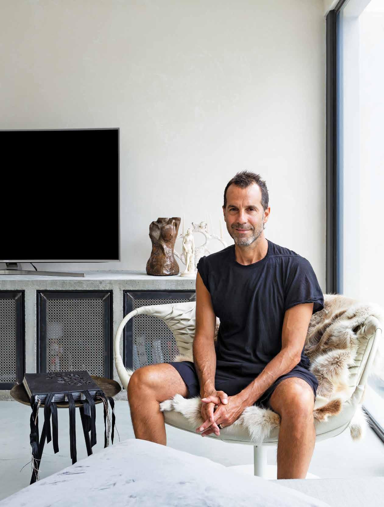
OPENER | TONY NICOLINI IN HIS PATRICIA URQUIOLA SMOCK CHAIR, WHICH TAKES PRIDE OF PLACE IN THE OPEN PLAN LIVING AREA. ABOVE | THE CRACKED CONCRETE PIZZA OVEN IN THE COURTYARD SHOWS A SIMILAR WORN PATINA AS THE HAND-MADE TIMBER DINING TABLE.
2 . portrait # 41
“Marcella and I love entertaining and being surrounded by food, whether it’s ready to be prepared or still waiting to be picked.”
(original home) into the present,” says Dom, who extended the exposed steel beams out to the courtyard to frame the swimming pool. “We wanted a space that could also accommodate large groups, anywhere up to 100 people,” adds Tony.
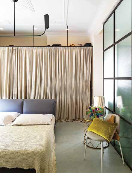
Dom used steel extensively in the home, with large pivotal steel doors and steel and glass screens creating subtle divisions between rooms. A steel and wire glass-panelled wall, for example, cleverly delineates the main bedroom and ensuite bathroom. Likewise, the front steel pivotal door is nestled into what was once the front porch behind a security door. “At night I love keeping this door perched open to allow the breeze to circulate,” says Tony, who is as mindful of senses such as touch as his highly developed taste buds. Even his dog Moet responds to the elements, poking her head out of the steel grates in the front entrance to engage with those passing by. “There’s something about the Italian culture, engaging with locals, sharing bread at the table and enjoying being with people in a space that feels like it’s just for you,” he adds.
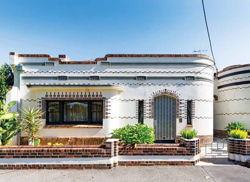
ABOVE | THE DISTINCTIVE 1930S HOME FEATURES A MOORISH-STYLE FAÇADE. BELOW | THE MAIN BEDROOM IS DIVIDED FROM THE ENSUITE BATHROOM BY A TRANSLUCENT STEEL AND GLASS WALL. OPPOSITE | THE KITCHEN INCLUDES AN INSITU CONCRETE BENCH TOGETHER WITH A SEMI-COMMERCIAL OVEN, IDEAL FOR ENTERTAINING ON A GRAND SCALE.
issue #44 habitusliving.com
Italian Artisans | italianartisans.com.au
2 . portrait # 43
“The kitchen had to be beautiful but also highly functional, not dissimilar to a well-planned restaurant.”
DESIGNER RUGS - UNIQUE DESIGNS FOR EXTRAORDINARY SPACES
SYDNEY | MELBOURNE | BRISBANE | AUCKLAND
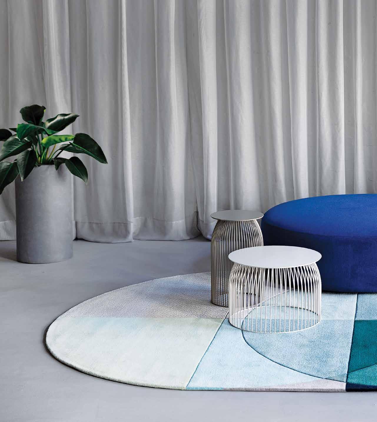
OCEAN BY BERNABEIFREEMAN
802 561
DESIGNERRUGS.COM.AU/HABITUS
1300
|

Domestic Goddess
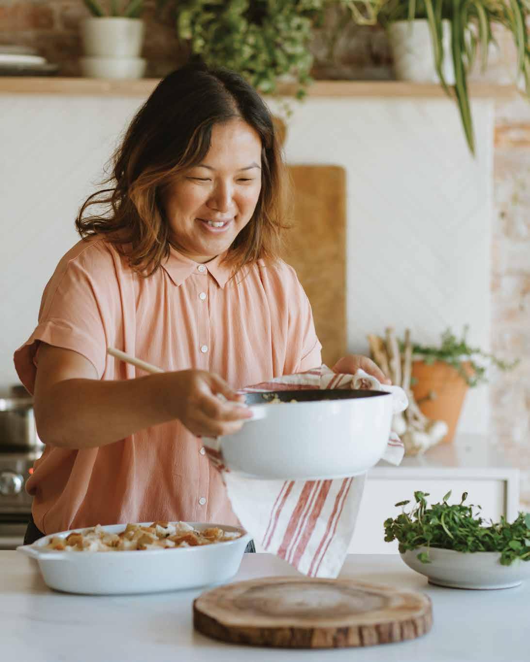
“Arthur Street Kitchen was never a business idea,” confesses Hetty McKinnon when asked about the genesis of her salad-making business, launched from the self-taught cook’s Sydney home eight years ago. “I just knew that I wanted to leave the PR industry and work for myself.”
Inspired by the gastronomic talents of her mother, a talented homemaker and a Cantonese immigrant, Hetty was drawn to the idea of cooking for people in her immediate community, as a way to connect with them on a deeper level. “Growing up, our family would sit down for dinner every night and my mum would present at least five or six beautifully prepared dishes,” says Hetty. “It was our daily ritual. The nurturing and joy through the cooking of food was instilled in me from a young age.”
Despite working from the narrow footprint of her inner-city terrace kitchen, Arthur Street Kitchen evolved organically into a thriving delivery business. “Trying to fit all the prepped and cooked food into my fridge resembled a game of Tetris!” she recalls. Hetty would then load up her bicycle, striking up new friendships, as she hand-delivered the vegetable-laden salads to customers in her neighbourhood.
After four years of success and the release of a bestselling cookbook, Community, Hetty and her young family jumped at the opportunity to live in New York City. Buoyed by Arthur Street Kitchen’s homegrown success, Hetty attempted to replicate the business from her new Brooklyn abode. “Ultimately, the context was very different,” she explains. “I ended up working from a commercial kitchen at one point. It was a sterile, soulless, incubator kitchen where no
one spoke!” In addition, she was often forced to leave her lovingly produced fare on her customers’ doorsteps. “I missed connecting with people over food. That’s what it’s really all about for me.”
In response, the foodie entrepreneur cocreated Neighbourhood Studio, a beautiful, light-filled community kitchen, with a fellow female chef in Brooklyn. The studio, with its raw brick walls and large, mobile island unit, was designed to facilitate foodie gatherings and ticketed events that showcase local talents and celebrate the stories and recipes of food lovers. It also serves as Hetty’s test kitchen for recipe development and the evolution of her cookbook series. There are now three cookbooks, Family the latest. The studio is an uncomplicated space, defined by exposed “pinky-fied” brickwork, simple white joinery, a skylight, a communal table and a large, wide oven. “I always notice how people are drawn to the island, even if we are strangers. It really brings people together.”
Hetty’s home kitchen is equally well-used. “I’m always in the kitchen,” she says, “either working or cooking for my family.” Blessed with abundant natural light, her Brooklyn home kitchen perfectly serves the family’s needs. “I don’t need much in a kitchen actually,” she explains. Her must haves? A large island, natural daylight and a few pieces of equipment like a Vitamix and Technivorm Moccamaster (coffee maker). “At the end of the day, it’s about keeping Arthur Street Kitchen small and connecting with those who cook my food and with those for whom I cook.”
Arthur Street Kitchen | arthurstreetkitchen.com
TEXT ELANA CASTLE | PHOTOGRAPHY LUISA BRIMBLE
Hetty McKinnon’s food is grounded in the flavours of her youth, the gastronomic influence of her immigrant mother, and a love for community and family.
issue #44 habitusliving.com
2 . kitchen & bathroom series # 47



issue #44 habitusliving.com
Driving design
TEXT HOLLY CUNNEEN | PHOTOGRAPHY DAVID WHEELER
For architect Andrew Benn, architecture is a solution-driven profession that works best when common ground
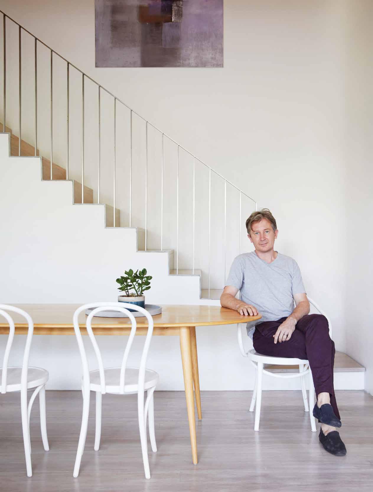
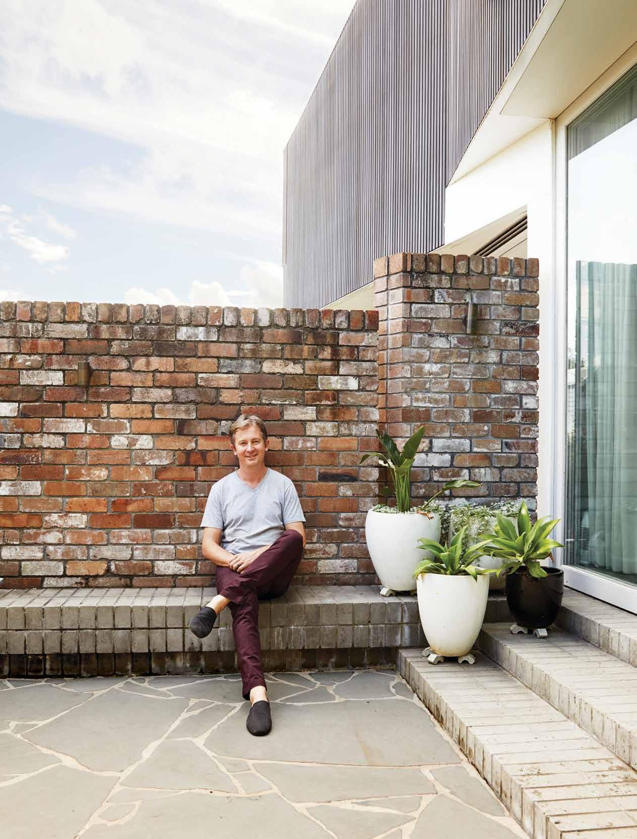
Architect Andrew Benn isn’t bound by the four walls that form a house. He takes time to reflect on the needs, wants and lifestyle of his clients to fashion sensitive architectural solutions. And although he has numerous built examples of his particular approach, it’s the house he lives in that is perhaps the best illustration.
Located in Balmain, Sydney, not too far from the edge of Sydney Harbour, Andrew lives with his wife Alice and their two young children in a house they own with his wider family. His mother is his neighbour. She downsized from their larger family home when Andrew was studying architecture, and it was understood that, when appropriate, he would work on the house. When Andrew and his family bought the neighbouring property in 2012 the time was right to begin the project.
As has come to be standard practice at Benn+Penna, the studio he founded and directs, the architect and client (in this case the family) sat down to identify the current and future needs of the house. “I think that it’s critically important to any of the work we do to set a long-term vision or master plan,” says Andrew. “So thinking about how a family might grow; how an individual might grow; and how a building might age is a vital aspect of any project.”
While the interior scope to his mother’s house was relatively typical – a modern update that respected the existing architecture – the structural work across the two semi-detached houses reconnects them after years of growing apart. Living in this

is found with clients.
2 . portrait # 51
manner allows for multi-generational support: Andrew to his mother and his mother to her grandchildren, as well as the sharing of resources that allows the extended family to keep costs, and their footprint, down.
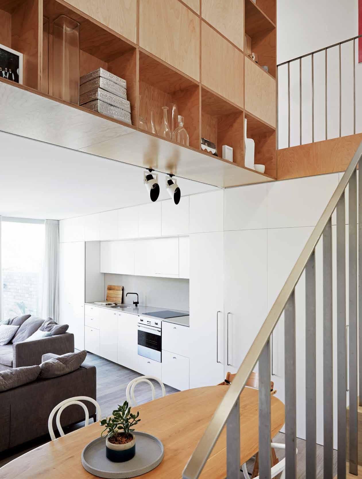
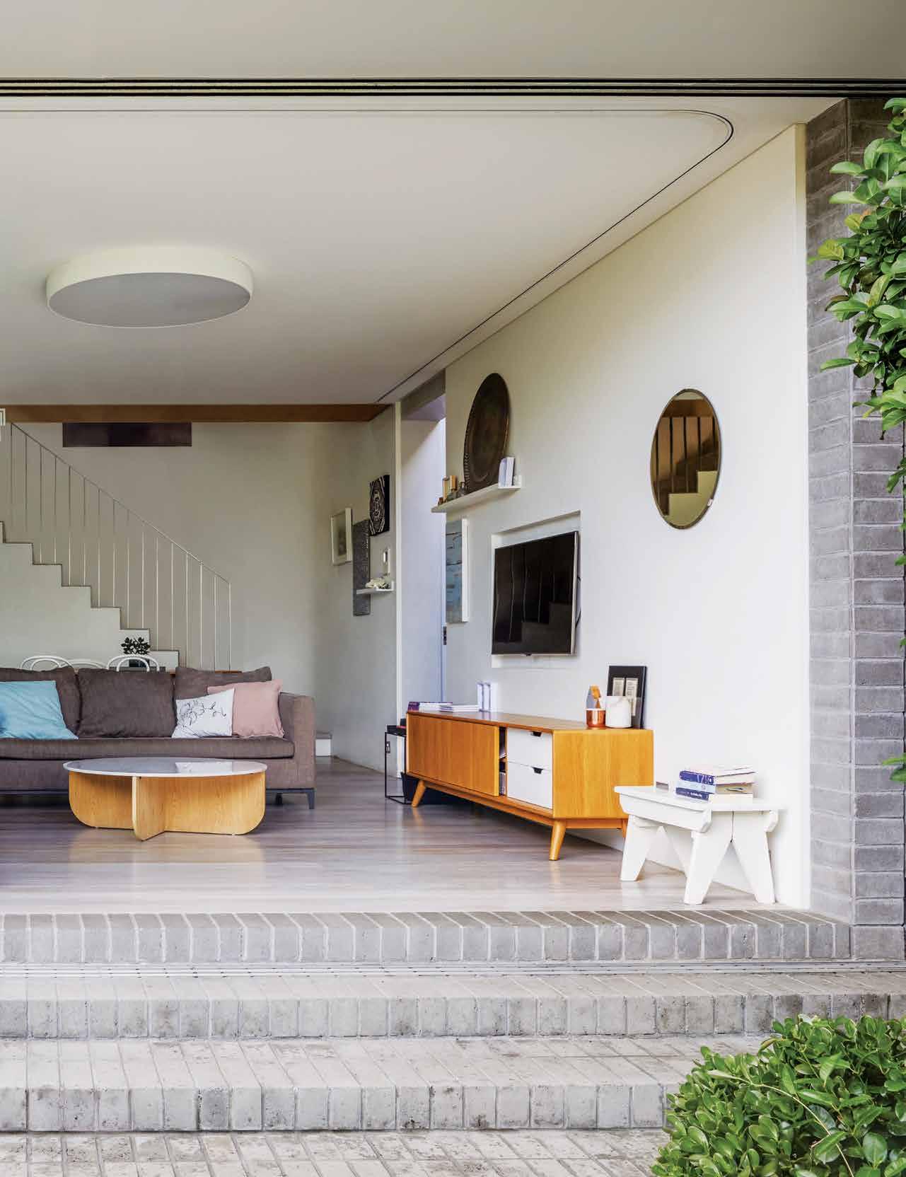
The approach taken to Andrew’s house is also noteworthy. During the design phase, he and Alice didn’t have children but they knew they wanted a family in the future. Recognising their reduced yet elastic need for space, Andrew created a small, self-contained flat in the front half of his house. They’re able to rent space they don’t need for supplementary income.
When their two children are older, they can reclaim this space. “We’ve designed it so we can easily regain that front room. The dividing wall is there but it’s had its structure designed so that we can cut holes through the wall and reunite them,” says Andrew.
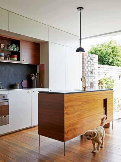
The kitchen is another example of thoughtful design that takes future needs into serious consideration. There wasn’t a need for a big kitchen so there is currently no island bench, however, plumbing is in place underfloor for if and when this changes. “Services and structure have been thought about in the long-term plan,” notes Andrew.
It was this project that marked the official beginnings of Benn+Penna in 2013, and really propelled it into the spotlight. In 2014 this joint project, dubbed A Balmain Pair, was awarded an Australian Institute of Architects’ NSW Architecture Award (Residential Alterations and Additions). “A lot of people were interested in this intergenerational living arrangement whereby you share resources within the family, keeping costs down, keeping your footprint down, et cetera. We’re running two homes under the one roof,” says Andrew.
OPENER |
LIKE. OPPOSITE | A SMALL VOID AROUND THE STAIRCASE GIVES THE FEELING OF SPACIOUSNESS
THE
IS A WAY TO STORE AND DISPLAY KEEPSAKES AND MEMORIES.
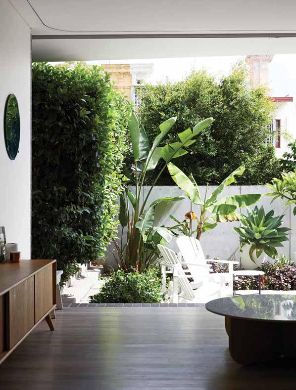
ARCHITECT ANDREW BENN TAKES A SEAT AT THE TABLE. PREVIOUS RIGHT | TIMBER SCREENS ON THE BUILDING’S EXTERIOR ARE FULLY ADJUSTABLE ALLOWING ANDREW AND FAMILY TO CONTROL THE WESTERN SUN AS IT RISES AND MANAGE THEIR PRIVACY. ABOVE | WITH MATURE HEDGES AND PLENTY OF FOLIAGE THE INNER-CITY COURTYARD IS OASIS
WHILE
TIMBER JOINERY
issue #44 habitusliving.com
2 . portrait # 53
The kitchen is an example of thoughtful design that takes future needs into serious consideration.

issue #44 habitusliving.com
European architecture has certainly had a strong impact on Andrew, which can be seen subtly in his work and thought processes.
2 . portrait # 55
This initial project connected with the architecture industry as much as with future clients. In the years since, modern additions to old homes have become the Benn+Penna niche, forming the large majority of the practice’s work. “It’s doing sensitive, modern additions to old homes that are not jarringly modern, we spend a great deal of time thinking about how to effectively integrate old and new,” says Andrew. “I’ve got a particular interest in the old architecture of Sydney and I want to make sure that whatever we do makes a very positive and long term contribution to the city’s history.”
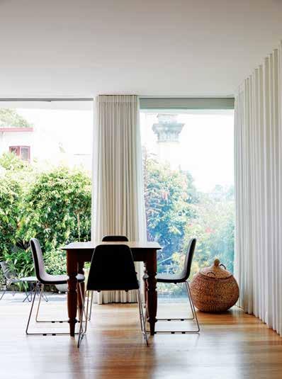
There are a couple of key strategies that he identifies in order to ensure the above. First and foremost, he never mimics the old: Andrew sees his job as an architect to complement or enhance rather than replicate. Secondly, materials that have grain and patina are chosen for their ability to sit well alongside old homes. Proportion, scale and massing are also important in ensuring that modern work doesn’t dominate or visually crush the existing structure.
There are little tricks that Andrew employs to delicately stitch together the old and new. “We’d often demarcate that junction where the old and new cross over; slightly highlighting the building’s parts to make its history more legible.”
There is no “Benn+Penna” visual cue present project-to-project, The studio’s portfolio is quite varied and Andrew attributes that to a client base that is varied along with an attitude in the practice that honours the clients needs rather than an architect’s desires.
PREVIOUS
AREA HELP MANAGE THE SPACE: TO THE RIGHT A TELEVISION IS HIDDEN BENEATH THE CURTAIN.
|
DARKER TIMBER
HAS A SLIGHTLY DIFFERENT STYLE. OPPOSITE | “A KEY COMPONENT IN MY EDUCATION WAS WORKING OVERSEAS,” SAYS
DESIGNING
RATIONALITY. issue #44 habitusliving.com
| THE REAR WALL OF THE LIVING AREA FULLY OPENS UP TO THE COURTYARD. ABOVE | THE CURTAINS IN ANDREW’S MOTHER’S LIVING
BELOW
WITH
AND BRASS ACCENTS, ANDREW’S MOTHER
ANDREW, AS HE GOES ON DESCRIBE AN ADMIRATION FOR THE DUTCH WAY OF
WITH
2 . portrait # 57
“A lot of people talked about it as this intergenerational living arrangement whereby you share resources within the family, keeping costs down, keeping your footprint down.”
Having said that, European architecture has certainly had a strong impact on Andrew, which can be seen subtly in his work and thought processes. After university Andrew went straight to the Netherlands having been invited to study at The Berlage Institute in Rotterdam, and then worked for a further three years in Amsterdam at the internationally acclaimed office of UN Studio before returning to Australia. But this influence started taking shape much earlier in life. “One of my most enduring architectural inspirations is Hugh Buhrich, who was a German architect who arrived here during World War II. My parents were friendly with his family, and as a child I remember eccentric stories about his legendary house in Castlecrag. His work is incredible, and particularly this house – a brilliant fusion of left and right brain thinking,” he recalls.
Now his is own practice well established, Andrew prides himself on creative solutions: with an emphasis on the word solutions. His approach isn’t wildly fantastical or out of the box for the sake of pushing buttons or inciting public/professional reaction. It really is solution driven. “I really enjoy the lateral thinking aspect of design, and finding innovative solutions that are both practical and logical,” he says. So while there can be elements to his work that may not seem like the most obvious response at first glance, they’re typically proven to be creative solutions that makes the most sense.
Benn+Penna | bennandpenna.com
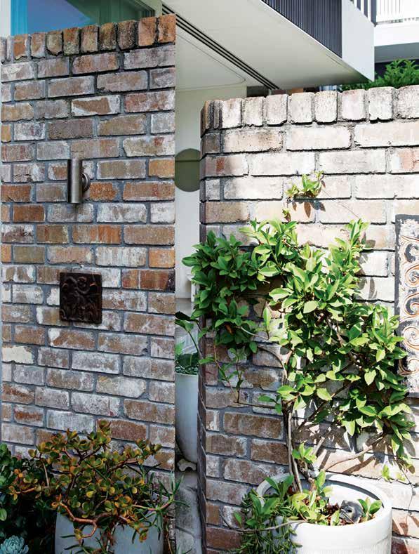
ABOVE | GAPS IN THE BRICKWORK SEPARATING THE TWO COURTYARDS APPEAR TO BE SUPERFICIAL ACCENTS, BUT THEY ALSO WORK TO CONTINUE THE FEELING OF CONNECTION BETWEEN THE TWO SPACES. issue #44 habitusliving.com
Redefining Surfaces. Redefining Limits.
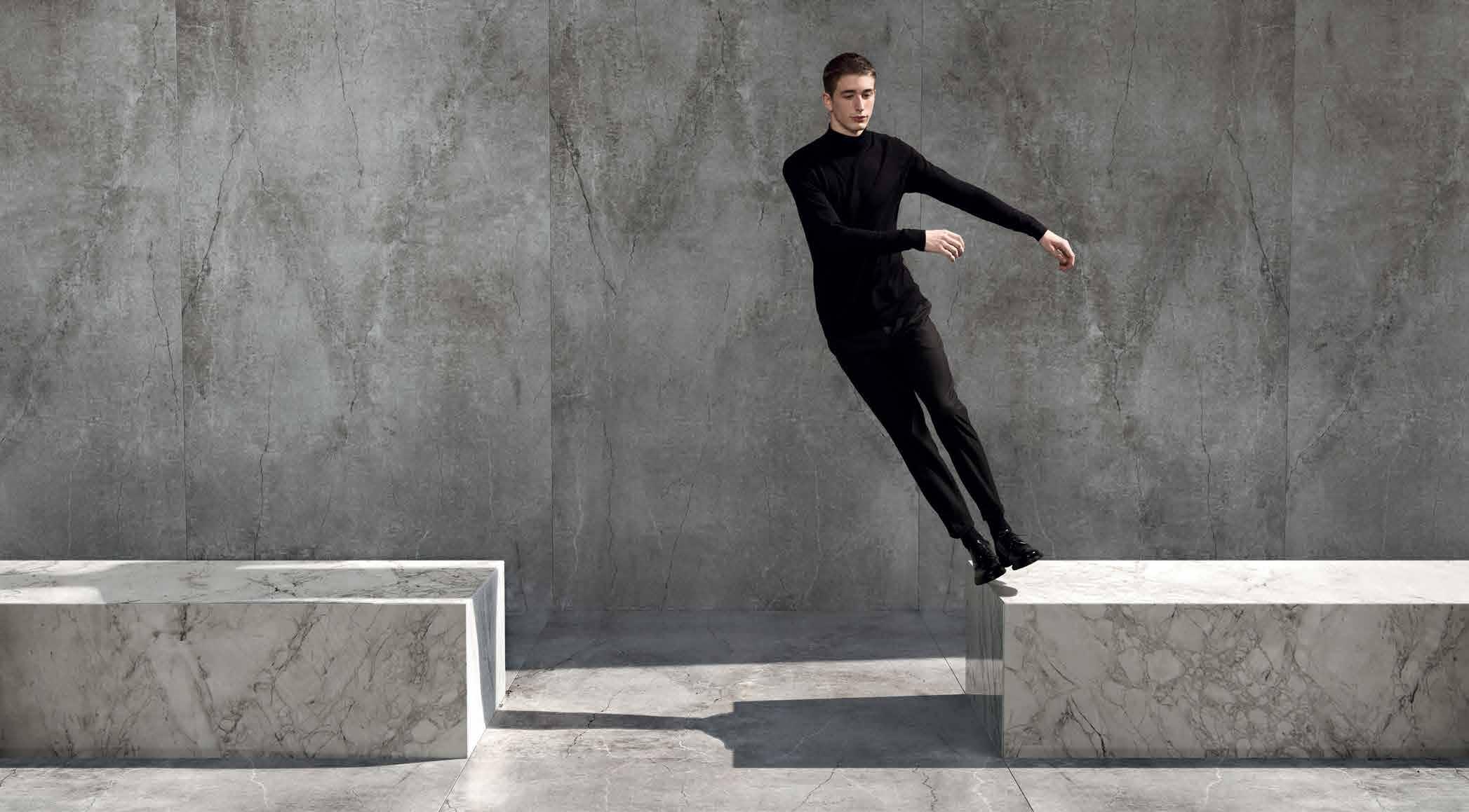
Dekton Ultracompact breaks down architectural boundaries and reimagines spaces to become infinite.
We have redefined concepts to create a revolutionary and versatile material with a unique design, format and resistance.
Wall/flooring colour Dekton Industrial Soke NEW Modules colour Dekton Stonika Bergen NEW
COSENTINO AUSTRALIA & NEW ZEALAND Adelaide | Brisbane | Melbourne | Perth | Sydney | Auckland / Follow Us: F T

Find out more about the 25 year Dekton warranty, look out for inspiration and find resources at www.cosentino.com
Out of Office
Having never been one to rest on her laurels, Kate Berry has a colourful portfolio spanning work in creative agencies, a food blog-turned-magazine, and an event series. We visit the eclectic kitchen of this Melbourne-based creative.
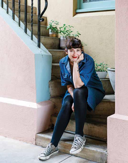
When Kate Berry’s daughter was bullied at school for her homemade lunches, she took an unorthodox route to reinstate her daughter’s confidence and reclaim the conversation around her lunches. Drawing on her creative-agency past and lifelong passions: food, photography and the gift of the gab, she started the blog Lunch Lady. In this space she documented the food they were making together – from prepping to cooking and right through to crafty packaging – from their home in rural Victoria.
Less than a year later, Kate was approached by Lara Burke and Louise Bannister of We Print Nice Things, to turn Lunch Lady the blog into Lunch Lady the magazine, which still exists today. “[It was] pretty crazy considering that if I was to do a magazine with anyone they probably would have been the people I would have chosen to do it with,” recalls Kate.
What started out as a mother–daughter passion project with a cult following quickly became a story of entrepreneurial success. For two years, Kate was the editor and a major player in Lunch Lady finding the success it still enjoys today. She helped grow and develop the brand’s identity and was responsible for creating, photographing, designing and commissioning much of the content. “But I realised all of a sudden I was making a magazine about family but I never hung out with my own.” So she moved on.
And out. Kate and her daughters have recently relocated back to Melbourne, in part for the opportunities city living presents and proximity to clients and collaborators; and in part for the culture and atmosphere for which Victoria’s capital is known and loved. Like many creatives in and around the industry, Kate gets inspired by, and feeds off, the enthusiasm of others. Definitely one for collaboration, other people’s excitement fuels her own, “I love hearing other people’s ideas and I love helping other people make their ideas happen.”
TEXT HOLLY CUNNEEN | PHOTOGRAPHY MARNIE HAWSON
issue #44 habitusliving.com
Having taken a new residence, she’s also taken a new kitchen. Fortuitously – or perhaps purposefully – the kitchen living and dining rooms exist together in an open-plan format. Living with her kids, it was important that when she is in the kitchen preparing meals – either for mealtimes, work or research – that they are still able to feel connected in the different spaces.
The kitchen itself, which she lovingly describes as “odd-looking”, features stainless steel benches – “great for cooking” – and a small window that lets natural light flow in. It also provides the perfect backdrop for Kate’s creations. “Previous kitchens haven’t had that beautiful little light pocket to take photos. Whereas my new kitchen has pretty little windows where I can put the food and take some photos,” she says.
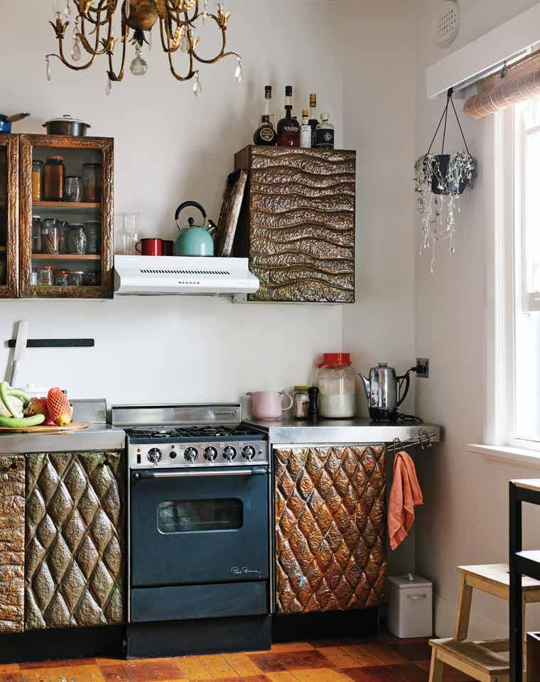
“Because our apartment is an old art deco apartment, it has character that our previous houses haven’t. So it’s nice to have a few bumps and weird little crooked angles.”
When asked how her use of the kitchen has morphed over the years as influenced by her varying roles and experiences, Kate divulges a newfound frugality that informs her cooking. Adjusting to city prices among other things, Kate tries to run a kitchen that doesn’t waste. “I’m enjoying challenging my kids to think that way as well. We buy fruit and veggies every week and we challenge ourselves to use everything,” she says.
Since wrapping up at Lunch Lady, Kate has gone on to write a book (which will be out later this year) and launch an event series, OK Motels, that was born out of a successful Instagram account that was essentially a platform for Kate to share her love of old motels and small rural townships. Back in a city full of “creative people doing cool things” and inspiring one another, only time can tell what Kate will do next.
Kate Berry | hellokateberry.com
2 . kitchen & bathroom series # 63
Enjoy your quarterly dose of Habitus delivered straight to your door. Each issue celebrates the outstanding work architects and designers within the Indo Pacific, both emerging and established, are producing. Don't miss out on the latest in architecture and design. includes shipping within Australia only

PAYMENT METHOD Cheque / money order AUD$ Charge my credit card AUD$ Name on Card Card Type Card Number Expiry Date Signature IT’S EASY TO ORDER Fill in your response below, overleaf or subscribe securely online at habitusliving.com/subscribe. FOR A GIFT – RECIPIENT DETAILS: FOR MYSELF
SELECT BELOW Mrs/Ms/Miss/Mr First Name Surname Address State Postcode Country Email Phone Mrs/Ms/Miss/Mr First Name Surname Address State Postcode Country Email Phone ONLINE: habitusliving.com/subscribe PHONE: (61 2) 9368 0150 MAIL TO: EMAIL: subscriptions@indesign.com.au FAX: (61 2) 9368 0289 Indesign Media Asia Pacific Level 1, 50 Marshall Street, Surry Hills NSW 2010 WHERE’S YOUR FAVOURITE PLACE TO ESCAPE/EXPLORE AND WHY?
PLEASE
to Habitus magazine
AUSTRALIA INTERNATIONAL (AUD$) 12 ISSUES SAVE 8 ISSUES SAVE 4 ISSUES SAVE 12 ISSUES SAVE 8 ISSUES SAVE 4 ISSUES INDESIGN $155 $43 $105 $27 $55 $11 $240 $39 $200 $21 $110 HABITUS $132 $59.40 $93 $34.6 $49 $14.80 $240 $42 $180 $22 $102 THE COLLECTION Vol. 2 Australia $29.90 (1 ISSUE) International $49.95 (1 ISSUE)
Subscribe
Subscribe to Habitus
NOURISH
In this issue we explore the very best in kitchen and bathroom design across the Region and investigate what makes these spaces so compelling, from a biophilic approach to the integration of smart technologies.
nourish # 65
Life eclectic
Luigi Rosselli’s sympathetic, sensual approach has given rise to some of Sydney’s most beautiful residential projects. His own home is a wonderland of family histories and the architect himself is a lover of all styles, with many a story to tell.
TEXT LEANNE AMODEO | PHOTOGRAPHY NICHOLAS WATT
issue #44 habitusliving.com
nourish # 67
Ask Luigi Rosselli to describe his style and the word he uses is eclectic. In fact, eclecticism was the theme of his university thesis when he studied architecture in Switzerland, before moving to Australia for a year in 1980 to work on the design of Parliament House. The theory, popular in the 19th century, posits style not as a personal language, rather a common one that suggests design is for everyone to share and ultimately interpret. So while his aesthetic is distinct and it’s virtually impossible to overlook that signature Luigi Rosselli Architects curve, there’s great diversity in his portfolio because of a humanist approach that always puts clients first.
“I’m just trying to create great environments for people to live in,” reflects Milan-born Luigi, “It’s not about preserving the architect’s ego, rather trying to understand the likes and passions of the client.” When he relocated to Australia for good four years after his Parliament House contract, it was for love. He met and married his Australian wife, Juliet, in Europe and the couple moved into a terrace in Surry Hills. While they lived in the front part of the house, Luigi ran his practice – which celebrates its 35th anniversary this year – from the back. Times were different and so were the jobs. A lot of Luigi’s very first projects were commercial commissions with tiny $6000 budgets and although it was just him, the work was constant and growth was steady.
Even back then, Luigi hated conforming and his resulting signature was more an accident than a choice; a subconscious rebuke of the boxy white buildings Sydney was
pumping out non-stop in the 1990s. Today, Luigi Rosselli Architects’ 18-strong team has made its mark in residential renovation and Luigi’s philosophy of working within the confines of a place’s character is arguably unmatched. His sympathy is what lends all his residential work a sensual quality, which finds its lushest expression in highly tactile materiality, elegant spatial planning and a mindful approach to setting.
“We’re quite soft in the sense we don’t like to confront the end user or offend them,” he offers by way of explanation. “We like our work to be quiet and to function as a building that’s easy to live in and that doesn’t affect the streetscape or passers-by. So in that respect we’re not as radical, say, as many other architects, but our spaces are very humane and that’s the priority.” To this end, many of the projects exhibit a seamless transition between old and new, achieving balance so the outcome is simply a better version of what it once was. It’s a characteristic clearly evident in Hill Top Cottage, where strict heritage restrictions created obstacles for the extension of the cottage’s sandstone base to incorporate a new basement level garage. And The Book House’s dramatically steep site, which has been carefully sculptured to deliver a home that’s nothing short of an elegant study in comfort and quiet retreat.
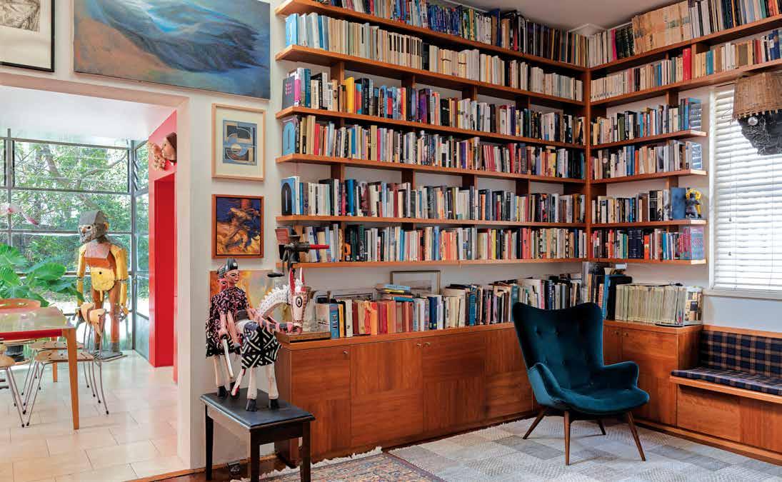
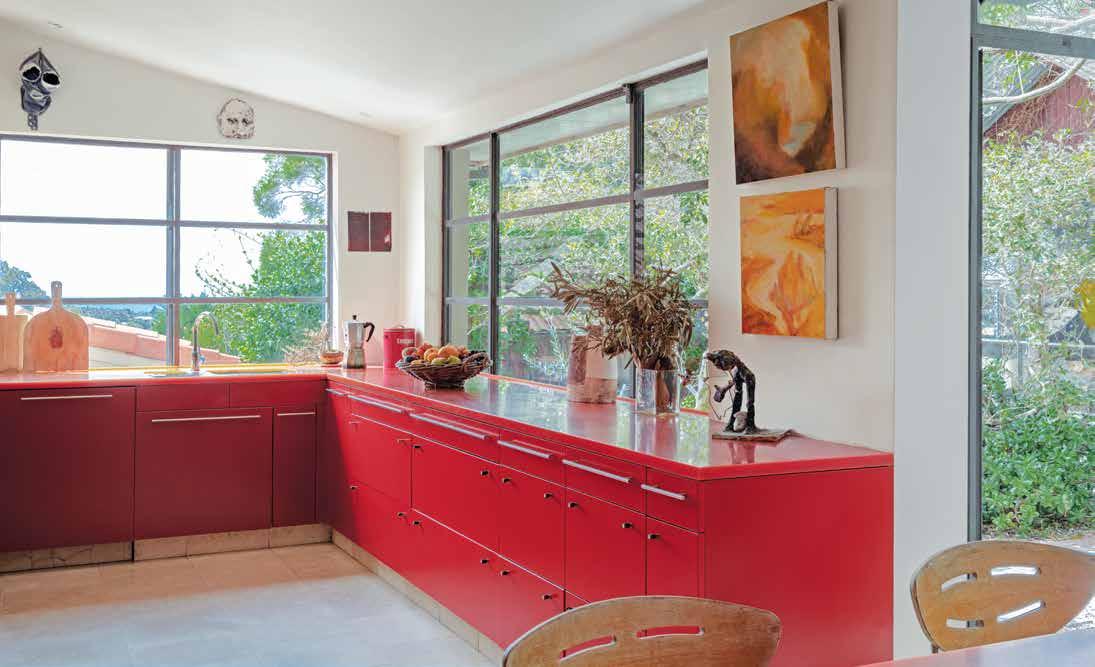
Luigi and Juliet’s own house in Clovelly, where they’ve lived for the past 30 years, is a seeming contradiction to the residential designs Luigi produces for clients. It’s maximalist where his designs are minimalist, full where his
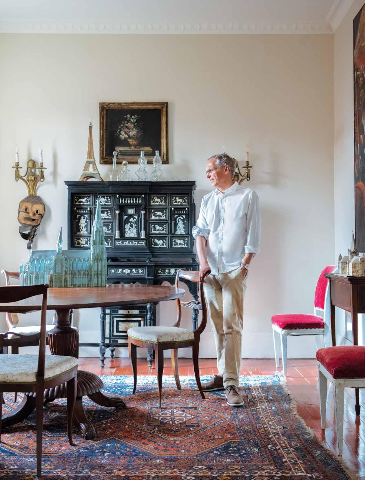
OPENER | LUIGI STANDS IN HIS DINING ROOM AMONGST VINTAGE PIECES OF
OPPOSITE ABOVE | BUILT-IN TIMBER JOINERY ACCOMMODATES A LARGE COLLECTION OF NEW AND OLD BOOKS AND A WINDOW SEAT PROVIDES THE PERFECT PLACE TO READ THEM. OPPOSITE BELOW | THE KITCHEN’S RED JOINERY MAY BE UNEXPECTED, BUT IT WORKS IN WELL WITH THE COLOURFUL ARTWORKS AND SOFT FURNISHINGS THROUGHOUT THE REST OF THE HOME.
FURNITURE AND OBJECTS. SOME COLLECTED OVER MANY YEARS, OTHERS HANDED DOWN BY FAMILY MEMBERS.
issue #44 habitusliving.com
Luigi and Juliet’s own house in Clovelly, where they’ve lived for the past 30 years, is a seeming contradiction to the residential designs Luigi produces for clients.
nourish # 69
commissioned work is restrained. The word eclectic comes to mind. But above all else it is a house full of history; a history of family and of ancestors past and each object, piece of furniture, and artwork has a story to tell. There’s beauty and intrigue to be found in every welcoming, comfy corner and for a first-time visitor it really is a wonderland.
Interestingly, the home revealed its own history to Luigi 27 years ago when a group of old ladies knocked on the door. One of them told Luigi she grew up in the house, which was built in the early 1920s. Her father had been a musician in a brass band and when the recession hit, he was out of a job so started collecting metals to on-sell. It was a meeting Luigi remembers fondly, not least because it answered a question that had baffled him since he moved in, as to why there was literally tonnes of steel in the basement. The old lady also told him that when they dug out the backyard they did it by putting sticks of dynamite in the sandstone and covering them with mattresses. Unsurprisingly, the neighbours complained and Luigi still chuckles at the thought.
As far as renovating his own home, Luigi did what he would typically discourage his clients to do: build a new room every time they had another child. While Raffaello, Adriano and Giselle no longer live at the family home, their three bedrooms are still very much a part of it. Raffaello, an architect like his father, also recently collaborated with Luigi to design a new home for the practice – the incredibly beautiful and aptly nicknamed The Beehive in Surry Hills – working as the project’s lead
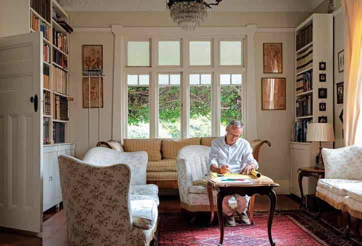
designer, with Luigi essentially as the client. The new office’s façade really is an exquisite example of highquality handcrafted architecture and reads more like a work of art than brise soleil. It also gives a flicker of insight into some of Luigi’s inspirations; vernacular architecture of developing nations and the farmhouses and barns of Italy, which he particularly admires for their cleverly perforated brickwork walls.
Raffaello is interested in a circular economy and the idea of producing something by not creating new materials, instead recycling existing ones. Fortunately, they were able to get their hands on some terracotta tile offcuts and the resulting zig-zag pattern on the office’s façade is not only good looking, it’s also environmentally sustainable. Luigi is likewise committed to producing environmentally sustainable design and is passionate about looking for ways to build with materials that come from the site.
Ask him what he likes most about what he does though and he’s quick to answer, “I like solving problems and I want to leave a legacy of built works that society can hopefully appreciate. So that’s why my work doesn’t confront, because in some ways I’m not building for myself or even for the client. At the end of the day, we’re building within a particular culture and leaving something behind that’s well crafted and long-lasting.”
Luigi Rosselli Architects | luigirosselli.com
ABOVE | THE SITTING ROOM IS SOMEWHERE LUIGI WILL WORK WHEN THE NEED FOR QUIET REFLECTION STRIKES. OPPOSITE | LUIGI AND JULIET HAVE A VAST ART COLLECTION COMPRISING SCULPTURES, PRINTS AND PAINTINGS THAT ADORN EVERY CORNER OF THE HOME.
issue #44 habitusliving.com
Luigi’s aesthetic is distinct and it’s virtually impossible to overlook that signature Luigi Rosselli Architects curve, yet there’s great diversity in his portfolio because of a humanist approach that always puts clients first.

nourish # 71
William.
The William is comfortable with its classic shape, paired with back cushions or scatter cushions in a choice of exclusive fabrics or luxurious leathers. The deep seating invites relaxation in formal and casual living spaces.
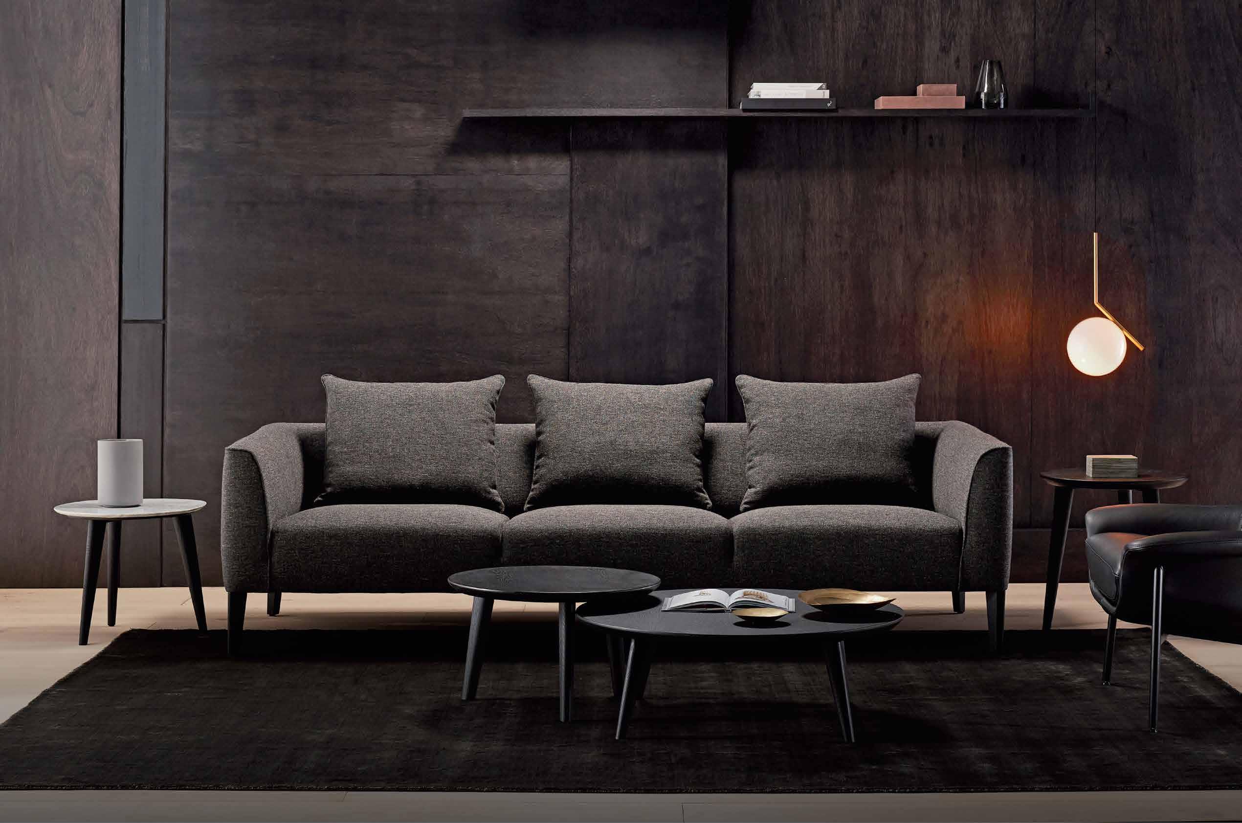
Designed in collaboration with renowned Australian designer Charles Wilson. KINGLIVING.COM
If you are a professional Interior Designer, Architect or Stylist, we encourage you to join the King Living Member Trade Program which offers you savings year-round on King Living designs. Apply online today.
AUSTRALIA | NEW ZEALAND | MALAYSIA | SINGAPORE | SHANGHAI | CANADA

Natural
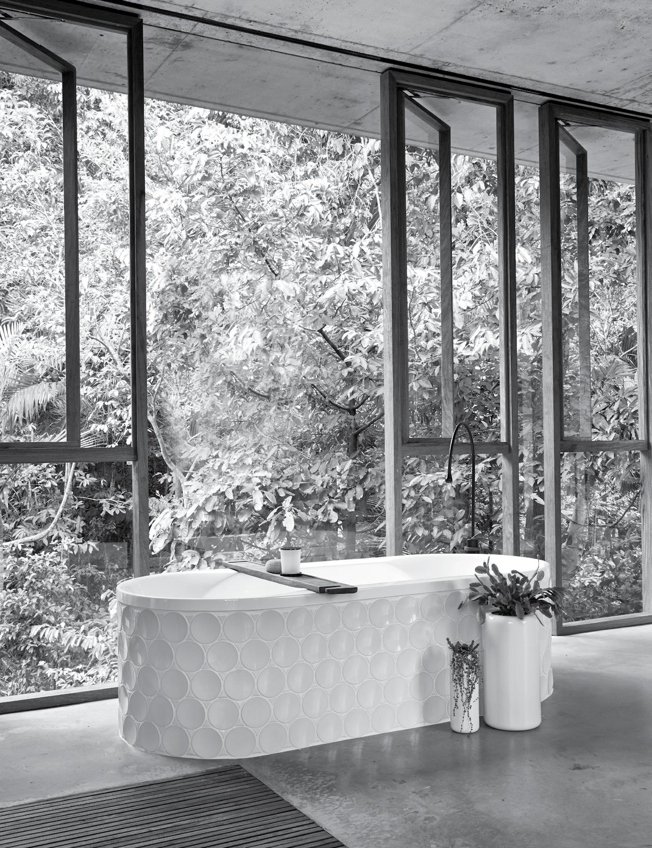
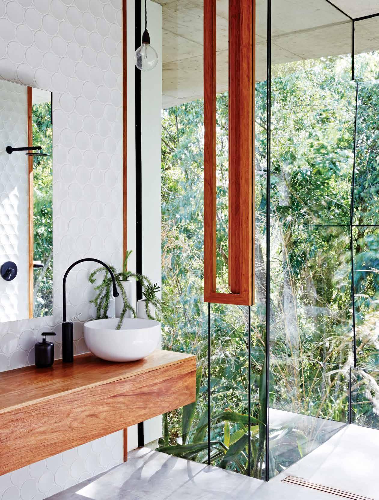
It’s safe to assume that most people presented with images of Jesse Bennett Studio’s Planchonella House for the first time would have a strong reaction to its breathtaking beauty. Queensland-based architect Jessie Bennett and his wife, interior designer and practice co-founder, Anne-Marie, designed and built the house themselves a few years ago and until recently lived there, too. It’s an incredible study in environmentally responsive architecture and one that blurs the boundary between inside and outside to the point where the house is as much embedded in its setting as the setting is embedded in the house. It really did establish a new Australian benchmark for what can be achieved using passive design, in this case the Venturi effect to create air flow.
But then again what’s an architect to do with a site such as this one in remote tropical north Queensland, surrounded by heritage rainforest on all sides except south? To work against the climate and landscape would be to disrespect the natural environment and, after all, why build in a location like this if bringing the outside in isn’t high on your agenda? While the glass walls of the house’s undulating profile lend each room its most compelling design expression, it’s the bathroom that stands out for its strong connection to the outdoors. This is a clear interpretation of the bathroom as sanctuary; a quiet oasis where one can retreat and seemingly enter another world.
Of course, bathrooms with this type of connection need relative seclusion in order to work, otherwise privacy becomes an issue. A bathroom with glazed walls and
timber-framed full-height operable windows would simply be misplaced in a high-density urban environment. Context is paramount and while incorporating the principles of biophilic design should be encouraged at all times, the connection with nature has to be logical otherwise the outcome appears forced, like it’s trying too hard.
New Zealand’s remote mountains, planes and beaches certainly lend themselves to bold residential designs that blur the boundary between inside and outside. And for a project like Kawakawa House in Piha by Herbst Architects, the brief specifically asked for a beach house that takes advantage of its coastal surrounds, so the clients can enjoy it at any time of the year. Situated at the base of a steep mountain slope, the site abuts a forest of mature Pohutukawa trees and the architects elevated all the living quarters to an upper level, ensuring the views of the ocean aren’t compromised.
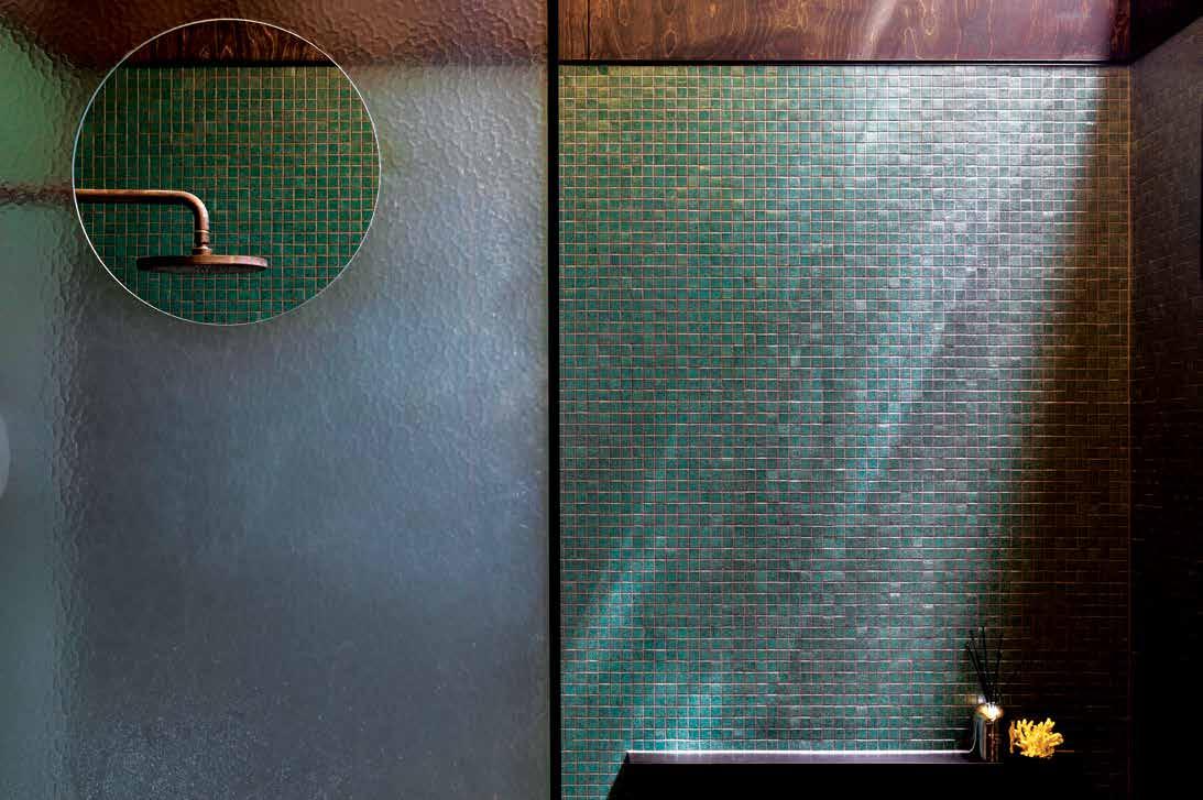
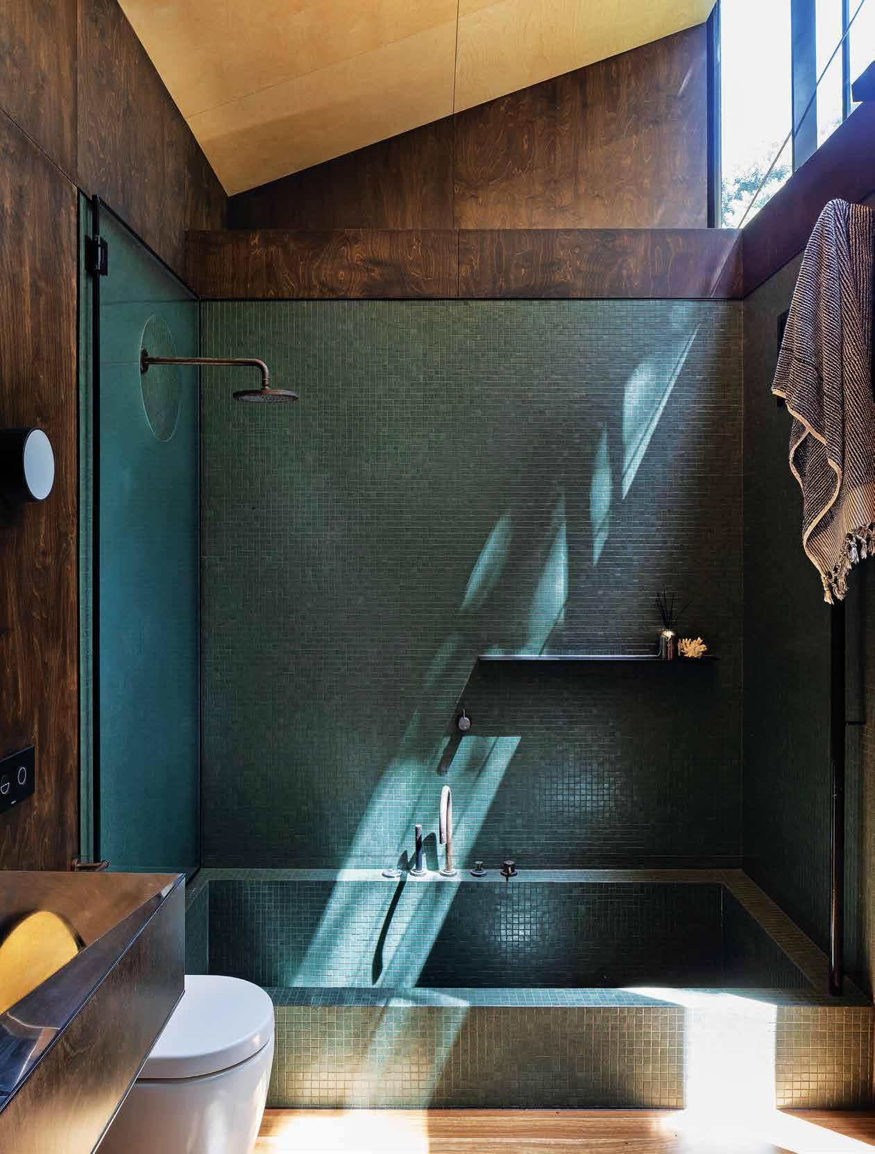
“We also wanted to make the most of the view of the trees and mountain as well as let the light in from above,” says practice co-founder Lance Herbst. “So we installed a continuous clerestory window to the perimeter of the upper volume.” This is a singular, striking design solution that brings a sense of cohesion to the home. And in the bathroom, it allows filtered sunlight to dance atop the space’s green tiles and dark timber surfaces. In this instance, the outdoors isn’t so much a backdrop as it is an accent, whereby a finely tuned scheme uses natural light to warm the bathroom during the harsh winter months, made all the more striking for its mindful restraint.
Connection to the outdoors is as highly desirable in the bathroom as it is in a residence’s living areas, where letting the outside in weighs positively on an individual’s wellbeing.
TEXT LEANNE AMODEO
connection
issue #44 habitusliving.com
nourish # 75
New Zealand’s remote mountains, planes and beaches certainly lend themselves to bold residential designs that blur the boundary between inside and outside.
OPENER
THE EARTHY
OPPOSITE | A CLERESTORY WINDOW AROUND THE UPPER VOLUME WORKS ESPECIALLY WELL IN THIS BATHROOM, WHERE IT ALLOWS LIGHT TO PLAYFULLY DANCE ATOP THE SURFACES. PHOTOGRAPHY BY PATRICK REYNOLDS issue #44 habitusliving.com
| THE BATHROOM OF JESSE BENNETT STUDIO’S PLANCHONELLA HOUSE BRINGS THE OUTSIDE IN THANKS TO FULL-HEIGHT GLASS WALLS. PHOTOGRAPHY BY SEAN FENNESSY ABOVE |
MATERIAL PALETTE OF HERBST ARCHITECTS’ KAWAKAWA HOUSE BATHROOM COMPLEMENTS THE NATURAL LIGHT. PHOTOGRAPHY BY PATRICK REYNOLDS
nourish # 77
Kawakawa House is a fine argument for treating the bathroom in the same way as any other room in the house. Just because it’s not a social space or somewhere people gather, doesn’t mean its design approach has to be different from the living areas, where connection to the outdoors is highly desired and, in fact, becoming an increasingly popular request amongst clients. In many ways, the bathroom poses the biggest challenge because of space constraints and existing services, but all that means is that there’s greater room for innovation. Case in point, Austin Maynard Architects’ renovation of an Edwardian-era house in Melbourne’s North Fitzroy.
The clients, who also work from home, asked for a design solution that would treat the dwelling like a sanctuary; their own quiet haven in amongst a busy inner-city suburb. As founding director Andrew Maynard explains, “At Kiah House we were charged with the task of creating spaces, both private and shared, that spill out into the garden and yet are adaptable enough to create solitude and privacy when needed. The idea was to give the clients a light and airy house with a ‘strong and positive vibe’; somewhere they could entertain family and friends, but also relax and meditate.”
Inspiration was drawn from traditional Japanese gardens and Buddhist retreats of Kyoto. As a result, the master bedroom has a dedicated Buddhist prayer space and opens up to the garden and ponds via sliding double-glazed panels. The bathroom is treated in the same way, with full-height glass doors opening up to a small private garden created in the gap between the new addition and the existing house. It’s the perfect context for the sunken brick bath, which takes its cue from the ancient Japanese onsen (natural hot springs), which were traditionally located outdoors.
In this instance, the architects have used red clay bricks salvaged and recycled from demolition sites around Victoria. It’s an aesthetic that deliberately evokes a sensual, earthy quality that makes anyone who uses the bath feel as though
they’re bathing within the landscape. The singular use of brick throughout the bathroom also contributes to its immersive qualities, enhancing the outdoor connection.
This concept of being at one with nature during the most personal of everyday rituals is important for creating a calming, relaxed environment. And taking time for oneself, treating the bathing experience as a moment to retreat and recharge, can contribute to a greater sense of wellbeing. Japan’s emphasis on bathing, whether in a public context or the privacy of one’s own home, is deeply embedded in the culture because there’s an understanding of its wellness benefits. The bathtub may be experiencing renewed popularity within Western bathrooms, but in a Japanese bathroom it’s long been customary and in today’s residential bathrooms it’s not uncommon to see designs evoking the traditional outdoor onsen, space and setting permitting.
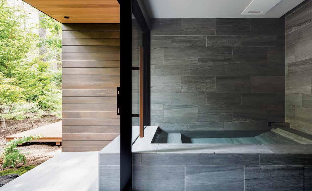
In Kentaro Ishida Architects Studio’s Weekend Villa in Karuizawa, the architects have created an open wet area that brings in the mountain area’s landscape. The villa itself comprises three interconnected volumes with roofs that resemble giant leaves and this biophilic expression is reiterated in the bathroom. While the space’s edges may be straight, the rich colour palette echoes the dense natural surrounds and the reflection of the trees within the bath water visually blurs the boundary between inside and outside beyond the full-height window’s glazing. Not everyone may want their bathroom to connect to the outdoors and certainly, that’s not even possible in all homes. Yet there is something to be said for the benefits this connection brings, from the visual appeal and appreciation a scheme can elicit to a number of personal benefits. And in this fast-paced world, feeling clear-headed, refreshed and relaxed is not to be underestimated.
ARCHITECTS IS INSPIRED
A JAPANESE ONSEN, PROVIDING THE CLIENTS
THEIR OWN PERSONAL OASIS. PHOTOGRAPHY BY TESS KELLY OPPOSITE BELOW | THE BATHROOM IN KENTARO ISHIDA ARCHITECTS STUDIO’S WEEKEND VILLA CAN BE CONSIDERED AN OUTDOOR ROOM, SUCH IS ITS PROXIMITY TO THE HOME’S SURROUNDS. PHOTOGRAPHY BY NORIHITO
OPPOSITE ABOVE | KIAH HOUSE’S BATHROOM BY
AUSTIN MAYNARD
BY
WITH
YAMAUCHI
issue #44 habitusliving.com
Taking time for oneself, treating the bathing experience as a moment to retreat and recharge, can contribute to a greater sense of wellbeing.

nourish # 79
HOME APPLIANCES BRAND IN GERMANY* BSH Group is a Trademark Licensee of Siemens AG.
Make every day, less everyday.
For those who are not satisfied with the ordinary and want to turn the everyday into something special, Siemens studioLine inspires with an extraordinary new design. The exterior shines with high quality materials, a reduced appearance, and controls that delight at every touch. Inside, new advances in automation and sensor technology power appliances that are faster and remarkably efficient. Discover Siemens home appliances today.
The future moving in.
 Siemens Home Appliances
issue #44 habitusliving.com
A gut Feeling
Nutritionist and health food blogger Jessica Sepel united a community back in 2012 when she began blogging about her personal experiences. Now, that community exists across a website, a nutrition app, a health program and several books.
Jessica Sepel began her blog, JSHealth, in her fourth year of study as a way to help heal her relationship with food.
As a chronic fad dieter studying health and nutrition, JSHealth was an outlet to chart her progress and document her transition to a healthier relationship with food. But most of all, it was a place where she could write about her experiences. The evolution of JSHealth came organically as Jessica spoke increasingly about her journey while completing a Bachelor of Health at Macquarie University followed by two years of nutritional medicine at the Australasian College of Natural Therapies. The community continued to grow and showed an interest in her personal recipes and the principles that she was living.
That was the driving factor in Jessica penning her first e-book, The Healthy Life, in 2013. Following which Pan Macmillan Australia approached her to turn it into a book of the same name in 2015. “The e-book contained my favourite recipes, my principles, my journey and my story,” says Jessica. And the book was an extended version of those same components.
Interestingly for a brand that benefits so strongly from its social media presence – a notoriously fast-paced medium that is constantly updating – the core principles of JSHealth have remained static. And that has been Jessica’s exact intention.
It would be remiss not to note that although the brand’s DNA hasn’t shifted in seven years, its offering has certainly filled out, coinciding
with demand. There is an online health program, a nutrition app, a line of vitamin supplements, and Jessica is currently writing her third book.
“Nothing has changed too much. The strength of the brand is the community and the products are there to support the community. There is no bigger dream than what we already have,” says Jessica.
Jessica and her husband bought their house in Sydney two years ago and the kitchen mirrors the JSHealth sentiments of lightness, balance and purpose. It’s is a simple space with a lot of counter storage and exposed shelving. “I wanted it to be an open, breezy space and all the things that I cook with are very much on the counter,” she says. Marble countertops were a recent upgrade to the kitchen extending the reach of the surface space and creating a feeling of openness in the kitchen; quite a necessary improvement given the fact Jessica likes her fresh produce and high-rotation ingredients at arm’s length.
The most important factor in the layout, design and colour palette (lots of white and muted colours) of Jessica’s kitchen was creating a space in which she wanted to be, and cook. The kitchen is a poignant statement reflecting the unique philosophies and aesthetics of Jessica and her brand.
JSHealth | jessicasepel.com
TEXT HOLLY CUNNEEN | PHOTOGRAPHY TIM DA RIN
2 . kitchen & bathroom series # 83
Kitchen comforts
Biophilic design is particularly effective in the kitchen, where a connection to nature makes the heart of the home even more welcoming.
TEXT LEANNE AMODEO
issue #44 habitusliving.com
nourish # 85
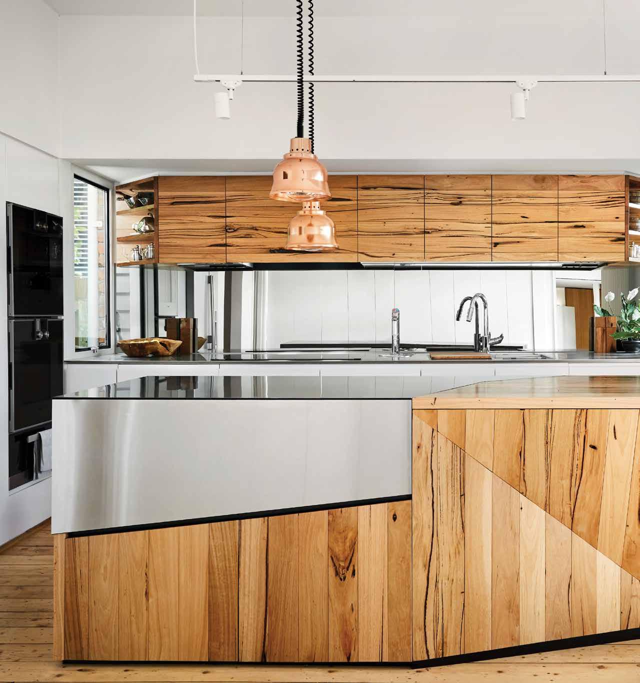
OPENER | AUSTIN MAYNARD ARCHITECTS’ KIAH HOUSE STRONGLY CONNECTS TO PLACE, OPENING UP TO A BACKYARD INSPIRED BY THE JAPANESE GARDENS OF KYOTO. PHOTOGRAPHY BY TESS KELLY ABOVE | KIAH HOUSE’S KITCHEN JOINERY IS NOT UNLIKE A TREE TRUNK IN ITS SCULPTURAL FORM AND SURFACE FINISH. PHOTOGRAPHY BY TESS KELLY issue #44 habitusliving.com
There’s possibly no other place in the home, apart from the bathroom, where form and function require perfect unison than the kitchen. Many people spend a fair chunk of their day there so it is important the space be conducive to their particular way of living. As a result, designers and architects are committed to making the kitchen as comfortable as possible because of the effect it can have on a client’s wellbeing.
How they go about this varies from practice to practice, region to region. But utilising biophilic design to facilitate positive physical and psychological impact is certainly having a moment. And with the introduction of the WELL Building Standard in 2014 – a performance-based system for measuring, certifying and monitoring features of the built environment that impact human health and wellbeing through air, water, nourishment, light, fitness, comfort and mind – the emphasis on designing for wellness is now stronger than ever. Of course, the guidelines include a feature on biophilia and the benefits of human and nature interaction in holistic design approaches.
So how are Australian designers and architects utilising biophilic principles within the kitchen? Generally speaking, the preference is for subtlety and restrained interventions, such as dotting the space with pot plants or painting a wall green. A biophilic plan features interaction with nature, nature’s patterns incorporated into the design, and the inclusion of natural elements. Integral to the plan is a scheme that responds to context and has a strong connection to place. This is evident in Austin Maynard Architects’ recently completed Kiah House in Melbourne’s North Fitzroy.
While the addition to an original weatherboard cottage built in 1927 may be located in an inner-city suburb, the architects have reimaged the site as an oasis, taking inspiration from the clients’ affinity for Japanese

nourish # 87
A biophilic plan features interaction with nature, nature’s patterns incorporated into the design, and the inclusion of natural elements.
gardens and the Buddhist retreats of Kyoto and blurring the boundaries between inside and outside. The kitchen therefore responds to a series of gardens and courtyards that allows plenty of sunlight and natural ventilation into the relatively compact space. The island bench further connects to the outdoors through a bespoke sculptural form that echoes the shape of a grand old tree trunk: it’s organic in appearance and highly tactile. It also brings the outside in and gives the kitchen its most compelling biophilic expression.
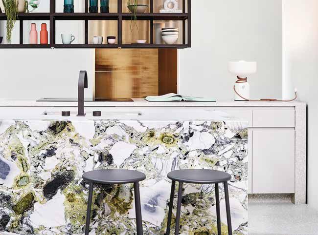
The project exemplifies the direct physical connection to nature that living in a house brings. But what about highdensity environments where the majority of apartments in multi-residential developments don’t have gardens on their doorstep? There is nothing to say the same positive effects can’t be achieved, there is just a greater reliance on elements that symbolise or evoke the outdoors. In the Clarion mixeduse development in Sydney’s Alexandria, for example, SJB has incorporated finishes in the apartment kitchens that evoke nature, most notably heavily patterned grey, green and white marble for the island benches. It’s an extraordinarily striking material that resembles a rocky surface or wall from one angle and an aerial landscape view from another.
The idea is that this indirect connection to nature triggers the same sense of wellbeing that a direct one does. It’s a concept explored in Terrapin Bright Green’s 14 Patterns of Biophilic Design: Improving Health and Wellbeing in the Built Environment, where the category of Natural Analogues discusses the use of artwork, lighting, textiles and material finishes to elicit such feelings. This type of application also works for clients who don’t want to fill their homes with pot plants. Ultimately, the best biophilic design champions seamless integration and supports harmonious living.
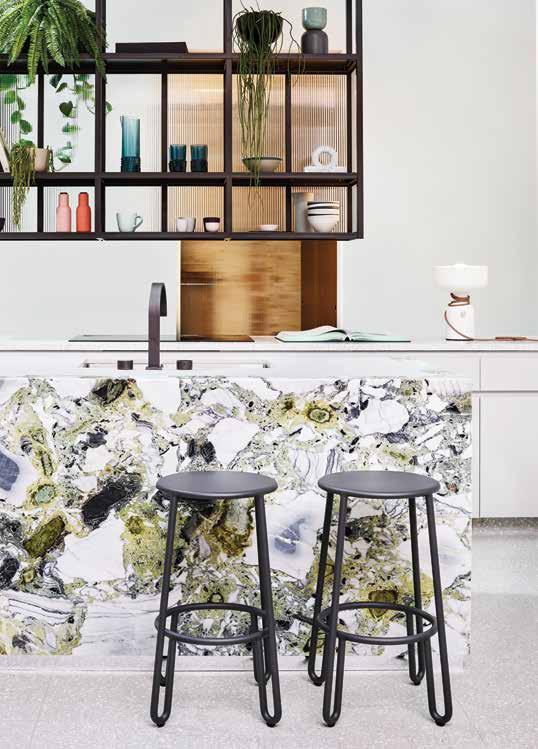
ABOVE | BIOPHILIC PATTERNING ON SJB’S CLARION KITCHEN ISLAND BENCH BRINGS THE OUTSIDE IN AT AN OTHERWISE COMPACT APARTMENT WITH NO DIRECT CONNECTION TO THE OUTDOORS. PHOTOGRAPHY BY ANSON SMART issue #44 habitusliving.com
Designers and architects are committed to making the kitchen as comfortable as possible because of the effect it can have on a client’s wellbeing.


issue #44 habitusliving.com
Back to Basics
Simplicity and smallness offer opportunities for design exploration to the founder of Singapore-based ipli Architects, Yip Yuen Hong.

When it comes to architecture and design, Yip Yuen Hong is the master of distilling complex requirements down to the essentials. The multiple President’s Design Award (Singapore) winner and founding partner of ipli Architects is an advocate and a practitioner of a solutions-driven design approach in which simplicity of form, program, material and space results in soulful and inspiring architecture.
Despite the focus of his practice largely on residential buildings with various-sized footprints, Yuen Hong finds the most comfort in smaller spaces that pose opportunities for exploration and innovation. With his approach to kitchen and bathroom design – for his clients as well as for himself – the architect warns against over-designing and oversizing that can come with an excessive amount of space. The temptation that comes with the luxury of space, in his words, can seduce clients into unnecessary wastefulness of resources, maximising the available footprint instead of focusing on the overall functionality of a space.
“My kitchen and bathroom design approach ties to my overall approach to architecture,” explains Yuen Hong. “I aspire to achieve a sense of timelessness and simplicity, while injecting a spatial quality or materiality that somehow makes you look at a space from a slightly different perspective.”
Having in recent years relocated from a terrace house into a smaller home, the architect is practicing what he is preaching by designing his personal space in an efficient and meaningful manner. “People tend to build everything in one go but I prefer to design for the essential requirements in mind and add on over time, according to the changing needs and lifestyle considerations,” he says.
Similarly, the architect believes that by distilling the needs of his clients to the very basics, the essential aspects of their character begin to stand out. Yuen Hong references creative space uses in housing typologies prevalent in Japan and Hong Kong, where spatial constraints often dictate the economical and creative solutions to space usage. “Everything becomes so tailormade in these small spaces, it can be quite exciting,” he says.
Thus, a kitchen and a bath can be designed with a degree of flexibility, as certain components can be changed and added over time, allowing each space to feel lived in. Yuen Hong calls this approach “a little more ‘undesign’” and ad-hoc, adding that oftentimes meticulously designed spaces may not allow for reconfiguration and adaptation to lifestyle changes and evolving preferences.
While keeping it simple and practical, Yuen Hong also designs to create inspiring spaces where light and air become important design elements. Within the tropical context of Singapore, this approach offers opportunities to connect interiors to the exterior, keeping spaces open and minimising the compartmentalisation of stale air. He balances privacy and openness, implementing strategies to bring light and air into tight and private spaces like bathrooms through a calculated positioning of openings, lightwells and light covers, or using landscape features to create layers of privacy.
“Within my design, I try to implement solution-driven, simple strategies that can creatively maximise the space,” says Yuen Hong. “My approach never seeks to be over the top but rather to contain subtle yet meaningful gestures.”
TEXT OLHA ROMANIUK | PHOTOGRAPHY KHOO GUO JIE
ipli Architects | ipliarchitects.com 2 . kitchen & bathroom series # 91

LET’S GO! REGISTER NOW Explore what Melbourne design is all about. Saturday Indesign is an immersive day of design where the community comes alive. Fuel your inspiration and creativity. motion
#SATURDAYINDESIGN SATURDAYINDESIGN.COM
design in
Clever days
Smart bathrooms are smart in so many ways, from the integration of high-tech gadgetry to the inclusion of biophilic patterns and handcrafted features.
 TEXT LEANNE AMODEO
nourish # 93
Today’s smart bathrooms run the gamut from biophilic sanctuary to sleek, tech-enabled retreat. The latest gadgets and products feature high on clients’ wish lists and for designers and architects, it’s that one room in the house where they can go a little crazy. This is often the space where those much-loved vintage tiles that don’t fit anywhere else find themselves or where an odd light fitting works best. It’s also possible to have fun with custom finishes, details and fittings, in order to make a statement.
This is very much the case with the bathrooms in SJB’s new Clarion mixed-use development, which includes 18 apartments, in Sydney’s Alexandria. The architects used a heavily patterned grey, green and white marble for the vanity, which they also installed as island benches in the kitchen. While it lends each apartment’s interior a sense of cohesion, it makes these two rooms especially hard to overlook. In the bathroom, the marble ties in well with the terrazzo floors, timber window reveals and greenery, producing an incredibly appealing biophilic expression. Elements of nature are also the inspiration behind Kohler’s latest collection of artist edition basins.
The four models are a collaboration between the bathroom products manufacturer and US-based artist Ashley Woodson Bailey, who was inspired by 17th century Dutch masters. They add a bold yet contained decorative flourish, generating even more curiosity because of the processes behind their making, which begin with a 3D arrangement that’s developed into a sketch and then handapplied before firing.
Yet not all surfaces have to be dramatic to be noticed, certainly the beauty in Caesarstone’s new Metropolitan Collection is its ability to provide an elegant backdrop for custom features or heavily detailed fixtures. The technology behind the concrete-inspired finishes means its non-porous surface is high-performing and works well poolside, in bathrooms and other wet areas.
Functionality considerations are paramount in the smallest room in the house and these days, there’s seemingly no product that hasn’t been tech-enabled in order to make life just that bit easier. From glass that shifts between transparent and opaque and underfloor heating to voice activated appliances and fixtures made all the more accessible with the rise in popularity of Google Home and Amazon’s Alexa. For internal bathrooms with no windows, there’s even a lighting system that reproduces the effect of natural sunlight. Produced by Italian company CoeLux, the product of the same name incorporates LED technology that reproduces sunlight’s spectrum and brightness.
Axor’s new PowderRain showerhead supports the bathroom as sanctuary trend with an offering developed in the Hansgrohe sound laboratory that’s splash-free and quiet. The jet emits thousands of micro-fine droplets and is also environmentally friendly because it reduces water consumption. Any bathroom manufacturer would be remiss to not engineer products with water-saving technologies and this area of research and development is where many excel. Such water-saving features aren’t usually the first thing to be highlighted in the catalogue, which is interesting. But this could simply be a positive sign of the times in which sustainable practice is now commonplace (as it should be).
In regards to questions of hygiene, the toilet is something that has to be discussed and with so many new ranges available, the task of selection isn’t as straightforward as it used to be. Veil by Kohler is about as high-tech as a toilet can get and its built-in UV cleaning bidet, touchless flushing and one-touch remote control makes it incredibly appealing as a low-maintenance, high-performance fixture. There’s something to be said for a bathroom that looks good and functions efficiently because of the sense of comfort it elicits and at the end of the day, that’s really what it’s all about.
OPENER | KOHLER’S HIGH-TECH VEIL TOILET IS AS SMART AS THEY COME AND SUITS ANY MANNER OF MODERN BATHROOM. OPPOSITE | THE USE OF A HEAVILY PATTERNED MARBLE IN THE BATHROOM OF SJB’S CLARION APARTMENTS ADDS VISUAL INTEREST AND A SENSE OF FUN TO THE SMALL SPACES. PHOTOGRAPHY BY ANSON SMART
issue #44 habitusliving.com
Functionality considerations are paramount in the smallest room in the house and these days, there’s seemingly no product that hasn’t been tech-enabled.
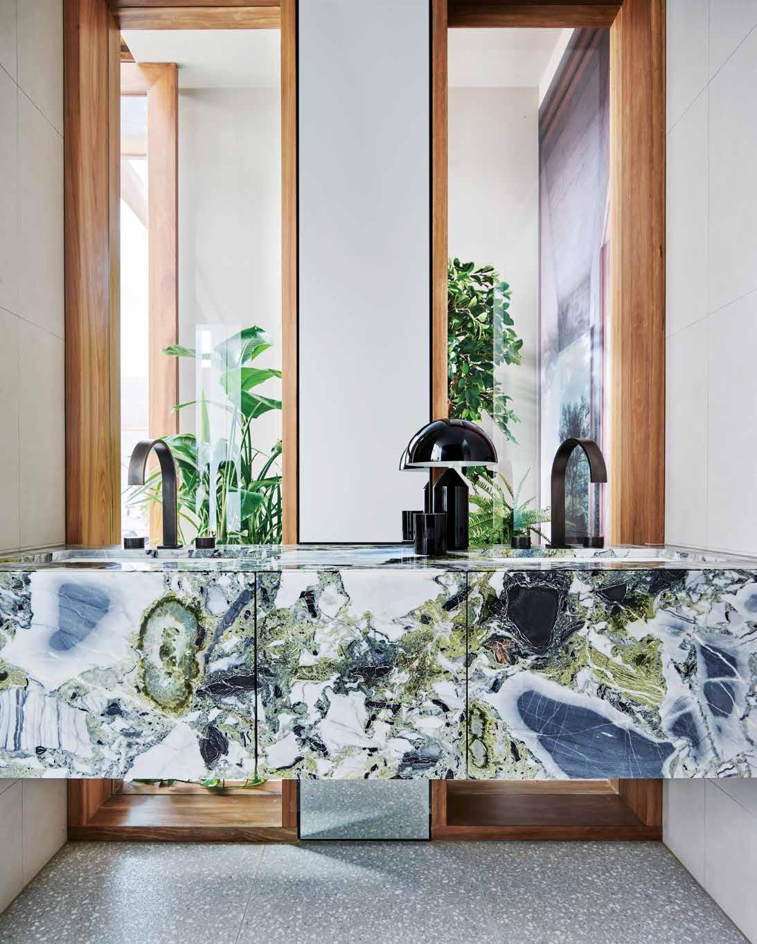
nourish # 95


Kitchens

Beach vibes,
good Times
The kitchen in Portsea Beach Shack, by Pleysier Perkins, is open, relaxed and robust enough for family and friends to casually gather around.
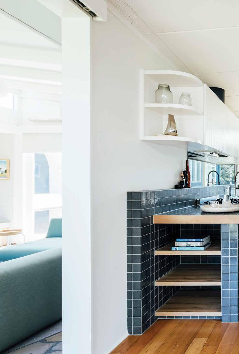 TEXT REBECCA GROSS | PHOTOGRAPHY MICHAEL KAI
issue #44 habitusliving.com

3 . kitchens # 99
Portsea Beach Shack
ARCHITECT Pleysier Perkins
PLEYSIER PERKINS
(61 3) 9533 6766
pleysierperkins.com.au
FINISHES
Beach houses are all about enjoying laidback times with family and friends. Portsea Beach Shack on the Mornington Peninsula is the holiday home of a fun, creative, professional couple with a young daughter. They engaged Pleysier Perkins to update and extend their classic 1960s beach house to improve the function and internal flow of the kitchen and living area and to create a better connection to the outdoors.
The kitchen is relaxed and robust; an open and comfortable space for family and friends to gather around. A play of coloured and textured materials – glazed tiles, timber joinery, stainless steel, white painted brick and V-groove boards – maintain the beach house vibe and evoke the spirit of mid-century architecture and design. “The client loved the handcrafted ideology of mid-century design and the subtle cracked effect of the glazed Japanese tiles are in keeping with the charm of the house,” says interior designer Elise Burton. The blue-tiled benchtop and timber joinery hug the existing brick chimney, and curved corners visually soften the straight lines of the architecture.
A stainless-steel bench provides a hardwearing surface for food preparation and dishes. The pantry and fridge are located where kids can easily come and go. And a freestanding cooker is large enough for casual summer soirées. “It’s all about sharing good times,” says Elise.
Pleysier Perkins | pleysierperkins.com.au
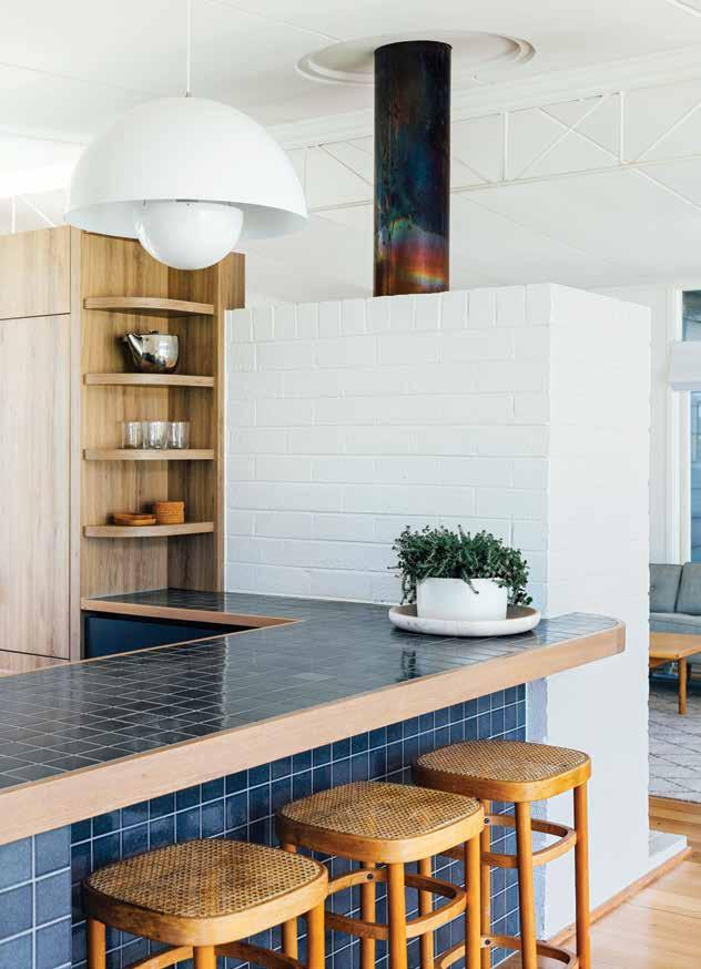 Natural White and Blue Sou’wester Dulux 2pac. Timber laminate shelving in Natural Chalet Oak by Duropal. MirraEcho mirror splashback in clear by Viridian. Minokoyo mosaic tiles from Academy Tiles.
LIGHTING
Louis Poulsen ceiling-mount lights and Flowerpot pendant light in white by &Tradition from CULT.
FIXED & FITTED
PREVIOUS | THE TILES HAVE A HANDCRAFTED AESTHETIC IN KEEPING WITH THE MID-CENTURY
THE LAYING OF TILES AND GROUT GAP. ABOVE | THE BRICK FIREPLACE IS THE HEART OF THE HOME AND IS HUGGED BY THE TILED BENCHTOP AND
issue #44 habitusliving.com
90cm free standing cooker from Smeg. Rangehood from Qasair. Fully integrated fridge by Fisher & Paykel. Fully integrated diswasher from Asko. Tap mixer in brushed nickel from Phoenix. ‘Squircle’ Tasmanian Oak joinery handles by Auburn Woodturning.
CHARM OF THE HOUSE. PLEYSIER PERKINS WAS METICULOUS ABOUT
TIMBER JOINERY.
Finished and considered
When interior architect Alena Smith was working in London, she realised that limitations of architecture often arise when designing spaces in historical buildings. Moving back to Australia, she was pleasantly surprised by the level of flexibility a designer could have. Coupled with an unmatched climate and plenty of design savvy clients, she believes that Australia offers a great opportunity for architecture and interiors to unite in design.
Completing a degree in architecture before honing in on interiors, Alena advocates that interior design should not be approached as a secondary factor. “For me, the interiors are a continuation of the architecture,” she says.
As an interior team lead, Alena aligns herself with Smart Design Studio’s unique approach to interior design. Collectively, the studio works to get the planning perfect, revising frequently to ensure a strong foundation before fine-tuning the details. “Whilst this approach takes time, it means that when projects are built, they feel finished, dressed, and have a sense of longevity.”
When working on kitchen and bathroom spaces, Alena is determined to make it the best experience it can be. “Both kitchens and bathrooms have evolved over many years from being utilitarian spaces, where the emphasis is on ergonomics. Now we have arrived at a cross path between luxury and intuitive spaces,” says Alena.
“Once you get the fundamentals right like an excellent plan, quality materials and good lighting, design can expand to accommodate for different personalities.”
In the years to come, Alena explains that she looks forward to designing beautiful spaces that seamlessly integrate sustainable practices and the latest technology.
 Smart Design Studio | smartdesignstudio.com
TEXT THIDA SACHATHEP | PHOTOGRAPHY VERONIQUE JENKINS
As an interior team leader at Smart Design Studio, Alena Smith creates beautiful, inviting spaces for living.
2 . kitchen & bathroom series # 101
Customary
yet contemporary
Situated in a small village northwest of Dak Lak province, Vietnam, spaces within YT House by rear studio are influenced by the surrounding vernacular.
Differing from kitchens in the western world, Asian kitchens often feature a classic charm with simple lines and a soft elegance that works to preserve cultural traditions that have been passed on from generations.
Based in Ho Chi Minh City, Vietnam, architecture practice rear studio harnesses design in a way that maintains privacy in the kitchen, but conveys the spirit of a modern user. Opening up to more than one common area within the house, the spatial configuration of the kitchen also caters for connectivity and conversation between family members.
Subtly juxtaposing with the rectangular form of the houses’ four walls and floor plan, rear studio designs the formal entryway within YT House as a circular structure, repeating. The circular block that houses the kitchen and the bathroom also works as a central core of the residence and frees up the common spaces to reveal a light, open-plan design. Framing the kitchen are curved solid walls, but carving out a rectangular doorway in the centre creates a sense of symmetry, similar to the timber batten screens that frame the exterior of the house.
In YT House, the kitchen really is the heart of the home – as it creates an important link with other functional spaces.
rear studio | rearstudio.com
YT House
REAR STUDIO (61 2) 9518 9900 rearstudio.com
FINISHES
Curved brick wall painted white. Enameled brick flooring. Pyinkado wood for the louver ceiling and the kitchen joinery.
OPPOSITE | THE KITCHEN IS SITUATED AS A MULTI-DIMENSIONAL SPACE THAT CONNECTS THE EXTERIOR GARDEN WITH INTERNAL COMMON AREAS.
The spatial configuration of the kitchen caters for connectivity and conversation.
ARCHITECT rear studio
issue #44 habitusliving.com
TEXT THIDA SACHATHEP | PHOTOGRAPHY QUANG DAM
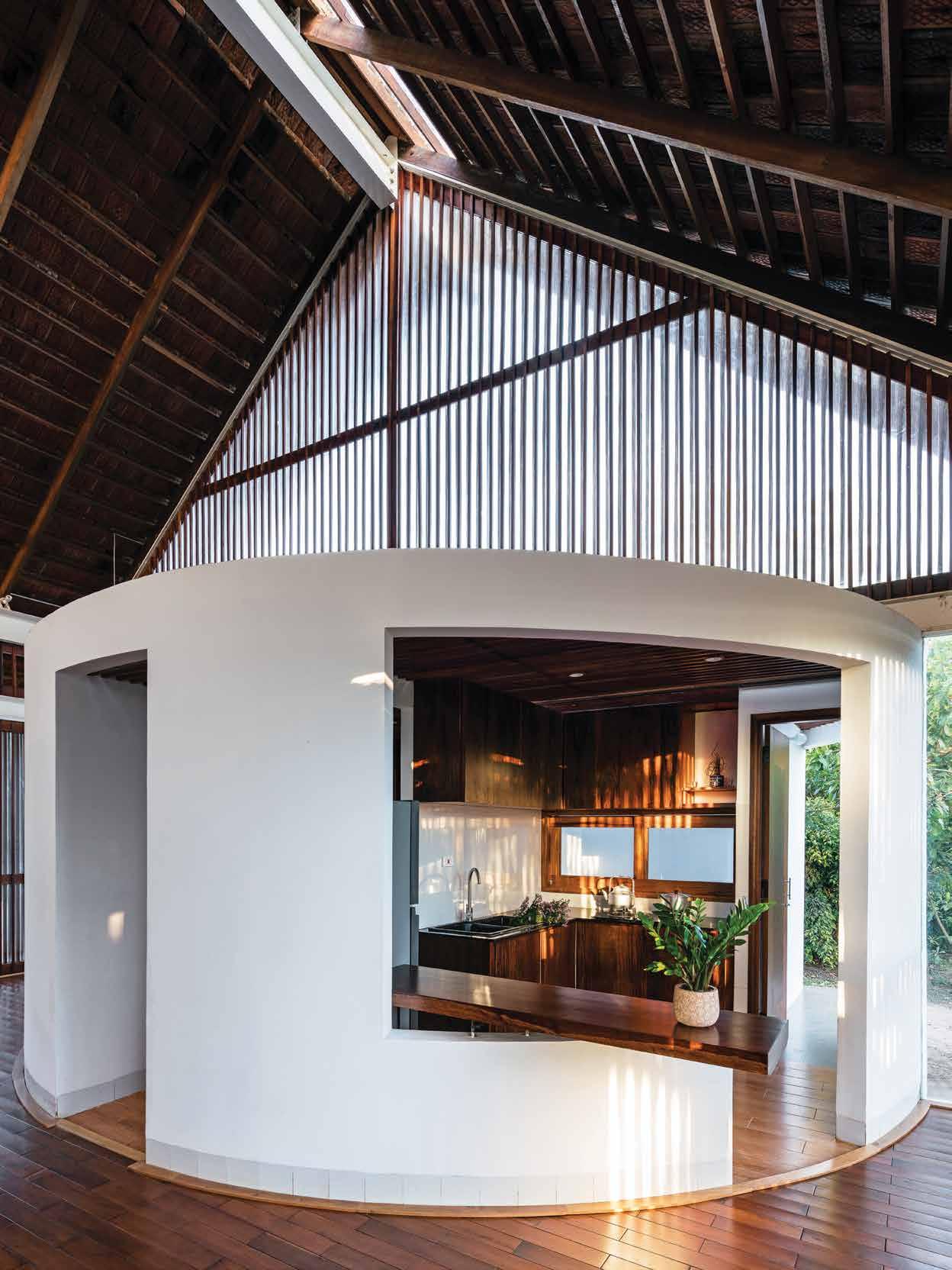
3 . kitchens # 103

issue #44 habitusliving.com
Part of the
Furniture
Benn+Penna designed the Leichhardt Oaks kitchen like a piece of furniture, creating a holistic backdrop in a calm and contemplative space.
As our kitchens become an increasingly integrated component of dining and lounge areas, they are being designed to quietly fade into the background to create a cohesive sense of space. The clients of Leichhardt Oaks wanted a calm and contemplative kitchen, dining and living room, and engaged Benn+Penna to design one long volume that flowed seamlessly out to the garden. “Because it is one room we were conscious of it not reading simply as a kitchen, but more as living room joinery, almost like a piece of furniture,” says Andrew Benn, director of Benn+Penna.
The kitchen has a pared-back design and minimal material palette. Joinery on the rear wall sits flush with the door and hallway openings to provide a smooth timber backdrop. Overhead cupboards have white timber door fronts to visually recede into the fully tiled wall, and underbench cupboards lockstep with the stairs, which offer a subtle division of space. Shelving tucked into the ends of the cupboards provides display space for the living room.
As the soft tones of the materials catch the afternoon sun through the high-level windows and the morning sun filtering in from the garden, they reflect the light around the room and cast a soft atmosphere across the space.
Benn+Penna | bennandpenna.com
TEXT REBECCA GROSS | PHOTOGRAPHY TOM FERGUSON
3 . kitchens # 105
Leichhardt Oaks
ARCHITECT Benn+Penna
BUILDER Invue Homes JOINERY Nu Space Joinery
BENN+PENNA
(61 2) 9518 9900 bennandpenna.com
FINISHES
The Oaks and Silkwood veneers from Navurban. Muro 41 tile in Milk from Di Lorenzo Tiles. Flooring in Bistre from Tongue n Groove.
FURNITURE
No.18 chairs from Thonet. Luxa rectangle dining table from Totem Road.
LIGHTING
Ambit pendant light from Muuto.
FIXED & FITTED City Stick kitchen mixer by Brodware. Kubus undermount sink in Polar White from Franke. 90cm gas cooktop and 75cm oven from ILVE. Fully integrated dishwasher from Miele. ActiveSmart integrated French door refrigerator from Fisher & Paykel. Lismore rangehood from Qasair.
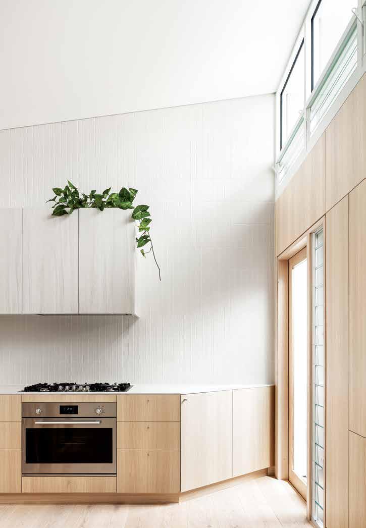
OPENER
IN A LIGHTER
TO
THE
ALL THE WAY
issue #44 habitusliving.com
“Because it’s one room we were conscious of it not reading simply as a kitchen, but more as living room joinery, almost like a piece of furniture.”
| KITCHEN JOINERY IS INTEGRATED WITH THE ARCHITECTURE OF THE ROOM, SITTING FLUSH WITH THE DOOR AND HALLWAY OPENINGS. ABOVE | THE OVERHEAD CUPBOARDS ARE
FINISH
BLEND WITH
TILES THAT REACH
TO THE CEILING.
A commitment to design
Sub-Zero and Wolf showcase an innate understanding of the architecture and design industry, and the Design Hunters who exist on the peripherals, offering an endless array of design possibilities.
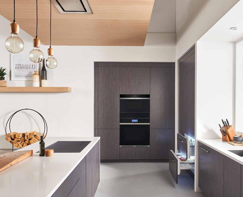
habitus promotion › Sub-Zero and Wolf #107
ABOVE | WOLF CONTEMPORARY INDUCTION COOKTOP ICBCI-365CB, CONTEMPORARY M SERIES CONVECTION STEAM OVEN ICBCSO-30CMB, CONTEMPORARY M SERIES SINGLE OVEN ICBSO-30CMB SUB-ZERO DESIGNER SERIES REFRIGERATOR/FREEZER DRAWERS ICBID-30CI.
There many moving parts in the design of residential projects: be they new builds, alterations and additions, or scaled renovations. From the configuration of site that begins a project to the furniture and interior architecture that encourages the way a space is utilised to the colour palette, materials and texture that are used to create atmosphere, the design possibilities are not only endless, they are inspirational.
In the kitchen, this extends to the selection of major appliances like ovens and refrigerators. At Sub-Zero and Wolf, choosing which appliances will enhance your cooking experiences is only the first step. Deciding upon design styles, options to integrate into custom cabinetry, and a stacked or linear installation is the next.
For example, the Wolf M Series ovens are available in four unique designs. The Professional oven is perhaps the boldest of the series, with the iconic Wolf red control knobs and stainless steel body. A variation with black or brushed stainless knobs is also available. The Transitional design takes the traditional stainless steel body but accents it with tubular handles, while the Contemporary design is just that: a modern, minimalist addition to the Wolf M Series with a seamless, handle-less design and black glass body (or stainless steel).
However one major design factor unites the four Wolf M Series ovens: Wolf’s commitment to performance. Colour LCD touch-screen controls ensure each of the ovens are easy to use while continuing the sleek aesthetic. There are also convenient pre-set cooking programs,
interior lighting, pyrolytic cleaning, a generous oven capacity at 144 litres, the advanced Dual VertiCross convection system, and the availability for single or double oven options.
A few degrees below, Sub-Zero refrigerators show us that sometimes the biggest impact is made in a more hidden manner. While their offering continues to include bold pieces that stand out to make a statement, their innovative thinking and deeper understanding of the needs and wants of the architecture and design community can be seen in their designer integrated refrigeration options.
Clients can opt to make their design prowess seen with the classic models, featuring the distinct grilles, strong lines and sleek hinges. Built in models are also available with hand-finished wrapped stainless doors. For those who align more with understated visuals, the Sub-Zero integrated fridge models almost disappear into cabinetry. Custom panels and new press-to-open engineering further the sleekness to this look.
Forty-eight models in the Sub-Zero refrigeration product range – in varying widths and configurations; ranging from side by side refrigerator and freezer units, to individual columns, and drawers – mean clients can confidently dictate their individual design needs knowing they will be met. A food preservation system unique to Sub-Zero sees function and performance as a given.
Sub-Zero and Wolf appliances offer an endless array of design possibilities to the design conscious consumer who appreciate and seek out an acute attention to detail.
issue #44 habitusliving.com
OPPOSITE | WOLF TRANSITIONAL M SERIES CONVECTION STEAM OVEN ICBCSO-30TMSTH, TRANSITIONAL M SERIES SINGLE OVEN ICBSO-30TMSTH. SUB-ZERO CLASSIC SERIES SIDE-BY-SIDE REFRIGERATOR/FREEZER ICBBI-42SSTH, WINE STORAGE ICBBW-30STH.
Sub-Zero and Wolf | au.subzero-wolf.com/en
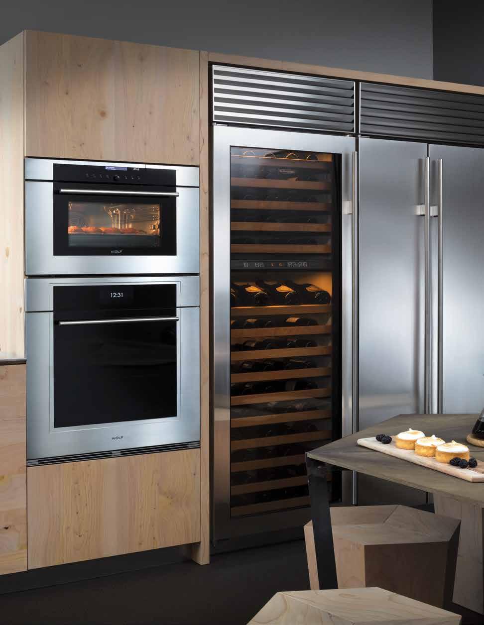
habitus promotion › Sub-Zero and Wolf #109
The Science of Design
“Each project presents new opportunities to examine the brief, clients, situation and site – and to grow a project out of that soil,” begins Perth-based architect Philip Stejskal. “We start each job with as few preconceptions as possible, which helps to keep it interesting for us.”
Kitchens and bathrooms are viewed as components within an overall scheme, Philip explains. “We like to tease out a strong concept – something that’s relevant to the project and personal for the clients – and then make decisions regarding planning and materials that are contextualised within that concept so that they are not arbitrary.”
Philip’s own house is a case in point: designed as a new build on a sub-divided site, it was constructed ten years ago using precast concrete panels. The external walls are sited on the boundaries to create an internal courtyard, meaning the only bathroom has no window, so Philip installed a section of translucent roof to draw in natural light.
He set out to build his own home without tiles or plasterboard, so the bathroom is a ‘wet’ room, with concrete floors and walls, and tempered Masonite wall cladding. It contains a bath, shower, toilet and vanity, and serves the family of five, plus a new puppy who sometimes needs to be hosed down!
The kitchen is also experimental: Philip was testing the idea of incorporating all of the main appliances in a central island bench, measuring 2.5 metres by 1.3 metres. “The plan allows and promotes interaction and helps to define the kitchen within the larger open-plan living space,” he says.
An adjacent wall houses pantry storage and a window seat, where family and friends can sit and chat with the cooks. “We are really happy with the way it functions,” he says. “Although now we are a family of five, we sometimes wish we had a bigger fridge, but it forces us to eat more fresh food.”
Getting the balance right between functional and social requirements is an issue that arises often with clients, Philip says, noting that Perth’s temperate climate – which is great for outdoor entertaining – leads many to request a second outdoor kitchen.
“There is a bit of an obsession about al fresco kitchens here, but whether the main considerations relate to cost or space, we believe that every room should play its part in a complementary relationship to other spaces,” says Philip. “So rather than having an outdoor kitchen, we prefer to make the internal perimeter of the kitchen permeable, with sliding walls and windows to connect to al fresco areas, which is much more efficient.
Philip’s own experimental kitchen has helped to inform his design approach with clients. “Over the years, we’ve taken a few things from my experiments into clients’ homes, although it’s pretty extreme to have the whole kitchen as an island; we haven’t done that for a client,” he says. “But it means that when clients are questioning what’s possible, we’re well placed to discuss all the alternatives and see what arises from those conversations.”
Philip Stejskal Architecture | architectureps.com
TEXT RACHAEL BERNSTONE | PHOTOGRAPHY BO WONG
Every new design project – whether it’s a kitchen, bathroom, or whole house – starts out as an experiment to research and resolve for architect Philip Stejskal and his team.
issue #44 habitusliving.com
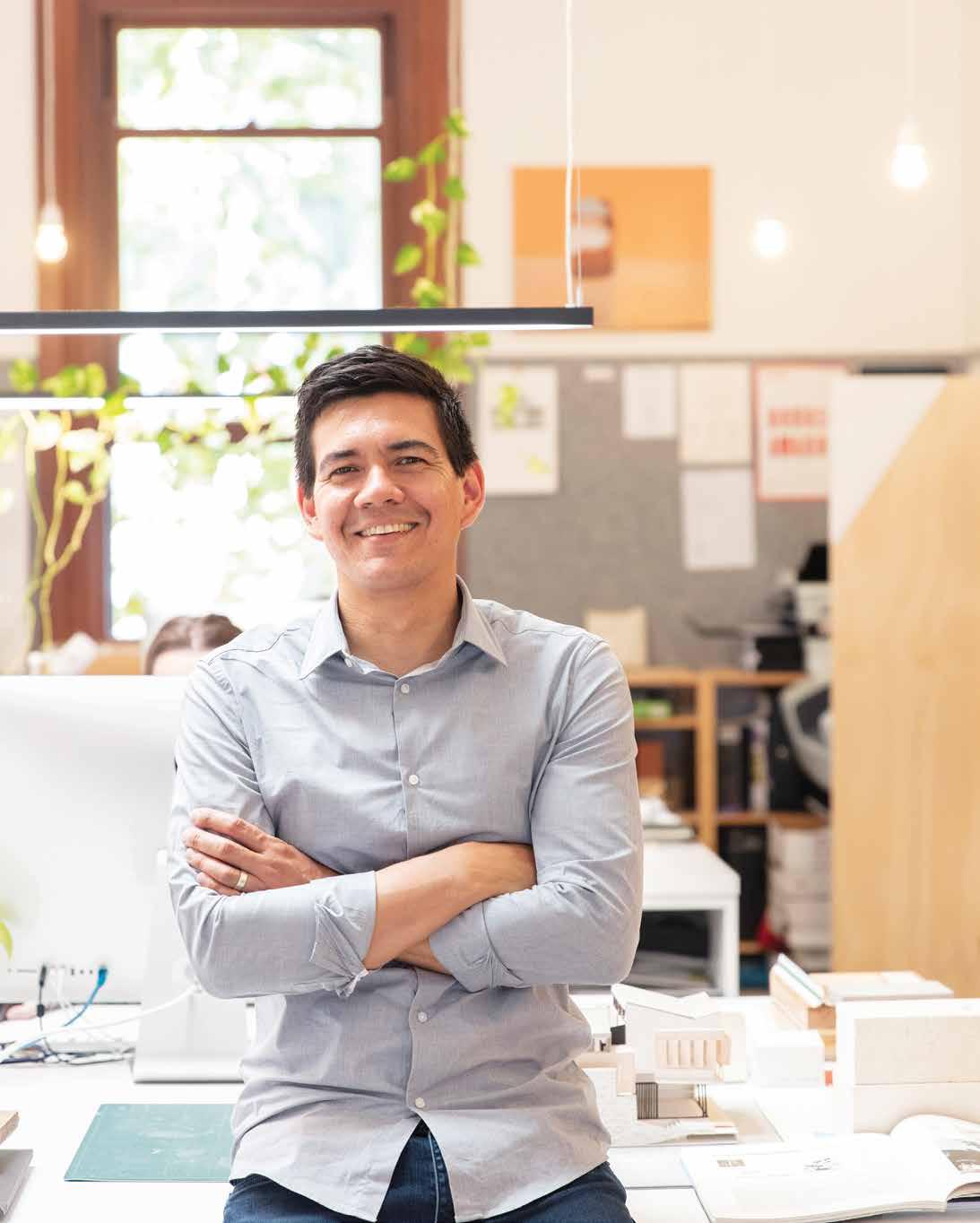
2 . kitchen & bathroom series # 111
Showering perfection: back in Black
The Red Dot Design Best of the Best Award winner Aio Aurajet twin shower system is back in a stylish new matte black finish for modern homes. With an intriguing sculptural form and elegant design, the Aio Aurajet not only looks amazing, but also delivers a divine showering experience.
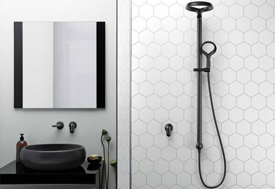
The Aio uses Methven’s Aurajet technology to deliver a highly efficient and luxurious shower. Featuring a unique halo-shaped showerhead, Aurajet utilises hidden nozzles to generate individual jets of water that deflect against precisely angled surfaces within the elegant contours of the showerhead. This creates stunning fans of dense droplets that deliver a wide, even, full-bodied spray – whether used as a traditional shower or in the detached handheld option.
The water flow of Aio is optimised to be water efficient without compromising performance. Designed and engineered in New Zealand for the world, the Aio Aurajet collection is available exclusively via Reece Bathrooms nation-wide.
Methven | methven.com/au
issue #44 habitusliving.com ABOVE | METHVEN’S MATTE BLACK
AURAJET IS MORE THAN A BEAUTIFUL BATHROOM FIXTURE – IT’S AN INSPIRED,
AND BEAUTIFUL WAY TO
AIO
FUNCTIONAL
SHOWER.
Continuing with the company’s ethos of creating amazing water experiences that don’t cost the earth, Methven has now just released the Aio Aurajet twin shower in full matte black.
Bathrooms
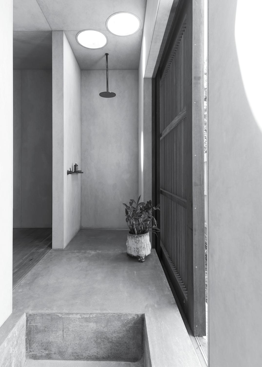
An ability to age gracefully
Brass hardware and terracotta tiles mark this bathroom by TRIAS, chosen as much for their visual appeal as durable nature.

issue #44 habitusliving.com
TEXT HOLLY CUNNEEN | PHOTOGRAPHY BENJAMIN HOSKING
Three Piece House is a new build designed by architecture studio TRIAS situated upon a raised, reclaimed brick platform. Located in Newcastle and enjoying coastal views, the clients were looking to downsize and live simply yet meaningfully. “They wanted their bathroom to be small and simple, with lots of natural light and low-maintenance finishes,” says Jennifer McMaster, a director at TRIAS. And it was equally important that the bathroom connect visually and theoretically with the ensuing residence.
There are moments throughout the house when the pre-existing brick platform rises up to make itself known, such as within the bathroom. “One long wall becomes a terracotta plinth, stepping up to host a basin and then folding down to create a shower seat,” says Jennifer. “In this way, it feels like another gesture within the overall design concept.”
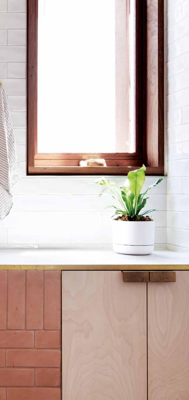
Designed as more of a wet room than conventional bathroom for a recently retired couple, TRIAS also sought inspiration in traditional Japanese bathrooms. This is clearly evident in the final design, where the shower seat is a place to perch, pause and enjoy a truly relaxing shower. While this may seem luxurious now, it shows TRIAS’ forethought and consideration of their clients’ future needs.
The terracotta is a visual nod to the residence’s brick base (which emerges again in the kitchen and fireplace). It is durable in nature, conveying an earthy, weighty sense to the space. “Terracotta also has a lovely natural softness, with a beautiful colour change between when it’s wet and dry,” notes Jennifer. To balance such a strong marker of the space, TRIAS utilised tonally light materials like mottled white tiles and brass fittings that patina with age.
TRIAS | trias.com.au 3 . bathrooms # 115
Three Piece House
ARCHITECT TRIAS
INTERIOR DESIGN AND DECORATION TRIAS
BUILDER GTS Constructions
JOINERY Urban Joinery
LANDSCAPING TRIAS in collaboration with Sustainable Sounds
TRIAS (61) 431 010 746 trias.com.au
FINISHES
Terracotta brick tiles in Acapulco, 400 x 400mm Italian grey terrazzo tiles and ceramic tiles in Flake White from Surface Gallery.
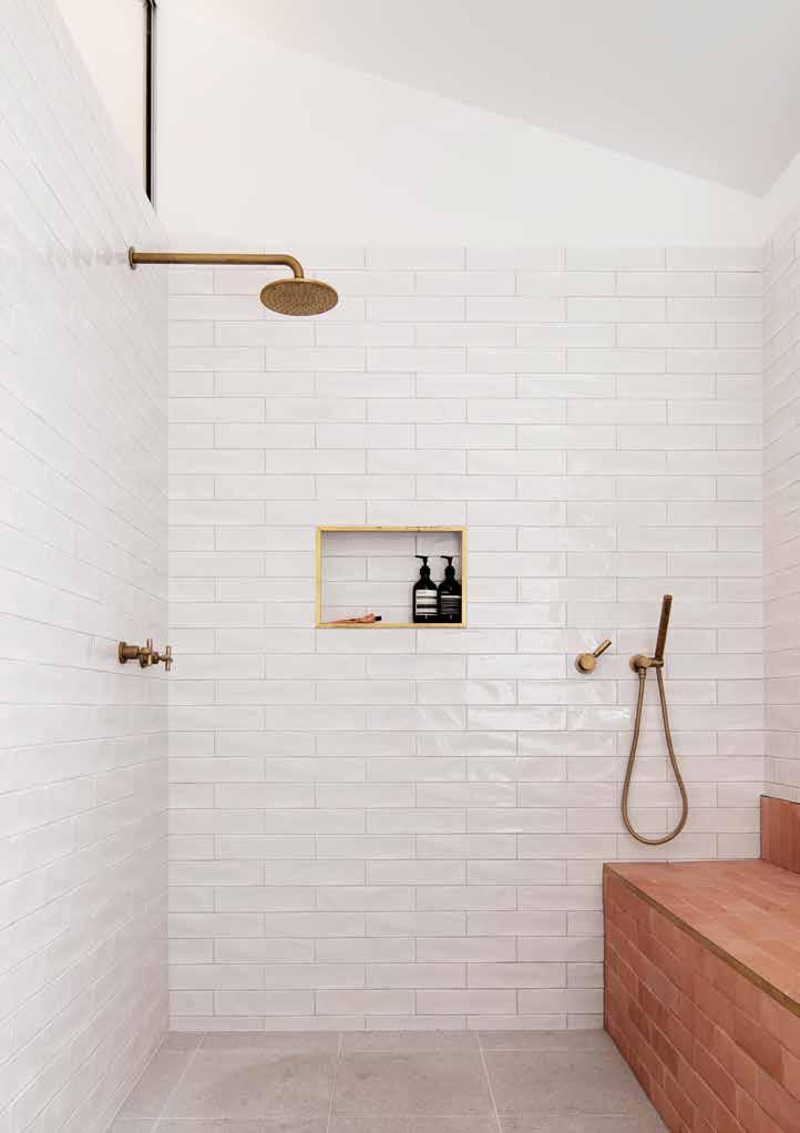
FURNITURE
Birch plywood cabinets, mirror and brass handles custom-made by TRIAS.
FIXED & FITTED
Icon wall mixer, Icon shower mixer, shower rose and hand shower supplied by Astra Walker. Toilet suite and basin by Astra Walker.
OPPOSITE | MATERIALS SUCH AS TERRACOTTA, TERRAZZO,
AND
THEIR ABILITY TO PATINA AND AGE BEAUTIFULLY AS FOR THEIR INHERENT DURABILITY. ABOVE | A CLERESTORY WINDOW ABOVE THE SHOWER LETS NATURAL LIGHT FLOW IN.
“One long wall becomes a terracotta plinth, stepping up to host a basin and then folding down to create a shower seat.”
BRASS
TIMBER WERE CHOSEN AS MUCH FOR
issue #44 habitusliving.com
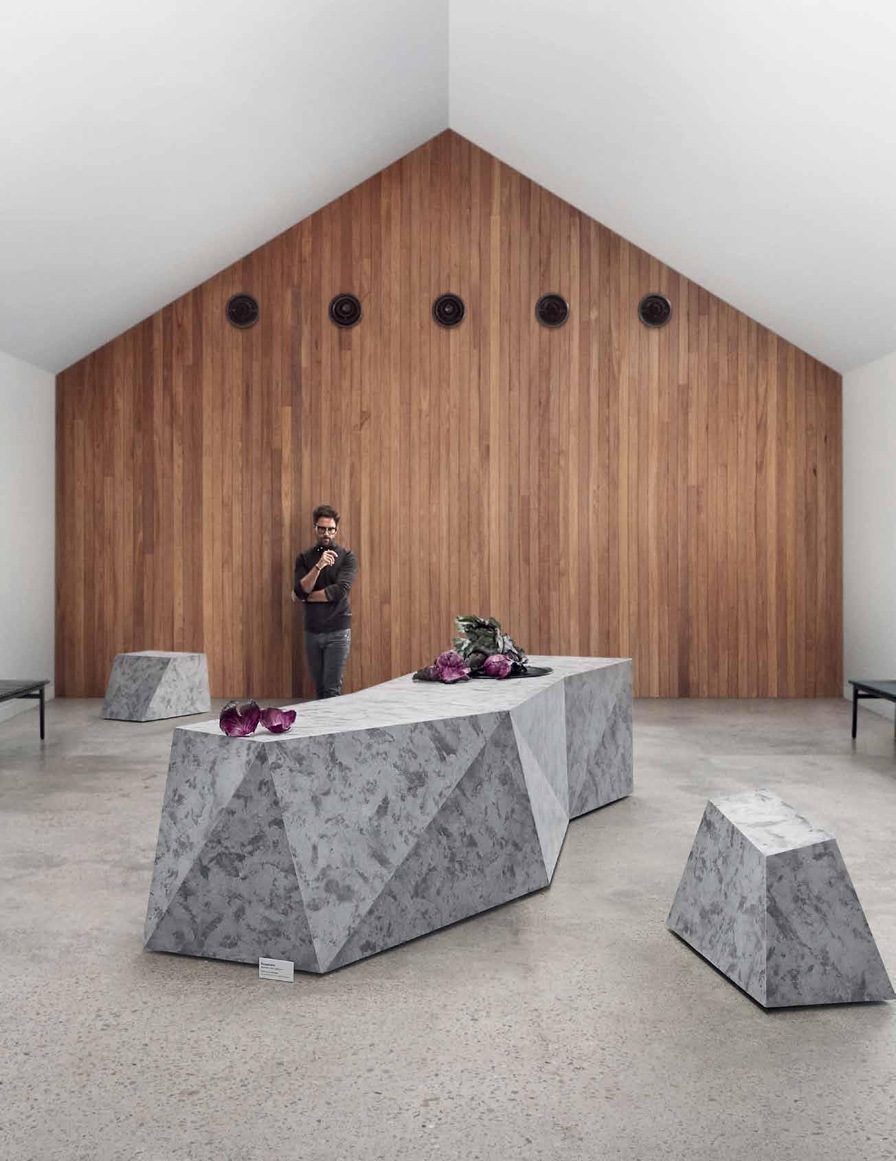


Alternative A Third
A dusky bathroom with differentsized alcoves and skylights are part of panovscott Architect’s addition to a federation-style cottage in Sydney.
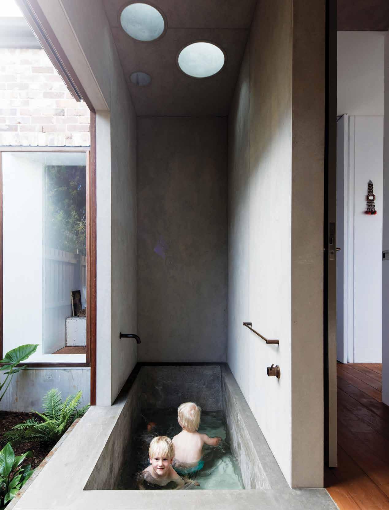 TEXT THIDA SACHATHEP | PHOTOGRAPHY BRETT BOARDMAN
issue #44 habitusliving.com
The impact that time has on buildings has been an ongoing interest of architects Anita Panov and Andrew Scott, founders of panovscott Architects.
Although this particular house was lacking natural light and a layout to fit the clients’ lifestyles, the original four-room cottage was still intact. Wanting to evolve rather than transform the existing architecture, panovscott Architects focused their attention on inserting a new build with precision – one that respects the existing cottage and celebrates a mature Jacaranda tree planted in 1901.
By placing a new addition between the existing edifices, Anita and Andrew enrich the heritage essence of the site, and encourage the owners to interpret the space as they see fit.
One bathroom, shared between the owners and their guests, is tucked behind a wall and awash with natural light. The space evokes a kind of sensory dignity often found in Japanese bathhouses. Inside, the concrete bathtub was cast and scoops down with minimal tones and clean lines.
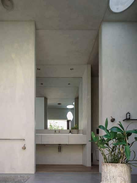
There is a strong association to the outside landscape with a floor-to-ceiling window and skylights that soften the palette, allowing users to admire the vistas, giving the bathroom the quality of a subterranean space. The wall also pulls back with timber sliding screens to reveal a lush garden. “We like to think that this has enabled a richness in the experience of a dwelling,” Anita explains.
panovscott Architects | panovscott.com.au
Jac House
ARCHITECT panovscott Architects
LEAD ARCHITECTS Anita Panov & Andrew Scott
INTERIOR DESIGN AND DECORATION panovscott
Architects
BUILDER Hammerstone
JOINERY Refalo Joinery
LANDSCAPING Budwise Garden Design
PANOVSCOTT ARCHITECTS (61) 421 447 534 panovscott.com.au
FINISHES
Ceiling and wall linings compressed fiber cement sheets prefinished by CSR in Barestone. Off-form concrete treated with Quantum finish from Solution Sealers. Spotted Gum window and screen doors by Acacia Joinery.
LIGHTING
Skylights from Velux. Skylight reveals by James Hardie.
FIXED & FITTED
Aged brass tapware and bathroom accessories in Icon by Astra Walker. WC from Rogerseller Complete collection.
OPPOSITE | THE CIRCULAR SKYLIGHTS FLOOD THE BATHING AREA WITH NATURAL LIGHT. ABOVE | THE VANITY HAS BEEN REPURPOSED AND RE-ENAMELLED FROM AN OLD KITCHEN BASIN.
3 . bathrooms # 119
Worlds colliding
TEXT ALEESHA CALLAHAN | PHOTOGRAPHY DEREK SWALWELL
European in spirit, approach and aesthetics, while delivering something truly Australian, Casa Atrio by Biasol is a modern classic.
The Melbourne suburb of Carlton is synonymous with historic charm and European flair. In among the narrow rows of Victorian-era workers cottages is a recently renovated family home that, when stepping over the threshold, embraces a distinctly French flavour. Bringing this design vision to life is Melbourne-based studio Biasol, headed up by Jean-Pierre Biasol.
Using the narrow constraints of the site as a positive, Jean-Pierre says that Casa Atrio is “conceived in three sections to provide light and life throughout the day”.
French luxe is expressed in the project through thoughtful detailing: elegant wall panelling, dark chevron timber parquetry and a sophisticated mix of marbles. Some of these elements also work their way into the bathroom. “Green and blue accent colours in furniture, joinery and marble carry the notion of luxe throughout the home, including the bathroom,” says Jean-Pierre.
Taking luxury to the next level, the upstairs bathroom integrates a deep, built-in marble bathtub, which “maximises the cathedral ceilings”. The floor detailing in this bathroom references the same chevron pattern used throughout the house, this time unfolding with rich white and grey swirls of marble. It’s a home where Australian soul meets the French je ne sais quoi
Biasol | biasol.com.au
Casa Atrio
DESIGN STUDIO Biasol
LEAD DESIGNERS Jean-Pierre Biasol & Alex Choi
BIASOL (61 3) 9428 5999 biasol.com.au
FINISHES
Bianco Forte stone flooring cut in chevron pattern from Parthenon Marble. Bianco Forte stone bath from Parthenon Marble. Concrete render by Alternative Surfaces.
LIGHTING
Perri Trimless downlights from Sphera Lighting.
FIXED & FITTED Tapware from Sussex Taps.
OPPOSITE | USING THE EXISTING DRAMA OF THE HERITAGE BUILDING, THE MASTER BATHROOM AT CASA ATRIO EXUDES LUXURY THROUGH ITS MARBLE FINISHES AND BUILT-IN BATH.
issue #44 habitusliving.com
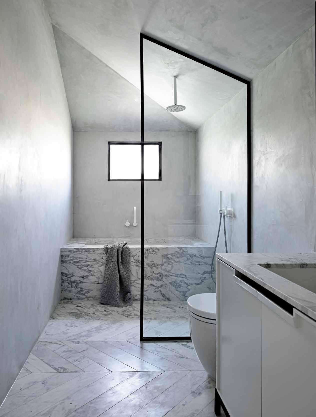
3 . bathrooms # 121
Tradition
for Today
Ospace Architects reference decades of Taiwanese homes through their material selection for this intimate Taichung apartment.
Abeautiful consistency flows through this home of a human resources consultant. It has to do with an open approach to space, an embrace of soft filtered daylight through sheer curtains and blinds, and most of all, a dedicated use of one particular material.

“We introduced an old material, terrazzo, as the main surface in the home,” explains HungHsuan Shen, a director at the Taiwanese firm Ospace Architects. The intention was to create the sense of a ‘Taiwanese’ home for the owner of the apartment, who had been working overseas for 20 years.
“Terrazzo was commonly used in the 1980s in Taiwan,” says Shen, “as the major finishing material on floors.” But here, Ospace Architects has introduced it to wall surfaces as well –including in the bright, open bathroom where it creates an intimate blush tone.
“We worked with our terrazzo specialist to improve the technique so it could be applied on the walls as well. The bathroom is almost entirely finished in one material to give the sense of a cave-like space with the feel of intimacy. We applied transparent waterproofing to protect the surface,” he continues.
The bathroom flows openly from the bedroom, with just a curving transparent glass enclosure containing the combined shower and bath. A number of partitions were removed from the apartment to enhance the flow of natural light and create a sense of openness. The result is a private relaxation zone that’s separate from, yet feels wholly related to, the living, dining and working area thanks to the consistency of material and spatial character.
ABOVE | THIS APARTMENT IS IN A 30-YEAR-OLD BUILDING AND THE BATHROOM WAS PREVIOUSLY SMALL AND HUMID. IT IS NOW SEPARATED FROM THE BEDROOM BY A GLASS SCREEN, WHICH ALLOWS SUNLIGHT TO FLOW THROUGH AND GIVES THE WHOLE AREA A HOMOGENOUS FEELING.
TEXT NARELLE YABUKA | PHOTOGRAPHY TZECHUN WEI
Ospace Architects | ospace.com.tw
issue #44 habitusliving.com
House with Terrazzo
ARCHITECT Ospace Architects
PROJECT LEADER Yuchiao Lin
OSPACE ARCHITECTS
(886) 4 2222 0152 ospace.com.tw
FINISHES
Traditional terrazzo by Baoan Chen.
FIXED & FITTED
Tapware and bathware from Kohler supplied by Fragrantia Co.
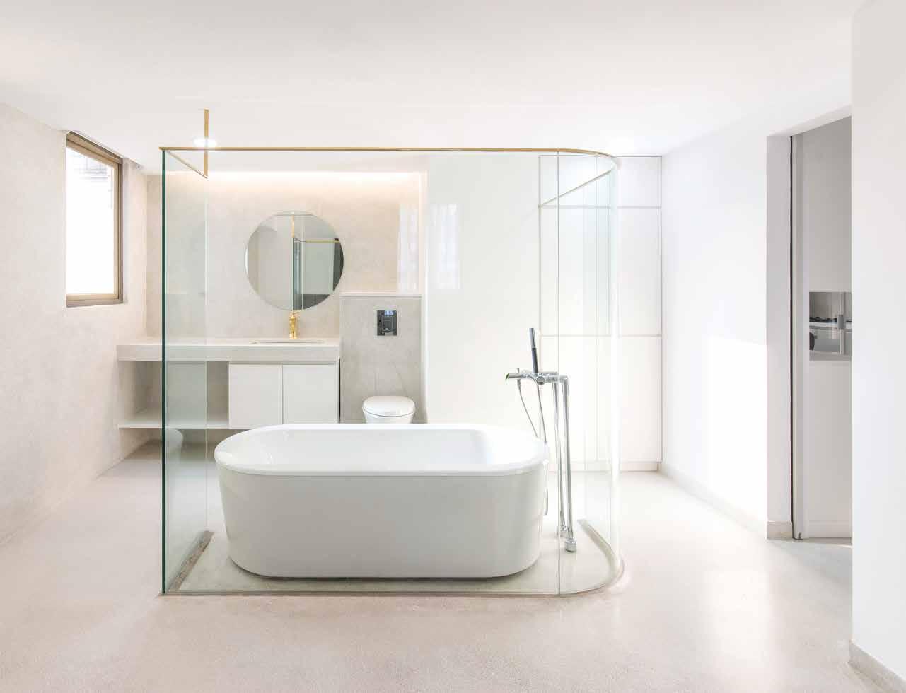
3 . bathrooms # 123
“The bathroom is almost entirely finished in one material to give the sense of a cavelike space with the feel of intimacy.”
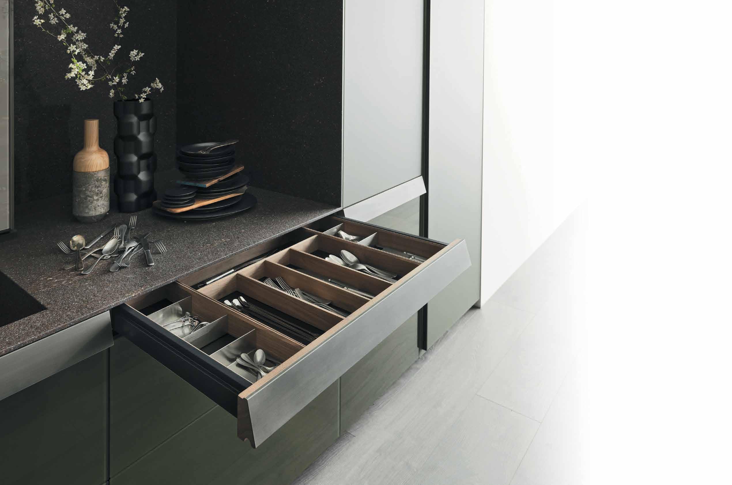
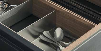
VALCUCINE KITCHEN EXCLUSIVE TO ROGERSELLER | HOMEPAGE PHOTOGRAPHY
BY ANDY MACPHERSON
Kitchen drawers are for cutlery, not paper trails.

Say goodbye to folders stu ed with documents. Now all project and home-related information can be uploaded to a secure, personalised online hub.
MAKE HANDOVERS, RENOVATIONS AND HOME MANAGEMENT EASY.
See how simple it can be at HOUSELAB.COM.AU


issue #44 habitusliving.com
The Fox and the Hedgehog
Take a look through the portfolio –online or via instagram – of Brisbanebased Hogg & Lamb, and you might be surprised to see that one project doesn’t necessarily mirror the characteristics of another. This is intentional, as one client may not share the same needs, or aesthetic intentions, as another. Michael Hogg and Greg Lamb, the co-founders of Hogg & Lamb, say their approach to architecture and design is predominantly informed by the client rather than a set style they are known for and engaged to roll out time after time.
Those two approaches form the basis of the two camps Michael calls the foxes and the hedgehogs. “The fox can adapt to any situation and make the best out of it, whereas the hedgehog has one idea of how to survive, and that’s what they do every time,” he says, aligning their studio with the foxes.
With each new ‘situation’ they are adapting to, (i.e. the client they are working with) they’ll ask the client to consider what they like, not necessarily what they need: as often the client may not know this explicitly yet. They’ll begin designing options early on with a general size and overall purpose in mind, which is usually informed by the client’s present situation and possible future evolutions. Michael and Greg use this period to refine the brief, exploring possibilities in and around it.
While this holistic approach considers the entire house, it very much zeroes in on the kitchen. “There’s an architectural idea for the house, and then we transfer that idea to the

kitchen, being one of the most important rooms of the house: what is the idea of the house, and how does the kitchen reinforce that idea?” says Michael. “The benchtops aren’t made out of stone because I like stone, they’re made out of stone because the idea for the house is reinforced by using stone,” he adds by way of example.
One of their recent projects was a house for a minimalist couple and their children. Michael and Greg honoured their clients by designing the major appliances – ovens, fridges and a microwave – out of view into a butler’s pantry. Additionally, the legs of the kitchen island mirror that of the dining table, making it easily thought of as furniture. “Because of the way the island bench has been detailed, it can operate in a lot of different ways,” says Michael.
For one of their current projects, Michael and Greg have designed an outdoor shower atmosphere in the middle of the house. Accessible from one of the bedrooms, this particular shower is completely uncovered and open to the sky, although a more traditional covered shower remains an option beside it.
Across all the spaces they’ve worked on, from residences to hospitality projects and even a church, one lesson that stands out to them is to never lose sight of purpose and usability. “Things have to work functionally in order for the architectural idea to be experienced,” says Michael. Perhaps in one, single way, all their projects do share a common thread.
Hogg & Lamb | hoggandlamb.com
TEXT HOLLY CUNNEEN | PHOTOGRAPHY HOLLY GRAHAM
According to Michael Hogg and Greg Lamb, there are two types of architecture studios, with two very different approaches.
2 . kitchen & bathroom series # 127
Designing the Heart of the Home
The kitchen is often considered the hub of modern house design – the heart of the home. Designing these spaces to be inspiring and eye-catching needs to be a holistic process.
Leon House is the man behind his eponymous Leon House design studio in Perth, and has been designing award-winning kitchens for more than 20 years.
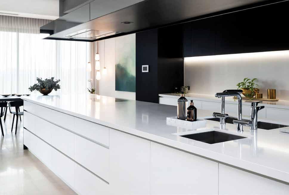
This featured kitchen was designed for a young family who needed a sociable, family oriented working kitchen that connected with the living areas indoors and out, which could seamlessly cater to large groups of family and friends.
Leon is driven by a passion and obsession with using minimalist interior architecture and clean lines to create spaces that work and inspire, using quality materials and
beautiful fixtures and finishes. He loved bringing all of these qualities to this East Fremantle house.
The kitchen is finished using a variety of brilliant surfaces and finishes, from the Bernini acid washed Carrara stone on the social island and chocolate stained oak by Fremantle Furniture, to the Caesarstone Snow benchtops and Frost Bruxelles brushed nickel handles – the kitchen is less drab cooking room, and more inspiration destination.
Perth locals can see Leon House’s latest kitchen at Antry’s new showroom, 45 Welshpool Road, Welshpool W.A.
Leon House | leonhouse.net
issue #44 habitusliving.com ABOVE | THE CLEAN LINES, MINIMALIST
AND EFFORTLESS VISUAL
OF ITS KITCHEN
ARE LEON HOUSE TRADEMARKS, AND SUIT ANY CONTEMPORARY HOME.
DESIGN
APPEAL
DESIGNS
A place to nourish


issue #44 habitusliving.com
A garden house of today
In a city filled with Dutch colonial houses, architect Andra Matin offers a modern take on a garden-house for a tech-savvy family.
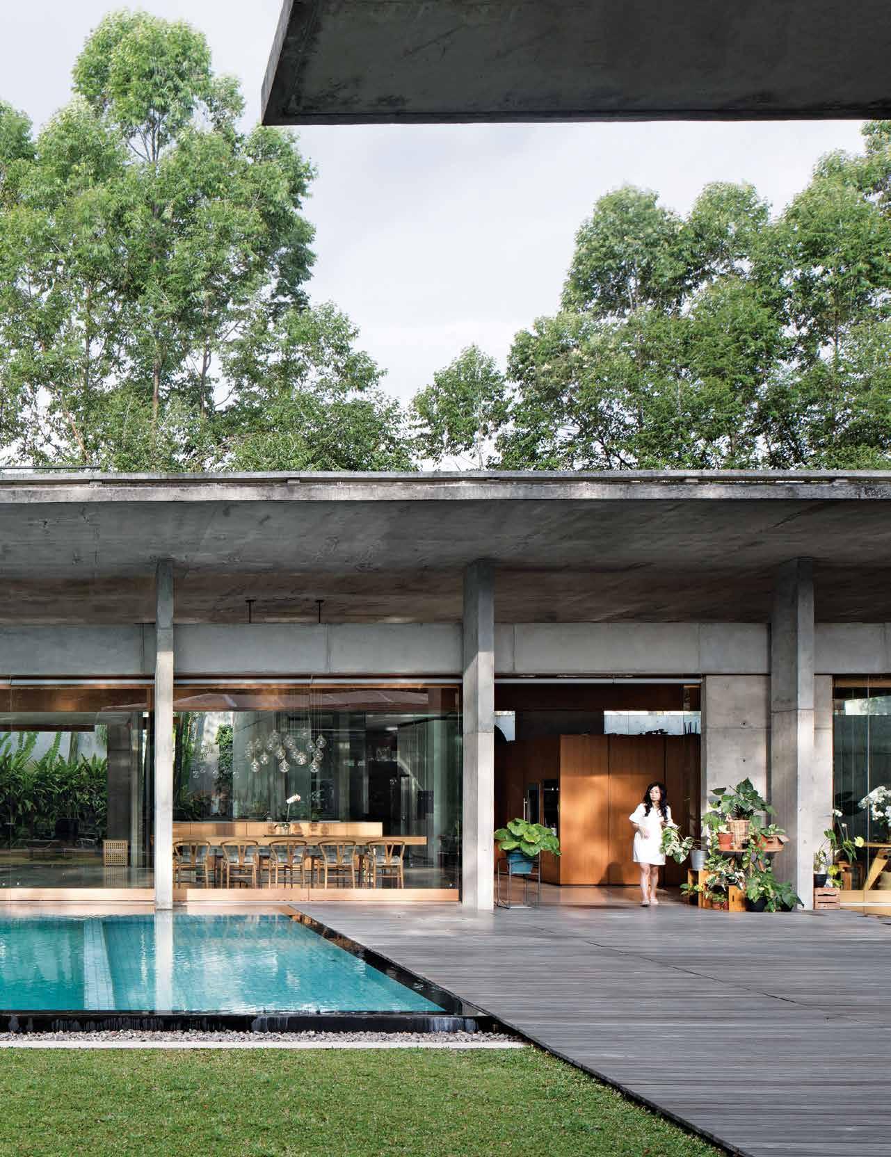 TEXT DANNY WICAKSONO | PHOTOGRAPHY MARIO WIBOWO
3 . on location # 131
There was a time when the city of Bandung, Indonesia, was called “Paris Van Java”. The northern hilly part of the city, with its lush setting and cool clean air, attracted many people in the early 20th century to come and enjoy the relaxing atmosphere. As the tea plantation business grew, new economy in the area became increasingly vibrant by the day and attracted more businesses to the city. Hotels, restaurants, cafés and leisure facilities started to grow, bringing people to come and enjoy a different kind of entertainment in the Dutch Indies. And before long, single family detached houses started sprawl.
Throughout the city there are many Dutch Colonial-style houses with terraces and balconies that overlook the garden. This is an architectural cue Bandung is known and celebrated for: it has always been a city in which one can understand that the relation between indoor and outdoor was created to established a more relaxing living environment. This motif is what makes Ismail, a tech entrepreneur, want to build a new house with access to more land than his childhood house.
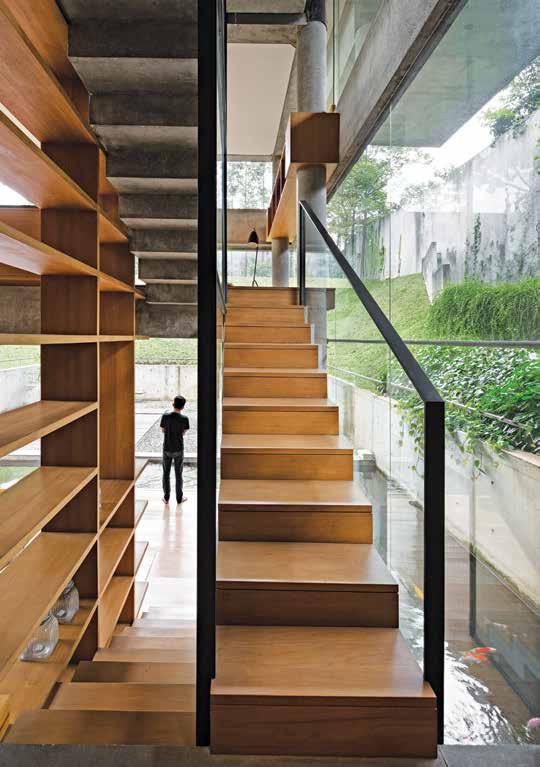
OPENER | A WELCOMING SIGHT WHEN ONE ENTERS THIS HOUSE: THE SWIMMING POOL AND WOODEN TERRACE CONNECTS DIRECTLY TO THE LIVING ROOM AND DINING ROOM. ABOVE | TIMBER AND CONCRETE ADD INTEREST. OPPOSITE | AT THE OTHER END OF THE HOUSE PRIVATE ROOMS, SUCH AS THE LIBRARY, WORKING ROOM AND MASSAGE ROOM, CONNECT TO A DRY GARDEN.
issue #44 habitusliving.com
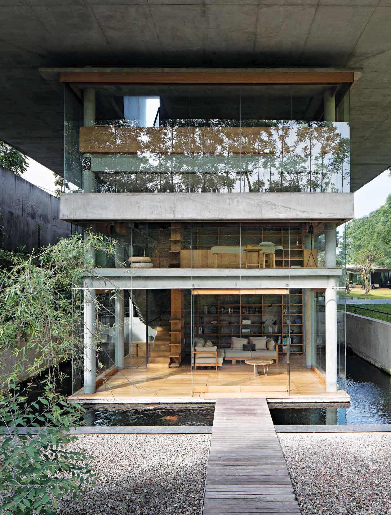
3 . on location # 133
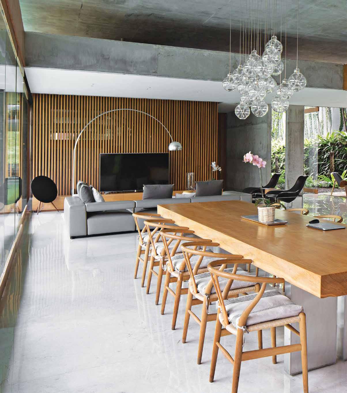
issue #44 habitusliving.com
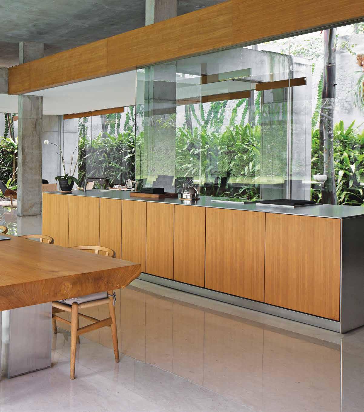
ABOVE | FROM BOUNDARY TO BOUNDARY, THE FAMILY CAN EXPERIENCE MAXIMUM VIEWS OF THE LAND FROM THE DINING AND LIVING ROOM THROUGH LARGE GLASS WALLS. 3 . on location # 135
Ismail has lived in Bandung his whole life. He spent his chilhood in one of his parents’ houses in north Bandung. It was a typical Bandung colonial house, with a terrace and garden surounding the building. As the city grew, and his career progessed comfortably, the opportunity arose to relocate within the city. So he bought a piece of land, feeling the time was right to move to a bigger house on a quieter piece of land.
“Location wise, our old house was much closer to the city centre and other places that we used to visit,” says Ismail. “But here we like it much better. The open spaces are bigger and it’s more relaxing.” This was the trade off that came with a quieter locale. And it was a friend that introduced Ismail to Andra Matin, another Bandung native. Immediately, Ismail knew he had found the right architect to build his new home.
“[Ismail and Andra] share the same interests and tastes in many things. Both of them love the outdoors,” explains Ismail’s wife. On the 5,650-sqaure-metre site, Andra carefully shaped the slopping land to create a 3-level outdoor area. With a simple brief to create
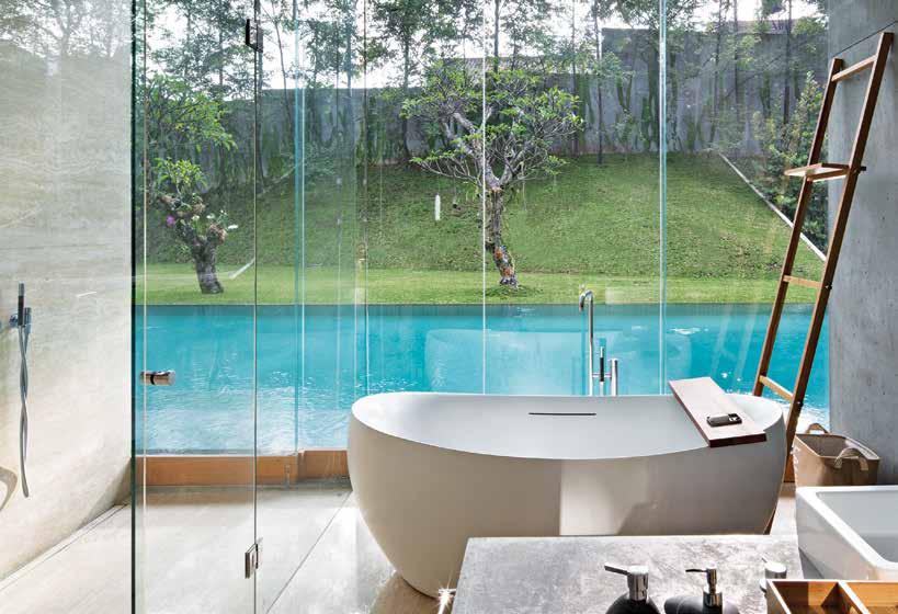
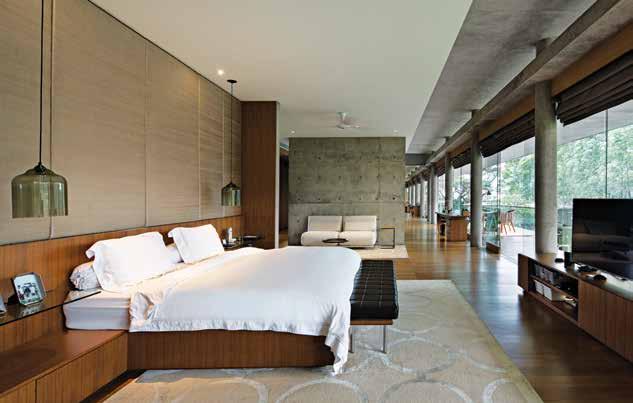
ABOVE | ALL THREE BATHROOM ENSUITES ON THE GROUND FLOOR HAVE AN EXTENDED VIEW TO THE POOL AND GARDEN. BELOW | THE MAIN BEDROOM ON THE SECOND FLOOR IS LAYERED WITH A MIX OF MATERIALS. OPPOSITE | GARDENS FILLED WITH DIFFERENT KINDS OF TROPICAL VEGETATION HELPS TO MAINTAIN THE TEMPERATURE IN THE HOUSE AT A COMFORTABLE LEVEL.
There are many vantage points within this house from which the residents can enjoy their desired connection to nature.
issue #44 habitusliving.com

3 . on location # 137
a house that is connected to the outdoors, the project team wanted to make sure the landscape could offer spatial experiences as dynamic as the building’s. The entrance connects the house to the surounding neighborhood and the ramp, connecting one level to the next, offers a dramatic entrance to the house’s main quarter, thanks to its long and narrow nature.
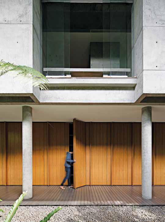
At the other end of the ramp, a Trembesi tree welcomes one into a space that reveals the residence’s true size. The main building offers spaces with different degrees of openness: an open space; a space with roof but without walls; and interior space with definite, but transparant, boundaries. In every part of this house, the residents can always feel connected to nature care of the 200-plus trees that were planted by the owners after construction.
In the three children’s bedrooms located on the first floor, the bedside and ensuite features views out to the swimming pool. The entrance to the bedrooms is via an open-air corridor and garden that likewise connects to the living
DRIVEWAY GARAGE ENTRY STAIRWAY FOYER FORMAL KITCHEN DINING LIVING KITCHEN W.C. BEDROOM ENSUITE 1 2 3 4 5 6 7 8 9 0 q w e r t y u i o p a STORAGE POOL JACUZZI STUDY GYM MASTER BEDROOM WALK IN ROBE MASTER ENSUITE BALCONY AV ROOM
GROUND FLOOR
LEFT | A WOODEN
THE
CORRIDOR CONCEALS THE ENTRIES TO THREE CHILDREN’S BEDROOMS. RIGHT |
issue #44 habitusliving.com
WALL ALONG
GROUND FLOOR
PLANS.
SECOND FLOOR FIRST FLOOR 3 . on location # 139
room, dining room and pantry. The kitchen is characterised by a large window with a view to a Thunbergia green-wall. The main bedroom on the second floor has a glass window façade that, on one side, opens up at the residents’ will. In this house, only the bedrooms feature air conditioning. Other zones take advantage of architectural openings that, regardless of size, allow cool air in to circulate freely.
At the highest point of the site one can enjoy an unobstructed view of the residence. From this height, the full length of the house is apparent and you can see the 6-metre overhang along all sides of the house forming a canopy that shades the balcony and terraces.
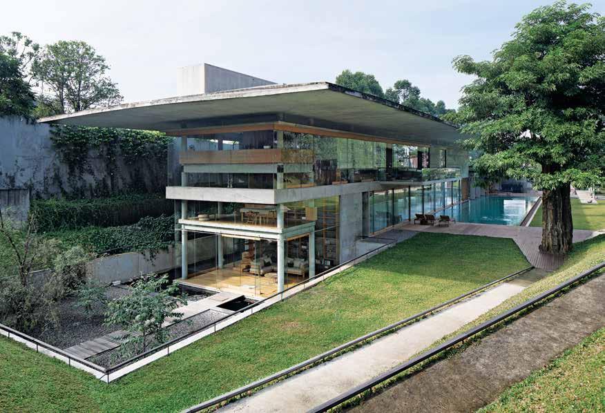
Clearly there are many vantage points within this house from which the residents can enjoy their desired connection to nature. This isn’t limited to the static environment, but the tropical weather, too. “A few weeks ago there was a heavy rainstorm,” says Ismail. “It was an amazing sight to see from this house.”
Andra Matin | andramatin.com
ABOVE | DESPITE THE SIZE OF THE RESIDENCE AND WIDTH OF THE CANOPY,
WALLS MAKE THE HOUSE APPEARS LIGHT AND THIN.
GLASS
issue #44 habitusliving.com
The main building offers spaces with different degrees of openness.
Designing for Now & for the Future
When it comes to our homes, today’s residents want – and expect - more. Not only must our homes be aesthetically pleasing but they should have fixtures and fittings that are genuinely useful and, as our focus shifts more and more to sustainability, be of high quality and long-lasting.
This doesn’t just apply to the traditional family house of old, either. Where multi-residential developments once favoured cost-saving practices over long-term quality and longevity, today’s residents expect a lot more, with apartments no longer seen as a short-term option but a lifelong investment.
With sleek, streamlined designs, cutting-edge technology and the ability to have pure, filtered chilled, boiling or sparkling water instantly at the touch of a button, the Zip HydroTap epitomises this move towards better, sustainable appliances, fitting the needs of today’s residences and those who occupy them.
The equally forward-thinking luxury property development company GURNER™ specifies Zip HydroTaps
in most of its multi-residential developments, thanks to its aligning ethos of offering more to residents in terms of quality, design flexibility and sustainability.
Founder Tim Gurner describes sustainability as “a major consideration for our luxury residences. Our vision is to create the type of luxury residences that are appealing to live in for this generation and the next, so they must not only look and feel beautiful, they have to stand the test of time and minimise waste.”
GURNER™ sources “only the very finest materials and custom-designed features throughout. Zip HydroTaps are the perfect example of luxury and functionality coming together as one. They offer residents ease of use and seamlessly integrate into the surroundings, while eliminating the need for additional appliances like a kettle which can clutter up the kitchen.”
Offering the perfect balance of aesthetics, sustainability, convenience and quality, the Zip HydroTap is everything a modern residence - and its users - needs.
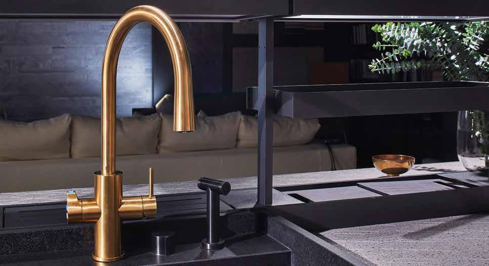
habitus promotion › Zip Water #141 ABOVE | THE ZIP HYDROTAP ADDS THE PERFECT BALANCE OF LUXURY AND FUNCTIONALITY TO THE MODERN RESIDENCE.
Zip Water | zipwater.com
Tim Gurner tells us why he specifies the Zip HydroTap in GURNER™ developments.
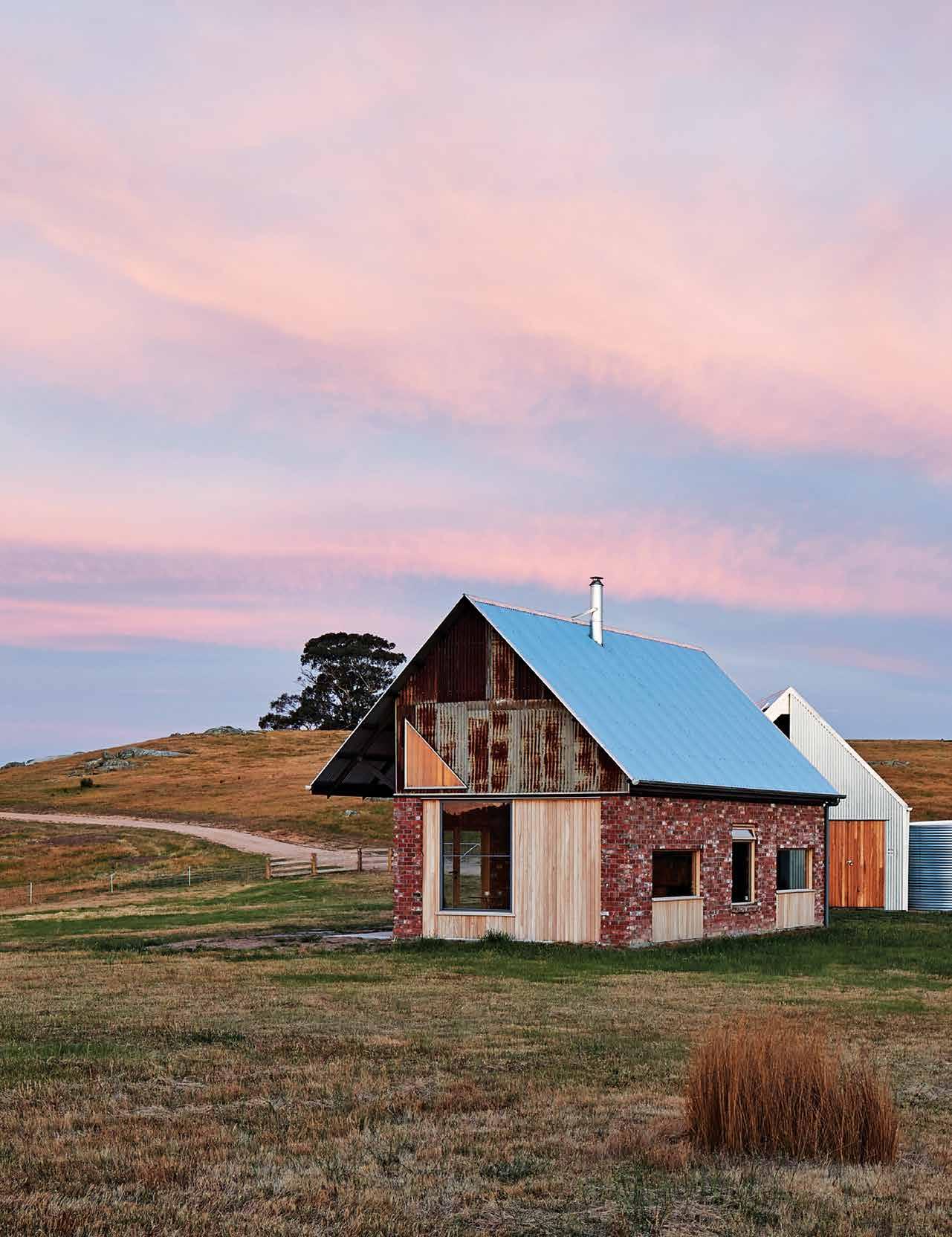
issue #44 habitusliving.com
Rural Retreat
An unobtrusive and self-sufficient weekender by MRTN Architects offers rural solitude and an opportunity to work the land.
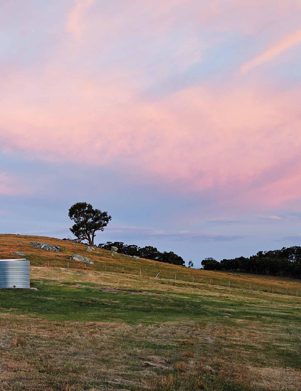 TEXT ELANA CASTLE | PHOTOGRAPHY PETER BENNETTS
3 . on location # 143
As you drive northwards, beyond Melbourne’s Tullmarine airport, semi-urban sprawl makes way for swathes of pastoral grazing land and grassy knolls, sparsely populated with pockets of trees and granite outcrops. As you descend a natural rise into the little-known district of Nulla Vale, two identical shed-shaped silhouettes come into focus; standalone structures across more than two kilometres of harsh terrain.
Occupying a mere 50 square metres in the centre of a 300-acre plot, a modest weekender marks the end of a snaking driveway, which rises and falls along a natural desire line. Designed by architecture practice MRTN Architects, this rural getaway belongs to two Melbourne professionals, Michelle and Louise (and their three dogs: Scout, Boston and Diesel), who sought sanctuary from their demanding city lives. “We drove off the obvious highways and stumbled across this piece of land, to which we felt an almost spiritual connection,” says Michelle. “It had no infrastructure. It experiences high winds. It’s inhospitable really, but we just love its rugged beauty.”
In many respects, this is no ordinary holiday house, where a comfortable, fuss-free lifestyle is a priority. “Our clients wanted a modest house where they could come together on the weekend,” explains MRTN director Antony Martin, “but they purchased this plot with the aim of really embedding themselves in the landscape. They didn’t want a quick fix.” Because the couple wants flexibility to potentially live there full-time in the future, they charged Antony with building a small home that could be converted into a larger house at a later stage. Their immediate need was to establish a connection to the landscape – an authentic commitment they’ve already demonstrated by adding a greenhouse, rehabilitative planting and

OPENER | EVOKING THE VERNACULAR SHED TYPOLOGY OF NULLA VALE AND ITS FARMING SURROUNDS,
HAVE DESIGNED A RURAL HOME THAT SITS DELICATELY IN THE HARSH LANDSCAPE. ABOVE | THE DELIBERATE USE – AND MANIPULATION OF – A SIMPLE A-FRAME SILHOUETTE RESULTED IN PITCHED ROOF WHICH AFFORDS OPTIMAL PHOTOVOLTAIC PANEL EXPOSURE.
MRTN
issue #44 habitusliving.com
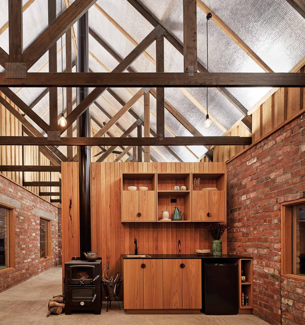
3 . on location # 145
the running of 260 Merino sheep on their plot. “It’s the right use of the land,” says Michelle. “We are living here in the way that people always have.”
The house and storage shed echo the vernacular architecture, with their familiar gable-ended forms and robust palette of materials. “We wanted to create something sympathetic to the rural character of the local agricultural buildings; something unobtrusive in the landscape,” comments Antony. The two structures are fundamentally sheds, but they possess an intrinsic quality that speaks of design intent well beyond the vernacular. “Using the shed typology was also a design strategy that enabled us to work with, and against, fixed parameters,” he adds. For example, the storage shed was sourced from The Shed Company and then divided into two sections. An open space, which lines up with the driveway, performs double duty as a car park and framed portal view to the house beyond. Given that there are no mains connections, the shed was the first structure to be built; its closed sections housing the photovoltaic panels and additional equipment necessary to power the house and any future additions.
The house – cranked at an angle and oriented north – is a rich bricolage of recycled bricks, salvaged corrugated iron, rough sawn timber and new galvanised roofing with preengineered timber trusses that are left exposed both internally and externally. The heritagegrade corrugation roof sheeting was carefully selected for its duller appearance. The result is an authentic collage of materials and textures that tone in with the palette of the landscape.
As one walks into the house itself, several other design decisions become apparent. “The idea was for the house to feel like a shed on the inside,” says Antony. “We didn’t want a cocooned environment; a mini recreation of the clients’ Melbourne home. This house is about being part of the site not removed from it.” As a result, the architects have specified the same materials for the exterior and interior of the house. The salvaged bricks and the honey-hued timber paneling and joinery reinforce the shed typology, their rusty tones and elemental nature harmonising with the colours of the flaxen grass and golden hued sunsets. In addition, all internal partitioning was specifically terminated at 2.4 metres, leaving the ceiling trusses visible from anywhere in the house, thereby creating the illusion of space. The sense of openness is also underscored by the abundance of natural light, drawn in through large window sections.
“Whilst the desire for embracing the views was of primary importance, we needed to create deep overhangs to screen out summer heat, while allowing in the winter sun,” adds Antony. The sun in turn warms the slab and walls in winter, thereby engendering a passive thermal effect. In summer, the house is naturally cool and habitable. An overhang also protects the house from strong winds, creating a protected outdoor porch.
Once inside, it’s not difficult to imagine the way in which Michelle and Louise inhabit their humble abode. For Michelle, days are spent indoors reading books and cooking. “We love that the windows are set at sitting height,” she says, “because we always feel connected to the outdoors. Even the dogs enjoy looking out the
OPPOSITE BELOW | THE BEDROOM WINDOW WAS SPECIFICALLY PLACED AT A LOWER LEVEL TO MAXIMISE THE VIEW WHEN IN BED.
OPPOSITE
ABOVE LEFT | BASIC BLACK TILES AND HARDWOOD JOINERY WERE USED THROUGHOUT THE BATHROOM, IN KEEPING WITH THE ARCHITECT'S DESIRE FOR RAW MATERIALITY OF AN "ELEMENTAL NATURE". OPPOSITE ABOVE RIGHT | ALL THE DOOR AND WINDOW SECTIONS WERE CAREFULLY SELECTED FOR THEIR
ENERGY EFFICIENT (LOW TRANSFER ENERGY) RATINGS.
The house is a rich bricolage of recycled bricks, salvaged corrugated iron, rough sawn timber and new galvanised roofing.
issue #44 habitusliving.com
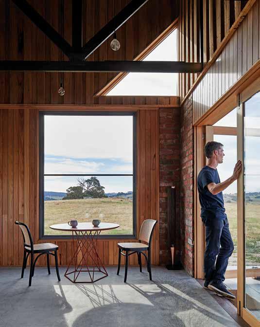
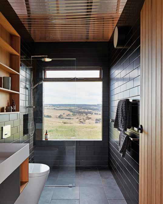
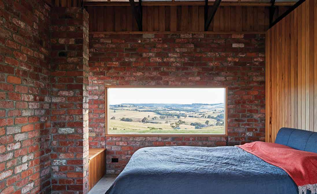
3 . on location # 147
ABOVE | PLANS. OPPOSITE | "WHEN YOU¹RE FACED WITH OVER 300 ACRES OF LAND IN WHICH TO SITE YOUR BUILDING, IT'S NOT ALWAYS OBVIOUS WHERE TO PLACE THE ARCHITECTURE," SAYS ARCHITECT ANTONY MARTIN. ULTIMATELY, THE TEAM DECIDED TO SITUATE BOTH STRUCTURES ALONG A DESIRE LINE IN SADDLE AND BUILD A 1.2 KILOMETRE-LONG DRIVEWAY ALONG THE NATURAL RIDGE TO PROVIDE EASY ACCESS. ENTRY LIVING KITCHEN BATHROOM BEDROOM SHED WATER TANKS 1 2 3 4 5 6 7
GROUND FLOOR issue #44 habitusliving.com
The couple wants flexibility to potentially live there full-time in the future; they charged Antony with building a small home that could be converted into a larger house at a later stage.
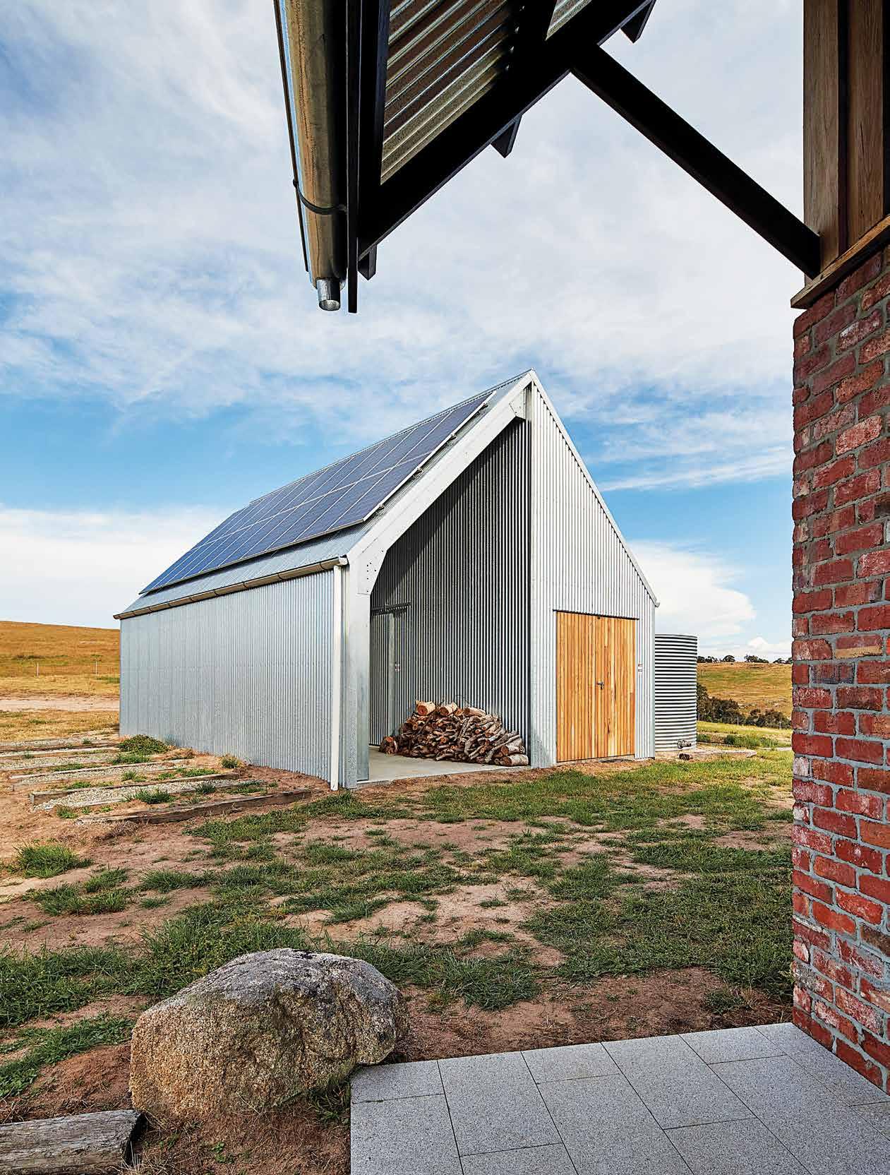
3 . on location # 149
windows and alerting us when a wombat or sheep passes by.” In contrast, Louise prefers to spend her time exploring the country in her all-terrain vehicle, in the company of the couple’s dogs and two rescue horses. “At night, the experience is different because windows become black, reflective surfaces, so all you have is the space inside,” adds Antony. “To create an intimate environment, we intentionally left the silver foil insulation exposed, which reflects the LED lighting located in the trusses. They cast a warm hue over the entire interior.”
For all its robustness, this weekend retreat supports the romantic desire for solitude and companionship and a sustainable and authentic connection to place. “This house was never going to be a standalone architectural artefact,” says Antony. “This is a humble home, not an object or glamorous form.” Here, a distinct lack of ego is plainly obvious. A restrained approach is utterly appropriate both in terms of the client brief and nature of this unique and ancient site.
MRTN Architects | mrtn.com.au
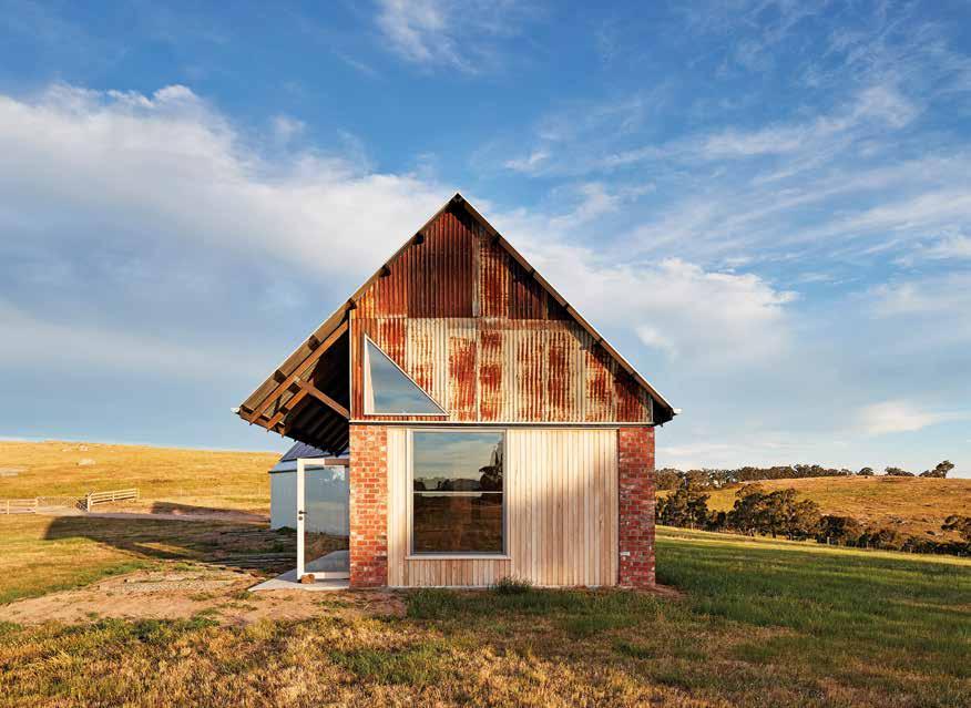
ABOVE | THE "UNFINISHED" GABLE END, WITH EASY-TO-REMOVE MATERIALS, ANTICIPATES THE NEXT ITERATION OF THE PROJECT, WHICH WILL BE AN EXTENSION FROM THE EXISTING HOUSE.
issue #44 habitusliving.com
“We drove off the obvious highways and stumbled across this piece of land, to which we felt an almost spiritual connection.”
RETURNS AUGUST 4 26 NEW EPISODES
There is no other television program in Australia like AUSTRALIA by DESIGN.
The program aims to bring beauty and creativity into the hearts and minds of Australians as we explore the impact of good design on our lives. Each series serves as an important ‘document’ in the recording of Australian design excellence.
In every episode we visit Australia’s most creative designs, interview the designers and the key players to uncover the human stories behind their pursuit of design excellence.
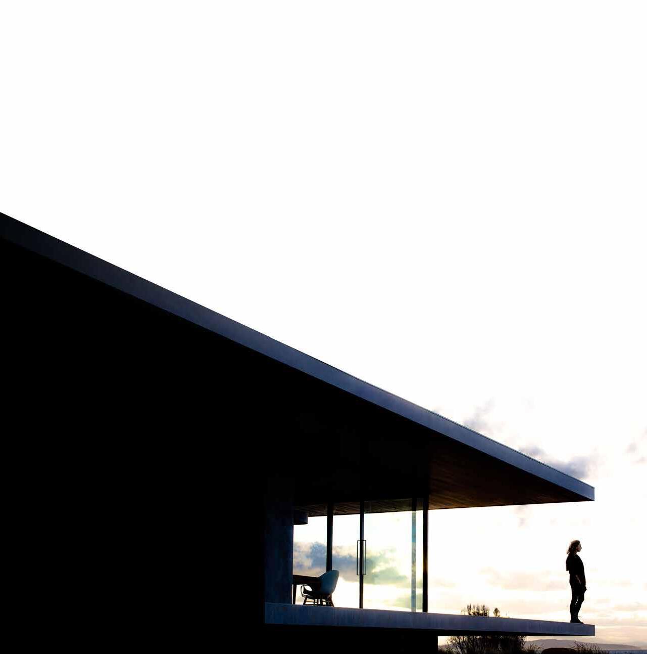
ARCHITECTURE | LANDSCAPES & GARDENS | INTERIORS | INNOVATIONS
Image: Brett Boardman
Diamond strength
This minimalist, contemporary residence is an entertainer’s dream.

issue #44 habitusliving.com ABOVE | THE RICHLY VEINED DEKTON® AURA15 IS USED ON THE KITCHEN ISLAND IN THIS HOUSE BY ALEC PAPPAS ARCHITECTS. OPPOSITE | DEKTON® SPECTRA, USED HERE AS THE DINING TABLE SURFACE, IS GLASS-LIKE VISUALLY SPEAKING, YET INCREDIBLY STRONG AND DURABLE.
Designed by Alec Pappas Architects and with Dekton®’s ultra compact surfaces in mind, this new house was designed for the second floor to take in water views from every angle. The clients wanted a minimalist, contemporary home that wouldn’t date and that would complement the streetscape and other modern homes nearby.

A family of four with two teenage children, the clients wanted a clutter-free, low-maintenance interior with naturalhued materials and a minimalist colour scheme. They had a close working relationship with FORM-RITE Co, which suggested the use of Dekton® by Cosenitno. FORM-RITE Co, the benchtop fabricator and installer, regularly works with the ultra compact surface, Dekton®, in kitchens, bathrooms and laundries. The sleek material and colour range suited the minimalist style of the clients and the architecture, and Dekton® Aura15 has been used for the kitchen.
Inspired by Calacatta and Carrara marble, Dekton® Aura15 provides timeless colour and style, with soft winding veining to complement the concrete-slab floor and timberveneer joinery in the kitchen and dining zones. In a unique moment where the architecture permeates the furniture, the kitchen benchtop (with an integrated cooktop to maintain a smooth, streamlined surface) extends into the formal dining room where it becomes a buffet.
The clients wanted a dining table with the same level of resistance, so they selected Dekton® Spectra, which is so black it looks like glass and reflects the sparkling Caboche pendant above the dining table.
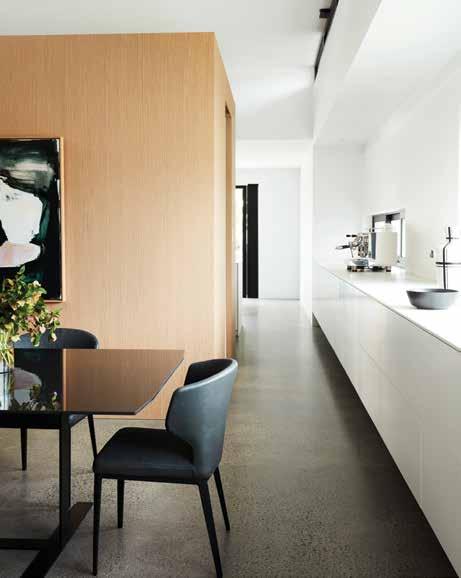
habitus promotion › Cosentino #153
Cosentino | cosentino.com
Urban Oasis
A home to escape to while remaining utterly connected to its surrounds, Fitzroy Lane House by Kennedy Nolan presents an island-like dwelling within a rapidly changing streetscape.

issue #44 habitusliving.com
TEXT ALEESHA CALLAHAN | PHOTOGRAPHY DEREK SWALWELL

3 . on location # 155
Set in the back block of an inconspicuous laneway on the streets of Fitzroy, Melbourne, is a house that stands strong. It draws the eye down the lane and creates a sense of awe. And that’s just from the outside. Step inside the home of Lucy Feagins and Gordon Johnson and one is transported to a sanctuary for modern living.

“Fitzroy is a very gritty environment, so the requirements for the home needed to offer some sort of refuge from that. It means when you go through the spaces there is always somewhere to look that is peaceful,” shares Kennedy Nolan principal Patrick Kennedy. “It’s amazing how there’s really not much space around this house, it’s a tight block but it doesn’t feel tight, and I think it’s because of the thoughtful little inclusions,” adds Lucy.
The project was a long time coming for Gordon and Lucy, having first acquired what was a “big old tin shed” some 12 years ago. As could be expected, Gordon and Lucy’s life was rapidly changing throughout the design and build process – they welcomed a baby and Lucy’s
business (The Design Files) continued to go from strength to strength. “The design adapted to these changes,” says Patrick, making room for the shifting needs of his clients. Some things that didn’t change over that time were the need for plenty of natural light and outdoor areas. “To get these we gave up lots of space to the void, lightwell, and the upstairs terrace,” says Gordon. Where many people would opt for as many rooms and as much space as possible, Gordon and Lucy chose instead to do the opposite. The resulting sense of spaciousness reveals itself upon traversing the threshold, where stairs lead you both up and down, and a massive void alongside a semi-translucent exterior wall pulls the eye upwards, inviting you to climb the stairs. “[The Ampelite wall] was a really amazing suggestion because if it was all solid it would feel quite dark. Now, it’s just so bright and beautiful even though there are no windows on one whole side of the house,” says Lucy. Patrick elaborates that it was all a matter of “balancing light and aspect”.
OPENER | THE HOUSE IS ESSENTIALLY AN ISLAND IN SPACE WITH THREE SIDES OPENING OUT TO THE STREET. ABOVE | THE UPSTAIRS LIVING SPACE FEATURES A TRAVERTINE FLOOR, WHICH IS AGEING GRACEFULLY IN PLACE.
issue #44 habitusliving.com
“Fitzroy is a very gritty environment, so the requirements for the home needed to offer some sort of refuge.”

3 . on location # 157

ABOVE | HOTEL LIVING AT ITS FINEST, THE MAIN BEDROOM OPENS OUT TO A SEMI-PERMEABLE BATHROOM THAT BRINGS THE OUTSIDE IN. OPPOSITE | THE HOME FEATURES UNEXPECTED DEPTH AND UNUSUAL ARCHITECTURAL DEVICES TO CREATE CONNECTION. issue #44 habitusliving.com
The void is a similarly strategic device. What was originally planned as a fourth bedroom was scrapped in favor of a central void space that accentuates the overall height of the building. “The void creates a much more beautiful entrance experience as you come up the stairs. It was more important to us than a room we would never go in,” says Lucy. “Gordon and Lucy were quite happy to carve bits out for outdoor space, vertical space, double-height space, and triple-height space – that’s because they weren’t greedy about the yield. They weren’t trying to max everything out and that means you end up with a much lovelier experience,” notes Patrick.
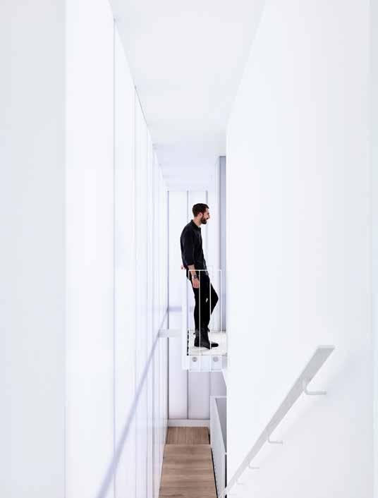
The top floor is the hub of the home, housing the living, kitchen and dining spaces, alongside the necessary inclusion of a terrace space. Full-height glass, large sliding doors and semi-operable windows coalesce to make for what Lucy describes as a “well-proportioned but generous-feeling space”. And despite the “postage stamp size” grassy nook, Lucy and Gordon are chuffed to have a veritable green lawn within such a densely urban environment.
Moving down to the second floor, the feeling becomes more intimate, as it should since it holds the bedroom and bathroom spaces. Again, nothing has been blown out of proportion, every room is rather modest while remaining comfortable. A notable inclusion in the main bedroom is a show-stopping bathtub, positioned across a balcony-like threshold looking out to a green void. It is at once private yet connected to the outside. “The bath is one of the best things, our daughter bathes in it every night and it means we’re not stuck

3 . on location # 159
What was originally planned as a fourth bedroom was scrapped in favor of a central void space that accentuates the overall height of the building.
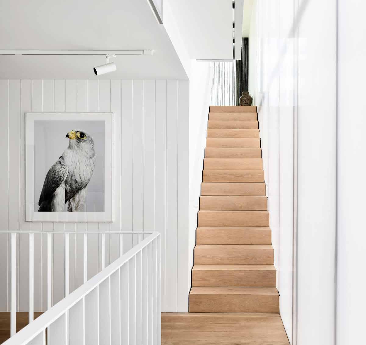
ABOVE | FOR GORDON AND LUCY, IT'S THE INVISIBLE THINGS IN THE HOME THAT HAVE BEEN THE BIGGEST SURPRISES: CROSS-VENTILATION, THOUGHTFUL DETAILING AND CONSIDERED ASPECTS. OPPOSITE | PLANS.
issue #44 habitusliving.com

FLOOR ENTRY STORAGE STUDY GARAGE W.C. LAUNDRY BEDROOM BATHROOM
BEDROOM ENSUITE
BALCONY DINING
1 2 3 4 5 6 7 8 9 0 q w
SECOND
MAIN
VOID
LIVING KITCHEN
e r t
FLOOR 3 . on location # 161
GROUND FLOOR FIRST
in a little bathroom, we can actually just hang in the bedroom and watch her,” says Gordon. The idea came from Gordon and Lucy’s stay in a Shanghai hotel. “It works extremely well because you get an extra threshold and depth rather than it being right on the edge. So you actually get a sense of space,” adds Patrick, from the architect’s standpoint.
Kennedy Nolan has employed many clever considerations that maximise every inch of the home. Other details that may not immediately be noticed but still add to the romance of the whole home include a Juliette balcony that connects the top floor living space to the rest of house by offering a vantage point back down the stairs. “It’s quite an eccentric, tall single space so we wanted to instil a relationship between all the levels,” says Patrick. Likewise a full-height window in the dining room – which extends up above the ceiling and pelmet – creates a
dramatic viewpoint to the laneway below. And perhaps the most intriguing thing of all is that when staring at the building’s exterior it is disorientingly hard to decipher which room is which. “There’s a lot of abstraction in this building, particularly in the exterior,” says Patrick. “We were trying to avoid that thing where the house becomes very legible from the exterior. It’s more like an open architectural object in space. You need to create a level of privacy and separation in order to not feel scrutinised as an occupant.”
Ultimately, Kennedy Nolan has created an urban refuge, allowing Gordon and Lucy to stay connected to a suburb they love dearly while simultaneously giving them a home that rejuvenates.
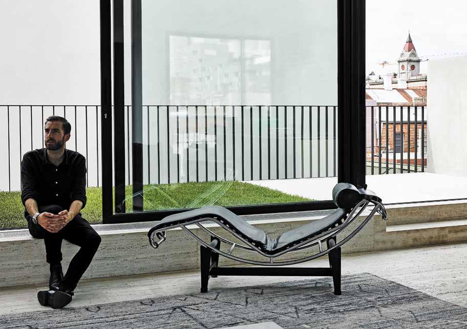 Kennedy Nolan | kennedynolan.com.au
ABOVE | LIVING WITH NO MORE AND NO LESS THAN WHAT IS NEEDED, THIS HOUSE ESCHEWS OSTENTATION TO CREATE A COMFORTABLE LIVING ENVIRONMENT.
issue #44 habitusliving.com
The Fielders Finesse® range includes five unique profiles, Boulevard™, Shadowline 305™, Prominence™, Grandeur® and Neo Roman™ all designed to combine the aesthetic appeal, durability and flexibility of steel cladding. All Finesse® profiles are available in a diverse range of materials including traditional COLORBOND® steel and high-end COLORBOND® Metallic and Matt steel finishes, offering options to suit any style.
fielders.com.au/finesse

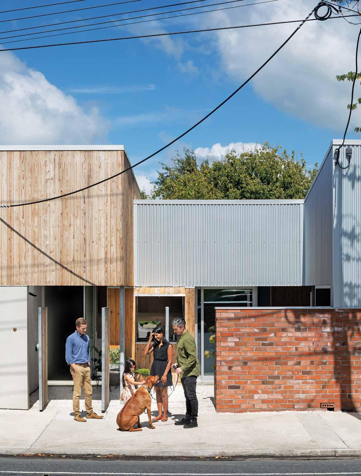
issue #44 habitusliving.com
A House in town
For this New Zealand family, relocating from Auckland to a rural town has led to a remarkable urban project: a semi-public house complete with a micro café and gallery.
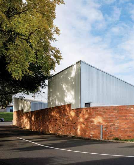
Moving home to Cambridge, New Zealand, had to have a hook for artist and teacher Grant and Karen. Swapping the city for a small rural town was risking being too quiet and conventional. Close to family, yes, but they needed an inspiring lifestyle too. They found their answer in an urban block in the business district where they have built a very unconventional house.
“They weren’t interested in buying land in a new subdivision,” says architect Christopher Beer. “Grant is an artist and stay-home dad, so he could see the possibilities of combining a small gallery and café with the house for their commercial possibilities. It also meant they could be part of the town community rather than isolated in a quiet suburb.”
Before they bought, they discussed the options for the 315-square-metre site with Christopher. Bordered on three sides by a main road and laneway, it could have two entrances, and they could build right to the boundary. This immediately led to discussions about a twobedroom courtyard house – both for the privacy they needed and the outdoor space they desired.
TEXT ANDREA STEVENS | PHOTOGRAPHY PATRICK REYNOLDS
3 . on location # 165
“Courtyard houses are common overseas,” says Christopher, “and they offer a solution to the internal privacy and intimacy needed for small residential sites. So we started with a boundary brick wall, defined three internal courtyards and a U-shape floor plan. To maximise the sense of space, the building is no more than one-room wide at any point with views through the site. We have created strong connections and overlaps between the layers of house and courtyard, making it a very social house.”
Each courtyard has a specific function. The front courtyard provides a buffer to the street, forms the house and gallery entrance, and creates an area for café seating adjacent the coffee hatch. A private bedroom block screens the central courtyard, a grassed family space overlooked by the bedrooms and the living wing. And then at the rear of the site, with laneway access, is a pebbled service and parking court.
The scheme reverses the suburban model of a freestanding house surrounded by empty space. Instead, the interior spaces have been moved to the edge of the site and the open spaces moved inside making them an integral part of the house plan.
In addition to bold planning, asymmetrical forms and industrial materials also eschew domestic conventions. The abstract assembly intrigues. Mistaken for a library, shipping container or power station, its function is ambiguous. “We didn’t use the language of residential architecture. The intention was to create an art object befitting the gallery function and its hard, urban surrounds,” says Christopher.
With no windows outward, large areas of raw corrugated iron and shed-like roofs, it keeps people guessing. The first hints of its domestic use happen at street level as you walk past timber slatted gates screening pebbled

 OPENER | STEEL AND TIMBER GATES PIVOT TO OPEN OR SCREEN THE FRONT COURTYARD. IN THEIR OPEN POSITION, THE SPACE BECOMES VERY SOCIAL. PREVIOUS RIGHT | VIEWED FROM THE SIDE LANE, THE HOUSE GIVES NOTHING AWAY. SOLID BRICK WALLS AND WINDOWLESS CORRUGATED IRON LEAVE PEOPLE GUESSING WHAT'S INSIDE. ABOVE & BELOW | CEDAR WEATHERBOARDS WRAP THE OUTDOOR FIREPLACE AND WOOD STORE CREATING A JOINERY ELEMENT FOR TEXTURE AND CHARACTER THAT CONTINUES INSIDE. OPPOSITE | GALLEY-STYLE, THE KITCHEN SPANS THE REAR SERVICE COURTYARD AND INNER COURTYARD, SCREENED FROM THE DINING AREA. IT HAS BEEN DESIGNED WITH ECONOMICAL PLYWOOD PANELS AND MARBLE TILES FOR THE BENCH.
issue #44 habitusliving.com
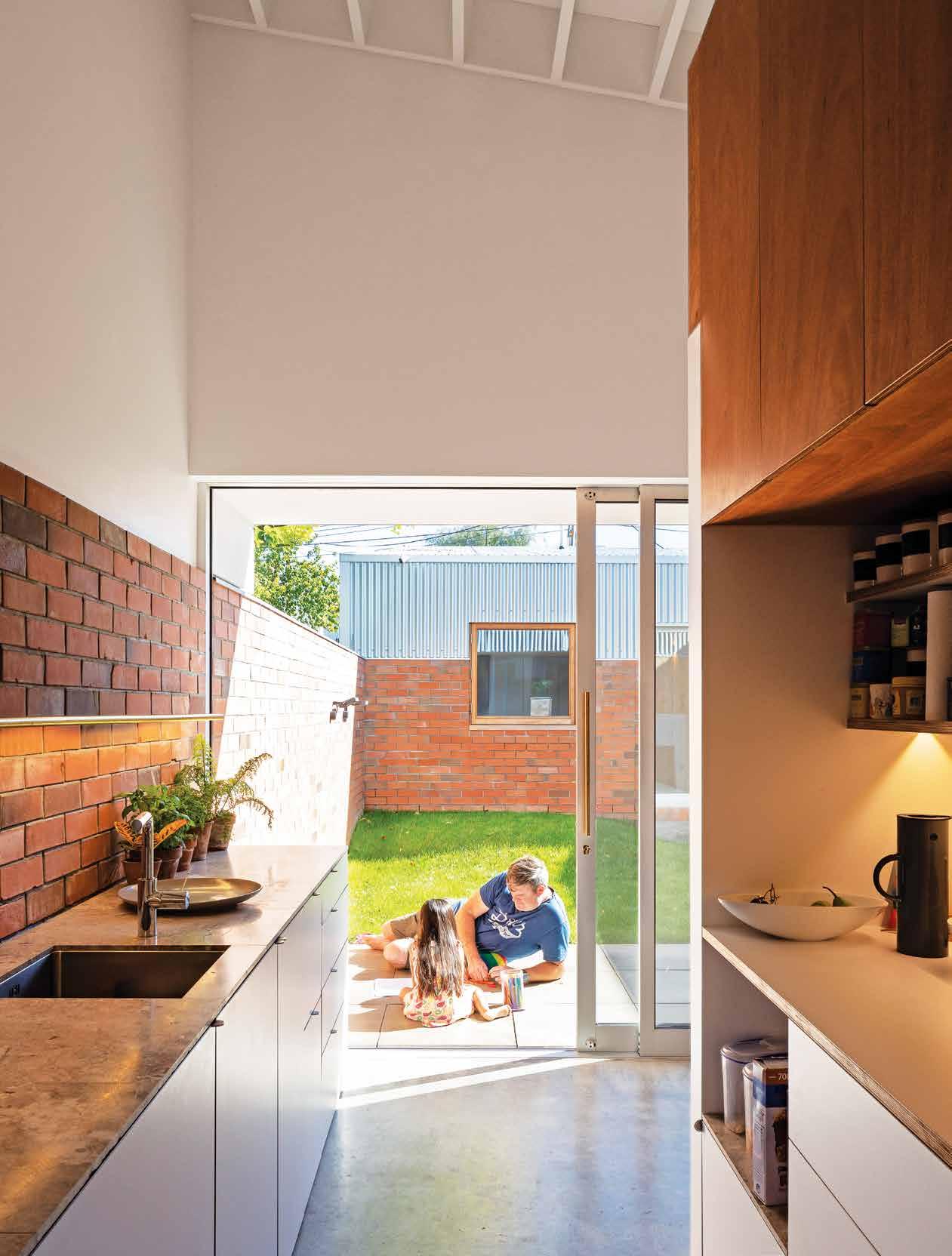
3 . on location # 167

issue #44 habitusliving.com
“We
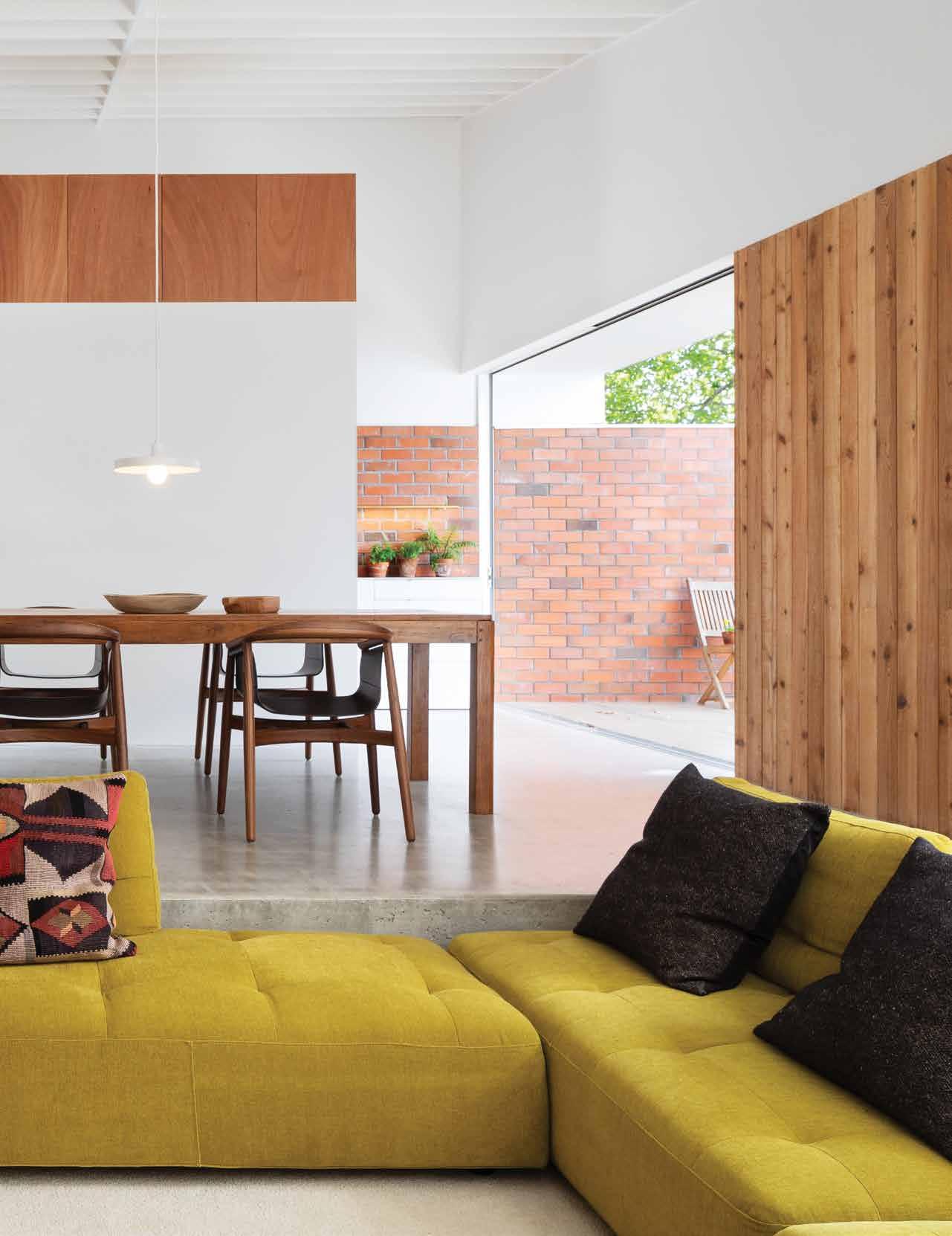
3 . on location # 169
have created strong connections and overlaps between the layers of house and courtyard, making it a very social house.”
courtyards and potted plants. This semi-public house moves very quickly from abstract and mute to intimate and open. When you visit the café and gallery, you get a peek into family spaces – a social blending the owners enjoy.
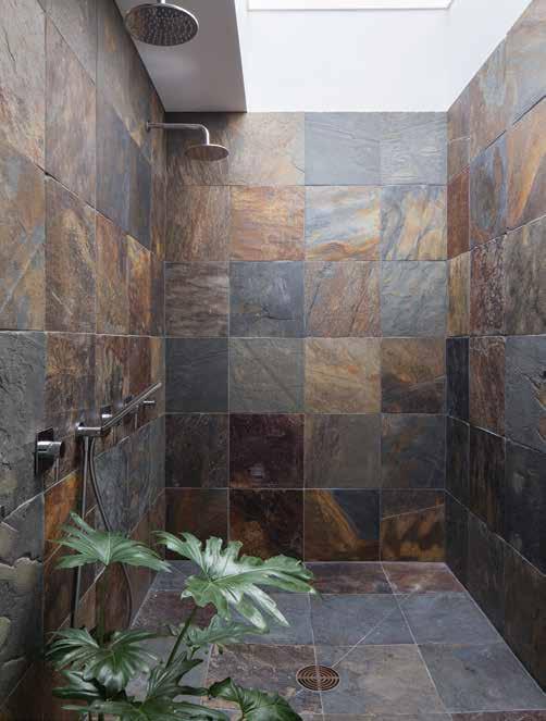
Materials are a curation of those found in the area along with some new. Brick and corrugated iron are borrowed from nearby shop lean-tos, while the knotted cedar weatherboard signals its softer, residential function. When moving through the house, the bold, external materials and forms become progressively smaller and finer, as they layer from public to semi-public to private.
The brick garden wall maintains a strong presence inside the house, defining the courtyard edges and moving through the gallery and kitchen to reinforce the continuity of space. Cedar weatherboards continue inside to play a space-defining and textural role. They’re used to wrap the bedrooms and create flush, invisible doors, looking for all the world like an exterior wall from the front courtyard.
Cedar continues around the main bathroom to form a single screen with the bedrooms between the front and central courtyards. Both bathrooms are top-lit by skylights, to let sunlight flood into the cavernous spaces. They are the most private spaces of all, with selfclosing, concealed doors. Walking into them feels like you have disappeared inside the wall. This sense of another world is reinforced by the lining of rustic split slate. “The uneven, cave-like surface of the slate brings a natural, primal feeling to showering,” says Christopher.
PREVIOUS | IN THE LIVING
IN
A
ASSEMBLY OF FEATURES AND FUNCTIONS. ABOVE | BOTH BATHROOMS ARE TOP-LIT AND FEATURE
SLATE LINING ON THE FLOORS AND WALLS. IN CONTRAST TO THE LIGHT, OPEN HOUSE, THESE SPACES FEEL VERY HIDDEN AND SECLUDED. OPPOSITE | KAREN RELAXES IN THE CENTRAL, FAMILY COURTYARD. SHIELDED BY A GARDEN WALL AND THE HOUSE ON TWO SIDES.
WING, ALL MATERIALS COME TOGETHER
COMBINATION – CONCRETE, KNOTTED CEDAR, PLASTERBOARD, PLYWOOD AND RED BRICK – TO CREATE
CURATED
SPLIT
issue #44 habitusliving.com
The interior spaces have been moved to the edge of the site and the open spaces moved inside.
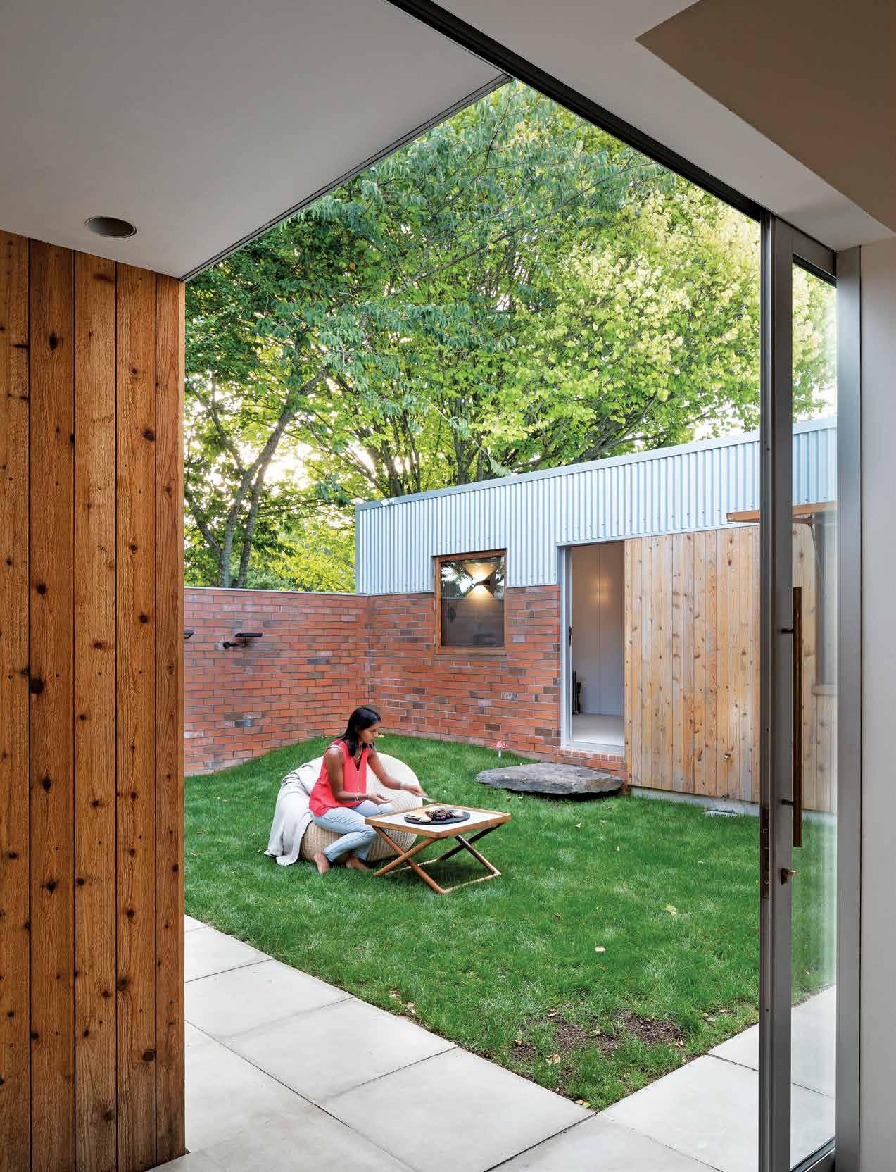
3 . on location # 171
GROUND FLOOR
FRONT COURTYARD
GALLERY
ENTRY
LAUNDRY
BATHROOM
MASTER BEDROOM
BEDROOM
STUDY
INTERNAL COURTYARD
LIVING
DINING
KITCHEN
REAR COURTYARD/ CAR PARK
w e
#44 habitusliving.com
1 2 3 4 5 6 7 8 9 0 q
issue
This semi-public house moves very quickly from abstract and mute to intimate and open.

OPPOSITE | PLANS. ABOVE | BEHIND THE PUBLIC COFFEE HATCH IS A LAUNDRY.
PART
THE
LINKING THE
HALLWAY BEYOND WITH THE BEDROOM WING AND
TOGETHER, THEY FORM
OF
CORRIDOR
MAIN
GALLERY.
3 . on location # 173
“It feels like standing on a rock beneath a waterfall. Visually, slate is luxurious and humble and when used in a bathroom brings warmth to a space which can often feel overly cool and slick.”
The galley kitchen in the second wing uses gaboon plywood and white plasterboard to screen the food prep area from the dining table and sunken lounge. “Grant and Karen wanted functionality first, but also a kitchen that sat within the home as a crafted, considered object,” says Christopher. “They didn’t want a separate pantry, but described a workspace with food easily reached, which we configured as a countertop with shelving above, drawers below and the fridge to the side. Washing and cooking is done on the opposite side, and the galley plan gives it a very economical footprint.”
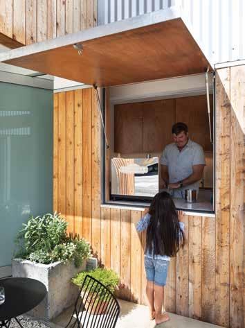
Grant and Karen’s home and gallery is a flagship project for New Zealand and proof of concept for how to build well with less space. It describes how to elegantly increase building density, reduce urban sprawl, reduce car dependency, and enhance lifestyles. Turning its back on the isolation of the suburban model, this social, community-spirited house offers a very promising addition to local development models.
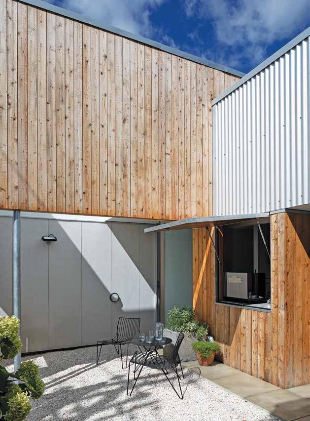 Christopher Beer Architect | christopherbeerarchitect.com
LEFT | THE SEMI-PUBLIC FRONT COURTYARD SERVES COFFEE AND PROVIDES ACCESS TO THE SMALL GALLERY. TUCKED DISCREETLY ON THE FAR LEFT IS THE FRONT DOOR TO THE HOUSE. RIGHT | THE COFFEE HATCH IS FITTED WITH A COMMERCIAL COFFEE MACHINE, SO GRANT CAN RUN A SMALL CAFE AND RENT THE SPACE FOR CORPORATE EVENTS.
issue #44 habitusliving.com

The black Box reimagined
If you think the black box on the back is a done deal in Melbourne, think again. Ha Architecture designs a new modern narrative in Melbourne’s inner west.

issue #44 habitusliving.com
TEXT ANNIE REID | PHOTOGRAPHY DEREK SWALWELL | STYLING BECK SIMON

3 . on location # 177
Creating a relaxed, community vibe in dense, inner-city Melbourne is a tough act by any stretch. But Steve and Keryn, who grew up in Adelaide and rural South Australia respectively, wished to do just that for their growing family.
With busy careers and three children, they were rapidly running out of space in their Kensington residence, which they’d bought in 2011 on a tightly packed street just four kilometres from the CBD. Built in 1914, the house sat somewhere between Edwardian and art deco in era and features.
The challenge was how to do more with less, by creating something new at the rear in contrast to the existing house and take it from a three-and-a-half to a flexible four-and-a-half bedroom home with a kids’ rumpus doubling as a fifth bedroom for guests.
On the plus side, the block was bigger than the single-fronted cottages across the street. This afforded a beautiful north-facing backyard that the family wanted to preserve as much as possible by minimising an extension. The
downside was the five-metre brick boundary wall to the east, which prevented solar access to the backyard.
“We also wanted a private space, and not to look into everyone’s backyards,” Keryn says. Enter Nick Harding, principal architect at Ha Architecture. An old school friend of Steve’s, Nick was not only someone they felt would properly listen to their brief, but also would respond to Steve’s own ideas on function and practicality as an expression of his career as a workplace architect.
As feasibility ensued, the three worked meticulously to make every available inch work. The design was then pared back so that the house could simply adapt – without any fancy tricks – to how the family wished to use it throughout the years.
“It’s everything from small, tiny scale design: a spot to sit with your kid right through to how rooms relate,” Steve says. “All good architecture and design is really more about being a setting to life rather than an object that you create.”
OPENER | SITTING ON THE STEPS IN THE SUN IS ONE OF THE FAMILY’S FAVOURED WAYS TO ENJOY THE NEW EXTENSION. OPPOSITE | THE COLOUR OF THE STAIR BALUSTRADE WAS THE SECOND MOST HOTLY DEBATED ELEMENT IN THE HOUSE; THE WHITE A PERFECT CONTRAST TO THE BLACK EXTERIOR SHELL.
issue #44 habitusliving.com
The two-storey black box is on the right, anchored by a spacious lounge/dining area at ground level which also flows out to the backyard.

3 . on location # 179

ABOVE | ADDING A SENSE OF SURPRISE, THE
SETTING FOR LIFE TO HAPPEN", ACCORDING TO STEVE. OPPOSITE | THE DIFFERENT LEVEL CHANGES EXIST SEAMLESSLY. issue #44 habitusliving.com
CURVED ISLAND BENCH IS THE HOUSE’S MOST POPULAR TALKING POINT. DESIGNED TO GATHER AROUND, IT CREATES "A
With a heritage overlay to the façade, the three kids’ bedrooms and family bathroom in the front haven’t changed, but the old lounge has been converted into the kids’ rumpus-slashfifth bedroom.
The remainder comprises the renovation beyond the central walkway, with the L-shaped element oriented to the west, abutting the boundary wall. The new kitchen and concealed laundry are to the left, with a timber deck and steps down to the backyard, while the twostorey black box is on the right, anchored by a spacious lounge/dining area at ground level which also flows out to the backyard. The main bedroom, study and ensuite are upstairs.
The box is a fairly simple design form, but its layering of rich detail adds unexpected surprises with clever functionality.

The angular cantilever and raking roof line tracks the precise movements of the sun for maximum solar access to the backyard and kitchen façade. Meanwhile the doubleheight stair with its ephemeral white balustrade connects the kitchen, living, bedroom and study above.
“The void makes these spaces that could otherwise feel tight, feel airy and plentiful; and the small footprint feels connected and generous,” Nick says. Steve and Keryn can turn and shape the house themselves too, using operable full-height glass windows and vertical timber screens that slide to control the sun, light levels and garden views.

3 . on location # 181
“The void makes these spaces that could otherwise feel tight, feel airy and plentiful.”
FIRST FLOOR
GROUND FLOOR
1 2 3 4 5
BEDROOM BATHROOM RUMPUS
6 7 8 9 0
KITCHEN
DINING
LOUNGE
OUTDOOR DINING
YARD
q w e r t
VOID
STUDY
MAIN BEDROOM
ENSUITE
BALCONY
VERANDAH ENTRY
#44 habitusliving.com
issue


OPPOSITE | PLANS. ABOVE | ALTHOUGH COMPACT, THE MAIN BEDROOM IS TAILORED WITH PLENTIFUL STORAGE. BELOW RIGHT | CANTILEVERED OVER THE END OF THE HOUSE, THE MAIN BEDROOM ENSUITE IS A BOLD BUT PRIVATE RETREAT. BELOW LEFT | THE ROUNDED OPEN CABINET IS BOAT-LIKE, COMPLEMENTING THE HOUSE’S ABILITY TO BE SHAPED AND TURNED. 3 . on location # 183
“Exploring light in this way means the house can adapt seasonally, creating a temporal experience of the home,” says Nick.
Upstairs, the bedroom and study have been tailored to suit how the couple lives. Dimmable lights at a low level on the bedhead wall joinery enable Steve to rise for travel without waking Keryn, with a little light strip allowing him to see his clothes. Beyond, the ensuite slots neatly into the cantilever over the end of the house – a decision that went against Nick’s intuition but works procedurally well in the space.
Downstairs, there’s a wow factor moment reserved for the kitchen island bench. Acknowledging people moving through and flowing around the space, its curved, round shape contrasts against the rectilinear design language, and was one of the most hotly debated elements in the house.
“It’s this futuristic thing floating in the middle of the room,” Steve laughs. “It implies that you want the whole house to revolve around it.”
Finally, an unexpected moment is the soft glow of light in the kitchen that peeps through the lower slats of the cabinets, mirroring the design language of the vertical timber screens.
Whether enjoying a sandwich in the sun on the steps, entertaining, or listening to the screech of the kids’ BMX tyres along the rear laneway, it’s a house that breathes, smiles and and now feels like home.
“It just feels like us,” says Steve. “Hopefully not too pretentious, low-key but clever.” And that is clever design indeed – the modern-day family model reimagined for inner-city living.
Ha Architecture | h-a.com.au

ABOVE | THE BLACK BOX IS A RESPECTFUL, FUTURE-PROOFED ADDITION TO THE BACKYARD.
issue #44 habitusliving.com


IH Residence Nulla Vale House and Shed

ARCHITECT andramatin
LEAD ARCHITECTS Andra Matin, Wiyoga Nurdiansyah, and Dhanie Syawaliah
INTERIOR DESIGN AND DECORATION andramatin
BUILDER Indra Santoso Kartika
LIGHTING Hadi Komara
LANDSCAPING PT. Ruang Hijau
ANDRAMATIN (62) 21 735 3338 andramatin.com
FINISHES
Precast concrete and travertine marble on floors. Custom exposed concrete, travertine marble, double plywood with teakwood veneer finishes and tempered glass on walls.
FURNITURE
Andy ’13 Sofa by Paolo Piva for B&B Italia. Eames Lounge Chair and Ottoman from Herman Miller. Mart Armchair by Antonio Citterio for B&B Italia. CH07 Shell Chair designed by Hans J. Wegner for Carl Hansen & Søn. CH24 Wishbone Chair designed by Hans J. Wegner for Carl Hansen & Søn. Verena kitchen system from Poliform. Kitchen and living space system from Bulthaup in pantry. Poliform wardrobe system in master bedroom. Custom shelving and cabinets by Saniharto.
LIGHTING
14 series chandelier from Bocci in dining room. Arco floor lamp by Achille & Pier Giacomo Castiglioni. Custom LED strip lighting. Custom Decorative UP & Downlight, painted in Dark Graphite Grey (Box Finsih). Mini Fluorescent Batten. Recessed silvercone covered downlighter from Reggiani. Recessed silvercone wall washer from Ushio. Recessed reverse trim directional silvercone downlighter from Targetti. Recessed reverse trim covered downlighter from OTY Light. Surface mounted milky white barret from Local. Surface mounted bulk head from Simes Art. Recessed directional swimming pool light from Ligman Janet. Recessed inground uplighter from BEGA. Surface mounted flood light outside.
FIXED & FITTED
Neorest W.C. from Toto. Additional fittings from Antonio Lupi, Duravit and Berker.
ARCHITECT MRTN Architects


MRTN ARCHITECTS (61) 3 8548 4638 MRTN.com.au
FINISHES
Heritage-grade galvanized corrugated cladding and roofing from Fielders. Vertical shiplap, board and batten cladding in Silvertop Ash from Radial Timber. Timber for windows and doors from Sustainable Construction Services. Zola door hardware from Designer Dooware. PV panels and battery from Off-Grid Energy. Café Grind Matt tiles (on walls) and floor tiles from National Tiles.
FURNITURE
Hoffman dining chairs from Thonet. Table by Ross Gardam.
LIGHTING
Strip LED lights from Light Project.
FIXED & FITTED
Fireplace from Nectre Bakers Oven. Quattro Zero Basin with integrated cabinet, Eccentric progressive wall mixer, Flow dual shower rail combination, and Zero 55 floor mount toilet pan from Rogerseller. Radius Lip Pull cabinet pulls from Auhaus.
Fitzroy Lane House
ARCHITECT Kennedy Nolan LEAD ARCHITECTS Patrick Kennedy, Rachel Nolan, Matilda Blazey JOINERY Gordon Johnson
KENNEDY NOLAN (61) 3 9415 8971 kennedynolan.com.au
FINISHES
Off-form concrete walls. Solid oak floorboards with WOCA Neutral finish. Saw cut travertine tiles from RMS. Semi-Translucent Danpalon façade system. Lexicon Quarter paint from Dulux. All cabinetry by Gordon Johnson.
FURNITURE
Le Corbusier dining chairs from Thonet.
LIGHTING
Lighting from InLite. Tizio bedside lamps by Richard Sapper for Artemide.
FIXED & FITTED
Tapeware from Astra Walker. Laufen Living Square sink, Vogue stone bath and Momento tile inset from Bathroom Warehouse. Wall tiles from Anchor Ceramics. Circular mirrors by Gordon Johnson.
issue #44 habitusliving.com
Town House / House In Town
ARCHITECT Christopher Beer Architect
LEAD ARCHITECT Christopher Beer
INTERIOR DESIGN AND DECORATION Christopher
Beer Architect
BUILDER Langsford Construction
CHRISTOPHER BEER ARCHITECT
(64) 7827 9944
christopherbeerarchitect.com
FINISHES
Polished concrete floor. Antique slate floor and wall tiles, and Tundra grey marble tiles from Artedomus. Plywood in Futura HPL by Plytech. Weatherboards in Western Red Cedar from JSC Timber. Red bricks from Monier. Zincalume corrugated roofing from Dimond. Aluminium doors and windows from Tasman Aluminium.
The Ridgeway House
FURNITURE
Sunken lounge modular sofa from King Living. Pelle armchairs by Lorenz+Kaz for Zeitraum, and Portofino table by Vincent van Duysen for Paola Lenti from ECC. Palla chair by Giovanni Travasa for Bonacina. Tio chair and table by Chris Martin for Massproductions from Simon James Design.
LIGHTING
Orbis pendant by Oriel Lighting. Bulkhead wall lights and flood lights by Superlux.
FIXED & FITTED
Basin and WC from Vitra. Tapware from M&Z. Bath from Marmorin. Kitchen mixer tap from KWC. Range cooker from Belling. Refrigerator and integrated dishwasher from Fisher & Paykel. Espresso machine by Elektra.
ARCHITECT Ha Architecture, Product & Environment

PROJECT TEAM Nick Harding, Madeline Hodge, Oscar Sainsbury, Sam Horwood, Ron von Felden
BUILDER Simon Jackson, Creative Living


Construction Pty Ltd
ENGINEER Robin Bliem & Associates
JOINERY Masterline Cabinets
LANDSCAPING Lanpro Outdoor Solutions
HA ARCHITECTURE PRODUCT & ENVIRONMENT
(61) 3 9417 2494 h-a.com.au
FINISHES
Decking and battens in Silvertop Ash, and charred Woca Black vertical cladding boards from Britton Timbers. Blackbutt Veneer Joinery from Timberwood Panels. Bianco Carrera marble from Peraway Marble. Feltex Carpet in Stonesfields 94 from Mr Carpets. Cobblestones in Raven from Eco Outdoor. Terrazzo tiles from Signorino.
FURNITURE
Milo lounge from Jardan. Molloy Dining Table and Chairs designed by Adam Goodrum for NAU from Cult. CH24 Wishbone Chair designed by Hans J. Wegner for Carl Hansen & Søn from Cult.
LIGHTING
Coco pendant light from Cocoflip. Highlight pendant designed by Archier from Rakumba. Caravaggio wall light designed by Cecilie Manz for Lightyears from Cult. Architectural lighting by Light Projects.
FIXED & FITTED
Stove, rangehood, oven and integrated refrigerator from Fisher & Paykel. Milli Pure tapware from Reece. Stovax Riva fireplace from Wignells.
Dress it up or play it down, here are the pieces that turned these houses into homes.
It’s all in the Details
3 . on location # 187

issue #44 habitusliving.com
A Decade Of Contemporary Furniture with Japanese Craftsmanship
For the past decade, Karimoku New Standard has showcased new standards of Japanese furniture design while in pursuit of responsible production processes and sustainably sourced Japanese hardwoods.
Defined by a fusion of progressive ideas and an unparalleled echelon of manufacturing excellence, Karimoku New Standard was established in 2009 by a leading Japanese furniture manufacturer as part of a network of companies under the Karimoku Group. Dating back to 1940, Karimoku has since established itself as a longstanding timber company built upon manufacturing high-tech and high-touch products.
Sourced from underused, low-diameter trees from the forests of North Japan to prevent lumber from being discarded or scrapped, Karimoku New Standard uses hardwoods such as maple, chest, and oak because the brand believes that a piece of furniture should last as long as the tree it was made from.
Personified by the international designers the brand chooses to collaborate with, including Scholten & Baijings, Big-Game and Christian Haas, Karimoku’s ethos focuses on contemporary, long-lasting furniture that combines creative talent with traditional Japanese craftsmanship.
Over the past decade, Karimoku New Standard has not only evolved through its collaborative approach, but also the belief that standards of manufacturing and design should be
exemplary in nature and universal. Imbued with a sense of joy, the brand’s designers and craftsmen create novel furniture of the highest quality through experimentation that is far from the classics, but nonetheless, attention-attracting.
This year, a curved backrest was added to the Caster Barstool to increase its functionality and timeless appeal. Available in two heights, the Barstool collection also comes in a contemporary colour palette that includes stains of grain grey, black or a clear coat finish on top of the solid oak for a natural appearance. The Archive Shelf, which utilises Karimoku New Standard’s expertise in wood craftsmanship, features solid Japanese oak slender beams and boards. Conceived as a platform for personal items to be treasured, the shelf is available in a natural finish or stained black.
Amongst this, the Castor Plus Chair and Armchair, as well as the Prop Sideboard have been added to Karimoku New Standard’s extensive collection in order to extend its offering to design products for the living and dining spaces by adding a contemporary aesthetic to the home.
OPPOSITE | THE CASTOR LOW ARMCHAIR IS LIGHT, COMPACT AND OFFERS GREAT COMFORT ESPECIALLY WHEN PAIRED WITH A COLOUR WOOD COFFEE AND SIDE TABLE, THE INTERIOR SPACE IS GIVEN A GRAPHIC ACCENT. #189
habitus promotion › Stylecraft HOME
Stylecraft HOME | stylecrafthome.com.au
issue #44 habitusliving.com
Discover beautiful products
Meet inspiring people
Indulge in architecture and design

Across Australia, New Zealand, South and South-East Asia
The online community for the Design Hunter®

Website | habitusliving.com

Facebook | habitusliving
Pinterest | habitusliving
Instagram | @habitusliving
Twitter | @habitusliving
Tony Nicolini and his wife Marcella
Photography by Catherine Sutherland
THE TEAM AT HABITUS MAGAZINE THANKS OUR ADVERTISERS FOR THEIR SUPPORT. USE THE DIRECTORY TO SEE WHAT PAGE A SPECIFIC BRAND IS FEATURED ON, AND VISIT THEIR WEBSITE TO LEARN ABOUT THE PRODUCTS AND SERVICES THEY PROVIDE.

Cattelan Italia 014-015 cattelanitalia.com Cult 006 cultdesign.com.au
Dekton 060-061, 152-153 cosentino.com
Designer Rugs 044-045 designerrugs.com.au/habitus
Habitus magazine is available at newsagents and bookstores across Australasia, South-East Asia, the USA, Canada, Europe, South America and the Middle East. Habitus is published quarterly in March, June, September and December. To subscribe securely online visit habitusliving.com/subscribe or email subscriptions@indesign.com.au to subscribe or request a full list of locations where Habitus magazine is available.
# 191 Australia
by Design 151 australiabydesign.com.au Camerich 036 camerich.com.au Cantilever 016 cantileverinteriors.com
Eggersmann 019 eggersmannaustralia.com Elica 185 shop.elica.com.au Essastone 117 essastone.com.au Fielders 163 fielders.com.au/finesse Gaggenau IFC-001 gaggenau.com.au Habitus House of the Year People's Choice 022 habitusliving.com/houseoftheyear Harvey Norman 004-005 harveynorman.com.au House Lab 124-125 houselab.com.au Ilve 048-049 ilve.com.au King Living 072-073 kingliving.com Laminex 033 laminex.com.au Leon House 128 leonhouse.net Living Edge 002-003 livingedge.com.au Methven 059, 112 methven.com Poliform 009 poliformaustralia.com.au Royal Oak Floors 089 royaloakfloors.com.au Saturday In Design 092 saturdayindesign.com Schweigen 096 schweigen-in.com.au Siemens 080-081 new.siemens.com Staron IBC staron.com.au StylecraftHOME 188-189, OBC stylecraftHOME.com.au Sub-Zero & Wolf 010-011, 107-109 subzero-wolf.com.au Sussex Taps 175 sussextaps.com.au Tongue n Groove 012-013 tngflooring.com.au Vola 031 vola.com Zip 020, 021, 141 zipwater.com
Di Lorenzo 035 dilorenzo.com.au
Your map to where the stories in this issue come from where is available
Taiwan #122
Singapore #90
Indonesia #130
Perth #110
ALFRED HITCHCOCK
world
issue #44 habitusliving.com
“Happiness is a small house, with a big kitchen.”
Sydney #50


stylecraftHOME.com.au Mon - Fri: 8:30am - 5:00pm info@stylecraftHOME.com.au Melbourne 145 Flinders Lane, Melbourne CBD Sydney 100 William Street, Woolloomooloo
Nilson Armchair by Lievore Altherr for Verzelloni


 CHRIS CONNELL, CHRIS CONNELL DESIGN


 TEXT LEANNE AMODEO


 TEXT REBECCA GROSS | PHOTOGRAPHY MICHAEL KAI

 Natural White and Blue Sou’wester Dulux 2pac. Timber laminate shelving in Natural Chalet Oak by Duropal. MirraEcho mirror splashback in clear by Viridian. Minokoyo mosaic tiles from Academy Tiles.
LIGHTING
Louis Poulsen ceiling-mount lights and Flowerpot pendant light in white by &Tradition from CULT.
FIXED & FITTED
 Smart Design Studio | smartdesignstudio.com
TEXT THIDA SACHATHEP | PHOTOGRAPHY VERONIQUE JENKINS


 TEXT THIDA SACHATHEP | PHOTOGRAPHY BRETT BOARDMAN


 TEXT DANNY WICAKSONO | PHOTOGRAPHY MARIO WIBOWO


 TEXT ELANA CASTLE | PHOTOGRAPHY PETER BENNETTS


 Kennedy Nolan | kennedynolan.com.au


 OPENER | STEEL AND TIMBER GATES PIVOT TO OPEN OR SCREEN THE FRONT COURTYARD. IN THEIR OPEN POSITION, THE SPACE BECOMES VERY SOCIAL. PREVIOUS RIGHT | VIEWED FROM THE SIDE LANE, THE HOUSE GIVES NOTHING AWAY. SOLID BRICK WALLS AND WINDOWLESS CORRUGATED IRON LEAVE PEOPLE GUESSING WHAT'S INSIDE. ABOVE & BELOW | CEDAR WEATHERBOARDS WRAP THE OUTDOOR FIREPLACE AND WOOD STORE CREATING A JOINERY ELEMENT FOR TEXTURE AND CHARACTER THAT CONTINUES INSIDE. OPPOSITE | GALLEY-STYLE, THE KITCHEN SPANS THE REAR SERVICE COURTYARD AND INNER COURTYARD, SCREENED FROM THE DINING AREA. IT HAS BEEN DESIGNED WITH ECONOMICAL PLYWOOD PANELS AND MARBLE TILES FOR THE BENCH.


 Christopher Beer Architect | christopherbeerarchitect.com
