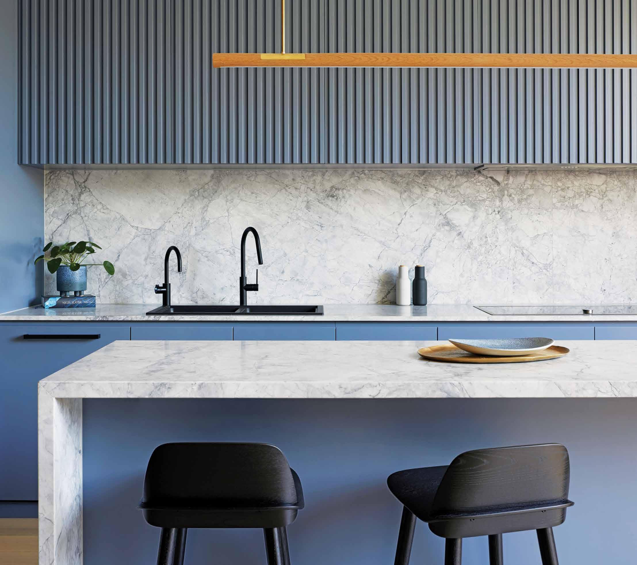
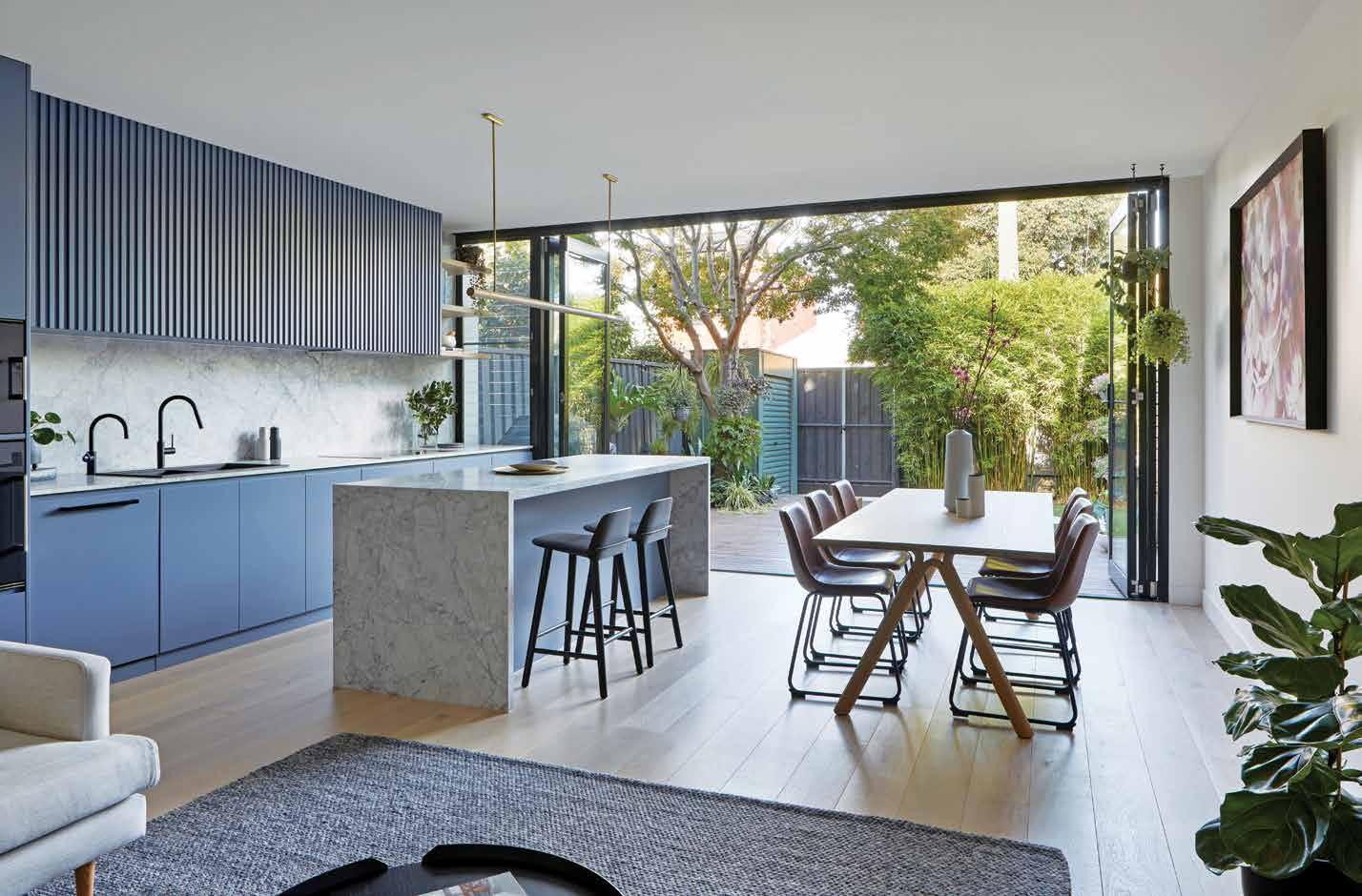
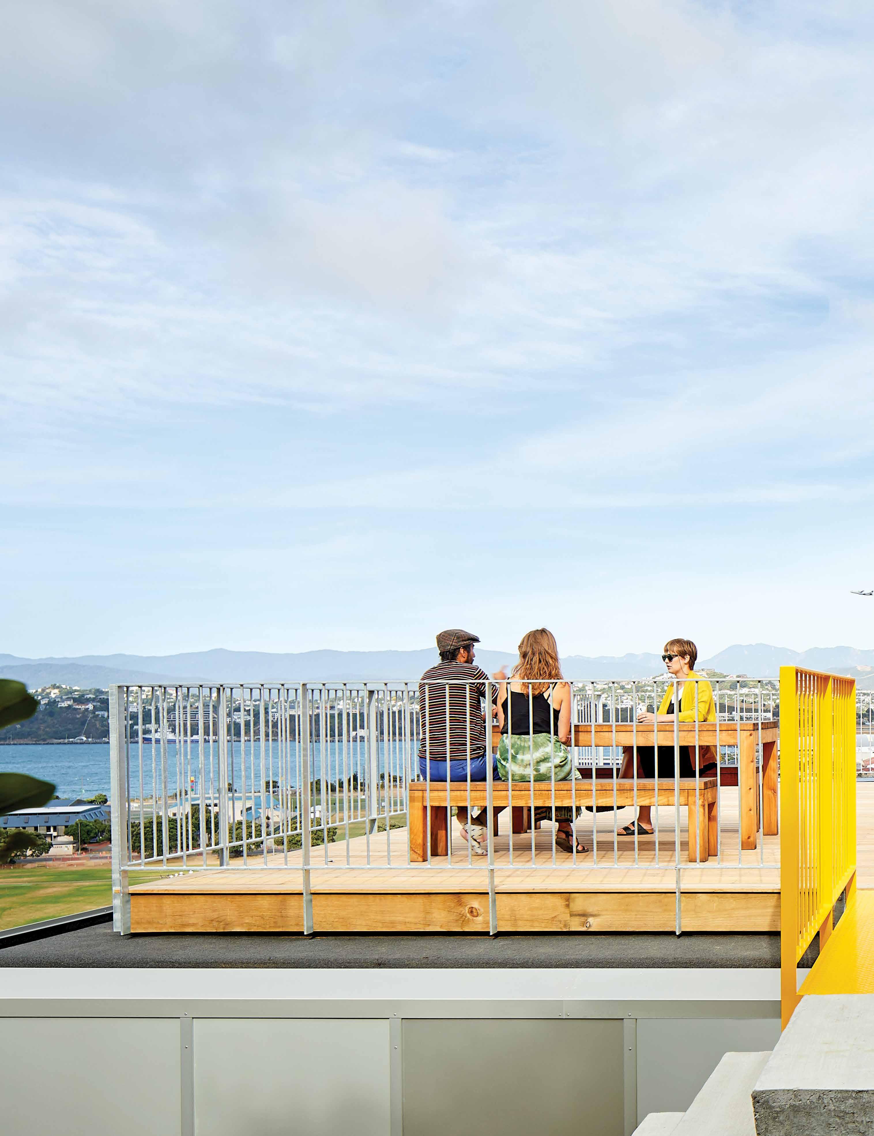
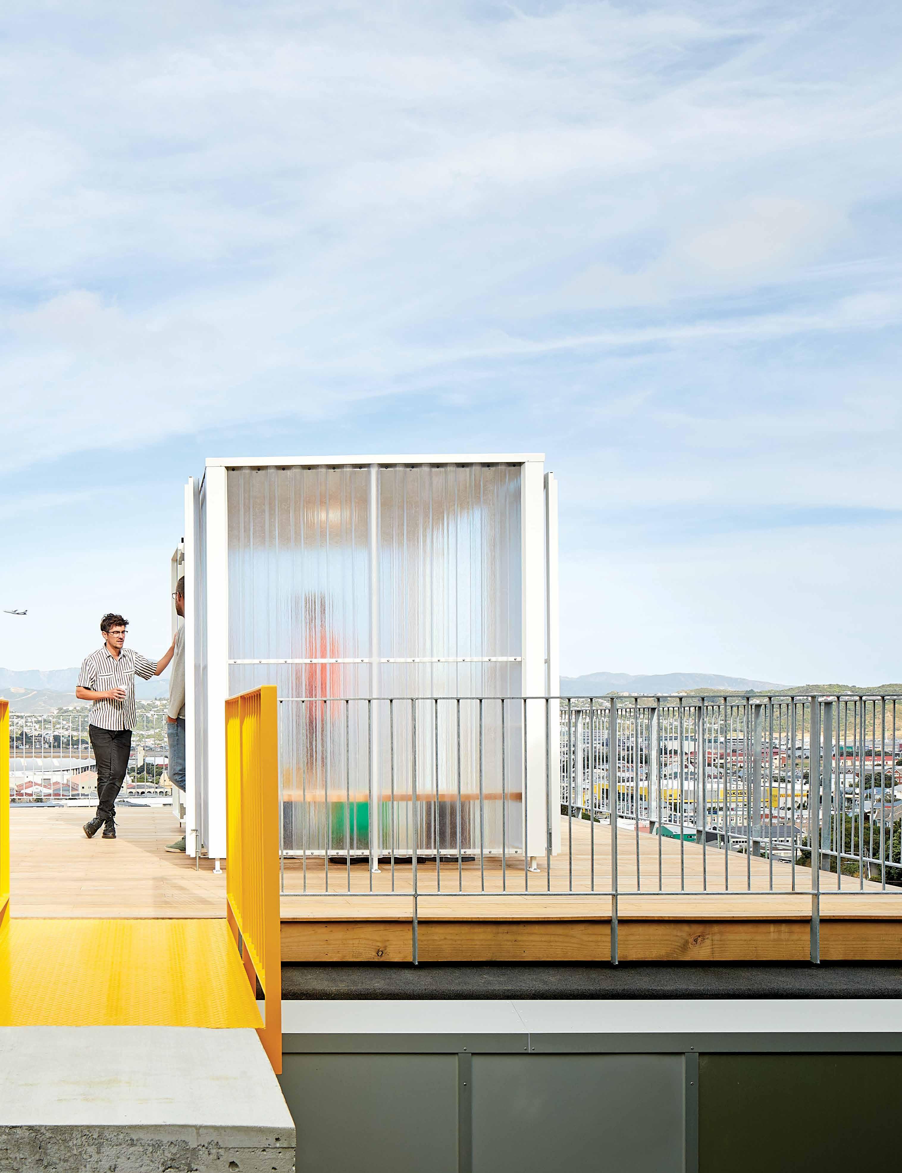
10x10 House offsets a small footprint with endless views; design anthropologist Trent Jansen in his new studio; and a remote, Indonesian farm stay. This is the Life Outdoors issue.

DECEMBER – FEBRUARY | 2020 AUD$17.95 | NZ$17.95 | SGD$13.95 9 > 771836 055007 46 #46
Luxurious outdoor furniture from leading designer brands.

www.coshliving.com.au
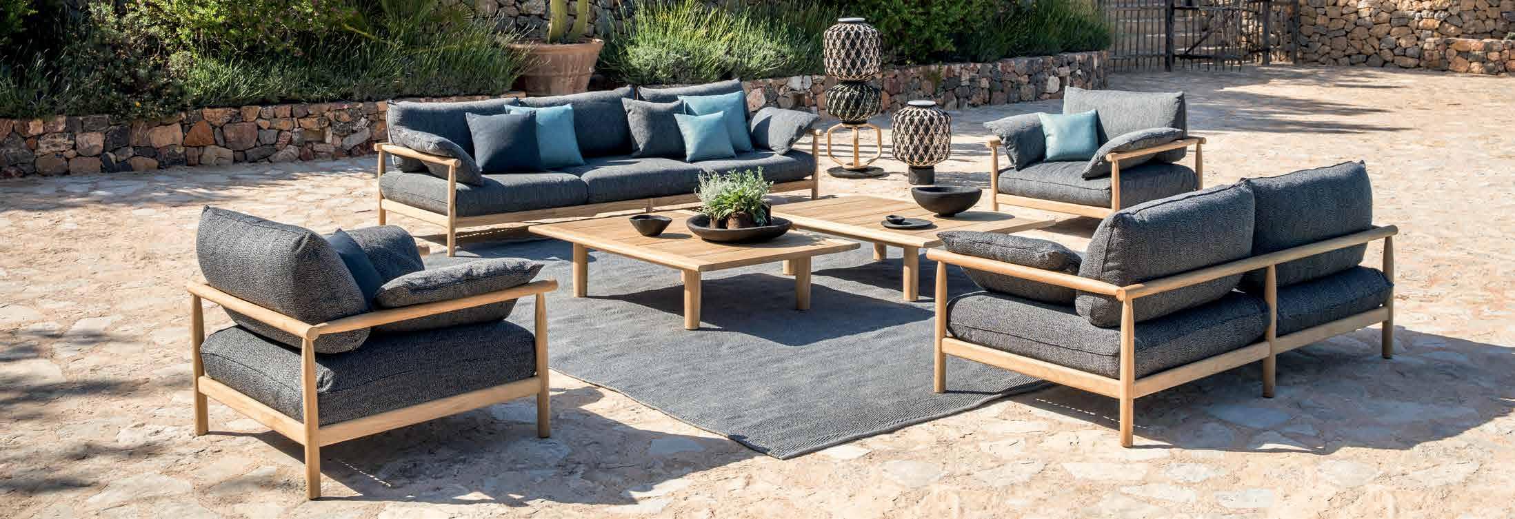
Tibbo Sofa by Dedon
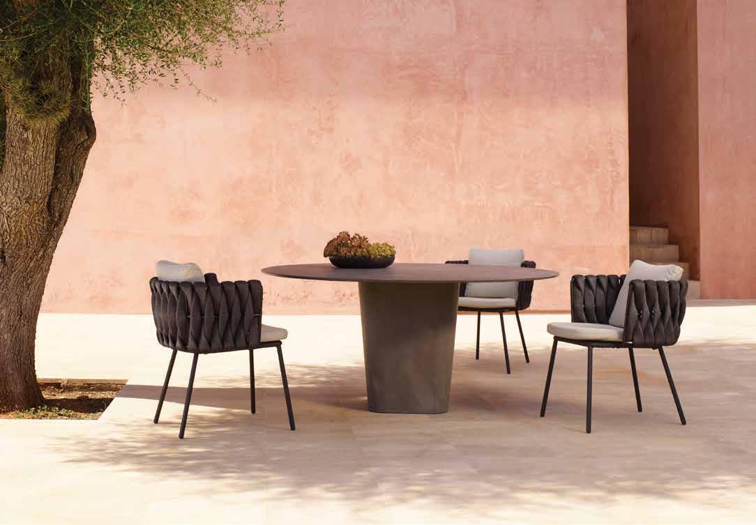
Tao Table & Tosca Armchairs by Tribu
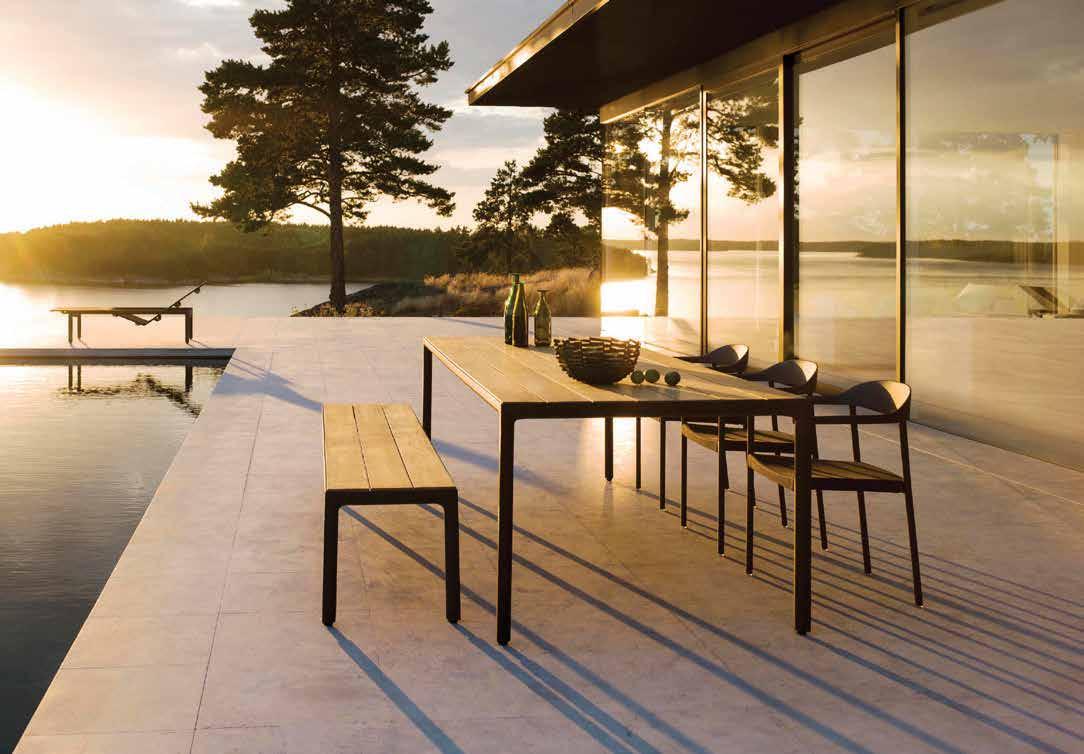
Illum Table, Bench and Armchairs by Tribu
Senja Sofa & Nomad Ottomans by Tribu

Exclusive to Collingwood 03 9281 1999 Cheltenham 03 9532 0464 Sydney 02 9317 3011 Brisbane 07 3254 0000 Perth 08 9415 2522
Swingrest Hanging Lounger by Dedon
Your design statement...


... lies within.
The difference is Gaggenau.

Grand architecture demands grand interior pieces. Refrigeration is one such design element and should speak to who you are. Every Gaggenau piece is distinctively designed, crafted from exceptional materials, offers professional performance, and has done so since 1683.
Make a statement: gaggenau.com.au
 Dirk
Founder & Designer – Extremis
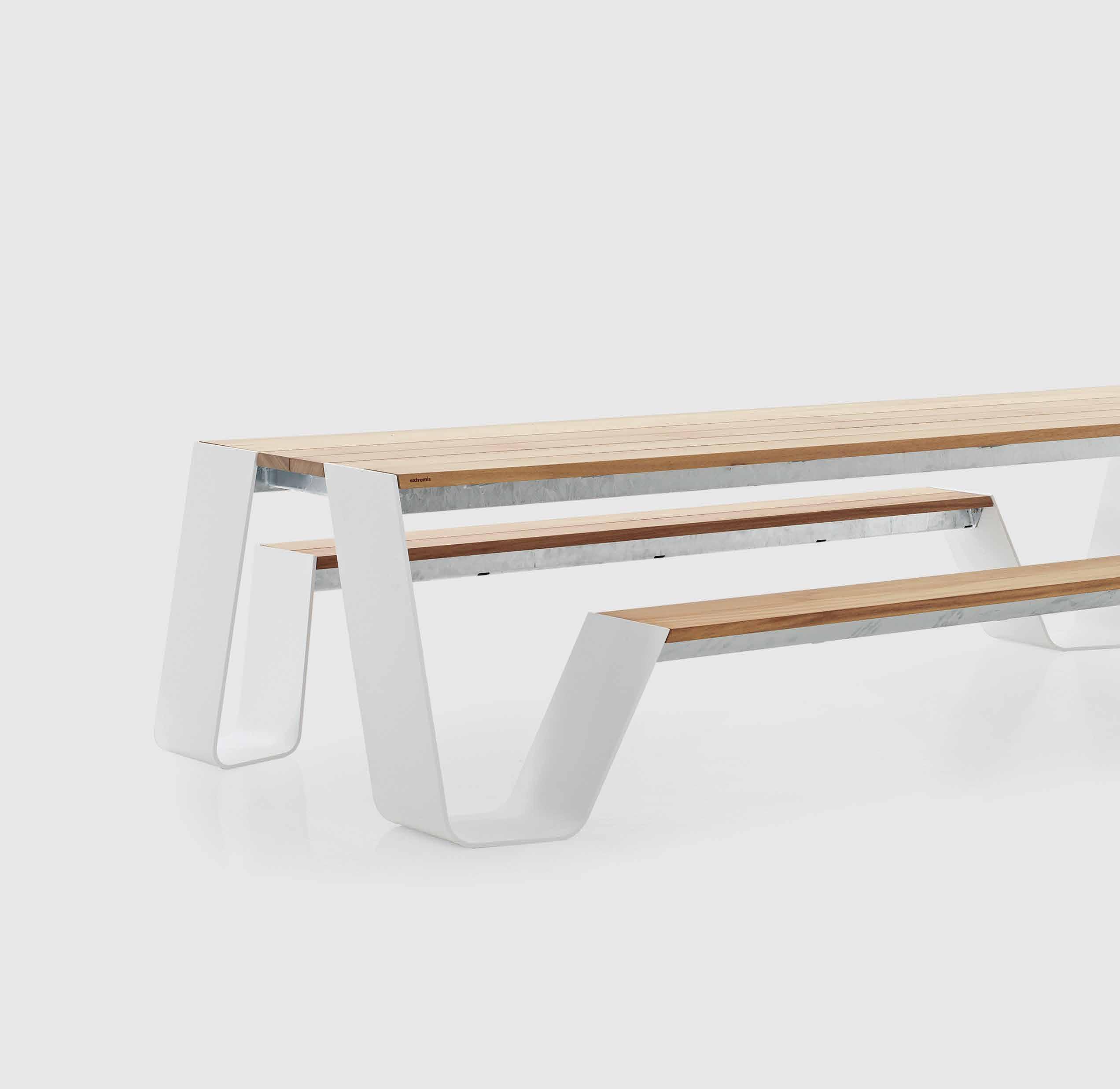
The Hopper Table by Extremis evokes the classic picnic table of yore, brought into a new era of comfort and material refinement. Designed by Extremis’ Dirk Wynants, Hopper’s slanted legs and softened edges allow users to slide in and out of the table without the need to disruptively lift yourself over the bench.
livingedge.com.au
 Wynants,
Hopper Picnic
Table


Dirk W ynants Furniture for Outdoor life. 20
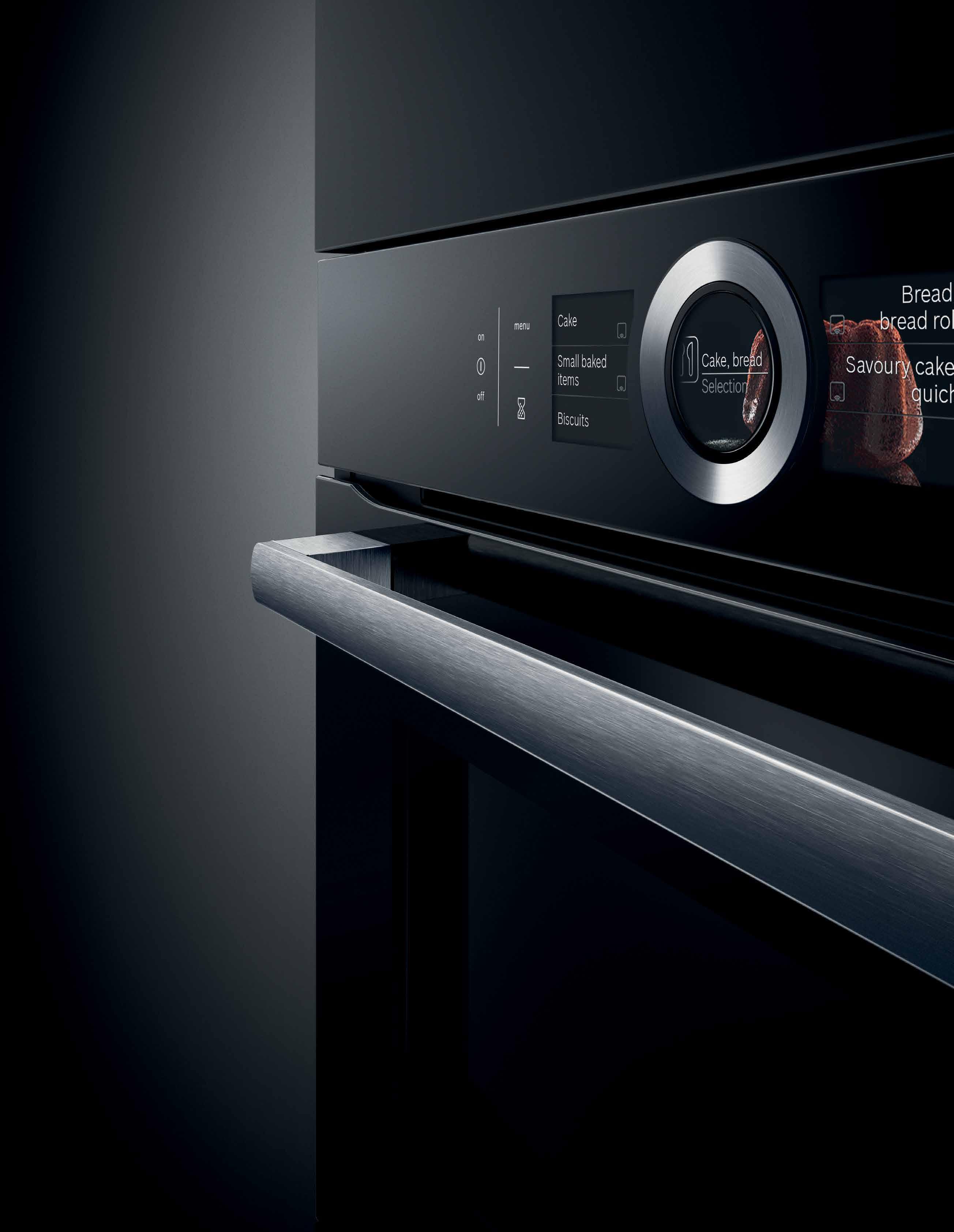
Introducing the stylish new black oven range. Combining a sleek, premium design with intuitive features, the new Series 8 black glass ovens provide a contemporary edge over the traditional stainless steel look. Perfect for those looking for something different. www.bosch-home.com.au
Here’s a Habitus-curated snapshot of the latest and greatest products to hit the local market. See it here first!
26
DESIGN NEWS
Discover the latest in furniture, furnishings, accessories, appliances and hardware to enhance your life lived as a true Design Hunter. We’ve done the research for you and scoped out the pieces that you need to be aware of – from established and emerging designers, makers and suppliers alike.

Personal stories, cultural traditions, and shared histories inform the design thinking of our Design Hunters this issue – and some of their most celebrated work.
46
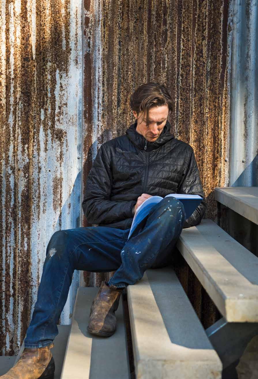
A designer and design anthropologist based on the NSW south coast, Trent Jansen uses his skillset to share the narratives and rich histories of the many cultures that exist within the Australian borders.
58 MILO NAVAL
An intimate dialogue between Filipino designer Milo Naval and his friend and frequent collaborator, Filipino–Australian architect Aya Maceda of actLAB.
70
The apple doesn’t fall far from the tree in the Byron Shire, where furniture designer and maker Martin Johnston took an apprenticeship with his father after high school. Following a brief working holiday abroad, Martin eventually – perhaps inevitably –took over the family workshop.
#46
TRENT JANSEN
MARTIN JOHNSTON
46 26
Life Outdoors
82 SUKASANTAI FARM STAY
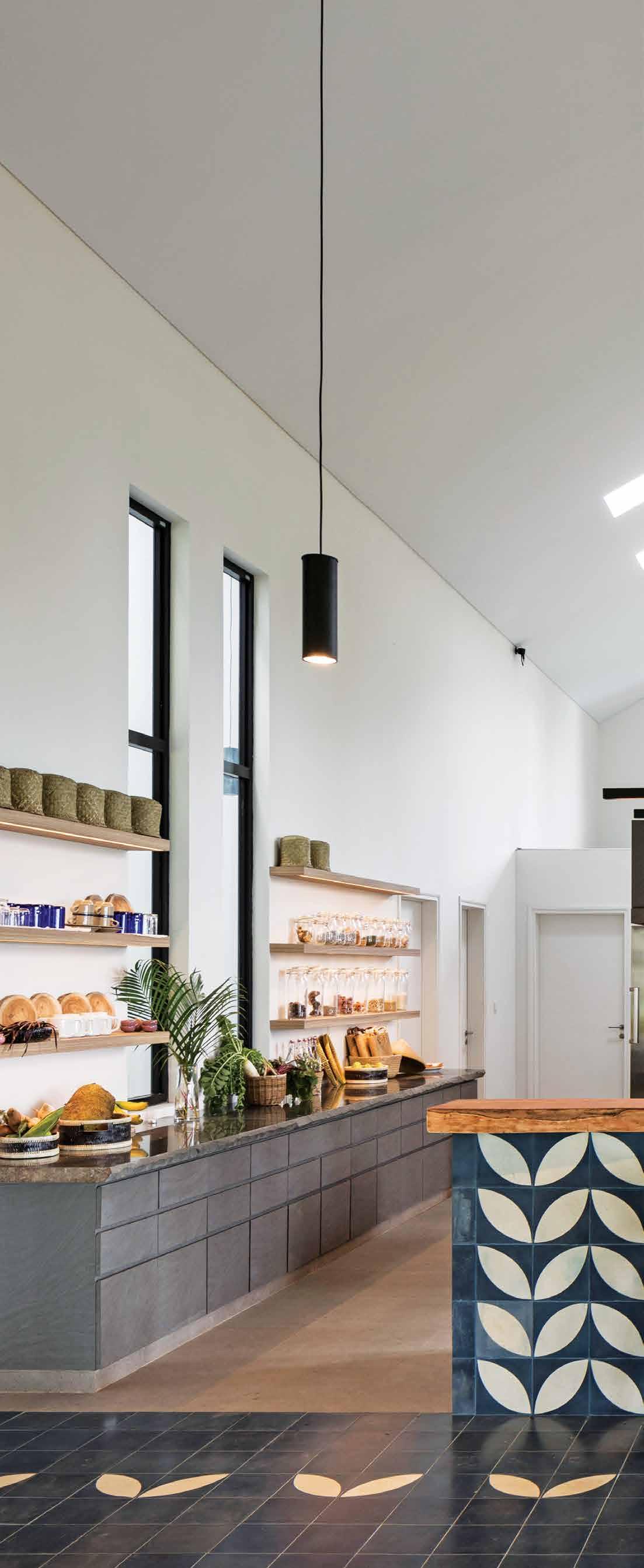
Patrons of this unique farm stay in rural Indonesia are encouraged to work the land and prepare their own meals from the fruits of their labour. The desire of the owners is to re-establish a connection between people and nature, and people and food.
94 MATERIALITY EXPOSÉ : RAMMED EARTH
What are the properties and benefits of rammed earth as a building material? Olha Romaniuk finds its claims to sustainability are multi-faceted.
104 LIFE OUTDOORS
A strong indoor-outdoor connection headlines many architect’s briefs in the residential sphere, but how are patrons and consumers seeking to be connected to nature in their public lives, too?
Steep sites, international influences, and the desire to feel close to nature has informed the briefs and inspired the architects behind these projects.
114 POWELL STREET
Melbourne-based architecture writer and editor Stephen Crafti speaks about his own home, and working with architect and friend Robert Simeoni on its renovation.

126 HOLE IN THE ROOF HOUSE
Not an inch bigger than it needed to be, this restrained house in Sydney’s east by Neeson Murcutt wraps around an internal courtyard and enjoys views down to the ocean.
136 RAMMED EARTH RETREAT
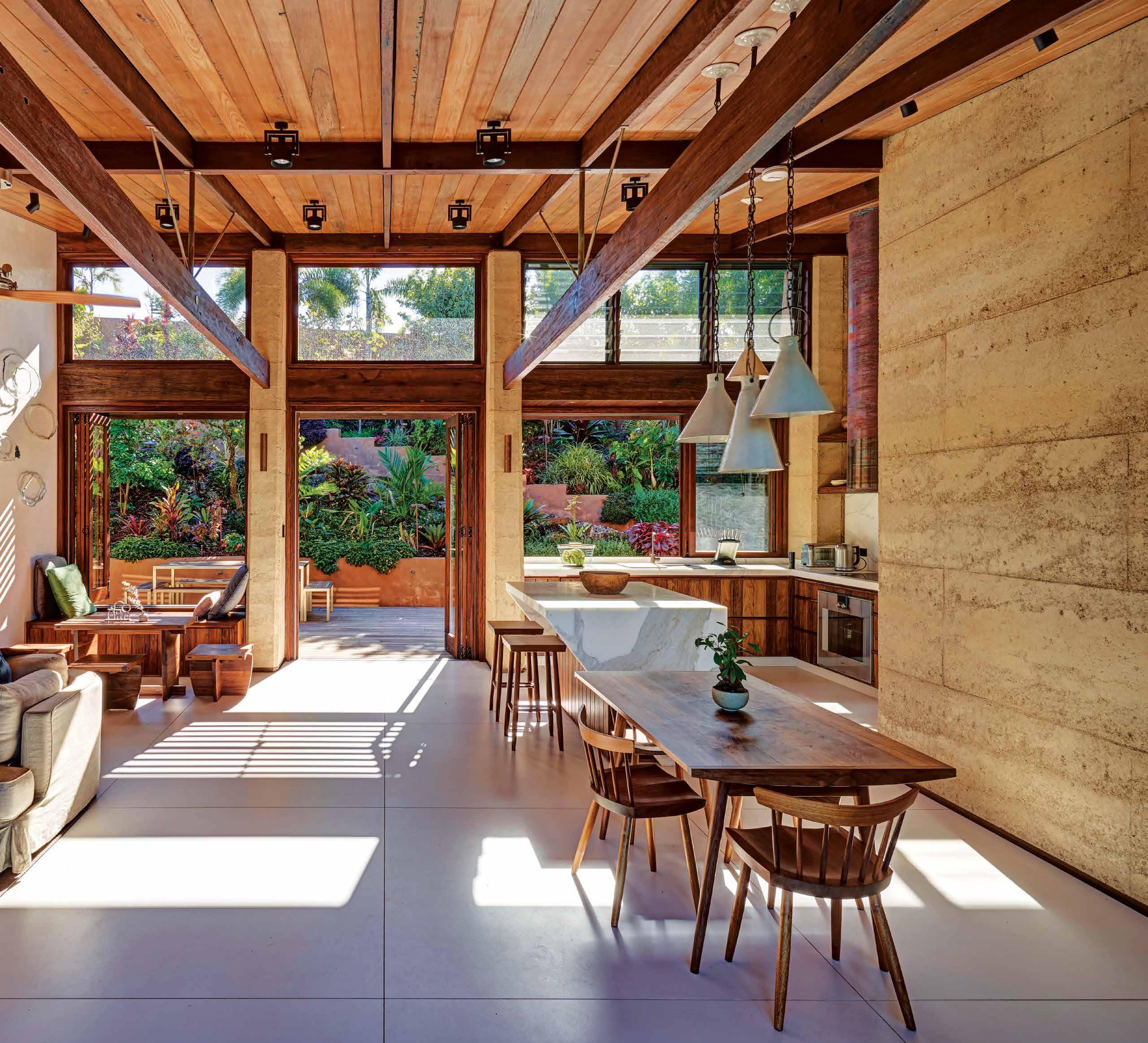
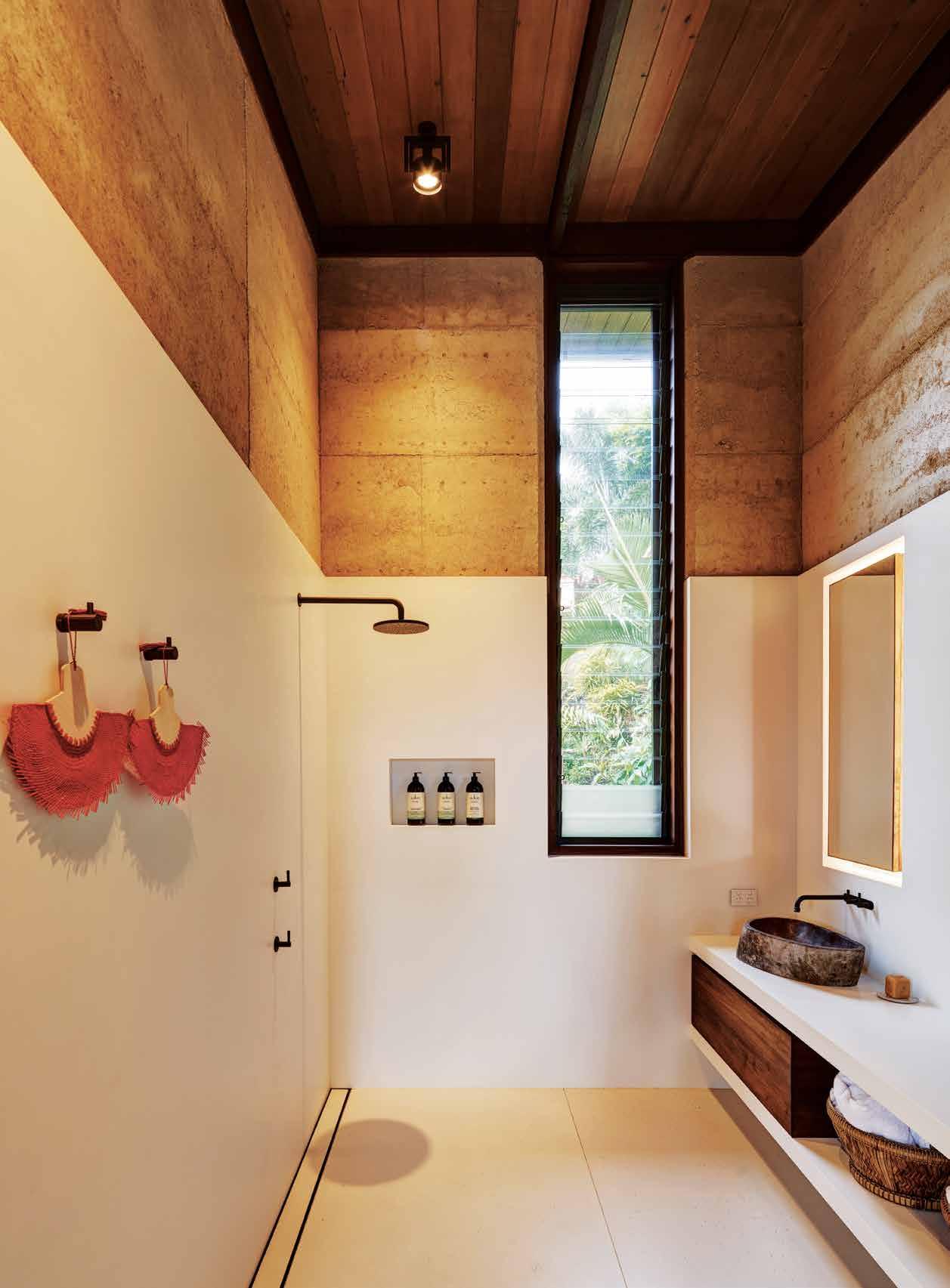
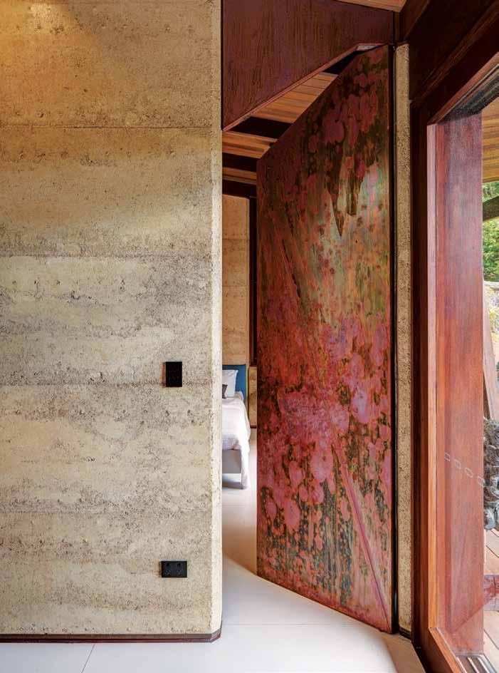
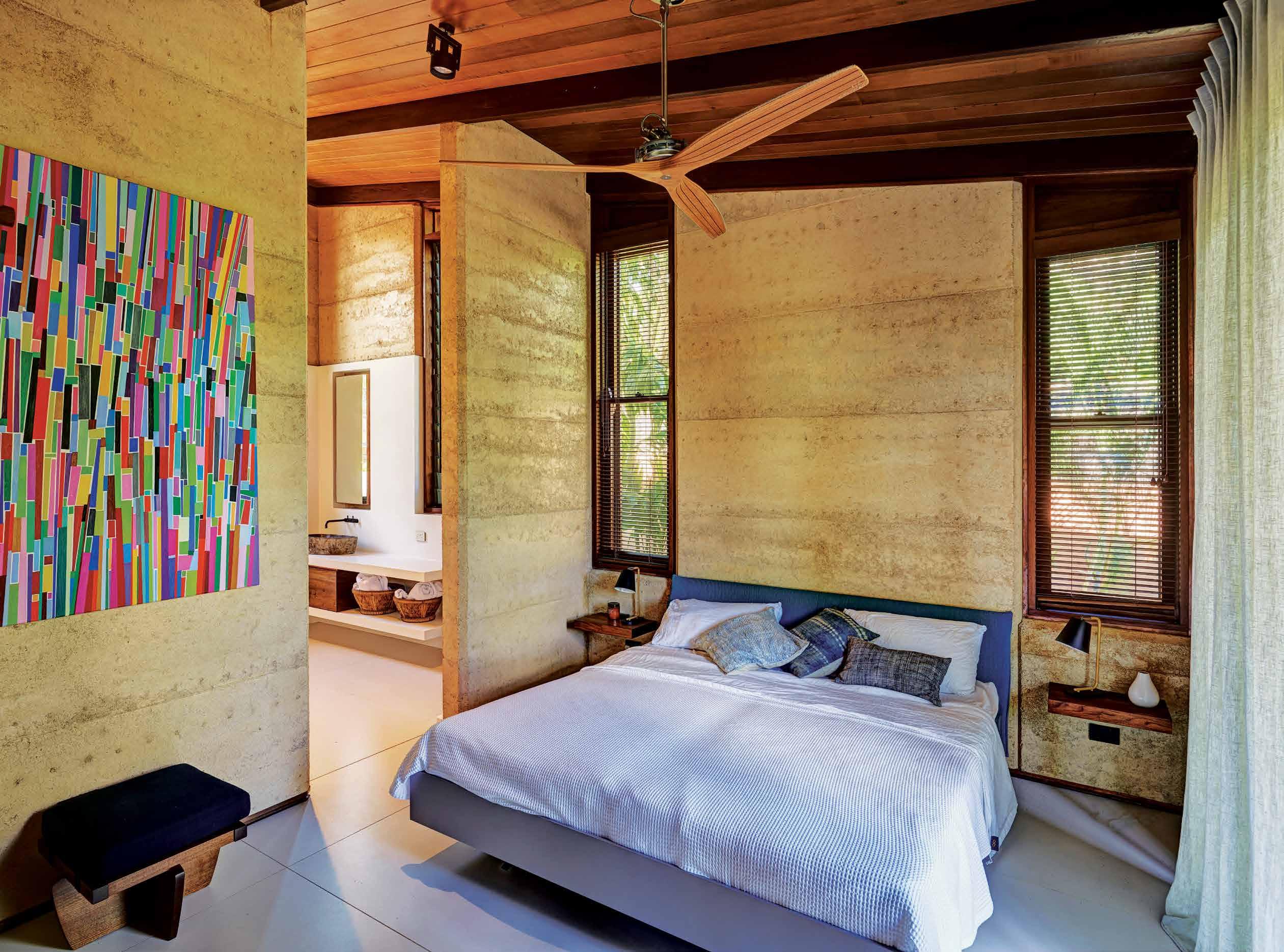
Brazilian-born, Byron Bay-based architect Thais Pupio doesn’t believe that a house needs to be high-tech to be architecturally innovative; this project is proof.
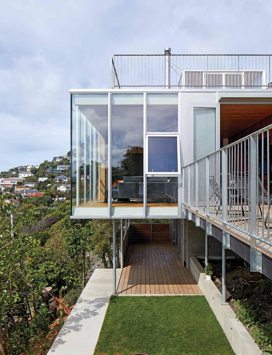
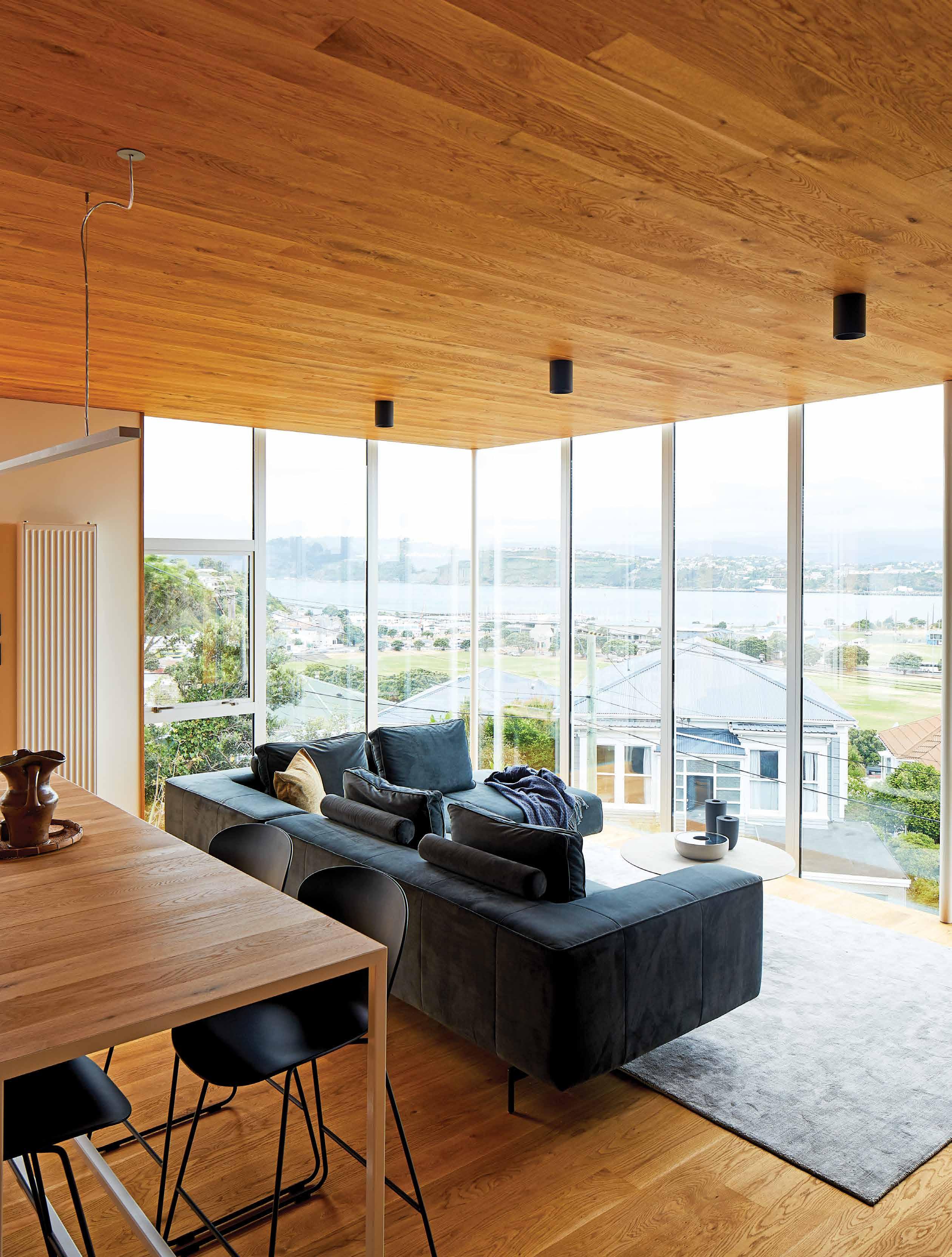
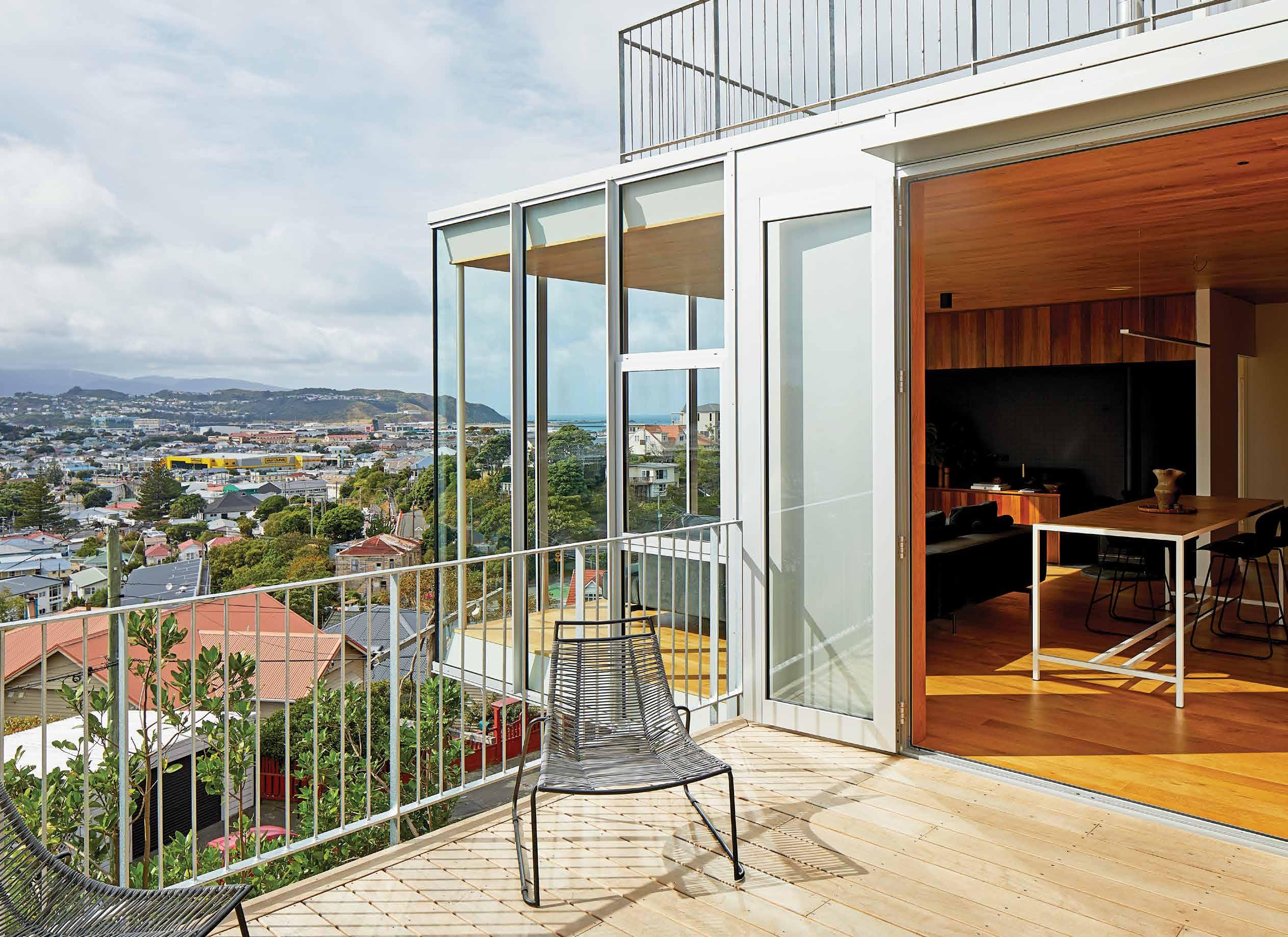
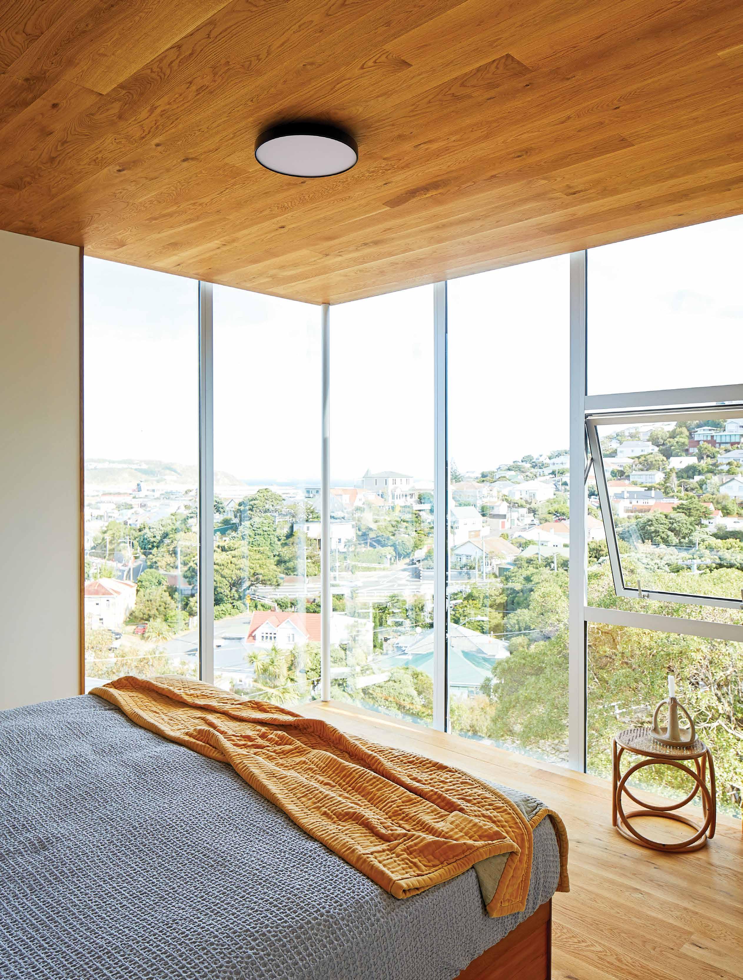
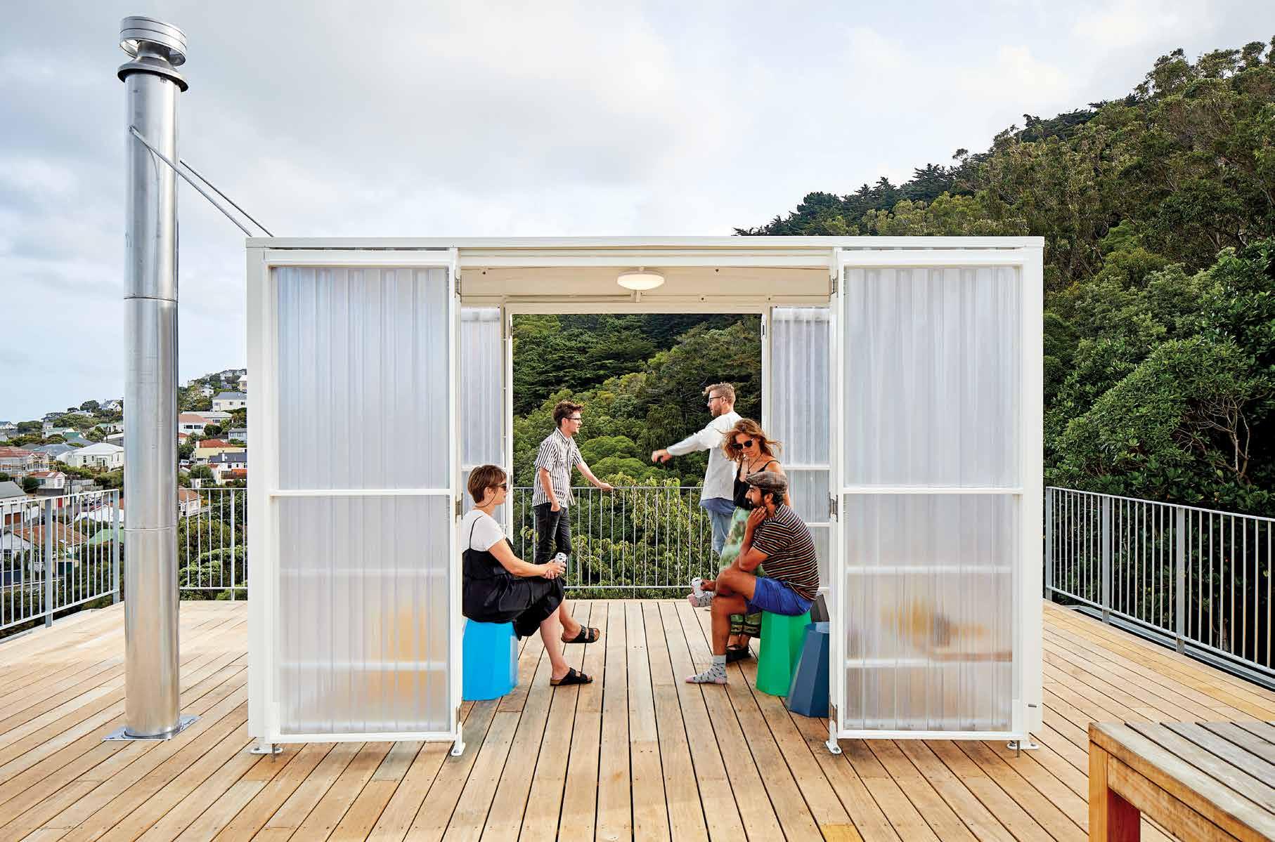
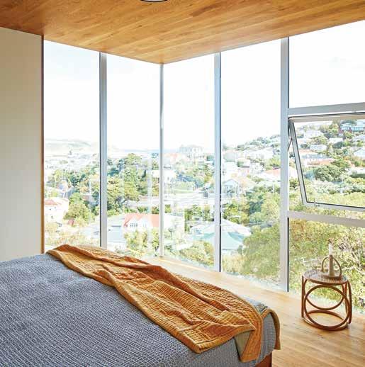
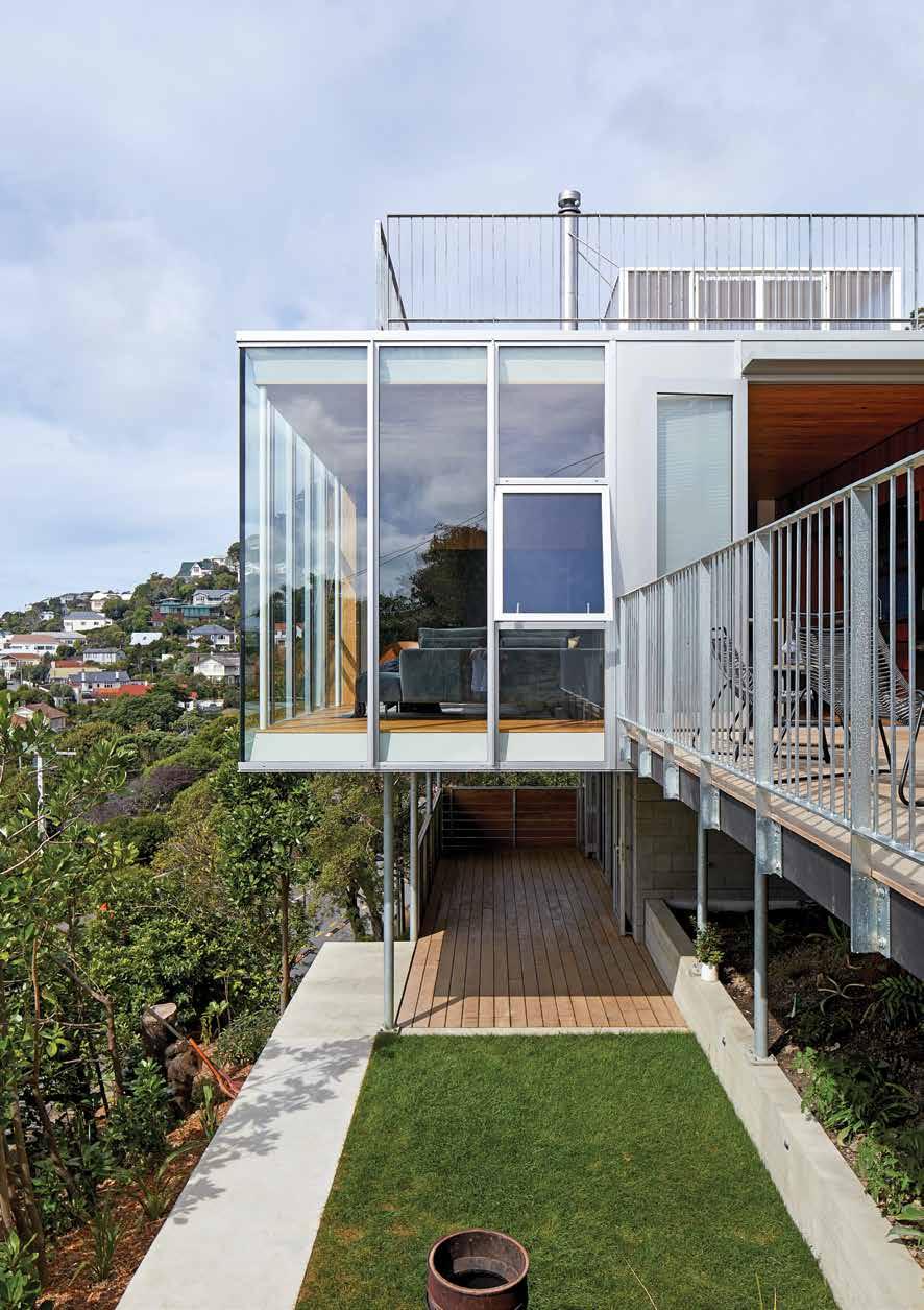
148 10X10 HOUSE
It didn’t bode well for Patchwork
Architecture that their clients had bought this site in Wellington off
architects who couldn’t make it work for them, but Patchwork persevered and the results are like nothing we have seen before.
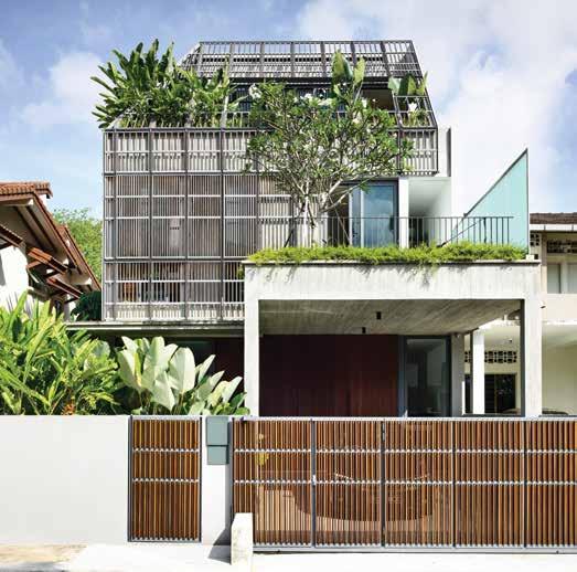
160 FADE TO GREEN
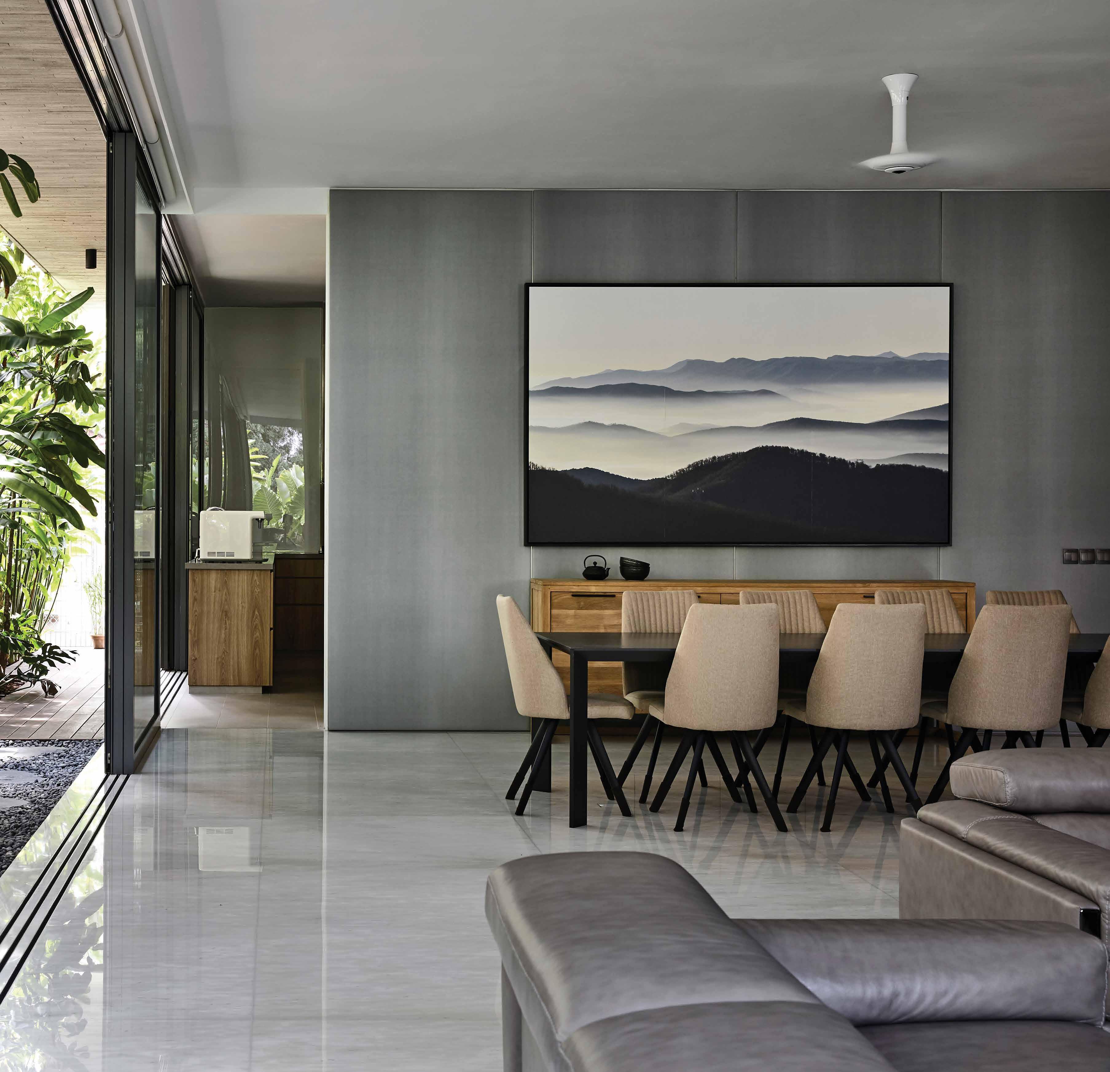
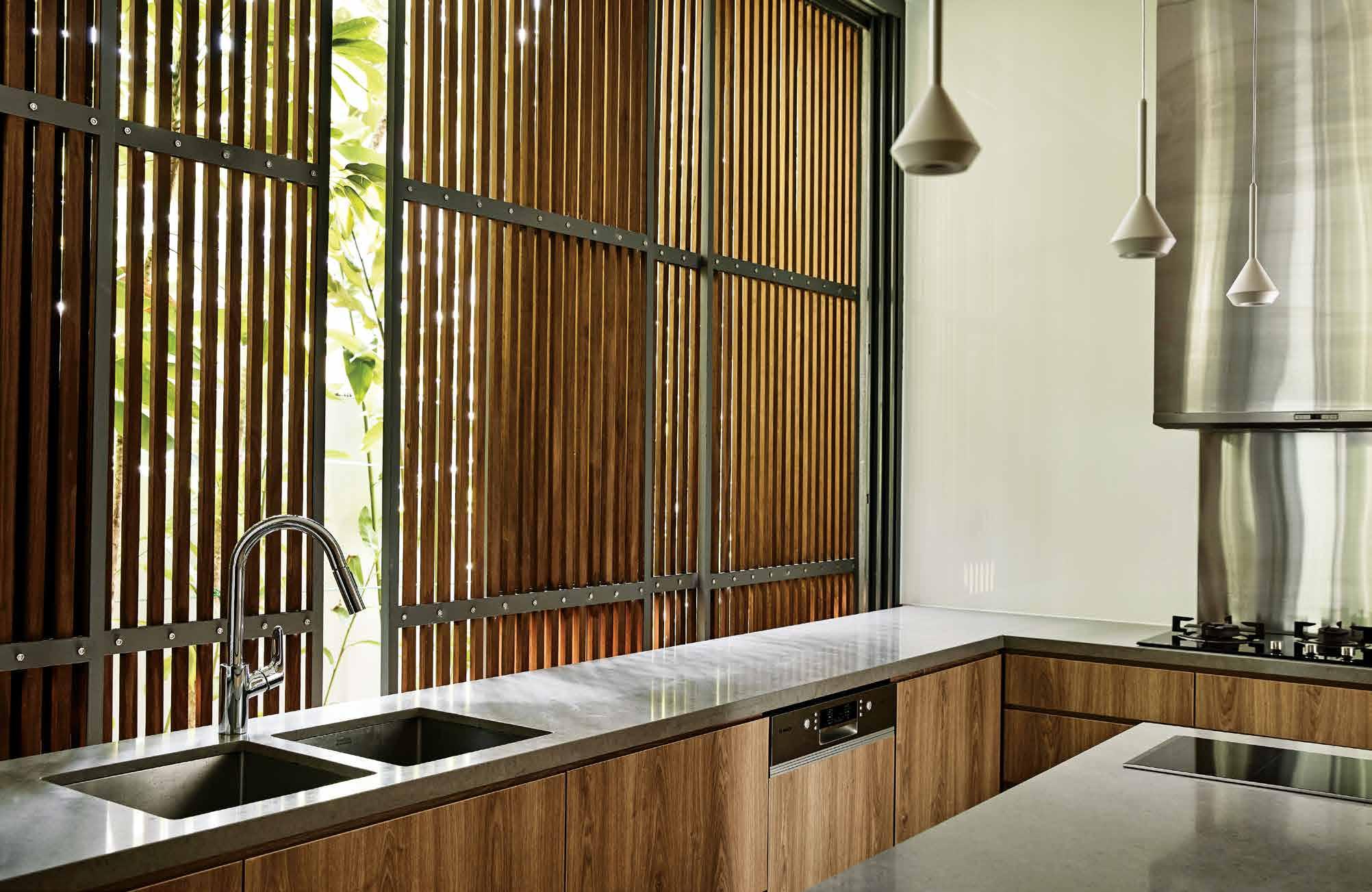
Raw and imperfect, this house by HYLA Architects in Singapore is quite a departure from the decadent nature of its neighbours. The thinking here was to blur the lines between nature and architecture, for the former to almost feel as it is overtaking the latter.
#46
148 104
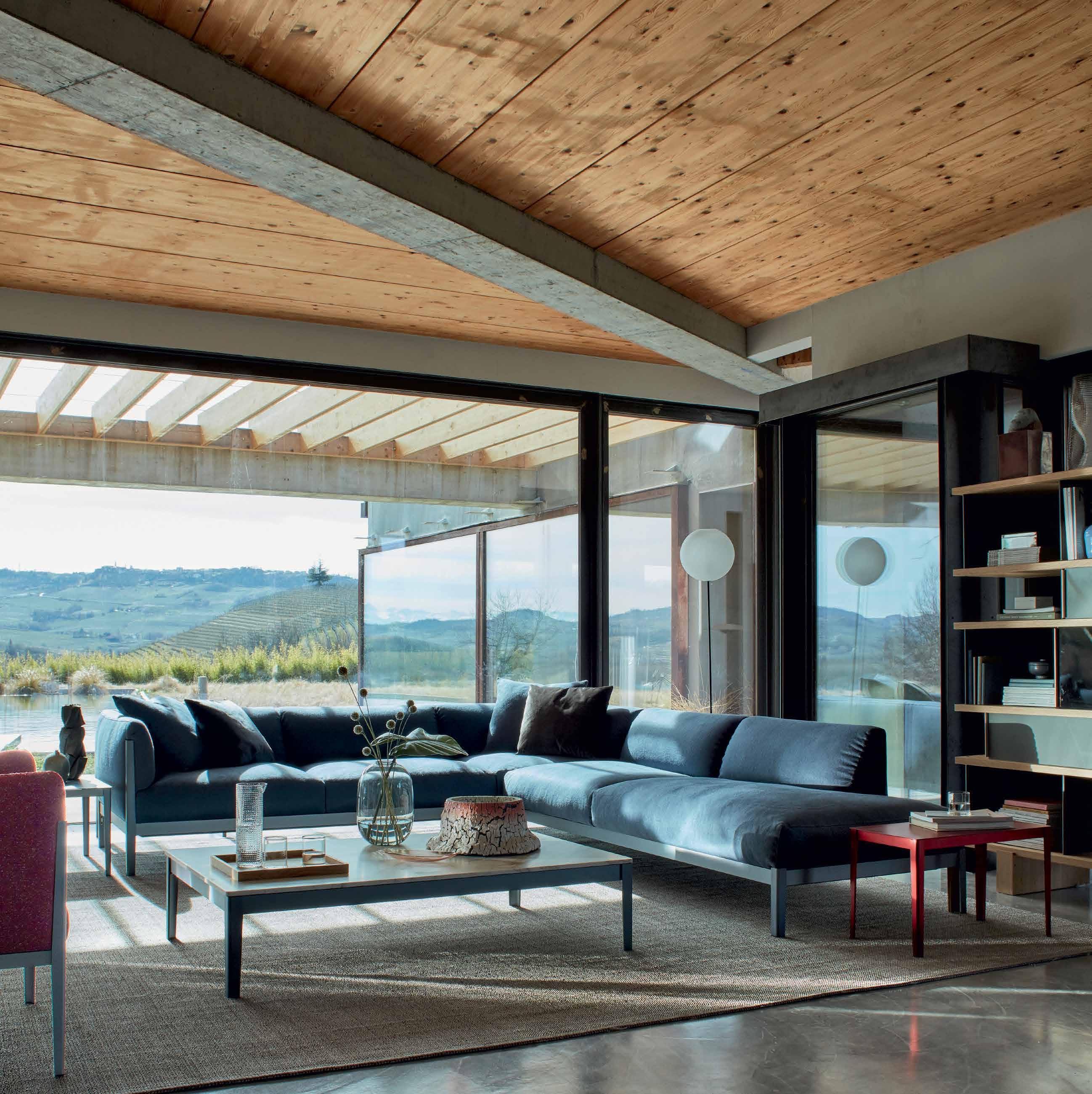


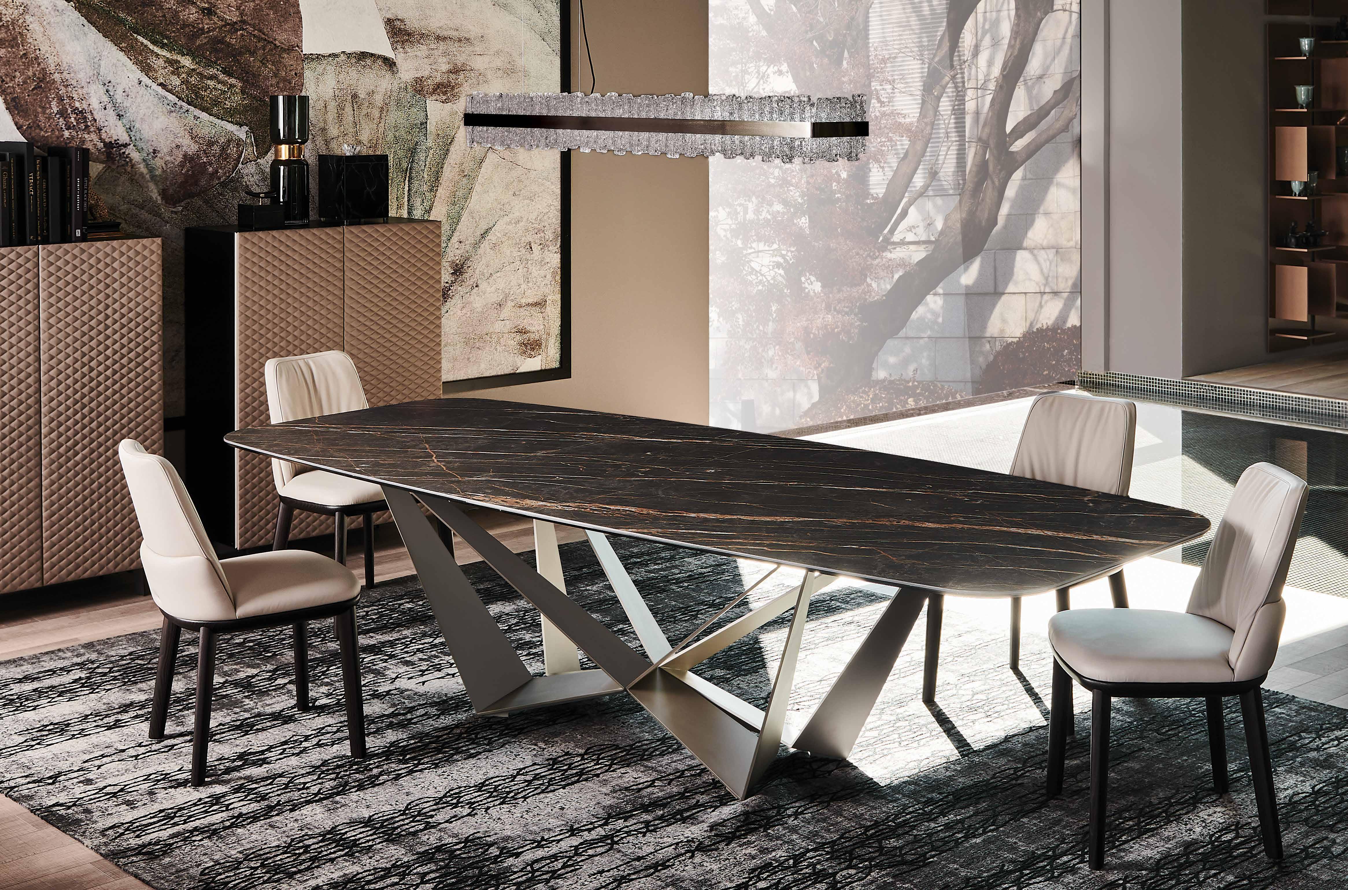 table SKORPIO KERAMIK - chairs BELINDA - lamp PHOENIX - sideboards TIFFANY - rug MUMBAI

info@cattelanitalia.com cattelanitalia.com


the first word
The great outdoors
The December issue of Habitus has to be one of my favourites to put together. As the weather begins to warm, seemingly promising summer’s imminent return, the Habitus team sifts through the projects, interviews and articles we have carefully curated to form the Life Outdoors issue.
This time around, we have been interested to explore the various ways design consumers express themselves through a connection to the surrounding topography – be that urban or rural, coastal or inland, close or far from the equator. Of course this is manifest in the homes they’ve engaged architects to design, build, or renovate – but we were also intrigued to see how this desire plays out in the public sphere, too. How is an aspiration to be connected to nature reflected in the design of the cafés, restaurants, retail spaces and even hotels that we, as Design Hunters, frequent?
Rebecca Gross has investigated this idea drawing on built examples across the Region. The Cornerstone Stores on the Gold Coast by Richards & Spence are a collection of retail spaces that each face inwards to a central courtyard, while in Vietnam SILAA has designed a homestay for guests to feel immersed in nature despite being a mere four kilometres from the centre of Huě.
A home made predominantly from rammed earth on a property in Byron Bay contrasts strongly with architecture writer and editor Stephan Crafti’s own house by architect Robert Simeoni in an inner suburb of Melbourne. And yet, despite these vastly different locales the two residences share an understanding of the context within which they sit and unique design cues that connect each to life beyond the four walls of the house.
Whether you’re sitting indoors or out, or within a space that’s tricky to define as either, I hope you enjoy the issue and invite you to continue the conversation at habitusliving.com
CUNNEEN | EDITOR
 HOLLY
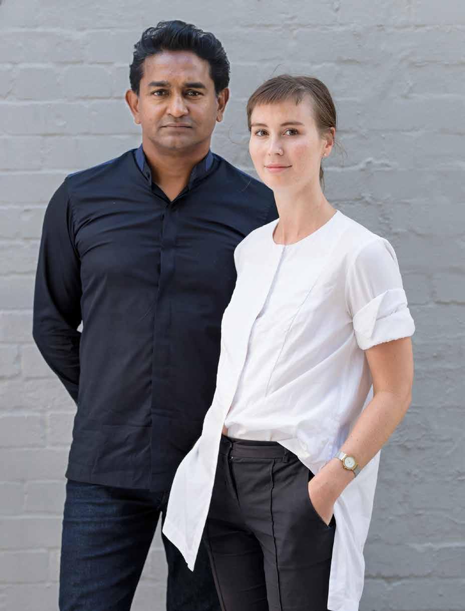
RAJ NANDAN FOUNDER & CEO INDESIGN MEDIA, HOLLY CUNNEEN EDITOR HABITUS
habitus takes the conversation to our contributors discovering their inspiration and design hunter® journeys
LEANNE AMODEO PARADISE FOUND #136
Leanne Amodeo is a senior editor, writer and media strategist specialising in architecture, design and visual art, and a former editor of Monument and Inside magazines. For the past two years, Leanne has joined us as guest feature editor for the Habitus Kitchen & Bathroom annual special. Alongside Habitus , she is published internationally, works with practices on public relations and communications, and advocates for the industry via lectures. This issue, Leanne’s words transport us to a rammed earth retreat in northern New South Wales that respects the local geography while simultaneously drawing influence from the architect’s Brazilian roots. “I’m always appreciative of the creative people I meet and the opportunities to learn about their work through interviews and site visits,” says Leanne. “I consider myself very lucky to write about good design and the incredible people who make it happen for a living.”

MICHAEL NICHOLSON PARADISE FOUND #136

After obtaining a degree in architecture from The University of Sydney, Michael has spent over 30 years professionally photographing architecture and interiors across Australia and Asia – much of which has appeared in the pages of Habitus From having worked with Max Dupain to fully embracing the transition from film to digital, he most enjoys the challenge of faithfully reproducing the relationship between indoor and outdoor, and creating a sense of “being there” which articulates the architect’s vision. During the course of his career Michael has enjoyed being a photographer-of-choice for some of Australia’s leading architects and, of course, Habitus.

TONY AMOS STORYTELLING THROUGH OBJECTS #42
Tony Amos began his career in New York City assisting some of the most globally respected photographers and building his own portfolio and profile with portrait photography. For over a decade now he has been based south of Sydney shooting lifestyle, interiors, portraits, still life and more recently travel assignments. The common thread in all his work is a subtle, naturalistic dedication to ambiance, colour and character. He is a master of colour, analogue printing and hand retouching. His artwork has exhibited in Australia and the US, and is collected in Australia, the US and Europe. Tony spends his time outdoors by nature and by choice, and appreciates his work as a photographer for what it can expose him to, and the doors it can open: “I chose this [line of] work as a way to see what I haven’t yet seen. My constant is change, exploration is my stimulation.”
CHU LIK REN A RETURN TO ROOTS #82

Based in Singapore, Chu Lik Ren is a practicing architect with CPG Consultants Pte Ltd; teaches design at a local university; and regularly contributes editorially to Habitus and Habitus Living. This issue, Lik Ren writes about a small and remote farm stay in Indonesia – designed by a Singaporean architect – that endeavours to reinforce, or in some cases re-establish, the connection between its patrons and the land in which they stay and from which their food grows. “I appreciate the links my work gives me with nature groups, landscape architects and government agencies that value biodiversity, nature conservation, wellness and biophilic designs,” says Lik Ren. “I find young Singaporeans caring passionately about the natural environment because it is a huge part of [their] identity, and that’s comforting. The built environment is never complete without a connection with nature.”

SIMON WILSON A FINE PERCH #148
Simon Wilson is a photographer and director with a dedicated focus on architecture, interiors and design. Video has become hugely significant in his work and a new tool for exploring the built world and the people involved. His base in Auckland, New Zealand, certainly doesn’t impede his ability or impetus to access projects nationwide and he is regularly up and down the country visiting some of the country’s best architectural projects – loving every minute of it. Among other reputable titles, Simon’s photography is regularly found in Habitus , and such is the case this issue capturing a compact residence in Wellington, atop an incredibly steep site. “I crave the outdoors and am spoilt here in New Zealand. At work photography forces me to engage with the elements constantly, being in tune with the weather and the light,” he says. “Our family has a small cabin designed by Patchwork Architecture which is pretty much all outdoor living. Whole days are spent on the beach, meals cooked outside and then evenings around the fire under the stars.”

eggersmannaustralia.com SilverTouch – exclusively by
INSTANT CONVENIENCE
Zip HydroTap provides pure tasting filtered water with instant boiling, chilled and sparkling water.
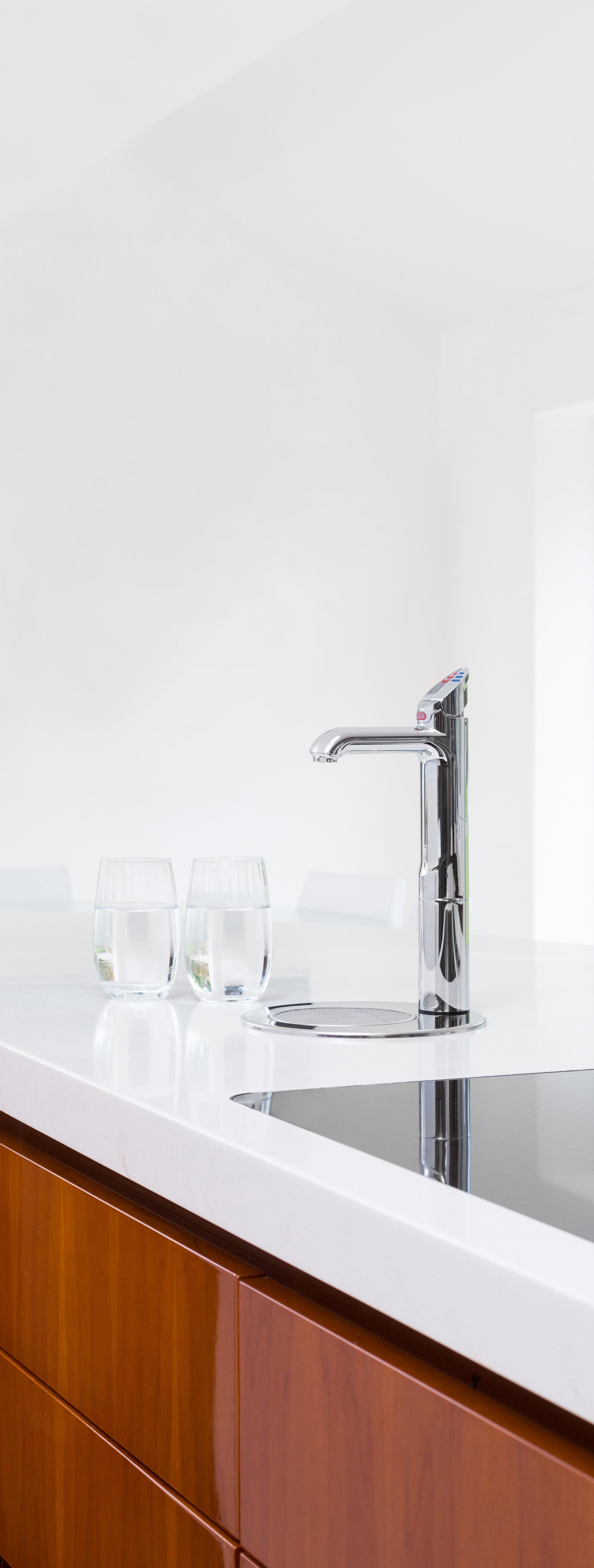
Discover more at zipwater.com

CHAIRMAN & FOUNDER
Raj Nandan raj@indesign.com.au
CONSULTING EDITOR
Paul McGillick
EDITOR
Holly Cunneen holly@indesign.com.au
SE ASIA CO-EDITORS
Janice Seow janice@indesign.com.sg
Narelle Yabuka narelle@indesign.com.sg
EDITORIAL ASSISTANT
Vicki Wilson vicki@indesign.com.au
ASSOCIATE ART DIRECTOR
Betty Wong betty@indesign.com.sg
GRAPHIC DESIGNER
Louise Gault louise@indesign.com.au
CONTRIBUTING WRITERS
Leanne Amodeo, Chu Lik Ren, Stephen Crafti, Rebecca Gross, Luo Jingmei, Aya Maceda, Olha Romaniuk, Thida Sachathep, Andrea Stevens
CONTRIBUTING PHOTOGRAPHERS
Tony Amos, Kurt Arnold, Brett Boardman, Sharyn Cairns, Tabitha Fernan, Hoang Le, Andy Macpherson, Michael Nicholson, Fabian Ong, Romello Pereira, Derek Swalwell, Simon Wilson
MANAGING DIRECTOR
Kavita Lala kavita@indesign.com.au
BRAND DIRECTOR
Colleen Black colleen@indesign.com.au
(61) 422 169 218
ACCOUNTS
Ting Zhang ting@indesign.com.au
Cassie Zeng cassie@indesign.com.au
ONLINE MANAGER
Radu Enache radu@indesign.com.au
WEB DEVELOPER Ryan Sumners ryan@indesign.com.au
BUSINESS DEVELOPMENT MANAGERS
Kim Hider kim@indesign.com.au
Brunetta Stocco brunetta@indesign.com.au
Valeria Valera valeria@indesign.com.au
CLIENT LIASON
Dana Ciaccia dana@indesign.com.au
PRODUCTION AND PROJECTS MANAGER Brydie Shephard brydie@indesign.com.au
PRODUCTION ASSISTANT Becca Knight becca@indesign.com.au
COVER
Photography by Simon Wilson
HEAD OFFICE
Level 1, 50 Marshall Street, Surry Hills NSW 2010 (61 2) 9368 0150 | (61 2) 9368 0289 (fax)
MELBOURNE
1/200 Smith St, Collingwood, VIC, 3066
SINGAPORE
4 Leng Kee Road, #06–08 SIS Building, Singapore 159088 (65) 6475 5228 | (65) 6475 5238 (fax)
HONG KONG
Unit 12, 21st Floor, Wayson Commercial Building, 28 Connaught Road West, Sheung Wan, Hong Kong indesign.com.au
require you to provide information about yourself. If you provide such information to us we may use the information to provide you with products or services we have. We may also provide this information to parties who provide the products or services on our behalf (such as fulfilment organisations). We do not sell your information to third parties under any circumstances, however, these parties may retain the information we provide for future activities of their own, including direct marketing. We may retain your information and use it to inform you of other promotions and publications from time to time. If you would like to know what information Indesign Media Asia Pacific holds about you please contact Nilesh Nandan (61 2) 9368 0150, (61 2) 9368 0289 (fax), info@indesign.com.au. Habitus magazine is published under licence by Indesign Media Asia Pacific. ISSN 1836-0556
IMAGE 10x10 House (p.148)
Printed in Singapore. All rights reserved. No part of this publication may be reproduced, stored in a retrieval system, transmitted in any form or by any other means, electronic, mechanical, photocopying, recording or otherwise. While every effort has been made to ensure the accuracy of the information in this publication, the publishers assume no responsibility for errors or omissions or any consequences of reliance on this publication. The opinions expressed in this publication do not necessarily represent the views of the editor, the publisher or the publication. Contributions are submitted at the sender’s risk, and Indesign Media Asia Pacific cannot accept any loss or damage. Please retain duplicates of text and images. Habitus magazine is a wholly owned Australian publication, which is designed and published in Australia. Habitus is published quarterly and is available through subscription, at major newsagencies and bookshops throughout Australia, New Zealand, South-East Asia and the United States of America. This issue of Habitus magazine may contain offers or surveys which may
THE NEW KITCHEN ESSENTIAL
All your drinking water needs, All-in-One beautifully designed system. Remove the need for multiple taps in your kitchen with a single, beautifully designed system that delivers boiling, chilled and sparkling filtered drinking water, as well as hot and cold unfiltered water for your sink.
The Zip HydroTap All-in-One offers every water option you need from one multi-functional tap and a single intelligent compact under-bench system. That’s why the Zip HydroTap will be the one and only hydration solution for your kitchen. Discover more at zipwater.com

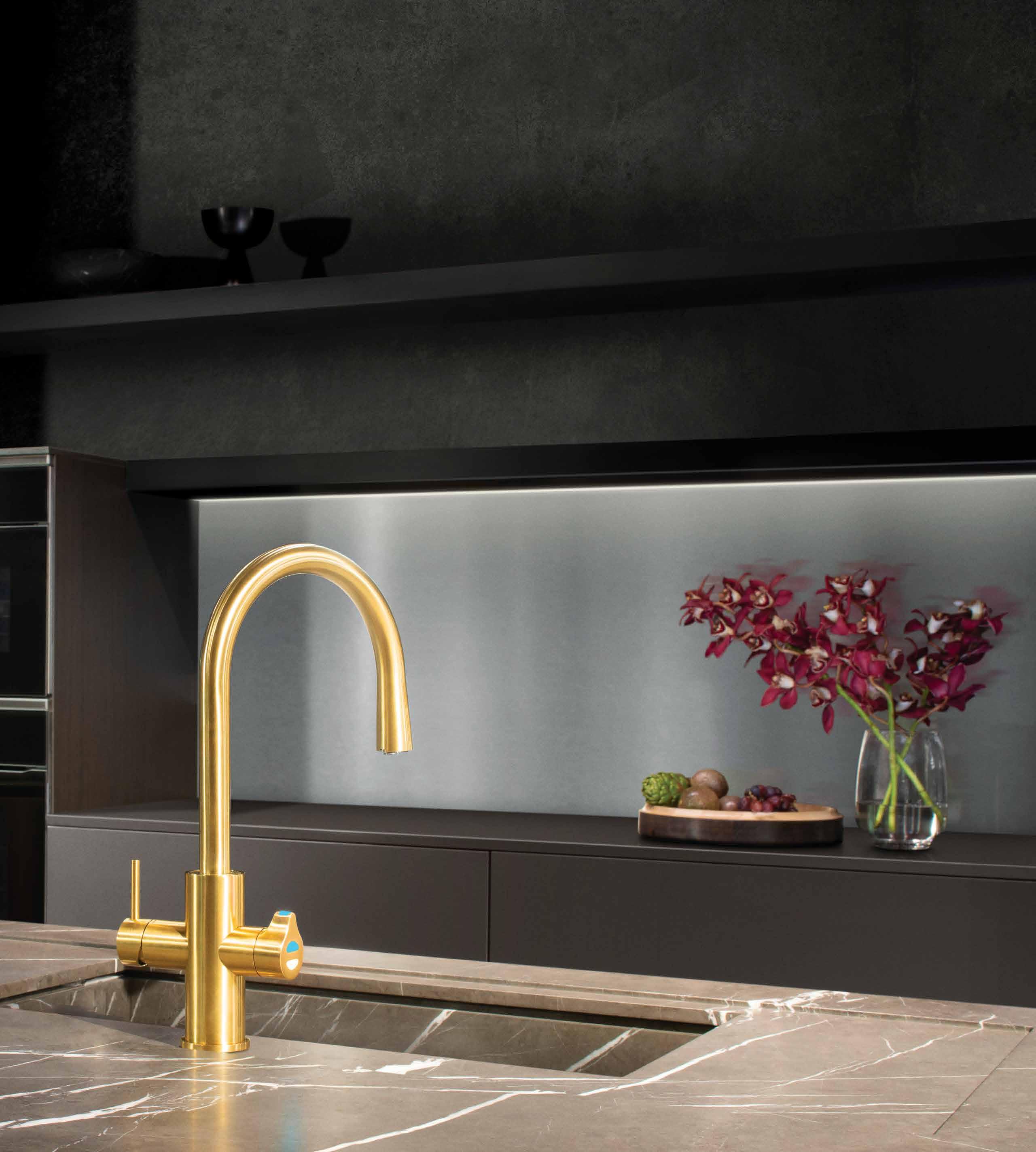
THE WORLD’S MOST ADVANCED DRINKING WATER SYSTEM ZIP HYDROTAP | PURE TASTING | INSTANT | BOILING | CHILLED | SPAR KLING
Through the many platforms in which Habitus exists we endeavour to highlight, champion and celebrate the uniqueness of our Region.
Chairman & Founder, Indesign Media
Raj Nandan
The essentials, only better

Life’s simple pleasures
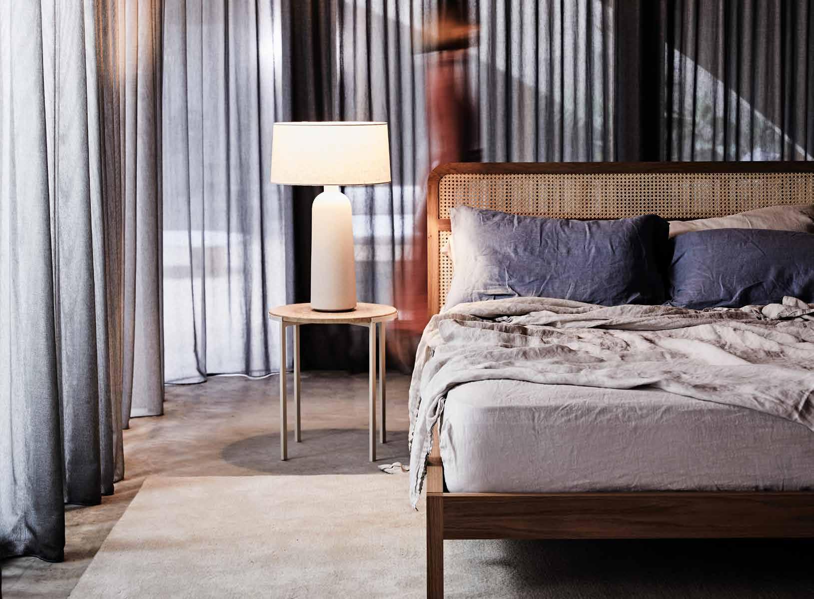
 The WILLOW bed from the Weekend Collection by Jardan explores the relationship and materiality of rattan and timber. A round sweeping silhouette offers a soft and gentle touch to any bedroom setting. jardan.com.au
issue #46 habitusliving.com
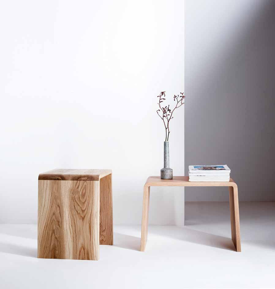
The PETRA SIDE TABLE by James Howe is named after the ancient Jordan city, carved from solid stone and designed to underscore the beauty of oak grain with its elegant and angular simplicity. jameshowe.com.au
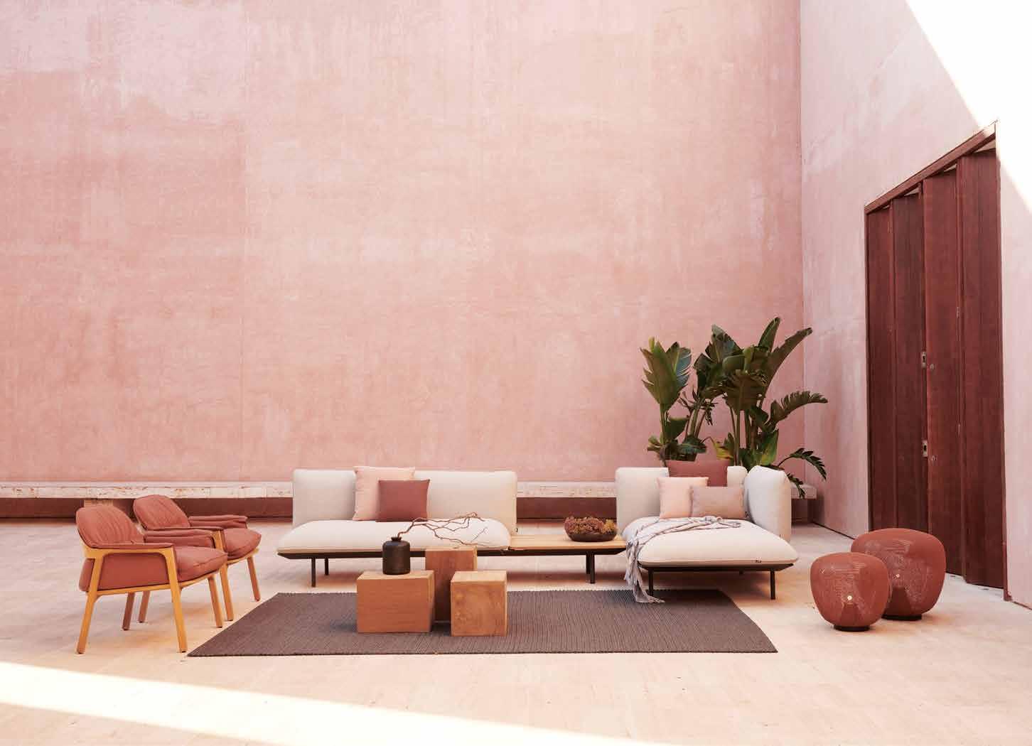
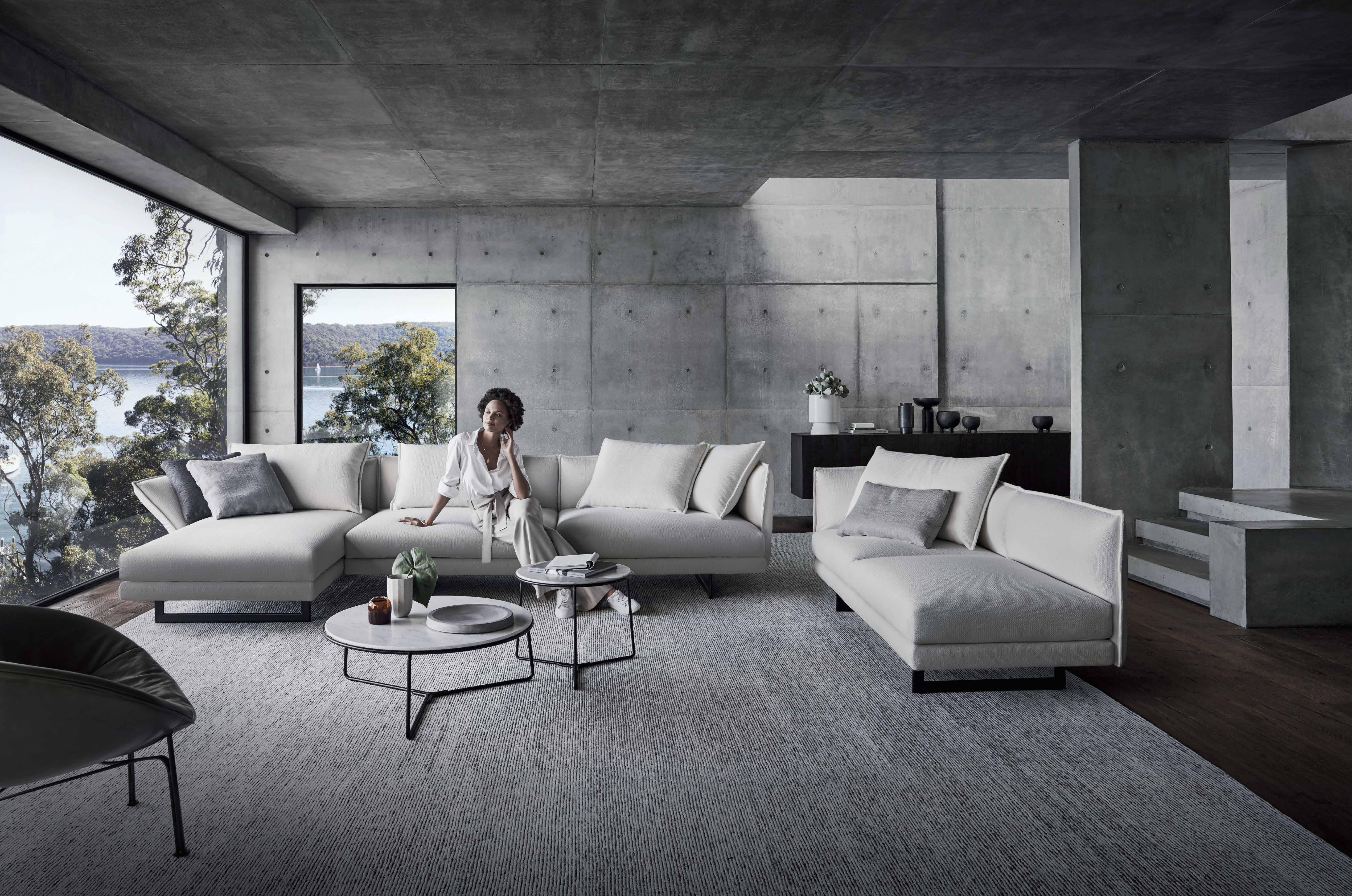
Curl up and relax on the modular SENJA sofa from Cosh Living . The highly flexible design invites you to combine a one, two or three-seater module with either high or low arms and a choice of regular or extradeep cushions for the ultimate outdoor lounge experience.
coshliving.com.au
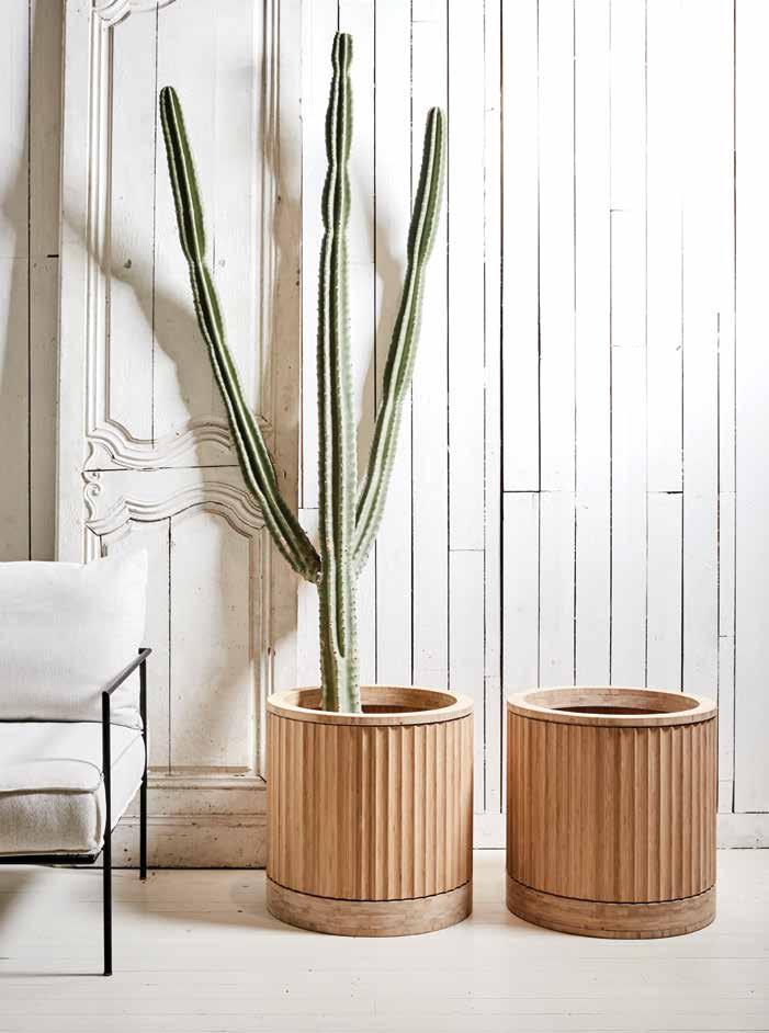
The PLEAT COLLECTION designed by Adam Robinson for House of Bamboo is a range of modern and simple planters with smart architectural detailing. outdoordesignerstore.com.au
An Organised Life ’s 2020 COLLECTION is designed to bring structure and organisation into busy lives through a curated selection of minimalistic stationery products.
anorganisedlife.com

1 . lightbox # 27
Through thick and thin
poliform.com.au
With summer on the horizon, Australian outdoor furniture design house, Tait , and Australian and New Zealand based textile house, Mokum , have come together to produce a Summer 2019/20 collection, reaching new levels of outdoor comfort and effortless style, built to last in Australia’s unforgiving elements.
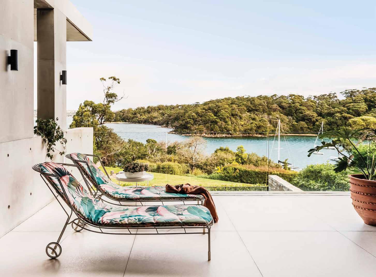
madebytait.com.au
 The CREEK coffee tables from Poliform are a collection of freely matching coffee tables consisting of two overlapping trays in wood, stone or a lacquered option, resting on a finely brushed metal frame.
issue #46 habitusliving.com
Introducing the new STONE CONNEXION range of porcelain stoneware with colours that express all the natural characteristics of stone to create a naturallooking, hardwearing surface for both exterior and interior areas.
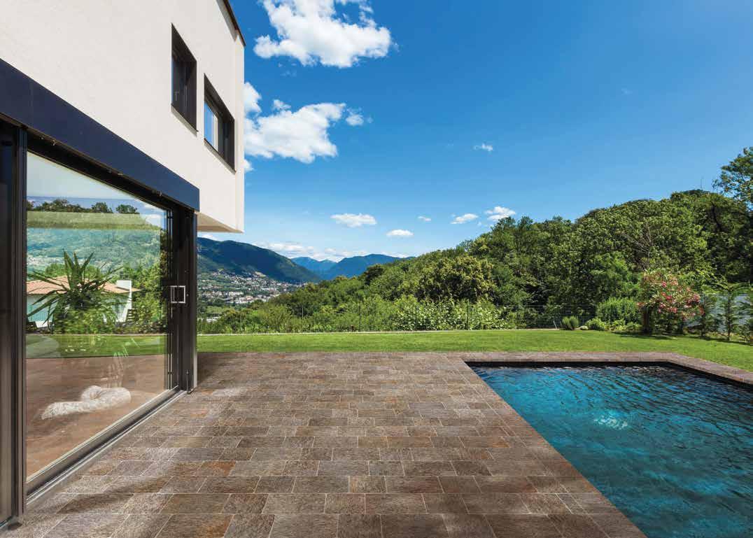
rockson.com.au
The TERRA range is a new collection of lights for the interior from Marz Designs Architecturally constructed, fresh and deceptively simple, Terra uses natural materials in functional forms. The range cleverly incorporates multiple combinations to create a broad and versatile selection of pendant, wall and ceiling lights.
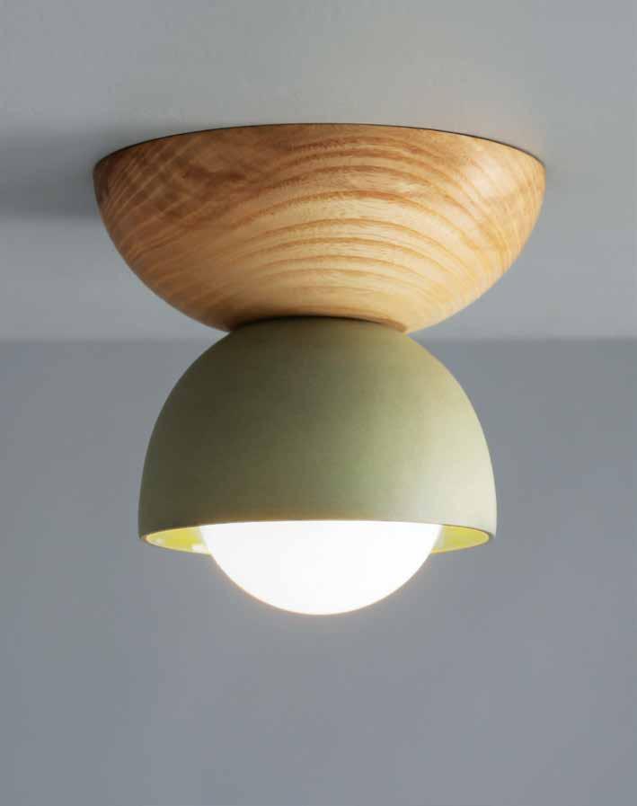
marzdesigns.com
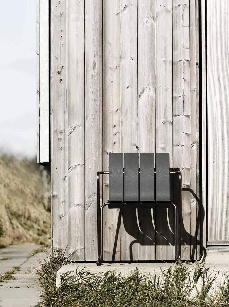
The OCEAN COLLECTION is a reimagined tableand-chair collection made entirely from ocean waste and recycled plastic. Combining innovative solutions to prevent pollution of the world’s oceans with one of the 20th century’s most renowned designers, Nanna Ditzel , this 1955 design is characterised by its light structure and is made and tested for outdoor use.
cultdesign.com.au
1 . lightbox # 29
All in the making
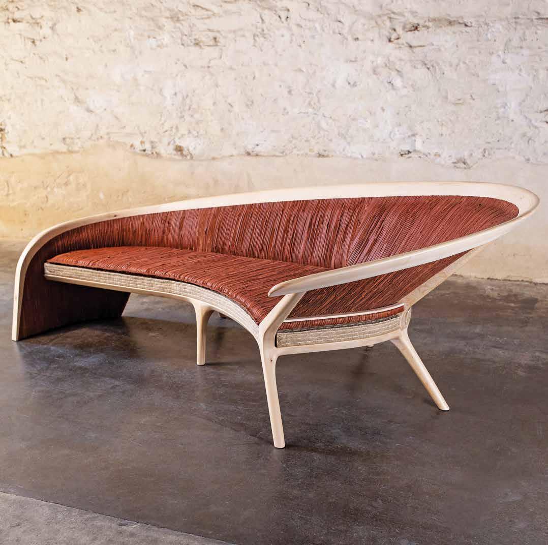
BROACHED GOULDER designed by Jon Goulder marks a very new direction for Broached Commissions . It is the first time the creative studio has focused on the narrative of one of its collaborators. This new collection of limited edition furniture recounts, through artisanal making, a deep connection between a fourth-generation Australian furniture maker and the generations that came before him. broachedcommissions.com
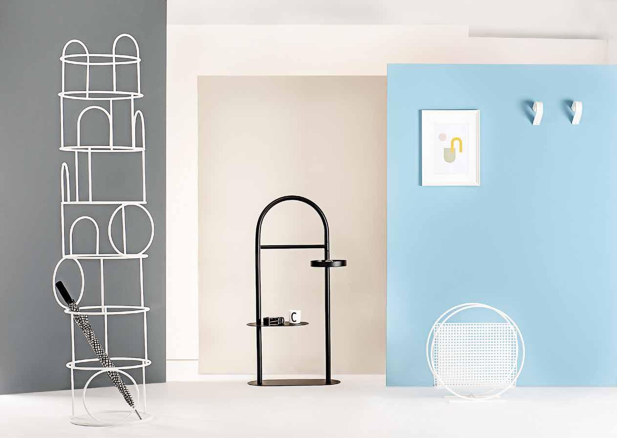
The new ROOMMATE collection, unveiled by Formae at Maison et Objet, features a modular and proudly limitless language, whereby each component is designed to become true companions in the room in which they are placed. This therefore creates a collection filled with products understood as ‘roommates’.
formaecollection.com
issue #46 habitusliving.com
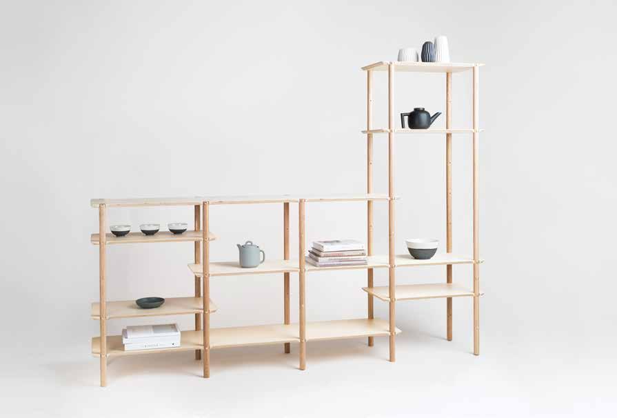
The SHIBUI L SHELF provides modular versatility with an aesthetic inspired by the Japanese notion of Shibui. Custom made brass pins punctuate each shelf offering a sophisticated, unique detail against the understated Tasmanian Oak and birch timber used.
plyroom.com.au
outdoor dining table was designed Giorgio Cattelan for Cattelan Italia . The base is available as titanium (seen here), white, or graphite embossed lacquered steel to complement the 12-millimetre ceramic top in matt Golden Calacatta.

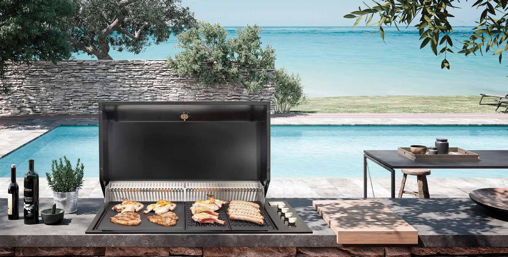
The ARTUSI Built-In Barbecue is the perfect appliance to take centre stage this summer. Featuring a completely built-in slimline design, it will be sure to add style and finesse to your outdoor space.
artusi.com.au
1 . lightbox # 31
Take a moment
Kun Design ’s collection of outdoor furniture, now available at Domo, offers modern, versatile pieces for any season, style and setting. The range is inspired by nature and life with forms and colours drawn from exotic flowers and plants; while the settings are designed for relaxation, conversation, dining and entertaining.
domo.com.au
Rectangular teak slats and matte white aluminium frames cut a stylish and airy swath. PERCH makes every day look like a holiday. Beautiful to behold from the back, side and front, the collection is made lounge-worthy with cushions covered in mildew and faderesistant Sunbrella™ fabric.

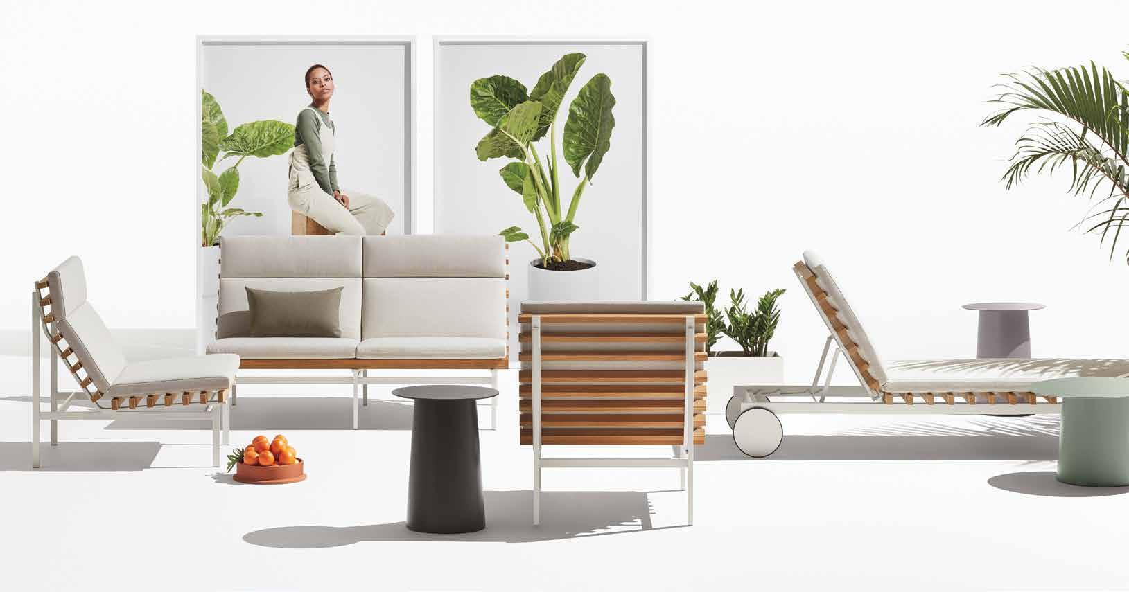
bludot.com.au
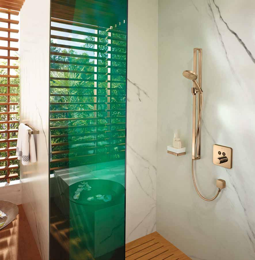
Utilising the PVD method to create robust and durable surfaces that are tougher than galvanised finishes, AXOR tap wear and shower ranges with FinishPlus surfaces include a choice of 15 metallic brushed or polished shades and are resilient enough to withstand use in outdoor kitchens or showers by the pool or seaside.
axor-design.com
issue #46 habitusliving.com

Materials matter
Celebrating the horizontal life, Ross Didier ’s new PUFFALO modular range exemplifies laidback style. Flop down, chill-out and feel yourself descending into slow motion. Puffalo inspires multiple combinations of voluptuous shapes and can adapt from the largest of living rooms to the smallest statement spaces. didier.com.au

robertplumb.com.au
 The RIBBON RANGE by David Harrison for Robert Plumb takes its inspiration from Bauhaus tubular metal furniture reinterpreted in a flat steel bar. Exemplary for life outdoors, the Ribbon Range looks surprisingly comfortable indoors as well as out.
issue #46 habitusliving.com



Life through design
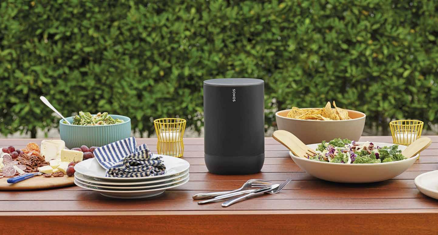
Introducing SONOS MOVE , the indooroutdoor speaker with all the smarts you’ve come to expect from Sonos . Connect to your Sonos system over WiFi at home or stream via Bluetooth everywhere else. Now you can take Sonos wherever the mood takes you.
sonos.com
SITZBOCK by Wilkhahn is designed with collaborative areas in mind. It’s great for brainstorming sessions and spontaneous interaction, inspiring both the body and the mind to try something different.

wilkhahn.com
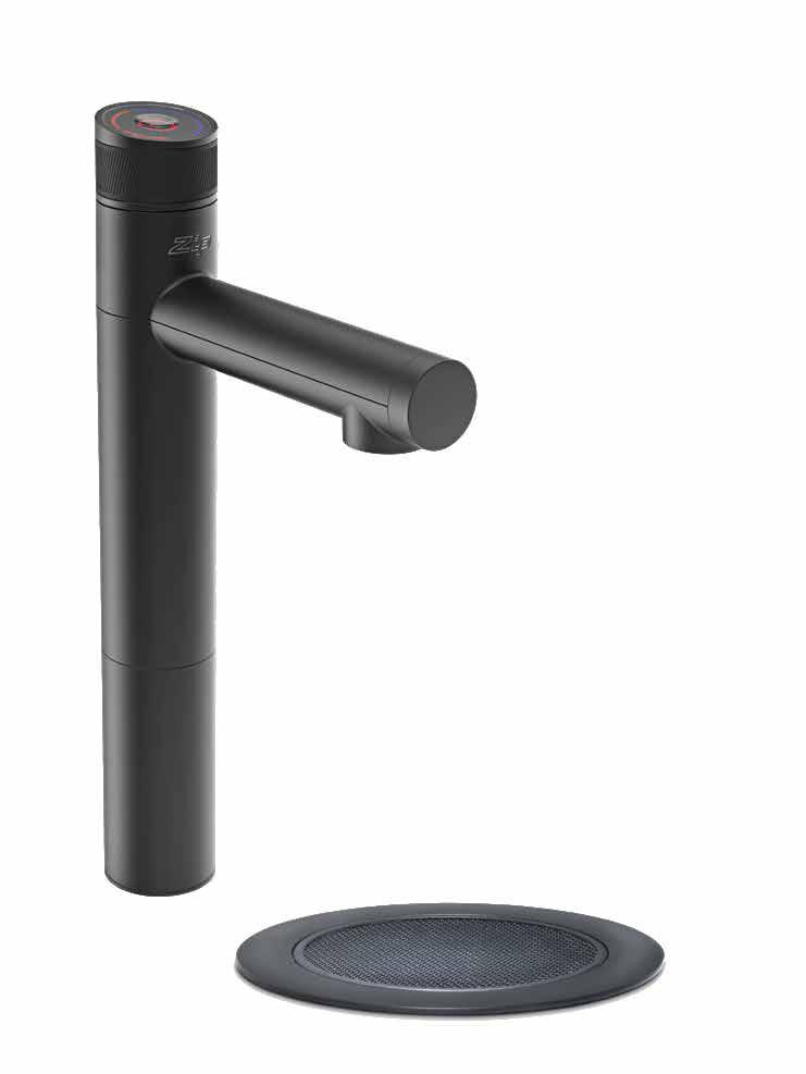
Zip Water has launched ZIP MICRO – the company’s smallest drinking water system that fits under almost any bench and delivers perfectly filtered boiling and chilled water instantly at the touch of a button.
zipwater.com
issue #46 habitusliving.com
For more inspiration visit polyflor.com.au

Finding balance
At the turn of the millennium, in 2002, Sam Hecht and Kim Colin formed Industrial Facility. The former was an industrial designer from London and the latter an architect from Los Angeles, and the new design studio based out of London was born out of a desire to improve design solutions rather than re-invent them.

Sam and Kim’s initial ambitions were to work with big studios, without having to become one. At the time, being seen as a large studio seemed like it would increase their chances of realising these goals. Strategic thinking came into play here, and the name of the studio, Industrial Facility, was used for its ambiguity. “The only way to do this was to initially confuse companies (who would not normally work with such a small studio) into thinking that, like them, we were a large corporation…‘Industrial Facility’ means nothing on the one hand, and everything on the other,” says Kim.
Evidently, it worked: Industrial Facility has long standing relationships designing for some of the most well known, global brands. For 20 years Sam and Kim have been designing for Japanese giant Muji, known for the emphasis it places on design minimalism, recycling, and reducing waste created through packaging. For the past ten years they have been working with Herman Miller, “where some of our best work has been produced”, says Kim. And over at Matiazzi, they have recently become art directors.
Industrial Facility also counts collaborations with Issey Miyake, Emeco, Epson, Santa & Cole and Wästberg.
While they have more than a few big-name companies listed in their portfolio, they’re also working with lesser known companies that offer very different experiences.
“Probably few of your readers would be aware of the medical company Novo Nordisk,” says Sam, of the Danish company Industrial Facility has been working with for more than a decade. “We do this to gain a high level of engineering understanding.” They have also worked with a number of start-ups on various projects over the years.
There’s a unique push and pull for designers between designing for oneself and designing for a large, varied, and global consumer base. On the one hand, design tends to mirror the passion of its creator and oftentimes this passion can be found in a fairly obscure focus. But on the converse, Industrial Facility is steadfast in its desire to create products that provide or improve a solution for many.
They sincerely enjoy collaboration, and in many ways a third party can help tease out a product that is both unique and viable commercially. Not only that, but the enthusiasm of others fuels their own motivation during the process. “Design is by virtue a grey subject: it’s not pure art or pure science. So the only way for success is if everyone is excited, curious, questioning
and inquisitive. Above all, I love the fact that rarely do we end up where we intended –nothing is prescribed,” says Sam.
Shifting to a forward focus, it’s hard to anticipate where we might see Industrial Facility. The long-term future isn’t something Sam and Kim believe you can accurately predict, so why box yourself into plans that might not be relevant or available? Social culture is evolving rapidly, Kim poignantly notes that ten years ago business like Uber, AirB&B and WeWork – and the very new patterns of behaviour that they facilitate – were nowhere on the horizon.
Thinking about the future needs of the industry, however, can be a little easier to consider as there are some non-negotiables at play. “Sustainable consumption must be taken up with vigour by the industry,” says Sam, specifically flagging single-use packaging that can’t be recycled. But there are other elements in the design process where there is room for improvement, too, such as widespread adoption of recycled or sustainable materials, reducing/recycling off-cuts, ensuring longevity and durability (phasing out built-in obsolescence), educating consumers to repair rather than replace, and cradle-to-grave management. “There are strong currents blowing but nothing yet concrete,” he concludes.
Industrial Facility | industrialfacility.co.uk
TEXT HOLLY CUNNEEN | PHOTOGRAPHY PETR KREJCI
The complementary insights of industrial designer and architect give Industrial Facility a unique advantage.
issue #46 habitusliving.com
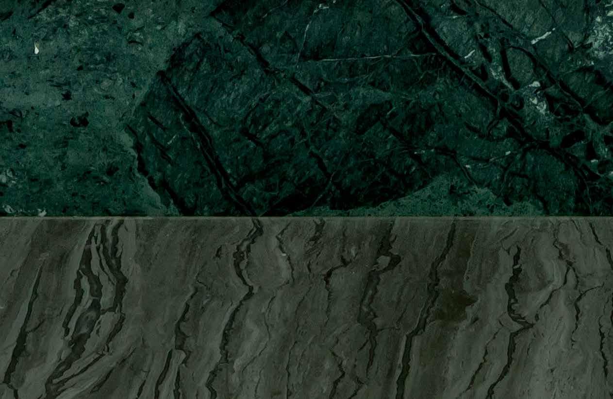
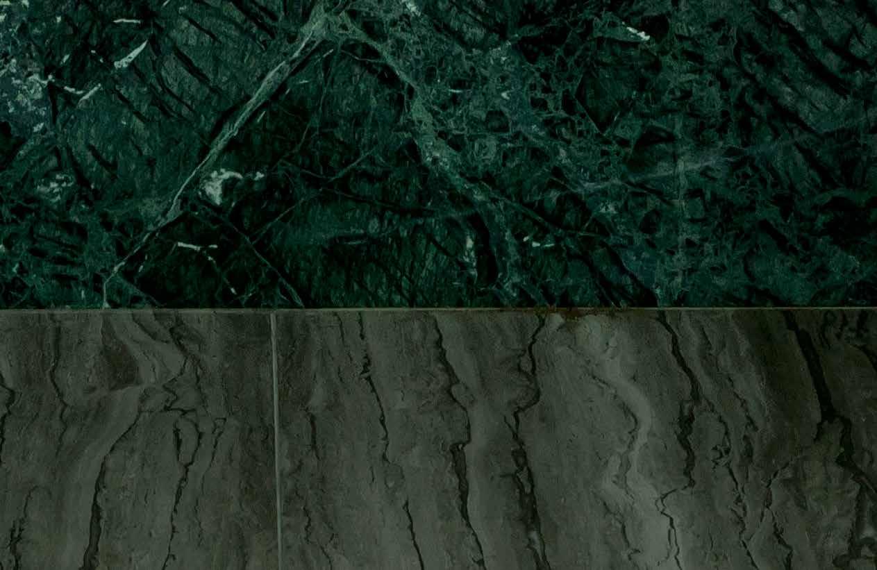


 111 One-handle built-in mixer in natural brass
2019 1969 Timeless VOLA Design Pty. Ltd. - 94 Wellington Street - VIC 3066 Collingwood Phone: +61 402 372 480 - sales@vola.com.au The original Project: Arjaan De Feyter Interior Architects
Designed by Arne Jacobsen in 1968 vola.com
A special Design News from our Habitus House of the Year Design Hunter partners
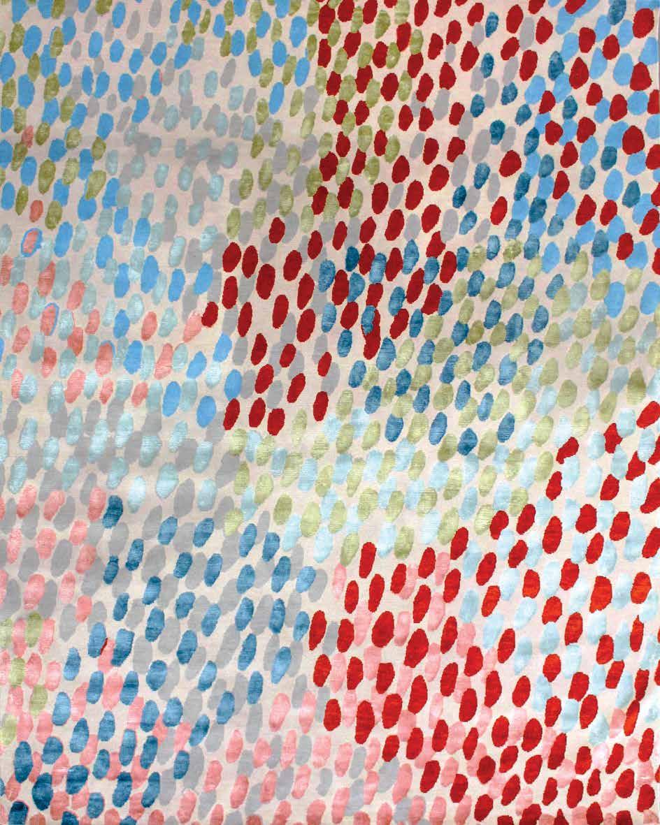
With an expanded range of ten nature-inspired hues in their best-selling AGRA collection, Armadillo & Co. presents a rug suited to every style and occasion.
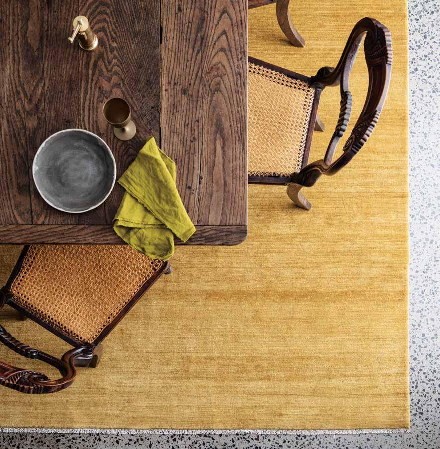
armadillo-co.com
Hale Mercantile Co. has become synonymous with luxury linen in Australia and around the globe. Grown, spun, woven and sewn only in Europe, their entire pure linen collection boasts an unrivalled colour palette and texture beyond compare.
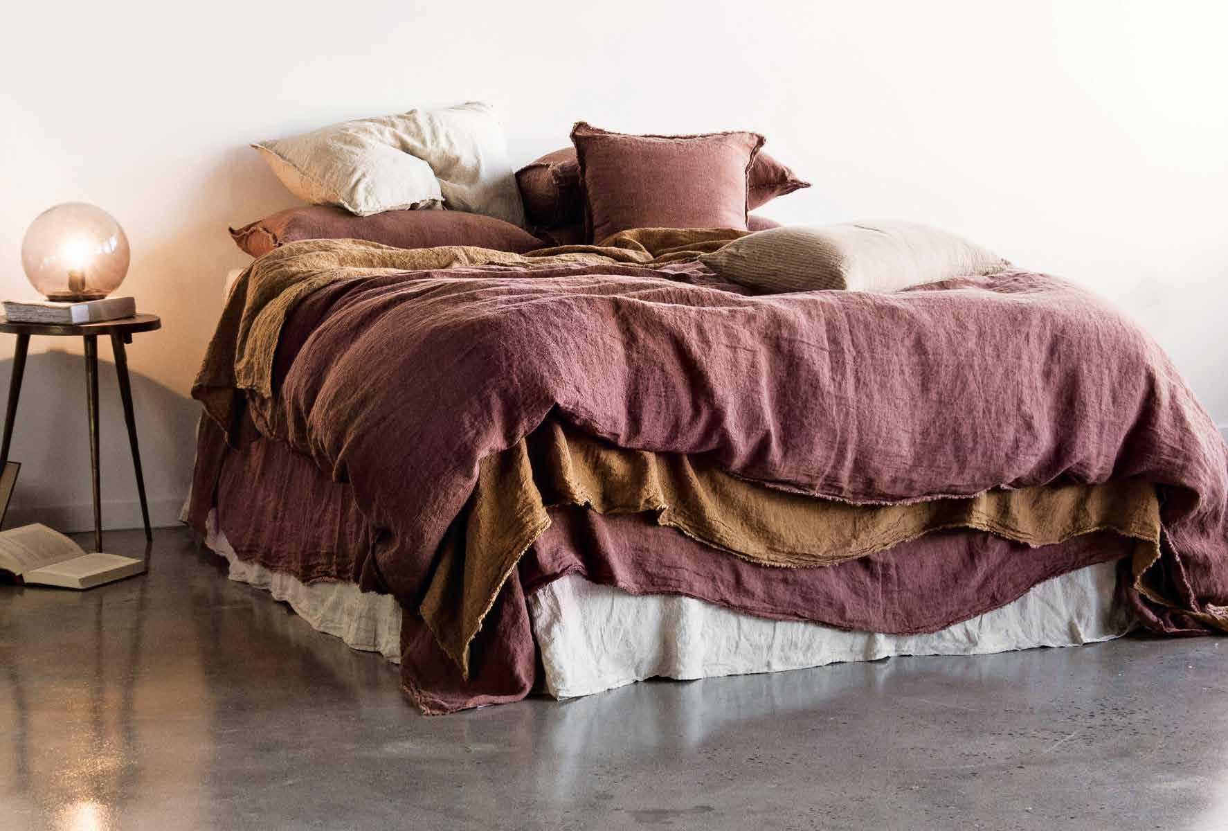
halemercantilecolinen.com
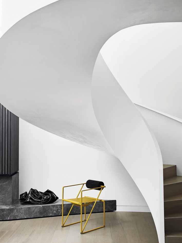
Studio Gallery represents a relevant collective of artists from emerging to advanced career. Their Melbourne galleries are on High Street, Armadale, and in Cheltenham – one of Melbourne’s largest art exhibition spaces – with a Sydney gallery set to open soon.
studiogallerymelbourne.com.au
issue #46 habitusliving.com/houseoftheyear
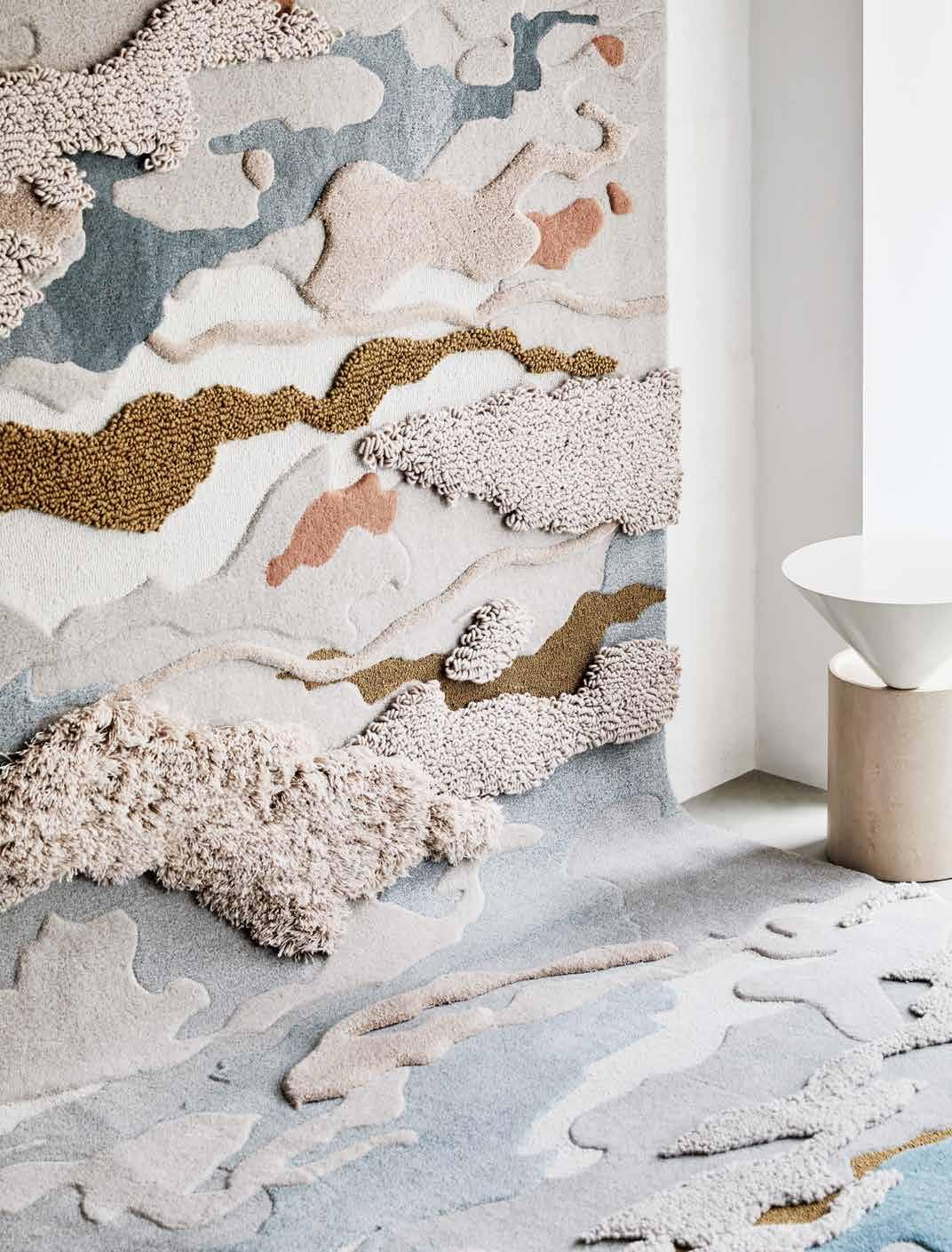
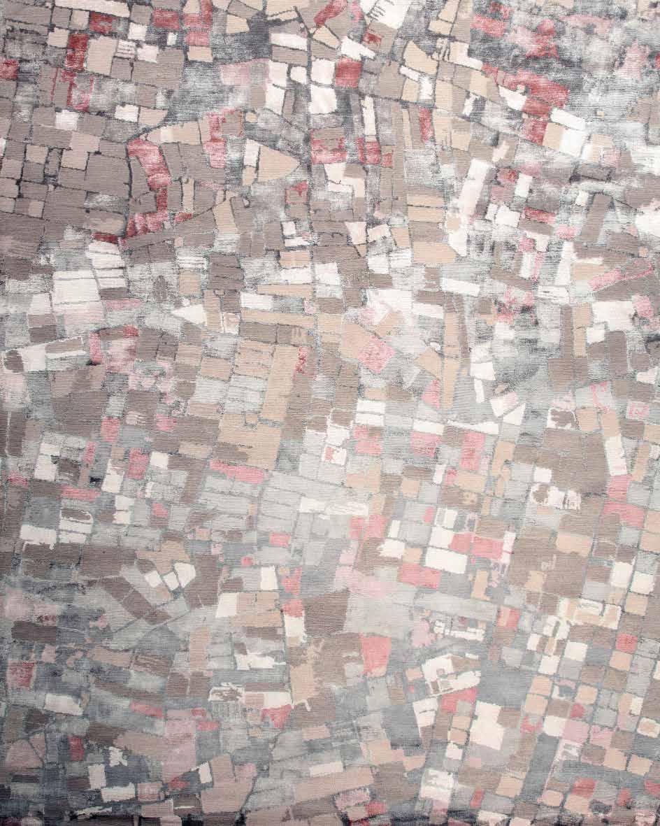
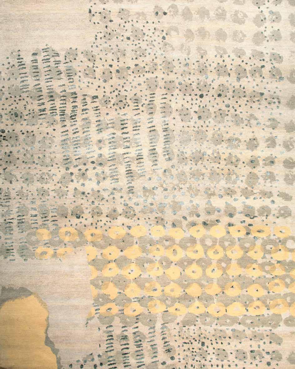
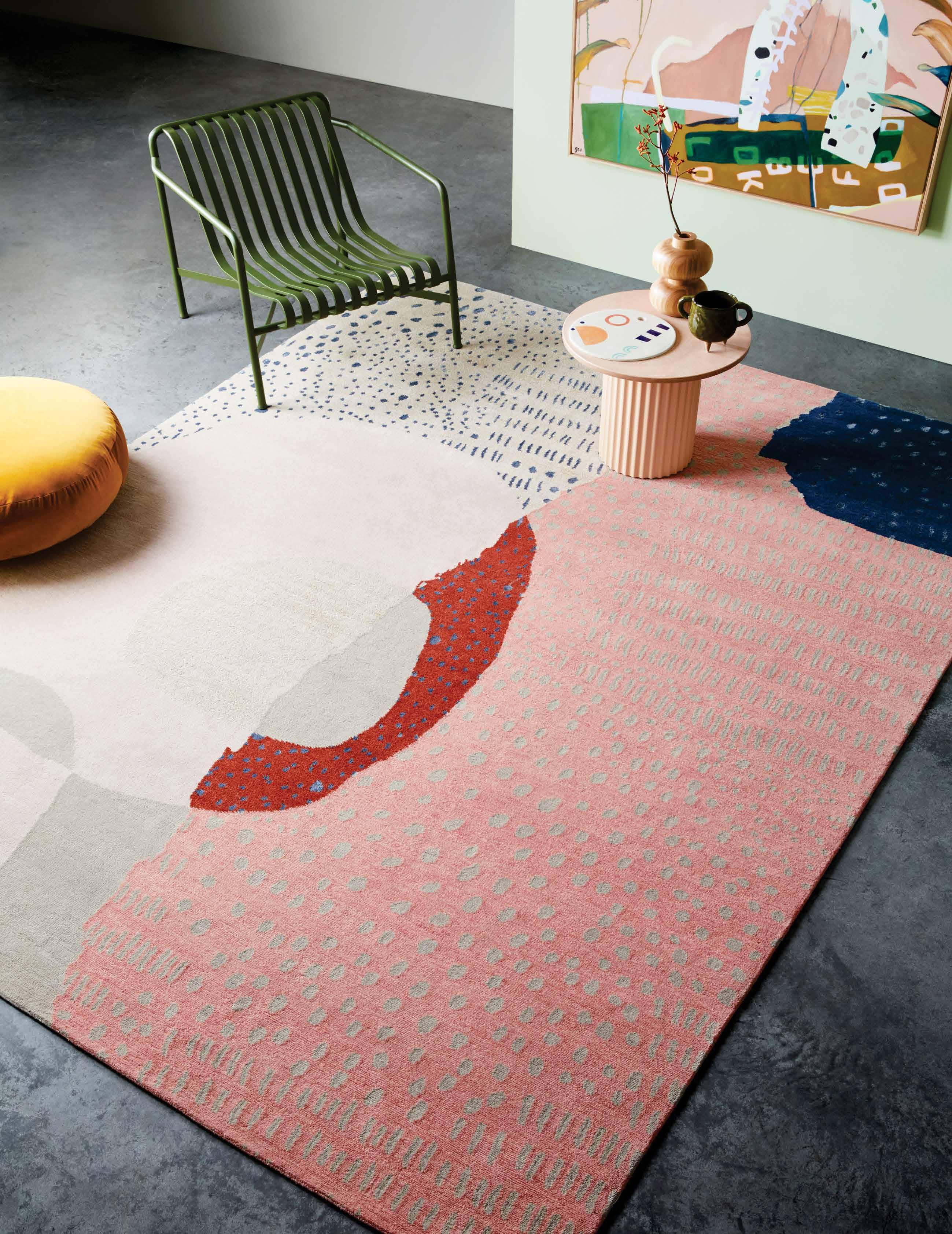
The X-MATERIALITY collection from Tsar Carpets features a wide range of textures, layers and colors to tell a nostalgic, calming story of coastlines, sand and ocean formations. Meticulous details have been translated into soft textiles using expertise and a passion for materiality and continual development of new construction techniques through experimentation and play.
tsarcarpets.com/x-materiality
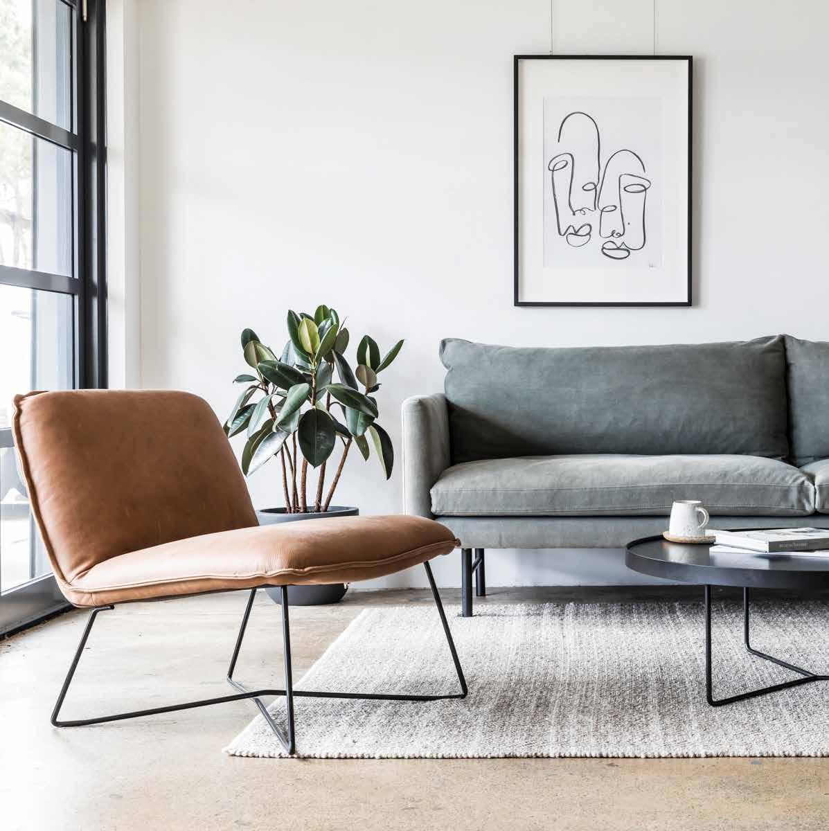
The ANDY occasional chair from the Design Kiosk collection is effortlessly comfortable, modern and inviting. Available in three natural-hued aniline leather options, this armless chair makes a timeless addition to any interior.
project82.com.au
is perfectly balanced on the edge of a rod, expanding the collection of lamps.
euroluce.com.au

#41 habitus house of the year Design Hunters
Designed by Michael Anastassiades for Flos , the IN&OUT version of the iconic IC Light creates atmospheric lighting for indoor or outdoor use. The sophisticated design takes as its basic form a sphere that
The BEOSOUND EDGE is a speaker and minimalist design object in one. Just one of many Bang & Olufsen wireless speaker systems designed to play seamlessly together across any living space.

premiumsound.com.au
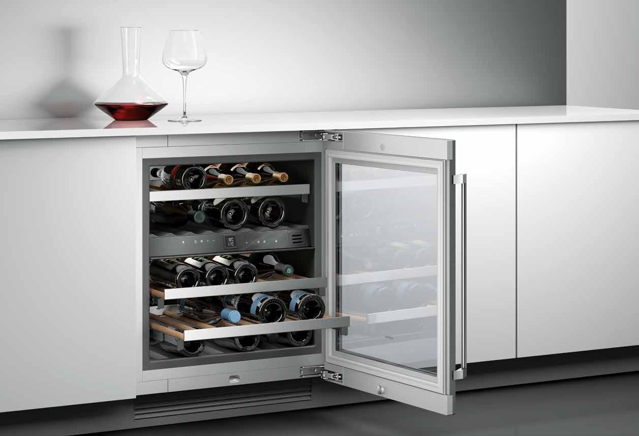
The under bench wine climate cabinet 200 SERIES integrates perfectly into any kitchen offering many functions; including two independent climate zones and a presentation light. Stainless steel with framed glass, 82 centimetres high by 60 centimetres wide, it holds a substantial 34 bottles in perfect comfort.
gaggenau.com.au
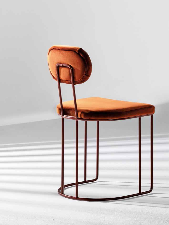
Designed by Anne-Claire Petre for Anaca Studio, the SEDIS CHAIR balances sculptural curves with strong, minimalist lines. Informed by art deco architecture, the seat and backrest may be upholstered in fabric or leather with the steel frame finished to a choice of five house powder coat colours.
stylecraft.com.au
issue #46 habitusliving.com/houseoftheyear
Designed in Australia, ZIMI is Phoenix Tapware ’s most versatile collection to date. There are 27 colours and finishing combinations available across a unique range of mixer taps, shower mixers and outlets. The colour options within the collection exist in three core palettes: neutrals, pastels and metallics.

phoenixtapware.com.au
earp.com.au
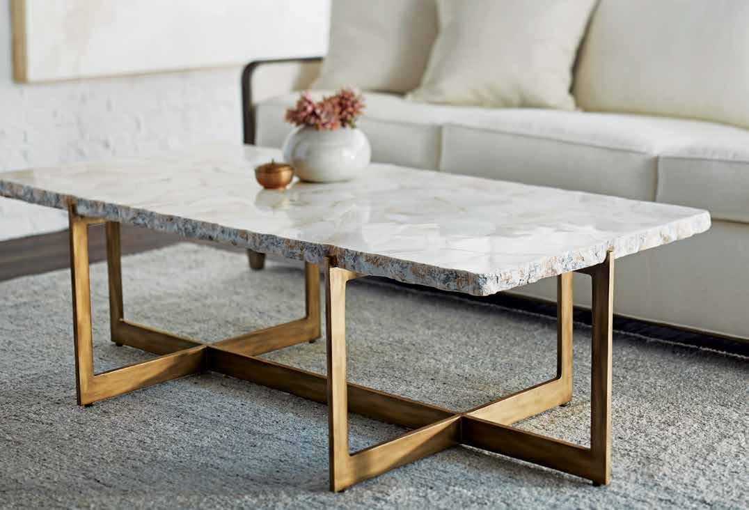
The DURHAM FOSSILISED CLAM COFFEE TABLE is crafted with inlaid fossilised clam shells which have gone through the process of permineralisation. Incredibly, fossilised clams are not found at the bottom of the sea, but on top of remote mountains, often embedded in ancient lava flows.
boydblue.com
#43 habitus house of the year Design Hunters
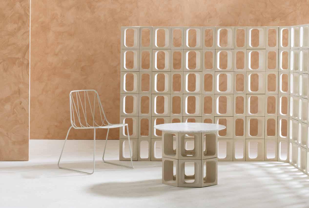
An award winning design by Tom Fereday for Earp Bros , OMNI reinvents the traditional breeze block by utilising a faceted modular shape that allows for a multitude of new and innovative applications to be built and designed.
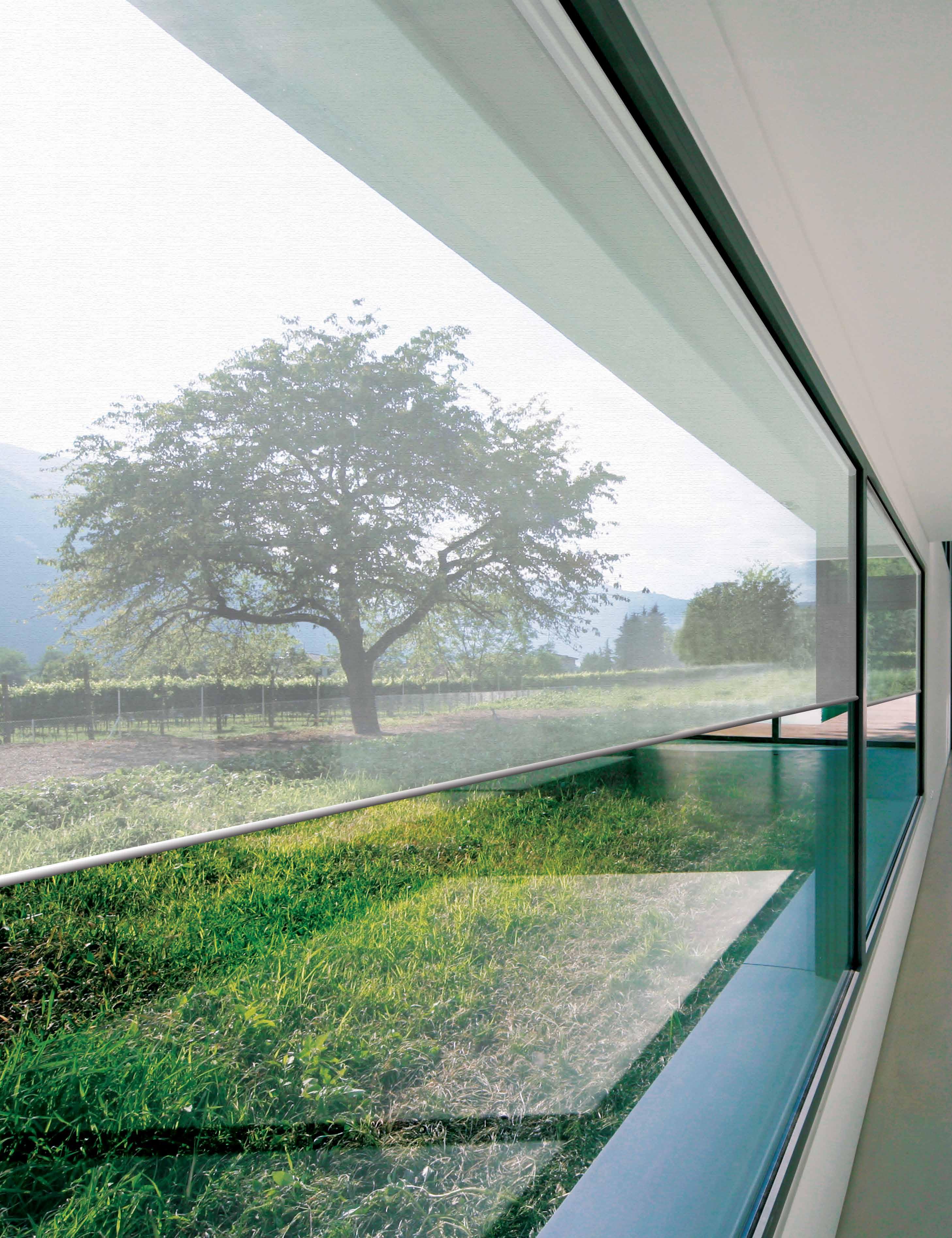
The one and only SilverScreen
The Global leaders in metallised performance fabrics and solar control solutions, Verosol use Nano type technology to create a product that no one else can match. The best in the market at reflecting solar radiation without affecting your view to the outdoors. Blinds with Verosol’s SilverScreen is not a cost it’s an investment.
1800 011 176 info@verosol.com.au verosol.com.au
Personal stories, shared

Storytelling through objects
From his base on the New South Wales south coast, Trent Jansen uses his work and its reach to sensitively share important historical narratives with a greater audience.
TEXT HOLLY CUNNEEN | PHOTOGRAPHY TONY AMOS
Trent Jansen calls himself a design anthropologist and anyone who is familiar with his work, and certainly anyone who has shared words with the man, can surely attest to this.
His folio is varied yet every object or collection he has designed reveals the same depth of research. Although one wouldn’t expect anything less, within the first five minutes visiting him at his recently completed studio in Thirroul on the New South Wales south coast, I understood this on a whole new level.
Towards the end of his time at UNSW Art & Design (formerly COFA) studying design, Trent was granted the opportunity to intern with the inimitable Marcel Wanders in Amsterdam. Trent’s first “proper taste of this kind of world” was a positive experience by all accounts and he is still in touch with the iconic Dutch designer today. Crucially, the experience helped him realise something very important: “I learned that he was my favourite designer, but I didn’t want to work for him,” he says.
Trent’s love of storytelling and anthropological research frequently comes into play in forming the basis of his projects. “It definitely starts off with research; it’s often something I want to learn more about or that I think is an important thing to talk about,” he says. “For me, it’s about telling stories that are otherwise untold.” A lot of the information he acquires comes from history books and academic texts but he also makes a concerted effort to engage with people who form a part of the story either directly or through their lineage.
issue #46 habitusliving.com

2 . portrait # 47

issue #46 habitusliving.com
Of course there is a sensitivity to be observed around the sharing of other people’s and cultures’ stories, of which he is acutely aware. From his perspective it is a great way to use his skillset to share important narratives with a greater audience. “It’s also important to me that the people that own those stories have the right to say yes or no as to whether I use them,” he notes.
Some of the more iconic projects he has worked on over the years can be seen as key examples of the depth of research that informs his work and the seriousness and sensitivity with which he takes sharing narratives.

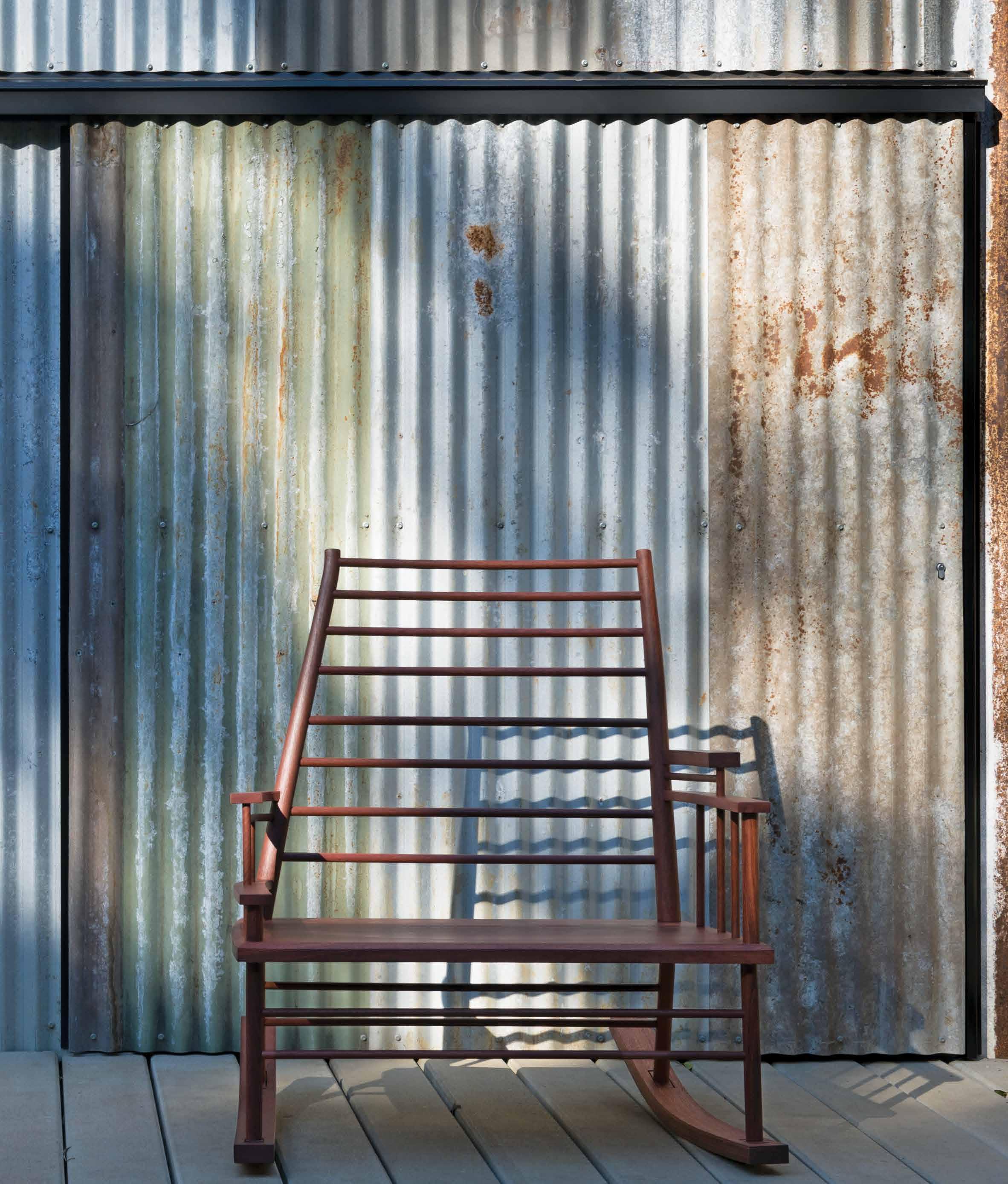
In 2013 Trent designed and produced, working with Adam Price of JP Finsbury, the Chinaman’s File Rocking Chair for Broached East by Broached Commissions. The limited edition collection was an exploration of Asia’s influence on Australia – especially China’s and Japan’s – since the industrial revolution. It had a particular focus on the mid-19th century.
The design theory is informed by a history lesson, it’s what inspired Trent to design what he did. And why close collaborators such as Adam and local carpenter Chris Nicholoson, who made the second edition in 2019, need to share his passion for making with purpose.
Chinaman’s File Rocking Chair is designed to simulate the movement a child experiences when carried in a traditional Chinese baby sling on the mother’s back. The rocking mechanism mimics the distinct rocking motion of the sling – the exact arc – which was
something Trent was able to observe in a filmic study and is very different to that of a normal rocking chair. It was also designed with a rural aesthetic in mind rather than a regal one, in accord with the class of economic migrants.
More recently, The Shaker Family Home is the physical result of an anthropological interest in Shaker-style furniture and, zooming out, Shaker culture. It was first seen at Salone del Mobile.Milano 2019. The cabinet that Trent has created, once again working with Chris Nicholson, represents a Shaker home with elements that are disparate from the cabinet as a whole. The drawers pop out and operate as autonomous objects. The top drawer, for example, becomes a desk, another drawer becomes a candelabra, and another becomes a mirror.
Trent was intrigued to note dual meanings within Shaker religion, crafting by hand, for example, also being understood as an act of prayer. And the furniture makers within the faith would certainly spend many hours ‘praying’ in this way, it became clear to Chris, working on this project with Trent, that the level of detail comes from an incredible amount of time spent and devotion to the craft. Critically, Trent and Chris share these values. “It’s not a story that could’ve happened with someone that was doing it on the clock. There’s so much time, so much precision, and so much detail. But, also, so much understanding of the history and the way that that culture manifests in those details,” says Trent.
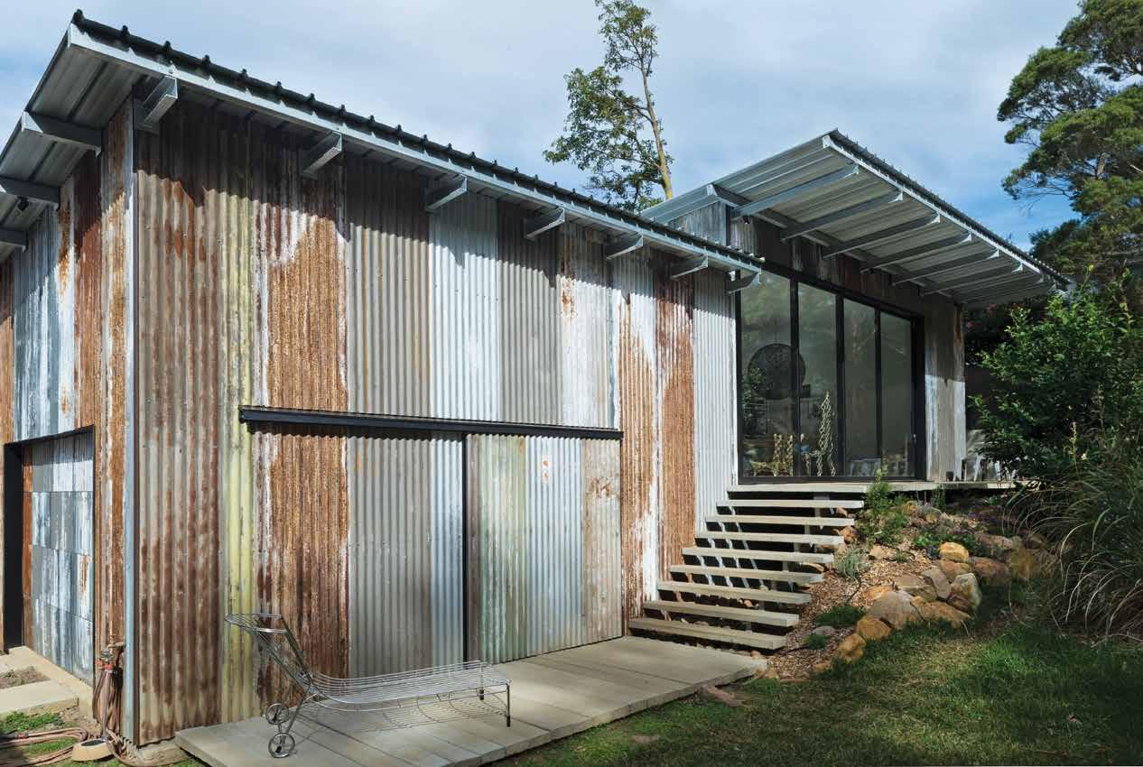
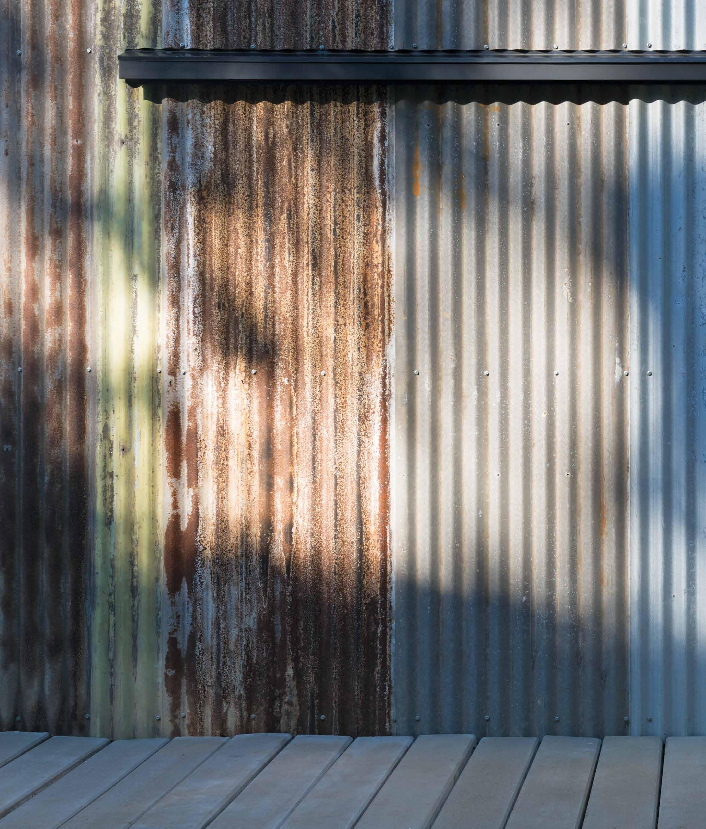
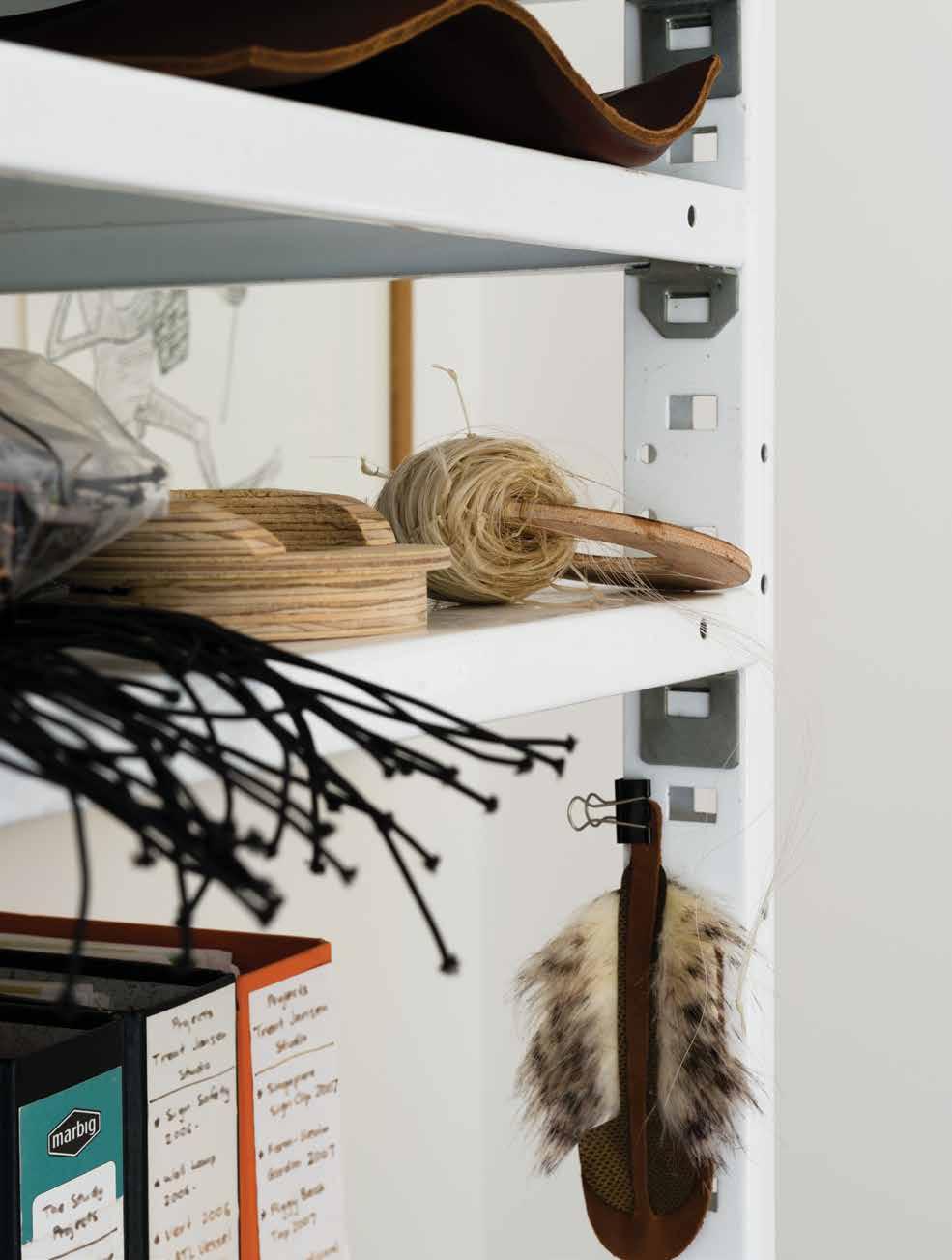
OPENER | DESIGN ANTHROPOLOGIST TRENT JANSEN SITTING ON THE STEPS LEADING UP TO HIS STUDIO IN THIRROUL, NSW. OPPOSITE | INSIDE THE “CLEAN” SPACE ARE SIMPLE METAL SHELVES CONTAINING RESEARCH, SAMPLES AND SUPPLIES. ABOVE | THE MATERIALS THAT COMPRISE THE NEW STUDIO ARE MOSTLY RECYCLED AND SOURCED BY THE DESIGNER HIMSELF, INCLUDING THE TIN SHEETS AND CONCRETE SLEEPERS.
2 . portrait # 49
Chinaman’s File Rocking Chair is designed to simulate the movement a child experiences when carried in a traditional Chinese baby sling on the mother’s back.
ABOVE | CHINAMAN’S FILE ROCKING CHAIR WAS DESIGNED IN 2013 FOR BROACHED EAST BY BROACHED COMMISSIONS.
issue #46 habitusliving.com
2 . portrait # 51

issue #46 habitusliving.com
Most recently, Trent has been working with Johnny Nargoodah, a Nykina man and studio technician who he first met in 2016 through the Fremantle Art Centre project, In Cahoots. During 2016 and 2017 Trent worked with several artists at the Mangkaja Art Centre in Fitzroy Crossing to create new work with locals. Both Trent and Johnny enjoyed working together and have continued to do so in the time since.
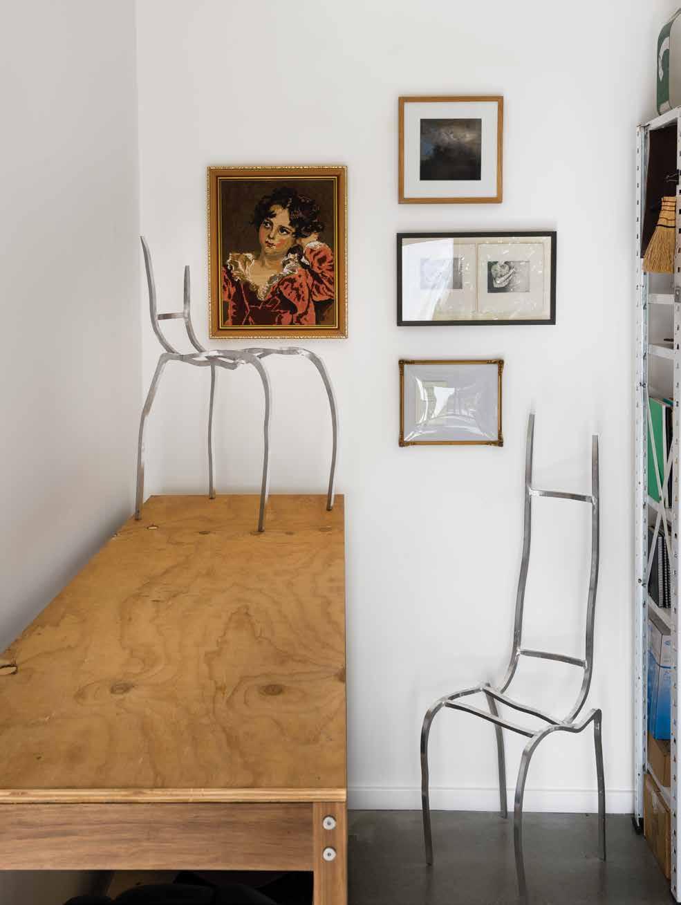
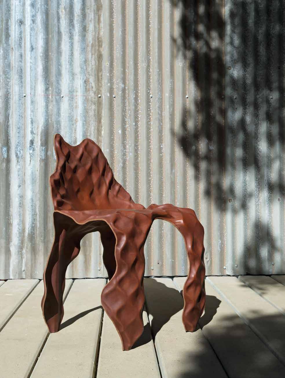
Their latest project, supported by funding from the Australia Council for the Arts, questions the notion that artefacts are conveyors of a singular set of values, attitudes and the cultural heritage of the maker/designer. Untitled at the time of writing, this work is the creation of an artefact from two people of different cultures.
It can also be seen as an exploration in ethical, cross-cultural collaboration and what that looks like: in practice as much as in the final product. Each time Trent and Johnny have worked together, this being the third, they endeavour to ensure authorship is entirely equal. With different personalities, skillsets, working habits and methods of idea generation, level collaboration can be seen as a skillset in itself.
The pair often experiments with different methods of collaborative design and making, such as sketch exchange. “Sketch exchange is a process whereby one collaborator produces a sketch and sends it to the second collaborator. The second collaborator then interprets the sketch, adding and subtracting elements based on their own sensibility, and then sends it back to the first collaborator… The process goes back and forth until neither collaborator can recognise their authorship, and the idea is a true co-authorship,” explains Trent. This explicitly equally authored work will be shown through Gallery Sally DanCuthbert and Arc One in Melbourne, during Melbourne Design Week 2020.
DRAWER IN SHAKER FAMILY HOME HAS A
OPPOSITE ABOVE LEFT | TRENT DOESN’T HAVE A SET STABLE OF MATERIALS THAT HE WORKS WITH. OPPOSITE ABOVE RIGHT | UNTITLED CHAIR BY TRENT AND JOHNNY NARGOODAH IS THE RESULT OF THE MANIPULATION OF AN ALUMINIUM SUBSTRATE WITH HAMMERS AND RAMS OVER A TIMBER PUCK, THEN LAMINATED WITH SADDLE LEATHER. OPPOSITE BELOW | THE TOP
DUAL PURPOSE, AS DO MANY OTHERS. PHOTOGRAPHY BY ROMELLO PEREIRA. ABOVE | TRENT’S DESIGNS AND HIS RESEARCH FILLS THE STUDIO.
Trent’s love of storytelling and anthropological research frequently comes into play in forming the basis of his projects.
2 . portrait # 53
The main reason for my visit, however, was in fact to see Trent’s new studio, a space that is split into an office and small workshop – “a dirty space and a clean space”. The brief was simple, and something that Trent and his partner had been drawing up plans for, for a number of years. When they were ready to turn plans into actions, they engaged Dane Taylor as a draftsman, and builder Matt Park of Good With Wood.
Originally Trent had planned to use reclaimed timber, but the result of a Bushfire Attack Level (BAL) assessment meant that all the materials had to be non-combustible, hence why concrete plays such a large role. The materials are still largely recycled, such as the retaining wall blocks made from overpour concrete and the tin exterior, Trent having sourced all the recycled materials himself.
The orientation of the studio benefits from the long side facing north with a large glass wall and sliding door marking the entry to the studio on this side; unfiltered light flows in as soon as the sun rises. “This is the warmest room in our house – or not in our house,” quips Trent.
A passive solar analysis by Dane allowed him to work out exactly how long the eaves should be to let the right amount of light in at the various times of day and year – there are currently no blinds in the studio. Surrounding bushland also works favourably, protecting Trent and anyone else using the studio from the western sun.
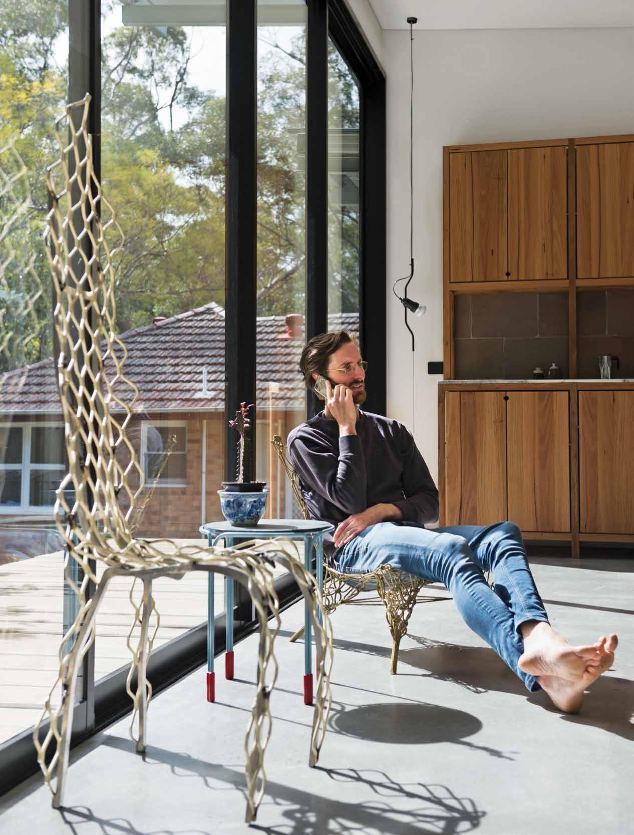
Having never designed a house or studio before, Trent worked closely with Matt and Dane as a collective on this project, each bringing unique insights and points of difference to the table. Trent’s folio of work, both personal and professional, tells the story of a creative who not only enjoys a narrative, but is a true collaborator.
Trent Jansen | trentjansen.com
ABOVE | THE KITCHEN BEHIND TRENT WAS DESIGNED AS AN INDEPENDENT PIECE OF FURNITURE. THE TIMBER WAS RECLAIMED FROM HOUSES WITHIN THE AREA.
Surrounding bushland also works favourably, protecting Trent and anyone else using the studio from the western sun.
issue #46 habitusliving.com
Seeing is Believing.

The POCO range by Gareth Ashton is inspired by the enduring pin-lever design, this elegant tapware delivers a new shape featuring a minimalistic handle and thin cylinder. A simply beautiful range that will enhance any room with its graceful forms.

SELECTION GALLER IES
335 Ferrars St, Albert Park, VIC
Ph: 03 8696 4000
1E Danks St, Waterloo, NSW
Ph: 02 8572 8500
94 Petrie Tce, Brisbane, QLD
Ph: 07 3369 4777
12 Sundercombe St, Osborne Park, WA
Ph: 08 9208 4500

issue #46 habitusliving.com
Collective Endeavour
Filipino-Australian architect, Aya Maceda, has worked in Australia and now resides in New York where she runs her practice, actLAB. Here, she speaks with friend and recent collaborator, Filipino designer Milo Naval, about the Siama Hotel.
2 . portrait # 59
TEXT AYA MACEDA | PHOTOGRAPHY KURT ARNOLD & TABITHA FERNAN
My friendship with Milo Naval began in 2011 when I interviewed him for Habitus #12, one of many articles for this title. As a Filipino immigrant to Australia, uncovering stories of designers from the Philippines became a way for me to reconnect with my roots.
Milo studied architecture and practised interior design, he spent most of his 25year career as one of the Philippines’ most influential furniture designer-makers. To design and build Siama Hotel culminates these stages, for which I was happy to be a part of as his collaborating architect.
Aya: Milo, it has been six years since we collaborated on the design of Siama Hotel. I remember an invitation to visit you in Sorsogon to talk about building a hotel on a coconut farm. Out of curiosity, I remember getting on a plane from Manila with my then two year old, driving to a remote inland location away from the usual tourist route, and finding myself awed by the vast expanse of tall coconut trees. You had already begun on the first building, your own home and you had asked me to redesign its grass roof – and to be involved in the project’s entirety.
Milo: We moved to the province of Sorsogon, my wife’s hometown to bring our kids back to their roots. At that time, we also wanted to help promote local tourism. There was nothing out there like Siama. We initially thought of

OPENER | DESIGNER-MAKER MILO
ABOVE | THE
OF
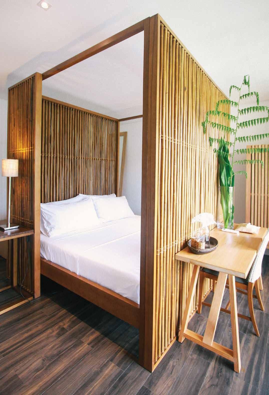
TIMBER SCREENED SUITES HOVERS ABOVE THE OPEN PLAN COMMUNAL SPACE ( LANAI ) AND GARDEN. OPPOSITE | A COMMUNAL DINING AND LIVING SPACE WHERE FURNITURE ITEMS HAVE BEEN DESIGNED AND PRODUCED BY MILO.
NAVAL.
MAIN PAVILION
SIAMA HOTEL WITH
issue #46 habitusliving.com

2 . portrait # 61
building a home for ourselves and for friends. The idea quickly expanded when we started to ask “why not share it with others”. We thought a 30-room hotel would be a good place to start.
Aya: Your vision for Siama was to create a different kind of retreat, an escape to nature in contrast to the beachfront hotels all over the archipelago. I vividly recall drawing plans, perspectives and typical details by hand spread out on the dimly lit dining table that we scrutinised over a few bottles of wine. We aesthetically desired for a modern interpretation of Filipino architecture. Like in traditional precedents, the ground floor would be a version of a Lanai – a generous, covered open-plan living space that bled to a garden, and the sleeping areas on the second floor would be given privacy and a way to control the elements by timber screens.
Milo: We talked about creating a large home. As you arrive in the lobby, you enter what looks like a living and dining space where everything is casual and communal so that people can interact and share meals as they would in a Filipino home. The furniture proportions and spaces in between are exaggerated to allow people to sit deeper and move in a relaxed way.
Aya: We discussed using common construction methods along with its complexities that drove how we designed and detailed the building. The project was conceived using a basic assembly: concrete columns, beams and slabs, plastered walls, a metal roof and a breathable skin.
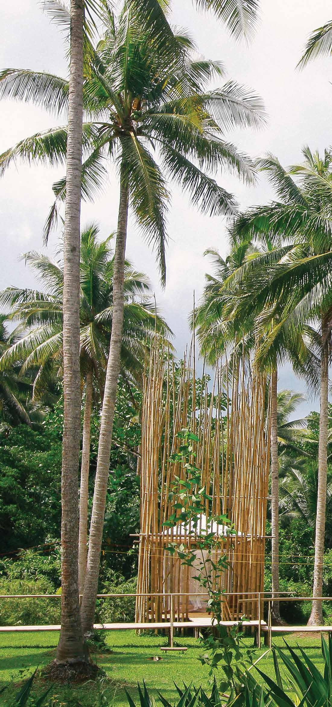
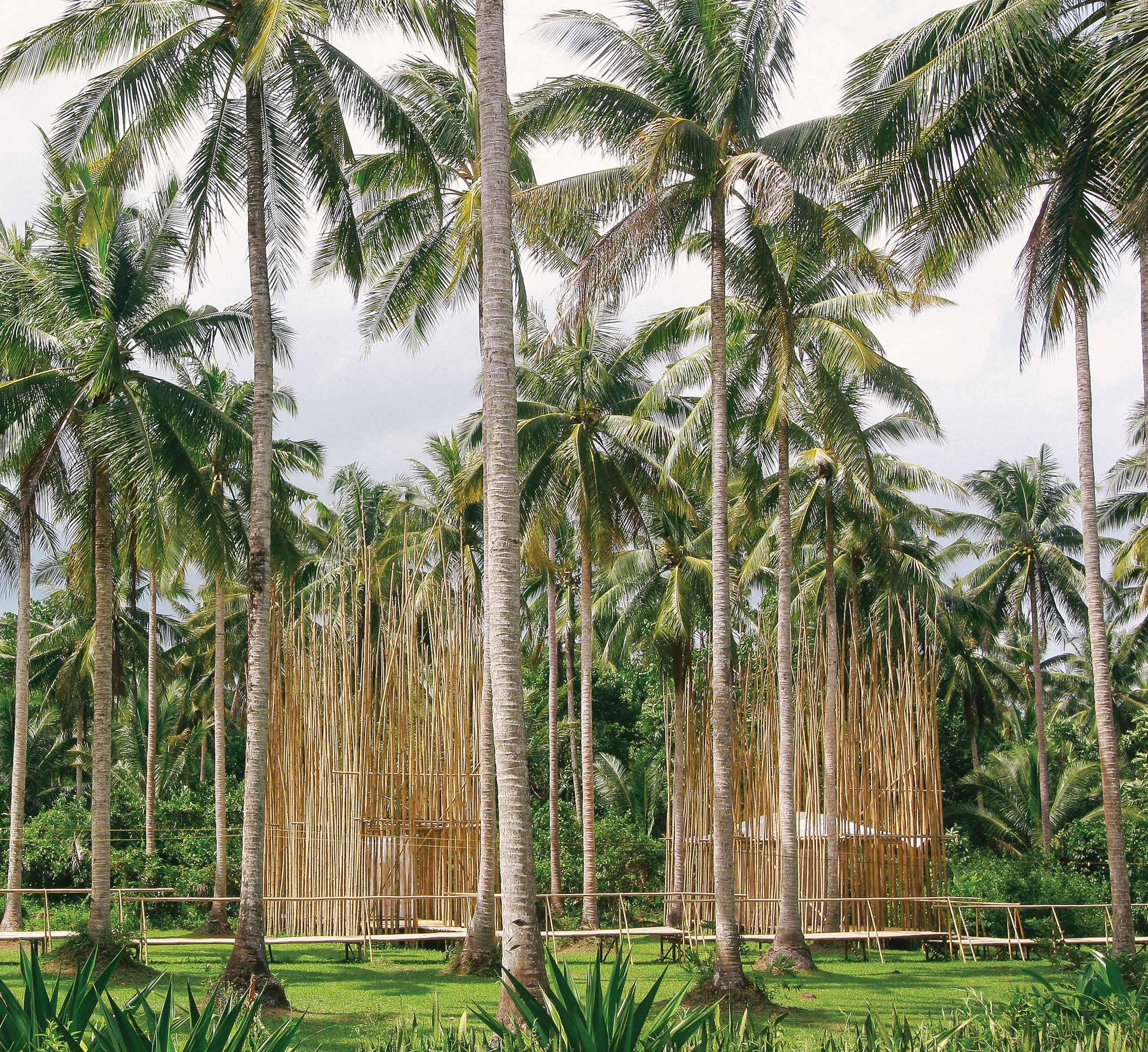
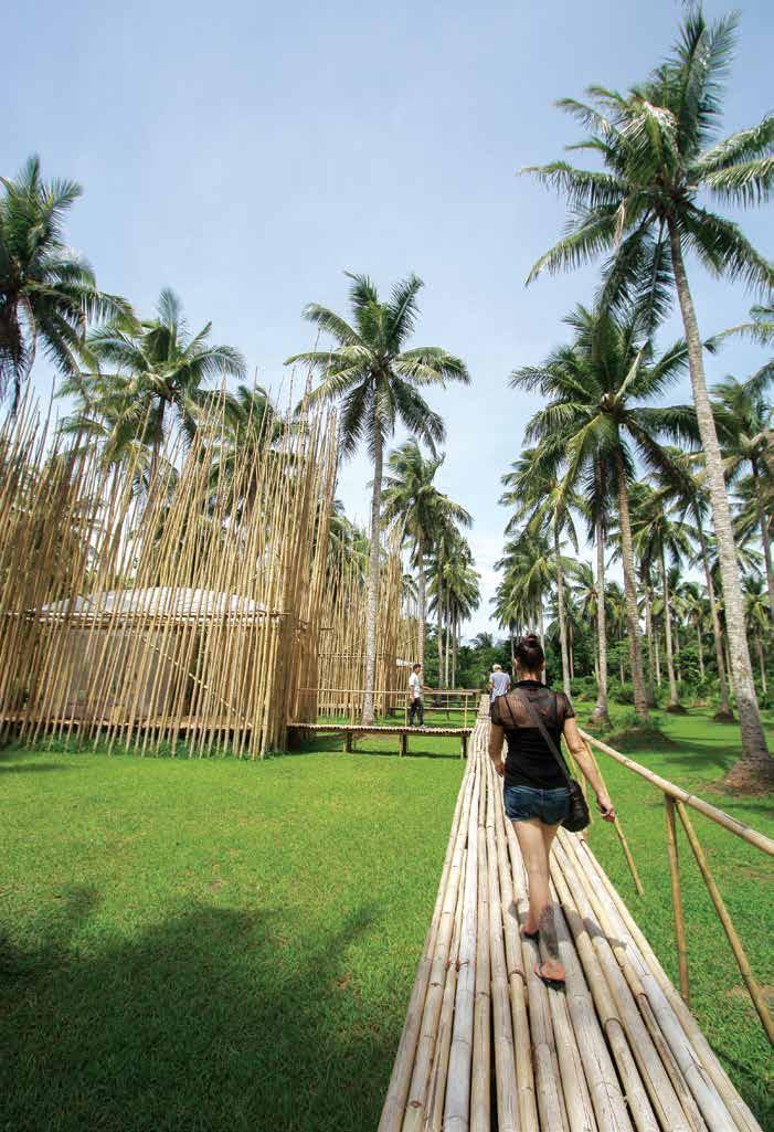
ABOVE | MASSAGE CABANAS WERE DESIGNED LIKE ISLANDS IN THE GARDEN, ACCESSED BY A BRIDGE AND GIVEN TRANSLUCENCY BY LAYERS
AND BAMBOO SCREENS. issue #46 habitusliving.com
OF FABRIC
2 . portrait # 63
Milo: We were building around what was available in terms of local skill and materials. Concrete was a material that blended well with nature and was easy to transport and work with on site. We used hand-operated concrete mixers, once in continuous shifts over 48 hours to pour the ground floor slab.
Each boulder that shaped the gardens, and transitions spaces between building and landscape, was moved by hand. Some were even unearthed as we dug for footings.
Louvres were made of abundant lightweight wood used in boats called Luktob Sliding screens were woven with rattan. We designed furniture made of local materials, as well as lights made of capiz shells. Local craftsmen and craftswomen supplied raw and finished products to us. In a way, the building of the resort supported the community suppliers and talent.
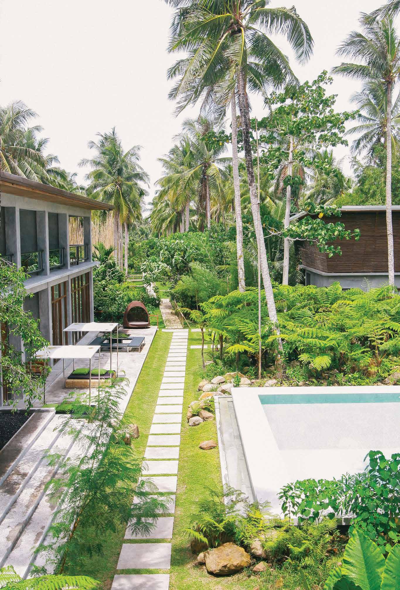
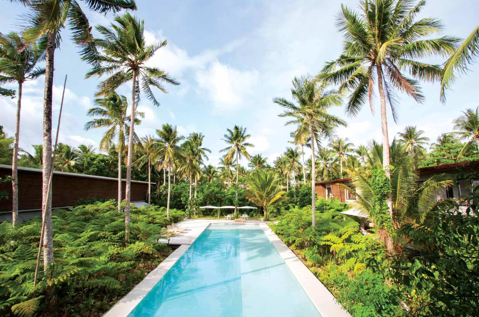
Aya: The part of the project dearest to me is the swimming pool surrounded by the garden you designed. The pool has three levels, designed for three types of users – a deep level for active swimmers including yourself, the mid level for kids, and the shallowest part for just getting the feet wet.
Milo: You introduced me to that kind of thinking, of designing one element for different situations. The pool is actually being used as designed! The garden surrounding the pool is enclosed by giant ferns on three sides that allow one way to enter and exit the pool and for privacy, like swimming in the middle of a forest.
Aya: You now spend most of your time living at Siama. You’ve even built a studio in the rear garden of the resort.
ABOVE
AS A BACKDROP
SUITES
issue #46 habitusliving.com
| GUEST PAVILIONS WITH THE EXISTING COCONUT FARM AS BACKDROP ORIENT TO THE CENTRAL POOL AND COURTYARD. OPPOSITE LEFT | MINIMALIST INTERIORS WERE DESIGNED
TO MILO’S FURNITURE PIECES – A
LIVE
EDGE TABLE WITH MIRRORED LEGS, RATTAN WOVEN STOOLS, CAPIZ SHELL LIGHTING AND A HARDWOOD ARMOIR. OPPOSITE RIGHT | GUEST
SHOWCASE
MILO’S MODERN FILIPINO FURNITURE PIECES DISTRIBUTED BY HIS COMPANY, OMO FURNITURE.

2 . portrait # 65
“We were building around what was available in terms of local skill and materials.”
Milo: I am designing in my studio and building prototypes in my workshop. The hotel has become a physical portfolio of what I do and what I believe in. Everything in the resort is something we designed. The resort has become a testing ground for future projects. In fact, our new venture Siama Surf, small beachfront villas now serve as a satellite for Siama. Next in the works is a mountain resort and another set in the hot springs, all of which will be part of a whole that would offer different experiences of Sorsogon.
Aya: I am thankful for this moment to talk about our collaboration, especially since our very friendship began with a conversation like this. Your work and life has always inspired me to continue digging into my own heritage to fuel my work.
So what’s next?
Milo: Come back home and let’s talk about the next collaboration.
ABOVE | HOVERING OVER THE GARDEN TO THE CABANAS SET IN THE EXISTING COCONUT FARM. BELOW | THE MULTI-LEVEL SWIMMING POOL OFFERING DIFFERENT EXPERIENCES FOR GUESTS IS ENVELOPED BY A LUSH GARDEN AND PAVILIONS ON THREE SIDES.
issue #46 habitusliving.com
Milo Naval | omofurniture.ph


issue #46 habitusliving.com
New school, old school
Furniture designer and maker Martin Johnston is continuing his family legacy in Byron Shire, working with craftsmanship techniques and machinery inherited from his father.

2 . portrait # 71
TEXT REBECCA GROSS | PHOTOGRAPHY ANDY MACPHERSON
Byron Bay and its surrounds have changed over recent years as city dwellers have flocked to the coastal paradise for a sea change or tree change. But drive 25 minutes north to Billinudgel and the laidback utopia still exists in the hinterland and on the coast. It’s here that Martin Johnston grew up and now works and lives with his young family, designing and making furniture with great respect for history.

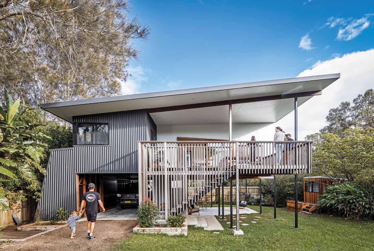
As the son of a well-respected local joiner, Marty grew up in and around the workshop of his father, Bruce, becoming familiar with machinery, tools and timber. He had a passion for being creative and developed a love for working with his hands, making skateboards and ramps with his friends.
Following an apprenticeship with Bruce after high school, Marty and his now-wife Casey travelled abroad and worked in England, where Marty made shop fittings for Urban Outfitters. Although he worked with less desirable materials, there was creative freedom in what he produced and the experience inspired Marty to start his own workshop. He and Casey moved back to Australia in 2010, ready to “chase the dream” as Marty describes. It was serendipitous timing as the popularity of Byron was really kicking off, and an influx of new residents to the area commissioned Marty to produce furniture and built-ins for their new permanent or holiday homes.
OPENER
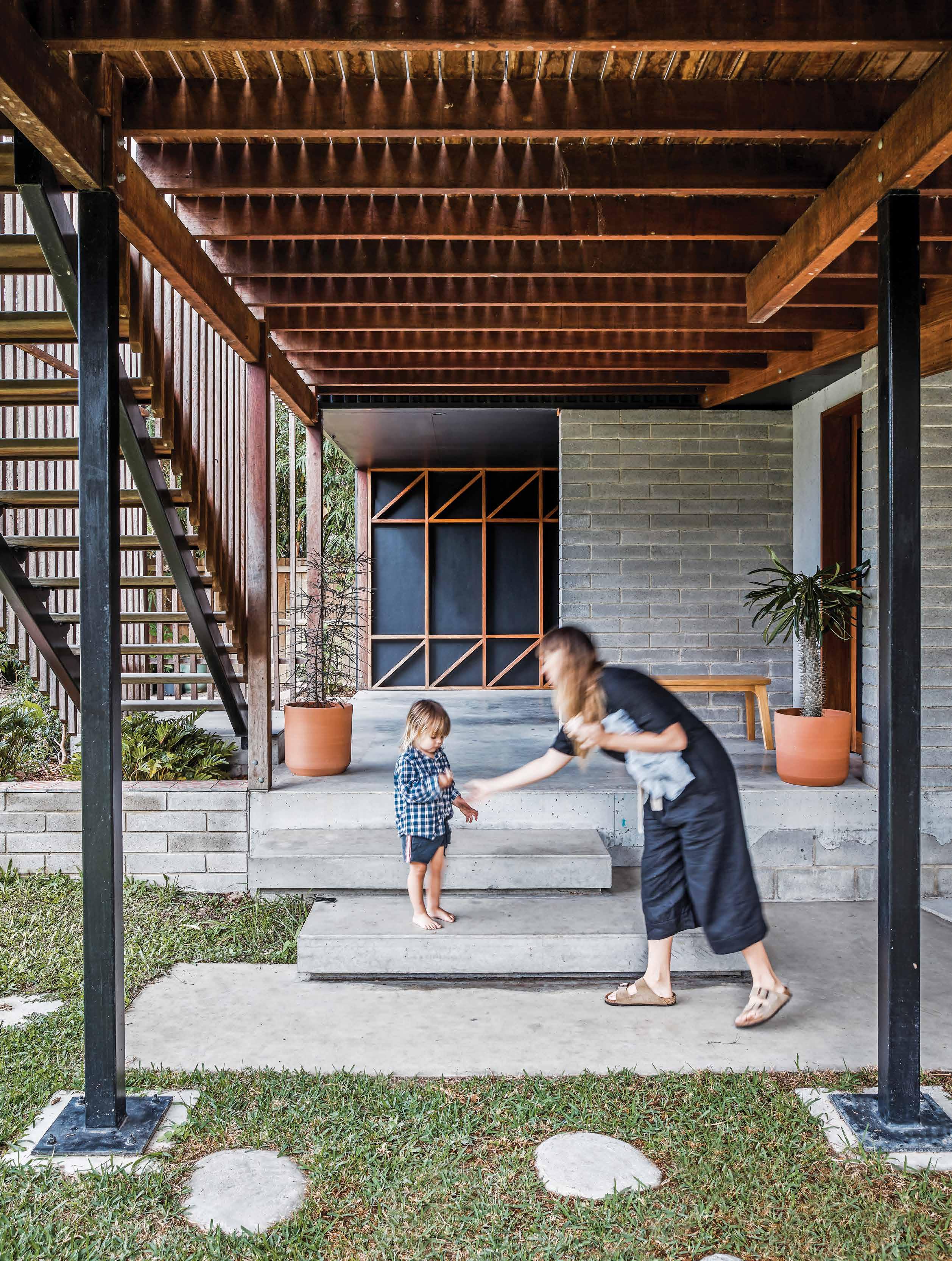
OPPOSITE | THE UNDERCROFT IS A RESPONSE TO THE SUBTROPICAL
A
| MARTIN JOHNSTON AT HOME WITH HIS WIFE CASEY AND THEIR TWO YOUNG BOYS, OZZY AND RAPH. ABOVE | DESIGNED BY JUSTIN TWOHILL, MARTY AND CASEY’S HOUSE IS INSPIRED BY THE QUEENSLANDER AND PAYS TRIBUTE TO MID-CENTURY FIBRO FISHING SHACKS. BELOW | MARTY DESIGNED AND CRAFTED ALL THE JOINERY, INCLUDING THE KITCHEN.
CLIMATE
AND FLOOD ZONE, AND PROVIDES
COOL PLACE TO PLAY.
issue #46 habitusliving.com
Located just five-minutes’ drive from the workshop, Marty and Casey live in a coastal town that conjures up the idyllic Australian dream.
2 . portrait # 73
issue #46 habitusliving.com
“We are a small-scale operation nestled away in the bush in a little old industrial town, and here I am building furniture like they did 50 years ago.”
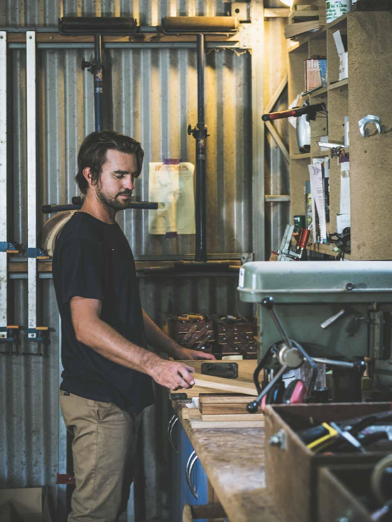
With the growth of his business and his father’s retirement, Marty took over the family workshop in 2017. “It’s a special privilege to continue in his workshop. I have a lot of pride in this area and people from dad’s generation still pop by,” Marty says. He also has the privilege of using the beautiful old machinery inherited from his father – British, German and Australian heirlooms from the 1950s. “They’re finely tuned machines and the whole street knows I’m working as soon as I turn them on. They rattle and roar. All muscle and no brains,” he says.
Along with the workshop and machinery, Marty inherited his father’s approach to craftsmanship, working through each design from small concept sketches to full 1:1-scale drawings on large sheets of plywood. It’s a technique that craftspeople have used for centuries and a “foolproof system” he says. “It’s fitting because we are a small-scale operation nestled away in the bush in a little old industrial town, and here I am building furniture as they did 50 years ago.” He is also attracting clients in an old-school way, as local residents, architects and builders drop by the workshop to request a table, sideboard or chairs.
Marty’s approach to his work is driven by strong beliefs and he draws on local resources wherever possible in support of the region’s skills, economy and sustainability. He brought on a young apprentice from Bangalow in 2019 – “Local work has always helped my family succeed so we wanted to further invest in our area” – and personally selects Australian hardwoods from plantations in Byron Shire and between Brisbane and Coffs Harbour – “I like to promote any business that is doing well in the area and coincides my beliefs.” Marty uses hardwood not only for its beauty and durability,
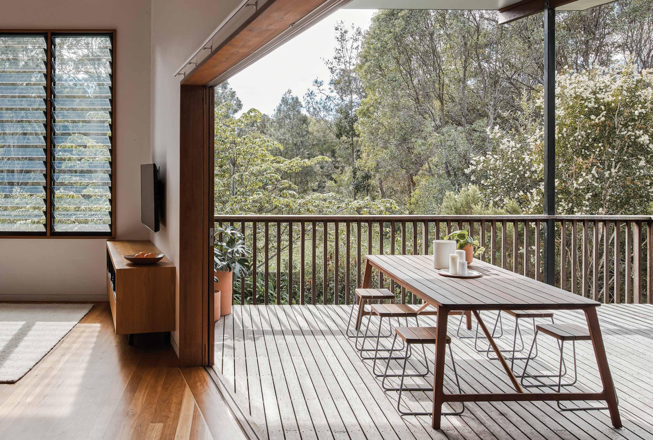
OPPOSITE | MARTY’S
HIS
AND STACKABLE
STOOL. ABOVE | MARTY FEELS PRIVILEGED TO WORK IN HIS FATHER’S
NEW AND
MACHINERY
TRADITIONAL
2 . portrait # 75
BYRON ST. TABLE WAS DESIGNED FOR LONG SUMMER NIGHTS, AND IS PAIRED WITH
LIGHT
BENT BARKER
WORKSHOP, USING
VINTAGE
AND
CRAFTSMAN TECHNIQUES.
Along the workshop and machinery, Marty inherited his father’s approach to craftsmanship, working through each design from small concept sketches to full 1:1-scale drawings on large sheets of plywood.
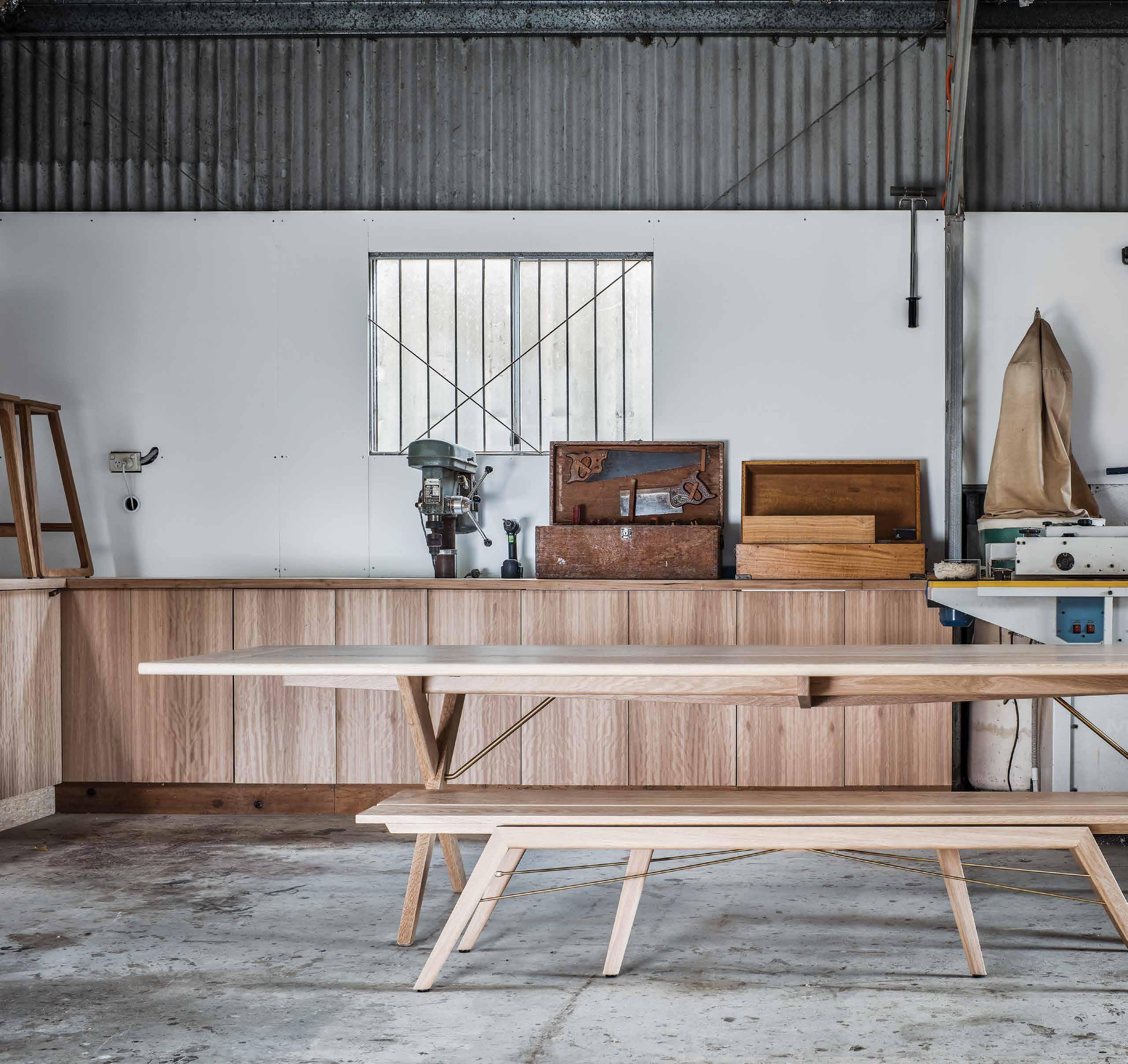
issue #46 habitusliving.com
but because at the end of a piece of furniture’s life, the timber is recyclable and biodegradable. “I think about where the material has come from and where eventually it will go; what will happen when its current use is fulfilled,” he explains.
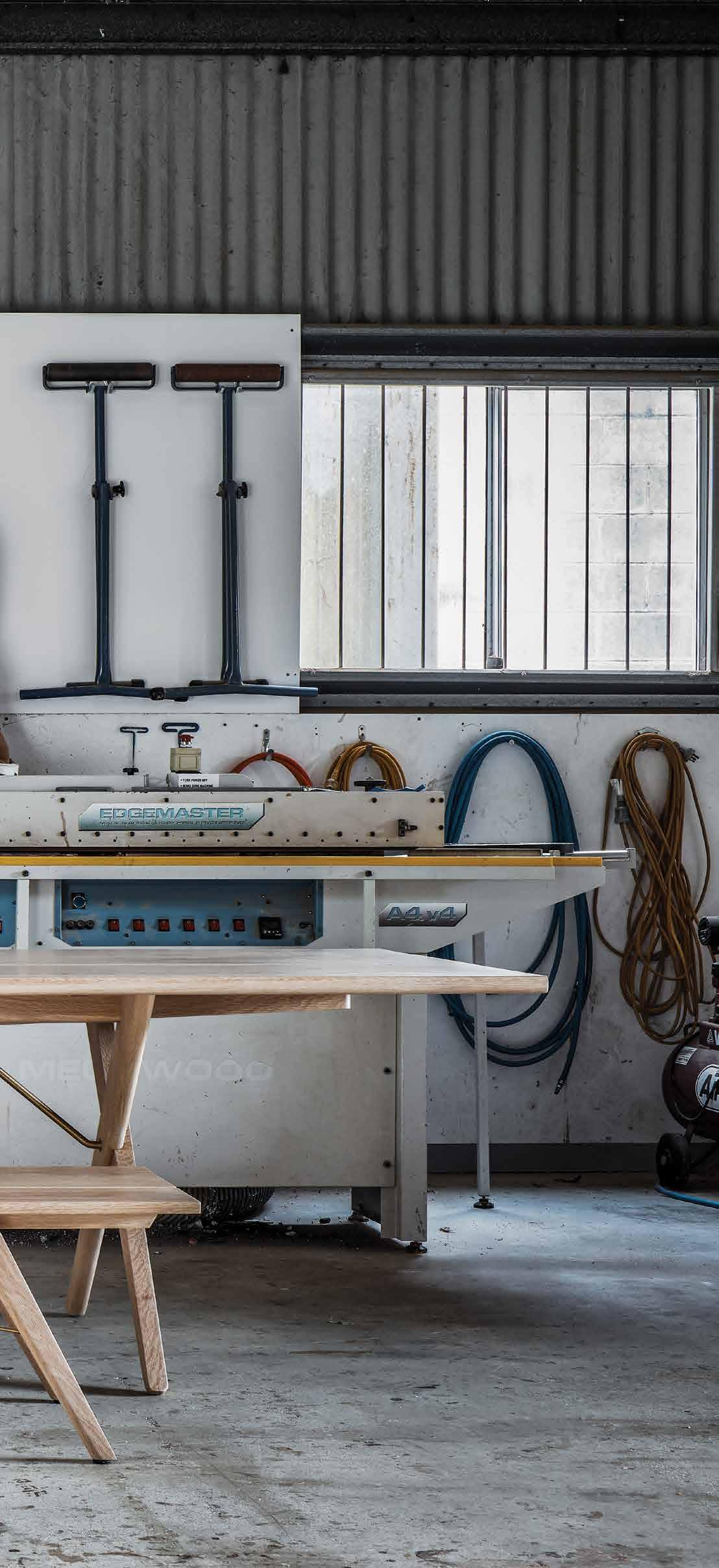
The designs of his built-in and freestanding pieces are intended to be as enduring as the material he uses, both in their robustness and style. They have appealing and timeless forms with clean lines, subtle curves and exposed details that emphasise the handmade craftsmanship and quality. These details often govern the form of a piece and have hints of mid-twentieth-century timber furniture, reflecting Marty’s interest in history and respect for Australian design. “My style is a response and homage to craftsmanship. I want to enjoy producing it and my pieces have become more technically driven as I have progressed,” he says.
Marty’s work is also inspired and influenced by the architects for whom he designs builtin joinery and he appreciates the challenge of large architectural jobs both for the scale and technical requirements. He produced the Kashihara table and bench seat designed by Luke Hayward of Atelier Luke and has done multiple projects with Justin Twohill of Büro Two Architecture, including Marty and Casey’s own home where they live with their two young boys, Ozzy and Raph. The couple are long-time admirers of Justin’s work, so given the opportunity, they wanted Justin to design their house.
Located just five-minutes drive from the workshop, Marty and Casey live in a coastal town that conjures up the idyllic Australian
ABOVE |
2 . portrait # 77
THE
KASHIHARA TABLE AND BENCH SEAT, DESIGNED BY LUKE HAYWARD AND MADE BY MARTY. “IT’S ALWAYS INTERESTING TO DIVE INTO THE MIND OF AN ARCHITECT AND THEIR PLANS,” MARTY SAYS.
dream. “Being in the workshop is hot and labour-intensive, but as soon as I drive down my street I get the refreshing coastal breeze and we grab the boys and go for a swim,” Marty says. Their house merges many of their stylistic preferences, including the classic Queenslander and the mid-century fibro fishing shack. Marty designed and made all the joinery and at only 58 square metres, the house also embodies the couple’s interest in small-space living.
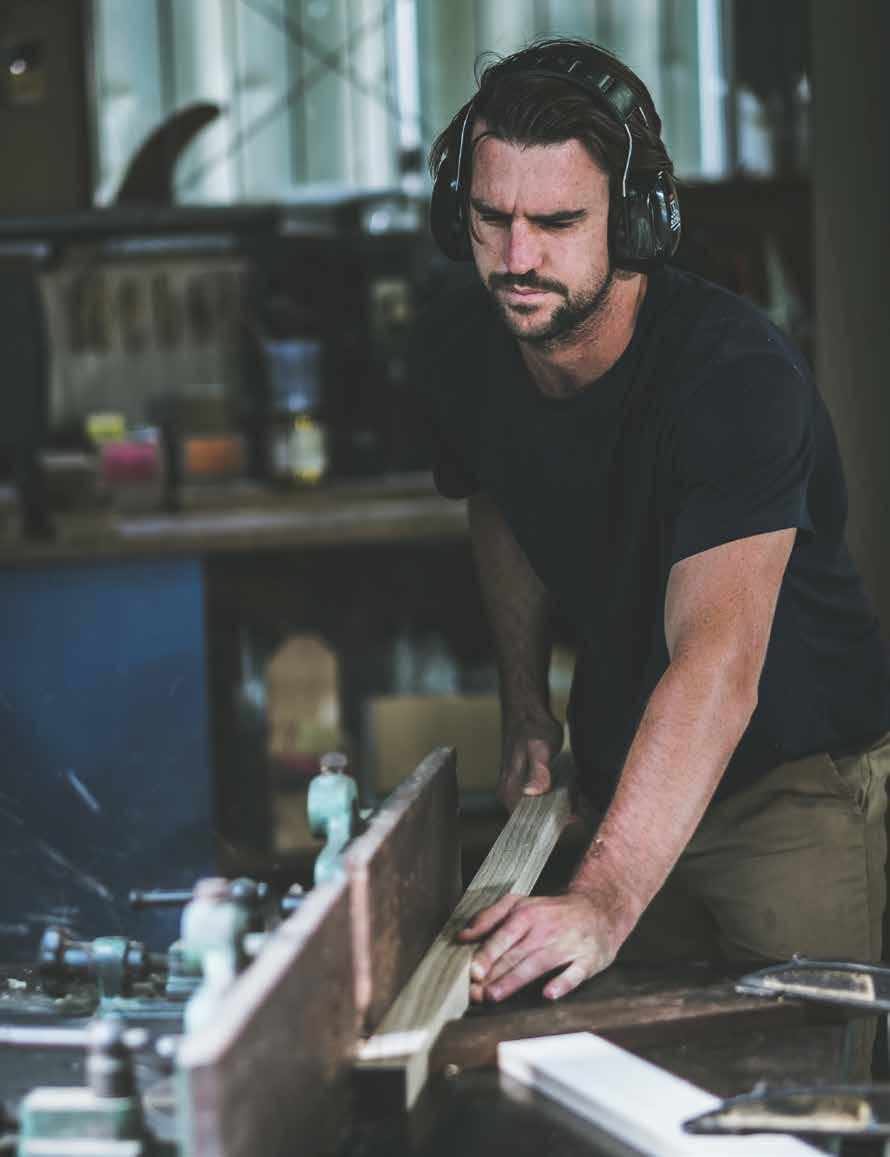

While Marty balances the joys and hard work of a growing business and growing family, he is proud to carry on his family legacy and traditional approach, personally delivering each piece to his clients and seeing the smile on their face. “There is the satisfaction of building and creating something, but it is tenfold when you deliver it to someone’s home and celebrate what you’ve done,” Marty says.
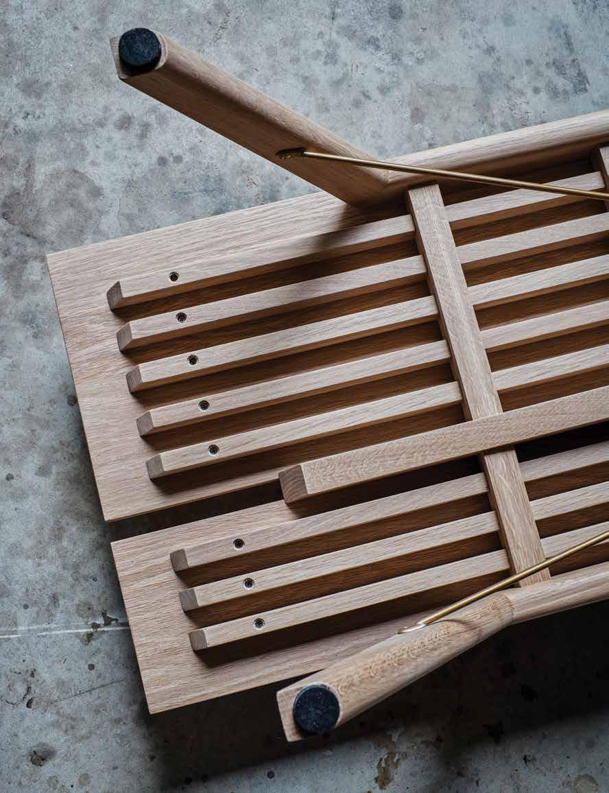 Martin Johnston | martinjohnston.com.au
ABOVE | MARTY AND
IS SET
DOESN’T
TOO FAR FROM THE TREE AND I LIKE THE IDEA
CASEY’S HOUSE
AMONGST
THE
TREES AND CLOSE TO THE COAST IN BYRON SHIRE. BELOW RIGHT | MARTY IS PROUD TO CARRY ON HIS FATHER’S LEGACY. “THE APPLE
FALL
OF THAT,” HE SAYS. BELOW LEFT | THE DETAILED DESIGN AND CONSTRUCTION OF THE KASHIHARA BENCH SEAT.
issue #46 habitusliving.com
Antipodean ease meets Italian craftsmanship
Australian design brand SP01 and Tom Fereday have teamed up to bring us an elegant collection of indoor-outdoor furniture, destined for great spaces.
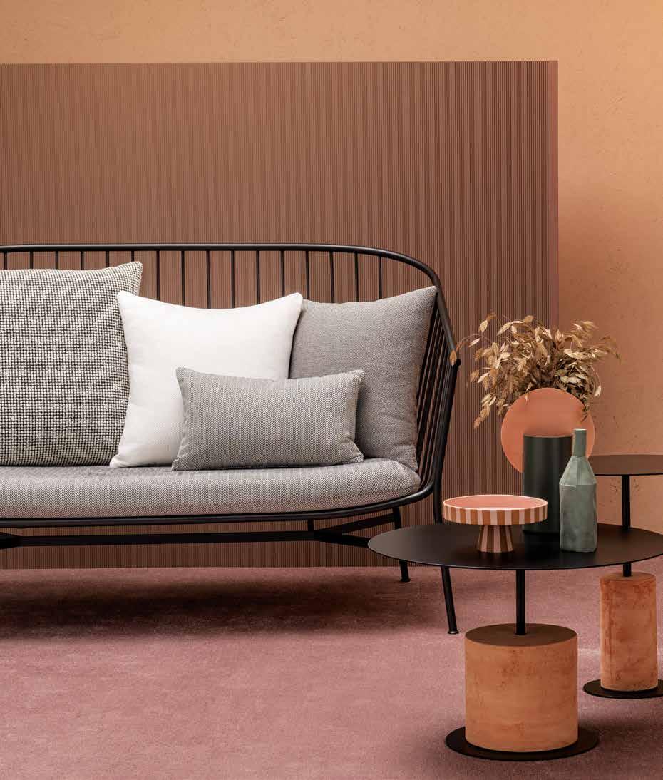

Conceived in Sydney, Australia, and made in northern Italy, SP01 is an international furniture brand that melds the ease of an antipodean lifestyle with the passion of Italian manufacturing. SP01 was established in 2016 with the aim to create an evolving catalogue of relaxed yet sophisticated furniture. Destined for spaces full of integrity, character and confidence, the constants at SP01 are clarity of function, purity of line and a sense of design history.
Building on the success of the original SP01 Jeanette dining chair, Sydney-based industrial designer Tom Fereday has extrapolated the generous deep tub wire-frame aesthetic to create a lounge chair, sofa, bar stool and coffee tables. “I developed the Jeanette collection in attempt to soften the often hard aesthetic of outdoor metal furniture and provide a personality to the pieces in order to give the collection a sense of identity,” Tom explains.
Slightly reminiscent of other design eras and subtly cheeky, the pieces employ precision metal-working and traditional hand-finishing to create elegant seating that encapsulates a casual-chic, indoor-outdoor vibe. The Jeanette coffee tables – available in three heights and variable diameters – feature tops of terracotta or finely veined marble in black, red, green, or white, partially machine-grooved to create visual interest and facilitate drainage.
Furthering the elegant collection is the Louie side table, designed using cylindrical terracotta or stone bases topped with metal discs. Playful and totemic, Louie is available in two heights and variable diameters, suitable for use indoors and out. “Complemented by solid marble, terracotta and textured fabrics, each piece is typified by a feeling of natural luxury and my hope is that it may be cherished and cared for as a collectable item of furniture,” says Tom.
habitus promotion › Space Furniture #79 ABOVE | THE JEANETTE LOUNGE CHAIR AND COFFEE TABLE. BELOW | THE JEANETTE SOFA AND LOUIE SIDE TABLES.
SP01 | s pacefurniture.com


PAYMENT METHOD Cheque / money order AUD$ Charge my credit card AUD$ Name on Card Card Type Card Number Expiry Date Signature IT’S EASY TO ORDER Fill in your response below, overleaf or subscribe securely online at habitusliving.com/subscribe. FOR A GIFT – RECIPIENT DETAILS: FOR MYSELF
SELECT BELOW Mrs/Ms/Miss/Mr First Name Surname Address State Postcode Country Email Phone Mrs/Ms/Miss/Mr First Name Surname Address State Postcode Country Email Phone ONLINE: habitusliving.com/subscribe PHONE: (61 2) 9368 0150 MAIL TO: EMAIL: subscriptions@indesign.com.au FAX: (61 2) 9368 0289 Indesign Media Asia Pacific Level 1, 50 Marshall Street, Surry Hills NSW 2010 WHERE’S YOUR FAVOURITE PLACE TO ESCAPE/EXPLORE AND WHY?
to Habitus magazine
Habitus AUSTRALIA INTERNATIONAL (AUD$) 12 ISSUES SAVE 8 ISSUES SAVE 4 ISSUES SAVE 12 ISSUES SAVE 8 ISSUES SAVE 4 ISSUES INDESIGN $155 $43 $105 $27 $55 $11 $240 $39 $200 $20 $110 HABITUS $160 $43.40 $115 $20.60 $60 $7.80 $252 $30 $188 – $94 THE COLLECTION Vol. 2 Australia $29.90 (1 ISSUE) International $49.95 (1 ISSUE)
PLEASE
Enjoy your quarterly dose of Habitus delivered straight to your door. Each issue celebrates the outstanding work architects and designers within the Indo Pacific, both emerging and established, are producing. Don't miss out on the latest in architecture and design. includes shipping within Australia only Subscribe
Subscribe to
LIFE OUTDOORS
In this edition of Habitus we explore the various ways in which Design Hunters seek to be connected to a natural landscape – in both the public and private sphere – and how architects and designers have met their clients’ briefs.
life outdoors # 81
to roots A return
A farm stay on the hills of Sukabumi, Indonesia, offers Goy Architects the chance to help realise a visionary client’s intention to build simply and sustainably for the community and beyond.
TEXT CHU LIK REN | PHOTOGRAPHY FABIAN ONG
issue #46 habitusliving.com
life outdoors # 83
There exists an ever-growing body of literature that promotes the benefits of human interaction with nature. In Japan, forest bathing is a time-honoured exercise that is believed to ward off illnesses. In Singapore, the practice of biophilia in design (a term popularised by Edward O. Wilson in 1984) and of building therapeutic gardens and community farms has become widespread. But the need to get away from the city to green spaces that promote wellbeing is an ancient impulse. They range from fanciful imperial retreats and country cottages to the humbler, present-day holiday campsites for families. Even so, with climate change and frantic urban living the reality for most people today, there is a rise of a different kind of getaway that is not themed after luxurious resorts for the well-heeled indulged within fenced premises.
Rather, they advocate a closed-loop, ecological lifestyle and while offering a restorative holiday, surreptitiously question the toll that relentless productivity, reliance on genetic engineering, and increasing energy consumption inflict on the land and food we consume. They take the form of farm stays and therapeutic retreats with digital detoxes thrown in, where air-conditioned comfort is not a given, but guests can rough it out and go back to basics, in tune with the
rhythms of the day and task of the hour. Their compounds are not necessarily gated and guests can interact with the local community and participate in planting and harvesting activities alongside with them.
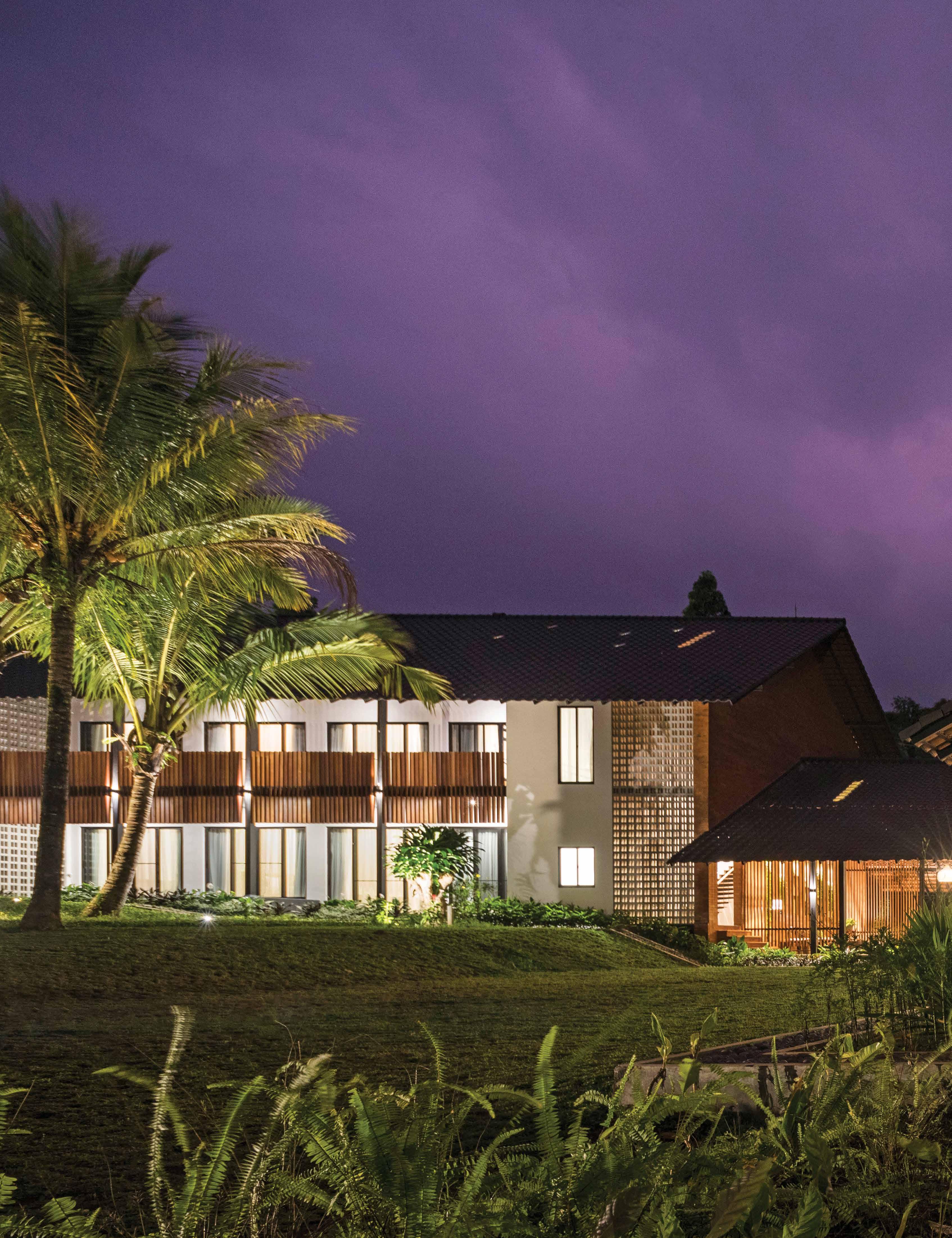
One such retreat is the Sukasantai Farmstay, a family-owned and run organic vegetable farmstay located on the highlands of Gunung Gede, Sukabumi, Indonesia. The 6-hectare farm had its beginnings as a hobby project to supply the family with vegetables free of synthetic fertilizers and pesticides, but soon grew into a small home-delivery enterprise, selling organic vegetables directly to consumers in Jakarta using recycled crates. The idea then evolved into building a farm stay as a means for city dwellers to be reacquainted with nature and the origins of their food supply. “With the growing disconnection of people not knowing how and where food comes from, the farm hopes to reconnect this disjuncture,” said Stephanie Moriyama, owner of Sukasantai Farmstay. The original family bungalow is preserved on-site and an independent, larger wing of accommodation was added on a sloping terrain next to it. Stephanie, a trained landscape architect, engaged an architect she had collaborated with on a previous project in Singapore to design the new wing on the farm. This became one of the impetus for architect Zhenru Goy to launch her practice in 2015.
OPENER | AN ARCHITECTURE
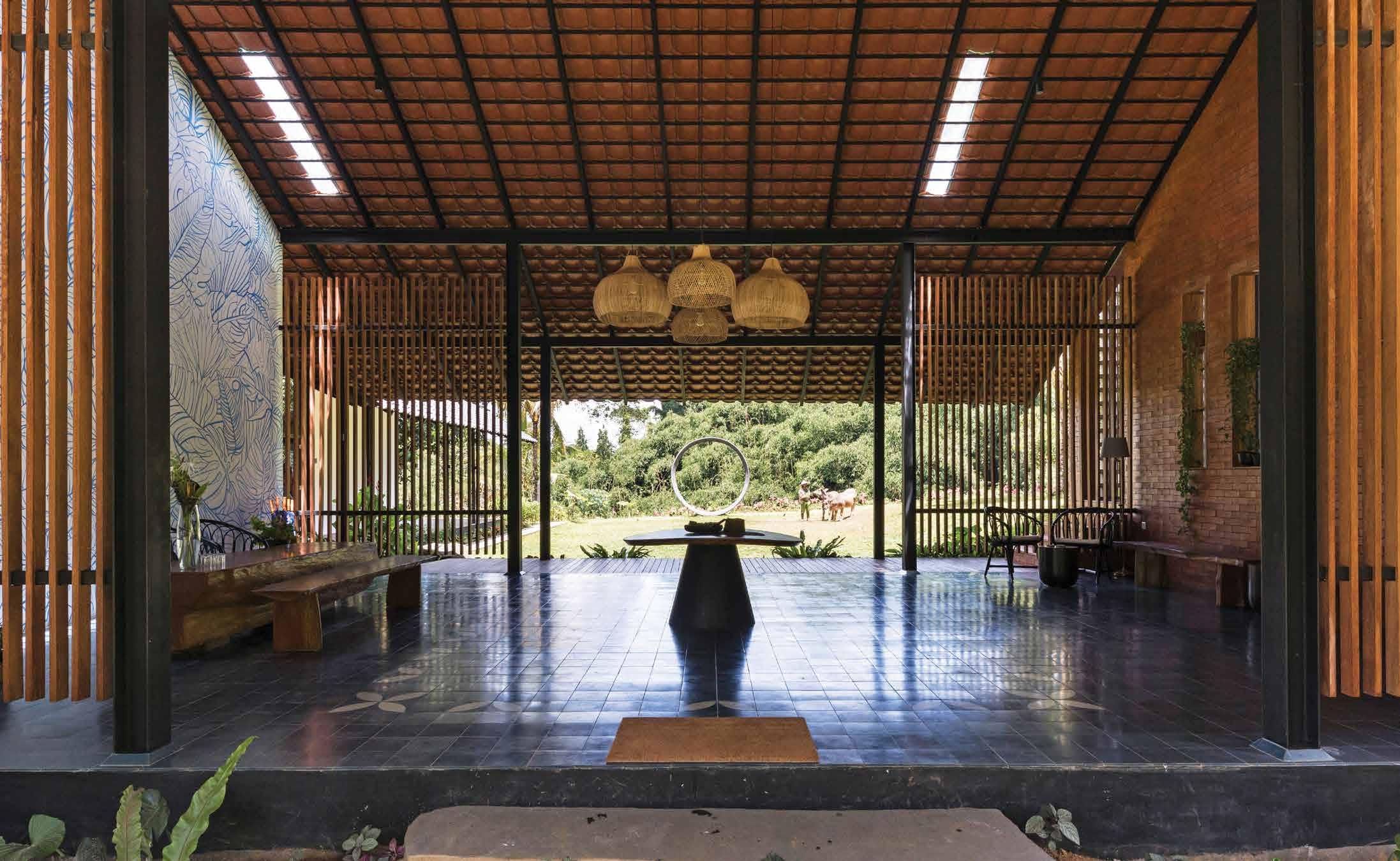
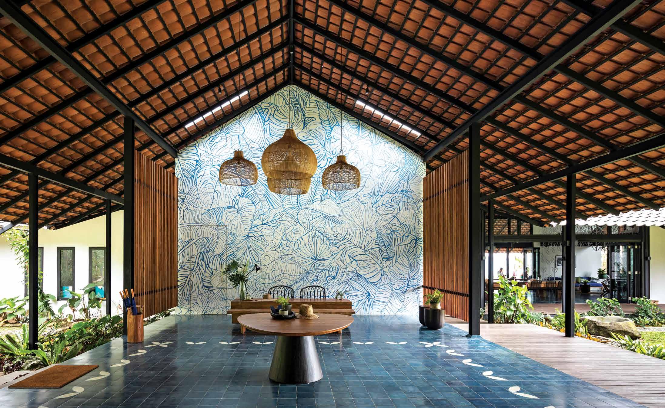
OPPOSITE ABOVE | THE ENTRANCE FOYER FEATURES A HAND-DRAWN ARTWORK FROM A SINGAPOREAN ART TEACHER. OPPOSITE BELOW | THE EXPOSED ROOF IS DESIGNED TO BE UNENCUMBERED BY STRUCTURAL BRACING, AIR-CONDITIONING UNITS OR EVEN FANS.
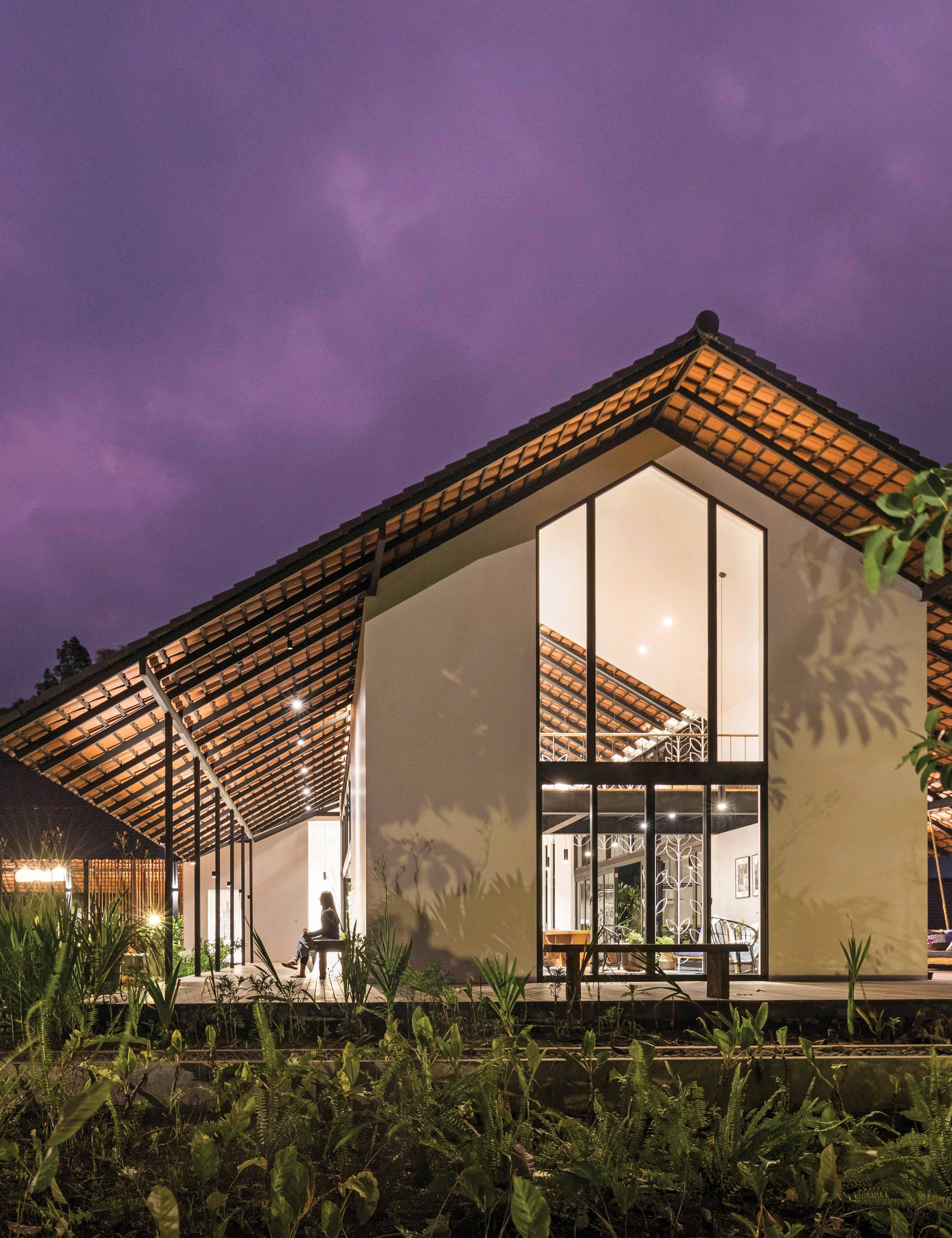
THAT IS SIMPLE, AIRY AND WELL-VENTILATED, WITH LOW EAVES TO QUICKLY DRAIN AWAY THE ABUNDANT RAINS ON THE MONTANE SITE.
issue #46 habitusliving.com
life outdoors # 85
issue #46 habitusliving.com
“With the growing disconnection of people not knowing how and where food comes from, the farm hopes to reconnect this disjuncture.”

life outdoors # 87
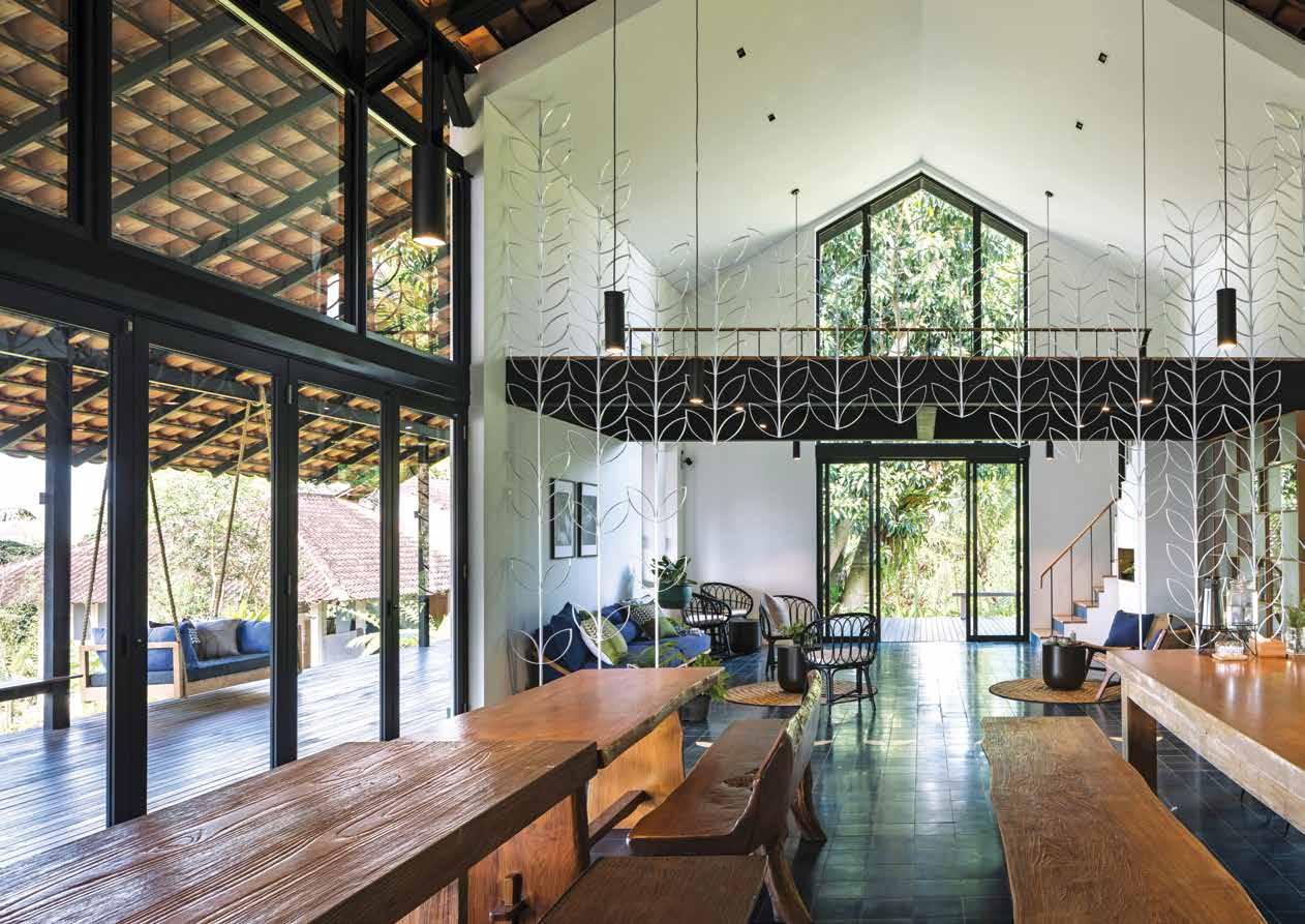

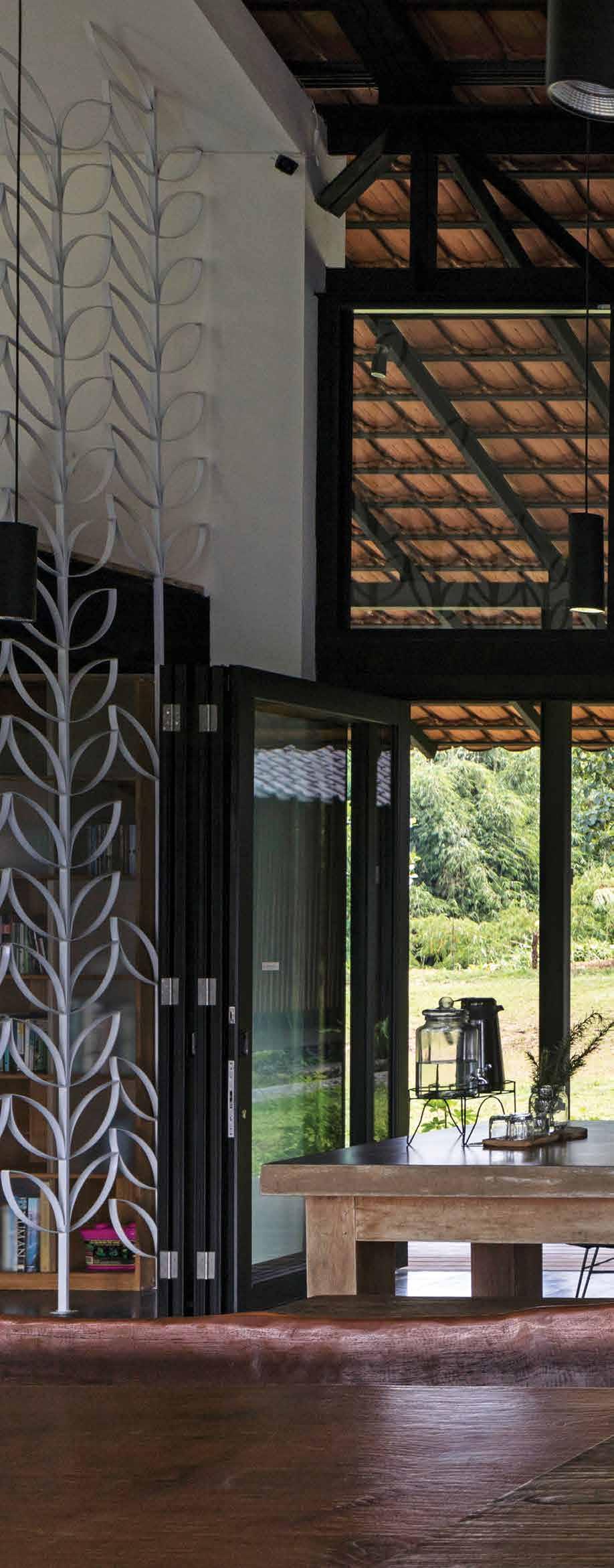
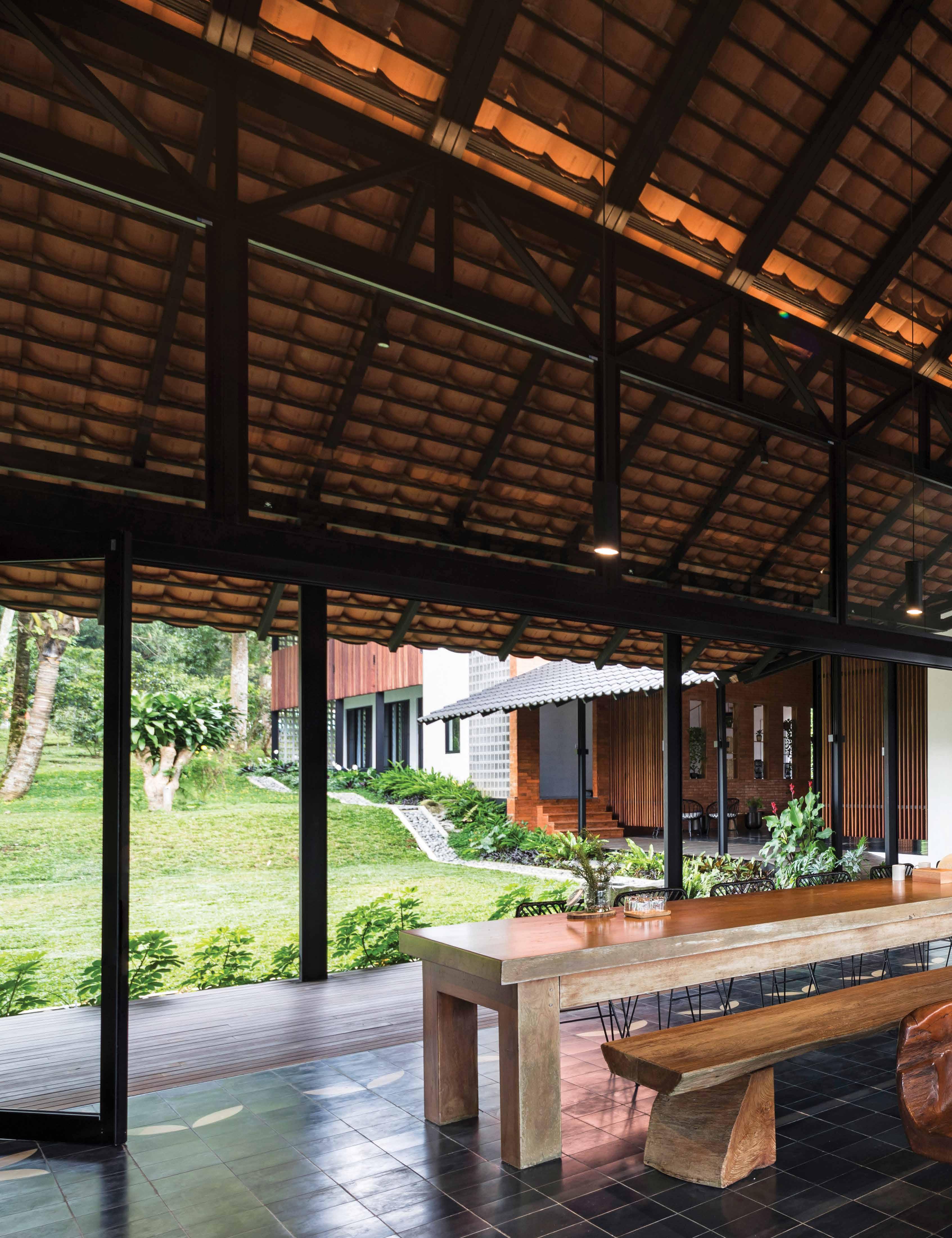
PREVIOUS | THE LEAF LIEFMOTIF IS USED ON FLOOR TILES, RAILINGS, DOOR PATTERNS, WALL SCREENS AND EVEN THE HOTEL BRANDING. ABOVE | THE COMMUNAL KITCHEN IN WHICH GUESTS WILL COOK WHAT THEY HAVE HARVESTED. BELOW | A LIBRARY ON THE MEZZANINE IS PERCHED OVER A GABLE END THAT FRAMES A VIEW TOWARDS AN EXISTING TREE. OPPOSITE | THE COMMUNAL DINING HALL IS THE MAIN SOCIAL HUB WITHIN THE FARM STAY.
issue #46 habitusliving.com
“The architecture was crafted around the existing mature trees such that guests can enjoy [them] from the interior.”
life outdoors # 89
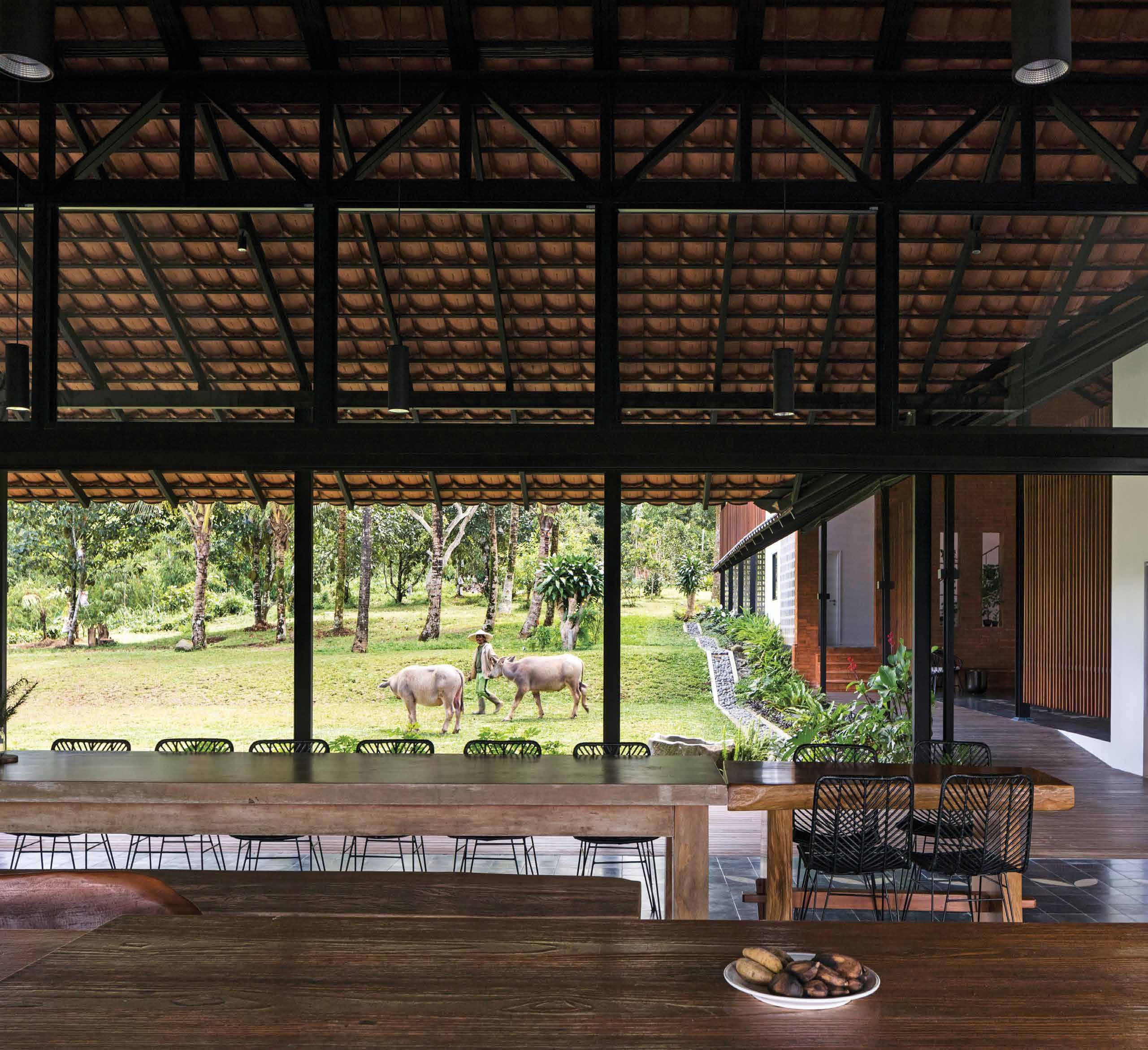
At Sukasantai, both Stephanie and Zhenru employed the simplest and most restrained of approach to consolidate the programme and layout of site. They eschewed the dispersed chalet layout so that guests are compelled to socialise and room service can be simplified. All 12 bedrooms the farm offers are lined across a linear block stretching some 75 metres over a terrain that dips gently down. They open out to a view of the bamboo forest valley while the bathrooms effectively become a barrier screening them from the noisier public road. The mid-point of this wing is bisected by a dining hall that spatially divides two implied courtyards of the wing. “Our design was also informed by the existing mature trees on-site,” says Zhenru. “A 10-metre-tall ficus elastica tree is our main feature for the dining space. We framed the tree by terminating the gable end wall with glass – showcasing the robust trunks and verdant leaves. The architecture was crafted around the existing mature trees such that guests can enjoy [them] from the interior.”
The dining hall is anchored by an open kitchen with self-serving dining concept, and guests are encouraged to participate in authentic “farm-to-fork” experiences such as vegetable harvesting, fruit picking, fishing, bamboo shoot hunting, sourdough bread workshops, tempeh making and other means of working for their meals. The rich volcanic soil here is host to over a hundred varieties of vegetable, medicinal plants, tropical fruits such as guavas, soursop, jackfruit, durian, and up to ten varieties of local bananas. They give the farm biodiversity that a purely commercial orchard would have lacked.

With its all-year round cool and wet montane climate, the high-ceilinged rooms are not air-conditioned, nor are the major roofs padded with insulation.
issue #46 habitusliving.com
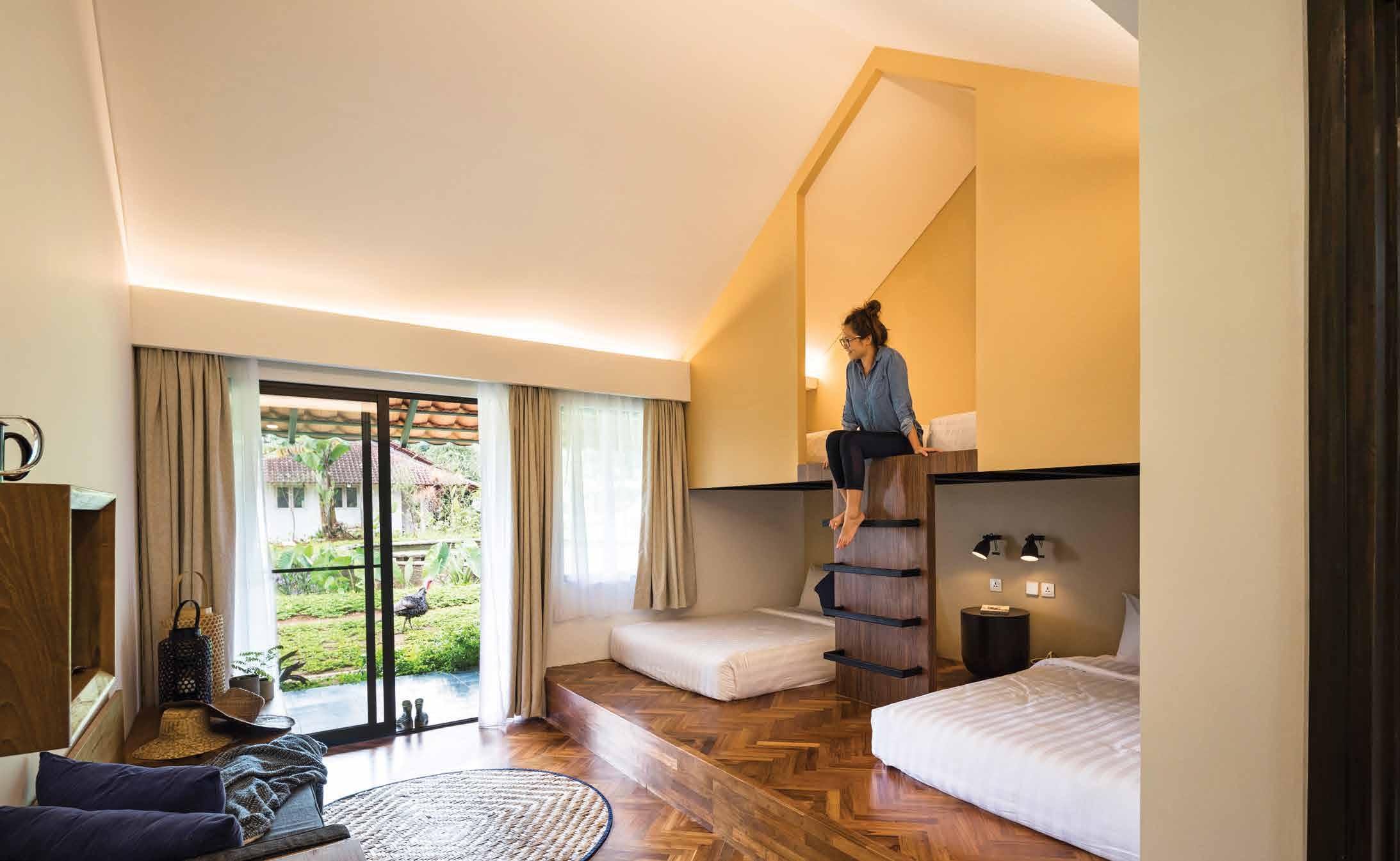
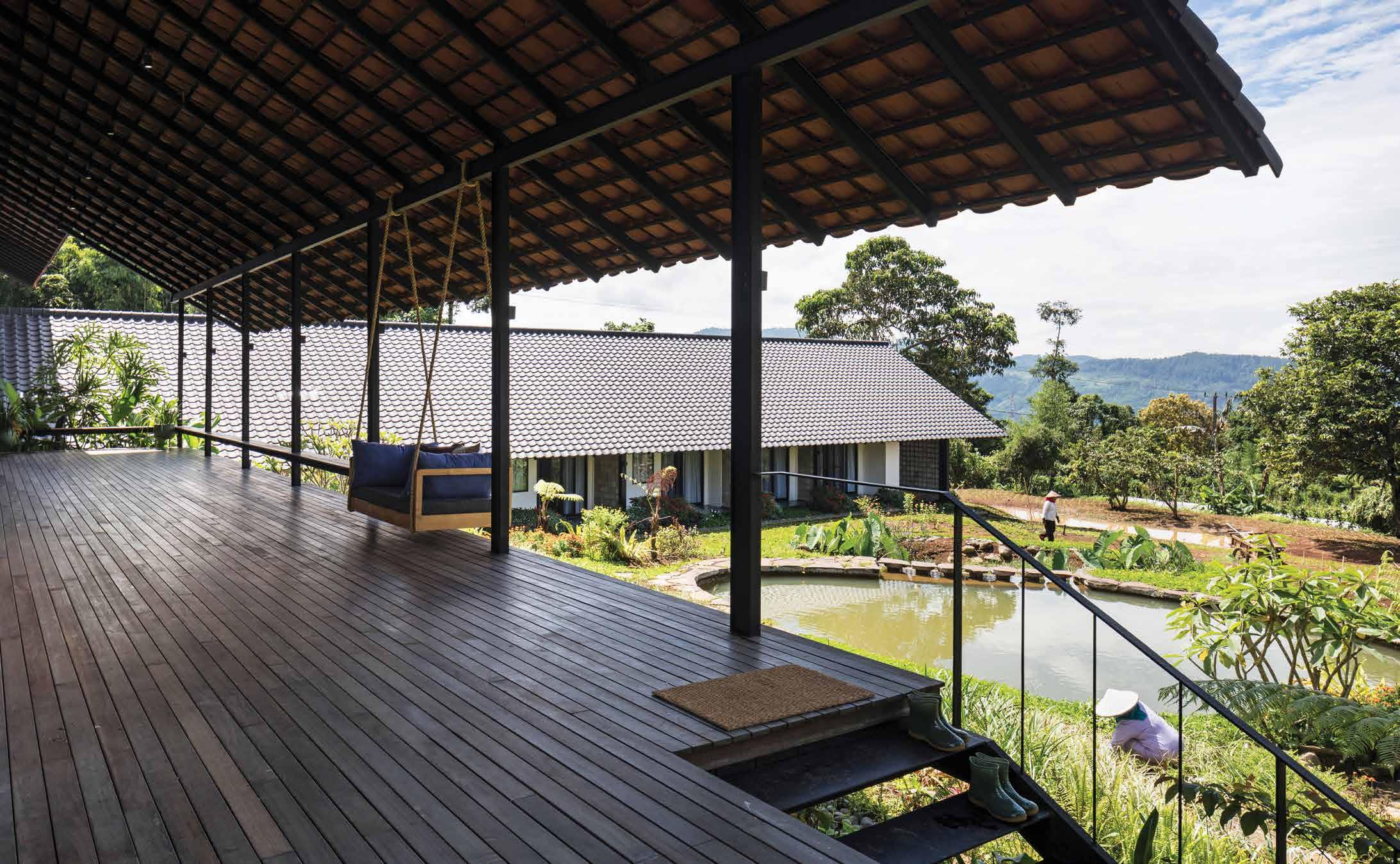
ABOVE | EXISTING TREES ARE RETAINED AND FRAMED BY THE ARCHITECTURE AT DIFFERENT VANTAGE POINTS. OPPOSITE ABOVE | THE DINING HALL OPENS OUT TO A GENEROUS VERANDAH AND A VIEW DOWNHILL. OPPOSITE BELOW | ONE OF THE ROOMS FEATURES A LOFT AND A VIEW TOWARDS THE OLD FAMILY HOUSE.
life outdoors # 91
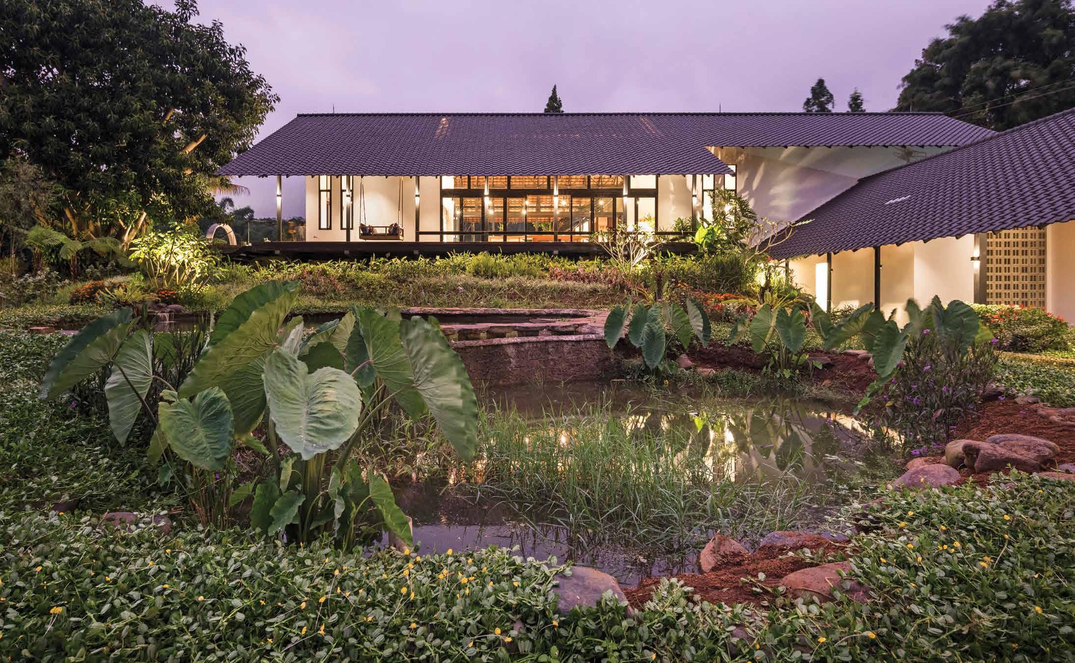
With its all-year-round cool and wet montane climate, the high-ceilinged rooms are not air-conditioned, nor are the major roofs padded with insulation. “We had to convince the engineer to try his utmost to design the roof structure to be free of any bracing struts,” Zhenru explains, “because we wanted it to be as simple as possible.” Rainwater falls freely over the eaves onto gravel-filled swales and drains downwards to a fishpond, then a reservoir where it is used for irrigation by gravity flow alone.
The development is a showcase of building sustainably with the land, respecting its topography and trees, working with locally available materials and workers to build and operate with. The understated vernacular design allowed the natural beauty of the site with its volcanic mountain as a backdrop to shine through without intrusive embellishments. There are no unnatural trappings of Wi-Fi, swimming pools, tennis courts or spas as the social enterprise agenda takes spatial precedence over the built environment. The effect is therefore not unlike a naïve painting of an extended habitat by a child; a staggered pitched roof shading open rooms amidst verdant palms. At night, lighting is kept discreet so that on a clear night, there will be no light pollution to mar the view of the stars, and that is about as unimposing and light-footed as one can get.
 Goy Architects | goyarchitects.com
ABOVE | THE LOWEST BLOCK OVERLOOKS THE RETENTION POND THAT CHANNELS RAINWATER FOR IRRIGATION. issue #46 habitusliving.com
The development is a showcase of building sustainably with the land, respecting its topography and trees.
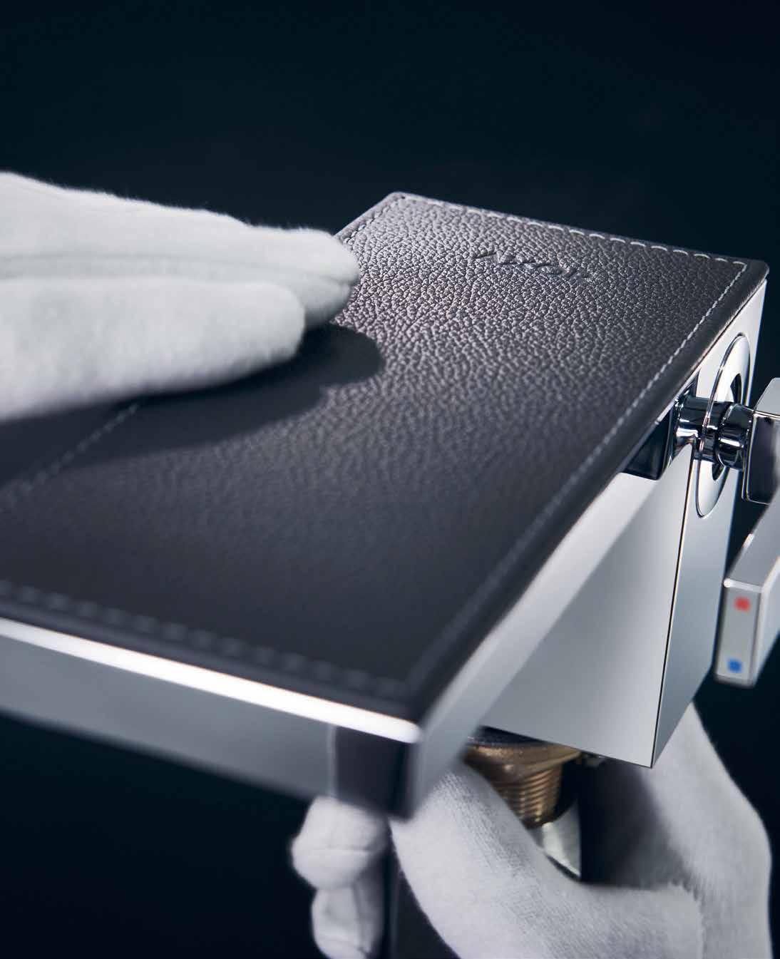
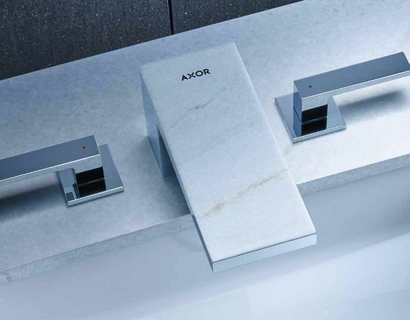
AXOR MYEDITION FORM FOLLOWS PERFECTION
Tapware that sets the stage for your creativity. With a choice of 16 PVD polished or brushed surfaces and crowned with a plate made from an exclusive portfolio of materials; glass, metal, wood, marble, leather. Over 350 combinations to express your personal statement in perfection.

For stockists contact 03 9811 9971 | axor-design.com
With love for Earth
With soil as the main, widely available ingredient, rammed earth construction is making its return to the forefront of sustainable design in regions around the world.
TEXT OLHA ROMANIUK
issue #46 habitusliving.com

life outdoors # 95
Abundant and resilient, rammed earth as a construction technique traces back thousands of years, having been used as a material everywhere from adobes of ancient African cities to the Great Wall of China. While there is still some hesitation in building with compressed soil due to its perceived structural limitations, the technique has been enjoying a resurgence of popularity in recent years, with architects and designers embracing rammed earth construction once again as an invaluable answer to sustainable construction. With rammed earth’s almost endless application possibilities coupled with recent innovative improvements in its durability and longevity, architects are adopting the technique within diverse climatic conditions and across rural and urban settings alike, particularly in countries where building materials are scarce or come at a high cost.
“Rammed earth opens up exciting opportunities of bringing earth as a building material into sites that are urban and compact within cities,” says Shruthi Ramakrishna, one of the founders of India-based Made In Earth design studio that specialises in compressed soil construction and uses the technique in projects ranging from private residences to commercial buildings. For Shruthi, rammed earth is the clear ecologically-friendly construction method that does not harm the surrounding ecosystem and can be easily adaptable to cold and hot climates through simple modifications of the basic material composition; such as additional insulation to make rammed earth more appropriate in cold climates.
“While there is no dearth of curiosity, many are concerned with the strength and durability of earth as a construction material,” notes Shruthi about the misconceptions of utilising the technique in the native country of India where Made In Earth primarily operates. The firm’s four founders, brought together by their mutual commitment to making buildings built with natural materials desirable, durable and accessible, are pioneering the use of rammed earth in contemporary expressions that are both elemental and ecofriendly, with a drive to make the technique accessible, both culturally and economically, for clients and contractors.
As some limitations to the use of the technique persist to the present day, firms like Made In Earth are discovering a realm of possibilities for rammed earth applications through experimentation and innovation driven by their conviction in the sustainable and cost-effective advantages of the technique. With clay-rich soil, water and natural stabilisers such as bitumen the main ingredients in rammed earth composition, the availability of materials locally can bring the transportation and construction costs down, making it an attractive choice of building material in cities and regions where other materials may not be easily accessible.
Other clear advantages include the insulating properties acquired via the thick sturdy walls constructed with the rammed earth technique that can create comfortable indoor conditions in hot climates and regulate indoor humidity. With their significant thermal mass, rammed earth walls can keep a home cool during the daytime without the help of air
ON
EARTH BLOCKS. OPPOSITE BELOW | THREE-BYTHREE FOOT
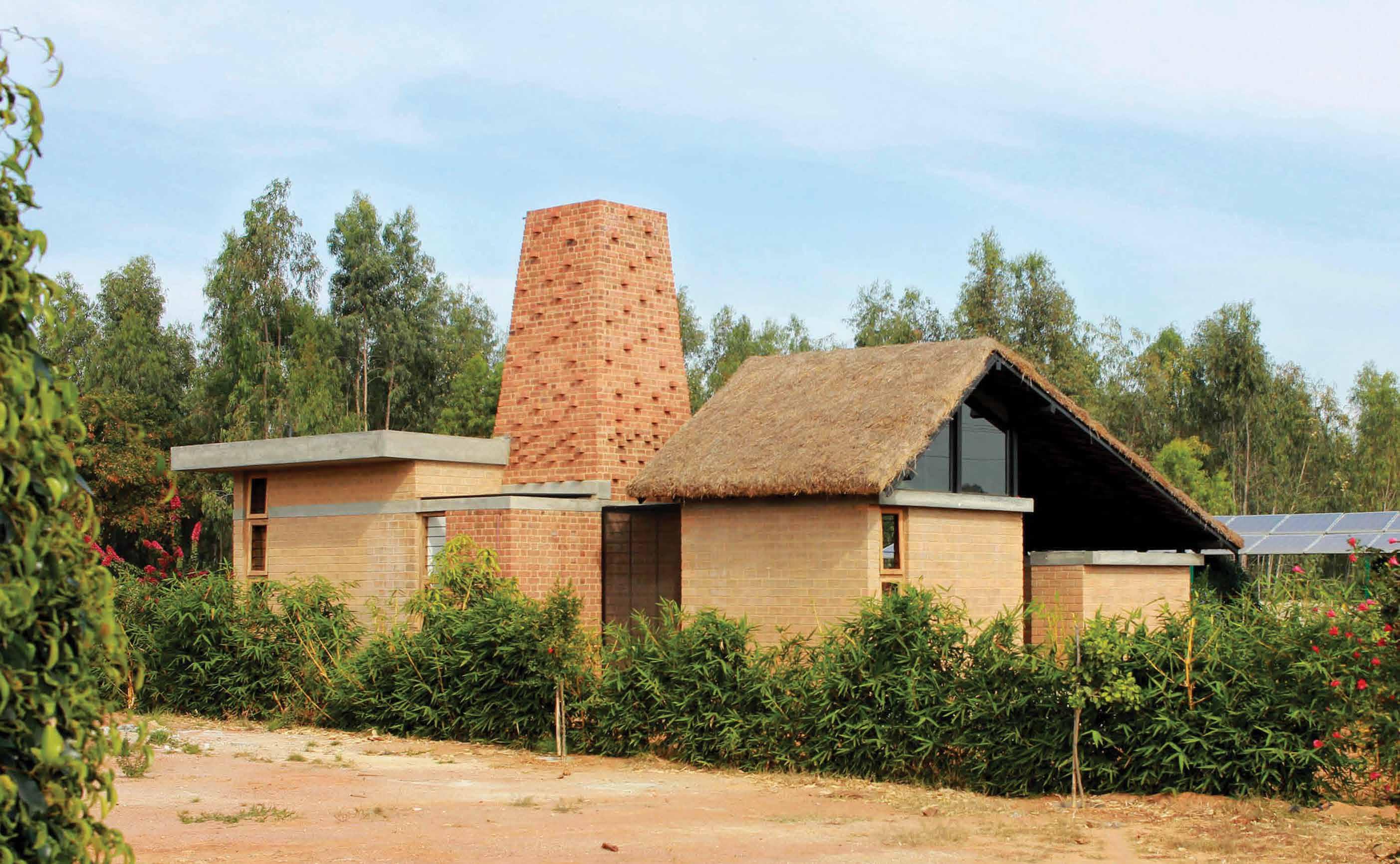
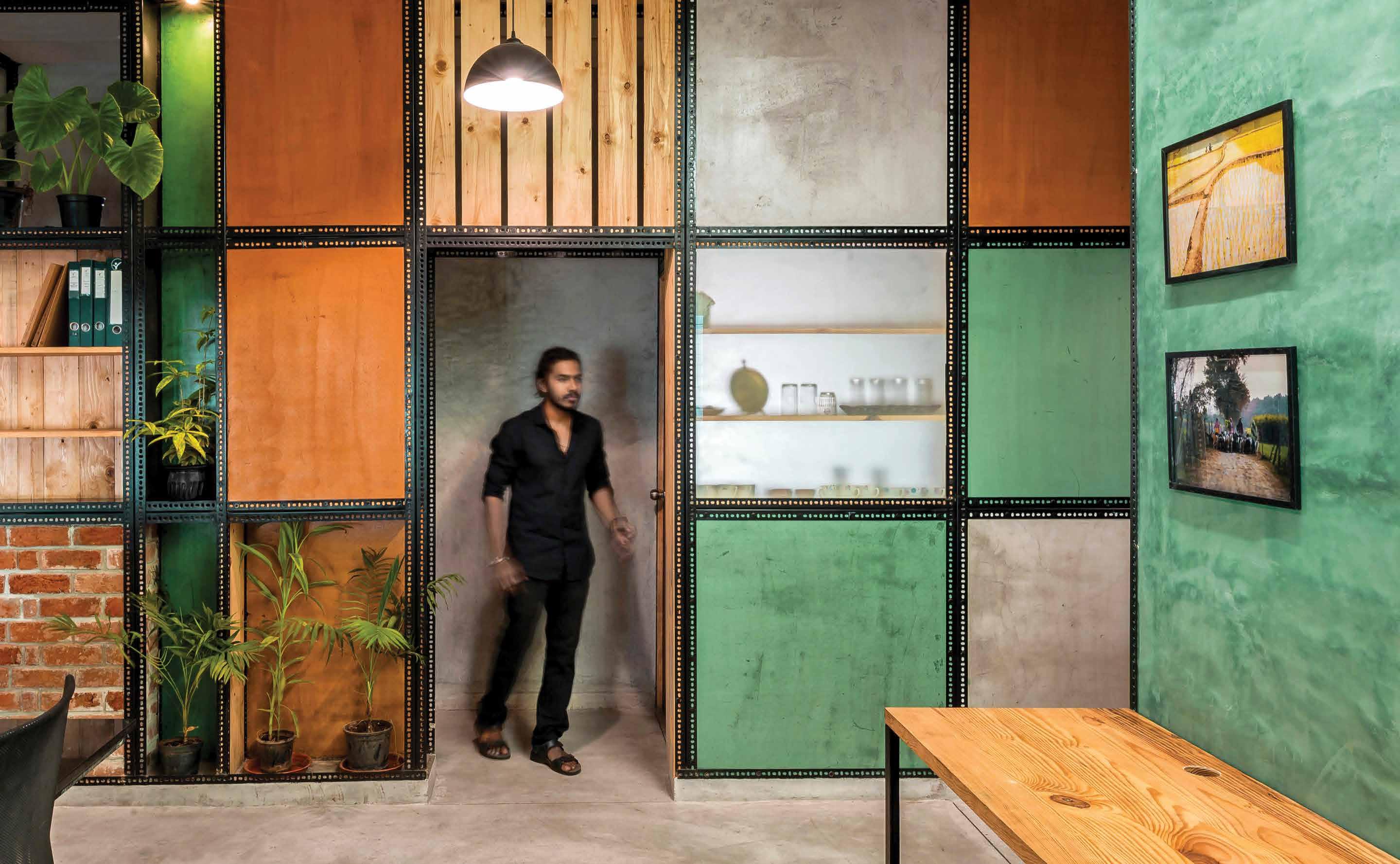
OPENER | THE INTERIORS OF INDIGO LAB REFLECT THE TYPICAL DESIGN APPROACH OF INDIA-BASED STUDIO MADE IN EARTH, USING RAW, NATURAL AND ECO-FRIENDLY MATERIALS, SUCH AS LIME AND CLAY. OPPOSITE ABOVE | THE BRICK KILN HOUSE IN MALUR, BANGALORE, WAS MADE IN EARTH’S
FIRST TAKE
BUILDING WITH COMPRESSED
FRAMES FILLED WITH CLAY, LIME, PINE WOOD, GLASS AND EXPOSED FIRED BRICK WERE USED AS PART OF A MODULAR STRUCTURAL SYSTEM AT THE ADITI ORGANIC CERTIFICATION OFFICE.
issue #46 habitusliving.com
“Rammed earth opens up exciting opportunities of bringing earth as a building material into sites that are urban and compact within cities.”
life outdoors # 97
conditioning, while additional insulation can improve the warmth of a house in cold climates, reducing the energy bill by using only one-third as much energy as a conventional home. Rammed earth’s high resistance to fire and rodents also makes the technique favourable from small to largescale construction applications.
Having built with rammed earth for years, Made In Earth continues to utilise the technique in specific conditions of the studio’s projects, challenging the misconceptions that the technique is inferior to the more traditional building materials. “There is no need to make it relevant in this part of the world [India], but there is a need to experiment more with it, to build more with it, and to bring a freshness to the kind of architecture that we make with it,” says Shruthi about the constant process of innovating by learning and improving the technique.
The slew of rammed earth projects in Made In Earth’s expanding portfolio is a testament to the versatility of the construction method in residential and commercial applications. With the studio’s projects including a builtby-hand school, a denim research and design studio, and a cosy private residence, it is popularising rammed earth construction at sites where other techniques such as cob and compressed earth blocks are not possible due to challenges of space and time.
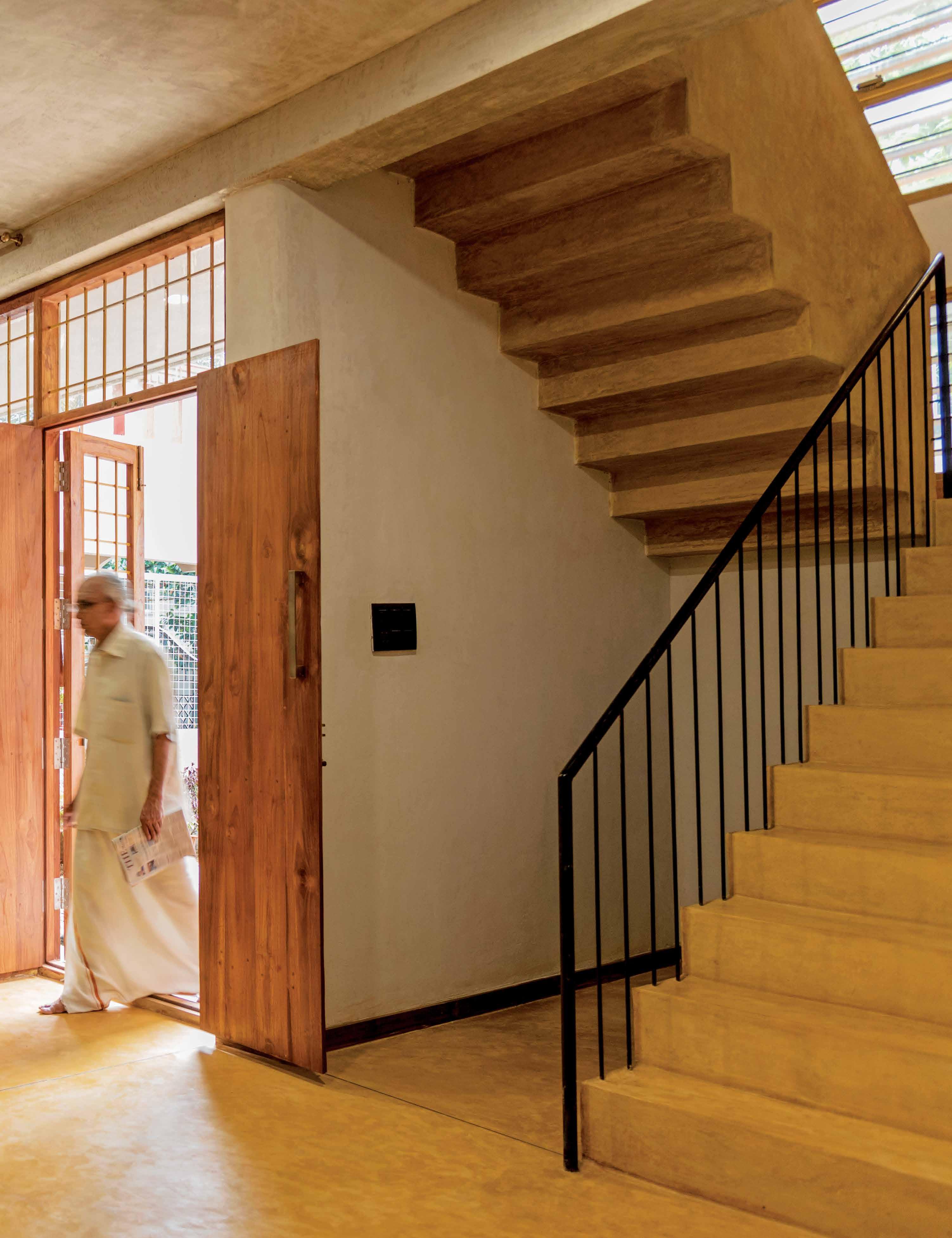
Such is the case for one of the firm’s latest residential projects, Ochre House, where Made in Earth used rammed earth to build a three-storey high residence with loadbearing rammed earth walls and natural finishes to create a sustainable solution on a compact site in West Bangalore.

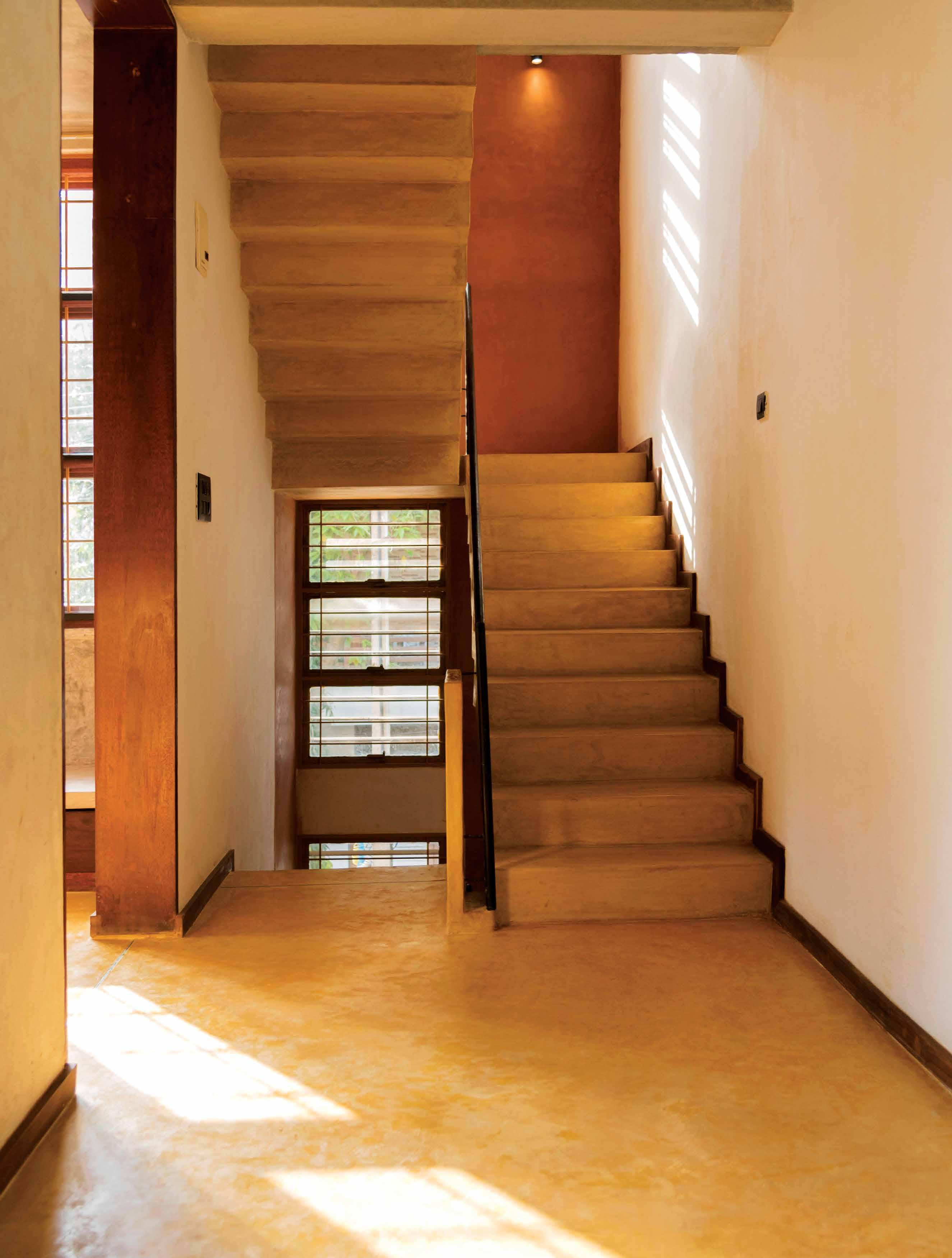
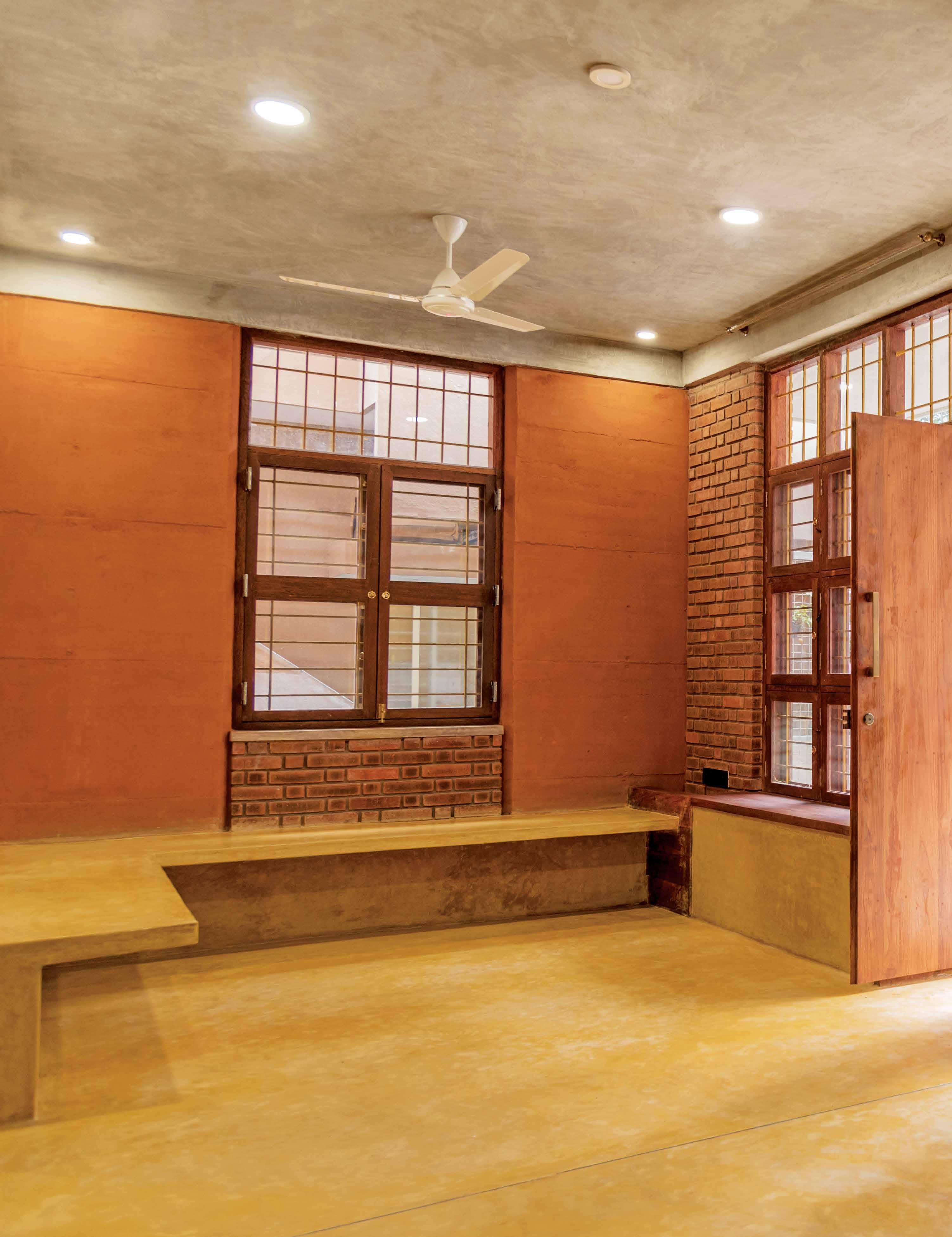
ABOVE | RAMMED EARTH WAS THE ESSENTIAL INGREDIENT TO CONSTRUCT THREE-FLOOR LOAD-BEARING WALLS AT A RESIDENCE ON A COMPACT SITE IN WEST BANGALORE. OPPOSITE | OCHRE HOUSE IS AN EXAMPLE OF A COST-EFFECTIVE URBAN HOUSE THAT USES CLAY AND LIME AS PRIMARY BUILDING MATERIALS THAT WERE SOURCED CLOSE TO THE VICINITY OF THE SITE.
issue #46 habitusliving.com
Thick sturdy walls constructed with the rammed earth technique can create comfortable indoor conditions in hot climates and regulate indoor humidity.
life outdoors # 99
issue #46 habitusliving.com
life outdoors # 101
“Rammed earth construction was a very relevant technique to adopt due to the compactness of the site and challenges of working within a city,” explains Shruthi. “The soil of Bangalore gives the typical red shade to the walls.”

Similarly, the firm’s other rammed earth projects unveil site-specific, sustainable solutions that revolve among locally abundant materials. Shruthi brings up another recent example: “In one of our projects, there was an excess of soil excavated for the foundation but not enough to complete all the rammed earth walls for the project. Therefore, we decided to combine it with other local sources of soils to make layered rammed earth walls.”
Though still facing the challenges of limited skilled labour knowledgeable in rammed earth construction, Made In Earth is continuing to build capacity within their internal team by diving into construction sites, testing out new techniques and training their mason teams. Currently working on a large college campus (Samvada Baduku Community College), the team hopes to popularise rammed earth construction beyond its reputation as a niche technique. Says Shruthi: “We hope to become a vector for reinforcing and nurturing the bold future of earth in architecture and look forward to building more and more public spaces, schools, colleges, hospitals as landmarks for people to discover these construction alternatives as viable and desirable options for all.”
PREVIOUS | MADE IN EARTH’S OCHRE HOUSE IS A PROTOTYPE OF ECOLOGICALLY RESPONSIBLE AND SUSTAINABLE BUILDING, MAKING USE OF SCARCE SPACE AND CREATING A NATURALLY LIT AND VENTILATED RESIDENCE. ABOVE | THIS SAME RESIDENCE USES NATURAL CLAY PLASTER AND LIME PLASTER PIGMENTED WITH YELLOW AND RED OCHRE FOR INTERNAL AND EXTERNAL FINISHES. issue #46 habitusliving.com
“There is a need to bring a freshness to the kind of architecture that we make with [rammed earth].”
The Habitus Collection Online gives Australian Design Hunters instant access to the best design products for residential environments. We take the hard work out of product selection, hand-picking the best design products available in the region. All in a single, comprehensive digital touch-point.
habitusliving.com/collection

Discover the best design products for home and living.
Life Outdoors
Humans have an inherent need to seek connections with nature and other forms of life, according to the biophilia hypothesis. This connection is vital for our health and wellbeing, yet in modern life, we spend about 90 per cent of our time indoors.
The importance of being outside and in close contact with nature is seeing a shift in the design of hospitality venues. Designers are blurring the lines between interior and exterior space, whether it’s a picturesque landscape or suburban location. By eliminating walls, framing views, using translucent materials and drawing on nature’s palette, these venues promote time spent outdoors, in the open air and amidst nature.
One such venue is Cornerstone Stores located between Currumbin and Tugun on the Gold Coast. Developed by a local family, Cornerstone Stores is a one-stop destination for the community and visitors with a curated mix of lifestyle-focused retailers, including a café, wine cellar and wellness boutique. Richards & Spence designed Cornerstone Stores with all boutiques facing a central courtyard, and
dining and social spaces spilling out to a lawn with views to Currumbin Wildlife Sanctuary. “Dining and circulation are externalised beneath a deep awning, and the northern edge is ambiguous allowing the development to borrow from the neighbouring creek and nature reserve,” says Ingrid Richards, co-founder of Richards & Spence.
Red brick continues inside and outside; across walls, floors and arches. Ivy creeps up the walls, greenery trails down from the awning, and a large pandunus palm occupies a void as if the building is becoming enveloped by nature. This submersion in nature is likewise the case at Garden Hotpot Restaurant in Southwest China, where MUDAArchitects has designed a free-flowing structure that mimics the ecological conditions. Hidden in a eucalyptus forest ten kilometres from Chengdu, Garden Hotpot Restaurant’s organic shape mimics the lotus pond and evokes the steam and smoke from boiling hotpots. “We used only pillars and boards to hide the building in the woods. This lets the building gently integrate with the site and delineates the shape of the lake in a light and peaceful way,” says Lu Yun, founder of MUDA-Architects.
The importance of being outside and in nature is seeing a shift in the design of hospitality venues as they blur the lines between interior and exterior space.
TEXT REBECCA GROSS
issue #46 habitusliving.com

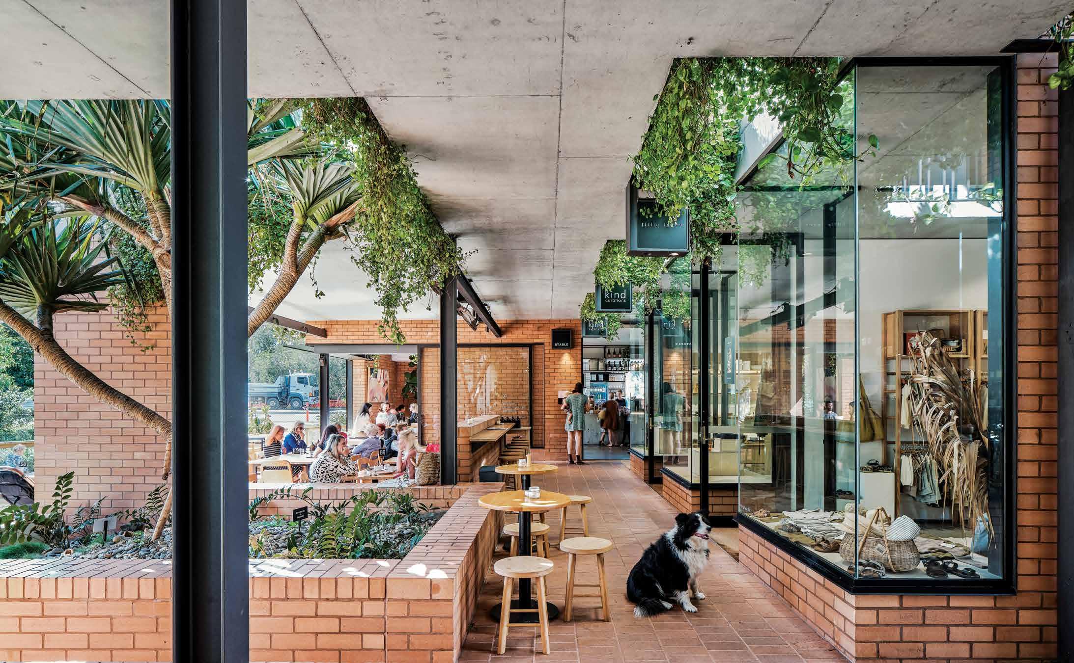
life outdoors # 105
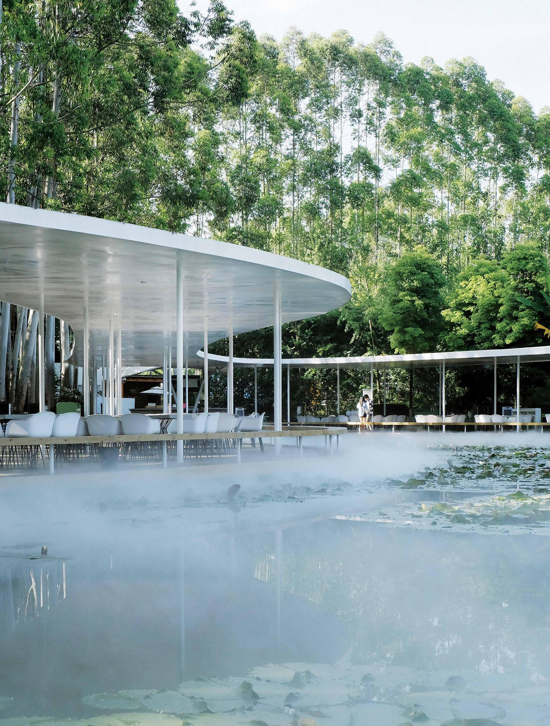
issue #46 habitusliving.com
No plants were removed from the site [of Garden Hotpot Restaurant] and the thin steel columns supporting the roof blend with the tree trunks to disappear into nature.
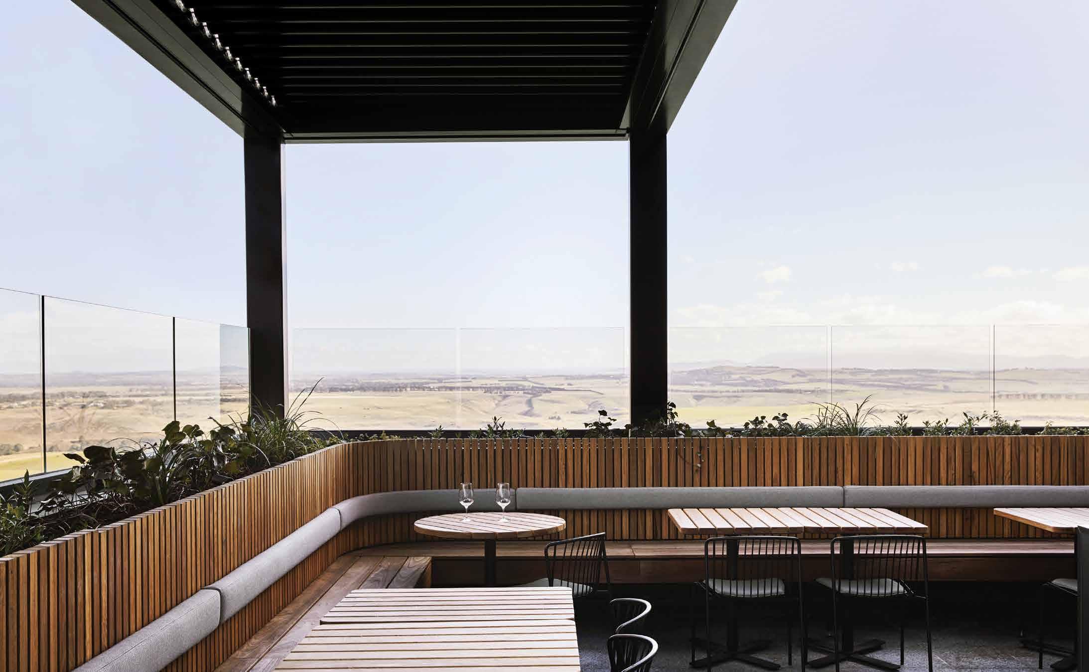 OPENER ABOVE | THE RED BRICKS OF CORNERSTONE STORES BY RICHARDS & SPENCE ARE A NOD TO 1960S APARTMENT BUILDINGS ON THE GOLD COAST. OPENER BELOW | DINING IS BENEATH A CONCRETE AWNING TO CATER FOR THE SUBTROPICAL CLIMATE. OPENER PHOTOGRAPHY BY ANDY MACPHERSON OPPOSITE | GARDEN HOTPOT RESTAURANT HAS A 290-METRE CIRCUMFERENCE AROUND THE LAKE AND STEEL COLUMNS BLEND WITH THE EUCALYPTUS TREES. ABOVE | GLASS PANELS AROUND THE TERRACE AT MARNONG ESTATE BY BIASOL ENSURE UNOBSTRUCTED VIEWS, AND LIGHT TIMBERS COMPLEMENT THE LANDSCAPE. PHOTOGRAPHY BY SHARYN CAIRNS
life outdoors # 107
By eliminating walls, framing views, using translucent materials, and drawing on nature’s palette, these venues promote spending time amidst nature.
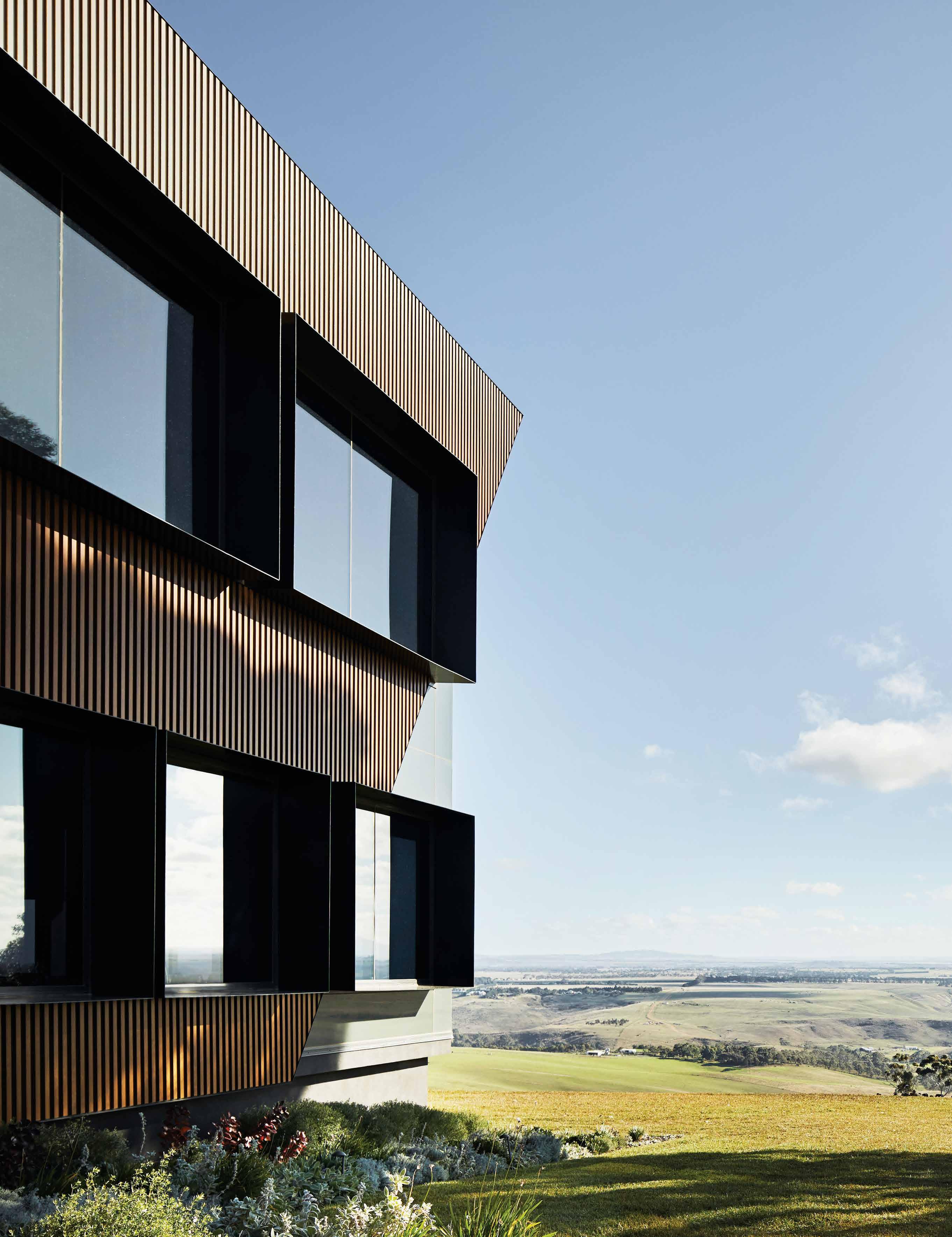
issue #46 habitusliving.com
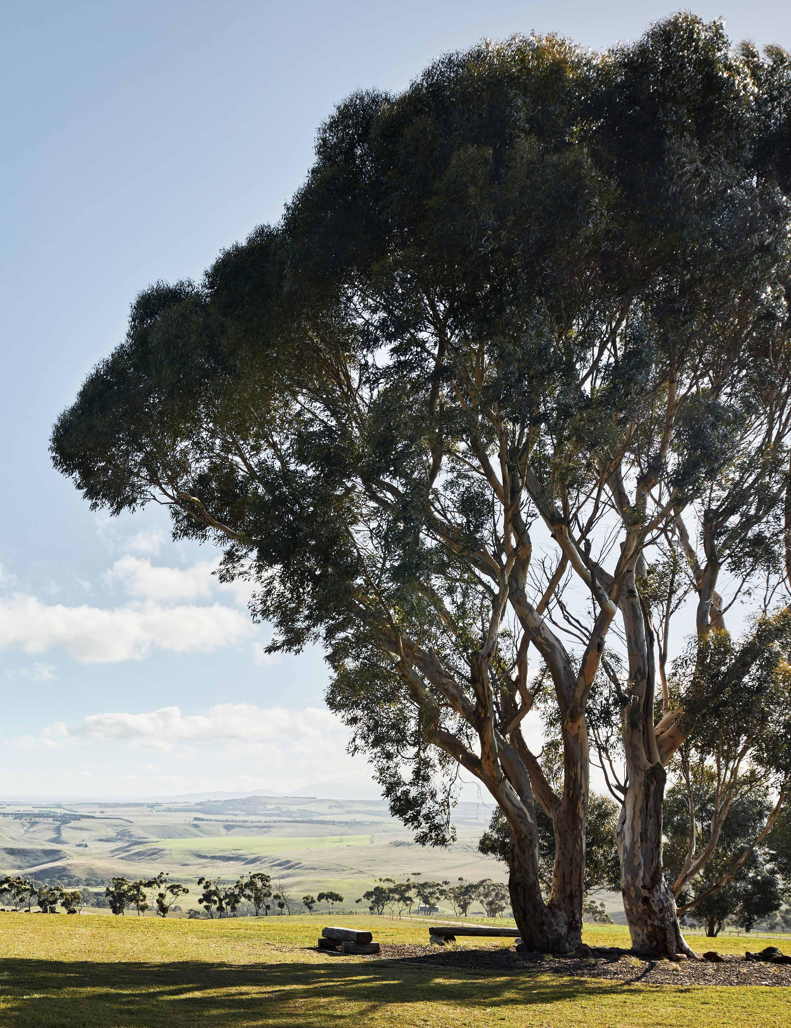
life outdoors # 109
No plants were removed from the site for construction and the thin steel columns supporting the roof blend with the tree trunks to disappear into nature. As mist from the pond permeates the space, it creates a romantic, faraway atmosphere.
In Vietnam, Sahi W&D House is only four kilometres from the centre of Huě, but it too feels a world away with minimal walls and translucent materials dissolving the barriers between in- and outdoors. SILAA Architects designed Sahi W&D as a homestay to encourage engagement between people and their setting. The timber structure blocks views of the neighbours, focusing instead on the trees to feel part of the natural world rather than the suburban streetscape. “Guests have the experience of living in a garden atmosphere, while also having more enclosed, private spaces,” explains Nguyen Huu Son Duong of SILAA Architects.
SILAA reduced the timber structure to its essential framework and incorporated voids and terraces and used polycarbonate panels to blur the boundaries of the hut and garden. Light and colour filters through the opaque panels and communal spaces encourage interaction between people and connection with nature.
Melbourne based design studio Biasol looked to the site’s landscape for the material palette of Bankvale Run bar at Marnong Estate, which sits on more than 100,000 acres north of Melbourne. While the terrace offers an open-air setting, the interior draws the outdoors in with earthy colours and natural textures inspired by the undulating farmland, vineyard and the Macedon Ranges in the distance. “The warmth and authenticity of the palette brings the beauty of nature into the space, complementing the views and unifying inside and out,” says Jean-Pierre Biasol, founder of Biasol.
Terrazzo floor tiles are speckled with warm orange, amber and olive-green; rendered walls have a textured surface; and timber ceilings radiate warmth. The banquettes and chairs are upholstered in rich brown and green leathers, and glass windows and panels ensure unobstructed views.
As urban development puts the squeeze on outdoor green space and urban living sees us become more estranged from nature, these new public environments seek to break down the barriers between interior and exterior, satisfying our need for open air and nature in the modern built environment.
PREVIOUS | MARNONG ESTATE OFFERS A
OPPOSITE ABOVE | SILAA
BELOW RIGHT | POLYCARBONATE PANELS PROVIDE A TRANSLUCENT BARRIER THAT CONNECTS INTERIOR AND EXTERIOR SPACES. OPPOSITE BELOW LEFT | HIGHLIGHT WINDOWS ALLOW FOR NATURAL VENTILATION IN HIGH HUMIDITY, AND BAMBOO CURTAINS PROTECT AGAINST THE COLD WIND IN WINTER. PHOTOGRAPHY OPPOSITE BY HOANG LE
VIEW ACROSS UNDULATING
FARMLAND AND VINEYARDS, WITH THE MACEDON RANGES IN THE DISTANCE. PHOTOGRAPHY BY SHARYN CAIRNS
ARCHITECTS USED RECYCLED, RECYCLABLE AND NATURAL MATERIALS, SUCH AS STONE, THATCH, RECLAIMED TIMBER AND TERRACOTTA BLOCKS. OPPOSITE
SILAA reduced the timber structure to its essential framework and incorporated voids and terraces and used polycarbonate panels to blur the boundaries of the hut and garden.
issue #46 habitusliving.com
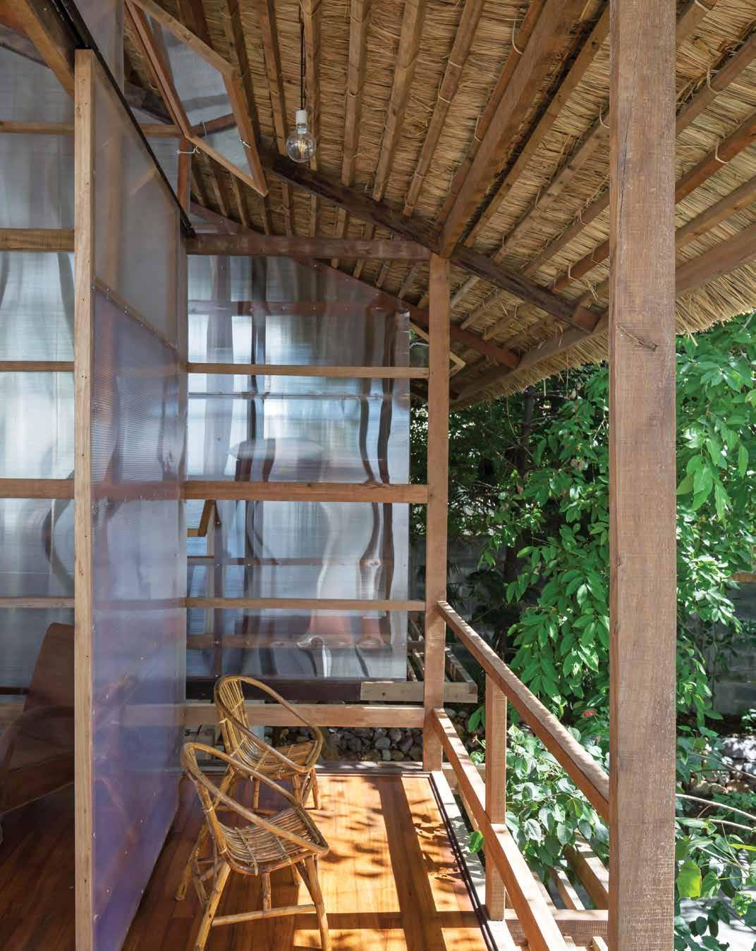
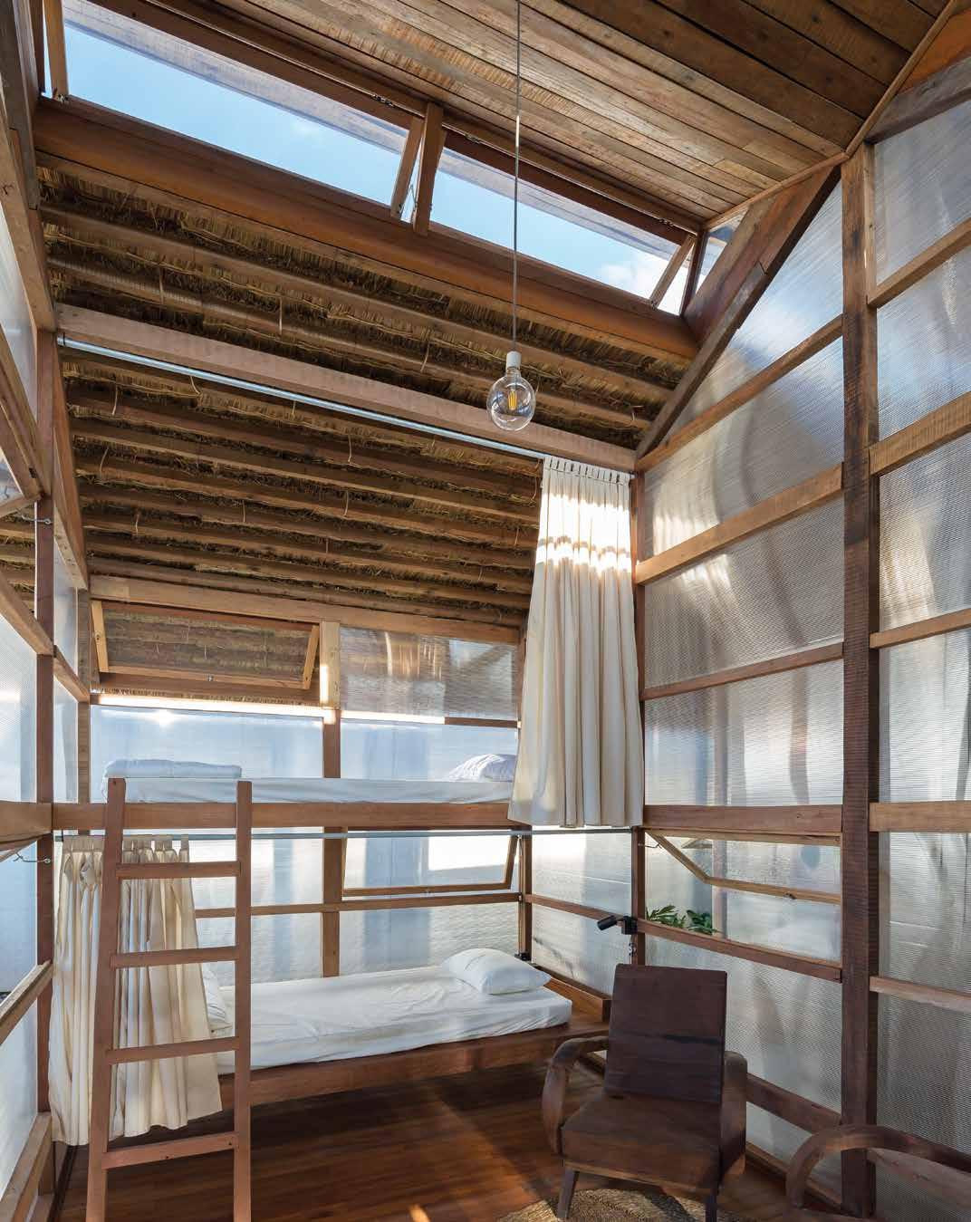

life outdoors # 111
HIGH PERFORMANCE SUITS


FARAGE.COM.AU
Seamless transitions indoors to out
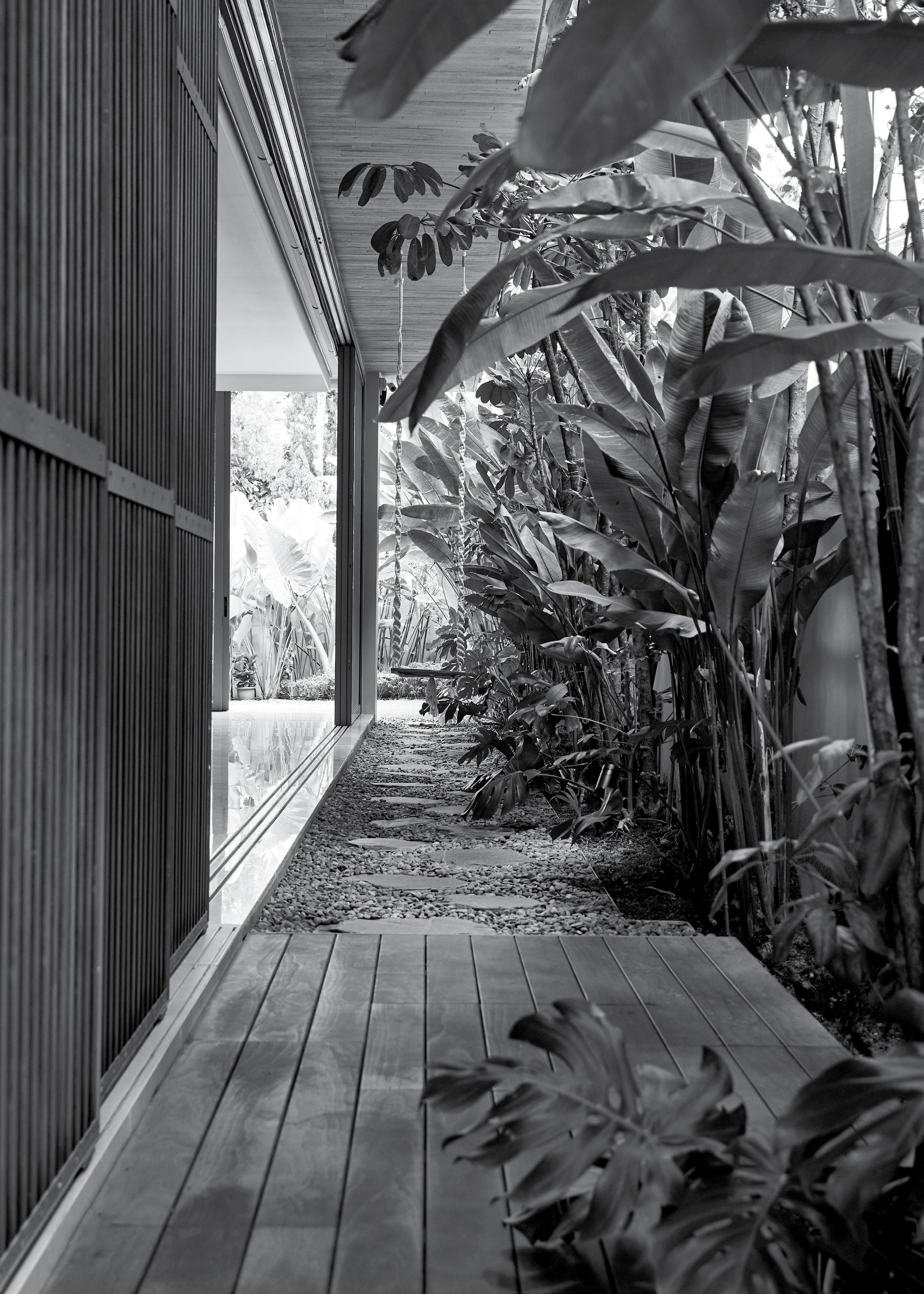

issue #46 habitusliving.com
My Architect
In this, the first of an occasional series in which writers on design talk about their own homes and working spaces, Habitus ’ Melbourne correspondent, Stephen Crafti, discusses the make-over of his home by architect, Robert Simeoni.
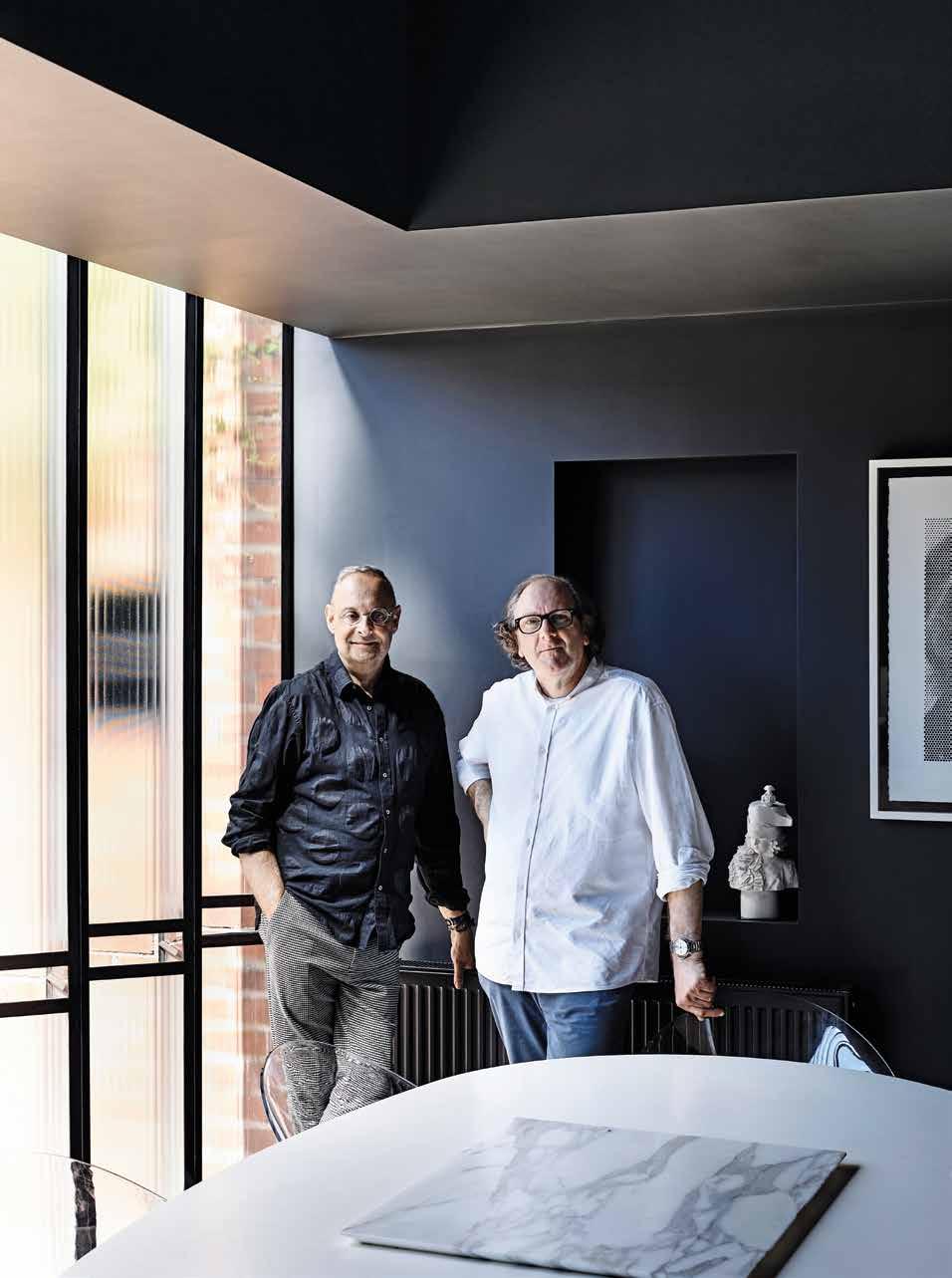 TEXT STEPHEN CRAFTI | PHOTOGRAPHY DEREK SWALWELL
3 . on location # 115
After nearly 30 years, writing on architecture is second nature. But when the subject is your own home, being objective takes on a different meaning.
The 1930s duplex that is now my home, couldn’t have been more rudimentary when purchased in 2011. Rented out for decades, the building’s sickly pale yellow rendered façade was as unenticing as the spindly garden, comprising concrete and a few weeds. Developers were eyeing the South Yarra block for demolition. My partner and I saw something else. Subsequently, so did architect Robert Simeoni, and furniture and lighting designer, Suzie Stanford.
“It was virtually intact, with a quiet elegance to the building,” says Robert, who has been on my radar since I first covered his awardwinning house at Woolamai in 2005. It was his fine handling in bringing together two disparate buildings, an 1880s Victorian cottage with a striking contemporary wing, that left me breathless at the time. But I was equally impressed with his quiet and contemplative manner, which had led me to write about many of his other projects over the years, including his own house, a masterfully updated Italianate villa that received an award from the Victorian Chapter of the Australian Institute of Architects.
Instead of getting distracted with finishes, our discussion centred on ideas from the outset. The home that had stood out most for my partner and I on our travels was Maison de Verre in Paris, by architect and furniture designer, Pierre Chareau.

OPENER
ONLY FULLY REVEALED WHEN SEATED AT THE DINING TABLE. OPPOSITE
A
ON
| THE STEEL AND GLASS EXTENSION, COMPRISING THE KITCHEN AND DINING AREA, HAS BEEN FINELY STITCHED ONTO WHAT WAS PREVIOUSLY A 1930S DUPLEX. PREVIOUS RIGHT | WRITER STEPHEN CRAFTI AND ARCHITECT ROBERT SIMEONI. ABOVE | THE DAPPLED NORTHERN LIGHT THROUGH THE TRANSLUCENT GLASS PROVIDES A DIFFERENT WAY OF LOOKING, WITH
THE GARDEN
| THE KITCHEN IS MORE AKIN TO
GALLERY WITH THE WORK OF FASHION PHOTOGRAPHER ROBYN BEECHE
DISPLAY.
issue #46 habitusliving.com
Contrary to most design practitioners where floor-to-ceiling views are obligatory, here there’s only a fine slither of clear glass.

3 . on location # 117
This house with a glass brick façade and strong industrial aesthetic was completed in 1932, three years before our humble duplex rose out of the dirt. But timelines mean nothing when comparing one of Europe’s most iconic homes to our extremely simple pre-war home. Fortunately, Robert saw more than a freestanding building in a quiet leafy street. “I didn’t want to pull the place apart. It needed to be touched lightly, but I also wanted to add something that was strong enough to connect the old with the new, almost a solitary object or a piece of sculpture,” says Robert, who was as mindful of the works of art, objects and furniture we have collected over many years. “There’s a certain quietness to the spaces, particularly with the muted light. I felt the new addition also needed to include that stillness.”
While Maison de Verre was on our minds, for Robert the image that resonated most was Bramante’s 1502 Tempietto in Rome. Ultimately, our new wing, comprising kitchen and meals area with a double-height void, features a fixed zig-zag translucent glass wall with a pivot door in the same shape reading as part of the wall. This unique structure is unlike both influences but reflects elements of them. The cupola is re-imagined with threedimensional steel panels that create a quilt-like effect in the sunlight.
And contrary to most design practitioners where floor-to-ceiling views to a northern garden are obligatory, here, there’s only a fine slither of clear glass that allows the courtyardstyle garden to be revealed when seated at the dining table. One of the other main sources of natural light is via a highlight window inserted into the dome, shedding indirect western light across a white canvas above the dark and moody kitchen joinery. I personally love watching the way the light moves across this broad expanse of white wall during the day, intensified in the outline of a window frame during the late afternoon when the light is at its strongest.

ABOVE & BELOW | NATURAL LIGHT IS EXPRESSED IN DIFFERENT WAYS, ANIMATING THE WALLS AND ALSO THE POLISHED CONCRETE FLOOR IN THE KITCHEN. OPPOSITE | THE PAST AND PRESENT IS CAREFULLY ARTICULATED WITH BOTH PERIODS RESPONDING TO THE OTHER.
issue #46 habitusliving.com
While Maison de Verre was on our minds, for Robert the image that resonated most was Bramante’s 1502 Tempietto in Rome.
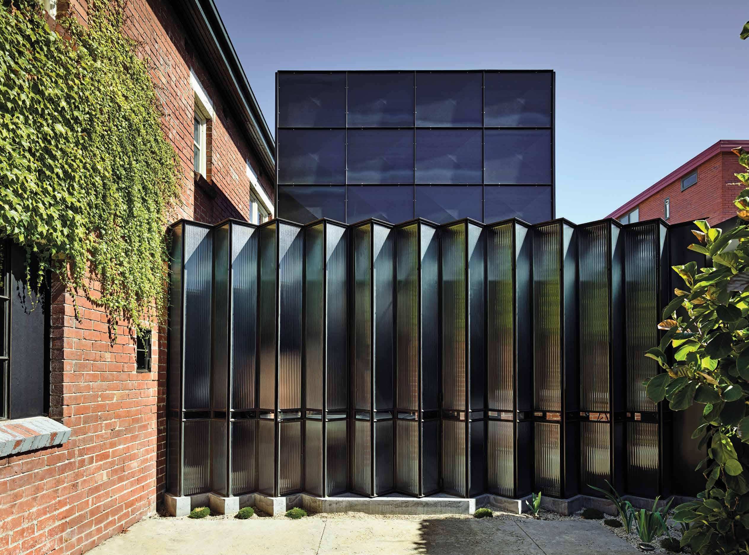
3 . on location # 119
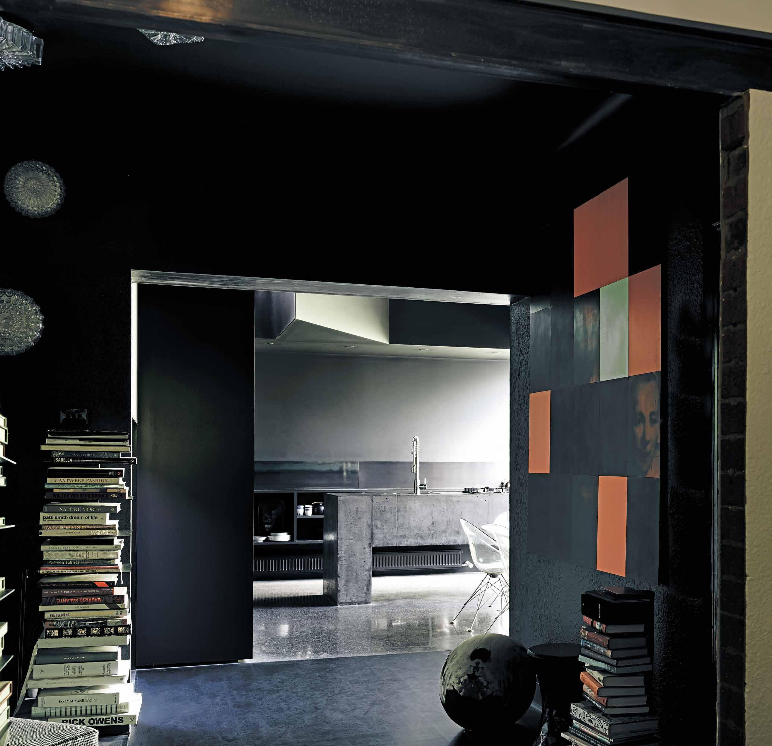
ABOVE | WHAT WAS PREVIOUSLY A BEDROOM IS NOW USED AS READING NOOK FRAMED BY THE WORK OF ARTIST LINDY LEE’S LAST VESTIGE. ROBIN BEECHE’S PHOTO VIVIENNE A LOOK OF THE ‘80S IS IN THE FORMAL LOUNGE. OPPOSITE | STEPHEN AND SUZIE STANFORD IN THE FORMAL LOUNGE THAT FEATURES SUZIE'S UNIQUE TAPESTRY FURNITURE AND CRYSTAL LIGHTS. Shouldn’t a house always capture the personality and unique qualities of its residents? issue #46 habitusliving.com
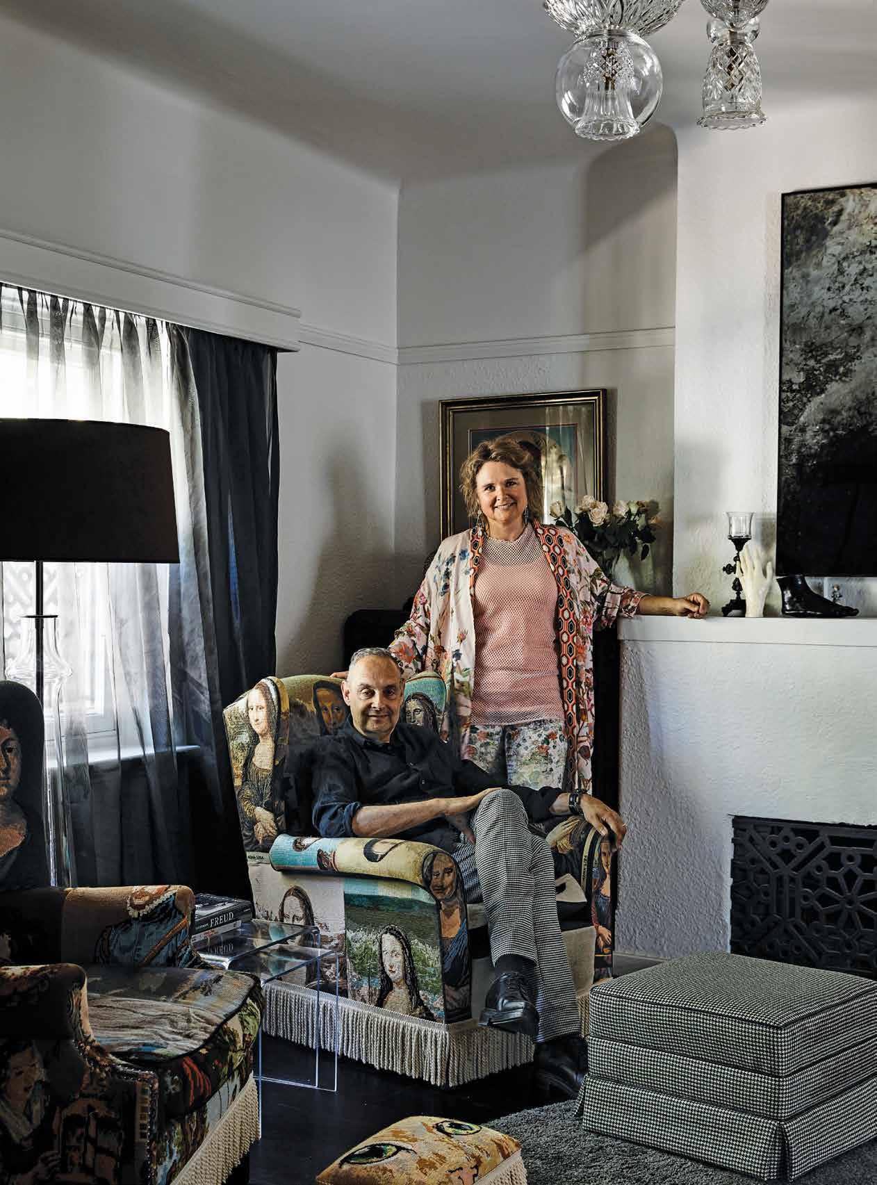
3 . on location # 121
Also captivating is the insitu concrete island bench, polished to the same effect as the floor and connected on just one end as though the two were ‘joined at the hip’. My five-year-old grandson was amazed when he first saw it: “That’s crazy!”
Rooms were opened up on both the ground and first floors, with the red brick incisions exposed rather than masked by new mouldings. Removing walls allowed for more fluid spaces. What was previously a bedroom is now a reading nook between the kitchen and sitting room. Upstairs, in what is now given over entirely to two empty nesters and a pampered cat, is the main and only bedroom, together with two separate dressing areas and a bathroom. The former two basic bathrooms is now an internal staircase (previously the only access between levels were two outdoor staircases on either side of the building).
We all felt the original rooms needed to be respected, as though the building was heritagelisted. The 1930s reeded-glass doors were retained and the decorative ceilings were highlighted in a soft tea-rose shade of pink, as were the upstairs bathroom walls and ceiling that wrap around dark chocolate brown tiles. This sculptural feature, constructed from D-Tiles, is evocative of a modernist 1930s bathroom. “There’s a theatricality about the spaces, partially with the way the light falls on each surface, as much as to the way the furniture and art are arranged,” says Robert. Suzie Stanford’s indelible signature tapestry chairs (Chareau coincidently designed tapestry chairs and lounges for his masterpiece), one daubed Mona Lisa, the other Blue Boy, are as cherished as the crystal chandeliers fashioned by Suzie using vases and objects that once would have been given as wedding presents when the duplex was built.
1 2 3 4 5 6 7 8 9 0 q
ENTRY SITTING TRANSITION DINING KITCHEN LAUNDRY STUDY OFFICE BATHROOM DRESSING BEDROOM
GROUND FLOOR FIRST FLOOR
issue #46 habitusliving.com

OPPOSITE | PLANS. ABOVE | A TROMPE L’OEIL IN THE FIRST FLOOR PASSAGE CREATING THE ILLUSION OF A THIRD LEVEL. 3 . on location # 123
It took a couple of years, but the renovation of my home is now complete. I love it when people come to visit, as guests or participants of one of my local architecture tours, and say: “It’s so you!” Well, shouldn’t a house always capture the personality and unique qualities of its residents? It’s dark and moody in parts and warm and textured in others. It’s clearly not Maison de Verre in Paris or Bramante Tempietto in Rome. It’s simply the Craftis’ house, a place that feels tailor-made for us. What’s more, we adore it!
The Powell Street House won the Marion Mahony Award for Interior Architecture and the John and Phyllis Murphy Award for Residential Architecture – Houses (Alterations and Additions) at the 2019 Victorian Chapter of the Australian Institute of Architects.


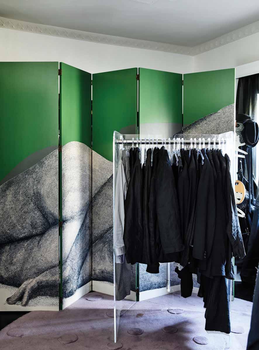 Robert Simeoni Architects | robertsimeoniarchitects.com
ABOVE LEFT | THE MAIN BEDROOM INCLUDES A WORK BY ARTIST JANET LAURENCE. ABOVE RIGHT | THE MAIN BEDROOM INCLUDES A WORK BY ARTIST DANI MARTI OVER THE FIREPLACE THAT HAS BEEN FILLED IN WITH SECOND HAND BRICKS. BELOW | THE ADAM AND EVE SCREEN BY ARTIST SIMON LEAH IN STEPHEN’S DRESSING ROOM.
issue #46 habitusliving.com

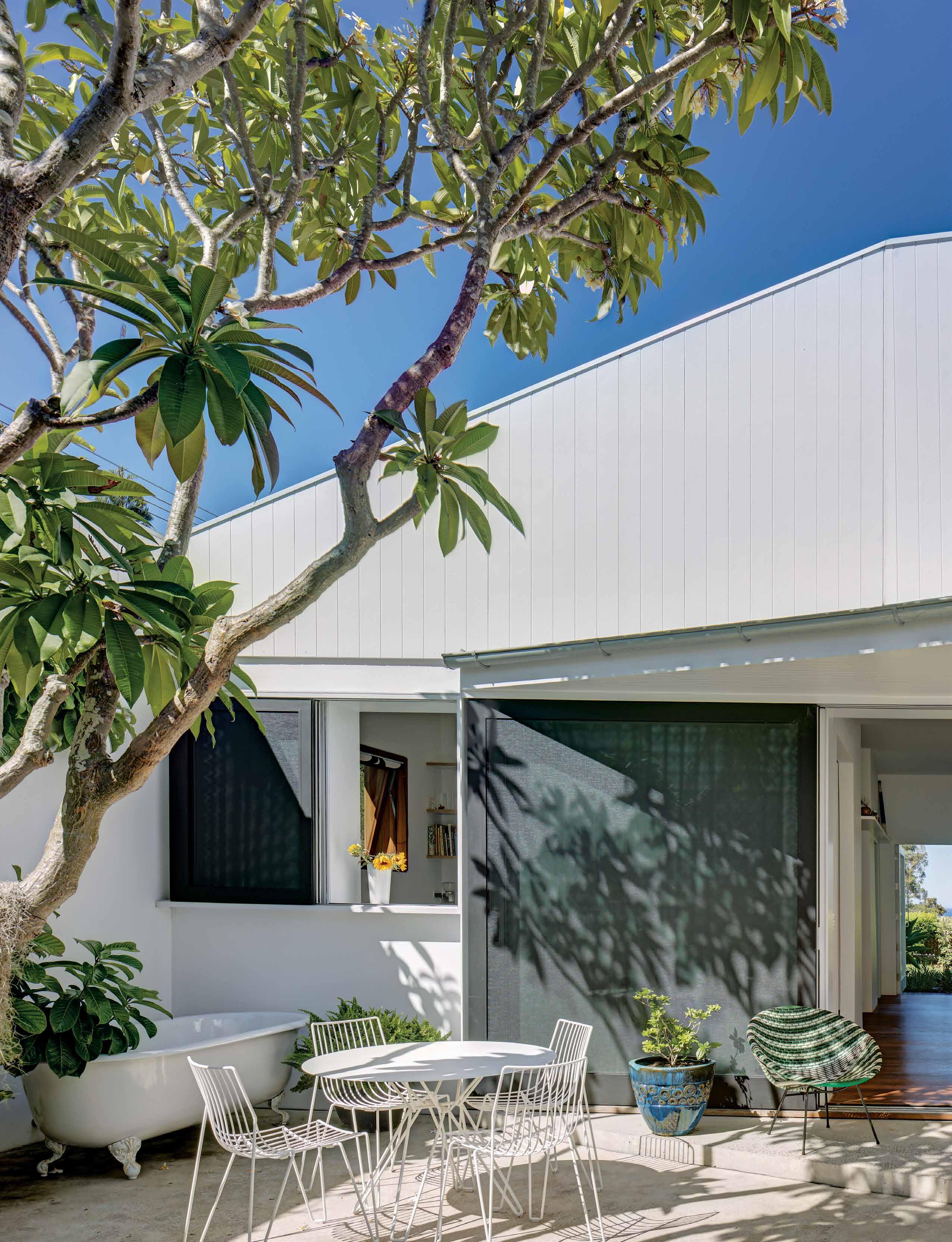
issue #46 habitusliving.com
Reframing the past
Being a good neighbour doesn’t mean not being able to enjoy your privacy, as this house in Sydney’s beachside Bronte demonstrates.
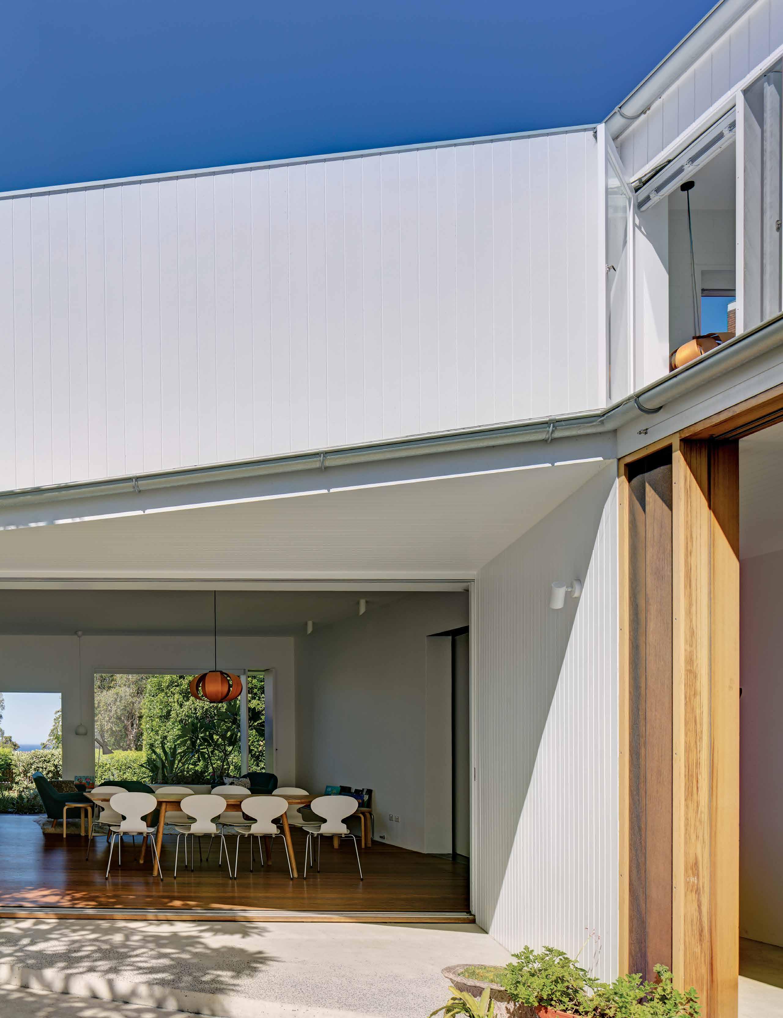 TEXT PAUL MCGILLICK | PHOTOGRAPHY BRETT BOARDMAN
3 . on location # 127
“We decided to wrap the place in landscape,” says architect Stephen Neille. In this case, a landscape that not only includes trees and plantings of flowering shrubs and creepers (such as the bougainvillea “borrowed” from the next-door neighbour) around three sides of the curtilage, but also the ‘wider context’ of Bronte’s pre- and post-war residential architecture.
Landscape architect, Sue Barnsley, has in fact added substantial amenity to the public domain, especially to the cul-de-sac street that terminates in a delightful pocket park. This in turn becomes another example of the architects’ strategy of borrowing the landscape and drawing it inside the house. The street is part of an elevated bullnose formation affording the house a garden at its tip, beyond which is an unrivalled view down Bronte Gully to the Pacific Ocean beyond.
It is this view and the roughly arrowhead shape of the site which has driven the planning of this re-configured and extended pre-war single-storey cottage.
It is home to architects Rachel Neeson and Stephen Neille and their two children. Rachel had previously lived in Bondi and wanted to stay near the beaches, which also suited her all-yearround surfing husband and professional partner, Stephen Neille.

The original cottage was entered from the ocean side and was of the railway carriage variety with a corridor down the middle and rooms off to either side on what is quite a deep block. The entry has now been shifted to the street, enabling what has become the living/ dining space to celebrate the view through a bold feature window and its all-glazed companion door to the garden.
This was part of an imaginative re-think of the original cottage to open it up and create refuge and prospect, a private yet light-filled home. The side street was walled off (apart from the front garden) with just a discreet entry door and the carport. The white-rendered wall is inflected by the timber entry door and the slightly extruded timber-framed windows of the kitchen and downstairs bathroom. Inside, the street can be observed from a generous lateral
OPENER | VIEW FROM THE COURTYARD LOOKING THROUGH THE LIVING/DINING SPACE TO THE GARDEN AND OCEAN BEYOND. ABOVE | LOOKING BACK INTO THE COURTYARD WITH THE CORRIDOR TO THE PRIVATE WING ON THE LEFT. OPPOSITE | THE CHILDREN’S WING ENDS WITH THE LAUNDRY AND A DISCREET DOOR TO THE STAIRS LEADING UP TO THE MASTER BEDROOM.
issue #46 habitusliving.com

3 . on location # 129
window in the kitchen and from the upstairs master bedroom. The addition element is a white-painted, two-level brick volume set back opposite to and overlooking the street side which on the ground floor provides a laundry and two bedrooms for the children. Upstairs is the magical master bedroom and ensuite, filled with light and enjoying splendid views into the front garden below and beyond to the ocean.
The grand gesture which gives the house its name, Hole in the Roof House, is the creation of a courtyard by removing part of the original roof on the street side with a mature frangipani tree craned in to lend it some natural character. This becomes an extension of the living/dining space and serves as an outdoor dining and entertainment area, a handball court and an outdoor movie space – it even has a bath for outdoor bathing in summer. The scale of the house remains consistent with its beachside neighbours, as do the white-painted brick and timber façades, and its suggestion of the beachside shack.
This is a house that seems to provide everything while never indulging in anything unnecessary. It has an easy, fluid plan with a variety of spaces, including the nooks and crannies of a true home. The fenestration is a delight and crucial to promoting both external
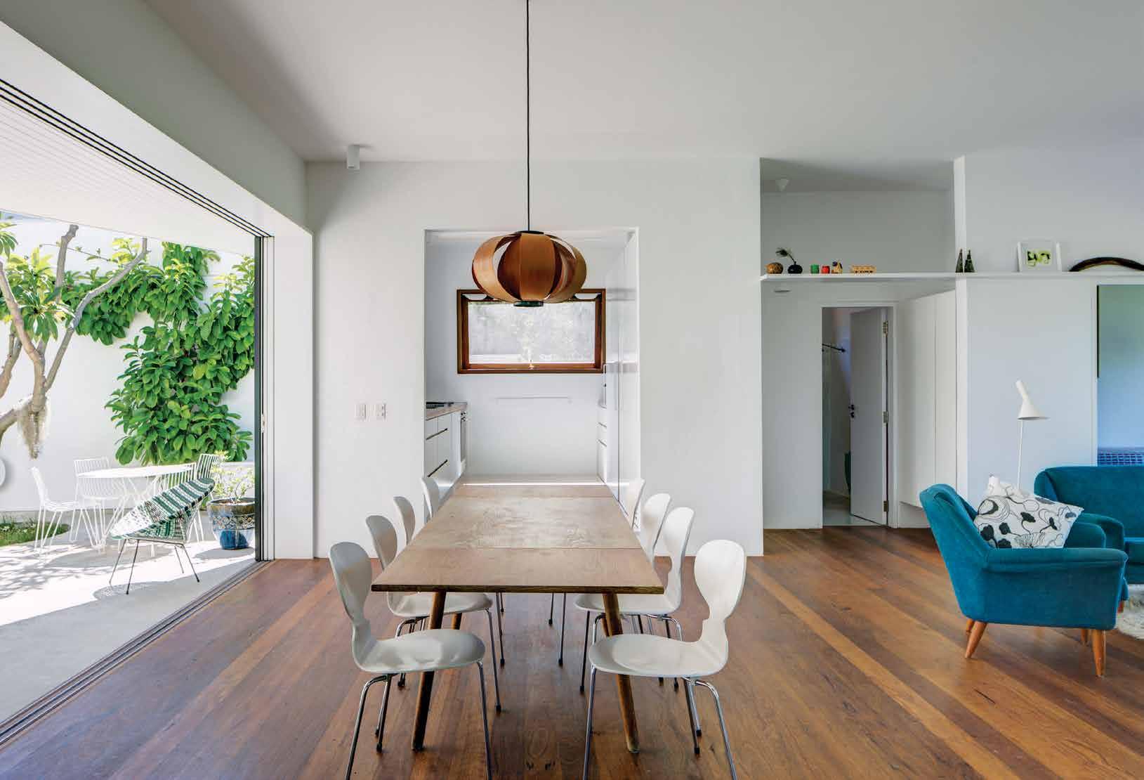
ABOVE | THROUGH TO KITCHEN WITH THE BATHROOM ON THE RIGHT. OPPOSITE | THE SLIDING TIMER-FRAMED DOOR TO THE COURT AND THE MASTER BEDROOM BATHROOM ABOVE.
issue #46 habitusliving.com
This is a house that seems to provide everything while never indulging in anything unnecessary.

3 . on location # 131
issue
GROUND FLOOR
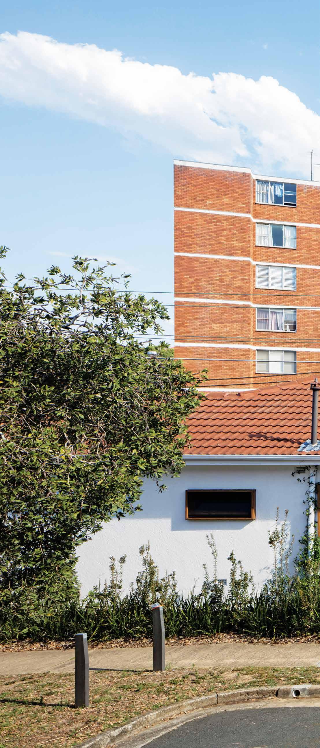
1 2 3 4 5 6
LIVING
STUDIO BATHROOM
KITCHEN
FIRST FLOOR 7 8 9 0 q w
COURTYARD
CARPORT
SUN ROOM
BEDROOM
LAUNDRY
MAIN BEDROOM
ENTRY
ENSUITE #46 habitusliving.com
The scale of the house remains consistent with its beachside neighbours, as do the white-painted brick and timber façades, and its suggestion of the beachside shack.

3 . on location # 133
and internal prospect with its constant variety of openings, including several generous feature windows, and a constantly changing edit of exterior views.
The detailing and finishes somehow manage to look elegant and simple at the same time. Likewise, the house never loses sight of its origins in its scale and through its timber flooring and white-planked timber skin. The white and off-white palette is subtly enhanced by the odd accent such as the two dark-stained Disa pendant lamps in the living/dining space, and extruded dark timber window and sliding door frames. There is also very satisfying detailing including discreet storage solutions (including use of the roof cavity), the subtle change in floor level for the kitchen, and the pivot door separating the living-dining space from the corridor leading to the private spaces. This is especially true of the windows. Here the architects developed what Stephen calls “flippers” – vertical slot openings with pivoting solid timber panels and flyscreens to provide insect-free ventilation, thus allowing generous, frame-free, non-opening windows to enhance the sense of connection with the outside landscape.
There is an easy and restrained delight to this house with its combination of privacy and connection to its urban beachside context. It has grace and elegance that, unsurprisingly, is also discreet and unostentatious.
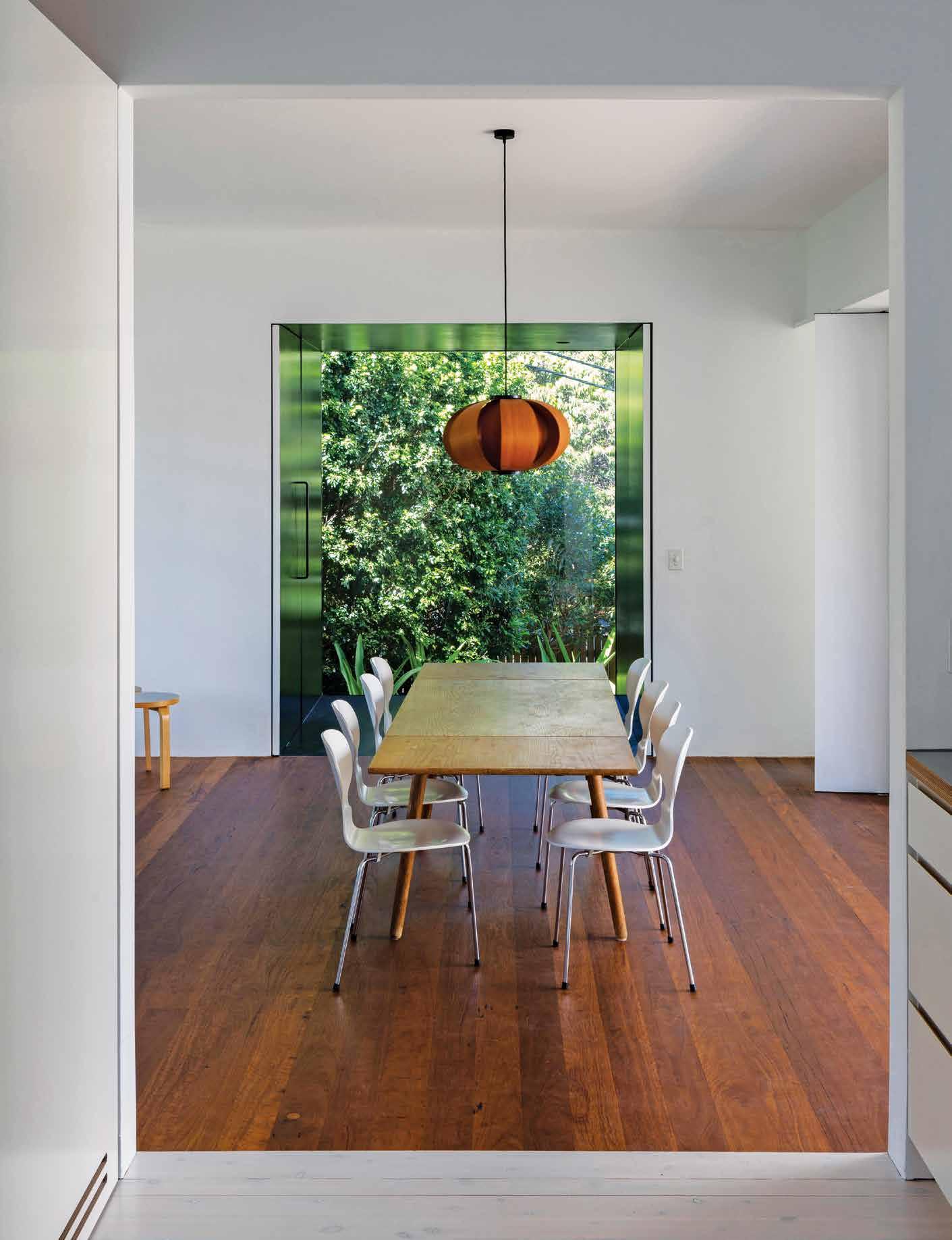
PREVIOUS LEFT | PLANS. PREVIOUS RIGHT | VIEW FROM THE STREET SHOWING THE HOLE IN THE ROOF AND THE MASTER BEDROOM SCREENED BY THE FRANGIPANI TREE. ABOVE | VIEW OF THE DINING SPACE WITH A FEATURE WINDOW TO THE REAR GARDEN.
issue #46 habitusliving.com
Neeson Murcutt Architects | neesonmurcutt.com
Anything is possible
When Kris Torma – once-upon-a-time a film and television set designer – and his horticulturalist brother Kim first launched their metal finishes business, Axolotl, it may have seemed an unusual move. Nearly 25 years on it’s clear to anyone familiar with them, or their business, that going against the grain is something that Kris and Kim do best.
It was 1995 when Kris and Kim first started Axolotl out of a desire to usurp the restraints and preconceptions of common materials. Operating out of a single-car garage space in the backstreets of Sydney’s Redfern, Axolotl set out to re-engineer semi-precious metals such as bronze and copper to take on new properties, such as becoming lighter in weight, more flexible in form, or stronger than the original. It was not long before Axolotl gained the interest of the architectural sector – particularly that of architects and designers looking for more cost-effective and flexible ways to incorporate metals into the interiors and exteriors of projects.
Starting out with a modest four metal samples, Axolotl now offer hundreds of finishes – each of them ground-breaking in its own right. “If we see a brief that isn’t yet met, we’ll invent a solution,” says Kris. Driven by the thrill of being creatively challenged has lead to the combining of surfaces and techniques that haven’t been considered before, for instance, inlaying metal in stone and concrete into glass.
“Learning and exploring new materials and processes is what interests us,” says Kris. And it’s evident in everything that Axolotl does, such as its involvement in the inaugural Easel Project, 2019. Initiated by industrial designer Adam Cornish and graphic designer Marcus Piper, the Easel Project invited eight leading creatives to push out of their comfort zones and challenge their typical palette of materials. Axolotl collaborated with the line up of creatives, which included Jaime Hayon, Adam Goodrum, and Louise Olsen (to name a few) to develop each of their unique concepts. The resulting range of materials and processes experimented with was extremely diverse – from fused plate glass to marble with brass inlay; etching; 3D printing (a service Axolotl introduced in 2017); to heat-tempered stainless steel.
“We have fun experimenting and developing our products,” muses Kris, “each piece is unique, and the sum of this is presented in our vast product range today.”
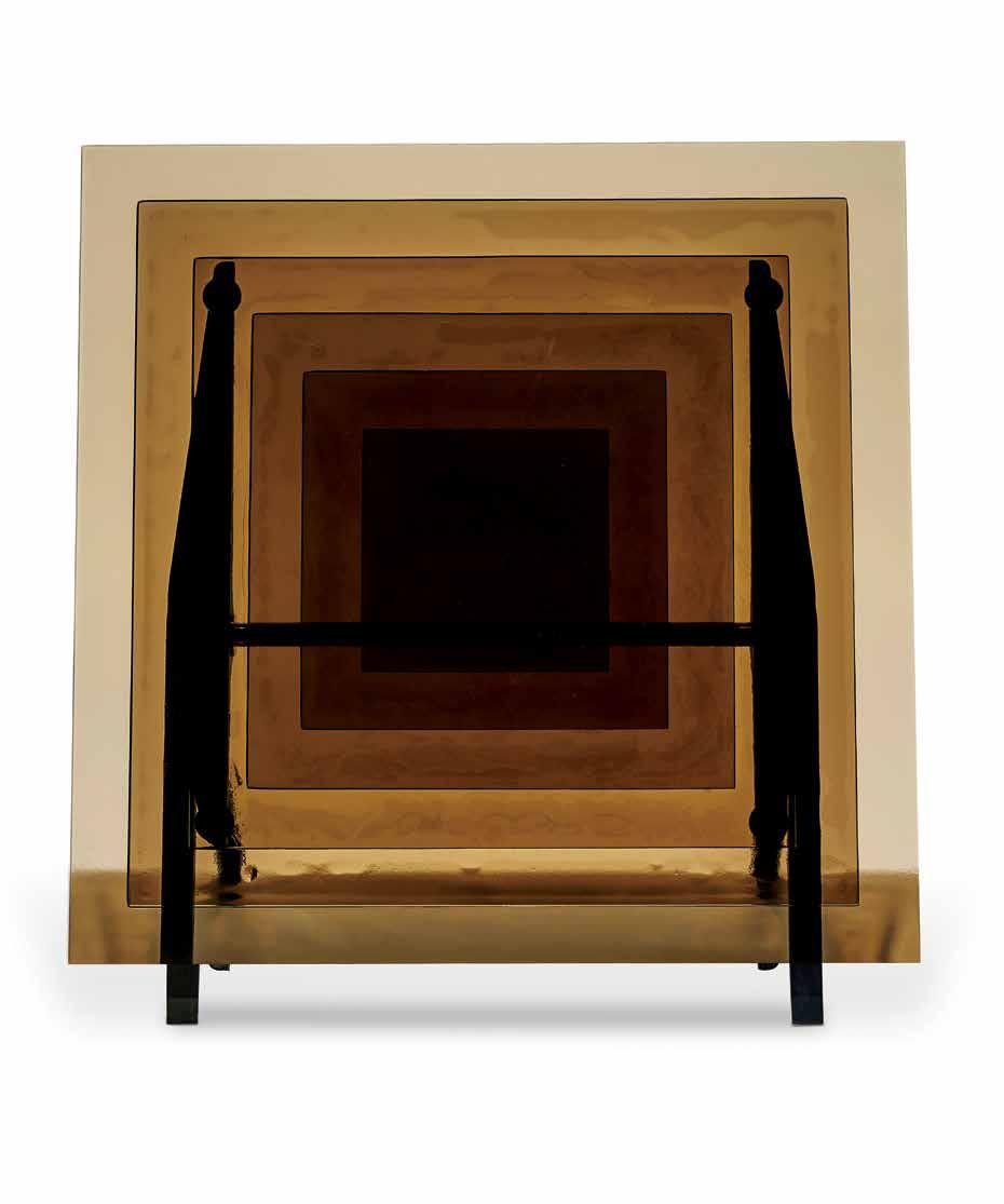
habitus promotion › Axolotl #135 ABOVE | ADAM GODRUM EASEL PROJECT FRAME.
Axolotl | axolotl.com.au
After 25 years of challenging preconceptions of what is possible and impossible, Axolotl continue to usurp the restraints of common materials.

issue #46 habitusliving.com
Paradise found
A rammed earth guest house in Byron Bay by Thais Pupio Design champions the ancient building material with incredibly appealing results.
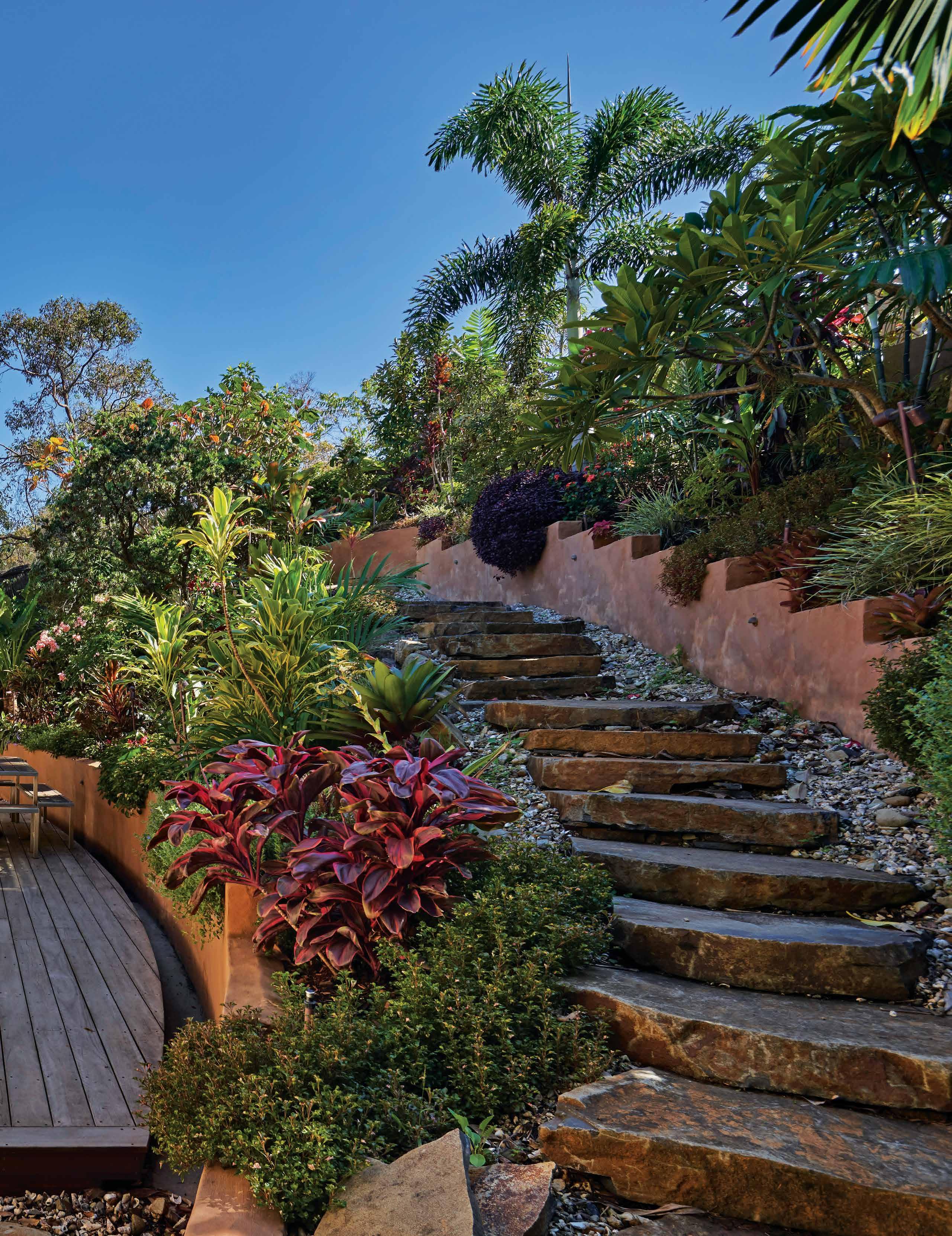 TEXT LEANNE AMODEO | PHOTOGRAPHY MICHAEL NICHOLSON
3 . on location # 137
Byron Bay is that quintessential little piece of Aussie beachside paradise. It’s a small New South Wales coastal town popular for its surf beaches, music festivals and colourful mix of bohemian nature lovers, shrewd developers, holidaying backpackers and fun-loving creatives. It’s also where Brazilian architect Thais Pupio set up her practice, Thais Pupio Design, after relocating to Australia 11 years ago. Florianópolis, where she used to live in the south region of Brazil, shares the same sub-tropical climate as Byron Bay and so the move was undoubtedly a strategic one. Thais is adept at producing highly efficient yet humble environmentally responsive residential architecture and the same design principles that drive her projects in Brazil also drive those in Australia.
It’s an expertise not lost on her recent clients, a husband and wife with three grown children who wanted a guest house next door to their own home. “They know I’m Brazilian and came to me with a sense that I could create something tropical in both appearance and
feel,” says Thais. “They didn’t want anything too rustic – or anything that looked like a beach shack – but it did need to be inviting, earthy and modern.”

An ordinary house built in the 1980s already occupied the property and the idea was to dramatically re-work it. The new two-bedroom residence needed to be low maintenance and conducive to entertaining large groups of friends and family. More importantly, it needed to retain the original footprint and not encroach on the clients’ lush garden; their pride and joy. As Thais explains, “They also wanted this established garden to become a part of the house, which just wasn’t the case with the former dwelling. So I needed to connect to the landscaping without imposing on it.” Resolving how best to frame views of the garden soon became the priority, along with Thais’ desire to create a serene, immersive experience for anyone sitting inside and looking out.
Generous glazing, and strategically placed louvres that facilitate ample cross ventilation, ensures a strong connection with the outdoors. As does the kitchen’s breakfast bar, which
OPENER | THE
WITH THE OUTDOORS.
THE
EXISTING GARDEN INFORMED THE DESIGN OF THIS GUEST HOUSE, WHICH SERVES TO BRING THE OUTSIDE IN. ABOVE | THE EXTERNAL BREAKFAST BAR CONNECTS THE KITCHEN
OPPOSITE |
INTERIORS RECEIVE PLENTY OF NATURAL LIGHT, WHICH IS GENTLY TEMPERED SO AS NOT TO BE OVERWHELMING.
issue #46 habitusliving.com

3 . on location # 139
is positioned on the deck beneath the large window. Oversized eaves at the front and rear extend the house into the garden, this outreach truly embeds the structure in its natural surrounds while also protecting it against the area’s big rains. Internally, bedrooms, two ensuites and a powder room/ laundry are positioned to the side to give over as much of the house’s relatively compact 124-square-metres as possible to the living areas. The kitchen, dining and lounge are in turn open plan and, together with the multiple full-height glass doors and clerestory windows, encourage that unobstructed connection with the outdoors that feels effortless.

The beauty of Thais’ scheme rests in its simplicity and the architect is quick to champion a low-tech design approach. “It’s not a high-tech house and was never intended to be,” she states. “Architectural innovation doesn’t mean a home needs to be run by remote control. Nowadays, we’re innovating if we’re thinking about our impact on the earth and for me, innovation means using the simplest techniques, principles and materials. You can live modestly and easily, but still live in a beautiful house that’s well designed.”

ABOVE | A CUSTOM COPPER EXHAUST FAN MAKES A BOLD KITCHEN STATEMENT. OPPOSITE | THE OPEN PLAN LIVING AREAS EASILY ACCOMODATES LARGE GATHERINGS OF FRIENDS AND FAMILY.
issue #46 habitusliving.com
Generous glazing, including strategically placed louvres to facilitate ample cross ventilation, ensures a strong connection with the outdoors.

3 . on location # 141
This home, like all of Thais’ projects, is informed by questions of environmental impact. What long-term effect will it have on its natural setting? How can it be sustainable without taking anything away from its location? Her resulting palette and decision to use rammed earth – an ancient building material she was very happy to discover the clients’ were likewise passionate about – offers a positive response. Its selected aggregates were sourced from a nearby quarry and compressed on site to form all but three of the building’s robust walls. The material itself has a low embodied energy and is low maintenance and – together with recycled timber used for the ceiling and cross beams – gives the home its most compelling design expression.

“The clients wanted something earthy but not dark and I also wanted it to be light and warm,” says Thais. “In this respect, the raw materials and raw colour palette works, while also communicating well with the natural environment.” The rear of the property abuts a national park and bushfires are a concern, so a fireproof material like rammed earth was a logical choice. Not only does its high thermal mass and durability meet the brief, but it allows for a healthy house too. For Thais, knowing her clients and their friends and family are living in a home that breathes, constructed from a non-toxic and non-polluting material is an achievement of which she’s incredibly proud.

ABOVE | IN THIS ENSUITE, HANDMADE DETAILS AND FEATURES PUNCTUATE THE OTHERWISE PARED-BACK SCHEME. BELOW | THE COPPER BEDROOM DOORS OFFER AN INTERESTING CONTRAST TO THE RAMMED EARTH WALLS. OPPOSITE | BOTH BEDROOMS ARE MINIMALIST IN THEIR STYLING, MAKING FOR CALM, QUIET RETREATS.
issue #46 habitusliving.com

3 . on location # 143
1 2 3 4 5 6 7
BEDROOM ENSUITE BATHROOM/
GROUND FLOOR

ENTRY
issue #46 habitusliving.com
KITCHEN DINING LIVING
LAUNDRY
To complement the rammed earth and timber palette, Thais incorporated custom copper detailing that provides visual accents throughout and together with bespoke joinery lends a handmade element to the design. The kitchen’s exhaust fan, bedroom doors and all the flashing will patina nicely over time, highlighting the timber’s rich maple hue and delicious surface imperfections of the rammed earth. A white marble island benchtop and splashback in the kitchen breaks up the earthy colour palette, as do the ivory-coloured floor tiles, which adds freshness to the interior’s overall scheme. This is a relaxed, comfortable home that also very much appeals to the imagination. Guests feel like they could be in a hidden villa in Mexico, a weekend getaway in Brazil or a retreat in Thailand, such is the design’s highly evocative nature. The fact they’re in Byron Bay isn’t too shabby a realisation either. Thais has created an exquisitely masterful study in passive design, sensitive to context and mindful of environment. And although her architecture is respectful and polite when it needs to be, it’s also bold, with an unapologetic confidence. As she reflects, “I like the idea that I can bring awareness to a way of living that embraces the use of simple passive design principles and smart, healthy materials. I’m hoping this house can be an example of that.”

OPPOSITE ABOVE | THE HOME IS SUITABLY EMBEDDED IN ITS LUSH GARDEN, AS PER THE CLIENTS' BRIEF. OPPOSITE BELOW | PLANS. ABOVE | CLEAR SIGHT LINES FROM THE KITCHEN TAKE IN THE GENEROUSLY PROPORTIONED OUTDOOR DECK AREA.
The rear of the property abuts a national park and bushfires are a concern, so a fireproof material like rammed earth was a logical choice.
3 . on location # 145
Thais Pupio Design | thaispupio.com
Elegance In A Historic Home
Celebrating its original character and charm, Blank Canvas Architects fitted House 184 with a Zip HydroTap and a material palette that echoes the sophisticated elegance of its past and present.

issue #46 habitusliving.com ABOVE | A ZIP HYDROTAP TAKES PRIDE OF PLACE IN THIS HOUSE BY BLANK CANVAS ARCHITECTS. OPPOSITE | FINISHED IN MATTE BLACK, THE ZIP HYDROTAP COMPLIMENTS THE HOME’S FOCUS ON MATERIALITY.
Just 5km southwest from Melbourne’s bustling central business district, the modern bay side suburb of Port Melbourne boasts contemporary architecture, restored workers cottages and historic landscapes. The revitalised area pays homage to the rich heritage of this inner-city suburb and its diverse community.
Designed by Blank Canvas Architects, House 184 represents a reimagined Victorian suburban home. Sitting on a compact 190m2 footprint of land, the Melbournebased creative studio took on the restoration of the space with a considered design approach, making the most of its dense urban setting and historic characteristics to create a home that was vibrant, contemporary and intricately connected to place.
While the façade and its archetypal Victorian details were retained, the architects sought to reimagine and reinvent some areas of the house, elevating its historic elegance. A modern reinterpretation was built at the rear, housing the open-plan living areas that work to maximise the internal space. Louvered screens and glass insertions create a seamless connection between inside and out, extending the home’s footprint as it melts into the back garden and the street beyond. This connectivity is enhanced with the help of large pools of natural light and plenty of foliage, creating a tranquil sanctuary that feeds into each room.

The palette and custom joinery highlights the designer’s focus on timeless materials in a humble orchestration that celebrates the past, present and future of the home. Through an artful balance of inspiring and functional design, every detail of Stables House is considered, making it the perfect place to entertain and relax. At the heart of the home, the kitchen embodies a textural harmony that echoes the relationship between the old and
the new. Prominently located on the marble bench top, the Zip HydroTap Arc in Matte Black is a key feature in the contemporary environment. Opting to cut down on clutter and excess, Blank Canvas Architects selected a Zip HydroTap that offers the family and guests the luxury of instant filtered boiling, chilled or sparkling water in a single tap to nourish the body in a rejuvenated structure of calming hues of neutral tones.
The architects ensured House 184 is given its own personality by revitalising the original character of the structure through contemporary materials that reflect the urban dialogue of Melbourne. From textured marble to oak features, each product has an inherent integrity to it, a materiality that speaks to the property’s locale and settles it into the history of workers cottages more broadly. A consistent palette of cerulean and shades of grey elevates the house and creates a succinct correlation between outside and in. Once inside, each room connects to the one before, creating a flowing experience that encourages feelings of calmness and serenity. This is added by an overall minimalism, a simplistic approach to interior decorating that prioritises quality, pragmatism and superior craftsmanship through intricate additions such as the Zip HydroTap. Offering unparalleled function and performance, this attention to detail elevates the residents’ daily routines while promoting a healthy lifestyle throughout the house.
Exploring the balance of urban density and considerate design through tonality, texture and form, House 184 is an exemplary representation of design celebrating heritage and contemporary residential living. Blank Canvas Architects crafted a home that encapsulates a personalised way of living, unique to a functional, yet elegant orchestration of space.
habitus promotion › Zip #147
Zip | zipwater.com
A fine perch
Emerging New Zealand practice Patchwork
Architecture had to ignore the rulebook to uncover an extraordinary solution for a challenging site.

TEXT ANDREA STEVENS | PHOTOGRAPHY SIMON WILSON
issue #46 habitusliving.com

3 . on location # 149
Wellington’s cleaved landscape is based on a visible fault line cutting north-east through the North Island before pitching into the Pacific Ocean. While this geography limits the size of the city, it certainly hasn’t constrained its architects or builders. They have responded with small, tall and interesting houses perched on ridges and clinging to impossibly steep hillsides.
To be a Wellington architect, therefore, is to be an expert in foundation design and resigned to the fact that large parts of a budget can get buried underground.


This small Kilbirnie site is no exception. As well as having a steep contour and awkward triangular shape, it has also been cut and retained for a bend in a busy arterial road. Not a site for the fainthearted, it was tellingly purchased off an architect by a builder. And at only 260 square metres, it’s had several schemes dreamed up but never realised.
Its new owners Adam (the builder) and Alicia Pierson commissioned Ben MitchellAnyon of Patchwork Architecture to develop a fresh scheme. “This was never going to be a conventional hillside house,” says Ben. “It would burn too much budget on excavation and waterproofing – money better spend on the house itself. We also had a busy road to deal with, so we lifted the house high above the traffic for privacy and to capture killer views of the harbour and surrounding suburbs.” This meant breaking the height-to-boundary controls by up to four metres on the road and public reserve boundary. However, the council wisely approved the scheme so this innovative design would create something unique from a seemingly uninhabitable site.
OPENER | THE ROOF DECK CREATES EXTRA SOCIAL SPACE AND MAKES THE MOST OF THE SITE'S PANORAMIC VIEWS. ABOVE | DESPITE THE SLOPE, THERE ARE THREE USEABLE OUTDOOR SPACES – THE ENTRY GARDEN, THE KITCHEN DECK AND THE EXTRAORDINARY ROOF TERRACE. BELOW | LIKE A TRUE WELLINGTON HILLSIDE HOUSE, THERE IS QUITE A CLIMB TO REACH THE FRONT DOOR. OPPOSITE | FLOOR-TO-CEILING WINDOWS EXTEND BELOW THE FLOOR AND ABOVE CEILING PLANES TO MAXIMISE THE GLASS AREA.
issue #46 habitusliving.com
Ben has designed a 10- by 10-metre box –exactly 100 square metres – set three storeys above the site entry.

3 . on location # 151

issue #46 habitusliving.com
Enigmatic and as un-house-like as you can get, it could be mistaken for a watchtower or small commercial building.
Ben has designed a 10- by 10-metre box –exactly 100 square metres – set three storeys above the site entry. Simple geometry has allowed him to rationalise the site and create a highly efficient plan. “The brief was for a threebedroom family home,” he says. “They had no preconceptions about the design and gave us full creative freedom. Having worked with Adam on several houses now, our starting point was the level of detail and perfectionism we’ve seen in his work. A simple square offered an incredibly crisp form – not only relating to Adam’s building interests but also leaving us more budget to apply to the detailing and materials.”
The house is supported by a concrete block core – enclosing a small office, laundry, entry and stairwell – and ten steel poles. The main floor cantilevers past these foundations to not only present a dramatic composition to the road, but also pitch the house out toward the view.

Reminiscent of the L.A. Case Study Houses of last century, the industrial panelised materials and minimal form challenges the stereotype of a home. From the outside, the structure is purposely devoid of recognisable house signs – no eaves, no pitched roof, no window reveals, no shutters, no traditional porch. Enigmatic and as un-house-like as you can get, it could be mistaken for a watchtower or small commercial building. Silver anodised cladding, flashings, joinery, downpipes and gutters – even a full metal underside – create a singular form broken only by vertical panel joints.

OPPOSITE | THE SEEMINGLY SIMPLE ALUMINIUM AESTHETIC BELIES THE AMOUNT OF WORK REQUIRED TO CONCEAL THE STRUCTURE. ABOVE | FRENCH PORCELAIN TILES AND OILED TASMANIAN BLACKWOOD ADD A WARM AND CRAFTED CHARACTER. BELOW | THE FREE-STANDING KITCHEN TABLE IS AT BENCH HEIGHT TO CREATE A SECOND WORKING SURFACE AS NEEDED.
3 . on location # 153
STAIRS DECK STUDY ENTRY LANDING LIVING KITCHEN / DINING 1 2 3 4 5 6 7 GROUND FLOOR FIRST FLOOR ROOF 8 9 0 q w e BEDROOM ENSUITE BATHROOM BUNK ROOM ROOFTOP DECK ‘BUS STOP’ issue #46 habitusliving.com
To explore the house, you climb seven and a half metres up two sets of external concrete stairs to arrive at the entry deck protected below the house proper.

OPPOSITE | PLANS. ABOVE | PERCHED ON A STEEP BANK, INGENUITY IN DESIGN AND CONSTRUCTION ENABLED A HIGHLY LIVEABLE SOLUTION.
3 . on location # 155

issue #46 habitusliving.com
“I love it when you get a strange site and it produces an unusual outcome. You wouldn’t look at the site and think a perfect square would be the logical response,” says Ben. “The clients were willing to take a risk with the sketch design and they trusted us to design them a great house. We knew Adam could build it, so we weren’t afraid to try unusual details. He knows what he likes, but also trusts us to do our thing and gave us input for how he wanted to put it together.”
To explore the house, you climb seven and a half metres up two sets of external concrete stairs to arrive at the entry deck protected below the house proper. A glass door leads into a timber-lined lobby and stairwell, where the warmth of the interior is immediately revealed by the oiled Tasmanian blackwood. Winding up another level, you arrive in a small lobby leading onto the main living space. Timber is used throughout the main floor, with a solid oak floor perfectly mirrored in a solid oak ceiling. This luxury is continued in two walls of blackwood cabinetry – the one-wall kitchen and living room unit. Dark grey matt ceramic tiles complete the dark palette. From this warm containment are two areas of floor-to-ceiling glass revealing an outside deck and a long view of Evans Bay from the corner window.
“The main living room is strangely peaceful despite the traffic and wind,” says Ben. “Quiet and warm; it’s the elevation above everyone else that gives that privacy. It is a house to sit and watch a storm.” Bedrooms are distributed on the other three corners of the square with two bathrooms set back-to-back on the hillside.
While it’s essentially a single-storey house, the architects have created useful outdoor spaces at three levels – below, centrally and overhead. The entry deck provides a covered

OPPOSITE | EUROPEAN OAK IS MIRRORED IN THE FLOOR AND CEILING THROUGHOUT THE HOUSE TO CREATE A WARM AND COSY INTERIOR. ABOVE | TOTAL PRECISION IN THE ALUMINIUM CLADDING AND JOINERY CREATE A STREAMLINED EXTERIOR. 3 . on location # 157
outdoor area and adjacent garden made private by new planting and with external access up to the main deck above. At the very top, a flat roof forms an open deck with a quirky ‘bus stop’ in the centre. Referencing the arterial road below, it provides a protected room from Wellington’s fierce winds – and fixed furniture that won’t blow away. Access is via a freestanding concrete stair – the fourth flight of stairs! – and across a bright yellow steel gangway.
“These spaces above and below make it very dynamic,” says Ben. “They provide views around the building, up and down – indoor–outdoor rooms that are inexpensive to create and add a lot of interest. The roof deck is a fairly unusual feature in a city known for its wind. But on a good day, there is no better place to be with its panoramic views of the harbour and city.”
This young and emerging design practice run by Ben and business partner Sally Ogle – colleagues from architecture school – is gaining a reputation for striking and innovative buildings. A small and adventurous practice challenging the status quo to find high-quality living solutions. Patchwork Architecture

ABOVE | THE 'BUS STOP' ROOF SHELTER IS A MUST FOR WELLINGTON'S WIND, PROTECTING PEOPLE AND AS A SPACE TO STORE FURNITURE.
| patchworkarchitecture.co.nz
issue #46 habitusliving.com
At the very top, a flat roof forms an open deck with a quirky ‘bus stop’ in the centre.
The love of good design
Established in 1983, the family-owned and operated Spanish furniture designer and manufacturer, Stua, gets its name from the phrase solo tengo un amor – “I have only one love”. That love is for good design. Good design that transcends the beauty of form to provide clever solutions for functional questions. Its high level of aesthetic and engineering detail defines the work of designers Jesus Gasca, Jon Gasca and Josep Mora, consistent throughout their collection of chairs, tables, stools, storage, lounge and outdoor furniture.
StylecraftHOME has been representing Stua in Australia on an exclusive basis for close to 20 years. Now the iconic Australian furniture establishment is excited to be stocking key pieces from the Spanish brand on the ground in Australia, alleviating the typical fourteen-week lead time for Stua products.
Among the Stua items now more immediately available from your local StylecraftHOME are the Costura Lounge and Armchair, inspired by the noble tradition of couture tailoring. Featuring a slim profile with tailored details, Costura comes in a number of different styles and configurations, including
a generous two or three seater lounge, chaise lounge, minilounge, armchair and ottoman.
Also now in stock in a limited range of finishes at StylecraftHOME is Stua’s Lau Console. Designed by Jesus Gasca, the Lau Console is at once simplistic and timeless, featuring an inclined leg with a refined curve connecting the top. Used as a decorative piece in a living room, hallway, or bedroom, the Lau Console can alternatively be paired with a stool to form a discreet, functional work surface or modern bedroom vanity.
Wrapping up the range of Stua furniture that, thanks to StylecraftHOME, we need not wait any longer for now is the Solapa collection of coffee and side tables. Designed by Jon Gasca, the Solapa collection is characterised by a shared, classical silhouette. Available in various sizes, Solapa’s adaptability allows you to use one table, or to arrange various sizes in your own unique nesting layout.
The Costura Lounge and Armchair, Lau Console and Solapa tables are now available in a limited range of sizes and finishes from StylecraftHOME.

habitus promotion › StylecraftHOME #159 ABOVE | THE COSTURA TWO-SEATER LOUNGE AND ARMCHAIR FROM STUA, VIA STYLECRAFTHOME.
StylecraftHOME | stylecrafthome.com.au
“Good design is not only about beautiful shapes. It always has to be clever in the solution of functional questions.” – Jesus Gasca, founder of Stua
Greening, screening and ageing well
Biophilic design may be trending but for HYLA Architects, it has always been an integral part of design in the tropics. This house in Jalan Harom Setangkai, Singapore, is a fine showcase of such an affinity.
TEXT LUO JINGMEI | PHOTOGRAPHY
DEREK SWALWELL
issue #46 habitusliving.com

3 . on location # 161
It is a cloudless, blindingly hot morning where the sun’s brilliance throws defined shadows on walls and the heat dissolves distant forms into mirages. I’m standing outside Fade to Green with architect Han Loke Kwang, founder and principal of Singaporebased HYLA Architects, observing one of his recently completed houses designed for a couple and their three teenage children.
The weather is typically tropical and barely bearable but it presents the perfect opportunity for the house’s properties to shine. The simple, two-and-a-half-storey structure is clad in a trellised skin aged to a chalky grey and the sunlight casts graphic shadows against the offform concrete shell against which timber strips are layered to bring out depth and detail. On the first storey, the verdant planting is mirrored at the house’s attic with greenery poking, pushing and feathering out of screens and balconies.
It’s a pretty spectacle, though not in the conventional sense of pristine whitewashed walls, ornate grilles and terracotta roofs capping neighbouring houses. The aesthetic here is more raw and imperfect, matched by the insouciant proliferation of plants. It’s a departure from the œuvre of HYLA Architects. “It contrasts with most of my other houses that are more streamlined and straightforward. In this house, both nature and architecture have a very informal feel; it’s not so manicured,” says Loke Kwang.

OPENER | AGED GREY TIMBER AND THE
AND
OF THE
ESTABLISHES A
FOR THE
ABOVE | THE FIRST STOREY LIVING AND DINING ROOM FULL-HEIGHT GLASS SLIDING DOORS ARE PERPETUALLY
OPEN TO LET IN THE
EXPOSED METAL NUTS
BOLTS
SCREEN
RUSTIC AESTHETIC
HOUSE'S FAÇADE.
LEFT
BREEZE.
issue #46 habitusliving.com

3 . on location # 163
On the first storey, a perimeter garden abuts common spaces.
He was inspired by vernacular houses homeowners built for themselves in south east Asia that use tin roofs and aged timber, with plants growing around them haphazardly. “For this project, our idea was to blur the distinction between architecture and nature, but we didn’t just do this with space. We did this with the building form in a way that nature appears to be almost taking over the building; nature interweaves with the skin,” he elaborates.
The assimilation of nature is a persistent theme in Loke Kwang’s designs. But while the concept usually presents as internal courtyards concealed behind reticent façades – fabricated as defence mechanisms from the sun and prying eyes, the screen here bestows upon the house a more open character. Playing diverse roles, it filters views and light while allowing the house to breathe. The screen design is also deliberately industrial, with bolts and steel members exposed. Timber from Norway using Kebony® technology not only fades to a charming grey over time but is also chemically treated to remove moisture so it doesn’t warp. Subservient to the culture of newness, not many Singaporeans favour the faded look of timeworn timber. But Loke Kwang is a fan. “To me, the faded grey is so beautiful, but people here don’t like things to tarnish. Hopefully, this project can change the perception. If you look at old buildings in Europe, they are very beautiful because they have aged well,” he reflects. At the same time, the thoughtful detailing of the skin
informs the interior experience. The timber battens are spaced wider apart over beams and denser over openings. “And at the very top, we let it open up so the plants can grow out of it. So there are many aspects to the screen,” adds Loke Kwang.
Indoors, the uncomplicated material palette takes its cue from the architecture with tonalities of grey and brown. The integral fusing of nature and building also grounds the internal experience. On the first storey, a perimeter garden abuts common spaces while on the second storey, a large window frames the vista of the car porch roof garden pillared with a sculptural Frangipani tree. The attic master bedroom suite enjoys a lush garden setting, created with a one-metre planter buffering the front balcony and edging the side elevation. Through habitual motions such as resting, bathing and the washing of hands, the encounter with nature does not stop. Tall plants act as a privacy shield, though blinds can be drawn should the occupants wish for more discretion.
Aptly, Loke Kwang thinks of the family as living surrounded by nature. This differs vastly from how the family used to live, hemmed up in an apartment. The wife particularly relishes this change. Her favourite corner is the living room where the indoor–outdoor dialogue is accentuated with full-height sliding glass doors that remain constantly open and a self-installed, old fashion rope-and-plank swing in the garden that beckons one to step into the green.
OPPOSITE ABOVE LEFT | THE ATTIC MASTER BATHROOM ALLOWS THE RESIDENTS TO TRULY RELAX IN NATURE. OPPOSITE ABOVE RIGHT | THE SIMPLE MATERIALITY OF PEBBLES, MARBLE AND TIMBER IS A FITTING CHOICE FOR THE ABUNDANT GREENERY. OPPOSITE BELOW | THE RUSTIC STRUCTURE OF THE SCREEN IS WELL APPRECIATED FROM THE KITCHEN.
The aesthetic here is more raw and imperfect, matched by the insouciant proliferation of plants.
issue #46 habitusliving.com


3 . on location # 165
1 2 3 4 5 6 7 8 9 0 q w e r t y
u
LIVING
DINING
KITCHEN
SERVICE YARD
LAUNDRY POWDER ROOM
UTILITY STORAGE
BEDROOM
ENSUITE
WALK-IN WARDROBE
MAIN BEDROOM
MAIN ENSUITE
STUDY
GARDEN STORAGE
ROOFTOP GARDEN
ENTRY
i
FLOOR FIRST FLOOR
ROOFTOP TERRACE issue #46 habitusliving.com
SECOND
ATTIC
“I like a lot of greenery. In fact, I love forests,” she says. “We’ve had a lot of visiting squirrels, so much so that we are experimenting with plants that are more resilient. We also see many birds.” The screen also works like a charm so the occupants rarely deploy the blinds. “It’s just nice, not too bright, and very well ventilated. And we hardly switch on the air conditioners,” she adds. This is affirmed on the day of our visit, where it is cool and shady despite the hot and humid weather outside.
It is all credit to Loke Kwang’s thoughtful implementation of passive and active methods to reduce heat load and cool the house. Aside from the screen, the house has a southeastnorthwest orientation to mitigate sun exposure. Where the western sun enters, more screening is applied, while in the east that is privy to the more forgiving morning sun, the façade is more porous. The house is also set back against the parti wall on the second storey for a skylight to bring natural illumination deep into the plan. A roof ventilator and heat-reducing window glass aids in cooling interiors, while solar panels and a rainwater harvesting system decreases maintenance cost for the owners even as they up the house’s eco-friendly qualities.
These are seemingly quotidian considerations but vital in creating a house that works and will last – an often overlooked aspect of sustainability. At the end of the day, it is not all fancy gestures for Han Loke Kwang, his clients trust that they will not only get a unique home, but also one that is easy and delightful to live in.

OPPOSITE | PLANS. ABOVE | THE MASTER BEDROOM IN THE ATTIC IS BUFFERED WITH A BALCONY AND PERIMETER PLANTER FOR THE RESIDENTS TO EMBRACE NATURE.
The house has a southeastnorthwest orientation to mitigate sun exposure.
3 . on location # 167
HYLA Architects | hyla.com.sg
Powell Street House Hole in the Roof House
ARCHITECT Robert Simeoni Architects

LEAD ARCHITECT Robert Simeoni
ROBERT SIMEONI ARCHITECTS (61 3) 9347 4411 robertsimeoniarchitects.com
FINISHES
Addition façade clad in steel with steel-framed reeded glass windows. Original floorboards stained and polished, with polished concrete flooring throughout extension. Black rubber tiled bathroom flooring from Pirelli. Bathroom wall, floor and integrated basin system from D-Tiles. Kitchen benchtop crafted from concrete with steel surrounds.
FURNITURE
Clients’ own collection.
LIGHTING
Light fittings in living and bedroom custom-made by Suzie Stanford. N55 Parete with DC01 glass from Viabizzuno in living and bedroom.
FIXED & FITTED
Dishwasher, cooktop and oven from Bosch. Integrated refrigerator from Fisher & Paykel. Tapware by Brodware. Toilet suite by Studio Bagno.
ARCHITECT Neeson Murcutt Architects


LEAD ARCHITECTS Rachel Neeson and Stephen Neille BUILDER Synergy One Building
ENGINEER SDA Structures
LANDSCAPING Sue Barnsley Design and Bates Landscape
NEESON MURCUTT ARCHITECTS (61 2) 8203 1870 neesonmurcutt.com
FINISHES
Matt concrete floor contrasted with solid Tallowwood floorboards. Bowral brick wall in Charolais Cream. Sycon clad walls painted in Natural White. Timber window frames by Acacia Joinery. Maxi-ply and laminex kitchen joinery complemented with stainless steel.
FURNITURE
Architect’s own sofa, Flokati rug and dining table. Ant dining chair by Arne Jacobsen for Fritz Hansen. Artek stools, daybed and coatrack designed by Alvar Aalto. Thonet B9 occasional chair by Le Corbusier. Tio Series outdoor dining table and chairs from Mass Productions.
LIGHTING
Disa pendant lamp by José Antonio Coderch. AJ Floor lamp designed by Arne Jacobsen from Louis Poulsen. Other pendants from Muuto and TILT.
FIXED & FITTED
Oven from Smeg. Dishwasher from Miele. Refrigerator from Fisher & Paykel. Kitchen tapware from VOLA. Washing machine and dryer from Miele. Shower, mixers and bathroom tapware from Brodware. Ceramic basins from Laufen.
Rammed Earth Retreat

ARCHITECT Thais Pupio
LEAD ARCHITECT Thais Pupio
INTERIOR DESIGN Thais Pupio BUILDER Heanesbuilt JOINERY P C S Cabinets
THAIS PUPIO DESIGN (61 4) 34 620 432 thaispupio.com
FINISHES
Rammed earth walls from Rammed Earth National. Porcelain floor tiles from Artedomus. Copper for skirting and on shadow lines of windows. Timber windows and doors from Duce Timber Windows & Doors. Recycled timber on decking, ceiling and roof sturcture with copper roofing. Pivot doors in copper with finishes from artist David Kas. Corian finish for walls and vanity at ensuites. Marble splashback and kitchen bench top from Custom Stone Solutions. All cabinetry custom made of solid timber from P C S Cabinets.
FURNITURE
Dining table, chairs and timber stools from George Nakashima Woodworkers, Philadelphia. Woven artwork above window seat custom-made locally by Zimmi from Weaving Nature. Decorative kitchen items and ceramics from Uscha at Newyrbar Merchant, Byron Bay.
LIGHTING
Handmade ceramic pendants from Natalie Page Studio, Philadelphia. Copper wall lamps and pendant in powder room from Creative Lighting, Byron Bay. All spot lights from Kreon.
FIXED & FITTED
All tapware, showers, hooks from Brodware. Carved stone basin sourced in Bali. Concrete tub in powder room from Slabshapers. Copper rangehood from Qasair with art from David Kas. All appliances from Gaggenau.
issue #46 habitusliving.com
10x10 House
ARCHITECT Patchwork Architecture
LEAD DESIGNER Ben Mitchell-Anyon
INTERIOR DESIGN Patchwork Architecture

BUILDER Dorset Construction
JOINERY David Aravena, Dazam Wood Design.
LANDSCAPING Dorset Construction / by owners
PATCHWORK ARCHITECTURE
(64 2) 7 7158 127 patchworkarchitecture.co.nz
FINISHES
Galvanised steel balustrades with anodised aluminium panel cladding. ‘Bus Stop’ made of white-coated steel with fiberglass cladding. Decking made from Garapa hardwood. Floor and ceiling made of European Oak from VidaSpace. Wall paneling and joinery made of Tasmanian Blackwood. In-situ concrete stairs for external and ground floor to first floor staircases.
FURNITURE Adelaide barstools, Amsterdam sofa, Veneto chair, Elba outdoor lounge chair, all from BoConcept. Custom-made dining table/island by Dazam Wood Design. Arnold Circus stools by Martino Gamper from Everyday Needs.
LIGHTING
Moth Lighting throughout.
FIXED & FITTED
Fireplace made of Pyroclassic Mini on recycled marble hearth. Tapware from Methven. Wall and floor tiles from Winckelmans.
Fade to Green
ARCHITECT HYLA Architects
LEAD ARCHITECT Han Loke Kwang
PROJECT TEAM Chong Wen Jin, Thomas Ong
BUILDER Emma Groups Construction
ENGINEER GCE Consulting Engineers
LANDSCAPING Nyee Phoe Flower Garden
HYLA ARCHITECTS

(65) 6324 2488 hyla.com.sg
FINISHES
Kebony treated timber screen on external façade and roof trellis.

LIGHTING
Arkos Swam M downlights from Relex Illumination.
FIXED & FITTED
Kawajun C5 Designer lever door handles from Lock & Co. Lunea undercounter basin by Villeroy & Boch. Main bathroom shower and bath mixers by Cristina Rubinetterie from Wan Tai.
Dress it up or play it down, here are the pieces that turned these houses into homes.
It’s all in the Details
3 . on location # 169
habitus on the ground...
Launch of Habitus House of the Year

In September, the Habitus team and our closest friends were invited to Gaggenau’s stunning showroom in Southbank, Melbourne, to celebrate the launch of the second Habitus House of the Year special edition.

Ahead of the official release of the magazine and website –habitusliving.com/houseoftheyear – guests were treated to an exclusive preview of the 20 outstanding feats of recently completed residential architecture that comprise the 2019 selection.
It was special evening shared between friends and colleagues in the industry: there were great supporters of the initiative such as Gaggenau, architects who featured in this special issue (amongst those whose work featured in previous editions), editors, writers, and photographers who contributed to the issue, and of course, the Habitus team.
A new, annual endeavour, can you believe we are already working on Habitus House of the Year 2020 ?

issue #46 habitusliving.com
PHOTOGRAPHY BY MARCEL AUCAR
Living habitusliving.com
Habitus
Gaggenau gaggenau.com.au


# 171
habitus on the ground...
Habitus Kitchen & Bathroom LIVE

Each year, the annual Habitus Kitchen & Bathroom issue is an opportunity for the team not only to revel in the beauty of some of the most stunning kitchens and bathrooms across the Indo Pacific Region, but also to report on the innovation in these spaces and the changing patterns and behaviours architects and designers are responding to. In celebration of the issue, and in order to further explore the ideas and themes explored within, Poliform Sydney was our gracious host for an evening of fine food, great conversation, and a thought-provoking panel discussion between architects Andrew Benn of Benn+Penna and Jennifer McMaster of TRIAS, NSW Poliform state manager Meredith Ong, and Habitus editor Holly Cunneen.

Habitus Living habitusliving.com
Poliform poliformaustralia.com.au

issue #46 habitusliving.com
PHOTOGRAPHY BY DEREK BOGART


# 173
issue #46 habitusliving.com
Discover beautiful products
Meet inspiring people
Indulge in architecture and design
Across Australia, New Zealand, South and South-East Asia
The online community for the Design Hunter®


Website | habitusliving.com

Facebook | habitusliving
Pinterest | habitusliving
Instagram | @habitusliving
Twitter | @habitusliving
Sukasantai Farm Stay
Photography by Fabian Ong
THE TEAM AT HABITUS MAGAZINE THANKS OUR ADVERTISERS FOR THEIR SUPPORT. USE THE DIRECTORY TO SEE WHAT PAGE A SPECIFIC BRAND IS FEATURED ON, AND VISIT THEIR WEBSITE TO LEARN ABOUT THE PRODUCTS AND SERVICES THEY PROVIDE.
Habitus magazine is available at newsagents and bookstores across Australasia, South-East Asia, the USA, Canada, Europe, South America and the Middle East. Habitus is published quarterly in March, June, September and December. To subscribe securely online visit habitusliving.com/subscribe or email subscriptions@indesign.com.au to subscribe or request a full list of locations where Habitus magazine is available.

# 175 Abey 055 abey.com.au Antonio Lupi 035 antoniolupi.it Armadillo & Co 040 armadillo-co.com Axolotl 135 axolotl.com.au AXOR 093 axor-design.com Bosch 006 bosch-home.com.au Boyd Blue 043 boydblue.com Cantilever 125 cantileverinteriors.com Cattelan Italia 012-013 cattelanitalia.com Cosh Living IFC-001 coshliving.com.au Cult 016 cultdesign.com.au Designer Rugs 068-069 designerrugs.com.au Earp Bros 023, 043 earp.com.au Eggersmann 019 eggersmannaustralia.com Elica 014-015 elica.com.au Euroluce 041 euroluce.com.au Farage 112 farage.com.au Fielders 067 fielders.com.au/finesse Gaggenau 002-003, 042 gaggenau.com.au Habitus Collection 103 habitusliving.com/collection Habitus House of the Year IBC habitusliving.com/houseoftheyear Hale Mercantile Co. 040 halemercantilecolinen.com ILVE 010-011 ilve.com.au King Living 056-057 kingliving.com Laminex 033 laminex.com.au Living Edge 004-005 livingedge.com.au Phoenix Tapware 043 phoenixtapware.com.au Poliform 024 poliformaustralia.com.au Polyflor 037 polyflor.com.au Premium Sound 042 premiumsound.com.au Project82 041 project82.com.au Space Furniture 009, 079 spacefurniture.com Studio Gallery 040 studiogallerymelbourne.com.au Stylecraft 042 stylecraft.com.au StylecraftHOME 159, OBC stylecrafthome.com.au Tsar Carpets 041 tsarcarpets.com/x-materiality Verosol 044 verosol.com.au Vola 039 vola.com Zip 020-021, 146-147 zipwater.com
Your map to where the stories in this issue come from where is available
world
issue #46 habitusliving.com TADAO ANDO
“We borrow from nature the space upon which we build.”
Melbourne #114
Singapore #160
Sukabumi #82
Wellington #148
Sorsogon #58

Series 2 – Coming Soon habitusliving.com/houseoftheyear REC SERIES 1 PARTNERS

Julep Lounge, Soap
& Rituale
for Tacchini stylecraftHOME.com.au Mon - Fri: 8:30am - 5:00pm info@stylecraftHOME.com.au Melbourne 145 Flinders Lane, Melbourne CBD Sydney 100 William Street, Woolloomooloo
Table
Rug


 Dirk
Founder & Designer – Extremis
 Wynants,
Hopper Picnic


 table SKORPIO KERAMIK - chairs BELINDA - lamp PHOENIX - sideboards TIFFANY - rug MUMBAI


 HOLLY
RAJ NANDAN FOUNDER & CEO INDESIGN MEDIA, HOLLY CUNNEEN EDITOR HABITUS


 The WILLOW bed from the Weekend Collection by Jardan explores the relationship and materiality of rattan and timber. A round sweeping silhouette offers a soft and gentle touch to any bedroom setting. jardan.com.au


 The CREEK coffee tables from Poliform are a collection of freely matching coffee tables consisting of two overlapping trays in wood, stone or a lacquered option, resting on a finely brushed metal frame.


 The RIBBON RANGE by David Harrison for Robert Plumb takes its inspiration from Bauhaus tubular metal furniture reinterpreted in a flat steel bar. Exemplary for life outdoors, the Ribbon Range looks surprisingly comfortable indoors as well as out.


 111 One-handle built-in mixer in natural brass


 Martin Johnston | martinjohnston.com.au


 Goy Architects | goyarchitects.com


 OPENER ABOVE | THE RED BRICKS OF CORNERSTONE STORES BY RICHARDS & SPENCE ARE A NOD TO 1960S APARTMENT BUILDINGS ON THE GOLD COAST. OPENER BELOW | DINING IS BENEATH A CONCRETE AWNING TO CATER FOR THE SUBTROPICAL CLIMATE. OPENER PHOTOGRAPHY BY ANDY MACPHERSON OPPOSITE | GARDEN HOTPOT RESTAURANT HAS A 290-METRE CIRCUMFERENCE AROUND THE LAKE AND STEEL COLUMNS BLEND WITH THE EUCALYPTUS TREES. ABOVE | GLASS PANELS AROUND THE TERRACE AT MARNONG ESTATE BY BIASOL ENSURE UNOBSTRUCTED VIEWS, AND LIGHT TIMBERS COMPLEMENT THE LANDSCAPE. PHOTOGRAPHY BY SHARYN CAIRNS


 TEXT STEPHEN CRAFTI | PHOTOGRAPHY DEREK SWALWELL


 Robert Simeoni Architects | robertsimeoniarchitects.com


 TEXT PAUL MCGILLICK | PHOTOGRAPHY BRETT BOARDMAN


 TEXT LEANNE AMODEO | PHOTOGRAPHY MICHAEL NICHOLSON
