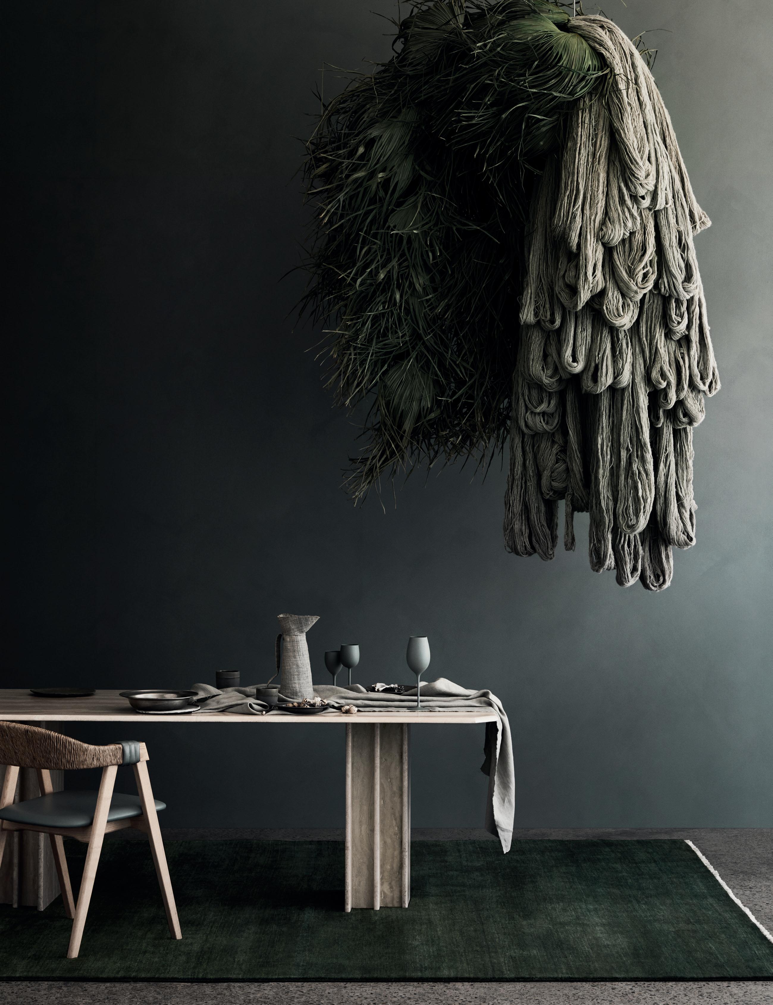
The architect-designed house and studio of a local artist; emerging living models that respond to exponential urban growth; and a home in India that blurs architecture and anatomy – this is the Design Culture issue.

MARCH – MAY | 2020 AUD$17.95 | NZ$17.95 | SGD$13.95
9 > 771836 055007 47
#47


Our masterpieces, require a master.
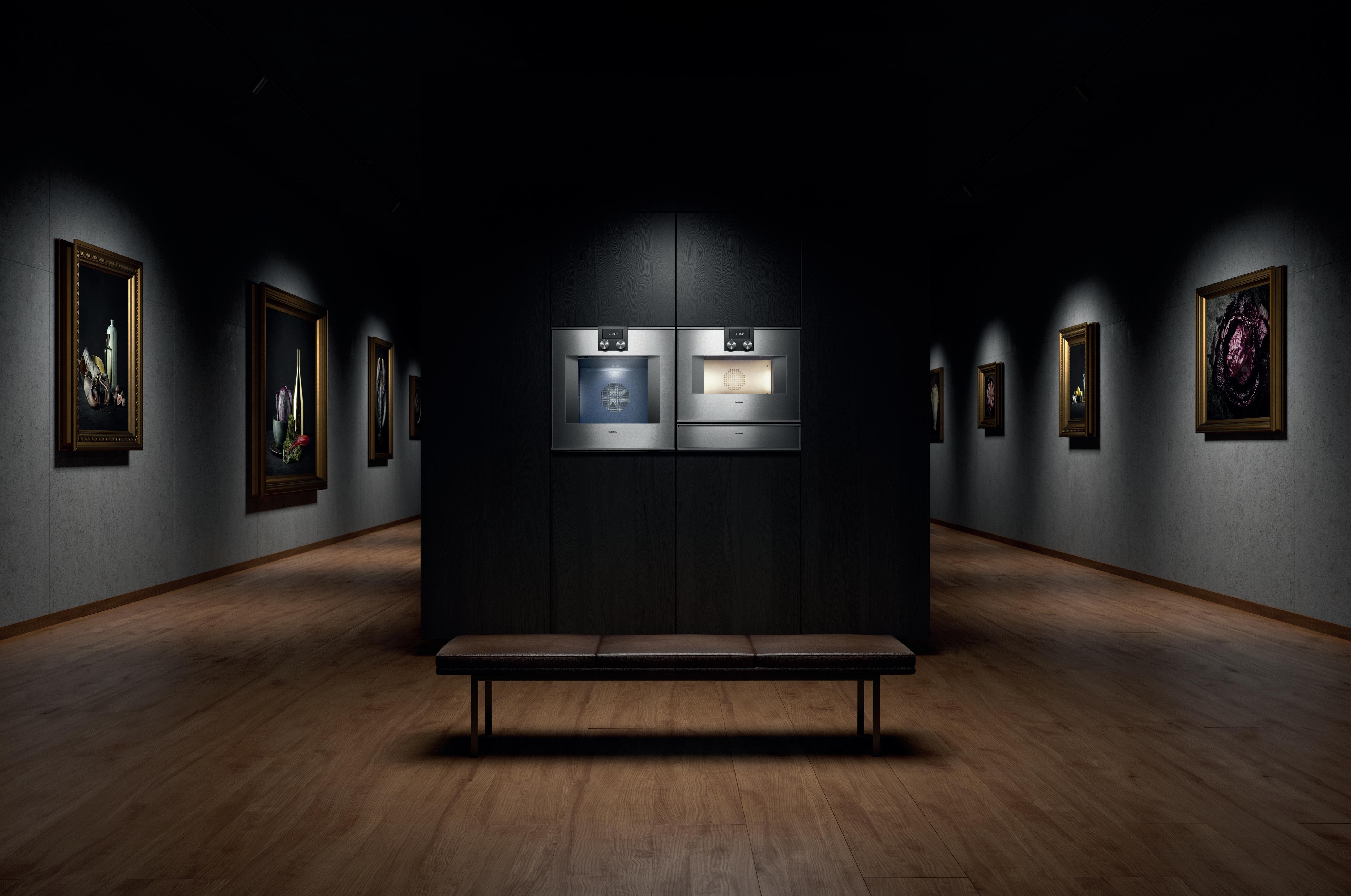
The difference is Gaggenau.
Create your masterpiece with ours. Then new combi-steam ovens and oven range open up a world that is waiting to be mastered. Every Gaggenau is distinctively designed, crafted from exceptional materials, offers professional performance, and has done so since 1683. Master steam: gaggenau.com.au


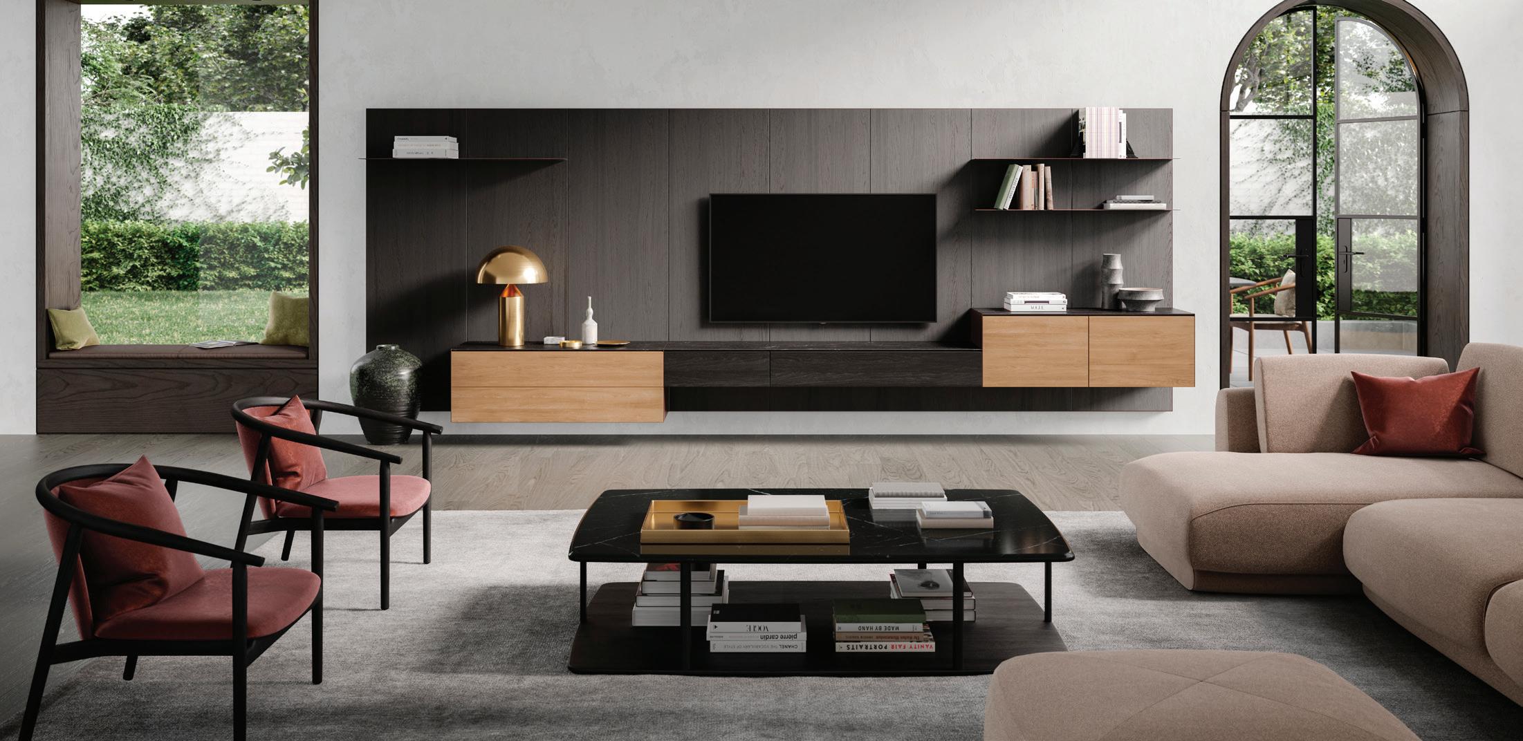
Frame allows a personalised solution to furniture and joinery needs by offering a wide range of functions and finishes to complement your home or office.
Exclusive to Melbourne | Sydney | Brisbane | Perth www.coshliving.com
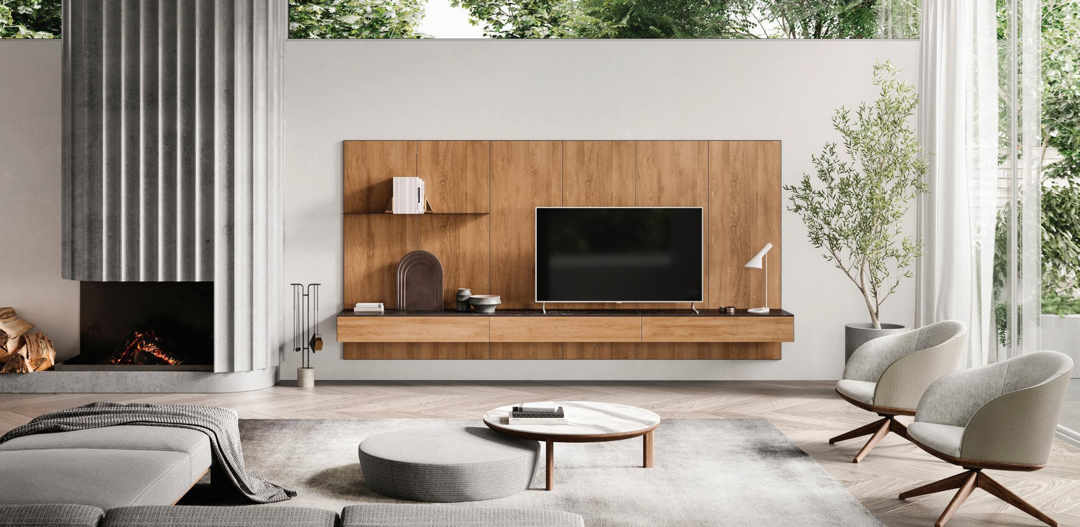 The Frame Living System integrates storage and technology into a seamless furniture solution for walls.
Designed by Justin Hutchinson.
26 DESIGN NEWS
From the latest technologies to advance offerings in the audio–visual market to furniture and soft furnishings that truly make one feel at home; from enhancing our cooking capabilities in the kitchen to a unequivocally restorative experience in the bathroom, Habitus has you covered for the latest in design.
Here are the people we’ve met along the road less travelled, who have generously welcomed Habitus and our loyal republic of Design Hunters into their homes and creative spaces.
42 JAMES GARVAN
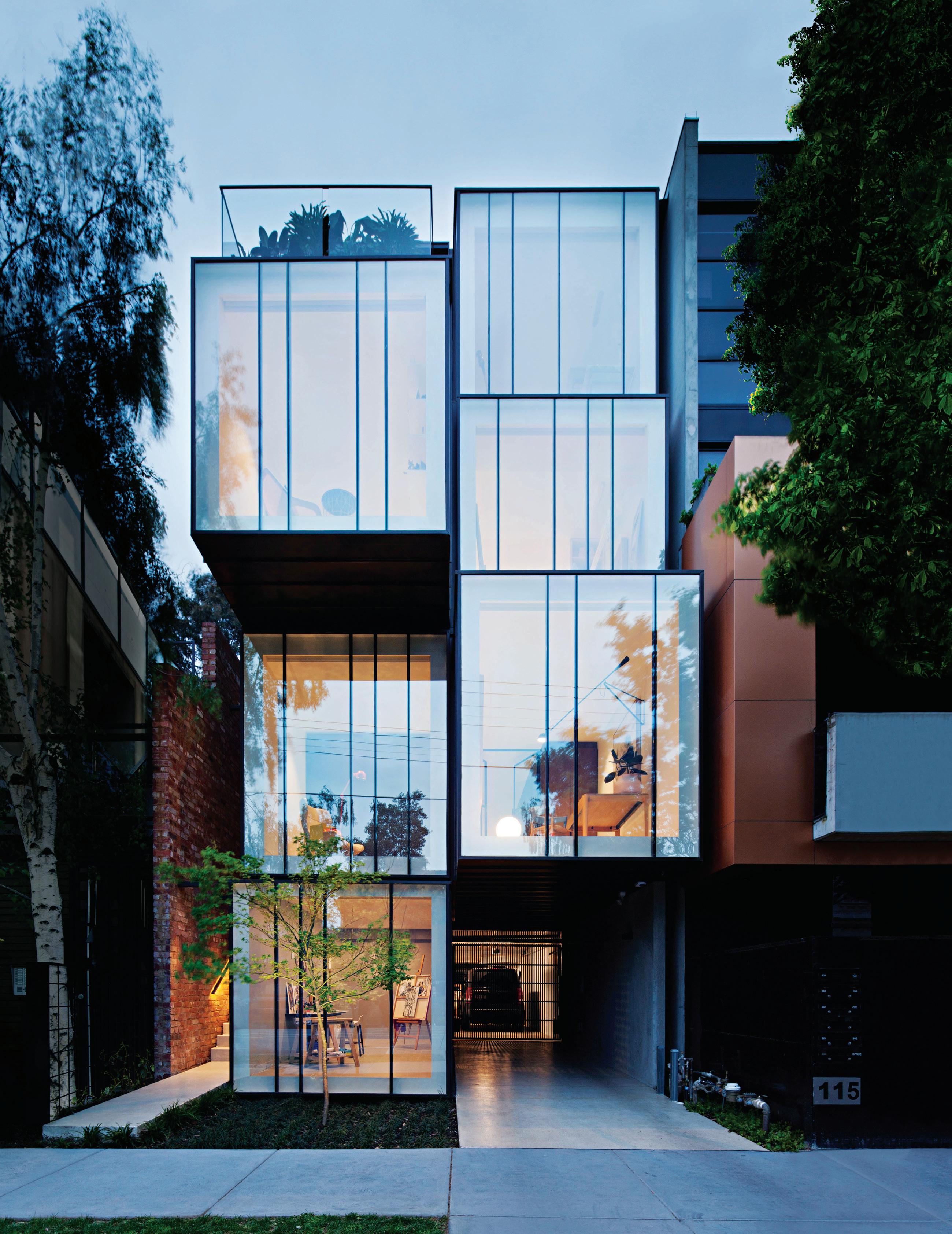
Having worked for some of the most celebrated architectural firms at home and abroad, architect James Garvan set up his practice in 2016. In the time since, James has been leaving his mark on the streets of Sydney.
54 HEDY’S HOUSE
An installation and photographic artist, Hedy lives with her son in a Melbourne warehouse that was designed by the late Australian architect Richard Swansson. The residence celebrates its history while catering to Hedy’s unique way of living and creating.
68 ROS MORIATY
Ros Moriaty and her husband John Moriaty founded the design agency Balarinji in 1983 in an effort to share Indigenous stories and design, and the heritage of their children, with the wider community.
#47
A form of expression, a reflection of personality, a solution to a problem – design can be all things to all people.
42 26
Design Culture
82 NEW HOUSING TYPOLOGIES
In the midst of what some are calling a housing crisis, consulting editor Paul McGillick looks at different housing typologies and foreign practises – translated to suit our unique way of living.
94 ICONIC BY KAREN MCCARTNEY
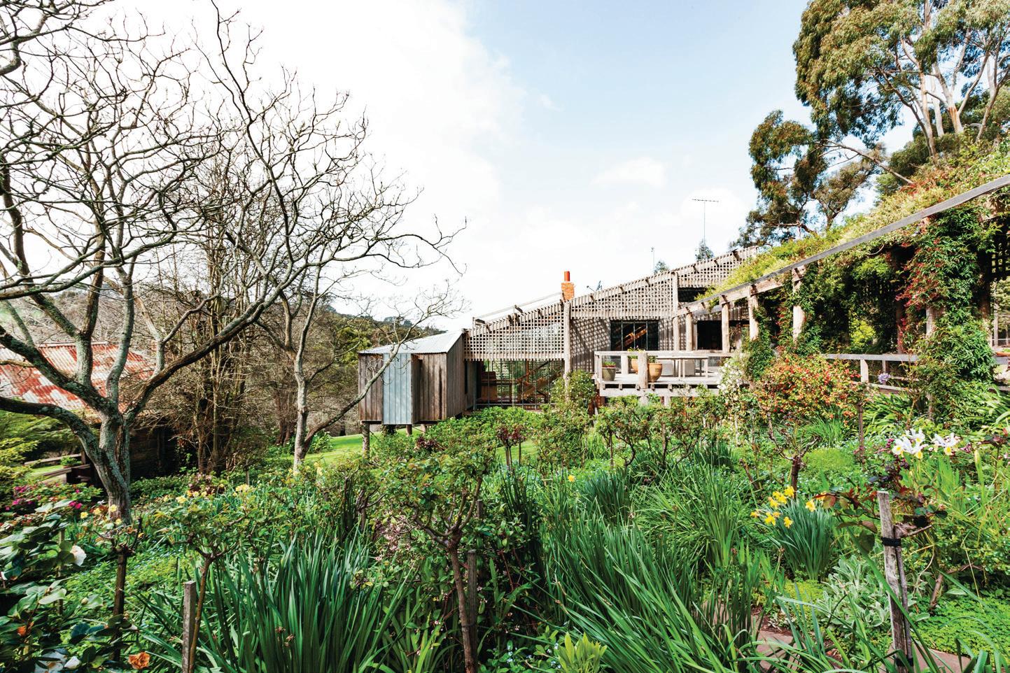
In this exclusive extract from Karen McCartney’s latest book, we are invited inside Jackson House by architect Daryl Jackson.
102 IN ABSENCE
In Absence is a powerful experience designed by Aaron Roberts and Kim Bridgland of Edition Office and artist Yhonnie Scarce.
108 25 YEARS OF SJB INTERIORS
SJB Interiors was formed with Andrew Parr at the helm. After a quarter of a century in practice Andrew reflects on the evolution of the industry.

Traversing up, down and across the Indo Pacific Region we are steadfast in our mission to bring you innovative and intriguing examples of life lived through design.
114 RIVER HOUSE GERROA
A bold orange kitchen, colour matched to the iconic Toga sofa in the adjoining living room, brightens the otherwise neutral palette of this beach house by Ian Moore Architects.
124 DARLINGHURST HOUSE
In the heart of Sydney this terrace renovation by Brad Swartz Architects simultaneously celebrates the 100+ year history of the house while modernising the interior configuration for its residents.
136 THREE STORIES NORTH Splinter Society artfully stitches together two separate residences to create a single abode in Fitzroy, Melbourne, for a couple and their young children.

150 SPINAL HOUSE
To house three generations in a single, humble residence formed a large part of the brief to Sri Lankan architect Palinda Kannangara for this house in Colombo.
162 TWINS HOUSE
Two twin brothers with contrasting personalities engaged architect Willis Kusuma to design two neighbouring houses in Indonesia that kept them connected, yet reflected their independent selves.
#47
136 108
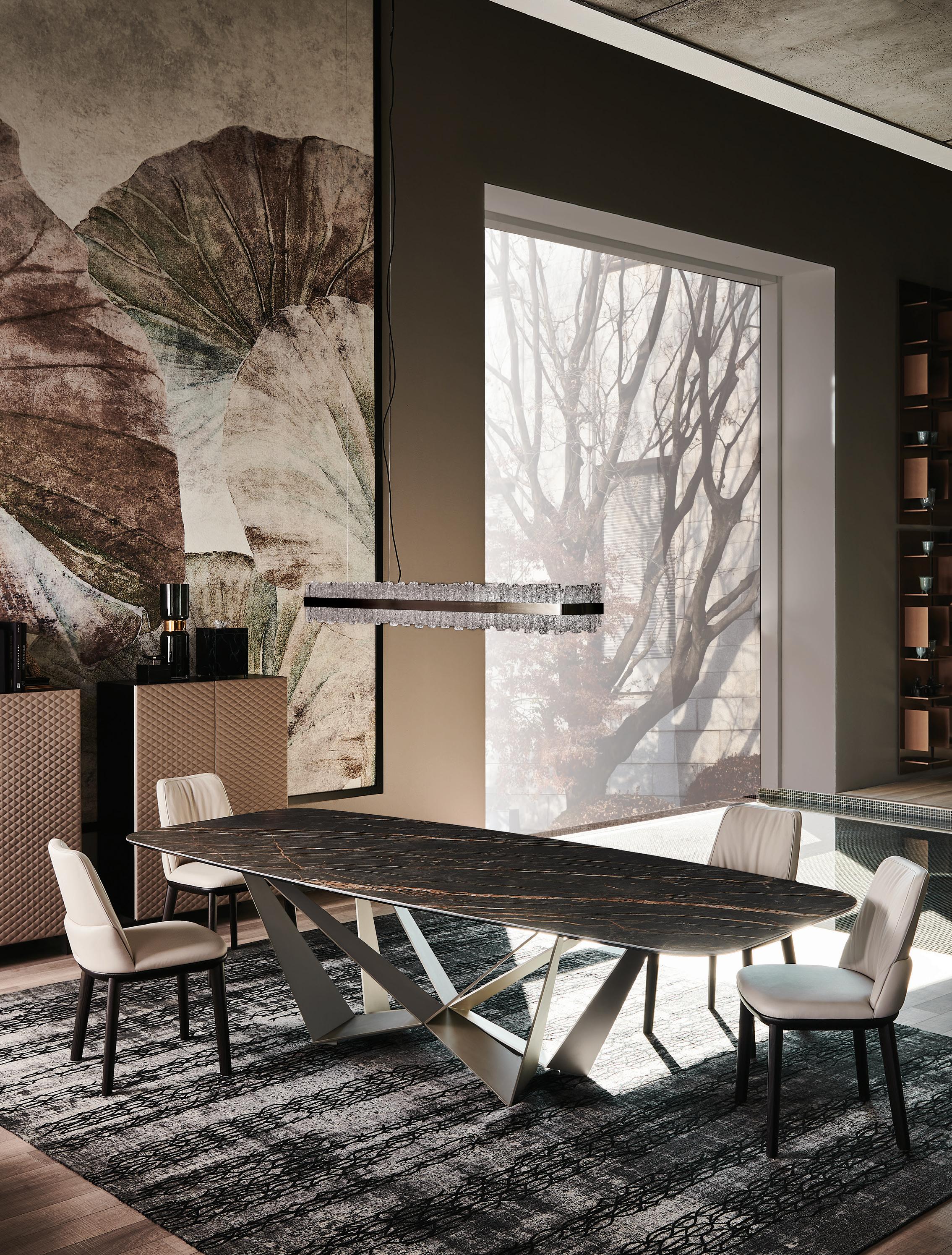

cattelanitalia.com
Live
table Skorpio Keramik chairs Belinda lamp Phoenix sideboards Tiffany rugs Mumbay The Place we














Take home INDE Gold Save the date INDE.Awards Gala, 14 August, Sydney Tickets on sale in May indeawards.com
the first word
Culture and community
Does culture cultivate design? And why are we drawn to the designs that we are? What is it about certain patterns, forms or an overall aesthetic that gets my head nodding in appreciation and not yours? A lot can be said for culture cultivating design (religious or national). The very mission of Habitus is and has always been to unearth architecture, design, and its creators that respond to our very unique way of life across the Indo Pacific Region.
This issue, the Design Culture issue, we took the opposite approach. We were interested to look at architecture and design that creates culture around it. In some articles it is a culture of appreciators, in others a culture of inclusivity, or of end users.
Architect James Garvan has run a solo practice since 2016. Yet each project he works on adopts a notable – and intentional – culture of collaboration between those involved: architect, resident, builder, landscape designer and so on. A few pages overleaf in the feature section we look at emerging housing typologies that respond to the ever-expanding population and the need for affordable housing. Moreover, many of the models have the added benefit of fostering a sense of community and culture between residents. This can be privately through shared gardens and essential facilities, or publicly in the form of coffee shops, retail spaces and small offices housed within the building.
There are two neighbouring and indeed connected houses in Indonesia by architect Willis Kusuma that facilitate and foster the relationship between its inhabitants – two twin brothers – and yet speak to their distinct personalities. In Sri Lanka, Palinda Kannagara Architects has designed a home for a family comprising three generations that allows them to feel united at home, yet cater to their vastly different needs and preferences.
I hope you enjoy this issue, and feel a part of the culture we hope to have created for the Habitus community of Design Hunters.
CUNNEEN | EDITOR
 HOLLY
RAJ NANDAN CHAIRMAN & FOUNDER INDESIGN MEDIA, HOLLY CUNNEEN EDITOR HABITUS
habitus takes the conversation to our contributors discovering their inspiration and design hunter® journeys
ASIH JENIE TRANSPLANTED ROOTS #150
Based in Singapore, born and educated in Indonesia, Asih loves good stories and lives to tell them. She believes that behind every good design is a good story. She holds a degree in architecture and graphic design but prefers to make a living by telling stories (primarily) with words. She has worked and written for various lifestyle and design publications in Indonesia, Hong Kong, Singapore and Australia since 2010 in various editorial roles. Most recently she was the Assistant Editor of Cubes Magazine and Indesignlive.sg. A self-confessed millennial, Asih is most drawn to the kind of architecture and design that delivers the most holistic, multisensory experiences. “Like a tropical building that makes the most of the climate for its inhabitants using local materials, or an artwork that is not necessarily enjoyable but gives a visceral impression. It’s chemistry.”

BENJAMIN HOSKING CELEBRATING THE RAW AND HONEST #54
Benjamin Hosking is an Australian photographer specialising in architecture, design and urbanism. His interest lies in the industry’s ability to transform the human condition and alter lives for the better. Taking a slower, longer form approach to image making, he has worked through the Indo Pacific Region for ten years documenting a wide range of projects that vary from archaeological sites to contemporary architecture. A storyteller in the truest sense, narrative, not aesthetics, comes first and foremost for Ben. “I’m drawn to everything from Mono-Ha to Asian post-war architecture,” he says. “My interest lies in the merging between the known and the unknown and how this narrative can be told in through art or the built environment.”

KAREN MCCARTNEY
WHAT MAKES AN ICON? #94
Karen McCartney was editor of both marie claire lifestyle and launch editor of Inside Out , a magazine she ran for ten years. In tandem
Karen has written several architecture books ( Iconic Australian Houses , Superhouse), which have been translated into successful exhibitions shown at the Museum of Sydney. In 2015 she published Perfect Imperfect and in 2018 The Alchemy of Things both with Murdoch Books. She is architecture editor of Belle magazine and produced Twenty-One Australian Architects, Breaking New Ground (Bauer Books) alongside a weekly design and architecture column in Fairfax Media’s Good Weekend . The first to admit she’s more Zen in her mind’s eye than in her real life, Karen has an affinity with architectural simplicity and raw materiality. “Inevitably I find myself drawn to simple buildings in nature with a combination of timber and concrete, sparely furnished and with well-placed ceramics.”


RACHAEL BERNSTONE
ANCIENT CULTURE, NEW DESIGN #68
Rachael Bernstone is a freelance journalist who specialises in architecture and sustainable design. After she completed a Masters in Architecture History and Theory in 2002 she was awarded a Churchill Fellowship to study sustainable and affordable housing, travelling to the UK, Finland, Sweden and the USA.
In addition to her passion for sustainable architecture and design, Rachael is excited by the role of Indigenous Australian narratives in design. “I lived in Alice Springs for two years and met and learned from Arrernte and Warlpiri people, and that opened my eyes to Indigenous Australia more broadly. I’m excited by the fact that some architecture projects are now incorporating local indigenous perspectives at very early stages – co-design with Indigenous people has an incredible potential to tell First Nations stories in ways that we can all connect with.”
SANDRA TAN
A STORYTELLING STRUCTURE #102
Sandra has cultivated an active voice in the Australian design media for six years. Beyond design, she advocates for Filipino food and culture through The Entree.Pinays, and founded Ricemilk , an online journal for creative people of colour. “My cultural heritage absolutely influences my work. Filipinos throughout the global diaspora have kept culture alive through storytelling. We’re also resourceful and imaginative people, both required skills for a writer,” says Sandra. “As a proud first-generation Aussie child of hardworking immigrant parents, I take a grounded, no-frills approach to design writing.”
TOM ROSS
SITE SENSITIVE #124
Tom Ross is a photographer from coastal Victoria with a studio in Melbourne. Trained at the Victorian College of the Arts, and Massachusetts College of Art, he works with architects, storytellers, and has been published internationally. A country lad at heart, Tom’s appreciation for architecture stems from his finely tuned attention to life’s simple pleasures. “I grew up outside the city in a place that was a garden as much as a house. Perhaps that has attuned me to more ephemeral qualities, like the path of the sun and a connection with the outdoors. It has also sensitised me to context. Much like my favourite houses, I want my work to be simple and unadorned with a concern for materiality and the lived experience.”
CHAIRMAN & FOUNDER
Raj Nandan raj@indesign.com.au
CONSULTING EDITOR
Paul McGillick
EDITOR
Holly Cunneen holly@indesign.com.au
SE ASIA CO-EDITORS
Janice Seow janice@indesign.com.sg
Narelle Yabuka narelle@indesign.com.sg
EDITORIAL ASSISTANT
Vicki Wilson vicki@indesign.com.au
ART DIRECTOR
Marcus Piper m@marcuspiper.com
DESIGNERS
Louise Gault louise@indesign.com.au
Harry O’Donnell harry@indesign.com.au
CONTRIBUTING WRITERS
Rachael Bernstone, Stephen Crafti, Asih Jenie, Karen McCartney, Sandra Tan
CONTRIBUTING PHOTOGRAPHERS
Brett Boardman, Sharyn Cairns, Charles Dennington, Nicole England, Marnie Hawson, Benjamin Hosking, Alice Hutchison, Eugene Hyland, K. Kopter, Katherine Lu, Daniel Mayne, Sebastian Posingis, Patrick Rodriguez, Tom Ross, Michael Wee, David Wheeler, Mario Wibowo
MANAGING DIRECTOR
Kavita Lala kavita@indesign.com.au
BRAND DIRECTOR
Colleen Black colleen@indesign.com.au
(61) 422 169 218
ACCOUNTS
Cassie Zeng cassie@indesign.com.au

Cristina Cerro cristina@indesign.com.au
ONLINE MANAGER
Radu Enache radu@indesign.com.au
WEB DEVELOPER Ryan Sumners ryan@indesign.com.au
BUSINESS DEVELOPMENT MANAGER
Brunetta Stocco brunetta@indesign.com.au
CLIENT LIASON
Dana Ciaccia dana@indesign.com.au
PRODUCTION AND PROJECTS MANAGER
Brydie Shephard brydie@indesign.com.au
PRODUCTION ASSISTANT Becca Knight becca@indesign.com.au
COVER IMAGE Hedy’s House (p.54)
Photography by Benjamin Hosking
HEAD OFFICE
Level 1, 50 Marshall Street, Surry Hills NSW 2010 (61 2) 9368 0150 | (61 2) 9368 0289 (fax)
MELBOURNE
1/200 Smith St, Collingwood, VIC, 3066 SINGAPORE
4 Leng Kee Road, #06–08 SIS Building, Singapore 159088 (65) 6475 5228 | (65) 6475 5238 (fax)
HONG KONG
Unit 12, 21st Floor, Wayson Commercial Building, 28 Connaught Road West, Sheung Wan, Hong Kong indesign.com.au
issue #47 habitusliving.com
Printed in Singapore. All rights reserved. No part of this publication may be reproduced, stored in a retrieval system, transmitted in any form or by any other means, electronic, mechanical, photocopying, recording or otherwise. While every e ort has been made to ensure the accuracy of the information in this publication, the publishers assume no responsibility for errors or omissions or any consequences of reliance on this publication. The opinions expressed in this publication do
represent
of the
the
or
Contributions are
at the
cannot
to provide information about yourself. If you provide such information to us we may use the information to provide you with products or services we have. We may also provide this information to parties who provide the products or services on our behalf (such as fulfi lment organisations). We do not sell your information to third parties under any circumstances, however, these parties may retain the information we provide for future activities of their own, including direct marketing. We may retain your information and use it to inform you of other promotions and publications from time to time. If you would like to know what information Indesign Media Asia Pacific holds about you please contact Nilesh Nandan (61 2) 9368 0150, (61 2) 9368 0289 (fax), info@indesign.com.au. Habitus magazine is published under licence by Indesign Media Asia Pacific. ISSN 1836-0556 INSTANT CONVENIENCE Zip HydroTap provides pure tasting filtered water with instant boiling, chilled and sparkling water. Discover more at zipwater.com HAB45_AD_HP_Zip.indd 1 2/7/19 5:19 PM
not necessarily
the views
editor,
publisher
the publication.
submitted
sender’s risk, and Indesign Media Asia Pacific
accept any loss or damage. Please retain duplicates of text and images. Habitus magazine is a wholly owned Australian publication, which is designed and published in Australia. Habitus is published quarterly and is available through subscription, at major newsagencies and bookshops throughout Australia, New Zealand, South-East Asia and the United States of America. This issue of Habitus magazine may contain o ers or surveys which may require you
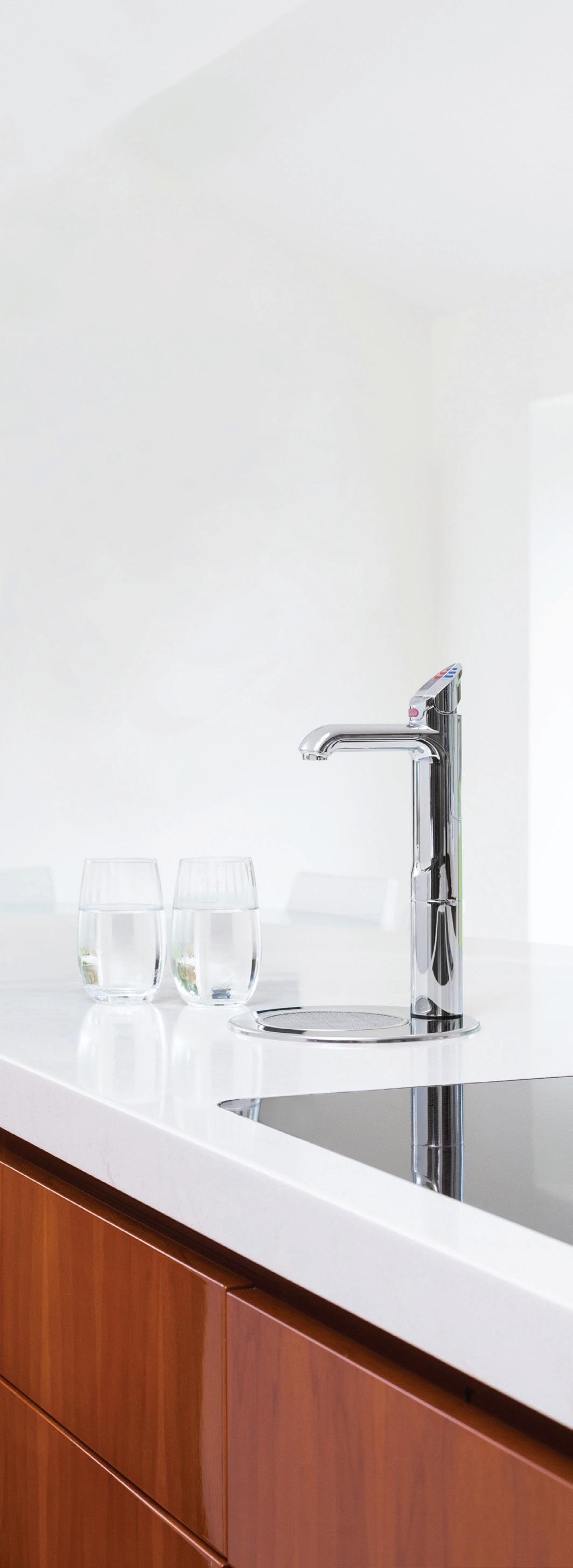
THE NEW KITCHEN ESSENTIAL
All your drinking water needs, All-in-One beautifully designed system. Remove the need for multiple taps in your kitchen with a single, beautifully designed system that delivers boiling, chilled and sparkling filtered drinking water, as well as hot and cold unfiltered water for your sink.
The Zip HydroTap All-in-One offers every water option you need from one multi-functional tap and a single intelligent compact under-bench system. That’s why the Zip HydroTap will be the one and only hydration solution for your kitchen.

Discover more at zipwater.com

THE WORLD’S MOST ADVANCED DRINKING WATER SYSTEM ZIP HYDROTAP |
|
|
|
|
PURE TASTING
INSTANT
BOILING
CHILLED
SPAR KLING
Habitus is a lens focused on the very best in design across the Indo Pacific Region – delivered across multiple platforms and across the globe.
Chairman & Founder, Indesign Media
Raj Nandan
Be
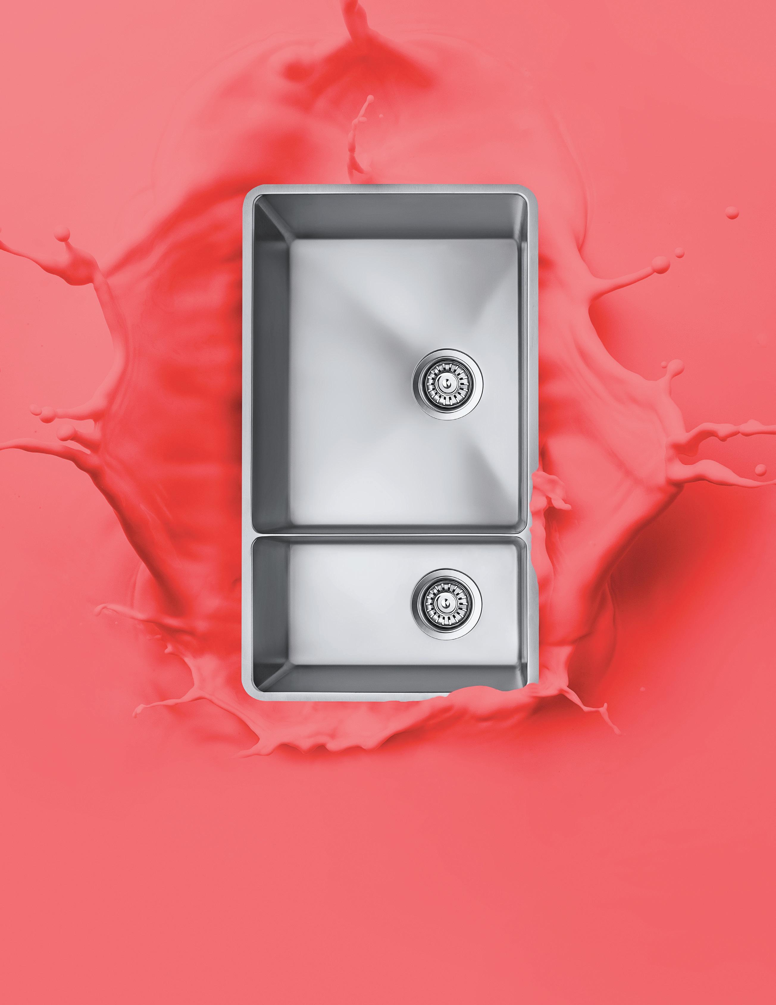
immersed. Abey Australia’s diverse range of sinks provides you with a selection from around the world. Visit an Abey Selection Gallery to immerse yourself in the collection. Lucia Bowl & 3/4 VICTORIA Selection Gallery 335 Ferrars St Albert Park Ph: 03 8696 4000 NEW SOUTH WALES Selection Gallery 1E Danks St Waterloo Ph: 02 8572 8500 QU EENSLAND Selection Gallery 94 Petrie Tce Brisbane Ph: 07 3369 4777 WESTERN AUSTRALIA Selection Gallery 12 Sundercombe St Osborne Park Ph: 08 9208 4500
Design detectives












Sculptural forms
Beeline Design is a brand known for its understated designs and interesting use of materials; they design and create furniture which lends itself to a modern aesthetic but has a timeless appeal. They have continued to do so with their latest additions to the RIDGE COLLECTION.
beelinefurnituredesign.com.au
Born out of collaboration between Melbourne designers Thomas Cohen and Maxam Whiteley, THOMAS MAXAM has launched CANDELABRA 0001 – the first of several limited-edition designs from the luxury product designers.


thomasmaxamstudio.com
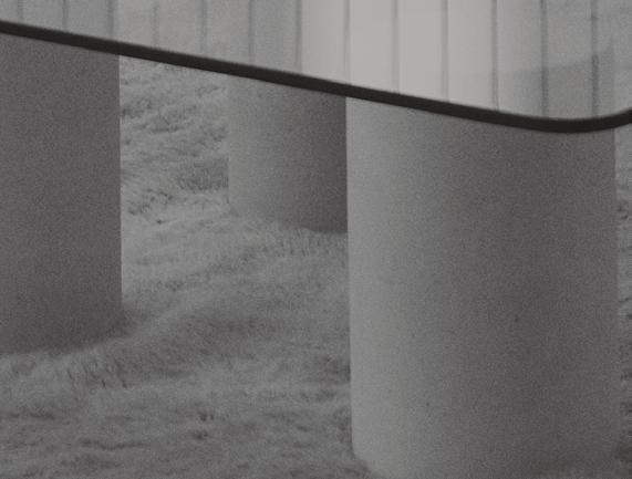
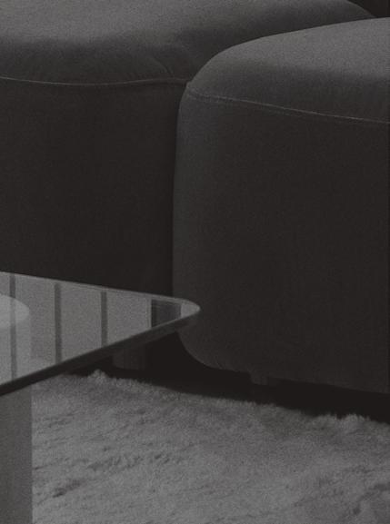
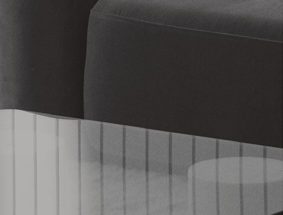
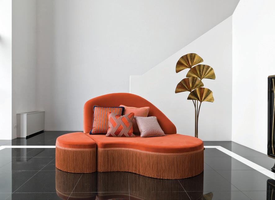
WAVE by Chiara Provasi is an evocatively curvaceous modular system that invites you to play with space in innovative ways. Elegant and freeform, this sectional piece can be configured to shape each unique environment, creating a sculptural centrepiece.
chiaraprovasi.com
issue #47 habitusliving.com
The frantic pace of today’s world makes the space and time dedicated to oneself especially important. Gessi has established an international tradition of creating extraordinary bathroom products that inspire the sensation of wellbeing and harmony. Designing a collection that embodies all the values of elegance and creating a space of wellness has resulted in Gessi ’s new RILIEVO COLLECTION. abey.com.au

Released earlier this year, SOL is the third furniture collection by Australian designer and creative, Sarah Ellison . SOL , a reference to the personification of the sun in Roman mythology, was inspired by Sarah’s desire to create pieces with a sense of warmth and permanence.
sarahellison.com.au
1 . lightbox # 27
Surface value
With this latest evolutionary step, the elemental geometry of the PUCK WALL ART has been finished in felt. The textile covers the basic profile lending it a tactile quality and diffusing the light with a warm intensity. vibia.com

Local fabric and wallpaper brand Willie Weston has launched a new collection developed with three artists from the heart of the Kimberley in northern Western Australia. The FITZROY CROSSING COLLECTION features original artworks by April Jones , Amanda Smith and Lee-Anne Williams , and was developed in partnership with Marnin Studio willieweston.com

issue #47 habitusliving.com
LOOKBACK combines a relaxed pattern with a nod to industrialism on its edges. Available in 7-millimetre porcelain in three stunning tones, special pieces are also available to create feature walls.


rockson.com.au
The new Laminex decors includes Black Birchply, White Painted Wood, Avenza Bianco, Urban Pezzato and Reclaimed Denim Fibre, all off which embody Laminex ’s commitment to design, innovation, quality and sustainability.

laminex.com.au
Danish design brand Vipp is rooted in the manufacture of industrial objects, favouring function over form with a distinct minimalist and timeless aesthetic. Famous for its iconic steel-cylinder pedal bins, Vipp now offers a complete range of furniture and softfurnishings available through Cult
cultdesign.com.au
1 . lightbox # 29
Creature comforts
NX IKO and ORLI feature HYDROSENSE – ground-breaking technology from the Phoenix Tapware design and engineering team. With HydroSense, water is transformed. Inspired by nature, the patented pending HydroSense technology delivers curved sheets that disperse midfall into dense, cascading droplets.


phoenixtapware.com.au


Luxurious linen house IN BED has released new-season and limited-edition designs in Rosewood and a beautiful Pinstripe linen, along with new heavy linen styles as a bedcover, pillowcase and cushion set.
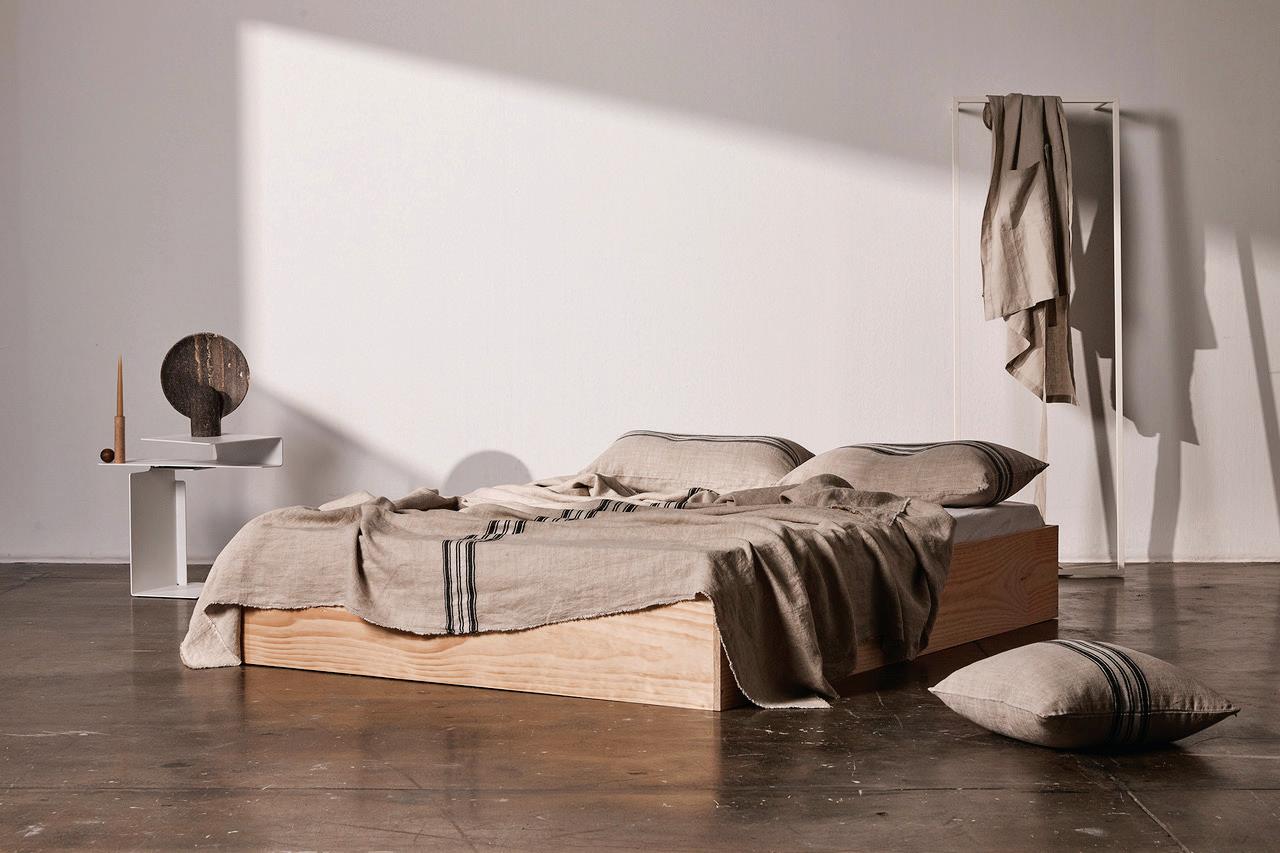
inbedstore.com
Designed to create a focal point in the decor of the home, the SERIF TV was developed through a collaboration between two of the world’s most esteemed industrial designers, Ronan and Erwan Bouroullec . The Parisbased Bouroullec brothers specialise in creating furniture through their approach to industrial design.



samsung.com

issue #47 habitusliving.com
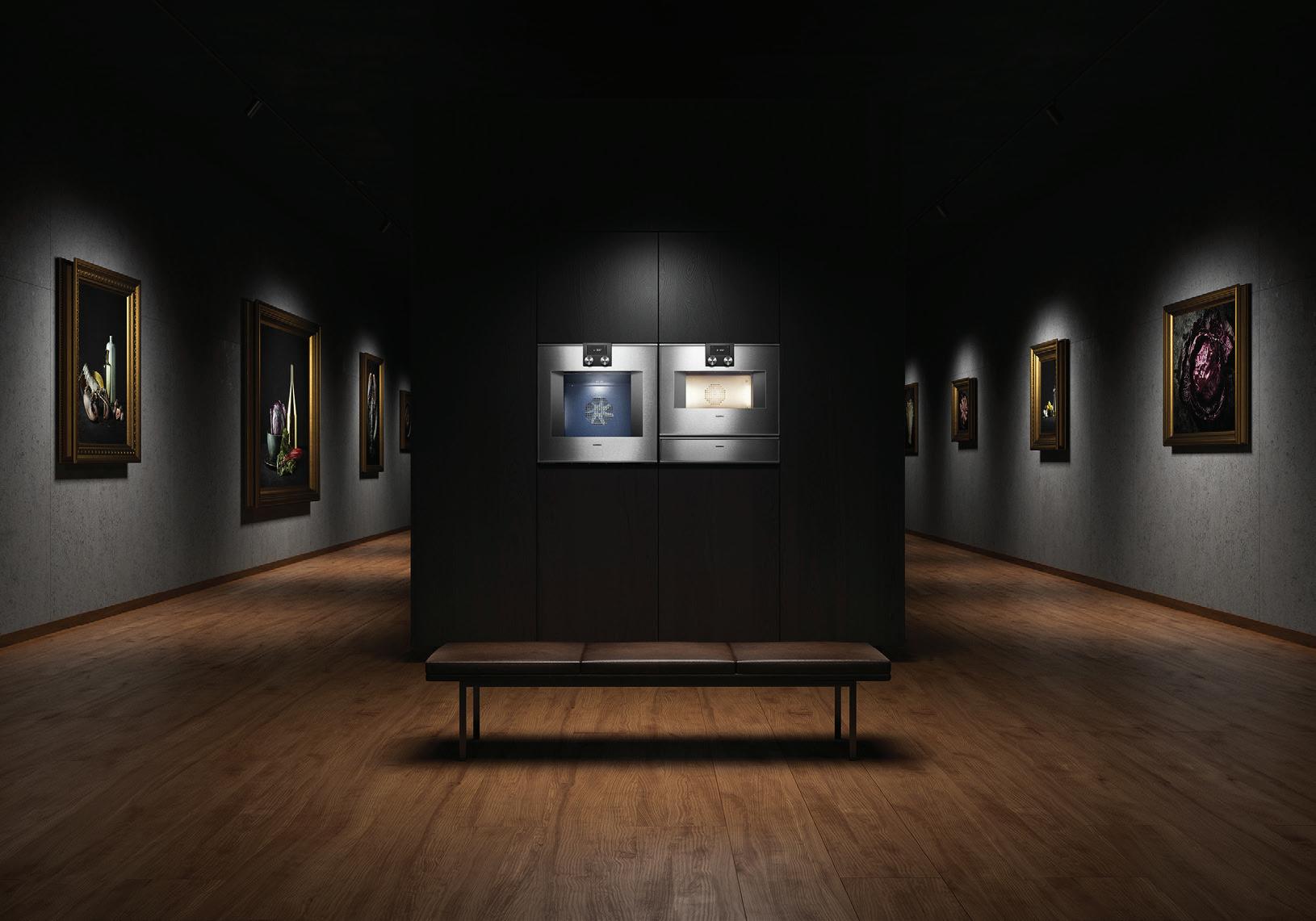
Having introduced the fi rst combi-steam oven into the private home in 1999, the newest generation of the Gaggenau combi-steam ovens are iconic in design and functionality. Off ering unrivalled flexibility and ease of use to inspire private chefs to master the beauty of cooking with steam.
gaggenau.com.au
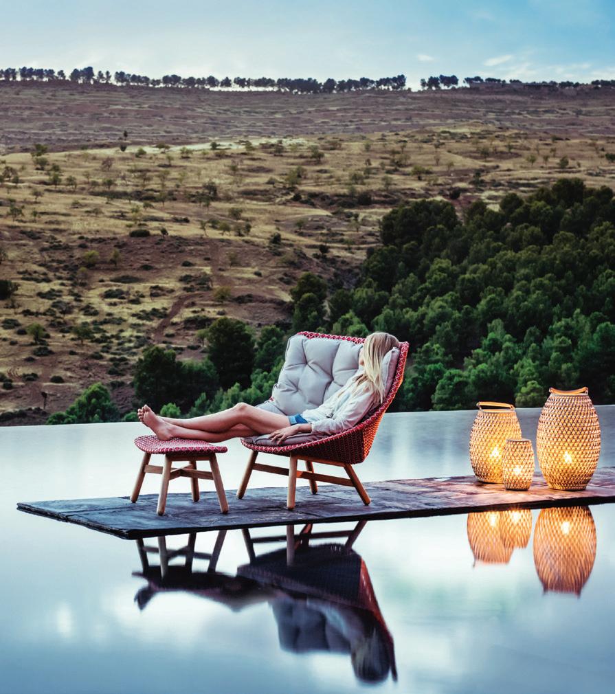
The MBRACE WING-BACK LOUNGE CHAIR from Cosh Living features a triaxial open-weave seat, solid teak base, high backrest for ultimate comfort and a choice of comfortable seat cushions.
coshliving.com.au

1 . lightbox # 31
Mixing materials
Characterised by its refined, elegant form, the JK EASY CHAIR by Jun Kamahara for Ritzwell is renewed for today featuring high-quality materials enriched by handcrafted artisanal details that combine Japanese culture with minimalist design.
stylecraft.com.au
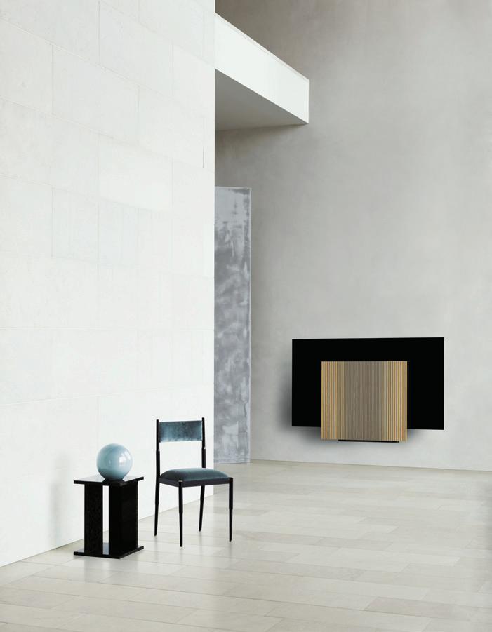
For those looking for first-class surround sound, the BEOVISION HARMONY 652 from Bang & Olufsen can turn any room into a powerhouse for performance. Designed to take centre stage, the Beovision Harmony 652 features two wings fanning out like a butterfly when turned on.
bang-olufsen.com
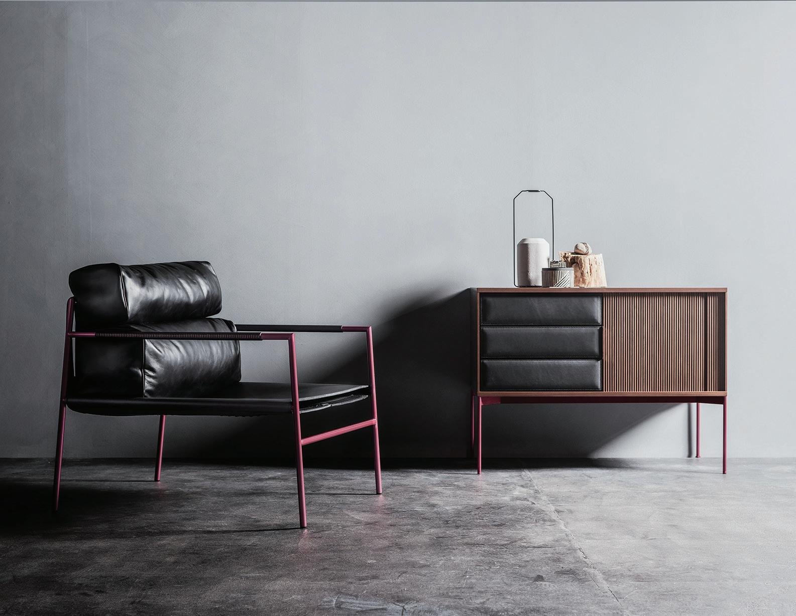
Available in free-standing and wall-mounted versions, EXISTENCE by Michele De Lucchi arose as an overlapping of small, varied boxes, like the experiences and keys to one’s life: a totem-bookshelf designed to contain books and objects in a single space, built around similar modules that repeat, though the same form never appears twice.
decastelli.com

issue #47 habitusliving.com


What’s it worth
Bethan Gray ’s work is characterised by bold, confident patterns, inspired by the shapes she sees all around her, from the growth spirals of shells to the sacred geometry in architecture all over the world. Her patterns are drawn by hand to capture their natural imperfections and then meticulously executed using ancient craft skills. livingedge.com.au
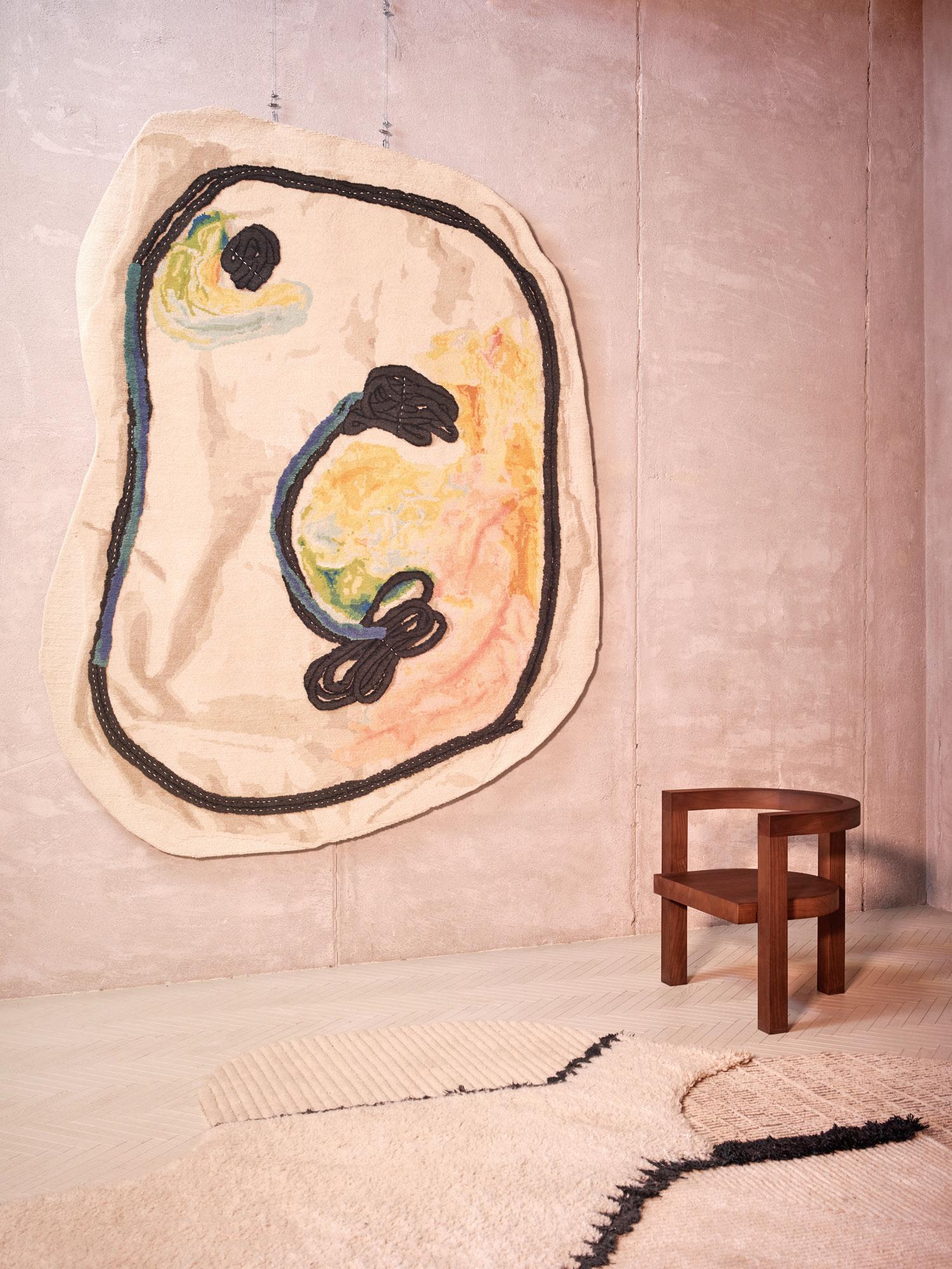
Designed by Faye Toogood and handmade in Nepal, cc-tapis’ DOODLES collection draws on tinkering techniques through the employment of off-cuts and appliquéd cords to create collage-style assemblages. As such, the pieces feature graphic stitching details that form curious patterns, connecting the playful cut-out shapes. Photography by Omar Sartor
poliformaustralia.com.au

issue #47 habitusliving.com

Understated essentials
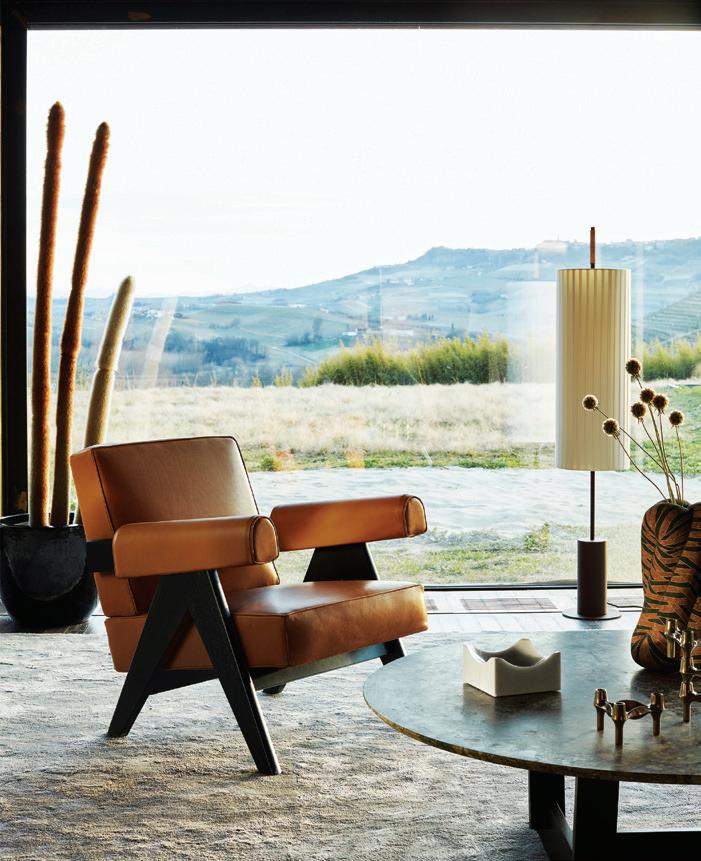
Cassina celebrates the creative genius of Pierre Jeanneret with the re-issue of the CAPITOL COMPLEX seating collection. Available now through Space showrooms, the re-issue honours designs produced in 1951 for Chandigarh’s Capitol Complex , an iconic architectural project in India.
spacefurniture.com.au











Comprising a variety of timber seating, the JASNY RANGE was designed by Berlin-based industrial designer Stephanie Jasny
The Jasny chair is ideal for multiple settings including workspaces, hospitality environments and the home. Designed with comfort front of mind, the chairs are solid and inviting, encouraging you to stay, sit and feel at ease.
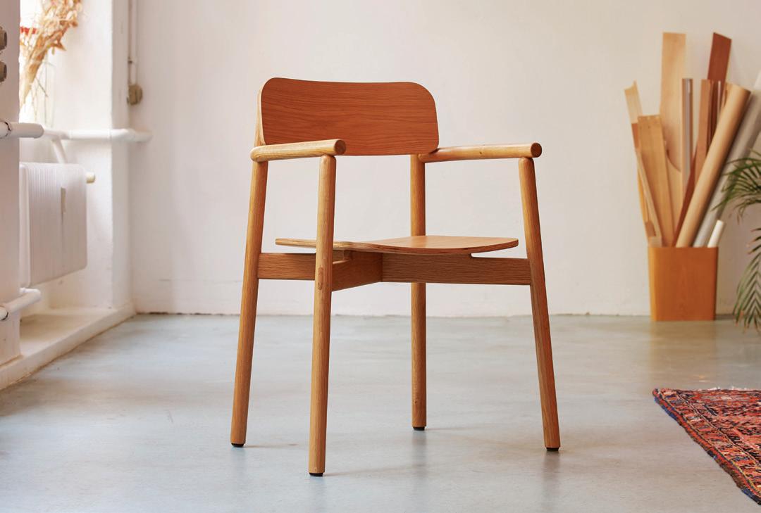
nomi.com.au


The new MAJESTIC SERIES from ILVE features new and improved brass burners that have an even, instantaneous heat that lets you simmer at low temperatures or instantly increase to searing hot.


ilve.com.au

issue #47 habitusliving.com
Visual Wonder
The apple didn’t fall too far from the tree for multidisciplinary designers and partners Ruben de la Rive Box and Golnar Roshan, who both grew up with fathers who were designers. Golnar in an Australian-Iranian household and Ruben in the Netherlands. Many years and two university degrees later (Golnar studied Visual Communication and International Studies at UTS and Ruben Interaction Design at the KKU University of the Arts, Utrecht) they met working for Marcel Wanders in Amsterdam.
Here, they set up a graphics department with the intention to bridge the interior and product teams. “That’s where we started to develop our multidisciplinary view of design and started to apply our thinking to objects, spaces and surfaces,” says Ruben. Next came London, where Golnar began working for Tord Boontje on projects for Moroso and Swarovski, among others. Ruben joined Tom Dixon’s studio and worked closely with Tom himself. In addition to working with some of the most globally reputable designers, this period gave them the opportunity to deepen their knowledge and understanding of the entrepreneurial side of running a studio.
“After working for some of the most renowned designers and clients of the industry to bring their visions to life we felt the urge to give presence to our own voices through our work,” says Golnar. Living at London in the time, amidst the cities’ inimitable creative buzz, Rive Roshan launched its first pieces in 2014.
In addition to bouncing between various design disciplines, and using methods of one to inspire the design thinking of another,
 TEXT HOLLY CUNNEEN | PHOTOGRAPHY DUNJA OPALKO
issue #47 habitusliving.com
Rive Roshan is a design practice working across many mediums questioning the perceived difference between art and design.
their work ultimately seeks to experiment in the intersection between art and design.
“A great artwork is something you can experience once and it can stay with you for a lifetime,” says Golnar. “You don’t have to own it to keep it with you forever.” A great piece of design, however, she says can be great because of how easily it is incorporated into daily life and rituals: “You can choose to own it or make use of it in your daily life”. Playfully challenging the opposing notions, Golnar and Ruben create art that is functional, or, design objects that incite an emotional or contemplative response. “Why shouldn’t the objects we use and the spaces we experience make us feel or think as well? This is how we approach our work,” she adds.
The idea that beauty equals vanity is similarly called in to question in the work of Rive Roshan. As Ruben notes, from the beginning a designer is taught that aesthetic is second to functionality – form follows function. “You are traditionally taught to engineer the most optimal answer to a problem,” he says. Like art, much of Rive Roshan’s work offers personal expression (theirs) as function, to be appreciated – or not. “That gradient between expression and function intrigues us,” says Ruben.
Visually, as opposed to conceptually, Rive Roshan’s projects and commissions are recognised for their imaginative and playful use of colour and visual interference through material. The Colour Shift Panels and Trichroic Table are two of their most well-known pieces and have recently been adapted for an installation in the new SKP department store in Beijing for a
collaboration with the Korean brand Gentle Monster. Rive Roshan has also have also collaborated on projects for Acne Studios, Rimowa and Jil Sander.
Recently, Golnar and Ruben were asked to collaborate on a series of carpets for Moooi. From a series of options presented the Trichroic design was one of two selected. This came as no surprise to the duo given it is one of their most well-loved designs. But what was surprising, says Ruben, was the green light on the Fluid designs: “they were simply inspired by the water in front of our studio, photographed from the front door.”
In 2019 for Dutch Design Week, Rive Roshan presented an exhibition, Stilled Life, to bring together a selection of their ideas and collaborations into the one space. “We wanted to create an immersive space that would create a stillness in people, through subtly stimulating all senses,” says Ruben.
Looking towards the future, the grand plan for Rive Roshan, for Ruben and Golnar is jarringly modest in contrast to their detailed and complex designs. It is simply to build a body of work that aptly represents their interests. Furthermore to continue to build a healthy practice that provides them with the opportunity, as Golnar says, to develop and experiment, sell and distribute.
1 . lightbox # 39
Rive Roshan | riveroshan.com

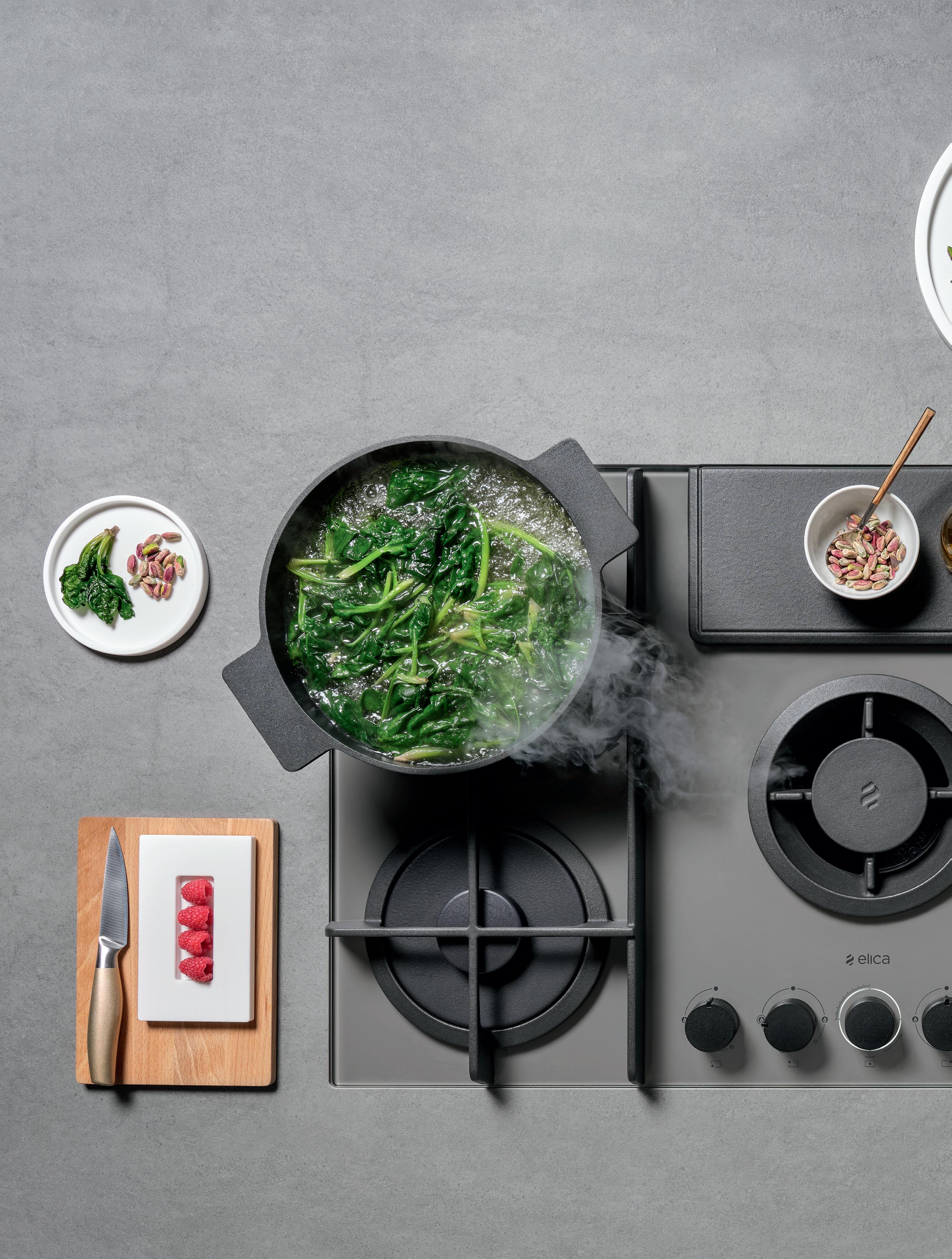
Introducing the stylish new black oven range. Combining a sleek, premium design with intuitive features, the new Series 8 black glass ovens provide a contemporary edge over the traditional stainless steel look. Perfect for those looking for something different. www.bosch-home.com.au
The creative centre























issue #47 habitusliving.com
Speak for yourself
TEXT HOLLY CUNNEEN | PORTRAIT CHARLES DENNINGTON
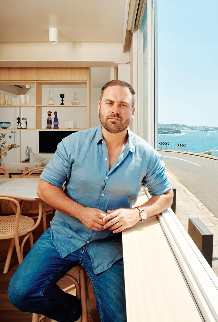
Sydney-based architect James Garvan has big dreams for his eponymous practice, but he isn’t one to shout from the rooftops. Rather, he is letting his work do the talking.
James Garvan began his practice, James Garvan Architecture, in 2016. But his story gets interesting well before then. Despite having family in the architecture and interiors professions, his original intentions were to follow the motions of his classmates and pursue finance. Before taking that leap, he took a gap year. With a base in London, James seized the opportunity to travel greater Europe and returned to Australia in awe of the architecture he had seen.
He changed his degree to architecture and allocated the first two years to decide firstly, if he liked it, and secondly, if he was any good. Evidently it was a firm ‘yes’ on both counts. James was awarded the Sir John Sulman Award for the Most Outstanding Academic Record at the University of Sydney and was placed on the Dean’s List of Academic Achievement five years running.
Before embarking on his solo venture, he worked for some of the most globally recognisable firms, such as Denton Corker Marshall and Philippe Starck (both in London), Hannah Tribe and Daniel Boddam (both in Sydney), and did some work in the hospitality space, too. But he found himself gravitating towards the residential sphere, appreciating the work for its human scale, sense of permanence
2 . portrait # 43
and substantial nature. The opportunity to positively impact the way people live, their experience of space, and their happiness, both subconsciously and consciously, was also a drawcard: fully aware of the accompanying responsibility.
Without too much time spent on the marketing side of things – “the work should speak for itself” – his business in the past three years has grown organically. A sole practitioner with no express plans to grow, James finds his clients, or they find him rather, through word of mouth. As such, having a positive reputation is paramount. A pillar of his practice is being able to offer a high-quality process, believing it will lead to high-quality outcomes. He does this by being respectful of budgets, and honest and upfront about timeframes, what is achievable, and what it’s going to take to realise a client’s wishes.
As much as his values are there to attract clients and promote his business, they also exist in order to attract the right clients. Scale isn’t a deciding factor for James: apartments, Alts & Ads, new builds – they are all categories he is happy to work within. Neither is a modest spend. “I firmly believe that you can create beautiful architecture on a tight budget,” he says. “Good architecture doesn’t rely on expensive materials; it relies on sensitivity to space, scale, and composition – and you can do all of those things on a tight budget.”

“Good architecture doesn’t rely on expensive materials; it relies on sensitivity to space, scale, and composition.”
2-BEDROOM
issue #47 habitusliving.com
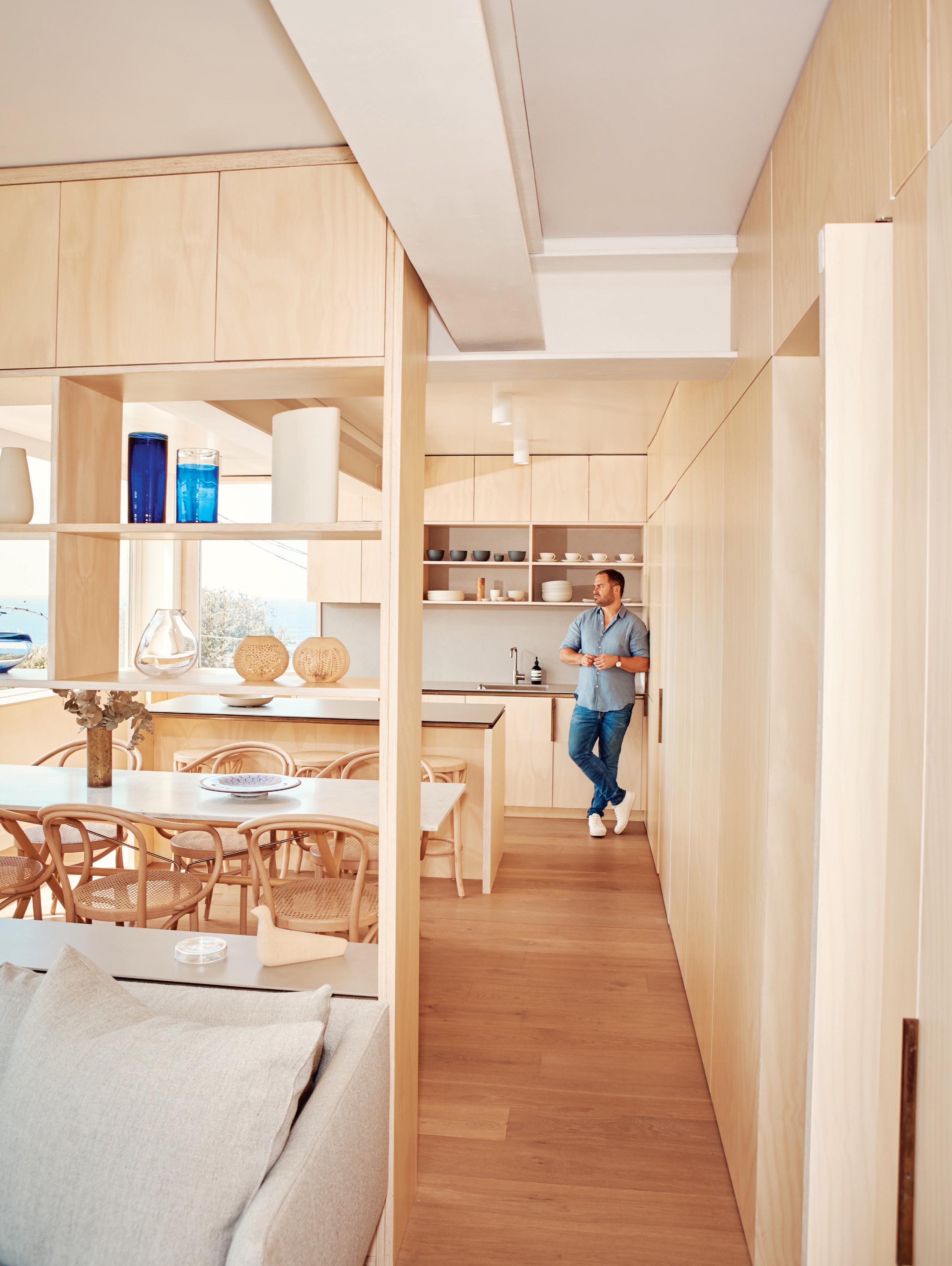
OPENER | ARCHITECT JAMES GARVAN AT HIS HOME IN CLOVELLY, SYDNEY. ABOVE | WHAT WAS ONCE A SPACIOUS 1-BEDROOM APARTMENT HAS BECOME
A CLEVERLY CONFIGURED
RESIDENCE
FOR JAMES, HIS WIFE AND NEWBORN. PHOTOGRAPHY BY KATHERINE LU
2 . portrait # 45

“People are willing to invest in architecture – we should be building really awesome stuff right now.”
issue #47 habitusliving.com
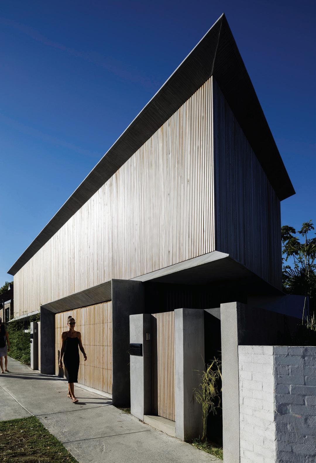
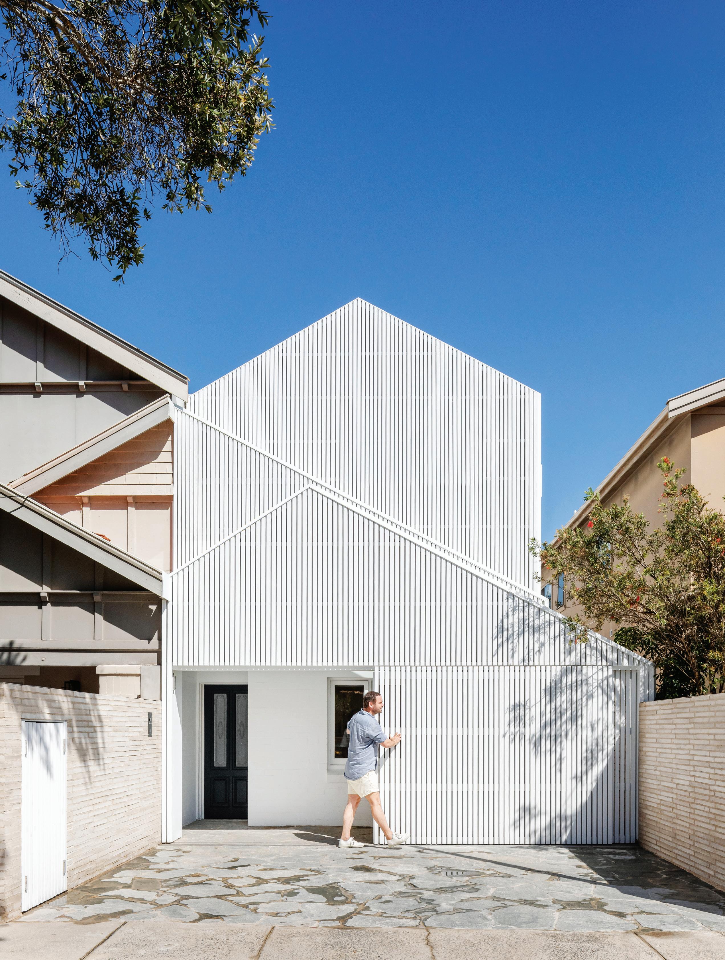
ABOVE LEFT | BONDI HOUSE, JAMES’ FIRST SOLO PROJECT, WAS DESIGNED TO BE A SCULPTURAL LANDMARK FOR THE STREET ON WHICH IT SITS. ABOVE RIGHT | THE DOWNSTAIRS LIVING SPACES FLOW FREELY BETWEEN KITCHEN, DINING, LIVING; AND INSIDE/OUTSIDE. PHOTOGRAPHY BY BRETT BOARDMAN OPPOSITE | NORTH BONDI HOUSE, ONLY RECENTLY COMPLETED, MIRRORS THE SHAPES OF ITS NEIGHBOURS YET COMPLETELY STANDS OUT WITH AN INARGUABLY ARRESTING FAÇADE. PHOTOGRAPHY BY KATHERINE LU
2 . portrait # 47

issue #47 habitusliving.com
Those who have an equal investment in quality driving a project, rather than the timeframe or return on investment, are the people with whom James wants to work. And not having anyone’s salary but his own to worry about he has the luxury to be quite selective in what he takes on.
It quickly becomes apparent that James’ whole process relies heavily on collaboration, and collaboration with the best at that. “Great architecture has a clarity of intent: the idea is legible at every scale throughout the entire project and it’s been executed really well,” he says. “To achieve that, you need to bring everyone on the ride with you from the get-go.” He is quick to note how heavily he relies on the builder to implement his designs, and his respect for the client knowing that ultimately they have the biggest stake (emotionally and financially) in a project.
In fact it’s the relationship between these main stakeholders – architect, client, builder, and in some cases interior or landscape designer – that James identifies as one of the main pressure points in residential architecture. He suggests it’s crucial to the success of a project that the architect is leading a willing team who is behind the project, has a sense of ownership over their individual roles, and is equally excited for the end goal. Moreover the stereotype of a categorically adversarial relationship between architect and builder is out-dated and unproductive.

Scale isn’t a deciding factor for James: apartments, Alts & Ads, new builds – they are all categories he is happy to work within.
ABOVE | MULTIPLE SKYLIGHTS FORM THE ROOF ABOVE THE DINING SPACE IN PADDINGTON HOUSE AND, TOGETHER WITH AN L-SHAPED COURTYARD, BATHE THE KITCHEN/DINING/LIVING ZONE WITH PLENTY OF NATURAL LIGHT THROUGHOUT THE COURSE OF THE DAY. PHOTOGRAPHY BY KATHERINE LU 2 . portrait # 49
issue #47 habitusliving.com
The financial aspect can be another pressure point. While James has noticed that people are increasingly willing to pay for good design, an architect needs to be respectful of budgets along the way. One of the benefits of bringing the builder in early is that they can flag things in the design stage that aren’t possible – or aren’t easily possible.
“I’m really optimistic about the state of architecture in Sydney and Australia,” says James. “We’re really lucky to practise here. We’ve got the best of everything: people, the landscape, climate, even money. People are willing to invest in architecture, we should be building really awesome stuff right now.”
James says his ambition of becoming one of Sydney’s most sought-after high-end residential architects is grand. Certainly it is great, but his work to date and contagious enthusiasm for architecture as a practice, service, and business bode well for him.
 James Garvan Architecture | jamesgarvan.com
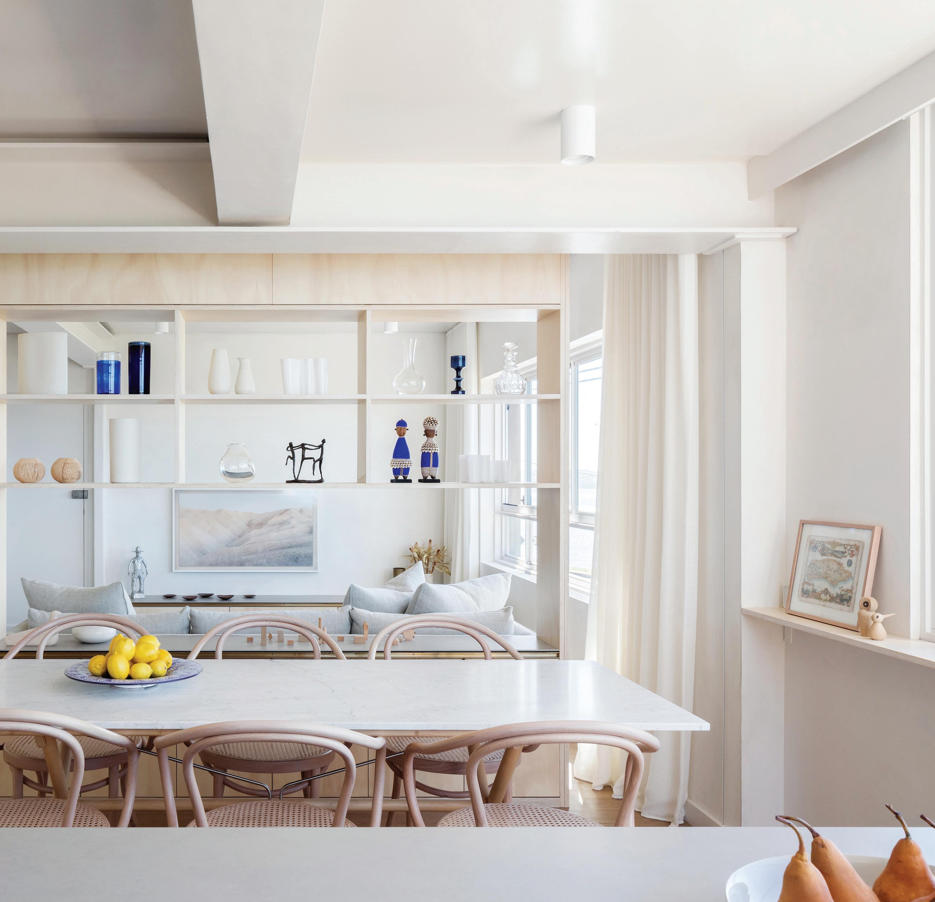
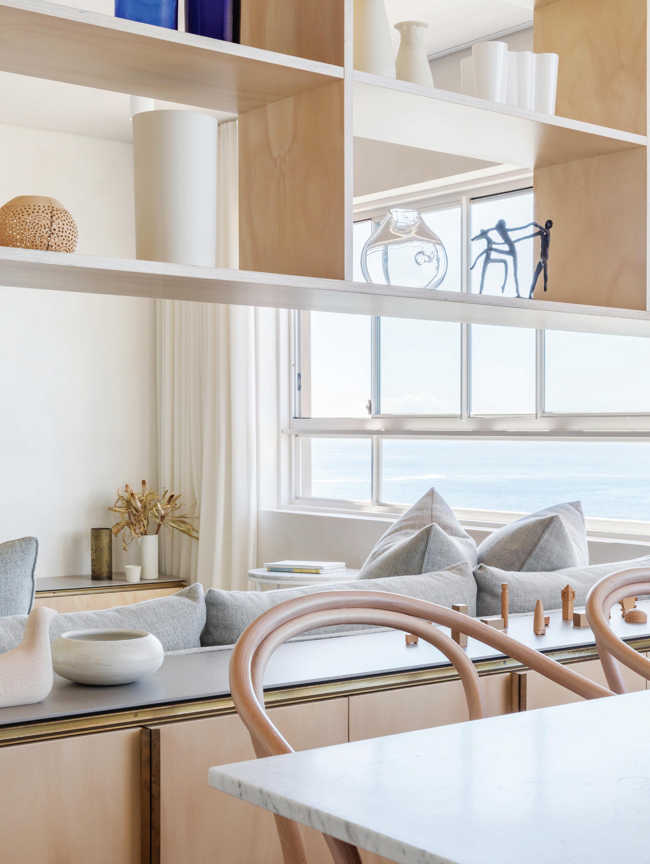
OPPOSITE | THE KITCHEN AND LIVING SPACES WITHIN CLOVELLY APARTMENT ARE PHYSICALLY AND VISUALLY CONNECTED, YET DEMARCATED BY OPEN SHELVING. PHOTOGRAPHY BY KATHERINE LU ABOVE | WITH A NUMBER OF COMPLETED PROJECTS UNDER HIS BELT, AND QUITE A FEW MORE IN PROGRESS, JAMES’ RECENTLY ESTABLISHED SOLO PRACTICE IS CERTAINLY GAINING TRACTION. 2 . portrait # 51
Ode to Brazilian design mastery
Tacchini celebrates the ingenuity and allure of Brazilian design.

Behind every object, there is a story. And behind every story, there is a person. This is philosophy behind the inimitable design brand, Tacchini. At Salone del Mobile 2019, this philosophy was eloquently expressed with the re-issues of two iconic modernist pieces from the great Brazilian architect, Martin Eisler.
As a designer, Martin Eisler’s work is unequivocally imbued with intelligence, charm, and sensual creativity. Son of famous Viennese art historian, Max Eisler, Martin emigrated to Buenos Aires, Argentina, in 1938 to escape the oppressive rule of the Nazi regime. Here, he dabbled in many facets of design from architecture to furniture; interiors to set design. As the artistic director of Forma Interieur, Martin became renowned for his innovative furniture designs, witnessing unprecedented affirmation throughout the fifties and sixties. During this time, the designer forged fortuitous relationships with the likes of Oscar Niemeyer and was one of the founding design-thinkers behind Brasilia.
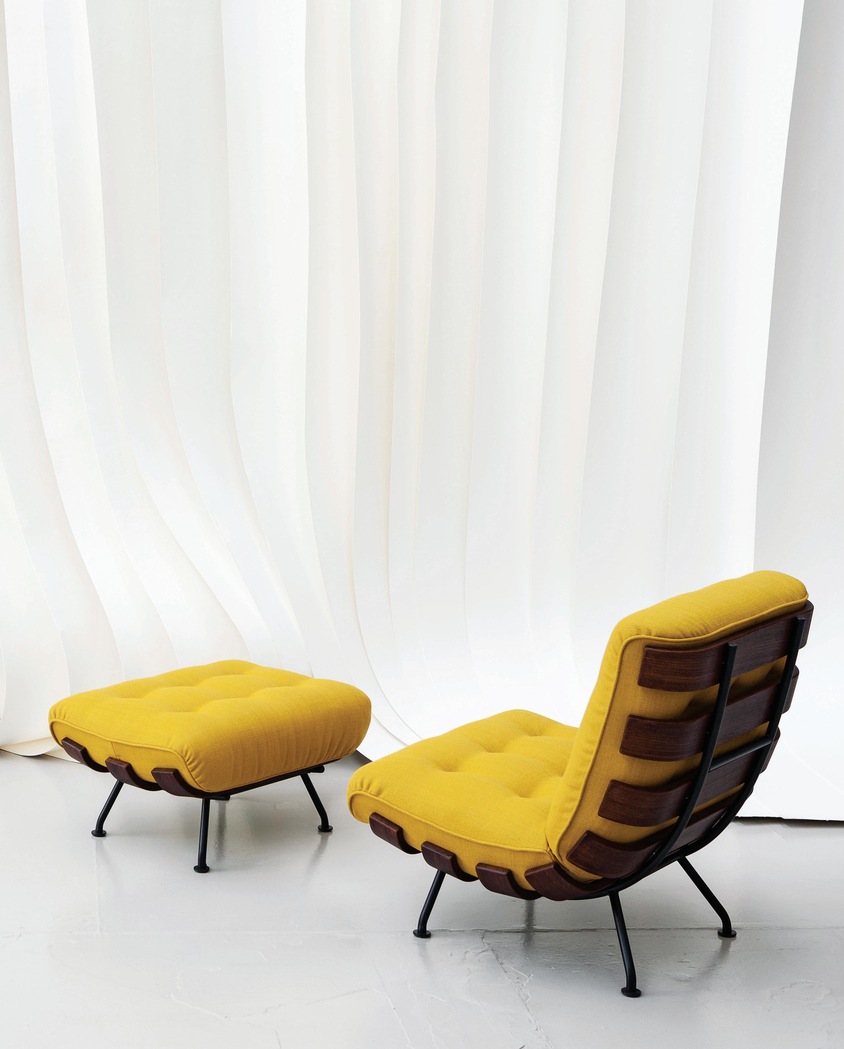
Perhaps two of Martin’s most prestigious pieces, the Reversivél and Costela chairs are testament to the sophistication of Brazilian design mastery. An armchair that marries informal style with elegance, Costela is characterised by sensual aesthetics, authentic materiality, and intelligent
design. The rounded bands of its elegant wooden structure wrap around the seat cushion to form a comforting embrace. A piece well ahead of its time, the Costela chair is design for longevity in its purest form; textile coverings for the seat cushion are customisable and changeable, meanwhile the base is easily dismantled and recyclable.
Yet another example of Brazilian design ingenuity, Reversivél by Martin Eisler is an armchair capable of transforming itself with effortless grace. Dynamic and flexible in equal measure, the re-edition of Reversivél offers a double comfort thanks to the seating arrangement that can be easily positioned in two ways so as to facilitate the use of seated armchair with a straight back, or in a semi-recumbent position, to facilitate greater relaxation. The simplicity and naturalness of the movement make its functionality seems obvious; an expression of cutting-edge intuition.
Inspired by the charm and history of Mid-Century Brazilian design, Tacchini’s latest collection is comprised of the Costela and Reversivél re-issues and the unpublished pieces of the most visionary contemporary names, along with stories of beauty resulting from the unrivalled expertise of the tradition made in Brianza; officially available in Australia through StylecraftHOME.
issue #47 habitusliving.com ABOVE | THE REVERSIVÉL ARMCHAIRS BY MARTIN EISLER IN TWO ALTERNATIVE CONFIGURATIONS. OPPOSITE | THE RE-ISSUE OF THE COSTELA CHAIR BY MARTIN EISLER.
habitus promotion › StylecraftHOME #139 StylecraftHOME | stylecrafthome.com.au
Celebrating the raw and honest
Art and architecture are beautifully interwoven in this warehouse-style abode in South Yarra. Home of an installation and photographic artist, everything has been curated with an exacting eye.
issue #47 habitusliving.com
TEXT STEPHEN CRAFTI | PHOTOGRAPHY BENJAMIN HOSKING
2 . portrait # 55

issue #47 habitusliving.com
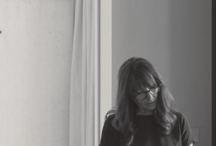
This unusual warehouse-style home in Melbourne, formerly occupying part of a 1930s mechanic’s workshop and designed by the late architect Richard Swansson, celebrates not only the history of the building, but the memories of loved ones. Designed for the owner, Hedy, an installation and photographic artist, each object and artefact within this home is curated, ready to be captured on film. A founding member of the cultural collective, Contemporary Collective, with a number of individual and group exhibitions, Hedy’s home is a visual and tactile environment. With Swansson’s passing in 2015, creating his vision for this home (his last to be designed) was a milestone for Hedy.
Work and home are intertwined in Hedy’s house, which she shares with her son Anton, a recent graduate in industrial design from RMIT University. His final year project is sprawled across a table-tennis table, which also doubles as a dining table. “I’m just waiting for him to clear up his models before I start spreading my own work out,” says Hedy, who keeps most of her tools concealed behind large sliding plywood doors in the studio. A sink, shelves and extensive joinery can be shut off completely when the studio is given over to entertaining.
One thing that immediately stands out is Hedy’s love of objects that carry meaning, many of which belonged to her late husband.
2 . portrait # 57
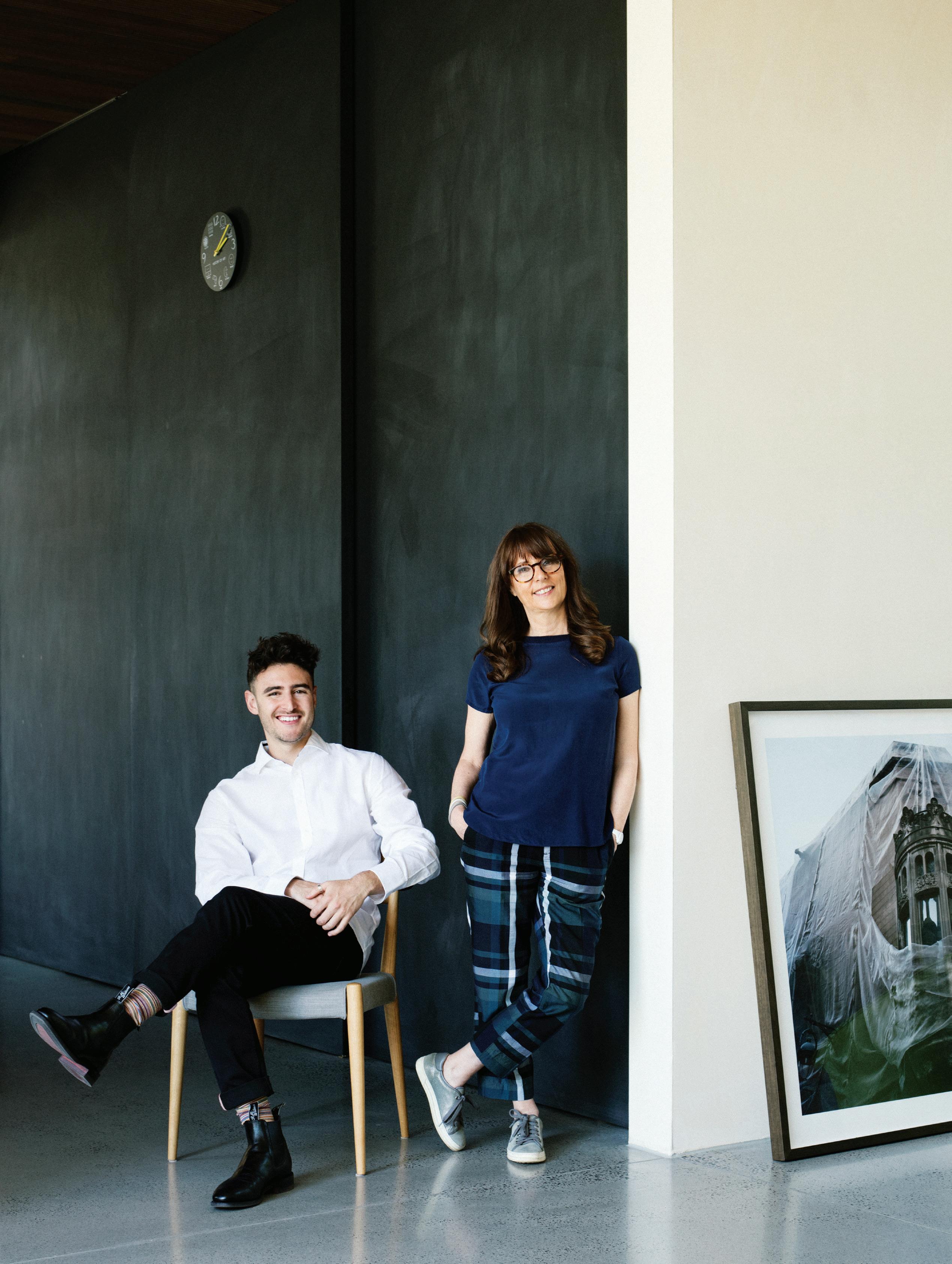
OPENER | HEDY RITTERMAN AND HER SON ANTON RITTERMAN, AN INDUSTRIAL DESIGNER, IN THE KITCHEN OF THEIR SOUTH YARRA HOME, STANDING IN FRONT OF THE SLIDING BLACKBOARD DOORS/WALL. VEIL OF TEARS BY HEDY RITTERMAN RESTS AGAINST THE WALL. OPPOSITE | THE 1970S-INSPIRED SUNKEN LOUNGE BELOW THE STAIRCASE IS AN IDEAL NOOK FOR WATCHING TELEVISION OR READING. THE 70S CLASSICS, INCLUDING PIERRE PAULIN, WERE HANDED DOWN FROM HEDY’S PARENTS. ARTWORK ON STAIRS KIND OF BLUE BY PETER ATKINS.

issue #47 habitusliving.com
Hedy’s ability to take simple items and transform them into something considerably more extends well beyond her photographic lens.

2 . portrait # 59
Some of his items, such as dental records of his patients lined up on a shelf, are captured in one of her photographs. “Now, everything is computerised,” says Hedy, who created a book dedicated to her husband’s personal belongings including simple items, such as his CD collection. Another work demonstrates her fine eye for buildings (she studied interior design as well as art). One work shows an art nouveau building in Barcelona, partially concealed by a gauze-like shroud. “I like materials to be expressed in an honest way, not ‘tricked up’,” she adds. The past, whether it’s memories of loved ones or the history of her home, is an important part of her psyche and the way she approaches her work.
There’s a sign across one of the worn timber trusses in the studio as to part of the home’s history saying ‘Cars garaged at driver’s own risk’. As whimsical are the original stacked timber planks suspended from the rafters. “The builders were going to ditch the original left over timber (for the renovation), but I was keen to retain as much of the original fabric as possible,” says Hedy.
Initially Hedy purchased the mechanic’s workshop, an 180-square-metre-footprint with the intention of renovating this shell with Swansson to create a home. However,
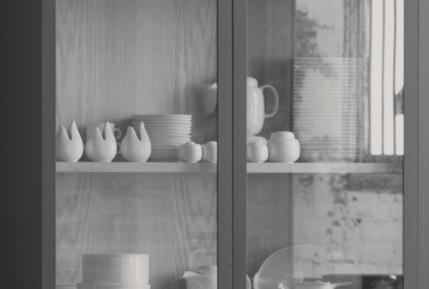
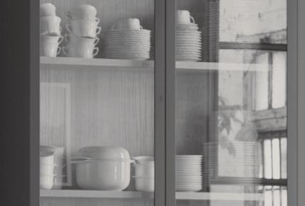
before plans were stamped for approval, the neighbouring Victorian terrace came onto the market. Some of the initial discussions remained pertinent, such as creating a self-contained-style apartment, along with expressing the original fabric of the garage. “I didn’t want to have too many level changes. The idea is that I can live here for the long term,” says Hedy, whose brief included a lift. “I wanted spaces that were also flexible, so the private part of this place can be easily screened,” she adds. The kitchen demonstrates a similar ingenuity. The stained oak timber table aligned to the stainless steel island kitchen bench can be separated and used independently. Likewise, the steel shugg-style windows on either side of the kitchen can be opened to serve up drinks to guests outside. “I love these steel windows [to the north]. I can just reach out and pick a few herbs,” says Hedy, who is as fond of her kitchen armoire, filled with all-white crockery once belonging to her parents. “I don’t love every piece of crockery, but when you display them en masse, all white, they say a lot more than if they were on their own.” Hedy’s ability to take simple items and transform them into something considerably more extends well beyond her photographic lens. “I can see something in a gallery shop and think there’s more to it.”
PREVIOUS
“I like materials to be expressed in an honest way, not ‘tricked up’,” says Hedy.
| THE MAIN STUDIO WITH ITS EXPOSED CORRUGATED IRON CEILING HAS A RUSTIC CHARM. OPPOSITE | THE STUDIO FUNCTIONS AS A GALLERY WITH WORK BY HEDY AND OTHER ARTISTS DISPLAYED AGAINST THE ROUGH BRICK WALLS. ARTWORKS GOING CLOCKWISE: SWAYTHE BY ANTON RITTERMAN, HEAD OF NEBULA BY JO LANE, UNTITLED#6 BY LINDA WACHTEL, SPIKE1 BY HEDY RITTERMAN, SHOPPINGCENTRE BY HEDY RITTERMAN AND BOARDWALK BY HEDY RITTERMAN.
issue #47 habitusliving.com

2 . portrait # 61

issue #47 habitusliving.com
Although there’s a clear delineation between the past and present, the use of materials in both is what Hedy refers to as honest. Recycled brick walls appear in the kitchen and steel lintels are exposed, as are the concrete floors that run across the entire ground floor. The in-situ concrete walls, expressed, rather than concealed, add to the industrial aesthetic, with cane window awnings adding a level of softness, as well as diffusing the northern light.
The first floor was always going to be designed as a self-contained apartment, rather than having endless bedrooms and bathrooms that are gradually closed up as children move out of home. Comprising the main bedroom, walk-in dressing area and ensuite, there’s also a large home office/retreat that benefits from cross-ventilation and northern light.
“The house isn’t precious in terms of materials, but the memories and collections surrounding me certainly are,” says Hedy, who has a number of designer furniture classics from the 1960s, including chairs by Pierre Paulin and Gaetano Pesce, once owned by her parents.
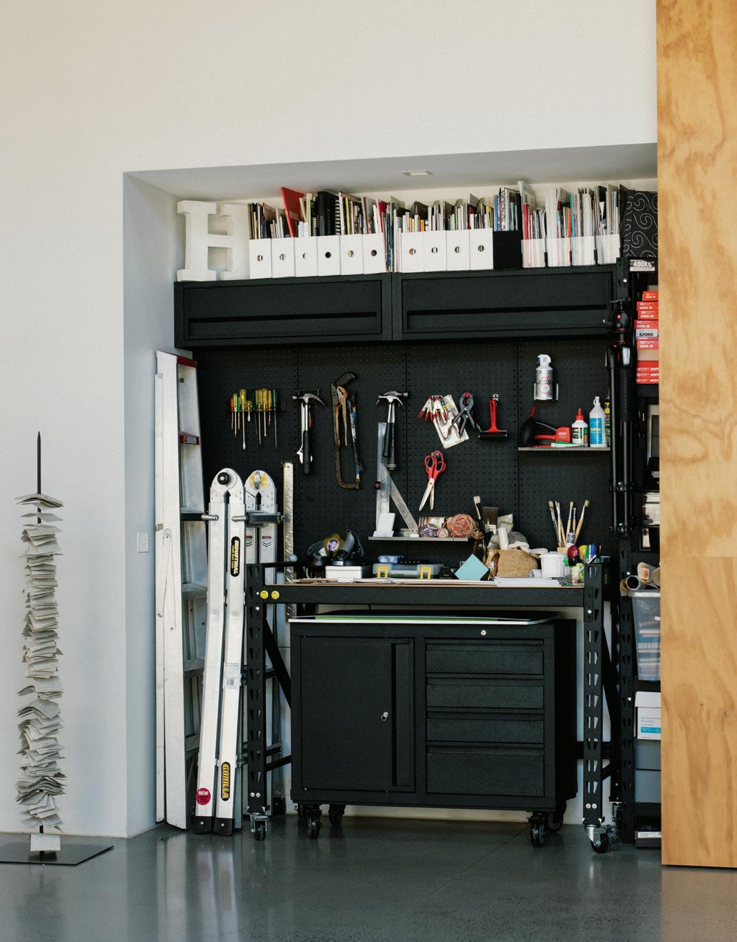
“My approach is to photograph what I see, not trick things up to create the right image,” she says, regularly looking up at the fluorescent sign displayed above the rafters ‘And one man in his time’ a line taken from Shakespeare. “These things are almost portraits of the people who have surrounded me. They’ll continue to resonate, just like Swansson’s designs.”
HedsPaceProjects | hedyritterman.com
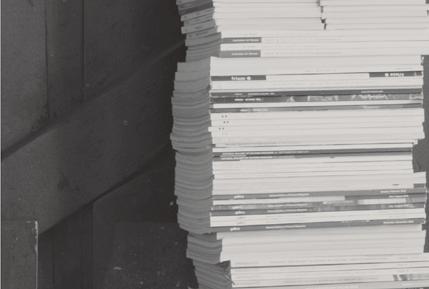
OPPOSITE | HEDY WITH A COLLECTION OF BOOKS AND MAGAZINES. ABOVE | THE WORKINGS OF THE STUDIO CAN BE COMPLETELY CONCEALED BY LARGE SLIDING PLYWOOD DOORS. 2 . portrait # 63
Expect the unexpected
In 2012, as a trained architect and industrial designer Massimo Minale founded the lighting and hardware brand Buster + Punch. Nearly 10 years later, the brand is well known around the world and available in 78 countries including Australia, offered exclusively through Living Edge. Before embarking on this solo venture, Massimo had worked for some of the most globally successful architecture practices, on world-class projects and with top-notch architects.

As a part of London’s sub-culture scene, Buster + Punch was never intended to simply be another lighting and hardware brand. Rather, the intention and indeed reality of Buster + Punch was to blur the lines between interiors, fashion, music and street culture. To this day, the brand enjoys a completely unique visual identity and offering.
“Our main purpose as a brand is to challenge the establishment, reflect the mood of our followers and disturb an interiors industry that has lacked the energy of our counterparts in fashion for far too long,” says Massimo.
With a light-hearted, rebellious spirit leading the brand, the intention is to bring focus on the essential yet oft forgotten elements around the home. According to Massimo, foundations such as light bulbs, doors handles, hardware and light switches are all too often neglected in the design industry. Consequently, there is an uninspiring selection for interior designers and design consumers to choose from.
Buster + Punch pays special attention to the design of these fundamental design elements. Massimo has reimagined these pieces as design objects so that architects, interior designers and their clients are able to create or live in spaces that exhibit an extra edge and deeper level of design consideration.
“When we first launched our light switch range in Stockholm, we had a queue of customers around the block trying to get their hands on the first drop,” says Massimo. “The magic is not just in the product but in the lifestyle and content that we inject into them. People resonate with the fact that buying a unique kitchen handle that looks and feels great can help them stand out from the general crowd and be part of an exclusive community.”
issue #47 habitusliving.com ABOVE | MASSIMO MINALE. OPPOSITE | ELECTRICAL SWITCHES IN BRASS AND STEEL.
Buster + Punch brings a rebellious spirit and its roots in London’s sub-culture scene to lighting and hardware design.

#65 habitus promotion › Living Edge
Buster + Punch | busterandpunch.com
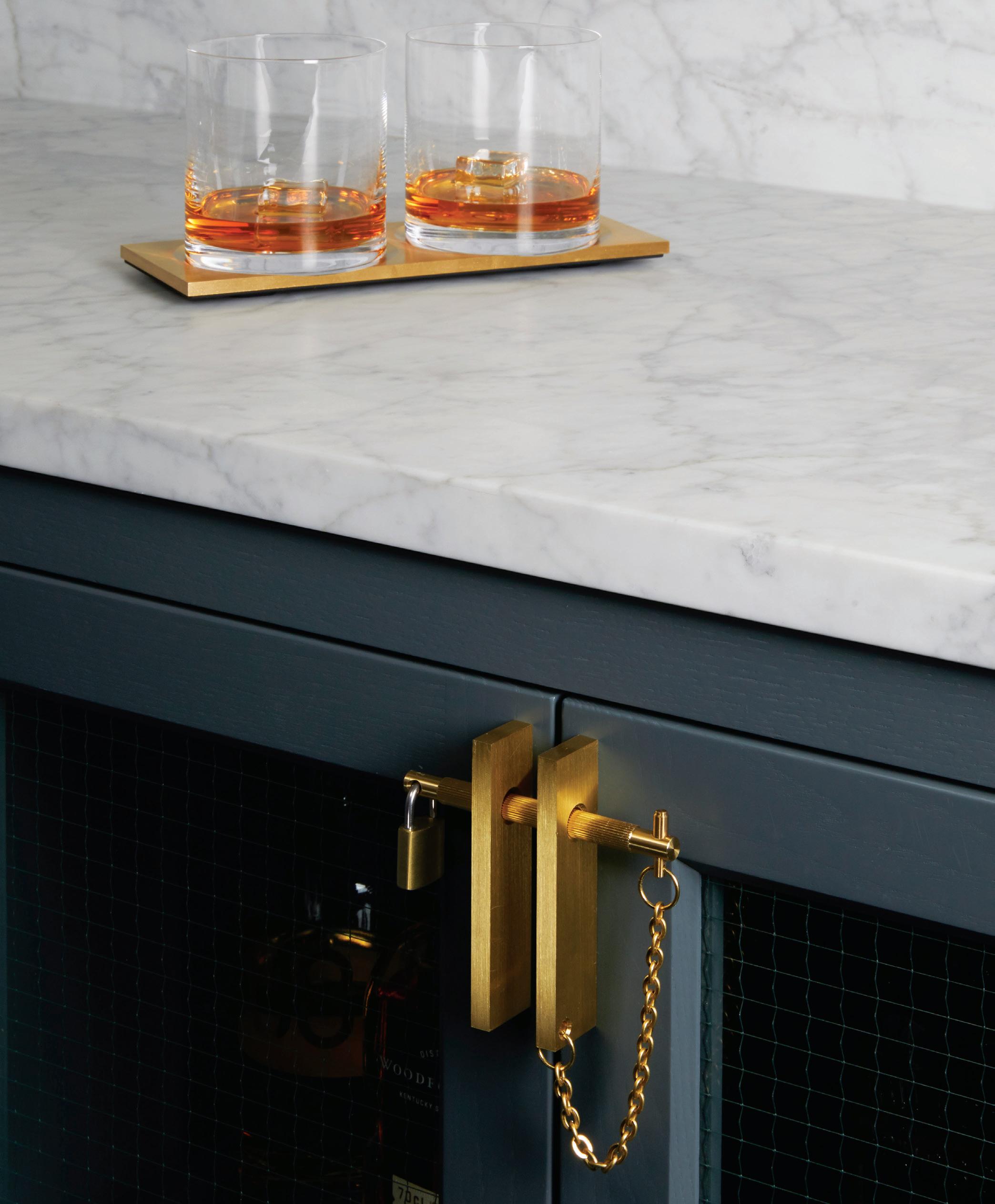
issue #47 habitusliving.com ABOVE | PRECIOUS BAR CABINET HANDLES IN BRASS. OPPOSITE ABOVE | THE CROSS-KNURLED DOOR HANDLE IN BRASS. OPPOSITE BELOW | A MATERIAL PALETTE OF STAINLESS STEEL, BRASS AND BLACK FINISHES.
He goes on to note that, interestingly, many of those initial customers didn’t actually own their own home. Rather, they were buying into the brand and the culture Buster + Punch had created. More than unique and attractive design pieces, consumers wanted to encourage a brand that valued great design as much as they did.
“Since that day we see our ‘cult-like’ community as our most precious asset and we continually try and produce product and content that excites,” says Massimo.
Their most recent collection, the Linear range, does exactly that and is intentionally quite a departure from what their consumer base might expect – or perhaps they’ve learnt by now not to expect anything!
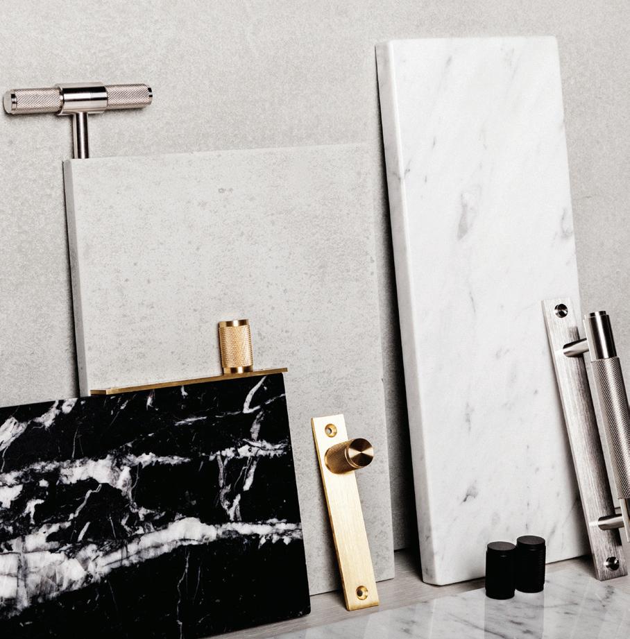
Linear is a range of small-scale cabinet handles – L-Bar and Precious Bar – inspired by the hardware of the fashion industry. The pieces feature a new take on Buster + Punch’s now iconic use of cross knurling in the form of linear knurling, as well as machined torx screws and rare solid metals. New finishes include gun metal and burnt steel in addition to the classic finishes: steel, brass and black. Core collection pieces such as Furniture Knob and Pull Bar are also available in the new Linear range.

habitus promotion › Living Edge #67
Buster + Punch | busterandpunch.com

issue #47 habitusliving.com
Ancient Culture, new design
If you’ve seen the Qantas jumbo jets painted with Aboriginal art – there have been five of them flying international skies over the past 25 years – you’ve come into contact with the work of Balarinji, a multi-disciplinary, Aboriginal-owned design agency based in Sydney. You may not realise, though, that the studio also works with architects and designers and is moving into the residential sector, as a way of telling important stories about Australia’s past and present.
Founded in 1983 by life and work partners John and Ros Moriarty, Balarinji was named for the skin name of their two sons, and it emerged from a desire to celebrate the Indigenous stories and heritage of their three children.
John Moriarty was born in the remote community of Borroloola in the Northern Territory in 1938, but was removed from his community under the government’s assimilationist policies of the Stolen Generations when he was four years old. He was taken first to a children’s home in Mulgoa at the base of the Blue Mountains of New South Wales, then to St Francis Boys Home in Adelaide, South Australia.
A desire to share Indigenous heritage with a new generation saw the emergence of Balarinji, a design agency that collaborates on projects across Australia.
2 . portrait # 69
TEXT RACHAEL BERNSTONE | PORTRAIT DAVID WHEELER
John reconnected with his mother as a teenager in a chance meeting in Alice Springs, only to be immediately separated again. He was finally able to be reunited with his family in Borroloola when he was 30. When the couple’s first child was born in Melbourne, John sketched turtles and Ros screen-printed them onto bedroom textiles. Friends asked to buy them, leading to the founding of Balarinji.
That was 36 years ago – John is now 81 – and the business has forged many strong and trusted relationships with Aboriginal and Torres Strait Islander people throughout Australia, thanks to its commitment to authentic engagement with people, culture, art, stories, and identity.
Today, the studio employs 15 people and its output spans public art and curatorial; urban regeneration and infrastructure; and branding campaigns and digital projects. In 2012, the couple also established the Moriarty Foundation, which provides early years programs for very young Aboriginal children and a football (soccer) program for six-to-16 year old boys and girls.
Speaking at #collectiveagency, the Institute of Architects’ national conference in June 2019, non-Indigenous Ros Moriarty outlined the company’s ethos “to deepen understanding of Aboriginal Australia for major projects nationally”. In the case of buildings and public spaces, she hopes that local Indigenous stories will be incorporated into all new projects. “At Balarinji, we’ve gone beyond engagement and consultation, to really collaborating deeply with the Aboriginal community,” she says. “These stories are foundational – and fundamental –to our identity, to who we are as Australians.”
At the conference she asked: “Who in this room – or who in architectural practice – is going to create Australia’s very first major public building expressing an Aboriginal sensibility, displaying us to the nation and the world, in terms of our foundational narrative?”
Balarinji is making some headway in this regard, having completed public art and interpretation for the Jezzine Barracks project in Townsville in 2014 with Place Design Group.
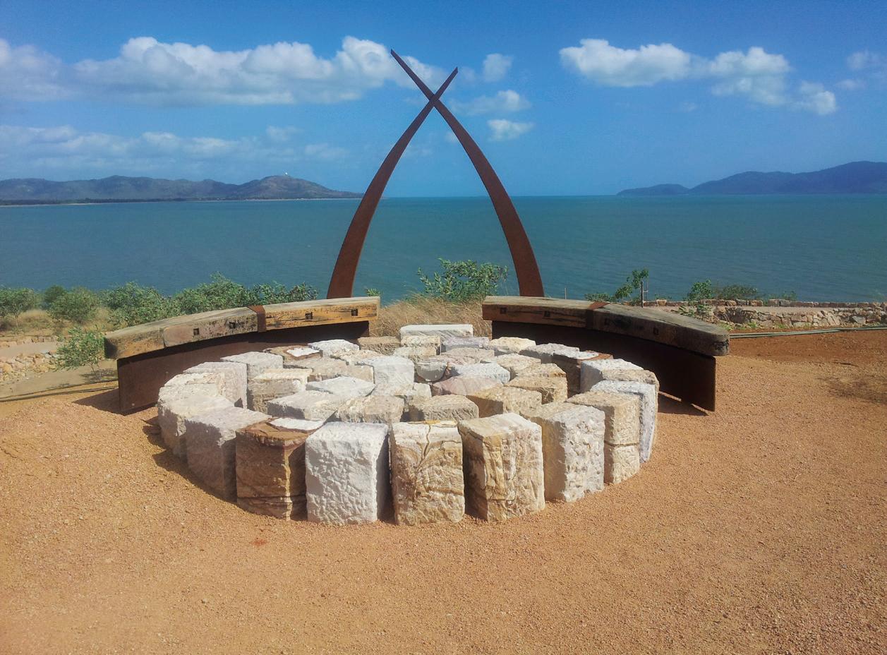 OPENER | (L-R) BALARINJI WAS FOUNDED BY ROS MORIARTY (MD) AND HER HUSBAND JOHN MORIARTY (CHAIRMAN). THEIR THREE CHILDREN HAVE ALL WORKED IN THE STUDIO AT VARIOUS TIMES AND SON TIM MORIARTY IS BALARINJI’S PROJECTS CREATIVE DIRECTOR. ABOVE & OPPOSITE | JENNY MULCAHY’S RETURN TO COUNTRY SCULPTURE (ABOVE) AND THE BROLGA SCULPTURE (OPPOSITE) BY JEREMY GEORGE AND RURIK HENRY ARE PART OF THE JEZZINE BARRACKS PROJECT IN TOWNSVILLE, QUEENSLAND.
issue #47 habitusliving.com
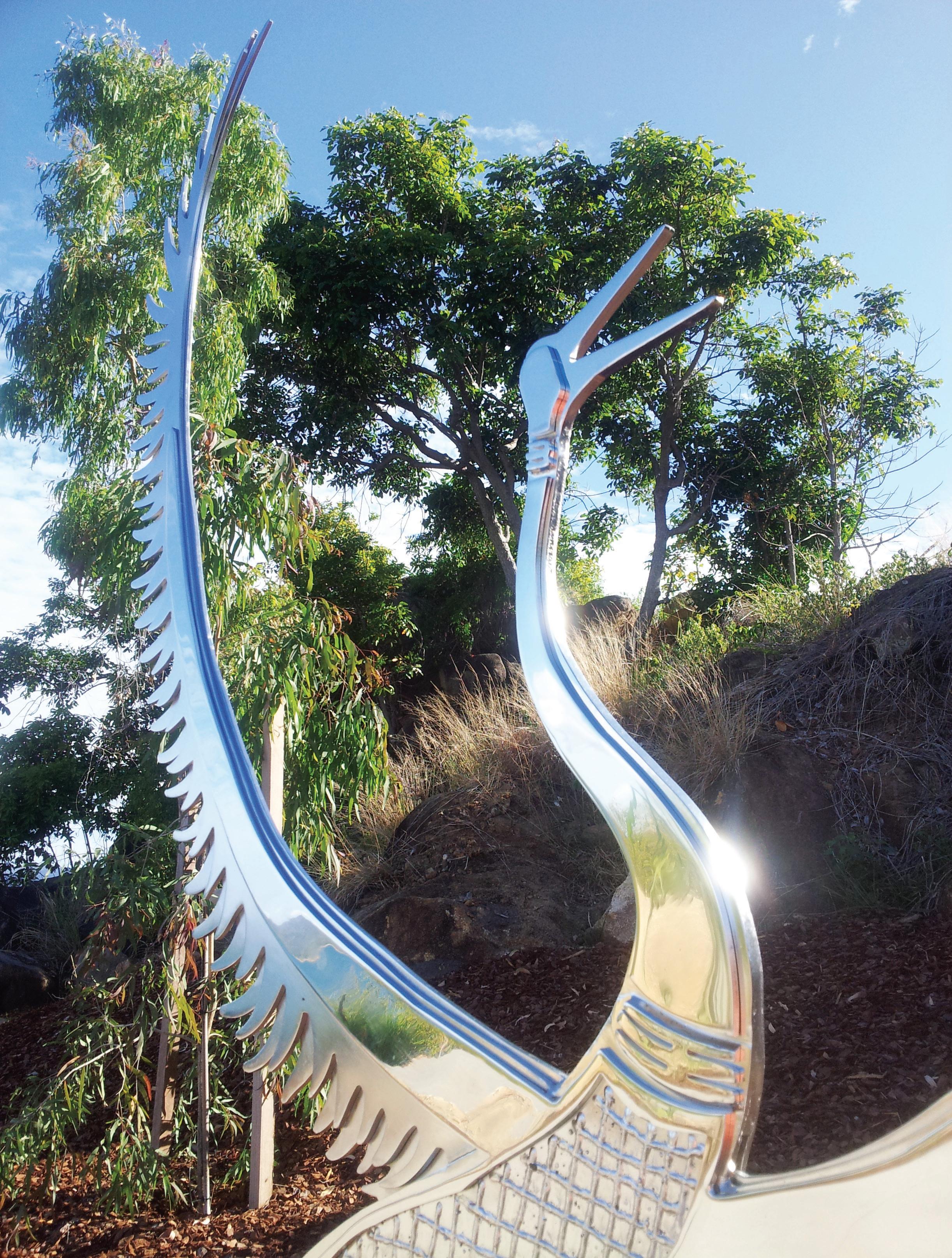
2 . portrait # 71
Ros sees opportunities for Balarinji to influence the development of new housing, initially through multi-residential projects in collaboration with architects.

ABOVE | THE NEW ENTRY TO SYDNEY’S REDFERN STATION ON THE CORNER OF GIBBONS AND LAWSON STREETS FEATURES ABORIGINAL ART AND DESIGN THAT REFLECTS THE LOCAL COMMUNITY AND ITS ABORIGINAL NARRATIVES. OPPOSITE | THE QANTAS DREAMLINER EMILY KAME KNGWARREYE
FIFTH AIRCRAFT IN THE BALARINJI-QANTAS FLYING ART SERIES. IT WAS INSPIRED BY THE LATE ARTIST’S 1991 PAINTING YAM DREAMING.
WAS THE
issue #47 habitusliving.com

2 . portrait # 73

ABOVE | THE
A CEREMONIAL
AND A
OF
IN
QANTAS EMILY KAME KNGWARREYE DREAMLINER PICTURED ARRIVING IN ALICE SPRINGS FOR THE FIRST TIME. THE ARTIST WAS A SENIOR MEMBER OF THE ANMATYERRE CLAN,
LEADER
CUSTODIAN
DREAMING SITES
ALHALKERE.
issue #47 habitusliving.com
“At Balarinji, we’ve gone beyond engagement and consultation, to really collaborating deeply with the Aboriginal community.”
Current projects include the Redfern Station Upgrade in Sydney (with Sydney Trains and Jacobs), the Sydney Metro West projects (with WSP and AECOM), and the M12 motorway (with RMS and Arcadis).
In partnership with Woods Bagot, Rogers Stirk Harbour + Partners, and Western Sydney University, Balarinji was shortlisted for the new Western Sydney Airport; a project that was recently awarded to Zaha Hadid Architecture and Cox Architecture.

As well as large infrastructure projects, Ros sees opportunities for Balarinji to influence the development of new housing, initially through multi-residential projects in collaboration with architects. “That’s the easiest first step, so we are linking with architecture practices that are in a position to engage in new types of conceptual thinking,” she says. “This is not just about Indigenous history and visual imagery, but the whole idea of Aboriginal society and culture and wellbeing: the importance of family, the principles around living close to Country, these can all be interpreted in housing design.”
A central premise of co-design, she explains, is that the local Aboriginal community must speak for each place, which can range in size and complexity from city blocks to precincts; highway corridors to stretches of coastline.
“That can be complex and we rely on our wide networks and deep history,” she says. “Because Balarinji has been operating for 36 years, we have a reputation for engaging with integrity, and we can seek out and activate that voice from local people.”
Balarinji’s multi-disciplinary approach helps smooth the way; the firm interfaces with interior designers, architects and landscape architects, and has historians, art directors, graphic designers and project managers on staff.
2 . portrait # 75
They bring together local Indigenous artists, storytellers, poets, performers and others on projects. The studio pays market rates for Aboriginal engagement to honour the value of their Intellectual Property, before brainstorming ideas about stories and working out how they might be represented, in an iterative process.
Ros cautions against only seeking out Dreaming stories, or past-tense tales. “Often these stories are very contemporary – stories of resistance and survival – so we look at new frames of creativity that architects can explore,” she says. “Also, Aboriginal people generally have a different world view to non-Indigenous people – they are less materially bound, they have a different philosophy that revolves around people and Country and the cosmos – and with the right process, design professionals can tap into these cultural connections.”
Co-design offers exciting opportunities for design professionals who might have typically looked to the USA and Europe for inspiration, she says. “We encourage architects and designers to explore the unique ways of thinking that exist here, and to explore how they can enrich their practice within a ‘ground-up’ and very Australian context.”
“This approach is no less global or sophisticated than those other alternatives, but there is a uniqueness in starting to describe our foundational story,” she adds. “And the design community is well-placed to be the catalyst to unlocking that, with the right pathways and a respectful approach.”
Balarinji | balarinji.com.au

CAME
ABOVE | JOHN AND ROS MORIARTY IN FRONT OF WUNALA DREAMING; THE FIRST PLANE IN THE BALARINJI-QANTAS FLYING ART SERIES, WHEN IT WAS LAUNCHED 25 YEARS AGO. THE IDEA
TO ROS IN THE MIDDLE OF THE NIGHT:
“WE HAVE TO PAINT A JUMBO!”
issue #47 habitusliving.com
“We encourage architects and designers to explore the unique ways of thinking that exist here.”
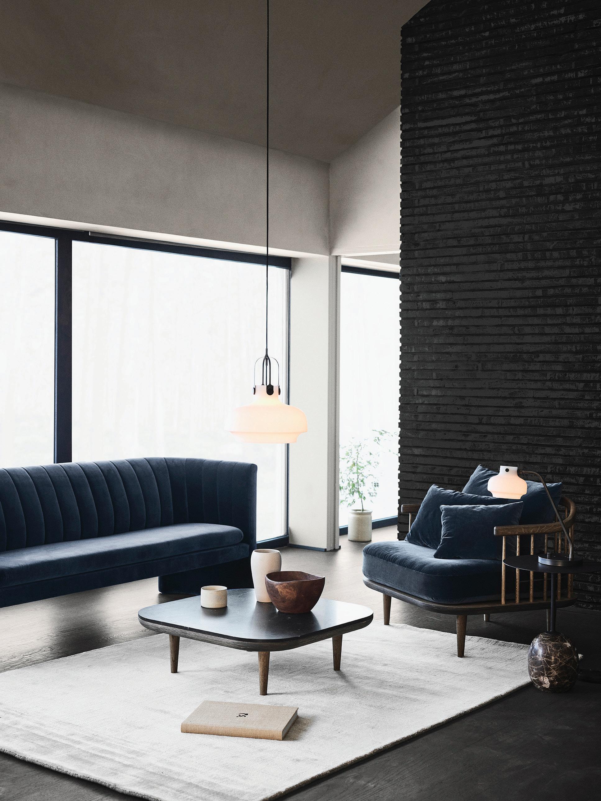
Crème de la crème
Maude Pilote of Hillam Architects and Elena Rajani of mckimm have reset the gold standard of Australian kitchen design.
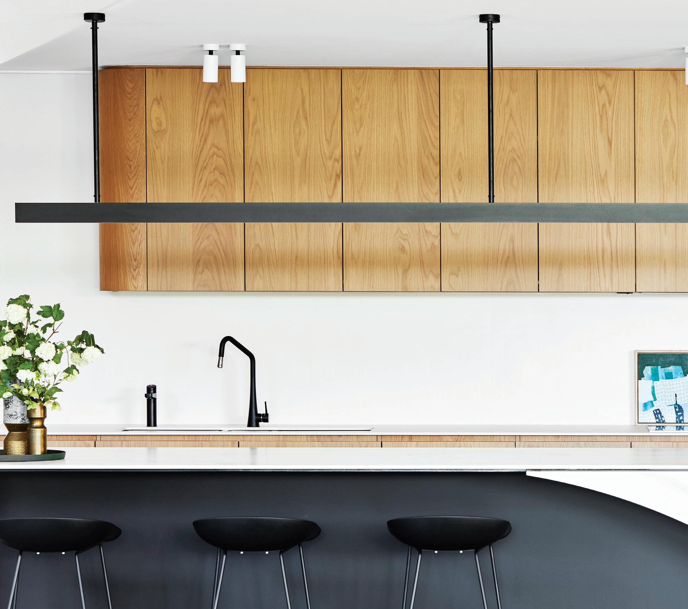
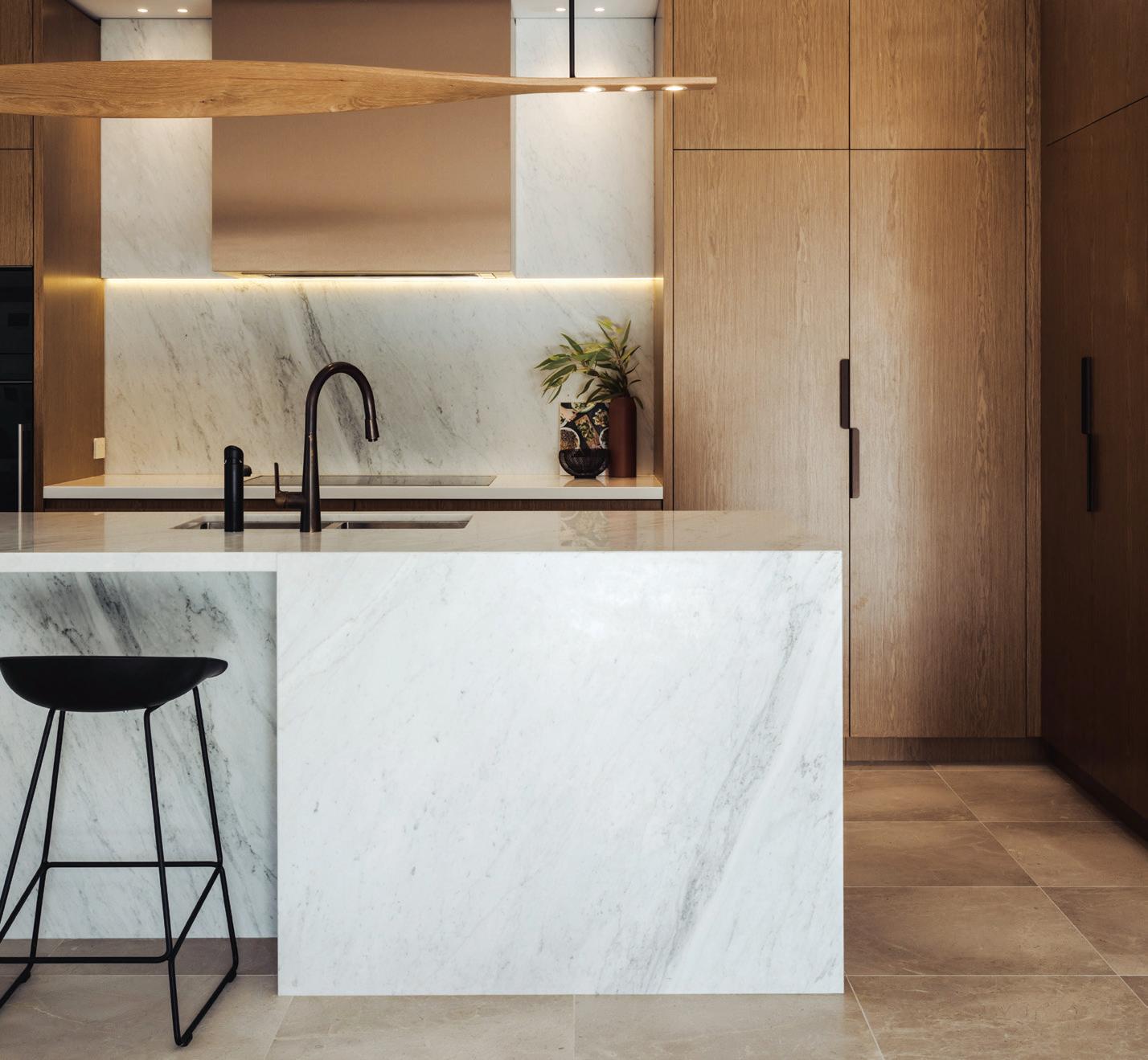
issue #47 habitusliving.com ABOVE | THE SAGAMORE HOUSE KITCHEN BY
OPPOSITE | THE EDEN DISPLAY SUITE KITCHEN
MCKIMM.
BY HILLAM ARCHITECTS.
There is no world in which a well-considered kitchen is not a priceless peice of residential design. Now, thanks to Zip Water, Maude Pilote of Hillam Architects, and Elena Rajani of mckimm, there is a new gold standard in kitchen design.
The inaugural 2019 Zip Water Kitchen Design of the Year Competition – in which Maude and Elena were named winners – held an inundation of entries up to a set of criteria, inarguably critical to a kitchen’s success.
Taking into consideration design effectiveness, ergonomics, traffic flow and work zones, storage, fixtures and fittings, lighting, visual appeal, and creativity, a blind judging panel of Australian kitchen design experts concluded that Maude’s Eden Display Suite kitchen design and Elena’s Sagamore House kitchen design ticked each of these boxes, and more.
With fine finishes, subtly exquisite detailing, and hints of asymmetrical intrigue, the Eden Display Suite by Hillam Architects was unrivalled when it came to naming the Best Multi-Residential Home Kitchen. A delightful juxtaposition of textures and finishes along with a well-considered use of space make the kitchen highly inviting, not to mention an effective sales tool.
The award for Best Freestanding Home Kitchen may not
have had such a clear-cut winner, with a hotly contested field of six finalists, but in the end, intelligent spatial planning and engaging materiality saw mckimm’s Sagamore House take out the title.
From the stunning sweep of the benchtop to the dramatic pendant light suspended overhead, everything about the Sagamore House kitchen is breathtaking. Impeccably planned and harmoniously balanced, it is an exceptional example of grand residential design. Light and bright, yet deep and moody all at once, this open-plan yet well-grounded kitchen is well and truly worthy of being the heart of the heart.
Among the shortlist for the Best Freestanding Home Kitchen Award were another two projects by mckimm –one of which was another of Elena’s – and one from GIA Bathrooms and Kitchens, Cantilever Interiors, and Paul Clout Design respectively.
“We’re thrilled with the high calibre of entries in our first ever Zip Water Kitchen Design of the Year Competition,” said Zip Water Marketing Director, Tom Fisher. “Working closely with kitchen designers is something we are passionate about at Zip and it’s been exciting to see the breadth of innovative designs using our HydroTap products.”
habitus promotion › Zip Water #153
Zip Water | zipwater.com.au
Subscribe to Habitus




Enjoy your quarterly dose of Habitus delivered straight to your door. Each issue celebrates the outstanding work architects and designers within the Indo Pacific, both emerging and established, are producing. Don't miss out on the latest in architecture and design.
Subscribe
PLEASE
of local artist; emerging living models that respond to exponential architecture and anatomy this is the Design Culture issue. #47 #46 footprint with endless views design anthropologist Trent a remote, Indonesian farm stay This is the Life Outdoors issue. PAYMENT METHOD Cheque / money order AUD$ Charge my credit card AUD$ Name on Card Card Type Card Number Expiry Date Signature IT’S EASY TO ORDER Fill in your response below, overleaf or subscribe securely online at habitusliving.com/subscribe. FOR A GIFT – RECIPIENT DETAILS:
MYSELF
FOR
Address State Postcode Country Email Phone Mrs/Ms/Miss/Mr
Name
Address State Postcode Country Email Phone ONLINE: habitusliving.com/subscribe PHONE: (61 2) 9368 0150 MAIL TO: EMAIL: subscriptions@indesign.com.au FAX: (61 2) 9368 0289 Indesign Media Asia Pacific Level 1, 50 Marshall Street, Surry Hills NSW 2010 WHERE’S YOUR FAVOURITE PLACE TO ESCAPE/EXPLORE AND WHY?
SELECT BELOW Mrs/Ms/Miss/Mr First Name Surname
First
Surname
to Habitus magazine
includes shipping within Australia only AUSTRALIA INTERNATIONAL (AUD$) 12 ISSUES SAVE 8 ISSUES SAVE 4 ISSUES SAVE 12 ISSUES SAVE 8 ISSUES SAVE 4 ISSUES INDESIGN $155 $43 $105 $27 $55 $11 $240 $39 $200 $21 $110 HABITUS $132 $59.40 $93 $34.6 $49 $14.80 $240 $42 $180 $22 $102 THE COLLECTION Vol. 2 Australia $29.90 (1 ISSUE) International $49.95 (1 ISSUE)
DESIGN CULTURE
This issue
Habitus explores the work of architects and designers across the Region who exemplify what it means to create with an overarching sense of social responsibility.
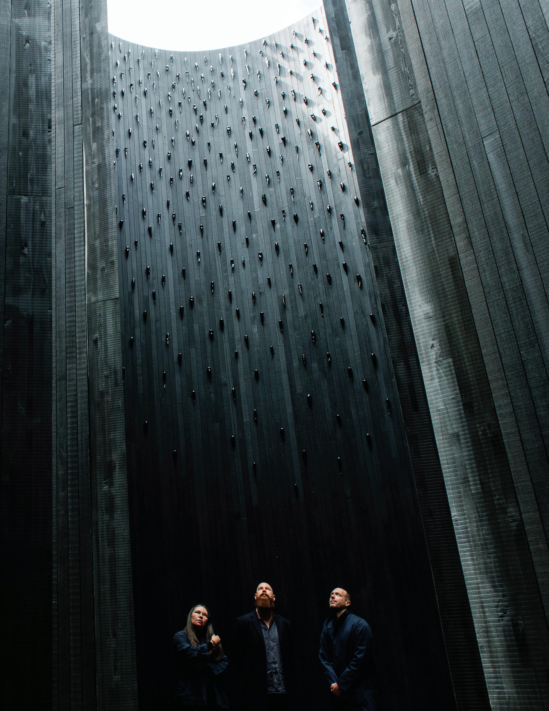
design culture # 81 PORTRAIT OF (L-R) YHONNIE SCARCE, CONTEMPORARY ARTIST; KIM BRIDGLAND, DIRECTOR, EDITION OFFICE; AND AARON ROBERTS, DIRECTOR, EDITION OFFICE INSIDE IN ABSENCE, 2019 THE 2019 ARCHITECTURE COMISSION AT NGV INTERNATIONAL, MELBOURNE FROM NOVEMBER 2019APRIL 2020. PHOTOGRAPHY BY EUGENE HYLAND
issue #47 habitusliving.com
New housing: turning Crisis into Opportunity
Is the housing crisis more an opportunity than a threat?
Paul McGillick looks at new approaches to housing in a changing social and economic landscape.
TEXT PAUL MCGILLICK
design culture # 83
issue #47 habitusliving.com
Probably because they live in the glorious isolation of an island continent, Australians erroneously think they are unique. For example, they think they are the only ones with a ‘housing crisis’. In fact, this is an international phenomenon very much to do with the rapid growth of cities. This growth strains available property resources, forcing prices up and making property less affordable to a growing number of people. Add to this changing social values, stretched infrastructure, and a shifting economic landscape and you have the scenario for developing new housing models to respond to that changing environment.
For Geoffrey London, Professor of Architecture at the University of Western Australia (who is working closely with the Western Australian government agency, Landcorp, to develop new affordable housing models) the issue is: “How can design intelligence be brought to the housing problem?” Such design intelligence, of course, needs to go beyond architecture and address overarching strategic planning and realistic economic models or what Geoffrey refers to as “considered options for the marketplace”.
We know that endless suburban expansion – seen throughout Australia and on the periphery of Asian cities such as Kuala Lumpur – is not sustainable. Instead, we need greater densification within existing urban and suburban areas where infrastructure resources can be concentrated along with employment and social amenities.
As Geoffrey points out, in Australia greyfield infill is starting to occur, but on an ad hoc basis. This has brought with it some architectural innovation, creating greater
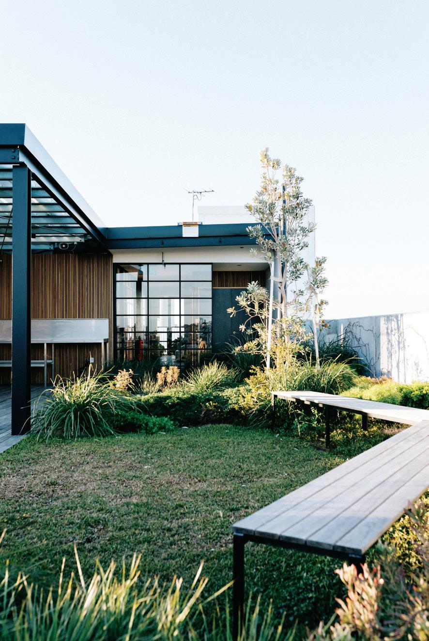
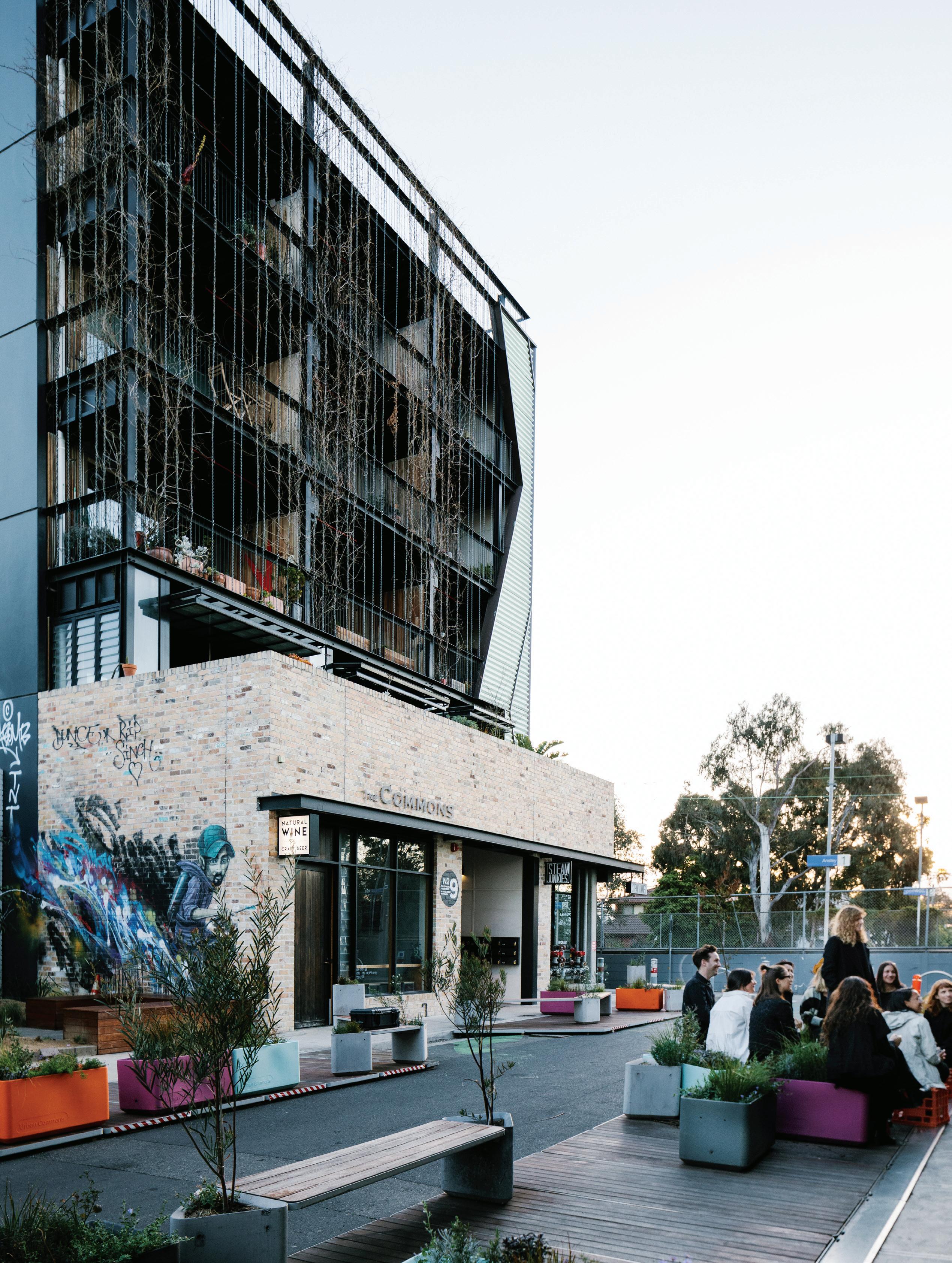
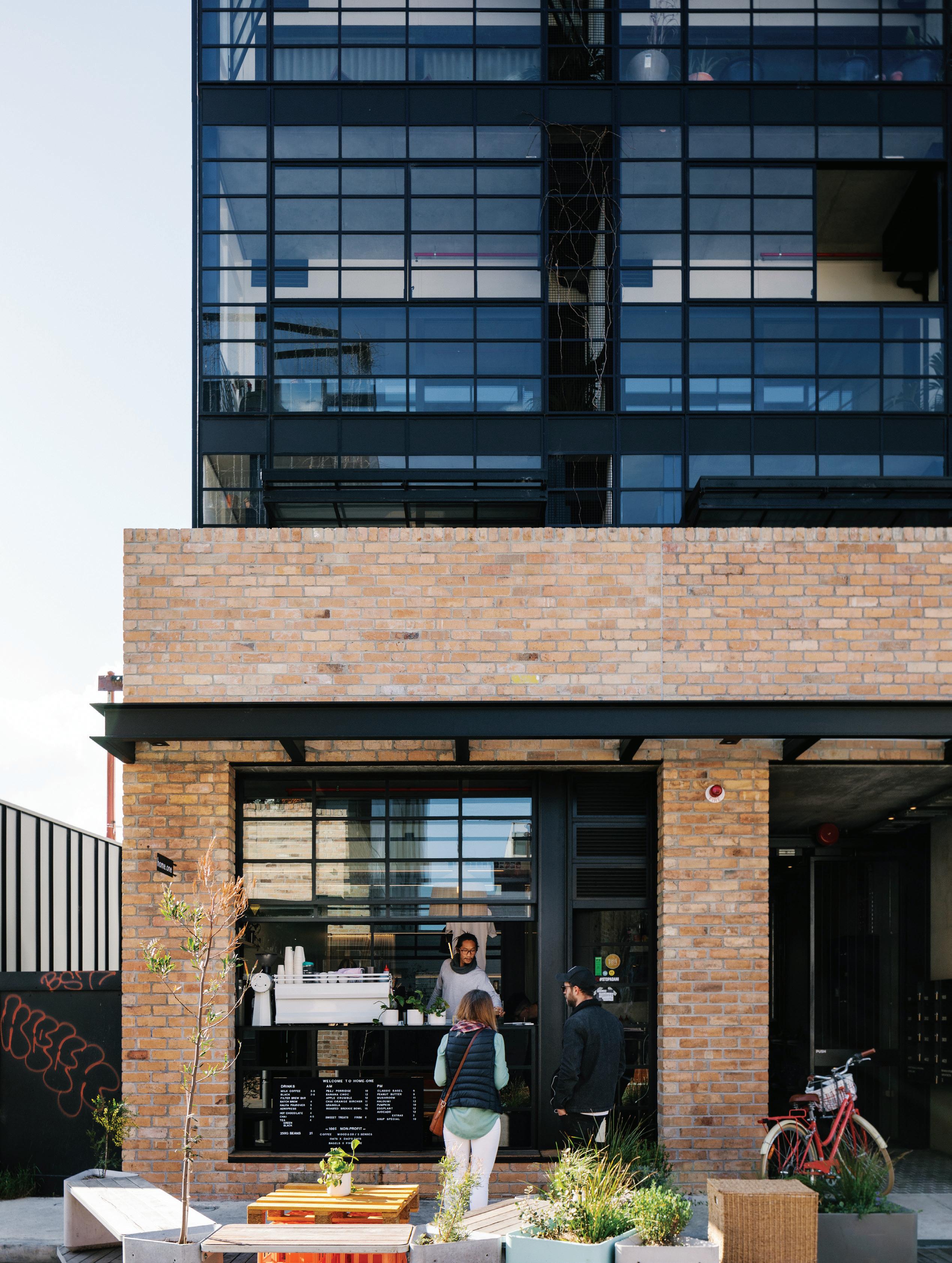
OPENER | TRUE TO ITS NAME, THE COMMONS CELEBRATES COMMUNITY THROUGH SHARED AMENITY. OPPOSITE | A COFFEE SHOP ON THE GROUND FLOOR ENCOURAGES OCCUPANTS DOWN AND THE STREET FURNITURE ENCOURAGES THEM TO STAY A WHILE AND MINGLE. ABOVE | A COMMUNAL GARDEN ON THE ROOFTOP OF THE COMMONS. PHOTOGRAPHY BY MARNIE HAWSON design culture # 85
density that is also liveable – unlike a lot of equally ad hoc medium-density, developer-driven apartment buildings that seem oblivious to notions of community and liveability. By way of contrast, Western Australia’s Landcorp is facilitating the White Gum Valley Housing Project in Perth. Here, in the first phase, individual owners have developed (with architects, spaceagency) their own multi-residential complex. Costs have been reduced by eliminating developer and marketing fees and creating stacked houses with common walls and extensive communal amenities.
This is an example of what is loosely known as the Baugruppe (literally, building group) model pioneered in Germany. This is basically a financial model and involves placing a cap on profits and eliminating marketing fees and expensive optional extras. It is summed up by Breathe Architects who designed Australia’s first example, Nightingale 1 (The Commons), in Melbourne’s Brunswick: “How can we build a well-designed, community-led building for owner-occupiers, not investors?” The result was a highly sustainable and more affordable 20-apartment building, now followed by further iterations: Nightingale 2 in Melbourne’s Fairfield (Six Degrees Architects), Nightingale 3 in Melbourne’s Brunswick (Austin Maynard Architects) and Nightingale Fremantle in Western Australia (EHDO) – all architect-designed in collaboration with the potential owners; all highly sustainable; all with a cap on profits for investors; and all eliminating unnecessary features resulting in a 5-10 per cent reduction in costs.

issue #47 habitusliving.com
Speculative Development projects are also beginning to re-think the way we live, especially from the point of view of sustainability, community and optimising available plots.

design culture # 87
James Legge, a Principal with Six Degrees Architects (whose Heller Street Park and Residences in Melbourne’s innersuburban Brunswick in 2011 was a fascinating forerunner with 10 townhouses and a merged private and public domain utilising remediated land) has made a special study of new housing models.
In a talk on the subject, he prefaced his remarks with a quote from the famed American urbanist, Jane Jacobs: “There is no logic that can be imposed on the city; people make it, and it is to them, not buildings, that we must fit.” James identifies three categories of housing development: Subsidised, At Cost, and For Profit. It is the At Cost models that are relevant to this article and they comprise: Cooperative Development, Deliberative Development (citizen-led), Deliberative Development (architect-led) and Enlightened Speculative Development. These are different development models and may take different forms in terms of financing and architecture. James’s talk focused on a number of German examples which almost certainly flag future developments elsewhere.
Typically, some form of co-housing is involved. In Australia (as elsewhere) this involves shared amenity such as community gardens, common rooms and recreation areas

and may be driven by any of James development models. An intriguing example of an early co-housing project in Singapore is The Cranes in the precinct of Joo Chiat, which I discussed in my book, Sustainable Luxury (2014). This involved consolidating two traditional shop houses, then restoring and re-developing them over four levels. The complex consists of six apartments with a central common courtyard, a reading room and two communal cooking and dining areas. The aim was to create a sense of community, not just within the complex, but within the wider Joo Chiat community, connecting with the traditional and authentic character of the area by retaining many of the original features of the shop houses, especially on the streetfront. The developer was a boutique developer (the architects were a special division of the large integrated architectural firm, Ong & Ong). It is an example of James’ Enlightened Speculative Development, as is Melbourne’s The Commons, which began as a Baugruppe project before being taken up by a developer.
However, Speculative Development projects are also beginning to re-think the way we live, especially from the point of view of sustainability, community and optimising available plots.
issue #47 habitusliving.com
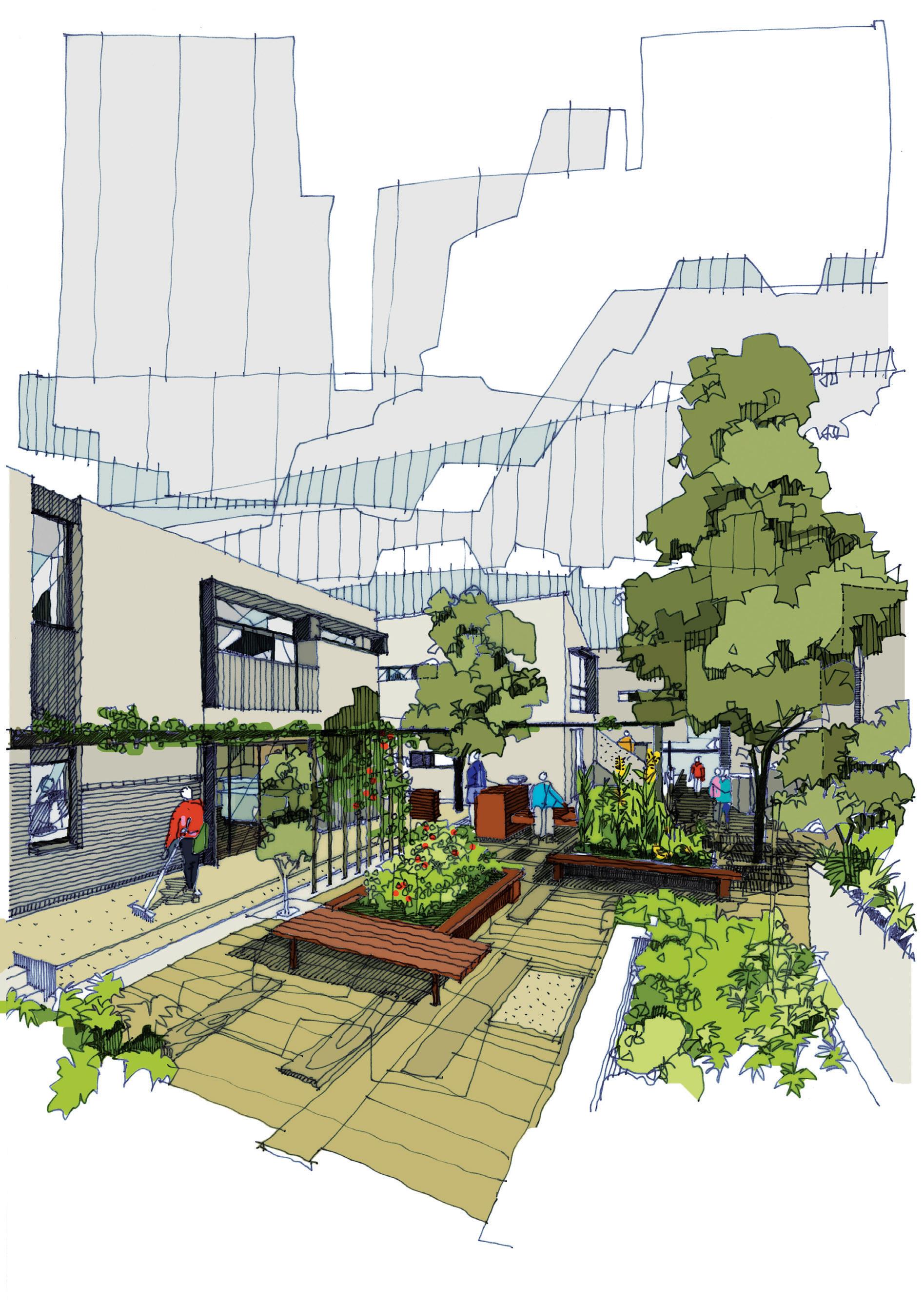
PREVIOUS | HELLER STREET PARK AND RESIDENCES SUCCESSFULLY COMBINES PRIVATE AND PUBLIC SPACE. PHOTOGRAPHY BY PATRICK RODRIGUEZ OPPOSITE | THE COMMUNAL GARDEN OR “SHARED BACKYARD” AT CLYDE MEWS. PHOTOGRAPHY BY ALICE HUTCHISON ABOVE | A SKETCH OF CLYDE MEWS. design culture # 89

ABOVE | THE LOBBY OF 71 STATION STREET IS DESIGNED FOR RESIDENTS TO BUMP INTO ONE ANOTHER. OPPOSITE | THE ENTRY IS DOWN A GATED LANEWAY TO THE LEFT OF THE BUILDING. issue #47 habitusliving.com
Six Degrees has designed sustainably focused clusterhousing in the Melbourne suburb of Thornbury. Clyde Mews consists of six townhouses and two apartments linked by walkways. Each dwelling is restricted to one car space and these spaces are located on the periphery of the complex to help integrate the complex as a community. The communal garden is designed as “a shared backyard”, while the complex boasts exemplary sustainable features, including the preferred use of material recycled from site as well as other recycled timber and bricks. Captured water supplies toilets and laundry needs while all the dwellings enjoy solar power and passive heating and cooling systems.
In Melbourne’s Fairfield (just four kilometres from the CBD on the Yarra River and diametrically opposite Nightingale 2) is 71 Station Street, a speculative development by Osten and designed by Cheah Saw Architecture. This project responds to a key issue in densification. Namely, if people are required to live in apartments rather than on quarter-acre blocks, then the experience has to replicate that of a home with amenities such as gardens and outdoor living.
This project sets out to do just that. Designed on a domestic scale, the complex consists of 13 dwellings in four storeys, each one different from the other to create the experience of one’s own unique home. The architects have set out to generate a sense of community within the complex,

but also with the village-like character of Fairfield which has a diversity of housing types. Hence, the three ground-floor apartments are designed for down-sizers who can enter their home straight off the street and into their own extensive garden, evocative of some of the older villas in the area.
Entry to the complex is down a side lane and through a private entry court and a human-scale lobby. The stairway is the main thoroughfare to encourage interaction – a “vertical street”. The smallest units across two levels are on the top floors. They are like townhouses and are aimed at young families and zoned to allow for privacy with the bedrooms on the upper level. Balconies throughout are designed to be outdoor rooms and part of the useable space.
We are now familiar with mixed-use developments which act as de-centralising satellite hubs combining residential with retail, hospitality, recreational facilities, libraries, and medical and child care centres. These represent a new ‘densified’ model of living, arguably superior to the suburban model with its propensity for social alienation. Running in parallel is a growing awareness of the importance of mixing demographics – age, ethnicity, income groups – in the interests of social sustainability and individual wellbeing.
An outstanding variation on this is in Singapore where Kampung Admiralty in the district of Woodland is the first integrated development in Singapore bringing aged care, and public facilities and services together under one roof.
design culture # 91
Designed by WOHA, the two 11-storey buildings form a vertical village (kampung) culminating in a community garden on the rooftop. At ground and mezzanine levels is covered public space and a hawkers food area. On the mid-level is a medical centre, while the 104 apartments are custom-designed for independent elderly singles and couples. It is, say the architects, “bringing together young and old to live, eat and play”. This is because the complex also includes a day care centre, thus promoting inter-generational bonding – a model now being explored in Australia that ensures that ageing members of the population remain socially integrated and active.
This article has highlighted just a few examples of new approaches to housing. If there is indeed a housing crisis, perhaps we should start to see it as an opportunity rather than a threat – to explore new ways of living, better aligned to the realities of the age we live in.

ABOVE | KAMPUNG ADMIRALTY PIONEERED THE TREND IN SINGAPORE
PHOTOGRAPHY
TO CREATE AMENITY AT STREET LEVEL AS WELL GREEN SPACE AMENITY IN AND ON TOP OF THE BUILDING ITSELF.
BY K. KOPTER
issue #47 habitusliving.com
Kampung Admiralty is the first integrated development in Singapore bringing aged care, and public facilities and services together under one roof.






MELBOURNE 2020 Join us in... SUSTAINABLEBUILDINGAWARDS.COM.AU 12 NOVEMBER 2020 | PLAZA BALLROOM, MELBOURNE @architecture&designaustralia @archanddesign @architectureanddesignaustralia

issue #47 habitusliving.com
What makes an Icon?
Though she wouldn’t say so herself, Karen McCartney’s latest book can be taken as a survey on Australian architects and the houses they’ve designed in the latter half of last century. In this exclusive extract, we look at the previously unseen Jackson House by architect Daryl Jackson.
| PHOTOGRAPHY
design culture # 95
TEXT KAREN MCCARTNEY
MICHAEL WEE
Someone referred to the recently published Iconic Modern Australian Houses 1950-2000 as a survey book and it took me by surprise, in that I had never considered it in that light before. A survey looks down from above, from a position of great height and knowledge, whereas I built this book from the ground up, with a starting point of mild ignorance. Initially through an emotional and physical understanding of the work of Bruce Rickard (we live in his 1967 Marshall House) an intellectual appreciation developed. Subsequently, through a gradual process of research, many in-depth interviews and house visits, I came to understand the landscape of Australian architecture from the 1950s onwards. This book is my education on the topic.
As a former magazine editor, I wanted it to have a singular visual identity and, while it certainly added an element of difficulty, it was important that we photograph all the houses as they existed in the 21st century. There is no doubt a book of archive material would have felt very different – broader, more linked to the time it was built and indeed perhaps more of a survey. This book represents houses that have survived, mostly intact, which is no small feat as the value of the land they sit on has been the downfall of many contemporaneous houses.
And indeed the land and its relationship to the houses is an important aspect in the book with the topology of the Australian landscape woven through the pages. Gabriel
Poole’s lightweight Gartner House on its steep site in Queensland, Ian McKay’s tent-like structure in Lobster Bay NSW, and Richard Leplastrier’s famous canvas-walled Palm House in Bilgola contrasted with the hunkering down of Barrie Marshall’s concrete Phillip Island House which buries itself in the landscape. “In its context it lurks like a stealth bomber, hidden and subversive”, say Haig Beck and Jackie Copper, in one of my favourite quotes.
But probably the most important aspect of this book is that it shines a light on the architectural gems we have here in Australia, the concepts that embrace climate, manipulate form and materiality in such a great variety of ways and show that with our vast landscape, with its different changing geographies, there is no such thing as one size fits all.
JACKSON HOUSE BY DARYL JACKSON, MORNINGTON PENINSULA
At first, the eye takes in the landscape of ancient gums and pines, the creek and the ridge beyond. Then follows the appreciation of the rusticity of the house itself, achieved through its weathered timbers, bush poles and corrugated iron, and the way in which it references farm buildings in the area while retaining its own distinctive character. As [architect Daryl] Jackson comments, ‘It is a vernacular vocabulary, but in an urbanistic form.’ With discussion and greater contemplation comes a new level of understanding. How the concept of the expanded Australian ‘lean-to’
issue #47 habitusliving.com
“The house had to contend with the landscape, with the pioneer timber slab-and-mud lean-to shed, and a 120-year-old cottage.”

design culture # 97
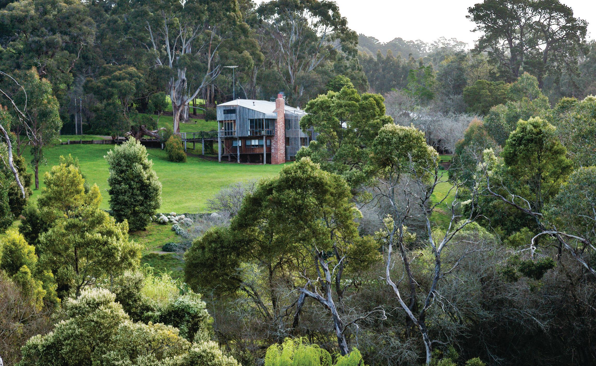

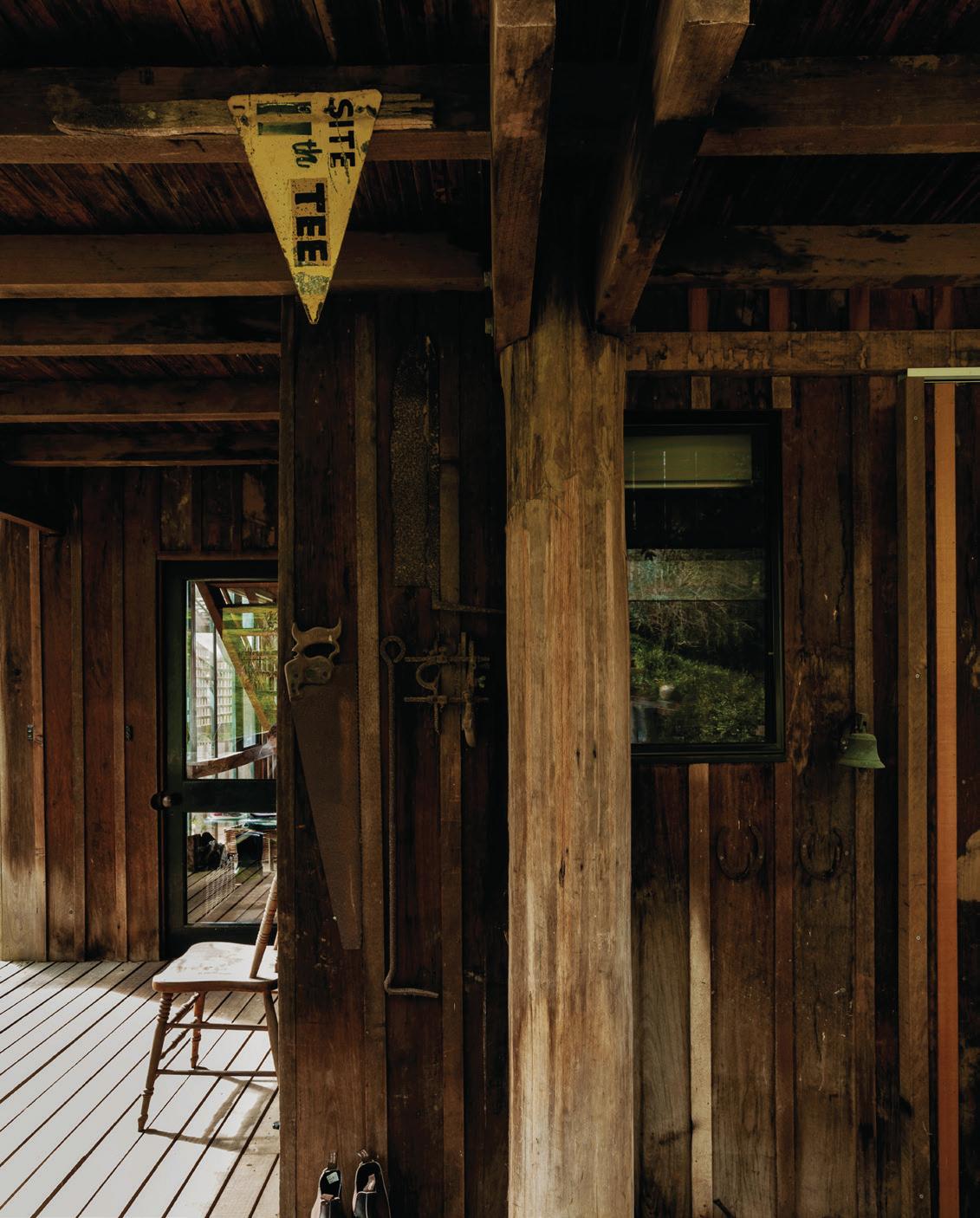
issue #47 habitusliving.com
developed from the appreciation of the simple pioneer cottage already on the land, and how, as Jackson says, ‘the spatial revolution, perhaps modernism’s crowning achievement, remains a keystone to my compositional tactics. Cubism in particular.’ What you experience at first sight is undoubtedly confirmed, but often in ways you had not quite anticipated, which surely is the purpose of all good art.
To escape at weekends, the Jacksons bought a farm block on the Mornington Peninsula. Jackson’s understanding of the landscape, and the power it commands, rendered him realistic about the task in hand. ‘The house had to contend with the landscape, with the pioneer timber slab-and-mud lean-to shed, and a 120-year-old cottage, with a marvellous white pre-Captain Cook eucalypt, on a hillside dropping away to a creek.’ As a starting point, his scheme evolved from what was already there – working into what existed in the European tradition, but in a quintessentially Australian context and form. ‘Building new to sustain the old became a leitmotiv in his work,’ writes Patrick McCaughey to describe his approach in the broader commercial context, but it is also true in this personal, domestic project.
Jackson first stabilised and restored the cottage of stone slab, sticks and mud, which was virtually falling over after 30 years of cattle trampling through it. This sparked the idea for the house, ‘of abstracting from the lean-to shape, the humble back porch or filled-in verandah to become the whole dwelling’, he says. Combined with his ability to arrive at what he describes as ‘primary situations’, such as finding the essence of the house via the landform, this gave him a strong sense of place from which to create. Jackson is tuned into scale and the relationship of the structure to the landscape, how it integrates into the composition of the garden on one level and addresses the ridge and the valley at a larger level. He calls it a ‘topographic composition’.
Jackson’s building is linked to the land in two ways. He explains: ‘A trellis sunshade becomes a fence separating garden and orchard from bush. The line it creates makes an important horizontal link between the house and stable.’ The entrance to the house is via a broad timber bridge
creating an anticipatory journey to ‘the heart of the house’. Structurally, its openness is immediately evident. A series of platforms linked by open-tread staircases and the twostorey, glassed-in atrium reveal his preoccupation with geometry. ‘My interest in Cubism is based on ideas of taking apart and transforming, of reconstructing and opposing, with elements being redefined and renewed by the changing set of relationships,’ says Jackson. He admired the work of Picasso in this period with his ability to fundamentally alter the literal, representative nature of art by abstracting from life to produce a shift in perception and alter the accepted order of things.
Yet the feeling of the house is by no means sharp and fractured. Jackson manages to sidestep the angular through his choice of materials, by the way in which the house has been fabricated, and through his ability to balance his passion for Cubism with another ‘ism’. ‘The key point about expressionism is the inner vision, portrayed as content. It uses the world of feelings and emotions as much as any rationale or functional stance,’ says Jackson. ‘These two threads are the constant, endemic to my work throughout my life.’
The importance of Daryl Jackson’s practice both in Australia and internationally cannot be underestimated. He has more than 100 awards to his name, is a RAIA gold medallist, holds an Order of Australia, an honorary doctorate at Ballarat University and, among his academic commitments as a professorial associate at Melbourne and Deakin universities, found time for many years to be a director of Essendon Football Club.
Images and text from Iconic by Karen McCartney


Photography by Michael Wee Murdoch Books RRP $59.99 AUD


design culture # 99
Saturday Indesign is just around the corner
One of the region’s longest-running and most-loved design events will again take over Melbourne this year. Set for 20 June, Saturday Indesign is a full day packed with inspiration, design conversations and many unforgettable moments wedged in between. It’s one you don’t want to miss!
Whether discovering the latest products and brands from here or overseas, or mingling with the brightest talent, there is something for everyone at Saturday Indesign. Immerse yourself in workshops, panel discussions and collaboratively designed installations – it’s all about learning and networking in a truly unique environment. Plus, getting around from A to B is simple with our dedicated buses where you can jump on and off throughout the day.
Fostering community and being part of what defines Australia design is one reason why people like DesignOffice’s Tom Reid get behind Saturday Indesign.
“Our geographical isolation from the rest of the world has always been seen as a bit of a curse, but I think it has helped us to create such a strong community and confident Australian design identity – and it is events like Saturday Indesign that helps to foster this,” he says.
For the first time, Saturday Indesign 2020 will host a special programme focusing on lighting. Envisaged as an Australian showcase of the famous Euroluce exhibition in Milan’s Salone del Mobile, you will be able to catch the latest insights and products in lighting. Be part of the dialogue around lighting and lighting design as this key sector continues to grow.
Registrations for Saturday Indesign open at the end of March, jump onto saturdayindesign.com to make sure you’re part of the action.
issue #47 habitusliving.com ABOVE & OPPOSITE | MOMENTS FROM SATURDAY INDESIGN 2019, PHOTOGRAPHY BY EINWICK
The date is set and it’s right around the corner, so mark your calendar for the best design event of 2020.
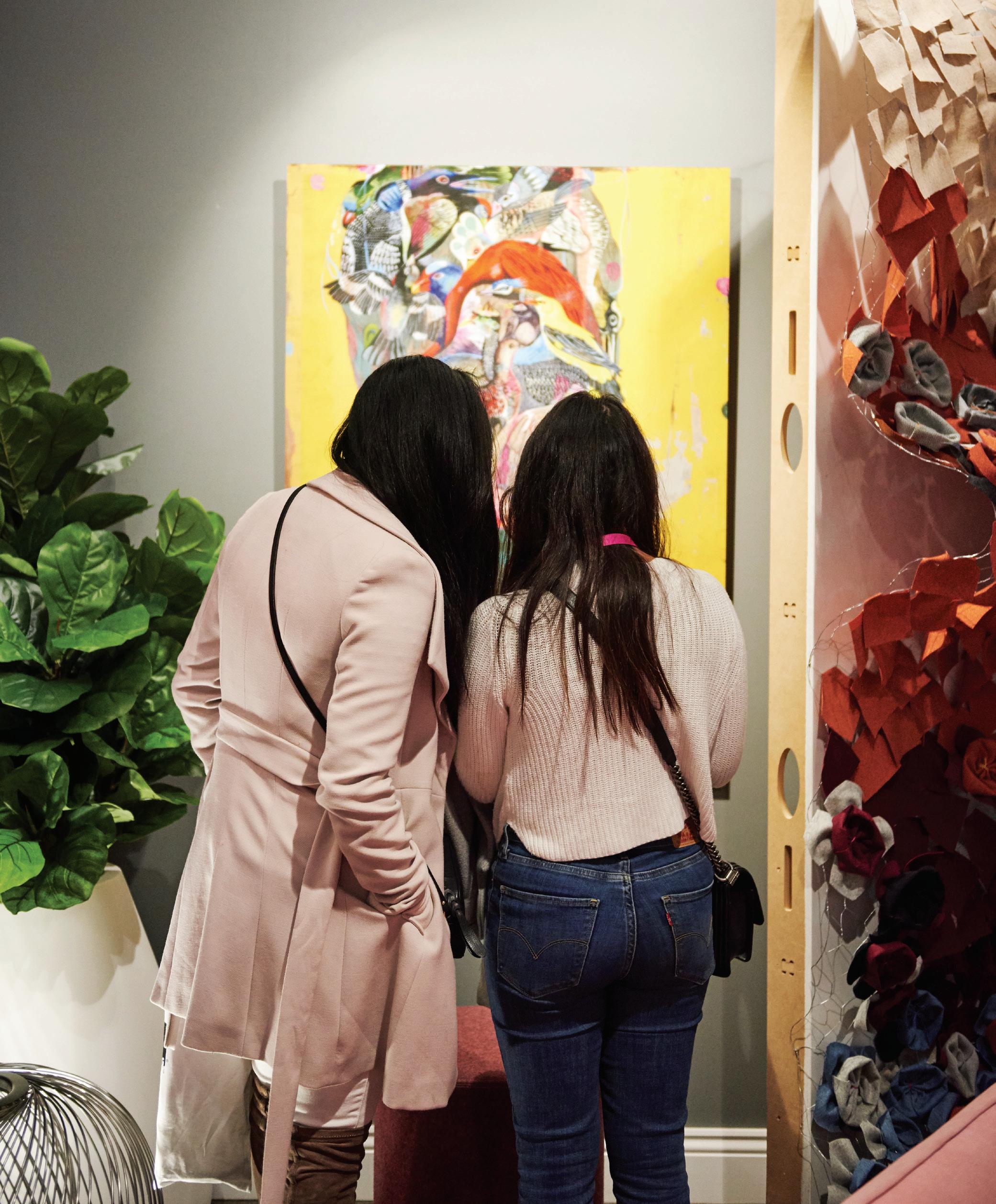
habitus promotion › Saturday Indesign #153 Saturday Indesign | saturdayindesign.com

issue #47 habitusliving.com
A storytelling Structure
Edition Office collaborates with artist Yhonnie Scarce on a powerful experience for this summer’s NGV Architecture Commission.
TEXT SANDRA TAN
In the manicured gardens behind the National Gallery of Victoria stands a sculptural monument, cleft in two.
Designed by Melbourne-based architects Aaron Roberts and Kim Bridgland of Edition Office and artist Yhonnie Scarce, In Absence is intended as an open cultural conversation through architecture.
“Being an annual event, there’s a real opportunity for the commission to engage with a cultural and political dialogue,” says Aaron. “We saw that as a way to engage with ideas of colonialism, and untold histories in the Australian amnesia.”
At the beginning of the creative process, Edition Office reached out to Yhonnie Scarce, an artist long admired by the studio, belonging to the Kokatha and Nukunu peoples of South Australia. After weeks sharing articles and essays, and exploring ways in which they might work together, the trio decided to use their work to address the erroneous colonial construct of terra nullius.
“We have such a highly intelligent culture,” says Yhonnie, “with agriculture and aquaculture, and all of these incredibly intricate systems that show that intelligence. Some of those structures are still standing after thousands of years.” Current estimates suggest 70,000 years. A staggering history of diverse peoples who had refined precision toolmaking,
a nuanced built heritage and a fundamentally sustainable, site-specific design legacy largely unrecognised by the Australian mainstream even today.
“Unfortunately, there are still many people who firmly believe that there was no design in Australia before colonisation,” says Kim.
From afar, In Absence’s towering, enigmatic presence compels one to investigate. A closer look at its exterior reveals rough-sawn timber slats, stained black, which line the inner walls too. Once inside the curved sanctum, the material continuity creates a sensory vacuum, framing the sky in an open circle, high above. Its two enclosed volumes are bisected by a corridor – a void representing deep loss and mourning, the trauma of forced disconnect between generations, and remaining gaps in empathy and cultural understanding. From the top of this black wooden shroud, a scatter of gleaming liquid forms cascade until just above head height: Yhonnie’s hand-blown glass yams.
“We use yams in all sorts of ways, for sustenance, they nourish us... But they also represent spirits – if you look at them, they have little shoulders, and their own personalities,” says Yhonnie. “When you see them inside the space, they take on a life of their own, really. They change colour with the light.”
design culture # 103
Positioned with tapered ends toward the ground, the delicate, organic figures take on an anthropomorphic significance. Shaped by the artist’s own breath, yet ghostly in appearance, Yhonnie’s yams encapsulate both life and death. These are deliberately placed in the spaces between boards, emulating growth that springs from cracks, symbolic of the remarkable resilience of Australia’s First Nations people.
“Her work is just so profoundly compelling. It can cut through you like a hot knife through butter,” says Kim. “Whatever blocks of resistance you have, it will find a way to worm itself in. It’s very rare to find artwork that can bypass your head so quickly.”
Borne of conversation, and in respect to a culture kept alive through spoken tradition, In Absence is a space for stories and communication. In architectural terms, the position of this small, culturally meaningful work adjacent to the iconic Roy Grounds building is in itself a dialogue, reflecting the changing dynamic between Aboriginal work and large institutions.
A curated program will run for the life of the work, with panel discussions and lectures at NGV, as well as storytelling and performances in and around the installation. But, if you are fortunate enough to find yourself on a solo visit, the effect is all the more immersive. High walls act as an acoustic shell where one can contemplate the Australian identity, its rich past and unwritten future.
“We know it’s a very, very small step. And we know it’s not tangibly making a critical difference,” says Kim. “But it’s enabling, hopefully, a broader conversation on a more sensitive and complex level, with a greater number of people. That’s the main aim, and our hope for the project.”
In Absence runs until April 2020 at the NGV International, ground level, Grollo Equiset Garden.

OPENER,
ABOVE & OPPOSITE ABOVE | INSTALLATION VIEW OF IN ABSENCE, 2019 DESIGNED BY YHONNIE SCARCE AND EDITION OFFICE FOR THE 2019 ARCHITECTURE COMISSION AT NGV INTERNATIONAL, MELBOURNE FROM NOVEMBER 2019 - APRIL 2020. PHOTOGRAPHY BY TOM ROSS. OPPOSITE BELOW | PORTRAIT OF (L-R) YHONNIE SCARCE, CONTEMPORARY ARTIST; KIM BRIDGLAND, DIRECTOR, EDITION OFFICE; AND AARON ROBERTS, DIRECTOR, EDITION OFFICE INSIDE IN ABSENCE, 2019. PHOTOGRAPHY BY EUGENE HYLAND
issue #47 habitusliving.com
Once inside the curved sanctum, the material continuity creates a sensory vacuum, framing the sky in an open circle, high above.
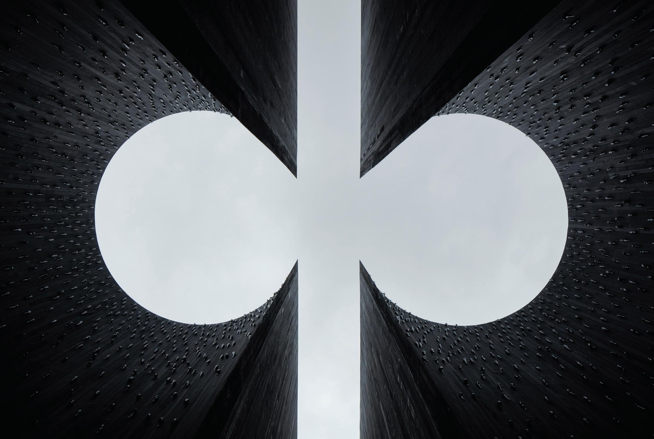
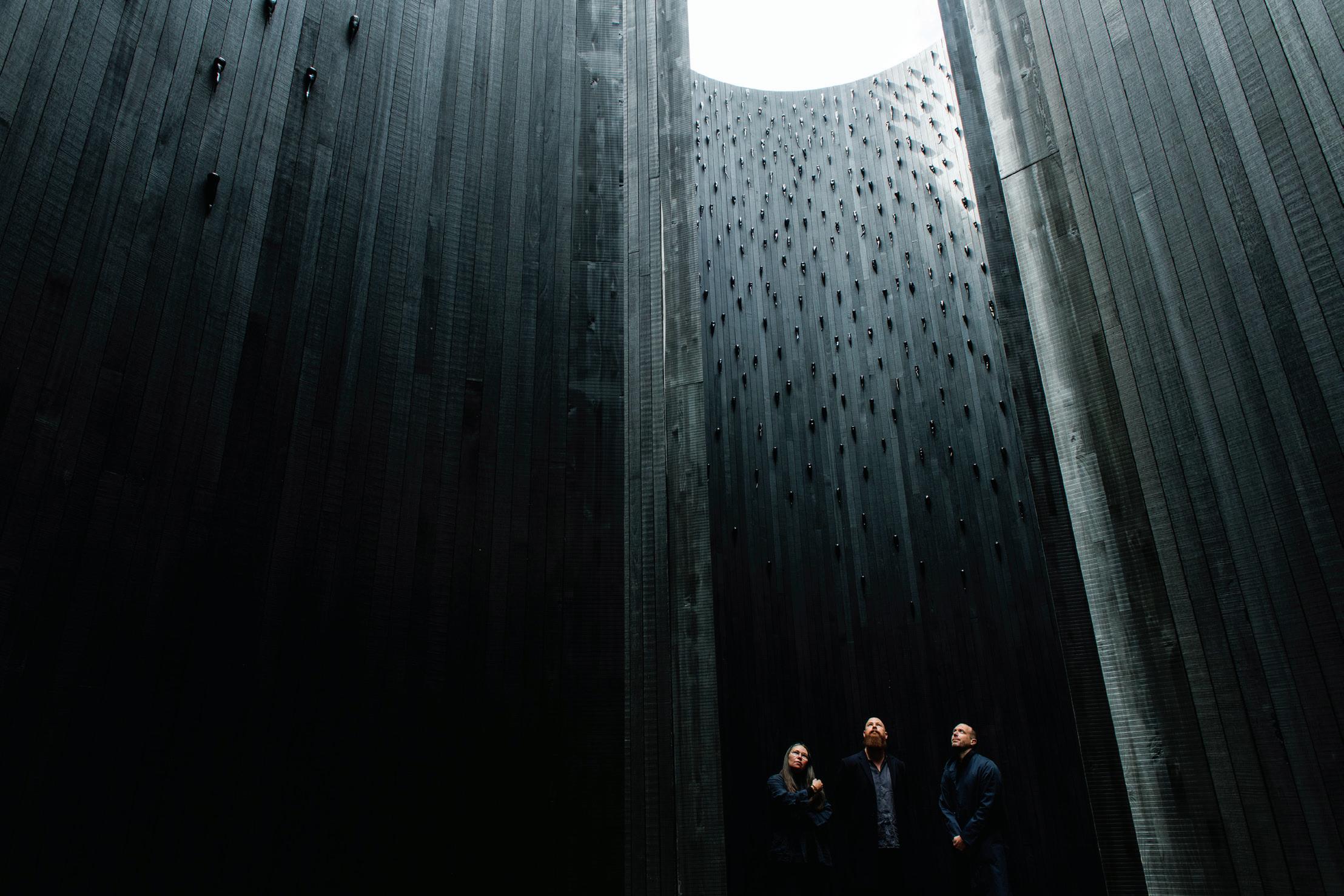
Luxurious outdoor furniture from leading designer brands.
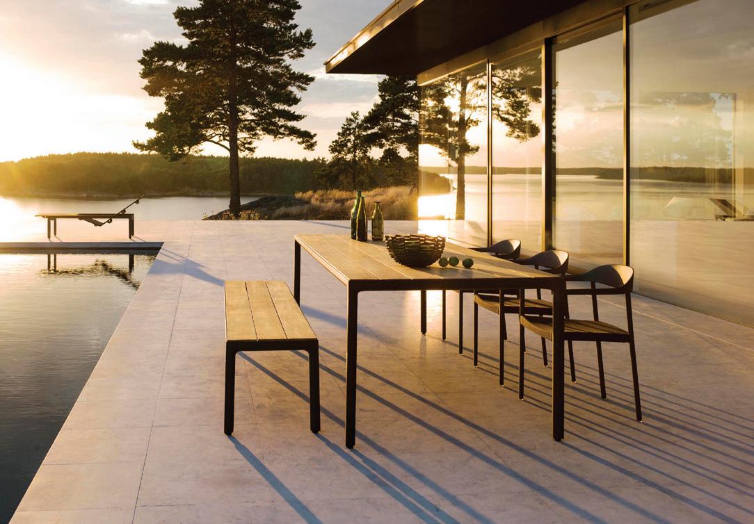
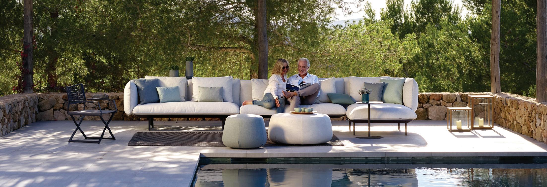


www.coshliving.com.au
Tibbo Sofa by Dedon
Tao Table & Tosca Armchairs by Tribu
Illum Table, Bench and Armchairs by Tribu
Senja Sofa & Nomad Ottomans by Tribu

Exclusive to Collingwood 03 9281 1999 Cheltenham 03 9532 0464 Sydney 02 9317 3011 Brisbane 07 3254 0000 Perth 08 9415 2522
Swingrest Hanging Lounger by Dedon

issue #47 habitusliving.com
Don’t stop me now
TEXT VICKI WILSON | PORTRAIT MARNIE HAWSON
At a time in which Australia had few truly multidisciplinary design practices, Alan Synman, Charles Justin, and Michael Bialek – the S, J, and B behind the almighty SJB – sought an innovative way to diversify their offering. Coincidently, a gung-ho young interior designer with a desire to breach new frontiers was within their midst.
Fresh out of RMIT’s Interior Design School, Andrew Parr had joined the acclaimed architectural practice in the late eighties as part of their budding team of in-house interior designers. “At the start, [SJB was] pretty much just architects doing commercial buildings and some houses,” says Andrew.
Come 1994, after five years of designing office fitouts and residential interiors, SJB was ready for growth. “I wanted to forge the business into different directions such as hospitality,” says Andrew. SJB Interiors was formed as a separate entity and set out to realise its own vision with the support of Alan, Charles, and Michael behind it – and Andrew at its helm. Absolutely this move broadened a potential client base, but it also allowed SJB Interiors to develop its own distinct style, separate yet connected to SJB.
Over the last 25 years SJB Interiors has become renowned for designing iconic places to eat, play, work, and stay. And for Andrew Parr, the man at the helm, the gig is far from over.
design culture # 109
“Our focus was to create moods and atmospheres within architecturally designed spaces, to make them feel comfortable in their environment, whether it was a corporate office or hotel, a restaurant or a high-end residence,” says Andrew. “We were about observing how people enjoy spaces, and designing in response.”
Early on, SJB Interiors stayed close to home, carrying out the contemporary, edgy office fitouts for Arnold Bloch Leibler and Grey Advertising in Melbourne. Soon enough, its big break into the hospitality sphere came thanks to Melbourne’s Crown Casino – the development of which, as Andrew recalls, practically kept Melbourne’s design industry afloat in the wake of economic recession. “I think that everyone will say that [the Crown Casino] made most of the big companies, including us, survive over that period –because otherwise it was destitute.”
Just as work on the Crown was wrapping up in time for its 1997 grand opening, fortuitous timing saw Sydney begin to gear itself up to host the 2000 Summer Olympics. It was all go from there. “From the late nineties, we started doing work in Sydney, and that was a big change,” remembers Andrew, “that really forged us on to doing a lot of hospitality work.” It was a period of exponential growth. Projects such as MG Garage, Middle Bar, and the Establishment Hotel became iconic additions to the cultural fabric of Sydney, and equally momentous projects in SJB Interiors’ body of work.
These days, SJB Interiors is strong team of 24, including Andrew and co-directors Ljiljana Gazevic and Leo Terrando. Still close to its roots, the team collaborates from time to time with its big brother, SJB Architects – most recently
on the refurbishment of Melbourne’s iconic Royce Hotel. Meanwhile, across borders, its long-standing relationship with Adina Hotels, along with a budding partnership with Hyatt Hotels, sees them continue to create fresh moods and atmospheres for destinations throughout Australia and Europe.
As a mentor for the next generation of SJB Interiors’ designers, Andrew preaches two textbook childhood lessons: look, listen, and learn; and who, what, when, how, and why. This advice grounds and guides the work of SJB Interiors, prioritising essence and atmosphere over aesthetics to produce places and spaces that stand the test of time. “A great interior has to work hard on many levels. It needs to be on brief, and function impeccably. And it must be above fashion, so it won’t be ripped out in a few years’ time. A great interior is enduring and memorable,” says Andrew.
In the 25 years since its inception, SJB Interiors has certainly proven itself enduring and memorable. It has pushed through economic downtowns, set industry benchmarks, won awards, and been behind the design of countless iconic places to eat, play, work, and stay – locally, nationally, and internationally. As for Andrew, experiencing – and surviving – the booms and busts of both industries and observing the cyclical nature of trends has matured him. Even so, Andrew’s passion, curiosity and pioneering spirit are as present as ever, continually a driving force for SJB Interiors – indeed a force to be reckoned with.
SJB Interiors | sjb.com.au
OPENER | ANDREW PARR FLEW THE SJB ARCHITECTS COOP IN 1994 TO BECOME FOUNDING DIRECTOR OF SJB INTERIORS. OPPOSITE ABOVE | COMPLETED JUST IN TIME FOR THE SYDNEY OLYMPICS 2000, THE ESTABLISHMENT HOTEL IS AN ICONIC PART OF SYDNEY’S HOSPITALITY INDUSTRY AND SJB INTERIORS’ BODY OF WORK. OPPOSITE BELOW | ONE OF SJB INTERIORS’ MOST RECENT PROJECTS, THE RENOVATION OF MELBOURNE’S ROYCE HOTEL. PHOTOGRAPHY BY NICOLE ENGLAND
issue #47 habitusliving.com
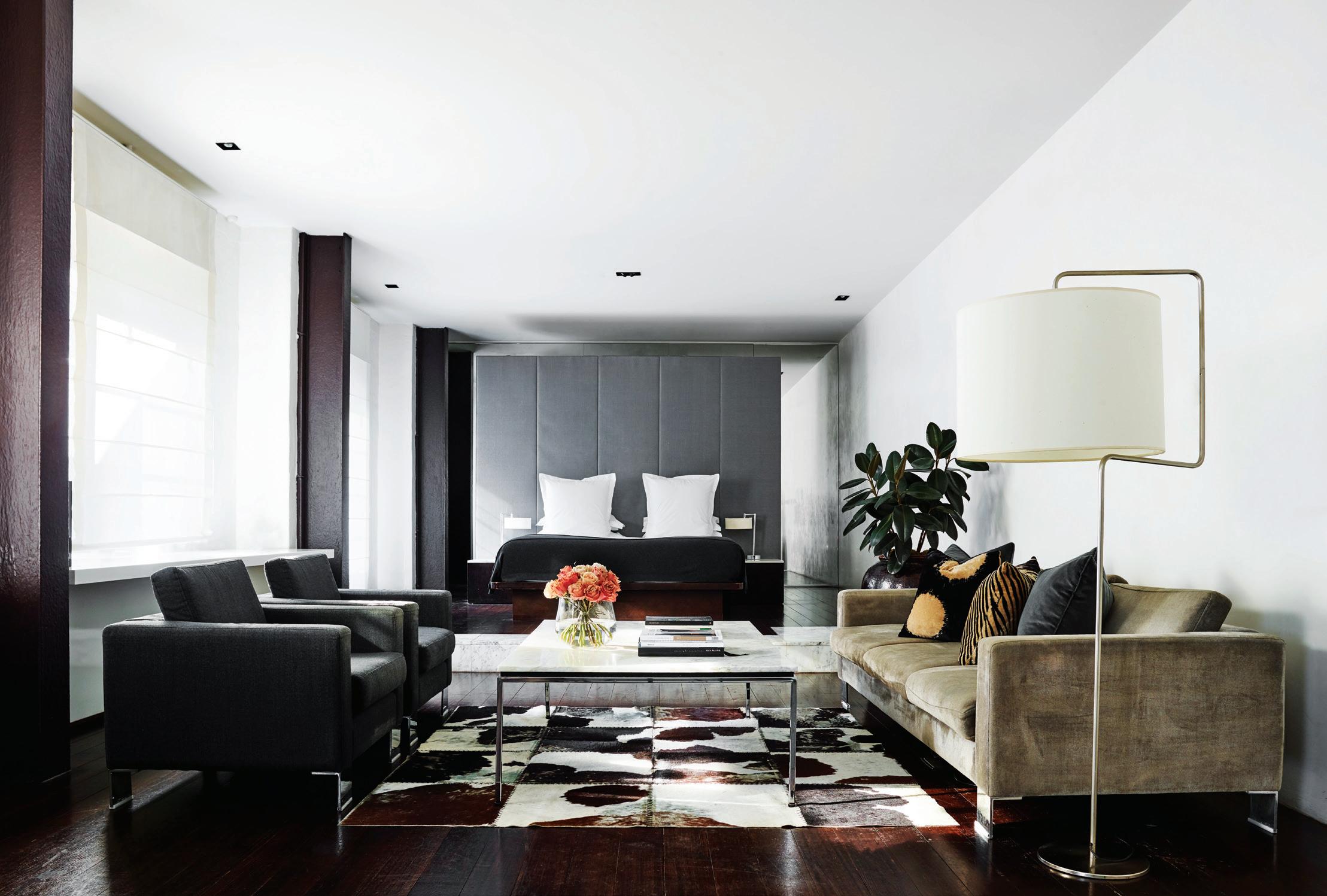

design culture # 111

At home, at last




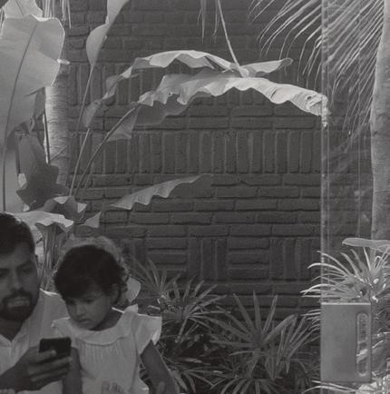









issue #47 habitusliving.com
House for all seasons
This beachside house takes an awkward site and turns it to its advantage to create a comfortably stylish getaway in summer and winter.

TEXT
| PHOTOGRAPHY
PAUL MCGILLICK
DANIEL MAYNE
3 . on location # 115
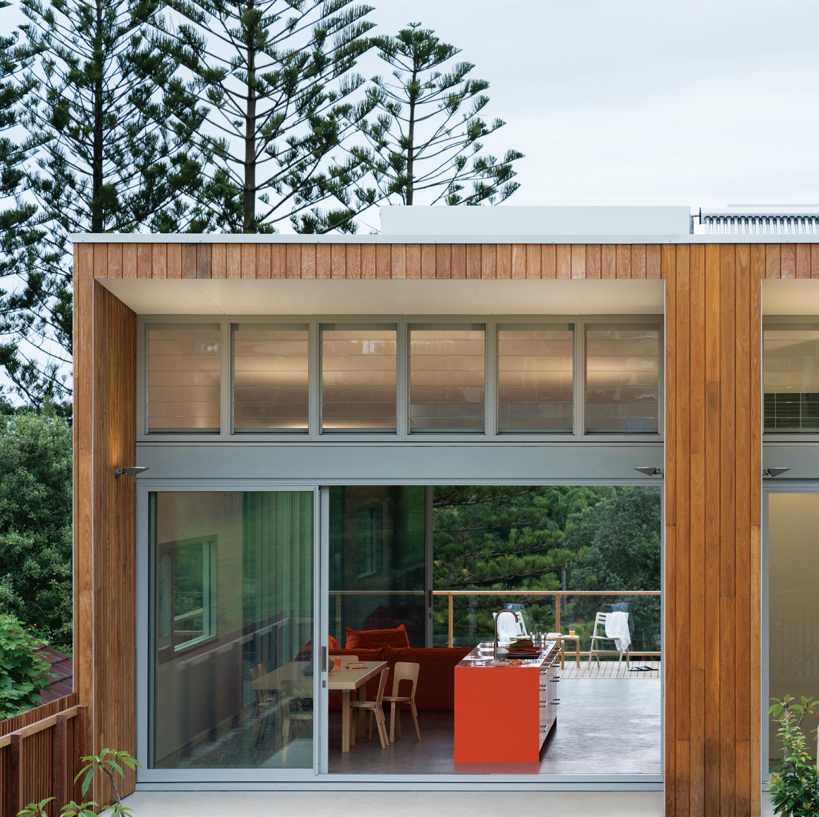
OPENER | A CLIFF PROVIDES VIEWS WHILE GREENERY OFFERS PRIVACY. PREVIOUS RIGHT | UPPER AND LOWER LEVELS ARE INDEPENDENT OF ONE ANOTHER WITHOUT ANY LOSS OF AMENITY. ABOVE | THE STREET-FACING ELEVATION WITH ENTRY TO THE UPPER LEVEL. issue #47 habitusliving.com
There are sites that can be either a problem or an opportunity. For architect Ian Moore, it is usually the latter – as was the case with this holiday home in Gerroa, on the coast south of Sydney. Set above a 4-5 metre sandstone cliff that drops down to a public reserve, the site overlooks not the beach, but the Crooked River and across to a dense clutch of trees which largely disguises a camping site. “We felt it was in a great position,” says Ian, “because it looked at the river, looked at the trees, but it was sloping down towards the back and it generated this opportunity rather than a problem in that we could get northern sun at one end and make the front of the house connect to a northern courtyard for all that winter sun.”
The roof follows the fall of the land, allowing winter sun to come in – further facilitated by two big pop-up skylights that, in summer, also provide natural ventilation. “It was a very simple strategy of taking a house that was facing the wrong way and using it to our advantage – and use the roof to drag that light in,” Ian continues.
The house is divided in two. The upper level is the client’s private, one-bedroom holiday home. This level is entered directly off the street, which creates the impression that this is a single-storey beach house. The lower level, intended as a holiday rental, is accessed down a side path, but with its view, generous back garden and covered terrace, does not give the impression of being a lesser, basement area.

3 . on location # 117
The aim was to construct a durable beach house, resistant to the ocean climate.
This lower level consists of three bedrooms, two bathrooms (including an ensuite), an outdoor shower, and a storage room for surfboards and canoes. A lockable door connects the two levels.

Inside, the strategic orientation of the house also drives the planning where a ‘tube’ runs the length of the house on both levels and includes a long storage wall, itself containing the kitchen unit.
The aim was to construct a durable beach house, resistant to the ocean climate. Hence there is no steel used in the building. Instead it is a modular, timber frame construction. It is clad in Tallowwood (also used for the decking) which will evolve into a grey finish. This neutral finish is consistent with the grey and white interior finishes which are intended to highlight the view. Because of this palette, Ian felt he needed just one “really strongly coloured element”.
This, he decided, would be the kitchen. He had already suggested they use the iconic Togo lounge in orange fabric and he showed the client a photo of the original, equally iconic, advertisement for the lounge from the 1970s of a young woman in Palm Springs lying back with her legs up and talking on the telephone. “She said that looked great – so I said I want to propose that we have an orange kitchen.”
They found a solid surface Staron colour that was almost the same tone as the Togo sofa and got a colour match for the polyurethane paint for the rest of the joinery.
ABOVE | THE HOUSE DEMATERIALISES CREATING SEAMLESS CONNECTION BETWEEN INSIDE AND OUTSIDE. OPPOSITE | A FEATURE WINDOW SETS UP A COUNTERPOINT BETWEEN THE ORANGE KITCHEN AND THE GREEN EXTERIOR.
issue #47 habitusliving.com
The roof follows the fall of the land, allowing winter sun to come in – further facilitated by two big pop-up skylights that also provide natural ventilation.

3 . on location # 119
issue #47 habitusliving.com
1 2 3
4
ENTRY
KITCHEN
DINING
LIVING
OUTDOOR LIVING
BEDROOM
ENSUITE
W.C. CAR PORT
EXTERNAL ACCESS GROUND FLOOR
LAUNDRY
BATHROOM 5 6 7
8 9 0 q w
FIRST FLOOR GROUND FLOOR
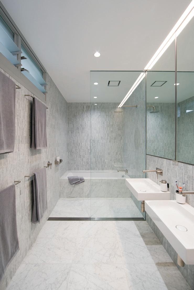

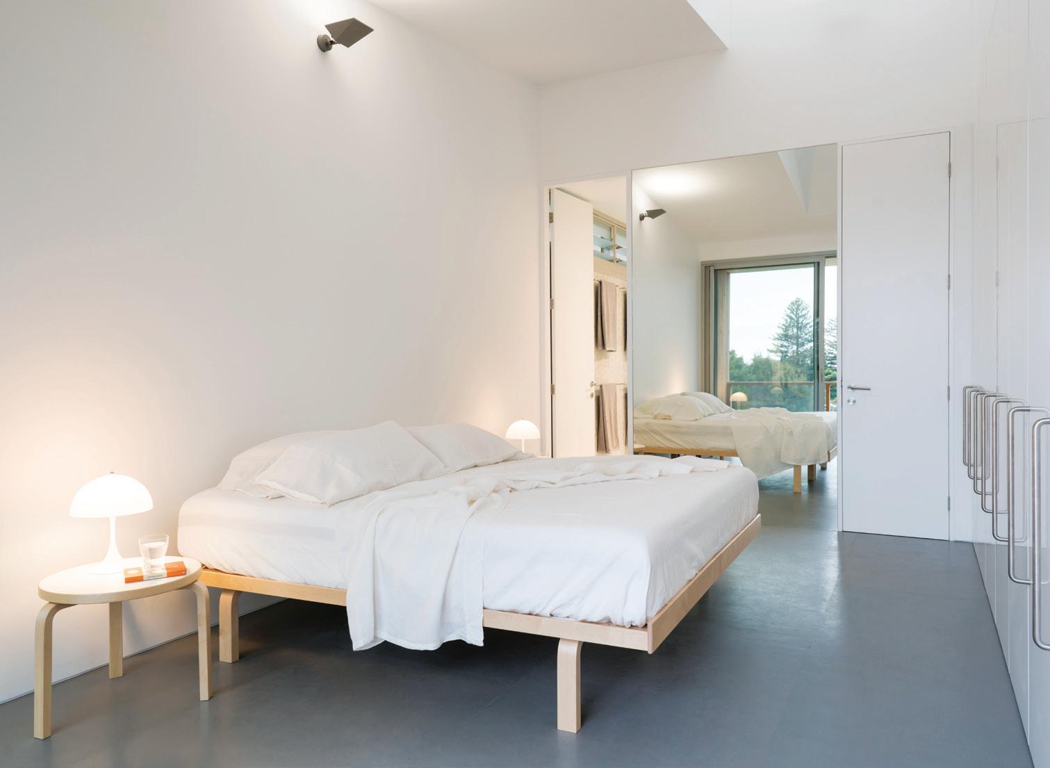
OPPOSITE | PLANS. ABOVE | THE OVERALL NEUTRAL PALETTE IS ACTIVATED BY THE ORANGE ACCENT OF THE KITCHEN UNIT. BELOW RIGHT | THE MASTER BATHROOM HAS THE REFINEMENT MOST BEACH HOUSES LACK. BELOW LEFT | THE MASTER BEDROOM IS GIVEN SPATIAL AMPLITUDE BY A FLOOR-TO-CEILING MIRROR. 3 . on location # 121
For the floor, the neutral strategy was continued with plywood covered in Comcork, an inexpensive but attractive warm and exceptionally robust cork product that gives a little when you walk on it and also brings acoustic benefits.

Although this is a beach house it avoids the customary utilitarian feel. The tiling in the bathroom, for example, is Carrara marble in the form of small tiles – but sourced at a price no more than standard tiles. And the house has all the amenities of a residential house such as a clothes drying area, large barbeque, careful detailing and fine finishes.
This is a house that adds to the growing stock of beach holiday houses which are destinations – rather than simply pit stops between home and the beach. It is comfortable and informal, while projecting a sense of style. Washed in light and designed to optimise sun penetration, it is a holiday house for all seasons.
Ian Moore Architects | ianmoorearchitects.com
ABOVE | THE ORANGE TOGO LOUNGE SEEMS JUST RIGHT TO RELAX AND ENJOY THE PANORAMIC VIEW.
issue #47 habitusliving.com
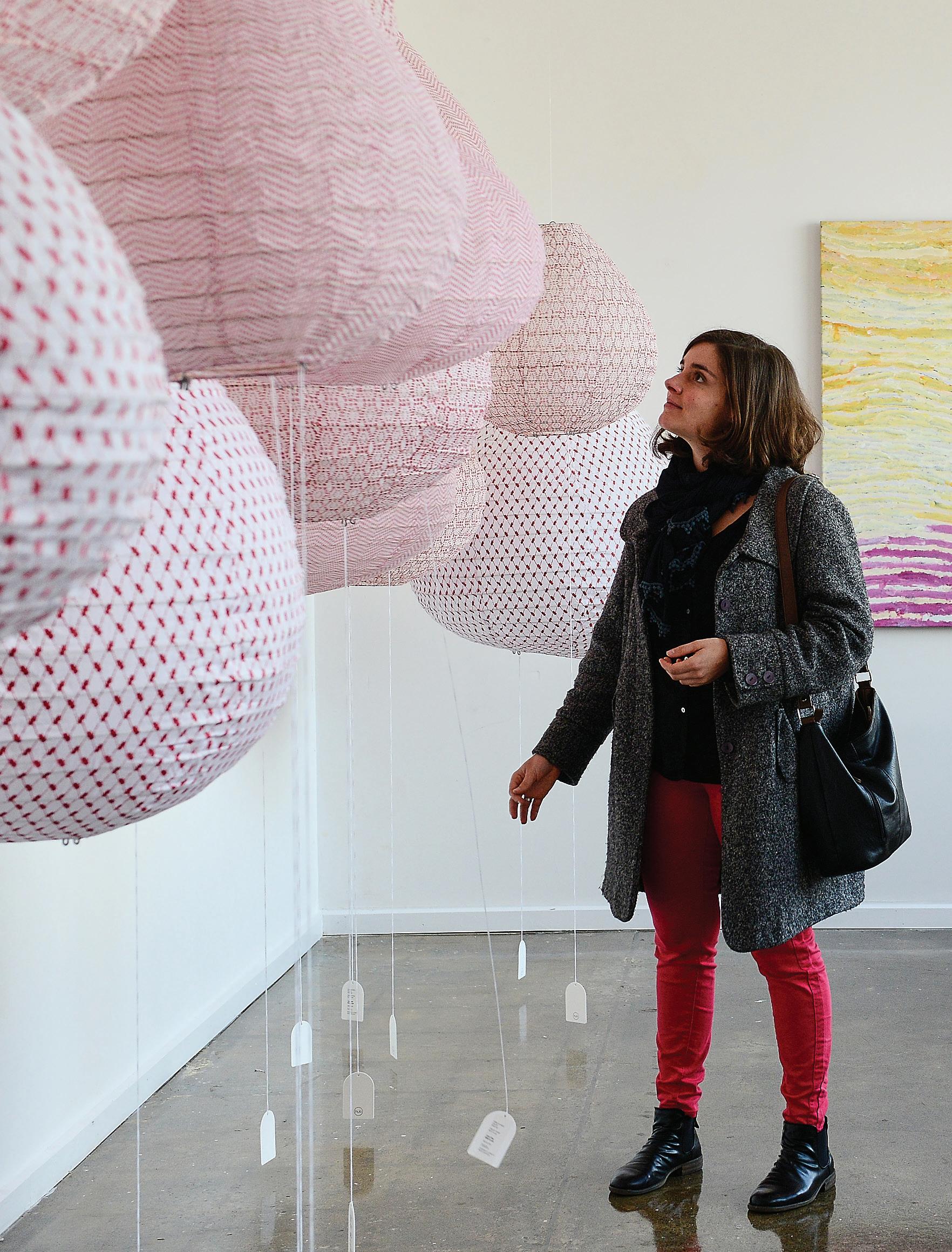
The daT e is se T ! Returning to Melbourne on 20 June, 2020. Join us for an unforgettable day of design. Be inspired and explore what the design community is all about. motion
in # sa TUR da Y i N desi GN sa TUR da Y i N desi GN.COM
design
Site sensitive
The eternal quest for natural light in an inner-city terrace finds a unique design solution in Sydney at the hands of Brad Swartz Architects.

TEXT
HOLLY CUNNEEN | PHOTOGRAPHY TOM ROSS | STYLING OLIVIA BOSSY
issue #47 habitusliving.com

3 . on location # 125
OPENER | WHERE POSSIBLE, ORIGINAL FEATURES SUCH AS THE SANDSTONE WALLS, FIREPLACES, AND FLOORBOARDS HAVE BEEN RESTORED AND CELEBRATED IN THIS TERRACE RENOVATION BY BRAD SWARTZ ARCHITECTS. ABOVE | THROUGH THE LIVING AND DINING ROOMS ARE THE KITCHEN AND PANTRY. OPPOSITE | A SINGLE WINDOW ON THE WESTERN, STREET-FACING

issue #47 habitusliving.com
WALL AND A WINDOW TO THE COURTYARD OPPOSITE WERE ONCE THE SOLE SOURCES OF NATURAL LIGHT IN THE FRONT TWO ROOMS.
It’s an almost immortalised brief to architect: residents of a heritage-listed terrace in an inner-city suburb – most often Sydney or Melbourne – imploring their architect to find a way to fill the house with natural light. And in response, an architect’s ingenuity and skill is tested as they face long and narrow houses with challenging site orientations, parti-walls, heritage associated restrictions, and council regulations to boot.
The residents of Darlinghurst House in Sydney had lived in the former incarnation of the residence some years before engaging architect Brad Swartz. They found him through the widely acclaimed Darlinghurst Apartment (his own) that effectively launched his eponymous practice back in 2015.
Unsurprisingly, to fill the house with as much natural light as possible was central to the brief, alongside updating and re-programming the 1880s-built terrace to facilitate a modern approach to living and respond to the couple’s unique way of life.
Being restricted to the confines of an existing shell was nothing new for Brad – his portfolio to date shows he is more than adept in this way of thinking. “Instead of being able to build out, it was about trying to create perceptions of more space,” he says. Subtleties in design, such as

3 . on location # 127
The colour palette of the original features that have been retained and restored is mirrored in the newer materials.
emphasising the 9.5-foot ceiling heights, shifting elements to allow uninterrupted sightlines and room widths, creating a continuous line of integrated joinery, and a light colour palette have helped Brad and his team achieve this atmospheric shift.
These integral yet understated design cues play supporting roles to the two main acts: a large, operable skylight and a central staircase that allows natural light to filter down.
A steel balustrade wraps the stair like a ribbon caught mid-motion, floating down through the centre of the house. It’s a strong sculptural element reminiscent of the work of American artist Richard Serra that absolutely characterises the project. Painted in a white just a touch glossier than that of the walls, the intended effect was to bounce light streaming in from the skylight down through the levels. Moreover, the black steel mesh footing of the stair was a strategic move as much as a visual marker, increasing visual transparency and allowing light to pass through, connecting the rooms directly beneath to the skylight rather than blocking them off.

The stair also offers a subtle journey as you climb and descend; on the first landing the height of the balustrade is almost exaggerated at 1300 millimetres, establishing a sense of peace and enclosure. As you reach the attic space, however, the railing height is reduced to the minimum requirement mirroring the openness of the second living space.
Initially the clients had hoped for a rooftop terrace. The east-west centre axis of the house means the existing courtyard on the ground floor is shaded for much of the year.
ABOVE | THE TWO BEDROOMS, AND NOW THE BATHROOM, ARE LOCATED ON THE FIRST FLOOR. OPPOSITE | LOOKING DOWN AS ONE APPROACHES THE SECOND LIVING SPACE, THERE IS A BEAUTIFUL VANTAGE POINT CAPTURING THE MATERIAL PALETTE.
issue #47 habitusliving.com

3 . on location # 129
ENTRY LIVING DINING W.C. KITCHEN PANTRY COURTYARD MAIN BEDROOM BEDROOM BATHROOM SECOND LIVING FIRST FLOOR ATTIC GROUND FLOOR 1 2 3 4 5 6 7 8 9 0 q issue #47 habitusliving.com
Unfortunately – though apparently not surprisingly – this wasn’t approved by council as they are careful to protect the visual and acoustic privacy of neighbours. In a conciliatory move Brad designed in the large, fully operable skylight that, when open, could trick the senses into thinking one was outside. “The fixed part gets your light in, but being able to open the whole thing up [makes] the room feel like an outdoor space,” says Brad.
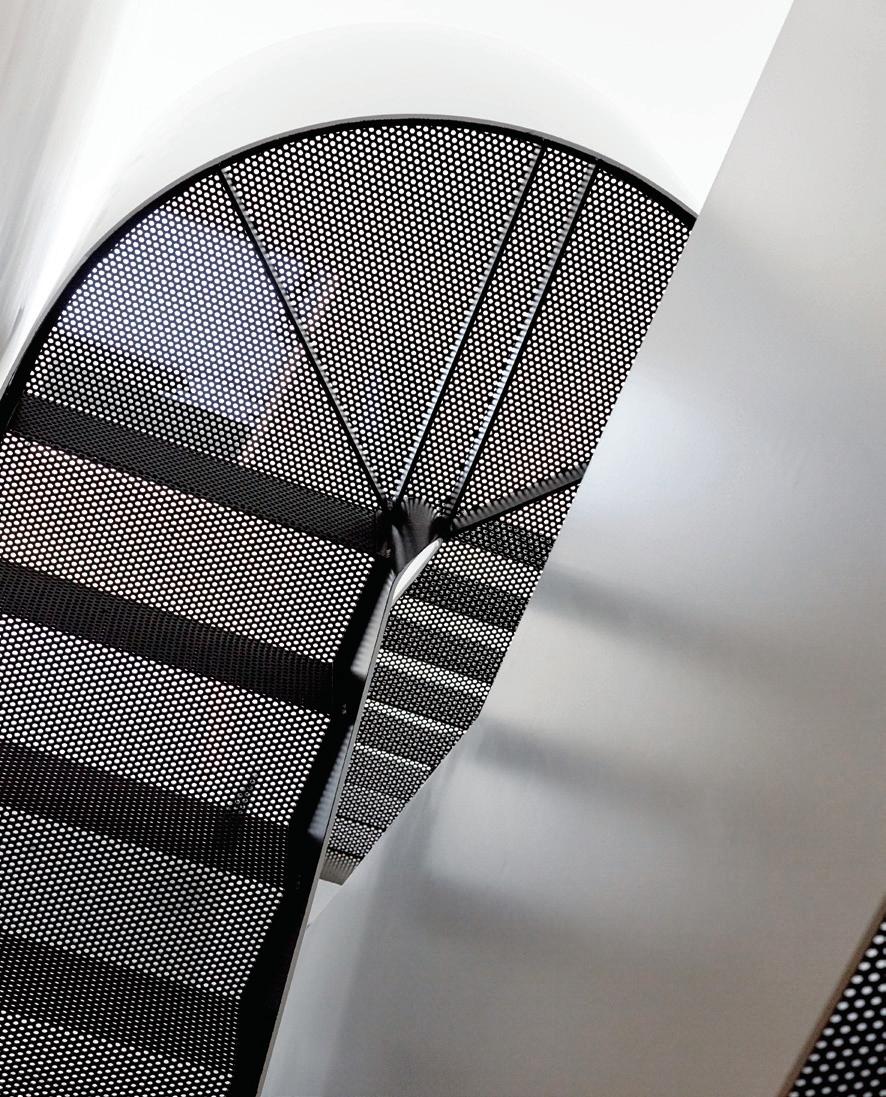
A second skylight was used in the bathroom (formerly a small study) and between the stair and bathroom a frosted glass panel allows the light from each to be shared without sacrificing privacy. “The light from the skylight over the stair brightens up the bathroom and, similarly, the skylight in the bathroom adds more light to filter down the stair,” explains Brad. At just one centimetre wide it also allowed the bathroom a little extra width, compared to a stud wall that would have been at least 110 millimetres wide. As the adage goes: a little often goes a long way.
While the second living area is the only addition in terms of square metres, the layout of the residence is drastically different. Mostly so on the ground floor. To begin with, the staircase was originally situated close to the front door, which was a strange progression of entry as it led upstairs to the two private bedrooms rather than deeper into the house to the entertaining
areas such as the living, dining and courtyard. It also cut the dining room almost in half. By flipping it 180 degrees, and moving it back and in line with the kitchen joinery, the dining room now feels open and spacious with clear sightlines and a generous ceiling height.
The kitchen located to the rear of the ground floor was plagued by a narrowing site and illconceived benchtops on either side. As soon as there was more than one person in the kitchen it would feel overcrowded. This was clearly not an effective use of space.
Without extending into the courtyard, which would have resulted in losing valuable outdoor space and access to natural light, Brad responded by removing the second benchtop lining the south wall. This also allowed him to increase the width of the remaining bench from the standard 600 millimetres to 700. Again, a seemingly small alteration made a sizeable impact on the performance of the space, affording extra room for food prep, serving meals, and everyday appliances. Beyond the kitchen is a carefully organised pantry and laundry that had previously housed an exceptionally small bathroom.
As it was the history of the terrace that originally appealed to Brad’s clients it was necessary to update the programme without designing out the site’s past.
OPPOSITE |
PLANS. ABOVE | BLACK STEEL MESH WAS CHOSEN FOR THE TREAD OF THE STAIRCASE TO ALLOW NATURAL LIGHT FROM THE SKYLIGHT ABOVE TO FILTER DOWN TO THE GROUND FLOOR; SPECIFICALLY TO THE FRONT TWO LIVING ROOMS.
The black steel mesh footing of the stair was a strategic move as much as a visual marker, increasing visual transparency.
3 . on location # 131
The colour palette of the original features that have been retained and restored is mirrored in the newer materials to ensure a feeling of visual consistency throughout the residence. For example, the black mesh steel of the staircase seamlessly transitions from the original dark timber floorboards.
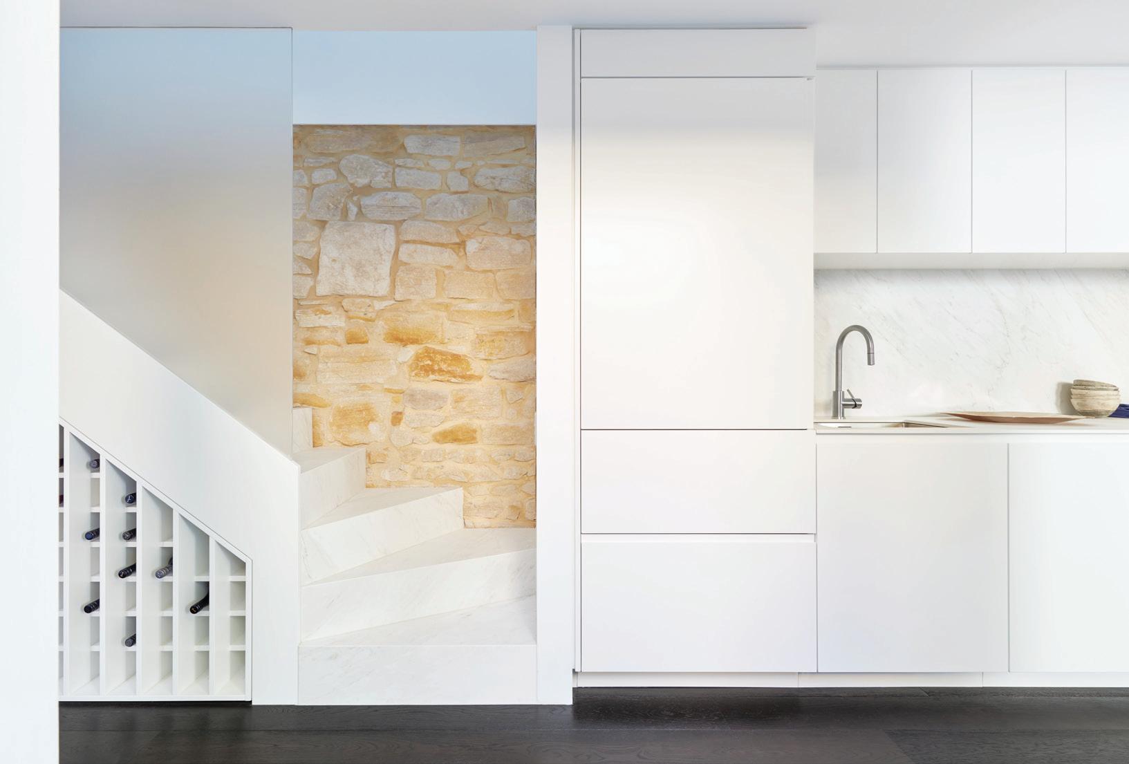
“Throughout the whole project there are constant touches. We tried to almost integrate the new interventions with the old interventions in a way that juxtapose each other [without competing],” says Brad.
It is this sensitivity to site, understanding of client, and appreciation of a clever programme, that makes this project such an interesting one. Furthermore, its adaptability allows onlookers and visitors to imagine themselves in this space. It treads the line between reflecting its owners’ way of life and appealing to that of others.

ABOVE | THE STAIRCASE IS IN A PERFECT LINE WITH THE KITCHEN JOINERY. OPPOSITE ABOVE | AN OPERABLE SKYLIGHT GIVES THE SECOND LIVING SPACE THE ILLUSION OF BEING OUTSIDE. OPPOSITE BELOW RIGHT | THE SECOND BEDROOM IS ONLY EVER MEANT TO OPERATE AS A GUEST ROOM, AS SUCH, IT HAS BEEN DESIGNED WITH LIMITED STORAGE AND OPEN LINES OF SIGHT. OPPOSITE BELOW LEFT | A FROSTED GLASS WALL BETWEEN THE NEW BATHROOM AND STAIRCASE ALLOWS LIGHT TO BE SHARED BETWEEN THE SPACES WITHOUT SACRIFICING PRIVACY.
issue #47 habitusliving.com
Brad Swartz Architects | bradswartz.com.au
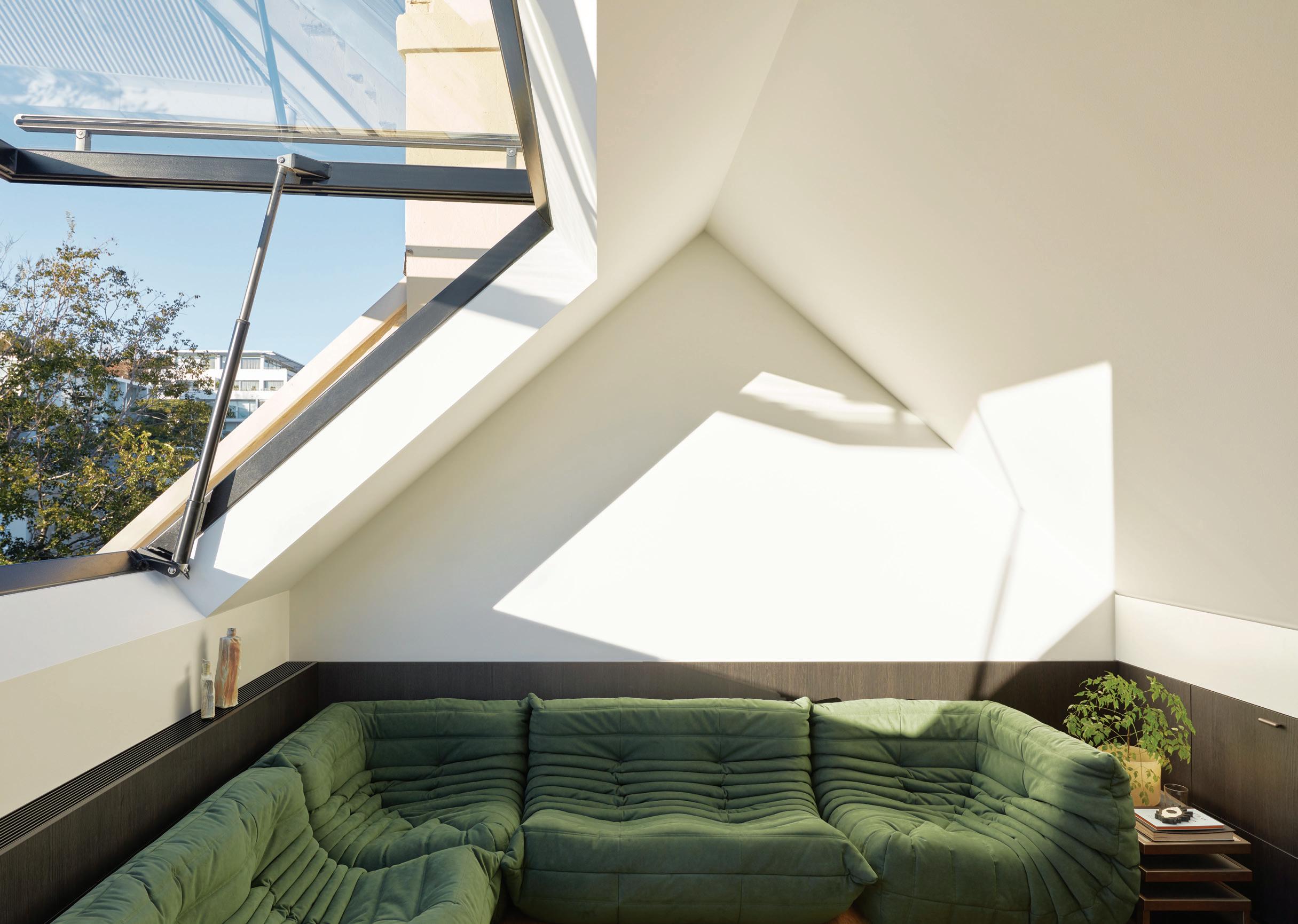
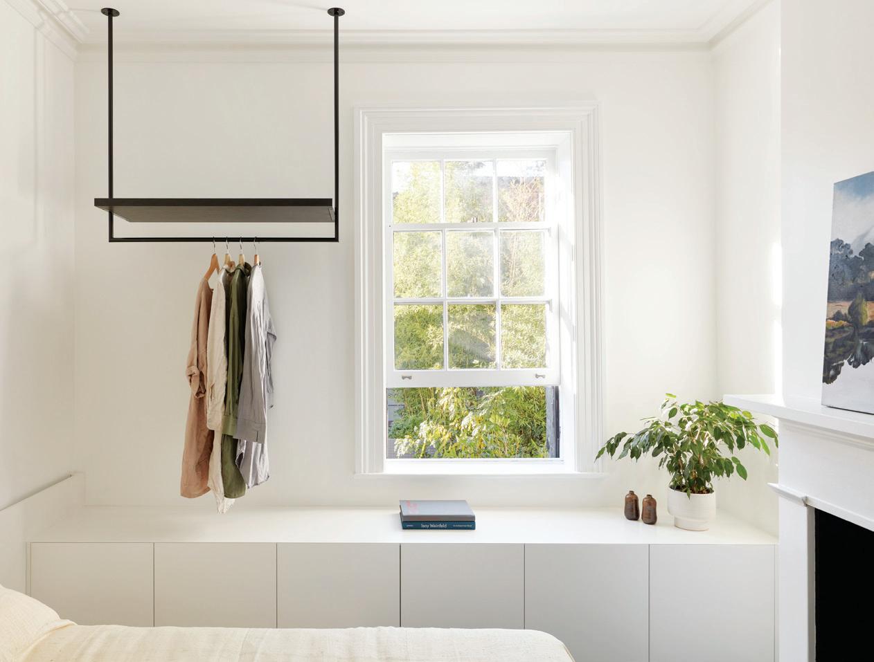

3 . on location # 133
 Featured | Agnese Armchairs, Sesann Lounge, Cage Tables & Umbra Rug by Tacchini

Australia 1300 306 960 stylecraft.com.au Singapore +65 6511 9328
Peeling back the Layers
For this Melbourne couple with two young children, creating a fine contemporary home as much as peeling back the building’s more recent layers drove the renovation.
 TEXT STEPHEN CRAFTI | PHOTOGRAPHY SHARYN CAIRNS
issue #47 habitusliving.com

3 . on location # 137
The owners of this warehouse-style home, built circa 1894, in North Fitzroy knew they would eventually renovate and extend. Given they were occupying approximately one half of their current floor space, it was a matter of waiting for the neighbour’s home (also three levels) to come onto the market. Originally home to one of Melbourne’s grocery businesses Moran & Cato, a portion of the adjacent building included a corner store to sell produce. In the 1980s, the two became part of a larger development of 22 units. “We simply waited patiently for the ‘universe’ to be presented to us (read: ‘neighbour’s property’),” says owner Sheree Steele, a milliner, who shares this impressive home with her husband Gabriel and their two young children, Ethan and Annika.
While the couple was working through cosmetic renovations on their abode, removing bright yellow 1980s laminates, two-pack paint finishes, and ad hoc additions, they knew there was a need to engage an architect to stitch the two properties together in a seamless manner (no pun intended). The Steele’s aesthetic, one that is slightly raw and industrial, perfectly correlated with that of architecture studio Splinter Society, the latter also having a penchant for the dark and moody, with a juxtaposition of both raw and luxe combined in the one palette. “As we were given a reasonably modest budget, we had to establish a few rules, including making as few structural changes as possible. The idea was to expose as much as the building’s original grain as possible,” says architect Chris Stanley, director of Splinter Society, pointing out the rough and exposed brick walls and timber trusses now expressed at ground level.

OPENER
THE
| THE ORIGINAL
HAVE
EXPRESSED,
THE NOTES SCRIBBLED BY
ON
OPENINGS SHOULD GO. ABOVE | THE CORNER STORE IS NOW A FINE CONTEMPORARY HOME. OPPOSITE | ETHAN AND ANNIKA SPENDING TIME ON THE STAIRS. issue #47 habitusliving.com
|
FRONT COURTYARD FEATURES EXPANSIVE GLASS WALLS AND AN OVERSCALED FRONT DOOR MADE FROM RECYCLED TIMBER. PREVIOUS RIGHT
BRICK WALLS
BEEN
INCLUDING
BUILDERS
WHERE DOOR

# 139 3 . on location

issue #47 habitusliving.com

OPPOSITE | THE
ABOVE | SHEREE IN HER STUDIO, A SECLUDED ENCLAVE
DRAMATIC STEEL WALL BECOMES ANIMATED BY THE OVERHEAD SKYLIGHT AND ALSO BY THE WESTERN LIGHT THROUGH THE HOME’S GENEROUS GLAZED ENTRANCE.
FRAMED BY TRANSLUCENT GLASS WINDOWS ON BOTH SIDES.
3 . on location # 141
“We’ve tried to retain as much of the original fabric as possible, while still creating a contemporary home for a family.”
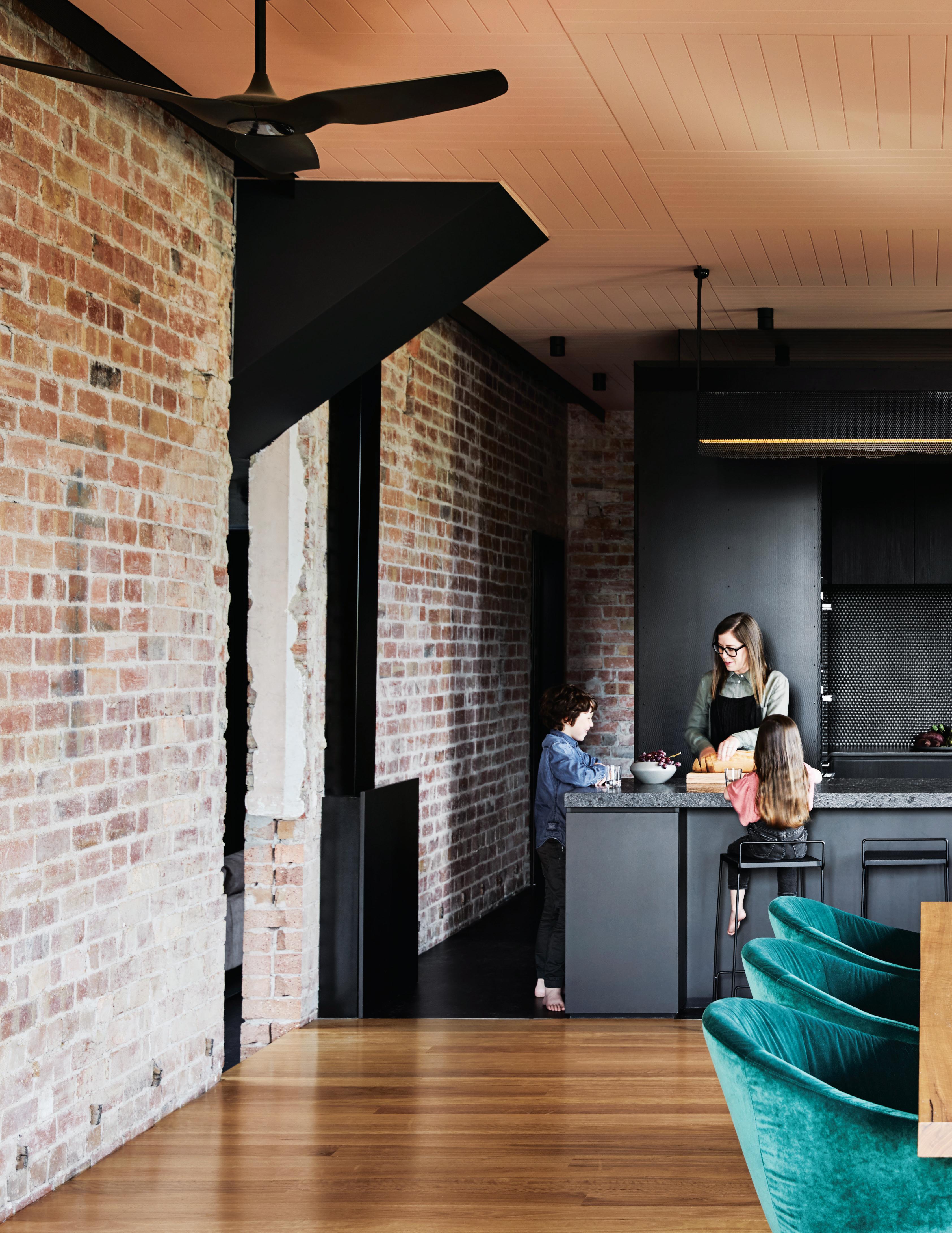
issue #47 habitusliving.com
The space now offers flexibility with areas being able to ‘mutate’ as the family grows.
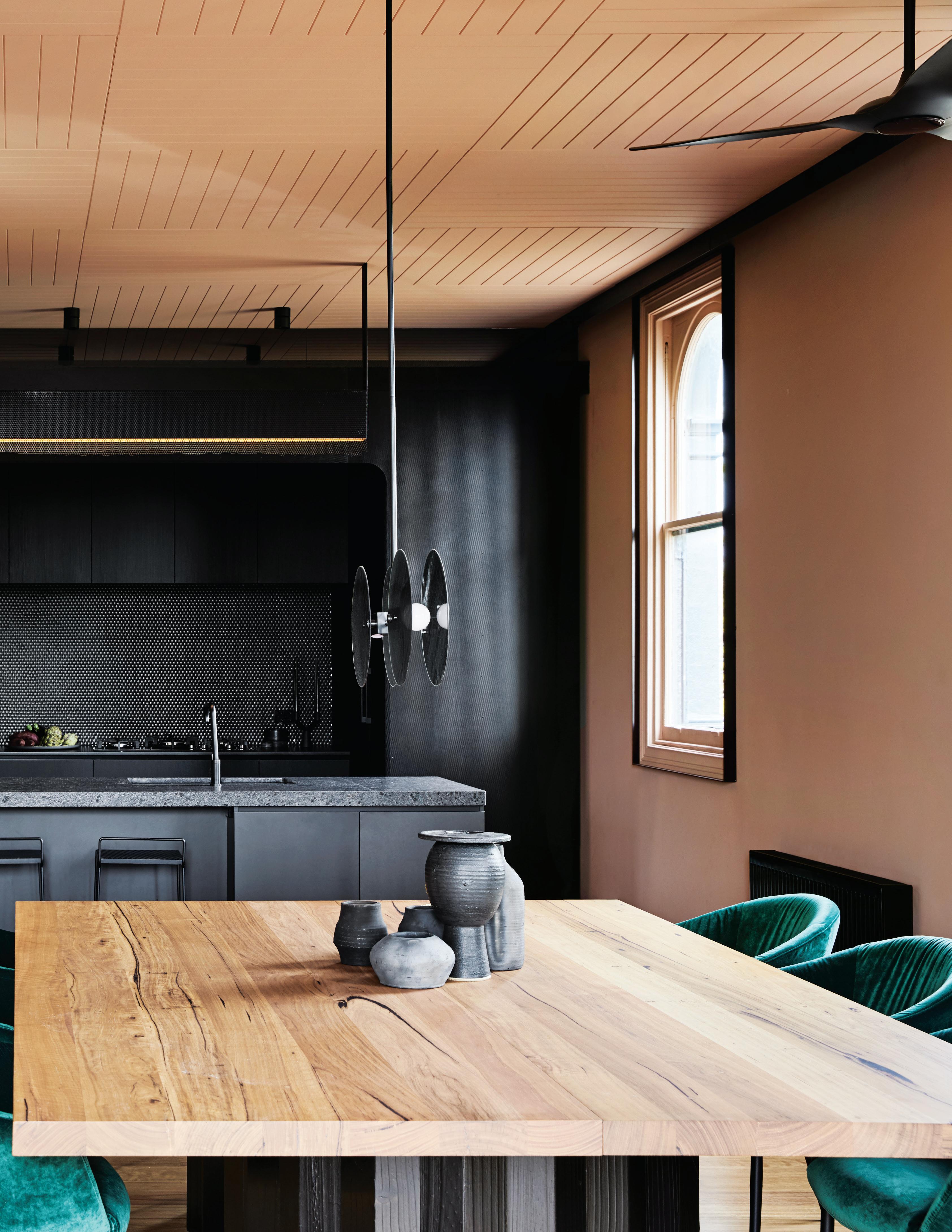
3 . on location # 143
However, to create one from two required some strategic moves. A 10-metre-high void located at the main entrance was achieved by partially removing two of the upper floors, and inserting a steel and fluted glass staircase. “We were keen to have some level of separation from the children, but at the same time be able to easily keep an eye on them,” says Sheree, who wants to be able to stay in this house for the long term. “We’ve allowed space for a lift in our later years, but we also were mindful of how this place would work as the children become teenagers and young adults,” she adds. Along with three bedrooms, two living rooms and a studio, the space also now offers flexibility with areas being able to ‘mutate’ as the family grows.
At ground level are the two children’s bedrooms, together with a shared bathroom, occupying the space of the original grocery store. There’s also Sheree’s studio, a place offering diffused western light and complete solitude. “As soon as I close that door, it’s like I’ve gone into another world,” says Sheree, who uses a billiard table as her workbench.
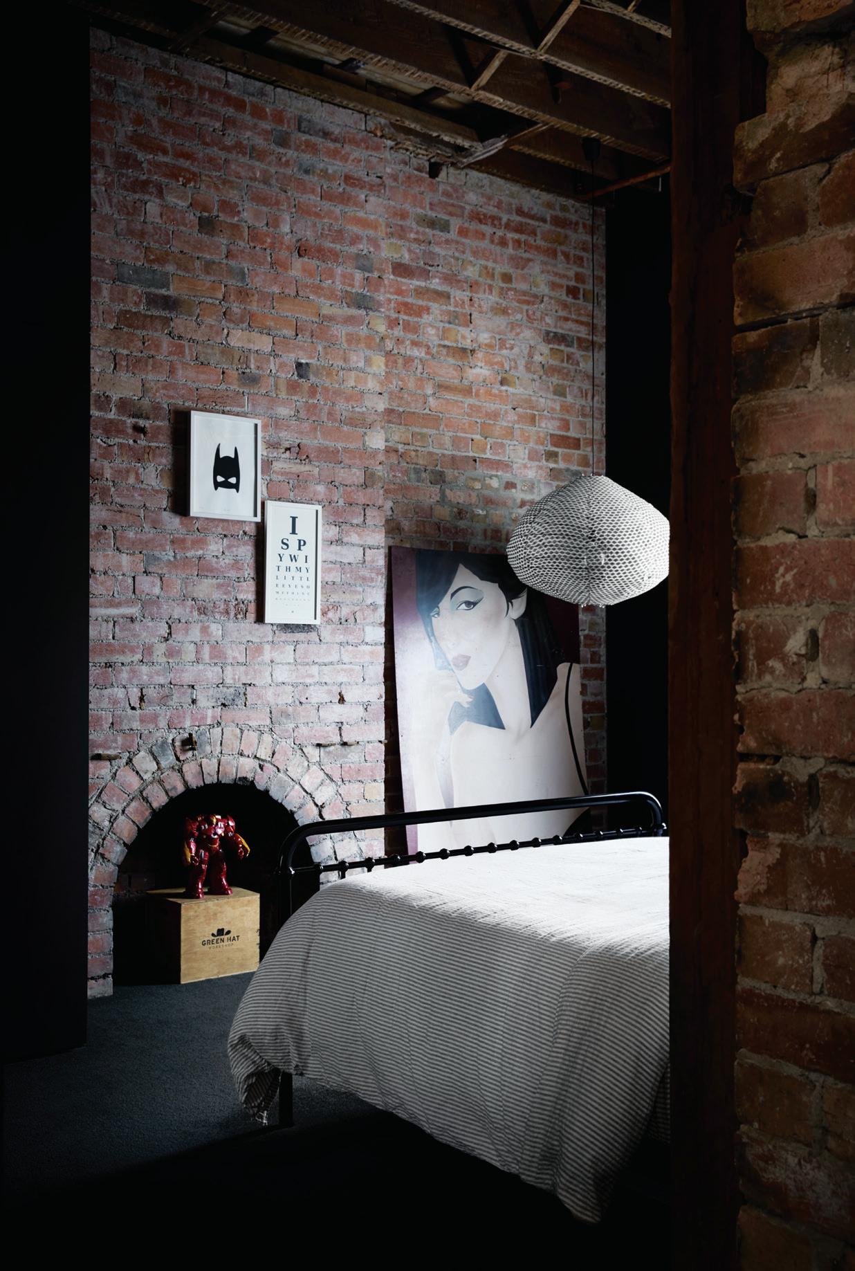
The kitchen and dining area, located on the first floor, creates a buffer for the main bedroom suite and parents’ retreat on the top level. It’s also just a few steps below the television nook, used primarily by the children. Here the brief for dark and slightly raw is beautifully expressed by Splinter Society.
The kitchen island bench is made from ‘leather’-finished black granite, the effect giving the surface an appearance of water droplets.
PREVIOUS | THE DARK AND MOODY KITCHEN IS AN AESTHETIC ENJOYED BY BOTH CLIENT AND ARCHITECT. ABOVE | ONE OF THE CHILDREN’S BEDROOMS ON THE GROUND FLOOR ONCE FORMED PART OF THE ORIGINAL GROCERY STORE. OPPOSITE | PLANS.
issue #47 habitusliving.com
SECOND FLOOR
FIRST FLOOR
1 2 3 4 5 6 7 8 9 0 q w e r t y u
ENTRY COURTYARD
ENTRY
LOUNGE
BEDROOM
BATH / SHOWER
STUDIO
BATHROOM
KIDS LOUNGE
DECK
LAUNDRY
W.C.
KITCHEN
DINING
MAIN BEDROOM
STORAGE
STUDY
PARENT LOUNGE
GROUND FLOOR
3 . on location # 145

issue #47 habitusliving.com
Rather than a butler’s kitchen, Chris designed all the kitchen appliances to sit within a brooding curved alcove. With its perforated steel edge, there’s a subtle nod to Victorian lace. “As you can see, we’re not afraid to use black. It simply magnifies the leafy outlook,” says Sheree, referring to the established street trees, seen through the series of original arched windows. Reflective smoked mirrors also feature in the interior, amplifying the views of the verdant surrounds. “Eventually we want to add more indoor plants to green up this place,” she adds.
Although the house takes up most of the site, there’s a generous rooftop terrace and also a modest entry courtyard, with a newly planted magnolia tree. As with the former Victorian house that virtually abutted the pavement, there’s only a slither of space. The outdoor open fireplace would have formed part of a living room. “We’ve tried to retain as much of the original fabric as possible, while still creating a contemporary home for a family,” says Chris, who made it apparent at every turn what was original and what was added. A new brassedged storage unit, for example, cuts a sharp swathe in the lobby, as does a Japanese-style 1.5- metre-wide paper lantern by ISM.
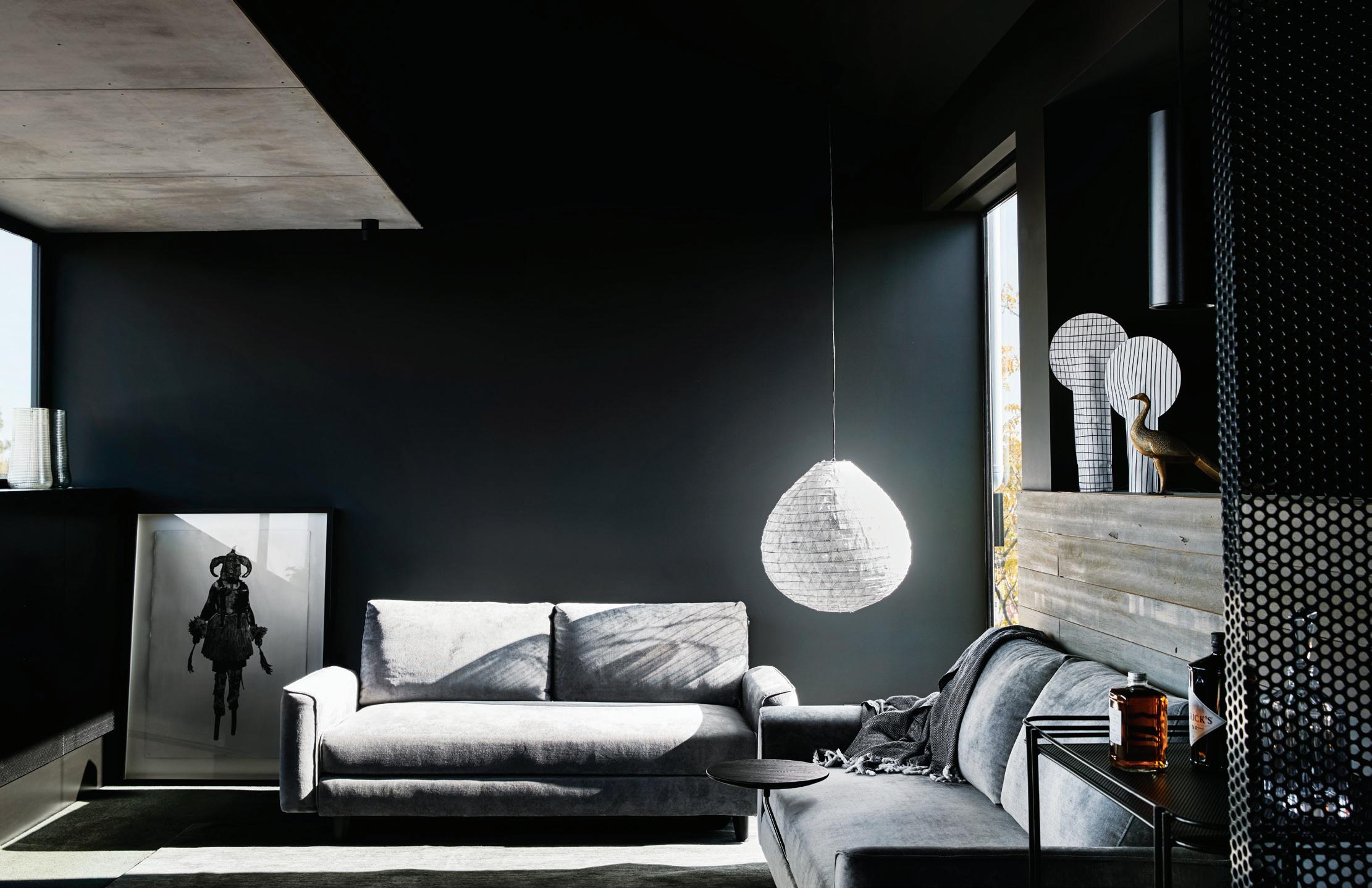
OPPOSITE | THE ENSUITE
TO
IS A COMPOSITION OF LIGHT AND
| THE INFORMAL LIVING/TELEVISION ROOM IS TREATED AS A SEPARATE ZONE BUT IN EARSHOT
3 . on location # 147
BATHROOM
THE MAIN BEDROOM
SHADE. ABOVE
OF THE KITCHEN.
Rather than smooth over the original bricks and doorways, there are clear indentations of where floors have been removed. Builder’s notes scribbled on walls also denote where the recent builders have forged new openings, ones that happen to align with the building’s original use. Some doorways, such as the one opening into Sheree’s studio, are framed in bluestone, considerably shorter than doorways today. “I loved revealing the old scars, celebrating them rather than burying them. These wall cables (no longer in use in Sheree’s studio) add another layer to the renovation,” says Chris. For Chris and his team, Sheree and Gabriel were a perfect fit. The Pinterest page presented in the initial meetings pointed to an aesthetic both architect and client could appreciate. “The images were generally dark and quite raw,” says Sheree, who loves the way natural light falls on the mild steel feature wall in the lobby, illuminated by a skylight. “There’s a continual play of light and shadow against the steel, particularly in the afternoon with the silhouette of the street trees,” she says.
Splinter Society | splintersociety.com
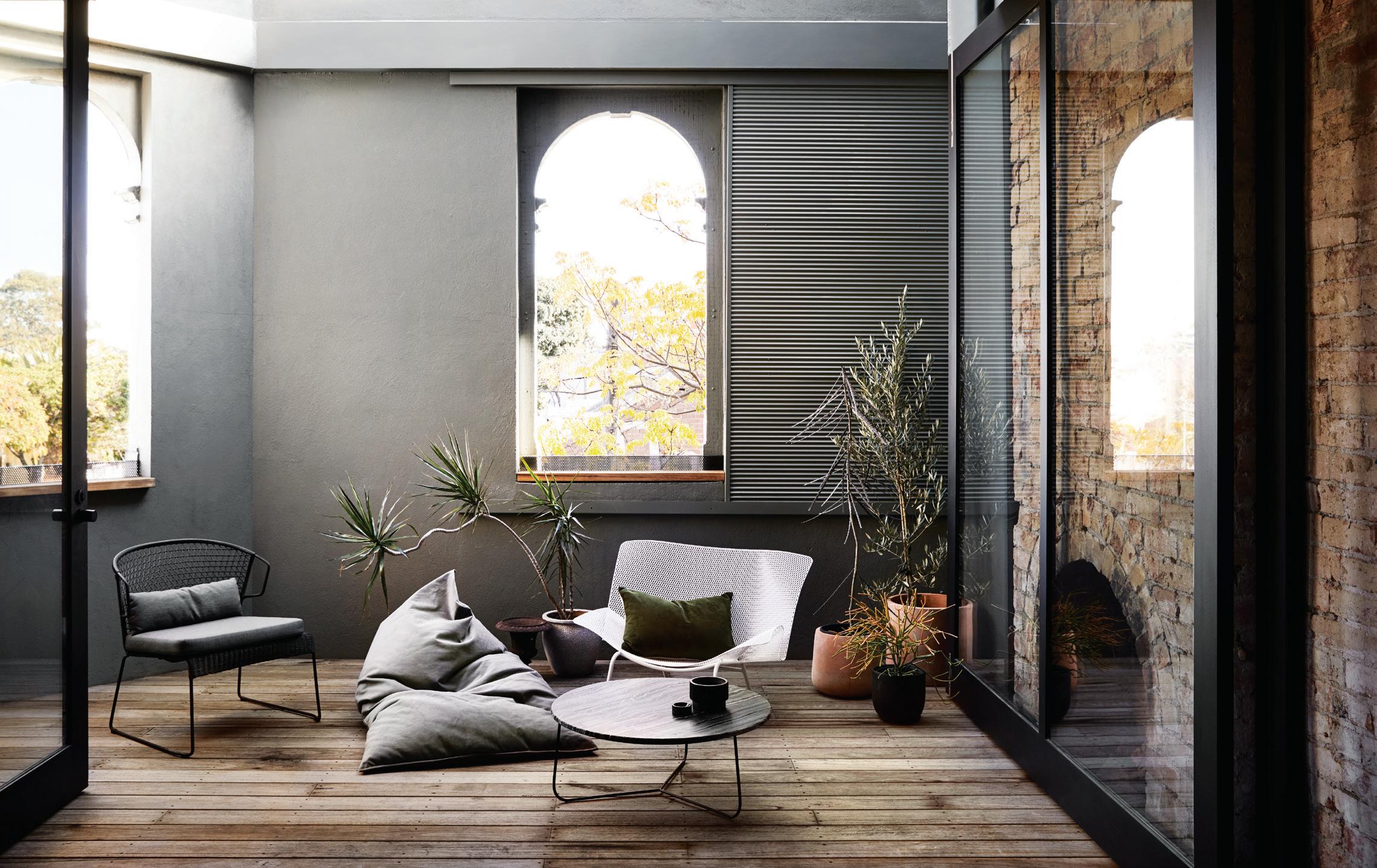
ABOVE | THE OUTDOOR TERRACE WITH ITS ORIGINAL ARCHED WINDOWS FUNCTIONS AS ANOTHER ROOM.
issue #47 habitusliving.com

Tickets on sale now. Visit www.dfl-danceforlife.com IN KIND SPONSORS GOLD SPONSORS PLATINUM SPONSORS SILVER SPONSORS
BY PROUDLY SUPPORTING
ORGANISED
Transplanted Roots
Sri Lankan architect Palinda Kannangara balances nature and culture in this breezy three-generation family home in Colombo.

TEXT ASIH JENIE | PHOTOGRAPHY SEBASTIAN POSINGIS
issue #47 habitusliving.com

3 . on location # 151
Sri Lankan wine and spirit entrepreneur Sathya Selvanagan wanted a home for his wife Madusha, their three daughters (the youngest a newborn) and his parents at Mount Lavinia, one of Colombo’s suburbs famed for its distinct golden-sanded beaches. The Selvanagans’ sizeable extended family lives nearby and Sathya wanted his family’s home to be large enough to accommodate all manners of large family festivities – baby showers, engagement parties, birthdays, pre-wedding ceremonies and so on – yet intimate enough to create memorable moments.
He also wanted the design of the home to be a contemporary tribute to his family’s South Indian roots. Madusha wanted their home to inspire warmth and be tightly integrated with the outdoors despite wall-to-wall construction that populated the plot of land they bought for their home. For this, the pair approached Palinda Kannangara, an award-winning Sri Lankan architect (recognised in the 2018 Habitus House of the Year Awards) whose career they have followed closely over the years.
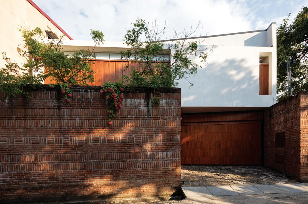
“The attempt was to capture a bit of the atmosphere of South India in nuanced and subtle ways – without any direct architectural
influences – to provide its residents with a deeper connection with their roots despite living overseas,” says Palinda of the design approach. The architect burst into global consciousness in recent years thanks to a cohesive portfolio that thoughtfully captures the spirit of Sri Lanka. Among Palinda Kannangara Architects’ well-known design hallmarks are locally sourced materials, many of which are salvaged from old or demolished estates; honest finishes that will gain patina over time; and landscape designs that accommodate the island’s torrential monsoon instead of trying to exist separately from it.
All of these are apparent in the Selvanagans’ house, and more. The 5410-sqaure-foot home is dubbed Spinal House after its main feature: an open-air central thoroughfare, a negative space that defines the spatial organisation of the home. The existing site was a trapezoidal plot wedged in a dense neighbourhood without significant views or vegetation. The spine is a natural design solution to divide the space into neat geometric zones and an opportunity for the residence to create its own oasis.
“Despite its stolid exterior, the house attempts to create an oasis for the family where living spaces are totally permeable, and lush
OPENER | THE LIVING AND DINING AREA ARE VISUALLY CONNECTED VIA A COURTYARD. ABOVE | THE HOUSE PRESENTS AN OPAQUE FRONT THAT HIDES THE OASIS INSIDE. OPPOSITE | THE HOUSE'S TITULAR 'SPINE' IS A GREEN COURTYARD TOWARDS WHICH ALL THE ROOMS IN THE HOUSE TURN.
issue #47 habitusliving.com
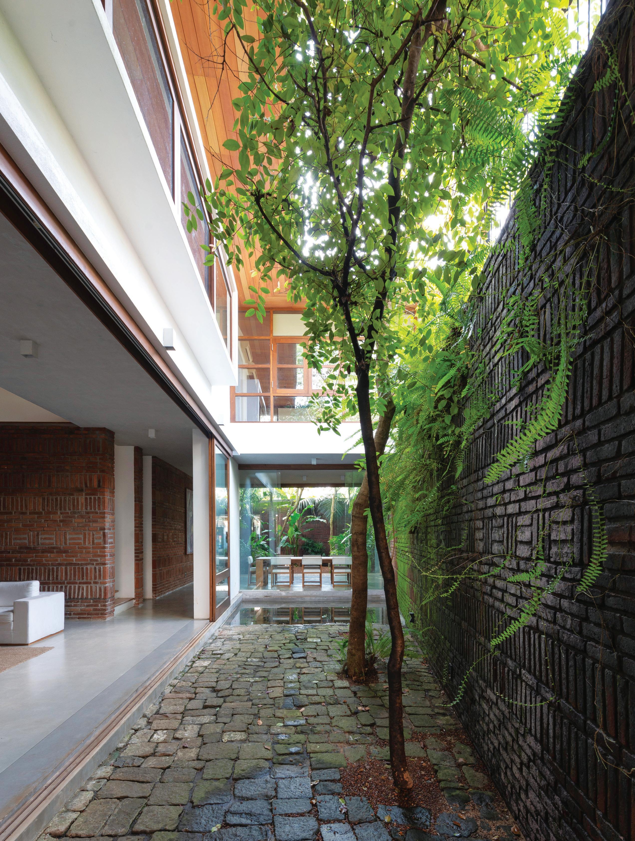
3 . on location # 153
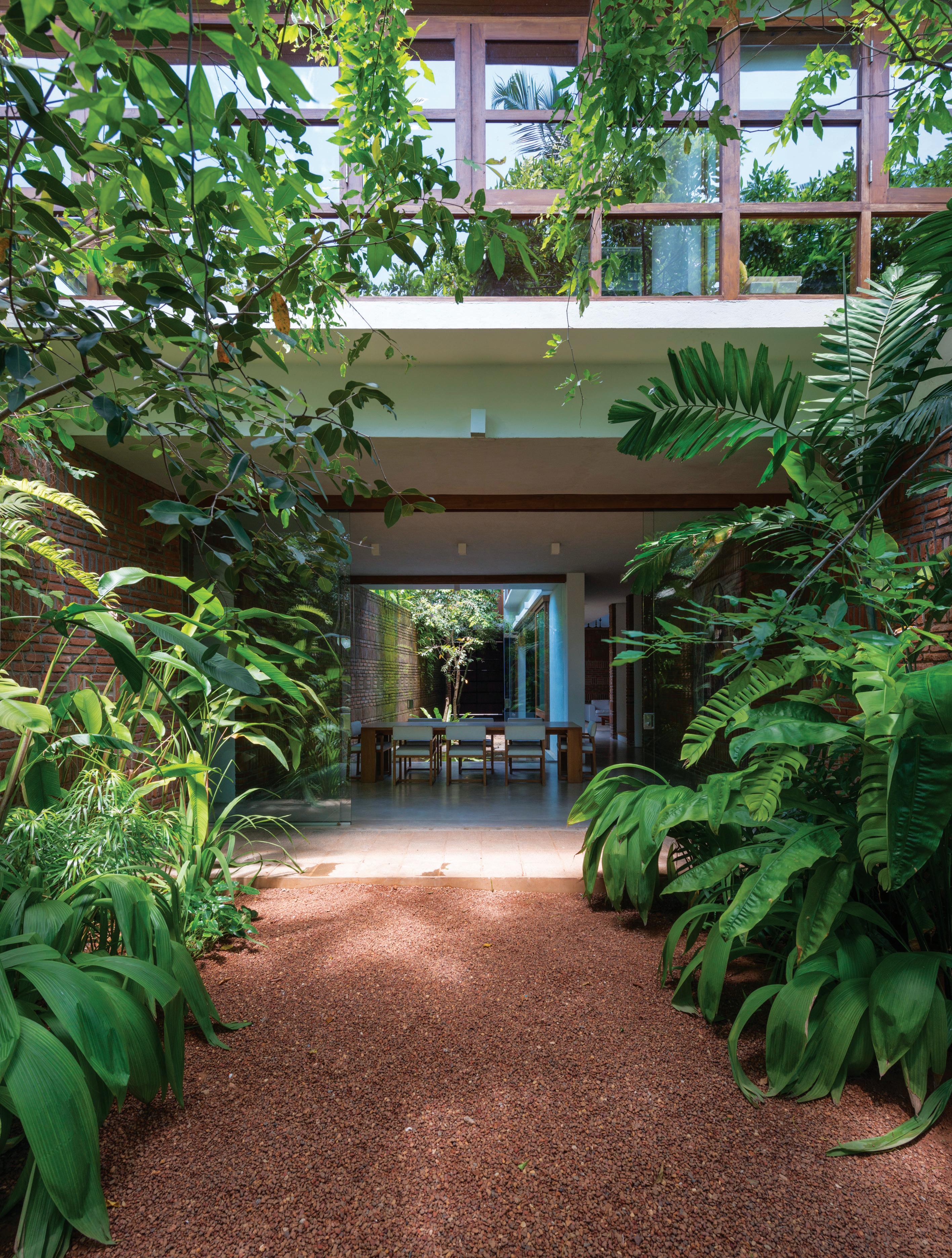
issue #47 habitusliving.com
gardens create a cool microclimate despite Colombo’s heat,” says Palinda. The spine separates the service areas from the living quarters and mediates the indoors with the elements, bringing natural light, breeze, and glimpses of greenery inside.
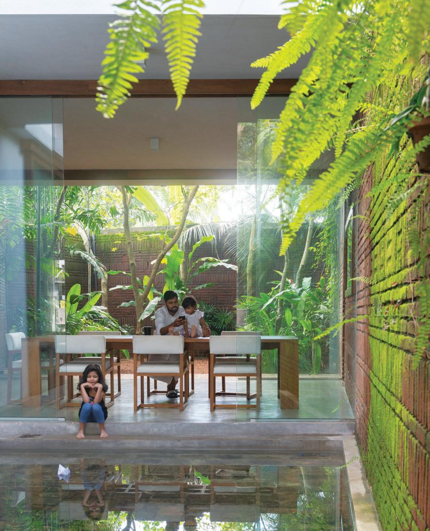
Walking along this spine is a journey rich in texture. It starts with a dry garden paved with stones salvaged from demolished tea estates and roads. This paved garden segues into a skim pond next to a dining room whose walls can be opened completely to the elements. During the monsoon, the paved garden transforms to a pond to accommodate the rain while during the dry season it cools the air that flows through the house. Bridging the main living quarters and the service quarters, the dining area is a brief interruption on the green spine that provides the residents a comfortable place to absorb the elements while staying indoors. On the other side of it, the spine continues, fanning out into a lush tropical garden.
The South Indian homage in the project is expressed subtly through the spatial and sensorial qualities of the residence, and always where it makes sense to the climate. Sathya’s grandparents hail from Tiruchirappalli, a city in the South Indian state of Tamil Nadu famous for its ancient temples and fortresses. The state is densely populated, featuring deep and narrow homes with alleys and multiple courtyards, quite a contrast to Sri Lanka’s much more simplified typology, which is influenced
OPPOSITE | VIEW OF THE SPINE FROM THE LUSH TROPICAL GARDEN AT THE REAR OF THE SITE. ABOVE | THE SKIM POND NEXT TO THE DINING ROOM COOLS THE AIR.
Madusha wanted their home to inspire warmth and be tightly integrated with the outdoors.
3 . on location # 155
by Buddhism and involves plenty of verandahs and open-air living, according to Palinda. He credits his studio’s partner, Varna Shashidhar, a landscape architect hailing from South India, for infusing the culture of the place in Spinal House. The unique pattern of the brick walls flanking the spine, for example, is a nod to the South Indian woven tapestries.
The South Indian influence is the most keenly felt in the home’s subterranean prayer room. Hidden beneath the wide gallery staircase, this prayer room is a no-frill take on garbhagriha (‘womb chamber’ in Sanskrit), the innermost sanctuary in a Hindu temple where the idol of the deity resides. The walls are polished cement finish, the floor granite tiles, and the lighting oil lamps placed on niches. It is a far cry from the heavily ornamented Hindu temple, but inspires no less reverence.
The same kind of poetic stillness is embedded in the rest of the house. If the lower level is warmer and more textural, the upper level is all about lightness. Walls and roof panels are whitewashed, the flooring is local timber, and all the rooms have generous openings to the spine, which the architects have articulated in different ways.
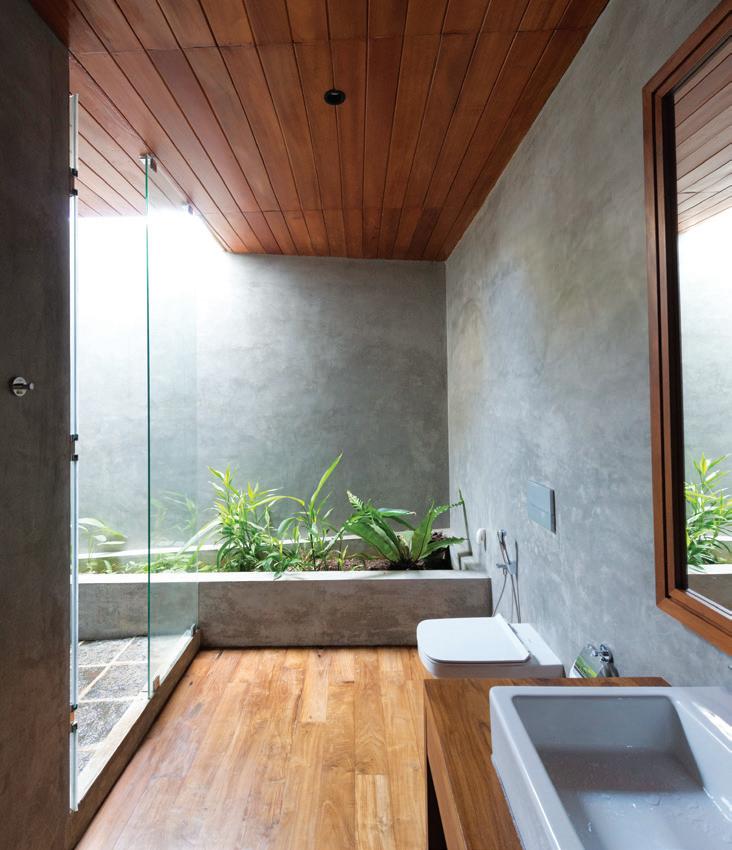
The study that bridges the master bedroom with the children’s bedroom features one continuous window with sliding glass panels. The playroom above the dining room is practically transparent, featuring glazed panels with timber frames – some operable and some fixed – overlooking the roof garden planted

issue #47 habitusliving.com
The study that bridges the master bedroom with the children’s bedroom features one continuous window with sliding glass panels.
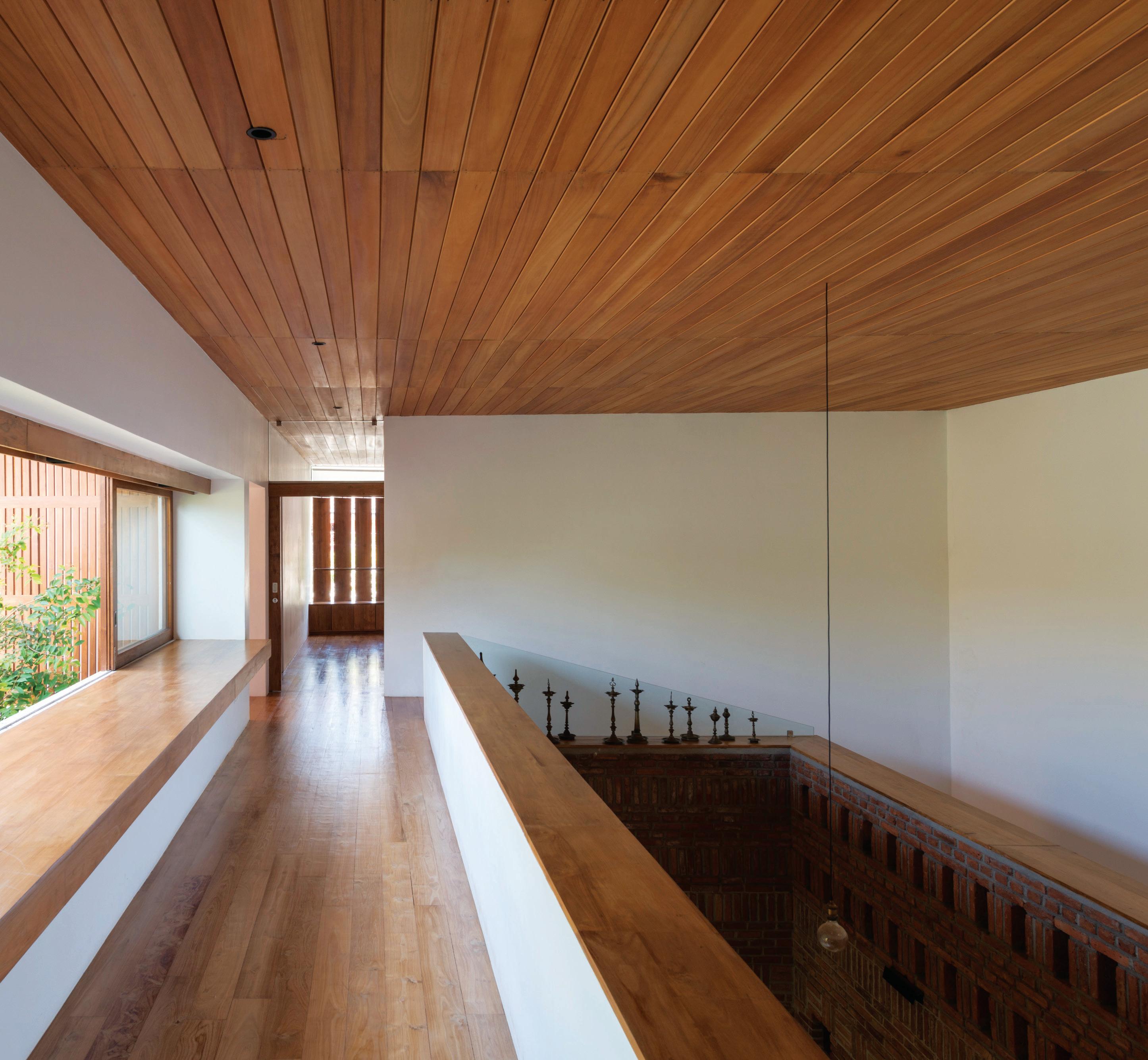
OPPOSITE | DAYLIGHT ENTERS THE MASTER BATH VIA A DISCREET SKYLIGHT. ABOVE | A VIEW OF THE STUDY ON THE UPPER FLOOR.
3 . on location # 157
ENTRY
STORAGE
BEDROOM
ENSUITE
LIVING
SHRINE ROOM
W.C.
DINING PANTRY
KITCHEN
CAR PARK
COURTYARD
SKIM POND
GARDEN
STUDY
MAIN BEDROOM
WALK IN WARDROBE
TV ROOM
SECOND LIVING & BAR AREA
UPPER FLOOR DECK
GREEN ROOF
TV ROOM
GROUND FLOOR UPPER FLOOR
#47 habitusliving.com
1 2 3 4 5 6 7 8 9 0 q w e r t y u i o p a s issue

OPPOSITE | PLANS. ABOVE | THE SUBTERRANEAN PRAYER ROOM IS A PLACE OF REVERENCE LIT BY OIL LAMPS. 3 . on location # 159
with herbs on top of the service quarters. The master bedroom opening features a deep ledge and pivoting timber panels that open and close together like blinds via a bespoke mechanism. During events, the house plays the role of a welcoming host with its open spaces, operable partitions and myriad fenestrations. The social butterflies have plenty of room to mingle, the playful have nooks and crannies to entertain themselves, while the shy and the reserved can observe behind smaller openings. And after, each family member can retreat to his or her own favourite spot: Sathya on the ledge of the master bedroom window, Madusha at the living-dining spaces near the garden, and the children weaving in and out of the indoor and outdoor spaces. Spinal House has successfully transplanted the cultural roots of South India in Sri Lankan land; it is a dreamy slow dance of nature and culture.
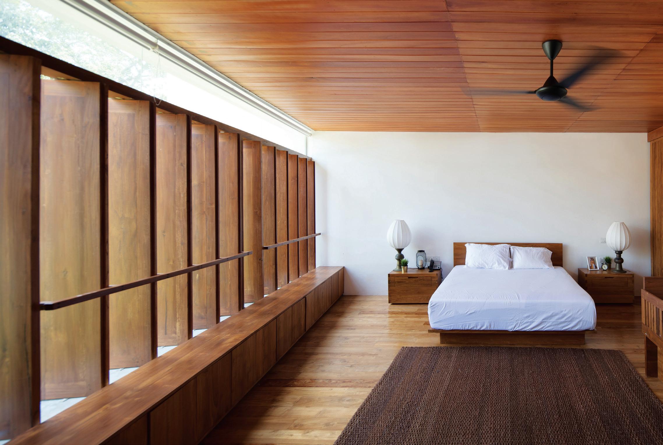
ABOVE | THE MASTER BEDROOM FEATURES A TIMBER-CLAD FLOOR AND CEILING, AND A SERIES OF OPERABLE TIMBER FINS AS WINDOWS.
issue #47 habitusliving.com
Palinda Kannangara Architects | palindakannangara.com

Don’t miss the annual Kitchen & Bathroom special On sale June 11 habitusliving.com IMAGE | CLARION MIXED-USE BOUTIQUE DEVELOPMENT0 BY SJB. PHOTOGRAPHY BY ANSON SMART
Room to grow together
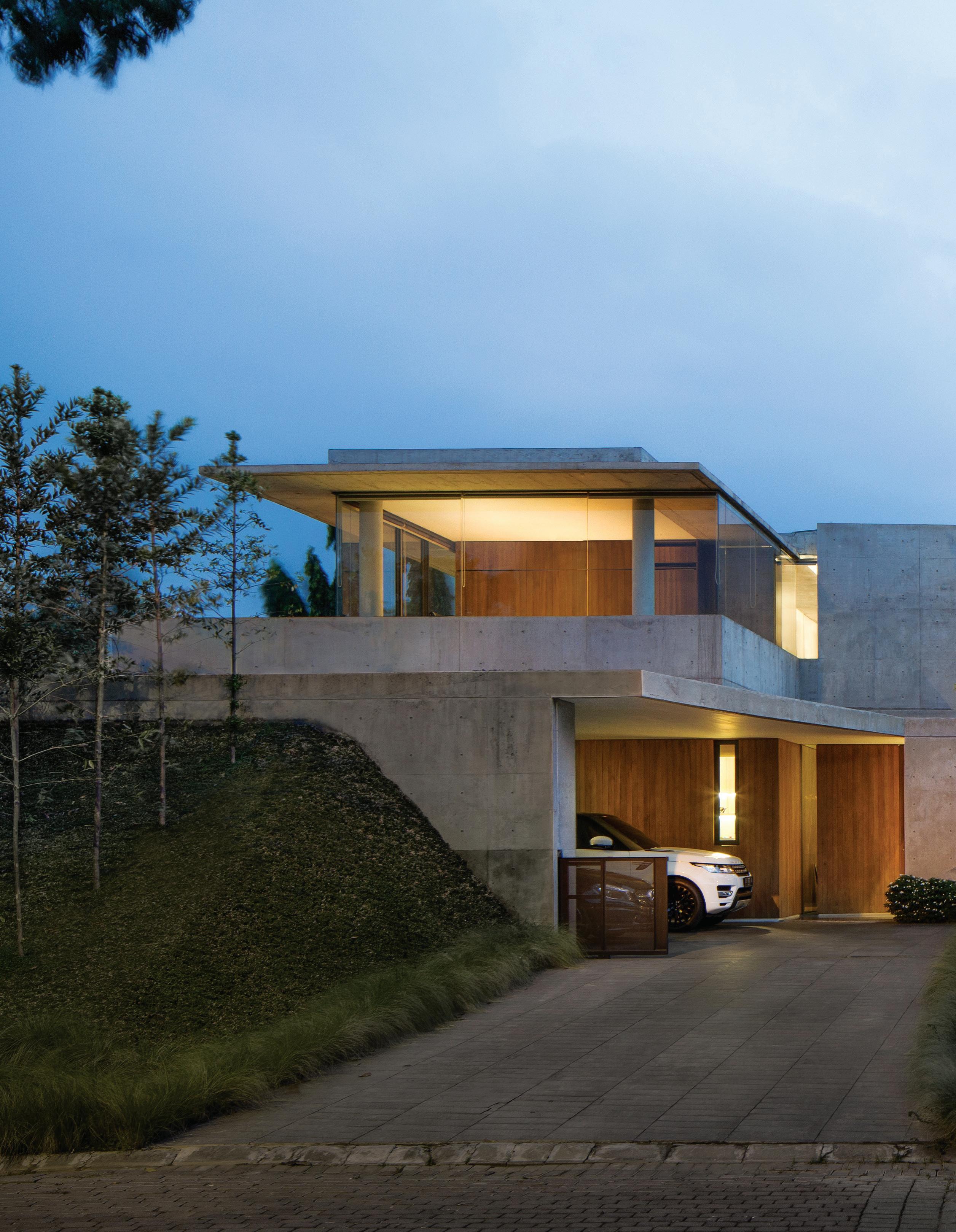
issue #47 habitusliving.com
Indonesian architect Willis Kusuma creates two houses in one plot for twin brothers that express their complex characters, complete each other, and give them enough room to grow and thrive.
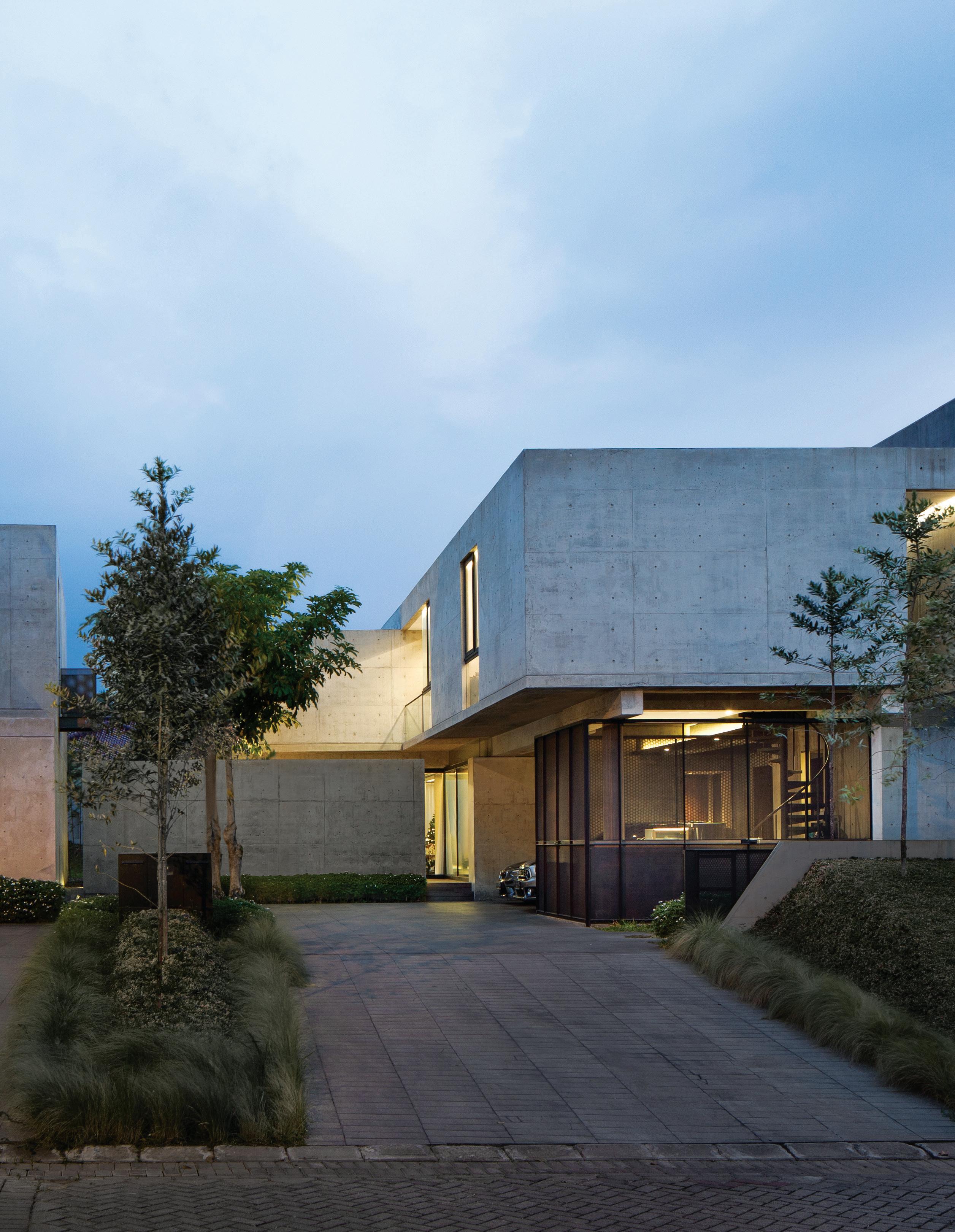
TEXT ASIH JENIE | PHOTOGRAPHY MARIO WIBOWO
3 . on location # 163
Twins Albert and Robert were in their late 20s when they approached Jakarta-based architect Willis Kusuma to design their home in Semarang, Indonesia, five years ago. The brothers, who were born and bred in the city, were about to start their hostel business – life was exciting, full of possibilities and a little bit unpredictable. But one thing they knew for sure was that they wanted to live near each other.
They bought a 1000-square-metre plot of land in one of the city’s new gated residential developments – just a stone’s throw from their parents’ home – and decided to commission Willis to build two houses on it. Previously, the twins visited one of Willis’ completed projects in Jakarta, a spacious three-bedroom apartment renovated from two separate units, and felt that the architect would be a good match. Today they are full-fledged hoteliers living in two separate houses on the same plot that the architect conceived as one project.
“They’re all about the functions, and both were modest with the indoor square footage. Albert requested about 300 square metres and Robert just over 200,” says Willis, speaking of the initial design brief. “Even though they are twins their room requirements couldn’t be programmatically more different.”
Willis affectionately used Introvert and Extrovert Houses as working titles. These nicknames do express the characters of houses and owners to an extent. “But like actual people, they have layers and nuances, and they might surprise you,” he says.
The site is a deep rectangle that fans out towards a view of Semarang’s green and hilly Candi area. It is one of the dreaded tusuk sate-type sites that directly face a T or an L junction. Tusuk sate literally means ‘satay stick’ in Indonesian – imagine the road as the stick with its pointy end poised to skewer the house, and the bits of meat as a potential series of problems. These plot types tend to be avoided in real estate because they require extra design treatment to mitigate the flow of traffic and other disturbances such as wind, noise, light pollution, prying eyes or the risk of collision. Feng shui has a more ominous term: poison arrow, which is said to be inauspicious. Willis took it in stride. “It’s all common sense, really,” he quips.
The site was split down the middle, leaving each brother with an even deeper rectangular area to plan his house. “The biggest challenge was to create comfortable spaces for each house and to make them somewhat connected but also allow for enough privacy,” says Willis.

DETACHED LIKE A
BOX. OPPOSITE |
OPENER
| THE TWINS HOUSE IN SEMARANG, INDONESIA COMPRISES TWO SEPARATE HOUSES IN ONE PLOT, AFFECTIONATELY DUBBED THE EXTROVERT HOUSE (LEFT) AND THE INTROVERT HOUSE (RIGHT). ABOVE | THE REAR VIEW OF THE INTROVERT HOUSE IS MOSTLY TRANSPARENT. THE STUDY ON THE GROUND FLOOR CAN BE ATTACHED TO THE HOUSE AS PICTURED OR COMPLETELY
GLASS
THE
FRONT VIEW OF THE INTROVERT HOUSE IS OPAQUE. THE DISCREET ENTRANCE TAKES YOU STRAIGHT TO THE DINING ROOM.
issue #47 habitusliving.com
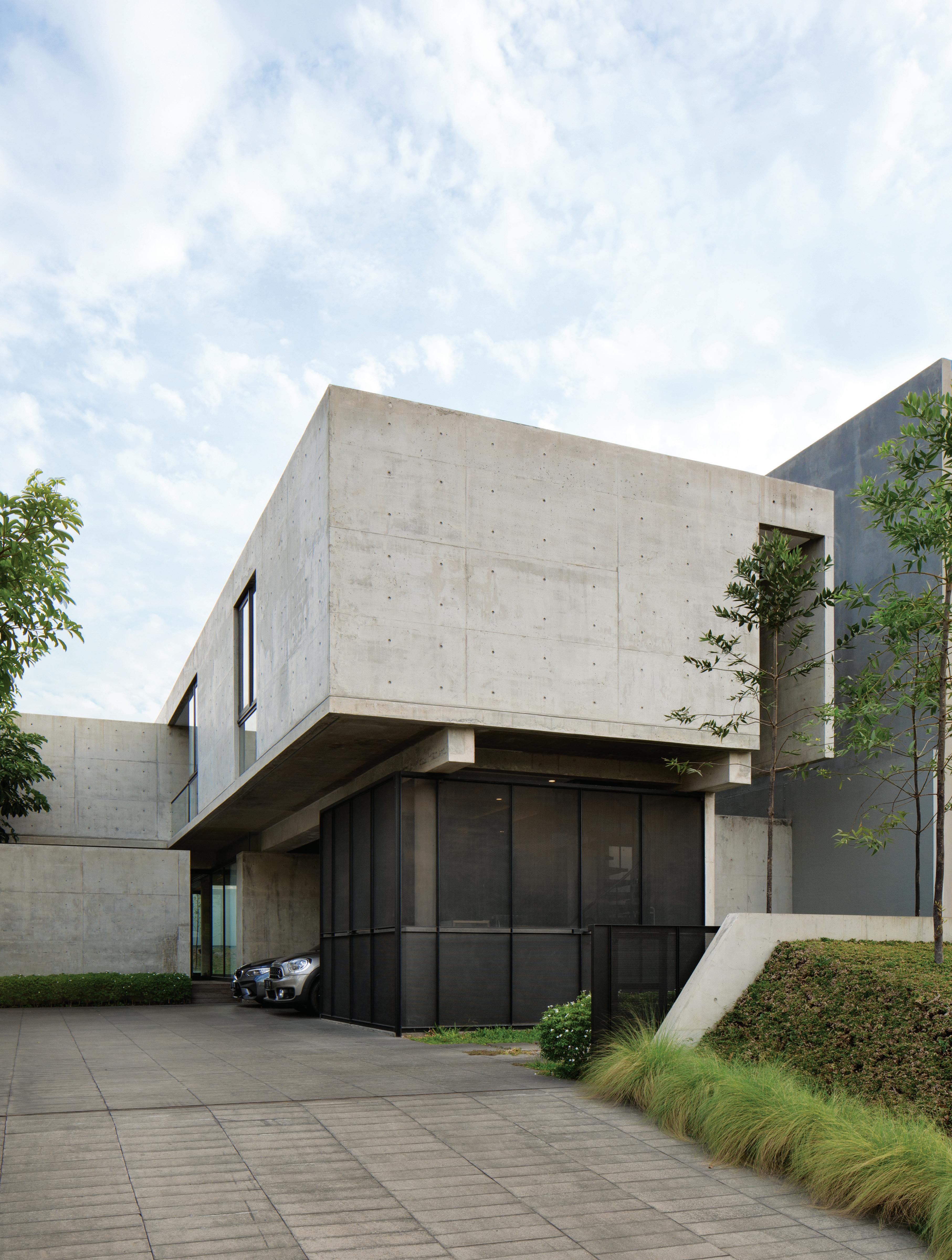
3 . on location # 165
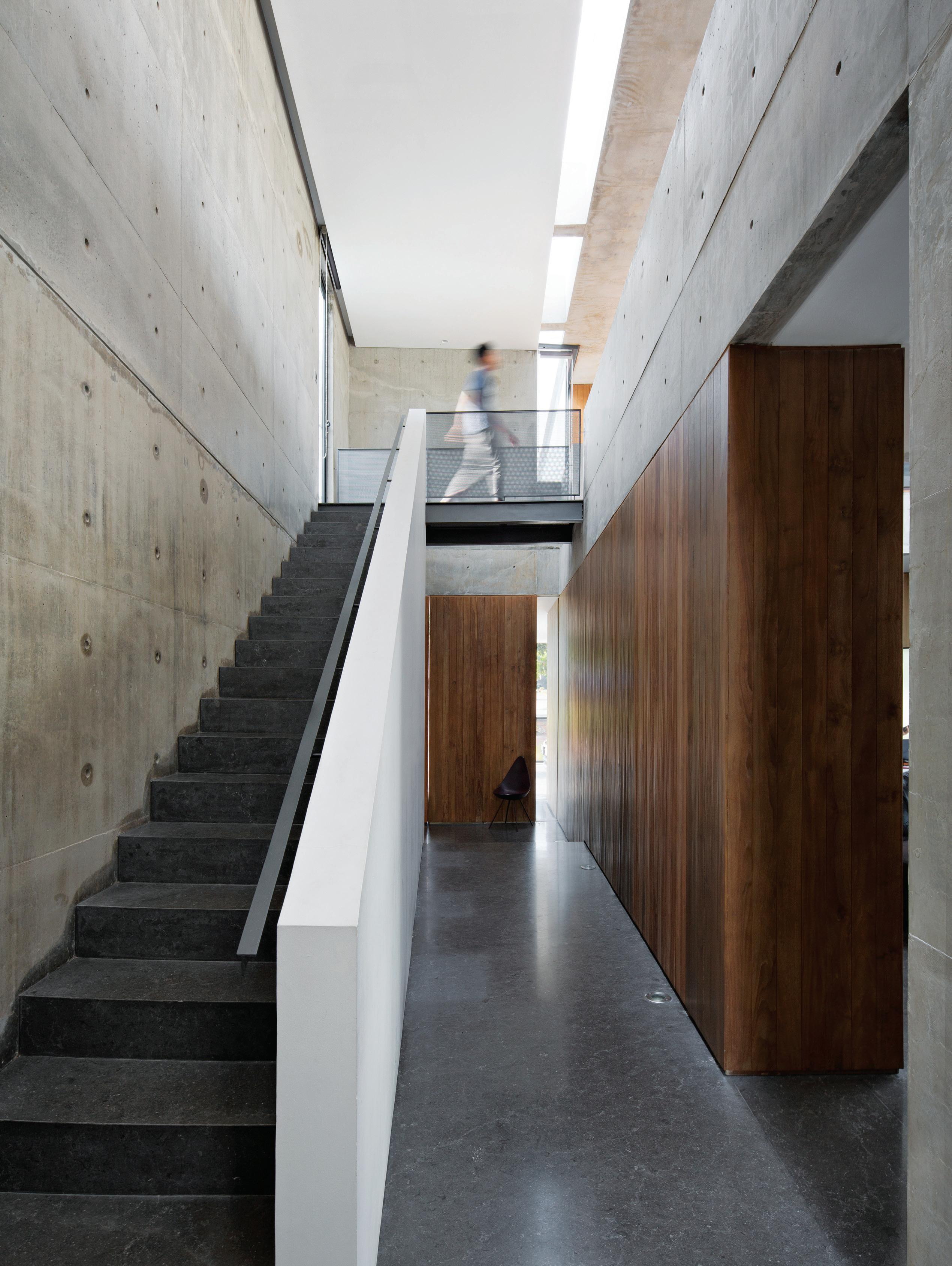
issue #47 habitusliving.com
The Extrovert House, elder twin Albert’s, sits on the tusuk sate portion of the site. It was set back from the road and buffered by a sloping front yard planted with trees. “This mini forest screens light, noise and views from the street,” Willis continues. The extroverted quality of the house is articulated in the design strategies: vast glazed walls, a clearly stated entrance, large opening, protruding decks and the placement of the master suite on the ground level.
“It gives you an immediate idea of where you’re supposed to go,” says Willis. The entrance sequence of Extrovert House is also processional: there is a climb up to the door, an entrance foyer and behind its wall, a doubleheight living room.
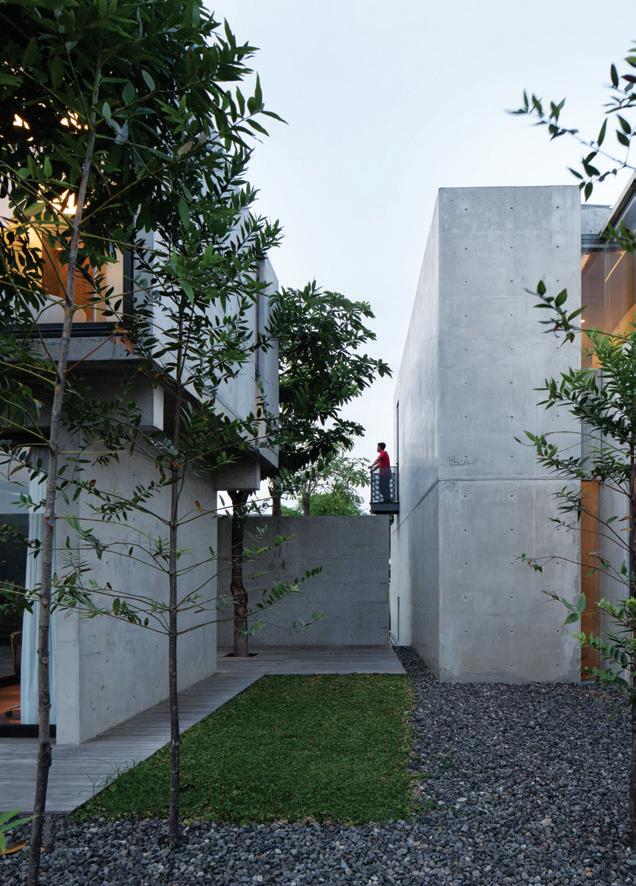
Robert’s Introvert House, in contrast, presents an opaque front and an intimate scale. The second-floor volume is mostly solid, the size of the openings is moderate, and you have to venture all the way to the back of the upper level to reach the master suite. The entrance is discreet. “Rather than a regular main-door entrance, it’s a glazed front with a pivoting glass plane on its side, through which you enter the house – it creates this thrill, like you’re sneaking inside the house through a window,” shares Willis. And there is no entry procession in this house; past this sneaky entrance, you’ll land in the dining area.
“Is this also an allegory of people?” I ask. The architect laughs. “I guess it does say something about how people are complex, layered creatures. Some people might be friendly from the get-go, but that doesn’t mean that they don’t have boundaries, and other
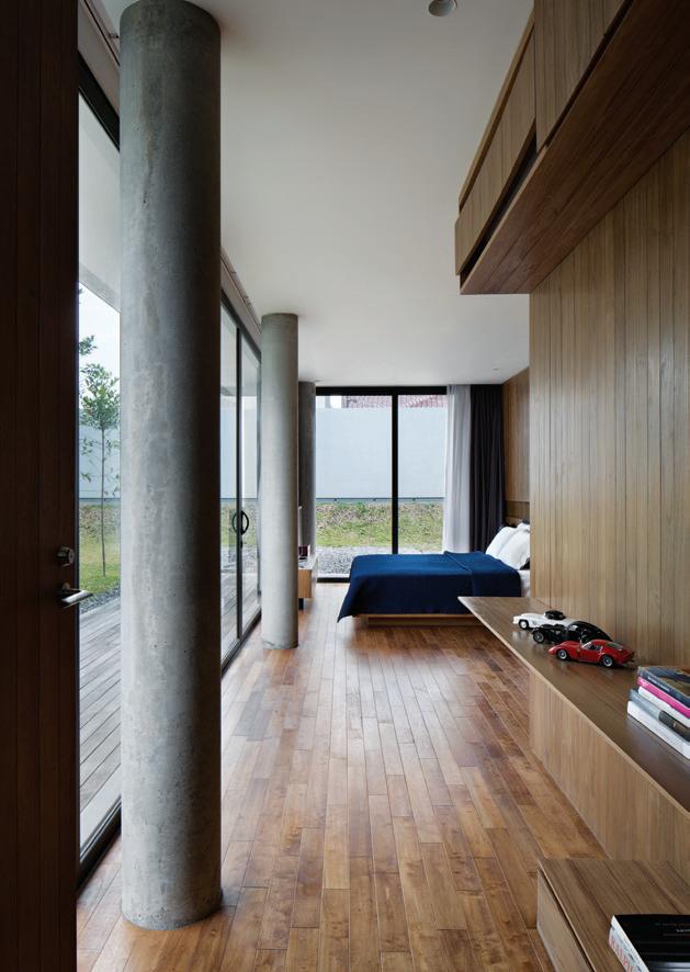
OPPOSITE | A WINDOW AND A NARROW STRIP OF SKYLIGHT PROVIDE A LITTLE LIGHT TO AN OTHERWISE DARK STAIRCASE AT THE EXTROVERT HOUSE. ABOVE LEFT | THE LANDSCAPE BETWEEN THE TWO HOUSES OFFERS BREATHING SPACE. ABOVE RIGHT | THE MASTER BEDROOM OF THE EXTROVERT HOUSE ENJOYS A 180-DEGREE VIEW OF THE GARDEN.
“Even though they are twins their room requirements couldn’t be programmatically more different.”
3 . on location # 167
GROUND FLOOR
1 2 3 4 5 6 7 8 9 0 q
DRIVE WAY
CARPORT
ENTRY
KITCHEN
DINING
LIVING
MAIN BEDROOM
WALK IN ROBE
ENSUITE
BEDROOM
BATHROOM
ALBERT'S HOUSE ROBERT'S HOUSE
LAUNDRY
DRYING AREA
GARDEN
BALCONY STUDY
1 2 3 4 5 6 7 8 9 0 q
DRIVE WAY
CARPORT
ENTRY
DINING
FIRST FLOOR w e r t y
LIVING
OPEN FOYER
STUDY
W.C.
LAUNDRY
DRYING AREA
KITCHEN
w e r t y u i
GARDEN
MAIN BEDROOM
WALK IN ROBE
ENSUITE
BALCONY
KID'S PLAYROOM
BEDROOM
#47 habitusliving.com
issue
people might appear reserved, but once you’ve broken through the barrier, you are accepted straight into their inner sanctum,” he muses.
Taking advantage of the safety of the gated complex, Willis left the houses without a fence, leaving an elevated landscape to do the job of concealing the houses from street view. A strip of wall between the houses shields a courtyard beyond, which is mostly taken up by a deck. Although officially part of Robert’s house, this deck serves as a communal outdoor hangout for both brothers and their guests.
Both houses feature several spacious viewing decks, indoors and out. The twins grew up in a home with decks, on which the family enjoyed 360-degree views of Semarang, and they wanted to transplant the experience into their adult houses.
The viewing deck at Extrovert House is Albert’s full-glaze study on the second floor, which directly faces the junction without a problem thanks to the mini forest in front. Robert’s study at Introvert House is located next to the deck on the ground floor. Its fully glazed walls can be reconfigured to connect the study to the rest of the house, or isolated as a glass box in the middle of the deck, showcased only to privileged eyes.
Both twins are pragmatic, no-fuss bachelors and wanted the houses to be as low maintenance as possible. This translates to a
minimal material palette comprising concrete, wood, steel and glass. The wood is Javanese teak, a warm-toned hardwood native to the area, also used in the house the twins grew up in.

“It balances the steel and concrete and it will age well,” says Willis of the timber, sharing that timelessness is one of the most important considerations in the design because these houses are not bachelor pads that the twins will flip once a more appealing real estate investment shows up in the market.
“They really mean to grow together with the houses,” he adds. Spacious studies can be converted to nurseries or extra bedrooms, and the houses can always grow another story or two. It is a simple project that has brilliantly expressed the complex characters of its dwellers while giving them enough space to evolve and grow.
OPPOSITE | PLANS. ABOVE | THE DINING AREA IN THE INTROVERT HOUSE FEATURES A TIMBER-CLAD WALL AND CEILING FOR WARMTH. THE SLIDING GLAZED DOOR IS THE HOUSE'S MAIN ENTRANCE.
Willis Kusuma Architects
3 . on location # 169
Darlinghurst House River House Gerroa
ARCHITECT Ian Moore Architects

LEAD ARCHITECT Ian Moore
PROJECT ARCHITECT Maria Gutierrez
INTERIOR DESIGN Ian Moore Architects
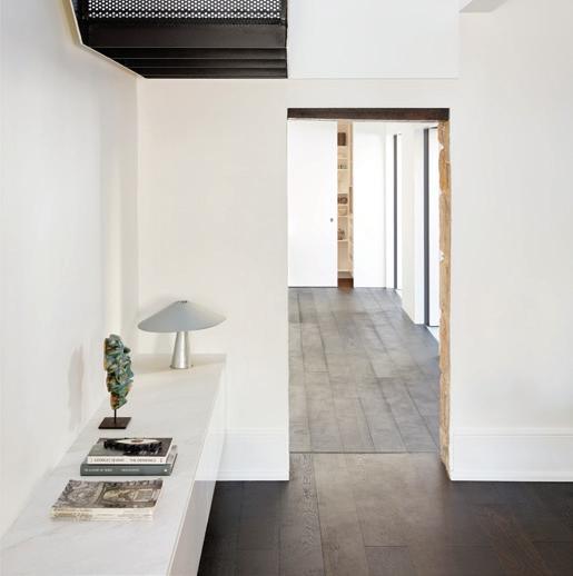
STYLIST Tess Strelein
BUILDER Lime Building Group
JOINERY Leisure Coast Kitchens
LANDSCAPING Outdoor Establishments
IAN MOORE ARCHITECTS (61 2) 8354 1887 ianmoorearchitects.com
FINISHES
Walk Easy cork sheet flooring in Steel Grey from Comcork. Bianco Carrara marble slabs with honed finish from Bisanna Tiles on bathroom floors. Tallowwood weatherboards with oiled finish for external walls. Plasterboard finished with Vivid White paint from Dulux for internal walls and ceilings. Bianco Carrara marble mosaic tiles with honed finish from Bisanna Tiles. Aluminium framed windows and sliding doors with powder coat finish from AWS. Windows manufactured by Hanlons Windows. Altair 152 clip operable glass louvres from Breezway. Staron Solid Surface Resin for kitchen benchtops.
FURNITURE
Togo sofa system by Ligne Roset from Domo. Artek coffee table from Anibou. Artek dining table and chairs from Anibou. Air Folding Chair by Magis from Dedece. Artek beds and sidetables from Anibou.
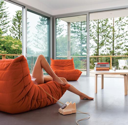
LIGHTING
Wall-mounted uplights by Bega from Zumtobel. LED Downlights by Brightgreen. LED strip lighting by Inlite.
FIXED & FITTED
Kitchen oven, cooktop, rangehood, and dishwasher from Smeg. Fully integrated fridges from Fisher & Paykel. Kitchen sinks from Abey. Barbecue from Ilve, rangehood from Smeg. Titan stainless steel tapware from Caroma. Puro bath from Kaldewei. Unit 60 basins by Studio Bagno. Cube Invisi Series II toilets by Caroma. Stainless steel grated drains by Stormtech.
ARCHITECT Brad Swartz Architects
PROJECT ARCHITECTS Brad Swartz, Claire Holton, Emily Elliott
STYLIST Olivia Bossy
BUILDER Align Constructions Pty Ltd
JOINERY Coastline Kitchens
LANDSCAPING Bell Landscapes
STEELWORK Steadly Steel
SKYLIGHT Tilt Industrial Design

BRAD SWARTZ ARCHITECTS (61 4) 2144 4338 bradswartz.com.au
FINISHES
Existing sandstone internal and external walls. Polyurethane paint finish joinery throughout. Michelangelo MAXIMUM honed Marmi collection tiles from Artedomus for lower staircase. Solid steel balustrade and perforated folded steel mesh treads and landings for upper staircase. Michelangelo MAXIMUM honed Marmi collection tiles from Artedomus for kitchen benchtop, splashback and bathroom tiles.
FURNITURE
Sometimes, We Sit Chair by Olivia Bossy. Pierre Jeanneret chair from Composition by Office Elias. Cork Coffee Table from The Vault. Like Butter Table by Olivia Bossy. Rug from Armadillo & Co. Glass sculptures by Shelley Witters from The Vault. Black vase from Spence & Lyda. Joao Manardu wooden drop vessel from Studio ALM. Alum dining table by Studio Henry Wilson. Comedia del Arte sculpture from Studio ALM. Togo sofa system by Ligne Roset from Domo. Articulated Coffee Table from The Vault. Vases from Planet Furniture. Beds from Project 82. Soldier Table from Grazia & Co. Additional vases from Planet Furniture. Artwork by Liz Alexander.
LIGHTING
Architectural lighting by Erco Lighting. Plafonnier 3 Bras Pivotants designed by Serge Mouille and Toio floor lamp from Flos. Mabeo metal light from Studio ALM.
FIXED & FITTED
Ovens and dishwasher from Miele. Wolf cooktop from Sub-Zero + Wolf. Rangehood from Qasair. Integrated fridge from Liebherr. Laundry appliances from Miele. Titan stainless steel tapware from Caroma. Falper Quattro Zero basin and bath from Rogerseller.
Dress it up or play it down, here are the pieces that turned these houses into homes.
It’s all in the Details
issue #47 habitusliving.com
Three Stories North
ARCHITECT Splinter Society
LEAD ARCHITECT Chris Stanley
INTERIOR DESIGN Splinter Society

BUILDER Birdsmouth Construction
JOINERY Terry Marshall
SPLINTER SOCIETY ARCHITECTURE (61 3) 9419 4189 splintersociety.com
FINISHES
Solid blackbutt decking and timber floors from Mountain Timber Products (with Loba matte finish internally). Resilient linoleum flooring in black from Forbo. Floor Tiles mix of black Brazilian slate from Pavers Plus, and rock finish porcelain tiles from Ital Ceramics. Escape Twist carpet from SuperTuft. Original brick shell maintained and utilised for most walls. Internal walls sealed with Boncrete, subtly lightened with a dash of white paint. Lightweight walls above clad in CSR Barestone and panelrib from Lysaght. Internal lining boards of Kennedys timber wire brushed, smokey grey, mixed species hardwood from Tongue n Groove. Wall tiles are black penny rounds from Cerdomus. Resene Karaka and Rascal wall paint. Aluminium and steel windows from Creative Aluminium. Laminate cupboards in thermo black natura from Polytec.
FURNITURE
Dining table by Mark Tuckey. Arca Armchair from P4. Oxydation low table by Ligne Roset from Domo. Nobsa rug from Halcyon Lake. Grillage Chair by Ligne Roset from Domo.
LIGHTING
Nebulae Vertical pendant by Ross Gardam. Grapho bubble pendant from ISM. Strip lighting and Tommy and Arc barrel spotlights from Studio Italia. Stelzen lamp from Studio Italia.
FIXED & FITTED
Appliances from Fisher & Paykel. Lugano range tapware from Par Taps. Concrete bathroom basins from Boyd Alternatives. Curtain fabric by Anthony Lynch from Warwick Fabrics.
Twins House Spinal House
ARCHITECT Palinda Kannangara Architects
PROJECT ARCHITECTS Palinda Kannangara, Ranmuthu Dissanayake
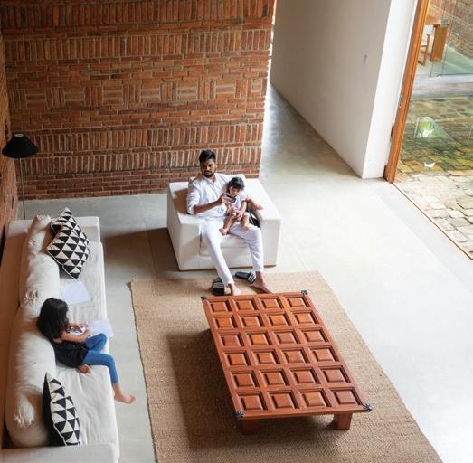
INTERIOR DESIGN Palinda Kannangara
LANDSCAPE ARCHITECTURE Varna Shashidhar (VSLA)
BUILDER Wathsala Constructions
PALINDA KANNANGARA ARCHITECTS (+94) 112 864 844 palindakannangara.com
FINISHES
Salvaged stone for the courtyards, Terrazzo flooring for ground floor, floorboards of local teak for upper level. Custom designed ornamental brick walls. Lunumidella timber ceiling. Garage door and pivot windows custom designed by Palinda Kannangara Architects and manufactured by local carpenter.
FURNITURE
Sofa, occasional chairs, dining table and dining chairs by Lee Furniture. Repurposed centre table, bed, bedside tables, wardrobes, bookshelves, shrine room timber screens custom designed by Palinda Kannangara Architects and fabricated by Lee Furniture.
LIGHTING
Corroded upward and downward lights custom designed by Palinda Kannangara Architects and fabricated by Kalaya. Spotlights, downlights, wall brackets, timber ceiling recessed lights from Majestic Electrical, Colombo.
FIXED & FITTED
Bathroom ware from Vitra, Hansgrohe and Hafele, Colombo.
ARTWORK
Painting by Sri Lankan artist Druvinka Madawala.
ARCHITECT Willis Kusuma Architects
LEAD ARCHITECTS Willis Kusuma, Laurencia Angelia
PROJECT TEAM Nanda Dermawan, Silvia Thiofilus, David Epson Mayer
INTERIOR DESIGN Willis Kusuma Architects
BUILDER PT. Pilar Perkasindo
LANDSCAPING Willis Kusuma Architects

WILLIS KUSUMA ARCHITECTS (62 21) 2555 8960
FINISHES
Locally sourced dark grey granite, solid teak, and sonokeling wood for flooring. Exposed concrete wall cast on-site. Locally sourced solid teak for internal walls and furnishing. Travertine marble for bathroom wall. Alumunium doors and window frames by Il Sogno. All custom steel joinery done by local craftsmen.
FURNITURE
Twin One is furnished with Eleanor Sofa by Vivere. Drop Chair by Fritz Hansen. Nong Chair by Santai Furniture. Twin Two is furnished with Sofa by Malinda Furniture and Lounge Chair by KARE. Office chair by KARE. Series 7 Chair by Fritz Hansen. Drop Chair by Fritz Hansen.
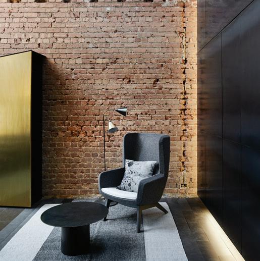
LIGHTING
Radon Wall Lamp and Kaiser Idell Lamp, both by Fritz Hansen.
FIXED & FITTED
Electrical sockets by Jung. Sanitaryware by Toto.
3 . on location # 171
habitus on the ground...
Habitus House of the Year Judging Day
For the second year running our Habitus House of the Year jury gathered at StylecraftHOME – this time at its Melbourne showroom – for a lively discussion on the 2019 selection and to ultimately decide on the winners (including an overall winner) and commendations.
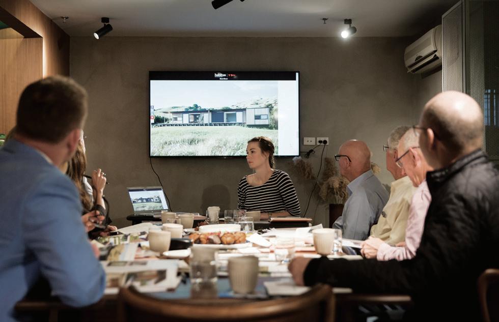
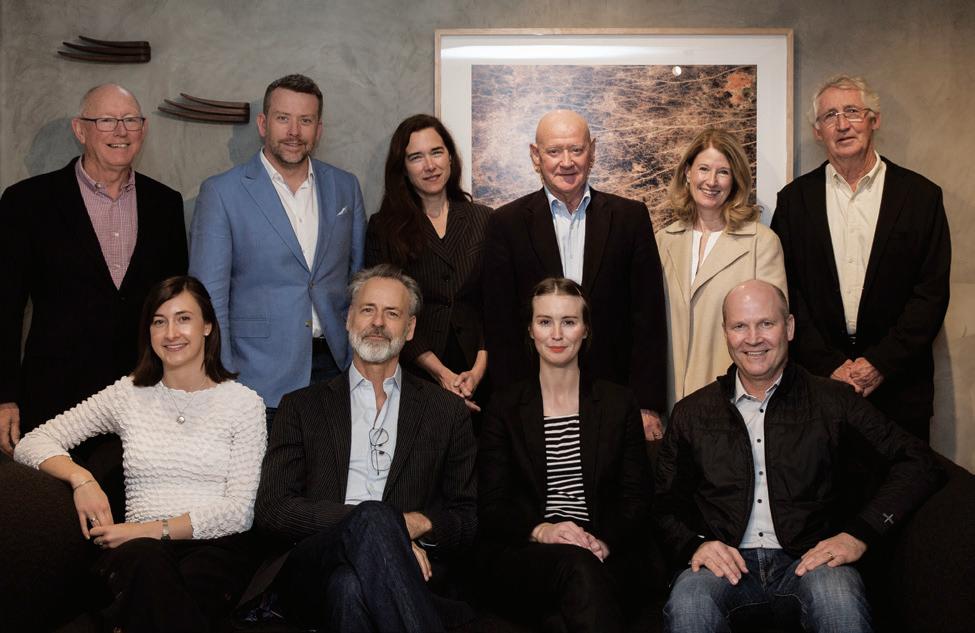

Returning jury members Neil Burley, Karen McCartney, Howard Tanner, convenor Paul McGillick, and editor Holly Cunneen were joined by new jurors David Clarke, Shelley Penn, and representatives from our Major Sponsors: Tom Fisher of Zip, Victoria Shaw of StylecraftHOME, and Robert Warner of Gaggenau.
A lively discussion indeed, many of our jurors commented that their understanding of certain projects evolved upon listening to that of other jurors.


issue #47 habitusliving.com
PHOTOGRAPHY BY MARCEL AUCAR
Habitus House of the Year Cocktail Evening

Following a thought-provoking judging day in Melbourne, friends of Habitus far and wide including architects, designers, photographers, writers and design enthusiasts gathered at StylecraftHOME in Sydney for the long-awaited announcement of the Habitus House of the Year winners.
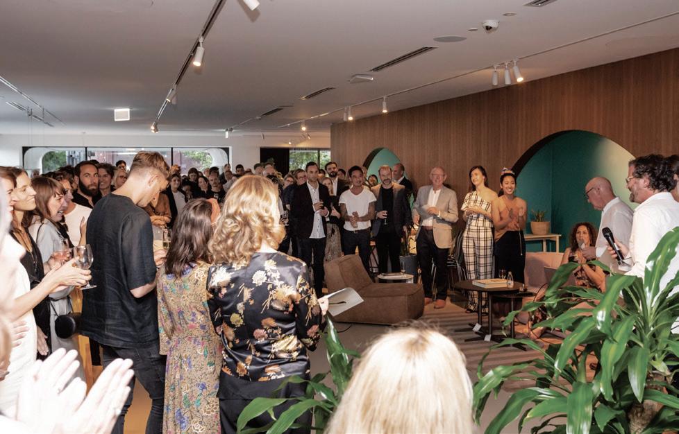
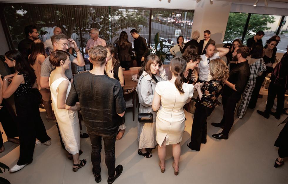
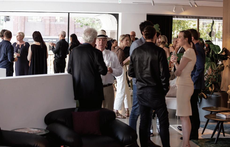
Congratulations to Bivvy House by Vaughn McQuarrie Architects for taking out the overall House of the Year award; Teneriffe House by Vokes and Peters was recognised for the Interior And Exterior Connection award; and BacHong House by LAB Concept Design recognised for the Architecture And Landscape award. Special commendations went to Roemah Kampoeng House by Paulus Setyabudi Architect and Huru House by WireDog Architecture. Make sure you stay tuned for Habitus House of the Year 2020
Habitus Living habitusliving.com
StylecraftHOME stylecrafthome.com.au
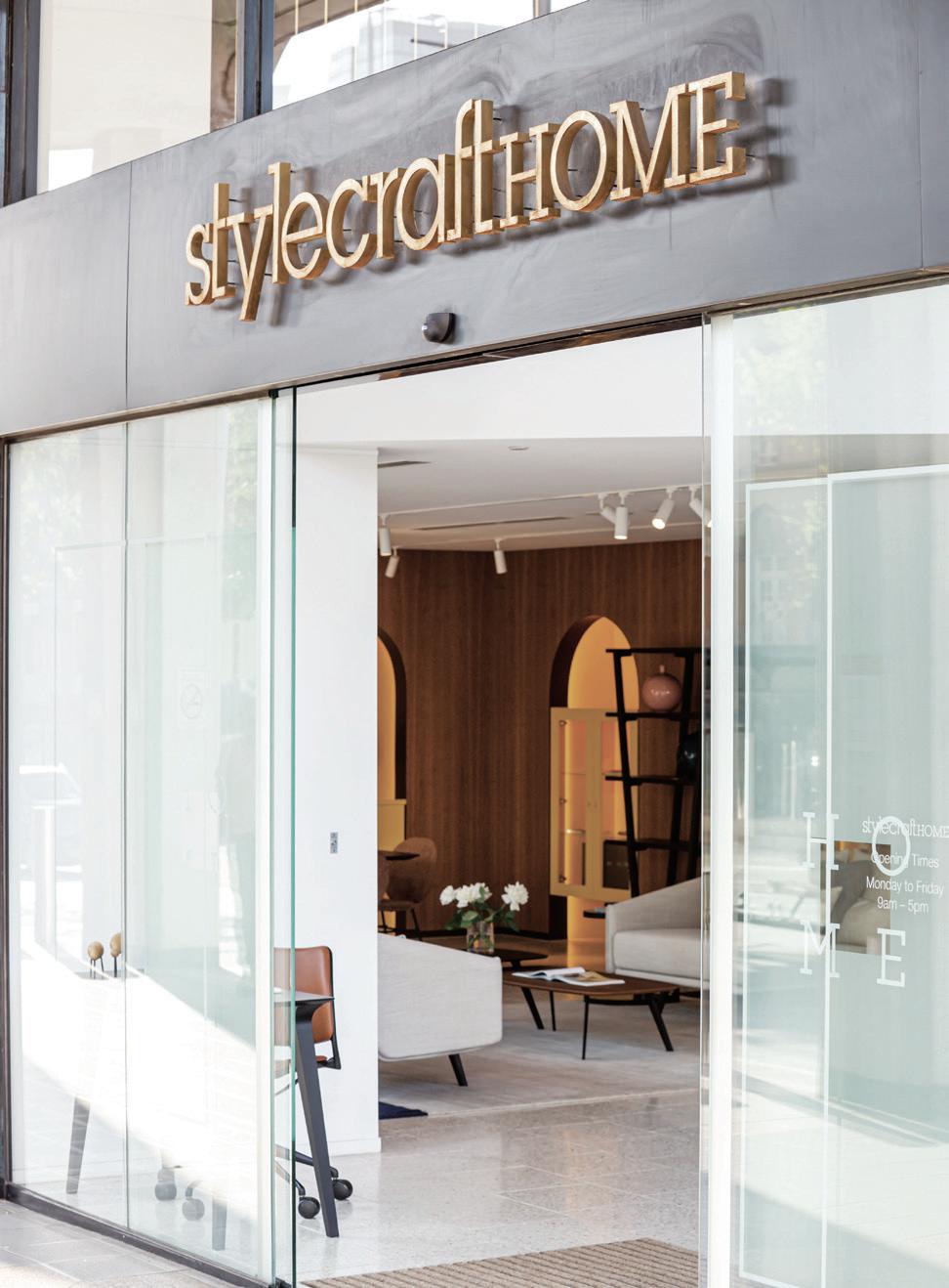
# 173
PHOTOGRAPHY BY PETER SUCHECKI
Discover beautiful products
Meet inspiring people
Indulge in architecture and design
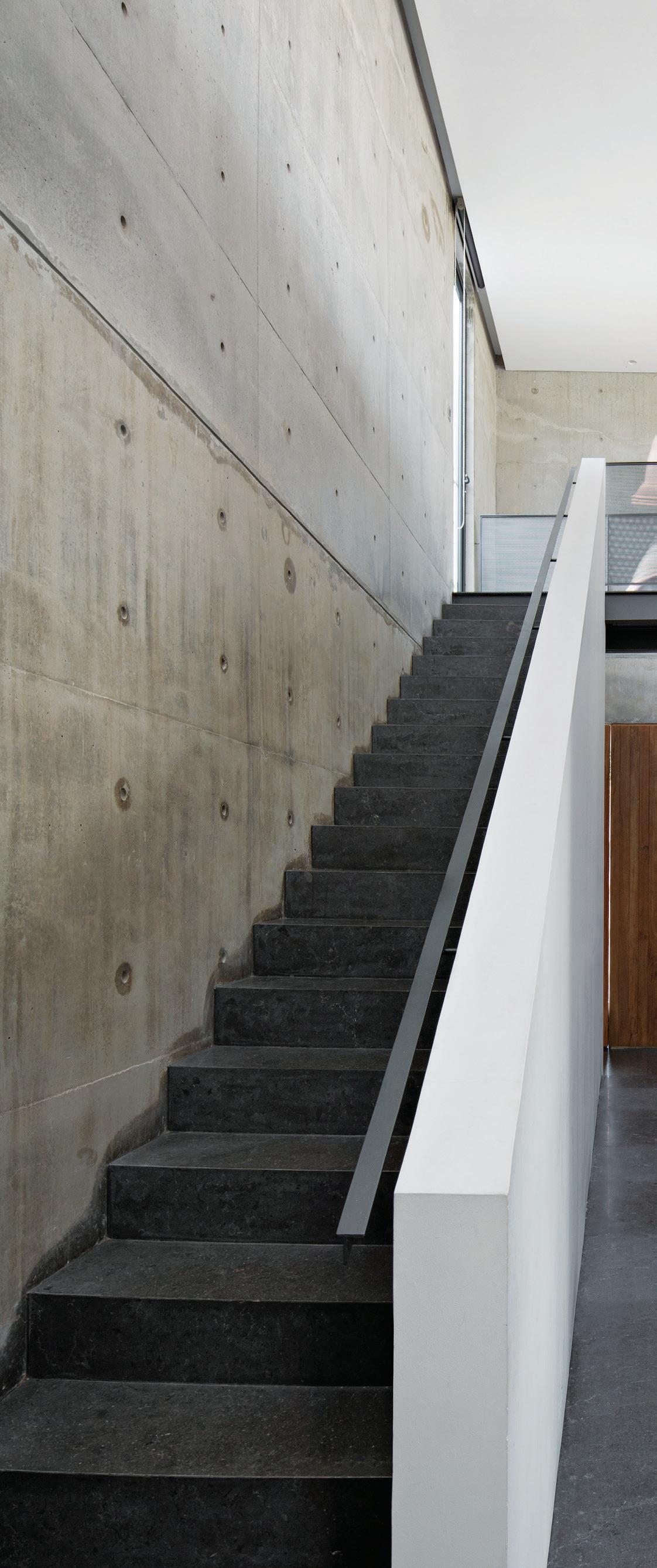
Across Australia, New Zealand, South and South-East Asia
The online community for the Design Hunter ®




Website | habitusliving.com
Facebook | habitusliving
Pinterest | habitusliving
Instagram | @habitusliving
Twitter | @habitusliving

 Twins House
Photography by Mario Wibowo
issue #47 habitusliving.com
THE TEAM AT HABITUS MAGAZINE THANKS OUR ADVERTISERS FOR THEIR SUPPORT. USE THE DIRECTORY TO SEE WHAT PAGE A SPECIFIC BRAND IS FEATURED ON, AND VISIT THEIR WEBSITE TO LEARN ABOUT THE PRODUCTS AND SERVICES THEY PROVIDE.
Abey 024 abey.com.au
Armadillo & Co OBC armadillo-co.com
Bosch 040 bosch-home.com.au
Cantilever 033 cantileverinteriors.com
Cattelan Italia 009 cattelanitalia.com
Cosh Living 006, 106-107 coshliving.com
Cult 012-013, 077 cultdesign.com.au

Dance For Life 149 dfl-danceforlife.com
Earp Bros 037 earp.com.au
Elica 010-011 shop.elica.com.au
Fielders 112 fielders.com.au/finesse
Gaggenau 002-003 gaggenau.com.au
Habitus Subscriptions 080 habitusliving.com/subscribe
Ilve 014-015 ilve.com.au
INDE.Awards 016 indeawards.com
King Living IFC-001 kingliving.com
Living Edge 064-065, 066-067 livingedge.com.au
Phoenix Tapware IBC phoenixtapware.com.au
Poliform 035 poliformaustralia.com.au
Saturday In Design 100-101, 123 saturdayindesign.com
Space 023 spacefurniture.com
StylecraftHOME 052-053, 134-135 stylecraftHOME.com.au
Sustainability Live & Awards 093 sustainablebuildingawards.com.au
Tongue n Groove 004-005 tngflooring.com.au
Zip 020, 021, 078-079 zipwater.com
Habitus magazine is available at newsagents and bookstores across Australasia, South-East Asia, the USA, Canada, Europe, South America and the Middle East. Habitus is published quarterly in March, June, September and December. To subscribe securely online visit habitusliving.com/magazine or email subscriptions@indesign.com.au to subscribe or request a full list of locations where Habitus magazine is available.
# 175
Your map to where the stories in this issue come from where is available
Sri Lanka #150
Indonesia #62
Sydney #42
Melbourne #136
world
issue #47 habitusliving.com
“Architecture belongs to culture, not civilization.”
ALVAR AALTO


handcrafted rugs, inspired by nature


 The Frame Living System integrates storage and technology into a seamless furniture solution for walls.
Designed by Justin Hutchinson.


 HOLLY
RAJ NANDAN CHAIRMAN & FOUNDER INDESIGN MEDIA, HOLLY CUNNEEN EDITOR HABITUS


 TEXT HOLLY CUNNEEN | PHOTOGRAPHY DUNJA OPALKO


 James Garvan Architecture | jamesgarvan.com


 OPENER | (L-R) BALARINJI WAS FOUNDED BY ROS MORIARTY (MD) AND HER HUSBAND JOHN MORIARTY (CHAIRMAN). THEIR THREE CHILDREN HAVE ALL WORKED IN THE STUDIO AT VARIOUS TIMES AND SON TIM MORIARTY IS BALARINJI’S PROJECTS CREATIVE DIRECTOR. ABOVE & OPPOSITE | JENNY MULCAHY’S RETURN TO COUNTRY SCULPTURE (ABOVE) AND THE BROLGA SCULPTURE (OPPOSITE) BY JEREMY GEORGE AND RURIK HENRY ARE PART OF THE JEZZINE BARRACKS PROJECT IN TOWNSVILLE, QUEENSLAND.


 Featured | Agnese Armchairs, Sesann Lounge, Cage Tables & Umbra Rug by Tacchini
 TEXT STEPHEN CRAFTI | PHOTOGRAPHY SHARYN CAIRNS


 Twins House
Photography by Mario Wibowo


