OCTOBER | 2020 – JANUARY | 2021 AUD$17.95 | NZ$17.95 | SGD$13.95 9 > 771836 055007 49 #49 INSIDE The most impressive examples of residential architecture across the Indo Pacific. habitusliving.com/houseoftheyear


SYDNEY | MELBOURNE | BRISBANE | PERTH | NEW YORK
Keeping true to the original European oak colour, Freado creates a neutral backdrop for any application.


Tongue n GrooveTM floorboards are designed with three solid layers of fine European oak for optimal finish, longevity and structural integrity.
tngflooring.com.au
Mermaid Waters Residence, Queensland | Designer: Jared Poole Design | Interiors: Beckspace Design | Photographer: Andy Macpherson
Freado Grande Eterno

THE NEW GENERATION 7000 MIELE.COM.AU/GENERATION7000 Contact our Projects Specialists: VIC 03 9765 4311 NSW 02 8977 4289 QLD 07 3632 2437 SA 08 8352 9542 WA 08 9286 7836 NZ 09 360 3587 #LifeBeyondOrdinary REDEFINE PERFECTION TRP MI 8814
OVEN AND POWERFUL STEAM OVEN IN ONE

Get the best of both worlds with the Generation 7000 Combi Steam Oven. An innovative conventional oven, a powerful and precise steam oven and a fully-fledged combination appliance – all in one. It’s so versatile you can use a range of different cooking methods – and so technologically intuitive it makes cooking in new ways feel perfectly familiar.

 GENERATION 7000 COMBI STEAM OVEN
Kett celebrates an Australian way of life, drawing inspiration from our natural landscapes and cosmopolitan cities. Collaborating with craftspeople from Australia and Italy to produce furniture with a timeless quality - indoors and out.
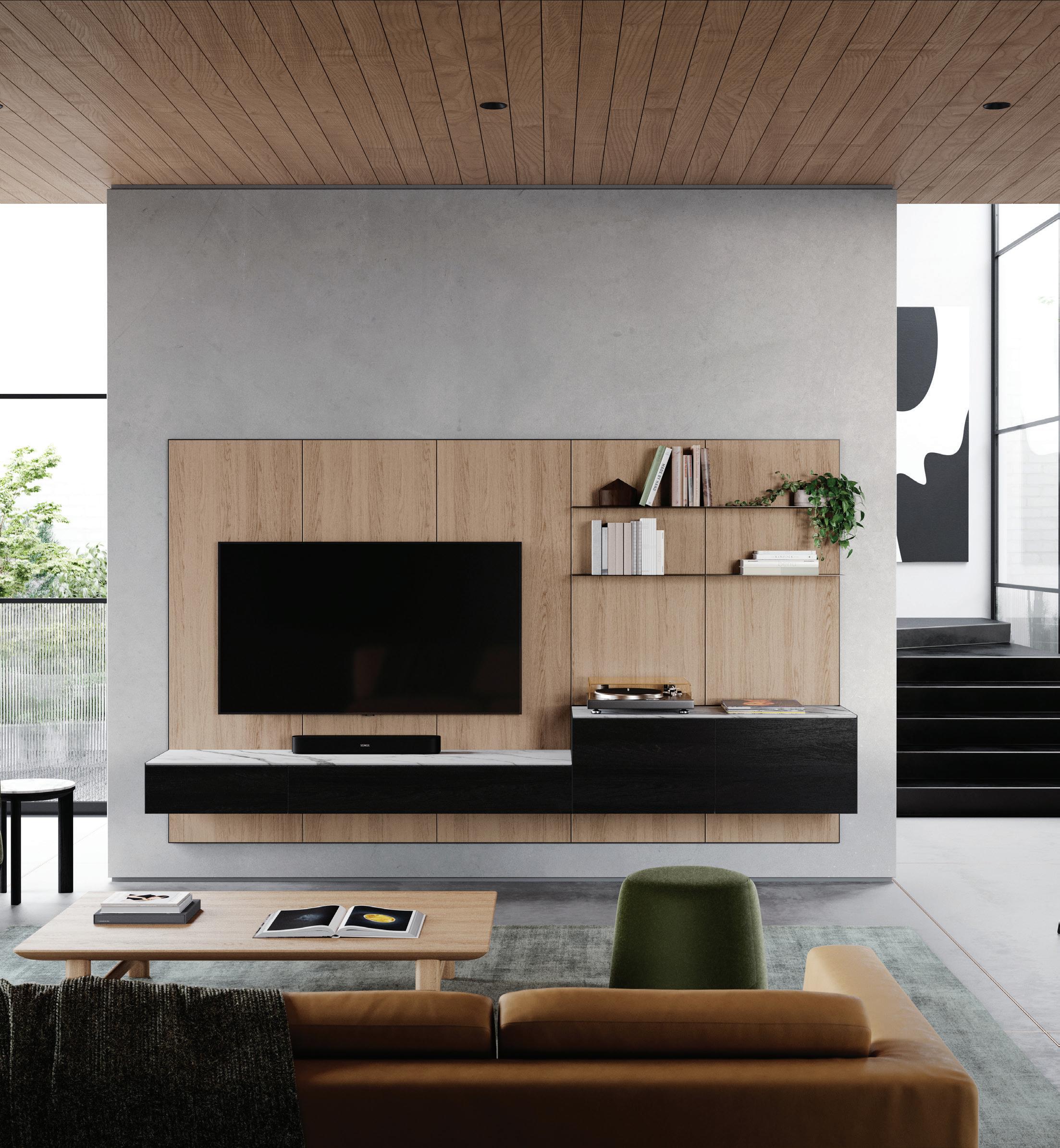 Frame Living System (Wall Unit), Otway Coffee Tables, Johanna Ottoman & Avoca Sofa.

Exclusive to
Melbourne| Sydney | Brisbane | Perth www.coshliving.com.au
Forrest Elliptical Table & Armchairs.

Be immersed. Abey Australia’s diverse range of sinks provides you with a selection from around the world. Visit an Abey Selection Gallery to immerse yourself in the collection. Barazza Cubo Double Bowl VICTORIA Selection Gallery 335 Ferrars St Albert Park Ph: 03 8696 4000 WESTERN AUSTRALIA Selection Gallery 12 Sundercombe St Osborne Park Ph: 08 9208 4500 www.abey.com.au NEW SOUTH WALES Selection Gallery 1E Danks St Waterloo Ph: 02 8572 8500 QUEENSLAND Selection Gallery 94 Petrie Tce Brisbane Ph: 07 3369 4777


mondoluce.com #49
your interiors and outdoor living areas with design-led furniture, products, appliances and finishes. 24 24 DESIGN NEWS
issue the editorial desk carefully curates the pages of the Design News section to showcase great design. We look for pieces that visually intrigue and inspire us, showcase innovation through technology or form, and stand to genuinely improve our daily life.
Enhance
Each
The Habitus House of the Year special annual edition comprises 20 of the most outstanding examples of residential architecture across the Indo Pacific Region that exemplify our unique way of living through design.


#49
J&J RESIDENCE Australia Hogg & Lamb 054 CORYMBIA BEACH HOUSE Australia Paul Butterworth Architect 062 UPSIDE DOWN AKUBRA HOUSE Australia Alexander Symes Architect 070 SKY HOUSE Australia Marra + Yeh Architects 076 CLT HOUSE Australia FMD Architects 084 RUCKERS HILL HOUSE Australia Studio Bright 090 WALL HOUSE II Australia Nathan Etherington Architect 098 HOUSE AT OTAGO BAY Australia Topology Studio 108 BOWDEN HOUSE New Zealand Belinda George Architect 116 #3 New Zealand Studio2 Architects 124 TE PAKEKE New Zealand Fearon Hay Architects 132 THE TWINS HOUSE Indonesia Delution 142 COMPOUND HOUSE Singapore linghao architects 148 BAMBOO VEIL HOUSE Singapore Wallflower Architecture + Design 154 CH HOUSE Vietnam ODDO Architects 160 BINARY WOOD HOUSE Thailand TA-CHA Design 166 SHADE HOUSE Thailand Ayutt and Associates Design
HOUSE AT KALALGODA India Damith Premathilake Architects 188 18 SCREENS HOUSE India Sanjay Puri Architects 196 WALL HOUSE Sri Lanka Abin Design Studio 124 166
044
172

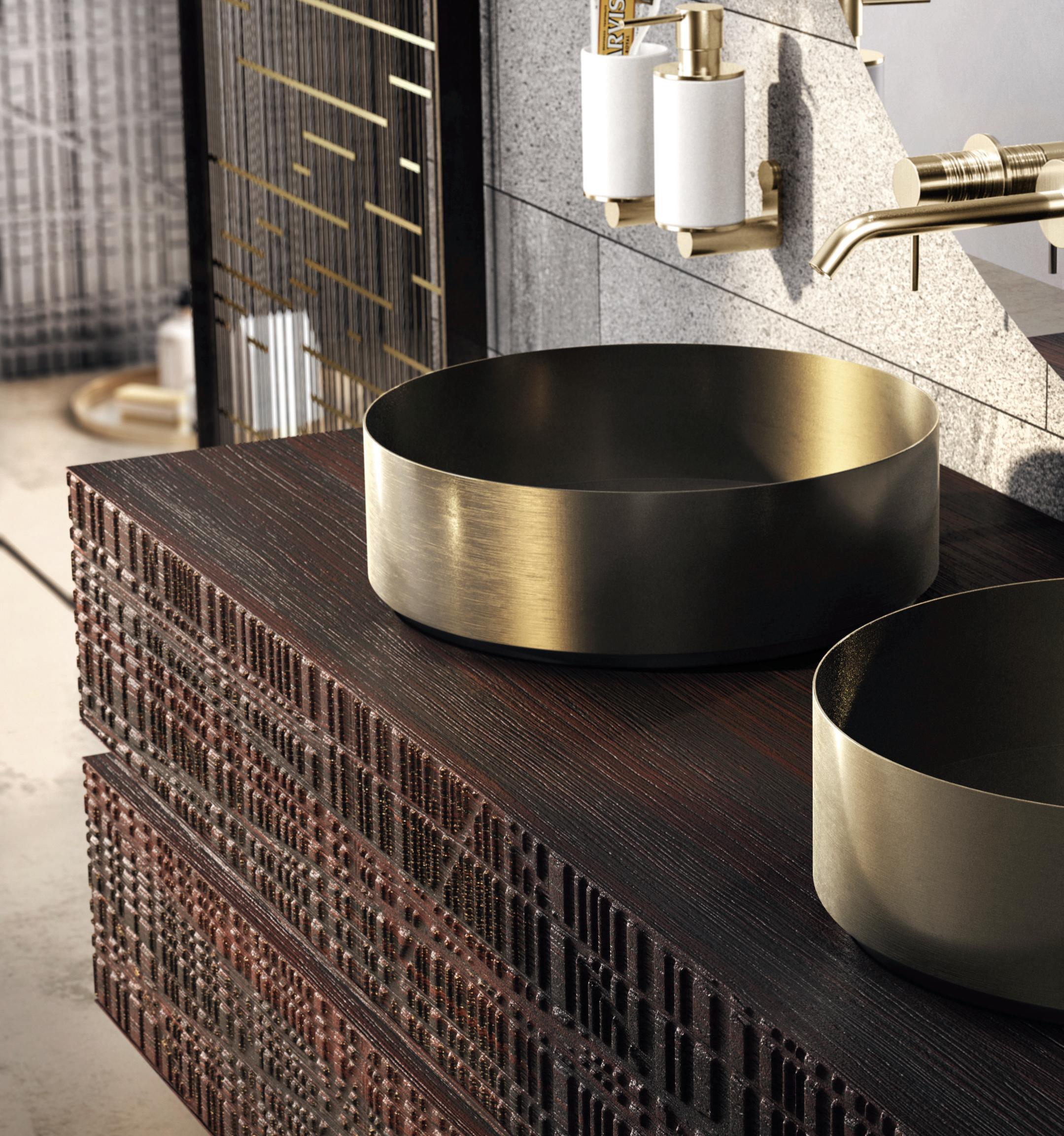


table SKORPIO KERAMIK PREMIUMchairs GINEVRAlamp PLANETAsideboard OXFORDmirror GLENNrugs MUMBAI


cattelanitalia.com






Available exclusively at

the first word
WHAT DO WE LOOK FOR IN A HOUSE?
For the past three years, the Habitus team has pulled together a collection of 20 diverse and wide-ranging residential projects dotted throughout the IndoPacific Region for the annual Habitus House of the Year special edition. We’ve looked at all sorts of typologies, from alterations and additions to new builds; compact inner city dwellings to rural homes in sprawling landscapes; full time residences to holidays homes; and briefs from families that are expecting to grow, disperse, age in place or house multiple generations.
But there are a few key elements that each and every project we’ve selected has in common. One is a genuine connection to the land on which the building sits. Another is that the architects have clearly understood and responded to their clients’ brief and unique way of life. In addition, while social, economic and environmental sustainability measures are typically taken into account, it is still worth celebrating when the solutions are innovative and imaginative.
These core attributes form the basis of the judging criteria for our jury of independent experts who come together to select which projects will receive Habitus House of the Year awards and commendations to be announced later in the year.
And who will you choose for the Habitus House of the Year People’s Choice award? Head to habitusliving.com/houseoftheyear for exclusive online content to help further inform your decision. Submit your vote online to enter the draw to win the Ultimate Design Hunter Package.
HOLLY CUNNEEN | EDITOR
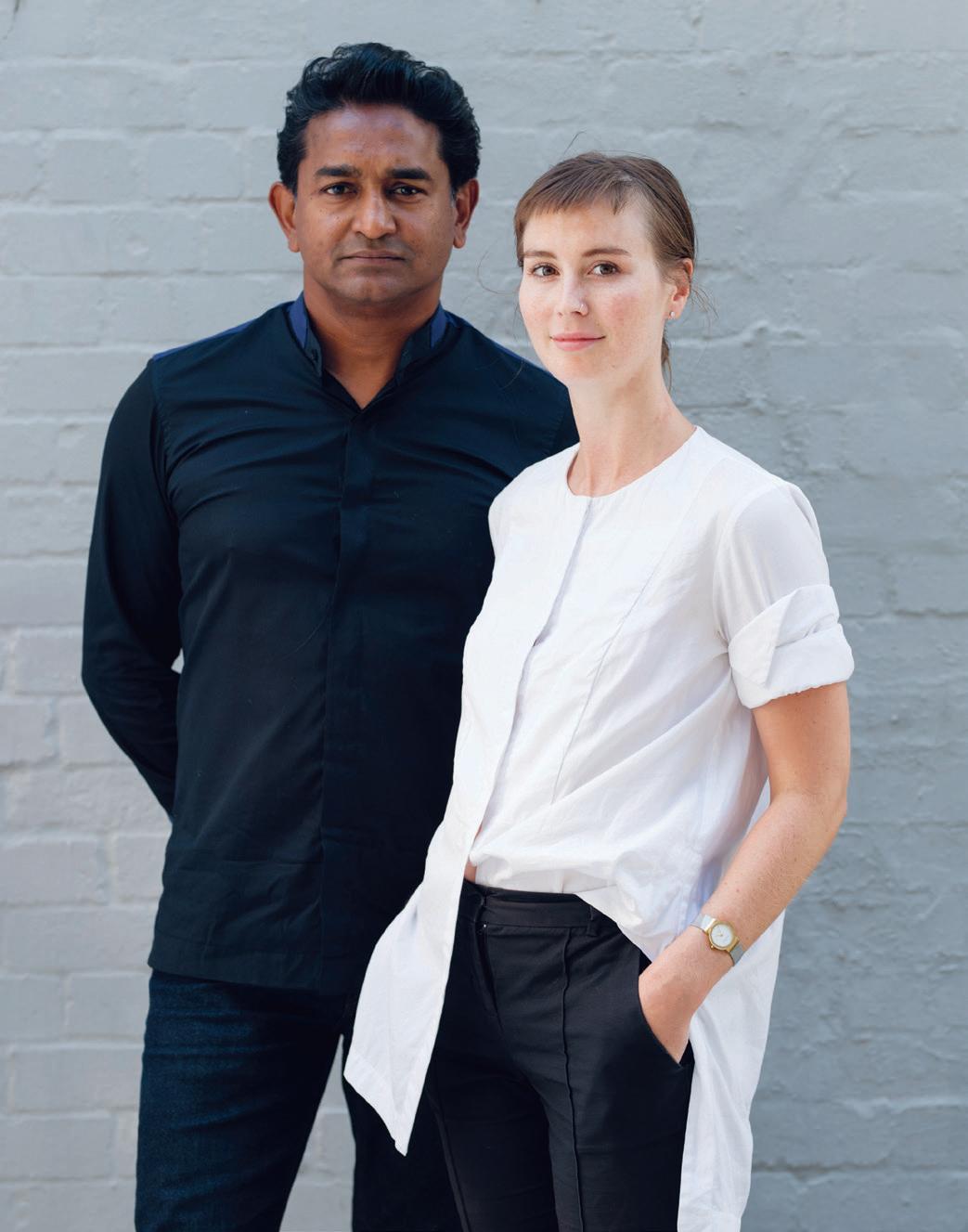 ABOVE Raj Nandan chairman & founder Indesign Media, Holly Cunneen editor Habitus
THE COLLABORATIVE SPIRIT
In putting the Habitus House of the Year special issue together, there always comes a time when we think: are we going to make it? Can we pull together twenty genuinely stand-out houses? And can we get the regional spread necessary to make the selection truly representative?
But most of all: can we get an enticing spread of different types of dwellings which fit the brief?
The brief, of course, has a geographic remit –namely, the Indo-Pacific Region. Crucially, we are looking for houses which reflect their place. This means houses that respond imaginatively to their physical location and climate, but also to the needs of the people who live in them and to the wider cultural context. In the broadest sense of the word, we are looking for sustainable dwellings – because this is what turns a house into a home.
It was no different this time round. But I think we have managed to assemble an intriguing collection of houses from across the Region which reflect diverse ways of life, but also the variety of ways in which basic, universal human needs are met by architects and designers.
If there is a linking theme, I think it is collaboration. Most obviously, this refers to the collaboration between the clients and their architects; a recognition that designing home is not so much about an architect’s vision, but about how architects help their clients to realise their vision. But it is also about not imposing on what is already there, going with the flow – working with the land and the climate, not against them; sometimes working with an existing structure, rather than pulling it down; above all, making the house fit the people who are going to live in it, rather than making them fit the house.
Just a few thoughts to take with you on your journey through these twenty wonderful houses.
PAUL McGILLICK | CONSULTING EDITOR
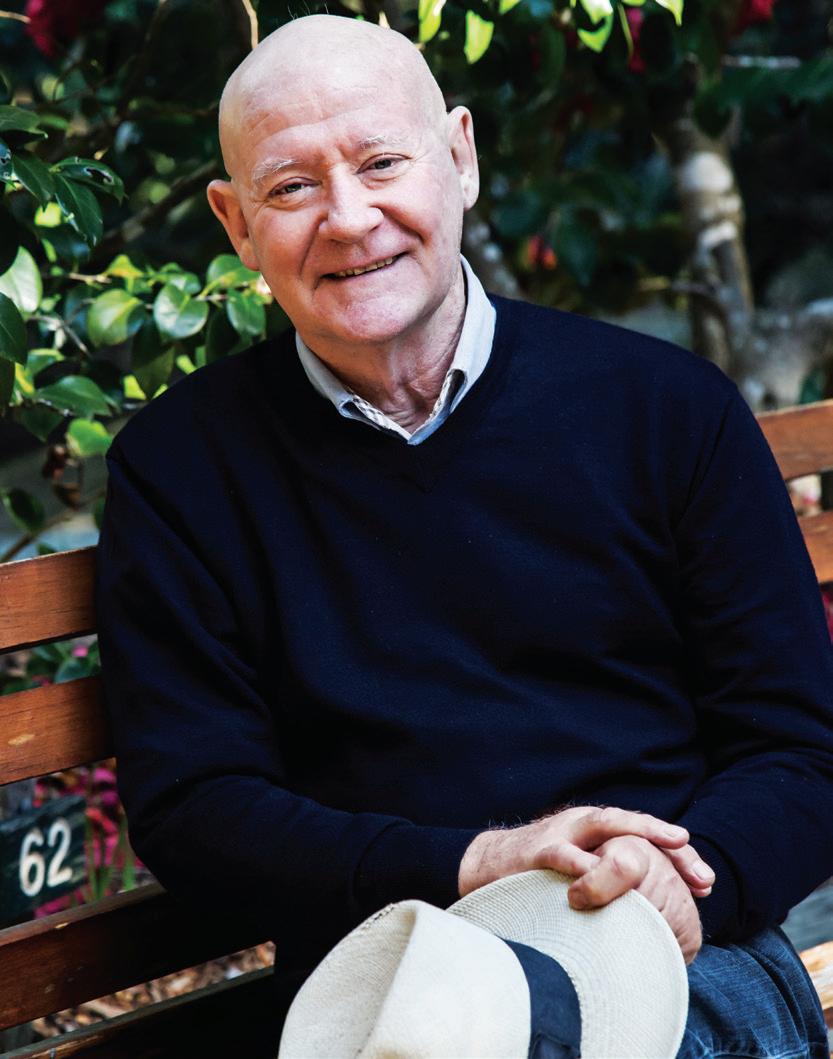 ABOVE Paul McGillick, consulting editor.
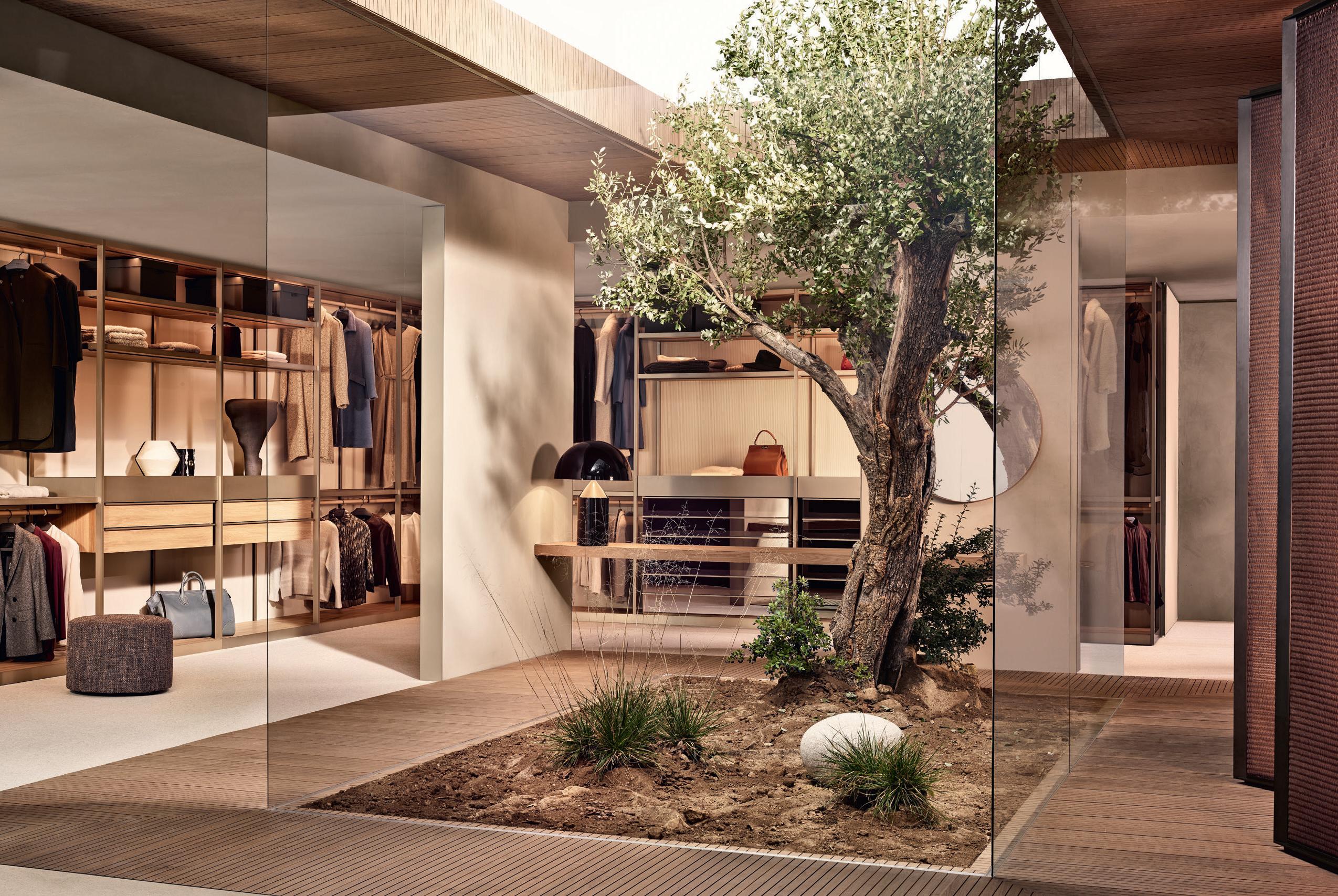
INSTANT CONVENIENCE
CHAIRMAN & FOUNDER
Raj Nandan raj@indesign.com.au
CONSULTING EDITOR
Paul McGillick
EDITOR
Holly Cunneen holly@indesign.com.au
SE ASIA CO-EDITOR
Janice Seow janice@indesign.com.sg
EDITORIAL ASSISTANT
Vicki Wilson vicki@indesign.com.au
ART DIRECTOR

Marcus Piper m@marcuspiper.com
CONTRIBUTING WRITERS
Andra Stephens, Stephen Crafti, Rachael Bernstone
CONTRIBUTING PHOTOGRAPHERS
Abin Chaudhuri, Barton Taylor, Beersingoi, Brett Boardman, Chalermwat Wongchompoo, Christopher Frederick Jones, Dianna Snape, Dinesh Mehta, Edmund Sumner, Eresh Weerasuriya, Fabian Ong, Fernando Gomulya, Hoang Le, Marc Tey, Nathan Etherington, Paul Hermes, Rory Gardiner, Simon Devitt, Simon Wilson, Suryan/Dang
MANAGING DIRECTOR
Kavita Lala kavita@indesign.com.au
BRAND DIRECTOR
Colleen Black colleen@indesign.com.au
(61) 422 169 218
BRAND DIRECTOR
Dana Ciaccia dana@indesign.com.au
ACCOUNTS
Vivia Felice vivia@indesign.com.au


Flora Li flora@indesign.com.au
ONLINE MANAGER Radu Enache radu@indesign.com.au
WEB DEVELOPER Ryan Sumners ryan@indesign.com.au
BUSINESS DEVELOPMENT MANAGER Brunetta Stocco brunetta@indesign.com.au
PRODUCTION AND PROJECTS MANAGER Brydie Shephard brydie@indesign.com.au
PRODUCTION ASSISTANT Becca Knight becca@indesign.com.au
COVER IMAGE #3 by Studio2 Architects (p.116)
Photography by Simon Devitt
HEAD OFFICE Sydney, Australia (61 2) 9368 0150 | (61 2) 9368 0289 (fax)
MELBOURNE
1/200 Smith St, Collingwood, VIC, 3066 SINGAPORE
4 Leng Kee Road, #06–08 SIS Building, Singapore 159088 (65) 6475 5228 | (65) 6475 5238 (fax) HONG KONG
Unit 12, 21st Floor, Wayson Commercial Building, 28 Connaught Road West, Sheung Wan, Hong Kong indesign.com.au
Habitus magazine is a wholly owned Australian publication, which is designed and published in Australia. Habitus is published quarterly and is available through subscription, at major newsagencies and bookshops throughout Australia, New Zealand, South-East Asia and the United States of America. This issue of Habitus magazine may contain offers or surveys which may require you to provide information about yourself. If you provide such information to us we may use the information to provide you with products or services we have. We may also provide this information to parties who provide the products or services on our behalf (such as fulfilment organisations). We do not sell your information to third parties under any circumstances, however, these parties may retain the information we provide for future activities of their own, including direct marketing. We may retain your information and use it to inform you of other promotions and publications from time to time. If you would like to know what information Indesign Media Asia Pacific holds about you please contact Nilesh Nandan (61 2) 9368 0150, (61 2) 9368 0289 (fax), info@indesign.com.au. Habitus magazine is published under licence by Indesign Media Asia Pacific. ISSN 1836-0556
Printed in Singapore. All rights reserved. No part of this publication may be reproduced, stored in a retrieval system, transmitted in any form or by any other means, electronic, mechanical, photocopying, recording or otherwise. While every effort has been made to ensure the accuracy of the information in this publication, the publishers assume no responsibility for errors or omissions or any consequences of reliance on this publication. The opinions expressed in this publication do not necessarily represent the views of the editor, the publisher or the publication. Contributions are submitted at the sender’s risk, and Indesign Media Asia Pacific cannot accept any loss or damage. Please retain duplicates of text and images.
water. Discover more at zipwater.com
Zip HydroTap provides pure tasting filtered water with instant boiling, chilled and sparkling
THE KITCHEN ESSENTIAL

All your drinking water needs, All-in-One beautifully designed system. Remove the need for multiple taps in your kitchen with a single, beautifully designed system that delivers boiling, chilled and sparkling filtered drinking water, as well as hot and cold unfiltered water for your sink.
The Zip HydroTap All-in-One offers every water option you need from one multi-functional tap and a single intelligent compact under-bench system. That’s why the Zip HydroTap will be the one and only hydration solution for your kitchen. Discover more at zipwater.com


THE WORLD’S MOST ADVANCED DRINKING WATER SYSTEM ZIP HYDROTAP | PURE TASTING | INSTANT | BOILING | CHILLED | SPAR KLING

lightbox


FAMILY TIES
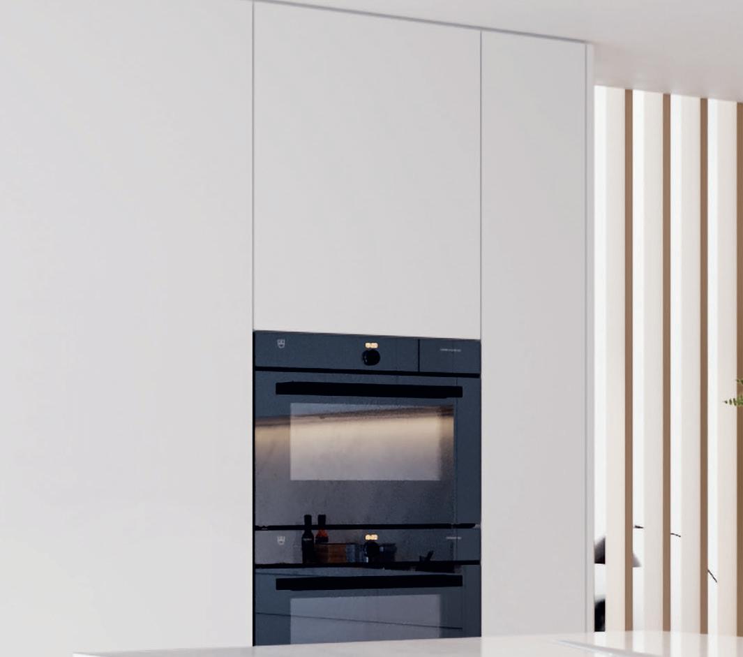
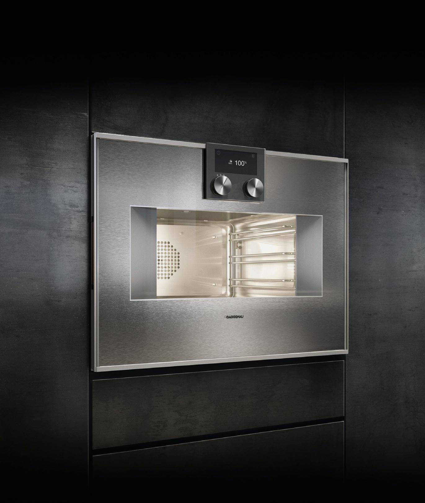
Having introduced the steam oven to the private kitchen 21 years ago, Gaggenau has continued to refine and innovate, ensuring their position at the forefront of modern and professional cooking results. The new Gaggenau 400 SERIES COMBI-STEAM OVENS do just that, capable of steaming, baking, cooking, braising, grilling, simmering, regenerating and more.
gaggenau.com
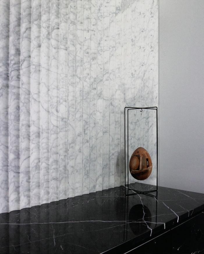

cattelanitalia.com
skheme.com
STONE CONCAVE is the latest 3D natural stone creation from Skheme featuring eight different stone colours and a unique concave shape. Suitable only for wall applications.
The new 2020 Cattelan Italia collection, of more than 60 products, continues the brand’s focus on materials, finishes and shapes in its search for manufacturing excellence. Here, the TYRON KERAMIK PREMIUM table is shown.
issue #49 habitusliving.com/houseoftheyear
Consistency through an interior can be established across a wide range of products by finding one shared attribute –such as colour, material or shape.
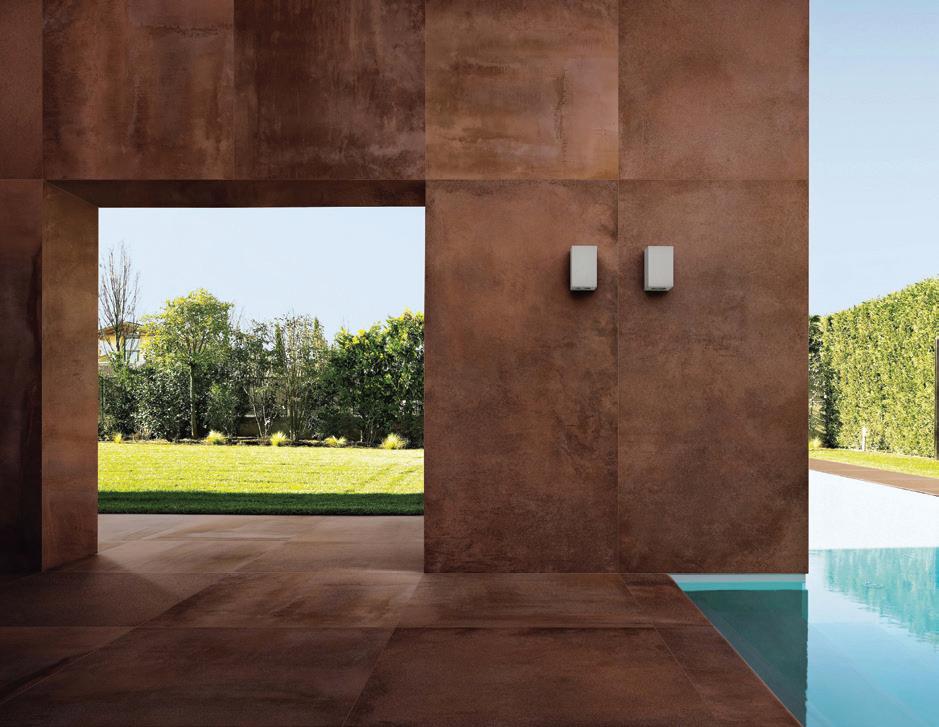
Rocks On Hard Surface Solutions are specialists in premium porcelain and ceramic wall tiles for every ambience and application, be it residential, commercial or public architecture.

rockson.com.au
MIELE ’s new GENERATION 7000 full-surface Induction Cooktop has been designed to ensure nothing stands in the way of creativity in the kitchen. It provides the perfect unobstructed flow for budding home chefs.

miele.com.au/generation7000/
Inspired by the ever changing movement and lightness of clouds, THE CLOUD collection from Dinosaur Designs plays with soft, ethereal hues to echo the endlessly shifting tones of a cloudfilled sky.
dinosaurdesigns.com.au

lightbox # 25
COMFORT FACTOR

The new BLOP ARMCHAIR from Mambo combines a tight metal structure with its soft, pillow-like arms and seat. Clean lines and a supple form o er a fresh, contemporary addition to any interior.


mambounlimitedideas.com
In a master stroke, B&B Italia has re-issued the sculptural 1970 CAMALEONDA SOFA by Mario Bellini . Born in 1935, Bellini is a pioneer of Italian design. His work in industrial and furniture design is strongly associated with anthropomorphic ideas, manifesting as sculptural and expressive designs that show subtle emotion.


spacefurniture.com.au


Contemporary design and modular flexibility provide multiple configuration options with the KING COVE OUTDOOR SOFA . Available in a range of new-generation waterproof Sunbrella® fabrics for a premium level of performance in the outdoors.

kingliving.com.au


#49 habitusliving.com/houseoftheyear
Design can tell a story but the most important plot line is function.
issue
The release of the TRACE DINING collection is sure to bring resort-style splendour into your outdoor space. Designed by Adam Goodrum and made by Tait , Trace Dining brings resort features into the courtyard with clean lines and sophistication – all the while maintaining a refreshingly relaxed design. madebytait.com.au
PANDARINE is the new two and three-seater sofa designed by Inga Sempé for HAY. In order to suit an individual’s needs, there are options for corner modules, chaise lounges, and armrests in a cylindrical form or with a reclining design that can be adjusted individually in the same way as the backrests.


hayshop.com.au


lightbox # 27


HARD WORKERS
Durable materials add longevity to high tra c areas such as family rooms and transitional spaces.
refi ned, contemporary design with a rawness of materiality, Geo is a collection of distinctive dining, hall, side and co ee tables.

danielboddam.com
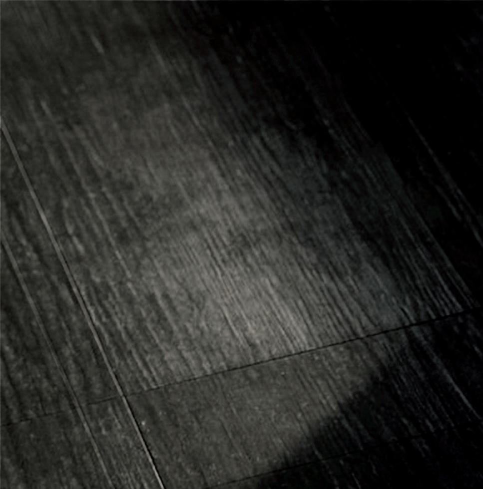
Tongue n Groove is passionate about Oak flooring. Unlike most engineered floorboards, made of layers of ply under a timber veneer, Tongue n Groove products are designed with three layers of fi ne European Oak for optimal fi nish, longevity and structural integrity.


tngflooring.com.au
 The unconventional application of rammed concrete is paired with timber and mouth blown glass for architect and furniture designer Daniel Boddam’s GEO collection. Uniting
issue #49 habitusliving.com/houseoftheyear

BLUSHING BEAUTIES
Consider the fi nal touches for a lasting impression.

Reliquia Collective ’s latest venture, AEYRE HOME , marks the brand’s venture into the home sphere with its iconic resin styles spanning trays and coasters alongside an expansion into glassware and brass incense holders.
reliquiacollective.com


The latest in the Matter Collection from Fibonacci , the GHOSTED (shown here) and Polarity terrazzo designs have been conceived to create a place in between the old and new worlds of terrazzo.
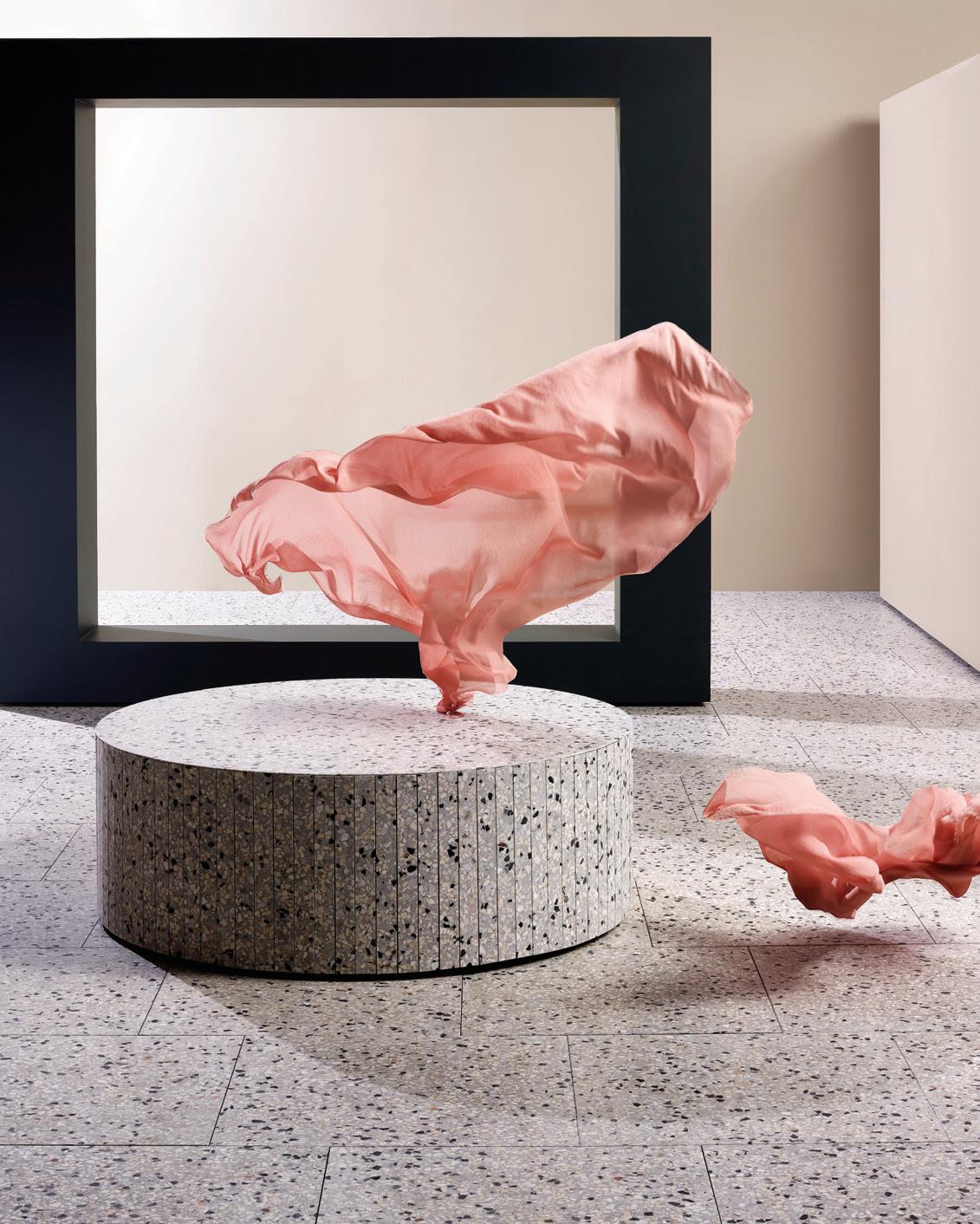


fibonaccistone.com.au


The ASPA TABLES, designed by MUT Design for Pulpo, are a simple study in geometry. Five cathedral glass layers stacked on top of one another creates a delicate play of colour and incidence of light, rich of dimensions.
domo.com.au


issue #49 habitusliving.com/houseoftheyear
DuraSquare. Striking. Precise. Rectangular.

 The new bathroom series, DuraSquare, blends the precise edges of the rectangular outer form with soft, organically flowing inner contours. The washbasin made from DuraCeram ® sits on top of a matching metal console, shown here in chrome. The glass shelf provides practical storage space. More information available at www.duravit.com.au
BETTER TOGETHER
Put your best foot forward with pieces throughout the home that will prepare you for the day, or help you wind down.
“With an extensive range of quality products and a choice of colour finishes, the LUNA collection is the practical choice to create your bathroom sanctuary,” says industrial designer Luke Di Michiel of Caroma

caroma.com.au
V-ZUG’s focus on innovation and design is perhaps most evident with this cutting-edge fabric care solution. Available to be fully integrated, or with stainless steel or matte black facia options, to suit your space, THE BUTLER nurtures your most delicate and loved garments with a combination of gentle drying, steam refreshing and soft anti-crease. It also removes bacteria and neutralises odours.
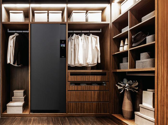
vzug.com
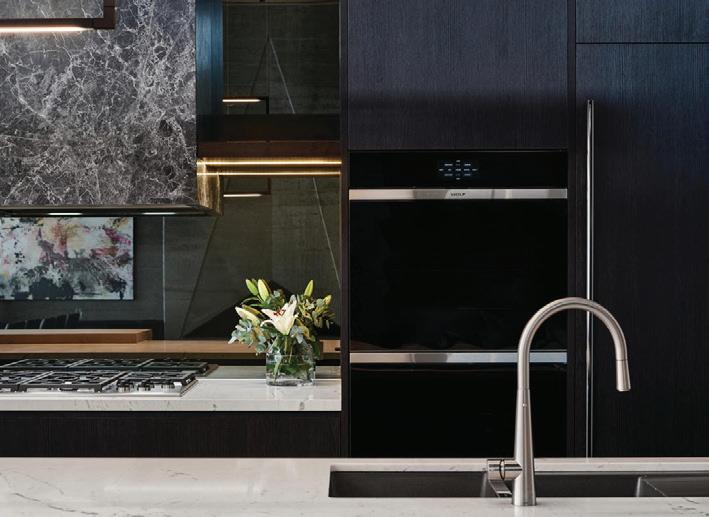
The WOLF M SERIES Contemporary oven with its minimalist handle free design and colour LCD touch panel has a distinct look sleek enough for even the most visionary kitchen.
subzero-wolf.com.au
The Five to Nine daybed designed by Studiopepe for Tacchini is iconic and contemporary in its design. Offering versatility in function, the backrest is available in two heights with an integrated table and option for fabric or leather upholstery. This allows for application in various spaces.
stylecraft.com.au

issue #49 habitusliving.com/houseoftheyear
Our masterpieces, require a master.
The difference is Gaggenau. Create your masterpiece with ours. Then new combi-steam ovens and oven range open up a world that is waiting to be mastered. Every Gaggenau is distinctively designed, crafted from exceptional materials, offers professional performance, and has done so since 1683. Master steam: gaggenau.com.au

GATHER ‘ROUND
Curved surfaces and organic shapes create a sense of luxury, made possible with Laminex® laminate in this kitchen by Kennedy Nolan and Laminex

laminex.com.au
The integrative, sculptural design of the limited edition Wilkhahn INLINE TABLE makes a unique statement when you enter the room, making it ideal for both home office environments and living spaces.

wilkhahn.com.au
The Zip HydroTap Celsius All-in-One Arc –Boiling, Chilled & Sparkling filtered and Hot & Ambient unfiltered tap features a single under bench command centre including full colour interactive touch screen display with pin code protection, boiling water safety mode and three energy saving modes.
zipwater.com

issue #49 habitusliving.com/houseoftheyear
Finishes and furniture for central gathering points around the house should be hard-wearing and durable.
BEFORE WE MAKE OUR TAPS, WE RECYCLE THEM.

All our taps begin their life as a solid block of recycled brass.

And at the end of the crafting process, all brass shavings are melted down to be reused again.
Here in our own Australian foundry. It’s a continuous cycle that’s truly Australian.
SUSSEXTAPS.COM.AU/SUSTAINABLE

Truly Sustainable.
Design precision
Sub-Zero and Wolf appliances and showrooms are for design-savvy, talented home chefs.
Uncompromising quality and endless design possibilities characterise the Sub-Zero and Wolf product offering. Furthermore, the diverse range of technologies and design solutions ensure that anyone and everyone is able to find a comprehensive kitchen solution that meets their unique cooking needs and stylistic preferences.
The Sub-Zero range is constantly responding to the three pillars of preservation. They are: precise temperature control, optimal humidity and purified air. With 48 models in the preservation range the refrigerator and freezer units come in varying widths and configurations; from side-by-side installations to linear columns. Moreover, one can choose from the Classic Series, which features Sub-Zero’s iconic distinctive grille and sleek hinges; and the Designer Series, designed to be fitted with customised panels to suit kitchen cabinetry or stainless steel for an ultra modern kitchen.
The Wolf range is known for its intuitive technology and ergonomic design – allowing the user to cook an endless array of dishes in endless comfort. Like the Sub-Zero range, Wolf products have been designed to suit a variety of aesthetic preferences from the classic pieces we know, love and seek comfort from, to the ultra sleek, modern designs that impress and inspire us.
With a diverse array of design styles available, SubZero and Wolf appliances deliver a design solution to suit any kitchen aesthetic. The showrooms in both Sydney and Melbourne have been designed by leading interior design studios to emphasise the design possibilities Sub-Zero and Wolf offers. The recently opened Sydney showroom designed by Adele Bates is case in point.
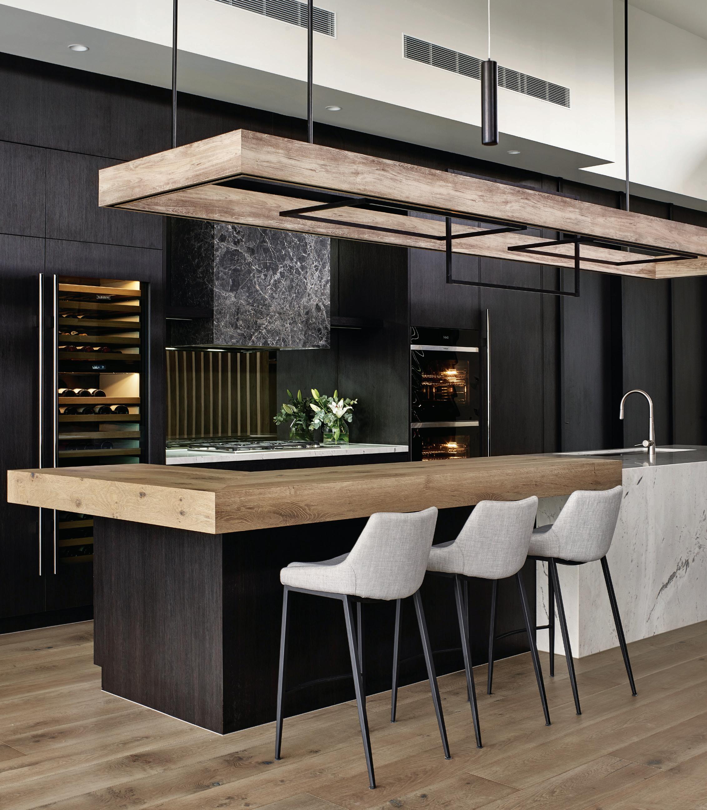
ABOVE & OPPOSITE The Sub-Zero Wolf Kitchen Design Contest 2nd Place Winner, Maker+May, featuring the SubZero Designer Series Refrigeration/Freezer and Wine Storage and Wolf M Series Contemporary Oven and Professional Gas Cooktop.
“The Sub-Zero and Wolf showroom in Surry Hills, Sydney, is designed to be an aspirational design and showcase space,” says Adele. “The space is cleverly zoned to create a sense of openness while housing a large quantity of appliances. The joinery is designed to showcase the design possibilities of the appliances across the product ranges, from full integration to bespoke door designs.”
The Sub-Zero and Wolf showrooms are located at Bank House, 11-19 Bank Place, Melbourne, and 63 Foveaux Street, Surry Hills, Sydney. To make a showroom appointment contact 1300 808 859 or visit www.subzero-wolf.com.au

issue #49 habitusliving.com/houseoftheyear
Photography by Daniel Fuge
Sub-Zero Wolf | au.subzero-wolf.com/en
habitus promotion › Sub Zero + Wolf #39
Preserve masterfully. Cook precisely. Live deliciously.
Savour the ingredients that stay fresher longer with Sub-Zero, the food and wine preservation specialist, the meals that are cooked to masterful precision with Wolf, the cooking specialist, and a kitchen appointed with elegantly crafted appliances.

Re f r ig er at ion. C ook i ng .
Melbourne Showroom, Bank House, 11-19 Bank Place, Melbourne. Sydney Showroom, 63 Foveaux Street, Surry Hills. subzero-wolf.com.au

Partners
Hunter Partners
Partner
Partner
Major
Design
Trophy
Supporting
These next 20 projects that comprise the Habitus House of the Year 2020 selection have been sought out by the Habitus editorial desk and our extensive network of contributing architecture editors.
Spread far and wide across the Indo Pacific Region, they are a true cause for celebration.
CAST YOUR VOTE FOR PEOPLE’S CHOICE habitusliving.com/houseoftheyear
J&J RESIDENCE HOGG & LAMB

BRISBANE | AUSTRALIA


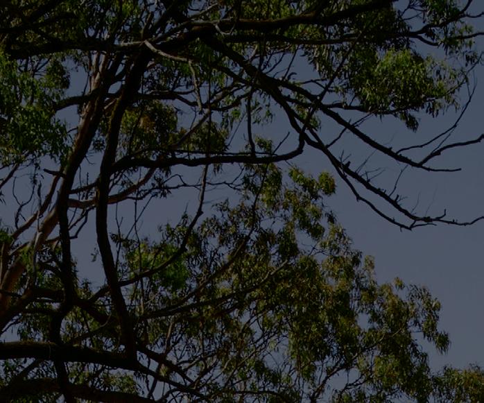
On a large site edging toward a Eucalypt reserve, J&J Residence strives to sit respectfully on the land and take as little as possible from fi nite resources.
issue #49 habitusliving.com/houseoftheyear
TEXT HOLLY CUNNEEN | PHOTOGRAPHY CHRISTOPHER FREDERICK JONES

habitus house of the year # 45
The J&J Residence is located in Chandler, an outer suburb of Brisbane and one of the city’s most expensive areas. The 50x200 metre site, which sits on the edge of a remnant Eucalypt forest, looks west to the city and enjoys a mountainous backdrop. Where its neighbouring blocks are significantly larger (some, four times the size), J&J Residence remains humble in footprint. Yet the architecture by Hogg & Lamb, which has offices in Brisbane and Northern New South Wales, is no less impressive for it.
Upon arrival, the first thing you notice are the thin, vertical, recessed, double-height windows’ that appear as two-storey volumes. The rear of the house is in stark contrast, with large glass sliding doors allowing unobstructed views to bushy Eucalypt trees. This in direct response to the client’s wish to feel connected to the outdoors from anywhere within the house. A 2.4-metre overhang protects this side of the house from the sun when it is strong.


The owners and clients of Michael Hogg and Greg Lamb are a mature couple with a penchant for entertaining and an adult child who visits on occasion. The J&J Residence needed to feel both spacious and cosy whether it was just the owners at home or a full house.
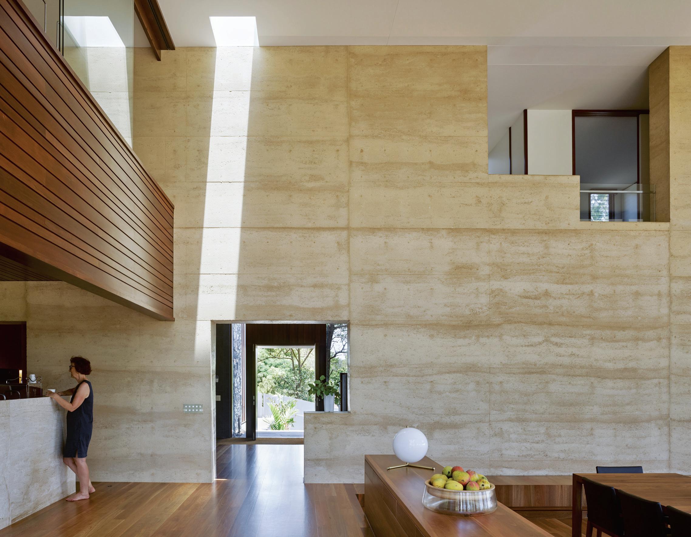
The house consists of two L-shaped plans divided by a monumental rammed earth wall that runs down the centre. The arrival side faces south west, with views toward the city. The main progression once inside is though the feature wall to the double-height, open plan living side. Comprising the kitchen, dining and lounge area, this side of the residence faces north east.
OPENER J&J Residence is located on the edge of a remnant Eucalypt forest, looking west to the city.
BELOW LEFT At the rear of the kitchen is an east-facing sun room.
BELOW RIGHT A James Turrell-inspired window: with a hidden frame and sharp detail, depth perception is obscured and the effect is that of artwork that changes with the seasons.
OPPOSITE ABOVE Entry is on the south wing, but to reach the main living spaces one passes through the 400mm-thick rammed earth wall.
OPPOSITE BELOW The open-plan living and dining area is characterised by an expansive doubleheight void.
issue #49 habitusliving.com/houseoftheyear

habitus house of the year # 47

issue #49 habitusliving.com/houseoftheyear

# 49 habitus house of the year
PREVIOUS Deep overhangs protect the interiors from the strong sun without eliminating the connection to nature that sliding glass doors and large format windows afford.
ABOVE Adjacent to the kitchen is a second prep kitchen, perfect for caterers to set up when entertaining.
BELOW Behind the main bedroom is a corridor to an ensuite and walk in robe.
The guest bedrooms and stairwell occupy the south side of the upper floor, while the main bedroom, ensuite and a reading room are on the north side. Hogg & Lamb have designed it in this way so that the residents are constantly moving through the rammed earth wall. And at 400 millimetres thick, you can pause in the openings, to stand within the wall.
Previous to this project, Michael and Greg had not worked with rammed earth, and suitably did an extensive amount of research on behalf of the clients. To take full advantage of the passive design benefits associated with the material they designed in vertical internal ducts that run down through the thick rammed earth wall, connecting the roof to a sub floor ventilation system. This creates activated thermal mass that works passively yet consistently through the seasons to maintain an optimum internal temperature.
For example, during winter warm air is collected in the roof and driven through the wall to warm the interiors. Conversely in summer, namely summer evenings, “skycool” conductive paint cools the roof space. Before daybreak when the air is at its coolest, the air collected in the roof is again pushed through the walls this time reducing internal temperatures.
Hogg & Lamb located a supplier on the Sunshine Coast who was able to provide the material in a colour that matched the site. The wall continues beyond the building to recede gently into the landscape. As a result the wall, which is scaled to mirror that of the site, feels like it is an extension of the land and its bushy flora.
While the environmental performance of the J&J Residence is strong, the aesthetics of the house and experience living there isn’t at all compromised. In fact many of the client’s guests have mistaken the rammed earth for travertine (mirroring the solid block of marble used for the kitchen bench). An affinity between materials –predominantly natural: marble, stone, rammed earth and timber – was sought out by the architects and goes to show that there is no longer “one look” to sustainable design.

Hogg & Lamb | hoggandlamb.com

issue #49 habitusliving.com/houseoftheyear
FIRST FLOOR
J&J Residence, Australia
ARCHITECT Hogg & Lamb
LEAD ARCHITECT Michael Hogg
INTERIOR DESIGN Hogg & Lamb
BUILDER Scott Harris Constructions
STRUCTURAL ENGINEER Westera Partners
SERVICES AND ENVIRONMENTAL ENGINEER Seed Engineers
HOGG & LAMB (61 4) 1779 1825 hoggandlamb.com
FINISHES
Spotted Gum timber cladding, flooring and veneers. Travertine internal floors by Architectural Stone & Wood Co. Rammed Earth Walls by Rammed Earth Constructions. Large format wall tiles by Neolith. Brescia Sandra Marble Benchtops by Architectural Stone & Wood Co. Rosewood timber framed doors and windows by Architectural Timber Joinery.
FURNITURE
Jaan Living sofas and Andoo lounge chairs, extending dining table and low back dining chairs by Walter Knoll. Eames Walnut Stools by Herman Miller. Custom bedhead.
LIGHTING
Glo-Ball by Flos. Custom LED mirror cabinets. Laser Blade downlights by iGuzzini. Wall lights by Rakumba. Track lighting by Molto Luce. LED exterior light fittings by Nocturnal Lighting.
FIXED & FITTED
Kitchen appliances by Miele. Fireplace by Chazelles. Tapware by Vola. Shower mixers by Astra Walker. Kartel by Laufen basins and W.C.
GROUND FLOOR
1 2 3 4 5 6 7 8 9 0 q
GARAGE
ENTRY
BATHROOM
OFFICE
SITTING ROOM
KITCHEN
PREP KITCHEN
LAUNDRY
DINING
LIVING
OUTDOOR ROOM
w e r t y u i o p a s
SUN ROOM
MORNING GARDEN
LAWN
POOL DECK
POOL
FAMILY ROOM
BEDROOM
MAIN BEDROOM
ENSUITE
WALK IN ROBE
LIBRARY
# 51 habitus house of the year
The King Living design and sales team work closely with valued architects and interior professionals. To make contact with a King Living representative apply online today at kingliving.com

King Cove Outdoor
Representing the pinnacle of King craftsmanship and contemporary design. Experience the art of living with the King Cove Outdoor collection.


issue #49 habitusliving.com/houseoftheyear
CORYMBIA HOUSE


PAUL BUTTERWORTH ARCHITECT

Corymbia House by Paul Butterworth

Architect provides its residents with a lowmaintenance holiday house for now, and an idyllic retirement setting for the future.
 STRADBROKE ISLAND | AUSTRALIA
habitus house of the year # 55
TEXT HOLLY CUNNEEN | PHOTOGRAPHY CHRISTOPHER FREDERICK JONES
Flexibility and future proofing in architecture are often talked about in one of two ways: the ability of a house to flex and contract as a family grows and eventually disperses, or as providing mature adults with a home suitable for ageing in place years down the track. But for the residents of Corymbia House on Stradbroke Island – Minjerribah in the traditional Jandai language of the Quandamooka people – and clients of Paul Butterworth Architect, they wanted a house that would presently serve as a holiday retreat before ultimately becoming a house to retire into full time. There aren’t too many obvious parallels to draw between the requirements of each typology, yet Paul Butterworth has managed to sensitively and thoughtfully respond to their unique brief.
Right now, the clients live in Ipswich and work full time. Margaret is an architectural historian and Nick a geologist. They have two sons in high school and visit the house frequently, not least because they have a family history with the site. Relatives owned the site for 35 years prior, so they know the area well and wanted to be sensitive to the landscape. This mentality aligned perfectly with Paul’s: “Our best projects are the ones that in a few years become unseen; they defer to the landscape and recede ideally as quickly as possible or over time.”
Although there was an existing house on site – a painted blockwork structure that had been added to over the years – it was riddled with asbestos and had issues with dampness and mould, so both client and architect agreed to demolish and start anew. The new Corymbia House takes far greater advantage of its site.
The house is located on a street corner next to council land. The clients’ relatives had planted out this land over time, though the majority was done 35 years ago. Today, it’s quite mature and Paul has incorporated it into the design as a “borrowed landscape” to create the sense of a bush setting.
Two stone walls and a timber arbour form the main entrance beneath the characterful, namesake Corymbia tree. A generous width between the timber beams encourages the Flowering Gum to peak through and cast interesting shadows. On the other side of the entry sequence, the house fully reveals itself as it opens on to the great room off the deck and leading to the kitchen with sightlines through
to the interior living spaces. This also works as passive security, in lieu of rigid fences, front gates and intercom systems – all of which are rarely found on the island.
Inside the house much of the flooring is timber decking, a continuation from outside. Not only does this offer a more casual atmosphere for the island retreat, but it’s also a practical decision, and one made often by Paul for the handful of other residences he has designed on Stradbroke Island. The island consists almost entirely of sand and, needless to say, it gets everywhere, but the intention is that by the time the residents reach the internal house proper, as much of the sand as possible will have fallen off and through the floor.
For effect the decking continues upstairs along the corridors connecting the three bedrooms that have been located to the upper, private level. The main bedroom and the boys’ bedrooms at either end of the plan all enjoy ocean views. Although they weren’t significant enough to warrant placing the living spaces on the upper level, they do offer personal and distinctive views for each family member.
The Corymbia House is retreat where Paul Butterworth’s clients can escape the real world, put their feet up, and indulge themselves. Yet despite the luxury of an island-based holiday house, the maintenance is minimal. Hardwearing finishes that are aged, anodised, or matte mean that above all, Margaret, Nick and their two sons can simply enjoy the change of scenery, and each other’s company.
Paul Butterworth Architect | pbarchitect.com.au
OPENER Two stone walls and a timber arbour mark the entry sequence, which continues through the garden before reaching the interior.
ABOVE A reading nook is located offside of the kitchen and main living, separated but visually open.

issue #49 habitusliving.com/houseoftheyear


 LEFT The corridor upstairs between the three bedroom remains open and connected to the living spaces beneath.
# 57 habitus house of the year
RIGHT Mature trees in the neighbouring council land afford privacy in the main bedroom.
LEFT The internal spaces of the Corymbia House have been designed to feel connected to its surrounding environment.
Corymbia House, Australia

ARCHITECT Paul Butterworth Architect
ARCHITECT TEAM Paul Butterworth and Kahn Neil
INTERIOR DESIGN Paul Butterworth Architect BUILDER Henderson Constructions
ENGINEER Bligh Tanner
TIMBER DOORS AND WINDOWS Architectural Timber Joinery
CABINETMAKER WPD Cabinets
LANDSCAPING By Owner
PAUL BUTTERWORTH ARCHITECT (61 7) 3354 3995 pbarchitect.com.au
FINISHES
Spotted Gum boards for flooring and decking. Cemintel Barestone, stained rough pine weatherboards, painted fibrous cement sheeting and charcoal stained Shadowclad plywood for external cladding. Clear finished hardwood plywood, spotted gum boards and painted fibrous cement sheeting for internal cladding. Caesarstone benchtops in Bianco Drift. Caesar Elapse wall and floor tiles in Cave and Neutral from Elite Bathware & Tiles. Yohen mosaic shower tiles from Artedomus.
FURNITURE By owner.
LIGHTING
Wall and ceiling lights by Gamma Illumination. Hinaki Pendant Lights by David Trubridge.
FIXED & FITTED
Haiku ceiling fans by Big Ass Fans. Tapware and accessories by Astra Walker. Appliances from Neff, Franke, Smeg and Asko. Catalano basins and Solo bath by Rogerseller.
ARBOUR OUTDOOR SHOWER GREAT ROOM LIVING DECK KITCHEN SITTING BBQ DECK
PURPOSE ROOM
GUEST SHOWER
WORK SPACE ENSUITE VOID 1
7
ENTRY
MULTI
LAUNDRY
BEDROOM BATHROOM
2 3 4 5 6
8 9 0 q w e r t
GROUND FLOOR FIRST FLOOR issue #49 habitusliving.com/houseoftheyear


NEW




FIND OUT MORE AT










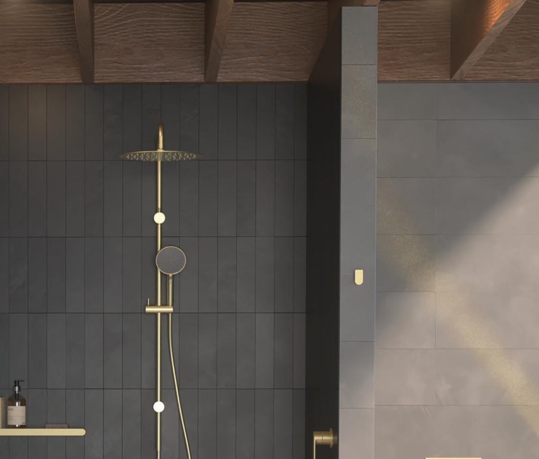
EXPRESS YOUR PERSONALITY WITH CAROMA’S NEW COLOUR COLLECTION.
UPSIDE DOWN AKUBRA HOUSE ALEXANDER SYMES ARCHITECT



issue #49 habitusliving.com/houseoftheyear
This o -grid residence in a remote rural area of north-west New South Wales celebrates 360-degree views while maintaining passive design principles.
NUNDLE | AUSTRALIA
TEXT HOLLY CUNNEEN | PHOTOGRAPHY BARTON TAYLOR

habitus house of the year # 63
The residents of the Upside Down Akubra House came to architect Alexander Symes with a relatively comprehensive brief. They owned a 314-hectare bull farm outside Nundle (50 kilometres south east of Tamworth) and had already selected the spot on which the house was to reside. At the crest of a gentle hill the clients wanted to capture the views in literally all directions: Yella Rock to the south, Hanging Rock to the east, views north through a grove of Eucalypts and west over the bull paddocks to the rolling hills that follow. “Essentially an amazing 360-degree view all the way around,” says Alexander. But it wasn’t that simple: given its remoteness, it also needed to be completely off-grid.
Alexander’s strategy to reconcile uninterrupted views all round and a comfortable internal climate was to design a massive roof structure with large overhangs wrapping around the entire building. This resulted in a roof 2.5 times the size of the 195 square metre floor plan. This blocks out direct sun during summer, but allows it in during winter to warm up the exposed concrete floors and walls, with concrete chosen for its ability to create thermal mass.
In fact, explaining this strategy to the clients is how the name for the project came about. Borrowing an Akubra hat and flipping it upside down, Alexander was able to describe with visual reinforcement his concept.
Inside, past an air lock entry designed to conserve the heat in winter as guests enter or exit, the house is organised around a central spine that contains the utility and service areas. On the western side of the plan are three bedrooms, within the service core is an ensuite to the main bedroom, a common bathroom and laundry. The eastern side forms an open study, living and dining area connected to the kitchen that flows out into the outdoor living space. Sliding glass doors access the impressive view towards Hanging Rock, while smaller ribbon windows continue all the way around the house.
OPENER Poised atop a gentle hill and encased in windows large and small, the Upside Down Akubra House enjoys views in every direction.
ABOVE The residents’ impressive collection of Indigenous art takes pride of place in the living area.

Blackbutt Hardwood, Radiata Pine and exposed concrete form a colour palette that mirrors that of the surrounding landscape.
BELOW LEFT The front door was located in such a place so that on arrival, one can see straight through the house and out to the paddock beyond.
BELOW RIGHT A large gutter with a central drainage point creates a waterfall like show.
issue #49 habitusliving.com/houseoftheyear


# 65 habitus house of the year
“There’s a larger window to wall ratio in the living spaces because that looks out to the views,” says Alexander. “But on the west the widow to wall ratio has been reduced so that you can minimise the amount of solar gains and thermal conductivity through the façade.” Moreover, this balances privacy for the bedrooms with the client’s desire for 360-degree views. “Through design or luck a lot of my projects are about aligning prevailing winds, views, and solar orientation to create the building form,” he continues.
Blackbutt Hardwood has been used for the doors, windows and joinery while the ceilings and awnings are finished with Radiata Pine. This gives a natural and warm feeling to the interiors and, in conjunction with the exposed concrete, a colour palette that mirrors that of the surrounding landscape.

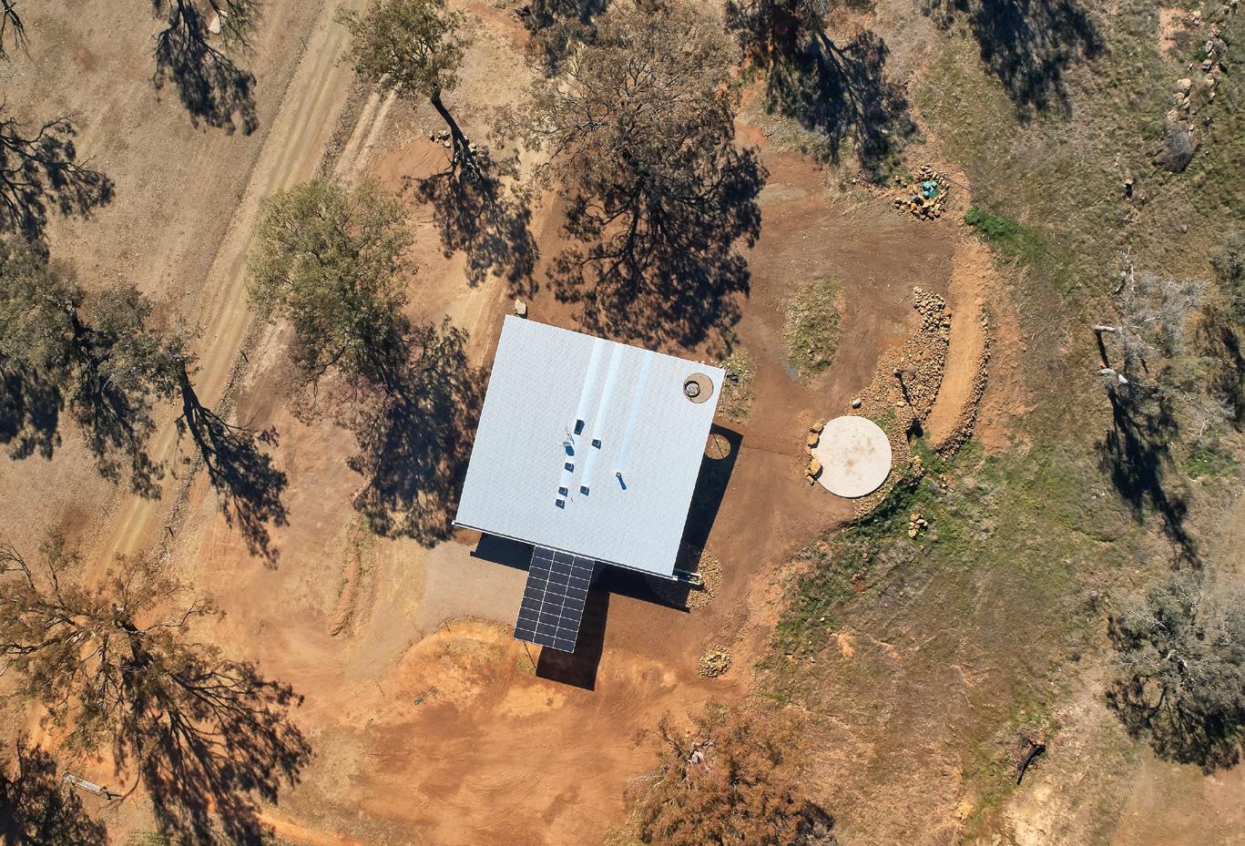
The skillion roof intersects with the carport roof in a double skillion style. The 80 square metres of the carport roof are comprised of LG neon bi-facial photo-voltaics, which in turn generate enough energy to run the house. The angle of the main roof and a 450-millimetre diameter gutter encourages rainwater to the eastern corner of the roof, where it free-falls “like a waterfall” into a concrete trough. This then feeds the rainwater into a 107,000-litre rainwater storage tank that collects enough water for the household and the management of waste.
“When it does rain it’s a joyous occasion,” says Alexander. “It’s about playing with the theatre of those moments [but] it’s not theatre for trickery’s sake, it’s theatre for what I consider real issues in the world such as water security and efficient use of resources.”
Living off-grid is by no means a new concept, concedes Alexander, but he notes that in this location – both remote and very much at the mercy of extreme weather – it’s entirely necessary.
Alexander Symes Architect | alexandersymes.com.au

issue #49 habitusliving.com/houseoftheyear
“There’s a larger window to wall ratio in the living spaces because that looks out to the views.”
Upside Down Akubra House, Australia
ARCHITECT Alexander Symes Architect
BUILDER Blue Eco Homes
STRUCTURAL ENGINEERING Ascent Consulting Engineers
ALEXANDER SYMES ARCHITECT (61 4) 1135 3001
alexandersymes.com.au
FINISHES
Zego Reform off form concrete walls. Solitex Extasana water permeable membrane by Pro Clima under Colorbond Custom Orb and Mini Orb cladding. Eco Outdoor Pacific Bluestone pavers. Pyrolave benchtops.
FIXED & FITTED
NeOn BiFacial solar panels by LG. Skylights by Velux, LightBridge insulated glass units by Viridian Glass. Brink Heat Recovery Ventilation system. D1000EPI fireplace by Chazelles and ceiling fans by Big Ass Fans. RP10 wastewater treatment system by Ozzi Kleen. Gutter by Eziform and strip drains by Stormtech.
ABOVE LEFT An outdoor deck acts as a natural extension to the indoor living area when the weather permits.
BELOW LEFT The northeastern outlook.
RIGHT An aerial view of the residence shows the solar cells that form the roof of the carport and power the building.
UTILITIES AIR LOCK ENTRY LIVING DINING KITCHEN PANRTY STORE BEDROOM ENSUITE LAUNDRY BATHROOM W.C. OUTDOOR ROOM FIREPIT 1 2 3 4 5 6 7 8 9 0 q w e r # 67 habitus house of the year
A collaboration with one of Australia’s most creative architecture practices.
Respected Melbourne architects Kennedy Nolan worked with the Laminex® Colour Collection to design this expansive kitchen, demonstrating the beauty and design versatility of Laminex® laminate with curved surfaces and organic colour.
Discover more at laminex.com.au


SKY HOUSE
MARRA+YEH ARCHITECTS
Combining two adjacent houses in inner-suburban Sydney came with constraints, but also opportunities to re-think the terrace house.

 SYDNEY | AUSTRALIA
issue #49 habitusliving.com/houseoftheyear
TEXT PAUL MCGILLICK | PHOTOGRAPHY BRETT BOARDMAN
The multi-generational house accommodates different generations under the one roof. Its origins lie in Asia with its tradition of family living. Now, as part of the sustainability project, we have the inter-generational house, whose designed-in flexibility allows the house to respond to changing needs over time.

This house is in Sydney’s inner-suburban East Redfern, a precinct clearly defined by the surrounding road system, generating a palpable sense of community. In fact, it’s not one, but two conjoined terrace houses. With three children, the clients felt at home in the area and were unwilling to move to the outer suburbs. But needing more space, they managed to acquire the neighbouring house. “They needed a place,” says architect, Carol Marra, “that could expand and contract” to allow for growing children and many guests.
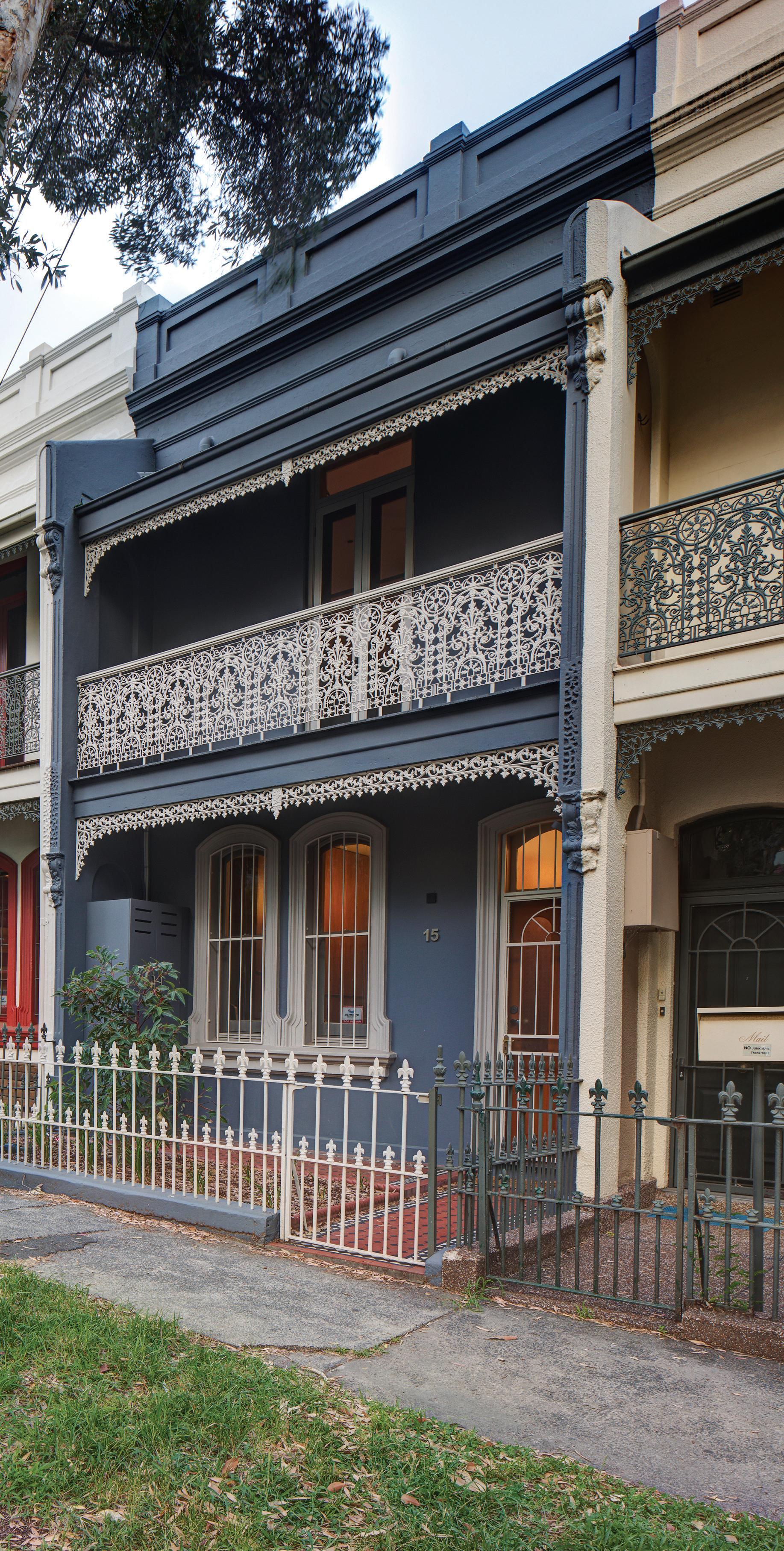
For the architects – based in Sydney, but who also work in Malaysia, Singapore and Borneo – it was an opportunity to re-think the dark and claustrophobic terrace house, imported from Britain and so inappropriate for the local climate. This they did by re-visiting the courtyard house typology and studying various examples in countries that share a similar climate to Sydney. Here they found a pattern of courtyards, atriums and internal open spaces.
Consolidating the two houses was not straightforward. This particular row of houses had skillion rooves, so an attic space was not possible. Moreover, the two houses were not on the same level – they were stepped following the slope of the street. The clients initially thought it was just a case of knocking a hole in the party wall. “We could have simply kept the party wall and worked out ways of dealing with the
habitus house of the year # 71

issue #49 habitusliving.com/houseoftheyear
different levels,” says Carol. “Or, we could rethink the typology of the terrace. We did make a hole, but it just wasn’t in the wall.”
That hole was an atrium that now not only draws in light and air, but also acts as an organising device for the house, dividing the public and private, parent and children spaces. In an inter-generational home this is important. As children grow older they have privacy issues and for parents working from home a lot, they need a space where they can’t be distracted.
The house is really a sustainability package. It allows for evolving family needs without selling up and moving on. But the atrium is also the key tactic in allowing the house to be air-conditioning free. Open at the top, it has a custom-designed retractable skylight made and installed by local company, TILT, together with a retractable screen. Built-in redundancy enables the skylight to be operable even during a power failure. Acting as a wind chimney, the atrium draws out hot air from the body of the house, but also from the upstairs bedrooms that have internal louvre windows.
The atrium functions as an internal courtyard while the consolidation of the two blocks has enabled a spacious external garden/ courtyard (with a self-contained granny flat opening both to the courtyard and the rear lane) that extends to a barbeque terrace connecting with the living/dining kitchen space. This has a retractable awning and effectively acts as the wet kitchen to the internal dry kitchen.
The material palette throughout is simple: concrete with a heated slab system for thermal mass and the kitchen benchtop, along with lightweight timbers. Spotted Gum is used throughout, says architect Ken Yeh, for its robustness. This includes joinery, the staircase, flooring and custom furniture downstairs.
 OPENER The two houses maintain their original street frontage to sustain the character of the street.
OPENER RIGHT The two backyards have been consolidated into a single courtyard garden.
OPPOSITE Looking towards the kitchen past the custom-designed sofa and island bench.
BELOW Changing light through the skylight animates the timber battens in the living area.
habitus house of the year # 73
LEFT Timber battens screen the upstairs master bedroom from the atrium.
Laminated veneer timber is generally used for structure – for its stability – and for the battens on the feature wall. The battens serve as an artwork with the effect of changing from light to dark as the eye travels down, but also as a screen to provide privacy from the atrium for the upstairs master bedroom. At ground level this wall conceals doors to the study, home office, sewing nook, library and TV room.

In order to maintain the heritage streetscape, the house still presents as two separate terraces with separate gardens. Likewise, because the atrium is effectively invisible from the street, the heritage roof profile of the row is also maintained.
Sky House, Australia
ARCHITECT Marra+Yeh Architects
LEAD ARCHITECTS Carol Marra, Ken Yeh
INTERIOR DESIGN Marra+Yeh Architects
BUILDER Shorebuild
JOINERY Oscar Prieckaerts and Jono Goode
LANDSCAPING Arborliz
LIGHTING DESIGN Architectural Lighting Design
STRUCTURAL ENGINEERING PMI Engineers
CONCRETE Concreative
INDUSTRIAL DESIGN Tilt
MARRA+YEH ARCHITECTS (61 2) 9319 3899 marrayeh.com
FINISHES
Matt off-white concrete floors and refinished original timber flooring. Spotted gum plywood from Big River Timbers. Murobond paints. Timber decking and cladding. Timber windows by Longma Joinery. Marrakesh plasterwork by Creative Wall Solutions.
FURNITURE
Clients own collection. Built-in seat and screen by Marra + Yeh Architects.
LIGHTING
Tolomeo and Castore by Artemide. Sky-fall pendants by Studio Italia Design. LED Strips by TecLED. Downlights and wallwashers by Vuelite and Boaz.
FIXED & FITTED
Parisi, Milli and Argent fittings and tapware. Siemens, Fisher & Paykel and Smeg appliances.
ENTRY STUDY LIBRARY LIVING KITCHEN LAUNDRY DINING DECK GARDEN CARPORT STUDIO MAIN BEDROOM WALK IN ROBE ENSUITE BEDROOM BATHROOM VOID ROOF GARDEN 1 2 3 4 5 6 7 8 9 0 q w e r t y u i FIRST FLOOR GROUND FLOOR
issue #49 habitusliving.com/houseoftheyear




CLT HOUSE

FMD ARCHITECTS


Appearing as a new dwelling, the CLT house by FMD Architects includes the reworking of a 1970s brown brick dwelling, driven by the use of cross-laminated timber and the rural typology.
 MELBOURNE | AUSTRALIA
issue #49 habitusliving.com/houseoftheyear
TEXT STEPHEN CRAFTI | PHOTOGRAPHY DIANNA SNAPE

habitus house of the year # 77
Designed for a couple with adult children and grandchildren, this house, located on Victoria’s Mornington Peninsula, is known as CLT, short for cross-laminated timber. “It was this material that drove the design; a material that could be fully expressed throughout the home, revealing its structure,” says architect Fiona Dunin, director of FMD Architects.

Fiona and her team were given a simple single-storey 1970s brown brick house on a sprawling 8-hectare site that operates as a working farm. “Peter and Sue are working towards retirement (from their building business) and are now spending more time during their week down here. The children and grandchildren are also here every alternate weekend,” says Fiona, explaining the need for a considerably larger home. “Peter also needed a place where he could work from,” she adds.
With a fall across the site of approximately four metres, one of the main issues was not only space but also, importantly, a connection to the northern garden, predominantly unused. So the brown bricks of the original house were rendered and a first floor addition, with a soartooth-style roof, was created. “I wanted to pick up on the surrounding farm sheds as well as bringing the appropriate even-quality light into the studio (on the first floor, along with the main bedroom at one end and a guest bedroom at the other).”

The ground floor, dissected by the covered carport, features a complete reworking of the original home on one side and a completely new bunkroom on the other. “The idea was to create the feel of an entirely new house rather than
OPENER The CLT home’s soar-tooth roof has a strong industrial aesthetic, allowing natural light to permeate the interior.
LEFT & RIGHT The timber staircase is framed by French wire that provides the balustrade.
OPPOSITE ABOVE The kitchen features bamboo joinery with the overhead lighting mimicking the shape of the soartooth roof.
OPPOSITE BELOW The study/work area on the top floor frames the surrounding trees.
The use of charcoal steel on the exterior picks up on the Gum trees as well as further echoing the industrial/farm aesthetic.
issue #49 habitusliving.com/houseoftheyear


# 79 habitus house of the year
something that’s been added to,” says Fiona. The children and grandchildren are now fortunate enough to have their own accommodation, including five bedrooms and two living areas. The kitchen and dining area on the ground floor brings the entire family together.
With an emphasis on functionality and practicality, the materials used by FMD Architects include cross-laminated beams expressed in structural elements, as well as in the form of a light fitting above the kitchen island bench – made from CLT but limed. The profile of this light also evokes the outline of the home’s soar tooth roof. “Sue and Peter didn’t want any superfluous details. But the CLT was also in the plan, given its ability to support considerable expanses, up to 14 metres in this case,” says Fiona, who was keen to create a certain rhythm in the design, as well as being able to frame the majestic gum trees on the property. The use of charcoal steel on the exterior picks up on the tree trunks as well as further echoing the industrial/farm aesthetic. At night, the house becomes even more animated when the interior lights create a more exaggerated profile in the bush setting.

What was a simple 70s house has become a substantial home for a large extended family. There are now not only sufficient bedrooms, but a variety of living and outdoor areas to choose from, including outdoor decks on the first floor that offer impressive views over Western Port Bay.
“The spaces are loosely conceived to cater for parents on the top level and the rest of the family below, but some areas are obviously shared,” says Fiona, who created a separate library/office for Peter on the top floor, as well as a large trestle-style table in the main workspace where grandchildren can spread out with their butcher’s paper and crayons. “It’s a place to be used and enjoyed, and designed to be extremely functional.”
FMD Architects | fmdarchitects.com.au

issue #49 habitusliving.com/houseoftheyear
“The idea was to create the feel of an entirely new house rather than something that’s been added to.”
CLT House, Australia
ARCHITECT FMD Architects
PROJECT TEAM Fiona Dunin, Jayme Collins, Bianca Pearson, Rob Kolak, Alex Peck, Andrew Carija, Owen Castley
BUILDER CCB Envico Pty Ltd
STRUCTURAL ENGINEER Vistek Structural Engineers
LANDSCAPING Client
FMD ARCHITECTS
(61 3) 9670 9671 fmdarchitects.com.au

FINISHES
Spotted Gum floorboards from Tait Timber in Bonatech Traffic HD Matt. Marmoleum flooring in Comet from Forbo and Savanna Carpet in Grey/3114 from RC+D. Existing brick external walls, rendered, and Colorbond Matt roofing in Monument from Unlimited Roofing. Structural cross-laminated timber and Glulam for internal walls from XLAM, with an aesthetic cladding of cross-laminated timber in Limewash from Stora Enso Australia.
1 2 3 4 5 6 7 8 9 0
FURNITURE
Cloud Sofa and Butterfly Lounge Chair from In Good Company. Dining table from Great Dane Furniture with dining chairs by Thonet. Wishbone chair in study from Cult.
LIGHTING
By client.
FIXED & FITTED
Thermoseal oven by Smeg, induction cooktop by Wolf and rangehood by Qasair. Pantry fridge by Liebherr. Dishwasher by Fisher & Paykel.
q w e r t y u i o
BATHROOM
W.C.
TERRACE CARPORT
MAIN
LIBRARY
GUEST
ENTRY FAMILY KITCHEN DINING PANTRY LIVING LAUNDRY BEDROOM WALK IN ROBE ENSUITE
BEDROOM BAR
BEDROOM
ROOM/SPA
STEAM habitus house of the year # 81


issue #49 habitusliving.com/houseoftheyear
RUCKERS HILL HOUSE


STUDIO BRIGHT


This Edwardian house has been given an entirely new lease of life by Studio Bright. The contemporary wing, with its telescopic picture window and curvaceous walls, embraces the garden and neighbourhood.

 MELBOURNE | AUSTRALIA
habitus house of the year # 85
TEXT STEPHEN CRAFTI | PHOTOGRAPHY RORY GARDINER
OPENER The indoors and outdoors are blurred with the kitchen treated as an extension of the garden.

ABOVE This meals area overlooks the swimming pool via a large northfacing picture window.

LEFT The kitchen and main meals area benefit from views of the street.
 RIGHT The curvaceous stairs follow the form of the house.
issue #49 habitusliving.com/houseoftheyear
OPPOSITE The corner site allows views of the city’s skyline.
Located at Ruckers Hill, one of the highest points in Northcote, Melbourne, and abutting a side street, this award winning home (Australian Institute of Architects Victorian Chapter 2020) displays a strong whimsical edge. “Our clients wanted something that was slightly playful, given they have three young children. But something that would also carry them though as a ‘forever house’,” says architect Mel Bright, director of Studio Bright.

Studio Bright restored the original Edwardian red brick home, removing the 1980s “faux-Edwardian addition”, together with the garage and sheds along the property’s southern boundary. The house’s flimsy aluminium windows were also removed, along with the unusual decorative choices from the 1950s. “We wanted to free up the back garden (orientated to the north) as well as allow the original home to breathe,” says Mel, who aligned the new covered link with a swimming pool to the east of the original corridor. This link, with its inverted brick arches, not only provides seating for the children and their friends but also a place to dive into the pool (in the form of built-in alcoves) from the other side.
There’s clarity to the floor plan, with the original home now comprising four bedrooms and bathrooms, including the main bedroom, with the new contemporary wing entirely given over to the kitchen and living areas. Unlike many contemporary extensions that take the form of a large glass box, the Ruckers Hill House comprises a series of thoughtfully interlocked spaces that have several functions. The music room, for example, located on the ground floor, is used to store one of the owner’s record collections and a place to play his music. But this also doubles as a living space for the family. Upstairs, there’s a library that also contains a foldout bed should guests stay over. The kitchen has two dining areas – one in the kitchen for the family, the other a smaller setting overlooking the pool, where the children often do their homework.
Studio Bright took a similar approach in the delivery of the new outdoor terraces. Rather than creating one area on the first floor, there are two, one located to the south that benefits from city views and is more protected from inclement weather, the other to the north, taking advantage of the winter sunlight and views over the neighbourhood.
One of the most innovative parts of this home is the kitchen, with its sliding doors allowing it to feel integral to the garden. Lined in timber, with a moveable mesh screen over the island bench, it exemplifies the bespoke nature of this design. “Our client didn’t want to be continually cooking in the kitchen, preparing snacks in between meals. The screen was her way of saying ‘The kitchen is now closed!’’’ says Mel, who provided a similar mesh veil to a side window in the kitchen, elevated above the pavement. “It’s lovely to be able to feel part of the streetscape, but still maintain a certain level of privacy.”
For Mel and her team, this project is a reminder of the subtle nuances played out in a house of this nature. It doesn’t have the massive extension and simply fill an aspirational wishlist. “The house operates on many levels. There are spaces here for the entire family because they fulfill a function, and importantly, give them pleasure in the process,” she says.
Studio Bright | studiobright.com.au
habitus house of the year # 87
ABOVE & BELOW The bathrooms are thoughtfully conceived in colourful hues of either teal or ochre.


FIRST FLOOR
GROUND FLOOR
1 2 3 4 5 6 7 8
ENTRY
BEDROOM
ENSUITE
LAUNDRY
BATHROOM
LINKWAY
KITCHEN/DINING
LIVING
Ruckers Hill House, Australia
ARCHITECT Studio Bright
INTERIOR DESIGN Studio Bright
BUILDER 4AD Constructions
ENGINEER Meyer Consulting
LANDSCAPE DESIGN tnla and Studio Bright
LANDSCAPE INSTALLATION MJR Landscape
STUDIO BRIGHT (61 3) 9853 4730 studiobright.com.au
FINISHES
GoodWood floorboards with clear water-based fi nish from VicAsh. Honed bluestone floor tiles from Perini. Klip-lok roofi ng by Lysaght. Bricks in Nilo Rustic from LOHAS and corrugated o form concrete for external walls. GoodWood V-Groove lining boards with clear water-based fi nish from VicAsh for internal walls. Glazed alumi nium sliding doors in dark bronze from Capral 900. Perforated screen in dark bronze by Locker Group. GoodWood Victorian Ash Veneer with clear water-based fi nish for kitchen joinery. Terrazzo bench and splashback in Pavlova from Fibonacci Stone. INAX Sugie Mosaic Hanten T5814 floor tile in grey and Antilia wall tile in 3013 and 3019 from Artedomus.
9 0 q w e r t
LOUNGE/MUSIC
COURTYARD
POOL
GARAGE
LIBRARY/STUDY
MULTI-PURPOSE/GUEST ROOM
ROOF DECK
FURNITURE
Co ee table, Harvey curved arm sofa and Harvey swivel armchair from Grazia & Co. Boyd Collection dining table from KFive. No. 18 dining chairs by Thonet. Toro Stool and Toro Table from Schiavello. Cushions by Willie Weston. Untitled artwork by Peter Davidson.
LIGHTING
Yanzi Suspension Light 3 by Neri & Hu in brass from Artemide. Circuit 1 wall light by Apparatus in blackened brass from Criteria Collection. Tivah Fixed 06-1125W external wall light by Havit in vintage brass from Richmond Lighting. D900 SH(X) ceiling light by Brightgreen in black from ECC Lighting. Crisp wall light, frosted, by Rich Brilliant Willing from Living Edge. POP P04 recessed down lights from Oty Light. Wall lights by Stilnovo from Nicholas & Alistair.
FIXED & FITTED
Dual Fuel Range DF48 free-standing oven and cooktop from Wolf. WCV 1300L-3 rangehood from Qasair. Luz Gooseneck stainless steel pull-out mixer from Abey. A69.08. V2 Basin Mixer with swivel spout in Matt Black from Astra Walker. Classic Duo Oval 113 bath in white from Kaldewei.
issue #49 habitusliving.com/houseoftheyear
Savour the ingredients that stay fresher longer with Sub-Zero, the food and wine preservation specialist, the meals that are cooked to masterful precision with Wolf, the cooking specialist, and a kitchen appointed with elegantly crafted appliances.

Preserve masterfully. Cook precisely. Live deliciously. Melbourne
Bank House. 11-19 Bank Place, Melbourne.
Sydney
63 Foveaux Street, Surry Hills.
subzero-wolf.com.au
.
Re f r ig er at ion. C ook i ng
Showroom,
Showroom,

issue #49 habitusliving.com/houseoftheyear
WALL HOUSE II

NATHAN ETHERINGTON

Designing a new house for one’s parents is a rite-of-passage for many young architects, although few draw on such a rich sense of history as this project in North Adelaide.


ARCHITECT ADELAIDE | AUSTRALIA
habitus house of the year # 91
TEXT RACHAEL BERNSTONE | PHOTOGRAPHY NATHAN ETHERINGTON


issue #49 habitusliving.com/houseoftheyear
Norman Etherington and Peggy Brock never imagined they would design and build themselves a new home. Both retired history professors, they had always lived in old houses and never harboured ambitions to build from scratch.
But when a site across the street from where they lived in North Adelaide was listed for sale – and it seemed likely that the existing house would be demolished to make way for new townhouses – they were prompted to act.
This unexpected opportunity gave Norman a chance to prove a point, after spending 40 years involved in heritage politics. “I was always coming up against politicians and architects who said: ‘Heritage preservation makes it impossible to do exciting new design; you can’t build in a heritage neighbourhood because of the restrictions; or it’s uneconomic’,” he recalls. “So I was determined to prove them wrong: to build something that was very new, that completely fitted in, and which complied with all the rules.”
From there, it was a natural progression to engage their son – architect and PhD candidate Nathan Etherington – to help them design and deliver their new house.

Together they created a plan to sub-divide the land to create two homes – one that could be sold to fund the construction. Both nestle comfortably in the narrow street, which regularly fills with people walking to cricket and AFL matches at the nearby Adelaide Oval.
To provide privacy from that passing traffic, and protection from the hot afternoon sun along the western elevation, Nathan shielded the house with a stone wall made of locally quarried Bluestone, a material that is plentiful throughout the suburb. Apertures in the wall provide views into and out of the house, and one of them looks straight through the house to frame a view of the nearby St Peters Cathedral.
The stonework grounds the house in its context, and while stone sometimes carries a reputation for being a difficult work with, that wasn’t the case here. “We visited the quarry in the Adelaide Hills and we loved the way the stone came off the mountain,” Nathan says. “They’d pull up a front-end loader to loosen it, then collect it manually and cut it. There is a minimal amount of work to get the material
ready for use in 100-millimetre deep pieces, and it was laid onsite by a bricklayer.”
Beyond the wall, a U-shaped plan fulfils several key functions: it creates three distinct outdoor courtyards with different outlooks and microclimates; it separates public entertaining and private sleeping zones; and it maximises the northern orientation for both wings. All of the main rooms are laid out on a single level, with a tower-like room located upstairs; used as a study, this space enjoys district views.
The lounge room is slightly elevated and provision has been made for the installation of a lift that will connect it to the adjacent kitchen and garage below, to enable the couple to remain in their new home as they grow older. There are very few precedents for this type of carefully designed, sympathetic to history, urban-infill residential project in Australia. The success of this one largely arose from the family relationships that underpinned it.
“If you look at the interiors of the house, there are some elements of my parents’ professions which come into it, a lot of objects and books which have been accumulated over time,” says Nathan. “Against that, there was a real desire on the part of everyone to do something that was distinctly contemporary.
“As a result, the project sits a little bit out of time: it’s not a historic project yet the contemporary expression is completely contingent on a historical understanding,” he adds. “It’s rare for a project to be infused with history, while simultaneously refusing to copy historical examples.
Nathan Etherington Architect | neastudio.com.au
OPENER Locally quarried Bluestone walls protect the occupants from passing traffic, and tie the house into its historic neighbourhood.
OPPOSITE ABOVE The main living area is elevated above the garage.
OPPOSITE BELOW In the future, a lift will connect all three levels through the kitchen, so the owners can comfortably age-in-place.
RIGHT The living room opens to a terraced courtyard with a pond, inspired by the owners’ travels to warm climates such as Morocco. This one opens up to views of the sky and nearby St Peters Cathedral.
habitus house of the year # 93
LEFT There is just one upper floor room –currently used as a study –which was positioned so as not to block northern light from the main living area and courtyard.
Wall House II, Australia

ARCHITECT Nathan Etherington Architect
LEAD ARCHITECT Nathan Etherington
BUILDER Lucent Constructions
JOINERY Gawler Custom
NATHAN ETHERINGTON ARCHITECT (61) 403 584 970 neastudio.com.au
FINISHES
Recycled Jarrah floorboards. Tumbled limestone floor tiles from Allstone. Bluestone from Kanmantoo Quarry, Adelaide. Spotted Gum shiplap cladding. True Oak roof sheet in Deep from Revolution Roofing. Aluminium doors and windows from Jolong.
LIGHTING
Recessed downlights from Erco. KC glass pendant lights from the Jam Factory, Adelaide. Lampe de Marseille by Nemo from Cult. Nelson Saucer Bubble Pendant by George Nelson from Living Edge.
FIXED & FITTED
Tapware from Astra Walker. Basins from Duravit. Liano toilet from Caroma. Bath from Kaldewei. Gas stove, rangehood and oven from AEG. Induction stove from Fisher & Paykel. Dishwasher from Asko. Fireplace from Escea.
1 2 3 4 5 6 7 8 9
ENTRY
KITCHEN LIVING ROOM
DINING ROOM
STUDY
BEDROOM
LAUNDRY
BATHROOM STAIRWELL
FIRST FLOOR GROUND FLOOR issue #49 habitusliving.com/houseoftheyear


Nurture your wardrobe
A revelation in fabric care, V-ZUG’s RefreshButler leverages cutting edge technology and superior design to nurture your most delicate and loved garments.
Imagine donning your most beloved coat to find it delightfully refreshed – soft to the touch, exquisitely aerated, none of the mustiness or dustiness that clings on from long storage or regular use.
When V-ZUG set out to develop the RefreshButler – fondly referred to as ‘the butler’ – it was with a vision to create more than just a clever invention. Rather, a beautifully crafted (not to mention intelligent) furniture piece that would actively care for your fabric, while also storing your favourite garments.
Executed with the utmost care, each RefreshButler is hand-built to order, before being signed off by a dedicated engineer. “It’s designed to care for those pieces of clothing that are meant to be with you for a long time,” says V-ZUG’s head of brand communication and gourmet academy, Sally Lukey. “The pieces you come back to season after season –the classic overcoat, your favourite jackets or that tailored little black dress.
“When you come home, your jackets or coat can be hung in the ‘butler’ which can be integrated into your design in a way that suits – perhaps in a laundry, an entry nook, or even in a wardrobe space.”
With coats and jackets safely ensconced, the RefreshButler instantly sets to work, nurturing your most loved garments with a combination of gentle drying, steam refreshing and soft anti-crease. It also removes germs and bacteria and neutralises odours.
With its manufacturing headquarters located in Zug, Switzerland, V-ZUG is renowned among the most discerning of clientele for its superior aesthetics, passion for innovation, and pioneering approach to sustainability. Designed using V-ZUG’s energy-efficient heat pump technology, the RefreshButler is a testament to V-ZUG’s remarkable
innovation and design culture. It even commands its own wing within the Zug manufacturing facility, ensuring that that Swiss boutique quality is always present and delivered upon.
As Sally says, the ‘butler’ has the effect of making you feel like “a million dollars”. “When we welcome guests into our showroom, for example, we take their coats and jackets and place them in the ‘butler’,” she says. “When they leave we hand them back their refreshed piece” – the million-dollar moment.
“Imagine offering that to your guests at home, or experiencing that every time you get dressed.” A uniquely luxurious sensation.
The RefreshButler is designed to order as a fully integrated piece, or can be finished in stainless steel or matte black facia
issue #49 habitusliving.com/houseoftheyear
ABOVE Integrate the RefreshButler seamlessly or opt to create a stand-out space, be it wardrobe, entrance or laundry.

BELOW The RefreshButler takes designer robes and fabric care to a new level.

habitus promotion › V-ZUG #97
V-ZUG | vzug.com

issue #49 habitusliving.com/houseoftheyear
HOUSE AT OTAGO BAY TOPOLOGY STUDIO


A humble design by Topology Studio is sensitive to the needs of its occupants without distracting from the beauty of the site on which it sits.
HOBART | AUSTRALIA
habitus house of the year # 99
TEXT HOLLY CUNNEEN | PHOTOGRAPHY PAUL HERMES
The House at Otago Bay by Topology Studio is located on a bend in the Derwent River in Tasmania. It is set back from the road and purposely humble on approach: the brick and timber façade is simple in shape and materiality and, while it appears to be a single story, a second, lower level was achieved by following the descent of the hill. Furthermore, the house intentionally obstructs the view on approach, saving the true grandeur of the location for a later reveal. This creates drama as you move through the residence.

Beginning outside, an understated entry forecourt is formed between the house and the boatshed. As you move through the internal spaces, the house physically and visually opens up. Built along an east-west curved spine wall, the roof curves up at either end and the western wall at the far end of the property is floor-toceiling glass, featuring expansive, uninterrupted views across the water and as far as Kunyani, Mount Wellington.
The house is located in a bushfire-zoned area, sitting atop rocky ground that falls away towards the water, and is exposed to strong winds. The clients, Mel and Lance, who live there permanently, gave a brief to Melbournebased practice Topology Studio for a robust and resilient house – no bigger than it needed to be – that felt connected to the site.
A mix of locally sourced masonry is appropriate given the environment, but also matches the tone of the site. The hardwood timber is non-combustible and the shape of the roof minimises the guttering required. These natural materials, as well as bluestone pavers, were chosen for their weathering capabilities. “This is a house that looks better with age, rather than requiring a lot of maintenance,” says Amy Hallett of Topology Studio.
OPENER The house was specifically located at the crest of the hill to capture panoramic views from the main living area, while the downstairs bedroom feels connected to the more immediate landscape.
ABOVE The entry to House as Otago Bay.
OPPOSITE ABOVE The verandah and outdoor living spaces can be accessed from the kitchen.
OPPOSITE BELOW Spectacular views out across the water body.
The house intentionally obstructs the view, saving the true grandeur of the location for a later reveal.
issue #49 habitusliving.com/houseoftheyear


# 101 habitus house of the year
Elements of the external material palette, such as the masonry and timber, continue inside. Concrete floors act as thermal mass boosted by underfloor and woodfire heating. The latter also helps with fuel loads in the site. The colours are kept neutral and pared back, not wishing to distract from the natural beauty of the area.
A curved wall on the south side follows the contours of the hill while the north wall sits back from a masonry colonnade that protects the openings, but also benefits the thermal regulation of the house. In summer the colonnade keeps the sun out, but in winter the low angle sun gets through to warm up the concrete slab. The lower level wall folds back to once again follow the site’s contours. A cantilevered masonry so t protects the lower ground floor, which wraps back into the site.
The site is large, but the building is compact, approximately 200 square metres inside. Though restrained in size, the House at Otago Bay is designed to be sensitive to the changing needs of its occupants and adaptable to (without attempting to predict) the needs of others if the house were ever sold.
Currently, the clients occupy the bedroom on the lower floor, deeply embedded within the site. The guest bedroom on the entry level, however, has been designed so that it can be converted into the main bedroom (with a robe and ensuite) should the clients ever need to live on one level. Similarly, the garage can be converted into additional bedrooms. Mel and Lance have got exactly what they need and nothing they don’t.
Like the landscape by which it is surrounded, this residence appears unassuming, beautiful, strong and self-su cient. Not only do the clients feel connected to the landscape of Otago Bay, but the building itself feels truly born of its environment.

Topology Studio | topologystudio.com.au
 ABOVE The positioning of the residence intentionally blocks the view on arrival, saving it to be discovered inside the house.
BELOW The main bedroom downstairs follows the descent of the hill.
issue #49 habitusliving.com/houseoftheyear
House at Otago Bay, Australia
ARCHITECT Topology Studio
LEAD ARCHITECTS Darren Kaye and Amy Hallett
INTERIOR DESIGN Topology Studio
BUILDER Cave Construction
JOINERY Kam Joinery
LANDSCAPE DESIGN Playstreet
LANDSCAPE CONSTRUCTION By client
TOPOLOGY STUDIO
(61 4) 5017 1630 topologystudio.com.au
FINISHES
Polished concrete for flooring. Klip-lok 700 Hi-Strength roofi ng in Colorbond ‘Monument’ by Lysaght. American Oak ceiling in WOCA natural oil fi nish. Custom shot-blasted blocks by Adbri Masonry for external and internal walls. Custom aluminium window frames and cavity slider doors in electro bronze powdercoat by Dulux. Timber flyscreen doors in Quantum Timber Finishes oil and frameless pivot doors. Custom joinery in bluestone and oak with WOCA natural oil fi nish by Kam Joinery. Classico benchtop in Raw Concrete by Caesarstone. Wall tiles in matt white from Rossetto Tiles. Bluestone pavers, diamond-sawn, from Bamstone.
FURNITURE
Furniture from Featherston Interiors.
LIGHTING
Cloche Pendants by Porcelain Bear. Shanghai pendant by Davide Groppi from Casa Mondé. Beehive Pendant Light A331 by Alvar Aalto from Artek. PH 3-2 1/2 Bollard outdoor light by Louis Poulsen.
FIXED & FITTED
Integrated fridge by Miele and integrated dishwasher by Fisher & Paykel. Oven by Asko and cooktop by AEG. Stainless steel sinks by Franke. Catalano basin and Arq taps in chrome from Rogerseller. Bath from Kaldewei.
ENTRY GARAGE BATHROOM BEDROOM KITCHEN LIVING DINING OUTDOOR TERRACE MAIN BEDROOM WALK IN ROOM ENSUITE 1 2 3 4 5 6 7 8 9 0 q UPPER FLOOR LOWER FLOOR habitus house of the year # 103
Ultimate kitchen freedom
With the customer experience front of mind and the use of technology to improve the lives of consumers, Miele designs timeless products that bring unparalleled convenience to the home. The new range of revolutionary dishwashers is another feather in their cap. It boasts an array of innovative features that free customers from some of the rigmarole of domestic chores – and visually elevates kitchen design in the process. With the choice of standard and XXL dimensions – and flexibility ranging from freestanding to fully integrated installation options – there is a G 7000 dishwasher for any kitchen space. The universal finishes of classic Brilliant White, contemporary Clean Steel, and the sophisticated Obsidian Black fascia design seamlessly integrate the appliance into any interior, with a handless option for the ultimate minimalist look. Sleek and elegant in its visual expression, the G 7000 range has been tested to the equivalent of 20 years average use and it possesses the design, features and innovative technology to take it well into the future.

Living up to their German ethos of Immer Besser (forever better), Miele never settles in the pursuit of constant improvement. The revolutionary G 7000 series of dishwashers is a unique expression of that spirit and is now available to Australian Design Hunters.
issue #49 habitusliving.com/houseoftheyear

#105 habitus promotion › Miele Miele | mieleexperience.com.au/g7000-dishwasher
Beyond the intuitive top-of-the-range M Touch controls offered alongside the more traditional user interfaces, the range features market-leading innovation that further lessens the customer’s need to interact with the appliance.

The dishwashers are equipped with Miele’s world-first AutoDos with integrated PowerDisk. The PowerDisk is an all-in-one detergent dispenser that automatically distributes the right amount of detergent at the right time based on the selected programme: a sensor measures the degree of soiling on cutlery to adapt the dosage accordingly. With enough detergent for an average of 20 uses, the PowerDisk doesn’t need replacing for up to a month based on average household usage.

The smart use of technology doesn’t end there. Miele’s innovation continues with the incorporation of their intelligent AutoStart programme, which allows for the dishwasher to be set to start automatically at the desired time, and the Miele@mobile app which enables the customer to remotely set and start a cycle from anywhere. “Our range allows even more flexibility in the kitchen, meaning that all that remains for our customers to do is to load and unload the dishwasher and occasionally replace the PowerDisk,” says Elisha Pritchard, Senior Product Manager of Dishwasher & Laundry at Miele Australia New Zealand. “Everything else can be left to the appliance, giving them back precious time to focus on the things they love.”
Those exclusive Miele technologies highlight not only the convenience of the range but also the inventive context and customer-centric design of the wider Generation 7000 collection of cooking appliances the new range of dishwashers is part of. “All of our appliances are designed with the customer experience in mind, and our cutting-edge new dishwashers are no exception, adding an unparalleled level of convenience and freedom into the home,” says Elisha.
Complementing the ease and convenience of the AutoDos with integrated PowerDisk, the G 7000 Dishwasher range also comes with a host of other features. The adjustable 3D MultiFlex tray, ergonomic FlexLine baskets, and EcoPower Technology that enables the dishwashers to use significantly less energy and water, together make the range an ultimate expression of Miele’s Immer Besser philosophy: innovative, durable, sustainable and stylish.
issue #49 habitusliving.com/houseoftheyear
OPENER The G 7000 dishwasher is a seamless addition to ultra modern, luxury-led kitchens.

OPPOSITE With AutoStart and the Miele@ mobile app, you can set G 7000 dishwashers to automatically start at one or several predetermined times.
ABOVE Adjust the interior of the dishwasher to each load’s unique needs with the adjustable 3D MultiFlex tray and ergonomic FlexLine basket.
Miele | mieleexperience.com.au/g7000-dishwasher
habitus promotion › Miele #107
BOWDEN HOUSE
BELINDA GEORGE ARCHITECTS

On a spectacular New Zealand east coast site, a holiday retreat by Belinda George embodies childhood memories while looking ahead to a sustainable future.


 TUTUKAKA | NEW ZEALAND
issue #49 habitusliving.com/houseoftheyear
TEXT ANDREA STEVENS | PHOTOGRAPHY SIMON DEVITT

habitus house of the year # 109

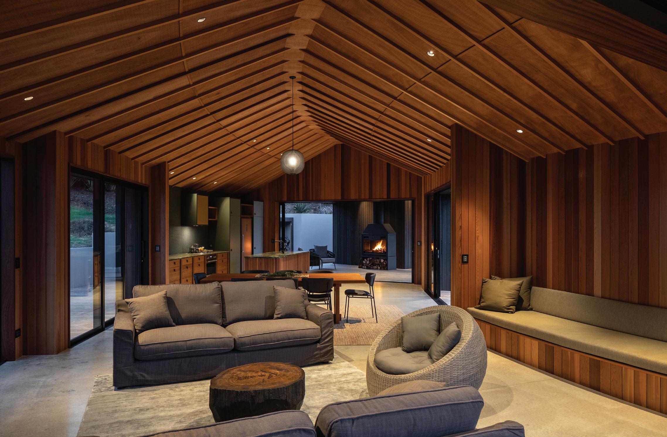
issue #49 habitusliving.com/houseoftheyear
When most coastal houses act as grandstands for the ocean view, this gentle timber house prefers the bush. Curled up in a natural amphitheatre, the perfect semi-circle creates a sheltered north-facing courtyard and a different outlook from every room.

“My client grew up on the land, it was their family farm for decades,” says architect Belinda George. “He has vivid memories of riding palm leaves down the hillside and through the bush, so I hoped to evoke this sensation of sliding and encapsulation in the crescent shape of the house.”
The family subdivided the farm several years ago for residential use and to reinstate the native bush, which is forever protected under a QEII National Trust covenant. Each family member chose a site each – there are six adult children and their mother – and then they sold the remaining lots to raise money for replanting.
With 70,000 trees planted to date – and another 300,000 planned over the next 15 years – native flora and fauna are re-establishing so quickly that Kiwis have been released into the bush by the Department of Conservation.
“The architecture needed to respond to this wider programme,” says Belinda, “so we chose sustainable and reclaimed timbers and stained the weatherboards charcoal to make the house recede into the bush. Timber roofing shingles helped us create the curve, and also offered a bark-like texture for a very visible roof. Inside, tongue and groove walls and concrete floors create easy-care surfaces for holiday use and for planting days when community groups come inside for a cup of tea.”
The house is cradled by the hill, but also close enough to the cliff edge to experience the power of the Pacific Ocean. The teal-blue sea below is visible but not accessible.
We chose sustainable and reclaimed timbers and stained the weatherboards charcoal to make the house recede into the bush.
OPENER Engagement with the native bush creates protection and intimacy.
OPPOSITE ABOVE The sweeping arc of the floor plan gently frames a semicircular courtyard.
OPPOSITE BELOW A magnificent 'Pacific roof' creates sculpture and movement inside.
ABOVE Timber roofing shingles shine in the sun like fish scales.
# 111 habitus house of the year
Like a clifftop nest, the house feels exposed at one edge and increasingly protected the deeper you go inside. The thrill of sliding down the hill is captured in the wind and the great sweep of the plan.

Low-slung and with generous eaves, its Pacific roof shelters 165 square metres of interior floor area arranged into two separate pavilions. Bedrooms and bathrooms are to the west, and the living area is to the east, near the cliff edge. The space between the two pavilions houses an outdoor fireplace and seating area and is protected from the elements by the roof floating uninterrupted overhead.
While the living room and kitchen span the full width, bedrooms are set back to create a deep, sheltered verandah. The bedrooms feel more like cabins and the experience more akin to camping. Guests walk outside to reach the bathroom and living pavilion. As a summer retreat, immersion in the sounds and smell of the coast create intimacy with the outdoors.
“I love the idea of ‘excavating’ the site to find connections with the past and bringing something of the client’s personality into the design,” says Belinda. “I try to pick something strong that will help inform the decision-making process throughout. So the curved form not only influenced material choice and detailing, it also reappears subtly in the cabinetry and furniture details inside.” Made from reclaimed Matai and Totara, and Iroko in the bedrooms, every piece tells a story.
At once elegant and poetic, practical and rugged, the house is a unique expression of the site and client brief. The curve extends these dualities by being a welcome embrace on arrival, but with a sense of movement and purpose in the sweep of its plan – connecting fond memories with an exciting future for this unique piece of land.
issue #49 habitusliving.com/houseoftheyear
Belinda George Architects | belindageorge.co.nz
1 2 3 4 5 6 7
Bowden House, New Zealand

ARCHITECT Belinda George Architects
LEAD ARCHITECT Belinda George
INTERIOR DESIGN Belinda George
BUILDER Pete Brown Builders
JOINERY Whangarei Aluminium
LANDSCAPING Seth Rosselt
BELINDA GEORGE ARCHITECTS (64) 2198 7645 belindageorge.co.nz
FINISHES
Polsihed concrete flooring throughout interior, bedrooms carpeted. Stained cedar weatherboard clad façade with alunimium joinery. Garapa for external decking and roof of timber shingles. Cedar paneling, TG&V in vertical format, for internal walls. Meranti plywood for ceiling.
FURNITURE
Dining table designed by Belinda George Architects, made by Smith and Parker Joiners (Whangarei). Log-end co ee table, tall boy drawer unit and bedroom furniture designed by Belinda George Architects, made by David White Furniture using reclaimed timber from New Zealand Native Riverwood.
Note: need to fact check if she mea nt she designed the items listed, or other items not listed.
HC waiting on fact check
LIGHTING
Lights by Inlite.
FIXED & FITTED
Kitchen and bathroom cabinetry by Danksa Cabinetmaking (Whangarei). Plumbing fittings by Plumbline.
OPPOSITE Belinda designed a new dining table from timber gifted by the client's brother.
RIGHT The kitchen opens onto a protected verandah space adjacent the bedroom wing.
KITCHEN LIVING BEDROOM BATHROOM UTILITY ENSUITE UNDERCOVER TERRACE
habitus house of the year # 113
Family first
A major renovation transforms a dilapidated ruin into a home.
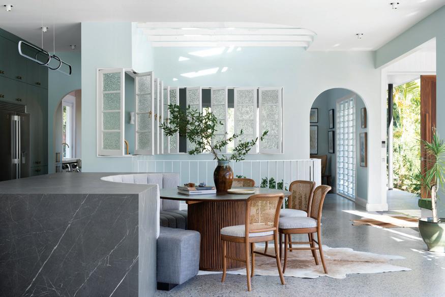
10 years ago, Australian renovating royalty Michael and Carlene (“The Block”, “Ready, Set, Reno”, “Open Homes Australia”) purchased a large family home in a leafy cul-desac in the Gold Coast Hinterland. Enchanted by its location and lush outlook, the couple looked beyond the home’s dilapidated state and envisioned a tranquil home that would give their young family space to escape, unwind and entertain.
Renovated slowly and with purpose, the house now comprises a collection of rooms where each is slightly different from the last, an evolution in style and design that subtly speaks to the considered refurbishment process. Where the existing structure sat atop the landscape, Michael and Carlene’s home sinks into it, with a perimeter of full-length windows and sliding doors creating a seamless connection
between outside and in. Dappled light drenches large, openplan rooms, where white beams and generous skylights mirror the epic proportions of the hinterland. In more intimate spaces, deeper material choices and earthy colour palettes create inviting spaces to escape and unwind.
In a home designed for a young family, the kitchen stands as the jewel in the crown. Oversized and open plan, the room combines kitchen, dining and informal living spaces, with sliding doors opening the entire space onto the sparkling pool. Positioned as the home’s centralised hub, the kitchen is finished with a statement island bench that anchors the room and facilitates connection, conversation and entertaining.
Finished in dark quartz, the island features a deep curve which has been scooped out to allow for a built-in bench. Acting as an informal dining and breakfast bar setting, the island caters for children and adults alike to make a space that epitomises family living.
Keeping clutter to a minimum, the kitchen includes a full butler’s pantry and laundry. Containing everything from the double-sized fridge to a washer and dryer, the space allows for the mechanics of home life to be elevated to a luxurious level. Epitomising this is the Zip HydroTap in brushed gold, which sits atop a vintage double sink. Allowing for instant boiling, chilled and sparkling water, the Zip HydroTap has fast become one of the family’s favourite new additions, satisfying a love for tea and sparkling water, while making sure Michael (as renovator-in-chief) remains adequately hydrated.
With only a handful of rooms still to be transformed, this is a project which gives weight to the saying that “good things take time”. Slowly evolving over a decade of work, this home is an ode to family dynamics, to growing children and changing needs, where design and architecture can provide a foundation for a life well lived.
LEFT An expansive, open-plan kitchen brings the home together.
Photography by Mindi Cooke
RIGHT Statement marble surfaces are matched by the impressive Zip HydroTap.
issue #49 habitusliving.com/houseoftheyear
Photography by Mindi Cooke

habitus promotion › Zip #115 ZIP | zipwater.com
#3 STUDIO2 ARCHITECTS


ZEALAND
Set on a leafy suburban site in Auckland, architect Paul Clarke’s own house combines practical family living with playful architectural invention.

 AUCKLAND | NEW
issue #49 habitusliving.com/houseoftheyear
TEXT ANDREA STEPHENS | PHOTOGRAPHY SIMON DEVITT
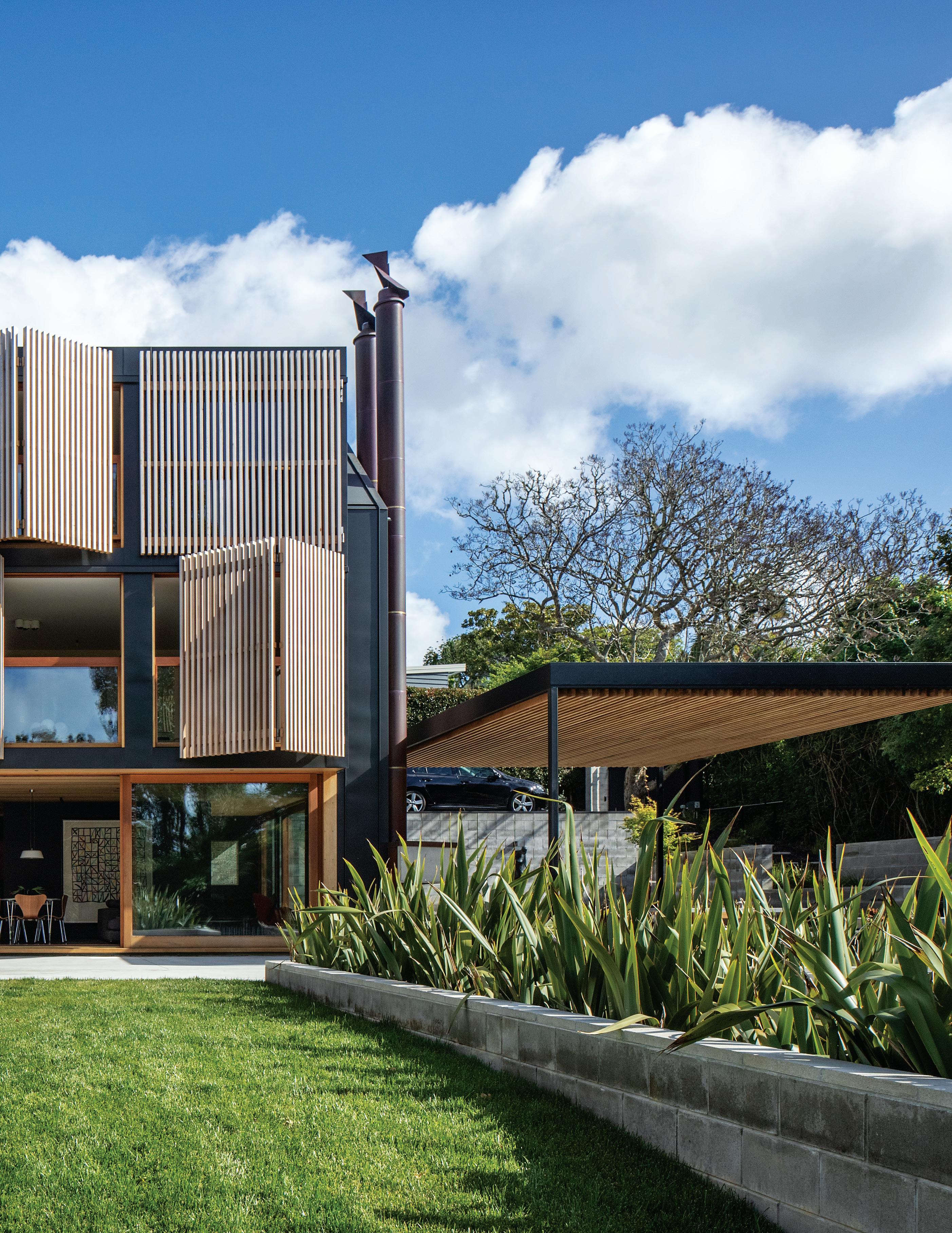
habitus house of the year # 117
OPENER Floor-to-ceiling, wall-to-wall shutters animate the northern elevation.
ABOVE Intimate family spaces were important to the family of four.
BELOW LEFT The kitchen is the main focus of the living floor.
BELOW RIGHT Rich materials in the main entrance create a sculptural and disarming space.


issue #49 habitusliving.com/houseoftheyear
The layout and detail are refined and coordinated for greater flexibility.
From colourful glass in the entry to treetop bedrooms, this architect’s own house is an adventure. “It’s a family home,” says Paul, “so spaces are warm and inviting to connect people, create memories and have fun.”
When replacing their previous residence on the site, Paul and his partner Deb wanted to record fond family experiences in the body of the new dwelling. As well as the main volume sitting in the same location as the original, the new structure also has a gable silhouette and black cladding.
For frequent visitors, subtle echoes of the previous house can be found inside. Ceilings are set at 2550 millimetres, as they were in the old home; the new staircase is in the same position as its predecessor; and Matai timber flooring is maintained and set in contrast with new polished concrete.
In every other way the layout and detail are refined and coordinated for greater flexibility as their boys grow into adults, and a better connection with the site and outdoors. Particularly so with the addition of a striking new pavilion extending northwards into the garden.
While the southern driveway elevation blends the new architecture with the traditional homes of the area, the north face is more abstract. Composed of Modernist planar roofs, folding and sliding screens, it is a geometric play of surfaces and recesses, light and shadow. Unconstrained by typology, Paul adapts each face to its micro context and climate.
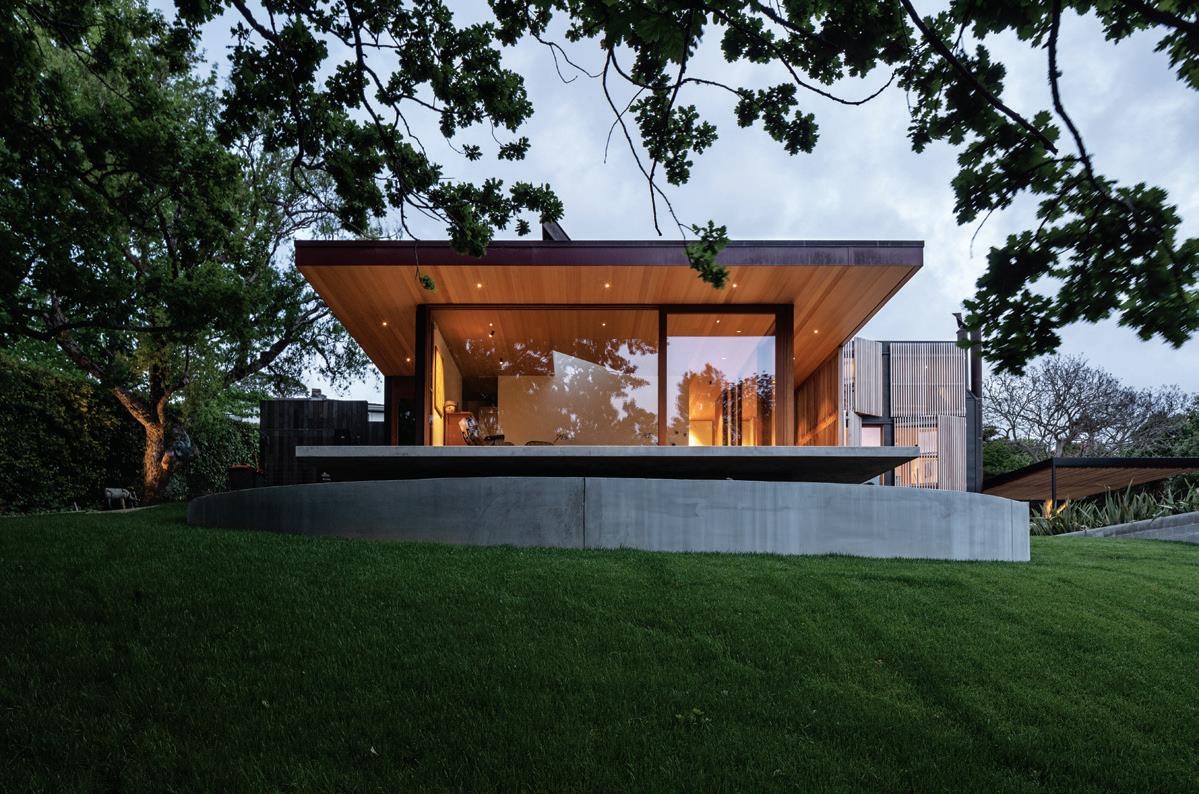
The main entry is accessed off a sweeping driveway wrapping down and around the house. Located between the two wings, this beautiful architectural space is full of delights. Colourful glass and Perspex keyholes paint patterns onto textured concrete walls, while a triangular skylight animates the space according to the time of day and the season.
Dropping down three shallow steps, visitors arrive in the heart of the house – the kitchen and main living area. “This room is the focus,” says Paul, “where enjoyment of food, beer, wine, family and friends creates memories daily.”
Black-painted walls, recycled timbers from the old house, and polished concrete provide a “dramatic, refined but homely simplicity”. A magnetic blackboard wall at the centre of the floor offsets drama and art with playfulness and frivolity. Snug and den-like, the room opens in two directions to connect with a protected western courtyard and north-facing garden and swimming pool.
Native Matai stairs and a sculptured handrail lead to two private floors containing a guest bedroom, study and family lounge on the middle floor, and the boy’s bedrooms on the top floor. The north elevation is perfectly modular, featuring a series of six double-hung windows. Stainless steel weights lower the top pane to create a glazed balustrade and an outer layer of sliding folding shutters shield the sun while allowing ventilation in summer.
From the treetops back to the ground floor, a whole new wing projects out into the garden. Accessed from the main entry, it contains a flexible garage and games room, the main bedroom and ensuite. Remote from the rest of the house, and screened by large trees, the bedroom feels like an oasis. Sliding shutters and a skylight above the bed allows for a feeling of yearlong camping – capturing the changes from day to night and the opportunity to sleep under the stars and the moon.
Paul has created a place that offsets art and architecture with playfulness and home comforts. It references the old and embraces the new with beautiful materiality and use of light. Although a conceptually led project, it doesn’t take itself too seriously always making people and experiences the heart of the design.
ABOVE The main bedroom offers a quiet retreat from the main body of the house.
habitus house of the year # 119
Studio2 Architects | s2a.co.nz
LEFT Beside the pathway to the front door, the study has a bay window or lookout.
#3, New Zealand
ARCHITECT Studio2 Architects
LEAD ARCHITECT Paul Clarke
INTERIOR DESIGN Paul Clarke
BUILDER Bravo Ltd
JOINERY Customtone
LANDSCAPING Studio 2 Architects with Topia Garden Design Ltd
STUDIO2 ARCHITECTS
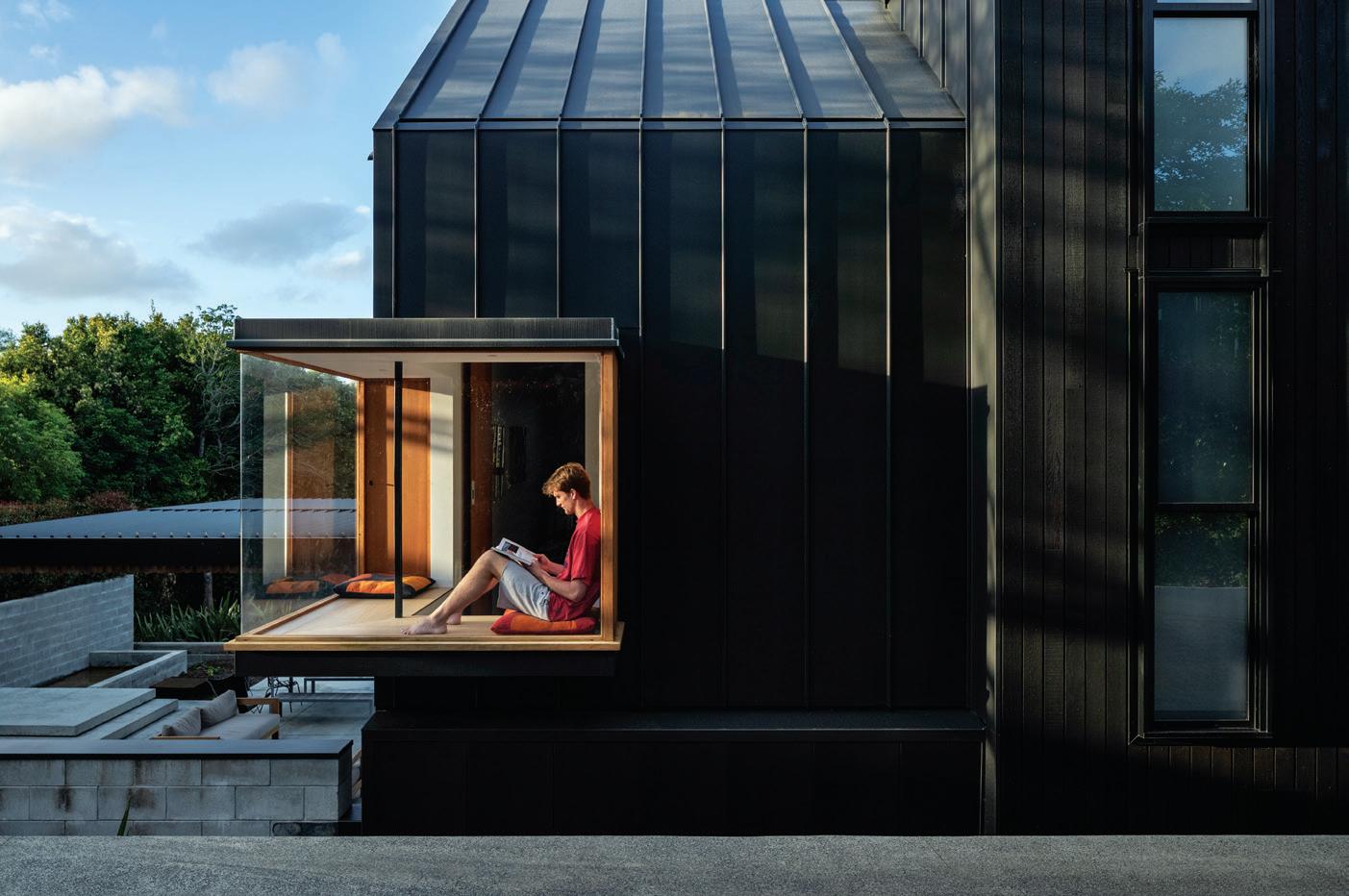
(64 9) 304 0090 s2a.co.nz
FINISHES
Concrete for flooring indoors and out, with polished finish throughout interior. Cedar weatherboards, stained black, for façade. WarmRoof two-layer bitumen waterproofing system from Viking Roofspec. Cedar cladding for ground floor ceilings and internal garage walls. Stamped concrete walls cast in-situ. Internal walls in plasterboard from GIB, black and white paint treatments for finish. Large format porcelain tiles from MC Tiles. Shutters made of natural cedar by Grandvue Joinery Ltd. Stairs and handrail crafted from matai timber. Cabinetry throughout interior made of recycled cedar weatherboards by Customtone.
FURNITURE
Furniture sourced from Cult, ECC, Matisse and Skagen.
LIGHTING
Lighting from Inlite.
1 2 3 4 5 6 7 8 9 0 q w
ENTRY
CARPORT
LAUNDRY
MAIN BEDROOM
WALK IN ROBE
ENSUITE
KITCHEN/DINING/LIVING
POOL
MAIN LIVING
STUDY
BATHROOM
BEDROOM
GROUND FLOOR FIRST FLOOR SECOND FLOOR issue #49 habitusliving.com/houseoftheyear




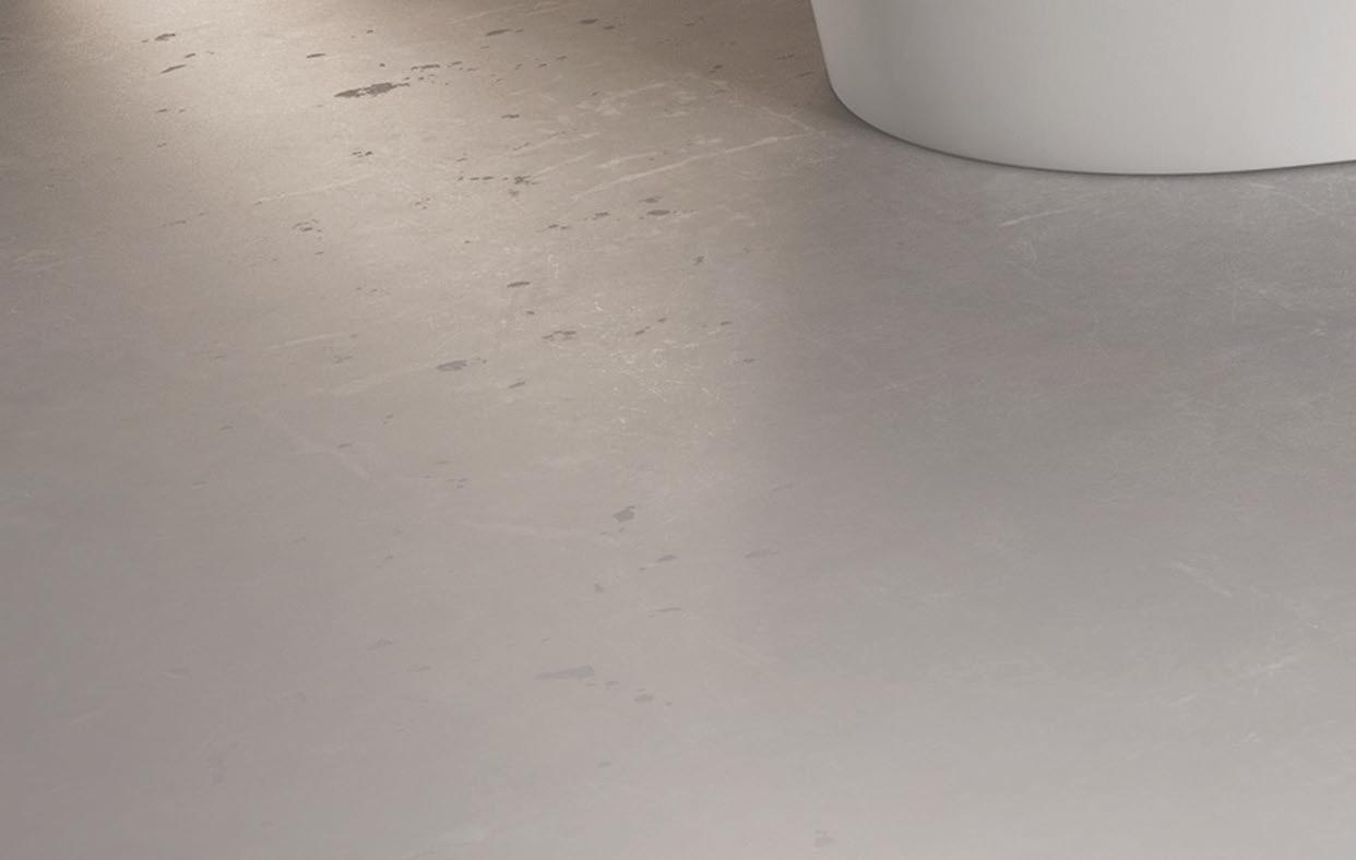

Cla ics newly interpreted: KALDEWEI MEISTERST Ü CK CLASSIC DUO OVAL 3.5MM ENAMELLED STEEL | 30 YEAR GUARANTEE | MADE IN GERMANY @BATHEAUSTRALIA WWW.BATHE.NET.AU | 1300 BATHE
The intersection of tech and wellness
With innovation at the core of everything they do, Zip Water utilises the latest technology to design
Balancing the line between technology and stylish design, the sleek simplicity of Zip Water hydration systems has been synonymous with pure drinking water for over 50 years. A centrepiece of residential and commercial kitchens around the globe, Zip’s products are anchored in research, customer feedback, and the brand’s innate ability to anticipate and respond to the dynamically changing needs of the modern world.
The result? Multiple Good Design Awards recognising their pioneering role in the world of hydration – and a variety of innovative water systems for any interior. We sat down with them to hear about their latest releases, a perfect expression of Zip’s innovative spirit, customer-centric design principles, and their clean, modern aesthetic.
Embodying the company’s ability to deliver innovative products that are born out of a genuine human need, the Zip HydroTap Touch-Free Wave was brought to market in just six months to provide contactless water access in the hygienedriven, post-pandemic workplace. “We’re proud of how quickly we’ve been able to develop the product. From initial concept to the first installation set for December, we’ve been able to get the product to market within six months – a process that would normally take up to three years,” says Mike Abbott, Marketing and Strategy Director for Australia and New Zealand.
A timely product for an uncertain future, Zip HydroTap Touch-Free Wave uses smart sensing technology to deliver instant boiling, chilled and sparkling water with the wave of a hand – with twin sensor activation to safely dispense boiling water.
Zip HydroTap All-In-One Celsius Arc represents the ultimate in functionality and streamlined modern design. Mike explains “The HydroTap All-In-One Celsius Arc design
ensures residential spaces have one single tap for use, whilst hitting all key design features, often using this product as the centrepiece of the kitchen.”
It delivers five water types from a single tap: filtered boiling, chilled and sparkling drinking water, as well as unfiltered hot and cold water. Boasting a range of finishes and a variety of advanced technological innovations, this system will elevate any residential space. Offering an interactive touch screen under-bench command centre, PowerPulse boiling water safety mode, sensor-activated energy-saving modes and advanced MicroPurity 0.2-micron water filtration, the HydroTap All-In-One Celsius Arc is the pinnacle of techenabled tapware.
Last but not least (except in size) is the Zip Micro, an awardwinning drinking system for smaller spaces. “Our product innovation team was able to make the under-bench smart command centre 37 per cent narrower than the traditional HydroTap models, giving the millions of Australians who work in smaller workplaces access to the HydroTap for the first time,” says Mike. “This was done without losing any of the performance of the original HydroTap,” he adds. With an integrated safety lock and intuitive twist activation with auto and manual fill options, Zip Micro is a simple yet effective solution – and proof that good things come in small packages.
With a focus on customer-centric design and innovation, Zip Water creates exceptionally relevant products. Through their latest releases, Zip exemplifies the delivery of pioneering and timely fittings that improve user wellbeing while embodying the best practices of modern design.
and manufacture state-of-the-art water systems that prioritise the health of their users.
issue #49 habitusliving.com/houseoftheyear

habitus promotion › Zip #123 ZIP | zipwater.com
RIGHT The Zip HydroTap All-In-One Celsius Arc in Brushed Gold.

issue #49 habitusliving.com/houseoftheyear
TE PAKEKE FEARON HAY ARCHITECTS


This New Zealand winter retreat provides the warmth, scale and timelessness of a traditional mountain cabin in a majestic alpine landscape.
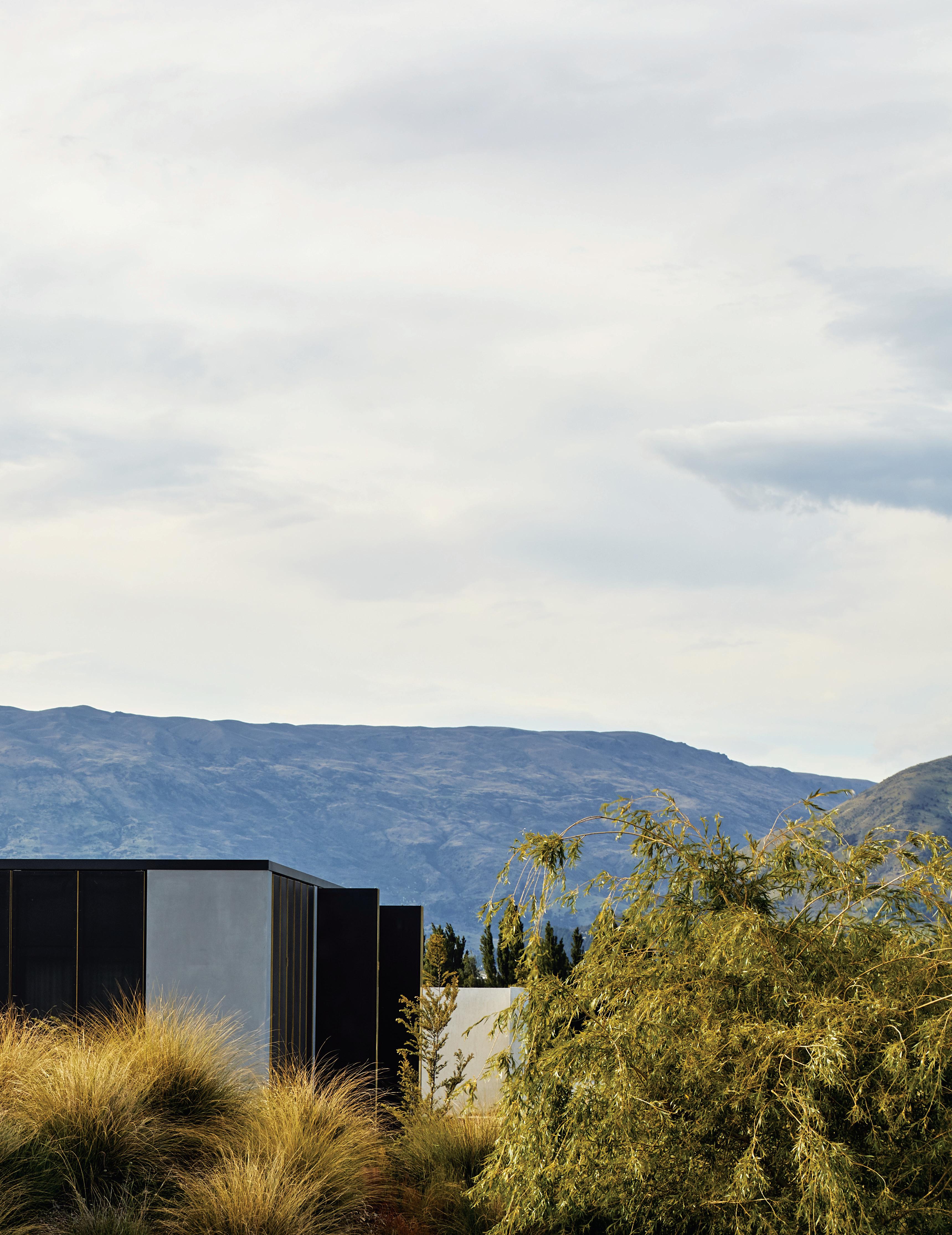
habitus house of the year # 125
WANAKA | NEW ZEALAND
TEXT ANDREA STEPHENS | PHOTOGRAPHY SIMON WILSON
“Our clients wanted a small and intimate house,” says architect Tim Hay of Fearon Hay Architects. “They’d seen Storm Cottage on Great Barrier Island and thought a similarly spacious cabin would suit their needs too.”
Intended primarily as a winter retreat, Te Pakeke (named after an old family name) is located in a suburban area north of Wanaka township, surrounded by the lake and mountains. Located on the corner of an arterial road, the challenge was to provide privacy and a sense of retreat without compromising the view.
Creating a protected microclimate around the house was also important for the owners, who wished to maximise the time they spent outdoors. Wintertime in the Southern Lakes region is crisp, clear and cold, with blue skies frequently accompanied by an icy southerly, so dealing with the wind was a prime design driver.
Fearon Hay reached for the pure forms of the wall and the cube to create simple, refined spaces. From the most protected – the interior – to the semi-protected – the courtyard – to the rolling, open lawn and lake view, the spatial layering provides a range of experiences from intimate to expansive.
The dwelling itself is sheltered behind an L-shaped garden wall, shutters, glass, curtains and layers within create different levels of enclosure and light quality. For Tim, “the cross section through these layers is in one sense very simple, but these strategies also create interest and complexity in how they filter light, and create more solidity or more openness according to the conditions and outlook.”
The garden wall breaks the chilly prevailing winds enabling the gravelled courtyard to be used year-round. “Being so far south, Wanaka has extended daylight hours and the owners wanted to make the most of the outdoors while they were on holiday.”

OPENER Moody and veiled, the retreat sits quietly in a vast landscape.
ABOVE Access to the house from the driveway is through the textured courtyard wall.
OPPOSITE ABOVE
Creating shelter from the wind is critical in the alpine landscape.
OPPOSITE BELOW
Bedrooms are accessed directly from the living room in an efficient floor plan.
The challenge was to provide privacy and a sense of retreat without compromising the view.
issue #49 habitusliving.com/houseoftheyear

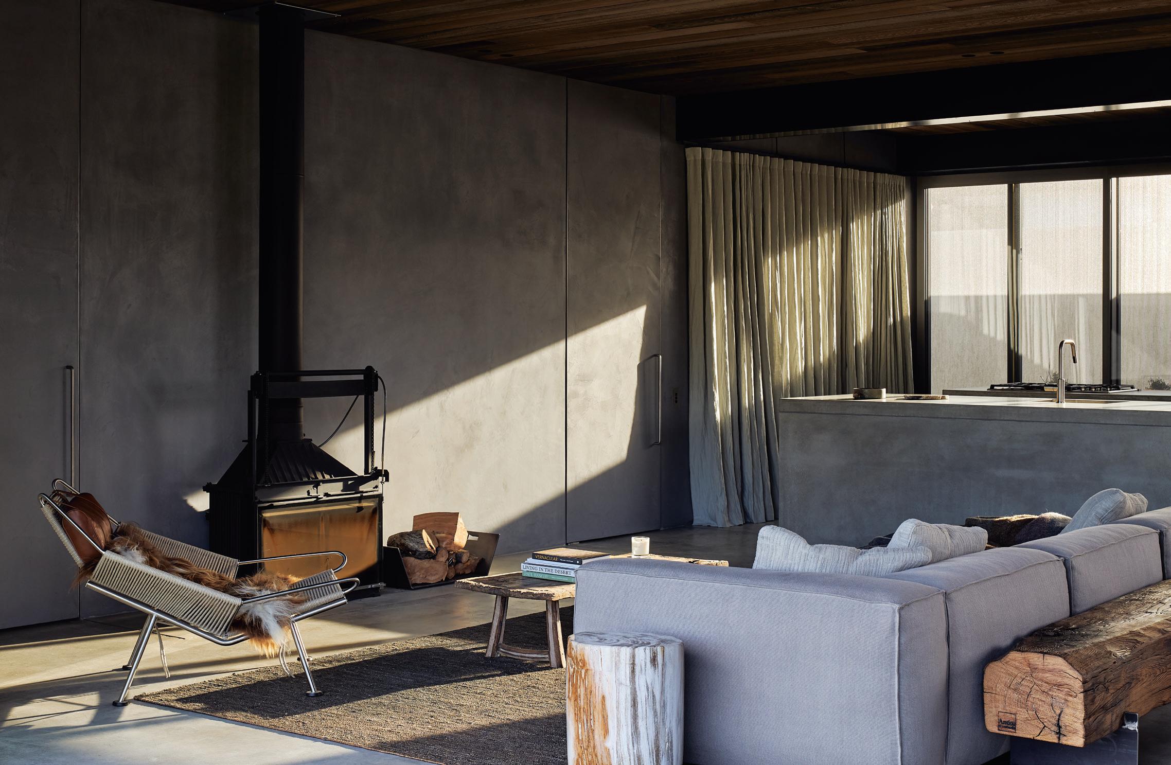
habitus house of the year # 127
The house itself is almost square, planned on a series of axes that allows occupants to sense layers, bringing in views and natural light from different orientations throughout the day. Within these axes, the architects have placed solid concrete walls and glazed openings to control views and enclosure.
Wrapping the exterior of the cube are a series of perforated metal shutters, edged in brass. These sliding, bi-fold panels are sun protection, privacy screening and can be locked down for security when the house is empty. They also veil the house in a gauzy mesh, which reduces its solid appearance for a more subtle presence in such an epic landscape.
Materiality is influenced by the mountains, the local stone and raw, glaciated lake walls. Rather than apply the local schist, Fearon Hay has used concrete in different textures to reference the environment and create a heatsink to warm the outdoor rooms.
The perimeter wall of rough-textured plaster recalls the old stone walls of Central Otago, without the nostalgia a more traditional material would create. Concrete is also used extensively inside, in the floors and countertops, with walls finished in hand-floated natural plaster. This solidity is balanced by the warmth of a cedar-lined ceiling, the gauzy screens and generous use of textiles.
The efficient 140-square-metre interior wastes no space and features various devices to expand and extend the view. Thick walls create a sense of separation between living and sleeping. Large openings east, south and west extend the living outside. And the utility block –with kitchen storage back-to-back with a laundry and gear room – is mirror-clad so that it dissolves within the open living space, providing captivating oblique reflections of the surroundings.
Layers of space, texture and light make Te Pakeke more than just a modern cabin. It is a sophisticated building offering both seclusion and expansiveness in a big landscape, and a modern interpretation of the mountain hut.
 Fearon Hay Architects | fearonhay.com
issue #49 habitusliving.com/houseoftheyear
The spatial layering provides a range of experiences from intimate to expansive.
ARCHITECT Fearon Hay Architects
Fearon Hay Architects (64) 9303 0128 fearonhay.com
1 2 3 4 5 6 7
ENTRY / OUTDOOR COURTYARD

DINING
LIVING
KITCHEN
BATHROOM
BEDROOM
ENSUITE
OPPOSITE An extra-deep wall and floor-to-ceiling curtains create privacy inside the cabin.
RIGHT The main living space glows at night through the metal screens.
# 129 habitus house of the year
Te Pakeke, New Zealand
An appetite for ambition
kitchen.
This year, however, it’s raising the stakes.
It could be said that the realisation of ambition is what Habitus House of the Year is all about. Each year, the lineup of outstanding projects, selected from across the IndoPacific Region, culminates in something akin to an exposé of ambitious residences, designed for ambitious, often profound, ways of life; and each year, we develop a taste for more. Such an appetite for ambition ought not, need not and shall not go unfed – thanks to Gaggenau and its inaugural Kitchen of the Year Design Contest.
As a brand that’s long been synonymous with excellence and as the pioneer of modern domestic kitchen appliances, in both form and function, Gaggenau is an ambitious type itself. Cultivating a name that epitomises sophisticated functionality, inimitable quality and impeccable design, the preeminent German manufacturer’s premium appliances for private kitchens are coveted by architects, designers and specifiers all over the world. As such, Gaggenau products are something of a hallmark when it comes to kitchens endowed with experience and luxury that go unparalleled.
Such a high calibre design context is indicative of a riveting contest – to be made official, as of now.
With its inaugural launch in October 2020, the Gaggenau Kitchen of the Year Design Contest is a new initiative intent on awarding those that set a new precedent in the realm of kitchen design. Open to professional kitchen designers,
OPPOSITE ABOVE
Gaggenau 200 series oven, coffee machine and warming drawer, Gaggenau Vario 400 series induction cooktop, Teppan Yaki and downdraft ventilation.
OPPOSITE BELOW
Gaggenau 400 series appliances including the CX 482 full surface cooktop and the Vario 400 series wine climate cabinets.
architects, interior designers, builders and developers based in Australia, the contest awards ambition in the kitchen and the pursuit of design excellence, with the Best of the Best accolade realised in an exclusive, 5-star European trip for two.
To be ordained Best of the Best and second to none, Gaggenau Kitchen of the Year Design Contest entrants must first compete for regional excellency. The awards will recognise the Best Regional kitchen designs from each of four Australian regions: the New South Wales/Australian Capital Territory region; the Victoria/Tasmania region; the Queensland region; and the South Australia/Western Australia/Northern Territory region – selecting the Best of the Best based on the utmost score. The Regional winners will each receive a divine Australian culinary experience to forever savour.
At the crux of the sure-to-be stiff competition is a judging panel of esteemed local design contemporaries whose names – Sue Carr, Mim Fanning, Neil Burley, Damian Hannah, Robert Warner, Raj Nandan and Clement Lee – are as inimitable as their design critique. Suffice it to say that to enter and be named a winner would be quite an honourable achievement and no small feat. Authenticity and originality of design; performance and end user considerations; quality of design and execution; and thoughtful integration of Gaggenau appliances culminate the contest judgement criteria and ultimately decide the awarding scores.
Eligibility to enter consists of a few simple yet pertinent criteria: entries must be from projects, multi-residential or private residential, located in Australia and completed between 1 January, 2018, and 30 April, 2021, featuring three or more Gaggenau appliances.
With entries open from 12 October 2020 until 30 April 2021, the countdown is on for the shortlist announcement in July 2021. And ultimately, that appetite for ambition will well-and-truly be fed, with the announcement of the inaugural Gaggenau Kitchen of the Year Design Contest winners, in September 2021.
Gaggenau is a brand that has long served to feed ambition – in design as well as in the
issue #49 habitusliving.com/houseoftheyear


habitus promotion › Gaggenau #131
| gaggenau1683.com.au
Gaggenau

issue #49 habitusliving.com/houseoftheyear
THE TWINS HOUSE DELUTION
Smart planning and lots of character make this tiny twin house a solution to extended families living on a small plot.
 JAKARTA | INDONESIA
habitus house of the year # 133
TEXT PAUL MCGILLICK | PHOTOGRAPHY FERNANDO GOMULYA
Rapidly growing cities in South-East Asia and in Australia mean that space is in increasingly short supply – and getting more expensive. Urban infill is part of the solution, even in cities like Jakarta with already high density. But the key is making such mini-developments fit for purpose by offering the amenity necessary for a quality way of life.
This house occupies just 73 square metres. In fact, it consists of two separate buildings, one two-storeys, the other a single level. The larger house is for a family of four, the other for a female relative. The location is a typical Jakarta rabbit warren with networks of narrow alleys linking to connecting streets. The Twins House is set in just such an alley, at 1.5 metres wide there is not enough room for cars to pass.
The ‘twins’ concept is of a brother and sister – two separate but related buildings. Just a very narrow pathway of gravel and concrete pavers separates the two homes, making them effectively two wings of the same house. There is no back yard and the front setback is tiny allowing just a narrow strip of garden, with the house separated from the street by a concrete wall and white steel mesh retractable gate.
Interestingly, in such an urban mélange, the Twins House acknowledges its context, not by attempting to reflect the built character of the neighbourhood – near impossible given the mad mix of structures – but by not standing out.

The architects have sliced out a corner from each of the structures. This breaks up the mass and makes it visually more interesting and less imposing.
issue #49 habitusliving.com/houseoftheyear
OPENER LEFT The house has a quietly sculptural character, off-setting its tiny size.
OPENER RIGHT Set in a dense urban rabbit warren, it stands out with its modest greenery.
OPPOSITE
BELOW Quirky angles and greenery make the house seem larger than it is.

 View into the living space of the small house.
ABOVE Looking from the small house across the connecting corridor to the larger house.
# 135 habitus house of the year
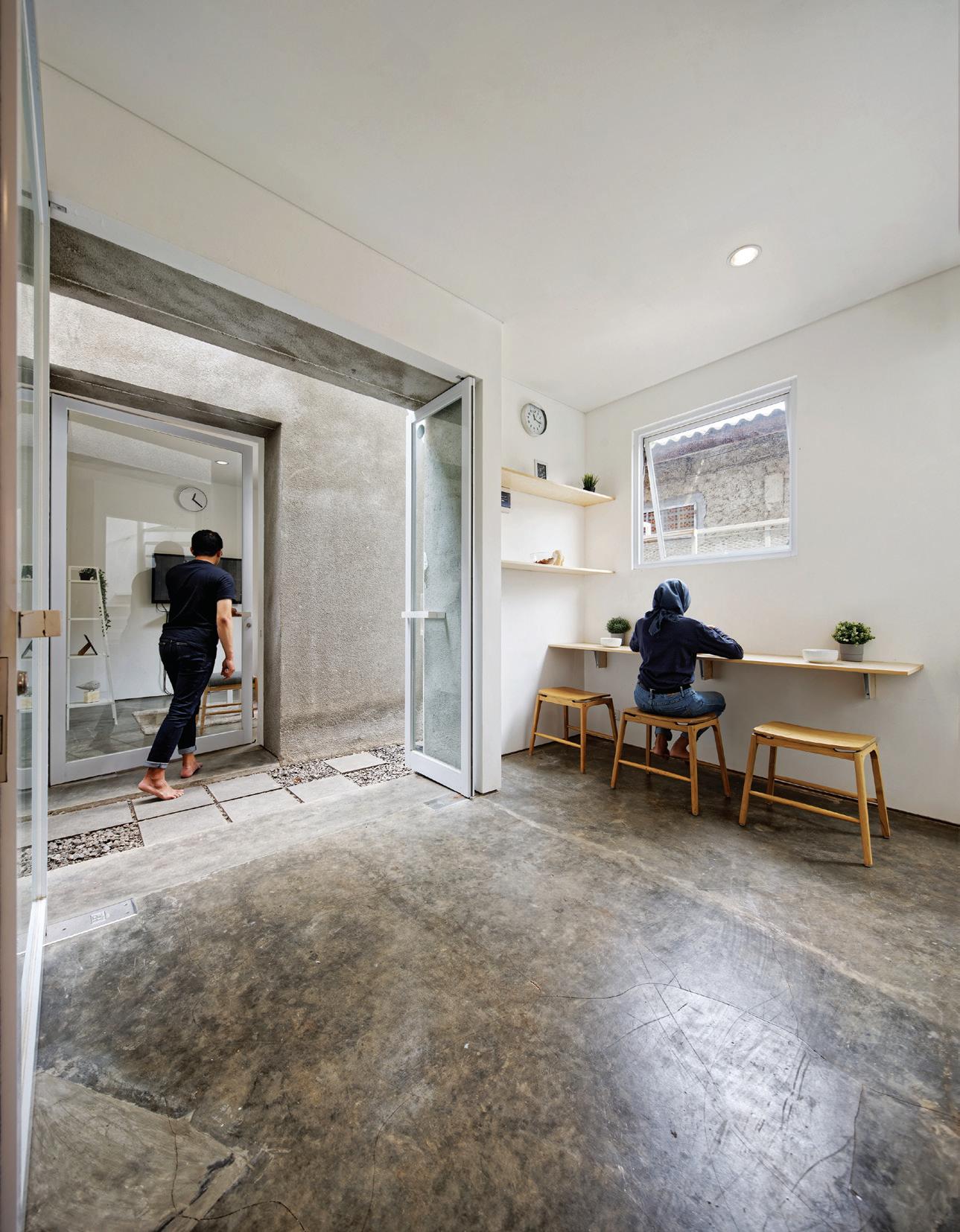


 ABOVE LEFT Making optimum use of space.
ABOVE RIGHT In the small house an internal tree rises in the living room.
BELOW RIGHT The tiny setback from the public lane.
issue #49 habitusliving.com/houseoftheyear
BELOW LEFT Looking down the corridor separating the two houses.
This is achieved partly by the nondescript grey concrete skin, but also by the way the architects have sliced out a corner from each of the structures. This breaks up the mass of the buildings and makes them visually more interesting and less imposing. But perhaps more importantly it provides the opportunity to create more precious green space, both inside and out.
In the living space on the first floor of the larger building there is a small triangular indoor garden with a central tree growing up and out – replicated in the living room of the smaller building. The additional benefit of these sliced out apertures, open to light and rain, is that –in conjunction with the narrow passageway between the buildings – air is circulated, helping to passively cool each building.

Inside, the buildings are a marvel of optimised planning, offering a surprising amount of privacy options. The main building offers two bedrooms, two bathrooms, a living room upstairs and a kitchen/dining space on the ground floor. The two households remain close, but separate and if the space inside – especially in the main building – seems constrained, the two levels with window openings compensate with prospect out.
Delution | delution.co.id
RIGHT The building seems to sprout greenery in defiance of its highly built-up context.
# 137 habitus house of the year
A very narrow pathway of gravel and concrete pavers separates the two homes, making them effectively two wings of the same house.
GROUND FLOOR


The Twins House, Indonesia
ARCHITECT DELUTION


LEAD ARCHITECT Muhammad Egha, Hezby Ryandi, Fahmy Desrizal
ENGINEER ARCHITECT Haidar Majid, Defi Andri
INTERIOR DESIGN DELUTION
BUILDER DELUTION Build
DELUTION
+62 21 50200402
delution.co.id


FINISHES
Well-coated exposed cement for flooring and kitchen benchtop, and exposed cement, rendered smooth for the
FIRST FLOOR
façade. Dry-Garden covered with split rock. Roof by Onduline. Perforated metal for stairs. Gypsum from Elephant, Tiles by Roman and Paint by Nippon Paint.


FURNITURE
Fixed furniture (dining table, kitchen set) by DELUTION Build. All other furniture client’s own.
FIXED & FITTED
Aluminum window sills from Alexindo. Toilet and Sanitair from American Standard and Toto. Pipes by Wavin.
1 2 3 4 5 6 7 8

GARDEN ENTRY
LIVING
BATHROOM BEDROOM
MAIN BEDROOM
ENSUITE
KITCHEN / DINING
LIVING AREA
LEFT Windows open out, while trees sprout out.
issue #49 habitusliving.com/houseoftheyear
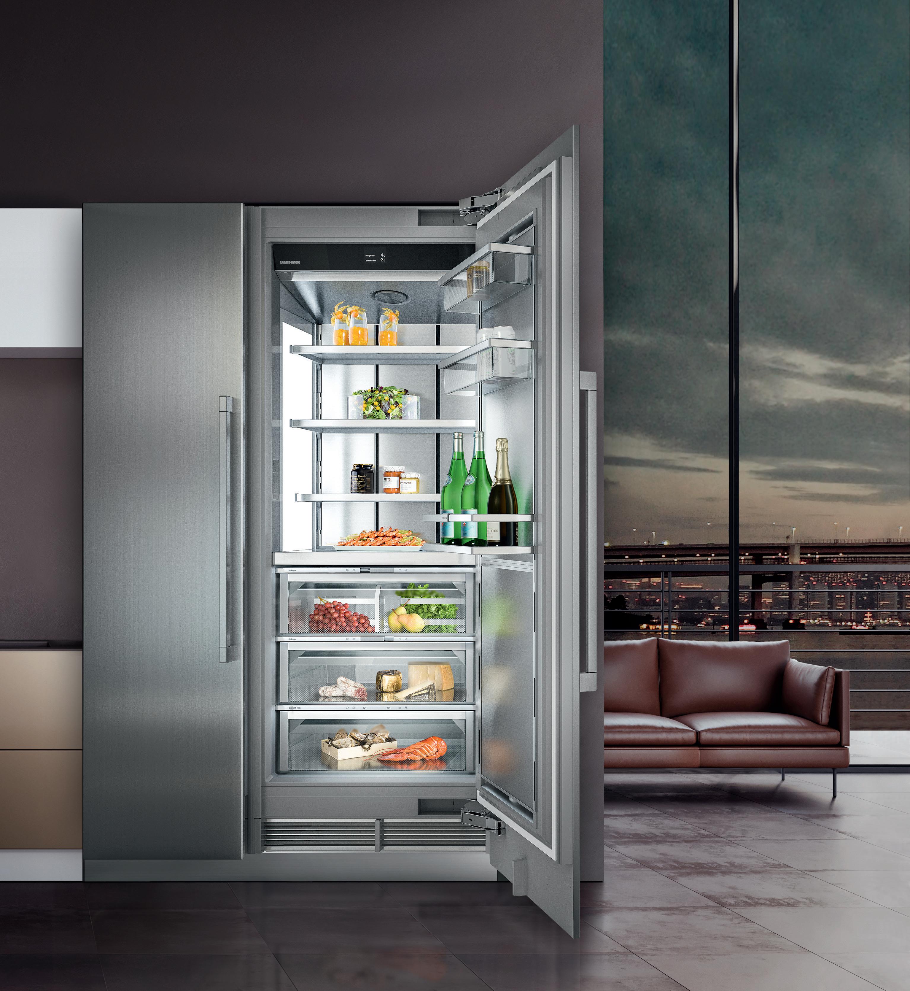


home.liebherr.com.au Quality, Design and Innovation Discover the Next of Cooling Technology – Monolith. A Technical Genius Manifests Itself in Impressive Design. home.liebherr.com.au
Open to interpretation
Following Elliat Rich’s winning design for the Australian Furniture Design Awards in 2017, Elliat and Stylecraft are proud to release the Different Thoughts collection.
In 2017, Alice Springs (Mparntwe)-based designer Elliat Rich was awarded winner of the Australian Furniture Design Awards for her sculptural vanity called Place. In the years since, Elliat has been hard at work in collaboration with Stylecraft on the recently launched collection, Different Thoughts, which resulted from that iconic first piece.
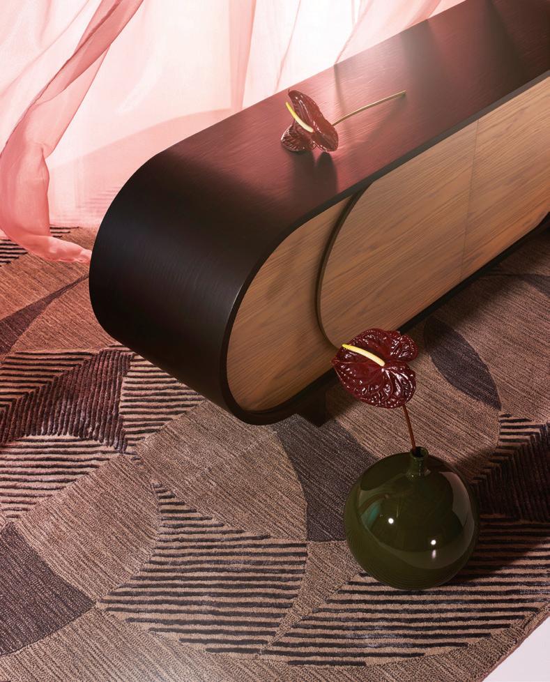
Comprising a credenza, floor light and rug, the Different Thoughts collection is the physical manifestation of Elliat’s exploration into what connects one person to another. “The intention of Different Thoughts was to see if I could translate a philosophical proposition into a three-dimensional diagram of that idea,” says Elliat. “The propositions encompass experiences of time; the practice of empathy; and the deep relationships between body, matter and our planet.”
Like an artwork, each piece in the collection has been given a title that gives a subtle clue into the meaning of the work, yet refrains from being too prescriptive in its interpretation. The credenza, called The other is more same than different, features a fluid form with soft curves that fold back into itself. The floor light, also known as The moment always passes, is both sculptural and functional: a textural glass profile hangs theatrically of its tubular metal frame. Finally, Our edges are mist is a large rug defined by its unique colour profiles and graphic pattern.
ABOVE The other is more same than different credenza visually appealing and completely functional.
OPPOSITE ABOVE Elliat Rich is a designer across many mediums. Here, furniture has been clearly inspired by art.
OPPOSITE BELOW LEFT
The moment always passes floor light is distinctly sculptural yet nonintrusive on space.
OPPOSITE BELOW RIGHT
Our edges are mist rug is available in a cool tones colour profile.

“I have distinct meanings that I was trying to encompass in form, but these aren’t prescriptive. For someone experiencing the work they have two points to find meaning between; there is the unconventional name of the work and then the piece itself,” says Elliat.
Balancing function with narrative is evidently core to the collection and turned out to be one of the key areas for which a collaborative approach was most successful. Elliat describes her practice as constantly moving between conceptual objects in her personal work and client designs that respond to a specific brief. She credits a strength of the collaboration between herself and Stylecraft as the ability for each party to monitor and uphold the desire for functionality and narrative, ensuring a balance remained between the elements and, if it was disturbed, was ultimately rectified.
Photography by Haydn Cattach. Styling by Natalie Turnbull
issue #49 habitusliving.com/houseoftheyear


habitus promotion › Stylecraft #141
Stylecraft | stylecraft.com.au
COMPOUND HOUSE
LINGHAO ARCHITECTS
SERANGOON ROAD | SINGAPORE


This may look like a radical house, but it is actually just about connection with family and with the natural world.
issue #49 habitusliving.com/houseoftheyear
TEXT PAUL MCGILLICK | PHOTOGRAPHY FABIAN ONG
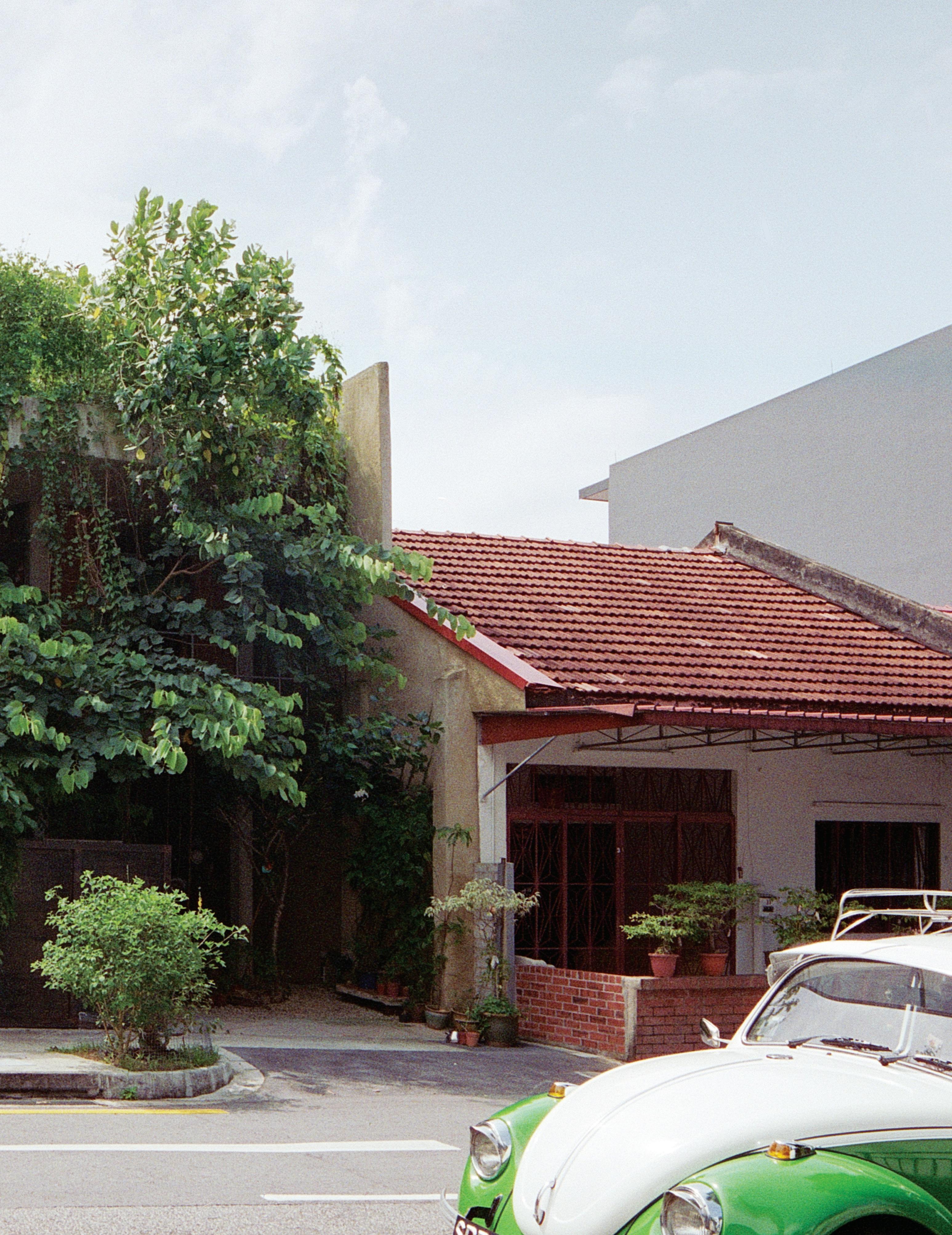
habitus house of the year # 143


issue #49 habitusliving.com/houseoftheyear
It was once just one in a street of very modest, single-storey row houses with pitched tiled rooves dating from the 1950s. Now its parti wall remains intact along with the opposing wall flanking a pedestrian walkway, but the interior has been completely opened up. Previously, says architect Ling Hao, the house was in a “very interiorised condition”, closed off to minimise noise from the busy street. But the family had grown to five. They needed more space – the rear courtyard had even been covered to create another room – and they hankered after a garden. Still, they were a close family. So, how to live together as a family, but have a garden and offer the privacy which growing children start to need – all on a modest budget?
For Ling Hao these were challenges he relished, especially the opportunity to work on a small house because, in Singapore, the obsession is to ‘max out’; that and the opportunity to respond to Singapore’s wet and humid climate without resorting to enclosed spaces with air-conditioning.
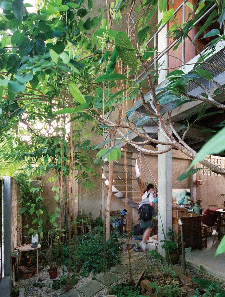
It helped that the lady of the house had grown up in a more rural environment and was used to the kind of traditional dwelling that Ling Hao himself grew up with in the Malaysian town of Kuching. His father had designed and built a concrete house on stilts with the ground floor entirely open. In this sense it was like a traditional compound house where the ground floor was entirely open and people lived in a single space. “Living in a house is not so much about how big your land is, but how you enclose and open up things – as long as you have sufficient shelter,” says Ling Hao.
The idea of the compound house was never spelled out. Instead, Ling Hao talked to his clients about how they lived. Also, they remained closely involved in both the design and building of the house throughout. The result is a house that truly reflects the way the family lives, but also provides flexibility and privacy as required. Most of all, it is closely connected to the natural world by virtue of its openness and the generous greenery, including the garden roof whose trees play a major role in cooling the house. “Everywhere you feel as though you are among the plants,” says Ling Hao.
A second floor has been created together with a roof garden without losing the scale of the existing streetscape. The ground floor is left largely open. The parents’ bedroom is at the back and can be closed off with glass sliding doors, but the rest of the downstairs space is family space, including the kitchen, which becomes a combined wet and dry kitchen. It is, says Ling Hao, basically a reconstruction where everything concrete has been kept, with only columns introduced to support the roof.
Upstairs is the children’s area, accessed by a spiraling steel staircase. A timber deck runs the length of this level with a raised timber bench so that the children can sit to do homework or read. Beyond this is a void open to the weather. Inside, slightly raised above the timber deck, is a single long space with timber flooring and slender timber sliding doors that enable individual spaces to be created as necessary. Similarly, sliding timber doors with low-level windows access the timber deck outside.
Ling Hao explains that to have created permanently enclosed rooms on this level would have changed the overall scale of the house, so “the floor becomes the furniture”. It may look Japanese, he says, but this is what traditional Malay houses look like – modest in scale, with low ceilings and the floor where everything happens. In this case, the timber also softens the interior against the hardness of the concrete.
Most importantly, though, the house has been opened up to allow air movement. As for the rain pouring in and creating “puddles”, well, the lady of house is used to that from her younger years. She likes puddles and has even grown used to the caterpillars that ravage her vegetables and greenery.
Linghao Architects | linghaoarchitects.com
OPPOSITE ABOVE The downstairs public spaces are completely open.
OPPOSITE BELOW The upper level has a timber walkway running the length of the flexible children’s bedroom spaces.
OPENER Lush greenery has developed to screen the open house from the street.
ABOVE The entry area off the street with steel stairway to upper level.
# 145 habitus house of the year
Compound House, Singapore

ARCHITECT Linghao Architects
C&S ENGINEER KH Consultants
BUILDER Coreform Builder Pte Ltd
LANDSCAPING Stable Unstable
LINGHAO ARCHITECTS (+ 65) 9845 1568
linghaoarchitects.com
FINISHES
Concrete flooring, finished with power float. Chengal Timber for flooring in bedroom. Internal walls finished with plaster, in sand colour. Hardwood wall for washroom made of Belian by Melcor Interiors. Sliding glass door frames made of Chengal Timber by Melcor Interiors. Terrazzo for kitchen counter. Planting media for roof garden from Plantze.
LIGHTING
Client’s own.
FIXED & FITTED
Client’s own.
1 2 3 4 5 6 7
LEFT The side of the house runs down a public right of way.
GARDEN/ENTRY
KITCHEN/DINING/LIVING
COVERED PATIO
BEDROOM
LAUNDRY
BATHROOM
FLEXIBLE BEDROOM
8 9 0 q w
W.C.
SHOWER
TIMBER CORRIDOR
MESH CORRIDOR
GARDEN
FLOOR ROOF issue #49 habitusliving.com/houseoftheyear
GROUND FLOOR FIRST
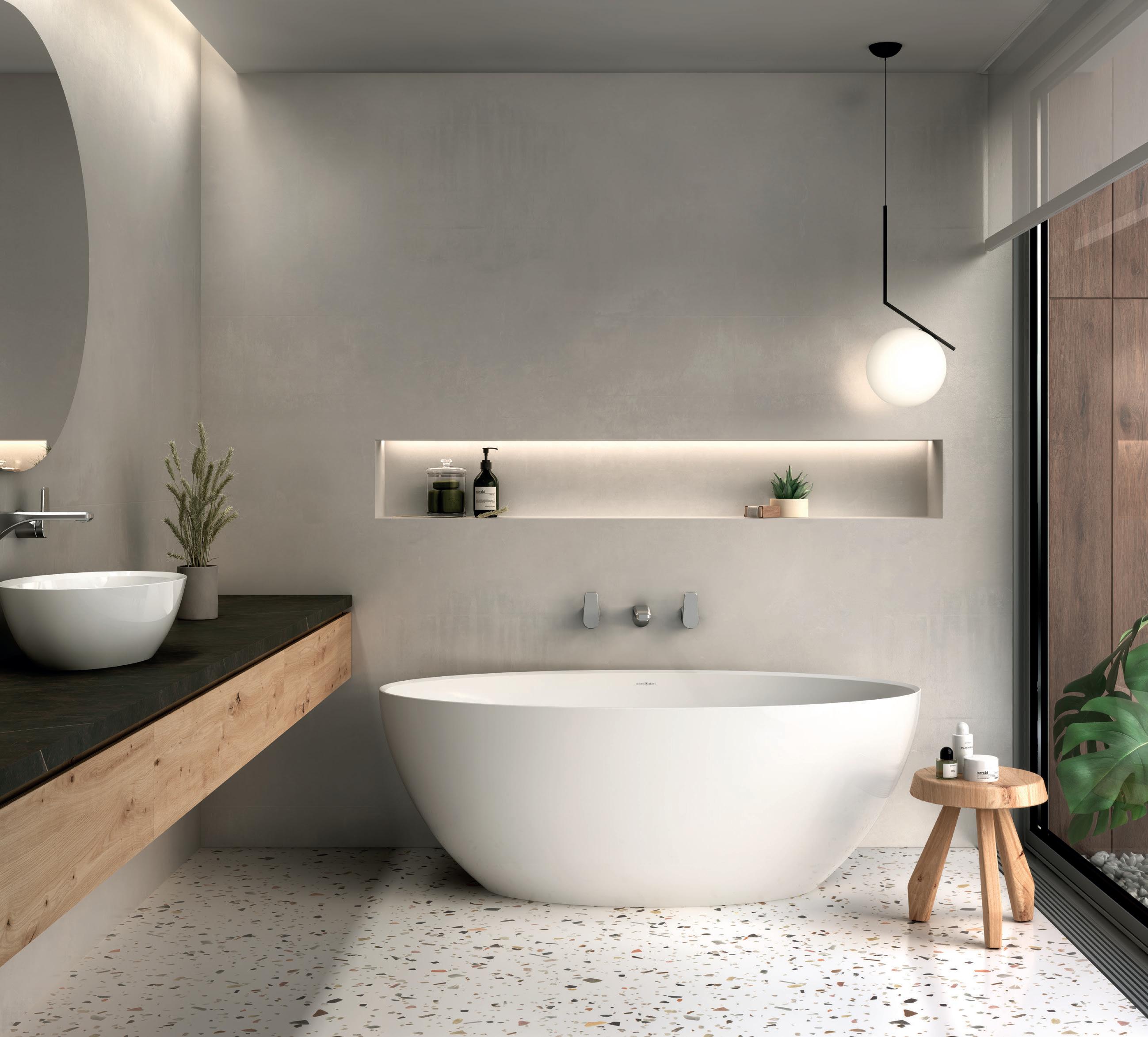


BAMBOO VEIL HOUSE WALLFLOWER


A sustainable, modern tropical home suggests openness and connection. But what if you also want privacy? This house reconciles the two.
BUKIT TIMAH | SINGAPORE
issue #49 habitusliving.com/houseoftheyear
TEXT PAUL MCGILLICK | PHOTOGRAPHY MARC TEY

habitus house of the year # 149
This 680-square-metre, semi-detached house replaces an earlier house on a curving triangulated site. It is for a small family of just three. “[I] had the luxury of building a small house with an ample amount of shade with deep overhangs,” says the architect, Robin Tan of Wallflower.
Part of the clients’ brief was for a house that allowed them to host gatherings of a quite large extended family, previously not possible. Otherwise, they were looking for a house that provided connection to the outside and some form of passive climate control, but without any loss of privacy.
The solution was found through another request from the clients. They had recently visited Kengo Kuma’s exquisite Nezu Museum in Tokyo and had been taken by the beauty of the bamboo-screened entry processional. Could they have something similar?
The result is an elegant curving skin of operable screens made of vertical bamboo columns that forms a second skin to the first floor of the house. The new, smaller house is set back further than the original and this has enabled the architects to have the bamboo screens extend out to the original setback line, leaving a 1-1.5 metre gap to the façade. The effect of this is to create an air bubble which helps cool the interior.
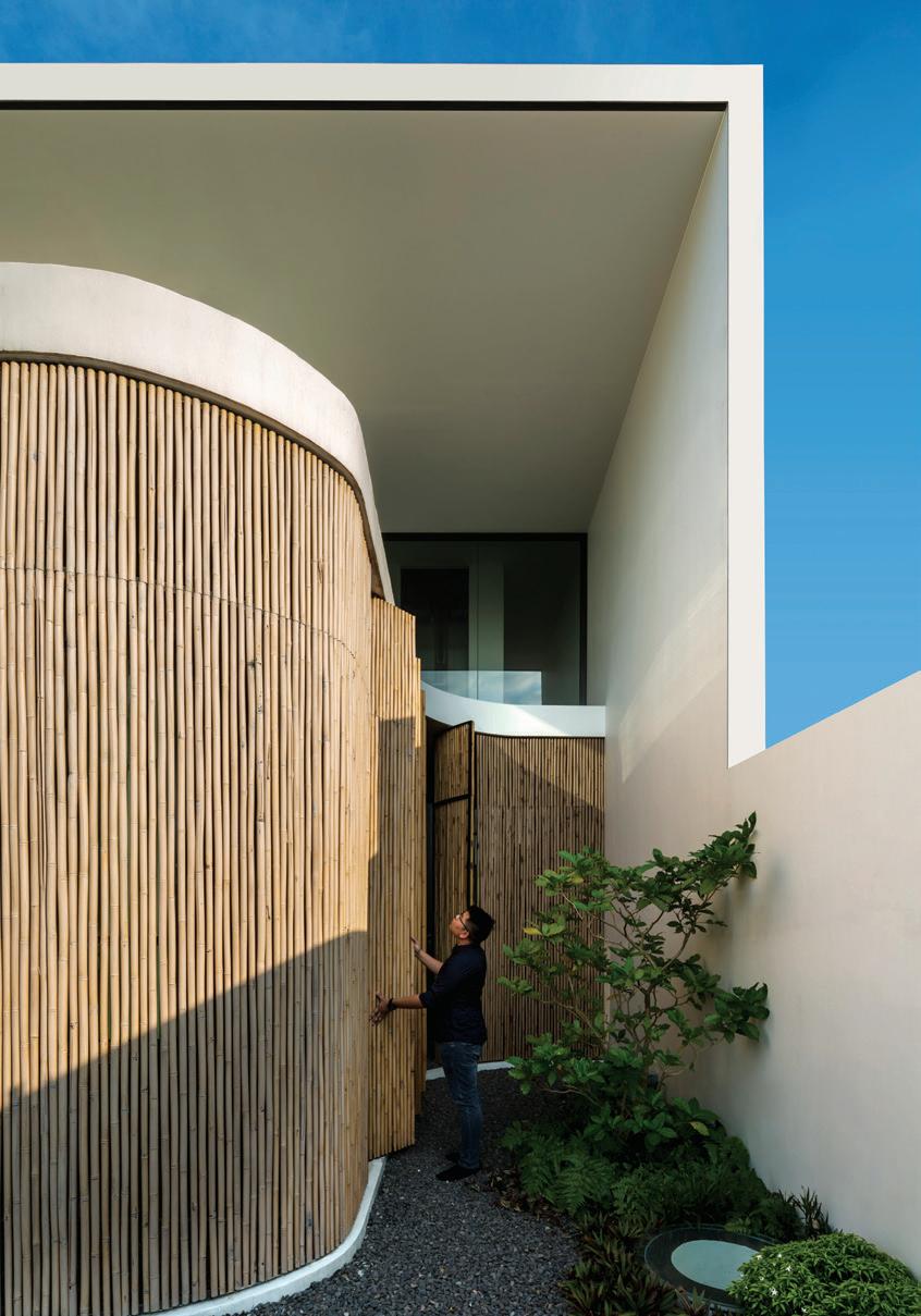
The individual screens are pivoting (resulting in less wear and tear) and the gaps between the bamboo columns allow natural ventilation as well as modulating light entering the first floor bedrooms and so creating a gentle play of light and shadow.
The public spaces in the house are on the ground floor, which is free flowing with ample entertaining space both inside and outside on the terrace. The private spaces are on the first floor with an attic above providing a study and a future yoga room.
Apart from the bamboo screens, climate mitigation is helped by a large overhang that wraps over the attic aided by ample greenery.
“We like to introduce pockets of greenery,” says Robin, “because in Singapore owners want to build up to the max. So we like as much as possible to bring the greenery up to the second storey and to the attic level.” In this case, there is a little garden above the garage. This not only helps cool the master bedroom, but it also provides a privacy screen from the neighbours opposite. Planting on the attic floor screens the western afternoon sunlight while also providing some green relief.
In these ways, the house becomes an urban oasis with an easy co-existence of private and public life. The private spaces on the first and second floors form a world of their own, but with the option of connecting with the street life outside. Meanwhile, the public living/dining/ kitchen area on the ground floor flows easily between inside and outside, making for an ideal gathering place.
Wallflower
| wallflower.com.sg
OPENER The bamboo screen wraps around the house providing both privacy and connection for the private spaces upstairs.
LEFT The screens individually pivot to reduce wear and tear over time.
OPPOSITE ABOVE The downstairs dining/living/ kitchen space opens up to accommodate large family gatherings.
OPPOSITE BELOW The operable vertical bamboo screens offer a constantly changing experience in the master bedroom.
issue #49 habitusliving.com/houseoftheyear

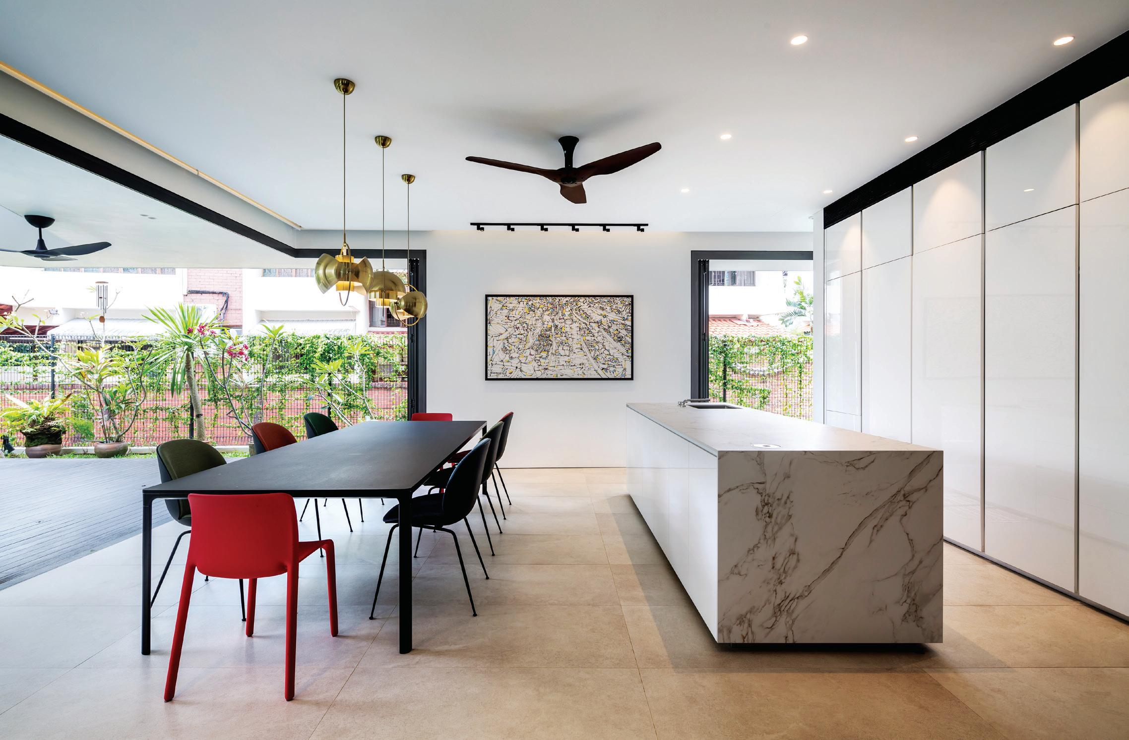
habitus house of the year # 151
LEFT Screens, an overhang and generous eaves protect the house from the tropical sun.
GROUND
Bamboo Veil House, Singapore
ARCHITECT Wallflower Architecture + Design
LEAD ARCHITECT Robin Tan
PROJECT TEAM Sean Zheng, Yong Mien Huei, Tan Yen Lin, Elvan Ong
BUILDER Littlewoods Design Pte Ltd

STRUCTURAL ENGINEER GCE Consulting
Engineers
M&E ENGINEER Ms Adeline Chua
LANDSCAPING Nyee Phoe Flower Garden
WALLFLOWER ARCHITECTURE + DESIGN
(65) 6297 6883
wallflower.com.sg
FINISHES
Natural bamboo screen on external façade. Porcelain floor and wall tiles from Rice Fields.
FURNITURE
Clients’ own.
LIGHTING
Arkos Swam M downlights and Ares & Flos external lights from Relex Illumination.
FIXED & FITTED
Kitchen from BI&L Collections. Olivari door handles from Locks Trading. Gessi bathroom shower and bath mixers, Villeroy & Boch wall hung water closet, and Claybrook freestanding bath from Wan Tai Bathroom Gallery.
CARPORCH
ENTRY
LIVING
DINING
DRY KITCHEN
WET KITCHEN
q w e r t y u i issue #49 habitusliving.com/houseoftheyear
1 2 3 4 5 6 7 8 9 0 FLOOR FIRST FLOOR ATTIC
LAUNDRY
UTILITY
W.C.
STORAGE
MAIN BEDROOM
WALK IN ROBE
ENSUITE
BEDROOM
GREEN ROOF
FAMILY
STUDY
ROOF TERRACE
Scale and elegance for Australian surfaces
Rocks On’s complete range of large format porcelain and ceramic tiles and slabs bring refined luxury and space to a variety of hard surface areas throughout residential, commercial and public developments – indoors and outdoors. While their extensive tile selection can be used to create visually stunning floors and walls, their larger format porcelain slabs are perfect for vanities, bench tops, splashbacks, tables and furniture, plus create seamless internal and external wall cladding.
Offering an array of surface finishes, the range provides the perfect aesthetic for any application. From the timeless elegance of marble, the character-filled versatility of concrete, the raw iridescence of metal, to the organic simplicity of stone, and the innovative qualities of decorative finishes, Rocks On completes the desired look for any space.
Beyond an undeniable visual appeal, porcelain and ceramic tiles and slabs also offer numerous material benefits. They are water, scratch, stain and chemical resistant which makes them both versatile and easy
to maintain. High performers even in harsh weather, these tiles and slabs provide excellent thermal performance – particularly useful when used as cladding or flooring. And thanks to their antibacterial and anti-VOC properties, they are safe both for people and for the environment.
With a solution for every aesthetic, and seamless compositional interpretations that enlarge any project space, these versatile large format porcelain and ceramic tile and slab options are available to designers and specifiers nationwide – and further establish that for every hard surface requirement, Rocks On has the solution.
Rocks On | rockson.com.au
With a selection of tiles and slabs for every purpose and aesthetic, Rocks On have become the brand of choice for high-quality porcelain stoneware surfaces.
habitus promotion › Rocks On #153
LEFT Blaze porcelain floor tiles and ceramic wall tiles recreate the beauty of oxidised metal.

issue #49 habitusliving.com/houseoftheyear
CH HOUSE
ODDO ARCHITECTS

Tradition and modernity come together in this Hanoi house that also provides a welcome breather from the noise and air pollution outside.
HANOI | VIETNAM
habitus house of the year # 155
TEXT PAUL MCGILLICK | PHOTOGRAPHY HOANG LE

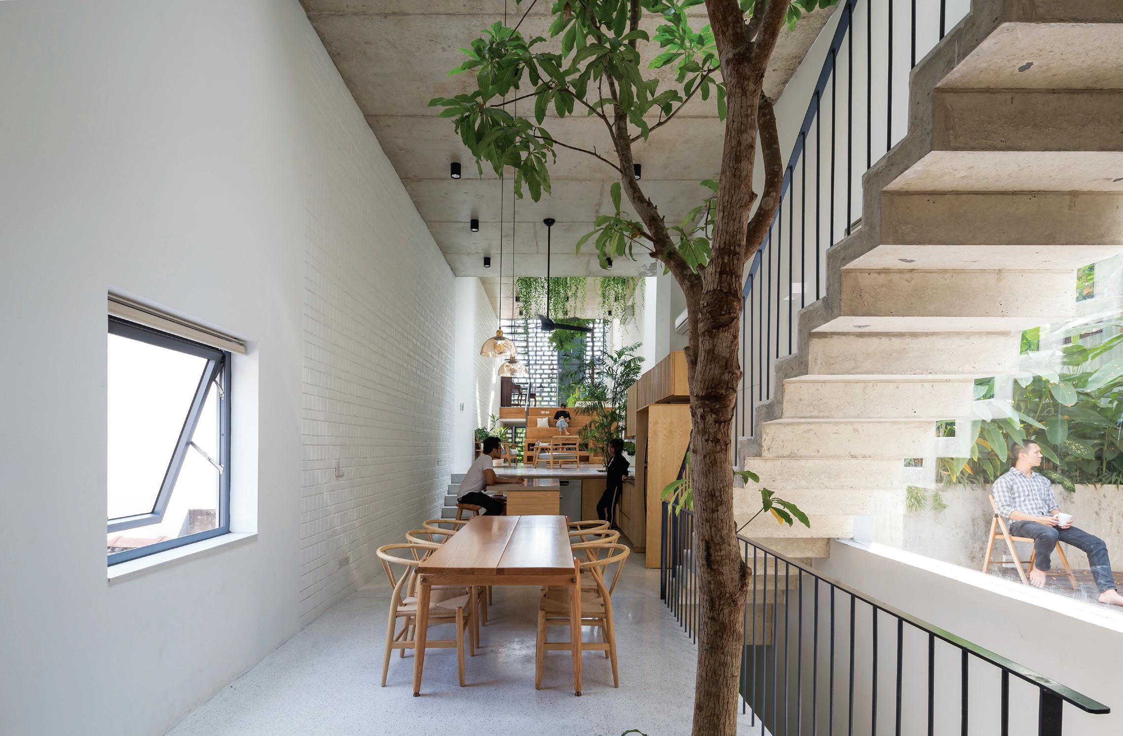
issue #49 habitusliving.com/houseoftheyear
We all know about free plan, but what about free section? This house over five levels (plus a roof terrace) plays with differing ceiling heights, split levels, three voids and a spread of functional spaces to create the sense of a continuous vertical space in what is a very narrow building.
The house was built for a three-generation family keen to maintain the Vietnamese tradition of multi-generational living in an age when it is threatened by smartphones, television and modern life generally. It is also a refuge from the noise and air pollution of Vietnam’s capital city, drawing in air and light from its voids, with ample internal green space including mature trees.
The inspiration for the house is also traditional, drawing as it does on the Vietnamese shophouse with its internal open courtyards. Like the shophouse it also incorporates commercial activity, in this case the ground and first floors that house a commercial enterprise. The building inherited the dimensions of the shophouse as well: the site is a mere 4.2 metres wide and 35 metres deep, much narrower than, say, its Singaporean counterpart. Hence, the ‘free section’ which counteracts any feeling of claustrophobia, not just by breaking up the floorplates and drawing in light and views, but also by spreading out household activities and so enabling greater levels of privacy.
The façade is a combination of perforated concrete blocks and steel-framed glass. It incorporates two street-facing, double-height windows for light and views, but also to give the
building some exterior character by breaking down the mass and alleviating some of the clutter of its immediate urban context.
The domestic realm starts on the second floor (level three) and is planned to provide for the needs of three generations as well as providing a healthy environment, including passive climate control through its internal greenery and its voids. The common spaces –living room, library, dining, kitchen – are spread over the three levels with a continuous sense of connection both vertically and in plan due to the varying ceiling heights, split levels and staggered voids. Internal trees provide a cooling, calm ambience and work together with timber detailing and joinery to soften the concrete shell.
According to the architects the aim of the design was to achieve spatial harmony, maintain family tradition, respond to the local climate and provide a contemporary lifestyle tempered by the benefits of a living tradition. It is really a clever exercise in balancing privacy and community within a total floor space of just 220 square metres.
OPPOSITE
Domestic spaces seem to almost float in a void while still providing intimacy.
RIGHT Greenery cools and softens the interior while a screen filters the outside urban environment.
 OPENER LEFT Looking down into the commercial part of the building.
OPENER RIGHT A varied façade contributes to being a good urban neighbour.
OPPOSITE ABOVE Spatial imagination allows for diverse domestic functions in a limited space.
BELOW
# 157 habitus house of the year
ODDO Architects | oddoarchitects.com
issue #49 habitusliving.com/houseoftheyear
GROUND FLOOR FIRST FLOOR SECOND FLOOR THIRD FLOOR FOURTH FLOOR ROOF


CH House, Vietnam
ARCHITECT ODDO Architects



CONTRACTOR B-UP construction
BUILDER 4AD Constructions




ENGINEER Meyer Consulting

LANDSCAPE DESIGN tnla and Studio Bright


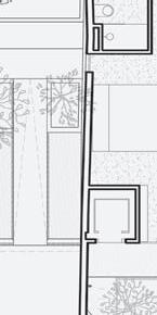


LANDSCAPE INSTALLATION MJR Landscape
ODDO ARCHITECTS


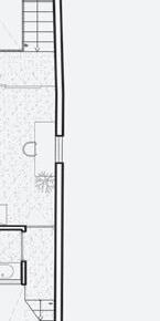



(84) 834 061 258 oddoarchitects.com
FURNITURE
Hand made in local workshops.
1 2 3 4 5 6 7 8 9 0

COURTYARD
BUSINESS
AQUARIUMS
GARDEN
BATHROOM
DINING ROOM
KITCHEN
LIVING ROOM
BEDROOM
TERRACE
q w e r t y u


STORAGE
MAIN BEDROOM
WALK IN ROBE
ENSUITE
LIBRARY
ALTAR ROOM
ROOF TERRACE
Create your sanctuary
If the kitchen is the heart of the home, then the bathroom is its soul. Where kitchens spill into living rooms and out onto backyards, bathrooms retreat in – a sanctuary for solitude, privacy and rituals of self-care. Because of this, the bathroom is an expression of self, a narrative of shape, texture and materiality that speaks to who we are when there’s no one watching.
Despite this, the everyday bathroom is one that has largely been governed by practicality. We choose toilets that save water and fittings that are steam resistant, selecting function over form and dressing up our pragmatisms with French candles and hand loomed towels.
Now, form and function can finally coexist with the release of a new collection from one of Australia’s most iconic bathroom brands. Building on over 75 years of excellence, Caroma have brought Urbane II and Liano II to the market, ranges that combine innovation and design to create bathrooms that look as good as they work.
Infusing contemporary Australian aesthetics with pioneering technology and sustainable excellence, the Urbane II and Liano II have raised the bar in luxury bathroom offerings. Perfect for energising mornings and relaxing nights, this curated range of products make aspirational bathrooms achievable, encouraging true creative expression by way of an inspired colour palette. For the first time, each of the collection’s offerings are available in five luxe coloured finishes, starting from
timeless chrome and evolving to the more modern tones of matte black and brushed brass.

Investigate further and it’s evident this is a collection that is just as much about performance as it is about design. Showers are revolutionised with V-Jet® Technology for an unprecedented level of control over water pressure, while toilets feature GermGard and Cleanflush® – patented innovations that help protect against harmful bacteria and create a cleaner, more hygienic and water efficient toilet.
All Urbane II and Liano II tapware products also feature Caroma EasySwitch – the universal in-wall body that gives you the ultimate flexibility, allowing fittings to be interchanged and updated as often as one desires. What’s more, the Physical Vapor Deposition (PVD) colour finishes on the tapware ranges deliver durable hardness and extraordinary scratch resistance, so they can keep the shine on and be cherished for much longer in time.
In a space that can be difficult to fit out, these new collections provide the products, finishes and visions we need to create bathrooms that are driven by both design and performance. Indeed, with a focus on personalisation and creative self-expression, the Urbane II and Liano II bring bespoke Australian styling to the Vogue range, allowing for wet spaces that are not just bathrooms but your sanctuaries.
The next evolution in bathroom design is here.
Caroma | caroma.com.au habitus promotion › Caroma #159
TOP Express your colourful personality with Caroma’s new Colour Collection.
BINARY WOOD HOUSE TA-CHA DESIGN


This house in Thailand’s north east o ers timeless living in perfect harmony with its environment.
PAK CHONG | THAILAND
issue #49 habitusliving.com/houseoftheyear
TEXT PAUL MCGILLICK | PHOTOGRAPHY BEERSINGNOI

habitus house of the year # 161
Responding to place is not just a sentimental exercise. It brings all kinds of benefits: to the existing environment but also to the people who will live there. Overall, it brings a sense of unity and a feeling of belonging. Too often the built environment brings alienation, but a home that responds to its place provides existential security.
Place consists of many things – landscape, flora and fauna, existing buildings and structures, the people who live there, and history. Place-responsive architecture takes all of these things into account, along with the character and needs of the people whose home this will be.
This house in the north-eastern Thai province of Pak Chong is for a Bangkok-based family of five. Originally it was to be a holiday rental home, but instead became a second home to the family and potentially a home to retire to for the parents.
The family wanted space, but they also wanted to respect the environment by minimising the impact of the new house on the landscape. Hence the house, on a site area of 600 square metres and set amongst verdant rolling hills, is oriented on a north-south axis, thus avoiding a forest of established Phayung trees (Siamese Rosewood) which instead now offer shade to the new house from the western sun. This decision formed part of an overarching sustainability agenda to “touch the earth lightly”.
An aspect of this was the way in which the architects used the traditional Korat House from Nakhon Ratchasima Province as an
OPENER The house floats above the landscape and has an almost fragile appearance.
ABOVE Different spaces and levels de-materialise and merge into one another.
OPPOSITE ABOVE The sunken outdoor living space makes the house seem to float above the swimming pool.
OPPOSITE BELOW
The dining/living space connects to the outside.
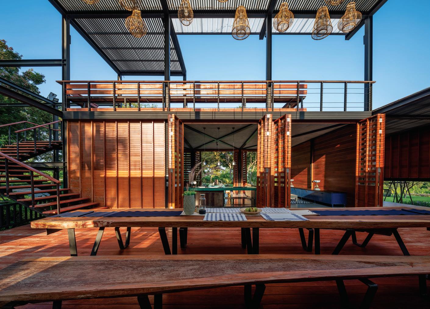
The architects used the traditional Korat House from Nakhon Ratchasima Province as an inspiration and a guide.
issue #49 habitusliving.com/houseoftheyear
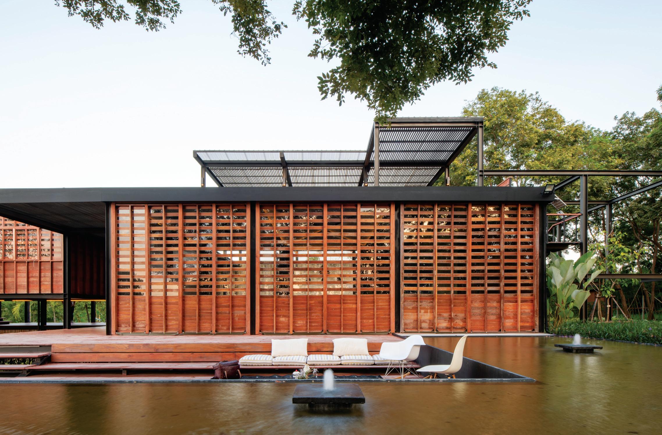

habitus house of the year # 163
inspiration and a guide. The Korat House is a family of spaces within a single storey wooden structure, with a raised platform and light gable roof. It is a pre-fabricated structure using a modular wall system.
The gable roof has gone, but the Binary Wood House is raised slightly off the ground, leaving the earth untouched and allowing life to go on underneath the house. It is a timber house using sustainably harvested timber – 80 per cent of it recycled – re-worked by local craftsmen. Locally sourced materials prepared by local craftsmen is environmentally sustainable, but also helps sustain local crafts and reduce the need to transport materials to site.
The architects also borrowed the strategy of using modular, pre-fabricated timber systems, resulting in a structure that retains the aesthetic appeal of the timber façade of the Korat House, but in a very lightweight form. In fact, the house seems almost to de-materialise without any sense of imposing itself on the landscape.

But this is no exercise in pastiche. It is part of a clever strategy to optimise the space provided without dominating the landscape. This is also the origin of the house’s name. For each of the spatial modules (3.4 metres in length, width and height), the architects designed in a binary identity: unoccupied/open space and occupied/enclosed space.
This means the house has a very fluid programme. Life in the house is not predetermined by functionally specific spaces. Some, like the bedrooms and kitchen/dining are, but other spaces can be what anyone wants them to be, while still allowing for a balance between privacy and community. The extensive use of permeable timber screens and open pavilions drive a sense of the house being an extension of the landscape – and part of the ongoing story of this place.
TA-CHA Design
ABOVE Functionally flexible areas connect easily with one another.
issue #49 habitusliving.com/houseoftheyear
Life in the Binary Wood House is not pre-determined by functionally specific spaces.
GROUND FLOOR
FIRST FLOOR
Bianry Wood House, Thailand
1 2 3 4 5 6 7 8 9
MAIN TERRACE
LIVING
BATHROOM
POND TERRACE
BEDROOM
ENSUITE
FUNKY TERRACE
SUNSET DECK
MAIN BEDROOM
ARCHITECT TA-CHA Design
INTERIOR DESIGN TA-CHA Design
BUILDER Thanpareeya Satthamnuwong and team
JOINERY Local craftsman
LANDSCAPING Owner and Local Gardener
STRUCTURAL ENGINEER Montien Keawkon
TA-CHA DESIGN
(66 8) 9669 6009
FINISHES
Living room floor finished with Epoxy coating by TOA. Steel elements finished with paint by TOA.
FURNITURE
Outdoor dining table and bench custom-made by local craftsmen. Other furniture from clients’ own collection.
LIGHTING
All pendent lights by Pisanulight. Loox LED strip lights by Hafele
FIXED & FITTED
Wash basin from Trusol Bathware. Bathroom fixtures by Cotto. Door, window and furniture hardware by Hafele.
SECOND FLOOR
# 165 habitus house of the year
SHADE HOUSE AYUTT AND ASSOCIATES
BANGKOK | THAILAND
TEXT PAUL MCGILLICK | PHOTOGRAPHY CHALERMWAT WONGCHOMPOO
In frenetic Bangkok, this house stays connected to the city while providing an oasis of cool green respite.

issue #49 habitusliving.com/houseoftheyear

habitus house of the year # 167
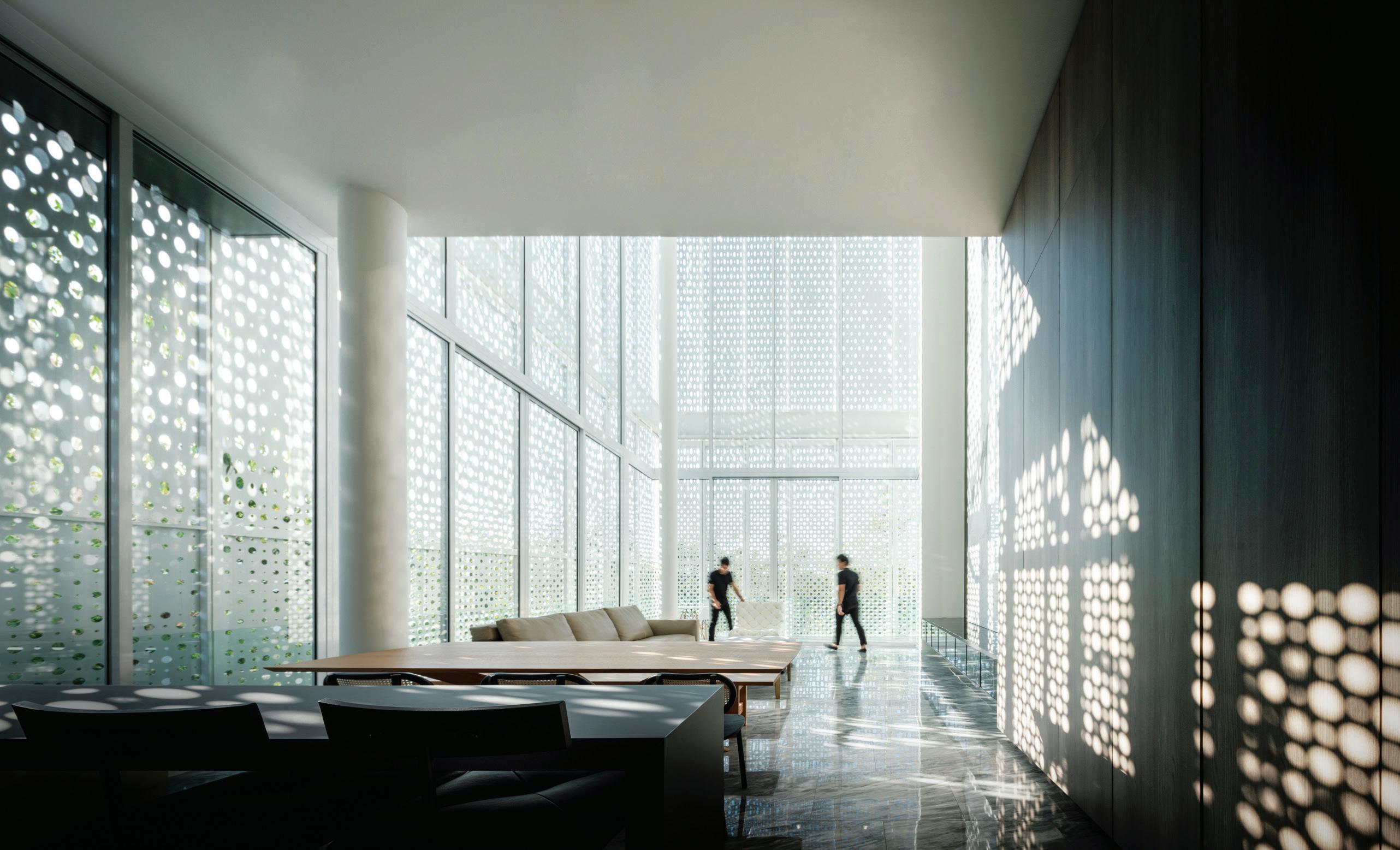

issue #49 habitusliving.com/houseoftheyear
The architects say that their objective in designing this house was to create an ecosystem, a kind of selfsustaining house with its own green lungs to combat the air and noise pollution of the city outside. At the same time, it is an exercise in refuge and prospect, combining the convenience of the city with the life-enhancing benefits of nature.
Originally conceived as a two-storey building, the architects found that by going up to three storeys they could increase the amount of green space by 60 per cent – twice the mandated green space for Bangkok. Then, by adding pocket gardens at each corner of the house and adding a green roof they could increase green space by 90 per cent and ultimately 150 per cent once the vegetation, including vines over the mesh and white steel rod walls, fully matures.
This strategy was aided by placing the infinity edge pool on the first floor as part of the primary residence. This left more space at ground level for landscaping while also enhancing privacy. At ground level there is also a fully self-contained guest suite, the ‘garden villa’, and a Buddha shrine (meditation) room, the latter a glazed garden pavilion framed externally by a screen of slender white metal rods that will eventually be covered in vines. A similar sculptural frame forms an entry sequence leading from the garage to the ‘garden villa’ blurring the division between the lush garden and the interior. This arrival sequence is staged, culminating in a lotus pond signalling the proximity of the meditation room.
OPENER LEFT The twin pods sitting at tree canopy level effectively become tree houses.

OPENER RIGHT
Perforated aluminium screens and filigree white steel rod mesh ensure transparency with privacy.
OPPOSITE ABOVE The double-height living space of the pool villa.
OPPOSITE BELOW

Looking out from the guest pavilion to the infinity pool.
ABOVE Stairs up to the guest villa.

Perforated aluminium screens with etched images of a Plumeria tree offer a subtle decorative element, provide privacy, and mediate the climate.
habitus house of the year # 169
The impression at ground level of total transparency and connection with the garden is replicated with the first floor ‘pool villa’. Here, a double-height living space with floorto-ceiling windows leads out to a terrace and the pool, the experience is of living among the trees, effectively in a tree house. Perforated aluminium screens with etched images of a Plumeria tree offer a subtle decorative element, provide privacy, and mediate the climate – the architects found that a 39-degreeCelsius day outside translates into a 26-degreeCelsius day inside due to the screening and natural ventilation.


The living quarters sit behind and around the void that extends up to the second floor; another self-contained ‘villa’ set among the tree tops with expansive views.
This is a house that seems to de-materialise so that the residence, far from imposing itself on the garden landscape, becomes a part of that landscape. It artfully uses cladding and screening to provide privacy while also generating the sense of connection to the cool, green garden outside.
Ayutt and Associates | aad-design.com
ABOVE The lush garden outside the glazed meditation room.
BELOW The guest villa has prospect out across the city and down on to the green canopy.
issue #49 habitusliving.com/houseoftheyear
FIRST FLOOR
SECOND FLOOR
THIRD FLOOR
Shade House, Thailand
ARCHITECT Ayutt and Associates design
INTERIOR DESIGN Ayutt and Associates design
BUILDER SNT Construction
JOINERY SNT Construction
LANDSCAPING Ayutt and Associates design
LIGHTING DESIGN Ayutt and Associates design
AYUTT AND ASSOCIATES DESIGN (66 8) 8221 9999 aad-design.com
FINISHES
Façades of perforated aluminium and steel grid. Oak timber and stone flooring. Bookmatched stone wall.
FURNITURE
Sourced from local suppliers. Sofa by Minotti.
LIGHTING
Decorative lights from Flos. Others sourced from local brand, Lamptitude.
FIXED & FITTED
Sourced from local supplier.
ENTRY
GARAGE
STORAGE
ENTRY
THERAPY ROOM
PANTRY
BATHROOM
BEDROOM
LAUNDRY
SERVICE QUARTERS
WET KITCHEN
PUMP ROOM
KOI POND
MEDITATION PAVILION
t y u i o p a s d f g
BEDROOM
ENSUITE
BATHROOM
KITCHEN
DINING
LIVING
TERRACE
SWIMMING POOL
MAIN BEDROOM
WALK IN ROBE
1 2 3 4 5 6 7 8 9 0 q w e r # 171 habitus house of the year
STAIR TO ROOFTOP
HOUSE AT KALALGODA
DAMITH PREMATHILAKE ARCHITECTS

Both a journey and a destination, this house connects its inhabitants to the natural world while creating its own connected internal world.
 COLOMBO | SRI LANKA
issue #49 habitusliving.com/houseoftheyear
TEXT PAUL MCGILLICK | PHOTOGRAPHY ERESH WEERASURIYA

habitus house of the year # 173
Alittle over 15 kilometres from downtown Colombo, this house offers a transition from the bustle of the city to rural calm. It is a classic example of the tropical modern house where the clean functionality of modernism is fully at home within a tropical climate: celebrating it without sacrificing comfort and sanctuary.
Typical of the tropical modernist house, the House at Kalalgoda turns its back on the urban street and only reveals itself through an articulated entry progression. A fairly narrow plot with a site area of just 364-metres-squared, the house presents at street level as a concrete frame (the garage and white rendered volume of the house) and a porous brick wall to one side of two handsome timber doors. Beyond these doors is a small entry court shaded by lush Dan trees (Lilly Pilly) and paved with earth-coloured tiles forming an edge to the red gravel garden. The upper level of the house partially conceals itself behind a timber screen made up of vertical slats to allow breezes into the bedroom behind.
But once inside there is a sequence of framed views leading through the dappled light of a double-height void culminating in the glazed living/dining area. This in turn leads out on to a stone terrace where the transition from urban noise to rural serenity concludes with sweeping views of a cool, green paddy field.
Apart from the visual connection to nature – through views and the diurnal play of light down into the void – the house can largely selfregulate. Natural ventilation is generated by the spatial flow of the open plan, porous timber screens on the windows and the double-height void, partly open to the sky, with its twin Dan trees set in the middle of a shallow pond.

The transition from urban noise to rural serenity concludes with sweeping views of a cool, green paddy field.
OPENER The doubleheight temple space with water features and trees.
ABOVE The piano nobile of the upper level looking down into the green void.
OPPOSITE ABOVE View over the paddy field to the rear terrace.
OPPOSITE BELOW View through the kitchen to the paddy field.
issue #49 habitusliving.com/houseoftheyear


habitus house of the year # 175
The cooling potential of the natural ventilation is enhanced by the house being open to cooling breezes off the paddy field.
The pond is backed by a blind brick wall, a defining boadwalk down the edge of the pond and wrapping around one end. This is made from recycled timber railway sleepers, while loose timber furnishings, vertical timber screens and timber planters combine with the brick wall to form a warm and natural palette.
Appropriately, the lower level of the house is dedicated to the public spaces, while the upper level is a kind of piano nobile intersected by the void. The upper level bedrooms and study look out on to the brick wall of the void, the rising Dan trees and glimpses of the sky.

With its use of textured natural materials, indoor greenery, framed views of the outside opening up to a grand vista and its family of intimate yet connected spaces, this house generates a sense of living in nature – and connection to nature – while still providing elegant and comfortable amenity. Part of that amenity is the pervasive mood of calm stillness, a meditative atmosphere concentrated at the heart of the house – namely, the cool, green temple-like void with its ceremonial water feature.
Damith Premathilake Architects | damithpremathilake.com
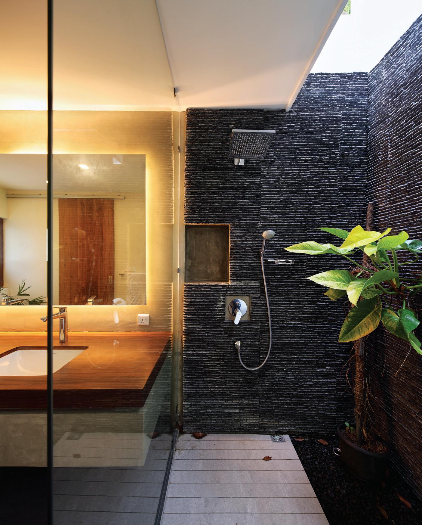 LEFT The stone-finished shower recess continues the theme of connection to nature.
BELOW An intimate garden courtyard framed by a porous brick wall form the entry to the house.
issue #49 habitusliving.com/houseoftheyear
House at Kalalgoda, Sri Lanka
ARCHITECT Damith Premathilake Architects




DAMITH PREMATHILAKE ARCHITECTS (94 1) 1432 2377

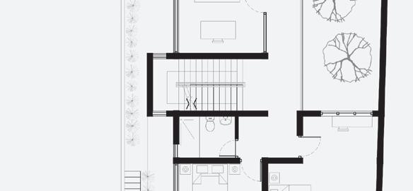


damithpremathilake.com

FINISHES
Cut and polished cement rendered flooring on ground floor common areas. Timber flooring on staircase and upper floor. In bathroom, cut and polished cement rendered walls and Naveen Ceramic Tiles on floor. Outside, railway sleepers on deck; bush hammered stone on verandah; clay bricks for entrance pathway.
FURNITURE
Justin Smith Wrought Iron and Upali Perera Furniture.
LIGHTING
Light fittings from Lights On Pvt. Ltd.


FIXED & FITTED
Lighting fi xture from Lights On Pvt. Ltd.
PARK
POND
ROOM
KITCHEN
ROOM
LIVING
BEDROOM
IN ROBE
TERRACE 1
e r t y u i o p GROUND FLOOR UPPER FLOOR ROOF # 177 habitus house of the year
ENTRY CAR
LOBBY
LIVING DINING
KITCHEN DECK PREP
SERVICE
W.C. BEDROOM ENSUITE BATHROOM STUDY LAUNDRY SECOND
MAIN
WALK
ROOF
2 3 4 5 6 7 8 9 0 q w
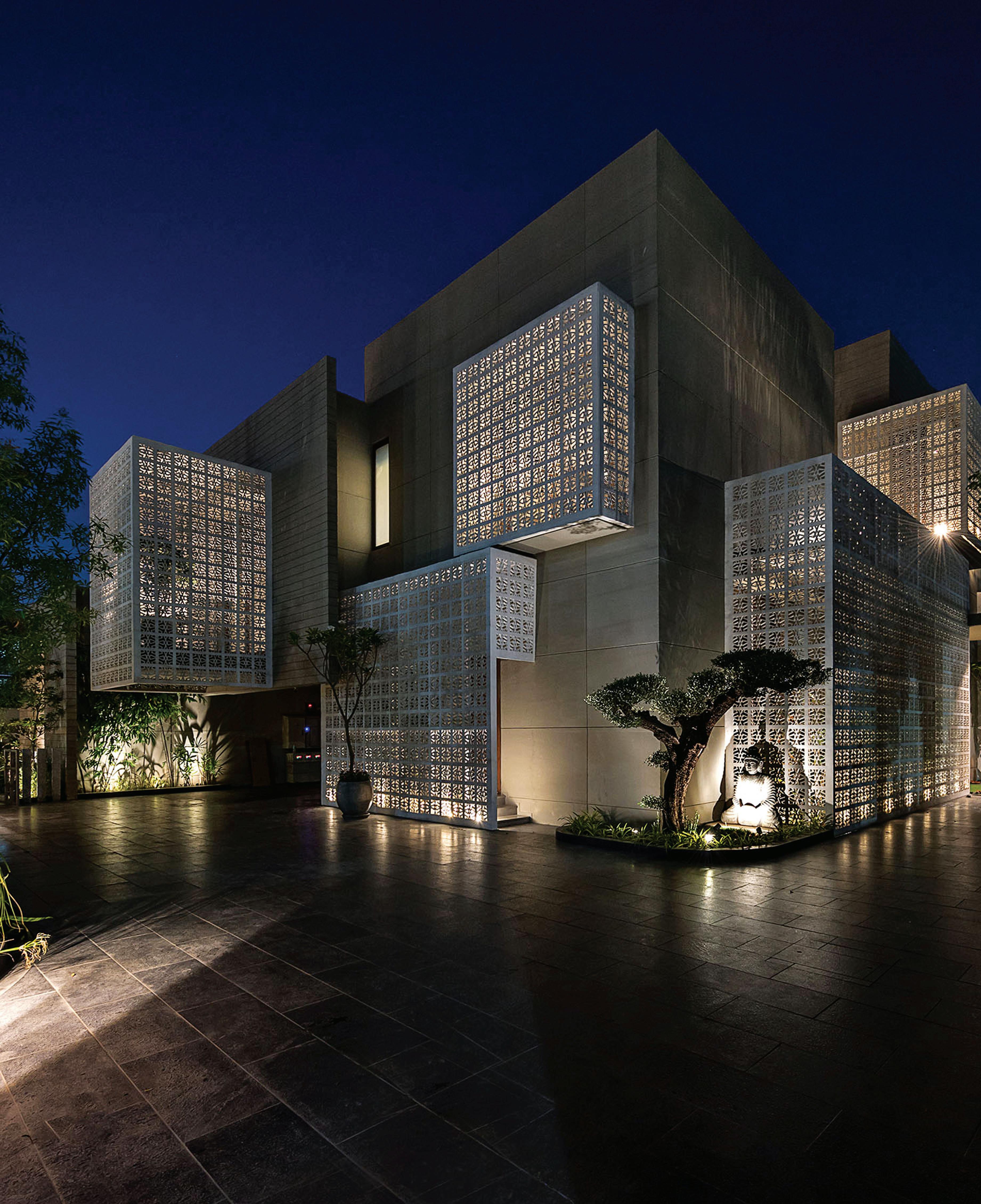
issue #49 habitusliving.com/houseoftheyear
18 SCREENS HOUSE SANJAY PURI ARCHITECTS
Responding to its context, this house is both elegant and simple in the way it provides refuge from the outside world.

LUCKNOW | INDIA TEXT PAUL MCGILLICK | PHOTOGRAPHY DINESH MEHTA habitus house of the year # 179


issue #49 habitusliving.com/houseoftheyear
Lucknow, the capital of the Indian state of Uttar Pradesh, is a culturally rich city with a built heritage going back to the 18th Century. Part of the broader cultural heritage is the chikan tradition of highly intricate embroidery using floral motifs. These are two of the elements making up the cultural context that informs this two-storey, six-bedroom house on the edge of the city. It is situated beside a busy arterial road and on the perimeter of a large, new residential estate.
It is a thoroughly modern house, but one which also responds strongly to its cultural and climatic context. Like any good modern house it is highly functional, especially in the way it mitigates summer temperatures of up to 35 degrees Celcius – but using some very traditional methods.
The two key traditional strategies it adopts are the use of the screen and the internal courtyard. Wrapping the house around a courtyard and using perforated screens to modulate light and mitigate heat is a feature of houses not just in India, but also throughout the Middle East. Typically, these houses consist of several layers. With this house in Lucknow, the layering begins outside with a high concrete wall separating the property from the road with greenery both outside this wall (as part of the verge) and inside, with the house set amongst lush gardens. Next, the outside skin of the house is formed in large part by perforated screens. Then there is an interstitial area – in this case semi-internal gardens – that begins the process of cooling and shading the house. This is followed by the actual building envelope – here raw concrete and glass – and finally the internal courtyard, open to the sky, which draws light in to the interior of the house, but also provides shade and generates natural ventilation.
In the case of the 18 Screens House, the screens strongly suggest the Islamic mashrabiya screen of carved wood latticework that typically encloses an elevated projecting oriel (bay) window. Here, all six bedrooms enjoy sheltered open terraces wrapped at the sides and on top
OPENER Screened extruded spaces create a sculptural play with the concrete walls.
OPPOSITE ABOVE The entry sequence of a grey, paved pathway.
OPPOSITE BELOW LEFT View of the internal courtyard and void.
by the screens that have been inspired by chikan embroidery. This includes the upper bedrooms whose terraces cantilever out to provide seating areas enclosed by the screens.

Inside, raw concrete is tempered by sandstone, timber finishes, green internal landscaping and particularly by the doubleheight internal courtyard. The house wraps itself around this courtyard that is entered from a processional entry path of pavers flanked by river stones and greenery. The courtyard sits at the bottom of a void rising up through the house with the upper rooms connected to the void by timber walkways.

The house gains added character by deftly off-setting spaces – entry to the internal court, for example, is set a little to one side of the approach path – and by varying the volumes of spaces so that individual rooms take on their own character.
This is a house which offers refuge both from the climate and from the noise and activity outside. It turns in on itself so that prospect is largely internal. External views are filtered through the screens and outside greenery. It is a cool, shaded internal environment drawing in natural light animated by shadows with its internal prospect enhanced by glimpsed views and a subtly indirect circulation.
Sanjay Puri Architects | sanjaypuriarchitects.com
OPPOSITE BELOW RIGHT
View back from main court to entry sequence.
RIGHT An exterior terrace pod with screened roof.
habitus house of the year # 181
GROUND FLOOR FIRST FLOOR
18 Screens House, India

ARCHITECT Nina & Sanjay Puri Architects
INTERIOR DESIGN Nina & Sanjay Puri Architects
STRUCTURE CONSULTANT Dr. Kelkar Design Pvt. Ltd.

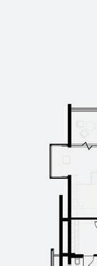
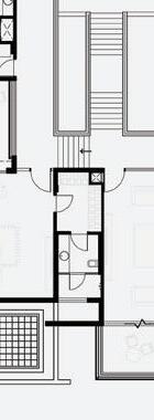


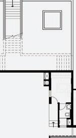


LANDSCAPING Envision
NINA & SANJAY PURI ARCHITECTS (91 22) 2496 5840 sanjaypuriarchitects.com
FINISHES
Paint from Asian Paints and Oikos.
FIXED & FITTED
1 2 3 4 5 6 7 8 9 0 q w e
ENTRY

LIVING ROOM
POWDER ROOM
DINING
UTILITY
STORE
KITCHEN
PUJA ROOM
GUEST ROOM
WC


OFFICE
DRIVER'S ROOM
PARKING SPACE
r t y u i o p a s d f g h
VERANDAH
MASTER BEDROOM

DRESSER
BEDROOM
DECK
SERVANT'S ROOM
SECURITY ROOM
SCREEN SHELTERED WALKWAY


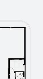
FAMILY ROOM
TERRACE
PANTRY
GYM
BALCONY
Windows from Fenesta framed by RitikaaWood. Kitchen fittings by Häfele, Miller, Siemens, and Faber. Bathroom fi xtures by Kohler, Grohe, and Gessi.
issue #49 habitusliving.com/houseoftheyear
NEW RANGE


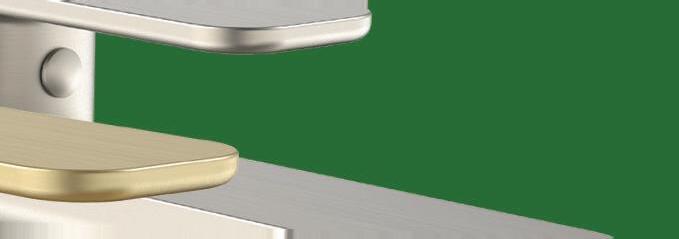


GET INSPIRED AT




COLOUR










WALL HOUSE ABIN DESIGN STUDIO

It started by wanting to close itself o , but this house ended up with an elegant blend of privacy and community.
 WEST BENGAL | INDIA
issue #49 habitusliving.com/houseoftheyear
TEXT PAUL MCGILLICK | PHOTOGRAPHY EDMUND SUMNER, SURYAN/DANG, ABIN CHAUDHURI

habitus house of the year # 185
This house is located in Bansberia, a city and municipality about 45 kilometres from Kolkata in West Bengal. The owner had acquired three adjacent plots on a busy intersection and wanted to consolidate them and build a new residence. He approached Abin Design Studio because he had seen previous residential work of theirs. His main preoccupations were to do with privacy, security and noise – to this end he requested a 3.5 metre (12 foot) high boundary wall.
However, it was immediately apparent that if such a wall followed the plot boundary, it would constitute a traffic hazard by obstructing sightlines on a corner site where several roads came together. After much discussion, the client agreed to give up a small part of the plot, allowing the wall to be facetted back to maintain clear sightlines. This also gave something back to the public domain by widening the footpath and providing for low-height shrubs.
The new strategy also led to the idea of integrating the wall with the building envelope which, in turn, offered the opportunity to shape the wall to a more human scale. The envelope is of weathered steel cut to provide simple, geometric patterning which complements, say the architects, the “timeless and monolithic” feel of the Silver Travertine wall. In addition, variegated large openings to the steel wall –providing tantalising glimpses into the building complex – together with bold angles to the façade, combine to animate the building’s exterior, making for a dramatic addition to the immediate urban context.
OPENER LEFT The internal courtyard is cool and private, its hard surfaces tempered by greenery and timber.

OPENER RIGHT Dramatic cuts in the weathered steel skin create a connection between inside and outside.
ABOVE The house almost de-materialises through its glazed timber-framed wall.

OPPOSITE ABOVE Timber finishes to the balustrading and window recesses soften the concrete body of the house.
OPPOSITE BELOW The streetscape reveals how some urban space has been created, fusing wall and skin.
Timber finishes, balustrading and stairs temper the industrial feel of the steel and the solidity of the stone.
issue #49 habitusliving.com/houseoftheyear

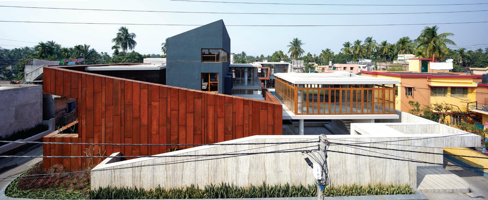
# 187 habitus house of the year
Inside the perimeter, the house – which is really a compound house – consists of several masses that wrap themselves around a series of courtyards with water features, a swimming pool, green and pebble gardens and informal stone step seating. All of this makes for a diverse and loose collection of spatial experiences offering both private nooks and public spaces for coming together. Moving around and through the compound creates the sense of a journey with an intriguing circulation from light to shade, inside to outside. Large doubleheight glazed walls – the framing replicating the patterning on the weathered steel wall – draw light into the interiors where timber finishes, balustrading and stairs temper the industrial feel of the steel and the solidity of the stone.
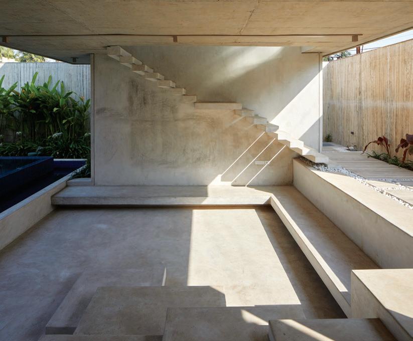
Overall, this house is a fascinating blend of privacy and community. As an urban player it provides privacy for the residents, but also manages to maintain connection with its immediate neighbourhood through the openings and scaling of its perimeter wall. Inside, it continues this strategy by its loose clustering of spaces and a unifying theme of transparency to create a relaxed family of public and private spaces.
 LEFT The courtyard offers an intriguing palette of materials, water and greenery.
BELOW Informal stepped stone seating creates a kind of family forum.
issue #49 habitusliving.com/houseoftheyear
Abin Design Studio | abindesignstudio.com
GROUND FLOOR FIRST FLOOR
FORMAL LIVING
SUNKEN SEATING AREA
POWDER ROOM
STUDY
CARETAKER ROOM
W.C. KITCHEN
DINING
DECK
GYM POOL
BIO-POND SIT-OUT BEDROOM
BALCONY TERRACE LOUNGE
Wall House, India
ARCHITECT Abin Design Studio
INTERIOR DESIGN Abin Design Studio
BUILDER Private House
JOINERY ADS Designs Pvt. Ltd.
LANDSCAPING Supermode Gardening
ABIN DESIGN STUDIO (91) 33 2466 6191 abindesignstudio.com
FINISHES
Corten steel façade. Travertino and ceramic tiles for walls and flooring. Timber shutters.
FURNITURE
Rugs from Jaipur Rugs. Custom-made furniture.
LIGHTING
From Flos.
FIXED & FITTED From Kohler.
1 2 3 4 5 6 7 8 9 0 q w e r t y
house of the year # 189
habitus


MiPlank: 2410 Washed Pine PICTURE IT INSTANTLY on our NEW Visualiser For more inspiration visit polyflor.com.au
THE TEAM AT HABITUS MAGAZINE THANKS OUR ADVERTISERS FOR THEIR SUPPORT. USE THE DIRECTORY TO SEE WHAT PAGE A SPECIFIC BRAND IS FEATURED ON, AND VISIT THEIR WEBSITE TO LEARN ABOUT THE PRODUCTS AND SERVICES THEY PROVIDE.


Discover
Meet
Indulge
coshliving.com.au


Cult 031 cultdesign.com.au

Duravit 033 duravit.com.au

Elica 059 elica.com.au
Gaggenau 035, 130-131 gaggenau.com.au
Harvey Norman 010-011 harveynorman.com.au
King Living 052-053 kingliving.com
Laminex 068-069 laminex.com.au
Liebherr 139 home.liebherr.com.au


Miele 002-003, 104-107 miele.com.au/generation7000
Habitus magazine is available at newsagents and bookstores across Australasia, South-East Asia, the USA, Canada, Europe, South America and the Middle East. Habitus is published quarterly in March, June, September and December. To subscribe securely online visit habitusliving.com/magazine or email subscriptions@indesign.com.au to subscribe or request a full list of locations where Habitus magazine is available.
beautiful products
inspiring people
in architecture and design
Across Australia, New Zealand, South and South-East Asia
The online community for the Design Hunter®
Website | habitusliving.com
Facebook | habitusliving
Pinterest | habitusliving
Instagram | @habitusliving
Twitter | @habitusliving
Ruckers Hill House
# 191 Abey 006 abey.com.au Antonio
antoniolupi.it Bathe 121 bathe.net.au Cantilever 022 cantileverinteriors.com Caroma
Cass Brothers 147 cassbrothers.com.au Cattelan
cattelanitalia.com Cosh
Photography by Rory Gardiner
Lupi 016
060-061, 095, 159 caroma.com.au
Italia 012-013
Living 004-005
Phoenix Tapware 183 phoenixtapware.com.au Poliform 019 poliformaustralia.com.au Polyflor 190 polyflor.com.au Rocks On 075, 153 rockson.com.au Space Furniture 009 spacefurniture.com Studio Italia 007 mondoluce.com Stylecraft 140-141 stylecraft.com.au StylecraftHOME OBC stylecraftHOME.com.au Sub-Zero & Wolf 038-039, 089, 114-115 subzero-wolf.com.au Sussex Taps 037 sussextaps.com.au/sustainable Teka 082-083 teka.com Tongue n Groove IFC-001
Vola IBC vola.com V-ZUG 014-015, 096-097 vzug.com Winning Appliances
Zip
tngflooring.com.au
028-029 winningappliances.com.au
020, 021, 040-041, 122-123 zipwater.com
Discover
Indulge
Across
Website | habitusliving.com


Pinterest | habitusliving

Instagram | @habitusliving
Twitter | @habitusliving
THE TEAM AT HABITUS MAGAZINE THANKS OUR ADVERTISERS FOR THEIR SUPPORT. USE THE DIRECTORY TO SEE WHAT PAGE A SPECIFIC BRAND IS FEATURED ON, AND VISIT THEIR WEBSITE TO LEARN ABOUT THE PRODUCTS AND SERVICES THEY PROVIDE.


Abey 006 abey.com.au

Antonio Lupi 016 antoniolupi.it
121 bathe.net.au Cantilever 022 cantileverinteriors.com

Caroma 060-061, 159, 183 caroma.com.au
Brothers 147 cassbrothers.com.au
Cattelan Italia 012-013 cattelanitalia.com
Cosh Living 004-005 coshliving.com.au
Cult 031 cultdesign.com.au
Duravit 033 duravit.com.au
Elica 059 elica.com.au
Gaggenau 035, 130-131 gaggenau.com.au
Harvey Norman 010-011 harveynorman.com.au
King Living 052-053 kingliving.com
Laminex 068-069 laminex.com.au
Liebherr 139 home.liebherr.com.au


Miele 002-003, 104-107 miele.com.au/generation7000
Habitus magazine is available at newsagents and bookstores across Australasia, South-East Asia, the USA, Canada, Europe, South America and the Middle East. Habitus is published quarterly in March, June, September and December. To subscribe securely online visit habitusliving.com/magazine or email subscriptions@indesign.com.au to subscribe or request a full list of locations where Habitus magazine is available.
beautiful products
people
Meet inspiring
in architecture and design
Australia, New Zealand, South and South-East Asia
The online community for the Design Hunter®
Facebook | habitusliving
Ruckers Hill House
# 191
Photography by Rory Gardiner
Bathe
Cass
Phoenix Tapware 095 phoenixtapware.com.au Poliform 019 poliformaustralia.com.au Polyflor 190 polyflor.com.au Rocks On 075, 153 rockson.com.au Space Furniture 009 spacefurniture.com Studio Italia 007 mondoluce.com Stylecraft 140-141 stylecraft.com.au StylecraftHOME OBC stylecraftHOME.com.au Sub-Zero & Wolf 038-041, 089 subzero-wolf.com.au Sussex Taps 037 sussextaps.com.au/sustainable Teka 082-083 teka.com Tongue n Groove IFC-001 tngflooring.com.au Vola IBC vola.com V-ZUG 014-015, 096-097 vzug.com Winning Appliances 028-029 winningappliances.com.au Zip 020, 021, 114-115, 122-123 zipwater.com
Your map to where the stories in this issue come from where is available
India #178
Thailand #161
Sri Lanka #172
Singapore #142
Brisbane #44
Sydney #70
Adelaide #90
Hobart #98
New Zealand #108
world
“As an architect you design for the present, with an awareness of the past, for a future which is essentially unknown.”
NORMAN FOSTER
issue #49 habitusliving.com/houseoftheyear


The original
white A texture that enriches the senses. Design in its purest form. 060A ceiling-mounted round head shower T39EL built-in heated towel warmer 520 basin spout with table-mounted mixer Explore the story vola.com/on-design VOLA DESIGN PTY. LTD. 94 Wellington Street | VIC 3066 Collingwood Phone: +61 402 372 480 | sales@vola.com.au vola.com
Matt

Nine Daybed
Studiopepe for
stylecraftHOME.com.au Mon - Fri: 8:30am - 5:00pm info@stylecraftHOME.com.au Melbourne 145 Flinders Lane, Melbourne CBD Sydney 100 William Street, Woolloomooloo
Five to
designed by
Tacchini


 GENERATION 7000 COMBI STEAM OVEN
 Frame Living System (Wall Unit), Otway Coffee Tables, Johanna Ottoman & Avoca Sofa.


 ABOVE Raj Nandan chairman & founder Indesign Media, Holly Cunneen editor Habitus
 ABOVE Paul McGillick, consulting editor.


 The unconventional application of rammed concrete is paired with timber and mouth blown glass for architect and furniture designer Daniel Boddam’s GEO collection. Uniting


 The new bathroom series, DuraSquare, blends the precise edges of the rectangular outer form with soft, organically flowing inner contours. The washbasin made from DuraCeram ® sits on top of a matching metal console, shown here in chrome. The glass shelf provides practical storage space. More information available at www.duravit.com.au


 STRADBROKE ISLAND | AUSTRALIA


 LEFT The corridor upstairs between the three bedroom remains open and connected to the living spaces beneath.


 SYDNEY | AUSTRALIA


 OPENER The two houses maintain their original street frontage to sustain the character of the street.
OPENER RIGHT The two backyards have been consolidated into a single courtyard garden.
OPPOSITE Looking towards the kitchen past the custom-designed sofa and island bench.
BELOW Changing light through the skylight animates the timber battens in the living area.


 MELBOURNE | AUSTRALIA


 MELBOURNE | AUSTRALIA


 RIGHT The curvaceous stairs follow the form of the house.


 ABOVE The positioning of the residence intentionally blocks the view on arrival, saving it to be discovered inside the house.
BELOW The main bedroom downstairs follows the descent of the hill.


 TUTUKAKA | NEW ZEALAND


 AUCKLAND | NEW


 Fearon Hay Architects | fearonhay.com


 JAKARTA | INDONESIA


 View into the living space of the small house.
ABOVE Looking from the small house across the connecting corridor to the larger house.


 ABOVE LEFT Making optimum use of space.
ABOVE RIGHT In the small house an internal tree rises in the living room.
BELOW RIGHT The tiny setback from the public lane.


 OPENER LEFT Looking down into the commercial part of the building.
OPENER RIGHT A varied façade contributes to being a good urban neighbour.
OPPOSITE ABOVE Spatial imagination allows for diverse domestic functions in a limited space.
BELOW


 COLOMBO | SRI LANKA


 LEFT The stone-finished shower recess continues the theme of connection to nature.
BELOW An intimate garden courtyard framed by a porous brick wall form the entry to the house.


 WEST BENGAL | INDIA


 LEFT The courtyard offers an intriguing palette of materials, water and greenery.
BELOW Informal stepped stone seating creates a kind of family forum.


