Issey Miyake Dover Street Market Ovolo Sydney, Hassell Sruli Recht Twitter Sydney, Bates Smart The ‘care’ issue. Issue #66 / Australia $16.50 / New Zealand $17.50 / Singapore $12.95 / U.S. $21.99 66 9 771443 870000 INDESIGNLIVE.COM A professional resource for the design curious.
everything you desire in a task chair


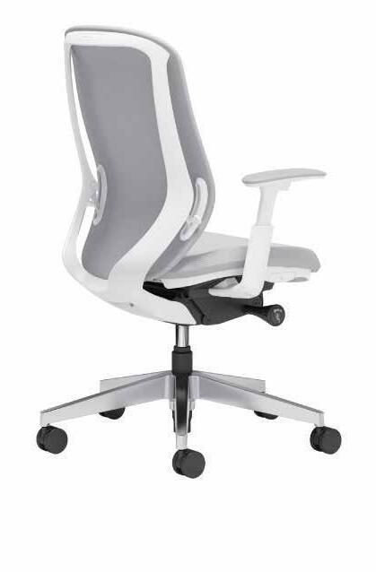

Australia Wide 1300 824 824 uci.com.au
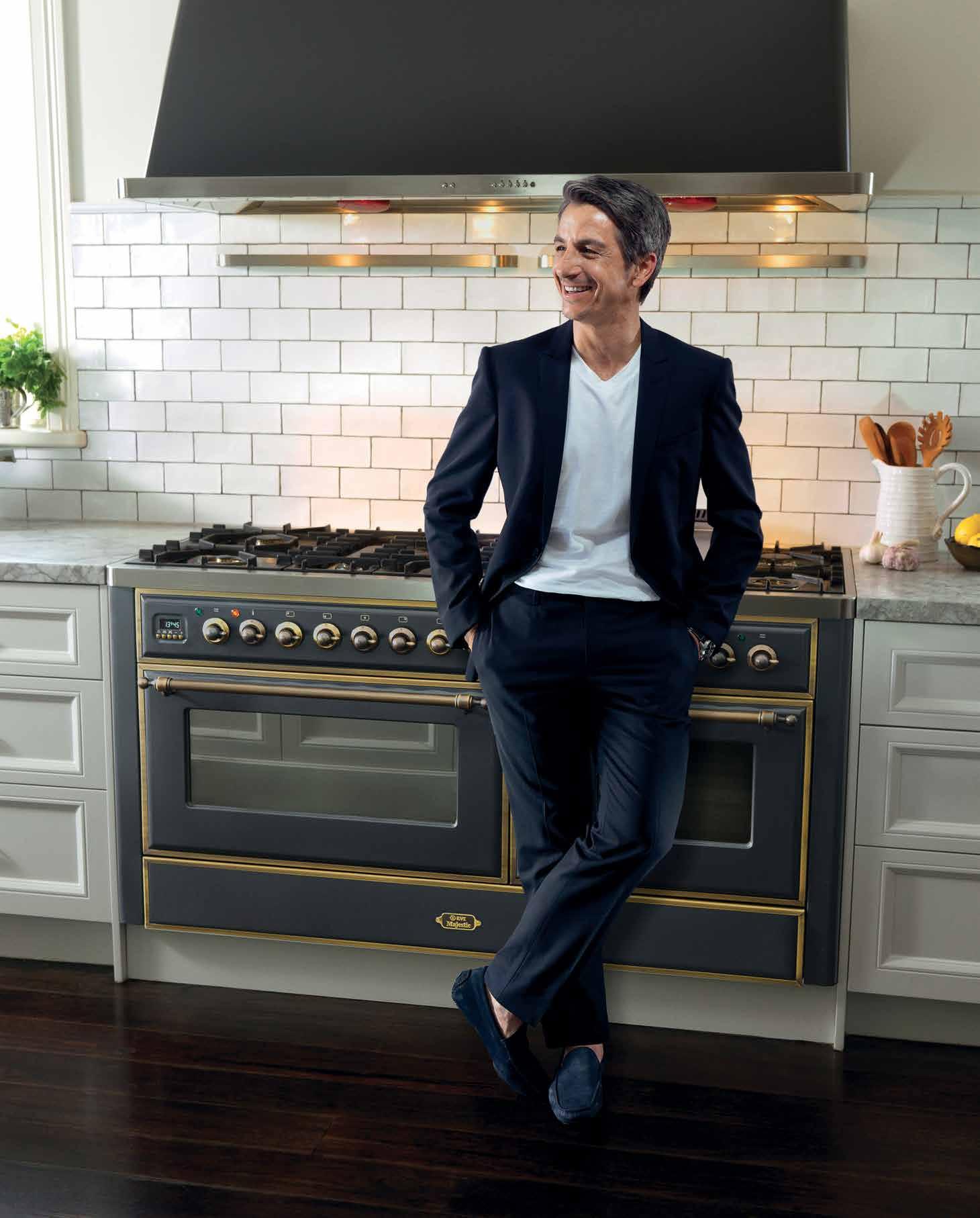
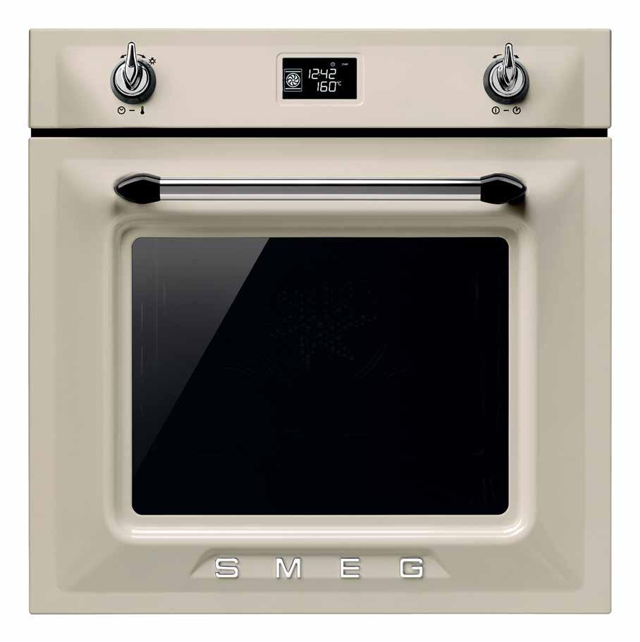
AVAILABLE IN PANNA (CREAM), BLACK OR WHITE ENAMEL AND STAINLESS STEEL, WITH MATCHING COOKTOPS AND RANGEHOODS

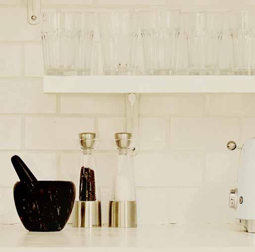
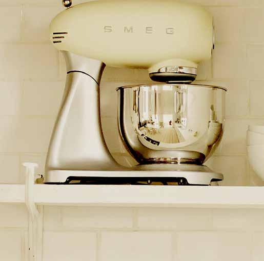
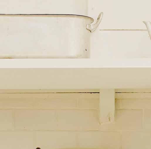
YES TODAY
SMEG VICTORIA COLLECTION. THE SOPHISTICATION AND STYLE OF YESTERDAY, TODAY.

smeg.com.au
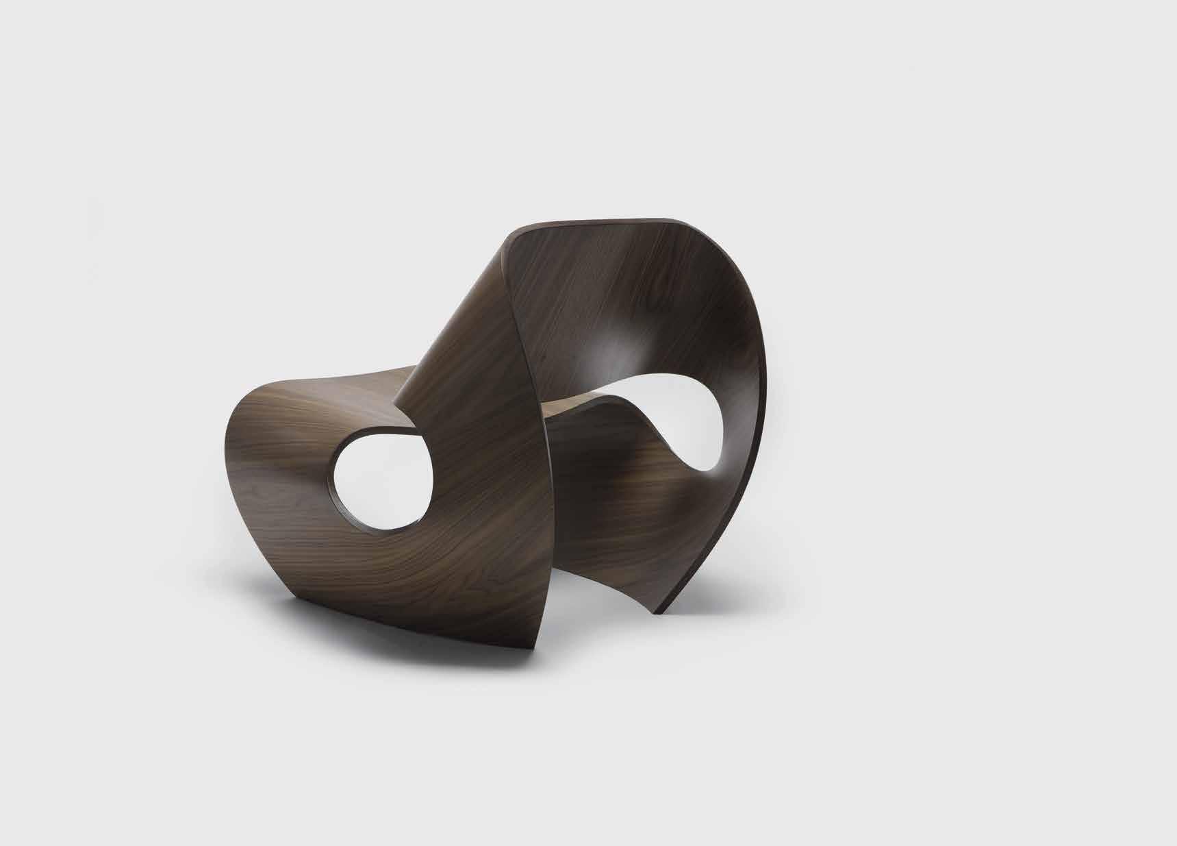
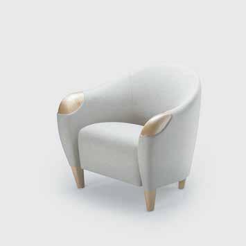
 Brodie Neill, Creative Director – Made in Ratio


With the Cowrie Chair, Brodie Neill has bridged digital precision and handmade craftsmanship. Such design breakthroughs are what we look for in every piece in our iconic collection.
livingedge.com.au


 The Cowrie Chair


Elevating the human experience of care.
Herman Miller Healthcare addresses human needs in health and wellness environments across the entire continuum of care, with designs that consider patients, families and caregivers.
The innovative performance and superior construction of our products results in spaces that function better, while our holistic, human-centred design approach means they feel better too.
+ Sleepover 1.2.3
Transforms from an arm chair to a single sleep surface – no mechanisms needed. +
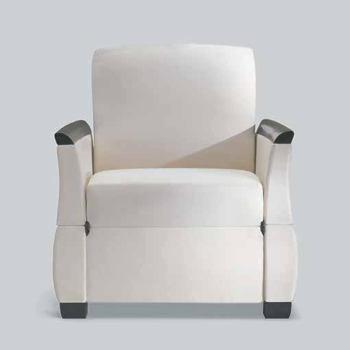
Ava
Comfort for long periods of sitting, with lay-flat recline position and controllable footrest.
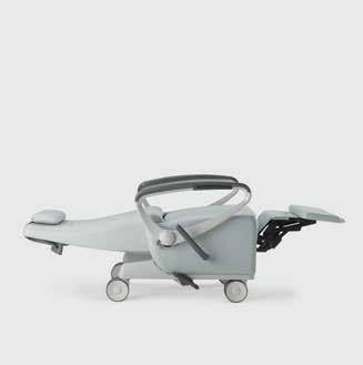
+ Procedure + Supply Carts
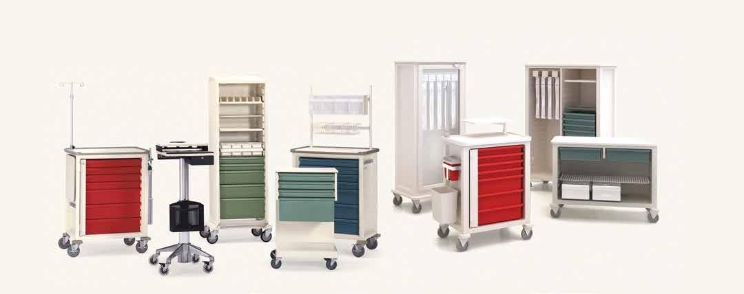
Modular system with universal sizes and easily interchangeable drawers and accessories.
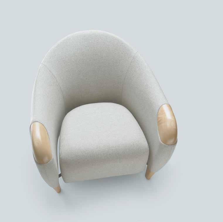
+ Florabella
Innovative floating seat lets potential contaminates flow to the floor, preventing build up of germs and bacteria.
Discover our full healthcare range at hermanmiller.com.au and nd out how we can help you create healing spaces that do more for the people who use them.
Mezzanine level 171 Robertson Street Fortitude Valley, QLD 4006
| +617 3216 1551
Danks St Waterlook, NSW 2017
| +612 9699 1131
Church Street Richmond, VIC 3121
| +613 9427 7000
P
1f
P
575
P
FOR LOVERS OF FINE OAK
Sepia floorboards are finished in a warm oak tone with a distinctive grain of contrasting white lime to give a soft French Provincial feel.
Tongue n GrooveTM floorboards are designed with three solid layers of fine European Oak for optimal finish, longevity and structural integrity.
tonguengrooveflooring.com.au
NSW Light Culture Australia · info@lightculture.com.au

QLD/NT Raylinc Lighting info@raylinc.com.au
VIC/SA Buckford Illumination Group · info@buckford.com.au
WA Lighting Options admin@lightingoptionsaustralia.com.au
ACT Integral Lighting info@integrallighting.com.au
Chairman/Publisher
Raj Nandan raj@indesign.com.au
Managing Director
Kavita Lala kavita@indesign.com.au
Co-Editors
Sophia Watson sophia@indesign.com.au
Alice Blackwood alice@indesign.com.au
Indesignlive Sammy Preston sammy@indesign.com.au
Editorial Director-at-large Guy Allenby (Sydney)

Content Producers Christina Rae christina@indesign.com.au
Andrew McDonald andrew@indesign.com.au
Business Development Managers
Dana Ciaccia dana@indesign.com.au
Colleen Black colleen@indesign.com.au
Client Success Manager
Alex Kwak alex@indesign.com.au
PA to Publisher
Elizabeth Davy-Hou
Production Managers
Victoria Kovacs victoria@indesign.com.au
Tina Fluerty tina@indesign.com.au
Online Manager Radu Enache radu@indesign.com.au
Web Developer Ryan Sumners ryan@indesign.com.au
Consulting Creative Director Christopher Holt christopher@holtdesign.com.au
Senior Designers
Sophie Taylor s.taylor@indesign.com.au
Michelle Byrnes michelle@indesign.com.au
Design Intern
Camille Malloch
Indesign Correspondents
Stephen Cra i (Melbourne), Mandi Keighran (London).
Contributing Writers
Annie Reid, Ashley Tucker, Ben Morgan, Byron George, Christina Rae, Leanne Amodeo, Lorenzo Logi, Mandi Keighran, Nicky Lobo, Paul McGillick, Sammy Preston, Stephen Cra i, Stephen Todd.
Contributing Photographers
Bre Boardman, Christine Francis, David Sievers, Dianna Snape, Earl Carter, Eugene Hyland, John Gollings, Marc Haers, Mark Blower, Marino Thorlacius, Masaya Yoshimura, Michael Anderson, Michael Muller, Nicole England, Nicholas Alan Cope, Philip Ørneborg, Ryan Cantwell, Sean Fennessy, Tyrone Branigan, Tom Ferguson, Trevor Mein, Tom Ross.
Business Manager Vivia Felice vivia@indesign.com.au
Accounts Gabrielle Regan gabrielle@indesign.com.au
Marketing Lauren Black lauren@indesign.com.au
Events Executive Caitlin Clark caitlin@indesign.com.au
Head O ce Level 1, 50 Marshall Street Surry Hills NSW 2010 (61 2) 9368 0150, (61 2) 9368 0289 (fax) indesignlive.com
Melbourne Suite 11, Level 1, 95 Victoria Street Fitzroy VIC 3065 (61) 422 169 218
Singapore 4 Leng Kee Road, #06–08,SIS Building, Singapore 149596 (65) 6475 5228, (65) 6475 5238 (fax) indesignlive.sg
Hong Kong Unit 12, 21st Floor Wayson Commercial Building, 28 Connaught Road West, Sheung Wan, Hong Kong indesignlive.hk
Join the global design gang, become an Indesign subscriber!
To Subscribe (61 2) 9368 0150 subscriptions@indesign.com.au indesignlive.com/subscribe Australia $55 (incl. GST) International AUD $110
Printed in Singapore
Indesign is printed with ENVIRO Soy-Based Process Black ink, UV Solventless Varnish and on paper which is awarded an Environmental Management Certificate to the level ISO14001:2004 GBT24001-2004 and Eskaboard and Eskapuzzle produced from 100% recycled fi bres (post consumer).
INDESIGNLIVE.COM 20 THE PEOPLE WHO GET INDESIGN DONE
INDESIGNLIVE All rights reserved. No part of this publication may be reproduced, stored in a retrieval system, transmi ed in any form or by any other means, electronic, mechanical, photocopying, recording or otherwise. While every e ort has been made to ensure the accuracy of the information in this publication, the publishers assume no responsibility for errors or omissions or any consequences of reliance on this publication. The opinions expressed in this publication do not necessarily represent the views of the editor, the publisher or the publication. Contributions are submi ed at the sender’s risk, and Indesign Publishing cannot accept any loss or damage. Please retain duplicates of text and images. Indesign magazine is a wholly owned Australian publication, which is designed and published in Australia. Indesign is published quarterly and is available through subscription, at major newsagencies and bookshops throughout Australia, New Zealand, South East Asia and the United States of America. This issue of Indesign magazine may contain o ers or surveys which may require you to provide information about yourself. If you provide such information to us we may use the information to provide you with products or services you have. We may also provide this information to parties who provide the products or services on our behalf (such as fulfilment organisations). We do not sell your information to third parties under any circumstances, however these parties may retain the information we provide for future activities of their own, including direct marketing. We may retain your information and use it to inform you of other promotions and publications from time to time. If you would like to know what information Indesign Media Asia Pacific holds about you please contact Nilesh Nandan (61 2) 9368 0150, (61 2) 9368 0289 (fax), subscriptions@indesign.com.au, indesignlive.com Digital Indesign Group is in strategic partnership with: Print Events
THE BALANCE BETWEEN TECHNOLOGY AND DESIGN JACKIE BY PANZERI
Ikko
You can’t make an omelette without breaking a few eggs, and if the eggs are anything to go by, then we’ve made one hell of an omelette!
Sure, we’ve had a saucy new makeover (we know, we look totally hot now), but more than that – and from what we’ve all come to learn from every after-school special in existence – it’s what’s inside that counts.
We are Indesign. We have always been Indesign and we will continue to love being Indesign. We curate, inspire, challenge, provoke, educate and at times even infuriate; bringing you the world’s most extraordinary design activity, edited for the Asia Pacific region – edited for you.
If we’ve chosen it to feature in our ever-so precious and limited pages, you know it’s something worth remembering. So, what does this all actually mean?
The theme of this issue, care, is a solid case-in-point. We could have done the easy thing and simply addressed ‘health’. Instead, we have explored the idea of care. What does care mean to our industry, and what does it mean to our clients? How and why are we investing in the R&D of wellbeing? Does care in the design process need to be transparent? Why are caring leaders and mentors a critical component of our industry? Here, we aim to both raise and answer all the big questions... and that’s just the beginning!
We also connect you with creative virtuosos like Tokujin Yoshioka, who dissects his time with the great Issey Miyake. We give you some one-on-one time with Australian-Icelandic designer, Sruli Recht, who looks to answer the question: Is there currency in controversy?
We ask whether hospitality is the future of ABW through the lenses of mixed-use hospitality project, Ovolo Sydney by Hassell. What happens when designers are the client?
We go backstage at the new Woods Bagot Melbourne office to reveal in-house materiality, customisation and collaboration… that’s just another just a snapshot!
We’ve said it before and we’ll say it again: We are Indesign. We have always been Indesign and we will continue to love being Indesign. Enjoy the issue!
21 INDESIGN FROM THE EDITORS
/indesignlive @indesignlive @indesignlive 100,000+
Indesign Co-Editors, Sophia Watson & Alice Blackwood
indesignlive.com
readers engaged across print, digital & social...
On
The Cover Close-up of Japan, London 1985; designed by one of the world’s most celebrated and prolific designers, Ikko Tanaka (1930-2002).
Tanaka has worked with Hanae Mori, Issey Miyake, the Mazda Corporation and many more. Tanaka is also credited with developing the world-renowned Muji together with Kazuko Koike (marketing consultant), and Takashi Sugimoto (interior designer). Tanaka was the design world’s ultimate disruptor; a true creative omnivore who challenged the status quo and coloured outside the lines when necessary. His work is a stunning symbol of the new direction of the Indesign brand. We hope you enjoy it!
The ultimate industry cheat sheet. 25-72
In famou S Big thinkers and creative gurus.
79-110
Issey Miyaki, Sruli Recht, Sans Arc Studio, Byron George, Front, Johannes Torpe, Nectar Efkarpidis
In SI tu
Provocative, radical and energising design.
115-169
Ovolo Sydney by Hassell
CoworkIrs Brooklyn by Leeser Architecture
House of Häagen-Dazs pop-up by Archiblox
Lot.1 Sydney by Enter Projects
Ivanhoe Grammar by McBride Charles Ryan -
Bodhi & Ride Gym by Hachem
Woods Bagot Melbourne by Woods Bagot -
Dover Street Market London by Rei Kawakubo
Swinburne Uni Factory of the Future by H2O
Marni Flower Pop-up Osaka by Consuelo Castiglioni
Twitter Sydney by Bates Smart I
What does ‘care’ mean to the industry, and what does it mean to our clients? 171-195 In
What can design learn from the art of festival food? 197-199
INDESIGNLIVE.COM CONTENTS 22
In Short
-
-
-
-
-
-
-
-
n Depth
t ere S t
Indesign is a professional resource for the design curious. We look for the point and purpose of everything in design and architecture; exploring why, how and what we do. Indesign is the only place you’ll find clever, provocative (and a little bit cheeky) conversation on our industry. Indesign is by and for creative professionals – both aspiring and established – hungry to continue exploring the ideas that inform the best projects, products and icons the world has to offer.” Indesign Media Asia Pacific Chairman/Publisher, Raj Nandan.
We INspire
We INvite
We INvestigate
We INform
We INvolve
We INfluence
We INfuriate
We INvoke thought
WE ARE INDESIGN WE LOVE BEING INDESIGN WE ARE FOR EVERYONE IN(TO)DESIGN
Are you IN?
WHO WE ARE INDESIGN 23
“
Australia 1300 306 960 Singapore +65 6511 9328 www.stylecraft.com.au
Featured | Kinesit Chair, Parentesit Panels design by Lievore Altherr Molina | Nuur Desk design by Simon Pengelly for Arper - www.arper.com
Photo by Dean Kaufman
the ultimate industry cheat sheet
INDESIGN 25 IN SHORT SHORT IN
Cos x Sou Fujimoto
Empty Architecture
For their fifth presentation at this year’s Milan Furniture Fair, Swedish fashion label COS enlisted Japanese architect Sou Fujimoto to reimagine an abandoned art deco cinema. Amidst the bustle and clutter of the fair, an event built almost entirely around physical objects and elements, Fujimoto’s Forest of Light was an empty sanctuary defined only by shafts of serene blue light.
Drawing on the historic Cinema Arti’s previous life as a play house, Forest of Light was an homage to the idea of both theatre and nature, becoming a space for observation, escapism, and experience. Inside, walls lined in mirrors, and dappled lighting provided by a series of alternating motion-sensored spotlights, referenced the building’s architectural past. Sparsely spaced stools scattered inside the venue gave visitors an opportunity to sit, to contemplate quiet emptiness, and to fully submerse themselves in the non-physical design. Fujimoto’s landscape was a peaceful forest at dusk, its dancing conical spotlights abstract trees in a dark, cinematic enclave. As models clad in the latest COS S/S16 collection stood poised beneath beams, light, fashion and emptiness blended together to become a gentle architecture all of its own.
INDESIGNLIVE.COM IN SHORT 26
INDESIGN 27 IN SHORT
Sydney, Melbourne, Brisbane Singapore, Kuala Lumpur spacefurniture.com
Tufty-Time, seat system designed by Patricia Urquiola and UP5-UP6, armchair designed by Gaetano Pesce. www.bebitalia.com
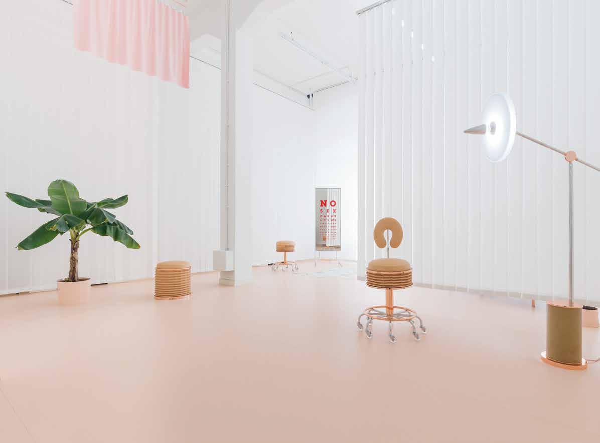
Atelier Biagetti No Sex
True to fine form, Alberto Biagetti and Laura Baldassari took their dissection of contemporary obsessions one step further at this year’s Milan Furniture Fair. Here, the creative duo addressed and penetrated the subject of the body, going even deeper into the human psyche with their project, No Sex. Sex is everywhere. It is thrust upon us, before our eyes, in our ears and on our minds. Sex in itself has rules – to be obeyed or broken. It is an act and the propaganda that revolves around it, to encourage it, warn against it, tells you how to do it…Have you done it? Do you do it? Did you do it? Don’t you do it…? In response to a time where virtual sex is taking over from physical sex and the body is an object of ever more manipulation and excess, Biagetti and Baldassari created their pink clinic designed to re-establish the individual’s inner equilibrium regarding sex. The pink retreat takes you through the ultimate wellness clinic to find yourself in a place designed to detox or retox (whatever your case may be) from the overdose or abstinence of sex in contemporary life. Inside is a daybed, a post-ergonomic medical chair in pale leather and fine natural rubber for laying back and
relaxing, designed for one, but wide enough for two. Two bird-like pieces wait on the daybed, as well as whoever is being treated there. Furnished with a standing lamp, a stool and low backed chair, leather accordion seats, a statuesque full-length mirror, all illuminated by a chandelier made of LED lights and latex. So, what should we be taking away from this? Quite simply, Biagetti and Baldassari raise a valuable point about confronting our discomfort – and ultimately questioning what the impact of doing so has on our creative output. Is it liberating, debilitating or destructive? Should we as designers be striving to wipe the figurative slate clean after each project, or is it better to allow our bias and insecurities to flow through and inform our work? Aside from these deeply important provocations, it is also worth mentioning that the No Sex pieces created are not only symbolic of the current struggle of young creatives in the phygital (yes, phygital) world, they are also tremendous representatives of contemporary Italian production. Each item is researched, designed and executed with the utmost attention to detail, typical of Biagetti, Baldassari and the Italian master craftsmen with whom they work.
INDESIGNLIVE.COM IN SHORT 30
Agile Working That Really Works
Indesign AWM
It is apparent – not one size ts all. Di erent jobs require di erent environments. Activity-based working is continually evolving and has moved beyond just ‘hot desking’, where multiple areas are now tailored into ‘hubs’ to work collaboratively for brainstorming and meetings. For this reason, today’s workspace needs customisation to not only t design but also budget. AWM works closely with the client to ensure both are met. Whether it is their Monorail workstation with a customised leg or the sit to stand Alto customised with purpose-built accessories, they provide solutions to design problems and challenges with functionality and usability.
Many AWM products have been developed for the client’s requirements, working closely together with the designer to workshop the concept and development of what is now known as the Alpha Leg. And this is what set’s AWM apart; they make your design work by harmonising the needs of both the designer and the end-user. Is your agile workplace working for you?


All Wood In The Hood
Indesign Pedrali Spa
The Pedrali wood division is this year celebrating their 10 th anniversary with the re-organisation and expansion of its production unit in Manzano. While many have commented on the recent fall of Italy’s reign on design, the strength of institutions such as Pedrali Spa signals that it might not be over just yet. “The tradition of artisan woodworking in the Friuli area, coupled with our extensive experience in the use of di erent materials, has allowed us to create a collection of furniture that responds to the demands of versatility and customisation in the contract sector,” says Giuseppe Pedrali, CEO of Pedrali Spa. “A successful pathway re ected in our record turnover of €71 million in 2015. This encouraging sign con rms the real value of Italian production in terms of cra smanship, technological innovation and creativity.” Inaugurated in 2006 in the heart of the Chair District in Manzano (Udine, Italy), the wood division has seen the creation of numerous landmark collections such as the Frida oak chair designed by Odo Fioravanti, which was awarded the XXII ADI Compasso d’Oro in 2011 for its simple sculptural elegance. From all accounts, the success of their production model and industrial process is based on the idea of doing most of the work internally, ensuring maximum quality and control over every phase: from design to production.
INDESIGN 31 IN SHORT
The Effect Of The Underground
What happens when you pass over the blue prints of a design classic to a renegade? More and more big time design houses are investing in the underground in order to apply a fresh coat of paint to classic design shapes. This year, Cassina enlisted quirky artist and designer Bertjan Pot to cra a set of bespoke textiles to apply to the classic Ultrecht armchair. Pot was given free reign to develop a contemporary twist to the icon designed originally by Gerrit T. Rietveld in 1935. Pot, who is best recognised for his 1999 orb-like Random light, said “Rethinking upholstery for a 1935 classic is a tricky thing, especially since the creator of that classic is not amongst us anymore.” Produced using an advanced computer-controlled jacquard weaving machine, Pot’s textiles are an utterly unique and perfectly balanced geometric pattern; the combination of spiralling triangles are never repeated. The e ect? Cassina’s time-honoured chair is maintained, almost gleaming new again.
Smeg x Dolce & Gabbana


Fashion regularly borrows from other creative disciplines to surprising e ect (The Piet Mondrian shi dress by Yves Saint Laurent in 1964, comes to mind). But while fashion appropriates art, can design likewise, appropriate fashion? Zaha Hadid’s travelling pavilion for Chanel was described as frivolous and super cial amidst the grip of recession in 2008 – but criticism aside, the structure was an striking tribute to the label’s iconic quilted bag. Cross-sector collaborations can seem less like a meeting of minds, and more like an outrageous pairing hinged on shock value over sincerity. We are however, invited to draw rst-time parallels between brands, and to level with a novel synthesis.
It’s A Kind Of Magis
Indesign CULT


‘Collaboration’ seems to be the name of the game these days, particularly when it comes to acheiving industry longevity. Celebrating its 40 th anniversary this year, Magis is renowned for its energetic and surprising works in plastic and metal, but also for its simply magic collaborations with globally-acclaimed design legends like Konstantin Grcic, Jasper Morrison and Marc Newson – to name a few. Magis continually o ers products that showcase masterful industrial design with a playful and quirky edge – but more importantly, in a playful and quirky format. The recent Magispace x Cult pop-up in Cult’s Sydney and Melbourne showrooms for example, demonstrates the value of working with each other, rather than against. The pop-up saw a large section of each showroom completely re-designed and styled to feature new 2016 products in addition to showcasing an archive of Magis’ much-loved classics. The success of these kinds of collaborations point to one inevitable conclusion – no one succeeds alone. And creating opportunities to team up with like-minded but di erently skilled people is nothing short of a recipe for success.
INDESIGNLIVE.COM IN SHORT 32
Nike Nature Of Motion Running Freedom
Adding to a broader, innovative exploration of design and designthinking at Milan Furniture Fair this year was Nike’s presentation, The Nature of Motion. The sprawling exhibition was one of the biggest the fair has ever seen, and included interactive high-tech installations and displays by Nike’s in-house designers, illuminating the evolution of Nike’s signature footwear, such as the Flyknit. Additionally, Nike offered a set of artists and designers an open invitation to interpret the idea of ‘natural motion’, a concept close to the design heart of Nike. The resulting designs and creations were displayed against stacks of white shoe boxes, which appeared like rows of curved white subway tiles. Abstract, non-commercial but thoroughly functional and forward thinking concepts blurred the distinction between nature, art, and design. The exhibition was creative freedom set in motion.
Abstract, non-commercial but thoroughly functional and forward thinking concepts blurred the distinction between nature, art and design at this year’s Milan.
Lindsey Adelman created a light installation inspired by the natural movement of plants. Lights communicated through vibrational movement in an effort to capture the elusive mystery of nature within the constraints of industrial components. Italians Enrica Cavarzan and Marco Zavagno of Zaven created oversized floor lamps, which referenced the organic and featured diffusers made with Nike Flyknit. In a specially constructed domestic environment, Martino Gamper’s collection of drums created a commentary on the rhythm of natural motion by stretching technical Nike Flyknit textiles over laminated plywood forms and securing them with Nike laces. Max Lamb’s surreal installation showcased heavy aluminum, granite and polystyrene blocks effortlessly levitating above an invisible film of compressed air, which enabled them to move with the lightest touch and, in turn, challenge perceptions of weight and effort.

INDESIGN 33 IN SHORT
–
–
Characteristically Scandinavian in identity, so on-trend colours, multisector functionality and over-all, beautifully social.
Please Be Seated
Indesign SB Seating
It’s no secret that our commercial and social lives are becoming increasingly blurred, yet many traditional furniture options fail to meet the needs of our now highly-collaborative and interactive lives. Originally developed through a unique collaboration between Scandinavian designers StokkeAustad, Form Us With Love, Grønlund Design and Scandinavian Business Seating, the RBM ‘Noor Up’ system is ideal for use in break-out areas, co ee bars and meeting spaces in various environments. The seating height of 63cm provides natural ergonomic seating comfort for the users. It ts well for use with tables around 90cm high, that is, RBM Allround tables. RBM Noor Up is stackable up to ve chairs. Armrests are optional in addition to a wide range of PP shell colours, 3D veneers, frames and fabrics.
SP01 Doin’ It For Themselves
Indesign Space Furniture

Conceived in Australia, designed by the renowned Milan-based studio Fattorini + Rizzini + Partners and produced by Italy’s leading manufacturers, SP01 is the new in-house design brand by Space Furnitue, featuring a collection of beautifully detailed, hand- nished furniture pieces designed for an international audience.
The SP01 team had a very clear vision; to create a new collection based on rigorous design and honest materials. Fattorini + Rizzini + Partners of course bring a unique breadth of skills and experience gained from working with leading brands including Arper, Moooi, Cassina and Zanotta, and have been recognised with numerous international awards, including the prestigious Compasso d’Oro.
While working with Fattorini + Rizzini + Partners is a de nite win, the real coup of this global-made-local team-up is that each of the pieces have been named a er long-serving members of the Space team, further emphasising their investment in true authenticity and highlighting the importance of humanising design.
INDESIGNLIVE.COM IN SHORT 34
–
–
 Jazz by Art Ceram. Made in Italy.
A unique magnetically-attached arm allows the disc to rotate around the body, directing or shading light.
Ross Gardam Tech(nique) Plus Tech(nology)
Melbourne-based designer Ross Gardam’s latest creation is a sublime marriage of old design techniques and new technology. This approach and mode of design process has permeated much of Gardam’s work since establishing his practice in 2007. Gardam has worked to ensure every piece has been carefully crafted – handmade by local Australian artisans and makers. The end result is a collection of products that are at once elegant, beautiful, accessible, and made for today.
Launched at Ventura Lambrate during this year’s Milan Furniture Fair, the Polar lamp follows a serene circular motif and a minimal operative form, comprised of a cylindrical ceramic base and a wide,
flat circular shaped shade set on top. The shape and movement of Polar is inspired by natural and seasonal phases of light, the ceaseless shifting of the sun, the moon and eclipsing darkness and day. Circular discs arc across the body of the lamp to illuminate shade. Technology meets technique where the lamp’s two counterparts represent a neat pairing of old and new. A unique magnetically-attached arm allows the disc to rotate around the body, directing or shading light. The top is available in white, blue, pink, and gold reflective finishes. Beneath the disc, Polar’s ceramic base is handcrafted using traditional slip casting, and the surface is bisque fired and presented unglazed.
INDESIGNLIVE.COM IN SHORT 36 –
–
In form, upholstery technique and fine detail, Pearson Lloyd’s luxurious Healey Lounge pays tribute to the bucket seats of legendary classic cars. Winner of the 2015 German Design Council Interior Innovation Award.
walterknoll.com.au
Healey Lounge by Pearson Lloyd, Tama Side Table by EOOS.
Boring is the new interesting, because it’s actually not all about furniture. It’s time to put everything else front and centre; the interior design, the architecture, the view, the pictures on the wall, the people. Forget the goddamn furniture!
Jump On Bored
The traditional office no longer exists and it’s time to let the furniture catch up. Our workplace deserves affordable solutions that comply with regulations and also manage to let the overall interior design shine. Creating more aesthetically pleasing furniture is not an option. It will either become unaffordable or will lead to impossible compromises. That is what made Lensvelt collaborators, Space Encounters, decide to shift the focus away from the furniture and onto other things, resulting in a process where they redefined office furniture by questioning what is truly essential about these designs. That is Boring Collection. Sober gray, no fuzz, no pretensions.
You can be sure any iconic interior will receive all the attention it deserves as long as it’s surrounded by Lensvelt’s (un)iconic Boring collection.
Oi Oi Oi! Local Design In Milan
This was the largest independent Australian presence in Milan to date... and they bloody killed it! With the support of Brickworks Building Products, Local Design presents Local Milan was a curated showcase of 12 leading Oz designers, dramatically stylised inside a former church-turned-theatre – Teatro Arsenale – within the alternative 5 Vie precinct. Curated by LD founder and stylist Emma Elizabeth and industrial designer Tom Fereday, the two challenged the rest of the world to question their country’s design identity, while making a strong statement about our own corner of the globe, and what design means to us.
INDESIGNLIVE.COM IN SHORT 38
–
–


PepsiCo.
Milan’s Unlikely Hero
While PepsiCo could be the most unlikely exhibitor to ever appear at an international design fair, and the least likely to receive any critical acclaim – their pop-bright presentation enraptured visitors attention again at Milan Furniture Fair this year for its fresh approach to design-thinking, and its compelling design alliances. The presentation forms part of a budding crop of industry outsiders and conglomerates joining the fair each year, like BMW and Apple.
Titled Mix it Up, the exhibition space was imagined by Design Group Italia. A ‘FIZZ Bar’ offered sparkling soda varietals, via the high-tech Pepsi Spire digital drinking fountain (the latest version features panel designs by industrial designer Benjamin
Hubert). PepsiCo’s in-house design outfit, the PepsiCo Design and Innovation Centre, created a set of proprietary emojis called ‘PepsiMojis’, which were translated into a wearable context as soon-to-be available sunglasses in collaboration with Jeremy Scott. A special Fiat Pepsi Car was designed in collaboration with Lapo Elkann’s Garage Italia Customs, and there was a solar cart, and a newly devised, environmentally-focused ‘Drinkfinity’ personal and portable beverage system. Karim Rashid designed bespoke barware accessories for the exhibition, including an ice bucket, glassware and tray. PepsiCo’s investment in Milan and in design more broadly is interesting, but also evidence of the power of design to create meaningful experiences that inspire people to connect.
INDESIGNLIVE.COM IN SHORT 40
Urquiola x
Frederico Pepe Beauty From Negativity
Patricia Urquiola does not like glass – the material, she says, “repulses” her. However, some of the Spanish architect and designer’s most recent and more spellbinding design collections and collaborations have been forged from re and sand. At Milan Furniture Fair in 2015, Urquiola created a series of shimmering, neon coloured iridescent glass furniture for Glas Italia, and applied geometric patterns to architectural glass for Skyline Design at NeoCon. This year, Urquiola partnered with graphic designer Frederico Pepe to produce stained glass credenza cabinets, screens and a low table for Milan boutique Spazzio Pontaccio. The result is arresting – panels of blue, red and yellow glass with sharp graphic diagonal lines reference stained-glass windows German artist Gerhard Richter. Given the freedom to mould the product in her own way, Urquiola cra ed beauty from the ashes of distaste. Perhaps there is something more intriguing to be gained from working with materials or modes that unnerve and unsettle us. Perhaps we work a little harder when asked to fashion something out of aversion or negativity, or maybe our best work is driven by our strongest emotions, where the outcome is ultimately more striking, and more personal.
You Need Therapy

Indesign Rogerseller


Milan Minute: David Rockwell, Stellarworks


“I feel like there is an opportunity to address how we live our lives now. Which is embracing transitions: where we work is where we play. Where we play is where we entertain. Once we began thinking about furniture that addresses how we live our lives and a more contemporary idea of this, one of the ways I like to think about it is ‘less hardware, more so ware’. Our rst piece in the [Valet Collection for Stellarworks] was the Valet. Going from the hustle and bustle of the streets, there’s not a lot of accommodation for where you put your stu . [Here was] a piece that suggested a ritual for that. I really fell in love with, and started to think about, the notion of a valet – which is someone who would help you through your daily life – and that the furniture could do that in and of itself…It’s nding a way to emphasis the emotional part of it.”
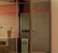
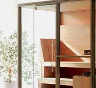
Sometimes, having a traditional Finnish sauna is just not enough luxury. So E egibi decided to combine this experience with that of the ancient Turkish bath ritual, known as a hammam steam shower, in the Twin Logica Mid. The combination of these two treatments provides an ultimate spa experience. The dry heat of 20-30 per cent humidity in the sauna triggers the body’s natural sweating mechanism. In contrast the hammam turns the humidity up to 100 per cent, which, via lower water temperatures, relaxes and regenerates the body. In Canadian Hemlock timber and laminated grés porcelain, the Twin Logica Mid is available in four con gurations and three colour schemes, with ve xed hues in the colour therapy system.
INDESIGN 41 IN SHORT
“For too long, [furniture] has functioned rather like a corset: a rigid and uncompromising addition to our body.”
Let’s Get Phygital...Phygital


Created by international design and innovation rm Carlo Ratti Associati with the support of Vitra, comes Li -Bit, the world’s rst Internet-of-Things sofa that can digitally transform into endless con gurations. The system is composed of a series of individual, upholstered stools, where each element is motorized using a linear actuator, enabling it to be raised or lowered. Li -Bit can be controlled in person, via a simple gesture (just hovering your hand in the air over the seat), or from a distance, through the use of a mobile app. The LiBit system can even become ‘bored’ when not used for a long time, it will start shape-shi ing on its own to engage users.

The dynamic Li -Bit system is further enhanced when assembled in large compositions, and here, activating a single stool will trigger a broader e ect, with the entire system recalibrating and generating a potentially in nite number of arrangements. Two elements together can make a chair. Four elements, a chaise longue. Nine elements, a large sofa. Dozens can radically rede ne any settings, even with con gurations reminiscent of a volcano or the Grand Canyon. “Architecture has o en been described as a kind of ‘third skin’ – in addition to our own biological one and our clothing,” says Professor Carlo Ratti, founder of Carlo Ratti Associati. “However, for too long it has functioned rather like a corset: a rigid and uncompromising addition to our body. Li -Bit draws on the potential of Internet of Things (IoT) technologies to transform our interior landscape, giving form to an endlessly recon gurable environment. In the future, we could imagine an architecture that adapts to human need, rather than the other way around. A living, tailored space that is moulded to its inhabitants’ needs, characters and desires.”
Droog: Public Space Private Parts
Public space is for everyone and no one. Based on raw data collected from socialcities.org, real people have decided that public squares are their favourite type of public space, but is this space really public? Both private and governmental organisations decide how the space looks and operates. That means they decide what we see, not us. Epically cool Amsterdam design collective, Droog, recently discussed the fate and future of their public space during a speaker event, Public Space: Private Parts. The discussion rasied some interesting ideas around the need for re-designing the public space to better connect freelancers and big corporations; gra ti-resistent benches; how companies deal with their public surroundings; and how placemaking designers have a a role in connecting professionals, enterpreneurs and locals to create and empower communities.
INDESIGNLIVE.COM IN SHORT 42
–
–
info-australia@sbseating.comcom


BRINGING LIFE TO ROOMS
RBM Noor
Titled Creativ Alphabet , this series of Alexis Persani’s graphic work embraces a glossy 3D landscape, with a surreal but delectable, mouthwatering and buoyant composition.

Pack A Punch Alexis Persani
Paris-based artist and self-taught graphic designer Alexis Persani’s visual alphabet and richly textured typography is powerful to say the least. Titled Creativ Alphabet, this series of Persani’s graphic work embraces a glossy 3D landscape, with a surreal but delectable, mouth-watering and buoyant composition. Persani’s text follows a similar aesthetic and heavyduty communicative style to New Yorkbased animator, and producer of trippy gifs, Zolloc (Hayden Zezula). In Zolloc’s looped scenes, faceless figures with doughy limbs emerge out of rich pastel landscapes. Both Persani and Zolloc are pushing the boundaries of graphic communication, inciting taste and touch through images bound in wild textures.
Dessein The Piemen
Launched in 2012, the mandate for Dessein Furniture has been to deliver original, accessible and Australian design furniture to customers across contract and retail markets. Their latest series, titled The Pieman Collection unites a cohort of serious up-andcoming and admired Australian talent: Tom Fereday, Simon Ancher, Nathan Day and Marcus Piper.
The collection’s namesake is Lake Pieman in Tasmania, where its timber has been sourced. Each log is tagged and can be traced back to the global positioning of the lake, a man-made reservoir created by the damming of the Pieman River on the west coast of Tasmania. “The Pieman Collection is actually a physical engagement with the timber, the quality of this material and the story behind its origin,” says Dessein founder Michele Chow. Amongst the locally manufactured collection is a chair by Fereday, shelves by Ancher, and a set of objects from Piper.
INDESIGNLIVE.COM IN SHORT 44
–
–
Your go to supplier for timber, laminate, vinyl, cork and bamboo flooring. commercial@premiumfloors.com.au www.premiumfloors.com.au • www.quick-step.com.au Design the floor you are looking for!
Cass Brothers On... PARISI’s Rimless Toilet Tech
Designers are inundated with briefs from their clients that they want there design and all xtures to be highly functional and almost ritualistic rather than simply looking nice. This means that the functionality of a product needs to be as beautifully designed as the form itself. In addition, many larger scale commercial tenders are becoming stricter and stricter on the hygiene standards in modern workplaces. PARISI’s range of Rimless Toilets are the recent hype in bathroom design and technology. Where cleaning agents and toilet brushes were not able to reach due to the compact design of closed rim pans, the innovation in new rimless design allows for a dynamic water supply and thorough cleaning. All rimless toilets include PARISI‘s Easy Clean Ceramic Glaze whereby active silver ions are baked into the glaze which dramatically decreases the buildup of bacteria, substantially minimising the need for harsh cleaning products. The new technology has been meticulously cra ed to ensure that when the ush is activated, the powerful delivery of water is projected through the rim and around the entire surface of the bowl for maximum cleaning, while preventing any splash back.
INDESIGNLIVE.COM IN SHORT 46
Indesign Cass Brothers


WE HAVE A BRILLIANT PROPOSAL AND IT IS LITERALLY BRILLIANT

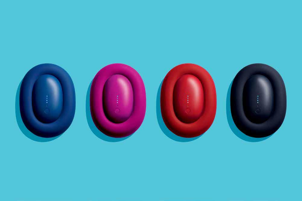
Bump Phone Charger
Human Tech
As technology becomes more and more interwoven with our dayto-day, its design needs to become more seamless and soft, its accessories invisible or fluid. Will there be a future where mobile phones are no longer a clunky and hard hand-held device? Can we expect a softer, less fashion-driven and more human-integrated derivitive of wearable tech?
King of hyper bright product design, Karim Rashid has recently introduced a softer, squishy concept to the world of technology. Push and Shove is a new start-up design company comprised of Rashid, as well as pals Richard Smiedt and Phil King. The trio’s first product is ‘Bump’, a wall charger and power bank in one pebble-like device, flanked by a one metre premium charging cable encased in a frame.
First of all, the design eliminates the likey tangle of power cords users often endure. Made of three main parts; a cable holder, wall plug and cables, the Bump bundle includes everything you need to charge all of your mobile devices. Its case folds and stores easily, and is forged from high quality coloured silicone small enough to fit easily into your pocket. Bump charges itself while it charges a smartphone, and the battery offers 1.5 times extra life. Rashid refers to the shape as a ‘blobject’ – a term he coined in 1991 to communicate sensual minimalism. No straight lines, yet the object is minimal, without any superfluous adornments and additives. For Rashid, Bump epitomises his philosophy of the organisation, visual elevation, and humanising of our everyday objects.
INDESIGN 49 IN SHORT
A World Of Pure Imagination
Indesign Sustainable Living Fabrics


The origins of good design are rarely from the design industry itself. O en, the most classic pieces are the result of some far out abstract inspiration. Sustainable Living Fabrics truly understands this principle. They are colour people, drawing inspiration from everywhere – whether it is from food, fashion, nature, art or architecture. Sustainable Living Fabrics work and re-work colour concepts to keep on top of colour trends and forecasts from around the globe that inspire them and the designers they work with.
Factory
Design District She’ll Be Right, Mate!
If apathy is an inherent all-absorbing Australian trademark, is it also a characteristic of our design, and our design events? Amidst a ceaseless global calendar of design tradeshows, furniture fairs, symposiums and week-long industry celebrations, Australian events are typically relaxed rather than precise a airs, exhibiting and heralding our talented mates over glorious design idols. Our national identity is a young and evolving one, and so is our design industry – so it makes sense that we shouldn’t yet take ourselves too seriously. Adding to the Australian design datebook this year was Factory Design District in Sydney – a showcase of 30-odd local producers, makers and designers, including national heroes like Dinosaur Designs and Mud, and incoming talent like Liam Mugavin and Timbermill (Je ries chair pictured here). Exhibitors were paired with local drink and dining stars (Rising Sun Workshop, Urban Winery, Young Henry’s brewery) for a more soulful presentation that championed local cra smanship on the whole. The focus was on an evolving, exciting identity – truer to the core of who we might be, instead of a repurposed, unauthentic image.
T-T-T-Touch Me
In response to the overwhelming presence of technology in today’s society, Design Academy Eindhoven students created the Touch Base exhibition for Milan this year, featuring objects and installations that were all designed to be touched. Curated by London designer Ilse Crawford, the space was lled with a series of mini-installations all cra ed to reconnect visitors with tactility, the most ‘lively’ of which, was an actual petting zoo. “Psychologists argue that touch is a basic human need, and perhaps even the essence of life,” said Crawford and cocurator Thomas Widdershoven. “Without touch we are le vulnerable – physically unsure and emotionally insecure.”
INDESIGNLIVE.COM IN SHORT 50
by Bellevue Architectural
Nothing In The Ceiling
Nothing In The Floor. No Unsightly Large Floor Plate
All the technology is morticed in the door.
The FritsJurgens® concealed pivot system (100% designed & made in the Netherlands) stands out from other sprung pivot systems in that all the technology is embedded in the door and not the floor.
With no imposing, unsightly floor & ceiling plates to diminish the visual attraction of the door; a clean sophisticated look & feel is achieved. The interface with the wall, floor and the ceiling becomes one.
Ideal for small to very large doors weighing up to 500Kg swing 90, 180 or 360 degrees. 90 degree hold open, auto open & close functions as standard. Engineered to last, manufactured to rigorous specifications & testedto1,000,000cycles.
Ideal for commercial & residential doors and with a substantial install base in Australia & New Zealand, the FritsJurgens® concealed pivot system is fast becoming the standard in pivoting door hardware.
®
For more information Bellevue Architectural Ph: 03 9571 5666 info@bellevuearch.com.au bellevuearch.com.au
Its in the door, not the floor
Nendo’s 50 Chairs
Illustrating Influence
Creativity begets creativity, inspiration is universal, and design and designers regularly crisscross creative disciplines in order to draw together various influences and craft new concepts. However – inspiration is rarely a literal expression, usually tucked away on studio mood boards as part of a broader grouping of artistic ideals. At Milan Furniture Fair this year, Japanese design house Nendo crafted a conceptual and artistic installation for New York’s Friedman Benda Gallery that actually applied the strong symbolic illustrative elements of Manga comics to a set of 50 stainless steel chairs. Born out of Japan in the early 19 th century – Manga is a means of
expression with a high degree of flatness and abstraction, built from a series of animated and emotive lines. Nendo’s concept borrowed the brush strokes or ‘effect lines’ typically attributed to Manga’s graphic style, applying a single graphic feature to each chair. Speech bubbles, exclamations, shock waves and expletives thrust outwards from the silver square-framed chairs, all set in rows on a neat and white comic book like grid within the Facoltà Teologica Dell’Italia Settentrionale. Devoid of colour, and texture, the mirror finish of the chairs reflected the world around them, telling its stories, just as Manga comics attempt to do.
INDESIGNLIVE.COM IN SHORT 52
Have

Your Timber And Use It Too
Indesign Royal Oak Floors


One of (in fact, arguably the most) common obstacle for designers and speci ers is reconciling the needs of their client; wanting the real deal but unable (or unwilling) to pay for it. This is particularly prevalent postGFC, where project managers and the like are always coming back to the bottom line, without wanting to sacri ce on quality or overall look and feel. As a result, the design industry has had to develop budget-sensitive alternatives to materials like solid timber or natural stone, without loosing the visual integrity of the project.
Royal Oak Floors cabinetry panels for example, are designed to replicate the popular aesthetic of individual oorboards being used to construct cabinetry and furniture pieces. By using individual lamellas of oak, the panels have the same colour and tonal variations as individual boards but are supplied in easy-to-use full size sheets. Between each lamella there is a subtle bevel. The panels are pre- nished and ready to use and can be trimmed with matching, pre- nished edge trims. Now cabinetry and furniture can be perfectly matched to ooring and made at a lower cost than previously was the case. Royal Oak Floors envisages that these panels will open up design opportunities that were once unavailable to many.
Add To Cart!
Top Product Finds From... Ajar


Indesign Ajar


INDESIGN 53 IN SHORT
Van Co ee Table Collection
Designer Francesc Rife Brand Kendo Mobiliario
The Bai Chair Designer Ander Lizaso Brand Ondarreta
Panel Lowchair Designer Lucy Kurrein Brand Capdell
Totally Floored
Indesign Bolon by The Andrews Group
Traditionally speaking, ooring is one of the last parts of a project to be considered, almost like icing on the cake. We o en forget about our oors, even though they are – quite literally – the foundation of our homes and o ces. Swedish superstars and design royalty, Bolon, has created a versatile new collection, which challenges architects and designers to integrate bespoke ooring into their design concepts – defying the idea that ooring is an a er-thought. The idea behind Bolon By You is to o er designers and architects the chance to create ooring that truly re ects the requirements of their projects – both aesthetic and functional. Through the web tool, users can select a pattern, play with the two design components, we and weave, save their designs and create a moodboard, which can be used together with the other elements of their project. Bolon designer Petra Lundblad explains: “As its name suggests, Bolon By You is all about you – the designer. We have created a series of new patterns we believe represent aesthetic variation and by using these, with various combinations of we and warp colours, bespoke
ooring can be achieved. What we hope to create is a situation where architects and designers can realise their visions with Bolon ooring as a dynamic, central design element.” The collection consists of six patterns of diverse character – Weave, Geometric, Dot, Lace, Grid and Stripe. From these, a wide spectrum of visual identities can be created. However, it is not only the patterns in Bolon By You that release creativity. Lundblad elaborates: “The four warp colours in the collection are earthy and natural and change perception of the patterns. The warp is made of a pro led yarn, a thread with a textured surface that can be used for jacquard weave. This method lets the oor release three-dimensional e ects and light re ecting patterns that bring any interior environment to life.” From graphic, linear expressions to organic, so er forms and playful elements, Bolon By You encourages designers to explore and create. With six new patterns, 12 new colours and for the rst time, the opportunity to create and order personal design expressions through an interactive web tool, this is the future of ooring.
INDESIGNLIVE.COM IN SHORT 54
Lee Broom Travelling Exhibition


Why aren’t we pulling more shit like this?! Award-winning product and interior designer, Lee Broom, unveiled his latest lighting collection, ‘Optical’, at this year’s Milan in a unique installation staged inside his studio’s delivery van, driven all the way to Milan from his London HQ.

The van has pitched-up on di erent days in the city’s key design hotspots.Inside Broom’s industrial grey and white liveried delivery van, Salone del Automobile, the back doors open to reveal a dramatic recreation of a traditional Italian palazzo along with his new lighting range. The interior – all in Lee Broom signature grey – with its ornate Corinthian columns, architrave and stuccoed detail were the unexpected backdrop for the crisp simplicity of the monochromatic Optical collection.


Highlighted from below by an illuminated oor, the result was an engaging moment for people to experience as they walked past the van. “While deciding where I should exhibit,” says Broom, “I thought – ‘what about everywhere?’ Making my Salone del Mobile mobile is an exciting way to exhibit. My designs are o en surreal and the idea behind the installation is to see something unexpected — a captivating optical illusion.” We think he totally nailed it.
Scholten + Baijings Arita Rising
2016 marks the 400 th anniversary of Arita – an ancient porcelain practice named a er an idyllic village surrounded by mountains and forests in the Saga Prefecture in Japan. It was in Arita that Japan’s very rst porcelain was made, and while the industry has waned signi cantly over the years, Arita remains to be a porcelain town. ‘2016’ is a new design collaboration set to commemorate the technique, Arita’s local artisans, and the treasure of slow design in a fast paced world. 2016 comprises of 16 collections of contemporary porcelain created by Arita’s local artisans and 16 international designers. Scholten + Baijings joined the fold with 27 hand-painted dishes. All the dishes have origins in actual historical forms. But when these were superimposed on one another by combining two, or even three outlines – complex new shapes emerged that could only be produced with the help of the latest technology. Supported by the Saga Ceramics Research Laboratory in Arita, Scholten + Baijing’s highly detailed moulds were produced by 3D printing and 5 Axis CNC milling.

INDESIGNLIVE.COM IN SHORT 56

SUNBRELLA ® IS A REGISTERED TRADEMARK OF GLEN RAVEN,
Pillows feature fabrics Peaking Out Sunrise and Twinkling Zinc from Robert Allen.
INC.
The Sh*t Evolution Sustainable Design Shit
Can design make a stand against throwaway culture? Amongst the glittering installations, glamorous industry parties and endless new product launches at Milan Furniture Fair – this year an exhibition titled The Shit Evolution boasted a slightly less lavish, but thoroughly sustainable edge. Italy’s Museo Della Merda (yes, literally, Museum of Shit), is intent upon demonstrating that recycled crap can not only be useful, but beautiful too. Presented at the Società d’Incoraggiamento d’Arti e Mestieri (SIAM) art school in Milan, the museum’s presentation comprised a number of dark rooms lled with objects made out of a clay-composite material that uses processed cow dung (something they’ve called Merdacotta), that is thankfully odourless. The exhibition presented a variety of objects owerpots, ower vases, tableware and art pieces. Sustainability without boundaries.
CBS Products Flow Power

Indesign CBS Products


There is nothing worse than working in an open-plan environment and having to literally ght over power sources! Colebrook Bosson Saunders (CBS) has recently released the Flo Power Hub as part of its new range in lighting and charging. Flo Power Hub provides desktop access to three USB ports for easy and convenient charging of personal devices in the workplace. Occupying minimal space, the unit o ers two ports of 1A standard charge and one port of 2.4A fast charge. The re ned aesthetic nish of Flo Power Hub is compatible with Flo monitor arm and all monitor arms supported by the Wishbone Post. The tidy and controlled charging facility can be retro tted to any existing Flo or Wishbone Post making it also a cost-e ective solution for users requiring charging devices on their workstations.Convenient desktop USB charging – nally!

INDESIGNLIVE.COM IN SHORT 58
Caesarstone & Tom Dixon We Give It Four Stars
Indesign Caesarstone
Dixon this year partnered-up with Caesarstone, for a multi-sensory theatrical event that placed food at its very centre. The Restaurant was like a meeting of two star chefs (in designer terms), the four-pronged cooking zone playing o elements of earth, re, water and air. Dixon skilfully blended his luxe lighting, furniture and accessories with the industrial, machined surfaces of Caesarstone’s top ranges. The result could really live on in its own right. “There’s enough space, enough possibilities, enough engagement with people cooking, to make it [something more],” Dixon says. The Restaurant represents Dixon’s strong belief that products shouldn’t sit on pedestals, but be permeable and engaging. He’s successfully taken Caesarstone o that pedestal too, moving it beyond the sculptural and experimental collaborations of past fairs, to create a working environment that you may just consider having in your own home.
Everybody Move Your Body
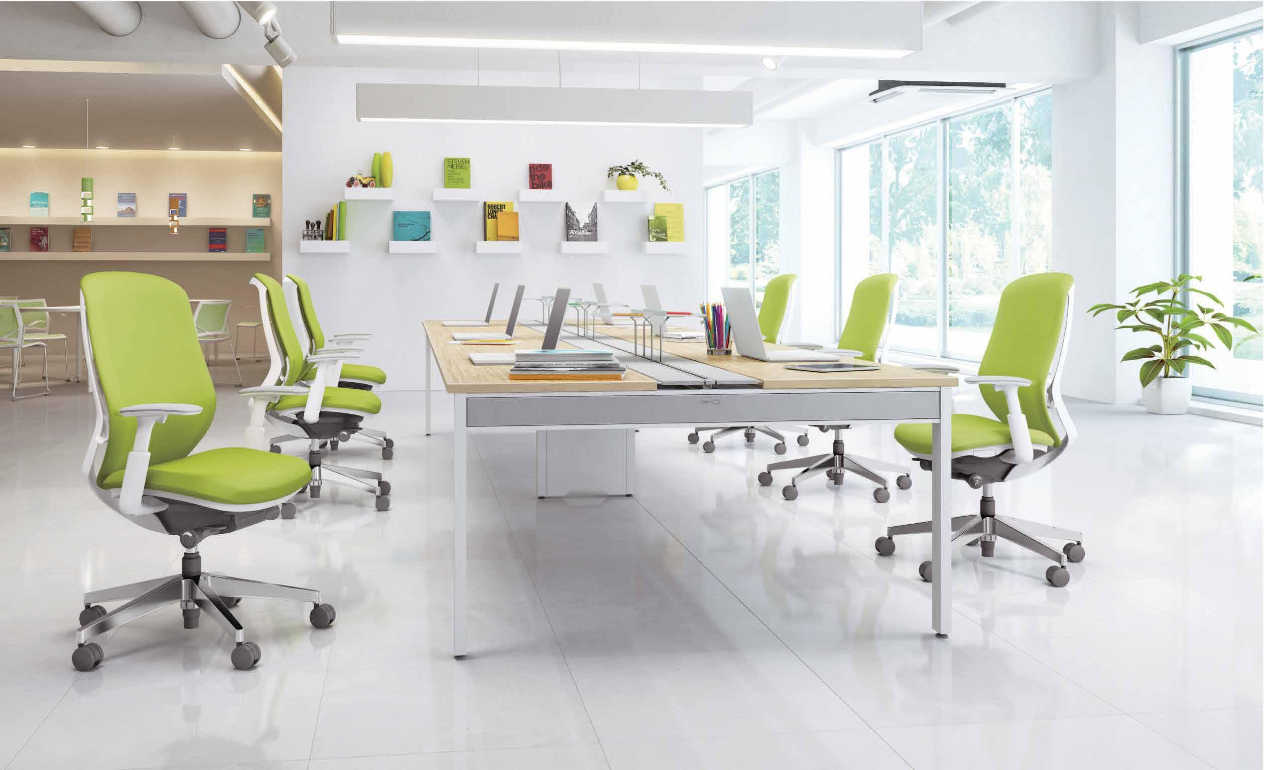
Indesign Schiavello
Recent studies estimate that during our lives we spend , on average, 80,000 hours sitting – that’s nine whole years! Further still, it’s been found that transitioning from seated to standing every 30 – 45 minutes can reduce fatigue as well as lower back discomfort in additional to a series of physiological diseases including diabetes, muscular atrophy and heart conditions.
It’s a relatively simple x and it’s what some of the design industry’s leading workplace product innovators are tapping in to, through research and development.
Schiavello’s Krossi Collection is a perfect example of this, engendering physical comfort through its very design.
The collection has been developed in line with extensive research undertaken by Schiavello who, in their 50 th year of operation, are using their long-standing experience in design and manufacture (among other things!), to shed new light and knowledge on Australia’s workplace evolution.
INDESIGNLIVE.COM IN SHORT 60
Stephen Burks On Conscious Consumerism


We had an epic 15 minute TED talk-style interview with Stephen Burks in Milan this year at the Dedon stand. Here’s an excerpt of some choice moments. Read the full interview online at indesignlive.com/stephenburks
“I am all about bringing ‘the hand’ to industry. What that means for me is looking and examining ways that [high-end brands] can bene t, in terms of the luxury of what’s possible by hand.


I like to talk about this ‘developers’ triangle’: the artisan in one corner, the designer (me) in one corner, and the missing link – always distribution. I look for ways to nd the right partner to develop the right product using the right technique.


Since 2005 I’ve worked with artisans in South Africa, Senegal, Rwanda, Kenya, Ghana, Haiti, India, Mexico, Indonesia, Philippines, most recently with an aboriginal community in the jungles of Columbia. I’ve encountered all kinds of cra traditions and I’m encountering new techniques I’ve not seen before.[But this isn’t] about cultural centre-play. I don’t want to take a picture and say, ‘Look, I’m gonna make something like this, or use this pattern’.
It’s about having a partnership. It speaks to the issue of diversity in design. This [RhoFiera Milan] design world is very exclusive. Myself, being the rst and only African American to work with all my clients, in 2016, is a little bit disheartening.


My work is also about opening doors to a more pluralistic version of what design can be…from an identity [and] cultural standpoint.
When does the rest of the world begin to participate? When does the other 90 per cent begin to have a voice in what design can be?

And for how long will luxury brands go around the world selling the same thing?
The minute you open the door [to] someone who seems foreign to this [luxury design] world… there’s more to the conversation. I think that dialogue will begin to develop in more regional and culturallyspeci c ways of brands expressing themselves.”
INDESIGN 61 IN SHORT
–
–
VINO COLLECTION THE DEFINITIVE SOURCE FOR ENDURING SITE, GARDEN AND CASUAL FURNISHINGS ® 50 MCLACHLAN AVENUE, RUSHCUTTERS BAY, NSW 2011 +61 2 9380 6605 WWW.JANUSETCIE.COM ATLANTA • BOSTON • CANCÚN • CHICAGO • DALLAS • DANIA BEACH • DUBAI • HIGH POINT • HONG KONG • HOUSTON • LONDON • LOS ANGELES MEXICO CITY • MIAMI • MONTERREY • NEW YORK • SAN FRANCISCO • SHANGHAI • SINGAPORE • SYDNEY • TORONTO • WASHINGTON D.C.
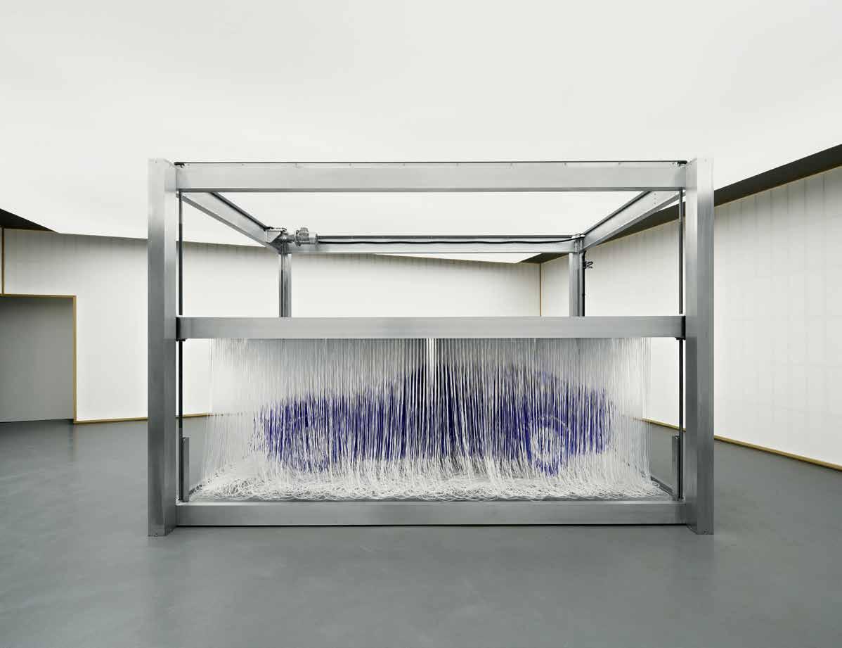
A Car Collaboration That Torques The Talk –
The Lexus showcase hosted food tasting by Japanese-born, Milan-based chef Yoji Tokuyoshi. formafantasma collaborated with Michelin-starred chef tokuyoshi on the theme of ‘water’, since it is one of the most hydrogen-rich elements in nature and the only byproduct emitted by a hydrogen fuel cell technology.
Car brand collaborations at Milan Furniture Fair have traditionally attracted a lot of scoffing and snobbery from the design glitterati –and to be fair, it’s not entirely undeserved. This year however, Lexus pulled out all the stops, teaming up with famed Italian duo Andrea Trimarchi and Simone Farresin of formafantasma, to create an installation that really hit the mark. Following this year’s theme of ‘anticipation’, formafantasma used the project to bring to life the elements embedded at the core of Lexus’ production methods; ecological technology, expert mobility, and the fusion of machine and craftsmanship. In terms of materiality, ‘an encounter with anticipation ’ combined contemporary finishes — like car paint, cast resin and stainless steel — with traditional materials like cotton fabric and pine wood. The industrial interiors of spazio Lexus – in Zona Tortona, a former metal factory, were softly illuminated using several light boxes referencing traditional Japanese architecture
and the origins of the Lexus brand. After visiting the Lexus headquarters in Japan, formafantasma decided to base the design of the installation on the brand’s heritage, which can be traced back to Japan’s early mechanised-textile industry. As an homage to these early roots, a loom-like machine pulled and released thousands of threads that, when stretched, recreated a three-dimensional outline of the LF-FC. Placed in the center of a room with walls inspired by Japanese shoji, the floating image of the concept car took shape in a truly unexpected way. Not only was this project aesthetically onpoint, the thing that really drove it home was its genuine reflection of the essence of the brand. None of the concept seem forced, but rather strongly grounded in what is real and true about Lexus. formafantasma took the best parts of Lexus, and put it together in a format that connected with design-o-philes in a meaningful way. And in the end, that is all we really care about – authenticity.
INDESIGNLIVE.COM IN SHORT 64
–
Advanced Screening
Indesign Screenwood
In its the rst major civic construction project since the Perth Concert Hall was built nearly 40 years ago, the new multi-level City of Perth Library has been built and designed by Kerry Hill Architects to revive and showcase the best of Perth’s history and knowledge. The new library was created to o er a true sense of place, providing plenty of community interaction as well as quiet and re ective spaces. The materials speci ed play a huge role in delivering on this concept, where Screenwood’s modular system Hemlock panels for example, were used for the slatted lining of the cylindrical void, to give the space a welcoming and highly cosy feeling, almost as if being ‘hugged’ by the building. Screenwood modular timber systems have been speci ed throughout the building, which covers areas in over seven levels including the History Centre, collections, reading rooms, AV multifunction rooms, a master staircase, green wall, and story-telling zones. The project is a stunning example of how the right materials can make all the di erence to the personality of a space.
Smart Hotel Cloud.7 Instanbul
Smart phones, smart cars, smart...hotels? Yep, smart hotels. Cloud.7 is a stylish yet a ordable new hotel brand that blends the authentic buzz of local and social with cosy, comfortable ‘clouds’ (rooms), gathered together around a digitally-connected guest-experience.
The smart hotel will o er its guests free Wi-Fi, check-in and out online, in-room ‘handy’ mobiles, 24-hour access to the Cloud.7 hospitality team via social media, a focus on local creative collaborations and natural produce and Meet the Locals where guests can get connected to and share experiences with like-minded locals in the city.
Owner Michael O’Shea says: “Our ambition is to become the number one choice for the digitally-savvy traveller who values a ordability, style, design and adventure. We want to achieve this goall across Eastern Europe, Caucasus and the Middle East, by the year 2020.” Responding to the lack of supply of a ordable yet high quality upscale hotels in these regions – where independent hotel penetration remains low and regulation and complexity and barriers to entry remain high – Cloud.7 will be opening 15 new hotels over the next two years; pioneering a response to the dynamic demands of connectedgenerations. “Our objective is to create real lasting and value-driven partnerships that focus’ on growth both in terms of margin performance and return on investment.”
INDESIGN 65 IN SHORT
Industry Expertise Much Ado About Rugs
Indesign Tappeti
“With the responsibility that comes with the trade, it’s crucial that interior designers use all the resources they can, so we o en seek guidance from a learned supplier,” says Ali McShane of The Bold Collective. “As a supplier of commercial and hospitality t-outs we always ensure the application of the product is speci ed correctly,” explains Tappeti’s Karinna Gobbo. “We o en get clients coming back to refresh or upgrade their interiors, no matter how ambitious.”
Vitra Colour Library I Don’t Have A Favourite Colour
Vitra is o ering a fresh and artistic spin on the simple colour swatch library in a new collaboration with their art director of colour, Dutch designer Hella Jongerius. Instead of a stock standard folder of fabric samples, Jongerius studied the properties and possibilities of the Vitra portfolio. Alongside Muller Van Tol, an Amsterdam-based agency specialising in temporary interiors, Jongerius created a kind of colour machine. Giant spinning tops displayed light, dark, green and red shades, while nine colour wheels suspended from the ceiling featured classic designs from Vitra designers, showing o colour’s relationship with shape, volume, and material. At Casa Vitra, there was no favourite colour – just a freewheeling world of possibilities for architects and interior designers.
London RCA Students Wearable Tent

This gives us hope for the future. Interior design and textiles students from the Royal College of Art developed this multifunctional wearable dwelling in response to the Syrian refugee crisis. The garment is designed to convert from a jacket with large storage pockets into a sleeping bag and also a tent. Lead by project tutors Dr Harriet Harriss and Graeme Brooker, the student design team demonstrated their keenness to use their design talent to make a di erence where it matters.
The Syrian refugee issue is a humanitarian crisis that needs as many spirited acts of compassion as possible to help address the problem. Author of the brief, Dr Harriet Harriss explains: “Art and design education is o en misunderstood to be frivolous and selfindulgent or focused upon designing for a cultural elite. What this project does is show that that isn’t the case, that our students are determined to see their inventiveness form part of the solution.”
INDESIGNLIVE.COM IN SHORT 66
Add To Cart! Top Product Finds From... UCI

Indesign UCI
INDESIGN 67 IN SHORT
Calibre Designer Kressel & Schelle Brand Casala
Plimode Designer Okamura Brand Okamura Mu e Lounge Designer Okamura Brand Okamura
Manga Table Designer UCI Design Studio Brand UCI
Alpha Designer UCI Brand UCI
Paradigm Designer UCI Design Studio Brand UCI
Old Made New
Indesign Instyle
Instyle’s latest textile release showcases three traditional Jacquard weaving techniques, giving a nod to the past that is reinterpreted for the modern day. Atelier is a beautiful, so and luxurious velvet available in 41 colours. With its three-dimensional uidity, velvet has been the richest of all textiles since historic times. Guild captures the magni cent essence of intricate Jacquard weaving with a double beam uncut loop pile construction. Its sculptural quality provides body and stability as well as creating a highly durable textile with a striking striped aesthetic. Vanguard is the most graphic of the trio. Celebrating the strength and simplicity achievable with the interlacing of yarns in a two colour at woven Jacquard construction. The humble drawn line is one of the basic elements of design, celebrated here in a dynamic geometric way, Vanguard plays with the relationship of presence and absence in the form of positive and negative space. The simplicity of a line as a stark outline or pro le of an edge re ects the rationale behind this design. The best of ‘old’ with the bene ts of ‘new’.
Part And Parcel
Indesign Staples
Business Interiors by Staples have successfully ful lled an interior partnership with Willemsen Group on a major construction project, One Canberra. One Canberra is a premium ’A‘ grade energy e cient building in a provincial location in Canberra requiring a range of commercial furniture that would complement the buildings striking, innovative and exceptional quality design. The partnership saw Business Interiors by Staples (BIBS) engaged to source and supply high-end furniture across the site including workstations, break-out areas, meeting rooms and café. BIBS successfully sourced business and executive chairs, desk, tables and sofa’s from leading European brands and carried out e ective service delivery within very tight project timelines. Business Interiors by Staples incorporates 28 years of expertise in the business furniture industry across various markets and sectors. Business Interiors by Staples partner with global experts to deliver market leading products that focus on design, ergonomics, durability, sustainability, quality, and leading trends.
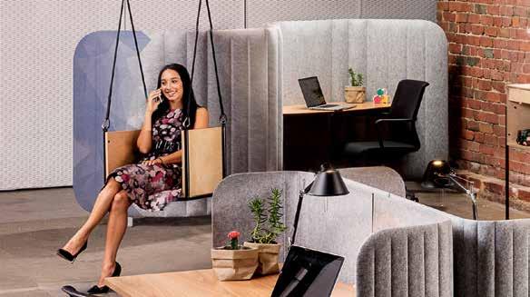
How’s It Hanging?
Within the agile working model, workplaces need a sense of fun and games. Designed by David Walley, Hang is a series of sculptural elements for storage and seating, including an epically cool commercial swing. Hang Loose is the perfect destination to getaway and unwind... no agile o ce is complete without a swing! The range caters to any contemporary o ce, where sta and visitors can interact incidentally; the new ‘water cooler’ moment. Hang is intended to appeal to users and designers of open plan o ce environments, and the designs are very much open-ended in terms of customisation.
INDESIGNLIVE.COM IN SHORT 68
Canberra is kicking some serious ass in creative industries right now. They might just be the dark horse of Australian design. Watch that space!
The Cool Kids In Canberra
Material Objects is a combined furniture exhibition from Canberrabased designers Elliot Bastianon and Andrew Carvolth that encompasses a broad cross-section of the craft and design experience. Bastianon’s work is a speculation of material possibilities and adventures that draw inspiration from folded structures. Carvolth on the other hand, has developed a contemporary Australian vernacular through a series of thoughtful objects that celebrate regional materials and processes.
Bastianon and Carvolth intend to design, manufacture, exhibit and document two collections that will be made at their shared studio Six Wiluna and exhibit at the Nishi Gallery this year. They see this exhibition as a significant step in their creative development as designers, being their first major exhibition where they will generate six-to-eight pieces each for the show. The purpose is to demonstrate the depth of creativity that is present in Australian
design – particularly Canberra – and serve as a launch pad for two early career practitioners. Bastianon’s work will be material specific, using the plastic sheet Woven Image EchoPanel® in every piece, drawing inspiration from folded structures. Bastianon believes that using non-traditional materials in furniture applications will keep his work away from well-worn paths and clichéd forms. He will assert his understanding of working this material (of which he has experimented previously here and there) and question the conventions of domestic furniture via unorthodox material applications.
Carvolth will be exhibiting furniture, lighting and other objects that are created using local materials including timber, leather and bone. Andrew feels that a re-appropriation of traditional making processes will yield a body of work that has a contemporary Australian vernacular. Using materials unique to the ACT region will inform the aesthetic choices of Carvolth’s work.
INDESIGN 69 IN SHORT
–
–
SYDNEY MELBOURNE
Nice And Roomy
What should a room feel like? What should it include, and what boundaries should it keep or cross? As living spaces have begun to blend and blur, an exhibition titled ROOMS. Novel Living Concepts hosted at the Palazzo dell’Arte at the Triennale di Milano sought to set out the state of interior architecture as it stands today.
The exhibition was part of this year’s return of the greater Milan International Design Triennale after a 20-year hiatus, and featured the work of a select group of interiors heavyweights, including Fabio Novembre, Umberto Riva, Lazzarini and Pickering, and Carlo Ratti. Novembre’s ‘INTRO’ drew inspiration from the very first room we ever encounter and our earliest perception of space – the womb. The designer’s ideal bedroom took on an ancestral sort of shape as a giant chrome egg flanked by two golden deities, the inside
lined with rich, patent red leather. Visitors entered and then exited, reborn. Ratti’s room merged all living activities in one space. ‘Pin Room’ was a personalised working, talking, playing and sleeping space. The responsive module changed according to need. A flat surface, made up of soft pins, could rise up in response to a simple hand movement, reconfiguring the space in a potentially infinite number of combinations.
Riva’s’Proposition for a Bolt Hole’ was centred upon isolation, a self sufficient room to be entirely alone in, inspired by Le Corbusier’s cabin in a pine forest on the Cote d’Azur. In Lazzarini and Pickering’s room, surfaces screen-printed with special pink, organic and hybrid photovoltaic ink that produced energy when exposed to direct sunlight.
INDESIGNLIVE.COM IN SHORT 72
INDESIGN X ARPER
Words Sophia Watson
What is the future of commercial furniture design?
sTYLECRAFT. C om. A u s TYLECRAFT / ARPER 73
It’s unsurprising that almost every design house on the planet seems to be having a crack at the agile working model. But while many are trying their hand at developing solutions, most fail to recognise that agile working requires far more than soft furnishings and a pastel colour palette.
It also requires more than “commercial design”, because the lines between sectors are blurring too quickly to stick to rigid ideas of what “commercial furniture” should be. And sure, while fixtures, fittings and overall tone have certainly become more forgiving in appearance (a là hospitality and residential), those choices need to have roots in something beyond aesthetics. Famed Italian design house Arper, saw this coming over 20 years ago.
“We aren’t an office furniture company; we’re a company solving problems irrespective of the sector,” says Arper’s owner and president of the board, Claudio Feltrin. “From the very beginning in 1989, that was the trademark of Arper; to design items that are timeless in aesthetic, with a modern functionality that can blend thematically and purposefully into any setting.”
In the early 2000s, Feltrin and Arper began to see huge shifts in the way people were working. “After the global financial crisis,” says Feltrin, “the market began to completely reassess what was important for them. For us, what was – and still is – very important
for Arper, is to tell the difference between what is ‘future’ and what is ‘trend’.” Colours and shapes come and go, but technology is a factor that Arper identified as being future critical. Enter ‘SoftTech’, Arper’s intelligent and beautifully designed philosophy on the nexus between design and technology.
Feltrin explains: “The idea of the workplace is changing. Today, we live where we work and we work where we live. A workspace can be a shared table or a private desk, a hotel lobby or a home library — we are no longer confined to the office alone. We travel, we meet, we work, we live. As these boundaries begin to blur, we form new ways of working that demand new tools that are lighter, more adaptable and more responsive.”
“Arper designs for the way we work today, and we believe that technology is essential to that approach: a technology that is ideally invisible, intuitive, silent and that creates a better relationship between object and person. It is not technology for technology’s sake, but innovation in its purest form, in the service of beauty and human interaction. We call this ‘Soft Tech’.”
But technology in itself presents challenges; it’s not an attribute to make visible for example. New technology is more lightweight, invisible, integrated and intuitive. Computers have become paper thin, cabinets have become obsolete because of digital storage,
sTYLECRAFT. C om. A u s TYLECRAFT / ARPER 74
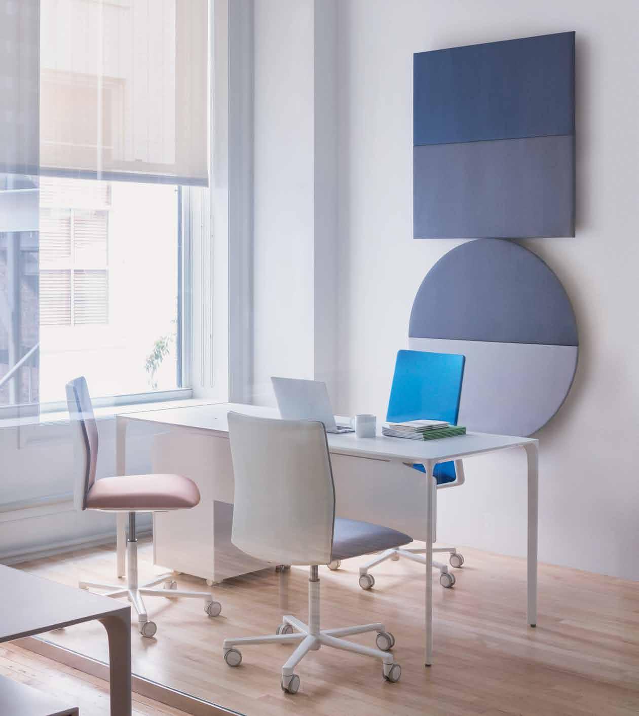
Above: Catifa 46 Chairs with Dizzle H74 Tables featuring Parentesit acoustic wall modules in Square and Round, by Lievore Altherr Molina. Opposite: Catifa Sensit Chairs with Dizzle H74 Table, by Lievore Altherr Molina, featuring Wireflow Sculptural Lights by Arik Levy for Vibia.
“Agile working lives beyond the walls of an office. It’s not only about breakout spaces and private work cubicals at HQ; it’s about working at the airport, in the lobby of a hotel, at a café or simply in your home.”
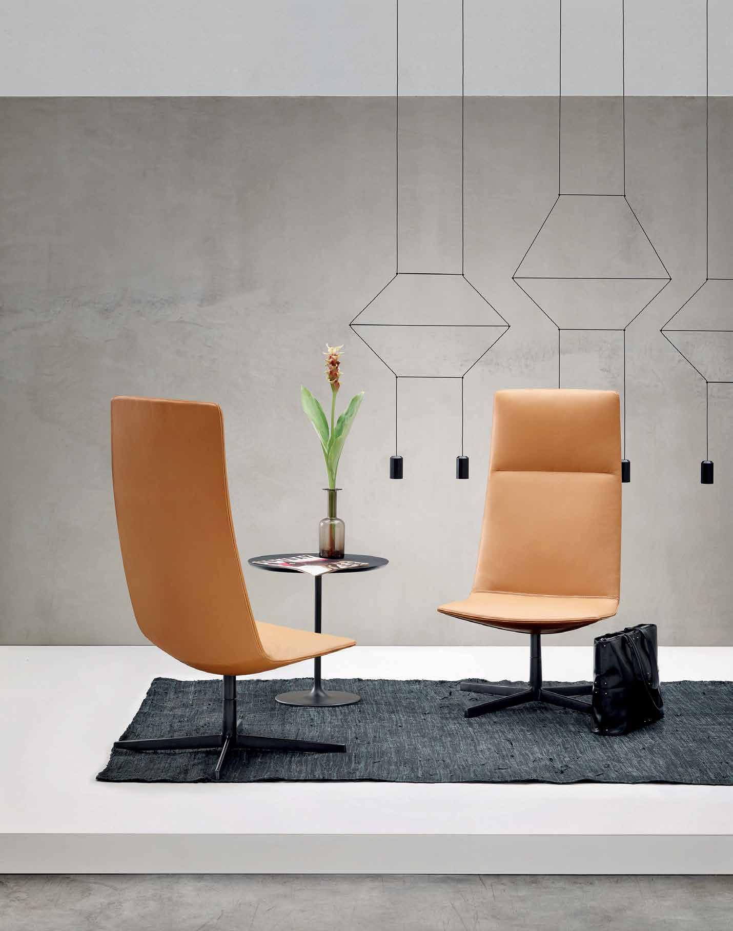
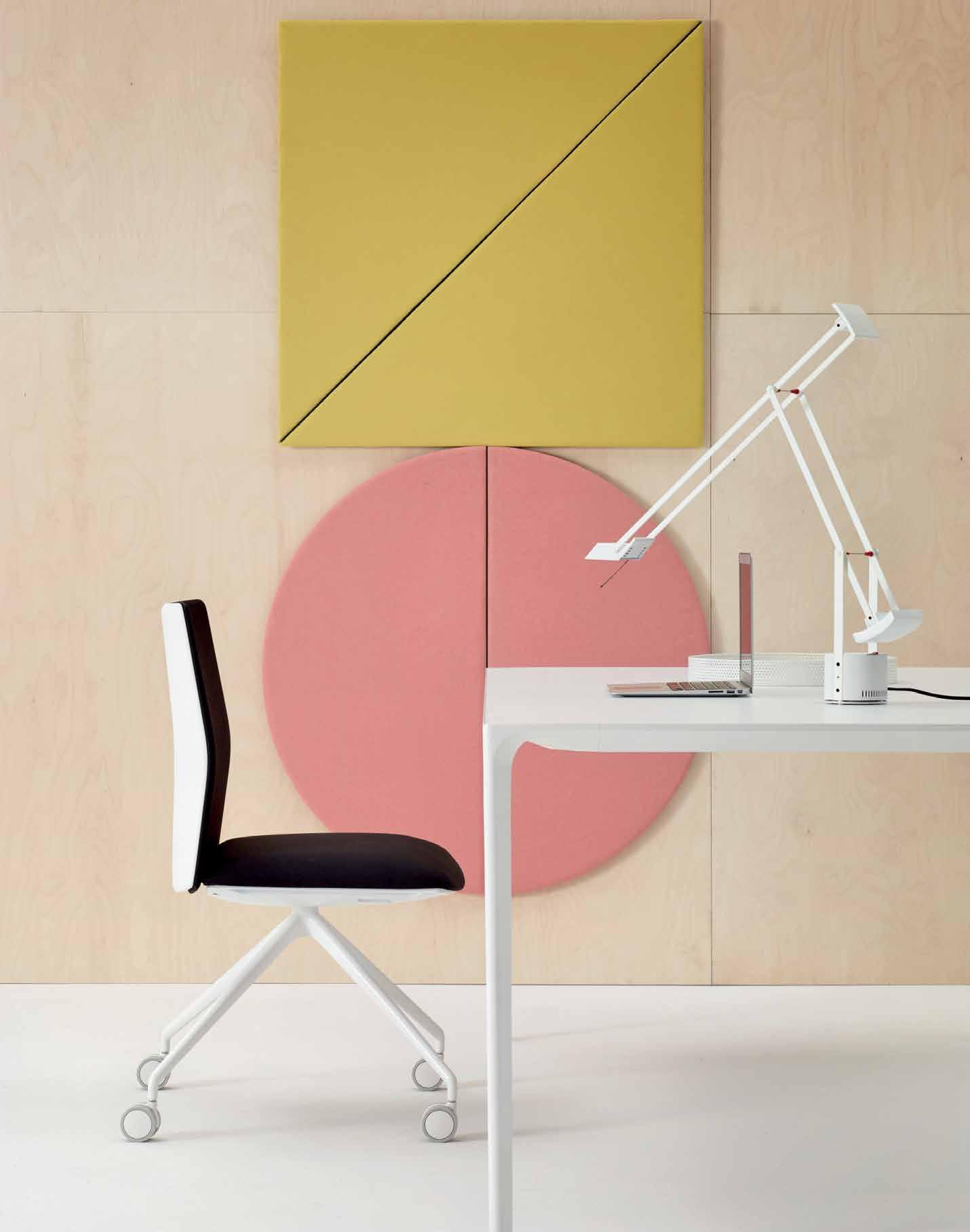
tables can have any shape because wires and cables are simply no longer necessary. Here, Arper have very cleverly used design as a tool to soften and humanise technology. The most recent instance of this approach in action is the Kinesit: Arper’s interpretation of what the modern office chair could and should be.
“We’ve often been asked why Arper hasn’t created a task chair, so we started to consider an aesthetic and design that might be the right fit for Arper, something that wasn’t otherwise available in the market. Our designs are very feminine, the lines are always very soft – and we wanted to follow this through with the office chair; to challenge and disrupt the traditionally masculine item. We wanted to create something that challenged the market standard. It was difficult, because there were many elements we couldn’t change, standards that we had to respect. So we started to ask ourselves, ‘Why do we accept that office chairs still look like a machine to support the body?’ Couldn’t it have all the required comfort, but look simply like a designer chair?”
The result is Kinesit, Arper’s first ever office chair. Light and minimal in design, the chair seat and back are fully adjustable
allowing it to conform to individual body types for optimal comfort. The chair features a built-in mechanism hidden discreetly under the seat that provides synchronised movement and seat-height command. An invisible, adjustable lumbar support is concealed within the backrest’s thin frame to give additional flexibility and comfort. Kinesit offers fixed or adjustable armrests and it is customisable with all fabric collections in Arper’s catalogue. And that’s the real difference with Arper. They are part of a very select few who understand that agile working lives beyond the walls of an office. That it’s not only about breakout spaces and private work cubicals at HQ; it’s about working at the airport, in the lobby of a hotel, at a café or simply in your home. Feltrin notes that: “Architects and specifiers need solutions; they don’t need ‘another’ product. And that is the spirit of Arper; we don’t want to just sell design, we want to part of it, and involve ourselves in the process; to educate and service the needs of our industry and support designers with the challenges they are facing.”
Arper is available in Australia exclusively through Stylecraft.
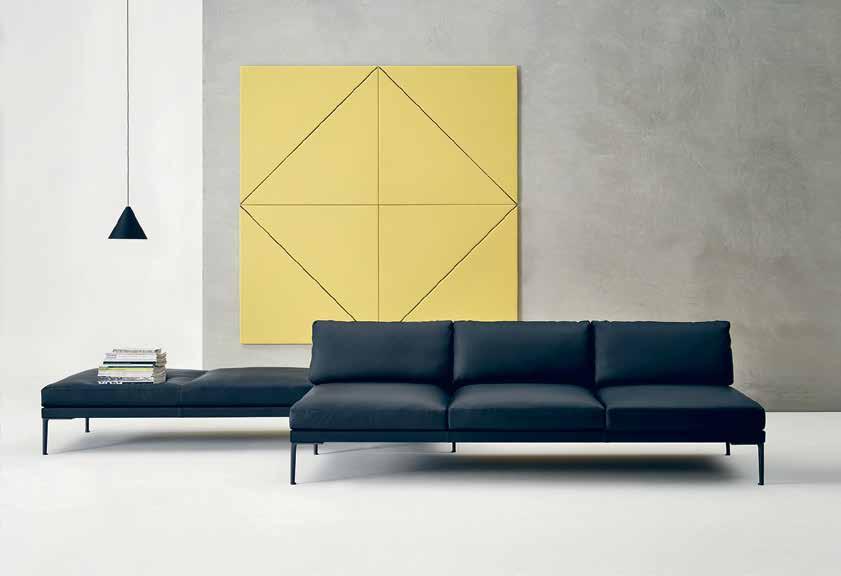
sTYLECRAFT. C om. A u s TYLECRAFT / ARPER 77
Opposite: Nuur Office Table by Simon Pengelly, Kinesit 4 Way Chair featuring the Parentesit acoustic wall module by Lievore Altherr Molina. Above: Steeve Lounge by Jean-Marie Massaud featuring four Parentesit acoustic wall modules in Square by Lievore Altherr Molina. Next page: Nuur Office Table by Simon Pengelly, Catifa Sensit Executive Chair and Parentesit acoustic wall modules in Square, Round and Oval, by Lievore Altherr Molina.
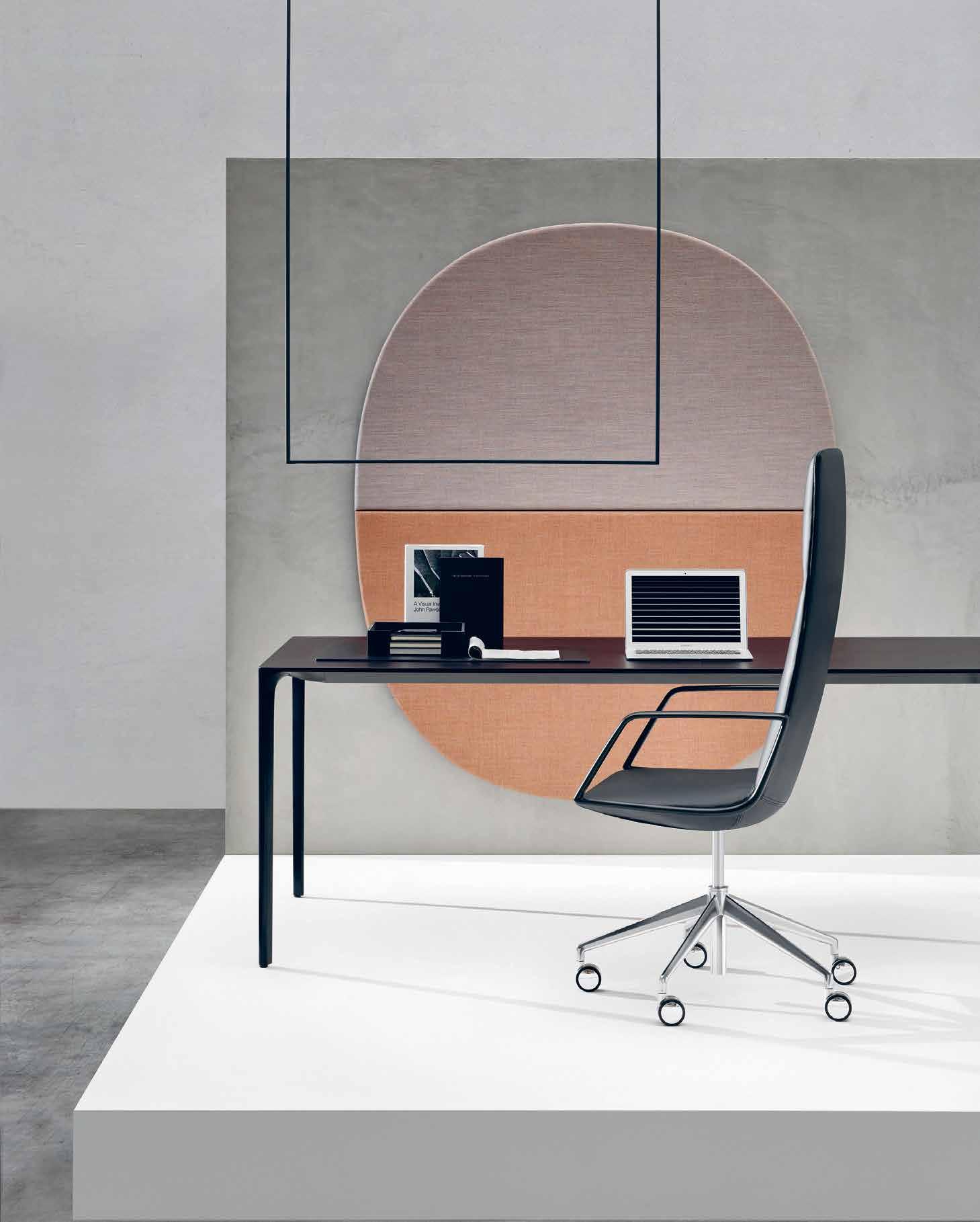
Big thinkers and
C reati V e gU rUs
INDESIGN 79 IN Famous
FAMOUS IN
Get Revolutionary
Words Mandi Keighran Photography Various
Are we as designers creating an environment where the next Issey Miyake might flourish? Senior creatives, Sawako Ogitani and Tokujin Yoshioka, from the famed Miyake Design Studio, explore the importance of Miyake’s attitude toward design and being a creative insurgent.
INDESIGNLIVE.COM IN Fa MO u S 80
Page 81:
has built his extraordinary reputation on a freedom of expression that has redefined notions of what apparel is and can be,
Page 82:
has been friends with graphic designer
since
in a
Fashion visionary Issey Miyake
Painting: Michelle Byrnes.
Miyake
Ikko Tanaka
the 1960s. Original artwork by Ikko Tanaka. Page 83: A stylised Geisha image produced by the pair
collaboration from the 1980s.
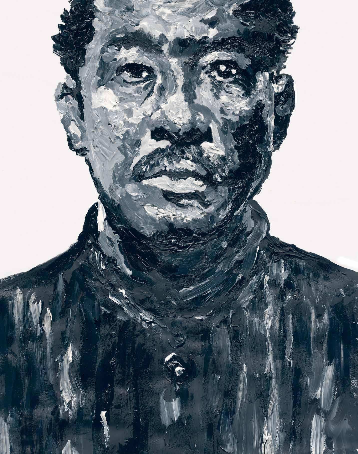

For close to half a century, Japanese designer Issey Miyake has been redefining the relationship between cloth and the body, unconstrained by existing notions of how fashion should frame the human form. He founded Miyake Design Studio (MDS) in Tokyo in 1970, and it was here that he and his team began to explore and develop new ideas for how technology and fashion could work together – particularly through the celebrated Pleats Please collection. Most importantly, he brought those ideas to life.
These days, 78-year-old Miyake rarely grants interviews (in a 2011 interview he said: “My brain. It’s tired.” And, in an email interview granted to the New York Times in 2014, his secretary stated that he prefers making things to talking. I did, however, manage to secure a phone interview with Sawako Ogitani, who has worked closely with Miyake at MDS since 1991. As we speak, she’s in Milan preparing an exhibition to showcase Pause for Harmony – a collaboration with iconic Finnish interiors brand, Iittala.
The collection of homewares is the first true collaboration for both brands, and is the result of a long relationship between Miyake and Harri Koskinen, who has been Iittala’s design director since 2011. Twenty years ago, however, when Miyake stumbled across Koskinen’s Block lamp, the young designer was just starting out. Miyake got in touch, and invited him to design a perfume bottle, a watch, and then hosted an exhibition of his work at the studio’s gallery, MDSG. Today, they are still working together to realise new projects.
In Milan, there’s no doubt that Ogitani will see myriad new and exciting ideas from young and emerging designers. But, how many of those ideas will be brought to life? In today’s fast-paced world, in which new ideas – often barely prototyped – are regularly showcased at Milan, devoured by the press and then promptly forgotten, how can we expect designers to deliver truly innovative products that will remain relevant for decades to come?
The pleating technique used in Miyake’s Pleats Please range, for example, took years to perfect. In the mid-1980s, Miyake came across
a light polyester-silk stole that had been pleats-processed after being folded and was convinced that it was the beginning of something truly new. Together with Makiko Minagawa – the leading textile designer and innovator for Issey Miyake since the brand’s inception – he led a team in researching suitable textiles and techniques, experimenting with silk, cotton and linen blends before finding the polyester fabric and technology that is still used today. It was four years before Pleats Please launched as a brand.
“Mr Miyake always says that to create new ideas is good, but not complete,” says Ogitani. “You have to realise those ideas. It’s something he cherishes as a designer’s responsibility to society and people.”
So, in 2007 he founded Reality Lab, a division of MDS dedicated to bringing new ideas, like the origami-inspired 132.5 range, to life. Here, he assembled a diverse team of designers – both in terms of age and professional experience. The head patternmaker is over 80 years old, while the youngest designer is in his early 20s. “They learn from each other,” says Ogitani. “The elder designers teach, and the younger ones give energy and inspiration. Mr Miyake really enjoys fostering this kind of team work.”
Designers are also expected to travel to find inspiration from Japan and around the world. “Our designers are constantly making trips to different locations. Especially in Japan, there are many places where the traditional way of making is continued,” says Ogitani. “It is very important to Mr Miyake. Designers might come up with new ideas, but they need technical expertise and craftsmen to help realise them. It’s a long process, and it’s challenging to bring a new idea to life.”
It’s a process that’s at the heart of Miyake’s studio, however at odds it is with the prevailing attitude of fast design. “All of our designers are encouraged to find new ideas that surprise and make people happy,” says Ogitani. “This spirit has been with us the whole time and it will continue.”
mds.isseymiyake.com,
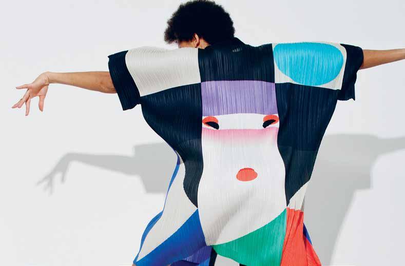
INDESIGN 83 IN Famous
tokujin.com

“To create new ideas is good, but not complete. You have to realise those ideas. It’s something Mr Miyake cherishes as a designer’s responsibility to society and people.”
Sawako Ogitani, senior executive, Miyake Design Studio.

Issey’s Protégé: Tokujin Yoshioka
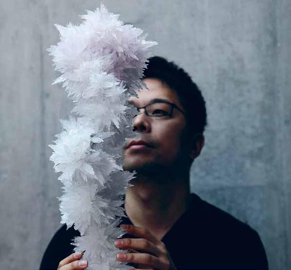
Renowned Japanese artist and designer Tokujin Yoshioka began his career in 1986, working first under Shiro Kuramata and then for Issey Miyake, who he regards as his mentor. Even after Yoshioka became a freelance designer in 1992 and then established his own studio in 2000, the two designers continued to work together and have a professional relationship spanning 28 years. Early collaborations include exhibition designs for Energieën at Amsterdam’s Stedelijk Museum, and Issey Miyake – Making Things,
first shown at the Cartier Foundation in Paris before travelling to New York and Tokyo. Yoshioka has also created dynamic interiors for Miyake’s stores in London and Tokyo. Most recently, Yoshioka designed the Transparent Body Installation for the current exhibition The Work of Issey Miyake at the National Art Centre in Tokyo. “I was always thinking of ways to surprise Issey Miyake,” says Yoshioka. “I have learned from him that there are various possibilities and freedom for design.”
INDESIGNLIVE.COM IN Fa MO u S 86
Page 84: Bamboo Pleats, designed by Issey Miyake for the A/W 1989 Collection, Photo: Yuriko Takagi. Page 85: Flying Saucer dress, designed by Issey Miyake for S/S 1994, on showcase for the 2016 MET Ball Preview: Manus x Machina. Page 86: Artist/designer Tokujin Yoshioka, Photo: courtesy of Tokujin Yoshioka. Page 87: Reality Lab 2013, by Tokujin Yoshioka for Issey Miyake, incorporating the trace of time cultivated in the space, the contrast between the texture of peeled wall and the futuristic coloured aluminum expresses contrast between history and future, Photo: Masaya Yoshimura.
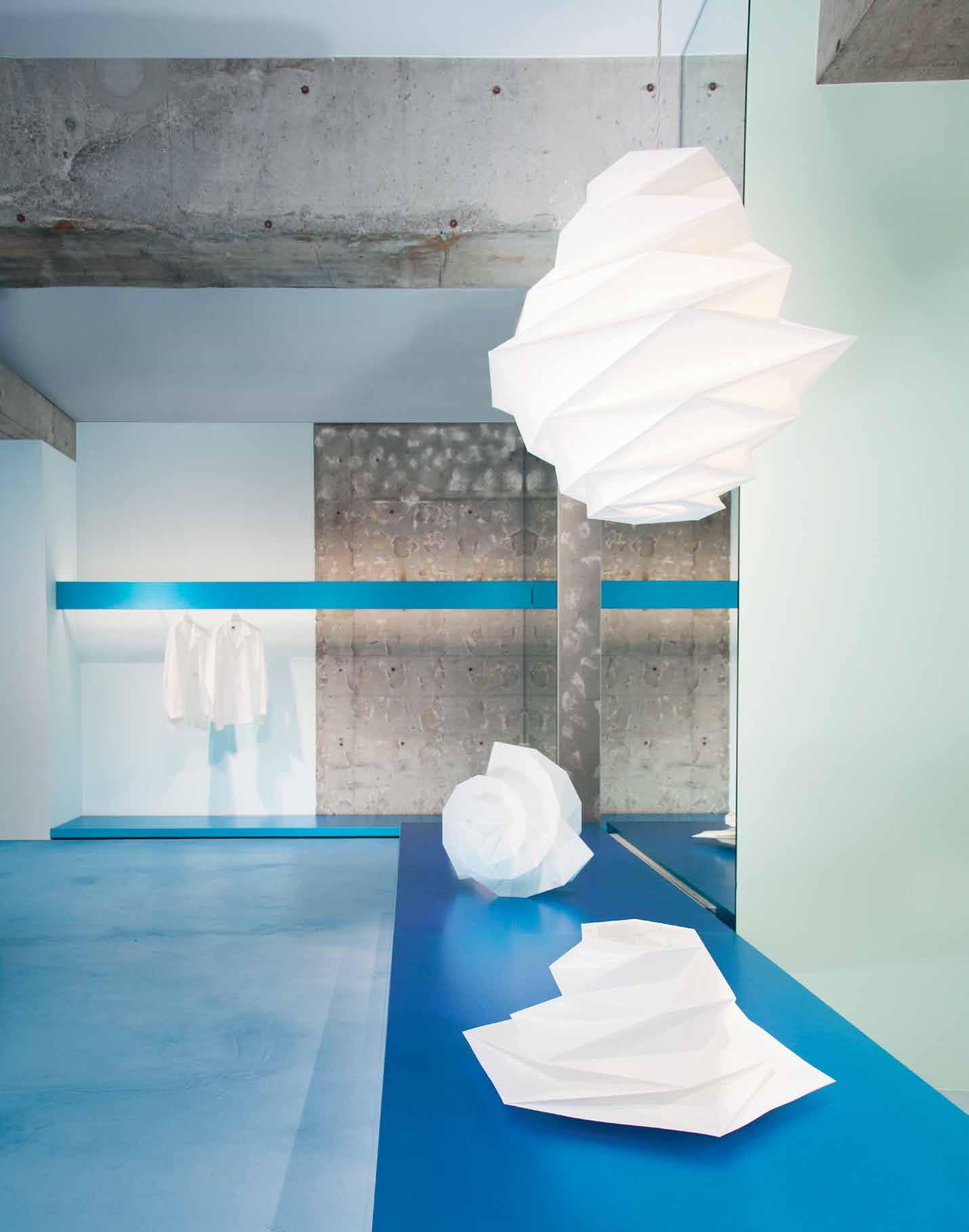


 Chip DeGrace, Executive Creative Director, Interface

Many of us in the design and innovation business likely already have that proclivity for optimism. After all, it’s your job to create a better way, every day. But with a healthy dose of pragmatism, it’s hard not to be overwhelmed by the enormity and systemic nature of the issues we face. Last year was the hottest in recorded history, and oceans are rising at a rate faster than anytime in the last 3,000 years. Inarguably, the human emissions of greenhouse gases are the primary culprit.
So where’s the optimism?
We see crazy, ambitious goals being achieved on a global scale. That’s the reward for the optimism from the past, and it gives us new energy to take on even bigger challenges.
More than 20 years ago, we set off on a mission to become carbon neutral, doing no harm to people or planet. Our “Mission Zero®.” We had no substantive program to follow. We did have a collective optimism and curious minds, an entrepreneurial hunger and a willingness to test, tumble and try again. We also had access to the creative capacity of many collaborators who contributed greatly to solve extremely difficult challenges.
With four short years to go, we are going to make it.
On the comprehensive measurements we report annually, such as carbon footprint, energy use/renewable energy, GHG emissions, recycled/biobased raw materials, waste to landfill and water intake, we are on target. With help from many collaborators, we believe we have achieved a larger reduction in our carbon footprint than any other industrial company in the world. We have shown how business can be a positive contributor to society while also making a profit.
It’s amazing progress, but it’s not enough. We need to move from doing no harm, to doing more good—to move from negative to positive.
Twenty-four years ago we were unaware of our impact on the earth and its people. Today, not only do we understand the effects of our daily decisions, but we also realize the influence of our achievements. There are so many great stories like ours around the globe. Our friend Amory Lovins has said, “If it exists, it must be possible.”
If a carpet tile company heavily dependent on petrochemicals can redesign itself, then anybody can. And if anybody can, then everybody can.


Our goal, with your help, is to create positive from negative, fostering a more equitable and inclusive world for all.
Introducing the World Woven™ Collection Weaving global inspiration into positive change.
WW865 Highland Warp
To learn more visit interface.com
Large and small squares, planks and skinny planks.
“If a carpet tile company can redesign itself, then anybody can. And if anybody can, then everybody can.”
Our newest offering for 2016 isn’t just a product. It’s a feeling of optimism.
The Comfort of Discomfort
Based in Reykjavik, Iceland, experimental designer Sruli Recht is no stranger to controversy. Take, for example, the time his Reykjavik studio was raided by police who seized his entire stock of ‘The Umbuster’ – an umbrella with a brass knuckled handle – and charged the designer with importing, manufacturing and intending to sell prohibited weapons, (Recht initially lost the case, but went on to win at the supreme court of Iceland). Or, the ‘Born Out of This’ jacket made from the wool of stillborn lambs that formed part of his first menswear collection in 2011. Perhaps most memorable, is the appropriately-titled Forget Me Knot art project from 2013, for which Recht documented a one-off surgery to remove a 100mm x 10mm strip of skin from his abdomen while he was awake. The skin – hair still attached – was tanned and mounted to a 24kt gold ring that is (still) for sale on Recht’s website for €350,000. It might not have sold, but it certainly garnered a lot of attention from the world’s media.
Speaking with Recht, however, it’s clear that while he sees designers as entertainers, his work is driven more by a passion for material and functional experimentation than by a desire to titillate the tabloids.
“When you are attracted to new things, often those new things will border on subversive themes or borderline materials, and technologies,” he says. “When society and technology evolve at different speeds, there will always be platforms to present combinations of ideas and materials that suggest behaviours some find a little too uncomfortably prescient. So, you make things that are new to you and surely new enough that people may just not be ready for them yet. It’s not as though you are walking
around thinking, ‘What is the next great way to upset people?’. These ideas combine in ways you can’t expect or control.
“You design for an audience, often intuitively or feeling your way through the dark, but when you have to explain these particular things, it is expositional, and strips away the mystery in an attempt to make instinct seem formulaic and prescriptive. So, in that sense, I don’t have a ‘philosophy’. I have reactions, just like everyone else. And those reactions spark ideas, which most often become objects as defined by narrative.
“Where the intellect and the emotions meet at the point of discomfort is a very immediate temporal place. It is a hyper-real experience that makes you completely aware of where you are at that exact moment in relation to everything around you, your past and your future. That is the reaction that I am most drawn to. And if I think about it a lot, that is the experience I like to design for people.”
So, the controversy is not the aim, but the outcome. Does this outcome have a value? Like anything, that’s in the eye of the beholder. And, as Recht points out: “The people who find what I do controversial are probably not the intended audience…what some call controversial, I call exciting. I am actually drawn to these prickly matters, both in what I do and in the work of others.” No matter who the audience is, however, Recht’s work invariably starts conversations around design and its value – and that’s got to be worth something.
srulirecht.com
INDESIGNLIVE.COM IN Fa MO u S 90
Page 91 & 93: Experimental designer Sruli Recht. Page 92: Recht’s store in central Reykjavik, Iceland, holds the complete Recht collection across two floors, featuring of course this Sharkskin Glove. Should you put your hand in, you will discover that the thorns, all directed to slant inward, will lock your hand in place, in the manner of ten thousand fishhooks. Should you attempt to remove it, the thousands of thorns will bite into the skin. You can put the gloves on, but to remove them would mean to cut them off. Gloves for life, or for one wear – the ultimate and final commitment, Photo: Marino Thorlacius.
Is there currency in controversy? Icelandic-Australian designer Sruli Recht explores why more designers need to get uncomfortable to truly be part of their creative process.
Words Mandi Keighran Photography Marc Haers
“I especially like things that make me uncomfortable. When something is uncomfortable it is new.”
Sruli Recht, experimental designer.
Who is Sruli Recht?
Born in Jerusalem, Recht moved to Johannesburg before relocating to Australia. He studied Fashion Design at RMIT in Melbourne, before moving to London where he worked with Alexander McQueen. In 2005, he headed to Reykjavik and opened his own studio and retail space, Vopnabúrið (Icelandic for ‘the armoury’).
He launched his solo career with a shoe collection that was described by trend forecasting agency WGSN as: “One of the most intriguing and imaginative footwear collections seen”. In 2010, Wallpaper* voted Vopnabúrið – Recht’s showroom – among the 10 most interesting shops in the world.
Recht spent the next years working across fashion, industrial design, film costume and fine art. Some of his most controversial projects include a bulletproof pocket square made of Kevlar; a pair of gloves made from barbed basking shark skin that have to be cut off once put on; and an auto-erotic asphyxiation belt made from Atlantic white-sided dolphin skin and reindeer leather.
–

INDESIGN X STaron
The demanding and high traffic environment of retail fit-outs requires a surface that’s durable, hard wearing, renewable and non-porous. Staron® Solid Surfaces meets these criteria to create projects that will look like the day they were installed for years to come. Inconspicuous joins and no dirt trapping crevices make for easy cleaning, something unachievable with many other materials, and the non-porous nature of the surfaces ensures that no stain is ever permanent.
The flexible design nature of Staron® also makes it possible to create any design imaginable. Thermoforming Staron® creates curves and shapes, allowing it to be formed and sculpted into almost any design or concept. These design versatilities saw Staron® recently being used at the Sunglass Hut Flagship Store in Sydney,
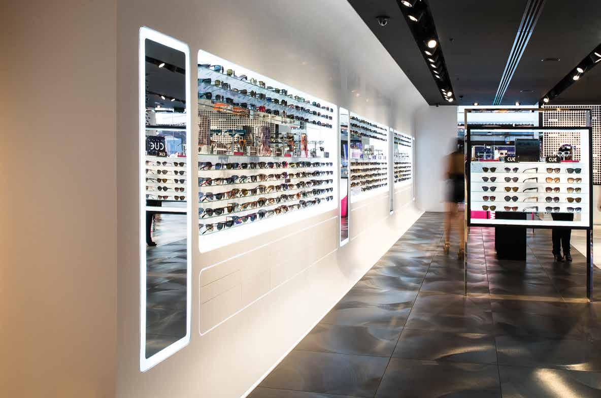
where surfaces have been gently curved into a wave shape concept that creates attractive display walls for merchandise. The Staron® walls continue with no open joins, in one beautiful piece, creating the look of a frozen wave.
Due to the non-porous and repairable properties of the surfaces, Staron® is also a hygienic solution for toilet partitions and vanities in shopping centres. The surface can be used to create service counters, baby change countertops, seating, wall panels, furniture pieces, display cabinets, table tops, feature shop fit-outs, shelving and creative sculptures. Inlaying multiple colours of Staron® also allows for the creation of corporate logos or colours - the possibilities are endless!
staron.com.au s taron ® s olid s urfaces 94
Above: Sunglass Hut Flagship Store in Sydney co-designed by Tim Bennett for Luxottica.
r etail Surface Solutions
NEW VISIONS OF WORK COLOGNE, 25.–29.10.2016


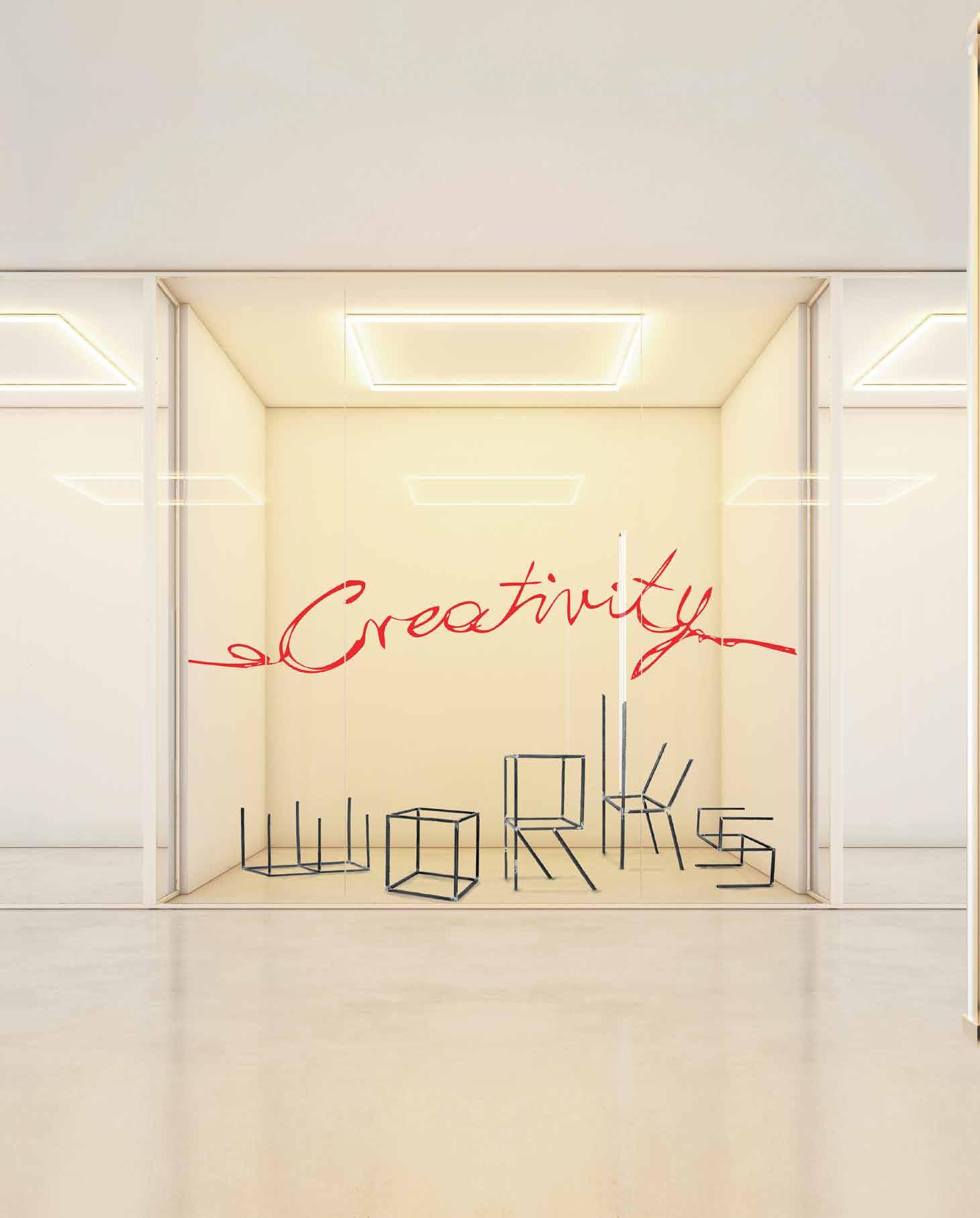
HOW WILL WE BE LIVING AND WORKING TOMORROW ?
FIND OUT AT ORGATEC As the world’s only platform for integrated, holistic workplaces, ORGATEC is the trade fair for reflective and progressive thinkers: Modern office furnishing, visionary interior design, forward-looking solutions for mobile working and sustainable strategies for the contract sector will provide momentum for new ideas and stimulate creativity. Be a part of it !
your
ticket online now and save up to 45%! Australian Representative: Fairlab Exhibition Management, PO Box 1096, Bakery Hill, VIC 3354 Phone 03 5332 2823, visit@koelnmesse.com.au WWW.ORGATEC.COM BLOG
Buy
admission
It’s All About Me
Words Leanne
The phrase ‘human-centred design’ has, in recent years, become an increasingly popular addition to studio profiles and mission statements. While it certainly sounds like the right thing to say, there’s a resounding lack of clarity around what it actually means. Designing for humans is what architects and designers do after all, so why make it seem like something out of the ordinary?
For Sans-Arc Studio founder, Matiya Marovich, this description simply reinforces his belief that the end user is always front-andcentre. And his resulting design approach and process is consciously informed by the way a space is to be occupied. As he explains: “It’s about designing experience into a space; about embodying an experience that’s full of references and a language people understand, whether consciously or subconsciously, so they’re left with a feeling.”
The Adelaide-based emerging practitioner recently applied this human-centric philosophy to his first residential project, an extension to a 1920s cottage in the city’s southern suburbs. It’s a bright and breezy single-volume space that resonates with a sense of happiness and comfort, due in no small part to a five metre-high ceiling.
“Understanding that every line you draw is going to have some sort of effect on the person using the space, that it will somehow change
the way they perceive the space, is important,” says Marovich. This awareness is also evident in his design for Pink Moon Saloon, a small bar in Adelaide’s West End that instantly appeals for its delightful gable. Marovich knew the distinct form would encourage curiosity and completely clad the intimate interior in timber to add intrigue.
It’s interesting that he doesn’t refer to himself as an architect or designer, but instead prefers to be called a ‘spacemaker’. As a logical extension of his phenomenological approach, the title emphasises the creation of space over the actual building itself. This approach means Marovich prioritises strong client relationships with a hands-on methodology involving lots of time spent on site.
Care and consideration for the end user is key to human-centred design and creating a space that’s an experience; investing it with feeling takes creativity, problem solving and constant revision. Marovich is one of a new generation of practitioners championing collaboration in an industry all the more interested in relinquishing ego in favour of altruistic practice.
sansarcstudio.com.au
INDESIGN 97 IN Famous
What the hell is ‘human-centred design’, anyway? Founder of Sans Arc Studio, Matiya Marovich, gets real about designing for people.
Amodeo Portrait Photography Ryan Cantwell Architectural Photography David Sievers
Page 96: Matiya Marovich of Sans-Arc Studio advocates a heavily collaborative, client-focused, hands-on approach to the spaces he designs. Page 98: Pink Moon Saloon, Adelaide.
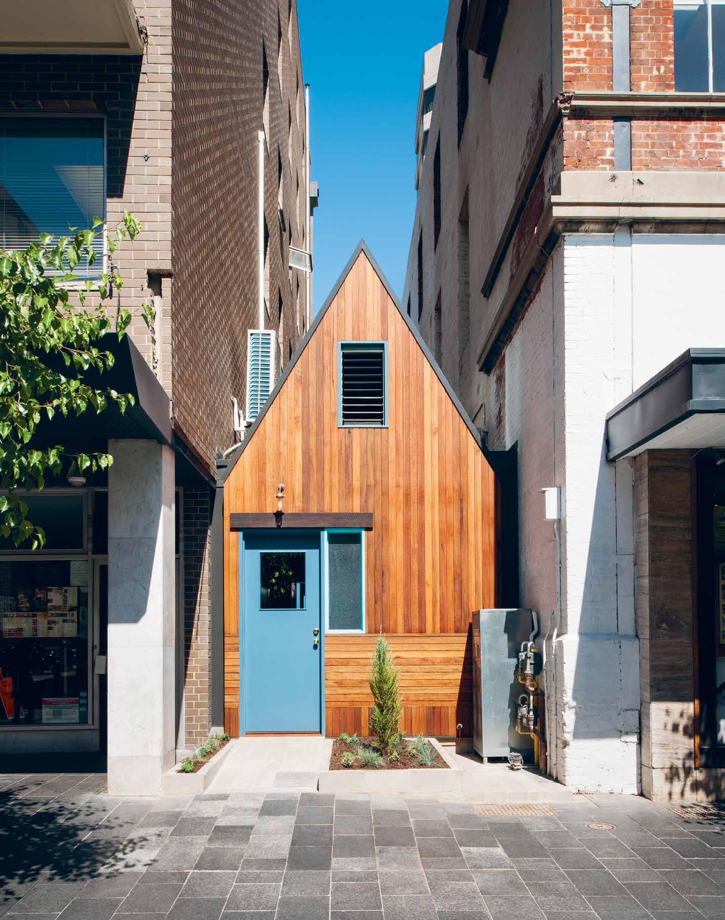
INDESIGNLIVE.COM IN FAMOUS 98
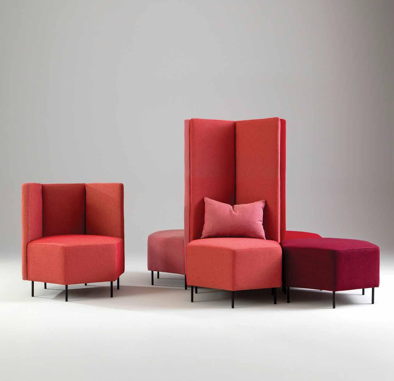

workspaces
| bistaples.co.nz
Inspirational
bistaples.com.au
Business Interiors by StaplesTM is proud to present Swedish brand, Jonas Ihreborn
Care overkill: the problem with imageobsessed A&D
INDESIGNLIVE.COM IN Fa MO u S 100
Resident columnist and designer, Byron George
Aah, image. In this Instagram selfie age it seems that to get ahead in this world, we all need to have our own personal brand – one that is unique, quirky and has that little point of difference that separates us from all of the other narcissistic self-obsessed people out there. Since the rise of social media and dating apps, the intentional and very self-conscious art of manipulating our image has become the way we portray (dare I say, sell?) ourselves to the world. The problem is when everyone is striving to be a bit quirky or a little bit unique –how do you actually differentiate between people?
The desire to be different or to have that point of difference is so strong on social media platforms that most of us seem to forget the point of these apps in the first place – to make connections. The ‘me too’ visuals of sculpted torsos and striped t-shirts fit into a certain trend-based way of looking at the world, but they have the effect of dumbing down what people are actually like. It’s like we all need a three-word slogan to define who we are because no one will bother to read any further. We have become a culture that is so selfobsessed, expedient and concerned with image that it eclipses how we behave and live our lives.
This is amplified in the design world. In an industry tasked with creating brand, words like ‘unique’, ‘quirky’, ‘wow factor’ and ‘point of difference’ become mantras that have the opposite effect to their original intention. These words define by reference to others rather than by what the company or individual actually does. It’s a difficult
conundrum as an understanding of how you fit into the market is an essential tool to keeping a business going. But Apple didn’t invent the iPhone in response to Nokia or Ericsson. They did it because someone had an idea.
Like trend-based design, caring too much about your brand and how it sits in the world can be anathema to the generation and exploration of ideas. You can never really know how people see you and you should really stop worrying about it. Wear the ugly jumper if you like it. Go off-brand. Explore stuff and realise that no innovation ever came from a focus group. The best thing about humanity is that everyone sees things slightly differently.
We could all learn from brands like Margiela, not because of their brand strategy, positioning in the market or media manipulation, but because of the internal approach they take to fashion which lead to these things. Great brands always start with something else. Image is always driven by other factors beyond the desire to project a certain image.
One person’s thigh gap is another person’s eating disorder. Worrying about what others are doing only feeds insecurity and crushes idea generation. Much better to care about your behaviour rather than your image.
Byron George and Russell Ryan are co-directors of award-winning architectural studio, Russell & George. russellandgeorge.com
INDESIGN 101 IN Famous
Launching
September
2016 2017 – The year of the INDE. Awards
INDE. is the new annual awards program by Indesign Media Asia Pacific, bringing together the best of our region for the first time.
INDE. celebrates the practices of design and architecture as well as the outcomes, and is uniquely positioned to offer international exposure and recognition.
Our talent on the global stage.
The Design Studio
The Work Space
The Living Space
The Social Space
The Object
The Influencer
The Building
The Prodigy
The Luminary indeawards.com
It Takes Two
It requires a unique dynamic between two people to become business partners. FRONT headliners, Anna Lindgren and Sofia Lagerkvist, are the poster-children of healthy business partnerships – even though their working style is a little unorthodox.
It’s a very intimate relationship you have with your business partner. It’s a sibling-hood without the blood, though plenty of sweat and tears. Think of the tensions that come into play every day in a business partnership: honesty (when brutally required), trust (always), aligned values and shared drive, understanding of one other’s idiosyncrasies and thought processes, respect and space for the other’s skillsets and opinion. It takes patience, compromise and perspective to be in business with another person.
Something you may not know about the kick-ass Swedish design duo, Anna Lindgren and Sofia Lagerkvist of FRONT, is that they’ve been in business together since university; but they don’t actually live in the same country. And yet they have overcome obstacles of geography and time difference to work in a fluid and harmonious tandem. And they most definitely are kick-ass.
At Milan Furniture Fair this year they were the toast of Axor, Thonet and Moroso, where they presented new tapware, a rocking horse and couch concepts (respectively). They even garnered a “very special” mention from Patrizia Moroso for their Triclinium sofa when she caught up with Indesign to chat about Moroso’s latest releases. (True to their spirit of experimentation FRONT upholstered the sofa in a technical material woven as if it were natural fibre. This caught the particular attention of Moroso whose passion for fabrics and surfaces “has been in my blood forever”.) With half the team in London and the other in Stockholm, the duo works in an enjoyable symmetry.
Skype is their lifeline. Conversations are rung in and thoughts pop up on desktops all day long. And they like their informal working mode. “What do people have in an office?” they laugh. “A printer, a pen? We have meetings all the time anyway, it’s a natural process.”
Ideas are sketched out, photos are taken and texted, samples are shared during frequent country-to-country touchdowns. When it comes to decision-making with their major clients, one acts as the other’s proxy. “We have 100 per cent confidence that the other will do the right thing,” they say.
When they first set out to design their WaterSteps tap for the Axor WaterDream project, Philippe Grohe, head of Axor, was keen to have all FRONT members present for each design and development meeting. It would cut down on complications in the process. But that’s not how FRONT works. “He quickly realised we are more or less the same brain,” they say.
The tap was a fast favourite among every fair-goer visiting the Axor showroom, confirming that FRONT are most definitely doing something right. And they do realise the import of their unique dynamic. “We are lucky to work like this,” they say. “It’s not easy to find someone you can have that kind of collaboration with. It’s a gift really. “We are also good friends, which makes it so precious.”
frontdesign.se, axor-design.com
INDESIGNLIVE.COM IN Fa MO u S 104
Words Alice Blackwood Portrait Photography Snapper Media
Page 105: Partners in business and unphased by the tyranny of distance, Sofia Lagerkvist and Anna Lindgren get hands on during the Axor WaterDream Event at this year’s Milan Furniture Fair, featuring the Water Steps mixer system designed by FRONT. Page 106: The Axor WaterDream WaterSteps mixer is based on the innovative Axor U-Base. The universal base for the sculptural metal spout becomes the key to achieving the ultimate creative freedom in mixer design. Custom-made spouts can simply be fitted on the base.


INDESIGNLIVE.COM IN FAMOUS
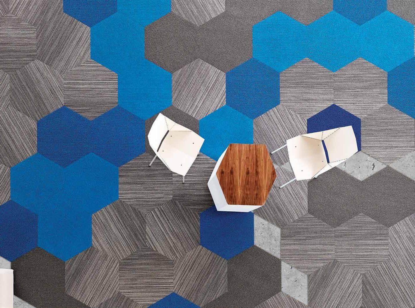


The Shaw Contract Design Lab is now open. The Shaw Contract Design Lab is a collaborative space for the local design community to learn, connect and be inspired. Designers will have access to their own dedicated co-working area, as well as an extensive sample library of design-leading commercial flooring collections. Brought to you by: Newton St Dale St Church St Gordan St Walnut St We are here Visit the Shaw Contract Design Lab at 650 Church St, Richmond VIC.
“I like to disrupt the design process. People get really pissed off. But then they learn how to accept the challenge and move it in new directions.”
Johannes Torpe, creative director and self-described ‘design activist’.
Just Do It
An efficacious self-taught Danish designer, Johannes Torpe is what some would describe as a jack of all trades. From a musician, lighting designer and club owner to furniture designer, restaurant owner and interior designer, he has proven that formal training isn’t a necessary prerequisite to success in the design industry. As the founder of his eponymous global design firm Johannes Torpe Studios, he has worked with an impressive line-up of clients including Hay, Roberto Cavalli, Dolce & Gabbana and Skype, and –up until his exit last year – Bang & Olufsen as creative director.
Torpe’s unique childhood has helped to inform his own trajectory, which has seen him carve out parallel careers straddling every aspect of the creative industries. The 43 year-old designer was raised by bohemian parents on a hippy commune in Denmark and taught to think freely, which saw him leave home at age 12 to play the drums. After teaching himself how to curate sound and light, Torpe started his own business at just 17, becoming one of the most sought-after lighting designers in Denmark. After finding success in the design world, in 1997 he went on to establish his own studio in Copenhagen. Along the way he and his brother even recorded a number one pop hit, Calabria, which sold over 10 million copies.
His compelling background has helped shape Torpe into a character that challenges the way things have always been done. Last year he embarked on a fellowship with the Architectural Department of the University of Westminster, London to begin a PhD. With minimal to no schooling, formal study or qualifications to his name, Torpe isn’t fazed. “I’m extremely comfortable being uncomfortable,” he quips. He’s even writing a book about it all. The tremendous scale of this undertaking is met with determination to create something that leaves a lasting impact. “I’m very clear about what I want to accomplish,” Torpe explains. “I don’t want it to just be a piece of paper and put it on a shelf at a university where only five people will read it. That doesn’t contribute to knowledge or give people something in any way. It’s important to me to give everything I can.”
Like many designers who have simply learnt on the job or through self-developed practice, Torpe questions the value of formal design education. While he may be dedicated to delivering something of his own that adds to design discourse, he maintains that a practicebased approach to learning is key.
“It’s very easy to be negative,” Torpe admits. “I believe design education is not theory, it is action. Everything is action-based. You don’t learn design. You learn the skills to use the tools, just like if you’re a carpenter. You need to learn the skills of communication, the skills of business, the skills of understanding and reading people. I don’t think these institutions are really teaching that way because they don’t know how to do it.”
A self-described ‘design activist’, Torpe’s passion lies in progress and challenging old ways of thinking. “Without the design-thinking, without the activism – somebody coming and shaking stuff up, stirring it around – it becomes totally mediocre. Mediocrity is the biggest enemy of anything.”
While Torpe laments that design institutions are slow to get up to speed, he remains enthusiastic about the current period of disruption the design industry is facing. “What digital media has done is completely change the way that we absorb things, and now we don’t look at our backyard any more, we look at the world when we search for design,” he continues. “Everything’s accessible, and that’s why many institutions are way behind because the younger generations are way ahead.”
It is disruption that fuels Torpe’s boundless energy, the joy he finds in his work, his readiness to try new things, and his innate refusal to accept things as they are. Today, he seems as much driven by the desire to disrupt as by a newfound mission to pass on his design activism through what may be his biggest challenge yet, a PhD.
johannestorpestudios.com
INDESIGN 109 IN Famous
Words Ashley Tucker Photography Philip Ørneborg
As a self-taught designer now returning to do his PhD, Johannes Torpe tells us his opinion on the value of formal design education verses practical skills and learning on the job.
Nectar Efkarpidis
“Some ice creams, like some design hotels, can be overwhelming. Like being stabbed in the tongue with an ice pick. A flavour from which nothing new can emerge. There is little space and few authentic narratives. These are sometimes places, ironically, with too much design. No restraint. It can feel like stepping into a themed ride at Disney world.”
indesignlive.com in FA mo U s 110
Creative design director, Molonglo Group (Hotel Hotel et al.)
www.abey.com.au Abey Australia’s diverse range of sinks provides you with a selection from around the world. Visit an Abey Selection Gallery to browse the range. Schock Double Bowl in Metallic – Schock 1 & 3/4 Bowl in Metallic – Schock Single Bowl in Metallic SINK DIFFERENTLY. *NEWLY OPENED* VICTORIA Selection Gallery 335 Ferrars St Albert Park Ph: 03 8696 4000 NEW SOUTH WALES Selection Gallery 1E Danks St Waterloo Ph: 02 8572 8500 QUEENSLAND Selection Gallery 94 Petrie Tce Brisbane Ph: 07 3369 4777 *OPENING SOON* WESTERN AUSTRALIA Selection Gallery 12 Sundercombe St Osborne Park Ph: 08 9446 8255
INDESIGN X MID16
You’d be forgiven for thinking that the all-woman lineup of Ambassadors for Melbourne Indesign 2016, August 12 and 13, is part of a plan by the design and architecture sisterhood.
Then again you might think that the fact the all-female ambassadorial domination at MID 2016 rated a mention here is perfect proof of A+D’s continuing patriarchal paradigm.
The truth however is more straightforward. It just happened. Or did it?
Did we mention that the new and improved Indesign Magazine you now hold in your hands is co-edited by two women and that one of August’s events – its WorkLife panel talks – is all about gender imbalance in the architecture and design industry? Discuss.
Anyway, however it transpired… the Ambassador lineup this year for the three precincts – CBD, Collingwood and Richmond – at Melbourne Indesign couldn’t be stronger.
Emma Telfer is the Creative Director of Open House Melbourne, an organisation that celebrates the city through its built environment. Emma is also a founding partner of the Office For Good Design, a unique curatorial group that works with private organisations and major cultural institutions to realise their interest in design, architecture, and the broader creative industries.
Heidi Smith is a workspace strategy expert at architecture and interior design practice Gray Puksand. Heidi collaborates with a diverse range of companies to enhance their cultural aspirations through comprehensive workspace design.
Adèle Winteridge is Foolscap Studio’s creative dynamo and is the founder and director. She has worked across public domain, hospitality, residential and high end workplace projects. She directs the team in the creation of spaces and experiences that bring precincts to life, while contributing to culture and community.
Simone LeAmon has built a career on fostering dialogues between the creative disciplines of art and design and the corporate sectors. Her work has been exhibited in numerous solo and group exhibitions both here and overseas.
Melbourne Indesign’s official Ambassadors have been chosen as four of Melbourne’s foremost design personalities, as major players in the design world in the Asia Pacific region, and as shining examples of the present and future strength of the industry.
Delegates and visitors to Melbourne Indesign 2016 will come across Emma, Heidi, Adèle and Simone either via their creative installations at one of the event’s three precincts, in their participation in our WorkLife or LiveLife panel talks, or at any number of MID’s sites and events.
indesigntheevent.com m elbourne i ndesign 112
Opposite, clockwise from top left: Heidi Smith, Simone LeAmon, Adèle Winteridge and Emma Telfer – Ambassadors for Melbourne Indesign 2016
Words Guy Allenby
Indesign: The Event – Australia’s fi rst and premier showroom-driven design experience – returns to Melbourne on August 12 and 13.

Friday: workshops, industry and architecture talks.

Saturday: MID returns to its Saturday In Design roots, with intimate events across local showrooms and event spaces.
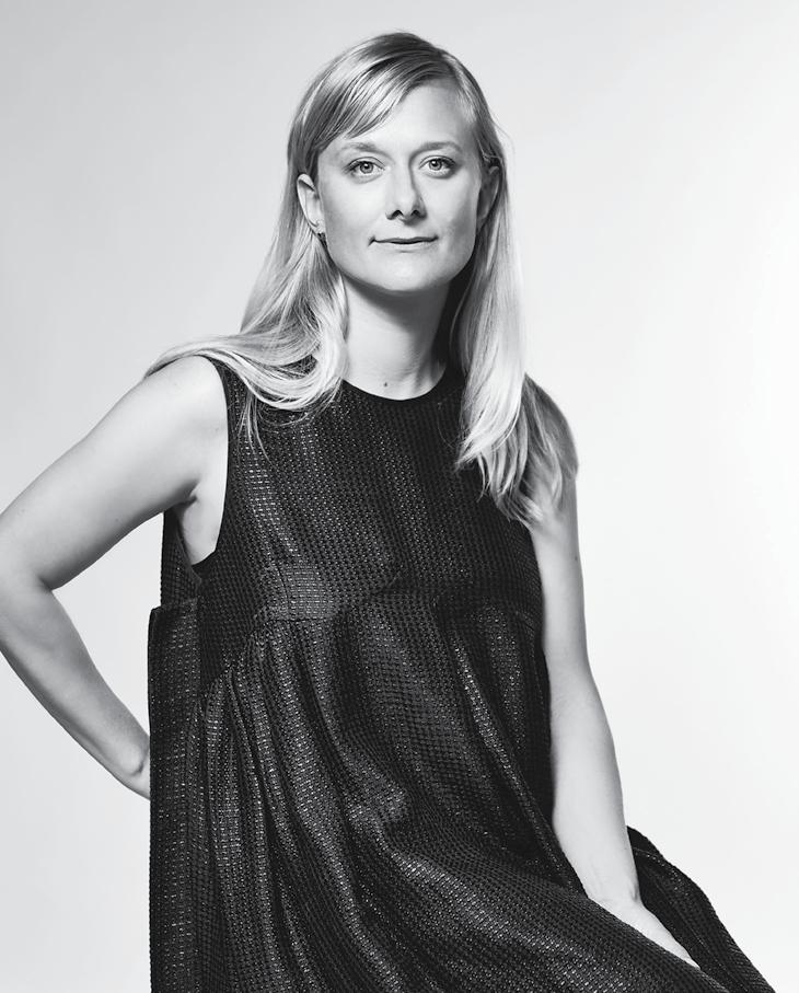
indesigntheevent.com


INDESIGN
–
Architectural


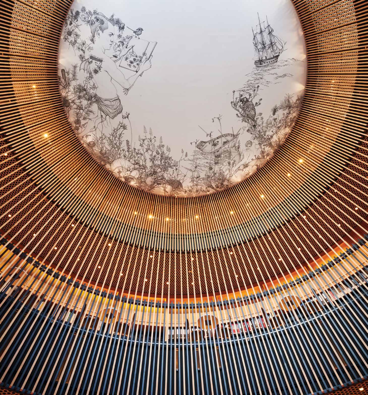
and Acoustic
Linear Timber Systems
Acoustic
Modular Design: Certified Timbers:
Solutions Email info@screenwood.com.au Web www.screenwood.com.au Tel 02 9521 7200
Specifi er: Kerry Hill Architects |
Photo: Francis Andrijich
Photographer, courtesy of City of Perth
Provocative, radical & e N er G i S i NG de S i GN
IN SITU Situ i N
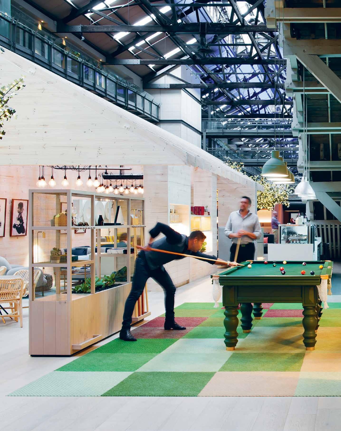
Eat, Work, Play
Ovolo Sydney, by Hassell
Words Paul McGillick Photography Nicole England
Opposite: Details like the pool table support the ‘fun and flirty’ profile of the Ovolo chain offering a range of surfaces and spaces for socialising or private work. Next page: The open lightweight pavilions and tree planters hint at exotic greenhouses cultivating rare plants. Page 120: Seen from above, the plan of the pavilions places the more intimate spaces at the core. Page 121: The pavilions offer privacy and intimacy while maintaining connection and an easy circulation. Page 122: The rooms have received a largely cosmetic make-over with colour highlights and trademark works of art.
INDESIGN 117 IN SITU
Is hospitality the future of agile working? If it is, the new multi-user focused Ovolo Hotel Sydney, designed by Hassell, is a wondrous glimpse into that future.
Can The Lines Be Blurred?
With the lines between work and life becoming blurred, can the experience of home and hospitality bring about a high-performance workplace? Hotels have always been a connector of life and work, but how well have they understood that? Perhaps the time has come for hotels to learn from the modern workplace. New generations bring new attitudes, new ways of living and new ways of working. But hotels have a strange habit of staying in the past. Even the proliferating smarty-pants designer boutique hotels seem more preoccupied with making statements than understanding the needs of a modern clientele.
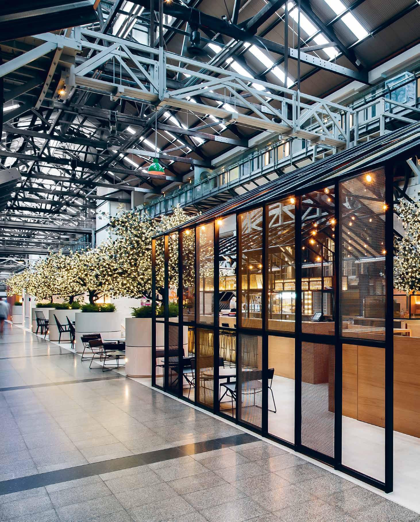
–
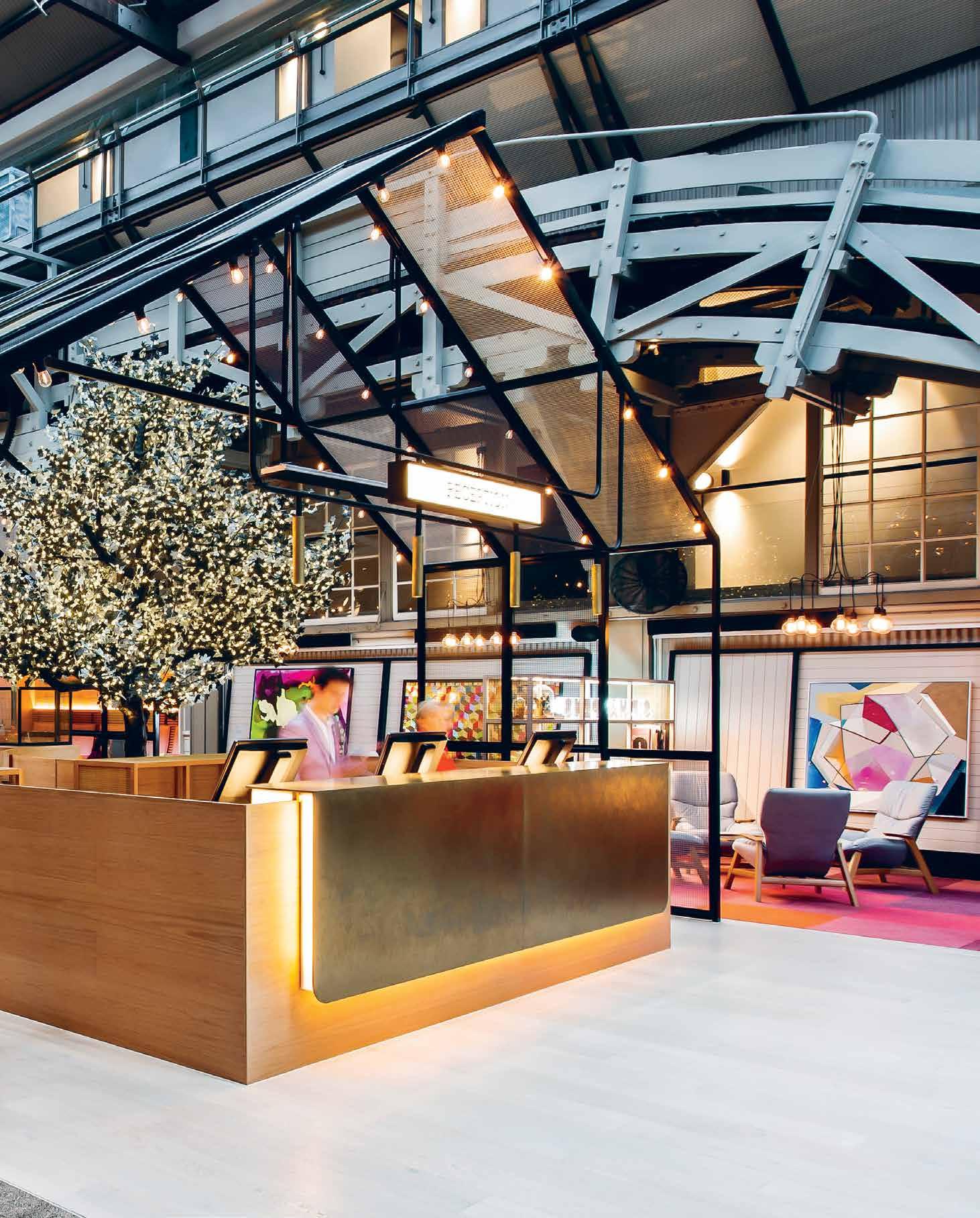
The assumption seems to be that all guests are tourists who are out all day and spend the rest of the time in their rooms. But what of the professional travellers who may not want to work in their room or in the utilitarian ‘business centres’ and who may want to have working meetings with local clients?
As team leader Matthew Sheargold reveals, the brief for Sydney’s Ovolo Hotel required only cosmetic renovations of the rooms, so the focus was strongly on the public area at the promenade level. Ovolo, says Sheargold, wanted this space activated. “They wanted energy and they wanted people to use it all day, not just come down for breakfast.” But it was a cavernous space and one long wind tunnel. There was no air-lock at the entry and strict heritage constraints would not allow one. The space was hot in summer and cold in winter and installing airconditioning was not an option due to heritage and expense. The feedback, says Sheargold, showed that people weren’t comfortable in the space and didn’t spend time there.
“So,” he says, “we interrogated every reason why someone might use this environment and how they might use it. We approached it in the way we would design working spaces and co-working hubs.”
This inside-out approach – which underlines the design of activitybased or agile working environments – has resulted in a strategy which breaks the space up functionally. It has become an exotic laneway populated by lightweight pavilions and planter trees. These have a human scale and create an intimacy that had been missing. At the same time, working closely with heritage consultant, Clive Lucas (who worked on the original makeover of the wharf), the structures making up this little community of spaces are open, creating
connection with the heritage context. Indeed, the trusses of the open pavilions replicate the heritage trusses and their angles.
Heating is incorporated into the pavilions and huge ceiling fans easily cool the space. The pavilions themselves, just like an activitybased workplace, offer a variety of sub-spaces to cater for different activities. There are small booths for private work, informal lounge areas and larger meeting spaces, along with a major conference room off the promenade. And, says Sheargold, “wherever you’re sitting, you can plug in and work or recharge your phone.”
The building is mixed-use (hotel, restaurants and residential), so Ovolo saw the opportunity to connect the local community as well as support guests to host on-site meetings. Hence, the all-day coffee points and bar in addition to the hotel’s own small breakfast area.
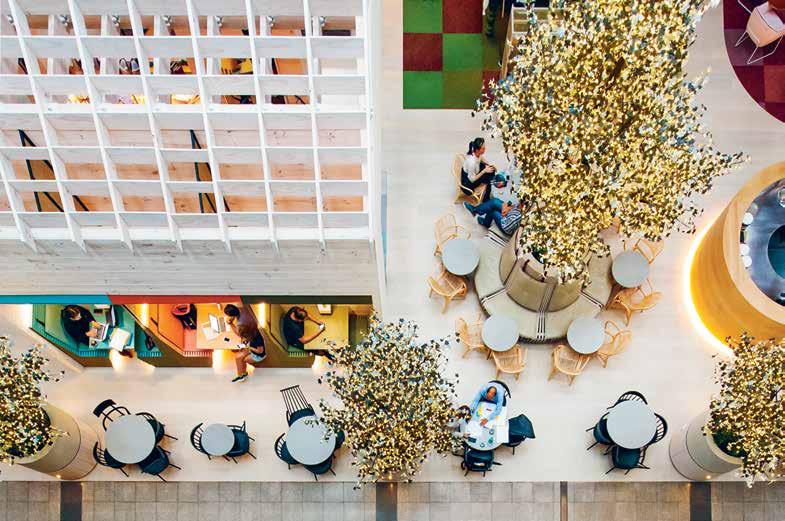
Environment is now entertainment and there is a blurring of the lines between public and private. The hotel occupies only first the half of the building. In the other half are some very well-heeled people who can access their apartments and penthouses through the hotel. One of the challenges was how to signal that this was a hotel when previously it had been largely hidden from the street. A new street awning with signage, along with a colourful art collection created a sense of arrival – with the happy approval of the local residents. As Sheargold points out, customer experience is central to the Ovolo brand. The trick with its new Sydney hotel is to bring the inside-out thinking of designing for the workplace to reimagining how a hotel works to really serve the needs of its guests.
hassellstudio.com
INDESIGNLIVE.COM 120 IN SITU
“The trick with [Hassell’s approach to the] new Sydney hotel is to bring the inside-out thinking of designing for the workplace to re-imagining how a hotel works to really serve the needs of its guests.”
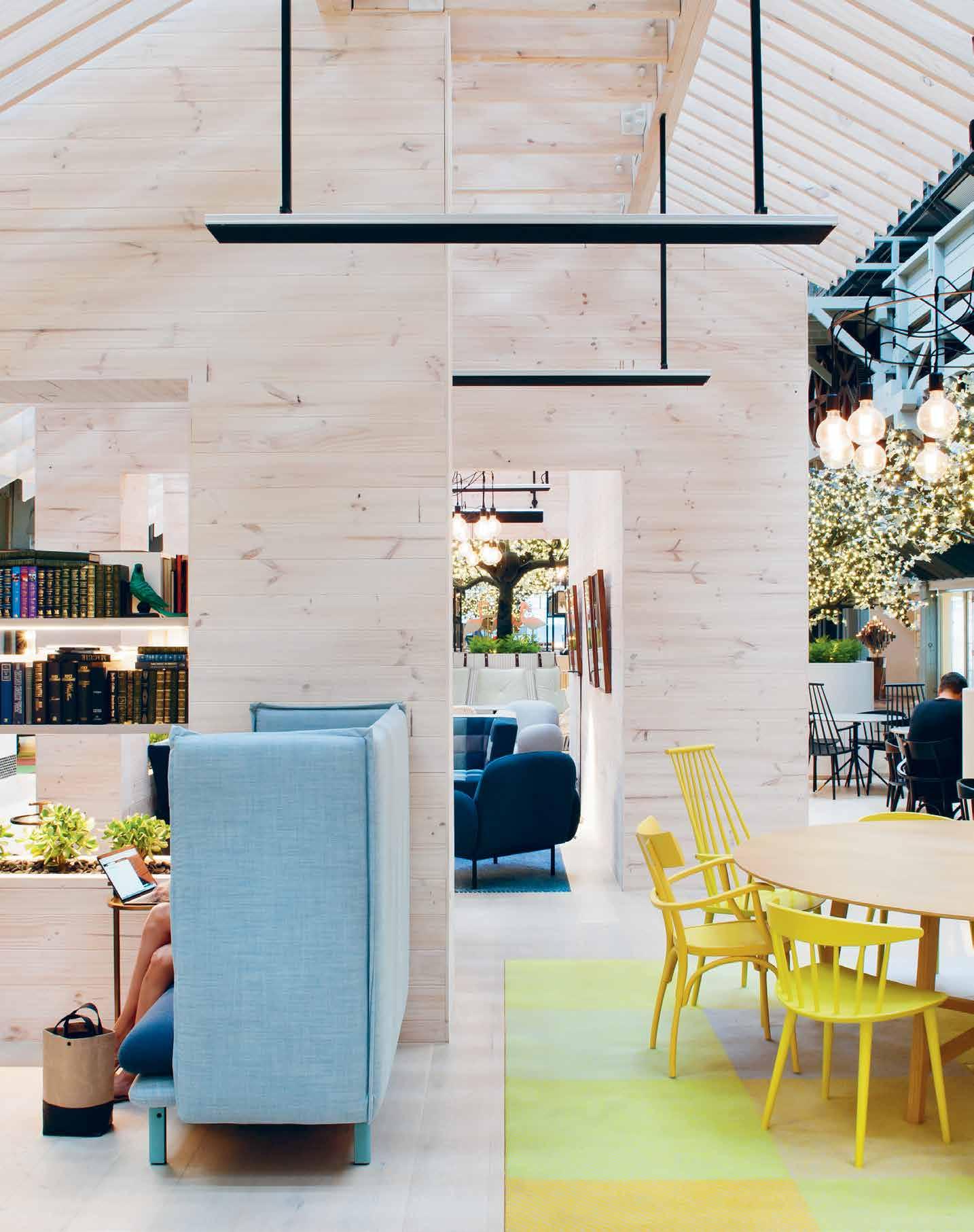
“All the forms reflect the building. There are subtle references in the detailing. The colours amp up as you get smaller. The bigger elements are the dustier, muddier colours of the building.” Matthew Sheargold, creative design lead, Hassell Sydney.
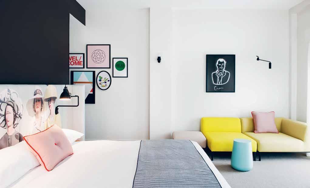
INDESIGNLIVE.COM 122 IN SITU
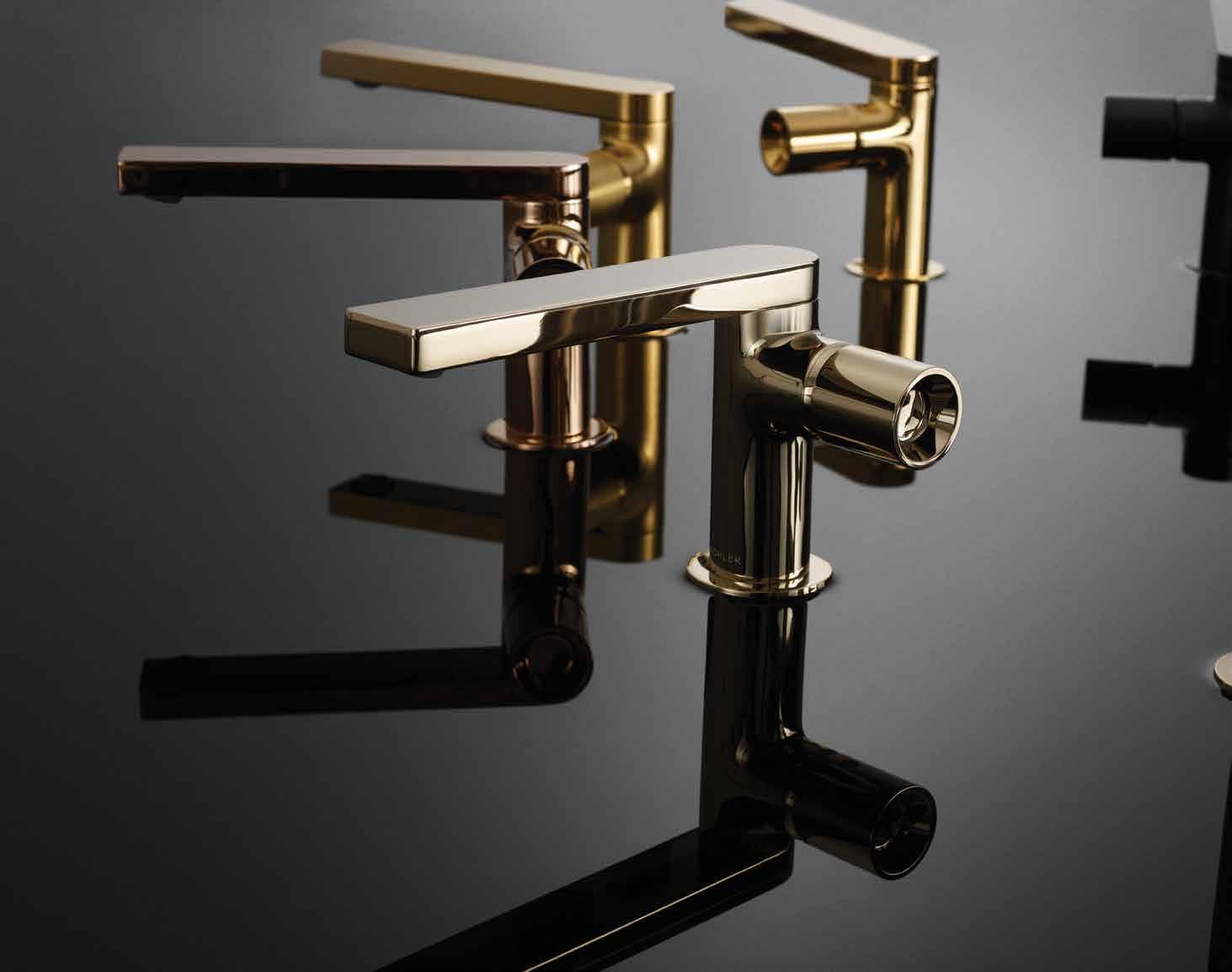


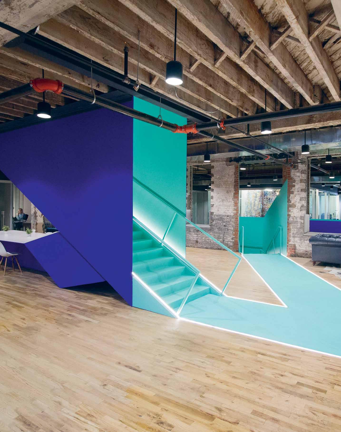
Millennial knowledge workers love turning dilapidated sites and suburbs into progressive commercial and cultural havens. How is design responding?
Cowork|rs by Leeser Architecture
Words Ben Morgan Photography Courtesy of Leeser Architecture
INDESIGN 125 IN SITU
These pages: At New York’s Cowork|rs Leeser Architecture has juxtaposed the down-at-heel fabric of an old Gowanus Canal ex-industrial building with vibrant, cutting-edge insertions.
Trash or Treasure?
What Does The Future Hold?
Sustainability; addressing the challenges of urban density and the desire for authenticity make developments such as Cowork|rs attractive to young socially-conscious companies. However, at the heart of any adaptive reuse project remains the need for effective and efficient work environments –prioritising productivity and financial success. This is perhaps what the ‘knowledge economy’ has the potential to do – through its nature of innovation, their pulling-power for investment, and their ability to seek out opportunities in places others can’t see.
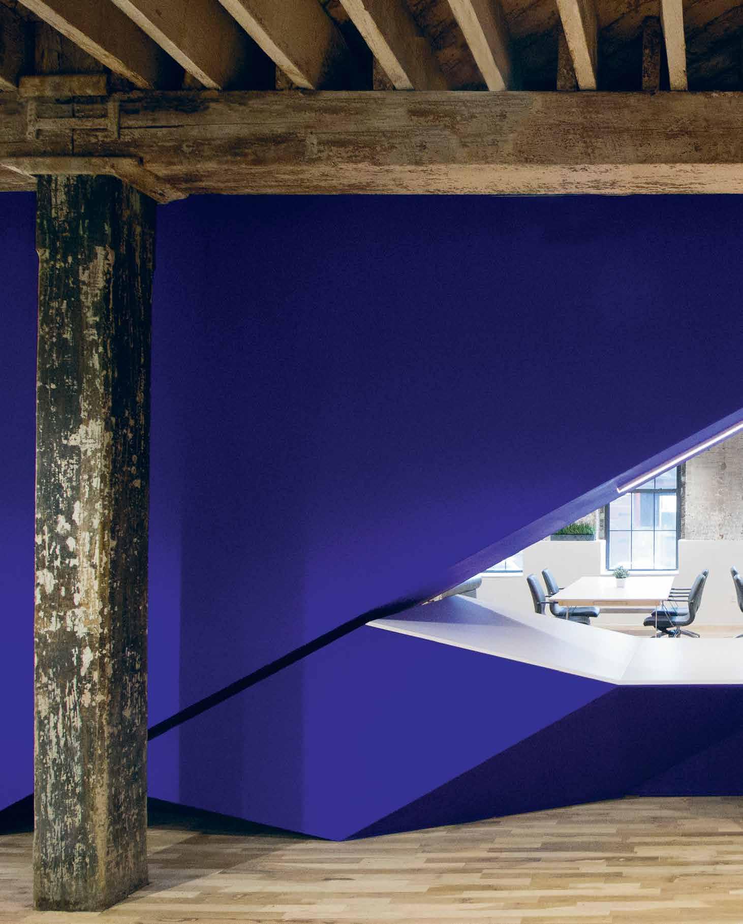
–
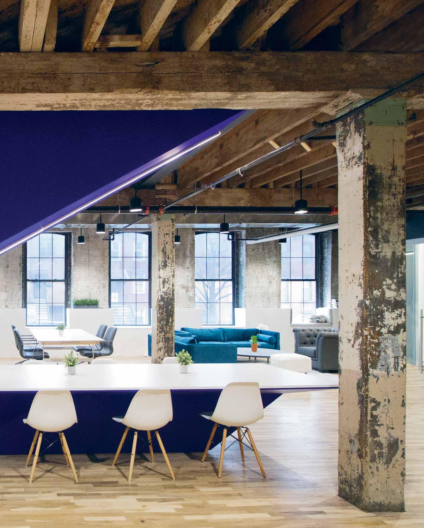
We’ve all watched in awe as the Silicon Valley workplace revolution has reconstructed o ces into giant daycare centres for adults, with everything from funpark slides to ball pits. But now, young digital natives are hunting out more than just fun in the workplace. In New York, Cowork|rs is a typical example of a company making its mark in that relatively new corner of the sharing economy, known as ‘coworking’. It has recently opened its second location in Brooklyn’s up-and-coming Gowanus Canal area, engaging Leeser Architecture to transform a dilapidated industrial building into a shared work space for multiple companies.
“They weren’t quite sure what they wanted,” comments principal Thomas Leeser. “But they were very interested in that old factory look and feel.” While the main fabric of the ex-industrial building –including existing gra ti – has been retained, Leeser Architecture worked to inject bold colours and modern insertions such as kitchens and seating areas and glass-partitioned o ce spaces; the main focal point being a bright-blue staircase running from the basement to third floor, acting as the “connective tissue” of the building. This figurative spine of the project provides both a contrast to the worn timber and brick of the old structure, as well as creating gathering points for the Cowork|rs members, helping to create a greater sense of community.

Cowork|rs also wanted to create something homely – their mo o is actually ‘at home, at work’. “I can understand it,” says Leeser. “I think this is global, this a nity with ageing buildings.” However, the architect believes there is a glut of these sorts of spaces, which rely on the building’s existing fabric to do all the work.
“We felt in order to distinguish them and make it unique, we had to o er them a contemporary edge. Particularly because they cater to young people. Within start-ups, it wasn’t really enough to have this sort of ‘grandma’ sensibility.”
There’s an obvious benefit in polluted, brownfield locations like Gowanus Canal. The building itself was previously vacant and dilapidated, and there is still a great deal of remediation to be done by the city to clean up the toxic canal itself. For Cowork|rs, rather than a turno , this represented an opportunity to be part of a burgeoning community of like-minded ‘knowledge workers’. Leeser notes that such buildings are also relatively easy for developers to convert into o ce spaces. “There’s less investment involved, the renovation process is much faster than building a new building, so the developers are actually very interested. For o ce space, those sorts of buildings appear to be ripe and quite a ractive for developers, and start-ups in particular prefer these kind of converted structures. It feels less corporate.
“Some [of the Cowork|rs] o ces are 1.2 x 1.8 metres, and there’s just one person si ing there doing something, and then there are companies that have 40 people renting a whole section, but they’re all young companies, there’s none of the more established businesses in there, so I think it’s a generational shi . People are more interested in trying their own thing and this sort of space gives them the opportunity to do so.”
leeser.com
INDESIGNLIVE.COM 128 IN SITU

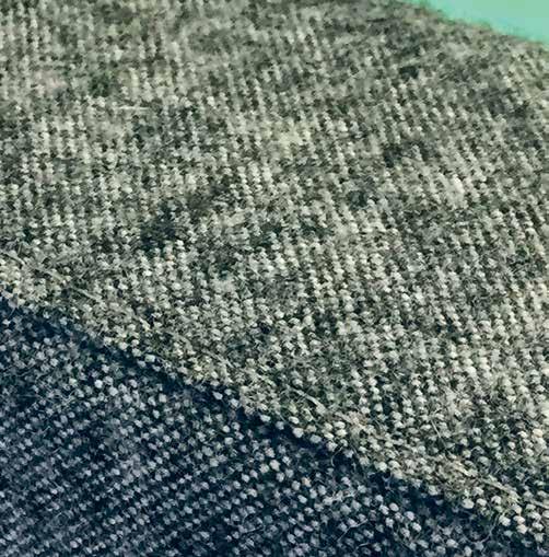
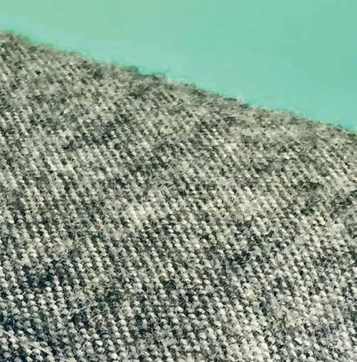
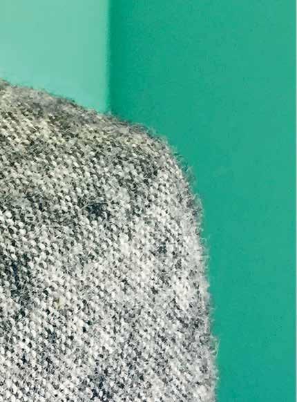


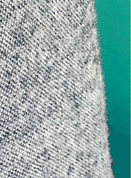
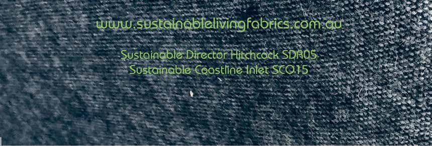


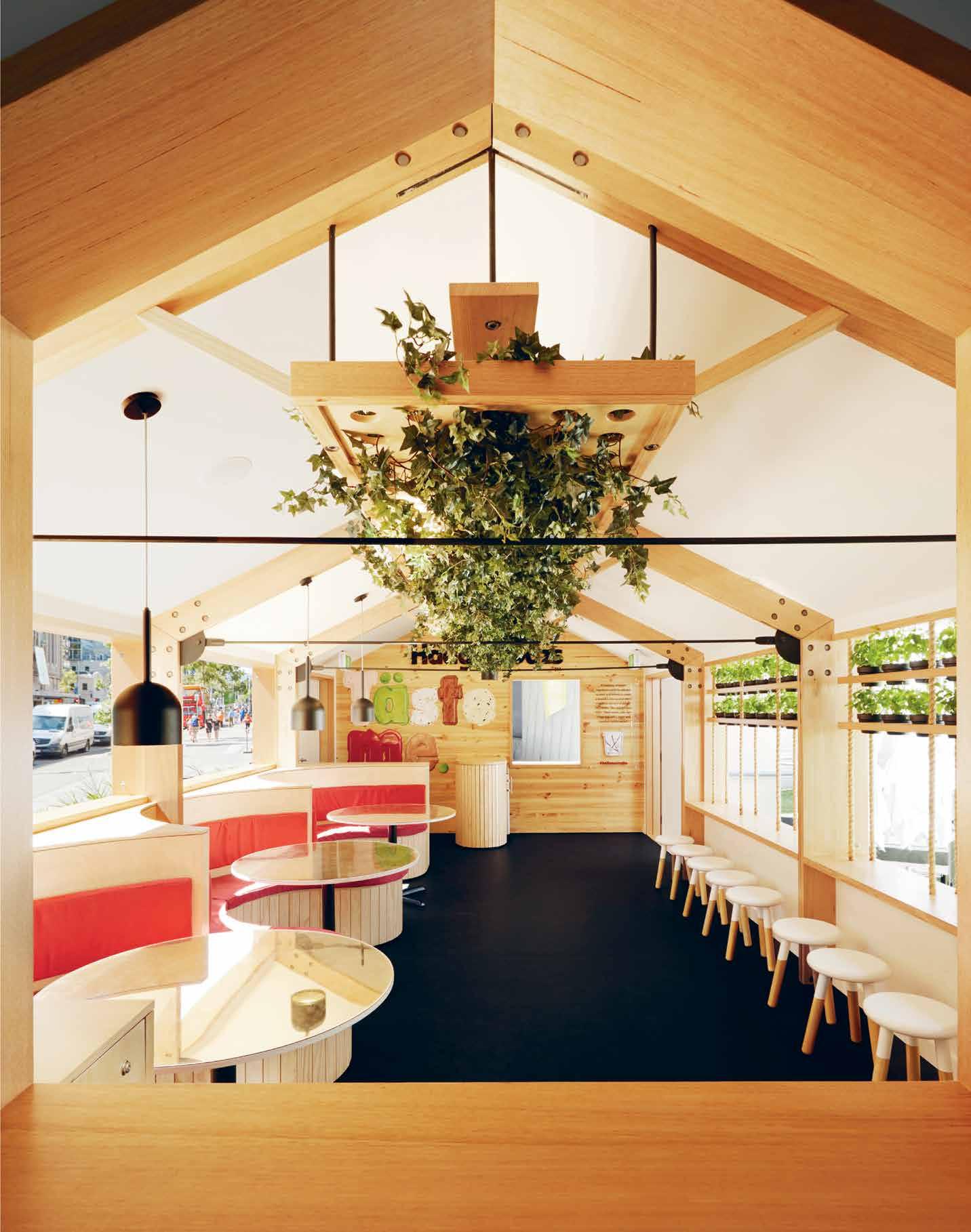
What happens to a pop-up when the six weeks is over? Designed by ArchiBlox, House of Häagen-Dazs, Melbourne, questions the role of design within ‘throwaway’ culture.
Don’t be a Tosser
House
of Häagen-Dazs
by Archiblox
Words Annie Reid Photography Tom Ross / Brilliant Creek
With the ability to capture iconic and interesting locations, the popup enables designers to create a distinctly local market experience while representing different brands.
Consider ice cream brand Häagen-Dazs’ recent pop-up experience, designed by ArchiBlox and located at Melbourne’s Federation Square. Featuring leafy vegetation, hanging plants, plywood custom seating booths and Weathertex external cladding, the modular design aligns with ArchiBlox’s core value of sustainability.
The local experience was all about telling a ‘Melbourne’ story: the interiors are sleek and unpretentious using carbon neutral and sustainable products, with the only Häagen-Dazs-branded crimson splashed on the space’s three booths.
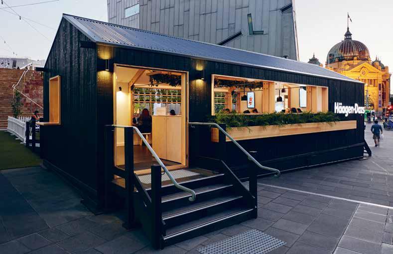
Bill McCorkell, ArchiBlox’s director adds that the process itself was also uniquely Melbourne: “That’s one of the beauties of doing business in Melbourne; the celebration of collaboration. As a whole the team: the clients, the marketing agent and us, worked really well together and delivered the outlet within 10 weeks from engagement,” he says.
Each material was carefully considered for its sustainability credentials, starting with the dark façade cladding from Weathertex;
the first Australian manufacturer to receive a Global GreenTag platinum certification. All joinery is from sustainably forested hardwood plywood, while timbers have been locally sourced from companies with sustainable forestry methods. With penetrations throughout the façade, the pop-up’s structure is open-aired to eliminate any need for mechanical airconditioning. And when it rains, external rails allow for shutters to be mounted manually to protect the internal spaces. All appliances, fixtures and fittings were selected with highly sustainable properties and green energy ratings too.
The net result is that a well-designed pop-up has the power to reinvent how retail outlets view their point-of-sale experiences for their consumers. “Brands can bring their product to the marketplace in a relatively inexpensive space, rather than using traditional retail outlets for ongoing sales,” McCorkell says.
Thanks to its considered materiality the structure will live on, unlike other throwaway pop-ups. After its tenure at Federation Square, it will travel to other locations around the country, including in Sydney.
archiblox.com.au
INDESIGN 131 IN SITU
Quality Family Time
Right: Principal and Project Design Lead, Bruno Mendes was in his element working with raw materials of timber and steel; “They essentially link each of the key spaces” – the main boardroom being a perfect example. Next page: The centrally located auditorium encourages ‘bump’ time between team members, just one of the ways it has facilitated greater collaboration. Page 136: Timber conference tables were handcrafted by furniture designer and Woods Bagot architect Josh Carmody especially for the fit-out.
INDESIGNLIVE.COM 132 IN SITU
When do the rules and theories of contemporary workplace design not apply? In the case of Woods Bagot’s new Melbourne headquarters, project lead Bruno Mendes threw the rule book out and picked up a cookbook instead.
Woods Bagot Melbourne by Woods Bagot Words Alice Blackwood Photography Christine Francis
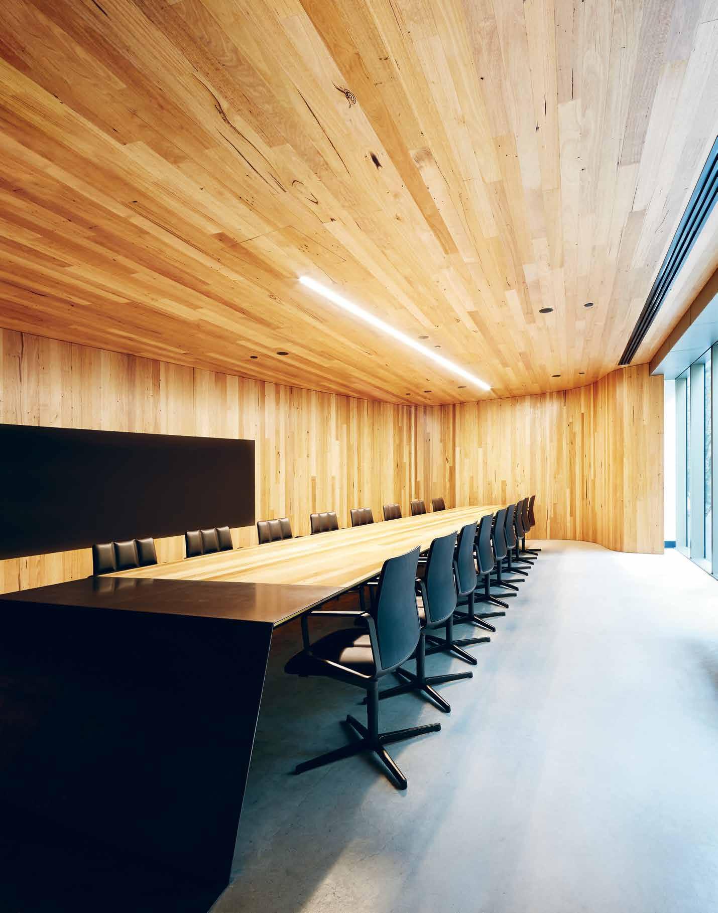
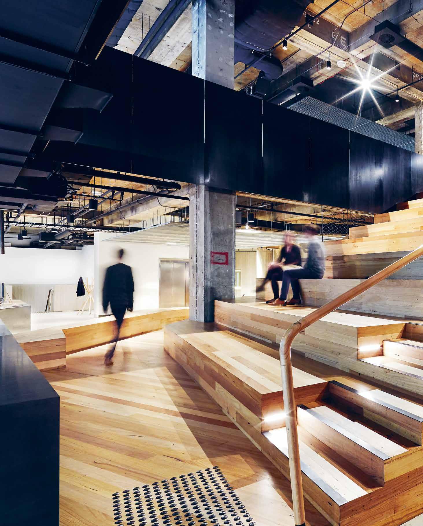
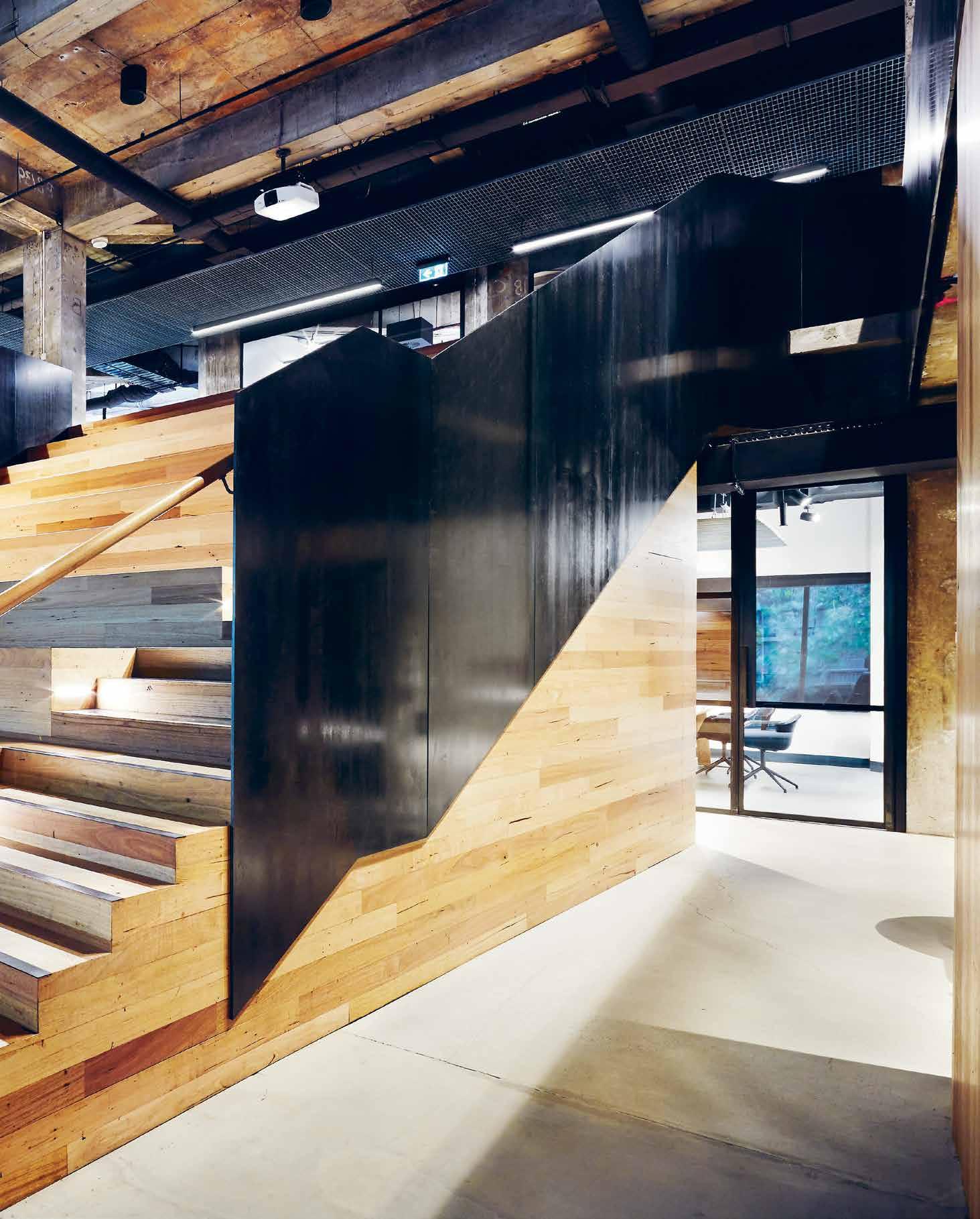
Perhaps one of the stiffest challenges an architect will face during their career is designing their own studio. “There really is nothing harder,” confirms Bruno Mendes, Melbourne-based principal with Woods Bagot (WB).
In taking up the mantel of project lead on WB’s new, in-house designed Melbourne studio, Mendes had some clear terms: “I said, ‘If I do this, you’ll leave me alone and I’ll do it.’ ” The project would be designed and built over a tight period of 2.5 months, and the studio’s staff of 100+ were to be brought in at three vital points during the process: at briefing which involved a studio-wide survey, and for the presentation of those survey findings (return briefing). On receipt of the keys, “I brought the entire studio over to see the [raw] space, and then they didn’t see it until it was completed,” says Mendes.
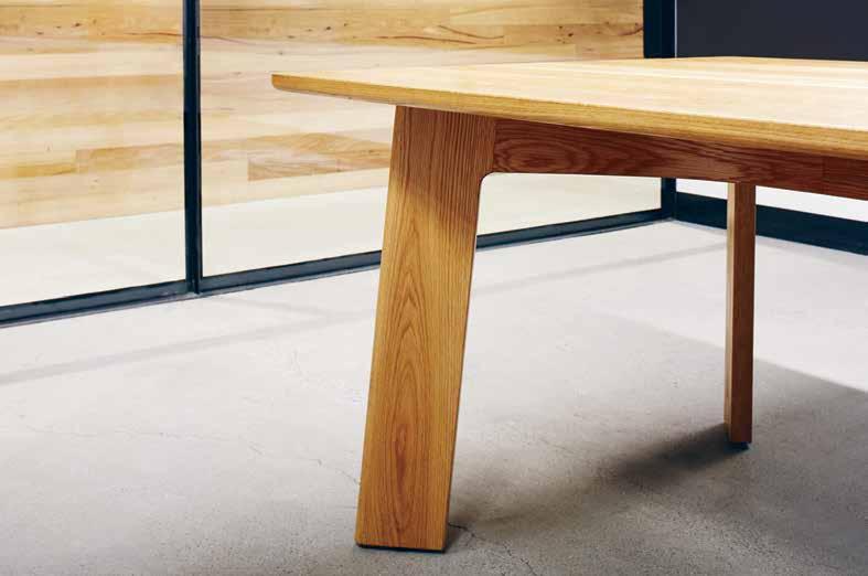
Mendes’ staff survey threw up lots of interesting results – key terms that ranged from ‘boring’ to ‘woeful’ to ‘exciting’. “The one that worried me most was ‘non-collaborative’,” says Mendes. In presenting his findings back to his team, the call for a variety of collaborative spaces formed a major part of the brief.
Mendes makes no bones about the fact that he isn’t a workplace architect. “There’s a lot of theory and terminology that’s been developed around workplace [design]. Frankly speaking, I didn’t buy into any of it. To create our new space it was always going to be focused on the team worked, along with a clear architectural vision around materiality and craft. It wasn’t a workplace vision we were creating, more a vision for our new studio. The idea of craft is extremely important especially when dealing with timber and steel. The studio is very much an extension of the lessons learnt from
building my own house ‘Law Street’ – an experiment in crafting steel and timber. In our old premises we lacked a variety of sufficient collaboration areas. We had an insufficient number of meeting rooms and as a result most of our meetings were at our desks.” When it came to the new tenancy: “The bones were good, but spread over two floors,” notes Mendes. “We needed to immediately connect the two floors and break down the ‘us and them’ mentality. It called for a significant gesture.”
That gesture was inspired, in part, by “one of the cheapest you’ll buy online!” says Mendes. The Family Meal by Ferran Adria from El Bulli is filled with the recipes of the dishes eaten by the El Bulli team at staff mealtime. Perhaps what struck Mendes most about this cookbook was its spirit of sharing. “It reveals the importance of that time in the day when they sit down, collaborate and share new ideas over food and wine – it’s that idea of breaking bread together.”
For Woods Bagot too, the most creative moments happen when they get away from their desks. The central auditorium is Mendes’ ode to that idea of ‘family time’. Connecting the upper staff area with the entry level reception, it hosts presentations, get-togethers – even karaoke sessions – among staff. More recently it’s gained the attention of external parties who come in to host their sharing sessions here as well.
“It was one of the most crucial moves,” says Mendes. “Everything else just flowed from that.” As Mendes points out, the forum may appear as architectural expression, but really it’s a “framework to allow that collaboration to happen.”
woodsbagot.com.au
INDESIGNLIVE.COM 136 IN SITU
“There’s a lot of theory and terminology that’s been developed around workplace [design]. Frankly speaking, I didn’t buy into any of it.”
LED lighting: designed by people for people
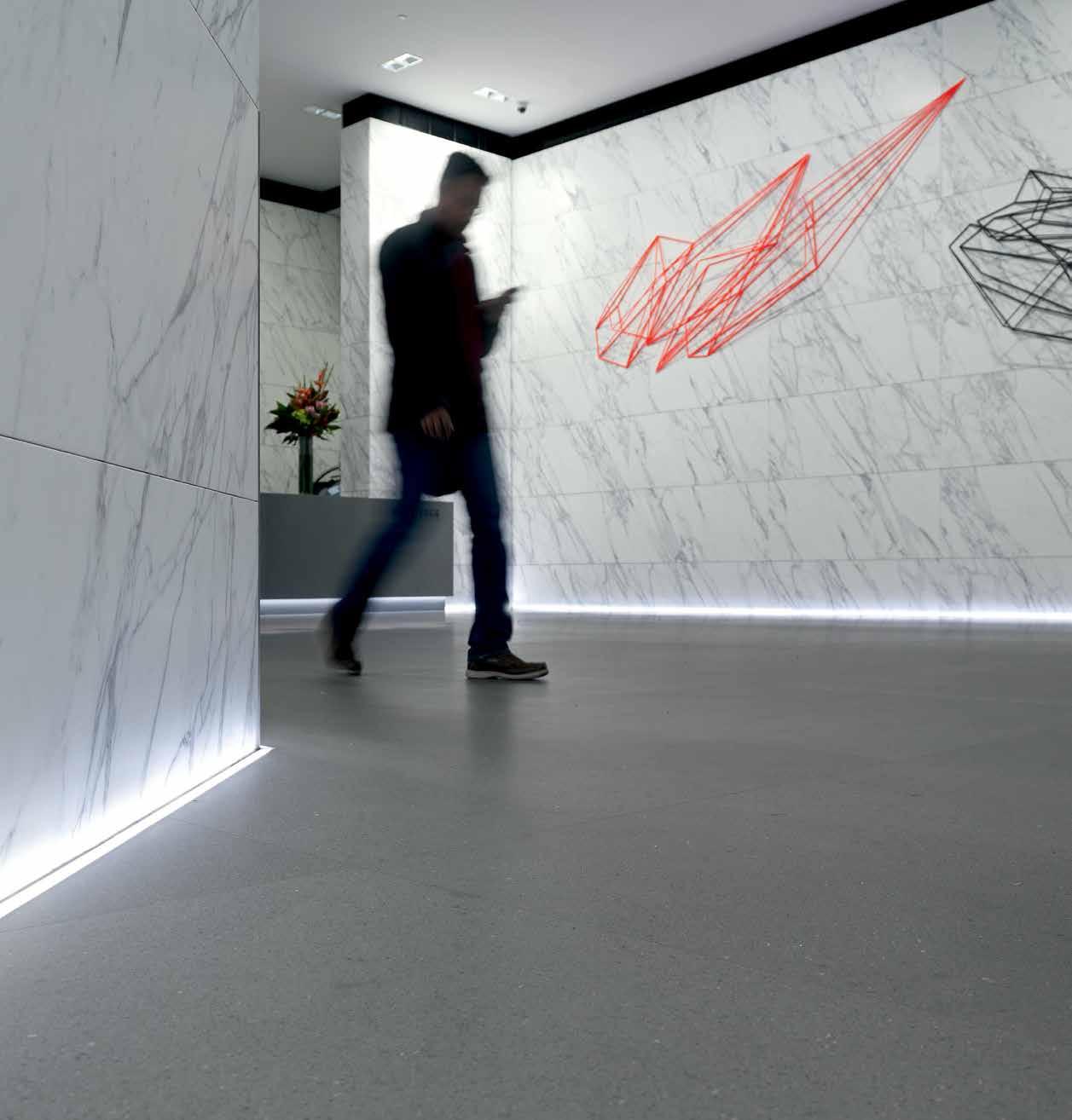
The knowledge and passion of our people provide you with best practice project solutions.
hotbeam.com
Photography: Andrew Worssam
Can design provoke desired behaviour within a space? McBride
Charles Ryan explores this possibility with colour, form and materiality in their most recent education project, Ivanhoe Grammar.
Back to School
Ivanhoe Grammar by McBride Charles Ryan
Words Stephen Crafti Photography John Gollings
“ We wanted to create an environment for learning and a place where teaching was able to be more fluid and connected to students’ needs,” says Debbie Ryan, who could see that teachers needed to work across a number of rooms in the one learning session and cater for student groups aimed at a particular activity. “It’s important, like science, that students feel a sense of ownership in their school and the specific spaces they gravitate towards,” adds Robert McBride.
INDESIGNLIVE.COM 138 IN SITU
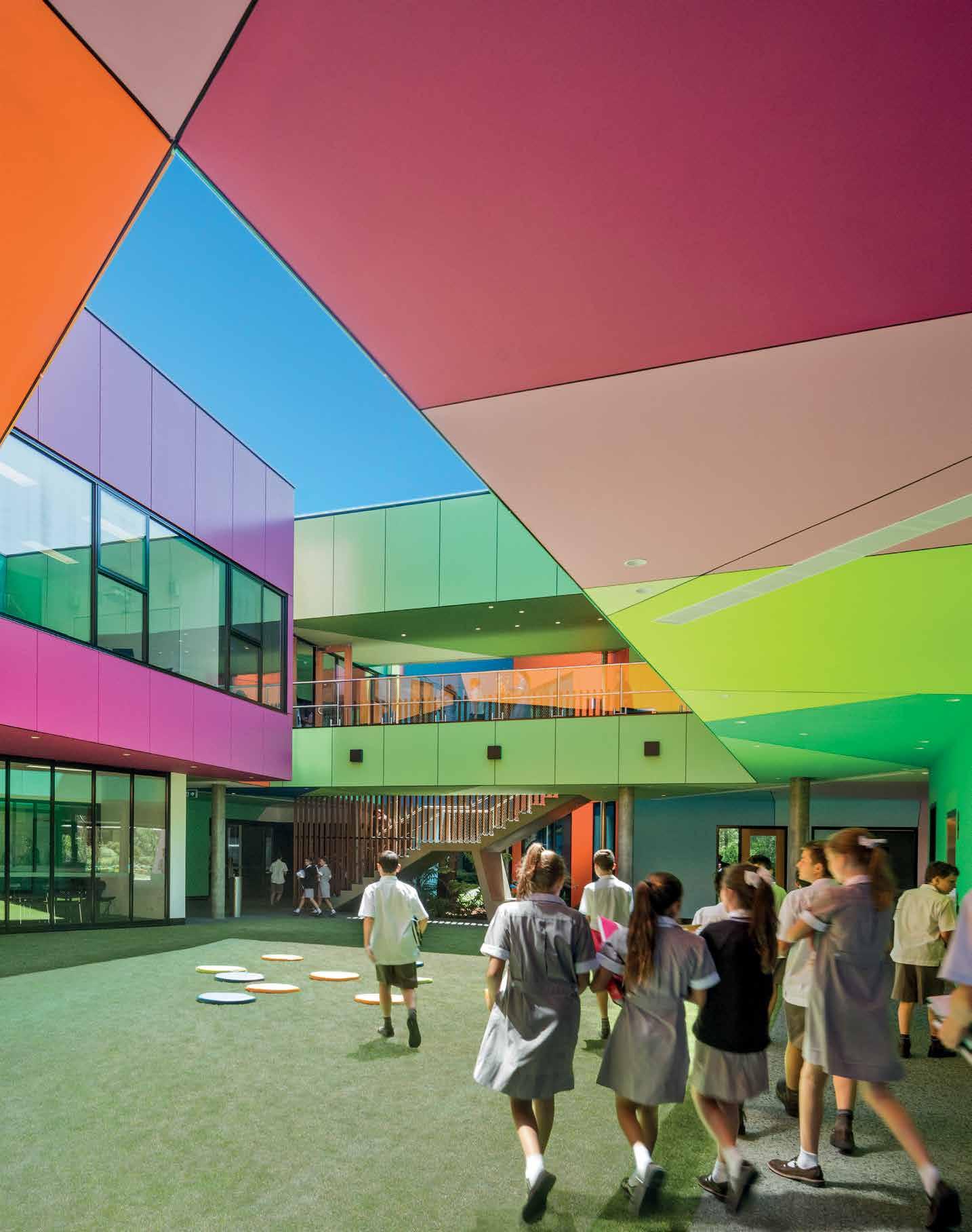
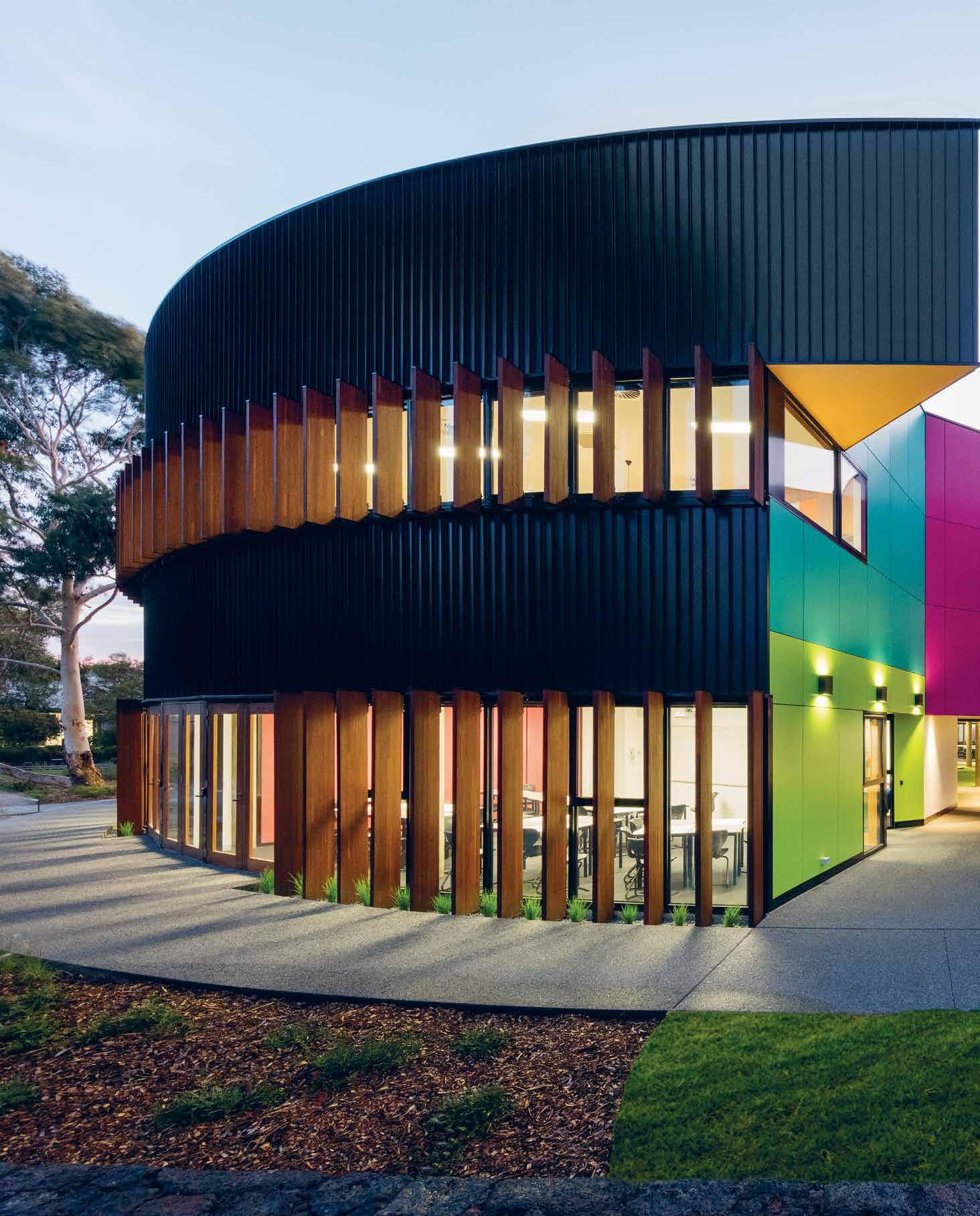
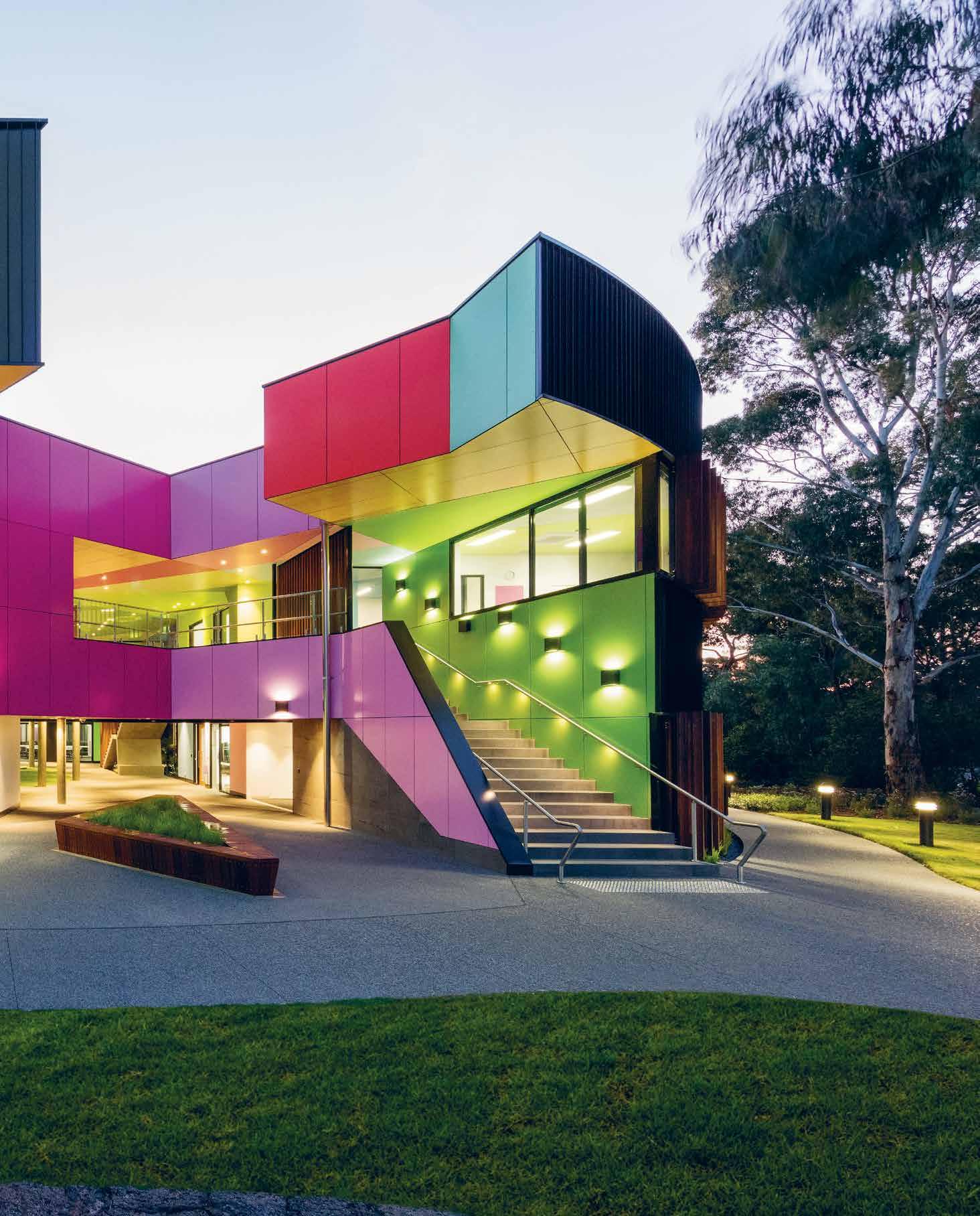
Though seemingly an abstract concept, the physical elements of design can in fact influence the way spaces are used and responded to. During their work on the latest addition to the Ivanhoe Grammar campus for example, MCR specifically designed the building “inside and out” to create the best possible canvas for how students would ultimately use the space. They explain that they achieved this using a series of design devices such as colour, shape, form and organic spacial reasoning that worked in harmony with the surrounding native bushland. Rather than the usual learning model where lecture theatres are the norm, the Science and Senior Years Centre at Ivanhoe Grammar’s campus features a series of tailor-made spaces ‘threaded’ through the circular building. Smaller rooms, greater connectivity and transparency allow both teachers and students to work comfortably in their own niche.
Unlike traditional laboratories, where white clinical rectilinear spaces are the norm, the Ivanhoe Grammar campus is more akin to a “mosaic of spaces”. Varying in size from 10 to 100 square metres in area, these blurred angular spaces frame the internal courtyard which functions as another learning space. “Some spaces need to be a uned to individual learning, others accommodating smaller groups. And sometimes, there’s a need to join ‘cells’ and create the one larger space,” notes fellow practice director, Debbie Ryan, who saw the grassed central courtyard as simply another learning environment. The centrepiece – MCR’s black steel ‘drum’ – features
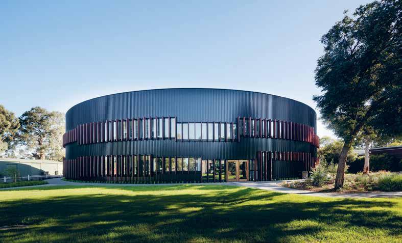
three apertures, creating a ‘rip’ within the drum, revealing a kaleidoscope of vibrant colour and an explosion of geometrical forms of coloured Vitrapanels. “The colour beckons you into the building, into ‘another world’, a place, like science, which is a metaphor for discovery,” says McBride, who located the entrances from the three key pathways leading to the centre. The sky, which is fully revealed at the centre of the building, acts as one of the many-segmented and vibrant colours.
MCR was mindful of not just creating a colourful and stimulating environment, but providing more e cient spaces for students and teachers. Some spaces at ground level are simply a few square metres, catering for those studying a less popular language. “We ‘unpicked’ all the di erent courses, examined the di erent cohorts, whether it was the sciences or languages, carefully analysed how each space would be used,” says Ryan. Having a variety of spaces in both size and form allows for greater flexibility. “Education is no longer prescriptive. It needs to respond to students as well as those teaching each subject.” Ryan was also keen to move away from the traditional orthogonal form of a classroom. “Most classrooms are simply square boxes. The mosaic shapes of each learning space allow students to think more laterally, which a er all, is what science and the broader learning environment is about.”
mcbridecharlesryan.com.au
INDESIGNLIVE.COM 142 IN SITU
Page 138: The central courtyard, with lilly pad-like cushions, ablaze with brightly coloured Vitrapanels. Previous page: The building’s steel cladding responds to surrounding charcoal-coloued tree trunks. This page: The circular design appears recessive in the landscape; timber ns frame each window to di use light.
“Most classrooms are simply square boxes. The mosaic shapes of each learning space allow students to think more laterally, which a er all, is what science and the broader learning environment is about.”
www.colebrookbossonsaunders.com.au
www.colebrookbossonsaunders.com.au
The world’s market leading monitor arm
The world’s market leading monitor arm


As the market leader in its class, Flo is more environmentally friendly, better looking, and a better performing product than any of its competitors.
As the market leader in its class, Flo is more environmentally friendly, better looking, and a better performing product than any of its competitors.


With great design and great performance, Flo offers a range and ease of movement that sets it apart from all other monitor supports.
With great design and great performance, Flo offers a range and ease of movement that sets it apart from all other monitor supports.


AD
Yin and Yang
Bodhi & Ride by Hachem
Words Nicky Lobo Photography Eugene Hyland
How are designers harmonising the physical and non-physical needs of their projects?
Physical exercise is good for the body. Meditation is good for the mind. Art, you could argue, is good for the soul. Bodhi & Ride founder and owner, Michaela Fellner explains: “My way to zone out is to either sort out my stuff on a mat or cushion, or sweat it out in a cycle studio. I couldn’t decide which one was better. I think I needed both,” she laughs.
When Fellner decided to open a studio that integrated these three forms under the one roof, she knew she had to seek out a creative collaborator that was as unique as her vision. She found him via a nightclub of all places. The sense of escape, release and sensory immersion in the sophisticated Bond venue in Melbourne, designed by Fady Hachem of Hachem, made an impression.
Together they walked through the site Fellner had secured for the studio – formerly an art gallery – and the vision began to take shape. “It’s rare for somebody to do something out of the box,” Hachem remarks, but this tri-focused project with Fellner at the helm was just that. Undergoing rigorous research, which included taking part in several yoga and cycling classes, the Hachem team first developed the branding, including the business name.
‘Bodhi’ represents the introspective, gentle, yin aspect of wellness, while ‘Ride’ refers to the more extroverted, energetic yang qualities. From these two opposing forces came the balance that inspired the interior design.
The shell of the two-level white gallery building was left intact, with exposed timber beams and generous ceiling heights. “The structure is quite beautiful,” Hachem remarks. “The last thing we wanted to do was ruin it – we wanted to improve it.” On the ground level a ‘spin chamber’ and ‘unplug pod’ are inserted behind the reception area, freestanding feature artworks in the building shell. These curvaceous forms are accentuated by gauzy curtains which
wrap the interior of the building shell, and by custom suspended lighting which ripples around the inserted pods. There is not a straight line in sight – cardboard tubes and other circular elements feature in the joinery, rugs and custom furniture. The gently amorphous theme encourages a feeling of safety, and a flowing circulation of both bodies and energy.
The nightclub references are clear in the spin chamber – you can “go dark” in here, as Fellner describes it. In this curved space, bikes are nestled in close to one another, much like a crowded dancefloor. Fifty different lighting settings (including strobe) and DJ-mixed soundtracks create an energetic (and sweaty) experience where riders (who are provided with cycle shoes to clip into the frames) can find an anonymous release in the near-dark chamber. Incredibly, thanks to acoustic consideration, the music can thump through the speakers in here while a meditation practice takes place in the adjacent pod.
This cocoon-like meditation space is simple and light. Wary of intimidating newcomers to the practice with heavy philosophy or pseudo-religious icons, cushions are the only adornment. “I wanted to bring meditation to life in a really modern, urban, contemporary way,” Fellner says.
The upper level is home to the ‘yoga loft’, with cork flooring and infrared heating creating a simple and warm floating space for mindful movement. A blank canvas covers the length of one wall, a reference to the building’s artistic past. Bathrooms are also located up here, with generous rainfall showerheads extending the luxurious experience. The body, mind and soul are all nourished in this carefully constructed space, a sensual exploration of wellness. hachem.com.au
Opposite top: The cork-floored, light-filled ‘yoga loft’ is a serene space for the meditative practice. Opposite below: A different kind of immersion is designed in the ‘spin chamber’, with nightclub-grade lighting and sound systems.
INDESIGNLIVE.COM 144 IN SITU
Whether a brief is abstract, detailed, or, as in the case of this project, non-existent, understanding the client and designing to their needs is always a recipe for success.
Needle in a Haystack
Lot.1 by Enter Projects
Words Lorenzo Logi Photography Brett Boardman
“ We didn’t want it to be a white-tile, exposed-timbers look, we wanted to bring the coffee to the front, so we took the distinctive ‘swirl’ effect of café latte, and elaborated the design around that.” Patrick Keane, director, Enter Projects.
INDESIGNLIVE.COM 146 IN SITU
When Is Wrong Right?
“The right angle is really the wrong angle,” says Enter Projects director, Patrick Keane. Lot.1’s design explores complex geometry through digitally fabricated interiors. Curved timber forms circulate, unfold and connect all of the functions of the venue. Spaces were stripped back to reveal the original fabric of the building: exposed brick, rough-hewn sandstone, wooden columns and old steel work. These rich textures have had modern elements layered over them to create compelling contrasts, and animated by subtle illumination.
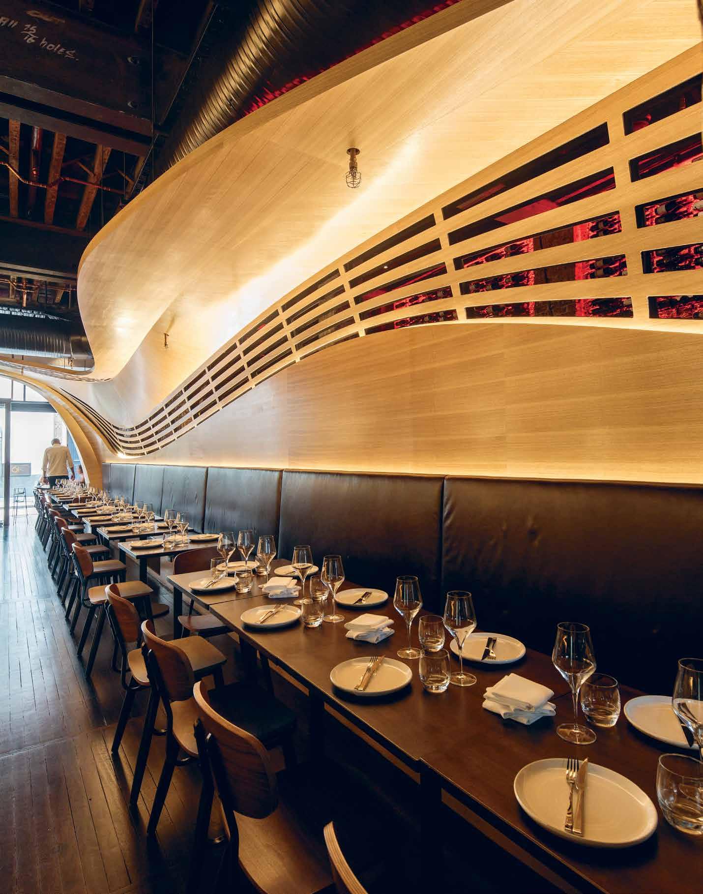
–
“The solution itself is striking, both for its aesthetic interest and its functional merit, but equally impressive is the designers’ willingness to engage with the client and put themselves in their shoes, to know what they want and need, even before they do.”
A design brief is a mercurial element. On the one hand it can offer a useful, sometimes indispensable guide to understanding a client’s objectives, tastes and resources; on the other, it can become a minefield of vague or contradictory ideas.
In particular with abstract or spare briefs, a designer is given substantial freedom – again, this can be both blessing and curse. So how does one take the initiative, put the best foot forward, and reduce the frustrating back-and-forth of endless edits and revisions? In the case of Lot.1, a newly opened café-restaurantcocktail bar in Sydney’s CBD, fortune has favoured the bold.
“[The client] needed to have a DA sent in for a license to open a bar premises,” explains Patrick Keane, director of Enter Projects, enthusiasts for unique, custom designs. “They didn’t necessarily need designs, but we took them some designs and said, ‘How ‘bout this?’ Interestingly enough, the first design we came up with was virtually unchanged.”
To hear Keane tell it, it was as easy as that. However, as with most seemingly effortless successes, there is more to the story. For starters, the client, The Primo Group, had not given the designers any sort of brief. Patrick knew that the company had a long history of wholesale and retail of coffee (Giuseppe Di Stefano launched Primo back in 1982), but that this was their first venture into high-end hospitality. He also knew the space they had chosen: two sideby-side lots on Sydney’s York Street, with abundant street facing windows, and a vexing separation wall dividing them.
“We did a little research, looked at the space and said, ‘This is what you guys need,’ ” says Keane. “We didn’t want it to be a Melbourne, white-tile, exposed-timbers look, we wanted to bring the coffee to the very front, so we took the distinctive ‘swirl’ effect of café latte, and elaborated the design around that.” The resulting space is defined by a three-dimensional ‘ribbon’ of timber which twists, turns, plunges
and expands as it moves from one room to the next. Even before you enter the venue, the design has a powerful effect. Seen from across the road, it appears to pass through the dividing wall, connecting the two sides of the restaurant space. Then, as Keane observes, “When you walk in the front door there’s the coffee bar, which turns into the banquette, and spins up into the light.”
The solution itself is striking, both for its aesthetic interest and its functional merit, but equally impressive is the designers’ willingness to engage with the client and put themselves in their shoes, to know what they want and need, even before they do.
That said, the highly technical nature of the sculptural timber elements made costs and timings hard to predict accurately. How did the clients respond to this? “Depends how far they want to stick their necks out and how special they want it be,” reflects Keane. “[Primo] wanted a point of difference.” He also emphasises the importance of having the client invest in a design: “You’ve really got to have someone who believes in it the whole way. And for this project it was Primo’s fearless director of operations, Michael Tama.”
Keane also points out that the client did contribute to the design, and was adamant on one point. “They were really keen on the coffee booth out the front,” recalls Keane, “and I didn’t really understand why until I saw it in action; it kind of stops the crowd, and draws people in.”
Of course, the best results pair designers’ expertise with client’s desires, and the traditional design brief and response model facilitates this. But beyond this, if a designer can show initiative and understanding, cutting to the pith of a client’s identity, they can bypass this stage and offer brilliant solutions.
enterprojects.net
INDESIGN 149 IN SITU
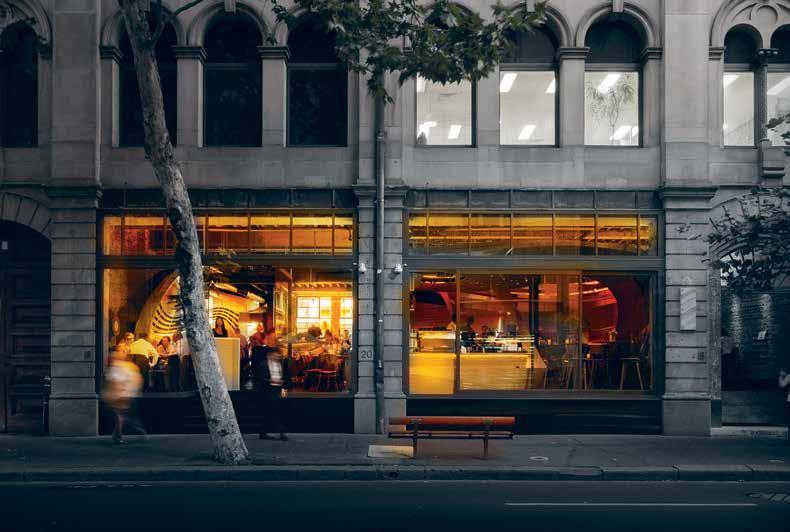
INDESIGNLIVE.COM 150 IN SITU
Page 146: The timber ribbon motif curls through the cafe/casual dining section. Previous page: Crisp angles and smooth volumes in the timber detailing create a dramatic contrast to the coursely textured original brick nishes. This page: Transparency and illumination are employed to create a series of public spaces with a VIP area hidden above the banquette seating.
“Depends how far [the client] want to stick their necks out and how special they want it be. You’ve really got to have someone who believes in it the whole way...Interestingly enough, the fi rst design we came up with was virtually unchanged.” Patrick Keane, director of Enter Projects.


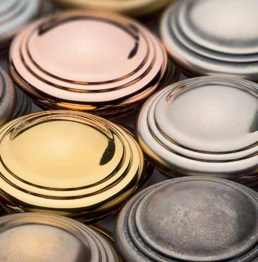
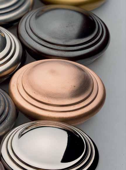
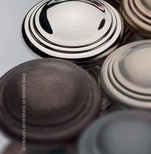
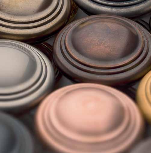


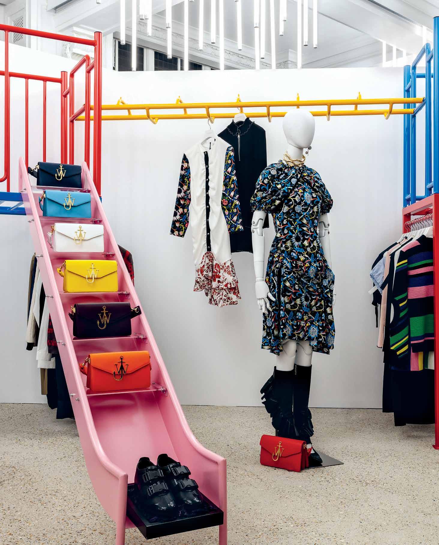
The recent completion of Dover Street Market’s new flagship space in London, is a provocative case study for retail designers looking to lure shoppers away from their laptops.
Retail in Revolt
Comme des Garçon
Words Mandi Keighran Photography Mark Blower
“ When we started, we wanted to create a new kind of retail experience, a kind of store that never existed before, that ignored all the preconceived notions of how a store should be, that dismissed the established rules of retail, that offered the customer a new and stimulating shopping experience that raised the spirits and excited the senses,” says Dover Street’s Adrian Joffe.
INDESIGN 153 IN SITU
Dover Street Market London by
The allure of shopping online is obvious – browse boutiques worldwide and have it all delivered to your doorstep at the click of a button. So, it’s hardly surprising that global online retail sales have risen from 10 per cent to more than 50 per cent in just over a decade. There is, however, still something to be said for the real-world shopping experience – the tactility, the immediacy of the interaction, and, of course, the retail experience created by interior designers and visual merchandisers.
Take, for example, Dover Street Market (DSM) – the retail concept created by Rei Kawakubo, Japanese designer and founder of cult label Comme des Garçons – which launched in London almost 12 years ago. “The initial concept was one of sharing a space, in a market kind of atmosphere, with all kinds of creative people who had a vision, and something to say,” says DSM CEO Adrian Joffe, who is also president of Comme des Garçons and Kawakubo’s husband.
Earlier this year, the flagship London store relocated from its eponymous location in Mayfair to a 10,600 square metres Grade II-listed space on Haymarket, which was built in 1912 by architect Walter Cave as the Burberry headquarters. It’s three times the size of the original space, and the interior feels more avant-garde art installation than department store.
Led by Kawakubo herself – who designed all Comme des Garçons and common spaces (including point-of-sale and changing rooms) – the design team stripped back the interior to an empty shell and restored it to its former glory, including enhancing the central
staircase. Other spaces and corners were allocated to brands –including Alaïa, Celine, Dior, and The Row alongside emerging brands such as Vetements, Gosha, and Molly Goddard – who have been left free to design as they wish. “They have to come in as a module from outer space and invade, but with respect for the larger setting,” says Joffe. The only guidance from Kawakubo? To spend as little as possible on the fit-outs.
It might seem an antithesis to the luxury labels stocked at DSM, but rather than an attempt to cut costs, the directive was designed to push the brands in new creative directions. It also allows for the entire fit-out to be regularly reconfigured. The result? The very essence of the idea of ‘beautiful chaos’ that DSM was built on, complementing the brand’s play on contrasts – rare and quotidian, luxury and street, young and old. It also makes for an everchanging and inspiring shopping experience.
“We think our customers are intrigued by the new location,” says Joffe. “DSM is always evolving. It is created by instinct, always wanting to do something new, and constantly adding elements. It’s very organic. The idea is to make shopping exciting.” And, as online becomes the new norm, this disruptive approach to retail design – one which eschews staid brand guidelines in favour of more challenging, dynamic and exhilarating interiors – will only continue to grow. After all, it’s the only thing guaranteed to keep shoppers from their laptops.
doverstreetmarket.com
INDESIGNLIVE.COM 154 IN SITU
Page 152: All brands with dedicated spaces were given the freedom to create their own design. The J.W Anderson space is inspired by a children’s playground in Jonathan’s hometown in Northern Ireland, complete with metal slippery slide and a colourful jungle gym. Page 154: The Bag Space is situated in the midst of a large-scale installation of white spheres, and located next to a cabinet designed by Emma Hawkins containing taxidermy bones and skulls, a vestige from the original store. Page 155: All Comme des Garçons spaces were designed by Rei Kawakubo, including the Black Comme des Garçons space.
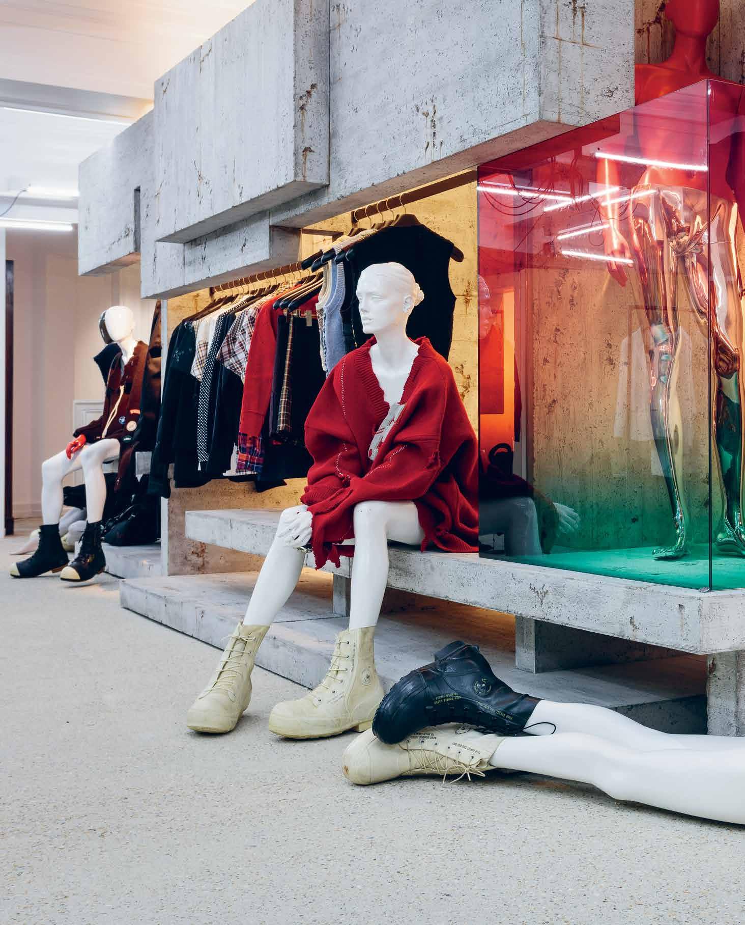
How Does It Feel?
The new Dover Street Market is home to an astonishing array of installations, interventions and environments, all conceived to create an atmosphere of beautiful chaos. The individual brand fit-outs within the interior are dizzyingly diverse – from a clear Perspex room with broken, chalky-white rose cornicing at Simone Rocha to a structure inspired by a children’s playground in Northern Ireland at J.W. Anderson. Even the acoustics have been designed to create chaos, with Brooklyn-based sound artist Calx Vive commissioned to compose a unique sonic environment on each floor. As the first store designed by Comme des Garçons with no false ceilings or down lights, lighting design plays an important role. Each floor features an installation from a prominent lighting designer, including Thierry Dreyfus and Pedro Cabrita Reis.
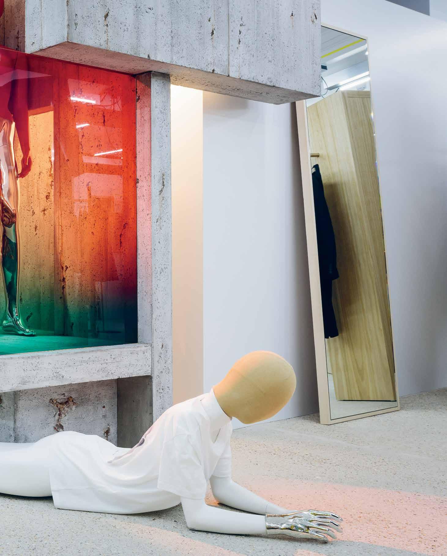
–
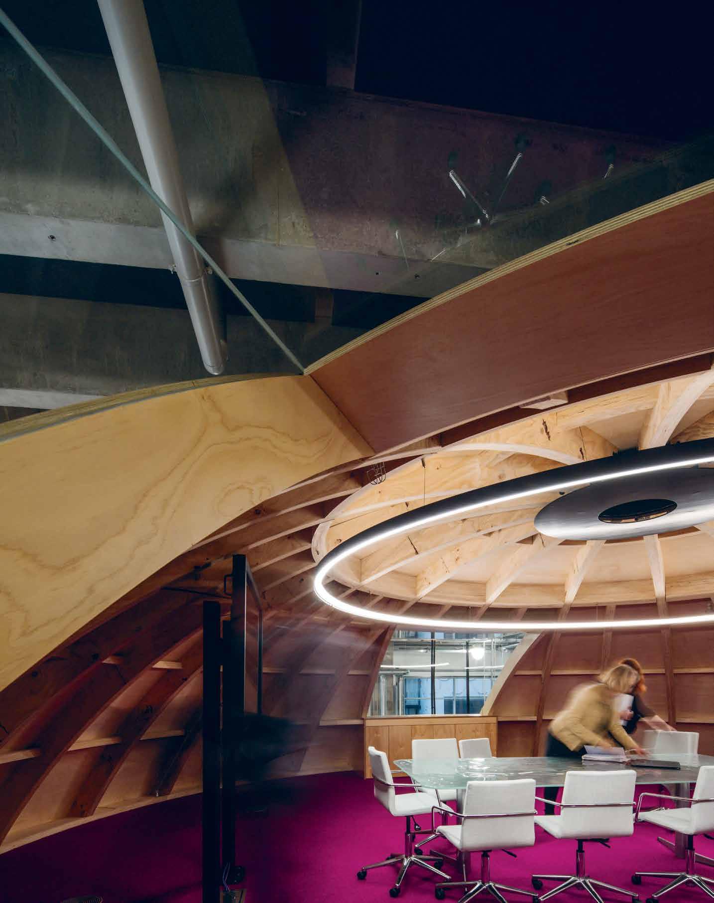
Melbourne-based H20 Architects bring together man and machine, blurring the lines to ease human discomfort around technology with Swinburne University’s Factory of the Future.
Inside the Egg
Swinburne University Factory of the Future by H2O Architects
Words Stephen Crafti Photography Trevor Mein
INDESIGN 159 IN SITU
How (and why) is design humanising technology?
Opposite: The enclosed meeting room at the pinnacle of the egg is beautifully expressed with its timber lined walls. Next page: The egg-shaped centerpiece was chosen for its organic shape, adding a natural touch. Page 162: Students testing out their ideas in the photo booth require 3D glasses to be worn.
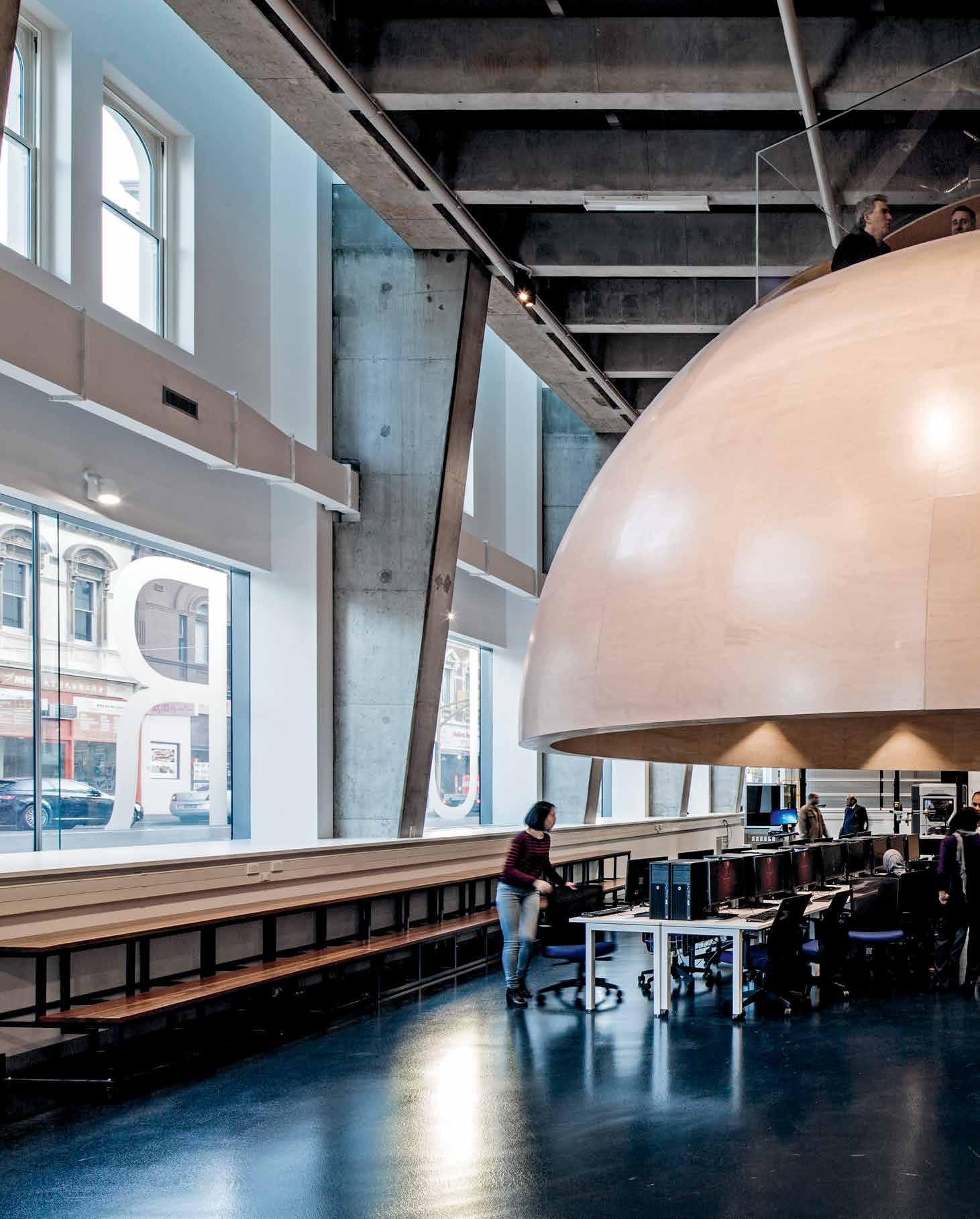
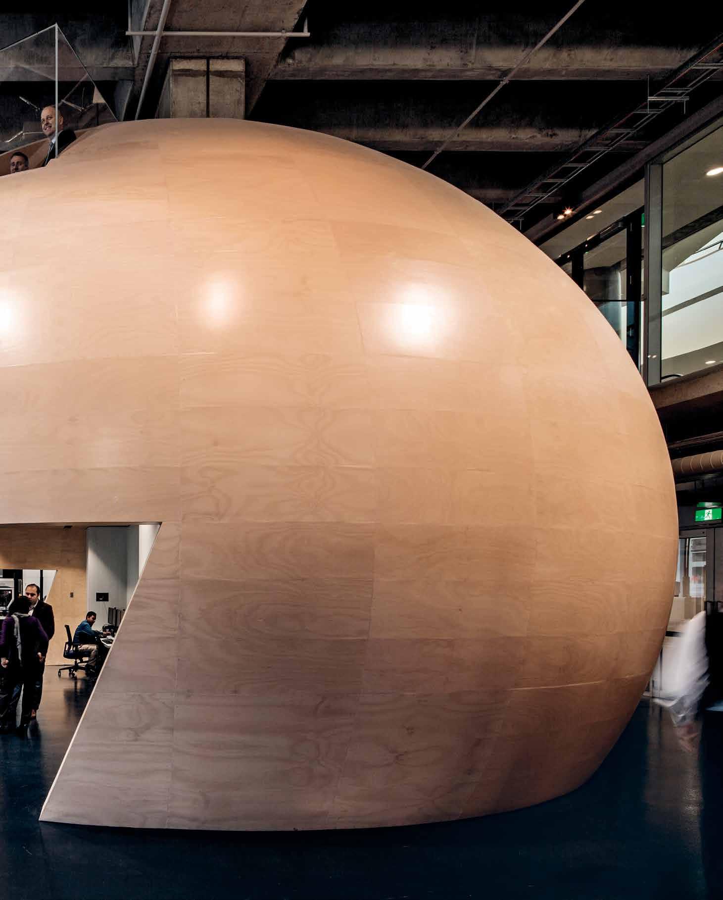
“H2O has bridged the divide between technology and human experience by using warming devices like timber, “skin-like” materials and human shapes. The “pink egg” communicates a kind of biologic feel that straddles the man-made and the organic. Inside the egg, the plywood-panelled walls remain raw; each panel was made-to-the-millimetre o site before being individually cra ed together by specialists.”
“The high-tech operations in Silicon Valley told us exactly what we shouldn’t be doing,” says architect Mark O’Dwyer, director of H20 Architects. “Those centres are quite chaotic. Some of them could easily be taken for sweat shops in some Third World countries.” So when it came to designing Swinburne’s Factory of the Future, O’Dwyer and his colleagues were more inspired by Stanley Kubrick’s 1968 fi lm 2001: A Space Odyssey. The futuristic-style fi lm, with its piercing monolithic black capsule, is closer to H20 Architects’ overscaled egg-shaped capsule placed below the building’s nine-metrehigh ceilings (only the façades of the two-storey Victorian shops were retained). “There is a sense of the past in our design, but we wanted to create a more tactile and human touch to what can sometimes be a clinical, or in the U.S. model, chaotic, arrangement,” says O’Dwyer, who was keen to take a di erent path in designing the factory as part of the university’s Advanced Manufacturing and Design Centre (AMDC). The two-level egg is made from hundreds of plywood panels coated a so pink, like the colour of skin or an eggshell. This so er approach creates a more organic and less industrial hightech environment. “Has this form (egg) been man-made or does it originate from a hen? The idea was to make the space inside feel as warm and tactile as possible,” says O’Dwyer, who has deliberately blurred the lines between machine and man-made. While the panels of the egg were initially produced in a factory and assembled on-site, each panel was carefully manipulated by hand by skilled cra speople to ensure a completely smooth surface. “We couldn’t err by a millimetre,” says O’Dwyer. At one end of the Factory of the Future is the design space, with computers
feeding ideas into the adjacent 3D cave (loosely resembling a photographic booth seen in railway stations). However, rather than the noise of trains or shu ing feet along a platform, students’ designs, whether they be for automotive parts or prototypes for new buildings or civic structures, are tested in 3D in the booth wearing customised glasses. That’s when students leave the cocoon-like egg and man and machine become one. “You can walk yourself around a house or an apartment and see the type of views, as well as the quality of spaces, to expect,” says Andrew, a student demonstrating some of the latest designs.
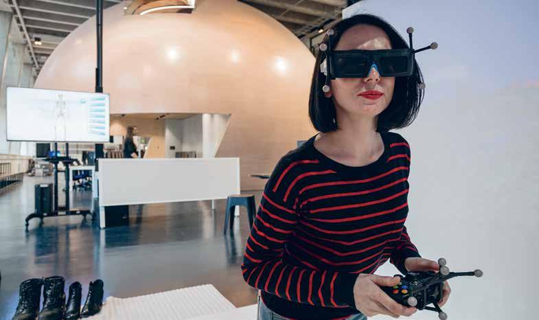
From the booth to the manufacturing side of the factory, products are produced and tested before being deconstructed and recycled in a series of machines located on the western side of the ‘egg’. The manufacturing component, unlike the egg, provides a more clinical environment with glass-fronted machines producing students’ designs in 3D before heading to the last set of machines to be fed back into the system and fashioned into something new.
“There’s a defi nite loop in the process,” says O’Dwyer, who used the actual egg as a meeting place. “The meeting areas required a di erent level of acoustics, lighting and level of service,” says O’Dwyer, who was keen to ensure a high level of comfort in what could be a sterile manufacturing environment. “Students need to feel at ease working with the latest technology. Using the latest technology shouldn’t feel overwhelming. It should feel quite natural, like an egg,” he adds.
h20architects.com.au
INDESIGNLIVE.COM 162 IN SITU


The Twitter Sydney office is a great example of what a design team can do when a global organisation is willing to bend the brand guidelines… just a little.
Welcome to Twitter IRL
Twitter Sydney by Bates Smart Words Alice Blackwood Photography Sean Fennessy
A ‘grown up start up’ – that was the brief to Bates Smart when they took on the Twitter Sydney office fit-out. Located in Sydney’s CBD, the site’s floorplate didn’t offer much room to ‘mix it up’, but when it came to applying Twitter’s brand guidelines to the interior fit-out, Bates Smart smartly negotiated a little flexibility into the schedule.
For what is a pretty straight-forward series of work spaces, encircling the base building’s central core, it’s the nuances of this office that give it depth and character and bring a sense of ‘home’ to the Twitter mothership’s Australian satellite.
“It was really important for us to find a balance between respecting Twitter’s brand guidelines and giving the local team a unique Sydney feel that they would be proud of,” says Bates Smart studio director Brenton Smith. “For instance, Twitter requested that aged, weathered components be specified wherever possible; [we] responded by designing a reception desk with live edge timber blocks and aged tan leather.”
For a company that trades in virtual reality, Twitter has allowed for lots of personal touches that speak to both location, and individual characters within the company. The quintessential Sydney feel comes to life through additions of bespoke plantation shutters, rattan and sandstone as well as light breezy fabrics. Golden anodised metal detailing pulls the palette together – a subtle nod to our current metallic fetish… or perhaps Aussies’ emblematic love for ‘green and gold’.
In a unique quirk, the bright blue Twitter bird logo has proven to be the most ‘bendy’ of all brand guidelines, reproduced in gold, integrated onto surfaces throughout the office, as well as a largerthan-life, all-lit-up Hollywood version.
It’s a very nice example of how a brand might maintain its core personality and character while simultaneously stepping into a brand new business suit.
batessmart.com
INDESIGNLIVE.COM 164 IN SITU
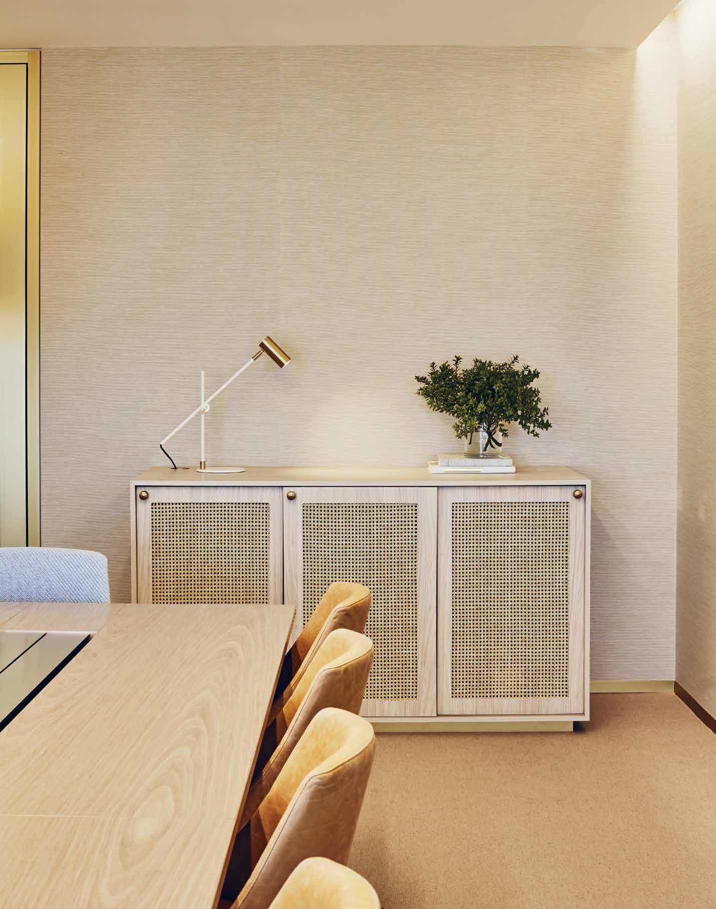
Unmistakably Marni
Marni
Castiglioni
Words Sammy Preston Photography Courtesy of Marni
What is the role of design in consumerism 2.0? In our post-GFC scramble to redefine consumerism, we now understand brands as people; friends that are an extension of our own make up, complementing our individuality, just as we like to see it. Advertising in its purist form is old hat, and it’s through richer experience that we get to know a brand most intimately, to sink into its complex DNA, transported mysteriously into the intangible. The role of design in these grand, live gestures is pivotal – it becomes the conduit between brand and consumer, consumer and brand.
To commemorate Marni’s 20 years in 2015, the serenely quirky Italian fashion house – founded by Consuelo Castiglioni – charted a yearlong journey. Described as a ‘non-celebratory series of happenings’, Marni Prisma voyaged from Milan Fashion Week, to Art Basel in Hong Kong, to Light Box Studios in Tokyo, and back to Italy for the Venice Biennale. An elaborate flower station and brand installation was set in each location – with each edition slightly different in its offer and design. Stemming, literally, from the brand’s flower design motif, visitors to the various blossom markets could purchase fresh flowers, as well as unique, one off items that tore from the brand’s archives and its characteristically artistic image.
Retail pop-up, and the concept of experiential branding is hardly a fresh idea – the novelty of a floating, one-off buying experience is well worn, and brands have had to work to present something more profound, especially memorable, and distinctly creative. Following the flower market’s success, Marni has opened a more permanent iteration in 2016 at the Umeda Hankyu Department Store in Osaka, Japan. The Marni Flower Café is an open gateway into the offbeat, whimsical world of Marni. Alongside more fresh blooms and exclusive products, the café concept underscores the brand’s Italian heritage (authenticity, tradition, good food and – of course – the experience that goes along with it).
Architecturally – the design borrows from the broader Marni aesthetic through a neat balance of shapes, materials and colours. The counter is finished in green onyx and coloured metal sheets, there is a wooden terrazzo floor, and small tables in various geometric shapes made in brass and green marble. Braided PVC stools branch from the new collection of furniture Marni unveiled at Salone del Mobile this year. Due to roll out across Japan and internationally, Marni’s Flower Café is a rich, multi-layered and deeply authentic apparition of the brand, meeting consumers fresh faced in the real world.
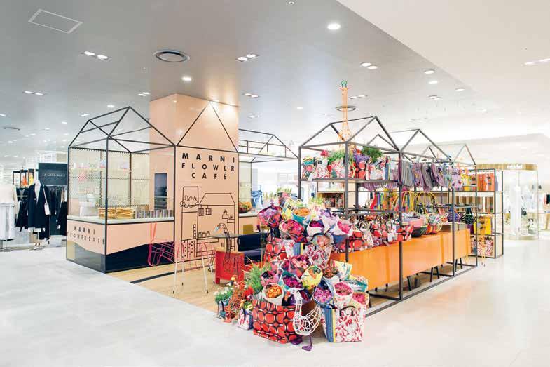
INDESIGNLIVE.COM 166 IN SITU
This page: Located on the third floor of Osaka’s Umeda Hankyu department store, the 535-square-foot café-cum-shop features a green onyx counter, interwoven PVC stools, a blue sofa, along with small tables crafted from brass and green marble. The Café serves Italian culinary specialties, and carries a range of customised Marni products, which change every four months.
Tokyo by Consuelo
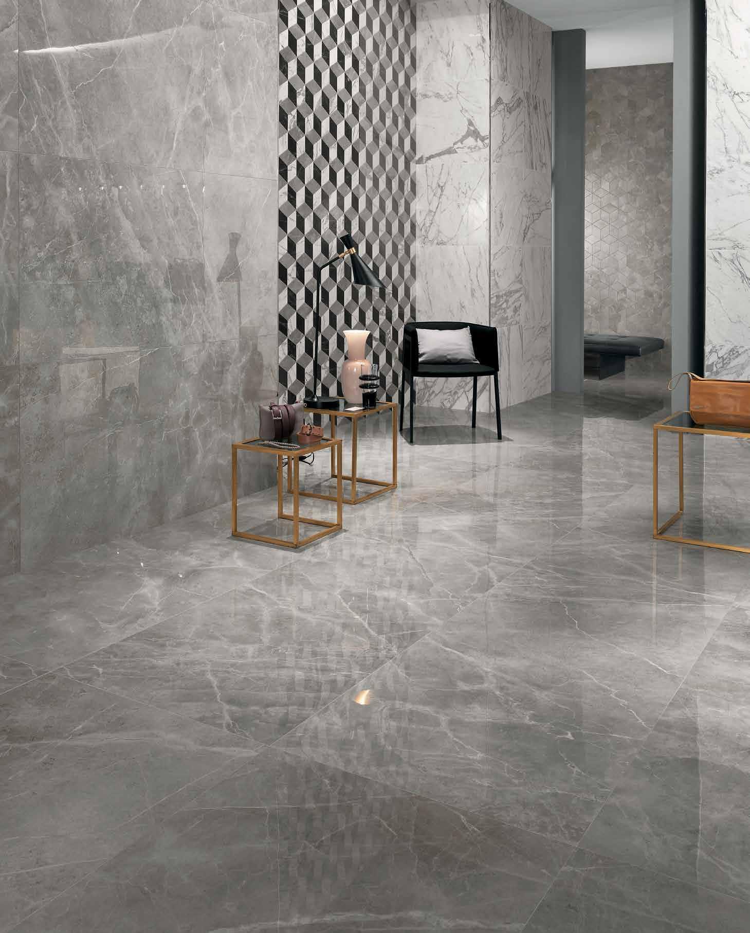


COLOURED BODY PORCELAIN TILES ETERNAL BEAUTY FROM ITALY 14/4-12 AMSTERDAM ST.RICHMOND (VICTORIA) +61 3 9421 6222
Fixed, Fitted & Furnished
Ovolo Sydney
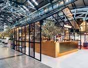
Architect Hassell
Lighting Consultant
Medland Metropolis
Engineering Consultant
Medland Metropolis
Graphics There
Total Floor Area 100,000 sqm
Hassell hassellstudio.com
Furniture ‘Seb’ chair, ‘Stanley’ stool, ‘Brandy’ table, ‘Bel’ mirror, ‘Harper’ chair, Jardan ‘Spike’ stool, Stylecraft
‘B&B Italia Tifty Time’ sofa, Space Furniture . ‘Eames
Classic’ lounge and ottoman, Living Edge
Lighting
‘Periscope’ ball lamp, Atelier Areti . Bedside lamps, Luke Furniture
‘Topos’ feature wall lamp, Hub Furniture Bathroom wall lamp, Fat Shack Vintage
Finishes
Fabric finishes throughout, Svenska KJ, Kvadrat , At Work with Camira , James Dunlop , JR Group , Gabriel Fabrics . Leather throughout, Contemporary Leathers , Spinneybeck
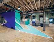
Leathers . Paint and special finishes throughout, Dulux , Wattyl , Axolotl . Metalwork throughout, Astor Metals , Locker Group , Alloy Design Tiles throughout, Academy
Tiles , Bisanna Tiles . Carpet throughout, Godfrey Hirst , Gibbon Group , Birrus
Matting . Timber flooring, SE Timber
Cowork|rs
Architect Leeser Architecture
MEP Engineer Guth DeConzo
Consulting Engineers
Structural Engineer
Structural Engineering
Technologies
Expediting Tag Team Group
General Contractor Titan
Reality & Construction
Total Floor Area 47,000 sqm
Leeser Architecture leeser.com
Furniture
Furniture throughout, supplied by client
Lighting
Office fluorescents, Barto
LED lights, Klus
Fixed & Fitted
Metal staircase, Mozart Iron Craft Corp
House of Häagen-Dazs
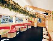
Architect Archiblox
Archiblox archiblox.com.au
Lighting ‘Kooper’ pendant light, ‘Sentinel 2’ wall light, downlights and lighting throughout, Beacon Lighting
Finishes
Paint throughout, Dulux Rubber flooring, Signature Flooring . Laminate joinery, Laminex . Kitchen wall tiles, National Tiles
Fixed & Fitted
Ceiling exhaust fan, Beacon Lighting
INDESIGNLIVE.COM 168 IN SITU
Want to know what made the spec’ schedule? Don’t worry, we’ve got you covered...
Lot. 1
Architect Enter Projects
Builder CJ Duncan
Heritage Architect
Weir Phillips Heritage
Structural Engineer
Martin Zimmerman
Joiner Karisma Joinery
Duration 2 years
Total Floor Area 950 sqm
Enter Projects enterprojects.net
Furniture
Light screens, banquet seating, Enter Projects Chairs, Instyle Seating Tables, supplied by client
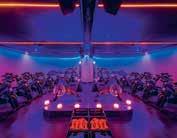
Ivanhoe Grammar
Architect McBride Charles Ryan
Land Surveyor
Absolute Surveying Building Surveyor Tekcon Group Services Engineer
NJM Design
Consulting Engineers
Sutrctural/Civil Engineer McFarlane & Co Quality Surveyor Debtech
Planner Whiteman
Property & Accounting Landscape Architect Ochre Landscapes
Drafter Rowe’s Drafting
Budget $8.65 million
Duration August 2013 –
December 2016
Total Floor Area 2,870 sqm
McBride Charles Ryan mcbridecharlesryan.com.au
Lighting Light switches, Clipsal Downlights, Versalux Wall lights, Zumtobel
Finishes
Generally throughout, ‘Wool Loop Pile Carpet’, Cavalier Bremworth . Labs, toilets: Comcork flooring, Comcork . ‘Vitral Panel’ wall panels, CSP Architectural Ceilings, Boral . Exterior
roof cladding, Lysaght
Glazing, Viridian Glass
Kitchen benchtops, Caesarstone . Classroom benchtops, Laminex
Fixed & Fitted
Bathroom vanity basin, taps, toilet suite, Caroma
Paper towel dispenser, JD MacDonald . Student tap, Enware . Staff lounge
cooktop, dishwasher, Fisher & Paykel . Courtyard drinking fountain, Britex Laboratory extractor, Fumex ME . ‘Broen’ gas outlet, lab tap, SGF Laboratories.
Bodhi & Ride
Architect Hachem Builder Striking
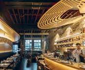
Constructions
Budget $3,400
Duration 3 months
Total Floor Area 400 sqm
Hachem hachem.com.au
Furniture
Furniture supplied by client
Lighting
Lighting throughout, James Ady
Finishes
Cardboard tubing, Cardboardtubes . Curtains, Warwick . Cork flooring, Premium Floors
Fixed & Fitted
Generally throughout, Phoenix, Caroma
Woods Bagot
Architect Woods Bagot
Joiner Adco Constructions
Woods Bagot woodsbagot.com
Furniture ‘Walker Knoll’ chair, ‘Muuto’ fiber chair, ‘Bassam Fellows Tractor’ stool, ‘La Chance
Bolt’ stool, ‘E15 Backerzahn’ side table, ‘Herman
Miller Eames’ side chair, ‘Established&Sons Frame’ chair, ‘Vitra Cork Family’ stools, ‘Herman Miller Arras Team’ tables, Living Edge . ‘Miyazaki DC09’ chair, Great Dane Contract . ‘ON’ chait, Wilkhahn . Custom stools and tables, Josh Carmody Studio
Lighting
Lighting throughout, Light Project
Finishes
Metal curtain, Steel Works Pinboards, Forbo Flooring
Swinburne University
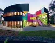
Architect H2O Architects
H20 Architects h20architects.com.au
Furniture Furniture throughout, supplied by client
Finishes
Internal paint, Dulux Dome exterior paint, Wattyl . Bridge walkway render, Parchem . Glazing throughout, Viridian . Door tint, Tint Design . Carpet throughout, Gibbon Group Ceiling lining, Aktar. Task chair upholstery, Maharam
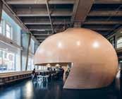
Curtain screen, Specialty Theatre Supplies
Fixed & Fitted
Kitchenette sink, Smeg Mixer tap, Brodware Bin, Häfele . Integrated dishwasher, Panduit . Bar fridge, Fisher & Paykel
Twitter Sydney Office
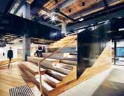
Architect Bates Smart
Project Managers
Facilitate Corporation
Main Contractor Renascent Services Consultant
Aston Consulting
Graphic Designers
Etsuki Creative
Lighting Designers
Point of View
Acoustic Consultant Wilkinson Murray
Building Regulation
Consultant Steve Watson & Partners
Duration September 2015 –
January 2016
Total Floor Area 1,800 sqm
Bates Smart batessmart.com
Furniture
Client lounge, ‘Seb’ armchair, ‘Horizon’ sofa, Jardan . ‘Wrap’ stool, Cult Boardroom ‘Grow’ chairs, dining ‘Feelgood Designs’ chair, stackable stools, side table, Stylecraft Coffee table, Mark Tuckey Boardroom meeting table, Thor’s Hammer
Lighting Reception and board ‘Lektor’ desk lamp, Fred International . Floor ‘Fork’ lamps, Space Furniture
Finishes
Reception rug, Tappeti . VIT room rug, Gibbon Group.

INDESIGN 169 IN SITU
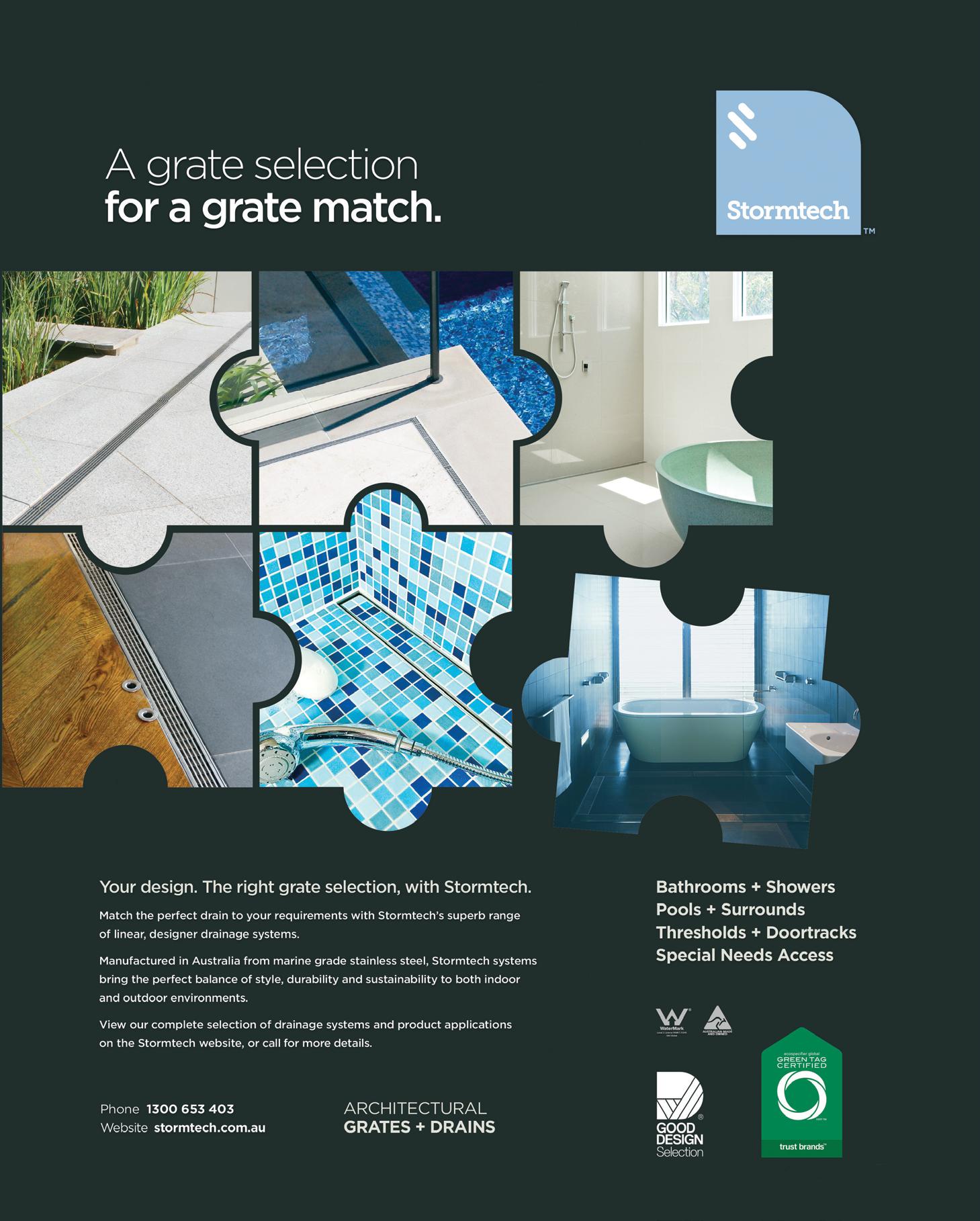
What does ‘care’ mean to the design industry, and to our cL ients?
INDESIGN 171 IN DEPTH
DEPTH IN
HIDE & SEEK
INDESIGNLIVE.COM 172 IN DEPTH
This page: Telstra Discovery Store, Sydney, by Geyer. Next page: Telstra Discovery Store, Melbourne, by Geyer.
Words Sophia Watson Photography Tyrone Branigan & Dianna Snape
“If you are looking at our industry from a consumer’s point of view, we are doing things that deserve much more attention than they are getting,” says HAY co-founder, Rolf Hay. “However, I don’t think that [transparency] is super important.”
The industrial process of design today is exceedingly complicated. Design is not only about ‘craftsmanship’ and we tend to get really caught up in that for some reason. Design is about knowledge, chemistry and process; it’s an exciting challenge but super complex. Design is about taking something that is very, very complicated and making it look uncomplicated. And that’s the beauty of it.
“It’s interesting when you’re speaking on an industry level with people in the industry who can appreciate those elements,” notes Hay, “but for a consumer, you buy the chair because it’s comfortable and you like it for whatever reason. It’s not interesting to the client that we were working for two years to balance the cooling of the plastic mould to get the right shape. Chances are they just don’t care about that.”
While it seems that process transparency can be quite a mixed-bag – if not a little damaging – for product designers, design openness is a critical factor to the future of architecture and interiors.
What interior designers like Tim Giles, associate and design leader for Geyer Melbourne, are seeing more and more, is that clients are looking for results beyond a nice building with pretty rooms in it. They’re looking for ways to create better experiences for their staff and their customers. And to be able to deliver these kinds of results, architects and designers need to stop working in isolation and instead work very closely and collaboratively with their clients at critical points of ideation and decision making.
Geyer’s recent work with Telstra in Melbourne and Sydney is a stellar example of this ethos. Giles and team invited Telstra’s inhouse designers to come and work collaboratively with them at the Geyer studio every week. In addition, Geyer designers also worked hands-on as retail employees in the former Telstra store to better assess the frustrations of the space and how their design could offer best-practice solutions. “Our approach with Telstra Discovery was heavily tailored to fundamentally improve the customer experience and control the degree to which their environments could support this change. When Telstra last invested in the redesign of their stores, iPads weren’t even invented, so the development of a new experience was largely concerned with how changing technologies impact human behaviours and customer expectations,” Giles recalls. “This kind of overhaul takes trust, and you can’t have trust without transparency. For example, I created hand drawings in front of the Telstra team for immediate testing and exploration of ideas, we did a lot of workshops with them to get a sense of the
brand and the strategies to get there. We did this together and with a highly transparent process which fully engages the client. Then to round out the research, we also worked in a Telstra store a few times – which put us into the user’s shoes for a genuine firsthand experience. Doing that really exposed the challenges people were facing with the technical issues of the space. And these are discoveries we wouldn’t have made had we not been open and completely transparent with our client.
“The results of this approach really speak for themselves; where the concept of ‘connectivity’ and ‘discovery’ is realised through spatial volumes, component design and communications integration in carefully choreographed customer experiences and curated technology stories. Supported by diverse settings and self-selected or staff assisted engagement, it includes interactive devices, one-to-one engagement pods through to masterclass tables and stand-up bars.”
Designing an iconic retail space was critical; elevators were flipped, a large entry void created and a cascading, interactive digital ‘central feature’ positioned to provide theatre and orientation. Sweeping walls and ceilings transition spaces throughout the levels aiding navigation and attraction. A neutral, fresh palette creates a relaxed ambience and provides a backdrop to products, technologies, communications and experiences. Flooring, matched to Melbourne’s bluestone, visually sweeps the footpath into the space. Sustainability principles were taken beyond materials and lighting to support Telstra’s sustainability commitments, contributing spaces for community enterprises.
“Sure, there are risks in [being open about everything],” says Giles. “For instance, there is the danger that you open yourself up to someone taking your competitive advantage. That does not bother us though. We continue to develop our knowledge and evolve our approach with the market anyway. There’s no room for postrationalisation either – it has to be real and honest and meaningful for them.
“And that is why design transparency is so important for our industry, because you want your clients to have a positive experience and see the value for themselves – even have a hand in making it. It gives our clients ownership over the outcome as much as the designers – they aren’t just handed something they haven’t been involved in and are really disengaged with. For me and for Geyer, it’s all about being generous with our knowledge. It’s in our DNA, because ultimately it makes us better designers. We don’t design ‘design’, we create spaces for people to use. And that’s what gives our industry value.”
geyer.com.au, hay.dk
INDESIGN 173 IN DEPTH
What is the value of transparency in the process of design?
Does the market care? Do our clients? Is it important in defining what our industry can do, or is it just about recognition from our peers?
Why caring leaders and design mentors are a critical component to the development of our industry.
Words
Paying it forward
INDESIGNLIVE.COM 176 IN DEPTH
Leanne Amodeo
The design industry (like any industry) simply cannot grow or progress without the care of its leaders. Every sector needs investment; good people with good ideas and even better skills to drive it. How these CEOs, entrepreneurs and experts choose to invest is likely determined by their role in a particular organisation, practice or project, but it’s their collective contribution that leaves a legacy, sets benchmarks and effects greater change aimed at benefitting the market.
For global design and consulting firm Woods Bagot, care is manifested in a strong commitment to research and development. The industry giant injects a percentage of its gross income into this area annually, which not only puts them ahead of the field, it also ensures they’re able to better serve the needs of the end user. Their recent rebrand, launching the People Architecture vision, reinforces a philosophy that shifts the focus of design towards human-centred experiences. It’s underpinned by SUPERSPACE, a contemporary ‘anthropological tool’ or process that maps and measures human behaviour in the form of computational intelligence.
“SUPERSPACE realises higher performing outcomes based on the analytics of raw data,” explains Woods Bagot’s group managing director and CEO, Nik Karalis. “What once may have been the intuitive domain of architects and planners can be accurately validated based on the assignment of different criteria into the algorithm and manipulated as required according to individual determinants.” Here, it’s not the data in isolation that’s important, rather how this information is applied within the built environment.
The goal is to sync design with the user experience and create buildings that are more socially and environmentally focused. SUPERSPACE essentially allows Woods Bagot’s team to better understand what works in a city. “From here, we can identify what gaps in the urban landscape are potential economic opportunities and utilise that capacity to put together mixed-use projects never before conceptualised,” says SUPERSPACE director Christian Derix.
This is an exciting prospect for the individual end user, who stands to inherit spaces and environments specially tailored to their needs. It also has big implications at a macro level with new solutions increasingly required to manage issues such as wellbeing,
urbanisation and global warming. As Karalis reflects: “We have a responsibility as designers and architects to use our expertise and apply our skills to the real problems facing our cities in order to remain a relevant profession.”
Just as significant as investing in research and development are collaborative working practices that seek to achieve improved outcomes. As far as Zenith Interiors is concerned, personalising this collaborative process is integral to getting a fully resolved product out into the marketplace. The commercial furniture supplier is expanding throughout Asia Pacific and their products’ commercial responsibility is something they view very seriously. “We take pride in selling good design,” says Zenith’s director Barbara Schmidt. “It’s really important to have the care factor – we couldn’t do what we do without caring – to make sure we have the right products.”
The path to distribution is more often than not long and involved. There are financial issues, packaging considerations and lots of time spent on product refinement. However, Zenith’s strength lies in working with designers from the beginning of the process, not just stepping in at the end. As Schmidt explains: “We give them the added value of understanding that this path is not just about design.”
There are lots of practical questions asked of the designers: How do you think the product should best be packaged? If you’re given an order for 100 will you be able to fill it? What should the product retail for? And Zenith’s industry knowledge is crucial in helping them answer each one. Of course, the collaborative process doesn’t just involve fostering emerging talent; it also provides support to established designers.
The recent launch of Schamburg + Alvisse’s Edo lounge range was the culmination of 18 months of hard work between Zenith and the 19-year-old Sydney-based design studio. It exemplifies outstanding manufacturing quality and careful attention to detail (even to the point where little custom socks were made for the frame during distribution). “Nothing has made us happier than seeing that product go to market and become one of our best sellers,” says Schmidt. “All the hard work pays off.”
woodsbagot.com, zenithinteriors.com
INDESIGN 177 IN DEPTH
“It’s really important to have the care factor – we couldn’t do what we do without caring .”
Barbara Schmidt, director Zenith Interiors.
WELL-MAKERS & C ARE -tAKERS
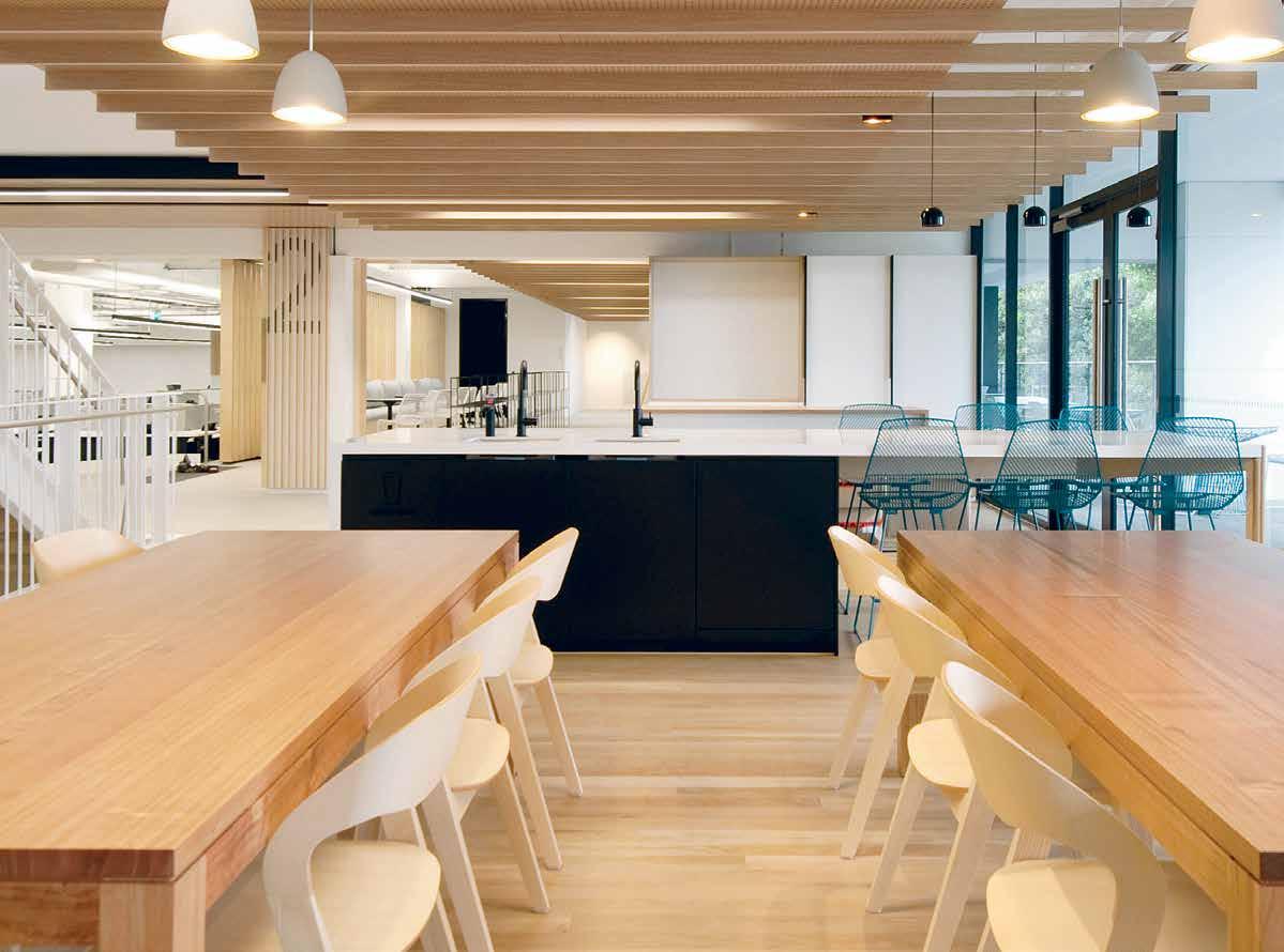
INDESIGNLIVE.COM 178 IN DEPTH
How and why is design investing in the R&D of wellbeing?
Words Stephen Todd Photography Michael Anderson
If mindfulness is next to godliness, wellbeing is the holy grail. It’s been 60 years since the World Health Organisation (WHO) first tabled the term ‘wellness’ as the optimal state of health of individuals or groups. Wellness, according to WHO, is a binary concept. Firstly, it requires “the realisation of the fullest potential of an individual physically, psychologically, socially, spiritually and economically”. Secondly, “the fulfilment of one’s role expectations in the family, community, place of worship, workplace and other settings”.
Trouble is, we don’t always know what’s for our own good. That’s where the Well Living Lab comes in. Established in Rochester, Minnesota in 2015, the Lab was founded as a research centre to study the effect buildings – and the fitt ings and furnishings within –have on the health and wellbeing of humans.
“Because we spend over 90 per cent of our time indoors, it is becoming exceedingly important to harness the built environment as a vehicle to support health and wellness,” says Dana Pillai, Well Living Lab executive director. “By making certain building and design decisions, we can change the culture of a space, and create a natural tendency towards health. For example, we can make staircases more accessible and inviting to passively encourage physical activity and the formation of healthy habits.”
All very well in theory, but the Lab is no mere think tank: it’s a practical design laboratory, 700 square metres embedded with a dense network of sensors and smart building controls. A cloudbased infrastructure enables high fidelity replication of particular environmental conditions. “For example, we can mimic the quality of light from the sun on a sunny day versus the quality of light from the sun on a rainy day. We are also able to both reproduce the properties of daylight that are conducive to working and to reproduce the qualities of light that are conducive to sleeping and relaxation in the evening.” It’s like a NASA flight simulator for terrestrial builds.
“Through the Well Living Lab, we have a great degree of environmental control,” says Pillai. “Whereas in a typical workplace environment you may observe a certain change in behaviour or biophysical response on a sunny day, for example, there are other environmental factors that might be at play. Because we can control environmental factors with such precision in the Lab, we can now better isolate variables, including light quality.” Pillai anticipates that the WELL Building Standard®, best-practice certification accorded by the International WELL Building Institute, will soon become de rigueur.
Kellie Payne, associate director of Bates Smart is the author of a recent white paper: Wellbeing in Design. Payne defines wellbeing
as: “A person’s individual ability to thrive in the workplace and in society as a whole,” and points to the Wellbeing Index developed by the Australian Centre On Quality of Life at Deacon University as a guideline for architects and designers. Bates Smart applied many such principles to its recent fit out of the Salvation Army headquarters, in Redfern. Previously the homebase of the South Sydney Rabbitohs, the structure is divided into four floorplates over 11,213 square metres, with windows to the street at the front and a laneway at the rear. Incorporating office space for Army commanders and their staff, meeting and breakout rooms, a 400-person event space and a chapel, the interior needed to maximise a sense of comfort and respite, while simultaneously optimising military efficiency. Uncluttered, it reflects a clarity of vision and quiet conviction that all shall be well.
Located on a busy arterial road, a high level of acoustic control was required to enhance that sense of being far from the maddening crowd. Perforated Tasmanian oak suspended below the air conduits absorbs noise and emphasises the horizontal vastness of the space. A generous stair in an open well permits communication between floors, its landings doing double-time as meeting places. On the other hand, privacy is readily available via a suite of hermeticallysealed rooms. Furnished with elegant chairs and stools around generous work surfaces, the entire interior strikes the perfect work/life balance. Of note: all furniture and fittings, specified by interior design project leader, Max Navius, are well-priced original designs, proof that style can be attained on a budget. And that’s wellbeing for the design industry.
Similarly, Australian company Welnis – interior and real estate wellness specialists – believe the future of the built environment is about intrinsically linking science, healthcare, technology and wellness with architecture and interior design to ultimately bring about ever improving levels of human sustainability. CEO Nigel Hobbs explains: “At no other time in human history have we understood the importance of wellbeing as much as we do today. Globally, 96 per cent of healthcare expenditure is on the treatment of illness while only 4 per cent is spent on prevention. The R&D opportunities that big data provides in bringing greater focus to illness prevention and wellbeing improvements are enormous. But we must be tireless in ensuring R&D continues to be at the forefront of wellbeing. With pandemic levels of preventable diseases globally the clock is ticking on how quickly we can make truly significant changes to our environments that in turn directly benefit our wellbeing.”
welllivinglab.com, batessmart.com, welnis.com.au
INDESIGN 179 IN DEPTH
Opposite: The Salvation Army new Australian Eastern Territorial Headquarters, Sydney by Bates Smart.
Does this filter make me look

INDESIGNLIVE.COM 180 IN DEPTH
totz profesh?
Ever worry that your Facebook page is only 80 per cent awesome? That your Instagram feed is too filtered? Or, not enough? Increasingly disincarnated by digital technology, we’ve become the inadvertent art directors of our own lives. In his seminal 1975 book, Travels in Hyperreality, Italian semiotician Umberto Eco unravelled the manner in which contemporary culture is composed of theatricalisations, recreations – what he famously termed ‘simulacra’. Around the same time, French Marxist theorist, Guy Debord, published La Société du Spectacle. Four decades down the track, we are the spectacles of our own society, hyperreal. With only 140 characters a Tweet, image is king.
For architects and designers, communicating a clear message about one’s practice to a distracted audience is problematic but not impossible. Realising they had an image problem, the principals at Architects EAT decided to use digital media as a force for good. EAT’s website “is a response to comments we were getting six or seven years ago that our office seemed kind of anonymous,” says director Albert Mo. “We were perceived as just another office pumping out work. So we thought, ‘What can we do to give it more personality?’” Simple really: give it personality. Literally. Behind the ‘People’ button on EAT’s website there are 16 well-groomed faces identified not by name or job title, but by character traits such as ‘Highly Organised Person’, ‘Ahead of the Game’, or ‘Whimsical Wit’. Only by clicking through do we learn that they are, respectively, Wenying Yao (senior interior designer), Morgan Novy (graduate interior designer) and Alejandra Cordova (graduate professional). This uncommon profiling schema “was also a means of giving more kudos to our staff, by crediting them as being part of the process,” says EAT director, Eid Goh. (Goh is ‘Client Focused’, Mo is the ‘Big Picture Person’ and the third EAT principal, James Coombe is the ‘Problem Solver’).
The net effect is to suggest a family of capable associates. Hierarchy is subliminal, detectable only in the flow from Mo, Goh and Coombe at the top, to IT manager Vincent Chin, respectfully dubbed ‘Our Neo’ in reference to Keanu Reeve’s glamorous hacker and reborn saviour of The Matrix. “Communication and design direction flows from top-to-bottom,” admits Goh. “But that doesn’t
mean Neo – or whoever else – is restricted in their input. They do contribute on a daily basis, but because we are a 16-17 people-strong team we need a fairly rigid system but one with enough flexibility to allow us to be dynamic and not sterile in the way we do things.”
Coombe adds: “As we’ve grown, we’ve had to shift our original horizontal structure. We don’t have cabals or fixed teams, it’s not delineated in that fashion. Everyone can contribute across projects.”
Collaboration, of course, is very now. Architect Andrew Maynard also used his website to effectively communicate the essence of his office, Austin Maynard Architects. On their homepage, in place of the standard ‘About’ button: “That’s right, we’ve tweaked our name. People say that we shouldn’t be messing with our ‘brand’, as it’s ‘bad business’ to do so,” says Maynard. “Perhaps they are correct, but we’re not interested in business. We are interested in life, happiness, fun, family and reward for effort.” Mark Austin joined Andrew Maynard Architects in 2007. In 2009 Austin became a director. “Mark is key in ensuring that what we draw is what we build. In 2016 we are calling ourselves ‘Austin Maynard Architects’. Very exciting times ahead!”
I for one, find it quite thrilling that we’ve arrived at a point where architects can demystify their metier with such confidence and ease. It’s not all roses and upbeat repartee, however. The problematic relationship between architects and designers and their devices and digital applications was the subject of a research project undertaken by London digital creative agency Six:thirty. “Technology promises to liberate us, but this freedom comes at a price,” note the curators of the resultant show, Unread Messages. “The digitisation of our everyday lives saves us time and brings us closer to the people we love. Yet at the same time, we feel rushed, isolated or enslaved by our devices.” Six:thirty created an online community to gather opinion from the public on the ‘always on’ nature of contemporary culture, exploring problems like data deluge and notification overload. From these conversations emerged three themes: Empowered But Dependent, The Curated Self, and Compulsive Behaviours. I’ll let you Google the rest –I’ve got to go check my Facebook feed.
thearamgallery.org, eatas.com.au
INDESIGN 181 IN DEPTH
This page: ‘Fidgity Machines’ designed by Takram London for Unread Messages by Six:thirty at Aram Gallery, London.
Words Stephen Todd Photography Courtesy of Aram Gallery, London
A recent exhibition at Aram Gallery, London explores the problem with image-dependent A&D and being too careful with your digital identity, while Melbourne-based design studio Architects EAT show us how they get the balance right.
In the words of the old song – everybody’s doing it. In the workplace, this means wellness. But like the dance craze referred to in the song, is wellness just another fad?
Words Paul McGillick Photography Earl Carter
Care overkill?
INDESIGNLIVE.COM 182 IN DEPTH
What Would Happen If?
Imagine leaving work healthier than when you came in that morning. How do we design a workplace to make you healthier – healthy minds, healthy bodies, healthy places and healthy cultures?
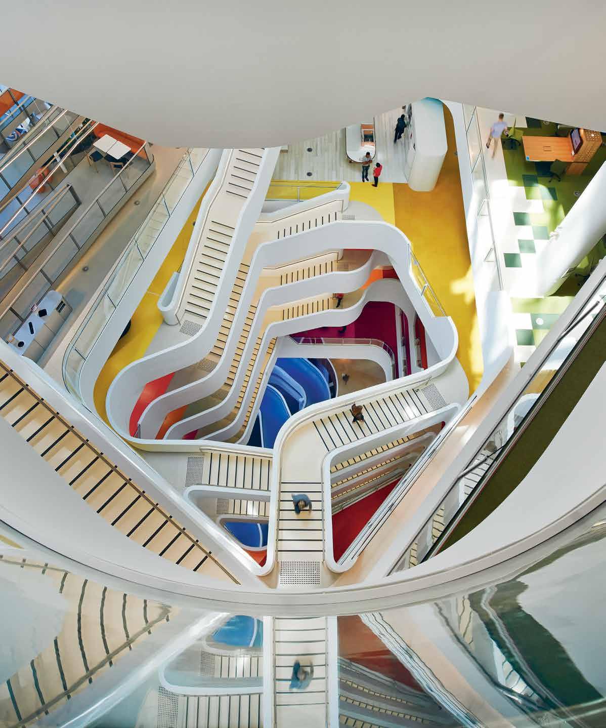
INDESIGN 183 IN DEPTH
–
The workplace over recent years has seen a lot of fashion. But that is not to say there has not been genuine change. It is just that as in any other field of human activity there are always the innovators and the imitators. Since Velhoen + Company’s legendary Interpolis project in Holland (1990-95), there has been what many see as a revolution in the workplace with radical changes following rapidly on one another.
However, Veldhoen’s Australasian director, Gijs Nooteboom, sees it more as an evolution because he says we have to distinguish between “the physical space and the mental space.” He adds that: “many organisations are copy-and-pasting solutions from 20 years ago, from flexible working into a new space, with the assumption that if you have done that, you have done the job.” He argues that you can change the physical workspace, but if you don’t change the mindset of the organisation, then nothing will really change in terms of outcomes.
So, you can do standing meetings and use standing desks, you can design great interactive spaces and flexible loose furnishings, but are people using these things effectively? As leading workplace consultant, James Calder, puts it: “Sure, I can see they are collaborating, but are they collaborating in the right way?”
This takes us into another zone – where mind and body come together to enable workers to make the best use of the amenities available in pursuit of their organisation’s desired outcomes. The emerging emphasis on wellness is really just the inevitable next step in the evolution of the notion of holistic sustainability in the workplace: a dynamic and rich ecosystem of environmental, organisational, social, personal and cultural sustainability.
The recently developed WELL Rating system in the United States has used Bloom’s taxonomy of needs (1949; revised in 2000) and Maslow’s hierarchy of needs (1943]) – both, incidentally, being increasingly used as a basis for managing knowledge workers – as a model. Hence, air, water, nourishment, light, fitness, comfort and mind all have to be addressed in ascending order of importance if
people are to be fully effective employees. This mirrors Maslow’s model of four key areas of health for the self-actualised individual: physical, mental, emotional and (often forgotten) spiritual health.
The WELL system links easily into the existing LEED and Green Star rating systems. As Duncan Young, head of workplace health and wellbeing at Lend Lease puts it: “I realised that moving beyond sustainability, the next logical step was an engagement of people around their wellness.” Having provided a healthy (sustainable) physical workplace, the next challenge is to help employees make the most of that physical amenity.
Put simply: healthy employees make for healthy businesses. This is also an aspect of businesses looking for a competitive advantage through attracting and retaining the best talent by providing healthy amenities and then reducing sick leave by maintaining a physically healthy workforce.
On the physical side this involves sit-to-stand work options, walking meetings (including coaching people in how to do them), providing healthy discretionary food, adequate natural light and fresh air, healthy lifestyle and nutrition advice, on-site medical and exercise facilities, yoga classes and end-of-trip amenities for walkers and cyclists – Lend Lease has a bicycle-user group, which works out the safest routes and provides tuition in cycle proficiency. With mental health, perhaps the most interesting development has been the growth of mindfulness and positive psychology classes which have personal benefits, but also help develop higher-level business interactive skills, such as active and reflective listening.
So, the short answer to our question is no, wellness in the workplace is not a fad, but a logical next step towards a holistic sustainability agenda in the workplace.
hassellstudio.com, lendlease.com
INDESIGNLIVE.COM 184 IN DEPTH
“Many organisations are copy-and-pasting solutions from 20 years ago, from flexible working into a new space, with the assumption that if you have done that, you have done the job. You can change the physical workspace, but if you don’t change the mindset of the organisation, then nothing will really change in terms of outcomes.”
Gijs Nooteboom, Australasian director, Velhoen + Company
Previous: Medibank Place Melbourne, designed by Hassell in consultation with Lend Lease.
INDESIGN X INSTYLE
Custom Design for Healing Environments
Considered choices plays a key role in the design of a healthcare facility. Research has shown that a well-designed, nurturing and therapeutic environment contributes greatly to how patients and families perceive their quality of care and overall experience, improving staff satisfaction and morale as well as reflecting the image of a facility.
Textile furnishings provide the ability to achieve this, creating a healing environment by adding natural elements, colour and texture to areas that would otherwise look hard, cold and clinical.
Australian textile supplier Instyle offers a wide range of coordinating drapery textiles, Cryptons upholstery and vinyls, wall coverings, and acoustic solutions that reflect the design philosophy of healing environments.
For designers and healthcare facilities that prefer a more customised solution, Instyle’s experienced designers also work closely with clients to interpret their vision, creating functional and tailored solutions for specific projects.
Carol Debono, a textile designer for Instyle, says, “This can include a new design, re-colouring an existing product, or fulfilling
a complex brief to meet specific budgets, weights, widths, finishes and performance requirements.”
A recent project that Instyle collaborated on sought to include a connection to local landscape to define specific areas. By customising the curtain colours, Instyle was able to support the designer’s vision of natural themes throughout the facility.
For the Royal North Shore Hospital, the designer wanted privacy screens to echo the colours used in the wayfinding graphics and building façade. Debono says, “We developed a construction that showed the same intensity of colour on both sides of the fabric. The result was a reversible, dynamic, and colourful textile that became the room’s focal point.”
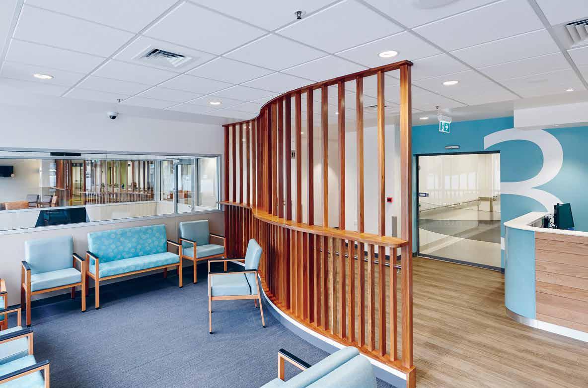
Instyle has developed numerous custom designs including Prince of Wales Private, La Trobe, Queen Elizabeth and Greenslopes hospitals amongst many others.
Through its strong relationships with leading manufacturers, Instyle organises computer simulations and prototype lengths to assist the client in decision-making, and ensures the production of consistent high quality products to create healing environments.
INSTYLE.com.au INSTYLE 185
Above: Launceston General Hospital by Artas Architects
Words
THE WAR FOR TALENT
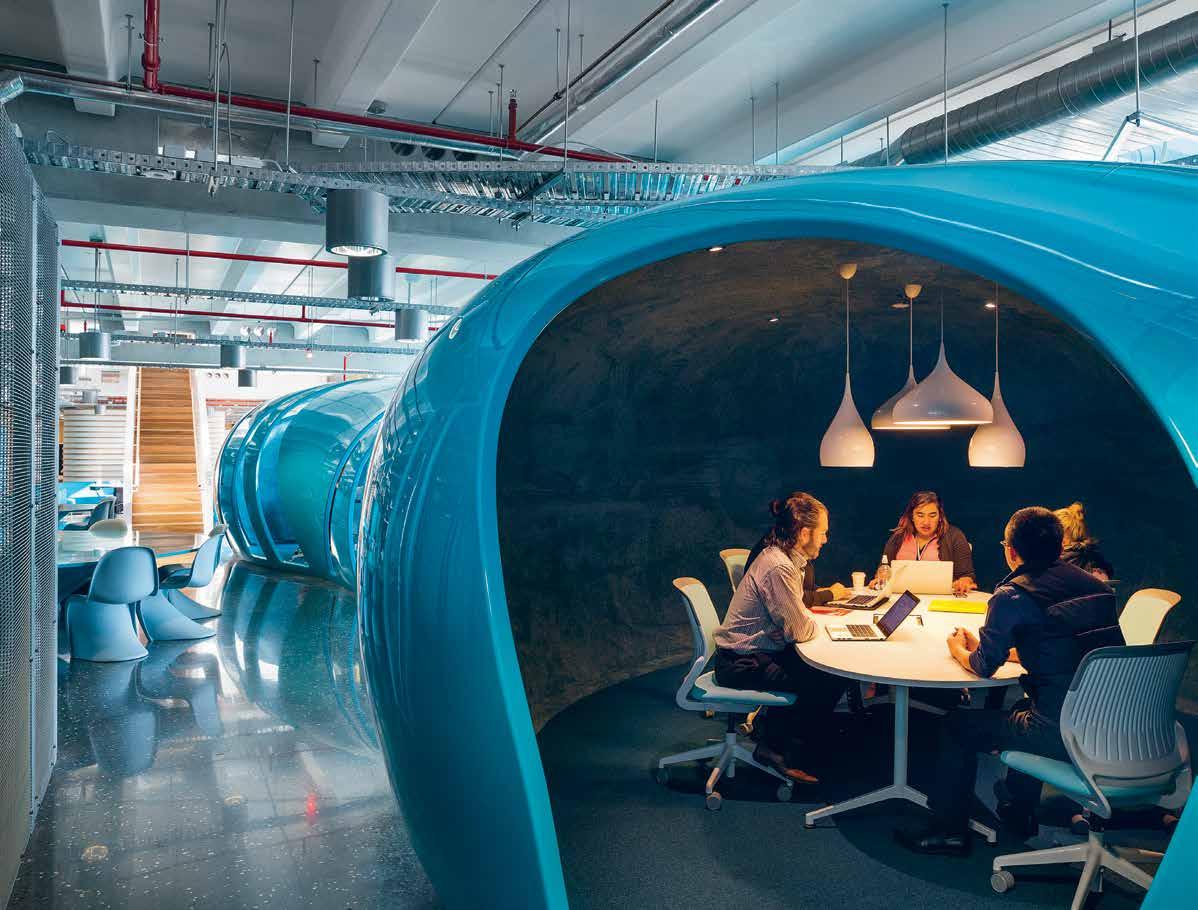
INDESIGNLIVE.COM 186 IN DEPTH
In the battle for the best skills, ‘caring workplaces’ are the ultimate bargaining chip. To this end, how is design giving companies the competitive ‘care’ advantage?
Guy Allenby Photography Courtesy MAT Office; John Gollings
“Prospective employees will directly read (and judge) the organisational and cultural underpinnings of somewhere by its interior design and facilities. Many [millennials] are not taking a conventional pathway with a professional or commercial corporation. So, that notion of co-working, or whatever you want to call it…flexible workspaces, free choice and all tha …is becoming a very viable work culture. Which all means that corporates are having to be cannier about competing for the best talent – tangibly expressing culture, showing they care – with their environments.”
If you had to pick an environment that marked a tangible shift into a new epoch of workplace design in this country, you’d push a pin into a map at the Campus MLC building, Miller Street, North Sydney, circa 1999. Designed by BVN, led by architect James Grose, this retail financial services headquarters was a glimpse into a future of office life that many organisations have since embraced to a greater or lesser degree.
Campus MLC went on to win an AIA National Interior Architecture Award for new working environment ideas that included a ‘Zen Den’ complete with tropical fish, bean bags and polished pebbles, a ‘Vertical Street’ (internal staircase) and – hard to believe, but rare at the time – strategically placed plug-in points for laptops. The interior attracted its fair share of gimmicky coverage about the pet fish and the cosy breakout spaces as well as plenty of considered column inches on the way the space was planned and designed to reflect and transform corporate ethos and working ways. Not to mention engender more meaningful contact between employee and employee and employee and clients. Or, as James Grose, national director of BVN Donovan Hill puts it today; a core element of the total concept was best articulated as engendering “tactility”. Community tactility – that is feeling part of a human network on the one hand, right down to the more visceral and the more obvious tactility of the emotional language of timber.
A significant aim of this tactile approach was to attract – and keep – the best and brightest. “It’s a way to keep the best people,” he said at the time. “Companies are now competing less on salary and more on lifestyle and environment.” And the principle applies even more so today. That isn’t to say that when a prospective recruit weighs up a new employer – or is considering a move to a different one – it’s because the bank/insurance company/law firm/tech company has (or hasn’t) physical elements like comfortable nooks for focused work or interaction, or free lunches, or a meditation room or showers and lockers next to bike racks in the underground car park.
These things are very desirable of course, but the real point is what they represent about an organisation’s culture. “It’s not about the kitchen or whatever,” says Grose, “but the intellectual underpinning
beneath that. It’s about a culture of support, of choice, of sharing –that’s what the business world is needing to do to bring people into a more conventional world.”
Indeed a 2014 Hassell research paper found that salary had the single largest influence on the attractiveness of a job (45 per cent share), but – added together – workplace culture (32 per cent) and facilities (16 per cent) combined to actually outweigh the relative pull of the pay packet. “Unprompted, respondents often cite physical workplace features as evidence of a good or bad workplace”, was one of the paper’s key findings. “The physicality or presence of a workplace is a visceral indicator of a culture of an organisation,” says Grose.
Prospective employees will directly read (and judge) the organisational and cultural underpinnings of somewhere by its interior design and facilities. Or put it another way, can we now say that effective contemporary commercial interior design is fundamentally about embodying a real sense of culture and care?
“Absolutely,” agrees Grose. “We now talk about designing for culture, rather than designing for workplace. We talk about human design. How do you design for humans?”
Or, more to the point, how do you design for the best young graduates and professionals? “Many of them are not taking a conventional pathway with a professional or commercial corporation,” says Grose. “So, that notion of co-working, or whatever you want to call it…flexible workspaces, free choice and all that…is becoming a very viable work culture.”
Which all means that corporates are having to be cannier about competing for the best talent – tangibly expressing culture, showing they care – with their environments.
And they’re not only competing with other corporates for talent but they’re also up against a working landscape where the expectations of the range of options for making a workplace environment more flexible are increasing, as are the alternative options to co-work and collaborate.
bvn.com.au, matoffice.com
INDESIGN 187 IN DEPTH
Page 188 & 190: ASB Bank North Wharf, New Zealand, by BVN, Photo: John Gollings. Page 191: Flexible Coworking space in Beijing by MAT office, Photo: Courtesy MAT Office
Did You Know?
Smales Farm on Auckland’s North Shore by BVN Donovan Hill/Jasmax is creating a workplace that “may be a world first in many ways,” says James Grose, “because it’s about providing a very flexible, open workplace in one building.” With 30,000 square metres of flexible working space, The B:HIVE will be the first building designed under the principles of the WELL Building Standard in New Zealand.
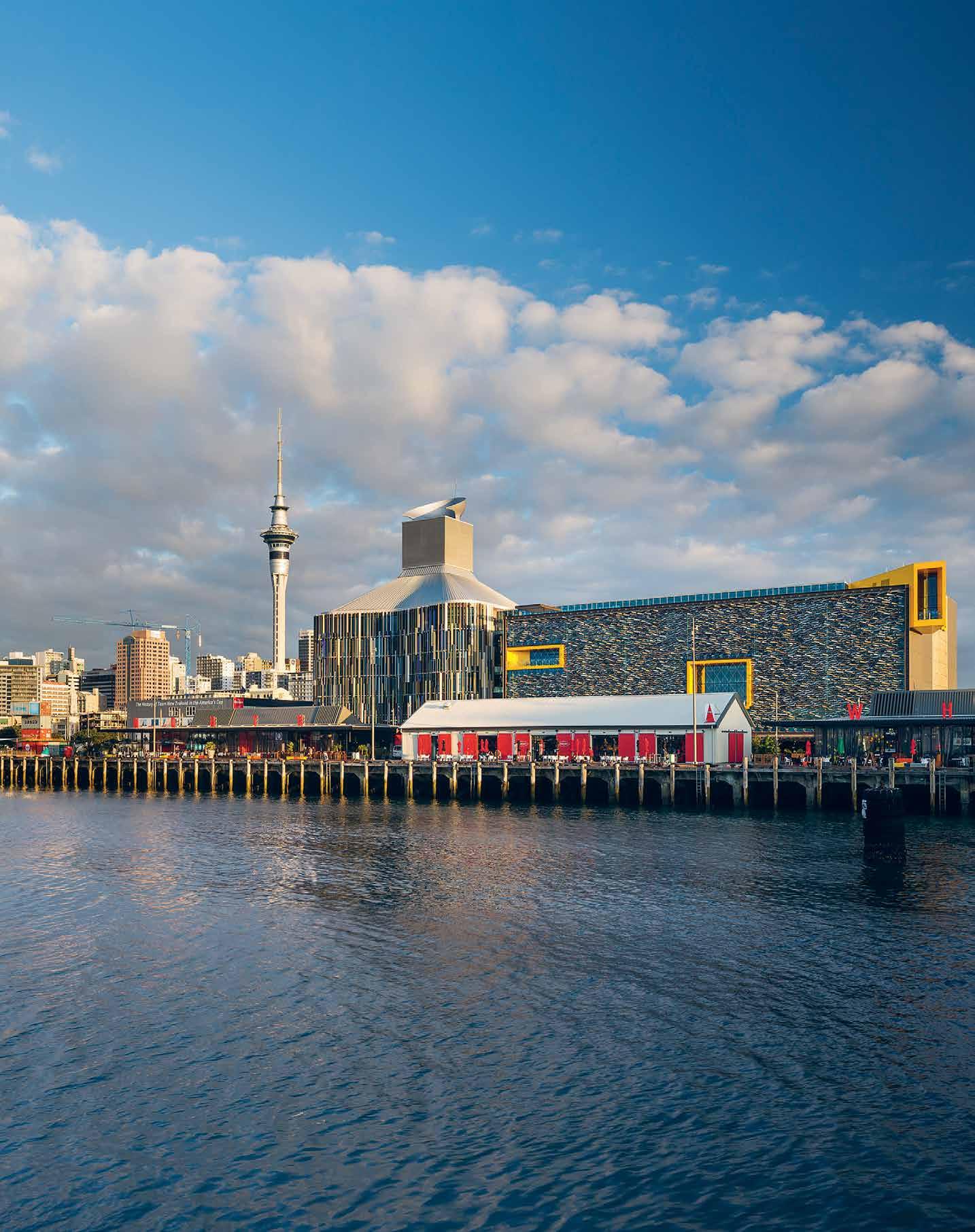
–
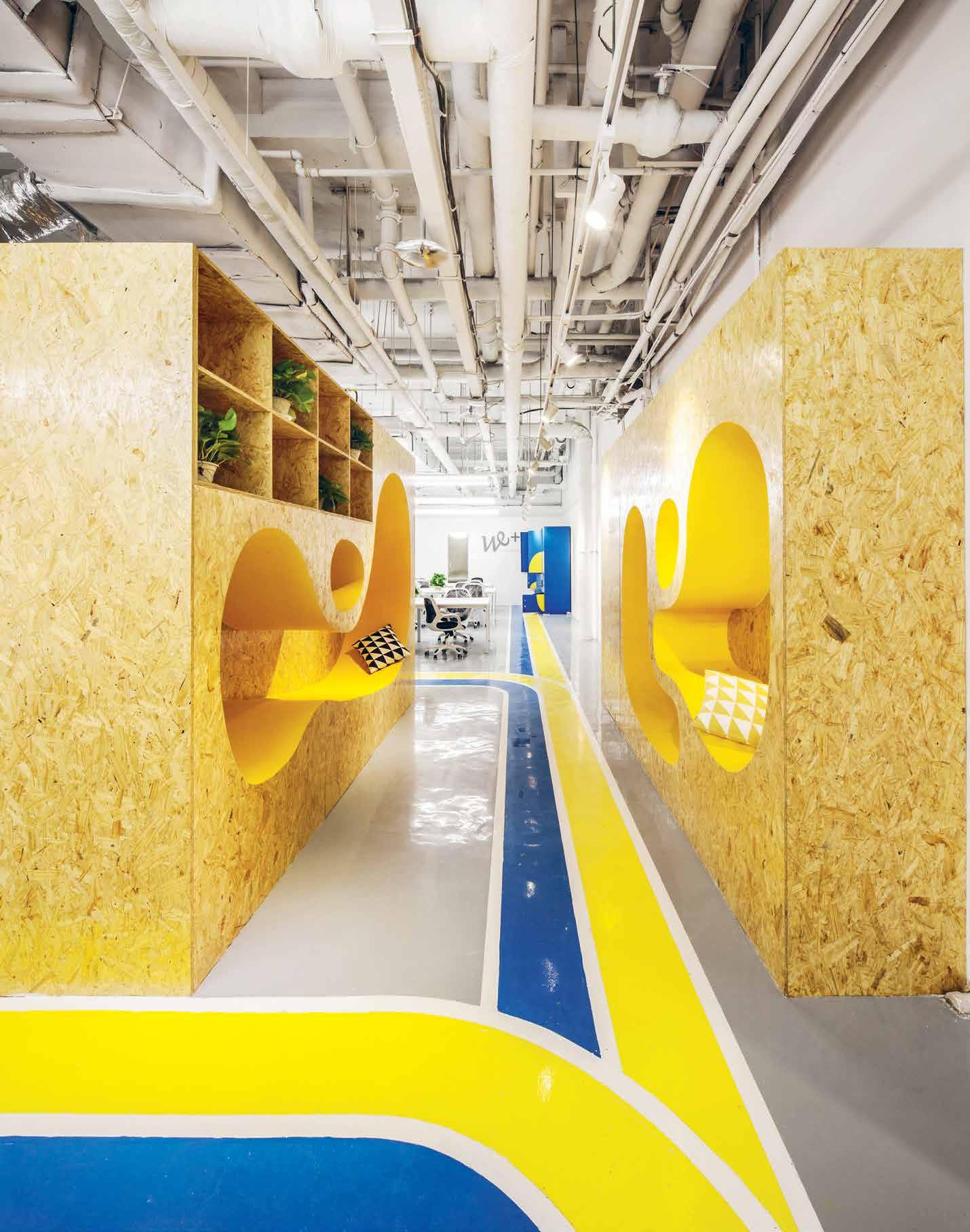
Our clients care ab O ut their clients
INDESIGNLIVE.COM 190 IN DEPTH
The arrival of online shopping had retailers scared for a moment there. And so they should have been. Why would customers ever want to step foot in a shop again if they can get it quicker, cheaper and with minimum fuss from the comfort of their own home? But the internet can’t offer real world experience and retailers were quick to realise this; upping their game with fit-outs that provided engaging customer-experience environments. The designer’s role in this exchange is continuously evolving in order to better care for their clients, so they can, in turn, better care for their clients.
Within the banking sector, NAB has recently opened teller-free technology enabled smart stores in Victoria and New South Wales, designed by architecture practice Warren and Mahoney. The traditional teller model of banking has been replaced with intelligent machines that enable greater transactional efficiency. Staff members float throughout the stores offering assistance, instead of remaining stationary behind a counter.
As Warren and Mahoney’s Auckland-based principal Gareth Huston explains: “Banking used to be synonymous with waiting, queuing and being ‘sold to’, but the new environments are now aligned with efficiency and empowerment. Breaking down the usual physical barriers that were in place with an open plan has provided both staff and customers with a more connected experience.”
It’s a human-centred design outcome that primarily responds to the customer’s need to get in and out as quickly as possible; an attractive proposition for anyone who’s time-poor. But the open plan also facilitates conversation in an environment that’s informal and flexible, making the customer’s experience far more participatory. They’re given broader opportunity for choice and this priority has directly informed Warren and Mahoney’s recent design for NAB’s Business Centre in Geelong, where staff populate the 1,000 square metre space alongside customers, who utilise the meeting rooms, technology and work zones to conduct their own personal business.
“The strategy behind the centre as an incubator environment is to create a shared physical space that belongs both equally to the customer and bank,” says Huston. It reflects a global trend towards customer self-empowerment, fuelled by advancements in technology. Customers are invited to negotiate their own banking experience in a new non-hierarchical setting. Making any customer-experience environment memorable is also important for not only keeping customers in the space, but for getting them to come back.
The most popular shopping centres, for example, have a point of difference that meet customers’ practical retail needs and also connect with them on an emotional level.
Kennedy Nolan Architects’ design for the lower ground level refurbishment of Melbourne Central was inspired by the city’s laneway culture – a local feature adored by residents and tourists alike. While familiar materials from Melbourne’s streets have been used throughout the fit-out, the most unexpected feature is a brand new immersive video art exhibition.
The Melbourne Central Art Loop includes a series of coloured ceiling portals containing mirrors and video art by artists, including Kieran Boland and Diego Ramirez. “It seduces the customer into looking up, rather than down at their mobile,” says Kennedy Nolan Architects’ co-founder Rachel Nolan. The result is a memorable customer experience that is as playful as it is engaging.
For Koichi Takada Architects it was important that their design for the interior of Sydney’s East Village Retail was the antithesis of the traditional shopping mall model in order to maximise customer engagement. “We wanted to do something that plugged into the local community and had a sense of gathering,” says practice founder and principal Koichi Takada. “So we came up with the marketplace concept – very popular in New York at the moment – and we used that as the basis for creating an environment that had more of a warm rustic, warehouse feel to it.”
Instead of leaving the space’s columns exposed, Takada clad them in plywood batons to create a series of ‘trees’ that fan up-and-across the ceiling. The result is as visually dynamic as it is memorable, with the ‘forest’ forming a canopy that envelopes customers, evoking a strong sense of calm. Incorporating a nature-inspired motif that connects the interior with the outdoors is also psychologically uplifting and if customers are happy, then they’ll be inclined to linger for longer. Takada’s most resounding design outcome is the project’s 5 Star Green Star rating, which has a very real impact on the customer’s wellbeing. Air quality has been improved through the incorporation of natural ventilation and natural lighting has been introduced into the space via skylights. Takada and developer PAYCE have set a new benchmark and they’ve frankly had to, as customers’ demands have increased. And as these demands continue to increase, designers’ capacity to respond with innovation, insight and consideration will also grow.
koichitakada.com, warrenandmahoney.com
INDESIGN 191 IN DEPTH
Opposite: Art Loop, Melbourne Central by Kennedy Nolan Architects by Warren and Mahoney. Next page: East Village Retail by Koichi Takada Architects, Photo: Tom Ferguson
Words Leanne Amodeo Photography Courtesy Warren and Mahoney; Tom Ferguson
How is design responding to the rising complexity of ‘customer care’ environments?
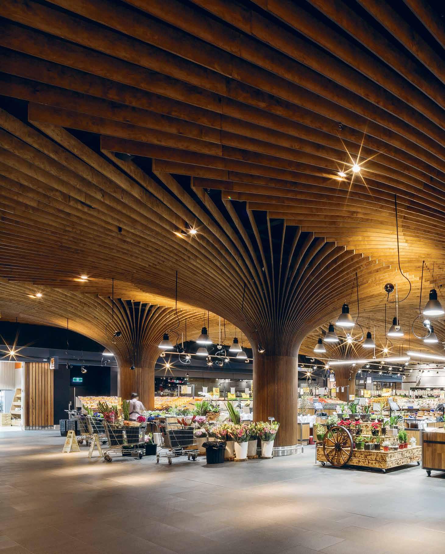
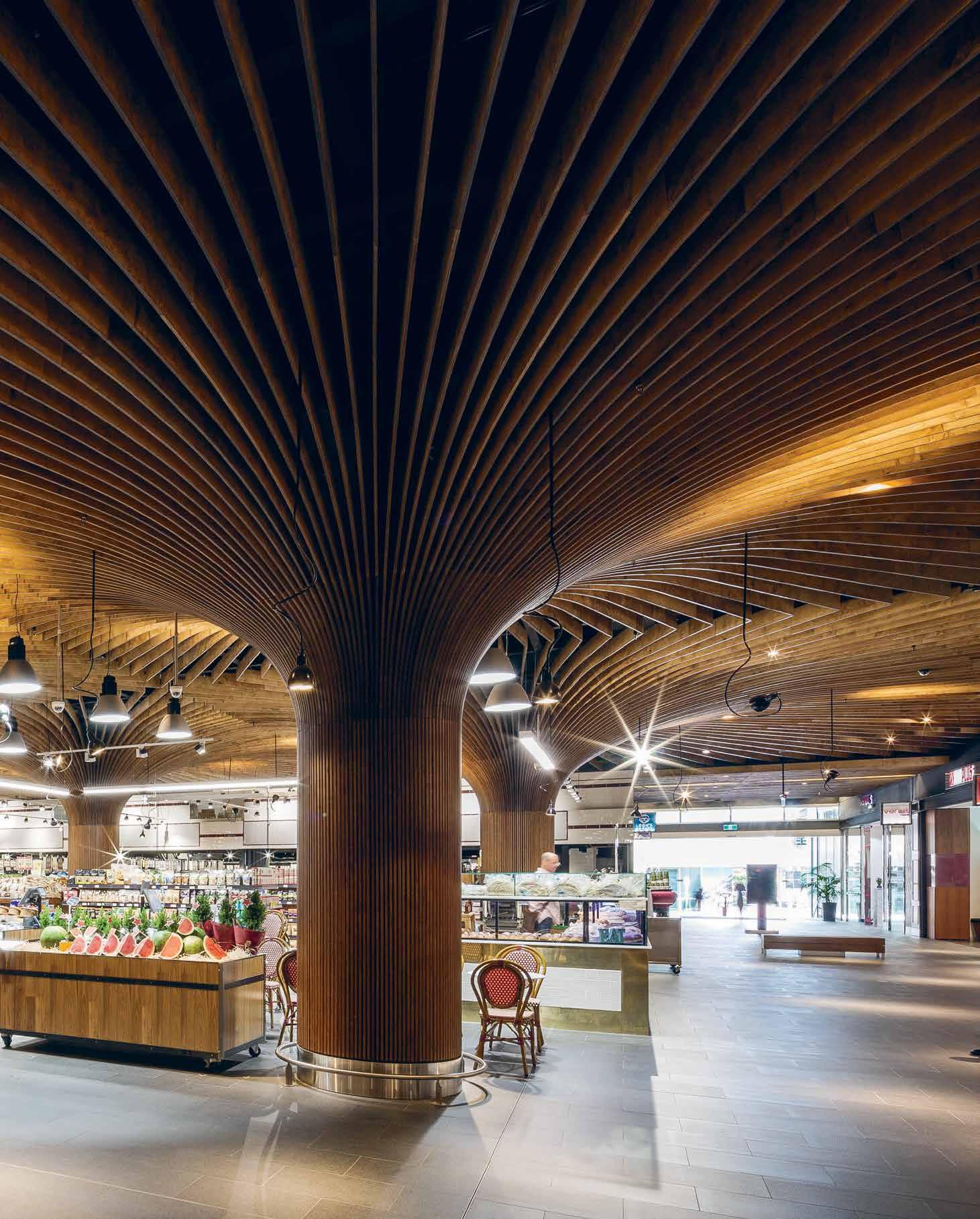
Interior designer Hamish Guthrie and architectural and interiors photographer Richard Glover get candid about the problem with project photography.
Is th I s project v I ral yet?
With the advent of new technologies that makes every camera enthusiast a photography professional, there’s one question we need answered: How do we handle ‘fast photography’? Striking photography can entice a wide range of audiences online, whereas unflattering photography is disappointing all round.
“Photography is quite a personal thing,” explains Hamish Guthrie of Hecker Guthrie. “Every office likes to have a way that their projects are represented, and photography is a way that a project is captured for posterity.
“More often than not, the way people see a certain project is not through them visiting the space, but through exposure of imagery through a multitude of media,” continues Guthrie. Indeed, the recent funding of viral concept Casa Brutale House, highlights the ways in which eye-catching imagery, whether of completed or conceptual projects, is becoming increasingly influential.
“Photographers aren’t miracle workers. I often speak to photographers and they’ll say they can only do so much, given what they’re working with,” Guthrie observes. “But there’s got to be merit in every project – there’s always something in there that captures the designer’s intent.
“But when you see a set of photographs that’s just a series of wide angle shots that are broad, flat, and poorly lit…well, the photographer hasn’t really endeavoured to capture the spirit of the designer,” Guthrie states, “and it’s really a failing of the relationship between the designer and the photographer.”
This relationship is a delicate one to navigate – more often than not, photographers find that it is the architect who is commissioning photography and liaising with the designer in order to create a brief. Needless to say, the priorities of architect and designer do not always align, and some photographers find it hard to exercise their craft when briefs are too prescriptive. One thing Guthrie wants to know, is how prescriptive is too prescriptive?
“It can be tricky,” notes architectural and interiors photography veteran Richard Glover, “but from the photographer’s perspective, the most important thing is to just talk to the client. Ideally, you
should visit the location with them, and discuss aspects of the project that are important and go from there.”
“I want to know how prescriptive they’re going to be. Or how loose. I want to know how the photographs are being used,” he explains. In preparation for a shoot Glover takes a look at the client’s website to see how their previous photography has been used in display and layout, and examines any publications that the photography will be pitched to.
“But I will always defer to the designer’s understanding because they will know it better than me; if they make suggestions about visual approaches, about details, about how the light might work, I will use that as a lead and happily work with the designer under their direction,” continues Glover, “but I don’t want to simply be following them around and being told to take a picture here or there, because you don’t always get strong photographs, so I’ll make my own suggestions.”
The clarity of the brief is of paramount importance, and that’s where Glover’s supplementary research comes in. He says: “If it’s quite clear what they want, then the designers don’t need to be there and I can just get on with it. Certainly, if I don’t have to stand, and talk, and discuss, I can be quicker, and more efficient with fulfilling the brief.”
Glover does note, however, that no matter how comprehensive a brief is, there are always spanners that appear on the day of the shoot that have to be navigated around. Whether this is a truck that materialises in front of a building, or a lost security door key, or even the weather, he finds himself in a constant state of negotiation.
“It comes down to mutual respect, I think. Photography can become stripped down to being a commodity, rather than a collaborative capture of a project. Frequently an image is sent on for other people’s benefit to a degree, and the photographer gets undercut through this process,” adds Guthrie.
He further explains that: “Like any collaboration, input should be given where input is required from both fronts. The result will always be better than the work of each party in isolation.”
heckerguthrie.com, richardglover.com
INDESIGNLIVE.COM 194 IN DEPTH
Words Christina Rae Photography Earl Carter
Opposite: Move Yoga Studio, Melbourne, by Hecker Guthrie, Photo: Courtesy Move Yoga.
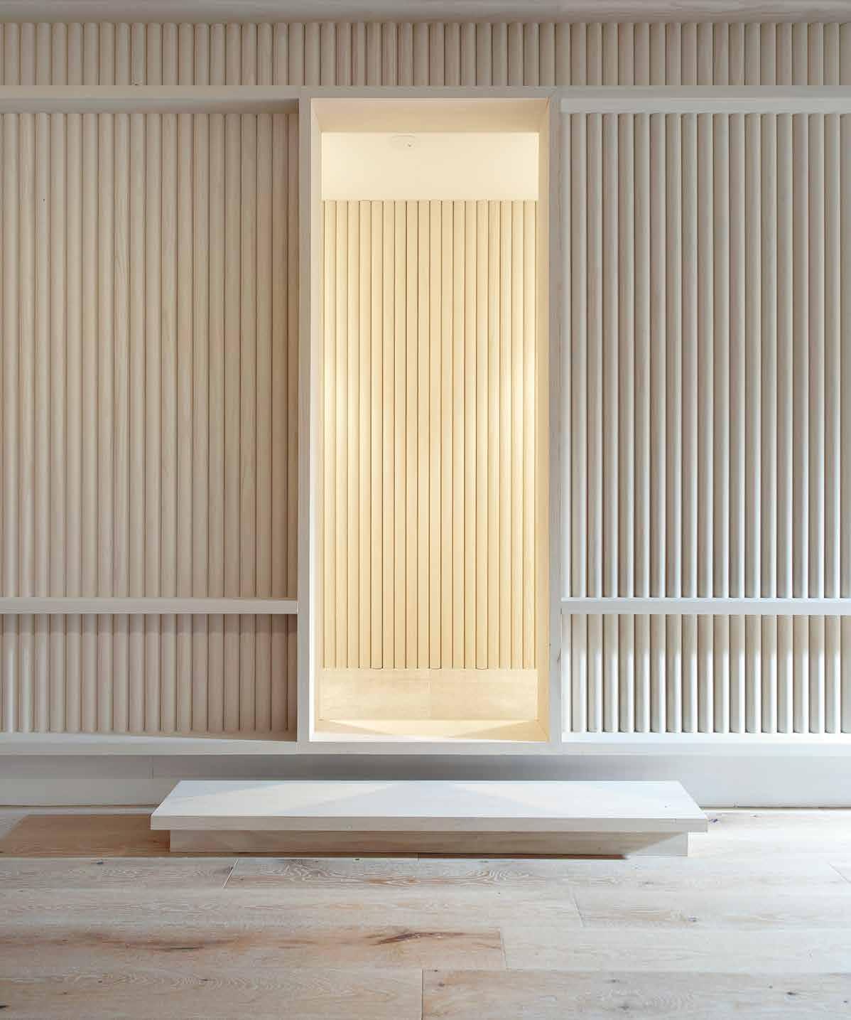
INDESIGN 195 IN DEPTH
INDESIGN X LAINE
Contemporary Colour and Texture
Offices can be inspiring spaces for staff, and Laine’s new fabric offerings help to create the spaces that energise an employee’s working environment.
Inspired by European colour trends, Lusso is a rich new wool and felt upholstery fabric that is dyed in solid and marle colour combinations. Lusso achieves a C.T.A. heavy duty commercial upholstery rating and is available in 29 modern colourways.
Laine’s Conforto wool felt upholstery fabric is not just an ordinary felt, but a luxurious high performance upholstery with the added benefit of Laine’s exclusive “Stain Guard, soil and liquid repellent finish” making cleaning a breeze. Composed of 100% wool yarn and dyed in solid and marle colour combinations, Conforto is available in 25 innovative and contemporary colours. Conforto has been
designed to meet the rigors of the commercial and hospitality sectors of our industry with a heavy commercial rating by C.T.A. standards.
Conforto also co-ordinates perfectly with Laine’s new heavilytextured fabric called Granite.
Granite is an upholstery fabric with a high abrasion resistance meeting C.T.A. standards for heavy commercial applications. Granite is available in 5 colours that complement our new Conforto felt fabric colour range.
Conforto & Granite are manufactured under the Enviro-Mark Diamond Certification Programme.
Laine’s three new fabrics utilise soft texture and the warmth of wool to help designers create inspiring commercial or residential spaces.
INDESIGNLIVE.COM 196 IN DEPTH 196 LAINE LAINE.com. A u
ABOVE: Laine Lusso Upholstery
What can design learn from the art of festival food?

Australian
the Victorian
of the
the
2016,
& Ed and Australia’s Cut
2016,
INDESIGNLIVE.COM 197 IN TEREST
Above:
band, Cut Copy, Photo: Michael Muller. Opposite: Sensory Restaurant at
College
Arts during
festival Sugar Mountain
created by Bomba head chef Jesse Gerner, Melbourne-based artists Tin
Copy for Sugar Mountain
Photo: Courtesy Sugar Mountain. Next page: Melbourne-based artists Tin & Ed, Photo: Tin & Ed.
Words Sophia Watson Photography Various
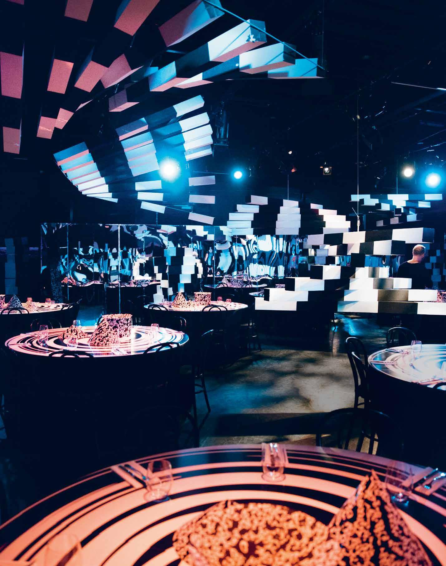
“We’ve always been a band that’s drawn inspiration from other art forms, so this opportunity to collaborate with talented people from different disciplines and create an immersive sensory experience for Sugar Mountain was very exciting for us.”
Jesse Gerner, head chef and owner of Bomba, thought people were “getting bored of smashing burgers and chips at music festivals”. Up until recently, festival food has been relegated to the realms of deep fried things on sticks, $7 soft serve and regrettable kebabs. So when the team behind music festival Sugar Mountain approached him with ‘Sensory Restaurant’ – an on-site, interactive dining experience holding four sittings of 50 minutes throughout the 2016 day-festival –he was totally into it.
As if this wasn’t already game-changing enough, local artists Tin & Ed worked with Aussie musos Cut Copy in collaboration with Gerner to create an interactive environment; sound, lights and food that would all come together to provide an experience for your eyes, ears and of course, mouth.
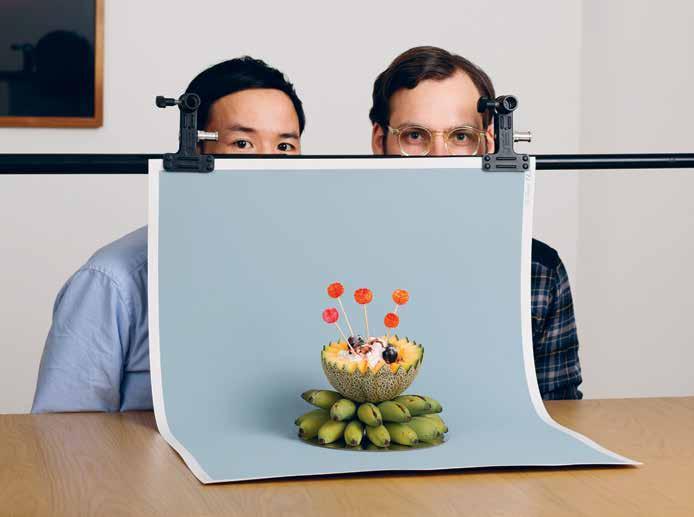
At times, food was served to you, other times it was hidden in the restaurant. Lights and music gave the audience clues on where and when to find it, all kept in time with the service, forcing users to actively engage and interact properly.
Five senses, four courses, three Melbourne icons – one experience. Sensory really disrupted what we have come to traditionally expect from our experience with festival food, and that is the lesson here for design: disruption.
However, it isn’t so much the fact that they challenged the status quo – as important as that is – but rather, how they got there. “It’s not just about coming in to eat,” says Gerner, “we’re collectively creating a show. The performance is part of the meal. We’re looking not only at the ingredients on the plate, but at how sight, sound, taste and smell work together.” Now, pay attention kids because this is
what we can learn from the art of festival food: collaborating with people well outside the boundaries of our own industry, can produce phenomenal results.
“Sensory is awesome because it’s one giant experiment,” says Tin & Ed. “A multi-sensory, multi-dimensional experience. We were super excited to be part of it because we were able to collaborate with Bomba and Cut Copy to create this experience of stepping into the unknown and deconstruct what was expected.”
Likewise Cut Copy’s Dan Whitford notes that: “We’ve always been a band that’s drawn inspiration from other art forms, so this opportunity to collaborate with talented people from different disciplines and create an immersive sensory experience for Sugar Mountain was very exciting for us.”
Throughout the four-course set menu, guests were treated to a tactile and interactive environment where all senses are stimulated through a 50-minute narrative. It was an alternate reality where the three artists played with how people see and understand the world around them, creating a visceral and unique dining experience. And that kind of game-changing approach to festival food would not have been possible without the disparate minds of three very different creatives.
And so my friends, what we should take away here is this: If we want to defy and disturb the accepted rules and boundaries of design, then we need to search for support outside our respective industries. Work in tandem to look at the future with a new set of fresh, unbiased lenses. Only then will create real and sustainable change. Just some food for thought.
INDESIGNLIVE.COM 199 IN TEREST
Cut Copy Frontman, Dan Whitford.
Be INspired
111 Abey abey.com.au
167 Atlas Concorde atlasconcorde.it 051 Bellevue Architectural bellevuearch.com.au 099 Business Interiors by Staples bistaples.com.au
008 Caesarstone caesarstone.com.au 047 Cafe Culture + Insitu cafecultureinsitu.com.au 143 Colebrook Bosson Saunders colebrookbossonsaunders.com.au
Domayne domayne.com.au 016 Herman Miller hermanmiller.com.au
Indesign
Indesign is for creative professionals – aspiring and established – hungry to continue the ideas that inform the best projects, products and people.
Light Culture lightculture.com.au
Premium Floors premiumfloors.com.au
043 Scandanavian Business Seating sbseating.com
012, OBC Schiavello schiavello.com
114 Screenwood screenwood.com.au
107 Shaw Contract Group shawcontractgroup.com.au 002 Smeg smeg.com.au
028 Space spacefurniture.com.au 094 Staron staron.com.au
170 Stormtech stormtech.com.au 024, 073 Stylecra stylecra .com.au 057 Sunbrella sunbrella.com
129 Sustainable Living Fabrics sustainablelivingfabrics.com.au
151 The English Tapware Company englishtapware.com.au
018 Tongue and Groove tonguengrooveflooring.com.au
IFC, 67 UCI uci.com.au
037 Walter Knoll walterknoll.com.au
006 Zenith zenithinteriors.com
Indesign

Without the support of our above industry BFFs (advertisers, to the laymen) you wouldn’t have this amazing resource! This symbolthroughout the mag and online represents those special few we have worked closely with over these many years, and who continue to support us and our industry. We totz them, and so should you!

INDESIGNLIVE.COM IN TEREST 200
014
137
020
004
095
055
035
059
045
048 Cosentino dekton.com.au 010 Cult cultdesign.com.au
Hotbeam hotbeam.com IBC Ilve ilve.com.au 102 INDE Awards indeawards.com 039, 185 Instyle instyle.com.au 088 Interface interface.com 062 Janus et cie janusetcie.com 123 Kholer au.kohler.com 070 Krost krost.com.au 196 Laine laine.com.au
Living Edge livingedge.com.au
Orgatec orgatec.com
P4 productsforpeople.com.au
Parisi parisi.com.au
Pedrali pedrali.it 163 Phoenix Tapware phoenixtapware.com.au
to Indesign and get 5 issues for the price of 4! ($55). Join the global design gang at www.indesignlive.com/subscribe
BFFs 5 for 4 Subscribe
for the point and purpose of everything in design – exploring what we do, how we do it, and why. Indesign is the only place you’ll
and
bit cheeky.
looks
find conversations on the design industry that is clever, provocative, insightful,
just a
JOIN THE GLOBAL DESIGN GANG...SUBSCRIPTIONS OFFER OUR BFFS...ADVERTISERS DIRECTORY