A professional resource for the design curious.
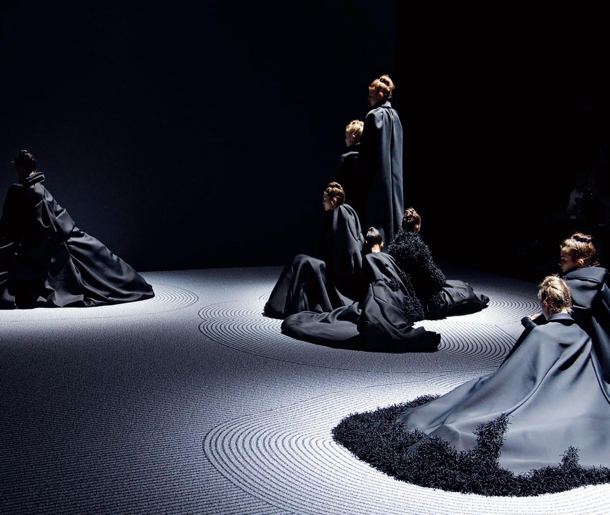
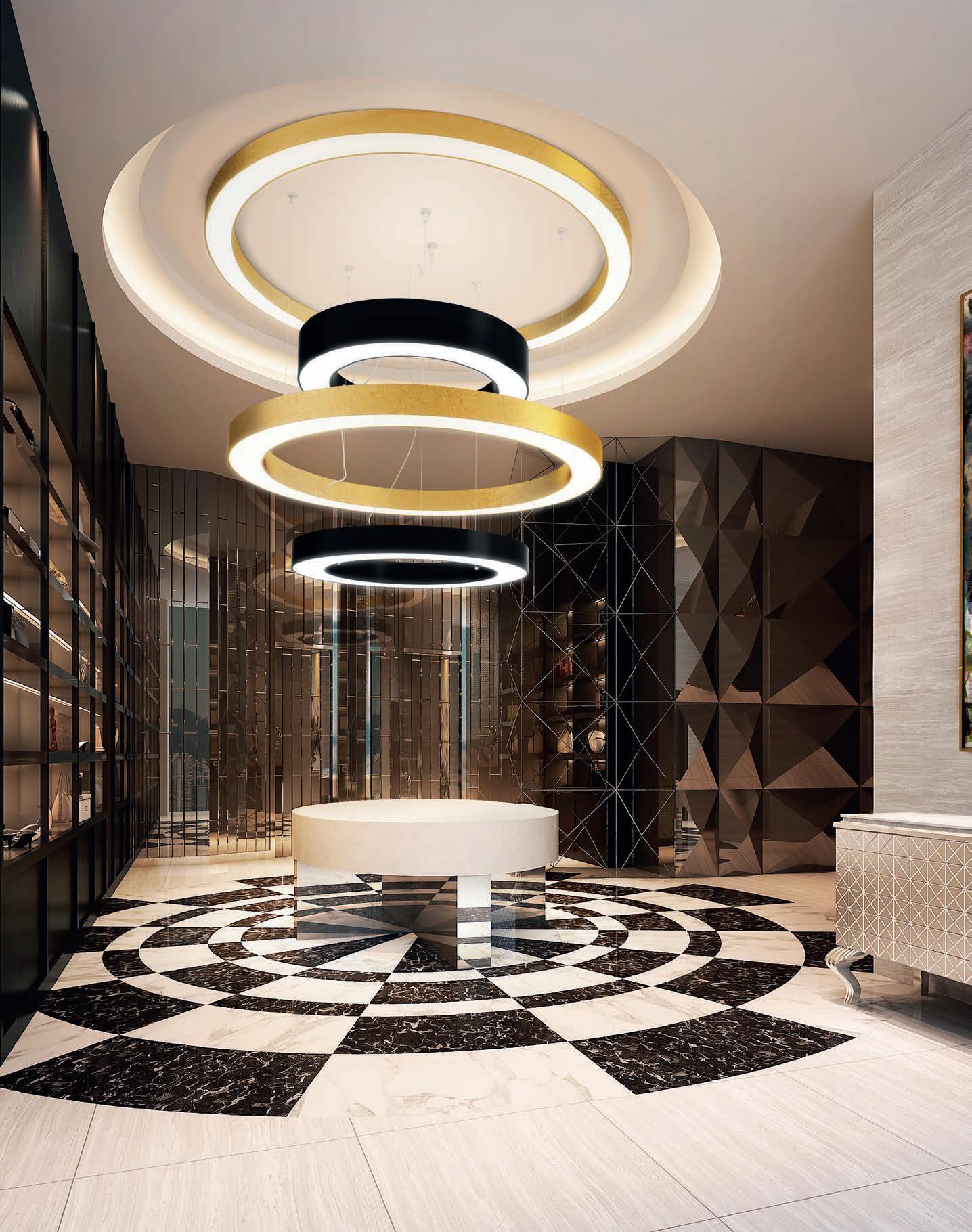
Viktor&Rolf, NGV

Richard Stevens, forpeople
Deloitte Perth, Geyer
University of Melbourne Arts West, ARM Architecture and Architectus
Snøhetta, Adelaide The ‘work, live, play’ issue.
INDESIGNLIVE.COM
Issue #68 / Australia $16.50 / New Zealand $17.50 / Singapore $12.95 / U.S. $21.99 67 9 77144387000 0
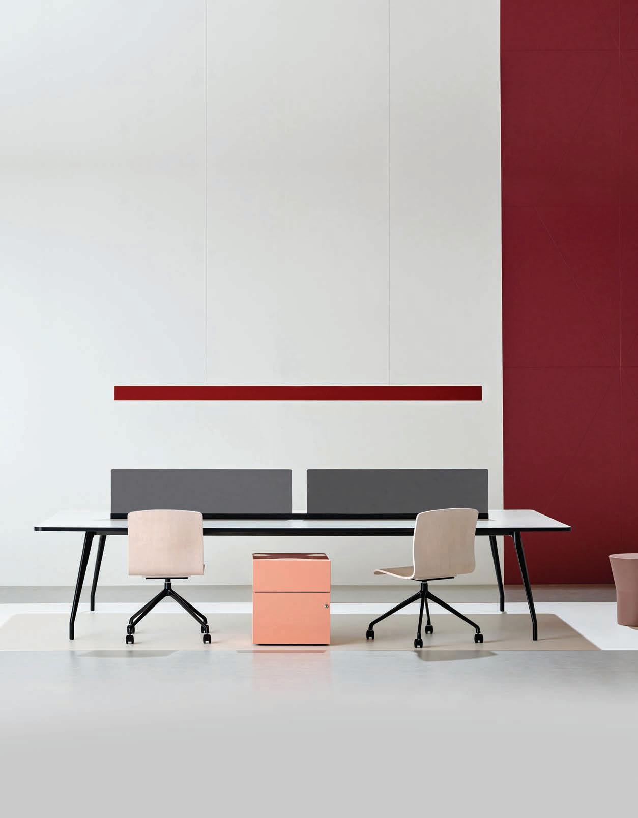
Victorian Comprehensive Cancer Centre | Melbourne

Australia Wide | 1300 824 824 Advise_ Create_ Exceed_ Client Expectations_
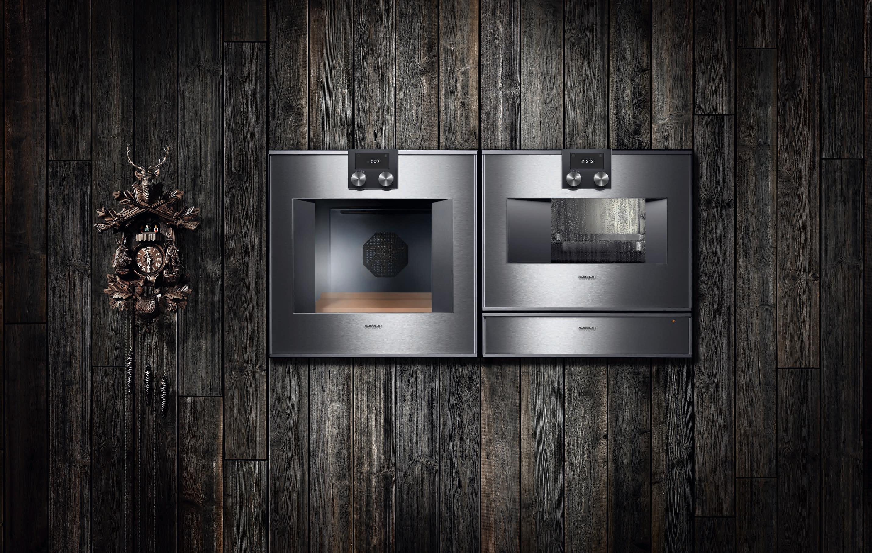 One of the most successful innovations to come out of the Black Forest. And a cuckoo clock.
The difference is Gaggenau.
In the Black Forest, some things never change – others have been evolving since 1683. Innovation has become a tradition for us ever since our company was founded as a hammer and nail works, along with unique design that is highly regarded the world over. Such as the ovens 400 series, shown here with oven, Combi-steam oven and warming drawer – a combination that unites cutting-edge technology and premium materials with superior design. Our appliances have been constantly evolving since 1683. The only thing that stays the same is that they just keep looking better and better.
For more information, please visit www.gaggenau.com/au.
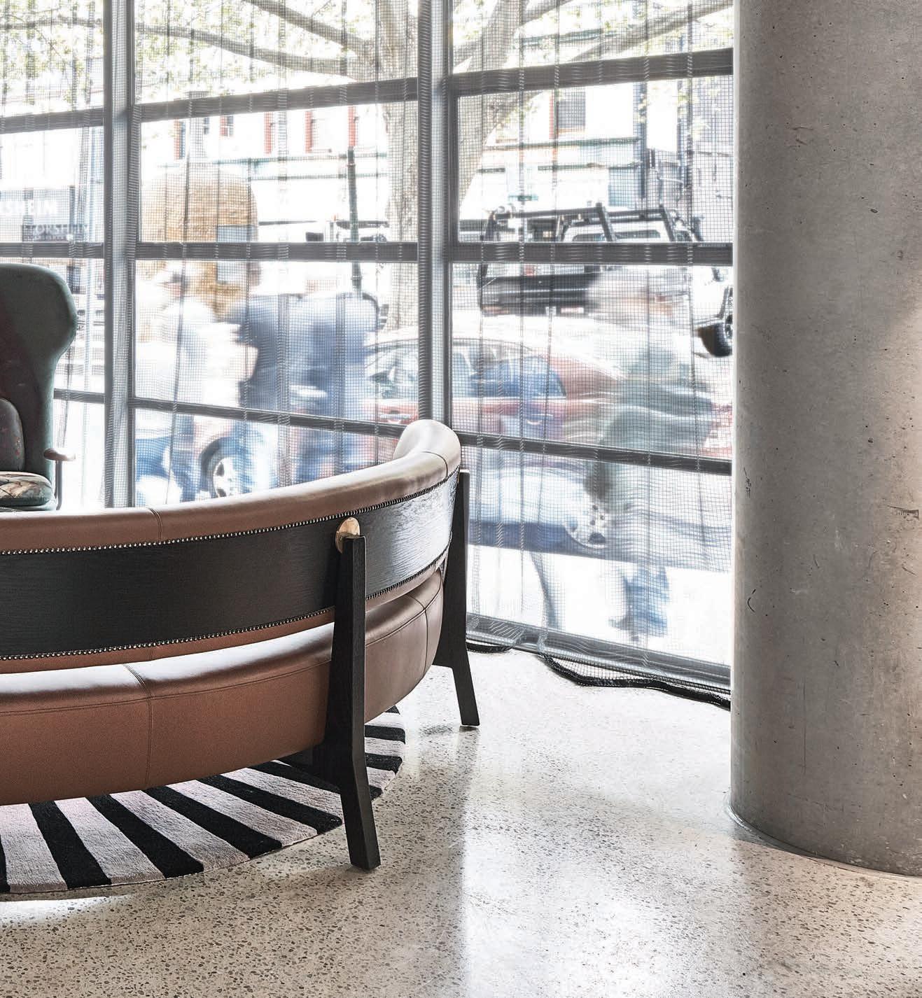
When designing the lobby for Melbourne’s QT Hotel, Nic Graham also created a bespoke range of furniture with Stellar Works. Fashioned to evoke a memory or a sensation, the luxurious interior creates the perfect environment for guests to steal a private moment while still being part of the action.

livingedge.com.au
 Nic Graham – Director, Nic Graham & Associates
QT Hotel, Melbourne
Nic Graham – Director, Nic Graham & Associates
QT Hotel, Melbourne

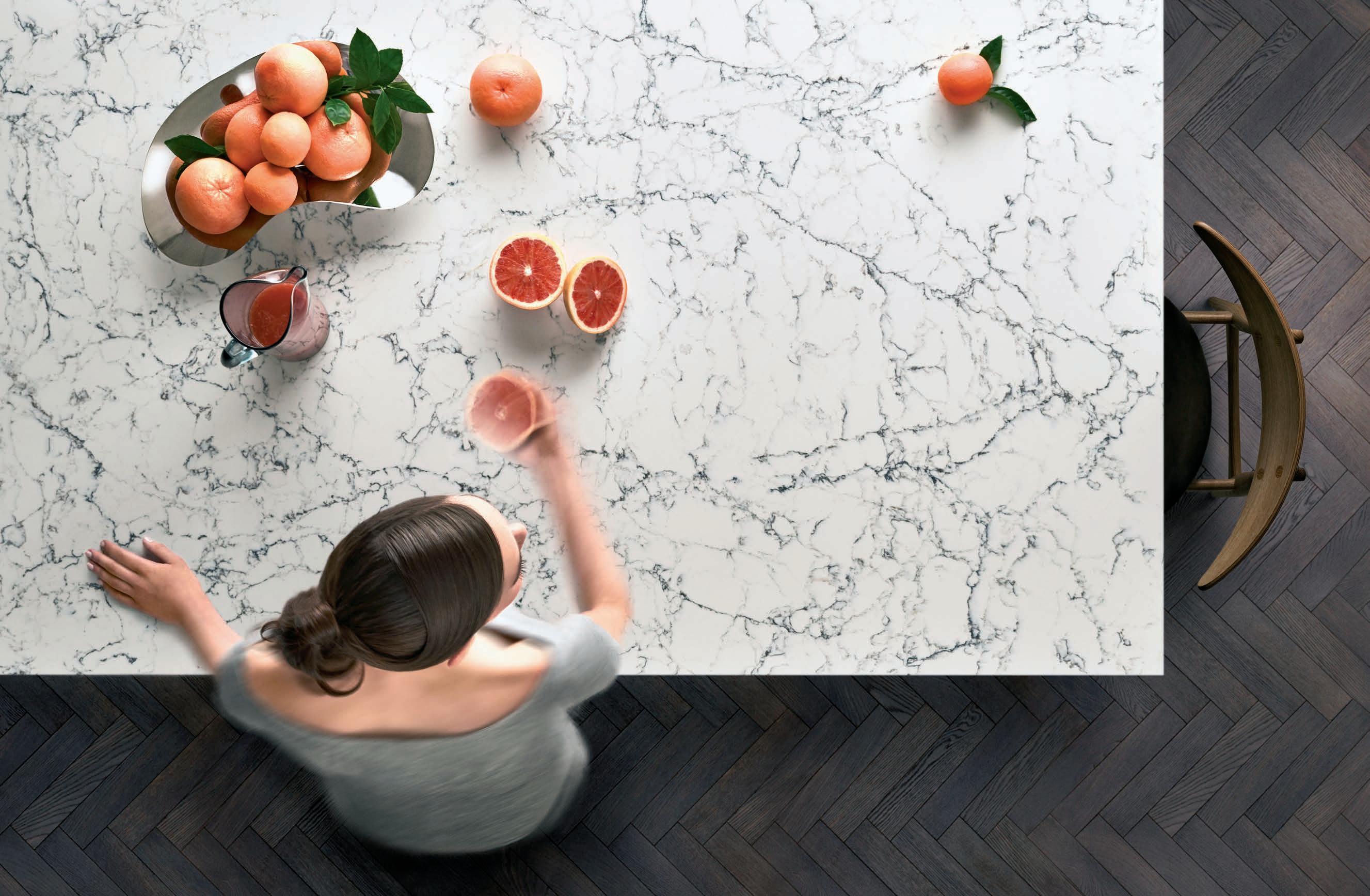
2016 New Collection White Attica™ www.caesarstone.com.au


WINE IS ART.
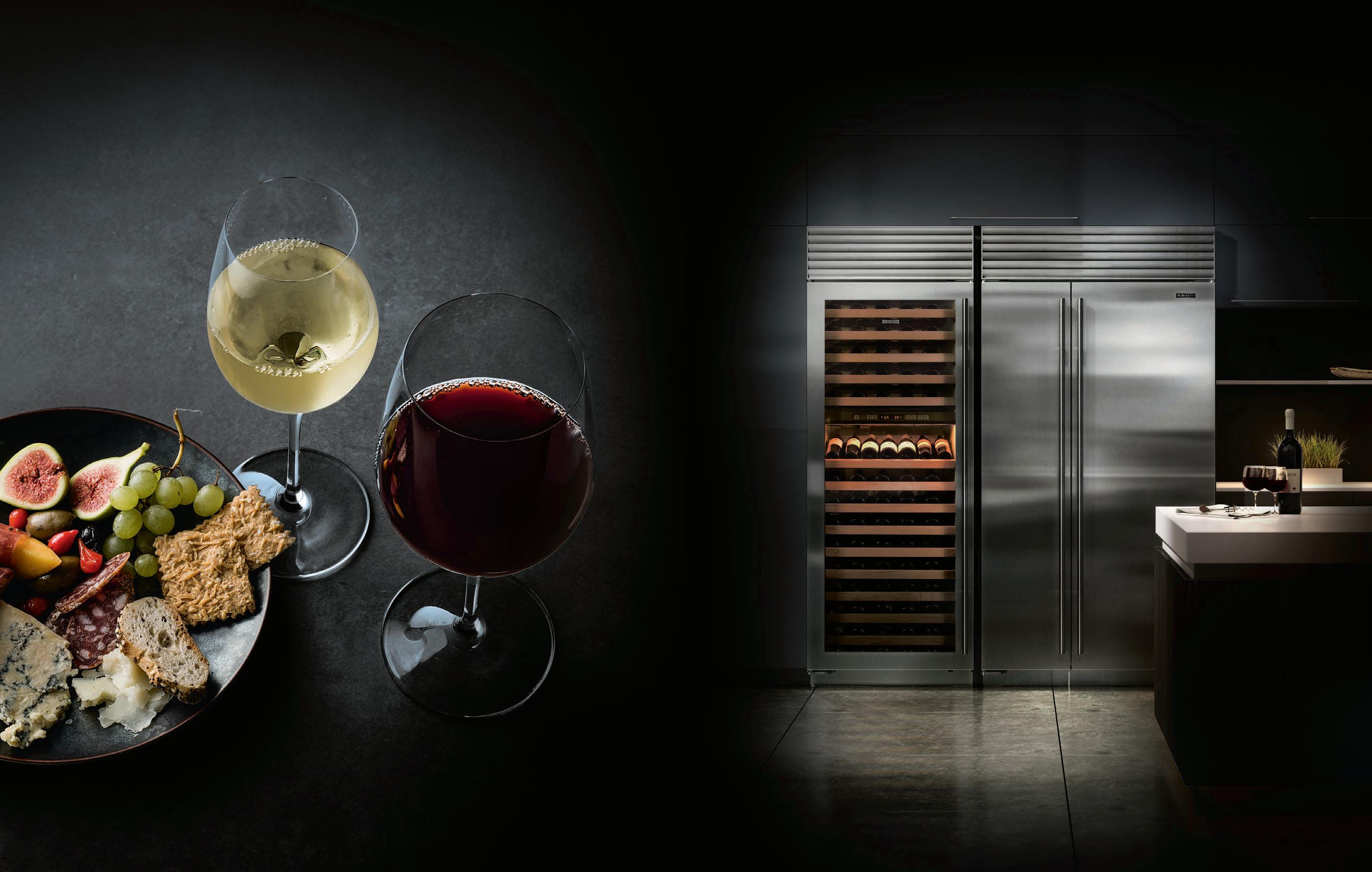


PRESERVE IT. su b zer o -wolf.com.au
craftsmanship and
Sub-Zero is
Its advanced technology preserves
In
performance,
without rival.
wine’s character.
Design + Performance ™ and Legendary Performance Fabrics ™ are trademarks and Sunbrella ® is a registered trademark of Glen Raven, Inc. SUNBRELLA.COM


LEGENDARY PERFORMANCE FABRICS ™
SAVANNAH COLLECTION THE DEFINITIVE SOURCE FOR ENDURING SITE, GARDEN AND CASUAL FURNISHINGS ® 50 MCLACHLAN AVENUE, RUSHCUTTERS BAY, NSW 2011 +61 2 9380 6605 WWW.JANUSETCIE.COM ATLANTA • BOSTON • CANCÚN • CHICAGO • DALLAS • DANIA BEACH • DUBAI • HIGH POINT • HONG KONG • HOUSTON • LONDON • LOS ANGELES MEXICO CITY • MIAMI • MONTERREY • NEW YORK • SAN FRANCISCO • SHANGHAI • SINGAPORE • SYDNEY • TORONTO • WASHINGTON D.C.
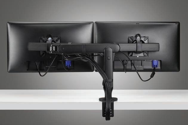
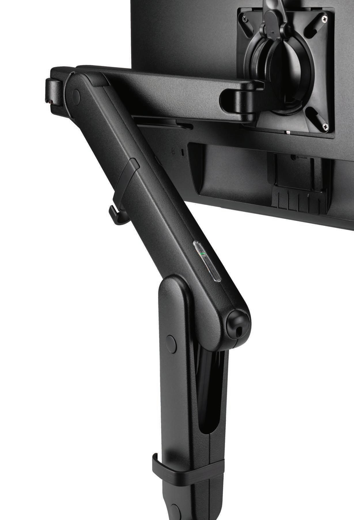
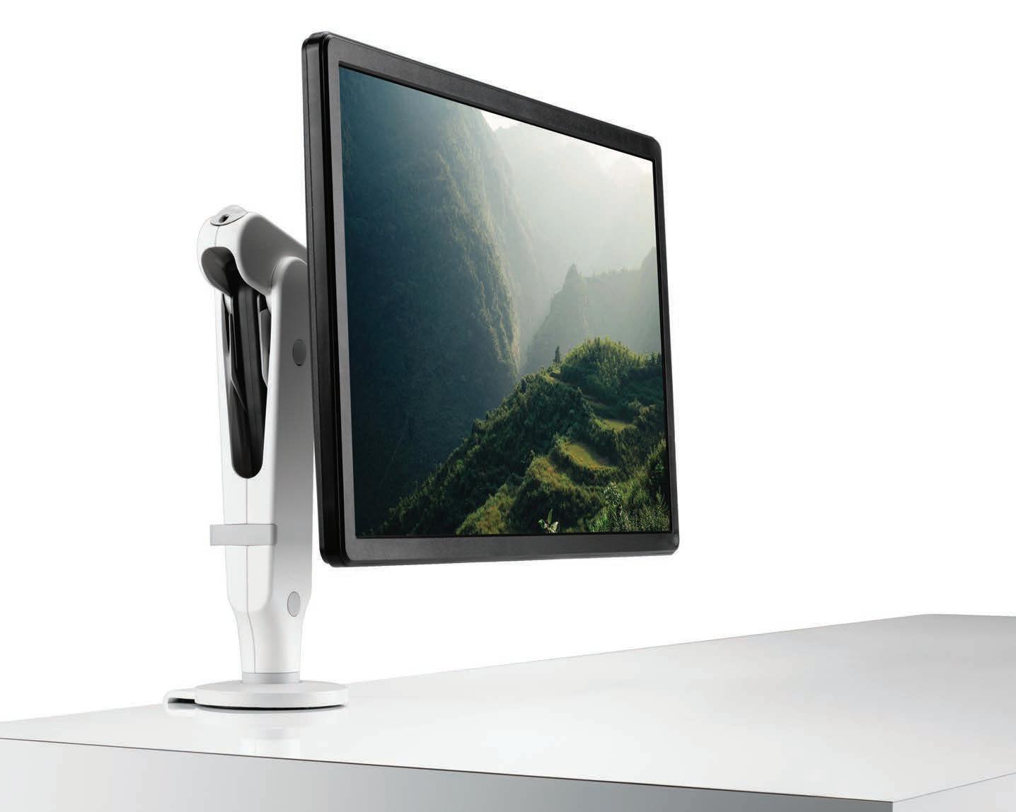
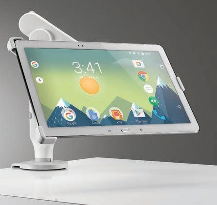
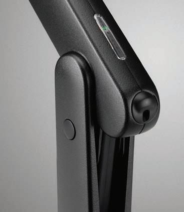
Ollin from CBSThe next chapter in ergonomic refinement
As technology advances, screens are becoming lighter and often more compact. With Ollin’s ability to accommodate weights from 0kg up to 9kg it is the ideal solution to help you, and your business adapt as the trend for lighter screens or the combination of a tablet/laptop continues.
A dual screen mount can be attached to the main arm, improving productivity by allowing you to switch smoothly between different applications. Ollin is the most cost effective and versatile dual screen solution on the market.
Available April, 2017.
info@cbsproducts.com.au AU: +61 1300 931 927 NZ: +64 27 492 9544 www.colebrookbossonsaunders.com
NSW Light Culture Australia · info@lightculture.com.au

QLD/NT Raylinc Lighting · info@raylinc.com.au

VIC/SA Buckford Illumination Group · info@buckford.com.au
WA Lighting Options · admin@lightingoptionsaustralia.com.au
ACT Integral Lighting · info@integrallighting.com.au
Chairman/Publisher
Raj Nandan raj@indesign.com.au
Managing Director Kavita Lala kavita@indesign.com.au
Co-Editors Sophia Watson sophia@indesign.com.au Alice Blackwood alice@indesign.com.au
Assistant Editor & Online Sammy Preston sammy@indesign.com.au
Editorial Assistant Andrew McDonald andrew@indesign.com.au
Business Development Managers Dana Ciaccia dana@indesign.com.au Colleen Black colleen@indesign.com.au
Sales Support & Reporting Genevieve Muratore genevieve@indesign.com.au
Group Operations O cer Sheree Bryant sheree@indesign.com.au
Production Assistant Natasha Jara natasha@indesign.com.au
Business Manager Vivia Felice vivia@indesign.com.au


Accounts Gabrielle Regan gabrielle@indesign.com.au Cassie Zeng cassie@indesign.com.au
Senior Designer Michelle Byrnes michelle@indesign.com.au
Junior Designer Joseph Panto joseph@indesign.com.au
Design Intern Camille Malloch
Original Design Template Christopher Holt HOLT Design
Online Manager Radu Enache radu@indesign.com.au
Web Developer Ryan Sumners ryan@indesign.com.au
INDE.Awards Lauren Black Lauren@indesign.com.au
Indesign Correspondents Stephen Cra i (Melbourne) Andrea Stevens (New Zealand) Mandi Keighran (London)
Contributing Writers Ben Morgan, David Congram, Jane Szita, Kath Dolan, Leanne Amodeo, Lorenzo Logi, Mandi Keighran, Narelle Yabuka, Paul McGillick, Stephen Todd, Tamsin Bradshaw
Contributing Photographers
Andrew Mørk, Andrew Worssam, Bre Boardman, Charles Dennington, Derek Swalwell, Joakim Blockstrom, Jean-Paul Goude, John Gollings, Jonathan Andrew, Kevin Mazur, NASA, Peer Lindgreen, Peter Wurml, Richard Boll, Ryan Cantwell, Sean Fennessy, Shannon McGrath, Stør Photography, Warick Baker
Head O ce Level 1, 50 Marshall Street Surry Hills NSW 2010 (61 2) 9368 0150, (61 2) 9368 0289 (fax) indesignlive.com
Melbourne 1/200 Smith St, Collingwood VIC 3066
Singapore 4 Leng Kee Road, #06–08,SIS Building, Singapore 159088 (65) 6475 5228, (65) 6475 5238 (fax) indesignlive.sg
Hong Kong Unit 12, 21st Floor Wayson Commercial Building, 28 Connaught Road West, Sheung Wan, Hong Kong indesignlive.hk
Join the global design collective, become an Indesign subscriber!
To Subscribe (61 2) 9368 0150 subscriptions@indesign.com.au indesignlive.com/subscribe
Yearly subscription: Australia $55 (incl. GST) International AUD $110
Printed in Singapore Indesign is printed with ENVIRO Soy-Based Process Black ink, UV Solventless Varnish and on paper which is awarded an Environmental Management Certificate to the level ISO14001:2004 GBT24001-2004 and Eskaboard and Eskapuzzle produced from 100 per cent recycled fibres (post consumer). CAREERSINDESIGN
MILANINDESIGN All rights reserved. No part of this publication may be reproduced, stored in a retrieval system, transmi ed in any form or by any other means, electronic, mechanical, photocopying, recording or otherwise. While every e ort has been made to ensure the accuracy of the information in this publication, the publishers assume no responsibility for errors or omissions or any consequences of reliance on this publication. The opinions expressed in this publication do not necessarily represent the views of the editor, the publisher or the publication. Contributions are submi ed at the sender’s risk, and Indesign Publishing cannot accept any loss or damage. Please retain duplicates of text and images. Indesign magazine is a wholly owned Australian publication, which is designed and published in Australia. Indesign is published quarterly and is available through subscription, at major newsagencies and bookshops throughout Australia, New Zealand, South East Asia and the United States of America. This issue of Indesign magazine may contain o ers or surveys which may require you to provide information about yourself. If you provide such information to us we may use the information to provide you with products or services you have. We may also provide this information to parties who provide the products or services on our behalf (such as fulfillment organisations). We do not sell your information to third parties under any circumstances, however these parties may retain the information we provide for future activities of their own, including direct marketing. We may retain your information and use it to inform you of other promotions and publications from time to time. If you would like to know what information Indesign Media Asia Pacific holds about you please contact Nilesh Nandan (61 2) 9368 0150, (61 2) 9368 0289 (fax), subscriptions@indesign.com.au, indesignlive.com Digital Print Events Strategic Partners
SILVER
PANZERI
SMALLER, NOT INFERIOR
RING BY
INDESIGNLIVE.COM 22 THE PEOPLE WHO GET INDESIGN DONE
80% OF ZIP HYDROTAP OWNERS DRINK MORE WATER*


We are all aware of the benefi ts associated with drinking enough water, but despite this, many of us go about our daily lives dehydrated to some degree.

As world leaders in instant drinking water appliances, Zip invented the innovative HydroTap, the smart and essential addition for every kitchen. Our integrated Australian-made appliance combines patented PowerPulse™ boiling and Direct DryChilling with MicroPurity filtration technologies to create pure-tasting boiling, chilled and sparkling water you will love in an instant.
When water is this convenient and irresistible you’ll love drinking more of it. We call this the Zip Effect. To improve your hydration and your family’s well-being, discover more at zipwater.com
Zip HydroTap. Now available in 8 new premium finishes.


THE WORLD’S MOST ADVANCED DRINKING WATER APPLIANCE ZIP HYDROTAP | PURE TASTING | INSTANT | BOILING | CHILLED | SPARKLING
*Statistic based on a survey of 354 owners of residential-installed Zip HydroTaps.
indesignlive.com
/indesignlive @indesignlive @indesignlive
Does anyone else feel like agile is kind of old news now? We get it, that’s a little controversial! Particularly seeing as it’s become the paradigm upon which modern workplace design is based. But in a world where change is the only constant, we’re pretty sure that ‘agile working’ – at least as we know it – is on a limited shelf life. So we’re moving forward, looking at where the future of workplace design is heading and courageously calling the shots on a new commercial revolution.
In this edition of Indesign: the ‘Work, Live, Play ’ issue, we cut the buzzwords and vague terminology to uncover what our industry is facing in the world of workplace design. We ask, if agile has become the norm, then what will the new, radical concept look like?
Here, we take a critical look at current models of workplace wellbeing: is it all a load of rubbish, or could we just be using too narrow a definition in addressing it? Using some of the region’s most progressive commercial projects, we uncover how and why we are redefining the term to embrace emotional and spiritual wellbeing as a means for designing engaging and positive commercial environments.
As part of our up-to-the-minute survey on agile working, we take you behind the scenes of Orgatec 2016 to critically review the latest workplace fittings, fixtures, furnishing, big ideas – and even the relevance of the event itself! We also address the hot topic of commercial kitsch versus experimentation and how to navigate between what’s progressive and what’s naff. We’ve discovered that with the surge of popularity in material selection in contemporary workplace design, pairing our clients’ new-found appreciation for materiality with the big bad data movement could well hold the answer to that all-important question, ‘What is the future of the workplace?’ (Flip to page 172 to see what we’re getting at!)
In these many pages, we critically review the role of architects and designers in shaping the ever-evolving work, live, play dynamic, and the people, products and projects that are driving them. Enjoy the issue!
Indesign
Co-Editors,
Sophia Watson & Alice Blackwood
INDESIGNLIVE.COM 24 FROM THE EDITORS
100,000+
readers
engaged across print, digital & social...
On The Cover
Viktor&Rolf: Fashion Artists explore the radical conception of “wearable art”. The spectacular and avantgarde creations of the Dutch fashion duo are currently on display for the first time in Australia; an exhibition organised by the National Gallery of Victoria (NGV) in close collaboration with the designers themselves. The cover image is from the Performance of Sculptures Haute Couture Collection show, S/S16, Photo: Peter Stigter. We hope you enjoy it!


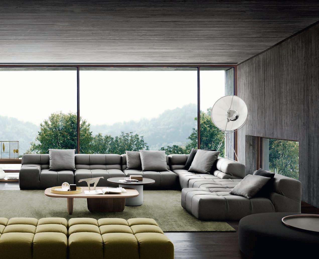
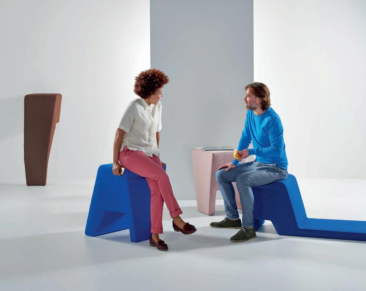
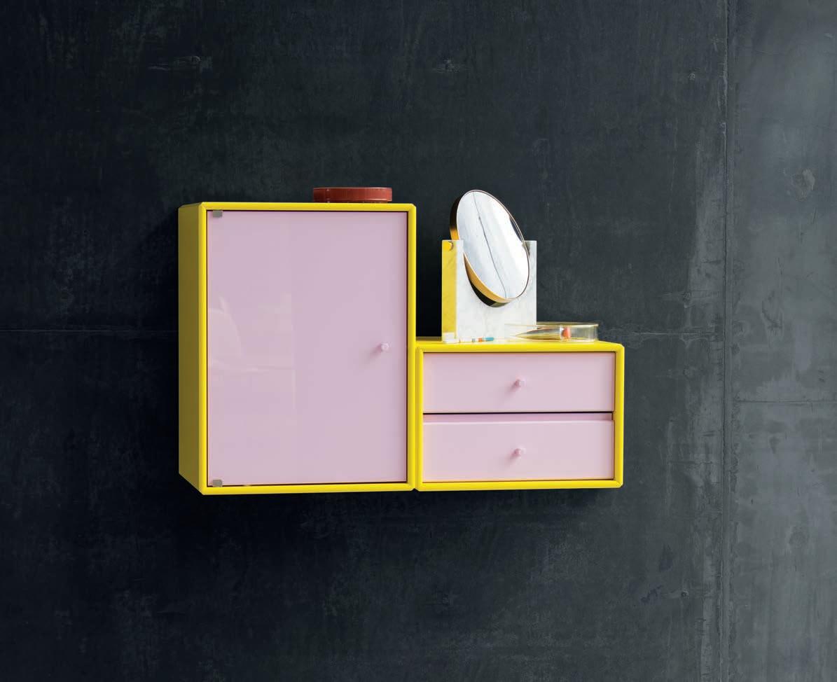
 Featured | Chill-Out Lounge Modular System by Gordon Guillaumier, Ledge Tables and Kelly Chair by Claesson Koivisto Rune
1300 306 960 www.stylecraft.com.au
The ultimate industry cheat sheet.
33-69
In famou S Big thinkers and creative gurus.
79-105
Snøhetta, Richard Stevens, Domenic Alvaro, Kelwin Wong, Tim Phillips
In SI tu
Provocative, radical and energising design.
109-161
Philips Headquarters Netherlands by LAVA -
200 George Street Sydney by FJMT featuring AR-MA -
r.a.w Melbourne by Travis Walton Architecture + Interior Design -
University of Melbourne Arts West by ARM Architects and Architectus -
Happy Place by Fiona Lynch Interior Design Office -
Ku.Be House of Culture & Movement by MVRDV and ADEPT -
Unispace Headquarters Melbourne by Unispace -
Rhoda Restaurant by Joyce Wang Design Studio -
Deloitte Perth by Geyer
I n Depth
Agile is old news! How and why our industry is breaking the paradigm.
167-193
What can design learn from Kim and Kanye?
195-199
In Short
In t ere St
INDESIGNLIVE.COM 28 CONTENTS
Mimicking natural rainfall, the dramatic flowing curtains of water from the FS3 deliver adjustable, high-performance bathing from a sculptural free-standing unit. Available in an array of finishes, the hand-crafted FS3 is the ultimate minimal statement.
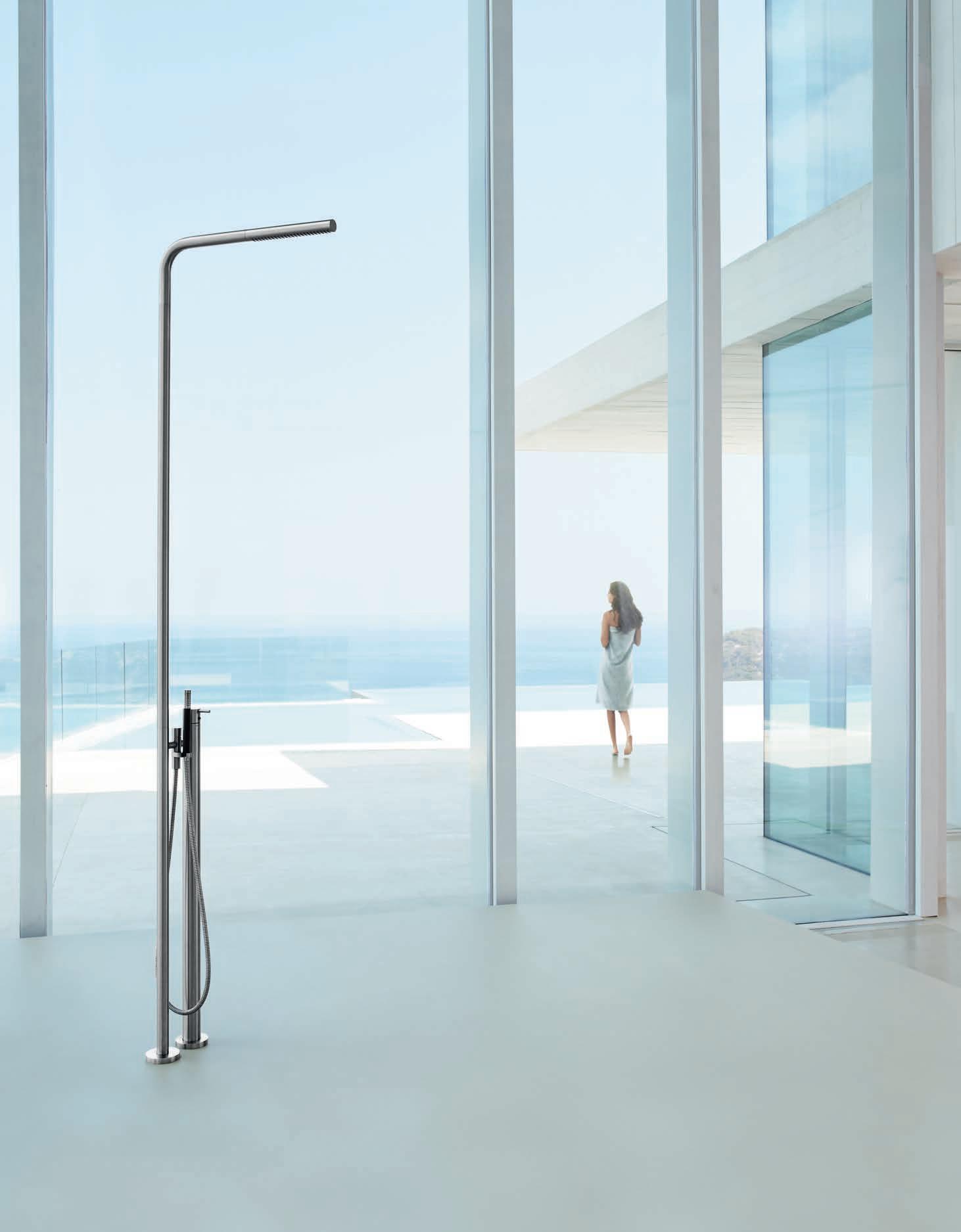
VOLA Design Pty. Ltd.
Tel.: +61 402 372 480
sales@vola.com.au www.vola.com

the ultimate industry cheat sheet
IN SHORT INDESIGN 33 SHORT IN
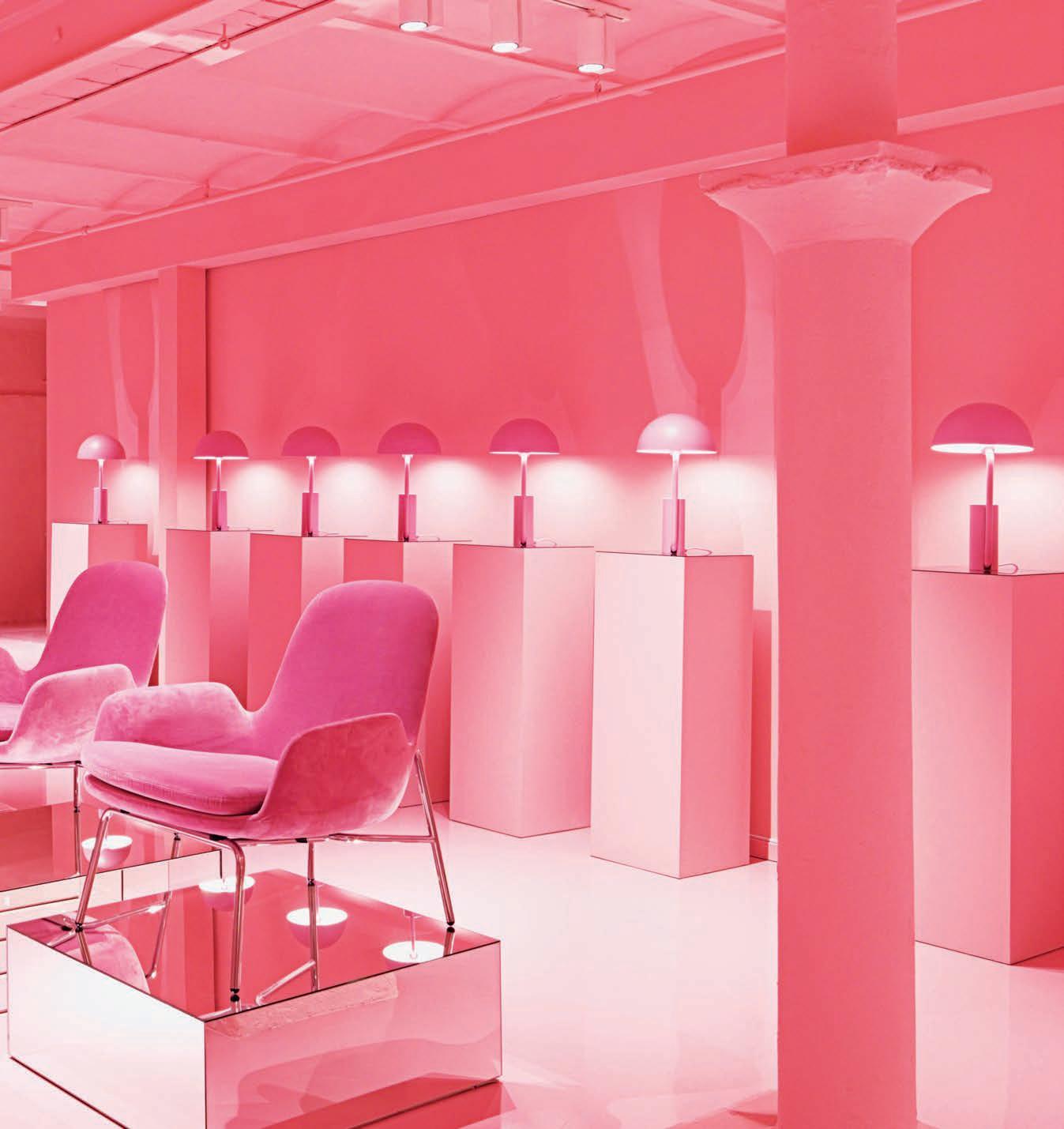
Think Pink
Four months ago, Danish dynamo’s Normann Copenhagen unveiled its newly conceptualised flagship store in Copenhagen, featuring a protruding mirrored corridor in the centre of the first floor, kitted out with rich pink velvet stairs which lead visitors down into a floor-toceiling-to-product basement.
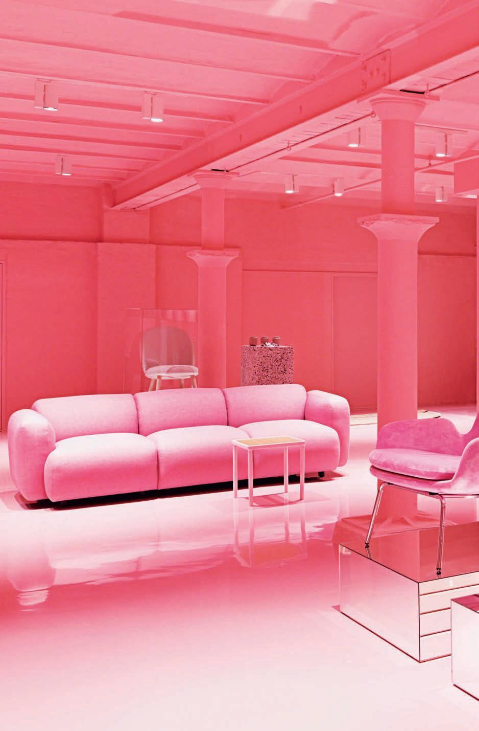
Wanting to manifest the theme “raw and industrial”, the store has been designed to clash materials and texture in a kind of ‘you’d never put that with this’ way – but somehow, the stark opposition between the design elements are a match made in interiors heaven. This very strange blend of materials includes epoxy resin, steel, coloured acrylic and shimmering terrazzo.
What’s also interesting about the layout of the space is that the Normann Copenhagen design team seem to have borrowed some design strategy principles from the hardcore workplace sector. For instance, not unlike an agile office, the showroom is divided into four different areas: hall, stage, ballroom and gallery. Each is decorated completely differently so customers can easily identify and engage with the zones and their particular purpose.
“We want to give visitors the feeling they’re moving around in an art installation,” said Normann Copenhagen designer, Hans Hornemann. “We’ve played with the contrast between warm and cold in a contemporary interior environment that pays homage to premises that we feel are very worthy of preservation.”
Originally launched in 1999 by Jan Andersen and Poul Madsen, Normann Copenhagen has become increasingly responsive to new trends in the design industry, and their newest blend of workplace and showroom is strong indication that they’re not done experimenting just yet.
IN SHORT INDESIGNLIVE.COM 34
IN SHORT INDESIGN 35
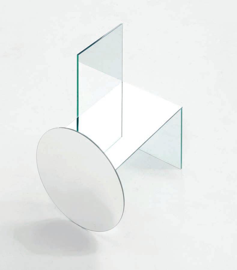
Through The Looking Glass
Young Spanish designer Guillermo Santomá’s Barcelona home, Casa Horta, became an Instagram sensation after its colour-blocked peach, emerald and Klein blue walls appeared in Apartmento magazine early last year. Santomá has a knack for geometry, cuts, illusion and space – and since then he has unveiled a series of five glass furniture pieces crafted in collaboration with Belgian fashion designer Dries Van Noten.
Made of glass and mirror circles, squares and triangles, each of the chairs are at once strong in their geometric form, but near invisible, and utterly fragile. While there’s an easy resemblance to Shiro Kurumata’s 1976 Glass Chair, and Santomá has united glass pieces using the same ultraviolet technology, this series treads closer toward the borderline between art and design.
Private Eye Snapchatty Spectacles
Will we ever want to wear the Internet? What do we relinquish if we do? Snap Inc., the video sharing social media sensation formerly known as Snapchat, recently released its very first hardware. Snap Spectacles are a set of round, retro shape sunglasses, with an inbuilt 115-degree camera lens for shooting 10 second clips, otherwise known as Snaps. It’s a pop-fresh design reboot of standard spyware camcorder glasses, that’s also linked via Bluetooth to your smartphone. But aren’t wearable cameras a little creepy? Spectacles come in a set of hyper bright colours, with ofthe-moment reflective lenses and a moderate price tag, meaning their mass appeal for selfie-stick-brandishing digital natives will likely supersede the unquestionably dorky Google Glass version. Peripheral lights indicate when Snaps are being recorded, but the Big Brother parallel, or even the eerie correlation to Dave Egger’s share-happy society in The Circle, might be unsettling for some, despite the hype. As technology becomes more covert, is design responsible for shielding our stowed away rights, like privacy?

IN SHORT INDESIGNLIVE.COM 36
–
–
Spanish designer Guillermo Santoma has a knack for geometry, cuts, illusion and space.
Well Done Chaps!
Quirky Londoners Barber & Osgerby this year celebrate their 20-year anniversary in architecture and design. Edward Barber, born in Shrewsbury in 1969, and Jay Osgerby, born in Oxford in 1969; studied architecture and interior design together at the Royal College of Art in London. They founded their eponymous architecture and design studio – Barber & Osgerby – in 1996. Since then, they have worked together at the interface of industrial design, furniture design and architecture.
Their work has been recognised with numerous awards, coming from their highly respected and prolific design work over the last 20 years, including but not limited to creating collections and commissioned works for the likes of: Vitra, B&B Italia, Venini, Cappellini, Magis, Swarovski, Flos, Established & Sons and Royal Doulton. Some of their more grand achievements include the 2010 Salone del Mobile, where the pair created an experimental installation for Sony. Through a series of conceptual objects that
exploited Sony’s new sound technologies, a perspective was presented for how electronics could be better integrated within contemporary home interiors. Another investigation, this time into school furniture and how dynamic movement in a chair can aid concentration, resulted in the forward-tilting Tip Ton chair launched with Vitra in 2011. And in the same year, Barber and Osgerby were appointed to design the London 2012 Olympic Torch.
As if all of that wasn’t enough, both Barber & Osgerby are both honorary Doctors of Arts, having lectured internationally and hosted workshops at Ecal, Switzerland, and the Vitra Design Museum. Their work is held in permanent collections around the world including the V&A Museum, London; New York’s Metropolitan Museum of Art; London’s Design Museum; and the Art Institute of Chicago.
After 20 years, this dynamic duo will continue to inspire with their experimental and personable approach to architecture and design –and we can’t wait for the next 20.
IN SHORT INDESIGNLIVE.COM 38
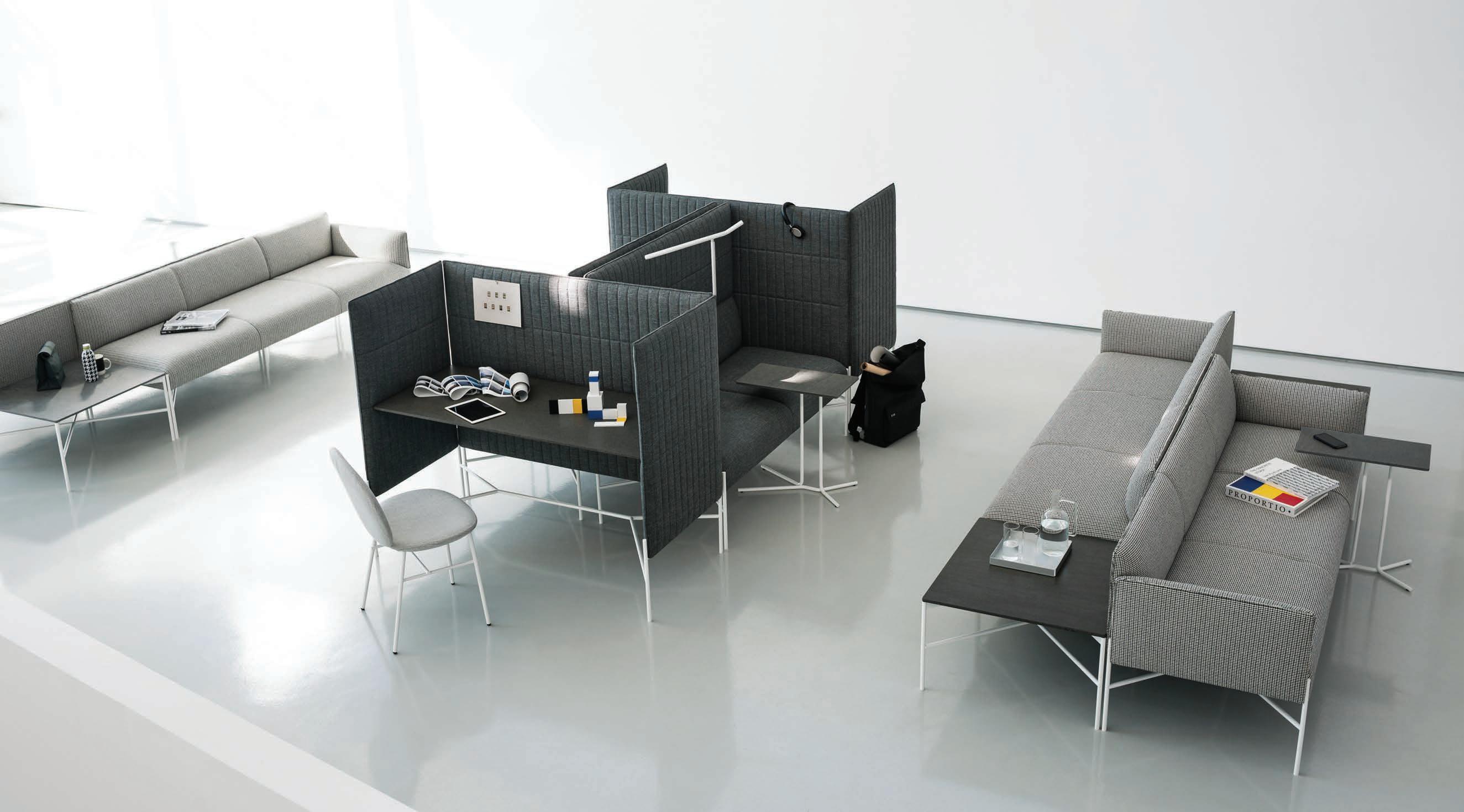
Space Recalibrated
Indesign Woven Image
Three years of research and 15 prototypes have distilled into one groundbreaking product that’s set to transform the workspace. The result of all that hard work is Scale – a modular, acoustic, architectural cell that completely rethinks the freestanding room divider, making it highly functioning and utterly flexible. Scale is the outcome of a collaboration between textile and interior finishes company Woven Image and leading British designer Benjamin Hubert, in response to the transformation underway in the workplace. How we work has been mutating over the last decade and the shift toward flexible modalities of working isn’t over yet.
“Workplaces today are constantly in flux, with teams organically growing and shrinking as projects demand,” says Hubert. “Commercial interior spaces need to be able to adapt to these demands.” This is where Scale is setting new standards and responding in new ways to changing environments by offering an innovative solution to the division of space.
2001: An Architecture Odyssey
The latest collaborative effort between Visual System and Philips Lighting Design gives you a glimpse into what our world might have become if Stanley Kubrick were an architect. Hosted in Brussels famed Atomium, Talk Interactive gives visitors control of a hemispherical sound and light environment. By placing their hands closely to a centrally located sphere, users can conduct an immersive light and sound experience around the larger sphere in which the work is situated. The project is an interactive extension to the Visual System public installation, Talk, and was the result of a series of discussions and experiments with Philips, with additional sound design by composer Thomas Vaquié.
Talk Interactive celebrates the legacy of Philips’ Poeme Electronique – a revolutionary multimedia experience, which was exhibited originally alongside the Atomium at the 1958 Brussels World Fair. Not unlike the work of filmmaking genius Stanley Kubrick, Talk Interactive forms a part of the Philips brand’s continued experimentation effort toward creating new and surprising experiences for the world through lighting. And they’ve certainly nailed it here.
A Proper Working Model
Indesign Krost
Krost’s new Sydney home is pushing the boundaries of what we’ve come to expect from the humble design showroom. Designed by interior architect Carly Krost, the new showroom cleverly weaves Krost’s office and staff spaces with interesting product displays. At the custom Design Studio visitors can test, try and play with various materials and colour swatches. The expansive, industrially inspired space boasts a truly intuitive experience, while showcasing the full library of Krost’s commercial and workplace design solutions.
IN SHORT INDESIGN 39
From sunrise to dusk —
5PM | 3000K
light for every mood.
3000K— 2000K
PREMIUMLIGHTING.COM.AU SALES@PREMIUMLIGHTING.COM.AU
The perfect ambience in residential and hospitality projects is now possible with revolutionary sunset dimming technology. Inspired by sunsets, this technology emulates the light of the sun going down. The Dusk Series delivers an innovative LED system that can be dimmed to 2,000 Kelvin. 8PM | 2000K CRI 90+ COB TECHNOLOGY 3K–2K DIMMING
Like The Corners Of My Mind...
Japanese installation artist, Chiharu Shiota is interested in memories, and the many objects and places that bear significant memories for us. The Japanese-born, Berlin-based artist recently presented her first Australian solo exhibition in Melbourne last year at Anna Schwartz Gallery as part of the broader Melbourne Festival.
Titled Absent Bodies, the installation was another of Shiota’s infamous tangled red webs – an explosive, wild and intricate flurry of blood-red string, fused with symbolic ornaments and objects.
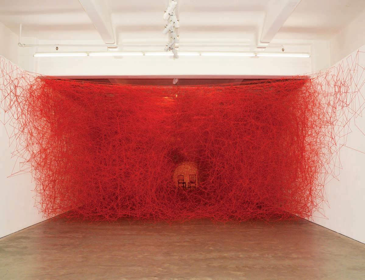
Born to a family of factory workers, Shiota’s father believed her life should be behind the sewing machine. But rather than follow in strictly industrial footsteps, she instead turned to winding and unravelling wirey yarn through museums, galleries and even (impressively) entire buildings.
“My creations with thread are reflections of my own feelings,” the artist explains. “A thread can be a cut, knotted or looped, can be
Shiota’s work is a poetic reminder that places, architecture, and all of our designed objects are imbued with memory, and become significant of their own accord.
loose or sometimes tangled. A thread to me is an analogy for feelings and human relationships.” At the 2015 Venice Biennale, Shiharu filled the Japanese pavillion with her tangled mass, suspending 50,000 tiny keys from the ceiling, which were donated from people around the world . And in Absent Bodies, Shiota’s red web stretched from floor to ceiling, wall to wall, funneling toward the centre to reveal two empty chairs facing one another. Shiota plays with the concept of objects and subjects that are no longer present but have left behind traces of their being there.
Her spellbinding work is a poetic reminder that places, architecture, and all of our designed objects – insignificant or significant at face value – are imbued with memory, becoming significant of their own accord. It’s a powerful idea in the ideation of any design; how visitors, consumers, or passersby will perceive design both now and in the future.
IN SHORT INDESIGNLIVE.COM 42
–
–

melbourne | sydney 1300 785 199 | info@interstudio.com.au www.interstudio.com.au FOR NOW
by CHRIS LILJENBERG HALSTRØM
Coming Up For Aire
Indesign Schiavello
In the commercial sector, the A+D community is increasingly involved in the war for talent retention. Mario Ruiz’ latest design, Aire for Schiavello, has just changed the battlefield. Meditating on proportion, balance and foundational geometries, Aire tells a design story of harmony – in aesthetics, in form, in utility – so seamlessly reflecting our dreams for accord and unity between individuals in the workplace. In this, Ruiz’ thoughtful design approach comes through in full force. “For me, design has to help the object to do its mission: being useful,” says Ruiz.
“Sophisticated, essential and light furnishings that don’t put labels on people, speaks so much about a company that seeks to add value to a more invisible thing like talent over status.”
Perhaps, then, Aire is less concerned with responding to talent retention than it is to supporting talent attention. After all, in Ruiz’ own words, “Design has to work for the people.” What a breath of fresh air(e).
Making Of A Danish Icon
Indesign Vola
Danish brand VOLA has always done things its own way – and with much success.
Starting with its partnership with revered Danish architect and designer Arne Jacobsen in the 1960s, the company has gone on to build a product line that is iconic and award-winning, and that remains true to Jacobsen’s design thinking and Scandinavian ideals.
All of VOLA’s products are made in its factory in Horsens, Denmark, using the finest materials that one can find.
A combination of traditional Scandinavian handcraft techniques and modern engineering technology is used to ensure the top-notch precision and quality finishing of all its products.
VOLA is also a specifier’s dream. Products are made in parts and upon order components can be assembled quickly, the purchase delivered in five days or less, anywhere in the world. In this era of nonexistent lead times – custom fixtures within these shrinking widows are a miracle.
IN SHORT INDESIGNLIVE.COM 44
Australian Centre for Contemporary Art Cities of Architecture
A series of talks exploring the recent architectural, urban and cultural history of some of the world’s most inspiring destinations. Enjoy a complimentary cocktail created for each city by the Melbourne Gin Company and Starward Whisky.
Launching 16 February 2017 at MPavilion, and continuing at ACCA from March to October. Season pass $200 / casual tickets $35.
Full program – accaonline.org.au/events
Australian Centre for Contemporary Art 111 Sturt Street Southbank VIC 3006 Australia accaonline.org.au
Connect with us: #accamelbourne acca_melbourne
Program Partner: Media Partners: Event Partners:
The Workplace Is A Jungle

Indesign Zenith Interiors


Armed with their new vision for the workplace – ‘No Boundaries’ – BuzziSpace emphasises that ‘nomadic-working’ is essential. According to BuzziSpace, there is a rapidly growing number of working nomads who seek highly experiential environments to meet and network with other individuals, making visits to the ‘o ce’ a luxury and a form of reward. It speaks to the ‘No Boundaries’ positioning of the brand, where design is meant to be adaptive for di erent work and collaboration styles.
On their stand at the most recent Orgatec, you could experience two worlds. On one side, an urban setting for the daily exible work routine where the BuzziJungle took a central position. Here, all kinds of solo workers can unite for working apart together in an inspiring ‘CoWork’ environment. Cross boundaries to the other equally luscious side, where you experience the true meaning of a: ‘Trophy O ce’, a real sanctuary where important meetings are held and key stakeholders are received in peace. Sociability, innovation and wellbeing take centre stage here, evident on the unique, experiencebased BuzziSpace stand. And we are totally obsessed!
IN SHORT INDESIGNLIVE.COM 46
Big Data Is Like, So On Trend
A custom-built big-data centre set provided the backdrop for Chanel’s spring- summer 2017 show at the recent Paris fashion week, which included models dressed as robots and bags with flashing LED displays.

Taking place at the Grand Palais in Paris, the brand’s famed creative director, Karl Lagerfeld – known for creating elaborate sets – transformed the historic site into the Chanel Data Centre. “The data centre is something of our time,” says Lagerfeld. “It’s the idea of the modern person, whatever the time, the century or the circumstances. It’s not technology in a cold way, it’s intimate technology,” he added. “Even if you don’t like the idea, technology
rules the world because it changed the world and it’s made many things easier; work, live and play.” The catwalk was set in front of giant control panels complete with multicoloured wires. Models, including two styled similarly to stormtroopers, emerged from the machines into a stark white room. The colours seen in the wiring were repeated in the collection, having been applied to digital prints and the signature Chanel tweed. Accessories included brightly coloured baseball caps, robot-shaped bags and monochrome clutches with LED displays. If the old adage that ‘fashion leads design’ is true, then we can rest easy knowing big data is going to be big – and beautiful, too.
IN SHORT INDESIGN 47
Turning 50 Feels Fabulous
Since 1966 B&B Italia has been at the forefront of iconic Italian design. This year, the brand celebrates its 50 th birthday via a series of international events, a documentary film and a new book which features a minimalist photographic series which pays homage to a truly rich and diverse design heritage.
Over the last 50 years, B&B Italia has produced some of the most iconic pieces of furniture and has played an important role in bringing design into the mainstream consciousness. Quality, creativity and innovation have always been part of the brand’s legacy. B&B Italia has collaborated and championed groundbreaking designers and architects who are now leaders in their fields, including the late architect Zaha Hadid, designers Patricia Urquiola, Naoto Fukasawa, Antonio Citterio and Barber & Osgerby.
The brand is known for having an unwavering commitment to investment in research and experimentation. The use of new technologies and materials and several of their products have won Compasso d’Oro industrial design awards. These achievements
are truly indicative of B&B Italia’s singular status – they stand as a design company truly unlike any other. Some of the brand’s most celebrated designs are the focus of a starkly beautiful photographic series titled: Abstract Landscapes that feature within the group’s latest book, The Long Life of Design in Italy: B&B Italia 50 Years and Beyond. Almost otherworldly, the series sees selected products placed within natural environments that highlight their form through bold contrast. Zaha Hadid’s Moon System glides silently on a granular red planet. Antonio Citterio’s Mart armchair rests back on a snow-dappled tundra. Shelf X by Naoto Fukasawa lies on pebbly sand, the lazy ripples of a wave caressing its geometry. While these products are beautifully portrayed photographically, in person their value becomes tangible.
For B&B Italia, the book, film and cavalcade of global events mark a 50-year milestone, as well as celebrate hundreds of iconic pieces and personal stories that connect us to the important legacy of design through the generations.
IN SHORT INDESIGNLIVE.COM 48
Indesign Space Furniture
PARISI.com.au SLOT Collection
It was late on Friday afternoon when we found out we’d won a large tender.
Of course, once all the high-fives stopped, reality set in.


We needed to staff up, fast. We called up some of the best contract engineers in the business to see who was available. Within a few days we had ten people about to start and nowhere for them to work.


But I was all over it.


I called in my Officeworks Business Specialist and we worked through all the furniture, tech and stationery we’d need. It was all ordered online, delivered and assembled before they started work. Another little win for me.

Get all over it. Visit officeworks.com.au/business-solutions
Printedfor09/02/2017.OWO2314_MB_BigWin OWO2314_MB_BigWin
Any Colour You Like
Birsbane-based sculptor Ross Manning’s monumental kinetic sculpture Melody Lines is all refracted rainbows - a little reminiscent of Pink Floyd’s iconic 1973 album, The Dark Side of the Moon. Installed within the cavernous foyer of Sydney’s industrial style art precinct, Carriageworks in late 2016, the largescale installation bended the boundaries of the site’s original architecture, offering up a new light and a new perspective. Suspended from the ceiling, Melody Lines is made up of an intricate system of conveyor tracks similar to those used in assembly lines and other industrial manufacture - touching upon Carriageworks’ industrial past. Described as ‘an expression of
moving colour in space’, the overhead conveyor weaves and zig-zags through the air above, ferrying numerous transparent pendants, which create an ever-shifting array of coloured light and shadows. The piece occupies the viewers peripheral vision, using optical flashpoints. For the time Manning’s installtion inhabited Carriageworks, its industrial interior was transformed into a dreamlike landscape, animated into a perpetual state of motion and flux. Through colour, movement and light Melody Lines begs us to bask in its radiance, but also to reconsider our surroundings, and the underlying architecture. Or, as Roger Waters put it, ‘Everything under the sun is in tune, but the sun is eclipsed by the moon.’
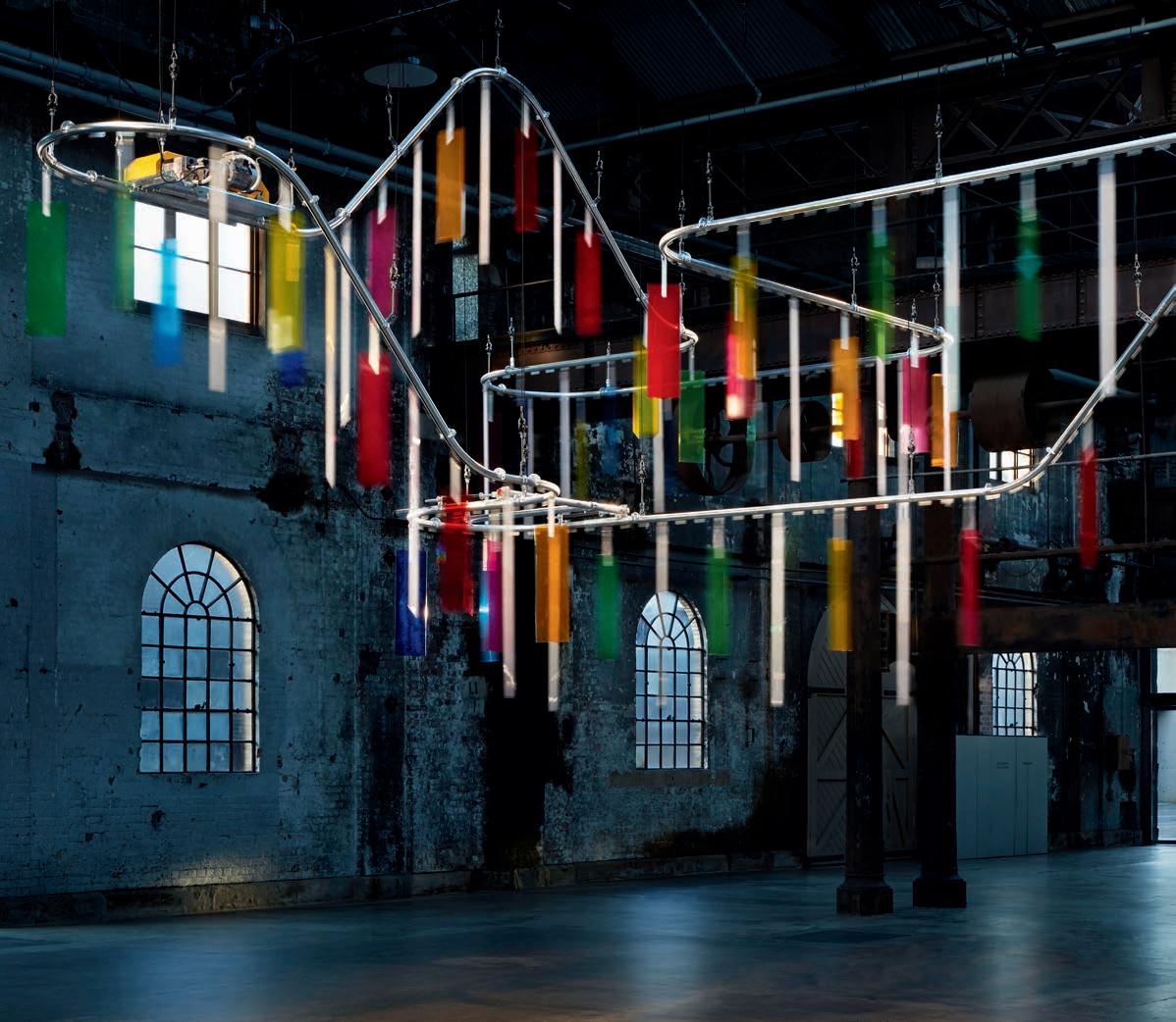
IN SHORT INDESIGN 51
It All Began... With A Bin
Indesign Cult
The Vipp story begins one spring Sunday in 1931 when 17-year-old Holger Nielsen decides to sell his car and invest in a metal lathe that allows him to work with one of his great passions – steel. As a newly educated metalsmith, Holger’s wife, a hairdresser named Marie, asked him to make a stylish bin for her salon. It was this request that marked the beginning of Vipp.
Accepting the challenge of crafting a receptacle for various potent chemicals found in a salon, Holger spent many days labouring in his workshop, until he emerged with what was to be the very first – and still unchanged – Vipp pedal bin. Many of Marie’s clients; doctors and dentists, felt the bin would be perfect for their own clinics,
particularly in light of its practical and sturdy design. And so, the humble Vipp pedal bin soon became a permanent and prolific feature of Danish clinics and has remained a fixture of the professional market for the last 50 years.
Today, Vipp is a third-generation family business. Holger and Marie’s youngest daughter, Jette Egelund took over the company in 1990, and has since been joined by her two children, Sofie and Kasper. Together with a committed team of employees and a growing range of products including everything from kitchens, bathrooms, dust bins and even an entire pop-up house, the family continues adding chapters to the remarkable Vipp story.
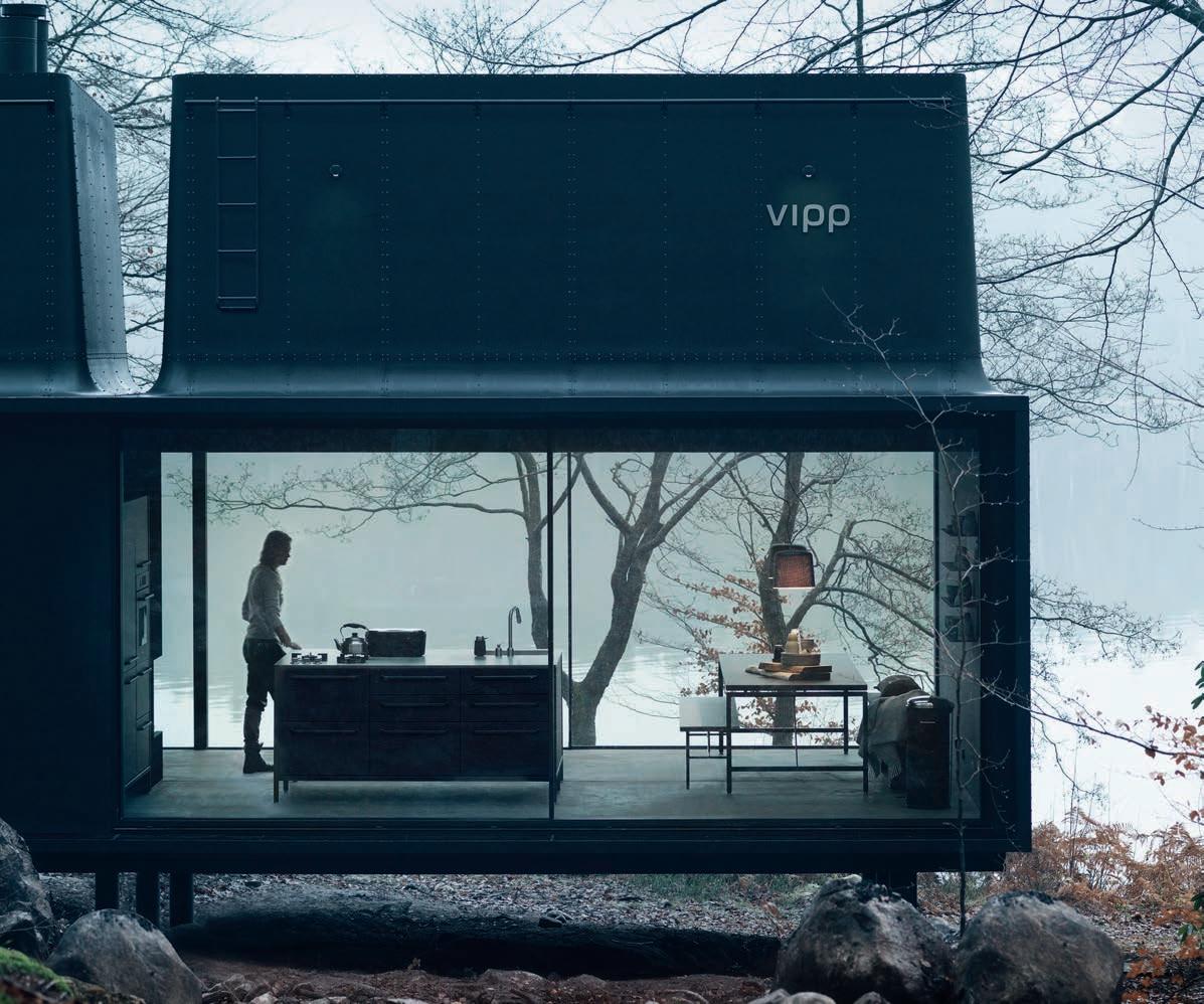
IN SHORT INDESIGNLIVE.COM 52
How Very Cross-Cultural
Macleay Street in Sydney’s Potts Point may be one of the most desirable local dining districts in the world. The strip is home to a collection of the city’s culinary best and brightest, including Kylie Kwong’s Billy Kwong, and Cho Cho San and The Apollo by chefs Jonathan Barthelmess and Sam Christie. Inventive menus, wine lists and flawless service rank on Trip Advisor – but is the secret sauce in the design? And if so, can design help to transport an otherwise local concept to another region of the world?
Barthelmess and Christie decided to find out, enlisting Sydney based interior starchitect George Livissianis (responsible for all three aforementioned) to fit out a Tokyo spin-off of Apollo. Located on the top floor of a new luxury plaza in Ginza, it may be just one of a handful of Greek restaurants in Tokyo, and certainly the only Australian-Greek eatery. Livissianis’ design fuses subtle crosscultural references to create something that holds steadfast to his original, but is also entirely new. Marble features (Greece) are paired with rich brown leather (Japan), while signage references the original Sydney outpost and Potts Point’s Art Deco past.
Some in the Bulbs collection were created using new techniques invented in the spur of the moment, but always with a uniqely ‘Netherlandish’ result.
Local Love
Bulbs is a local exhibition by Netherlandish design house, Lensvelt. The crowning feature of the initiative is that every possible aspect of it is local.
The objects themselves, created by artist Caroline Prisse, are blown in the famed Van Tetterode glass studio in Amsterdam. The studio worked together with Karel Appel, Jan Wolkers, Corneille Prisse and many other big names to produce these unique works with some local love. The Van Tetterode glass studio for example, is a company with a glorious history some Amsterdam inhabitants might still remember.
Lensvelt feels strongly connected to Van Tetterode and, through Bulbs, and hopes to contribute to the conservation and promotion of this unique company.
IN SHORT INDESIGN 53
–
–
Kobylka created the chairs to expose a material that would usually only be used as a supporting and unseen design element.
Can Concrete Feel Soft?
Designed by Brazilian architect Paulo Kobylka, The PK6 and PK7 chair and sofa are made from industrial metal screens. “The design intention transforms industrial profiles and a wired mesh, usually applied as supporting elements, into protagonists on the main stage,” says Kobylka.
Kobylka’s PK1 and PK2 sofas similarly questioned the appeal of industrial materials, by featuring long cantilevered cushions designed to resemble large slabs of concrete.
Each piece is handmade, with every trim, weld and fold manually created by a team of artisans. The braided pattern of the mesh has been created using an industrial loom. Foam cushions help alleviate the hardness of the material, with soft tubes also placed over the armrests. Hardcore comfort.
Sue Carr: The ‘Boys Club’
“One of the most challenging characteristics of the industry when I began my career in the 1970s was the lack of opportunities for women to lead in business. The era saw a construction and development industry dominated by men who considered interior designers as someone to choose the curtains and cushions. Along the way I embraced leadership positions within the tightly knit ‘boys club’, and I hope my example and dedication to education and advocacy for women in design has paved the way for a new generation of young talented females who seek key inspiration in their own careers.” – Sue Carr, Carr Design.

IN SHORT INDESIGNLIVE.COM 54
–
–
5 Minutes With Axia Design
Indesign Living Edge
“Our design process for commercial furniture always starts with what the workplace needs in terms of usage, comfort and accessibility,” says Axia Design co-founders, Jean-Loui De Ridder and Mathieu Gabiot. “The designs we create have refined aesthetics and minimalistic lines, which allows them to be fully integrated within public and office spaces. We always strive for contemporary and timeless creations, and Niche, StandAlone and PhoneBox are products that really echo these values.”
“Digital technology though, has been the greatest influencer in adapting our approach, especially with regard to communication on the move and having work at your fingertips at all times through mobile phones, laptops, tablets and apps. Technology has given us more mobility in and outside of the office. But the downside is
that they provide ‘noise pollution’, which affects the people around us. That is why we believe in strong acoustic solutions, and in fact we have incorporated this in all our designs for PROOFF, which boosts wellbeing by providing comfortable and quiet environments for refuge and focus. “‘Agile Working’ is another factor, although we don’t really actively use that term when designing – but we do work with the same principles. The furniture designs and interiors we create support an active way of working as opposed to being ‘glued to the desk’. The right space and product design enables organisations and people to move easily between open and silent spaces for activities such as face-to-face meetings, focus tasks, taking calls, checking your email, having co-creating sessions, just meeting up or to simply take a break from it all.
IN SHORT INDESIGN 55
Patrizia Moroso On Why Australian Designers Rule!
“It’s not something that I can prove, but it’s my gut feeling that in Australia and Asia there is a lot more creative freedom than there is in Europe. We have a heavy heritage and history of design, so we tend to get stuck in the same old boring traditional sofas and not break from that tradition enough. I hate that same old ‘grandma’s sofa’ approach to design. But because of Europe’s design heritage, it’s very common to continually go back to the classics, especially for the bigger design houses because they are safe, there is a security and confidence in those classics.
This however, gets in the way of research and experimentation, which means aiming to create something that has never existed before. And that’s what design should be – it’s about the ‘new’, if it already exists then what’s the point? In Europe this is a big
problem, where true design is considered scary and a bit dangerous. Australia and Asia on the other hand are very new, and have a very different culture of design thinking. Good design needs to have roots somewhere, and Australian designers have younger roots; roots that are made up of the roots of many other places around the world, not just the one.
I think as well, Australia is one of the only places in the world that has a strong culture of female designers – there seems to be far more female designers than there are in Europe, which is just sensational. It’s almost like a rebellion against the traditional design establishment of mostly men who played it safe, and now we have women doing wonderful artistic and experimental things taking us in a whole new direction.”
IN SHORT INDESIGNLIVE.COM 56
Indesign Hub Furniture
‘Be our region's talent on the global stage.’
Enter Now
INDE. is the new annual awards program by Indesign Media Asia Pacific, bringing together the best of our region for the first time.
INDE. celebrates the practices of design and architecture, and is uniquely positioned to offer international exposure and recognition.
The Building
The Design Studio
The Work Space
The Living Space
The Social Space
The Object
Launch Pad
The Influencer
The Prodigy
The Luminary
Architecture and design throughout Asia Pacific has never been more inspiring. Submissions for INDE. have been of such a high calibre that we’ve extended the entry period. Enter now and be part of the global design story. Submissions close on 17 February 2017.
indeawards.com
The Bvlgari Hotel London Design Week
At the recent London Design Festival, Bulgari Hotel got bold with Morag Myerscough and Luke Morgan’s interactive Sign Machine. Juxtaposing calm and chaos, Myerscough and Morgan have responded to the elegant and tranquil hotel lobby with a highly visible and playful disruption. The Sign Machine is a kinetic installation and is a response to the ‘crowdsourced product wall’ soon to be unveiled in the Designer/Maker/User permanent exhibition designed by Studio Myerscough at the recently unveiled London Design Museum. The machine uses some of the products from the wall and opens a dialogue between the user and the components of the structure and its surroundings. Users are able to sit in the machine and turn a series of rods to control signs that brandish bold simple messaging, causing objects and signs to interact with one another and create wider statements. It’s playful, provocative and just a lot of fun.
Get The Edge
Indesign Rogerseller
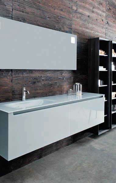
Italian design with Italian sophistication, Fattorini + Rizzini have created a sleek bathroom solution that combines elegance and functionality.
Waving the Italian design flag high is renowned designer and manufacturer of bathroom furnishings, Falper. Their latest creation enters a new dimension of luxury and brings forth a sculpted and refined basin vanity presented entirely in glass.
Designed by Fattorini + Rizzini for Falper, Edge is a timeless piece that combines clean lines with highly sophisticated craftsmanship. The sleek lines of the cabinet combined with the soft, sculpted curves of the integrated basin give Edge an ultra-modern aesthetic, while at the same time remaining classic and timeless. The 10mm tempered glass top is treated with nanotechnology paint that creates a softtouch feeling whilst also making the surface fingerprint and stain resistant, perfect for everyday use. 4mm tempered glass panels line the front and sides while double drawers ensure ample storage space. The drawers feature moulded handles that echo the soft design lines of the basin and compliment the soft frosted glass finish. Simply stunning.
IN SHORT INDESIGNLIVE.COM 58
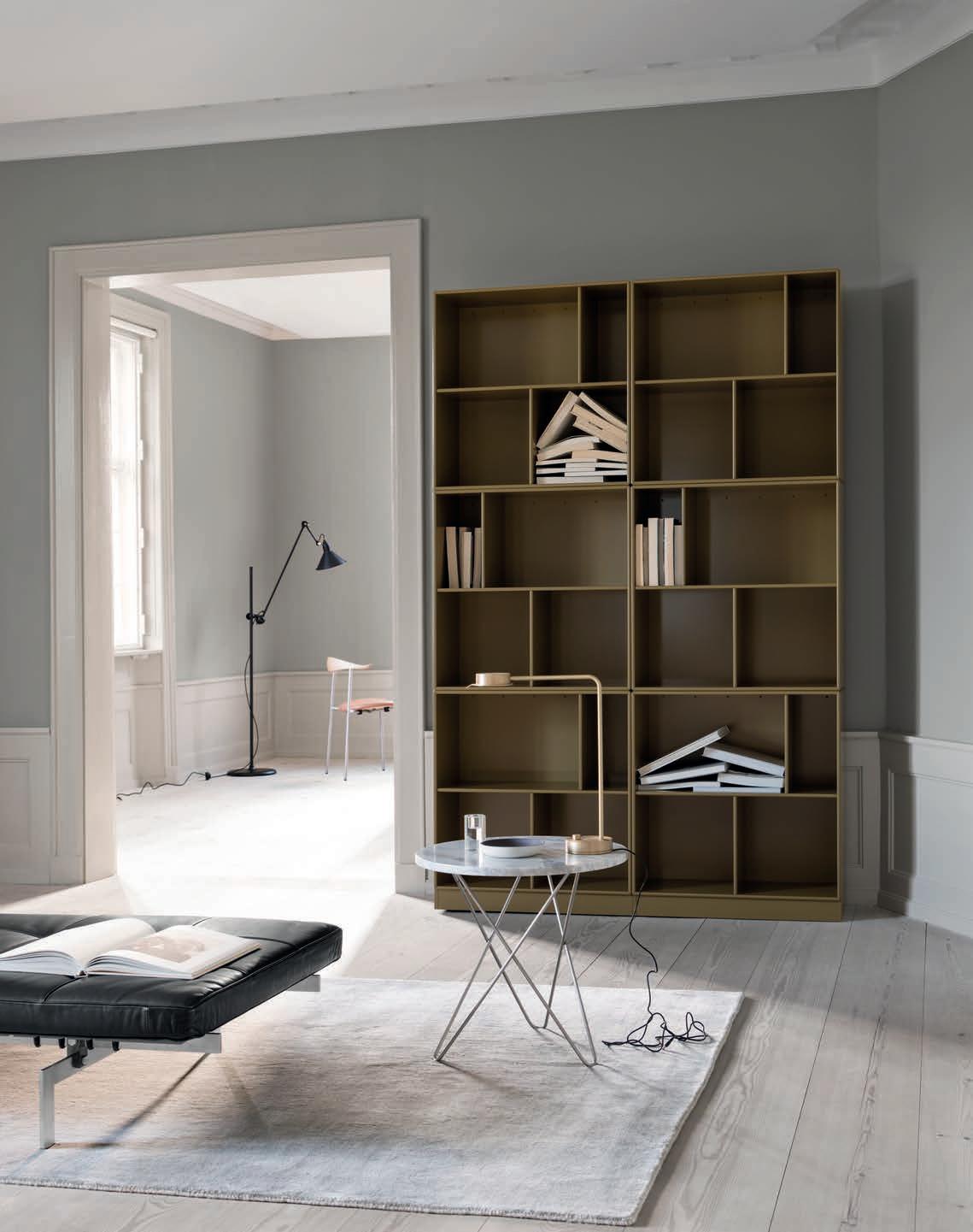
Can Shelves Have Personality?
Indesign Cult
Bringing cabinetry to the next level in our region, Montana’s modular shelving system offers freedom to create a room with true personality. The exceptionally functional system comprises 36 modules, 4 depths and 42 colours that can be combined in boundless ways to design expressive and customised spaces, suitable for creative homes and workplaces.
Montana was founded in 1982 by its current lead designer, Peter J. Lassen who since the 1950s has worked closely with the grand old men of Danish design, including Arne Jacobsen, Jørn Utzon, Piet Hein and Verner Panton. Lassen’s work with these designers is reflected in his idiom for simplicity-meets-functionality, thus inspiring the subsequent launch of several of their pieces in the
Montana’s founder, Peter J. Lassen once famously said: “What are you making? If your answer is ‘solutions’, then this is an ending. But if you answer: ‘I am making possibilities’, then it is an opening.”
Montana collection. Montana’s bright colour palette for example, carries on Verner Panton’s legacy as one the most colourful designers of his time. New collections within the flexible system are Montana SOUND, Montana Wardrobe and Montana Bathroom. The Montana collection also includes an office furniture line for modern workspaces and a series of height adjustable tables and desks with a strong design profile. When Lassen developed the Montana System, there was a detailed mathematic and philosophical principle behind it: every Montana element should be able to be infinitely combined, be practical, goodlooking, durable and independent of changes in fashion. That is the way it has been since 1982, and that is the way it will always stay.
IN SHORT INDESIGN 59
–
–
What Can Fashion Teach Us About Architecture?
Viktor Horsting and Rolf Snoeren, Viktor&Rolf, first came on the scene in the early 90s after, as amateurs and recent design school graduates, they took out all three prizes at the then Salon Européen des Jeunes Stylistes in Hyères, France. In the 23 years since, they’ve stayed relevant – and afloat – in the tumultuous fashion industry, a feat in itself. From October-February 2016/17 the National Gallery of Victoria (NGV), along with international guest curator Thierry-Maxime Loriot, held a spectacular exhibition showcasing some of the design duo’s most memorable moments. Luck has had nothing to do with their long-standing success. An artistic vision and cutting-edge eye was only a part of the equation,
as the two consistently prove that ebbing and flowing with the market is central to designing for what they saw was missing and in our current political climates. As other designers and fashion houses caught on and helped saturate one area – they quickly jumped to another. When you look at the history of their work, jumping backand-forth between fashion-cum-art installations, haute couture, ready-to-wear and around again, it’s immediately evident. As architects and designers we should read their approach as testimony that it’s not enough to be creative.
There are lots of creative people with agency out there – you need to be clever, responsive and forward-thinking, too.
IN SHORT INDESIGNLIVE.COM 60
HÅG SoFi Mesh
the latest addition to the HÅG
Family Now available in Australia! info-australia@sbseating.com
Introducing
SoFi
Add To Cart! Top Product Finds From...
Indesign Winya Indigenous Furniture
Seen And Not Heard
Indesign Luxxbox
The launch of the new Haptic spatial divider from ThinkLab by Luxxbox not only ushers in a new era in volume creation but will change the way the design industry looks at product specification. Taking over where traditional office partitions leave off, the Haptic screen is an innovative volume creator and spatial divider. Whether creating rooms within rooms or buffering hard surfaces, Haptic defines spatial boundaries while tackling the hard tasks of noise attenuation and privacy. “Research has demonstrated that enhanced privacy and noise attentuation will increase employee productivity. It means less disturbances and fewer interruptions resulting in higher concentration and quality of communication. Not to mention a general reduction in employee sound fatigue and stress, which can only be a good thing,” said Luxxbox founder and designer, Jason Bird.
To assist designers in navigating the screen, Luxxbox has developed an online specifying tool, enabling designers to build a Haptic screen in real-time, which then generates a visual representation and a unique specifying code for ease of quotation and ordering. “As product becomes more multi-purpose and complex, the margin for error in translation from original design intent all the way through to a project manager placing the order can increase exponentially. We see digital specifying as the future for the design industry. The investment in development of this tool is for the benefit our clients and designers and we hope to see it roll out across all of Luxxbox and ThinkLab product ranges in the future.”
IN SHORT INDESIGNLIVE.COM 62
Name Resi Double Chair Designer & Brand Winya Furniture
Name Ki Chair Designer & Brand Winya Furniture
Name Gen X Meeting Table Designer & Brand Winya Furniture
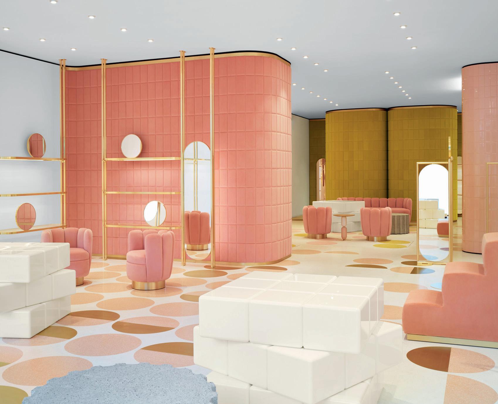
Red Valentino
By India Mahdavi
Famed Italian fashion house Valentino recently revealed their long anticipated RED retail concept store (an acronym for Romantic Eccentric Dress) on London’s enviable high-end Sloan Street.
The brand’s creative director, Pierpaolo Piccioli, commissioned French architect, India Mahdavi to create an emotional and highly romantic theme for the space. “The initial idea, together with India, was to create an intimate space, fraught with feeling,” said Piccioli. “A meeting place that favours dialogue. A virtual and real exchange of ideas.” Mahdavi, who is also the architect behind the interiors of London’s Sketch restaurant, developed an almost harlequin palette of colour and materiality to bring the concept to life. Primarily using bubblegum-pink and mustard-yellow velvet panels for the interior with a combination of chromatic and brushed metallics, Mahdavi and
Piccioli aimed to make the space inviting to customers through the space, made visible through the exterior shopfront framed in brass. Inside, the 170 square-metre space features Mahdavi’s signature use of colour, with accents of soft pink and vibrant ochre against a white backdrop. “Colour is fundamental in my work, so is texture,” said Mahdavi. “I use texture like colour, and I use colour to bring light.” The curving white walls are lined with plush velvet panels, and the white terrazzo flooring is patterned with coloured circles.
The whole interior is a celebration of fine detail. The fixtures for example, include clothing rails and light fittings made from brushed brass. Circular mirrors are fixed within the brass frames around the store, and Mahdavi’s 70s-style Charlotte chairs give customers a place to “romantically recline”.
IN SHORT INDESIGN 63
INDESIGN X light culture
Panzeri has been in the lighting business since 1947. Today, the Italian company remains wholly owned by the Panzeri family who maintain a high degree of hands-on involvement in the design and manufacturing of a wide range of decorative, semi-decorative and technical light fittings. So, what distinguishes this range from that of numerous other manufacturers?
Importantly, Panzeri does not make ‘glowing furniture’. Its full range of 70 product families is designed to be functional in terms of light distribution, glare control, efficiency and the use of high-end LED technology; the range does include a relatively small number of purely technical downlights as well as linear and track based lighting systems, but this is not where its major strength lies.
One of the company’s guiding policies is to be independent of external sub-manufacturers to the greatest possible extent. Over its near 70-year existence, this has necessitated a major investment in tooling, extrusion capability, casting, laser cutting technology and development of customised components. This not only ensures an efficient supply and assembly chain, but also provides total control over quality, which becomes clear when the fittings are examined in detail. Another defining aspect to the Panzeri philosophy is the sheer diligence and considerable design thinking that has been supported by use of high quality raw
materials and workmanship. In fact, much of the Panzeri design is based on the use of Venetian sourced glass in multiple forms and size options.
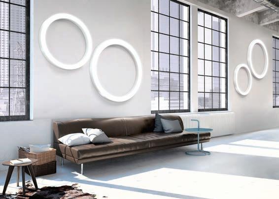
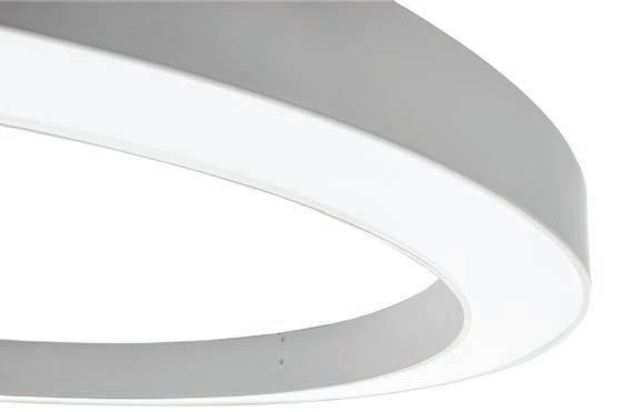
Though steepted in a culture of rich R&D, Panzeri clearly enjoys pairing well-researched technology with a refined design aesthetic. The strongly graphic ‘circles of light’ for example, which comprise the flagship ‘Silver Ring’ and ‘Golden Ring’ series are not just attractive sculptural pieces, but pendant or wall/ceiling fittings with scale and purpose.
These pendant, recessed, ceiling or wall mounted fittings are simple ‘filled’ circles, providing a downward, uniform, light distribution over a wide area from dimmable LED sources that can be provided with either a ‘warm’ or ‘cool’ colour temperature.
Interestingly, Panzeri’s commitment to the development of new and custom fittings powered by efficient energy saving LED technology is complemented by the fact that its factory is selfsufficient in energy terms.
The Panzeri collection carries a five-year warranty and, depending on shipping method, lead times vary between 6 and 12 weeks. To read thefull story, head to lightculture.com.au.
Light Culture is the exclusive partner of Panzeri in Australia.
lightculture.com.au light culture 64
Opposite: Gold Ring suspended luminary, designed by Panzeri available in Australia from Light Culture.
Words Andre Tammes Photography Christian Hillebrand
To encourage employees to interact, Neri&Hu created a staircase strategy with generous landings, seating areas and strategically positioned windows to enable chance encounters.
Stair Of Encounters
Media giant, Bloomberg had previously featured a “sculpturally iconic” spiral staircase connecting the three floors of its Hong Kong headquarters. But as the office began to grow in numbers, the company decided it would be better to swap this for something that inspires its workers.
Neri&Hu’s response was to create a more elaborate, boxy staircase that offers a variety of spaces for both informal meetings and spontaneous encounters. “The client’s brief was to design a staircase to connect the three different floors of their office, with the explicit rule that this stair should be used daily as the only vertical connection,” said the Shanghai studio, led by Lyndon Neri and Rossana Hu.
“Our challenge was to redesign a staircase that would work within the structural limitations of the knock-out panels in the floor slab, while still creating a more spacious journey.”
For Young And Old
Indesign The English Tapware Company
A common perception is that The English Tapware Company only offer brassware for classical-style interior designs. It is true that their product is ideally suited to the interior project where European eclectic style is celebrated by mixing contemporary pieces with traditional. However, for the ‘minimalist’ look favoured by some, Perrin & Rowe Contemporary is a range of tapware and showers with streamlined styling ideally suited to this purpose, just as the new hardware offerings from Armac Martin and Frank Allart Contemporary collections aid in minimalism.
Perrin & Rowe Contemporary offers not just the look but also the quality essential for specification into luxury and high-use projects. Tapware failure is not a desirable option in a busy hotel or in a beautifully detailed home. Armac Martin likewise offers not just the look but also the essential for specification into luxury and highuse projects. Frank Allart offers not just the aesthetic but also the functionality neccesary for specification into various typologies.
IN SHORT INDESIGNLIVE.COM 66
–
–
It’s A Shaw Thing
Indesign Shaw Contract Group
Designed by Gray Puksand, The Shaw Contract Design Lab in Melbourne, is a collaborative space where local design professionals can find inspiration in commercial flooring , engineered for beauty, durability, and cradle-to-cradle sustainability.
“The Design Lab is designed to meet the functionality and creative needs of our clients and team members,” says Shaw Contract Australia’s managing director, Bill Magee. “This space will become a hub for local design professionals, where they can experience our industry-leading commercial flooring products, as well as a place to learn, connect and be inspired.”
A challenging brief was given to Gray Puksand, to accommodate Shaw Contract’s design clients, sales team, customer service, operations and marketing in one cohesive and collaborative space. Gray Puksand accepted the brief to push Shaw Contract out of their comfort zone, delivering an innovative space for both clients and staff, which showcases the global brand with local relevance.
Dale O’Brien, associate at Gray Puksand and project leader for the Design Lab, explains that the project combines a ground floor retail showroom and warehouse and a first floor open plan space for 25 people. These include collaborative and quiet work areas and a multi-function meeting room. “Central to our design philosophy was to create a story around good design using quality materials, classic furniture and an acknowledgment of the importance of good partnerships in design. It was quite an honour to be selected to design the Shaw Contract Design Lab,” says O’Brien. Gray Puksand created bespoke design solutions, including shopfront graphics and internal signage based on the periodic table, as well as a creative carpet yarn installation. The installation adorns structural forms of the showroom space, exploring the evolution of flooring from a traditional art form to a precise science. The use of this raw product creates a secondary architectural wayfinding link to the rear of the showroom – a nod to the brand’s manufacturing.
IN SHORT INDESIGN 67
Product Report
Cersaie 2016
Indesign Urban Edge Ceramics
This year, there was a small seed of expression by several companies which showcased the technological directions being pursued. These brave conductors expressed themselves with the instruments of large textured and very stunning surfaces within the ranges of 2800x1200x6.5mm. This forward-thinking technology is also seen being paired with cold-glaze technology where the porcelain is fired at only 80 degrees compared to standard glazes starting at 800-1,200 –degrees dependent upon colour.
There was also aspiration toward the ‘perfectly imperfect’ texture. Tactility became a relieving juxtaposition to the smooth unsympathetic surfaces we are exposed to on a daily basis. The products presented this year provided a rich, sensory experience of both tactility and playful aesthetic contrasts. The shift from cold surfaces to warm tactile finishes revealed surfaces more like linen
than ceramic. Paired together with lighter and thinner technologies, this concept points the materiality of ceramic surfaces toward a new trajectory with limitless opportunity for experimentation. To this end, one of the show-stoppers at this year’s Cersaie fair was the Dream Series by Italian design house Fondovalle.
Dream is inspired by the natural weft of linen: one of the world’s most ancient fabrics still widely used in interior design for its simple yet refined look. A light but outlined weave crosses a surface available in three pastel shades that evoke the colours of the sky, earth and green, in a wide range of formats.
Like a painting, uncontaminated forests decorate the wall, echoing the enjoyment of our vital relationship with nature. Certainly one of the best innovations to come out of this year’s offering, beautifully combing technology with ancient materiality.
IN SHORT INDESIGNLIVE.COM 68
Raising The Bar
Indesign China Good Design
Described as the first independent design competition in China, the China Good Design award was established in 2015 to bring outstanding works by local and overseas designers and companies to the attention of the huge Chinese market. The programme is organised by Red Dot, which is well known globally for the illustrious Red Dot Design Award.
The winners of China Good Design 2016 were announced on 30 October in Xiamen. A total of 158 works were recognised across 31 diverse categories, from Living Rooms and Bedrooms to Households, Interior Design, Fashion, lifestyle and accessories, Sports, Communication, and more. Following the same stringent judging standards that the Red Dot Design Award is famous for, this year’s entries were assessed by an international jury made up of independent industry experts such as Gordon Bruce (USA), Martin Darbyshire (UK), and Prof. Renke He (China).
The Gold Standard Of Retail Design
Safety deposit boxes function as display cabinets in this Bangkok retail space for Spanish footwear brand 24 Kilates. Designed by Barcelona studio, External Reference, the design team were briefed to create an interior that exudes both luxury and high-end eccentricity.
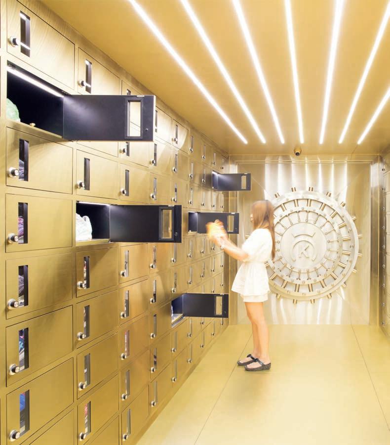
The brand itself described their vision for the new space as: “not just a common clothing shop, but a place where clothes are carefully selected and presented as precious art pieces.” And thus, the shoestore-cum-bank-vault concept was born. Featuring a wall disguised as a grand vault door with a big wheel that frames the shop logo, the functional merchandising element of the space uses an array of safety deposit boxes lining the walls in place of traditional shelving. “The interior looks like an exclusive treasury, filled with safes and safety boxes,” said the architects.
The team chose a primarily gold colour scheme to create the impression that everything in the shop is made of metal, ultimately conveying a sense of material value. The golden deposit boxes span whole walls, with some shoes hidden behind closed doors – again, reinforcing the idea of exclusivity. “These devices help to hide products from customers’ view momentarily, which invites them to discover products,” said the designers. “Each design feature was strategically developed to confer further magic, mystery and uniqueness to the items exhibited.”
IN
INDESIGN 69
SHORT
INDESIGN X Fisher & Paykel
Work better, work together.
“We are curious about people. How they live, where they live, what they do and how they use things.” The Fisher & Paykel culture is one of open innovation, which allows people to work collaboratively to find insights and ideas that connect with customers and respect our planet. “Our belief in innovation and creativity isn’t limited to our design teams,” says Fisher & Paykel’s General Manager of Design Integration, Mark Elmore. “We foster resourceful and imaginative thinking across the company. Even from way back in the early days, we have always maintained this egalitarian approach to ideas.”
This is a uniquely valuable and advantageous feature for us architects and designers, who – for once – are given the opportunity to influence product direction based on what we are experiencing in our own projects; the challenges, the trends, the briefs, overall functionality and so on.
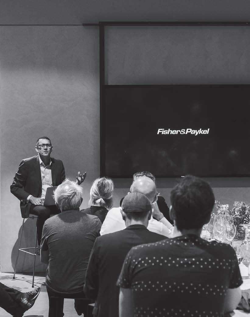
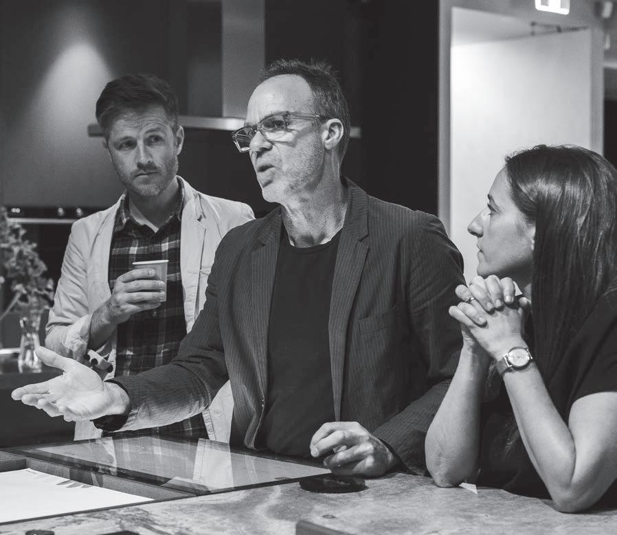
Recently, Fisher & Paykel held the Future Design Workshop ; an interactive, hands-on forum, giving a select group of Australia’s top architects and designers an exclusive, first-hand look at the brand’s planned product offering as well as the opportunity to shape the future design of their appliances.
Hosted at the magnificent new Fisher & Paykel Experience Centre in Sydney’s Alexandria, the half-day workshop featured insights from key figures including Auckland-based industrial designer, Jamie McLellan, General Manager of Industrial Design Mike Jensen, Chief Designer for Cooking and Dishwashing Products Lauren Palmer, and Chief Designer of Laundry and Refrigeration Mark Haydon. Broken up into smaller groups of around eight architects and designers, the Fisher & Paykel team
created a series of stationed workshops where they invited designers could ask questions, give critical feedback, offer suggestions for future developments and generally provide insight on current market expectations on the Australian lifestyle design category.
As architects and designers working on the front lines, no one is more clued-in about the needs of the market than us. So it is a source of perpetual frustration when many of the European appliance houses for example, design their products a) without much industry consultation and b) exclusively for the needs of the European market.
This investment in local feedback and experience truly sets Fisher & Paykel apart, and the collective experience of the 20+ designers at the recent Future Design Workshop is a real testament to that. In fact, many of those present consistently expressed their appreciation for the opportunity to share their frustrations and wish lists alike with Fisher & Paykel, particularly around the areas of multi-residential and commercial projects.
What is really exceptional here is that the Future Design Workshop isn’t a one-off occurrence, but an on-going commitment to design curiosity and discovery. This culture of collaboration – both internal and external – is a hallmark of the Fisher & Paykel brand, where “hidden insights are waiting to be uncovered,” says Elmore. “For us, design is not a self-serving goal; it is a human endeavour to make life better. Continuous innovation is part of the Fisher & Paykel design philosophy.”
The results of the Future Design Workshop will see the release of some major product innovations in 2017, so stay tuned!
fisherpaykel.com/au fisher & paykel 70
Opposite: The Fisher & Paykel Future Design Workshop, hosted at the Fisher & Paykel Experience Centre Sydney, November 2016.
Words Sophia Watson Photography Jackie Chan


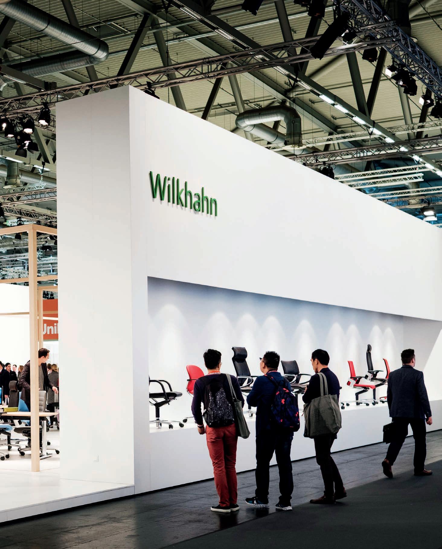
INDESIGN X WILKHAHN
Words Narelle Yabuka Photography Courtesy of Wilkhahn
Everyone’s talking about movement in the workplace. Is that the only thing we need to worry about?
IN SHORT INDESIGN 73 wilkhahn.com.au wilkhahn 73
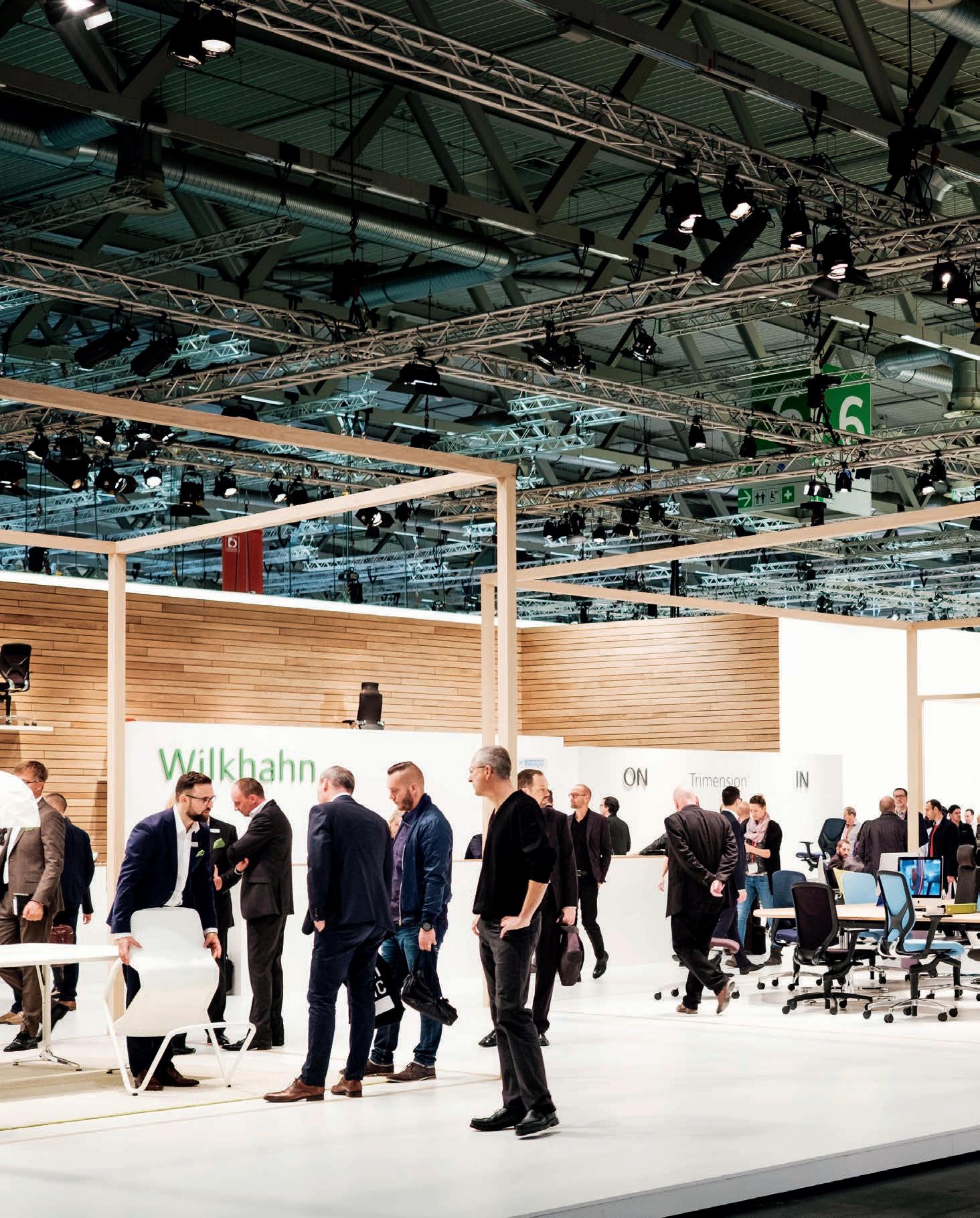
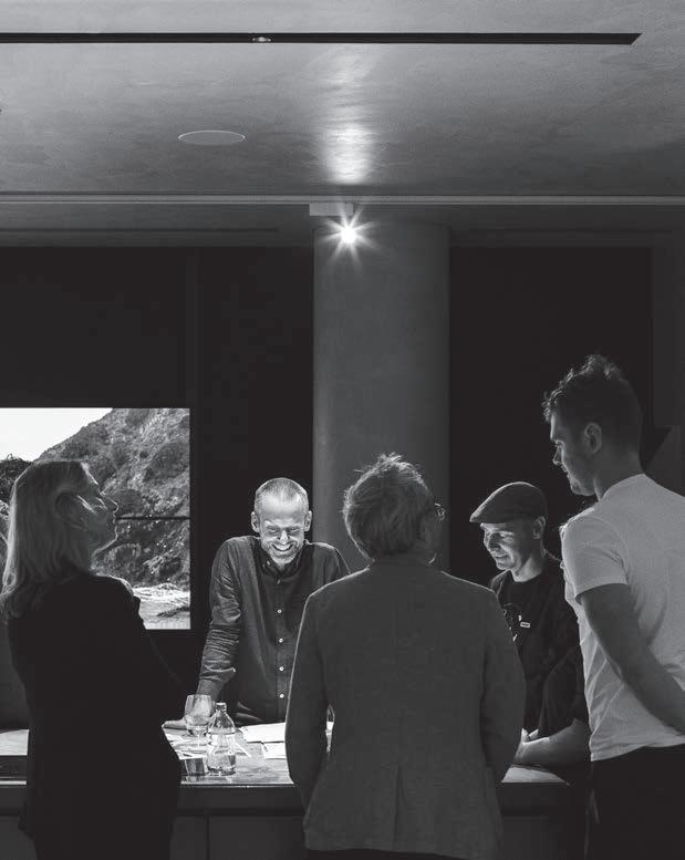
Touring the halls of the international office furniture trade fair Orgatec, you can be assured of hearing one term repeatedly: ‘movement’. There’s no surprise there. Every brand with its finger on the pulse of workplace design discourse will claim to have deeply considered the physical need for a range of postures for the seated human body.
There were certainly standout products to be seen in response to the issue of movement, yet some brands achieved more sophisticated outcomes than others via the depth with which they considered and tested the physical realities of that one little word. But is there more we should be thinking about?
“We’re not just physically over-stressed, which is a huge problem globally; we’re also mentally over-stressed,” says Burkhard Remmers, Wilkhahn’s Germany-based Director of International Communication and Public Relations. “It’s the worst combination you can have, and people are feeling it more and more in their lives and work,” he adds.
For Remmers, and for Wilkhahn, this is one of the three biggest problems we face in the workplace. And we embark on a conversation about how the company is responding proactively to the big challenges in today’s work environments.
He explains, “The mixing of professional and private content on the same device means we’re never offline anymore. There’s no rest day. We’re constantly expending mental energy. The normal bodily reaction to mental stress is maximum physical activity, but if you’re restricted in your movement, that’s when health problems emerge.”
He cites a study recently released in Germany that evaluated the reasons for sick leave. “More than 50 per cent of the days off were for muscle, joint and psychological issues. Depressive disorders and burnout are becoming heavy problems in our society,” he says. Wilkhahn’s IN task chair, with its three-dimensional flexibility that encourages changes in posture and therefore the release of muscle tension, is perhaps the brand’s leading product in the quest for a healthy body at work. But perhaps we could all do better at finding our work-life balance.
Number two on Remmers’ list of today’s workplace challenges has to do with the lack of identity in many offices. “Our capacity for virtual communication means we’re no longer forced to go to our workplaces. In response to that we’re seeing a lot of ‘collage’ design concepts. It’s the creation of different atmospheres in a bid to make the workplace more attractive,” he says. “But there’s not always meaning in that diversity; a lot of these spaces could be anywhere.” Related problems, he suggests, are the gamification of the workplace combined with the infantilisation of the worker.
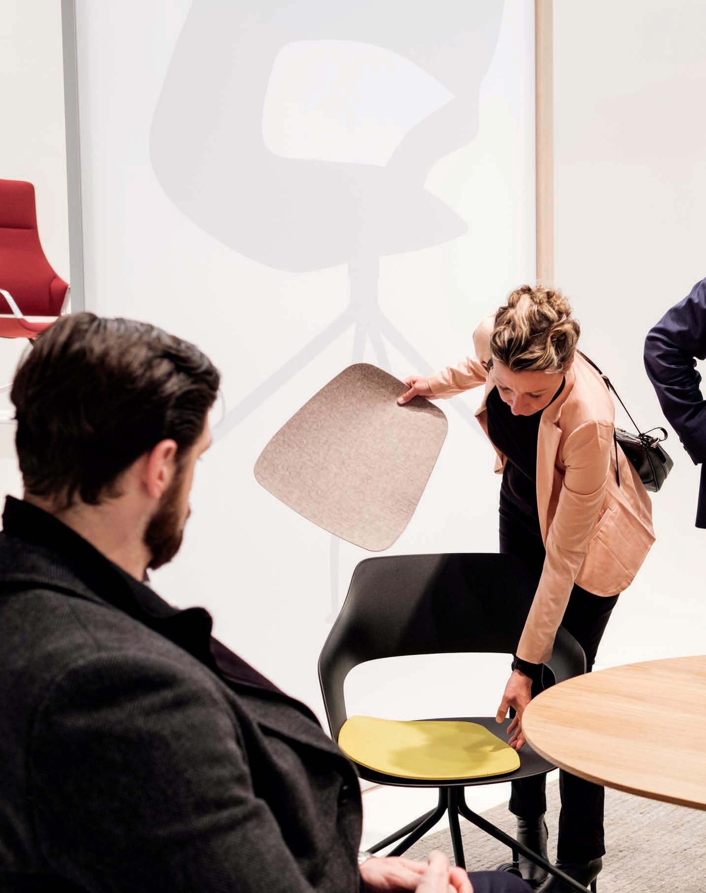
One of Wilkhahn’s new releases at Orgatec, the Occo chair and table range (designed by jehs+laub), targets exactly these problems through enormous versatility as well as an identifiable design language. The familiar forms of an ‘O’ and a ‘C’ can be read in the characteristic shape of the chair’s seat and backrest. But a suite of options for the frame, the cushioning and the shell colour add up to a staggering 72 possible variants through which designers can respond to the particular functional and stylistic requirements of their project. “We think it’s a good answer to the identity problem,” says Remmers confidently.
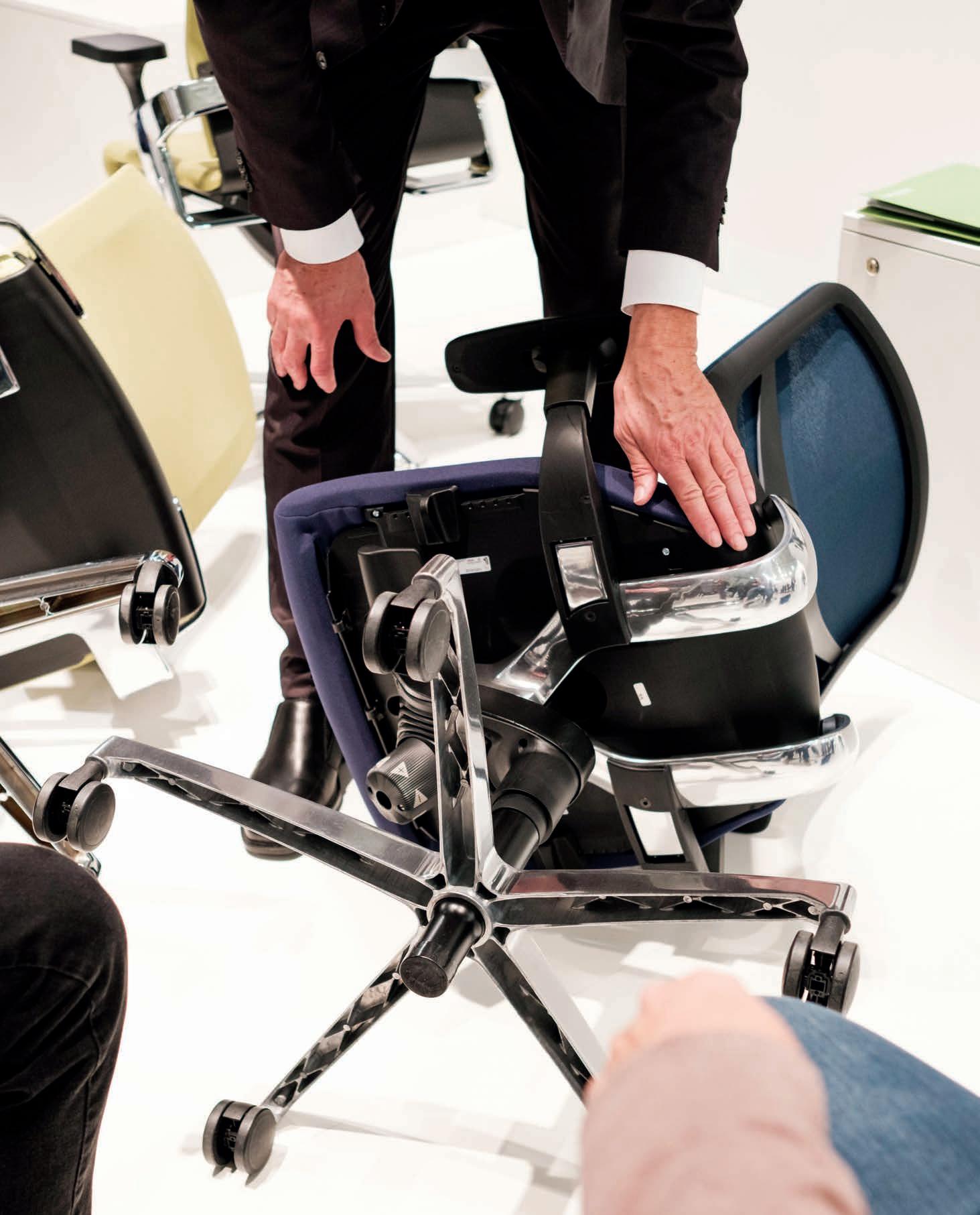
Challenge number three, he suggests, is a lack of curiosity – or more accurately, a lack of fascinating objects that inspire curiosity and the experience of new forms. “Curiosity is a motivation to move,” he says. “It can animate people because we’re curious by nature.” He points to another of Wilkhahn’s newly launched products – the Metrik cantilever chair. “The cantilever chair is an old topic, but with new technologies it’s possible to have a completely new design approach.”
Metrik was designed by whiteID, a studio that’s best known for its automotive design work, and the parametric design methods of that industry can be clearly read in the chair’s form. Polygonal shapes and rounded edges are part of its distinctive integrated body, which is defined by the form-fit assembly of the tubular steel frame and seat component. “It’s a fascinating aesthetic that can be found in architecture as well,” says Remmers.
And while the smart, self-stabilising mechanism of the new mAx table by Andreas Störiko was a talking point, the sense of fascination didn’t get any stronger at Wilkhahn’s Orgatec stand than around the prototypes for PrintStool One – a 3D-printed stool designed by Thorsten Franck and made with biodegradable lignin. “It’s the perfect example of how we use new technologies to increase the value of an object and stimulate people to use it,” says Remmers. We’re already wondering when we can place our orders.
To think of the work environment as a place where risk dwells seems drastic at first. But when you consider the links between one’s environment and one’s physical and mental health, it’s not such a stretch. If the design of the objects around us can optimise our physical experience of the workplace while also influencing our mental experience of it toward the same end, we’d all have a lot less to worry about.
wilkhahn.com.au
IN SHORT INDESIGNLIVE.COM 76 wilkhahn 76
Previous: Wilkhahn Orgatec 2016 stand in Cologne, Germany. Opposite: The Occo chair, designed by Jehs+Laub (Markus Jehs and Jürgen Laub) for Wilkhahn. Next page: The IN office task chair, designed by Wilkhahn.
“The mixing of professional and private content on the same device means we’re never offline anymore. There’s no rest day. We’re constantly expending mental energy. The normal bodily reaction to mental stress is maximum physical activity, but if you’re restricted in your movement, that’s when health problems emerge.”
Big thinkers and
C reati Ve gUrUs
INDESIGN 79 IN Famous FAMOUS IN
The Road Less Travelled
Words Leanne Amodeo Photography Ryan Cantwell
Scandinavian architectural and landscape workshop, Snøhetta, recently expanded their practice to Australia – not in Sydney, nor in Melbourne, but Adelaide! It seems to be a hallmark of the brand to set up shop in traditionally obscure or overlooked locations around the world. Snøhetta’s managing director for Australasia and architect, Kåre Krokene, explains why.
It’s been almost 30 years since Snøhetta’s Norwegian founding partners established their first office in Oslo. The choice of location was certainly logical, but following the architectural practice’s inaugural commission to reconceive the Alexandria Library in Egypt, its ‘small town’ base was suddenly called into question. Unsurprisingly, there were those who thought one of the bigger European cities would have been a more appropriate place for such a globally-focused firm to be operating, especially considering the significance of its growing portfolio.
Those same commentators were probably just as bemused when the practice established a studio in Innsbruck and most recently (and, quite possibly, most unexpectedly) Adelaide. Although Snøhetta’s second office is in New York and it now also has studios in San Francisco and Stockholm, it’s become a hallmark of the brand to set up shop in traditionally overlooked locations. Their choice to work out of ‘under utilised’ cities in the regions in which they operate has been necessitated by major commissions in each locale, while the studios’ resulting growth has been an organic process, sustained by active, thriving markets that want what Snøhetta does.
For the practice’s managing director of Australasia and architect Kåre Krokene, the impetus to establish a studio in the South Australian capital gained traction off Snøhetta’s first Australian project, the UniSA Great Hall (in partnership with JamFactory and Adelaide-based JPE Design Studio). As he explains, “We’ve had some really good momentum come out of that process and we saw this as an interesting opportunity to formally set up a studio.”
Of course, Adelaide is the ideal homebase for Snøhetta’s Australasian operations. It’s central to both the east and west coasts of Australia and is in close proximity to New Zealand. But the establishment of the Adelaide studio isn’t simply a narrative on geographical convenience or professional congeniality. Rather, it’s about being part of a newly identified creative hub in order to realise outcomes not able to be achieved elsewhere.
Snøhetta’s business agenda not only benefits the practice itself but also considers industry, creating win-win situations across the board. People, process and projects (in that particular order) are at the core of the practice’s values and its DNA is formed by generosity of spirit, manifested in the promotion of knowledge sharing, genuine collaboration and an understanding of social and cultural context. “Gone are the days when the starchitect comes in, takes over and imposes their particular brand – it just doesn’t work anymore,” says Krokene. “It’s easy to do something incredible, but to do something credible you need local understanding and that’s why we’re going to be a plug-in, not a threat.” Krokene is working with a number of other Australian architectural practices, with the majority of projects currently based in Melbourne, including the Arts Centre Melbourne’s masterplan. By also situating the Adelaide studio in JamFactory’s CBD premises, the opportunities for ‘cross-pollination’ between the institution’s designers and makers and Krokene’s threemember team, are great.
Snøhetta could have just as easily set up a studio in Sydney or Melbourne, although there’s no reason to believe either location would have proven more advantageous. The new Adelaide studio exemplifies how borderless the architecture and design industries have become and its establishment encourages architects and designers to embrace the old cliché and think outside the square. Being open to opportunities regarded as obscure or unpopular stands to disintegrate industry bias and misconception, as well as breed innovation and growth. “Technology allows for it, cultures allow for it and people are open to it working,” observes Krokene. “And it’s a benefit getting somebody from somewhere else to come in and work with local designers, just as there are practices in Adelaide currently looking at international projects. It’s the way of the future and it shouldn’t be feared.”
snohetta.com
INDESIGNLIVE.COM IN Fa MO uS 80
Page 81-83: Architect and Snøhetta’s Managing Director for Australasia, Kåre Krokene in the firm’s first Australian location, Adelaide. Page 84: Kåre Krokene on a building site in Adelaide for one of Snøhetta’s inaugural Australian projects.
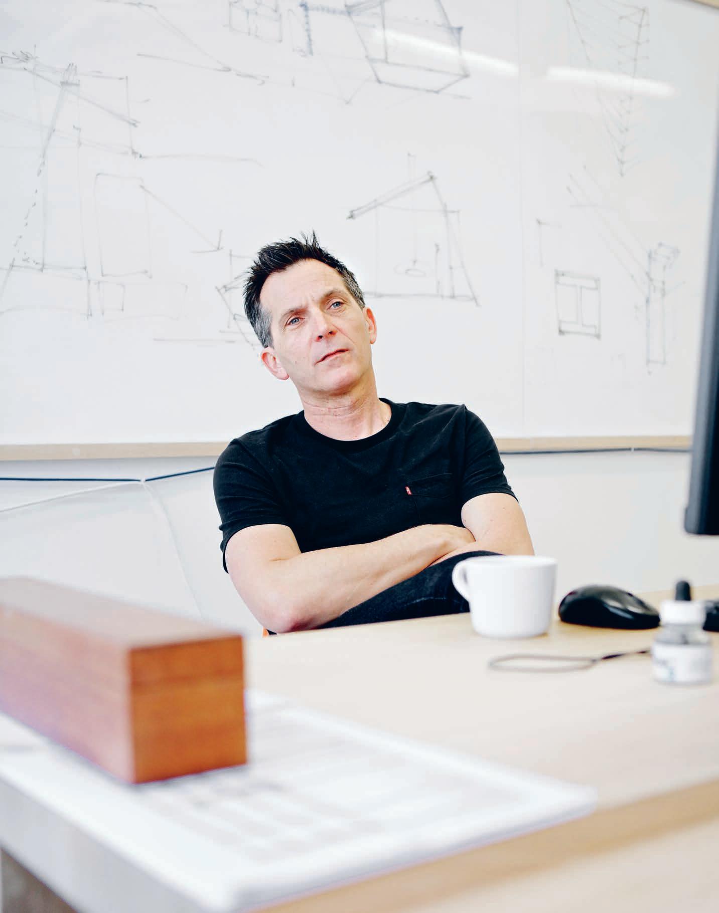
“Gone are the days when the starchitect comes in, takes over and imposes their particular brand – it just doesn’t work anymore. It’s easy to do something incredible, but to do something credible you need local understanding. That’s why we’re going to be a plug-in, not a threat."
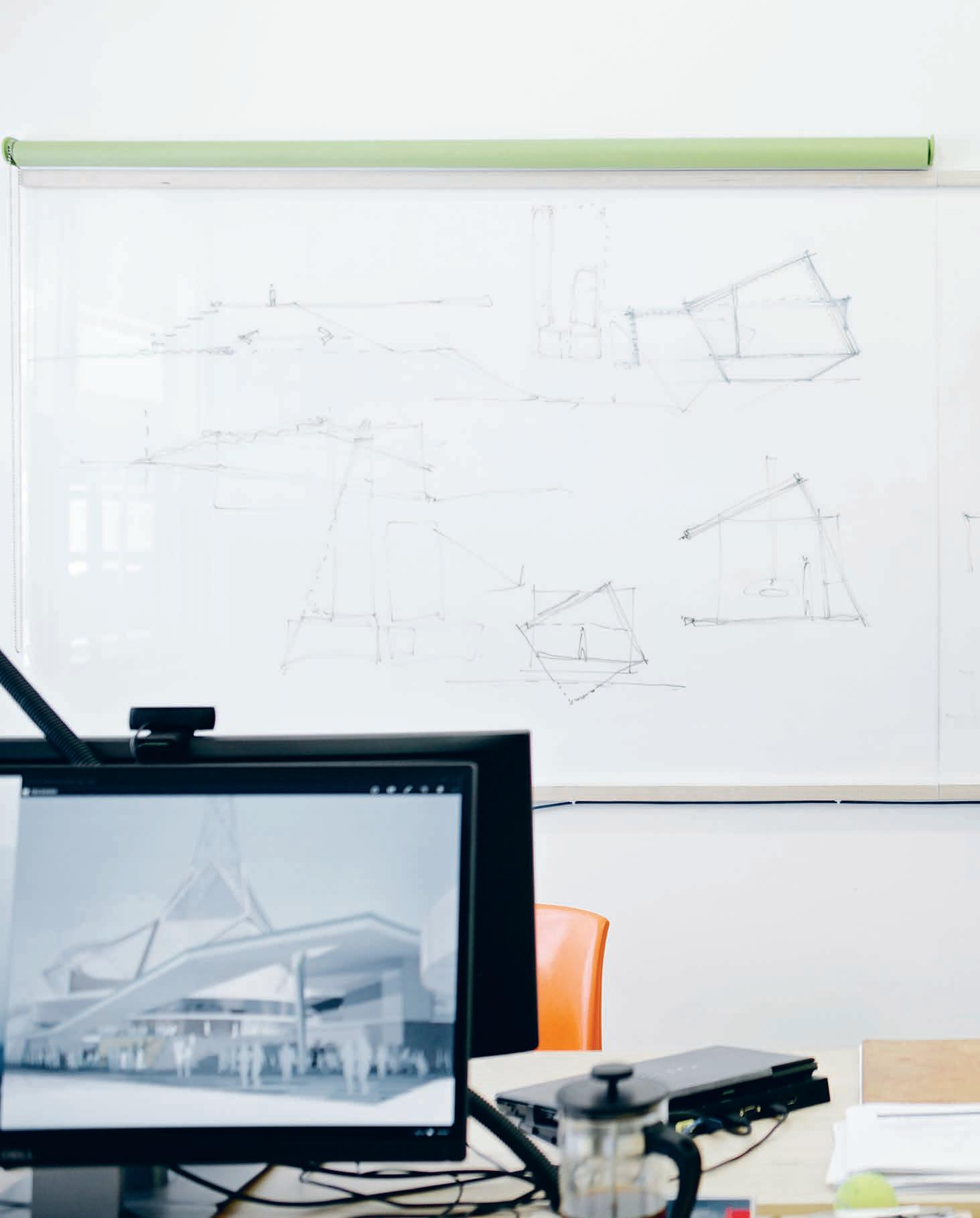 Kåre Krokene , Architect and Managing Director for Australasia, Snøhetta
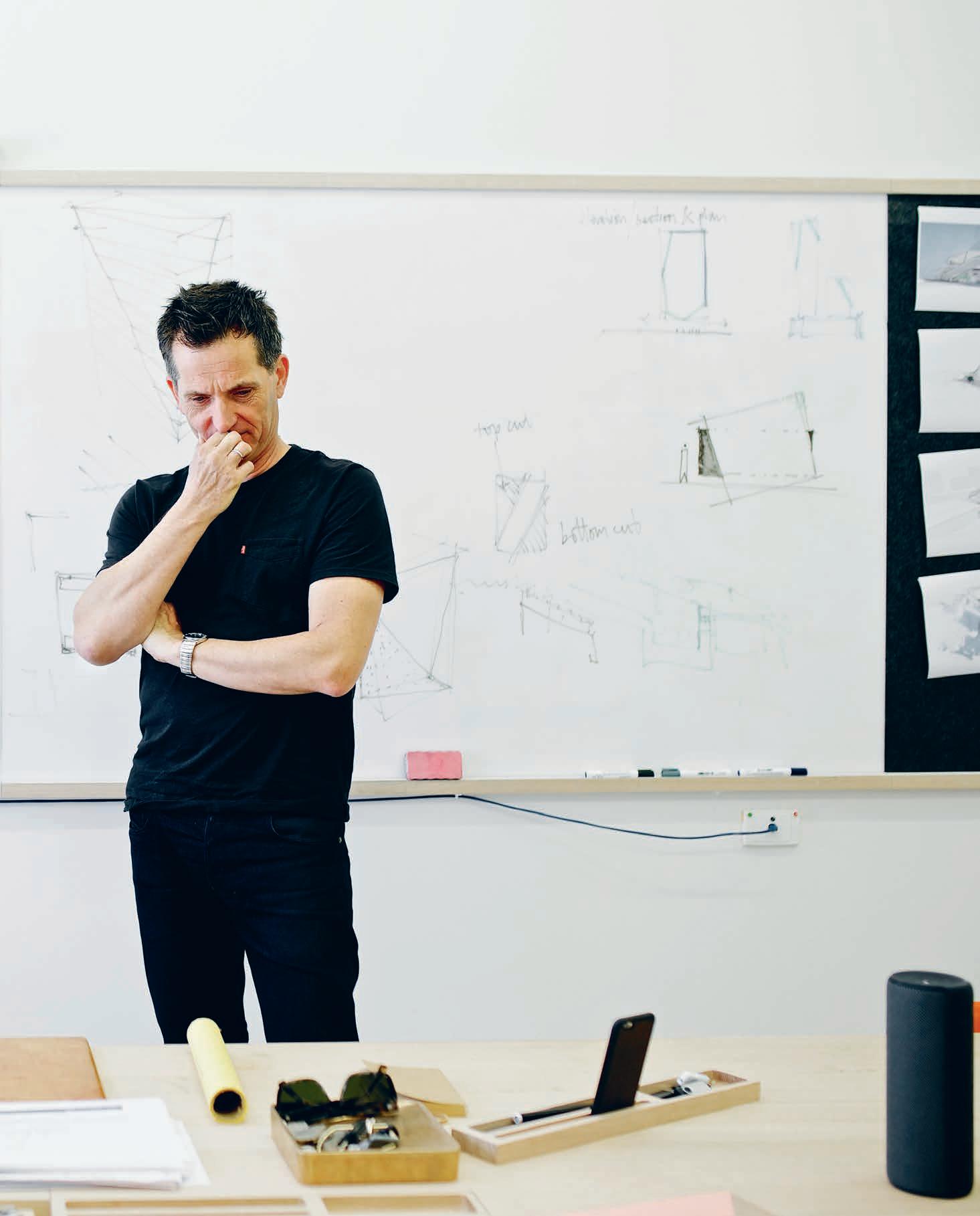
Think Local Act Global
“Technology allows for it, cultures allow for it and people are open to it working,” observes Krokene. “And it’s a benefit getting somebody from somewhere else to come in and work with local designers, just as there are practices in Adelaide currently looking at international projects. It’s the way of the future and it shouldn’t be feared.”
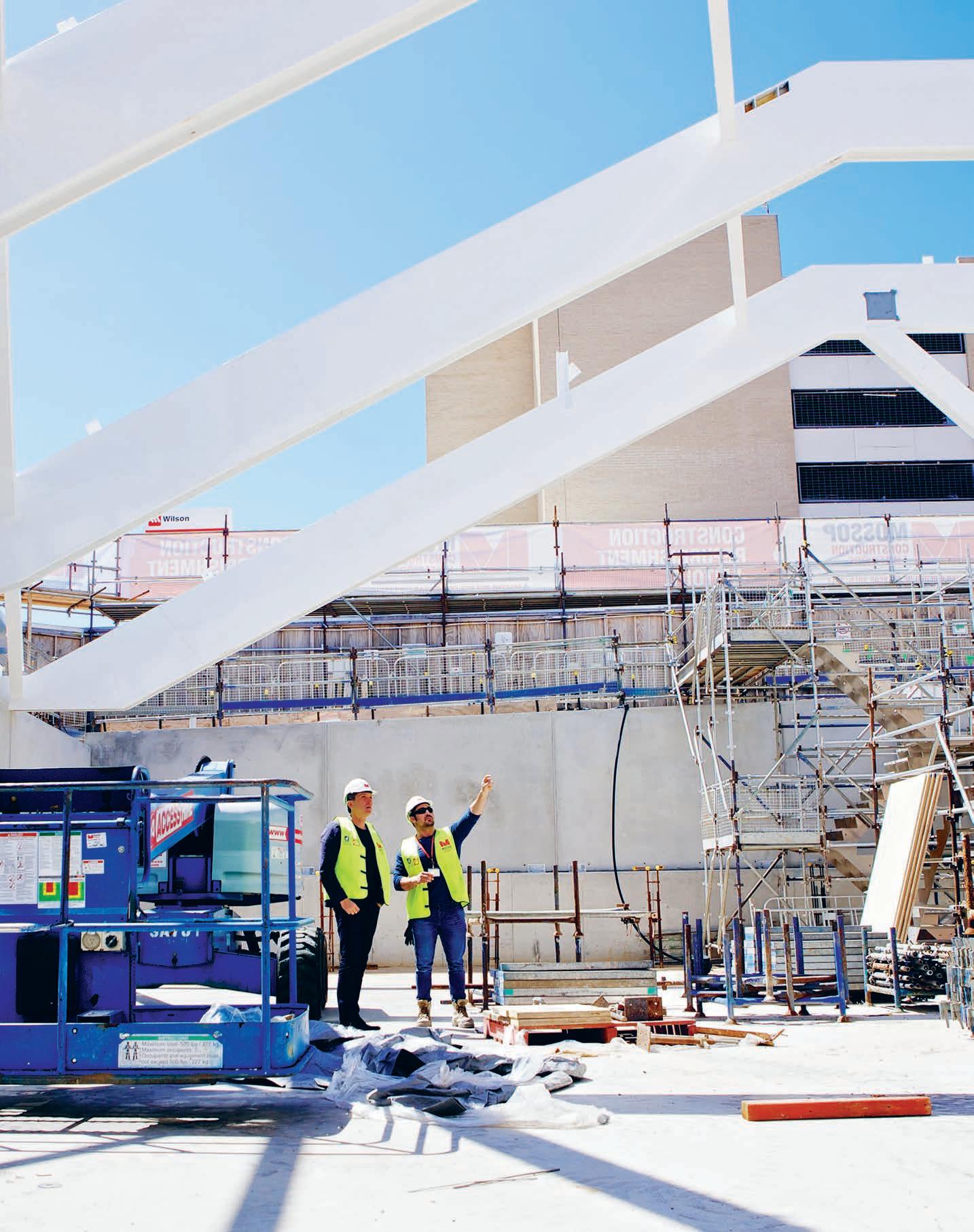
–
INDESIGN X CBS
Unique, dynamic movement in the office
Ever moving and changing day by day, the business world is never static. The modern workplace needs to reflect this in both its spatial design, and importantly, in its fit out options. With cloud computing increasingly the norm, and the use of hybrid laptop tablet computers ever on the rise, how we use computer screens and work day to day in the 21st century requires a different approach to the past.
Unique, responsive and expertly designed, Ollin is a dynamic monitor arm that encourages users to interact with technology and each other as seamlessly as possible. Ollin, from CBS has been designed to react to modern technological advances
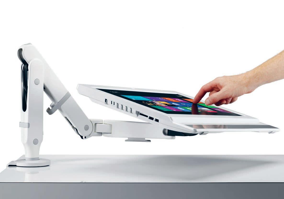
that have seen screens becoming lighter and more compact. The elastomeric properties of Ollin, means that the arm can accommodate weights from 0kg up to 9kg. As trends develop and screens become lighter, Ollin is positioned to grow with a business’ developing needs.
Another advancement in modern workspaces is the prevalence of dual screen working. With Ollin’s easy adaptability, it is able to support this shift in working styles with a dual screen mount, which can be attached to the main arm. With no need to provide a separate arm for each screen, expenditure is kept to a minimum, while the productivity benefits of dual screen working increases.
cbs 85 colebrookbossonsaunders.com/au
This page: Ollin’s dynamic manoeuvrability allows it to suit a wide range of office computing needs
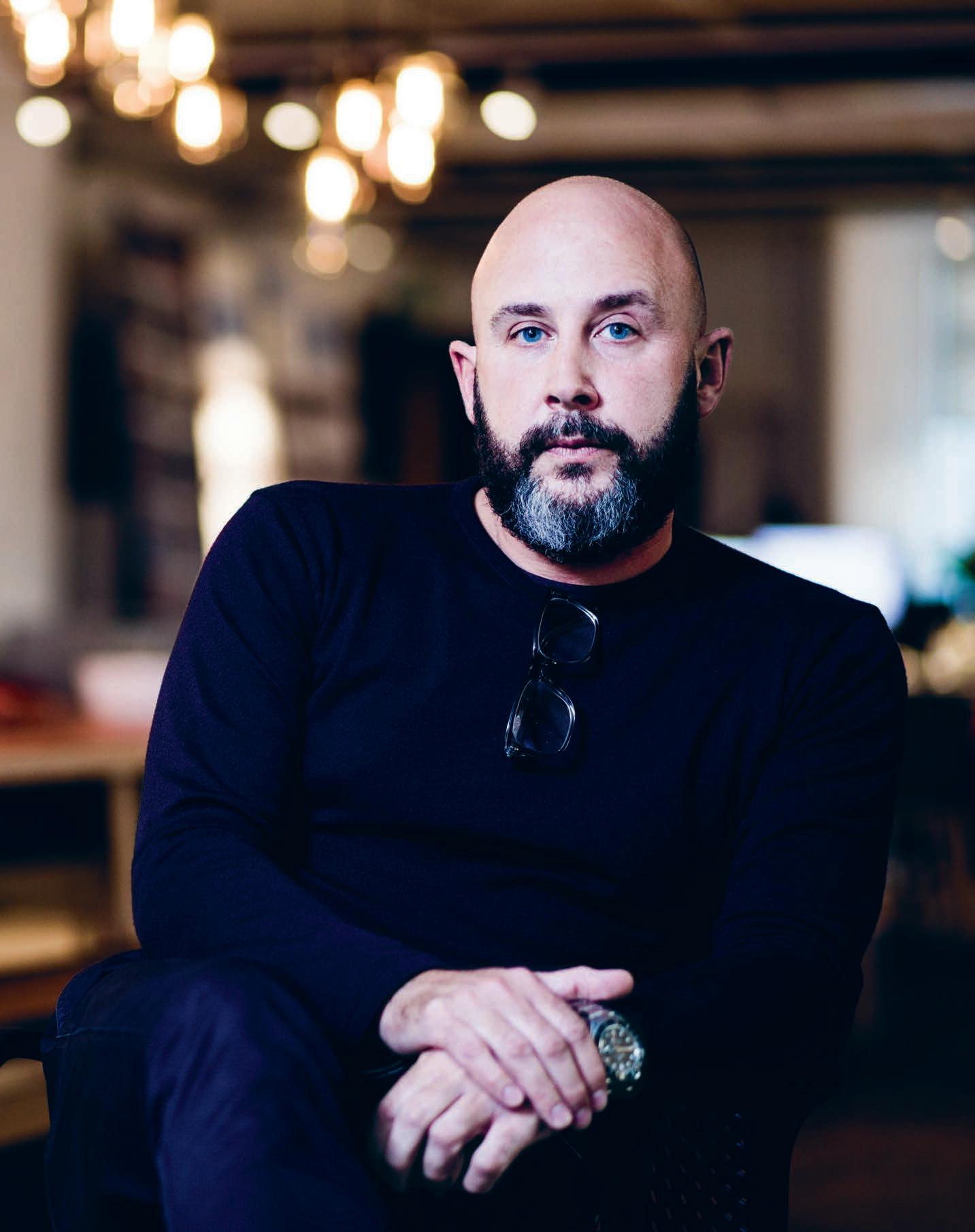
What’s Your Problem?
Are we so embroiled in the process of delivering design that we’ve lost sight of the problems we’re solving?
Richard Stevens, founder and creative director of forpeople, has pioneered an observational approach to design that puts a whole new slant on end-user needs.
INDESIGN 87 IN Famous
Words Alice Blackwood Photography Richard Boll
“It all goes back to this idea of feel–think–do,” says Stevens. “It all sounds a bit cliché.” Yet, in founding forpeople, Stevens’ intention was to be thoroughly different. “We’d delivered many design projects that took a completely different approach, but it all came back to this idea that if you don’t think as designers, rather, you think as people…” Stevens’ unspoken words here are this: it reframes the argument, shifts where the perceived challenge lies, and creates a new value proposition for customers that also, importantly, resonates at a business case level.
“We often have clients who come to us with briefs shaped by ‘all this research says this’. That’s really great, but the massive gap that remains is, ‘What does it all mean?’ ” For Stevens and team, the research is often beside the point. They want to understand our emotional connections to objects, places and needs.
Having worked across many different sectors – from auto to air travel, beverage, luxury fashion, furniture design – forpeople is open to a dichotomy of influences and often draws from these in tandem to “get into that bit in-between”, to build a story based on observation and discover what resonates with people. It’s this process of looking again and reconsidering the situation at hand that often fundamentally changes their clients’ original brief.
When forpeople embarked on the development of a range of workplace seating for Herman Miller in 2011 the brief seemed, by the studio’s standards, pretty simple. Herman Miller wanted a group of chairs that were appealing to feature in meeting rooms and collaborative spaces. Renowned for its thought leadership around ergonomy and the workplace, Herman Miller had reams of knowledge and insight from which forpeople might draw from. However the research wasn’t enough for Stevens and team. “We spent a lot of time observing people in meeting spaces.” Their observations led them to discover what Stevens called ‘The Boring Meeting Syndrome’. Think about the cache of personal mobile devices we bring to every meeting. How long does it take before we start restlessly shifting in our chairs? How, why and how often do we move?
“For me it was the perfect example of a need that had never been articulated.” It became the reframing to the original brief and a crucial starting point for five years of product development that resulted in the launch of the Keyn Chair Group in 2016.
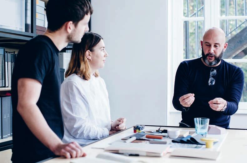
While all this was going on, Stevens had also been seconded to British Airways (BA), where he served as creative director for three years. Here, he worked in parallel on big-picture projects ranging from BA’s major sponsorship of the London Olympics, right through to the ‘Future of Flying’, (a long-term creative strategy for the ground and air experience).
Workplace design and air travel may seem worlds apart, but there is one common thread that draws the two together: technology. While Herman Miller, on the one hand, was pioneering its real-time workplace data capture system, ‘Passport’, Stevens was working with BA to consider the implications of technology and smart devices on its customers’ travel experience. “When you think about it, the only thing a customer has with them the whole way through a journey is their digital device. So that digital device becomes the first point of contact an airline has with you, as a customer.”
From an experience point of view and an upselling perspective, the opportunities become boundless. The possibility of upgrading yourself and rising above the “class segregation” that defines most airline travel. The ability to change and enhance your experience as you’re travelling. To move beyond the over-simplified comforts of flying (essentially, as Stevens points out, a seat, a table, and an entertainment device), and think outside the [flying] box.
Whether it’s workplace or travel – it’s still about having a memorable, positive experience. Not losing sight of people’s primary needs. Harnessing disparate forces like technology, and observation and insight, to create the building blocks of an experience that feels familiar and easy, while also being just that little bit magic.
forpeople.co.uk
INDESIGNLIVE.COM IN Fa MO uS 88
“We massively embed ourselves within organisations. Everything is done collaboratively because you can’t design in a world where you’re throwing stuff over the fence anymore.”
 Richard Stevens, creative director, forpeople.
Framing The New Familiar
“We often talk about the ‘new familiar’,” says Stevens. “People crave newness in everything but they also demand familiarity. It’s about being able to strike that balance between the two.” In the new-look workplace, where the concept of agile working is fast becoming a mainstream concept, Stevens believes it’s about finding a healthy balance. “Workspaces that give you a sense of place and reassurance and simplicity, whilst change continues to happen around it.” Because if we’ve come to learn one thing about today’s technology-driven world, it’s that change is not the end result, it’s the constant.
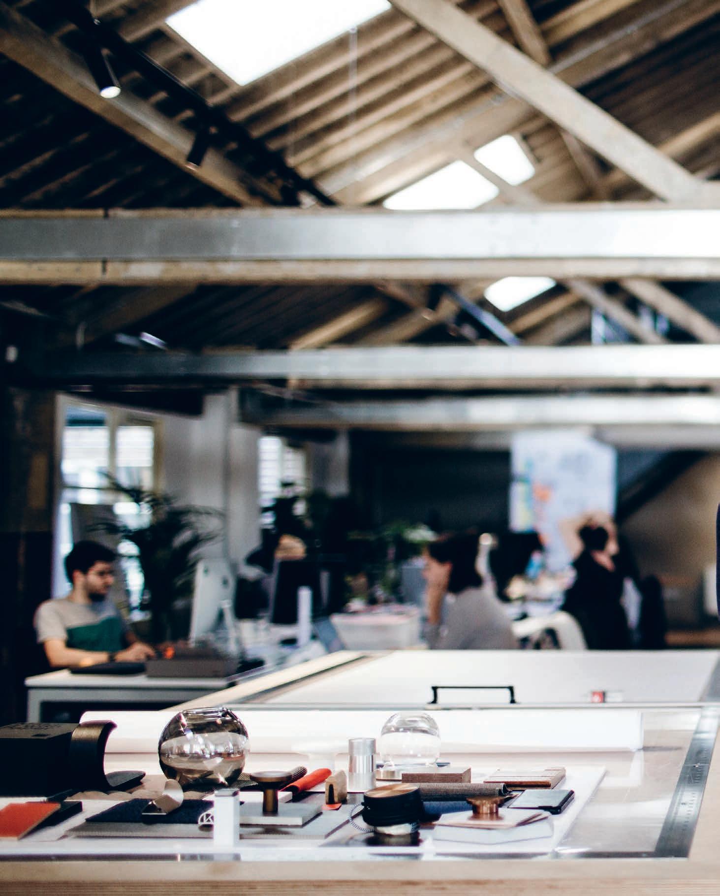
–
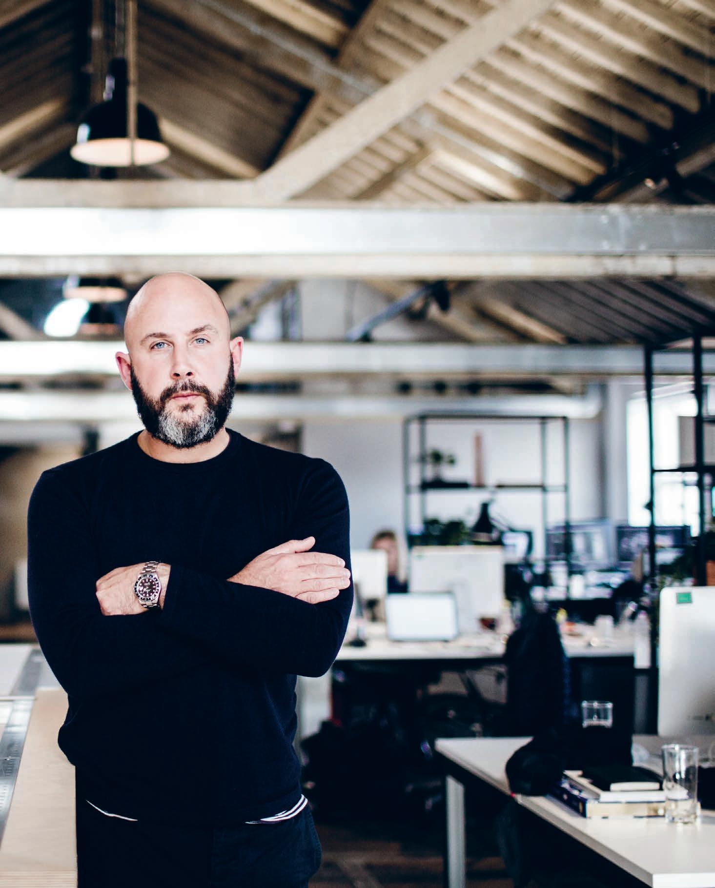
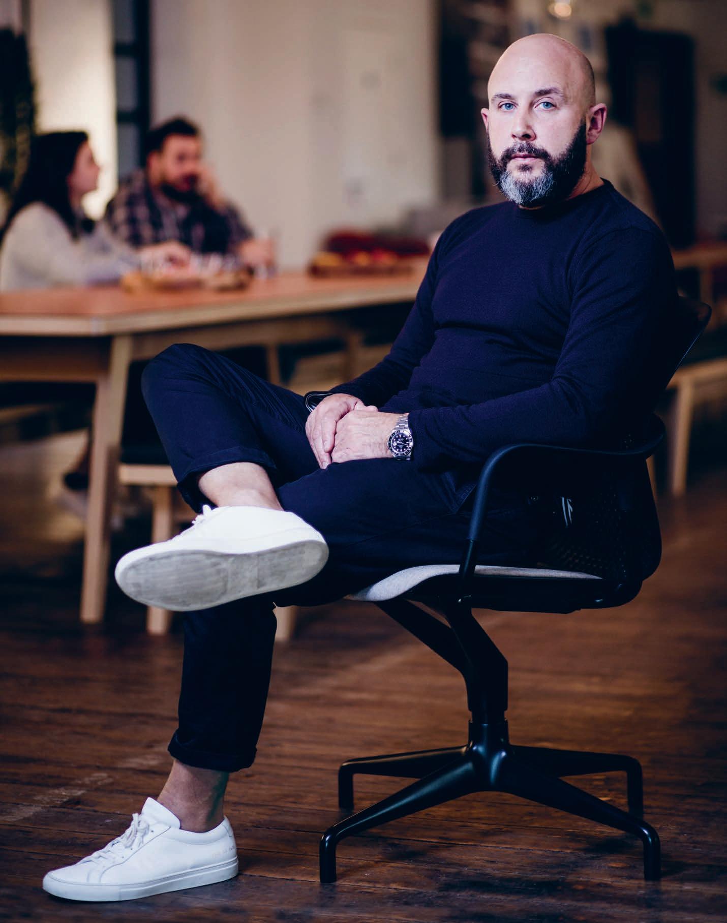
Seated Yet Always In Motion

Herman Miller initially tasked forpeople with creating a versatile group of meeting and side chairs that shared as much componentry as possible. ForPeople delivered on this by coming up with a system based on four components: a cradle that is standard across the group, a single-piece back and shell, and a range of base and upholstery options. The surprise, though, came from forpeople’s observations, and research that pointed to just how often we change postures (up to 53 times per hour). It made sense to take movement into consideration, and the resulting chair is based on a CradleFlex system, which sees the seat back stay in contact with the user’s spine, while shifting up to 10 degrees.
INDESIGN 93 IN Famous
–
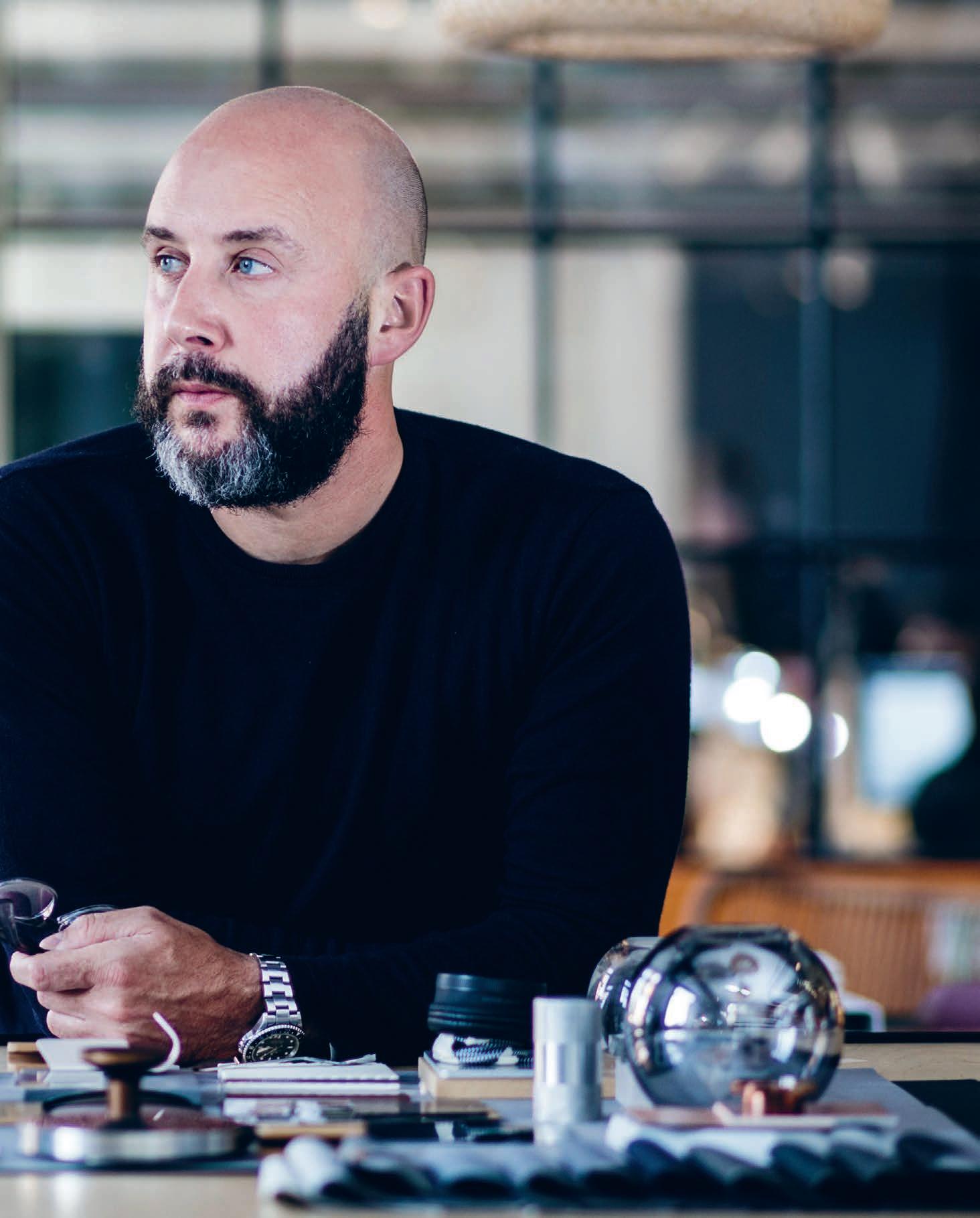
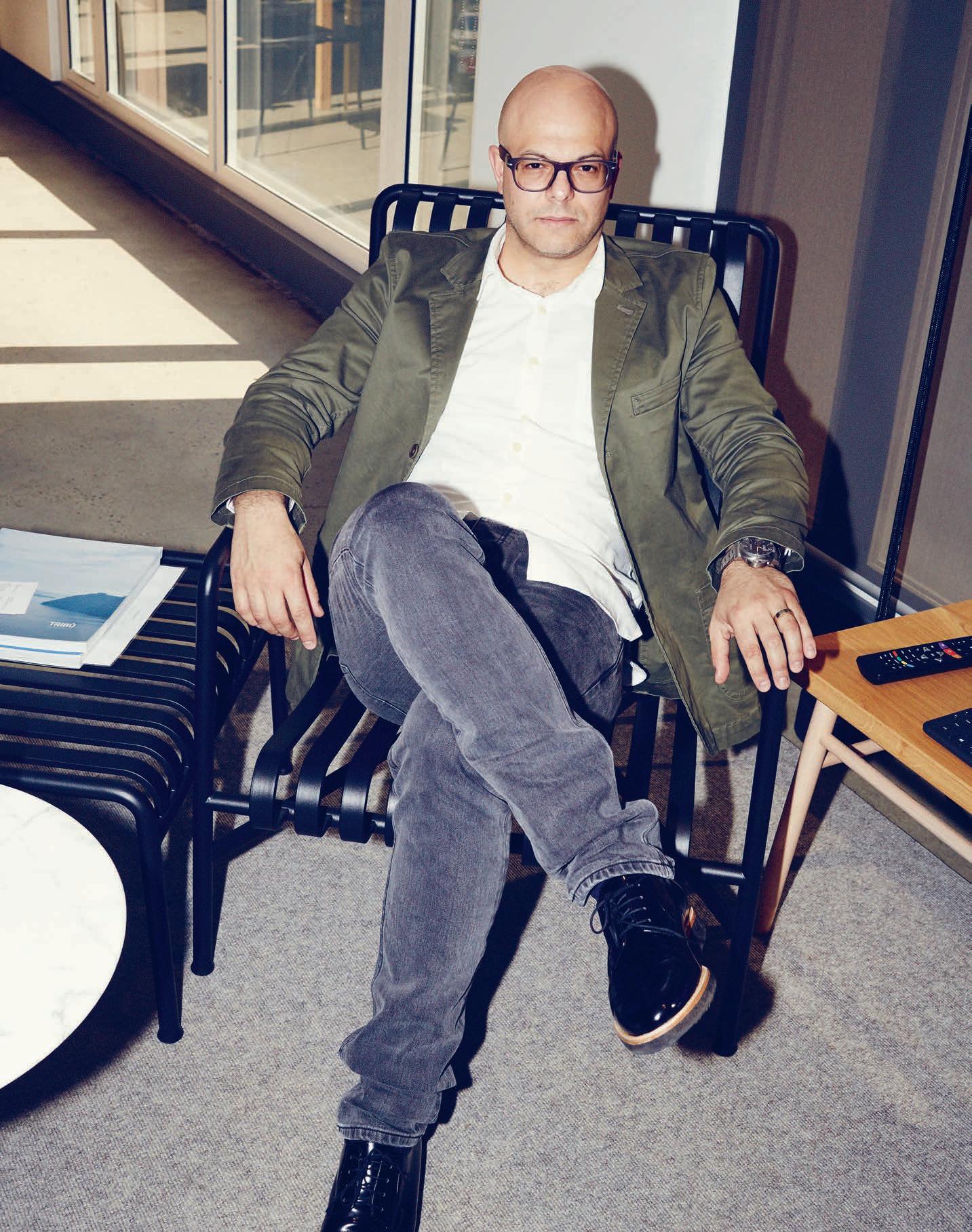
Think Bigger, Think Better
Interview Sophia Watson Photography Charles Dennington
Architect and director of Woods Bagot’s global design studio, Domenic Alvaro is one of the industry’s most original thinkers. Working across every imaginable sector the world over, Alvaro’s design philosophy is simple: agitate traditional typologies.
“When I say ‘unique’ I’m referring to a design’s relevance and connection to its client, the brief or the specific location of the project. ‘Unique’ is the responsiveness to the needs of an individual project. And when you really tap in to the core nature of the brief, or the client or the site, then you end up finding its unique qualities.
I’m a true believer that buildings and interiors need to be and feel site specific; they need to have a sense of locality and place not just in terms of materiality, but largely through site and context.
For example, we’re in the process of completing a transport project here in Sydney called Wynyard Walk, which is a transit orientated development. It’s a project that connects the city to Barangaroo. We need to, of course, make the site feel civic and public, but we also need to have a strong site response predicated by the brief. So how then do we create an architectural response so tailored that it creates a highly unique experiential result?
The interior for instance, is based on a really beautiful flow of language. It’s a transit-space. It enables the volume of around 22,000 people per hour to move from the city through to Barangaroo. It’s an important connector for the new direction of this city. It’s a big piece of infrastructure that sits partially underground and partially at a confluence of highways and plazas and other existing infrastructure throughout Sydney. So the question then becomes: how can you create a site-specific sense of place when your ‘place’ is made up of so many disparate pieces?
Wynyard Walk is a good example of using design language to connect all the seemingly random bits and pieces, so that there’s this constant association back to the flow-line in the project. Whether that be the line of the ceiling, the line on the wall, the geometry of the resulting interior, the portal shape, the way the sandstone carves at the end of the portal. That sense of curvature and flow-line language gets carried through from the macro concepts through to the minor lighting pelmets. It’s that narrative that’s incredibly important in connecting the broad urban narrative down to the tactile point of touch. Woods Bagot is constantly moving through a whole range of typologies and sectors. The majority of our projects are increasingly becoming more mixed-use. We also just recently won a competition for a new 55-storey tower development in Parramatta, which will
house, among other things, a new QT Hotel and 305 apartments sitting above a public thoroughfare precinct. Again, there is always a challenge in trying to define a unique response for a tower that is specifically for the city of Parramatta; a catalyst for urban rejuvenation. It’s a project that has really brought Woods Bagot’s global intelligence together around specific design know-how on both the residential and hotel sectors.
When thinking about how I would define something as ‘unique’, the typology can be so varied. For a tower you’re looking for the shape and available geometry you can work with, and then how to make that unique. On top of that, there are so many different readings of a tower; from the distant reading in the skyline, as you approach and then enter the building, as well as the amenity of the tower. This particular project has a rooftop destination bar, which we needed to consider, being the culmination of the greater experience. What I looked for there was this kind of playfulness in standard leisure typology being revealed to the public. This is a good example of honing down on what is unique, finding that narrative and then curating that narrative throughout every aspect of the project.
Those phrases ‘design language’ and ‘design narrative’ really do get misused, and we really try to redefine them when training our teams. My methodology for example, is very much about using the design narrative as a tool to unlock the bespoke and unique solutions within projects. That’s the key. It starts from the larger more urban narrative, and works its way down to the finer rational materiality.
In doing that, you’re always forced to assess your design processes and the validity of them for projects. For me, you’ve got to be critical within that phase of review – within the narrative and within the language. Being a harsh critic of your own work is very important. What we’re trying to bring is that rigour to every aspect of our work, yet the hand can be quite different. In fact, we’ve got some of the best young talent in the business. I’m constantly astounded by what they are able to accomplish. So it’s more about harnessing that talent to be able to harness the available narratives and in many respects, curating that as a harmonius package.”
woodsbagot.com
INDESIGN 97 IN Famous
It’s About Them Not Us
“From being a curator to having a very strong hand down to the fine detail of a project, the challenge is really about bringing out the voice of the project, rather than the voice of the architect. And that’s the challenge because traditionally of course, this hasn’t been the case.”
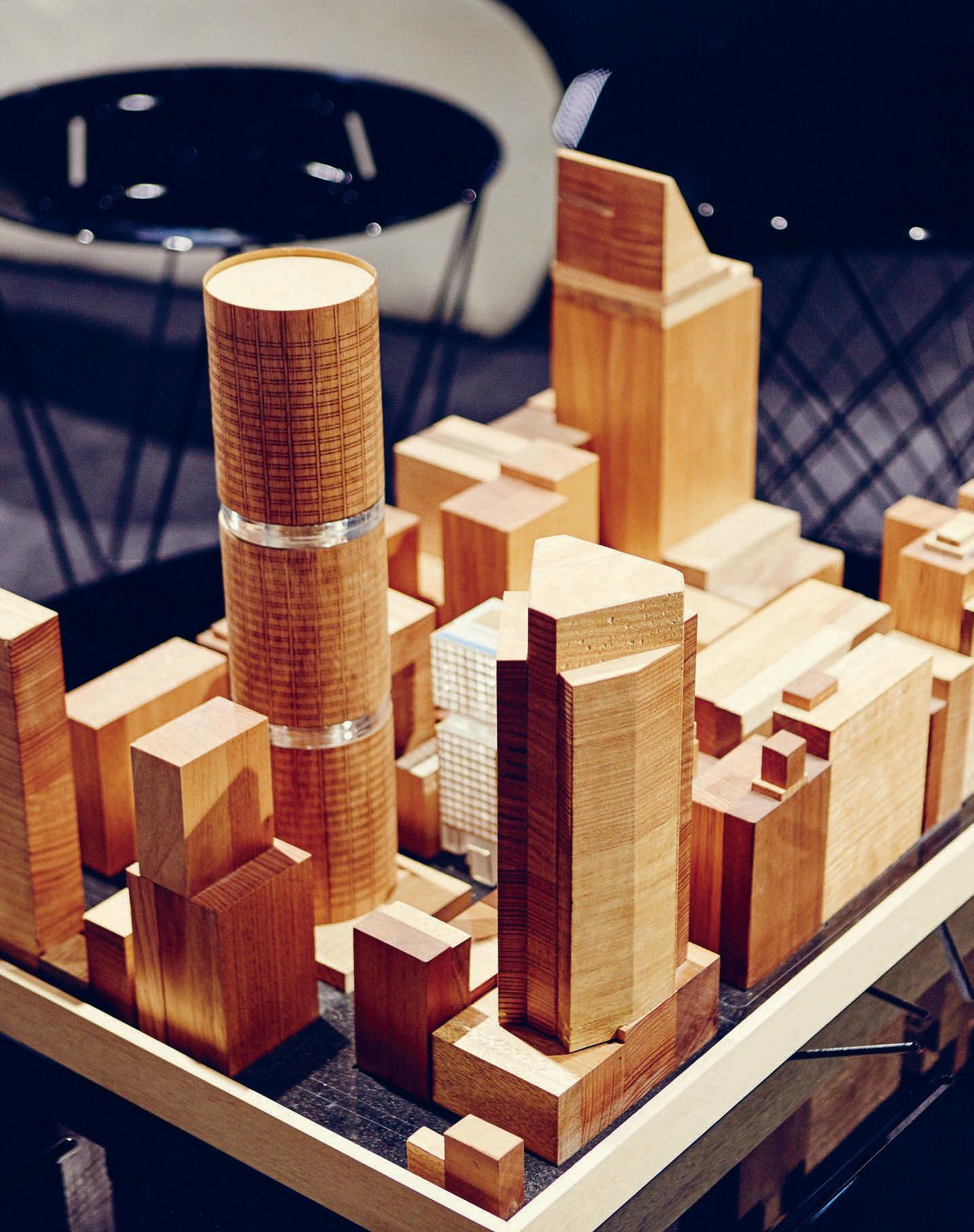
–

Domenic Alvaro
“The complexity of architecture is getting more rigorous, more involved and more detailed. But if you get it right, it means that you’re not getting a singular, monumental object. If you look at the specifics of each opportunity, you’ll get a really unique outcome. ”
Domenic Alvaro, architect and director, Woods Bagot


Guilloché jewellery for doors

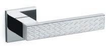
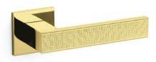
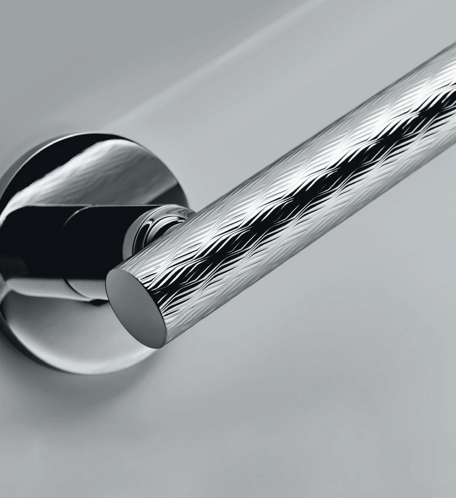
model: Atena - Panier
With the Guilloché collection, Olivari of Italy rediscovers an ancient technique of goldsmith engraving to give “life” to the surface and generate amazing vibrations of light combined with the subtleties of texture.
Olivari; 100% made in Italy for over 100 years.
Guilloché by Bellevue Elegance & sophistication in design and Texture. Its more than a handle is luxury. Contact Bellevue Architectural for your 2017 catalogue info@bellevuearch.com.au | 03 9571 5666 Atena - LigneAtena - Rank Diana - ChevronDiana - Barley www.bellevuearch.com.au
Hola @ Me
How and why are our most remotely-located creatives using social media? Young West Australian architect and graphic designer, Kelwin Wong, uses Instagram to shed light on the under-celebrated heritage of the most remote capital city in the world.
As he drove around his neighbourhood one day, West Australian architect and graphic designer, Kelwin Wong, found a cluster of 1980s townhouses that fascinated him. When he Googled them later that day, he found very little information. “Part of the challenge today is that if we can’t access the information readily it’s as though it never happened,” he says. This was the seed of an idea that has since turned into a ‘Poster Challenge’ on Instagram, where Wong uses his graphic design skills to create one post each day documenting architectural, cultural and personal experiences.
Wong has made hundreds of static and animated posts, celebrating everything from Perth’s iconic built heritage, to word play, politics and moments from his own day-to-day life – often incorporating a healthy dose of humour. As the content we consume becomes shorter, and smaller and faster, it becomes harder for words to convey everything they need to. So images and animations such as those in Wong’s poster challenge must take on an almost impossible task: to tell whole stories in a 2x2inch square. “The way people consume media has shifted dramatically – it’s about short copy, factoid nuggets. Also, the way we experience things is predominantly on-screen, so [the poster challenge] is all about bright, engaging colours as well as motion graphics, which I find can add a next-level interpretation of buildings.”
While not all of his posts focus on architecture, those that do aim to highlight both the memorable and the unsung architectural heroes. “I’m trying to elevate the status of design and even our heritage
[in WA],” Wong explains. “I find that with Australian architecture publications there’s a lot of emphasis on the eastern states, and those projects get a lot of coverage, but not with Perth. And I’m not really sure why it is that way. I was trying to add to the pool, to say ‘this is what we have here, and we can celebrate it as well’.”
Architecture, with its linear forms and bold shapes lends itself nicely to the Instagram format, eliciting feelings and triggering memories when presented in its simplest form. “I try to capture the essence of the architecture, without getting too bogged down in the smaller bits and pieces that make up a building.” To achieve this, the designer visits each and every building that he features, which allows him to get a greater understanding of their form, and develop a response to how he feels. “People have come up to me and said things like, ‘oh, I remember going there with my grandparents’. It’s been really interesting to hear from people what buildings mean or meant to them. Using graphic design is a great medium in which to do that.”
By using his unique set of talents in architecture and graphic design, Wong is able to highlight more than just iconic buildings. He is using social media, graphics and animation to bring to life the social, cultural and built heritage of his city, and in turn, is demonstrating the role designers have in not just building, but also documenting, the world around us.
kelwinwong.com
INDESIGNLIVE.COM IN Fa MO uS 102
Words Ben Morgan Photography Courtesy of Kelwin Wong

INDESIGN X SUB-ZERO & WOLF
For those not in the know, Sub-Zero & Wolf are widley accepted as the leading manufacturer of luxury refrigeration and cooking appliances worldwide. Synonymous with state-of-the art kitchen technology, Sub-Zero & Wolf deliver specialist culinary results in the home without compromising on style or luxury.
As the innovators of food preservation, Sub-Zero offers a unique ‘Air Purification’ system in their refrigerator line, which removes harmful gases and odours. This imaginative process was originally developed for NASA to aid food preservation. Additionally, the Dual Compressor system, standard on all Sub-Zero fridge/freezers, is a completely unique feature to the Sub-Zero brand. The separate compressors within the fridge and freezer sections enable each compartment to operate independently meaning that odour and flavour transference is prevented to stop your ice-cubes tasting of fish! This exclusive function prevents temperature fluctuations, saves valuable energy and is proven to keep food fresher for longer.
Likewise, Wolf offers a comprehensive range of built-in ovens, cooktops and dual-fuel ranges offering the user precise control to
deliver truly professional results in the home. The Wolf collection also includes sleek ventilation units and integrated warming drawers. With superior performance and leading-edge design, Wolf appliances fuel a passion for cooking as well as design.
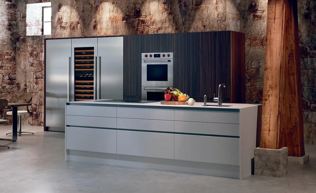
To better lend itself to the flexible needs of professional designers, you can choose from designs that boldly stand out or sit seamlessly integrated alongside existing décor in various widths and configurations.
Individual tastes in food and design are met with endless potential with Sub-Zero & Wolf. There are sleek designs with modern flair or classic, professional-style equipment while the size and set up of the equipment ranges from compact to grand scale.
Unmistakeable elements making both Sub-Zero & Wolf design icons. From hot to cold and back again, Sub-Zero & Wolf are two specialists destined to harmonise into one exceptional kitchen. For specification opportunities and other enquiries, please visit subzero-wolf.com.au or take a visit to the national Sub-Zero & Wolf showroom at Bank House, 11-19 Bank Place, Melbourne.
subzero-wolf.com.au sub - zero & wolf 104
This page: Sub-Zero Refrigerator ICBIC-24R, Wine Storage ICBIW-24, Freezer ICBIC-24FI, Wolf Double Oven ICBDO30PM/S/PH.
Two brands. One extraordinary kitchen.
Dare To Be Different
Given the many constraints, it’s amazing that any original architecture ever gets built. But a young Sydney industrial design outfit has re-written the rules and at the same time become an international Australian success story.
How to make the shells? That was the great challenge that threatened to stop the Sydney Opera House in its tracks. And it’s the kind of challenge that continues to inhibit architectural creativity. Industrial designer, Tim Phillips quickly lists the things that limit architectural freedom: traditional construction methodology and what builders will do; materials and manufacturing knowledge; design limitation such as understanding of mechanical; structural and electrical design; and of course – inexperience.
It is just precisely issues which Phillips’ company, TILT, addresses as part of its package to provide customised industrial design solutions to architectural problems. “The message I put to architects,” says Phillips, “is that there is no need to compromise on your architectural intent because of traditional construction methodologies. There is so much material and technology available to you and we have the benefit of knowing about it and its capabilities because of our industrial design background.”
What makes TILT special is that it takes responsibility, delivers the product and provides after-sales maintenance. So there is no risk to the builder or the architect. “There’s an interface between our product and the building – we can make something fit and accommodate the building tolerances.”
Phillips studied industrial design at Newcastle University where he was able to indulge his passion for making things. After graduation he stayed on at Newcastle where he began a Masters degree, tutored and started up his own consultancy, giving him early commercial experience. Eventually, he moved to Sydney to work with product design and engineering firm, Kenovations.
“It was a little different to other traditional design consultancies,” he explains, “because we weren’t creating mass-produced consumer goods – large, one-off engineering projects were our forte.”
They got their hands on some architectural projects and “for me that stirred a bit of a passion to do something beautiful as well as mechanical.” While making sliding rooves and sculptural pieces, they also developed heliostats for the concentrated solar thermal market, which led to an approach from the Frasers Group to do a feasibility study for heliostats for One Central Park in Sydney.
They won the job – their first design and construct project and an eye-opener because Phillips could see a new business model, one which would not just make money, but also offer creative satisfaction to both himself (now general manager) and his team.
He then acquired the architectural side of Kenovations, re-branding it as TILT (“a playful name implying some functionality and a different perspective”), downsizing significantly, retaining some product design clients, building up the R&D side and spending a lot of time quoting on projects, many of which are now coming to fruition as the strong interest in sliding rooves, skylights and heliostats starts to get traction.
These days a third of TILT’s business is off-shore, with projects in the U.S. and China – though everything is designed and manufactured in Australia.
Basically, TILT gives architects a licence to push the envelope and design something which has never been tried before. If it costs more, Phillips points out the commercial benefits. With operable elements, he says, “you get buildings that transform – they’re dynamic and multi-functional, and that’s really exciting for the architect and really exciting for the client.”
tilt-industrialdesign.com
INDESIGN 105 IN Famous
“Pioneering studio, Tilt: A new era of originality,” notes Paul McGillick.
INDESIGN X OFFICE SPECTRUM
The more time we seem to be spending in the office, the more we come to the realisation that our working environments need to be places of calm and comfort. For Charter Hall Flexispace, a new co-working style office, the brief was to create an environment that would truly embrace these qualities. So much so that it felt like a second home.
The specific needs of the Charter Hall space were complex. Clients of the brand for example, can come in and rent a desk, rent an office, a conference or function room – and as such, the environment needed to be truly flexible, and capable of catering for a wide variety of clientele. But how can you achieve the needs of many in a single space, while keeping an atmosphere of comfort and calm?
“The space needed to offer clients various ways of working,” says Joyce Seeho, director of Office Spectrum. “We worked with Felice Carlino of Sumu design because of his extensive experience and understanding in designing luxury airport lounges like the Qantas Premium Lounges in Hong Kong and Singapore.”
Carlino’s approach to harmonising the needs of Charter Hall and their clients, was to integrate a system of beautiful furniture throughout the space that performed remarkably well for the functional requirements of the users, but that also conveyed and contributed to establishing that sense of calm and comfort. It was also important that the space reflect the existing Charter Hall brand.
“The idea for Charter Hall was to provide quality finishes and a sense of luxury on a tight budget,” notes Carlino. “Here, we included
some really beautiful pieces from Maruni, pieces that are driven by a very Japanese approach both in aesthetic and philosophy. The private working booths and workstations have been finished in fabric with soft colourways to add a bit of life, colour and warmth to the space. We also added the flourish of molo lights to add a softer glow and a less harsh geometry to the environment.”
As well as creating a very flexible, calm and comforting space, one of the other key drivers of the project was sustainability. To this effect, Office Spectrum reused and recycled all of the glass petitioning left on site from the original Macquarie Bank fit out. Office Spectrum also enlisted the help of an independent environmental auditor, who confirmed the project conserved some 19 tonnes of carbon.
All the light fittings were reused from Charter Hall’s redundant light fitting stock which were “as new”, blinds on the floor were cleaned and the old carpet tiles were recycled in other fitouts. This kind of sustainable approach further contributes to the positive dynamic of the space. Seeho explains: “By reusing as much as we could, you can see that there are savings in both carbon emissions and money for not having to purchase new materials. These savings were redirected towards purchasing high quality Maruni FSC designer timber reception furniture, molo design LED light pendants, a huge 14 metre long feature graphics wall by Natasha Hammond of Krasivaya Design and and beautiful styling elements by David Harrison.
officespectrum.com.au
officespectrum.com.au office spectrum 106
Opposite and Page 108: Nearly all the furniture used on the floor are either GECA accredited or from FSC timber, and Office Spectrum have a take back policy for the furniture and workstations if no longer required by Charter Hall. LED lighting was used where possible and all lighting is programmable on sensors and dimmer switches and Office Spectrum also used low VOC paints on the walls.
Charter Hall co-working a collaborative project by Office Spectrum and Sumu Design
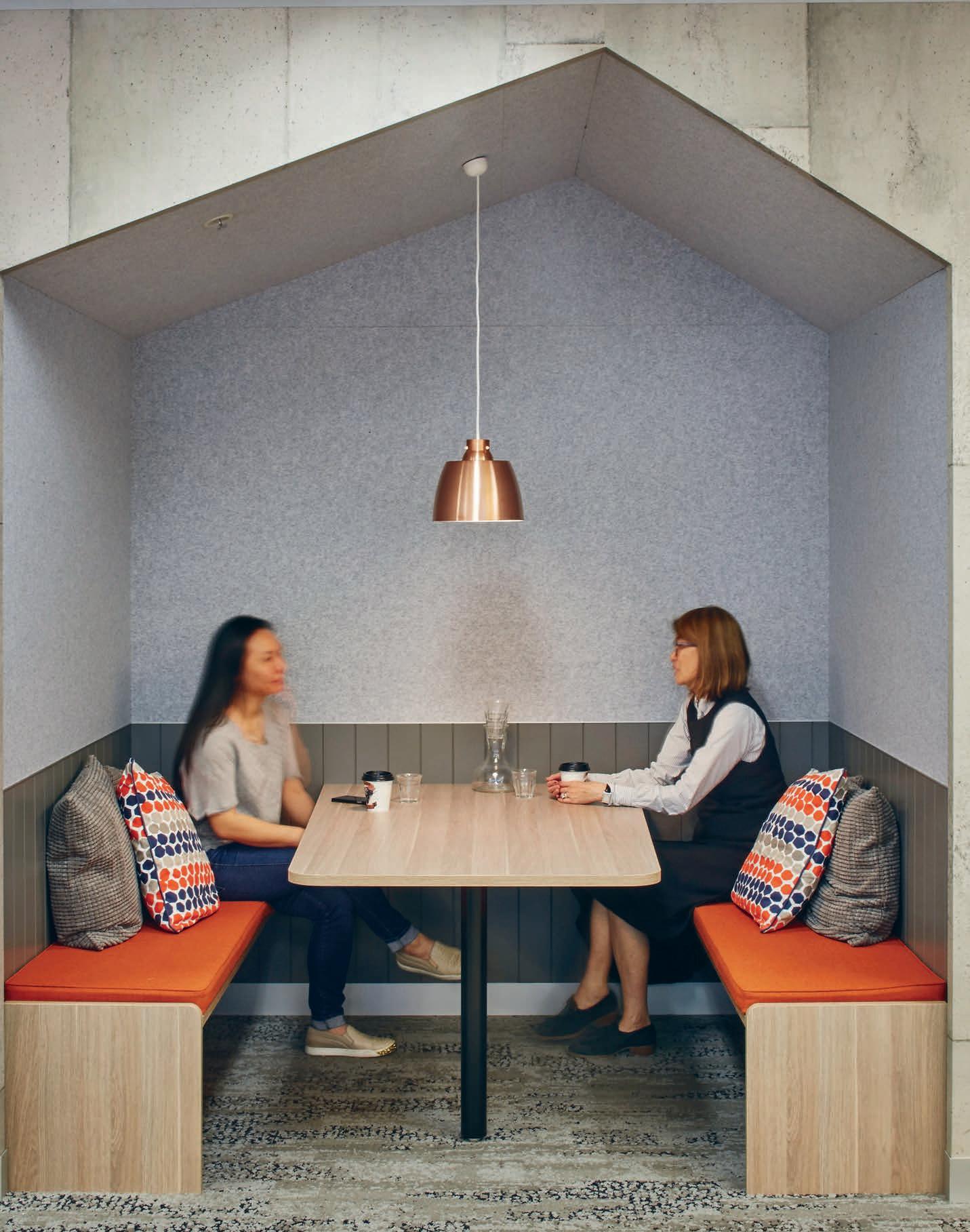
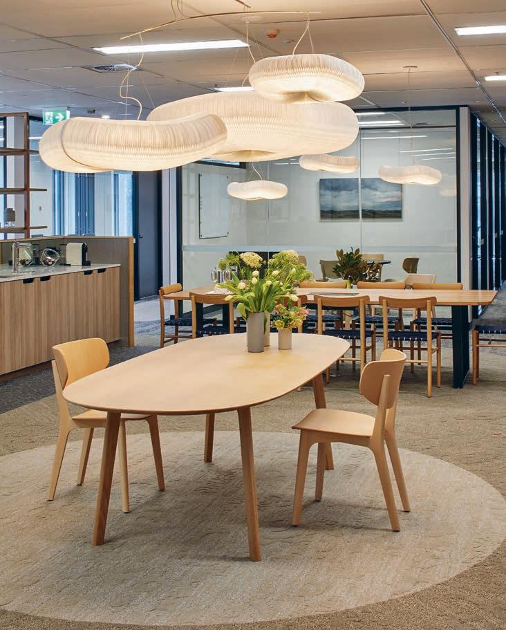
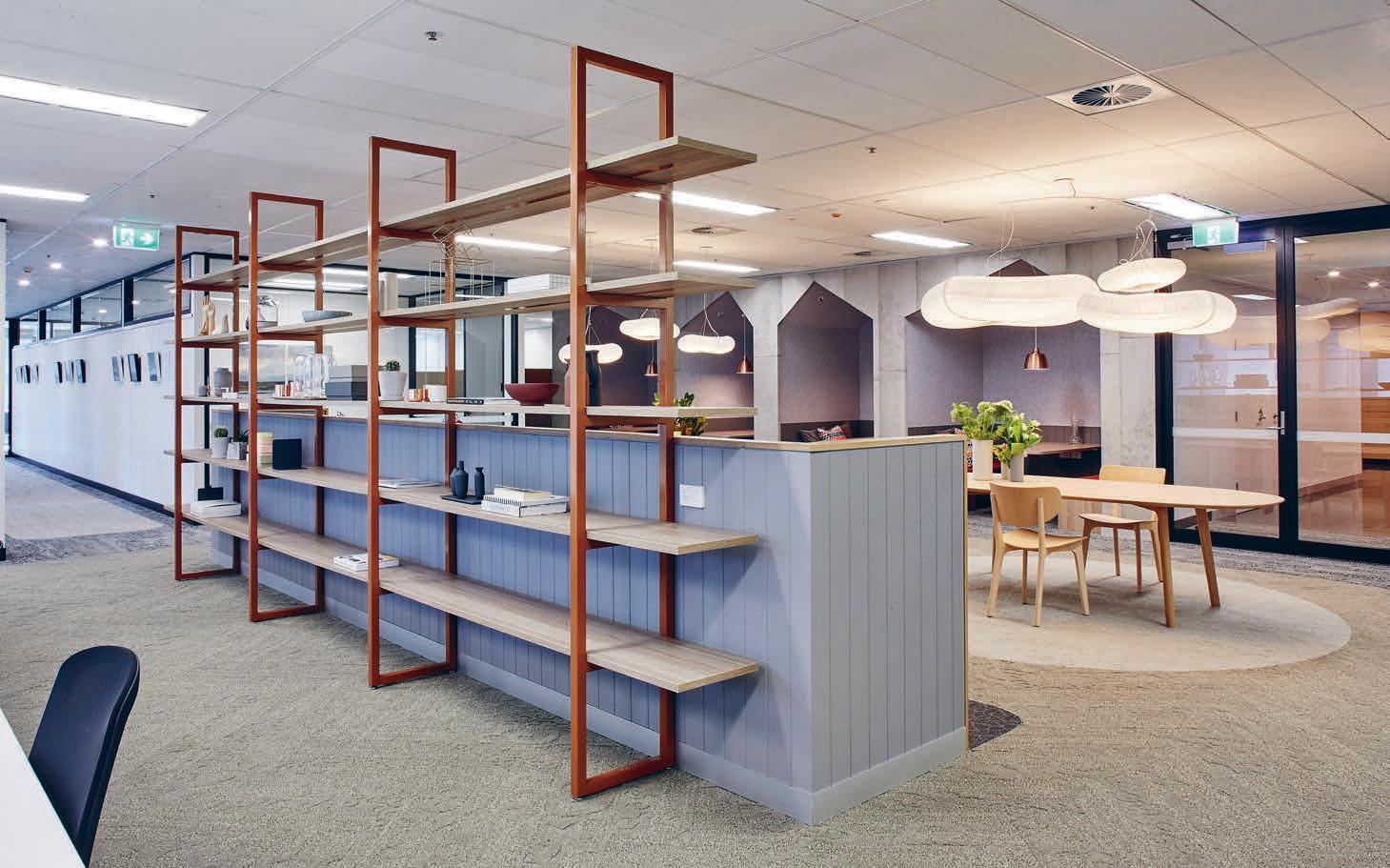
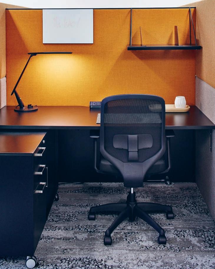
spectrum
Provocative, radical & eN er GiSi NG de Si GN
IN SITU Situ iN
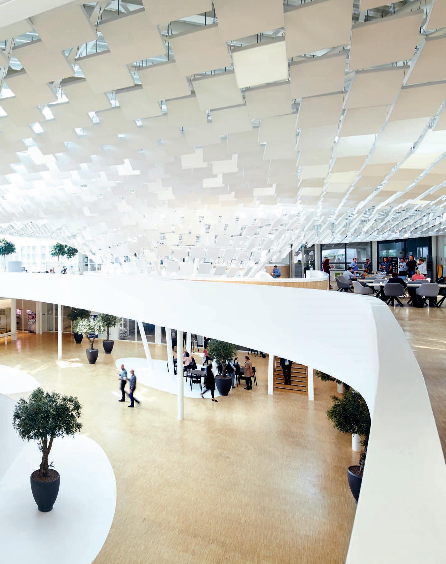
Go Lightly
Philips
Words Jane Szita Photography Jonathan Andrew
For the new HQ of Philips Lighting in the Netherlands, globetrotting architecture office LAVA was asked not only to provide innovative workspaces and an impressive reception area for receiving guests, but also to demonstrate the use of lighting to improve people’s lives.
“How light affects humans and how we can use it to create better living spaces,” says LAVA director Alexander Rieck, was therefore the inspiration behind the design, which revolves around a 3,250 square-metre atrium dominated by an installation known as the ‘Light Tree’. “We thought about the experience of light. Light is only visible when it reflects on something, so we developed a multifaceted three-dimensional Light Tree ceiling with the qualities of light reflection, diffusion, and emission,” Rieck explains.
“The ceiling installation has roots in recent research by the Fraunhofer Institute on the effects of lighting on people,” adds LAVA senior architect, Nuno Galvão. “In Nature, the sun gives us a sense of time,” he explains. “Working in an office means that people miss the subtle changes in light during the day. As research links levels of comfort and attentiveness to the human perception of such variations in our environment, we designed the Light Tree to filter and reflect the natural light from the atrium side windows and skylights.” In addition to magnifying the effect of daylight, the installation features warm light fixtures placed so as to emulate natural sunlight during darker days typical in northen Europe.
These are programmed to embody the varying light effects of different seasons. The installation consists of 1,500 panels suggesting leaves on a tree, with a reflective surface on the back of each panel amplifying daylight and creating a play of light and shadow. Some 500 panels feature self-emitting Philips Ecophon Soundlight; a material combining LED lighting with integral sound absorption in a single system. After abundant preparation, including numerous co-creative meetings with the board and actual users of the space, the final Light Tree took just three weeks to assemble on site.
The atrium (formerly the courtyard of the 1950s building) combines a number of social amenities from a coffee bar to meeting rooms. Glass partition walls ensure that the effects of the installation are felt throughout the adjacent work environments, while wooden floors add warmth and tactility to the space. A core of naturally varying light thus illuminates and enlivens the HQ.
“In our office, we take pride in pushing the boundaries of knowledge and practice,” say Rieck. “We like to start with a theoretical approach and bring it to an architectural context. This project was one of those moments when we realised that we managed to make that a reality for everyone to experience.”
l-a-v-a.net
INDESIGN 111 IN SITU
Headquarters Netherlands, by LAVA
How can non-physical design elements such as ‘light’ bring people together? Philips by LAVA uses “intelligent lights” in a parametric designed ‘tree’ to boost communication, creativity, interchange and wellbeing for staff and visitors.
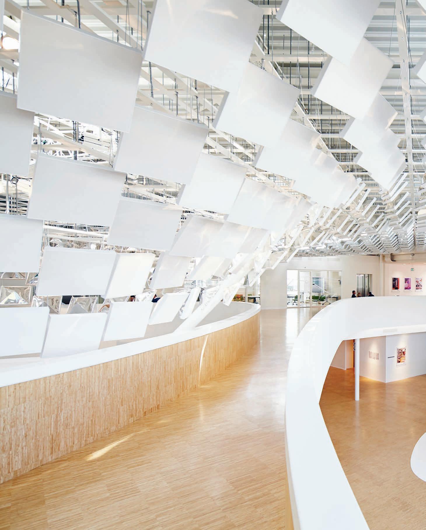
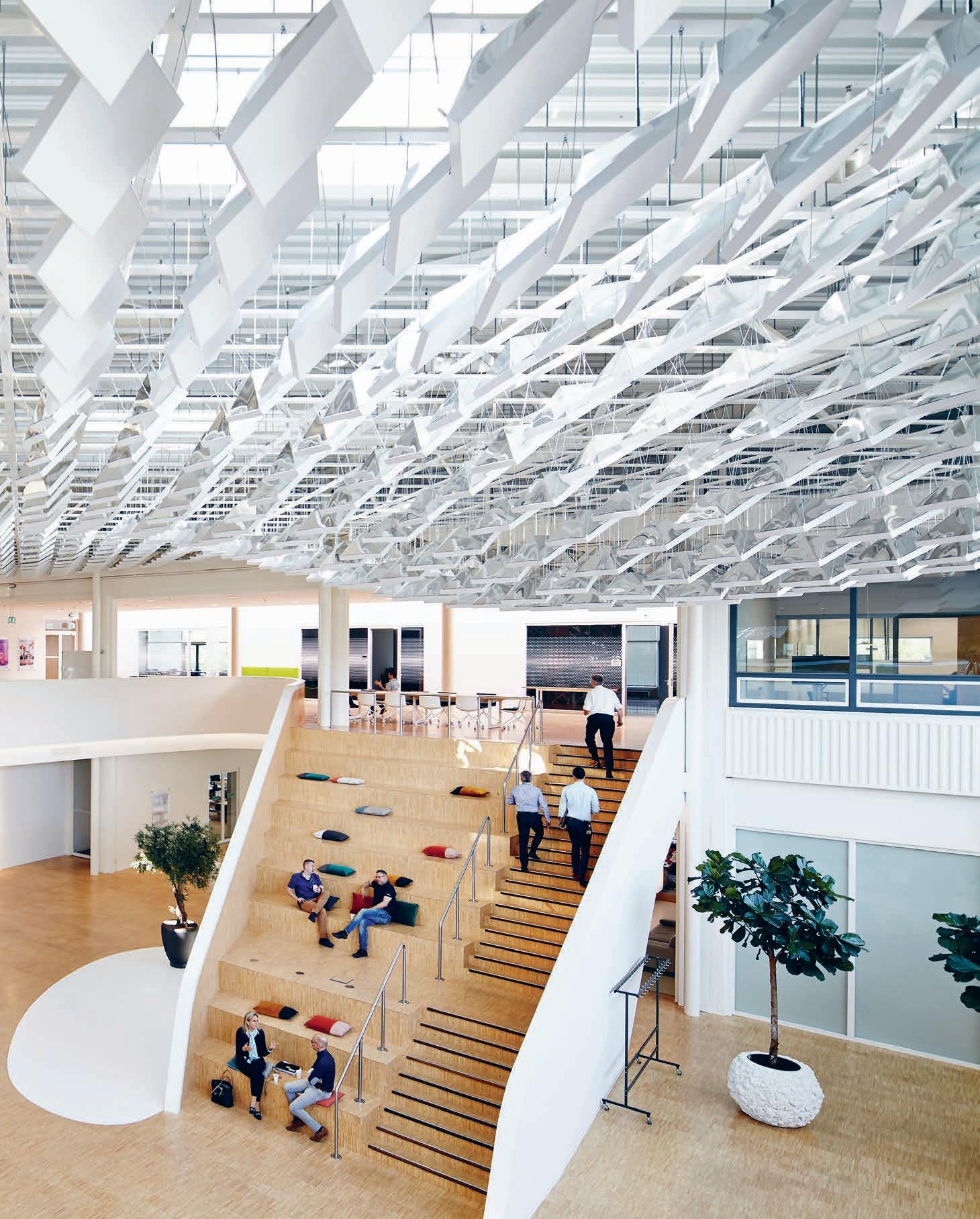
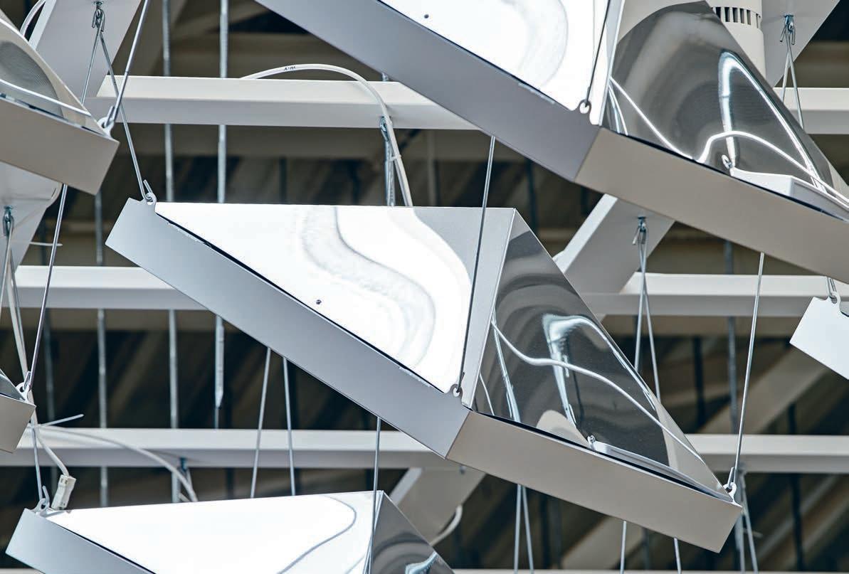
INDESIGNLIVE.COM 114 IN SITU
“As research links levels of comfort and attentiveness to the human perception of such variations in our environment, we designed the Light Tree to filter and reflect natural light from the atrium side windows and skylights.” Nuno Galvão.
INDESIGN X DKO
Just eight kilometres from Melbourne’s CBD, 100 Albert Street is a new collection of eight designer homes in the up and coming suburb of Preston. The spacious one-bedroom apartments and two- and three-bedroom townhouses have been designed by DKO to offer unparalleled modern style with generous dimensions, quality fixtures and finishes, within a contemporary aesthetic and secure environment.
Driven by the pressure of modern housing affordability in Melbourne city limits, DKO’s design here responds to the challenge of offering affordable and attainable housing without sacrificing architectural flair.
Traditionally, a site of 840 sqm size would see 3 generic townhouses built, yet DKO increased this density by almost 3-fold
to 8 dwellings, mixing one, two and three bedroom designs. The spaces have been arranged to recall the traditional layout of 3 dwellings in their appearance, in a clever design sleight of hand to mitigate the perception of the density from the outside.
Familiar elements such as bricks, weatherboarding, pitched roofs and paling fences recall a classic suburban landscape, yet are abstracted and employed in contemporary ways to blend the eight homes into the modern residential context.
At Albert Street, DKO has delivered eight homes that are rich in space and materials, responding to the local landscape and not compromising on quality. The hybrid proposition is an admirable one, and something that other sites could see duplicated and replicated to better provide considered outcomes at attainable levels.
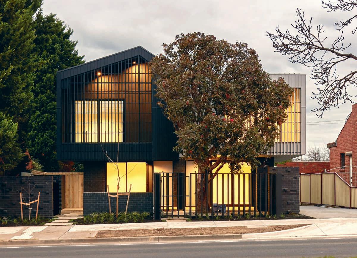
dko.com.au dko a rchitecture 115
This page: DKO’s modernist design maximises spacious design on a small scale
Photo: Dan Hocking
Spacious living on a small scale
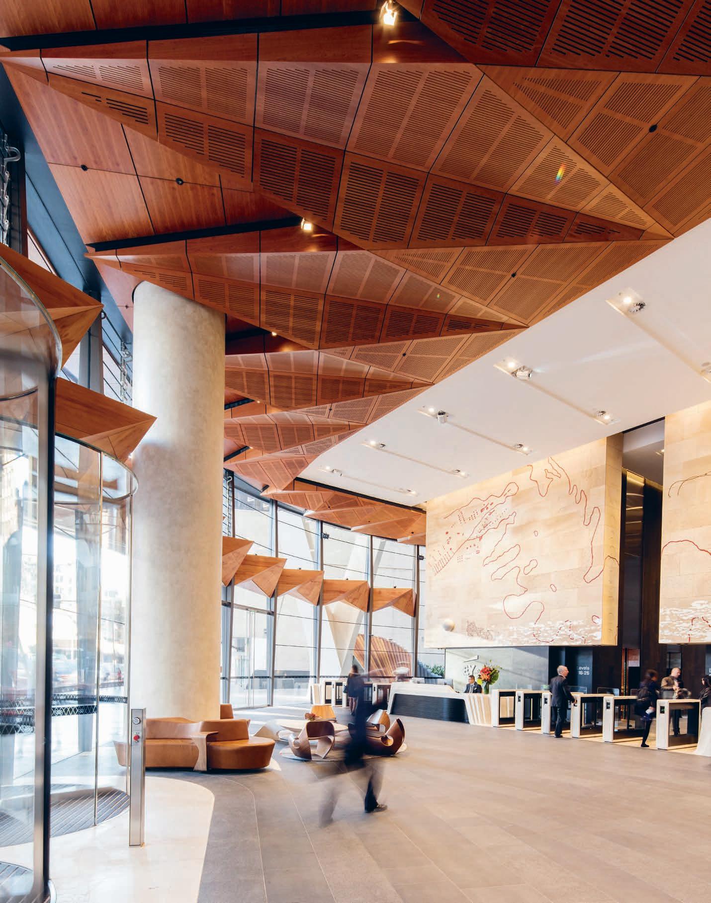
How are advances in technology allowing industrial design engineers to create an agile working model for their industry? FJMT’s recent 200 George Street project featuring AR-MA demonstrates the outcome of a sophisticated digital design, capitalising on the hybrid skills of technology-native architects.
Techno-Native
INDESIGN 117 IN SITU
200 George Street Sydney, by FJMT featuring AR-MA Words Lorenzo Logi Photography Brett Boardman
“3D models are data-driven and parametric; able to adapt to and accommodate design changes flexibly throughout design, development and fabrication. But it’s not about being dogmatic about one medium or one way of doing things,” says AR-MA director, Gabriele Ulacco.
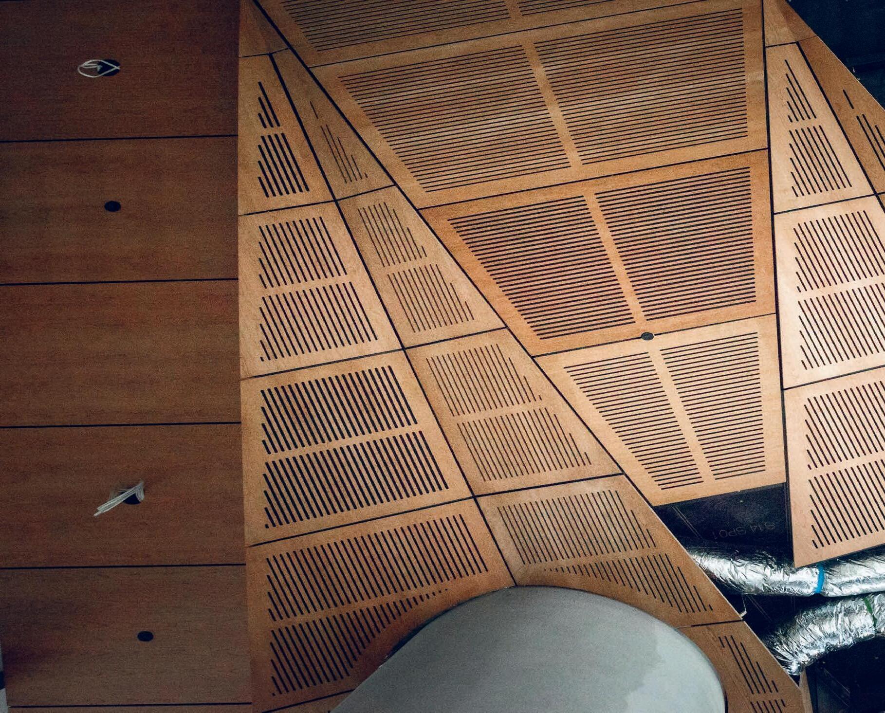
“We really focus on making comprehensive 3D models for production. Sometimes that means we’re actually bypassing paper altogether, and the outputs are digital files that go straight to machines in the factory...”
Much of technology’s impact on architecture to date has resided in the ability to process vast quantities of data, increasing scale and efficiency to permit previously impossible structures. Mirvac’s recently completed 200 George building by FJMT on the other hand, showcases how digital tools are able to render minutely precise designs and complex geometries.
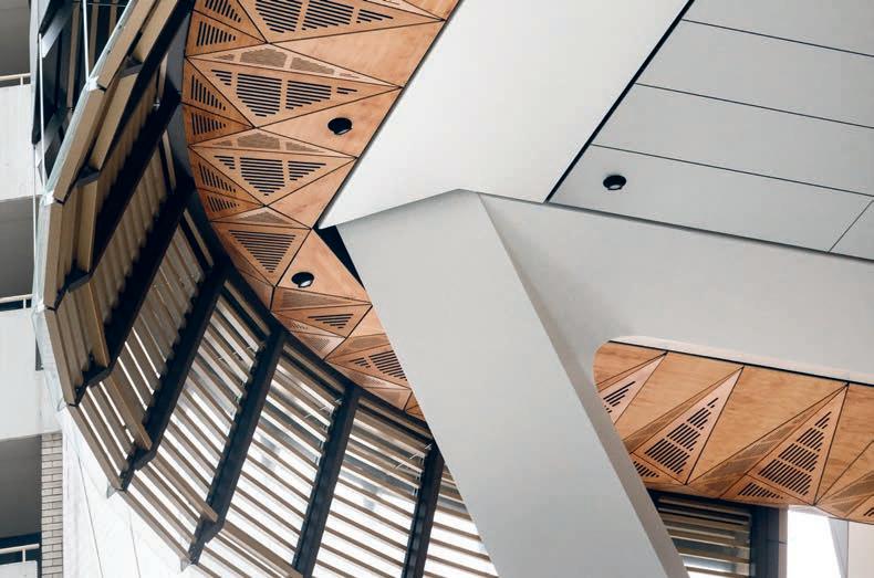
Sydney practice AR-MA (Architectural Research – Material Applications) was engaged as part of a specialist façade team, including ARUP and Empire Glass and Aluminium, to manage design and construction of the podium glazing and cladding.
The results are compelling, especially the timber components, which render remarkable dynamism and fluidity from highly precise geometric arrangements. A sort of macro, threedimensional type of cabinetry.
To achieve this, AR-MA employed CAD, but elaborated the designs down to millimetric scale. “We really focus on making comprehensive 3D models for production,” says Gabriele Ulacco, director of the practice. “Sometimes that means we’re actually bypassing paper altogether, and the outputs are digital files that go straight to machines in the factory that then manufacture from that digital information.” The approach smacks of a ‘uniting theory’, integrating design, engineering, fabrication constraints, material limitations and logistics in a collaborative virtual construction paradigm that guarantees the built product’s fidelity to the digital
model. AR-MA designer, Guido Maciocci points out, “Contrary to conventional methodologies, the 3D model is now the master and the 2D drawing is the reference.”
Of course, if it were easy, everyone would be doing it, and in this regard AR-MA’s cultivation of a team of trained architects who can also rustle up a line of code when the software lacks a feature, sets them apart: “[Coding] is fundamental to our approach. It means being dexterous with whatever medium, whatever tools,” explains Ulacco. Then there are the toys, perhaps most notably the LIDAR scanner, which sprays a room with laser dots and composes a design drawing based on real-life dimensions. AR-MA use this to reconcile their own drawings with the build, or, as Ulacco phrases it, “get all the messiness of the reality of a construction site back into that model,” so that any discrepancies are resolved before components are fabricated. This is especially crucial because, as Maciocci explains, “Our 3D models are data-driven and parametric, able to adapt to and accommodate design changes flexibly throughout design, development and fabrication.”
However, despite their obvious skill, and an admission that the technologies are profoundly disruptive, AR-MA view themselves as part of a community of talents. As Ulacco observes, “It’s not about being dogmatic about one medium or one way of doing things.”
ar-ma.net
INDESIGNLIVE.COM 120 IN SITU
Page 116, 118-119: The lobby area and exterior of 200 George Street designed by FJMT, featuring design and construction of the façade, podium glazing and cladding by AR-MA, ARUP and Empire Glass and Aluminium.
Spin. Sydney Indesign: Cruisin’ on in, 2017
We haven’t reinvented the wheel – but it’s rolled ‘round again. Sure, we’ve been around the block a few times. Melbourne, Perth, Brisbane, Singapore, Hong Kong. Quite some mileage! But we never run out of gas. The region’s single-most powerful and commercially focused vehicle for connecting designers, specifiers, suppliers and architects. But there’s nothing old about this model because for 2017 we’ve pimped our ride. Spread across three major design precincts, we’re tightening our
stronghold to go further with the brands that get our gears into drive than ever before.
Fill the tank. Take the ride. Go on, come for a spin.
sydneyindesign.com.au
Indesign
August 2017
Up! 80 80 15 24 03 02
Sydney
11–12
...Buckle
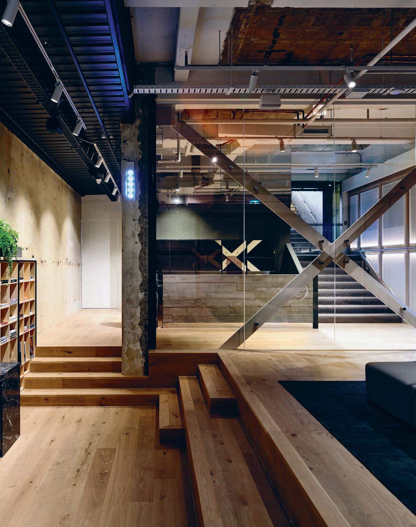
Working with architect-designer, Travis Walton, health and fitness company Ready And Willing (r.a.w. for short), has created a very un-gym environment. It takes many cues from modern office design, bringing warmth to an industrial space. Each space however, is unashamedly about health and fitness.
The ‘Un-Gym’ Gym
In Australia, the gym is probably the last great bastion of bad design experiences. With a handful of exceptions, they are generally designed around rows of bulky equipment, with only cosmetic attempts at making them inviting, while ‘wellness centres’ tend to follow the blonde-wood Scandinavian aesthetic. When Ready & Willing (r.a.w. studios) found its subterranean space on Melbourne’s Russell Street, the health and fitness operator knew they had to create something different—they wanted a fitness space that was more lifestyle club than gym.
“They were really about creating a space that was different to most other fitness spaces,” says Travis Walton, the man tasked with carving out a unique aesthetic in the basement location. “If you’re thinking about this idea of a ‘gym’, that sort of concept is dying these days. It was more about a focus on a lifestyle space, creating a community and a design experience. That was a key focus. When you take all of those elements and then combine them with good quality trainers, then you’ve got a new breed of product in the market.” Rather than a traditional gym space, r.a.w. studios is made up of several flexible spaces able to accommodate everything from yoga and barre, to movement training, boxing and mixed martial arts. Perhaps the most obvious departure from a traditional gym environment is the communal lounge area.
The open-plan space features generous lounges, oak timber floors and a well-stocked kitchenette for members. “We put the lounge area separate to the reception area. We created rooms off that main area as well so there was this sense of a community hub—and within that there was fresh tea, fridge amenities, hot, cold and sparkling water. It is used for meditation or relaxation prior to doing a class or even just putting your shoes on and off, but it has also become a social point.” r.a.w. studios takes many cues from modern office design, bringing warmth to an industrial space. Though, each space is unashamedly about health and fitness. Not unlike a flexible office, the studio spaces feature all the necessary equipment for a variety of activities, without compromising the aesthetic.
Workplaces have been undergoing a revolution, moving from seas of grey cubicles, to agile workspaces, with designers working to make spaces suit people, not the other way around. With projects such as r.a.w. studios’, gyms are finally experiencing similar rumblings. “Health, fitness and wellness are really important things in people’s lives. People are trying to get more balance because they’re so time poor,” Walton says. “We wanted to give people a real design experience.”
traviswalton.com.au
INDESIGN 123 IN SITU
r.a.w. Melbourne, by Travis Walton Architecture + Interior Design Words Ben Morgan Photography Derek Swalwell
Opposite: View from the communal lounge area through to the concrete entry stairway and concierge desk. Page 124-125: One of the larger ‘flexible wellness spaces’ in the studio, which are used for anything from yoga, barre, movement training, boxing and mixed martial-arts.
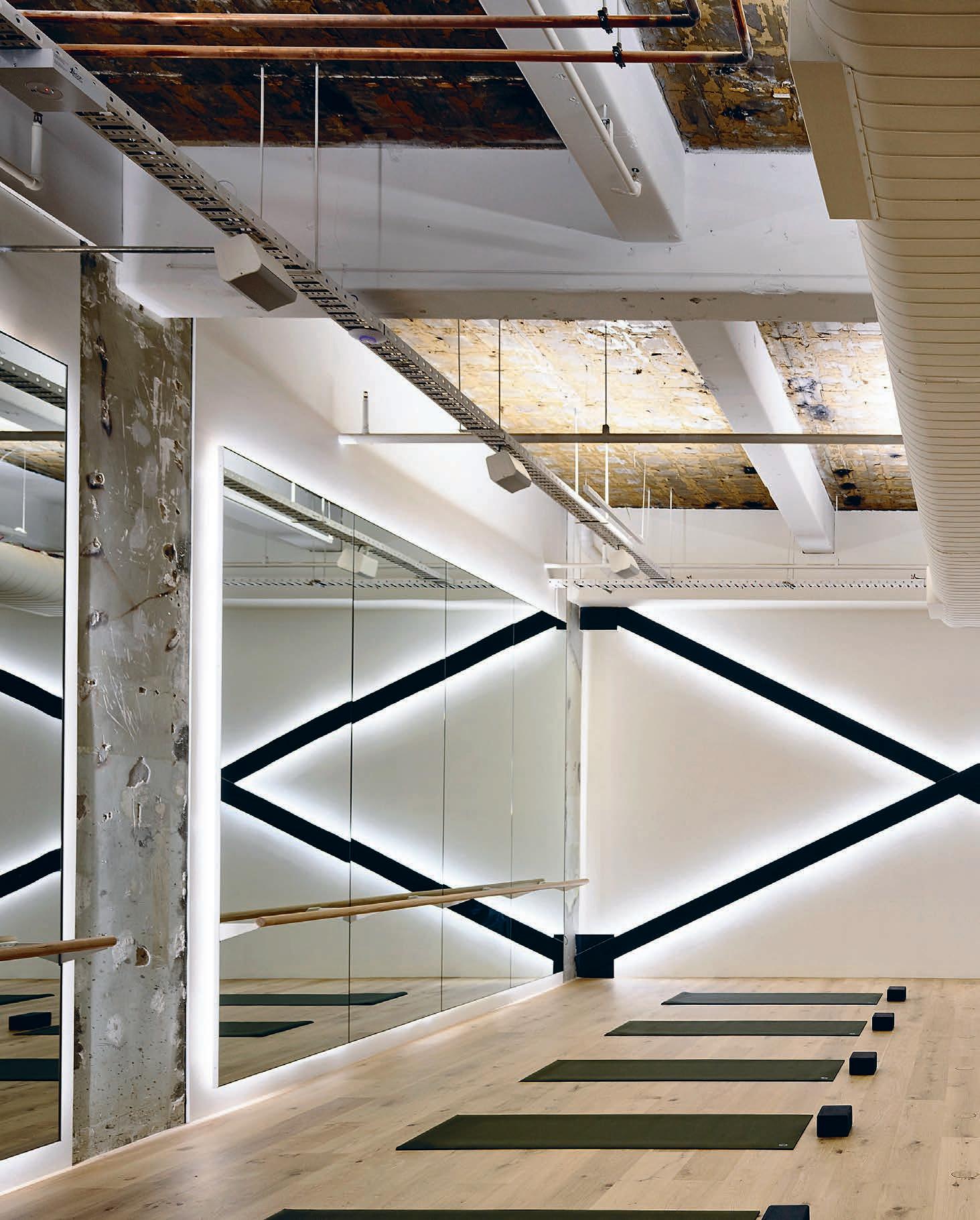
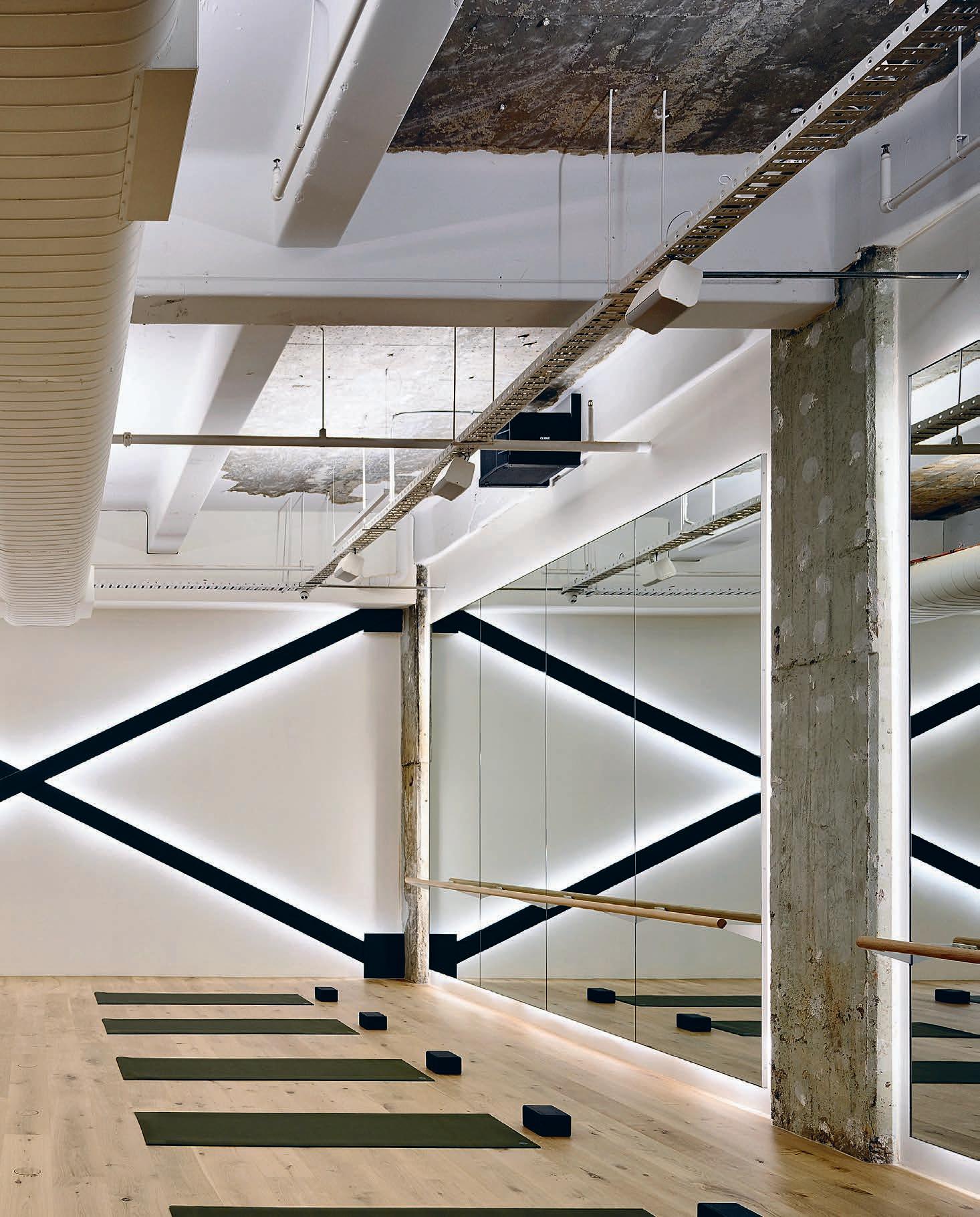
What is ‘salon learning’ and how is design responding to this new educational format? Arts West, Melbourne University’s riotous new Arts Faculty by ARM Architecture and Architectus, reimagines on-campus learning via the philosophy of object-based learning.
Cabinet Of Curiosities
University of Melbourne Arts West, by ARM Architecture & Architectus
Words Kath Dolan Photography John Gollings & Warwick Baker
INDESIGNLIVE.COM 126 IN SITU
Opposite: Arts West’s remarkable façade was created using parametric 3D software more commonly used for modelling by gamers. ARM meshed a virtual façade and virtual images of objects taken from the university’s collections (including statues of Salome and a group of Indigenous dancers), Photo: Warick Baker.
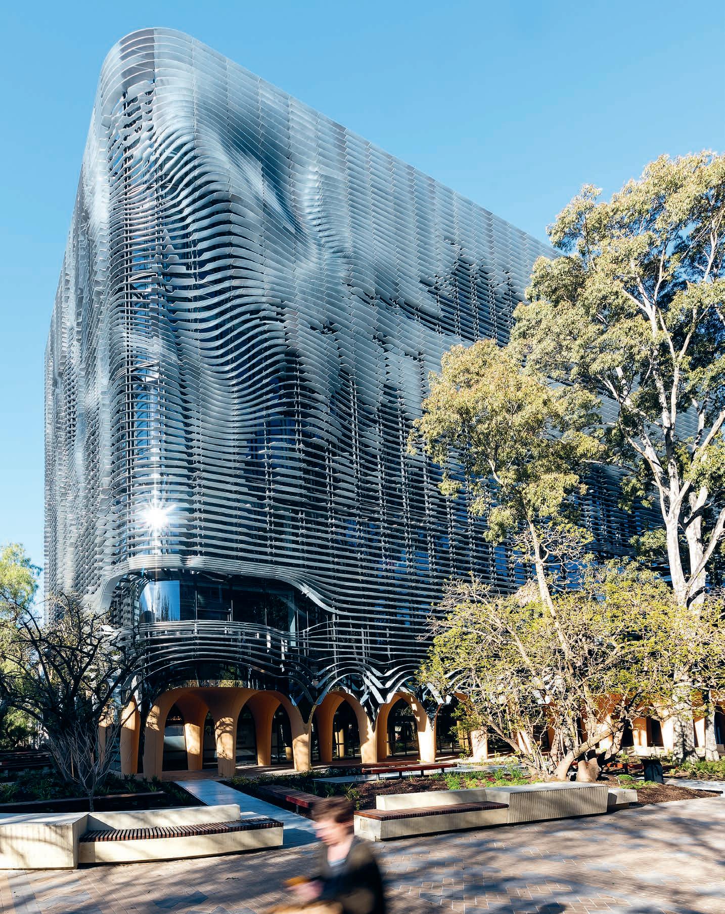
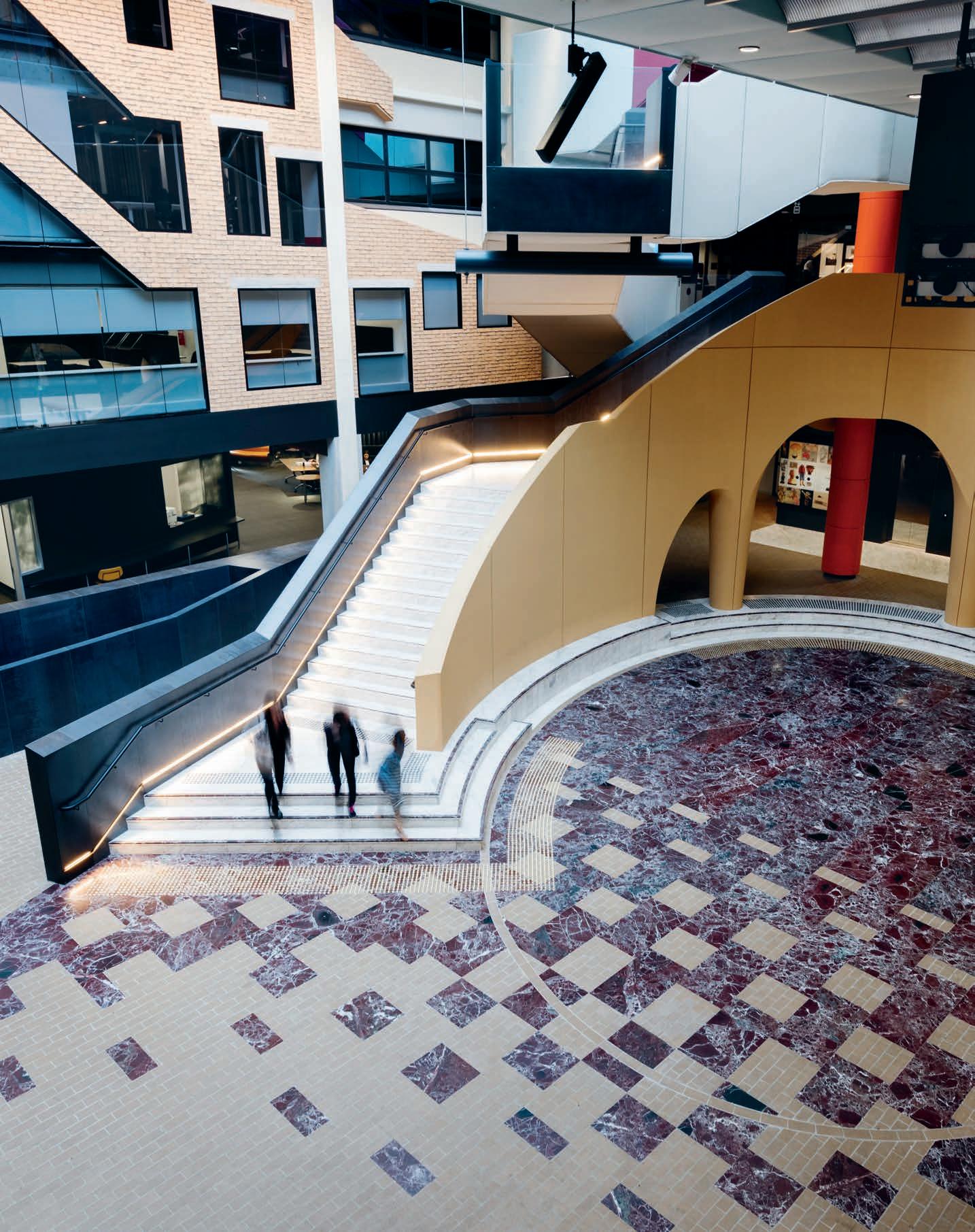
Universities around the world are grappling with the same pointed questions in this era of online learning. What’s the function of a physical campus nowadays, and what should they look like and feel like to inhabit? How can design herald change in the philosophies underpinning education and attract new cohorts without alienating existing staff and students? Can landmark buildings designed to reflect contemporary ideas like hands-on, interactive, object-based learning (OBL) adapt easily to accommodate new pedagogies in the future?
For educational design specialists Architectus and civic and cultural doyens ARM Architects, the answers lay in creating a cleverly playful, richly decorative, wildly varied, digitally integrated ‘cabinet of curiosities’ that would invite students and staff to discuss, collaborate, recharge, debate and linger well beyond the confines of traditional classrooms and timetables.
Amongst Arts West’s many highlights are a soaring, four-storey atrium with contemporary cloisters at ground level and a spectacular, upholstered central staircase; exuberantly decorated lifts featuring digiglass images of the uni’s architectural icons (including a carpark used in the cult film Mad Max); and themed student boltholes more akin to hip hotel lounges than universities. A suite of formal and informal learning areas include a cinema-quality interactive theatre, media lab, lecture theatre, consultation pods, casual ‘prop and stop’ zones and adaptable teaching spaces designed for collaborative project work not ‘chalk and talk’. Discreetly integrated digital technology has replaced old fashioned central lecterns. Teaching spaces and student lounges are enlivened by vintage wallpapers, ornate curtains, digitally-printed carpets and hand-painted floor tiles, styled by themes as diverse as vampish, ‘70s Vivienne Westwood tartan to cool grey botanicals.
“It’s almost like the physical campus experience has to be heightened in some way,” says architect Marina Carroll from Architectus. “Students are showing they’re not going to turn up and sit in a lecture for two hours to hear someone go through a PowerPoint presentation.” To that end, both designers and teaching staff have
placed the university’s 23 extraordinarily wide-ranging and valuable cultural collections front and centre. “Learning around an object has many benefits, one of which is it triggers a stronger memory and association,” Carroll explains. “It becomes a springboard for a whole heap of grounded and contextual discussion.”
Arts West celebrates its most treasured objects in extravagant style, inside and out, rendering online tours of even the world’s greatest museums and cultural institutions remote and two-dimensional by comparison. The building’s exterior is wrapped in a virtual façade of swirling metal fins imprinted with images from ancient figurines. The interior showcases themed collections (curated by the university’s exhibition designer and refreshed each semester) across seven floors in climate controlled display cabinets placed in a mix of highprofile and unexpected locations, from circulation corridors to two interconnected, state-of-the-art OBL Labs where intimate groups can study and handle these very precious pieces.
Museum-quality lighting and superior acoustics throughout (aided by extensive upholstering including not just the staircase but structural columns) achieve a hushed, reverential atmosphere around these extraordinary objects, even along busy thoroughfares.
“We spent a lot of time working up the mood of the environment,” says ARM Architects’ interior leader, Andrea Wilson. “You can’t get that three-dimensional, immersive experience by looking at something online.”
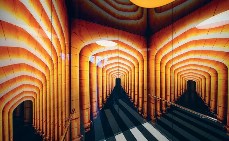
The executive director of the Faculty of Arts, Joanne Ligouris, says Arts West has had a profound impact on the university as a whole. “We have been overwhelmed by how our students and the university community have embraced the building and by the number of requests to use the spaces in Arts West,” she says. “It has created a central hub for Arts students with close proximity to the library and other Arts buildings, including the historic Old Arts building. It’s also an innovative, creative and fun place that opens people’s minds to the rich possibilities of an Arts education.”
armarchitecture.com.au, architectus.com.au
INDESIGN 129 IN SITU
Page 128 & 129: The Arts West lobby atrium (Photo: Warick Baker) and one of the elevators (Photo: John Gollings), designed to push the boundaries between interior architecture and decoration. Page 130-131: There are open-plan spaces for research staff, students, single offices for senior academics, and multiple-person office spaces for funded research units. Photo: Warick Baker.
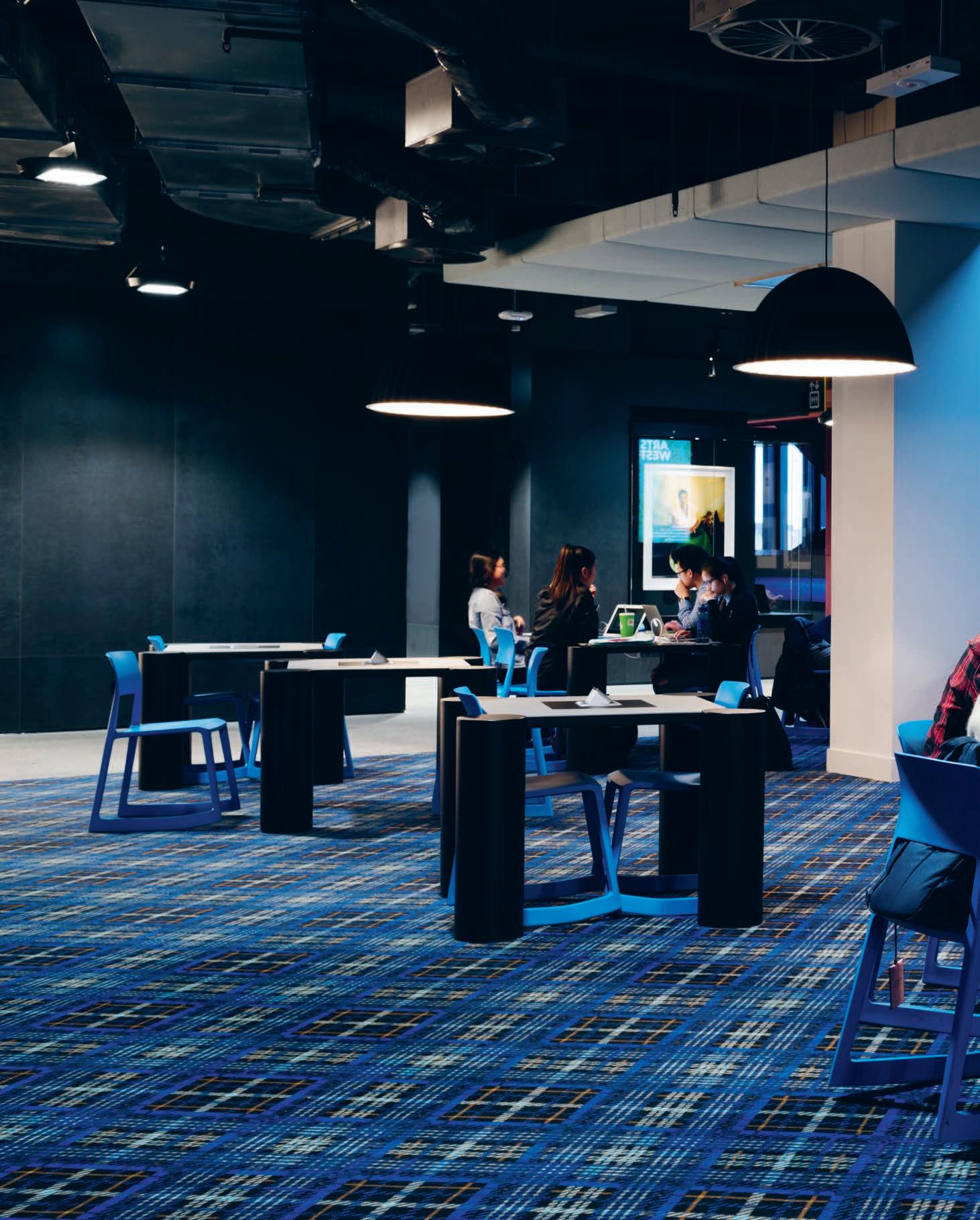
The Salon And The Warehouse
Arts West’s interior is a bold combination of robust, neutral, warehouse-style materials. From concrete aggregate floors, exposed ceilings and stud walls to textured ceramic tiles that encase central service areas like toilets, as well as decorative Salon-style lounges and learning spaces, which ring each floor for maximum natural light. Themes, like the university’s prized collections, span many centuries and broad interests, hence the skilful mash-up of everything from Bedouin tents to hoop pine ply-look ceramic floor tiles and Versailles-inspired wallpaper. “The Salon is a dressing of the space to take your imagination elsewhere,” Wilson says.
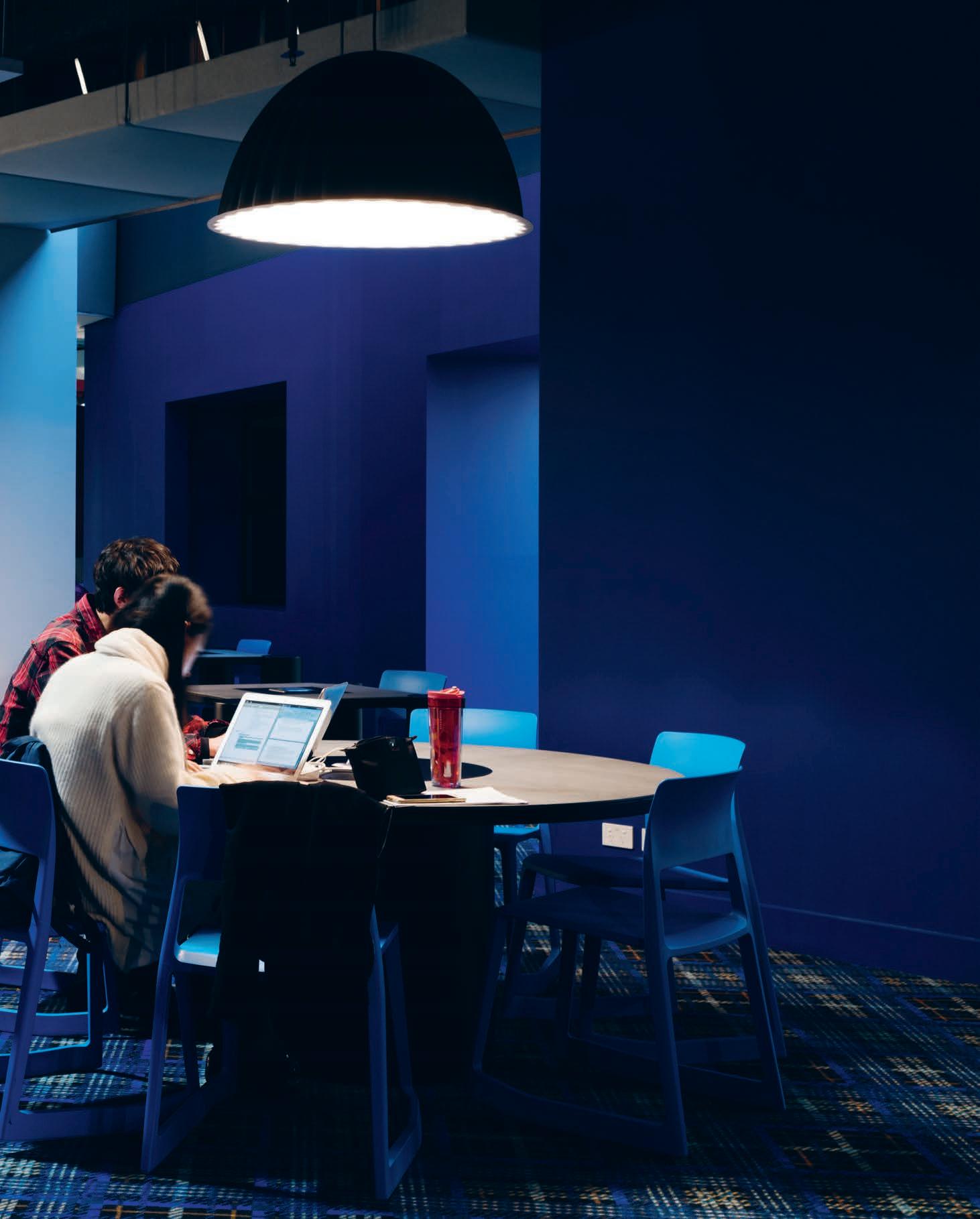
–
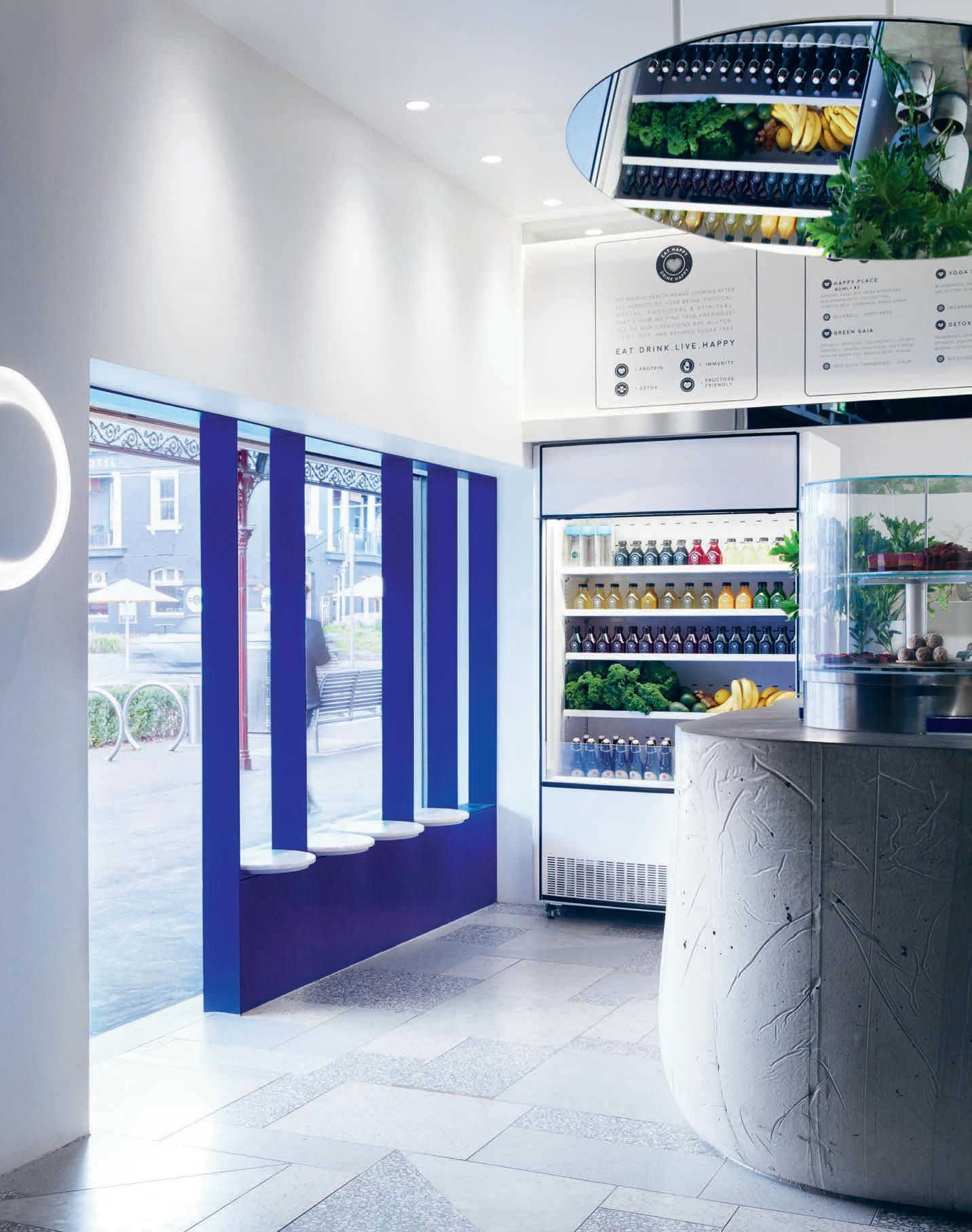
Designer Smiles
We know from biophilic design studies that timber elementally connects us back to nature. In doing so it actually encourages greater levels of productivity, as well as conjuring feelings of positivity and creativity. Plants and natural hues of blues, greens and browns, too, help to make us feel happy and inspired, as opposed to anxious, bored and disengaged. Really, it’s no wonder we’ve seen such a proliferation of plywood fit-outs and verdant indoor greening creep into hospitality, retail and commercial workplace environments!
Happy Place, is ‘yet another’ juice bar-slash-café to join the droves of yoga and smoothie guru-style start-ups popping up around our major cities. But it’s a juice bar that clearly differentiates itself from the rest with a very open ‘non guru’ statement.
Fiona Lynch of the Fiona Lynch Design Office headed up this retail project for client Salvatore Malatesta of ST. ALi coffee fame and the aptly-named Lola Berry, a nutritionist, published author and social influencer in her own right.
“With Happy Place we really wanted to stay away from the guru idea and smoothie store aesthetic, and keep it urban and contemporary,” says Lynch. “When you think of some of the other juice bars out there, it’s all ‘timber boxes’,” she says. So for this business, Lynch set out to embody a ‘happy, healthy, natural’ brand message using an entirely different material palette.
Concrete is juxtaposed against highly textural terrazzo shot through with quartz. Here, a subliminal link is made to the healing powers of crystal, not to mention the fact that customers receive a little piece of quartz with each smoothie they purchase.
Metal finishing is used on the shop front, complemented by a queue of “sweet” quartz stone seats that balance along the front window, refracting shards of light as they gaze out into the street.
A “happy” electric blue gives the fit-out an uplifting zing and is part of what Lynch describes as the “new vernacular” she wanted to bring to this store. “It think it’s a bit futuristic,” she says. “We looked at what’s been done elsewhere and quickly saw that there’s a strong ‘smoothie language’ with ply. We looked at restaurants, and fashion stores like Issey Miyake that specifically don’t have any timber, and we deliberately looked to change the vernacular.”
There’s an element of strong discipline to this fit-out, where many juicy fit-outs feel “rambling” in design. Sitting front and centre is a monolithic, free-formed, poured concrete counter. Supporting graphic elements include a pale pink open fridge, blue steel work and a circular refrigerated display case for sweets.
The patterned terrazzo flooring with brass details underfoot and a large mirror overhead were incorporated as a special request from Berry, who recognises the powerful role of Instagram in marketing her brand. Hence, fashionable shoe shots and light-hearted ‘halo’ snaps are well catered for.
“It’s all a very clean approach that doesn’t feel like a traditional health food shop,” says Lynch. But the one thing it does deliver on is that sense of ‘happy’… because, you know, #yolo!
fionalynch.com.au
INDESIGN 133 IN SITU
When happiness is a valuable currency, is designing emotions a thing? Author and nutritionist Lola Berry and coffee mastermind Salvatore Malatesta have joined forces with Fiona Lynch Design Office to launch Happy Place. A juice bar-café designed to deliver a sense of health and happiness to each and every customer.
Happy Place Melbourne, by Fiona Lynch Design Office Words Alice Blackwood Photography Sean Fennessy
Opposite & page 134-135: The raw and organic elements are reflected through a mix of earthy and ‘monolithic’ concrete and stone materials. Energising crystals will be structurally placed throughout the space to create an atmospheric energy that will encourage feelings of happiness and self-connectivity.
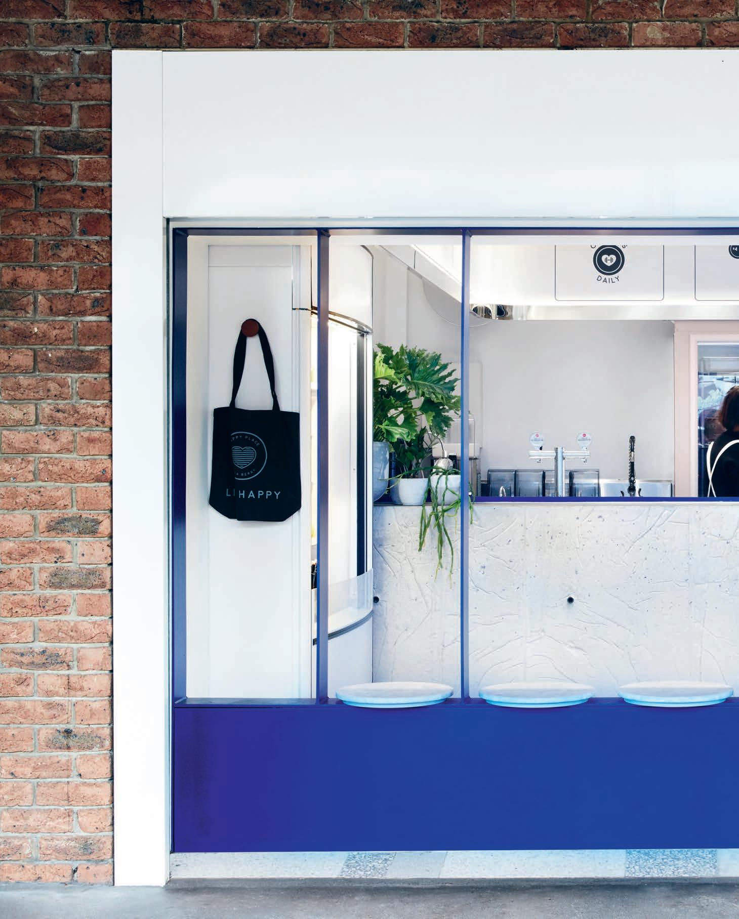
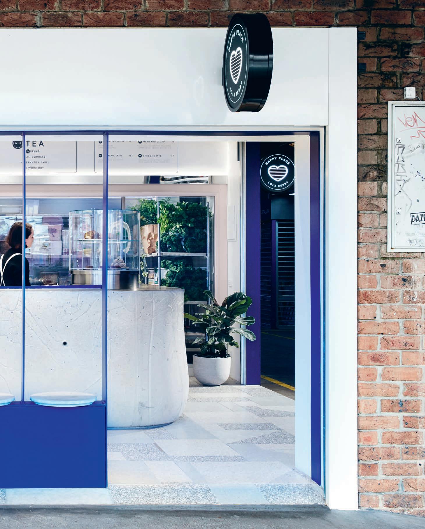
Could thinking like a kid be valuable in the workplace? Ku.Be by MVRDV and ADEPT is a new typology for a community building designed to encourage play and bring out the inner child in users.
(Don’t) Act Your Age
MVRDV & ADEPT
Words Mandi Keighran Photography Adam Mørk
INDESIGNLIVE.COM 136 IN SITU
Ku.Be House of Culture & Movement Copenhagen, by
“There were very serious men in suits climbing walls and taking slides. They were people that you would never expect to be playful if you saw them on the street,” says ADEPT co-founder, Martin Krogh.
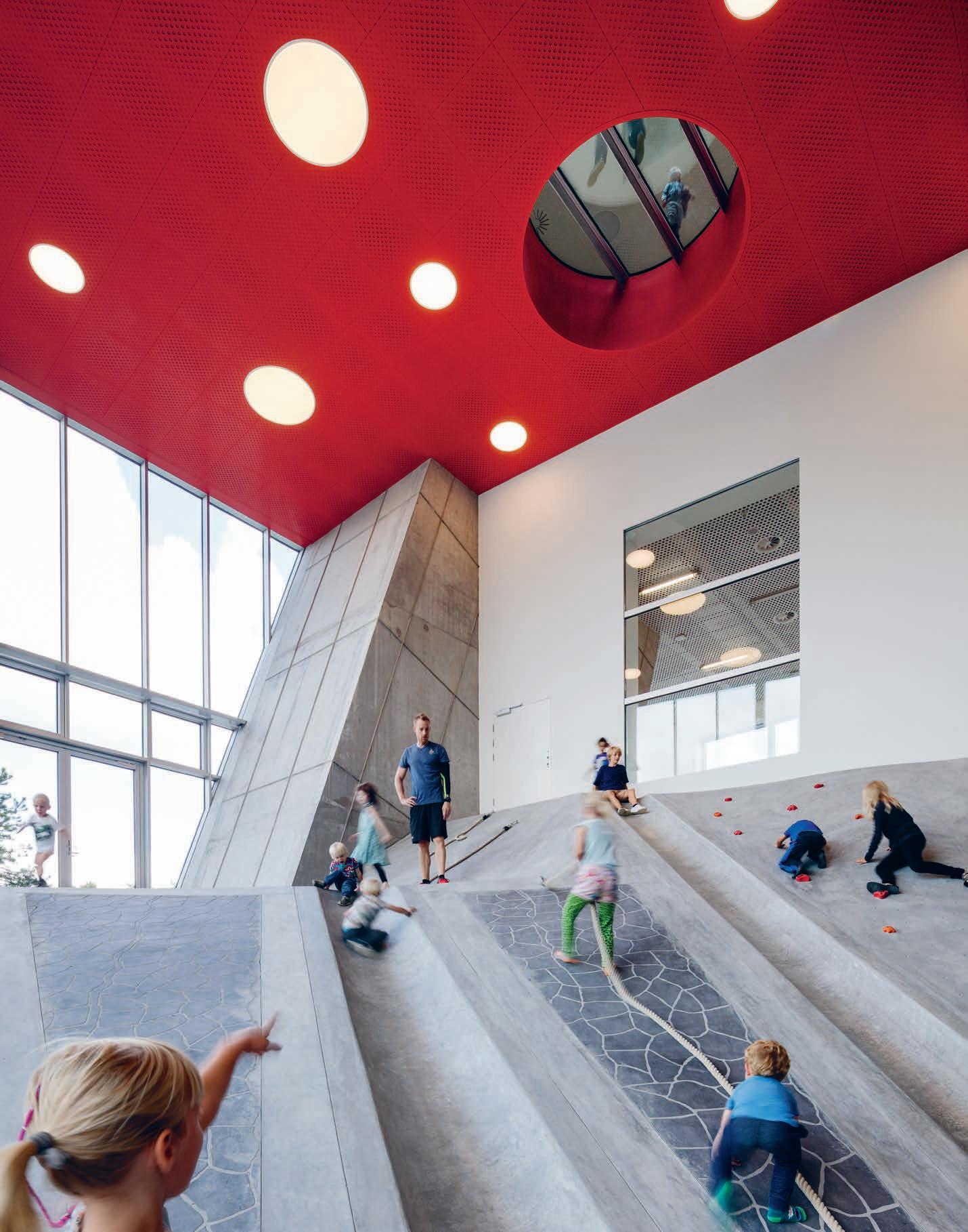
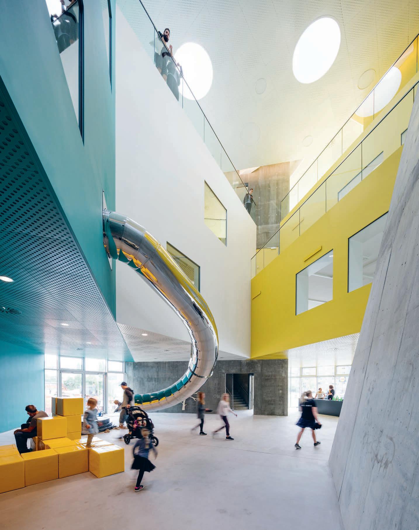
Visitors to the new community centre in Copenhagen’s Frederiksberg district could take the stairs, but the climbing walls, slides and rope ladders are a much more fun way to move around – and they are definitely not just for kids.
Ku.Be – a portmanteau of kultur and bevægelse, the Danish words for ‘culture’ and ‘movement’ – is a collaboration between Dutch studio MVRDV and Danish architects ADEPT that incorporates a mix of disparate building types into one. From library to cooking school and gym to theatre all aim to bring out the inner child in even the most sensible of visitors to encourage an active lifestyle outside of a regular gym. “The idea was not just to make a culture house, but to create a whole new typology that hasn’t been played with before,” says Martin Krogh, co-founder of ADEPT.
Instead of traditional floorplans the building has six volumes – or zones – each designed for a very specific purpose, with everything from an educational kitchen in the FoodZone to a running track in the PulsZone and a 300-seat theatre in the PerformanceZone. Each zone is uniquely configured for its purpose, creating complex volumes contained within the rectangular form of the 4,000 square-metre building that encourages people to explore.
To get from one zone to another, visitors navigate the PlayZone. The irregular space, formed where the various zones meet, has been filled with all manner of unconventional elements that seem more suited to a playground than a community centre. “You can climb up a wall or a rope ladder and then slide down a pole, or a concrete slide,” says Jacob van Rijs, co-founder of MVRDV.
“As you move around the building, you can see all the different activities taking place, encouraging people to try new things.” Looking in from the outside, the PlayZone is visible through glazed sections, and the other zones are concealed behind a ceramic-tiled façade, creating a sense of intrigue.
To appeal to adult sensibilities, the play equipment was realised in a sophisticated neutral palette of silver, black, timber and concrete while the building itself is a riot of colourful walls. “Everybody has some kind of playfulness in their character,” says van Rijs. “Ku.Be is designed to bring that out of people. The whole building is a holistic play element.”
It certainly seems to be working. At the recent opening, a twelvehour event that ran until 3:00am and was attended by Frederik, Crown Prince of Denmark, the designers were surprised at how much adults embraced the playful concept. “There were very serious men in suits climbing walls and taking slides,” says Krogh. “They were people that you would never expect to be so playful if you saw them on the street.”
“It’s a building with no fixed idea of what kinds of activities can take place within – the users will take the building and use it in the ways they think best,” adds van Rijs. “It’s a beautiful idea, and I hope it can operate in reality. I want people to see it and think it’s cool and want to do something similar in their space.” And if the reaction of the straight-laced men in suits are anything to go by, then we may well be looking at the very first blueprint for ‘playtime working’.
kube.frederiksberg.dk,
INDESIGN 139 IN SITU
mvrdv.nl, adept.dk
Previous, opposite & page 140-141: The 3,200 square-metre community centre, features a series of varied ‘active environments’ including: exhibition spaces, performance hall, health centre, library, study areas, sports hall, yoga zone, café (school), kitchen, play zone, retail, offices, parking, playground and public park. The project is a new typology, developed out of the response to a brief that solely asked for a building that would bring people together and improve the quality of life.
“Everybody has some kind of playfulness in their character. Ku.Be is designed to bring that out of people. The whole building is a play element.”
“ You can climb up a wall or a rope-ladder and then slide down a pole, or a concrete slide. As you move around the building, you can see all the different activities taking place, encouraging people to try new things.” Jacob van Rijs.
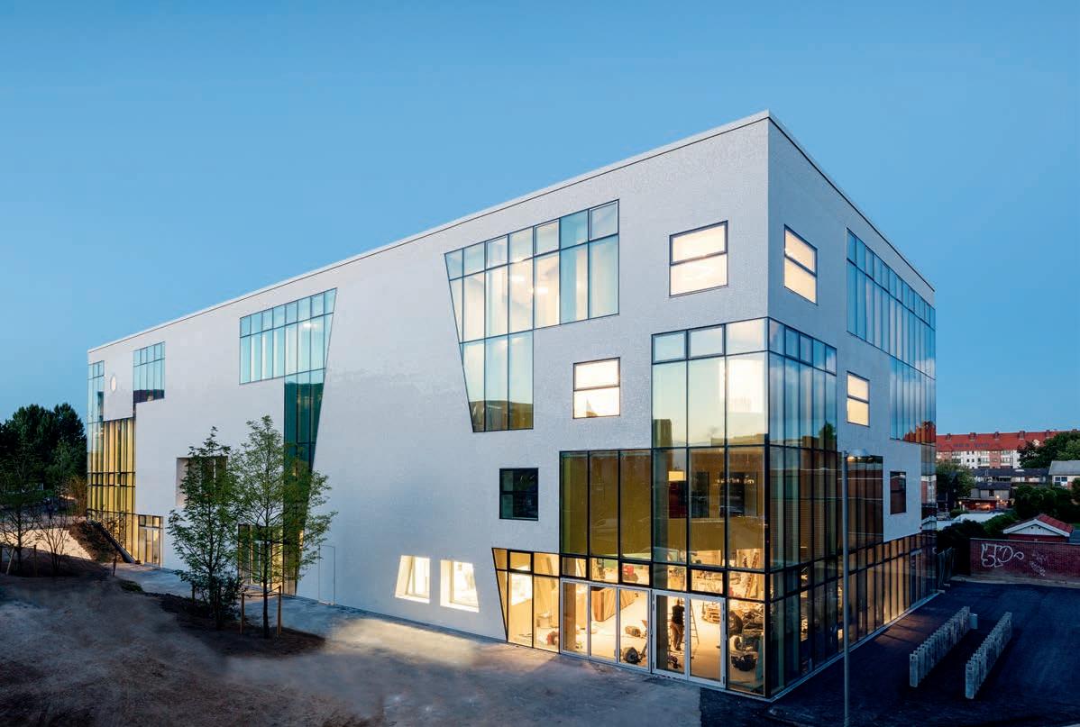
INDESIGNLIVE.COM 140 IN SITU
Zone Out! Ku.Be’s Top Six Spaces
FoodZone : A trapezoidal space with an educational kitchen and herb garden. The café serves the whole building and functions as a reception area.
ThinkZone : For learning activities, exhibitions, and creative workshops.
PerformanceZone : A 300-seat theatre that opens out onto the garden – performances can take place either inside or out.
ZenZone : A glass-floored quiet space for activities such as yoga, meditation, pilates and “sleeping concerts”.
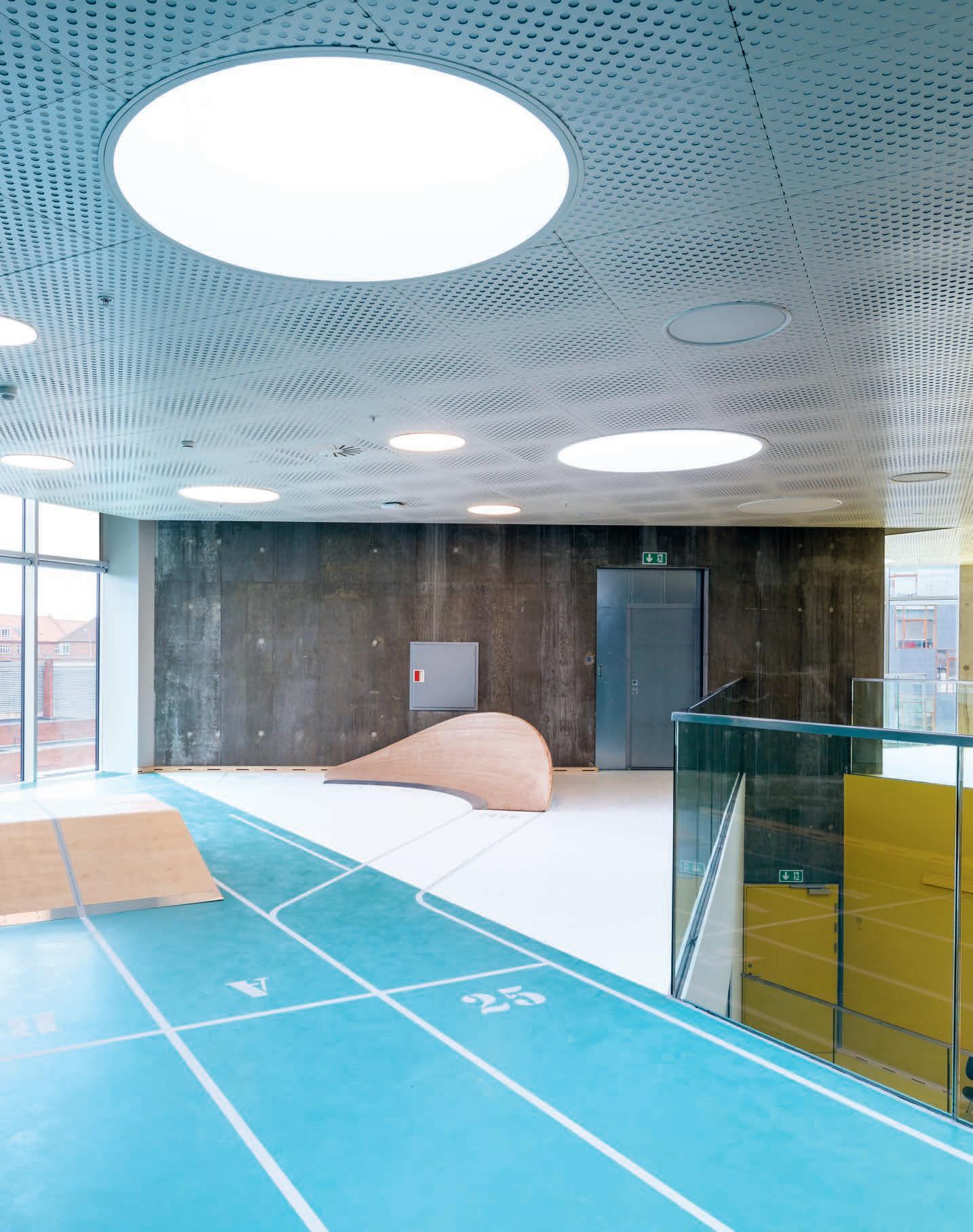
PulsZone : A large arena for all kinds of sports and fitness activities, including gymnastics, trampolining, and running.
PlayZone : The circulation space between the zones has been designed to encourage play; think slides, ropes, climbing walls and nets.
–
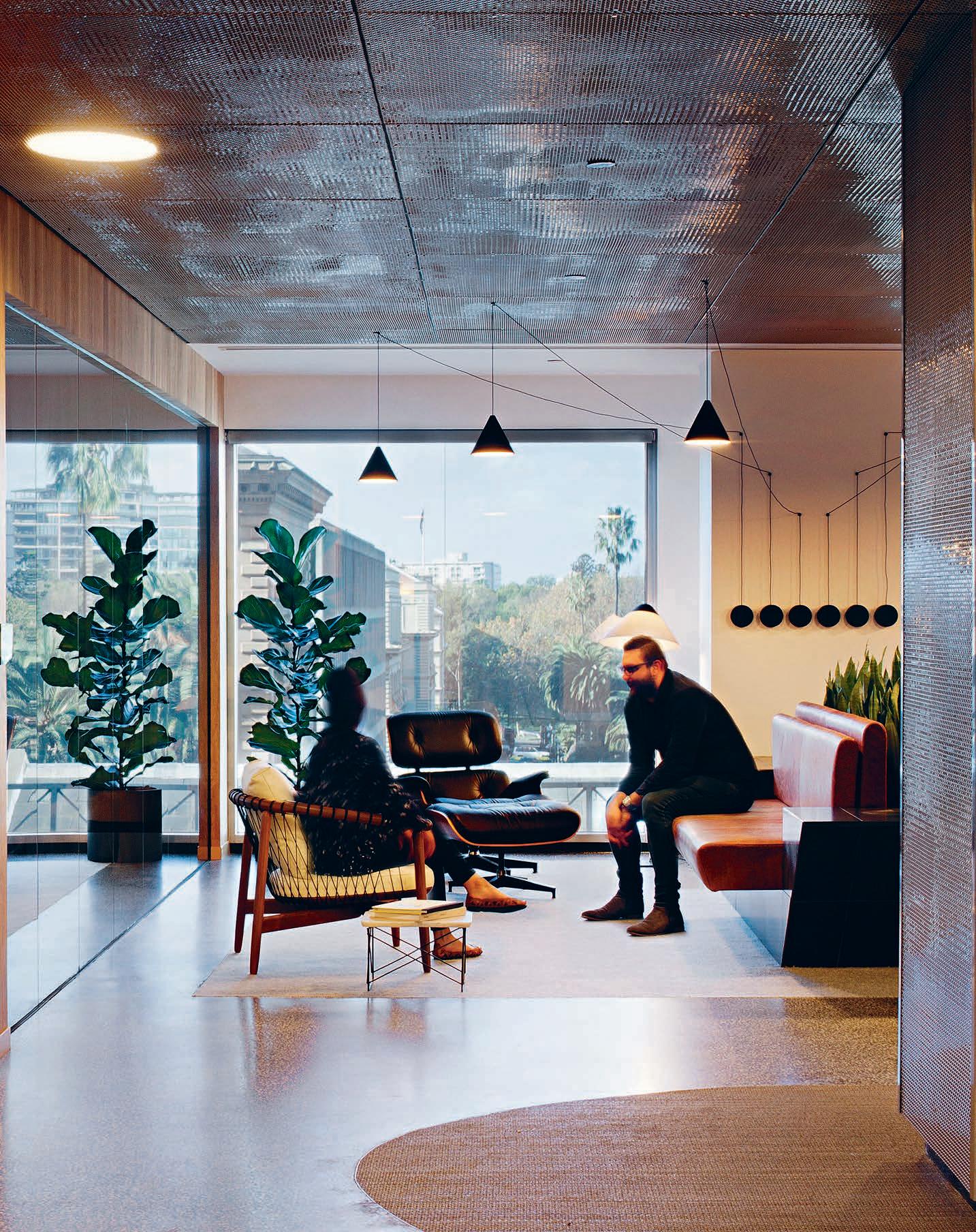
How can ‘smart workplaces’ stay flexible when advancements in integrated technology move so quickly? Unispace’s new Melbourne studio exhibits a built-in fluid and mutable working style that transcends the clunkiness of faddish design trends and wire-driven technology.
Non-Stick Agile
“ We love to collaborate and it comes back to ego. We have no ego, we’re about disrupting traditional methods of working and embracing different points of view; everyone’s encouraged to contribute and co-create,” says Unispace global design director, Simon Pole.
INDESIGN 143 IN SITU
Unispace Headquarters Melbourne, by Unispace
Words Alice Blackwood Photography Shannon McGrath
Frictionless Working In Action
Hands-free connectivity is the invisible cornerstone of the Unispace studio. The team use Crestron technology’s AirMedia. “It’s like AppleTV,” says Pole, “you can basically walk into any room, type in a code and there’s your laptop on screen.” For collaboration they use Skype for Business and Office 365. For drawing, teams use Revit and BlueBeam exclusively from their laptops. It’s the seamless technology, and integration of it that has essentially shaped the Unispace studio.
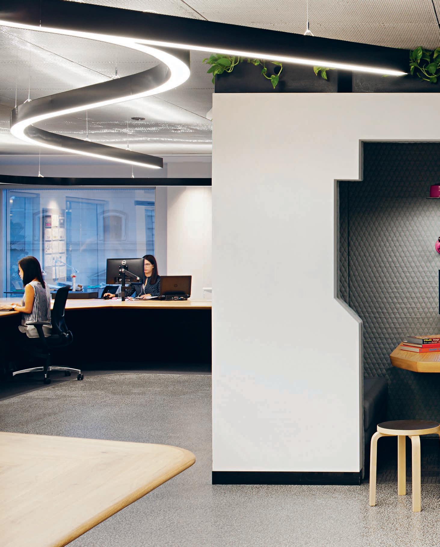
–
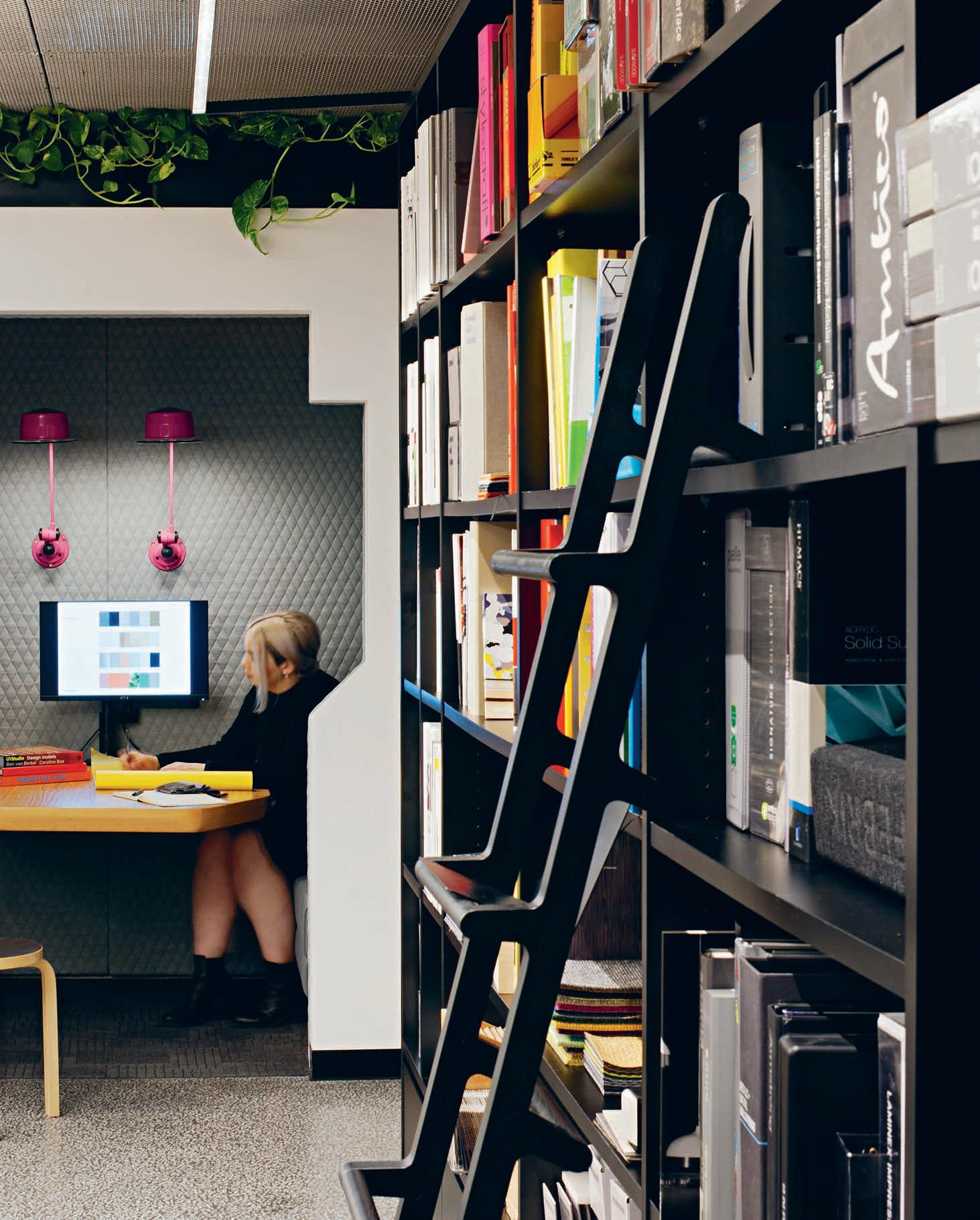
Have you heard of Unispace? They’re a relatively new design business, having come onto the scene some five-and-a-half years ago. With studios located around Australia and internationally, the company is not what you’d call your traditional design firm, having originated in strategy, design, project management and building/ construction backgrounds.
“We sit in the middle,” says Simon Pole, Unispace’s global design director. “We offer top tier strategy, design and project management and we can deliver your project for you as well. We found that the typical project methodology can cause conflict [between designer, project manager and construction]. So we set out to create a team that understands the whole process and empathises with each phase. It’s about breaking down the egos within the disciplines to ensure that we are all working in synchronicity – everyone’s at the table at the same time.”
Unispace’s recently completed Melbourne studio is, as Pole describes it, a physical manifestation of Unispace’s unique methodology. Located at the ‘Paris end’ of Collins Street in Melbourne’s CBD, the studio exudes a fluidity in both floor plan and fit-out that challenges your expectations – right from the front door. To walk out of the lift is to wander right into Unispace’s communal kitchen, where a team member comes forward to greet you and direct you where necessary. The space is exceedingly open-plan and fluid, the eye drawn toward the long, snaking length of a custom-made work bench that runs through the space. Perhaps the most static elements are the island benches that float across the kitchen and entrance. In arriving at the right solution for Unispace, Pole and team considered the realities of agile working.
“A lot of design firms talk about flexible working but live in a paper-driven architectural icon of a space. With the scale of projects we work on, you need to be more agile as the teams and project
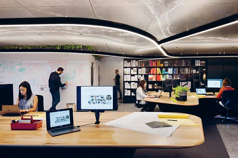
types are moving quickly.” The long, central work bench exists as a manifestation of this agile working idea allowing project teams to metamorphose with utmost ease. “It’s like a travel agent selling you a beautiful holiday spot without understanding what it’s like being there,” says Pole, “It’s necessary for us to work this way in order to [properly understand it] and advise our clients.”
To the very rear of the bench is a project lab, which supports rapid interchange between lab-users and a desk-based task force. Pole also points out a series of grey felt project display panels, which can be moved from wall-to-wall allowing for quick visual ideation that can literally be carried across into a formal boardroom setting. “It’s all about making things as efficient as possible and maximising collaboration,” says Pole. “We love to collaborate and it comes back to the ego thing. We have no ego, we’re about disrupting traditional methods of working and embracing different points of view; everyone is encouraged to contribute and co-create.”
“We’ve found that our culture is our biggest differentiator compared to other firms and we constantly look for ways to maintain this as we grow.” This differentiation extends right through to materiality. “So much design out there is pop-y, fashionable and ‘follow-me’. We said, ‘Let’s go back to quality design, minimal finishes and bespoke setting variances.’ ” This was expressed through a simple execution of epoxy terrazzo flooring, solid timber benching and woven stainless steel ceilings. Nothing overly fashionable, the focus being on longevity.
In embracing change and agility as their constant, Unispace has cemented a brand ethos and working style that offers them opportunity for growth and the ability to embrace whatever comes their way – and look good doing it.
unispace.com
INDESIGNLIVE.COM 146 IN SITU
Page 142, 144-146: The space uses a well-curated combination of spaces to ‘focus’, ‘retreat’, ‘collaborate’, ‘socialise’ and ‘present’, all kitted out with the most progressive approach to technology and big data Australia has ever seen.
www.abey.com.au Abey Australia’s diverse range of sinks provides you with a selection from around the world. Visit an Abey Selection Gallery to browse the range. Barazza Cubo Single Bowl – Barazza 1 & 3/4 Bowl – Barazza Easy200 Double Bowl SINK DIFFERENTLY. VICTORIA Selection Gallery 335 Ferrars St Albert Park Ph: 03 8696 4000 NEW SOUTH WALES Selection Gallery 1E Danks St Waterloo Ph: 02 8572 8500 QUEENSLAND Selection Gallery 94 Petrie Tce Brisbane Ph: 07 3369 4777 *NEWLY OPENED* WESTERN AUSTRALIA Selection Gallery 12 Sundercombe St Osborne Park Ph: 08 9208 4500
The future of hospitality is multi-sensory: touch, taste, smell, sound and so on. How then are we personifying our clients in the design of their spaces, and how can we pull this off without being gimmicky? A new Hong Kong restaurant and bar by Joyce Wang Design Studio takes a different approach, encapsulating the chef’s character and culinary style in the space itself.
Personal Space
For chef, Nathan (‘Nate’) Green, Rhoda is a highly personal project. The British chef ran contemporary tapas joint 22 Ships for two years before Yenn Wong, CEO and founder of JIA Group, entrusted him with his own restaurant in Hong Kong’s Sai Ying Pun – a place where he could let his passions roam free. And these passions don’t just come through in the food, they also come through in the design, which was conceived and executed by Joyce Design Wang Studio.
“One of the biggest influences on the design was Nate’s cooking and the way he works with food,” says Joyce Wang, the studio’s principal designer and founder. “He’s working with a barbecue and he uses a very Japanese aesthetic when it comes to plating the dishes.”
The materials in particular reflect Green’s cooking style: charred cedar cladding – created using an ancient Japanese technique called ‘shou sugi ban’ – calls to mind the charcoal grill he cooks on. “The same goes for the style of chair we used; we created this Japanesestyle silhouette,” says Wang.
The materials also represent Green’s own interests and obsessions that further fuel his culinary endevours. Copper elements – the aged copper cladding on the bar, the copper light fixtures and copper surfaces – reference his passion for restoring vintage cars. The lightbox, which hangs suspended from the ceiling of the private dining and drinking area showcase vintage tattoo flash art, embodying Green’s love of tattoos. Called the Barber Room, this room is a tribute to Green himself. “He used to have a big beard, so I wanted to make the room feel hairy,” says Wang.
150-153:
To give the space that hairy feeling, Wang and her team designed an installation of shaving brushes on one wall, and they pushed chicken wire through concrete, giving the walls here a raised, beardy texture. This technique certainly had the desired effect, and it was a neat solution to a key obstacle the team faced: budget.
“I have to make sure our restaurants are financially viable,” says Yenn Wong, who is the force behind F&B pundits JIA Group. “Construction is getting so expensive in Hong Kong, which makes it hard when you’re trying to build details into a space.”
Wang and her team rose to the challenge, though. “The budget pushed us to design in very creative ways. With the texture on the wall in the Barber Room, we knew we couldn’t go for very luxury finishes, so we had to find a way around this,” says the designer, who also worked with plenty of recycled elements. The washing drums hanging from the ceiling are one example. These now function as vast, dramatic lanterns that add to the visual feast.
That’s not to say that Rhoda is in any way overdone – it’s not. Wang has a knack for creating sensory experiences that hit just the right note. And that is exactly what she’s done here: through copper, brick and wood, and through texture and clever details, she and her team have designed a restaurant and bar that perfectly embodies Chef Nate’s personal brand and the delicate philosophy of Rhoda.
joycewang.com
INDESIGNLIVE.COM 148 IN SITU
Rhoda Restaurant Hong Kong, by Joyce Wang Design Studio Words Tamsin Bradshaw Photography Courtesy of Joyce Wang Design Studio
Opposite & page
The restaurant features burnt walls, a chandelier made from smoked washing-machine drums and a barbershop-themed den. Wang used ‘shou sugi ban’, or stained oak wood cladding, on the restaurant’s walls and columns. Shou sugi ban is a traditional Japanese method of smoking wood and a way of preserving it for architecture. It is a material that encapsulates the spirit of Chef Nate Green’s signature cooking style.
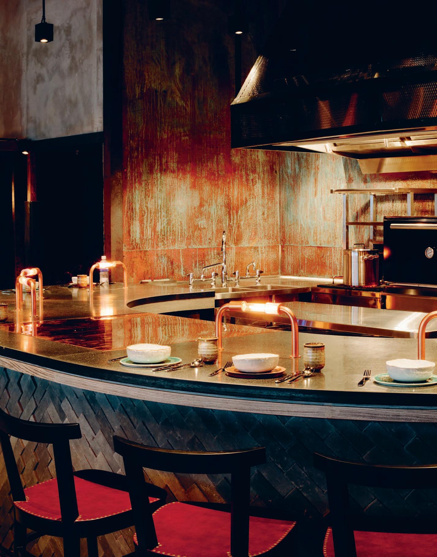
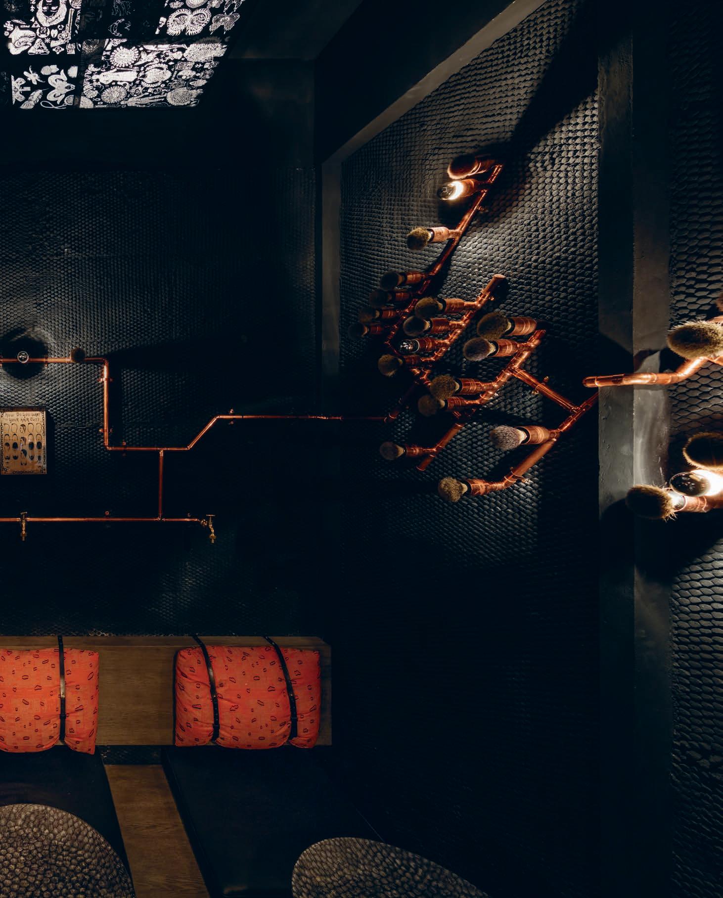
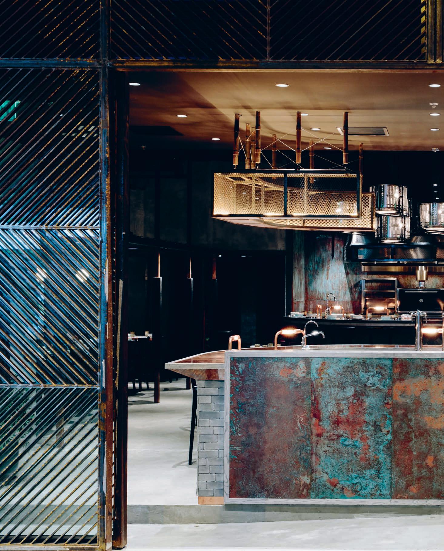
What’s In A Name?
Rhoda is named after Green’s grandmother, who first inspired him to become a chef. At the eponymous restaurant, the food draws on granny’s cooking: it’s down-to-earth, comforting and accessible. The same goes for the space. The double front doors slide open wide to reveal the copper-clad bar at the front, encouraging passersby to come on in. Rose patterns feature on the restaurant’s tables, too – a reference to ‘rhoda’, which means rose.
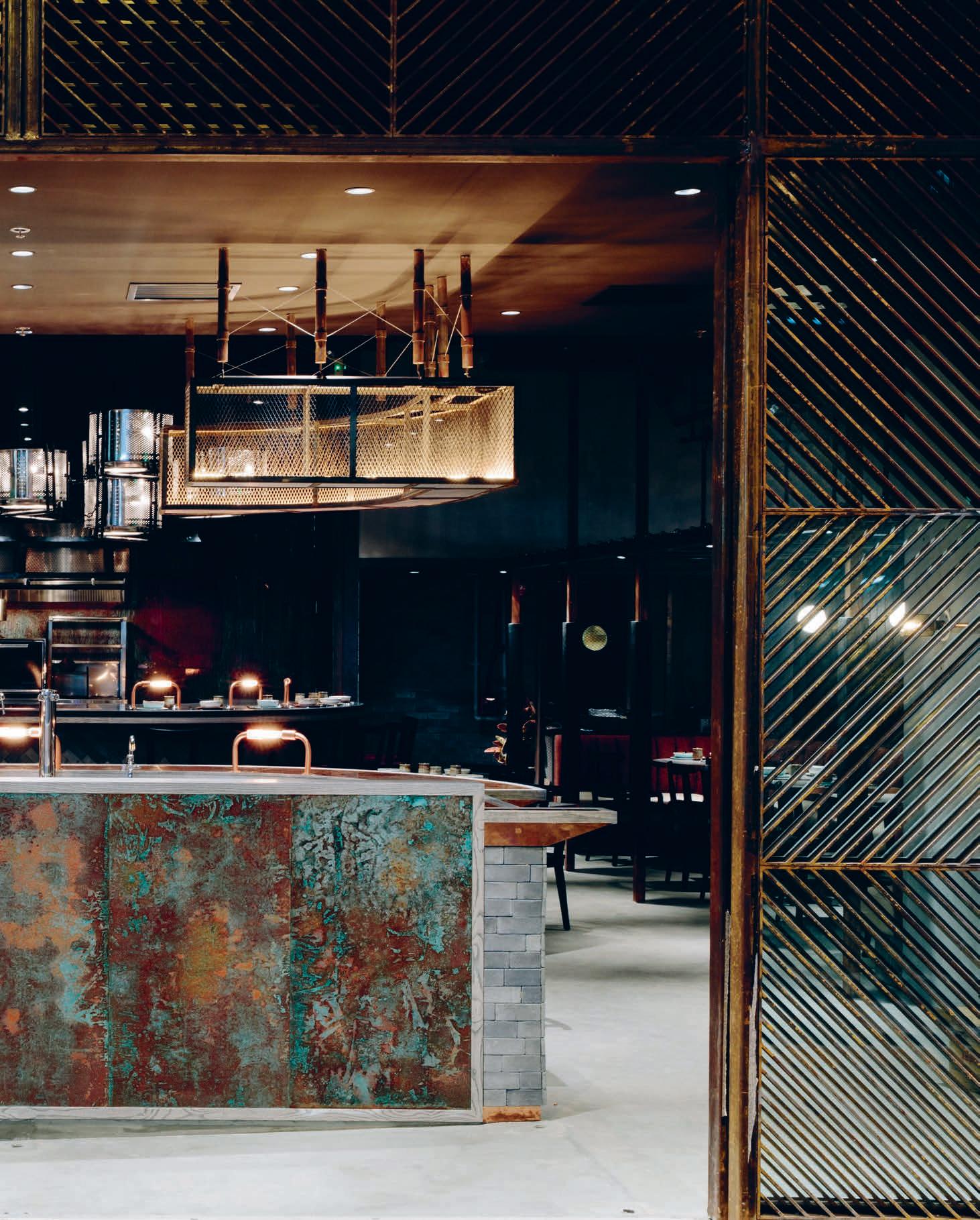
–
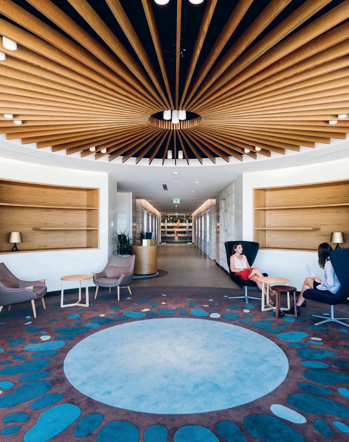
How does the world’s most influential auditing firm self-audit? Designed by Geyer, the new Deloitte Head Quarters in Perth is a stellar case study for selfanalysis and designing for the (sometimes opposing) needs of many in a single space.
Stop, Collaborate & Listen
INDESIGN 155 IN SITU
“It’s difficult to break the mentality of ‘oh no, that area is for lunching in, not working in’, but we eventually moved passed that line of thinking,” says Deloitte Perth’s managing partner, Michael McNulty.
Deloitte Perth, by Geyer
Words David Congram Photography Courtesy of Deloitte Touche Tomatsu Limited
Present & Experiment: Can We Have It All?
“One of the biggest developments to arise from these new spaces, which we’re most proud of, is that we’re finding that clients can’t wait to come here and visit us. It’s a big step forward for our teams because rather than always working off-site, our clients are excited to come in and immerse themselves in our full brand experience.” – Michael
 McNulty, Deloitte Perth office managing partner.
–
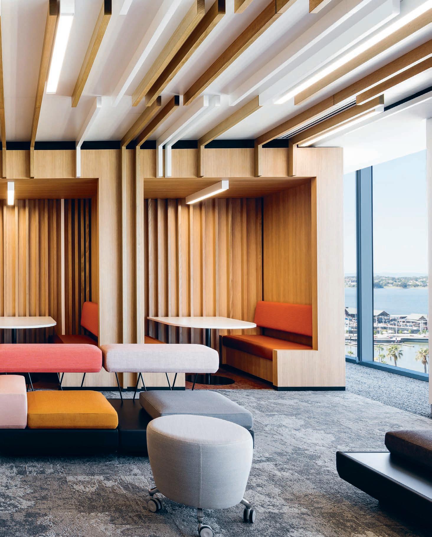
As I write this article, I am noticing my colleagues across the office. Some are on the phones; some gathered around a computer are judging magazine layouts; two are laughing across a table; some are working independently with focused intent. Though we all occupy the same space and work toward a common goal, the way we get there is quite different. There are those who might feel more productive working independently with their headphones on, and those who feel the benefit of working more closely with a team through every step of any process. My mind begins to boggle, as I start to think about how small of a team we are, and how these complexities compound exponentially in much larger workplaces, like the new Deloitte Touche Tomatsu Limited (Deloitte) in Perth I have just returned from visiting. While there, I’m told that by mid 2017, Deloitte’s total global workforce will exceed 244,600 employees. So how on earth could you design user-specific workspaces across the world for such a number? How can two absolutely opposing concepts – the desire of collaboration for some, and the love of privacy for others – be realised in the design of a single space?
Well, here’s what my trip to Deloitte Perth taught me: choice. Nuzzling up against the Swan River, Deloitte Perth’s approximately 450 employees and 60 partners take up three levels of Brookfield Place Tower – home to a stellar line-up of WA’s top-end ASX listed companies (most of whom seek the business problem-solving rigour for which Deloittians are renowned).
Rightly proud of its “playful culture with serious intent”, according to Michael McNulty – Deloitte Perth’s managing partner – their new home is an “invigorating workplace that inspires staff engagement, bringing the Deloitte brand to life.” And he’s certainly not wrong.
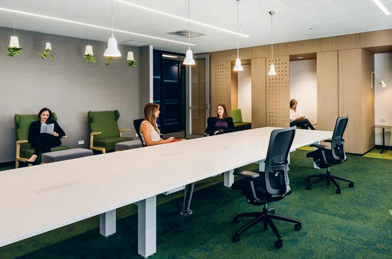
With interiors designed by the team at Geyer, Deloitte Perth offers its employees ample choices for spaces of collaboration, focus and artfully attuned areas for casual and creative collisions. With organic, softened-edges wherever the eye alights – on the corners of furniture, the shape of pendant lights or in the pattern weaves of carpet – I begin
to realise that ‘free-form’ in the design of these spaces is more than just a leitmotif: it’s a worldview. Meeting rooms kitted out with the latest in advanced technology facilitates the team’s collaboration with colleagues across the globe. But I note, in particular, the walls. They’re all curved and covered in graffiti. “These curves reference a neat and consistent free-flow of ideas,” says Kim Thornton-Smith, design principal and partner at Geyer said, “Freedom and fluidity is, after all, the core of successful collaboration.”
Because walls in these collaborative meeting spaces (named ‘Design Thinking Rooms’) are all either glass, whiteboards or digital whiteboards, the freedom to lash out with your marker in hand actively makes problem solving the fluid, instinctual and flexible phenomena it always should have been. In a way, the entire office – the walls especially – therefore becomes Deloitte’s biggest tool; one enormous think-tank realised in material form. Creating an absolutely flowing interface between worker, space and tool, this is not an office to house the work; it’s the work itself.
“There was a tiny bit of resistance,” says McNulty, “which soon dissipated when we got underway, because this is a significant redefining of working behaviours.” Deborah Wallbridge of Geyer who steered the project, highlights that the overall success is in large part due to the extent Deloitte encouraged change-management initiatives. Consequently, team Geyer were able to engrain that ever-essential executive buy-in into the design process. Heavily based around new innovation strategies for the business, “the drive for including and educating Deloitte employees,” says Wallbridge, “was at the root of our design-thinking.”
This staff engagement strategy ensured that the design result reflects the increasingly global trend of an ultra-mobile, ultraconnected and ultra-forward-thinking workforce. Hand me a marker, would you? I need to take note.
deloitte.com/au
INDESIGNLIVE.COM 158 IN SITU
Page 154: Lobby and reception area to the left as you exit the elevators.
Page 156-157: One of many areas within the space designed specifically to enable collaboartion, presentation and open-plan working. This page: This room is a ‘quiet space’ specifically designed for focus and solo working, with a strict ‘no noise’ policy in the area.
INDESIGN X STarON
Staron® Solid Surfaces is already renowned for their wide range of surfaces, applicable across both commercial and residential projects. With silk-like finishes and reliable durability, the quality of the Staron® Solid Surfaces range has always spoken for itself –but now, it’s getting even better.
Staron® Solid Surfaces has now launched the Supreme™ Collection; a range of surface finishes that adopt the look and beauty of natural stone, while having the advantage of easy maintenance and joining capabilities present in the existing solid surface range. With 10 distinct colours for designers to choose from, featuring unique wave patterns in different hues and clarities, the Supreme™ Collection is the latest addition to the Staron® family of stylish and sturdy finishes. The 10 colourways in
the Supreme™ range include: Delphi, Cloudbank, Natural Bridge, Magnolia, Dawn, Dandelion, Pastoral, Loam, Ocean View and Presto. Each colour features a soft veining emulating the look of a natural stone from a soft white with cloudy waves to a deep natural hue with deeper veining.
Like the entire Staron® Solid Surfaces range, the Supreme™ Collection is comprised of both natural and pure minerals, derived from bauxite and blended with an advanced pure acrylic resin, resulting in the world’s premium surface material. Non-porous by nature, inconspicuous joining capabilities and the option to renew the surfaces, the Staron® Solid Surfaces range offers finishes that are beautiful in aesthetic, strong in design, and easy to clean and maintain.
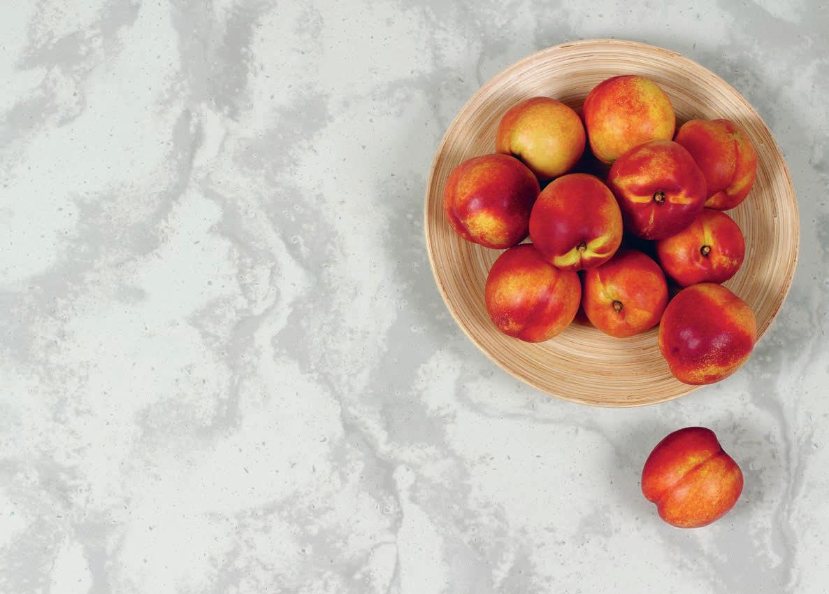
staron.com.au staron 159
This page: Staron®’s new Supreme™ Collection in ‘Dawn’.
The look of stone, and performance benefits of a solid surface
Fixed, Fitted & Furnished
r.a.w Melbourne
Architect Travis Walton
Architecture + Interior
Design
Joinery Tri-Vision
Budget $1million
Travis Walton Architecture + Interior Design traviswalton.com.au
Furniture
Custom banquettes, Paris D’ecor. Mesh panels, Locker Group
Lighting
Lighting throughout,
Ambiance
Philips Lighting Headquarters
Architect LAVA
Project Management Brink Groep
Space Planners BICG
Structural Engineers
Adviesbureau Tielemans
MEP Engineers Deerns
Total Floor Area 10,700 sqm
LAVA l-a-v-a.net
Lighting
Lighting throughout, Philips
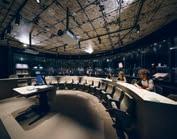
Finishes
‘Terrazzo’ floor covering, Durabella . Bamboo decking, floor and wall tiles, Moso . ‘Twist’ carpet, Desso ‘Marmoleum’ linoleum, Forbo . Epoxy coating, Bolidt . Wall paint, woven wallpaper, Reinweiss Wooden ceiling, Derako
Fixed & Fitted
Aluminium screen frame, Basaltgrau . Ceiling islands, acoustic ceiling, Ecophon Sink and closets, Sphinx
University of Melbourne
Arts West
Architects A+A (ARM
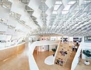
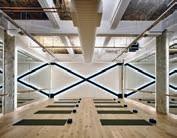
Architecture + Architectus)
Builder Kane Construction
Structural Constulant
IrwinConsult
Project Management
AURECON
Building Surveyor McKenzie Group Quality Surveyor Slattery Australia
Budget $67million
ARM Architecture armarchitecture.com.au
Architectus architectus.com.au
Furniture Gallery display cases, Designcraft . ‘Lowe Atticus Monteray’ bench seats and table, HUB Furniture ‘Humanscale’ task seats, group study desks, climate workstations, Schiavello . ‘Timeshift’ table, Wilkhahn . Drafting stools, Vitra . Circulation hallways stools, study space ‘Satellite’ table, ‘Gubi’ chairs, stools, ‘Hansen’ chairs, Cult . Conservatory seats, Profurn . ‘Arflex’ hug chairs, Arthur G ‘Claude’ 3-seater, Radford Furnishings . Office task chairs, Stem . Office pedestals, Planex
Lighting
Themed study space
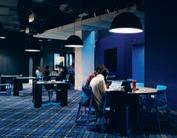
lighting, Living Edge
Private meeting space
‘Jielde’ pendants, Euroluce
Lift cat LEDs, Artemide
Finishes
Paint throughout, Dulux Timber floor throughout, Hurford Hardwood Column upholstery throughout, Pelle Leathers . Printed flooring throughout, dyed ceiling rugs, RC+D Ege . Marble flooring and walls, stair and wall cladding, office boarder tiles, Signorino . Column renders, Abilox, Keim Stair upholstery, Kvadrat Ceiling aluminium, Locker Group . Student Lounge flooring, botanic collections, The Andrews Group . Circulation hallways acoustic panelling, KAYDRA . Exposed ceilings, Sonoglass . Conservatory walls and ceilings, Austral Plywoods . Wallpaper, Ellie Cashman . Themed study space wallpaper, Pure Interiors . The Refectory walls, Flavor Paper Galleria curtain, Radford Furnishings . Object laboratory wallpaper, Wallpaper Antics Lift car custom graphics, Emerystudio
200 George Street
Architect FJMT Builder Mirvac Façade, Podium Glazing and Cladding Design in collaboration with AR-MA
Façade Engineering ARUP Timber Fabrication GDK Group Glass Fabrication Empire Glass and Aluminium
Total Floor Area 2,310 sqm
Duration 19 months
FJMT fjmtstudio.com AR-MA ar-ma.net
Happy Place
Architect Fiona Lynch Design Office
Duration 5 weeks
Total Floor Area 37 sqm
Fiona Lynch fionalynch.com.au
Lighintg
‘Bahnia’ LED wall lamp, Space Furniture . ‘Delta Spy’ and ‘Deep Starr II’ downlights, Inlite
Finishes
Stone tiled flooring, Terrazzo . Paint throughout, Dulux
Fixed & Fitted
‘Viper’ steamer, Coffee Machine Technologies
Kombucha tea taps, Ballsy Brewing . Glazed cool room, display fridges Mariljon
INDESIGNLIVE.COM 160 IN SITU
Want to know what made the spec’ schedule for all our featured projects? Don’t worry, we’ve got you covered...
Ku.Be House of Culture and Movement
Architects MVRDV + ADEPT
Landscape Architect SLA
Engineering Soren Jensen
Concrete Contractor CC BRUN
Duration 6 Years
MVRDV mvrdv.nl ADEPT adept.dk
Furniture
Fixed furniture, Jakon
Generally throughout, Please Wait to be Seated , Frederica Mobler Partitions, Deco
Lighting
Indoors throughout, Louis Poulsen , Fagerhult Outdoors throughout, Igruzzini
Finishes
Facades throughout, Trancadis , Schüco . Flooring throughout, PU Gulve , Monofonalt . Ceilings, Triplex , Rockfon . Partition walls, Gipsum
Fixed & Fitted
Doors throughout, Swedor
Unispace Melbourne
Architect Unispace Engineer ECM Graphics TILT
Duration 6 months
Total Floor Area 450 sqm
Unispace unispace.com
Furniture Workspace, boardroom chairs, boardroom credenza, graph meeting and boardroom tables, Wilkhahn . Meeting room, business lounge chairs, ‘Eames’ chair, ‘Eames’ wire-base table, La Chance ‘Borghese’ coffee table, Living Edge . Quiet room chairs, Stylecraft . ‘Copenhagen’ barstool, Cult . Quiet room desk, Humanscale Lab workbench, Zenith Interiors
Lighting
Neon, LED signage, NDY
Lighting
Finishes
Chalkboard locker doors, Demar Project Panels
Bolon floor finish, TAG
Meeting room carpet, workspace carpet, Tretford Carpet . Business lounge rug, Cavalier Bremworth Quiet pod carpet, butler pantry flooring, Signature
Flooring . Curtain fabric, Boyac . Leather finishes, NSW Leather Co . Various upholstery, Febrik . Smoked finished glass, Viridian Laminate throughout, Laminex . Whiteboard surfaces, Surface Squared Paint throughout, Dulux Ceiling grid, Armstrong Ceilings . Various stone finishes, Baltic Stone Various timber joinery, Havwoods . ‘Terrazzo’ floor finish, Pangea Flooring Echo panel pinboard, Woven Image
Fixed & Fitted ‘Leibherr’ fridge, Andi-Co Australia . ‘Fisher & Paykel’ fridge, electric oven, ‘Electrolux’ dishwasher, Appliances Online Integrated microwaves, Omega . Small sink, Reece Zip tap, Zip Industries
Island bench mixer, puck system hooks, Vola Butler’s pantry mixer, Phoenix Tapware
Rhoda Hong Kong
Architect Joyce Wang Design Studio
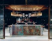
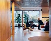
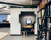
Contractor Tother
Contracting Co Graphics Light & Motion
Total Floor Area 151 sqm
Joyce Wang Design Studio joycewang.com
Furniture
Barber room table-top, Pun Projects
Lighting
Custom chandeliers and lighting, Newright
Finishes Worn fabric, Kvadrat . Baber room cushions, Nuno Japan Custom cushion belts, Fungus Studio HKG
Fixed & Fitted
Bathroom hardware, Buster and Punch
Deloitte Perth
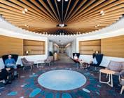
Architect Geyer
Builder Dawn Express
Services Consultant NDY Joinery Sampari
Total Floor Area 6,000 sqm
Duration 14 months
Geyer geyer.com.au
Furniture
‘Zody’ task chair and stool, ‘X99’ training chair, ‘Hello mobile’ client chair, ‘Mama Bear’ and ‘Sita’ client concierge, Orangebox ‘Tara’ client source chair, ‘Point stool’ client ottoman, ‘Fletcher Vaughn’ 2-seater, collaboration bench, focus chairs, client meeting room table, ‘Orbit’ kitchen banquette table, ‘Modulus’ training table, ‘Maria’ laptop table, bench table, ‘Lemon’ collaboration table, ‘Breaker’ table, ‘Return’ focus pods, ‘Always hoop’ workstations, Haworth Stacking client chair, Anibou . Boutique client meeting chair, typical timber stool, ‘Sancal’ boomerange chill wing armchair, breakout stools, ‘Pio Pio’ armchair, client side-bench, meeting sidetable, ‘Buzzi’ collaboration table, ‘Lily Pad’ table, door cabinet, mobile pedestal, ‘Rumba’ workstation, Zenith Interiors . ‘Sita’ client meeting chair, typical meeting room chair, folding table, Wilkhahn . ‘Plot’ modular, Olto . ‘Jiff’ coffee table, Fanuli . Lockers, Interloc . ‘Mek Drive 2’ compactus, Dexion Reception table, DeDeCe
Lighting
‘Wallace’ library booth lamp, OneFortyThree ‘Angelpoise’ library pendant, teapoint booth pendant, Cult . Pendant over kitchen, Living Edge Boardroom lamp, Great Dane
Finishes
Vinyl, Karndean . Laminate, Laminex , HVG . Echo panels, Instyle . Typical floor veneer, New Age Veneer. Splashback tile, Skheme . Stone, Caesarstone , CDK Stone Black glass, Decoglaze Ground rock wall, Gosford Quarries . Timber boards, Havwoods . Acoustic panels, Autex . Concierge partition, Diverse Metals Paint throughout, Dulux Plastering throughout, Rockcote . Client veneer, Briggs Veneer. Textile, Kvadrat Maharam , Innofa/Febrik . Film meeting, Sunscreen . Tile and grid ceiling system, Armstrong . Perforated metal ceiling, Fricker
Fixed & Fitted ‘Boskke’ hanging pot plants, Boskke Plants
INDESIGN 161 IN SITU
INDESIGN X HERMAN MILLER
Words Sophia Watson Photography Courtesy of Herman Miller
An evolution on a revolution.
Why would you remaster An Icon? In response to their decision to remaster The Beatles’ discography, Abbey Road Studios said that by “treating the material with respect, but not shying away from the application of modern technology, it was felt that fidelity to the group could be improved.”
Remastering icons is certainly nothing new; think the Volkswagen Beetle, the Apple computer, the digital re-re-release of Stanley Kubrick’s 2001: A Space Odyssey – the list goes on. However, what’s most important here is that none of these classics were ‘recreated’ – but rather ‘remastered’.
When the Aeron chair by Herman Miller first launched in 1994, it was unlike any chair the world had ever seen. Instead of a padded throne, designers Bill Stumpf and Don Chadwick did away with foam and fabric to create a true machine for sitting. Uniting humancentred design with Herman Miller’s leadership in innovative technology and materials, Aeron quickly became the best-selling and most recognisable performance chair of all time – it was even featured in episode #354 of The Simpsons, where Homer dreams that God sits on an Aeron. With over 7 million sold in 134 countries, the chair is a vital tool for people around the globe and holds a rightful place in popular culture.
In collaboration with co-original designer, Don Chadwick, almost 25 years after its debut, Herman Miller reveals a project over two years in the making – the Aeron chair, remastered. Herman Miller’s new Aeron retains the distinctive silhouette of the iconic
chair, but every component of the design has been updated to raise the bar for performance seating: ergonomically, functionally, anthropometrically and environmentally.
So, what’s actually changed here? Well, overall the dedicated team of Herman Miller scientists, engineers, materials specialists, and researchers have enhanced the chair by combining the latest insights in anthropometrics and ergonomics with two decades of advancement in materials, manufacturing, and technology. The resulting chair is recognisably an Aeron, but features stronger and smarter materials, better adjustment capabilities, intuitive controls, enhanced aeration, and a healthpositive, more comfortable sit.
Essentially what we have here, are four new key features of the Aeron 2.0: 8Z Pellicle for zonal pressure distribution and aeration, PostureFit SL for adjustable sacral and lumbar support, intuitive adjustments for optimal comfort and customisation, and holistic material palettes to enhance modern environments.
The 8Z Pellicle allows air, body heat and water vapor to pass through the seat and backrest to help maintain even and comfortable skin temperature. With PostureFit SL, adjustable, individual pads stabalise the sacrum and support the lumbar region of the spine to mimic a healthy standing position. While the original design supported many work activities, Aeron’s updated design features user adjustments for intuitive fine-tuning. Advancements in engineering for example, have allowed
hermanmiller.com.au herman miller 162
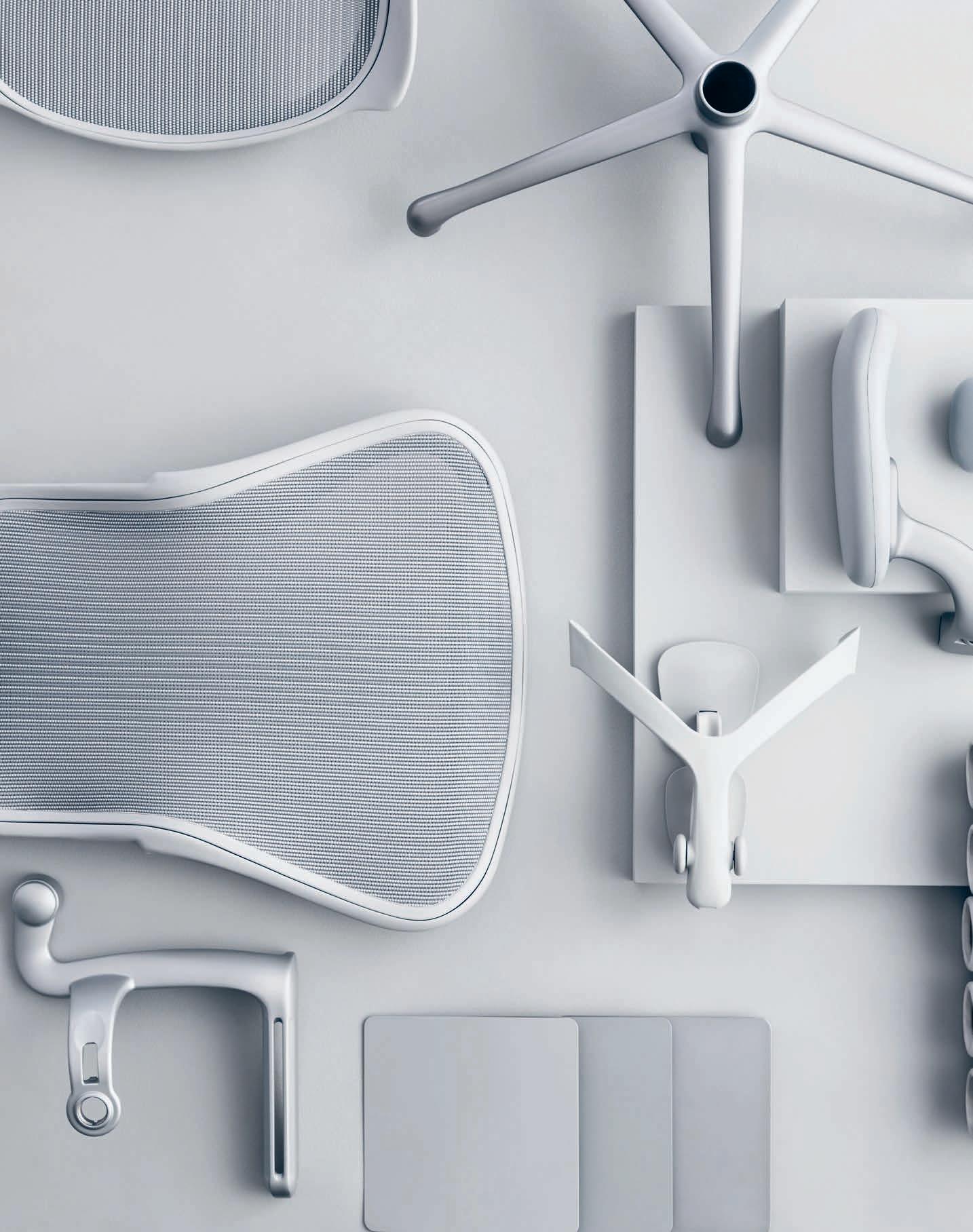
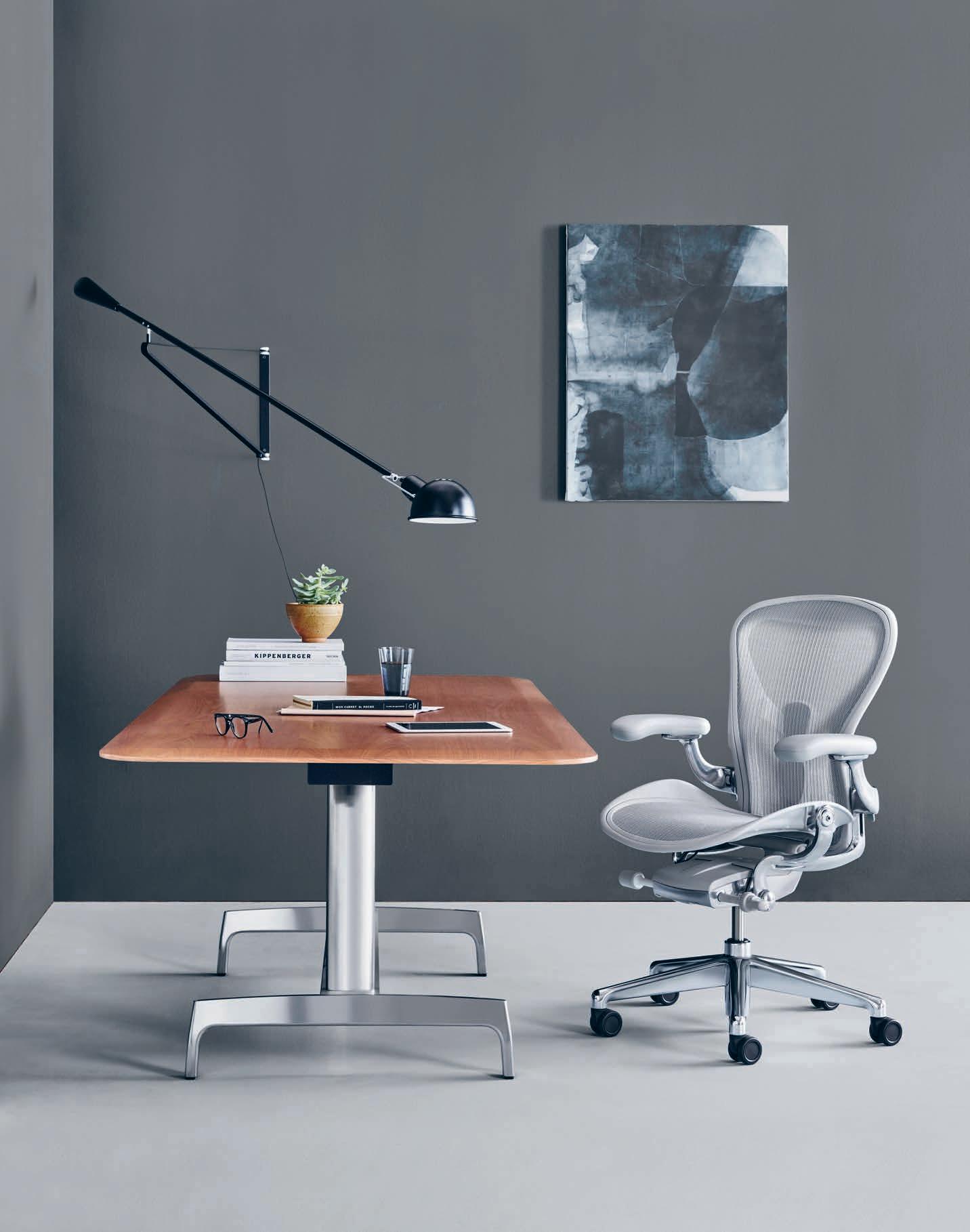
Herman Miller to scale back the amount of turning, twisting, and time spent customising a personal fit. Now the sitter can reach a custom recline in 13 turns or less. And finally, while Aeron’s materials don’t simply contribute to the appearance of the chair, they are the design. In revisiting Aeron for the future of workers and workplaces, every effort was made to significantly improve upon the comfort and performance of the original, while also creating a beautiful, harmonious look-and-feel through updated colours, materials, and finishes.
Though the new Aeron certainly hosts the latest and greatest advancements in technology and materials, the decision to reexamine the design criteria of the iconic chair came from Herman Miller’s relentless pursuit of investigating the changing needs of people and their working environments, and wanting to design solutions for a new generation of users.
“The workplace that Aeron launched into in 1994 is vastly different from the workplace of today,” says Aeron’s original co-designer, Don Chadwick. “The agile workforce requires freedom and variety within workspaces to support multiple types of work during different parts of a day. The new Aeron is a cross-performance and cross-floorplate solution equally well
suited to a quick collaboration session among colleagues as to hours of concentrated focus on an individual project. For workers sitting in Aeron, cross-performance design means the chair fully accommodates the widest possible range of activities and postures people adopt while working. For organisations, cross-performance makes Aeron suitable for a wide array of workplace settings, from group spaces to dedicated workpoints.”
The premise for the design of the original Aeron in 1994 was to create the most comfortable chair possible. Chadwick recalls: “We decided to question assumptions about the form and materials of an ergonomic office chair, as those assumptions led to predictable results and a sea of similar chairs. Bill Stumpf and I set out to experiment with new technologies in materials and manufacturing. We were dedicated to breaking new ground in chair design.”
“The task of re-examining the design criteria that led us to the classic Aeron was an opportunity to step back and ask ourselves how we could apply two decades of knowledge and material and manufacturing advances to make the chair even better. The result is a complete remastering of the chair, retaining the form while improving on every aspect of the performance.”
hermanmiller.com.au herman miller 165
Previous & opposite: The remastered Herman Miller Aeron chair in ‘Mineral’, originally designed by Don Chadwick and Bill Stumpf, remastered by Don Chadwick for Herman Miller in 2016.
“It’s going to be a whole new experience, and yet the chair is still going to be an Aeron chair.” – Don Chadwick.
Introducing the
+61 3 9419 0000 DARKON.COM.AU PRODUCT@DARKON.COM.AU Super Mini EDGE 15 Super Mini GRAZER 15 wINNER (2016) ies Super Mini SKIRT 30
super mini family
Agile is old news! here’s how design is bre A king the pArA digm
INDESIGN 167 IN DEPTH
DEPTH IN
WORKPLACE DESIGN HAS GONE
TO THE DOGS
INDESIGNLIVE.COM 168 IN DEPTH
It’s no secret that our built environment can shape our habits and choices, regulate our sleep-wake cycle, drive us toward healthy and unhealthy choices, and passively influence our health through the quality of our surroundings. Hell, we’ve managed to build an entire industry around it!
In fact, research suggests that employers spend roughly 90 per cent of their annual operating costs on people. Crazy, right? What this means is that even a small impact on productivity, engagement and satisfaction in the workplace can have huge returns on investment. And therefore, health and wellness is one of the largest growing industries in the design and architecture market, where we are finding more and more that our clients expect health to have a higher influence on the design decisions we make for their projects.
The ‘agile working’ term gets thrown around a lot today – often as a kind of catch-all explanation for new modalities in how we are supposed to be working. Efficiency, collaboration, focus, privacy, social and so on. We use these words far too interchangeably when referencing ‘agility’ and it’s presumed positive effect on our overall wellbeing. But when you strip all of that away, what does it actually mean?
At the heart of agile working is people. It’s a way of working in which an organisation empowers its people to determine for themselves where, when and how they work – with maximum flexibility and minimum constraints, facilitated of course through the ultimate blend of technology and design.
When it comes to the physical wellbeing element of our industry’s approach to commercial design, we’re totally on top of it.
Governing bodies such as the WELL Institute for example, have established a widely accepted evidence-based rigour, covering off factors like air, water, nourishment, light, fitness, comfort and so on, as the primary factors in professional wellbeing. Well, that all sounds fantastic on paper, but is it the whole story? Are these physical wellness initiatives making us work better? Happier? Healthier? What’s really missing here are the design strategies we create to serve our fundamental needs to be emotionally and mentally well.
The science of emotional wellbeing is arguably more complex than its physical counterpart, though equally as critical for designers and architects to master. Designing a dog-friendly commercial environment for example, is not as easy as it sounds. While dogs have been proven to reduce stress and anxiety, bring teams together, encourage optimistic attitudes, behavior and morale as well as improve the overall demeanor of people in the space, designing environments that cater for dogs while also balancing the requirements for physical wellness is no walk in the park.
In their recent workplace project for pet insurance company, PetSure, Sydney-based design studio The Bold Collective demonstrate the ultimate harmony of designing for both physical and emotional workplace wellbeing.
Sitting across four-levels within their parent company, Hollard Insurance’s Chatswood building, The Bold Collective was appointed to design PetSure’s new pet-friendly workplace on levels one and two. “You can absolutely design to improve emotional wellbeing by creating positive, uplifting environments that are welcoming and human in
INDESIGN 169 IN DEPTH
Is workplace wellbeing a load of rubbish, or do we simply have too narrow a definition? PetSure’s new head office space by The Bold Collective demonstrates the benefits of widening our wellbeing strategy gaze to reveal how design can redefine ‘being well’.
Words Sophia Watson Photography Andrew Worssam
scale,” say designers and co-founders of The Bold Collective, Monika Branagan and Ali McShane. For Branagan and McShane, the key is not designing physical and emotional wellbeing as separate elements, but as one harmonious concept. “There needs to be clever thought around support spaces within work settings to ensure that staff can find privacy and areas to retreat to when needing to focus, but also sufficient spaces that encourage human interaction and socialising, which are important factors for metal maintaining wellness.”
PetSure for example, were breaking away from a hierarchical office-based environment to a more inclusive open layout where this transparency helps to make all staff feel “a level of comfort and inclusion,” say McShane and Branagan, “Humour was really key in breaking down formalities, and we have designed the PetSure workplace with a sense of fun and play, which ultimately contributes to a more pleasant and friendly environment.”
Examples of this ‘physmotional’ design philosophy are built into the very fibre of PetSure’s environment. The centerpiece of the concept is the interconnecting stairs, creating greater connectivity across the business units. “This was a opportunity to design a collaborative tiered-seating amphitheatre for all staff presentations and informal meetings. The large void provides visibility between floors creating a more open, inviting feel,” say McShane and Branagan.
The design approach of “fun and play” further contributes to not only giving the space some personality, but also giving the users of the space a sense of ownership and therefore mental comfort in their workplace. McShane and Branagan note that: “We definitely ticked the fun box by designing a repetitive kennel-form with a pitched roof from the meeting rooms to the open meeting structures and kitchen area. Additionally, the environmental graphics took inspiration from the
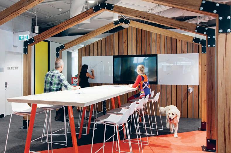
PetSure website, which has ‘petimonials’ describing the benefits pet owners have experienced through insuring their pets with PetSure. We also overlaid pet illustrations onto locker fronts and staff helped to name the lockers based on their own pet names.”
Even the more physical aspects of workplace wellbeing were designed to have an emotionally positive effect, McShane and Branagan explain, where aspects of access to natural light and plant life were key. Interestingly, design necessities such as hygiene, air quality, light and so on, were used as devices to unlock opportunities for a more mentally friendly dynamic. “PetSure was keen to be inclusive when it came to hosting pets in their workplace and both cats and dogs are welcome. Working with particular guidelines, we designed cat enclosures (that was a first!), which included a litter house, climbing stairs, scratching pole and shagpile carpet. The dogs however, roam free but are encouraged to stay within the large polished concrete areas to contain any surprises. We did raise some concerns around how dogs and cats would interact with one another, thinking it might make things tense, but we haven’t heard of any major incidences.”
If The Bold Collective’s achievements in PetSure’s new HQ are anything to go by, then we as an industry need to stop defining workplace wellbeing in such limited parameters and embrace a far more hybrid design approach to wellness. Aside from the obvious and thoroughly researched benefits, if this unified philosophy means more dogs in the office, then as far as I’m concerned, what more motivation do we need?
theboldcollective.com.au
INDESIGNLIVE.COM 170 IN DEPTH
Page 168: Kitchen area, where dogs are also welcome, featuring a custom thatched kennel roof.
This page: While there are closed-off private meting rooms, the space also features ‘open-air’ collaboartive meeting spaces, kitted out with the best technology to better communicate both internally and externally. Opposite: The centerpiece of the space, the collaborative multipurpose interconnecting stairs/ampitheatre.
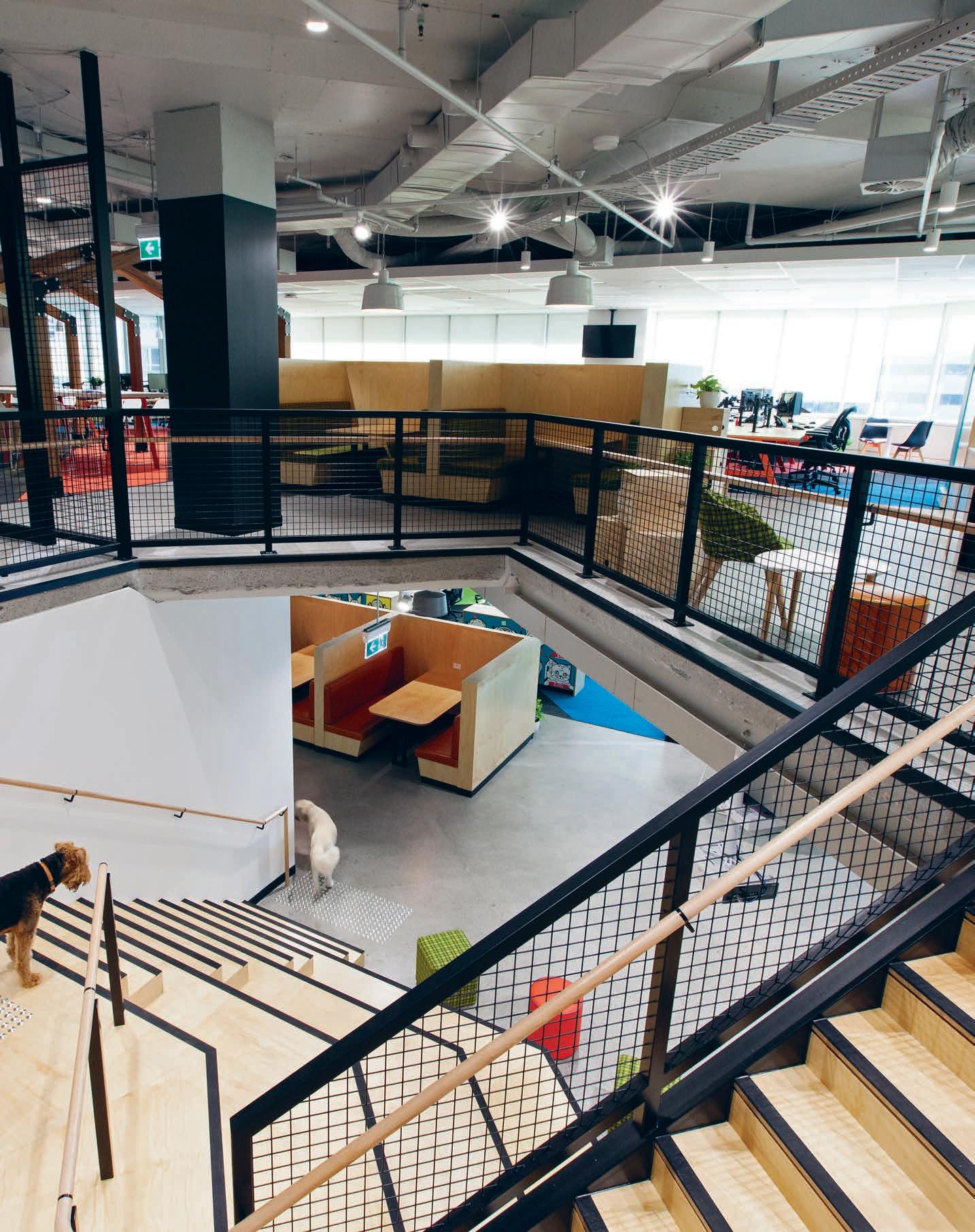
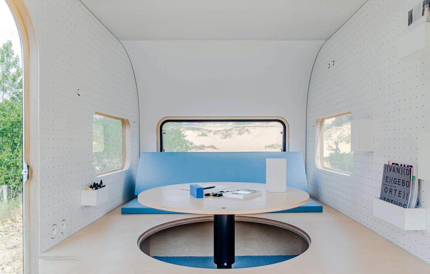
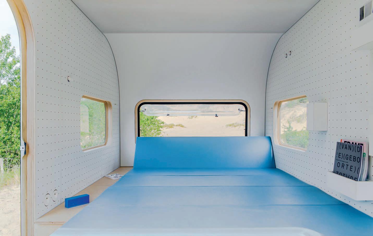
work o N w HEELS
Agile workplaces are nothing new these days. Over the past decade, work environments that offer employees a variety of flexible spaces and ways of working have become the norm – particularly at large companies that want to attract the best talent. The same goes for remote working. Working from home or a café is fairly commonplace, and some companies, such as Upworthy and WordPress, are completely distributed, with no centralised workforce. So, what happens when you combine these two concepts? That’s the thinking behind #dojowheels, a mobile workspace designed by Belgian design studio, FIVE AM.
“We often design workplaces for others, and we were thinking about flexible ways that we could work,” says design partner, Mathieu Bellens. “It was supposed to be a low budget, low profile personal project, just for fun. But then it didn’t really turn out that way.”
During construction, the fabricator for the timber floor offered to fit-out the entire caravan as they loved the concept and saw it as a way to showcase their capabilities. So, rather than the low-cost project initially envisioned, #dojowheels was realised as a sleek, white, timber-clad pod with an internal set-up that can be easily reconfigured to suit the user’s needs.
The flat surface can serve as a couch, seating or bed, and has an inregrated pop-up table integrated and storage underneath. The pegboard walls allow various accessories – from stationary boxes and shelving units to planters and magazine racks – to be added and moved as needed. As the space is modelled around an existing caravan body, it can be plugged into a charging point or car to provide power and has a rechargeable battery. #dojowheels was completed just before Salone del Mobile 2014, and so FIVE AM decided to put it to the test by announcing they were going to open an office abroad. Bellens drove it to Milan and set up for five days, while creative partner, Olivier Caluwier, stayed in Belgium. “We wanted
to showcase that thanks to modern technology it really is possible to work together in completely different locations with the help of an agile workplace, like #dojowheels,” says Bellens. “We hoped it would create a buzz. But, while everyone loved the concept, there wasn’t much follow up.”
So, for the next two years, the mobile workspace was put to use at FIVE AM to support their innovative “creative Fridays” approach to working. From Monday to Thursday, the team works on studio projects, and Fridays are put aside for more creative work, often conducted from #dojowheels in different locations. “It’s a nice way to escape the everyday and disconnect from our daily problems,” says Bellens. “It changes how you approach work and means that you’re never bored or fall into a routine, which obviously isn’t conducive to creative practice.” And it seems that the rest of the design industry is catching on. Following a 10-day trip to Kortrijk for the Biennale Interieur, interest in #dojowheels unexpectedly took off, driven by a growing general interest in mobile working and an Architizer A+ award. “This kind of remote-agile working is becoming more popular,” says Bellens. “It gives professionals so many possibilities and changes how you think about work.”
So, is this the future? Not quite… while roving around the countryside in a mobile work pod might sound like the dream, and FIVE AM consider the kind of agile working that #dojowheels facilitates essential to creative practice, it’s only part of the equation. “We think that physically working together is still very important,” says Bellens. “#dojowheels is good for a particular purpose and it allows you to work in a different way when you feel the need to, but it isn’t a full-time replacement for the workplace. More of an imaginative addition to it.”
fiveam.be
INDESIGN 173 IN DEPTH
Could combining materiality with big data be the future of the ‘office-less’ workplace? This modified caravan by FIVE AM is an innovative agile workspace that disrupts the routine of the office. And it might just be the ‘next-gen’ agile.
Opposite & page 174-175: FIVE AM stripped back the interiors of the old caravan, fitted new wooden window frames and replaced the ceiling. A circular meeting table that seats six can be raised from the new plywood floor, which is inserted at a raised level to create space for storage below.
Words Mandi Keighran Photography Stør
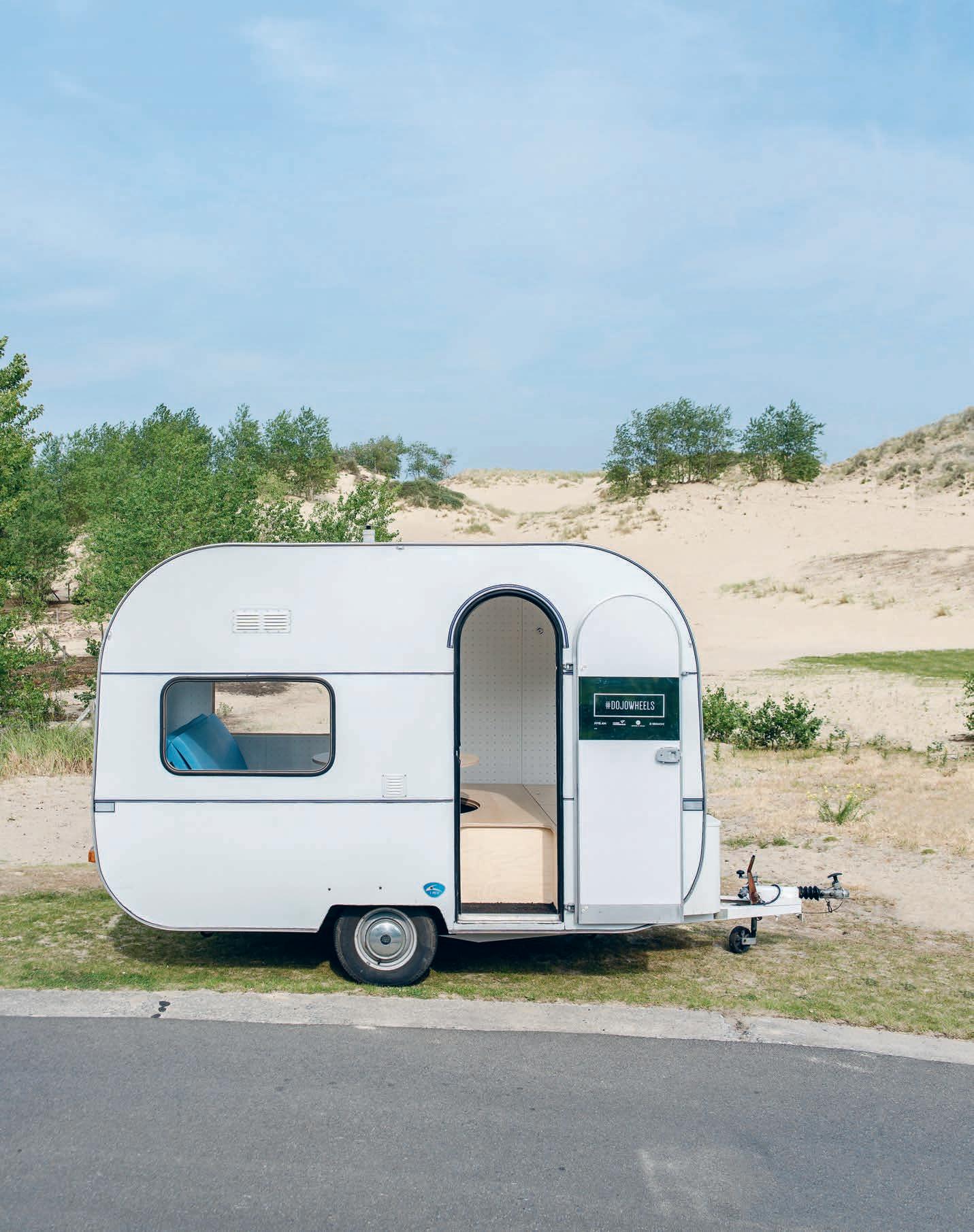
Mobile Working Is Super Cool
The longer sides of the caravan are lined with whitepainted pegboards that can be used to attach wooden boxes for storing stationery, magazines and plants. Project drawings can also be displayed here. At one end of the space there is a blue couch that can fold down to create a bed. There is also a small fridge for keeping up to 150 beers cool. A new ceiling features integrated artificial lighting, as well as a skylight above the table. There is a range of different lighting options – from reading lamps to work and outdoor lights – allowing you to create the different working environments you need.

–
Ground Control
The International Space Station is a 40-year design experiment in creating the ultimate environment to work, live and play. The result? Perfect agility. Too perfect. Astronauts want to know if we’ve told Houston, ‘there’s a problem’.
Words David Congram Photography Courtesy of NASA & ESA
o Major aG ile
INDESIGNLIVE.COM 176 IN DEPTH
t
The degree to which space exploration has shaped your workplace cannot be overstated. We like to flatter ourselves with airs of (apparently) only just yesterday having created design solutions to allow collaboration, moving target objectives and intuitive transformation for the modern workplace to flourish. Well, I’m sorry to tell you, kid – but NASA has been toying with hardcore workplace agility as far back as the early 70s.
Launched almost 30 years ago in 1998, The International Space Station (ISS) is undoubtedly a marvel of architecture and design. Ignore that it’s larger than a football field. Also ignore that of its 935 cubic metres of pressurised space and spacecraft infrastructure, the design principles of the ISS have created the first blueprint of what we now call agile working.

The ISS is one colossal hot desk; so modular, dynamic and flexible it accommodates a constantly rotating nomadic workforce. In fact, during a recent study of 12 ISS astronauts and cosmonauts in orbit, researchers reported that all crew exhibited an increased homogeneity in values, reluctance to express negative interpersonal association and a concomitant increase in work autonomy and virtual leadership – overall, a positive tendency
toward ‘groupthink’.1 Productivity? Tick. Collaboration? Tick. In communication with NASA Mission Control to monitor Environmental Control and Life-Support System [ECLSS], the crew spend their time working on experiments in the various laboratory wings of the Destiny Module and the Zvezda Service Module that also houses living quarters, the galley and utilities –all so extremely modular that furniture is minimal to almost nonexistent. Spatial economy and reduced overheads? Tick. Creating ‘zoned activity’ areas? Tick. Virtual connectivity? Tick.
But, here is where designers have some explaining to do. Because the agile model is (officially) only quite young in our workspaces on Earth, we lack indication for how both agile designs and agile operations affect us long-term. The ISS, then, presents us with the evidence of an entire workforce generation bred entirely agile. Unfortunately, the results aren’t pretty. While the spatial attuning of the ISS provides zones for collaboration, refuge, communality, focus and retreat, the interface between the human body and the designed space is far from fluid or salubrious. Recently, NASA reported that while the operational models afforded by the design of the ISS allowed ‘groupthink’ to flourish, crew members confirmed
INDESIGN 177 IN DEPTH
1 Vinokhodova, A.G., Gushin, V.I. (2012). ‘Study of values and interpersonal perception in cosmonauts on board of International Space Station’.
Paper #IAC-12-A1.1.8. International Astronautical Federation. Proceedings, 63rd International Astronautical Congress, Naples, Italy, October 1–5, 2012.
2 Anderson Robert W., The Cosmic Compendium: Space Medicine (NY: Creative Commons, 2015), pp. 107-108.
3 Evans, Gary W.; Johnson, Dana. ‘Stress and Open Office Noise’, Journal of Applied Psychology, Vol 85(5), Oct 2000, 779-783.
4 Won Yang Kang, Won-Ju Park, Keun-Ho Jang, Hyeong-Min Lim, Ji-Sung Ann, Seung-Hyeon Cho and Jai-Dong Moon, ‘Comparison of Anxient and Depression between Office and Manufacturing Job Employees’, Annals of Occupational and Environmental Medicine, 2016; 28: 47. Published online 2016 Sep 15.
Mayday! Is Agile Hostile?
Posing a 420-tonne inevitable homeward-bound calamity, the orbit of the ISS is determined on a path of unrepentant re-entry to Earth. After almost 30 years of braving a blistering sunrise every 90 minutes, the arbitrary spite of space junk, intercranial hypertension and spacecraft-induced radiation carcinogenesis, the ISS will be evacuated in four years and destroyed without apology. Is this a bleak glimpse into the fate of agile? Disposable, expensive and perhaps even damaging?

–

increased feelings of loneliness, lower support from colleagues over time and a negative effect on cognitive adaptation. 2
Under not dissimilar occupational conditions, Buzz Aldrin (Apollo 11) famously touched back down on earth, turned to liquor, suffered depression, anxiety, and became a car salesman in Texas. Edgar Mitchell (Apollo 14) spent the last of his days threatening journalists with lawsuits and rifles, yammering on about the CIA covering-up extra-terrestrial activity. Cosmonaut Valentin Lebedev (Salyut 7) spiralled into depression on the ISS and disassociated himself from the rest of his crew. Lisa Marie Nowak (STS-121) gained international attention after being arrested (in space diapers, no less) for her attempted kidnapping, burglary, battery and assault of U.S. Air Force Captain, Colleen Shipman. And, perhaps, the recent most despairing report: through years of crippling depression, pain and paralysis after returning to Earth, in 2006 Dr. Charles E. Brady (STS-78) committed suicide.
Behavioural psychologists are reporting that in agile workspaces across Earth – in addition to increased disruption, stress, and dissatisfaction 3 – there is an overwhelming trend toward
deindividuation, dissociation, depression and occupational rootlessness. 4 The agile worker is fated to be free – a highfunctioning itinerant working everywhere and nowhere – where zero-gravity freedom has become captivity. We have designed a workplace in which the extensive totality of work is no longer directly accessible. A workplace in which personal fulfilment in work has become a problem because we’ve designed a material world which disavows the personal. A world where flexibility is starting to look like another word for submissiveness. Modularity, segmentation. Collaboration, deindividuation.
The ISS is all at once the most experimental and the most expensive single item and single workplace we have ever designed. But in our over-enthusiasm to continually remake it today on our doorstep, none of us have seemed to realise there might be something wrong. That it might be too late. That it might be a dead circuit. Can you hear me, Major Tom?
Page 177-179: Working on the ISS requires constantly checking ECLSS, updating communication equipment, modifying the ISS infrastructure. Here, agility defines a line between work and survival. This page: Utilities modules on the ISS demand an extreme version of modularity for a myriad of experimental work and living situations. A modularity so extreme, that our conception of furnishing is not modular enough. Their response? Get rid of it. Opposite: The ISS is designed as a permanently orbiting research facility. Here in the Zvedza Module, Astronauts tether themselves to the walls to sleep (sans bed).
INDESIGNLIVE.COM 180 IN DEPTH
nasa.gov
flexible Working, agile Prisons?
INDESIGNLIVE.COM 182 IN DEPTH
Norway’s criminals are famously treated humanely. Even violent offenders serve time in liberal penitentiaries like Bastøy Prison, where inmates and guards work together tending to animals and farming, taking classes and playing tennis. And, in Norway, this experimental approach to correctional services tends to be the rule rather than the exception. The hope is that encouraging principles like respect, collaboration and responsibility – similar to the values promoted in today’s workplaces – will promote rehabilitation and lower rates of repeat offenders.
Increasingly, design practice, with its focus on problem-solving and reflective thinking, is included in this approach. In a fitting twist of fate, ceramics from one of these ‘prison design workshops’ were bought by Johan Laursen, the head chef at Fru K, for use when serving up the restaurant’s fitve – or seven – course tasting menus.
This kind of collaboration between the design industry and the country’s correctional services can be traced back to a 2009 partnership between Vik Prison and the Bergen Academy of Art and Design. In 2013, Norwegian designers and co-founders of studio Morten&Jonas, Morten Skjærpe Knarrum and Jonas Norheim, took the partnership even further. Based on an idea from Skjærpe Knarrum’s master’s thesis, the duo began working with the Correctional Service, Western Norway to open a design studio based out of Bjørgvin Prison that collaborated with inmates, and also ran workshops at prisons in Bergen and Vik.
Called Studio Bjørgvin, it was the fitrst program of its kind in Norway, possibly the world. The idea was to teach useful skills to inmates with a lack of formal training and education, and in the process help them change the way they think. “Inmates are often impulsive,” says Skjærpe Knarrum. “Design thinking helps them consider the decisions they make.” The fitrst project, completed at Bjørgvin Prison in 2013, was a playful table lamp called ‘Bake Me A Cake’ for Norwegian brand Northern Lighting, with brochure photography and text also done by inmates.
At Vik prison, they worked with inmates on a timber bench that was exhibited at 100 per cent Norway for London Design Festival 2014. They also designed and built a café at Bergen prison that is used for barista training of inmates. The inmates even designed a coffee machine that was put into production in the prison in early 2015.
One of the biggest benefitts of introducing design to the prison system is the possibility to reduce recidivism. Research indicates that around 80 per cent of all crime has a lead time of less than 15 minutes, suggesting that those commit ing crimes may lack impulse control and tend not to consider consequences. Leif Waage, a Norwegian psychologist and assistant regional manager at Western Region, believes that design could be the answer, encouraging inmates to plan ahead, consider consequences, and seek solutions to speci fitc problems. “The design process strikes a balance between theoretical and practical work,” says Waage. “It can also help to provide new skills and greater levels of empowerment.”
There are no studies yet to indicate how the integration of design practice has speci fitcally affected recidivism rates in Norway, however the country has one of the lowest in the world at just 20 per cent. Compare that to the U.S., where 76.6 per cent of prisoners are rearrested within fitve years. So, it’s safe to say that Norway’s correctional services are doing something right – and introducing design into the system, alongside other aspects of ‘restorative justice’, has been well-received by inmates, the prison staff, and even the design industry at-large.
“The design workshops are popular, as many inmates enjoy doing more creative work in prison,” says Skjærpe Knarrum. “It can be challenging to work in this way, but it’s also very rewarding. A big part of our work in the prison system is to see, listen and understand – and then, of course, to challenge.”
morten-jonas.no , kriminalomsorgen.no, thethief.com
INDESIGN 183 IN DEPTH
Can workplace design stop crime? In Norwegian prisons, the agile model is being used as a way to rehabilitate inmates and lower rates of recidivism – and it seems to be working.
Opposite: Designed by Morten&Jonas, the ‘Bake Me A Cake’ table lamp – made from oak wood and smoked tinted glass – is manufactured by the inmates in Bergen Prison in Norway through a unique collaboration between the designers, Kriminalomsorgen region vest (the Norwegian correctional services) and Northern Lighting. The goal is to create a high quality design production inside Norwegian prisons to challenge and reshape the ways inmates think and act.
Words Mandi Keighran Photography Courtesy of Morten&Jonas
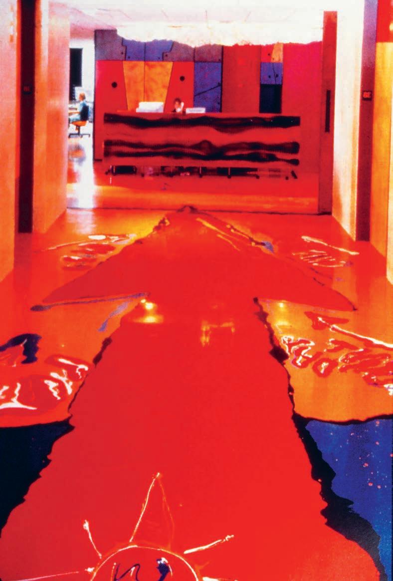
INDESIGNLIVE.COM 184 IN DEPTH
Kitsch, Please
The
INDESIGN 185 IN DEPTH
Opposite: The office of American advertising agency Chiat/Day Los Angeles, designed in 1994 by Italian architect and industrial designer, Gaetano Pesce. The brightly coloured plastic resin flooring was actually hand-poured by the architect, himself. Page 187: Sound-proofed ‘meeting eggs’ in Google Hub Zurich, masterplanned and designed by Camenzind Evolution, 2008.
danger of kitsch in the workplace: How to experiment without going naff.
Words Stephen Todd Photography (Chiat/Day) Courtesy of Gaetano Pesce & (Google) Peter Wurml
I’ve got a dirty little secret: I am a great admirer of Gaetano Pesce. All that melted resin, the spew-like hues, the joyously informal shapes of his table, chair and lighting designs. But even I would not have wanted to work within the Pesce interior of advertising agency Chiat/Day. When it was unveiled in 1994 Chiat/Day Los Angeles was hailed as the manifestation of a new era in post-industrial office design. When it was shuttered five years later, it was widely descried as a flop.
Armed with Motorola flip-phones, Chiat/Day boffins struggled to attain meaningful mobility – or even somewhere to sit. Twenty years later, we’re almost completely unleashed, but still we’ve not reached consensus on how to best articulate the workplace. Sure, the cubicle is virtually extinct, the boardroom obsolete, and yet best practice continues to elude us. Partly that’s because technology is evolving more rapidly than design. Partly because, with Boomers obliged to remain in the workforce longer, rubbing shoulderpads with Gen-Y’s skinny pants, we’ve never had greater generational chafe. Some want beanbags, others slipperydips. Most want to just get the job done.
I find it intriguing, how swiftly the home/anywhere office fell into disrepute. Only a handful of years ago we were eulogising hot desking in our pyjamas while making jam. The demise is mostly due to those nasty market forces: if you’re double-dipping the dining table as desk, you’re cutting retail sales by half.
So all of a sudden showrooms are filled with incredibly seductive solutions for ‘domesticating the workplace’. And some of these are very excellent indeed. Alexander Lotersztain’s Tetronimo blocks for Stylecraft have all the chutzpah of Tetris – I suspect even Pesce
would appreciate its 1980s flair (If you squint, they could look not unlike his New York Sunset sofa system of 1980). Then there’s David Caon’s Bloc office seating and work surface system for Living Edge. Sophisticated, the seemingly endless configuration options mean that the Bloc offering is incredibly generous. But Caon’s sensitivity to the capacity of specifiers to trip over into kitsch led him to devise a fool-proof colour/fabric matrix based on Raf Simons’ textiles for Kvadrat. Ignore it at your own peril.
The capacity to get it wrong is a real consideration. Google has filled its global offices with such fun-park detritus as: ski gondolas, Montgolfier baskets, industrial evacuation chutes, trailer trash vans, basketball courts, and hippy-dippy dream pods. All the while, they’d have done a lot better if they’d invested in actual, structural solutions to their buildings rather than throwing cheap gimmicks at their workers. The gusto with which Google employees seem to lap it up too, is discouraging.
In general, things to be wary of in the work arena include: tree houses, wading pools, grottoes, pagodas, pirate ships, Tarzan vines, belief in the over-used shipping container, fake plants, treadmills, repro mid-century furniture, fake Persian carpets, loft kitchens, assemblages of meaningless picture frames, table soccer... That is, of course, unless you work in the head office of Matt Blatt – in which case any of the above is fine and dandy. You can use them to furnish the special circle of hell we’ve reserved for you.
As for me, I’d still be kind of keen to kit out my home office with that Pesce wire frame and melted resin Chiat/Day desk I found on 1stdibs. com. I just need to rustle up the $US22,000.
INDESIGNLIVE.COM 186 IN DEPTH
“One person who worked in the famous Chiat/Day office said, ‘it was like sitting inside a migraine’.”
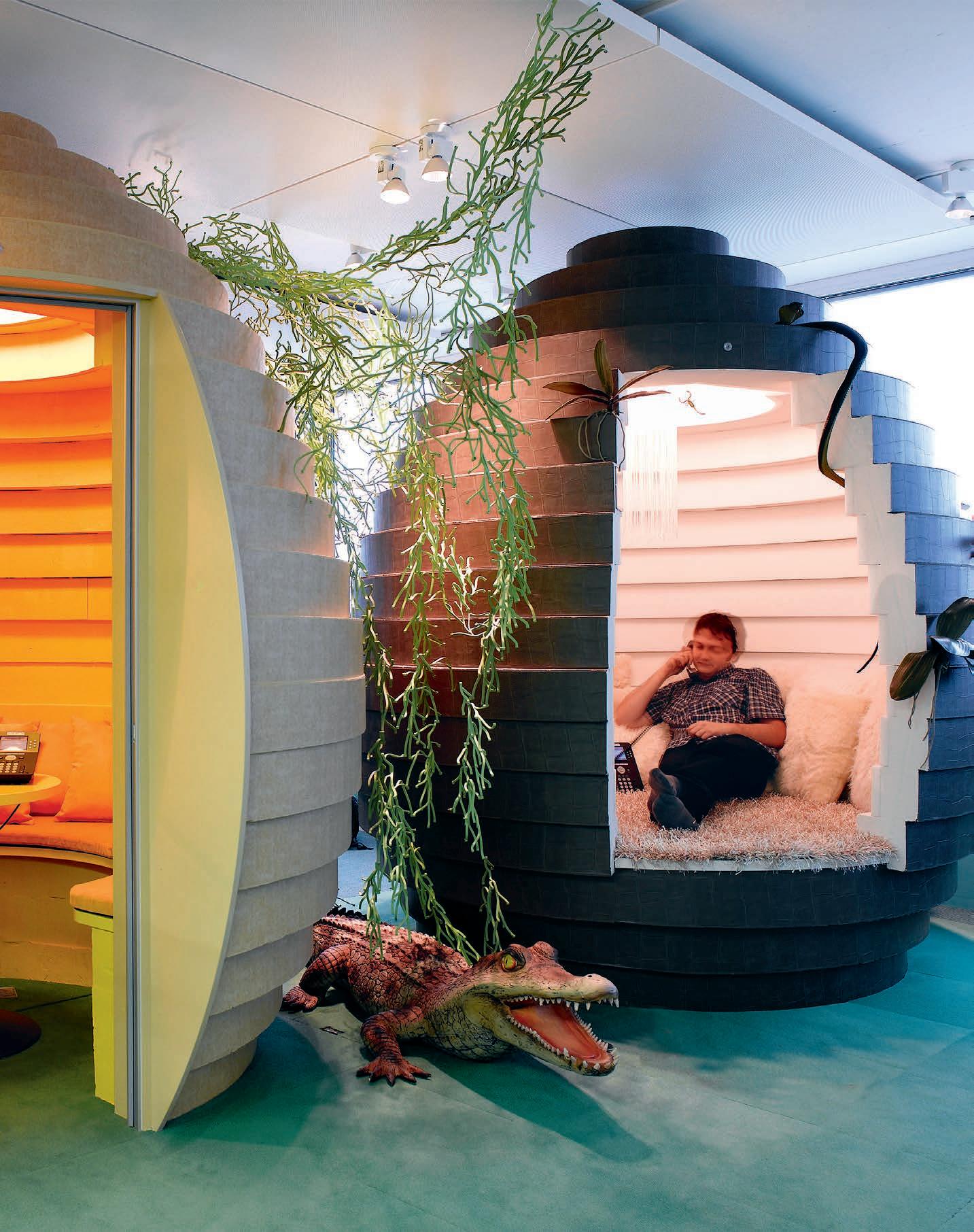
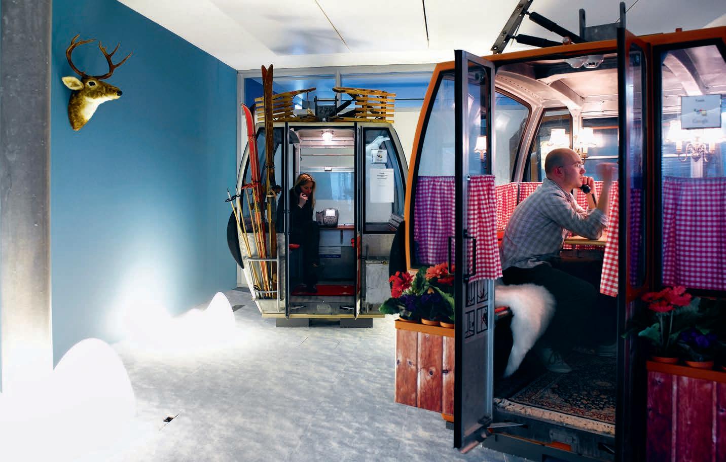
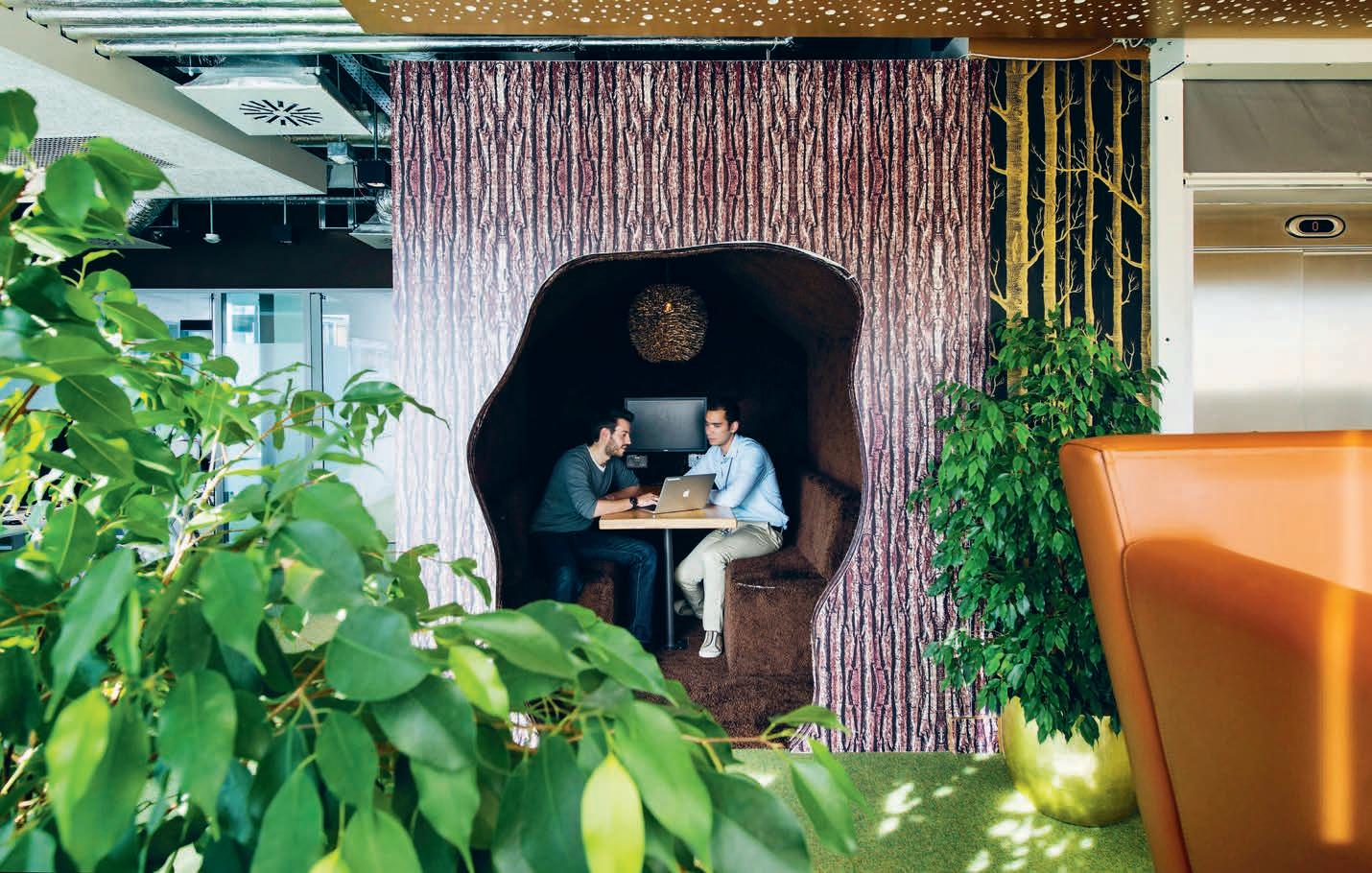
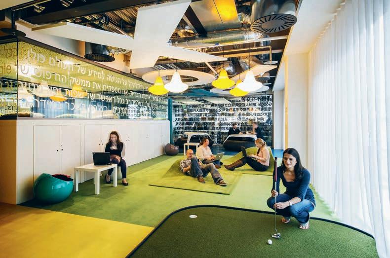
INDESIGN 189 IN DEPTH
“
With Boomers obliged to remain in the workforce longer, rubbing shoulderpads with Gen-Y’s skinny pants, we’ve never had greater generational chafe.”
Opposite top: Swiss gondola phone booths in Google Hub Zurich, masterplanned and designed by Camenzind Evolution, 2008.
Opposite bottom: Informal meeting area on the ‘forests of the world of gasworks’ floor in Google Campus Dublin, masterplanned and designed by Camenzind Evolution, 2013. This page: Minigolf mental recalibration space on the ‘search’ level of Google Campus Dublin.
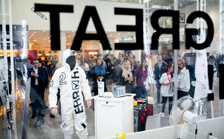
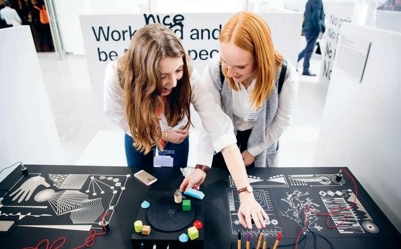
INDESIGNLIVE.COM 190 IN DEPTH
provocative is positive
Every year, some “designer” fresh out of university with little or no industry experience will drag themselves out of their usual trawling of Pinterest to pen some wildly inaccurate Facebook post, proudly proclaiming: “I’m so anti-trade events, man. They’re so predictable and only about product”. Which, by the way, is total garbage.
Design events are the lifeblood of our industry. They are quite literally the only places that we get an opportunity to come together as an industry, outside of the day-to-day pressures of our work, to really challenge and question what it is that we’re doing and where we’re headed.
Salone del Mobile, Stockholm Furniture Fair, Maison & Objet, Sydney/ Melbourne/ Singapore/ Hong Kong/ Perth Indesign, International Contemporary Furniture Fair New York, London Design Festival, Clerkenwell Design Week; these events push our industry FORWARD. They give us momentum. And without them, we wouldn’t have a format in which to actively disrupt and experiment with our collective practice of design – and not having that forum is a dangerous prospect indeed.
This year’s Orgatec is a stellar example of why the entire global design industry needs to get together once a year and present their R&D for the year ahead. This isn’t just about products, it’s critical that revolutionary ways of thinking, making and designing are shared here by veterans and emerging designers alike. Orgatec 2016 for instance, focussed on the concept of New Visions of Work , with the specific driver of #CreativityWorking as the over-arching theme of the event. It’s very clear that our understanding of work is changing.
As little as a few decades ago nothing happened without a fixed desk or set hours. Now, work is increasingly mobile and networked. How is this change going to evolve further? What will the office of the future look like – will it even exist? How will we live and work tomorrow? And most importantly, how are we as an industry going to respond? These and other critical questions are being creatively dissected by the next generation of architects, designers and creative thinkers at each and every Orgatec.
In 2016, the #CreativeWorking space demonstrated our industry’s most progressive attitudes toward these ideas. The results speak for themselves really, where students in particular were given the opportunity to really upset the apple cart and aggravate the establishment with their ideas for where this industry should go next. Ideas that otherwise would not have been shared or voiced. Some students are hell-bent on “making the office great again”. Others graffitied ordinary grey workstations that served to rip apart industry clichès like: “Make Things Happen” to “Shit Happens!”, “Start Making Sense” to “Stop Making Bullshit!” and my personal favourite “No Pain, No Gain” to “No Money, No Fame!”.
Trade events like Orgatec are a chance for us to change, to disagree, to try something new. Without them, design as we know it would arguably not have progressed as far or as rapidly as it has, nor will it continue to without the support of the global industry at-large.
orgatec.com
INDESIGN 191 IN DEPTH
Every year without fail, Orgatec upsets the design establishment. And it’s always a good thing. Here’s why…
Words Sophia Watson Photography Courtesy of Felix Vorbek and Johannes Winkler
Opposite: ‘Let’s Make The Office Great Again’ an interactive installation by emerging graphic designers Felix Vorbek and Johannes Winkler for the Orgatec 2016 ‘New Visions For Work’ initiative, which featured throughout this year’s fair, driven by the theme of #CreativityWorking.
TOP 3 fr O m O rgaT ec 2016
Words Sophia Watson & Narelle Yabuka Photography Various
Best Stand
The Rolling Workspace, Kokuyo
In response to the increasing importance of real communication among workers in the office, famed Japanese commercial design house, Kokuyo, have this year used their booth to focus on the action of writing for enhancing the ideas and creativity of individuals and teams. In collaboration with Nendo, Kokuyo proposed a new type of workspace with whiteboards as a key
tool connecting stationery and furniture, both of which are our business domains. On the stand, circular whiteboards created various writing scenes that flexibly change and produce an innovative and attractive communication space that inspires the creativity of people who work inside. It’s an exciting concept and if nothing else, it was strikingly beautiful. Total Instagram bait.
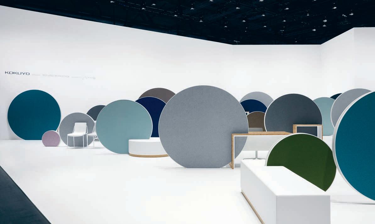
INDESIGNLIVE.COM 192 IN DEPTH
Indes I gn ed ITO rs’ PI cks
–
Honorable mentions to: WORK by Vitra featuring Laufen pop-up, No Boundaries by BuzziSpace, Think New by Normann Copenhagen, and The Ironic Office by Pedrali. –
Best Idea Workspace, Tom Dixon
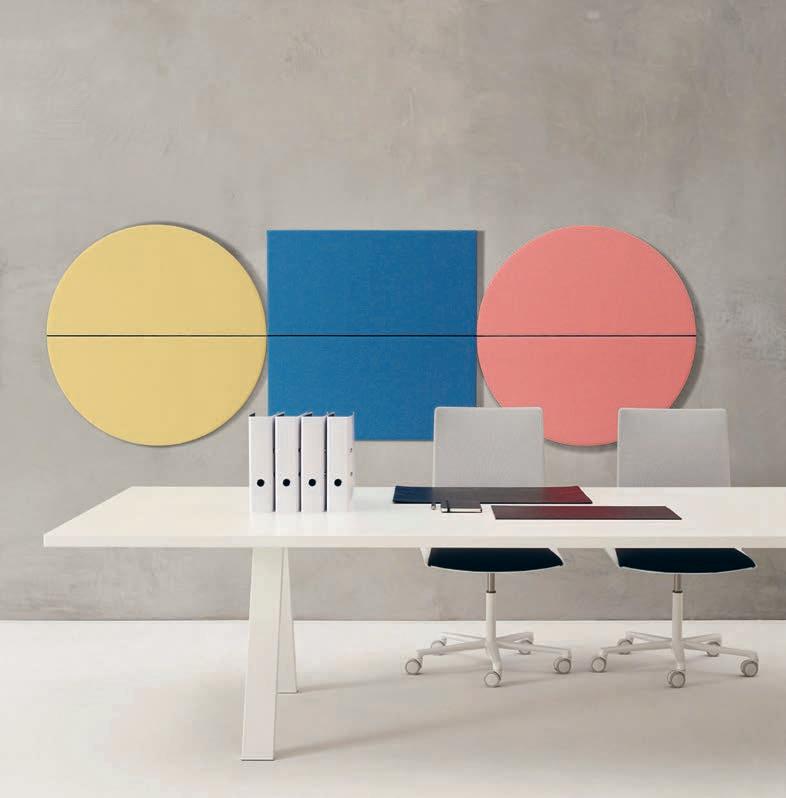
Is there anything the duke of design can’t get right? Dixon’s staunch figure was featured milling about his stand and having some fascinating chats with the punters about his focus at this year’s Orgatec, including the paperless office versus our love for the past. “The paperless office was an interesting dream,” he notes, “as was the idea that everything would move online and life would be lived through the screen – but we know that people still cherish an analogue life – the papers, the pens, the keys and physical objects that continue to give us manual satisfaction.” Where does that leave us, Tom? Dixon’s response has been a series of products including Boom, Cube and the Slab Desk that enable technology and the idea of the paperless office, with the materiality and tactility of the past that we apparently cannot do without.
Best Product Work/Life Collection, Arper
New amongst the Arper Work/Life collection is the Steeve modular lounge system; the Parentesit acoustic wall module; Catifa Sensit office chair; Cross table; and Kinesit office chair. These pieces are ideal for a wellappointed living environment, as well as any sophisticated working environment – a perfect balance of work and life. The products featured in this collection demonstrate how Arper continues to play its part in the debate around workplace evolution with the ‘Soft Contract’ concept. It favours high-design, beauty and the flexibility to adapt to different settings. The extension to the Parentesit range with freestanding screens for example, gives users the option of dividing a room in half, or partitioning off a space for quiet, independent thought. Each product in this family serves as a reminder that Arper is indeed a product design force to be reckoned with.
INDESIGN 193 IN DEPTH
–
––
Honorable mentions to: Let’s Make The Office Great Again (LMTOGA) by Felix Vorbek and Johannes Winkler, No Boundaries by BuzziSpace, The Ironic Office by Pedrali, Visions of Work by Arper, Office for Motion by Wilkhahn.
–
Honorable mentions to: Telo Lounge by Sebastian Herkner for Cappellini, Poise by Anders Hermansen for Englebrechts, Be_Hold by Patricia Urquiola for Haworth, Amp Chandelier by Simon Legald by Normann Copenhagen, and Foster 512 by Foster + Partners for Walter Knoll.
indesign X Cu LT
Design that’s lightyears ahead
Cult has launched three new lighting designs from Danish lighting company, Lightyears. Designed in collaboration with leading designers GamFratesi and Nikolai Wiig Hansen, the new designs showcase Lightyears’ trademark approach to robust materials, functionality and minimalism.
Founded in 2005, Lightyears specialises in designing and producing high quality lamps to provide functional lighting while serving as eye pleasing aesthetic statements. Over the last ten years, Lightyears has collaborated with some of the top designers from around the world, and these two collaborations continue this journey. All three of the new designs sit seamlessly within the Lightyears portfolio of designer lighting. Designed by GamFratesi, the new Suspence pendant presents a fresh and organic style for modern
pendant lighting, with natural soft curves and pinched shade. Also designed by GamFratesi, the Suspence Nomad floor lamp introduces a whole new concept of lighting in the form of a movable floor style, suitable for both indoors and out. The Night Owl lamp, designed by Nikolai Wiig Hansen, recalls the iconic modernist style of the 1950’s, offering a friendly table lamp design with personality and style. Lightyears, available in Australia through Cult, has spent over a decade creating a range of contemporary and innovative lamps. These Lightyears range, including these new three designs, are produced in robust materials like copper, steel, glass, acrylic and PC. The ambitions of the Lightyears lighting collections are the fusion of the fresh and the iconic, where the exciting nature of the new is appreciated alongside the skill the experienced.
cult 194 cultdesign.com.au
This page: Lightyears, from Cult, channels a classic sense of modernism, updated for the 21st century.
What can DESIG n L E arn from KI m & Kany E?
INDESIGN 195 IN Teres T Teres T IN
Words Sophia Watson Photography Various
Ok, hear me out. I totally understand that from the outset, holding up Kim Kardashian and Kanye West as aspirational architecture and design industry figures is batsh*t insane. But stay with me here – I promise I’m not crazy.
Kim and Kanye – or ‘Kimye’ if you’re into the whole celeb portmanteau thing – should be used an industry resource for one purpose: brand and marketing genius. Say what you will about this controversial couple, they know how to make a brand out of practically nothing and with almost no marketing budget.

Let’s look at Kim in particular here. Ok, so she’s the daughter of someone vaguely famous, but Mrs. Kardashian-West has managed to forge her personal brand with nothing more than a bit of ambition and a pink bedazzled Blackberry.
Before she became one of the most famous women on the planet with her hit reality show Keeping Up With The Kardashians, Kim Kardashian ran a humble closet organisation business. Young Kim would clean out the closets of Hollywood celebrities and sell all of the unwanted clothes on eBay for her clients. Before she was a big-shot in her own right, celebrities including: Paris Hilton, Nicole Richie, Brandy, Rob Lowe, Serena Williams, Cindy Crawford, Kenny G and Sugar Ray Leonard numbered among her employers.
Some major industry networking coups and one sex tape later, Kim is worth over US$85million and has become a global household name by making her personal brand (herself) a
consumable digital commodity. But how did she do it, and what can we learn from her success? One: Kim knows her audience. Her target audience is those people on your Facebook feed who would describe themselves as a “meme junkie”. These are reality TV binge-watching folk who are regular subscribers to People Magazine. Kim delivers to her target audience. She gives them what they want to see: sex, money, fame and all in the form of carefully constructed Tweets; Instagrams and Snapchats. Everything from her holiday in Bali; after-parties; red carpets; photos of her daughter’s Kid-chella party; behind-the-scene snaps of photoshoots and selifes in her bathing suits, is all custom-made content, designed to share, consume and engage with.
Not only does Kim know how to create content for her audience, she knows how to get a return on her investment. The most obvious example is turning her most embarrassing and public moments into merchandise. The “Kim crying” meme was cleverly worked into a series of items for purchase – emojis, clothing, press-on nails, birthday cards, coffee mugs – all developed to drive revenue for her brand. The less obvious revenue stream is the monetisation of her very own fans and followers on social media, where her Instagram numbers can mean millions in lucrative endorsement deals and promotional partnerships.Second: Kim is relentlessly consistent in her approach to marketing. From her magazine photoshoots, her Tweets and Instagram selfies, through to her many global
INDESIGNLIVE.COM IN T Er EST 196
You might think “not much”, but there are many industry lessons to be learned from the world’s most famous couple.


appearances, Kim delivers ongoing and relevant content for her fans – Every. Damn. Day.
Kim’s content is meticulously crafted (yes – it is actually a well thought-out strategy) to satisfy her audience’s ongoing demand to access her brand through original material – direct from the horses mouth. She ferociously updates her social channels – almost 24 hours a day in fact – and keeps her content forms varied by understanding the types of content that give her a point of difference. The infamous PAPER Magazine cover shot for example – Break The Internet – set her cover shot apart from all the other standard celeb cover shots. Kim Kardashian’s cover photo, together with the other photos in the spread inside the issue used a sheer genius combination of shock value, marketing savvy and of course, her famous derrière.
Finally: Kim and Kanye stay front-and-centre in the limelight. They never shy away from exposure and, in fact, they make sure that they are photographed on a daily basis in order to stay current and relevant. Unlike other celebrities, they never complain about being in the public eye. And why would they? Having their lives out in the open – the good, the bad and (especially) the ugly – is their bread and butter. Remarkably, they know their imperfections and they make money out of them too. They don’t seem to view putting on weight as a massive blow to their self-image because they know that they can make hundreds of thousands of dollars while losing the pounds through diet pill and workout gear endorsements. Kim

has uploaded countless selfies with her waist-trainers, diet pills and detox teas. It has actually been reported that for each Tweet and Instagram post in which they endorse a brand, they can earn as much as US$200,000. Just for one lousey social post!


So, what lessons are there to be learned here? Sure, the architecture and design community need to play it slightly more conservative and professional than the Kardashian-Wests. But there are three main pearls of wisdom to take away from the Kimye marketing machine.

A) know your audience and how to leverage it. Is your target audience not super design-savvy? Create bespoke content around educating them on your work and the ideas and principles that drive it. B) be consistent in your approach to market and know your point of difference. If you’re brand is silent, then how can you expect your audience to hear you? Is your key demographic millennials or boomers? This will make the difference between posting custom video content or creating academic white papers. And finally, C) be present and active in the industry and encourage the exposure of your brand. Get out from behind the desk and network, baby! The Asia Pacific in particular, is a culture driven by doing business with people you know – or at least know-of. Attend every industry function, event, cocktail party and seminar series you can. Introduce yourself and repeat, repeat, repeat!
And who knows? You might be selling your own Instagram posts for a cool million one day!
INDESIGN 199 IN Teres T
Page 196: Kim Kardashian and Kanye West on the red carpet of the 2016 MET Gala: Manus x Machina Ball, Photo: Kevin Mazur. Opposite: ‘Break The Internet’ cover of PAPER Magazine, Winter 2014 issue, creative concept by Drew Elliott, photography by Jean-Paul Goude. Kim wears Mikimoto necklaces and earrings, custom dress and vintage gloves. This page & page 197: Official ‘Kimojis’ designed by social experience company, IMVU, commissioned by Kim Kardashian and Kanye West.
Be INspired
147 Abey Australia abey.com.au
045 ACCA accaonline.org.au/events
101, IBC Bellevue bellevuearch.com.au
006-007 Caesarstone caesarstone.com.au
020-021, 085 CBS Products colebrookbossonsaunders.com
037, 194 Cult cultdesign.com.au
046 Dance for Life danceforlife.live
166 Darkon darkon.com.au

012-013 Designer Rugs designerrugs.com.au
115 DKO dko.com.au
016-017 Domayne domayne.com.au
070-071 Fisher & Paykel fisherpaykel.com.au
002-003 Gaggenau gaggenau.com/au
162-165 Herman Miller hermanmiller.com.au
057 INDE.Awards indeawards.com
043 Interstudio interstudio.com.au
018-019 Janus Et Cie janusetcie.com
030-031 Krost krost.com.au
022, 064-065 Light Culture lightculture.com.au
004-005 Living Edge livingedge.com.au
106-108 Office Spectrum officespectrum.com.au
050 Officeworks officeworks.com.au/business-solutions
049 Parisi parisi.com.au
072 Phoenix Tapware phoenixtapware.com.au
040-041 Premium Lighting premiumlighting.com.au
061 SB Seating sbseating.com
OBC Schiavello schiavello.com/aire
032 Space Furniture spacefurniture.com
159 Staron staron.com.au
026-027 Stylecraft stylecraft.com.au
010-011, 104 Sub-Zero subzero-wolf.com.au
014-015 Sunbrella sunbrella.com
121 Sydney Indesign sydneyindesign.com.au
IFC-001 UCI uci.com.au
029 Vola vola.com
073-078 Wilkhahn wilkhahn.com.au
5 for 4
Subscribe to Indesign and get 5 issues for the price of 4! (AUS$55). Join the global design gang at www.indesignlive.com/subscribe
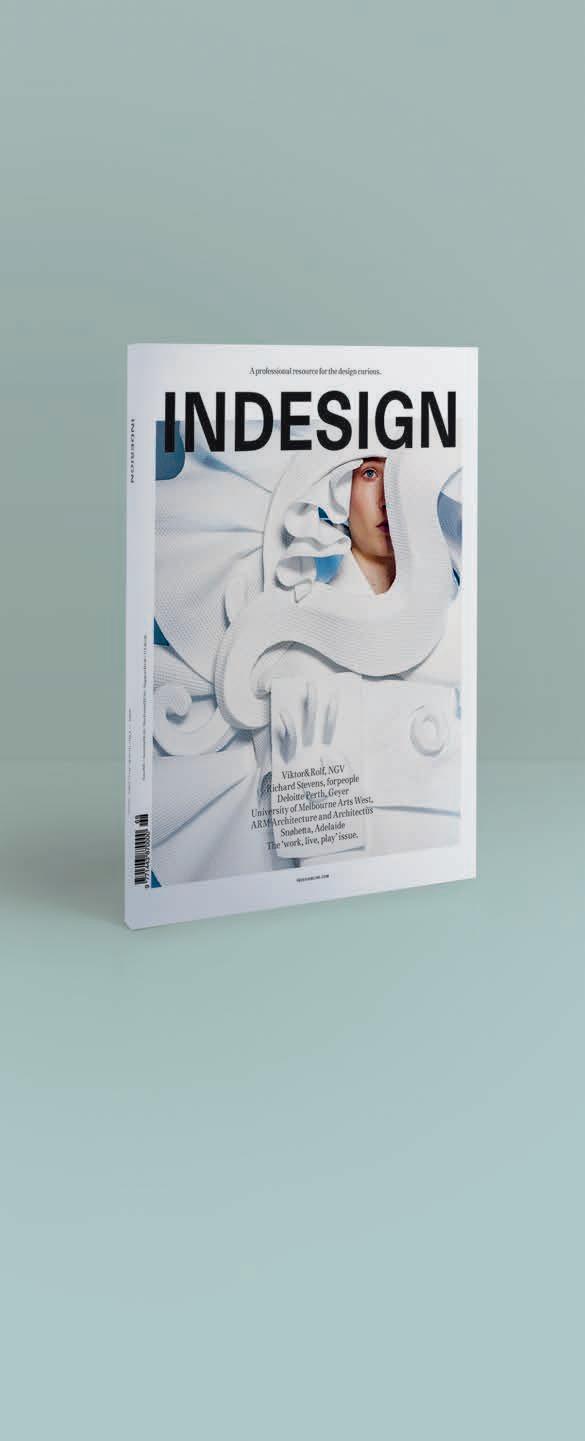
Indesign looks for the point and purpose of everything in design – exploring what we do, how we do it, and why. Indesign is the only place you’ll find conversations on the design industry that are clever, provocative, insightful, and just a bit cheeky.
Indesign is for creative professionals – aspiring and established – hungry to continue the ideas that inform the best projects, products and people.
025 Woven Image wovenimage.com
008-009 Zenith Interiors zenithinteriors.com
023 Zip zipwater.com
Indesign BFFs
Without the support of our industry BFFs (advertisers, to the laymen) we wouldn’t have this amazing resource! This symbol throughout the magazine and online represents the special few we have worked closely with over these many years, and who continue to support us and our industry. We totz them, and so should you!
INDESIGNLIVE.COM IN T Er EST 200
JOIN THE GLOBAL DESIGN GANG...SUBSCRIPTIONS OFFER OUR BFFS...ADVERTISERS DIRECTORY
by Bellevue Architectural
Nothing In The Ceiling
Nothing In The Floor. No Unsightly Large Floor Plate
All the technology is morticed in the door.
The FritsJurgens® concealed pivot system (100% designed & made in the Netherlands) stands out from other sprung pivot systems in that all the technology is embedded in the door and not the floor.
With no imposing, unsightly floor & ceiling plates to diminish the visual attraction of the door; a clean sophisticated look & feel is achieved. The interface with the wall, floor and the ceiling becomes one.
Ideal for small to very large doors weighing up to 500Kg swing 90, 180 or 360 degrees. 90 degree hold open, auto open & close functions as standard. Engineered to last, manufactured to rigorous specifications & testedto1,000,000cycles.
Ideal for commercial & residential doors and with a substantial install base in Australia & New Zealand, the FritsJurgens® concealed pivot system is fast becoming the standard in pivoting door hardware.
®
For more information Bellevue Architectural Ph: 03 9571 5666 info@bellevuearch.com.au bellevuearch.com.au
Its in the door, not the floor