INDESIGNLIVE.COM A professional resource for the design curious. Sydney Indesign 2017 PearsonLloyd Chifley Plaza Sydney, SJB Brenton Smith, Bates Smart PwC Melbourne, Futurespace The ‘consume’ issue. Issue #70 / Australia $16.50 / New Zealand $17.50 / Singapore $12.95 / U.S. $21.99
traverse Sydney | Melbourne | Canberra | Brisbane | Adelaide | Hobart | Perth | Ulverstone Inspired by architecture. made possible by engineering.
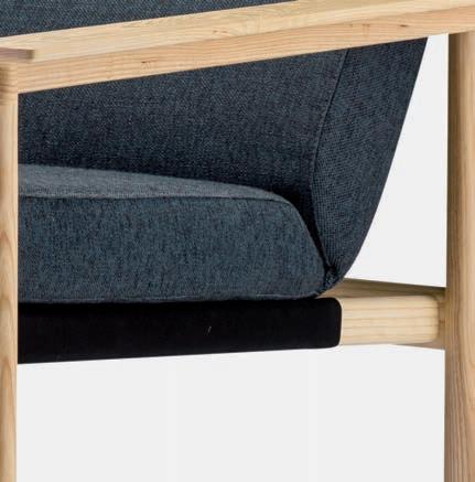
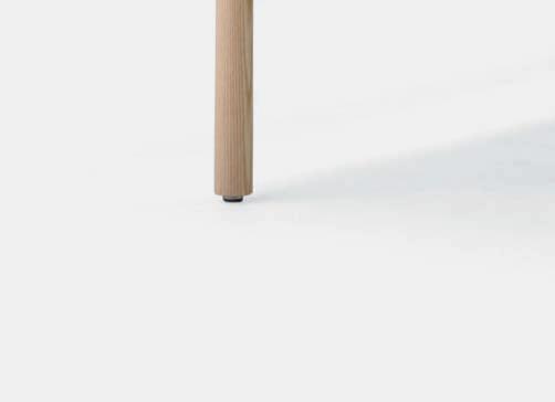
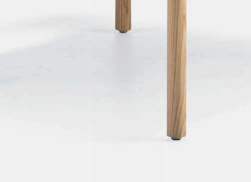
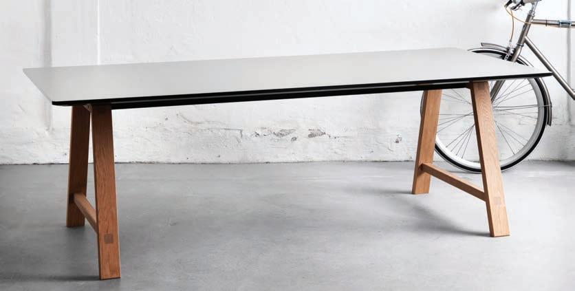
Engineered simplicity.

uci.com.au
DESIGN BEGINS WITH THE LINE

MINIMAL, MODERN AND ELEGANT. UNSURPASSED COOKING TECHNOLOGY.

SMA17018


OVENS • COMPACT OVENS • WARMING DRAWERS • COFFEE MACHINE • COOKTOPS smeg.com.au
TRP MI 6988 VIC 9765 7436 NSW 8977 4235 QLD 3632 2471 SA 8352 9532 WA 9286 7835 NZ 573 1269
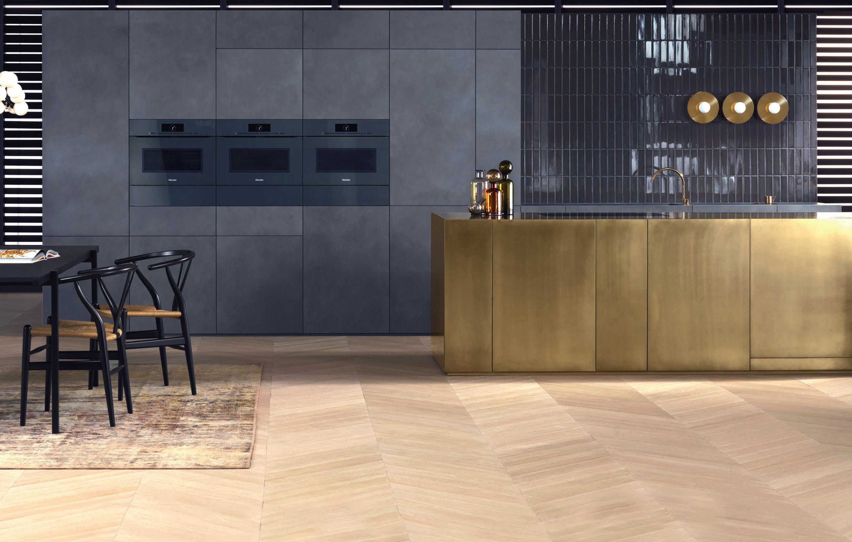
Miele innovation. Pure design. No interruptions.
Miele ArtLine handleless appliances. For the purist. The pure elegance of the design is free of even a hint of visual interruption. Miele innovation. Minimalism at its best. For assistance with your next project, contact Miele’s dedicated team of industry specialists in our Project Division, or call into any of our Miele Experience Centres.
miele-project-business.com.au
Hailed for her use of tactile textures and luxurious materials, Welsh designer Bethan Gray has developed a signature style. Patterns, texture, purity of line, clarity, harmony and attention to detail define her highly original style transcending the boundaries of trend.
livingedge.com.au
Shamsian Nizwa
Bethan Gray, Designer


What began with a spark...

...emerges as an icon.
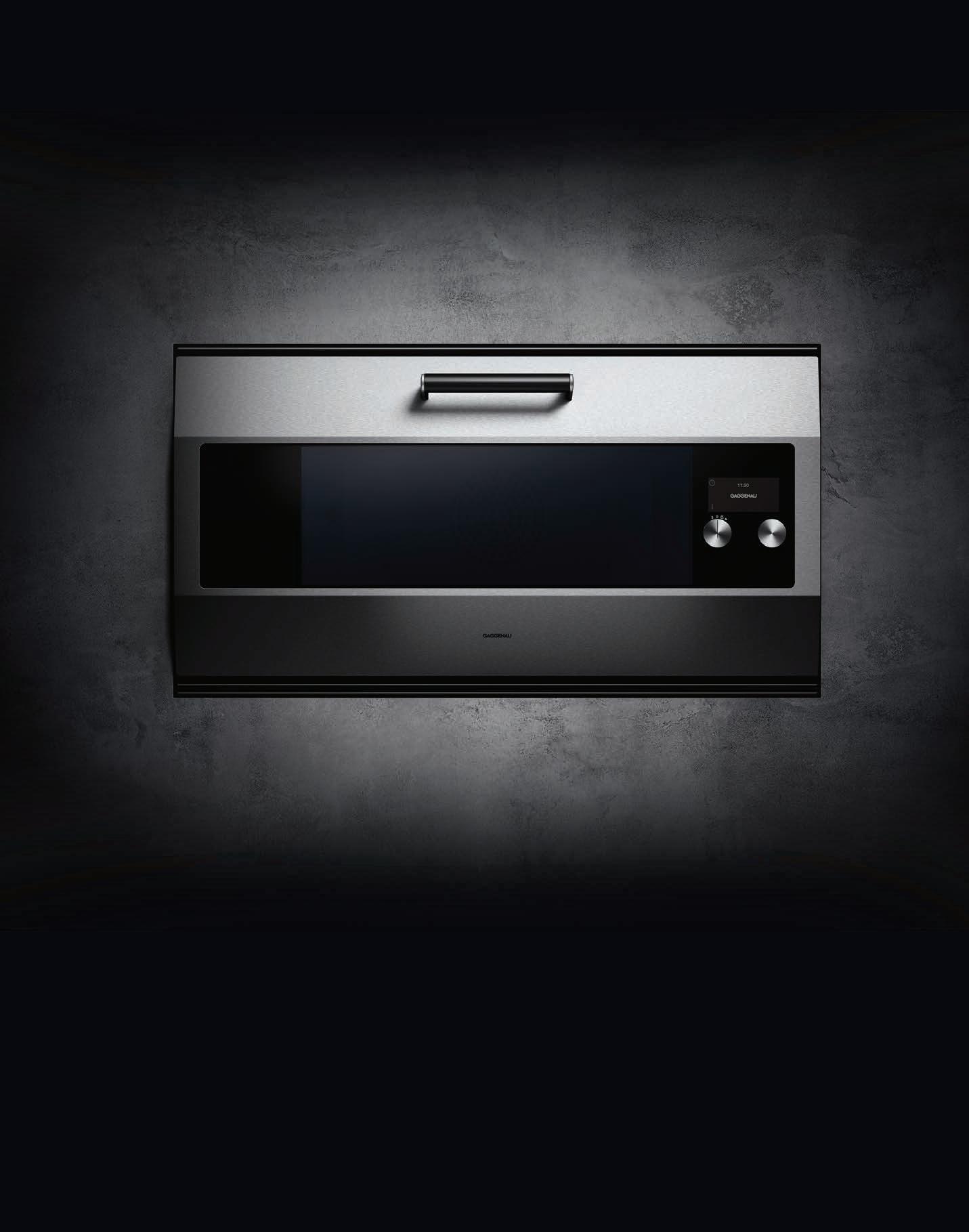
The difference is Gaggenau.
We have been perfecting one oven for 30 years. Our latest rendition accentuates its distinctive design: the door is now created from one imposing 90 cm wide sheet of 3 mm high-grade stainless steel. It represents one vast entrance to culinary potential.
This remodelled, hand-crafted work of art is the culmination of our finest principles, skills and ethos. We’ve christened it the EB 333 in recognition of our 333 years of working in metal. This has always been more than an oven; it is a promise to create masterpieces.
For more information, please visit www.gaggenau.com
IN TR OD UC IN G TH E NE W
PE MB RO KE
BA TH RO OM CO LLE CT ION
Th e Vi ct or ia + Al be rt Pemb ro ke ba th is aptl y nam ed af te r th e bi rt hp la ce of Eng la nd’ s fi rs t tu dor ki ng as it evo ke sa re gal el eg an ce Th is tr ad it io na l do ub le -e nd ed ba th isac ce nte d by cris p co rn er s an da de co ra ti ve ri m.
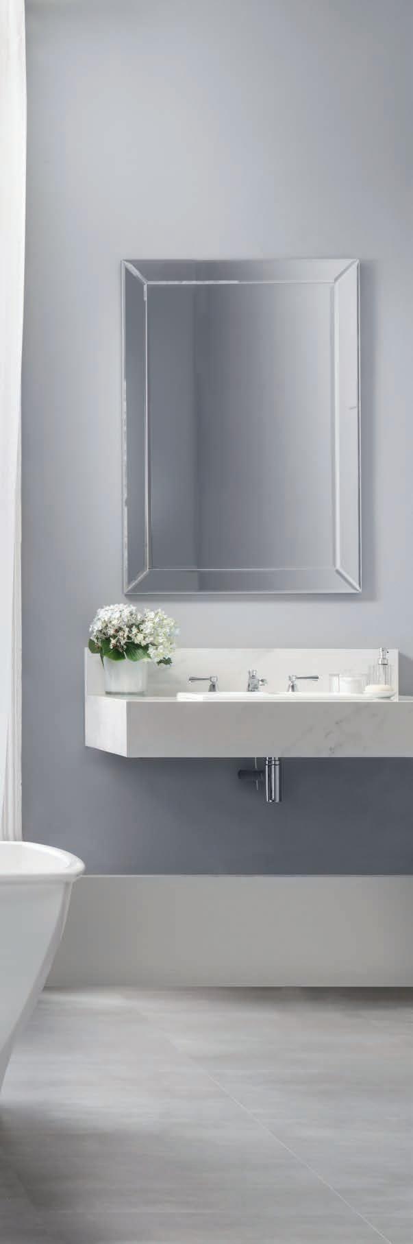
De sign ed by Men eg he ll o Pa ole ll i As so ci at i.
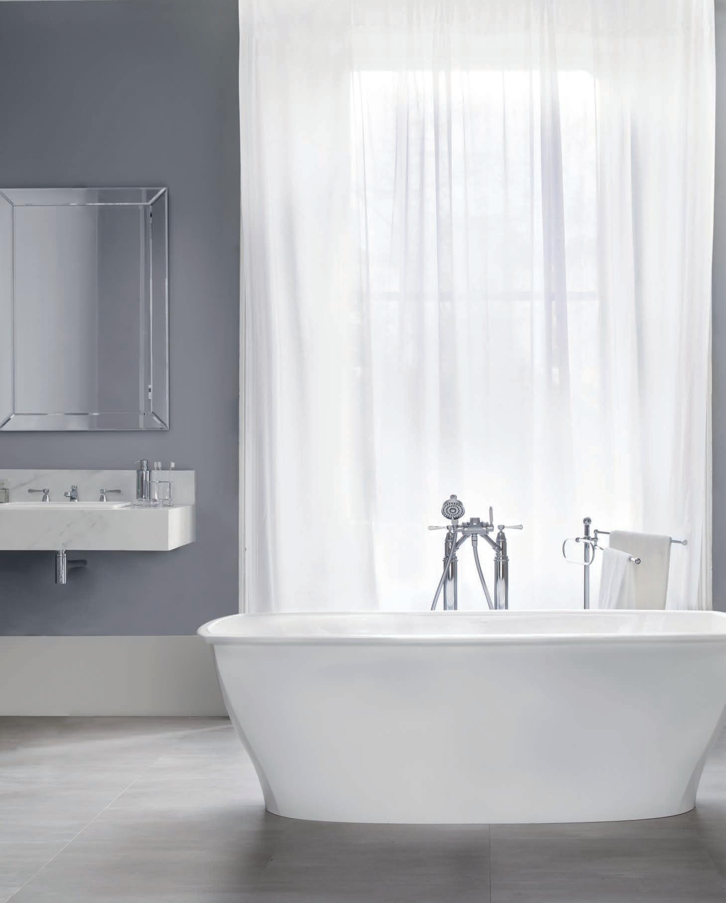
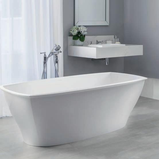
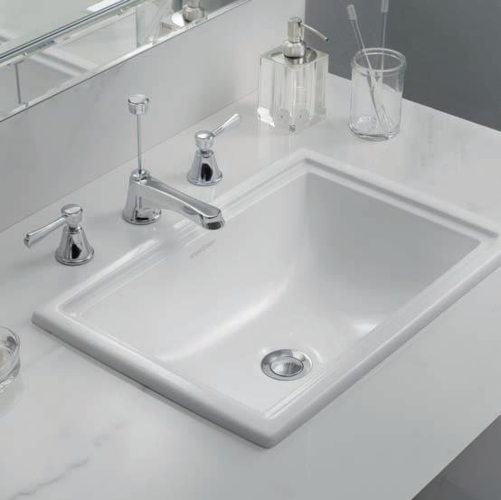
BATHROOMDESIGNCENTRE • AL EX AND RI A- 84 O’ RI OR DA N ST 02 83 39 71 03 • AU BU RN - 10 3-12 3 PA RR AMA TT A RD 02 87 48 4367 VIS IT OU R WE BS IT E- WWW .D OM AY NE. CO M. AU Dom ay ne ® st or es ar e op e ra te d by in dependen t fran ch is ee s. Ac ce ss or ie s sh ow n ar e not in clu de d. 34 42 17_ NA U
Vi ct or ia + Al be rt Pemb ro ke Ba th $5 65 0 Vi ct or ia + Al be rt Pemb ro ke Ba si n $6 50
Mezzanine level 171 Robertson Street Fortitude Valley, QLD 4006 P | +617 3216 1551 1f Danks St Waterloo, NSW 2017 P | +612 9699 1131 575 Church Street Richmond, VIC 3121 P | +613 9427 7000
LOVERS
OAK
FOR
OF FINE
Chamoisee Prime The gentle warmth of a honey-brown hue enhances the natural oak finish of our Chamoisee timber.
Tongue n Groove™ floorboards are designed with three solid layers of fine European Oak for a premium level of finish, longevity and structural integrity.
tonguengrooveflooring.com.au


Shaw Contract’s latest collection A Walk in the Garden is inspired by the harmony of man-made surfaces in nature. Cradle to Cradle visionary William McDonough has captured moments from a garden in China, that inspired the way we make products to this day.
Chairman/Publisher
Raj Nandan raj@indesign.com.au
Managing Director
Kavita Lala kavita@indesign.com.au
Co-Editors
Sophia Watson sophia@indesign.com.au
Alice Blackwood alice@indesign.com.au
Editorial Assistant Andrew McDonald andrew@indesign.com.au
Brand Directors
Dana Ciaccia dana@indesign.com.au
Colleen Black colleen@indesign.com.au
Sales Support & Reporting
Genevieve Muratore genevieve@indesign.com.au
Group Operations O cer Sheree Bryant sheree@indesign.com.au
Production Manager Natasha Jara natasha@indesign.com.au
Business Manager

Vivia Felice vivia@indesign.com.au
Accounts
Ting Zhang ting@indesign.com.au
Cassie Zeng cassie@indesign.com.au
Senior Designer Michelle Byrnes michelle@indesign.com.au
Junior Designer Camille Malloch camille@indesign.com.au
Online Manager Radu Enache radu@indesign.com.au
Web Developer Ryan Sumners ryan@indesign.com.au
INDE.Awards Lauren Black Lauren@indesign.com.au
Indesign Correspondents

Stephen Cra i (Melbourne) Andrea Stevens (New Zealand) Mandi Keighran (London)
Contributing Writers
Andrea Stevens, David Congram, Leanne Amodeo, Lorenzo Logi, Mandi Keighran, Marg Hearn, Michelle Bailey, Paul McGillick, Rebecca Gross, Sandra Tan, Stephen Todd
Contributing Photographers Charles Dennington, Chris Gloag, Christine Francis, Felix Forest, Hugh Hamilton, Nicole England, Peter Clarke, Sean Fennessy, Simon Devi , Trevor Mein, Yvonne Qumi
Corrections
Indesign #69 incorrectly credited the photography used on pg 157, for the Staple Café designed by Samantha Eades. The images were in fact original photography by Michael Gazzola (mgfolio.com.au) We deeply apologise for the error.
Head O ce Level 1, 50 Marshall Street Surry Hills NSW 2010 (61 2) 9368 0150, (61 2) 9368 0289 (fax) indesignlive.com
Melbourne 1/200 Smith St, Collingwood VIC 3066
Singapore 4 Leng Kee Road, #06–08,SIS Building, Singapore 159088 (65) 6475 5228, (65) 6475 5238 (fax) indesignlive.sg
Hong Kong Unit 12, 21st Floor Wayson Commercial Building, 28 Connaught Road West, Sheung Wan, Hong Kong indesignlive.hk

Join the global design collective, become an Indesign subscriber!
To Subscribe (61 2) 9368 0150 subscriptions@indesign.com.au indesignlive.com/subscribe
Yearly subscription: Australia $55 (incl. GST) International AUD $110
Printed in Singapore Indesign is printed with ENVIRO Soy-Based Process Black ink, UV Solventless Varnish and on paper which is awarded an Environmental Management Certificate to the level ISO14001:2004 GBT24001-2004 and Eskaboard and Eskapuzzle produced from 100 per cent recycled fibres (post consumer).
CAREERSINDESIGN
1800 556 302 | www.shawcontract.com.au
Shaw_half page.indd 1 5/23/17 11:27 AM
All rights reserved. No part of this publication may be reproduced, stored in a retrieval system, transmi ed in any form or by any other means, electronic, mechanical, photocopying, recording or otherwise. While every e ort has been made to ensure the accuracy of the information in this publication, the publishers assume no responsibility for errors or omissions or any consequences of reliance on this publication. The opinions expressed in this publication do not necessarily represent the views of the editor, the publisher or the publication. Contributions are submi ed at the sender’s risk, and Indesign Publishing cannot accept any loss or damage. Please retain duplicates of text and images. Indesign magazine is a wholly owned Australian publication, which is designed and published in Australia. Indesign is published quarterly and is available through subscription, at major newsagencies and bookshops throughout Australia, New Zealand, South East Asia and the United States of America. This issue of Indesign magazine may contain o ers or surveys which may require you to provide information about yourself. If you provide such information to us we may use the information to provide you with products or services you have. We may also provide this information to parties who provide the products or services on our behalf (such as fulfillment organisations). We do not sell your information to third parties under any circumstances, however these parties may retain the information we provide for future activities of their own, including direct marketing. We may retain your information and use it to inform you of other promotions and publications from time to time. If you would like to know what information Indesign Media Asia Pacific holds about you please contact Nilesh Nandan (61 2) 9368 0150, (61 2) 9368 0289 (fax), subscriptions@indesign.com.au, indesignlive.com Digital Print Events Strategic Partners MILANINDESIGN INDESIGNLIVE.COM 22 THE PEOPLE WHO GET INDESIGN DONE
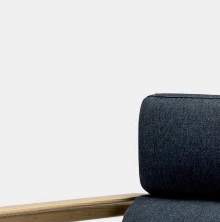
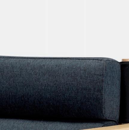
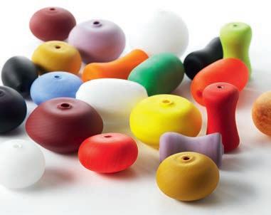
Soap Tables & E63 Table Lamp
Australia 1300 306 960 Singapore +65 6511 9328 stylecraft.com.au
Design by Gordon Guillaumier & Umberto Riva
On The Cover
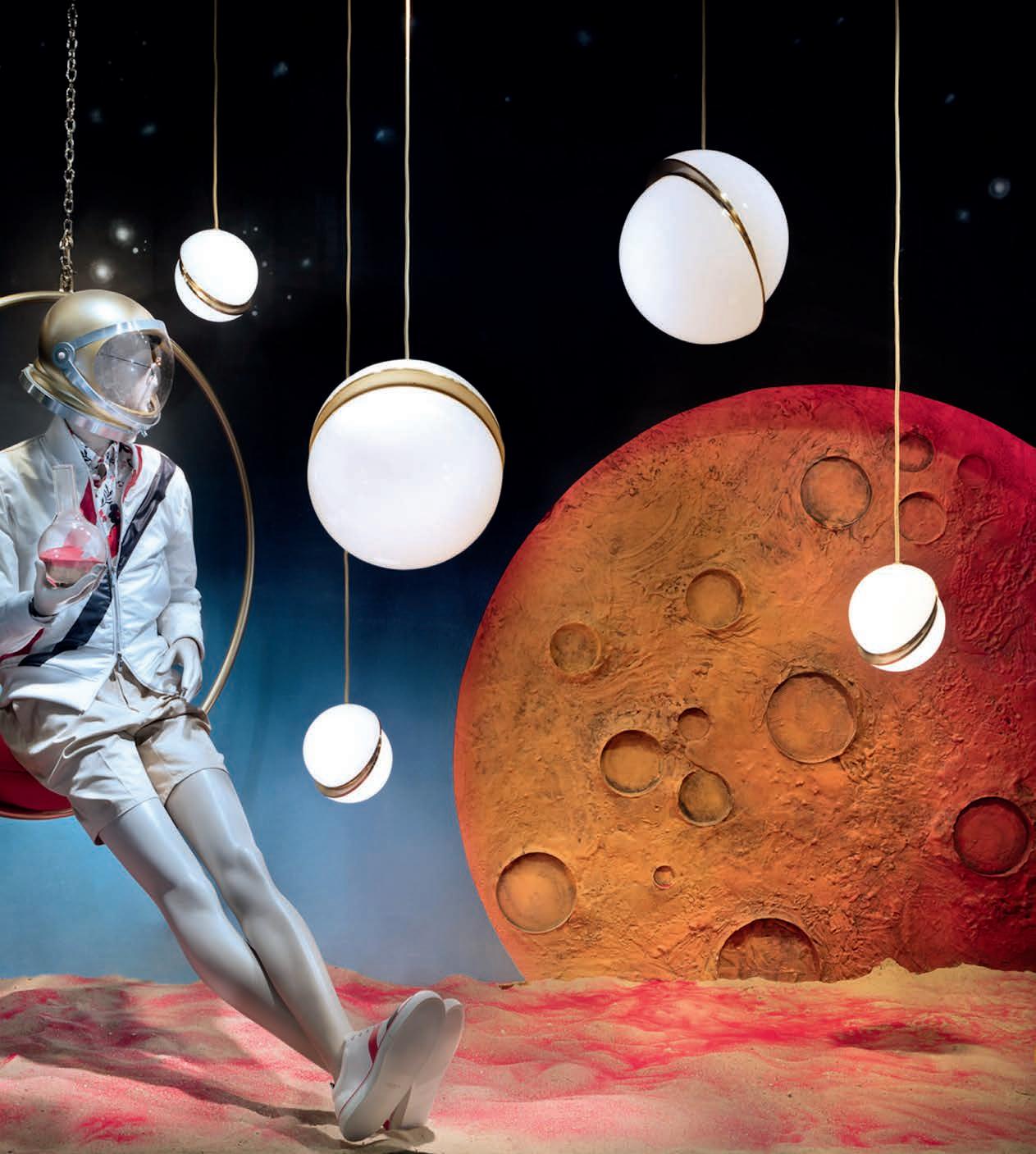
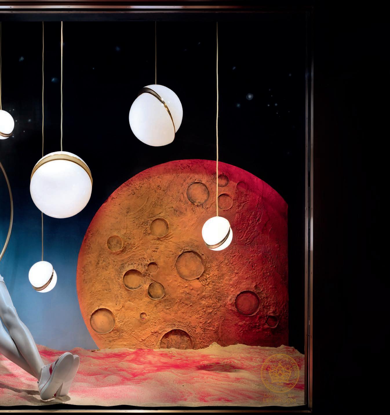
From Shoreditch to Fi h Avenue: British awardwinning furniture and lighting designer Lee Broom has partnered with Bergdorf Goodman Men’s Store to create the concept and collaborate on the design of their prestigious Fi h Avenue menswear windows. The windows were unveiled to coincide with the launch of NYCxDesign 2017 and ran from May-June. This particular setting, Explore, features the Crescent light, Mini Crescent light and Hanging Hoop chair, all designed by Lee Broom. Photography by Ricky Zehavi. We hope you enjoy it!
Retail is arguably the most chaotic and rapidly shi ing sector in contemporary design. The fortunes of the shopfront are at the whim of the consumer and just when you think you’ve got it all figured out – the dart-board moves yet again. Fluctuating generational behaviours (from Baby Boomers to Milennials, and even the newly emerging “Gen Viz”) predict the life and death of the retailer. And those brands and businesses that have lost sight of technology’s role within the sector, or not plo ed out their future-proof strategy, may be in grave danger of losing relevance among their market.
In this edition of Indesign: the ‘consume’ issue, we ask, what is design’s value proposition to its retail clients? We put the spotlight on inventive strategies and maneuvers used by our industry’s top practitioners in navigating this increasingly volatile sector. We unravel the market mysteries of technology and commerce, speaking with some of the world’s most creative entrepreneurs who are delivering intelligent, lasting and accessible solutions. Employee-less retail, for instance, is a growing concept, gaining popularity fast! Is it simply a pipe dream or a legitimate fixture of next-gen retail models? Flick to page 170 to see what we’re ge ing at.
‘Future-proofing’ may be a dreaded term in retail design, but against the odds there are those that have cracked the code in producing retail environments that outlast the brutal five-year cycle. Don’t believe us? We have the proof right here, on page 178!
The value of emotional experiences in physical retail has become a lifeline for Australia’s, at times, floundering retail industry. This we know. But are the same old popup installations that once had us flocking in-store eliciting the same response? Here, we speak with design’s most exceptional retailers on how they are thinking di erently on this vital concept.
This issue, it is our intention to surprise, shock and please you! We invite you to rethink everything you ever assumed about retail, to look beyond the shopfront to consider the imaginative solutions and intelligent design strategies shaping contemporary commerce. We invite you to consume the best the industry has to o er – enjoy the issue!
Indesign Co-Editors, Sophia Watson & Alice Blackwood
INDESIGNLIVE.COM 24 FROMCONTENTS THE EDITORS
indesignlive.com /indesignlive @indesignlive @indesignlive 100,000+ readers engaged across print, digital & social...


The ultimate industry cheat sheet.
Big thinkers and creative gurus.
79-106
Luke Pearson and Tom Lloyd of PearsonLloyd, Brenton Smith of Bates Smart, Kylie Dotoric and Alicia McKimm of We Are Huntly, Mario Nanni of Viabizzuno IN
Provocative, radical and energising design.
109-167
PwC Melbourne by Futurespace
Russell McVeagh Auckland by Warren and Mahoney
Collins Square Events Centre by Carr Design Group
Gilbert + Tobin by Woods Bagot
Sheraton Mirage Port Douglas by Mim Design
BEON Energy Solutions (Powercor CitiPower) by Siren Design
Chifley Plaza Sydney by SJB
St Andrew’s College Centennial Chapel Christchurch by Architectus I
What exactly is our industry selling when it comes to retail?
169-191 IN
What can design learn from Holly Golightly?
193-199
SHORT
IN
33-78 IN FAMOU S
SI TU
-
-
-
-
-
-
-
N DEPTH
T ERE ST
INDESIGNLIVE.COM 26 CONTENTS

walterknoll.com.au Walter Knoll Australia info@walterknoll.com.au T +61 8 8182 3925 My clean lines come with a soft side. LEADCHAIR MANAGEMENT. Design: EOOS
FOOD IS ART.


RESPECT IT.
Superior food preservation. Professional cooking performance. Craftsmanship and technology without equal.

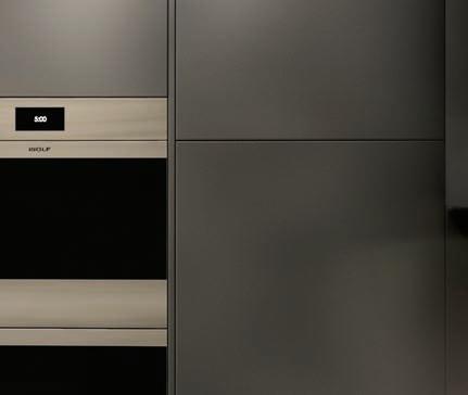
o -wolf.com.au


zer
su b


THE ULTIMATE INDUSTRY CHEAT SHEET
IN SHORT INDESIGN 33 SHORT IN
Lee Broom Gets Planetary
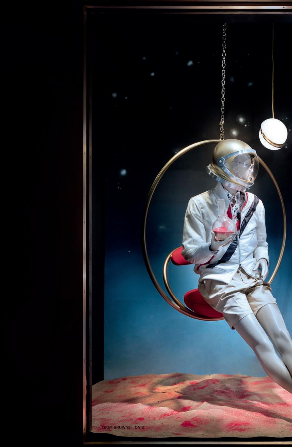
From Shoreditch, LDN to Fi h Avenue, NYC: British award-winning furniture and lighting designer Lee Broom has partnered with Bergdorf Goodman’s Men’s Store to develop the concept, and collaborate on the design, for their prestigious Fi h Avenue menswear windows.
The partnership with the luxury mid-town New York retailer saw Broom curate his unique lighting, furniture and accessories alongside the latest menswear fashion for Summer 2017. The windows’ grand unveiling coincided with NYCxDesign 2017, running May to June.
As collaborations go, this particular venture demonstrates a rather clever business move on Broom’s part. It supports his entry into the US market with a purposebuilt US e-commerce site, establishing the Lee Broom brand presence ahead of the showroom opening in Los Angeles this year.
The collaboration also gave Broom a unique opportunity to present his products in a completely new way – and with a classic Bergdorf aesthetic in mind. The four windows, themed Exercise, Work, Play and Explore, explored the habitual day of a man in a surreal and scenographic style. Window furnishings included signature Broom pieces like the Crescent and Tube lights, Crystal Bulb, and Optical collection which explores material combinations of Carrara marble, crystal and polished brass.
With an already established UK and international online platform, the timing seems right for Broom to open shop in America, with his new US site retailing the full range of products.
All in all, a creatively exciting and on-brand way to enter new markets.
IN SHORT INDESIGNLIVE.COM 34
IN SHORT INDESIGN 35
“A new way of living won’t be possible without sensitive and practical use of design to create products that both service a need and, more importantly, play a part in emotional wellbeing.”
Design For Digital Nomads
Indesign Living Edge
“The boundary between personal and work life is blurring. Millennials are becoming a new class of digital nomads; unburdened by paper and having to pay for their WiFi,” says Les Basic founder and designer Alexander Lotersztain. “Young entrepreneurs are blending travel and work like never before, and as such they require basic needs from the environments they frequent – be it the home, hotel, satellite o ce or a café.”
Les Basic is the brainchild of Lotersztain, who describes the brand as being focused on ‘slow living’, to alleviate hard-and-fast, digital lifestyles.
“It’s about quality, connection to natural, noble materials, and authenticity.” The launch range comprises seating, tables, modular sofas, outdoor dining, lighting and clever accessories, all planned to naturally evolve and expand.
Classic Rhythms
Bauhaus and Modernism continue to inspire lighting house Lambert & Fils and it really shows in their latest series, the Laurent collection. In keeping with the studio’s commitment to working with local, skilled trades, the team engaged the expertise of a fellow Quebec glass blower to cra this latest piece. An adjustable suspension system of wires and anchors allows for the nal form to vary, from a pure, minimalist orb to something more intricate and Art Deco. “Our research focused on the solid surface and the orb form, where the globe acts as the link between the two,” says founder Samuel Lambert. Launched as part of Euroluce at Milan Furniture Fair 2017, Laurent was certainly a stand out for its classic, almost rhythmic form.
IN SHORT INDESIGNLIVE.COM 36
–
–
parisi.com.au GIÓ Evolution
Decode/ Recode
At the recent Milan Furniture Fair, Salviati’s Decode/Recode exhibit was easily a crowd favourite. Deployed within the vaulted halls of Milan Centrale – the fair’s newest design district – the installation by Italian designer Luca Nichetto and Swedish perfumer Ben Gorham, invited visitors into an immersive experience amongst a series of mouth-blown glass objects tailor-made for the event.
A play of light and materials characterised the Strata hall, where compositions of glass layers stood between walls of translucent textile. The Pyrae hall hosted a crowd of gures, including a multitude of lighting objects made from stacked glass elements and showcased on a 53 podium arrangement.
What’s most interesting, though, is the engineering aspect of the totems. Here Nichetto explores the potential of modular glassware, so each illuminated object is made using several stacked pieces which can be pieced together in an interchangeable fashion.
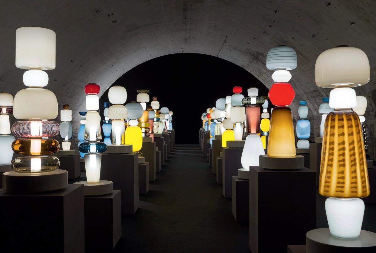
To create the collection, Nichetto rst designed a set of 25 base modules, which were then made using one of 10 traditional techniques, in 15 colours. This made for thousands of possible unique combinations. “A fascination for the depiction of human forms through culture and history – for the idea of character –
here materialises in 53 di erent objects,” explains Nichetto. “Exploring the expressive potential of Salviati glass, we used colour and technique to design simple modules that, combined, introduce the possibility to create more than 10 unique and original gures, not one the same, each one beautifully proportioned.”
According to collaborator Salviati (a brand that has worked with traditional Murano glass for over 150 years), the exhibition was intended to explore how centuries-old methods can be combined with contemporary aesthetics, ultimately preserving traditional techniques within modern design culture.
Third collaborator in the trio, Ben Gorham, explains how, through the qualities of glass, they were able to develop the concepts of stackability and layering. “The interaction of each piece determines variations in colours, textures and gures, so it was really natural to see how glass interacts with other parts and with the light.”
Decode/Recode was de nitely the show-stopper of the precinct, if not a contender for best installation this year. And not just within the Pyrae halls, but across the entire fair and out into the social stratosphere.
IN SHORT INDESIGNLIVE.COM 38
INDESIGN X
SCHIAVELLO
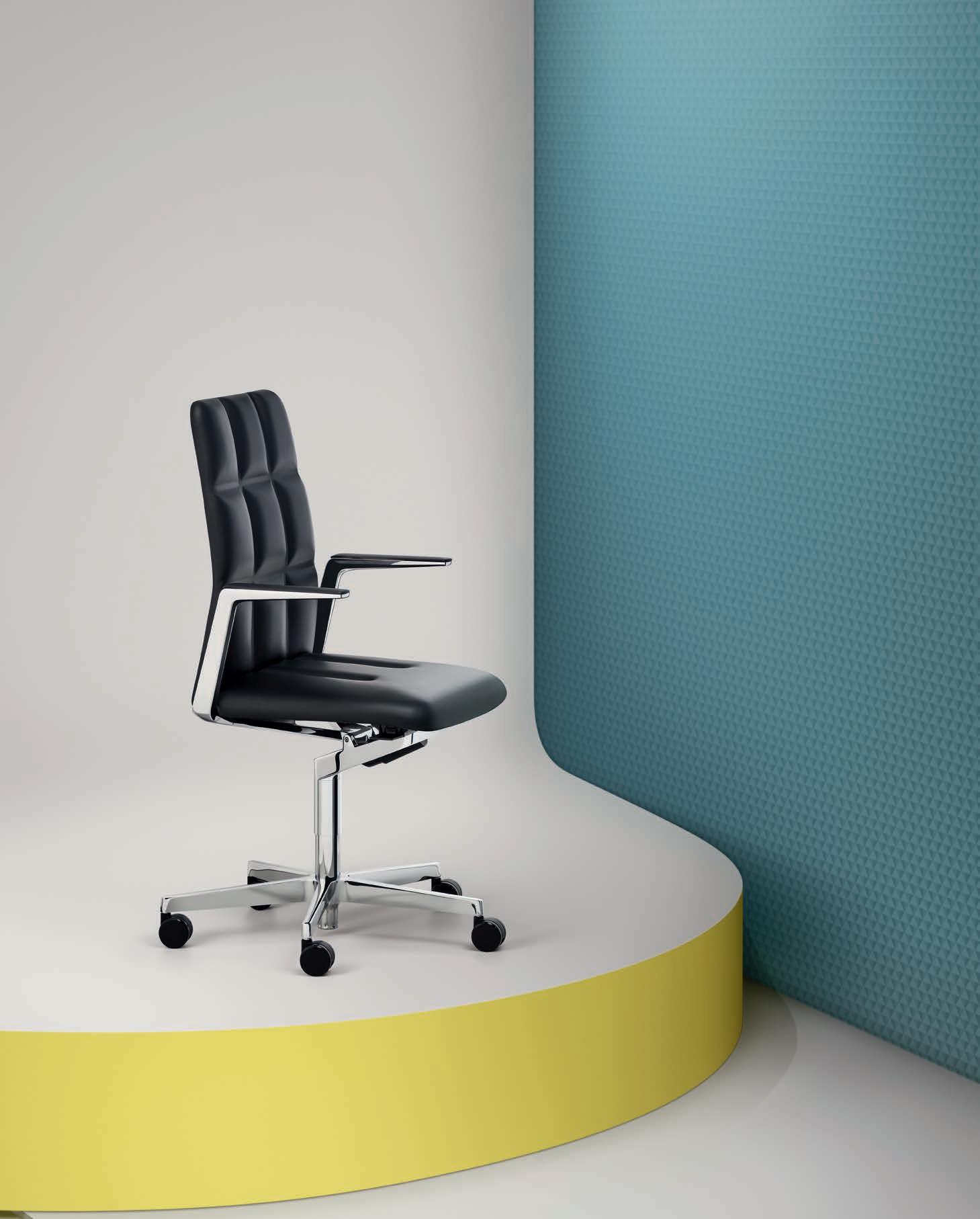
His is a raison d’être quite unlike any other. Standing for sensitive connoisseurship and orientation in a world of objects, Mario Ruiz’s hallmark is the discrete nobility of vital forms, a steadfast commitment to the timeless dignity of simplicity in design. His work exudes the charm of memory and the con dence of modernity. It is stately and casual – a seeming con ation of opposites that coalesce into a portfolio that is rst-and-foremost undeniably intelligent. Especially in the commercial sector, Ruiz’s work speaks to the profound need for change, exibility and the way in which design can mobilise capital-T Talent.
In his own words, “to reach unity with simple shapes is complex to achieve and it is what helps emphasise that the important thing in an o ce is the people. Sometimes, we do not realise that this is the foundation for the happiness of workers.”
Having last year released the Aire collection of harmonious commercial designs – in aesthetics, in form, in utility – Ruiz has con rmed yet again that the thoughtfulness in his design approach is perfectly suited to the desire for exibility, modularity and the ethos of agility in the workspace. His latest – the MR Chair, available throughout Asia Paci c thanks to Schiavello – exempli es the scope of exibility which contemporary design can achieve if only we continue to respond thoughtfully to changing cultural landscapes.
And it was precisely this readiness to respond and reinterpret that recently caught the eye of the Spanish Royal Family.
Having just been awarded the National Design Prize by King Felipe VI of Spain, and the Spanish Ministry of Economy, Mario Ruiz now holds one of the world’s highest regarded accolades for visionary design practice. O the back of Aire’s unbelievable popularity and MR Chair’s innovative design process, this honour bestowed by the Spanish Royal Family is a sure- re sign that achieving balance between material quality and a high degree of resilience is no small feat of accomplishment.
Ruiz’s latest gures-forth as an exemplar in this space. Cast in a mineral bre plastic that took over three years to develop, the MR Chair rede nes the spectrum of plastic’s materiality in industrial design. Ri ng on the classic shell chair form, the MR Chair’s suite of options across the frame, cushioning and shell nish, according to Ruiz, “add up to seventy- ve possible design variants through which designers can respond to the particular function and stylistic requirements of their project.”
Perhaps Ruiz, himself, put it more elegantly: “an e cient design system speaks so much [for] companies that seek to add value to more invisible things like talent over, say, status. A er all, design has to work for the people”. Hey MR, we’re a fan!
40
Words David Congram Photography Courtesy of Schiavello
Available in 75 di erent design variants, the MR Chair by Mario Ruiz is distributed throughout Asia Paci c via Schiavello
SCHIAVELLO.COM SCHIAVELLO
Delightfully Deconstructed Indesign Space Furniture
During her creative process for Filo, designer Andrea Anastasio became inspired by the idea of deconstructing the traditional lamp form. By separating the individual pieces that it comprises – the light source, base, decoration elements and electrical wiring – Anastasio brought out each part’s own structural and aesthetic signatures. Filo’s essential character is the result of playing with elements that are not traditionally considered decorative, alongside the adornments. The colourful electrical wire is wrapped in fabric. Varying shapes of Murano glass spheres contrast with the minimal ceramic di user in a rhythmic dialogue. These elements are reminiscent of a delicate necklace strung with colourful glass beads.
The lamp comes in eight colour combinations, from light watercolour tones to transparent hues of Murano glass, to bright, bold accents of the uorescent cord – each with distinct personalities. The diversity of options makes it possible for Filo to work in a variety of spaces, where users have the ability to string the necklace-like wire in whichever loop pattern they choose.


IN SHORT INDESIGNLIVE.COM 42
Taste The Serenity
Indesign Instyle
A noisy dining space is a common roadblock for any diner looking to catch up over a co ee or meal. But the good news is there are e ective design solutions, developed speci cally to combat the dull roar. Ecoustic ® Veneer is a new acoustic panel that combines superior sound absorption with the sophistication of timber veneer.
An opportunity arose for Instyle to test the e ectiveness of its Ecoustic® Veneer with La Spiaggia, a busy Italian restaurant in which diners expressed regular frustration with the sound levels in its upstairs dining room.
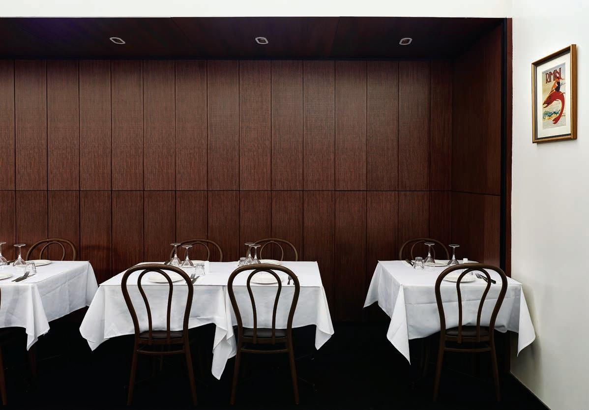
The loss of repeat customers prompted La Spiaggia’s owner, Maurizio Lombardo, to look for a solution to the restaurant’s poor acoustic quality. Instyle’s managing director, Michael Fitzsimons, a regular diner at La Spiaggia, had experienced these issues rsthand. He suggested Instyle’s new acoustic product would resolve this problem while also seamlessly blending with the restaurant’s interior. In consultation with acoustic specialist and principal at Acoustic Directions, Glenn Leembruggen, the noise reduction treatment involved installing perforated Ecoustic ®
Veneer panels (NRC 0.8) in the noise-prone area. Easy to install, Ecoustic ® Veneer was retro tted over the existing timber panels during the day while the restaurant was closed.
Acoustic Directions tested the acoustic performance of Ecoustic® Veneer before and a er installation, showing a marked improvement in overall noise level reduction. Leembruggen highlighted an additional bene t, noting that patron noise levels lowered a er the installation, due to diners not needing to speak louder to be heard.
Lombardo says he was overwhelmed with the result. “We are so pleased with Ecoustic® Veneer in reducing noise in our restaurant. It works perfectly. Previously, customers would tell us they loved our food and service but could not tolerate the noise within the restaurant. We’ve even had customers request to be seated in the downstairs area as upstairs was too noisy. Now we can con dently seat a group of 50 people upstairs as the noise levels are considerably lower and our customers can hear each other,” says Lombardo.
IN SHORT INDESIGN 43
On entering this installation the visitor was engulfed by the omnipresence of ‘money’ and experienced the sensations and emotions that it evokes: awe, yearning, hope, anxiety and euphoria.
Money, Money, Money
Laura Baldassari and Alberto Biagetti of Atelier Biagetti continue their analysis of modern society’s greatest obsessions with another immersive, experiential design project. It’s the third in the so-called Biagetti saga – this time curated by Maria Cristina Didero.
In 2015 their Body Building installation examined power and beauty through the seemingly skin-deep subject of the human body. NO SEX in 2016 addressed human psychology through the rst basic element – that is, sex. So, then, the title of Atelier Biagetti’s 2017 project is a logical progression: GOD
Seemingly insigni cant on their own, together these three letters make up one of the most powerful words ever written; a word heavily laden with meaning and preconceptions. But the GOD interpreted by Baldassari and Biagetti does not aim to fuel a theological debate, rather it investigates something that in today’s society is (or seems to be), all-consuming and all-powerful; something that is at the root of all our rules and aspirations and thus governs the way we live our lives. That is, money.
The environment they created at this year’s Milan Furniture Fair was a place where the rites and rituals associated with money were carried out on every level – demonstrating the good and the bad.
IN SHORT INDESIGNLIVE.COM 44
–
–
Designinfluenceshowweengagewith aspaceand Ihaveseenhow itcanchangepeople’smoodsandemotions.
Ibelieve ahomeshouldguide youinits design,andthatits futureshould remainauthenticand respectfultoitspast. Followingtrendsdoesn’t work.Gooddesignistimeless,it won’tdate.Ourhomeis aplace we sharewith familyand friends,wherewecanalsoswitchoffand recharge.That’s what makesitspecial. spacefurniture.com
 Andrew Parr,InteriorDesigner Stacey Pavlou,Salon owner
Specify With Care
Indesign Zenith Interiors
Health and aged-care is experiencing a design renaissance of sorts and, with the launch of ranges such as Zenith Care, it’s clear that these sister sectors are ready for change. Zenith Care comprises purpose-driven designs for health and aged-care that seek to increase comfort and actively contribute to enhancing patient recovery without compromising on style and design. Team Zenith has harnessed its workplace design know-how to ensure this new range adheres to a philosophy of stringent functionality and intelligent ergonomy, with wellbeing celebrated front and centre.
Finger On The Pulse
Indesign Gibbon Group
Gibbon Group’s new range from Modulyss, entitled Fashion&, reimagines the relationship between materiality and narrative. Encompassing up-to-the-minute carpet tile looks, this collection enables the idea of ‘form and function’ to be told in an interesting way. Drawing inspiration from fashion history, runways, street style and social media, the ability to mix and match components in numerous combinations allows end-users to express their style personality to the ‘Nth degree’.
Sense Of Belonging
Indesign SeehoSu
Driven by a ‘Made In Italy’ philosophy, Discipline is a brand that aims for conscious and sustainable choices. Its identity is symbolised by the primary use of natural materials as an emblem of wellness. Not only are these e cient, resistant, recyclable and biodegradable, they also require low environmental-impact manufacturing processes. Discipline conveys these concepts through an essential and authentic design approach that conjures emotions of both familiarity and surprise. Their collection revolves around three key principles: exibility, versatility and adaptability, carefully considering the domestic environment as well as workplace and public spaces. Products are created with the purpose of sharing both a clear identity and a sense of belonging for those who select them. Let’s bring some discipline back into our projects!
IN SHORT INDESIGNLIVE.COM 46
YourPartner in kitchen, laundry and bathroom projects

When designing kitchens, laundries and bathrooms for your clients, you need a dependable partner who understands and supports your project needs. You want a collaborator who listens and works with you to integrate appliances and accessories with your designs.
Winning Commercial, the commercial division of Winning Appliances, has extensive experience in the residential property development industry. We partner with leading architect and design firms to provide product advice, specifications and personal service. Talk to us today to see how we can partner on your next project.


-
Proudly supported by


1300 070 070


winningcommercial.com.au Get in touch today!
Photo Credit: Doma Group
The Pier Kingston
Canberra
-
“ Ke al is, in my opinion, the most exciting outdoor brand in terms of their creative strategy. They put colour into outdoors, which none of the other outdoor companies were doing. They were the first.”
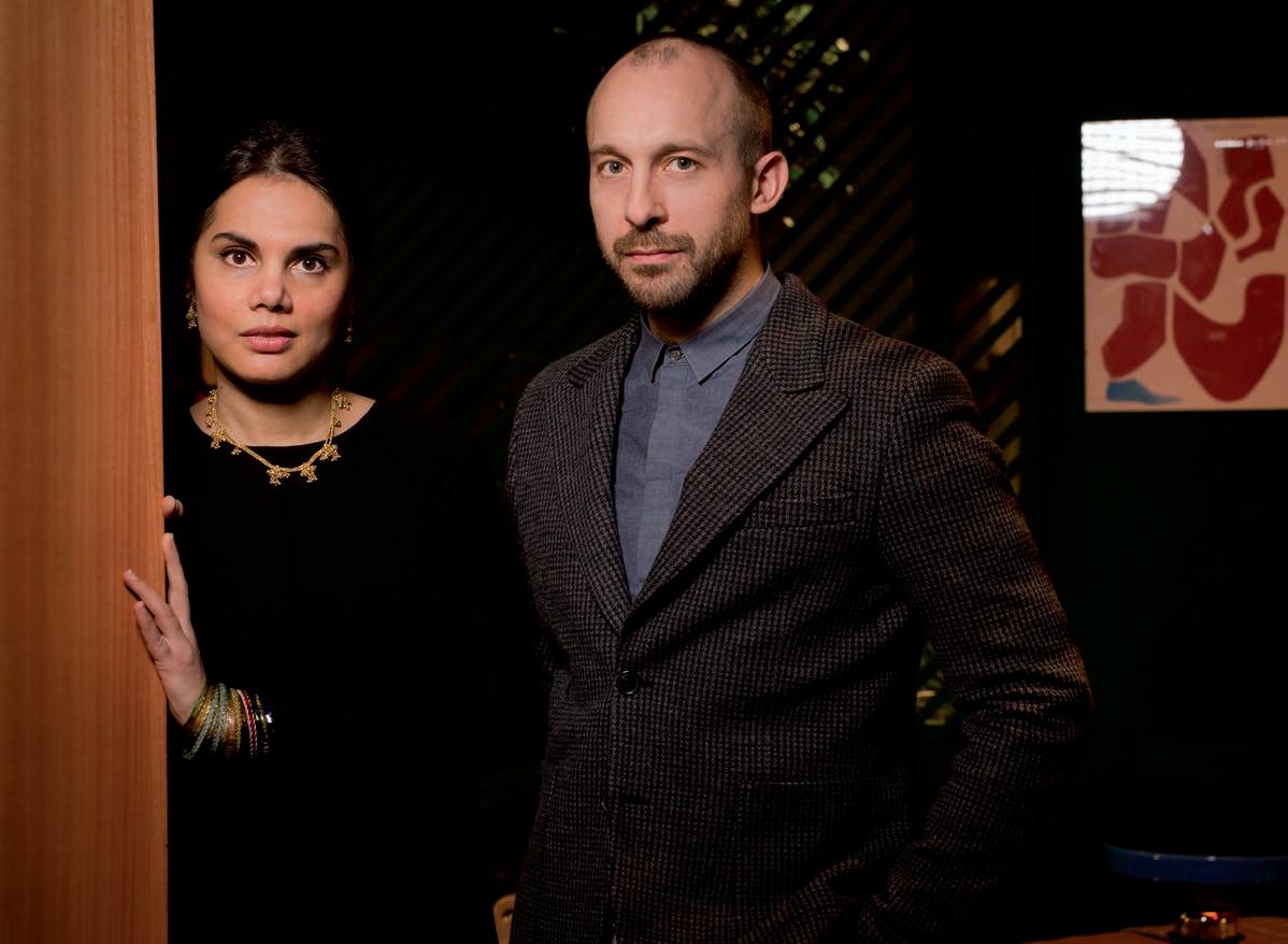
5 Mins With Doshi Levien
Nipa Doshi and Jonathan Levien are in a good place right now. “We’re going through an extremely liberating period for our studio. We’ve reached a stage where we’re choosing very carefully the projects we’re excited about, and that’s all we’re doing,” says Levien. “We have the freedom to explore the very artistic, experimental aspect of design – almost design as art, as the pure expression of ideas,” adds Doshi. “Then we equally have the opportunity to do very industrially produced work. We’re really enjoying that diversity and freedom. It’s very liberating.” Both art and industry have had their place in the development of Doshi Levien’s latest pieces for Kettal. The concept for the new Parallel fabric, for example, originated by looking closely at the structure of the fabric itself. Doshi Levien created a weave that would allow light to pass through and cast a pleasing chequered shadow pattern. “This project was really looking at how to make a mix of colours visible on the surface, but when you hold it up to light, the silhouette has to be interesting. On that fabric you’ve got a double line of yarns creating the check so that when you hold it up you get the silhouette
e ect,” explains Levien. “We went into quite nerdy detail to arrive at those designs,” he says. “You have to understand the structure of the fabrics, and how colour and structure work together.” Doshi elaborates: “You can’t make a 3D model with textiles. Textiles behave very di erently once they’re woven and you can’t visualise them on the computer.” Levien adds: “In terms of process, Nipa is actually creating colour; she’s not choosing a colour. She’ll paint and mix colours. It’s very much a process of making, not choosing.” The new Bela rope emerged from similarly rigorous creative and technical processes. “Bela is a three-dimensional form of the very ne diagonal lines you get with a twill weave structure,” explains Levien. It plays on the tonal di erences between colours, using the thin lines of the twill to mix colour so that from a distance the ropes look rich and on closer inspection the ne two-tone e ect is visible. “There’s a mélange in all the materials we’ve created,” says Doshi. “For us it’s really good to work with a company where we are doing the iconic pieces like the Cala chair, but we’re also designing the materials. And we really like that.”
IN SHORT INDESIGNLIVE.COM 48
–
–
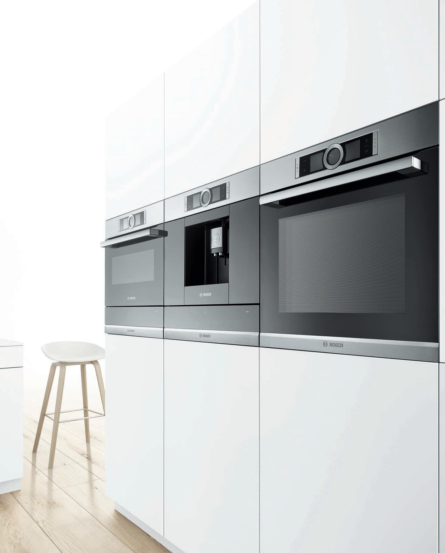
Bosch Design: setting the standards
300 international Design Awards in the past 5 years
IKEA Is Awesome Now
What used to be one of the industry’s most reviled institutions is now earning a reputation as an authentic design house, committed to investing in original talent. The ‘inspired by’ or ‘replica’ debate is still very much alive, but in the meantime IKEA has taken a U-turn to invest in quali ed designers who can deliver original, authentic and, importantly, highly accessible designs for the masses.
Tom Dixon, Jasper Morrison, Naoto Fukasawa, Patricia Urquiola, Walter Van Beirendonck, Studio Truly Truly – these are globally established and celebrated design studios contributing to widening the scope of design democracy under the IKEA banner. Their e orts at the recent Milan Furniture Fair, for example, were very much aimed at emphasising a new era for the brand, while also establishing a globalised sense of design democracy.
Dubbed The IKEA Festival, the Swedish brand launched its newest furniture collaborations alongside a program of events
focused around the idea of the living room and what it means to us today. From morning yoga to robotic painting, the IKEA warehouse at Ventura Lambrate became one of the most Instagrammed fair highlights of 2017. On show were collaborations with Tom Dixon and Hay, as well as room concepts by Faye Toogood for IKEA. Rounding o with a ash sale on Sunday in which classic IKEA furniture items were discounted by 40 per cent, visitors were invited to take home their very own piece of the festival – not something you would generally get to do at Milan.
Though there are still some problematic aspects to the house of IKEA, it’s a more-than-encouraging step in the right direction –particularly on the authentic design front. And while it might seem frivolous and even a bit unfair, it should be acknowledged that anything which opens us up to being accessed by the wider public is a good thing. Maybe even – dare we say it – bene cial?
IN SHORT INDESIGN 51
Knock-On Success
Indesign Bellevue Architectural
Bellevue Architectural is excited to announce that FritsJurgens fully-concealed sprung pivot door system has won the distinction of 2017’s Red Dot Award for Product Design. A er several days and assessing thousands of products from all over the world, FritsJurgens of the Netherlands has been recognised for having created a product with an outstanding high quality design, earning them the internationally sought-a er seal of quality. Professor Dr Peter Zec, founder and CEO of the Red Dot Award said, “FritsJurgens has recognised that good design and economic success go hand-in-hand. The award by the critical Red Dot jury documents their high design quality and is indicative of their successful design policy.” Bellevue Architectural is extremely proud to be the exclusive partner with FritsJurgens in the Australian and New Zealand markets, opening the door to opportunity for design throughout the region.
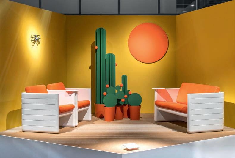
Californian Romance
Designed by Milan-based studio CalviBrambilla for Pedrali, the Solid Geometry stand at Milan Furniture Fair was a major hit. Covering over 800 square metres for the launch of seven new collections, the stand was designed as a tribute to the ‘soundness’ of Pedrali through the geometry of solids. Each setting was styled as a distinct character. The Reva collection, for example, played on a 1960s Californian summer motif, complete with cacti and a warm coastal sun. This also set the scene for the Sunset collection by Alessandro Busana.
IN SHORT INDESIGNLIVE.COM 52
–
–
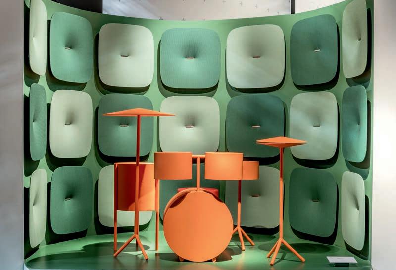
Designed by Marcello Ziliani, Pedrali’s Snooze sound absorbing panels are the next big thing for the agile o ce, having recently launched at Workplace 3.0 at Milan Furniture Fair.
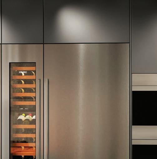
Fits Like A (Kitchen) Glove
Indesign Sub-Zero Wolf
The kitchen is where the best of life takes place – food, drink and good conversation with those closest to you. It is also plentiful in its design possibilities – so why not choose the best? Food preparation and cooking specialist, Wolf, is known for its uncompromising cra smanship in design and technology, and it’s with this legacy that the company has unveiled its all-new Module Cooktops.
Wolf has designed this new range of module cooktops to cover the entire gamut of cooking methods – from steaming right through to teppanyaki cooking – all housed within a stylish and utterly contemporary aesthetic.
With a compact width of 381 millimetres, the cooktops allow even the smallest of kitchens to cater for high-performance cooking. And, the variable nature of the range lets you combine individual modules to create a truly custom cooktop.
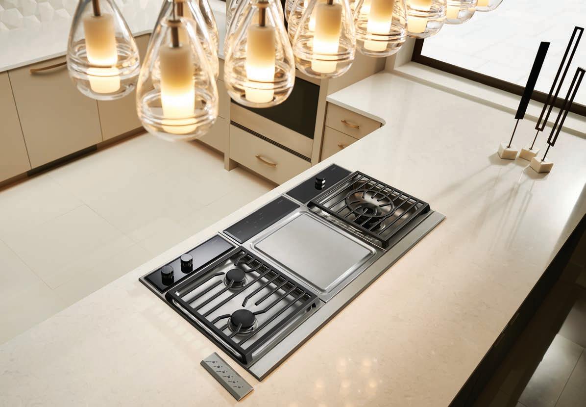
Wolf modules have a streamlined control layout and frame , to seamlessly pair with one another. The range comes in six modules: induction, dual-element indoor grill, steamer, teppanyaki,
two burner gas and multi-function single gas burner – designed to deliver a powerful 24MJ/h, a perfect option for wok cooking. Sleek and variable designs, exceptional build quality, and superior performance – the Wolf module cooking system is the clear choice for designers looking to cater to individual tastes while also maintaining aesthetic unity in a contemporary kitchen. Wolf’s design possibilities let you enjoy a lifetime of adventurous and more satisfying cooking. With precise control options, the dish you have in mind will always be the dish you bring to the table. And, for a truly uni ed design style, the Wolf cooktops can be combined with Sub-Zero’s refrigerators and wine storage units to create the ultimate luxury kitchen.
The Wolf range is available exclusively at e&s, Winning Appliances and Spartan Electrical across Australia. For speci cation opportunities and other enquiries, visit subzero-wolf.com.au or visit the national Sub-Zero Wolf showroom at Bank House, 11-19 Bank Place, Melbourne.
IN SHORT INDESIGN 53
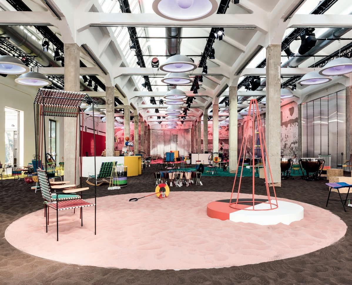
The Marni Playland
Don’t you just love it when fashion and design cross over?
Particularly at Milan where the spectacle factor is nice and high. For the Milan Furniture Fair this year, famed fashion-house Marni transformed its showroom on Viale Umbria into one big designer playground called The Marni Playland. Appealing to the young at heart, the fashion house invited the public to forget prede ned rules to ‘playfully’ interact with the space and the intriguing elements within.
Withinthe Playland a stretch of coloured sand featured toys (yes, you could look and touch!), storage containers for basketball, colourful cones for stacking rings, and baskets with parts that were so out of proportion they highlighted the irony of the creative approach. Showcased alongside this was the new limited edition of Marni home furnishing accessories. This year, the collection
encompassed seats, stools, rocking chairs with holder armrests, and chairs with rooves that created a comfortable haven for snuggling.
As always, Marni’s contribution to the fair was open to the whole city, being that the public’s involvement was integral to its story. Visitors were able to interact with the items on display, rest on picnic blankets designed for the occasion, devise their own interpretations of the furnishings and, of course, buy the products.
More than simply fun for the sake of fun, The Marni Playland also rea rmed the brand’s commitment to children’s charity initiatives, with part of the sales proceeds going to Only The Brave Foundation. This year, the donations went towards the Associazione Piccolo Principe, which hosts young children in need within the district of Milan. It just goes to show that, even in the highest echelons of luxury design, the industry has the capacity to give back to its community.
IN SHORT INDESIGNLIVE.COM 54


“ This anthropomorphic lantern range ventures into decorative art. Presented individually or arranged in totem-like stacks, they take on the appearance of illuminated characters.”
Likable Luminaires
Raw nature, so summer colours and the breezy spirit of barefoot luxury pervaded DEDON’s booth at Milan Furniture Fair. Developed in collaboration with internationally renowned interior designer Werner Aisslinger, the booth conveyed all the ease, serenity and brightness evoked by its name, The Hideaway Beach
However, the real attraction of The Hideaway Beach was the furniture itself, including The Others, Stephen Burks’ new exotic collection of animated lanterns, as well as extensions to such award-winning collections as Brixx, Tibbo and Mbrace. Platforms of di erent heights helped to separate the pieces, giving each the opportunity to shine.
Movers And Shakers
Indesign Scandinavian Business Seating
“Standing is not the solution to sedentary behaviour in the workplace,” says Andrew Green, general manager of Australia and New Zealand for Scandinavian Business Seating. “Selecting a chair with a centretilt mechanism is the answer. The Karolinska Study conducted by the Swedish Medical University has dispelled popular ergonomic myths by illustrating that standing is not necessarily more productive, and that sitting (in the right chair at least) doesn’t have to be sedentary!”
Distributed by Scandinavian Business Seating, HÅG has long been a pioneer of ‘active sitting’ with its Balanced Movement Mechanism. Without even being aware of it, you move when sitting on a chair with centre-tilt, meaning it’s possible to move and focus on your work at the same time.
IN SHORT INDESIGNLIVE.COM 56
–
–
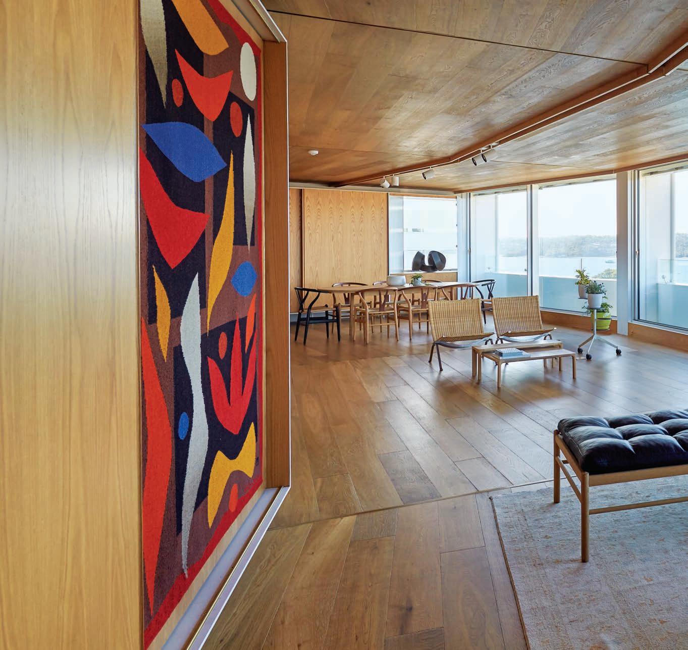
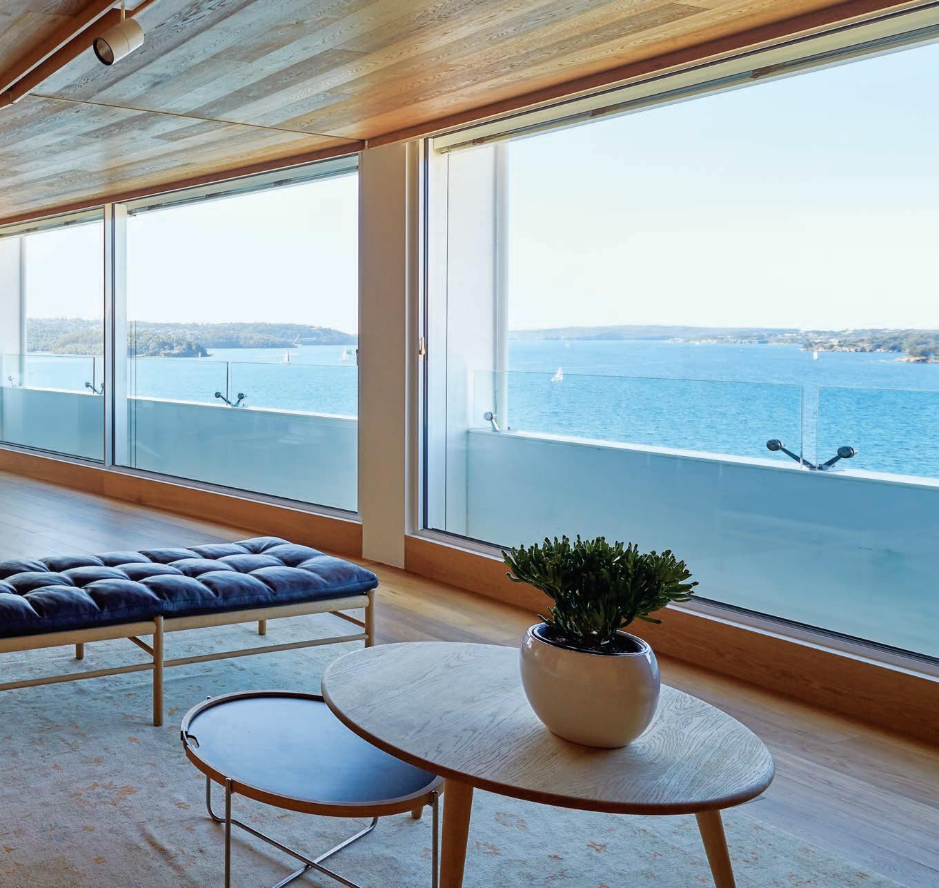
The Enduring Luxury Of Timber
Like anything, the foundation of any space is o en the biggest (and most important) investment when it comes to high quality, long-term value. When building a home, or tting out an o ce, a restaurant – or really just any space at all – ooring is o en considered to be one of the most crucial elements, a ecting both the property’s value and the comfort of its end-users. Taking the brunt of everyday wear and tear, it is vital to choose a style of ooring that suits a myriad of needs confronting any possible stakeholder.
Whilst being a key functional element of the home, the right ooring also has the ability to transform an environment aesthetically – by selecting high-quality ooring, all interior elements coalesce into a holistic design scheme.
Precision ooring is one of few outliers delivering real solutions to this brief by creating products matched with top-level expert service – all imbued with meaningful narratives and quality materials to allow us all to better connect with our environments.
So why not consider a high-end ooring solution? This is where yours truly, Precision ooring, is uniquely positioned to help. Precision ooring is a leading timber ooring specialist, comprising a wide range sourced locally and overseas. It also specialises in sustainable solutions surrounding recycled timbers sourced from condemned wharves, warehouses and old wool stores, perfect for lovers of both antiquated charm and industrial edginess.
Renowned for transforming tired, worn-out spaces into luxurious, high-value abodes, and with a huge display of timbers in its awardwinning showroom, Precision ooring is the place to go for luxury ooring. With a visionary and passionate approach to providing truly custom-made timber ooring solutions for any environment across residential, commercial, hospitality and healthcare sectors, the team at Precision ooring strive for a heightened degree of fully integrated service.
From assisting architects and interior designers to specify the perfect product to an exactitude, to ensuring that builders and their clients can watch their ideas come to life, in their own words “we are taking wooden ooring to the next level.”
Understanding that no two projects are alike, Precision ooring’s experts also understand that timber, too, is individual. In each and every oorboard from their vast range, a matchless character shines through. Even down to bespoke nishes, custom board widths and the inimitable grain and knotting so distinctive to luxury timber, no other material – be it natural or indeed man-made – matches the inherent beauty and endurance of solid hardwood.
As one of the frontrunners delivering real design solutions to invigorate project briefs, Precision ooring creates custom products matched with top-level expert service.
IN SHORT INDESIGN 57
Indesign Precision ooring
Turn Up The Fun Factor
Indesign Caesarstone
Things got a little crazy in the ballroom at Palazzo Serbelloni – the late eighteenth-century palace in Corso Venezia, Milan. And we mean that in a good way! This year, Caesarstone continued its Designer Collaboration Programme – which last year saw Tom Dixon create a series of experimental kitchens inside a deconsecrated church. This year Jaime Hayon turned up the fun factor with a kaleidoscopic pavilion that mixed references and upturned expectations of engineered quartz. Stone Age Folk was the pinnacle event of the brand’s year-long collaboration with Hayon.
Earlier this year we reported on his series of furniture that used Caesarstone in a type of punchy new-age marquetry: cabinets with faces, bird-shaped tables and more. The concept took a more architectural form in Milan, where the same set of inspirations ( ora, fauna and folklore from various cultures) manifested in a riot of shapes, patterns and colours. “I tried to reinvent marquetry with my aesthetic,” Hayon told Indesign magazine. “I thought the
“Design today is not only about creating functional stu . It’s also about being surprised, and challenging the material and challenging the creativity.”
challenge here was to raise the voice of the Caesarstone material – to make it stand out more. It’s a twenty- rst-century type of stone and when you assemble it together and make marquetry, you can create something really special,” he says.
The pavilion, which featured a hand-assembled metal structure, incorporated 48 Caesarstone colours as well as coloured glass that cast graphic shadows onto the palace walls. Tribal masks and clown faces appeared in large scale on wall panels, alongside spinning carousels made with Caesarstone, and other furniture pieces.
“I wanted to make something a little bit wild. Things clicked when I met Caesarstone and it became a great opportunity. What I always try to nd, especially now at this moment in my career, is people who want to do something that will push the limits,” says Hayon. What did he hope people would take away from the pavilion experience?
“I already saw it just now – exactly what I want people to feel. ‘Wah? What’s that?’ This e ect of being surprised – that was my aim.”
IN SHORT INDESIGNLIVE.COM 58
–
–
May I Have Your A ention, Please?
Designer Maarten Baas has a long history of causing a sensation at the Milan Furniture Fair. It is not just his design handiwork that creates a stir – the Dutch designer is also in the habit of using big performances to showcase his work.

This theatrical approach is a quintessential part of what has become known as the Maarten Baas Milan circus. This year was no exception with Baas, in collaboration with German design house Lensvelt, launching the 101 Chair with an installation entitled May I Have Your Attention, Please?
According to Baas, attention is currency. “We share our opinions, like, shout, advise and compliment each other. Every year at the Fair we witness this cry for attention. Large corporations with spectacular presentations, young designers with renewed ideas. See me, hear me, look at my work! But just like opinions, each chair is unique. This was my inspiration to shamelessly use the title May I Have Your Attention Please? ” The installation featured dozens of whispering horns that come together as a whole. And as always, he has our attention.
Fabulous Formafantasma
The Amsterdam-based studio was one of many at Euroluce this year demonstrating a new movement toward lighting as sculpture. Occupying space at the Spazio Krizia venue, Formafantasma’s installation showcased a display of studies: the groundwork for current and future developments in the eld of lighting. It also marked their transition into more industrial elds of design. While the nished objects are formally developed and de ne a new, more industrial direction for the studio, the experiments (concisely named by the designers as ‘tests’ and numerically divided) demonstrated the duo’s intuitive and research-based process. Their work is best characterised by their experimental material investigations into issues such as the relationship between tradition and local culture. Reinforcing this experimental approach, the luminaires throughout the presentation were carefully assembled using pencils and erasers, as well as steel rods, bricks and insulation material.
Additionally, LED strips were le visible and un ltered, embracing the punctuated light as an opportunity rather than a limitation. This demanding investigation of light and the use of optics, mirrors and glass, culminated in a collection of objects that revealed new depths the closer you got to them.
As always, this quirky cabal of creatives did not disappoint!
IN SHORT INDESIGNLIVE.COM 60

the
Introducing the Madison Avenue collection by Gareth Ashton. Providing a complete look for your bathroom, designed with style and budget in mind. Visit an Abey Australia Selection Gallery to meet the extended Gareth Ashton family, a collection of toilets, baths, basins, showers, tapware and accessories. VICTORIA Selection Gallery 335 Ferrars St Albert Park Ph: 03 8696 4000 NEW SOUTH WALES Selection Gallery 1E Danks St Waterloo Ph: 02 8572 8500 QUEENSLAND Selection Gallery 94 Petrie Tce Brisbane Ph: 07 3369 4777 *NEWLY OPENED* WESTERN AUSTRALIA Selection Gallery 12 Sundercombe St Osborne Park Ph: 08 9446 8255
Meet
family.
LG X
Tokujin Yoshioka
Titled S.F Senses Of The Future, this impressive large-scale work by LG and famed Issey Miyake protégé Tokujin Yoshioka aimed to illustrate humanity’s relationship with the natural world, ultimately illuminating LG’s human-centric design philosophy. Set within Superstudio Più at Milan Furniture Fair, the installation o ered visitors an immersive sensory experience and a taste of what the future holds.
In an opening statement using Yoshioka’s S.F chair, the presentation invited visitors to explore the concept of ‘Hope for the Future’ through the lens of a commonplace object, (that is, a chair). However Yoshioka’s S.Fs are no ordinary chairs, rather ones born of science ction. Seventeen S.Fs were artfully ensconced with LG’s advanced organic light-emitting diode (OLED) displays. The chairs appeared both static and dynamic, emitting brilliant ashes from the double-sided panels, while also portraying a meditation on the
blindingly fast speed of modern life. Visitors were invited to take a seat and experience LG’s next-gen display technology.
The second part of the exhibition, ‘Wall of the Sun’, was represented by a 16-metre-wide, ve-metre-tall structure, comprised of nearly 30,000 individual OLED light modules. The wall undulated gently, inviting rays of light and simulating the comfort and warmth felt on bright, sunny days. This extraordinary installation o ered a unique glimpse of how human-centric and responsive lighting can transform space in the near future.
“This collaboration was a great experience for me as well as a challenging opportunity to create a work of art that has never been seen before,” says Yoshioka. “Through this large-scale installation and LG’s advanced technology, I believe that people can rediscover their relationship with the natural world in a more radical way.” We would have to agree.
IN SHORT INDESIGNLIVE.COM 62
The future belongs to the curious.
And after 10 years in the game we are still pokin' around. luxxbox.com


C U R I O I T Y


Meet Ori. Light as art.
Light has been reimagined with Ori – a wall luminaire that opens the doors to new possibilities.
Used singularly or collectively, the Ori Wall Light is bound to turn heads with its razor sharp beam produced through lens technology. Available in one, two or three beam directions – the possibilities are only limited by your imagination. Start specifying at unios.com/ori

Congratulations to the winners of the 2017 INDE.Awards.
The team at Indesign Media Asia Pacific would like to thank our INDE.Awards Partners, our INDE. Jury and everyone who entered for the INDE.Awards inaugural year.
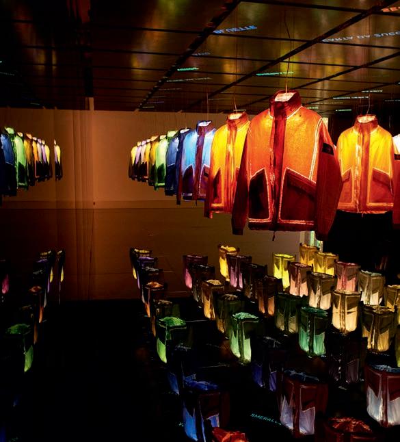
Prototype Research Series_02
The coolest of the cool, famed Italian sportswear creatives Stone Island recently presented the second instalment of their ground breaking Prototype Research Series at Milan Furniture Fair. The series created numbered garments made in fabrics and with treatments born from research and experimentation processes that have not yet been industrialised. Where Series_01 was an incredible laser-etched re ective jacket, Series_02 applies Stone Island’s signature garment dye process to Dyneema, the strongest and most durable lightweight bre in the world. These limited edition pieces were made of two sets of 50 items that have been garment dyed with 50 colour recipes in Stone Island’s own Colour Laboratory. The interactive exhibition was complete with mirrored oors and monitor ceilings alongside displays of 50 di erent shades of the jacket in a rainbow of colour. Though primarily a fashion exercise, Stone Island’s work here should serve as a reminder to avoid complacency. We need to be exhaustive and imaginative in exploring the design options and opportunities that already exist, while also considering the possibilities of those that don’t.
The INDE.Awards will return next year. So, let’s see what 2018 has in store for us.
IN SHORT INDESIGNLIVE.COM 66
From more than 400 entries of the very best in design across Asia Pacific…
indeawards.com info@indeawards.com #indeawards
Beneath The Surface
What is it about stone that we nd so enrapturing? There are few natural elements that hold the potential to propel our imagination in such dramatic directions. And there is certainly no other material to which we habitually return to express our very humble, human orientation to the natural world.
As the physical manifestation of millennia, shaped by time’s passing, the ravages of wind and rain and tectonic dgets, stone is a microcosm of Earth – expressing our dreams of duration and nourishing our desire for the authentically unique.

Authentic. Unique. Two better adjectives could not be chosen to describe the alluring power of stone, exempli ed recently in Sensa: a new natural stone surface by Cosentino ®. From the uppermost climes of Brazil and India, the Sensa portfolio of high-quality granite is expertly curated in strict accordance with Cosentino’s aesthetic,
performance and integrity criteria. It’s designed to provide architects and designers with an elegant and exotic surface solution that adds visual and functional value to any project.
Aesthetically, Sensa is remarkable for a high degree of delicate veining – making each slab truly inimitable in appearance. Subjected to Cosentino’s signature durability treatment (Senguard NK), Sensa carries inbuilt research and development, o ering a high degree of technological nesse that allows the stone to naturally breathe while remaining impervious to staining and damage. Through enhancing the stone’s natural properties, Sensa is purpose-designed for protracted endurance, future-proo ng the aesthetic quality of the material with a 15-year certi ed guarantee.
Thanks to Mother Nature, Sensa by Cosentino® slabs are unique because of their varying veins, textures, nuances and colours.
IN SHORT INDESIGN 67
Indesign Cosentino
The Big 1-0!
Indesign Luxxbox
Luxxbox began small – a one man show designing furniture and lighting while representing international brands. Since then, the appreciation for Australian designed and made product has increased along with a general consumer appreciation for good design. For Luxxbox, it’s been a thrill to travel on this same road, which has allowed founder, Jason Bird and his design team to expand its concepts. “We are now one of the largest – if not the only – design studios in Queensland which also manufactures its own product,” says Bird. “A er recognising the bene ts for the business and our clients of having a tighter focus on the manufacturing processes, we established our factory which includes a joinery and upholstery team so that we can keep the detail tight. This has had a fantastic impact on our product design which we can now undertake [ourselves]. But we are also chu ed that we can support Australia’s furniture manufacturing industry by employing skilled tradespeople and cra speople and o er apprenticeships to keep the skills alive.”
Innovators At Heart
Bolon is all about pushing the boundaries. The Swedish ooring brand’s 2017 Milan exhibition, Innovators At Heart, went right to the core of its DNA with a series of collaborations that highlighted their passion for community and experimentation.
On display was two new collections of Bolon Rugs; a new ooring collection, Bolon By Jean Nouvel Design; and material experimentations created with designers of note – Doshi Levien/Moroso, BD Barcelona, Thonet, Monica Förster Design Studio, Kettal, Cappellini and Gärsnäs.
It’s very hard to choose just one favourite, but if we had to, it would have to be the samurai-inspired long-neck armchair by Swedish design duo Emma Marga Blanche and Fredrick Färg (Blanche & Färg).
Made almost entirely of Bolon’s woven vinyl ooring, the Long Neck armchair envelops the sitter within a large shell-like backrest.“It’s a shell that you can walk into and it will protect you,” explains Färg. “It is inspired by samurai body armour, where hard and so materials are sewn together.” Blanche adds: “We are working with Bolon’s new textile, experimenting and trying to nd new combinations and ways to use it. We love the challenge of working with something new, something which in a way pushes the boundaries of what you can do with material,” Färg adds. “This is what Bolon has always been doing. We love it.”
IN SHORT INDESIGNLIVE.COM 68

businessinteriors.com.au | businessinteriors.co.nz
Inspired. Discover the new Inspire range.
Be
Lock And Load!
Indesign Activelocker
There was a time when a chair was just a chair and a desk just a desk, but in today’s world of blended typologies, we know that’s no longer the case. As design has become more personalised and versatile, objects take on new functionalities and thus new contexts and meanings. So when you’re looking at lockers, it pays to look beyond the lock-up exterior and think about the role they can play within the larger workplace.
Lockers are about personal space and de ning priorities –reducing someone’s personal space from a whole o ce into a box. With Activelocker there’s a real opportunity for designers to experiment, have fun and make a design impact.
Rather than hide the lockers in the background, or resign them to the ‘last-minute additions’ list, Activelocker reframes them as interactive features, compatible with pin boards, white boards, chalk board paint and even photo frames. One hundred per cent Australian made and owned, the Activelocker range
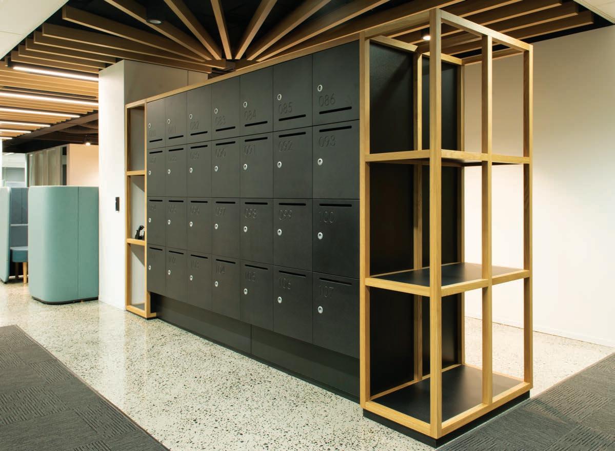
Activelocker has a history steeped in understanding the classic and latest locking technologies, with the end result being long-term, successful storage solutions. Time to lock it in!
suits any modern environment; from corporate o ces like the recent installations in Macquarie Bank and EY; to commercial environments like Woolworths, or industrial environments like Sydney Trains.Such diverse sectors have all reported bene ts of exible storage solutions. Some ideas for design ourishes include classics such as planter frames and planter boxes, are rejuvenating spaces visually and improving the air quality of the o ce. On the more decorative end of the spectrum are features such as mixed colours, artistic graphics, and even illumination options.
Innovating outside the proverbial square, Activelocker manufactures its lockers using high quality panels from Australian Manufacturers Laminex and Polytec, both of whom have a long and proud history in Australian manufacturing. With design expertise and on-site client training, Activelocker o ers a comprehensive range of locking solutions, ensuring the right lock for the right environment. Unlock the possibilities at activelocler.com.au
IN SHORT INDESIGNLIVE.COM 70
–
–


LEGENDARY PERFORMANCE FABRICS ™ Design + Performance ™ and Legendary Performance Fabrics ™ are trademarks and Sunbrella ® is a registered trademark of Glen Raven, Inc. SUNBRELLA.COM
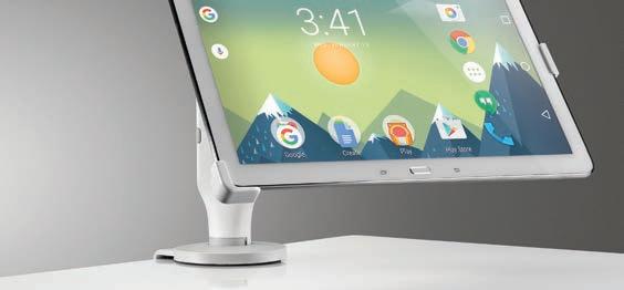
Ollin from CBSThe next chapter in ergonomic refinement.
Ollin, our revolutionary new monitor arm, supports the screen technology of today and helps you prepare for the screen technology of the future.


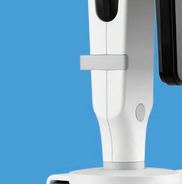

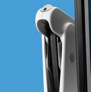

Its unique technical cord supports weights from 0kg up to 9kg, helping you stay in touch as technology advances, and screens become lighter and more mobile.

As you adopt and adapt your workspace to accommodate new technologies, Ollin can grow with you and evolve how you work.


info@cbsproducts.com.au AU: +61 (0) 1300 931 927 / NZ: +64 (0) 2 7492 9544 www.colebrookbossonsaunders.com
–
INDESIGN X
ST YLECR AFT
“Aaaaah,
73 73 STYLECRAFT.COM.AU / STYLECRAFTHOME.COM.AU STYLECRAFT / STYLECRAFT H OME
Words David Congram Photography Courtesy of Tacchini
ma quanta sei bella!”
Two overheard passers-by at the Tacchini stand, Salone del Mobile 2017.
“Innovation is not enough anymore. You need storytelling, and the ability to communicate through a brand like Tacchini is so important.”
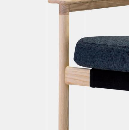
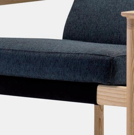
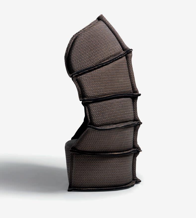
In the briefest words possible, Tacchini exudes the charm of yesterday. Since the late 1960s, Tacchini’s signature sweeping oblique lines and generous sculptural forms have maintained a courageous stance in the space of contemporary design. Unconventional in its con dent embrace of modernity and yet still redolent of early twentieth-century design, the brand has become an undisputed gold standard in the world of contemporary furnishings, continuing to innovate with un agging aplomb well into its ieth year.
And yet, y years older, time still fails to weary Tacchini. In our overstimulated and interconnected (read: over-connected) world, it is little wonder that we crave the stability of timeless design to alleviate our fractured needs and mutable lifestyle. At Milan for Salone del Mobile this past April, Tacchini proved once again why timelessness – rather than a mere harkening back – is actually a constant ‘work in progress’: a negotiation between contemporary technologies and the aesthetic worlds of industrial design history. Exhibiting a new suite of designs inspired by art deco masterpieces (prodigiously reinterpreted by Gianfranco Frattini, Gordon Guillaumier, Umberto Riva, PearsonLloyd and Jonas Wagell) Tacchini wowed punters in Milan for blurring the lines between those spaces by which we compartmentalise our lives: be it home and work, or public and private spaces. Both collectively and individually, the latest Tacchini o erings – available throughout Australia via Stylecra and Stylecra HOME – are in one word ‘harmonious’: balanced perfectly between commercial and residential applications to respond directly to our increased need for exibility.
In the words of one of their collaborators, PearsonLloyd, “Innovation is not enough anymore. You need storytelling, and the ability to communicate through a brand like Tacchini is so important.” A er all, “furniture is really just a simple idea – a bunch of tables, chairs and screens, and so on – but we need to think poignantly about why we become emotionally stimulated by a ‘thing’.” Exempli ed by their latest collaboration with Tacchini, PearsonLloyd’s Ischia is a modular seating system designed speci cally for a myriad of
social spaces but is nonetheless intended to pull at our heartstrings. As a collective seating system, Ischia maintains a strong essential feel created through the modularity of its sculptural free-form compositions. Speaking to our collective desire for endurance and vitality, each miniscule component of this elegant system recalls the weatherworn terracotta shingles of the Ionian coastline. Memories of the ancient world’s modest re nement intermingle with up-tothe-minute contemporary design features. Strong textural variants playfully manipulate the collection’s approach to materiality as organic upholstered forms o set large marble volumes at the base.
While furniture will continue to remain a tactile experience, this spirited negotiation of materiality is also a hallmark of Tacchini’s collaborative e orts with Switzerland’s Gordon Gauillaumier. With n incredible appearance of lightness, his occasional table collection –Soap – brings graphically veined and high-polished marble table tops into conversation with the rectilinear shapeliness of their delicately ne brass legs. Meanwhile, of his sofa cheekily named ‘Face To Face’ (also exhibited in Milan), Guillaumier attempted to rediscover the human dimension of our gaze. “Sit down next to me,” he says, “I want to look at your face while we speak, to understand what you’re thinking”. As a dynamic piece, Face To Face radically modi es its users’ behaviours. Two backrests mirror each other, while so feather cushions beckon us to face one another – distilling public spaces into intimate moments for communality.
For half a century, Tacchini has reinforced its position as an advocate of the avant-garde – the mainstay of contemporary design to whom many in the A+D community will continue to set their watches. In the words of PearsonLloyd, “Tacchini is a tight community with incredible vision for art direction. It really is just wonderfully simple.”
Tacchini’s latest – including a new collection of accessories, Edizione – are distributed throughout Australia by Stylecra and Stylecra HOME.
77 STYLECRAFT.COM.AU / STYLECRAFTHOME.COM.AU STYLECRAFT / STYLECRAFT H OME
Page 74-75: Ischia seating and screen designed by PearsonLloyd for Tacchini. Opposite: Face To Face lounge designed by Gordon Guillaumier for Tacchini. Page 78: E63 Steel Table Lamp by Umberto Riva for Tacchini.
Modern Classics
At this year’s Salone del Mobile, Italian manufacturer Tacchini launched re-imagined designs from their classic collection. The E63 lamp, designed by Umberto Riva in 1963, was originally produced in plastic and sheet metal and now re-edited by Tacchini in steel, copper and bronze, it playfully refracts reflections to amplify brightness.
–
BIG THINKERS AND C REATI VEGURUS
INDESIGN 79 IN FAMOUS FAMOUS IN
Super Colliders
Words
Mandi Keighran Portrait Photography Chris
Project Photography Various
INDESIGNLIVE.COM IN FA MO US 80
When Luke Pearson and Tom Lloyd founded their eponymous studio, PearsonLloyd, in 1997 they set out to bring the worlds of furniture design and industrial production closer together – an approach that has brought them success as one of the world’s most celebrated design studios.
Gloag
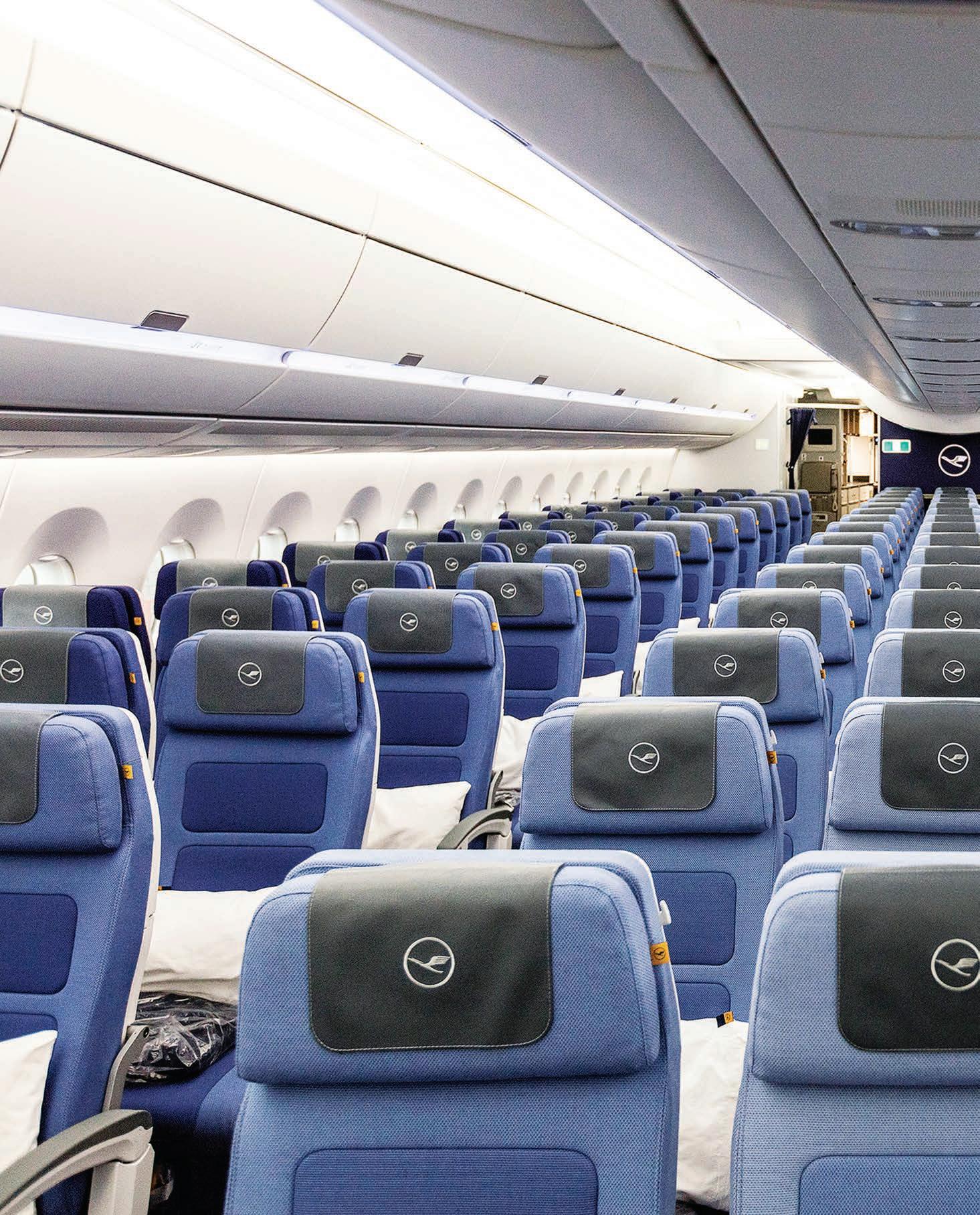
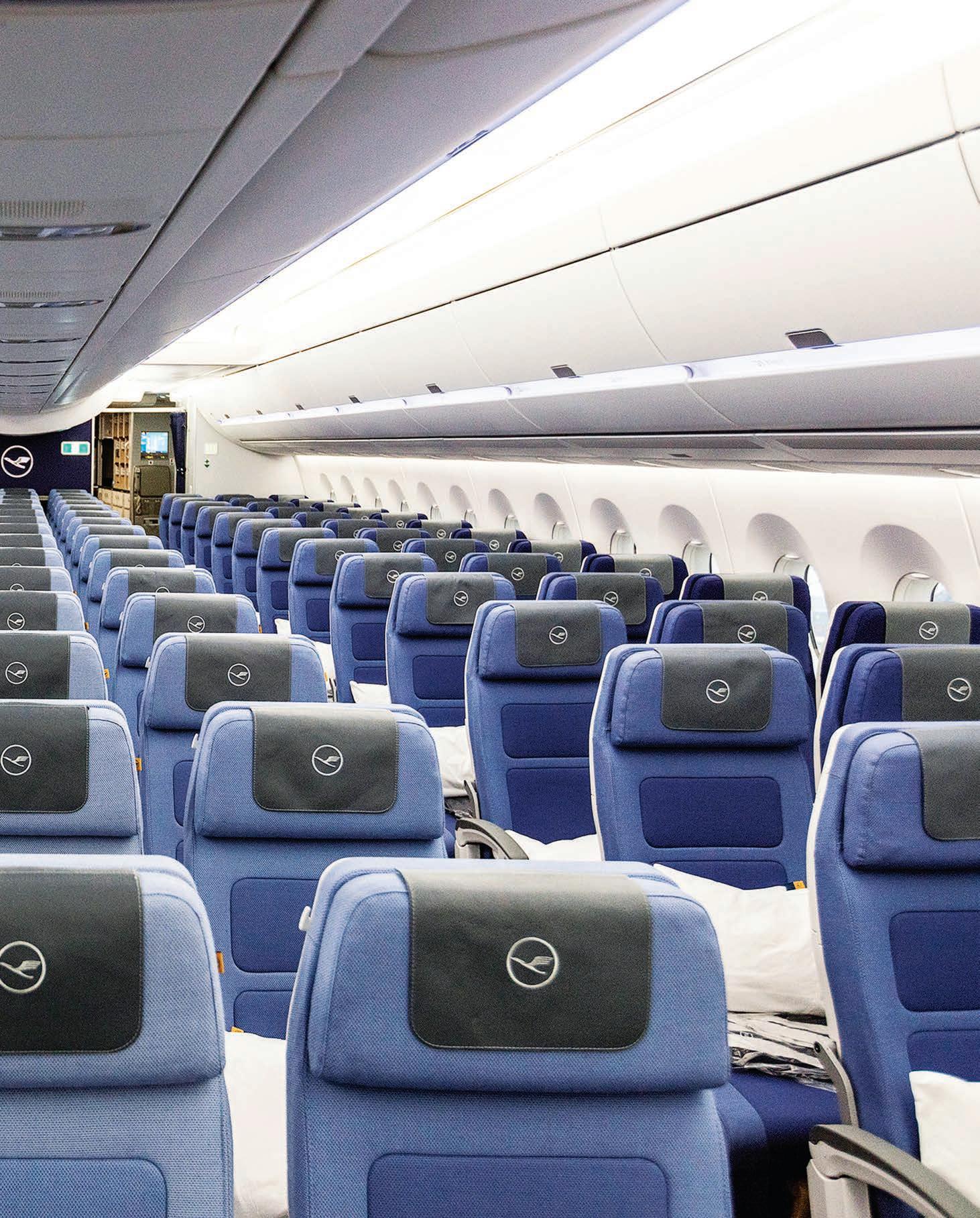
Opposite & Page 82-83: Luke Pearson and Tom Lloyd, founders of PearsonLloyd. Photos: Chris Gloag. Page 84: Luke Pearson and Tom Lloyd in their London studio. Photo: Chris Gloag. Page 85: TIMBA Table and Chair designed by PearsonLloyd for Bene. Photo: Bernhard Angerer. Page 86-87: The Economy Class cabin environment for Lu hansa’s new A350 eet, designed by PearsonLloyd, 2017. Photo: Christian Engels.
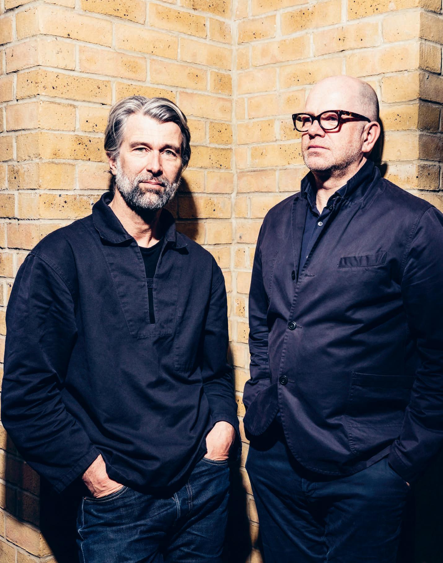
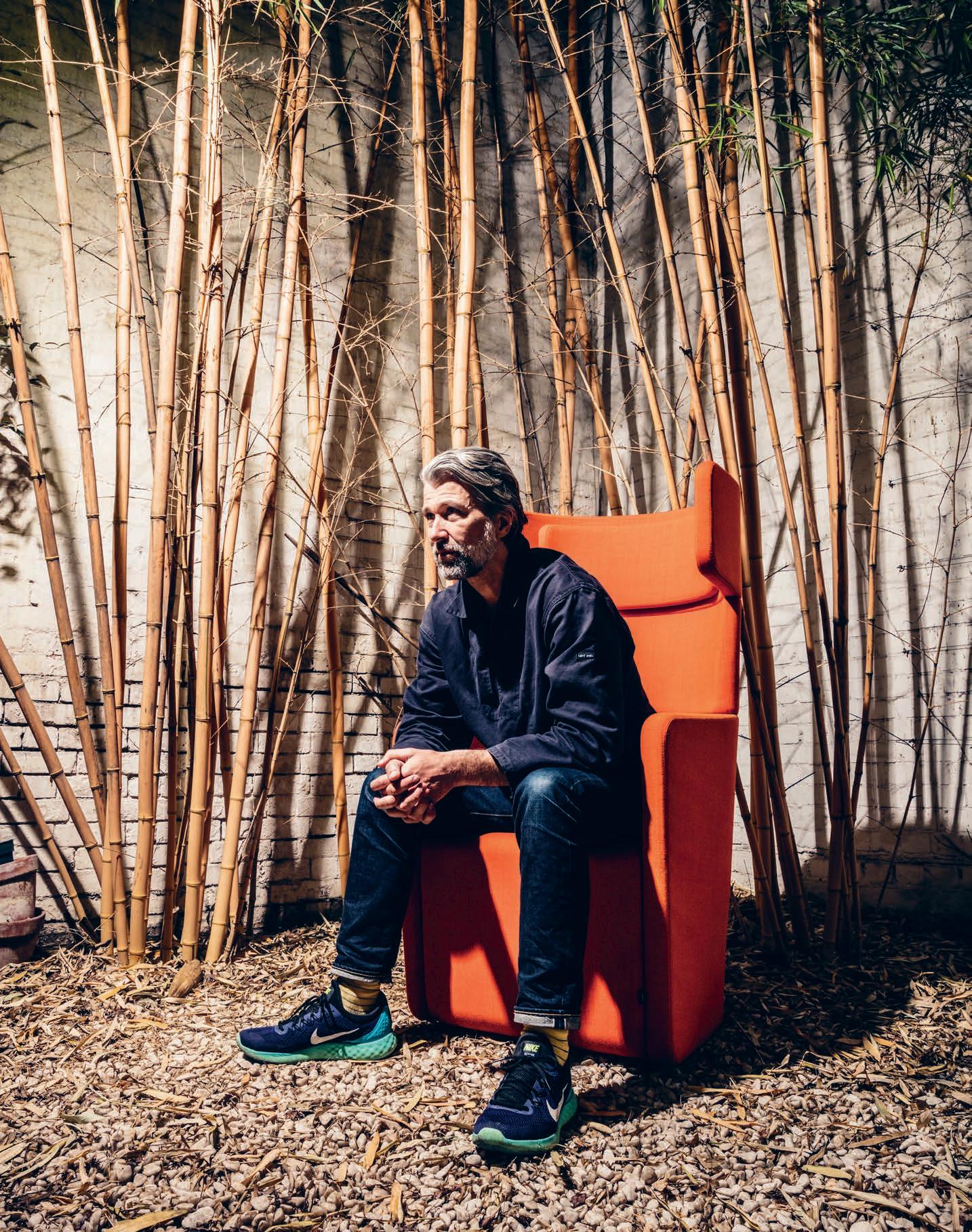
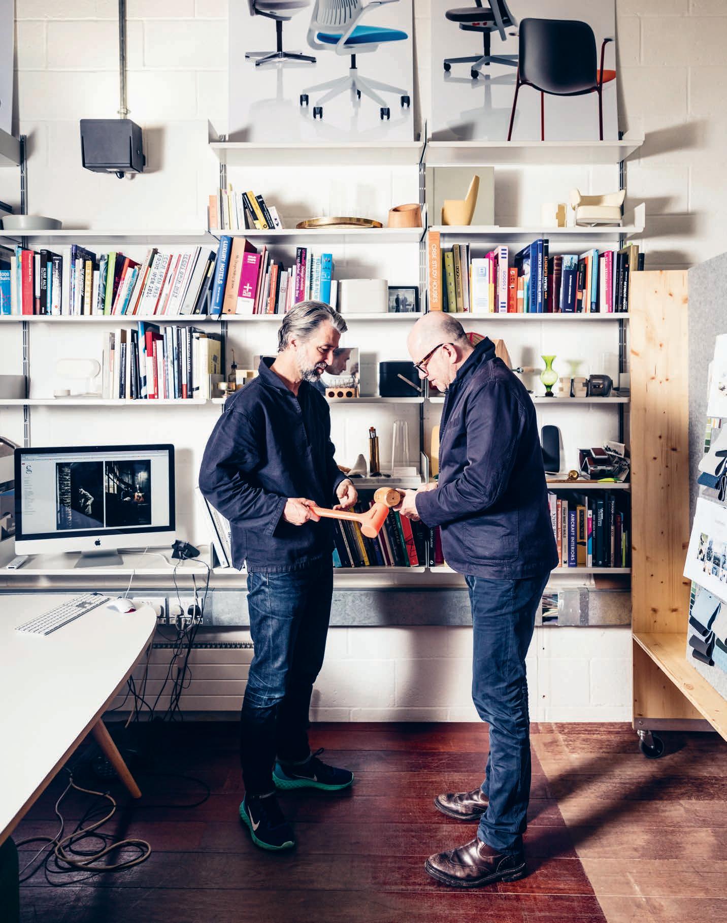
Two decades ago, a pair of recent design graduates from London’s Royal College of the Arts would meet to drink beer and discuss the duality of the design world. One of them had studied industrial design before completing a masters in furniture design, while the other did the opposite, and they were intrigued by the di erences, and similarities, between furniture and industrial product design. Today, that duo – Luke Pearson and Tom Lloyd – are pursuing that same discourse at the helm of PearsonLloyd, one of the UK’s most celebrated design studios. “We had an ambition to mix those two worlds in a way that hadn’t previously been done, except perhaps by the Italian architects of the 1950s,” says Pearson. “And today,” says Lloyd, “that mix is still absolutely as we dreamt about it twenty years ago.”
PearsonLloyd began designing furniture – for the likes of Walter Knoll and Bene – but with an approach that was distinctly informed by industrial design practice and its focus on the client relationship and end-user. “A recognisable fingerprint has never been our main goal,” says Pearson. “We’d like it to be somewhat undercover and camouflaged.” So, while they may have worked on numerous successful projects with global reach, there are few that are instantly recognisable as the work of the pair – perhaps the studio’s most distinguishing feature. “There has to be a ballet between the client’s DNA and your own DNA as a designer,” says Lloyd. “But, we love that our work is celebrated through our collaborations. It’s a bit like playing tennis. Rafa Nadal can’t be a great tennis player without someone on the other side of the net.”
With this approach – which was unusual during the late 1990s, the heyday of superstar designers with their idiosyncratic style – it wasn’t long before the studio transitioned from furniture design with an industrial design bent to industrial design with the aesthetic sensitivities of the furniture world. In 2001, aviation giant Virgin Atlantic approached PearsonLloyd to design their upper class seats. “That was the first time that we really got a sense that our approach might work,” says Lloyd. Taking this approach even further, the studio began to work on service projects, for which there wasn’t necessarily
a physical solution to the design problem. Take their much-publicised A Be er A&E project from 2011, which reduced aggressive behaviour in hospital emergency rooms by fi y per cent simply by changing the way patients were provided information about their experience. Or, their recent work with InterContinental Hotels Group – they designed a strategy to re-think the hotel room based on current work trends, but the actual physical spaces were designed by local designers who implemented their strategy. “Design at its best has always dealt with these complexities,” says Pearson. “At its simplest, it is an individual cra expression. At its most complex, it deals with systems and how those systems work with and for people.”
The most rewarding projects however, are those that are both these things. Parcs for Bene, for example, is not only a beautiful collection of functional furniture for the workplace, but also represented a massive shi in the way people worked and how organisations engaged with workplace design strategically when it launched in 2009. “It was very timely,” says Pearson. “We thought it was going to be a disaster but its strength was that it was forward-thinking. Because of the crash, everyone had to radically re-think their work style – Parcs was perfect, and it quickly became a market-leading product.”
Not only is their work relevant – take their Intelligent Waste collection for Joseph Joseph, which elevates the relatively modern act of recycling in the home – but it is inherently thoughtful. Looking through their portfolio, there is the sense that they only work on projects that they feel contribute to be ering the world – whether in a large or small way.
“When we started the studio, there were 3.7 billion people on the planet,” says Pearson. “Today, there is double that. What we do becomes more relevant as we, as humans, make it easier, cheaper and faster to do things. It’s exciting because, as we get older, we can use our experience to help companies develop things intelligently and thoughtfully – that’s something that we both look forward to.”
pearsonlloyd.com
INDESIGN 85 IN FAMOUS
Mile High (Design) Club
For their design of the Lu hansa A350 Economy Class earlier this year, PearsonLloyd’s a ention shi ed from the individual seat to the e ect it plays within the cabin as a whole, creating a unique traveling environment. Drawing inspiration from the ideas of space, time, scale and focus the studio designed a cabin in which the seat is both a singular product with an immediate visual character and part of the whole, in dialogue with its surroundings inside and outside the cabin. Emphasising cra and textiles, PearsonLloyd designed each seat to be unique and individual based on weaves and colours, yet part of a collective experience – not unlike each passenger’s perception of their travel.

–
From The Inside, Out
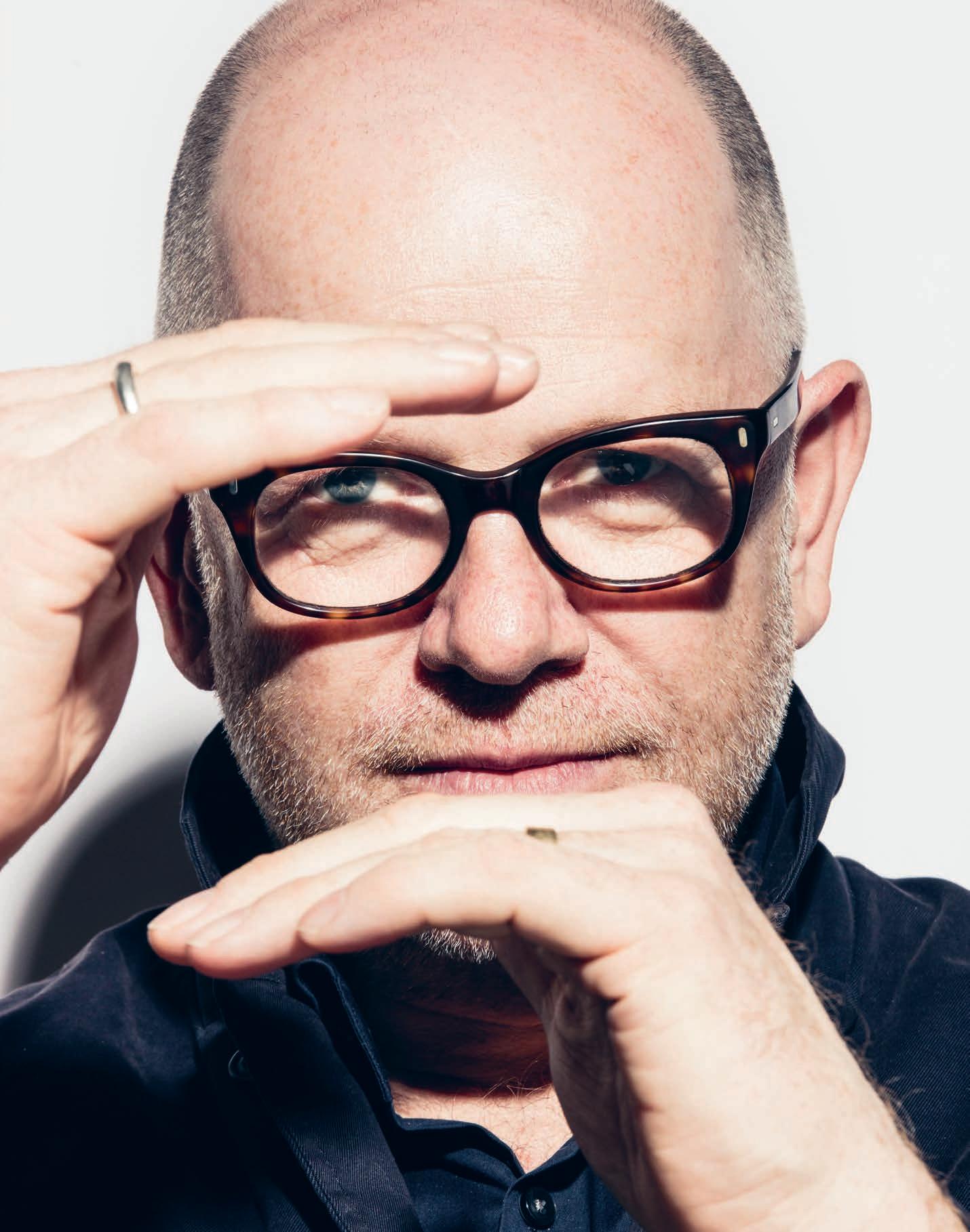
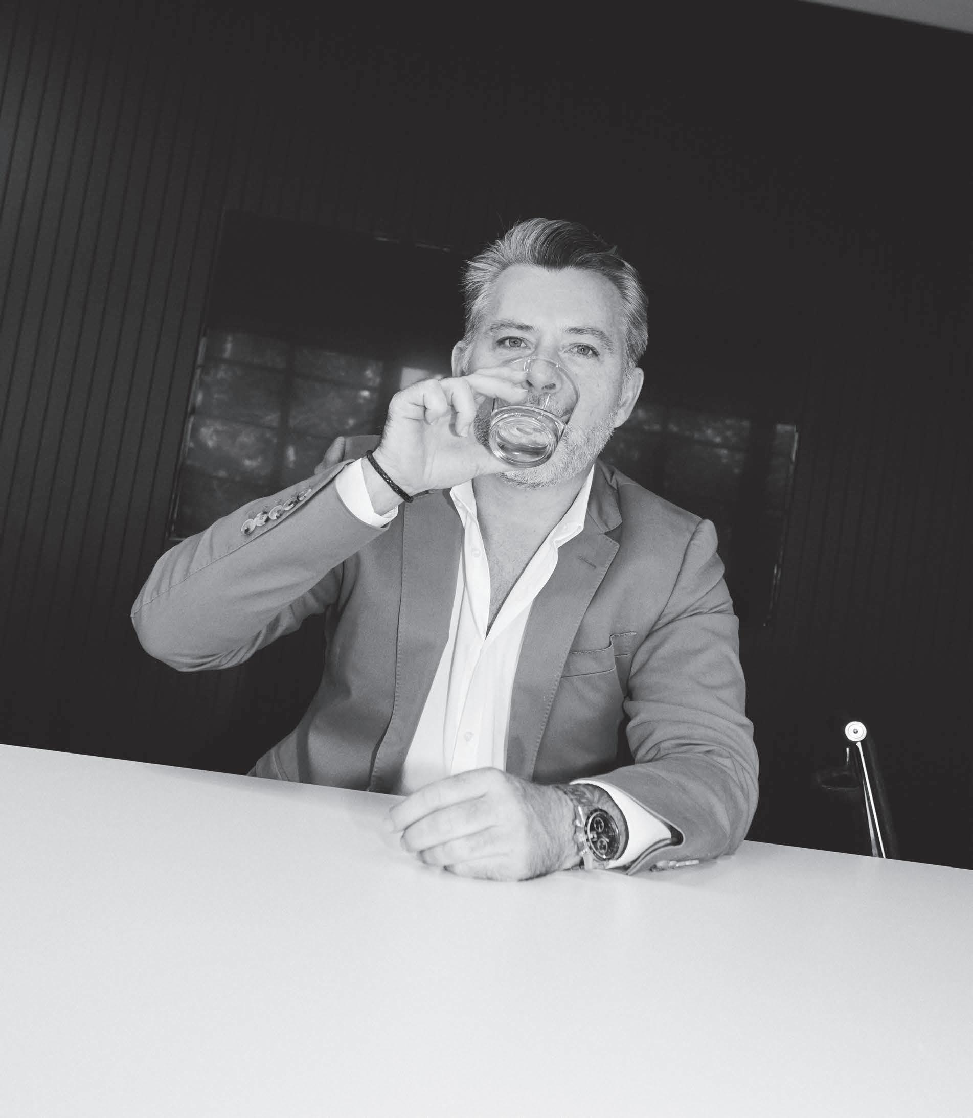
A er six years with Bates Smart, building the Sydney interiors design studio to a streak of acclaimed projects including Corrs Chambers Westgarth, the InterContinental Hotel and OneThirty Hyde, Brenton Smith was a natural choice for the role of Director. Accordingly, his transition into it has been seamless. As he puts it, “On a day-to-day level, not a lot has changed. Which I think is the right way to be, because with a lot of change it makes you wonder whether it’s the right appointment, right?”
Smith seems less interested in the circumstances and reasons for his promotion than he does in the values of the practice he now leads, however, and is irrepressible regarding them. “What we like doing the most is collaborating and producing Bates Smart architecture and interiors that make the project one holistic product,” he says. “On integrated projects, we foster a lot of creative intelligence early on. That’s our main objective. When we do that, we find that we’ve got a very considered approach.”
This creative intelligence, according to Smith, “cra s a story. It cra s a response. It cra s everything, from an outcome from the envelope and the massing of the building, to the way you see people inside the space and how it evolves.” The consistency of this story throughout a project is the signature of Bates Smart’s pairing of the capabilities of a fully-fledged architecture firm with the capillary a ention to detail of a bespoke approach; what Smith playfully calls ‘Big Boutique’.
To achieve this, Bates Smart astutely deploys its primary asset: its sta . For instance, the practice has a policy of rotating teams through di erent typologies. Smith expands, “One day, a team may be working on the Four Seasons. The next thing you know, they may be working on a legal firm. That agility and flexibility helps us bring to market things that are sometimes a li le bit di erent—not quite as stereotypical as what you’d expect if the same team worked on the same kind of projects all the time.”
The policy applies at all levels, with the practice’s structure eschewing the traditional divisions into departments for commercial, hospitality, residential, etc. At the top, Smith leads Sydney’s interiors practice across all project types: “Our structure gives me
opportunities to understand di erent market nuances, di erent client profiles. It gives me a broader range of design outcomes, which is kind of unique. I don’t think there are a lot of top level architects that run across that many di erent sectors. I like this approach.”
Bates Smart also invests in keeping its sta informed, stimulated, and inspired. The practice regularly commissions white papers on various industry issues, for example. “That kind of granular research—deeply examining how the sectors we’re studying are working—really jumpstarts ideas about how they can be improved,” reflects Smith. The Bates Smart team then look to other creative mediums for inspiration: “Particularly with interiors, we look to a whole lot of di erent industries for design creativity. Looking at fashion, industrial design, and other fields that are highly creative and detailed is another really good way to stimulate ideas and examine materiality from a di erent perspective. We can then bring those ideas into workplace, hospitality, leisure, and all other kinds of projects,” Smith explains.
Also, and crucially, given the realities of demanding clients and punishing deadlines, the practice keeps a close eye on the wellbeing of its employees, encouraging a strong internal design culture and the pursuit of individual projects. This tradition was most recently illustrated by Nancy Ji, a Bates Smart designer who won the 2016 Mercedes-Benz Design Award for her Lily Tray Table, now part of Tait furniture’s collection. “We are incredibly supportive of people who want to discover and push their talent outside of the o ce,” Smith says. “I believe, personally, that this is key to cultivating Bates Smart’s strong design a itude and culture.”
As a result, Bates Smart has evolved and maintained a versatile, commi ed team abreast of the latest developments both within their field and across the creative industries, uniquely positioned to o er exceptional design responses. Or, in Smith’s words, “Over the last 150 years, the practice has remained so robust and resilient because we have made sure that it's a highly refined product. It's very well cra ed. We're still very much about that finesse.”
batessmart.com

INDESIGN 91 IN FAMOUS
On the eve of his promotion, Bates Smart Director Brenton Smith speaks on the recipe for creative intelligence that keeps the practice at the top of its game.
Words Lorenzo Logi Photography Charles Dennington
“Our structure gives me opportunities to understand di erent market nuances, di erent client profiles. It gives me a broader range of design outcomes, which is kind of unique. I don’t think there are a lot of top level architects that run across that many di erent sectors. I like this approach."
 Brenton Smith, director, Bates Smart.
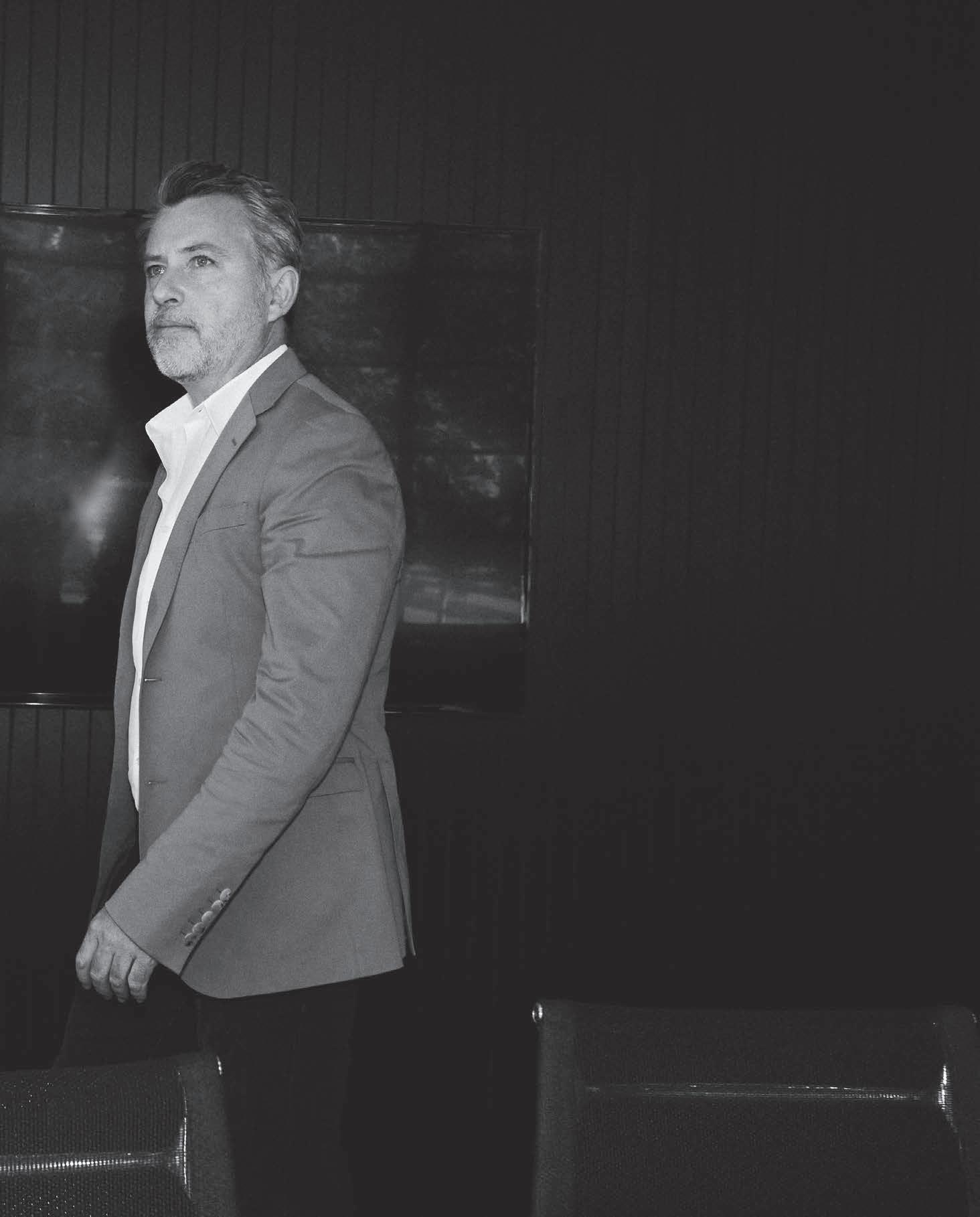
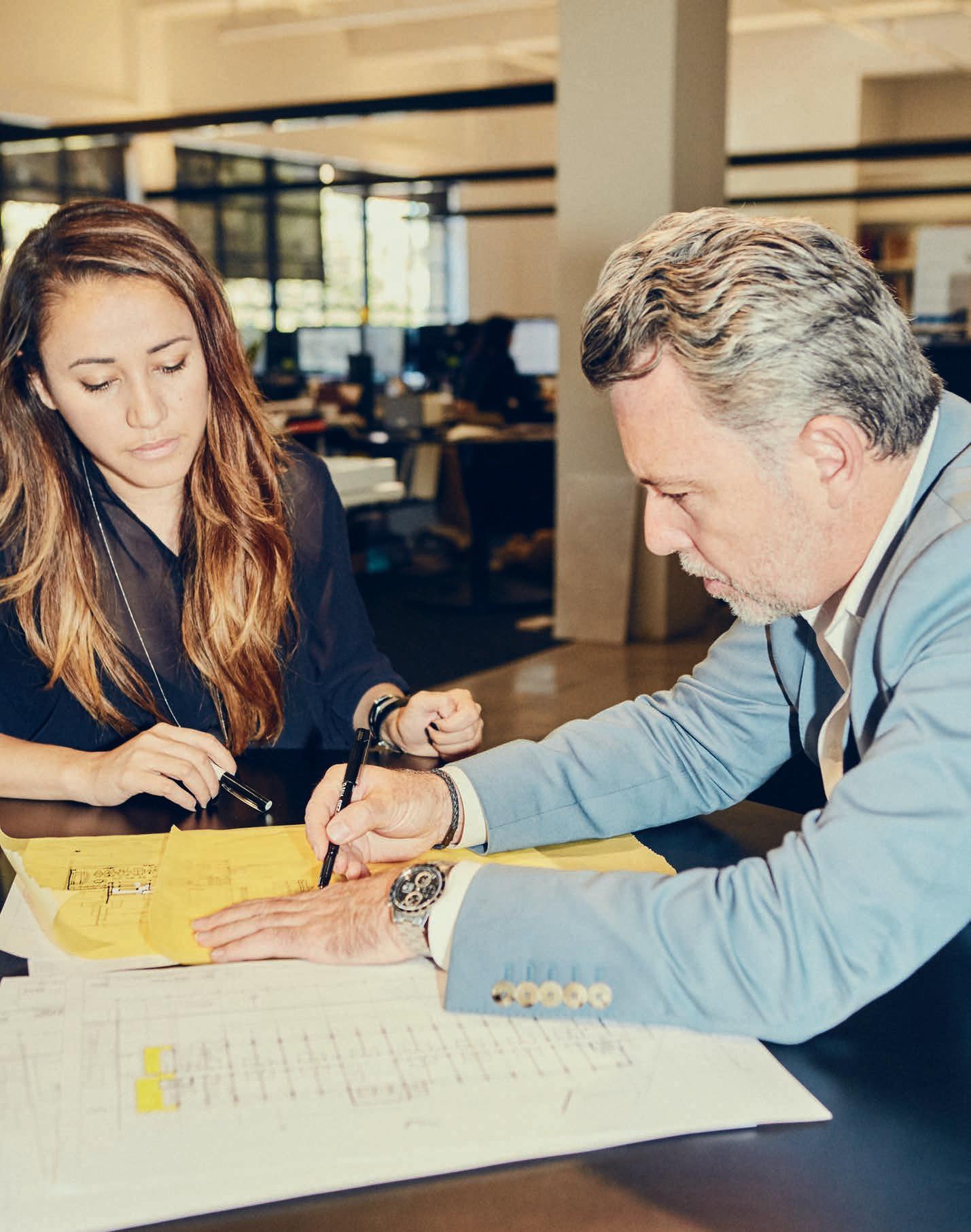
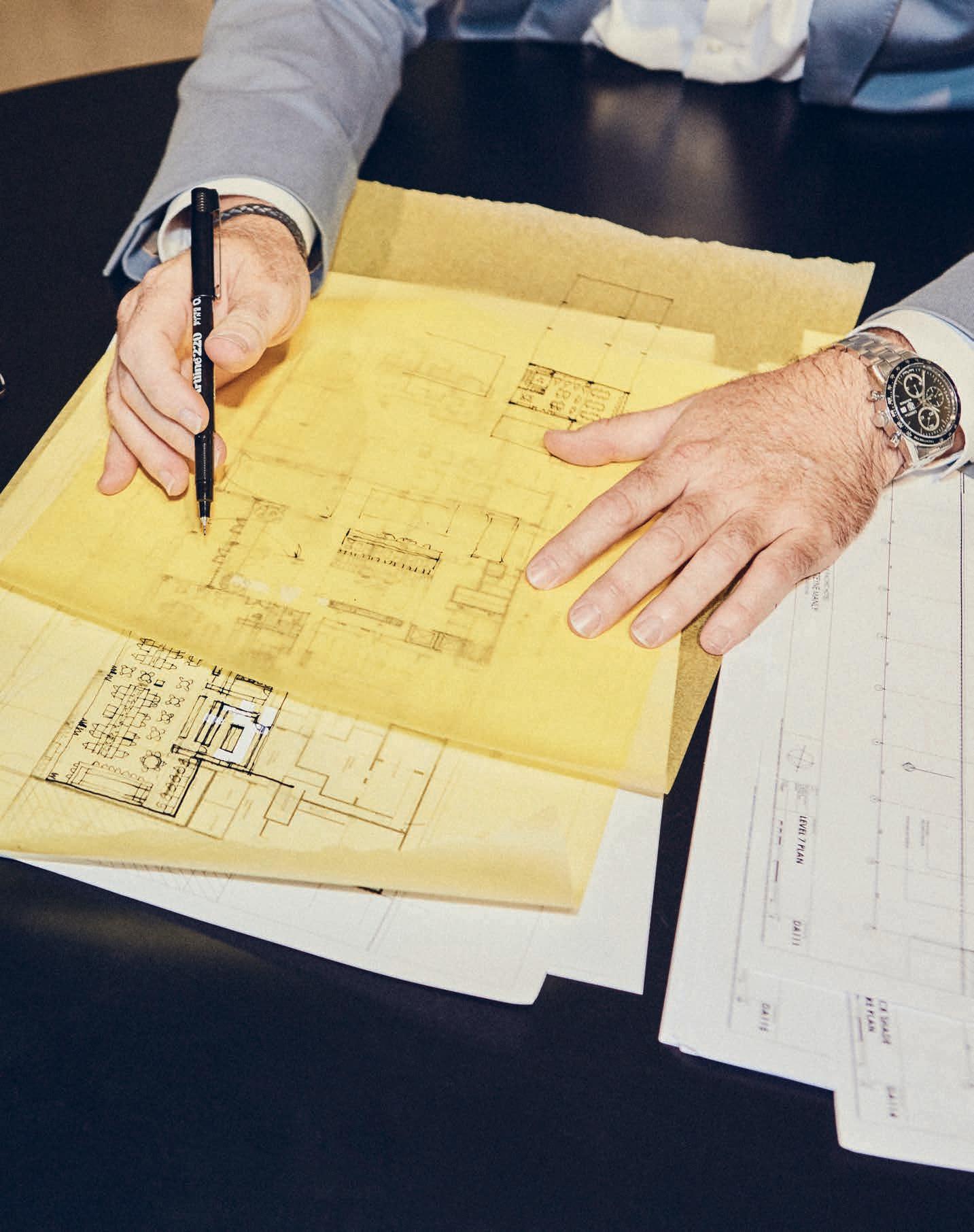
Minimal Mavens
Words Sandra Tan Photography Christine Francis
Just o Chapel Street, in Melbourne’s sociable inner-south, a discreetly marked heritage building emits the kind of relaxed charm, characteristic of the practice within. The one-time dance studio retains its original timber floors, with a new white interior shell accommodating the team of six at the core. Artfully placed greenery completes the scene: the headquarters of We Are Huntly.
Co-founders Kylie Dorotic and Alicia McKimm met at university, and a er some years gaining individual experience in the field, decided to join forces. “We wanted to create a title that wasn’t all about us, to describe a li le design firm that looks for new ideas,” says Dorotic. Playing with descriptive terms for hunting and gathering, a name was decided upon, and We Are Huntly was established in 2013.
Since then, it has been something of a stellar trajectory for the team, named Emerging Interior Design Practice at last year’s Australian Interior Design Awards. Building on a strong background in residential design – in fact, an early project of theirs was featured on Grand Designs – We Are Huntly have extended their portfolio to include an array of beautifully resolved commercial, hospitality and retail focussed work.
Compared with the largely predictable requirements of residential work, in some ways, these civic projects require a greater leap of faith between client and designer – something that Dorotic and McKimm are learning to embrace. While it is commonly the client that defers to the designer’s expertise, “With public spaces, you do have to trust and draw on the client’s knowledge of their field and their own brand quite a bit,” says Dorotic. “When there’s a strong story behind the brand identity, it helps – we can then come up with a design and visual language that communicates that.”
In the early conceptual stages, We Are Huntly aim to distil four or five words, which describe the client’s vision for the
space, relating to mood, or colour. Every design decision from this point is then measured against these words, a strategy which the practice has found aids in maintaining the integrity and focus of the original idea.
Alicia says, “We try to focus on the idea of being timeless. There has to be a strong idea, but not 10 di erent ideas in one place. Just one.”
Demonstrative of this is their work at Prahran Grocer, a contemporary supermarket which reimagines a small-town local grocer from the 1950s. Here, clipboards and pegboards used as signage are employed to graphic e ect, making a motif of everyday items. Similarly, Penny Drop, a café at the base of Box Hill’s new Australian Tax O ce, is defined by the repetition of circles, an expression of the whimsical concept of a penny dropping from the pockets of the financial institution overhead.
“Everyone is so plugged into social media; Pinterest, Instagram –our brains are so clu ered,” says Dorotic. “It’s important to preserve negative space, visually as well as in an intellectual capacity. And to trust in the big idea.” We Are Huntly strive for an honest, reductive approach to their work, a method which draws on the power of the singular statement.
In conversation with McKimm and Dorotic, it is clear that their open dynamic is a key factor in the success of the practice. A collaborative a itude and the pursuit of an uncompromised design, two qualities which the pair work to maintain as their young practice gains momentum.
“We balance our aesthetics out, and we challenge each other a lot,” says Dorotic. McKimm agrees. “I think our strength is in being able to nut things out together, finding the answer in the back and forth.”
wearehuntly.com.au
INDESIGNLIVE.COM IN FA MO US 96
In an age of relentless stimulus, founders of Melbourne design studio We Are Huntly, Alicia McKimm and Kylie Dorotic, demonstrate the uncompromising power of less.
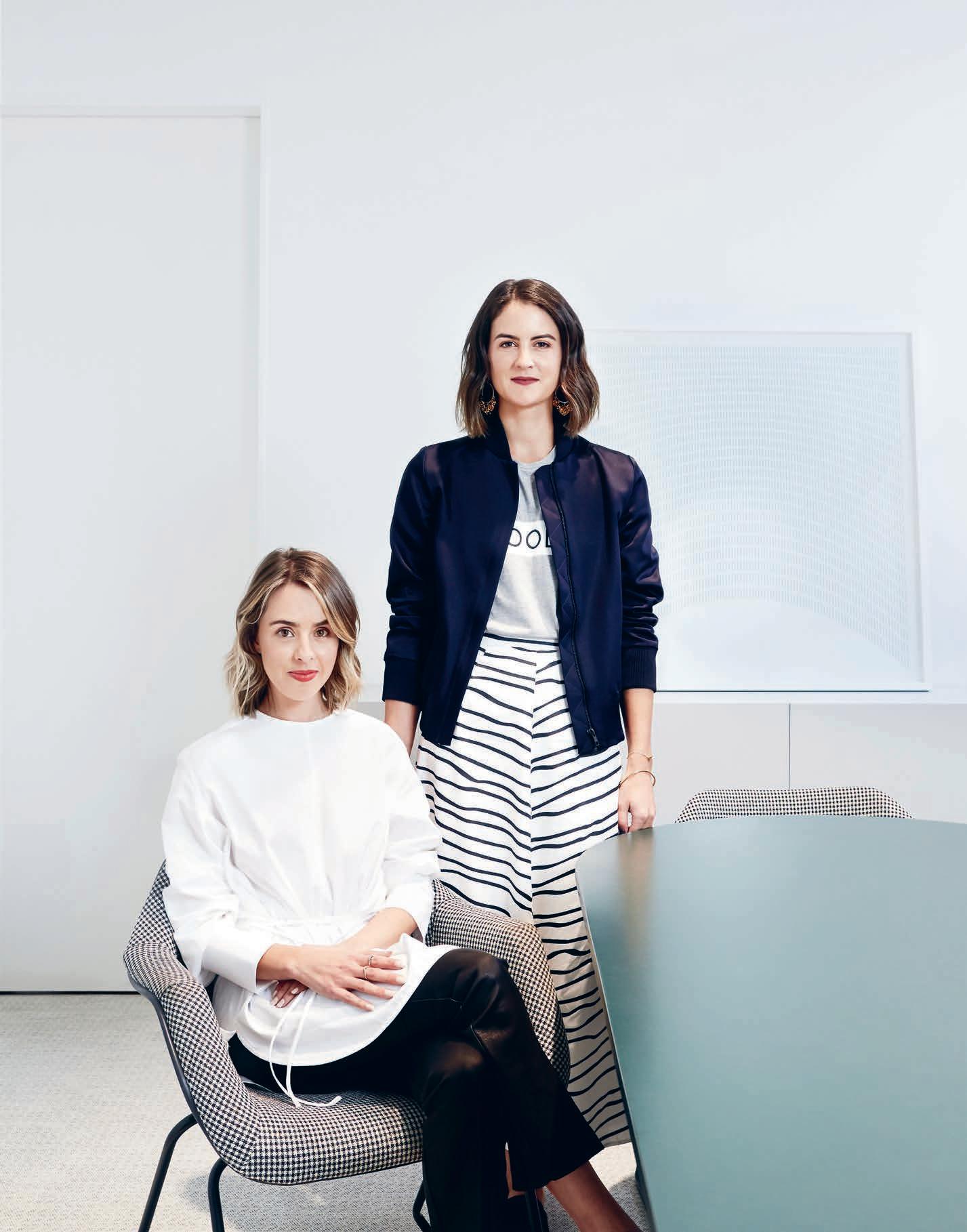
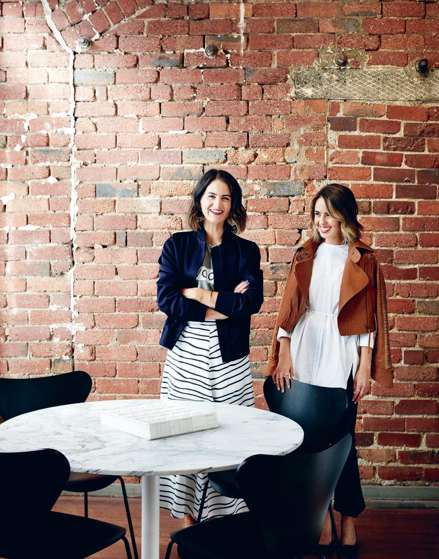
Less Is More
“In the early conceptual stages, We Are Huntly aim to distil four or five words, which describe the client’s vision for the space, relating to mood, or colour. Every design decision from this point is then measured against these words, a strategy which the practice has found aids in maintaining the integrity and focus of the original idea.”
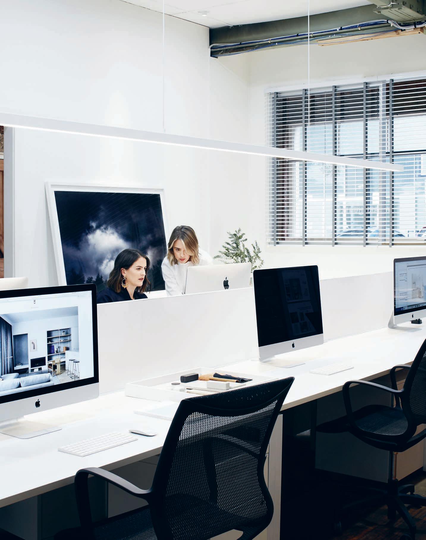
–
OVERLAP TABLE & BENCH
Designed by TAF Architects for Skagerak
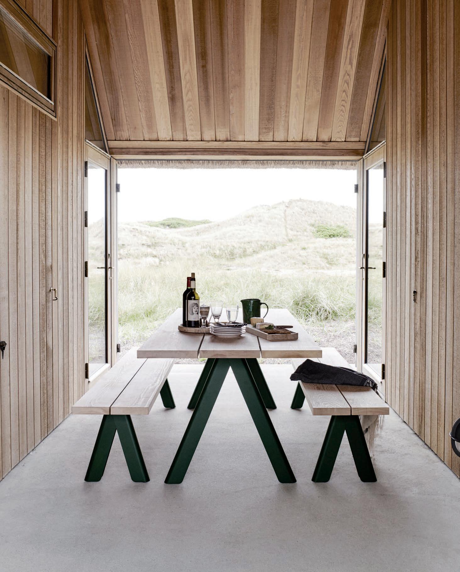
melbourne | sydney 1300 785 199 | info@interstudio.com.au www.interstudio.com.au
INDESIGN X
TH E HOUR GLASS
Words Sophia Watson
In celebrating the launch of their new Sydney store, we speak with global luxury watch boutique, The Hour Glass, on what drives their retail philosophy and the value of authenticity in their environments.
102 THEHOURGLASS.C OM THE HOUR GLASS
“The departure point for all our retail projects begins with one basic truth: true luxury can only exist in the moment of true authenticity,” says The Hour Glass’ managing director, Michael Tay. “And this quest for authenticity governs the luxury universe and the objects, environments and experiences created within it.”
How this translates into the brand’s approach to retail design is unlike any retail strategy currently operating across the globe. The key di erentiation? Anti-replication. Of their fourty international showrooms, not one is the same as any other. Instead, each project is carefully considered and its unique spirit is purposely brought to the forefront.
Nestled within the CBD’s luxury precinct alongside Chanel, Gucci, Ti any & Co and Bvlgari, the new Hassell-designed Hour Glass Sydney has been purpose-built for their unique clients – the world travellers. Here, Tay explains that: “We are highly sensitive that we are building retail experiences for the global shopper. To that end, we feel that there must always exist moments in the store where they lose themselves in the theatre of our horological retail stage, enjoying a free- ow of co ee, whisky and conversation around the passion of horology. It is more a hub for enthusiasts to gather than a
store designed to ensure a commercially focused outcome.” The challenge however, with inspiring the ‘world traveller’ is that they have seen and experienced so much that a standard retail store just wasn’t going to cut it. Working with Hassell, The Hour Glass was very conscious that their client is “intellectually curious, extremely well travelled and has seen more than you think they have,” notes Tay. “Our challenge for a new project then, is to explore how we can continue to inspire and delight The Hour Glass clients.”
This is where the philosophy of uniqueness and authenticity comes into play. Tay explains: “In every region you visit, you may nd that many brands carry a uniform strategy across their boutiques or stores. We believe in the consistency of our values to be consistent across the world as the hub for horology, but we also want our customers to feel as though they are entering into a unique realm. This dynamic is what we are trying to accomplish. All fourty of our boutiques have their own exclusive personality and footprint and each one of them has a unique experience to be discovered.”
The Hour Glass Sydney is intended to be a beacon for contemporary watch retail; and the spectacular results con rm the brand’s reputation and legacy as a “lighthouse of luxury”.
105 THEHOURGLASS.C OM THE HOUR GLASS
Previous page, opposite and above: Designed by Hassell Studio, the fresh new Hour Glass Sydney boutique is nestled in the CBD’s luxury precinct, located at 142 King St, Sydney NSW 2000.
“The quest for authenticity governs the luxury universe as well as the objects, environments and experiences created within it.”
A Lighting Legacy
A er a lifetime of working in lighting, Viabizzuno’s Mario Nanni’s artistic talents continue to grow, what can the design community learn from him? Mario Nanni is, as he his quick to point out, not a lighting designer – he’s a creative who works with light. His first ideas about light as a creative tool came from his Italian childhood, from sunlight flowing into a classroom creating a divine aura, to the flickering of the cinema projector during a movie matinee with his grandfather. Its obvious now that lighting was always going to be how Mario expressed his creativity.
Viabizzuno, named a er the main road of the small Italian village of Bizzuno where Mario Nanni lived as a boy, was born in 1994. As president and artisan designer, Mario has spent over two decades driving the unmistakable style of Viabizzuno, unique in the world of lighting.
“Our philosophy is to project the form of love,” Mario says on Viabizzuno’s approach, “I am an artisan who knows how to work with his own hands. My knowledge comes from what I have learned by listening to the stories places and people tell. I don’t like the words ‘installations’ or ‘performance’, what I do is take on projects to create intimacy between people and places.”
Mario’s approach, combining artisan skills and design, has him creating light for all purposes; light for seeing, light for working,
light for contemplating, and passionately, light simply for admiring. It’s with this in mind that Mario created his own language, his own fundamental rules that go beyond the traditional techniques.
The juxtaposing ideas of presence and absence are what Mario weighs up in each project; the presence of light and absence of an obvious lighting source, “Light only where it is needed” Mario says.
Having worked with a plethora of designers with his ‘poems of light’, Mario sees all of his work as tributes to light and shadow, where the strength of light coincides with darkness. This border between light and dark is where Mario’s architecture takes shape.
Honesty, a genuine approach to materials and ideas, and eye for great collaboration, and a constant curiosity on the way the designed world interacts with itself – this is why Mario Nanni and Viabizzuno are the icons they are today, and what the design world at large should take away from the legacy, “Work in a laboratory, not in an o ce,” Mario says, “Give form to ideas, and reflect on those ideas on paper. You can translate conceptual ideas into objects, places, projects; a sheet of paper is always the beginning of infinite possibilities.”
INDESIGNLIVE.COM IN FA MO US 106
vbo-labs.com
Words Andrew McDonald Photography Courtesy of Viabizzuno
by Bellevue Architectural
Nothing In The Ceiling
Nothing In The Floor. No Unsightly Large Floor Plate
All the technology is morticed in the door.
The FritsJurgens® concealed pivot system (100% designed & made in the Netherlands) stands out from other sprung pivot systems in that all the technology is embedded in the door and not the floor.
With no imposing, unsightly floor & ceiling plates to diminish the visual attraction of the door; a clean sophisticated look & feel is achieved. The interface with the wall, floor and the ceiling becomes one.
Ideal for small to very large doors weighing up to 500Kg swing 90, 180 or 360 degrees. 90 degree hold open, auto open & close functions as standard. Engineered to last, manufactured to rigorous specifications & testedto1,000,000cycles.
Ideal for commercial & residential doors and with a substantial install base in Australia & New Zealand, the FritsJurgens® concealed pivot system is fast becoming the standard in pivoting door hardware.
®
For more information Bellevue Architectural Ph: 03 9571 5666 info@bellevuearch.com.au bellevuearch.com.au
Its in the door, not the floor
INDE S IGN X LIVING EDGE
There are few furniture brands that rival Walter Knoll when it comes to design legacy. Going strong for more than 150 years, Walter Knoll has a rich heritage that has seen it perfect the art of luxury design, service and production. Walter Knoll is embarking on a new era of service and production for its expanding commercial o ering.
By manufacturing its internationally designed conference and executive products in Australia, the brand is taking advantage of the benefits of local production including tighter lead times for commercial and workplace projects and fit outs.
Walter Knoll’s new range of locally manufactured products, which are available through Living Edge, complement the brand’s already extensive collection of commercial furniture.
Based on the concept of “Leadership and Identity,” three recent additions are some of its most dynamic design solutions to date, and now delivered with a four to six week lead time.
Conference-X by EOOS responds to the need for workplace flexibility. O ce spaces may be required to serve as boardroom, seminar room or event space and Conference-X’s flexible, light
and considered form balances functionality and elegance to meet a variety of purposes. EOOS has also designed the Leadchair Management collection of chairs, the result of a five-year development process. The new generation of swivel chair for management and conference areas embodies the design DNA of Walter Knoll with premium materials, high-quality cra smanship and precision engineering.
Scale-Media, designed by Wolfgang C.R. Mezger, reimagines the future of conferencing and communication. The customisable range of conference tables is available with a variety of table-top shapes, including rectangular, elliptical and trapezoid, to suit di erent workspace environments and floor plates. They have sculptural bases, veneer or painted surfaces and a high degree of integrated technology for an interconnected workforce.
Along with the design of its commercial products that aim to promote corporate leadership and identity, Walter Knoll continues to reimagine and advance the art of service and production. Available through Living Edge, its new collection is now manufactured locally by skilled cra smen to meet tight schedules and high standards.
108 LIVING EDGE LIVINGEDGE.COM.AU
The design of leadership and identity.
New additions to Walter Knoll’s 150-year-old portfolio were exhibited at Orgatec 2016 under the theme ‘Walter Knoll: Leadership & Identity’. They are currently available throughout Australia via Living Edge.
PROVOCATIVE, RADICAL & EN ER GISI NG DE SI GN
IN SITU SITU IN
The old-school ‘client showroom’ is in desperate need of a shake-up – but where to start? Designed by Futurespace, PwC’s new Melbourne headquarters is purpose-built to break down traditional barriers between sta and clients. The results, writes Marg Hearn, are extraordinary.
It’s Show Time
PwC
Melbourne
by Futurespace
Words Marg Hearn Photography Nicole England
Opposite: Frosted glass cubes make up the central stair connecting four client oors. The colours glow from within, creating intimate meeting spaces that ‘ oat’ in the void. Page 112: The Tech Lounge takes inspiration from apple’s ‘genius bar’ concept, eliminating the boundaries between customer and assistant. Page 113: A central café sits beneath, The Drop, a custom oating ceiling that acts to ground the café within the open space. A plum-toned resin oor guides people alongside the Digital Waterfall (an interactive Signature Tech solution), and the vibrant coloured boxes.
INDESIGNLIVE.COM 110 IN SITU
Se ing the tone on arrival to PwC Melbourne’s pioneering client space is the unconventional red polished resin floor, boutique hotel-esque check-in and the buzz of the exclusive client and sta café. It’s an end-to-end and evolving story that combines the best of hospitality and retail design with domestic traces to create an “innovative, unexpected and memorable experience” for clients, that starts before and extends beyond the visit.
Connecting the client experience floors by a central staircase is one of the biggest disruptors to traditional client spaces in Australian workplace design, asserts Futurespace managing director Angela Ferguson. “PwC turns the whole idea of a client space – being behind closed doors – on its head.”
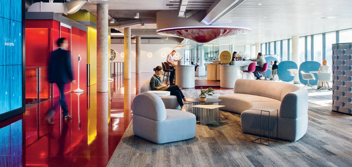
Futurespace won the pitch to deliver the fully-integrated 10,000 square-metre fit-out with Mirvac Development and Construction for PwC’s Melbourne client experience floors, in mid 2015, on the back of securing the PwC Sydney project.
The design capitalises on the building’s large rectangular space by inserting stairs and multiple “meeting boxes” in between two cores.
“We felt the best way to achieve connectivity between PwC sta , [PwC itself], and its clients, was to cut out a huge slice of the space – to open the firm up and show the bigger PwC story,” says Gavin Harris, Futurespace’s design director.
Another key disruptor is the diverse choice of workspace types, giving PwC the ability “to pick the right se ing for how business partners want to work with clients,” Harris says. Co-creation spaces are one example that allows clients and business partners to work together to solve complex business problems. There’s also meeting rooms varying in scale and formality, a prototyping room, fun spaces, secure project areas, a digital studio, a sunken lounge, auditoriums, event spaces and Hub Theatre – all supported by di erent levels of hospitality (the Yarra Café, Moose Lounge restaurant and on-site catering), technologies and furniture.
Creating di erent spaces “allows for di erent thinking to develop,” adds Ferguson. “The client experience spaces are also about communicating to the world that PwC have evolved from an accounting practice into a professional consulting firm.”
Permission is granted to clients through the design, to stay, work, collaborate or network with PwC partners, sta and other clients –and to own and create project spaces for varying periods of time.
Likening the project outcome to the Uber of client environments, “PwC has really understood that we live in a world where people want choice over how they consume – whether that’s media, experiences or professional services,” says Ferguson. Two innovative signature technology archetypes work as a key connecting element and add to the client experience. One is Flame Tree – a digital artwork, developed by lighting engineer Bruce Ramus in collaboration with Futurespace. It references local aboriginal history and incorporation of everyday weather data gathered from the outdoor environment, creating a living, interactive artwork.
Another signature technology is the digital waterfall designed by Futurespace in collaboration with Downstream. Backing on to the artwork, the waterfall provides a touch screen communications and marketing channel for PwC and clients, allowing information such as white papers and presentations to be shared. It’s Ferguson’s prediction that: “Client spaces will not only become a larger, more significant and active part of the workspace, that barrier between the working area and the client area will become more blurred and overlapped.” While PwC has embraced technology as part of the client experience, she says the project speaks to the role of physical space in facilitating both virtual and face-to-face connection and business success. And ultimately the way of the future is about creating and sustaining relationships.
futurespace.com.au
INDESIGN 113 IN SITU
Page 114-115: Custom designed Pods serve as concierge points at the main client entry. Page 116: A circular room with high de nition screens that wrap 280 degrees for presentations and workshops.
Bring Them Backstage
As client spaces continue to evolve, the boundaries between the two blend and blur. A new depth of interconnectedness between the two begins to emerge. PwC’s client experience spaces are about realising and discovering the potential of their clients through collaboration, technology and environment.
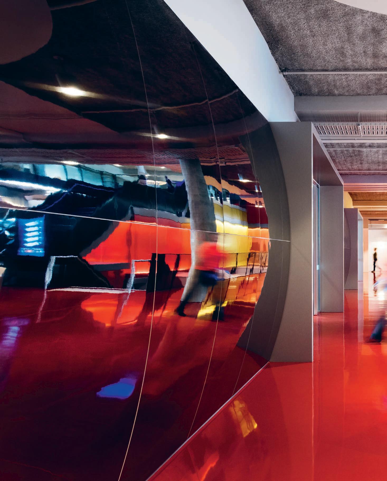
–
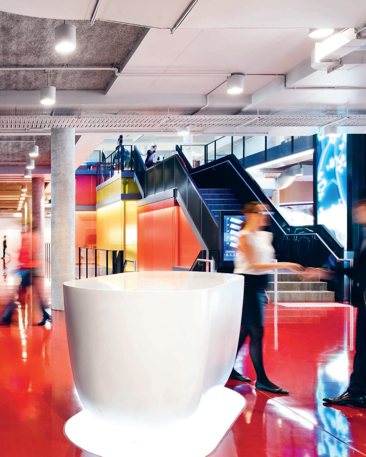
“PwC recognised that clients want all the ‘givens’ that sta receive in today’s workplace design – IT support, easy Wi-Fi access, lockers and showers – but amplified in quality. Di ering client needs [and] PwC’s openness to new possibilities, new ways of working, new behaviours and new ideas, informed the amenity o er,” says Angela Ferguson.
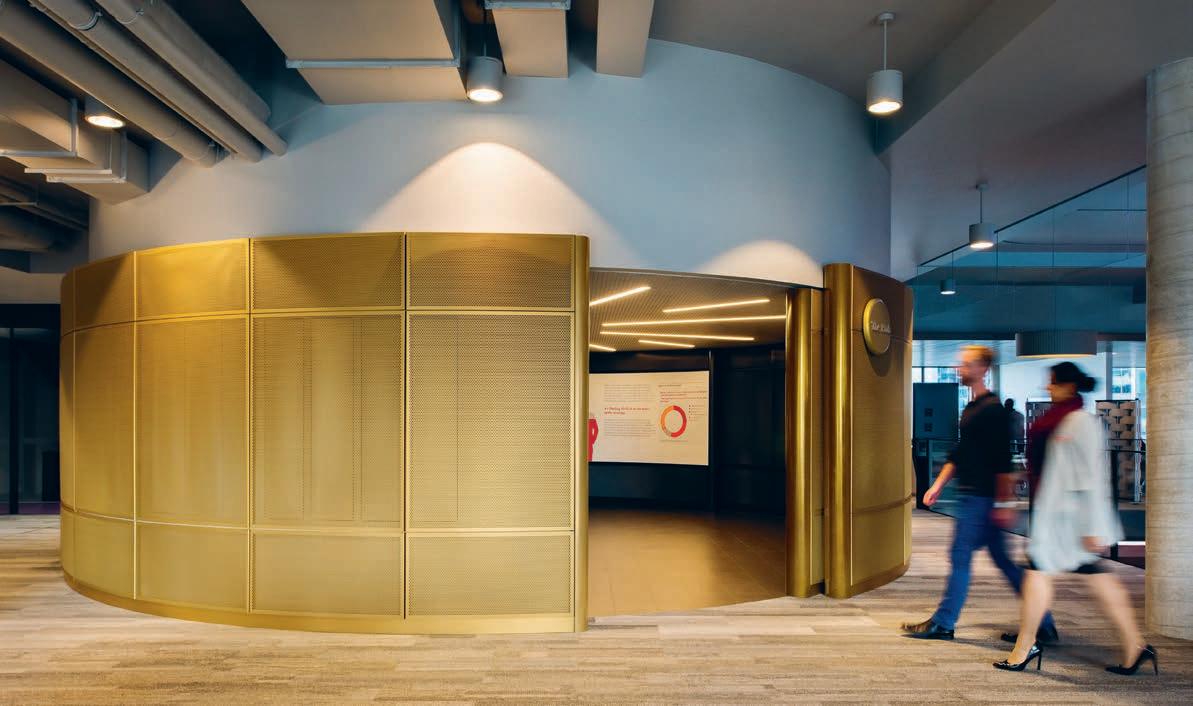
INDESIGNLIVE.COM 116 IN SITU
INDESIGN X SB SEATING
With more and more isolated corner o ces being swallowed up by open plans, the principle of all the elements in a space needing to work together is increasingly relevant. Executive chairs are typically among the bulkiest and most a ention-grabbing furniture items in the o ce. HÅG’s latest release, the new executive chair HÅG Tribute, challenges that stereotype.
HÅG Tribute is one of the slimmest executive chairs around. But that by no means translates to a sacrifice in terms of comfort. Says its Norwegian designer Svein Asbjørnsen of sapDesign: “With this chair, we have a set of new standard in uncompromising comfort. It’s about how we, as humans, are not designed to sit still.”
HÅG Tribute incorporates the signature HÅG in Balance® technology that allows the chair to continuously support the body’s movements as you transition between active and passive
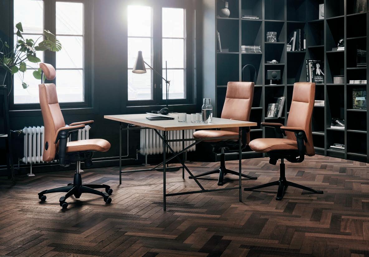
si ing. The new revolutionary features are the active upper-back and headrest, which tilt forward as you recline to provide optimal support and reduce tension in the top half of the body. The S-curved back and integrated adjustable lumbar support take care of healthy si ing for the lower half of the body. HÅG TiltDown armrests allow you to sit closer to your desk. And the ribbed footplates encourage di erent foot positions and enhance stability.
All this comes in a stylish package that evokes a distinguished air of authority. With a generously padded square-cut profile atop a sturdy frame, the elegant HÅG Tribute can be customised with an extensive selection of leather and textile upholstery. The chair is a tribute to its designer and its users – the executives who need the best.
info-australia@sbseating.com
117
Above: HÅG considers the HÅG Tribute to be its most comfortable deluxe task chair to date. It o ers a sleek appearance despite being broad and generously padded.
A tribute to style and substance. SCANDINAVIAN BUSINESS SEATING SBSEATING .C OM
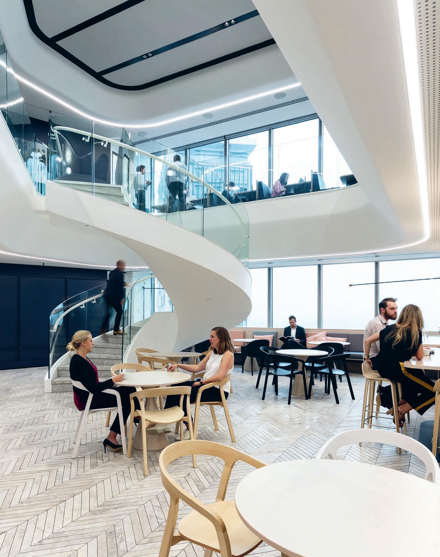
The legal sector has traditionally adhered to a strict workplace hierarchy, with senior sta alloted a private o ce and entry-level employees assigned to the ‘open-plan’. Designed by Warren and Mahoney, the new head o ce for New Zealand law firm Russell McVeagh, challenges this antiquated workplace approach with a daring, material-rich agile strategy.
Agile’s Final Frontier
INDESIGN 119 IN SITU
“We knew it would be a significant shi , but it has exceeded our expectations. The benefits of greater collaboration, knowing what’s going on around you, the buzz and engagement. It’s a game changer,” says Craig Columbus, Russell McVeagh’s chief information o cer.
Russell McVeagh Auckland by Warren and Mahoney Words Andrea Stevens Photography Simon Devi
The rise of the agile workplace has been widely adopted by almost every professional sector the world over, with the legal industry being the very last to let go of its prized personal o ce status symbol.
Russell McVeagh is among the first of New Zealand’s legal firms to go fully open-plan. Having transformed its Wellington o ce, it has followed with the Auckland branch, opening two working floors horizontally and vertically with a spectacular new stair void and common area. “Law is probably one of the last industries to embrace agile working,” says Craig Columbus, Russell McVeagh’s chief information o cer. “The global financial crisis shook everything up, and as our client base has become more mobile and nimble, we realised we had to do the same.”
To be a success, the new open-plan environment had to be supported by a wholesale change in technology. Russell McVeagh swapped desktop computers for laptops, so -phones and headsets so that employees are no longer tethered to their desk. The confidentiality required for legal cases requires a variety of unique, alternative support spaces, particularly sound-proofed rooms for phone calls and small, private meetings.
“The library and other focus zones have been key in creating a workplace to meet all needs,” says Warren and Mahoney interior design principal, Sco Compton. A strategic briefing process arrived at three prominent themes – discerning, intricate and coveted. These represented practice values of the highest quality service and output, and a workplace that would support employees to perform at this level. ‘Intricate’ and complex legal cases are matched by
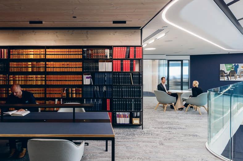
refinement and a ention to detail in design. And the theme ‘coveted’ means a workplace where clients and sta want to spend their time. The exquisite interior is a physical embodiment of modern company values to a ract and retain the best legal practitioners in the country. At the social and intellectual heart of the firm is an open common area with a kitchen and café-style seating on the lower level, and the library and quiet workspace on the upper. The spaces are linked by a stunning helical stair and void, and have one of the best harbour views on the floor. By swapping distributed kitchene es for a large central one, people move around more in a dynamic o ce environment. “It was controversial to cut a hole in the floor and build a new stair,” notes Columbus. “We already had stairs and a li . But by creating one common area, we now get the co-mingling we never had before, with cross-pollination of expertise and happenings in the business.” From this democratic main hub, a very organic planning module of work points and curved sit-to-stand desks flow across each floor. Curved meeting pods and concentration spaces are positioned near the core, while every inch of real estate is utilised around the window perimeter with built-in seating and storage.
Within hours of commissioning the first laptops, people were up and about, working from the common hub or café. Since completion in December 2016, Russell McVeagh has recorded higher employee satisfaction levels around technology and flexibility, as well as higher productivity levels. A promising sign from the final frontier of agile.
warrenandmahoney.com
INDESIGNLIVE.COM 122 IN SITU
Page 118: The central meeting area and dining space with adjacent full-service kitchen, open-plan working areas and private meeting rooms. Page 120-121: The centrepiece of this t-out is a stunning spiral staircase, connecting the lower level dining area and kitchen to the law library, single workstations and intimate meeting spots. This page: The law library and break-out areas are curved around the central atrium and stair.
“Open-plan works when it is supported by the other se ings and spaces that enable you to concentrate or access privacy when you need it, as well as being able to take your technology with you.”
a new way of thinking about shapes & spaces
Neolith’s large format slabs transform imagination to functionality. Available in a wide range of colours and patterns, Neolith is scratch, stain and heat resistant; making it suitable for the most demanding domestic and commercial applications both indoors and out.


For more information visit www.neolith.com.au
For more information visit www.neolith.com.au


 Beton
Basalt Grey
Beton
Basalt Grey
VIC 03 8552 6000 VIC Showroom 03 8552 6090 NSW 02 9822 5155 NSW Showroom 02 9822 5910 QLD 07 5537 3222 SA 08 8340 2877 WA 08 6240 2200 W www.cdkstone.com.au E info@cdkstone.com.au cdkstone cdkstone PROUDLY BROUGHT TO YOU
Strata Argentum
Estatuario
Calacatta Pulpis Iron Moss
extraordinary surface
Carr Design Group combines corporate, residential and hospitality design principles for a diverse and flexible function space at the Collins Square Events Centre. Have they created the ultimate new design typology for next-gen hospitality? We think yes…
The Perfect Blend
INDESIGN 125 IN SITU
Collins Square Events Centre by Carr Design Group
Words Rebecca Gross Photography Peter Clarke
Opposite: The formal dining room with oor-to-ceiling wine display. Page 126-127: The expansive events lobby with minimal but plush seating, enveloped by the textural, so -wave ceiling. Page 128-129: Collins Square Events Centre glass and steel exterior, looking into the front lobby, main Art Deco events bar, and business centre on the upper levels. Page 130: A luxurious lounge area adjacent to reception.
Inventing New Design Typologies
The sensual and evocative approach to materials is akin to hospitality design while also drawing on the comfort required in residential design. So , curved and voluptuous furnishings provide moments of plushness and intimacy within the built environment and contrast with its sharp precision, reflective surfaces and hard rectilinear forms.
–

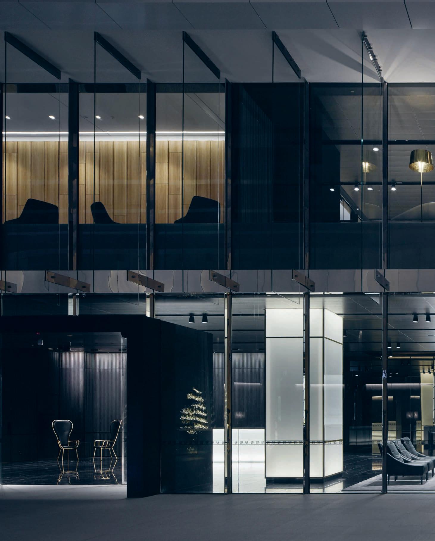

Workplace, residential and hospitality design function on di erent principles: workplace design fosters productivity; hospitality design o ers a distinctive experience; and residential design promotes comfort. At Collins Square Events Centre, Carr Design Group has combined these principles and ambitions to generate a new design typology for commercial developments. O ering the amenities, service and professionalism of a hotel, this on-brand, high-end space is set to advance the evolution of corporate environments.
Collins Square in Docklands, Melbourne, is one of Australia’s largest commercial mixed-used developments, comprising six o ce towers with retail and hospitality spaces. The Events Centre is a flexible and agile space within the complex and it provides tenants with convenient access to sophisticated hospitality spaces and services. Catering for groups ranging from 12 to 500 people, the Events Centre can be configured for a variety of purposes, including seminars, conferences, meetings, trade shows, private dining and cocktail functions, allowing tenants to hold events in a space that is separate but related to their workplace.
With no precedent or benchmark for this type of space in a commercial development, the Carr design team, led by director Dan Cox and associate Rosie Morley, looked to other hybrid models such as hotels and private member clubs to provide the right mix of spaces for Collins Square tenants. “We thought of it as a hotel with the tenancies in the towers as the guest rooms,” Cox explains. “They have access to room service, private dining, a bar and high-end conferencing facilities and technology, as well as the level of service and management they would experience in a hotel.”
The atmosphere and aesthetic of the Events Centre is sophisticated, subdued and moody, serving to di erentiate the space from the Collins Square lobby and atrium from which it is entered. “There is an elegance to the dark. It disarms the corporate experience and indicates to guests they are crossing a threshold into a new environment,” says Morley.
As one would experience in a hotel, there is a reception desk, coat room and concierge at the entrance. Illuminated features, such as the entry columns, front desk and back-lit bar, also herald the start of a new spatial experience and subtly guide guests into the ballroom-like pre-function area. This area provides access to a series of rooms with operable walls that allow them to be configured as smaller or larger spaces, including a private dining room. The behind-the-scenes catering facilities are contained within an internal core where they can service all spaces without being visible front of house.
The sensual and evocative approach to materials is also akin to hospitality design while drawing on the comfort required in residential design. So , curved and voluptuous furnishings provide moments of plushness and intimacy within the built environment and contrast with its sharp precision, reflective surfaces and hard rectilinear forms.
This so ness is also evident in the pre-function area where the windows are cloaked in fabric to temper the exterior view and the ceiling is draped with metal mesh to create a more intimate atmosphere. The wave-like e ect disguises the increased ceiling height while enhancing the lateral sense of space as it’s reflected in the surfaces of the mirrored perimeter.
“The Events Centre is a project with blurred lines and it had no precedent, but it’s a model now being adopted in other developments,” comments Cox. Indeed, by drawing on the principles of workplace, hospitality and residential design, the Events Centre is a luxurious, distinctive and highly functional space that provides the services and sophistication one would expect from a hotel, but within a corporate environment. carr.net.au
INDESIGNLIVE.COM 130 IN SITU
Sit Better, Feel Better
Sit Better, Feel Better
Scandinavian Business Seating has a wide portfolio of European brands.
Scandinavian Business Seating has a wide portfolio of European brands.
All our products are made in Scandinavia and bring design & ergonomics into your everyday life
All our products are made in Scandinavia and bring design & ergonomics into your everyday life
info-australia@sbseating.com
info-australia@sbseating.com
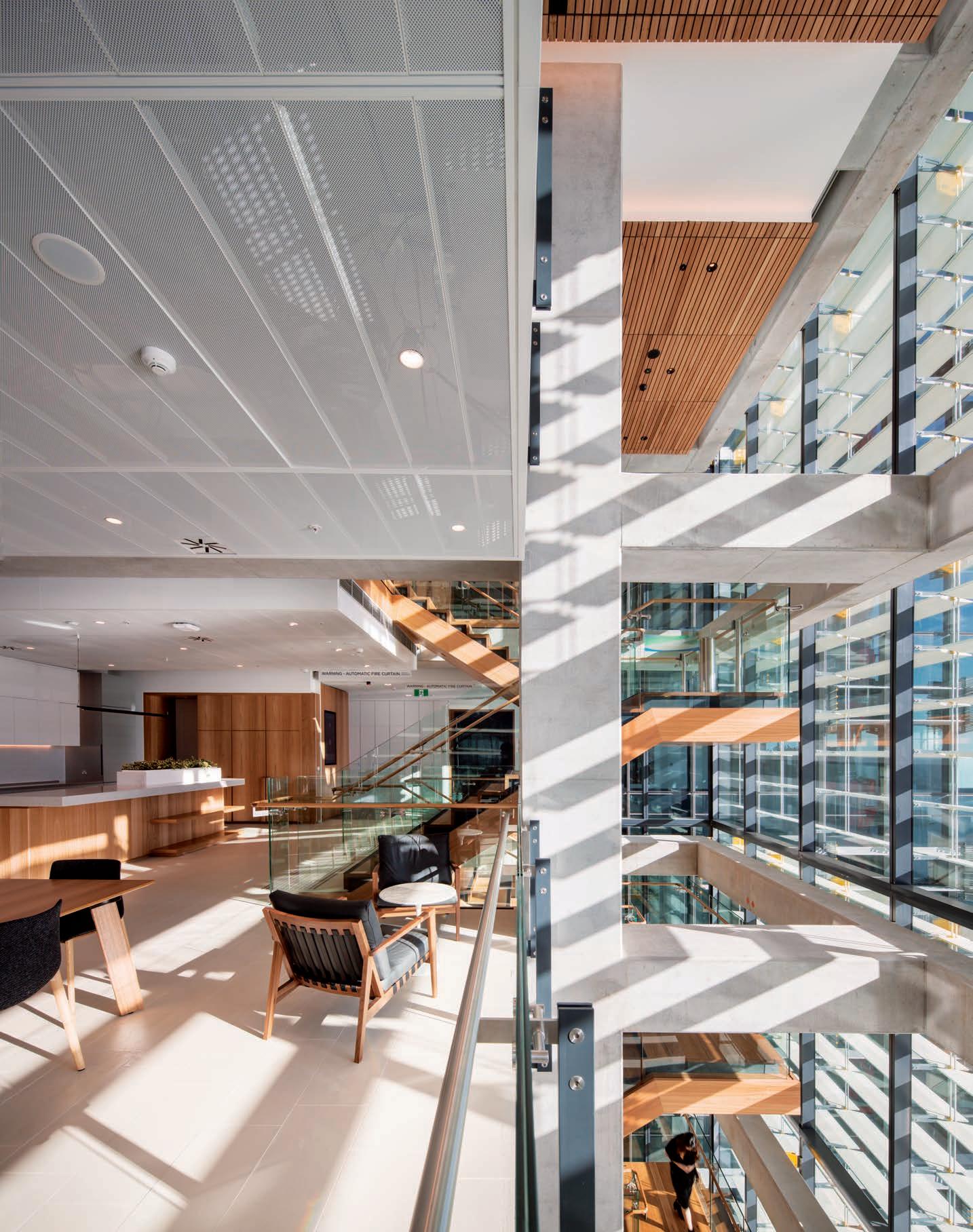
Design that reflects its local environment is a huge focus for practising architects and designers, and Sydney’s Barangaroo development is a hotbed for this kind of thinking. Gilbert + Tobin’s new Barangaroo workplace, designed by Woods Bagot, draws inspiration from the rich history and landscape of the site, while nestling nicely into Sydney’s new commercial identity.
Nature And Nurture
I was making my way through Sydney’s Wynyard Walk – the new underground pedestrian link between Wynyard Station and Barangaroo – and two things struck me. The first was that Barangaroo, Sydney’s rapidly emerging new mixed-use precinct, was now truly connected with the city. Si ing essentially at the base of a sandstone escarpment on the foreshore of Darling Harbour, it was previously a remote, undeveloped satellite to the CBD. But now, especially as a large part of it has been completed and the high-rise commercial towers substantially tenanted along with a dynamic retail and hospitality component, it is fully integrated with the city, contributing to a fluent connection between the city and our famous waterfront.
The second thing was the recurring serpentine graphic motif in the passage, which references the original water course flowing down to the harbour. I was on my way to visit the new Sydney premises for the large Australian commercial law firm, Gilbert + Tobin. The designers of this new workplace, Woods Bagot, have picked up on this image – and on the curvilinear expression of Rogers Kirk Harbour’s tower –with the fit-out’s sinuous built forms and in the striking illuminated cut-away snaking through the ceiling.
These design elements were also a response to Gilbert + Tobin’s brief for an environment which not only acknowledged the specific context, but also the Australian light and landscape as a complement to their significant collection of contemporary Australian art.
The back story here is that Gilbert + Tobin, led by principal, Danny Gilbert, was the first firm to commit to moving to Barangaroo. The conversations with Woods Bagot date back to 2012 and it was the second business to move into the new quarter. At the time, says Woods Bagot principal and project leader, Amanda Stanaway, “it was not a particularly popular choice” because it meant leaving their Park Street base and its proximity to the law courts.
But, says Stanaway, Gilbert is “a true disrupter and innovator and he was comfortable with making everyone else uncomfortable”. Gilbert saw the practice of commercial law changing. “He led the partnership to make that decision,” says Stanaway. “He helped drive the workplace mentality and the workplace philosophy. He wasn’t obsessed with what anyone else had done, he was obsessed with doing what was right for the firm.”
In terms of location, it meant being close to the ‘big end of town’, while in terms of the workplace it meant an open, flexible environment which facilitated the cross-disciplinary collaboration necessary in the new legal landscape. It was also essential that the new work environment be a learning environment because law is very much about how experience and knowledge are passed on from one generation to the next. This required breaking down barriers and moving people out of o ces.
So, for Gilbert, the appeal of Barangaroo was the proximity to big business and the large floorplates of the Rogers Kirk Harbour
INDESIGN 133 IN SITU
Gilbert + Tobin Barangaroo by Woods Bagot Words Paul McGillick Photography Trevor Mein
Where The Bush Meets The City
The Australian landscape inspired the design of Gilbert + Tobin’s fitout. Local timbers and stones used throughout the space intended to reflect the Barangaroo precinct and surrounding escarpment. Evoking a sense of walking into an art gallery, a neutral interiors scheme allows indigenous artwork to be showcased in client facing zones, while a large, round reception desk provides a welcoming experience, breaking down the barrier between law firm and client.
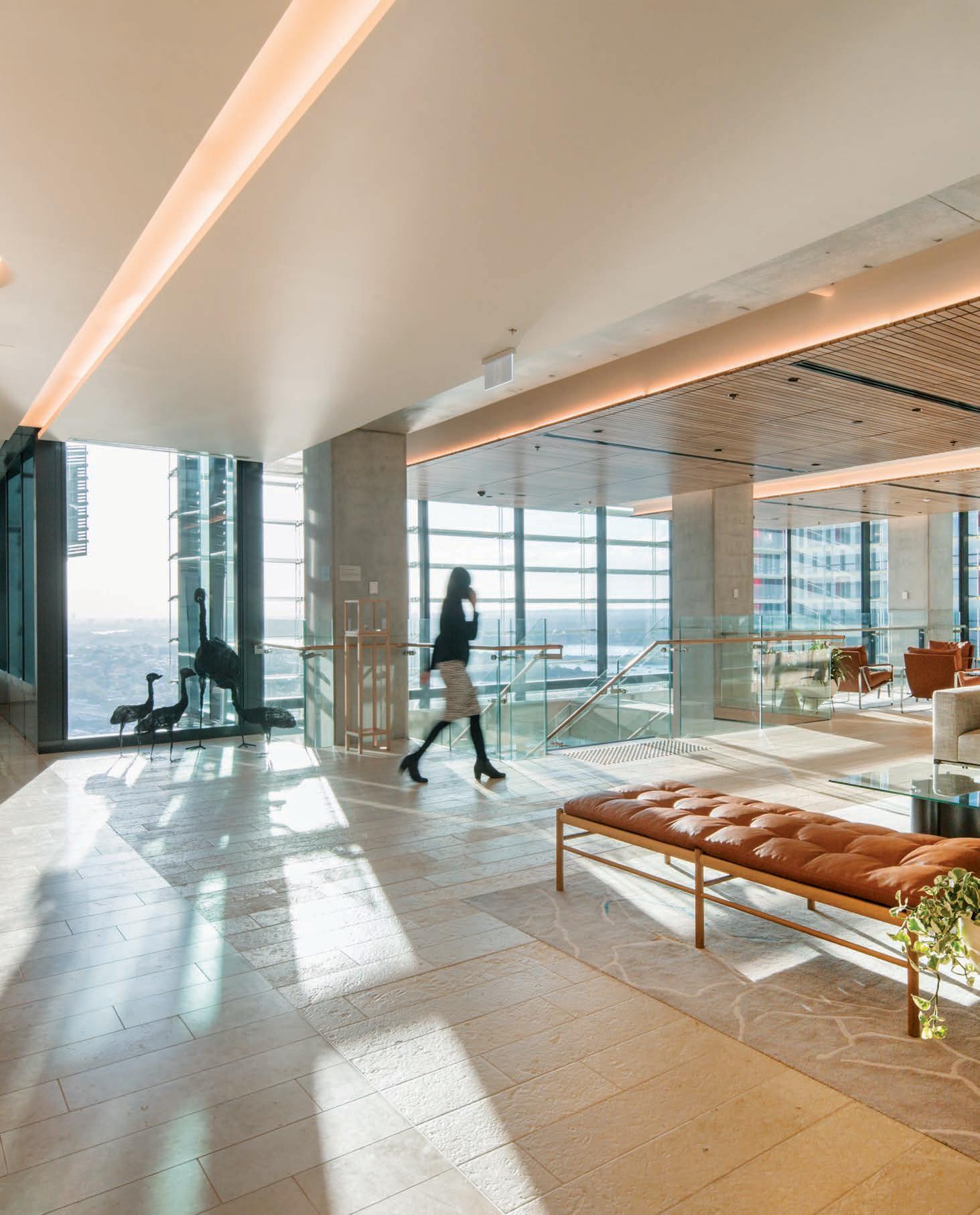
–

tower, which o ered the opportunity for an imaginative, but calm and relaxed, workplace with room for a variety of work and meeting spaces – and that’s before you look at the sensational views west over the harbour or back over the city towards the Harbour Bridge.
The big, deep floorplate with its central li core posed many challenges, especially balancing intimacy with connection, so important for a law firm which, says Stanaway, was aiming to generate energy but also respect the need for focussed, private work.
Given the idiosyncrasy of the floorplates in the Barangaroo International Towers – the ovoid shape with an east-west axis and the li core in the middle – the challenge for all the tenancies has been how to design the arrival sequence. I have now seen four and Gilbert + Tobin’s is certainly the boldest. One steps out of the li to be immediately confronted by a massive circular white reception desk. “It’s not really a desk,” says Stanaway, “it’s really a piece of sculpture that happens to have two people si ing at it.” The branding is minimalist, signalling the theme of the fit-out: sophisticated, but relaxed, with a restrained pale e suggesting the Australian landscape and acting as a backdrop to the art collection and the stylish loose furnishings.
The reception level is given over mainly to meeting spaces and client-facing facilities. There are two client reception areas, one on
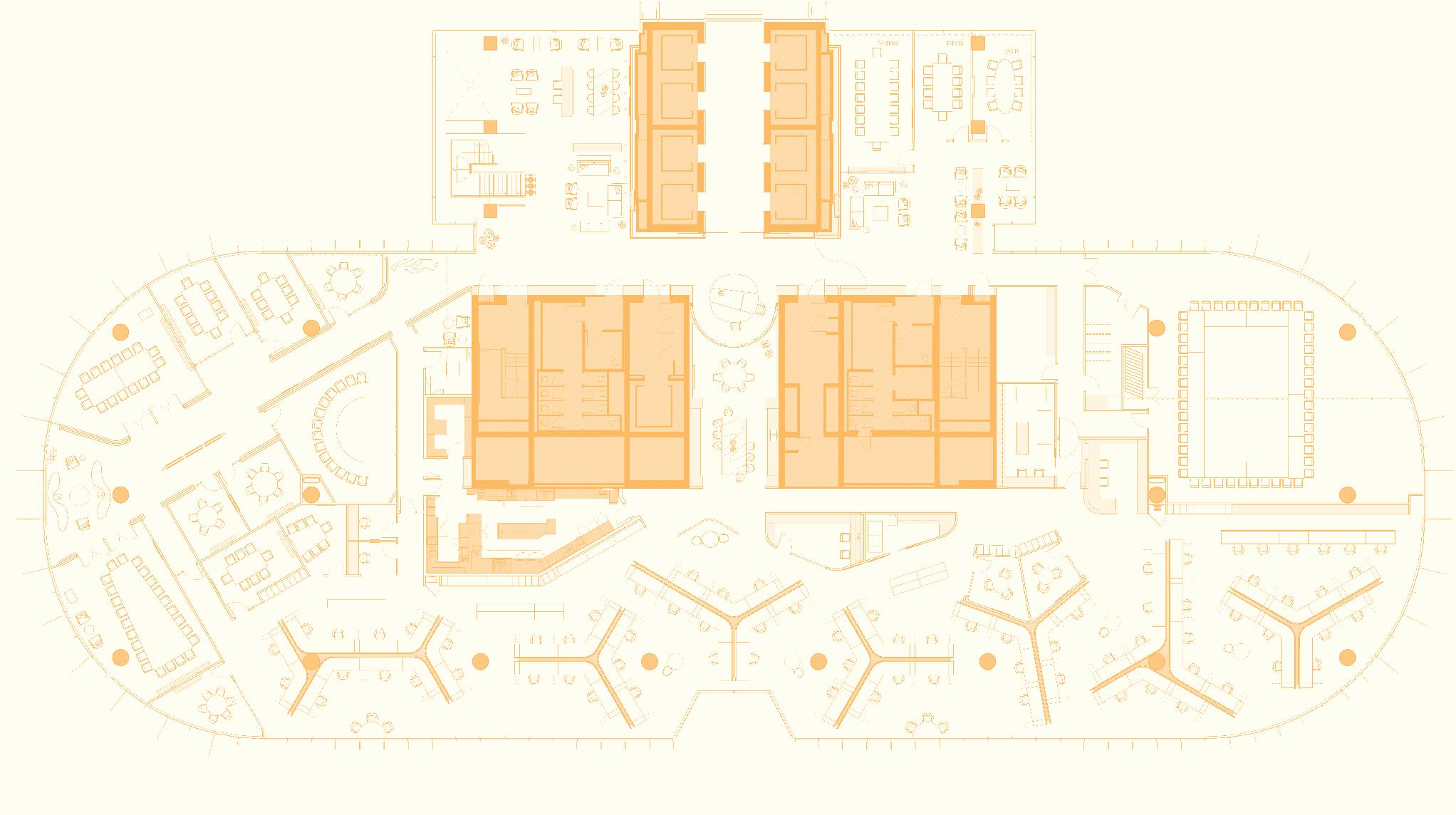
either side of the core. Otherwise, the only real di erence between the 3.5 levels occupied by Gilbert + Tobin are the social spaces which all enjoy the splendid views west of the city.
Front-end briefing was done by Calder Consultants and the resulting o ce environment was very much the product of an ongoing collaboration between concept and design, driven internally by Danny Gilbert who, says Stanaway, was “very clear about re-working the typology of work.” A significant result of this is the custom workstations designed to respond to the floorplate. They are larger than normal and incorporate ‘hockey-stick’ end positions (for lawyers) with a central, straight desk for admin sta . They incorporate three screens (one a laptop) which ‘undulate’ to create privacy while also o ering variety to the o ce landscape. As Stanaway puts it: “They tried to tailor the technology to the typology of the user rather than tailoring the workspace itself.”
The Gilbert + Tobin workplace is an understated, but quietly innovative response, not just to the unusual base building, but to the rapidly changing nature of legal practice and Sydney’s morphing commercial identity.
INDESIGNLIVE.COM 136 IN SITU
1 ‘West Village’
working
2 Li Lobby 3 ‘East Village’ client meeting rooms 4 Client meeting room 5 Client VC meeting room 6 Sta kitchen 7 Facility space 8 ‘Woodstock’ training meeting room 9 Client anti space 10 Open work area 4 5 1 7 10 2 9 3 6 8
woodsbagot.com Page
133: The water-facing central staircase and atrium straddles the site’s 3.5 levels, with adjacent kitchen and dining area located on the second oor. Page 134-135: Gilbert + Tobin’s client reception lounge is a museum-like space featuring Indigenous Australian art. This page: Floor plan for level 35 of the new Gilbert + Tobin workplace.
Gilbert + Tobin, Level 35 Floor Plan
client waiting
area
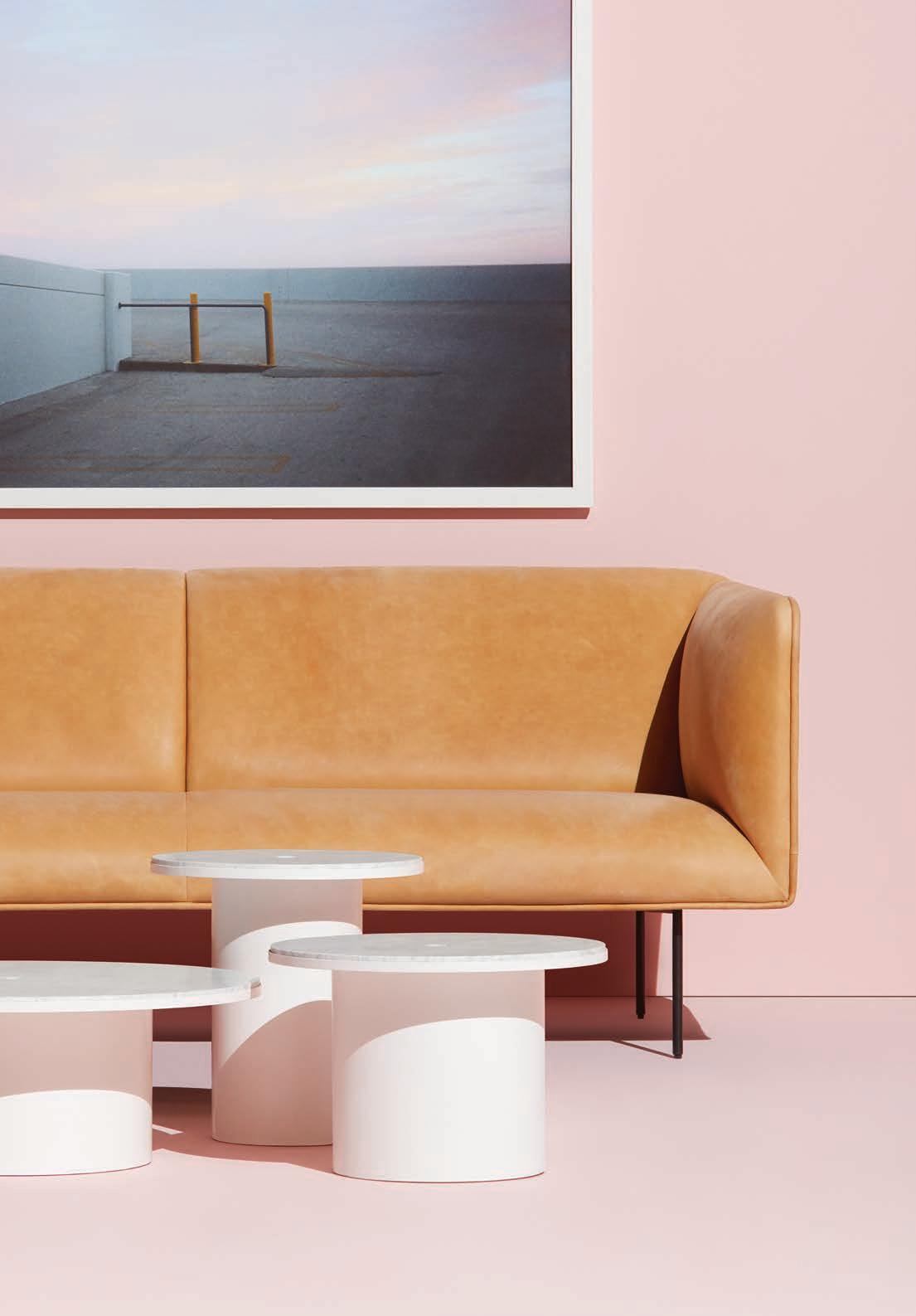

SYDNEY | MINNEAPOLIS AUSTIN | CHICAGO | LOS ANGELES MEXICO CITY MONTERREY NEW YORK | SAN FRANCISCO BLUDOT.COM.AU
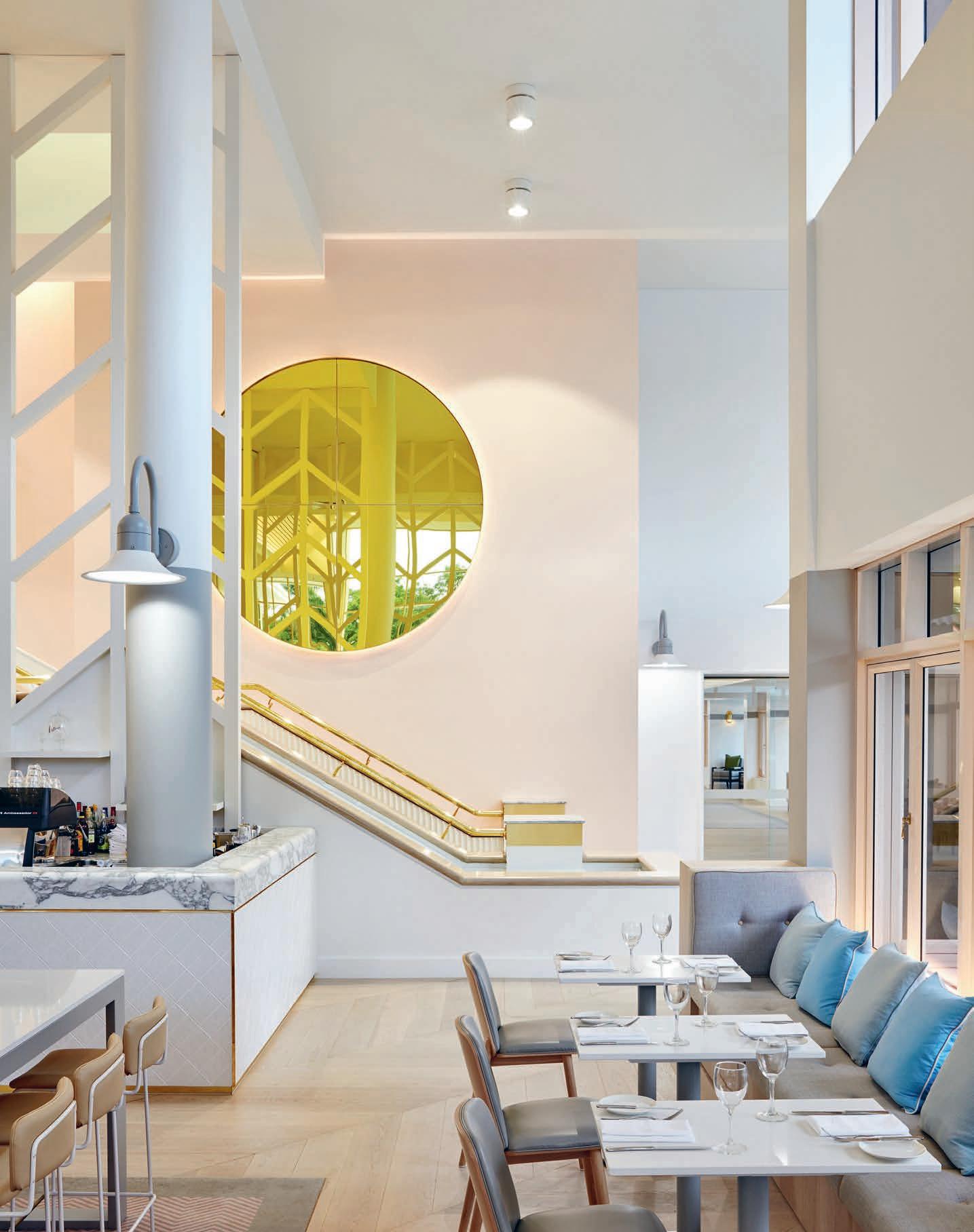
What defines the luxury resort of 2017? As the goalposts of modern travel continue to shi , Mim Design o ers up a vision of post-millenium luxe with the new Sheraton Mirage in Port Douglas. Welcome to resort living 2.0.
Super Luxe
Determined to balance the exoticism of 1980s glamour with time-honoured contemporary design, Mim Design lobbied for elements of the original hotel to be preserved and even reinstated.
INDESIGN 139 IN SITU
Sheraton Mirage Port Douglas by Mim Design
Words Michelle Bailey Photography Sean Fennessy
Modern Luxury Tinged With Nostalgia
The lounges pay homage to the “glamour days” when presidents, rockstars and celebrities frequented these rooms. “We wanted to make sure they looked as luxurious as possible,” says Miriam Fanning of Mim Design. “It was really important that every shape and form was understood as something that could have sat comfortably in that era.”
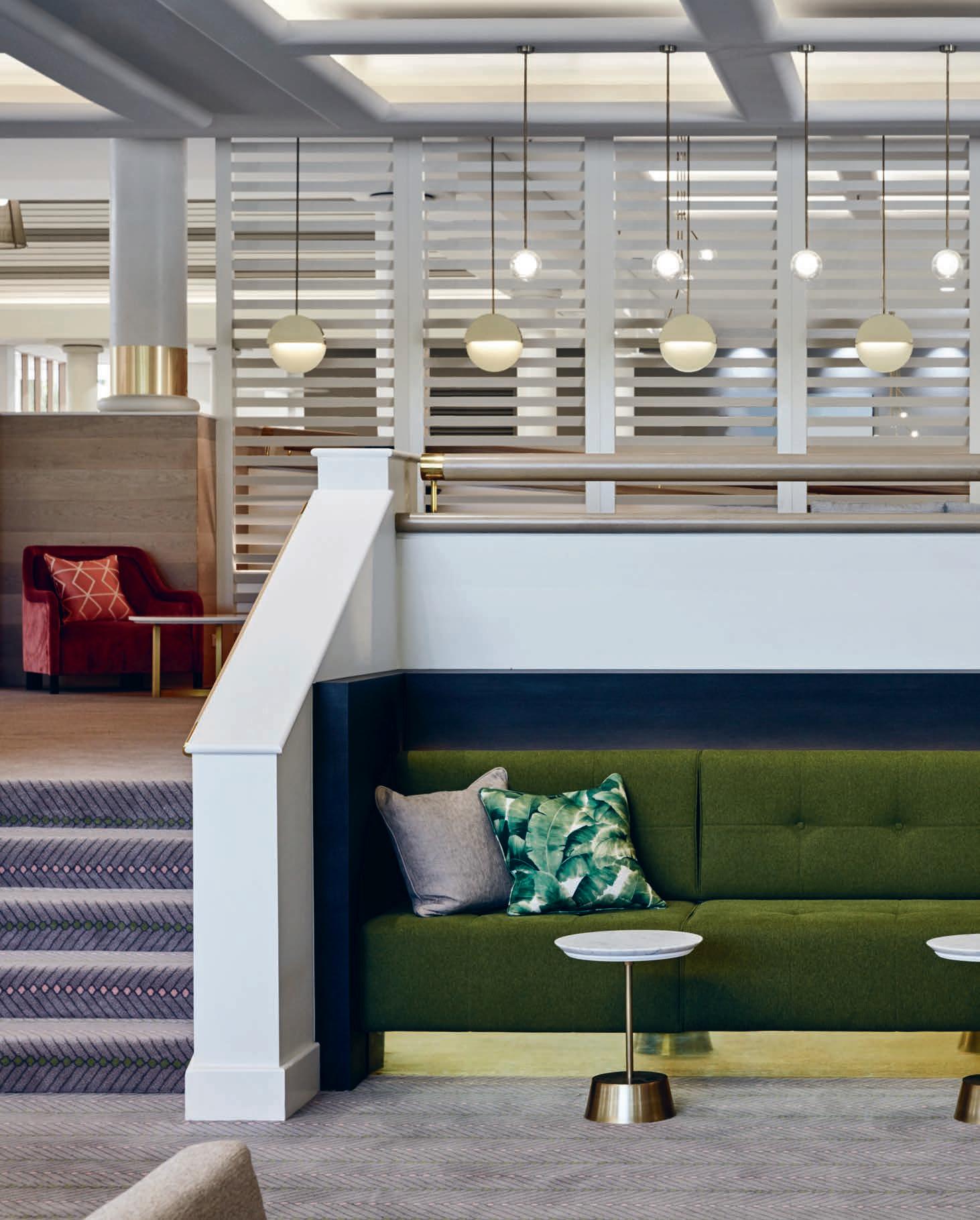
–
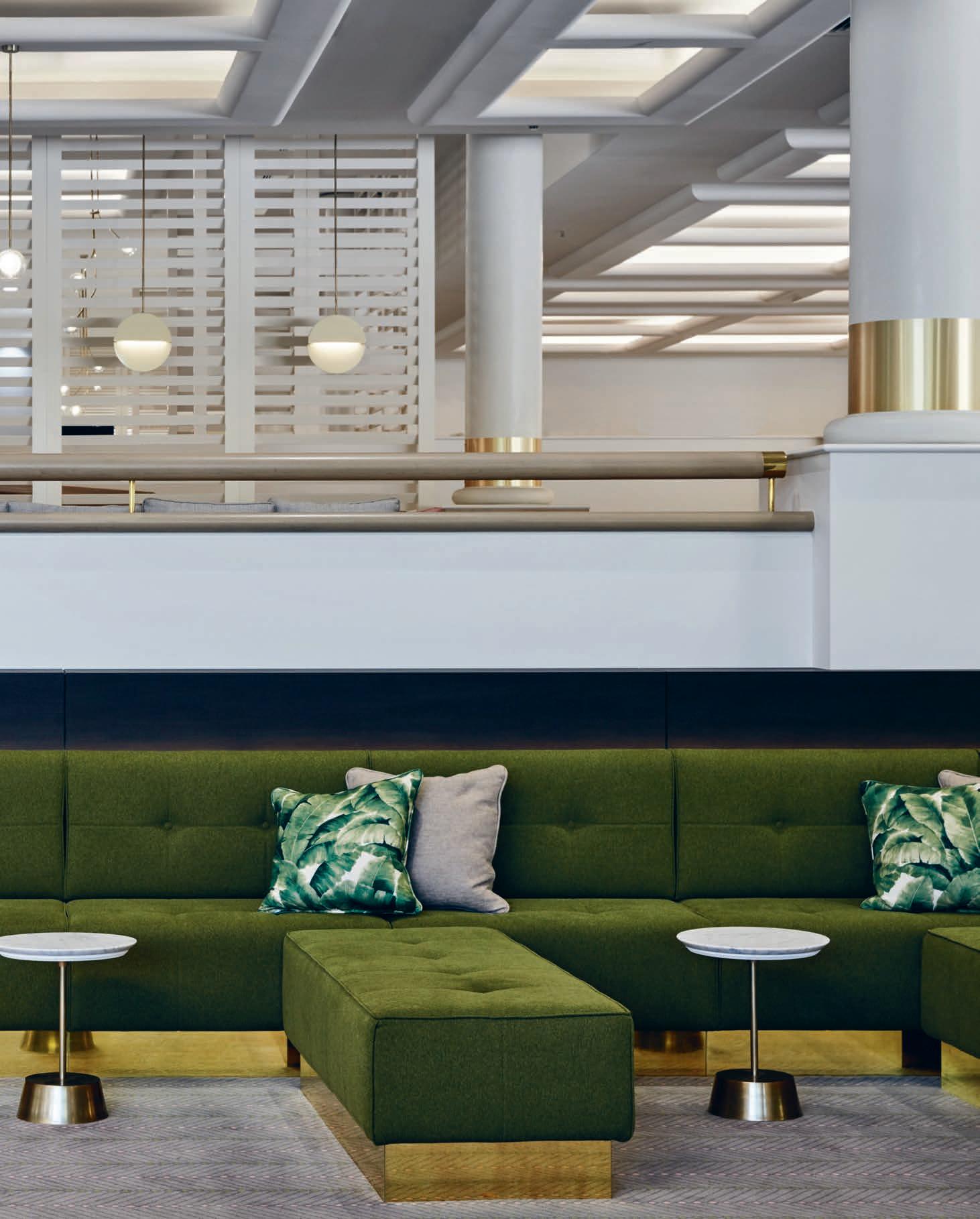
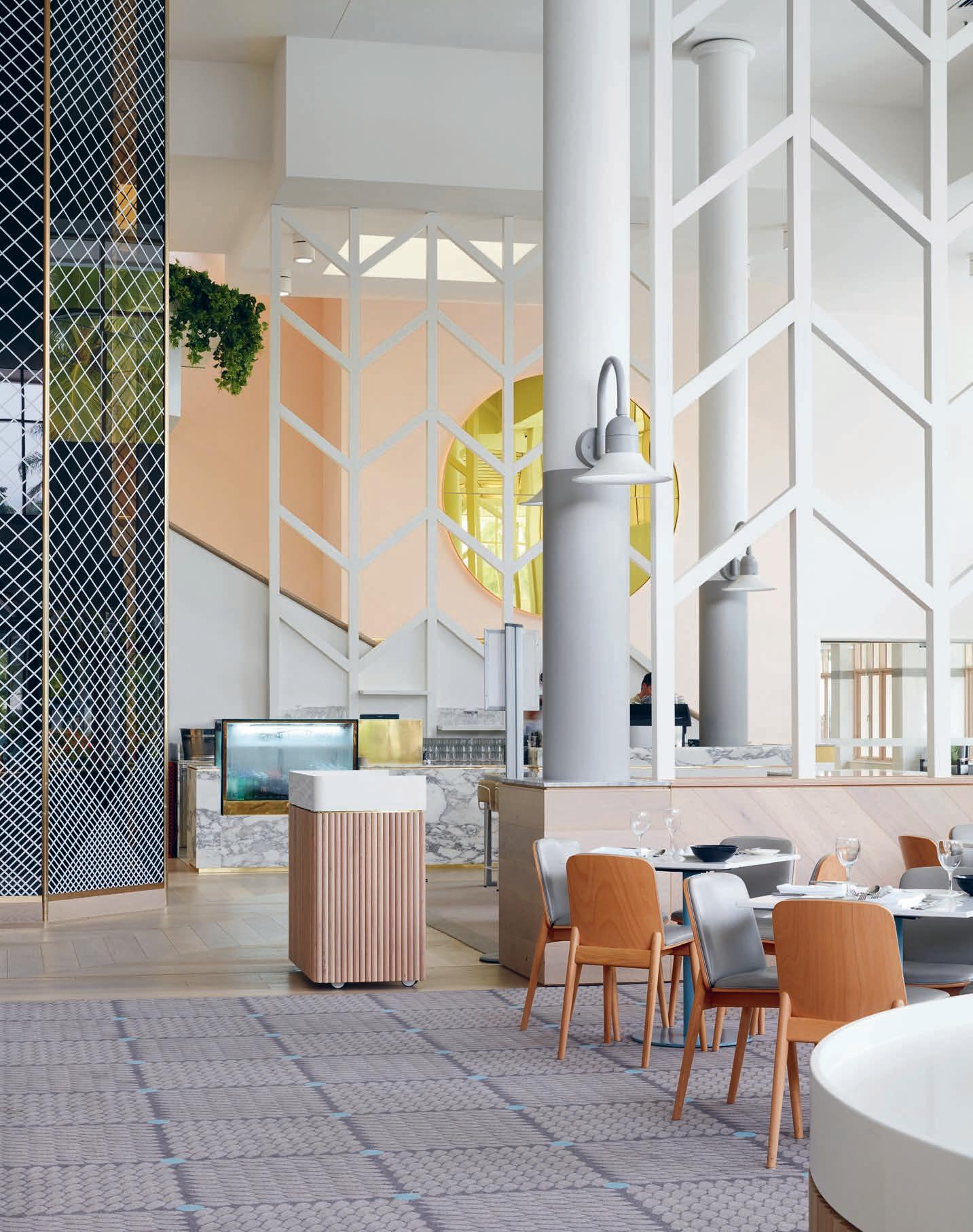
“The successful curation of bespoke elements including carpet, lighting, joinery, furniture and so furnishings serve to enrich the whole as an authentic experience of place. A new meaning of ‘luxury’ for a post millennium world.”
In 1987 Christopher and Pixie Skase created the iconic Sheraton Mirage Resort in Port Douglas, Queensland. It emerged at a time when the idea of luxury wasn’t just a lifestyle espoused by the privileged but a stylised idea about ‘living in excess’ that permeated all cultural fields; fashion, music, art and architecture. As an audacious byproduct of the time, the Sheraton Mirage Resort epitomised this hedonistic world. It boasted the biggest pool ever created in an Australian resort along with lobby and communal areas more lavish than the Far North Queensland town could comprehend. Raising it further into stratospheric levels of luxury was its signature iconic, pastel pink façade.
When Mim Design was approached to oversee a renaissance of the building’s interior, they commi ed themselves to divulging the provenance of the icon with forensic dedication to the task.
Miriam Fanning, founder and principal of Mim Design and lead designer, Kristiina Reeve, found there was plenty to inspire them. “There was a beautiful feel to the interior,” Fanning says. “The lobby and communal areas were very spacious, very luxurious for their time.” Three decades on, those opulent spaces were begging to be reimagined. “Knowing it was an icon of its time, we wanted to return it to its iconic status,” says Fanning.
The design process began with a focus on the experience of the grand spaces of the lobby and foyer. “Rather than massive empty spaces we wanted to create more intimate spaces and more informality,” Reeve says. The team also sought ways to amplify the experience of the landscape and presence of the exquisite beachfront se ing. This involved making more fluid, physical connections to outdoor space, but the concept translated in more figurative ways also. Swathes of lush indoor plants were introduced and tropical references made through coloured and pa erned textiles.
“We wanted to introduce fresh, eclectic and fun references, playing on the idea that colour is embraced more readily in the ‘tropics’,” Reeve says.
Determined to balance the exoticism of 1980s glamour with timehonoured contemporary design, the team lobbied for elements of the original to be preserved and even reinstated. Weighty brass hand rails, gracing the impressively scaled staircases, were identified as a key material finish and a direct reference to luxury. “We took it further, adding brass cu details to the columns and brass to joinery items within the bu et areas,” Fanning says. Archive footage revealed other fragments that deserved reinstating, namely the so , pastel finish of lime rendered timbers. These elements were reintroduced to create a subtle framework to bridge the aesthetic of old and new.
The true genius of the extensive refurbishment reveals itself as an the authentic revival of 1980s luxury; a celebration of pastel hues juxtaposed against bold geometric pa ern with brass and timber accents used to so en a deliberate yet subtle visual dissonance.
The successful curation of bespoke elements including carpet, lighting, joinery, furniture and so furnishings serve to enrich the whole as an authentic experience of place. The result is a complex and joyful experience that rejects pastiche and instead draws upon a wealth of references to embrace a tropical beachfront se ing, a rich and colourful history and a revitalised future for the Sheraton Mirage brand. The project balances the bold with the beautiful in a glorious cacophony that translates, in a contemporary way, a new meaning of ‘luxury’ for a post-millennium world.
mimdesign.com.au
INDESIGN 143 IN SITU
Page 138 & 142: The newly relaunched ‘Feast’ restaurant adjacent to the lobby and guest lounge. Page 140-141: The enhanced arrival experience includes the revitalised main entrance, improved porte cochére, and a warm, light- lled lobby and reception area.
What are the principles and strategies behind designing for incidental sta collisions and chance encounters? Siren Design maps out its creative thinking and approach for Powercor CitiPower’s BEON Energy Solutions, Melbourne: a purpose built workplace which encourages its sta to ‘interact’ and ‘collide’.
Collision Course
BEON Energy Solutions (Powercor CitiPower) by Siren Design
Having completed Powercor CitiPower’s multiple regional Victoria Depot sites and its 12,000 square-metre Melbourne CBD headquarters, Siren Design were ideally positioned to deliver a second CBD workspace for the client in an adjacent substation building in collaboration with the team at B2B Project and Construction Management. But as is typically the case amid Melbourne’s famous laneways, their first hurdle was to locate it. “The building was practically impossible to find!” says Nicole Pollak, managing director of Siren Design. “Definitely a wellhidden gem.”
Through a garage door and up an ominous old li , the team discovered an industrial warehouse in prime position, apparently in use as a ramshackle storage yard for building materials and pieces of set design. Further investigation unearthed a stage set-up and costumes found to belong to Melbourne band, Client Liaison, who were using the space as a rehearsal area.
“It was a bit of an ordeal to si through,” Pollak says. “But the building was so underutilised for a city location, and it had such a great shell.”
In close proximity to Powercor CitiPower’s Market Street space, the property formed the perfect new digs for the group’s new o shoot, BEON Energy Solutions. With the building façade situated on a slant, and no obvious street entrance, the team were faced with a number of logistical and accessibility challenges. By rotating the li and punching a new opening to face the street, Siren Design established a more welcoming sense of entry.
“It was crucial to connect the design to the surrounding laneways, and give the brand a genuinely Melbourne identity,” Pollak says. To this end, a local artist Dan Wenn was engaged to cover the existing roller door entrance and break-out in gra ti. “We really wanted to express the BEON and Powercor CitiPower story in a visual way,”
says Pollak . “At the same time, we didn’t want to be overbearing with the brand colours, so they are present in peripheral details, like conduits and piping.” This thoughtful emphasis on branding and team culture is fundamental to Siren Design’s design strategy, and informs the project’s careful spatial planning. Placing the social hub of the kitchen and break-out area at the fore means that people are exposed to this zone every time they leave or enter the building.
“It was important to maintain that social, communal feeling at that entry point,” says Pollak. “It also brings a level of transparency – as visitors walk through that break-out space, it prevents that feeling within the business of ‘we’re going to have our best foot forward to our clients, and show another side to our sta ’.” The overall e ect is pleasingly egalitarian, open and welcoming.
Meeting rooms and board rooms are organised so that there is a sense of peace and division, with glazing film cleverly applied to give the illusion that rooms are glowing – a visual allusion to their energy trade. Flexible linear workstations allow for growth, with booths in the breakout area also hooked up with power and data. “We wanted to be able to provide additional space to work away from your desk with dual use for collaboration,” says Pollak.
The amount of custom construction and joinery in the project is a particular triumph for Siren Design. Avoiding o -the-shelf solutions – par for the course in more conventional commercial fit-outs – the team instead cra ed bespoke steel partitioning and glazing. In order to address ESD requirements, the team put on a new roof, bolstered the insulation and improved its acoustic properties. “We made a feature of the trusses by painting them black – it is a very chunky, industrial scheme,” says Pollak. “It is such a unique building, and we really wanted to showcase the character of it.”
sirendesign.com.au
INDESIGNLIVE.COM 144 IN SITU
Words Sandra Tan Photography Yvonne Qumi
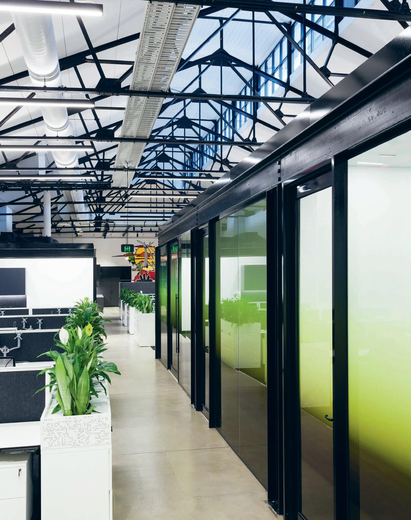
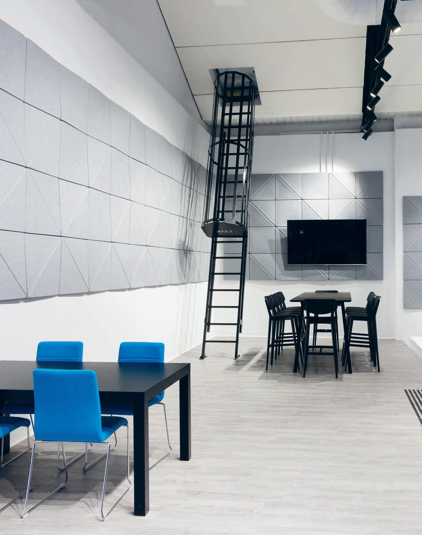
INDESIGN 147 IN SITU
“
BEON Energy Solutions, Level 19 Floor Plan 1 High bench collaboration setting 2 Open plan workstation zone 3 Boardroom/ meeting suites 4 Lockers and amenities 5 Informal meeting and utility point 6 Meeting suites and quiet rooms 7 Fire stairs 8 Open plan workstation zone 9 Level 1 li lobby and o ce entry 10 Kitchen break-out and informal meeting zone Page 145:
3 2 1 4 5 6 7 9 8 10
The thoughtful emphasis on branding and team culture is fundamental to Siren Design’s strategy and careful spatial planning. Placing the social hub of the kitchen and break-out area at the fore means that people are exposed to this zone every time they leave or enter the building.” – Sandra Tan.
The open plan workstation grid curls around stand-alone meeting rooms.
Opposite:
The break-out collaborative work area at the foot of the central staircase between levels one and two. This page: Floorplan for the primary work area.
The shopping mall is making a comeback – but not in the way you might expect. SJB reimagines the retail experience at Sydney’s iconic Chifley Plaza through a clever pairing of Manha an Art Deco nostalgia and a design strategy that appeals to our hearts and our feet.
A Dramatic Revival
Chifley Plaza Sydney by SJB
Words Sophia Watson Photography Felix Forest
Do you remember that time – way back – when you would get all dressed-up, just to go into town? Your mother would put on her pearls and her best face of makeup just to make the pilgrimage into the CBD David Jones or Grace Brothers? This was a time well before online shopping, when the mall was the epicentre of glamour, a uence and aspiration for many punters looking for a sophisticated experience, all topped o with a passionfruit sponge cake at the adjoining high-tea room.
While online shopping has thrown the purpose of physical retail into question it seems that, despite our predications the bricks-andmortar is dead, a resurgence of the classic shopping mall has revived the sector. And it’s a revival that is largely design’s doing.
Sydney’s famed Chifley Plaza shopping mall, by SJB, reimagines the retail experience with inspiration from the Manha an Art Deco style of the original building itself. Since its inception, Chifley has been an iconic retail precinct in Sydney’s CBD, renowned for extraordinary marble detailing and high-end shopping. SJB has taken the interiors to a new level by retaining the aesthetic and historical nostalgia of the precinct and architecture while delivering a more modern interpretation of it.
On the upper floor, for example, an enormous backlit ceiling acts as a glowing skylight visible from all levels. Taking inspiration from iconic international public buildings like Le Bon Marche in Paris and The Guggenheim in New York, the pa erned backlit ceiling acts
as a focal point, throwing a lovely wash of light through the tri-level atrium void. With this illuminated ceiling, an interior pale e of black-and-white marble, aged brass, dark timber and deep greens gives the retail experience a sense of glamour and prestige. More than just a stylistic change though, this major refurbishment also restructured the architecture for improved circulation; a new glass li was introduced, the escalators were repositioned and the existing mezzanine rotunda was removed for be er sightlines throughout the building.
“We approached the design by understanding the problems, considering options and looking to historical references that might help unfold the answers,” says SJB director and design lead, Jonathan Richards. “For example, we loved the idea of a backlit ceiling to resolve the issue about low ceiling heights and a hidden food-court. It would be the draw-card on entering Chifley. The enveloping canopy of light also created a sense of marketplace.”
In designing the smaller details, Richards and team note that they “always like to be heavily involved in the prototyping of furniture, joinery and construction details”. Richards says: “The builders made 1:1 mock-ups that gave us the opportunity to finesse proportions, colours and materials to ensure the final outcome feels properly resolved and completely thought through.”
This is really the departure in thinking from current large-scale retail models – where the approach is almost grid-like and templated
INDESIGNLIVE.COM 148 IN SITU
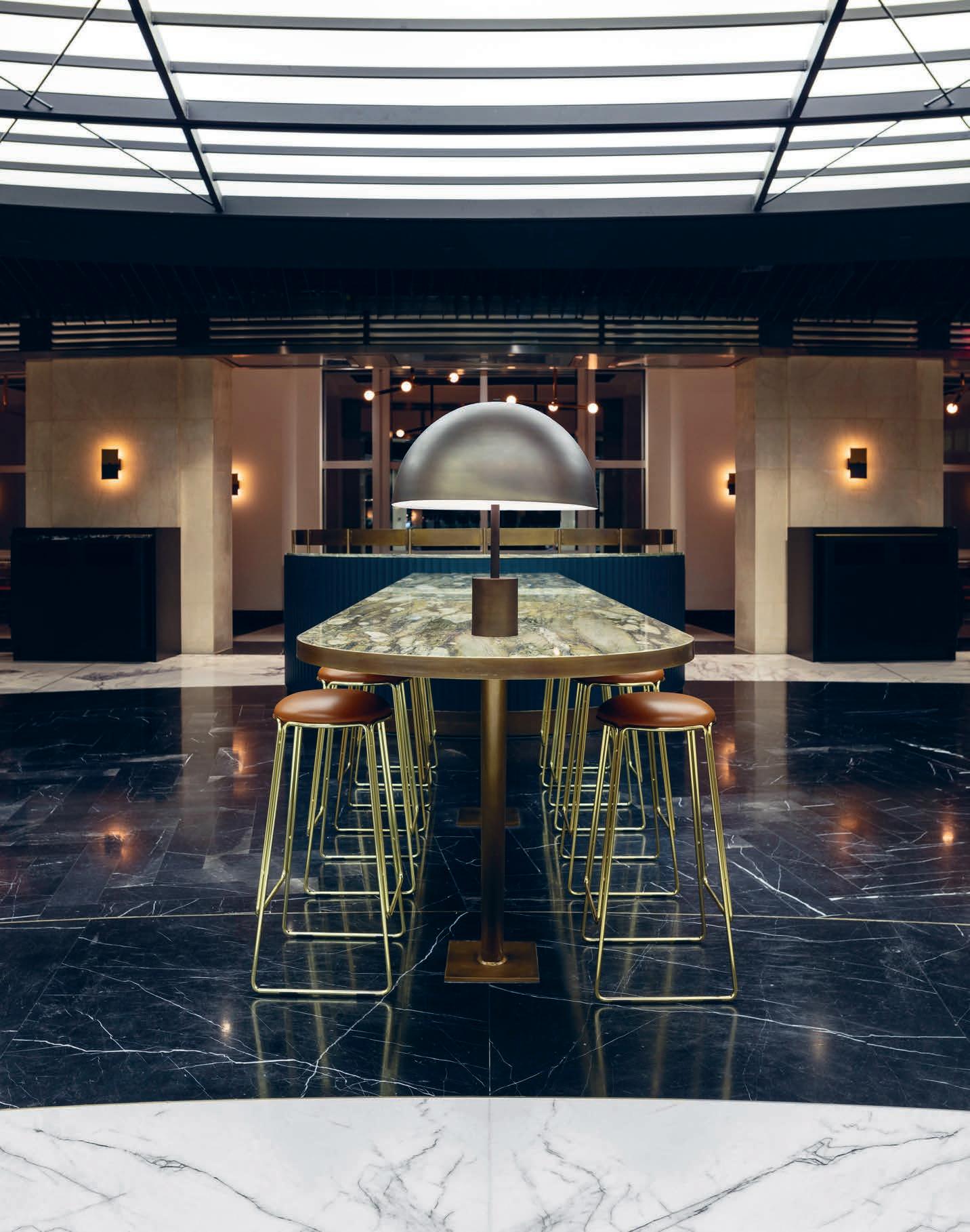
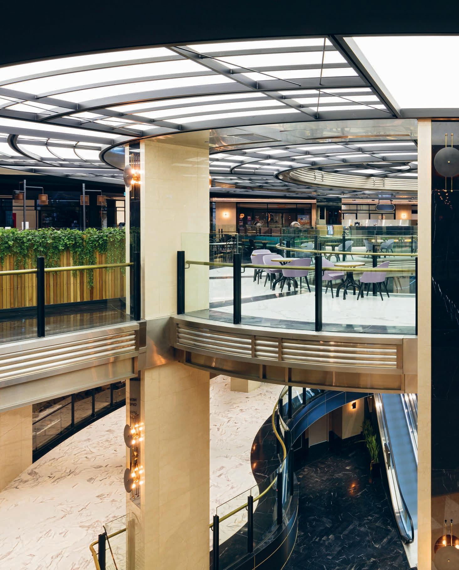
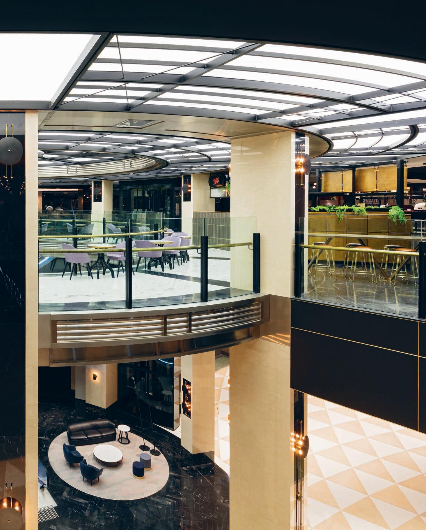
“We made an early decision to distinguish our work by a very limited pale e of black and white. The ceiling panels [and] floor stone slabs are all black and white, and all metal work is ma e black. We so ened this approach by introducing deep greens into the so furnishings and joinery. ” Jonathan Richards, SJB director.
– to this more hyper-luxe, rich-in-detail, bespoke archetype. In that vein, SJB was clever in its reimagining of classic retail tropes. “The food court at Chifley is less of a takeaway eatery and more of a providore marketplace,” says Richards. “It was designed as a high-end food precinct. It is still very much a place for lunches and co ees but it’s more exclusive, more luxurious and far more elegant that the commonplace CBD food court. We worked with our clients on developing a design that would a ract a more executive level customer for lunch. There have always been food courts and there have always been restaurants but the intention here was to create a space between these two where it still felt casual but of a higher calibre. The seating areas for instance, all have a sense of privacy so that the customer can have valuable time to themselves or even hold o -site meetings.”
But while the aesthetic connections to past and present were important, considering the way people would ultimately move through and use the space was a key focus point. Richards recalls: “The major challenge was a more pragmatic one of how to make
a hospitality precinct on the third floor of a retail centre actually work. People tend to flow easily into ground floor hospitality spaces but encouraging them to ascend to the third floor of a commercial building for lunch is a challenge. We resolved this by making enormous changes to the way people move through Chifley. We cut away a large mezzanine floor to enable be er sightlines. We built a new glass li , new escalators and a gigantic circular backlit ceiling that on the top floor that has become the focal point of the whole venue. The food-court had been largely out of sight – now it is on full view and the centrepiece of the space.”
Since its re-launch in February this year, the reimagined Chifley has be re-established as the Sydney CBD’s most sophisticated retail and food o ering. With its wonderful sense of drama and genuine quality there’s no doubt that the shopping mall is back in town.
sjb.com.au
INDESIGN 153 IN SITU
Page 149: A solid marble shared dining table on the third- oor food court.
Page 150-151: Looking down from the food court atrium at the cut-away mezzanine and the lounge and entrance foyer below.
Opposite: Plush forest green restaurant-style booths are used as common eating areas on the third- oor food court.
Designed by Architectus, St Andrew’s College Centennial Chapel is part of a new generation of civic buildings emerging from the earthquakedamaged Christchurch. It replaces its arts and cra s predecessor, but thanks to some careful salvage and reuse, it wonderfully translates the principles of old religious dogmas into future-forward physical spaces.
Old Dogmas, New Tricks
INDESIGN 155 IN SITU
“Good church architecture will embody the creative tensions between transcendence and immanence, the personal and the communal, the universal and the situational – a strong philosophical framework for the design.” – St Andrew’s College representative.
St Andrews College Centennial Chapel Christchurch by Architectus
Words Andrea Stevens Photography Simon Devi
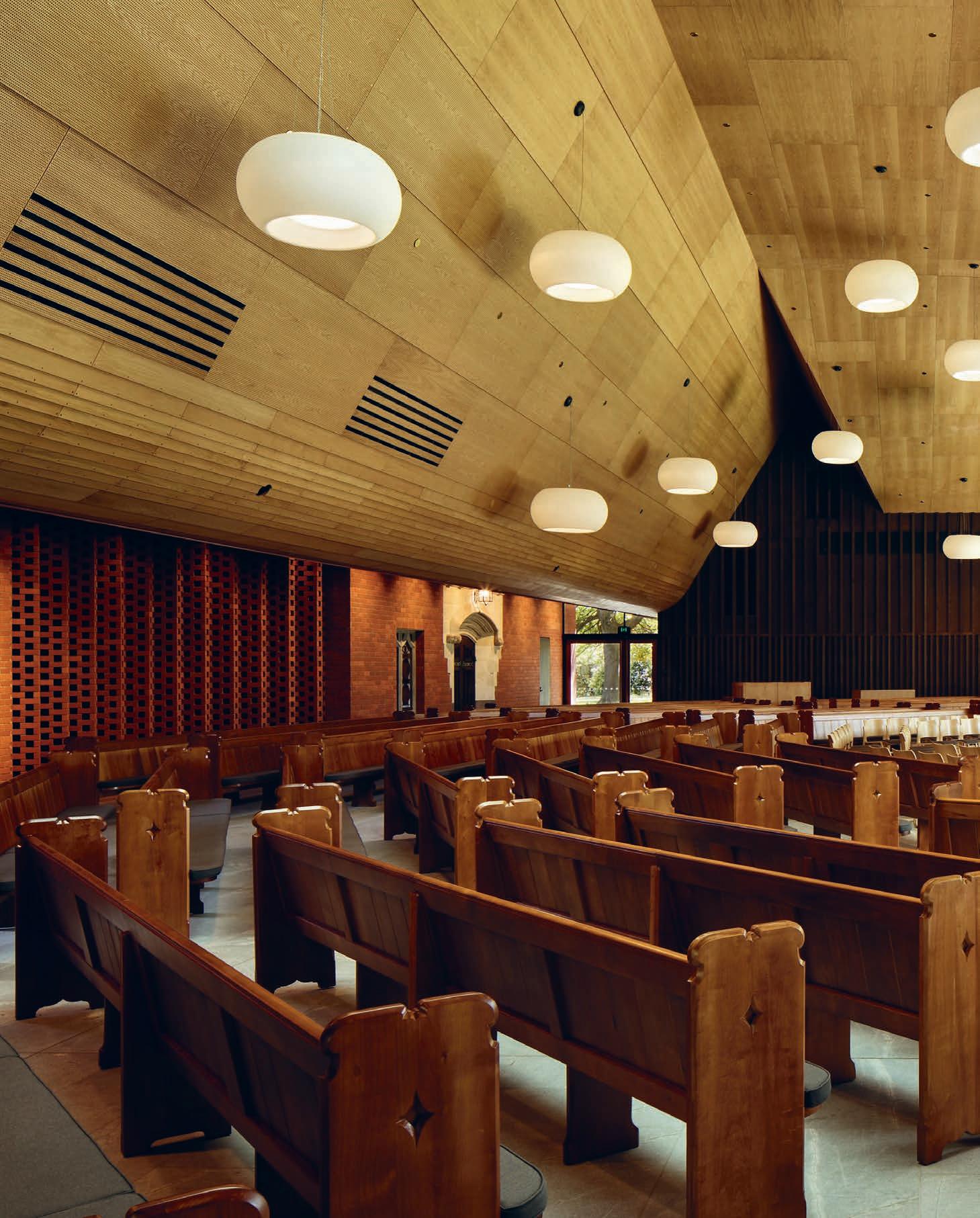
Let The Light In
With the Memorial Wall forming the background of the nave, the foyer and vestry at either side, the congregation is focused toward the sanctuary and its expansive glazed wall. “The Memorial Wall represents the idea of the universal,” explains architect Patrick Cli ord. “It is ancient and heavy, with a sense of timelessness and o ering a place for personal reflection. While the glazed wall is outward looking, contextual and opens you to the world.”
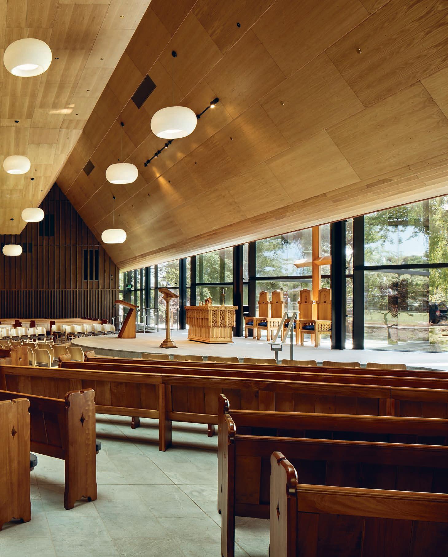
–
Reusing fabric from an older building – brought about by ruin or demolition – has a fascinating architectural tradition. From Roman columns salvaged for medieval churches to Carlo Scarpa’s enigmatic Castelvecchio Museum in Verona, historical elements kni ed into ‘modern’ spaces provide contrast and continuity.
When designing St Andrew’s College’s new chapel in Christchurch, Architectus embraced the opportunity to reuse salvaged fabric from the original 1955 World War II memorial chapel. Historic stained glass windows, portals, gargoyles, glazed tiles and bricks were all artefacts the College wanted to incorporate. “We had to be careful not to be overly nostalgic,” says architect Patrick Cli ord. “But equally, in a city that has lost so much, I think it’s important to build on memories. We have utilised, abstracted and expanded on a language that we think is important, both from the old chapel and other building types from the region. So, although we have designed something new, there is a sense of familiarity. This building is not singular or anonymous.”
In addition to the salvaged elements and rehousing the World War II memorial, the new chapel needed to be much larger than the original, and create a new interpretation of both the worship space and its connection with the landscape. The College elegantly articulated its aspirations in the brief, whereby “worship should be kept simple in relation to both formal and visual e ect. [With] no undue clu er or distraction.” And described how “good church architecture will embody [the] creative tensions” between transcendence and immanence, the personal and the communal, the universal and the situational – a strong philosophical framework for the design.
The architects set up an east-west building entry and axis as in the original chapel, but turned the congregation 90 degrees by locating
the sanctuary to the south, overlooking the stream and playing fields. Elements from the old chapel are embedded into a 50 metre-long ‘Memorial Wall’ made of concrete block and clad in red brick. It has two deep alcoves for the Book of Remembrance and baptismal font, and contains a series of small quiet rooms. The cra ed details of the new brick – its intricate la ices and niches – make the reused building parts feel at home and create a wonderful contrast against the large planar walls.
The universally understood languages of light and dark, personal and communal give architectural expression to the function of the chapel, and, together with bright acoustics and rich materials, create an atmosphere for worship.
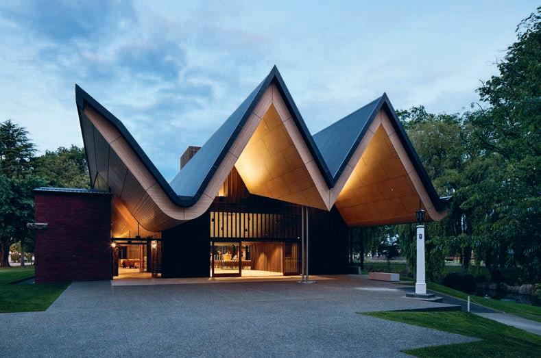
With the landscape as backdrop, the dais runs the length of the space o ering a semi-circle extension for the communion table and lectern. The curve ripples out in the arrangement of the pews (also original) to create a “gathered community” as described in the brief, allowing worship to be “a participatory event, not a spectacle.” A large folding roof spans the length of the room, and extends out past the foyer to create a generous veranda. Inspired by the first church buildings in Canterbury – the ‘V Huts’ – the double V provides acoustic reflectance and absorption internally, as well as adding a strong sculptural character to the exterior.
The new architecture is richly layered spatially and materially, but maintains an overall conceptual clarity. It reinstates the red brick architecture along the road boundary, deploying stone, timber and brick to reference the historic European architecture of the city. Yet it graciously proposes a lighter, Pacific language for Christchurch, one that resonates deeply with its location and climate.
architectus.com.au
INDESIGNLIVE.COM 158 IN SITU
Page 154: The glazed sanctuary opens to the park, its strong triangular geometries referencing local Gothic architecture. Page 156-157: Pews are arranged as a collection of class-size seating groups – an intermediate scale between the individual and the community. This page: The local ‘V-Hut’ is reinterpreted here at large scale to create a generous and protected forecourt.
I ND ESI GN X ILVE
It’s an Italian thing.
With some people, it’s cars. With others, it’s clothes. But it could be a chair or even a cooker. You know you’re hooked when you can’t walk past without looking longingly at its curves or joins or some other obscurity nobody else has noticed. And why is it that so many of the inanimate things we fall in love with emanate from Italy?
German design is somehow di erent: function comes first and form appears an a erthought. Everything works like clockwork, without a doubt, but something is missing. Italian stu is made to work beautifully but also seems to have that certain... pennacchio? What is that special Italian design ‘thing’? The appreciation of this aesthetic is what creates an unspoken bond amongst a cionados.
ILVE cookers are no exception.
We spoke to devotees of ILVE cookers to try and be er understand the nature of their passion.The ILVENTISTA seems to have the same underlying appreciation of beautifully functional design beloved by admirers of B+B Italia furniture or Alessi homewares.
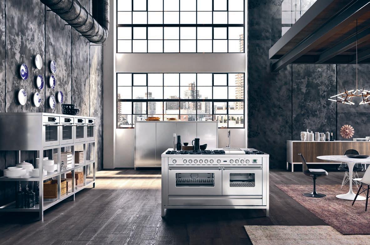
It seems to emanate from the source of the product, the very life and soul of a country, its people and their unmatched bravado and joy. Handmade in a state-of-the-art factory near Venice, ILVE’s master cra smen make products with commercial grade heritage, designed for the very best Italian homes.
But more than this, ILVE’s cognoscenti will talk of the special relationship they seem to build with their cooker in a manner akin to relationships people have with cars or motorbikes. These products can act like anchoring points, grounding you throughout your life. While ILVE is uniquely positioned at the apex of where people come together to connect and forge communities.
If you love cooking for family and friends, you’ll inevitably spend a lot of time with your ILVE cooker and will come to knowingly adore its individual nuances. For the ILVENISTA, the Italian spirit, that special design ‘thing’, seems to enrich this relationship beyond normal realms. La vita e bella!
159 ILVE ILVE.COM.AU
ILVE Kitchen Appliances. Hand Made in Italy since 1952. Showrooms in Sydney, Melbourne, Brisbane, Perth and Tasmania ilve.com.au For commercial range details visit eurolinx.com.au
Fixed, Fitted & Furnished
PwCMelbourne
Architect Futurespace
Project Manager Savills
Project Management
Builder Mirvac Construction
Services Engineer Simpsons Kotzman
Duration 18 months
Futurespace futurespace.com.au
Furniture ‘Beetle’ chair, ‘33A’ stool, ‘Bulbo’ tables, ‘Issy’ lounge, ‘Plum’ chair, ‘Seashell’ chair, ‘About A’ table, ‘Little Friend’ table, ‘DLM’ table, ‘Taco’ table, Cult ‘Takushi’ table, ‘Bell’ table, Anibou . ‘Fiber’ chair, ‘Oslo’ lounge, ‘FK Bucket’ chair, ‘Nerd’ stool, Eames rocker chair, ‘Oki’ tables, ‘Around’ tables, ‘Asterisk’ clock, Living Edge Raincoat stand, Jardan ‘Buzziville’ workpod, Zenith Interiors . ‘Husk’ chair, ‘Cloverleaf’ sofa, Space Furniture . ‘Mood’ office chair, ‘Mushroom chair’, Ke-Zu . ‘Timba’ table, ‘Kush’ cushions, ‘Blom’ chair, agile wall, ‘Kase’ storage, ‘Strain’ table, ‘Gas’ chair, ‘Gorka’ chair, ‘Softscape’ lounge, ‘Dressed’ lounge, ‘Bloom’ side table, ‘Blade’ table, ‘Nebula’ screens’, Stylecraft . ‘ALA’ chair, ‘Guest’ lounge, ‘Ledge’ lounge, ‘Adriondack’ chair, ‘Turi Turi’ table, Own World . Custom rugs, Designer Rugs . ‘PBS’ tables, Koskela . Garden wall, terrace planter, Tait
Lighting
‘Aballs’ lamps, ‘Parachilna’ lamp, ‘Cement Wood’ light, Ke-Zu . ‘Lean’ light, Great Dane Furniture ‘Grasshopper’ floor lamp, Cult . ‘Alistair’ light, ‘Unfold’ lamp’ Living Edge . ‘Prop’ light, Space Furniture . ‘Baffle’ pendant, Schiavello . ‘Calenda’, ‘Inox’ lights, Artemide ‘Supernova’ ceiling light, Delta Light . ‘Artist 40’ LED, Divine Lighting . ‘Orotund’ wall lamp, FLOS . ‘Vaeder’ ceiling lamp, Modular Lighting Instruments
Finishes
Reclaimed skinny plank, Interface . Resin floor, Hychem . ‘Venture’ plank, Havwoods Flooring . ‘Van
Gogh’ wood, Karndean
‘Safestep’ vinyl, Forbo
Flooring . ‘Stronghold’ vinyl, Altro Floors
Signature vinyl, Amtico
‘Nature’ tiles, Academy
Tiles . ‘Ultima’ ceiling tiles, Armstrong . Perforated ceiling, Knauf Australia
‘Les Reflects’ laques, Barrisol . Paint throughout, Dulux . Perforated
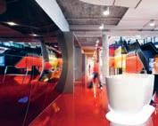
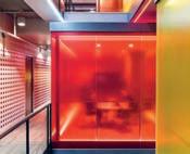
aluminium, Arrow Metal Systems . Textiles, Febrik
Upholstery, Kvadrat
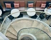
Maharam . Wall Talker, Baresque . Echopanels, Woven Image . Satin doeskin, Universal Anodisers . Smoke silver metallic finish, Alucobond Ravine natural oak finish, Polyec . Laminate finishes, Laminex Group . Solid surfaces, CASF. Eveneer veneer, Elton Group Sycamore leathers, Pelle Leathers . Cast Concrete, 2Barrows Concrete
Russell McVeagh Auckland
Architect Warren & Mahoney
Project Manager RCP
Builder Alaska
Construction Interiors
Structural Engineer
Structure Design Services Engineer NDY, Marshall Day
Duration 18 months
Warren & Mahoney warrenandmahoney.com
Furniture Workstations, Aspect Furniture Systems ‘Vitra’ meeting chair, Cite ‘Happy’ stool, ‘Ballerina’ round table, Goldsworthy ‘Mattiazzi She Said’ café chair, ‘Felix’ arm chair, Simon James. ‘Muuto Visu’ stool, Unison Workspace ‘About a Lounge’ arm chair, Cult . ‘Kase’ storage, IMO
Lighting
Lighting generally throughout, Ocean Lighting . ‘Muuto’ decorative lighting, ‘XAL Move it’ track lighting, Unison Workspaces
Want to know what made the spec’ schedule for all our featured projects?
INDESIGNLIVE.COM 160 IN SITU
Don’t worry, we’ve got you covered...
Finishes
Stone and tiles throughout, SCE Stone & Design
‘Interface’ carpet, Inzide
Commercial . Paint generally throughout, Resene . Feature timber, Dinesen . Acoustic panels, Autex Interior
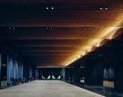
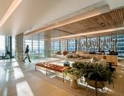
Ascoustics . Timber veneer, Prime Panels . Steelwork, Rivet . Powder coating, Dulux . Fabric upholstery throughout, Kvadrat
Maharam . ‘Pelle’ leather upholstery throughout, Cloth NZ
Fixed & Fitted
‘Quadra’ hydrotaps, Billi Tapware, Plumbline
Collins Square Events Centre
Architect Carr Design Group Carr Design Group carr.net.au
Furniture ‘Lunar’ bar stool, ‘T-Gong’ coffee table, ‘For Sure’ conference chair, ‘Spazio’ dining table, ‘Laval leather chair’, ‘Four Cast’ task chair, ‘Guest’ sofa, ‘Balance’ meeting table, ‘Sketch’ dining chair, ‘U-Turn’ lounge chair, ‘Turi Turi’ coffee table, ‘Kurve’ sofa, ‘Amati’ lounge chair, ‘Paper’ coffee table, Own World . ‘Jean’ armchair, ‘Pelle & Ossa’ armchair, ‘Febo’ armchair, ‘Papillo Grande’ armchair, ‘Pathos’ stool, Space Furniture ‘Leslie’ armchair, ‘Nay’ side table, ‘Platner’ coffee table, ‘Catlin’ coffee table, ‘Bellagio’ outdoor table, ‘Poltrona’ armchair, Dedece . ‘Timetable’ folding table, ‘Graph’ chair, ‘Confair’ lectern, Wilkhahn . ‘Silhouette’ workstation, pedestal, Zenith Interiors . ‘Liaison’ sofa, ‘Plec’ umbrella stand, Living Edge . ‘Ikon 867’ high table, Cafe Culture + Insitu ‘Bong’ coffee table, Cult
Lighting
‘Tom Dixon Base’ floor lamp, Dedece . ‘Atollo’ lamp, Euroluce
Finishes
Joinery laminate generally throughout, Laminex
Reception acrylic, All Plastics . Custom ‘Axminster’ carpets, custom hand-tufted rug, Brintons . ‘Tretford’ carpet role, Gibbon Group
‘Zulu’ curtain, Grey velvet banquette seating upholstery, meeting room upholstery, Kvadrat
Maharam . Reflect glazing, Reflex Technology Reception area glass, Viridian . Fluted glass, Custom Glass & Fittings
Level 5 and 6 joinery laminate, Arvic Laminates
Timber look laminate, George Fethers & Co
Business centre aluminium, anodised aluminium, Sapphire Aluminium
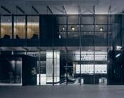
Metal drapery, DAAC Stainless steel generally throughout, Rimex Metals Paint throughout, Dulux
Decorative timber stains, Gunnersen . Marble, CDK
Stone . Stone, Gipoint Washplane, Caesarstone Tiles generally throughout, G-Lux . Veneer, Elton Group . Grey velvet upholstery, South Pacific Fabrics . Leather upholstery generally throughout, Pelle Leather. Auditorium furniture upholstery, Warwick Fabrics
Woods Bagot woodsbagot.com
Furniture
‘Mirra 2’ chair, ‘Fabricus’ lounge chair, Eames walnut stool, ‘Jaan Living’ lounge, Eames meeting tables, ‘Mirra’ task chairs, Living Edge . ‘Graph’ chairs, ‘Cantilever’ chair, Wilkhahn . ‘Physix’ chair, ‘Repos’ lounge chair, Vitra . ‘Catifa’ dining chair, ‘Mayfair’ meeting chair, ‘Blava Easy’ lounge chair, ‘Gher’ informal meeting table, ‘Aro’ coffee table, ‘Blade’ meeting table, coffee table, ‘Fabricus’ armchair, ‘Bob’ chair, ‘Stylus’ coffee table, Stylecraft . ‘Kuskoa’ barstool, Cosh Living . Side lounge chair, Carl Hansen bench seat, About A Lounge highback chair, ‘Steelwood’ café chair, ‘Swan’ chair, ‘Box’ lounge, Cult ‘Croissant’ lounge chair, Cafe Culture + Insitu . ‘Vela
Counter’ stool, ‘Tube’ coffee table, Space Furniture
Custom reception desk, asymmetrical meeting table Schiavello . ‘Stella’ dining table, Zuster. ‘Tribeca’ coffee table, Poliform ‘Mika’ table, Koskela ‘Web’ Chairs, trolly, UCI
Lighting
Floor lamp, Artemide
Finishes
Carpet tiles generally throughout, Interface
Custom rugs, Designer Rugs . Paint generally throughout, Dulux
Timber joinery, Australian Architectural Hardwoods
Timber veneer, Briggs
Veneers . ‘Pure Acoustics’
timber acoustic blade, Acoustics by Imprint . Vinyl flooring throughout, Forbo
Flooring . Stone finishes generally throughout, Artedomus . Stone laminate, Laminex . Countertops, Caesarstone . Marble tables.
Euromarble . Ceramic wall tiles, Living Tiles Magnetic whiteboard laminate, Halifax Vogel Group . Polished chrome trim, Polished Bright Colour back glass, mirror, Palmers Glass . Utilities wall panelling, Woven Image . Leather upholstery throughout, Contemporary Leathers, Instyle, Pelle
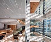
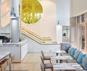
Leathers . Acoustic wall panelling, Fabric upholstery throughout, Kvadrat
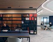
Maharam . ‘Mokum resort’ fabric, Mokum Textiles
Vinyl film, 3M
Sheraton Mirage Port Douglas
Architect Mim Design
Project Manager Savills
Builder Vaughan
Constructions
Services Engineer GHD Landscape Designer Scott Carver
Budget $43 million
Mim Design mimdesign.com.au
Furniture Custom oak chair, custom stone dining table, Prototype Furniture.
Finishes
‘Natural white’, ‘Angel’, paint throughout, Dulux ‘Super white’ benchtop, ‘Verona’ fridge bench, CDK Stone . ‘Paris’ tile, Signorino Tile Gallery
‘Half friar grey’ column panel, Resene . ‘Rope weave’ carpet, Brintons . Leather upholstery, Instyle Timber classing, Woodcut
161 IN SITU INDESIGN
Gilbert + Tobin Architect Woods Bagot
BEON Energy Solutions
Powercor CitiPower
Architect Siren Design
Project Manager + Builder
B2B Project and Construction Management
Structural Engineer
Kersulting
Service Engineer
Waterman Group Building Surveyor
McKenzie Group
Duration 4 months
Siren Design sirendesign.com.au
Furniture
‘Humanscale’ world chair, ‘Slot’ stool, personal pedestal units, ‘Krossi’ informal meeting table and fixed height tables, adjustable work stations, Schiavello . ‘Vybe’ sled base chair, Workspace
‘Doll’ lounge chairs and barstool, Hub Furniture
Artificial plants throughout, Frenchams . Two shelf tambour, lateral drawer, planter boxes, Planex Standing locker, Interloc Lockers . ‘Asterisk’ table, Workspace . Custom PBS table, ‘Eveneer’ custom table, custom Mika table, ‘AC’ table, discbase table, Koskela
Lighting
Custom neon sign, Electric Confetti . Surface mounted LED light, recessed LED downlights, wall washer, ‘Linealuce’ surface mounted up light, iGuzzini . ‘Alume XXL’ recessed LED, ‘Intra light pipe’ suspended LED, ‘Moto Luce’ LED pendant, wall mounded luminaire, ‘Prolicht X-Small’ light and sign, IBL LED Profile and highbay, ‘B Lux’ lighting throughout, ‘Intra’ pipe tube, Light Project
‘Lightnet Basic’ recessed
LED, LPA. ‘Invader’ surface mounted downlight, Prolicht ‘Druple’ suspended LED, JSB Lighting . ‘Swerve’ suspended light, M-Light ‘Klik’ multibeam,
Lighting and Electrical
Distributors . ‘Zoneworks’ emergency lighting, Clevertronis . Presence detecting lights, Steinel
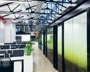
Finishes
Ceiling tiles, Armstrong
Ceiling paint, metal finish, wall paint throughout Dulux . Casual meeting and loose furniture
upholstery, Kvadrat
Maharam . Loose furniture
upholstery, Sustainable
Living Fabrics . Flooring
carpet tiles, Interface,
Ontera . Timber style vinyl, Signature Floors . Bathroom tiles throughout, Classic
Ceramics . Colour glazing, Tint Design . Custom
artwork, Graffiti Artists
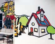
For Hire . Kitchen overhead
joinery, whiteboard
laminate, Surface Squared
Kitchen below bench
joinery, Formica . Kitchen
island and bathroom vanity
laminate, Polytec . Kitchen and bathroom benchtops, Caesarstone . Concrete render, Bishop Décor Wall
Finishes . ‘Echopanel’ privacy screens, Woven Image . Timber screening, Woodform . Bathroom splashback, Perini
Acoustic panels throughout, Autex . ‘Manhattan
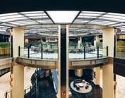
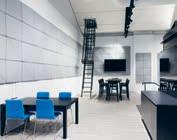
Graphite’ rug, Bayliss Rugs
Fixed & Fitted
Toilet and shower portioning systems, TPI Partition System
Accessible basin, basin mixer, ’Leda Care’ toilet, Male bathroom showerhead, ‘Liano Nexus’ bath/shower mixer, Cube urinal, semiraised basins, soap holders, accessible basin mixer, accessible toilet suite, grab rail, Caroma . Soap dispensers, L-shaped grab rail, coat hook, shower kit, JD Macdonald . Floor water waste drain, Bathroom
Ware House . Bathroom wall mounted ironing board, Robinhood . Toilet roll holder, RBA Group . Wall mounted feature mirror, Artefact Industries . ‘Mizu
Drift’ sink mixer, Reece Zip hydrotap, Zip . Dyson Airblade, Washroom Accessories . ‘Leibherr’ integrated fridges, Panasonic microwave, Bosch semi integrated dishwasher, Abey undermount sink pack, Appliances Online
Chifley Plaza Sydney
Architect SJB
Project Manager Compass
Builder BUILT
Structural Engineer TTW
Hydraulic Consultant Insync Services
Budget $30 million
Duration 8 months
SJB sjb.com.au
Furniture
‘Stellar Works Lunar’ lounge chairs and sofas, Living Edge . ‘Ox Design’ bar stools, Great Dane Furni ture . ‘Plank Monza’ dining chairs, Cafe Culture + Insitu . ‘Otto’ dining chairs, Thonet . ‘Hay About A’ dining chairs, Cult . ‘Gubi TS GamFratesi’ coffee tables, Own World ‘Bolon Flow’ rug, The Andrews Group
Lighting
‘Davide Groppi Sampei’ floor lamps, Dedece ‘Apparatus Studio’ wall lights, pendant lights, Criteria Collection
Finishes
Tiles throughout, Calibre Concepts. Marble throughout, Adriatic Ceramics . Brass joinery throughout, Creative Metal Fabrication . Leather upholstery, Pelle Leathers Velvet upholstery, South Pacific Fabrics
St Andrew’s College
Centennial Chapel
Architect Architectus
Builder Armitage Williams
Construction
Structural Engineer Holmes
Consulting Group
Services Engineer Powell
Fenwick Consultants
Acoustic Engineer Marshall Day
Budget $10 million
Duration 3.5 years
Architectus architectus.co.nz
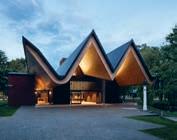
Furniture
Pew seating, Southern Creations. Lectern, Treology. ‘Howe’ 40/4’ chairs, ‘Kase’ table and shelves, ‘Armstrong’ lounge and chairs, IMO . ‘Tom Dixon’ candle holders, ECC
Lighting ‘Fosnova Venere’ main pendant, ICL
Finishes
‘Trespa Meteon’ exterior panels, firesafe MDF panels, Decortech . ‘Sunset red’ terracotta floor tiles, Middle Earth Tiles ‘Atlantic’ granite stone tiles, European Ceramics Exterior ‘Aggregate’ concrete, Christchurch
Ready Mix . Window joinery, Thermosash Commercial
Roofing, Roof Logic . ‘VM Anthra’ fascia, VM Zinc
INDESIGNLIVE.COM 162 IN SITU
Guilloché jewellery for doors


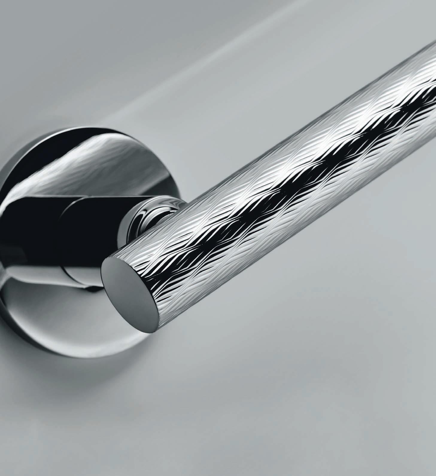
model: Atena - Panier
With the Guilloché collection, Olivari of Italy rediscovers an ancient technique of goldsmith engraving to give “life” to the surface and generate amazing vibrations of light combined with the subtleties of texture.
Olivari; 100% made in Italy for over 100 years.
Guilloché by Bellevue Elegance & sophistication in design and Texture. Its more than a handle is luxury. Contact Bellevue Architectural for your 2017 catalogue info@bellevuearch.com.au | 03 9571 5666 Atena - LigneAtena - Rank Diana - ChevronDiana - Barley www.bellevuearch.com.au
INDESIGN X CULT
A new era for Australian design.
A er 20 years as the leading purveyor of international design in Australia, Cult expands into the production, manufacture and retail of Australian design with the launch of NAU – a new contemporary design brand characterised by Australia’s most curious, creative and spirited design talents. New by necessity, Australia’s design culture stems from a place of isolation.
Our in uences are unique to the rest of the world, and unlike our European counterparts, we have no design ancestry with which to adhere. We utilise and embrace our extreme natural landscapes and rare materials, from closed canopy forests to dense dry bush and open rolling plains. We are free to immerse ourselves amongst this, and as a result have carved out a resourceful, hands-on and open-minded design culture.
O ering furniture, lighting and accessories, NAU by Cult is the embodiment of this fresh- thinking, broad-spectrum approach. Producing designs suitable for residential and commercial spaces, from elegant lounge furniture to modular shelving with endless possibility, the NAU collection is reductive in form, honest in materiality and timeless in style.
Driven by the ambition to bring premium European design to Australia, Richard Munao established Cult in 1997 with a humble showroom in the backstreets of Chippendale. Since then, Cult has
grown into the leading purveyor of the best international design in Australia and New Zealand, with a portfolio of over 35 brands across furniture, lighting and accessories, such as Republic of Fritz Hansen, Louis Poulsen, HAY, Magis, Carl Hansen & Son and Poltrona Frau.
Celebrating their 20th anniversary this year, Cult has evolved from showroom destination to full-service design house; diversifying into the production, manufacture and retail of Australian design, together with the education and advocacy for authentic design.
In 2014 Cult launched its rst exclusive collection of Australian furniture; the AG x Cult capsule of residential and commercial pieces by acclaimed designer Adam Goodrum. Since then, Cult’s product development arm has grown signi cantly in size and recognition; a collective of designers from around Australia now designing furniture, lighting and accessories for Cult.
The time is now to establish these designs as one brand, and promote Australian creativity to the world. From this, NAU is born. So who makes up this enviable cabal of Aussie design talent? Four the launch of NAU, the collective includes: Adam Cornish, Jack Flanagan, Adam Goodrum and Gavin Harris.
NAU launched internationally at ICFF in New York in May and will continue to demonstrate the strength and ability of Australian designers on the global stage.
164 CULTDESIGN. C OM.AU CULT
Opposite: Original Australian landscape photography by Brooke Holm for Cult. Page 164-165: NAU design collective including (from le to right): Jack Flanagan, Gavin Harris, Cult founder Richard Munao, Adam Cornish and Adam Goodrum. Styling: Marsha Golemac; Photography: Dan Hocking.

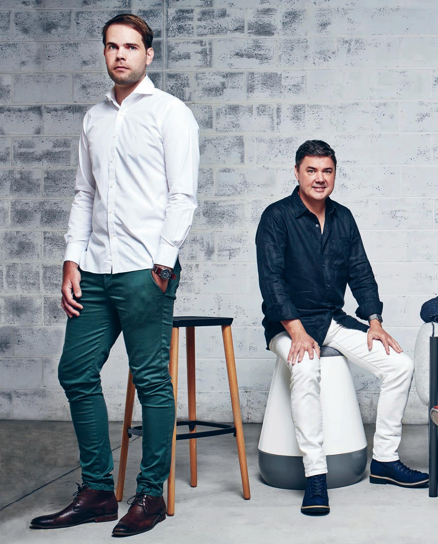
“The time is now to establish these designs as one brand, and promote Australian creativity to the world. From this, NAU is born.”
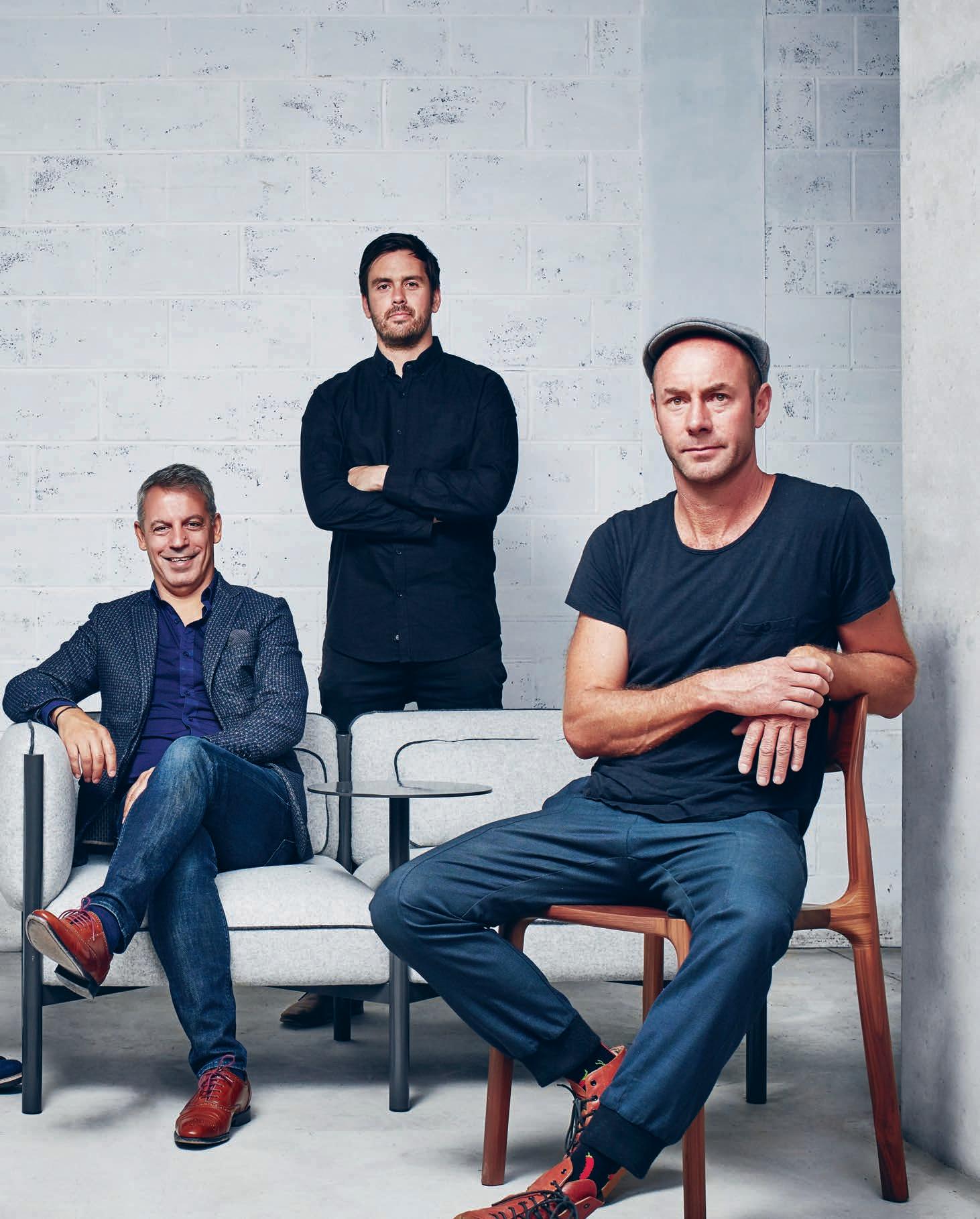
NOW SELLING


SURRY HILLS’ FINEST BOUTIQUE DEVELOPMENT: EXCEPTIONAL APARTMENTS BY CANDALEPAS ASSOCIATES WITH INTERIORS BY LAWLESS & MEYERSON .


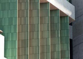
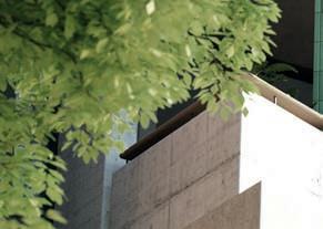
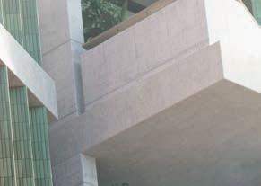
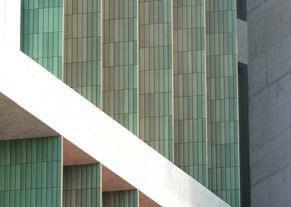
DISPLAY GALLERY NOW OPEN, BY APPOINTMENT. 418A ELIZABETH ST, SURRY HILLS (ENTER VIA DEVONSHIRE ST) — 1800 447 634 | THESURRY.COM.AU ARTIST’S IMPRESSION
HOYNE
WHAT EXACTLY IS OUR INDUSTRY SELLING W HEN IT COMES TO RETAIL?
INDESIGN 169 IN DEPTH
IN
DEPTH
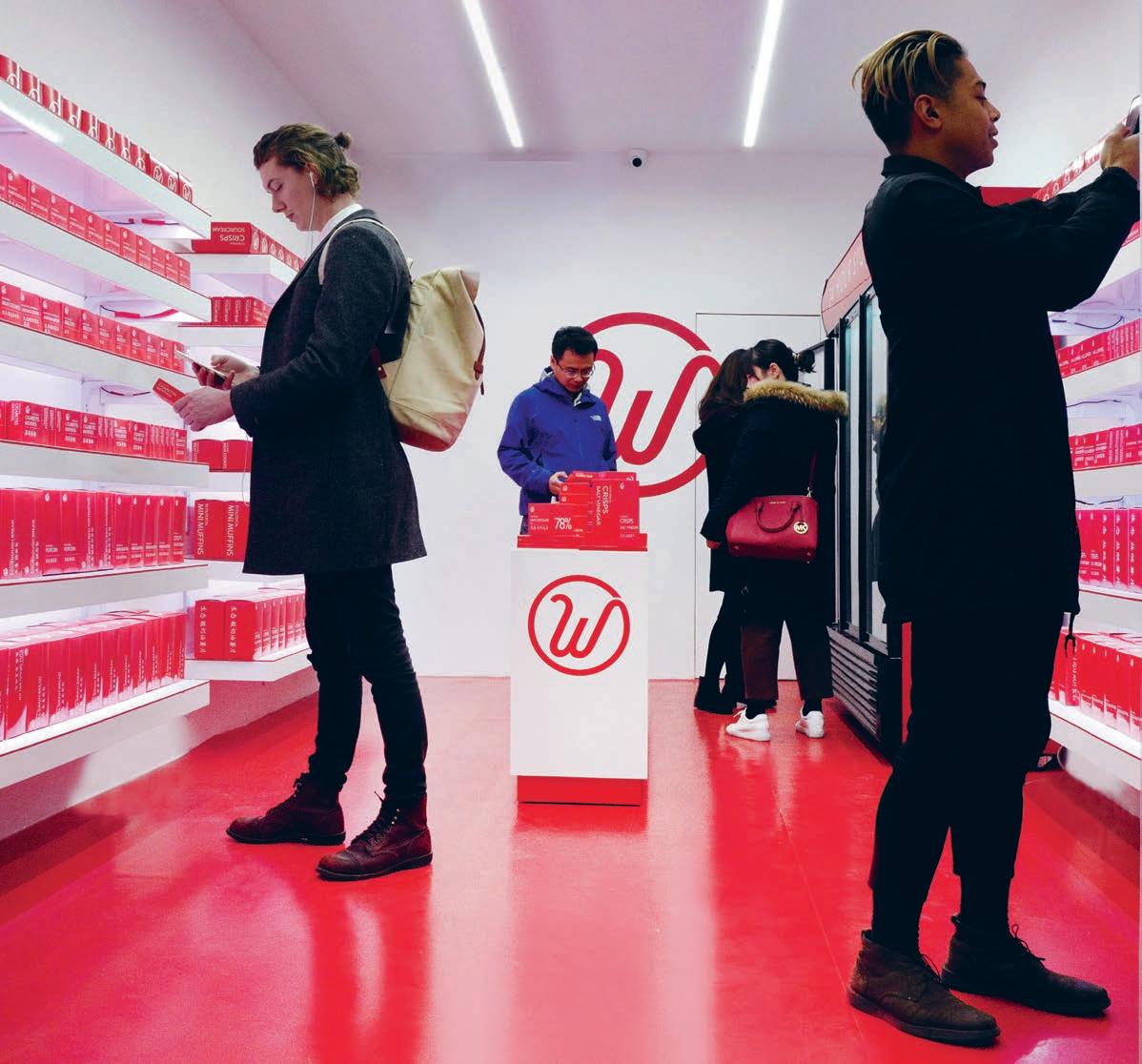
INDESIGNLIVE.COM 170 IN DEPTH
FAD OR FIXTURE?
Employee-less retail sounds like an absolute dream to me. No longer will I feel shame for leaving the house in my pajamas at 2:43am on a Saturday morning because I simply must have a bag of marshmallows and a mango. This kind of judgment-free utopia is of course only possible through the magic of technology. But here’s the kicker – while the technology certainly exists, few retailers can actually a ord it.
And that’s really the issue – not that the technology is a ‘fad’, but that it’s never around long enough for consumers to develop regular behavior around. This means of course, that opportunities to designin retail tech are a rare occurrence, and therefore requires designers to catch–on fast when the chance to do so eventually comes up. The issue of access however, won’t be a problem for long, where young designers and tech-heads the world over are working to democratise technology-driven retail.
Swedish startup, Wheelys, has this year launched its first ever 24hour, unmanned convenience store in Shanghai. Wheelys247 operates via an app with no need for employees to man the decks, allowing customers to buy grocery items like chocolates, cigare es or potato chips at any time, day or night.
To deter thieves, every shopper will require the Wheelys app installed on their phone and linked up to a credit card in order to enter the store. On stepping through the doors, the shop’s artificial intelligence (AI) will recognise the customer, greeting each person individually. Customers will use the app to scan and purchase items, with video cameras around the store keeping a vigilant eye on what is going on inside. The store will not require any manpower to serve customers, in fact the app will even work so that the store owners can track and be alerted when stocks are ge ing low.
Prior to the Shanghai launch, Wheelys first tested their unmanned store concept in Viken, a small town in Sweden, where its purpose focused more on providing a 24-hour service when other nearby shops were a 20-minute drive away. With the Shanghai opening, the startup wanted to test the setup in a crowded city environment. In move to give retailers a ordable access to advanced retail tech, Wheelys wants to license the stores to entrepreneurs around the world, preventing the ‘smart shop’ revolution from being confined just to big cities and international businesses who can a ord to trial the technology.
“The most important step is to do everything in a new way,” says Wheelys CEO Maria De La Croix. “We are building an infrastructure that connects young people around the world and aids them with the tools of the retail revolution. The 24/7 employee-less store is only one tool. Equally important is the network, the app, and so on. For us, this is the core of what we do, and why we are starting to dislike being compared to Starbucks since this comparison misses the point. To say that we will become bigger than Starbucks is like saying that AirBnB will become bigger than Mario Hotels. Of course we will, but Starbucks is just one part of the gray mass that is the real competition.”
And this isn’t the brand’s first foray into democratising the future of retail. The Wheelys247 project is actually a follow-on from their existing bike café phenomenon in enabling mobile purchases at any of its 250 independently owned stations.
The first retail bike launched back in 2014; the very first organic bicycle café prototype, which could be purchased by budding retailers for just $3,000. The bikes have since popped up in over 45 countries around the world, and acted as a way of allowing anyone to start their own eco-friendly catering or retail business with high-end technology at its core.
The bike cafés are powered by a pedal-assisted electric motor, and each comes with two solar-powered burners. They also feature air purifiers, 15L fridge, and an integrated digital display, ROK Espresso Brewer, Wi-Fi, two running taps, a Bluetooth stereo system, light-up sign, three-burner gas stove, an integrated lock and a two-metre green carpet. In the same way that Wheelys bikes made catering accessible to entrepreneurs worldwide, the startup again wants to shake up the system with their AI powered shops, which could equally replace local convenience stores in big cities.
Wheelys is an excellent example of how we as designers don’t have to sit around and wait for a client with a big budget to exact this kind of change in the retail sector. If we so choose, we can very much be in the drivers seat and define our own system of next-gen retail and its relationship with technology – regardless of cost and access. Now that is a future worth investing in.
wheelyscafe.com
INDESIGN 171 IN DEPTH
Employee-less retail is a concept gaining popularity fast and the pressure is on for designers to deliver best-in-class augmentation strategies. But are these new-fangled systems simply a novelty or a legitimate marker of next-gen retail?
Words Sophia Watson Photography Courtesy of Wheelys
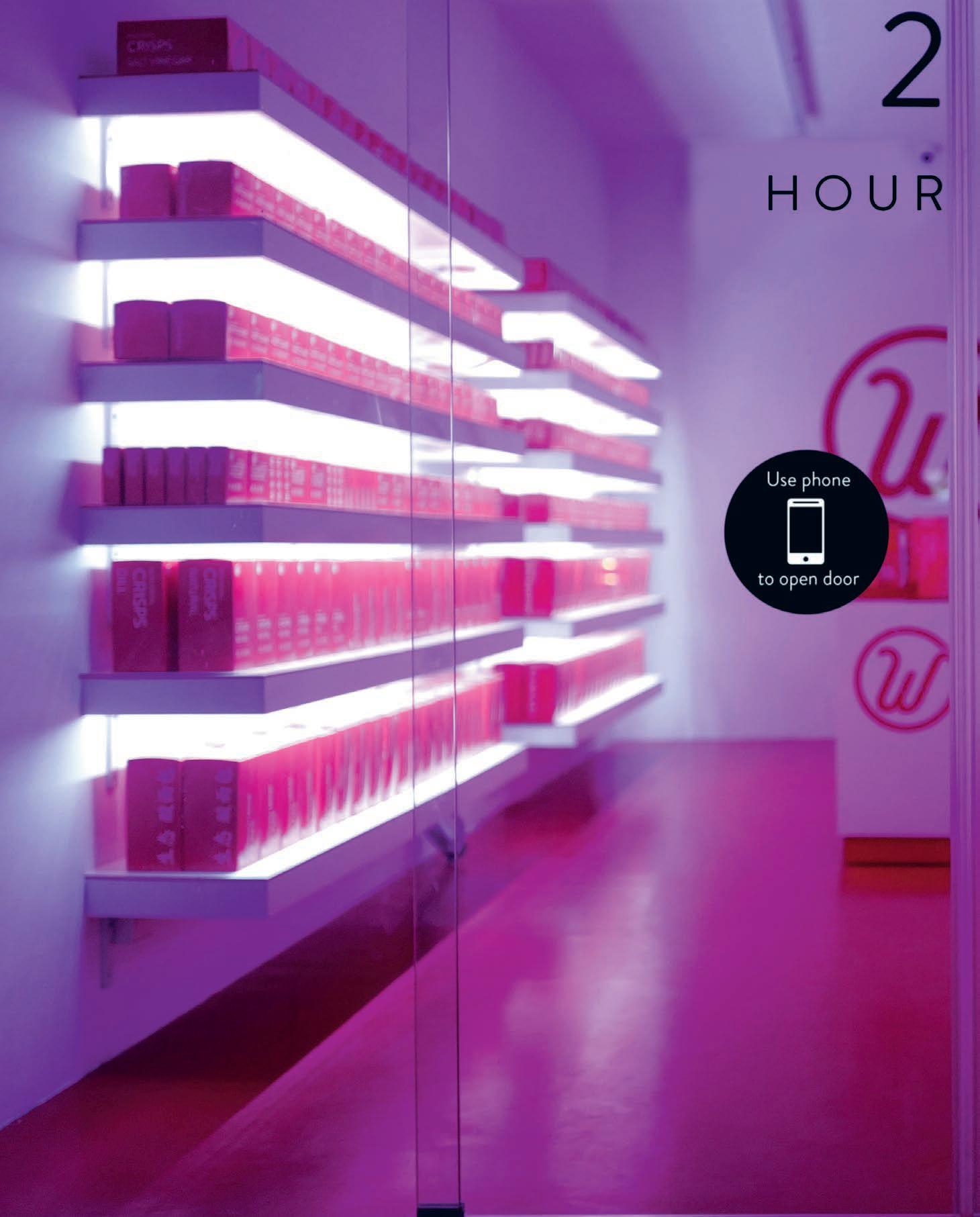
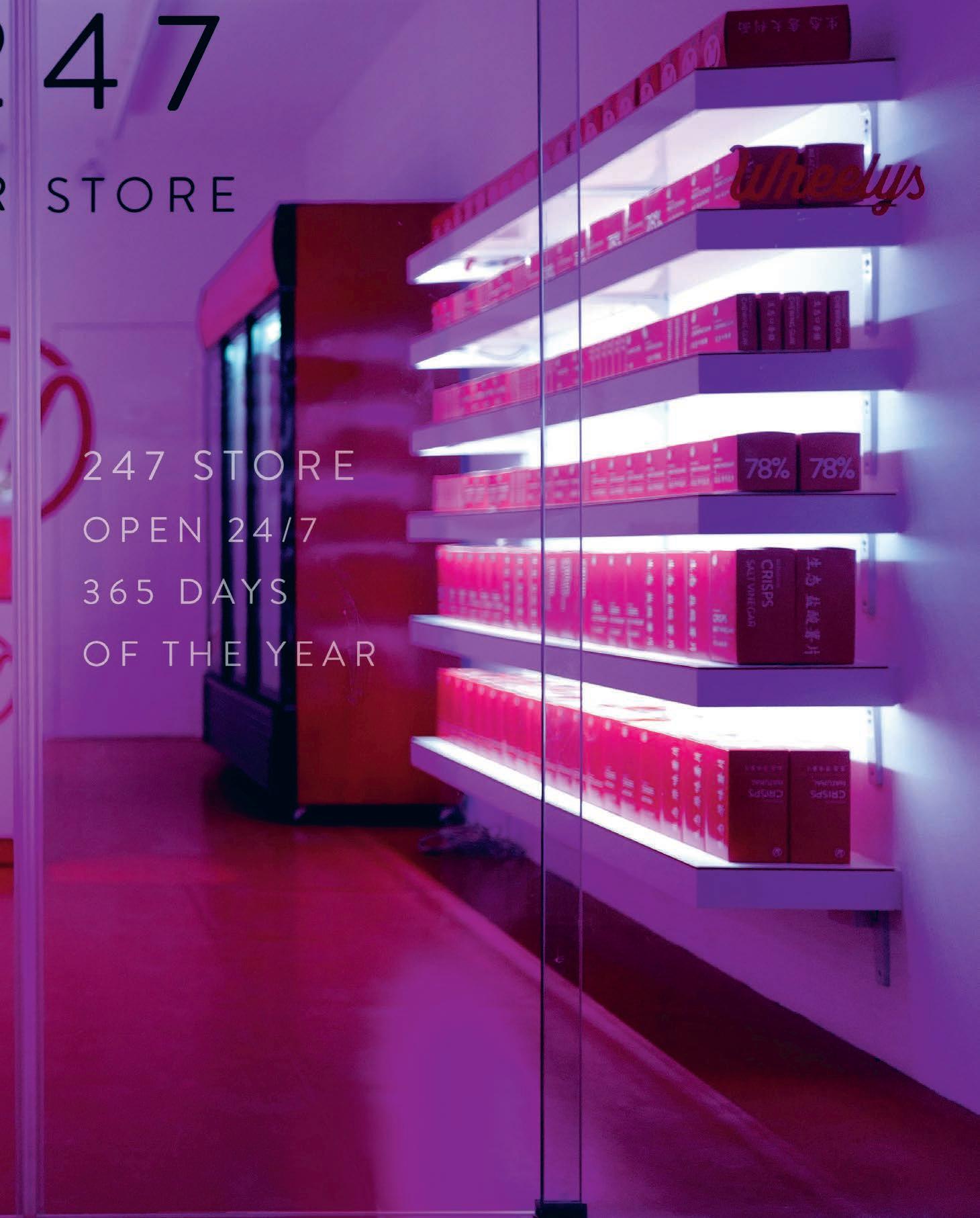


INDESIGN 175 IN DEPTH
“The most important step is to do everything in a new way. We are building an infrastructure that connects young people around the world and aids them with the tools of the revolution. The 24/7 employee-less store is only one tool.”
– Wheelys CEO, Maria De La Croix.
Page 170 and 172-174: Wheelys247 operates via an app with no need for employees to man the decks, allowing customers to buy grocery items like chocolates, cigarettes or potato chips at any time, day or night. This page & Page 176-177: The Wheelys bike cafés are powered by a pedal-assisted electric motor, and each comes with two solar-powered burners. Having launched in 2014, the bike is now present in over 45 covers.
Can design future-proof retailers against the five-year cycle?
CONSUMER CLAIRVOYAN CE
It wasn’t too long ago that retailers were panicking at the surge in popularity of online shopping. Everyone had an opinion as to whether the Internet would become our new one-stop-shop and whether storefronts would simply turn into some nostalgic relic of days gone by. But panic isn’t necessarily a bad thing. For many retailers it was a call-to-action and their response is to give customers something the Internet never can – a memorable tangible experience.
The role of designers in creating positive experiential retail environments shouldn’t be underestimated. Good design is an investment and a well-designed fitout adds brand value, as well as helping to future-proof businesses, in much the same way as giving outstanding service does. Unsurprisingly, bespoke design is something successful companies like global skincare giant Aesop has long utilised to maximise brand longevity and customer loyalty.
As part of a recent plan to upgrade their brick-and-mortar o erings, Aesop engaged design studio Russell&George to renovate their Doncaster store in Melbourne. The brand’s changed a lot since co-directors Ryan Russell and Byron George first designed this outlet’s original fitout in 2008, and their renovation needed to reflect that. Although they kept the existing ceramic wall and floor tiles, a new custom stainless steel display unit and sinks, service
counters and a bespoke light fi ing were installed. “It creates a dialogue between old and new,” says Russell. “But also makes it look more contemporary; it was the next step forward for the space.”
The insertions are deliberately bold and highly tactile, referencing artist Marcel Duchamp’s infamous found objects. However, for all their memorable sculptural qualities, they are hyper functional and so they need to be, in order to bring the store in line with the latest global retail service methodology.
This is an approach that places customer experience at its core and determines best practice for customer engagement. So the designers carefully considered the positioning of the sinks, as well as how customers are greeted when they enter the store and two service counters were put in to speed-up the point-of-sale (POS) process. It’s a dynamic yet straightforward configuration that makes the most of its customisation to a ract first time passers-by. In regards to future-proofing, this simple design strategy is a small piece in a much bigger puzzle that also includes the application of quality materials that can outlast the five-year cycle.
As Russell explains, “Future proofing a retail space is about showing a high level of design rigour, achieving a sense of timelessness and utilising innovation to make the customer experience as interactive as possible.” The Doncaster
INDESIGNLIVE.COM 178 IN DEPTH
Australia’s top designers are tackling the challenge head-on, with Russell & George undertaking the refurbishment of Aesop Doncaster and Geyer re-imagining banking retail for Suncorp.
Opposite & Page 180-181: Aesop Doncaster Renewal by Russell&George. Page 180: New Suncorp retail strategy oor plan by Geyer. Page 181: Client booths and meeting areas at the new Suncorp Concept Store West eld Parramatta, designed by Geyer.
Words Leanne Amodeo Photography Aesop by Trevor Mein & Suncorp by Hugh Hamilton
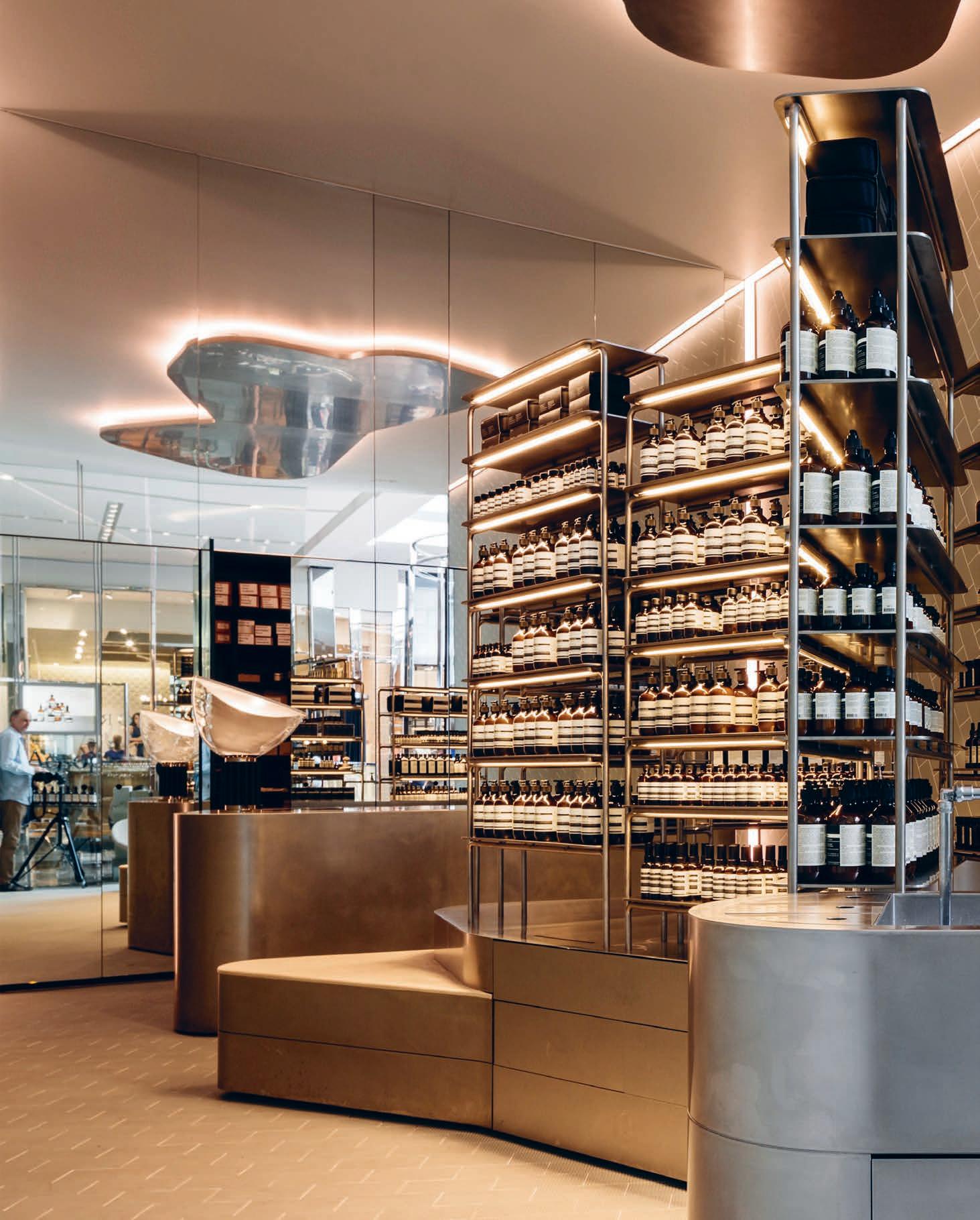
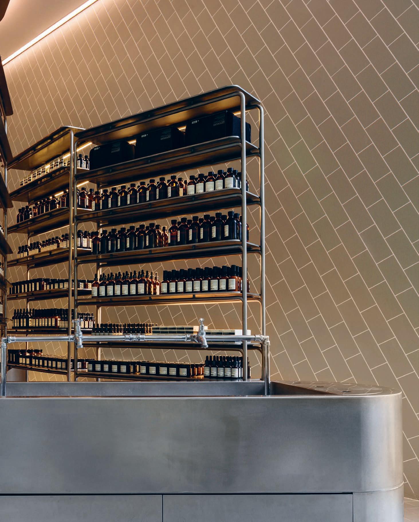
Suncorp West eld Parramatta Floor Plan
1 ATMs at rear of store
2 A new take on the teller window and client-facing area feat. tablet-based service options
3 Private client-facing meeting rooms
4 Client communication booths
5 Collaboration, showcase and demonstration area
6 Client waiting and breakout reception area
7 Semi-private focused client space
8 Entrance
INDESIGNLIVE.COM 182 IN DEPTH
3 2 1 4 5 6 7 8
refurbishment undoubtedly nails this, as does another project, the recently completed Suncorp concept store at Westfield, Parrama a, by interior design practice Geyer.
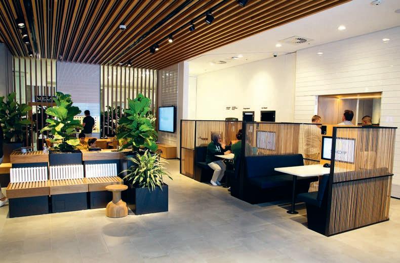
It’s an interesting case study in exemplifying the possibility to future-proof retail businesses through design, because Suncorp is not a retailer in the traditional sense of the term. It’s a finance, insurance and banking corporation, but they were very clear in their brief. “The client wanted the new store to deliver a meaningful experience to customers and the bo om line was to design a store not a bank,” says Geyer’s creative design leader, Tim Giles. It formed the basis for a two-day workshop where the interior designers and client co-created the design outcome.
The resulting concept is based on the notion of a sandbox – something you can play around with and change. From a future-proofing perspective, it was important the new fitout was flexible and could be reshaped and remodelled as required. So the componentry is modular and able to be reconfigured, while implementing a tablet-based service (as opposed to having tellers) allows sta the freedom to roam. A generously sized table is also used for multiple purposes, from seminars to informal
conversations, which incidentally creates activity in the space. This casual environment projects Suncorp’s commitment to wellbeing and the store even sometimes boasts a ‘kids space’ that goes a long way in helping to relieve customer anxiety. One of the scheme’s more unexpected features is the positioning of the ATMs at the rear of the store, rather than at the front. “We wanted to create an environment that encourages customers to dwell,” explains Giles. “So if they’re already in the space then they’re more open to interaction with sta .”
These small positive in-store experiences add up to a good overall impression of the brand. And as with any outstanding example of design-enabled future-proofing, this is only made possible through a solid understanding of the retailer’s business. Designers need to proactively engage in rigorous discourse that challenges anything ordinary and, where possible, involve the client in the design process. Outcomes will be all the more robust and most likely very well received.
russellandgeorge.com, geyer.com.au
INDESIGN 183 IN DEPTH
The resulting concept for Suncorp Parama a is based on the notion of a sandbox – something you can play around with and change. From a future-proofing perspective, it was important the new fitout was flexible and could be reshaped and remodelled as required.
FEELING IT
The significance of emotional experience is crucial to the survival of the shopfront. We’ve known for a while that o ine shopping should focus on multi-sensory and theatrical experiences – but how are we taking this design thinking to the next level? The recent pop-up installations for Hermès and Valexta’s 80th anniversaries may hold some answers.
Words Stephen Todd Photography Various
INDESIGNLIVE.COM 184 IN DEPTH
Opposite & Page 184-185: The Valextra 80 th Anniversary pop-up installation in Milan, designed by Snarkitecture, Photos: courtesy of Snarkitecture. Page 186-188: HermèsMatic concept pop-up shop in Kyoto Japan, a laundromat for Hermès silk scarves, one of the symbols of the house and an icon of Parisian style. Photos: courtesy of Hermès .
I’m a failure at retail, a recalcitrant shopper. The trill of the till leaves me limp. To paraphrase Sartre, Hell is other people –shopping. In a sense, that makes me a perfect crash-test dummy for the seemingly endless stream of pop-ups screaming for my a ention. Over the years I’ve been invited to a Bocconcini evening in a London bike shop, a paint ball/book launch day in Berlin and a champagne brunch in a hot air balloon in a field just outside Paris. The product being spruiked was leather upholstery. While ‘experiential retail’ has become the catch-cry of the 20-teens, in fact the idea of creating buzz by extraordinary o er is not new. Some date it to the Vienna Christmas markets of the 13 th Century but to my mind the real antecedent to today’s frenzy of ephemeral marketing is Comme des Garçon’s ‘guerrilla store’ concept launched in a disused Berlin bookshop in 2004. This spawned a series of CdG guerrilla store actions in emerging markets from Warsaw to Helsinki to Ljibljana to Stockholm to Singapore. Echoing the earnestness of F.T. Marine i’s Futurist Manifesto, Comme’s communiqué for its then radical retail program read : “The location will be chosen according to its atmosphere, historical connection, geographical situation away from established commercial areas...” In other words, the holiest of holy avant garde fashion brands would prove its eternal cool by se ing up shops in cheap rent areas thus encouraging urban renewal whilst itself gaining access to nascent markets at minimal investment and with no long-term strategy.
The original intention was noble – to propose an alternative to the creeping mega brand takeover of once-hip neighbourhoods. Like Prada’s behemoth of a shop designed by Rem Koolhaas and taking up the block on Broadway and Prince in SoHo, New York. In that one fell swoop, Prada opened the floodgates to corporate presence in lo land and upped rents to the point where the artists who had previously lived and worked in the neighbourhood South of Houston had to move across to Brooklyn thus giving rise to the hipster. Thanks Miuiccia.
In the meantime, the demolition aesthetic of Comme des Garçon’s temporary guerrilla stores had inspired the brand to open a permanent ‘destroy’ style store in London’s Dover Street – the temporary had become permanent. (In an ironic twist, Dover Street Market has itself been priced out of the W1S 4LT postcode and relocated to the less glamorous Haymarket.)
Brand fatigue is a thing, the consumer is increasingly savvy. Martin Raymond and Chris Sanderson of Future Laboratory warn of an imminent consumer backlash against short-term, ephemeral products. They reckon we’re about to enter the “age of the long near” typified by long-term thinking. “We are turning towards substance,” Sanderson says. “We are wanting things that have some sense of weight or meaning or context rather than brands that have li le meaning.” Buzzwords such as cra ed, artisanal, immersive, curated, innovative, disruptive, bespoke, heritage and authentic are all out. Marketers have well and truly passed “peak hipster” as Future Laboratory puts it.
INDESIGN 185 IN DEPTH
And yet, temporary installations are still being rolled out to mark a (sometimes tenuous) moment in a brand’s narrative. At the Milan Furniture Fair this year, COS – the upmarket division of Swedish schmu e brand H&M – invited London’s Studio Swine to create an installation that would somehow evoke some sense of savoir faire. The resulting metal tree emi ing white bubbles that popped into nothingness served as a metaphor for the irrelevance of the initiative to the brand. In a similar vein, Italian leather goods brand, Valextra invited New York’s Starkitecture to mark its 80 th anniversary with a temporary installation in its via Manzoni store. The billowing, arctic white fabric draped from industrial sca olding was pleasant enough to look at and Instagrammed to no end, but one was le wondering, Why?
As Forbe’s magazine’s retail commentator Nikki Baird puts it, “gimmicky events like pop-up bars or meals in stores” are out. “This is the easy way of ge ing more experiential in retail, and ultimately it fails. Why? Because the emotional connection to the brand is tenuous at best. We need more. Because once you’ve been there and done that, there’s just not a lot of sense of community or potential for engagement going forward. Because ultimately those experiences are still focused on ge ing people to buy, rather than on an owner experience.”
At Hermès, they’ve always understood the importance of brand narrative – they have, a er all, a wonderful story to tell about a saddler who sets-up shop in Paris in 1837 and ends up ki ing out
old European nobility. The notion of hand-touched is intrinsic to the brand’s identity and each year they communicate an essence of tactility. (There have been Hermès puppet theatres, Hermès cooking courses, Hermès card games, and so forth...) Late last year, they launched the HermèsMatic (which is sonorous in French as Hermamatic) concept pop-up shop, which is essentially a posh laundromat for Hermès silk scarves, one of the symbols of the house and an icon of Parisian style. Reading like a bank of Pantone orange 1448 swatches, a series of washing machines and their a endant boxes of dye are deployed to dip-tint clients’ precious silk carrés in an overdye of denim blue or fuchsia pink.
Apparently iconoclastic, in fact the HermèsMatic program ticks all the boxes of e ective experiential retail. It engages with the existing customer, creates an exclusive artefact and bonds a kind of secret club, a Priory of Sion of Parisian chic. At the same time, new members are invited to join the initiates by purchasing a silk scarf and having it tinted one of the two hues. Right now, as I type this, an elite squad of women are walking around Amsterdam, Strasbourg, Munich and Kyoto – the cities where HermèsMatics were installed – sporting a badge of some considerable honour that even the grinches among us find cool.
valextra.com,
INDESIGNLIVE.COM 188 IN DEPTH
hermes.com
“Gimmicky events like pop-up bars or meals in stores are out. This is the easy way of ge ing more experiential in retail, and ultimately it fails. Why? Because the emotional connection to the brand is tenuous at best. We need more.”
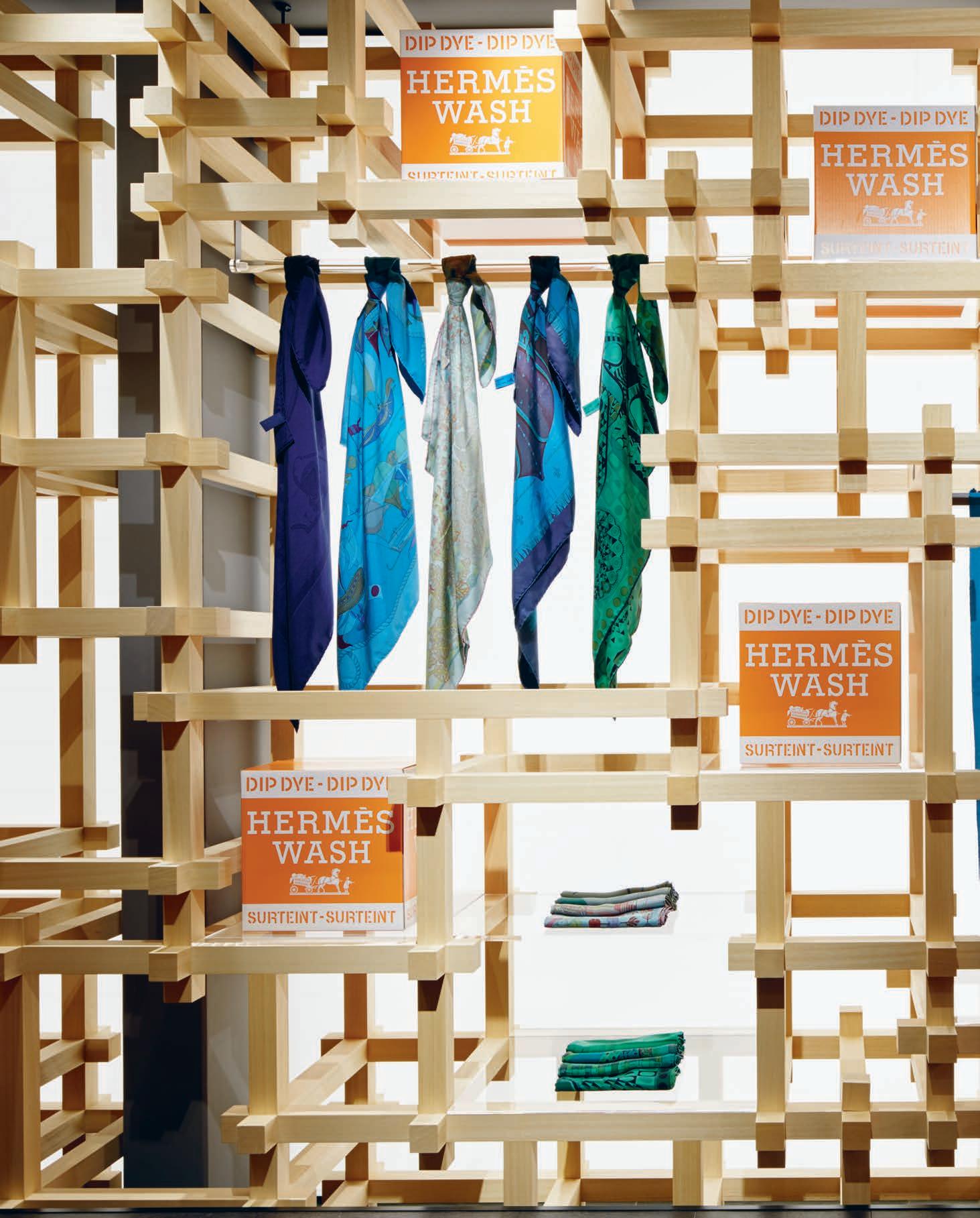
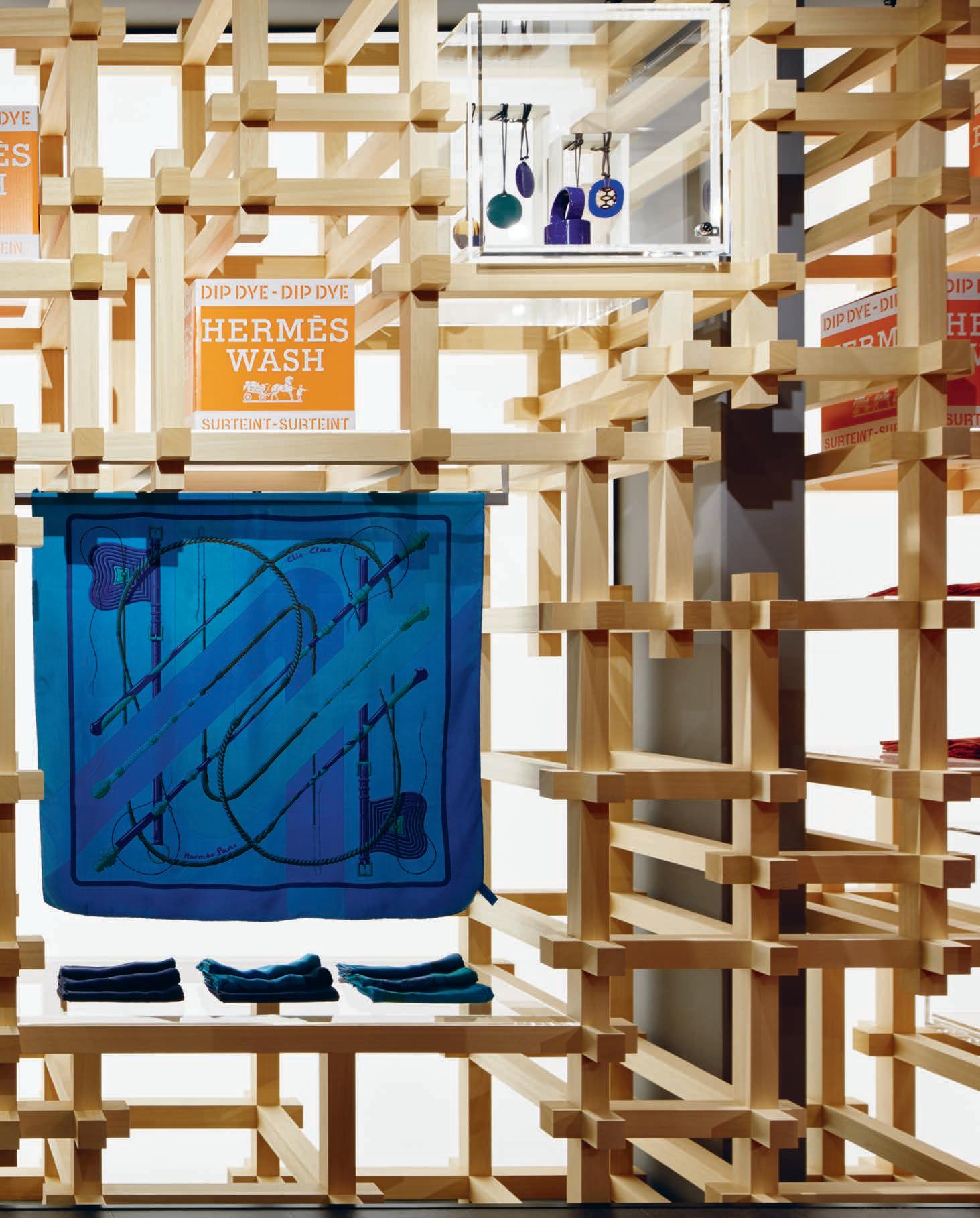
I NDES I GN X UCI
Design and manufacturing, together to help women.
UCI is a well-known specialist in the commercial furniture and fitout world, famed for their reliable delivery of design, manufacturing and shipping solutions, and recently the company turned its expertise to Perth’s Women’s Resource and Engagement Network.
The UCI team is composed of industrial designers, mechanical engineers, and graphic designers with a shared passion for product development and innovation. UCI has devised unique designs specifically suited to the local marketplace all across Australia, and has been recognized accordingly with a number of design awards.
UCI’s Perth brand partnered with IA Group to design and deliver the new o ce fit out for the Women’s Resource and EngagementNetwork, WREN.
This project consisted of providing a functional, innovative and user-friendly fit out to their new workspace, creating an environment that is able to function equally as o ce, meeting space, and assistance facility, all while existing as an area where employees and clients alike can feel comfortable, relaxed and safe.
UCI specializes in these project-based solutions, providing large and multi-site projects and client customization wherever they go. What drives UCI’s business is a passion for the best, customized and unique to the site fit out of every o ce they approach.
As a provider of high-quality workstations and o ce furniture, UCI has built a reputation for striving to achieve environmentally aware and e cient manufacturing operations, with a strategic vision that leads to new and be er products, with a conscientious approach to design.
Focusing on ongoing product refinement, UCI is driven by a genuine desire to be the best in every aspect of its business by continually investing and upgrading facilities in the pursuit of excellence and value.
This Women’s Resource and Engagement Network project is exemplary of UCI’s design and o ce fit-out work, and a great sign of design and actions working together for the be erment of our world. Empowering women through design.
192 UCI UCI.COM.AU
WHAT CAN DESIGN LEARN FROM H OLLY GOLIGHTLY?
INDESIGN 193 IN TERES T TERES
IN
T
Perhaps Holly Golightly was right – if you’re not dressed to be out in public, then maybe you shouldn’t be. Like many of the world’s most admired design houses, Holly Golightly is always perfectly tailored, chichi and de rigeur, whether she just woke up, or is throwing a roaring cocktail party for New York’s high society. Holly is always dressed for the occasion, poised and ready to give you everything she has to o er – but only for just the right people. She is a piece of content that leaves you wanting more, and in our industry’s war for relevance, architects and designers could certainly learn a thing or two from her. A er all, she’s a brand that’s remained at the forefront of cultural relevance for more than 50 years.
About exactly halfway through Blake Edwards’ 1961 classic Breakfast At Ti any’s, Holly Golightly (Audrey Hepburn) has the ‘mean reds’ and finds herself si ing with ‘Fred-darling’ (George Peppard) in a strip joint, gawking at the night’s ‘entertainment’. Behind the bar, a rather poor imitation of her shimmies on a stage, undressing down to only some decorously arranged paste jewellery. “Do you think she’s talented, deeply and importantly talented?” Holly asks her chaperon. “Amusingly and superficially talented, yes. But deeply and importantly, no.” Amusing. Superficial. Ta-da! Ladies and Gentleman of the design industry, I give you our biggest struggle yet: the war for relevance.
In an industry that is becoming increasingly loud and overcrowded, ‘amusing and superficial’ is a phrase we are beginning to hear more and more. In fact, veteran Italian designer Stefano Giovannoni puts it rather well: “The industry is starting to feel like we have arrived at somewhere ridiculous. All the designers work for the same companies, and the companies themselves have become all too similar to one another. You can see the same chair designed by the same person on three di erent stands at Salone del Mobile, with li le variation.”
But what could Holly Golightly possibly teach us here? Well, for one thing, in a crowded market Holly knows her point of di erence. She knows exactly who she is and how best to communicate it. “It’s useful being top banana in the shock department!” she famously coos. And not unlike a small handful of the contemporary design community’s most exciting visionaries, top banana Holly Golightly is a disruptor in an insurgent economy – one of our very first examples of a truly agile brand.
Let’s start with the opening credits for example. Fi h Avenue, five AM. Mercer and Mancini’s Moon River swells to a demi-crescendo as a Checker cab pulls up curbside outside Ti any & Co. Out steps a beanpole in a black silk evening gown, oversized sunglasses, chewing on pastry. She glances at her reflection amongst the jewels, a li le green-faced a er having to be ‘entertaining’ for several hours. But now, she’s alone. A er spending all night unsuccessfully on the hunt for an investor – royalties for services rendered – she gazes inside Ti any & Co, window-shopping for a new packaging strategy to market. And, she’s going to need it. Why? Because the marketplace is competitive, darling, choked with lookalikes and eerily similar products. Armed with lakes for eyes,
INDESIGNLIVE.COM IN T ER EST 194
Words David Congram Photography Courtesy of Paramount Studios
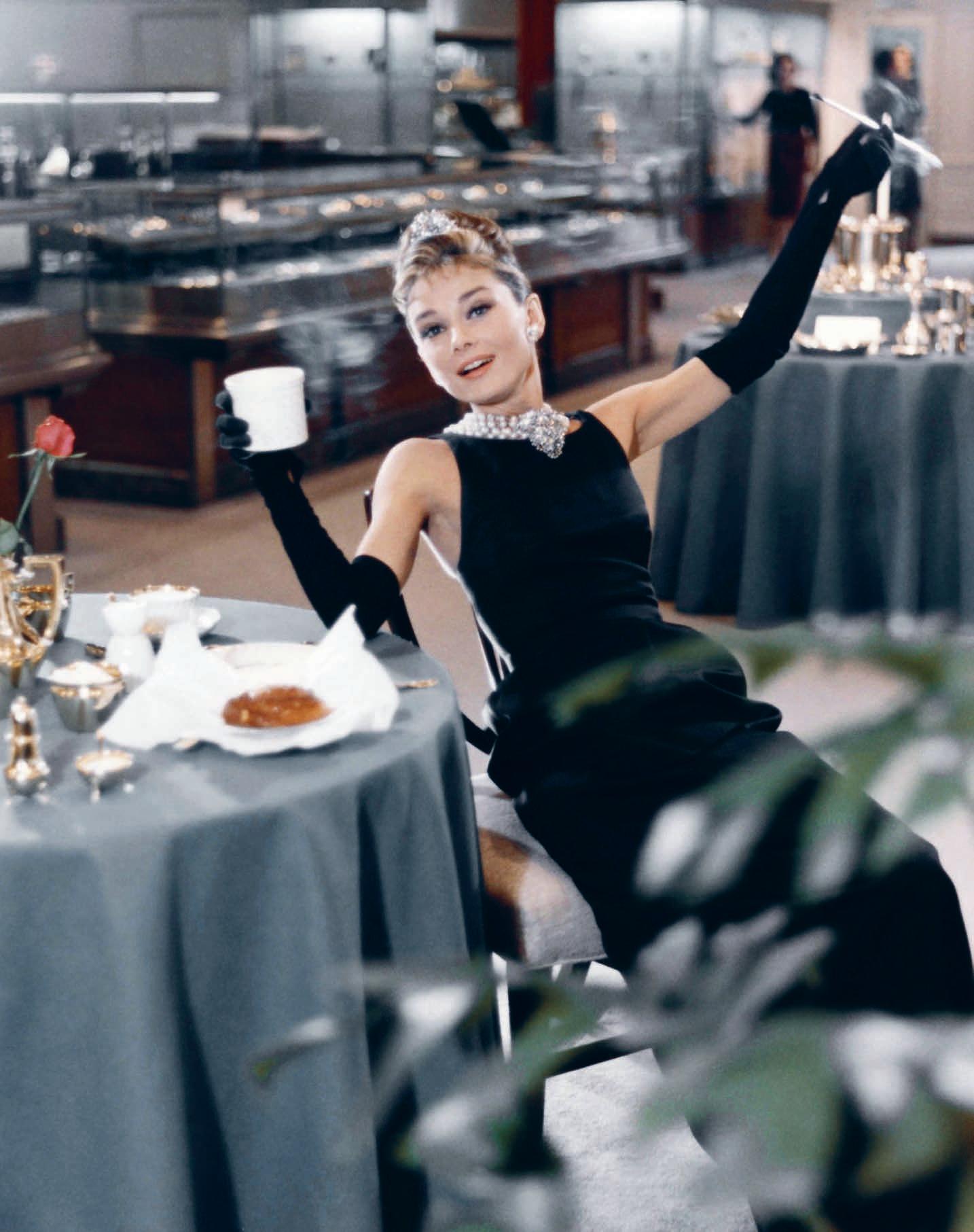

A Girl’s Gotta Do What A Girl’s Go a Do
Holly knows her value proposition and isn’t willing to compromise the integriy of her personal brand or its autonomy for anyone. “Promise me one thing: don’t take me home until I’m drunk – very drunk indeed. (...) And I will not accept drinks from gentlemen who dissapprove of me. I’ll pay for my own whiskey...and don’t you forget it!”

–

her trusty li le black dress and her ki enish je ne sais quoi, she is uniquely positioned to demonstrate that capital-R Relevance amid a maelstrom of competition, makes her not only di erent from the rest, but an absolute “must-have”.
So, in the pursuit for relevance, what does she actually do? Disrupt, rinse and repeat – and always on her own terms. She parties all night and sleeps all day (either in the nude or a bedfellow’s tuxedo shirt); she occasionally shopli s for a cheap thrill; she thinks of marriage scornfully and “can’t think of anything she’s never done”; she saws a bathtub in half and calls it a sofa; she finds a cat, keeps it, and then refuses to give it a name. Running her own li le operation out of her own li le studio, her micro-corporation of making, supplying, distributing, dispatching and marketing herself works entirely to her own schedule. She sips co ee from a jar at midday, drinks champagne before breakfast –flying in the face of proper conventions and tradition.
But make no mistake, Ms Golightly is also a cautionary tale for today’s practicing A+D – a er all, the parties have not always raced ‘til dawn, and the shoes have not always been stored in a vase in the refrigerator. Constantly disrupting the market to achieve competitive di erence – similar to a generation of designers

starved for those three per cent wholesale price royalty cheques –Holly forged the path arguably taken by icons such as Tom Dixon and Marcel Wanders. Disruption and rebelliousness certainly keeps top bananas on the top shelf – but it requires constant change and creative foresight. You’ve got to keep them guessing – like where Holly, for example, constantly re-invents herself whenever she’s going a er her next big investor. It’s key that she is calculated, not calculable.
Reaching her full and somewhat subversive potential through independence, creativity and a unique grasp on her prospect market and target audience, she navigates a myriad of her multipurpose talents for clients – from the inmates at Sing Sing prison to the powder rooms of Manha an’s finest restaurants – to mobilise talent and hold capital. Constantly repackaging her proposition to the market, Holly knows that relevance is scalable: quarterly yeilds ($50 big ones for the powder room keeps her sharp) but repeat business ($50 more for the cab) keeps her flush.
So, become the top banana in the shock department: disrupt, be agile, run a er that meal ticket, forget about the ‘mean reds’ of royalties that don’t always pay out. Just make sure your brand is always dressed to be seen. Go on, you’ll be darling at it.
INDESIGN 199 IN TERES T
Page 195: Holly Golightly, played by Audrey Hepburn, dines in Manhattan’s famed Fi h Avenue Ti any & Co store for promotional material in the lead up to the release of Breakfast At Ti any’s, 1961 (Paramount Studios). Page 196-198: In the opening credits of the lm, Holly Golightly stares into the window of her most treasured destination, Ti any & Co. Page 198: Holly gets some shut-eye in her chic yet disheveled New York apartment alongside her no-name slob cat, ‘cat’. This page: Holly meets Paul Varjak (a.k.a Fred) played by George Peppard, her upstairs neighbour, for the rst time.
Be INspired
061 Abey abey.com.au
070 Activelocker activelocker.com.au
107, 163 Bellevue Architectural bellevuearch.com.au
137 Blu Dot bludot.com.au

050 Bosch bosch.com.au
069 Business Interiors businessinteriors.com.au
010-011 Caesarstone caesarstone.com.au
030-031 Cafe Culture + Insitu cafecultureinsitu.com.au
072 CBS Products colebrookbossonsaunders.com
067, IBC Cosentino cosentino.com
012-013, 164-167 Cult cultdesign.com.au
016-017 Domayne domayne.com.au
014-015 Gaggenau gaggenau.com
055, 159 Ilve ilve.com.au
066 INDE.Awards indeawards.com
032, 043 Instyle instyle.com.au
101 Interstudio interstudio.com.au
020-021 Janus Et Cie janusetcie.com
088-089 Krost krost.com.au
008-009, 108Living Edge livingedge.com.au
063 Luxxbox luxxbox.com
006-007 Miele miele-project-business.com.au
123 Neolith neolith.com.au
037 Parisi parisi.com.au
049 Pedrali pedrali.it
057 Precisionflooring precisionflooring.com.au
117, 131SB Seating sbseating.com
039, 040-041 Schiavello schiavello.com
059 SeehoSu seehosu.com.au
022 Shaw Conract shawcontract.com.au
002-003 Smeg smeg.com.au
045 Space Furniture spacefurniture.com
023,073-078 Stylecra stylecra .com.au
028-029, 053 Sub-Zero Wolf subzero-wolf.com.au
071 Sunbrella sunbrella.com
102-105, OBC The Hour Glass thehourglass.com
5 for 4
Subscribe to Indesign and get 5 issues for the price of 4! (AUS$55). Join the global design gang at www.indesignlive.com/subscribe
Indesign looks for the point and purpose of everything in design – exploring what we do, how we do it, and why. Indesign is the only place you’ll find conversations on the design industry that are clever, provocative, insightful, and just a bit cheeky.
Indesign is for creative professionals – aspiring and established – hungry to continue the ideas that inform the best projects, products and people.
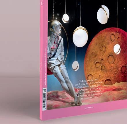
168 The Surry thesurry.com.au
018-019 tongue n groove tonguengrooveflooring.com.au
IFC-001, 192 UCI uci.com.au
064-065 Unios unios.com
027 Walter Knoll walterknoll.com.au
047 Winning Commercial winningcommercial.com.au
025 Woven Image wovenimage.com
004 - 005Zenith Interiors zenithinteriors.com
Indesign BFFs

Without the support of our industry BFFs (advertisers, to the laymen) we wouldn’t have this amazing resource! This symbol throughout the magazine and online represents our valued partners we work with closely, and who continue to support us and our industry. We them and you should too!


INDESIGNLIVE.COM IN TEREST 200
JOIN THE GLOBAL DESIGN GANG...SUBSCRIPTIONS OFFER OUR BFFS...ADVERTISERS DIRECTORY


Discover more at silestone.com | Follow Us F T A product designed by Cosentino ® Colour Eternal Marquina Cindy Crawford on Silestone Countertop TOPS ON TOP COSENTINO AUSTRALIA e-mail: infoaustralia@cosentino.com On Top Feel the new velvety texture