INDE.Awards 2018, The Region’s Best Design I N DESIgN Luminary Mia Feasey Suncorp Sydney, g eyer Edward Barber, Barber & Osgerby 8bit, Architects EAT The WorkLife Issue.

INDESIGNLIVE.COM
professional
Issue #72 / Australia $16.50 / New Zealand $17.50 / Singapore $12.95 / U.S. $21.99 72 9 77144387000 0
A
resource for the design curious.
La Collezione Moon
Rediscover
harmony with nature through our new Moon outdoor collection

Sydney | Melbourne | Canberra | Brisbane | Adelaide | Hobart | Perth | Ulverstone


uci.com.au

Mezzanine level 171 Robertson Street Fortitude Valley, QLD 4006 P | +617 3216 1551 1f Danks St Waterloo, NSW 2017 P | +61 2 9699 1131 575 Church Street Richmond, VIC 3121 P | +61 3 9427 7000
FOR LOVERS OF FINE OAK
Chamoisee
The gentle warmth of a honey-brown hue enhances the natural oak finish of our Chamoisee timber.
Tongue n Groove™ floorboards are designed with three solid layers of fine European Oak for a premium level of finish, longevity and structural integrity.
tngflooring.com.au

 Design by Francesco Rota
PLUS
Soft form and easy modularity
Also pictured: SCREEN partitions and JEY table.


Introducing Stylecraft Rugs
The latest Australian design collaboration for Stylecraft sees the launch of a new range of luxurious, hand-crafted rugs. A statement in design and quality, the five rugs that form the inaugural range have been designed by leading Australian designers (pictured left-right) Keith Melbourne, Tom Skeehan, Ross Gardam, Helen Kontouris and Alexander Lotersztain. The range is diverse in colour, texture and size with each designer drawing on their uniquely individual aesthetic and inspiration.

Designed in Australia, handcrafted in India through TAPPETI Rugs, the handmade collection utilises natural fibres including New Zealand Wool. Handmade processes are used by local artisans for dying the yarn, tufting, binding and finishing.
Stylecraft will also be donating 10% of each rug sale to Australian organisation, Tjanpi Desert Weavers. TDW enable over 400 female artists in remote central Australian deserts to earn income from their craft. Committed to enabling indigenous artists to continue to be able to use their skills, our contribution will support the facilitation of material supply, workshops and exhibitions of their woven baskets and toys.
Australia 1300 306 960 Singapore +65 6511 9328 stylecraft.com.au


Subtle. Sophisticated. New Cloudburst Concrete™ Concrete domesticated by Caesarstone® www.caesarstone.com.au

UNIVERSAL LIGHT


We believe in light as an extension of every surface, every structure. Enriching everyday experiences through light.


Awarded Australia’s Best Hotel in 2017, Jackalope encapsulates our lighting ethos. – one light, infinite applications. The one luminaire design accentuates every architectural detail from the individual suites to the exterior facades. We call it universal light.
 Designed by Carr Design Group / Lighing supplied by Lights & Tracks
Chairman/Publisher
Raj Nandan raj@indesign.com.au
Managing Director
Kavita Lala kavita@indesign.com.au
Editor Alice Blackwood alice@indesign.com.au
Special Edition Editor
Paul McGillick
Indesignlive Editor Aleesha Callahan aleesha@indesign.com.au
Content Editor & Client Manager

David Congram david@indesign.com.au
Editorial Assistant Andrew McDonald andrew@indesign.com.au

Brand Directors
Dana Ciaccia dana@indesign.com.au Colleen Black colleen@indesign.com.au
Sales Support & Reporting
Genevieve Muratore genevieve@indesign.com.au
Production Natasha Jara natasha@indesign.com.au
Accounts
Ting Zhang ting@indesign.com.au
Cassie Zeng cassie@indesign.com.au
smart lighting solutions
Australian designed and made Bluetooth operated LED lighting

Senior Designer Michelle Byrnes michelle@indesign.com.au
Designers
Julia Gee julia@indesign.com.au
Tracey Hein tracey@indesign.com.au
Louis Wayment louis@indesign.com.au
Online Manager
Radu Enache radu@indesign.com.au
Web Developer Ryan Sumners ryan@indesign.com.au
Indesign Correspondents

Andrea Stevens (New Zealand) Mandi Keighran (London) Stephen Cra i (Melbourne)
Contributing Writers
Aleesha Callahan, Andrea Stevens, Annie Reid, David Congram, Holly Cunneen, Kirsty Sier, Leanne Amodeo, Lorenzo Logi, Paul McGillick, Sandra Tan, Sophia Watson
Featured Photographers
Bre Boardman, Charles Dennington, David Wheeler, Demas Rusli, Derek Swalwell, Katherine Lu, Gareth Hayman, Mark Cocksedge, Masayoshi Sukita, Nicole England, Noah Kalina, Richard Glover, Shannon McGrath, Sharyn Cairns, Simon Wilson
Head O ce Level 1, 50 Marshall Street Surry Hills NSW 2010 (61 2) 9368 0150, (61 2) 9368 0289 (fax) indesignlive.com
Melbourne 1/200 Smith St, Collingwood VIC 3066
Singapore 4 Leng Kee Road, #06–08,SIS Building, Singapore 159088 (65) 6475 5228, (65) 6475 5238 (fax) indesignlive.sg
Hong Kong
Unit 12, 21st Floor Wayson Commercial Building, 28 Connaught Road West, Sheung Wan, Hong Kong indesignlive.hk
Join the global design collective, become an Indesign subscriber!
To Subscribe (61 2) 9368 0150 subscriptions@indesign.com.au indesignlive.com/subscriptions
Yearly subscription: Australia $55 (incl. GST) International AUD $110
Printed in Singapore Indesign is printed with ENVIRO Soy-Based Process Black ink, UV Solventless Varnish and on paper which is awarded an Environmental Management Certificate to the level ISO14001:2004 GBT24001-2004 and Eskaboard and Eskapuzzle produced from 100 per cent recycled fibres (post consumer).
CAREERSINDESIGN
@wyallastudiowww.wyallastudio.com.au
All rights reserved. No part of this publication may be reproduced, stored in a retrieval system, transmi ed in any form or by any other means, electronic, mechanical, photocopying, recording or otherwise. While every e ort has been made to ensure the accuracy of the information in this publication, the publishers assume no responsibility for errors or omissions or any consequences of reliance on this publication. The opinions expressed in this publication do not necessarily represent the views of the editor, the publisher or the publication. Contributions are submi ed at the sender’s risk, and Indesign Publishing cannot accept any loss or damage. Please retain duplicates of text and images. Indesign magazine is a wholly owned Australian publication, which is designed and published in Australia. Indesign is published quarterly and is available through subscription, at major newsagencies and bookshops throughout Australia, New Zealand, South East Asia and the United States of America. This issue of Indesign magazine may contain o ers or surveys which may require you to provide information about yourself. If you provide such information to us we may use the information to provide you with products or services you have. We may also provide this information to parties who provide the products or services on our behalf (such as fulfillment organisations). We do not sell your information to third parties under any circumstances, however these parties may retain the information we provide for future activities of their own, including direct marketing. We may retain your information and use it to inform you of other promotions and publications from time to time. If you would like to know what information Indesign Media Asia Pacific holds about you please contact Nilesh Nandan (61 2) 9368 0150, (61 2) 9368 0289 (fax), subscriptions@indesign.com.au, indesignlive.com Digital Print Events Strategic Partners MILANINDESIGN INDESIGNLIVE.COM 20 THE PEOPLE WHO GET INDESIGN DONE


Australia 1300 306 960 Singapore +65 6511 9328 stylecraft.com.au ThinkingQuietly Workstation
On The Cover
PwC Sydney by Futurespace. According to Futurespace’s Angela Ferguson: “We’ve designed the first in a new wave of projects that herald the death of the boardroom as we know it.” Perhaps the boardroom isn’t completely defunct, just yet. But, as Ferguson says, businesses now want to engage with their clients the way they engage with their staff.
Flip to page 150 where we interview Ferguson and international design icon Tim Kobe on creating a first-class experience for clients and staff.
Nicole England.
250,950+ readers engaged across print, digital & social...
indesignlive.com
/indesignlive
@indesignlive
@indesignlive
Did you know Australia has the world’s largest percentage of open plan offices? 42 per cent to a global average of 23 per cent. That’s pretty significant. We’re also the most flexible with our employees – more than half of Australian workers can choose to work remotely, should they wish. The jury is still out on just how this impacts Australian business in positive productivity terms. And it will be years before we gain a wider perspective on the impacts – good and bad – that new working typologies have on our personal and professional lives.
What we do know, though, is that Australians are leading the world in workplace design. We are constantly metamorphosing our designs to adapt to changing user needs – whether that be employees, clients or customers. In the manner of a mutating organism, Australia’s top workplace designers are mating their design principles, cross-breeding their disciplines and breaking with convention to holistically cater for a complexity of human needs.
In this issue of Indesign, the WorkLife issue, we challenge the ‘new norm’ of agile working to discover what lies beyond the frontline of the workplace revolution.
Meanwhile, in real time, we’re actively enabling specifiers and suppliers to push the boundaries in workplace design, through an all-new boutique specifier event, entitled FRONT. Through industry workshops, design discussions, and a pop-up marketplace/event space (encompassing 70 of the country’s leading architectural and design suppliers), FRONT facilitates knowledge-sharing around design, while simultaneously demystifying the decision-making process. It’s a no-fuss neo-trade fair, that does away with the posturing to focus on the business at hand. FRONT is scheduled to launch in Sydney this August. Stay tuned for further updates and get involved at www.front.design.
And now, allow me introduce you to our Special Edition Editor (former Indesign Editorial Director), Paul McGillick. Paul’s take on the workplace revolution (page 24) fills me with anticipation for the future. Enjoy the issue!
Indesign
Editor, Alice Blackwood
INDESIGNLIVE.COM 22 FROM THE EDITOR
Photo:

parisi.com.au SHARP Collection
Where’s The Workplace Really At?
The ‘workplace revolution’ is generally dated from Veldhoen & Co’s innovative rethink of the Amsterdam police headquarters in the early 1980s. But, as I suggest elsewhere in this issue, it could just as easily go back to Frank Lloyd Wright’s extraordinary Johnson Wax headquarters (1936-39) with its organic building form reflected inside with an open plan office, tree-like supporting columns, bespoke Steelcase furnishings echoing the form of the base building, use of natural light and its ‘biophilic’ experiment with internal trees and plantings.
Whatever the case, it’s worth asking after 30 years of radical change in the workplace: where is it really at and where can it go from here? There has been a lot of superficial stylistic imitation by designers claiming to follow activity-based working principles and so imposing one-size-fits-all solutions. Veldhoen, which developed the strategy of activity-based working, doesn’t use the term any longer. And we need to remember that Veldhoen are workplace consultants, not designers. This signals its commitment to insideout solutions – namely, solutions which match design and workplace culture, based on the uniqueness of every client.
This bespoke approach will be one of the dominant trends in coming years. Another associated trend will be to do with change management. Just as off-the-shelf design solutions don’t work for different businesses, so it can’t be assumed that workplace strategies suited to one business will work for others. So, consultants like Veldhoen and Australian company, Calder Associates, spend a lot
of effort establishing an appropriate workplace culture for a client before devising an implementation strategy managing the change from one way of working to another.

This trend is aligned with another major shift, namely the ongoing technological revolution. So far, workplace design has tended to fit the technology into an overall design strategy. But increasingly it will be technology driving the design solutions. In turn this will drive a growing emphasis on designing buildings which are fit-for-purpose. Generally, so far, it has been a case of adapting to existing buildings – even the new International Towers at Barangaroo offer a footprint which allows for a variety of tenants. The NAB Headquarters at 700 Bourke Street in Melbourne’s Docklands (Woods Bagot with Calder, 2013) is an early example of a building designed from the inside out to facilitate a new workplace culture.
Finally – and keeping in mind Wright’s amazing building –holistic sustainability encompassing environmental, social, emotional and cultural sustainability will also drive new workplaces. Here, Mirvac’s EY Centre, 200 George Street (page 92) is an outstanding recent example of a building ‘doing the right thing’ in terms of its occupants’ wellbeing, but also in the way it recognises its cultural, heritage and urban obligations.
INDESIGNLIVE.COM 24 FROM THE Sp E ci al Edi T i O n E di T OR
#72 The WorkLife Issue – Special Edition Editor, Paul McGillick


The ultimate industry cheat sheet. 29-56
Big thinkers and creative gurus. 65-86
INDESIGN® Luminary Mia Feasey, Edward Barber, Simone Oliver, Benjamin Hubert
Provocative, radical and energising design.
91-137
Mirvac headquarters at EY Centre, Sydney, Davenport Campbell
Lonely store Newmarket, Auckland, Knight Associates -
8bit Collins Street, Melbourne, Architects EAT -
Suncorp, Sydney, Geyer -
Flack Studio headquarters, Flack Studio -
Crone Architects headquarters, Crone Architects
What is the design thinking shaping today’s workplace revolution?
What can we learn from the Bowie Bonds?
165-167
In Short
In famou S
SI t u
In
-
n D epth
I
t e re S t
141-162 In
INDESIGNLIVE.COM 26 CONTENTS


walterknoll.com.au Walter Knoll Australia info@walterknoll.com.au T +61 8 8182 3925 My clean lines come with a soft side. LEADCHAIR MANAGEMENT. Design: EOOS


TOPS ON TOP Discover more at silestoneoceania.com | Follow Us F T On Top Feel the new velvety texture
COSENTINO AUSTRALIA e-mail: infoaustralia@cosentino.com
Cindy Crawford on Silestone® Eternal Marquina
the ultimate industry cheat sheet
IN SHORT INDESIGN 29 SHORT IN
Bold In Gold
Out with the old, in with the gold! You may recall late 2016 when all anyone could talk about was Normann Copenhagen’s epic new head-to-toe pink showroom. And now, not even 12 months later, the brand has ditched its Insta-famous soakedin-Millennial-pink Copenhagen flagship interior in place of an ode-to -gold that puts Vatican City to shame.
Titled The Runway Issue, the concept for the 1700 square-metre space was Normann Copenhagen’s love-letter to the fashion world. Designed as a “runway for furniture” by Normann Copenhagen designer, Hans Hornemann, the showroom is crafted as a linear display of products, which are likened to supermodels, that appear to float on a sea of molten gold – so very haute couture! As per its pink predecessor, the monolithic, mirrored staircase appears as if from nowhere in the centre of the first floor, guiding visitors to the lower gallery where mustard velvet steps give way to a terrifically assaulting glow of metallic and chrome gold, made even more spectacular by the trail of Normann Copenhagen signature lighting fixtures.
The result is an interesting and extravagant space that draws attention to complement the product collection, known for its restrained and detail-oriented aesthetic, juxtaposed and emphasised by the outrageous application of glittering gold.
It’s obviously a ridiculously cool space, but what’s even more compelling is its ‘in-transit’ nature. Previous residents of the Copenhagen location included a water distillery, theatre, sound studio and cinema. Not only has Normann Copenhagen been sensitive in maintaining key elements of the space’s physical history, but also its predilection for change. Not even 12 months ago, the showroom was a pink sculpture museum. Today, it’s a golden haute runway. And tomorrow? Well, whatever it is, we can’t wait to see what follows.

IN SHORT INDESIGNLIVE.COM 30

IN SHORT INDESIGN 31
A Desk Of One’s Own
Spending time honing a skill can o er a certain level of insight – think the waiter who has developed clever e ciencies in a restaurant or the avid home chef who has a kitchen laid out like a pro. It’s this same line of thinking which Ilse Crawford brought into her design for a writing desk. Most would know Crawford as the founder of renowned UK-based interior design rm Studioilse. Something less known, perhaps, is that Crawford was the launch editor of Elle Decoration. So it would seem writing and design are in her blood.
The result is the Companion Desk – a compact timber piece, manufactured by De La Espada and available at Criteria Collection in Australia. Perfect for small spaces, the tabletop folds down to hide messy papers in a ash, while also feeling reminiscent of traditional writing consoles. Unlike a traditional writing desk is the form itself – clean, streamlined and slim – which brings it into a more modern incarnation. Perched on the side is a curvaceous cork bowl, an accessory that perfectly holds all the cords and wires.

Are We Designing In Limbo?
If we could name the movement of our time, what would it be? Even the top design minds are having trouble pinpointing it. “I would say we’re [bridging] between time and space,” says Rossana Hu of Chinese practice Neri&Hu. She, with co-founder Lyndon Neri, debated the death of interior design trends as part of a panel talk at the 2017 World Architecture Festival.

The discussion, which centred around the leading ‘style’ of our times, found that while Modernism and Post-Modernism may have reigned in the past, these days the only dominant style is non-style – o en referred to as eclecticism or transitional style.
When asked what category they feel their work falls into, Hu states: “I think it’s hard for an architect to critique and label themselves. I would like to think we are beyond labelling. But I don’t know if we would label ourselves as a transitional style.” Instead they transcend time and space: “Time meaning the past and the future, because we work with a lot of historic buildings and we... see ourselves as breathing new life into old buildings and working with that history. And bridging East and West ... from local to global.”
Adding to the sentiment, Neri explains: “It’s interesting considering the idea of transitional, when this is translated into Chinese it refers to time and space, which is all about in-between space.”
IN SHORT INDESIGNLIVE.COM 32


Looping You In COS x Snarkitecture
Succeeding in retail is tough. Securing the affections of fickle consumers demands creative nous and emotional intelligence. Where Aesop, for example, has clearly established its brand culture through its exquisitely designed retail stores, the likes of COS differentiates itself from the masses by regularly commissioning architects, designers and artists to come up with curious and inspiring installations that are at once artistic, but also expertly designed.
In the city of Seoul, South Korea – a veritable melting pot for retail, art and design – COS recently launched its latest collaboration with Snarkitecture. Working together for the third time, the two creative teams have conceived an installation designed to engage the child within.

Loop is a sparse and minimalist installation that uses sound to great effect. It fills its surrounding space with a constant whirring
A sea of 100,000 white marbles snake their way along four powder bluecoloured tracks. One marble is added every five seconds, creating a steady and hypnotic hum of white noise.
of white noise, produced by a deluge of white marbles winding their way across four tracks. A new marble is popped onto the track every five seconds. Following the twisting powdercoated aluminium track, each marble winds its way around and drops into an adjoining space, creating a sea of scattered white marbles.
Co-founder of Snarkitecture, Daniel Arsham, explains that the intent of the project was to be playful but to also create a place of contemplation. In this way it deliberately asks visitors to investigate the installation, forcing them to work out how the system operates. Alex Mustonen, Snarkitecture’s other co-founder, adds that he hopes the project inspires interaction and a memorable experience. Beyond that, it also offers followers of COS yet another ‘collectable experience’ for the social media feed. We wonder what they’ll do in Milan this year.
IN SHORT INDESIGNLIVE.COM 34
–
–

Fifty Years Young
Indesign Vola

Arne Jacobsen designed the first VOLA taps in 1968, and while some 50 years have passed since, the VOLA design ethos re mains pure. Jacobsen imagined design where all mechanics are hidden, leaving only the aesthetically pleasing design seen by the user. Over the years, this design ethos has evolved to encompass a suite of designer-ready creations, enabling individual looks and unique combinations of handles, spouts, and accessories – with the VOLA range now coming in an array of steel, brass and chrome finishes, and 14 bright colours. Aesthetics has always driven VOLA and there is still more to come. Now incorporating wellness into its design offering, the brand’s three-way shower diverter is an exemplar of new directions: letting the user decide jet function allows a unique wellness experience.

How Will WeWork In The Future?

According to WeWork’s Balder Tol: “The sad fact is that few architectural and engineering design practices consistently collect information on whether or not their buildings work. WeWork is harnessing the data it has collected over recent years to organise the office around its users. It knows, in real time, how its spaces are being used and what maintenance is required.” Tol foresees a future in which “smart furniture will respond to individual requirements, recognising who is at the desk through their mobile phone. Software will predict and respond to the pattern of how an office space is used... The average human spends 87 per cent of their lives in buildings, and to be part of a movement that improves that standard and humanises work is incredibly exciting.”
Pencil To Panel
Can a well-designed product fuel new creativity and improved solutions? Moving Walls offers us a new source for better working and better ideas, with Moving Panels – detachable writing/working surfaces that are designed to be an extension of the mind and hand. They’re paper-thin and frameless and clip onto the Moving Wall rail in a single, seamless, soundless magnetic manoeuvre. Use it as if you would a piece of paper – on tabletop, lap, back of a book, wall, together or alone. “[They] are not furniture in the original sense. Both products are tools, and with them one can create new areas,” says designer Jörg Boner. “The idea behind the Moving Walls system was to further collaboration and idea-finding.”
While Boner may be designing into an era in which work and life exist in close alignment, these tools aren’t necessarily intended to further blend the two typologies. They do, however, help “to make the working situation more human”, Boner says. “Because it serves as an exchange and [supports] the development of ideas in any situation.”
IN SHORT INDESIGNLIVE.COM 36
Has Design Lost Its Humanity?
Being a citizen of the world, as well as a practising designer, opens us to a plethora of influences and visual references that begins with the sophistication of social media celebs and ends with the honest simplicity of ethnic motifs. Belgian fashion designer, Dries Van Noten, leverages a multitude of cultural references in the development of his collections. “For me, other cultures have always been a starting point,” says Van Noten. He spoke at Business of Fashion’s VOICES conference in December last year. The discussion focused on the tensions and opportunities that arise from being a citizen of the world in an age of cultural appropriation. When every visual reference and idea is there to be consumed, appropriated and then reshared by every individual – what are the rules of ownership? And how can we remain truly original in our designs?
Van Noten assured audiences that he never takes his cultural references too literally. “Often we take one element we like, combine it and then key activity starts... you start to mix those things, you make something very personal of it. It’s like layering it, putting elements together, it’s not only looking to things of the past, it’s bringing in things of the future.”


Living and working in Antwerp – a city famed for its diamond trade, Van Noten references the openness and all-encompassing spirit of the city. “Antwerp [has] a good connection between fashion, photography, dance and art – [it’s like] one big creative blur.” He highlights the pleasing contrasts of contemporary art and “ethnic things” as a key influence. Among his recent offerings is an Autumn/Winter 2017-18 collection which expertly remixes a series of backdated Van Noten prints. Pieces display a fabulous mishmash of chintzy wallpaper (Spring 2000), Japanese kimono print (Fall 2013), Ikat (Spring 2010)... the list goes on!
While information and communication is the currency of work, life and design, an element of humanity has been lost, says Van Noten. Celebrity culture and the business of fashion overtakes the beauty of crafting and making. The demands of scale and speed put pressure on the process, while the rise of celebrity fashionistas – (“Kim Kardashian’s skincare becomes more important than what designers make!”) – devalues talent and skill. At a time like this, refocusing on designing and making becomes tantamount. “Bringing back the dream [of fashion] is important,” Van Noten says.
IN SHORT INDESIGN 37
9
10
August
–
2018 Sydney


WWW.FRONT.DESIGN
Powered by Strategic Partners
The future of the commercial and hospitality sectors is in this room.
Paper Revolution
Australians use one billion disposable coffee cups every year. That equates to an enormous amount of landfill for something that seems innocuous. But these small cups are a huge contributor to waste in Australia, it’s even been estimated that they are the second largest contributor to litter waste after plastic bottles.
Across the pond, Britain is facing a similar problem and UK paper company G.F Smith is trying to change that, one cup at a time, through the launch of its new paper range Extract.

Taking five used coffee cups to create a single sheet of paper, Extract is a direct response to the current overuse of a product that is harming our environment. Standard disposable coffee cups are made of 90 per cent paper, 10 per cent plastic. It’s the polyethylene coating on the inside of the cup that makes them non-recyclable. G.F Smith has developed a zero waste process to upcycle the paper of the cup and recycle the remaining plastic part. The resulting paper range comes in 10 colours, all inspired by the natural environment. G.F Smith would like to be forced to discontinue the product – the thinking being that, as word gets out, the demand for take-away cups will dwindle, along with G.F Smith’s raw material supply.
Let’s Talk Branding For A Minute
Indesign Designpreneur
As design director of Ellis Jones, David Constantine wants more architects and designers to consider the role of branding in the built environment.
With a background in design innovation, Constantine now works at the intersection of brand identity in the arts, culture and built environment sectors. “We’re working with architecture practices like ThomsonAdsett and Gray Puksand. As brand and identity people, we’ve often felt disenfranchised from the broader application of our work because the client doesn’t see the opportunity. But the more I work with architects, the more I realise they have the same frustrations –they don’t feel as though they have a voice beyond what the client expects them to do.”
And what about that buzz term – ‘design thinking’? Constantine believes design thinking is a force for good if it results in a better outcome. “Design thinking sits above all the design disciplines because it’s all about absolute respect for the end user. Everything has to be driven around what will make a better, more functional, more emotive, more delightful experience for that person, regardless of whether it’s a brochure, an app, a website or a building. Every time we sit down with an architect and a client, it’s been an amazing opportunity for collaboration.”

IN SHORT INDESIGNLIVE.COM 40


Computer-Age Playgrounds
By TeamLab
What on earth is ‘ultratechnology’ – and can it be fun? Meet teamLab, the interdisciplinary Japanese collective whose team encompasses a disparate array of people from digital backgrounds – mathematicians, artists, engineers, programmers and architects (among many others). Coining themselves as ‘ultratechnologists’, the collective aims to push the boundaries of art, science and creativity, all through fun, interactive art that requires co-creation and collaboration. Their work harnesses new and unexpected technologies to create installations that make people think about how they inhabit space. And they’re currently in Sydney – well perhaps not them personally – but their exhibition, Future Park, at the Powerhouse Museum.
The exhibition comprises eight interactive installations – all very playful in nature – that evolve in real time, making every minute of every day a unique iteration of the project. Visitors are invited to explore digital jungles, compose symphonies and invent imaginary animals and people of the future. Of Future Park, teamLab says: “Digital art allows our bodies to become more
immersed in the artwork than ever before. The medium can be transformative and the intentional movement and behaviour of people can cause visual changes in the artworks. As a viewer walks freely through an art space, the artworks transform based on his or her behaviour and movement. Viewers are able to experience art in a new way – through movement, interaction and collaboration.”
It’s an experimental approach that could add a lot of value to the way we conceptualise new ideas and develop our designs. Now more than ever, as technology infiltrates every aspect of work and living spaces, the possibilities for new relationships between the body, technology and space are plentiful.
TeamLab makes light of the challenge with interactive works like Light Ball Orchestra, a symphony of light and sound created using giant colourful musical balls. Every movement you make, influences the movement of your ball and thus the entire space – a fluid state of colour, light and sound in space.

IN SHORT INDESIGNLIVE.COM 42

Add To Cart! Top Product Finds From...


IN SHORT INDESIGNLIVE.COM 44
Taki Designer Henry Sgourakis
Henry Designer Henry Sgourakis
Pi Designer Henry Sgourakis
Zsa Zsa Designer Henry Sgourakis
Mandy Designer Henry Sgourakis
Indesign Arthur G
Harvey Designer Henry Sgourakis
Phone Addiction –It’s A Thing
When the famous philosopher Umberto Eco tried to quit smoking cigars he sucked on a wooden stick as a substitute. The point was not to remove the nicotine, but to simulate the physical habit of sucking on the cigar. These days we use smart devices such as e-cigarettes to wean ourselves off nicotine, instead focusing our addictive tendencies on habits far more insidious. Such as the ‘Like’ button.
The Guardian last year reported on the dystopian nightmare that smartphone functionality is breeding – addictive Liking, the irresistible urge to constantly pull-to-refresh. It revealed that many of the technologists who invented these ‘cute, clever fixes’ were weaning themselves off their iPhones and banning their children from most of Apple’s arsenal of ‘i’s.
For product designer Klemens Schillinger, Eco’s wooden stick approach proved to be the light bulb moment in designing a set of Substitute Phones for the digitally fatigued. The ‘phones’ offer all the physical simulation of using a smart phone, but none of the digital functionality. Rows of marble-like beads allow you to absentmindedly scroll, swipe and tap, but without any of the stimulation of connectivity.

“In the beginning I tried to make different substitute phones – some would simply be a mirror,” says Schillinger. One can only assume these would be to appease compulsive selfie tendencies.
“The scrolling version [I arrived at] was the most liked by people. It also made sense to me to simulate the finger movements we do with our phones – scrolling up and down, swiping left and right, zooming in. Some of these movements were born with the smart phone.”
So how do you simulate the sensory experience of your phone? All that smooth, responsive surfacing? “The main part is made from a high density plastic, similar in weight to normal smart phones. The plastic is then coated in a soft touch lacquer, to give it a warm touch. The balls are made from a natural stone, which contrasts with the plastic.” Schillinger also points out the hidden ‘energies’ of the natural stone –no electronic zaps or overheated batteries here.
In its own way a cute, clever fix, Schillinger’s Substitute Phones are a timely reminder that our daily lives need not always be digitally enabled. Perhaps some enforced digital isolation could be a good thing for us all.
IN SHORT INDESIGN 45
Old Books, New Tricks
In the digital age, institutions like libraries were predicted to fall by the proverbial wayside along with all the other presumed-useless artefacts that weren’t Millennial-proofed – because when you’ve got a Kindle or an iPad, who needs a book? However, against all odds, the humble library (or not-so-humble in this case) has had a major revival.
The most recent example is the Tianjin Binhai Library in China designed by MVRDV in collaboration with a larger cultural masterplan developed by global architectural firm GMP Architekten to create a link between the adjacent park and the new cultural district. To give the space a sense of community and life, MVRDV dramatically shaped the building around the luminous spherical auditorium – referred to as ‘The Eye’ – a deliberate device used to make the space look and feel like a living organism.

Surrounding this focal point, terraced bookshelves echo the form of the orb, resulting in a topographical landscape of contours that wraps around the entirety of the interior, while accommodating a whopping
Terraced bookshelves gracefully gravitate around the spherical ‘Eye’, a topographical interior landscape laden with books.
total of 1.2 million books. The building’s five storeys offer a range of facilities, with the ground floor housing easy-access reading areas in addition to the auditorium. Above, the first and second floors contain reading rooms and lounge areas, while the top two floors include offices and meeting rooms with integrated technology, computer, and audio rooms. Meanwhile, a subterranean storey accommodates service spaces, book storage and a large archive.
“We opened the building by creating a beautiful public space inside; a new civic-urban living room as its centre,” says MVRDV co-founder, Winy Maas. “The angles and curves are meant to stimulate different uses of the space, such as reading, walking, meeting, working and discussing.” It’s also an ambitious exercise in creating new typologies for well established cultural institutions – pulling them into the 21 st century and the imaginations of an over-stimulated public. This is a majorly cool and future-proofed community epicentre – even for the digital native.
IN SHORT INDESIGNLIVE.COM 46
–
–

SYDNEY 5/50 Stanley Street Darlinghurst +61 2 9358 1155 MELBOURNE 11 Stanley Street Collingwood +61 3 9416 4822
Industrial Luxe
Indesign Academy Tiles
KAZA, born of the concrete controversy, has helped rebrand the once industrialonly material as one worthy of designer consideration. Striking an impeccable balance between artisanal skill and advanced technology, KAZA is a way to add a tactile 3D accent for flat surfaces. Suitable for walls small and large, the tiles balance a sense of contemporary style with an indefinable sense of artistry – luxury for the commercial fit-out, as well as the modern home.
Founded in 2012 in Budapest’s historically artistic Szentendre neighbourhood, KAZA has always been more than just a manufacturing facility. High tech manufacturing capabilities and expert hand-sculpting come together to produce each tile. Prototypes are shaped in metal by expert sculptors before being moulded manually by hand. From the process’ start to the final pack, at least 10 pairs of caring hands take part in the moulding, grinding, selecting and treating of the tiles.
KAZA’s Tre tile range gives you the creative tools to puzzle together a customised tessellation of tiles – from clean, minimal concepts to elaborate kaleidoscopic masterpieces.
Working In Harmony
Indesign Rogerseller
When you really think about it, the desk is the basis upon which a workspace is built. It’s ground zero – the place where you bring an idea, or a set of thoughts, into reality. In creating the Victor desk, furniture manufacturer LEMA was looking to bring a sense of calm and creativity to an individual’s work and/or study space. Harnessing the powers of form and materiality, Victor is designed to help you channel the zen. It’s a contemporary piece that establishes its identity as elegant and innovative, with hidden drawers and a sophisticated aesthetic. “LEMA’s designers have perfected the art of subdued elegance, creating pieces that impart sophistication and class into a living space,” says Rogerseller’s Tanya Sharpe. “Rather than drawing attention to themselves, the individual items complement the rest of the living space, creating a harmoniously stylistic environment.”

IN SHORT INDESIGNLIVE.COM 48
–
–
ONLY ZIP TECHNOLOGY


TRANSFORMS WATER INTO A FORM YOU’LL INSTANTLY LOVE.


As world leaders in instant drinking water appliances, Zip invented the innovative HydroTap, the smart and essential addition for every kitchen. Our integrated Australian-made appliance combines patented PowerPulse™ boiling and Direct DryChilling with MicroPurity filtration technologies to create pure-tasting boiling, chilled and sparkling water you will love in an instant.


When water is this convenient and irresistible you’ll love drinking more of it. We call this the Zip Effect. To improve your hydration and your family’s well-being, discover more at zipwater.com

Work Hard, Play Hard
Designed by The Stella Collective, Memcorp Sydney’s new workplace is all about encouraging employees to be active and/or totally zen before, during and after their day at the office – an interior trend that is fast becoming known as ‘end-of-trip’ facilities. While the ‘workplace wellbeing’ brief is certainly nothing new, The Stella Collective has avoided the typical ball pits and exercise bikes to develop what may be the world’s most ultra-cool commercial chill-out zone.
“
‘
Zephyr’, as it is now known, houses an exclusive lounge, two meeting room spaces and 25 exclusive private bathrooms for workers to shower, spa and prepare for their day, rinse off after a lunch time run or yoga sesh, find some respite while on a deadline, or simply knock back a few refreshments after 5.30pm,” says The Stella Collective founder and director, Hana Hakim.
Sitting in the basement of the iconic 256 George Street building, this part-Scandinavian lodge, part-Japanese bath house has been
designed thoughtfully and head-to-toe for a highly luxe userexperience. The material palette alone, featuring green velvet drapery paired with elegant dark timber flooring, rich brass, warm timbers and cool marble finishes, all topped off with plush furnishings, provides the ultimate oasis from the corporate life that looms above.
Borrowing heavily from high-end hotel, hospitality and spa design disciplines, the finer details of the space give the user a sense of disconnection and separation. The space then becomes a wellcrafted illusion, where The Stella Collective has used a series of clever design devices you might find typically in a luxury hotel or spa. Hakim says: “We even had custom-designed door handle ‘pulls’ made out of Black Heart Sassafrass, which is a rare Australian timber from Tasmanian architects In-Teria. We wanted something that was nice for people to grab onto and provides a nice ‘grounding’ moment before stepping into a meeting.”

IN SHORT INDESIGNLIVE.COM 50
Add To Cart!
Top Product Finds From...


 Indesign Wilkhahn
IN SHORT INDESIGN 51
ON Designer wiege
Occo Designer jehs & laub
Graph Designer jehs & laub
FS-Line Designer Klaus Franck, Werner Sauer
Confair Designer Andreas Störiko
Asienta Designer jehs & laub
What A Lightweight!
Indesign Abey
Does your bathtub weigh too much? It’s a regular roadblock for designers fitting out a bathroom. The Gareth Ashton ClearStone bath range tackles this challenge with a newly developed material known as dolomitic marble. It’s exceptionally tough and hard wearing, and also allows for delicately thin edges and graceful lines. And it means that most bath models are under 100 kilos. Hand finished and delivered in a heavy duty carry bag. Don’t raise the roof! We’ll take the stairs.

Incredible Test Of Strength
Indesign Temperature Design
As one of the only furniture brands to produce all its designs in the UK, ercol prides itself on the quality of its manufacturing and craftsmanship. As the story goes, Lucian Ercolani would take great pride in throwing a classic ercol Windsor chair out of a third-floor window to test the strength of the wedge and tenon join. He would triumphantly watch the timber shatter as the join remained intact. The point being, “the joinery and craftsmanship is stronger than timber”, says ercol’s Henry Tadros. Still today, classics such as the Butterfly (below) and Windsor chairs remain universally relevant in both their make and their aesthetic, evolving naturally alongside ercol.

Glowing Gables
In Melbourne’s east, Piccolino by Hachem design studio has turned a 20-year-old pizzeria into a sacred slice in the suburbs. Having run his small suburban takeaway for two decades, owner and client John Dib had a vision to grow the business into a slick sit-down restaurant. “It was about his family and legacy, and leaving his own footprint on the area,” says Fady Hachem, “so it had to be dynamic.”
On a typical pedestrian shop front, only five-and-a-half metres wide, Hachem was engaged to create an architectural statement. With such a long, narrow site, the only way was up. Expansive glazing on both sides and a double height volume creates a striking, cathedrallike frontage. “When you walk in there, it’s almost uplifting – it does feel like a chapel. The experience of the space is just amazing,” Hachem says. The building’s open transparency has also become great inbuilt advertising for the business, in Hachem’s words: “To cars coming down [the road], it’s lit up like a Christmas tree!”

IN SHORT INDESIGNLIVE.COM 52

Why We Ignore Fashion: Morten Bo Jensen
Indesign
Designpreneur
Outsiders are often surprised by how small the VIPP team is. “When people ask to meet the department and the design team, [the general response is]: ‘It’s just him!’ ” Morten Bo Jensen, the company’s chief – and sole – designer, laughs. The small team belies VIPP’s status as modern industrial design stalwarts whose iconic steel pedal bin is part of the Museum of Modern Art’s permanent design collection.
Yet this pared back operating scale feeds into VIPP’s philosophy, at the core of which is a desire not to overcomplicate things. “There’s a big difference between improvement and change,” he explains. “I think what happened with the bins is just a slight improvement.” Incremental improvements to the bin include a better damping mechanism and refining of the form to achieve curves that Holger sought but couldn’t achieve due to tooling issues; when today’s bin is placed next to the 1939 model, the family resemblance is clear. The same can be said of all new additions to the VIPP product family whether furniture, lamps, or kitchen accessories. “The new take on all the new products is slightly more contemporary in shape and style,” says Jensen. “We didn’t set out to do things that looked
as if they were from 1939.” Concentrating on forging and treading their own path rather than competing for space on the beaten track, VIPP today closely resembles the company established by Holger Nielsen in 1939. The Nielsen family remains immersed in VIPP, whose lean team of in-house talent allows the company to continually build on existing knowledge and brand understanding to remain faithful to Nielsen’s original vision.
Though VIPP’s product offering has evolved, the original products are still recognisable. Materiality links old and new products, while stainless steel, powdercoat, and rubber, are heavily featured, allowing the manufacturing process to shine through. VIPP designs are also driven by craftsmanship and a desire to create lasting products. Jensen is wary of the emerging tendency in industrial design to bow to trends and fast fashion. “When you have something that is very fashionable, at the same time you know that in a little while it’s going to be very out of fashion.” VIPP products ignore fashion in the way that only the classic can, and are timeless investments to be passed on from generation to generation.

IN SHORT INDESIGNLIVE.COM 54

Sabine Marcelis uses a signature resin casting technique to create prisms of colour that appear solid when viewed front-on, and as transparent planes of gradated colour from different angles.
Modern Day Mondrian
Dutch-New Zealand designer Sabine Marcelis just keeps wowing us with her amazing work with colour, light and resin. Her award-winning design for the Dutch Pavilion at Cannes Film Festival reveals itself as a reinterpretation of Mondrian’s iconic Composition with Red, Blue, and Yellow (1935). Marcelis brings this painted work firmly into the 21st century, reinterpreting it in an architectural context. Black lines become thin structural elements, while rectangles of colour are extruded into volumetric forms. The black lines also work to structure empty space, drawing the eye to the red blue and yellow fields as a point of focus and substance within space. In a comment on the influence of new-age mediums like film, Marcelis layers her design with new projection technology, creating a multidimensional Mondrian-esque revival.
Just Look At Yourself!
With our trusty smartphones constantly clutched in one hand, the need to wear a watch is pretty much eliminated. As a status symbol and fashion statement, however, it remains an item of necessity.
The ultimate analogue selfie device, Minimalux’s new Timeless piece has all the formal and material credentials of a classic wristwatch. But on second glance you’ll find a crystal clear mirror glass face – no ticking hands, no blood-pressure-inducing numbers. Minimalux has designed it as a device for checking your reflection, and surreptitiously watching the people around you.
We are living through one of the most voyeuristic periods in social media history – thanks to the rise of selfie culture. As technology continues to change, so too does our behaviour around social watching and selfie-sharing – from video selfies to augmented reality selfies, emoji selfies and of course the ever abounding selfie economy propped up by social media influencers. In the spirit of all good design and art, Timeless is a timely reflection (pun intended!), on our obsession with watching ourselves and watching others. Functionally speaking, it is a practical analogue alternative to phone cameras. But... is a selfie still a selfie if you can’t share it?

IN SHORT INDESIGNLIVE.COM 56
–
–


Officeworks has developed a furniture system to help fit-out workspaces with high-quality commercial furniture solutions. For businesses seeking value without compromise, the Stilford Furniture System has a variety of configurations to suit a wide range of fit-outs. We’re here to help you fit-out workspaces. Printed for 25/01/2018. Furniture on this page comes flat-packed, ready to assemble. Display accessories not included. OWO2895_ID For more information, contact an Officeworks Workspace Solutions Specialist by emailing officefitout@officeworks.com.au
INDESIGN X Caesarstone
“You don’t have to be a chef or even a particularly good cook to experience proper kitchen alchemy: the moment when ingredients combine to form something more delectable than the sum of their parts.” – er in Morgenstern
CAESARSTONE.COM.AU CAESARSTONE 58
Words David Congram Photography Noah Kalina, courtesy of Caesarstone

used to be the family’s meeting point is turning out to be a ‘future living room’, a place where we entertain and
Think back, carefully. Think back to the memories that charm you most. Undoubtedly, a large proportion of them occur in a kitchen –and this comes at no surprise. After all, the kitchen has always been a perennially popular stage upon which we let our lives play out. A place to cook, a place to eat, a place to gather and commune, the kitchen operates in our lives with magnetic pull: it is one the first rooms we visit each morning, and among the last to be enjoyed each night. In bygone days, we knew it by the name ‘hearth’ – and its closeness to ‘heart’ has never failed to elude either poet or commoner.
It has become clear that whether in our day-to-day lives or in the story of global history, the kitchen remains a constant. As other rooms fluctuate in size to accommodate shifts in human need, the kitchen has withstood millennia of architectural styles with grace. But while it has always adapted to the never-ending tides of technological advancement, the kitchen has today arrived at its pinnacle moment. “The kitchen space is continuing its journey to the centre of the home,” says Caesarstone CEO, Raanan Zilberman. “What used to be the family’s meeting point, is turning out to be a ‘future living room’, a place where we entertain and host,” he continues. And he’s right, of course. Alongside the recent explosion of interest in cuisine – the offshoots of which include around-theclock cookery channels, the appellation of ‘foodie’, even culinary tourism – the kitchen has now entered a new phase of maturity, with many of the kitchens in our homes so well-equipped with the latest appliances they make even Michelin-hatted restaurants blush.
As Caesarstone’s CEO – a leading developer and manufacturer of premium surfaces characterised by high functionality and designdirection – Zilberman is uniquely placed to observe the revolution that is currently taking place in kitchens across the world. At the helm of Caesarstone’s comprehensive portfolio of quartz surfaces backed by advanced technologies, Zilberman draws my attention to the manner in which, even in just the last 40 years, the kitchen has absolutely transformed from the hidden, purely utilitarian space, to one of the most public of the home. “We are very interested in the shifting role of the kitchen space,” he tells me, “and wanted to be leading this discussion.”
Now collaborating with Snarkitecture – the New York-based collaborative practice that, in the words of co-founder Alex Mustonen, “is found in the space between art and architecture” – Caesarstone looks forward to investigating the impact that rising culinary culture is leaving on our kitchens. Interested in the functionality of such spaces, the creative partnership has already been touted to be a ‘Milan-must’, invigorating the breath-baited anticipation of the global design community ahead of Milan Furniture Fair this coming April.
As the fifth iteration of Caesarstone’s designer collaborations which, in previous years, has seen the quartz manufacturer cocreate with the likes of Raw Edges, nendo, Phillippe Malouin, Tom Dixon and Jaime Hayon, its 2018 collaboration with Snarkitecture explores the serviceable side of the kitchen space, and in particular
CAESARSTONE.COM.AU CAESARSTONE 60
Page 59: Daniel Arsham, Ben Porto & Alex Mustonen of Snarkitecture, Photo: Noah Kalina. Opposite: Caesarstone’s 4033 from the newly released ‘Rugged Concrete’. Page 62: Caesarstone’s 4601 ‘Frozen Terra’ with concrete matte finish.
“The kitchen space is continuing its journey to the centre of the home. What
host.”
– Raanan Zilberman


looks anew at what is indisputably one of the most central elements to the modern kitchen: the kitchen island.
Inspired by the changing states of water in culinary history – the manner in which cuisine has evolved alongside our evolving mastery of water in its various states of temperature and form – the collaboration has also been recognised for its stirring comments upon the impact of water in the natural world. As we continue to undergo the effects of climate change, the profound (and often damaging) effects of water on our immediate environments now requires the architecture, design, development and planning communities to respond with a renewed creative ingenuity and foresight.
‘Creative ingenuity and foresight’ might just as well characterise the recent Caesarstone and Snarkitecture collaboration. Even though each of the different kitchen islands respond to distinct forms and qualities of water (titled, variously, Ice Island, Water Island, Steam Island and Play Island), collectively they attest to the technology, performance, entertainment and communality shared equally by our dreams of the modern kitchen and Caesarstone’s unique approach to design stewardship. Each harnesses the sinuous, graphic and stratified quality of Caesarstone’s quartz collections to conjure the topographical conditions altering water from frozen to vaporous, in motion to undisturbed. Whether cradling a sphere of ice within a bold crystalline form, vapour jets, or an
endless fountain of water splashing down lithe gradations of cool grey, each of the installation’s four islands feature quartz from Caesarstone’s historic and current collections.
Hot on the heels of the release for their latest range, ‘Rugged Concrete’ – designed in response to the drama, high textural variation and authenticity of industrial interiors, the brand’s commitment to offering the ultimate surface marries seamlessly with Snarkitecture’s ongoing journey of making architecture and design perform the unexpected.
“This theme of the kitchen island resonated with us from the very beginning,” says Mustonen, “because of the understanding that the kitchen is the social hub of the house. This idea aligns with Snarkitecture’s goal of creating environments and experiences that are designed to be inclusive.”
Where the joy of food lies not only in its consumption but also in its preparation, the kitchen as a concept becomes near sacrosanct. It remains not only just a space to prepare food, nor just to perform one’s mastery of gastronomic techniques. “We see it as a kind of unknown territory,” says Mustonen. But for many of the design-hunters in Milan, it is a very ‘known’ territory, indeed. The installation evokes the emotional universe inherent in kitchen design: the space where generations gather across time’s divide to learn the culinary secrets of their forebears and thus add their chapter to a continuing legacy.
CAESARSTONE.COM.AU CAESARSTONE 63
“This theme of the kitchen island resonated with us from the very beginning,” says Snarkitecture’s Alex Mustonen, “because of the understanding that the kitchen is the social hub of the house .”

Big thinkers and C r eati V e gU rUs
INDESIGN 65 IN Famous FAMOUS IN

Baptism Of Fire
Words Paul McGillick Photography Various
INDESIGN Luminary
INDESIGN 67 IN Famous
Opposite & pages 76 & 78: Forever young? Mia Feasey has built Siren Design to reflect a fresh & agile approach – both in workplace culture and design approach, photos: Charles Dennington. Page 77: Siren’s green, tech-savvy, organic spaces for Atlassian, photo: courtesy of Siren Design.
Mia Feasey of Siren Design is living proof that guts and ambition can make distant dreams a reality. Here’s how the former girl-band front-woman came to lead her own international design firm.

Ultimate Flexibility
Siren Design draws on flexibility as a core value in all of its client dealings and design responses. As Mia Feasey notes, it helps Siren’s diverse clientele turn best-case scenarios into world-class solutions. For software company, Atlassian – globally recognised as the number one ‘best place to work’ – Siren rose to the challenge of designing a workplace that supported Atlassian’s high-performance culture, while also offering staff a biophilic connection to their senses.

–

I won’t admit to how long it has been since I last met up with Mia Feasey, but it scarcely matters since she remains the youthful and ebullient person who launched Siren Design all those years ago. The company has grown to match its success, but it remains an inclusive group of equals, proud of its flexibility and openness to new ideas.
And the company has multiplied. Nicole Pollak set up a Melbourne studio, Penny Sloane took them offshore to Singapore, Jeanne Chan, having performed with Feasey in an all-girl band (à la The Spice Girls, but “of Asian appearance”) in London during the 1990s, has recently joined the company as chief operating officer along with Tamara Sheeran as practice manager.
Feasey had made a number of false starts in terms of professional training in Britain – “I have the attention span of a gnat” – when her adoptive Australian mother suggested she try a new start in Australia. This she duly did at the age of 20, taking with her the ongoing ambition to be an interior designer. Feasey finally completed an interior design course in Sydney, but quips that, of all Siren’s staff, she still has the least number of letters after her name. But that will be remedied in due course because she is now in the second year of an MBA at Harvard University, requiring annual visits to the prestigious business school.
In Sydney, she says, “I started waitressing, didn’t really know anyone, no solid qualifications and I wanted to be a set designer – but started an interior design course.” Through Jim McBride (then at Geyer) she got a job running the resource library while still waitressing, hostessing at night clubs and running a coffee bar in Martin Place. She then did eight months as the only interior designer in an architectural firm – “I was very lonely because I was the only interior designer, but I learned a lot because I had to do everything.”
“I started to do some work for a builder,” she continues, “and he ended up getting me to come on board with him designing, on site, offices attached to warehouses. I was 24 and just learned by doing. I ended up in partnership with him and became a director – which I thought was pretty cool but had no idea what it meant.”
“Going back to the singing thing,” she reflects, “I think what happened was that I thought: ‘Mia, if you can stand up on stage in front of thousands of people and sing when you know you have no talent, you can do anything. It always gave me the sense of knowing that I could do it because I could do what was absolutely horrifying to me.
“It was a combination of all the different jobs I had as a teenager and in my 20s. Then I had to start cold-calling to win work. I had to get to know everyone. I’ve had mentors along the way. I had a fear of failure. But I had nothing to lose in a way. When you’re that young, you don’t know anything. It’s ignorance, isn’t it?”
An international magazine recently devoted an entire issue to Siren Design, labelling them “game changers.” The term obviously resonates with Feasey: “It’s because my background is so varied and not from a traditional path – study and everything – so I think about things in a different way.”
After four years with the builder, at 27 she went out on her own. “I think I had four staff and we were very fortunate that the first job I won was Yahoo7 at Walsh Bay.” With her was Penny Sloane, the first person she had hired in the design and construct business. The name Siren was suggested by one of her ‘mentors’. “I said don’t be ridiculous, but he said: ‘Mia, it rolls off the tongue, people will remember your name. You’re women, all girls.’ So, I did and it is the best thing I have ever done.”
Brave, open and honest are some of the core values the company celebrates – exemplified by its Monday morning all-in conferences where everyone is encouraged to be open about all and everything.
Feasey adds open communication and community to the core values. “We do workshops every year with all the studios,” she says, “we’re a family and support each other.”
Flexibility, too, is key “because if you are very rigid in your approach it is hard to give the client the flexibility they need to reach a really good end goal.”
Opportunity also is a driver – giving opportunity to young designers. They take on four interns each year, two of whom will get full-time jobs, and the company builds-in the flexibility to welcome back, often part-time, staff who have gone off to become mothers.
“I’m in the business of management,” says Feasey, reflecting on how her role has changed from the early years, “supporting my designers to be the best they can be and giving them what they need to do that.”
Join us at INDE.Awards 2018 as we celebrate The Luminary, presented in partnership with Wilkhahn.
sirendesign.com.au
INDESIGN 71 IN Famous
Hidden Depths
Words Lorenzo Logi Photography David Wheeler
What’s in a chair? Not much that should meet the eye, according to Edward Barber of Barber & Osgerby. His minimal, meaningful approach to furniture design is the antithesis of a rising culture of over-productivity and under-design. His new Vitra Pacific chair is a clear statement of intent.
INDESIGNLIVE.COM IN Fa M O u S 72


Seated (appropriately) on Vitra’s new Pacific chair amid the luminous expanse of Vitra’s Sydney showroom, Edward Barber is soft-spoken, animated, and a little jet-lagged. On the third day of a whirlwind tour of Australian cities organised by the Swiss design company to present its latest product, Barber’s schedule has been packed with meetings, interviews, photo shoots and presentations.
“Vitra is a really strong believer in having the designer launch the product because if the designer is explaining why they’ve done something, it’s more compelling than having a sales guy tell someone about a product,” Barber explains.
Despite his many commitments, Barber’s passion for the chair’s design (and design, in general) is infectious, and once he hits on a vein of discussion, he is eloquent and expansive. To explain how the project for the Pacific chair came to be, Barber launches into an account of Barber & Osgerby’s relationship with Vitra, which began in 2011 with the design of the Tip Ton chair. In light of Tip Ton’s unique seating solution and consequent success, Barber recalls, “[Vitra chairman] Rolf Fehlbaum said to us: ‘I really like what you did with this. I’d like you to try and apply a similar thinking towards the office chair.’ ”
As the British designers quickly discovered, office chair design, especially in the European Union, is heavily regulated: “You’re very constrained,” comments Barber, “not that that’s necessarily a problem. It’s always good to have constraints as a designer.”
Further to the external restrictions, however, Barber & Osgerby were pursuing standards set by their own design ethos. “The biggest problem for us was trying to find something different out of all this sea of chairs. While we were researching, we looked at a few hundred chairs already on the market [and] we didn’t actually like any of them.”
“The chairs we did like were old chairs, not current models,” Barber continues, “They were chairs from the late 1960s and 70s, and we realised what it was: they were so simple. They didn’t have all these levers, gadgets and [visible] moving parts. They were just very simple, honest chairs. So, we set about designing a really simple, honest chair with all the function of a contemporary task chair.”
Voila! – the Pacific chair. At first sight, the chair exhibits a clean, elegant aesthetic, with pleasingly slim-line armrests and approachable, rounded contours. Perhaps most striking is
the elongated backrest, which drops below the level of the seat, somewhat reminiscent of a long coat falling past a high belt.
It is what can’t be seen, however, that distinguishes it. Inspired by the classic armchair models from their research, Barber & Osgerby strove to conceal the mechanics of the chair – height and tilt adjustment levels, lumbar support – while making them easy to access. Demonstrating on his own chair, Barber points out: “it just feels like a nice piece of furniture, but underneath here, easily accessible, you’ve got all the controls. It does all the things [an office chair needs to] but actually, it feels like a really elegant piece of furniture.”
The story of the Pacific chair leads to a more general discussion on the tension between innovation, sustainability and commercial success that designers must navigate. Echoing an increasingly common concern, Barber comments: “There’s way too much product. There’s so much, too much stuff.”
But Barber also concedes that commercial reality requires companies to constantly pursue novelty, that consumers are insatiable when it comes to new product. “You have to innovate. You have to produce new products otherwise, you die, as a company. We wouldn’t be talking now if I hadn’t designed a new product, that generates interest in the company,” he observes.
Barber & Osgerby’s response is to be highly selective with the work they do, and invest themselves fully in it. “We really don’t like to take on a project unless we can see that there’s a genuine benefit,” Barber reflects. “We don’t actually produce that much stuff as a studio. We do, maybe, five or six projects a year. There are other designers that will put out 50 products in a year. For us, that’s impossible. I don’t believe you can do 50 relevant projects in a year, honestly.”
Circling back to the Pacific chair, one might make the parallel that just as its clean exterior conceals complex functionality underneath, Barber & Osgerby’s relatively minimal output belies the consideration every project receives. The merit of this approach is evident: even in the showroom of one of the world’s leading office seating brands, the Pacific stands out from its peers as a new and valuable design solution, worthy both of the designer’s attention, and of the consumers’ interest.
barberosgerby.com
INDESIGN 75 IN Famous
Page 81: Edward Barber is one half of Barber & Osgerby, a studio committed to designing pieces that have “genuine benefit”. Page 82: The Pacific chair for Vitra takes its cues from the simplicity of 1960s & 70s chair designs. Page 84: Barber & Osgerby’s Tip Ton chair for Vitra fast established itself as an international success & was the tipping point for the studio’s Pacific chair project.
“We really don’t like to take on a project unless we can see that there’s a genuine benefit... We do, maybe, five or six projects a year. There are other designers that will put out 50 products in a year. For us, that’s impossible. I don’t believe you can do 50 relevant projects in a year, honestly.”
Edward Barber, founder, Barber & Osgerby.

Mastering the art of understatement.
The difference is Gaggenau.


Unifying apparently contradictory elements is an art we master to perfection. Our iconic design exudes an irresistible charisma even in its uncompromising minimalism. Like the ovens 200 series, here with oven, Combi-steam oven and warming drawer. The stunning composition in Gaggenau Anthracite or Metallic elegantly blends into every interior design. Far from being opposites, statement and understatement are united in perfect harmony. For more information, please visit www.gaggenau.com/au


Beyond The Glass Ceiling
Words Holly Cunneen Photography David Wheeler
Some people might feel stifled, unsettled, or even anxious as they approach what seems to be the peak of their career. Where do you go when you’ve lead great projects, gained recognition and respect from peers and mentors, and held top-dog positions at architectural firms of high standing? What comes next? Look to Simone Oliver, recently appointed to the role of principal at Fender Katsalidis (or FK) after 22 years at Geyer, many of which spent as Peter Geyer’s personal protégé, and, consciously or otherwise, she’s reached new heights. She didn’t stop climbing.
Oliver has never been afraid of the unknown. Never one to rest on her laurels or stick to what seems safest. “Many moons ago” she was studying journalism at the University of Queensland, and in a serendipitous directional switch, she swapped degrees – inspired by the ‘greener pastures’ of her neighbour’s architecture studies.
In 1993 as a graduate interior designer, she began working for one of the country’s preeminent workplace designers, Peter Geyer. “He was my absolute mentor,” she says. He invested in her talents, included her in every meeting he attended, and facilitated an executive level of exposure when Oliver was in her early 20s. As much as she was exposed to senior designers and high-level clients, she was equally exposed to Geyer’s unique way of thinking.
“He talked about workplace as a business proposition, which was unheard of at the time. Back in the 90s it was design for design’s sake… he introduced this idea around strategy and the workplace environment being a tool that a company could use to underpin its value proposition to the people who work there, and to their own clients.”
Four years under Geyer’s wing and once again Oliver changed course. Following an urge to explore other typologies in design, she worked for Sue Carr alongside Nic Graham, predominantly on hospitality projects. “Going from commercial [design] where everything is predominantly architectural, through to working in hospitality where you are introducing in textural elements really broadened the way I think about design,” says Oliver.
By the time the Global Financial Crisis hit in 2007 she was back at Geyer as an associate. After working on a few major projects –including Westpac’s 75,000 square-metre Kent Street project – the
repercussions of the crisis made themselves known in Australia and Oliver shifted focus to the education sector. “That, for me, was the start of an absolute love for [designing] education environments.
“Working with universities [provided] this incredible opportunity to see design transform the way in which people learn, think and behave. I began to realise that design can make a difference surrounding whether a student is engaged or not.” In parallel, agile working began to gain momentum, and Oliver realised her educationbased learnings were particularly relevant for workplace contexts.
“For me there was a real tangibility around changing human behaviour and contributing to a better life for people. I started to work with a number of workplaces that were adopting the agile model and there was a synchronicity, for me, with what was happening in education. A transformation has happened to workplace and it has become a very human-centred pursuit in design.”
Now, Oliver finds herself at FK, principal and leader of the interiors team. The appeal was three-tiered. The projects: MONA in Tasmania, Hotel Hotel in Canberra, and Eureka Tower in Melbourne, were internationally acclaimed. The DNA of the company stretched strongly back to the founders’ original intentions. And lastly, FK is actively engaging with its market for interiors. “Fender Katsalidis Architects recently rebranded as FK. And that enables that chameleon-like approach to being a multidiscipline firm,” comments Oliver.
What excites Oliver most about her move is the opportunity to combine a strategic approach to unleashing the design potential of FK’s projects across a diversity of sectors and project opportunities. “It’s about revealing and unearthing the vision of the client, ideating the possibilities of how design might make a difference to the human experience of space, and ultimately making a positive difference to the lives of people who experience FK environments. A design proposition that is beautiful, smart and purposeful. I’m excited about that,” says Oliver.
INDESIGNLIVE.COM IN Fa M O u S 78
fkaustralia.com
Simone Oliver has had many ‘bucket list’ moments in her career. Rather than seeing these as the milestones of her professional life, she has turned them into the stepping stones. Her appointment as principal at Fender Katsalidis promises a “busy 12 months” and plenty of fresh potential.


OUR TEAMS HAVE SIGNED UP! ORGANISED BY SPONSOR A TEAM OR DONATE DIRECT NOW www.dance-for-life-18.raisely.com/donate
Mind Over Matter
Words Leanne
In Benjamin Hubert’s world, having talent and vision is one thing, but to have empathy – that’s where the hard work begins. Hubert has devoted his practice and studio, Layer, to intimately understanding what users really need.

Benjamin Hubert is by no means a new player in design, having established his eponymous studio almost 20 years ago. Within this time the London-based industrial designer has built an impressive portfolio peppered with collaborations alongside industry giants including Herman Miller, Nike and BMW. When he re-branded to become Layer in 2015 it was more than just a name change. The new identity signalled a consolidation of the multi-disciplinary practice’s many arms, all of which are underscored by an experiencebased design methodology.
Hubert and his 21-member team are people-focused and their projects are developed with a view to improving the end user’s life. “We want to understand the way people are living now and how they’ll be living in the future because we want to make people feel happy and healthy, both mentally and physically. So everything we
do is lifestyle-driven rather than performance-driven,” he says. This genuinely human-centric approach allows Hubert to personalise market research to get the best design outcome possible. He’s dismayed that so many of the tools and instruments used in everyday life aren’t fit for purpose and he’s on a mission to change that. By conducting extensive interviews, workshops and brainstorming sessions on a project-by-project basis, Hubert gathers insights into what the end user needs and how best to accommodate it.
The process was particularly effective in determining products that make up the recently launched electronic accessories brand Nolii by Layer (in collaboration with entrepreneur Asad Hamir). Each of the collection’s five items is designed to streamline the use of personal devices, effectively ridding the need for numerous plugs and cables, which can become messy. Stack, for example,
INDESIGN 81 IN Famous
Amodeo Photography Courtesy of Layer
Power Tools For Light Travellers
As a case study for what Layer as a multi-disciplinary studio does best, Nolii is exemplary. Its products position Benjamin Hubert and his team at the forefront of smart industrial design, while Nolii as a brand reveals the strategic role design can play in business and travel today. Set (pictured here), is an all-in-one travel solution that allows you to travel light – and travel far – without the cumbersome complications of power adapters, chargers and batteries.

–

provides power for a smartphone, laptop and tablet simultaneously. Couple is a phone case with a clip section to which other electronic accessories can be attached.
The products are slick and sophisticated in appearance and their intuitive functionality makes the experience of using technology that much easier. As Hubert explains, “We’re interested in making sure design is a really powerful tool for people who use it and for business too. You can do that with a single product; you can do that with a piece of branding, but the most meaningful way of doing it is by creating a whole experience.”
Along with designing the actual products, Layer was also responsible for creating Nolii’s digital platform, branding and art direction. The resulting solution is a holistic one and makes for strong market impact because the user experience is cohesive from beginning to end. Hubert doesn’t overlook anything and his attention to detail is acute. It’s a standard he applies across all collaborations, including the recent update to Layer’s existing Cradle range for Moroso.
New chairs and a room-divider feature a stretch mesh material – made using digital knitting techniques – that extends across a lightweight, easy-to-manufacture metal framework. The material’s functionality is programmed into the three-dimensionality of the knit and while it offers good support, its elasticity means the level of comfort achieved is akin to relaxing in a hammock.
Utilising innovative digital techniques appeals to Hubert because it’s a no-waste process, in keeping with Layer’s ethos of delivering intelligently designed objects and products with minimal environmental impact. Axyl for Allermuir is the studio’s latest collection, comprising furniture made from recycled materials. Each piece is characteristically clean and bold in form and by choosing to use say, recycled aluminium over new aluminium for the chair’s Y-frame, the amount of energy expended during production is dramatically reduced.

Hubert and his team are currently working on a number of major projects that promise to improve their respective sectors. These include using digital platforms to change the future of sports information, addressing transport issues by rethinking the experience for airline passengers and evolving the mobile communication experience. Most importantly, Hubert continues to ensure all disciplines within his studio are working well together to deliver outstanding results. “We’re not interested in being a Jack-of-all-trades,” he says. “We’re interested in making the complete experience the best it can be.”
layerdesign.com
INDESIGNLIVE.COM IN Fa M O u S 84
Page 89: Benjamin Hubert has been in the trade for almost 20 years, but his relatively new studio, Layer, marks a whole new approach to his design practice. Pages 90-91: Set by Nolii. This page: Sketch of the Axyl stool for Allermuir.
Opposite: Axyl chair for Allermuir – the chair’s recycled aluminium Y-frame uses just 5 per cent of the energy required to create new aluminium.

Benjamin Hubert
“We’re interested in making sure design is a really powerful tool for people who use it and for business too. You can do that with a single product. You can do that with a piece of branding. But the most meaningful way of doing it is by creating a whole experience.”
Benjamin Hubert, founder, Layer

Bosch Design: setting the standards
300 international Design Awards in the past 5 years


Celebrating Asia Pacific’s most outstanding designs on the global stage. RSVP indeawards.com Platinum Partner Category Partners Launch Pad Partners Entries extended, closing 9 February. Contact us: Sydney +61 2 9368 0150 / Singapore +65 6475 5228 Join us at the INDE.Awards Gala, 29 June, as we name the region’s top projects and designers. A game-changing awards evening not to be missed. Book your tickets now.
Powered by Strategic Partners
in D ES i gn X GIBBon GRoup
In an inspired attempt to combat the often-exploitative nature of our working culture and provide our clients with the sustained and singular attention they require, many of us in design are turning to the time-saving potential of outsourcing. Calling upon the advanced skill of specialist designers, manufacturers and supply houses, these custom design solutions are specifically positioned to add value back to the client’s brief. Additionally, they also offer outstanding design solutions minutely considered to any client and any user’s exacting needs.
With the mission of “bringing you flooring products of quality that have a point of difference”, the team at Gibbon Group Architectural derstands that ique and tailored design processes are central to the success of the final result.
Through derstanding the singular challenges our creative practitioners face, Gibbon Group has formed a new design team with Celia Harmon (pictured) at the helm of its Tretford Custom Rug division. Harmon, who has a backgrod in graphic design and media, also happens to be part of the Gibbon Group family, and is working to assist designers in fulfilling their creative brief.
Committed to supporting designers through the creation of outstanding pieces with a fully consultative service, the in-house Gibbon Group team reformulated a design process to consistently support the innovation and individuality required for our clients’ core brand identities in a commercial landscape. After initial briefing, and preliminary analysis for spatial atting, the in-house Gibbon Group design team can work off anything you give them –from completed design work on CAD files to rough sketches or even just a chat – to determine required custom elements.
But as a custom solution, this is only half the story behind the project’s success. After all, custom design solutions require custom design processes – and Tretford Custom Rugs are constructed quite unlike any other. As a complete custom service, Tretford Rugs allow for absolutely bespoke design outcomes – where the scale, shape, and colour combinations offer almost endless possibilites.
For over four generations, the Gibbon Group family continues a tradition of meeting the needs of interior architects, designers and end users with sustainable high performance carpet solutions across the full spectrum of contemporary design.

livingedge.com.au living edge 90 90 gibbongroup.com.au g ibbon g roup
Celia Harmon of Gibbon Group’s in-house custom design team works in collaboration with our industry’s most-active practictioners.
The power o f C ustom In Commercial Design.
Provocative, radical & e N er G i S i N G de S i GN
INDESIGN 91 IN SITU Situ i N

Can you design emotional intelligence into a workplace? The trail-blazing EY Centre in Sydney gives it a red hot go, with a human-focused approach to both the development and design of the building.
EY Centre’s appeal proved irresistible for Mirvac which, half-way through the development process, decided to locate its headquarters across six floors of the building.
INDESIGN 93 IN SITU
High
Mirvac headquarters at EY Centre, Sydney by Davenport Campbell Words Paul McGillick Photography Various
EQ
The key word here is ‘integration’ because the development process was so fully integrated that the design of Mirvac’s own workplace over six vertically connected levels of the building was always going to be an extension of the building fabric itself.

Mirvac owns the land and was both developer and builder. It is also 50 per cent owner of the building as well as managing it and being its own tenant. From the beginning, the whole development process was highly integrated and client-responsive. The project also represented a major shift in commercial building development: from designing buildings to designing for the people who would work in those buildings, prioritising the needs of individuals over the companies who employ them. It was this process which influenced Mirvac to move its own headquarters into the building. Mirvac itself – as designer, builder and developer – is a highly integrated organisation in which all parts of the company need to work together. It was this model that was applied to the development of what was to become the commercial tower known as the EY (Ernst & Young) Centre, designed by architects, fjmt. It was a highly consultative process involving all the stakeholders, including both employees and future tenants. This was particularly the case with Mirvac’s own tenancy, with Mirvac employees consulted throughout the process, which enabled the design team to develop a thoroughly customised workplace.
A Humanised Workplace
This was an approach which aligned perfectly with Davenport Campbell (the designers of the Mirvac interiors) because, in recent years, the practice has honed a strategy aimed at producing bespoke
environments tuned to the specific needs of each individual business. For example, Davenport Campbell has come up with Seven Principles of Human Design Thinking for Workplace Design, consisting of: Not everyone works in the same way; humans work to a natural cycle; create place, not space; help people do their best; everything effects emotions; make people feel safe to work differently; and use technology to enable people to interact. Consistent with this approach, Davenport Campbell set up a pilot space which gave Mirvac employees the opportunity to ‘test drive’ the new workspace while giving the designers the opportunity to evaluate feedback and modify designs as necessary.
The floorplates are designed to allow teams to connect not just horizontally, but also vertically, making the building inherently predisposed to promote flexible work practices. This is supported by the fact that the EY Centre is a ‘smart’ building where technology in Mirvac’s tenancy constantly monitors air quality, sunlight, power and water usage, while automatically adjusting the internal environment for the optimum comfort of its users. This begins with the innovative closed cavity façade with its golden internal timber louvres, which optimise natural light and connection to the outside without compromising internal comfort. A ‘smart tenancy’ app and interactive display screens help both visitors and employees make the best use of facilities, providing guidance through the building and updates on room availability, among other features. Similarly, data management has taken a ‘human-centred’ approach, which enables Mirvac to analyse, assess movement, collaborate and utilise the workspace to optimise overall use.
While vertical connection is commonplace these days, the Mirvac workspace has made the connecting staircases – which provide
INDESIGNLIVE.COM 94 IN SITU
Page 92 & above: Floorplates are designed to connect teams horizontally & vertically, Photos: Katherine Lu. Page 95-96: The golden sheen on EY Centre’s closed cavity façade is owing to its light-optimising timber louvres, Photos: Gareth Hayman & Brett Boardman, courtesy of fjmt. Page 98-99: The striking lobby artwork by Judy Watson,
Photo: Brett Boardman, courtesy of fjmt. Page 100: The building’s modelled form & use of natural materials blends into its urban context, Photo: Demas Rusli, courtesy of fjmt.

Magic Windows
The building’s closed cavity façade provides enormous thermal, aesthetic and acoustic benefits. This is the first time the system has been used in Australia and the first time in the world that a closed cavity façade has used timber louvres. From the streetside, the window system contributes to the building’s unique soft golden glow. Together with its gentle organic form and use of timber mullions and folded timber planes of the ground plane awning, this inviting palette makes the building appealing within an otherwise harsh cityscape. The louvres automatically adjust to changing conditions outside, controlling heat and light transfer into the building.

–
both a physical and visual connection between all six levels – pivot around each of the floor functions. Activity points around the staircases include presentation spaces, encouraging interaction, spontaneous informal meetings and a sense of constant, productive activity. E ectively, it is Mirvac’s own version of activity-based working and uses a now common urban planning model for the overall organisation of the workspace. However, this is a much less gridded version of the town model usually seen, one informed by the rounded end forms of the floorplates. Hence, while there is a central, common area with associated multifunctional spaces and a ‘main street’ connecting the ‘neighbourhoods’, there are also minor streets leading o to intriguingly confi gured networks of work spaces.
The hub of Mirvac’s tenancy is the Town Hall, a communal space with a profit-for-purpose café, designed to bring employees together informally. Then there are the ‘neighbourhoods’ which consist of meeting rooms and o ces clustered around a ‘main street’ and o ering sit-to-stand and dra ing-height desks, conventional workstations, quiet spaces, synergy points and collaboration pods. The detailing, which includes everyday decorative objects housed in bespoke shelved joinery, is warm and natural and aims to promote a home-away-from-home atmosphere.

Mirvac’s aim was for a high performance workplace customised to suit the diverse but integrated activities of the company. Mirvac was also aiming to engender gradual behavioural change, a cultural transformation to match the Group’s integrated model.
Mission Accomplished
Mirvac’s James Harvey (then program manager – transforming the way we work, and now innovation lead – retail, sustainability and corporate), says Mirvac “has become more e cient with
space, reduced our carbon footprint, turned into a highly mobile organisation, formalised flexibility into policy, and produced a happier and more engaged workforce.” He continues: “It’s also given sta a stronger sense of productivity as line-of-sight management is a thing of the past. Outcome-based roles are now in line with a cultural shi , but they still need to be managed correctly with constant communication.”
Supporting Harvey’s reflections, The Building Occupants Survey System Australia tool was used to measure Mirvac’s employee satisfaction. This showed a 35 per cent improvement for overall health performance, health and productivity (the building includes generous end-of-trip facilities). Noise distraction and privacy scores improved 50 per cent as did spatial comfort scores. Satisfaction with visual aesthetics increased from 30 per cent to 91 per cent and the perception of how workplace positively influences health increased from 33 per cent to 88 per cent compared to the previous o ce.
As commercial projects go, they don’t come more integrated than Mirvac’s headquarters at the EY Centre. Starting with Mirvac itself as a multifaceted property development company, to the base building which integrates into its contemporary and historical cultural context. From there, Davenport Campbell’s fit-out was able to take advantage of an exceptional building fabric to design a high performance workplace, which is homely, relaxing and inclusive. Or perhaps this is actually why the space is so e cient: it generates such a sense of physical and emotional wellbeing, backed up by state-of-the-art technology – so the people working in it are inevitably more productive and creative.
INDESIGN 97 IN SITU
Mirvac headquarters, Level 28 Floor Plan 1 Arrival & welcome 2 Meeting rooms 3 Boardroom 4 Lounge & café 5 The contemplation garden 6 Gallery 7 Insights wall 8 Main street 1 4 5 6 7 8 3 2 2 2 2
davenport-campbell.com.au, mirvac.com


Holistic Sustainability
We often forget that sustainability is an ecosystem including environmental, economic, social, emotional and cultural aspects. EY Centre adopts a holistic approach. It is fully LED-lit, SAMBA sensors monitor air quality, lights are programmed to vary brightness and darkness to maintain optimum circadian rhythms... and the building recycles its own water! It has extensive end-of-trip facilities, high levels of natural light and improved air quality through a combination of active chilled beams, V.A.V.D. systems and the use of low-VOC materials. As a ‘good neighbour’ it references the forms and materials of key nearby buildings while its modelled form and use of natural materials ensure it does not impose itself on its urban context. It celebrates its cultural heritage by reproducing the outline of the former foreshore and through a striking lobby artwork by Judy Watson, using sandstone quarried from the site. More than 23,000 archaeological artefacts were recovered prior to construction; a selection is permanently displayed in glass vitrines in steps outside the building. It’s really no surprise that Mirvac’s tenancy has achieved the first GOLD WELL Rating in Australia, and a 6 Star Green Star Interior As-Built rating. EY Centre itself has achieved a 6 Star Green Star Office Design v3 certified rating; 6 Star Green Star Office As-Built v3 certified rating; targeting a 5 Star NABERS Energy rating and targeting 4 Star NABERS Water rating.
INDESIGNLIVE.COM 100 IN SITU
–


get work clarity www.zgonic.com The Zgo Monitor Arm: Gold (2012 Australian International Design Awards). Z1 Monitor Arm
Here’s a fashion brand that steps away from the retail chorus line, to whisper its story in quiet and intimate tones. Women’s clothing and lingerie label, Lonely, uses its latest branding touch-point to invite the curious and deliver the unexpected.
Ambiguous Beauty
INDESIGNLIVE.COM 102 IN SITU
Lonely store Newmarket, Auckland by Knight Associates Ltd.
Words Andrea Stevens Photography Simon Wilson
“ T he Lonely brand speaks strongly about layers of intimacy so a space that focuses on the customer, their experience, and the process of buying lingerie remains essential,” says designer Rufus Knight.

Objects Of Empowerment
Knight references mid-century Modern designers and contemporary artists through fit-out features such as the large, round wall shelf and point-of-sale counter – a homage to the late Gabriella Crespi, a Milanese designer whose objects famously balance design with sculptural abstraction.

–

Lonely is something of an enigma in the world of retail. A globally successful brand, it treads a careful line between promotion and intimacy, exposure and privacy, fragility and confidence. The attitude is borne out of founders’ Helene Morris’ and Steve Ferguson’s distaste for the highly sexualised lingerie industry. They reject the push-up bra, don’t want models in makeup – that’s if they use models at all.
Growing global with a strong digital presence, the brand now has three flagship stores in New Zealand to express its values in a physical space. The latest to open is in Teed Street, Newmarket. Like the other stores, Teed Street upturns a number of retail conventions, the most obvious example being no window display, in fact there is no view into the store.
While Lonely’s Ponsonby and Wellington store fit-outs shield the street view with marble walls, Newmarket takes this a step further with a long, blinkered corridor. It is so unexpected in retail that, usually once a day, passers-by tiptoe down the hall, peek around the corner, only to retreat. But for those bold enough to make the journey, the space inside is intimate and private with creature comforts like mineral water and plush seating. It feels like you have stepped into a ladies department of the 1920s.
The space is part of the historic Hayes Building from the area’s industrial past, with large, rugged concrete columns and beams. Designer Rufus Knight of Knight Associates knew this history had to be celebrated, but he also needed to create a soft space suitable for women’s clothing display and fitting. So he developed the concept of ‘a store within a store.’
Drawing on the beautiful Pink Salon in Villa Noailles by Robert Mallet-Stevens, Knight has created a perimeter of flesh-pink plaster
shell floating off the existing walls. Original columns and beams are sandblasted and exposed at ceiling level, their texture in stark contrast to the new softly lit plaster. On the floor, wide planks of aged oak connect with the industrial past, and give a sense that the store has been there a long time.
“We have expanded our vocabulary in the uniquely Lonely sense of being modern and romantic,” says Knight. “Layers of intimacy are really important with the delicate garments and lingerie. So a space that focuses on the customer, their experience, and the process of buying lingerie was essential.”
Knight has explored female design histories across the three fitouts. Mid-century designers are present in the space, paired with contemporary artists and makers. Gabriella Crespi’s fluid brass forms are reimagined in the counter and a large round wall shelf. Eileen Gray’s Bibendum chair is upholstered in a midnight blue velvet. And Charlotte Perriand’s Méribel stools grace each of the changing rooms.

The garments themselves are displayed on a single curving steel rail, arranged and top-lit for an interplay with light, weight and colour. Only two or three sizes are on display at any time to encourage conversation between the customer and store personnel. This soft touch merchandising continues in the round counter – there is no till or fixed point of sale, and the customer can freely move around the counter between the display and changing areas.
The space speaks in calm and confident forms, but keeps service and customer experience at its heart. By removing unnecessary retail conventions, Lonely has simplified the whole retail experience.
knightassociates.co.nz
INDESIGNLIVE.COM 106 IN SITU
Page 103: The fit-out utilises a tactile palette of oak, plaster, polished brass & cast bronze. Pages 104-105: Knight uses calm, confident forms to channel a sense of serenity, effectively stripping back the high-gloss glamour generally associated with retail store experiences. Above: The fitting rooms furnished with classic Charlotte Perriand Méribel stools.


When your client is competing in a saturated market of gourmet fast food, how do you ensure their offering says something different? With a new designer diner in Melbourne’s Collins Street, Architects EAT and 8bit talk brand evolution, the significance of Super Mario and the sophisticated art of casual hospitality.
Burger Bitmap
8bit Collins Street, Melbourne by Architects EAT
Words Sandra Tan Photography Derek Swalwell
INDESIGN 109 IN SITU
Opposite: Coloured pegs on the point-of-sale counter reference video game coins. Page 110: Detailed wooden partitions help create separate zones throughout the restaurant. Page 111: Visible from the exterior, feature lighting elevates 8bit’s street presence. Page 112-113: Wall treatments in the style of Tetris pieces evoke playful movement. Page 114: 8bit’s vivid interior distinguishes it from its Bates Smart-designed complex.
From smashed avocado to share plates, Melbourne’s no-fuss food culture hits upon a winning formula for chefs, restaurateurs and foodies the world over. Hospitality design is booming, and the influx of smart new cafés and walk-in eateries reflects an appetite for familiar, affordable eats in an on-trend ambience.
So insatiable is the current demand for quality fast food that gastronomic giants Shannon Bennett and Neil Perry have both opened burger venues in recent years. Meanwhile, local chains like Grill’d have engaged award-winning architects to bring design sensibility to its fit-outs, and McDonald’s continues, albeit awkwardly, to push a ‘gourmet’ slant (Big Macs on wooden paddles, anyone?); both ends of the culinary scale are in a race to attract the masses in the middle.
Cleverly targeting this mid-range market is 8bit: a trio of burger joints wrapped in pixelated zing. Invoking the energy of Nintendo’s most famous Italian plumber through branding initially developed by Studio IO, what 8bit does so well is speaking directly to its core audience of nostalgic 30-somethings, while its reliably tasty cuisine is a drawcard for young and old. “We’re all Eighties kids, so the concept from the beginning was about bringing those arcade games back,” says Alan Sam, co-founder of 8bit alongside head chef Shayne McCallum.
Since opening the first restaurant in Melbourne’s suburban west in 2014, a high turnover has seen the group expand to a second and third outlet in the CBD. And with each iteration, 8bit levels up. “Our new city location became an opportunity to create a showroom for our brand, to reach a different market,” says Michelle Sam, group operations and management at 8bit. “At Collins Street we thought, ‘Okay – now we can really take 8bit on a journey,’ ” Alan adds. “Just like when Mario jumps into one of those pipes, he comes out into another world.”
Housed within a wider complex and architectural shell by Bates Smart on a 220 square-metre site merging two tenancies, Architects
EAT applied strategic signage to establish 8bit’s unique presence on Collins Street. “The brand’s identity is very strong, and visually, quite loud,” says Eid Goh, director at Architects EAT. “So to maintain that consistency, we looked for ways to enable it to shout out to the public.”
Deftly balancing 8bit’s exuberant kitsch factor with a rigorous architectural response, Architects EAT recasts the brand in a more polished form. The cartoon-like novelty remains – clusters of timber planks form cubist clouds overhead – but it is skilfully controlled.

The move to Collins Street signals a progression from the glorious grittiness of 8bit’s original Footscray store. This particular venue intentionally targets the older, desk-bound demographic populating its corporate surrounds – a drinks menu which previously featured only milkshakes has been extended to cater to an after work tipple. “Once you start serving alcohol, all of a sudden, it turns from a takeaway joint to a relaxed dining venue,” says Eid. “The environment changes into a more mature offering, and the ‘stay’ time increases. You linger a bit longer.”
To stem the flow of loiterers at the point of sale, the team at Architects EAT developed an efficient spatial plan which ensures that people can enter, order and find a spot straight away. Booths and zoning between varied seating solutions create more intimate pockets of space, with precise detailing evident in steel tables, vivid banquette seats and inventive wall finishes. The overall effect exudes authentic design permanence, in an environment which seamlessly accommodates families alongside suited professionals. “As a practice, there is no set language in the way we express our stylistic outcomes,” Eid says. “Our aim was to evolve the 8bit language.” eatas.com.au
INDESIGNLIVE.COM 110 IN SITU
“At Collins Street we thought, ‘Okay – now we can really take 8bit on a journey.’ Just like when Mario jumps into one of those pipes, he comes out into another world.”


Food Over Fashion
As online shopping continues to slowly cripple bricks and mortar stores, it is the hospitality sector’s time to shine. “What we’re seeing is that, from a landlord’s point of view, they will often rejig the whole master plan in order to create more food spaces within the precinct,” says Eid Goh of Architects EAT.

INDESIGNLIVE.COM 114 IN SITU
–

LEEF VICTORIA Selection Gallery 335 Ferrars St Albert Park Ph: 03 8696 4000 NEW SOUTH WALES Selection Gallery 1E Danks St Waterloo Ph: 02 8572 8500 QUEENSLAND Selection Gallery 94 Petrie Tce Brisbane Ph: 07 3369 4777 *NEWLY OPENED* WESTERN AUSTRALIA Selection Gallery 12 Sundercombe St Osborne Park Ph: 08 9208 4500

Sometimes the most evolved designs are those left incomplete. When conceptualising the new Suncorp headquarters in Sydney, Geyer worked to the idea of ‘designing to 80 per cent’.
Future-Proofed
Suncorp, Sydney by Geyer
Words Kirsty Sier Photography Richard Glover
The result is a radical take on workplace flexibility. While the building caters to its occupants in the present, it comprehensively avoids dictating their needs going into the future.
INDESIGN 117 IN SITU
To state the obvious, design is – at its core – for people. The best commercial designs work on a granular level to ensure that the most idiosyncratic and fine-grain needs of its occupants are anticipated in advance, even before they move into a building. But the glaring disparity between design and the people it works for is that, while people change and adapt, large-scale design – once implemented –often can’t.
In this sense, Geyer’s interior scheme for Suncorp’s new Sydney headquarters is more organic than monolithic. Mark Talbot, studio leader at Geyer, runs through the various conceptual overlays that informed the project, all of which came back to flexibility. For instance, he says, the idea of ‘designing to 80 per cent’ was one of the key aspects of Suncorp’s brief, an idea that was “a ‘wow’ moment” for Geyer; a breath of fresh air from the polished and perfect designs so commonly sought by big corporates.
“Thinking ahead was a really important part of this,” says Talbot. “The space needed to be elastic and fluid; Suncorp knew that, considering how fast technology is changing, everything would need to be transformed, so they didn’t want to make it so that everything was integrated. They needed to be able to undo stuff when they needed to open up more space, or when they needed to enclose space. They wanted stuff to be easily swapped in and out.”
Geyer’s response to this was to treat the building as two separate design components to be tackled: “a shell and scenery”. The ‘shell’ aspect refers to those necessary structural components that frame and map any built project: the walls, the roof, the rooms, and anything that could and should not be easily moved. But the ‘scenery’ is where this project really distinguishes itself. To describe this deep-rooted and pervasive flexibility, Talbot uses the analogy of a theatre set: inside the cocooning shell, all of the components that form Suncorp’s scenery are able to be constantly curated and reinterpreted by occupants. Geyer’s design is such that all Suncorp employees become designers in their own right.
“One of the key principles was to completely untether people from where they were working, so that they were able to work anywhere,” says Talbot.
As we walk through the building, Geyer designer Lisa Beetson points out all of the components that are there one minute, but might be completely different the next. In smaller conference spaces, we are shown walls that can be completely retracted to merge three adjoining rooms; walking past a large boardroom whose shell of writable whiteboard wall panels are currently configured to accommodate a team of about 20, we are told that these panels can be moved around the overarching metal framework and re-configured into smaller sets of two, three, six or more individual spaces; a demonstration of the furniture around the office proves that all of it is highly moveable.
“It was very different from other workplaces I’ve worked on, where they don’t like furniture to move; where the furniture just stays in that one spot,” says Beetson. “Where here, it has to be on casters or easily moveable so that [employees] can spread it and move it and curate the space however they want.”
As much as many contemporary workplaces are being designed as ‘agile’ or ‘mobile’ to accommodate a changing workforce, this is only so helpful if workers have no motivation to move around a space. To encourage Suncorp employees to try out the various iterations of workspace across the building levels, Geyer designed four key floors: two ‘community floors’ on levels seven and 15 that can be used for larger gatherings or as an alternative to off-site meetings, and two different layouts of ‘typical’ work floors sandwiched in-between.
The two layouts of these work floors have been dubbed ‘A’ floors, which have a larger range of meeting spaces and drop-down desk arrangements; and ‘B’ (or ‘hub’) floors that have a greater mix of social spaces, as well as larger kitchens. These typologies have been arranged in a BAAB configuration across floors. “The idea is that you’re only one floor away from the other floor type, so it encourages mobility and people making use of other facilities,” explains Beetson.
INDESIGNLIVE.COM 118 IN SITU
geyer.design
Page 116: An informal lounge zone exudes a familiar, homely feel. Opposite: The entry to the reflection zones carry natural overtones. Page 120-121: Community destinations offer a social hub with village atmosphere. Page 122: Above – Noise-free reflection zones with dimmed acoustics for concentrative & reflective work; Below – Formal client engagement zone with semi-enclosed meeting spaces.
“The space needed to be elastic and fluid; Suncorp knew that, considering how fast technology is changing, everything would need to be transformed, so they didn’t want to make it so that everything was integrated... They wanted stuff to be easily swapped in and out.”

Shifting Scenery / Solid Shell
Geyer conceived Suncorp’s Sydney headquarters as a robust ‘shell’ filled with moveable scenery. All of the furniture and fittings – from poufy lounge chairs to sliding walls – take the idea of dynamic workplace design to impressively comprehensive depths.

–


INDESIGN 123 IN SITU Suncorp, Sydney Level 3 Floor Plan 1 S ocial hub 2 Collaborative workstation zone 3 Open plan workstation zone 4 Mee ting rooms 5 Innovation wall 6 Individual c oncentration zone 7 C ontent access bench 8 Agile spine 3 2 1 4 5 6 7 8
There are no new ideas, says Flack Studio. But there is certainly a ‘Flack’ way of doing things. This manifests through a cheeky blend of cultural and design references that are at once eclectic and tasteful, and oh so very Flack.
Studio Mash Up
Words
In tackling the design of his studio space, David Flack went down the proverbial ‘rabbit hole’, constructing a working model of his own inner workings. For his team and clientele, the studio is a deep dive into an immersive world of design – and all of Flack’s own making.
INDESIGNLIVE.COM 124 IN SITU
Flack Studio headquarters by Flack Studio
Annie Reid Photography Sharyn Cairns

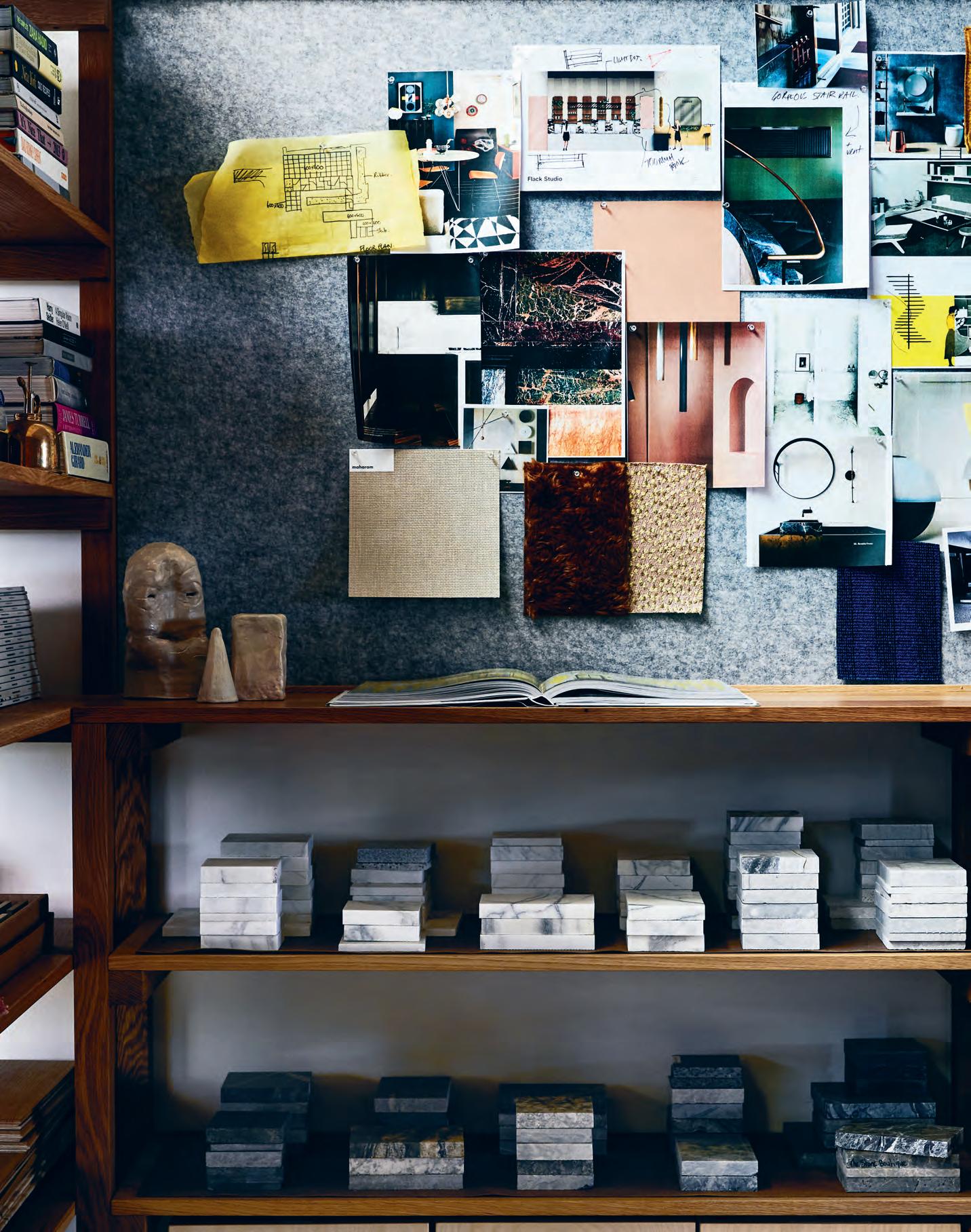
A quick peek around Flack Studio’s new space in Fitzroy reveals no white, boxy surfaces. Instead, the former electroplating factory is the outer embodiment of the inner workings of founder, David Flack’s mind. Or in other words, an outward look in, to rethink the conventional design studio.
“After Milan [Furniture Fair] this year, we realised we needed to push the space more and be clear about what our studio is for us, and make sure that is communicated in the design,” says Flack.
But it’s much more than pot plants and prints: it means very curated spaces aligned to key business goals: to actively collaborate with the design industry, to create an engaging space for clients, and to foster the working culture among the tight team of eight –each informed by Flack’s passion for travel, art, books and design. “We don’t think there are any new ideas but definitely a ‘Flack’ way of doing things,” says Flack’s practice manager, Mark Robinson. “So, in all our spaces we blend new with old, vintage with new, and preferably custom furniture.”
To collaborate with industry, Flack created an innovative approach – a supplier area in the front reception zone. And during the fit-out, he sent a call-out to the industry, to see if suppliers also wished to contribute to the new space.
There’s evidence throughout: a timber tiled wall by Mafi, artwork from nearby galleries and, as a key focus, various marble walls from preferred stone suppliers. Other highlights include a ‘Malibu Stacey’ pink kitchen by Ashwood Design, and pendant lighting by Anna Charlesworth. “Everything we spec’ is here for clients to see. We want spaces that are layered, so not necessarily to feel like you’re buying culture, or buying personality,” Flack says.
For clients, the front conference area is also where their initial meeting takes place. But it’s the studio’s rear space that brings the full Flack experience to life. They’re invited through a steeply arched doorway – complete with doggie door for Alfred and Frank,
the studio’s adorable Spoodles – into the rest of the studio. Here, a finishes area is framed by Flack’s collection of ceramics, art and design books and cascading greenery. This space also hosts studio parties and gatherings.
Around the presentation table, clients can touch and play with every product that the studio supplies. From trolleys that roll out revealing stones and timbers, to hanging soft material samples – all positioned within easy reach and updated regularly by suppliers through Flack’s staff. “We were worried that this might open up a can of worms and allow too much involvement,” Robinson says. “But it actually shows the client we’ve done our research – and that’s what they want.”
For staff, a ‘pleasure wall’ featuring a hot pink neon sign sits atop shelving showcasing books, magazines and other elements of interest, curated by staff on rotation. In the previous space, these items were relegated upstairs never to be seen again. This way, they’re easily visible, ready to spark a conversation and help to evolve the culture of the studio.
Furthermore, in line with Flack’s passion for travel, he takes the studio overseas once a year. They spent a week in Japan recently visiting exhibitions, galleries and places of design and architectural interest. “That’s the beauty of design – it doesn’t stop with one discipline,” comments one of Flack’s team members, Josh McLean.
It’s now three years since Flack Studio was born, and Flack has stayed true to his calling. Business remains design-led rather than financially motivated – and the only way is up.
Flack Studio was shortlisted for The Prodigy category at INDE. Awards 2017.
flackstudio.com.au
INDESIGN 127 IN SITU
Page 125: The entrance to the studio space features a Mafi wooden wall & artwork, The Offering by Jacqui Stockdale. Page 126: Space to touch & play – a visual excerpt from Flack’s extensive samples library. Pages 128-129: The ‘pleasure wall’ where staff can indulge their diverse creative leanings. Page 130: In the entrance area, Flack-designed marble plinths provide a unique exhibition space for a revolving door of suppliers & artists.
“Everything we spec’ is here for clients to see. We want spaces that are layered, so not necessarily to feel like you’re buying culture, or buying personality.”


It’s Your Time To Shine
“Once a month we hand over to furniture suppliers to style a space at the front at their will,” says Mark Robinson, practice manager at Flack Studio. Their creations are displayed around three custom marble plinths. “We’re trying to mix it up with the usual suspects and also feature unknown Melbourne artists.” As well as fostering greater engagement with Flack’s suppliers, the installation appeals to clients too, allowing the focus on furniture to remain front and centre.

–
Brought to you by Founding Partner Principal Partner Celebrating Asia Pacific’s best emerging talent –from prototype to production Will this year be your year? Join us for your career-defining moment at the INDE.Awards 2018 indeawards.com/launchpad

One way to engender a paradigm shift in organisational culture is to shed one’s old skin and seek out new horizons. Pioneers of change, design directors Sandra Furtado and Niall Durney are taking Crone Architects on a journey of transformation that starts with people and place.
Youth-filled Energy
Think of Crone Architects and you probably think of high-rise commercial buildings. But Crone has been quietly re-inventing itself, led by young design directors, Sandra Furtado and Niall Durney. Hence, the practice has recently completed small-scale projects like the Orange Regional Museum (winner of the Sulman Medal for Public Architecture 2017), and The Connection – Rhodes Community Centre.
Although at 850 square-metres with a 7.2 metre floor-to-ceiling height it is anything but small-scale, Crone’s new studio at Sydney’s World Square is a stunning metaphor for an architectural practice renewing itself. Its huge space and fully glazed north-facing façade make it unique among architectural offices and it acts as the physical analogue to Crone’s cultural shift.
Crone had been in its Kent Street premises for 25 years where the staff were spread over three levels with little connection between the practice and visiting clients. So, they began to search for a new location. “We were keen,” says Durney, “to find a space that could speak for itself and we really liked the heritage of Transport House in York Street.” But it suddenly became unavailable, prompting them to follow up on a tip to check out the Ernst & Young (EY) commercial tower at World Square, designed in fact by Crone back in 2005.
At the time, Level 18 (just above podium height, but with grand views north down George Street) was being used as EY’s mail room. It was dusty and dirty with “giant compactors dotted around the floorplate”.
“We came here on a rainy day,” recalls Furtado, “and there was this beautiful light. You could see the mist outside and hear the rain hitting the window.” They saw the possibilities immediately, especially the potential to be emblematic of the practice’s accelerating cultural shift.
“I call this the warehouse in the sky,” she says. “It gives you a sense of being in a creative, collaborative space, like an industrial space.”
A limited budget probably helped because it led to a very simple design solution, allowing the space to do most of the talking. From the lifts there is no foyer as such and the visitor turns the corner to have the exhilarating double-height, light-filled space reveals itself. A monochrome grey carpet complements otherwise industrial elements, along with the beautifully understated oak detailing as the visitor walks past glazed meeting rooms and the working architects to an expansive end space with a large communal lunch table and the boardroom off to one side.
“We are trying,” says Durney, “to design an office which is agile and design-focused. The thing about the fit-out is that everything looks very temporary. It’s a light touch within the space.” Crucially, everybody gets equal light and the space is flexible to allow for a constantly changing practice.
It is an exciting, yet reassuringly calm and quiet space which successfully communicates the new culture – one which Furtado calls holistic, design-driven but emphasising the need for the architects to be across all aspects of design and buildability. “We ended up,” says Durney, “hiring 35 staff in the space of two years. A huge regeneration.” It means they have a lot of young staff, including a lot of people from Europe – Durney himself is Irish/French and Furtado Portuguese. This was not by design, but it has contributed to a major shift in the culture of Crone Architects.
crone.com.au
INDESIGN 133 IN
SITU
Crone Architects headquarters by Crone Architects
Words Paul McGillick Photography Katherine Lu
Opposite: The office opens to dramatic views pointing north to the city. Page 134: Double-height ceilings & exposed detailing contribute to that ‘warehouse in the sky’ feel.

INDESIGNLIVE.COM 134 IN SITU
“I ca ll this the warehouse in the sky. It gives you a sense of being in a creative, collaborative space, like an industrial space.” Sandra Furtado


Fitted & Furnished
Mirvac headquarters at EY Centre, Sydney
Interior Design
Davenport Campbell Builder Mirvac Change Management Puzzle Partners
Services Consultant Mirvac
Davenport Campbell davenport-campbell.com.au
Mirvac mirvac.com
Furniture
Workstations, Haworth , Steelcase . General chairs, Steelcase , Jardan , Hub Furniture , Cult Stools, Anibou , Jardan , Workarena . Meeting chairs, Cult , Wilkhahn , Stylecraft
Tables, Arredorama , Stylecraft , Workarena
Lighting
Lighting throughout, Cult , Euroluce , Artemide , Light
Project , JSB Lighting , Eagle Lighting , Living Edge , KKDC , Light Culture ,
TEC LED , Great Dane
Furniture , Spence & Lyda , Xenian , iGuzzini , Koda
Lighting , Zumtobel
Finishes
Paint throughout, Dulux Fabric generally throughout, Warwick , Mokum , Woven
Image , Kvadrat Maharam , Instyle , Febrik , At Work with Camira . Leather upholstery, Pelle Leathers
Blinds, Flexitrack
Laminate finishes, Polytec , Laminex . Carpet, Interface Access floor finishes, ASP Coir flooring, Natural Floor Coverings . Resilient flooring, Forbo Flooring
Systems . Floor coverings generally, Regupol , Amtico . Timber veneer, New Age Veneers . Joinery throughout, Austral Wright Metals . Wall panelling, Supawood . Counter tops, Smartstone . Timber flooring, Style Timber Flooring . Sandstone, City of Sydney. Tiles, Academy Tiles


Fixed & Fitted
Appliances throughout, Smeg , Blanco , Clark , Zip Water
INDESIGNLIVE.COM 136 IN SITU
Want to know what made the spec’ schedule in our featured projects? Don’t worry, we’ve got you covered...
Fixed,
Lonely store Newmarket, Auckland
Interior Architect
Knight Associates Ltd.
Architect
Fabricate Architecture
Builder
Property Direct Services
Shop fitters
Robinson Interiors
Landscape Designer Jared Lockhart Design
Duration 8 months
Knight Associates Ltd. knightassociates.co.nz
Furniture
‘Bibendum’ Classicon armchair, ‘Meribel 523’ change room stools, Matisse . ‘Extrasoft’ divan, Studio Italia

Lighting
‘Find Me Mono’ FLOS ceiling lighting, ‘Tip of the Tongue’ FLOS point of sale lamp, ‘Bob’ FLOS pendant, ‘Portico’ exterior lighting, ECC
Finishes
Handwoven jute floor covering, Nodi Rugs . ‘Suave’ plaster, Ambitec . ‘Concrete’ paint, ceiling ‘Eighth Ash’ paint, Resene . Salvaged European oak floorboards, Creative Flooring
Fixed & Fitted
‘BeoLab 17’ wall speaker, Bang & Olufsen
8bit Collins Street, Melbourne
Architect Architects EAT Builder Arkim
Structural Engineer KH Engineering Services Engineer TJ Consulting Engineers
Budget $800,000
Duration 8 months
Architects EAT eatas.com.au
Furniture
Non-custom furniture throughout, Dowel Jones
Lighting
Lighting throughout, Ambience Lighting, Fat Shack
Finishes
Paint, Dulux . Oak panelling, Gunnersens Spotted gum panelling, Navurban . Tiling, Classic Ceramics . Quartz surfaces, Caesarstone
Fixed & Fitted Bathroom fixtures, Caroma
Suncorp, Sydney
Architect Geyer
Project Manager
Turner & Townsend Thinc
Builder Buildcorp
Structural Engineer Robert Bird Group Services Engineer Medland
Duration 2 years
Geyer geyer.design
Furniture
Furniture throughout, Thinking Works, Keith Melbourne, Ross Gardam, Stylecraft . Miscellaneous furniture, Koskela , Jardan , Zenith . All Muuto, Herman Miller throughout, Living Edge . Hay throughout, Cult Saba Italia throughout, Cafe
Culture + Insitu . Bernhardt Design, Enea throughout, KE-ZU. Fornasarig throughout, Own
World . Jasper Morrison throughout, Vitra . Moroso throughout, Hub Furniture Workstations throughout, Unifor, Haworth , Schiavello
Lighting Lighting throughout, iGuzzini , JSB Lighting , Yellow Goat

Finishes
Finishes throughout, Kvadrat Maharam , Sparkk , Febrik , Interface , Mohawk , Regupol , Classic Ceramics , Instyle , Baresque , Materialised . E3 ceramic steel, Polyvision . Ceiling finishes, Armstrong , CSR Martini
Fixed & Fitted Fittings, Billi.
Flack Studio headquarters
Interior Design Flack Studio
Builder Pinto the Builder
Budget $85,000
Duration 6 weeks
Flack Studio flackstudio.com.au
Furniture
Classicon Bibendum chair, Eileen Gray adjustable table, Anibou . ‘Baxter’ chair, Criteria Collection
Lighting
Lighting throughout, Anna Charlesworth
Finishes
Marble throughout, Artedomus , CDK Stone , Signorino , Stone Boutique Wooden wall, Mafi Australia . Floorboards, Storey Timber. Wall hooks, Simone Pittella Door hardware, Bellevue
Architectural . Rugs, Halycon Lake
Fixed & Fitted
Bathroom products throughout, Agape , Mary Noall. Refrigerator, Fisher & Paykel
Crone Architects headquarters
Architect Crone Architects
Project Manager Intermain
Builder Intermain
Structural Engineer Arcadis
Services Engineer
Norman Disney & Young
Budget $1.2 million
Duration 12 weeks
Crone Architects crone.com.au
Furniture
Humanscale ‘Diffrient
World’ task chairs, ‘Aire’ Workstations, Schiavello
Lighting
‘Highline 60’ meeting room pendants, Est Lighting ‘Robus’ office pendants, LED Group


Finishes
Polytec ‘Ravine timber’ veneer joinery, Intermain ‘Echopanel’ pinboards, Knauf . Carpet tiles, Ontera
Fixed & Fitted
‘Quadra’ kitchen mixer, Billi . Sub-Zero and Wolf microwave and oven, Winning Appliances
INDESIGN 137 IN SITU
I NDESIGN X
Upl I f T INg
Designing
When Activity Based Working Is The New Normal.
Words David Parker
Much more than hot desking, activity based working (ABW) has become an important aspect of contemporary workplace culture – with many businesses using it as a way to commit to employee welfare and productivity, especially in computer-intensive workplaces. Since 2010, many of Australia’s largest companies have adopted ABW as their corporate standard.
A lot of benefits are attributed to ABW, from better use of resources through to cost control, to improved ergonomics and employee satisfaction. But are such benefits measurable? By whom are they measured? And, where?
Typically, an ABW fit-out consists of installing work points or workstations that are easily adjustable, to be used by different employees on an as-needed basis. In practice, this involves a combination of monitor arms for adjustable screens and laptops, network-enabled smart phones for portable communications, height-adjustable desks, and the division of the workplace’s floorplate into zones for quiet working, silent working and collaborative working.
The use of monitor arms sets ABW apart and allows for the easiest change of computer positions for different employee work styles. One way to measure the popularity of ABW in Australia is to consider monitor arm shipments, with Uplifting Solutions, the leading Australian supplier of monitor arms, having supplied over 40,000 monitor arm units in the past 12 months alone.
Corporate fit-out and refurbishment activity has seen ABW concentrated in key sectors. In Australia, where it is thriving perhaps more than anywhere else, the trend is almost exclusively private sector, with finance predominating. Macquarie Bank was one of the first to formally implement ABW, followed by Westpac, NAB, CBA, ANZ and Rabobank.
Cost savings emerge from reductions in the staff-to-desk ratio, commonly for most financial institutions at 85 per cent. That is, 85 desks to every 100 staff members. Some consulting firms, such as PwC, with a higher proportion of out-of-office staff such as auditors, can run a ratio of up to 50 per cent - or one desk for every two staff members.
Over the past eight years, the Westpac Group, has installed more than 35,000 monitor arms in more than 300 different locations throughout Australia. Uplifting monitor arms are the corporate standard for both Westpac and St George Bank retail branches, as well as throughout Westpac Group administrative offices. For one Sydney ABW fit-out alone, five different types of monitor arms were used, totalling a huge roll-out of over 10,000 individual units.
Similarly, the Commonwealth Bank of Australia is applying ABW principles to all new offices. Again, Uplifting monitor arms are the corporate standard used by bank tellers, financial traders, software developers, designers, accountants, administrators and security analysts in a wide variety of roles and locations throughout the organisation.
It is not only the financial sector that currently benefits from this favoured product type, however. Telstra, Australia’s largest telecommunications company, initiated a new corporate program known as the “future way of working” in 2014. With over 28,000 monitor arms now installed on 14,000 Telstra desktops, tomorrow’s way of working has arrived, today.
Author note: David Parker is the founder and managing director of Sydney-based Uplifting Solutions Pty Ltd. He has a Bachelor of Economics from the University of Sydney and a Master of Science from the University of Brighton, UK.
138 uplifting.com.au uplifting


139 uplifting.com.au uplifting
straight to your inbox twice a month: architonic.com/subscribe

ARCHITONIC REPORT
WHAT IS THE DESIGN THINKING SHAPING TODAY’S WORKPLACE REVOLUTION?
INDESIGN 141 IN DEPTH
IN
DEPTH


Is hot desking really as ‘hot’ as it claims to be? Studies reveal that while flexible and agile working modes are designed to empower the individual, they also contribute to low productivity and absenteeism. Can a happy medium between old and new typologies be achieved?

Politics of Balance
INDESIGN 143 IN DEPTH
Words Leanne Amodeo Photography Unispace Sydney by Shannon McGrath | Sky Central by Mark Cocksedge
I can’t help but think hot desking is one of those things that sounds like a good idea in theory, but in practice, just doesn’t live up to what it promises. Call me old fashioned, but I like the reassurance and familiarity that sitting at my own desk day-in, day-out, gives me. I like being surrounded by framed snaps of my loved ones and colourful Post-It Notes reminding me of what I have due tomorrow. Why on earth would any workplace designer want to take that sense of security away from me?
Don’t get me wrong, I’m not issuing a personal vendetta against desk sharing – I get it. The embrace of activity-based working models, in which open plan layouts and hot desking prevail, has certainly informed this contemporary shift in workplace design. An office environment promoting agility and flexibility empowers employees to better manage their work and how they work. It also facilitates greater opportunities for interaction and collaboration, boosting morale and idea generation. Regardless of my semi-resistance to the idea, it’s an undeniable improvement on offices of yesteryear, where stuffy rooms and a lack of communal space made for a workplace culture lacking in dynamism.
Yet what designers have to understand is that one size doesn’t fit all. And the informality of an open plan office has also been known to prohibit productivity in some people. The ‘modern’ open plan workplace has its drawbacks, as digital design company Portable recently discovered in its Redesigning Work (2017) report. They collated information that indicates these spaces can be detrimental to workers’ attention spans and satisfaction, are noisy and often contribute to an increase in absenteeism.
I’m not suggesting that reverting back to the old model is the answer. I’d like to see something in between – something that combines old and new (and gives me back my own desk in the process). And that’s why an office like Unispace’s new Sydney headquarters works so well, because it successfully takes the best bits from both approaches. The global design firm is aware that workplaces can be subject to the adage ‘different strokes for different folks,’ and so their office provides a mix of unallocated workspaces, a dedicated project room for collaboration and quiet
rooms for working autonomously. It’s an effective design solution because not only does it give employees their right to choose how they work, it also gives them the right to adopt their own level of agility without feeling it an imposition.
Design must work with the end user, not against them, to facilitate highly functional outcomes. And while designers are dealing with how to better reconcile the open plan office, they’re also grappling with how to best address the issue of work-life balance. It’s an elusive concept for so many workers – again, something that works well in theory, but maybe not so great in practice – and one they’ve been trying to achieve for a long time. So how to engineer it?
The Portable report suggests ditching this idea of ‘balance’ and thinking about it as ‘integration’. This shifts the focus from whether the work is being done and where it’s being done, to how it’s being done and to what standard. Flexibility is instrumental in this equation and this is what an agile workplace supports. However, the downfall is that employees may not be able to implement boundaries between work and life, especially since personal electronic devices make it literally impossible to switch off. Integrating work into our lives is something most of us do without thinking. Isn’t it time to do the reverse and integrate our lives with work? This is something HASSELL recently explored with the design of Sky Central’s new West London office, a mighty 45,000 square-metre workplace spread across three levels. HASSELL’s team established a series of internal ‘neighbourhoods’ accommodating around 200 people each as a way of zoning the interiors. These neighbourhoods feature a range of different workplace settings and are also supported by ‘home zones’, comprising entry spaces that include kitchens, meeting tables and informal seating areas. It might just work to prevent that feeling of being completely swallowed by work. Either way, workplace designers still face many challenges, but there’s plenty of food for thought here and even more room for unbridled innovation.
hassellstudio.com, portablestudios.com.au, unispace.com
INDESIGNLIVE.COM 144 IN DEPTH
Page 141: The retreat space at Unispace Sydney. Opposite: Unallocated work spaces give the Unispace team the autonomy to choose where & how they work. Page 144-145: Casual sitting areas blur the boundaries between work & home in Sky Central. Page 146: HASSELL’s design for Sky Central encourages the flow of people & ideas around the business.

INDESIGN 145 IN DEPTH

what designers have to understand is that one size doesn’t fit all. the informality of an open plan office has also been known to prohibit productivity in some people. t h e ‘modern’ open plan workplace has its drawbacks...

Shifting Gears Takes Practice
Part of Sky Central’s transition into its new working environment involved a Live Lab experience for team members to test the tenets of agile working before making the big move. Developed with HASSELL, it has significantly contributed to the operational success of HASSELL’s new fit-out for Sky Central.

–

a first-class welcome

INDESIGNLIVE.COM 150 IN DEPTH
Above & Page 154: The Virgin Atlantic Airways Clubhouses by Eight Inc are designed to support a next-gen client experience that is smarter, more personal & highly customisable. Pages 151-153: PwC Sydney by Futurespace is designed to provide a new & experimental client experience for the company.
Creative cross-pollination moves the world forward – a truth I think we’ve all accepted. But if we want to know where the answers to the future of the workplace can be found, we need to cast our gaze beyond the commercial bubble. Elvis Presley for example, changed the future of the music industry when he blended sex (at least the suggestion of it) into his performances – a crossover that had, until then, been unthinkable. Andy Warhol likewise revolutionised the art world when he rebelled against the aristocratic establishment and proclaimed that the future of the art community could be found in the ordinary, accessible world of pop-culture and stock grocery items –again, a strange and unexpected mixture which proved to be the fuel that the art community arguably needed to survive.
Similarly, the next frontier of smart workplace design is cracking the formula on a ‘binary’ user format, where companies are looking to not only improve the performance of their employees, but the experience for their clients, too. What remains mostly uncharted is the creation of a unique client experience within the workplace. Traditionally, it’s been all about the workers. In the meantime our commercial clients are looking to us for leadership, and by necessity we must widen our scope of reference to tackle the challenge at hand.
The aviation industry presents us with some strong solutions in this area, where the world’s top airlines offer best-in-class client experiences from departure to arrival, while also attracting and maintaining the world’s most talented staff – often all within a single environment. It’s everything we’ve been looking for!
For Tim Kobe, founder and CEO of global design firm Eight Inc, the client experience, whether in a workplace, an airport lounge, or a plane, is quite consistent. “I’m not convinced that every company’s needs are so different. Ultimately, the primary role of any company is to serve people in a meaningful and effective way.” For Kobe, every design should begin from this place, ensuring “that the experience customers have with the brand align and resonate at both a functional and an emotional level”.
This was certainly the thinking that drove Eight Inc’s design for premier airline Virgin Atlantic, specifically their series of award-winning transit lounges, the Virgin Atlantic Airways Clubhouses (VAAC).
The initial brief for the VAAC was to provide a sophisticated refuge for Virgin customers before or in-between international flights. “Over the years, the romance has slowly been drained from travel,” says Kobe. Virgin, however, was determined not to let this happen. Organised into several zones, the VAAC offer everything a weary traveller could want, including: a full-service bar; lounges with armchairs for work or relaxation; tables for dining; a business centre; a complete kitchen; restrooms and showers. The long southern wall is occupied by a window that overlooks the runways, and is shaded by a series of sliding glass panels that create a daily animation of coloured light across a luminous glass bar and reception. Different ceiling heights expand the space vertically, rich mahogany wall panels in the dining area provide a warm contrast to the glass, and sculptural seating elements featuring modern furniture add to the contemporary but comfortable environment.
“We thoroughly considered how the lounge would fit into a broader spectrum of travellers’ various encounters with Virgin Atlantic. I really think that when you stop thinking of your design existing in isolation – in this case, the pre-flight experience, the flight experience proper, and the post- flight experience – you will produce something much greater, more holistic and connected. And that is what’s really valuable in a modern service industry.”
For Kobe, the markings of this next-gen client experience is “smarter, more personal and highly customisable”. In the case of VAAC every possible element of the journey is designed to support this far more comprehensive approach to user experience. “The quality of the food, the variety of support services that give each type of traveller the right kind of facilities and support – from the business traveller, the solo traveller, or family on vacation – every moving part is considered. For example, there are services and facilities that recognise the needs that people have when they travel, be they personal care and grooming, entertainment, work and/or recreation.”
Futurespace’s Angela Ferguson has long recognised the aviation industry for offering a valuable benchmark for workplace designers looking to set a new standard in quality user amenities. But, she says: “Flexible, tech-enabled workplaces that provide a great deal of choice catering to individual needs and preferences, have collaborative and concentrative spaces, are sustainable, with a focus
INDESIGN 151 IN DEPTH
Words Sophia Watson Photography PwC Sydney by Nicole England | Virgin Atlantic Airways Clubhouses courtesy of Eight Inc.
Keeping your workers happy is important. But making your clients feel special is just as critical. The future of business lies in a ‘binary’ design approach that equally addresses clients’ and workers’ experiences. Futurespace’s Angela Ferguson and international design icon Tim Kobe open our world up to new possibility.
on health and wellbeing” have only ever been available to the staff. “Innovation when it comes to customer engagement and providing client spaces with the same level of amenity has not evolved in parallel during this time. Until now!” Ferguson says. “With the finalisation of PwC’s projects in both Sydney and Melbourne, we’ve designed the first in a new wave of projects that herald the death of the boardroom as we know it.”
Perhaps the boardroom isn’t dead quite yet. But, as Ferguson says, businesses now want to engage with their clients similar to how they engage with their staff. “The old Mad Men-style of client engagement – in a formal room with four walls and a door and some sort of presentation screen (whether that is digital or analogue) just doesn’t cut it any more. In the future, the boundaries between workspace and client space will become more blurred and connected to each other.”
The brief from PwC was to create an end-to-end client experience that was exceptional, memorable and embraced the best ‘outsideof-industry’ intelligence. The result is two PwC sites in Sydney and Melbourne that demonstrate a best-in-class blend of hospitality, hotel, retail, technology and airline club lounge spaces.
Kobe highlights the importance of “personalisation and the clever integration of technology and media. [...It’s] what allows the customers to define and engage in the experience in a much richer way.” This is certainly the case for Futurespace’s approach to PwC, where the design thinking rests on four key pillars that define a new and highly experimental client experience for the brand: outside thinking (hospitality/airline/travel), collaboration, technology, health and wellbeing.
For outside thinking at PwC, catering experiences are designed to suit the personality of the guest. Each floor has a number of food and beverage offerings, and there is a large commercial kitchen across two of the floors. This kitchen caters for events held across the floors and in the large multipurpose event area. There is also a separate restaurant inside the client spaces that serves breakfast, lunch and dinner and is a great way for PwC to connect with its clients.
For collaboration, instead of having a meeting in a closed-off and secluded room, an entire floor at PwC Sydney is dedicated to co-creation where clients workshop ideas and solutions with PwC’s people. Additionally, PwC’s ‘fun space’ borrows heavily from the airport lounge archetype featuring arcade games, table tennis, music rooms, a LEGO room, and treadmills to get into the creative mindset. “Clients and PwC people come here to work through
creative blocks, take a break from the intensity of their workload and to be inspired in unexpected ways,” Ferguson explains.
This is also supported by PwC’s approach to technology which, rather than being focused on daily admin, is designed to create a signature experience enhancing collaboration. Among PwC’s many innovations is a digital waterfall which provides a continuous stream of information that flows through four floors of the building.
In the way of health and wellbeing, Futurespace saw the opportunity to bring further intelligence from aviation’s ‘end-of-trip’ amenities, which for PwC resulted in state-of-the art bike racks, hotel-quality showers and secure lockers. Ferguson observes: “Clients are now enjoying, and expecting, access to these amenities. A client visiting from another state or country, for example, may wish to keep up their exercise routine or even join in a local running or walking group. Providing the ability for them to seamlessly integrate their lifestyle with their working life goes a long way towards excelling at customer service. Other helpful supports you can set up for your client are cloakroom and bag storage facilities, change rooms, meditation or prayer rooms, and access to kitchen facilities.”
When simmered right down, what seems to be the golden egg that workplace designers can borrow from aviation is “giving users control”, says Kobe. “I think the opportunity here is for designers to look at more than just empathy for the client’s pain-points and work to layer emotional connections over the service and function of the environment. This idea of mass customisation can drive a new era in products and services, and we as designers have a critical role to play in establishing that baseline.”
In the case of PwC, Ferguson notes how Futurespace’s goal was to develop a client experience that gave people – staff and clients alike – “permission” to use the environment in ways that best suit their needs. She concludes: “Putting the client first in your workplace will help attract the best type of people for collaboration, cement your position as a leader in your industry and will future-proof your organisation against the constant change faced by businesses in the 21 st Century. In a world where innovative workplace design for an organisation’s people has become de rigueur, it is time for this creativity and inventiveness to be applied to the design of the environments where a business engages its customers and clients.”
eightinc.com, futurespace.com.au
INDESIGNLIVE.COM 152 IN DEPTH

Daily Admin Digitally Enhanced
The technology at PwC creates a signature experience for clients. A digital waterfall offers clients a continuous stream of information, while the welcome wall allows regular guests to self check-in. The media fountains help you book a meeting room, participate in a poll or source information about the local area. It’s not unlike a premium traveller’s ‘pre-flight’ experience.

–


INDESIGNLIVE.COM 156 IN DEPTH
“I t hink the opportunity here is for designers to look at more than just empathy for the client’s pain-points and work to layer emotional connections over the service and function of the environment.”
Collection
Specify architecture, building and design products online, on demand.


indesignlive.com/collection


D es i G n X PRof I L e SyST e MS + PRo AV
Today’s workers, it seems, never really ‘unplug’. After all, the workforce ranks are swelling with Millennials, a generation that switches seamlessly between desktop and mobile devices and embraces all forms of digital communication wholeheartedly. Thanks to advances in technology and the rapidly growing popularity of social media, screen-based devices are indispensable parts of not just our day-to-day lives, but also of our 9 to 5.
In the age of the Internet of Things, hyper connectivity is no longer reserved for mobile phones, computers, or tablet devices: it’s bleeding into everything from wearables to coffee makers and lighting control systems. In short, we’re heading toward a future in which anything that can be connected to a wireless network and controlled that way too. Recognising the centrality of technology in the commercial spaces of tomorrow is the new shared showroom between Profile Systems and Pro AV, a unique marriage of two divergent but nonetheless intertwined elements of contemporary design.
When it comes to offerings, the two companies could not be more different. Profile Systems provide highly functional office furniture that caters for the evolving needs of today’s workplaces,
particularly in terms of adaptability. Priding themselves on strong client relationships and ‘co-creation’, by which consultation is used as a key driver for developing solutions, Profile Systems has a wide product catalogue that includes workstations, seating, tables, and storage solutions.
Tackling the contemporary office from a different angle is Pro AV, which leads the Australian market in the provision of state-of-the-art audio and communication technology. With more than 20 years’ industry experience, Pro AV is keenly attuned to the challenges faced by commercial spaces adapting to new technology, and well placed to address these.
Located in Surry Hills – a Sydney haven for all things design and creative – the new showroom is a major step toward the offices of tomorrow. Unlike anything in the commercial furniture or tech sectors to date, the showroom positions itself firmly in the nexus between the two industries, presenting them as entities that complement rather than compete with one another.
Together, Profile Systems and Pro AV highlight how commercial design can be future-proofed with integrated tech solutions. Now we can enhance connectivity and functionality without compromising on design.

livingedge.com.au living edge 158 profilesystems.com.au proavsolutions.com.au profile systems + p r o a v
in
No Need To ‘ f ut ure-Proof’. The f ut ure’s Already Here.
Profile Systems & Pro AV’s Sydney showroom celebrates the importance of technology today.
Creative

INDESIGN 159 IN DEPTH
C
ommons
Words Paul McGillick Photography Courtesy of Steelcase
The holy grail for Today’s workplace is op T i mum creaT i vi T y. so how do we overcome T h e disconnec T b e T w een enabling space and enabling T echnology?

It seems we have been talking about the future of the workplace forever – or at least since Frank Lloyd Wright’s visionary Johnson Wax Headquarters in 1939. But today, with technology metastisising seemingly overnight, we live in a post-future age when the present becomes the past before we can even get up in the morning. Today the workplace is increasingly defined by the potential of rapidly changing technology. This is a workplace where the imperative is creativity – not just for competitive advantage, but to simply keep up with a constantly evolving business environment.
However, despite the extraordinary transformation of the workplace in terms of its amenity over the last 20-odd years, there is often a disconnect between the designed space and emerging technology. This constrains the ability of the workplace to fully liberate the creativity of its workers.

A recent Steelcase report shows that 72 per cent of workers rate creativity as their key skill, while 61 per cent of business leaders lament their organisation’s lack of creativity. At the same time, says Steelcase’s Christine Congdon, director of global research communications, one in three workers remains disengaged while another third are somewhere in the middle – with all the negative effects on a business that entails.
An important driver of this disengagement is the feeling of being overwhelmed by the pace of change, and the growing complexity and competitiveness of the business environment. Creativity is the best response to these problems. Workers are more engaged when they have the opportunity to be creative, and a creative mindset enables them to adapt to an ever-evolving business environment. As Steelcase puts it in their report: “The ability to respond, react, make decisions and solve problems to advance the organisation is enabled through individual and collective creativity that is attuned to even subtle changes in the system.”
But what of that disconnect between an enabling space and enabling technology? Anybody can be creative, but then everybody is different. So, both the space and the technology need to cater to different tasks and different modes of work, from individual to pair and group work. Steelcase and Microsoft recently teamed up at Steelcase’s Sydney Work/Life Centre to present models of five different creative spaces illustrating how design and technology can work together in a holistic way to facilitate the creativity of workers.
The Maker Commons is described by Congdon as “a casual open environment for work requiring social integration.” It’s a creative space for unplanned, ad hoc meetings. It provides some casual seating and a kitchen. But at its core is a raised island bench running parallel to an 84-inch Microsoft Surface Hub, a highly sophisticated digital whiteboard which can be used in conjunction with the small, portable Surface Book.
The Duo Studio is designed for pair work, probably the most creative form of interaction. An enclosed room, it allows for two people to work side by side, each using the individualised Microsoft Surface Studio. But it also includes a small lounge area for visitors who can connect via the smaller version of Surface Hub.
The Ideation Hub is designed for small group interactive work. An enclosed room, it features a compact, raised round table with stools complemented by a 55-inch Surface Hub.
The Focus Studio allows for both individual and pair work with screens providing a degree of isolation. Air-touch desks allow height and angle adjustment for different computer activities, while wriggle stools are provided for casual visitors.
Finally, there is the Respite Room tucked away in a private corner with soft furnishings to allow relaxed postures encouraging private free thought.
The whole installation is designed to showcase how fit-for-purpose technology – facilitating individual and collective creativity – can be integrated with specifically designed spaces as a holistic response to the need for diverse forms of creativity in the workplace.
The diversity of spaces – catering for individual and group work, structured to impromptu gatherings and including a variety of amenity – is not in itself unique, especially in Australia which is something of a world leader in innovative workplaces. Steelcase’s research, for example, shows that Australia has the world’s largest percentage of open plan offices (42 per cent versus a global average of 23 per cent) and that 53 per cent of Australian workers can, if they choose, to work remotely, versus a global average of 45 per cent.
But what is intriguing in the Steelcase/Microsoft collaboration is the holistic approach, fusing bespoke technology with bespoke spatial design to take on the challenge of enabling a genuinely creative workplace.
microsoft.com, steelcase.com
INDESIGN 161 IN DEPTH
Time To Liberate Your Thoughts
The Respite Room is an intentionally designed ‘solitude space’ that shields you from the general rush and bustle of the office. It’s a place where you can lounge at will, and let your thoughts run free.

INDESIGNLIVE.COM 162 IN DEPTH
Page 159: The Duo Studio for people to pair up & collaborate.
Page 161: For small groups, the Ideation Hub offers all the answers. This page: The Respite Room.
Opposite: The Maker Commons is a creative space designed for ad hoc meetings and social engagement.
–

INDESIGN 163 IN DEPTH
i ND es i G N X Sc H IAvello
Having just thrown open the doors on their new retail showroom in Melbourne, Schiavello embarks on an exciting, and very promising, new chapter. Designed in collaboration with Hecker Guthrie, the new space is an exemplary case study in Australia’s unique approach to designing bricks-and-mortar retail destinations in the digital age. “We sought to bring an architectural sensibility to the interior of the new Schiavello retail showroom,” say the dynamic design duo Paul Hecker and Hamish Guthrie, “enhancing and augmenting the existing space with a play of different shapes and forms to draw attention to its contemporary context.”
And the result is an astounding feat of sensory overload: spaces tease and unfurl throughout the showroom; natural golden light floods in from the Melbourne cityscape; rooms subdivide into more intimate rooms, bringing to a crowning point the playfulness and childlike wonderment that so characterises Hecker Guthrie’s portfolio.
From seating to shelving and tables, Schiavello’s residential offerings are on par with their commercial and contract lines, bringing the world-class style, functionality, and innovation that designers already know and love into the contemporary Australian home. “We recognised two streams within the Schiavello brand,” says Hecker. “The first is the corporate side for which the brand is

best known, and the second is the hospitality and domestic side in which they’re becoming increasingly influential,” he continues. “As a result, the showroom location is separated into streams for ease of use – thus carefully curating spaces to ensure easy navigation for customers throughout.”
Understanding that the core values of the Schiavello brand touch an important emotional note for the Australian public, Hecker Guthrie sought to build unique competitive advantage in the otherwise oversaturated and highly disruptive landscape of consumer-driven design. While the future of traditional retail environments has an uncertain future, this showroom proves that intelligent design thinking can generate elite customer experiences. As the new frontier of competitive differentiation, it’s this emotional connection to the brand story, that draws us in to enjoy the physical oneness of being part of the action.
Throughout Australia and Asia, following recent launches in Dubai and Beijing, Schiavello is an enduring champion of Australian-made design. The showroom’s emphasis on natural light and open plan living is attuned to the direction in which residential design appears to be headed: bright, airy interiors in which spaces melt into one another. And the memory? It’s the discrete charm of creative, thoughtful design. Design, that is, to articulate the future of ‘home’.
livingedge.com.au living edge 164 164 schiavello.com schiavello
Visit the Schiavello Retail Showroom at 35 Queensbridge Street, Southbank Victoria.
Step Inside Schiavello’s New Melbourne Retail Showroom By Hecker Guthrie.
WHAT CAN W e L e ARN FROM TH e BO WI e BO NDS?
INDESIGN 165 IN Teres T Teres T IN
Words David Congram Photography Masayoshi Sukita
Every industry has its in-joke. Ours? A designer’s bank balance. But as we approach our annual multibillion-dollar blowout – Salone del Mobile di Milano – the in-joke is beginning to enter the water supply. In the coming months, this sheer inequity will no longer prompt its usual exasperated eye rolling but, rather, substantial column inches under scandalised headlines. And I, for one, cannot help but agree with Ilse Crawford’s notorious quip for The Guardian: “Designers too often end up being voluntary workers for millionaires.”
That we’ve become an industry of over-enthusiastic debtors is no longer a point of contention. After all, many of the objects at Salone will be prototypes exhibited by designers in the hopes of snagging a royalty. Whether emerging or emeritus, most continue to chase manufacturers to license production of their lamp/table/et cetera on the standard two to five per cent factory cost return. Yet, many will never see the fruits of manufacture through this brokering of intellectual property. Little wonder, then, that with each of its yearly iterations, Salone elicits fewer accolades and increasingly more qualms. Is this our industry’s most glittering achievement? Or, arguably more apt, is Salone’s half-million square metres of ‘stuff’ merely a wide paupers’ grave of stillborn furniture – a laundering front hiding the lack of earning being passed down the industrial relations pipeline from underpaid designers to their unpaid interns?
“I think there are other models to be explored,” Ross Gardam, one of Australia’s most active designers, tells me. “For instance, even crowd sourcing has changed the way products can be funded or markets tested. Other models may offer better systems of transparency in the future.” He’s right, of course: there’s no cigar in an unsustainable remittance system, but it needn’t be our only system.
In 1996 David Bowie, of all people, realised this too. The tail end of the old millennium was not kind to the music industry. If video hadn’t killed the radio star, then vacuous IP protections, convoluted subsidies and slap-on-the-wrist licensing infringements certainly did. Chart cycles had shortened and consistently high-indexing bands and artists were beginning to sink into disregard under a flood of newer, nimbler choices. (Sound familiar?)
A handful of commercially unsuccessful (albeit technically dazzling) 1990s albums had left our once young Starman in a state of frustration and penury that even stints in a Swiss tax haven and a cocaine rehabilitation clinic couldn’t alleviate. In January 1997, news broke that he’d shorted the system and therewith invented the century’s final financial phenomenon: David Bowie became a tradable Wall Street commodity.
Annoyed by paltry royalties and masterpieces lost to the studio archives, Bowie sought the backing of The Pullman Group, Fahnstock
United States Investment Bank and Prudential Insurance Company
Of America. His intention? To consolidate over 287 of his standing copyrights and recordings into assets-backed securities (including ‘Life On Mars?’, ‘Space Oddity’, and ‘Ashes To Ashes’ et al.). The desire was simple – and supremely worth of note in our case: raise a lump sum of cash rather than rely on capricious income flow from royalties. Outwitting a remunerations structure to be no longer variable but, finally, secured, he released The Bowie Bonds onto the trading floor. All were purchased before the NYSE bell rang out that afternoon.
The Bowie Bonds securitised the practice of innovation and creation, immediately rewarded its practitioner with USD$55 million, and dominated the market returns for broadcast fees, live performances, retail record sales, commercial usage, media licensing, merchandise... the list goes on. Right on the cusp of 30-year reissues and the compact disc revolution, investor returns mushroomed. Finally securitised and no longer the subject of market whim, every fraction of every cent Bowie’s work generated was funnelled into a SPV (or Special Purpose Vehicle) that Moody’s Investor Services stamped with an impressive triple-A rating. In so doing, interest skyrocketed to 7.9 per cent, outstripping the American economy’s alltime record 6.37 per cent for USA Treasury Bonds.
For the first time in human history, IP and innovation became the global economy’s strongest asset backing. The man who sold the world finally got to cash in.
“Say a product is projected to have a low turnover,” Gardam explains to me. “If so, even a five per cent royalty return might not even keep that designer in coffee money. On the flip side, if the designer is only supplying a sketch on a high volume product, then five per cent might not be equitable.” Naturally, decision makers in our industry will always adore such licensing agreements: through piecemeal recompense, the licensee is able to circumvent the potential financial risks involved in lump sum payments for products that may (or, critically, may not) enjoy commercial success.
And yet, Gardam is still right. A royalty is a financial reality for our industry. But non-secured and constantly variable, it needn’t be the only one, and the manufacturer needn’t be the only beneficiary. “What I do know,” he continues, “is, as an industry, we need more camaraderie between designers on the subject. We need to be aware that our small actions have larger flow-on effects.” After all, the stars are looking very different today.
davidbowie.com, rossgardam.com.au
INDESIGNLIVE.COM IN T E r EST 166
For many furniture designers struggling to survive on two to five per cent royalties cheques, the recently departed David Bowie delivers a masterclass in ‘get rich or die at Salone’.
Opposite: David Bowie, 1973.
Photograph by Masayoshi Sukita. © Sukita/The David Bowie Archive

Be INspired
5 for 4
Subscribe to Indesign and get 5 issues for the price of 4! (AUS$55). Join the global design gang at www.indesignlive.com/subscribe

Indesign looks for the point and purpose of everything in design – exploring what we do, how we do it, and why. Indesign is the only place you’ll find conversations on the design industry that are clever, provocative, insightful, and just a bit cheeky.
Indesign is for creative professionals – aspiring and established – hungry to continue the ideas that inform the best projects, products and people.
002 - 003 tongue n groove tngflooring.com.au 135 TurnerArc turnerarc.com.au
IFC - 001 UCI uci.com.au 018 - 019 Unios unios.com 138 - 139 Upli ing Solutions upli ing.com.au 027 Walter Knoll walterknoll.com.au 051 Wilkhahn wilkhahn.com 025 Woven Image wovenimage.com 020 Wyalla Studio wyallastudio.com.au
004 - 005 Zenith zenithinteriors.com
101 Zgonic zgonic.com 049 Zip Water zipwater.com
Indesign BFFs
Without the support of our industry BFFs (advertisers, to the laymen) we wouldn’t have this amazing resource! This symbol throughout the magazine and online represents our valued partners we work with closely, and who continue to support us and our industry. We them and you should too!
INDESIGNLIVE.COM IN TEREST 200 115 Abey abey.com.au 107 Academy Tiles academytiles.com.au 033 Apaiser apaiser.com 140 Architonic architonic.com/subscribe 044 Arthur G arthurg.com.au IBC Blu Dot bludot.com.au 087 BOSCH bosch-home.com.au 014 - 015, 058 - 063 Caesarstone caesarstone.com.au 028 Cosentino silestoneoceania.com 012 - 013 Cult cultdesign.com.au 080 Dance For Life dance-for-life-18.raisely.com 010 - 011 Domayne domayne.com.au 038 - 039 FRONT front.design 077 Gaggenau gaggenau.com/au 053 Geberit geberit.com.au 090 Gibbon Group gibbongroup.com.au 064 Haworth haworth.com/ap 006 - 007 Ilve ilve.com.au 088 - 089 INDE.Awards indeawards.com 157 The Indesign Collection indesignlive.com/collection 041 Instyle instyle.com.au 016 - 017 Krost krost.com.au 055 Laine laine.com.au 131 Launch Pad indeawards.com/launchpad 142 Light Co lightco.com.au 149 Map mapfurniture.com 057 O ceworks o ceworks.com.au 047 Own World ownworld.com.au 023 Parisi parisi.com.au 158 Profi le Systems profi lesystems.com.au 035, 131, 164 Schiavello schiavello.com 140 SeehoSu seehosu.com.au OBC Smeg smeg.com.au 043 Space spacefurniture.com 008 - 009, 021 Stylecra stylecra .com.au 157 The Collection indesignlive.com/collection
JOIN THE GLOBAL DESIGN GANG...SUBSCRIPTIONS OFFER OUR BFFS...ADVERTISERS DIRECTORY


SYDNEY | MINNEAPOLIS | AUSTIN | CHICAGO | LOS ANGELES MEXICO CITY MONTERREY NEW YORK | SAN FRANCISCO BLUDOT.COM.AU
DESIGN BEGINS WITH THE LINE


MINIMAL, MODERN AND ELEGANT. UNSURPASSED COOKING TECHNOLOGY.


OVENS • COMPACT OVENS • WARMING DRAWERS • COFFEE MACHINE • COOKTOPS
smeg.com.au SMA18828
