A professional resource for the design curious.
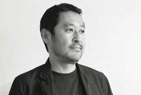
Oki Sato, nendo
The Retreat Hotel, Design Group Italia
Michaela Sheahan, HASSELL
University of Adelaide, ARM Architecture
In DESIGn Luminary Jon Johannsen
Yancoal, Hammond Studio
The ‘Healthcare & Wellbeing’ Issue.
INDESIGNLIVE.COM
9 > 771443870000 75
Issue #75 / Australia $16.50 / n e w Zealand $17.50 / Singapore $12.95 / U.S. $21.99
SMEG’S FINEST EVER
dolcestilnovo.com.au

WHERE PASSION MEETS PRECISION, COMES A TRUE CULINARY MASTERPIECE

SMA18915


SPRING
ARRIVING


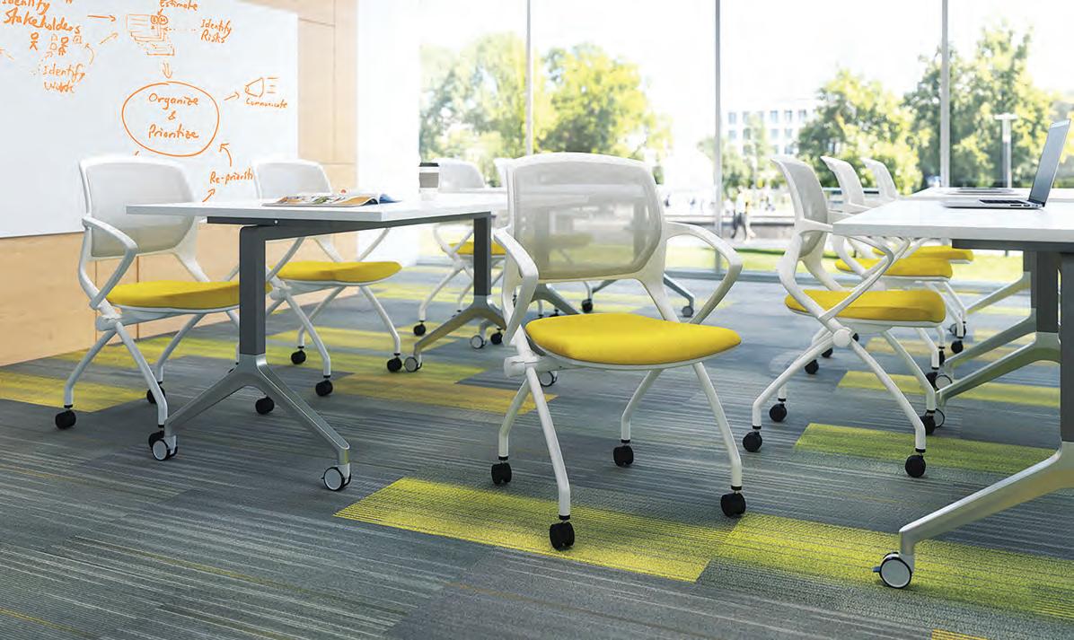
Atlas Office Landscape

Different by Design
 Designed by Tim Wallace


Atlas Office Landscape is a work system which brings together height-adjustability and collaborative working in one elegant solution.
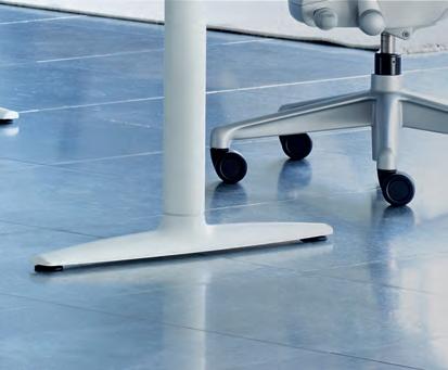


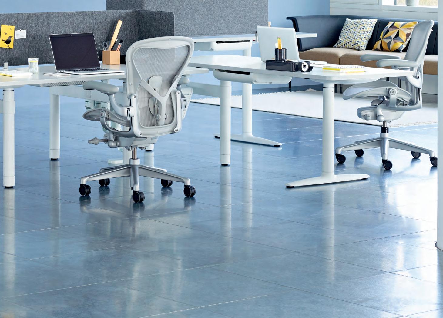
Combine desks, screens, tables and storage elements to create spaces that invite collaboration, zones for focused activity or impromptu meetings.


hermanmiller.com.au | hermanmiller.com/asia Foll0w us on | HermanMillerAsiaPacific
William Smart – Founder & Creative Director, Smart Design Studio
William Smart – Founder & Creative Director, Smart Design Studio

William Smart wins awards blending brilliant architecture and interior design. He has transformed this space with the ultimate in comfort and function from the iconic Living Edge range.
William Smart wins awards blending brilliant architecture and interior design. He has transformed this space with the ultimate in comfort and function from the iconic Living Edge range.
livingedge.com.au
livingedge.com.au


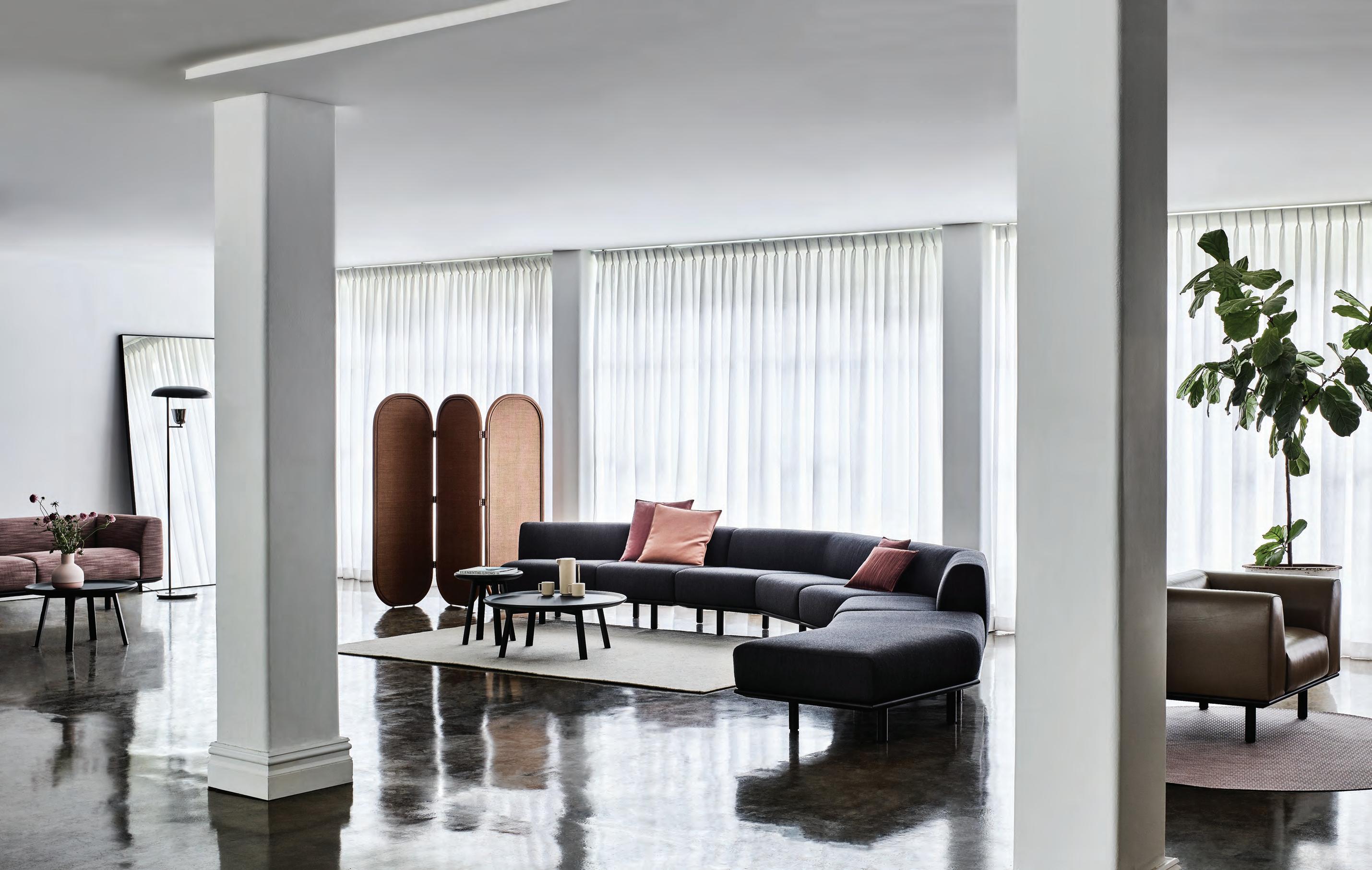
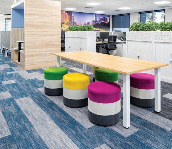
PLATFORMA
By ZENITH Design
Modular seating and tables with a soft residential aesthetic.
Discover the Metropolitan Collection | New Excava™ Cutting edge urban designs for a lifetime of experiences. Uniquely yours. www.caesarstone.com.au
Introducing the Underline Workstation
 by Simon James Design
district.com.au
Make your mark


The INDE.Awards celebrates the Indo-Pacific region’s most progressive design and architecture. Establish your place among the region’s leading names.

Entries open 29 November indeawards.com.au

“A revelatory experience of landscape and culture.”


– INDE.Awards Official Jury 2018


Winner | The Building & Best of the Best krakani-lumi, Taylor and Hinds Architects
Chairman/Publisher
Raj Nandan raj@indesign.com.au
Managing Director
Kavita Lala kavita@indesign.com.au
Editor Alice Blackwood alice@indesign.com.au
Special Edition Editor
Tracey Ingram
Indesignlive Editor Aleesha Callahan aleesha@indesign.com.au
Editorial Assistant Andrew McDonald andrew@indesign.com.au
Content Editor & Client Manager David Congram david@indesign.com.au
Brand Director
Colleen Black colleen@indesign.com.au
Business Development Managers

Danielle Nichols danielle@indesign.com.au
Kim Hider kim@indesign.com.au
Laura Hicks laura@indesign.com.au
Client Liaison
Dana Ciaccia dana@indesign.com.au
Client Success Executive Brydie Shephard brydie@indesign.com.au
Accounts
Ting Zhang ting@indesign.com.au


Anita Arbita anita@indesign.com.au
Designers
Julia Gee julia@indesign.com.au
Tracey Yee tracey@indesign.com.au
Louis Wayment louis@indesign.com.au
Online Manager Radu Enache radu@indesign.com.au
Web Developer Ryan Sumners ryan@indesign.com.au
Indesign Correspondents
Andrea Stevens (New Zealand) Mandi Keighran (London) Stephen Cra i (Melbourne)
Contributing Writers
Aleesha Callahan, Enya Moore, Leanne Amodeo, Marg Hearn, Patricia Arcilla, Paul McGillick, Sandra Tan, Sophia Watson
Featured Photographers
Adrien Williams, Alice Hutchinson, Alisha Tinsley, Charles Dennington, Glenn Hester, Ian Ten Seldam, John Gollings, Keith McInnes, Ko Sasaki, Louis Poulsen, Lyndon Stacy, Marie Louise Munkegaard, Michael Moran, Mike Bink, Phil Handforth, Rory Gardiner, Sandor Duzs, Sean Fennessey, Shannon McGrath, Takumi Ota, Terence Chin, Thijs Wolzak
Head O ce Level 1, 50 Marshall Street Surry Hills NSW 2010 (61 2) 9368 0150, (61 2) 9368 0289 (fax) indesignlive.com
Melbourne 1/200 Smith Street, Collingwood VIC 3066
Singapore 4 Leng Kee Road, #06–08,SIS Building, Singapore 159088 (65) 6475 5228, (65) 6475 5238 (fax) indesignlive.sg
Hong Kong Unit 12, 21st Floor Wayson Commercial Building, 28 Connaught Road West, Sheung Wan, Hong Kong indesignlive.hk

Join our global design community, become an Indesign subscriber!
To subscribe (61 2) 9368 0150 subscriptions@indesign.com.au indesignlive.com/subscriptions
Yearly subscription: Australia $55 (incl. GST) International AUD $110
Printed in Singapore
Indesign is printed with ENVIRO Soy-Based Process Black ink, UV Solventless Varnish and on paper which is awarded an Environmental Management Certificate to the level ISO14001:2004 GBT24001-2004 and Eskaboard and Eskapuzzle produced from 100 per cent recycled fi bres (post consumer).

All rights reserved. No part of this publication may be reproduced, stored in a retrieval system, transmi ed in any form or by any other means, electronic, mechanical, photocopying, recording or otherwise. While every e ort has been made to ensure the accuracy of the information in this publication, the publishers assume no responsibility for errors or omissions or any consequences of reliance on this publication. The opinions expressed in this publication do not necessarily represent the views of the editor, the publisher or the publication. Contributions are submi ed at the sender’s risk, and Indesign Publishing cannot accept any loss or damage. Please retain duplicates of text and images. Indesign magazine is a wholly owned Australian publication, which is designed and published in Australia. Indesign is published quarterly and is available through subscription, at major newsagencies and bookshops throughout Australia, New Zealand, South East Asia and the United States of America. This issue of Indesign magazine may contain o ers or surveys which may require you to provide information about yourself. If you provide such information to us we may use the information to provide you with products or services you have. We may also provide this information to parties who provide the products or services on our behalf (such as fulfillment organisations). We do not sell your information to third parties under any circumstances, however these parties may retain the information we provide for future activities of their own, including direct marketing. We may retain your information and use it to inform you of other promotions and publications from time to time. If you would like to know what information Indesign Media Asia Pacific holds about you please contact Nilesh Nandan (61 2) 9368 0150, (61 2) 9368 0289 (fax), subscriptions@indesign.com.au, indesignlive.com Digital Print Events Strategic Partners CAREERSINDESIGN MILANINDESIGN ARE YOU DRINKING ENOUGH WATER? ZIP0491 IND HP AIO 243x95 v01.indd 1 21/8/18 2:06 pm ZIP_HP_V1.indd 1 30/8/18 11:17 am INDESIGNLIVE.COM 20 INDESIGN IS BROUGHT TO YOU BY
80% OF ZIP HYDROTAP OWNERS DRINK MORE WATER*


We are all aware of the benefits associated with drinking enough water, but despite this, many of us go about our daily lives dehydrated to some degree.


As world leaders in instant drinking water appliances, Zip invented the innovative HydroTap, the smart and essential addition for every kitchen. Our integrated Australian-made appliance combines patented PowerPulse™ boiling and Direct DryChilling with MicroPurity filtration technologies to create pure-tasting boiling, chilled and sparkling water you will love in an instant.
When water is this convenient and irresistible you’ll love drinking more of it. To improve your hydration and your family’s well-being, discover more at zipwater.com Zip HydroTap. Now available in 8 new premium finishes.

*Statistic based on a survey of 354 owners of residential-installed Zip HydroTaps.


THE WORLD’S MOST ADVANCED DRINKING WATER APPLIANCE ZIP HYDROTAP | PURE TASTING | INSTANT | BOILING | CHILLED | SPARKLING
At Indesign we’re passionate about progressive design and architecture, and firmly believe our region is one of the best in the world. And we know you’re on the same page with us on this one!
We founded the INDE.Awards in 2017 to bring this vision to life, and shine a spotlight on the designers and architects who are putting the Indo-Pacific region on the global map. With entries to the INDEs 2019 opening Thursday 29 November, we’re excited to bring you the next chapter of the INDEs. If you have an amazing project, studio or individual worthy of an international design award, then flag them for entry.
What makes the INDEs truly unique is its regional reach. As 2018 judge, Abbie Galvin of BVN, says: “There’s an incredible sense of community and what this awards [program] has done [is] bring a whole community of architects and designers together in what is a really big region.” Likewise, our 2018 winners represented the diversity and dynamism of the region, revealing an expansiveness in both knowledge and background. Last year’s gala brought together a melting pot of people from all fields of architecture and design across the region. It really confirmed our conviction that our region’s design community has something important to offer the global design profession.
With two INDE.Awards winners featured in this issue, Pattern Studio (page 74), and Synergy building at CSIRO by BVN (page 100), we are excited to see what the INDEs brings us in 2019.
Speaking of great work, in this issue, the ‘Healthcare & Wellbeing’ Issue, we capture the many views and visions of designers, and their clients, who are cultivating a newlook wellness economy that encompasses healthcare, aged care, fitness, personal wellness and more. I’ll hand over to our special edition editor, Tracey Ingram, to tell you all about it, page 24.
Indesign Editor, Alice Blackwood
INDESIGNLIVE.COM 22 FROM THE EDITOR
indesignlive.com /indesignlive @indesignlive @indesignlive 250,950+ readers engaged across print, digital
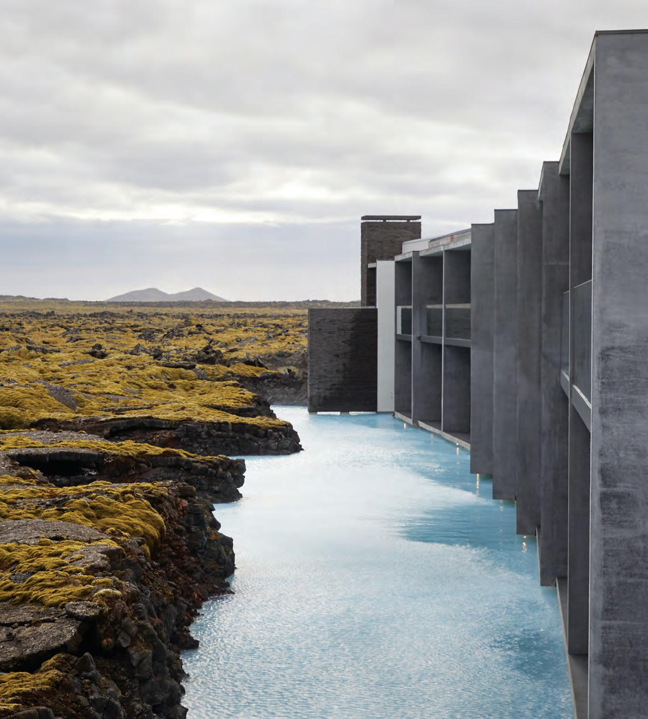
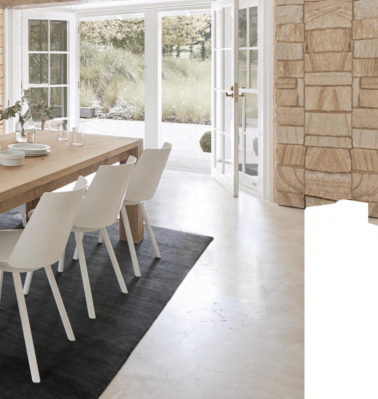
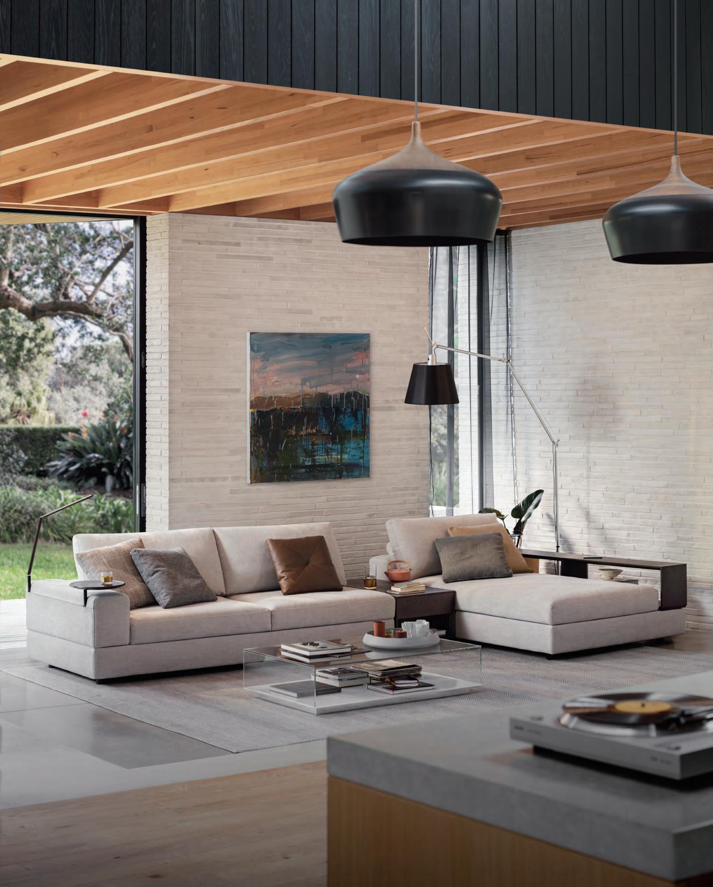
On The Cover Biophilic inspired wellness: The
& social...
Retreat Hotel by Design Group Italia is nestled into the natural lava formations of Iceland’s Blue Lagoon, and epitomises the complex relationship between nature, technology and architectural space, photo: Blue Lagoon Iceland. Read more in our article Human Vs. Nature, page 160.

parisi.com.au O’RAMA Collection
Healthcare. The industry that for decades would have been better tagged as ‘sick-care’ is finally starting to live up to its name. Bolstered by the rapidly expanding wellness economy, healthcare is becoming more holistic, with a focus on prevention and activation. Facilities are beginning to approach service and treatment from a patient’s perspective, in addition to prioritising visitor experience.
Just as fitness fanatics can track their daily step count with their phones, many patients can now access their own medical files. Healthcare is no longer a passive, treat-me scenario, it’s a team effort. Future visions see patients (and apps) playing an even greater role in their own treatment. Artefact studio proposes Aim, for example, a self-driving mobile health clinic that travels to patients’ houses. The system relies on a phone app and a set of personal devices to monitor a user’s health.
Technology may have opened doors, but it’s also at odds with another wellness trend: shutting off and returning to nature. But can technology actually enhance biophilia? See how an Icelandic spa marries two seemingly opposing forces on page 160.
As experience starts to shape healthcare environments, it’s only natural to look to experts in the field: experience designers. What if a hospital’s waiting room could feel more like an art exhibition?
Or you could you move through a hospital in the most harmonious way, soothing your nervous system in a time of heightened stress? The increased anxiety and potential disorientation associated with a visit to the emergency department led Billard Leece Partnership to design Austin Health Short Stay Unit (page 151) as if it were a signpost, guiding people to exactly where they need to be – as quickly as possible.
“Patient expectations have changed,” says Ralf Lambie of Tinker imagineers, whose studio transformed treatment into play at the Centre for Overweight Adolescent and Children’s Healthcare in Maastricht, the Netherlands (page 138). “Hospitals must organise their processes in such a way that they offer the highest possible value. The coffee served to patients may turn out to be just as important as the rankings of the medical specialists. And if waiting at the airport can be agreeable, why should it be any different at a hospital?”
Join us as we explore the full gamut of healthcare and wellbeing in this new, digitally and creatively enabled millennium.

INDESIGNLIVE.COM 24 FROM THE Sp E ci al Edi T i O n E di T OR
Tracey Ingram is special edition editor for Indesign ‘Healthcare & Wellbeing’ Issue. Tracey is a freelance design writer and editor, and editor-at-large for FRAME magazine.
In today’s wellness economy, healthcare is becoming more holistic.
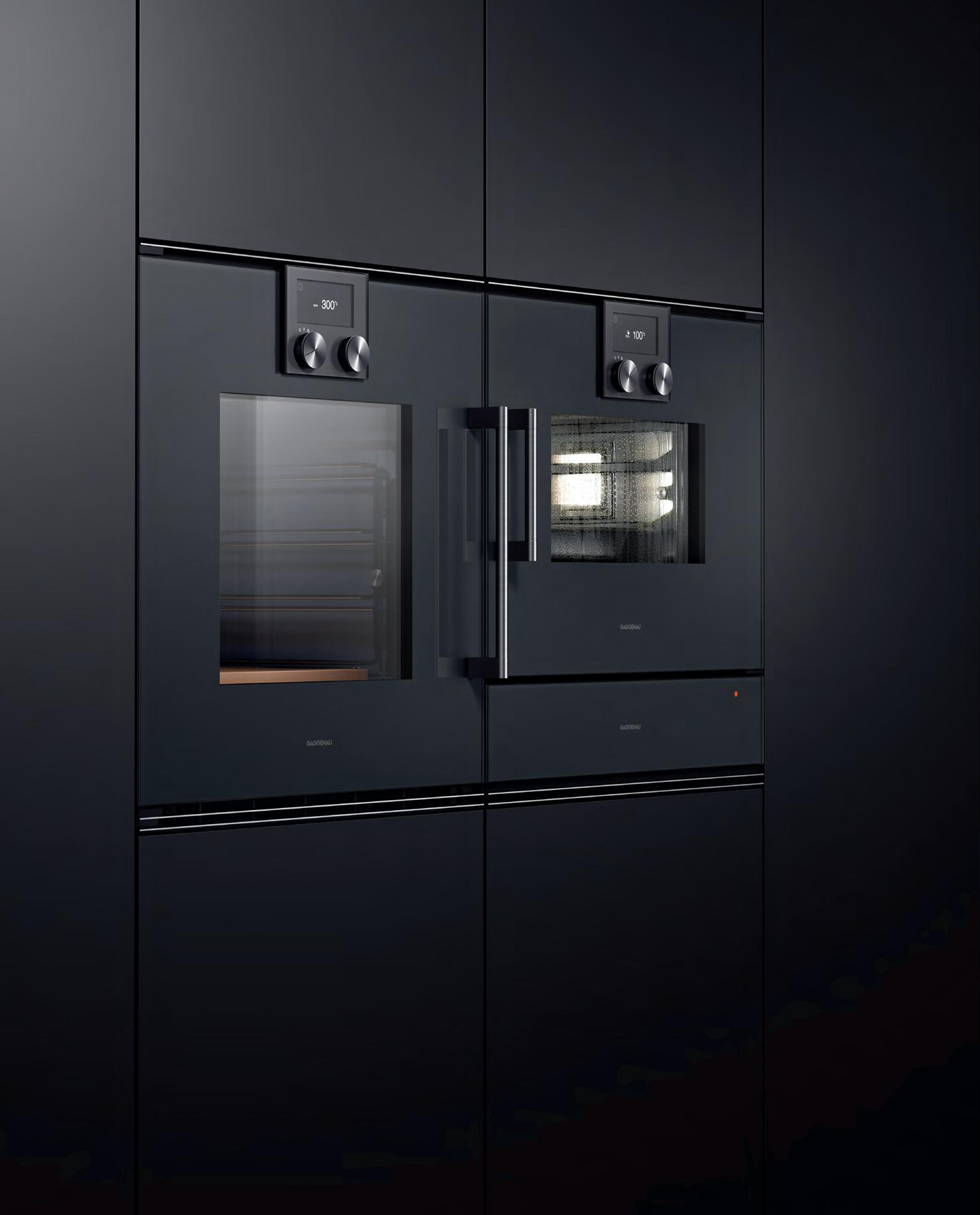
Mastering the art of understatement.
The difference is Gaggenau.
Unifying apparently contradictory elements is an art we master to perfection. Our iconic design exudes an irresistible charisma even in its uncompromising minimalism. Like the ovens 200 series, here with oven, Combi-steam oven and warming drawer. The stunning composition in Gaggenau Anthracite, Metallic or Silver elegantly blends into every interior design. Far from being opposites, statement and understatement are united in perfect harmony. For more information, please visit www.gaggenau.com.au
The ultimate industry cheat sheet.
Big thinkers and creative gurus.
Oki Sato, INDESIGN Luminary Jon Johannsen, Lily Goodwin and Josh Cain, Poul Henningsen
Provocative, innovative and inspiring design. 85-130
Perth Children’s Hospital by JCY Architects and urban designers, Cox Architecture, Billard Leece Partnership with HKS Inc
Light Warrior Investments & Made Establishment, Melbourne by WOWOWA
Synergy building at CSIRO Black Mountain campus, Canberra by BVN
University of Adelaide Common Teaching Area Upgrades by ARM ArchitectureYancoal, Sydney by Hammond Studio -
Australian Nursing & Midwifery Federation, Melbourne by Crone Architects I
Indesign annual healthcare and wellbeing think tank.
137-166
With ‘keynote’ insights from Bernard Salt, The Demographics Group; Nicholas Antoniou, Plus Architecture; Michaela Sheahan, HASSELL; Tracey Ingram, Indesign #75 special edition editor.
In Short
In famou S
29-52
61-83
In SI t u
-
-
-
n D epth
INDESIGNLIVE.COM 26 CONTENTS


www.haworth.com/70th-anniversary
Brought to you by Founding Partner Principal Partner Celebrating Asia Pacific’s best emerging talent –from prototype to production Entries open 29 November. This could be your year. Join us for a career-defining moment. indeawards.com/launchpad
the ultimate industry cheat sheet
INDESIGN 29 IN SHORT SHORT IN
Honour The Light Within
As the personal wellness industry gathers momentum, we see yoga studios and gyms adopting a mantel of accessible luxury. Taking their cues from premium club environments, and blending them with an Average Joe’s mentality (forgive the Dodgeball reference). In the crafting of this new public image, the fitness industry – and particularly yoga studios – have tapped into a lucrative market of social media-savvy yogis who draw thousands of followers with their attractive, marketable lifestyles.
While the social pull is strong (and as good a reason as any to make your yoga studio stylish and memorable), there is very much a serious, introspective – and far from flashy – side to the practice. “Often yoga is too neatly summarised as only a light and happy pursuit, which it can be,” says architect Richard Stampton. “But a reality and strength of yoga is that it can reflect and mediate the essential oppositions in life and our nature –not all of which are light and easy.”
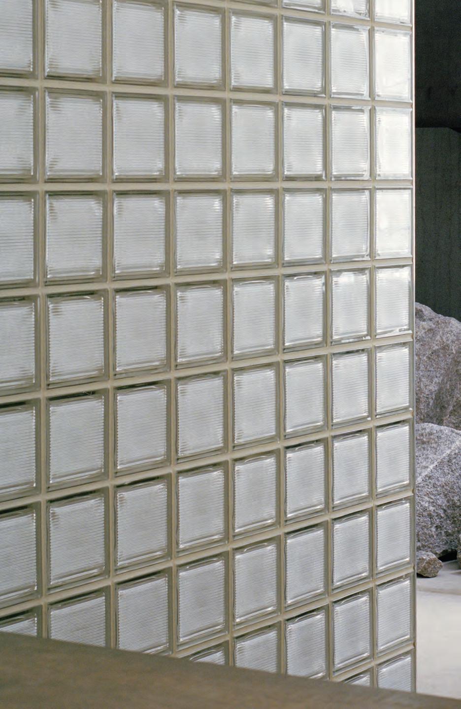
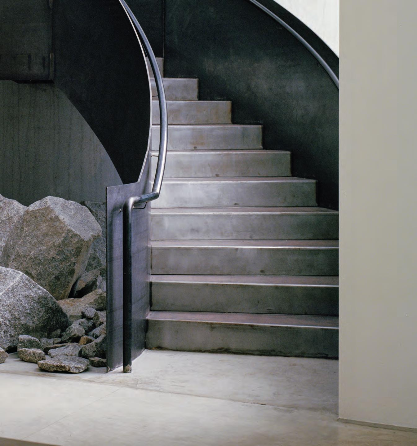
Artist Kirra Jamison’s second Good Vibes Yoga (pictured right) inhabits an existing studio space in Collingwood, designed by Stampton for a previous client, Kaz Kingdon, and Ashtanga Yoga teacher, Eoin McCarthy. Being a student himself, Stampton was ideally positioned to interpret the principles of yoga through design. The objective was an aesthetic that felt “bold and warm, but also humble and frugal, rather than stark.”
The robust material palette comprises concrete, glass, timber and steel. Unsealed granite boulders beneath a hand-buffed staircase express the honest, elemental nature of yoga in a way that eschews ornament or cliché. A once dingy groundfloor is cleverly illuminated by a central changeroom made of glass block, serving as the project’s functional and poetic core.
“I guess light is to architecture what the breath is to yoga,” Richard says. “I hope that the balance we struck between the conscious and subconscious operation of the design adds, in some meaningful way, to the students’ experience and development of their practice.”
INDESIGNLIVE.COM IN SHORT 30
INDESIGN 31 IN SHORT
The Price Of Creativity
When you’re working to an incredibly tight timeline, something’s gotta give, right? Phare Shoes, designed by Christopher Elliott Design, was conceived and documented in just two weeks! But the quick turnaround didn’t hamper creativity, Elliott says. In fact, the shortened time frame was something that worked in his favour.
“The good thing about the short deadline is it gave us an insight into how we can simplify some of our services. We had to look at the way we achieve our deliverables, and go, ‘Okay, what’s the most efficient way we can get there?’ Because there just wasn’t time for any fluff.”
Eye-catching in its aesthetic, Phare features strong angles and geometries, which collide with peach tones and pops of magenta and blue. The outcome is what Elliot himself describes as a “feminine but powerful space”.
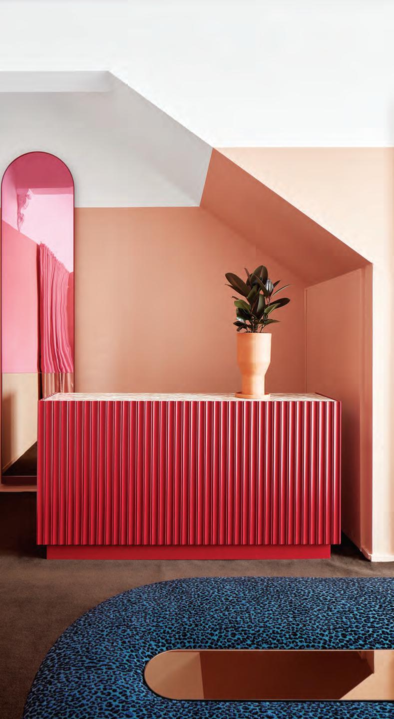
The concept for the space came from wanting to reflect the brand itself, but also the “courage that the owner shows in the design of her products”. These elements were infused into the design, not simply through the colour palette, but with some of the design choices – such as a blue capsuleshaped, leopard print bench seat.
Elliott says he “was immediately excited by the opportunity” of the project, which came to him via the owner – also a friend. Right from the get-go it was apparent that they both had similar ideas for how the small, short-lived space could come to life, all in an incredibly short amount of time.
Part of the project’s success can be attributed to the acute level of detailing and polished execution. This is no mistake and forms the backbone of Elliott’s approach to design. “My design philosophy is about detail and execution. To me, quality comes through in the way something is executed, which is just as important as the design itself. I would rather have less of everything, but all of good quality, than a whole lot of stuff that just isn’t up to scratch.”
INDESIGNLIVE.COM IN SHORT 32

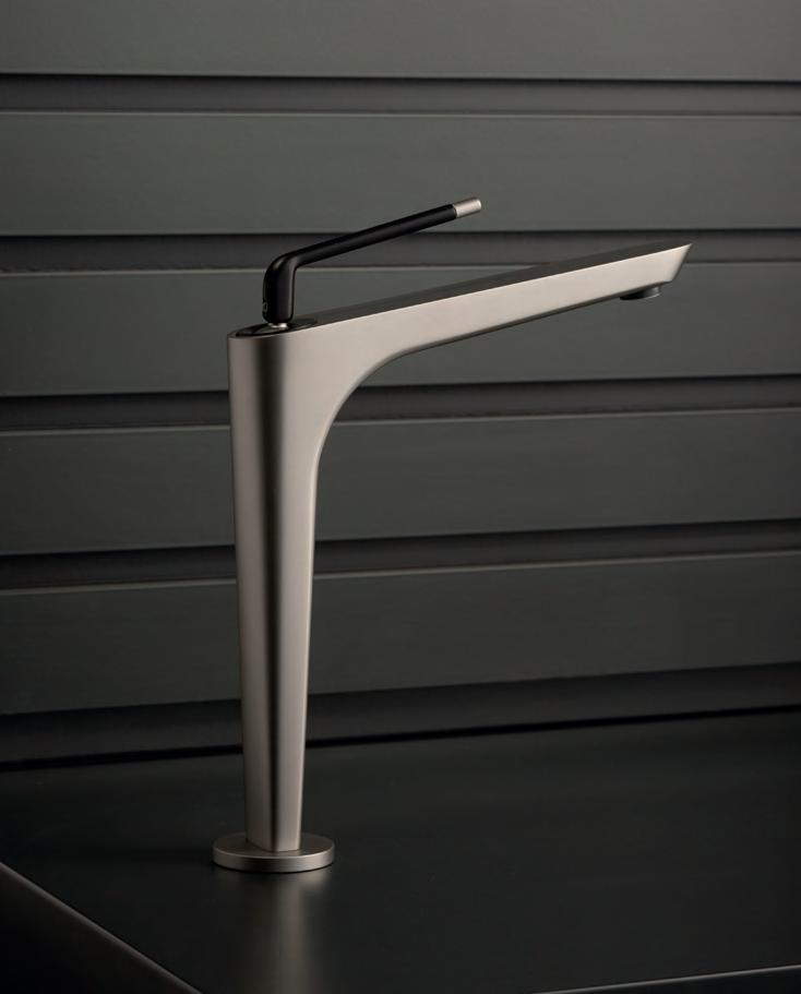
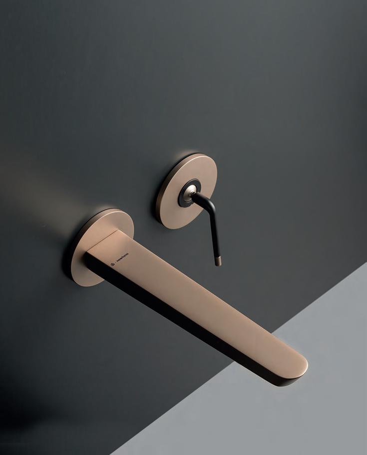
Shaping water naturally since 1968 Celebrating 50 years and beyond. Watch our original stories at vola.com FS1 Free-standing bath mixer with hand shower VOLA Design Pty. Ltd. - Tel.: +61 402 372 480 - sales@vola.com.au - www.vola.com
why...
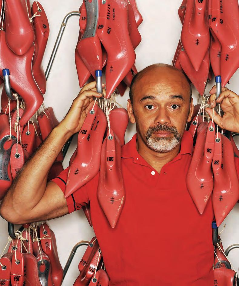
Louboutin Goes Legal
In a notable win for creative professionals everywhere, the uno cial emperor of shoes, Christian Louboutin, was successful earlier this year in a landmark legal battle to protect the distinctive red soles that have de ned his legendary footware brand. The European Union Court of Justice ruled in favour of the french designer, stating that the sole’s colour was separate from their form — an attribute ordinarily not protected by EU trademark law. Louboutin took the case to court following Dutch brand Vanharen’s marketing of its own red-soled shoes. “Colour alone doesn’t mean very much to me,” says Louboutin, “it’s always a question of how colour is applied.” In the case of form and application, Louboutin’s soles are very much the intellectual property of the Christian Louboutin brand, as The Court found. The fact that there is now a legal precedent that protects form, application and name means creative professionals are in a much stronger position to legally take on the replica trade.
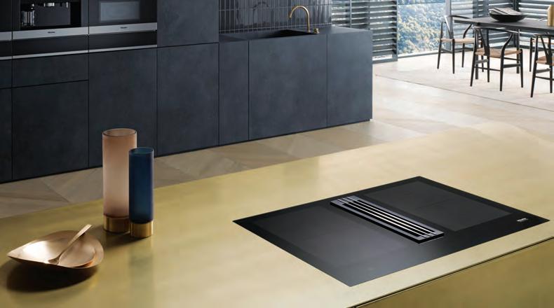
Consider The Cook
Indesign Miele
Winner of a 2018 Good Design Award, the Miele TwoInOne cooktop encourages a new-think approach to cooking and kitchen design. Through combining induction cooking technology with an integrated downdraught extractor, Miele has realised a modern cooktop design equipped for every kitchen scenario. Ideal for openplan kitchens, the cooktop features touch controls for both the cooking zones and the extractor. Though in practice, when cooking, it’s easy to rely on the extractor’s automatic controls.
INDESIGNLIVE.COM IN SHORT 34
–
–
This might be the most important legal precedent for designers in our industry’s history. Here’s
Breaking The Mould
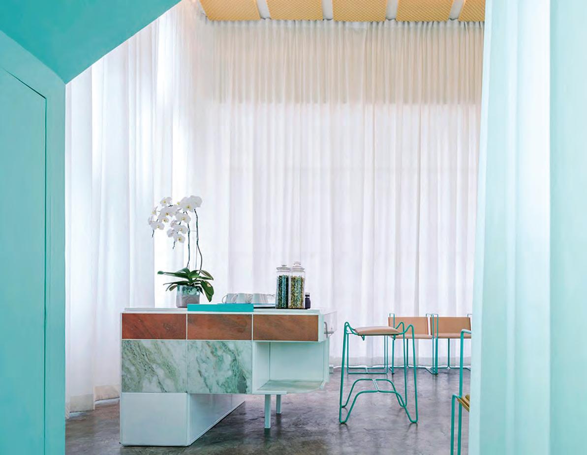
Because of Thailand’s limited geographic sprawl, the vast majority of its shopfronts are designed with a cookie-cutter approach to achieve one defining feature – utility. Here, designers are faced with a pretty big challenge to inject a measure of unpredictability into what are otherwise very predictable spaces.
This was the brief given to local design firm, Space Popular, in its reimagining of Bangkok’s Infinity Spa, spread across two traditional Thai shop houses. “These concrete shells all share the same layout, sizes, proportions and materials; being the most generic spatial typology in the city where all kinds of programs are stuffed,” say Space Popular architects Lara Lesmes and Fredrik Hellberg. “Besides the practical issues that this typology poses, experientially the aim was to visually eliminate the concrete shell with the use of few materials –paint, light and textiles – and concentrate the attention on the nearly 20 custom-designed furniture pieces that would communicate purpose in an otherwise muted space.”
Sections of bright turquoise paintwork and matching furniture, for example, offset the otherwise white-washed treatment rooms. These rooms are draped with back-lit curtains – providing a neutral backdrop for the brightly coloured furniture.
As well as designing the interior, Space Popular also created bespoke furniture, including manicurists’ tables, adjustable massage chairs and shelving with niches designed to hold specific nail polish bottles. “The lack of architectural features lets the eye travel from object to object undistracted. The furniture pieces are in extreme contrast with the background: while the space is monochrome, white, soft and textured, the objects feature a high saturation polychromy with smooth materials such as metal, marble and leather. Together they constitute a collective identity through their forms and colours, constructing the identity of the space while addressing very important and distinct issues of comfort and ergonomics,” say Lesmes and Hellberg.
INDESIGNLIVE.COM IN SHORT 36
Change Up The A itude
It’s o en the case that, in urban centres, structures will be knocked down in the name of ‘progress’ – only to be swi ly replaced with future-proofed o ce blocks. But in doing so, history is also razed and a hidden well of opportunity lost. At the FRONT Design Forum, held as part of FRONT in August, Dr Peter Tonkin weighed in on the topic of adaptive reuse buildings , pointing out just how valuable heritage buildings are.
“The advantage of reuse is you get a lot for nothing. Because generally in a new build, you’re tailoring everything to the brief and squashing it in, but with adaptive reuse [you’re getting] a lot of volume in terms of ceiling heights and spaces,” states Dr Tonkin. “The other really valuable thing is, you get a greater variety of spaces and richness of texture, a kind of instant identity that people o en struggle for, with a new build, where it o en feels quite forced,” he says.
Complying to a complex brief can o en complicate matters – not to mention updating and future-proo ng an old [structure] to comply with current building and energy standards. However, Dr Tonkin says, “with an adaptive reuse you’re again three steps down the path. It’s not a limitation of creativity, it’s a di erent sort of creativity.” Perhaps history can play a pivotal role in our move toward a sustainable future.

Brains And Beauty
Indesign Krost
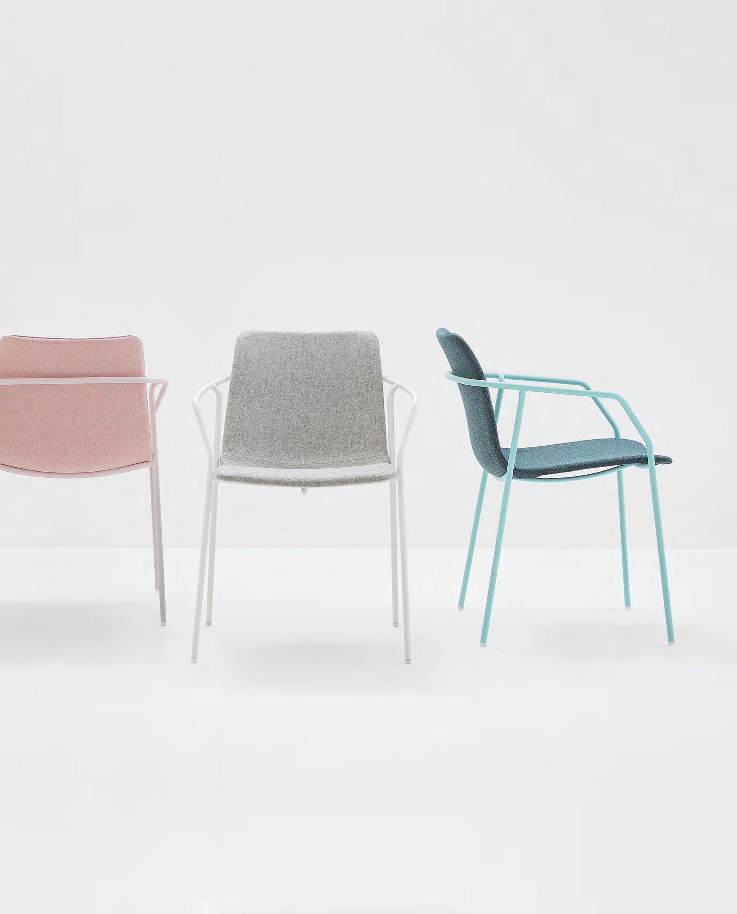
Scalability Defines Agility: Ichiro Iwasaki
In the design of his recent Kiik collection for Arper, Japanese designer Ichiro Iwasaki says customisation and scalability are the future of agile environments. “I started by observing public spaces like parks, museums, airports; places where people are on the move. Today, public spaces are dynamic and active, and they accommodate a range of needs: stillness and motion, activity and rest, work life and private life, ease and seriousness. You see people standing and chatting, talking on the phone, leaning against walls, working on laptops, or resting. Traditional sofas don’t have the capacity for this variety of lifestyles. We developed Kiik so each module can stand alone, or be linked together. This way of designing means there are no limits to the con gurations that can be created. It is scalability more than modularity, therefore, that de nes Kiik and the future of agile spaces.”

When it comes to customising o ce spaces for a variety of working situations, practicality o en takes a front seat to aesthetics. Knowing designers’ preference for style and functionality, Krost’s new Velo range looks to balance the scales, allowing for the creation of seamless desks of any size, without compromising on visual appeal. With a streamlined leg pro le and integrated power options, the result is a manageable solution for the o ce that acknowledges the role aesthetics plays in a productive workspace. Customisable to suit any space or desire, Velo encompasses tables, workstations and desks, so whether it be a room or an entire o ce, the solution is cohesive and can be delivered and installed within three weeks.

INDESIGN 37 IN SHORT
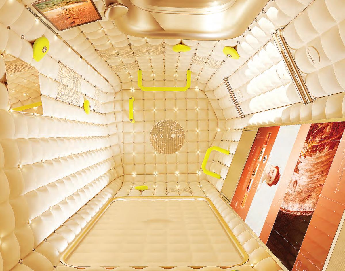
The Final (Design) Frontier
As the world continues to warm up at heart-stopping rates, it’s no surprise to find we are looking beyond Earth to contemplate life in space. The most recent effort on this front is from the maverick French designer, Philippe Starck, with the Axiom Space Station. Not unlike Richard Branson’s commercial flights to the moon, this habitation module will house paying individuals on expeditions to the space station, due to open in 2020. Starck wanted his interior to evoke the feeling of being weightless in the womb; to create a “comfortable egg that is inviting with soft walls and a design perfectly in harmony with the values and movements of the human body in zero gravity”, he says. “A space station is ruled by a fundamental law: zero gravity. Unlike terrestrial life constraints, life in space is a multi-directional freedom. This dematerialisation shall be a first approach to infinity. The traveller should physically and mentally feel their action of
floating in the universe.” According to Axiom, Starck’s interiors are designed to enhance life in orbit, and to provide an added level of luxury to its forthcoming space station. Starck’s design includes large, rectangular gold-capped windows with rounded corners that would frame views of the earth below. The suede-textured walls of each private cabin are dotted with hundreds of nano LED lights that change colour depending on the time, and where the space station is travelling in relation to the earth. “Just as all the shades of lights and colours of day and night, the egg will also live to the mood and bio-rhythm of its osmotic inhabitant,” said Starck. Axiom recently announced the launch of its space tourism program, which will offer individuals 10-day expeditions to its space station, connected to the International Space Station, at a cost of £41 million (AUD$55 million) per ticket. But you can’t put a price on good design!
INDESIGNLIVE.COM IN SHORT 38
For those who are not satisfied with the ordinary and want to turn the everyday into something special, studioLine inspires with an extraordinary new design. The exterior shines with high-quality materials and a reduced appearance, whilst inside the latest advances in automation and intelligent cooking technology are delivered in signature Siemens style.


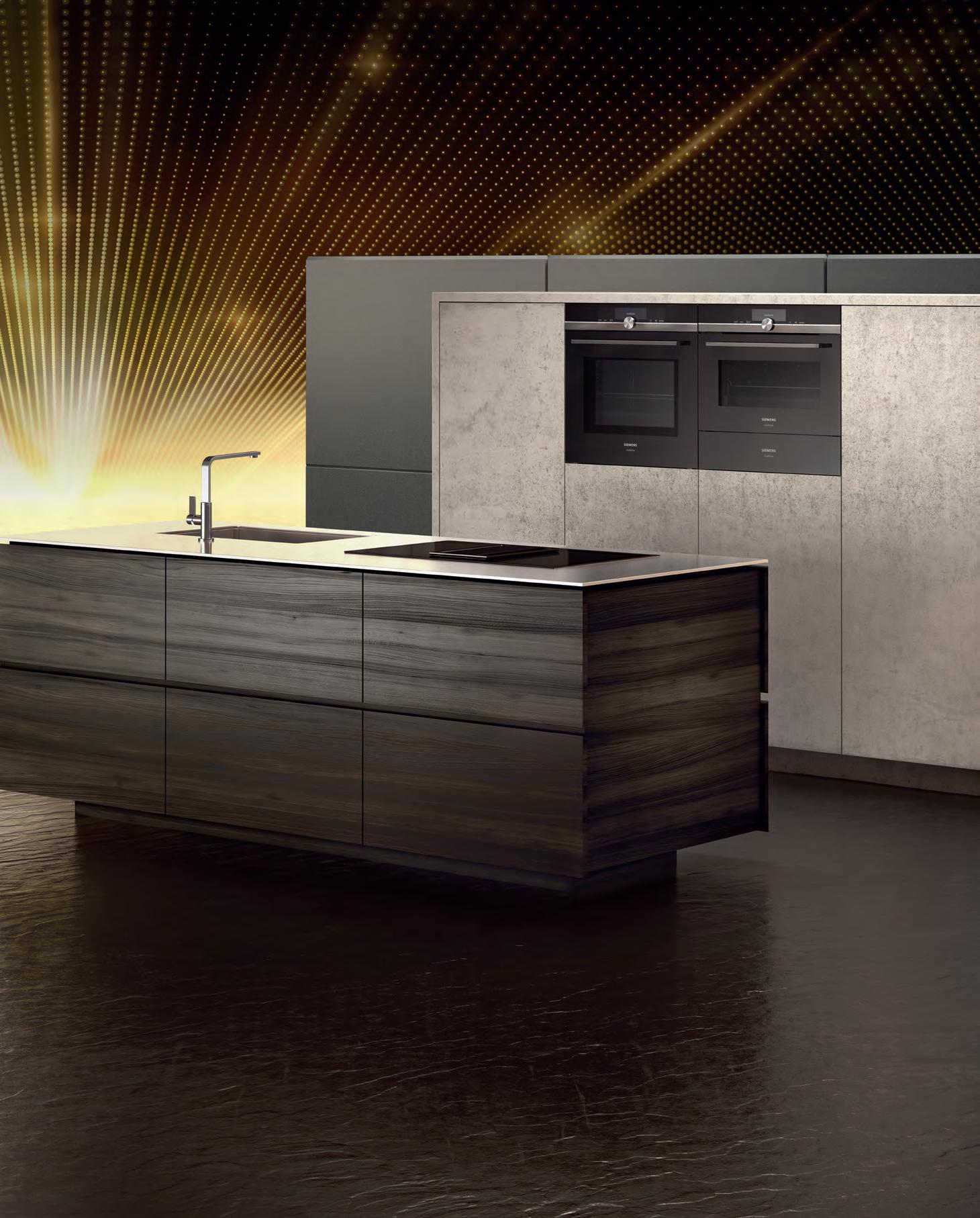
Introducing studioLine by Siemens.
Discover the suite of Siemens home appliances today. Siemens Home Appliances HOME APPLIANCES BRAND IN GERMANY* BSH Group is a Trademark Licensee of Siemens AG. *Source: Euromonitor, per Major Domestic Appliance definitions, volume brand sales, 2017
Cute As A Bu on Indesign Cube + Circle
It’s rare to nd a sofa so adaptable in its design that it easily ts into lounge rooms, o ces, aged care facilities and clinics. Swedese’s Button Sofa displays premium Scandinavian construction with its timber frame and luxurious leather detailed accessories. The ergonomic design makes it optimal for elderly care as the high, shallow seating and comfortable armrests enable the user to easily sit down and stand up. Hygienic qualities also make it suitable for sensitive environments, as the seat fabric can be removed and the tall frame allows for ease of cleaning underneath.
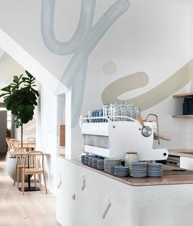
Breezy And Brunchy
Let’s not kid ourselves – creating a space where people actually choose to be for extended periods of time is a rare feat. The art of good hospitality is largely down to good design, and few designers know the di erence between spaces that are pretty, and spaces that attract and host people.
Following the success of sister-café Moby 3143, also designed by Golden, Lenny’s proprietors hoped to connect with locals and visitors alike. Inspired by its location on a breezy bayside boulevard, Lenny 3206 is a Melbourne hospitality destination with design intent driven by the familiar and the convivial. Lenny comes alive through preppy pastel tones, robust materials and a textural palette that beckons guests to stay a while.
This friendly, welcoming undertone is emboldened by strength in materiality – marble, terrazzo, solid oak and steel –juxtaposed with a playful, hand-painted mural that dances from one end of the café to the other. In a nod to Lenny’s cursive brand identity and the adjacent bay, organic motifs are peppered throughout the space, from the shapely communal table and arched pendant lighting, to the central bar rendered in jagged rock formations.
The humble rock quickly becomes a recurring theme, not as a monolith but instead a considered, intricate detail, expressed in a custom door handle and striking wall sconces by Melbourne lighting studio LAAL.
INDESIGNLIVE.COM IN SHORT 40
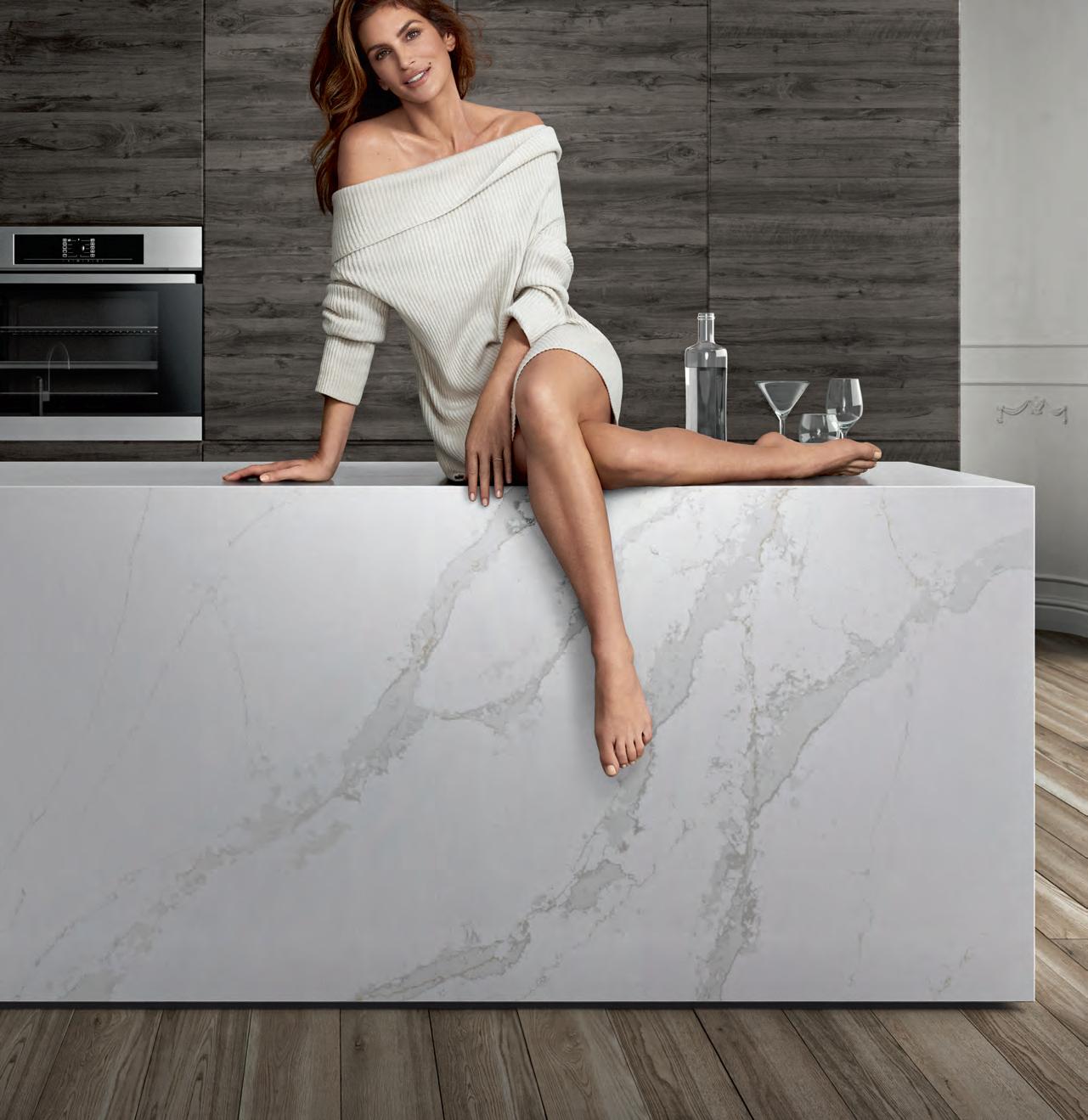


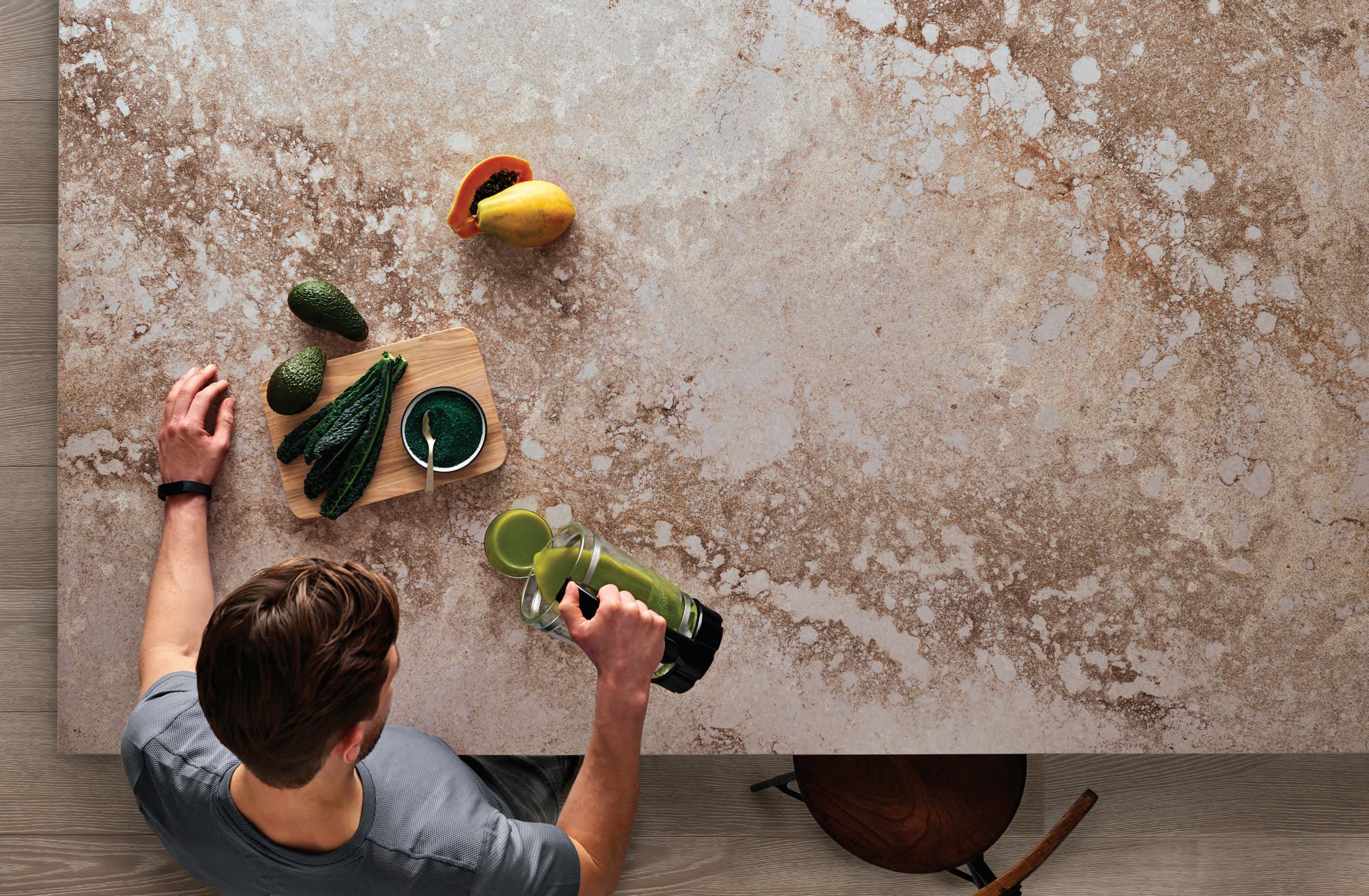
A product designed by Cosentino ® On Top
TOPS ON TOP Feel the new velvety texture n Discover more at silestone.com | Follow Us F T VISIT OUR SHOWROOMS IN Adelaide | Brisbane | Melbourne | Perth | Sydney
Cindy Crawford on Silestone Eternal Calacatta Gold
Finish With A Flourish
Indesign Caesarstone
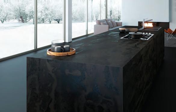
The industrial movement in contemporary interiors has led to a robust design vocabulary that frees us up to make statements through nishes. Tarnished metal, untreated wood and raw concrete are just some of the urban surfaces now penetrating the industry – particularly hospitality and commercial contexts. Excava (below), from Caesarstone, blends and contrasts the authentic features of rust and concrete to create an intriguing patina. Its beauty re ects the geological decay of stone, weathered by time and nature.
Ross Didier On Helm
“The Helm [for James Richardson] is not over-designed, but quietly con dent. It’s really intended to be as little designed as possible. While familiar in form, [it] has unique and distinguishable details such as the sculpted arms, pleat feature on the back face, subtle curves in the form and pinched upholstery seams nicely contrasting with the solid timber. I wanted to develop a modular sofa range that proved unobtrusive and useful, with an intelligence matched with styling.”
Weird Science
Imagine a facial recognition algorithm that could scan your face and psycho-analyse you better than a best friend or parent could. Just what sort of things could it tell you? Age, gender, weirdness, aggressiveness... To think that technology could read you so deeply, in a single digital ‘glance’ is quite unsettling, is it not?

“In this age of AI becoming so dominant we really need to create experiences and platforms to discuss the ‘black mirror’ of AI,” says artist Lucy McRae of her recent pop-up sci- beauty salon project, Biometric Mirror. McRae dwells at the very edges of architecture, performance and science to build experiential narrative and cultivate a world of imagined possibilities.
Biometric Mirror invited visitors to receive a ‘digital facial’ in which an AI scanned their biometric data and revealed the mathematically ‘perfect’ version of their face. “But what if AI gets it wrong?” poses McRae. Who’s to say what perfection is? Because behind every AI is a human building the algorithms...
INDESIGNLIVE.COM IN SHORT 42
From Zero To Nada
The Scandinavians have done it again! Commissioned by the Finnish Cultural Institute in New York as part of the recent NYCxDesign program, the Zero Waste Bistro breathed new life into the largely oversaturated sustainability conversation.
Co-curated by Harri Koskinen and Linda Bergroth, and designed by Bergroth, the pop-up restaurant focused on new material innovations and making sustainable design cool again. Guests walked into a mottled silver-blue space composed of Durat panels


The circular economy comes to hospitality with Zero Waste Bistro where food and waste management as well as water e ciency is paramount.
made from recycled Tetra Pack – a packaging material commonly used for milk cartons. Durat is a unique, sustainable solid surface material that contains recycled plastic and is 100 per cent recyclable.


The Finnish company has been pioneering in the circular economy, minimising the need for virgin raw materials. As an additional nod to sustainable design through longevity, famed Finnish design brand Artek, known for its clean and minimalist pieces that last for generations, provided the furniture for the space.

INDESIGN 43 IN SHORT
–
–
Conference rooms are named after popular Instagram accounts and search terms, like Accidentally Wes Anderson, Rainbow Bagel, Rich Dogs of Instagram, and All Black Everything.
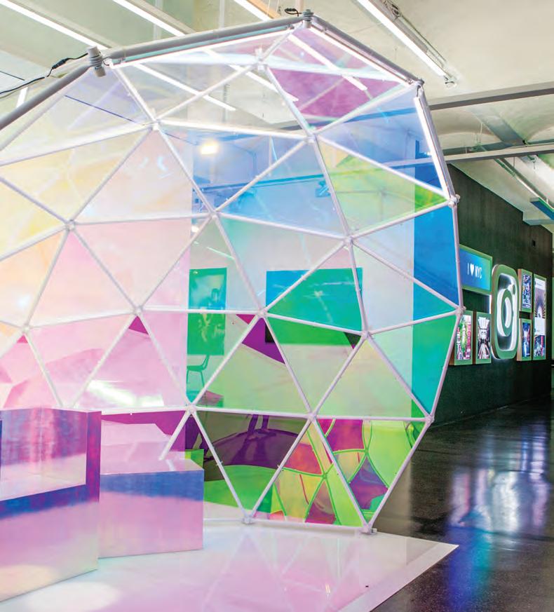
Glitch And Glamour
How do our workplaces reflect our social habits and, more importantly, why should that matter? This was the process that Frank Gehry’s design firm went through when designing Instagram’s New York headquarters. In its newly designed digs, the brief was to design a space that encourages and facilitates users selfdocumenting their day via Instagram’s live feeds, stories and the enduringly popular, good-old-fashioned selfie.
Here, the spaces feature elements such as a soundproof media studio where you can snap photos with various digital backdrops; a digital greeting wall with rotating imagery from the Instagram feeds and stories of Instagram 800 million-plus users; and the ultimate selfie weapon – a partial geodesic dome complete with user-controlled lighting and dichroic glass which changes colour depending on the angle.
Is VR The Next Wellness Milestone?
Hypnotherapy has been clinically proven to have positive effects on our mental and physical health, so it’s no surprise that designers are seeing opportunities to integrate it into spaces that require elements of wellness, such as the modern workplace. One of the more interesting projects in this field by virtual reality (VR) designer, Allison Crank, combines hypnotherapy with VR technology to create a virtual recovery and recuperation program for the stressed and over-worked.
Here, Crank replaces your average hypnotherapist with the Cheshire Cat to make the experience less clinical and more whimsical. Crank explains: “I’ve been quite alarmed by the increasing cases of burnout, insomnia and other stress-related conditions in working professionals (of an increasingly younger age) around the world, and so I wanted to develop a product to reduce stress and improve our overall mental wellbeing.”
Working at the intersection of technology, media and architecture, Crank proposes a personal virtual-reality spirit animal-cum-sleepguide that has the potential to have a significant effect on the agile workforce – a hypothesis worth testing!

INDESIGNLIVE.COM IN SHORT 44
–
–
Pure LooP Maxi DesigneD by CLaus breinhoLt for infiniti Design. www.infinitiDesign.it info@infiniti-Design.CoM.au
Darjeeling Unlimited
The Pink Zebra, a high-concept restaurant in northern India, uses specific architectural and design styles to express the political history of a region. Designed by local studio Renesa, the project uses design to communicate the narrative of the site, from the bygone days of the British Empire to the films of Wes Anderson. Located inside one of the oldest structures in Kanpur – a major industrial city formerly known as Cawnpore – the architectural landmark has been described as a ‘concoction of design theories’. “The core idea was to create a design hybrid to leave the visitor hanging in the middle of an artistic sea,” says the design team.
Here, Renesa drew from the client’s love of Wes Anderson movies. The interior references the American filmmaker’s use of symmetry and restricted colour palettes, which often give the expression of a surreal, self-contained world. However, in order to break this rigorous spatial ideology, the architect added black and white zebra stripes to the pinkish tones often associated with the British Raj.
Renesa explains: “The simple idea was to create a distinct aesthetic and architectural style that connects to the city and its people [through] the use of a striking colour palette. The Pink Zebra with its unique façade creates an everlasting effect on passersby and invites them into a magical, expertly-crafted world whose spaces are framed to treat the eyes.”
Renesa’s concept for the Pink Zebra demonstrates the value of design as a powerful storytelling device, and how the historical and political nuances of a region can be artfully translated in a contemporary context while preserving the authenticity of a local culture. And that is far more valuable than haphazardly throwing around Millennial pink.
INDESIGNLIVE.COM IN
46
SHORT
VENETTE


polytec’s newest innovation in decorative doors & panels delivers exceptional fi ngerprint resistant technology in the purest matt form.

The silky smooth fi nish of VENETTE creates an inviting and pleasant touch experience, whilst the pure matt surface assures low light refl ection, reducing the need for constant care and cleaning.
VENETTE’s advanced surface technology creates a soft appeal, and invites you to explore the surface without the concern of excessive fi ngerprints and scuff marks.
Australian made pre-fi nished board exclusive to polytec, VENETTE pure matt will add a touch of luxe to any interior joinery application.


www.polytec.com.au p 1300 300 547
Pure Matt.
Drive Away No Pay
While every brand is looking to ‘create experiences’ for its customers, the buck really stops with designers, to deliver the blueprints for these new ‘brand horizontals’. Recently launched by Toyota, Drive to Go (D2G) is a new retail concept based on car sharing. The service targets under-25s who live in metropolitan areas and cannot a ord to own a car. Designed by Archicept City, the rst D2G in Nagoya, Japan uses a glamping motif to attract users to the space. A er taking their ll of free sandwiches and co ee in the café, customers can select a rental car that’s already equipped with outdoor camping gear. Once checked in, they need only collect their friends and drive to one of the partnering campsites to complete the glamping experience. As designer Atsushi Muroi says: “It’s no longer about the purchase of high-end goods but rather the gaining of new experiences.”
A.C.T. Creative
Enrico Taglietti is arguably the godfather of Australian modernist architecture and one of Canberra’s most treasured artists. He is being honoured at the ACT’s DESIGN Canberra festival (1525 November). Its series of programs highlights his distinct and highly personal design character so o en expressed through his use of unusual sculptural shapes and angles, cantilevered planes of roof and deck, and concrete. Taglietti studied in Milan under luminaries like Gio Ponti, Franco Albini, Bruno Zevi and Pier Luigi Nervi. His work led him to Australia in 1955, where he continues in Canberra today. Also headlining this year’s festival is famed Japanese architect Kengo Kuma whose installation, NAMAKO, highlights the relationship between place, experimentation and cra smanship.
RawFinement
Indesign Cosentino
Sustainability and the industrial aesthetic may be mainstays of modern design but the two do not always work in harmony . Dekton’s Trilium and Radium surfaces bridge the divide, made with 80 per cent of content recycled from excess materials.
Trilium’s mix of volcanic shades – deep greys, blacks and rusty tones – are inspired by oxidised stainless steel. Meanwhile the deeper and darker surface of Radium captures the visual texture and colour variegation of rusty, acid-degraded steel. While richly industrial in aesthetic, these re ned surfaces are smooth to touch.
INDESIGNLIVE.COM IN SHORT 48
Introducing Jasper II. Where living is King.
At King Living we don’t design furniture just for show. We design for how you really live. Meet the stylish new Jasper II. Built on King Living’s superior steel frame, backed by a 25-year warranty, it features innovative Smart Pockets™ and clever hidden storage space. So you can relax and enjoy the comfortable silences. That’s King Living. Where living is King.
If you are a professional Interior Designer, Architect or Stylist, we encourage you to join the King Living Member Trade Program which offers you savings year-round on King Living designs. Apply online today.

KINGLIVING.COM
Del Kathryn Barton X Designer Rugs
Fashion and art has a funny way of making its way into interiors, allowing us to finish our spaces in the same way we might complete an outfit. Over 10 years ago, the Sydney artists Del Kathryn Barton teamed up with fashion label Romance Was Born to create a whimsical eye print that made its way across jewellery, totes, t-shirts and more. Designer Rugs has a discerning eye for creative individuals who are curious enough to cross disciplines, recently using Barton’s original RWB collaboration as a launch pad for a series of rugs, including Code Fluff, pictured right.
“I approached the collaboration with Designer Rugs being the lover of colour and maximalist aesthetics that I am,” says Barton. “I kept requesting more and more colour ways! After some deliberation I selected a small section of my enormous painting, sing blood-wings sing, and scaled it up. I am particularly thrilled with the pinks and oranges, two of my most favourite colours! Code Fluff is quite simply a wild magic rug that I want to fly away on!”
Lia Pielli, senior designer at Designer Rugs, says: “Del Kathryn Barton’s artworks are incredibly detailed with a myriad of colours. The challenge was to simplify the detail and reduce the number of colours in the artwork so it could be translated into a rug, while maintaining the integrity of the design.”
With Designer Rugs the hallmarks of Barton’s work – seductive line, strong colour use and a whimsical unpicking of the cosmos –take on new dimensions. No longer restricted to just the walls or the body, her artistic vision becomes a tactile tool for interior expression.
Margiela’s Dream Coat
When fashion house Maison Margiela (MM) contacts you with a brief to create a custom coat, what do you do? Why, you take on the challenge, of course! Dutch artist Claudy Jongstra specialises in tapestries and textiles that bring presence and humanity to both commercial spaces and the body. Her work is finely detailed and designed to comment on place, people and culture.
Jongstra most recently produced a coat, in collaboration with Maison Margiela by John Galliano for its F/W 18/19 ‘Artisanal’ Collection. “The brief was that we are modern nomads living and working all over the globe. We connect strongly with what we are wearing, as a second skin,” she says. The coat itself is hand-felted to a pattern provided by Galliano , and produced in a custom indigo dye palette. The garment is layered in narrative, details such as ‘natural’ shiny spots around the pockets expressing “where your hand would touch the coat very often”.

While textiles can bring softness and a sense of care to interior environments , the body’s relationship with textiles is slightly more complex, says Jongstra. The fabric we wear brings with it layers of connotation, speaking to fashion and individuality but also making a sociopolitical comment.
Jongstra is known for aligning herself with strong-minded brands, like Maharam, with whom she’s released the Drenth Heath collection. “Maharam,” she notes, “has been consistently supportive of the philosophy and value behind [my] work... They are not afraid to work with progressive designers, and stand behind their radical ideas in a very open and transparent way.”
INDESIGNLIVE.COM IN SHORT 50
Be immersed.
Abey
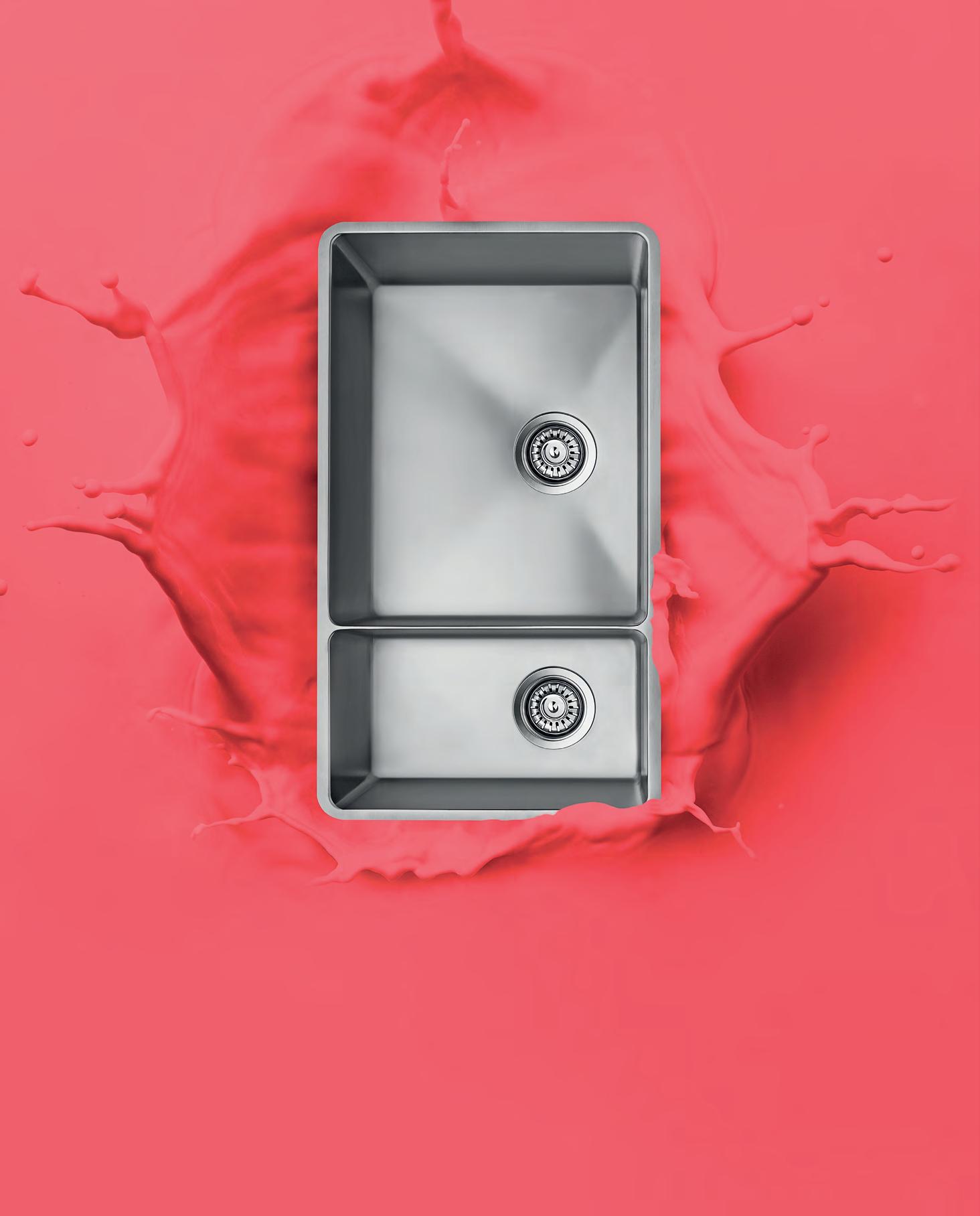
Australia’s diverse range of sinks provides you with a selection from around the world. Visit an Abey Selection Gallery to immerse yourself in the collection. Lucia Bowl & 3/4 VICTORIA Selection Gallery 335 Ferrars St Albert Park Ph: 03 8696 4000 WESTERN AUSTRALIA Selection Gallery 12 Sundercombe St Osborne Park Ph: 08 9208 4500 NEW SOUTH WALES Selection Gallery 1E Danks St Waterloo Ph: 02 8572 8500 QUEENSLAND Selection Gallery 94 Petrie Tce Brisbane Ph: 07 3369 4777
Soft
As Plastic
Indesign Above Le
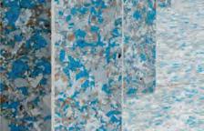
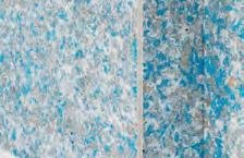
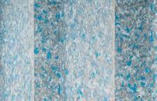
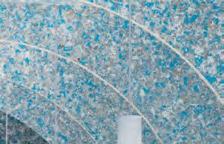
The threat to our oceans and marine life is approaching critical levels. With the world’s population using an unsustainable amount of plastic, it falls to the innovators to suggest a new way forward. Above Le has been working with Carpets Inter for 14 years now, bringing the local market a commercial carpet solution manufactured from discarded PET bottles.
“EcoSo is made from 100 per cent post-consumer material re-engineered from discarded drinking water bottles, plus ve per cent post-industrial recycled PET,” says Cameron Sinclair of Above Le . “This environmentally friendly backing meets all the stringent performance criteria required in a carpet tile, delivering outstanding performance in terms of durability, walking comfort, acoustical propensity and indoor air quality,” he says.
“In the 14 years we have been delivering EcoSo into commercial projects, we have recycled over 700 million PET bottles.” Pictured here, Fronditha Care in Melbourne by Contour Commercial Interiors.
Don’t Slouch On This Couch
Indesign Zenith
Blended typologies – especially in workplace design – are no new thing. However, it’s an approach that seems to have cemented itself in the commercial realm, where the subtle, homely appeal of a residential aesthetic is being adapted for high-use contexts. The in-house design team at Zenith is sensitive to these developments and has responded to the growing call for modular furniture solutions that carry a so , residential aesthetic with the launch of Platforma.
Drawing its name from its solid ash base, Platforma’s clean, architectural lines are o set by its relaxed upholstery. A nely blended approach that o ers commercial context with a touch of hominess.
Platforma encompasses all the options typical of a modular collection – armchair, lounge, modular lounge, chaise and ottoman, and all adaptable to suit a variety of commercial settings. The Zenith Design team has even extended the range to include a planter box and complementing side and co ee tables. A testament to the team’s passion for creating adaptable and innovative workplace solutions.
INDESIGNLIVE.COM IN SHORT 52
DISCOVER THE AUSTRALASIAN COMPANY LEADING THE WAY WITH INNOVATIVE, EXCLUSIVE, INSPIRING AND BEAUTIFUL HARD SURFACE SOLUTIONS.
Over 20 years of supplying exclusive and luxurious porcelain stoneware
Bespoke hard sur face materials for custom layouts and design
Highest quality Italian and Spanish ceramic tiles and slabs
Supplying major residential, commercial and infrastructure projects throughout Australia & South Pacific
Providing floor and wall solutions to complex projects for both interiors and landscaping
Our wide range of tiles and slabs can be precision cut into many formats including mosaics to create new designs and features
Supplying the most diverse glass mosaics, using transparent, iridescent, mirrored and textured materials Respected by leading architects, designers and builders throughout Australasia for supplying materials that maintain the integrity of their projects
Rocks On www.rockson.com.au | 02 8303 0100
Visit
our showroom 32 33/110 Bourke Road,
2015
Alexandria NSW
Ergonomics And Style From 9to5
STYLECRAFT.COM.AU 54 INDESIGN STYLECRAFT
Page 55: Diddy Executive Chair. Page 56: Zoom Nesting Chair, Cydia Task
Page 58: Cydia Mesh Task Chair. Page 59: Neo Task
Words Andrew McDonald Photography Courtesy of 9to5 Seating
Chair.
Chair.
STYLECRAFT.COM.AU 56 INDESIGN STYLECRAFT
The di erence in proper ergonomic seating can make or break the productivity and morale in the modern o ce. As we, as an industry, have become more aware of the health risks associated with incorrect seating and improper working standards, design mentalities – particularly related to furniture and spatial designhave evolved to combat this US-based specialists, 9to5 Seating, design and produce worldclass ergonomic seating to service the health and productivity needs of the modern workplace. Since 1986, the production of 9to5’s executive, task, guest, conference, stool and lounge seating solutions have been driven by a design ethos that asserts ergonomic design is a worthy inclusion in all aspects of our working lives. Thanks to the keen eye of Australian design supplier, Stylecra , 9to5’s seating ranges are now available to the local market.
The in-house design team at 9to5 is renowned for its attention to detail. This leads to the design and production of task chairs
that are aesthetically pleasing, built for daily use, ergonomically support the body and posture and positively contribute to health in the workplace.
“9to5 Seating can ensure the quality of their products because they control every aspect of the internal supply chain,” says Tony Russell, Stylecra ’s brand director. “E ectively they have 10 factories under one roof – all CAD design, CNC mould and die fabrication, plastic injection moulding, foam injection moulding, tubular metal bending and welding, aluminium die casting and polishing together with powder-coating is done in-house by 9to5. A team dedicated to quality- nished products then assembles the individual items. Quite simply, this translates to an ability to control every part of the manufacturing process.”
9to5’s adaptive designs and in-house manufacturing also allows for complete seating collections that align with a cohesive aesthetic. As seating specialists, 9to5 provide a range of solutions
STYLECRAFT.COM.AU 57 INDESIGN STYLECRAFT
“Whether it is one chair or a project solution, the 9to5 build-to-order process ensures the quality of each piece. The vertically integrated business model also allows a value-add proposition across the complete seating range.”
for the commercial workspace and educational and training requirements. For the workplace, individual user needs are catered for with weight balanced and synchronised mechanisms, adjustable lumbar and back height, seat depth capabilities and arm rest options. Seating with high stackability and nesting for ease of storage and exibility are available for educational and training purposes, with accessories including transport trolleys, linking devices and underseat storage available.
“Whether it is one chair or a project solution, the 9to5 build-toorder process ensures the quality of each piece,” says Russell. “The vertically integrated business model also allows a value add proposition across the complete seating range.”
An Indesign favourite is the Neo task chair, featuring a clean, contemporary aesthetic that is suitable for the majority of workspaces and features a complete synchro mechanism with
adjustable lumbar support and seat slide. The backrest comprises breathable mesh for comfort within the workplace environment. The Neo design is also available in a dra ing stool version allowing for visual consistency within collaborative working zones.
Other notable collections include the Diddy for meeting and conference rooms, and the Zoom range – the ultimate in collaborative seating. The di erent models within the Zoom range include a chair suitable for conference and training rooms featuring a castor base and exible seat that allows the chair to nest for easy storage, whilst other models within the range include a height adjustable o ce chair and dra ing stool.
With a lifetime warranty o ered on all structural and mechanical parts and a ve-year warranty on leather, fabric and foam, designers can rest assured that 9to5 chairs will stand the test of time for end users.
STYLECRAFT.COM.AU 58 INDESIGN STYLECRAFT


Special Lights, we bring our passion for design to every project. Our Projects team will work with you to create lighting solutions for your Commercial, Hospitality, Residential and Retail projects.
Lights Projects brings together design expertise and leading European brands
Lights 586 Crown St, Surry Hills NSW | speciallights.com.au | (02) 8399 2411
to Special Lights, this stunning luminaire collection combines artisan methods of production with advanced techniques.
Bover of Barcelona PR OJ ECT S DIVISION
At
Special
More than just Special
New
Introducing
big thinkers and creative gurus
INDESIGN 61 IN Famous FAMOUS IN
A Beautiful Mind
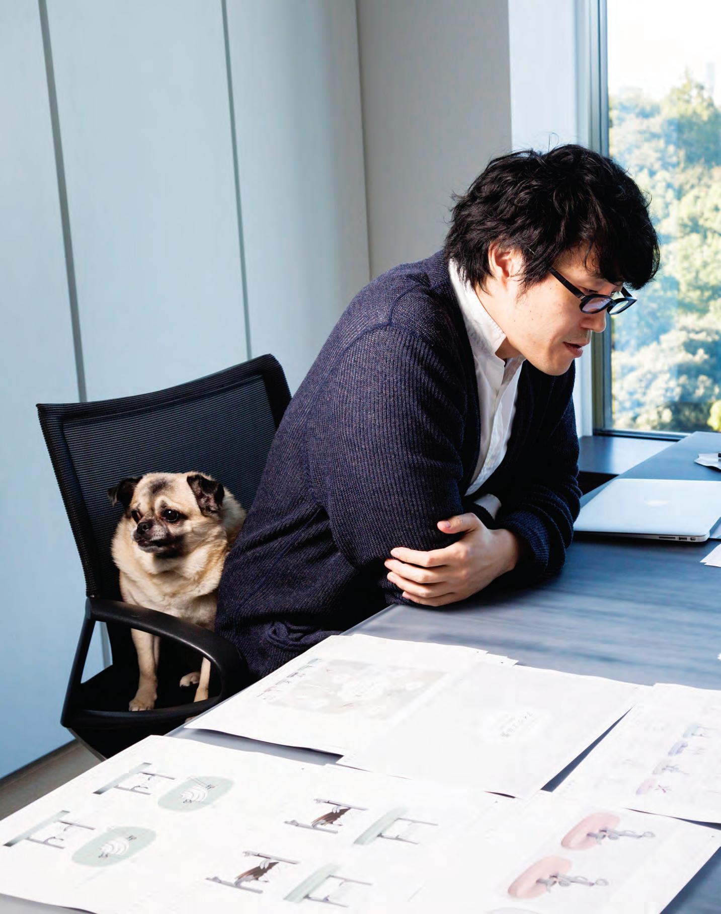
Oki Sato is a hard man to get hold of. His studio’s prolific output gives you the distinct impression that he may never sleep. And he’s constantly on the fly, so a face-to-face can be quite hard to come by. However to meet him in person dispels any myth of the ego-centric design-fluencer. His calm, constant presence reveals a masterful mind that seems to live in the moment, always alert and attentive.
When we met in Milan earlier this year – a fleeting 10 minute interview at Fritz Hansen in the Brera District, Sato revealed that he may – just may – be dropping in to Melbourne later in the year. That hint rapidly manifested into a solid reality, with the announcement of Between Two Worlds | Escher x Nendo at National Gallery of Victoria. Ahead of the exhibition’s opening, I speak with Oki Sato on topics of practice, creativity, leadership and entrepreneurship.
Alice Blackwood: The diversity of your output is so varied, is there a common thread that ties your vast portfolio together?
Oki Sato: I find a project appealing when it is difficult for me to imagine the final output, or when I cannot perceive the impact of its completion. This is when I feel excited about an opportunity. It’s the same feeling I get when I experience something [for the first time], like using an unfamiliar object or technology. A project that has a level of uncertainty, and makes you feel a bit anxious, is a project worth jumping into.
AB: Tell me about nendo’s working culture, and the unique team dynamic that influences how you work day-to-day?
OS: Every single project at nendo has a single designer assigned to it. I work together with each of those designers, forming small teams to work and progress with each part of the project throughout its process. While I am the one that comes up with the core ideas for each project, unexpected situations can often develop and steer the project in a different or wider direction.
How those initial core ideas will develop and transform along the way is mostly unpredictable. The final design will change largely depending on the skills of the designer and how they handle these evolutions. This element of uncertainty is one of the most exciting parts of the design process in our studio.
AB: How do you balance the demands of being a designer, a leader and a manager?
OS: Thinking of strategies and management is also a creative act. The important thing is that you should not draw a line between the actual design work and the management that supports it. It can be compared to using the right side and left side of the brain; it’s not healthy to overload just one of them. Possibilities of exciting design will arrive by supporting and balancing both sides of the brain. These are the moments I enjoy most.
But there is a limit to what one person can do. When we have very dynamic and short-deadline projects, it is inevitable that you must collaborate with other designers. In this case I mentor and direct them throughout the process.
INDESIGNLIVE.COM IN Fa M O u S 62
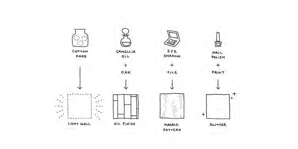
Opposite and page 66: Oki Sato, the designer behind nendo, photos: © Ko Sasaki. Page 64-65: Floor three of the Shiseido flagship store in Ginza, Tokyo, photo: Takumi Ota. Page 67: Sketches of nendo’s Shiseido store renovation concept in which cosmetics are applied to construction materials, courtesy of nendo.
Words Alice Blackwood in conversation with Oki Sato Photography Various
“
In order to become a better director, like an athlete, you need to practice, be aware of the changes and regularly refine the technique. The balance needs to be considered for each project individually and continuously. Similarly to the relationship between light and shadow.”
 Oki Sato , chief designer and founder, nendo
Buff And Polish
In nendo’s Shiseido flagship store renovation in Ginza, Tokyo, the interior construction takes its cues from common make-up rituals. Similar to making up one’s face, walls are finished in paper made from thinly spread cotton pads; wooden elements are conditioned with Shiseido’s signature Camellia oil; eye shadow is brushed onto the walls for a marble-like effect; nail polish is mixed into the paint to create shimmering ceiling art.
–
In order to become a better director, like an athlete, you need to practice, be aware of the changes and regularly refine the technique. The balance needs to be considered for each project individually and continuously, similarly to the relationship between light and shadow.
AB: In business and in design, how do you remain energised and motivated day-to-day?
OS: A good night’s sleep, coffee and quality time with my dog are the necessities for my breaks. Designing actually gives me motivation for new designs, work itself gives me the energy I need. I try to refuse projects that don’t excite me, because they might affect everything else.
AB: When it comes to staffing and studio, what is your ‘sweet spot’?
OS: I often hear from other designers that ‘seven’ is a magic number. For me, the numbers are irrelevant. ‘Quality’ is more important than ‘quantity’. I am not worried about having too many team members, as long as they are good at what they do. We started nendo in 2002 with six people, now we are around 40 people, and if we include collaborating companies we have around 90 people. However the way we work and how we think has not changed.
AB: You mentioned that you spend three hours every day reviewing 50-60 projects with your staff. I was fascinated by your ability to always be ‘in the moment’ on each project, rather than multitasking across many simultaneously. How did you develop this unique project management style?
OS: Simple. When we started, we didn’t have too many projects – at that time I often had difficulties to come up with new ideas. The more projects I get, the greater distance I have from each of them, and it
allows me to have a clearer view on what is right for every project. I think this helps me to face each project more naturally. So, with the growth of the company rather than adapting a new management style, I realised that this style fits me very well.
AB: You’ve designed the exhibition space for Between Two Worlds | Escher x Nendo. What insights and learnings informed your design?
OS: I was interested to learn of the obsessive nature of Escher’s working process, and the passion he had for his creations. It is quite clear that Escher did what he really loved doing, and I feel that we have this in common. I found [however] the differences to be more interesting and inspiring. For example, Escher created three-dimensional expressions in two dimensional techniques. I am just the opposite, which creates an interesting contrast in this collaboration. A less obvious difference between us is in the creation process and the examination of new ideas. Escher took a ‘seed’ of an idea and pushed it to its limit. He tested one idea in many ways using different techniques, tools and methods. My process is to bring new seeds of ideas to every project I work on. Generating new ideas is an inseparable part of my process.
While Escher evolved ideas in a very logical, mathematical way, I work more intuitively, with reality-based inspirations. So in this exhibition I tried to [integrate] the nendo ‘seeds’ in the Escher logical thought process. Since both processes require a lot of energy, my brain is already very tired. But I truly enjoyed this process, and it has brought a fresh point of view into our office.
nendo.jp
INDESIGN 67 IN Famous
Terms of Engagement
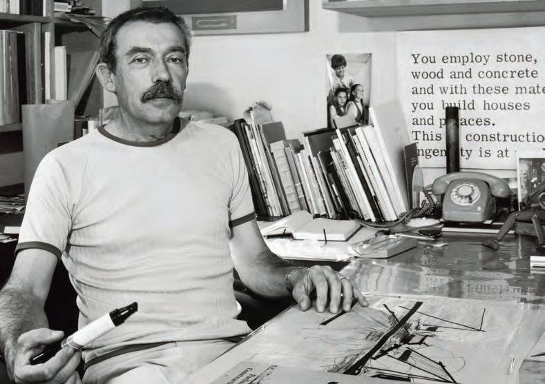
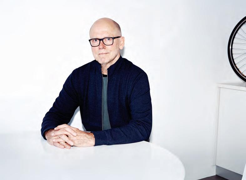
Words Paul McGillick Portrait Photography Charles Dennington
INDESIGN Luminary
Jon Johannsen’s career has been about buildings and their context. He is led by the conviction that liveable communities are diverse in their demographic engagement. This is his story.
INDESIGNLIVE.COM IN Fa M O u S 68
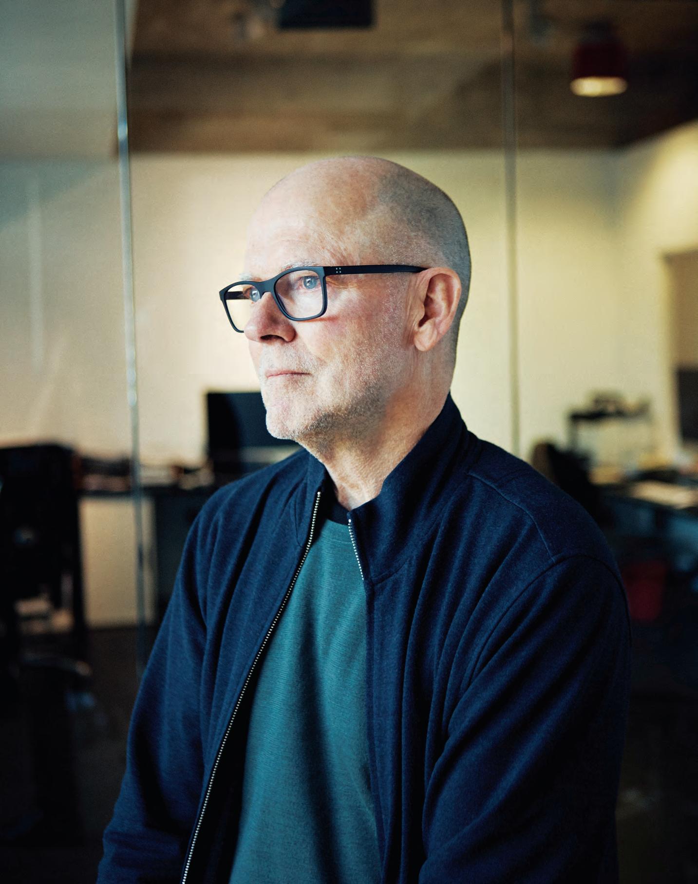
Jon Johannsen is a tall, wiry and obviously very fit man who completely embodies his Danish ancestry. He’s been in practice as an architect for more than 40 years, a timespan that includes working for a host of outstanding architectural firms (as well as his own longestablished practice) and a wide span of very different projects. We could say the same of many other architects, but two things make Johannsen special.
Firstly, apart from the diversity of his portfolio – which in recent years has included a specialisation in innovative aged care and seniors facilities – there has been a steady evolution in the way his practice works. Partly this has been to do with the usual fortuitousness as new kinds of projects pop up, taking the practice down new paths. But it also has to do with responding to a changing (many would say deteriorating) architectural environment involving fee cutting, increasing use of building designers and ongoing issues with developers wanting to ‘max out’ projects.
Secondly, Johannsen is one of those still relatively rare architects who is committed to social engagement – as distinct from social commentary. Speaking of his early interest in architecture, he says: “The attraction for me was that I had always been interested in the way spaces were put together, things that were used day-to-day, whether it was houses or city spaces. I always enjoyed going into the city and wandering the streets and seeing what was happening.”
In other words, for him the architecture and its context were always inseparable. In time, this starting point evolved into a fascination with how design can help shape liveable communities based on the principle of engagement between all the demographics typical of Australia’s diversity – ethnicity, age and occupation,
not to mention the over-arching issue of affordability. This has led Johannsen’s practice in new directions and it has meant taking on a clutch of design review panels (Liverpool, Parramatta, Hornsby, North Sydney and Waverley), and involvement at local level in planning issues. He is, as those of us of a certain age would once have said, engagé
He grew up initially in Alice Springs before the family moved to Adelaide. They lived in the then-emerging suburb of Woodville and it was here, with so much building activity going on, that Johannsen developed a love for architecture. “I was interested,” he says, “in the way things came together in buildings.” He went to an education evening, then to Institute talks which led to visits to Hassell and Woods Bagot before gaining a state government scholarship to study architecture. He would later work in the Public Buildings Department until 1975, when he left and set up his own practice. But it was recession time, so he decided in 1978 to do the grand tour of Europe for six months which included a stint in London with the opportunity to attend talks at the AA by the likes of Richard Rogers, Norman Foster and Cedric Price.
Back in Adelaide he worked for Hassell which asked him to go to Sydney as part of its newly established office. He went on to work with Edwards Madigan (where working with Col Madigan and Chris Kringas was “amazing”), Stephenson & Turner and Philip Cox, before establishing his own practice with Trevor Armitage which lasted 12 years before he founded Architects Johannsen & Associates (AJA). The introduction of the 2002 State Environmental Planning Policy No 65 – Design Quality of Residential Flat Development, lent support to Johannsen’s strong interest in medium-density projects.
INDESIGNLIVE.COM IN Fa M O u S 70
Page 69 and 72: Jon Johannsen believes that built environments must acknowledge our diverse and constantly changing society.
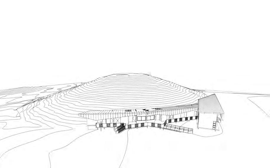
Above: Sketch of AJA’s design for the Tom Wills Oval Community Field Amenity Block, Sydney Olympic Park, courtesy of AJA. Opposite: Blackman Park Scout and Amenities Hall, Lane Cove, photo: Keith McInnes.
Something For Everyone
AJA designed the Blackman Park Scout and Amenities Hall in Lane Cove with structural efficiency, low energy use and ease of access in mind. In response to specific height and ventilation needs, a deep profile metal roof curves over a series of steel portal frames, coming to rest in a sculptural, ribbed fringe.
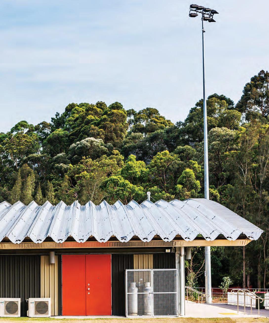
INDESIGN 71 IN Famous
–
“SEPP65 brought some significant improvement, especially at the bottom end around Sydney; except out west – there have been some questionable processes where developers are using designers on projects with the SEPP65 stamp by external registered architects. But this is less so now as the Government Architect is pushing back against that, with the design architect now required to attend council meetings.” SEPP65, says Johannsen, was “a turning point – with infill apartment buildings showing the way – because it is still the best example of a set of guidelines for high-density living. It provided a good set of benchmarks”.
But Johannsen was conscious of the limitations of high-rise – its lack of inclusivity and affordability. Hence, while AJA has done plenty of medium-density projects, it has made a name with its smaller scale townhouse projects such as Redfern Terraces, Camperdown Terraces and an innovative Lendlease project at Manly where AJA designed the Springcove Terraces.
Seeking to explore issues of livability and engagement, AJA has recently completed a series of outstanding seniors, aged care and multi-use community buildings – the latter including Blackman Park Scout and Amenities Hall in Lane Cove, and Tom Wills Oval Community Field Amenity Block, Sydney Olympic Park.
His recent Watermark project, set on the edge of Murrumbidgee River in Wagga Wagga, involved the adaptive reuse of a Catholic seminary and aimed to encourage the broader community to use the open spaces. This was assisted by including a café adjacent to a caravan park which has now become a kind of community hub. In Parkes, AJA re-thought an existing seniors village. “We looked at it
being more than just a village for those who needed it, but as a gateway for the community to come in as well. We have ended up with a community hall, café, children’s play area, and a chapel. So, the whole thing is about engaging with the rest of the town.”
In the meantime, the practice has evolved a new model based on consultancy and design resolution services. “I see it as a way of practising which involves stepping back from the traditional architectural role and, at the pre-development application stage, giving advice on the key areas for the particular area you want to work in, the type of building you want to do, and how it can be best approached to achieve the best outcome for both developers and the community.” It is also about keeping the practice sustainable in an increasingly difficult architectural environment.
Johannsen remains driven by the ideal of a built environment which is liveable because it acknowledges that our society is diverse and constantly changing. This brings with it a need for inclusivity and a recognition that we have to provide opportunities not just for future generations, but for people in key service industries (police, nurses, teachers, et cetera) to have access to affordable and accessible accommodation.
We need, he says, to challenge the idea of ‘entitlement’ – the nimby attitude – and realise that we all benefit from sharing and engagement whether it be densification, mixing demographics in buildings and precincts, or activating the ground plane in high-rise apartment buildings.
aja.com.au
INDESIGNLIVE.COM IN Fa M O u S 72
 Duomo Stem Wall Light
www.anaestheticdesign.com
Made in Australia
Bronte residence | Design and styling: Lane and Grove.
Photo: Prue Ruscoe
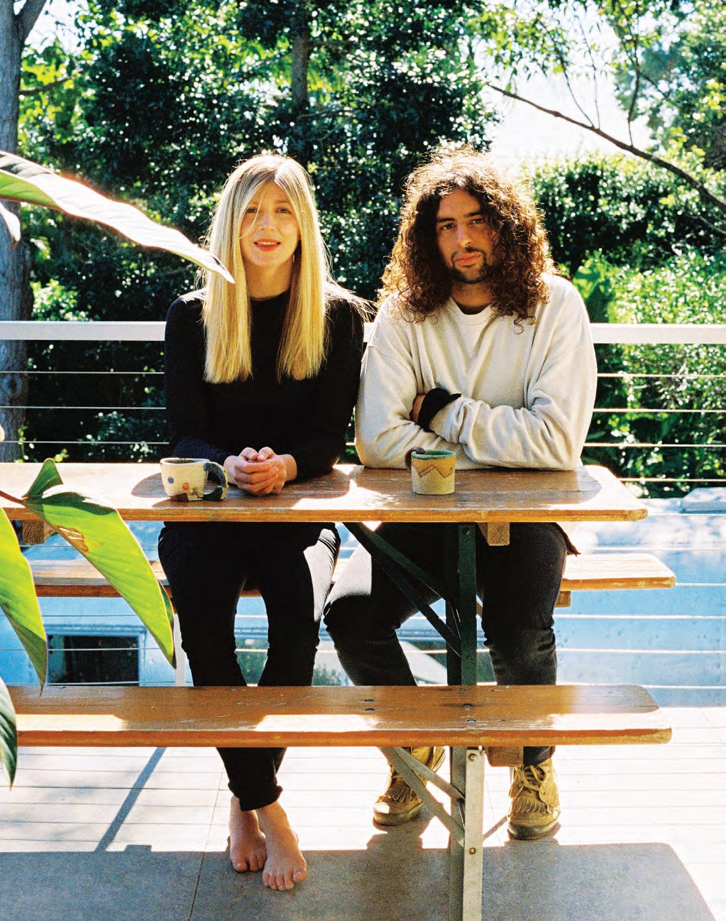
In The Groove
Words Enya Moore Portrait Photography Alisha Tinsley
Behind the high fantasy and lighthearted whimsy of Pattern Studio’s work lies a deep consideration for functionality and detailing. Just two years into business, this unique, layered approach has garnered the studio international acclaim with an Honourable Mention at the INDE.Awards 2018.
Lily Goodwin and Josh Cain are partners in life but professionally, the pair makes up Pattern Studio, a two-year-old design practice based in Byron Bay. Goodwin studied interior architecture in Perth before landing a job at Hassell, while Cain started out by helping build houses for friends and family before also working there too. “That was more or less my training,” he says. “I think it helped me more than a degree because it made me hungry to learn, progress and improve – I felt I had to earn every opportunity.” After deciding to go out on their own, Goodwin and Cain began Pattern Studio. “We craved something different, a bespoke design approach,” Cain explains.
The sensibilities of the ‘bespoke’ practice they have carefully constructed is evident in their growing portfolio. From the refined, blissed-out peachy interiors for The Daily Edited’s flagships in Melbourne and Sydney, to the diverse and eclectic guest rooms of The Collectionist hotel in Camperdown, Sydney, the appeal of Pattern Studio is obvious – the interiors are certainly ‘Instaworthy’. Yet, on closer consideration, it is clear that Goodwin and Cain offer more than a slick veneer.
A hint of this is evident in the neon ‘I hope this looks good online’ sign that adorns the wall of the micro-bar in The Collectionist, a space Goodwin and Cain designed along with nine guest rooms. The glowing sentence speaks directly to the viewer, daring you to take the picture while, at the same time, gently teasing that very desire. On another level, it offers a thoughtful reflection on issues facing design and architecture today.
Goodwin and Cain are all too aware of the significance of their designs beyond their life on the screen. “Functionality isn’t necessarily something that shines through when you’re looking at
a photo of an interior,” says Goodwin. “The fact that a space is much more likely to be seen as an image, than experienced in person, is a little problematic for our profession; a disproportionate emphasis can be placed on aesthetics while other factors that influence how a space feels can fall to the wayside.”
In the rooms created for The Collectionist, Pattern Studio was driven by the importance of the ‘human experience’. The project offered a number of challenges from the bones of the pre-existing building to the creation of individualised rooms. By focusing on light and materiality, the pair developed a framework that allowed for coherency and quirks. According to Goodwin, it was a fine line to toe. “We took care to conjure the right amount of surprise without getting too theme-y or crossing over into the realm of kitsch. We explored ways to create atmosphere and mood using colour and texture,” she says.
Perhaps it is a perspective gained from their Byron base – away from the hustle and bustle of city life – but both Goodwin and Cain exude a clear vision for future projects. There is, no doubt, a bigger picture in their minds, one where meaningful work that creates a lasting impact takes centre stage. “The work that I think we can do, we haven’t had the opportunity to do yet,” says Cain.
Expressing a passion for projects with more of an influence on society, Goodwin lists everything from aged care to secular religious architecture, to a collaboration with MONA’s eccentric David Walsh as desirable. “Good projects for good people for good reasons,” says Cain. “It’s about working with clients who really believe in doing something different for people.”
patternstudio.net
INDESIGN 75 IN Famous
Opposite and page 77: Lily Goodwin and Josh Cain founded Pattern to focus on a bespoke design approach. Page 76: No two rooms are the same at The Collectionist hotel, photo: Terence Chin. Page 78-79: The award-winning The Daily Edited Melbourne flagship, photo: Sean Fennessy.
Home Work
Based in Byron Bay, Lily Goodwin and Josh Cain operate Pattern Studio from an atelier within their own home. Starting out, they didn’t need a formal studio space as their operations were small – they worked mainly from their laptops. As Pattern Studio grows, they have developed a more traditional studio space.
INDESIGN 77 IN Famous
–
Honourable Mentions
The Daily Edited steps offline with its Melbourne flagship which received an Honourable Mention at the INDE.Awards 2018. A stand-out in The Shopping Space category, judges commended Pattern Studio for referencing advancing technology and the intangible qualities of e-commerce to imagine a futuristic space filled with reductive elements and generous volumes.
–
The Sculptor
Who put the PH into Louis Poulsen’s PH lamps? Its designer Poul Henningsen did – despite the fact that these seemingly ubiquitous pendant lamps (even I have four PH 5s) are invariably referred to as Louis Poulsen lamps.
One reason for the confusion is that the two formed one of the great design and production partnerships of the 20 th century and beyond. It all started when Henningsen (1894-1967) got to know Sophus Kaastrup-Olsen, who ran Louis Poulsen. The company had started importing wines before shi ing to selling tools and electrical equipment. This “joint destiny”, as design historian Thomas Dixon calls it, began in 1925 when it exhibited prototypes (including the PH 5/5) manufactured by Louis Poulsen for what was ultimately to become the PH 5 lamp at the World Exhibition in Paris. PH (as he was to become known) won a gold medal and caused a sensation.
Henningsen’s lights were the result of years of observation and experimentation. His problem solving was empirically based and emerged through trial and error. The process epitomises the Danish design tradition (think Jacobsen, Kjærholm).
Carbon lament lights had replaced para n lamps in Denmark in 1907. But the para n lamp shades were slow to adjust to the new light source. An apocryphal story has it that Henningsen’s mother Agnes – a noted author – disliked the intensity of the light because it showed her wrinkles. So Henningsen set about designing a lamp that hid the light source from view and created an even distribution of light without intrusive pools of illumination on the ceiling or dining table. His insight was to see the lighting as an integral part of the room and our experience of it. Not only did inappropriately shaded electric lights distort the relationship of light to shade in a room, but there was a missed opportunity to add a sculptural element. The series of lights that culminated in the PH 5 (1958) aimed to avoid harsh shadows and to ensure that there was always light where it was needed. This is achieved by the use of contrasting curved shades of di erent sizes and shapes, which conceal the light source and subtly distribute the light.
A certain amount of light penetrates through the glass shades and many of the metal shades are painted on the inside in colour-
LOUISPOULSEN.COM 80 INDESIGN LOUIS POULSEN
Opposite and page 82: Archival photographs of Poul Henningsen with original editions of some of his most well known lamps, including PH5 and PH Artichoke, photo: Louis Poulsen. Page 83: The brushed brass anniversary edition of the PH Artichoke lamp being assembled at Louis Poulsen’s factory in Vejen, Denmark, photo: Marie Louise Munkegaard.
Poul Henningsen is synonymous with the name Louis Poulsen. On the 60th anniversary of some of Henningsen’s best-known lamps we look back at his empirical process.
Words Paul McGillick Photography Courtesy of Louis Poulsen

adjusting red and blue tones. The recommended height above the dining table is 60 to 80 centimetres, which aids the e ective distribution of light but also turns the light into a sculptural object – one that doesn’t stand out from the room, but becomes part of it.
Where the PH5 was an intimate light, the PH Artichoke (1958) was designed for large rooms with high ceilings. It consisted of 72 shaped, rectangular ‘leaves’, originally in copper and later available in brushed stainless steel and white lacquer. “It’s about making a good design and a good perception of light,” says Rasmus Markholt, Louis Poulsen’s director of product and design. “The xture actually makes you feel comfortable when you’re around it.”
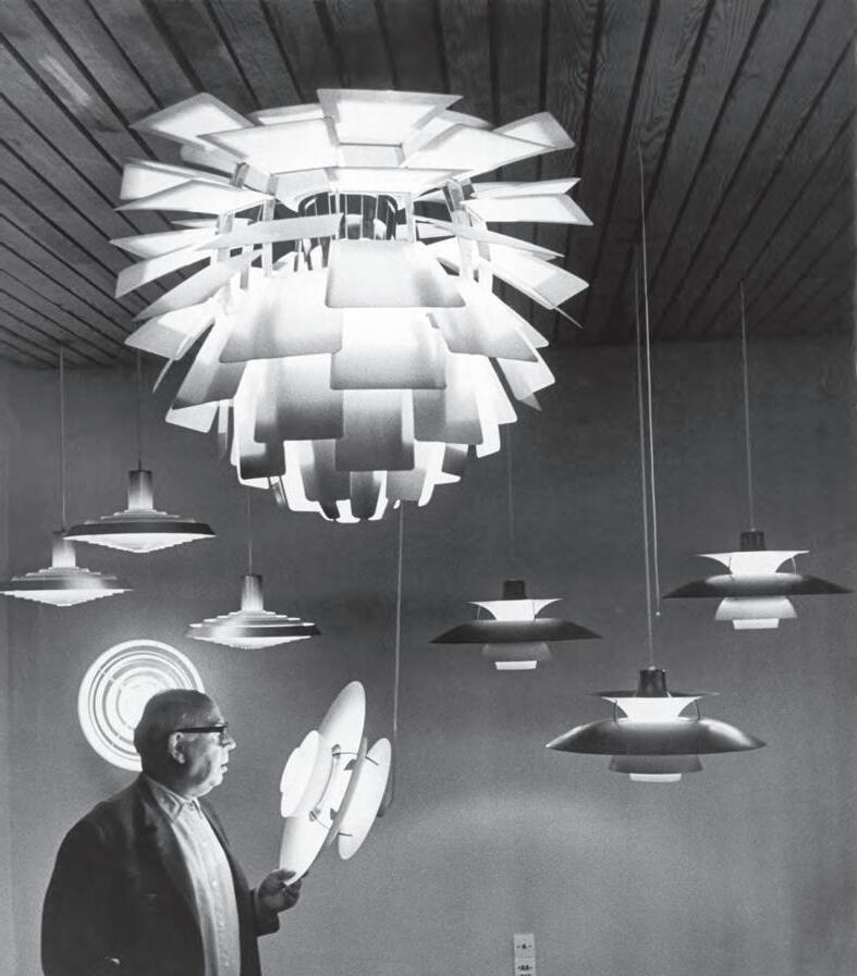
Now, celebrating 60 years, Louis Poulsen has produced new versions of the PH 5 and the PH Artichoke, along with the Mini –a small version of the PH 5 aimed at a family market. “It’s important that we revitalise the lights, bring them up to date,” says Markholt.
This they have certainly done with a stunning, mirror-like copper nish to the PH 5 and PH 5 Mini. As any proud owner will tell you, the re ections cast by the lights are a crucial part of the experience. Now, the polished metallic nish has its own built-in re ections, the ve curved tiers not just illuminating a room, but also re ecting it back on to the light itself.
“By using copper,” says Markholt, “the thought was to bring warmth into the xture. The shades don’t have a clear lacquer, so that means they will patinise in time. It will become darker.”
This brings a whole new life to the lamp, a life separate from the original PH 5. “That’s the power of these iconic pieces,” he says, “they keep on living.” This material innovation in the quest for even ner sculptural forms is continued with the new PH Artichoke whose 72 layered leaves will now be available in brass in all sizes.
LOUISPOULSEN.COM 82 INDESIGN LOUIS POULSEN
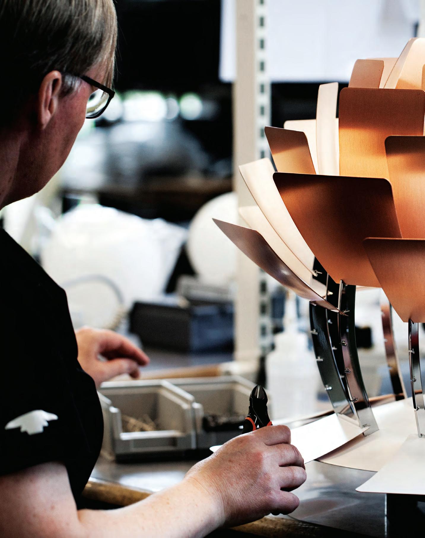
Fingerprint Free Minimalism
Around the world, tastes are changing. In a return to modernist architect Adolf Loos’ assertion that “ornament is crime”, designers and end users alike are beginning to seek out spaces that make new, inventive use of materials that eschew embellishments in favour of combining style and functionality.
Design trends re ect an ongoing shi away from the ornate, elaborate designs of yesteryear, toward a clean, minimalist aesthetic that prioritises subtlety over showiness. Where, in the past, dark coloured laminate was restricted to decorative, handso applications due to its vulnerability to ngerprints, marks and scratches, Polytec has looked beyond its limitations to nd new design possibility.
The fruition of this is Venette, a ngerprint resistant, anti-scu decorative surface, produced in Australia by Polytec. Warm and smooth to the touch, Venette has been developed to stand up to the wear and tear of busy commercial environments. It will not smudge, scu , or show ngerprints, allowing designers unprecedented freedom to specify dark coloured pre- nished board for high use vertical applications.
E ortlessly combining innovative, sustainable technology with a moisture resistant LPM composition, Venette delivers a luxe contemporary aesthetic alongside outstanding performance.
This innovative surface solution is available in seven colours of Ultra White, Cinder, Black, Canterbury Grey, Blossom White, Black Wenge and Oxford. It can also be speci ed in single or double-sided pre- nished sheets sized 18mm x 2400mm x 1200mm.
A unique UV coating process covers Venette’s surface to ensure a hard wearing protective lacquer nish that is UV stable indoors. In addition to its outstanding performance and high degree of design exibility, Venette is environmentally conscious in its design.
It is applied to sustainable E0 board, free from formaldehyde and GreenRate Level A certi ed by Global GreenTag. In working with Venette its low maintenance bene ts quickly become obvious. Combined with its planet-friendly design and a sevenyear manufacturer’s warranty, the emphasis is rmly on function, aesthetic, sustainability, and contributing to a healthy and sustainable future in commercial or residential interiors alike.
84 POLYTEC.COM.AU INDESIGN POLYTEC
Provocative, innovative & ins P ir ing D esign
INDESIGN 85 IN SITU Situ i N
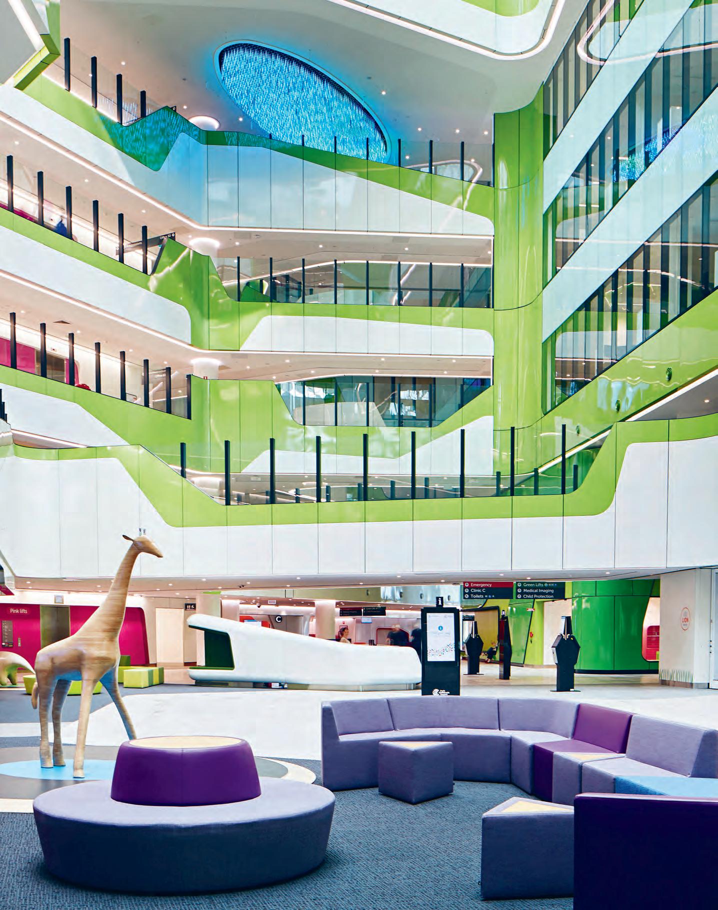
Frightening or fascinating? Perth Children’s Hospital takes the nightmare out of hospital visits, inviting curiosity and play into its life-changing spaces.
Healthier Horizons
Perth Children’s Hospital by JCY Architects and urban designers, Cox Architecture, and Billard Leece Partnership with HKS Inc
Words Tracey Ingram Photography Shannon McGrath
INDESIGN 87 IN SITU
Opposite: A Play and Wait area on the atrium’s ground floor looks south towards main reception. Page 88-89: The Reading Nook within the Fun-on-Four Recreation Zone for patients and siblings. Page 90: Children play on the ground floor level outside an allied health clinic. Page 91: Same Day Surgery Recovery Lounge looks across to Kings Park. Page 92: A Paediatric Intensive Care Unit patient room.
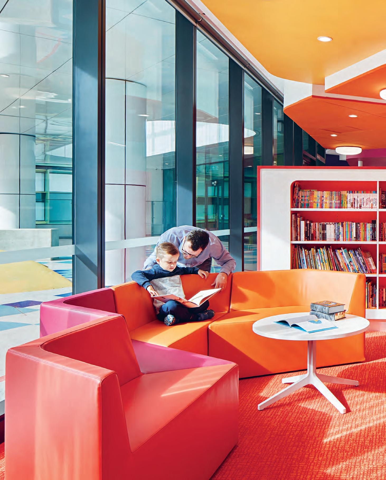
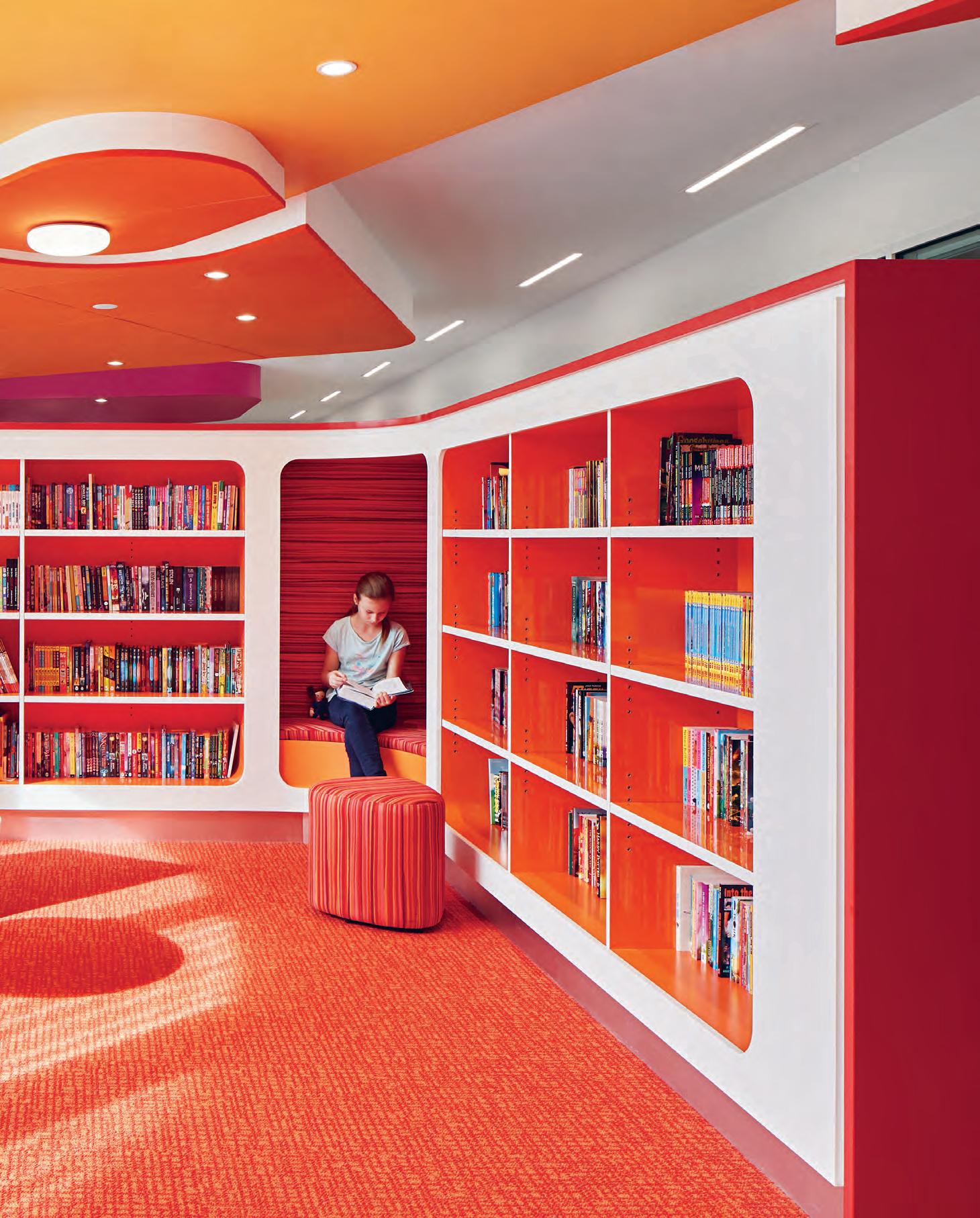
“We had to remember that children are not just mini adults. They generally see the world from a different angle than the average adult.”
How, as an adult, do you design a hospital from a child’s perspective? That was the question lingering in the minds of the team behind Perth Children’s Hospital: JCY Architects, Cox Architecture and Billard Leece Partnership (BLP) with HKS Inc. Aware of just how daunting a hospital visit can be – particularly for a sick child – the designers sought to reduce anxiety by visualising spaces through the eyes of young patients, and by grounding the architecture in its distinctly Western Australian surroundings.
The hospital sits on the south-western edge of Kings Park, a site dominated by native bushland. The park’s prevailing grassy palette served as inspiration for the façade of the building, whose blueprint is based on a petalled stem. The hospital’s interior, meanwhile, references the “bursts of colourful wildflowers that sweep through Western Australia each year”, says Mark Mitchell of BLP. Rather than saturate the space in childlike primary hues, the team “used colour sparingly”, says Cox Architecture’s Fernando Faugno, “as both a means of wayfinding and as an element of surprise that provides moments of distraction and reduces levels of anxiety.” Sculptural coloured objects denote both decision-making points and destinations, helping visitors to locate lifts, reception desks, waiting zones, play areas and staff stations. Bold colourful distractions, meanwhile, include graphic elements that appear on the walls in patient corridors.
It’s well documented that bright, contrasting colours are more distinguishable than duller tones in a youngster’s field of vision, so a cheerful interior palette hardly qualifies as radical childoriented design. The designers took things a step further, however, assessing every element from a youthful vantage. From lowered seating to visual cues at a child’s eye level, the team’s various interventions may even be overlooked by adults.
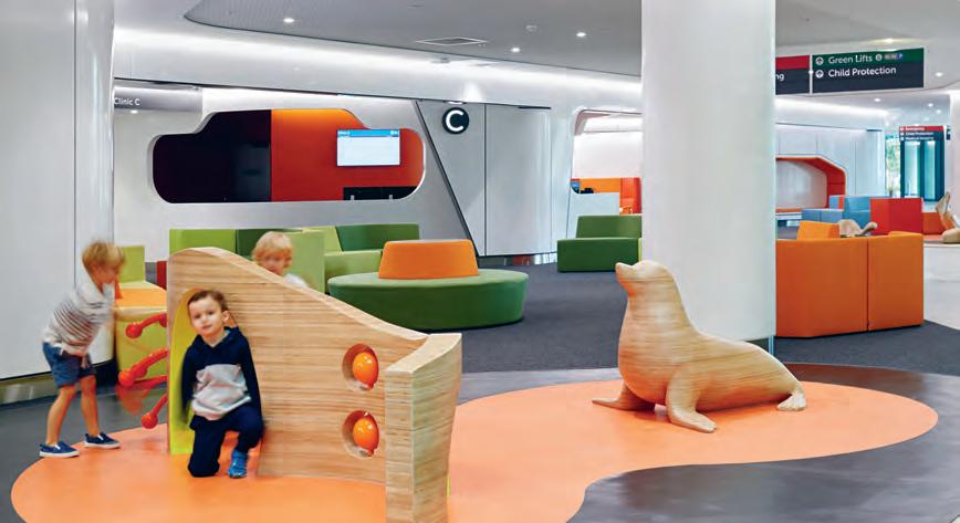
Getting into underage character required “talking and listening, researching and watching, and a bit of creativity and imagination”, says Mitchell. “Firstly, we had to remember that children are not just mini adults. Their bodies are proportioned very differently and
they generally see the world from a different angle than the average adult. They may be more fascinated by what is on the floor than on the wall.” Accordingly, ceilings at Perth Children’s Hospital have also become canvases, serving as a diversion for those being wheeled around on trolleys.
“Children also have a very different life experience,” continues Mitchell. “They may not have developed language for expressing themselves verbally; they may not know how to identify their pain; they may need a parent nearby to feel safe. Through our own experiences as well as consultation with staff and patients, we tested a number of concepts that were deliberately child-focused. We created play nooks that are easier to get into if you are smaller, and we made sure the fun parts of each room were accessible from a low height, while the parts that may cause anxiety were well hidden.” The designers also masked medical equipment, diminishing its scale through the bold co-mingling of colour and built form.
The project highlights one of the most distinct differences between child and adult healthcare facilities: in the former, the patient’s support network plays a more active role in the care process. Perth Children’s Hospital is therefore designed with family members in mind. “There’s an incredible sense of play throughout the public and clinical zones,” says BLP’s Tonya Hinde, “so that siblings and friends can also enjoy the hospital experience.”
Likewise, bedrooms revolve around family. “Parents will commonly stay overnight in the patient’s room to comfort their child and participate in the caring process,” says Mitchell. Envisaging bedrooms as blank canvases, the designers ensured families could personalise their space and surround a child with familiar objects.
“A hospital experience can be frightening or it can be fascinating,” says Hinde. “It’s up to us as designers to vary the internal landscape so that apprehension can be replaced with discovery and adventure. There’s just no reason why a hospital environment should be dull.”
jcy.net, coxarchitecture.com.au, blp.com.au, hksinc.com
INDESIGNLIVE.COM 90 IN SITU
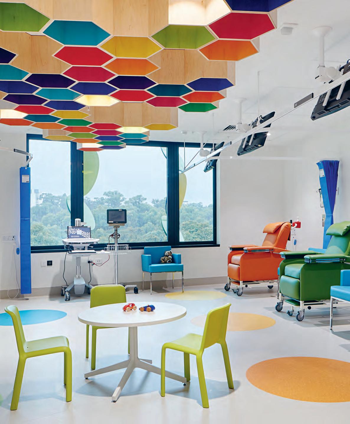
INDESIGN 91 IN SITU
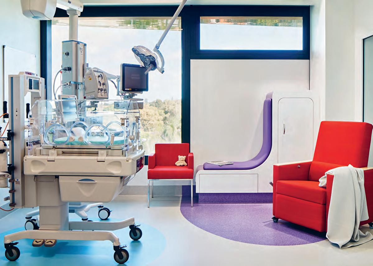
INDESIGNLIVE.COM 92 IN SITU
“T here’s an incredible sense of play [in] public and clinical zones so that siblings and friends can also enjoy the hospital experience.” Tonya Hinde
Architectural and Acoustic Linear Timber Systems
Modular Design: Certified Timbers: Acoustic Solutions
Email info@screenwood.com.au

Web www.screenwood.com.au
Tel 02 9521 7200
 Specifier: Kerry Hill Architects |
Photo: Frances Andrijich
Photography courtesy of City of Perth
Specifier: Kerry Hill Architects |
Photo: Frances Andrijich
Photography courtesy of City of Perth
What happens when you mix an investment company with George Calombaris’ hospitality group? Monique Woodward of WOWOWA walks us through the golden columns and industrial interpretations that have tamed this challenging warehouse tenancy.
Light Warrior Investments & Made Establishment, Melbourne by WOWOWA
Words Sandra Tan Photography Alice Hutchinson
INDESIGNLIVE.COM 94 IN SITU
Golden Opportunity
Opposite: In the entry zone, brass-lined columns create a “sparkling entry moment”. Page 96-97: The fit-out densely splices the interests of clients Light Warrior Investments and chef George Calombaris’ Made Establishment. Page 98: Workspaces offer respite from the intense bling of the entrance.

Sparks And Spice
In the entrance zone brass-lined columns hint at classic Greek architecture while cleverly concealing existing structural elements. On one side of the entry, a vibrant ‘flavour wall’ – client George Calombaris’ idea – is lined with jars filled with colourful spices and ingredients.
–
As Cremorne in Melbourne’s inner east shakes off its industrial heritage, its working population has become an increasingly mixed bag. Expansive old warehouses make neighbours with creative studios and wholesale traders. An ambitious tech venture might set up next door to a panel beater.
In this urban setting, on the top floor of a historic Rosella Preserving factory, the affiliated offices of Light Warrior Investments and Made Establishment converge. The former, an ethical investment company led by the former CEO of Swisse, supports social and environmentally sustainable ventures. The latter, chef George Calombaris’ hospitality group, is the engine behind its well-known Greek-inspired venues. “The clients wanted it to feel like a cohesive space, yet distinct at the same time,” says Monique Woodward of WOWOWA.
Made Establishment and Light Warrior already shared the original, smaller version of the office on site, which had been designed by Six Degrees Architects. With growing staff numbers in the Light Warrior business creating full-to-bursting conditions, WOWOWA was brought in to reconfigure the old plan and use the remaining floor space to double the size of the office. “Because the company was growing so rapidly, even as we were designing, the layout needed to accommodate for that growth,” says Woodward.
Catering to two separate brand identities, with respect to the original design intent, made for something of a conceptual smorgasbord, too. Between Made Establishment’s rich Greek influence and Light Warrior’s entrepreneurial dynamism, WOWOWA sought a common visual ground. A material palette began to form around the golden, geometric branding of both businesses. “Light Warrior is a high energy brand. So for us it was about reflecting that concept of big picture dreaming,” says Woodward.
The curvilinear sweep of the entrance, articulated in brass batons in a style reminiscent of Calombaris’ opulent Press Club restaurant, takes a cue from the warehouse’s internal structure and serves as a high-impact introduction to the shared workplace. This curve is echoed by a new tiered ceiling mass that elegantly obscures level changes and utilities overhead. Similarly, brasslined columns became a neat way to absorb existing structural elements into the new design, an embellished reference to classic columns in Greek architecture. Solid brass pendant lights, designed by WOWOWA in collaboration with Rakumba Lighting, cluster together over the main entrance meeting space and complete the warm, gleaming effect. “We wanted to create this sparkling entry moment,” says Woodward.
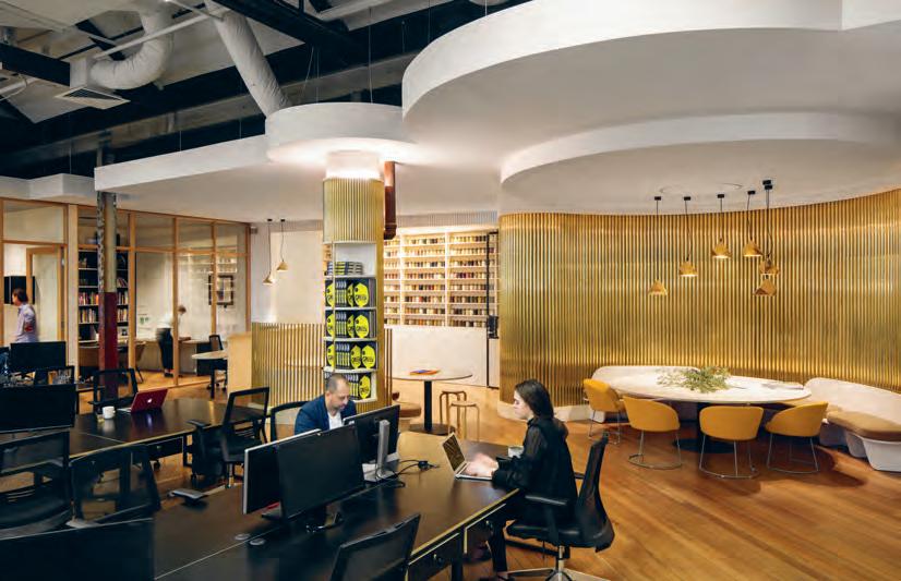
Enforcing Made Establishment’s own identity within the existing framework, WOWOWA reinterpreted the steel windows from the original Six Degrees design. “We did the same detail but in timber, to give it new character with a continuous feel.”
To maintain a similar architectural language and preserve Six Degrees’ industrial look, WOWOWA continued the exposed ceiling into the extended section. Expressed steel structures, including inbuilt brass planters, define different zones and combine the materiality of new and old spaces.
Adjacent to the bling-filled entry is the “respite” of long workstations in black. Lights from the existing office look fresh in their new context, minus the old suspended ceiling. “Overall it was a very technical, spatial problem-solving exercise. There was a lot to consider, and so it turned out quite design-dense. There is a lot going on,” says Woodward. wowowa.com.au
INDESIGNLIVE.COM 98 IN SITU

Easy As Pi
“The building is like Venice,” says architect and BVN principal, James Grose. He is referring to how, on the outside, Synergy at CSIRO has many address points and never reveals all of itself at once. On the inside, it is stimulating visually, never repetitive and replete with intriguing openings and corridors which disguise their end-points.
Be that as it may, this is deliberately a very Australian building. Not in any literal sense, but in the sense that “authentic architecture,” says Grose, “has a resonance of its place”. Like major research institutions all over the world, the new Synergy building expects to host many international visitors. “It’s the flagship of CSIRO,” says Grose, “and hence it needs to be seen as an Australian building. They wanted this to be seen as a highly developed scientific place, but they wanted it to be Australian. They didn’t want it to feel like you had arrived in France or Germany.”
So, the origins of this building lie in its local context, even down to how it lies on Walter Burley Griffin’s original Educational Axis. But it also shares the site with earlier, significant buildings by Frederick Romberg, Darryl Jackson and Ken Woolley. The new building’s transparency and unique ‘X-Box’ plan maintains visual connection with that built tradition.
It also sits at the foot of Black Mountain with its indigenous scribbly gums, their multi-coloured bark peels and the characteristic graphic
trails left by the scribbly gum moths. From this context, the architects derived the five colours of the building’s palette and the random frequencies of the exterior metal louvres, which partially form the mixed-mode natural ventilation system.
As Grose points out, “Metaphor is the generator of architectural expression.” The building could not exist anywhere else, because the ideas are generated from here. “While it may not look literally that it’s from here,” he says, “it can only be [in this location].”
The building is actually two, joined by a central atrium. The visitor first encounters the sealed, airconditioned laboratory ‘box’ whose terracotta Equitone cladding is suggestive of the weatherboards on rural sheds. Past this we arrive at the ‘X-Box’ with its multi-coloured, randomly angled louvres with solid upper parts (natural ventilation requires 60 per cent of the façade to be protected from the sun), while the lower parts are perforated to ensure light and views out. This prospect as Grose refers to it, was crucial. The CSIRO is concerned with the land, water and soil and it was important to create a connection with nature and Black Mountain in particular.
The principles of connection and transparency are continued on the inside. The building provides a collaborative work environment, more like a library, says Grose, than a workplace. This is because the self-contained (but connected) laboratories are complemented by
INDESIGNLIVE.COM 100 IN SITU
Synergy building at CSIRO Black Mountain campus, Canberra by BVN
Words Paul McGillick Photography John Gollings
CSIRO’s Synergy building entices scientists out of their labs and into open, collaborative spaces. It was an ambitious proposition from the architects, BVN, but in making the hypothetical a reality the team has created a workplace that is nothing short of award-winning.
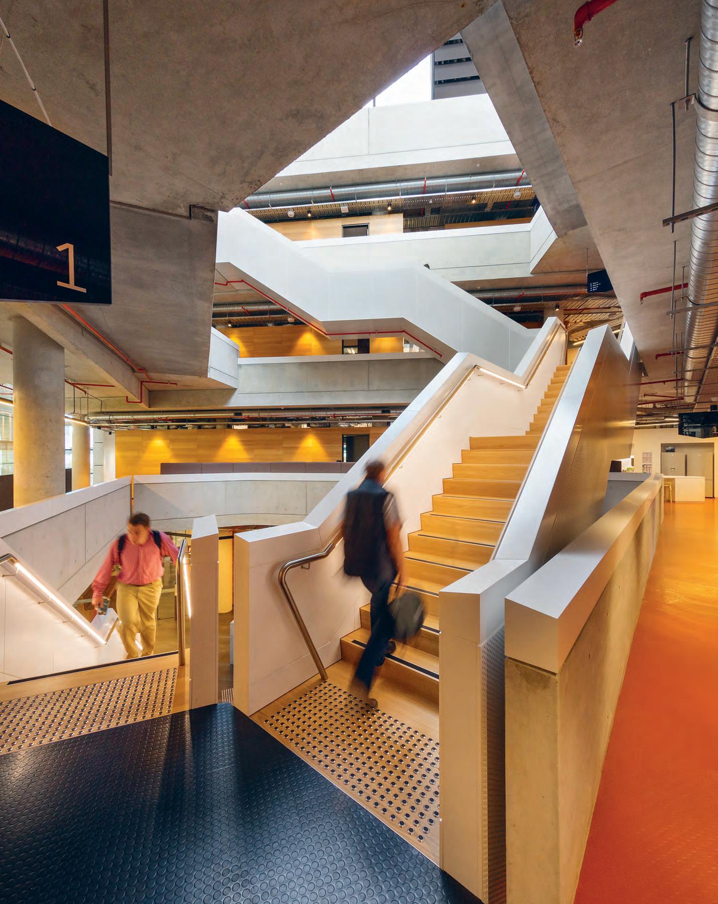
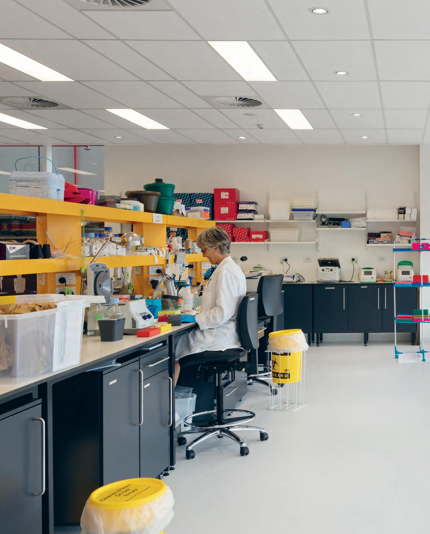
Natural Connections
The laboratory window design functionally reduces solar penetration while allowing ‘prospect’ from the workplace. This connection between the surrounding natural environment – especially Black Mountain – is an important cultural issue for CSIRO, as the bulk of its scientific research is at the conjunction of natural and human systems.
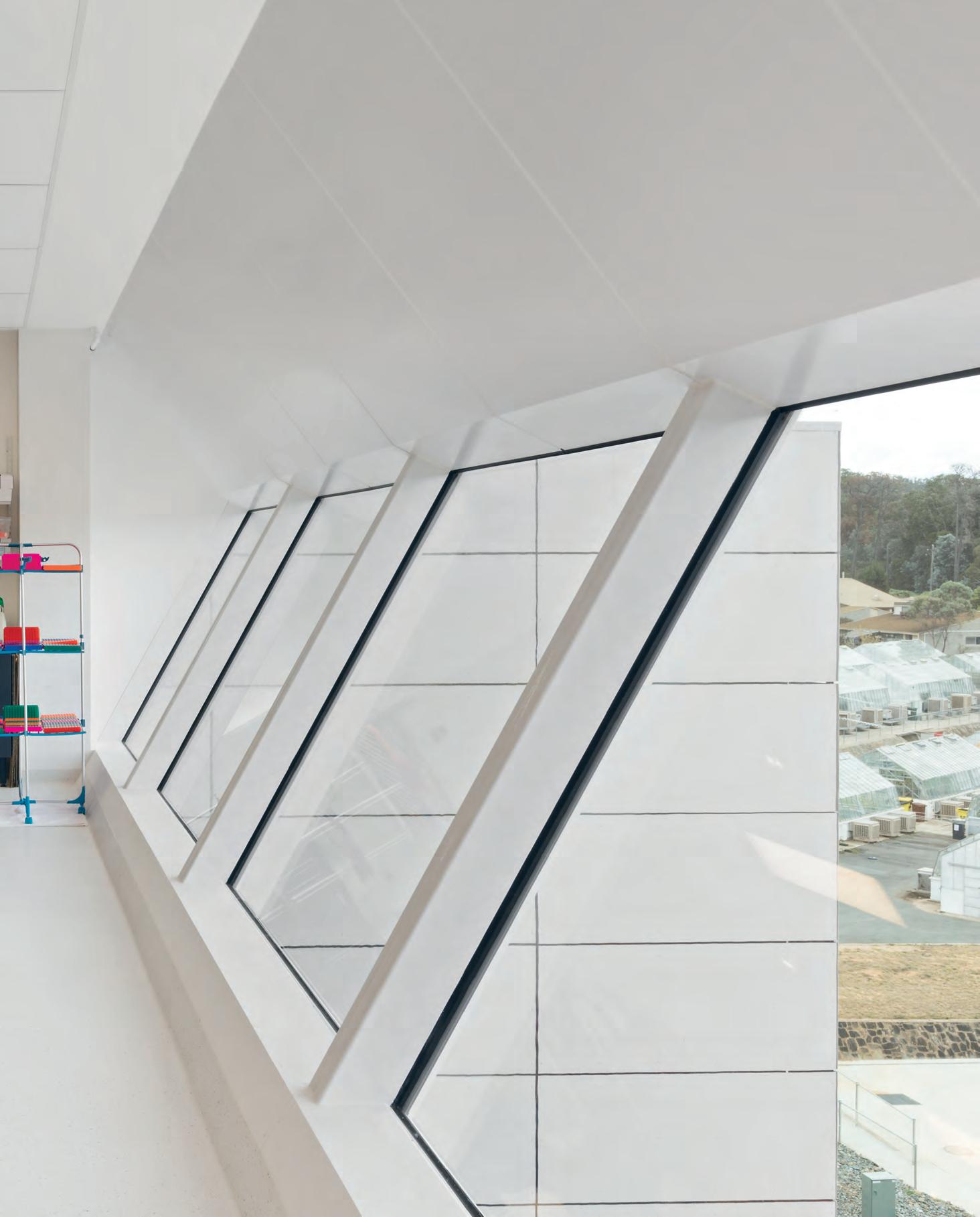
–
‘write-up’ areas where the scientists write up their research. Hence, they work at custom-designed workstations more like library carrels, providing privacy but also enabling interaction.
Getting this idea up was not easy. But the CSIRO asked for a reduction in the per capita footprint and the architects pointed out that any workplace needs to be collaborative. Using prototypes in the Darryl Jackson Discovery building, the architects were able to persuade everyone that they could provide privacy and acoustic protection along with the opportunity for collaboration.
“The whole principle is that you move through the atrium to go anywhere,” says Grose. “You can’t avoid connecting and bumping into people. But, it being scientists and labs, it’s not like a workplace. It’s a very quiet, ordered place. It’s a very cloistered environment. So, the challenge for us was to go from the idea of a central corridor with discrete offices to an open workplace.”
Four neighbourhoods have been created on each floor along the spines of the ‘X-Box’, each with about 30 workplaces, seen as the ideal number for preserving intimacy. Separating these neighbourhoods from the central atrium are banks of wooden ‘boxes’ that contain intimate meeting rooms and quiet rooms. “So,” says Grose, “it quite clearly delineates between the publicness of the atrium and the intimacy of the neighbourhood.”
At the centre is the atrium which soars up in a grand lightwell with huge chimneys for smoke control and air extraction. The floor heights between the laboratory building and the office building are different which enabled the architects to “get some complexity into the dialogue between these two spaces”. This complexity is supported by material variety – scribbly gum timber finishes, off-form concrete walls and laminated balustrading – which is complemented by different ramps and stairs providing connections. The spaces, says Grose, are not bland open spaces, but have a degree of intricacy to them. Hence, the social areas around the atrium duck and weave and offer a variety of places to eat and drink. Meanwhile the main kitchen and cafeteria area leads to an outdoor terrace and a clear visual connection with the Discovery building.
“For an architect,” says Grose, “these buildings are always the best ones to get because they have the potential to tell a rich story. It has got to be a building which is clearly internationally benchmarked, but it has got to feel Australian. It has a level of authenticity about how it sits and where it sits.”
The Synergy building at CSIRO was winner of The Work Space at the INDE.Awards 2018.
bvn.com.au
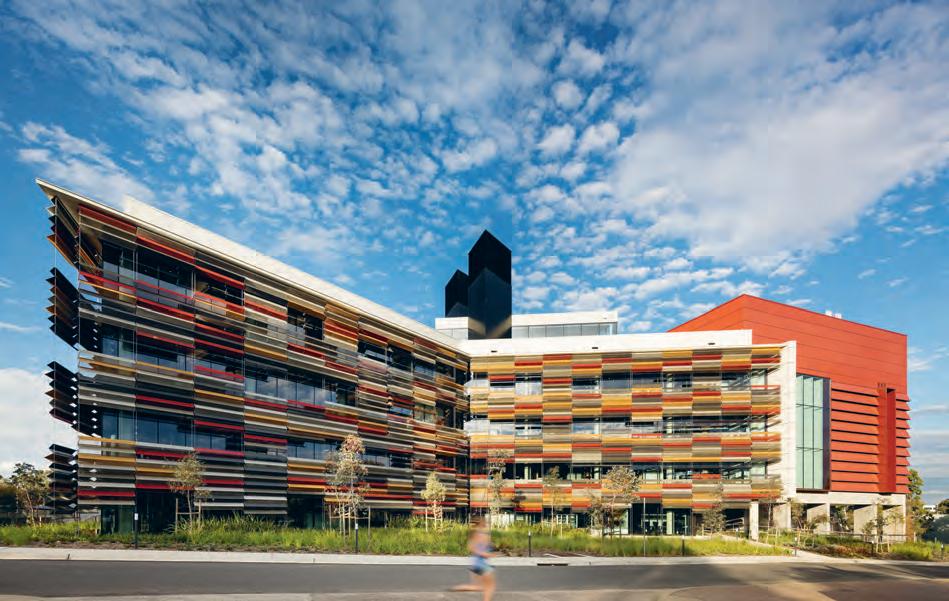
INDESIGNLIVE.COM 104 IN SITU
Page 101: The atrium connects the whole building, providing a convenient bump-in zone for scientists who are traditionally siloed in their spaces. Page 102-103: The uniform façade of the science labs is broken only by discreetly recessed and angled windows. Page 104 and 106: The building is clad in multi-coloured, randomly angled louvres designed to help ventilate and naturally illuminate internal rooms.
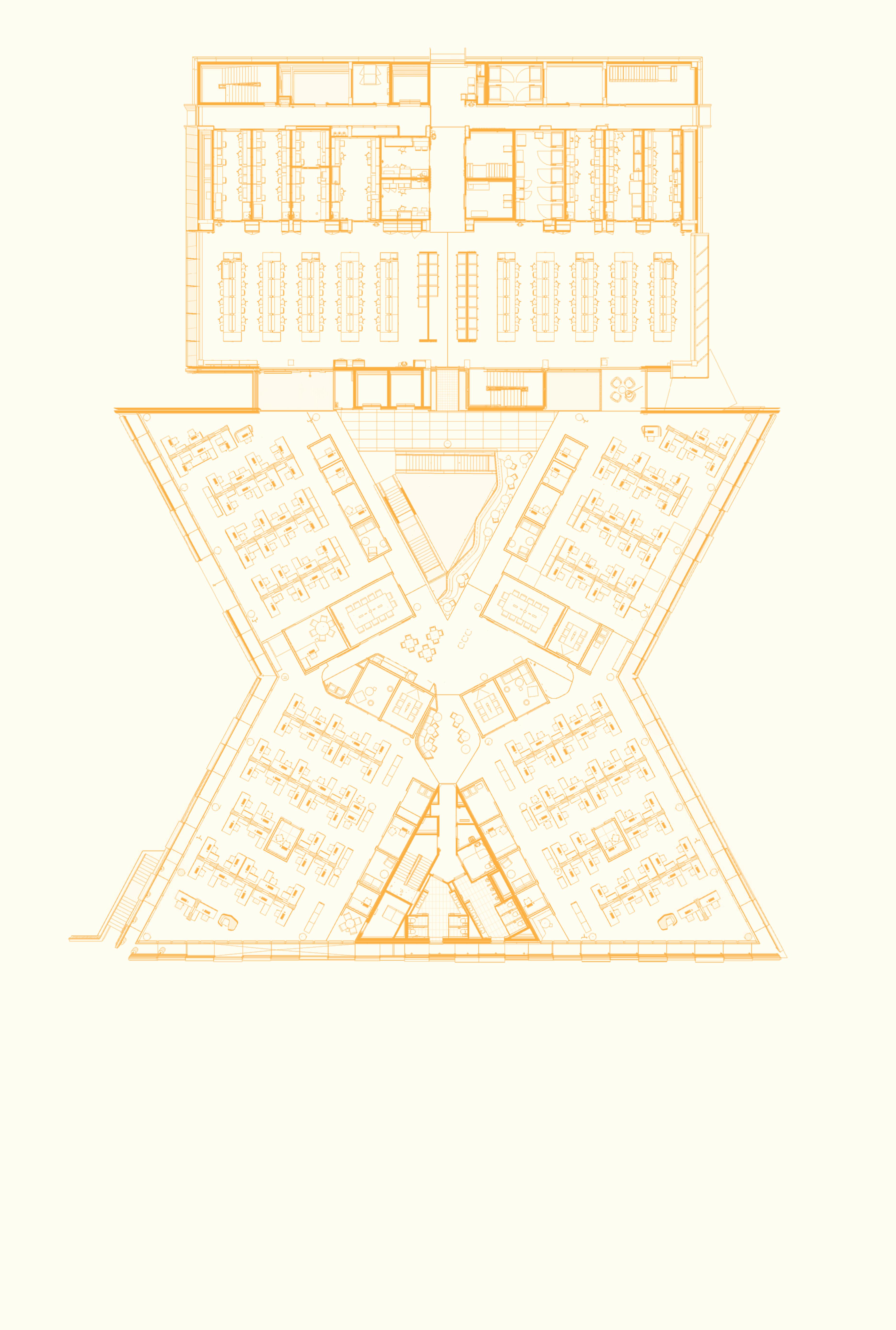
INDESIGN 105 IN SITU 1 1 1 1 2 3 3 4 Level Two Synergy, CSIRO 1 O ffice workplace 2 C irculation atrium 3 L ink atrium 4 P C2 research laboratory
Feathers, Fins And Scales
Staff were initially sceptical about the multi-coloured perforated metal louvres, but now delight in the climate control and sense of connection with the landscape of Black Mountain. The louvres feather towards the building’s edges and the five colours derive from the trees and form of the mountain.
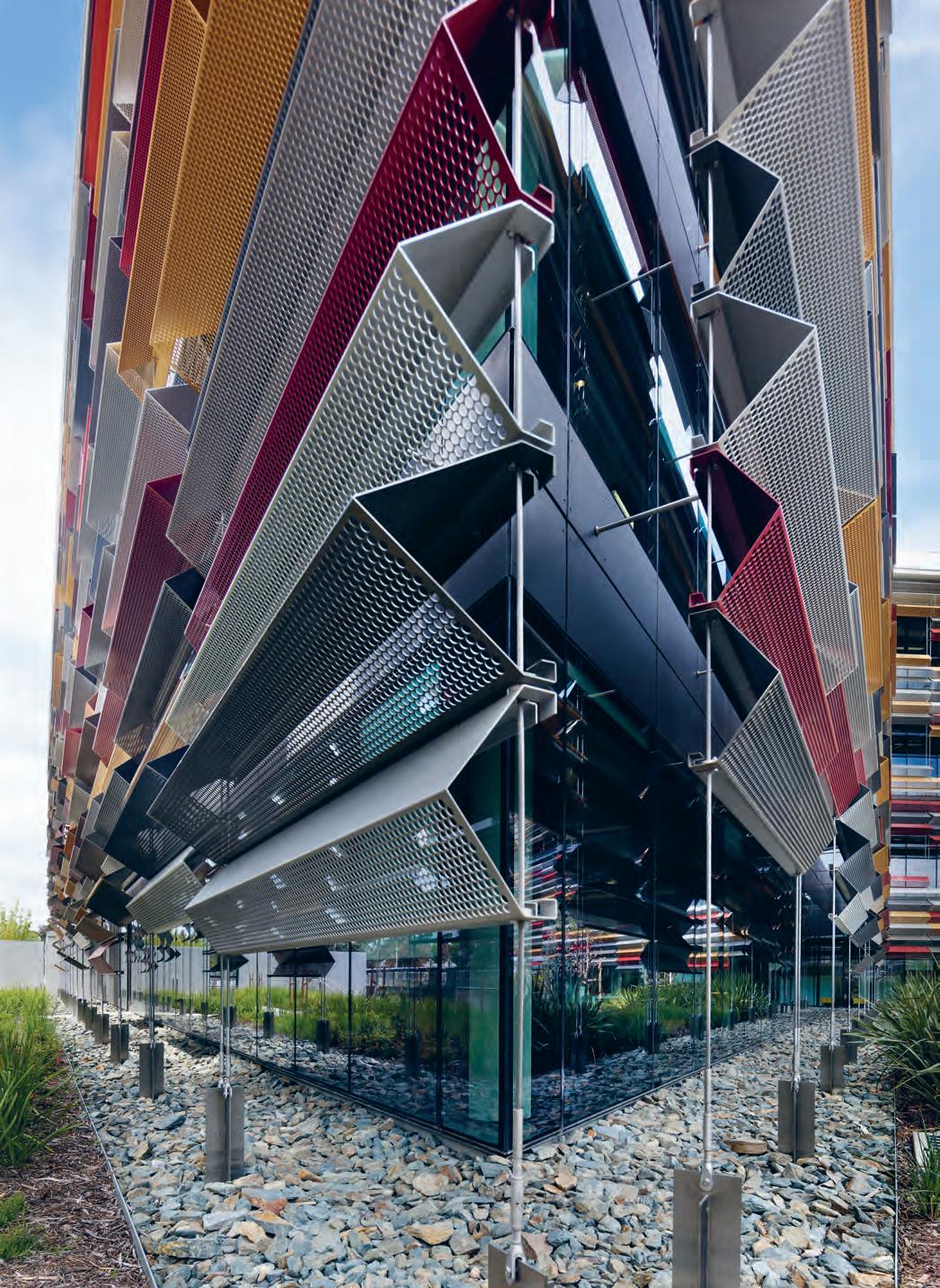
INDESIGNLIVE.COM 106 IN SITU
–
A COLLABORATION
Introducing the Frampton Lounge. A beautifully crafted piece designed and manufactured in Australia. A collaboration between I.G Design and a small number of Australian furniture manufacturers creating a selection of statement pieces utilising the finest materials and local craftsmanship.
New Release by AMD Collective
www.ig.design
Eastern Seaboard
Zane Van de Kerkhof p - 0429 098 399
e - zane@ig.design
Western Seaboard
Jason Sweetman p - 0437 517 119
e - jason@ig.design
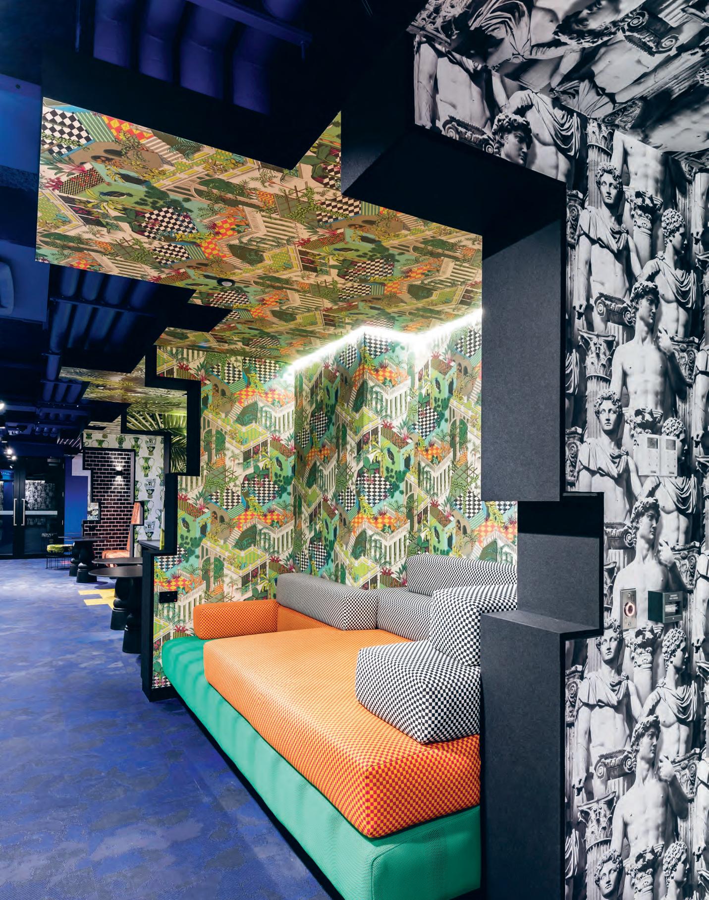
In the University of Adelaide a gorgeous chaos of pattern and colour pulls students down the proverbial rabbit hole. But ARM Architecture has been careful to control the immersion, with meticulously considered interiors that facilitate student-centred learning and imaginative ideation.
Ordered Chaos
University of Adelaide Common Teaching Area Upgrades by ARM Architecture
Words Leanne Amodeo Photography Lyndon Stacy
ARM’s recent University of Adelaide refurbishments are unlike anything you’ve ever seen. These dynamic upgrades across two buildings at the main campus on North Terrace are proof that creating effective learning environments isn’t just about providing practical outcomes for students. While clear sight lines, efficient lighting, reliable acoustics and intelligent temperature control are important, so too are interiors that are accommodating, flexible and inspirational. And in bringing elements of genuine wonder and curiosity to one of the country’s oldest universities, ARM is also advancing current pedagogical discourse surrounding student-centred learning.
“It’s not passive design,” says Amber Stewart, ARM’s associate and the project’s interior architect. “University should be a time and place where you’re not afraid to test out new ideas and our interiors reflect that. They’re definitely not spaces you can say nothing about.” Indeed, the refurbished Engineering South building’s lecture theatres take experiential design to the next level. The larger tiered room is themed ‘atmosphere’ and the smaller one themed ‘earth’; both are uncompromising in presenting immersive environments that seem a world away from the actual campus they inhabit.
Stewart and the project team skilfully worked within a modest budget to utilise low cost finishes for maximum impact. Printed carpet, bold wallpaper, bright paint applications and coloured upholstery give the outdated rooms a much-needed face lift, as well as imparting a sense of ownership to the students who use them. Interestingly, distraction isn’t an issue with all the patterning underfoot, behind the seats or to the side, as the front of each lecture theatre has been left deliberately unadorned.
In the Barr Smith South spaces (accessed via the subterranean Horace Lamb entry beneath the Barr Smith Library), the same decorative devices are used to even greater effect. Step inside and the foyer is all dramatic angles, harlequin flooring and wallpaper featuring Ionic and Corinthian columns intermingled with statues of ancient Roman gods and guards. Beyond that, the six break-out study booths each have their own distinct identity, heightened by the wrapping of wallpaper on each alcove’s suspended ceiling. Yes, it’s over the top and that’s the intention. But this is a basement with very low ceilings and no windows; it was always going to take a lot to activate it.
INDESIGN 109 IN SITU
Lost In Study Space
The view from the entry foyer takes in the full extent of the project’s renovations, from new lockers to self-contained teaching rooms and break-out study spaces. Patterned flooring and decorative wallpaper wrapped around the suspended ceiling makes everything feel incredibly immersive, a deliberate strategy to encourage students to sink in to their studies and linger a little longer.
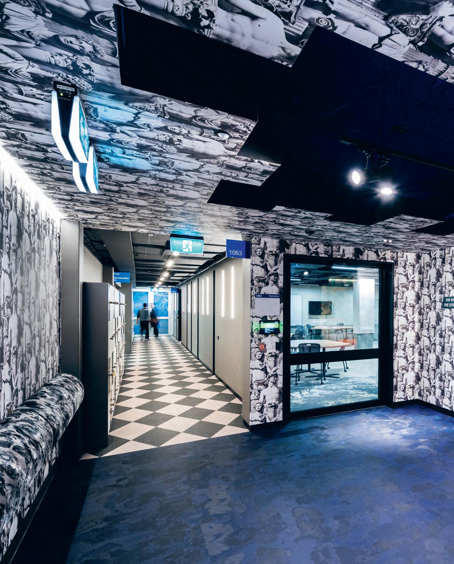
–
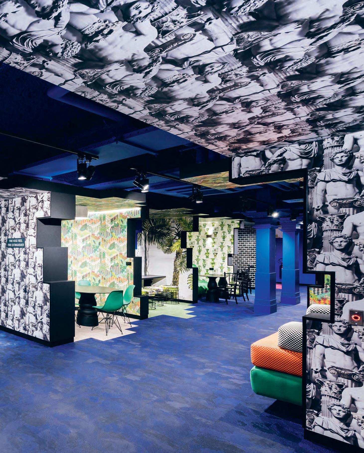
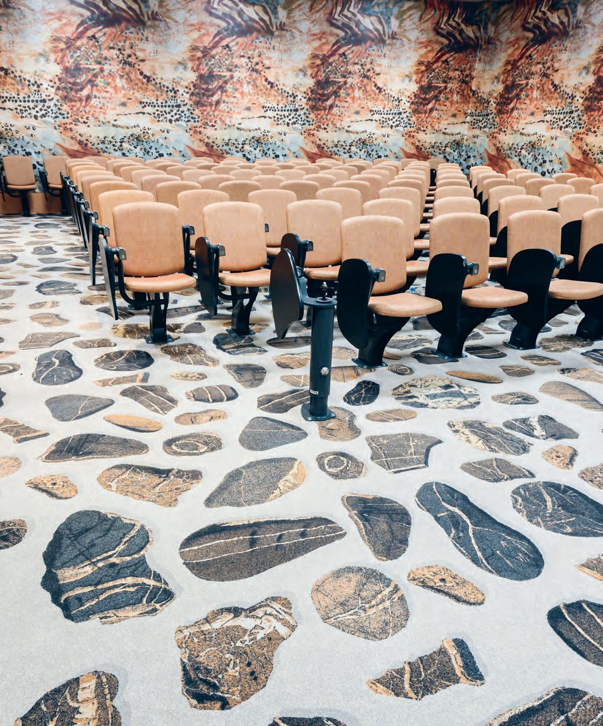
INDESIGNLIVE.COM 112 IN SITU
The architects’ embrace of maximalism is equal parts ingenious and necessary, and works to engage students in areas previously avoided. “We played on the idea of discovery and so like Alice’s Adventures In Wonderland , you go down the rabbit hole and end up somewhere interesting and unexpected,” she explains. The breakout zone has been treated as an ancient ruin of the heritage listed Barr Smith Library’s Reading Room, with the design’s narrative gradually revealing itself as you move through the different ‘rooms’, from grand staircase to conservatory. International Klein Blue applied as ‘sky’ and ‘windows’ provides ‘views’ among the heavily patterned wallpaper, further adding depth and vibrancy. It’s also used to highlight the structural columns and seamlessly integrate them into the design.
This area’s strong immersive qualities are what makes it so welcoming and its contrast with the adjacent teaching rooms, each with a 70-person capacity, lends the overall scheme a sense of carefully
considered nuance. The interior design is relatively pared back in these two spaces, with printed carpet the only decorative flourish. However, all emphasis is on the custom desks, which are able to be configured to three different modes, depending on students’ needs. They exemplify the latest pedagogical approach by promoting adaptability within the classroom. As Stewart explains, “These spaces need to be future-focused, so they have the flexibility to support different teaching and learning styles. It’s all about the students and this allows them to learn in ways that suit them, whether independently, in small groups or as a whole class.”
The success of ARM’s refurbishments not only lies in its futureproofing, but in its reactivation of under-utilised pockets of the university – keeping students on campus and making their learning experience all the more exciting.
armarchitecture.com.au
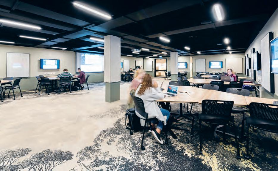
INDESIGN 113 IN SITU
Page 108 and 110-111: The classical statue wallpaper leads to study booths between crumbly-edged walls. Opposite: Mineral energies are represented through the Earth Room wallpaper and carpet. Above: This flexible learning classroom features a baroque landscape panorama carpet.
Page 114-115: The silver seat in this lecture theatre pays homage to Australian astronaut Andy Thomas, a Faculty of Engineering alumnus.
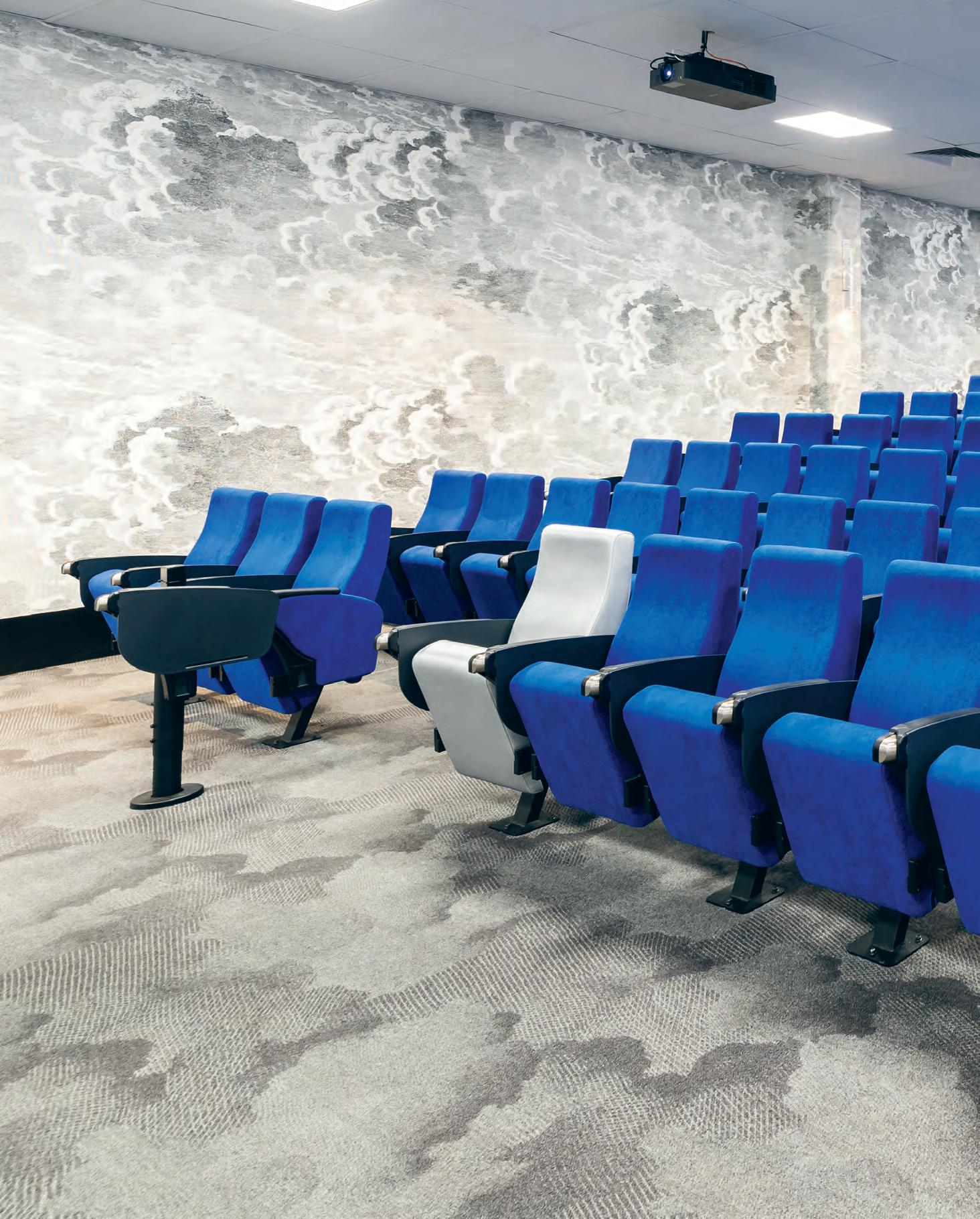
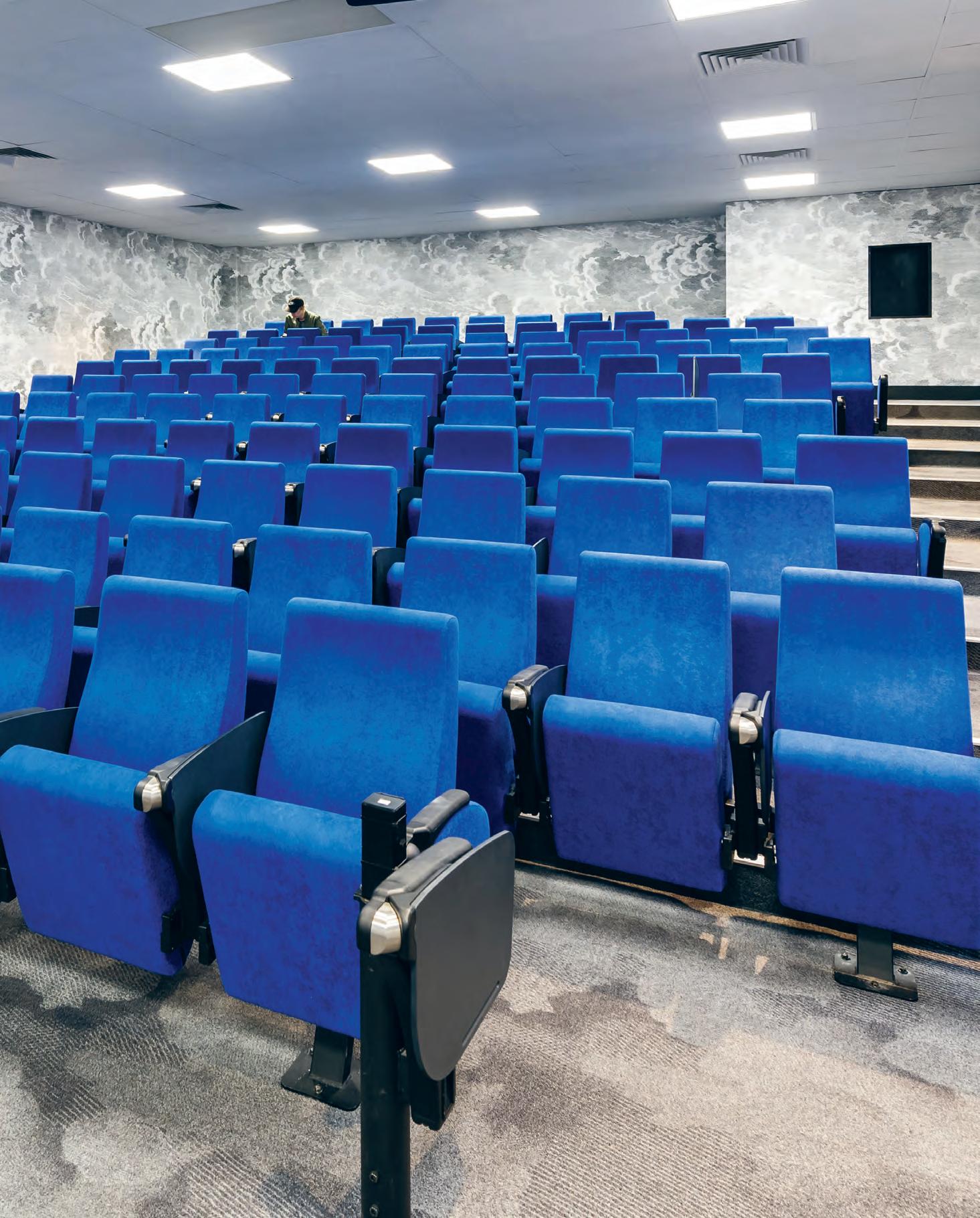
Breaking with the convention is never a neat process, but in the design of Yancoal’s Darling Park office Hammond Studio proposes new working modes for Yancoal’s evolving company culture.
Breaking
New Ground
Words
Building collaboration and transparency into Yancoal’s daily internal workings, Todd Hammond and team has “brought the best of our knowledge from the hospitality sector into the office”.
INDESIGNLIVE.COM 116 IN SITU
Yancoal, Sydney by Hammond Studio
Patricia Arcilla Photography Terence Chin
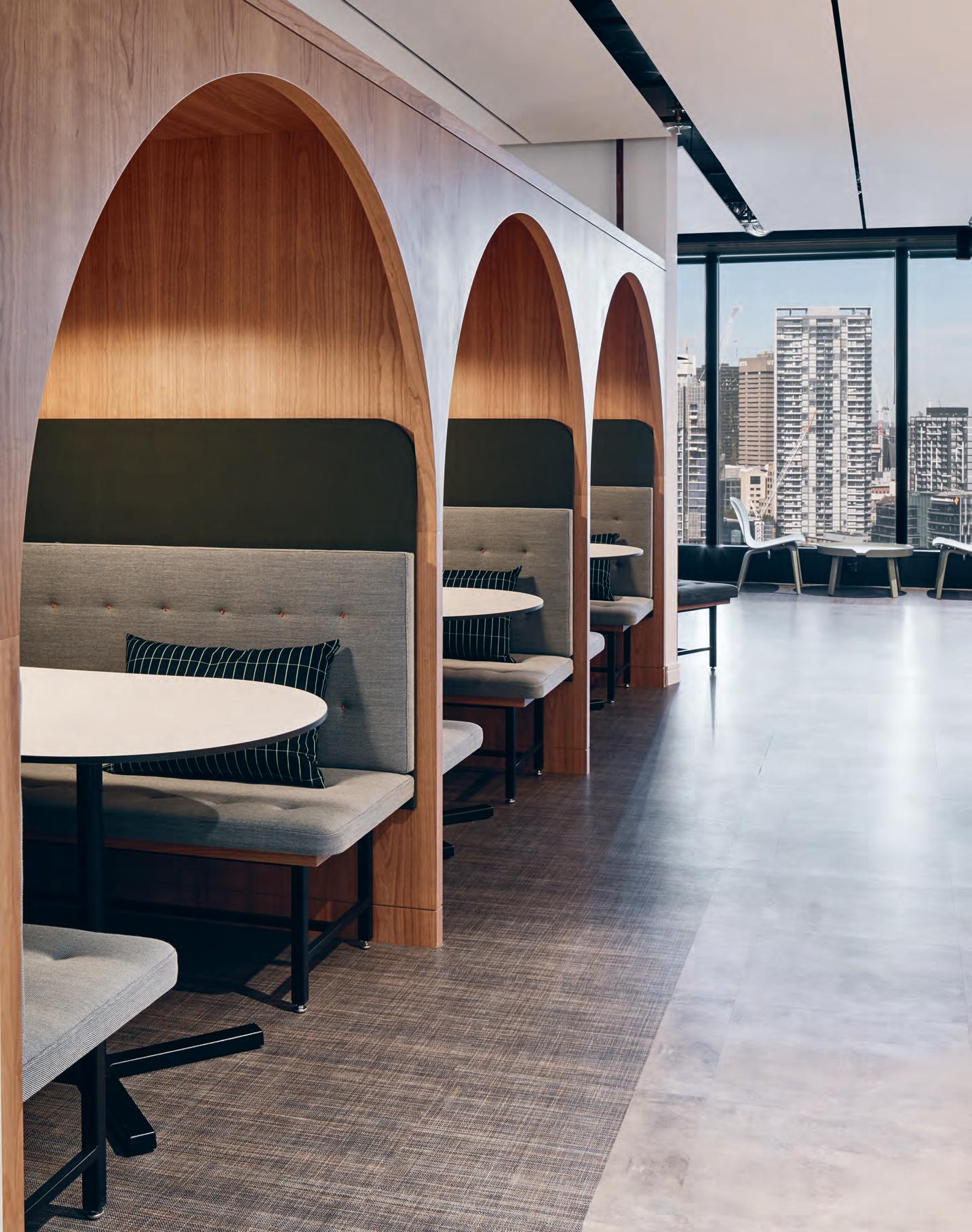
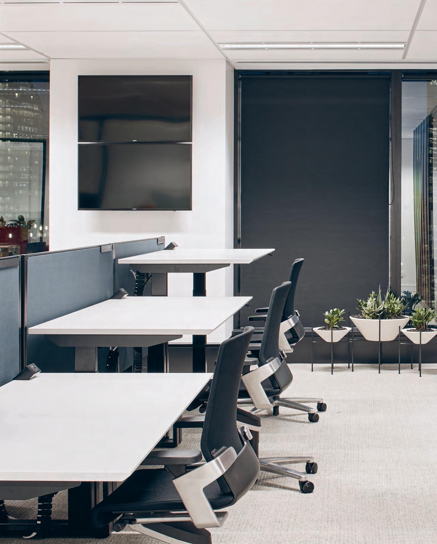
Flexible Furnishings
Workspaces within the Yancoal office are purposefully varied to cater to different personalities. The philosophy is paralleled in the furniture selection, with sit-to-stand desks and Wilkhahn task chairs at all workstations and in external meeting rooms.
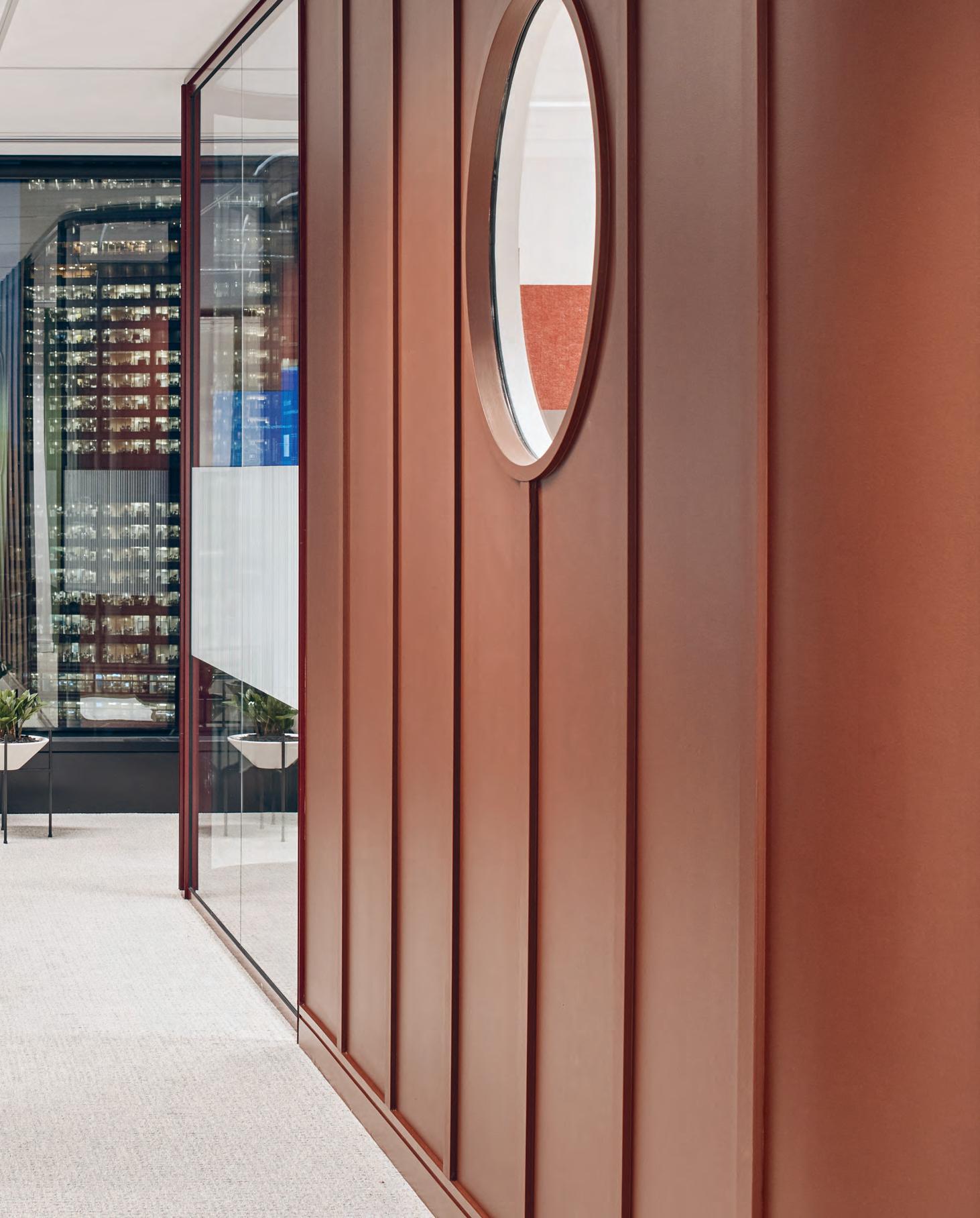
–
For its new headquarters in Sydney’s Darling Park, Yancoal, Australia’s largest pure coal producer, sought to emulate this collaborative spirit and foster stronger connections between its office personnel. Sydney-based Hammond Studio brought this vision to life, crafting a workplace that challenges the conventions of the conservative coal mining sector and those inherent in Yancoal’s nature as a majority Chinese-owned company.
“The Chinese culture is quite hierarchical and very conservative in its outlook,” explains Mark Jacobs, Yancoal executive general manager – environment and community. Accordingly, the company’s previous offices separated senior staff and rank-and-file workers along a predictable divide: the former given bright rooms with a view along the façade, while the latter simply filled the space behind. Hammond Studio director, Todd Hammond, inverted this relationship, dedicating the bulk of the 1900-square-metre floorplate to spaces for meeting, collaboration, and day-to-day work. External meeting rooms for trade and government delegations and stakeholders occupy premium positions along the north-western façade, where full-height glazing grants ample sunlight and stunning eighteenth-storey views. “We did a view analysis before we did anything,” says Hammond. “You can see a lot of the Darling Park precinct from here, and how the architecture bleeds across from one part of it to the other.”
This sense of gradual transition is mirrored in the meeting rooms, united by a palette of glass, dark metal, and richly textured American black cherrywood timber. Red and gold accents reference Yancoal’s Chinese heritage while allowing seamless transition into the lobby, where Hammond’s granular attention to – and flair for – detail is on display in full force. Fossilised limestone flooring nods subtly to the company’s mining activities, while custom wall-mounted light trays throw out haloes of warm, diffuse light that soften the sunlight filtering through wide windows.
This softening hints at Hammond’s deft management of difference throughout the project, which carefully balances opposites: light and dark, open and closed, straight and curved. In response to the rigid geometry of the office’s triangular floorplate, curves abound, from the elegant tapered ends of shared tables in breakout areas to the rounded corners of meeting rooms; elsewhere, a fiddle leaf fig blooms forth from an apsidal niche finished with glossy white ceramic tile. In the so-called ‘back-of-house’, pods of six workstations encircle a core of 17 offices, and print and utility rooms. The result is an uncluttered open plan that gives teams direct sightlines and access
to one another, the views, and natural light. It’s a far cry from what Jacobs describes as the “fields of grey” in Yancoal’s former offices, and fosters a spirit of openness and community. “There has definitely been a cultural shift with this project,” says Hammond. “Yancoal is seeing a lot more collaboration, a lot more transparency, and a lot less hierarchy,” he says.
Though the design-led shift is undoubtedly serious business, it’s not without an element of playfulness. Throughout the back of house are six colour-blocked internal meeting rooms that challenge the staid reputation of the mining sector. The rooms bear culinary names that reference their respective colour themes: the Olive Room, for example, features carpets, furniture, and a glazing suite in a chic muted green, while the Merlot Room is similarly resplendent in sumptuous shades of red. The overarching effect of these sophisticated meeting rooms and nearby breakout spaces – bedecked in stylish Kvadrat textiles and pastel furniture – is that of a high-end, refined hospitality space, a connection that is far from incidental. As Hammond says, “We brought the best of our knowledge from the hospitality sector into the office. You could quite easily take the breakout spaces out of this building, put them outside, put up a café sign, and they would work.”
Elsewhere, the office gives workers a choice between different workspaces that range from booths and hot desks to one- or twoperson quiet rooms and team breakout spaces. “Always, the success of these areas lies in creating variety and different offerings for different people,” explains Hammond. “It’s about having a varied offering for different personalities.” In specifying top-of-the-line furniture throughout the office, the project’s central message is clearly reinforced: all Yancoal members are a valuable part of the team, and all are valued equally.
Representing a seismic shift in Yancoal’s company culture and a shining example of the transformative power of good design, the Darling Park project is also a testament to the value of close clientdesigner relationships. “The most successful projects are always the ones where the clients are engaged,” says Hammond. “The journey was a very pleasant, positive one.” Jacobs agrees: “Everyone felt like we were part of the same team,” he says. “Having commonality of purpose was really helpful and from a client perspective we’re delighted with the result. It’s everything we hoped it would be.”
hammondstudio.co
INDESIGNLIVE.COM 120 IN SITU
Page 117: Semi-enclosed booths for informal gatherings or individual focus. Page 118-119: The Host sit-to-stand desk system by SeehoSu WorkLife. Page 121: The Berry stand-up collaboration room. Page 122: Hub space with shared communal counter.
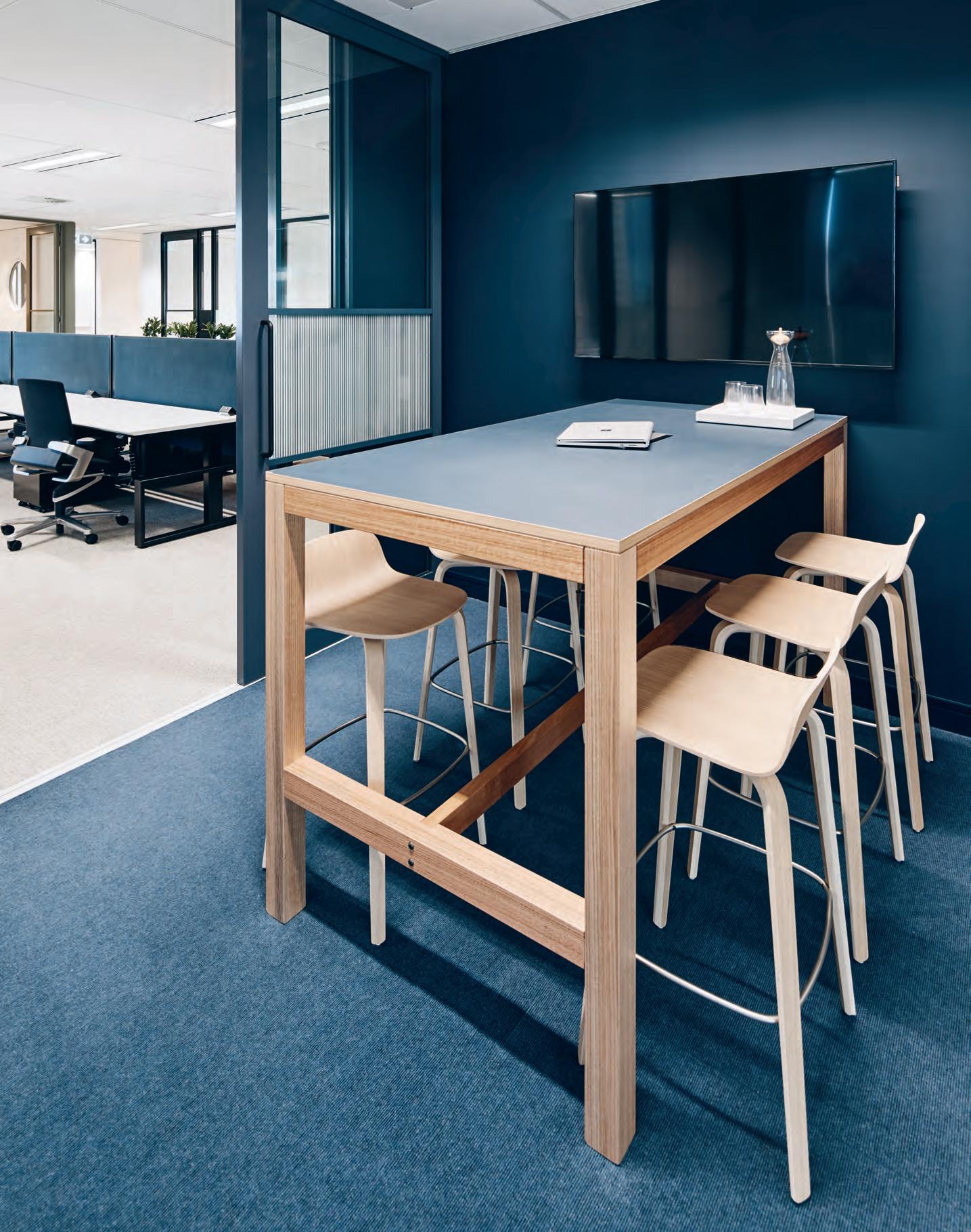
Working In Circles
The office’s triangular floorplate is softened by the sweeping curves of elegant, tapered table ends in the breakout areas, arched doorways framing booths, and rounded corners edging the meeting rooms.
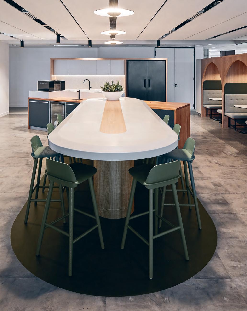
INDESIGNLIVE.COM 122 IN SITU
–
Principles Of Quality &tradition
For more than 20 years Cult has been bringing the world’s best and most unique in design to Australian shores. It champions the authentic and the creative in design, showcasing techniques that vary from the traditional to the contemporary. Already a favourite among speci ers and end users, thanks to its extensive collections and international brands, the Cult family welcomes a new name to the fold with Danish brand &tradition.
Dedicated to merging centuries-old Scandinavian design heritage with modern creativity, &tradition produces re ned pieces that are contemporary yet timeless and pure in their aesthetic.
Established in Denmark in 2010, &tradition bridges the ideals of Nordic tradition with contemporary design thinking. By reshaping, rede ning and reinventing materials, techniques and forms, &tradition strives for timeless design, honouring past traditions and continuing to create new ones.
Through &tradition’s unique library of furniture, cra meets art, function meets form and material meets its potential. Its collection
features established and emerging designers and spans almost a century of design – from 1930s to present day. The Mayor sofa, for example, was initially conceived in 1939 by Danish architects Arne Jacobsen and Flemming Lassen. Its timeless fusion of form and function has been reinvigorated by &tradition to become one of its most well-known pieces.
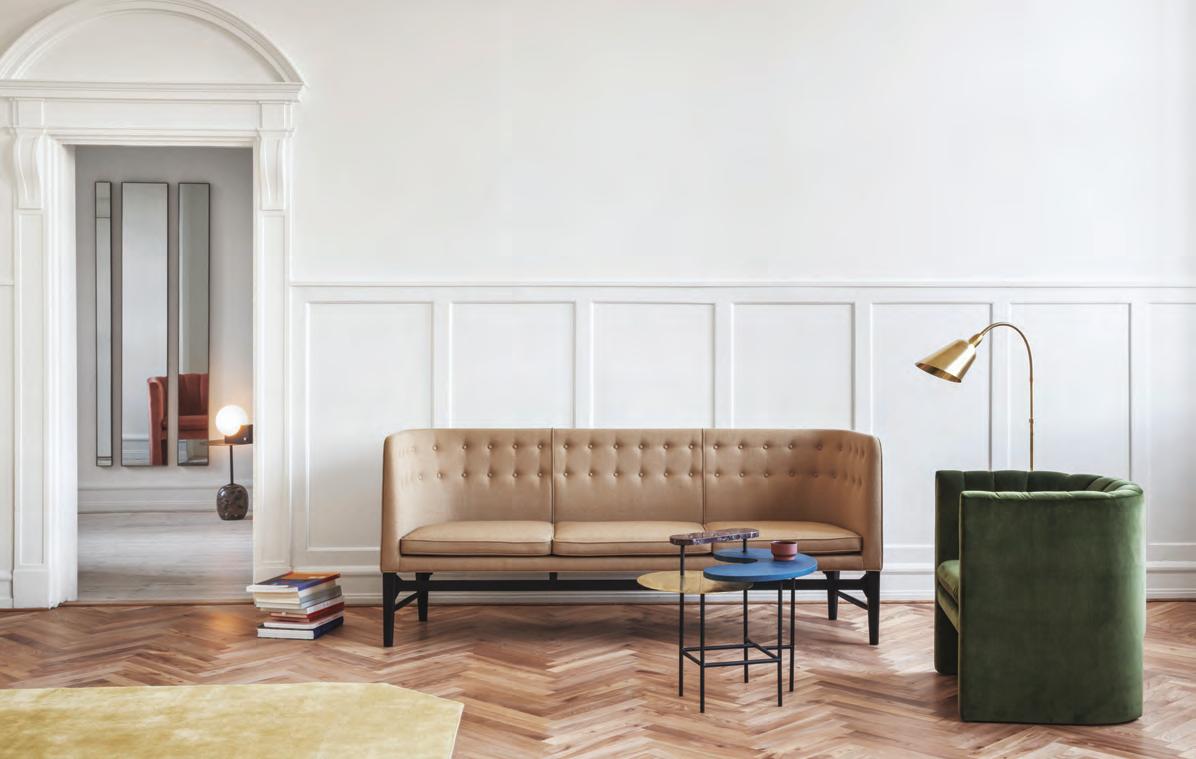
Building on the Danish tradition of cra smanship imbued in the sofa’s wooden base, the sophisticated three-seater combines this Scandinavian wood aesthetic with a tightly tailored canapé shape, elegant button detailing and three loose cushions. It’s a look inspired by the Modernist movement of its time and one that engenders a sense of quality yet livability.
Showcased and available to order from Cult showrooms in Australia and New Zealand, &tradition’s collection of pieces proves that the principles of quality are timeless: good design will always maintain its beauty and methods of production can be revived or re-thought to create design that will stand the test of time.
123 CULTDESIGN.COM.AU INDESIGN CULT
Above: Mayor sofa, Bellevue oor lamp, Loafer lounge chair, Palette table and The Moor rug, from &tradition.
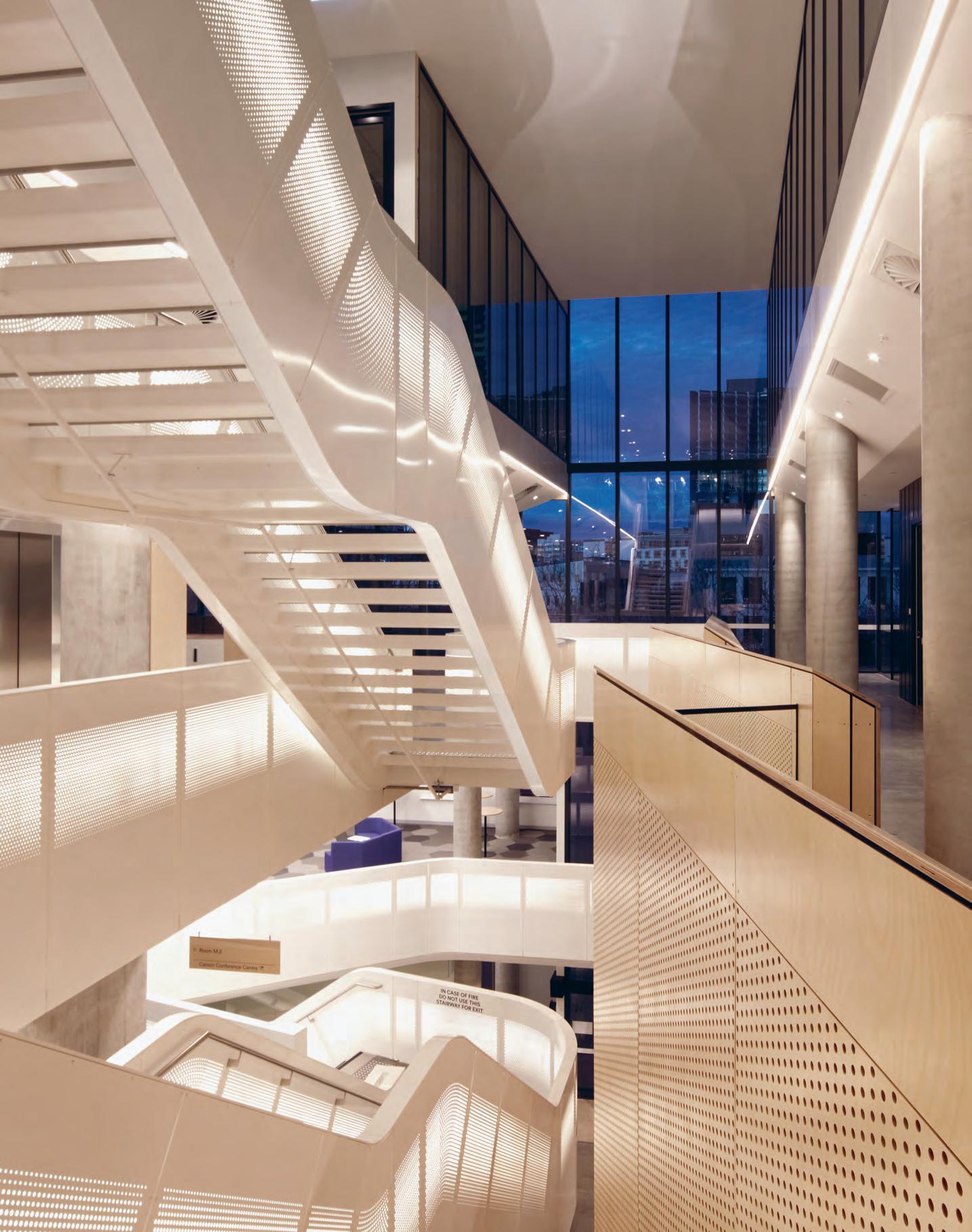
Crone Architects’ uplifting and pragmatic design for ANMF in Melbourne empowers healthcare professionals to pool their knowledge, absorb new learnings and, importantly, ‘walk the walk’.
The Brains Trust
Divided into four distinct parts for conferences, education, commercial tenancies and workplace, the Australian Nursing and Midwifery Federation’s (ANMF) new 10-storey Victorian Branch headquarters in Melbourne is likened to the human body by its designers, Crone Architects.
“At its heart you have the auditorium, which is a complex but extremely productive space, the veins are the staircase and the façade is the skin that helps the insides stay habitable by reacting to the light. The brain at the top of the building contains the workplace spaces and staff that help keep everything running,” explains designer Ryan Williams.
Championing wages and conditions for nurses, midwives and carers, ANMF provides access to industrial, professional and legal representation, education and training facilities for more than 82,000 members in Victoria.
A big focus for the Federation is continuing professional development and education. Environmentally sustainable workplace practice is one topic attracting plenty of health professionals to the education spaces in the building, which achieved a five-star Green Star rating.
“Our members are working hard to change the large carbon footprint in hospitals,” says Lisa Fitzpatrick, ANMF (Victorian Branch) secretary. “So we wanted to make sure our building reflected that commitment in its design and operation.” Embedding environmentally sustainable design (ESD) early in the design process includes harnessed natural light penetration, city views and perimeter spaces for staff. “Because ESD had its place and wasn’t about ticking boxes we were able to orientate the building core to the north and centre it within the floorplates,” says Williams.
An accent placed on “open, airy and light-filled” interior spaces is offset by sophisticated acoustic solutions, and ensures visual and physical connectivity between the organisation’s diverse functions.
“There is a clear aspiration for a collegiate culture, intercommunication, learning, and k nowledge transfer, which is handled differently at various scales within the organisation – within team, within departments, between departments and between occupied floors.”
The thought given to long-term flexibility and adaptability will see the client get the most out of the diversity of working, teaching, learning and collaborating spaces which are future-proofed with technology,
INDESIGN 125 IN SITU
Australian Nursing & Midwifery Federation (ANMF), Melbourne by Crone Architects
Words Marg Hearn Photography Glenn Hester
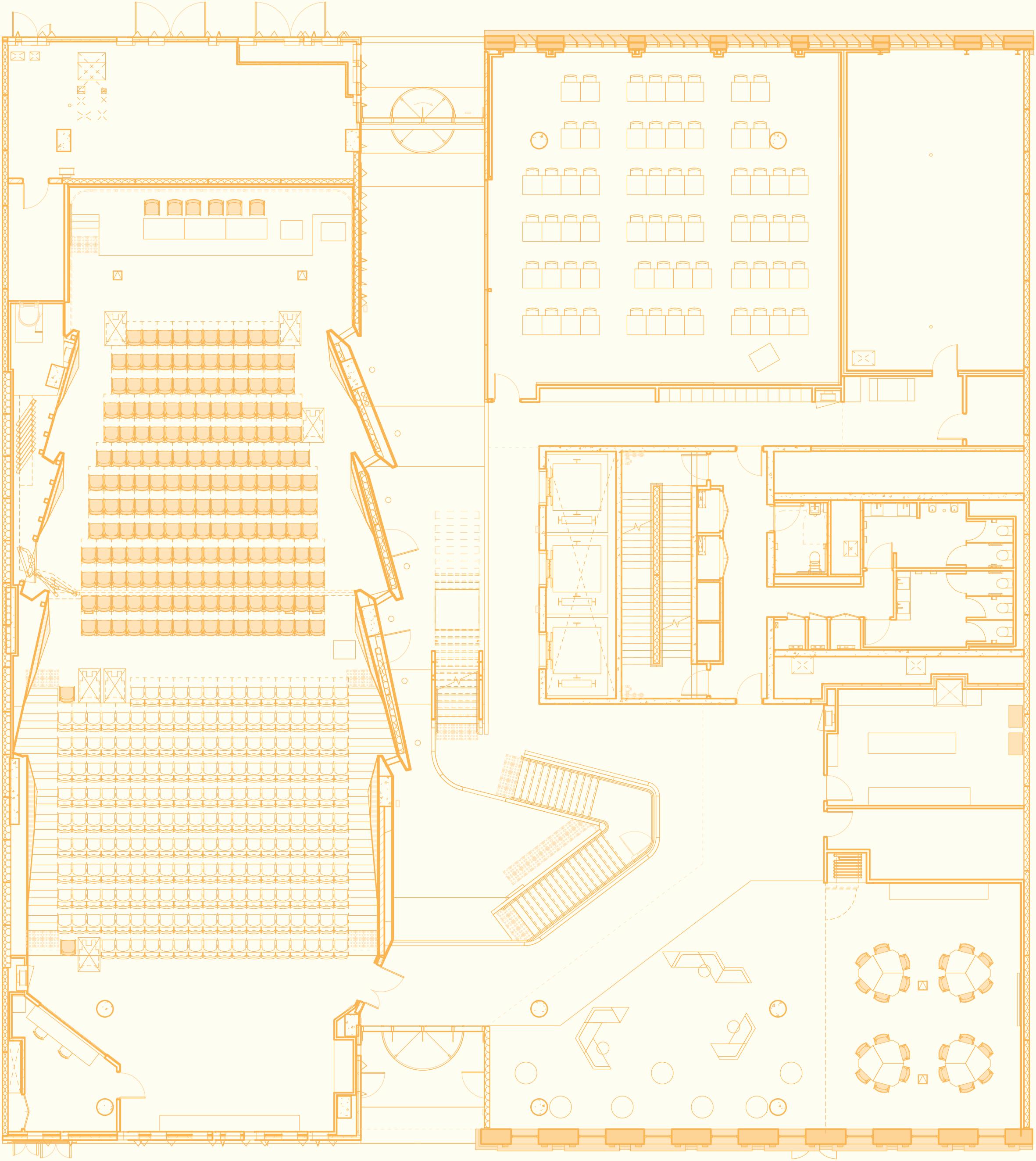
INDESIGNLIVE.COM 126 IN SITU Mezzanine Level Australian Nursing and Midwifery Federation 1 Au ditorium breakout area 2 Auditorium audiovisual room 3 Flexible mixed-use area/training room 4 Food transfer area for event catering 5 C lassroom space 6 Printing and locker facilities 7 V isual and physical connection through void 8 S ecurity gate between Ground Floor and Mezzanine Level 4 1 2 3 5 6 7 8
as far as is conceivable. A prime example is the oft-used, 400-seat auditorium featuring locally-crafted, faceted timber walls and ceilings, a skylight “punching through” – bringing natural light in without impacting what’s going on – and operable walls for splitting the room.
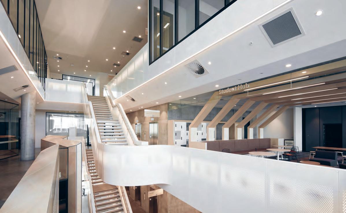
Against a growing presence of online education, the nurse laboratories in the education spaces, with live streaming capabilities to the auditorium, play a “critical” role in simulating practical experience. One is equipped with bariatric capacity to ensure appropriate training, for those doing the lifting of today’s heavier patients.
Workplace amenities like generous sit-to-stand desks provide a sense of home for staff in preference to hot desks. Meanwhile bookable private rooms, and the staff hub’s array of seating, indoor nooks and outdoor spaces give people the “tools” they need. Overarching that is the intent of “creating an environment where people feel safe and comfortable in a space, alone or with others”, elaborates Williams.
The nurturing extends to next generation health professionals with student members having access to facilities like the bespoke library, practical device charging bays and bike storage.
Serving as a functional and visual link from the ground up through to the education levels – with built-in fitness benefits – is the gauze-inspired staircase. Or there’s the smart lift. Circulation balances to “encourage interaction and cohesion between staff while wider questions of accessibility for the vision and hearing impaired, and degrees of mobility, were considered to provide a safe and healthy working environment.”
While designing an environment with “feel good factor was always on the radar”, says Williams, it’s the post occupancy period where its successful carriage has been affirmed.
crone.com.au
INDESIGN 127 IN SITU
Page 124 and 127: The gauze-inspired staircase provides a visual link from the ground up to the education levels.
Perth Children’s Hospital
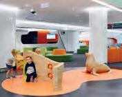
Architect
JCY Architects and urban designers, Cox Architecture, and Billard Leece Partnership with HKS Inc
Interior Designer
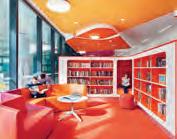
JCY Architects and urban designers, Cox Architecture, and Billard Leece Partnership with HKS Inc
Managing Contractor John Holland Group
Structural, Civil, Façade and Traffic Engineer Aurecon
Services Engineer Norman Disney & Young
Landscape Architect Newforms Landscape Architecture
Compliance Consultant Philip Chun and Associates
Wayfinding Büro North, Diadem
BIM Management PDC Consultants
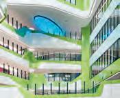
Budget: $1.2 billion
Duration: 89 months
JCY Architects jcy.net
Cox Architecture coxarchitecture.com.au
Billard Leece Partnership blp.com.au
HKS Inc hksinc.com
Lighting Generic fittings, Norman Disney & Young and John Holland
Finishes
‘Cubic Colours’, ‘Urban Retreat One’ and custommade carpet tiles, Interface ‘Accolade Plus’ and ‘Accolade Safe’, ‘Timberline’, ‘SafeGuard’ and ‘Amalon NG’ vinyl flooring and wall, vinyl skirtings, Armstrong ‘Sarlon Traffic’ flooring, Forbo. ‘Solid Blackbutt’ flooring, Boral . ‘Cermiche Guovera’, ‘Wincklemans’ ceramic floor tiling, ‘Floor Gres’ wall tiles, European Ceramics . ‘Romax Harlem’ floor tiles, ‘Junhua’, ‘Equipe’, ‘Ying Fei’ wall tiles, Myaree Ceramics . ‘Agrob Buchtal Basis 2+’ and ‘Agrob Buchtal Choma II’ non-slip floor tiling, Cermica Solutions
‘Vitra Arkitekt’ wall tiles, Original Ceramics
Tonalite Italy – Hexatile, Academy Tiles . Aluminium and powdercoat skirting trims, Alspec . C/S bamboo handrails and bump rails, ‘Acrovyn’ door protection, C/S Group. ‘Wash & Wear 101’, ‘Enviropoxy’, ‘Aquanamel’ gloss and semi gloss and ‘Arcathane’ wall and trim paint; ‘Duratec X15’, ‘Duratec’, ‘Alphatec’, ‘Duralloy’ and ‘Electro’ powdercoating, Dulux ‘D2015’ powercoating, Interpon . ‘Colour Papago’, ‘Colour Gloss’, ‘Signature’ laminate veneer and door lead finishes, Polyrey. ‘Impressions’, ‘Origine’, ‘Diamond Gloss’, ‘Innovations’ and ‘Fusion Laminate’ veneers, Laminex . ‘True Grain’ natural timber veneer, Briggs Veneers . Acrylic solid surface, Corian . ‘Guardec’ decorative acrylic wall lining, Interviron . ‘Euromir mirrored Perspex Frost’ wall lining, Mitchell Plastics
‘Tessematt Transparent’ wall lining, Mulford Plastics. ‘Lucere’, ‘Lucere Kaleidoscope’, ‘Lightblocks Ice’ and ‘Bencore’ wall lining, Baresque . ‘Hexagon’ and ‘Round’ perforated aluminium mesh, Locker Group. ‘Echo panel’ acoustic wall panelling and operable wall panelling, pinboard fabric, ‘Aero Crypton’, ‘Mono Crypton’, ‘Neo’, ‘Bonbon’, ‘Dino Stripe’, ‘Mono CR’ and ‘Matrix CR’ upholstery fabric, Woven Image . ‘Quietspace’ acoustic panel, Autex . ‘Nature’ vinyl mural wallpaper, Eurowalls . ‘Polyrey’ laminate for WC and shower partitions, Hufcor. ‘IPC’ door protection, Novaplas . ‘Solid Standards’ door leaf finishes, Greenlam . Custom pattern colourback glass, Digiglass ‘EuroBloc Room Darkening’, ‘EuroScreen Transparent window treatment, Woven Vertilux . ‘Crypton Savanna’, ‘Crypton Dash’, ‘Tetra’, ‘Silica’, ‘Max’, ‘Momentum Textiles Silica’, ‘Legacy’, ‘Stitches’, ‘Crypton Eco Webb’, ‘Vanicia’, ‘Vaggio’, ‘Vocal’, ‘Track’, ‘Beeline’, ‘Agora’ and ‘EON’ upholstery fabric, Materialised ‘Bitmap’, ‘Messenger 458640’, ‘Micro 466099’ and ‘Wafer 465330’ upholstery fabric, Maharam . ‘Crypton collection’, ‘Nouveau’ and ‘Focus’ upholstery fabric, Laine Furnishings . ‘Studio’, ‘Soho’, ‘Pellan Ultimate’ upholster fabric, Austex
Commercial Fabrics
‘Stamskin Top’ upholstery fabric, Innova Engineer ‘Chelsea’, ‘Ecostyle’ and ‘Renegade’ upholstery fabric, Sustainable Living Fabrics . ‘Airskin’, ‘Hybrid’ and ‘Suede’ upholstery fabric, SvenskaKJ. ‘Skai Tundra’ upholstery fabric, Décor Design Centre . ‘Paintbox’ upholstery fabric, Instyle ‘Lafgard’, ‘Amareto Plus’
and ‘Amareto Evolution’ fabric upholstery, Hadley Australia . ‘Asha’ and ‘Vintage’ fabric upholstery, Mac Textiles . ‘Febrik’ upholstery fabric, Moo Agencies . ‘A20 AcoPerf’ stretched hydrotherapy pool ceiling, Barrisol
Fixed & Fitted ‘Medical’ basin, ‘Integra 500’, ‘Flora’ and ‘Caravelle 550’ semi recessed basin, ‘Stirling 1675’ bath, ‘Leda Wall Faced Invisi Series II’, ‘Cosmo Sovereign Care’ and ‘Care 800 Invisi Series II’ toilet suite, ‘Invisi Series II Smartflush’ cistern, ‘Cube InvisiTM Series II’ urinal suite, Caroma . ‘IFO Cera’, ‘IFO Sign’ and ‘IFO Sign Compact’ basins, junior toilet suite, Enware . Custom design basin, Corian . Under bench chilled/boiling water unit, Zip . Kit of parts joinery, back of house cabinetry, tea-prep and break-out cabinetry, Antry Inpatient room joinery, day treatment unit joinery, mental health patient joinery, bedheads typically, staff base joinery, recreation and Radio Lollypop bench seating, PCH Foundation Gift Shop, Ferguson Corporation . Reception counters, including main reception desk, recreation storage shelving, burns unit and oncology unit joinery, Frontline Interiors Stainless steel benching, Western Stainless Solutions
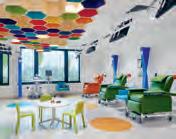
INDESIGNLIVE.COM 128 IN SITU
–
Want to know what made the spec’ schedule for our featured projects? We’ve got you c overed...
Fixed, Fitted & Furnished
–
Light Warrior Investments & Made Establishment, Melbourne
Architect WOWOWA
Interior Designer
WOWOWA
Project Manager
WOWOWA
Builder BuiltPlus
WOWOWA wowowa.com.au
Furniture
‘Herman Miller Aeron B’ desk chairs, Living Edge ‘Danube’ occasional tables, ‘Marilyn 7C40’ occasional chairs, Café Culture + Insitu . ‘ORBIS EA 180-DEG’ workstations, Zenith
Lighting ‘Monroe’ pendant light by WOWOWA, Rakumba
Lighting
Finishes
Brass pipe wall cladding, Austral Wright Metals
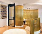
Synergy building at CSIRO Black Mountain campus, Canberra
Architect
BVN
Interior Designer BVN
Project Management RPS Project Management
Builder Laing O’Rourke
Structural Engineering
Taylor Thomson Whitting
BCA & Fire Engineering
AE&D
Civil/Traffic Electrical/ Comms/Av Security/Acoustic Engineering Aurecon
Mechanical/ESD Engineering Steensen Varming (Aust) Pty Ltd
Hydraulic Engineer THCS Pty Ltd
Landscape Designer ASPECT Studios
Accessibility
Eric Martin & Associates
Budget: $110 million
Duration: 34 months
BVN bvn.com.au
Furniture
‘Artek’ dining chairs and stools, ‘Krossi’ round tables, ‘Vitra’ focus booth, Schiavello. Steelcase gesture task chair, NinetwoFive Interiors . ‘Orbis’ workstations, Zenith
Lighting
‘ARC’ floor lamp, Schiavello ‘Australume’ corridor lighting, Heyday5
Finishes
Yellow stringybark timber on floors, joinery, pod wall cladding, ACT Interiors/ Capital Veneer. Studded rubber floor tile, Spectrum Floors . Corian benchtops, face panels, splashbacks, KPD
Fixed & Fitted ‘Verosol’ façade blinds, BMAC. Insitu-concrete on atrium balustrades, Pacific Formwork and ACT Projects . Feature cappings on balustrades, KPD . ‘Forma Variflex’ operable walls, Dorma
University of Adelaide
Common Teaching Area
Upgrades
Architect
ARM Architecture
Project Manager
Rob Hutson, University of Adelaide
Builder
Sarah Constructions
Structural Engineer
WGA
Services Engineer
BCA Engineers
Acoustic Engineer
Marshall Day
A&V Technology
University of Adelaide
Building Certifier
Katnich Dodd
Budget: $1.9 million
Duration: 24 weeks
ARM Architecture armarchitecture.com.au –
Furniture
Break-out spaces: Moooi extension chair, new antique container stools and tables, Space Furniture . NAU
‘Rev’ stool, Cult . ‘Ellis’
ottoman, Grazia & Co
Teaching spaces: ‘Krossi’ student table, Schiavello
Throughout: Herman Miller
‘Caper’ chair, Eames ‘DSR’ chair, Innerspace SA
Lighting
Break-out space: Sneak Trim 2.0, Box 2.0, Neon LED, Teaching space: Highline 60, Lecture theatre: Hoop deep edge 104 downlight, Est
Lighting. Lecture theatre:
‘Heavy Rain’ wall light, Ilanel
Break-out space: ‘Cloche’ ceiling light, ISM Objects Foyer: ‘SystemKanal 50’
lighting, Efficient Lighting Systems. Break-out: ‘KTS
Kopa Track’ spotlight, Kopaglobal
Finishes
Lecture theatre and teaching space: Atelier EGE carpet, RC+D . Foyer and break-out: Bolon by You vinyl, Bolon
Break-out and teachers
space: ‘Quietspace & Cube’
acoustic panels, Autex
Break-out space: Designers
Guild, Bagatelle Reglisse, Croisette Rainette, and Cole & Sons wallpaper, Break-out space: Designers Guild, Soft Jardin, Mathura Graphite and House of Hackney fabric, Radford Furnishings
Break-out space: Vision, Replik wallpaper, Vision Wall . Lecture theatre:
Casamance, Oxymore 3 wallpaper, Zepel Fabrics
Break-out: ‘Spectrum
emerald’ leather, Pelle
Leathers . Break-out: ‘Lift’ and ‘Checkers’ fabric, Lecture theatre: ‘Sudden Foil’ fabric, Kvadrat Maharam
Lecture theatre: ‘Blaze
Paprika’, ‘Ashcroft Ocean’ fabric, Warwick Fabric
Joinery: Ravine Natural Oak, Ravine Sepia Oak, Ravine Aegean Oak, Polytec ‘Duropal’ anti fingerprint joinery, Benchtop City ‘Spraywool’ ceiling acoustic spray, Knauf Insulation
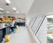
Break-out: ‘Frieda’ paint, Porters Paints . Lecture
theatre: ‘Sassy’ paint, Teaching spaces: ‘Stone’ and ‘Knave’ paint, Foyer: ‘Grey
Cabin’ paint, Lecture theatre: ‘Taupe White’ and ‘Winnipeg
Fog’ paint, Dulux
INDESIGN 129 IN SITU
–
Yancoal, Sydney
Architect Hammond Studio
Project Manager
Generate Property Group
Property Advisory Counsel
Builder FDC
Services Engineer
Evolved Engineering
Duration: 6 months
Hammond Studio hammondstudio.co –
Furniture
‘Host System’ SeehoSu
Worklife work stations, ‘Roundish’ armchairs and sofa, ‘Hiroshima’ chair, SeehoSu . ‘On Chair’ task chair, Wilkhahn . ‘Soft Shell’ meeting room chairs and reception tables, Vitra . ‘Lunar’ meeting room armchairs, ‘Vizu’ and ‘Nerd’ meeting room stools, ‘Around’ café table, Living Edge . ‘Pure Loop Binuance’ meeting room chairs, ‘Stratos’ and ‘Breda’ informal meeting armchairs, ‘Ikon’ table system, ‘Planar’ meeting tables, ‘Bold’ café table, ‘Miura’ informal meeting table, Café Culture + Insitu Tacchini ‘Soap’ reception coffee table, Thinkingworks ‘Blade’ meeting room tables, Stylecraft
Lighting ‘Bureau’ wall light, Alma
Lighting . ‘Blade’ downlights, iGuzzini . ‘Crescent lamp’, Space Furniture . ‘Ginger M’ table lamp, ‘Ginger 20’ breakout pendants, ‘Ginger A’ wall lights, Est Lighting
Finishes
‘Fossil’ reception flooring
‘Yuki Border’ wall tile, Artedomus . ‘Duo’ meeting room carpet, Passo Flooring . ‘Tretford’ carpet, Gibbon Group . ‘Marmoleum Walton’ resilient flooring, Olive, Smokey Blue, Salsa, Burgundy and Pebble linoleum furniture finishing, Forbo . ‘LVT Warm Polished Cement’, Interface . ‘Strong Strawberry’, ‘Red Box’, ‘American Mahogany’, ‘Murray Red’, ‘Pesto’ and ‘Shire’ paint, ‘Stone Grey’, ‘Mangrove’, ‘Deep Ocean’, ‘Intensity Dessert’, ‘Hunter Red’, ‘Black’ powercoating, Dulux . ‘Tempest’ and ‘Boro 2’ paint, Murobond ‘Lancaster’ and ‘Amiable’
acoustic walls, Camira
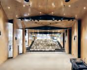
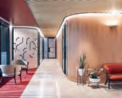
‘Tek’ fabric walls, ‘Steelcut
Trio 2’ fabric wall, Kvadrat
‘Deep Grey’, ‘Red Wine’, ‘Indigo Blue’ and ‘Hot Red’
Echopanels, CFS . Blue
Echopanel, Woven Image
‘Wizard Hotshot’ fabric wall, Textile Mania . Anodised
Matt Natural powdercoat, JEB . Sovereign Gold powdercoat, Australian Aluminium Flooring
‘Baye’, ‘Sarsen Grey’ and ‘Eggplant’ laminate finishes, Laminex . ‘SEI’ laminate, Abet Laminati . Cherry woodwall veneer, Elton Group . Australian myrtle cherry Glulam, DGI . TGYBEL terrazzo, Signorino
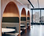
Grey Corian finishes, CASF Linen2230, Caesarstone
Australian Nursing & Midwifery Federation
Architect
Crone Architects
Project Manager
Montlaur Project Services
Builder
Multiplex Australia
Structural & Services Engineer WSP
Fire Engineer Exova
Quality Surveyor Altus Page Kirkland
Town Planner Urbis
Façade Engineer AECOM
Heritage Consultant
Lovell Chen, Bryce Raworth
Budget: $74 million
Duration: 26 months
Crone Architects crone.com.au –
Furniture
Workplace and education
loose furniture to base build, Stylecraft . Loose furniture to base build and education areas, Jardan . Auditorium seating, KFive.
Lighting
Ground floor pendant lighting, Darkon
Finishes
Workplace feature wall and ceiling cladding, Woodform Australia . Education and workplace pinboards, feature print acoustic panels, Instyle Inset rugs to reception areas, Tappeti. Upholstery to base build and education areas, Jardan . Flooring throughout workplace and education Areas, Bolon. Acoustic panelling, Atkat Australia Tiling throughout, Signorino Vinyl flooring to education area, Shaw Contract Group
Fixed & Fitted Amenities throughout, Caroma
INDESIGNLIVE.COM 130 IN SITU
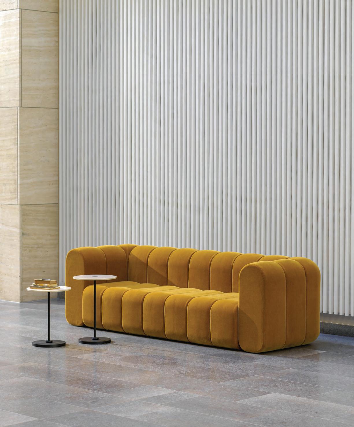
BOB Sofa p4.design
ABW and Agile Go Head-to-Head
Words Aleesha Callahan Photography Various Opposite:
STEELCASE.COM 132 INDESIGN STEELCASE
Samantha Giam of Steelcase has spent time researching agile working and how ABW can appropriate some of its techniques. Page 134: Steelcase’s furniture innovations facilitate activity based working and agile.
“An agile-inspired approach works harmoniously with a more traditional ABW style of working. If anything, when implemented through a considered design approach, they will work hand-in-hand. It could even be argued that ABW, in fact, supports an agile way of working.”
Activity based working (ABW) has been part of the designer’s toolkit for some time. At its crux it’s all about facilitating environments that allow people to work with whoever they need, wherever they need. A more recent methodology to be added to the line-up is agile working. Are they interchangeable? Does one foster the other? Is one more e ective than the other? Always sitting at the forefront, Steelcase has put time into researching the ins and outs of agile working to glean insights that could be applied to the modern workplace.
Understanding Agile
Traditionally, agile working has a founding in so ware development, in what is called ‘scrum’. It runs in a cyclical, iterative manner whereby small teams can run through an entire process within one space. All of that team’s needs are met as they go from ideation to development, to presentation and back again.
Steelcase began observing one such so ware team in action. In watching them cycle through this process some key requirements really stood out. Furniture – with its ability to adapt, move and be repurposed – was a critical element to an agile mode of working. But you don’t have to be coding to apply some of these methods. An agile-like approach can be just as successful for other types of team functionality.
So where does ABW come in? It doesn’t need to be one or the other. An agile-inspired approach works harmoniously with a more traditional ABW style of working. If anything, when implemented through a considered design approach, they will work hand-in-hand.
It could even be argued that ABW, in fact, supports an agile way of working. A key takeaway, then, from a traditional agile or scrum approach is to allow workers the exibility to create the perfect environment around themselves. And furniture is one of the best ways to do so.
Furniture for a Modern Workplace
Demountable, moveable furniture is the simplest way to facilitate an agile-like approach to working. Just as technology has been revolutionising our screens, home and work lives – technology is changing furniture and the materials that go into making them.
One such example of this is Steelcase’s Lessthan ve chair. Tapping into the need to constantly move and rearrange furniture for di erent styles of working, the Lessthan ve chair weighs less than 5 pounds (2.2 kilograms), making it readily portable. Designed by Coalesse and Michael Young, the Lessthan ve chair is constructed out of carbon bre and can stack up to four chairs high. The type of versatility that both ABW and agile workplaces call for.
Another new product released by Steelcase that has been founded on facilitating work is the SILQ chair. The SILQ chair has been created through investigations into technology and materiality. The result is a highly advanced chair that intuitively responds to the human body. SILQ is a revolution of task seating, feeling more like a second skin than something to sit on.
As working styles continue to evolve, adaptable furniture is just one way the o ce environment can keep moving forward.
STEELCASE.COM 135 INDESIGN STEELCASE
Get Wired With e15
The penetration of technology into all aspects of our lives isn’t showing any sign of abating. In fact, within commercial environments, the open embrace of technology has positively impacted e ciency and productivity, as well as improving talent retention and attraction. But let’s not forget that while technology has its advantages, within workplace contexts it can also present distinct challenges, too.
From a workplace design perspective, there are plenty of headaches to be had. A er all, with new tools and advances comes an abundance of wires, cables, consoles and cords that clutter spaces and cause unsafe conditions for end users. Proper management of these cables is critical for meeting best practice expectations and delivering a workable, future-proofed design solution for commercial clients.
With these considerations squarely in mind, e15 – one of Germany’s leading design studios – releases the PONTE table alongside the brand’s proprietary integrated cable management system, BUSY.
E15’s strong foundation in product design derives from its co-founder and architect, Philipp Manzier. This allows the brand to continuously develop high-quality original products that are compatible with an array of workplace needs where user functionality and accessibility is key.
A smart, streamlined solution, PONTE is one of e15’s classic table designs. Demonstrating e15’s thought-leadership in managing cables, integrating technology and future-proo ng functionality for ongoing technological change, PONTE – in the words of Manzier himself – “has an archetypical form and distinct corner joint detail, accounting for the special allure of this table.”
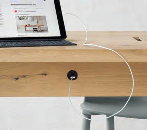
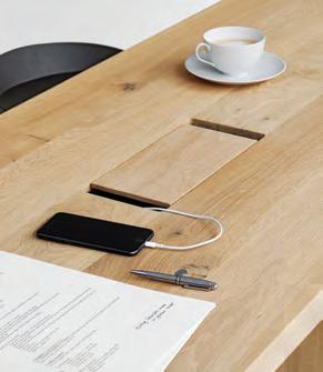
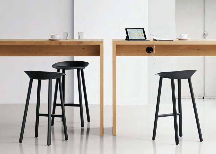
Whether used for collaboration, conferencing or focused work, when paired with BUSY’s ample wire management system, PONTE can accommodate a range of professional behaviours and needs in one sleek, con dent form.
As a customisable cable management system, BUSY o ers designers endless choices of material, dimension, form, colour and nishes to truly make their own mark on their next projects. Supremely functional, BUSY includes wire outlets, channels and conduit components that all recognise Australia’s current certi cation standards, and can be incorporated into any table design from e15’s entire range.
With both PONTE and BUSY, e15 celebrates its human-centric approach. Amplifying the reality of ever-changing end-user demands in an inclusive, welcoming and accessible way, e15’s cable management systems are re-usable and future-proofed against the inbuilt obsolescence of evolving technologies: a de nite value-add that workplaces can enjoy for years to come.
136 INDESIGN LIVING EDGE LIVINGEDGE.COM.AU
PONTE, BUSY and e15’s entire portfolio is distributed in Australia through Living Edge.
indesign annual H e alT HCa R e a nd W el l Bei ng TH
i nk Ta nk
INDESIGN 137 IN DEPTH
IN
DEPTH
shape up
In a new era of recovery and rehabilitation, designers are reconceiving architectural space as a tool for activation.
Words Tracey Ingram Photography Various
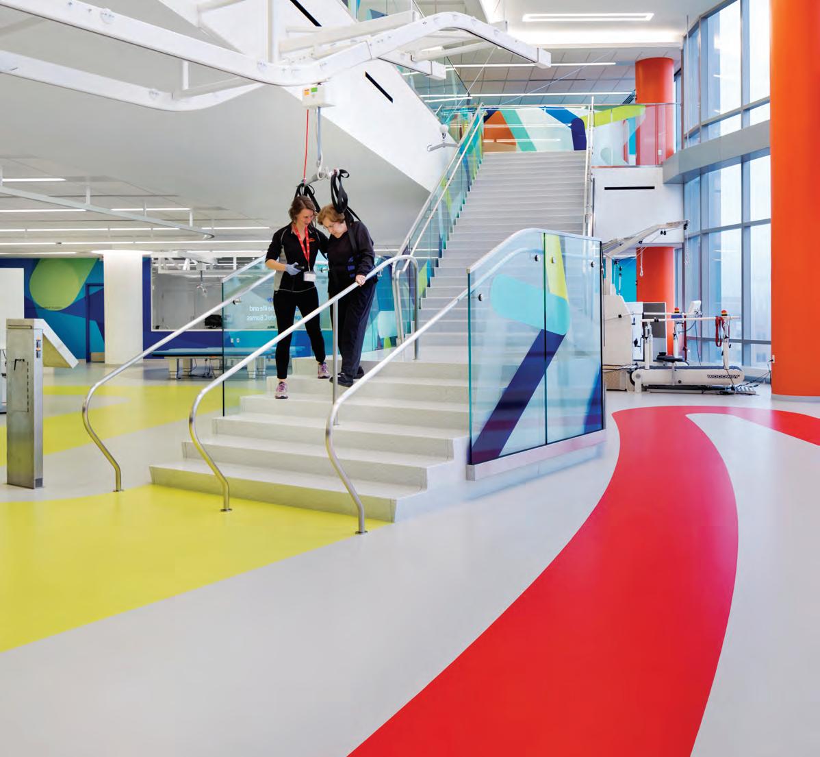
shake down
INDESIGNLIVE.COM 138 IN DEPTH
Sitting is the new smoking. Since entering the modern vernacular some years ago, the phrase has prompted a tectonic shift in the workplace landscape. Height-adjustable desks, bar-style meeting areas and workout equipment are now part and parcel of many contemporary office places – all in the name of fostering wellbeing while working.
But what about spaces in which wellbeing is the primary goal? In hospitals, Ralf Lambie sees the focus shifting from recovery to prevention. The senior creative consultant at Tinker imagineers worked on COACH: the Centre for Overweight Adolescent and Children’s Healthcare in Maastricht, the Netherlands. “The COACH team is convinced that clients will be motivated to exercise once they feel at home and are having fun. We aimed to create a room that would enhance their self-confidence, and would subtly reinforce the importance of exercise and a healthy diet,” he says.
The Tinker team got to the heart of the matter with one straightforward gesture: removing seating from the waiting room. Instead, the space is filled with activities that invite physical engagement from visitors. According to medical staff, says Lambie, “children are running around and feel at ease among the bright colours, playful elements and pavilions, which stimulate them to explore and learn. And accompanying family members are challenged to join in the fun as well. One game even explicitly invites cooperation.”
Community sports complexes are also responding to the increased focus on preventive medicine. Daryl Maguire, Warren and Mahoney principal and sports expert, whose firm was responsible for the QEII Recreation and Sports Centre in Christchurch, New Zealand – notes that such projects are now seen as “wellness centres”, which “suggests a holistic approach to fitness”.
Warren and Mahoney’s brief for QEII was to create a sustainable public building that restores and grows participation in sport in the wider Christchurch community – more people, more active, more often. “Our design encourages participation by placing sport on display and creating a welcoming, vibrant place at the heart of the local community,” says lead architect Alex Head. Adjacent to two
high school playing fields, the building creates a central hub for complementary facilities: sporting, community and recreation. “This centralisation helps to catalyse participation and provides a pathway for school children to thrive in swimming and sports,” says Head. The “pathway” he speaks of is further reinforced by the interior design. Glazing connects the fitness centre and leisure water space – where various activities encourage interaction with water from a young age – to the foyer and community café, bringing energy out into the open.
Chicago’s Shirley Ryan AbilityLab – a design by HDR and Gensler in association with Clive Wilkinson Architects and EGG Office – also encourages its users to get up and moving. A rehabilitation centre for those with complex conditions, the AbilityLab puts clinicians, scientists, innovators and technologists under one roof. “Since rehabilitation is 24/7,” says Amber Wernick of Clive Wilkinson Architects, “all spaces are designed to activate and challenge patients.” Wernick mentions the unique colours and shapes at the end of patient-room corridors, which stimulate exploration and walking practice. Along the way, the rubber flooring is marked in stages so patients can track their progress. Most of the AbilityLabs incorporate invigorating colours, graphics and textures. The top floor of the Think + Speak Lab, on the other hand, is intentionally calming, since many of its patients are recovering from traumatic brain injuries.
The project doesn’t just support recovery, it actually aids it. Perhaps the most explicit example is in the Strength + Endurance Lab, where a staircase serves as both a pathway and a rehabilitation tool. Reminiscent of yet another modern office trope, where elevators are tucked out of sight, and taking the stairs becomes more appealing, the approach signals a shift in the way architects are – and should continue to be – looking at spaces. Instead of serving as a container for tools and equipment, interiors can become tools themselves.
tinker.nl, warrenandmahoney.com, clivewilkinson.com
INDESIGN 139 IN DEPTH
Opposite: A staircase serves as a rehabilitation tool in the Legs + Walking Lab at Shirley Ryan AbilityLab. Page 140: Invigorating colours and graphics feature in the Arms + Hands Lab. Page 141: In the Think + Speak Lab tent pods are used for private consultations, photos: Michael Moran. Page 142-143 : Private consultation pavilions within COACH. Page 144: Tinker imagineers have created a stimulating environment for COACH that seems miles away from the world of hospitals, photos: Mike Bink.
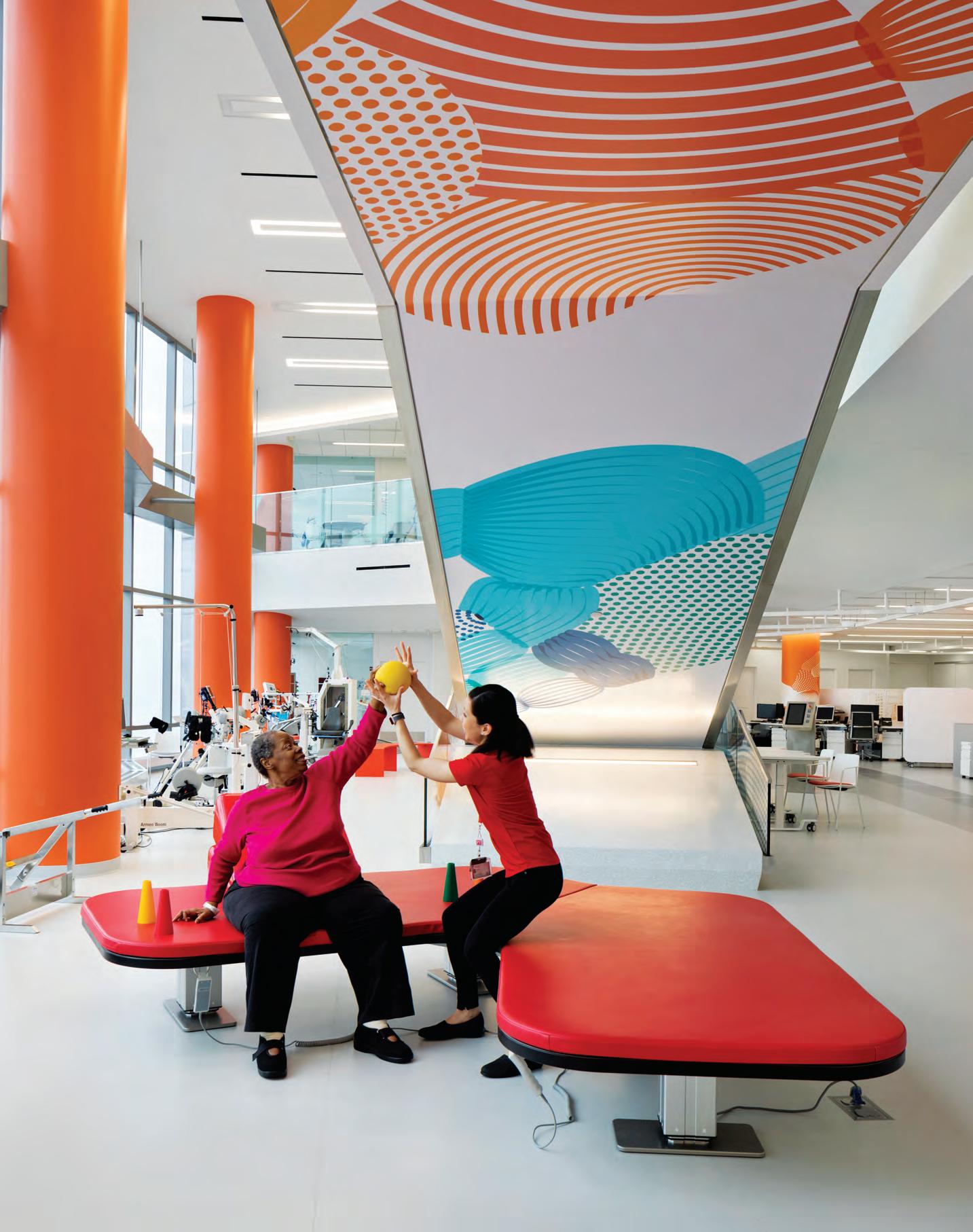
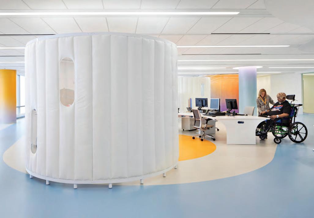
INDESIGN 141 IN DEPTH
“Since rehabilitation is 24/7, all spaces are designed to activate and challenge patients.” Amber Wernick
Pop-Up Pavilions
A cosy and colourful space for a consultation and weighing: these temporary pavilion structures at the Centre for Overweight Adolescent and Children’s Healthcare are scattered around two central squares. The interplay of lines and surfaces conjures the vision of mixed-up playing fields. The pavilions themselves are made from unfinished wood and are fully dismountable.
–
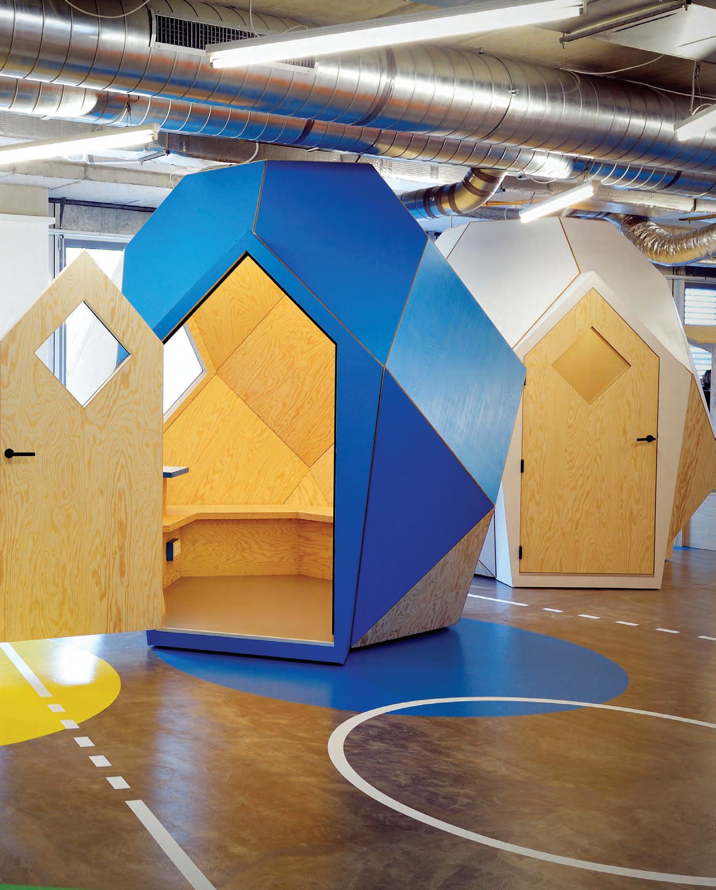
Stretching Mind And Body
In open waiting areas at the Centre for Overweight Adolescent and Children’s Healthcare, Tinker imagineers has produced digital exhibits and handson elements to encourage children and their parents to be active and interactive. Stretching, balancing, climbing and clambering all contribute to making healthy connections in these purpose-built games.
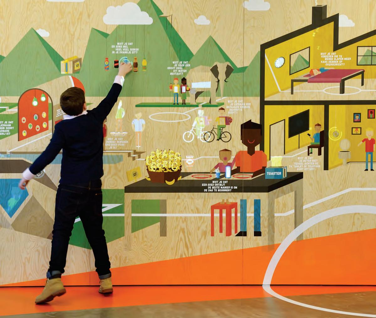
INDESIGNLIVE.COM 144 IN DEPTH
–
Italian for style.


The new STILE tapware collection from Gareth Ashton encapsulates the definition of style across five high-end metallic finishes for the bathroom. Made in Italy, STILE is now available in Australia. Visit an Abey Australia Selection Gallery to immerse yourself in the collection.


VICTORIA Selection Gallery 335 Ferrars St Albert Park Ph: 03 8696 4000 *NEWLY OPENED* WESTERN AUSTRALIA Selection Gallery 12 Sundercombe St Osborne Park Ph: 08 9208 4500 NEW SOUTH WALES Selection Gallery 1E Danks St Waterloo Ph: 02 8572 8500 QUEENSLAND Selection Gallery 94 Petrie Tce Brisbane Ph: 07 3369 4777
Zest
If we’re going to disrupt the aged care sector, who better to bring on the journey than Baby Boomers? Futurist and demographer Bernard Salt believes they have the perfect ‘get up and go’ disposition to make ‘ageing’ all the rage.
For (Later) Life
INDESIGNLIVE.COM 146 IN DEPTH
Words Marg Hearn in conversation with Bernard Salt
Schooled in rock‘n’roll, the Boomers are more professional, more tertiary educated, more active and have less mobility issues than any previous 60s-plus group. “I think Baby Boomers will rail against the concept of an old folks’ home,” Bernard Salt suggests.
The next 25 years will see the number of people over 65 years double as 5 million Baby Boomers “jump into the space” previously occupied by 2.5 million.
“There are a whole lot of Baby Boomers moving into old age, and they will live longer and healthier lives,” says Salt. “We’ve come from the period in history where you worked to the age of 65, then retired and were eligible for the old age pension.” Technically, you were branded ‘old’.
But unlike previous generations, Salt believes the Boomers will not kowtow to age 65 as a trigger for acting, thinking or behaving old. “If you can remain healthy in your 60s and early 70s, there’s a lot of living to be done,” he asserts. “For architects and designers who are sensitive to an ageing community through an architectural lens, this is a good space to be in during the next 20-30 years. It’s really the chance to set a new vision for how life might be lived.”
Six ways designers could revolutionise ageing Australia
Salt says:
Ageing is a spectrum, not a pigeonhole
Use of the term ‘aged care’ needs to shift. It’s ageist and has negative connotations. It will be commandeered by the politically correct and reinvented. We need to regard what’s currently dubbed ‘aged care’ as an industry that is far more nuanced than it is. Just as there are about five different segments in the first 25 years of life – infancy, childhood, pre-teen, teen, young adult and adult – for Boomers, the concept of ageing will become like a spectrum.
Conceptualise ageing as a series of
doors
The Australian aged care industry lumps everyone over 65 years into one big block. From a different standpoint, what we now call old age, could be broken into three main phases that people move through, like a series of doors.
Designers in the residential and senior years markets would ideally be thinking about homes that adapt for each stage. Phase one kicks in around 58 years and runs through to 68 years with people typically city-based and more working than retired.
In phase two, 68-78 years, people might be more retired than working. Lifestyle – sea or tree change and visiting grandchildren starts to offset the commercial side. Beyond 78 years, phase three is often lived alone, when a partner has passed away and children are living globally. Being able to connect through technology, having companion pets, religious affiliation or spirituality, home security, accessible spaces and mobility support will be significant.
Cultivate non-ageist workplaces
As more people in the older bracket remain in the workforce, avoid pigeonholing by age group. We’re talking people in their 60s and 70s who may not be the CEO or managing director, but are more likely to be ‘special interest workers’; have them rub shoulders with people in their 30s and 40s. Communal spaces and kitchens where people can collaborate, engage, and bump into other staff helps ensure senior workers are part and parcel of the workflow and the office comings and goings. Ergonomic sit-to-stand desks and accessible design will need more attention.
Connecting community
Being more active and engaged in exercise than their predecessors, could see Baby Boomers push demand in the wellness sector. That could mean exercise facilities – leaning more towards pilates and yoga than gyms. It could also mean spaces where men’s groups or special interest groups can meet, and where people remain connected for other friendship and hobby groups. Open and flexible public amenities, largely provided by local councils, could be used for activities such as card games at one end, with more private spaces for yoga at the other.
Think relationships
As people age, our thinking changes. Relationships and connections become increasingly important. How older people might be interspersed with and part of the broader community will be one of the great challenges. There will be a market for five star, hotel-style residential living – currently aged care facilities – where you can buy in everything from room service to medical attention and nursing care. I don’t anticipate that people will want to be closeted away in a little enclave with ‘all’ old people.
Combat loneliness
Loneliness and social isolation is going to be a major issue, when one partner is deceased and children are based globally. Could we see the emergence of almost commune-type, collaborative housing for those aged 65-80 years? Three or four individuals might live together, each with their own kitchenette, but have a sense of privacy yet shared communal spaces. Co-housing, cohabitation or companion relationships where people live together in a communal sense, but not in an intimate way, while still having privacy – how might that work? I’m not sure anyone has come up with the right model yet.
Bernard Salt is a futurist who analyses demographic and social change to interpret how society and business might evolve. He is managing director of The Demographics Group, which assists business, government and the community in navigating demographic and social change. thedemographicsgroup.com.au
INDESIGN 147 IN DEPTH
P: 02 9678 9540
nationalsignbuild.com.au
sales@nationalsignbuild.com.au
DELIVERING POWERFUL BRAND AWARENESS THROUGH SIGNAGE
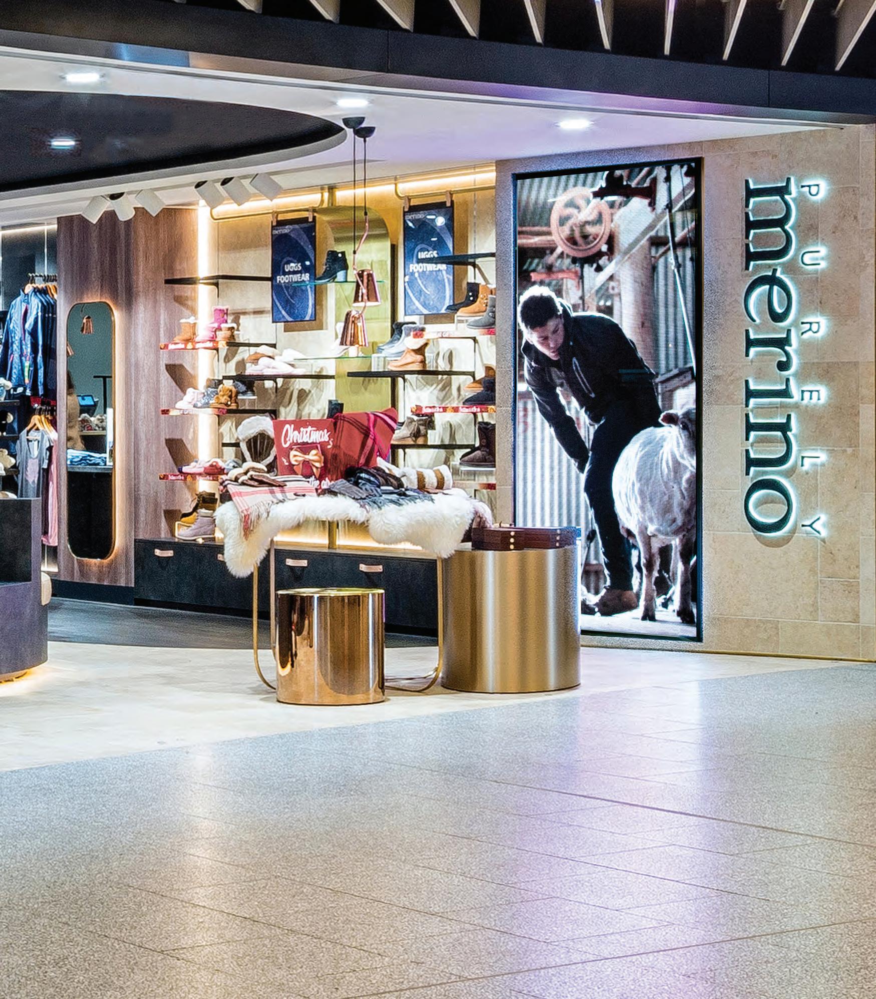
Ageing Vertically
It’s no secret that Australia, like all developed countries, is entering an era of ageing. In 25 years, one in four Australians will be over 65. One of the factors leading to this is our ever-increasing life expectancy. It has risen from 71 in 1976 to 82 in 2016, and is anticipated to be at 92 by 2040. A third of our life will be experienced as a senior citizen. And the majority of it in relatively good health. That’s thanks to medicinal and technological advancements as well as a greater importance put on our health and wellbeing – prevention rather than cure. So, what will that period of our life look like?
The emerging demographic is likely to be assisting with the grandchildren. They’re also likely to be continuing to work in one way or another. They’re not so much looking for a sea change or a tree change, but to maintain the quality of life they are used to, in the places they are used to, around their circle of friends and family, close to local cafés, fitness centres, sporting clubs and hobbies, and tailored assistance in the times and scenarios where they require it as they age in place.
From family to community
A few years ago, we saw a significant shift in the apartment market. At the release events for Plus Architecture’s apartment developments, we observed people ^ walking up to the board and reserving two or three apartments at a time, directly next to one other. And it happened frequently.
Most of the time it was the same scenario: couples looking to downsize from their family home in the nearby area to a more manageable apartment, allowing them more time to partake in the things most important to them. Selling their house and downsizing to unlock their equity would significantly increase their ability to maintain their lifestyle.
This new wave of seniors is used to being up in the air, they’re used to higher density living and are looking for a hotel-like experience to which they aspired while growing up.
From isolation to integration
With the move to ‘ageing in place’, we move away from a broadacre village typology. It simply is not economically viable due to the premium land values of urban environments. The only way is up. The developments that really flourish integrate within communities
and mirror its diversity, offering a range of housing suited for students, singles and couples, families and empty nesters, combined with supporting development for child, aged and memory care.
We must combat isolation with integration, and we are seeing that in community-driven developments that are inclusive, the ground plane is opened up, as opposed to the outdated approach of shutting others out as a security measure. It’s 2018, and we can be secure and integrated simultaneously.
From innovation to normalisation
Community-driven, vertically-integrated senior living developments are a progressive and innovative solution for inclusive and vibrant environments for the third stage of our lives. We need more of them, and they need to be economically viable for us to see more. In New Zealand, the Retirement Village Association has put forward several motions to planning authorities to allow senior living developments to prosper. These include greater site area percentages, fewer setbacks and parking requirements, which allow them to compete with residential developments. Planning authorities should seriously consider similar allowances in Australia, as well as potentially giving extra height allowances or earmarking a percentage of lots for senior living in key areas.
It is not an illness to age. It should be celebrated, revered and positively anticipated. With attitudinal change and careful planning and consideration we can create that future – the new normal. When these seniors were growing up, flying by airplane was an experience reserved only for the elite and now it is a common service for the everyday person. The hope is that quality senior living developments and ageing in place will follow suit. And the only way to achieve that is by going up.
Nick Antoniou is an associate and head of communities at Plus Architecture. plusarchitecture.com.au
INDESIGN 149 IN DEPTH
^ The apartment market had been tailored towards investors, not for people who wanted to buy and live in their own apartment. The investor product wasn’t right for owner-occupiers’ demands and that’s where we saw the shift: combining two one-bed apartments to make a larger two-bedder, for example. An investment for family to live in until they out-grew it. It would then take on a second life as the downsizers’ main residence – all the convenience of apartment living but with added space.
Words Nick Antoniou
Why the future of senior living is up in the air.

AUSTRALIA | NEW ZEALAND | HONG KONG CHINA | JAPAN | SINGAPORE | INDIA www.colebrookbossonsaunders.com
When the fight or flight instinct kicks in, there’s no time to read a sign. Recognising that many visitors to hospitals and emergency departments are stressed or panicked, these designers have used artistic and architectural mechanisms to navigate patients to their destination.
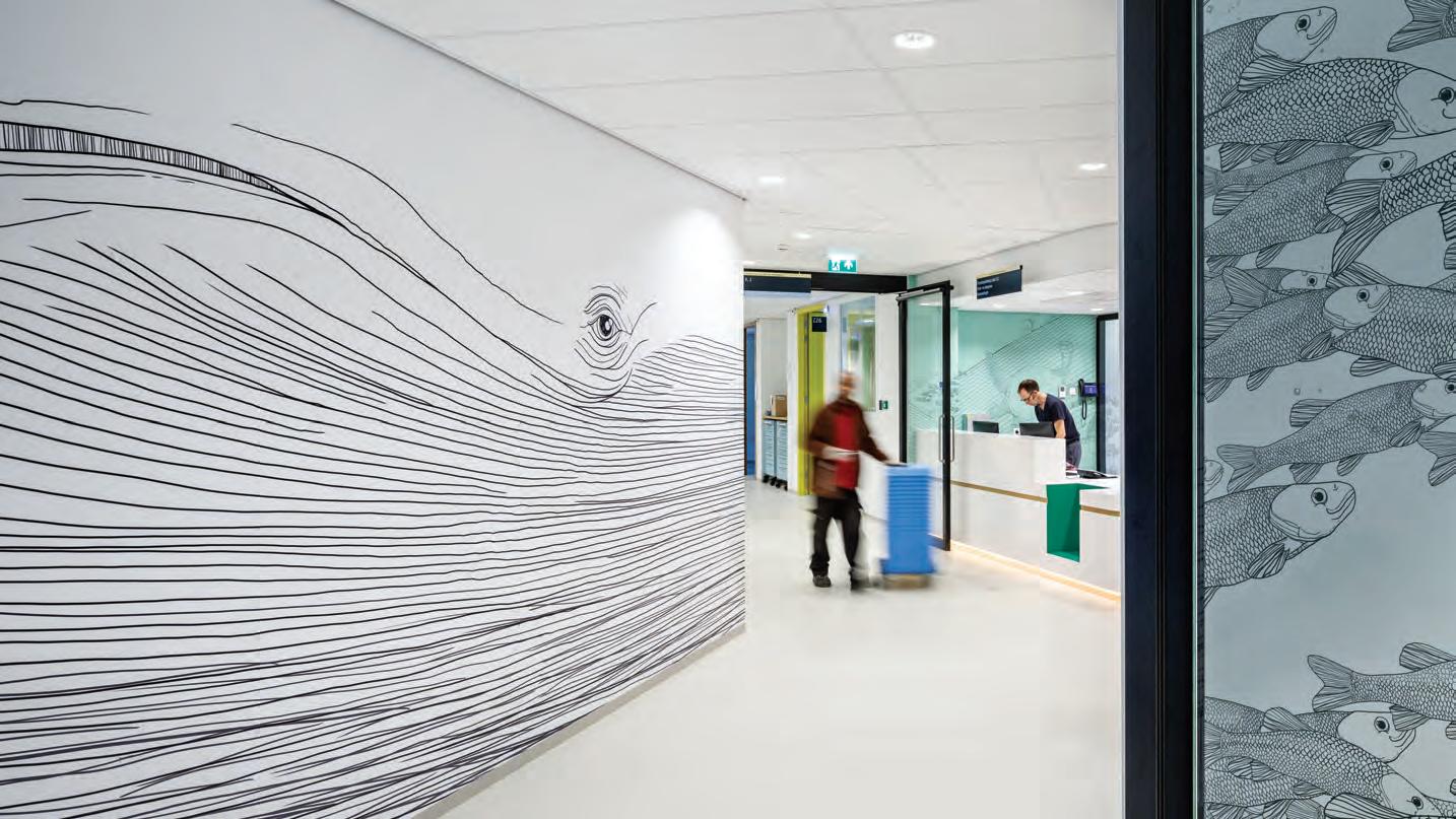
in times of great stress
INDESIGN 151 IN DEPTH
Words Tracey Ingram Photography Various
Navigating a labyrinthine building can be stressful enough, let alone in a moment of fragility. In our current era of information overload, how can designers help hospital users know where to go – and where not to go – without exacerbating an already anxious adventure?
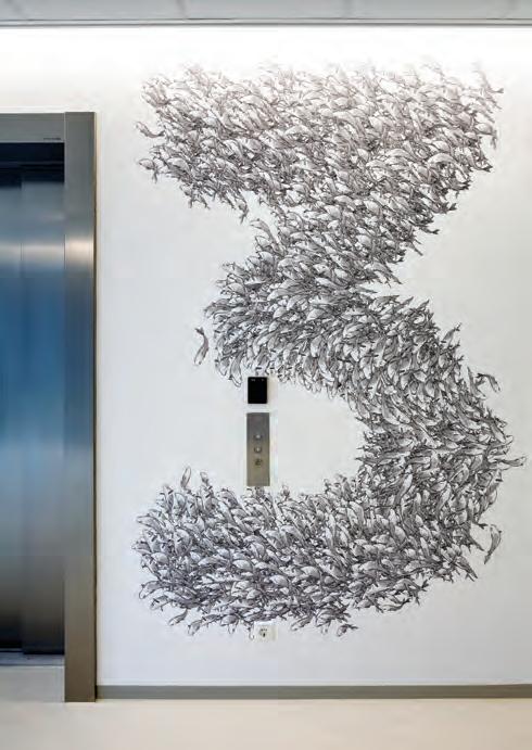
Topping the list of stressful hospital scenarios is a trip to the emergency department, which is “often someone’s first visit to a healthcare facility”, says Tonya Hinde of Billard Leece Partnership (BLP). She and colleague Mark Mitchell are explaining why their design for Austin Health Short Stay Unit in Melbourne’s Heidelberg treats the building as a signpost. The project is an extension to an existing emergency department that was notoriously difficult to locate. “Since people are often quite stressed when going there,” says Mitchell, “we wanted to make sure they could easily find the front door.” BLP achieved its goal with animated arrow-like panels and lighting, even more evident by night. The next step was to implement intuitive wayfinding inside. Aware that natural light plays a vital yet subtle role in spatial navigation, BLP established sweeping panoramic views from within to help users orient themselves via landmarks, and incorporated skylights on the south side that abuts other buildings. “People within the unit can remain in tune with what’s happening outside,” says Mitchell, noting that balanced circadian rhythms are important for patients and shift workers alike – especially since ‘accidents and emergency’ is a 24/7 affair.
Often overused in institutional architecture, signage can become problematic in healthcare environments where visitors may be visually or lingually impaired, and where technology is changing so rapidly that what’s here today might not be there tomorrow. Instead, BLP gave colours and patterns a definitive role while basing its scheme on what Mitchell refers to as “areas of intensity versus areas of nothingness.” People in transit, for instance, might encounter only blank walls – no distractions – whereas clusters of furniture and lighting can act as destination points.
Azad Chichmanian of Neuf architect(e)s agrees that wayfinding should be intuitive and rely as little as possible on signage. He was the partner in charge of Canada’s Centre Hospitalier de l’Université de Montréal (CHUM), conceived together with CannonDesign. Citing stress and the complexity of hospital buildings as factors, Jocelyn Stroupe of CannonDesign says, “Wayfinding can be more difficult and confusing than it would be for a normal, healthy population. People may not pay attention to standard cues; often they don’t even see signs in times of stress.”
At CHUM, architectural elements become guides. Daylight helps to orient visitors, while bold colours – visible from afar – differentiate departments. Aware that colour isn’t a global language, the designers articulated programs into volumes. “The changes of plane mean you see the volume before you see colour,” says Chichmanian, “which helps visitors create a cognitive map of the various spaces.”
INDESIGNLIVE.COM 152 IN DEPTH
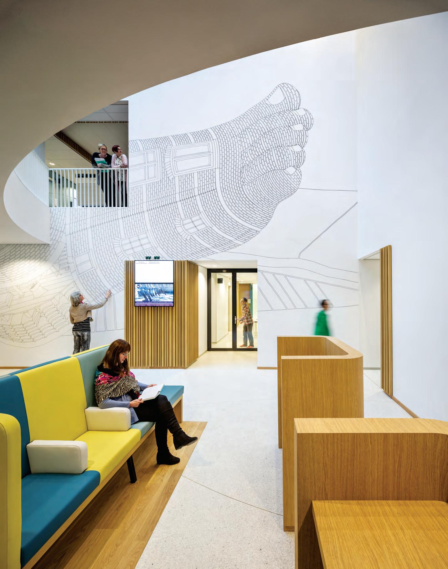
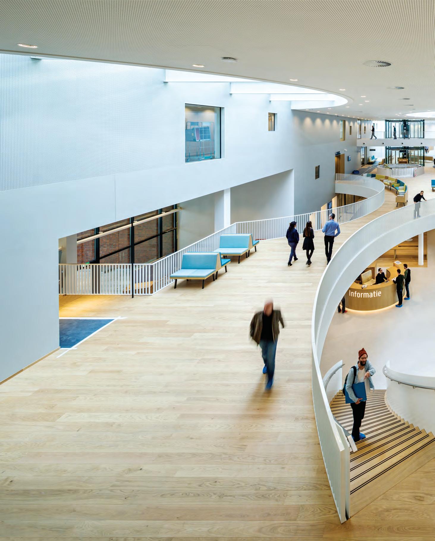
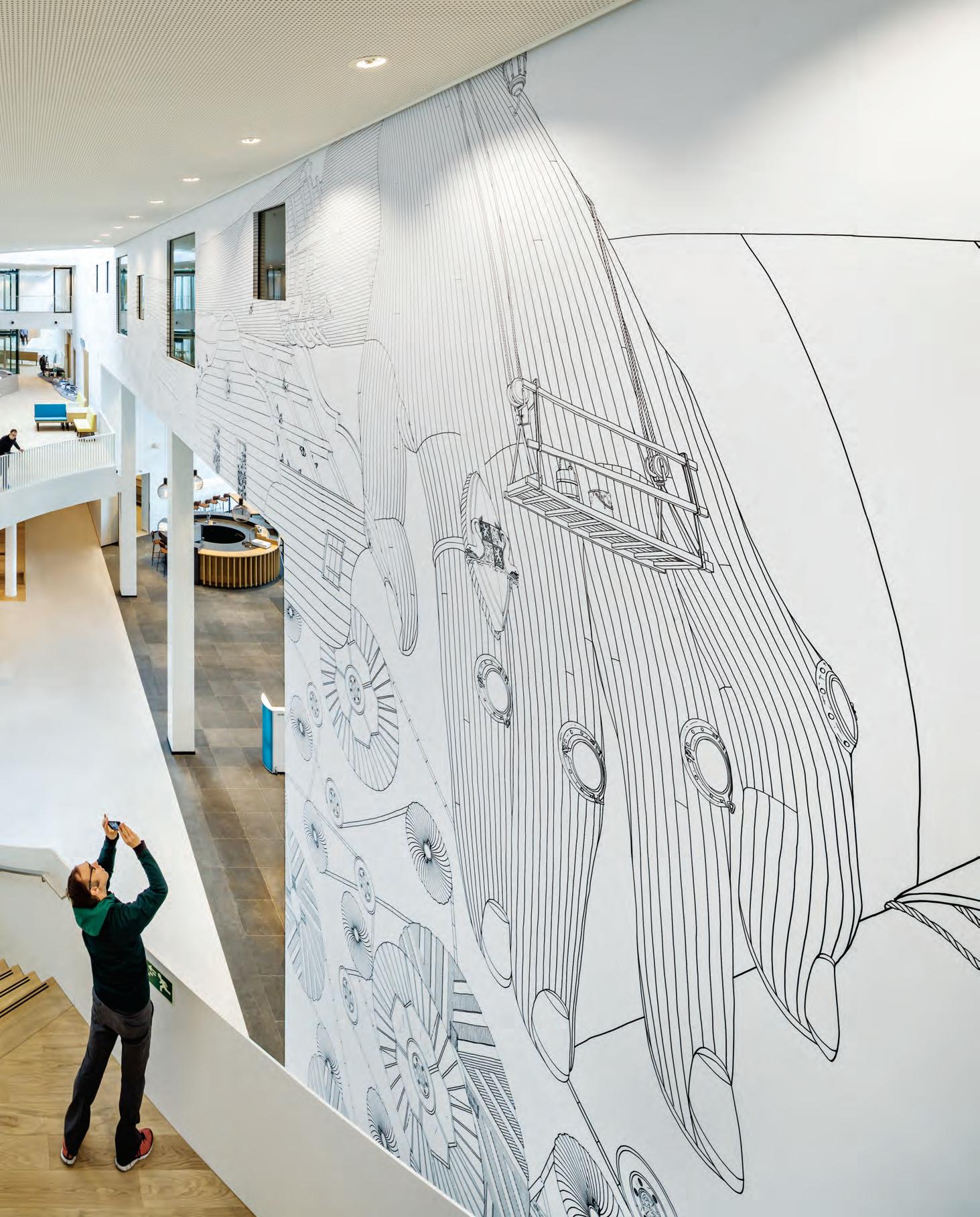
Mapping Cognitive Journeys
At Canada’s Centre Hospitalier de l’Université de Montréal, Neuf architect(e)s with CannonDesign use architectural elements like volume, as well as public art works, to help visitors create a cognitive map of the spaces. The team achieved its ambitious vision through innovative design techniques including parametric design on the building envelope and 3D-printed models.
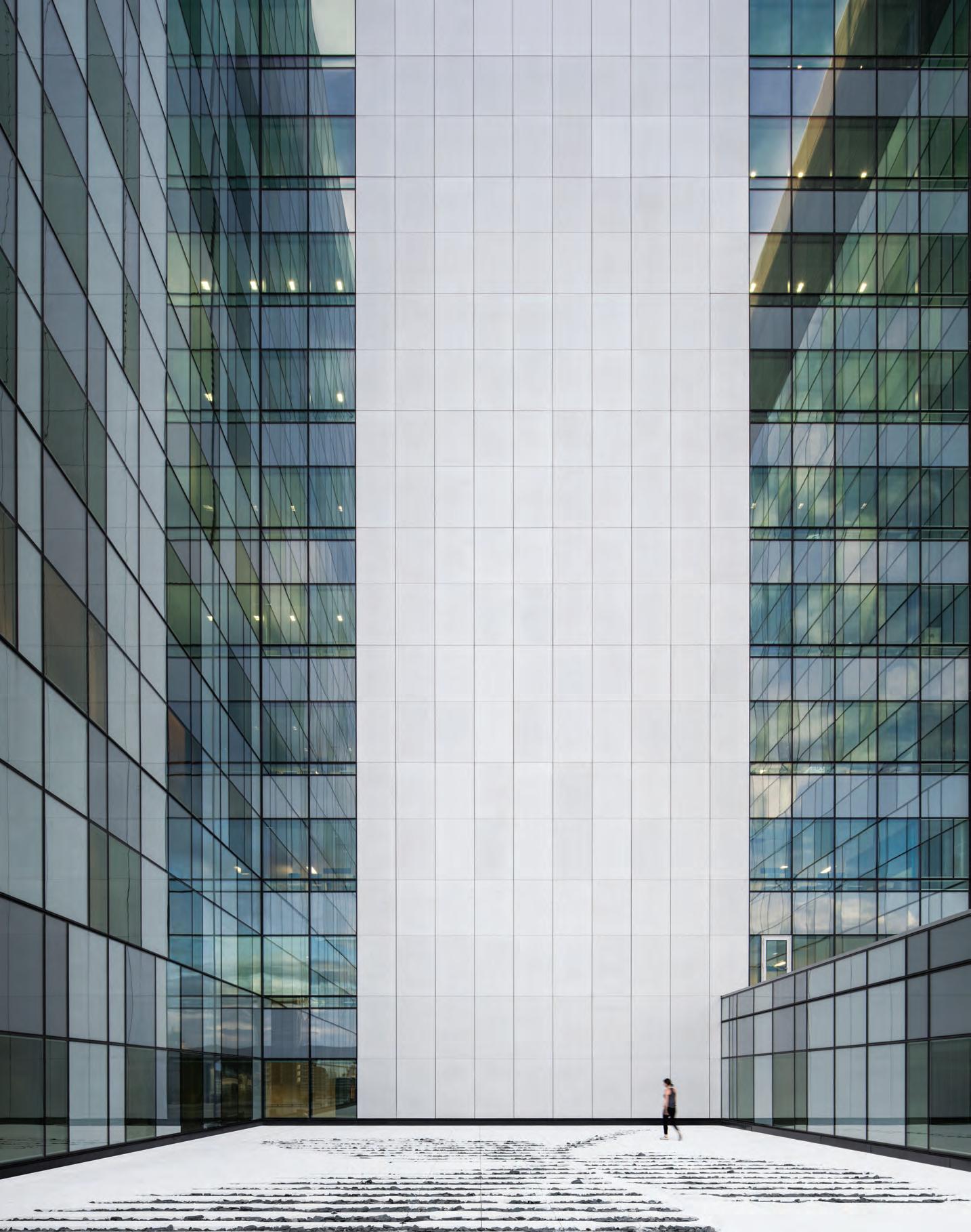
–
What sets CHUM apart from others is its focus on large public art pieces. “Both a distraction and a wayfinding tool,” says Chichmanian. “The art is significant, memorable. People will know where they are when they return to a certain piece.” All works in the main circulation area are therefore located at decision points, such as junctions.
Silo Agency’s Rogier Coopmans believes in the importance of the customer journey, which is why a trip to Zaans Medical Centre in the Netherlands begins before patients even enter the facility. Mecanoo architects brought in Silo to design the spatial identity and wayfinding at a very early stage in the project – “a key factor in making sure they aren’t simply additional layers in a building”, according to Coopmans. Invitations arrive at visitors’ homes, complete with imagery and information to help them reach their destination. Upon arrival at the centre, patients scan themselves in and receive a day ticket that details such data as appointments and route. The latter is clearly signposted throughout the building. Visitors who don’t feel like reading, or are less able to do so, can follow a pictogram – a Dutch tulip, for example – to their destination.
Silo’s process involved defining the best positions to help patients find their way, in a natural way. Putting themselves into users’ shoes, they “walked” through a digital model to get a feel for the surroundings. Running through every scenario for visiting different departments – from entrance to journey’s end – they assessed not only what visitors would think along the way but also when they might appreciate something else. A coffee, for instance, or a specific view. “It’s the same story after a visit. Instructing people how to leave a building is often forgotten.”
While they did include some child-specific wayfinding elements at a lower eye level, Silo specifically chose a straightforward approach. “Wayfinding can of course be more subtly integrated into architecture. Walls, ceilings: it’s all possible. But those methods should be employed in buildings such as schools – places that can use a bit of fun. For hospitals, this is serious business. You don’t want to mess with wayfinding; you can save lives if you do it well.”
blp.com.au, cannondesign.com, neufarchitectes.com, siloagency.com
INDESIGN 157 IN DEPTH
Page 151-155: At Zaans Medical Centre, visitors can follow pictograms to their destination, the designers tested every wayfinding scenario using a digital walk-through, photos: © Thijs Wolzak. Opposite and above: At CHUM, volume, colour and artwork help to create an intuitive wayfinding experience, photo: Adrien Williams. Page 158: Areas of intensity contrast areas of nothingness in BLP’s Austin Health Short Stay Unit, photo: Ian Ten Seldam.
INDESIGNLIVE.COM 158 IN DEPTH
“Aware that natural light plays a vital yet subtle role in spatial navigation, BLP established sweeping panoramic views from within to help users orient themselves via landmarks.”
Would You Work There?
Why hospitals need to be designed for staff as well as patients.
Words Michaela Sheahan
Hospital design is so centred on the needs of its patients that in some instances, safe and effective workplace design is not given the consideration it deserves. The underestimated value of staff may be more significant than hospital management perceives. But this can be rectified with a renewed focus on the hospital as a workplace, as well as a place to treat patients.
As with all workplaces, people are the greatest asset, and a hospital is no different. Without appropriately skilled and dedicated staff, a hospital cannot provide care for those who depend on it. Health systems around the world are grappling with persistent issues of staff burnout, fatigue and stress, which have considerable implications for administrators that are seeking to attract and retain a skilled workforce.
According to the Australian Institute of Health and Welfare, Australian hospitals employed more than 400,000 staff across 1300 private and public hospitals in 2016. While 10 million acute and non-acute hospitalised patients spent an average of five-and-a-half days in hospital, a full-time staff member, on the other hand, would have spent roughly 241 days in the same space. Hospital design matters as much to the staff as it does to the patients.
In 2015, Hassell embarked on a two year research partnership with the University of Melbourne Health Systems and Workforce Unit, and the Australian Commonwealth Department of Industry to explore the role of design in two different hospital issues: the attraction and retention of nurses, and staff communication in emergency departments. These studies contribute to a growing body of research about the implications of limited or ineffective space for staff to perform a full range of daily tasks – not just bedside care.
The story that emerged from staff at several public hospitals in Australia and the United Kingdom was that workplace design demonstrates the value that hospital administrators place on their employees. So when staff shortages and employee health are ongoing issues, managers would do well to listen when their staff say things like, “I wouldn’t keep a ferret in a box without a window, so why would you have an employee in a room without a window?”
Hospital design is a complex process that involves integrating the needs of a broad range of stakeholders with competing demands. As a consequence, space is a particularly valuable commodity. Logically and inevitably, patient demands take priority in the planning of any health facility. The design challenge is to create
space and efficiencies both within and beyond the patient areas that enable staff to undertake paperwork, meetings and hand-overs, while also providing social spaces to store belongings, rest, talk and eat.
Limited storage and circulation space, inadequate lighting, poor privacy, and ad hoc facility maintenance affect staff safety, comfort and efficiency. These are aspects of a workplace that employees in other sectors take for granted, yet for some health workers, the provision of something as simple as a tea room or a space for confidential conversations is not guaranteed.
Borrowing design ideas from other sectors is not new, but it is a growing phenomenon. And it can improve the working lives of employees in hospitals if clients and designers are willing to think laterally about how employees use their time and space. We often find that healthcare clients are uncomfortable applying ideas from other workplace models because hospitals have specific safety requirements and systematic processes that are fundamental to a high-performance healthcare environment. But in all workplaces there is a need to meet with colleagues, to stop for rest and meal breaks, and to attend to administrative tasks.
Lessons from the commercial office sector apply – just in a different setting, with a different emphasis. For example, our emergency department research discovered that healthcare staff craved spaces for confidential conversations, uninterrupted by patients. This prompted discussions on what elements from a commercial setting could work successfully in a hospital scenario, such as small booths or niches.
With so much research available about workplace productivity and behavioural psychology, it is incumbent upon designers to apply the lessons learnt from other sectors, while maintaining a sensitivity to the particular requirements of healthcare. Not all the new ideas implemented in other workplaces will readily translate into a hospital setting. But while the healthcare sector continues to face workforce shortages, administrators must actively pursue workplace strategies to address the shortcomings in staff facilities. And in so doing, they are demonstrating how highly valued healthcare staff are.
IN DEPTH
Michaela is a researcher in the knowledge and strategy team at Hassell. hassellstudio.com
INDESIGN 159 IN DEPTH
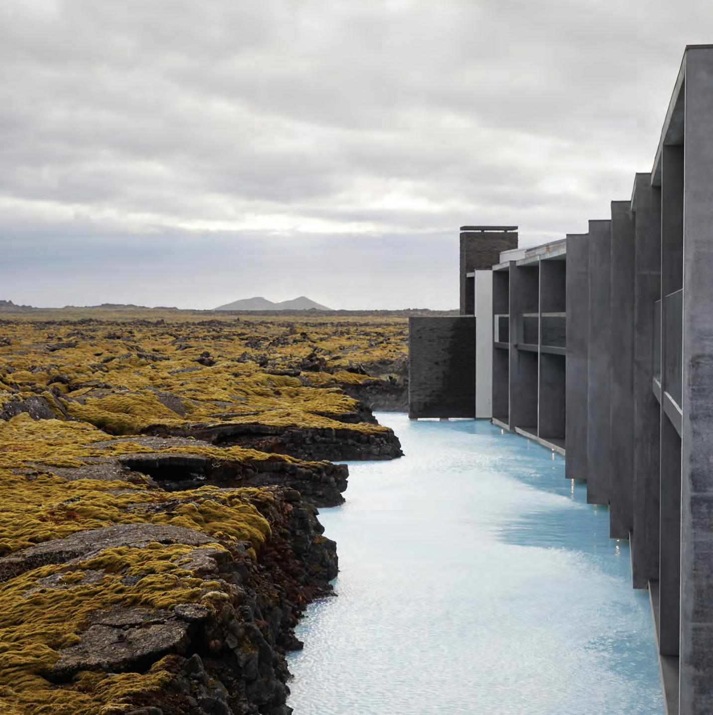
INDESIGNLIVE.COM 160 IN DEPTH
human vs. nature
To create the most soothing wellness and healthcare experiences, designers are delving into biophilia: access to and imitation of nature, which is purported to reduce stress and aid recuperation. But as technology becomes an increasingly important factor in today’s spaces, how can these two seemingly opposite forces – one physically natural, the other synthetically digital – find harmony?
Richard Does of DesignInc and Sigurdur Thorsteinsson of Design Group Italia (DGI) believe the task is made easier by the tendency towards smaller, subtler and more integrated technologies (let’s forget the iPhone X for a moment). Both DesignInc and DGI have worked on recent biophilic health-related projects; the latter responsible for the experiential design of The Retreat Hotel, a new venue nestled into the natural lava formations of Iceland’s Blue Lagoon. Together with the building’s architects, Basalt, DGI also designed the interiors.
“Blue Lagoon epitomises the relationship between the natural and the man-made,” says Thorsteinsson. The geothermal spa is located about 45 minutes drive from Reykjavik. The lagoon may appear to be one of Iceland’s many organically formed hot springs, but its mineralrich water – which is reputedly beneficial for sufferers of skin ailments – actually arrives from a nearby geothermal power plant, Svartsengi.
DGI relied on biophilia to “visually soothe the nerves”, says Thorsteinsson. He’s referring to an interior palette derived entirely from the surroundings, whose colours blend with the real landscape that penetrates the space through sweeping windows. And – since the place is a spa, after all – there are various ways to physically interact with the environment, from bathing to skincare rituals using ingredients harvested from the water. He says: “A friend told me his blood pressure immediately drops when he steps inside the building.”
The design team also wanted to honour Blue Lagoon’s technologyreliant origins; you couldn’t drill the holes to reach the revered water without it. “The building wasn’t meant to disappear; that would be imitating nature. We wanted a distinctive man-made object in sync with nature.” What does disappear, though, is the technology employed to enhance The Retreat’s biophilic elements. “We initially thought technology would play a much more dominant role, but in the end we downgraded and concealed it.” Save for some decorative features, all lighting, for example, is hidden. Iceland’s sunlight has a warmer-than-average colour temperature, Thorsteinsson notes.
Emulating nature’s golden hue, DGI worked with Liska lighting design to conceive a system that sits behind each bedroom’s acoustic silencing ceiling: a man-made take on Iceland’s sound-dampening, moss-blanketed landscape. When the light is switched off, the source is invisible. Operable manually or via a tablet, the system makes it possible to achieve accurate shifting colour temperatures from sunrise to sunset. “You could also introduce other colours, but that wasn’t the aim. This project isn’t about technology for technology’s sake; it’s about the feeling you get from technology.”
While The Retreat capitalises on nature’s beauty, DesignInc’s Royal Adelaide Hospital (RAH) is planned around landscaped courtyards. “Biophilic design is important for achieving patient wellbeing,” says Does. “A healthy environment assists in a faster recovery.” He believes the need for biophilic design will only increase as cities become denser and green space becomes a premium. “It’s important that architecture extends the landscape into the building’s interiors.”
RAH reportedly tops the Australian charts in sustainability and technological innovation. While some developments are conspicuous –as a patient, it’s hard to miss a robot delivering your food, for example – Does says since “advancements are often invisible to the public eye, it’s important for designers to visually interpret biophilia in the application of shape, texture and sunlight. RAH is conceptualised as a park within a hospital. This theme of nature permeates every aspect of design throughout the hospital and its landscape, be it material, pattern, image or form.”
Thorsteinsson, meanwhile, sees a lack of forethought about how technology is integrated into interiors. “In the early phases of a project, technologists and engineers often run the show. Every discussion becomes about tech. Interiors should be about humans, not tech. Things go wrong when supporting roles try to take the lead. Technology has advanced so quickly; you can do almost anything you want. That’s when things become difficult. People don’t know what to do with it. That’s the phase we’re in now. We need humanists to guide how technology should be applied.”
designinc.com.au, designgroupitalia.com
INDESIGN 161 IN DEPTH
As human-centred design comes head-to-head with technology, two architectural firms are splicing biophilia and digital innovation to augment a modern healthcare and wellbeing experience.
Words Tracey Ingram Photography Various
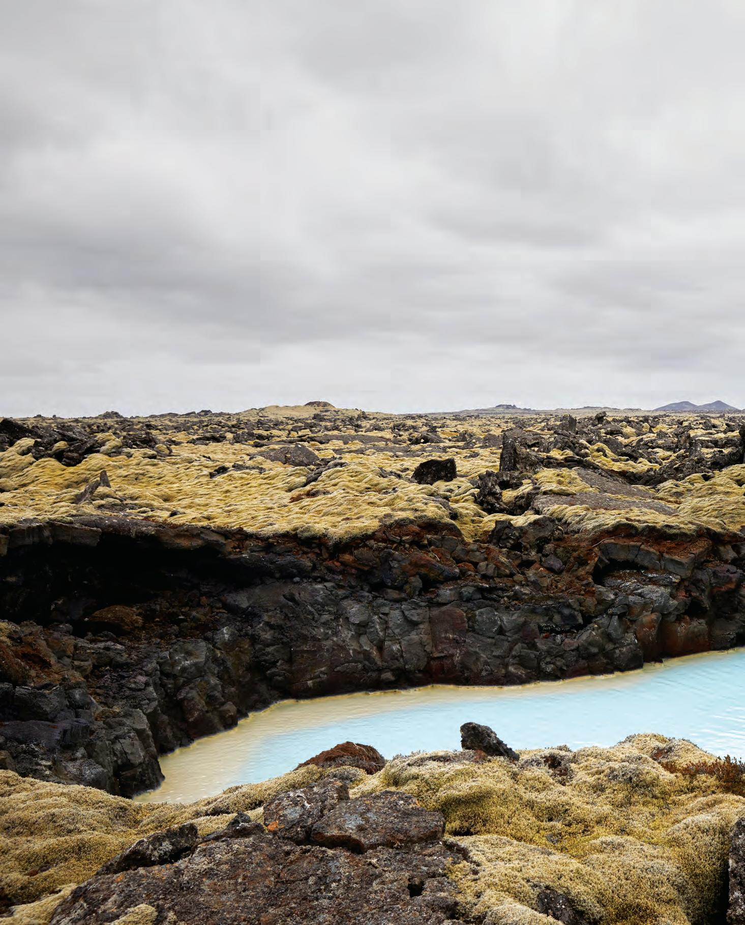
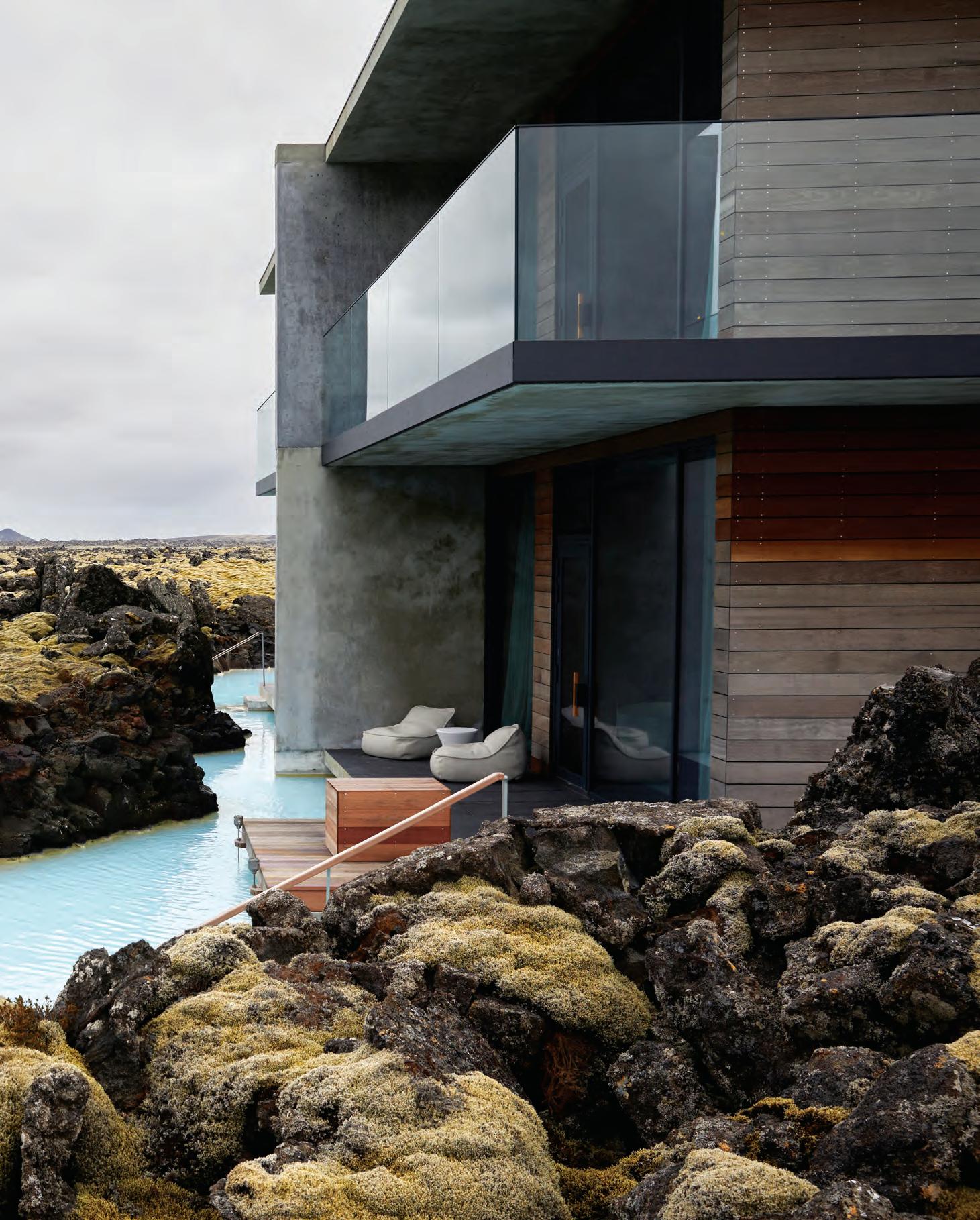
Natural Inclinations
The Royal Adelaide Hospital’s entry cloister is defined by a tree-inspired steel structure and geometric leaf pattern, which creates a dappled shadow onto the stone floor. Within the cloister are organically shaped concrete and timber seats that protrude from the floor like tree roots, while the reception desk is inspired by a fallen tree trunk or a crawling root.
INDESIGNLIVE.COM 164 IN DEPTH
–
Page 160-163: The Retreat Hotel takes its inspiration from its mossy, water-steeped landscape, photos: Blue Lagoon Iceland.
Above: The entry cloister at Royal Adelaide Hospital, photo: Phil Handforth. Opposite: Facade graphics for Royal Adelaide Hospital are by artists Deb Jones, Christine Cholewa and Rachel Harri, photo: Sandor Duzs.
Tap To Treat
Ours is an age of on-demand everything. Armed with smartphones, our portals to the great wide world, we can order a ride, a meal, a new sofa. We can stream whatever films we choose right into our living rooms. And therein lies the rub: we’re spoiled for choice. That demand for instant gratification is pervading every industry. If it’s possible to request delivery of a single crepe to your innercity office (a true story from a Deliveroo cycle courier), why can’t healthcare come to you, too?
“Patients have become consumers,” writes Bonny Slater in Uniting Healthcare and Community: What Healthcare Customers Crave (published via gensleron.com, 6 February 2017). Slater is a senior interior designer at Gensler and designer of Unity Health Care, the largest network of community health centres in Washington D.C. “Only the healthcare providers who understand what their patients really want will win their loyalty. Today’s consumer market is about catering to niche groups, and the companies that succeed here achieve cult-like brand loyalty.”
While many people may not think of healthcare in terms of branding, it’s true: it’s a business. And as is the case for many successful businesses, convenience often wins. At the extreme end of the spectrum are concepts like the Aim platform by Seattle-based Artefact studio. Here, Artefact proposes a self-driving mobile health clinic that travels to patients’ houses. The vehicle is part of an integrated chain between homes and clinical environments. Tapping into the rise in personal data-tracking services – devices like the Apple Watch that allow you to monitor everything from sleep patterns to activity levels – Aim utilises a mobile app and a set of personal devices to observe a user’s health.
While such systems would give a degree of control back to patients, helping them to play a more active role in their health journey, is there a risk that they become too involved? Remember we’re dealing with complex data here – information the majority of the general public doesn’t understand. Any interface that shares vital healthrelated data with patients should prompt urgency in emergencies and reassurance in benign situations.
Lighter apps (that is, apps that are more lightweight companions to experience) already do – and will continue to – play a part in supporting discharged patients and streamlining services in the industry. Experience design and innovation agency, YML, foresees solutions that remind recovering patients to take their medication or to complete a set of rehabilitation exercises. Users could also monitor and record side effects: data that could be relayed to healthcare providers. Meanwhile, Capsule in New York City (additional cities are currently on the company’s radar) is offering an alternative to standing in line at a pharmacy. Capsule’s app allows clients to chat with a pharmacist and to order prescriptions directly to their doors. Technology should essentially make life easier, particularly in times of ‘dis-ease’. And while digital natives may feel liberated by app-driven, automated healthcare options, others – particularly the older generation – may still feel more confident with a human touch. But when the former demographic outnumbers the latter, perhaps technology-based systems will outweigh bricks-and-mortar healthcare models.
INDESIGNLIVE.COM 166 IN DEPTH
is a freelance design writer and
Tracey Ingram
editor, and editor-atlarge for FRAME magazine.
Words Tracey Ingram
In which the gig economy comes to personal healthcare.
The
Room By Pattern Studio
Guests can choose to stay in any of the 39 individually designed rooms by Amber Road, Pattern Studio, The World is Round and Willis Sheargold
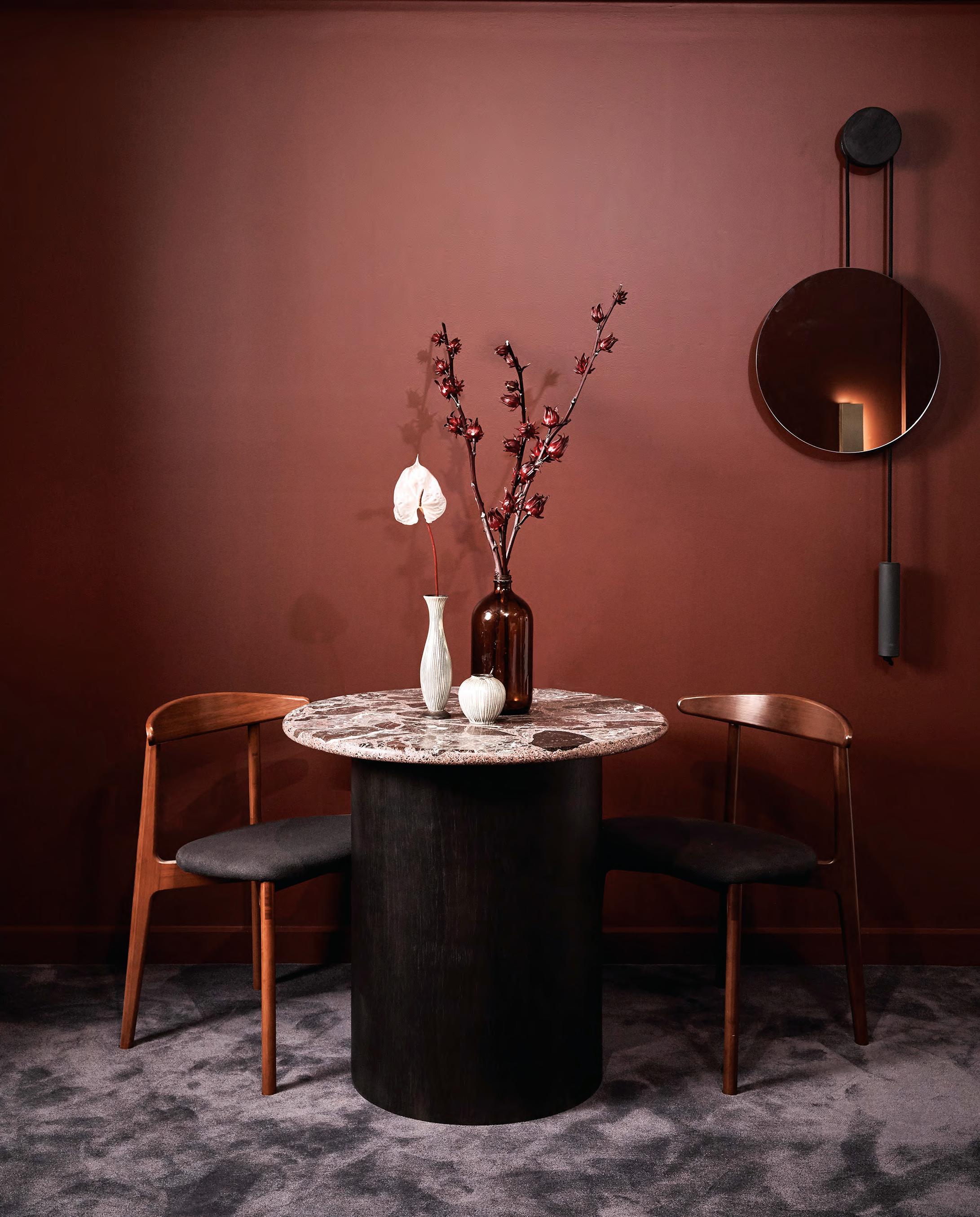
Joni
Sydney’s first custom designed hotel Image credit: Terence Chin Choose Different
Collectionisthotel.com.au
Get INspired
Indesign is for creative professionals – aspiring and established – hungry to continue the ideas and thought leadership that inform the best projects, products and practices in the Indo-Pacific region.
Indesign looks for the point and purpose of everything in design – exploring what we do, how we do it, and why. It is the only place you’ll find clever, provocative and insightful conversations with the design industry.
Indesign Our Supporters
It’s thanks to the support of our industry BFFs – that is, our valued advertisers – that we are 75 issues strong.
We like to symbolise our through the magazine and online, to acknowledge the valued partners with whom we work closely, every day. We thank them for their support and sharing in our passion for architecture and design in the Indo-Pacific region.
INDESIGNLIVE.COM 168 051, 145 Abey abey.com.au 073 Anaesthetic anaestheticdesign.com 035 Billiani cafecultureinsitu.com.au 010-011 Caesarstone caesarstone.com.au 150 CBS colebrookbossonsaunders.com 041 Cosentino cosentino.com/en-au 018-019, 123 Cult cultdesign.com.au 012-013 District district.com.au 025 Gaggenau gaggenau.com.au 027 Haworth haworth.com/70th-anniversary 002-003 Herman Miller hermanmiller.com.au 107 I.G Design ig.design 016-017 INDE.Awards indeawards.com 045 Infiniti infinitidesign.it 049 King Living kingliving.com 014-015 Krost krost.com.au 028 Launch Pad indeawards.com/launchpad 004-005, 136 Living Edge livingedge.com.au 080-083 Louis Poulsen louispoulsen.com 148 National Sign Build nationalsignbuild.com.au 131 P4 p4.design 023 Parisi parisi.com.au 099 Phoenix phoenixtapware.com.au 047, 084 Polytec polytec.com.au 169 Residentia residentia.group 053 Rocks On rockson.com.au 093 Screenwood screenwood.com.au 039 Siemens siemens.com IFC-001 Smeg dolcestilnovo.com.au 060 Special Lights speciallights.com.au 132-135 Steelcase steelcase.com 054-059, IBC Stylecra stylecra .com.au 167 The Collectionist collectionisthotel.com.au 006-007 Tongue n Groove tngflooring.com.au 033 Vola vola.com 008-009 Zenith zenithinteriors.com 020, 021 Zip zipwater.com
Subscribe to Indesign and receive 5 issues for the price of 4, AUS$55. indesignlive.com/subscribe
5 for 4
SUBSCRIBE TO INDESIGN ADVERTISERS DIRECTORY
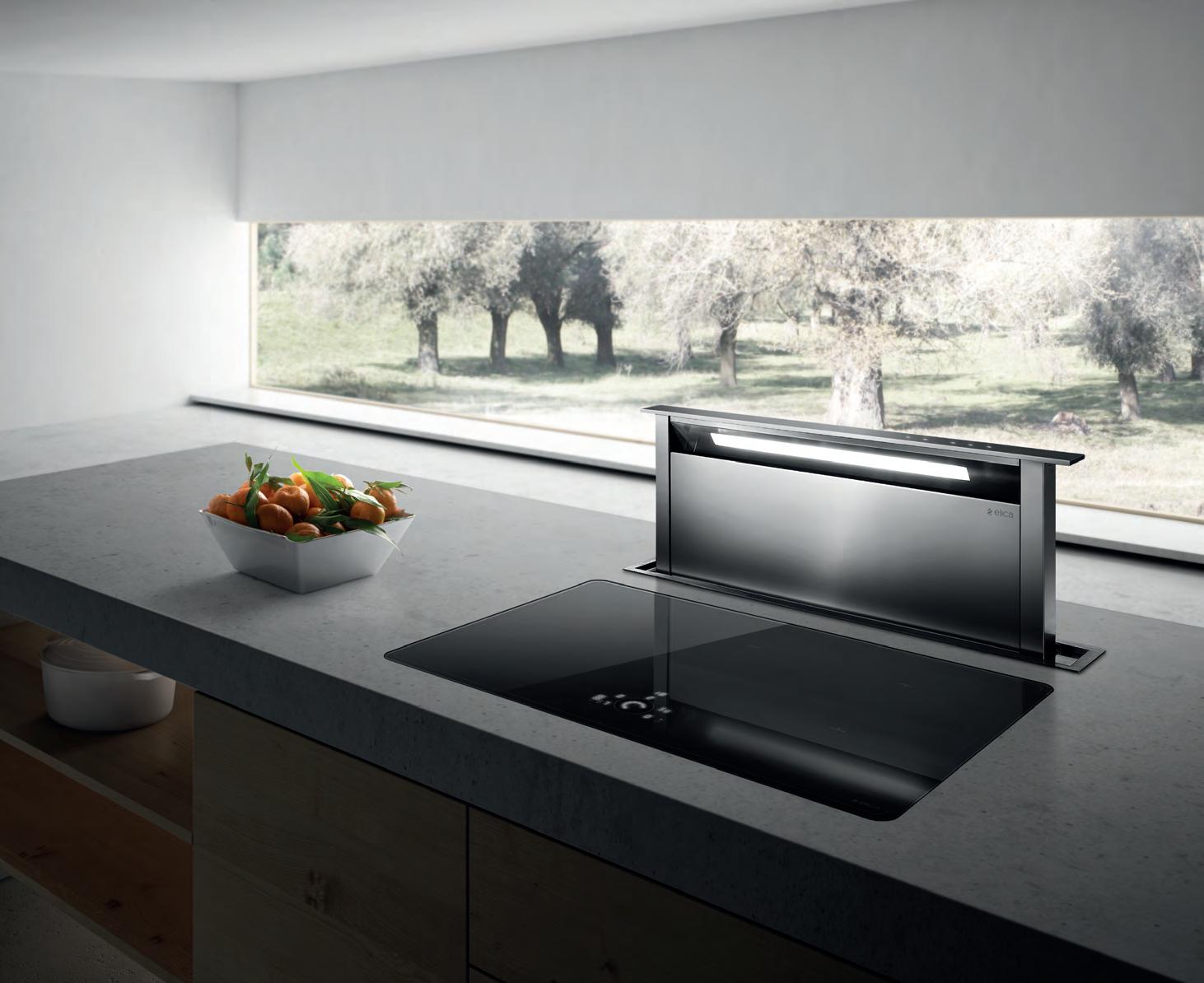
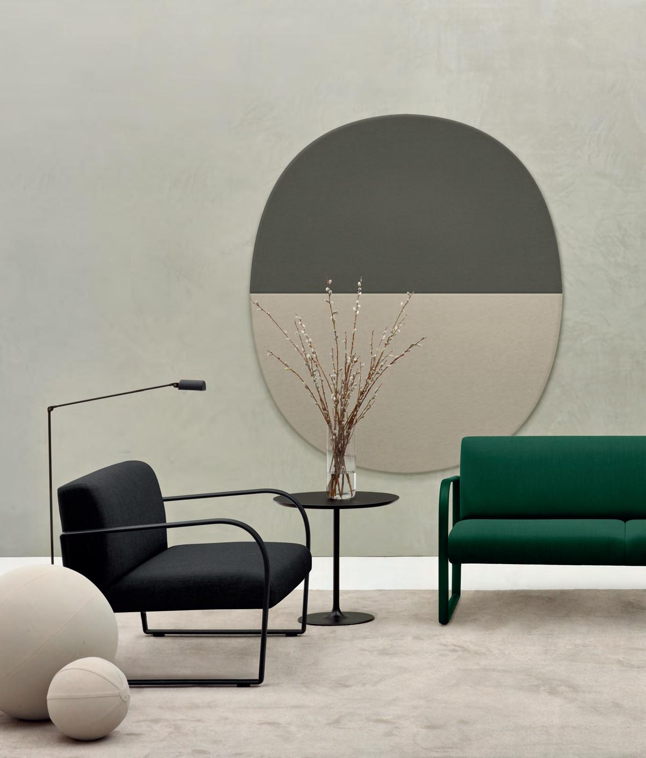
Australia 1300 306 960
stylecraft.com.au Singapore +65 6511 9328
Featured | Arcos Lounge by Lievore Altherr, Dizzie Table and Parentesit Wall Panel by Lievore Altherr Molina - www.arper.com
