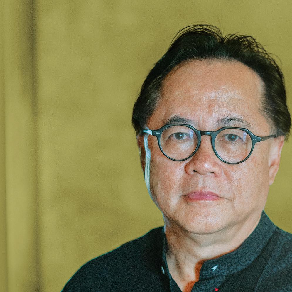
I NDESIgN Luminary Diane Jones, PTW
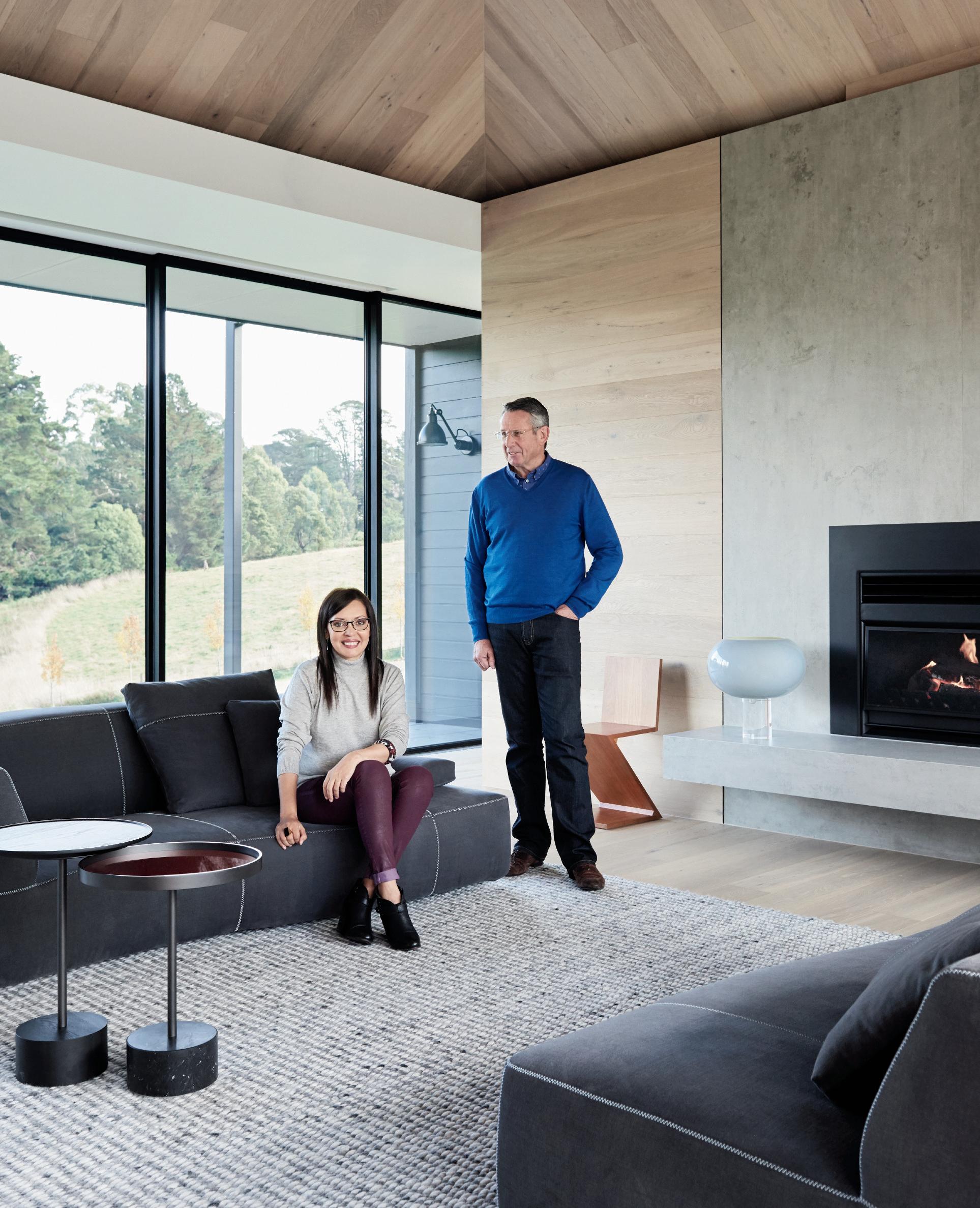
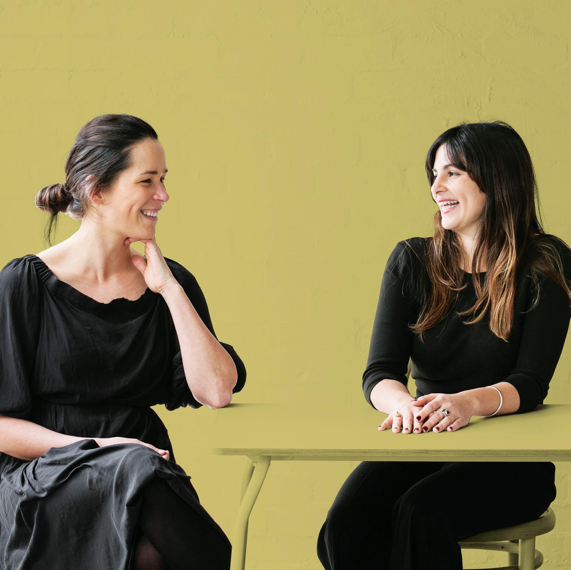
Ingrid Richards & Adrian Spence, Richards & Spence
The ‘Customer Experience’ Issue.


I NDESIgN Luminary Diane Jones, PTW
Ingrid Richards & Adrian Spence, Richards & Spence
The ‘Customer Experience’ Issue.





 Designed by Tim Wallace
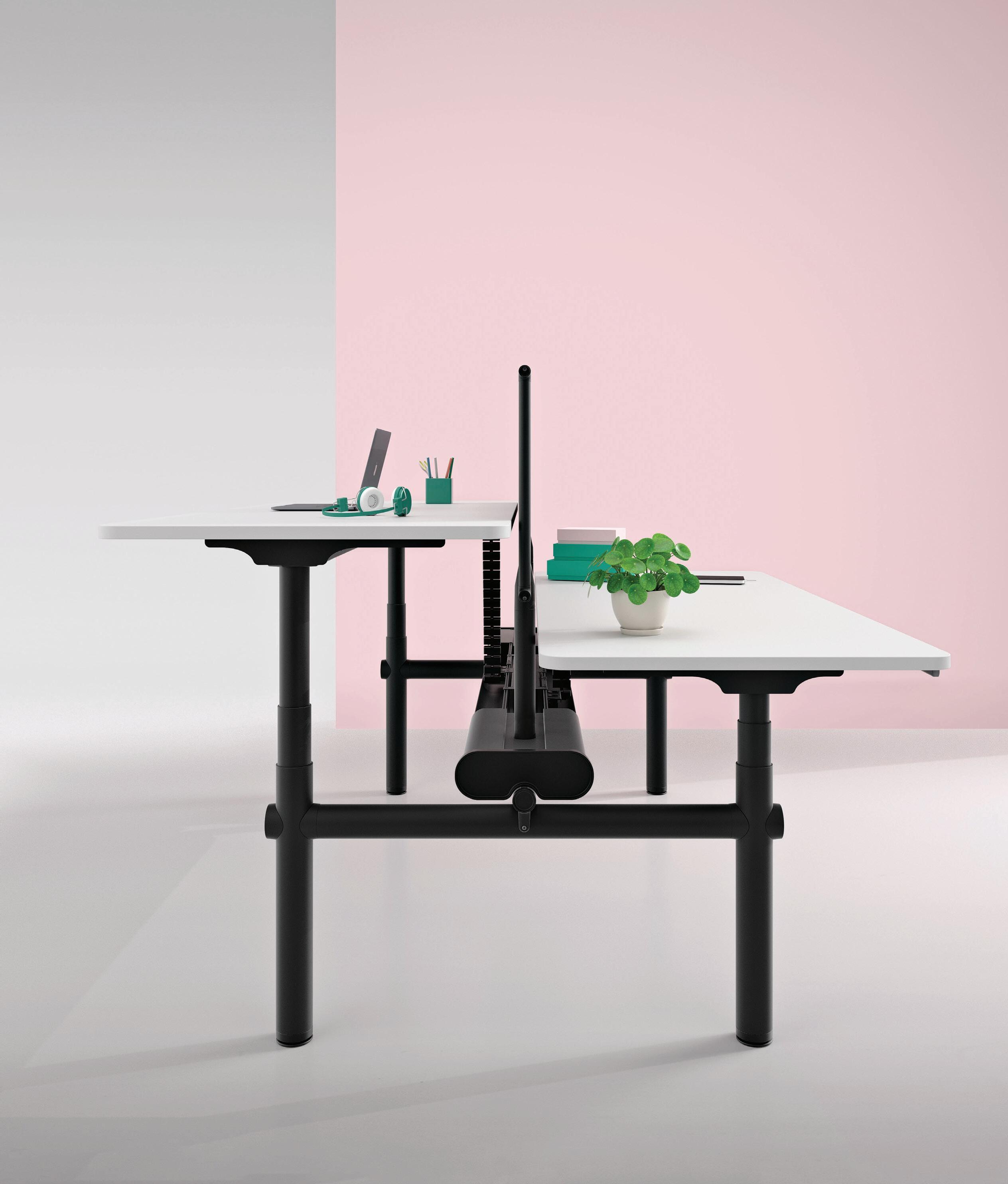
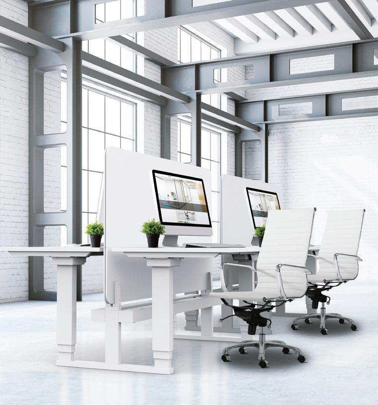
Atlas Office Landscape is a work system which brings together height-adjustability and collaborative working in one elegant solution.


Combine desks, screens, tables and storage elements to create spaces that invite collaboration, zones for focused activity or impromptu meetings.
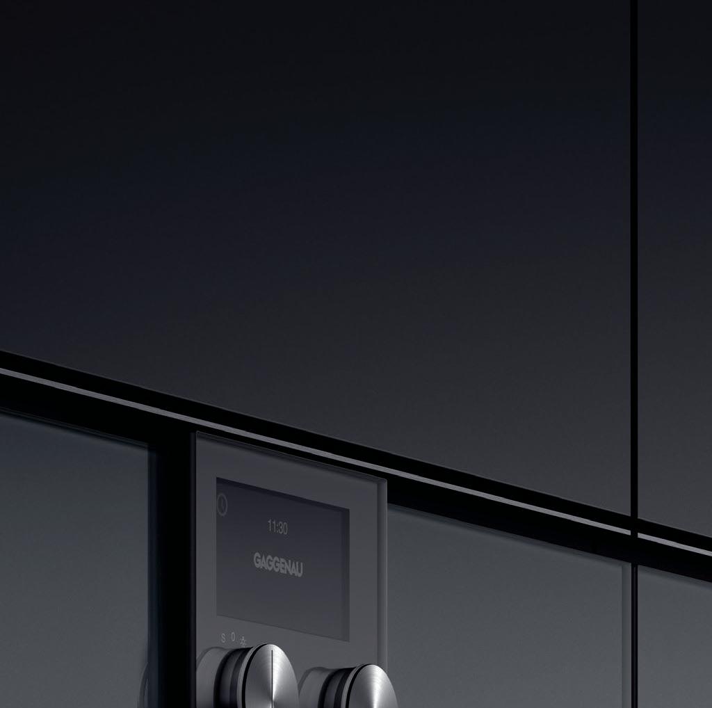
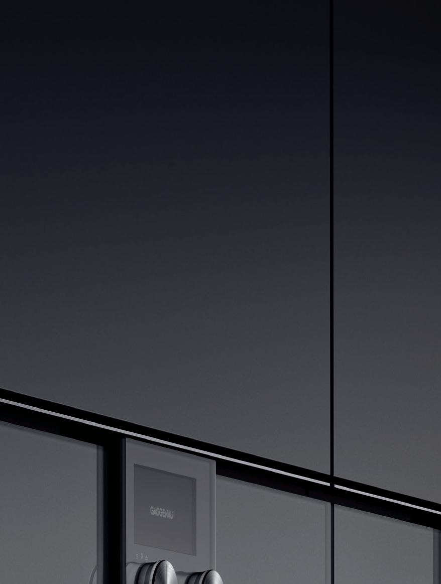

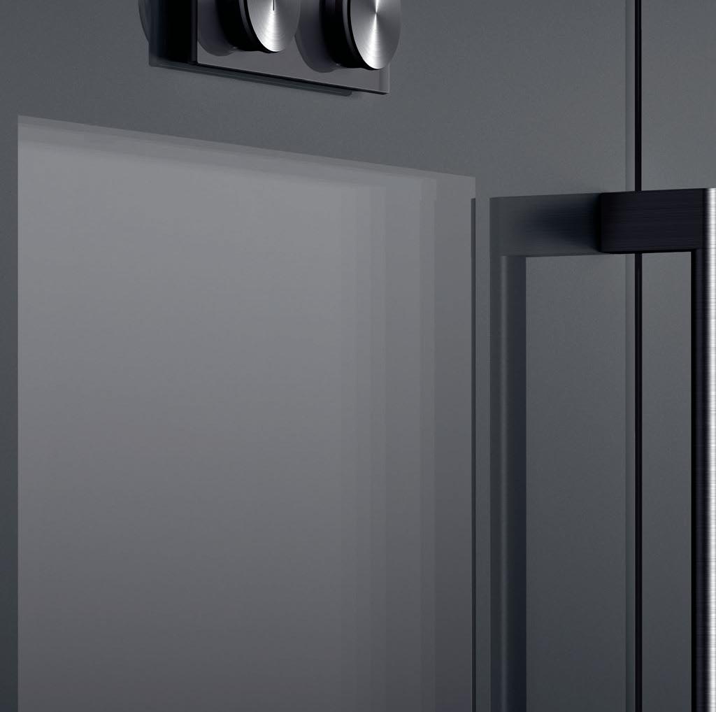
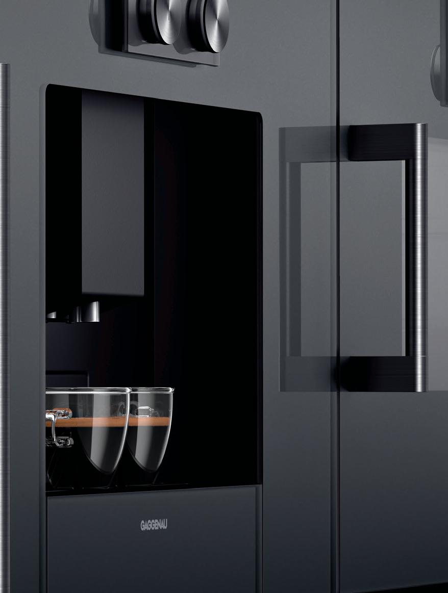

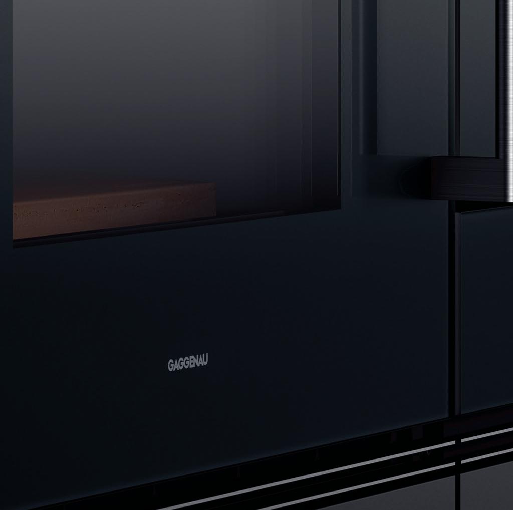



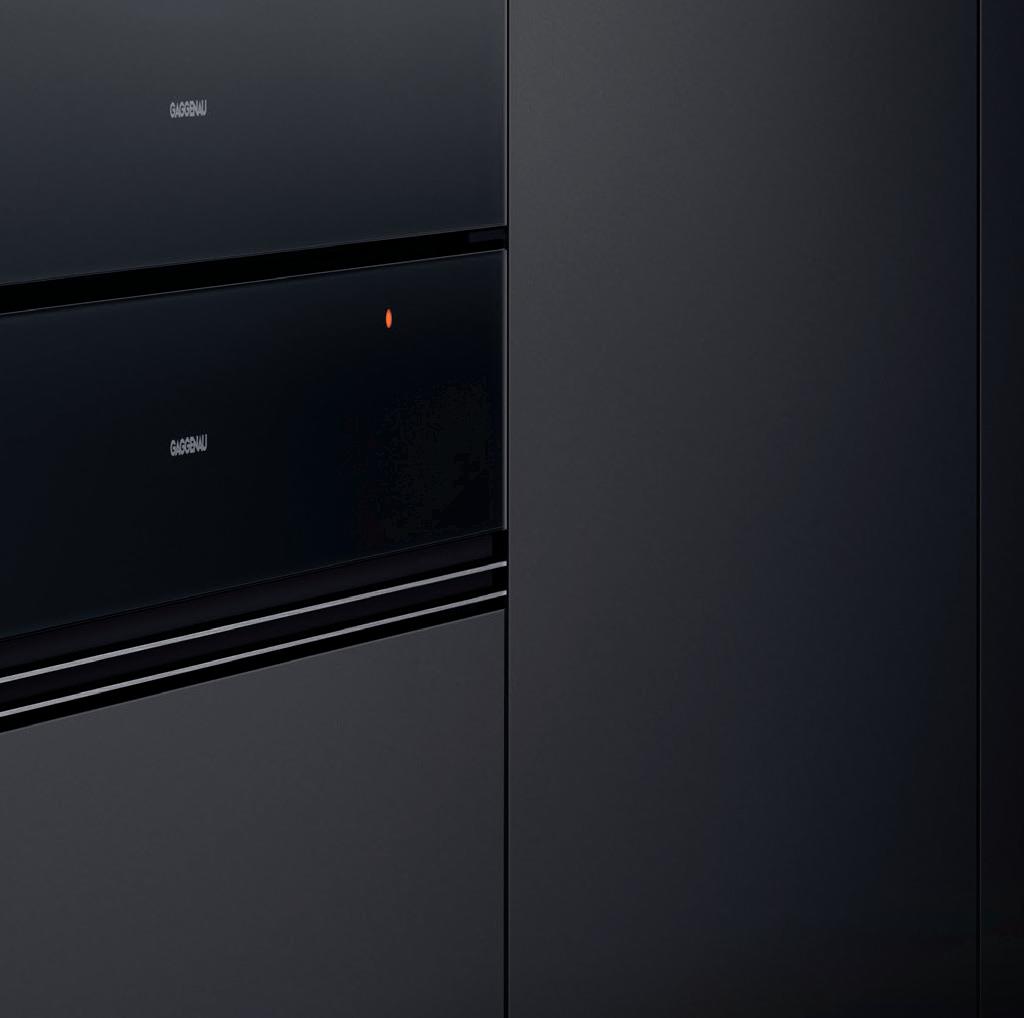




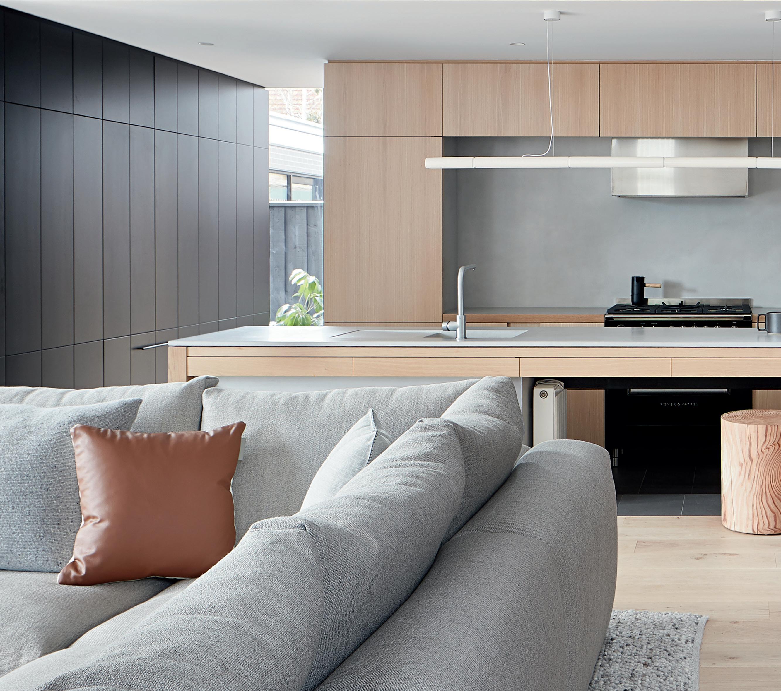
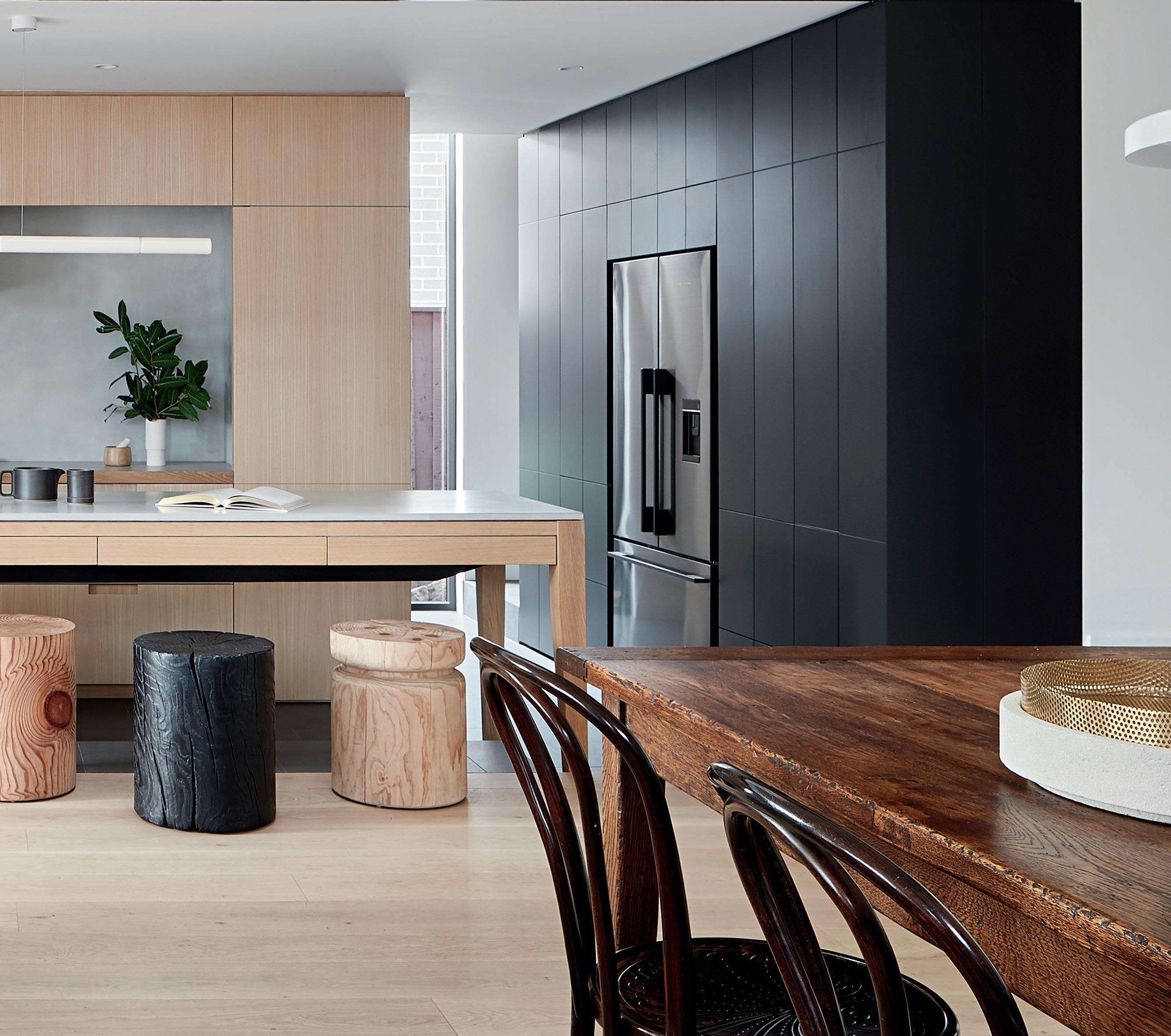
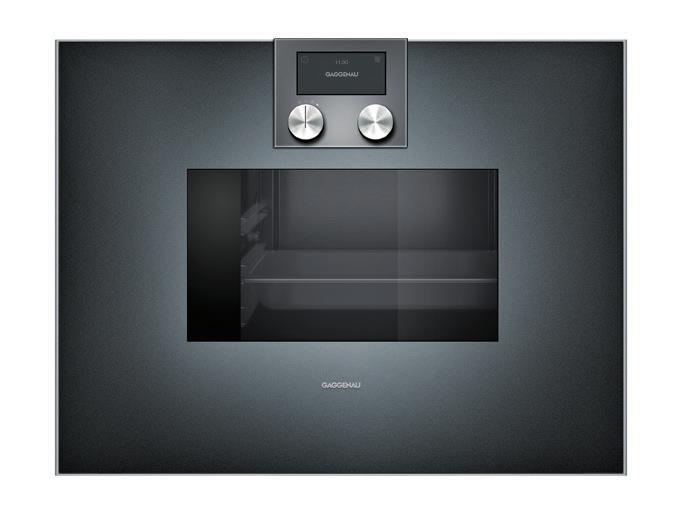
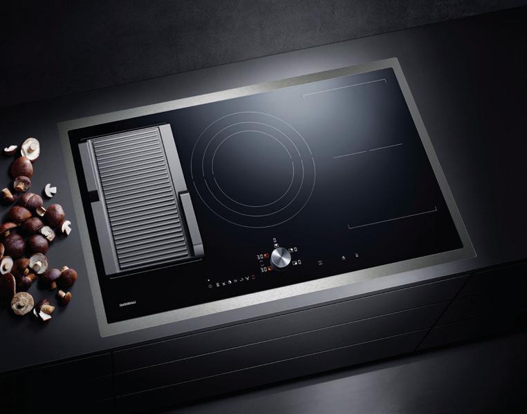
Unifying apparently contradictory elements is an art we have perfectly mastered. Our iconic design exudes an irresistible charisma even in its uncompromising minimalism. Demonstrated by our 200 series above including oven, coffee machine, Combi-steam oven and warming drawers; the stunning composition in Gaggenau Anthracite or Metallic elegantly blends into every interior design. Far from being opposites, statement and understatement are united in perfect harmony. For more information, please visit www.gaggenau.com/au
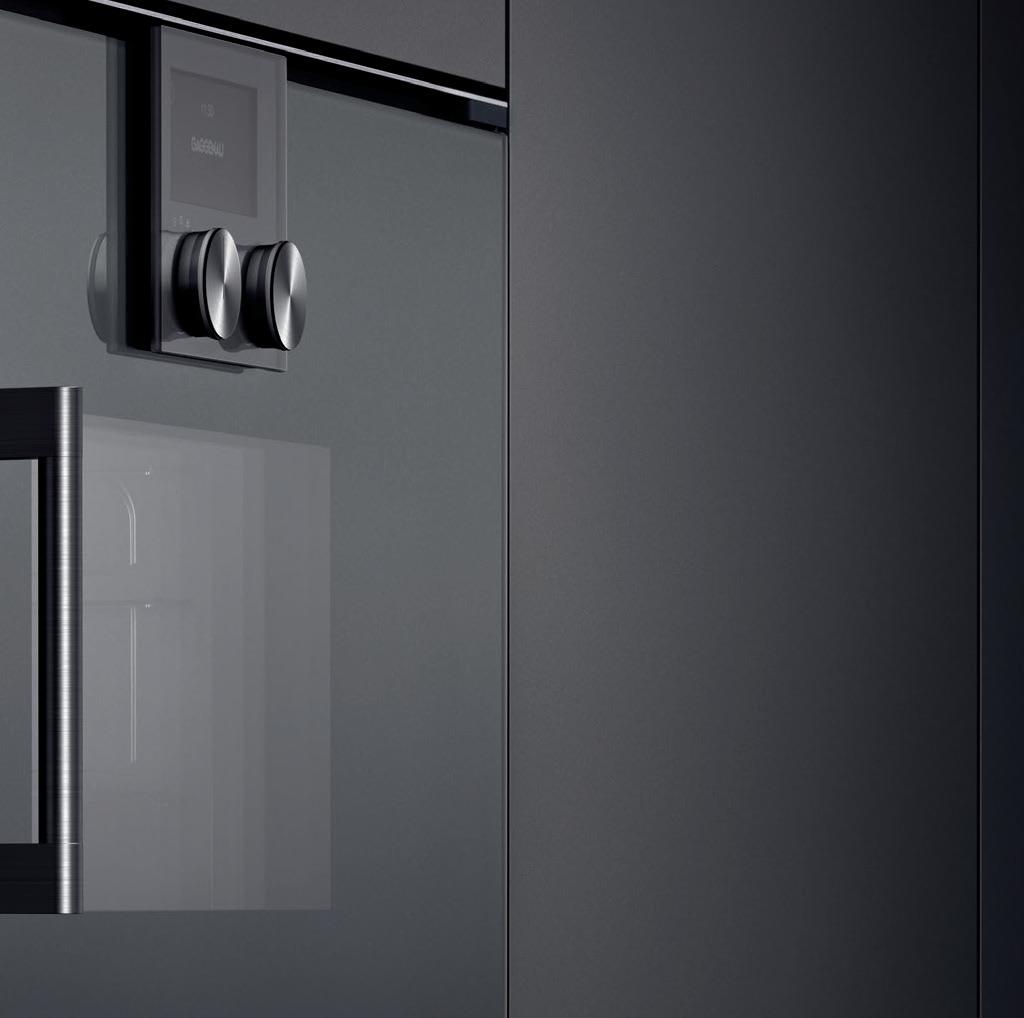
 Mastering the art of understatement.


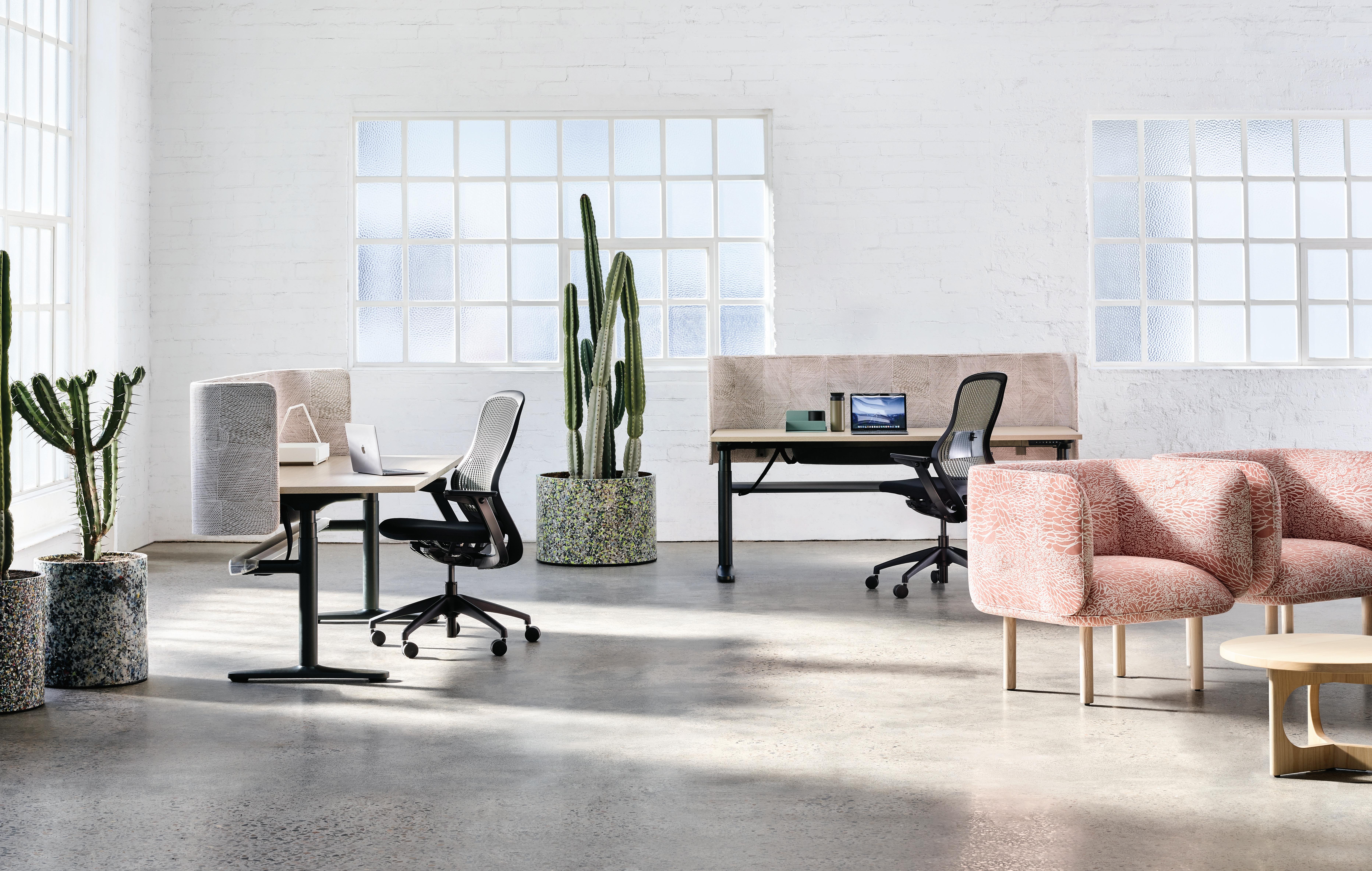
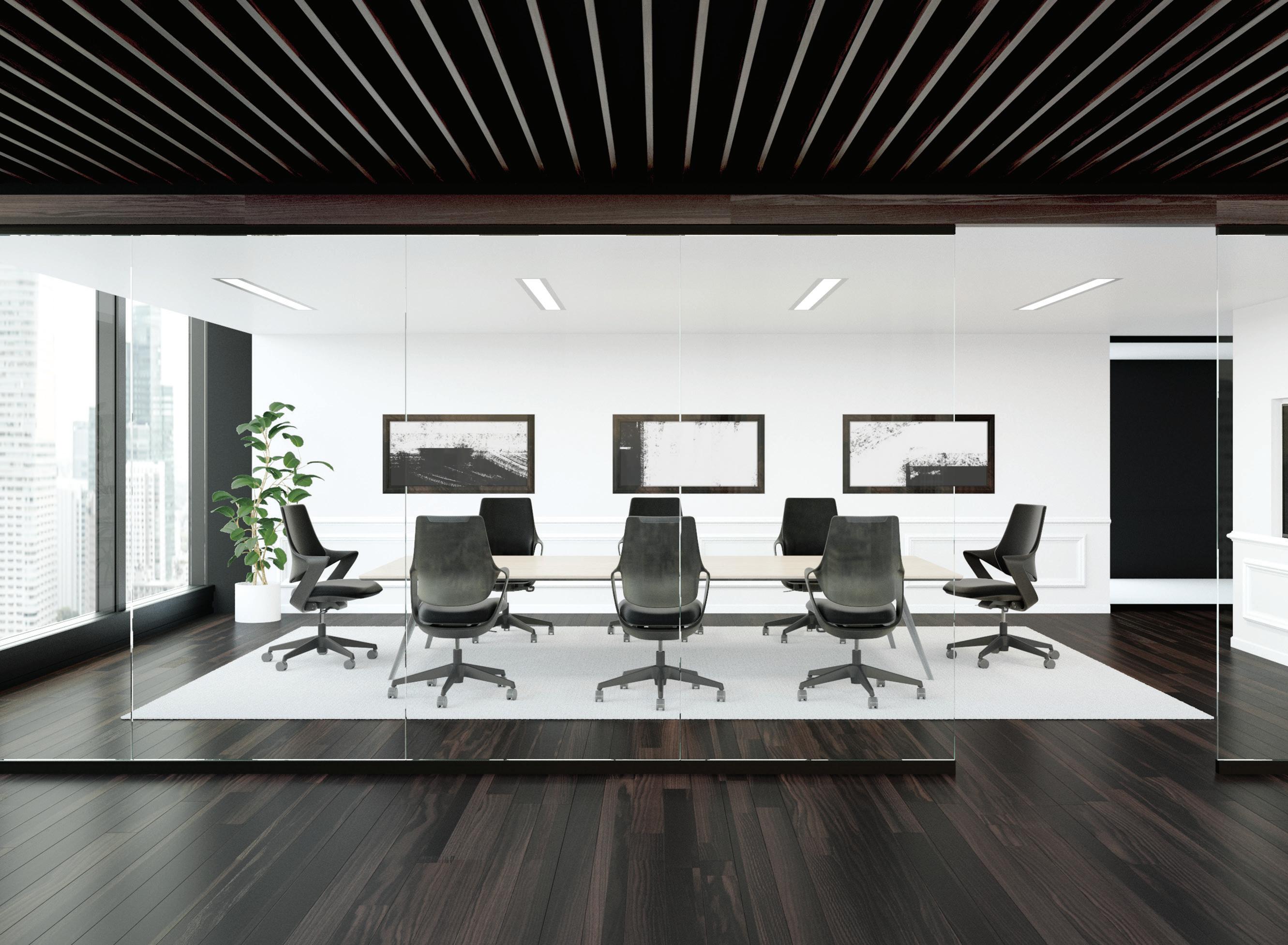
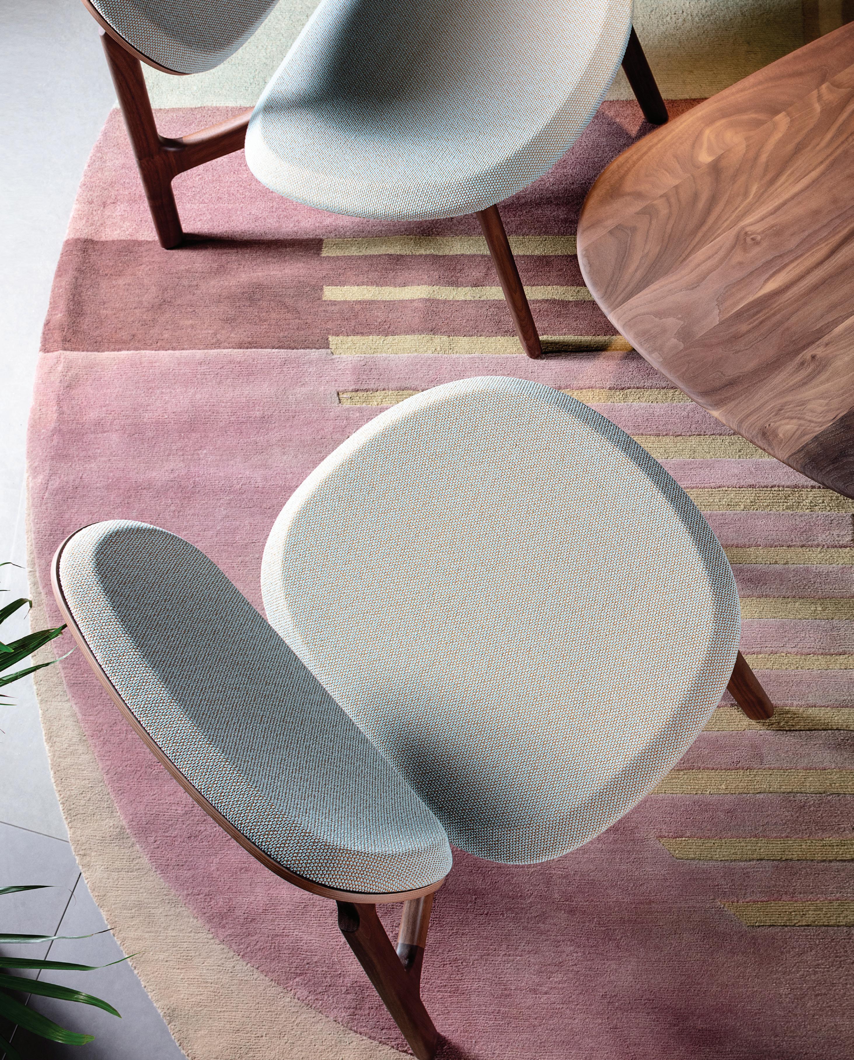
ZENITH designs, manufactures and distributes leading edge products for corporate and commercial environments.Pictured: ZENITH ORBIS Workstation with Precinct Screen, Formway Belite Task Chair, Swiss Design Wes Armchair & Nicholls Design Archie Table



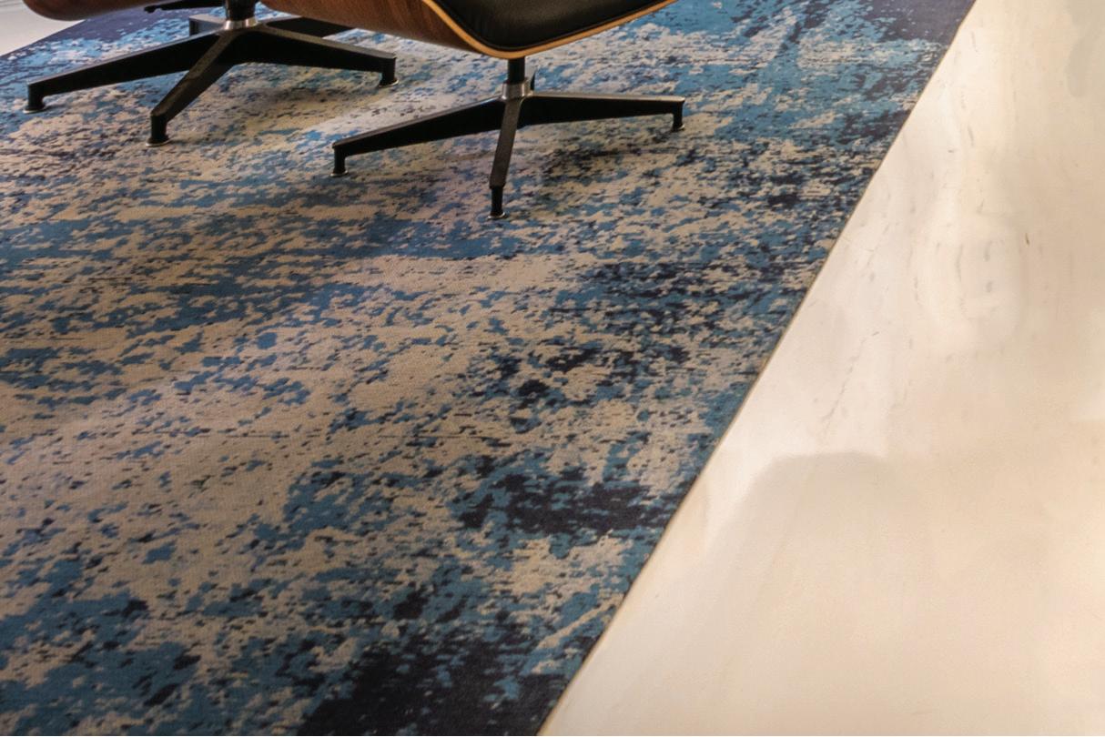
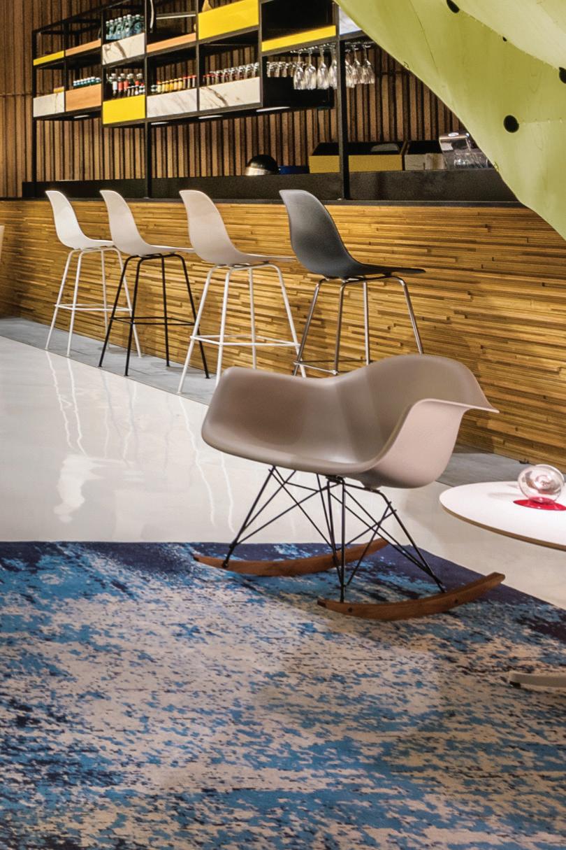
The Chadstone Mall Project by Lombard x Jack aims to design a comfortable and inviting meeting place for both customers and employees. The design needed to have flexibility to allow for staged events and provide a respite where customers could relax and recharge their electronic devices.
The design of the rugs needed to respond to the international and exclusive retail tenancies of the Chadstone Mall

“Designer Rugs were very professional and a pleasure to work with,” says director Kath Lombard “They were responsive and proactive with sampling and provided excellent design assistance with technical and maintenance queries.”
Designer Rugs are custom made specialists, with over 30 years of experience in a wide range of clients and sectors. We are passionate about finding unique, tailored solutions for commercial and residential interiors.

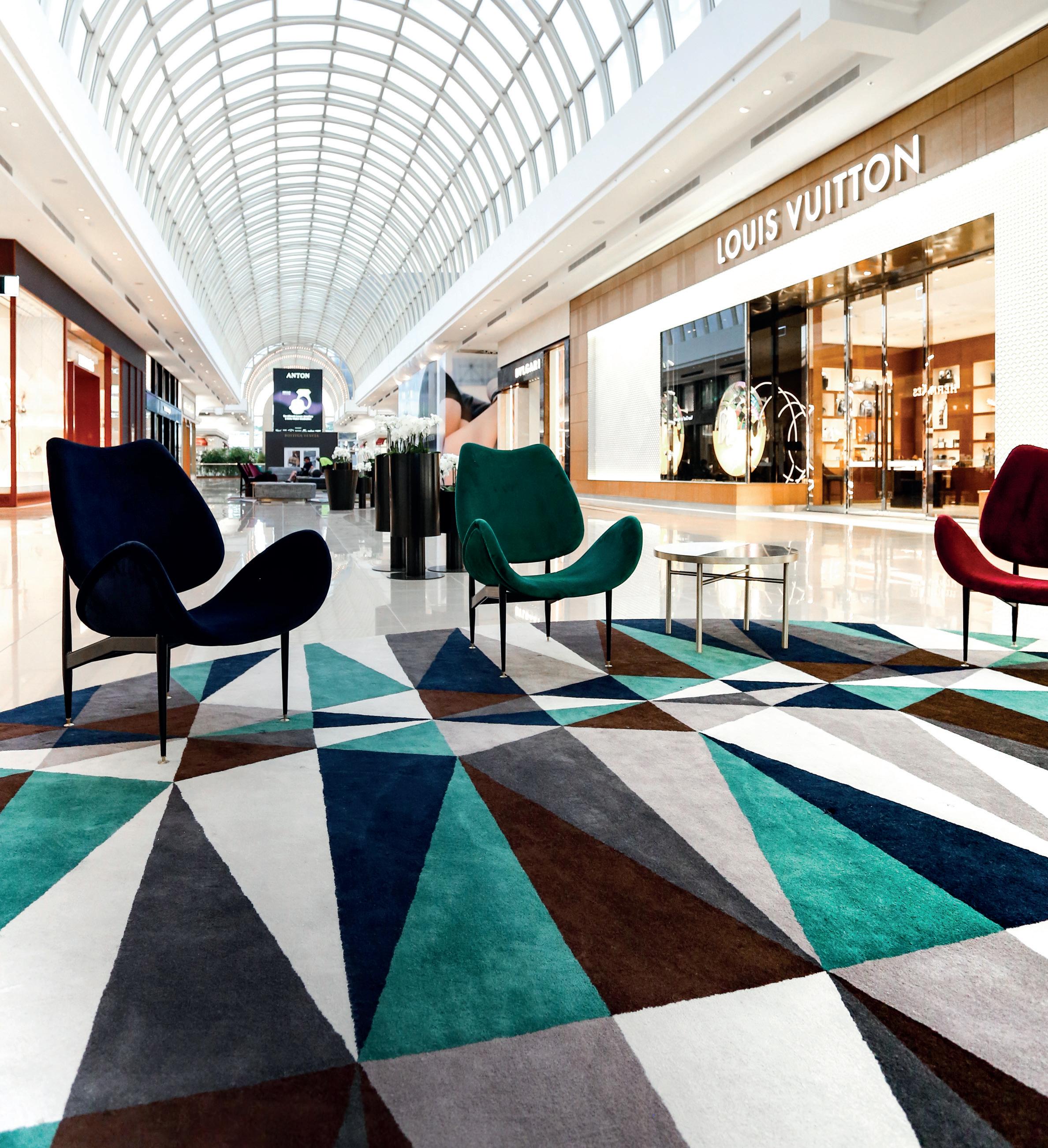
“The pattern making was to be energetic and striking in design and serviceable in its materiality.
”
Kath Lombard, Lombard x Jack
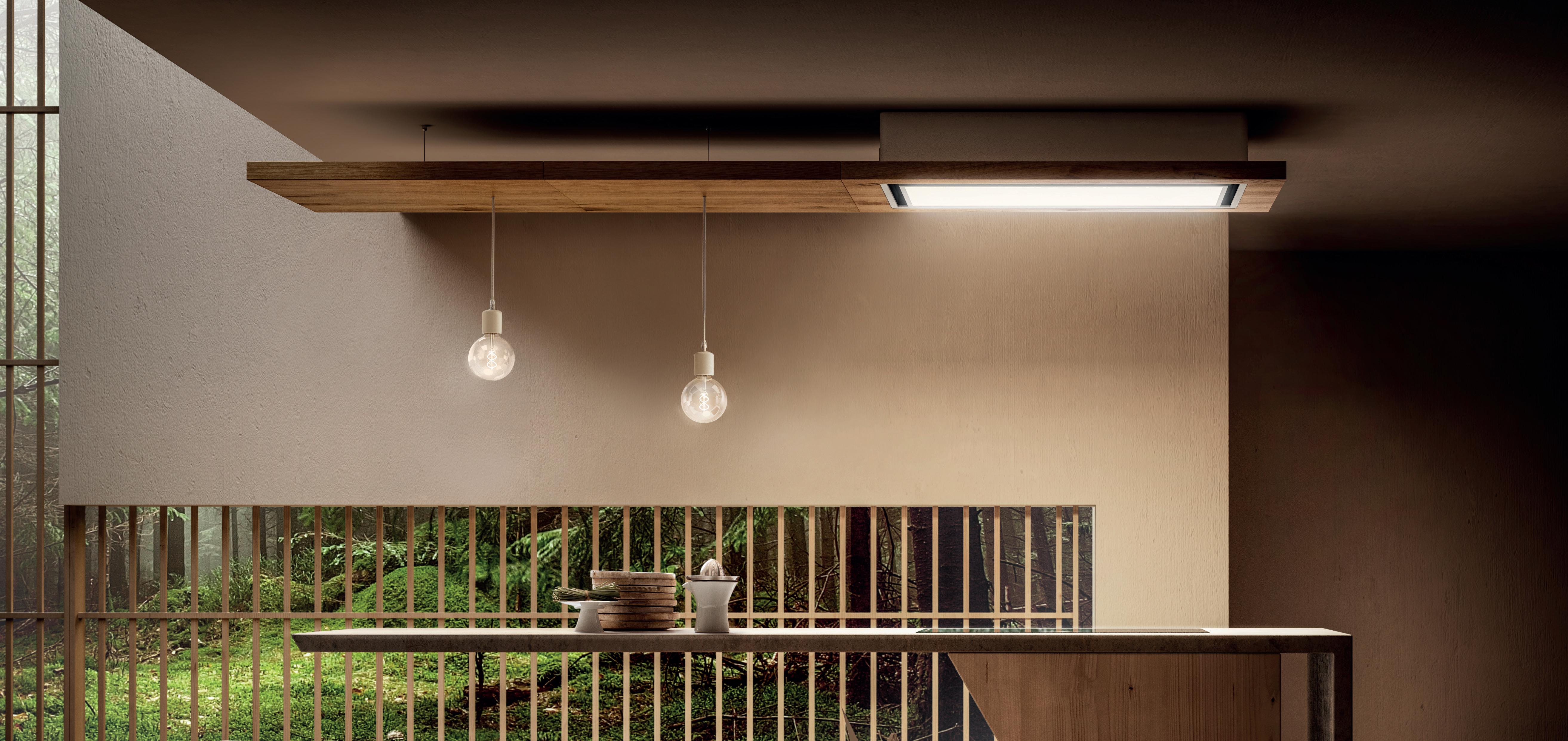




























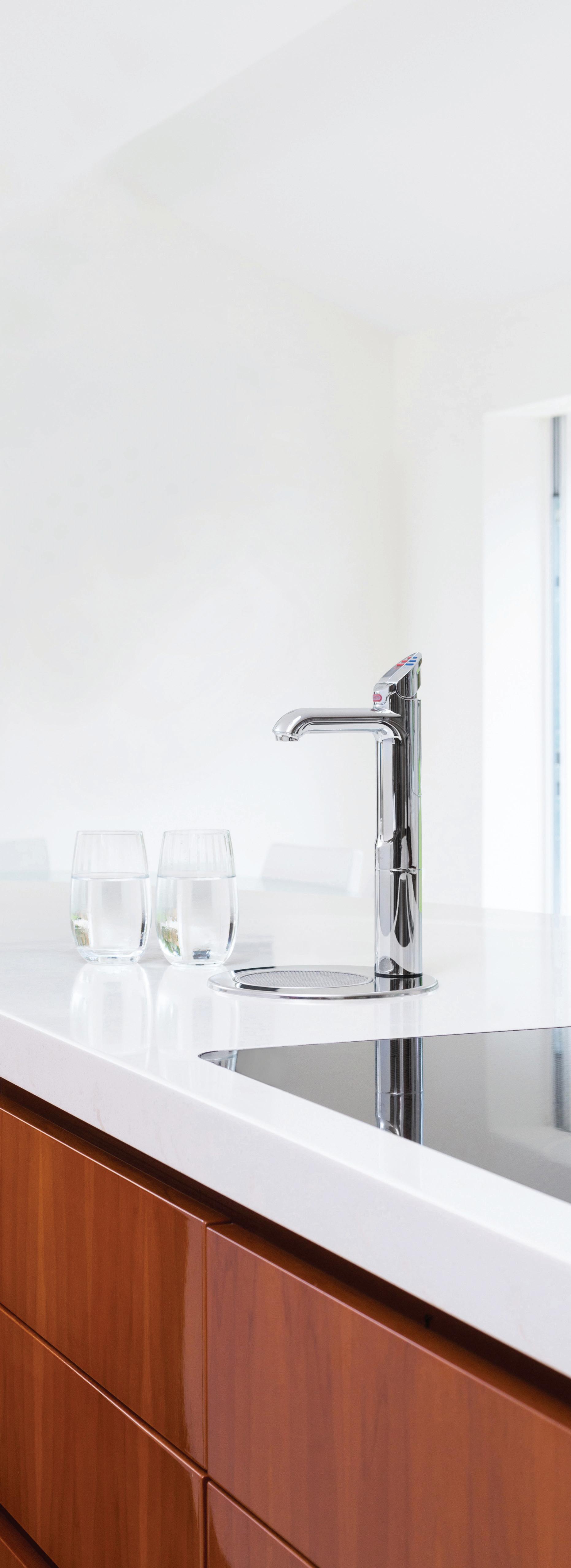
All your drinking water needs, All-in-One beautifully designed system. Remove the need for multiple taps in your kitchen with a single, beautifully designed system that delivers boiling, chilled and sparkling filtered drinking water, as well as hot and cold unfiltered water for your sink.
The Zip HydroTap All-in-One offers every water option you need from one multi-functional tap and a single intelligent compact under-bench system. That’s why the Zip HydroTap will be the one and only hydration solution for your kitchen. Discover more at zipwater.com


Chairman/Publisher
Raj Nandan raj@indesign.com.au
Managing Director Kavita Lala kavita@indesign.com.au
Editor Alice Blackwood alice@indesign.com.au
Indesignlive Editor
Aleesha Callahan aleesha@indesign.com.au
Editorial Assistant Andrew McDonald andrew@indesign.com.au
Brand Director Colleen Black colleen@indesign.com.au
Business Development Managers
Kim Hider kim@indesign.com.au
Valeria Valera valeria@indesign.com.au Brune a Stocco brune a@indesign.com.au

Client Liaison Dana Ciaccia dana@indesign.com.au
Production and Projects Manager

Brydie Shephard brydie@indesign.com.au
Production Assistant
Becca Knight becca@indesign.com.au
Accounts
Cassie Zeng cassie@indesign.com.au
Ting Zhang ting@indesign.com.au
Lead Designer Louise Gault louise@indesign.com.au


Designer Louis Wayment louis@indesign.com.au
Online Manager Radu Enache radu@indesign.com.au
Web Developer Ryan Sumners ryan@indesign.com.au
Indesign Correspondents
Andrea Stevens (New Zealand)
Mandi Keighran (London) Stephen Cra i (Melbourne)
Contributing Writers
Leanne Amodeo, Patricia Arcilla, Aleesha Callahan, Annie Carroll, David Congram, Stephen Cra i, Jo Hoban, Tracey Ingram, Paul McGillick, Thida Sachathep, Kirsty Sier, Emily Su on, Pia Sinha, Sandra Tan, Stephen Todd, Narelle Yabuka
Featured Photographers
Lauren Bamford, Damian Benne , Peter Benne s, Bre Boardman, Jason Busch, Daniel Chia, Terence Chin, Charles Dennington, Giuseppe Dinnella, Shao Feng, Sean Fennessy, Tom Ferguson, Felix Forest, Murray Fredericks, Gemmola, Edward Hendricks, Ben Hosking, Khoo Guo Jie, Julien Lanoo, Edmon Leong, Derrick Lim, Andy Macpherson, Paul Martin, Trevor Mein, Shannon McGrath, Emma Nevison, Tatjana Pli , Oscar Rialubin, Dion Robeson, Tom Roe, Mark Roper, Kara Rosenlund, Martin Siegner, Anson Smart, Nguyen Tien Thanh, Andre Wiredja, Manfred Yuen, Tom Ziora
Head O ce
Level 1, 50 Marshall Street
Surry Hills NSW 2010 (61 2) 9368 0150, (61 2) 9368 0289 (fax) indesignlive.com
Melbourne
1/200 Smith Street, Collingwood VIC 3066
Singapore
4 Leng Kee Road, #06–08,SIS Building, Singapore 159088 (65) 6475 5228, (65) 6475 5238 (fax) indesignlive.sg
Hong Kong
Unit 12, 21st Floor Wayson Commercial Building, 28 Connaught Road West, Sheung Wan, Hong Kong indesignlive.hk
Join our global design community, become an Indesign subscriber!
To subscribe (61 2) 9368 0150 subscriptions@indesign.com.au indesignlive.com/subscriptions
Yearly subscription: Australia $55 (incl. GST) International AUD $110
Printed in Singapore
Indesign is printed with ENVIRO
Soy-Based Process Black ink, UV Solventless Varnish and on paper which is awarded an Environmental Management Certificate to the level ISO14001:2004 GBT24001-2004 and Eskaboard and Eskapuzzle produced from 100 per cent recycled fibres (post consumer).
indesignlive.com
/indesignlive @indesignlive
We can all attest to the fact that Australia has a lot of design events – we’re incredibly lucky! However, to date, there has not been a commercial design event that has allowed us to openly and collaboratively address the increasingly fragmented specification chain within Australia’s design, development and construction industries. Nor the design products that offer highly technical features tailored to unique needs.
FRONT changes all that. It’s a two-day event that puts the emphasis on bringing people from all areas of specification together in one dedicated location. FRONT is where you can meet designers, architects, suppliers, property developers, consultants and end-users to share your ideas and experience, and build purposeful, connective relationships geared towards mutual growth and outcome.
FRONT also presents the very latest in high-performing fit-for-purpose products for workplace, education, healthcare and hospitality contexts. Take the conversation off-stand and use FRONT’s well-appointed communal spaces to talk shop. Expand your knowledge through FRONT Forum, encompassing two full days of keynote lectures, panel discussions and CPD presentations. We’ve put together a preview of the brands, innovations and design developments that you can see at FRONT, page 67. You can also head to www.front.design
I’d also like to take this opportunity to congratulate the very deserving winners of INDE.Awards 2019, page 27. Are you keen to enter INDE.Awards 2020? Next year marks two decades in design for Indesign Media Asia Pacific – that’s 20 years of supporting and celebrating our region’s outstanding design community. We can’t wait to officially launch INDE.Awards 2020 –it’s a special commemorative edition that will celebrate the best of the decade. Stay tuned for our program launch next month!
Finally, welcome to Indesign’s ‘Customer Experience’ issue. We’re fascinated by the paradigm shifts taking place in hospitality and retail design – all led by the way we consume. Join thought-leaders Ingrid Richards and Adrian Spence, page 76; Ryan Russell and Byron George, page 176; Koichi Takada, page 100; Stephen Crafti, page 82; and Stephen Todd, page 152, to explore this new ‘customer experience’ epoch.
The ultimate industry cheat sheet.
In
Adrian Spence and Ingrid Richards of Richards & Spence, Stephen Crafti, Nora Fehlbaum of Vitra, INDESIGN Luminary Diane Jones of PTW.
Provocative, innovative and inspiring design.
99-145
National Museum of Qatar, interior architecture by Koichi Takada Architects, architecture by Atelier Jean Nouvel
Ovolo The Valley, Brisbane by Woods Bagot
David Jones and Country Road Group headquarters, Melbourne by Gray Puksand
Denton Corker Marshall studio, Melbourne by Denton Corker Marshall
Microsoft Technology Centre, Sydney by Tom Mark Henry
CAMILLA AND MARC Westfield Bondi Junction store, Sydney by Akin Atelier I
The 21st century customer craves escapism, emotion, and a sensitive touch.
151-180
Featuring insights from Stephen Todd, David Congram, Alexander & Co, Pattern Studio, Studiopepe, Bar Studio, Various Associates, Studio Ongarato, Russell & George, Grazia & Co, and more.









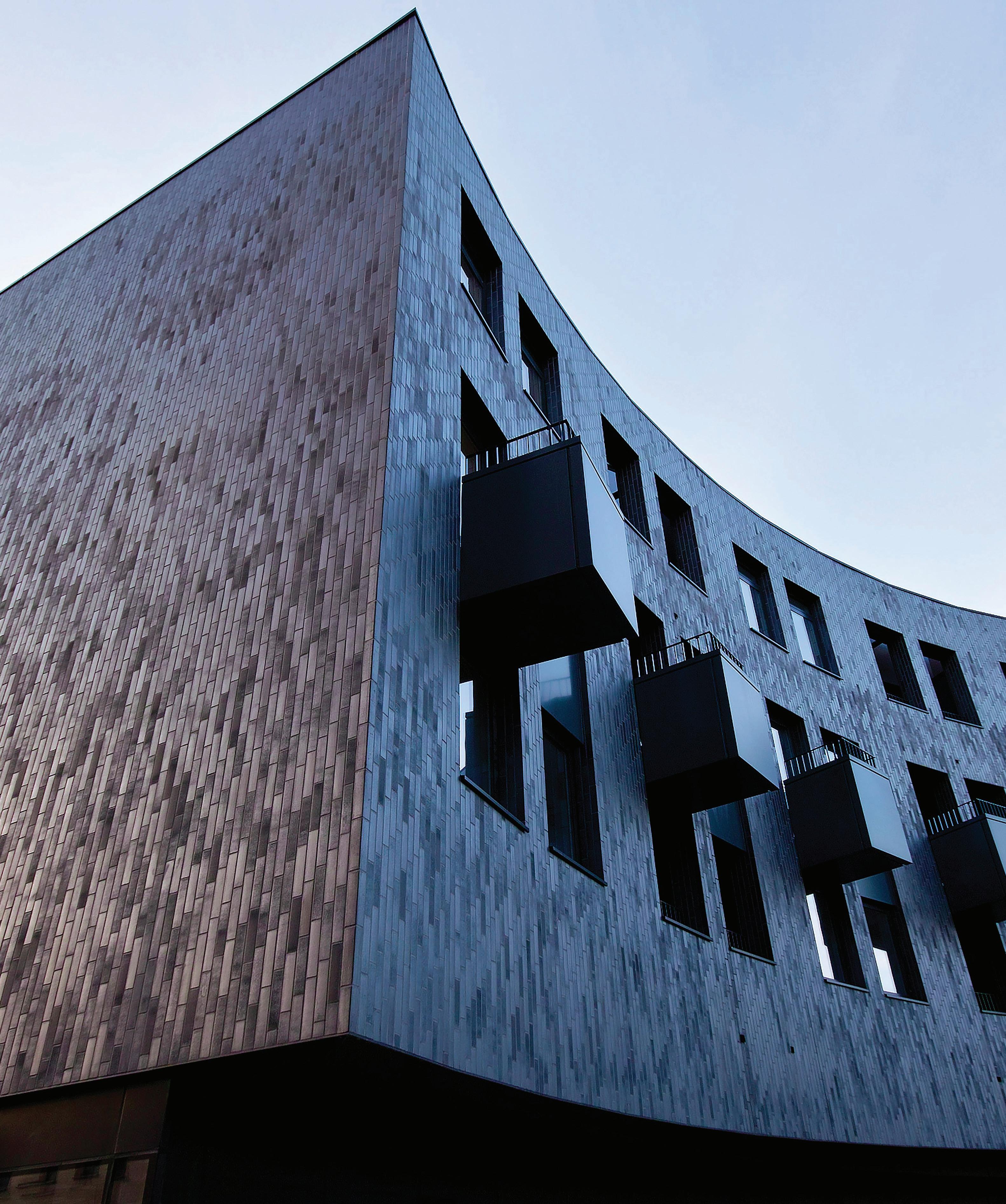
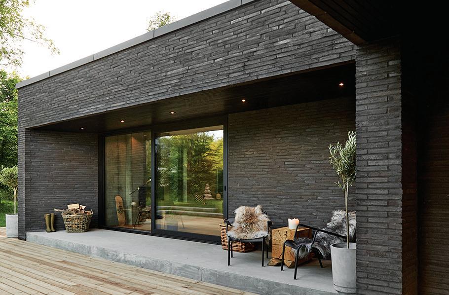
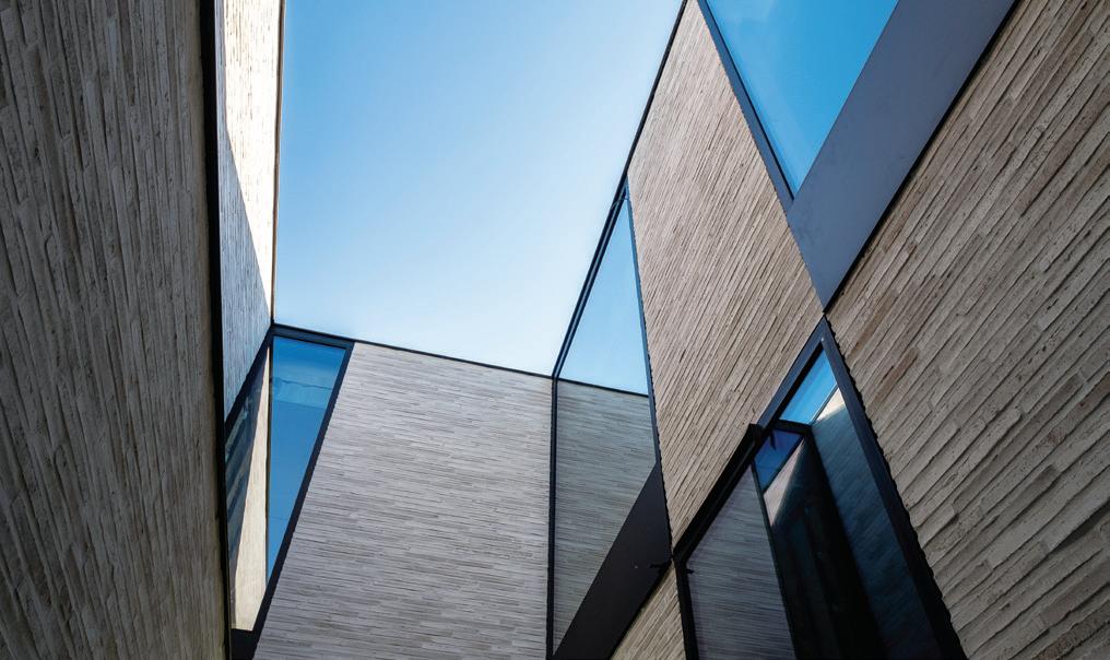
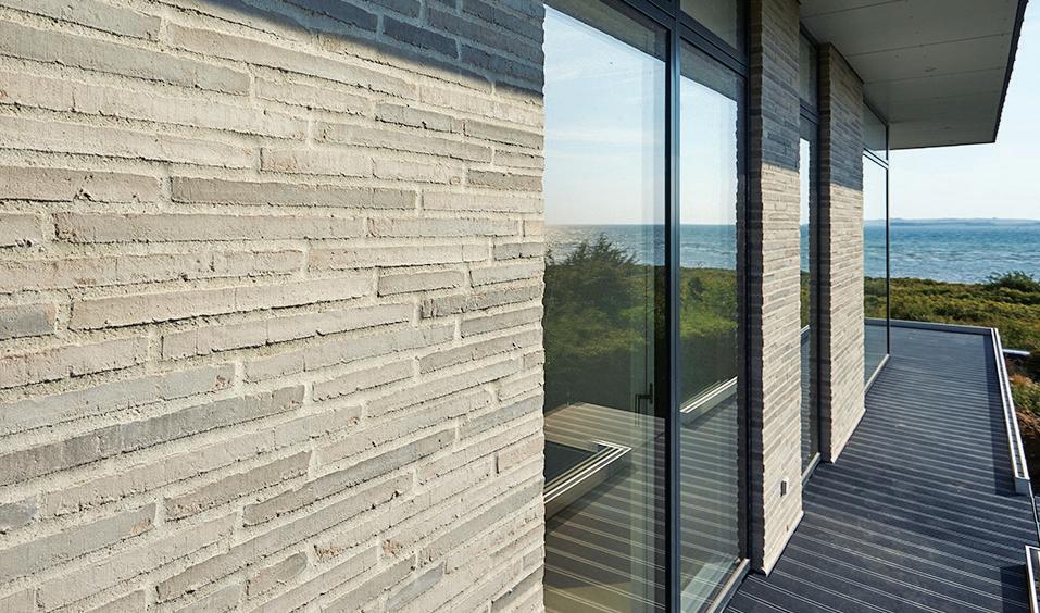
CORIUM from PGH Bricks & Pavers.


A break through brick cladding system combining the natural beauty of real brick, with cost effective, fast track installation of ‘system’ based cladding. With its diverse palette, decorative and textural patterns are easily created and CORIUM brick tiles can be mounted at any angle to achieve truly dynamic finishes – even overhead for soffits and ceilings. Use CORIUM to stunning effect in the design of mid to high-rise buildings. Unlimited design possibilities in a genuine brick finish at height.









corium.pghbricks.com.au | 1300 267 486














On Friday 21 June, the winners of the INDE.Awards 2019 were announced in Melbourne. Selected by our esteemed jury from over 430 entries, this year’s winners represent progressiveness in design, superior quality in process and output, and a sensitivity to culture, locality and the human condition. Congratulations go to all winners, our region’s brightest celebrated on the global stage.

Chan Ee Mun, WOHA (Singapore)
Eleena Jamil, Eleena Jamil Architect (Malaysia)
James Calder, Calder Consultants (Australia)
Jan Utzon, Utzon Architects (Denmark)
Joshua Comaroff, Lekker Architects (Singapore)
Joyce Wang, Joyce Wang Studio (Hong Kong, UK)
Judy Cheung, Cheungvogl (Hong Kong)
Leone Lorrimer, Lorrimer Consulting (Australia)
Luke Pearson and Tom Lloyd, PearsonLloyd (UK)
Luke Yeung, Architectkidd (Thailand)
Paul McGillick, McGillick Consulting (Australia)
Raj Nandan, Indesign Media Asia Pacific (Australia/Singapore)
Shashi Caan, SC COLLECTIVE (USA/UK)
Stephen Burks, Stephen Burks Man Made (USA) Sue Carr, Carr (Australia)
“Look no further for the perfectly integrated design practice”

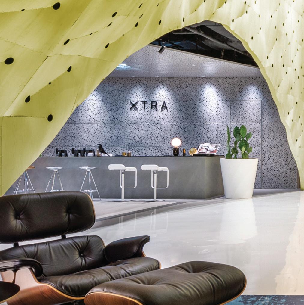

INDE.Awards
Photography: Edward Hendricks
Indesign Media Regional Editorial Board
Photography: Martin Siegner
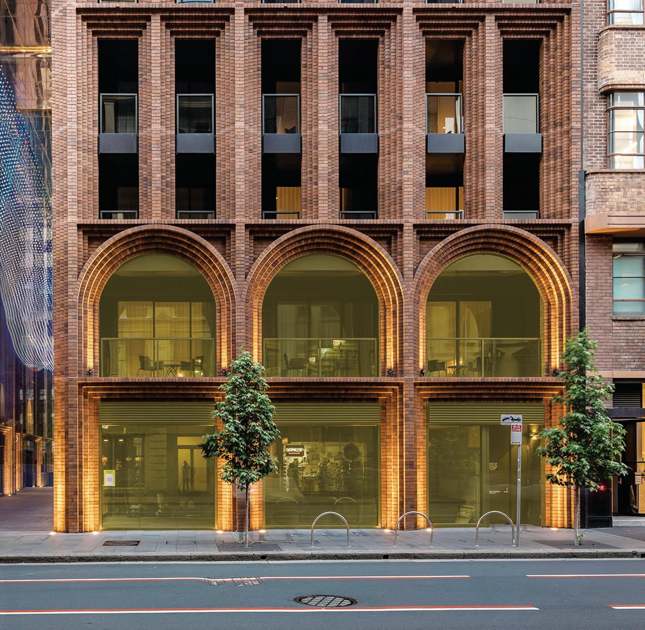
“Amenity, quality and gentle refinement”
Maitland Riverlink | CHROFI with McGregor Coxall, Australia
“Simple, tactile and immediately part of the landscape”
INDE.Awards 2019 Jury
Photography: Brett Boardman
Honourable Mention | Freycinet Lodge Coastal Pavilions, Liminal Architecture, Australia
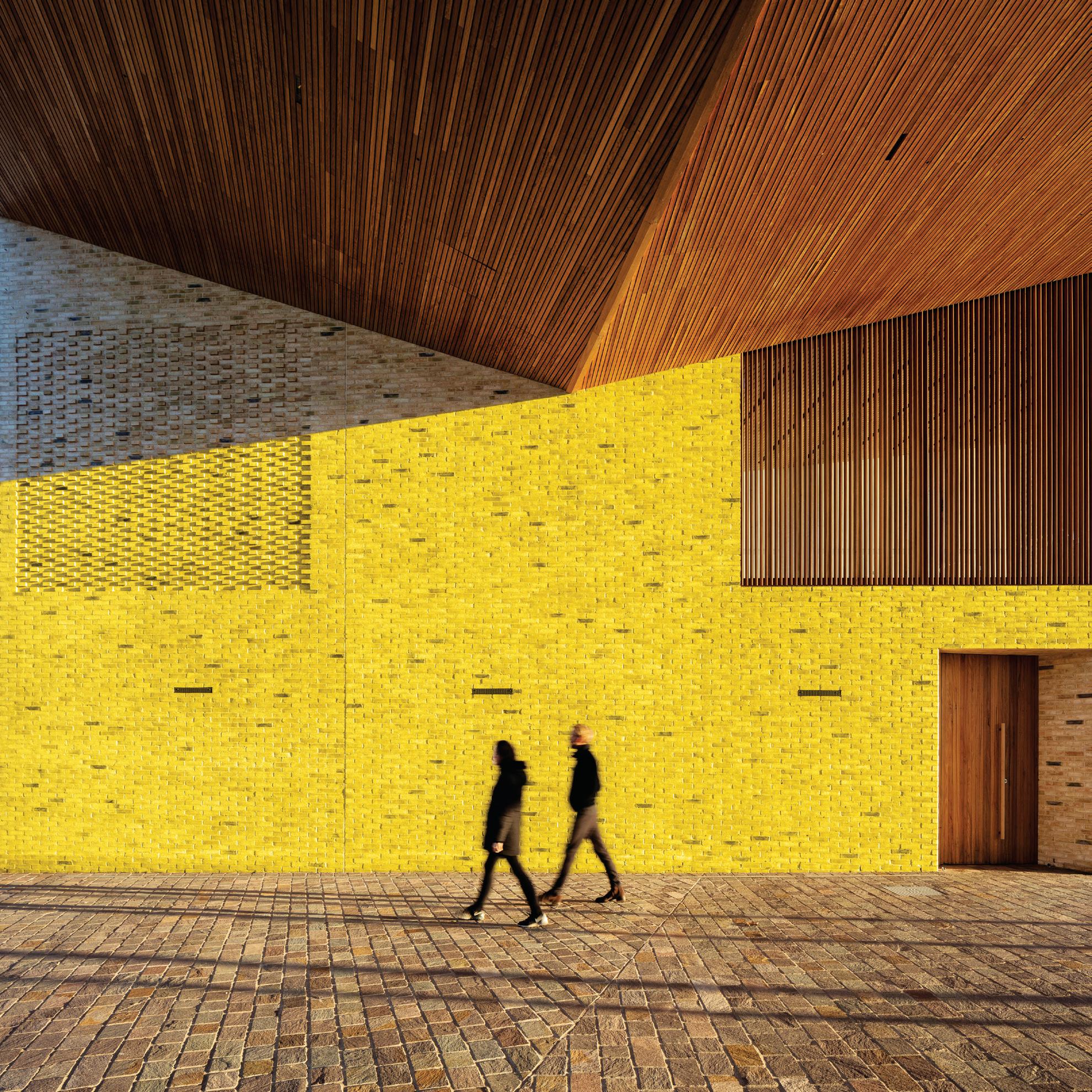
Short Lane | Woods Bagot, Australia

INDE.Awards 2019 Jury
Photography: Trevor Mein
Honourable Mention | Arc, Koichi Takada Architects, Australia
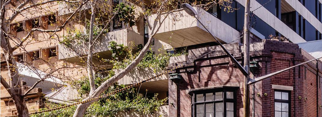
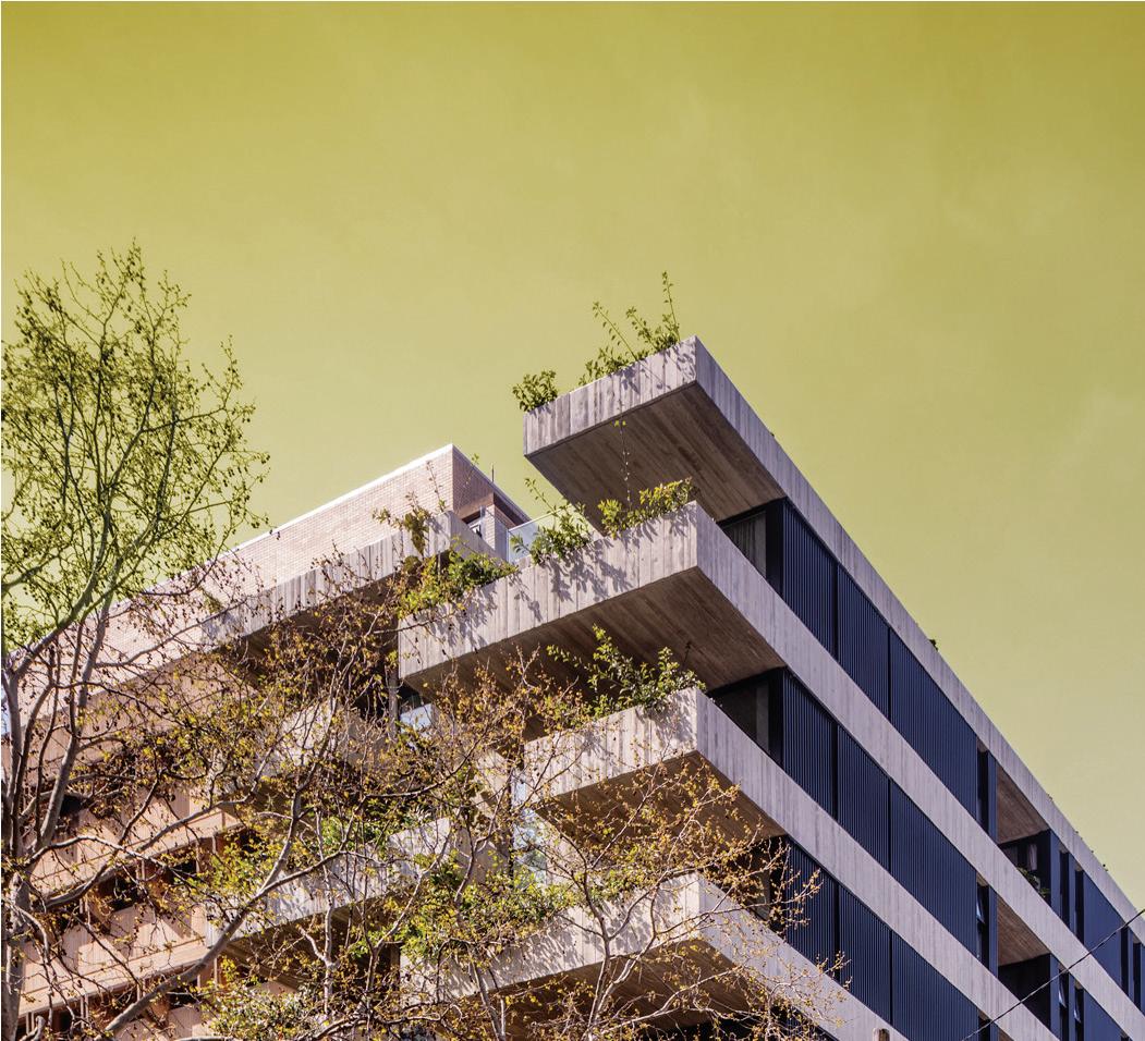
“Garden living and café life meet in Sydney’s inner burbs”
PROJECT #13 | STUDIO WILLS + Architects, Singapore


“Space, privacy and communal living – a smart reinvention”


INDE.Awards 2019 Jury
Photography: Khoo Guo Jie
Honourable Mention | Family Holiday Structure, Imaduwa, Palinda Kannangara Architects, Sri Lanka
S Space | H&P Architects, Vietnam
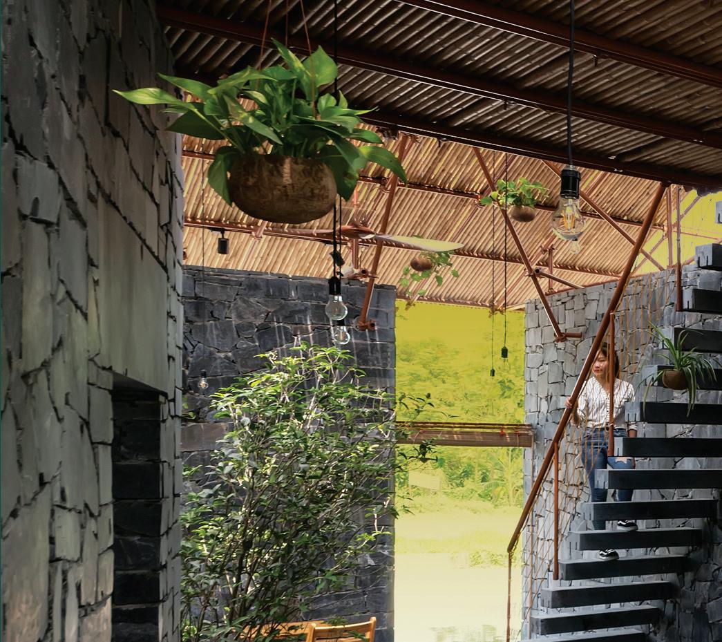
“A tranquil open space with natural materiality”
INDE.Awards 2019 Jury
Photography: Nguyen Tien Thanh
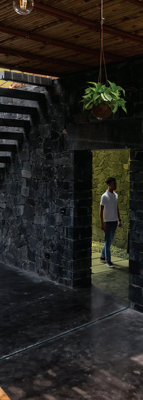
Honourable Mention | Tingtai Teahouse, Linehouse, China


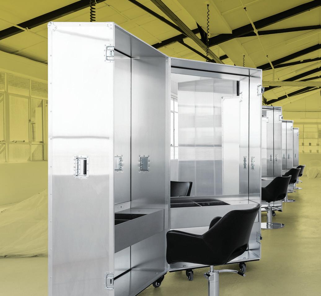
“Futuristic salon meets infinitely flexible exhibition and event space”
INDE.Awards 2019 Jury
Photography: Tom Ferguson
Honourable Mention | Caroma on Collins, Archier, Australia
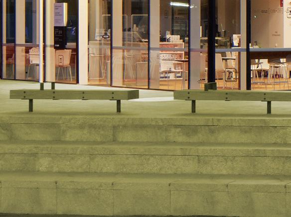
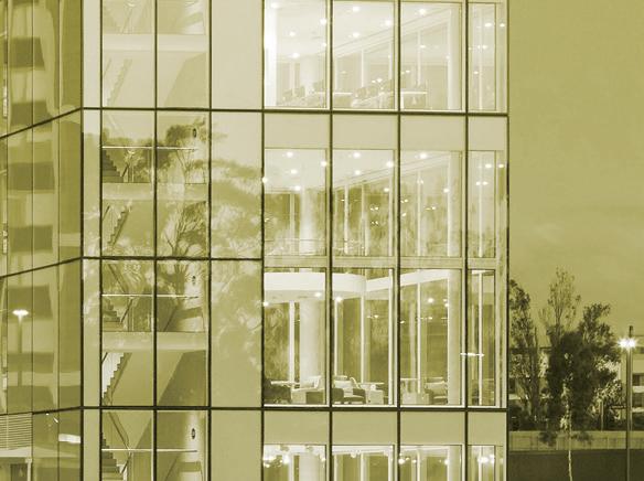
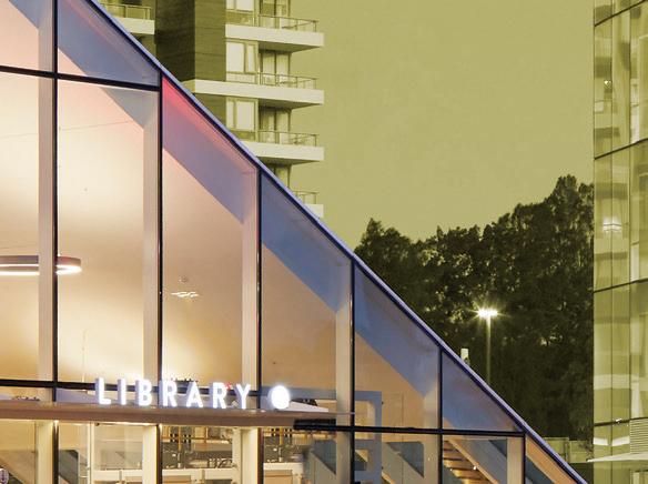
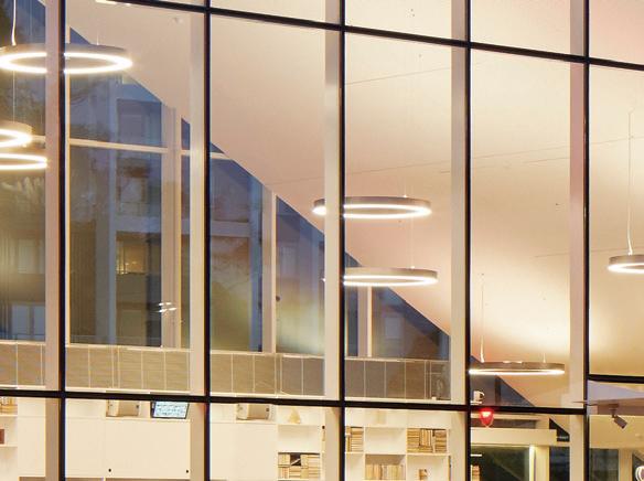
Green Square Library and Plaza | Studio Hollenstein with Stewart Architecture, Australia
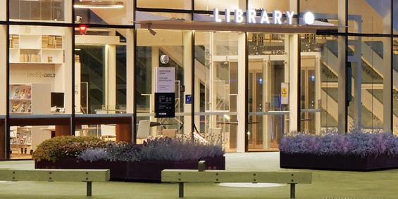
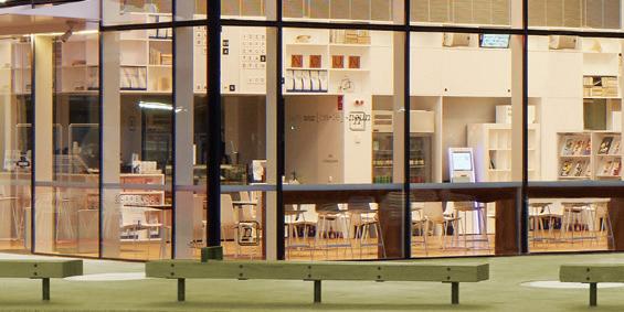
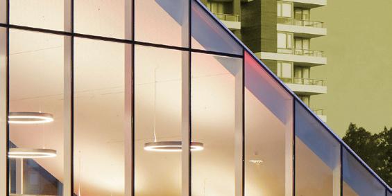
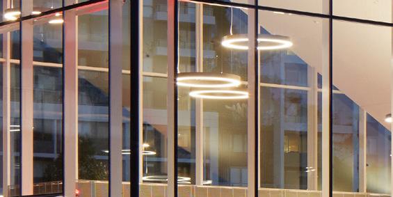

INDE.Awards 2019 Jury




Photography: Tom Roe

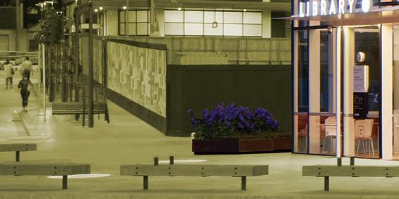
Honourable Mention | Western Sydney University Liverpool Campus, Woods Bagot, Australia
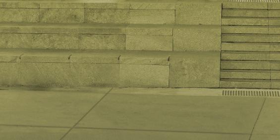
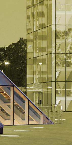
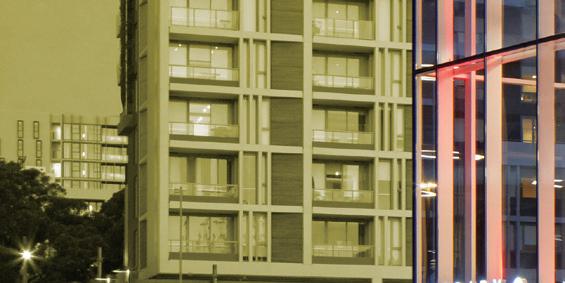



“A learning urbanscape that celebrates transparent knowledge exchange”
Punmu & Parnngurr Aboriginal Health Clinics | Kaunitz Yeung Architecture, Australia
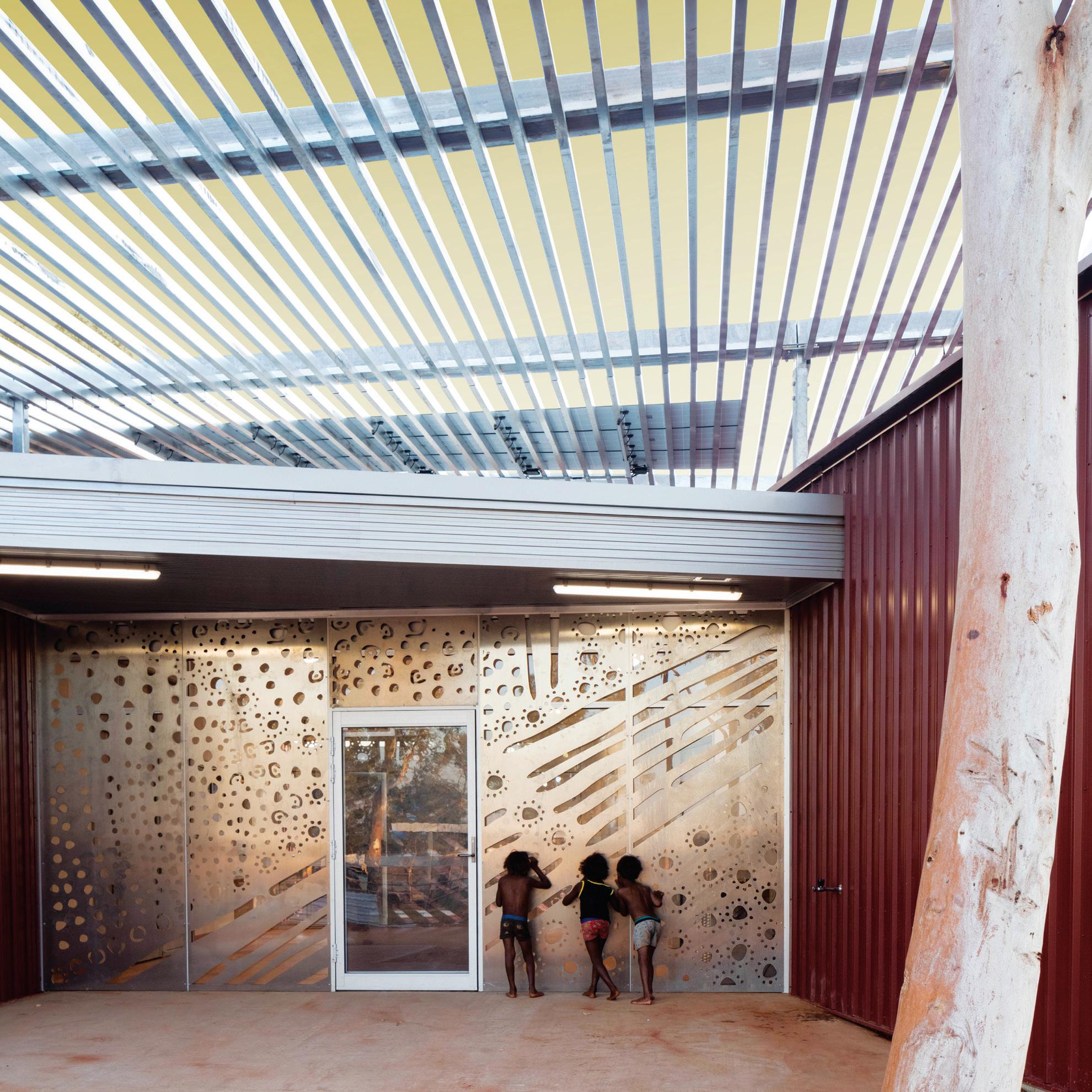
“Welcoming, comforting and eminently practical spaces tackling a critical issue”
INDE.Awards 2019 Jury
Photography: Brett Boardman
Honourable Mention | Perth Children’s Hospital, JCY, Cox Architecture & Billard Leece Partnership with HKS, Australia
Space & Time | Russell & George, Australia




“An experimental workplace that evolves and intrigues”










































Photography: Paul Martin



Honourable Mention | Piazza Dell’Ufficio, Branch Studio Architects, Australia





INDE.Awards 2019 Jury
Photography: Jason Busch
Honourable Mention | UOVO, SUPERSTRUCTURE SG, Singapore

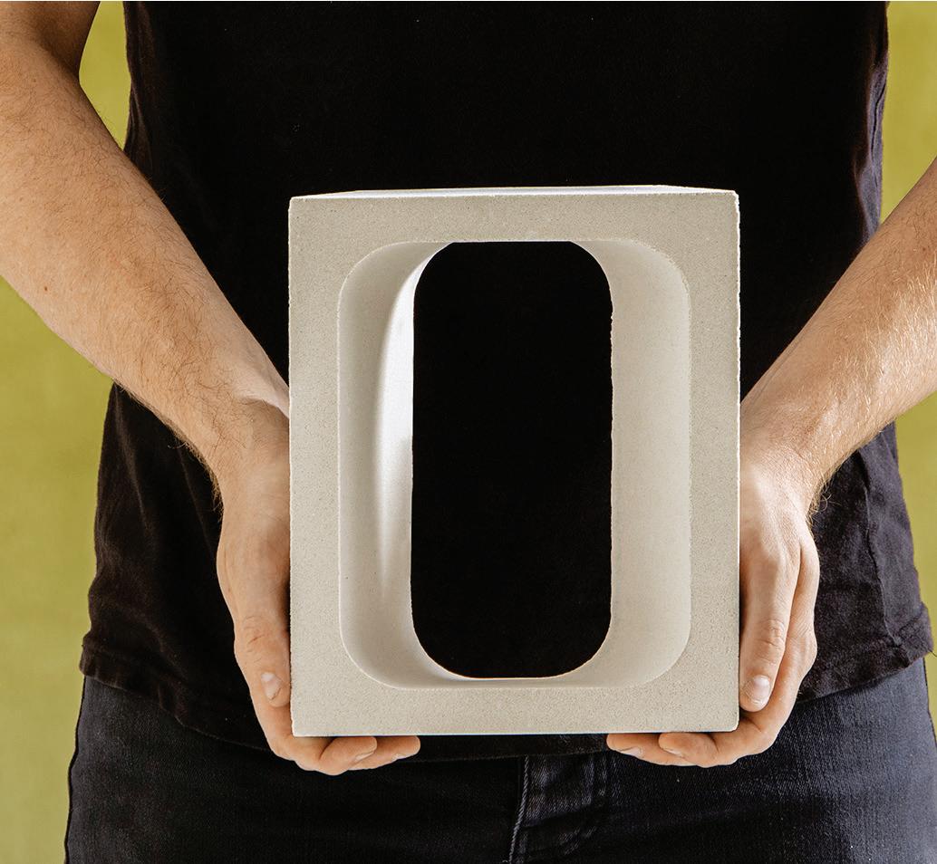
“Breeze blocks become space invaders to transform your inner sanctum”
“Redefining practice by bridging the gap between idea and construction”


INDE.Awards 2019 Jury
Photography: Derrick Lim
Honourable Mention | Edition Office, Australia

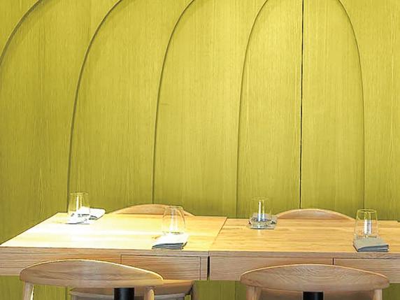
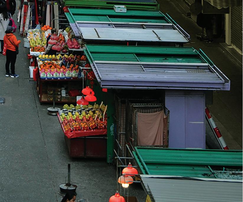
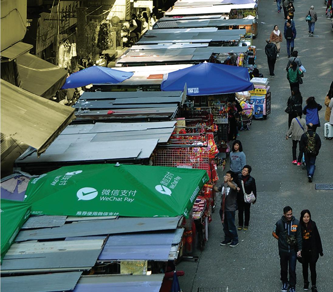
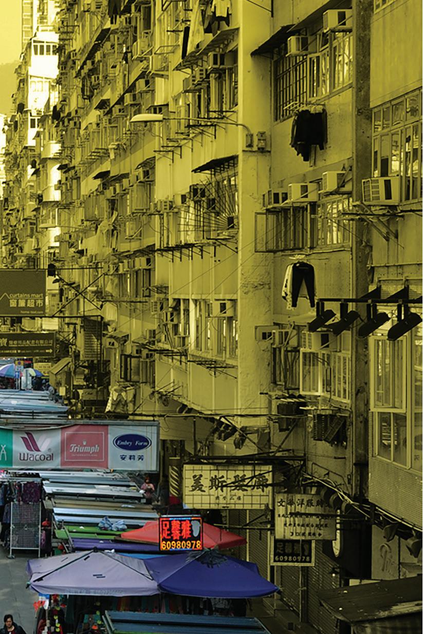
Hawker Reload | Groundwork, Architects and Associates, Hong Kong
“An unprecedented intervention that saved Hong Kong’s street markets”

INDE.Awards 2019 Jury
Photography: Manfred Yuen
Honourable Mention | GRID Education, Carter Williamson Architects, Australia
INDE.Awards 2019 Jury
Photography: Andre Wiredja

“Driving a long-term vision for Indonesian architecture”
INDE.Awards 2019 Jury
Photography: Gemmola
“Advocates for the emotional potential of design”

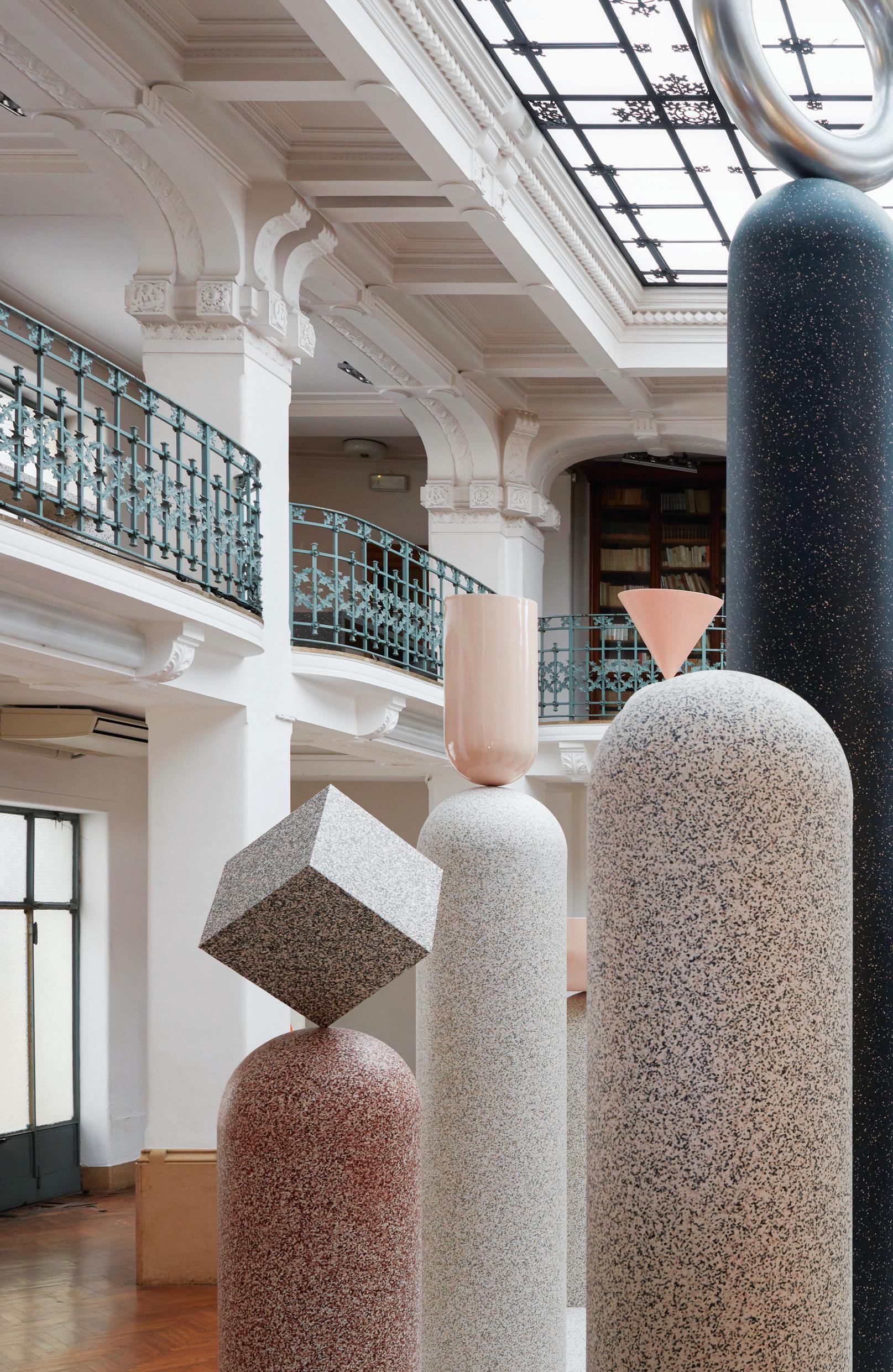
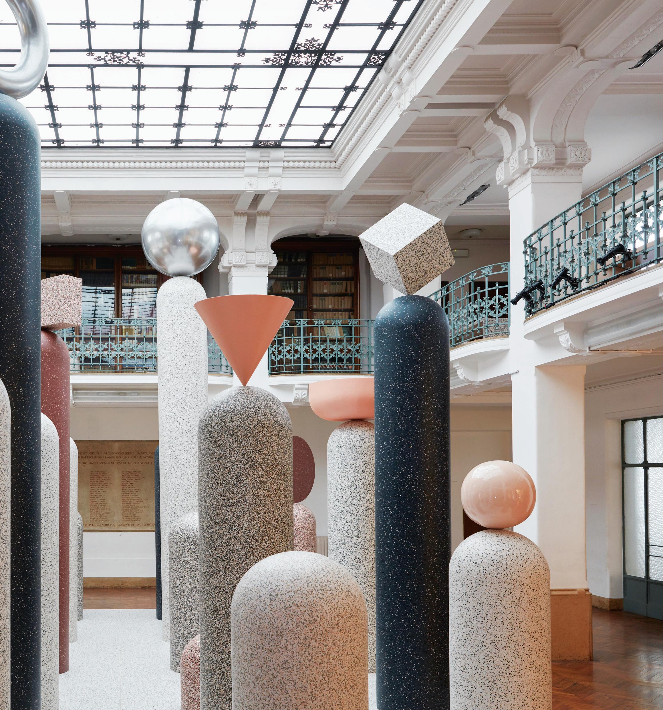
Sustainability has moved well past recycling as a symbol of the ultimate virtue. Fastmoving innovation has saturated industries as far-flung as science and technology to fashion, art and design. And thank goodness for that. So comprehensive is the influence of sustainability, it has transitioned from nascent movement into a fashionable trend that is increasingly being enforced by the consumer. Non-recyclers need not apply. For years designers have been pushing sustainability as something that, when done correctly, can be not only virtuous but downright aspirational. At the Milan Furniture Fair this year, this potential was reinforced beyond all reasonable doubt. Case in point: the perception-shifting power of the iQ Surface, a collaborative project between Swedish design studio Note and Australian flooring experts Tarkett. The collection comprises five thematic variations on vinyl flooring (a particular specialty of Tarkett). Colour curation is the driver behind each of these themes, which is where Note came in. The studio created a distinctive colour family and surface technique for each iteration of iQ, which is aesthetically reminiscent of classically elegant materials such as terrazzo. For this reason, Note and Tarkett decided to launch the product in Milan’s iconic Centro Filologico Milanese, one of the oldest centres for the study of language. As part of this breathtaking, installationbased product launch, iQ was strewn over the venue’s historic arches, forms, columns and brick faces, transforming it into a world of contemporary colour with timeless edge, challenging preconceptions of the possibilities of vinyl as a design material. But here’s the kicker. Not just enviably beautiful, the material is technologically edgy. Not only is each iQ colourway made using as much recycled material as possible, it is designed with a fully closed loop in mind. The vinyl flooring is able to be recycled endlessly, tying back into Tarkett’s production process even after decades of use – an example of sustainability that is timeless not only in name and design, but in literal application.
The straps cut out of the DL lounge chair twist and hug users’ backs when they sit down.
“With any collaboration, it becomes a dialogue between two very different perspectives and technical skill sets.” These words belong to Dion Lee, the iconic Australian designer known for his strong tailoring and signature style of cutting into structured cloth.
Although there is difference in any collaboration, there is also similarity. The new DL range of furniture – a collaboration between Dion Lee and DesignByThem’s Sarah Gibson and Nicholas Karlovasitis – is wonderful precisely because it celebrates shared design values from two different sides of the fence.
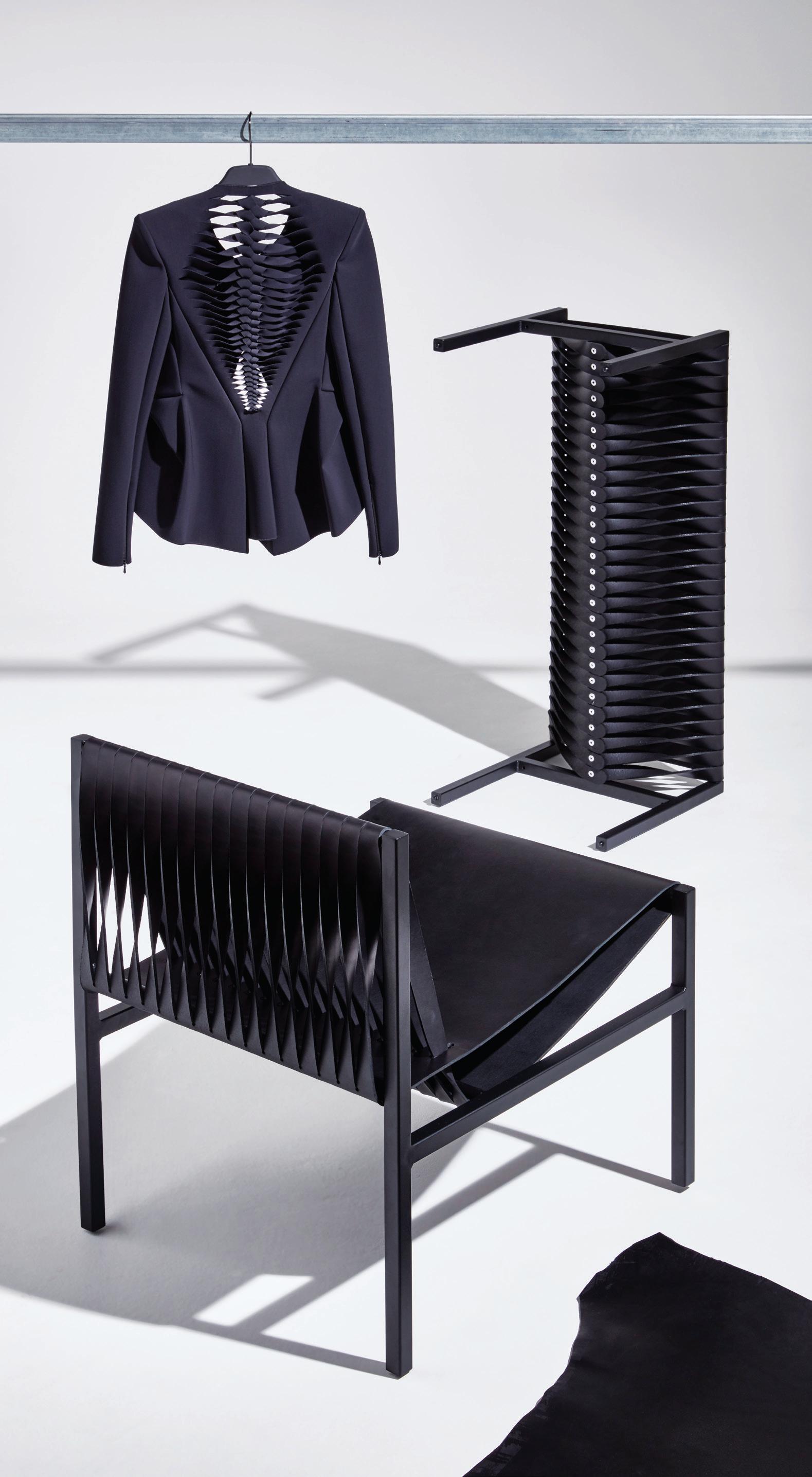
The range, launched at Milan Furniture Fair, consists of a lounge chair and bench that apply the same edgy cuts and timeless structural details of Dion Lee’s fashion collections, combined with DesignByThem’s penchant for industrial design channelled into contemporary, user-friendly products.
The seed for DL was first sown during a casual conversation in Milan and has taken over three years to resolve into its current form. The designers’ shared interest in a technical design and desire to explore different materials and techniques culminates in purposeful, functional and aesthetically strong products. Intended for use by “innocent bystanders” in Dion Lee retail stores, comfort is at the heart of these chairs. The designers chose leather as the primary material for its physical comfort, and because it softens the otherwise harsh-edged aesthetic. Durable, timeless and structurally bold, it’s a lesson in making the familiar radical – a fitting outcome for two brands at odds in their complementarity.
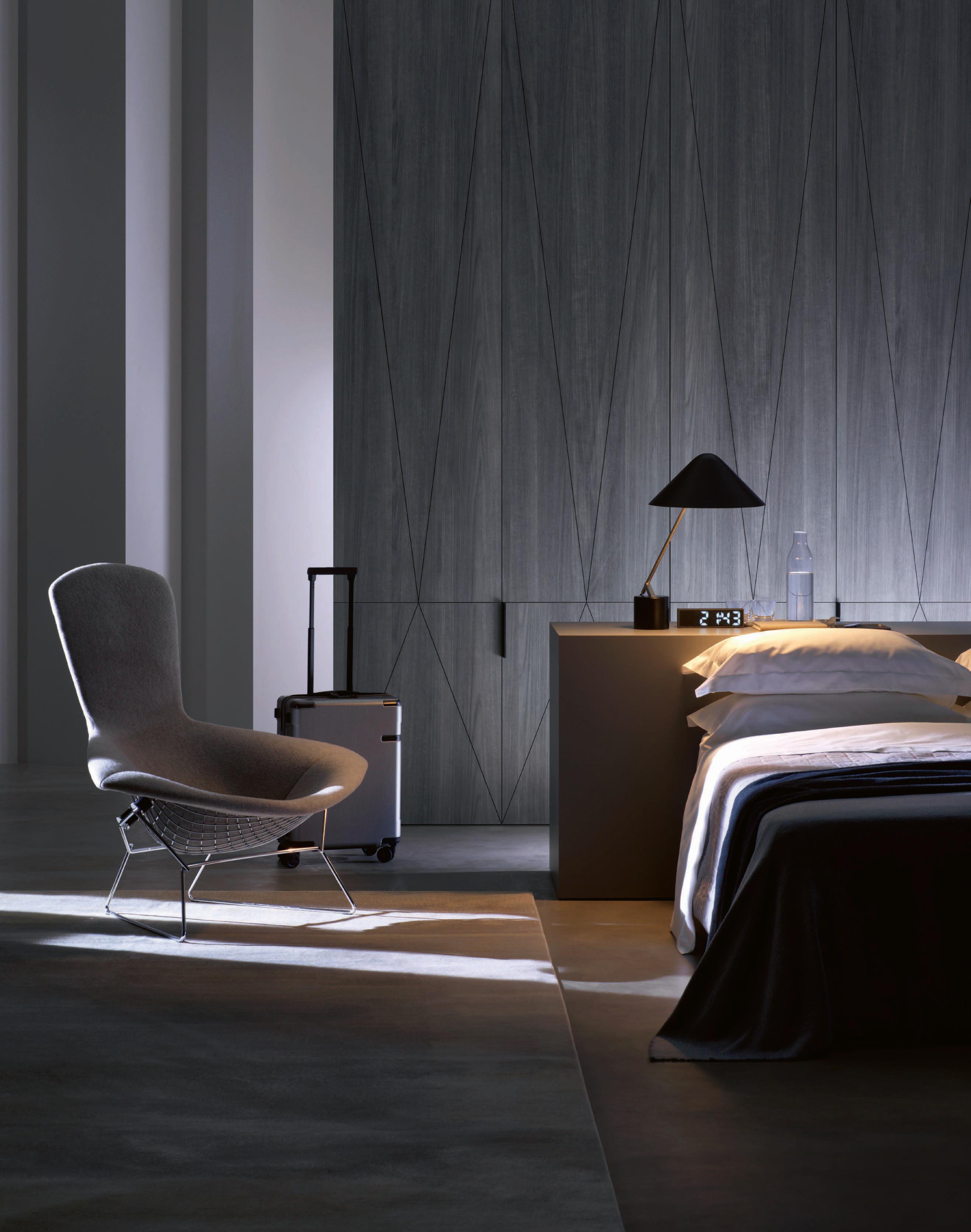

Blair Cooper of NoiseNoiseNoise has a vision for the micro and macro in equal measure. Dabbling in disciplines of fashion, graphic design and retail, the projects undertaken by her studio (including Subtype in Melbourne, le ) are ultimately driven by customer pro le. We quiz Cooper on the changing rules of retail. Indesign: How has retail design evolved since you came into the game?
BC: It is less about volume and more about experience. Gen Y shunned the mall and Gen Z is bringing it back – as long as the store is speaking the same language. Customers want more than messy rails of discounted product; they want to feel a part of a community. Brands need to embrace an experiential o ering. Indesign: The rules of retail are changing every day. How can brands keep up?
BC: I feel that there are no rules; it is actually about exibility. Clients are looking for something ‘wow’, but it’s also a little scary to move away from the trialled and tested standard of a store. We try to think about the ‘changeable’ elements of the design that we can have some fun with, and keep the bones of the space to what we know works.
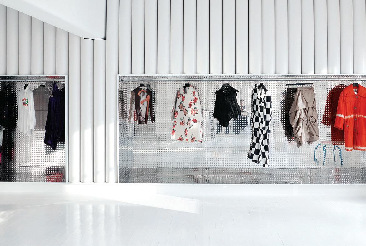
Much like private art collectors which open their archives to the public, fashion collector Octavius La Rosa wanted to open his personal collection of 3000+ avant-garde garments to the public and turned to Sibling Architecture for a cutting-edge retail concept. The result, dot COMME, nods to the white cube concept of an art gallery while moving beyond it. Much like the garments that hang as objets d’art on racks resembling futuristic picture rails, the interior delivers customers into a world of invention: white walls are textured and undulating, rugs slither abstractly up walls and luxurious change rooms hide behind concealed portals.
Indesign Herman Miller
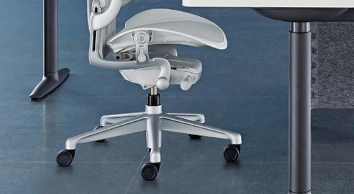
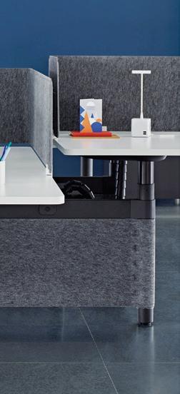
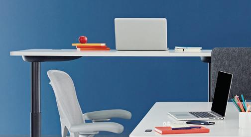
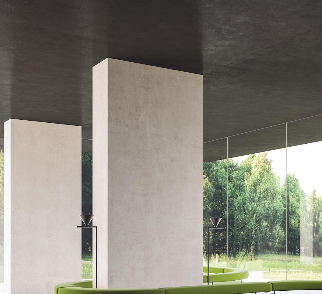
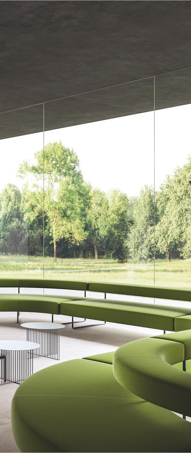
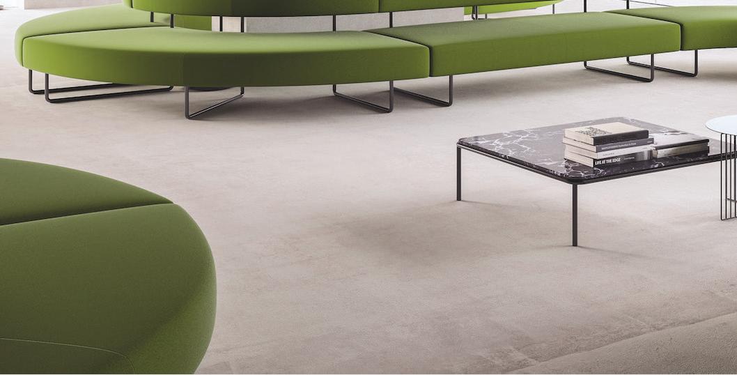
“Customers will never love a company until the employees love it rst,” says marketing guru, Simon Sinek. This exact sentiment also informs the idea of humancentred design. Workplaces today focus on boosting comfort and encouraging movement, so employees can remain productive and engaged. Herman Miller’s Atlas O ce Landscape, an ergonomic height-adjustable system, goes by this design mantra too. With multiple set-up options including a unique windmill pattern thanks to its innovative cable management system, the product is ideal for focused work and impromptu meetings.
Indesign UCI
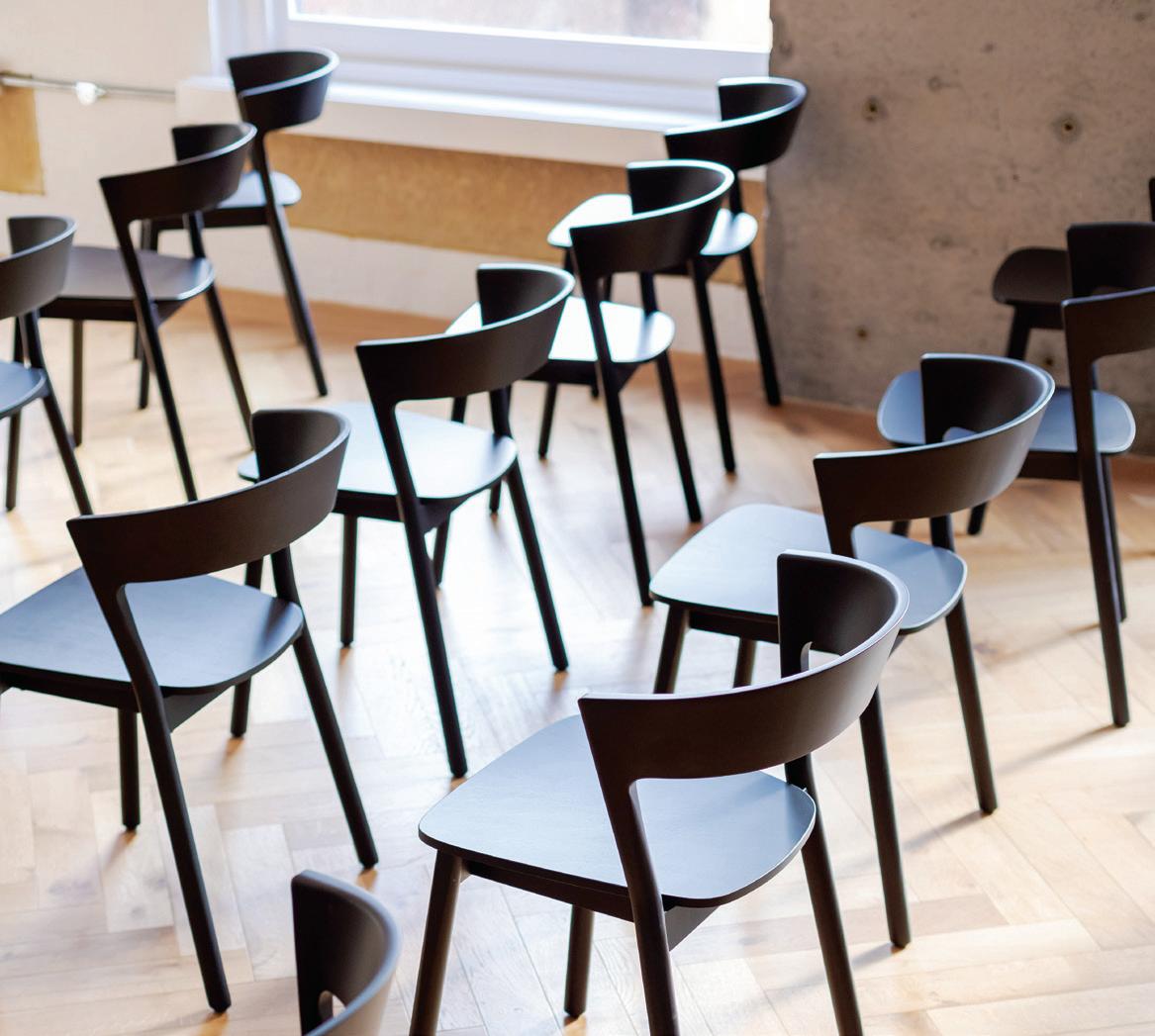
What makes Scandinavian design so popular? Elegance, simplicity of form and utmost functionality are just a few qualities that spring to mind. These are also some of the characteristics imbued in the Edith chair. Designed by Massimo Broglio for Trabà, the Edith chair has turned heads since its very rst debut, and with sensuous curves and a strong form, it’s not hard to see why. Plus the Edith is stackable, customisable and is complemented by a stool version. Very Scandinavian indeed.
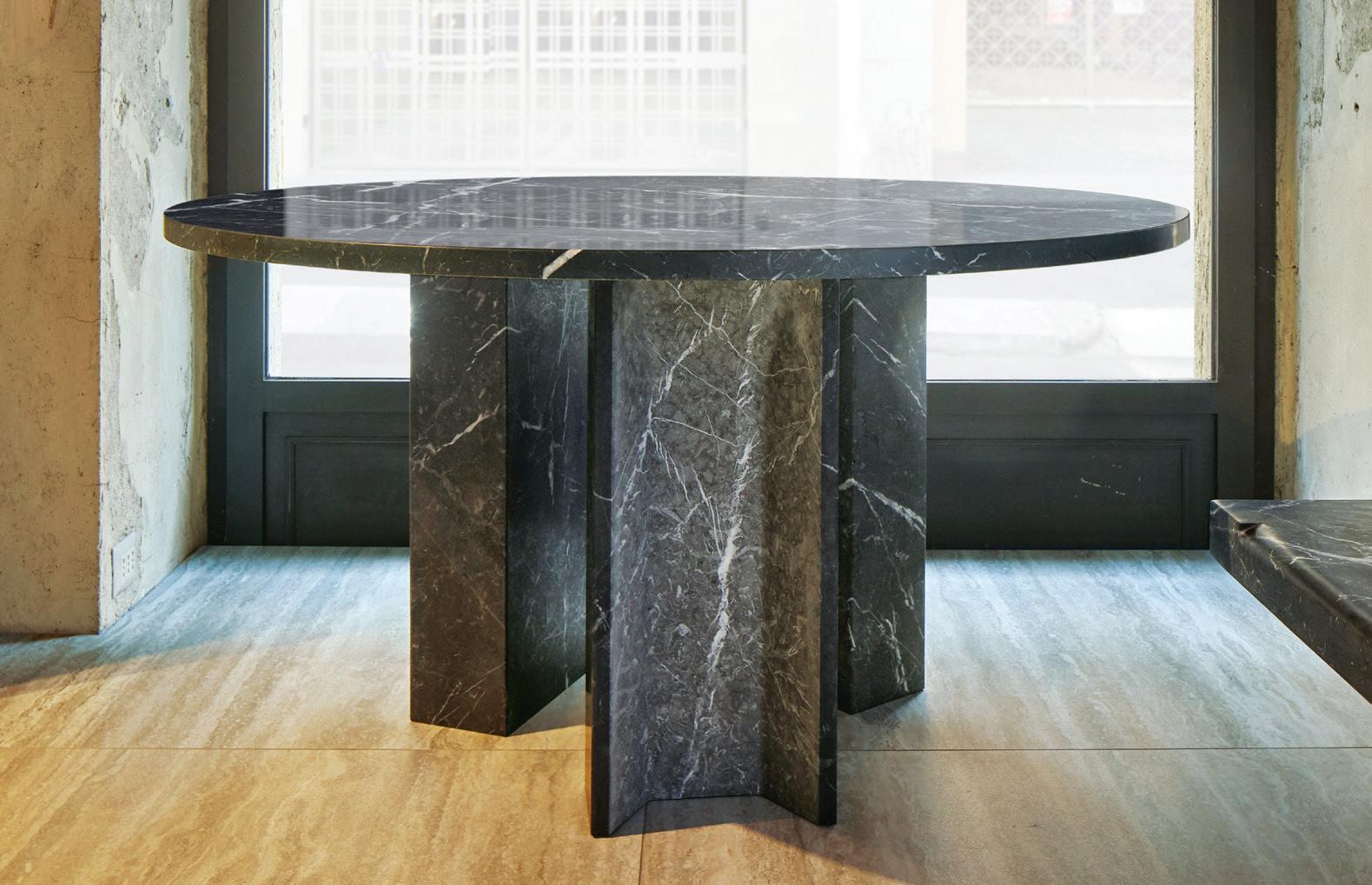
A simple manipulation of basic materials such as wood, stone, metal and leather can have a deeply profound e ect. This is the basis of the Elemental collection from BassamFellows (available through Living Edge). Subtlety is everything, so the brand says. It’s an inherently oxymoronic notion, the concept that something unassuming by design can leave such a lasting impression. Yet it does. The Plaza collection of tables and benches, launched at Milan Furniture Fair, was created using single pieces of travertine, Nero Marquina or Bardiglio marble. Conceptually, Plaza toes the line between dynamic, modern forms and an ancient methodology: the fashioning of shapes carved from single blocks of marble.
Indesign VOLA
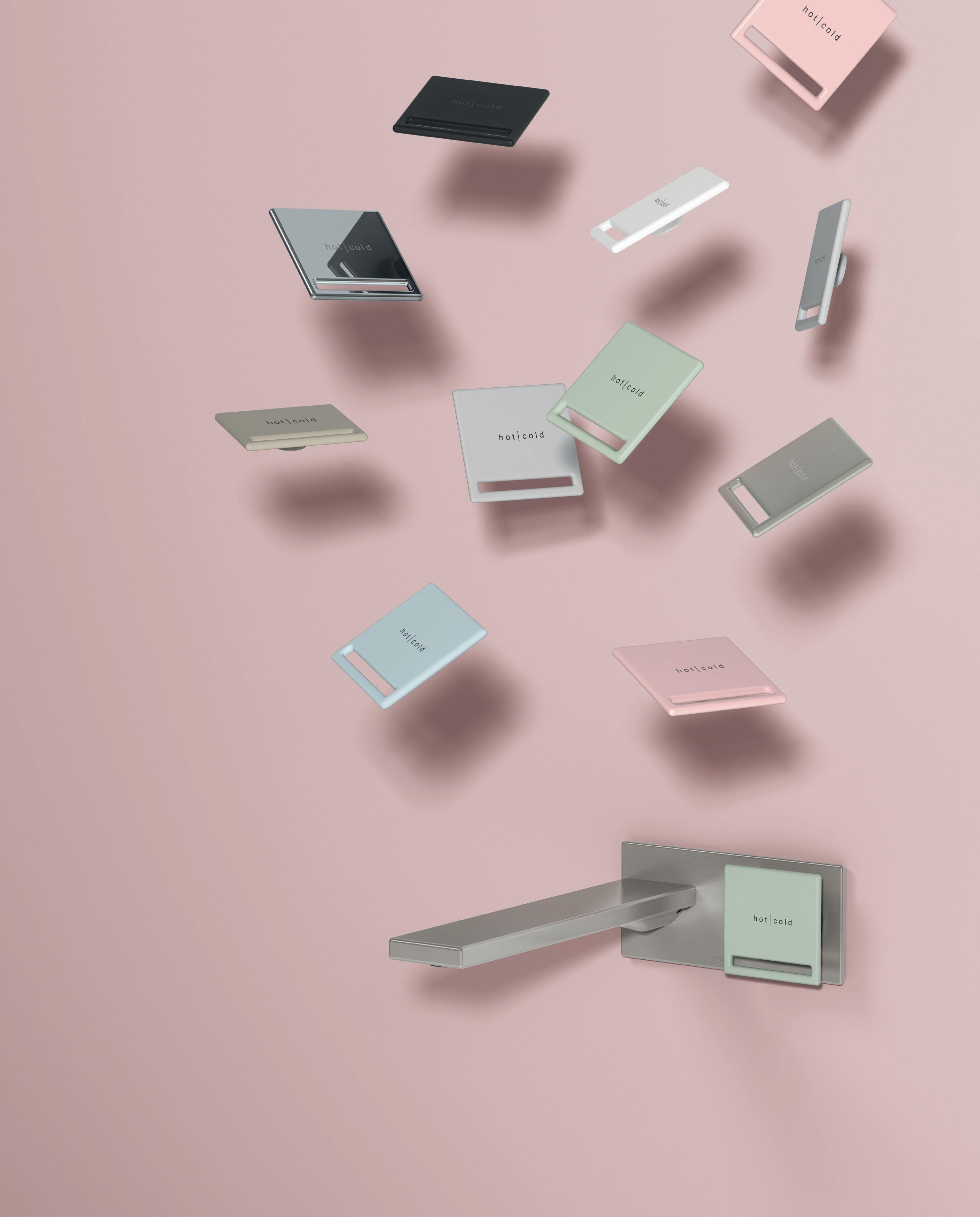
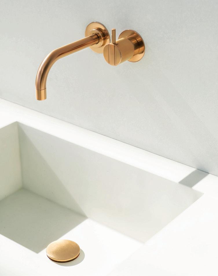
What makes design worthy of recognition? Is it aesthetic superiority, sustainability, user-friendliness, cra smanship? Or a combination of all? For VOLA the latter rings true. VOLA’s 111 Washbasin mixer designed by Arne Jacobson in 1968 won a 2019 German Design Award. High on form and function, this single handle built-in mixer is still getting gongs – 50 years on from receiving its rst ID Prisen award.
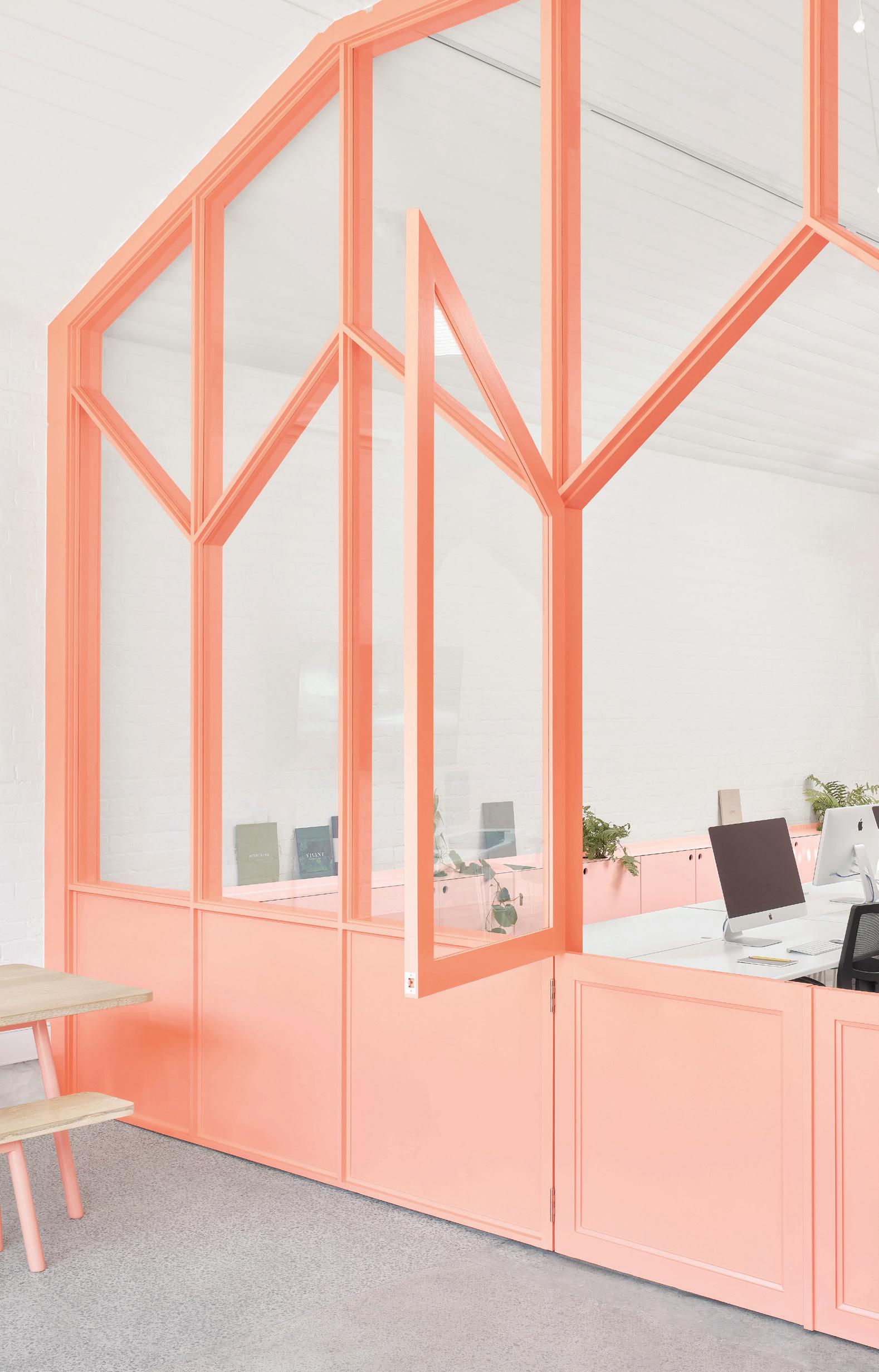
Business can get messy. Working stations, files, archives and competing needs for space can make a workplace chaotic, quickly. But if your client’s needs are thoroughly assessed from the outset, and the character of a workplace pegged, then personality and functionality are able to come together in a playful space of deceptive simplicity.
This is what was achieved by BoardGrove Architects when it took on the renovation of a shared studio space in Windsor, Melbourne. The two businesses that use the space –Earl.St, a graphic design studio, and ANGLE, a boutique property developer – had for years been slogging it out in a warehouse building with little natural light, minimal colour and a mess of squeaky office chairs. As a close-knit team of creative professionals, this existing space failed to capture the vivacity that defines their output – and with little storage or display space, there was no room to share and hide their collateral.
For this project, colour and spatial definition were the two driving agendas. BoardGrove conceived of a modern, gradated colour scheme in three shades of peach to lighten the space: the darkest shade was used towards the front of the studio, where natural light was most plentiful, getting lighter towards the back. A windowed stable wall was erected towards the entrance as a playful separation of meeting and working space, without cutting one end off from the other. Neon signs shaped like irreverent emoji characters replaced the glum hum of fluorescent lighting.
Mid-height, peach-hued cupboards were installed along the edges of the studio to hide away necessary business materials while, for more aesthetically-pleasing design projects that beg showing off, retail-style display shelving was installed, with spaces specifically designed for the incorporation of pot plants and greenery.
Indesign PGH Bricks & Pavers
Indesign Sub-Zero and Wolf
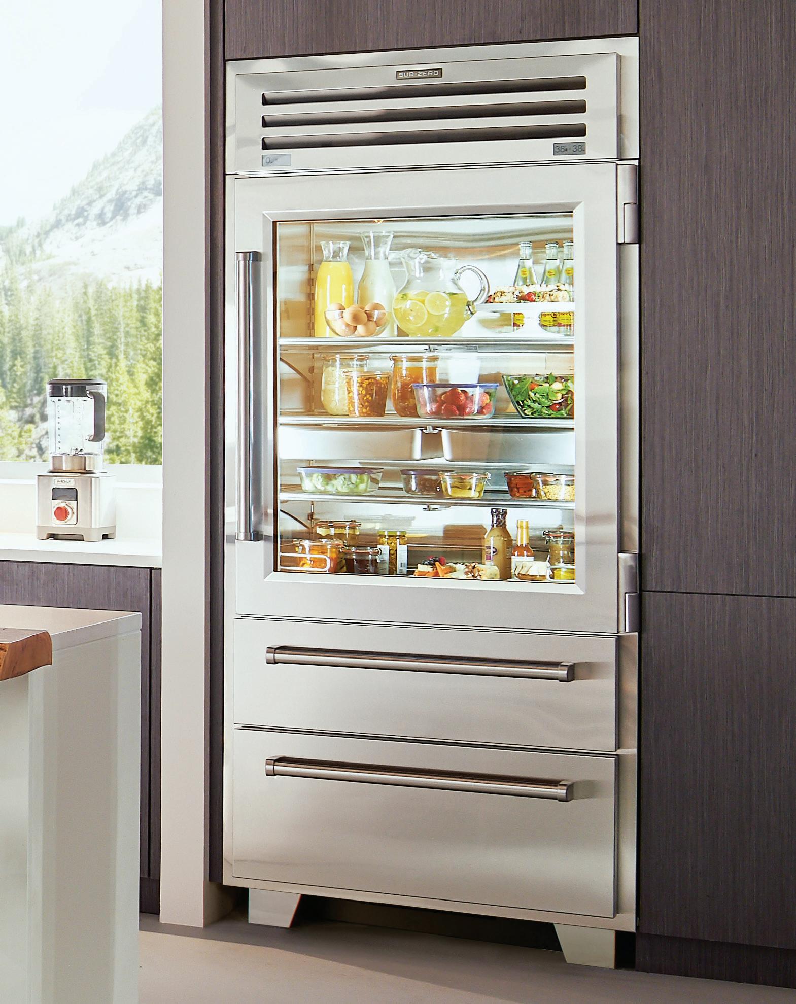
Once considered purely utilitarian, stainless steel has rmly established itself within the modern lifestyle vernacular. The Sub-Zero Pro 36 refrigerator/freezer is designed to elevate the kitchen with its sleek, minimalistic appeal. Cra ed using stainless steel on the inside and out, perhaps most impressive is its ability to blend seamlessly into existing cabinetry, or simply stand-out from its surrounds. Sub-Zero has backed this up with groundbreaking food preservation technology: dual refrigeration, air puri cation, smooth-glide crisper drawers, and an ultraviolet light resistant glass door.
When gardens, shopping, eating and tourism find fusion in one airconditioned building, it’s safe to say the Singapore model has eclipsed itself. Jewel Changi Airport opened in April with enormous crowds thronging the toroidal inverse dome on a series of ticketed preview days. Since then, Jewel’s already iconic 40-metre-high waterfall-in-a-garden has been documented in tens-of-thousands of Instagram posts and the surrounding ring of retail and food and beverage spaces has seen brisk trade.
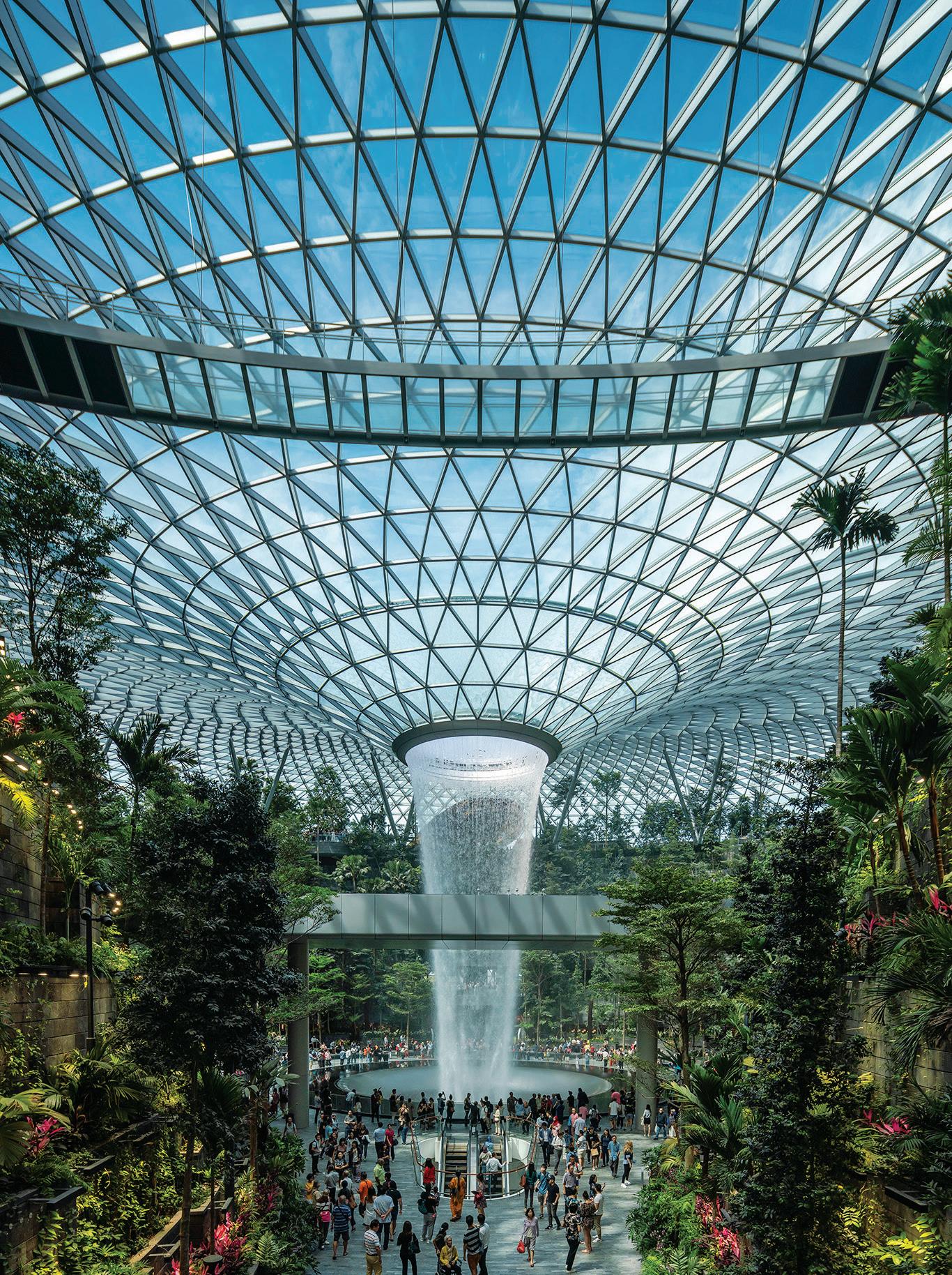
Working with numerous collaborators, Safdie Architects (design consultant) has delivered what it describes as a new building prototype for connecting city and airport –“transforming the airport’s principal function as a transit hub into that of an interactive civic and urban centre”, says Safdie.
The aim was to serve the people of Singapore and travellers equally. So alongside services for both groups in the ring, Jewel’s garden resonates as a spectacle for all. “We felt that the attraction should be timeless and attract people of every age and income,” says Safdie.
In Singapore, one is never far from shopping opportunities. But here, Safdie was adamant that commercial spaces and their associated branding should not intrude into the garden. As such, they circumscribe the garden and waterfall with four ‘gateway gardens’ carving valley-like links at regular intervals around the ring.
Beneath the garden, where the waterfall rushes through a broad soundproof acrylic tube, basement-level dining outlets enjoy direct vistas of the spectacle. It all comes together to create a dream-like reality with a narrative that can be translated by all.
While there is a growing antipathy towards the ‘cookie-cutter approach’ within retail, is it really all that bad? Veteran of retail design, Morris Co.’s Alexandra Morris, is of the opinion that consistency has its benefits – and its downfalls. “Providing customers with an exceptional store experience with great connection to the brand is key,” she says. “There should be a direct connection between the brand’s ethos and the built environment. The cookie-cutter approach has its advantages, such as creating strong brand consistency, but the brand runs the risk of not evolving its store environment and losing connection with its customer as the store design [ages]. Creating a unique user experience is key.”

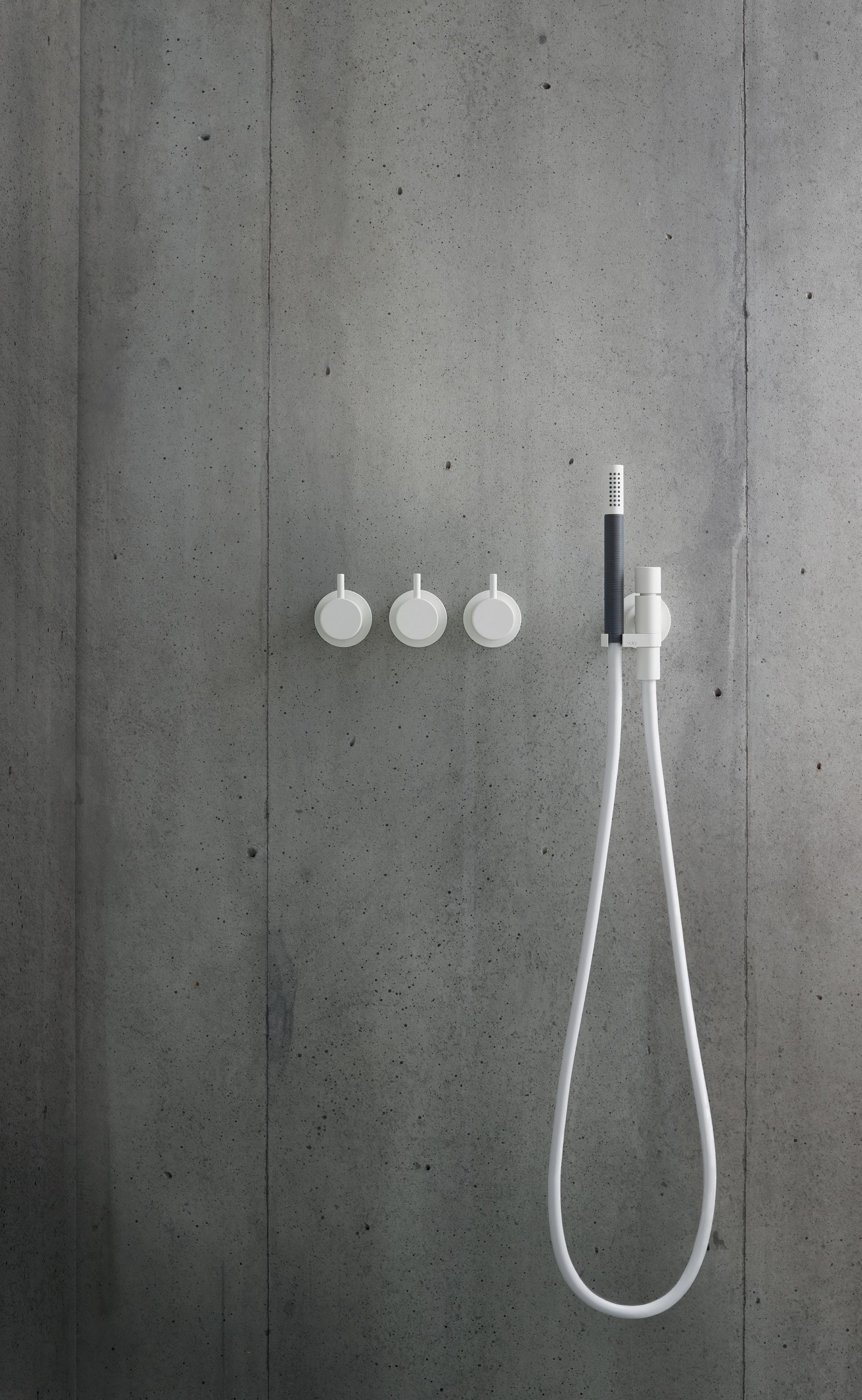
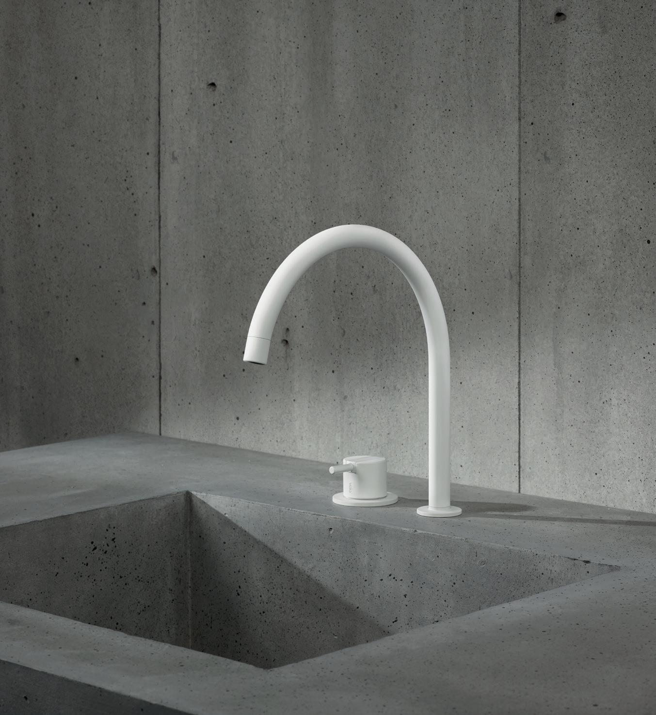
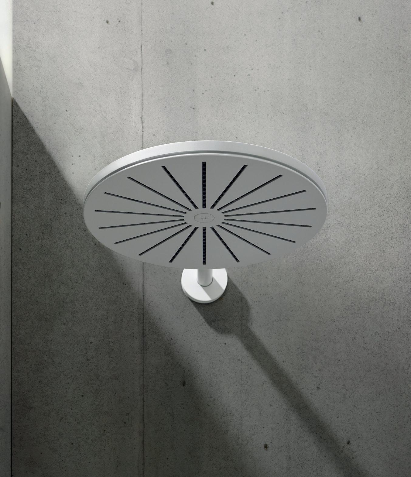 Top left: 060 round head shower Bottom left: 590H basin mixer
At Milan Furniture Fair this year, Brooklyn-based lighting producer Roll & Hill (available through Space Furniture) showed just how substantially collaboration can broaden the horizons. Not one but four new collections were revealed at the fair, each of them the byproduct of relationships with four radically di erent designers: Arbor by Karl Zahn (right); Pole by Philippe Malouin; Geode by Jason Miller; and Coax by John Hogan. Glass, metal and wood, curves and rods – these disparate lighting series have little in common except for experimentation, each addressing di erent needs in the market and proving that divide and conquer can sometimes deliver more exciting results than staying in your lane.
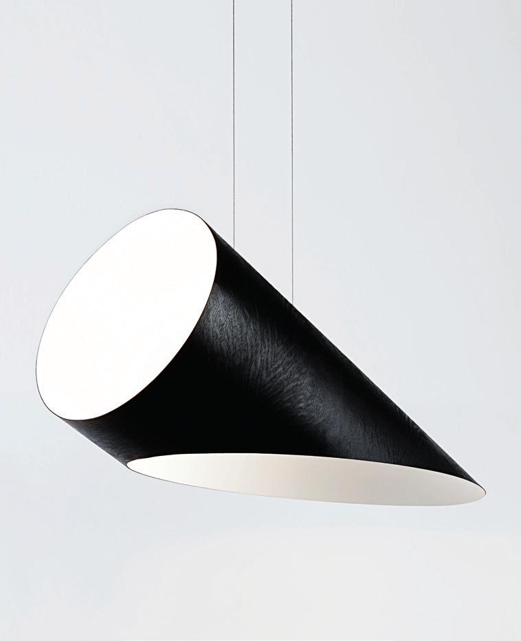
The Arbor collection is an example of how an individual designer’s experience can shed fresh light on old ideas. With a reputation built on work with wood and other natural materials, Zahn’s background stems from a childhood in Vermont, where he grew up playing in the forest and wood shops. Combining this with an education in product design at the Rhode Island School of Design, Zahn’s lighting designs sit somewhere between traditional furniture-making and stark Modernism. The Arbor collection is a similar study in convergence, a geometric creation of oak wood that pairs classic shapes with hard asymmetrical lines; warm natural materiality with the thinnest of wires; literal black with literal white.
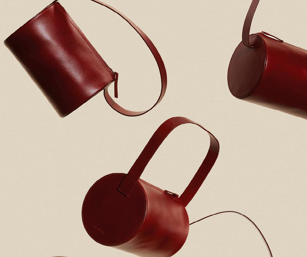
There is an old adage that says, you can’t successfully experiment unless you have mastered the basics. As its name might suggest, cult fashion and accessories brand Building Blocks is all about mastering the basics – except, there is nothing basic about it. Its raison d’etre is to li minimalism out of a bland reputation and elevate it to something avant-garde. By omitting the excessive and returning to timeless forms, the brand is almost anti-fashion, eschewing trends in favour of essential elements, cra ed to exacting standards and with irreverent details adding that element of endearment that makes a staple. In a consumer market where disposability is fast becoming na , considered anti-fashion is the ultimate fashion statement.
Indesign WINC
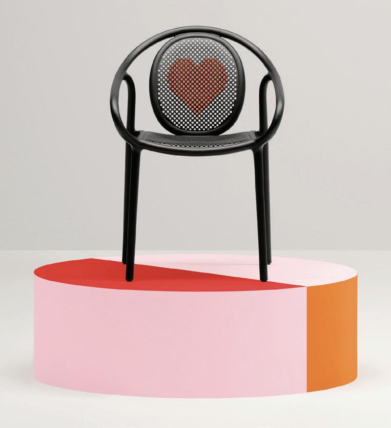
Almost everything we use and interact with can be tailored to our personal requirements and it’s amazing just how down-to-the-detail this capability can be. The Remind Pixel from Pedrali allows you to decorate the perforated backrest of the chair with tiny colourful polypropylene pixels. A golden opportunity for those looking to unleash their inner artist. Pedrali’s plastic furniture is made using premium raw materials, so the chair is 100 per cent recyclable and eco-compatible. Eco-conscious creativity at its best.
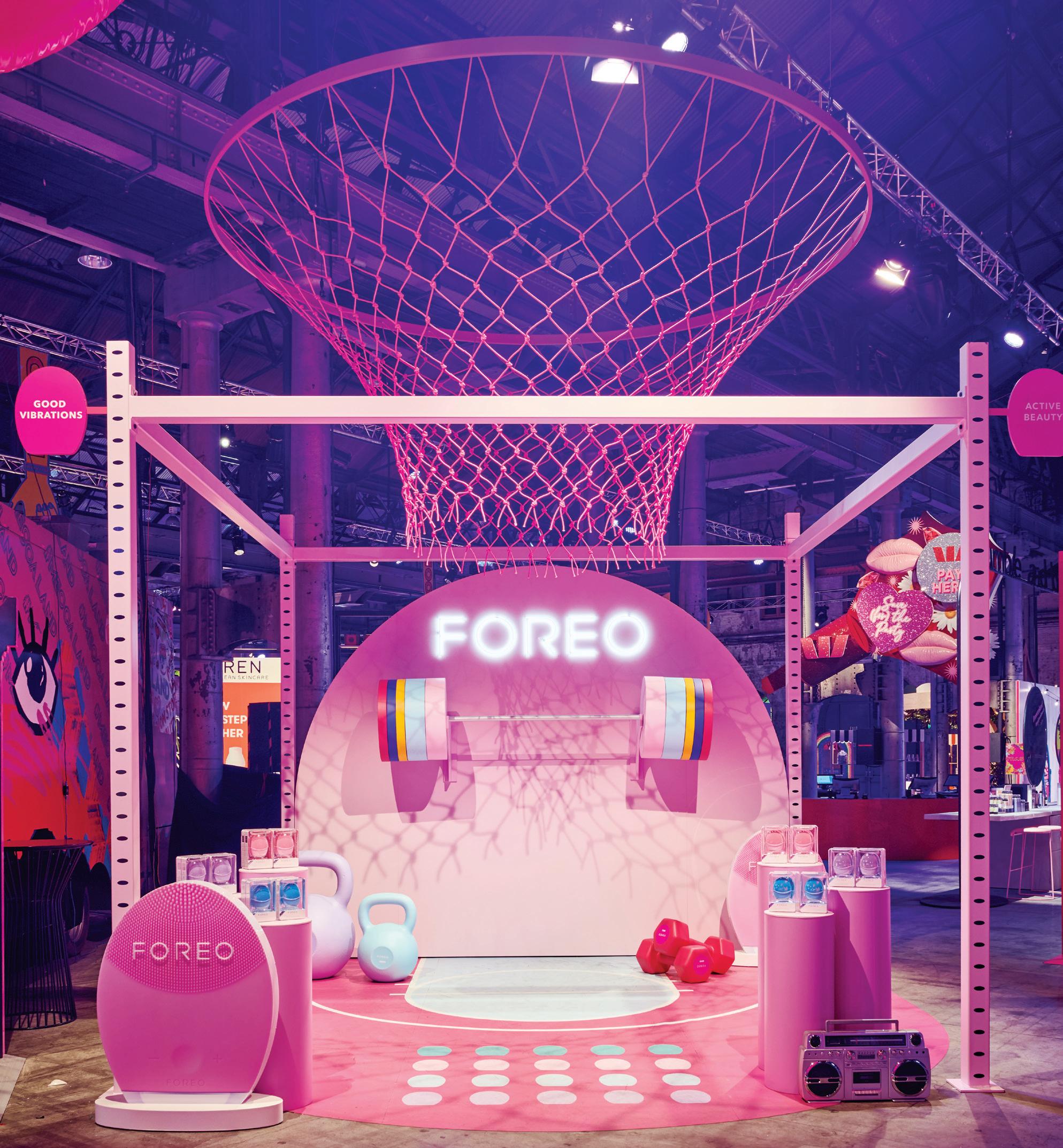
Props provided endless photo and social media opportunities generating optimum brand engagement online and off. –
Brands are so much more than products now,” says Amanda Henderson, creative director for visual merchandising brand, Gloss Creative. “Design is important as it provides new vehicles for expression as brands continually renew themselves and involve their audiences.” At the beauty extravaganza Meccaland (held in Sydney in May), Gloss Creative collaborated with Foreo to design a visually-compelling stall filled with plenty of pop. ‘Active beauty’ was Foreo’s core focus
for the second-ever Meccaland event. The brand worked with the concept of an 80s-style gym themed in the same colours as its new product range. Gloss Creative brought the idea to life through a tight 4x4-metre installation – complete with metal frames, a macramé basketball net and digitally-printed graphics on vinyl floors. Props like kettlebells and barbells were used to lend interest and an element of fun to the stall’s design.
There are more than 70,000 coffee shops in South Korea and, with spaces opening and closing faster than subway doors in the capital, good spatial design does just as much as a menu to create staying power. Within this slick city driven by modern advancement, Etcetera – a café, wine bar and crafts retailer – sticks out like a leaden concrete thumb. Fitted out by local designer Jeonghwa Seo, Etcetera floats as an elevated concrete jungle in refreshing juxtaposition to the glimmering steel jungle of Gangnam’s Apgujeong area. Granted, this was true enough before Seo came on board. The café and wine bar already existed as a concept composed of concrete and glass, but the owners’ mission to Seo was to design furniture that sat with the Brutalist aesthetic, creating more an in-situ object than a café. Running with this idea of raw materiality, Seo designed all the furniture and objects for the venue’s interior by hand – a sure-fire way to differentiate it from other retail spaces. Raw concrete, welded aluminium and brass form the primary material palette, forged into elongated elliptical shapes by Seo, who left his artist’s mark on
products such as the oak-topped aluminium stools, into which weld marks have been purposefully left ungrounded to show the ‘pure’ quality of the material.
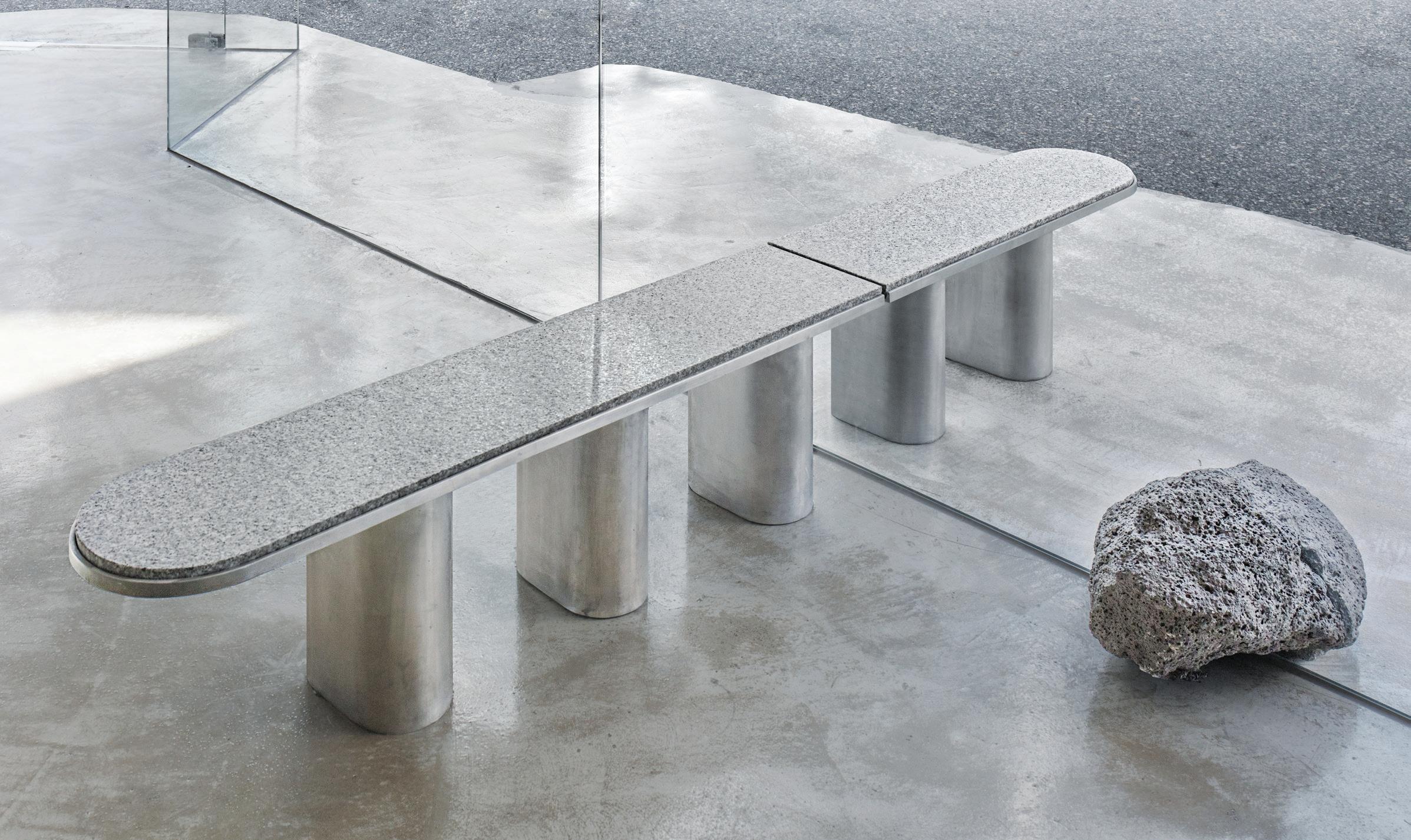
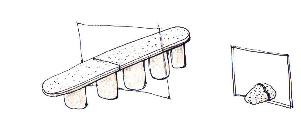
Like an industrial cupid, Seo also identified materials that would bring out the best in the café’s existing features. For instance, the street-facing facade of Etcetera is pure glass, so that its interior is entirely visible to passers-by. To highlight these transparent properties, Seo designed a bench seat that appears to puncture the glass, providing both indoor and outdoor seating in one smooth line.
Seo’s staunch commitment to raw simplicity is best exemplified in his method. Instead of using cutting-edge processes and technical renders, he worked from freehand drawings and old-fashioned trial-and-error. A wine shelf, for instance, is handmade from mud, concrete and wooden crates; an object from another time to bring out the raw quality of drinking wine. The final result appeals to a basic craving for texture and authentic materiality; the difference between seeing the mountains on screen and spending a day climbing them.
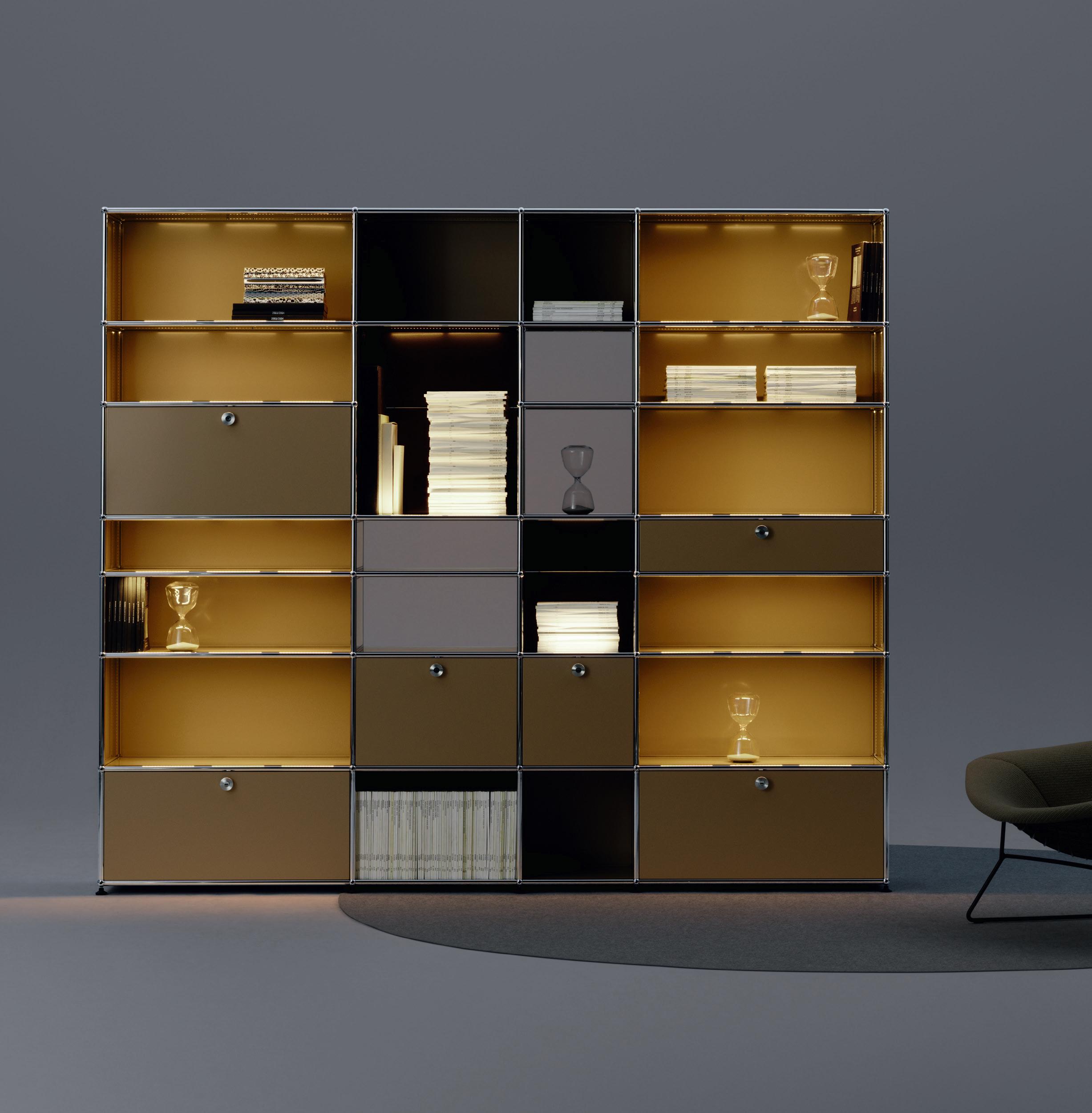
See the difference light makes… USM Haller E lighting is now available and can be integrated into your customised furniture.
www.usm.com





Building a USM Haller shelving system is akin to playing with large colourful blocks with con gurable drawers, doors and panels. One could transform it into a book shelf, desk, wardrobe; the possibilities, practically endless. With the modern Haller E Lighting system, the modular shelving design now embraces cable-free power supply.
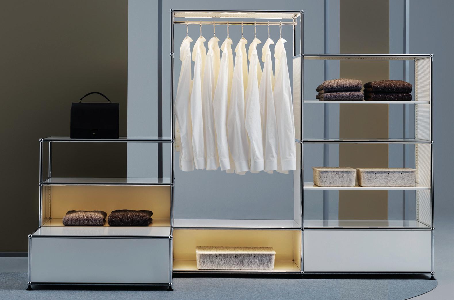
Power ow has been seamlessly integrated into the furniture structure thanks to the re nements of the ball, connector and tube. The lights embedded in the tubes provide warm and even lighting while the USB inserts help mobile devices stay charged. A perfect balancing of aesthetic re nement and practicality.
Indesign Tait
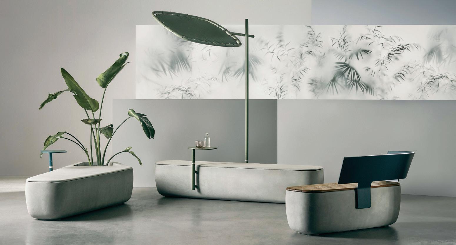
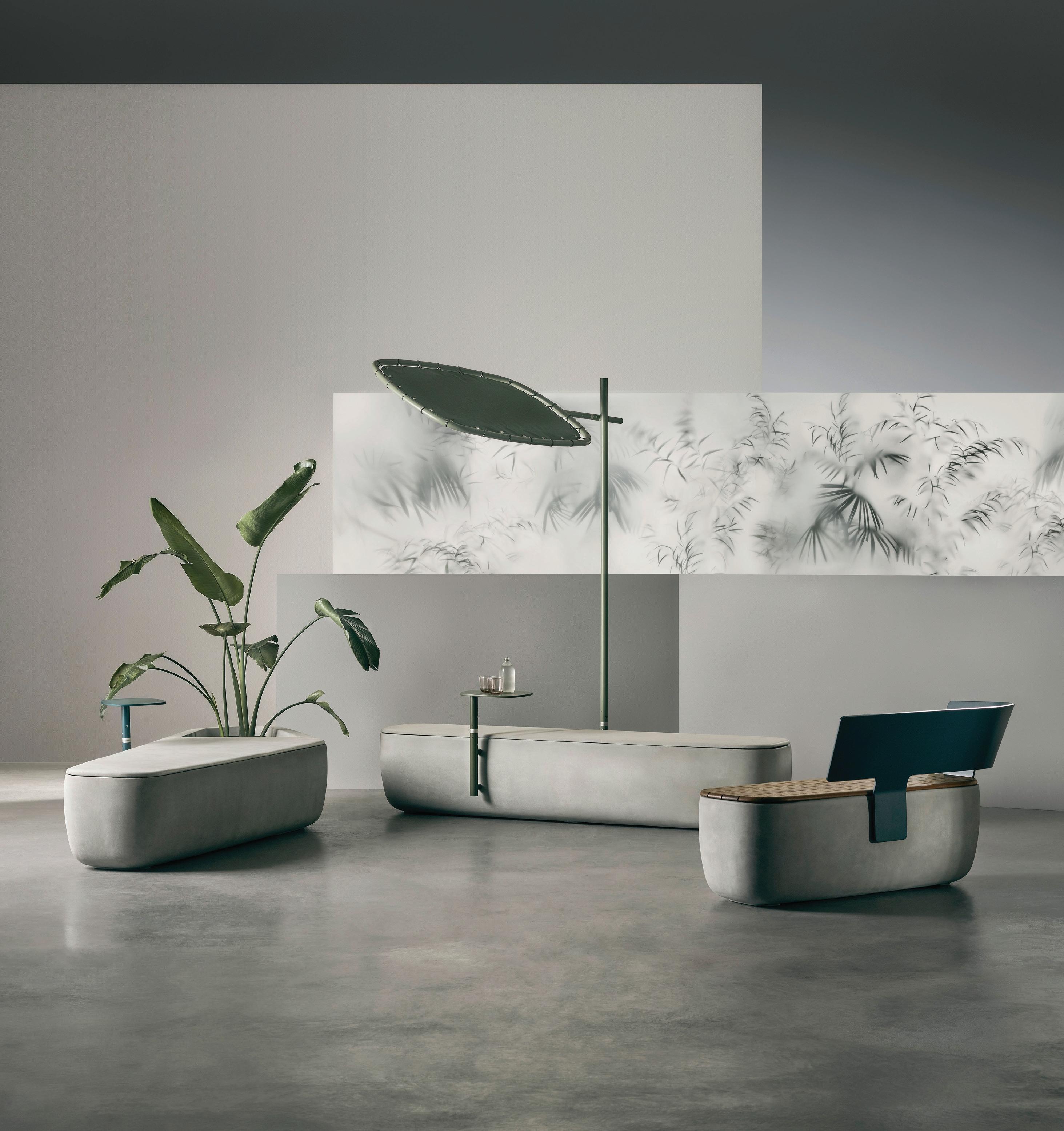
An “increasing need to draw people out of the high-density, siloed and processed living/working environments and into rejuvenating, activated common spaces” has inspired Tait’s Scape collection designed by Adam Goodrum. With wholesome curves that feel warm and tactile, this uid system consisting of outdoor-friendly elements is a departure from cold, angular public furniture. “Scape intuitively entices people into its domain – whether that’s jumping on the laptop to answer [emails], taking the kids to the park, or even just enjoying a breather in some wide-open space,” says Tait’s Gordon Tait. The modules can be con gured with side tables or backrests if needed, and are suitable for harsh environments through to corporate break-out zones.
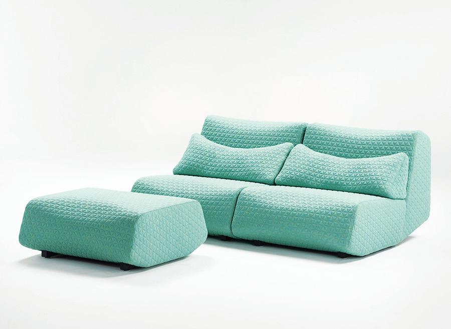
Anything that speaks to a ‘counterculture’ is of interest to us. When we came across Low Life, the modular seating system by Numen/ForUse for Prostoria, we thought it particularly arresting. Harking all the way back to the 1960s in its references, it looks to informal space and unconventional design typical of that period’s countercultural movement. That’s where the past ends and the future begins. Its rounded edges are dynamic in form and with a futuristic undertone. Combine backrest heights and seat depths to arrive at your own perfect combination. It’s an interesting place to come from – 60s counterculture – to design a product for the modern workplace which is, in itself, a little anti-establishment in its hybrid, ultra- uid formats. Available through Stylecra in Australia.
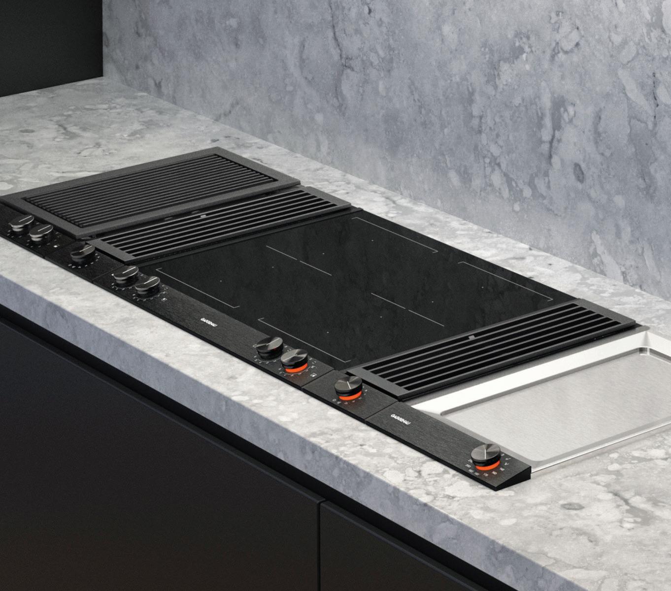
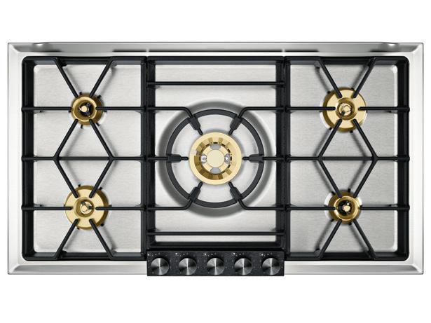
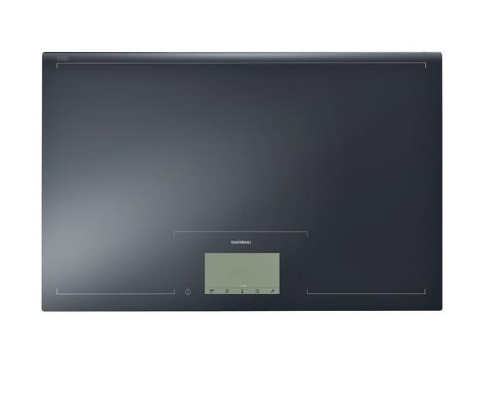
Indesign Gaggenau

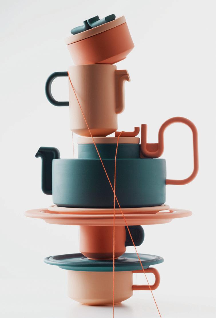
What makes a teapot one of those hallowed design objects and a rite of passage for any industrial designer worth their salt?
Bethan Laura Wood has considered the conundrum and conceived the Tongue Tea Set – a fun, and even slightly provocative edition for a time-honoured tradition.
A classic reborn, the Tongue Tea Set marries linear architectural forms with the frivolity of the 1970s (Wood even notes hot pink garden flamingos as a reference). The ‘tongue’ in the name is both literal and playful: it refers to the flat ribbon-like forms that flow along the claymation-esque body, creating a voluptuous curve from handle to spout: two tongues meeting. With a candy bag of references ranging from iconic German manufacturer Rosenthal, to the wiggles of Eduardo Paolozzi, Tongue Tea Set is an irreverent playground of design history and modern imagination – all wrapped into a modern-day tea service.
Or is it defined by a certain derivative-ness – that sense of the chameleon, where it might adopt the texture and tone of its surrounding environment as its own? Valencian designer, Victor Carrasco, has conceived of the Fitt Classic for Billiani – a wooden chair that is both directive in its design, yet liberated from time and place.
Carrasco is himself a designer with a passion for synthesis, sustainable growth and a pragmatic vision of the future. With an emphasis placed on comfort and multi-applications, he has applied a proportional play that renders the Fitt Classic striking in its own right. A Design Nation stand-out from the Milan Furniture Fair 2019.




FRONT delivers the most forward-thinking products for commercial, hospitality, education and healthcare sectors. Here we share a preview of the new innovations on show at FRONT 2019.
FRONT x Planex
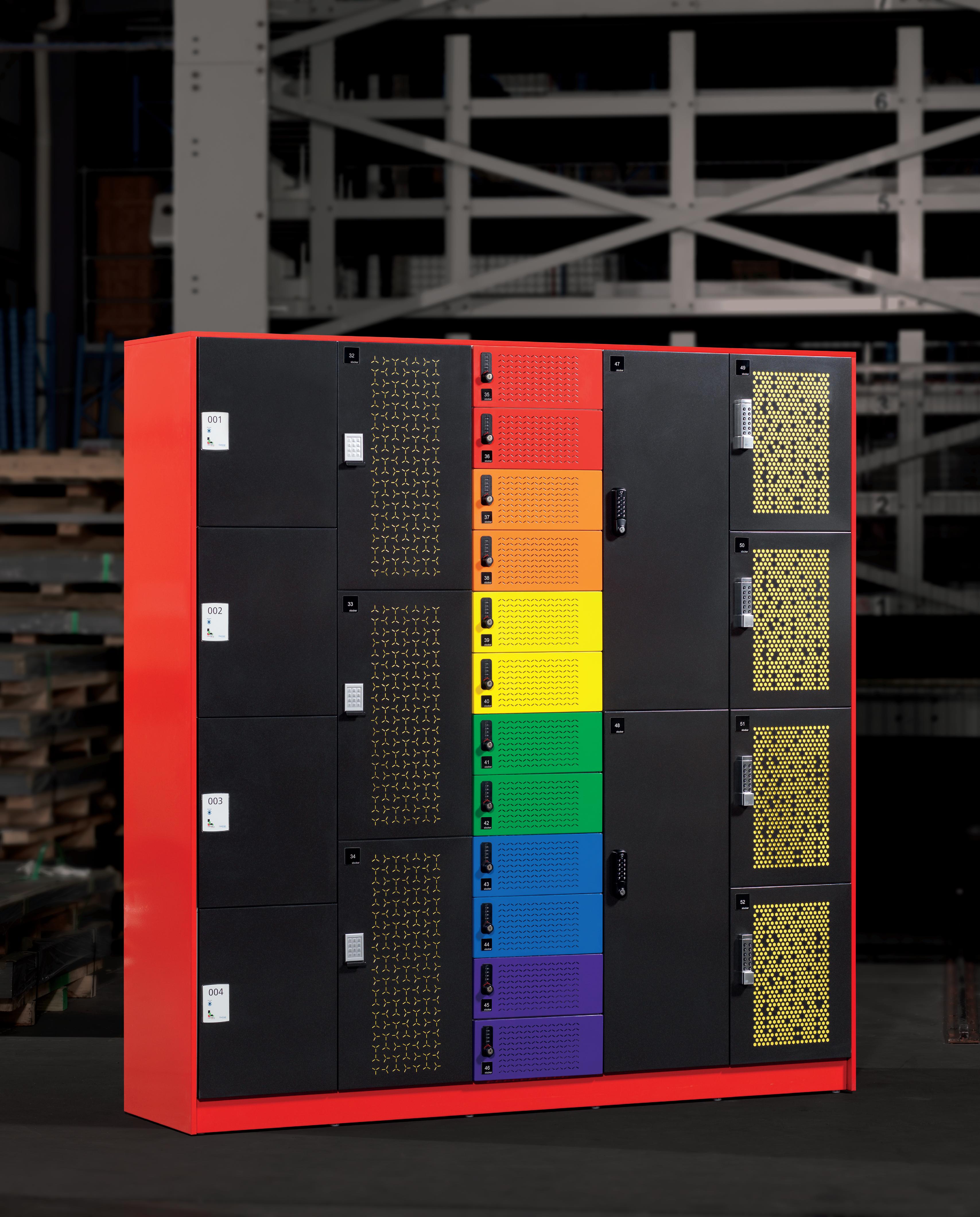
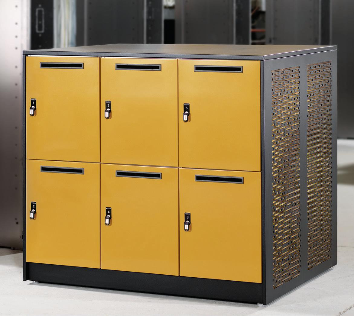
The evolving nature of the workplace requires products that are durable, versatile and elegant for the modern employee. Planex believes in creating custom storage solutions for the workplace that are sustainable and embody the personality of the brand. Designing and manufacturing all its products in Melbourne, Planex’s philosophy of ‘built-out obsolescence’ sets its apart from the rest. PlanexDesign co-directors Leo Ryner and Jean-Pierre Jardel developed the original xLocker to redesign the concept of the contemporary locker within the office. The xLocker was a “sophisticated locker that was fit for purpose, attractive, modular, quick and easy to install and relocate”, says Jardel. Addressing rapidly evolving working modes, the revolutionised and inspiring xLocker2 is a steel personal storage solution designed to accommodate flexible, agile and activity-based working styles. Instilled with the DNA of the original design, xLocker2 is designed to meet the changing demands of the market and aid collaboration, productivity and flexibility.
FRONT x Maxton Fox
A master of its trade, Maxton Fox is a privately owned Australian manufacturing business that is 50 years in the making. It takes pride in refining its expertise in the process of creating pieces in collaboration with partners across large-scale projects in workplace, residential, hospitality and education sectors. Experts in delivering premium quality product across joinery and furniture systems, Maxton Fox puts quality as a first priority.
The brand will be bringing to FRONT bespoke solutions for experiential spaces, working meticulously with longstanding partners Polytec. Functional, agile and adaptable is the premise for this year’s collaboration. Showing a true representation of honest and superior craftsmanship, Maxton Fox continues to impress and inspire.
FRONT x Elevar
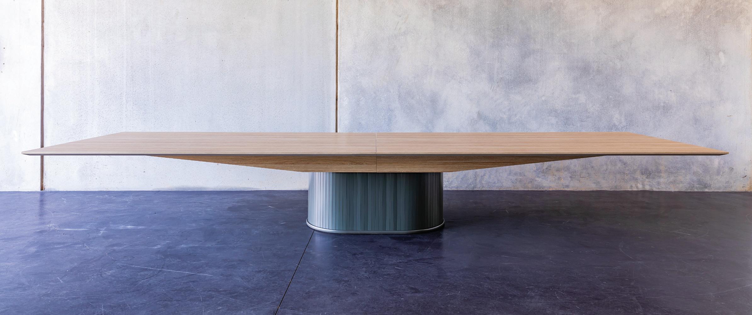
Focused on improving productivity and wellbeing in the workplace, Elevar produces quality electric workstations and accessories that put the emphasis on superior reliability, functionality and versatility. Through its extensive dealer network Elevar distributes its products Australia-wide and is dedicated to making workplace environments both healthier and more comfortable.
At FRONT, Elevar returns with an exciting new range of products for 2019. The EON Workstation System (pictured left) is designed for change. Its adjustable height and flexible system is intended to refresh office layouts and upgrade seating positions. Meanwhile the Ergotron JÜV is a nonelectric, adjustable work surface wall mount system, fully customisable with built-in power and data, and designed to rejuvenate any interior. Finally, the Elevar Booking is a complete system that addresses a variety of booking needs in one simple-to-use system. Ideal for meeting rooms, visitor registration and personal desk control, it is instantly ready to facilitate maximum efficiency in the office.
FRONT x Gunnersen
Committed to prioritising customers’ needs, Gunnersen cares about the clients and maintaining close relationships while delivering functional and versatile surface solutions. Established in 1879, Gunnersen is the largest Australian distributor of wood-based panel products across Australia. The brand’s DesignerPly range is a decorative range of plywood specifically selected to create a unique visual impact for wall panelling, custom joinery and ceiling panels in any environment. Suitable for an array of applications, plywood is easy to work with and the organic beauty of timber is strong and stable, making it a natural choice.
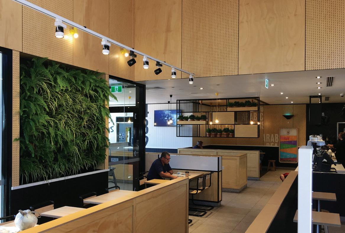
DesignerPly’s extensive range of custom solutions include printed, acoustic, powder coated, perforated and laminated plywood to achieve any desired design. Supplied with a Group 1 fire rating status, DesignerPly is a certifiably safe material for any commercial space. Real, responsible and beautiful, DesignerPly ticks all those essential boxes for sustainability, functionality and performance.
FRONT x Zip Water
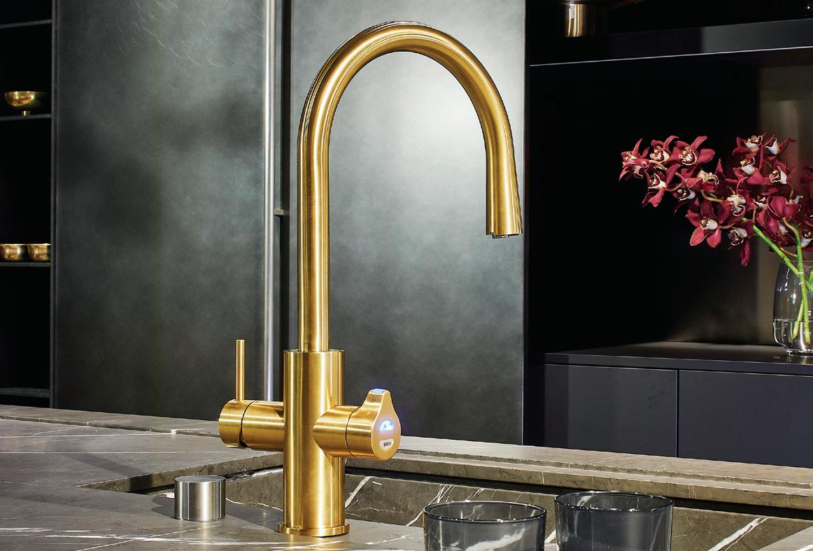
Specialists in advanced hydration solutions, Zip Water brings the world’s most innovative and sophisticated drinking water systems. Australian designed and manufactured since 1947, Zip Water is present in over 70 countries world-wide. Efficiently transforming the way we drink water, the superior Zip HydroTap Celsius All-InOne product is made with the latest technology to deliver the purest tasting; instant filtered boiling, chilled and sparkling drinking water, plus hot and cold washing up water in a single tap.
Developed with sustainability at the forefront of its design process, the HydroTap is an internationally recognised sustainable product – from early stages of the production and processing through to the distribution and installation. Research has demonstrated that 80 per cent of Zip HydroTap users significantly consume more water throughout the day, reducing the risk of fatigue and aiding concentration, productivity and general health and wellbeing. Dedicated to wellness in any environment, Zip Water represents the future of water in a single, beautifully designed, easy-to-use tap.
FRONT x europanel
Pioneers in fabricating bespoke acoustic panelling, europanel makes a statement with its euroBLADE for the Ice Cave at Skye Hotel Suites in Sydney. The fully customisable suspended ceiling panel system creates a sculptural statement through the dramatic composition of organic curves throughout the heated swimming pool area. Originating as a compelling design by Koichi Takada Architects, the re-creation of the concept into its physical form successfully pushes the boundaries of fabrication and design outcome.
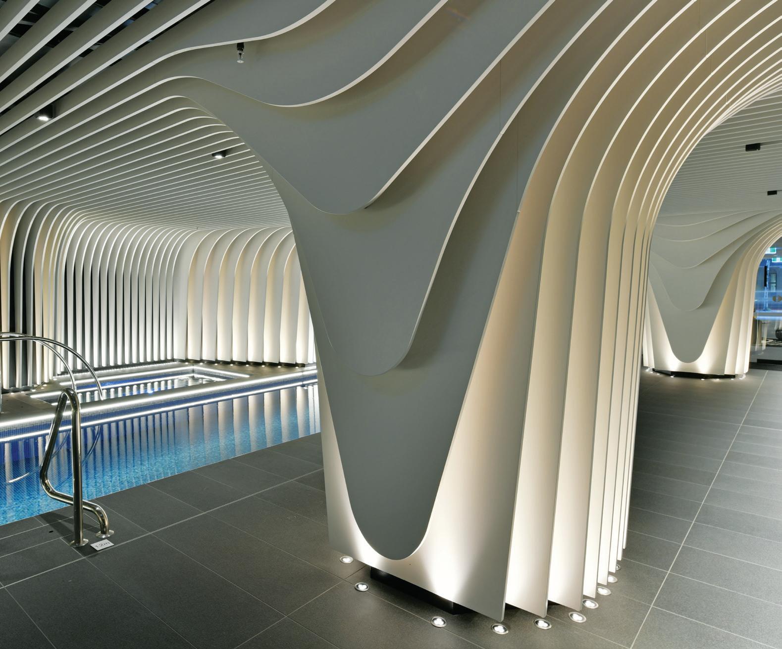
Innovating beyond simply fabricating acoustic panelling, europanel uses materials and textures that offer flexibility, sustainability, a zero-carbon footprint, and through expert engineering – maximum sound absorption. Specialising in delivering innovative decorative and acoustic solutions for any design vision, europanel uses its expertise in joinery manufacture to make revolutionary steps toward creating compelling and sensory spaces.
FRONT x Tarkett
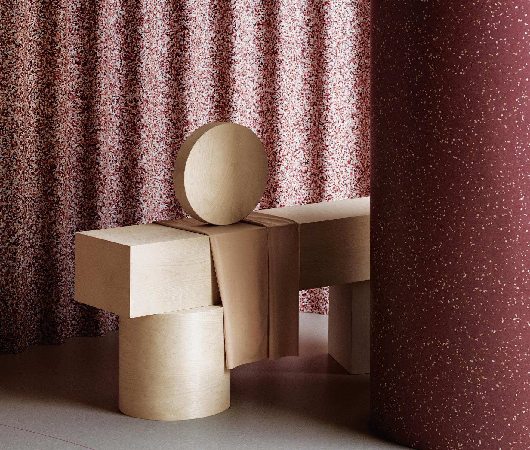
Function meets beauty in Tarkett’s new iQ Surface collection designed in collaboration with Note Design Studio. With more than 130 years in the industry, Tarkett is a world leader in innovative flooring; its iQ Surface gives credence to this expertise, pushing the boundaries for homogenous surfaces in design and architecture.
Previewed at Milan Furniture Fair 2019, the collection excels in areas of performance and aesthetic, offering limitless landscapes of expressive colour along with essential qualities of durability, versatility and sustainability. “During the curation of iQ Surface’s colours and groupings we’ve always had a central idea of [this collection] acting as a ‘skin’,” says Note Design Studio’s My Degerth. “It’s a material that deserves to fill a space, you can do so much with it.”
FRONT x Dyson
With a presence in over 65 countries world-wide, Dyson is one of the world’s most innovative and forward-thinking brands. Starting with one simple idea, James Dyson invented the world’s first bagless vacuum cleaner and, since then, Dyson has grown into the inspiring, driven and limitless brand that the world knows of today.
At FRONT, Dyson presents the newly released Dyson Lightcycle™ task light, representing the very latest in lighting innovation following two years in development. An evolution from its current generation of LED lighting, the Dyson Lightcycle™ uses a unique time, date and location-driven algorithm to calculate the colour temperature and brightness of daylight anywhere in the world. With an automatic light adjustment system, it changes in colour depending on your local temperature and brightness throughout the day.
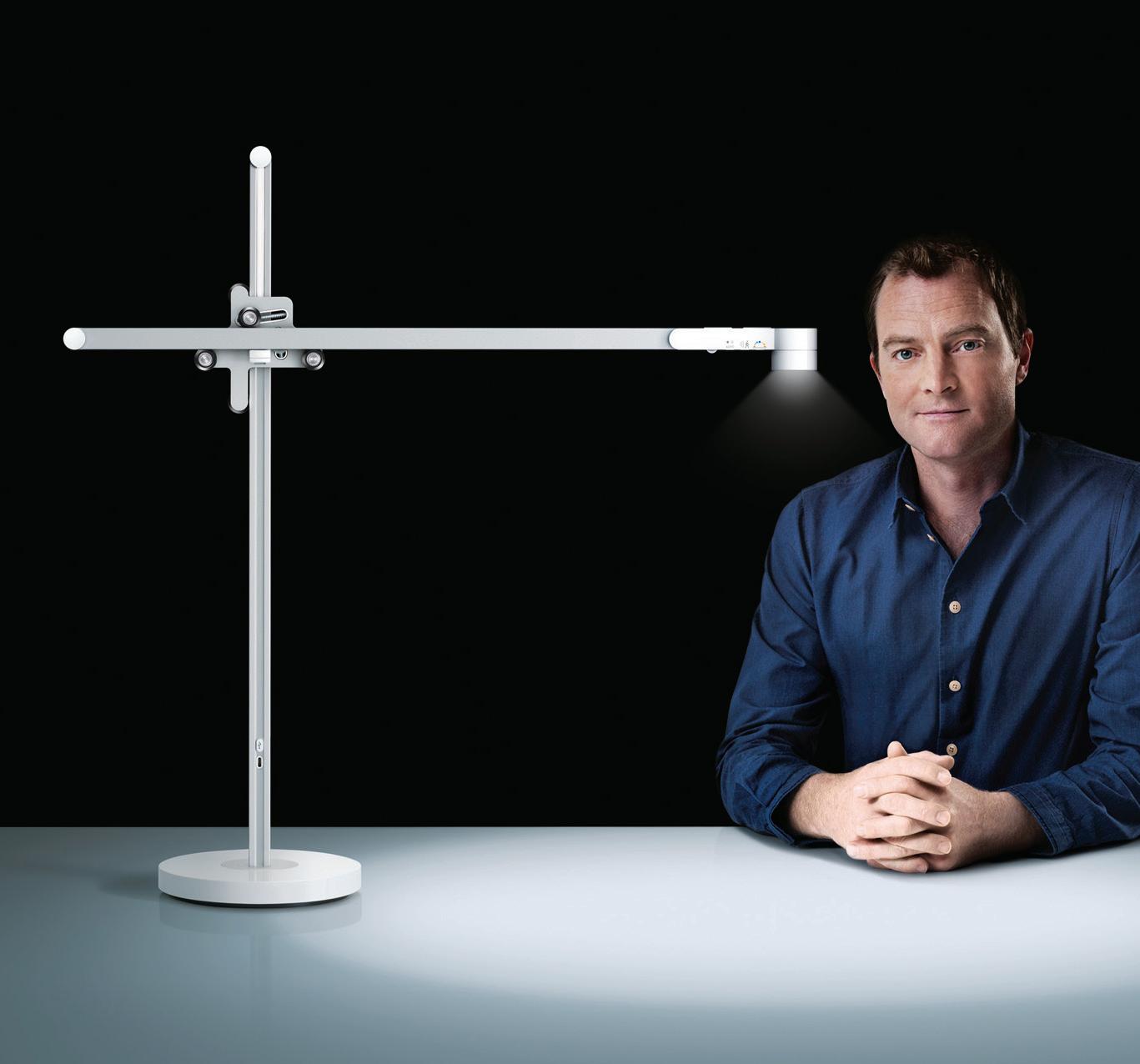
First-class technology through the Dyson Link app provides a range of customisable and easily accessible options for the user to experience this product’s full potential. Using ambitious and superior creativity, Dyson really does redefine everyday technology.
FRONT x Polyflor
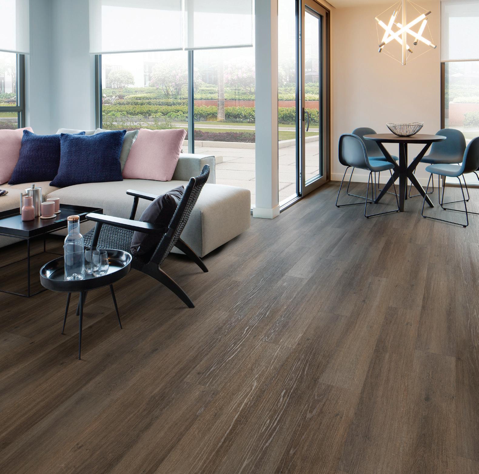
Guided by a strong belief in designing for a better environment, Polyflor’s products are impactful, dependable and sustainable inside and out. Offering customers a wide variety of vinyl flooring solutions to suit any need, Polyflor’s superior quality products demonstrate sustainable slip resistance and acoustic noise reduction alongside qualities of practicality and style.
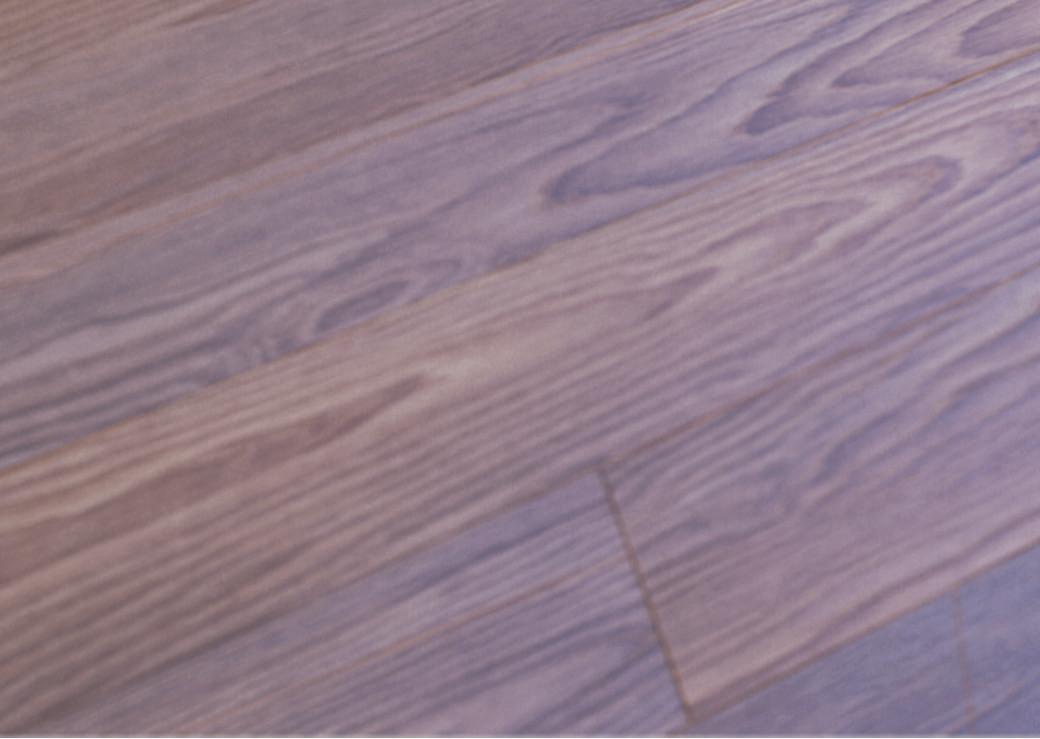
Its new collection of luxury vinyl tiles, Expona Superplank, is designed to inspire engaging and stylish interior spaces. Working with a team of Australian interior design experts in the development of the range, Expona Superplank’s authentic wooden planks and abstract geometric tile formations exude elegance as well as sophistication.
The collection is engineered with a premium 0.55mm wear layer making it ideal for use in heavy commercial interiors. Its new 2mm gauge also provides a seamless bridge when installed alongside 2mm sheet flooring. The ultimate in practicality, style and durability.
ON AIR SUNDAYS FROM 2.30PM
26 New ePISODeS
There is no other television program in Australia like AUSTRALIA by DESIGN.
The program aims to bring beauty and creativity into the hearts and minds of Australians as we explore the impact of good design on our lives. Each series serves as an important ‘document’ in the recording of Australian design excellence.
In every episode we visit Australia’s most creative designs, interview the designers and the key players to uncover the human stories behind their pursuit of design excellence.
EON Workstation System by Elevar
EON is a revolutionary new system that shelves the inflexibility one has come to expect with traditional workstations.
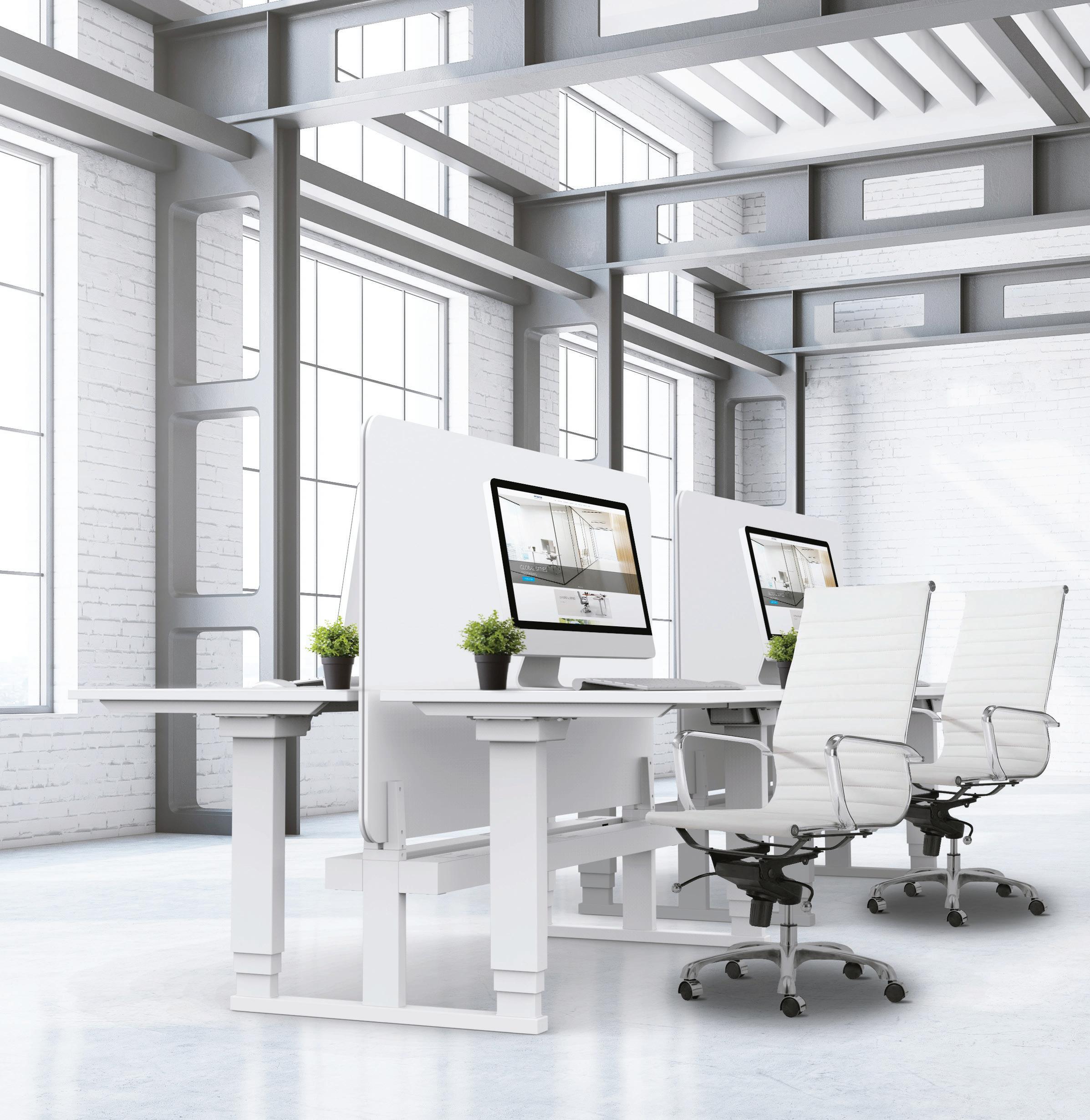
EON offers a full spectrum of fixed and adjustable leg options with the ability to reconfigure layouts, or upgrade from fixed to height adjustable frames as required.
eLeVaR eOn – Raising the standard.
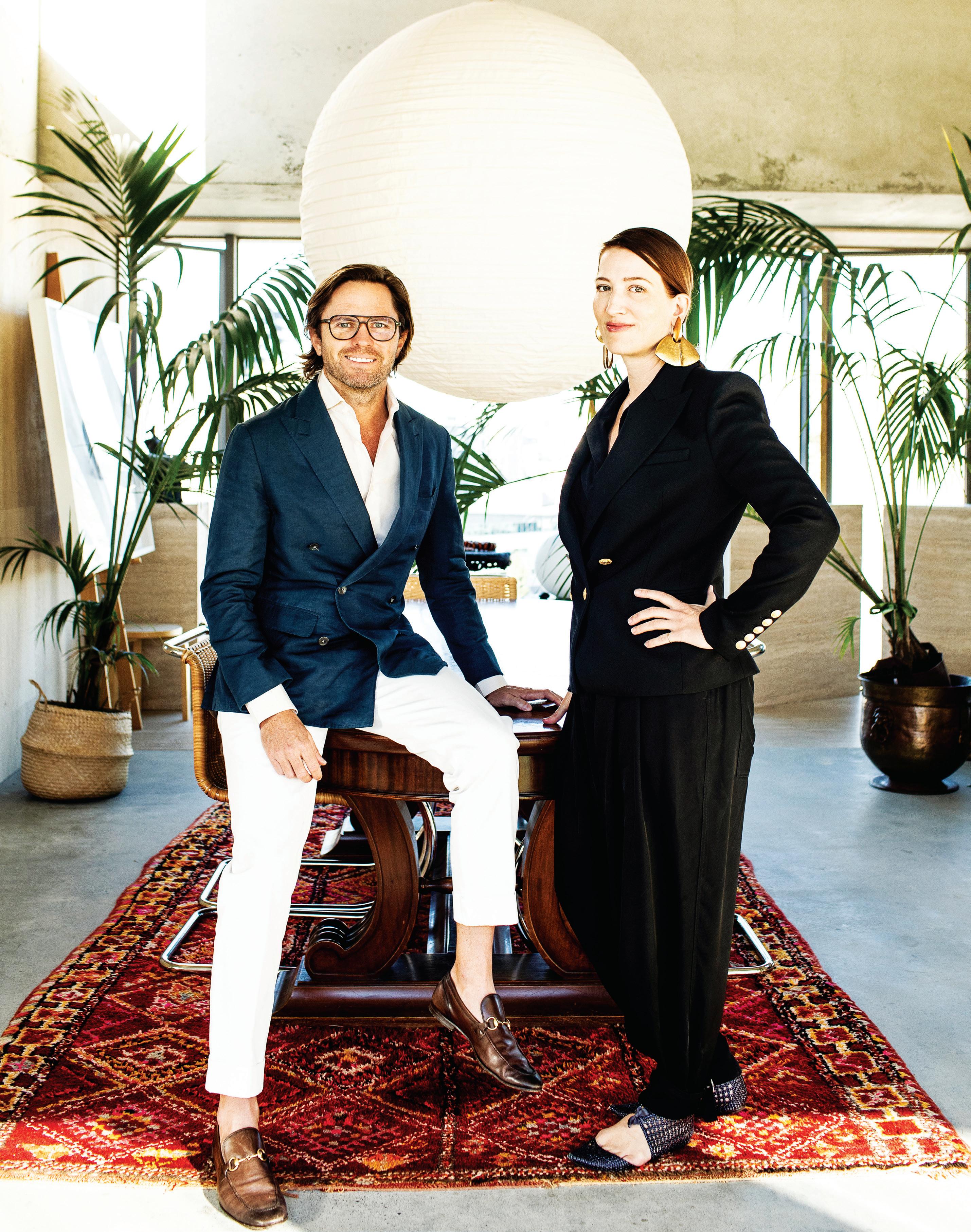
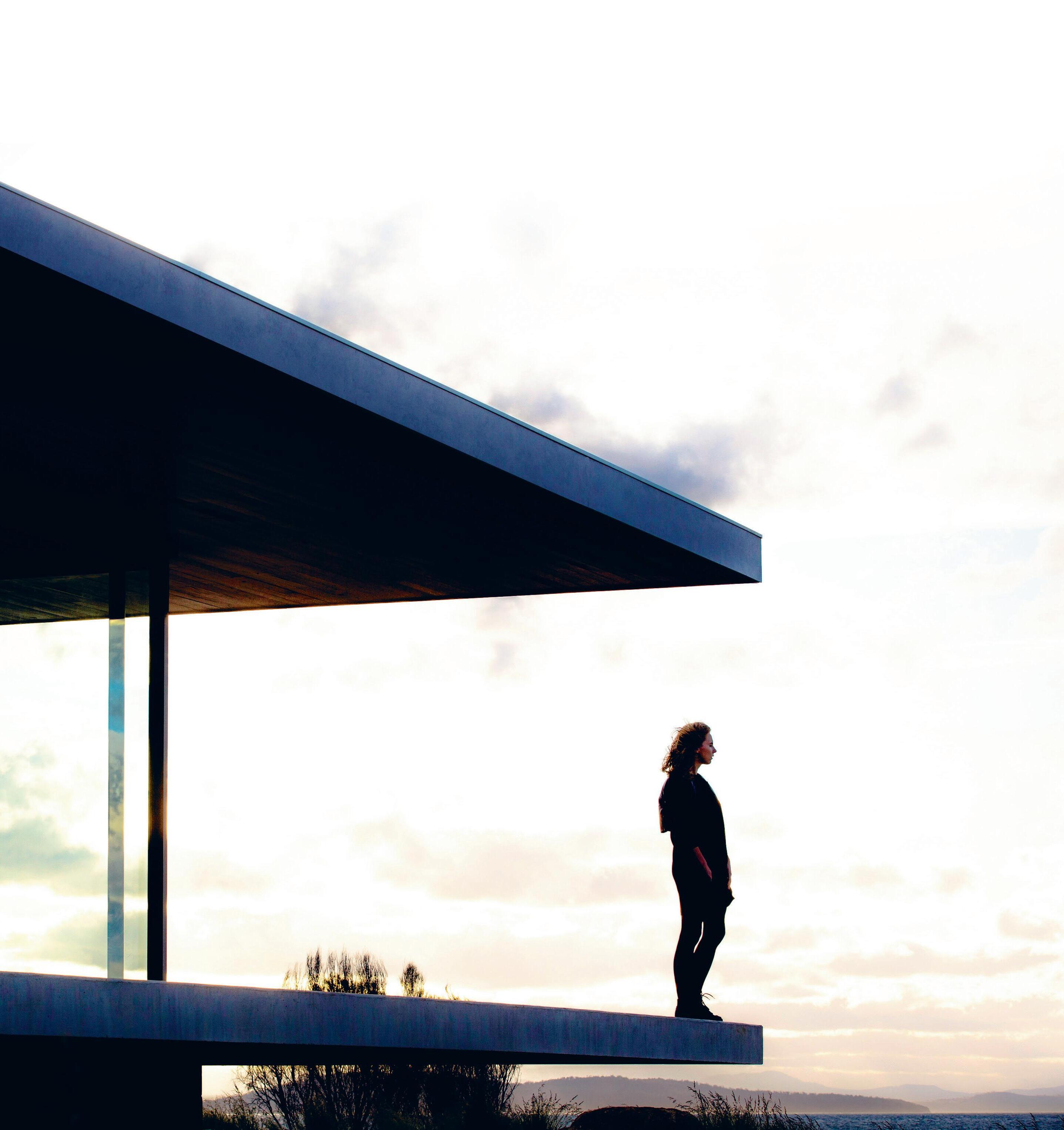
For Ingrid Richards and Adrian Spence, Brisbane is more than just the city they call home – it’s a wellspring of inspiration. The pair reflects on lessons learnt in over a decade spent reshaping the civic identity of the Queensland capital.
“We see ourselves as custodians of our built environment, and aim for well-mannered and dignified outcomes.”
Adrian Spence
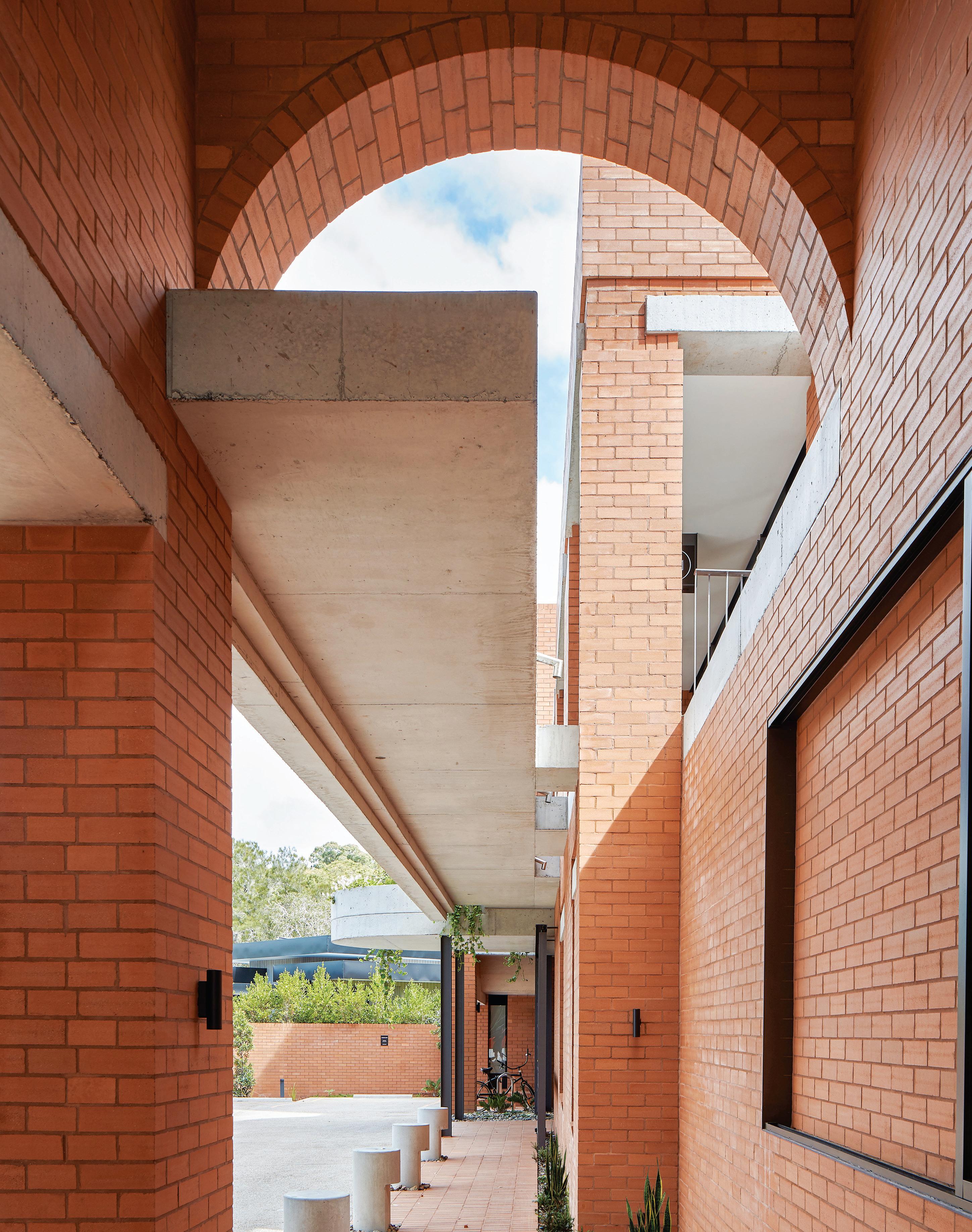
The first thing that strikes you about Brisbane is the atmosphere. Here, sunny optimism meanders into laid-back languor, all in the space of a day. The sonorous sound of crickets after a lush rainstorm clings to the imagination like honey. For Ingrid Richards and Adrian Spence, the pair behind Brisbane-based architecture practice Richards & Spence, the influence is a potent one. “Climate is the single most defining factor to our character and sense of place,” says Richards.
Indeed, in a region in which weather has shaped an entire architectural vernacular – the heritage Queenslander home –Richards’ sentiment has historical resonance. But with the rise of homogenous skyscrapers that tower over the banks of the Brisbane River, the city’s identity is in flux. “Rather than rely on associations with international cities like New York, our ambition is to find our own civic identity,” Richards says.
At just 11 years old, the practice has already carved a reputation for creating civically minded spaces that are distinguished by their minimalist material palette and nods to Brutalist form. Raw, unpolished concrete, brick and breeze blocks are stacked en masse to create buildings that feel unpretentious, dependable, even nostalgic. “A limited material palette makes the experience more potent,” points out Spence.
But the momentum behind the success of the practice is not solely derived from its stylistic sensibilities. If anything, aesthetic elements are merely a means to a more intangible end. “We are more interested in experience than style. We look for circumstantial opportunities to create charm without being self-conscious,” Richards explains. “We are seeking a reductive outcome: as much as necessary, but as little as possible.”
With this deft simplicity and focus on experience, Richards & Spence has quietly transformed pockets of Brisbane’s public realm. The practice’s impressive résumé includes the redevelopment of the Gasworks Market, the international terminal at Brisbane Airport, and the James Street precinct, which has since emerged as a benchmarksetting locality for Brisbane’s retail and hospitality offering. And with
last year’s opening of the practice’s most significant project to date –The Calile Hotel – Richards & Spence has firmly established itself as a pivotal player in the city’s design evolution.
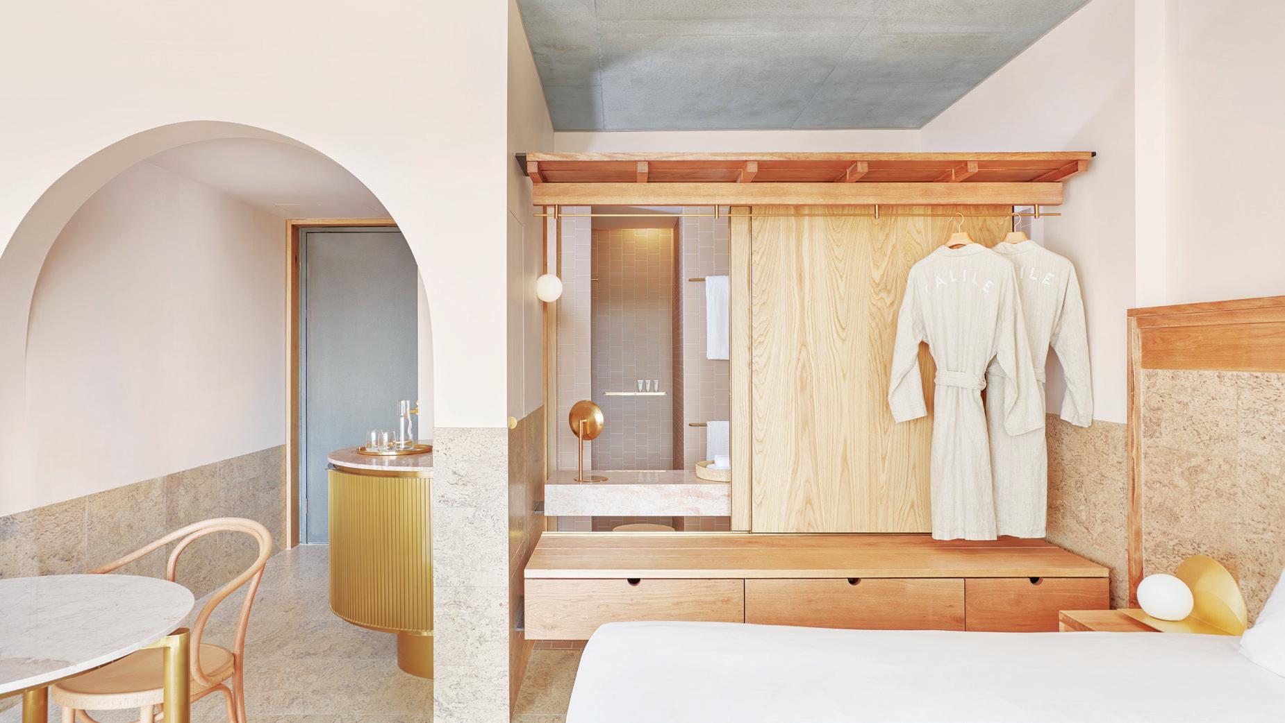
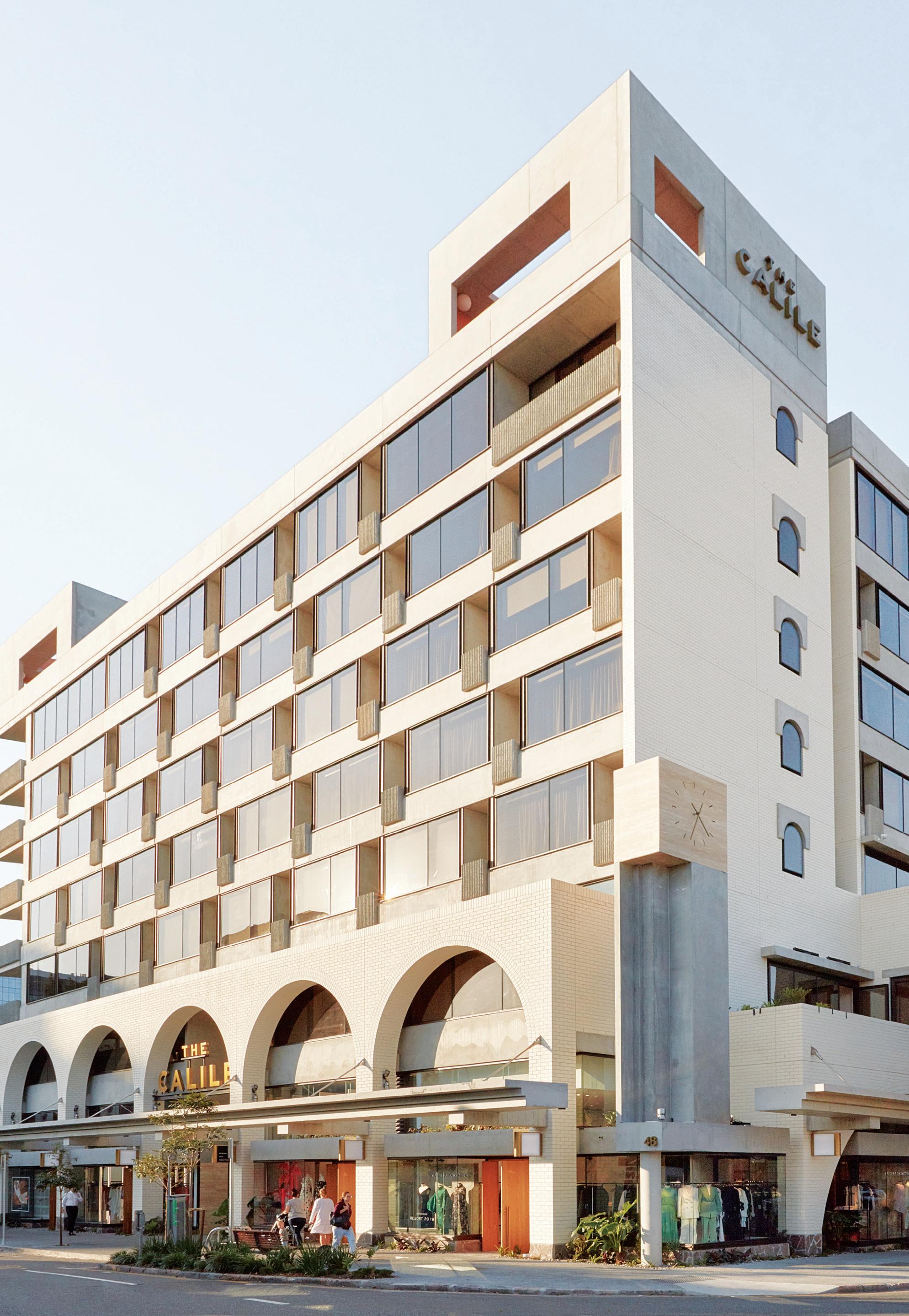
“The Calile Hotel embodies the collective thinking of our work within the James Street precinct,” explains Spence. The jewel in the crown, the hotel is symbolic of the practice’s commitment to process. “Each project is a prototype for the next. We see ourselves as custodians of our built environment, and aim for well-mannered and dignified outcomes.”
When it comes to Richards & Spence’s retail and hospitality projects, this ambition has been realised through commissions that play on the interaction between public and private realms. Concept retail store Museum of Small Things and the flagship store of Australian jewellery brand Christie Nicolaides are dimly lit, cavernous spaces that encourage intimate experiences. By contrast, the airy Cornerstone retail and dining precinct south of Brisbane shows how a building can encourage flowing, public engagement.
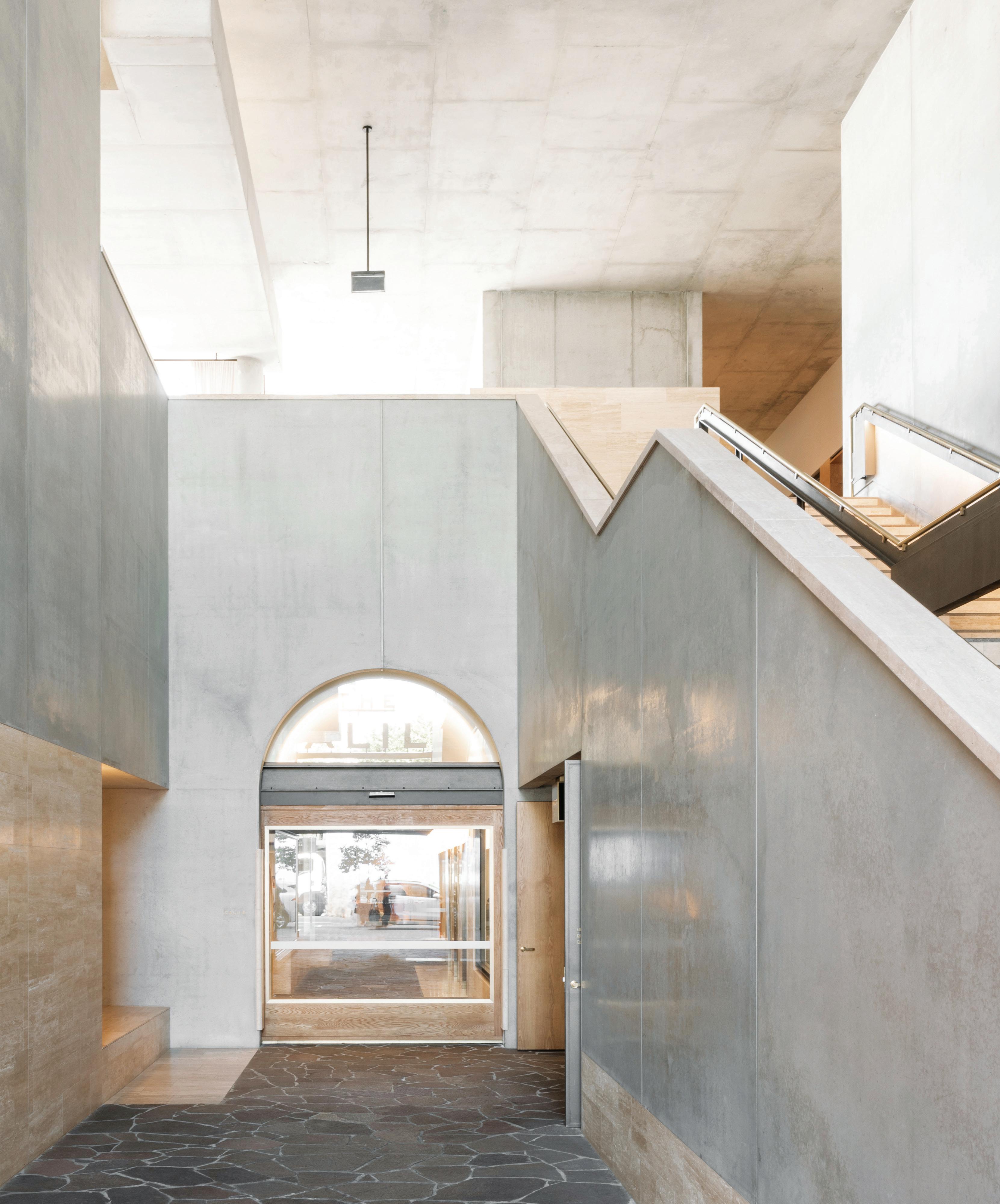
The importance of experience is abundantly clear at The Calile Hotel’s Lobby Bar, where pink marble and brass fixtures are surprisingly luxurious elements, dramatically juxtaposing the hotel’s Brutalist, concrete exterior. “Quiet contrasts of high and low, large and small, light and dark, crude and refined are employed to curate a spatial experience,” offers Spence.
Explaining the practice’s rationale, Spence points out that creating site-specific solutions is crucial to avoid any notions of ‘theming’ – a particularly important reminder when the aim is to create something of lasting value. “We look for opportunities inherent in the site and context to form the identity of a venue. A non-prescriptive plan allows for different tenures throughout the life of the building – a passive sustainability of sorts. We consider our work to be part of the evolution of our city, not a full stop in time. Our ambition is to make buildings that feel like they have always been there,” he says. A simple intention, but one with lasting value.
richardsandspence.com
There is nothing normal about The Calile Hotel which breaks the city hotel mould with its resort vibe reminiscent of Palm Springs, Mexico City and Miami. It’s become a vitalising force in Brisbane’s James Street precinct, activating surrounding fashion boutiques, design showrooms, eateries and more.
Are we being honest with ourselves when critiquing ‘good’ verses ‘great’ work? Stephen Crafti doesn’t think so.
Food is regularly criticised on everything from television shows through to the print media. There is an endless number of food guides that rate restaurants, from five stars to zero. Everything from a waiter’s attitude to the food served on the plate (even the type of crockery is sometimes singled out) – all this is literally ‘served’ up to the public for critical consumption. In theatre, the same could be said, as with dance performances and art exhibitions. But when it comes to architecture and design everything is supposed to be amazing!
How can this be? Let’s face it, if every project you read about in print or see on television is considered amazing, each one would receive top accolades. And this is certainly not the case in the current architecture and design award system, with generally one winner, which is truly amazing and creates a paradigm shift in architecture or design. The other projects or products may be deemed to be highly competent and worthy of recognition, but they are clearly not on the same level as a winning entry. If there was a greater opportunity to provide honest feedback in the reporting of architecture and design, then all would benefit.
So, why then is there a lack of criticism in architecture and design? Surely editors of design magazines would not include something they felt was less than amazing? But the reality is that not everything in a magazine gets the front cover, or even the same number of pages. An editor will obviously not communicate to an architect or designer that their project is not number one for a specific issue. It may in fact create a broader picture in which to showcase where architecture and design is going at a certain point in time.
The writer commissioned to cover a certain project may feel it has merit and adds something new for readers to contemplate. If one reads between the lines, there are signals that indicate whether the reviewer is ‘hooked’ into a project or simply on the sidelines taking accurate notes. So why can’t a writer on architecture and design be more up-front?
A house renovation, for example, may have some impressive features. The floor plan may also place a writer into new territory. But have certain things not been addressed, like the lack of attention given to the sauce on a piece of meat? It could be a heritage-listed home with an intact interior that was completely obliterated in the makeover. Why didn’t the reviewer comment on this lack of thought, or the connection with the home’s history? Because it would offend the designer in question? Are they that thin-skinned? Surely, a story could include some criticism that would not cause the architect or designer to go into a meltdown.
Architects and designers are accustomed to being criticised throughout their rigorous training. Their designs are pinned up on a wall – whether it’s a schematic for a building or the concept for an item of furniture – and the lecturer and classmates question what they see in front of them. Considered ‘character building’, but importantly, integral to their learning process, the pitfalls of the project in question come to the fore. Perhaps the designer was unaware that taking a certain approach eliminated the possibility of creating something that could have become considerably more!
From my own experience as a writer (with nearly 30 years’ experience), my tack is to write on projects that are of merit. I certainly don’t want to have my name at the end of a project that is not of a certain standard, just to fill pages in a magazine. However, I would love the opportunity to be more critical in my stories. Sometimes the projects I cover are truly amazing and there are not enough superlatives to capture the impact the project has.
I was extremely fortunate to see architect Sean Godsell present a residential project, located in the country, at this year’s Australian Institute of Architects (Victorian Chapter) awards. The house was simple, but at the same time showed a level of ingenuity I had not seen before. The automated series of ‘hatches’ set into the home’s broad canopy was exhilarating to see in operation – well, at least through his images. That house was truly amazing! However, seeing an old house with a simple glass box tacked onto the back is not in the same league. How can it be? It may include similar materials, just like a chef with the ingredients for the meals they prepare. But the technique and approach of two people is not the same and never can be. Those reading this story might say, ‘But does it matter?’
Of course it does. The industry, along with the broader public should know when something is amazing or simply good. It doesn’t have to be rated as with restaurants, but simply reviewed in an honest manner, highlighting faults as much as impressive features. After all, one spends considerably more on a house than a meal in a restaurant. And the impact lasts for decades – as opposed to the few hours it takes a meal to pass through one’s system.
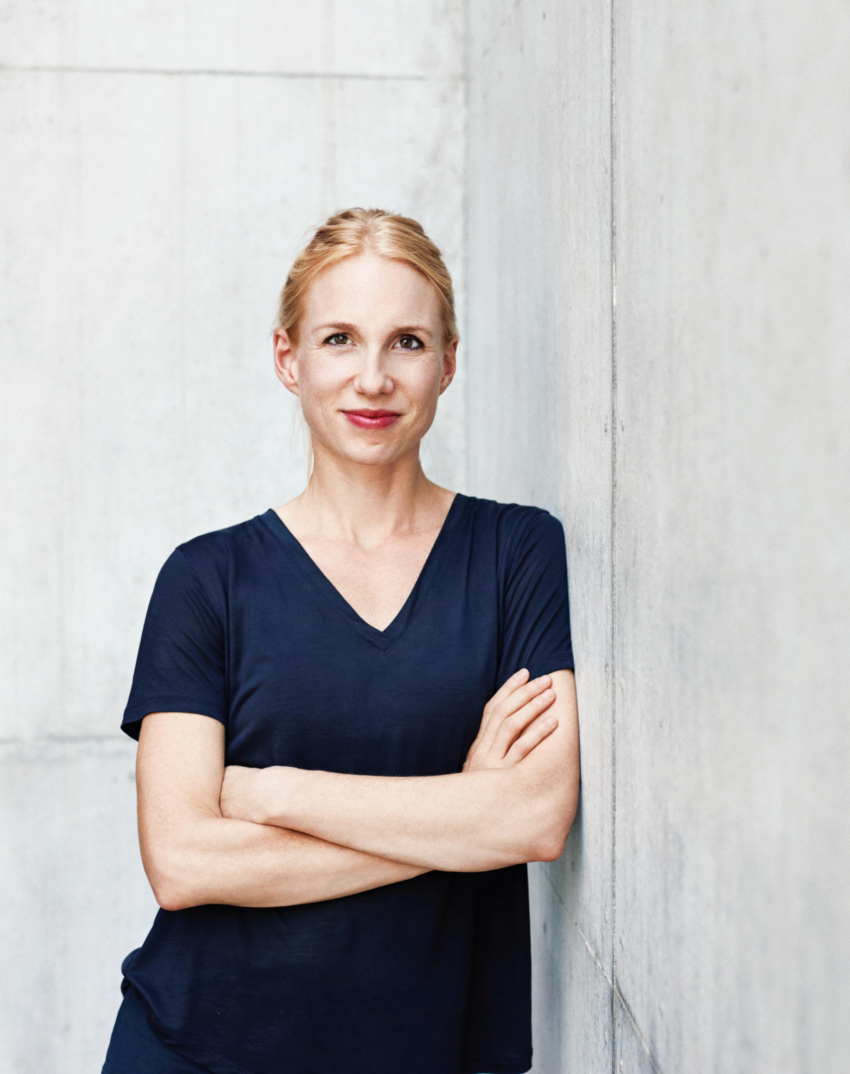
For Vitra CEO Nora Fehlbaum, leading one of the world’s most celebrated design brands across the changing landscape of commercial design isn’t just a job: it’s a family matter.
For most people, Vitra is the last brand brought to mind by the term family business. Yet that’s exactly what the Swiss design powerhouse is: since its founding by Willi and Erika Fehlbaum in 1950 Vitra has been led by three successive generations of Fehlbaums, all of whom have helped the brand evolve from niche retailer into one of the most globally respected names in furniture.
In 2016 Nora Fehlbaum became the latest member to continue the family legacy, taking over the reins from her uncle Rolf Fehlbaum and assuming the role of CEO.
On a warm afternoon in Sydney, in town to launch the new Unifor Vitra showroom, Fehlbaum candidly discusses the inextricability of her family history from the company and the fact that her leadership wasn’t always on the cards. “It just happened,” she laughs, explaining that she spent her formative career years abroad where she studied management and economics in the US, before working with a number of international companies. She finally joined the family business in 2010, spearheading development on the Vitra Campus.
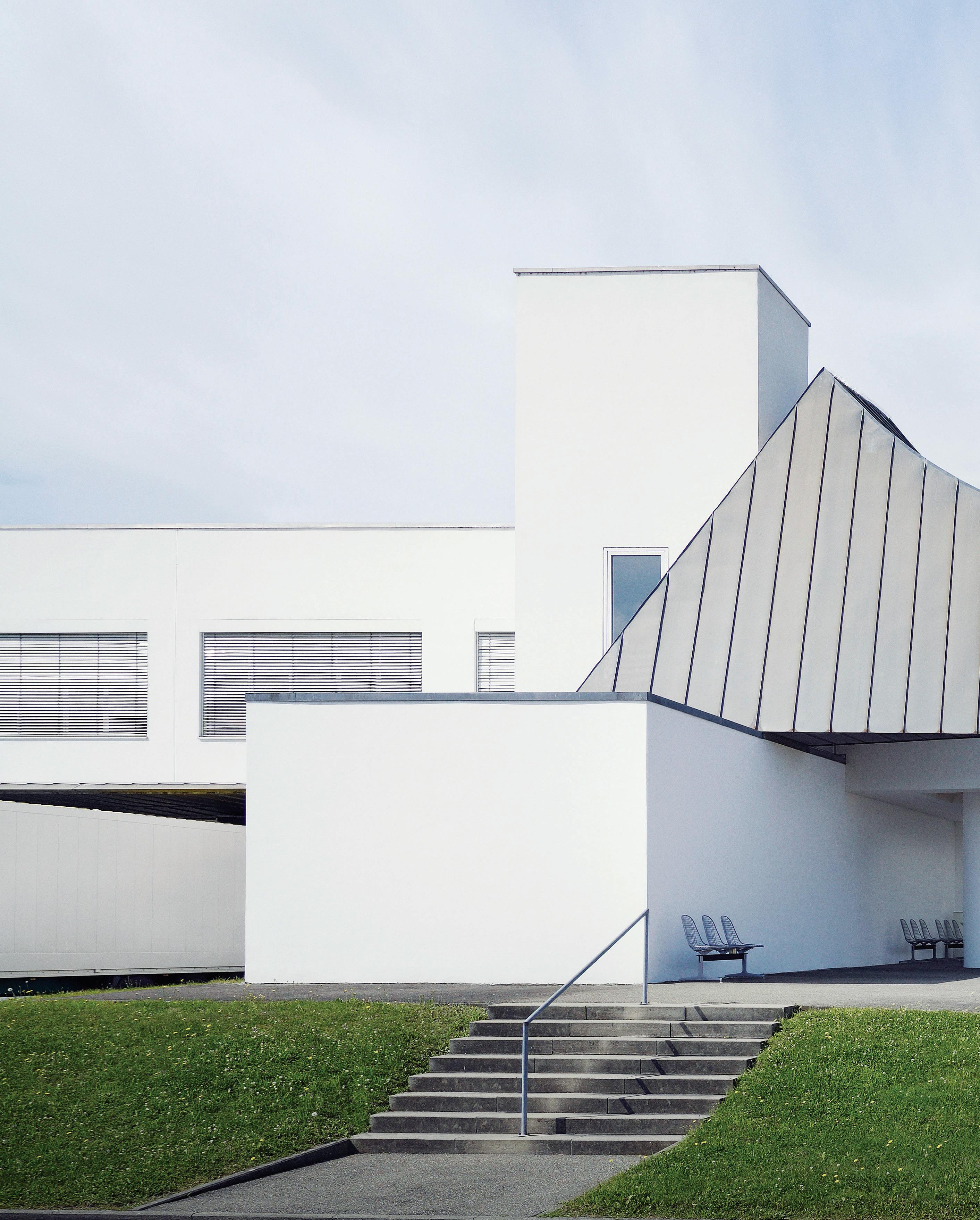
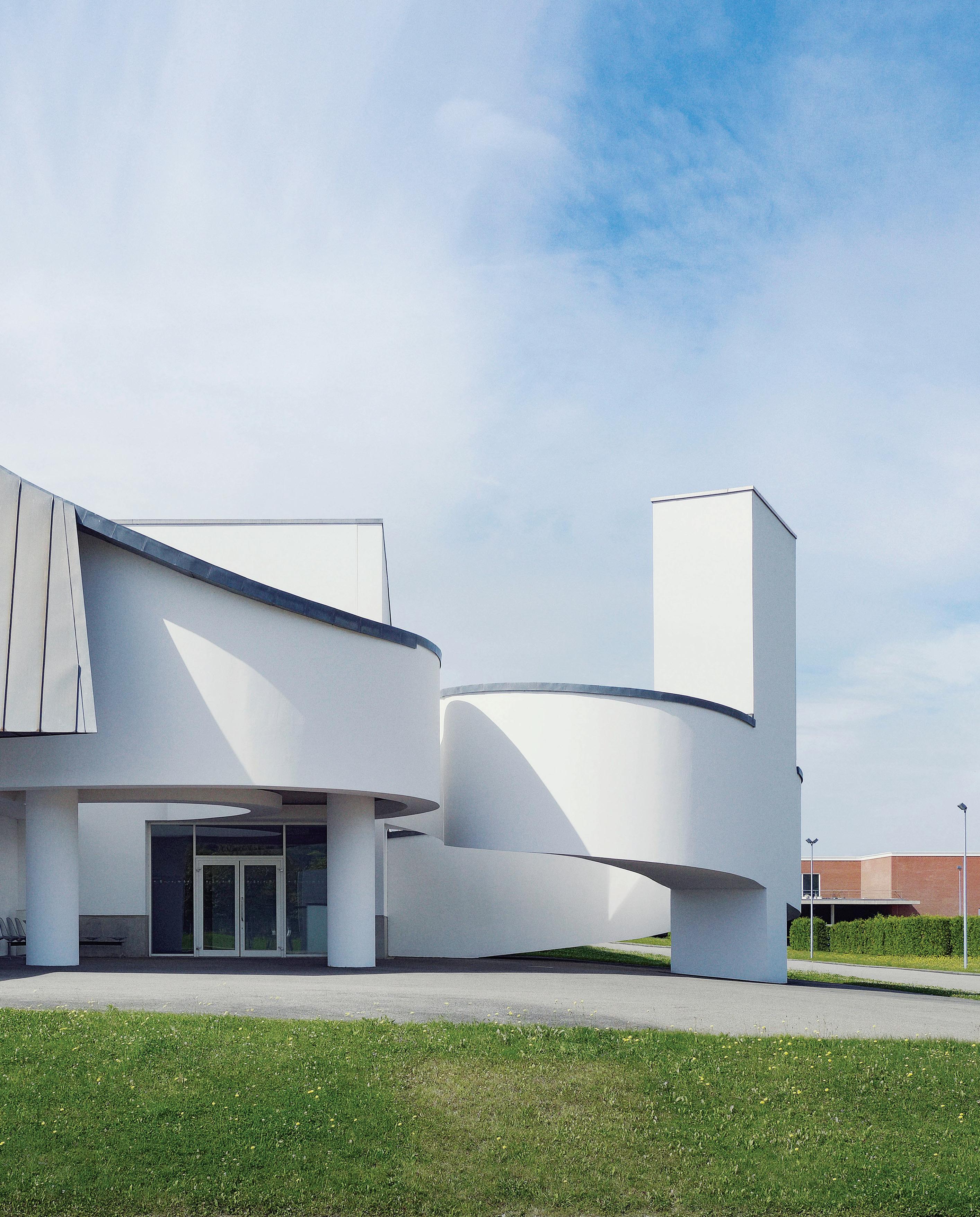
Opened to the public in the 1980s, the Vitra Campus is something of a dreamscape for contemporary design lovers. It brings together major works by Frank Gehry, Zaha Hadid, SANAA and Herzog & de Meuron, amongst others. Fehlbaum’s task was to guide the campus
through a new stage of development and accommodate annual visitor numbers that had soared from 100,000 to 400,000 in a short period. “It was a very good role [in which] to understand the company better, and to know how to serve customers the right way,” says Fehlbaum. “It was really about curating the customer experience.” Under her guidance the campus expanded to include a store, café, and second museum for the collection, VitraHaus, and today thrives as one of Weil am Rhein’s key design destinations.
For Fehlbaum, the campus embodies Vitra’s ethos of developing to meet a need, and not purely for innovation’s sake. “There wasn’t a masterplan that was executed very quickly,” she explains. “It has grown over the decades. We built only when there was a necessity, and only when we found the right person for the project.” This thoughtful, incremental innovation underpins Fehlbaum’s leadership of the company, and allows her to navigate the complexities of transitioning a mid-century icon – one closely entwined with her own family history – into the 21 st century. “There’s a balance that needs to be struck between on the one hand making sure that the legacy and classics are well taken care of,” she muses, “and on the other investing heavily in new products with contemporary designers, fulfilling new needs that we’re seeing in the market.”
In 1989 architect Frank Gehry designed the Factory Hall for Vitra. Here, ramps and pillars create a formal connection to the neighbouring Vitra Design Museum. The sprawling campus has developed in a considered way over the decades, serving to transition a mid-century icon into the 21 st century.
These “new needs”, Fehlbaum says, are particularly apparent in the workplace. “In the past you had a very clear expectation of what a workplace looked like, be it a workstation or a desk,” she recalls, elaborating that mobile technology has blurred boundaries between the spaces in which we work, live, and play and threatens to make conventional offices obsolete. Far from daunted by this, Vitra has embraced the shift toward greater flexibility in its own headquarters, where Fehlbaum herself works within the shared workspace. “I wanted to be a part of it,” she says. “I feel like when I’m in the office I should be available and visible – all the things that go on between the lines, you really don’t get those through email or when you sit on a different floor.” Fehlbaum encourages people to embrace the impermanence that has become commonplace in workspaces and daily life as an exciting opportunity for evolution. “Many of our customers are not only looking for an office that allows for flexibility and easy change because of the functionality, but also because of what it reflects,” she muses. “It says, ‘Actually, don’t think tomorrow is the same as today. We have to move, we have to change – we have to continue to evolve.’ ”
Fehlbaum is acutely aware that the world beyond workspaces is in flux, too. Economic uncertainty and evolving social norms have caused widespread instability, and technology has created a new tyranny of distance: paradoxically, we are more connected than ever on a global scale, though geographic barriers remain. To combat this and build connections in previously unexplored markets, Vitra is rolling out global e-commerce that makes its products more accessible to customers and underlines their value proposition.
“With our history and our products, we have so many stories to tell. We see it as our task to educate the consumer about what design is, how it is created, and who the authors of the products are,” says Fehlbaum. “It’s our experience that today’s customers want to know more about any object they are investing in. Understanding its story leads to a connection with and appreciation for the original product, rather than a copy.”
vitra.com
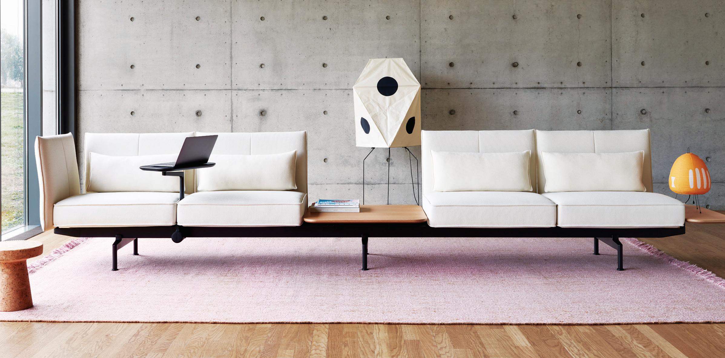
“Many of our customers are not only looking for an office that allows for flexibility and easy change because of the functionality, but also because of what it reflects.”
Nora Fehlbaum, CEO, Vitra.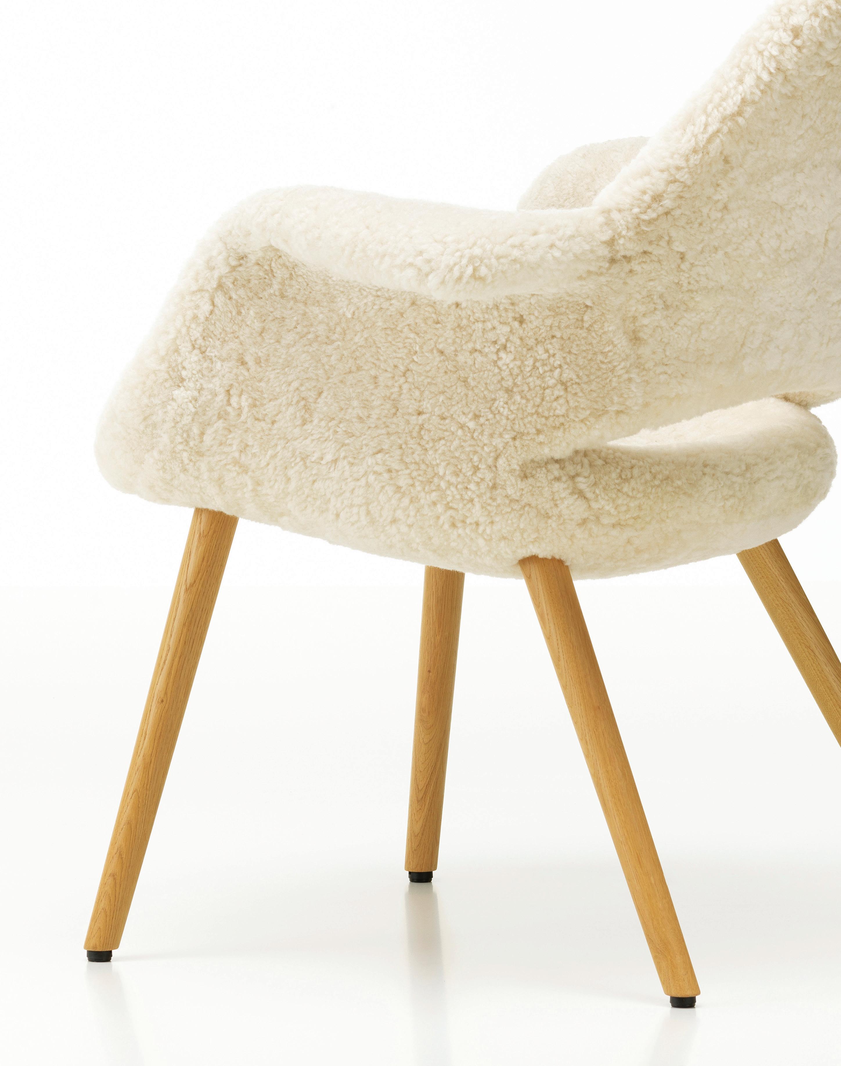
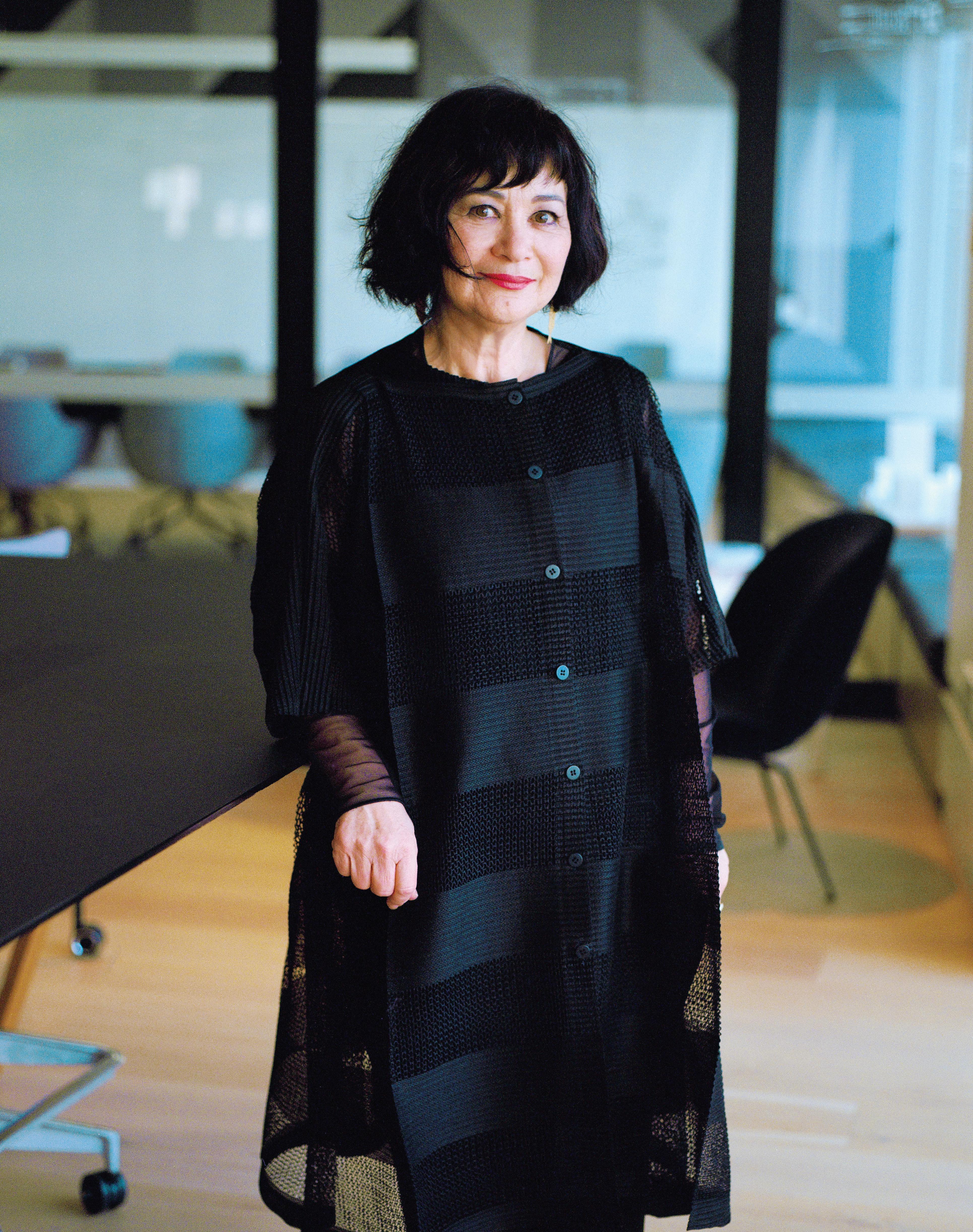
Diane Jones has been executive director at PTW since 2014. A natural leader of people, she considers herself to be “just one of the team”, bringing to the role a coherent philosophy and sense of conviction built over many years of practice.
Diane Jones is softly spoken, considered in everything she says without ever sounding pedantic or guarded, and reveals a frame of reference well beyond the field of architecture. Although she carries the title of executive director at PTW Architects (formerly Peddle Thorpe Walker) in Sydney, she insists she is just one member of the leadership team. This highlights the priorities of this remarkably successful architect, but also how important integrity and ethics are to her.
It was instilled into her during her time working with the legendary John Andrews at his famous ‘shed’ on the water at Newport, on Sydney’s northern beaches in the late 1980s prior to joining PTW.
“He had a very high sense of integrity,” she says, “what was right and wrong, and keeping to your principles. He instilled that in his staff. Although John was the figurehead and had the final say, it was very non-hierarchical. One day he said I was good at organising things and he wanted me to be coordinator for a big competition they had on. I ended up as a young graduate helping to coordinate a competition and the directors. That was a good lesson to learn – that you just do what you need to do, whenever you need to do it.”
This also highlights the importance to her of lifelong learning. It is a personal principle (she has just embarked on a PhD) but is also a professional ideal. She believes in research-based architecture and
the staff at PTW are continually participating in workshops. “We encourage people to make notes and articulate shared readings. It is part of the daily discourse,” she says.
There is a certain irony in how it all began.
“When I finished high school,” Jones recalls, “I couldn’t decide what I was going to do. So, I decided I might just go alphabetically – ‘a’ for architecture, ‘l’ for law, etcetera. So, that’s how I ended up in architecture. And, interestingly, a lot of my work in practice has involved justice and law. I help run an interdisciplinary research network on justice spaces, and I have done work with mental health units, and places where people have a disability of some sort. So, I think all the interests ended up intertwining.”
Her undergraduate degree was at the University of NSW (UNSW). She then went to the NSW Government Architect office, working for people such as Lionel Glendenning and Andrew Andersons (later a director at PTW) focusing on health, schools and Elizabeth Farm –“a fantastic experience”. Then a Fulbright Scholarship took her to the University of Texas, Austin, specialising in heritage architecture. The conditions of the scholarship required her to return to Australia, which she did, but soon left for Hong Kong.
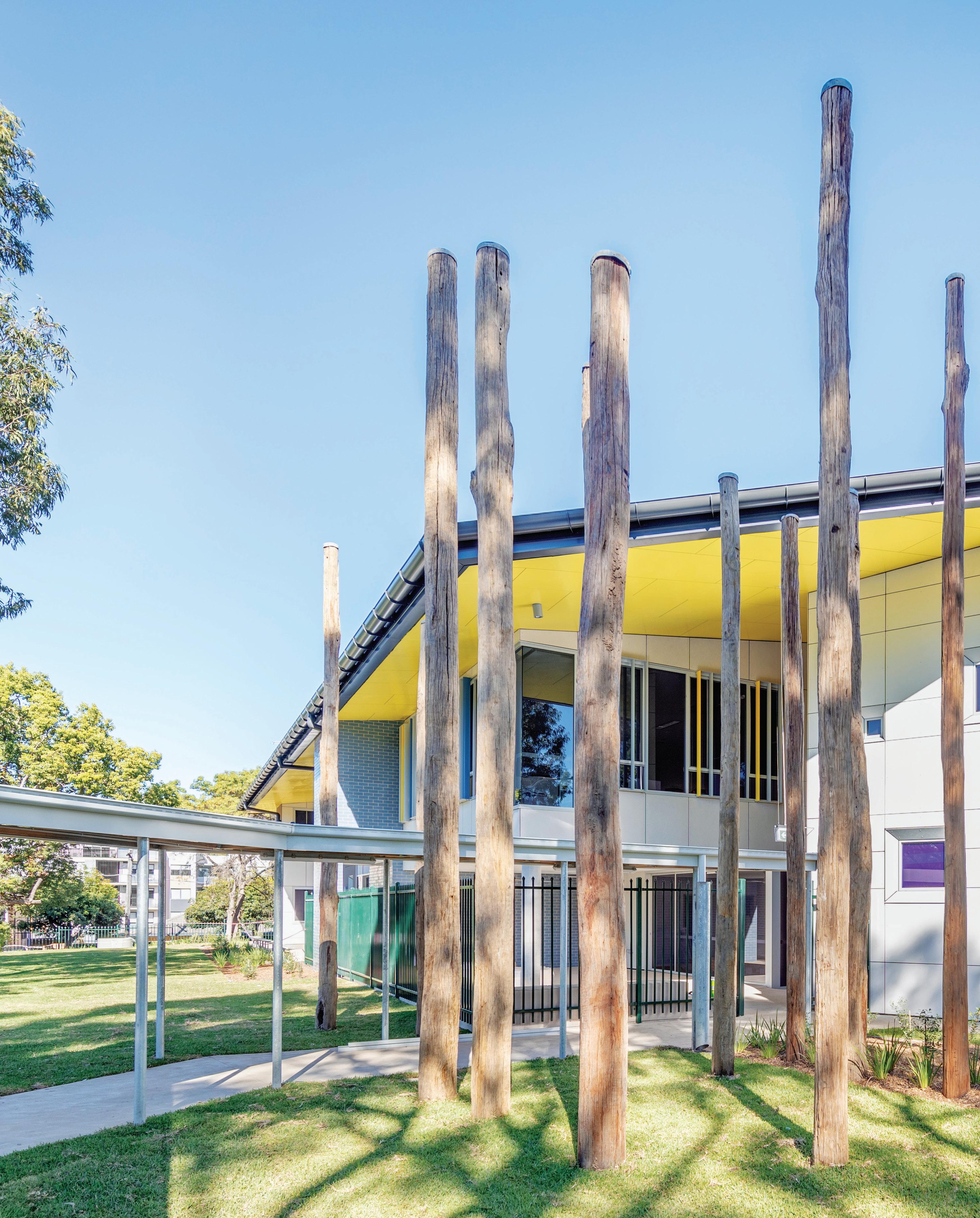
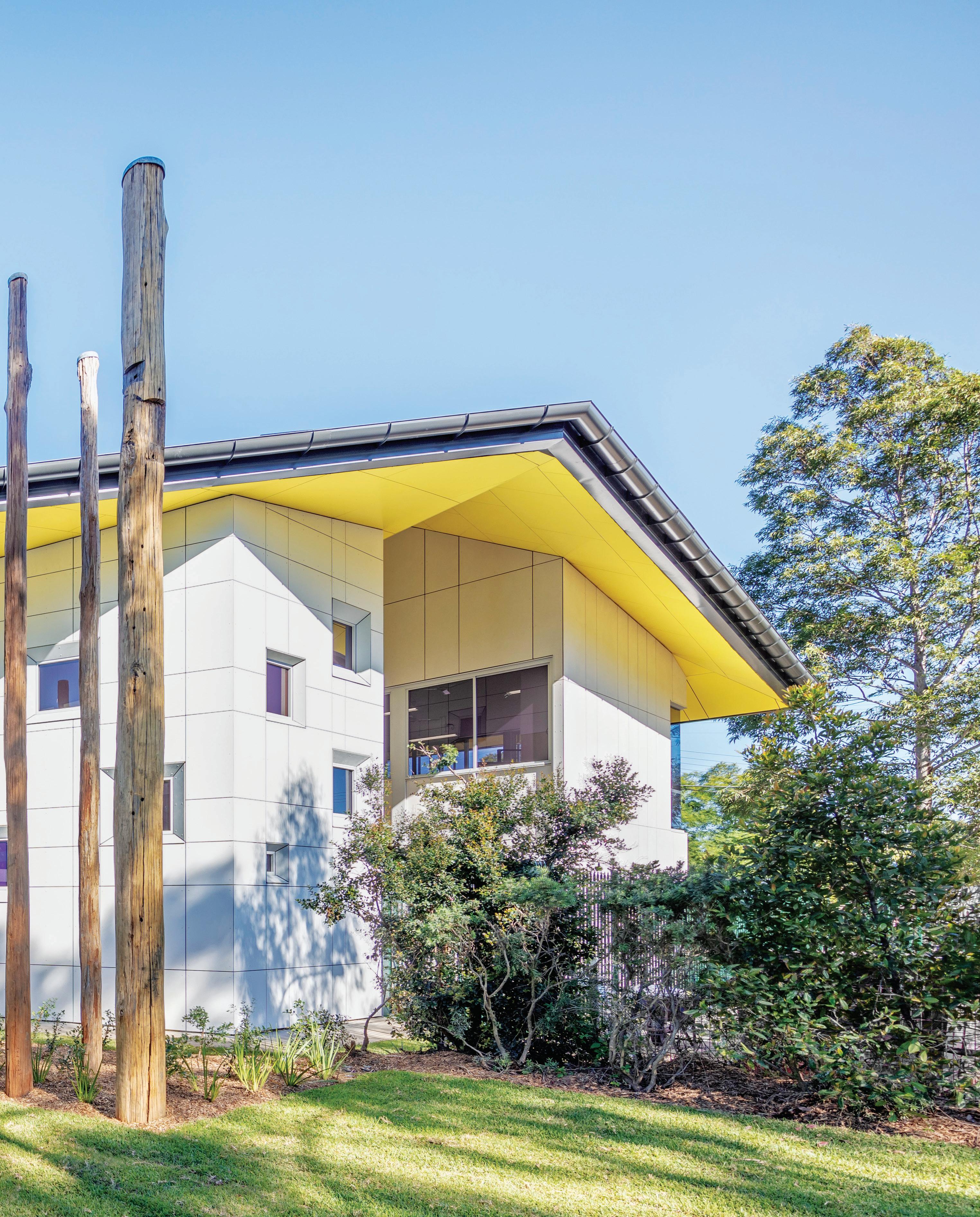
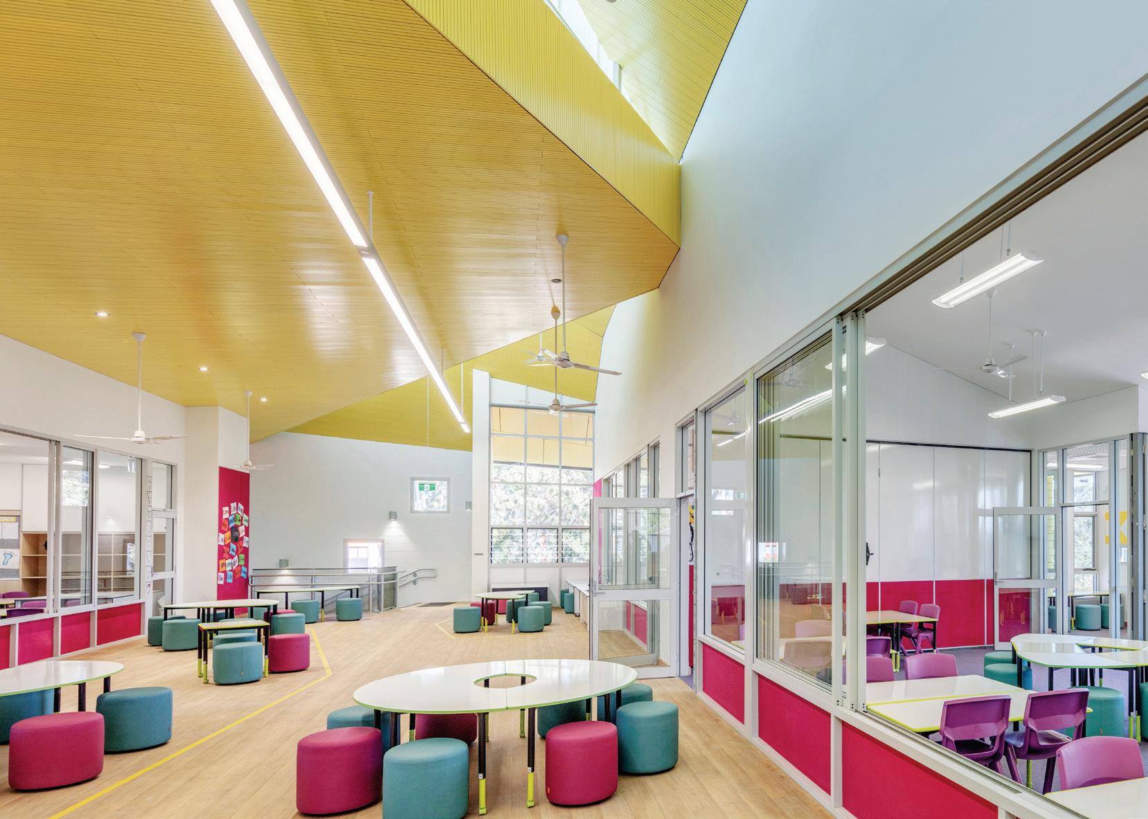
The Penrith Public School upgrade (NSW) sees bold architectural forms and street presence give identity to the school. Designed by PTW Architects with McIntosh & Phelps, the brief was to create new permanent teaching spaces to facilitate 21 st-century and future-focused learning objectives.
Hong Kong proved to be a watershed.
“It is a bit clichéd,” she reflects, “to say that you hope you’re actually doing something that benefits the wider community – that’s probably why I wasn’t so interested in residential architecture, because that’s so personal. Whereas I have always liked public architecture. I worked on interiors for a big Hong Kong firm which was really very good – because it taught me what I didn’t want to do. Within PTW I have always done civic work, institutional work, work for not-forprofit organisations. It hasn’t been mainstream commercial.”
For Jones, the notion of teamwork goes well beyond individual teams. It is a community-wide and inter-disciplinary concept bringing together professional practice, industry and university learning and research. She herself is an adjunct professor at UNSW, a co-convenor of the Court of the Future (research) international network, and involved in numerous other advisory and research bodies.
Teaching has always been a key part of Jones’ professional life. It is, she explains, partly to do with giving back. But teaching also “makes you really think about what is important. It makes you do research, learn ways of communicating, helps you understand why people are having a problem [with] something, which also requires a degree of self-reflection, and learning new skills.”
For her this is crucial to a professional’s repertoire and something she tries to instil in her staff at PTW – clear design intentions and an empathy for the people who will be using the building you are designing. “I have been always lucky enough to run my own team. So, for me it is not so much the title, but actually being able to have a team of people and working on the projects that I think are important. At the moment I am really interested in how you transfer knowledge within a practice.
“I am just one of the leadership team here. You have to ensure that everyone working here is working to achieve excellence. It is a bit of a cliché, but I believe – because architecture is such a hard profession –that something has to drive you. It’s long hours, the pay’s not fantastic,
sometimes things take a long time to get built. When they [do] go into construction if you get 80 per cent of what you put up you’re probably doing well. You’ve got to fight really hard. So, I think, there has to be something driving everyone to excel in what they’re doing.”
“You have to always talk about it and be open. And sometimes you can be a little bit melodramatic about it. It’s like having a child – you have to look after it, fight for it. Not just because you want a wall to be pink or yellow, but you have to understand why you have done something and that ‘why’ relates to how people use it and how it affects their wellbeing. And, as much as possible, backing that up with some proper research.”
PTW is now 130 years old and an international practice. How does one ensure its constant renewal?
“Because most of the original directors have gone,” Jones explains, “we have been conscious about renewing it and about setting up processes and discussions that do address the issues. It needs a certain consciousness and you take learnings from other places. I’m on a pro bono board for a facility we did for the Prince Henry Bay masterplan and we’ve been put through quite rigorous clinical governance training. I have been able to bring some of that training to PTW. We have now set up different work groups, a structured way of saying we need to capture the knowledge and skills of the much wider office than previously.”
In a recent talk, Jones commented that architectural spaces gain their meaning from the experiences of the people who use them. It is this empathy which informs her approach to a profession which too often lacks such empathy –and it is an empathy she extends to her staff, both at home and to those in the “hardship” posts abroad.
ptw.com.au
ENCOURAGING CONNECTION INSPIRED WORKING RESPITE AND REJUVENATION ENHANCED WELLBEING
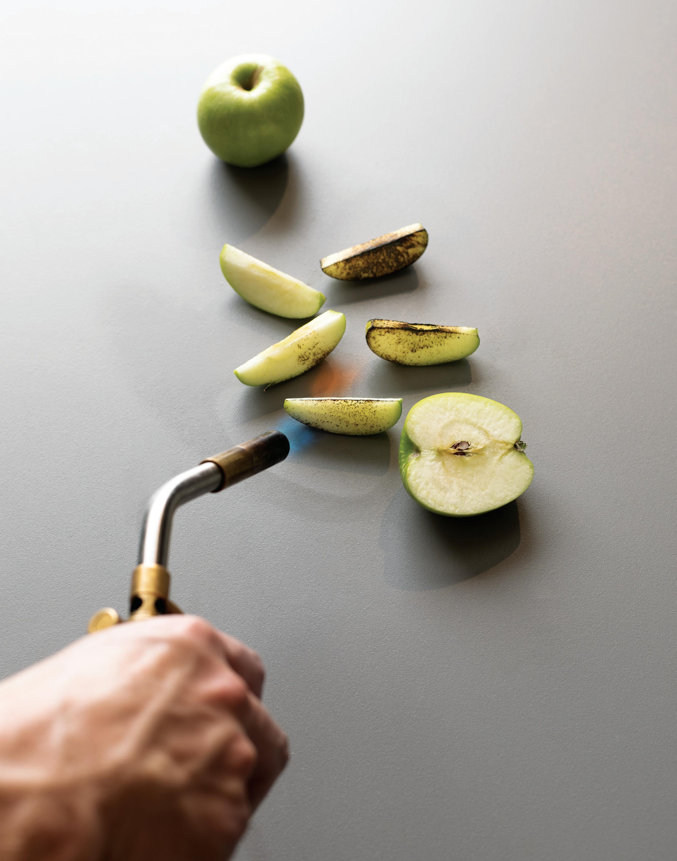
Inspired by integrity, authenticity and simplistic beauty, the Wickens at the Royal Mail Hotel, located in Victoria, is a celebration of food, people and place. Renowned for its thoughtful food philosophy and extensive wine list, Byrne Architects has created an experience that is designed to impress and engage the community.
The design concept focuses on the creation of a dining space layout that puts executive chef, Robin Wickens, centre-stage where the guests on each table have a view of the kitchen. Boasting a oorto-ceiling glass front, the open and bright kitchen blurs the boundary between chef and guest – building a relationship through food and process. Located inside the kitchen, one can book the Chef’s Table –putting the guest in the front row. Wickens’ preparation routine is an intensive and meticulous process using the local produce harvested from the kitchen garden. Working on the Dekton® Korus surface, it provides the perfect canvas for Wickens’ vision for the dishes. Heavily invested in cra ing a sophisticated and multi-functional kitchen space, Wickens requested for the t-out to have premium materials and equipment. To incorporate a sense of warmth into the kitchen, Byrne Architects avoided using stainless steel, identifying Dekton® as the best solution for a non-stainless steel kitchen environment. Dekton® gives the chefs the opportunity to
work on the surface without limitation. Designed speci cally for a food environment, Dekton® Korus’ tranquil shade of grey allows the vibrant and rich colours of the food to stand out.
“Dekton® is designed for working with food. You can put hot and cold things straight onto the benchtop – rolling pastry or kneading bread where you need a constant chilled temperature or cooking directly on it with a blow torch. I have never used anything like it,” says Wickens.
Awarded two Hats in the 2019 Good Food Guide Awards, Wickens o ers an immersive and sensorial experience in a space that opens itself to uninterrupted views of Victoria’s Grampians Mountains. Set in a theatrical charcoal cube, it is an architectural stand-out in the Dunkeld area. Acknowledging its context and surroundings, Byrne Architects incorporated and celebrated local materials and elements paired with re ned European products into the design of the venue. A beautiful composition of sandstone and Australian hardwood occupies the space with Walter Knoll German dining chairs elevating the dining room.
Highly focused on the guests’ engagement in its degustation concept, visitors are invited to go on a food journey lled with drama and passion through a sensory design-led narrative.
Koichi Takada Architects’ interiors for the new
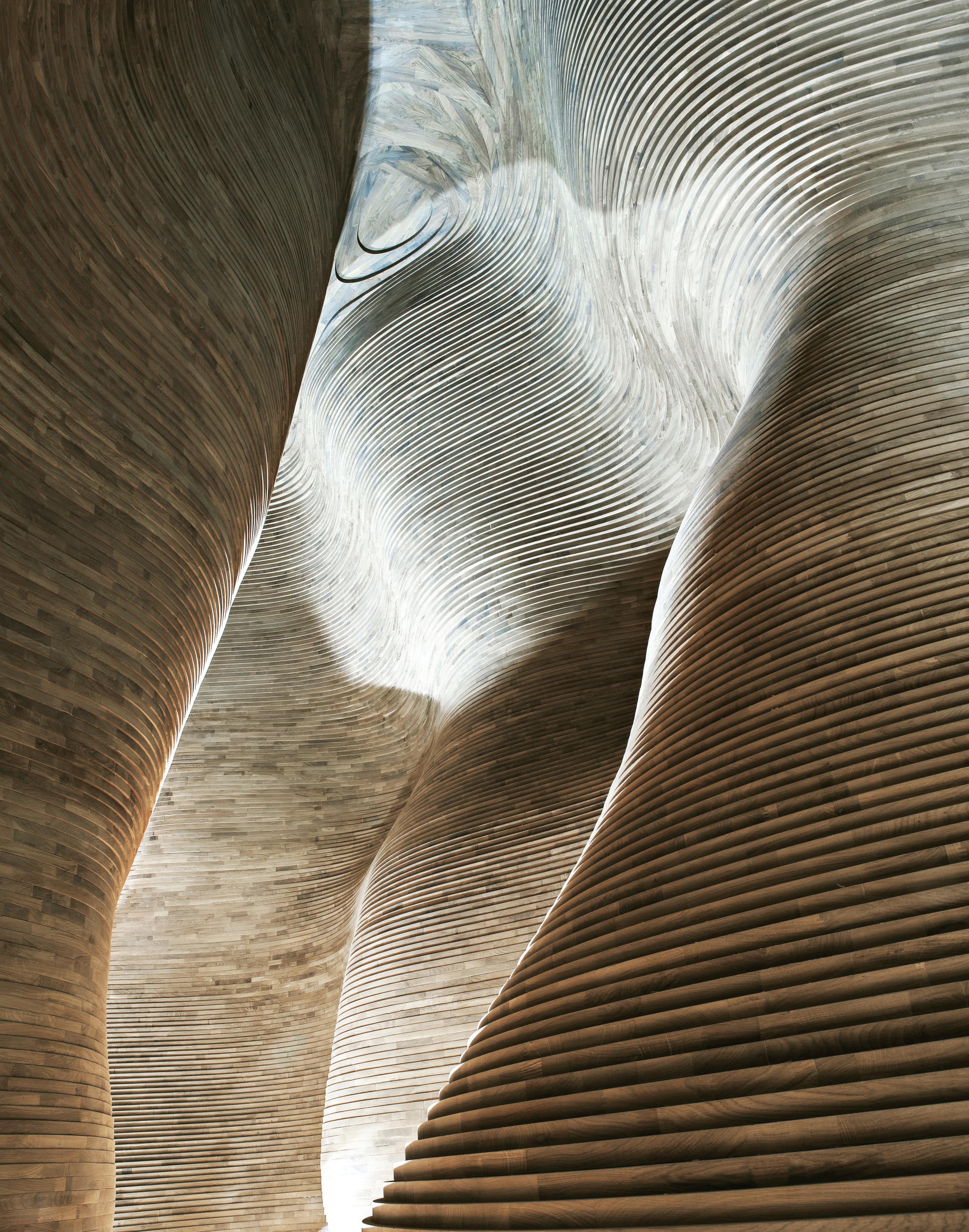
National Museum of Qatar exude a visceral beauty that is breathtaking in their impact and imagination.
National Museum of Qatar, interior architecture by Koichi Takada Architects, architecture by Atelier Jean Nouvel Words Paul McGillick Photography Oscar Rialubin and Tom Ferguson
Working within Jean Nouvel’s National Museum of Qatar, Koichi Takada has helped transform the desert close to Qatar’s new airport into an international destination. The museum explores the country’s past, present and future ambitions.
“We wanted to create something genuinely Qatari. Also we wanted to tell the story. Because it is a museum, narrative is very important.”
A recent success story of Australian architecture has been the rapid rise of Koichi Takada Architects (KTA), headed up by Japanese-born and trained Koichi Takada. Unlike many practices, KTA made a relatively quick transition from individual residentials to large-scale projects. That they negotiated the steep learning curve was no doubt due in large measure to Takada’s relentless work ethic, instilled in him by his rigorous, and sometimes brutal, Japanese training.
The practice is known for its innovative edge, refined elegance and a warmth of touch both in its architecture and interior design –inspired by Takada’s philosophy of bringing nature and architecture together. Its expansion beyond Sydney is relatively recent and it remains best known for buildings like Arc in Sydney’s Clarence Street and the extraordinary Infinity at Sydney’s Green Square –both notable for how they activate urban life at street level.
Yet, while the practice is quickly internationalising itself with projects in Tokyo, Los Angeles, Mexico City and Jakarta, its international presence actually goes back more than 10 years, to when they were invited to compete in an international competition to design the interior spaces of Jean Nouvel’s remarkable National Museum of Qatar inspired by the ‘desert rose’, a naturally occurring mineral formation in the desert. They were given the job involving
six locations over 53,000 square metres in 2012. These locations are the gift shops, the Café 875, the Desert Rose Café, Members’ Lounge and Jiwal Restaurant. The museum is now open along with the shops and Café 875 (a reference to an especially refined type of gold found only in the Arab states).
To say that these spaces are amazing would be an understatement –not because they seek the ‘wow factor’ or because they seek to match Nouvel’s extraordinary curvilinear building (according to Takada “there are no straight lines in the building”), but because of the imaginative and sensitive response to their context.
“I think the reason they chose us,” says Takada, “was the attitude. Basically, they told me, we were the only ones who tried to respect the Qatari culture. We wanted to create something genuinely Qatari. Also we wanted to tell the story. Because it is a museum, narrative is very important. We cannot create architecture without that context. The only problem was that I didn’t understand the context.”
The discovery of oil and gas in the early 1970s transformed Qatar. In the face of rapid change, the royal family now wants to preserve traditional values and the museum, with the theme ‘innovation meets heritage’, is a key part of that agenda by presenting the history and culture of Qatar and helping to make Qatar a cultural hub.
With the help of the royal family and others, KTA was introduced to the things which make Qatari culture: the desert, the Dahl al Misfir (Cave of Light, a natural underground sanctuary formed from fibrous gypsum crystals suffused with its own light), the traditional Bedouin tent and its tradition of the masjilis (floor dining), the love of adornment, and the magical souks or market areas clustered in the narrow, high-walled alleys of the city.
As a result of growing familiarity with the culture, the original competition-winning designs evolved significantly. The final result is driven by the design concept of a ‘desert-scape’ and is a powerful, yet intimate cluster of experiential spaces – spaces which embody the museum’s mission.
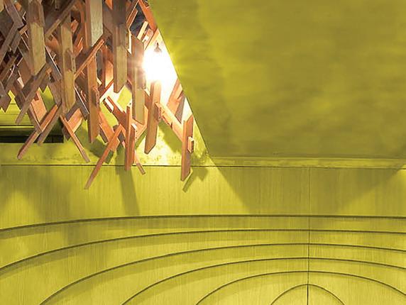
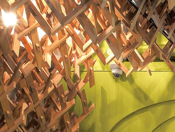
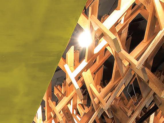
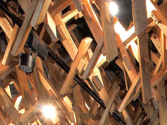
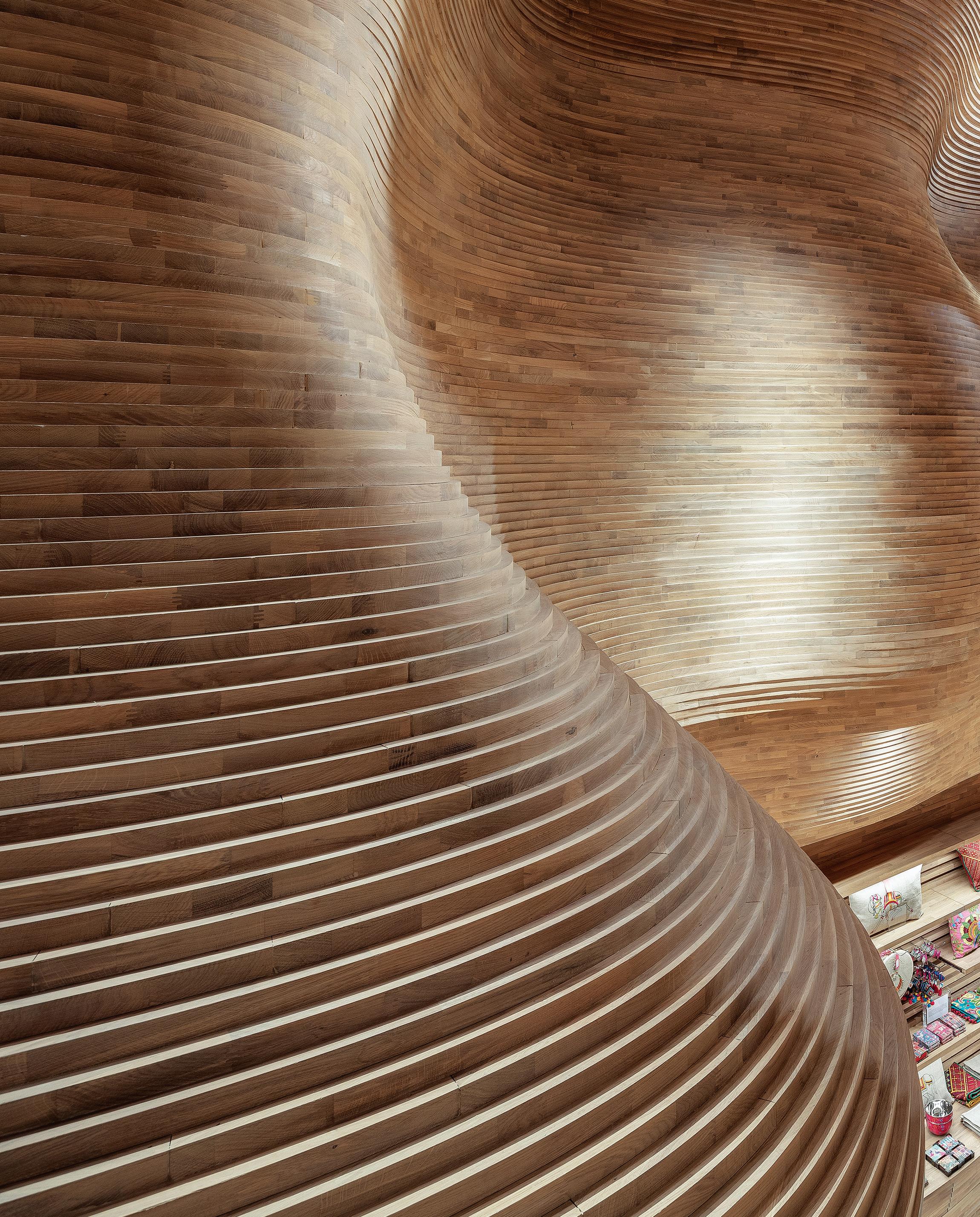
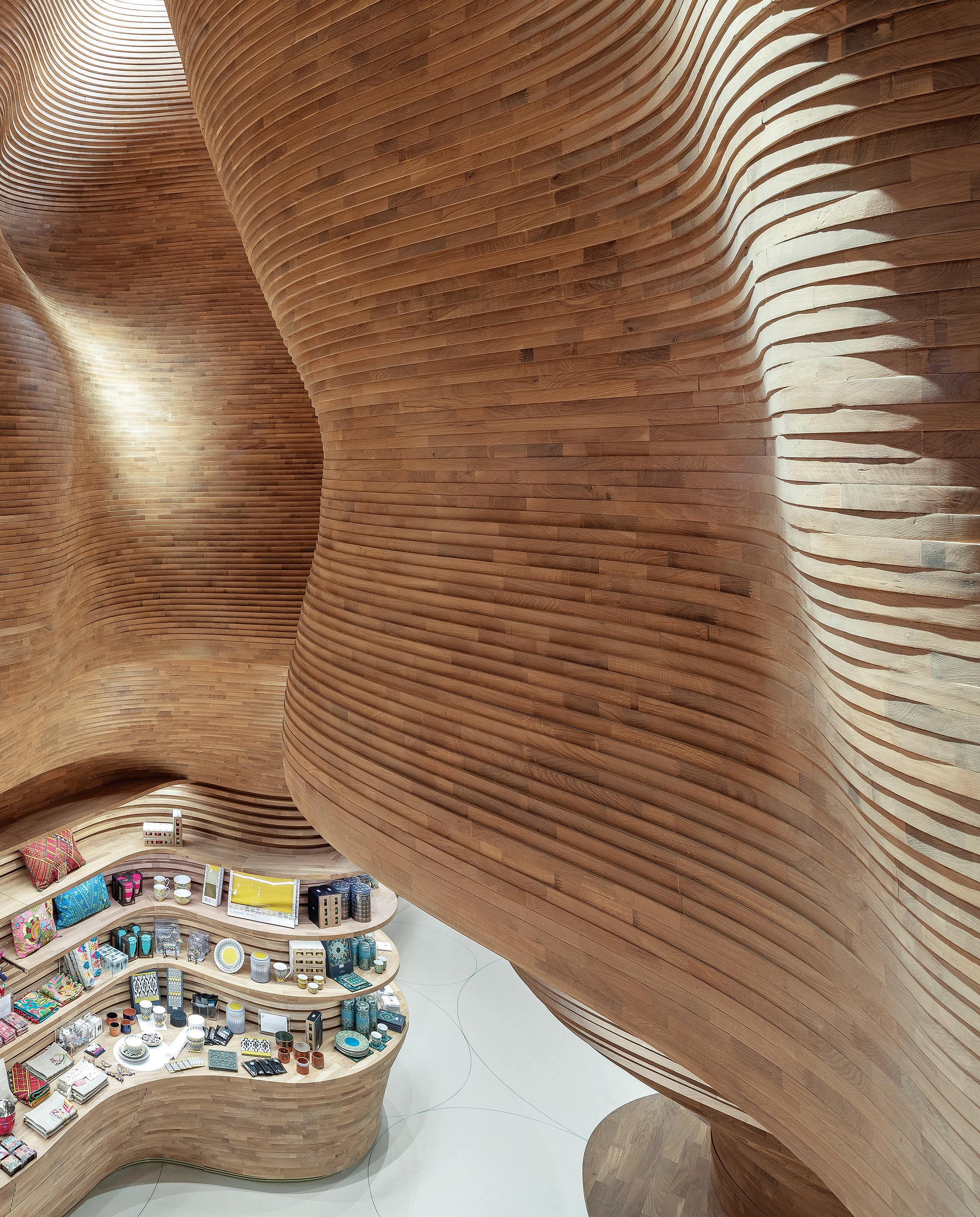
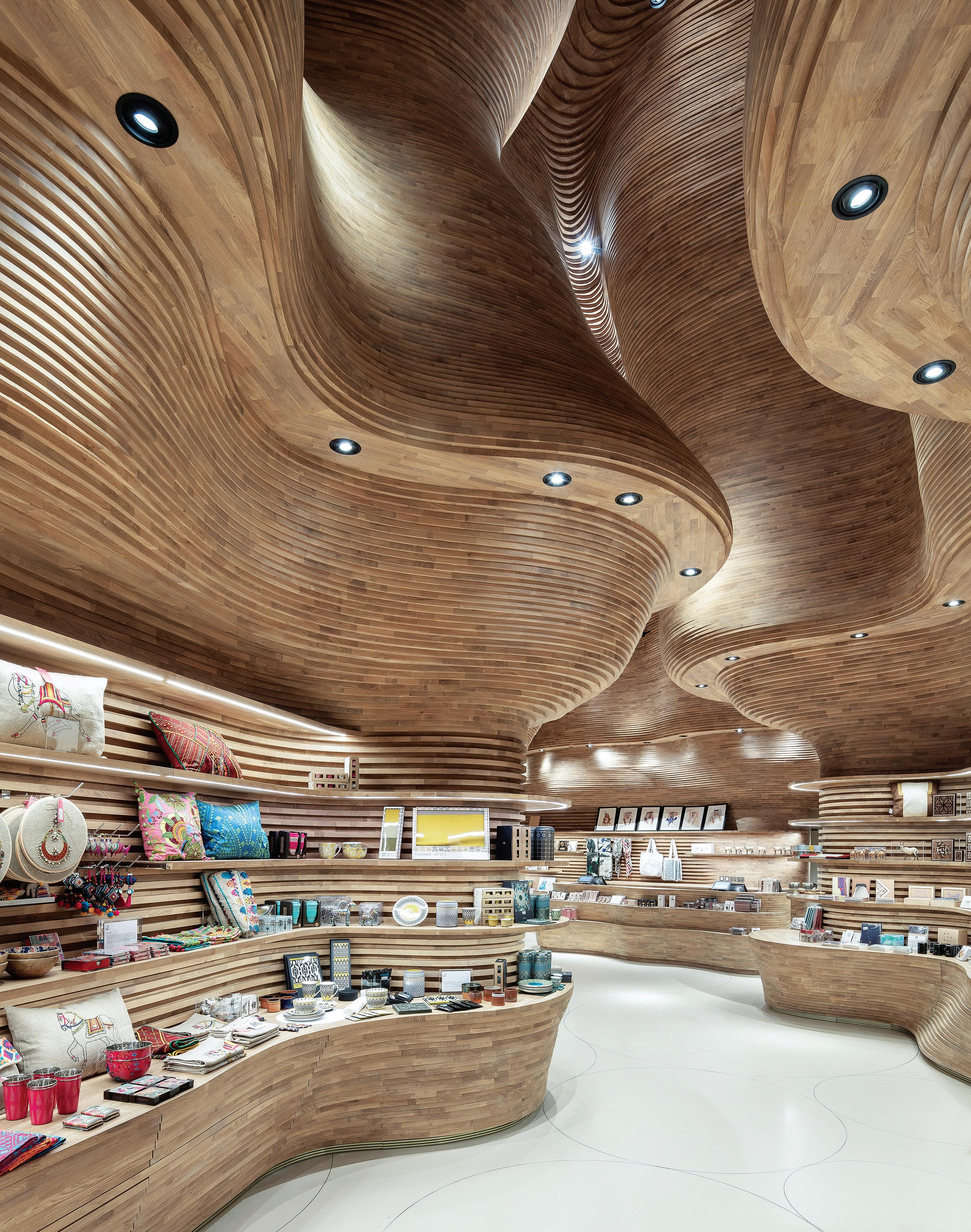
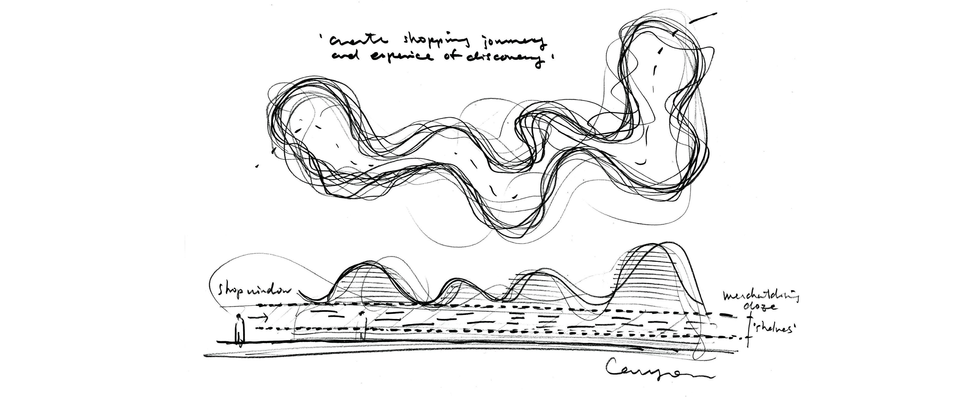
The gift shops were inspired by the Cave of Light and include an eight-metre void which, like the cave, sinuously reaches up towards the light. This void is clad in 40,000 unique pieces of coated, solid European Oak designed and made in Italy by master carpenter, Claudio Devoto, and assembled by hand on site. The joinery and shelving mirror the organic character of the space. It is, says Takada, “an organic landscape of timber, a three-dimensional jigsaw puzzle”. Natural light filters in shards down into the space, making for a constantly changing experience according to the time of day. It also helps turn a functional space into something particularly beautiful, leading Elle Décor editor-in-chief, Whitney Robinson, to describe it as “the world’s most beautiful museum gift shop”.
“It needs to work as a shop,” Takada explains, “because this is a business, not just a showcase. And it needs to be part of the context that Jean Nouvel created – and it’s not a typical museum, it’s closely connected to nature, to the desert rose.”
For its part, the Café 875 (discreetly located on the mezzanine floor above the museum’s entry lobby) responds to the Bedouin tent, the majilis and traditional medallion rings. These elements blend in with more contemporary café seating with the banquette fabric reflecting that same mix, including the traditional black and white stripes of the Al Sadu weaving heritage.
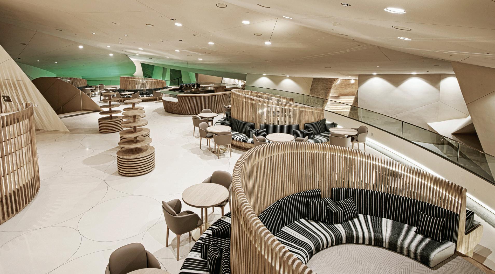
Takada talks of a “harmonising architecture” and insists that beyond functionality, it is a case of “how you feel” in a space. Serving such a philosophy is the materiality and the craft with which those materials are assembled – for fine craftsmanship itself puts us in touch with our humanity. The interior spaces at the museum celebrate fine craftsmanship, not in a showy way, but as a driver of intimacy leading to reflection on the experience of the museum and its mission.
“The lesson,” says Takada, “is not to forget the roots” and to support the museum’s aim to show Qatar’s past, present and ambitions for the future. jeannouvel.com,
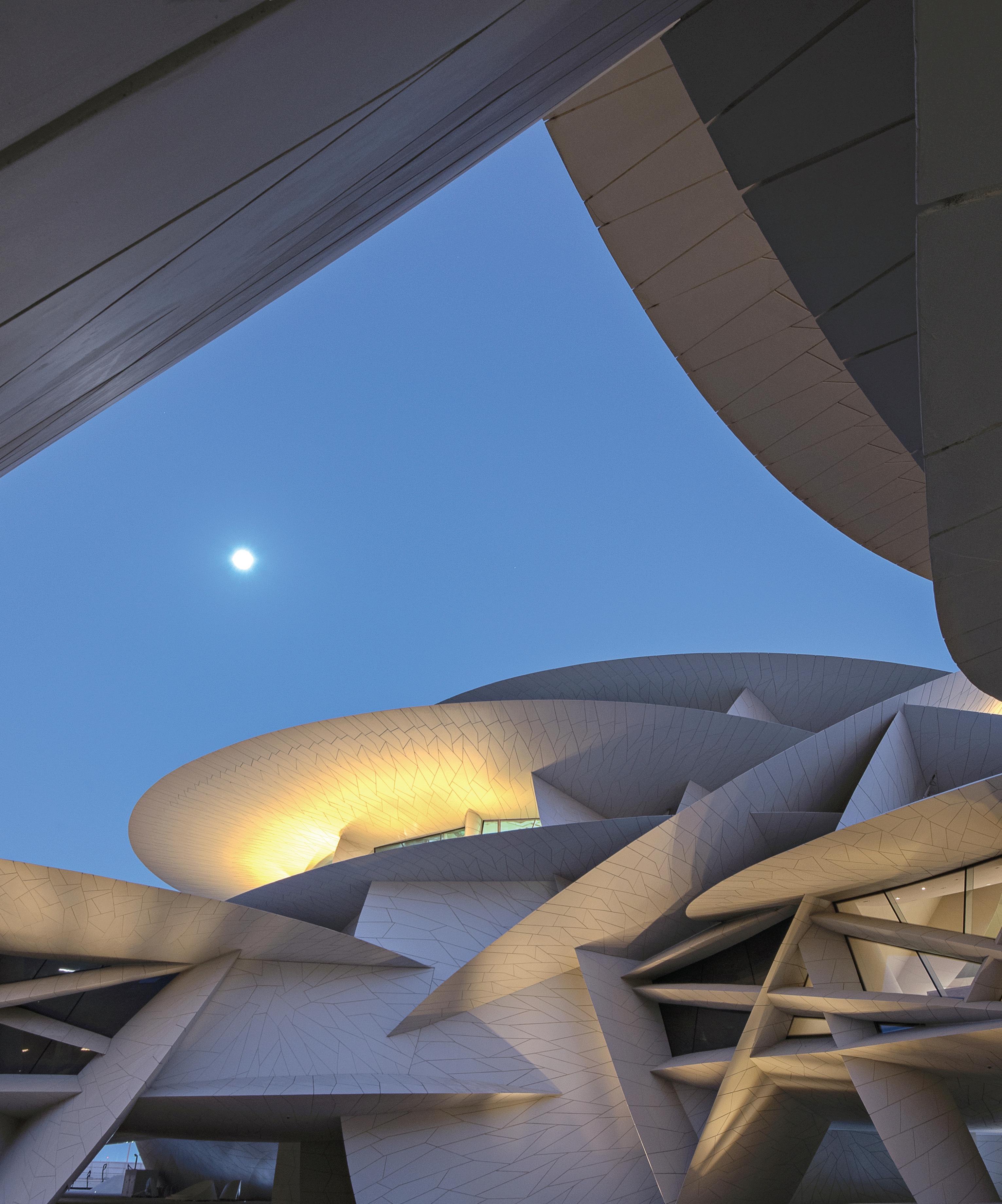
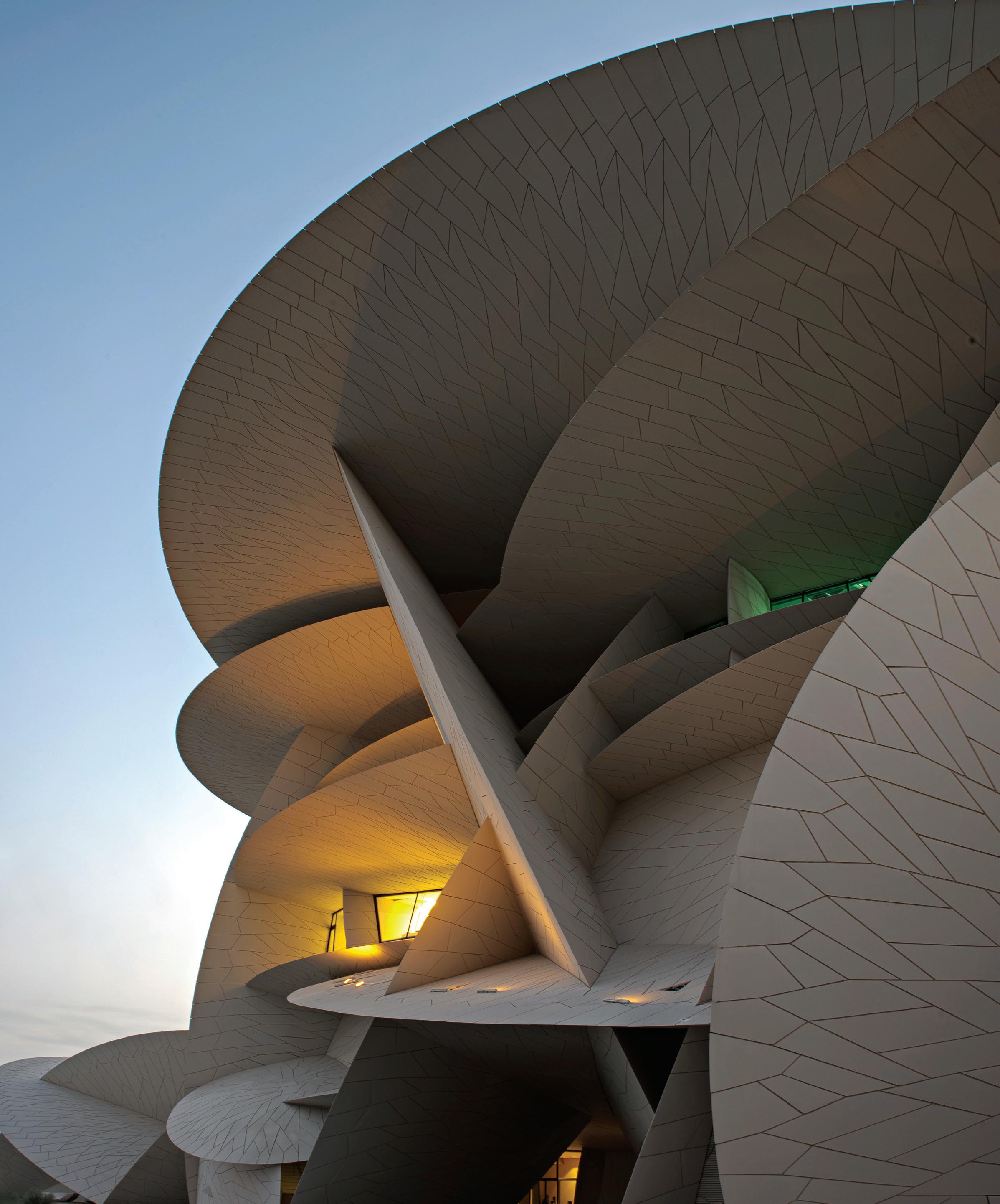
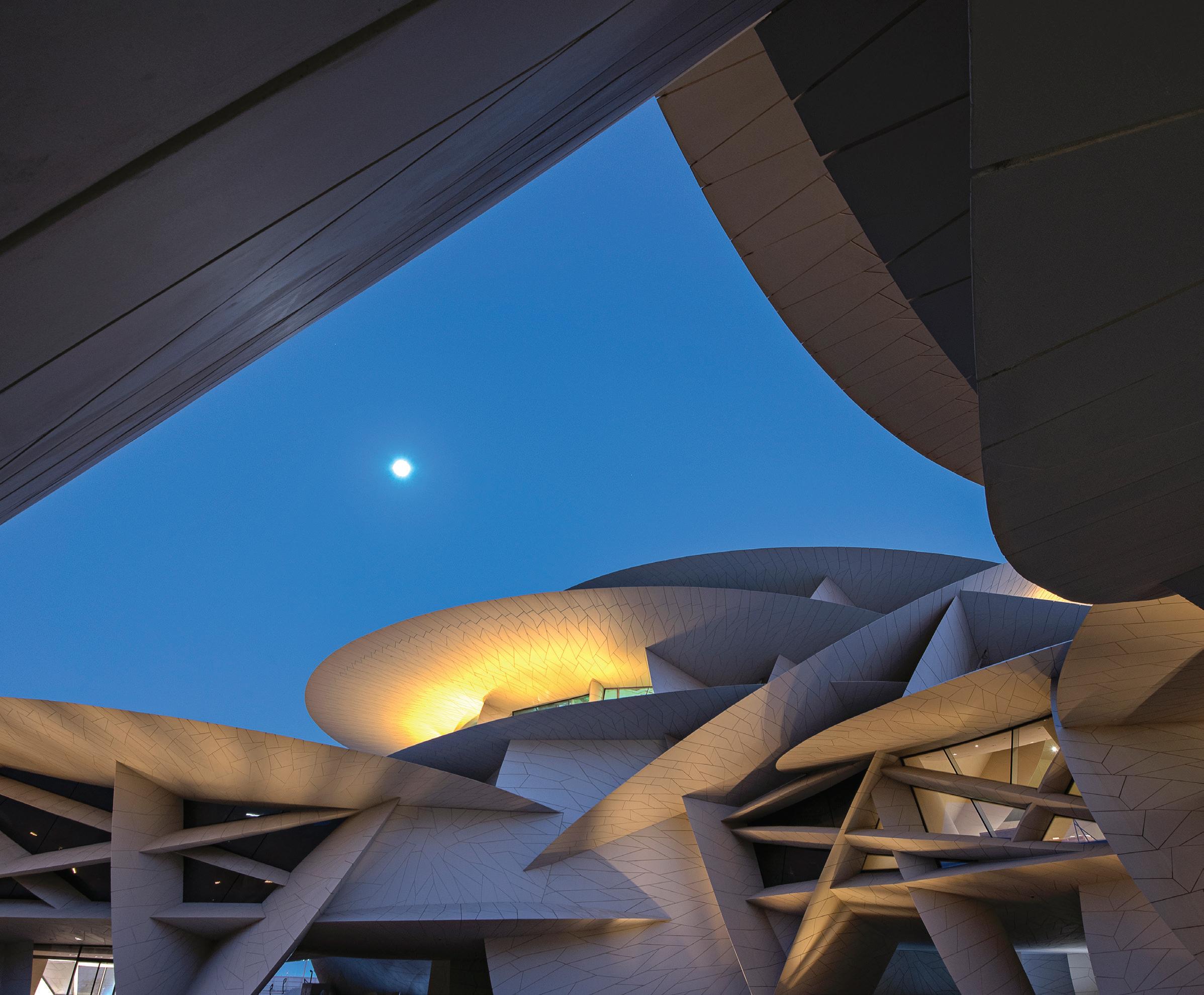
“It’s not a typical museum, it’s closely connected to nature, to the desert rose.”
Koichi Takada
Designed by Lievore Altherr Molina European design meets Australian manufacturing
Ovolo The Valley, Brisbane by Woods Bagot
Words Jo Hoban Photography Dion Robeson
Here’s a hotel that puts you at the centre of its live theatre. Ovolo The Valley appeals to the independent, spirited traveller seeking a little more customised curation from their hotel stay.Opposite: The reception desk is set against an egg shape carved into the wall, with the smaller signature gunmetal egg installation as a backdrop. Page 111-112: View from the sofa across the lobby space, which plays with unique textural pairings and experimental applications. Feature artwork on far wall is Dancer by Gregory Hodge. Page 114: The writer’s desk and luggage console feature bespoke joinery that plays with texture, colour and form. Textured circular artwork by Lisa Madigan; bespoke wallpaper by Liz Casella. Page 115: The rock star suite features curved cabinetry and stylish detailing.
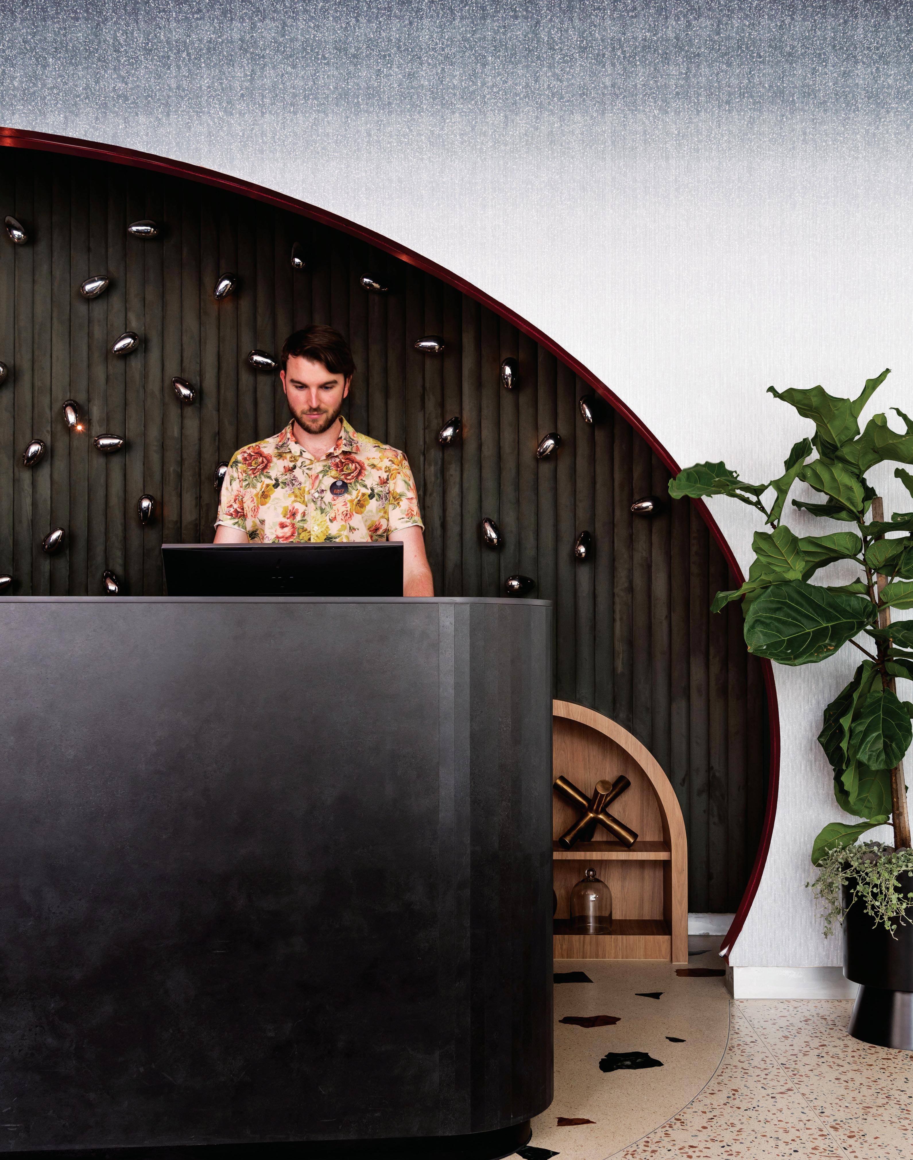
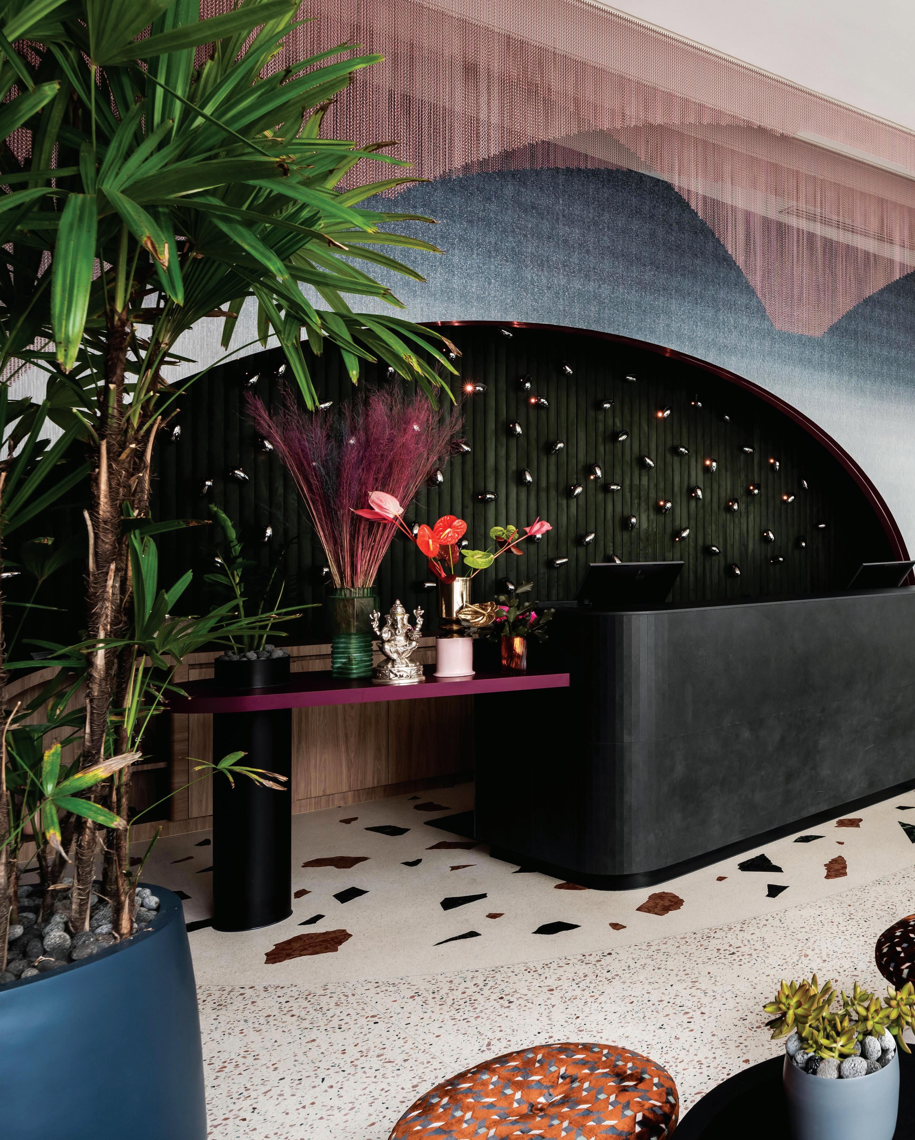
This hotel provides a whimsical ‘installation’ where guests radiate at the centre of an art story. It’s a “conceptual experience for the curious, creative-minded traveller... somewhere that really speaks to the values that you hold is a new level of luxury,” says Woods Bagot’s Eva Sue.
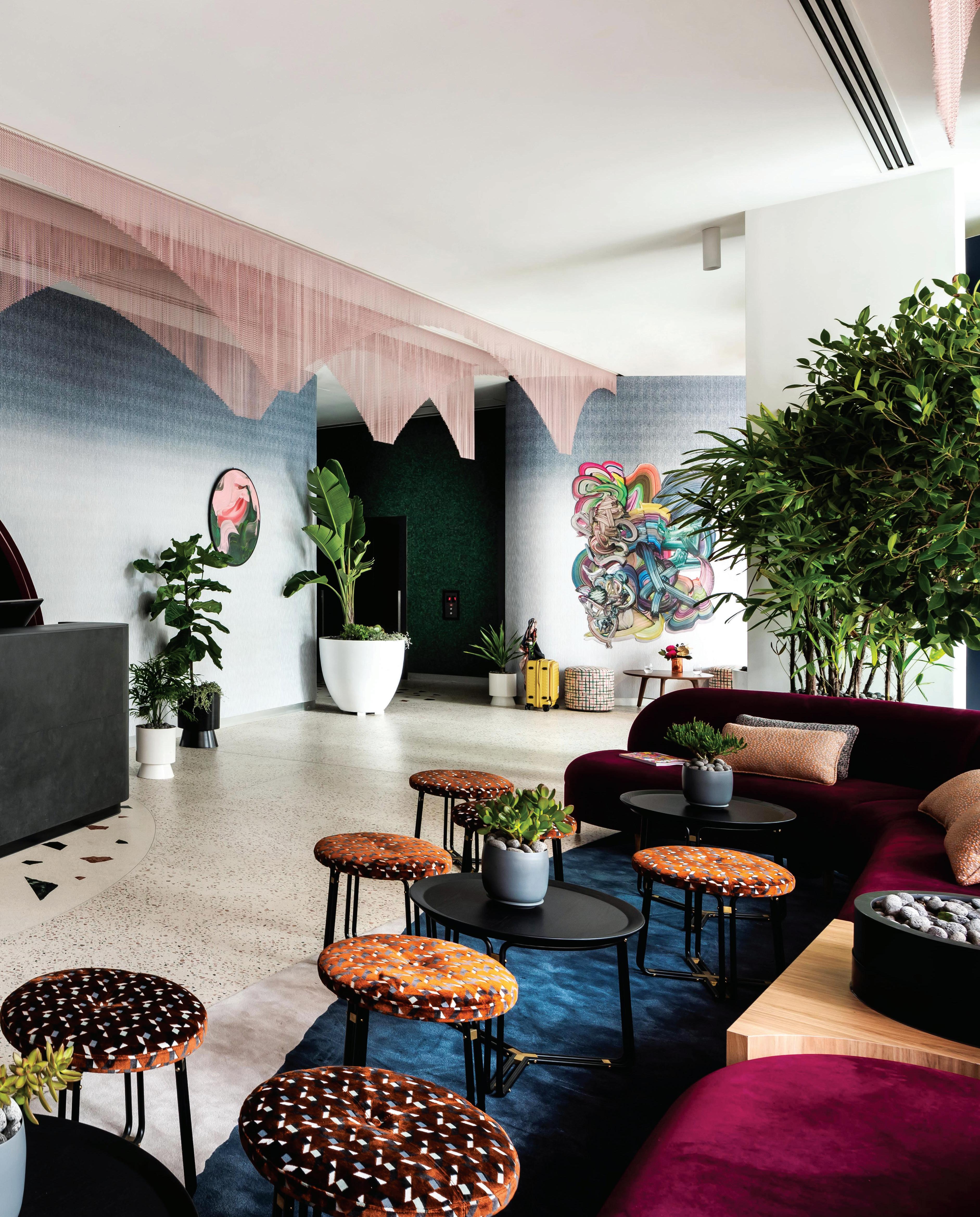
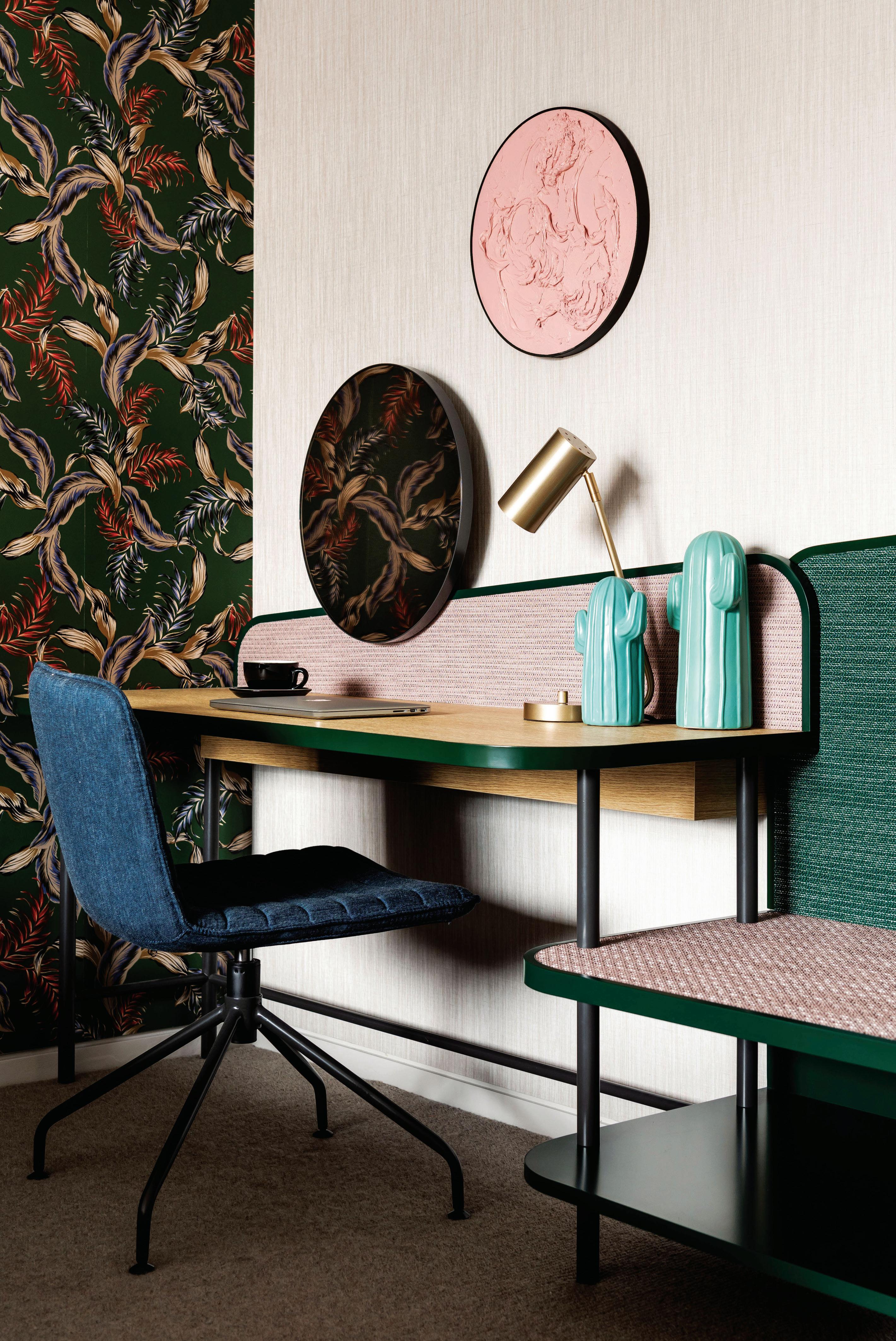
Iconic late artist David Bowie once said: “I don’t know where I’m going from here, but I promise it won’t be boring.” Bowie may have enjoyed a trip to Ovolo The Valley. The boutique hotel opened in November 2018 and radiates with glorious personality. With multilayered, sensory interiors designed by Woods Bagot, Ovolo The Valley warmly welcomes guests offering them a surprising and artful journey, inspired by its location.
Historically, Fortitude Valley is one of Brisbane’s most vibrant cultural hubs, revered for its alternative nightlife and diverse entertainment options. Development has boomed in the past decade, attaining the locale a heightened level of elegance, while still vibrating with its undeniable edge.
“Ovolo is an agile brand, unconstrained by traditional standards; each hotel very much has its own personality and style,” explains Eva Sue, Woods Bagot principal and project lead. “The company’s brand ethos celebrates fashion, art and music, and embraces the uniqueness of each hotel’s locale.” When Sue and her team were tasked with refurbishing what had previously been The Emporium hotel, it was an inspiring opportunity to write a bright new chapter in the hotel’s story. Sue was briefed to experiment and play, while simultaneously embedding all of Ovolo’s values into a sophisticated interior design concept.
“The design celebrates Fortitude Valley’s dualities – the rich colours of the streets and laneways, its social and cultural diversity. It also provides a counterpoint to that urban realm by creating whimsical and immersive moments within. The Valley provides an unexpected oasis for guests,” Sue explains. The refurbishment included 101 guest rooms and suites, two ‘rock star’ suites that pay homage to David Bowie – a master of reinvention, the lobby and reception area, lift lobbies, corridors, boardroom and a rooftop pool.
When guests transition from outside into the hotel, the lobby is intentionally like a continuation of the urban realm, with its bold artworks, and sumptuous sofa beckoning guests to sink in.
Surrounding velvet-covered stools hint at the relaxed social atmosphere. Layered and contrasting materiality frames the communal space, reflecting the multi-faceted nature of Fortitude Valley, and the personalities of those who journey through it. The highly visual and tactile qualities of the lobby are a striking demonstration of the project’s commitment to Ovolo’s ethos.
Despite the rich visual approach, Woods Bagot was constrained by budget and timeframe, and had to be resourceful. In the suites, bedheads, writing desks and luggage consoles feature bespoke joinery that plays with scale, colour and form. “We created modular designs that fit across all the different room typologies. It was a smart balance between buildability, beautiful detailing and the finish itself,” Sue describes. Suites also feature bespoke wallpapers referencing Australian flora by textile artist, Liz Casella.
The design team worked with art consultant Kathleen Wilson to ensure original pieces by local artists were featured throughout the guestrooms, lobby and communal areas, enriching the guest experience by urging a deeper interaction within the space. As guests move into the ground floor lift lobby, for example, a colourful gorilla sculpture peeks out from a separate nook, inviting closer inspection.
All Ovolo hotels offer two signature rock star suites and for The Valley, Sue and her team felt that honouring David Bowie would capture guests’ imaginations: “He is undoubtedly one of the most inspirational cross-disciplinary artists of recent times and we thought that had nice synergies with the overarching concept of The Valley. The rock star suites offer playful yet sophisticated experiences that take the Ovolo guest by surprise. Each has 1970s-inspired velvet lounges and a gold bar for those who dare!”
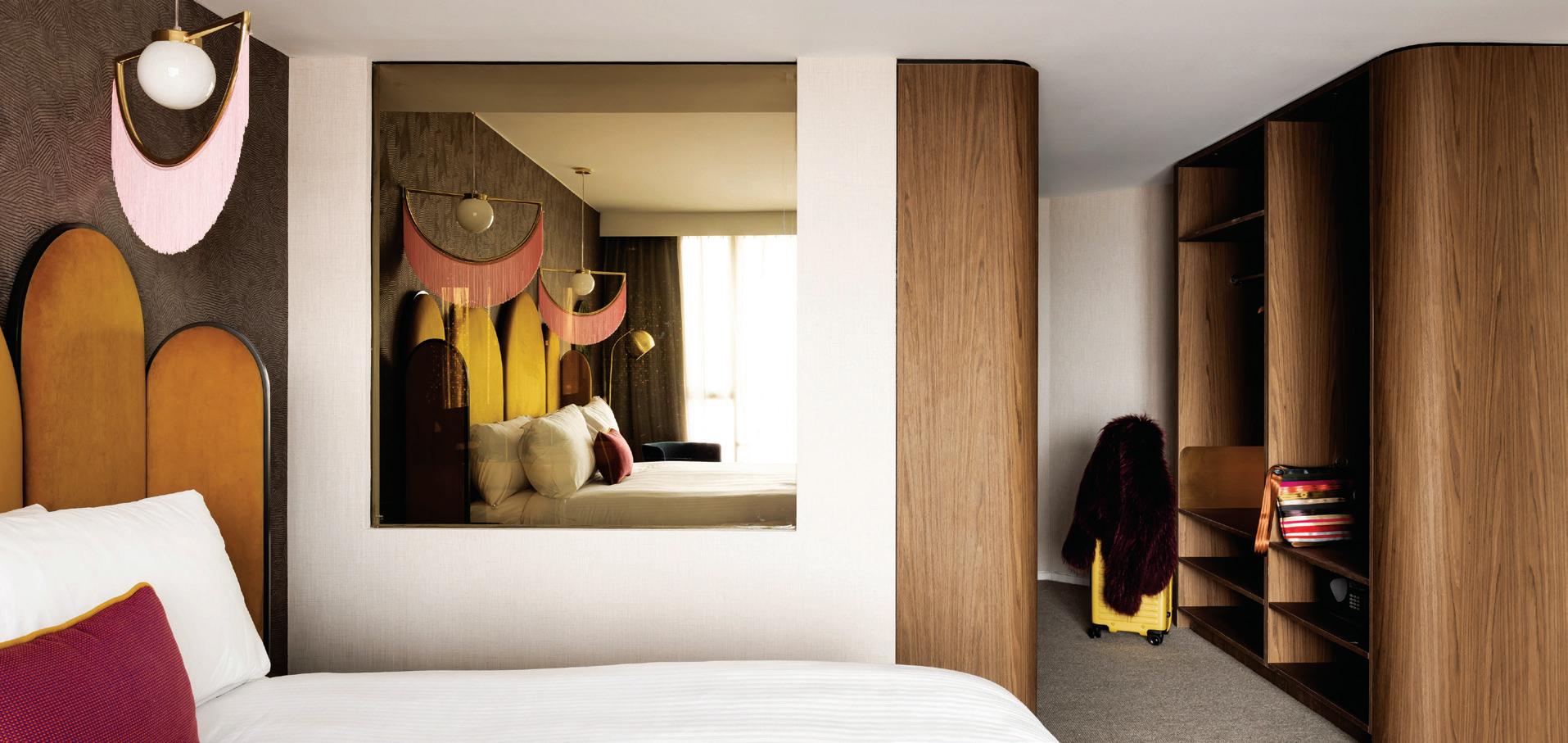
This is certainly a hotel where uniqueness is celebrated, and personality prevails.
woodsbagot.com
“Ovolo is an agile brand, unconstrained by traditional standards; each hotel very much has its own personality and style.”
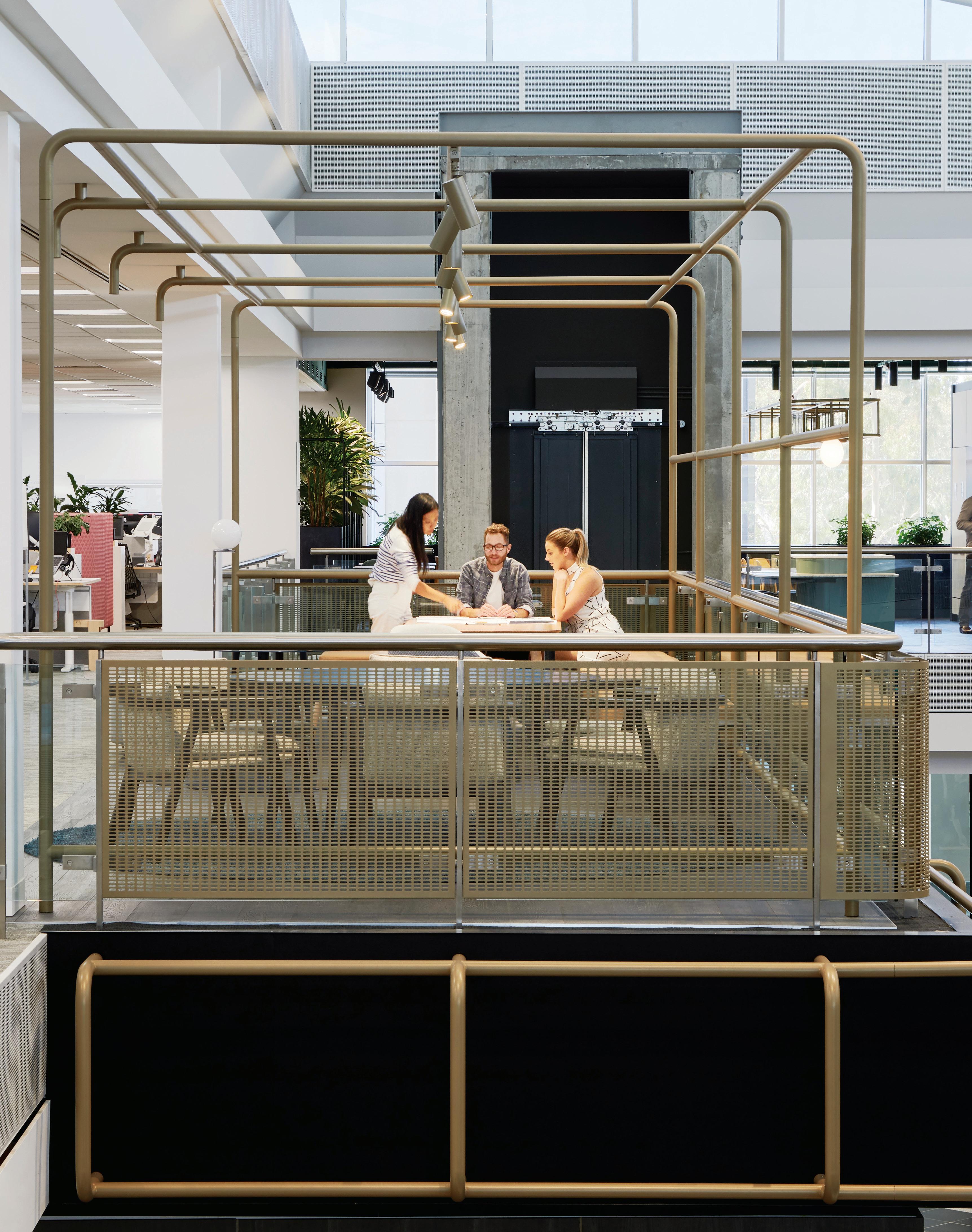
Six major Australian labels, two buildings, one unified workplace... how does it work? Heidi Smith of Gray Puksand gives us the scoop on David Jones’ and Country Road Group’s stylish new Melbourne headquarters.
Mostly any Melburnian, probably dressed head-to-toe in black, would attest to their hometown being the nation’s true fashion capital. The city’s sartorial cred’ boomed late last year, when historically fashion-forward retailer David Jones farewelled its Sydney offices to join Country Road Group in a new shared working environment, developed by Gray Puksand.
“For us it was really quite an exciting opportunity to create a new culture for six brands that needed to come together and cohabit, as well as take a fresh look at what a contemporary Australian retail headquarters might be,” says Heidi Smith, partner and national interior design lead at Gray Puksand in Melbourne.
As part of their project research, the design team went abroad, gaining valuable insight on world-class fashion houses across Europe. Of particular note were the head offices of Scotch & Soda and G-Star in Amsterdam, where a singular vision for each brand’s clothing and retail stores influenced the way their workspace was expressed.
“You can really trace the brand DNA from the product in store, right through to the look and feel of their office, and it’s something that builds solidarity,” says Smith. “We brought all of those learnings back to this project, to see how we might create a design story that could unite them.”
And so, ‘the home of Australian icons’ was conceived. Spanning two buildings and 25,000 square metres, the brief required private quarters for each brand. With six distinct groups to accommodate –David Jones, Country Road, Mimco, Politix, Trenery and Witchery – division was crucial in protecting IP, but it was equally important to have public areas where they could put their work on show once ready. Gray Puksand addressed this with conventions native to the retail experience including signage, flexible display platforms, and hanging space. Light-filled atriums, which form the heart and hub of each of the two buildings, also provide ample space for exhibitions at the ground floor.
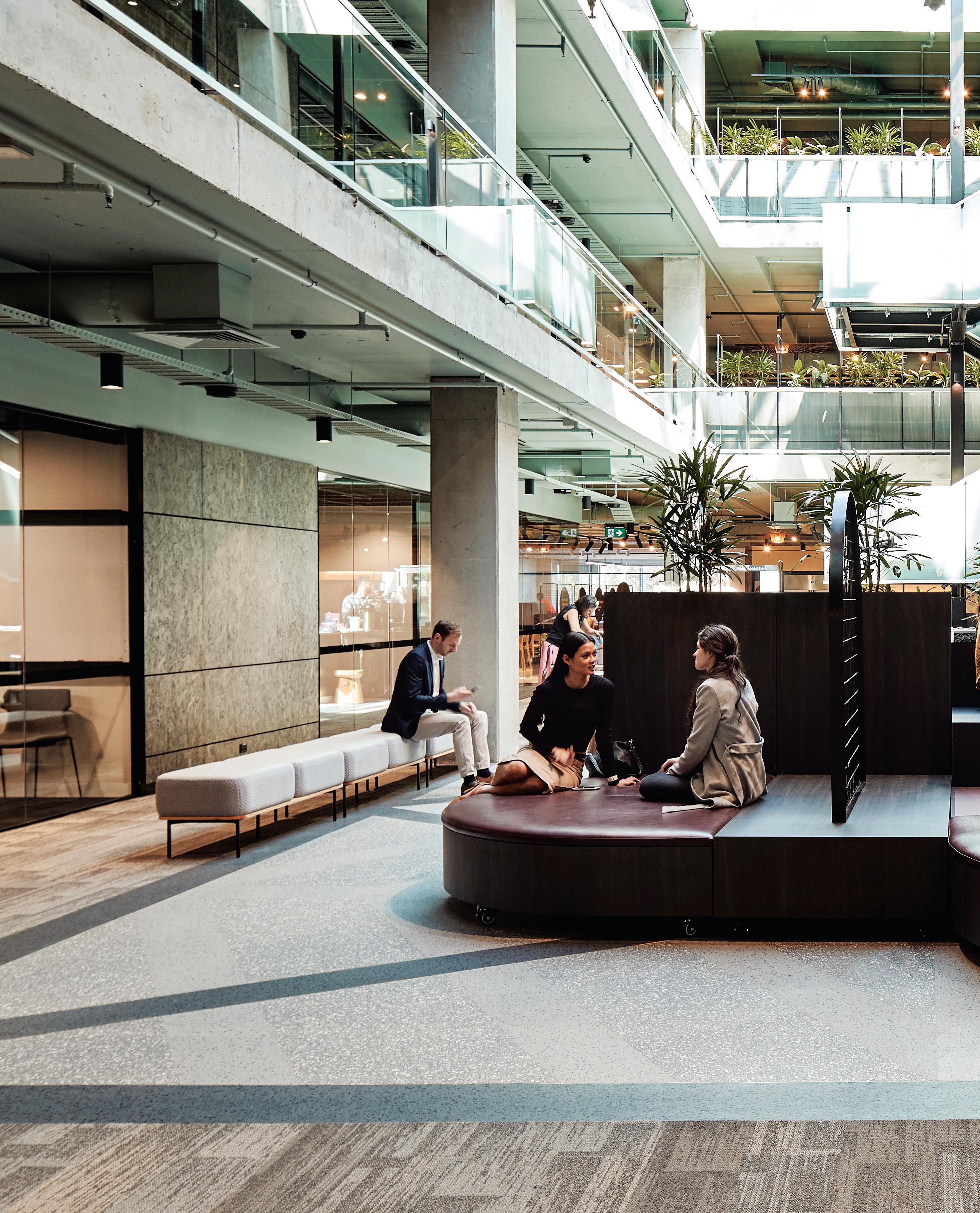
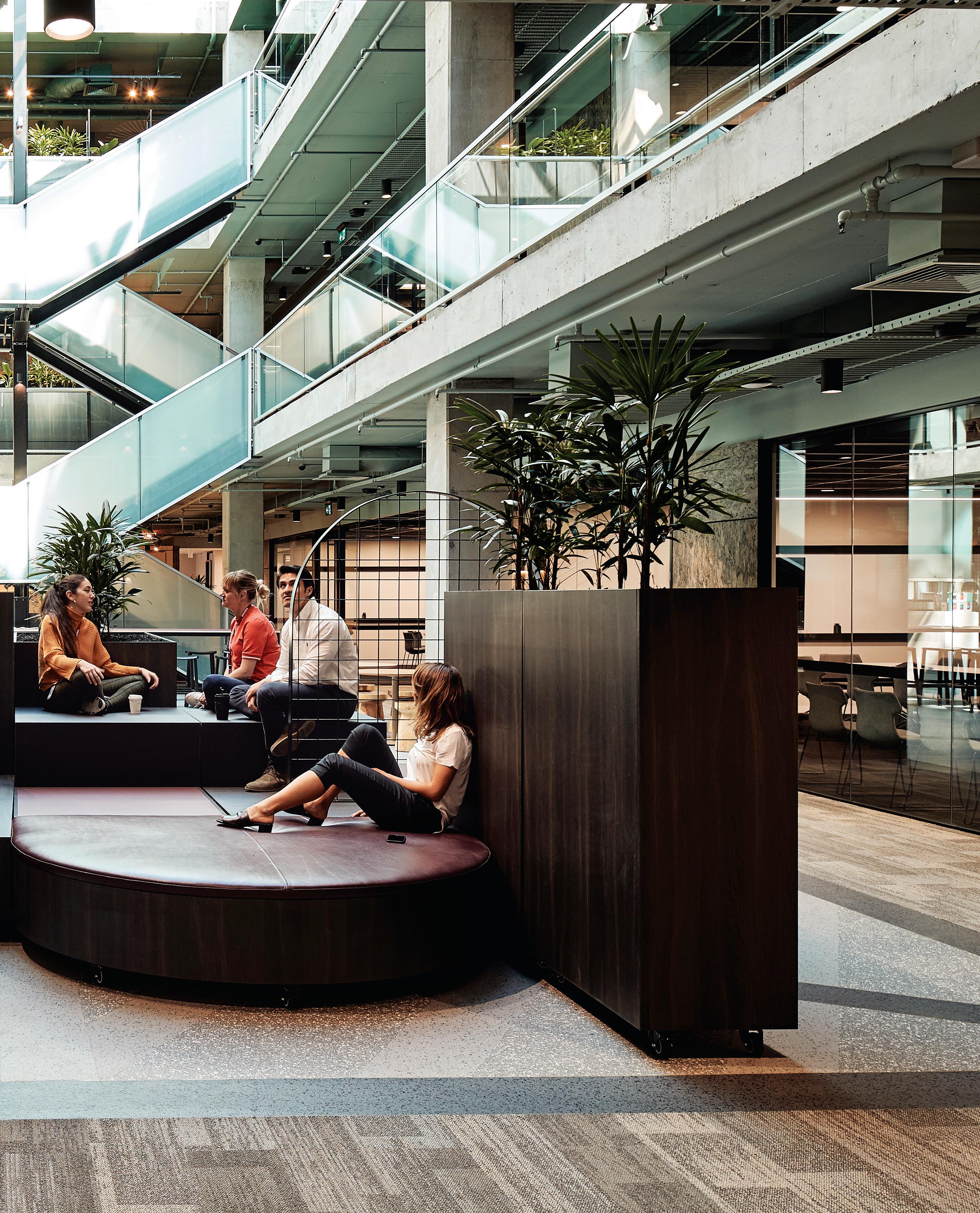
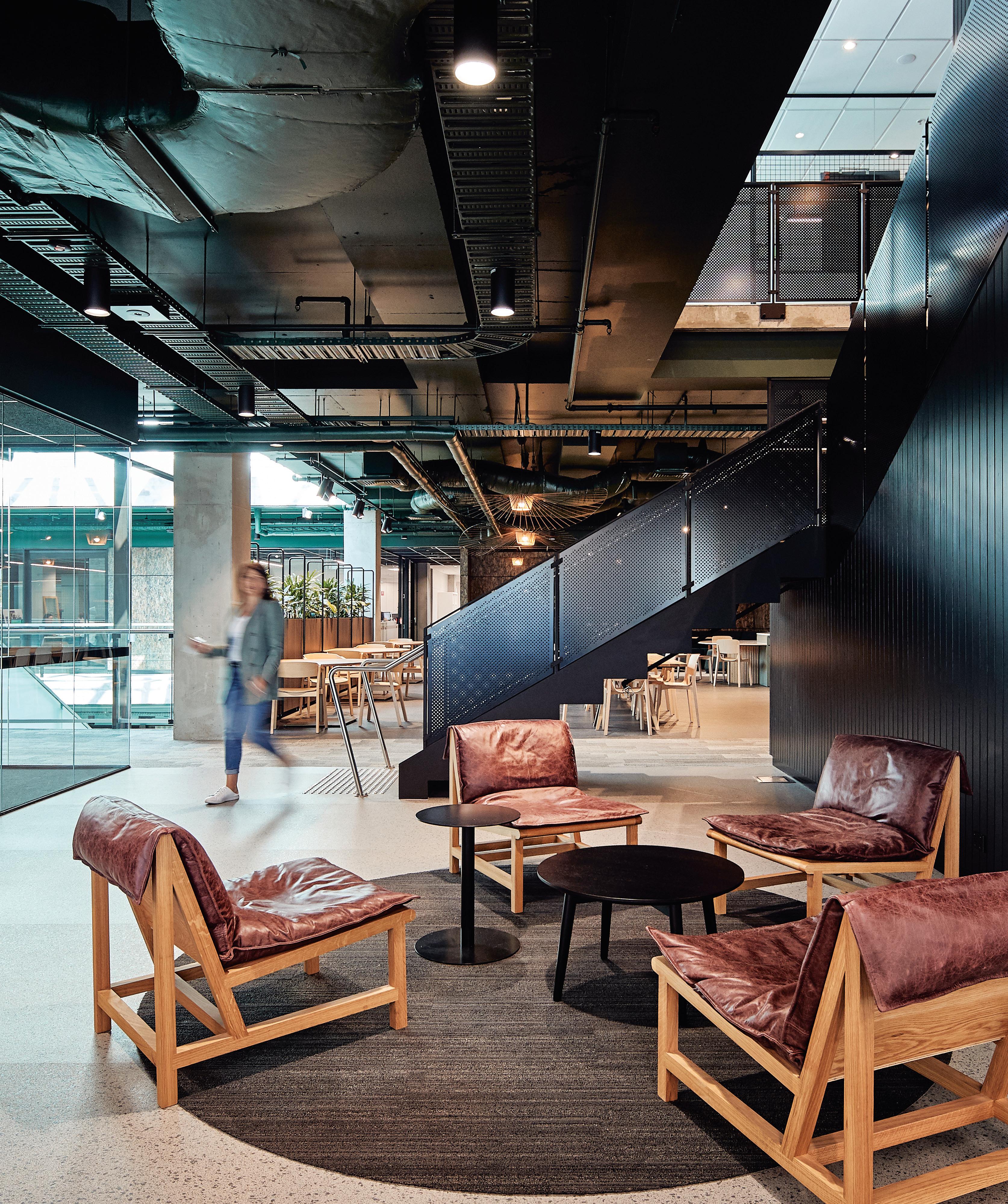
“All the furniture there is moveable, so they can hold presentations, test visual merchandising for the department stores, or even run a catwalk,” says Smith. Here, staff line the multi-level balconies for a view to the dynamic space below. “It’s a cool way for each brand to show off their latest ideas and get broader feedback from people in other departments.”
Gray Puksand also drew inspiration from the communal hospitality focus that they had witnessed in effect at the Scotch & Soda and G-Star offices, where staff are encouraged to eat lunch together, and inviting social spaces enable communities to form organically. Lounge areas exude the casual glamour of a hotel lobby, while sophisticated breakout spaces are inspired by bars and restaurants in Melbourne. Of course, a home for Australian icons must be furnished with local product, and the fit-out is peppered with key pieces by Australian designers Adam Goodrum, Tom Fereday, and Sydney-based furniture group, Project 82.
Given David Jones’ gourmet providore status, carefully considered food and beverage outlets at the core of each atrium form an integral part of the design. One hosts a coffee cart service, a little café where informal meetings take place, and the other replicates the beloved David Jones Food Hall, where staff can buy pre-prepared meals and groceries. “One of the most iconic elements of ‘DJs’ is its fantastic food hall, so we took elements of that and brought it right into the office,” says Smith.
“We wanted to build a place where anyone could connect over food and drink, and become part of the community. They’re like proper town squares – a mini hospitality and retail precinct.”
David Jones’ culinary centre is situated here too, where a test kitchen develops new food for tastings, so staff can have their say on new products destined for public sale. Beyond the obvious social benefits, this intentional integration of hospitality and retail throughout the workspace encourages desk-based staff to keep the end user’s shopping and dining experience front of mind, helping to inform strategies implemented in-store.
“Having a village of brands all together may have been a bit of a mindset change, but now that they’ve settled in, it’s been really successful,” says Smith. “Each group feels at home in their own brand neighbourhood, and people naturally intersect outside of that as well. Across the board, it’s a totally activated community.”
David Jones and Country Road Group was Shortlisted for the 2019 INDE.Awards’ The Work Space category, proudly partnered by Colebrook Bosson Saunders.
graypuksand.com.au
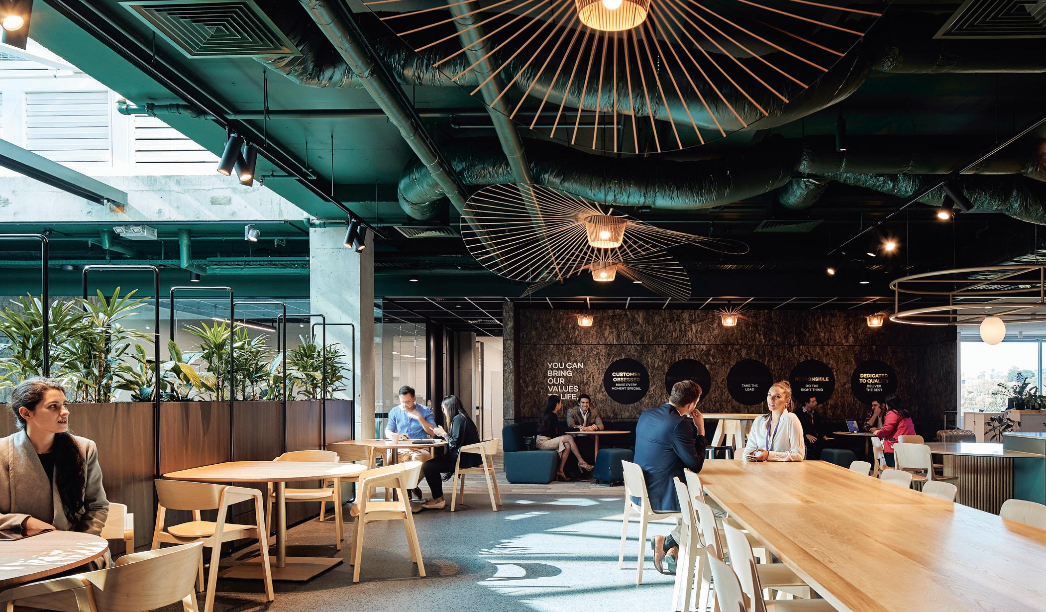
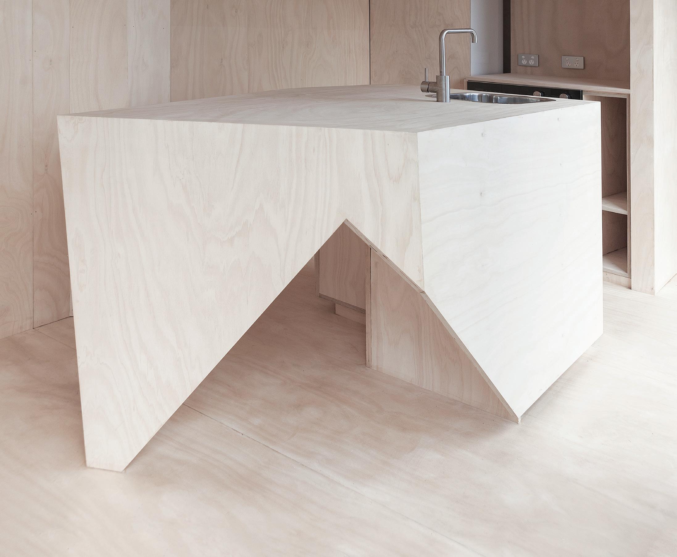
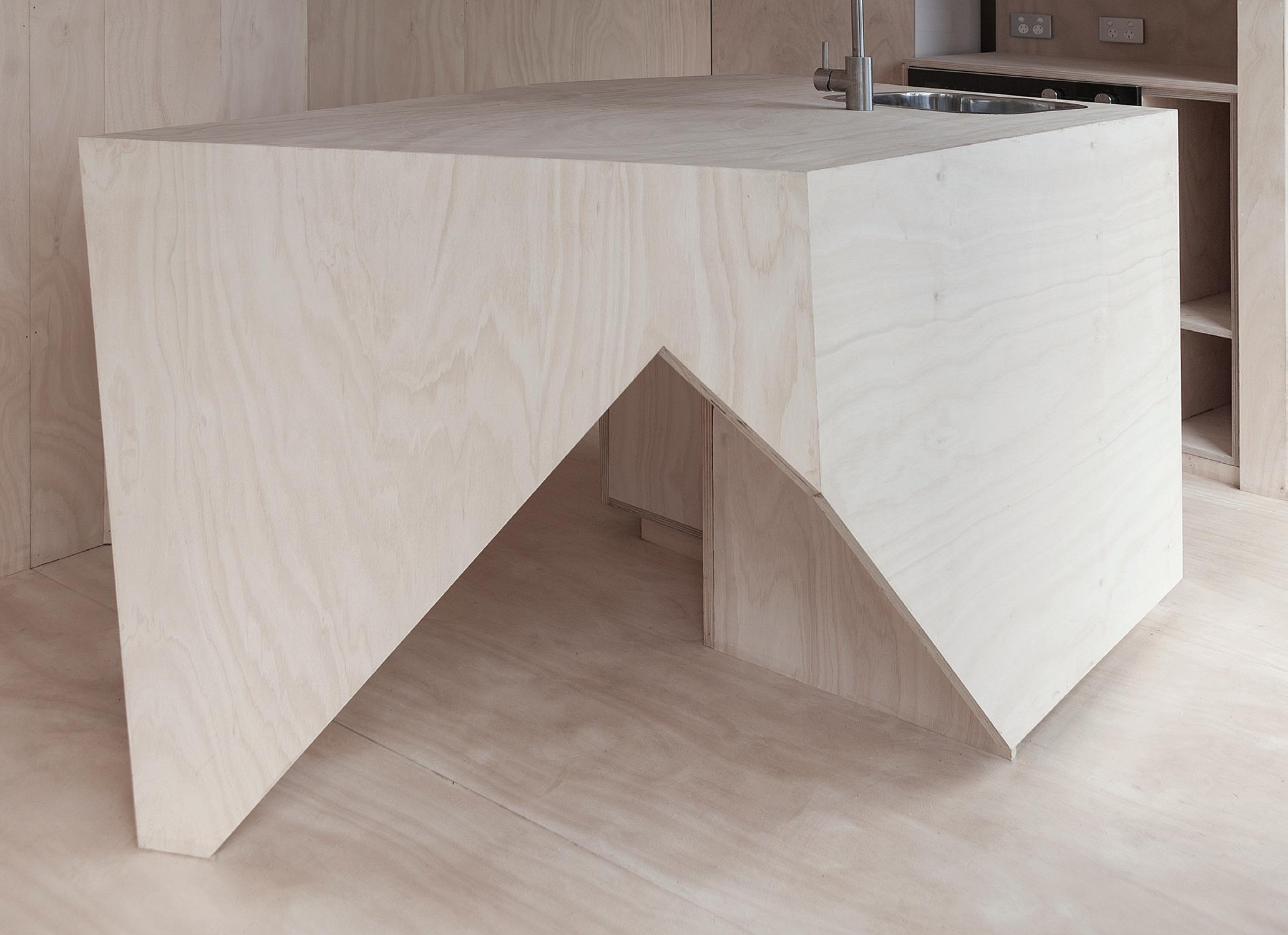
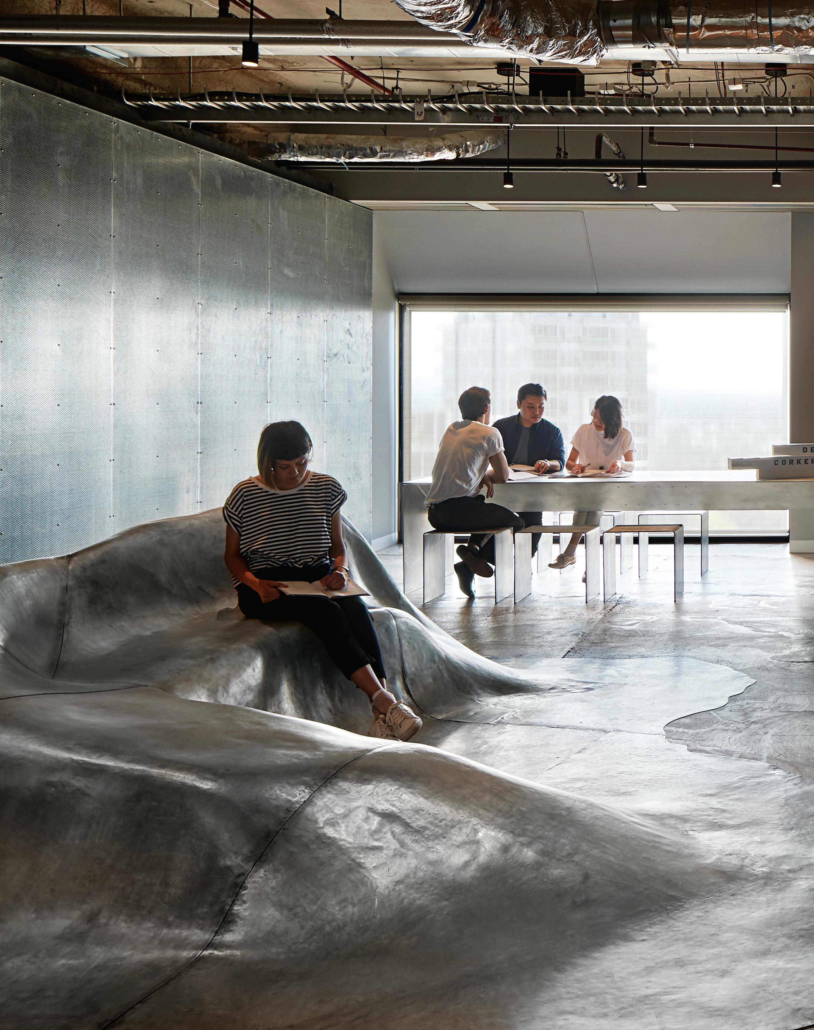
Moving ‘uptown’ from five floors to a single open studio, Denton Corker Marshall has eschewed the popularist office palette of soft pastels and soothing timbers.
“It’s a fairly stripped back fit-out, but it’s honest and conveys the way we work, as much as how we design,” says DCM’s founding director and architect, Barrie Marshall.
Architect Barrie Marshall prefers the old-fashioned approach when it comes to design. While the DCM staff are focused on their computers, Marshall is more likely to be found with a pencil in his hand, perched over his drawing board.
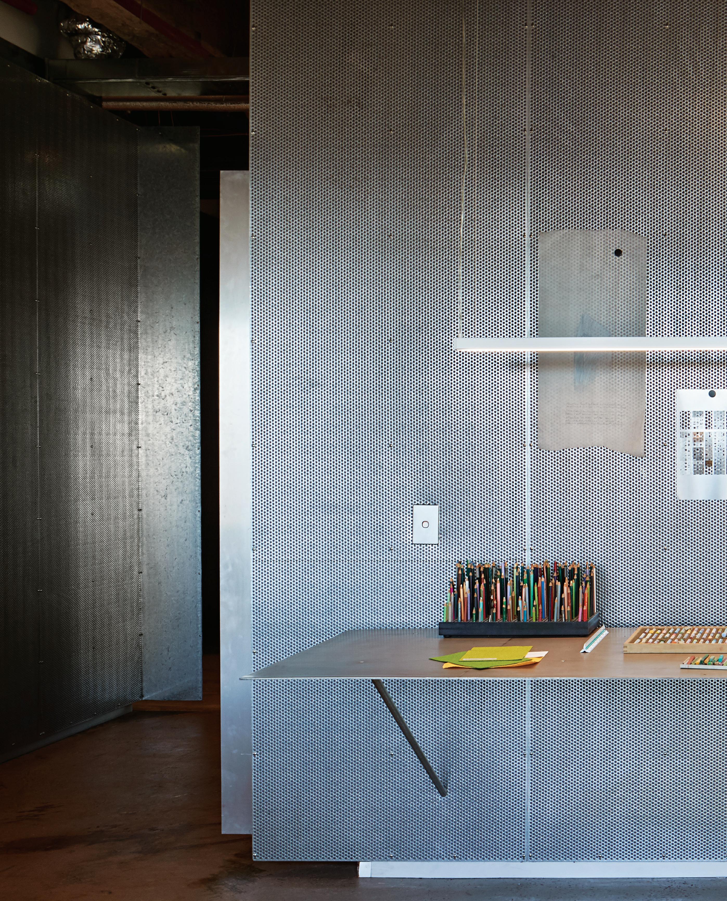
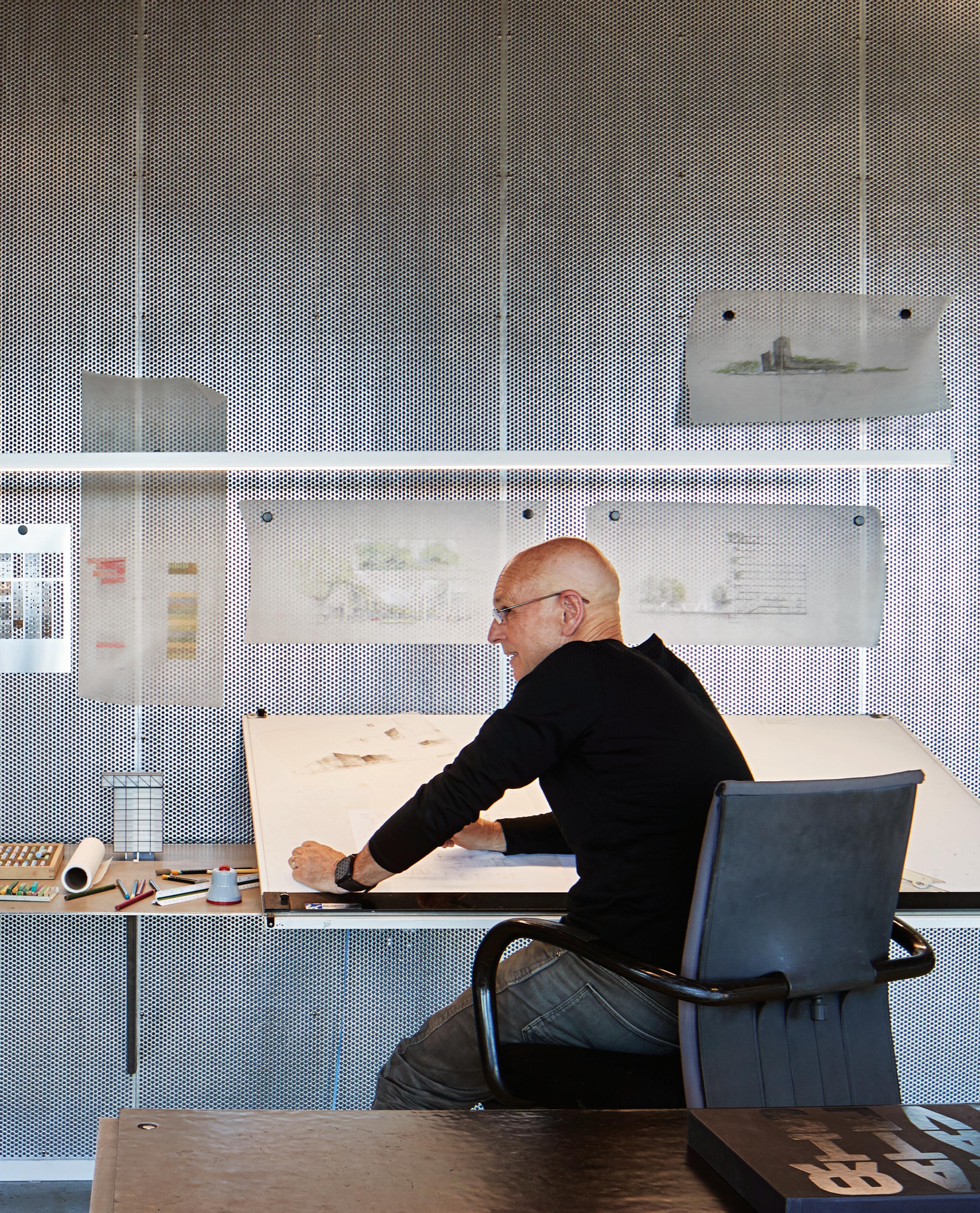
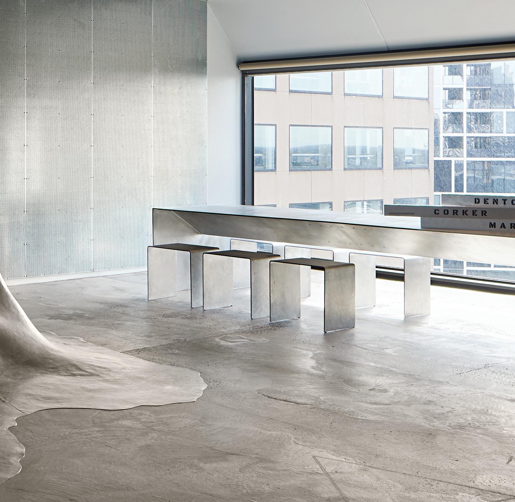
“We haven’t changed our approach since we started, except for the short time that we experimented with the Memphis scene in the early 1980s, as did many other architects.”
Denton Corker Marshall (DCM) is well-known on the Melbourne and international architecture scene. Melbourne’s ‘gateway’ (sometimes referred to as the ‘sticks’), the Exhibition Centre, and the Melbourne Museum – all designed by DCM – are now ingrained in the city’s landscape. However, producing these great projects requires the right creative workspace and after decades of operating from five levels in Exhibition Street, it was time to move. “John (Denton) and I were happy enough with the multi-level arrangement, but the younger directors and the broader staff (85 in Melbourne) were keen to be in a more studio-style environment, on one level,” says architect Barrie Marshall, founding director of DCM.
DCM found a suitable workspace at the ‘top of the city’, just a stone’s throw from its previous location, at 55 Collins Street. Located on the 19 th level of one of the two towers designed by I.M. Pei in the 1980s, it was undergoing a refurbishment when the 1000 square metres of floor area were first inspected. “The tradesmen were just about to lay carpet and ceiling tiles until we asked them to halt this process,” says Marshall, who was keen, as were his colleagues, to create a robust and industrial aesthetic.
Instead of ceiling tiles, the pipes and airconditioning ducts were left exposed. The concrete floor has also been left, complete with all the ‘blemishes’ time produces. And in a style that has been a consistent part of DCM since the early 1970s when the practice was established, finishes are raw, simple, and meticulously executed. Perforated steel wall panels appear on virtually every wall, with many of DCM’s furniture designs, such as the ‘Adelphi’ chair (named after the notable Adelphi hotel in Flinders Lane) appearing in many of the breakout spaces and meeting rooms. However, the pièce de résistance is a fluid metal ‘cloth’, formed as a bench at reception, a one-off that is immovable. “I wanted something that looked as though it grew out of the ground, as in the landscape,”
says Marshall, whose hand sketches of DCM’s pavilion at the Venice Biennale four years ago also feature upon arrival.
Although DCM’s new office is located in a corporate tower, the last thing in mind was producing a corporate-style environment – think an ‘interior designer’ rather than architecture aesthetic. “We haven’t changed our approach since we started, except for the short time that we experimented with the Memphis scene in the early 1980s, as did many other architects,” says Marshall, who still appreciates some of the iconic designs from this period, including two highly desirable Torso armchairs by Paolo Deganello in 1982, now taking pride of place outside the firm’s library.
Unlike the previous DCM fit-out with a singular view to a laneway, the new office is centred around the lift core, and enjoys floor-toceiling windows on all sides, offering views of Port Phillip Bay in the distance and people scurrying below along the city pavements. “Even though we’re on the 19 th floor, you can identify people you know walking below,” says Marshall.
Conceived in a non-hierarchical manner, the staff, including the directors, share the open-plan workspaces, breaking off into individual teams when required. Small breakout areas, also framed in perforated steel, allow for more intimate gatherings, while large trestle-style tables in the kitchen morph between work and lunch. “It’s a fairly stripped back fit-out, but it’s honest and conveys the way we work, as much as how we design,” says Marshall, who is one of the few architects remaining who still works from a drawing board, rather than sitting behind a computer. “John and I sit in one corner (the south-east corner) and we like to make things with our hands,” says Marshall, pointing out the plasticine models of the ‘blob’ that now features in reception.
dentoncorkermarshall.com
The fit-out is robust and industrial, with exposed pipes and ducts straddling the ceiling. It’s the last thing one would expect from entering this corporate tower with its marble-clad lobby, and yet perfectly in-character for Denton Corker Marshall.
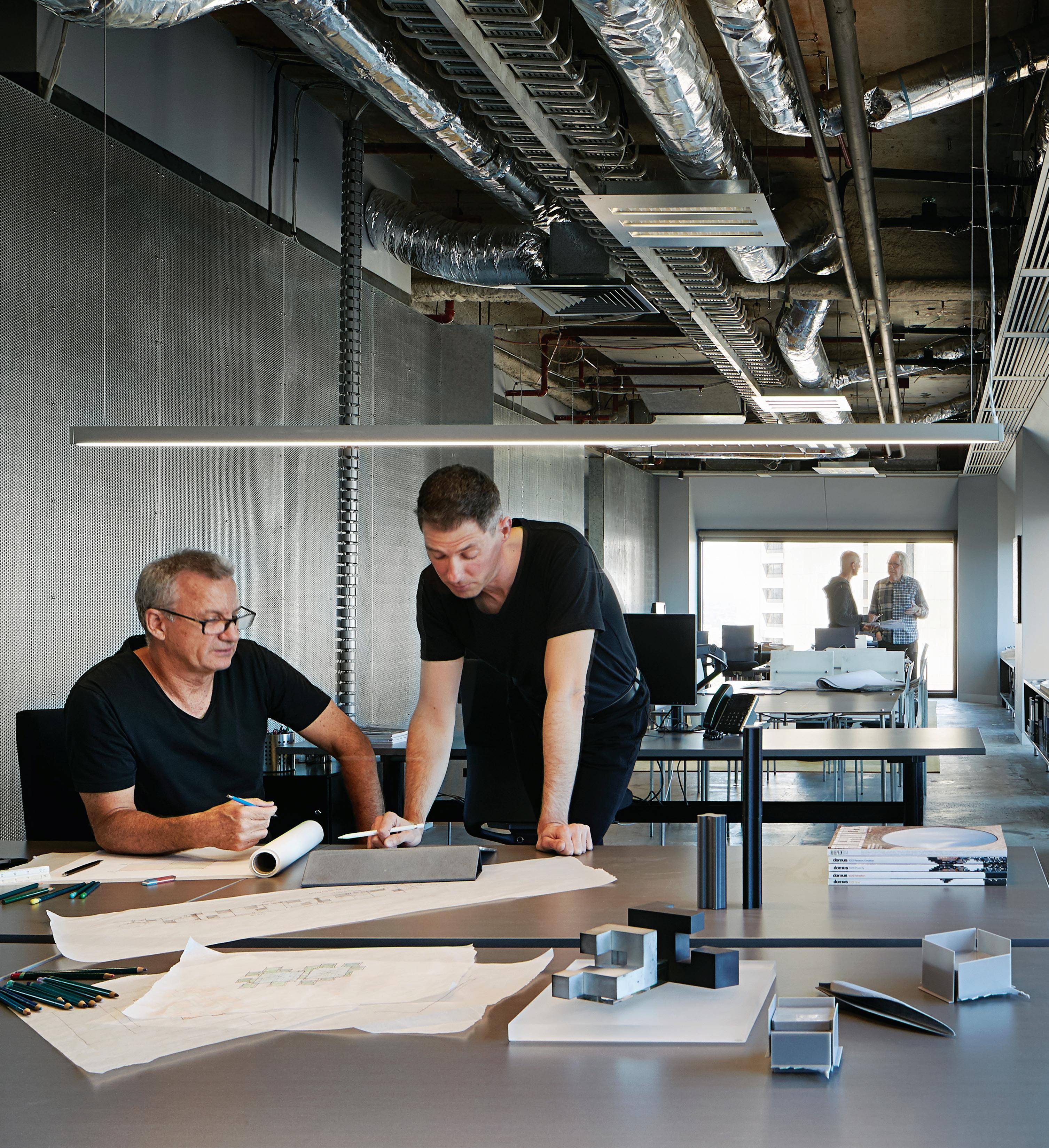


When a small interior architecture team lands the job of creating a major new headquarters for Microsoft, it’s a good day at the office. “To say we were ecstatic is an understatement!” says Jade Nottage, director at Sydney-based studio Tom Mark Henry. “They’re a huge client for a studio of our size.”
The complex brief called for three floors of multifunctional space over 1650 square metres. Most of its tech-savvy, mobile staff would use the space to hotdesk, so the office needed to be an adaptable, attractive destination for people who could choose to work anywhere. Overall, it should appeal to a wide demographic range –from school groups who might be toured through the space, through to visiting CEOs.
“Microsoft had a clear impression of what they thought the project should look like based on previous fit-outs they’d done internationally, but they also requested a local approach,” says Nottage. “They wanted it to feel like you’d walked into an Australian office.”
With most of the Microsoft team assigned to oversee the Sydney project based in Singapore, weekly Skype meetings with engineers, staff and internal design consultants became crucial, particularly in achieving a common design language which accounted for differing cultural references. “I suppose when you don’t live in Australia, it would seem like a very bright, vivid country. So there was a perception that the sand is yellow, the water is blue and the
As designers we’re used to pushing our client. But what if the client pushes us right back? Microsoft Technology Centre shows what can be achieved when designer and client together strive for more.Microsoft Technology Centre, Sydney by Tom Mark Henry Words Sandra Tan Photography Damian Bennett
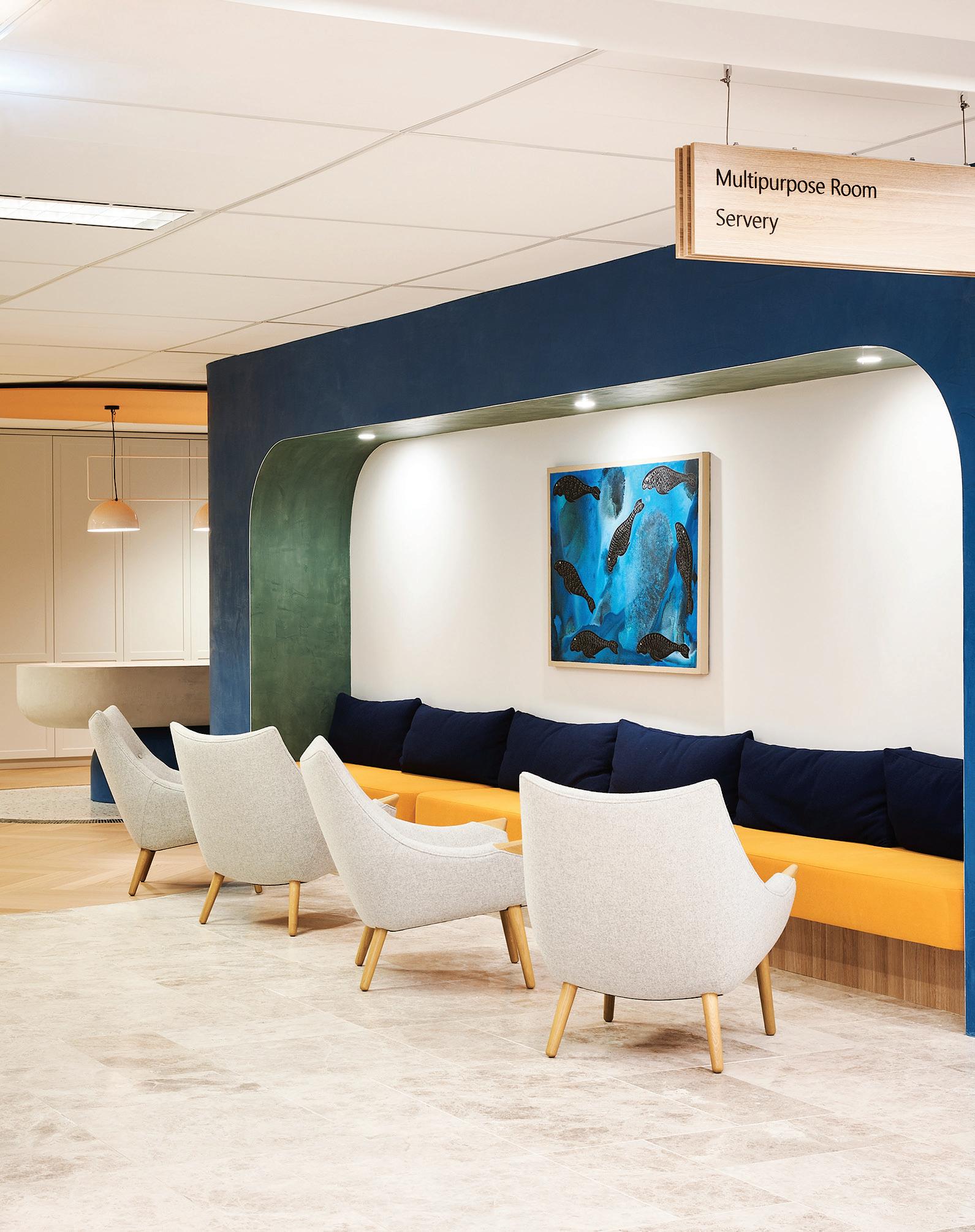
trees are bright green,” Nottage says. “What we tried to explain is that actually, Australia is quite earthy. For us, the colours are muted. Trees are a Eucalyptus green. Sand is creamy, the landscape is a terracotta tone. So that was the direction we pushed for.”
And who better to inject some nuanced native colour than a local creative? Tom Mark Henry engaged Melbourne-based textile designer and artist, Cassie Byrnes, to apply her hand-painted exuberance to office walls. One mural depicts a spray of protea flowers, a distinctly Australian motif, in peach and soft pink against dramatic dark green foliage. A playful detail, such as you might expect from a trendy restaurant. “It’s an approach that we take as a company across all our projects, taking a corporate space and introducing elements you might find in a café, or a hotel,” Nottage says. “People are going to spend some serious time there, so it’s important for them to feel comfortable.”
Bold gestures continue throughout the breakout areas, where Tom Mark Henry’s aptitude for striking hospitality design becomes evident. At the core of a staff kitchen sits a sculptural island bench, carved out of industrial foam and hand-finished by skilled tradespeople. The space is imbued with chic, mature versions of the primary hues found
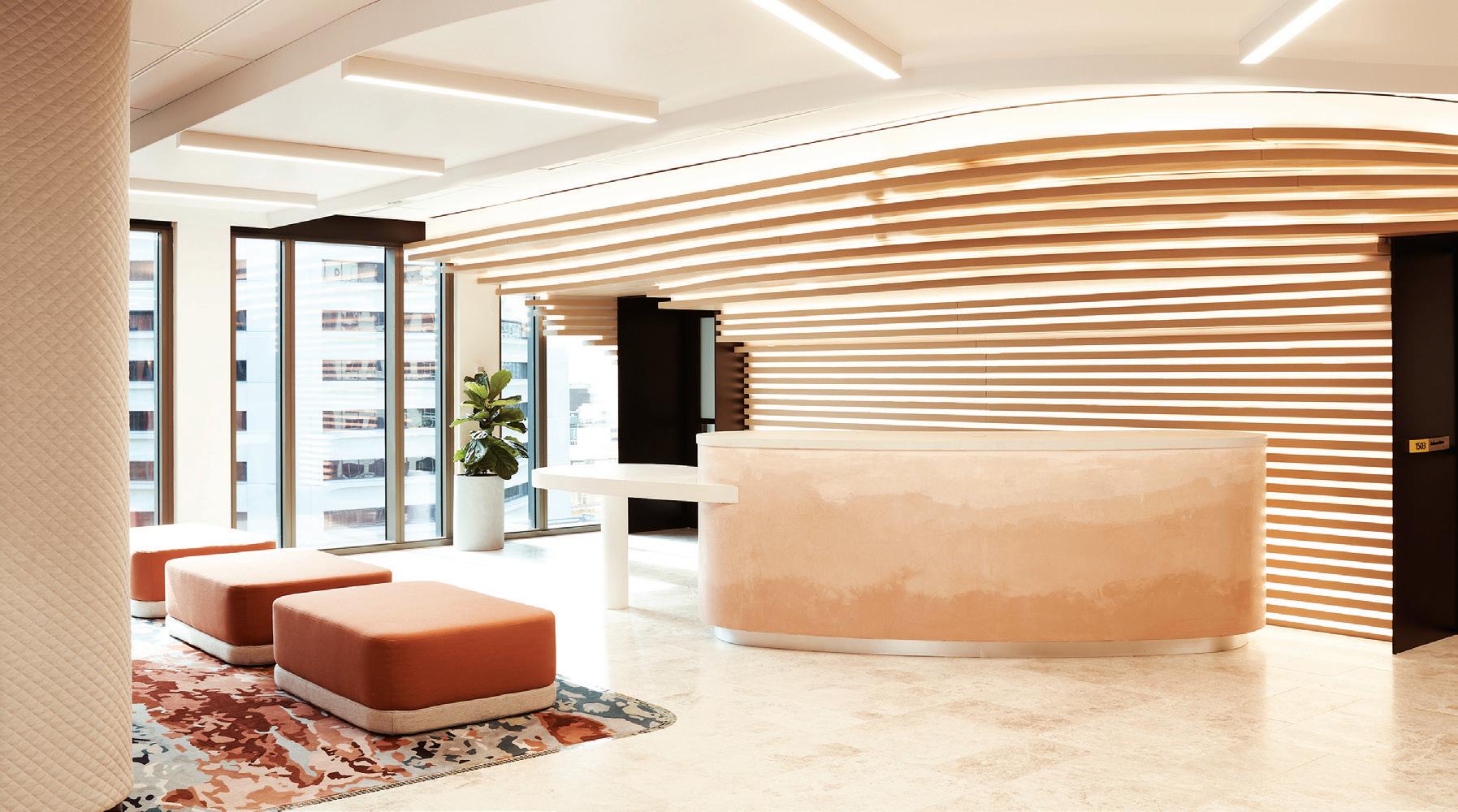
in Microsoft’s Windows logo – yolky marigold in place of yellow, rich burnt red and ocean tones between green and blue.
Despite the office’s lively, impactful quality, a certain neutrality is implemented wherever the company’s latest is on display. “If you’re trying to showcase Surface Pros and Surface Hubs, and all this amazing Microsoft technology, you don’t need it surrounded by a million design moments,” says Nottage. “It dilutes the product.”
To this end, boardrooms demonstrate a more pared-back, sophisticated palette. Similarly, the executive bar, in robust grey stone and black veneer, creates an understated monochromatic cool, distinct from the upfront personality of the centre’s concept-driven public spaces. “In the end, they pushed us further and we also challenged them,” says Nottage. “The result is a fit-out that they love, that is very different to anything else they’ve got around the world.”
Microsoft Technology Centre was Shortlisted for the 2019 INDE. Awards’ The Work Space category, proudly partnered by Colebrook Bosson Saunders.
tommarkhenry.studio
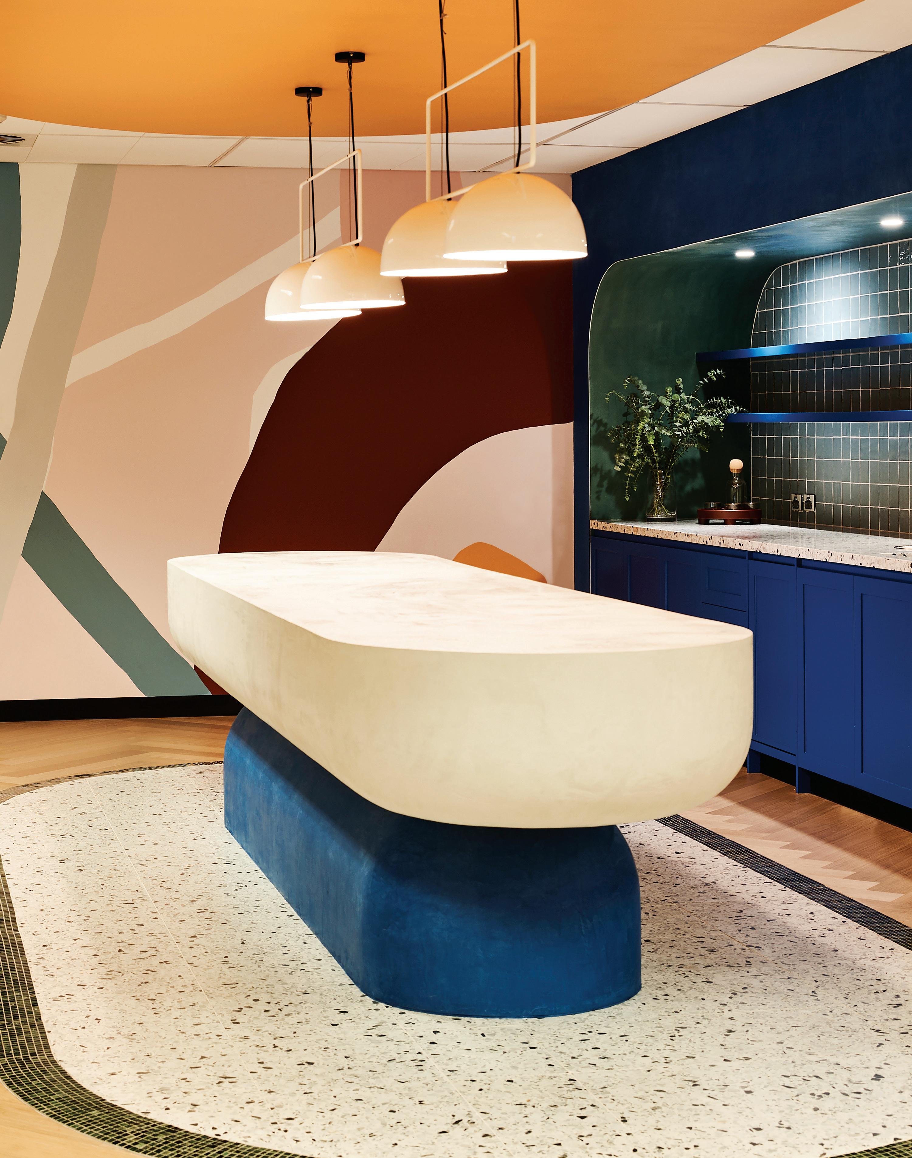
Warm tones and timber surfaces respond to a comprehensive fit-out guide from Microsoft, which outlined its preference for a tactile, human-centred environment. Texture, interesting materiality and a softer approach came through strongly in the brief.
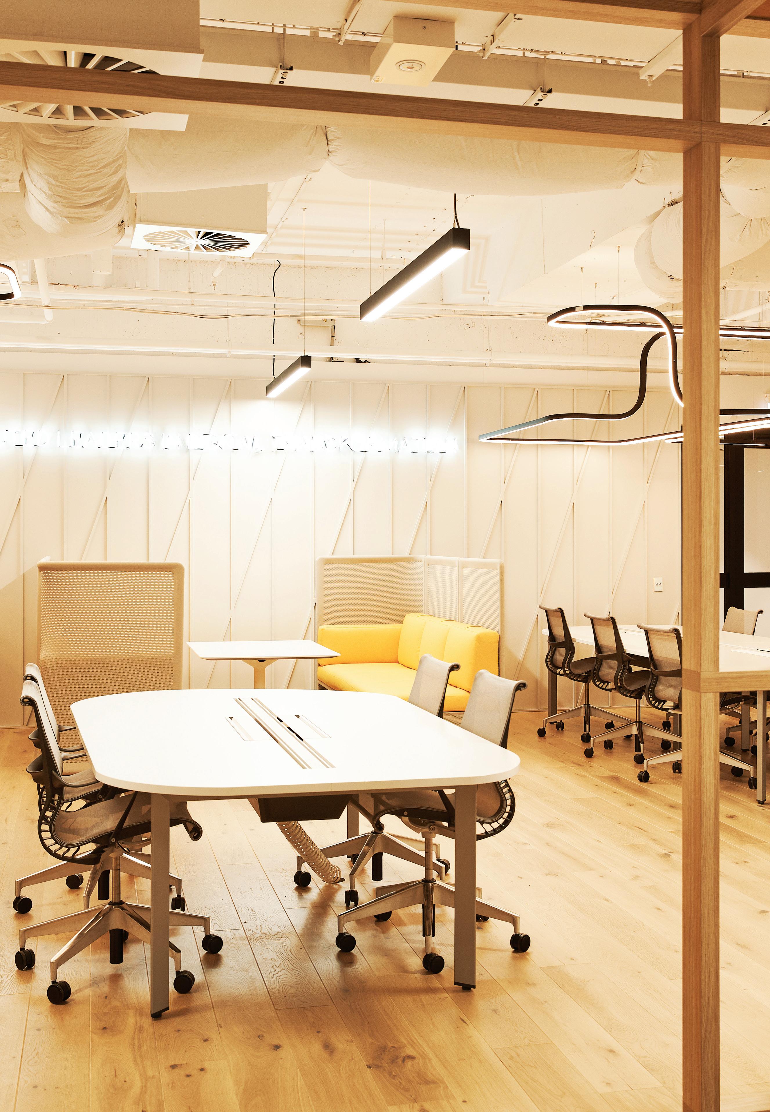
The Global leaders in metallised performance fabrics and solar control solutions, Verosol use Nano type technology to create a product that no one else can match. The best in the market at reflecting solar radiation without a ecting your view to the outdoors. Blinds with Verosol’s SilverScreen is not a cost it’s an investment.
As competition for consumer spending continues to intensify, the emphasis being placed on customer experience is increasing. And there’s possibly no place where this resonates more strongly than the suburban shopping centre. Within this heady environment of bright lights and seemingly limitless opportunity, brands are in danger of being overlooked and that’s not a good thing. However, retailers have been quick to realise they need to offer memorable retail experiences that not only attract customers, but keep them coming back. They understand good design can add value to their business and consequently, the newest Australian retail fit-outs are highly evocative, next-level interiors that exhibit an astute branding awareness.
For Akin Atelier, a detailed approach and uncomplicated philosophy around creating engaging customer experiences has informed all of its retail designs to date for fashion house CAMILLA AND MARC, established in 2003 by siblings, Camilla FreemanTopper and Marc Freeman. The Sydney-based studio’s fit-out for the recently completed Westfield Bondi Junction store is especially significant because it’s a major shopping destination within the
fashion designers’ hometown. “Both Camilla and Marc place a lot of importance on understanding and respecting their customer,” says Akin’s director Kelvin Ho, who likewise hails from Sydney. “So it was imperative we deliver a space that reflects a degree of modern sophistication, while also being welcoming.”
Creating an immersive brand experience within a fish bowl-like site may have posed some challenges. But the resulting scheme addresses the exposed nature of the triangular shaped ground-floor tenancy by providing an all-encompassing environment that’s in stark contrast to the shopping centre’s busy thoroughfare. Lush materiality and exquisite craftsmanship characterise the new fit-out, drawing customers in via a change of visual pace, which enables them to directly connect with the brand. A sequence of partitions break down the interior’s expanse, making for a semi-open plan that ensures a sense of intimacy. While the combination of timber herringbone and Palladiana terrazzo tiling (featuring volakas, smeraldo quartz and classic travertine) further denotes the different zones within the store’s front-of-house.
‘Customer experience’ are the words on every retailer’s lips in 2019. Retail design aficionados Akin Atelier show us what a successful customer experience looks like.Opposite: The point-of-sale counter and display plinth reference Anish Kapoor’s highly reflective, undulating Cloud Gate sculpture. Page 140-141: There is an emphasis on lush materiality and exquisite craftsmanship that culminates in a visceral experience for the customer. Page 142: A section of rippled wall incorporates green smeraldo quartz shelves.
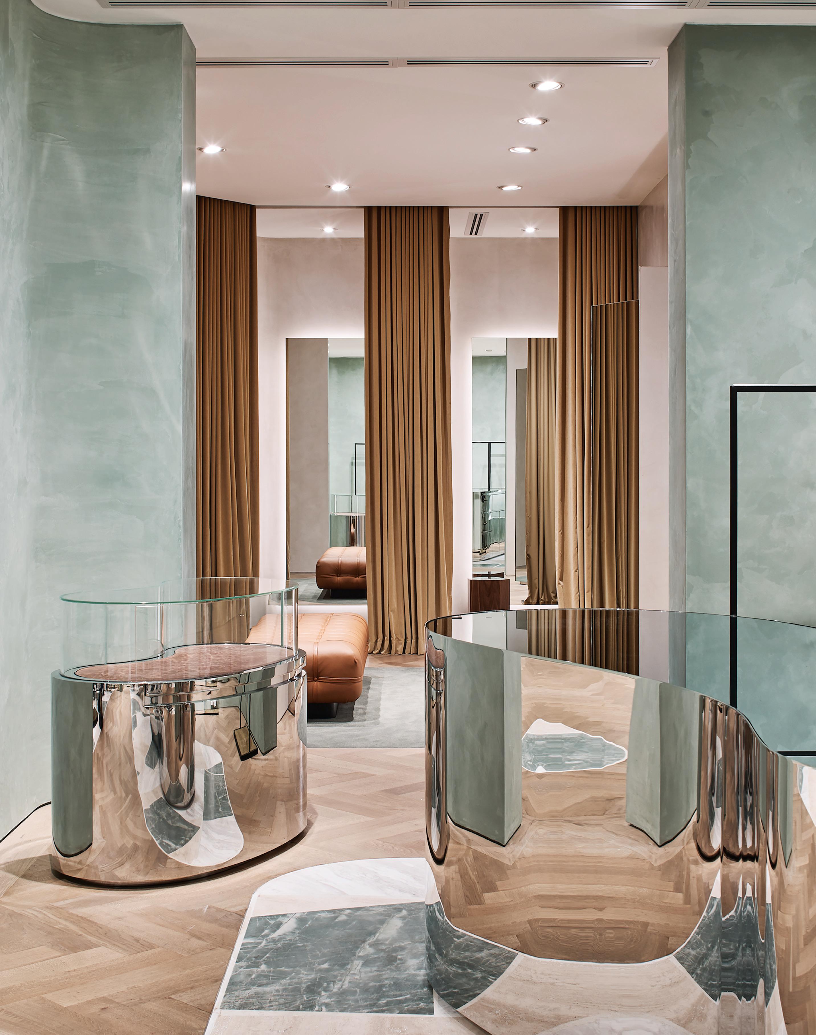
This store’s colour palette is an evolution from the classic neutral hues Kelvin Ho used in previous CAMILLA AND MARC fit-outs. “We liked the green as a timeless colour that would provide a nice backdrop for [their] collections of clothing...”
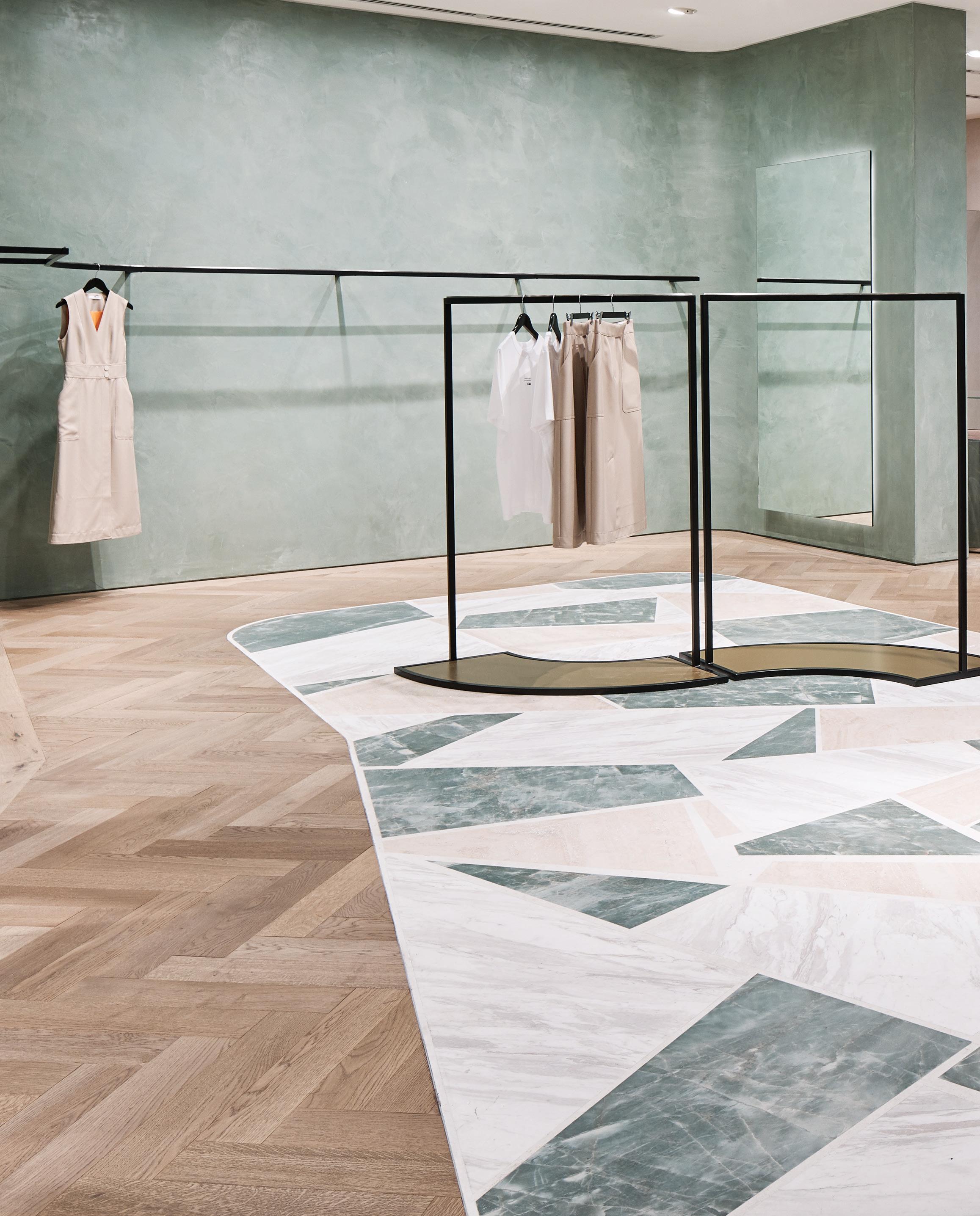
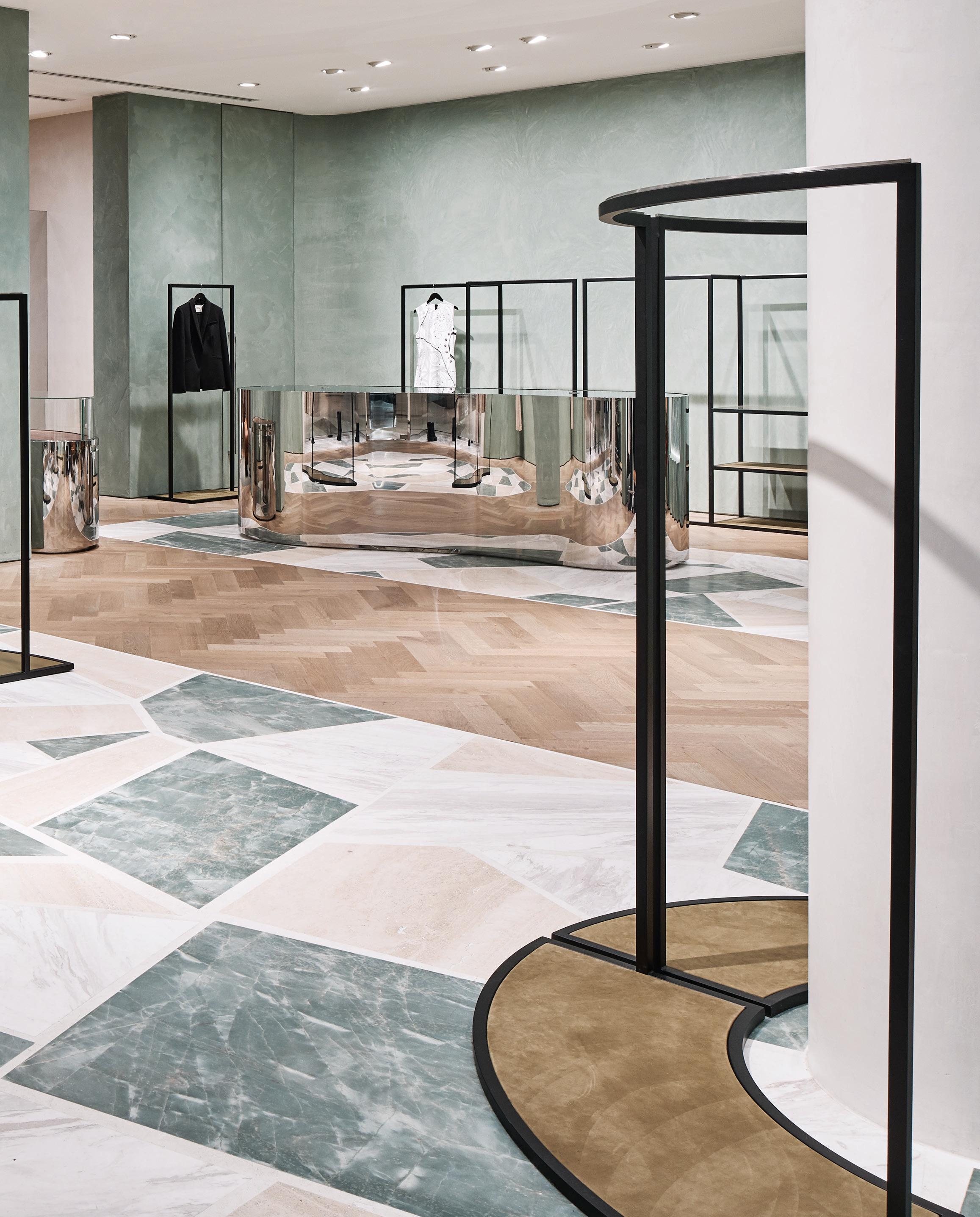
It’s a high-end outcome, although there’s a resounding softness and delicacy to it too. The minimalist colour palette champions a musky green that befits the Bondi setting and the decision to apply the custom Marmorino render to the walls serves to inject the interior with an ambient sense of calm. This floor-to-ceiling finish envelopes the customer, heightening their shopping experience. As Ho explains, “With an established brand like CAMILLA & MARC that has such a strong design sensibility, it was all about creating the best backdrop to elevate the clothing, without overpowering it.”
Despite the cohesiveness of this palette, moments of visual interest also punctuate the space. These pockets of curiosity, including the section of rippled wall that incorporates green smeraldo quartz shelves, are strategically placed to lead the customer through the interior, compelling them to slow down and take everything in. In this respect, the scheme plays on the idea of a rich tapestry that begs closer inspection and perhaps the most curious aspect of the whole

fit-out is the highly polished point-of-sale counter and display plinth, both whimsical nods to artist Anish Kapoor’s Cloud Gate sculpture. It’s testament to Ho’s meticulous eye that the curved form of these features resonate with the rippled wall, which in turn complements the sensual Nicos Zographos leather seating. Every element has been carefully curated to provide a framework into which a series of fixed and mobile slimline black steel racks are inserted. These allow the clothes to be displayed prominently – behind the counter, around a central column, along the back wall – so they appear to float in mid-air. It’s a considered scheme; perfectly balanced and judiciously edited. Ho and the Akin Atelier team, along with the clients, have ultimately succeeded in implementing a customer experience that’s a clear extension of the brand, making the customer feel special in the process.
akinatelier.com
Set within Sydney’s picturesque harbour, Hotel Palisade celebrates the city’s unique heritage through a contemporary, eclectic design that extends from spatial design through to service of beverages. Renowned for designing spaces that are rich in colour, tonality and texture, Sibella Court of The Society Inc. cra ed Hotel Palisade to become a story of modern luxury.
Originally built in 1915, the building explores the journey from the past to present with its original character paying homage to the people of the harbour. References to the building’s past live in the bespoke details. On the ground floor the Public House is a vibrant orchestration of tones: emerald leather banquettes paired with original mottled green tiles; the deep blue hues of distressed walls; the aged steel-lined and copper bar and elements of dark timber.
Produced by local manufacturers and designers, the xtures and nishes use honest materials of zinc, steel, canvas, leather, copper and timber – a nod to the industrial past. This aesthetic extends to the innovative Vestal high capacity tap by Zip Water. Taking its proud bench-mounted place at the bar, Vestal o ers customers ltered still or sparkling water through its advanced
multi-beverage system. It is a pioneering high capacity product designed to elevate beverage distribution to a whole new level.
As the crown of Hotel Palisade, the Henry Deane bar boasts some of the best views in Sydney. Level ve is spoilt with expansive views of the city and sets this bar apart from the rest. Sumptuous design elements cover the space – from the curved glass panelled kitchen to the porcelain and leather fronted bar, all complemented with brass touches that extend right through to the Vestal tap.
“We are always trying to limit single use items in our bid to have less negative impact on our environment, so anything out of a tap as opposed to single use bottles is a step forward for us,” says manager, Dom Beinke. The practicality and the positive impact on the environment of the Vestal tap is an exciting step forward for Henry Deane. Synonymous to the overall aesthetic of Hotel Palisade, the brass material of the Vestal tap is the perfect accompaniment to one of Sydney’s most unique spots.
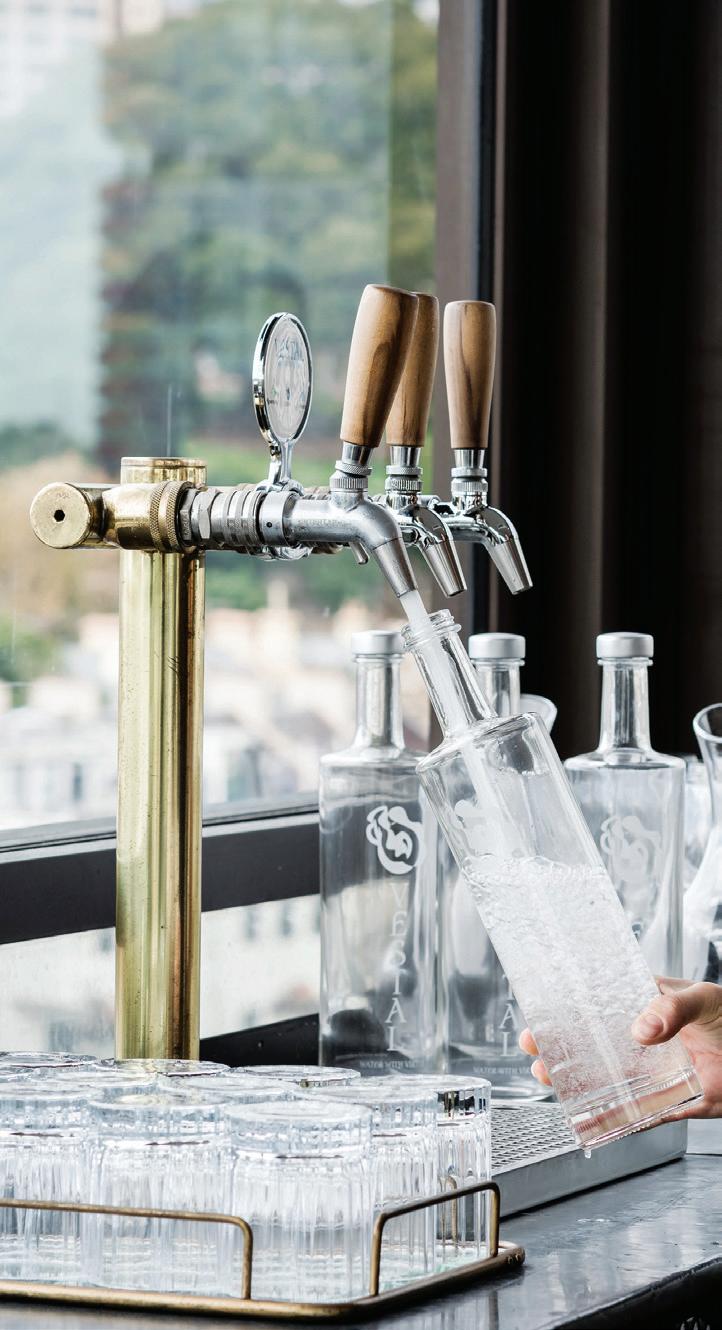
A space that echoes the story of by-gone eras and its evolution over 100 years, Hotel Palisade is an elevated space of extravagance, history, engagement and glamour, a new benchmark in the evolving hospitality scene of Sydney.
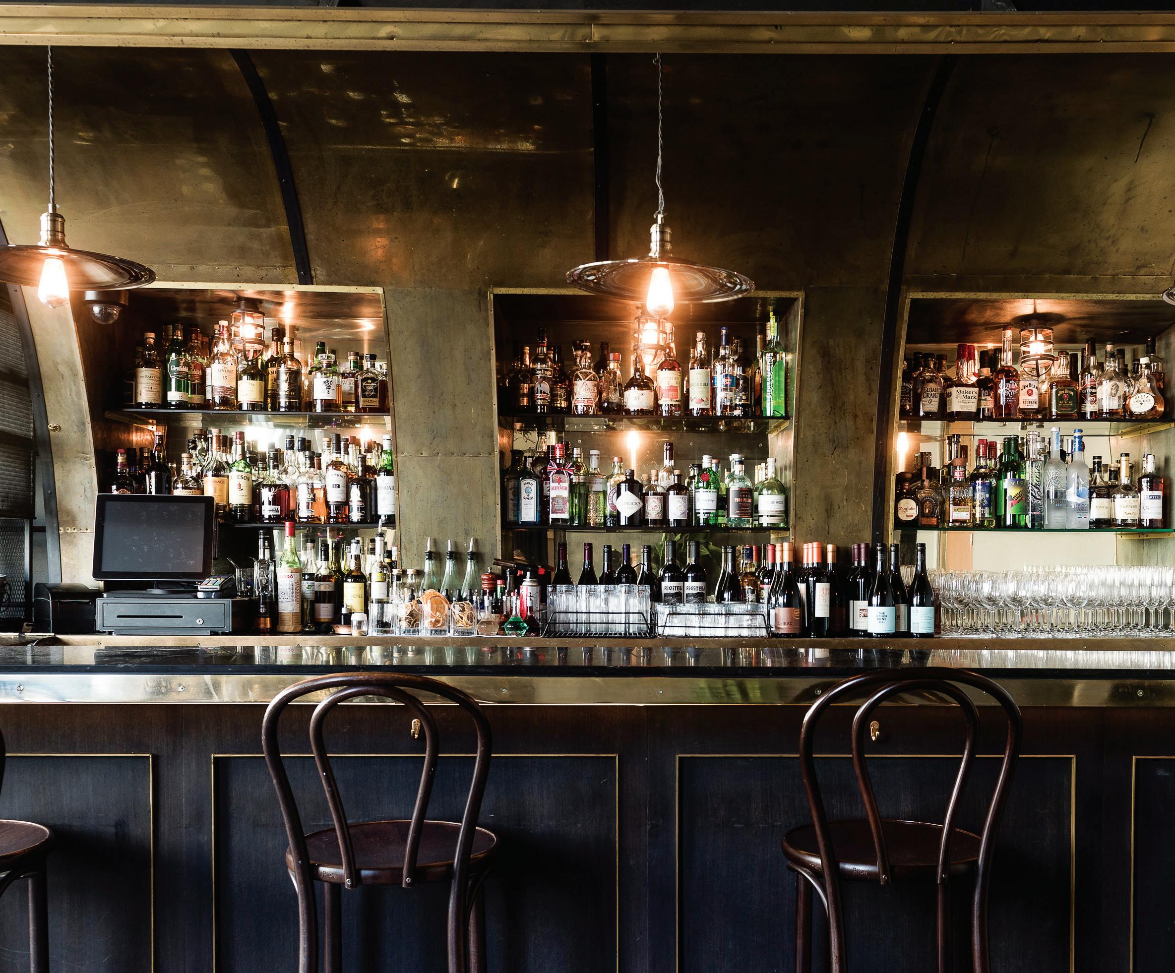
National Museum of Qatar
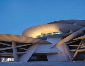
Gift Shop and Children’s Gift Shop Interiors
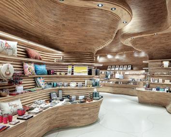
Koichi Takada Architects
Architect Atelier Jean Nouvel
Project Manager ASTAD
Project Management
Builder Devoto Design
Operator/End-User IN-Q
Enterprises WLL (subsidiary of Qatar Museums)
Main Contractor IMAR
Trading & Contracting
Sub-Contractor (Joinery) Devoto Design
Sub-Contractor (MEP)
Sogelec
Duration 16 months
Koichi Takada Architects koichitakada.com
Atelier Jean Nouvel jeannouvel.com
Lighting Koichi Takada-designed ceiling LED, ERCO. Koichi Takada-designed linear LED, IBL Lighting
Finishes
Solid European oak timber finishes, Piarottolegno SpA Timber cladding and joinery execution, Devoto Design Oil timber coating and FR primer, Rubio Monocoat Spectrum Abyss leather upholstery, Pelle Leathers Epoxi Terraro, Existing Floor
Fixed & Fitted Ironmongery, drawer runner, electronic lock mechanisms and accessories, Häfele , Blum . Custom stainless merchandising accessories, local supplier/ manufacturer
Ovolo The Valley, Brisbane Design Practice Woods Bagot
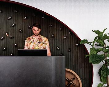
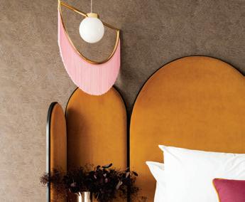
Builder IQ Construct
Project Manager TM
Commercial and Leisure
Art Curator Kathleen Wilson
Duration 8 months
Woods Bagot woodsbagot.com
Furniture
Conference table, chairs, stool, Stella Works . ‘Caruso
Music Cabinet’ feature console by Paolo Cappello for Miniforms, James Richardson
Lighting
Custom guestroom
lighting, Mass & Co. ‘Wink Houtique’ feature pendants, Masquespacio
Finishes
EGE ‘Canvas Collage’ corridor carpet by Nicolette Brunklaus and custom rugs, RC+D. Guestroom carpet, vinyl timber planks, Godfrey Hirst . ‘White Beauty’ polished marble stone, ‘Artech Basaltina Grigio’ porcelain tiles, Ace Stone + Tiles . Custom terrazzo flooring, iQ Construct ‘Casamance’ wallcovering, COVRD. Wallcovering custom artwork by Liza Casella and Materialised, Materialised . Kube Contract wallcovering, Eurowalls Upholstery – Raf Simons for Kvadrat, Patricia Urquiola for Kvadrat, Kvadrat . Clarke and Clarke upholstery, Fabric Agencies . Various upholstery, Maharam, Warwick Fabrics, Casamance . Bolon vinyl, The Andrews Group. Sicis glass mosaic tiles, Elite Bathware and Tiles . Woodwall walnut timber veneer, Elton Group Lamitak laminate, Surteco Decore . Various laminate, Laminex . Metal chain mesh, Chain Craft . Drapery, Warwick
Fixed & Fitted Guestroom and public area custom joinery, casework and lighting, Mass & Co Bathroom fittings, Phoenix Tapware , Caroma . Milli fittings, Reece . Mirror, Viridian Australia
Want to know what made the spec schedule for our featured projects? We’ve got you covered...
Fixed, Fitted & Furnished
–
David Jones and Country
Road Group headquarters, Melbourne
Design Practice Gray Puksand
Builder Tandem Building
Group
Project Manager Volo Projects
Quantity Surveyor Prowse
Quantity Surveyors
Service Engineer Rudds Consulting Engineers
Structural Engineer Walbridge Gilbert Aztec
BCA PLP
Acoustics WSP
Access Consultant Morris
Access Consulting
Audiovisual Lumicon
ESD Inhabit
Duration 19 months
Gray Puksand graypuksand.com.au
Furniture
Furniture throughout, District, Simon James, Project 82, Tom Fereday, Jardan, Something
Beginning With, Walter Knoll, Armadillo and Co
Lighting
Lighting concept throughout, NDY Light
Finishes
Carpet throughout, Shaw
Contract . Paint throughout, Dulux . Fabric, Kvadrat, James Dunlop, Zepel Fabrics . Laminate, Laminex
Tile finishes, Signorino
Denton Corker Marshall studio, Melbourne
Architect
Denton Corker Marshall
Interior Designer
Denton Corker Marshall
Project Manager Denton
Corker Marshall + Schiavello
Builder Schiavello
Structural Engineer Arup
Services Engineer Umow Lai
Acoustic Engineer Marshall Day
Access Consultant Before Compliance
Building Surveyor Philip Chun & Associates
Budget $1.5 million
Duration 12 months
Denton Corker Marshall dentoncorkermarshall.com –Furniture
‘Krossi’ workstations, Denton
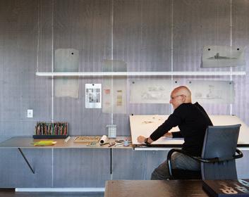
Corker Marshall-designed reception desk, Schiavello
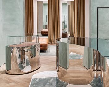
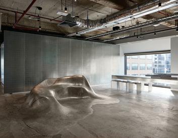
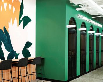
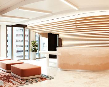
Denton Corker Marshalldesigned banquet seating, MAP. ‘Eames Segmented Base ET166’ meeting tables from Herman Miller, Living Edge ‘.04’ meeting room chairs by Maarten Van Severen for Vitra, Unifor. ‘Duet’ bar stool, Stylecraft . Denton Corker Marshall-designed reception chair, custom made in Indonesia . Denton Corker
Marshall-designed breakout tables and chairs, Edra
Lighting
Denton Corker Marshalldesigned task lighting, Schiavello. ‘P351’ laser downlight, iGuzzini
Finishes
Denton Corker Marshalldesigned wall finishes, Rapid Perforations . ‘Swing Stroke’ carpet tiles, Interface
Fine ribbed Sisal rugs, Floorspace . Quietspace acoustic ceiling panels, Autex . Breakout bench veneer, Eveneer Timber in midnight, Elton Group Breakout joinery laminate, ‘Innovations Brushed Graphic 509’, Laminex
Fixed & Fitted Aluminium silver joinery knobs, Häfele . ‘Schock Soho’ breakout sink, Abey. ‘Quadra’ sparkling tap, Billi
Microsoft Technology Centre, Sydney
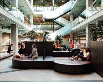
Interior Design Tom Mark Henry
Builder Schiavello
Project Manager JLL
Joinery Pluim Joinery, Maneto Architectural Joinery, Optima Joinery
Lighting designer/Mechanical, Electrical/Hydraulic
Engineers LAM Consulting
Engineers
Acoustician TTM Group
Artist Cassie Byrnes
AV Consultants Arup
Wayfinding and Graphics
The Colour Club
PCA Steve Watson & Partners
Budget $7.5 million
Duration 12 weeks
Tom Mark Henry tommarkhenry.studio
–
Stone finishes, Euro Natural Stone , Fibonacci Stone
Carpet flooring, Shaw
Contract . Carpet tiles,
Interface . Marble finishes, Terrazzo Australian Marble
Vinyl and carpet tiles, Forbo
Stone surfaces, Artedomus
Upholstery, Febrik , Kvadrat
Maharam . General finishes, Polytec . General textiles, Autex . Contact textiles, Instyle . Sto Render Systems, Sto Render. Textiles, Sparkk
Wall coverings and textiles, Baresque . Timber finishes, Market Timbers . Tile and stone, Earp Bros . Decorative timber panels, Supawood
Custom mural, Cassie
Byrnes . Porcelain finishes, Corian . Veneer, Briggs
Veneer. Glass, Sydney Glass
Surface finishes, Marblo
Artisan workers of timber, metal, glass, textiles etcetera, Macquarie Renderers.
Fixed & Fitted
Faucet fixtures, Astra Walker. Franke kitchen fixtures, Zip tap, LG fixtures, Fisher and Paykel fixtures, Winning Appliances Handles and knobs, Lo & Co
CAMILLA AND MARC
Westfield Bondi Junction store, Sydney
Interior Design Akin Atelier
Project Manager/Builder emac construction
Structural Engineer Edmund Design Services
Akin Atelier akinatelier.com
Furniture ‘Nicos Zographos’ tables, 1stdibs
Finishes
Timber herringbone flooring, Oslek Timber ‘Pallediana’ terrazzo tiling, Mediterranean Marble Custom render walls, Marmorino
Fixed & Fitted
Smeraldo quartz shelving, Artedomus
Furniture
Haworth furniture, Haworth
Herman Miller, Vitra, Stellar Works, E15 furniture, Living Edge . Steelcase, Viccarbe, Turnstone furniture, Steelcase
Lighting
General lighting, Dowel Jones, LPA, Versalux, Pierlite, Light Lights Lights
Delta Light , Inlite . Lucifero’s, Gineico. Flos, Euroluce . CTO
Lighting, Spence & Lyda
Finishes
Ceiling finishes, Armstrong Paint throughout, Dulux
Timber flooring, Havwoods
Ceramics, Classic Ceramics
Carpets, Tsar Carpets . Tiles, Surface Gallery
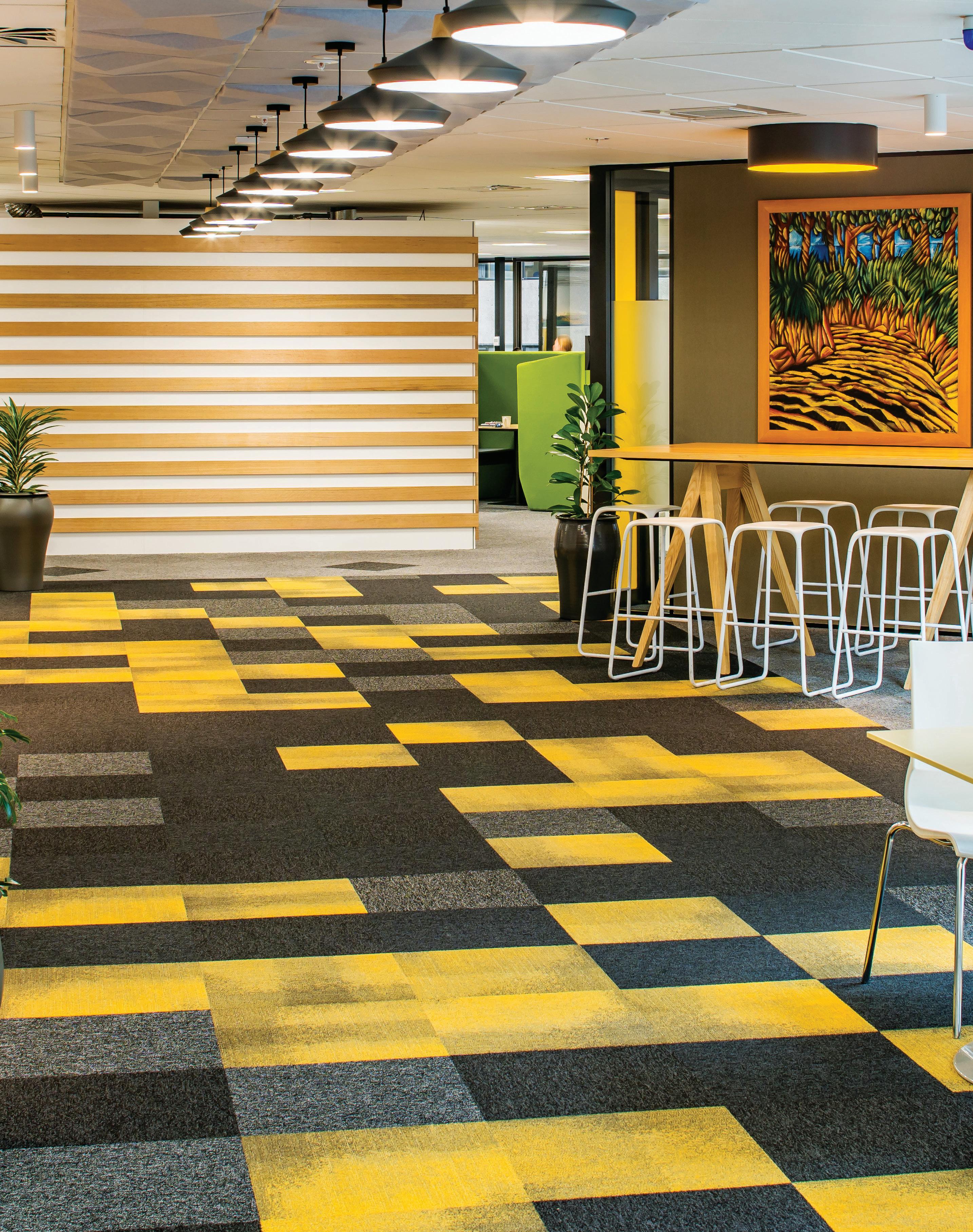
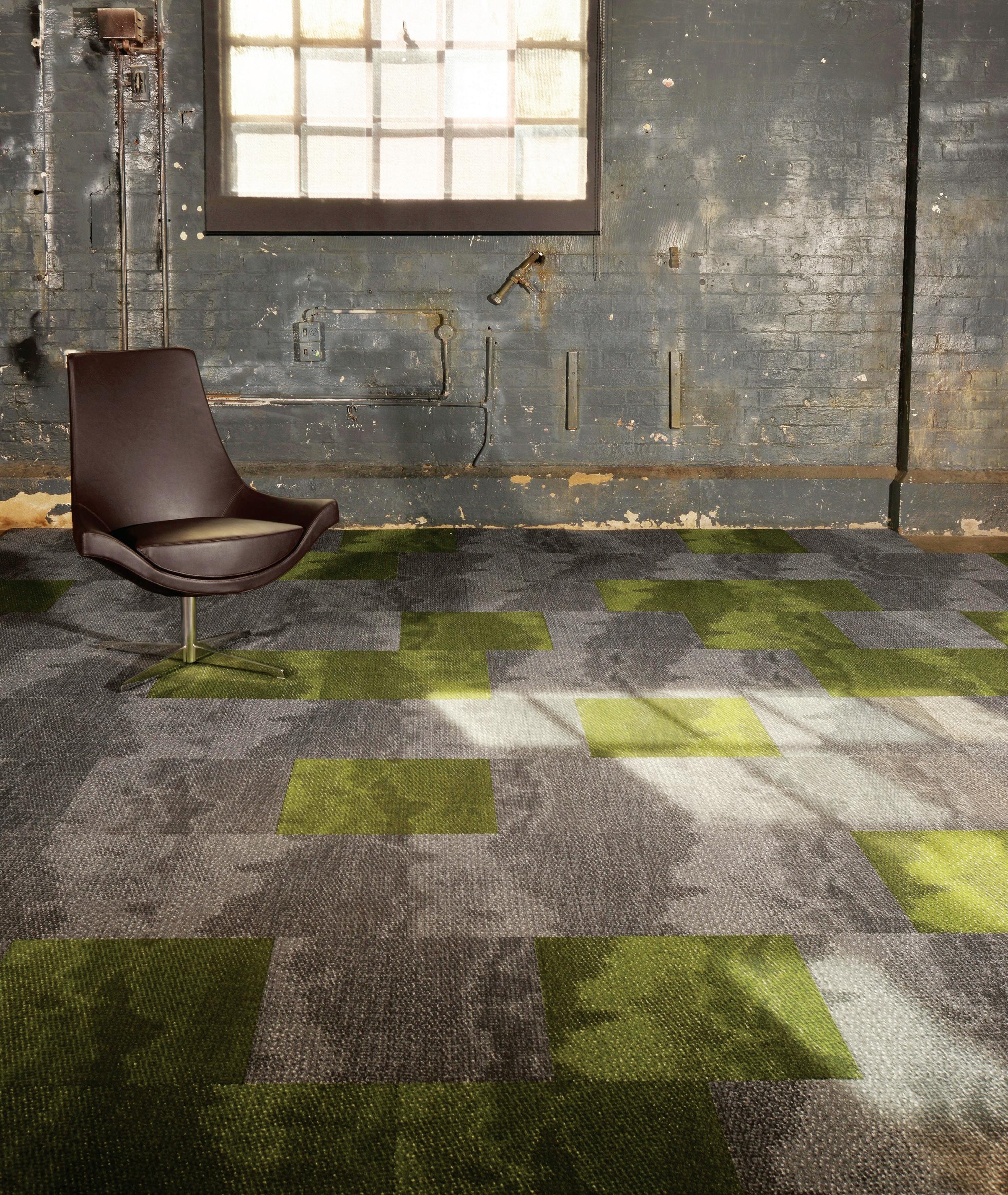
Milliken-Ontera has more than 20 years’ experience in the design and manufacture of unique carpet tile systems. The company is part of the Milliken family, and has been manufacturing in Northmead, Sydney, servicing Australian and New Zealand markets. Bringing both creativity and a pioneering spirit to ooring design, it has been at the forefront of a growing demand for carpet tiles as a exible ooring solution that can positively impact everything from design vision right through to user wellbeing.
In the 21st century, innovation and rapid shi s in consumer demand o en de ne new directions in design. Milliken-Ontera brings all these in uences and opportunities into play, using its fully customisable carpet design manufacturing system to produce bespoke solutions that address complex project requirements and changing user needs. The system empowers both designer and supplier to collaboratively achieve sophisticated and truly personalised carpet tile solutions for world-class projects.
Supporting this is Milliken-Ontera’s suite of leading-edge technologies – all housed in its Sydney headquarters. From a unique dye injection system which enables precisionist colour selections, to its easy-to-use visualiser technology; each tool has been developed to enable designers to holistically engage in the ooring design process.
Recognising that the design of an interior environment vitally impacts users’ emotional, physical and psychological wellbeing, Milliken-Ontera’s ooring solutions place extra emphasis on health and wellness. Its WellBAC™ range of carpet tile backing products, for example, can improve indoor air quality, decrease muscle strain, and lower ambient noise levels.
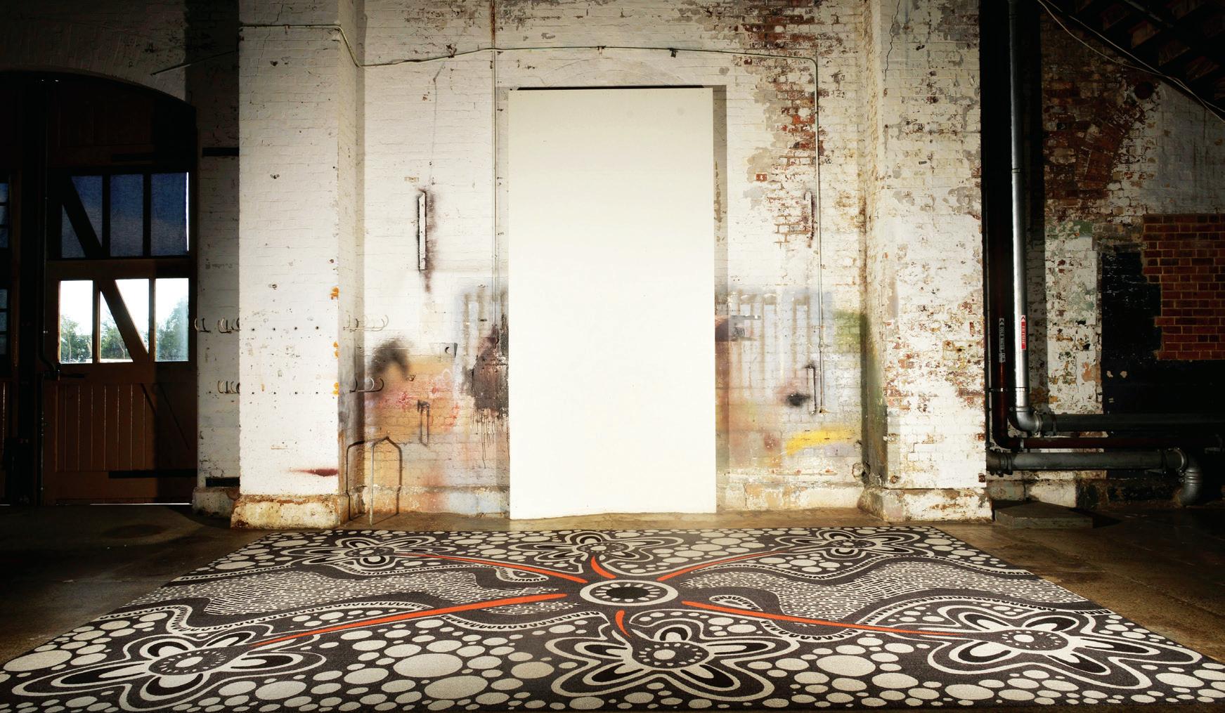
Milliken-Ontera is also closely aligned with local and global industry-leading bodies such as the Well Living Lab. As an international founding member of the Well Living Lab,
the Milliken-Ontera design process is deeply informed by its health and environment standards. The result is ‘clean green’ environmentally sustainable carpet tiles, with all design ingredients PVC-free and harmless to the environment. More broadly speaking, its ooring solutions also empower us to re-think what the oor can be and can accomplish within the broader landscape of health and wellness.
Milliken-Ontera’s ethos of integrity goes much deeper than just product design. Led by a culture of ‘doing good’, the company has made a strong and lasting commitment to social responsibility. As Shaneel Deo, Managing Director of Milliken-Ontera, says:
“It’s about doing good for our employees, our customers and the communities we live in. It’s also about ensuring the products we produce can do good for their nal purpose, providing a positive impact within interior spaces, with environmental and sustainable bene ts.”
Milliken-Ontera recently became a proud national corporate donor of the Property Industry Foundation (PIF) to target youth homelessness. Other key involvements include actively supporting Aboriginal communities through its Indigenous Engagement Program. This has already seen exciting results with a recent collaboration with Saltwater Freshwater Arts Alliance and the National Aboriginal Design Agency seeding the ‘Water Yuludarla’ commercial carpet collection.
Custom and innovative design solutions, cost-e ective processes, realistic lead times, and a philosophy and commitment to environmental sustainability, wellness and doing good in the community – these are the principles that have inspired Milliken-Ontera to the position it is in today. Whether your next project requires a subdued ooring that inspires relaxation, or a loud splash of colour to create excitement in a space – with Milliken-Ontera, you’re covered.
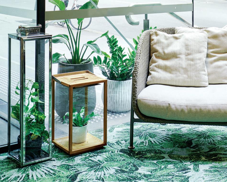
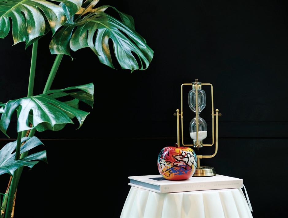
Set within the bustling CBD of Australia’s largest city, BoPo is rede ning the meaning of ‘meeting place’. Through its carefully curated environment, BoPo addresses the growing demand for socially-oriented spaces to engage and accommodate re ective, contemplative and collaborative activities.
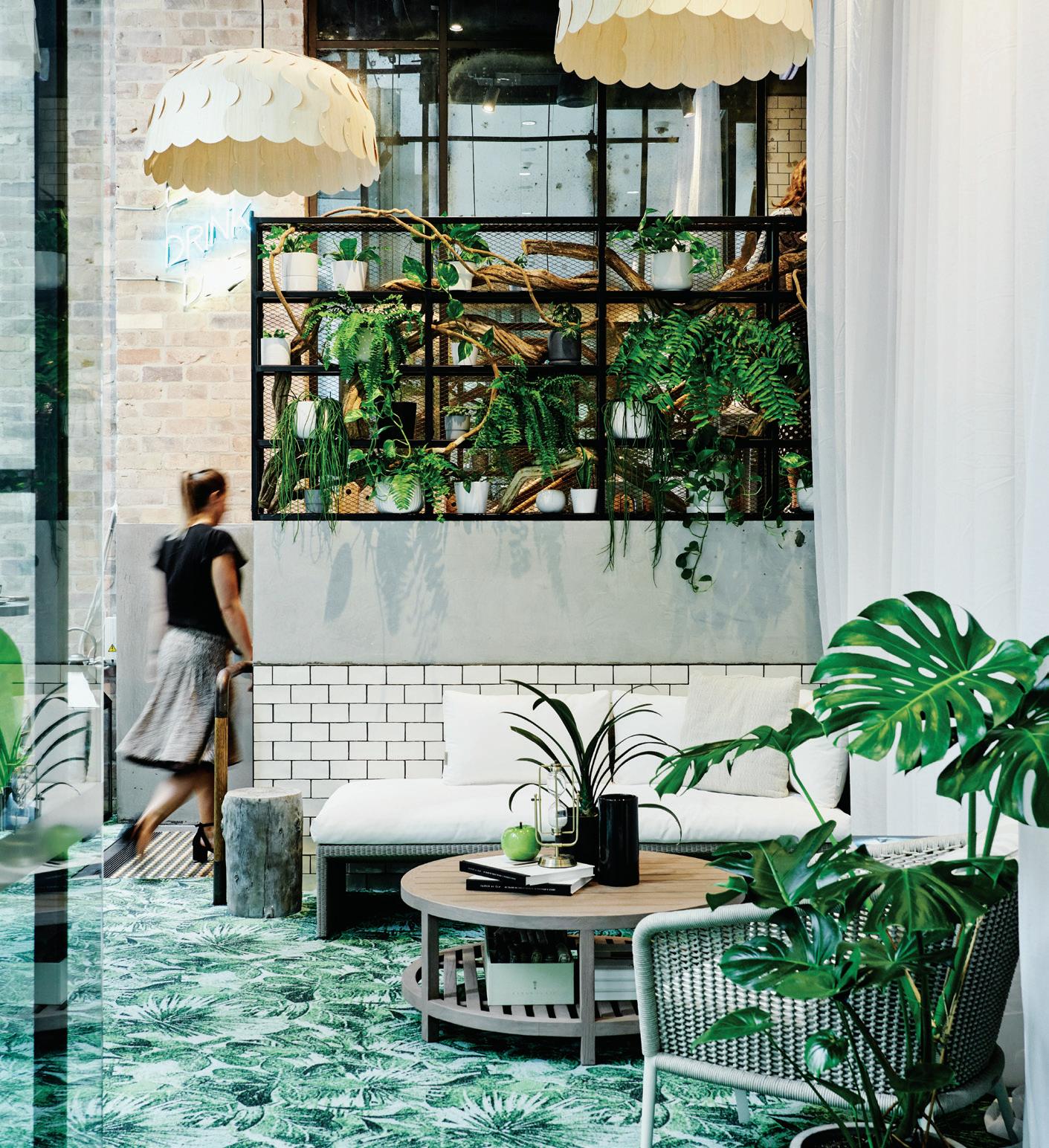
Haworth engaged Gensler to develop the brand creation and experience of BoPo, brie ng Gensler to create a sensory and playful space that erred on the side of abstract installation. The result re ects the strong sense of partnership and passion for design shared by Haworth (The Porter), Gensler and parent venue, Bowery Lane. BoPo manifests as a multisensory experience where hospitality-meets- showcase settings, lled with abstract installations and o ering a playful, dynamic sanctuary away from more traditional working environments.
Available for an array of exclusive small functions and meetings, this fusion concept continuously evolves to adapt to the seasonal
trends of the bustling workplace. Throughout the year, the space is cra ed to follow the changing seasons of Sydney. The light airy months of summer see it decorated with the vibrant tones of a custom Milliken-Ontera dye injected carpet, furniture from the luxurious Janus et Cie, and beautiful Beau lights from PLN Group – both of which are Haworth Partners. During the colder months, the space transforms into a cove of warmth – a cosy, comfortable thinking space.
As both a space and a human-centric platform, BoPo creates an immersive experience. It serves to highlight the evolution of modern workplace culture and reinforces the importance of the workplace as a dynamic environment. Located at 1 O’Connell Street in Sydney, BoPo essentially provides a stimulating and enticing ‘third’ space for local members of the community. Not only is BoPo a new space to collaborate, but a new and exciting dimension within the wider workplace revolution.
the 21st century customer craves escapism, emotion, and a sensitive touch.
Retail and hospitality sectors globally are collectively shifting to ‘customer experience’ models. Who is leading the way? And how are they doing it?
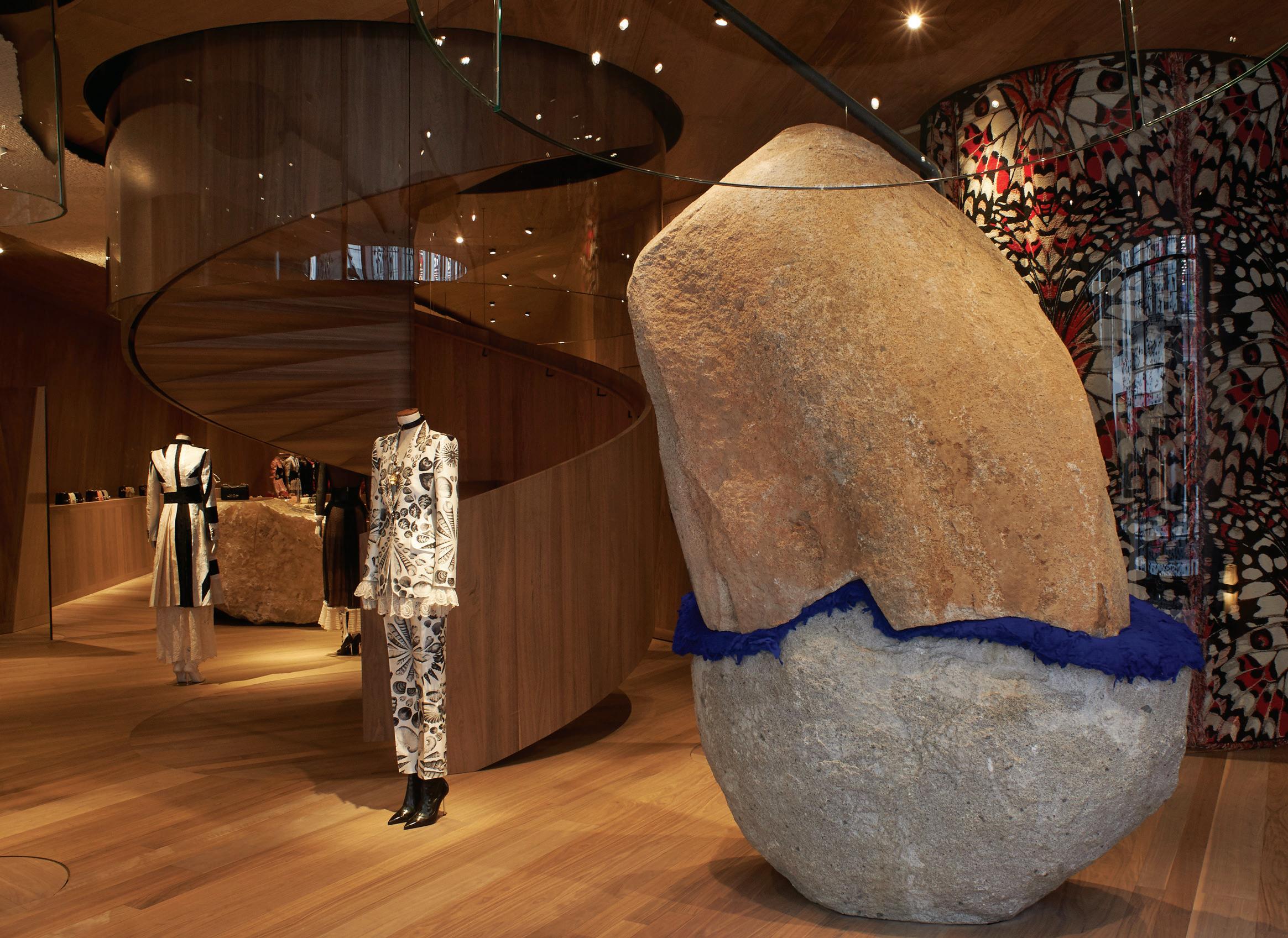
It’s been 20 years since Joseph Pine and James Gilmore floated the idea of experiential retail in their book The Experience Economy and still there’s little agreement on what it actually is. A slippery dip in a swimwear store? Catching your own fish in a restaurant? A café at Tiffany so customers can breakfast there? Boom-tish!
“It’s less about a passive desire to buy from a brand that delivers a simple experience than a need to have a proactive relationship with a brand you can engage with collaboratively,” says Chris Sanderson, co-founder of global consumer insights consultancy The Future Laboratory.
The Future Laboratory’s Retail Report 2019 advises that brands and services will increasingly be required to add value to their offer as sustainability, convenience and personal service shape consumers’ desire for more meaningful interactions and initiatives.
Supermarkets that provide in-house nutritional advice, convenience stores that specialise in ethically-sourced produce, retailers which operate as community platforms, transforming private property into public amenity… these are among the trends driving vitality in the retail and hospitality sector.
Technology, Sanderson says, is particularly potent in transforming a retail outlet into an “experience hub” by creating more personalised and customisable services. He points to H&M, which has been trialling mobile services that enable digital point-of-sale material to be aligned to an individual’s personality or past shopping purchases. And to Zara, which is launching an artificial reality (AR) app in 120 outlets that will allow shoppers to view virtual models wearing its clothes around those stores.
The Future Laboratory’s prediction that DTC (direct-to-customer, that is, digital native) brands will begin disrupting the department store experience by popping up within their walls is already playing out at Hudson Yards, the $25 billion private retail development on Manhattan’s west side, in New York. The self-proclaimed ‘triumph of culture, commerce and cuisine’ recently opened a Floor of Discovery that is providing the first brick-and-mortar environment for previously online-only brands like Rhone activewear and men’s underwear label, Mack Weldon. The Muji there will feature a custom embroidery station; the Snark Park, an exhibition space designed by Snarkitecture, will showcase a rotating schedule of “playful and immersive design environments”, according to Esty Ottensoser, retail specialist of Related, the company which developed the Hudson Yards site. “A spirit of creativity unites the Floor of Discovery, from shopping to dining to Snark Park’s imaginative exhibitions,” he says.
As fast fashion and consumer brands make inroads with technology, brands with an embedded sense of craft and heritage are amping up their DNA. At the new three-storey Alexander McQueen store on Old Bond Street, London, (pictured left) the top floor is a dedicated atelier space in which people can engage with elements of the house’s archive. They can look through historical sourcebooks (McQueen, who died in 2010, owned a spectacular collection of Victorian-era fashion catalogues) and see how some of the new garments – designed by McQueen’s acolyte Sarah Burton – are devised. In a sector renowned for its secrecy and fear of copy, McQueen is showing itself to be fearless, a quality for which the late designer was renowned. The store, designed by Chilean architect Smiljan Radic is radically bizarre in its beauty, very on-brand.
For Mulberry, British interior designer Faye Toogood physically embodied the brand narrative in the new concept stores, thus enabling customers to share in its history. “Mulberry was founded in the Somerset countryside, where their products are still made, and has grown to become a modern brand with a global audience,” says Toogood. “I wanted to reflect Mulberry’s status as a contemporary British heritage brand through an interpretation of the raw power of the British rural and urban landscape.”
By juxtaposing soft materials such as hand-tufted rugs and velvet button-upholstered furniture with the hard edges of glass, ceramic and concrete, Toogood reckons the design pays tribute to rugged highlands, rolling fields, woodlands and concrete tower blocks. “I wanted the stores to feel more like a welcoming home than a retail environment,” she says.
Meanwhile, hospitality, as Sanderson points out, has experience at its very heart. “And it’s increasingly where the 21 st-century consumer is investing their discretionary income.”
The Burwood Brickwork hospitality and retail hub, due to open 15 kilometres east of Melbourne in December, rings all the right bells of sustainability, community and ethical consumption while waving top-notch experiential creds. Developed by Frasers Property along with Living Building Challenge guidelines, the 2000-square-metre rooftop of the new complex will be the site of an organic farm and eatery conceived and operated by Tully Heard, the team behind acre Eatery in Camperdown and The Greens in North Sydney.
“Our aim with acre Eatery has always been about changing how urban dwellers think about, experience and consume food,” says Luke Heard of studio Tully Heard. The rooftop farm and greenhouse will provide to-table produce for the three establishments operated by acre – a full-service restaurant, a Glasshouse café and an al fresco space. It also has the potential to produce a surplus that can supply the other food and beverage operations, and even offer fresh organic goods to residents of the 700 dwellings attached to the development.
“We definitely want to have a farmer’s market as part of the regular rooftop activities,” says Heard. Other activities will include educational workshops on urban agriculture and sustainability, cooking classes and community gatherings (anyone for rooftop yoga?).
“This will be the most sustainable retail centre ever developed, assuming we can meet the Living Building Challenge,” says Peri Macdonald, executive general manager of Frasers Property Australia. The Challenge, overseen by the International Living Future Institute, is the world’s most rigorous proven performance standard for buildings. According to Macdonald, it requires at least 100 per cent energy generation from renewable sources, the capacity to capture, treat and re-use all water the building requires, a zerosum on material waste and complete avoidance of ‘red list’ matter (everything from alkylphenols to volatile organic compounds).
The whole 13,000-square-metre hectare development is designed to “push the boundaries of what a retail and entertainment destination can be”, says Macdonald.
And that’s something worth experiencing.
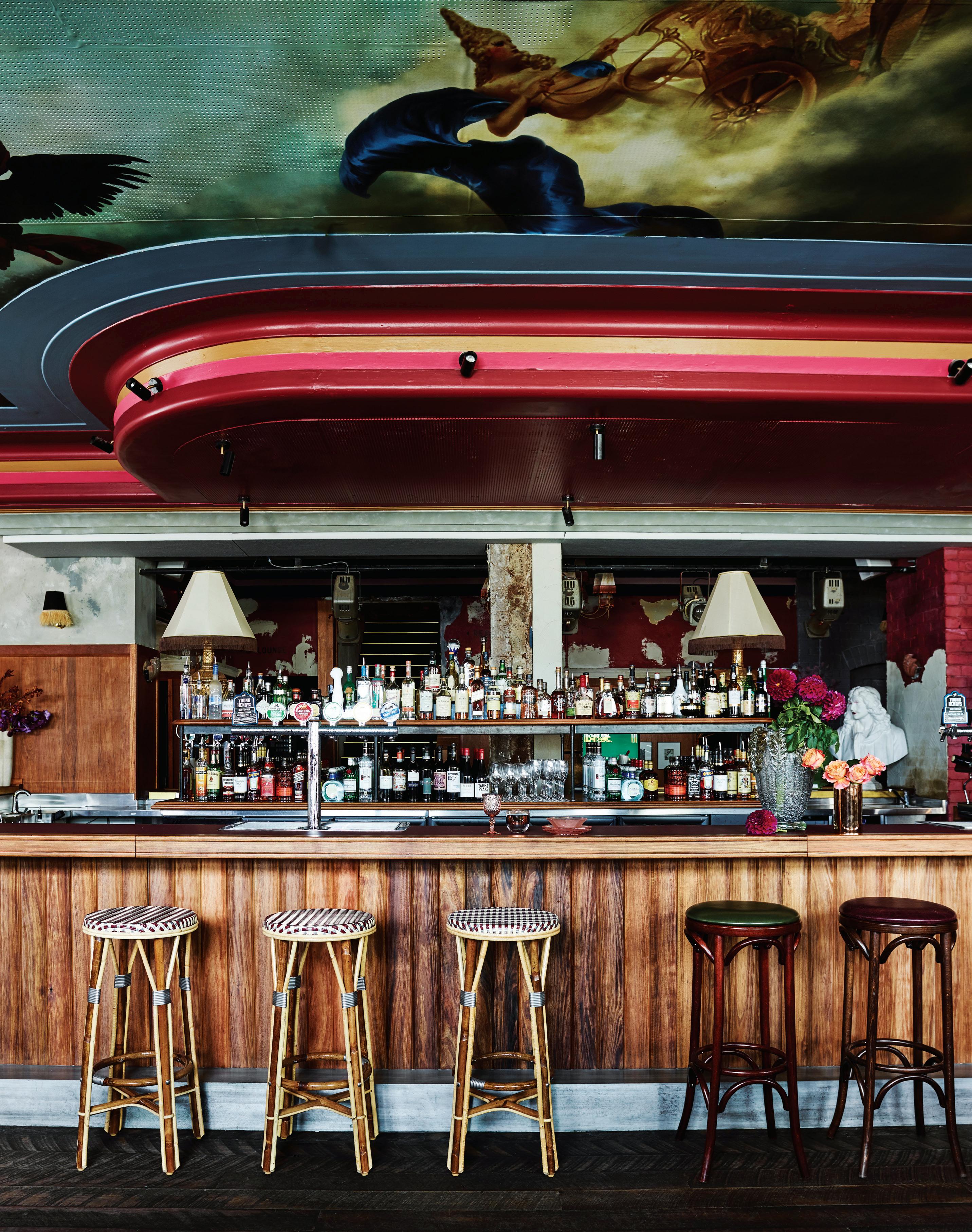
Inclusivity and the recognition of diverse voices and perspectives have become driving values of our time. How do we translate this new focus on cultural sensitivity into hospitality design?
Alexander & Co’s Jeremy Bull and his team conceived of the Imperial Hotel and its rich history as a ‘lost palace’ whose restoration and reinstatement in the consciousness of a new generation was “long overdue”.
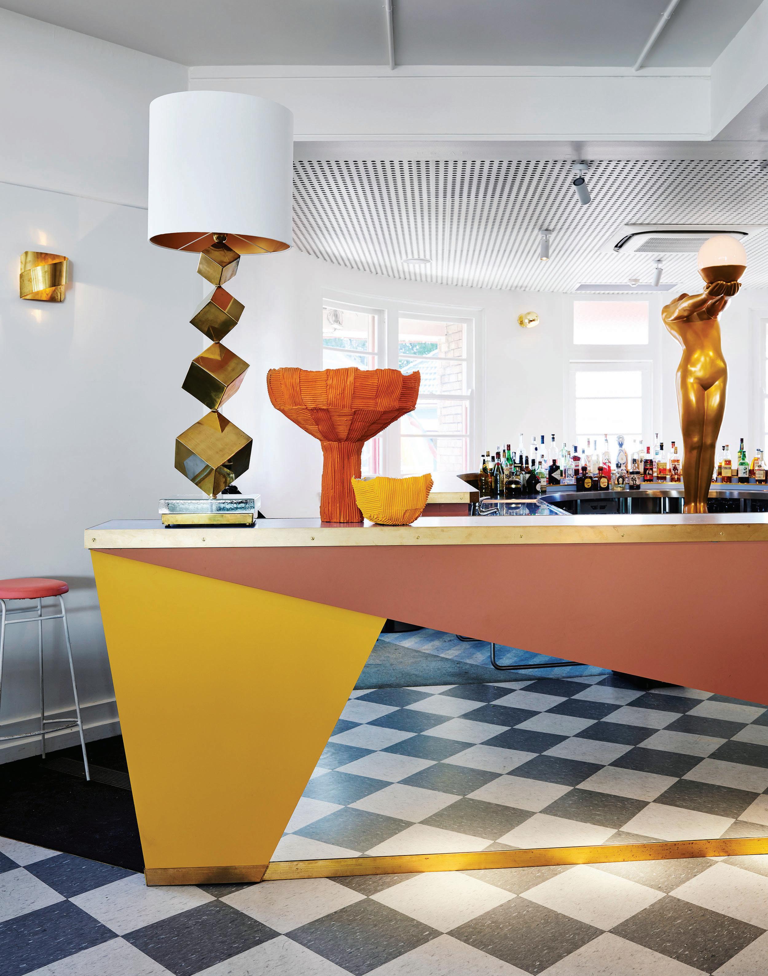
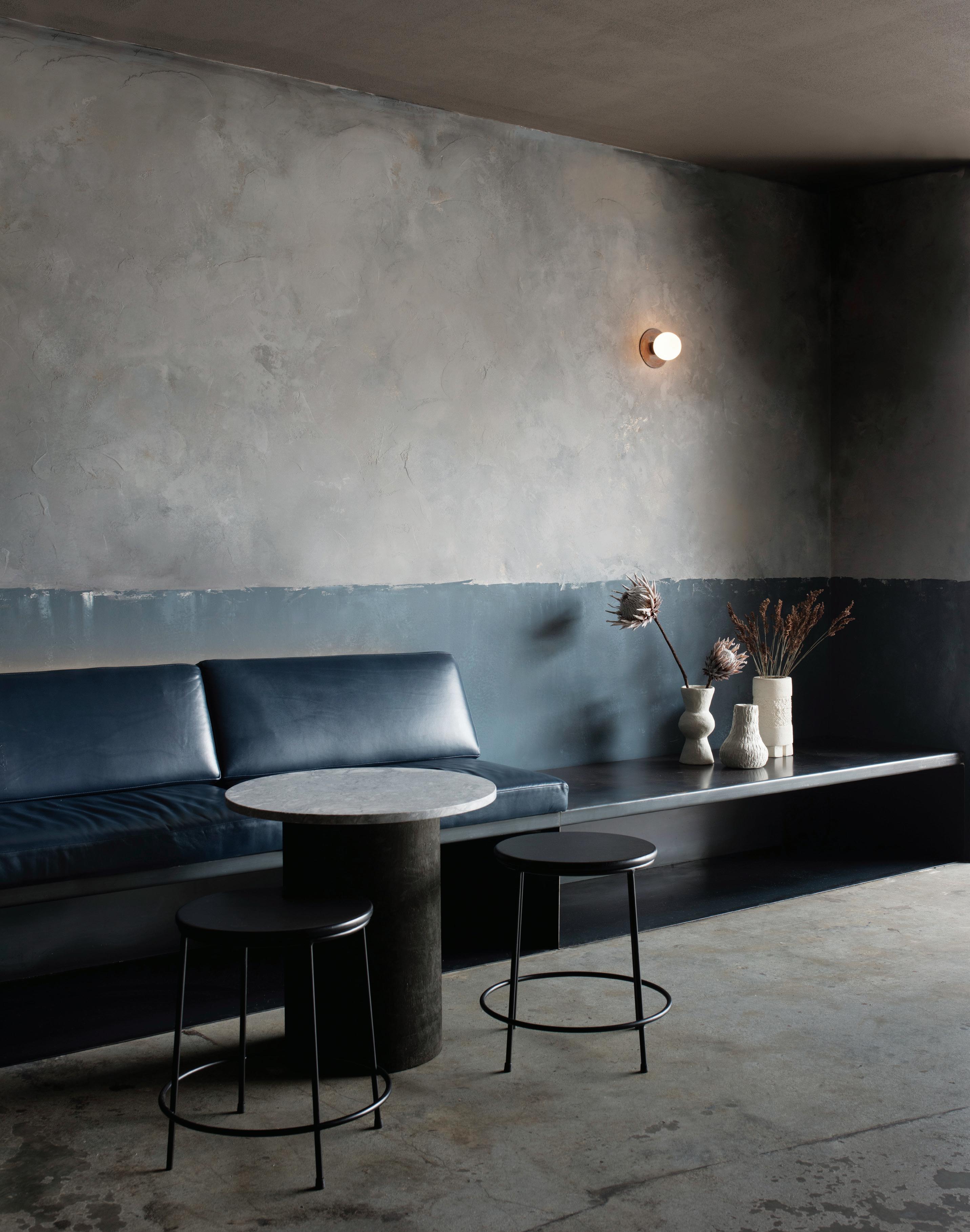
Design is a potent storytelling medium. This is particularly true when it comes to stories of the past: architectural relics are vestiges of bygone eras, flaking frescoes paint ghostly images of ancestral lore, and unearthed objects provide glimpses into what daily life was once like. But what of the present? How can design reflect the concerns of today, including the push toward greater inclusivity in the stories we tell and the ways they are told?
Ironically, addressing concerns of the present may entail looking toward the past. Such was the approach taken by Jeremy Bull, principal of Alexander & Co, when his practice was tasked with refurbishing The Imperial Hotel – a Sydney LGBTQI (lesbian, gay, bisexual, transgender, queer, intersex) icon, and backdrop to the vibrant opening scenes of cult classic The Adventures of Priscilla, Queen of the Desert. “There was a massive collection of history and cultural value,” Bull explains. “We knew that if we were going to do the work and substantially reposition the venue, we couldn’t lose this cultural history.”
Consequently, while The Imperial’s interiors are undeniably contemporary, they also draw on the camp iconography that has long been entwined with LGBTQI culture. Sumptuous velvet is paired with fringe in complementary colours, while streamers in celebratory shades of orange, yellow and scarlet hang from the ceiling; in the heritage-listed front bar, a Renaissance-style ceiling fresco depicting a religious scene and characters from the LGBTQI community looms large.
“Our practice felt the significance of our role to create legacy and inclusivity for a community in need of safe haven and to steward the next lifecycle of this structure within the LGBQTI community of Sydney,” says Bull. “It had to be outrageous, inclusive and fantastic but not light. Among its array of colour and shape is the gravity of its legacy, the shadow of history cast upon its many surfaces. This is a place to celebrate and discover, but also a place with significant history and sometimes even heaviness.”
This respectful design approach is shared by Sydney practice Pattern Studio, which recently completed a fit-out for Locura, a South
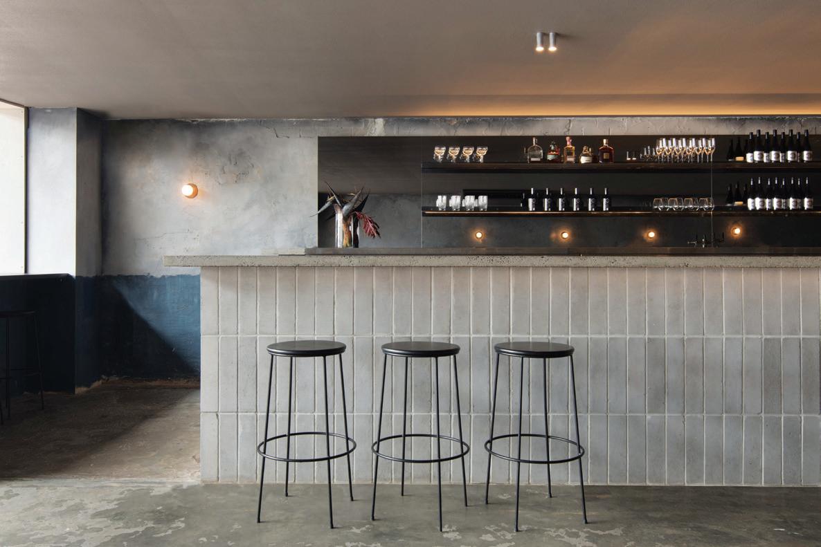
American restaurant in Byron Bay. From the outset, the practice was determined to pay homage to South American culture and aesthetics without trivialising them. “In the classic Aussie Mexican restaurant, there’s a desire to do something kitsch – bright colours, sombreros on the walls,” muses Lily Goodwin, director of Pattern Studio. “We really tried to take an approach that was more considered than just, ‘Let’s paint cacti on the wall.’ ”
Goodwin and practice co-director Josh Cain drew from their travels throughout South America to create an evocative, multifaceted restaurant interior that is redolent of Mexico’s humble, everyday late-night venues. “For us, the charm of venues in Mexico and South America is really this sense of having been put together by hand, of being a bit rough around the edges,” Goodwin says. This handcrafted charm is echoed in Locura, where quiet confidence transcends the need for easy iconography or design gimmickry. In the main bar, grey brick and raw concrete are sparingly adorned with bare-bulb sconces and hand-painted planes of colour, while leafy plants cast shifting shadows from the outdoor courtyard space. The overall effect is exotic without being exaggerated, and sensitive without being safe. Far from restricting Pattern Studio’s practice, cultural sensitivity has only enriched it, enabling critical thinking about the responsibilities that accompany design’s storytelling capabilities. “We always try to be very conscientious that if there are any cultural influences in our work, we respond to these in a way that avoids appropriation,” Goodwin explains. Reflective of the approach taken by Alexander & Co to The Imperial Hotel, Locura is a triumph of thoughtful design that understands the discipline’s role in not only telling new stories but doing justice to old ones.
The Imperial Hotel was Shortlisted for the 2019 INDE.Awards’ The Social Space category, proudly partnered by Woven Image.
alexanderand.co, patternstudio.net
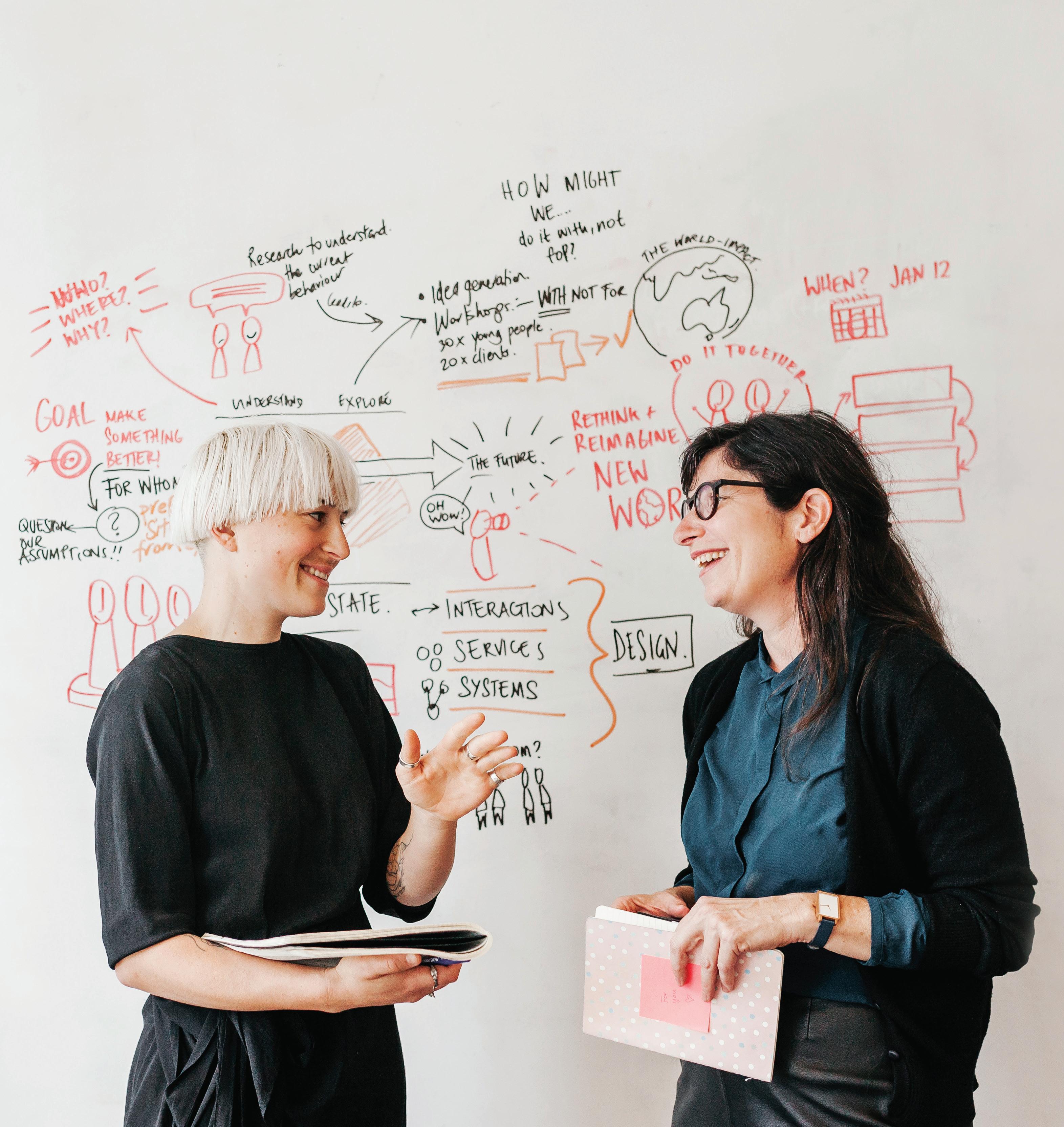
We’ve all had that experience – the user guide that doesn’t answer your questions, no one available to sort your problem, finding the product to match your need. At the end of the day, these failures to match organisational capability with customer needs are a failure of design.
According to Steve Baty, co-founder with Iain Barker and Janna DeVylder of Sydney-based MELD, this is not what contemporary design practice is about. MELD is a specialist in the design of customer-centric services for large-scale organisations. According to Baty, it’s about “understanding not just the object of design itself, but the system within which that object exists and operates, and the human technical systems around that thing.”
As its name suggests MELD brings things together – in more ways than one. MELD, says Baty, draws on “a range of disciplines, theoretical frameworks, tools, techniques and bringing those to bear on a problem.”
Its way of working also involves bringing all the stakeholders together to design systems that work for everyone. It is a process which avoids the top-down approach to design and seeks to balance quantitative and qualitative approaches to determining organisational outcomes and procedures. Barker is quick to point out, though, “it’s not actually trying to apply ‘customers know best’ or customer insight rules.”
Over 15 years creating “digital things” for organisations, Barker found that when people tried to use those things, the design had not taken into account the broader context in which they were being used, nor the customer experience. Ten years ago when MELD was founded, no one was really designing services. What Baty terms ‘contemporary design practice’ was at that time “nascent” or emerging. “Contemporary design practice,” he says, “has gone through a process of abstracting away from a specific medium.” Hence, at MELD they are working on digital things, physical things and on intangibles such as service design. The key thing is understanding the ecology of a business, given that the ecology includes not just the organisation and its staff, but also its customers. “A service,” says Baty, “doesn’t exist in a vacuum, a building doesn’t exist in a vacuum, and a digital product or service doesn’t exist in a vacuum. It’s part of a socio-technical system and the economics in which we operate. You cannot separate those things and design in isolation.”
Another important principle in MELD’s approach is integrating the people who will be impacted by what they design. It is what they term human-centred design, itself the outcome of the progression
away from user-centred design or customer-centred design. “If you think about an aged care facility,” Baty explains, “it is not just the person who is being cared for, but their carers, their children or their partners who are also impacted by that service. Their active participation in the design is important.
“We have,” he says, “a definite desire to be making an impact on what we call the fabric of our society, on the socio-technical system in which we operate. It’s our banking system, our utilities, how we generate and use electricity, our transport systems, it is the buildings in which we live and work, urban planning – in all of those things we see the potential to be improved. How do we adapt and adopt design into new spaces.”
Australia is marked by a sense of equality and one trend that is emerging strongly is breaking down barriers – literally the counter –to create a more collaborative relationship between service providers and their clients. This is mirrored in the workplace where the physical space is designed to allow ad hoc teams to come together, work together for a period of time then disperse. It reflects, says Baty, “the conscious desire to design a physical environment that better matches the destructuring of hierarchy and the balancing of the power dynamics around the different groups that are working together.”
“It’s leading from the edge,” says Barker, “and away from directive leadership styles. There is no more important time for organisations to understand the people they’re designing things for. There is an existential question going on as to why organisations exist. It is very trendy for organisations to say they are obsessed with the customer and want to deliver great customer experiences, but actually becoming that is a lot harder for most organisations than they think. It’s not about a few bells and whistles. It actually requires some deep and fundamental changes as to the organisation’s values and how it incentivises people. Playing that through takes a bit of time. It’s a transition of being, morphing from one state to another. Many of the organisations that we see are on a journey. They haven’t arrived at the destination and that transition is very uncomfortable. That’s a trend that we’re seeing – a lot of transitions, a lot of transformations. And many are stuck halfway.”
For MELD, helping organisations along that journey requires a balance of optimism and pragmatism. “It’s not having a head-in-theclouds vision,” says Barker. “You do small things which are working towards a bigger and more significant thing.”
meldstudios.com.au
Any organisation will tell you it is obsessed with its customer. But delivering a great customer experience requires a socio-technical understanding of human needs. Enter MELD.
In today’s new-world ‘O2O’ order the ‘prosumer’ can determine the fortunes of a brand with the swipe of their thumb. What do we know about this new breed of consumer-producer?
It was 5pm in London as I alighted from the tube. New Year confetti congealed to gutters. The high street was frantic with windfall Christmas cash. Hundreds of fellow passengers swaddled themselves against the cold, makeshift carapaces of the day’s Evening Standard under one arm, the other embowered with excesses of bags – Balenciaga, H&M, Fortnum & Mason, Sainsbury’s. It’s all quite fatiguing … and very po-mo.
In each copy of the Standard, column inches mourned the fate of British retailing while the European Union Withdrawal Act consumed parliamentary agenda. Sterling had become shaky and the dollar an in-joke. And yet, quite literally in the other hand, cargoloads of purchased goods were in transit, acquired by my fellow passengers from more than 5.7 million square-metres (and counting) of London retail space. 1 Whither retail, indeed.
At first, I didn’t quite understand why all these walking paradoxes had congregated outside a new shop in Fitzrovia, LEGO Wear, the pop-up clothing store and the latest in LEGO’s ongoing vertical integration efforts. It had remained entirely empty since opening –and remains so – save for whitewashed walls and a Snapchat code on a single plinth. According to Lea Sandell, social media innovation lead at LEGO Group, the design of the entirely empty shop apparently represents “an opportunity for a brand new limited edition product for adults, and taps into both the sense of style and nostalgia of that audience – while exploring that interesting space where the digital and physical worlds merge.”
It’s devilish sleight of hand. LEGO Movie II was screening across the road, a film of an imaginary plastic brick world existing alongside a real world of bricks and mortar. Meanwhile, a virtual AR (artificial reality) shop for LEGO apparel was held secret inside its bricks and mortar envelope. Is this just simulacra folded inside itself, gimmickry masquerading innovation?
Winners in this space think not. According to Jack Ma, co-founder of the Alibaba Group and arguably the most successful person in global retailing history, the shop might be empty but the future of retail has undeniably arrived. In a 2017 keynote to Hupan University: “The essence of new retail is new technology. Data and algorithms are playing an increasingly important role in today’s production. They are the driving force of advanced productivity.”
But in gathering yet another market into Big Data’s quantum embrace, this recognition appears little more than trite platitude. We always knew that algorithmic integration would allow online, offline and logistics to cohere into a dynamic imaginarium of retailing – one, importantly, constrained by neither time nor location. And yet, in revolutionising everything from the fit-out of the shop floor through to stock operations, what we didn’t expect was that it would ring the death knell for the consumer.
After all, when was the last time you begrudgingly gave your custom for lack of shopping options? When was the last time you made purchasing decisions solely on the basis of price point differentiation? When was the last time you said, ‘I had no choice, it was all they had in store?’ Precisely.
Would-be consumers are now barraged by an O2O world of onlineto-offline shopping where retail destinations provide links between
purchasing stimuli, brand advocacy, a customer’s life and the conversations of their networks. We own the t-shirt and we become Gucci. We #selfie with our iPhones and we become Apple. At once flock and shepherd, we are the capital-B Brand. In our many guises of Instagram influencer, microblogger, YouTuber sensation, etcetera, we exert benevolent control of marketing messages, raising or razing companies at a thumb scroll.
Outside the LEGO Shop again. It hits me: no-one is here to consume. They came to produce. And Nasdaq’s compounded annual growth rate for this sector (11.7 per cent CAGR per annum) suggests the revolution is building momentum globally. From local shores, Sephora’s Sydney flagship by Geyer combines traditional retailing elements with VR (virtual reality) screens and a whole host of smart fixtures and IoT (Internet of Things) wizardry, offering prosumers digital and physical activities seemingly unrelated to making just a purchase.
“As everything becomes commoditised and available through the ether,” says Gary McCartney of McCartney Design, an Australian leader in this space, “retail environments will rely less on stock and more on affecting how we feel.”
Designers in this space need to forget everything they know – your client wants design for participation, not for purchases. Take note: Chinese retail revenues continue to mushroom at a growth rate of 7.5 per cent (equating to US$5.636 trillion per annum, or more than 60 per cent of global retail revenues by 2020). 2 Pioneering designers, here, are zeroing-in on ‘prosumer emotional motivators’ 3 combining narrative scenography with a client’s pre-existing digital aims. Cartier’s watershed exhibition-retrospective-cum-VR-storeexperiment (designed by Adrien Gardère in Shanghai last year) stands forth as exemplary.
Answering to prosumer demand for greater degrees of engagement unseen in the luxury space, the experiment used VR to place prosumers in the shoes of the brand’s first key opinion leader – 1900s aviator Alberto Santos-Dumont – and retraced his iconic flight path (and one of Cartier’s first PR campaigns) over fin de siècle Paris. From educating prosumers on the heritage of the brand, allowing them to travel to other of its retailing premises across the world (and at different historical moments). Also connected to Weibo, WeChat and all the usual suspects, the stunt pulled in a 7 per cent bump in timepiece sales (US$2.89 billion), achieving a foothold for Cartier’s legacy pieces – a first in its Chinese markets.
“Most important here is the concept of reality,” McCartney reminds me. “In an increasingly crowded, stressful and challenging world, people will reach out for what’s real – real relationships, real experiences, real food, real emotions.”
What’s real? Not bricks – that’s the illusion. References
It’s no exaggeration to say the world’s biggest design fair attracts crowds like none other and while the content is invariably good, the cues can be less than well received. Last year, the co-founders of design agency, Studiopepe, Arianna Lelli Mami and Chiara Di Pinto presented Club Unseen, a secret dance club in retaliation against the hectic crowds, cues and utter chaos of Fuori Salone. The design intent was to represent the quiet that gives space to creativity.
This year, they worked with brands like Areti, Ceramica Bardelli and Tacchini on an installation/exhibition space entitled Les Arcanistes: The Future is Un/Written. Housed in a large industrial space formally used in the 1900s for manufacturing gold, the manifesto project was an investigation into the interplay between matter and divination. The name derives from the archanists, the first chemists, and plays on the secrecy of the formulas they kept to create gold, porcelain and glass. But it also references the Arcanas, the 21 Tarot cards representing collective unconscious. “Though the future is unwritten, the answers already lie within us,” reads the studio’s design statement.
The multidisciplinary design studio works across installation art, interior design, product design and creative consultancy and this human-centric, experiential approach to design and installation has heavily informed other works in the duo’s portfolio. As such, it is exactly what Studiopepe has become known for since its foundation in 2006.
“We investigate the subjective and objective sensations and experiences linked to colours in order to define the personality of each project,” says Di Pinto. It’s this approach that leads them to their ultimate vision and ensures each project has a unique identity. In 2018 Studiopepe completed an interiors project for Cafezal, a local speciality coffee shop in Milan. This project exemplifies the studio’s partiality for playing with geometry and colour.
“We like working with classic shapes and creating variations on archetypes using materials and colours to reinterpret a project or piece rather than [inventing] unusual forms,” says Di Pinto. “The result of this is a very simple, yet very refined design that could be from the Art Deco era or the 80s, but still looks contemporary.”
Lelli Mami is quick to point out, though, that although she and Di Pinto love to work with eclecticism and be brave with design, they’re never designing for design’s sake: “Aesthetic and beauty is not something that is only relayed with shapes. It’s a moral attitude, it’s supposed to create an emotion; otherwise it’s destined to pass away in a very short time.”
It’s clear the duo is acutely aware of the changing nature and expectations of hospitality and retail spaces. Now that we know and understand the profound effects that architecture, design and interiors can have on consumers, the bar is set higher than ever before. “Hospitality is becoming more and more personal,” says Di Pinto. Studiopepe assesses not only the black and white requirements of a brief, but also external influences like environment, location, culture, history, target audience and brand DNA. By working with these factors rather than against them, the studio can craft experiences that incite emotion.
“We always try to amaze you,” says Lelli Mami, by way of final comment. And they do, but what I find truly amazing, is that sometimes this may be in the colour and boldness of a space they’ve created, other times in presenting something unexpected yet sincerely aligned to a brand. And yet sometimes it’s simply in Lelli Mami and Di Pinto’s thought processes – a dynamic that indelibly marks the design of a space.
studiopepe.info
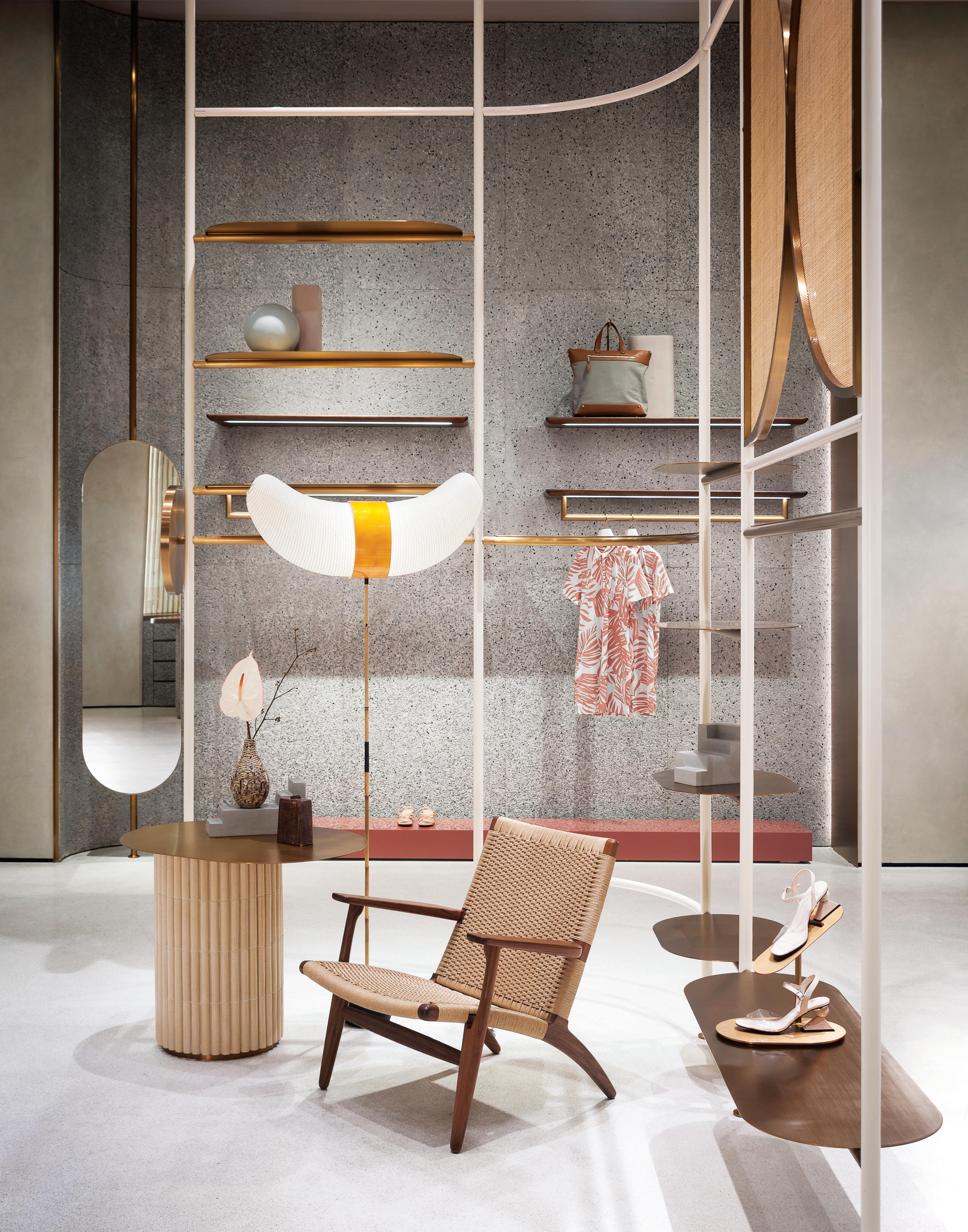
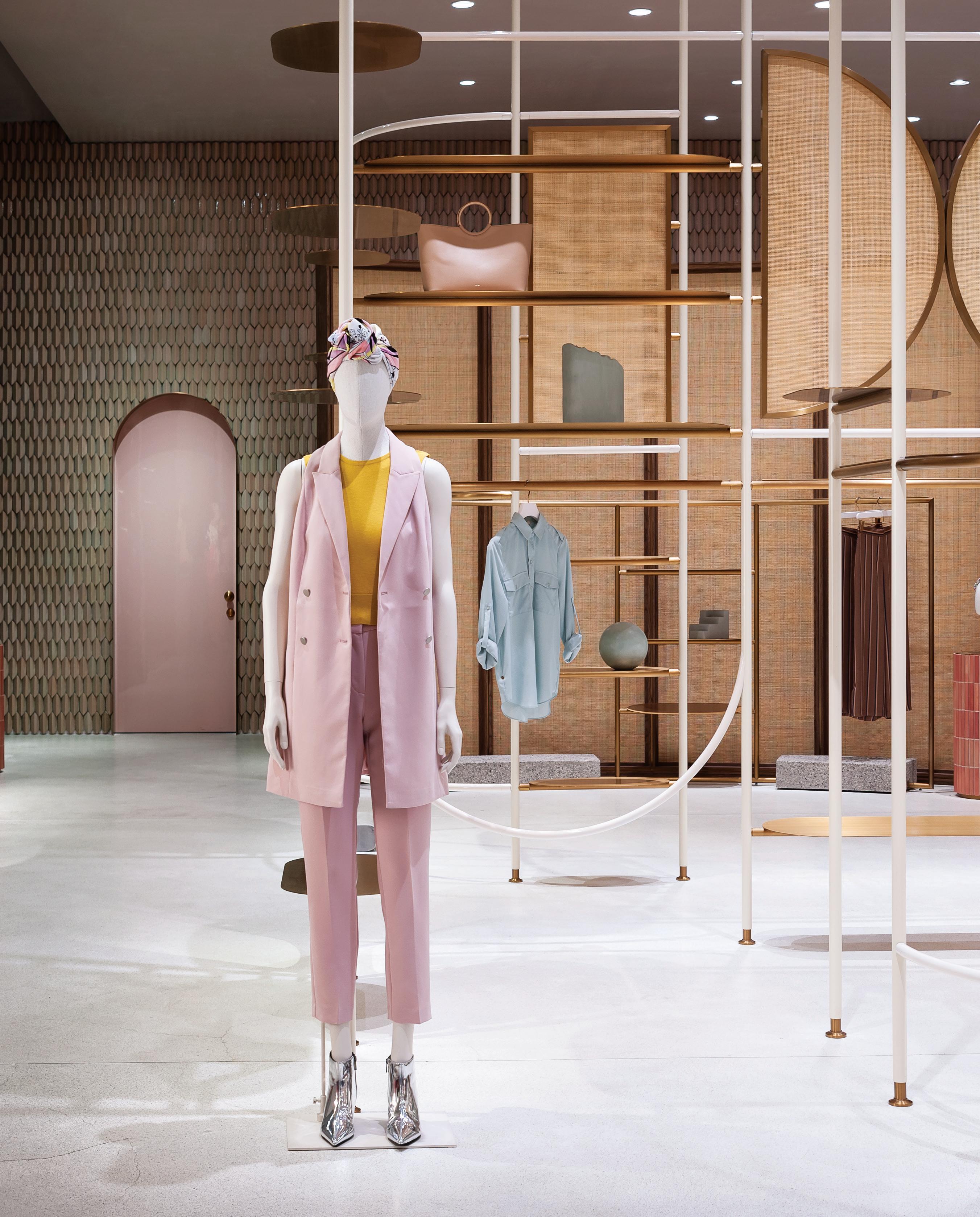
Studiopepe’s concept for Jaspal, in Bangkok reveals a pleasing array of contrasts that speak to a fluid, free-plan layout. Vertical lines play off soft forms, concrete and raw wood offset glossy and lacquered surfaces.
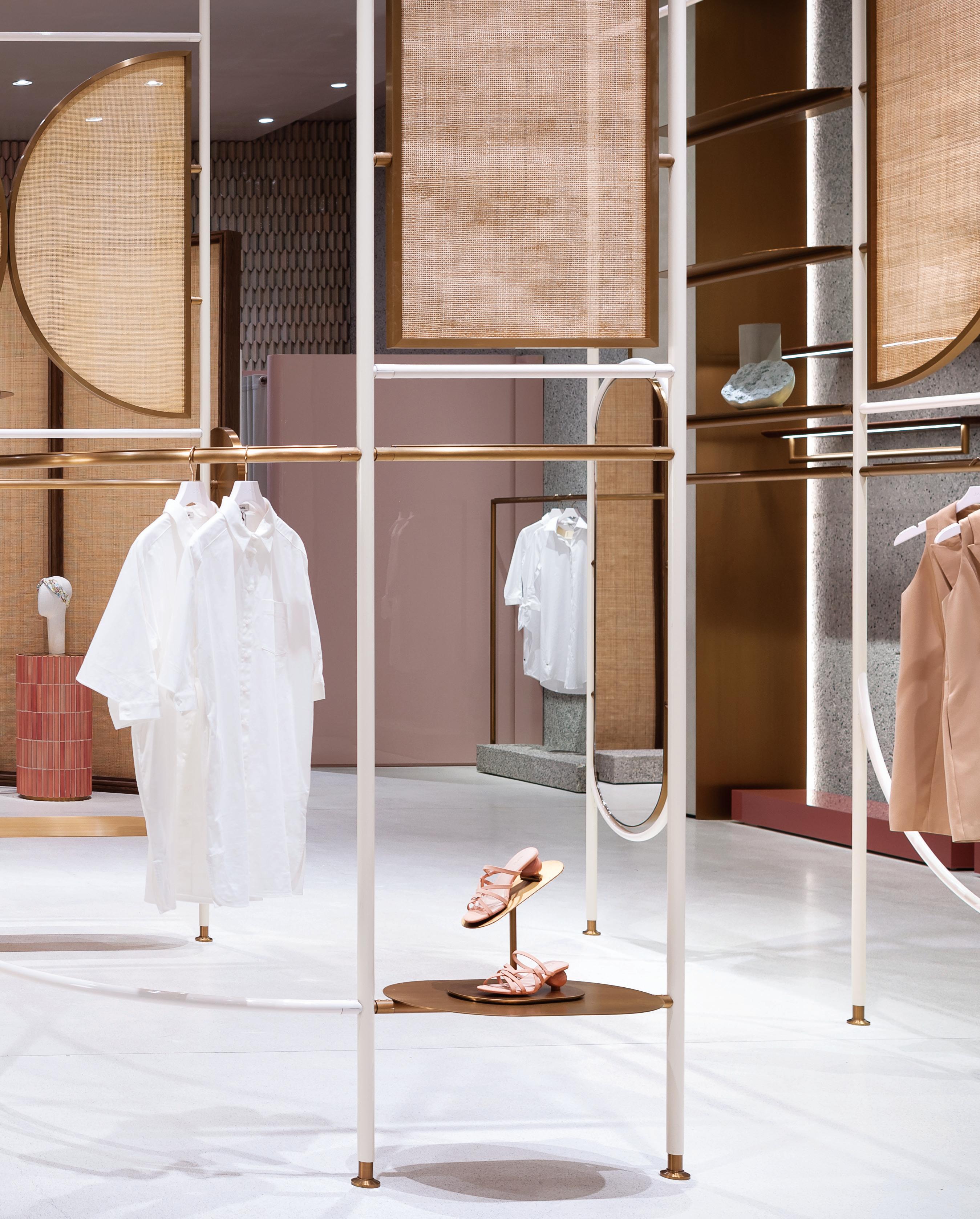
COMMENT bar s T udi O
“We’re increasingly seeing an appetite among operators to look at how to broaden the experience of their hotels. There is a genuine opening up of the idea of experience. i t’s also about authenticity. We really look for genuine engagement, a genuine sense of connection that is not a fashionable, flash-in-the-pan kind of offering. This comes down to the issue of how travel has changed, and a lot of it is due to travellers having advanced information. Everyone has seen or heard of where they’re going before they arrive. We feel it’s an important part of our projects that there is much to experience when you arrive... your experience of being in the hotel is more than your preconceived expectations.”
– Felicity beck, principal/director, and rowena Hockin, communications director, bar s tudio, barstudio.com
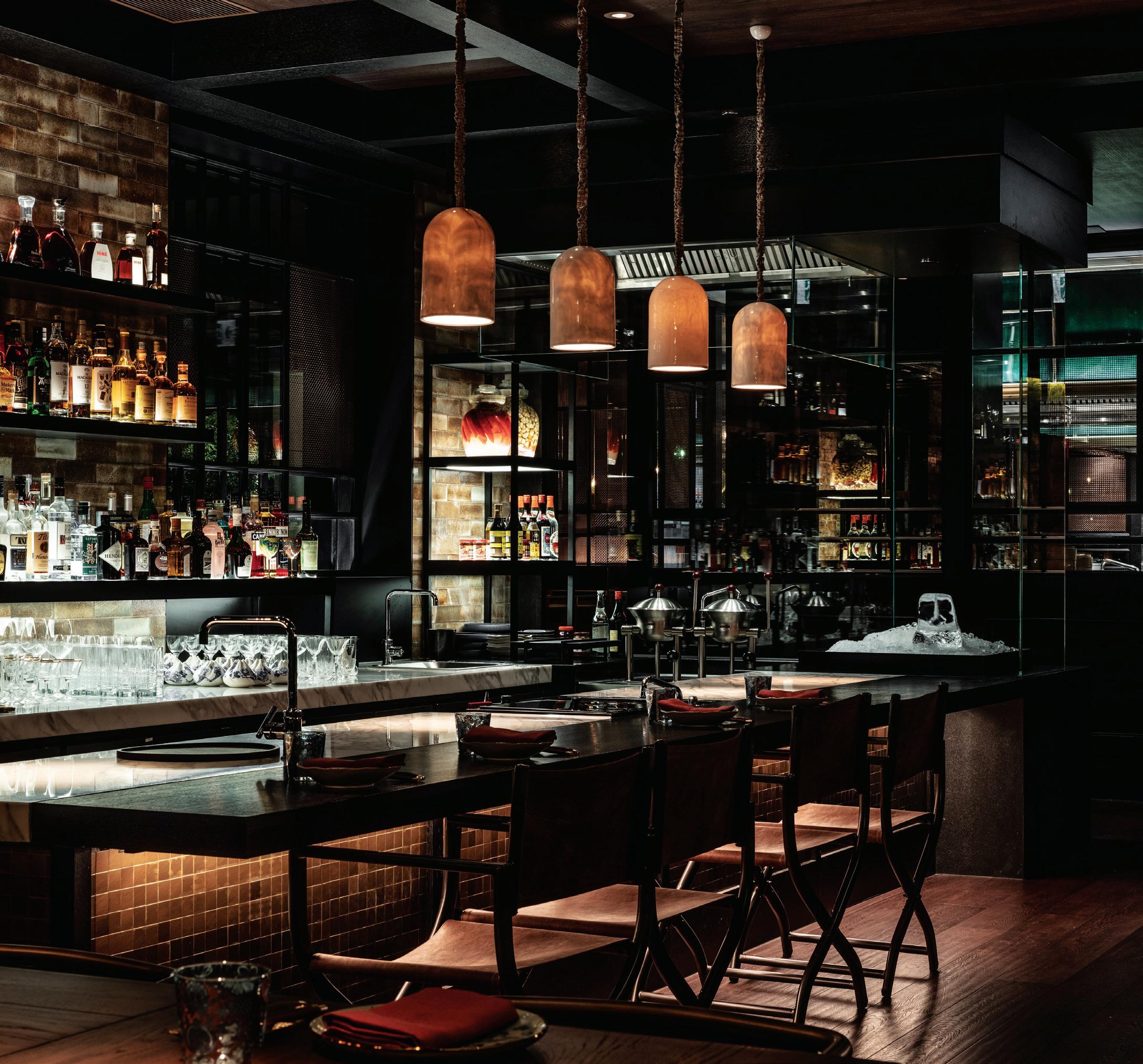
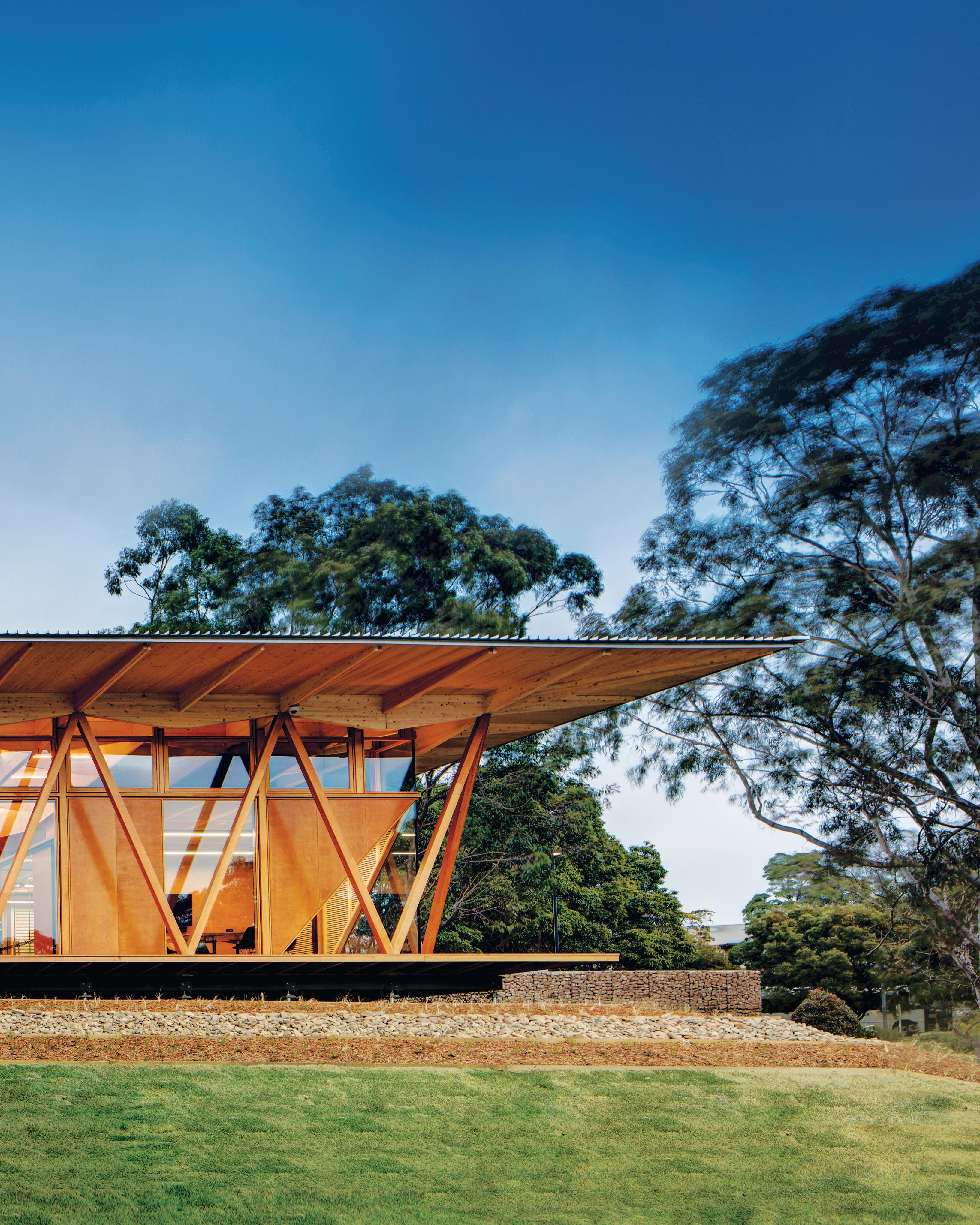
In China where a majority of people shop online, Various Associates raises the stakes to connect with customers through intense emotion.
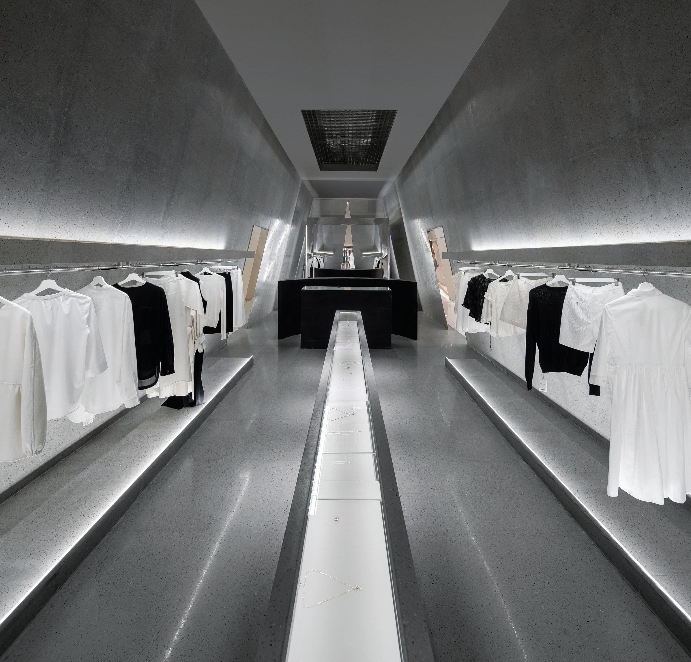
Qianyi Lin and Dongzi Yang founded Various Associates in 2017. The pair had just returned to Shenzen from London after graduating from the Royal College of Art: Lin with a degree in interior design and Yang in architecture. “There were huge development opportunities in Shenzen,” says Lin, whose partner speaks of the Chinese city’s “newness” and “lack of cultural expression”. Within the urban landscape of rapid expansion, they create spaces that ask users to do the opposite: to slow down.
Tracey Ingram: What is Various Associates’ retail-design vision?
Qianyi Lin: Shops in China tend to all look the same. We want to bring some personality to the retail landscape here – to create some differentiation and to really express our clients’ identities. Clients are also realising that stores aren’t just about turnover. They want to connect to their customers on an emotional level. Sometimes they want to shock people. In any case, they want people to remember the space –and they want a design that can compete on an international stage.
Dongzi Yang: Online shopping is incredibly popular in China, more so than in physical retail stores, so one of the main questions we’re trying to answer is how to attract people back to offline environments.
TI: How do you get to the root of a client’s identity?
QL: After our initial discussion with the client, we use storyboards to draft a concept that matches the tale they told. Our design also has to suit the site, and we follow a function-first mentality.
DY: Take our recent boutique for SND. The client saw and liked a gallery we’d previously done in Shanghai. There are very few gallery
spaces in Shanghai; that’s how he found us. He wanted to replace his existing string of small stores with just one: a bigger space with a bigger impact. The idea was to create a gallery-like environment, with every item treated as a work of art.
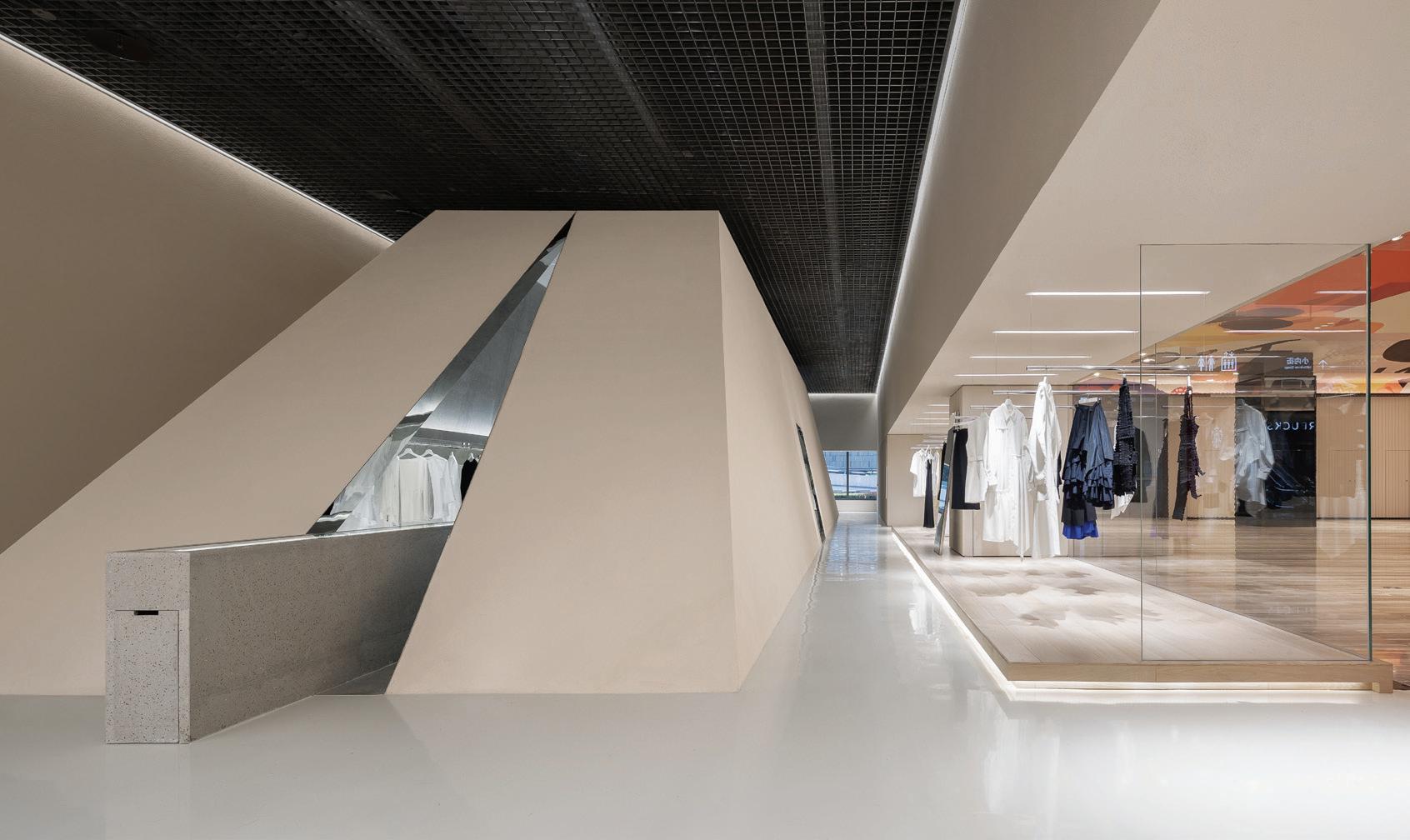
TI: How does the concept of a gallery affect the way people move through the space?
QL: Retailers want to make sure customers walk around the store to see as much as they can. At SND, we made sure they follow a certain route, as you would in a gallery. The interior is arranged around a central pyramid. A small gap, visible from the outside, offers only a peek inside to pique the curiosity of passers-by. When they enter, they have only one way to go.
TI: Galleries are often places for deceleration. Is this a consideration in your work?
QL: We want people to slow down, to explore. For SND, we therefore broke with display conventions. Lots of boutiques want to show lots of things in one area. And they often show too many things in total – it’s overwhelming. The pyramid divides the SND space into two areas: one bright and open, the other more charming yet more secretive. The latter houses the most expensive items. And instead of using mannequins, we designed displays that you can leisurely weave in and out of. You’re encouraged to walk back and forth, to see everything.
various-associates.com
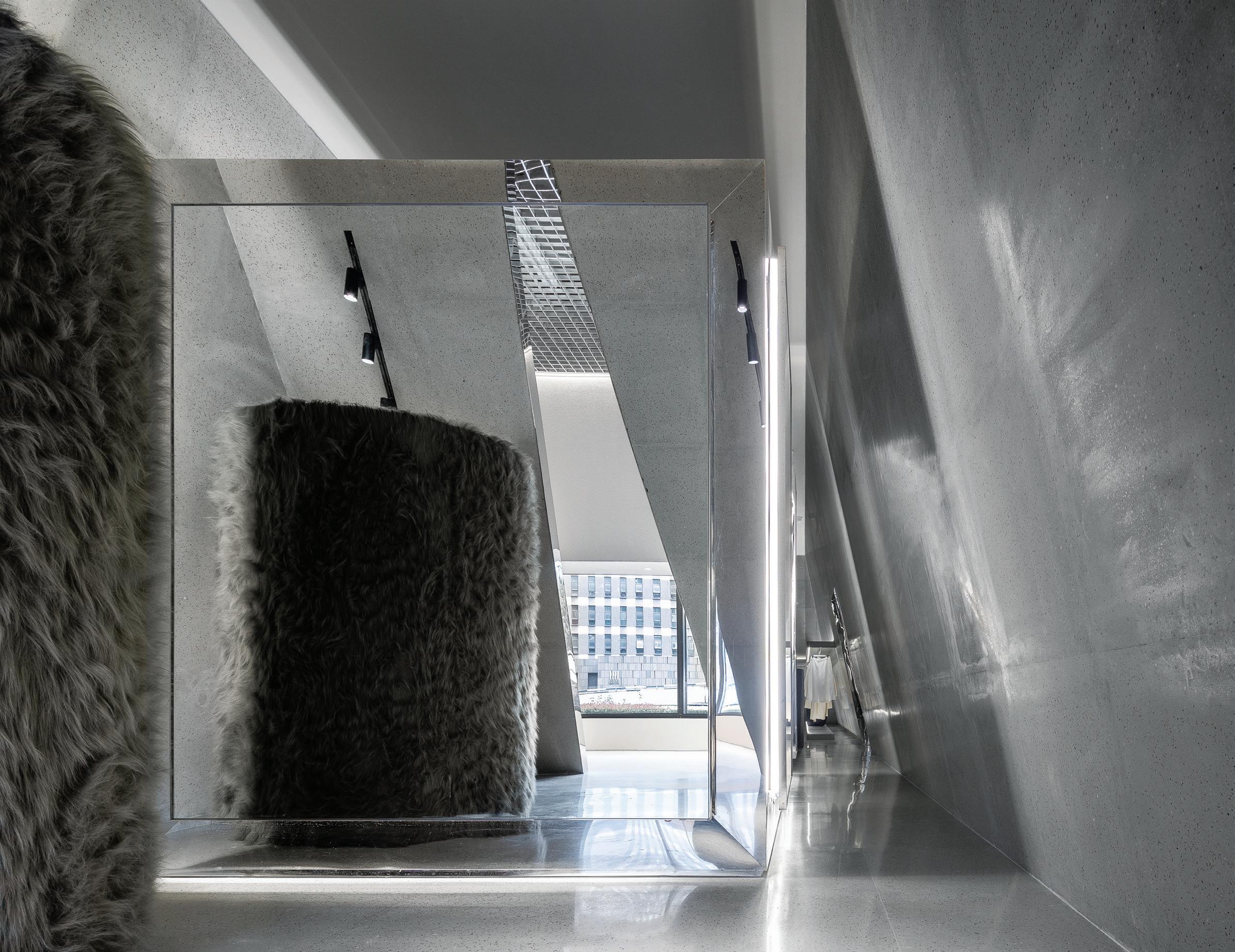
“[Clients] want to connect to their customers on an emotional level.
Sometimes they want to shock people.” Qianyi Lin, Various Associates
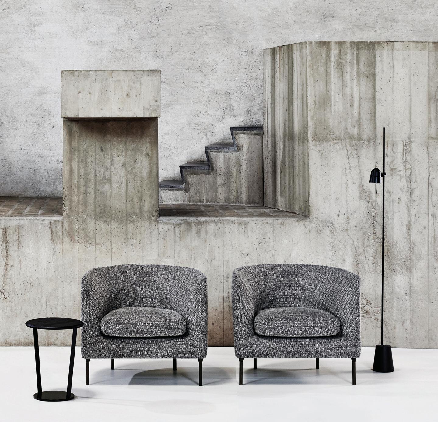
Each year the Milan Furniture Fair manages to surpass even the highest of expectations with its extensive showcase of innovative designs, vibrant installations and compelling ideas. The ownworld team attended the fair this year and has earmarked a selection of exciting new collections for Australian designers.
From laCividina comes the Suiseki collection, drawing inspiration from the organic form of rocks, plants and landscapes. The Suiseki modular lounge and lounge chair by designer Andrea Steidl reveal its masterful cra smanship through meticulous upholstery, stitched to mimic the distinct qualities of a natural sculpture. Suiseki also puts a renewed emphasis on the backrest with a backdrop appearance pushing beyond the perimeter of the armrests.
Meanwhile Desalto, in collaboration with an impressive roster of international designers, has released ve new collections. A particular highlight is Eugeni Quitllet’s Strong collection, with tables and seating characterised by a curved steel tube – the structural core of the Strong products. By using art to shape new ideas, Strong comes to life through clean, continuous forms.
The collection includes a cantilever chair and stools in variable heights, alongside three table adaptations.
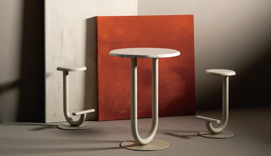
Bensen released four new collections this year, each staying true to its ethos of nely cra ed furniture through simple, honest design. Smooth surfaces, so cushions and a versatile modular form take over in the Delta collection. The Delta Club lounge chair follows the same arm pro le as the sofa collection with superior comfort through its multi-layer seat cushions on a webbed frame. A perfect addition to any room, the Delta Club lounge range is designed for pure comfort and style.
A brand full of curiosity and charisma, Arrmet has always been ahead of its time with pieces that explore diversity and functionality, with an avant-garde attitude. This year Tomoya Tabuchi attracted much attention with the Kiyumi chair, armchair and stool collection. Available in Ash veneered plywood or upholstered in fabric or leather, Kiyumi ingeniously conceals its complex construction to create a sleek and elegant form. Adaptable to a variety of environments – from home to hospitality, the Kiyumi collection demonstrates stunning cra smanship through intricate and clean details.
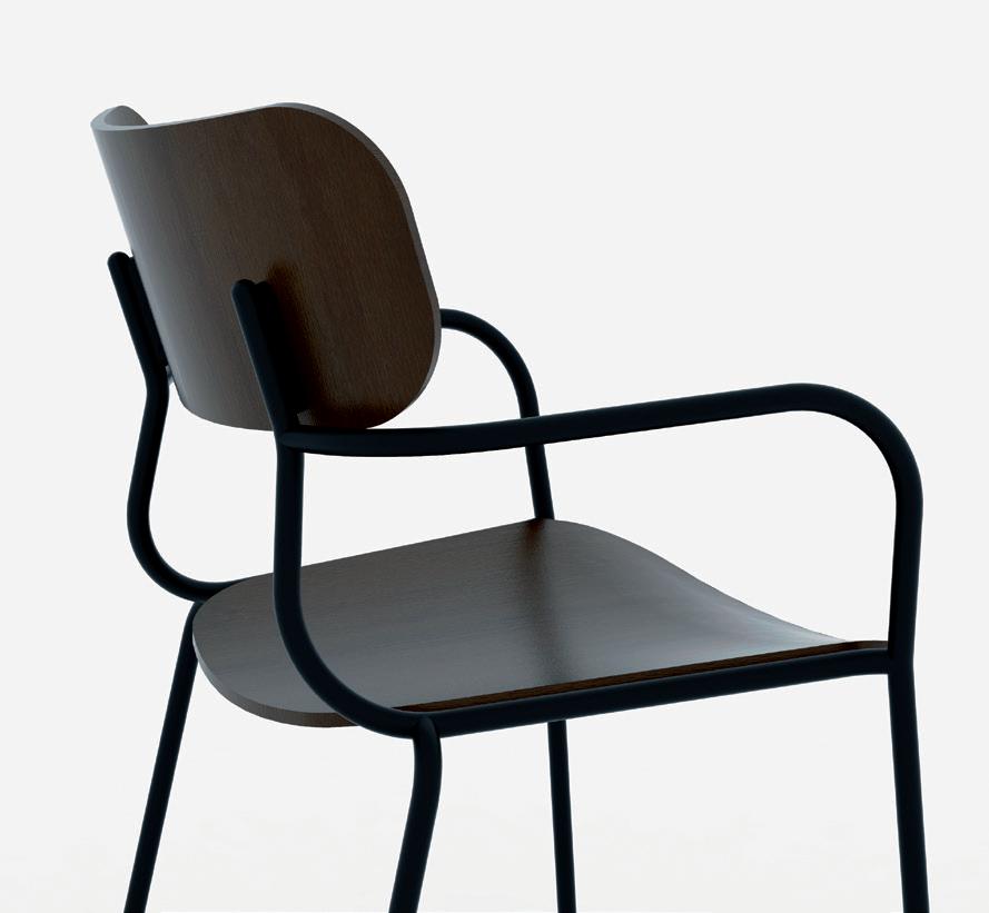

“[People] want to engage with the story or brand in real time, as they might with an interactive art exhibition or performance. o ver the next three years, entertainment, narrative and brand experiences in hospitality will become more enveloping in a bid to capture customers’ imagination and attention. b y creating uniquely immersive experiences which draw upon a brand’s true point of difference, hospitality will allow customers to leave their ‘real’ world
behind. While consumers are now more attuned, and resistant, to overt advertising, they are hungry for authentic experiences that shift their perspectives or offer them something genuinely enriching. Hospitality brands will need to strive for difference, authenticity and go beyond what already exists to create a new, profound and edgy experience for the customer.” – fabio ongarato, co-founder and creative director, Studio ongarato, studioongarato.com.au
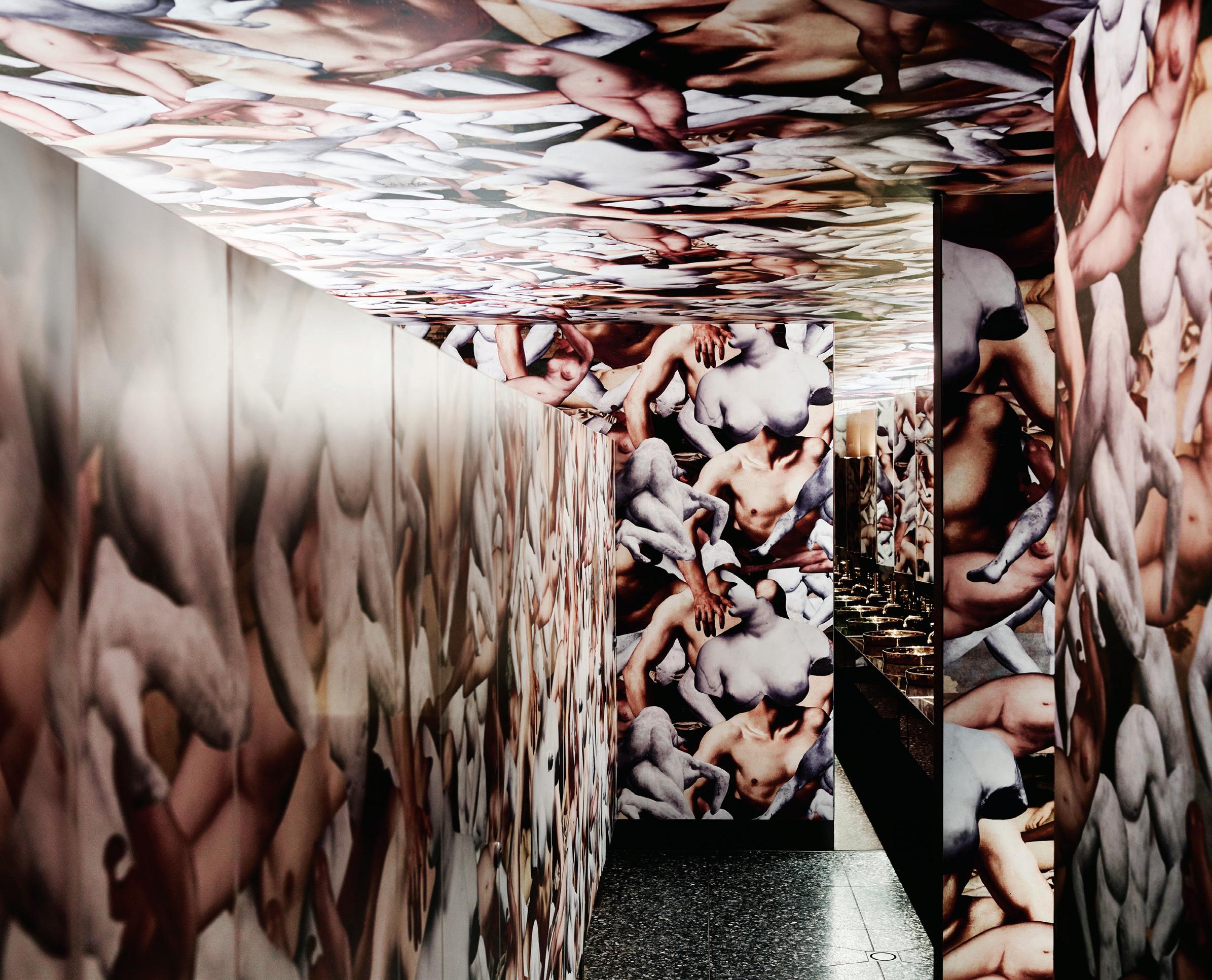
From hyper-real run-ins to fragmented customer profiles, Russell & George throws out the rule book and “slams” typologies to design spaces that make you stop and put down the phone.
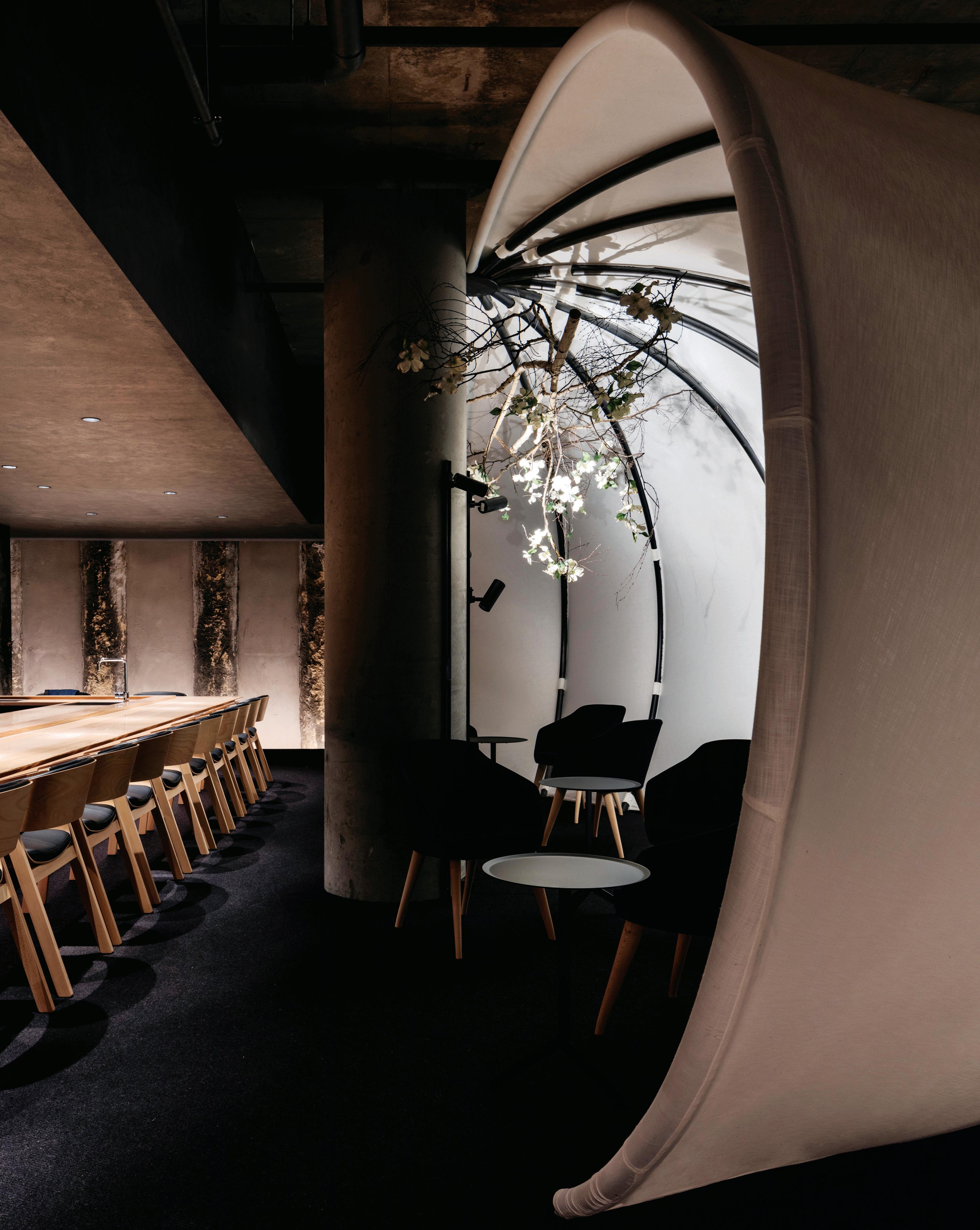
A bold, unusual and thought provoking interior sets the scene for a kaiseki dining experience at Ishizuka, in Melbourne. Russell & George was involved throughout the process, from location selection right through to final design.
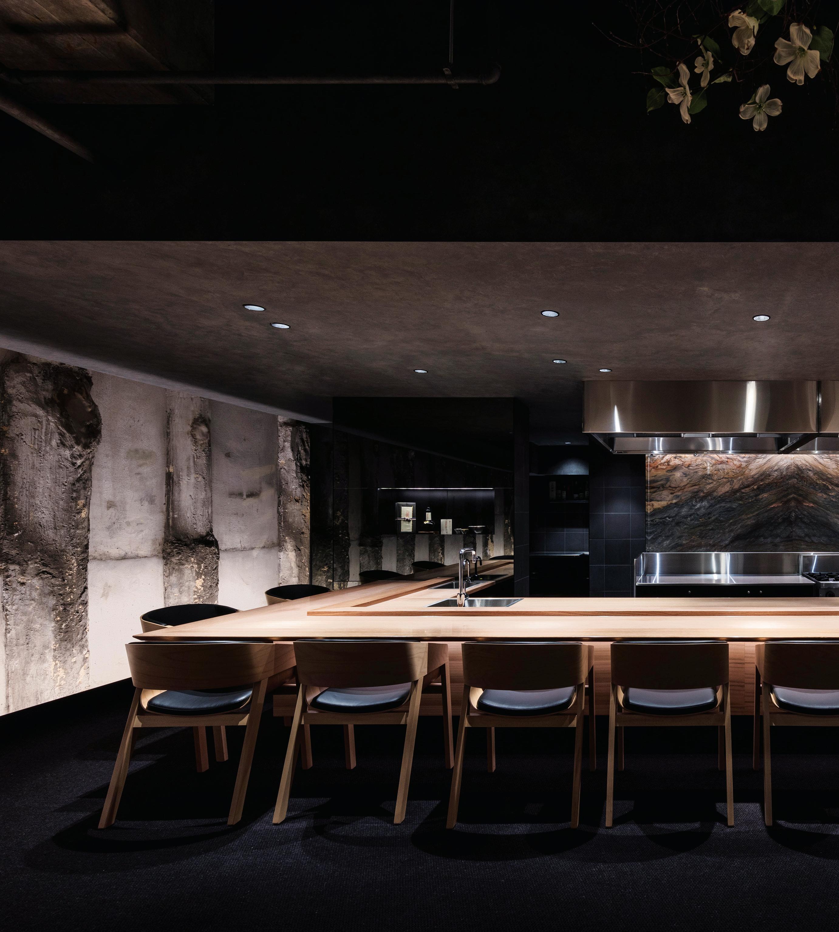
Byron George and Ryan Russell believe retail and hospitality are merging into a similar genre. “The things that are transforming retail are actually transforming hospitality too,” says George, co-founder of award-winning studio Russell & George.
Purchasing automation, social media and blurring gender boundaries are all contributing to what is becoming a brave new world in retail and hospitality design. “There are no golden rules,” says George. “Every project is different and it comes down to the research phase and understanding what the client is doing.”
Core to Russell & George’s process is a research phase and abstraction process that sees them investigate beyond the boundaries of the norms, “slamming” vastly disparate operating models to re-model “how the plate gets to the table”, for example. “What we’re looking for are new narratives,” says Russell. He and George unravel the paradigm shifts shaping modern hospitality and retail design.
People want escapism
RR: You can literally automate your hospitality and your retail experience. It means that hospitality venues need to be more distinct, they need to have a singular voice. If I can get something online and delivered to my home, there has to be something really good going on, on-site, for me to go in there. When people go to restaurants and retail spaces they fundamentally want to escape. They want what they get when they look at YouTube. I think what’s happening is that we’re having to create more heightened or hyper-real scenarios in order to get people off their phones, [to] just enjoy the moment without documenting it. The job of a good interior, hopefully, breaks that down.
There is no core client
RR: Core clientele is an interesting point because I don’t think core clientele exists anymore. [Particularly in retail] we’re now getting crossovers in gender. It’s very gender neutral. You’ve got men buying
from what would traditionally be female fashion houses and vice versa...especially among a younger generation [of consumers]. There’s simple cues that heighten societal awareness around those things. We, as designers, have the ability to [design those cues, even] before it becomes legislation.
BG: It goes both for retail and hospitality. It goes back to core principles, that you’re making a customer feel good; actually giving them an experience they’re not going to get online, or they’re not going to get at home. That’s fundamentally it, isn’t it?
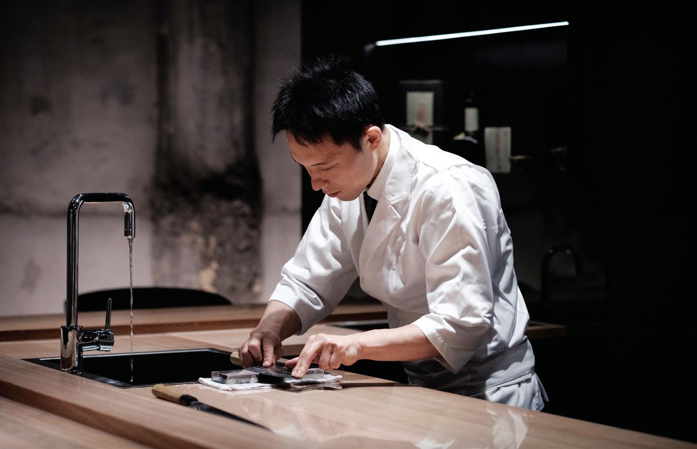
The dumbing down of the customer
RR: I think one of the biggest challenges we’re facing is the dumbing down of the customer – especially in large retail environments where there’s a one-size-fits-all [policy]. It doesn’t exist. Pushing to ‘tailor’ for a customer [creates] a very flat journey. There’s no peaks and troughs. What used to happen would be that the data you analysed would be in core customer groups…it’s a pretty generic way of looking at it. Whereas the better brands look at customers in terms of heightened ideals around advocacy.
BG: Hospitality is generally only as good as the operator, and it’s only as good as the service. You can design the most beautiful room, but if the service is bad, the food is no good and people aren’t treated that well, then it doesn’t hold together. It always has to be driven by the service model. The back-end is actually what drives hospitality – not what it looks like. What it looks like really comes afterwards. Think about places you go to quite a lot. They just make you feel comfortable and they’re appropriate to what the offering is.
russellandgeorge.com
“ customers continue to become more educated and socially aware. We’ve started developing a conscience about things such as the sustainable sourcing of coffee beans; this is now extending to other areas such as interiors and we believe it will continue to do so over the next few years. t here is an appreciation amongst discerning patrons who recognise not only good design but also put a value on where the furniture has been sourced. a s disposable fashion resulting in unnecessary landfill continues to be a growing problem, there is a gradual change in customers’ mindsets. People now appreciate good workmanship, local manufacturing and design longevity.
t he chair they sit on, the table they eat upon – are all customer touch-points that either enhance or detract from their overall experience. Designers are now recognising this and specifying furniture to meet much more than just an aesthetic brief.”
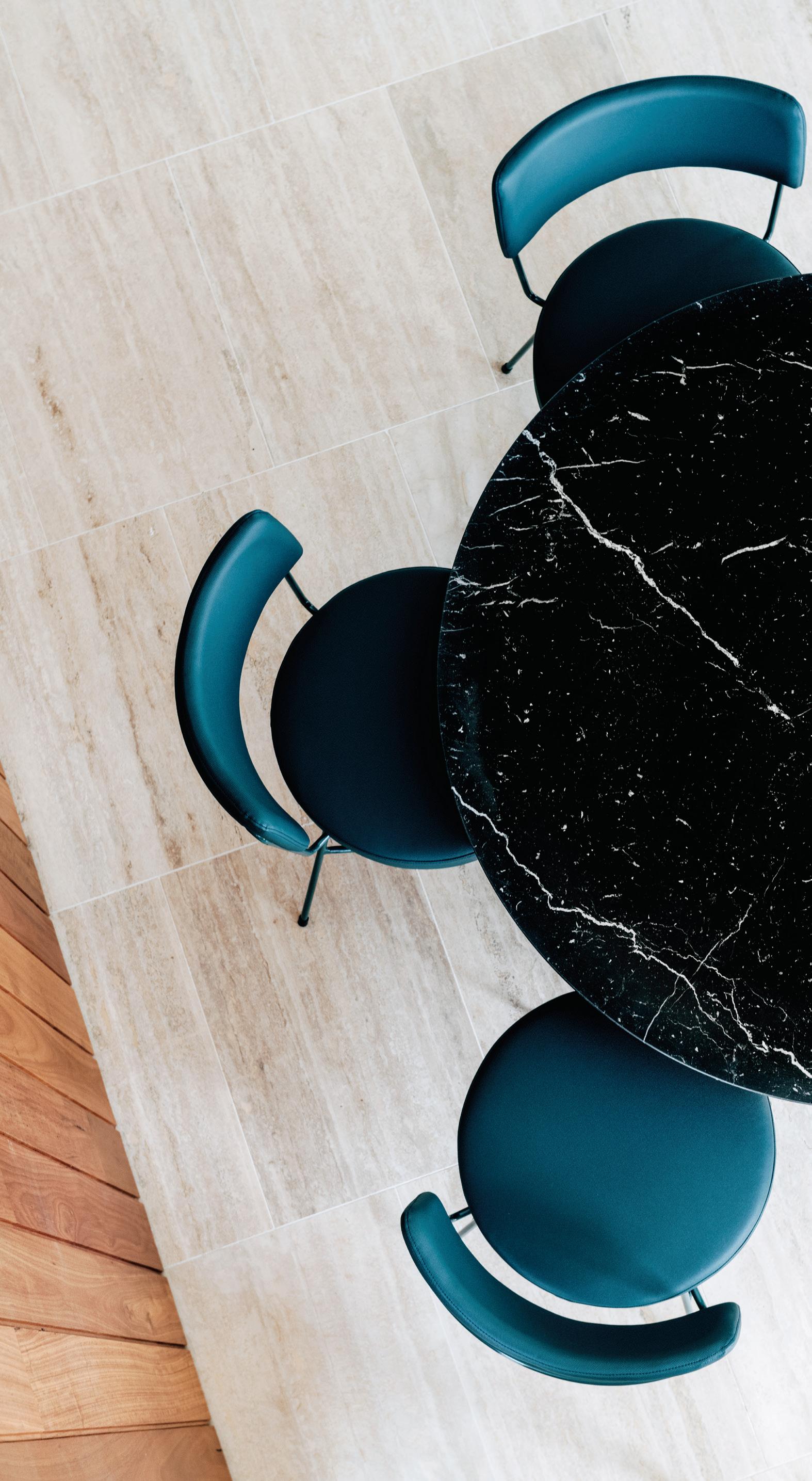 – Grazia m ateria, founder, Grazia & c o, graziaandco.com.au
“In the past, the public rarely saw female architects in the media,” says Suzie Hunt, Western Australian immediate past president, and a board member of the Australian Institute of Architects. “Thankfully, this is changing.”

As a judge on Australia By Design’s architecture TV series, Hunt is among the many females in the architectural world who are making a sizeable and noticeable impact. Whilst the gender disparity in architect numbers in Australia is still apparent, it is an evolving process and through its scope of content and broader industry engagement, Australia By Design exempli es this.

Joining Hunt as a judge and presenter on Australia By Design is Jill Garner, Victoria’s government architect. Garner expresses that the audience for Australian By Design is a more public one that she is used to. However, “it is clear they [the audience] are both engaged and interested in architectural ideas, processes, challenges and outcomes. It is great to showcase the work
of architects and designers – of diverse gender or cultural background – who make the buildings and places that we all occupy or visit.”
The TV series, now in its third season (and currently airing on Channel Ten), re ects diversity in a way that is accessible to the general public – successfully opening up the industry to a wider audience. “As TV producers creating design content for a broad Channel Ten audience, we feel an obligation to represent the diversity that exists within the design community, especially in this country,” explains Mike Chapman, the show’s executive producer. “We are, a er all, perception creators. So, although we are not purposefully targeting gender imbalance, we ensure we shine a light on the extraordinary design contributions from both men and women.”
Tune in to watch Australia By Design’s architecture series and be a part of the conversation.
Versatility in design isn’t simply a market advantage, it’s a necessity. A hotel lobby now doubles as a workspace, as do airport lounges, cafés, restaurants and even the planes themselves. Event spaces and clubs rival CBD restaurants as a place to network and build business relationships. The lines between the home and o ce continue to blur as a traditional workforce seeks to feel more at home, and freelancers and contractors pursue a home o ce to replicate a more corporate environment.
Furniture designers and suppliers can immediately identify a successful interior t-out in the exibility it o ers – and so too can the intended patrons. Lyndon Neri and Rossana Hu, founders of Shanghai-based inter-disciplinary architectural design practice, Neri&Hu, run their studio using research as a design tool, so it follows that pieces recently released through Stellar Works showcase a high level of versatility and exibility.
The Club Stand at the Victoria Racing Club in Flemington, Melbourne, is a recently completed renovation by Bates Smart. Throughout the new $128 million ve-level stand which, according to Bates Smart, occupies nearly the same footprint as the former, one can spot the Utility stools by Neri&Hu for Stellar Works. Borrowing from the popularised industrial aesthetic, the Utility collection presents as raw and uncomplicated, yet considered in its
design and material selection. A combination of leather, dark timber and brass imbues this series of lounges, chairs and bar stools with elegance and old world charm. And, in an environment such as the Victoria Racing Club, the Utility stools reinforce an atmosphere of contemporary luxury in an elite yet high tra c area.
On the other side of the country, in Perth, Stellar Works can likewise be found in the shared spaces of AMP Tower (more recently referred to as 140 St Georges Terrace). While the original building by Forbes + Fitzhardinge opened in 1975, the iconic building in Perth’s CBD has recently undergone major modern interior refurbishments.
In the lobby and breakout dining areas, Neri&Hu’s Utility dining chairs sit in good company with Exchange dining tables by Jun Aizaki, founder of Crème, for Stellar Works. The Brooklyn-based multidisciplinary design studio is a collective of international designers motivated by a solution-driven approach to design. The Exchange collection, including the dining table, is a conversation between steel and wood, between the timeless and modern.
Here, pieces from the Utility and Exchange collections toe the line between corporate and comfortable, creating a space that is as suitable for a client meeting as it is a lunchtime respite. Clearly, the value of the versatile is not lost on Stellar Works, nor the designers with whom it engages.
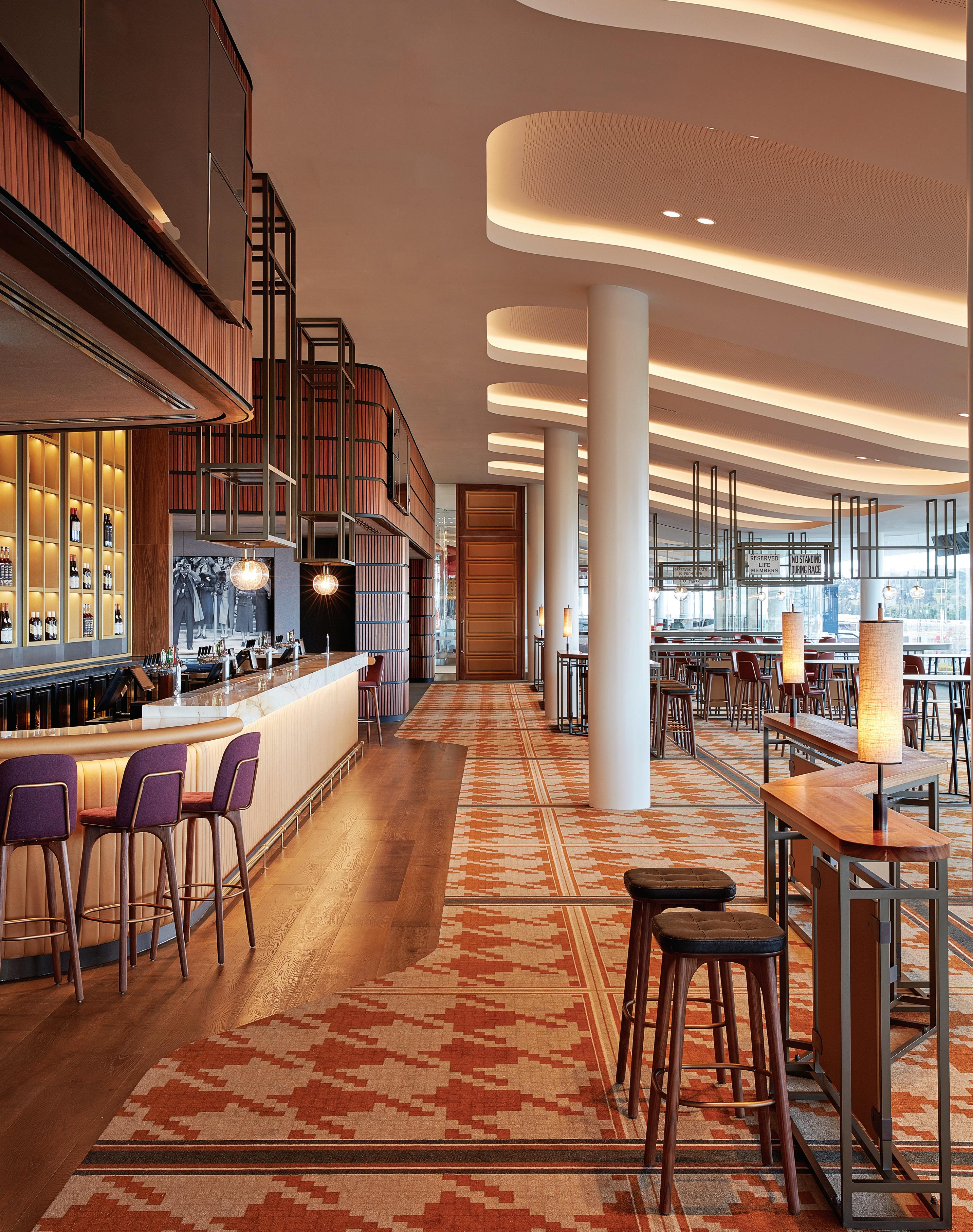
Indesign is for creative professionals – aspiring and established, who are hungry to continue the ideas and thought leadership that inform the best projects, products and practices in the Indo-Pacific region.
Indesign looks for the point and purpose of everything in design, exploring what we do, how we do it and why. It is the only place you’ll find clever, provocative and insightful conversations with the design industry.
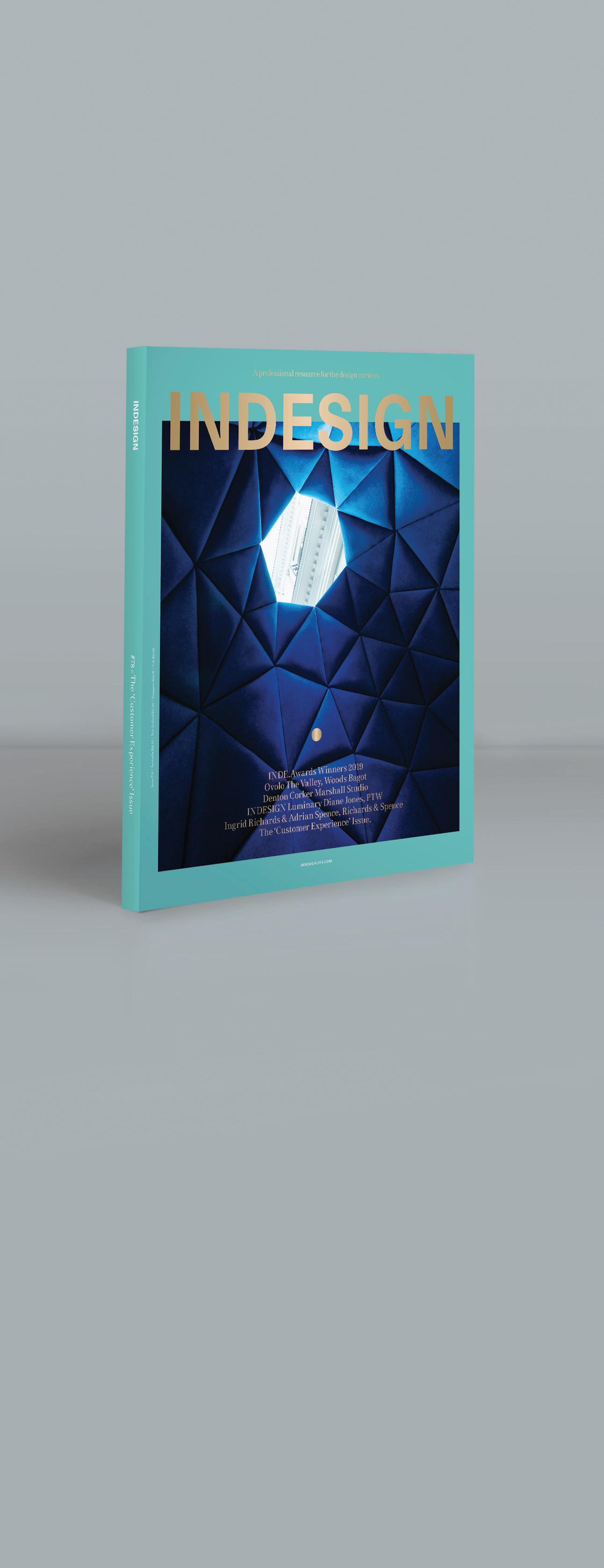
It’s thanks to the support of our industry BFFs – that is, our valued advertisers – that we are 78 issues strong.
We like to symbolise our through the magazine and online, to acknowledge the valued partners with whom we work closely, every day. We thank you for your support and sharing in our passion for architecture and design in the Indo-Pacific region.


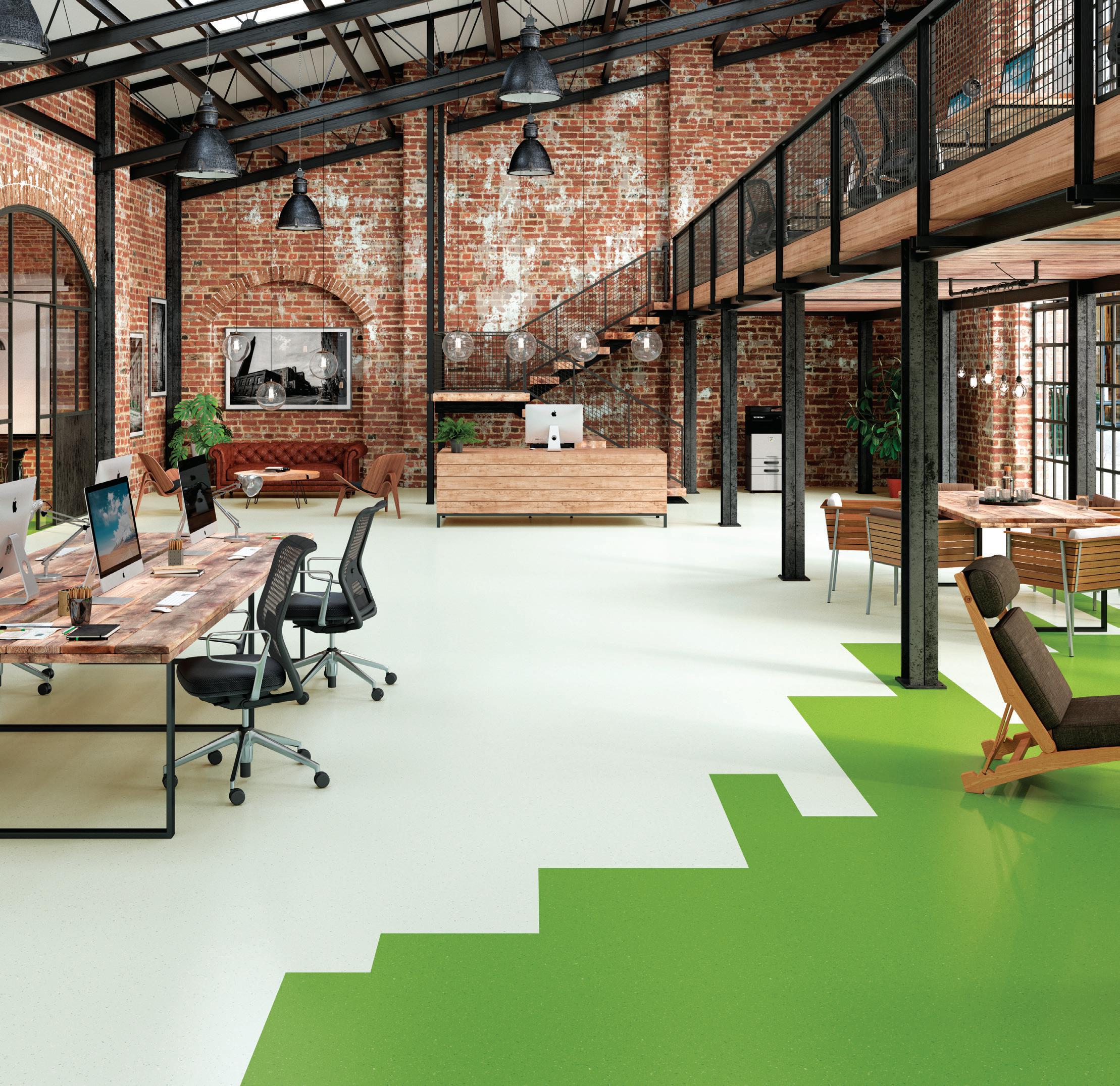


Our natural world is alive with wonderfully concealed textures and materials that create beautiful arrangements of shades and colours. When exploring our surroundings, we can often be absorbed with a focal point or an exceptional view. This can often distract or disguise many of the smaller components that make up what we see. Only when we look closely at these indiviual elements, is it possible to discover a whole new world of shades and colours.
We have used this philosophy to generate our new Palettone flooring collection. We hope this will inspire you to construct a captivating foundation for your next interior design project.





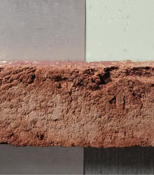

For more information visit: http://www.polyflor.com.au/product/palettone/ or contact Polyflor Australia 1800 777 425 or sales@polyflor.com.au


