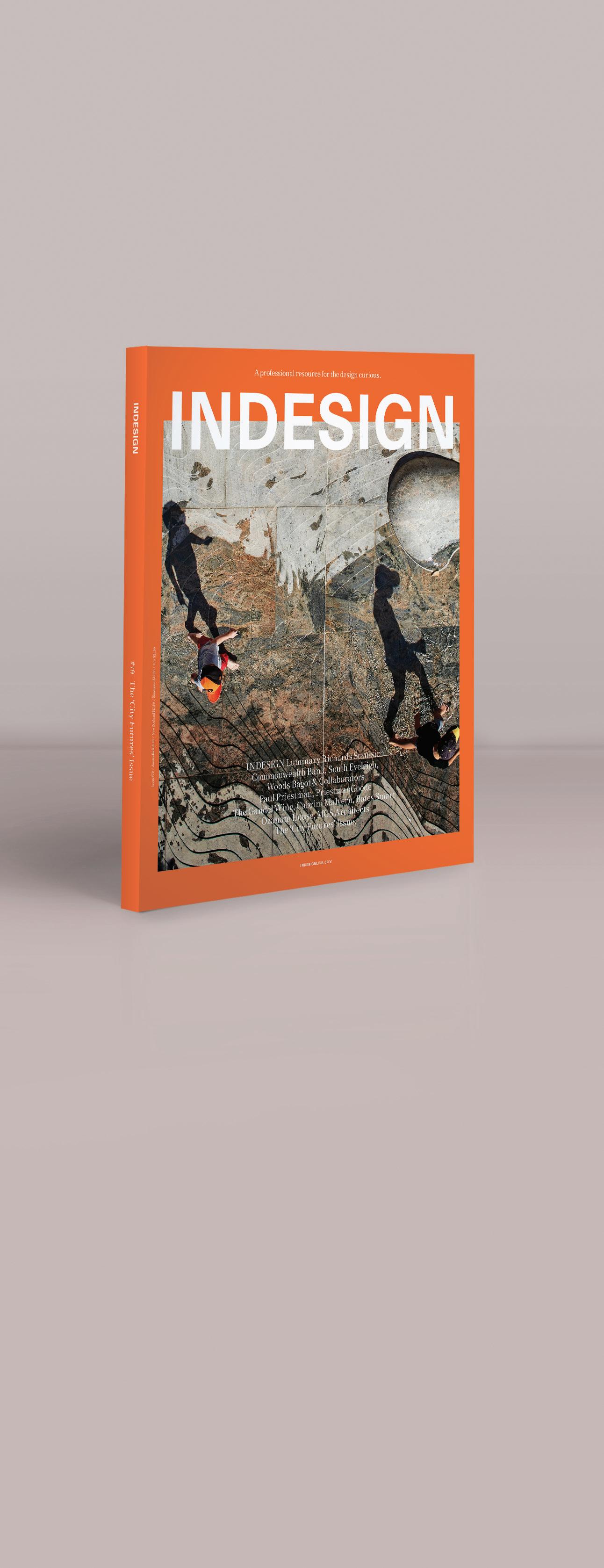
INDESIGN Luminary Richards Stanisich
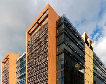
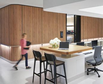
Commonwealth Bank, South Eveleigh, Woods Bagot & Collaborators
Paul Priestman, PriestmanGoode
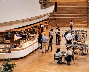
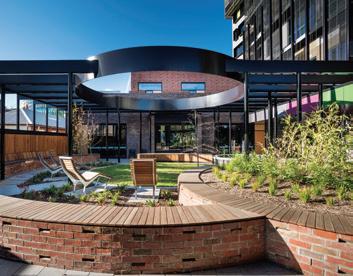
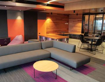
The Gandel Wing, Cabrini Malvern, Bates Smart Ozanam House, MGS Architects
The ‘City Futures’ Issue.

INDESIGNLIVE.COM A
Issue #79 / Australia $16.50 / New Zealand $17.50 / Singapore $12.95 / U.S. $21.99
professional resource for the design curious.

Instant Comfort, Everywhere HermanMillerAsiaPacific Meet Cosm – our latest office chair that provides instant comfort, everywhere. hermanmiller.com/cosm
 ©2019 Herman Miller, Inc.


Rumba Workstation
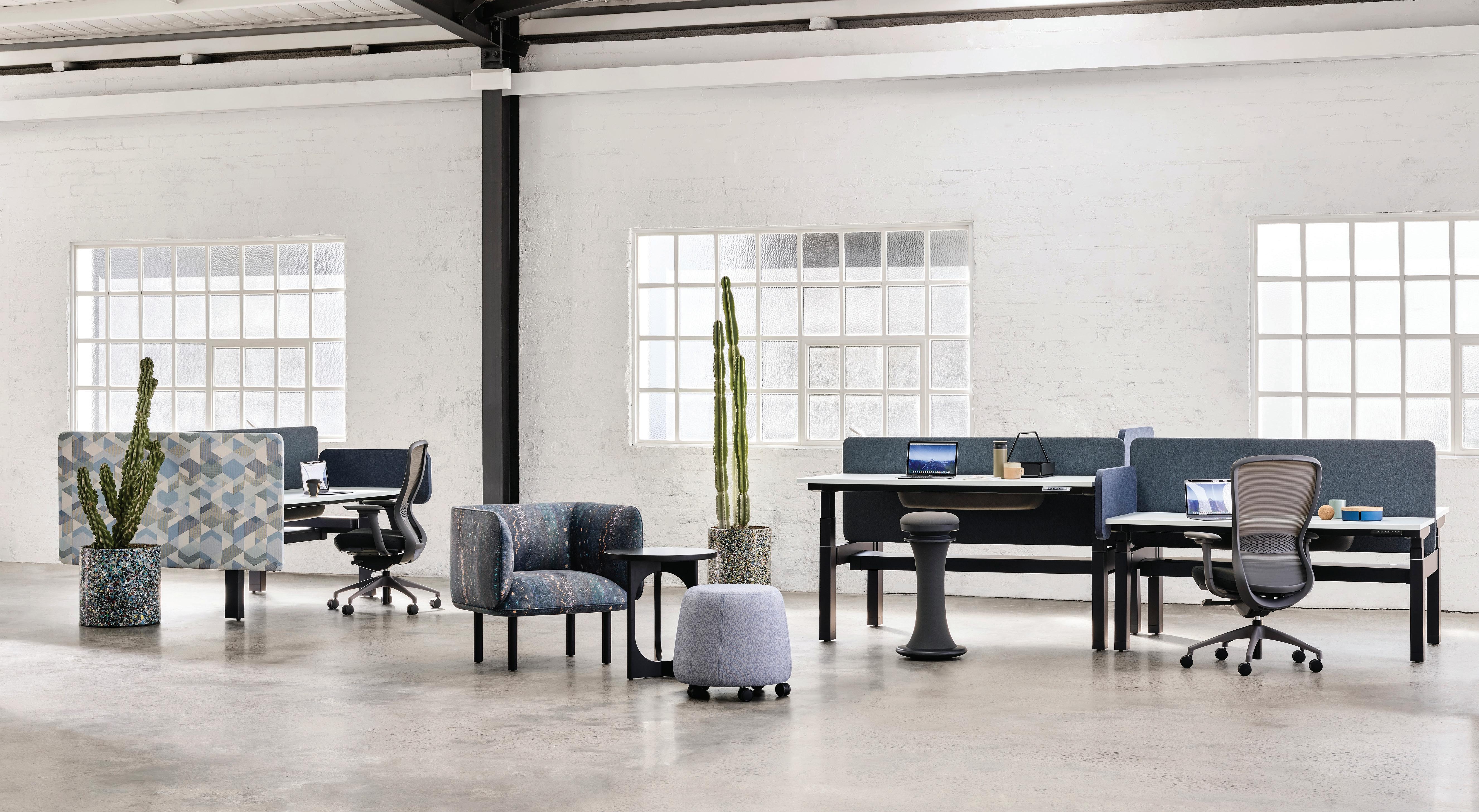 Pictured with: Precinct Screens, Vox Task Chairs, Wes Armchair, Archie Table, SOL-Dash Mobile Stool & Dress Standing Aid
by ZENITH Design























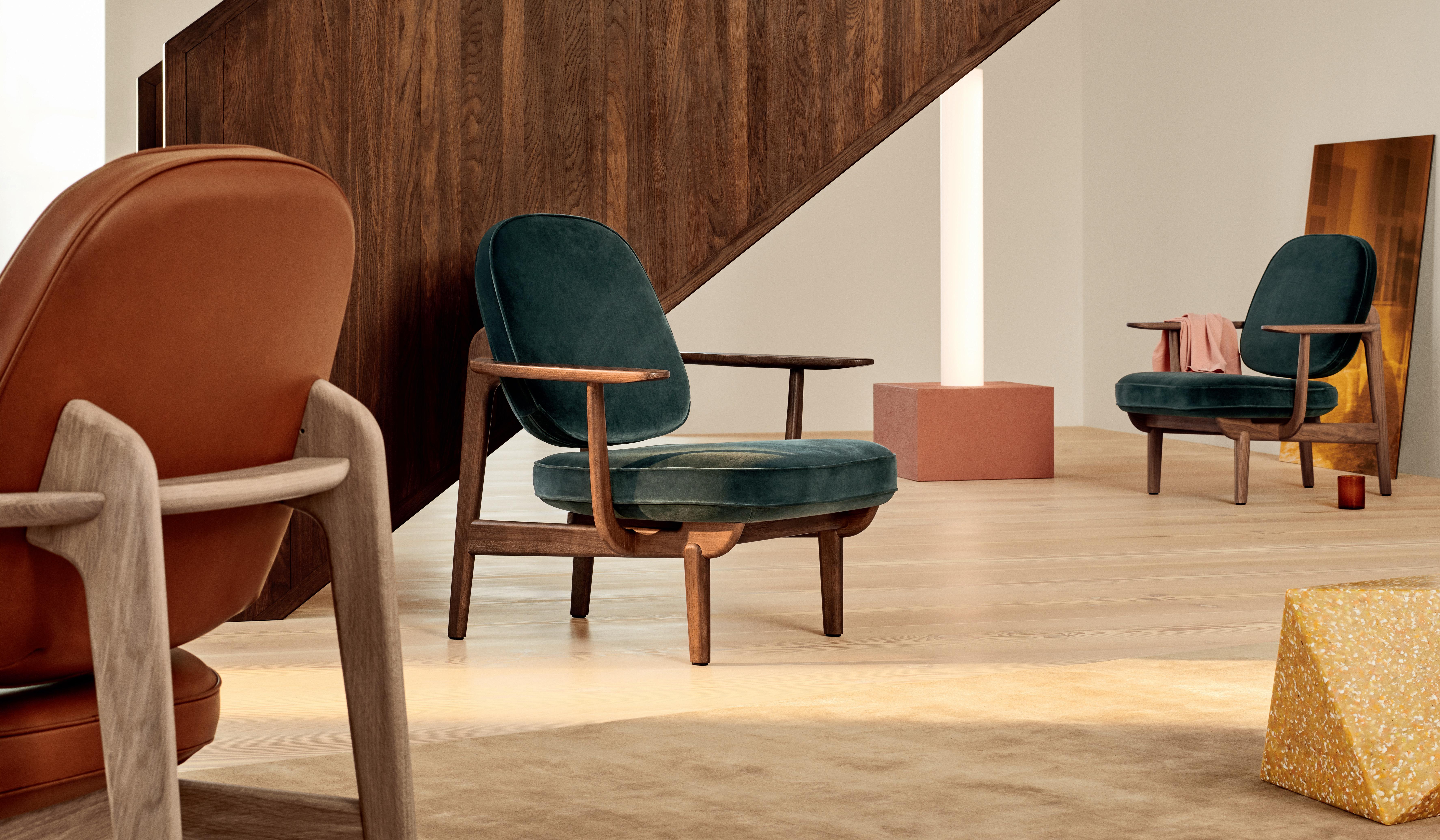

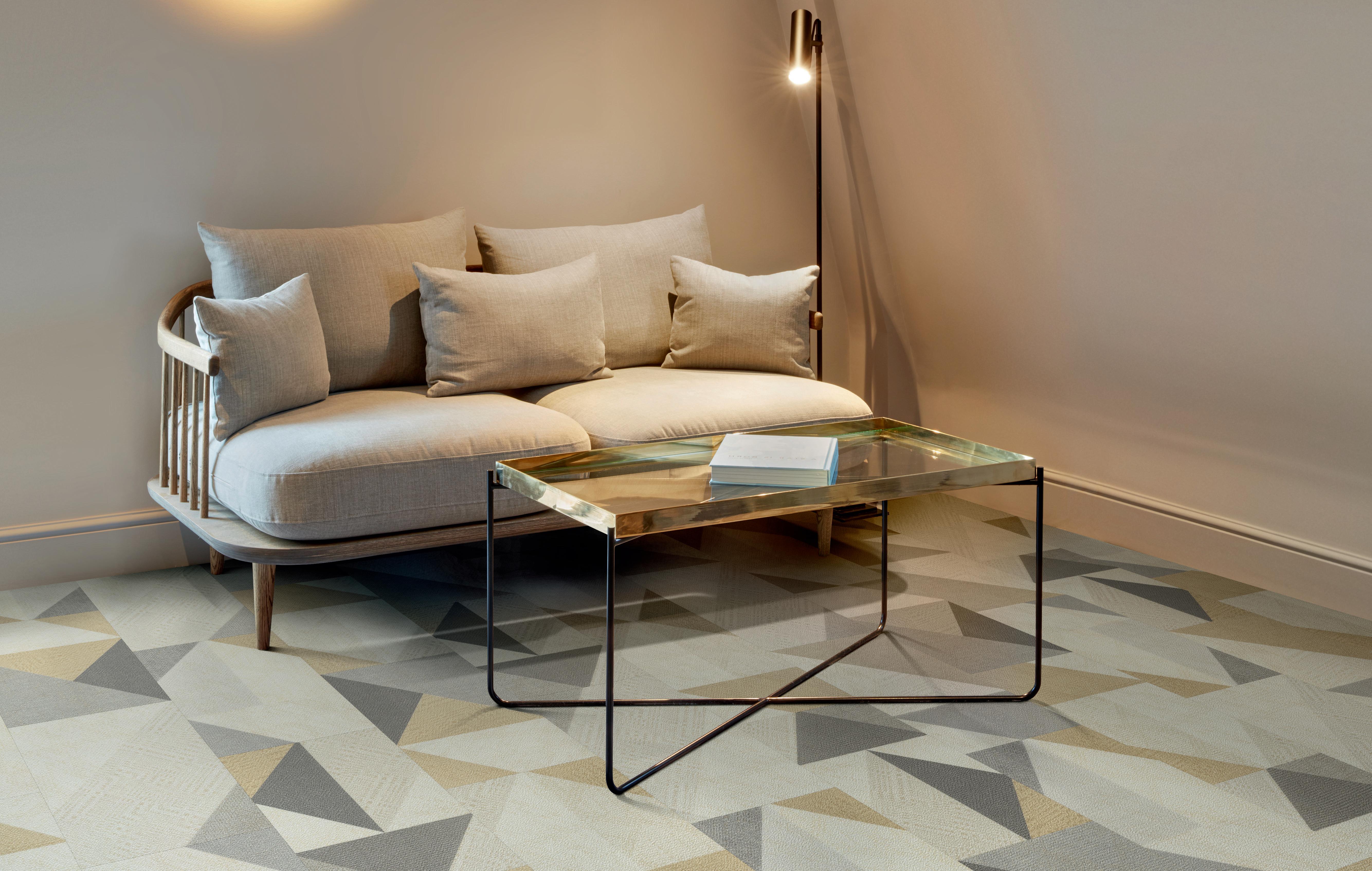
A CONCEPTUALLY DEVELOPED COLLECTION OF LUXURY VINYL TILES, DESIGNED TO INSPIRE ENGAGING AND STYLISH INTERIOR SPACES
For more inspiration visit polyflor.com.au

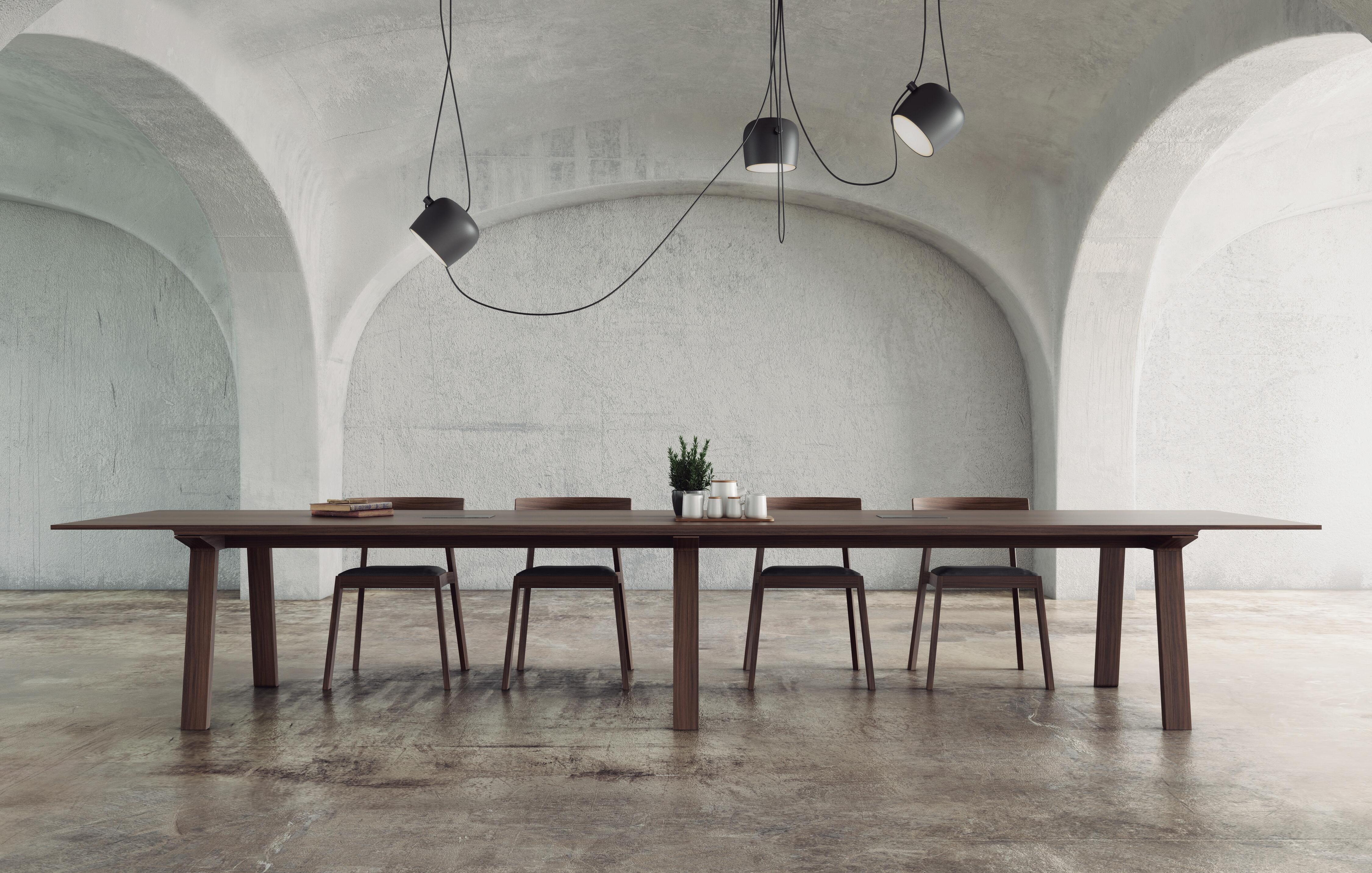










Introducing OE Quasi Light
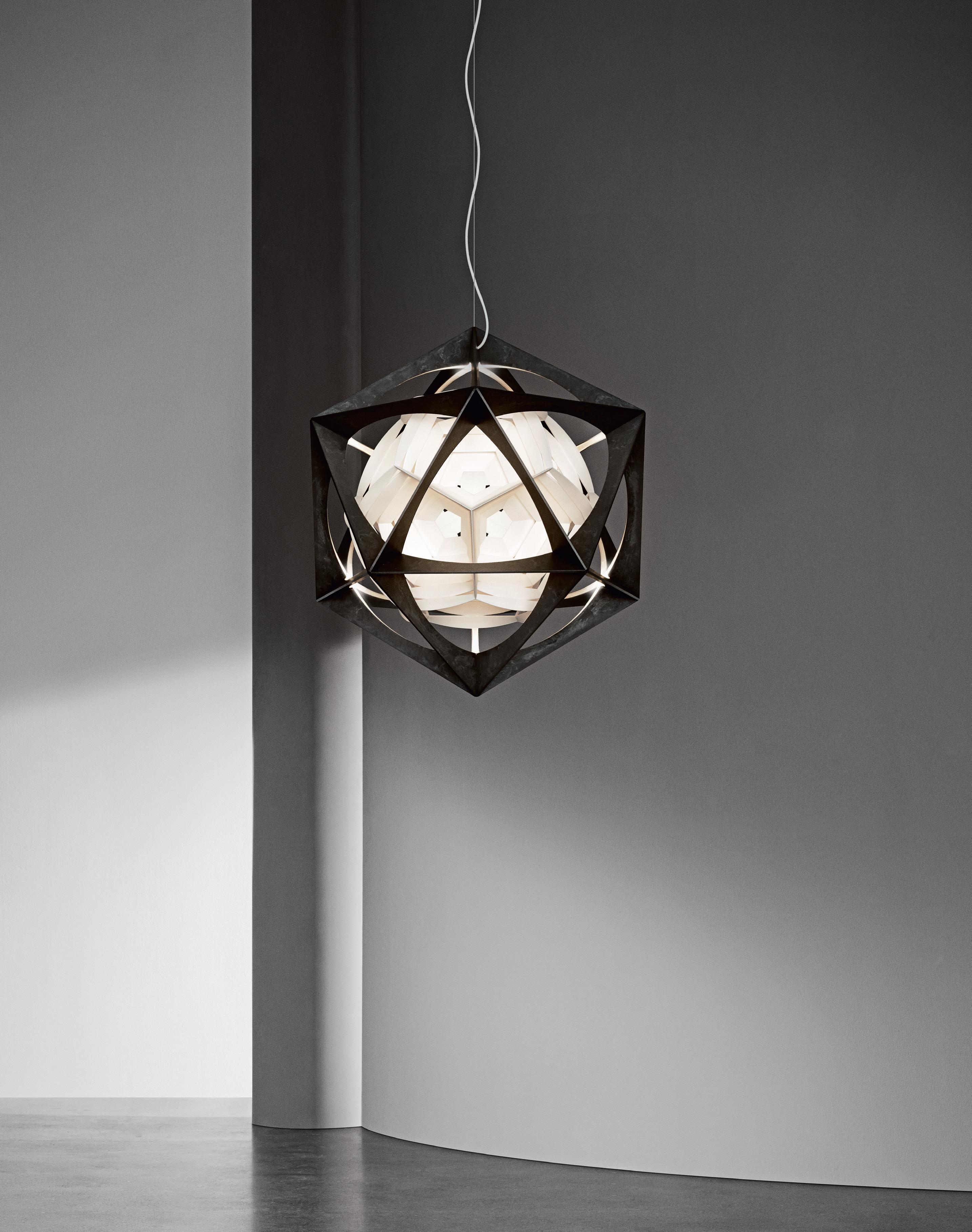
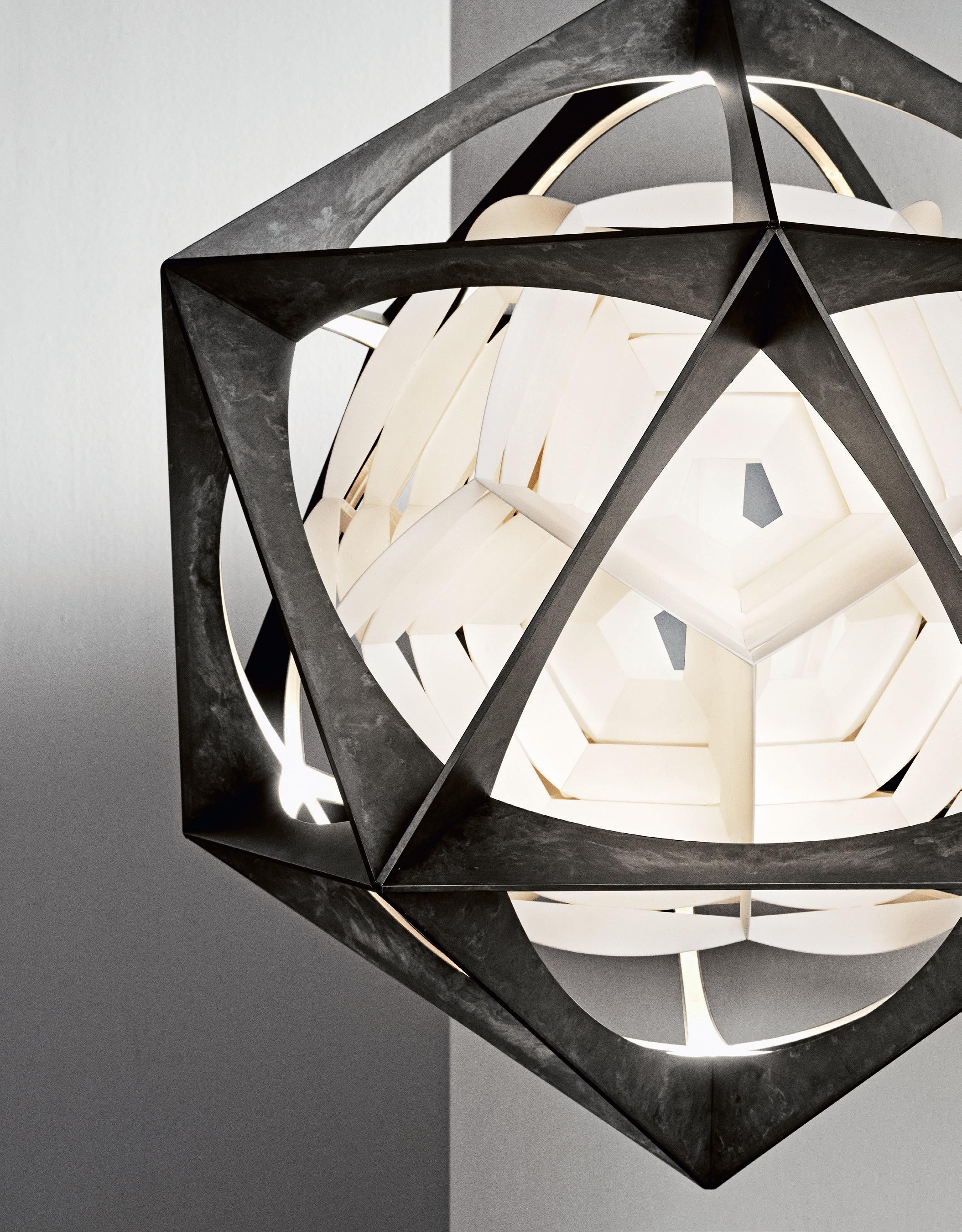
 Design to Shape Light
OE Quasi Light
Design by Olafur Eliasson louispoulsen.com
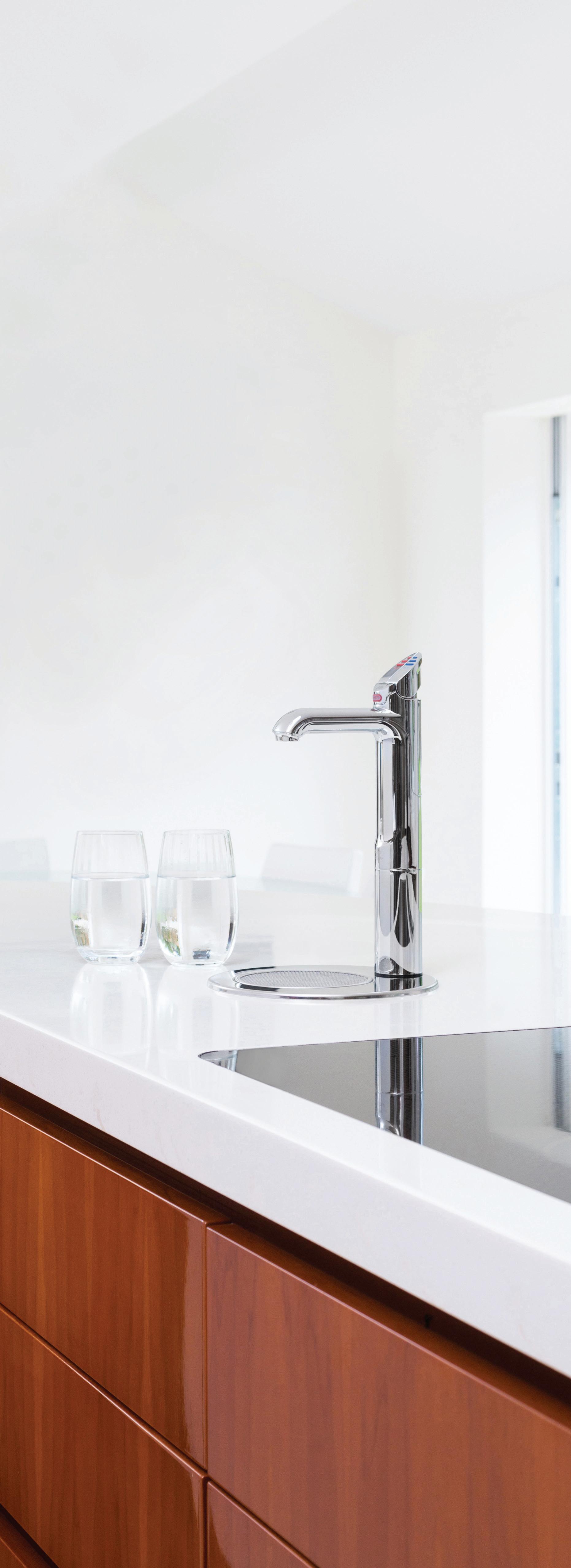
THE NEW KITCHEN ESSENTIAL
All your drinking water needs, All-in-One beautifully designed system. Remove the need for multiple taps in your kitchen with a single, beautifully designed system that delivers boiling, chilled and sparkling filtered drinking water, as well as hot and cold unfiltered water for your sink.
The Zip HydroTap All-in-One offers every water option you need from one multi-functional tap and a single intelligent compact under-bench system. That’s why the Zip HydroTap will be the one and only hydration solution for your kitchen. Discover more at zipwater.com


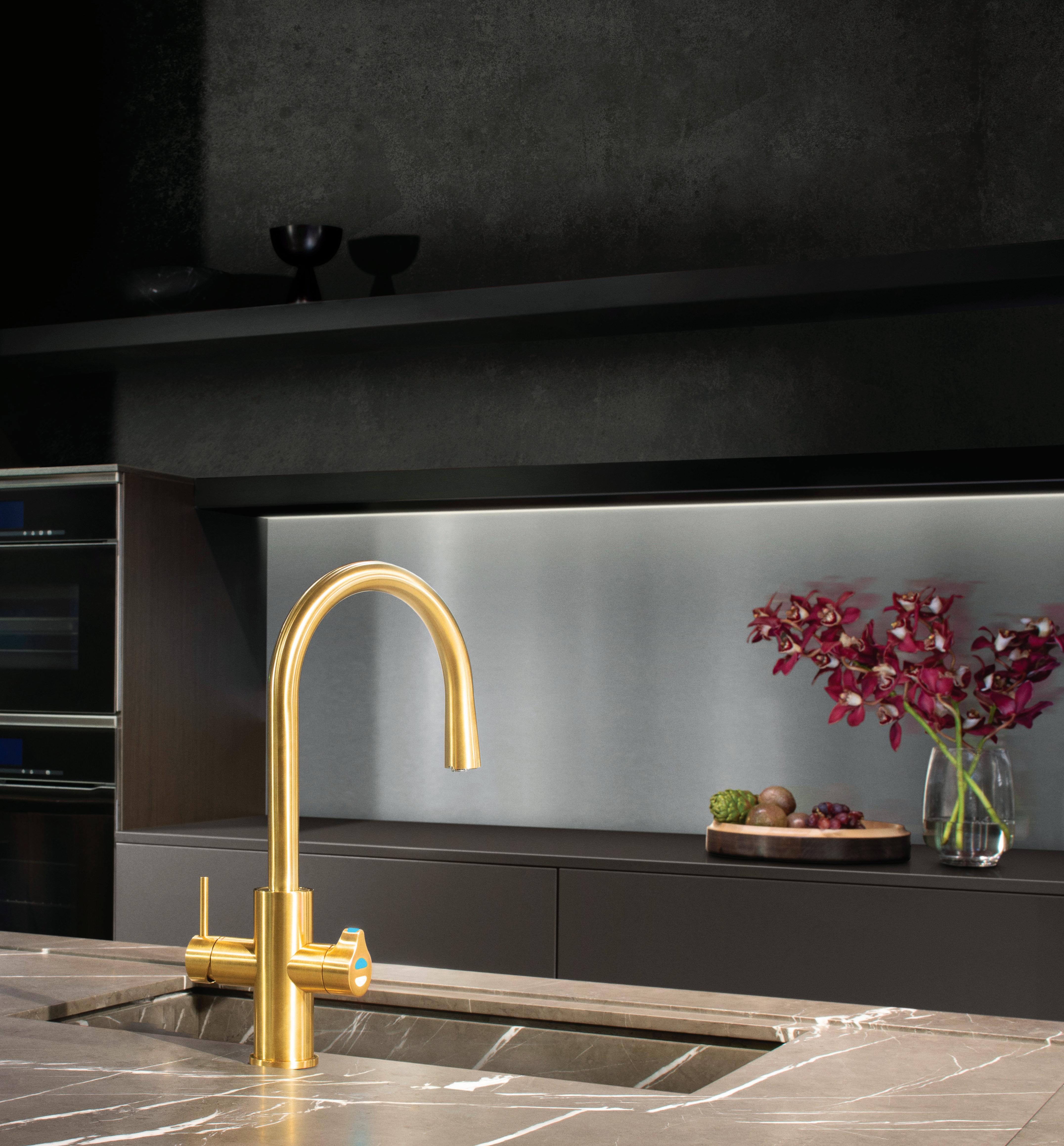
THE WORLD’S MOST ADVANCED DRINKING WATER SYSTEM
ZIP HYDROTAP | PURE TASTING | INSTANT | BOILING | CHILLED | SPAR KLING
CEO and Founder
Raj Nandan raj@indesign.com.au
Managing Director
Kavita Lala kavita@indesign.com.au
Editor Alice Blackwood alice@indesign.com.au
Consulting Editor Paul McGillick
Indesignlive Editor
Aleesha Callahan aleesha@indesign.com.au
Brand Director Colleen Black colleen@indesign.com.au
Sales Manager Dana Ciaccia dana@indesign.com.au
Business Development Managers
Kim Hider kim@indesign.com.au
Valeria Valera valeria@indesign.com.au Brune a Stocco brune a@indesign.com.au

Production and Projects Manager


Brydie Shephard brydie@indesign.com.au
Production Assistant
Becca Knight becca@indesign.com.au
Accounts
Cassie Zeng cassie@indesign.com.au
Ting Zhang ting@indesign.com.au
Lead Designer Louise Gault louise@indesign.com.au


Designer Louis Wayment louis@indesign.com.au
Online Manager Radu Enache radu@indesign.com.au
Web Developer Ryan Sumners ryan@indesign.com.au
Indesign Correspondents

Stephen Cra i (Melbourne)
Mandi Keighran (London) Andrea Stevens (New Zealand)
Contributing Writers
Leanne Amodeo, Rachael Bernstone, Aleesha Callahan, David Congram, Stephen Cra i, Mark Healey, Annie Hensley, Mandi Keighran, Andrew McDonald, Paul McGillick, Emily Su on, Marg Hearn, Pia Sinha, Andrea Stevens, Sophia Watson, Tone Wheeler
Featured Photographers & Image Producers Michele Aboud, Peter Benne s, Bre Boardman, Peter Clarke, Charles Dennington, Alana Dimou, Giuseppe Dinnella, Thurston Empson, Nicole England, Felix Forest, Dan Hocking, MakeMapsStudio, Adam Mørk, Shannon McGrath, Trevor Mein, Tim O’Connor, Ian Ten Seldam, Gregor Titze
Head O ce
Level 1, 50 Marshall Street Surry Hills NSW 2010 (61 2) 9368 0150, (61 2) 9368 0289 (fax) indesignlive.com
Melbourne
1/200 Smith Street, Collingwood VIC 3066
Singapore
4 Leng Kee Road, #06–08,SIS Building, Singapore 159088 (65) 6475 5228, (65) 6475 5238 (fax) indesignlive.sg
Hong Kong Unit 12, 21st Floor Wayson Commercial Building, 28 Connaught Road West, Sheung Wan, Hong Kong indesignlive.hk
Join our global design community, become an Indesign subscriber!
To subscribe (61 2) 9368 0150 subscriptions@indesign.com.au indesignlive.com/subscriptions
Yearly subscription: Australia $55 (incl. GST) International AUD $110
Printed in Singapore Indesign is printed with ENVIRO Soy-Based Process Black ink, UV Solventless Varnish and on paper which is awarded an Environmental Management Certificate to the level ISO14001:2004 GBT24001-2004 and Eskaboard and Eskapuzzle produced from 100 per cent recycled fibres (post consumer).
All rights reserved. No part of this publication may be reproduced, stored in a retrieval system, transmi ed in any form or by any other means, electronic, mechanical, photocopying, recording or otherwise. While every e ort has been made to ensure the accuracy of the information in this publication, the publishers assume no responsibility for errors or omissions or any consequences of reliance on this publication. The opinions expressed in this publication do not necessarily represent the views of the editor, the publisher or the publication. Contributions are submi ed at the sender’s risk, and Indesign Publishing cannot accept any loss or damage. Please retain duplicates of text and images. Indesign magazine is a wholly owned Australian publication, which is designed and published in Australia. Indesign is published quarterly and is available through subscription, at major newsagencies and bookshops throughout Australia, New Zealand, South East Asia and the United States of America. This issue of Indesign magazine may contain o ers or surveys which may require you to provide information about yourself. If you provide such information to us we may use the information to provide you with products or services you have. We may also provide this information to parties who provide the products or services on our behalf (such as fulfillment organisations). We do not sell your information to third parties under any circumstances, however these parties may retain the information we provide for future activities of their own, including direct marketing. We may retain your information and use it to inform you of other promotions and publications from time to time. If you would like to know what information Indesign Media Asia Pacific holds about you please contact Nilesh Nandan (61 2) 9368 0150, (61 2) 9368 0289 (fax), subscriptions@indesign.com.au, indesignlive.com Extended Digital Extended Print Extended Events Indesign Family CAREERSINDESIGN INSTANT CONVENIENCE Zip HydroTap provides pure tasting filtered water with instant boiling, chilled and sparkling water. Discover more at zipwater.com Strategic Partners MILANINDESIGN INDESIGNLIVE.COM INDESIGN IS BROUGHT TO YOU BY
It has been a year of milestones for Indesign Media. In June we brought home our most successful INDE.Awards yet. With 430+ entries from more than 14 countries, the awards program has carved out a uniquely democratic platform for the Indo-Pacific region – something which no other awards program does. Design excellence is not dependent upon big budgets and slick imagery; weight is given to the role of design in respect to local culture, community, and user needs.
Closely following the INDEs was Saturday Indesign, making its exciting comeback to Melbourne after a two-year hiatus. Its festival-like atmosphere creates an event dynamic as yet unmatched in our region. And the opportunities for connection and collaboration are plentiful.


On the commercial design front, we staged the second annual FRONT.design at Barangaroo, Sydney. It’s an ambitious event – the first and only of its kind in Australia – with a rich and multi-faceted program that addresses our complex commercial ecosystem. It has been effective in bridging the gaps between a vast playing-field of stakeholders and building productive links where before none existed.
The success of these initiatives is leading us with renewed vigour into 2020, the year in which we celebrate 20 years in business and in print. Stay tuned for some exciting reveals!
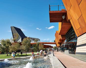
On the topic of futures: what are the imperatives for our cities in 2019 and beyond? I put the question to the design leaders and industry experts for the ‘City Futures’ issue. What arose were vital and important themes around urban density (pages 142 and 152), housing affordability (page 132), multi-functional aged and healthcare environments that foreground the dignity of the user (page 145), and the critical importance of moving forward in a ‘co-design’ partnership with Indigenous people (page 154).
This is an issue that is alive with the voices of our design community. You’ve put words to it, we’ve given it the platform it deserves. Enjoy!
INDESIGNLIVE.COM 22 FROM THE EDITOR & PUBLISHER
indesignlive.com /indesignlive @indesignlive @indesignlive 250,950+ readers engaged across print, digital and social... On The
Yagan
article on
Raj
Cover
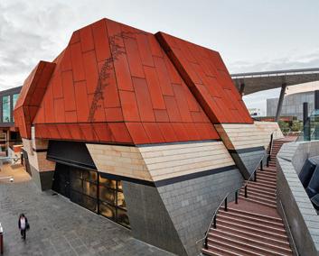
Square, Perth by Lyons Architects with iredale pedersen hook and ASPECT Studios is featured in our
Co-Designing Community With Our First People, page 154, photo: Peter Bennetts.
Nandan CEO and Founder, Indesign Media Asia Pacific
Alice
Blackwood Editor, Indesign magazine
SYDNEY 5/50 Stanley Street Darlinghurst +61 2 9358 1155 MELBOURNE 11 Stanley Street Collingwood +61 3 9416 4822
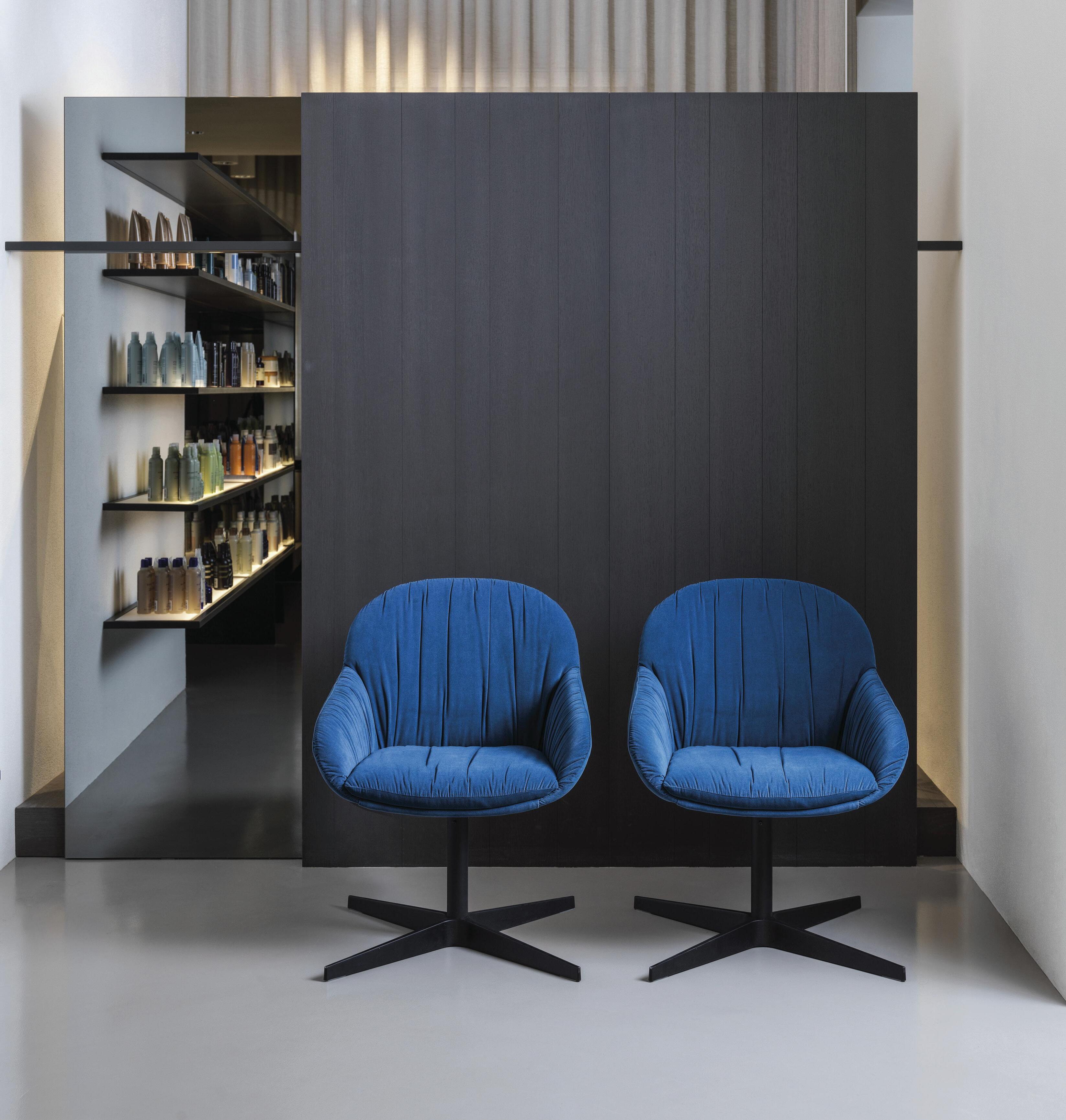
Elba Soft Armchair by Crassevig
Annie is a principal at fjmtstudio leading fjmtcommunity, a discipline dedicated to reinforcing place specific design through consultation, placemaking and art integration. Much of her 17 years at fjmt has been dedicated to community, cultural and urban design projects. No matter the typology, Annie continues to reinforce the importance of the public as a primary stakeholder.
Her contribution to fjmt’s distinct, site-specific response includes in-depth research into the locale and its community, engagement, place strategies and post occupancy evaluation. She continues her involvement in a number of completed projects to optimise their ongoing success, including Bunjil Place in Victoria.


Bringing Back The Town Square
Page 162
Introducing the Voices of Indesign –The ‘City Futures’ Issue
Stephen Crafti started writing on architecture and design in the early 1990s after purchasing a Modernist 1950s house in North Balwyn, Melbourne, designed by Montgomery King & Trengove. “I would never have thought that decades later I would still be writing in this specialised area, continuing to ‘live the dream’ on a daily basis!” Stephen says.
So Artificial!
Page 68
Clare Cousins Architects
Clare Cousins established her Melbourne practice, Clare Cousins Architects, in 2005. Engaged in projects large and small, the studio has a particular interest in housing and projects that nurture community. Clare is a life fellow of the Australian Institute of Architects, and its immediate past national president.
Clare was an inaugural investor in the Nightingale model, a socially, financially and ecologically sustainable multi-residential housing model. She is now undertaking her own Nightingale project as one of six architecture practices collaborating to deliver Nightingale Village as both designers and developers.
Clare is a special issue advisor for Indesign #79, helping to define the themes and topics we have covered in this issue. –
Fight For Affordable Housing
Page 132
Bates Smart
Mark Healey is a studio director at Bates Smart in Melbourne. As a senior interior designer with over two decades’ experience in Australia and internationally, Mark specialises in leading and delivering high quality healthcare, hospitality, multi-residential, civic and commercial developments.
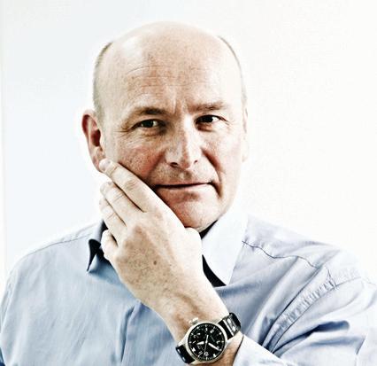
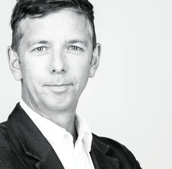
Mark has achieved numerous career highlights since joining Bates Smart in 2003. He has been lead designer for projects including the awardwinning Royal Children’s Hospital, Bendigo Hospital, and The Gandel Wing at Cabrini Malvern.
Mark is an active member of the Design Institute of Australia and alumni of the Committee for Melbourne’s leadership program, the Future Focus Group.
Healing With Dignity
Page 120
Tone Wheeler is a director at Environa Studio with Jan O’Connor, and a passionate advocate for environmental architecture. He has taught at universities for 30 years, served on boards and appeared regularly on television and radio.
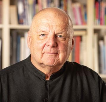
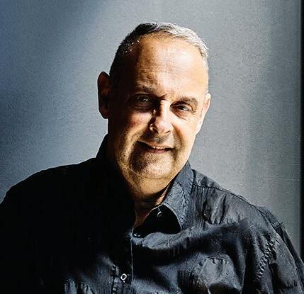
Australia’s Rack-Stack-And-Pack Syndrome
Page 142
As a designer and chairman of PriestmanGoode, Paul Priestman leads a wide range of projects, from product design through to transport. He has built a reputation for his award-winning future concepts – visionary ideas to improve our everyday and encourage sustainable, long-term thinking. He is an inspirational speaker on the subject of design and creative future thinking. In 2015, Paul was voted one of London’s 1000 most influential people by the Evening Standard for the third consecutive year. In 2016 he was recognised as one of Britain’s 500 Most Influential individuals by The Sunday Times
Paul is a special issue advisor for Indesign #79, helping to define the themes and topics we have covered in this issue.
–
What’s The Rush?
Page 128
Annie Hensley Principal fjmt
–
Stephen Crafti Architecture and design writer
–
Clare Cousins Founder
Mark Healey Studio Director
–
Tone Wheeler Director Environa Studio
–
Paul Priestman Chairman PriestmanGoode
INDESIGNLIVE.COM 24 contributors
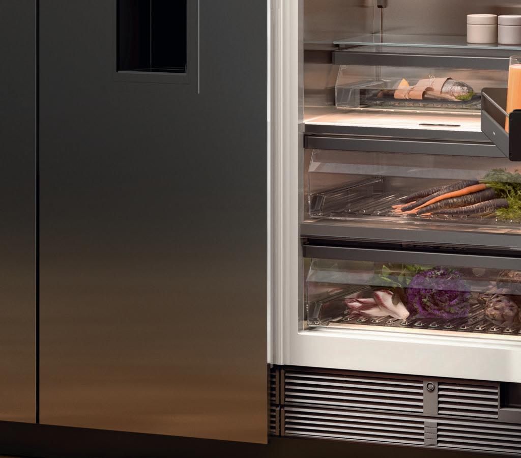
Your design statement lies within.
The difference is Gaggenau.


Grand architecture demands grand interior pieces. Refrigeration is one such design element and should speak to who you are. Every Gaggenau piece is distinctively designed, crafted from exceptional materials, offers professional performance, and has done so since 1683. Make a statement: gaggenau.com.au



In Short
The ultimate industry cheat sheet.
29-54
In famou S Big thinkers and creative gurus.
61-80
INDESIGN Luminary Jonathan Richards and Kirsten Stanisich of Richards Stanisich, Stephen Crafti, Sebastian Herkner, Sandra Furtado and Peter Sullivan of Furtado Sullivan
In SI tu
Provocative, innovative and inspiring design.
85-122
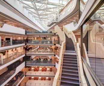
Commonwealth Bank at South Eveleigh Axle – Building 1, Sydney by Woods Bagot with Davenport Campbell (interior design), fjmt with Sissons Architects (base building), Mirvac (developer)
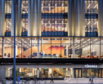
Tūranga, Christchurch, New Zealand by Architectus in association with Schmidt Hammer Lassen Architects
McCorkell Brown Group offices, Melbourne by Ha Architecture
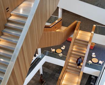
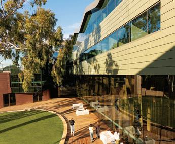
The Gandel Wing at Cabrini Malvern, Melbourne by Bates Smart with special comment from Mark Healey of Bates Smart
I n Depth
Housing, health and cultural imperatives for our cities’ futures.
127-167
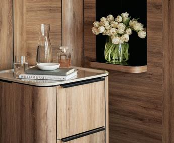
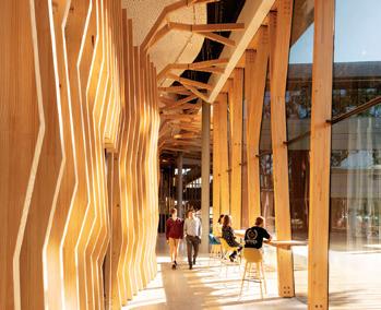
Featuring Ozanam House, Melbourne by MGS Architects
Orygen and Orygen Youth Health, Melbourne by Billard Leece Partnership
BaptCare, Melbourne by ClarkeHopkinsClarke
Yagan Square, Perth by Lyons Architects with iredale pedersen hook and ASPECT Studios
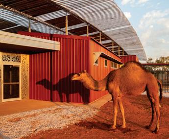
Punmu & Parnngurr Aboriginal Health Clinics, Western Australia by Kaunitz Yeung Architecture
With special comment from Paul Priestman of PriestmanGoode
Tone Wheeler of Environa Studio
Yoshiharu Tsukamoto of Atelier Bow-Wow
John Doyle of NAAU
Graham Crist of Antarctica Architects
Annie Hensley of fjmt
-
-
-
-
INDESIGNLIVE.COM 26 CONTENTS
Introducing the stylish new black oven range. Combining a sleek, premium design with intuitive features, the new Series 8 black glass ovens provide a contemporary edge over the traditional stainless steel look. Perfect for those looking for something different. www.bosch-home.com.au
the ultimate industry cheat sheet
INDESIGN 29 IN SHORT SHORT IN
Hospitality’s 15 Minutes
Anyone paying attention to modern hospitality typologies will know that it is no longer a singular experience. The name of the game now is duality, where success is as much about the digital experience as it is about the physical. So how are we as designers responding?
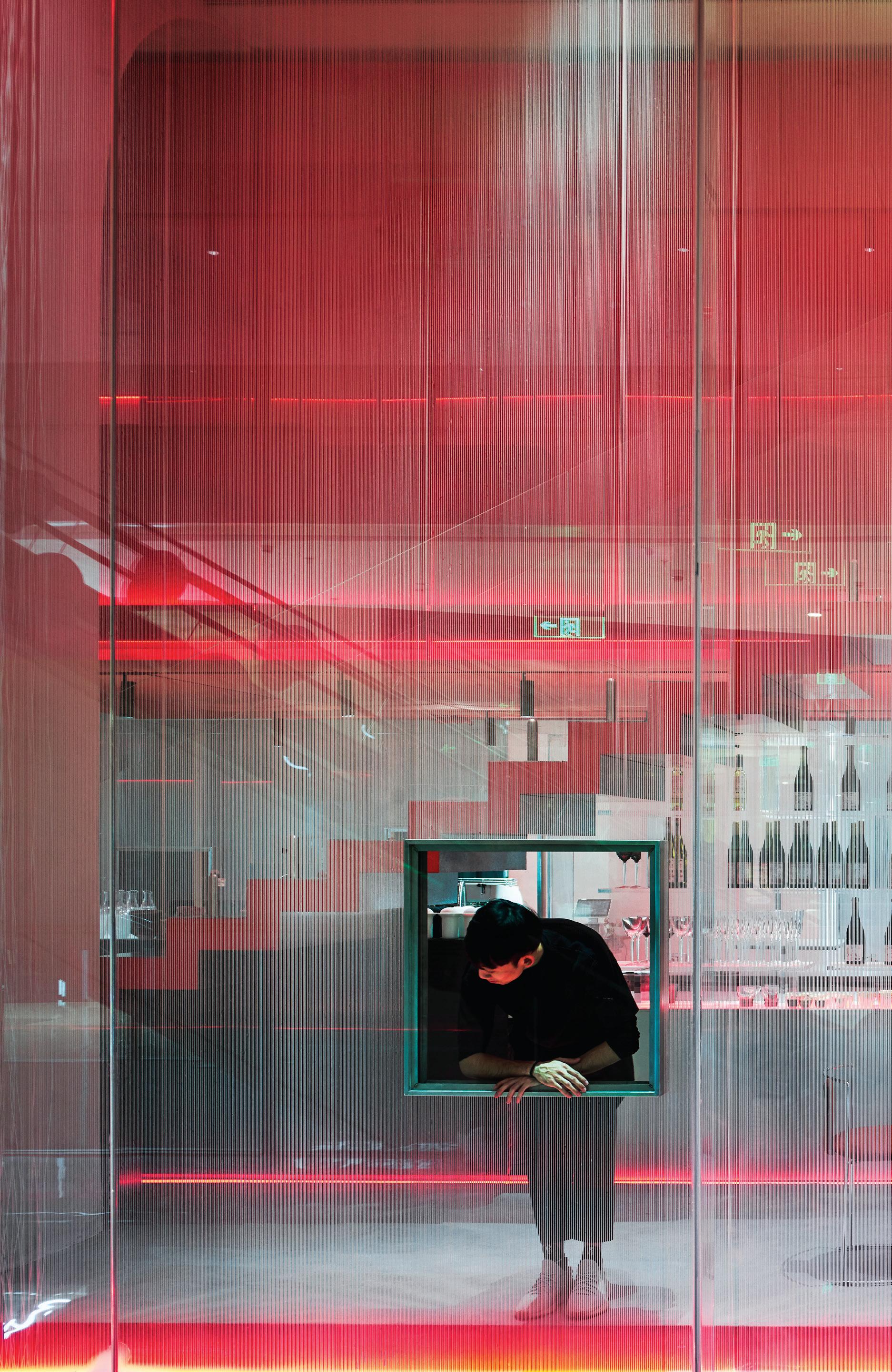
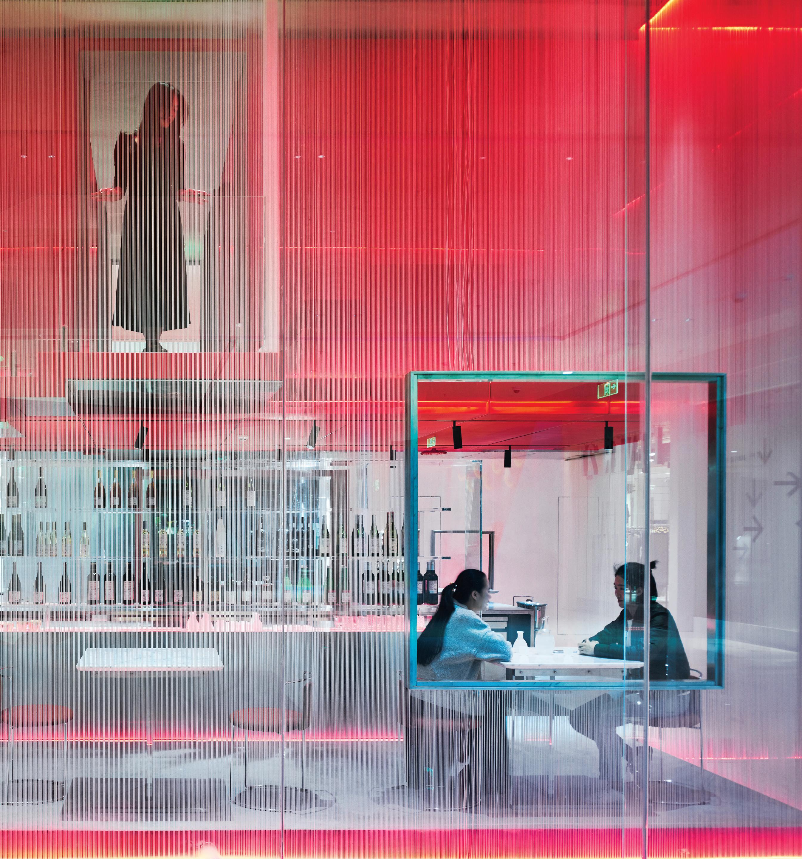
Situated within the Nanshan district of Shenzhen, China, Waterfrom Design has envisioned the interior of Doko Bar, a bespoke dessert shop and local hotspot.
Inspired by the famous Andy Warhol quote, “In the future everybody will be world-famous for 15 minutes”, the project focuses on placing diners at the centre of a grand show. With social media and celebrity culture in mind, the venue becomes a 360-degree theatre experience of observing and being observed. From the transparent, open spaces, to the bright colours and ‘Instagrammable’ plates of food. Every step of the process is designed to see and be seen.
The floorplan places diners in a prime position to observe their surroundings. Windows, which are so often the best seats in a restaurant, are also brought into the interior. Frames punctuate the interior space, mimicking the squares of photos found in social media. These elements are also illuminated with light, putting the spotlight on the guests themselves.
The first floor revolves around the chef’s bar; on the second floor the stairs are lined with glass, providing views down to the lower level and transparency throughout the interior volume. Inspired by fashion catwalks, the walkway leading from the stairwell is designed to resemble a runway. In the midst of these layers of glazing, a giant red box seemingly floats mid-air. It is intended to appear as a VIP room, like the balcony of a classical opera theatre – a privileged place from which you can observe and be seen.
In essence, Doko Bar aims to mirror our ever-present social media relationships that are both real and virtual. In doing so it astutely captures our experience with modern hospitality spaces.
INDESIGNLIVE.COM IN SHORT 30
INDESIGN 31 IN SHORT
Why So Serious?
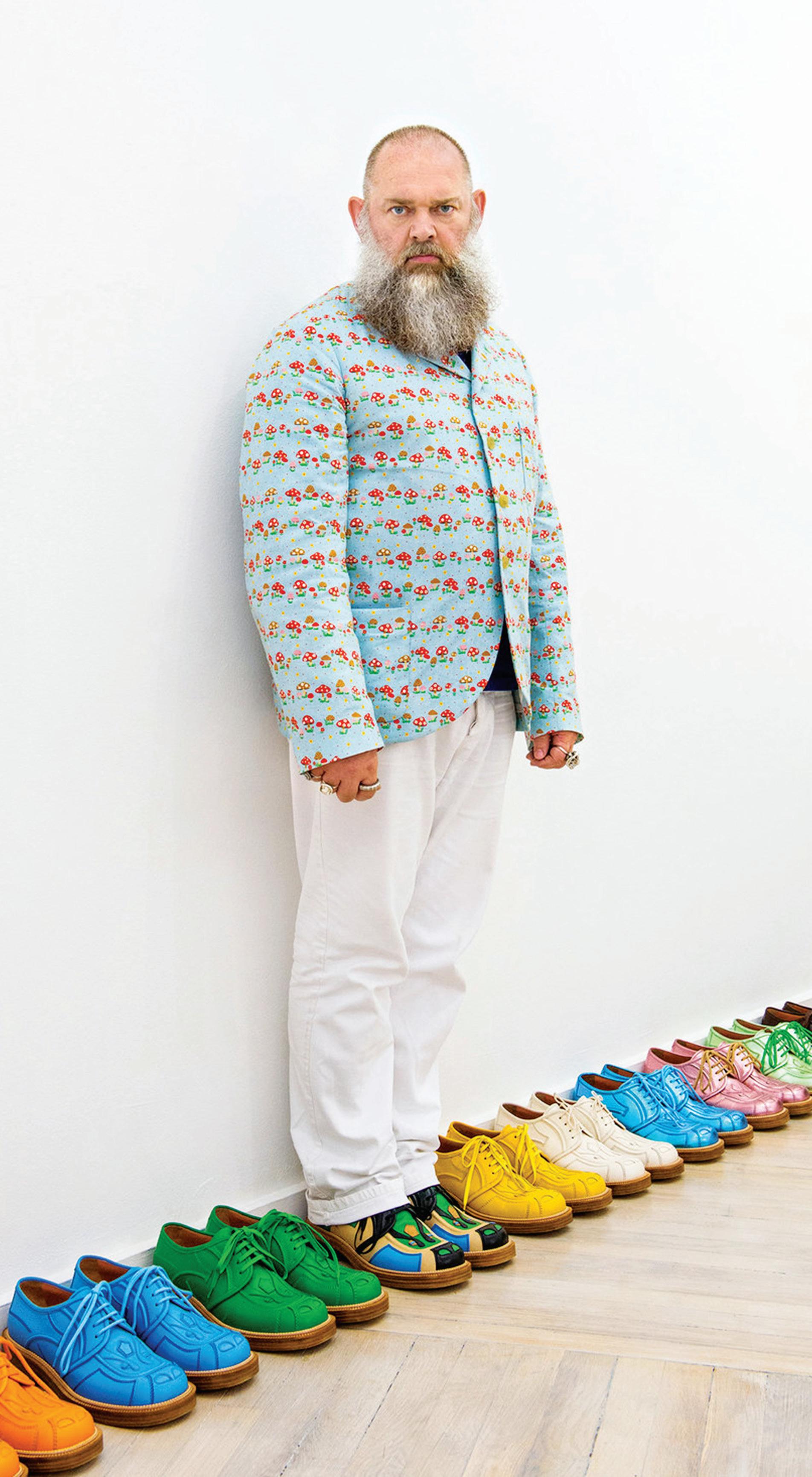
From the moment Walter Van Beirendonck graduated from the Royal Academy of Fine Arts, Antwerp back in 1980 he has continually shocked, surprised and seduced us. His larger-than-life character, defined by strong graphics, innovative cuts and an irreverent approach to fashion, sends us a little off-kilter and has us questioning the world around us. From the long latex jackets, tube skirts and muzzle headpieces of his controversial 1982 debut Sado, to the muscle-tight latex suits of his fetish-inspired Paradise Pleasure Productions (A/W 1998) , his phallocentric Sexclown collection (S/S 2008) and more, Van Beirendonck offers humour and irreverence in the face of tooserious creativity.
They say that behind every joke is a flicker of truth, and that’s what’s so valuable about the exciting catalogue of Van Beirendonck’s work. Each and every collection is so immediately arresting that it forces you to really stop and think.
The man himself says: “I’m a very dedicated fashion designer and it’s still my passion. For me, it’s important that I am a human designer; approachable and very much related to our contemporary world. I believe you can communicate a lot through fashion and that’s what I really like about it.”
For Van Beirendonck, the future of fashion is found in the most raw, unstructured moments. He says that humour is often the jumping-off point to access these greater truths about people and often yields the most authentic results. Just imagine the possibilities for designers in taking this more human-centred approach.
INDESIGNLIVE.COM IN SHORT 32
–
–
“All the shows I have ever done are a communication tool,” says Walter Van Beirendonck, a master of humour and irreverence.

Be immersed. Abey Australia’s diverse range of sinks provides you with a selection from around the world. Visit an Abey Selection Gallery to immerse yourself in the collection. Lucia Bowl & 3/4 VICTORIA Selection Gallery 335 Ferrars St Albert Park Ph: 03 8696 4000 WESTERN AUSTRALIA Selection Gallery 12 Sundercombe St Osborne Park Ph: 08 9208 4500 NEW SOUTH WALES Selection Gallery 1E Danks St Waterloo Ph: 02 8572 8500 QUEENSLAND Selection Gallery 94 Petrie Tce Brisbane Ph: 07 3369 4777 www.abey.com.au
The Science Of Socialising
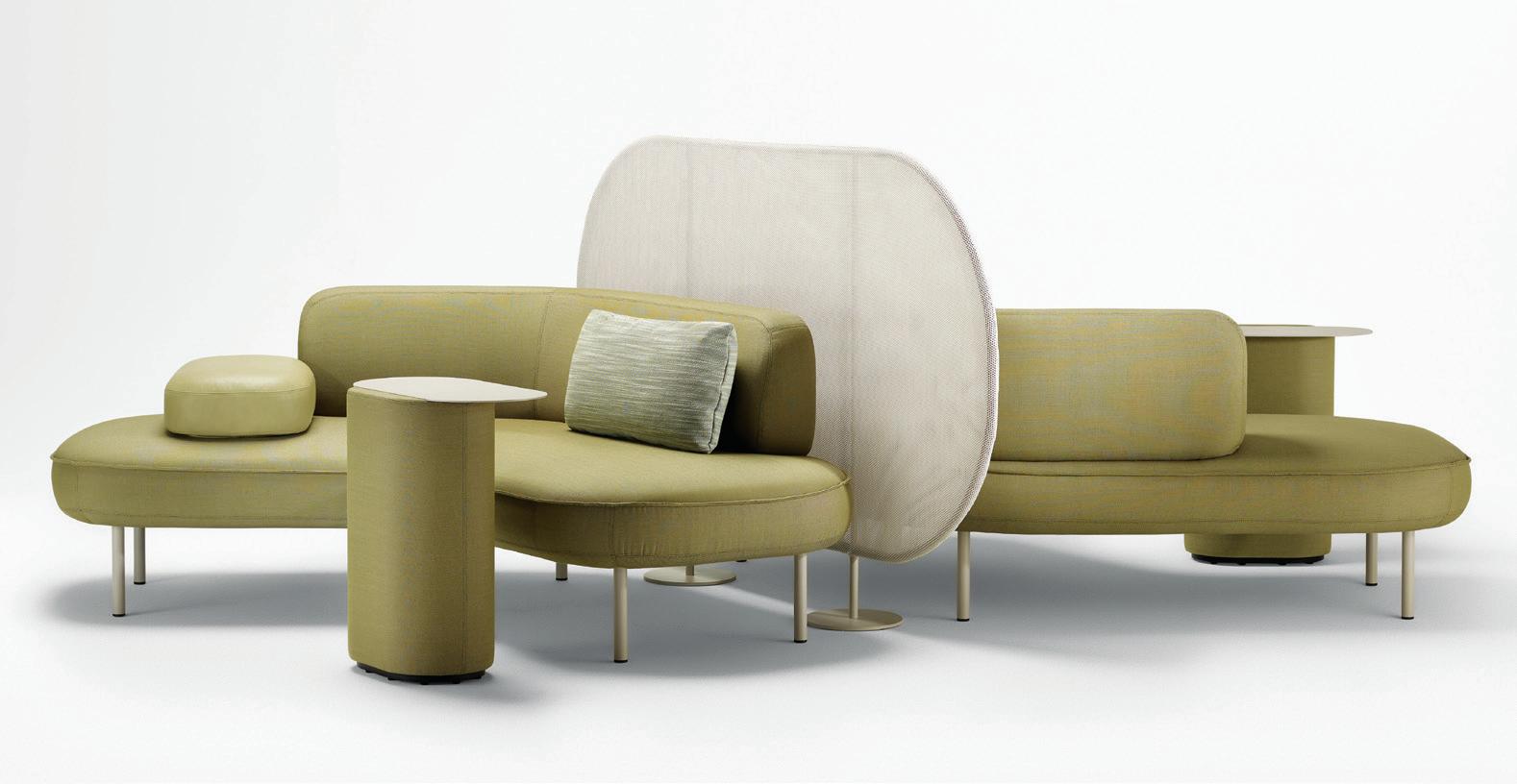
Indesign Zenith

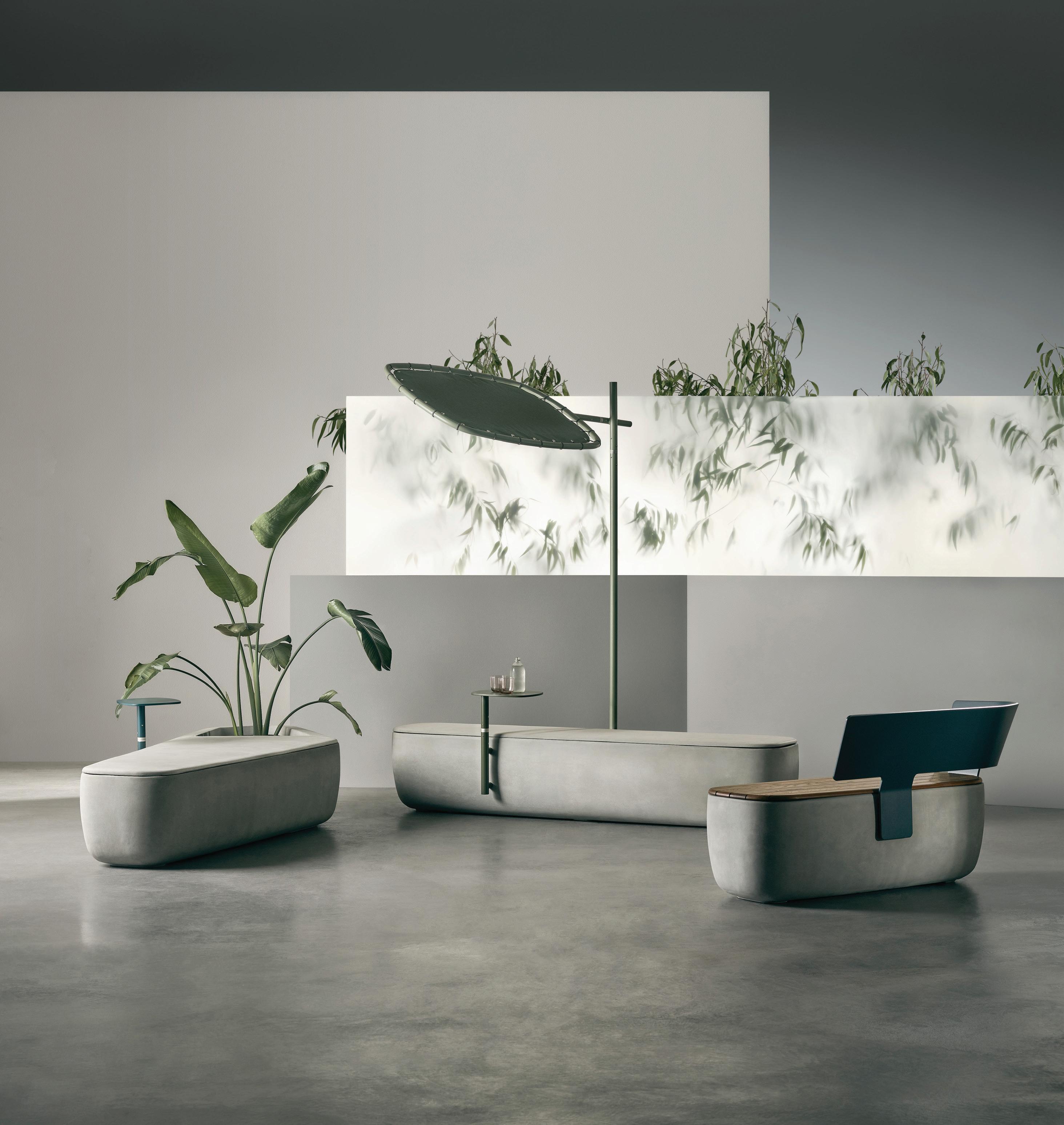
“The idea for [Bayou] was inspired by conversation, the way we meet and greet, and the sociology of interaction. These abstract notions nd their physicality in the gentle, so and open forms of the sofa’s elements,” says designer, Frag Woodall. The Bayou collection is made up of harmonious uid forms and can be con gured in a number of ways to enhance interactivity. Bayou is in its element in de ned commercial spaces as well as open-plan environments.
Royal Nut Company By Breath Architecture
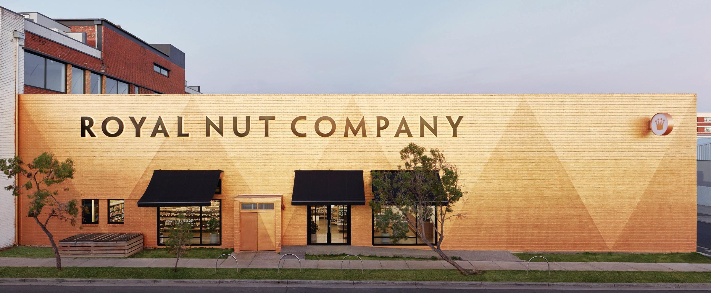
Have you heard? When it comes to bringing a brand to life, exteriors are the new interiors. This was certainly the case for Melbourne’s Royal Nut Company (RNC) when it approached fellow locals Breathe Architecture to give its brand a more iconic home. A Brunswick institution, the Royal Nut Company is a beloved family business that’s been selling wholesale nuts to locals for three decades. In recent times, Melbourne watched RNC change to a sustainable business model reducing its plastic packaging, and sourcing and buying home-grown local nuts. Most notably, it has been working with local beekeepers for its honey and producing its own nut butters.
A fan of the long-standing business, Breathe Architecture was right by RNC’s side when its warehouse was sold to make way for apartments. The designers were keen to help RNC move into its new factory – a vacant site awaiting revitalisation. Celebrating the site’s industrial history, the original character of the warehouse was retained: exposed roof trusses, high-level steel windows, original brickwork and concrete oors. The existing brick warehouse was painted gold, establishing the company’s presence within the industrial area; also a nice nod to the brand’s ‘royal’ status and its in-house honey products. As Breathe founder, Jeremy McLeod, explains: “We wanted to make it functional, we wanted to keep it honest and of course, we wanted to make it gold, very gold.”
Combined with oversized super-graphic elements borrowed from former decades, the façade becomes a memorable landmark, resonating with the royal character of the brand. Internally, a whitewashed material palette was adopted alongside the gold motif that appears throughout. This places emphasis on the Royal Nut brand and the products themselves.
INDESIGNLIVE.COM IN SHORT 34
Scape
DESIGNED BY ADAM GOODRUM
ENCOURAGING CONNECTION INSPIRED WORKING RESPITE AND REJUVENATION ENHANCED WELLBEING
An Urban Room With Local Flavour
What makes a city great? Is it the architecture? Hospitality and retail? Quirky locals? It’s no surprise to hear that these are just some of the elements that make a city desirable. Culture is arguably the most significant ingredient in the distinction of any city. Sure, you can have a transit system that runs like a Swiss watch, but it’s really the holistic proposition of lifestyle and local culture that lives at the heart of a metropolis – and its devoted visitors.
In south-western France, Bjarke Ingels Group (BIG) and FREAKS Architecture have designed a major new cultural venue that contains a trio of institutions. Centrally located in Bordeaux, the new 18,000square-metre MÉCA Cultural Centre brings together three regional arts agencies: FRAC for contemporary art; ALCA for cinema, literature, and audiovisuals; and OARA for performing arts.
“Now that MÉCA has opened, the fourth and final element is here: the city and the citizens of Bordeaux,” says Bjarke Ingels, founding partner and creative director, BIG. “Within this new urban room,
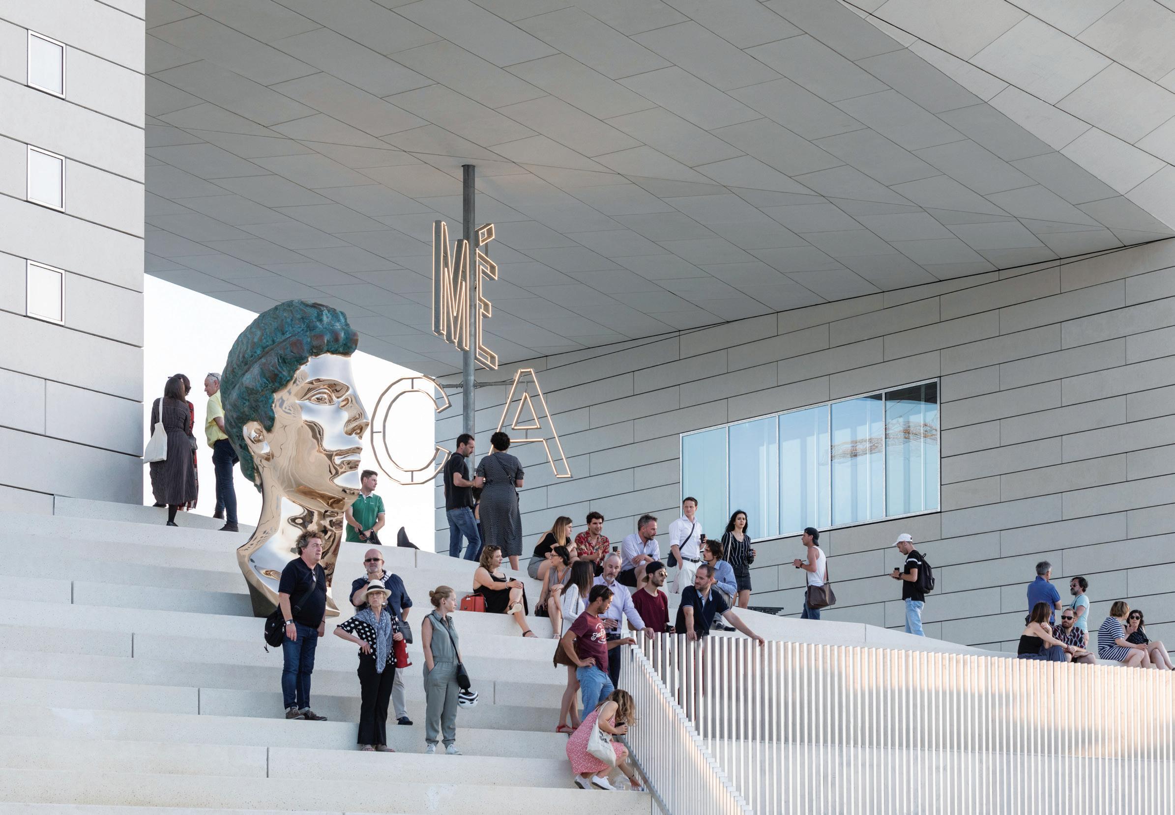
we have already seen the arrival of the first skateboarders, the first romantic couple sharing a bottle of Bordeaux on the steps, and the first demonstration on the sloping promenade. So consider MÉCA’s urban room as a blank canvas, or rather an empty frame, for the Bordelais to fill it with their ideas, their creativity, their culture, and to make it their own.”
BIG and FREAKS conceived the building as a single loop of cultural institutions that forms an extension of the promenade. “Not only does MÉCA spill its activities into the public realm and the urban room, but the public is also invited to walk around, through, above and below the new cultural gateway,” Ingels says. “By inviting the arts into the city and the city into the arts, MÉCA [provides] opportunities for new hybrids of cultural and social life beyond the specific definitions of its constituent parts.”
A rich and real designed melting pot of architecture and culture, peppered with plenty of hospitality, retail, and quirky locals to boot.
INDESIGNLIVE.COM IN SHORT 36
iQ Surface
HOMOGENEOUS VINYL
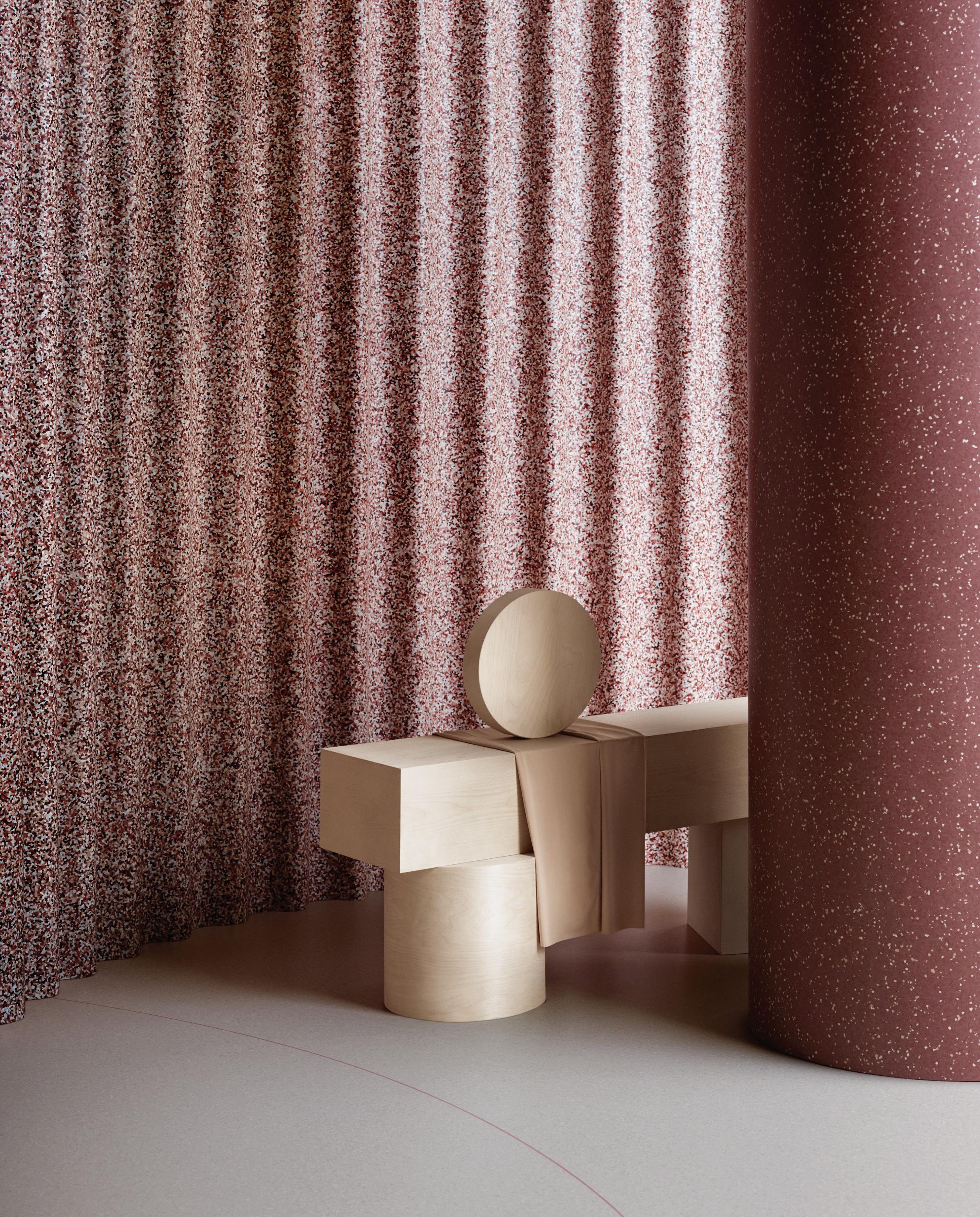
Previewed at Milan Design Week, the iQ Surface range is created for designers. The result of a collaboration between Tarkett and Note Design Studio, the range gives equal weighting to function, form and expression of colour. Taking homogeneous vinyl flooring to new heights the iQ Surface range can be used across floors, walls and furniture opening up greater possibilities to play.
WWW.TARKETT.COM.AU
Created for Designers

Living The Gourmet Life
Indesign Gaggenau


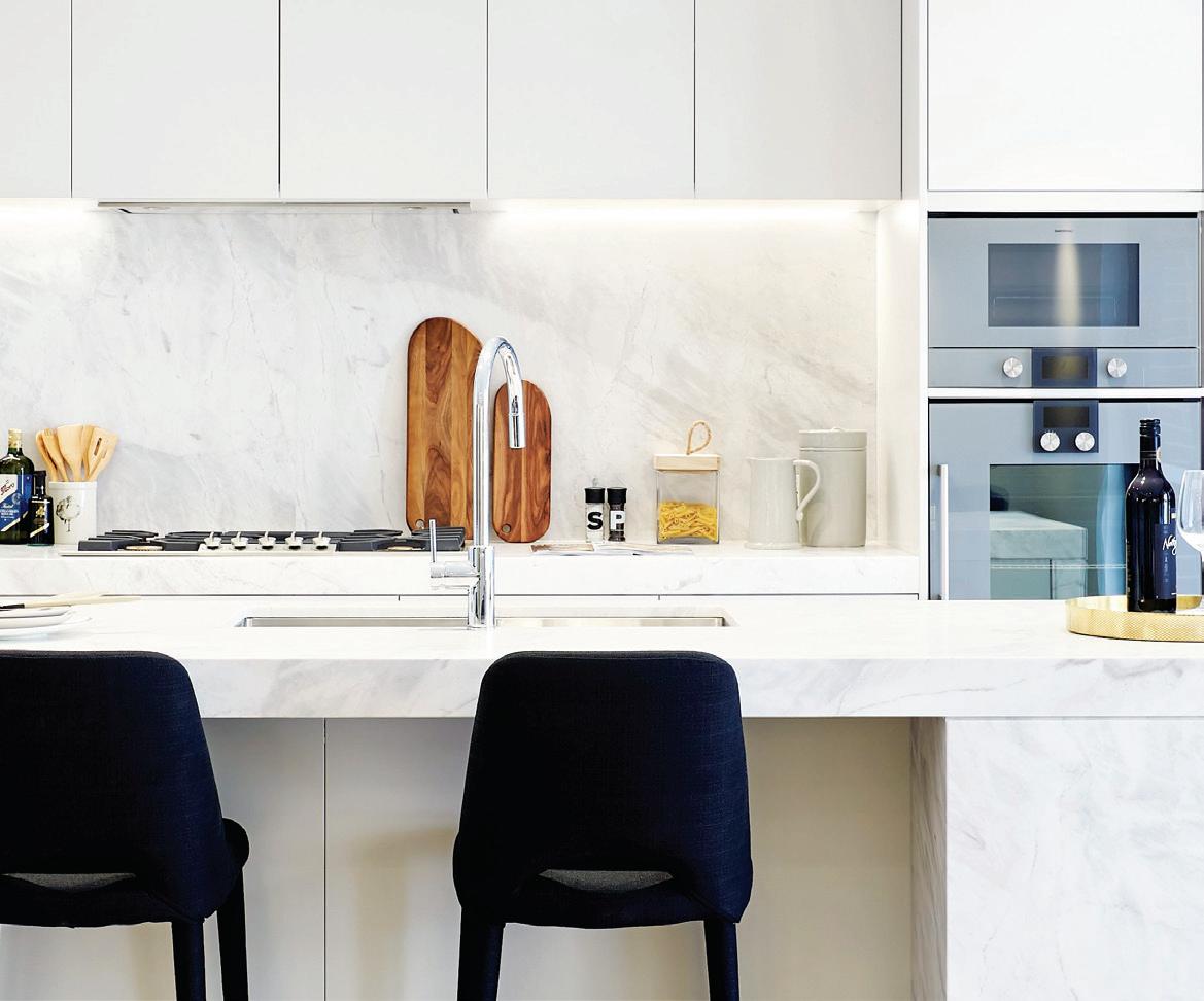
Striking a balance between old and new, The Malton contributes to the history of its area (in Beecro , NSW) while also providing residents with “everything they need to lead a contemporary, laid-back lifestyle”, says Dean Chivas of developer Central Element. Lending sophistication to every residence is an elegant kitchen complete with professional-grade Gaggenau kitchen appliances. Think, the Gaggenau 200 series oven and microwave with full surface grill and 90cm gas cooktop – for a world-class gourmet experience.
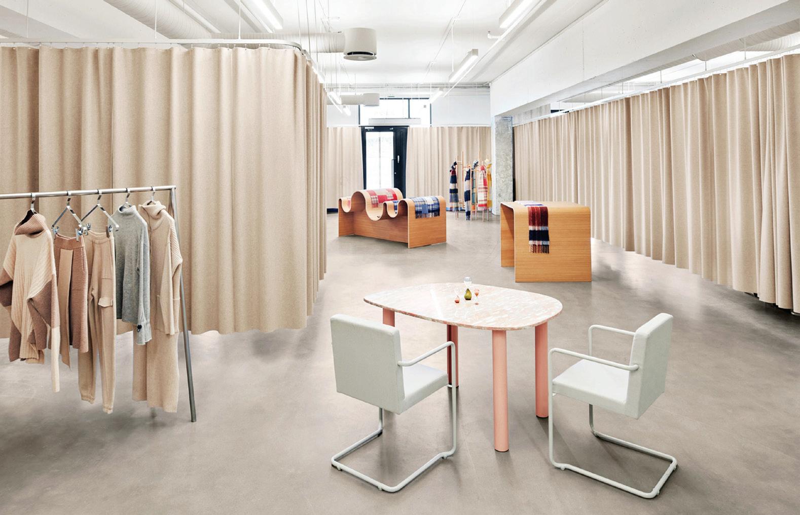
Holzweiler Flagship Oslo
Is digital design now part of the interior designer’s remit? Snøhetta has designed both physical and digital retail spaces for Oslo-based fashion label Holzweiler, featuring a muted colour palette and gridded elements. Holzweiler was keen to o er its customers a similar retail experience both online and in store, so asked Snøhetta to design a showroom and agship store, but also to create a website to match. “The aim with the showroom, the agship and the online sales channel was to create a seamless and holistic customer experience that brings the brand and people closer together,” explains Snøhetta cofounder Kjetil Trædal Thorsen. A multidimensional brand universe.
Dot-Dot Dash-Dash
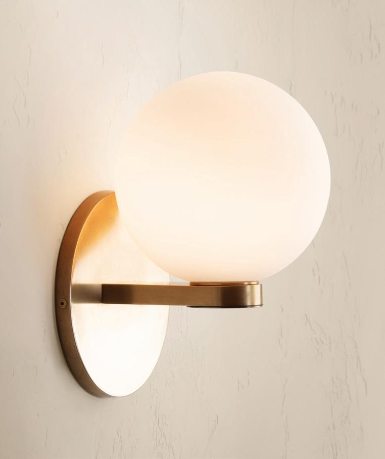
Indesign Nightworks
“The modularity of Code enables architects and interior designers to choose from six standard con gurations or use the individual components to create a light that will suit their space,” says Nightworks founder, Ben Wahrlich. The range has been cra ed using hand-blown glass and solid brass and is inspired by the dots and dashes of Morse code. An original design approach sure to make your projects shine.
INDESIGNLIVE.COM IN SHORT 38
Life On Mars
With climate change high on the agenda, designers are addressing the challenge in numerous and imaginative ways. Not least of all, considering what life on Mars might be like.
HER, which is located in the centre of the Fashion Walk of bustling Hong Kong, is the ambitious project of stylist Hilary Tsui and created by Clap Design. Angela Montagud, Clap Design cofounder and studio director, says: “We came up with three key points that reflected the essence of HER: femininity, purity and strength. We imagined immediately a sinuous landscape, with impressive mountains and pure materials. The aim with this store is to transport the user to a new planet, so we designed an entire experience around this principle.”
From the façade that shows the mountainous landscape of the interior, to the moment in which the user receives their purchases specially ‘space packaged’, shopping at HER is a curated series of experiences that are altogether martian-esque.
Stacked terracotta display plinths and celestial aluminium partitions create an other-worldly atmosphere which Clap likens to “reddish mountains”, where accessories can be displayed or visitors can pause and dwell. The tiles have also been applied across the floors and the lower half of the store’s exterior.
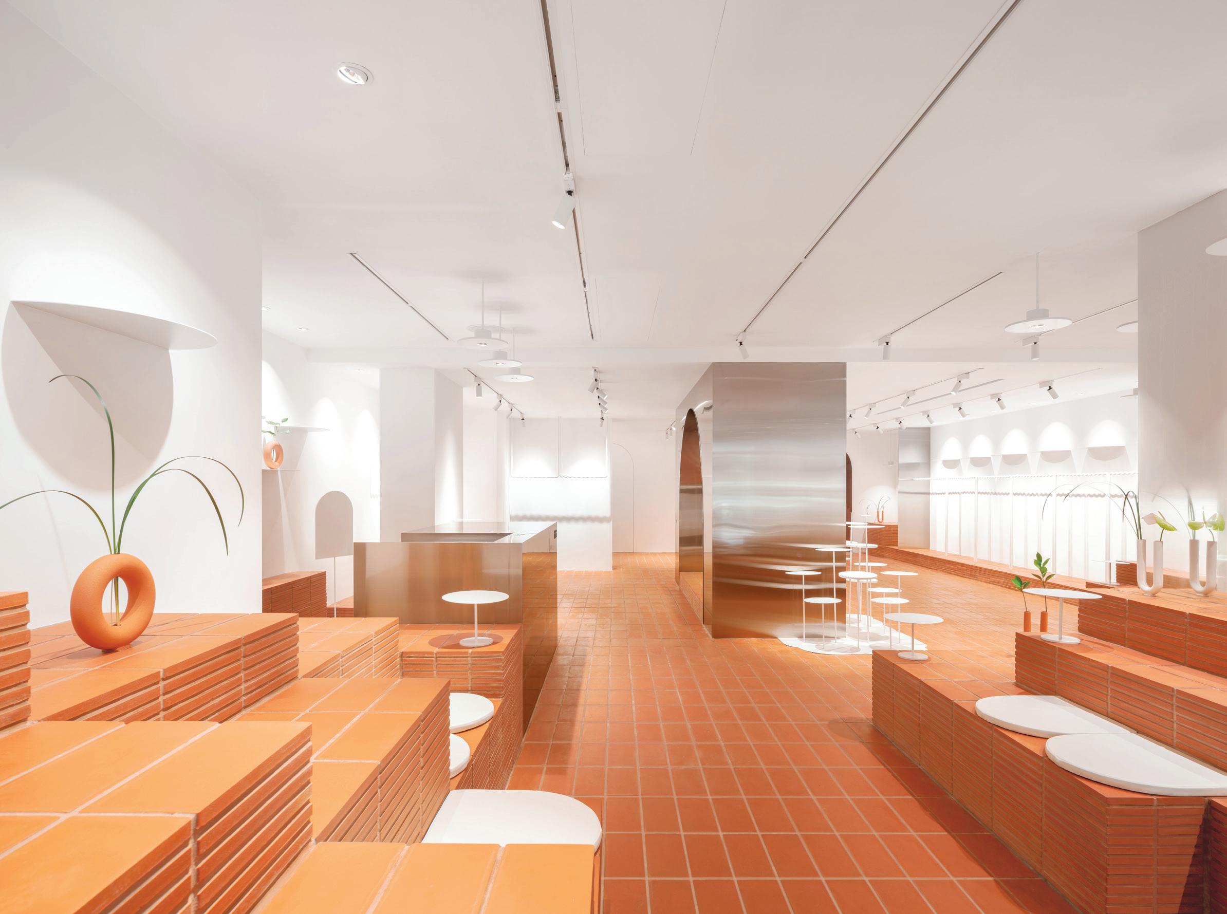
Clothing items are hung from suspended racks shaped in waves. Jewellery is presented on pale circular tables supported by thin metal stems, intended to resemble “small white lotus leaves that grow from the mountains,” says Montagud.
As well as the service counter in the café, structural columns and an arched partition have been clad in spacecraft-style aluminium. Continuing the space theme is a handful of portholes – akin to those seen on a rocket – which have been cut-out of the peripheral walls and covered with orange-tinted glass. Rounding out the customer journey is the take-home surprise: your purchased goods vacuumpacked – much like an astronaut’s food.
INDESIGN 39 IN SHORT
It’s Only Natural Kangaroo Valley Outhouse
Sustainability is a tough nut to crack. While we all talk a big game about reusable or sustainable materials, we rarely discuss spatial impact – specifically the affect of our designs on a site’s natural habitats and cultures. Designed by Madeleine Blanchfield Architects, the Kangaroo Valley Outhouse is a bathroom in the bush which services a nearby cabin for overnight stays. The concept was to separate the bathroom from the cabin
and mimic the experience of camping. It is situated low on a hillside, about 30 metres from the accommodation and accessed via a pathway though dense landscape. This mirrored cube, elevated above the existing ground and nestled in vegetation, completely disappears during the day. Reflecting the lush landscape, only the subtle lines of the cube’s edges are visually legible. Once inside, its all-glass walls afford 360-degree views.
Could an uninterrupted design approach herald a new-generation approach to sustainability within the built environment?
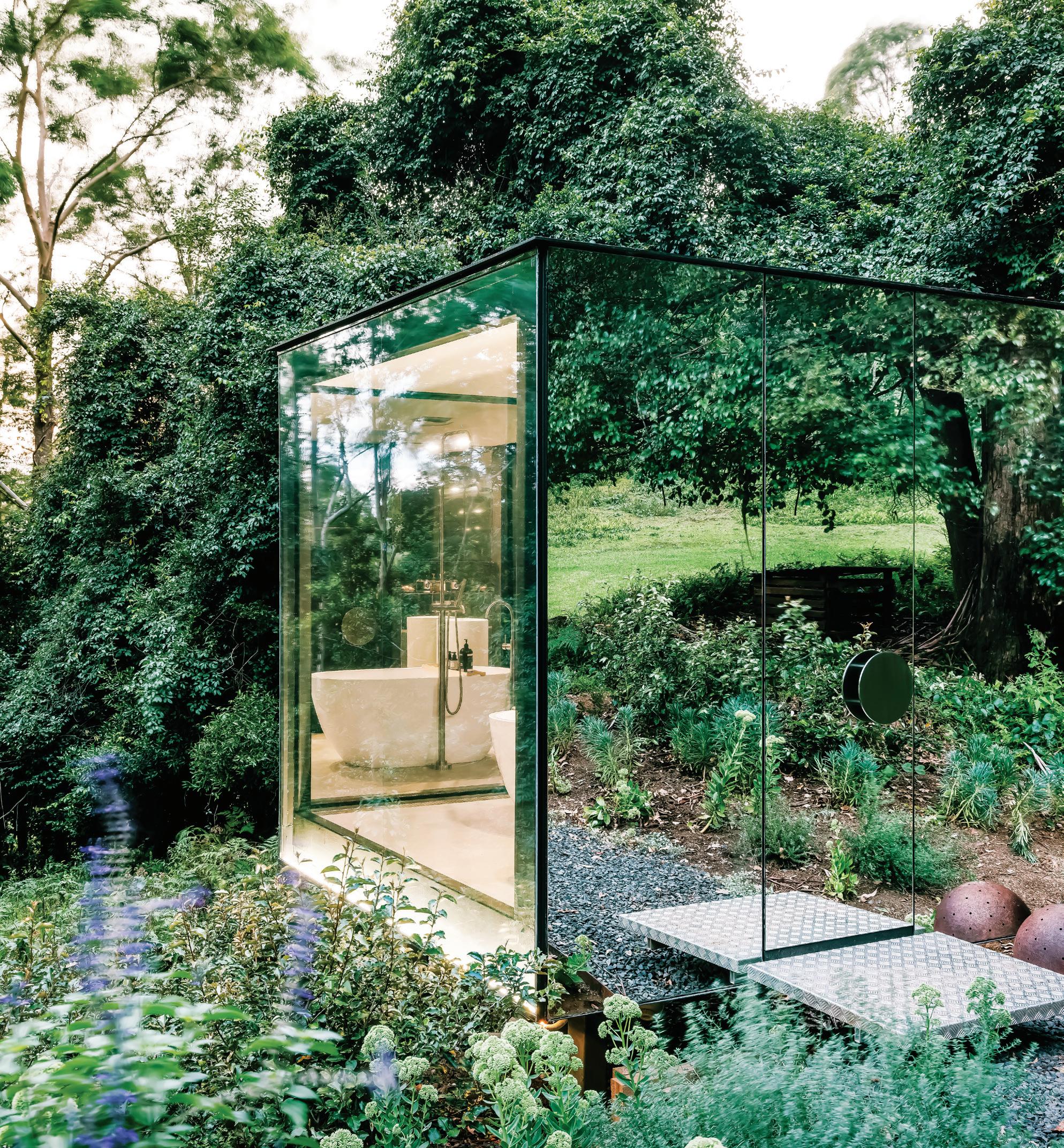
INDESIGNLIVE.COM IN SHORT 40
–
–
Oasis Of Calm
Indesign UCI
Designing for wellness and the human experience – it’s by no means a new concept but what does it look like in the modern age? Making a landmark statement from the outside in, the Victorian Comprehensive Cancer Centre (VCCC) has been able to achieve a welcoming, comforting and restorative space that puts human needs front and centre.
Designed by DesignInc and Silver Thomas Hanley with McBride Charles Ryan, and completed in 2016, the space features sweeping curves, so light and natural timbers, which all come together to de ne the specialist hospital. Punctuating the calming space is a series of custom furniture items, created in collaboration with UCI Projects. Throughout the large-scale medical precinct 1800 chairs dot the space, specially made to withstand the niche needs of a medical environment.
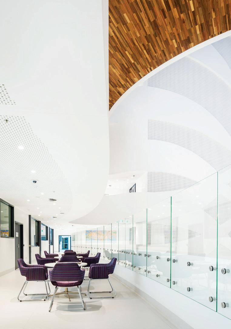
The building’s exterior is a physical manifestation of the concept of networks and clusters converging. Taking this line of thinking inside, zones for di erent purposes like waiting, eating and socialising have been integrated at careful junctures to encourage engagement. In collaboration with the design team, UCI delivered comfortable, durable seating options for VCCC’s high-tra c spaces. Within the cavernous building, the so furnishings help to anchor the functions throughout. As such a signi cant healthcare environment, getting the right balance for patient-visitor wellbeing has made all the di erence to the project’s success.
On A Sit-To-Stand Health Kick
Indesign Stylecra
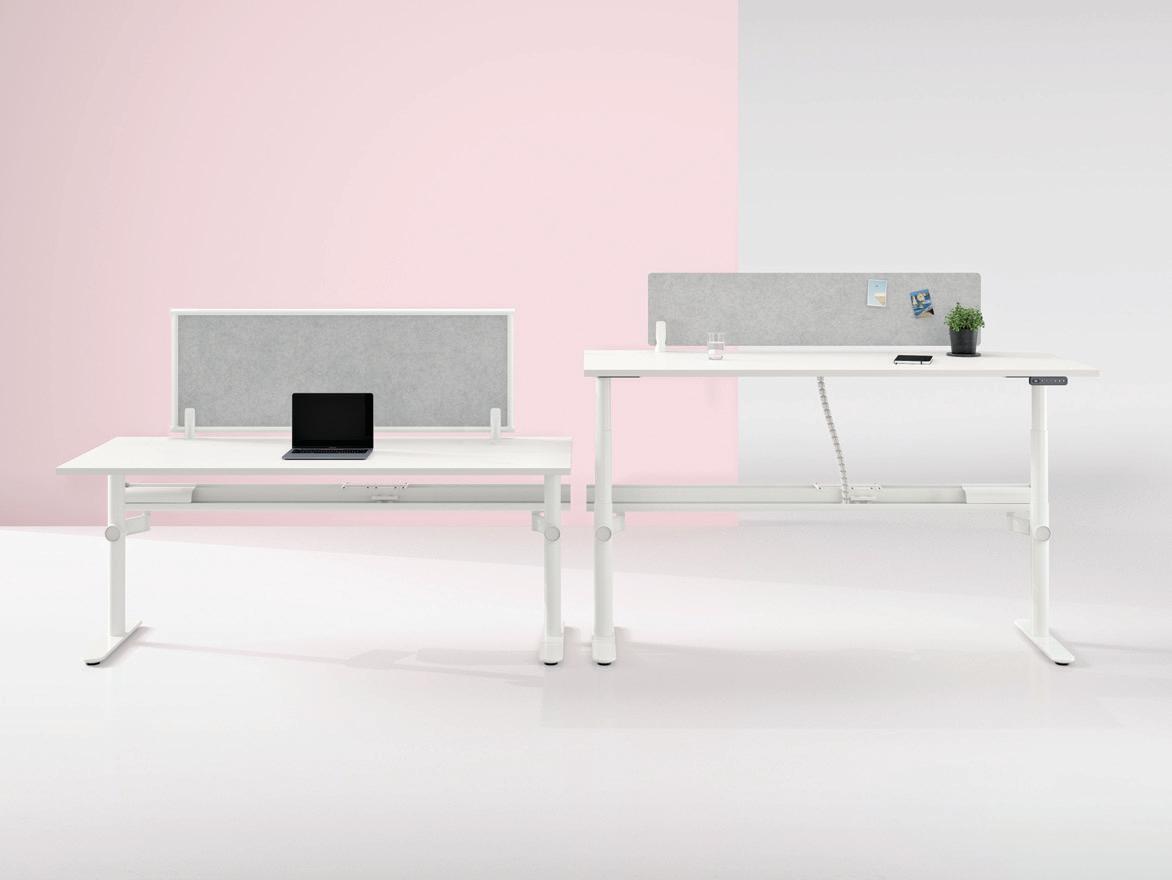
Studies on the bene ts of sit-stand desks have revealed a noticeable improvement in productivity along with reduced back pain among users. People also admit to feeling more focused compared to sitting hunched over a laptop all day.
Built for today’s agile workspace, Stix is a workstation and table system by Thinking Works available with a height-adjustable framework. For added privacy, the sit-stand desk comes with screens upholstered over an acoustic PET board or manufactured with exposed acoustic PET from a range of PET colours.
What Lies Beneath
Indesign Milliken-Ontera


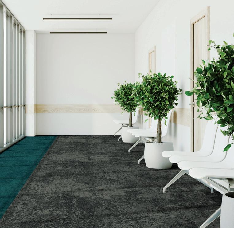
To feel both safe and upli ed within a healthcare environment is a unique combination that inspires con dence and promotes wellbeing among patients, sta and visitors alike. The right ooring, for instance, has been shown to help with patient recovery while also improving sta e ciency. With elegant organic tones and seamless textures, the Manaaki collection by Milliken-Ontera helps create a calming experience in healthcare spaces. Its antimicrobial treatment also contributes to a healthier interior environment.

INDESIGN 41 IN SHORT
Hashtag Cool-porate Campus?
Instagram-ready offices are really hitting their stride. Why? Because they are designed to encourage Millennial employees to forget they’re in an office park and, it seems, the Millennial workforce responds best to blurred environments that mimic their non-professional lives.
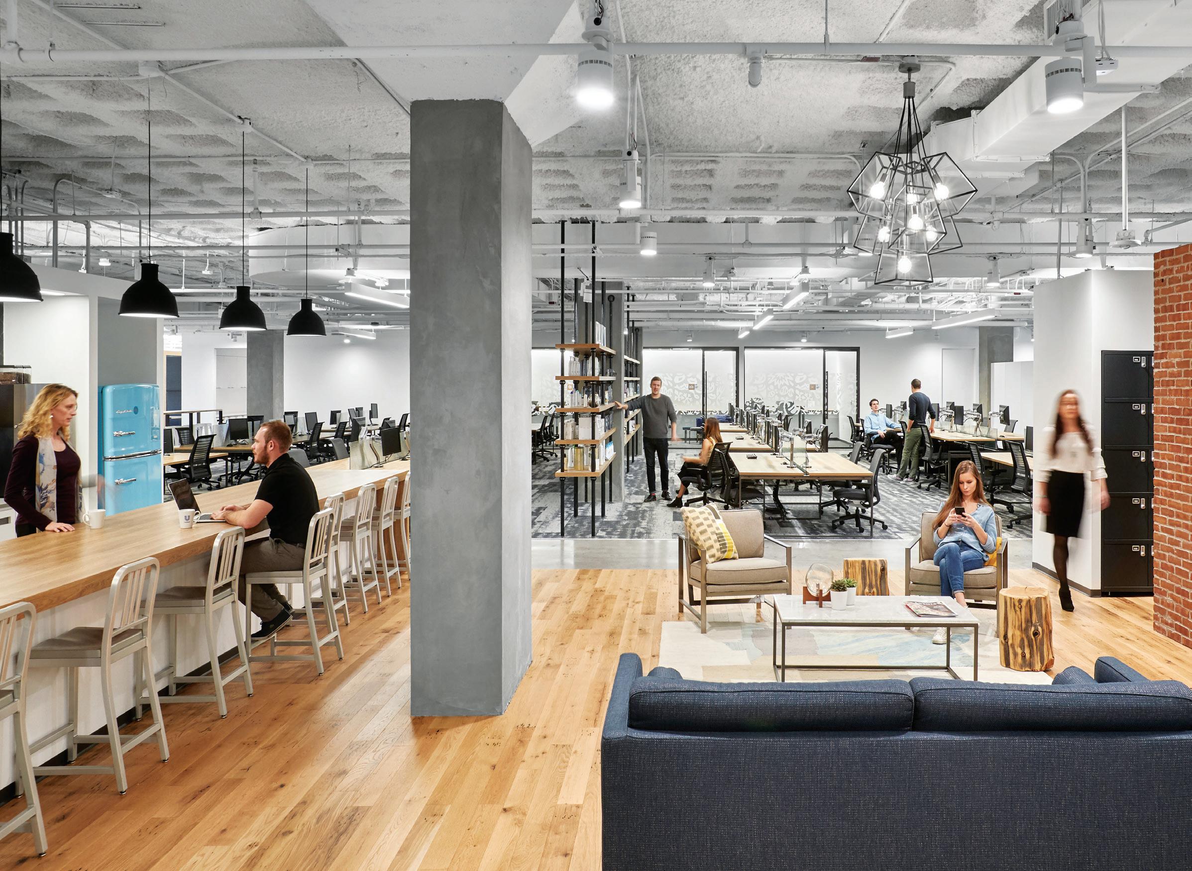
Perkins+Will has overhauled the North American headquarters of consumer goods company Unilever with new communal areas designed to challenge workers’ perceptions of the traditional suburban office park. Unilever has long had its headquarters in New Jersey, just across the river from New York City. But increasingly the company has needed a more dynamic work environment to help recruit employees.
Perkins+Will was charged with rethinking the corporate campus, which accommodates about 1450 employees and several hundred independent contractors. The goal was to create a showpiece headquarters that would be “smart, sustainable and Instagramready with a feeling like you were in Manhattan”, say the architects.
Rather that razing the site and starting fresh, the architects chose to renovate four existing 1960s and ‘70s rectilinear buildings. They also added a lofty central atrium that rises 12 metres on the site of a former courtyard. “The [30,000-square-metre] renovation included interiors, as well as the construction of an entry pavilion and common area that stitched together the open space between individual buildings to create an entirely new, enclosed structure.”
The existing buildings have been revamped with open workspaces, huddle rooms, lounges and lockers. The central volume houses The Marketplace where employees can shop, work and socialise. Additional amenities include coffee stations, a fitness centre, hair salon and cafeteria. The building features a range of smart technologies including thousands of sensors that measure light, temperature, humidity, carbon dioxide and human presence. If this is what companies are facing to attract and retain talent, the challenge for designers is then to find new ways of making the workplace a compelling and hashtag-worthy experience.
INDESIGNLIVE.COM IN SHORT 42

Visit: 27/69 O’Riordan Street Alexandria NSW 2015 | Call: (02) 9313 5400 | Web: bludot.com.au
Rest And Find Relief
Indesign Krost


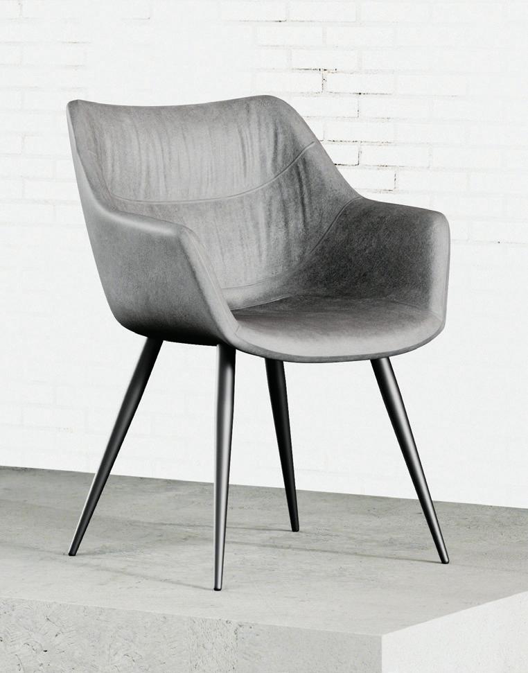
O en transitional spaces in healthcare facilities – those areas where patients and families are caught in a seemingly endless ux of waiting – feel uncomfortable and appear unappealing. With the concept of care embedded so deeply within the healthcare experience, simple and e ective choices can make all the di erence.
Good furniture design can o er comfort by supporting a range of postures and activities – conversation, information sharing, resting. It can also provide a smooth transition from pain and emotional uncertainty to relief and vital information.
Enter Nina, a unique and practical occasional chair by Krost. The chair o ers supreme comfort through its highdensity foam padding and full micro bre upholstery. Its generous sizing – coupled with the use of commercial-grade fabric and rigorous quality testing – means it is exible to its application and context.
Let’s Talk
Bathroom Ergonomics
Indesign antoniolupi
Ergonomics as a concept is expanding in its contextual relevance, moving beyond the ‘expected’ realms of desking and task-seating to address the environments and products that are most connected with our bodies. In particular, ergonomics has become a central principle for bathroom designers specialising in those elements such as baths, toilets and more.
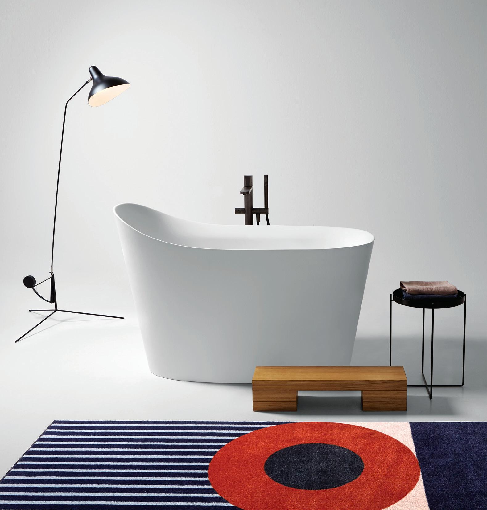
With designers prioritising the creation of healthier and safer bathing environments, end users today have the ultimate luxury of a space that looks and feels good. Just like the Mastello bath designed by Mario Ferrarini for antoniolupi. The design is rmly anchored by the concept of safety and ergonomics with emphasis placed on added functionality, as well as relaxation and a memorable bathing experience.
Ferrarini has designed the Mastello with a comfortable, integrated seat and an edge that rises gently to act as a headrest. The internal seat makes for comfortable submerged reclining while an external wooden step means you can hop in and out of your tub with ease. At 135 centimetres in length, the bath is ideal for integrating into smaller spaces. And, it can comfortably accommodate users up to a height of 195 centimetres.
Envisaged as a spacious bath and a micro oasis for relaxation, the Mastello really embraces its uid lines with so shapes and smooth surfaces that appeal to our haptic senses. Through its very design, the bath gives back to the body and mind. An embracing of wellbeing and ergonomics in both form and functionality.
INDESIGNLIVE.COM IN SHORT 44
WHERE PORCELAIN BECOMES ART
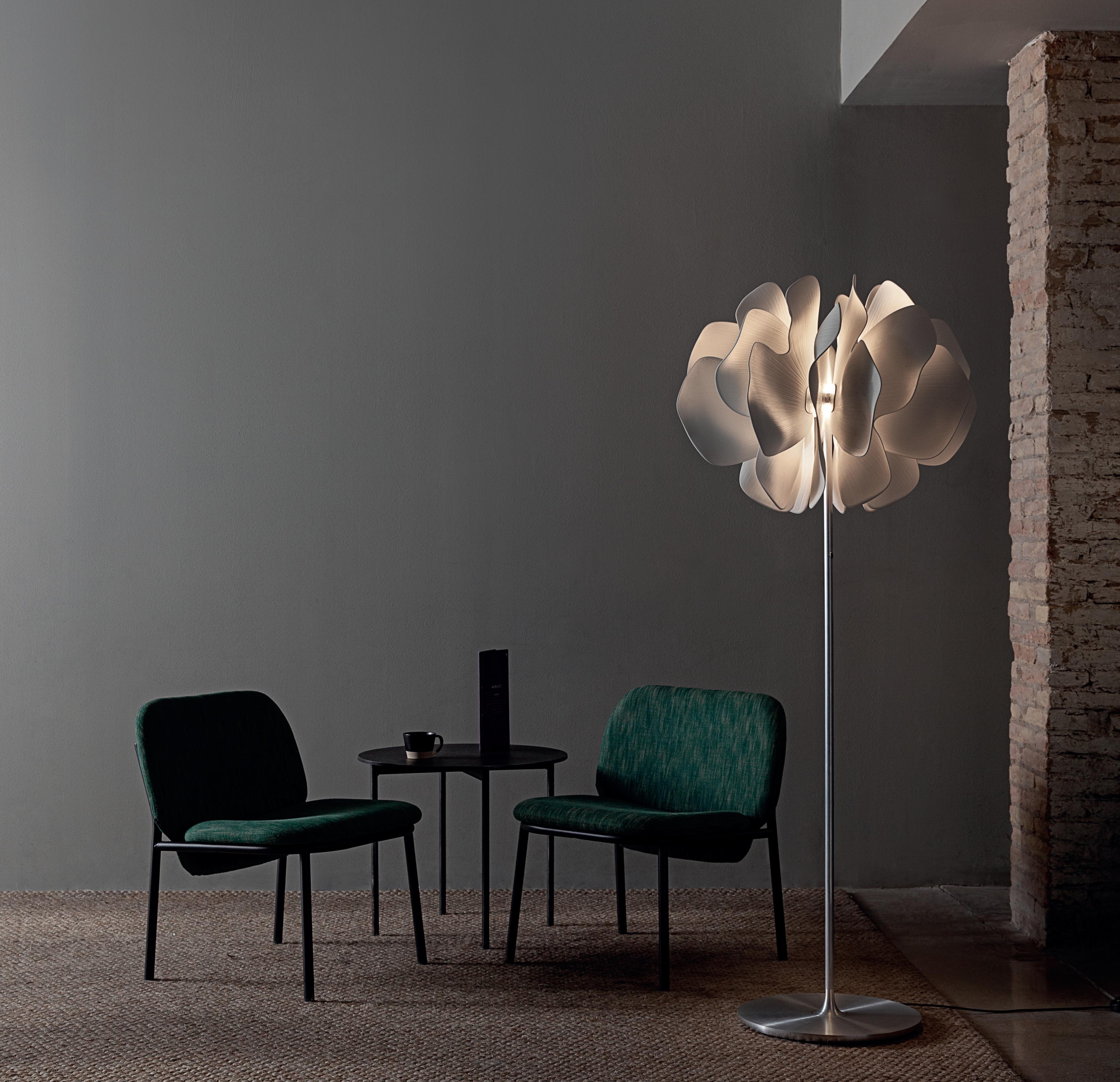
Lladró Boutique 143 York Street, Sydney, NSW 2000 Australia
lladrosydney@formfluent.com
now open in sydney
Seeds Of Success
Ahh the pop up. It’s retail’s most valued currency right now – particularly when it comes to bringing customer experience strategies to life. While we may not have a hand in creating these strategies we are certainly charged with the responsibility to develop their physical manifestation. The secret it would seem is in high-impact solutions that speak to the tenets of a brand and resonate with its customer base in a meaningful way.
Recently cult beauty brand Glossier teamed up with landscape designer Studio Lily Kwong to create a pop-up shop in Seattle, USA. Most notable was its seemingly sub-tropical interior – a proverbial walk in the park. In collaboration with Kwong, Glossier’s in-house team drew inspiration from the area’s natural topography, including the close-by Mount Rainier and their much-loved neighbourhood park.
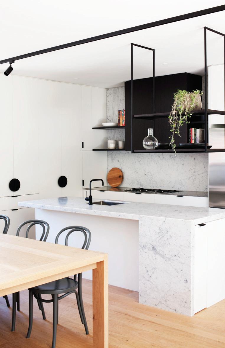
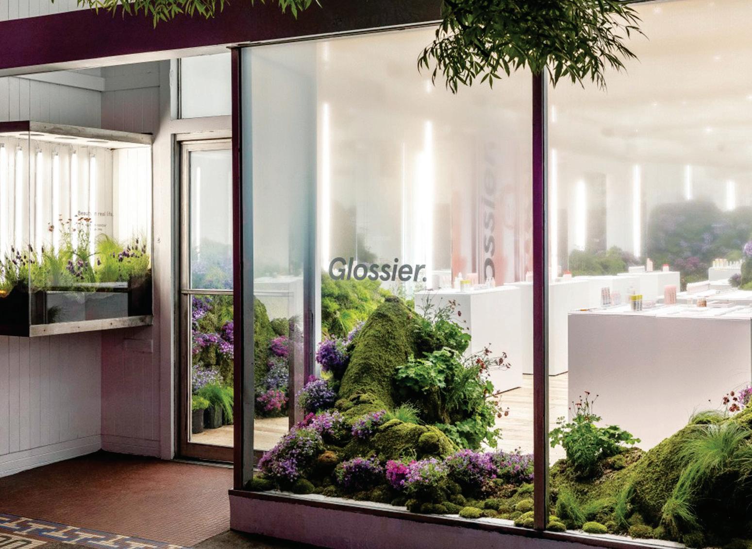
“A er talking to people in the area and doing some on-the-ground research, we were really inspired by everyone’s love for nature and how it seemed to be a unifying theme within the community,” said Kendall Latham, Glossier’s senior environmental designer. “With Glossier Seattle, we wanted to capture the mood of the surrounding landscape and represent the juxtaposition of nature and technology in the city.”
Visitors stepped into a bright space lled with plant-covered mounds of varying sizes. Live moss, Mexican feather grass and owering shrubs adorned hills constructed from wooden ribs and wire mesh. White display pedestals topped with Corian surfaces mimicked walls of stark white – a clarifying contrast to the verdant hills and raw pine ooring. The team also incorporated large-format imagery in tones of pink and purple, a signature of the Glossier colour palette. The perfect fusion of global brand and local community with a side of installation that feels refreshingly le -of- eld and yet relevant.
The Urban Edge
Indesign Phoenix
Conservation is all about striking a balance between preserving the special character and signi cance of a heritage area while bringing about change in a way that sustains it into the future. The Chestnut Townhouses in Cremorne, Melbourne, designed by NTF Architecture make for an interesting study, exploring new forms of interaction between urban dwellings and their heritage surroundings. Their built form appears unembellished so as not to visually compete with the decorative heritage buildings in the vicinity. Even materials used are simple, unre ned and robust to complement the surrounds. In contrast, the townhouses’ interiors feel contemporary and modern, o ering a combination of luxury, comfort and convenience to residents. This is particularly evident through the selection of tapware and bath accessories. In fact, in a couple of the boutique townhouses, Phoenix was the brand of choice for the kitchen and bathroom designs. The bold matte-black nish of the Vivid Slimline Sink Mixer (pictured above) succeeds in lending character and an industrial urban edge to NTF’s kitchen design and the surrounding living zones.

INDESIGNLIVE.COM IN SHORT 46
(Photo: Shannon McGrath)
‘Reefs’ by Dauphin is inspired by the infinite variety of coral reefs, and provides solutions for the open office environment by offering comfortable structures with visual and acoustic privacy.
The Reefs modular system adapts to the unique requirements of organisations, individuals and tasks and allows unlimited design options, from configurations that foster collaboration to hideaways for quiet focus.
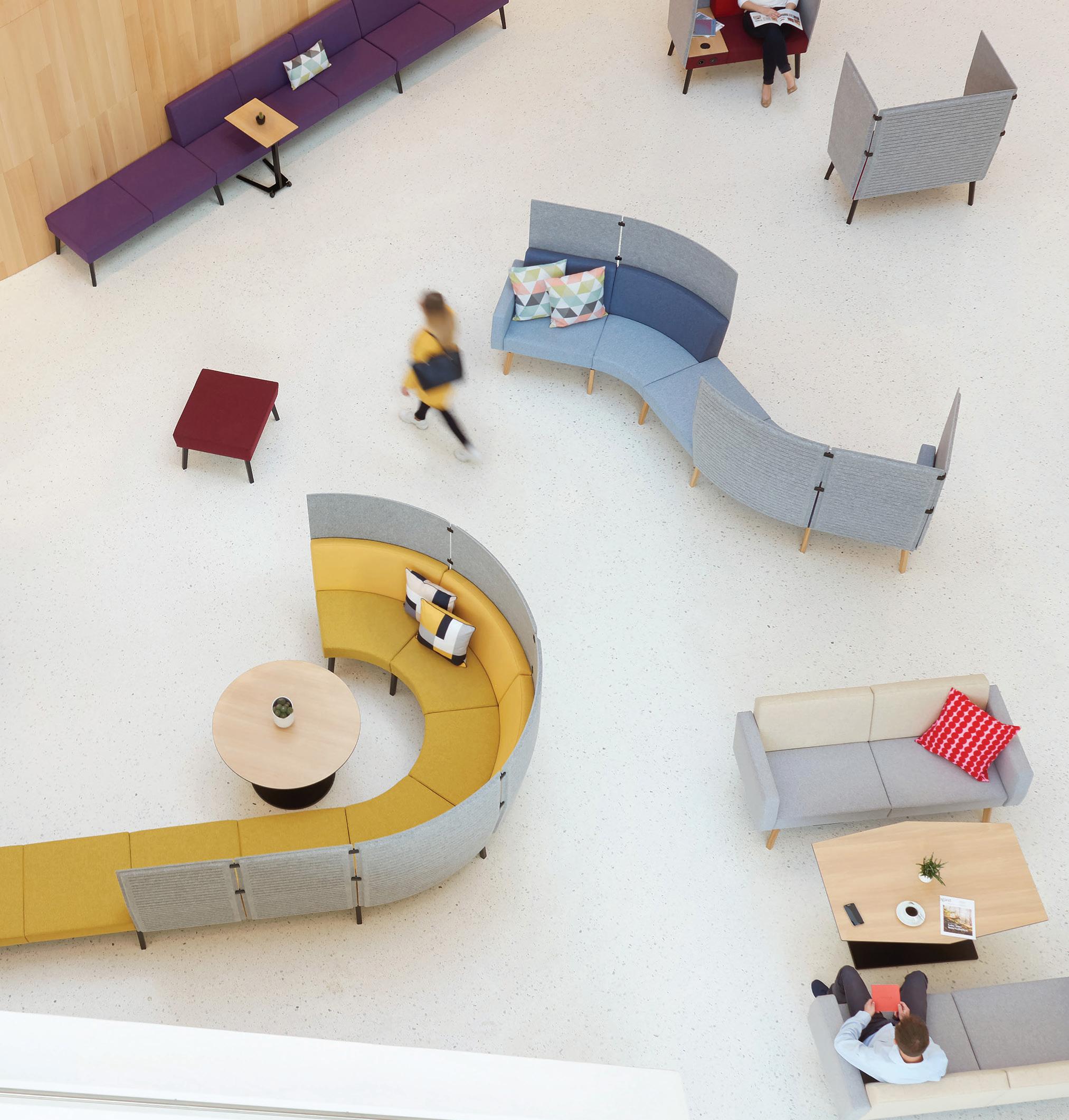
Available now from Business Interiors – the home of innovative furniture solutions.


businessinteriors.com.au/indesign 1300 301 110

Sustainable Coatings For Healthy Spaces
It’s that rst moment of arrival in a space that de nes your direction – that transcendent moment of breaking through the threshold and soaking in the artistry, design and cra smanship that is embedded within a building’s walls and ceilings. Yet powerful, considered and thoughtful design comes down to more than just aesthetics – it has the ability to make you feel good and positively a ect your physical, mental and emotional state.
Revolutionary architect, Luis Barragán once said: “Architecture is an art when one consciously or unconsciously creates aesthetic emotion in the atmosphere and when this environment produces wellbeing.” That shi towards health and wellbeing within the built environment continues to be paramount, and the ability to engender change through design comes in the most intelligent of forms. In search of an artful balance of promoting wellbeing and providing an aesthetic sanctuary, Australian-based company, Wattyl is committed to creating the best products and materials that achieve this.
An advocate of good design, healthy spaces and product innovation, Wattyl has introduced I.D Advanced. Paint is a key consideration in human health – it is a material that promotes a nurturing atmosphere within a space that extends to the futureforward thinking for wellness spaces of tomorrow. The instinctual and sensorial response to a newly nished space needs to have a welcoming and comforting feeling that eliminates the toxicity of paint smells.
“Our inspiration was to build on the platform of the previous Wattyl I.D range to have a further positive e ect on the indoor environment and the health of inhabitants,” says technical director at Wattyl, Matthew Fitzgerald. Determined to mitigate toxins and enhance air quality, Wattyl’s most advanced paint
has an impressively low VOC formula that surpasses the Green Star requirements of the Green Building Council of Australia. I.D Advanced is the latest in Wattyl’s centennial company history in protecting, enhancing and elevating high performance coatings of Australian buildings.
Wattyl o ers a paint that eliminates the shock of ingesting the chemical smell and toxins within a newly nished project and a product that genuinely cares about the people inside the space. Durable, versatile and dynamic, the product’s Total Protection Technology™ delivers a new level of protection o ering advanced cleanbility, washability and stain resistance. Designed for tactile experiences, the interior paint formula elevates any space with its extensive and contemporary range.
“The bene ts of low emissions from I.D Advanced, containing VOC<1g/L minimises impact on indoor air quality. I.D Advanced has been formulated and tested to meet globally recognised antimicrobial standards, improving environments such as hospitals, healthcare, educational and institutional spaces and meets the requirements of long service life,” Fitzgerald adds.
Environmentally sound and re ned, Wattyl I.D Advanced boasts architectural and ethical advancements all in one product. It o ers technical innovation with a touch of sophisticated elegance that celebrates building materials that enhance the way people live and use spaces.
With health and wellbeing at the forefront of the product and brand’s philosophy, it recognises that healthy, human-centric spaces are a right and in this contemporary context, it should be at the start of every conversation. The nished product of I.D Advanced is designed for the present married with an exceptional awareness for a better, cleaner and healthier future.
WATTYL.COM.AU 48 INDESIGN WATTYL
Words Emily Sutton Photography Courtesy of Wattyl
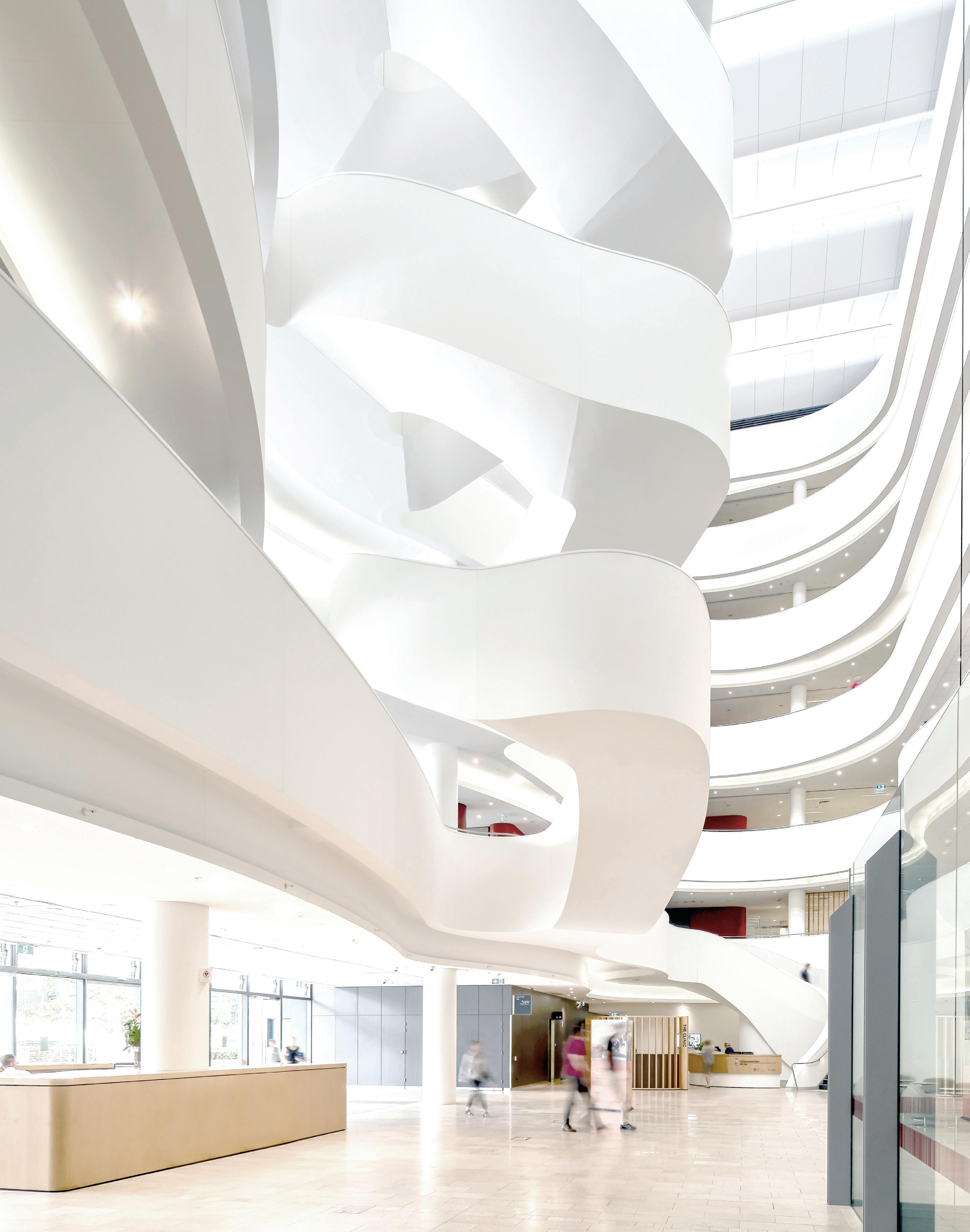
Wattyl worked on the Charles Perkins Centre at Sydney University to use its revolutionary building materials to support the research centre’s committment to improving global health.
INDESIGNLIVE.COM IN SHORT 50
Humble Pizza Hearts Formica
Nostalgia is a powerful tool for creating hospitality venues that appeal to our emotions and gain our loyalty. Nineteenfifties-style milk bars, rock ‘n’ roll burger diners and kitsch bars are nothing new. So how are we taking nostalgia to the next level?
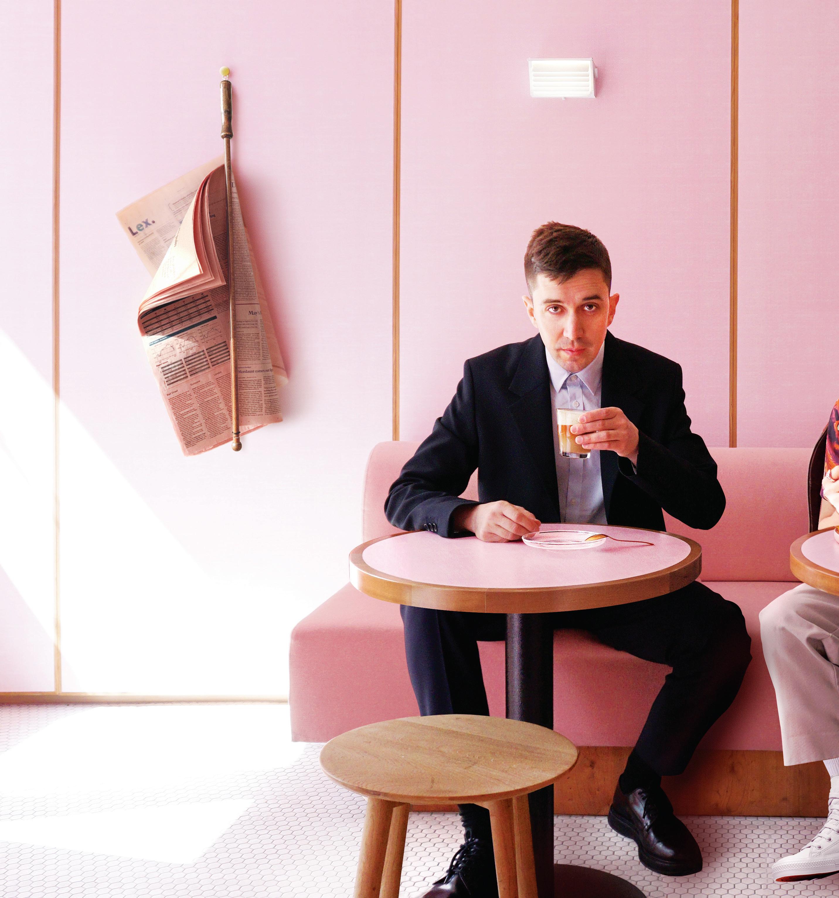
Designed by Child Studio, Humble Pizza is London’s latest hospo-hotspot. Situated on King’s Road, a boutique-lined street in the affluent Chelsea neighbourhood, Humble Pizza boasts a menu of exclusively plantbased pizzas.
Its almost entirely pink interiors have been designed by Child Studio to emulate the aesthetic of the workmen’s cafés, commonly known as greasy spoons, which sprung up across London in the 1950s.
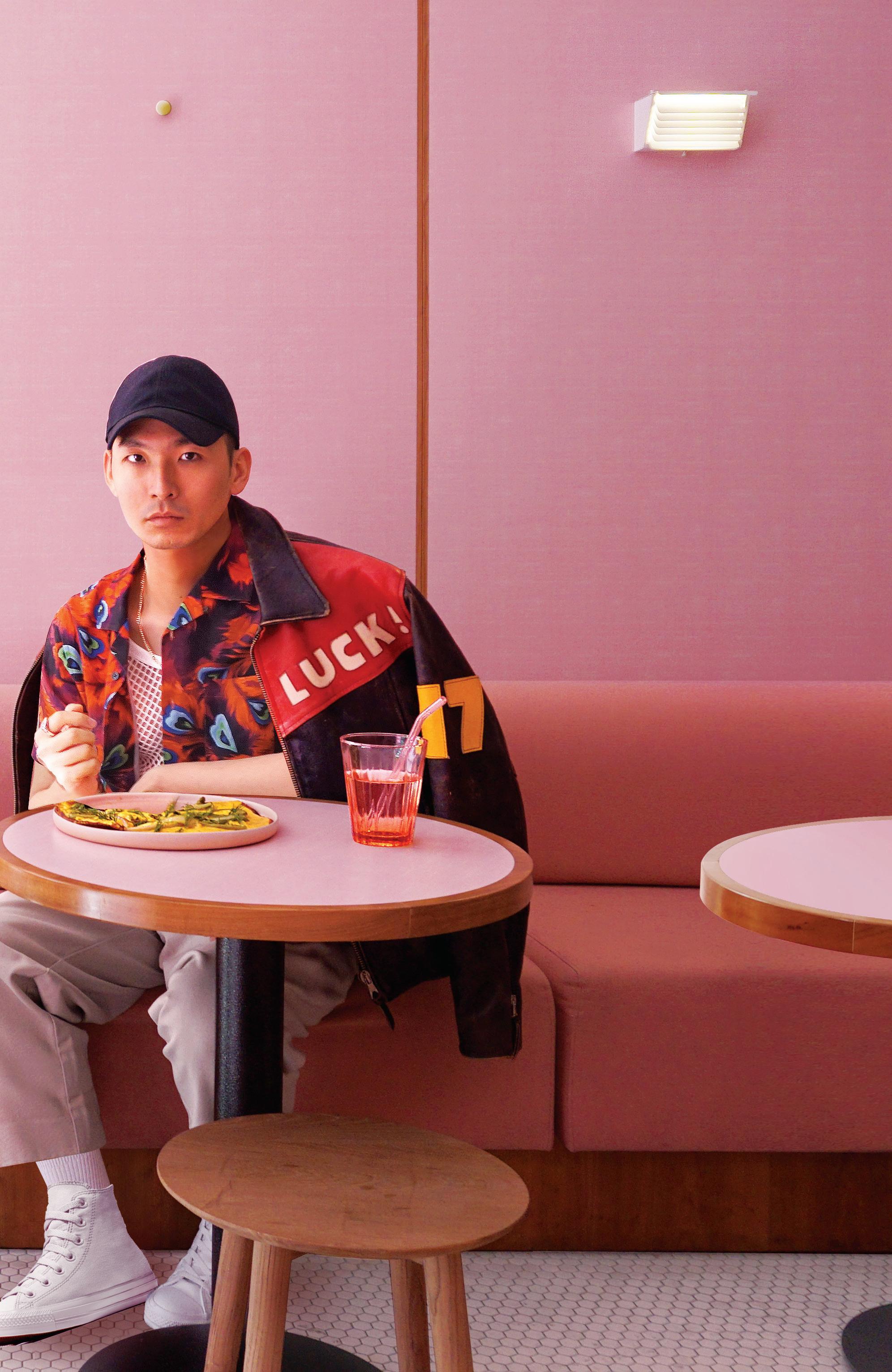
These cafés served no-frills food and typically featured pastel-coloured surfaces made from Formica, a laminated composite material invented in 1912. “We have long been attracted to the cinematic quality of London’s ‘Formica cafés’, the duality of Modernist design language and the playful, almost cartoonish spirit,” explains Chieh Huang and Alexey Kostikov of Child Studio. Apart from the white tile floors, surfaces throughout the eatery are clad with cherry wood-framed panels of pink Formica. The material has also been used to cover the countertops of the circular dining tables and the service desk that sits beside the entrance. The studio worked closely with the Formica factory to give the panels a subtle, linen-like pattern.
A candy-pink seating banquette runs towards the rear of the eatery, where a partition with recessed opening looks through to a forest-green kitchen. The opening is fitted with lights to draw attention to the chefs at work, creating what the studio hopes will be a “cinematic focal point”. “This project aims to create a contemporary version of this unique typology,” say Huang and Kostikov.
It certainly does that, along with its décor of pink broadsheet newspapers hung intermittently across the walls. Definitely a fit-out that tugs at locals’ heart-strings, and awakens the interest of visitors who ‘heart’ Formica extra hard.
INDESIGN 51 IN SHORT
Arch-tivist: Odile Decq

French architect Odile Decq studied architecture and urban planning in Paris, back when having these dual qualifications were in every architect’s interest. They’ve been pivotal in establishing Decq as an international leader in design, and a luminary to women in design. Decq was in Sydney recently for the SCCI Architecture Hub. She delivered a keynote address on architecture as place rather than building.
In an exclusive interview with Indesign, she tells us: “I am an activist. My architecture is [about] activating cities. When I do a museum, office building or home, architecture is [literally the] activist” – of a site, community and the individuals within. “I always look at a building as a place, not an object,” she says. “It’s a place of living: doing something in your life.” Understanding a site and its urban context is vital to conceiving a built environment. Before any project, she visits “the place [site], the surrounds and the people for whom I have to build, and after that I start.”
Decq likes to break bread with the people who will interact with her architecture.
“I always have a meal with them – by having a meal with them I understand how they socialise. After that I go to the site, walk on the site and understand what is around. This is really a journey, to the place and the people that are living there.”
Activism manifests in many different ways for Decq who also considers herself an activist for women in architecture. She believes young female designers need strong role models from above. “We need woman in powerful positions to aspire to,” she says.
INDESIGNLIVE.COM IN SHORT 52
–
–
A champion for women in design, and for architecture as a product of place and people.
SIMPLE, INTUITIVE, ADAPTIVE. MOVING WALLS - FOR THE CREATIVE AND DYNAMIC WORKPLACE. www.t-c-w.com.au SYDNEY 02 8070 9314 MELBOURNE 03 9614 3333
The Art Of Cra
Indesign Rocks On

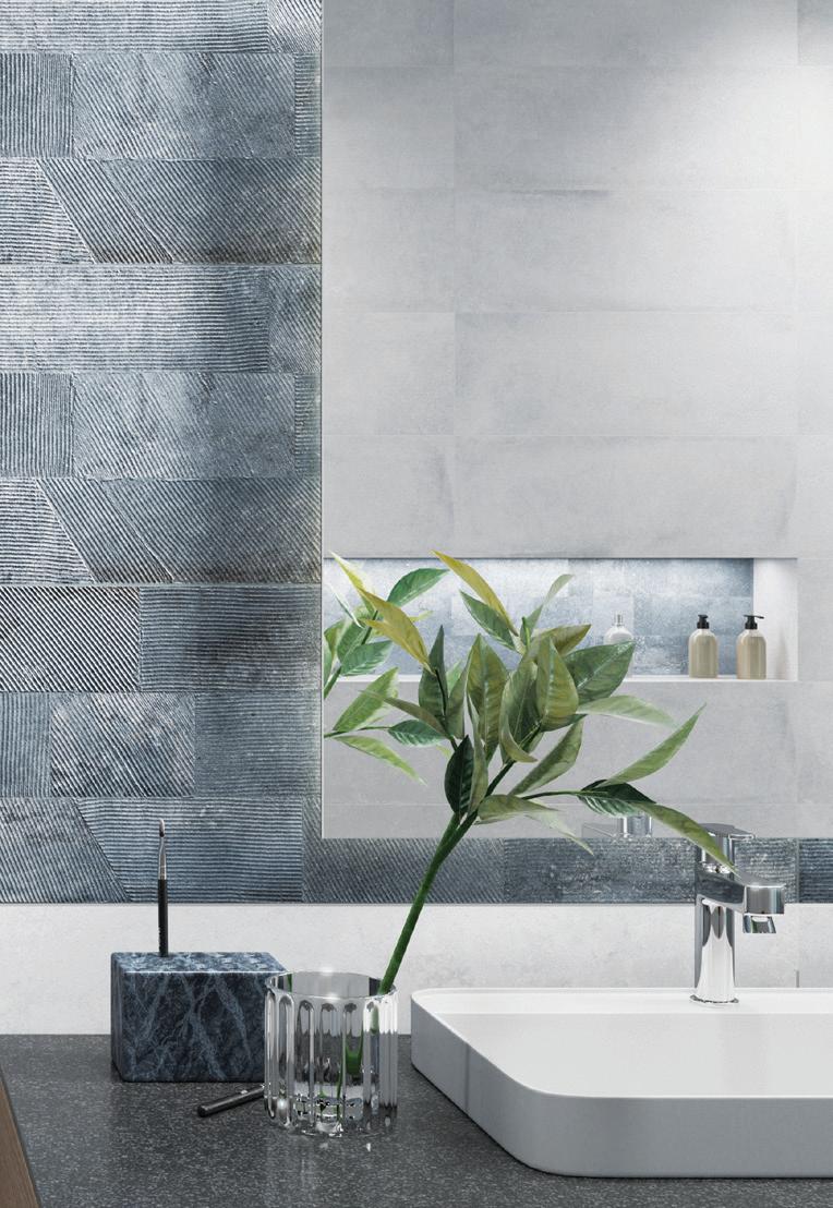
Cra smanship is a marker of quality and at the core of successful design. Just like the wide range of meticulously cra ed porcelain and ceramic, wall and oor tiles from the house of Rocks On. With a new range of uniquely designed oor tiles and nishes in an assortment of sizes, the brand has also launched wall and feature tiles, inlaid timber wall panelling, and bookmatched luxury stone slabs. Interestingly enough, all the tiles have been created from hard-wearing scratch, stain and acidresistant porcelain, ensuring surfaces stay evergreen and beautiful for years together.
Wear Your Emotions On Your Sleeve
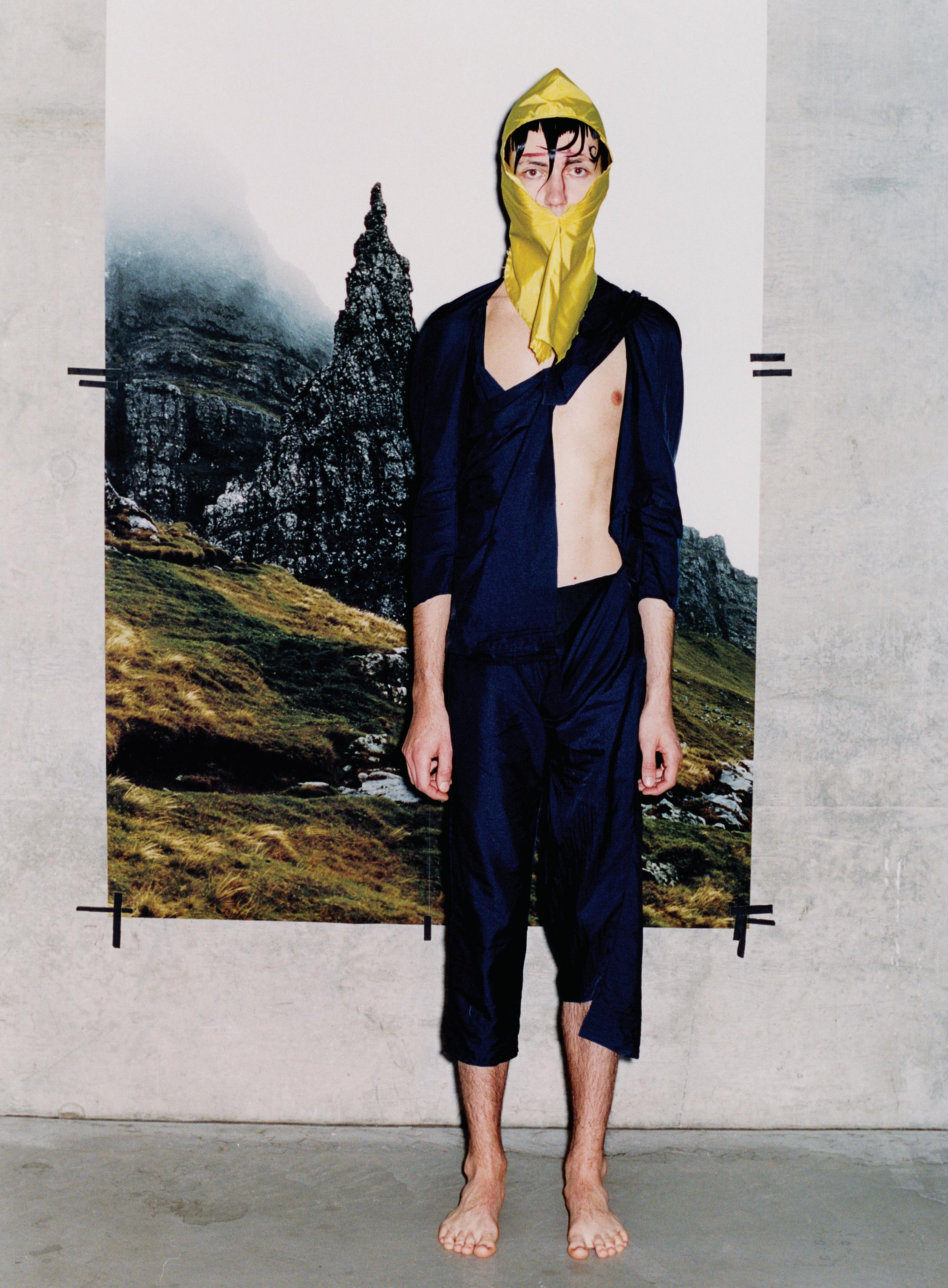
Fashion as personal expression takes on new meaning in Beatrice Sangster-Bullers’ recent collection, The Order of The Singularity, which sees arti cial intelligence integrated into the garments to map wearers’ mental states and display their emotions. Models were given an electroencephalogram (EEG) brain-activity recording device to measure their brainwaves. This was linked via Bluetooth to a screen interface tted into the chest of the garments. Algorithms converted the EEG signals into audio and visual outputs, allowing users to hear and see their brainwave data in real-time on their smart devices. Sensors also tracked heart rate, body movement and breathing. The wearer could choose what visual output they projected onto their clothing – a virtual display of emotion.
INDESIGNLIVE.COM IN SHORT 54
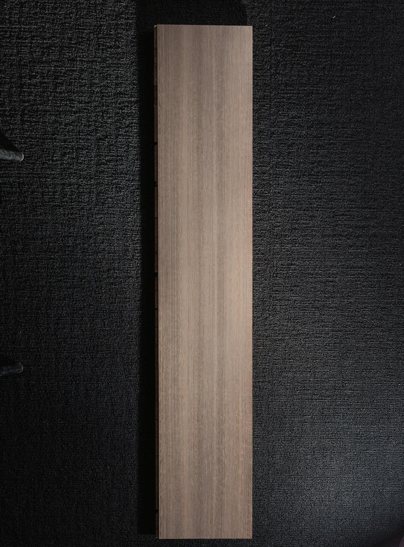
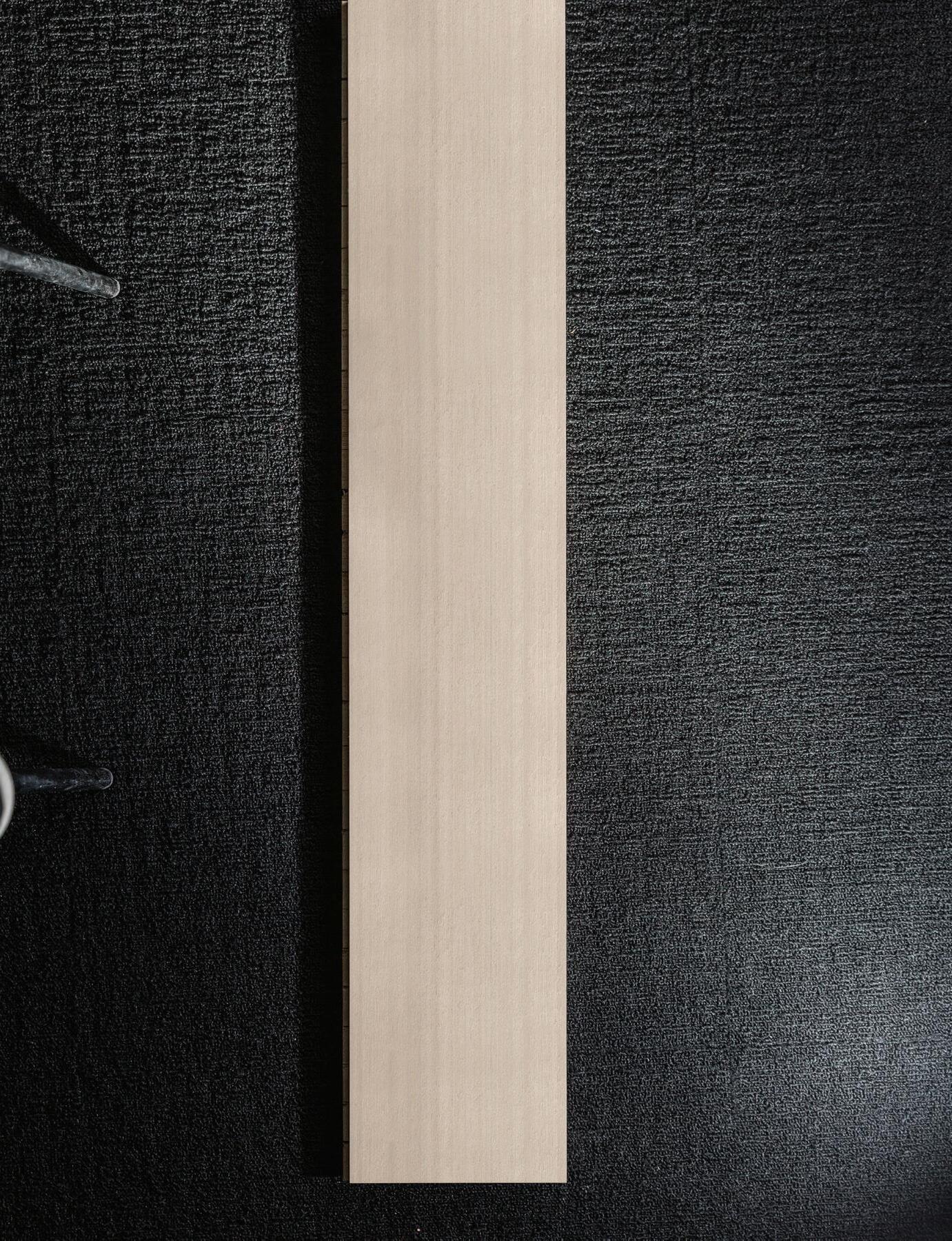
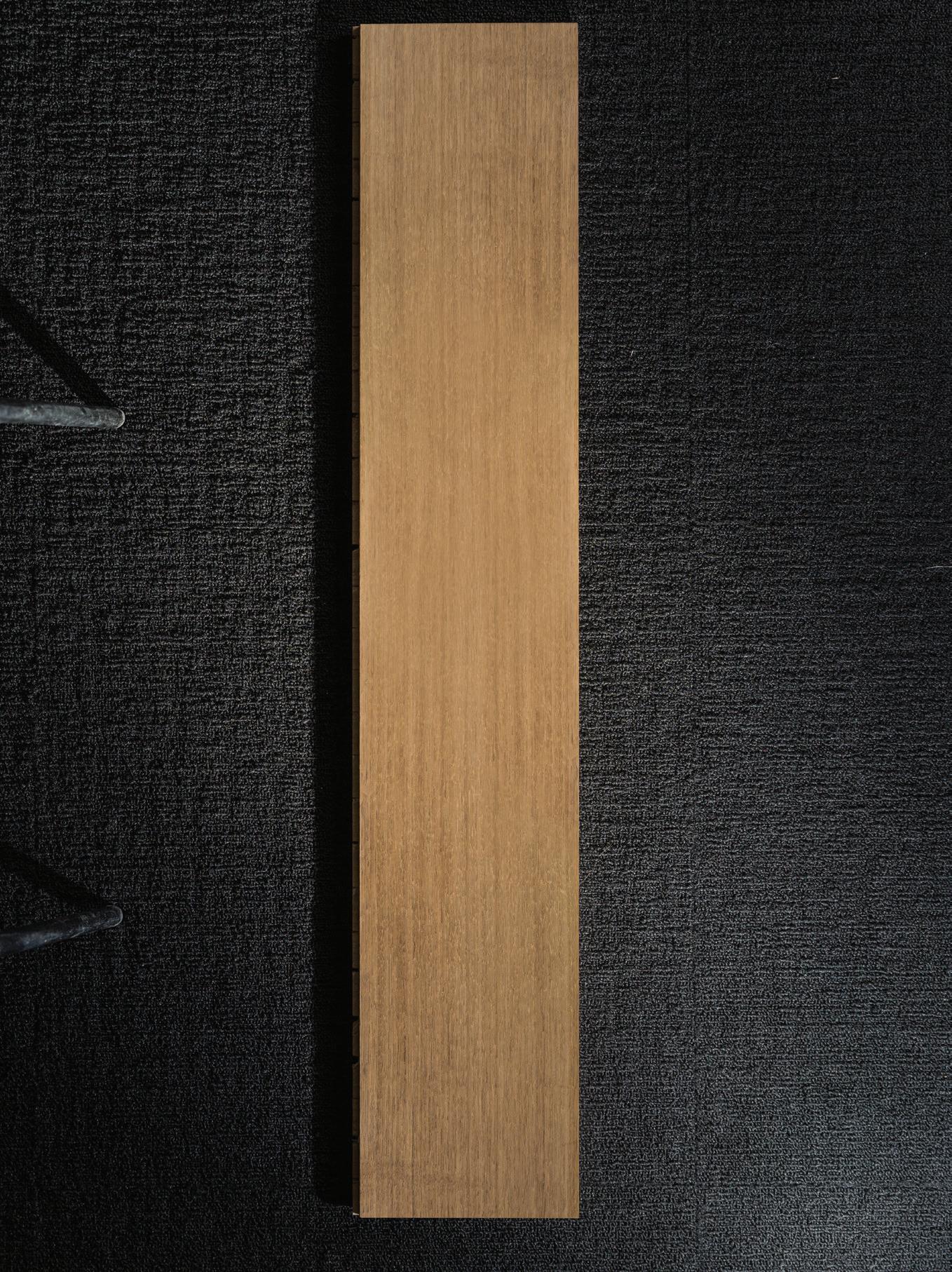
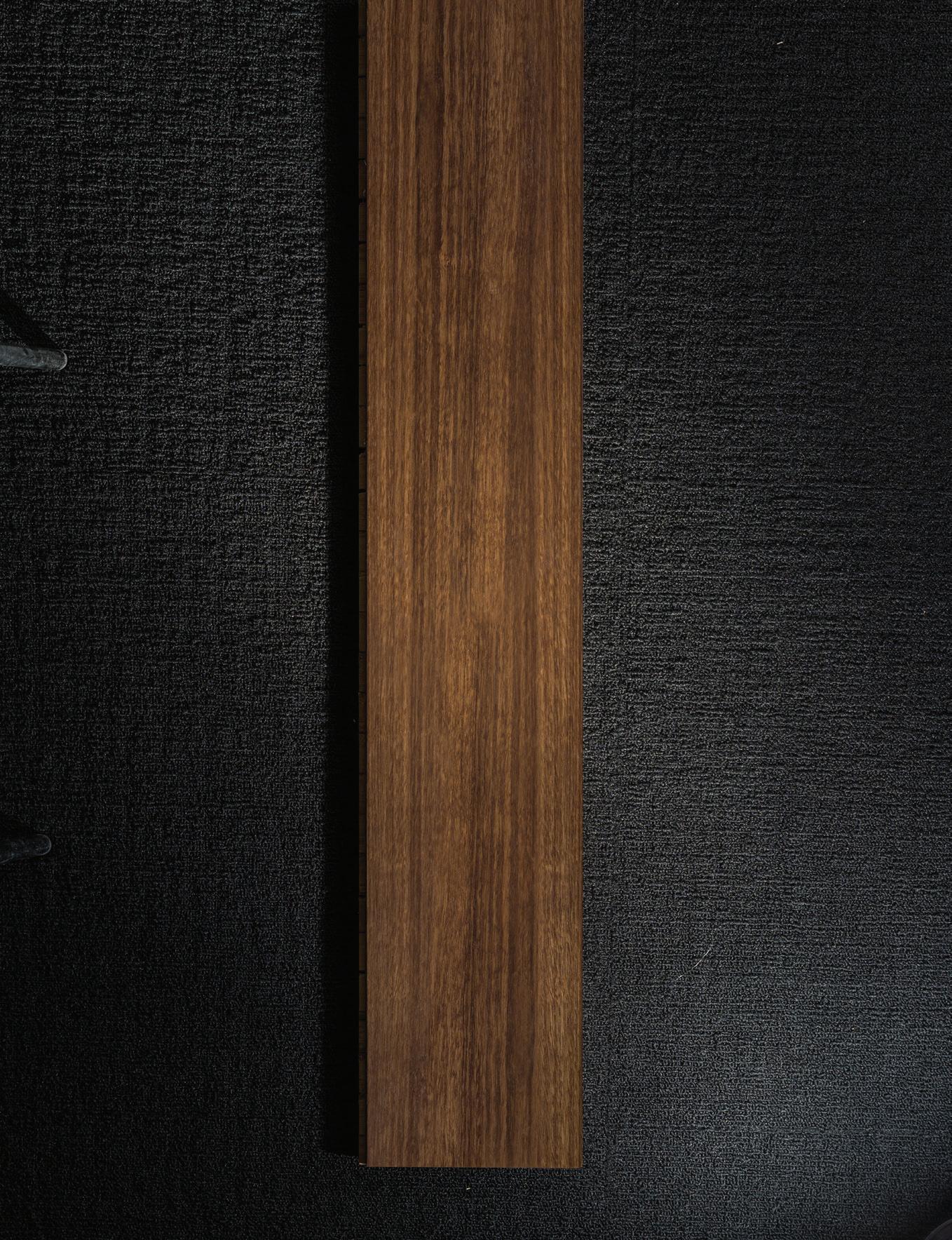
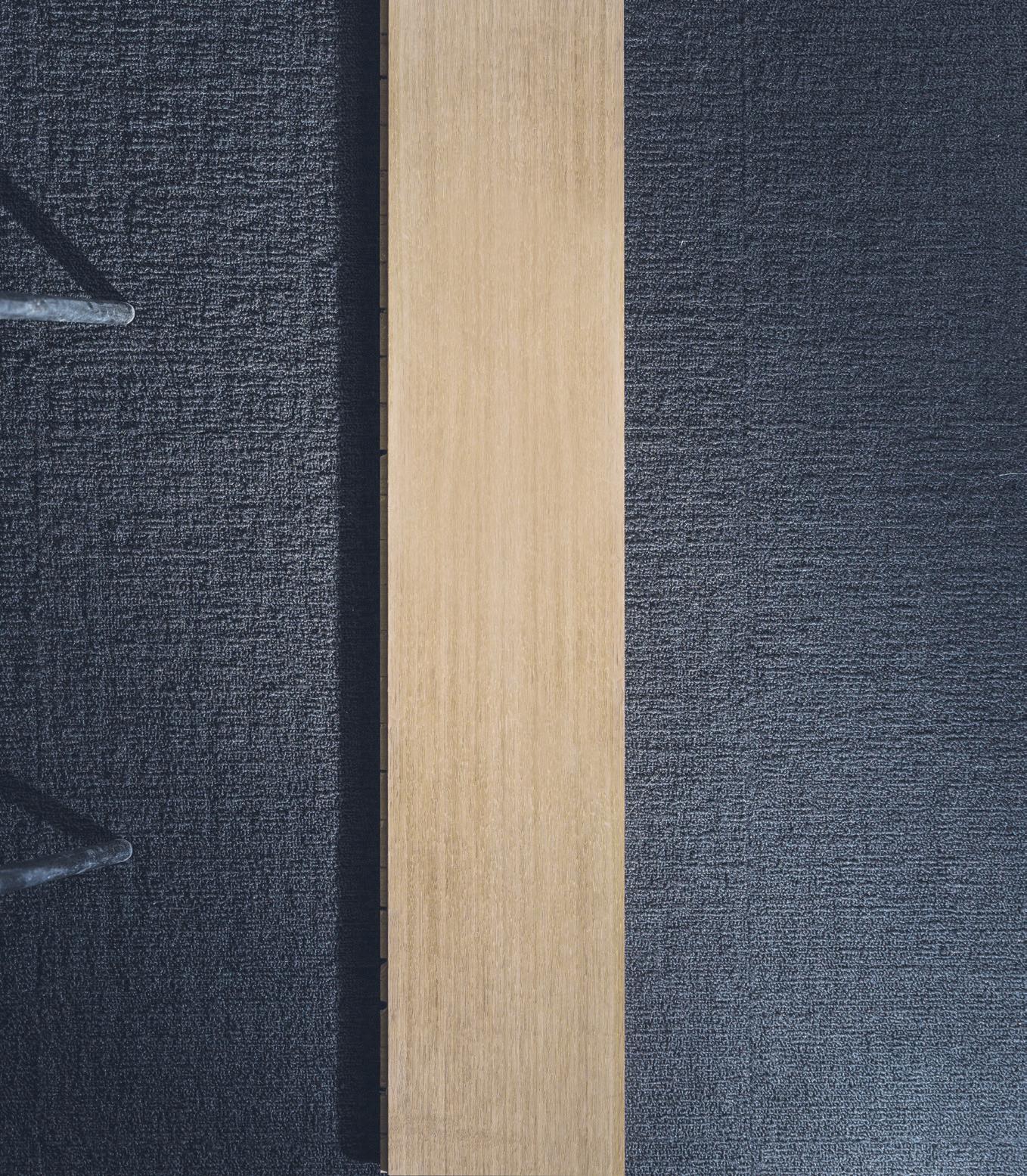
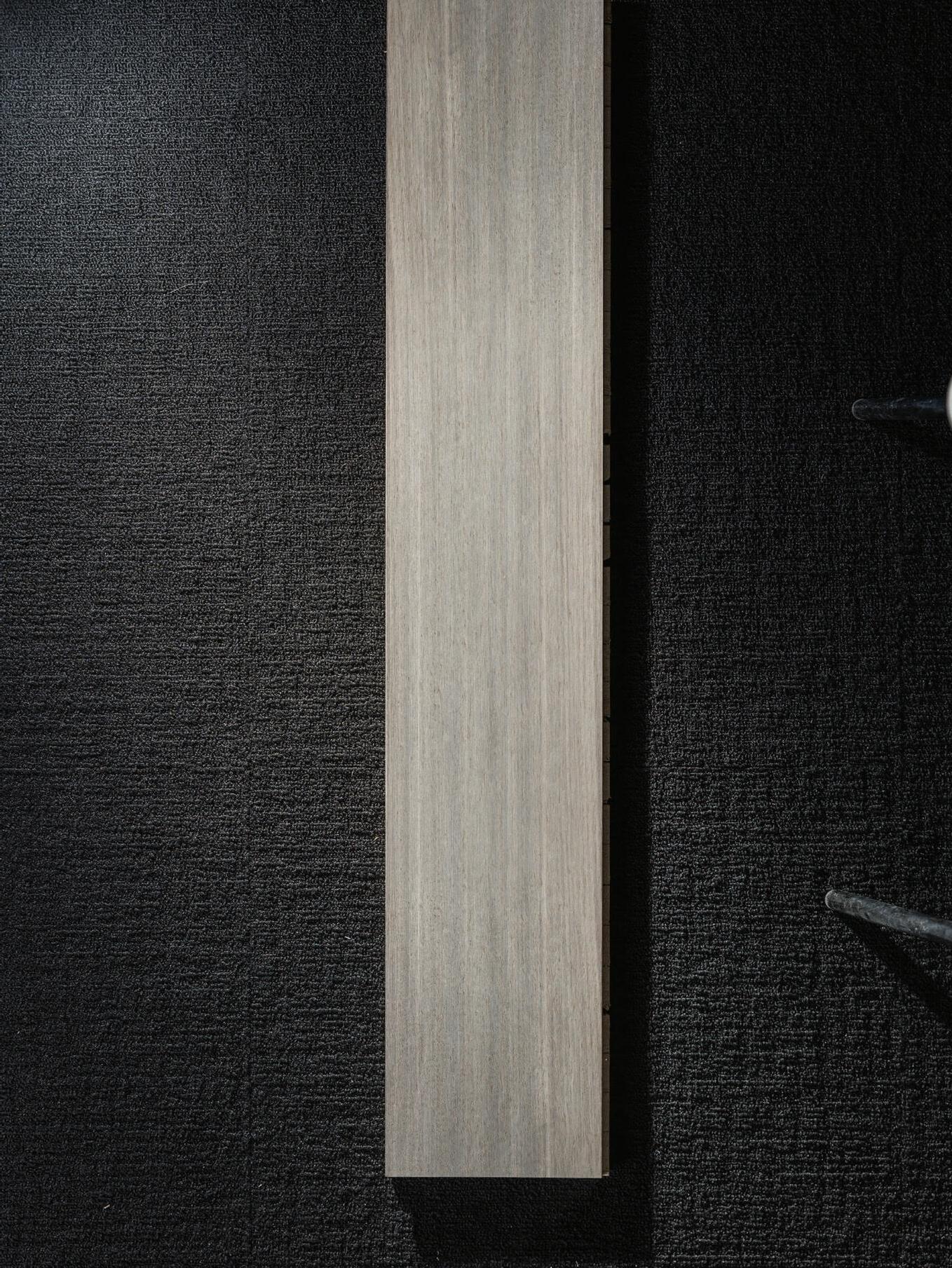

The World Of Tom Dixon
Words Emily Sutton Photography Peer Lindgreen
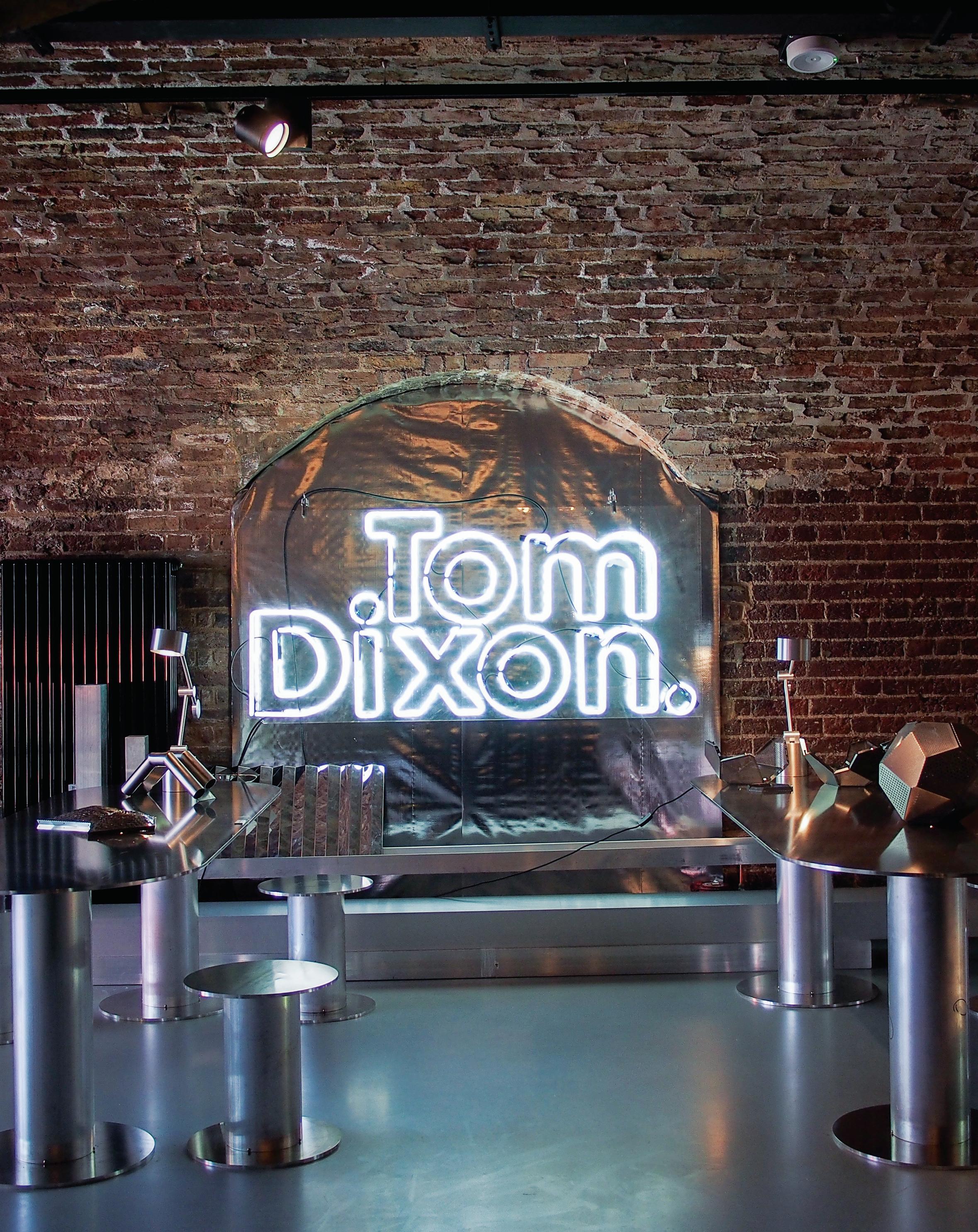
The new creative studio of Tom Dixon at The Coal O ce is a celebration of experimentation and innovation of art, design, culture and community as a collective movement. Reimagining the 21st century retail experience, Tom Dixon looks beyond the boundaries and cra s a truly immersive experience that encapsulates the future-forward way of living, working and entertaining.
LIVINGEDGE.COM.AU 56 INDESIGN LIVING EDGE
LIVINGEDGE.COM.AU 58 INDESIGN LIVING EDGE
Design has the power to create a feeling, to make you question the details and push the boundaries of innovation and creativity. It is a medium in which designers showcase their narrative and their personality – giving them an opportunity to de ne their own style.
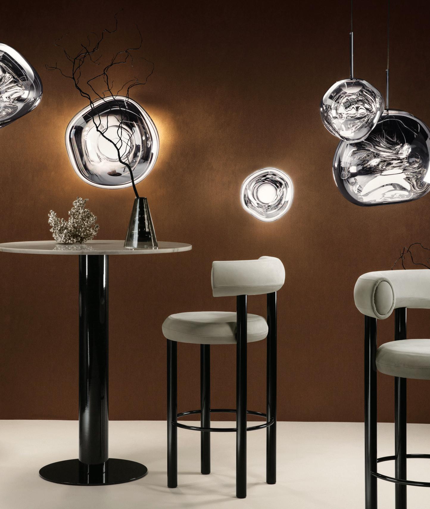
A pioneer, leader and boundary-pushing creator, Tom Dixon continuously brings exciting design propositions to areas of lighting, accessories and furniture. The Tom Dixon brand itself encapsulates a distinct nature and a joyous, quirky and rigorous of design.
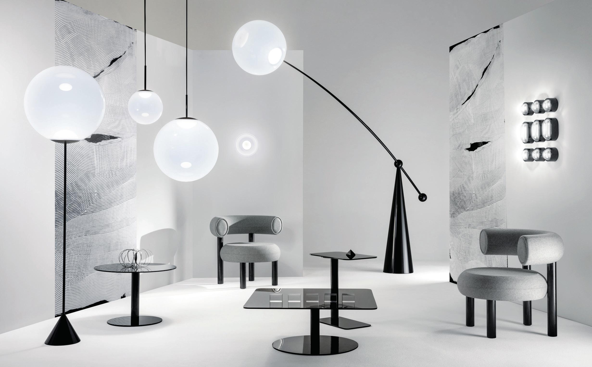
Breaking barriers in conventional shapes and textures of lighting and furniture, the meticulous and exuberant cra smanship of Dixon’s pieces are celebrated within the new studio of The Coal O ce by Design Research Studio (DRS). A restless innovator, Dixon established DRS in 2003 under his design direction as a trailblazing creative powerhouse across high concept interiors, architectural design and branding projects for the spaces and brands of tomorrow. Against the historic industrial backdrop of Coal Drops Yard in the iconic area of Kings Cross in London, The Coal O ce is the new home for Dixon’s latest experiments and collaborations, and a multi-disciplinary platform that puts the spotlight on innovative and thoughtful design.
As one of Britain’s brilliant, anarchic and creative minds, Dixon has cra ed a hub of creativity, combining a shop, workshop and o ce with a restaurant and café to showcase his brand’s latest ideas in interior design and product innovation.
It’s a truly immersive experience, elevating our interaction with the brand to a holistic and spatial level. Dramatic and robust within the site’s existing fabric, the interior space allows Dixon to put his re ned, sculptural pieces into action. Stepping into the doors of The Coal O ce is a transcendent experience of past, present and future,
where ornamental collections of lighting and furniture illuminate the space and highlights the brand’s ingenious engineered materiality and cra smanship.
As a multi-disciplinary agship that encompasses the future of living, working and entertaining, The Coal O ce works to rede ne the way we experience multi-functional spaces in the contemporary context. Dixon’s vision is focused on product development and integration tailor made for the multi-use, adaptive and agile spaces. Curated with furniture and lighting pieces to represent the story and journey of authentic design, the space encourages visitors to indulge in the brand philosophy and versatility of the new workspace.
Consistently changing the pace in food, functionality and future living, the pieces on show enhance the workplace experience and focus on fashion, cra and culture as a collective movement. Statement lighting hangs from the exposed ceiling to create a visual beacon within the space. De ned by sculptural archways, each zone celebrates design through vibrant colours, distinct forms, luminosity and a multitude of furniture pieces. A veritable journey across the full breadth of Dixon’s creative spirit and distinct approach.
Sharing Dixon’s passion for sophisticated and extraordinary design, Living Edge is proud to bring his inimitable work to Australian shores. Living Edge believes in brands that represent a lifestyle and a story. A new edition to Living Edge, Tom Dixon rede nes the traditional workplace with contemporary pieces and elements that take the nature of the o ce to the next level. Driven by sophisticated design and exceptional, authentic and innovative spaces, Living Edge celebrates interior pieces that enhance the way people live in the present and for the future generations –synonymous to the philosophy of Tom Dixon.
LIVINGEDGE.COM.AU 59 INDESIGN LIVING EDGE
FACADES BY
FACADES NOW AVAILABLE
REDEFINING ARCHITECTURE
Transforming imagination into functionality, Neolith Facades are now available. After years of development, Neolith is the superior standard in surfaces. Neolith Facades have redefined European architecture. Neolith is suited to a range of cladding applications and can be used with multiple cladding systems.
Talk to our Neolith Specialists today to discuss Neolith’s certifications and which cladding system best suits your application. Add a complete and consistent finish to your next project with Neolith Facades.
Proudly brought to you by CDK Stone.
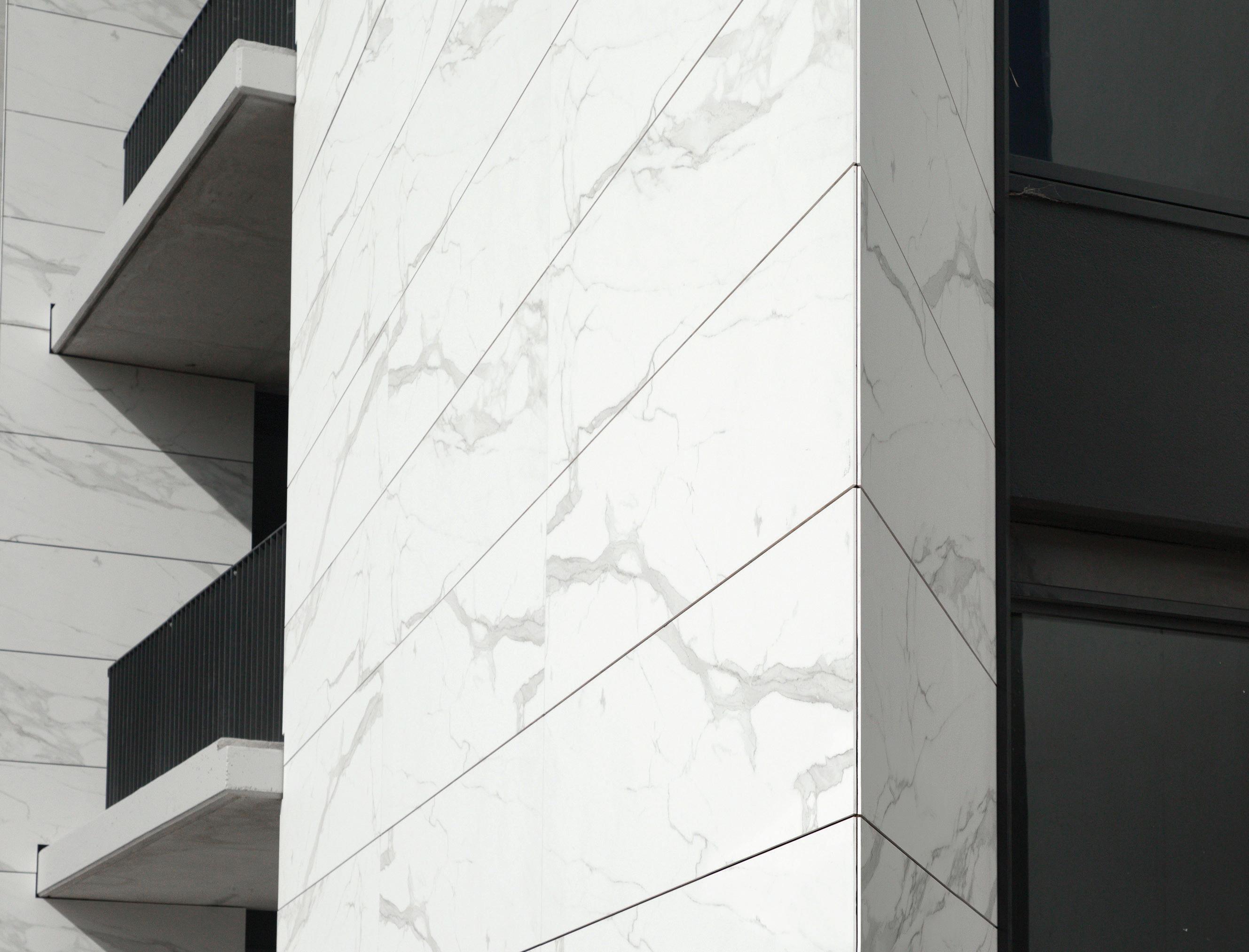
ESTATUARIO | CLADDING Discover more at www.cdkstone.com.au
Big thinkers and
C reati V e gU rUs
INDESIGN 61 IN Famous FAMOUS IN

An Arranged Marriage
Thrown together by circumstance, Kirsten Stanisich and Jonathan Richards formed a professional partnership that has seen them grow, flourish and forge a brand of their own.
INDESIGN 63 IN Famous
Words Paul McGillick Portrait Photography Charles Dennington
INDESIGN Luminary
INDESIGNLIVE.COM IN Fa MO u S 64
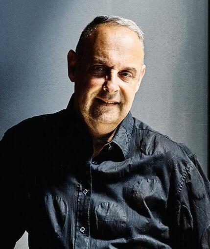
Quizzed about whether the success of his partnership with Kirsten Stanisich is because they are similar or different, Jonathan Richards comments that they are quite different. “I didn’t ever go to Kirsten and say, ‘Hey do you want to start a partnership?’ We just found ourselves together. It’s like an arranged marriage. A company just joined us and said, ‘You guys will work well together’.”
He says they are good friends and with an equally good working relationship. “We have lunch all the time, we hang out together – it’s a very easy conversation and throwing up of ideas.” But Stanisich quips that “it’s like having a big brother who can tell you to pull your head in”.
The company that brokered this professional marriage was SJB, the Melbourne-based architecture and interior design firm which 23 years ago sent a fairly raw young architect and designer, Stanisich, to Sydney to start up a new branch of the practice.
For Stanisich, architecture hadn’t been an obvious choice. She was halfway through a classics degree when she bailed out into architecture at Melbourne University. “If the world was a different place,” she elaborates, “I would love to be a fashion designer. When I say fashion, I don’t just mean things changing, I am talking about the essence of materiality, silhouettes, fabrics. To me fashion really reflects what’s happening socially.” But at university she was sustained by a group of fellow architecture students who helped her clarify the path forward.
Following graduation she worked for an architect in Melbourne for two years before joining SJB. “I ended up working with Andrew Parr on the casino in Melbourne and I realised I really liked the interiors side, so I [stayed] in interiors. Andrew’s got an incredible energy about him. And he just loosened me up about the possibilities of what things could be.”
Sydney was a challenge and she says she was “thrown in the deep end a bit”, but it was the “right place at the right time” and she got to work with Andrew Parr on iconic projects such as MG Garage and the Establishment Hotel.
Richards’ early years were equally circuitous. He didn’t really know what he wanted to be, but at school he was good at drawing and liked maths. “I didn’t even know what architecture was, really. I wanted to be an artist. But my dad didn’t support me, saying I’d never make any money as an artist. I didn’t really believe him, but I was too scared to just embark on being an artist. So, I enrolled in interior design [at University of Technology Sydney] thinking it might be an artistic form of architecture. I did like modern buildings and I liked being in them, but I didn’t think I was capable of architecture. With interior design I thought I could draw and use my artistic passions in some kind of three-dimensional shape. And I really enjoyed it.”
His first job was with BVN (originally Bligh Voller), which he loved. Then he thought he should get back to his “artistic leanings”, so he went into exhibition design, working for Freeman Ryan before
INDESIGN 65 IN Famous
“If the world was a different place I would love to be a fashion designer... To me fashion really reflects what’s happening socially.”
Page 62 and page 66: “We have lunch all the time, we hang out together – it’s a very easy conversation and throwing up of ideas.”
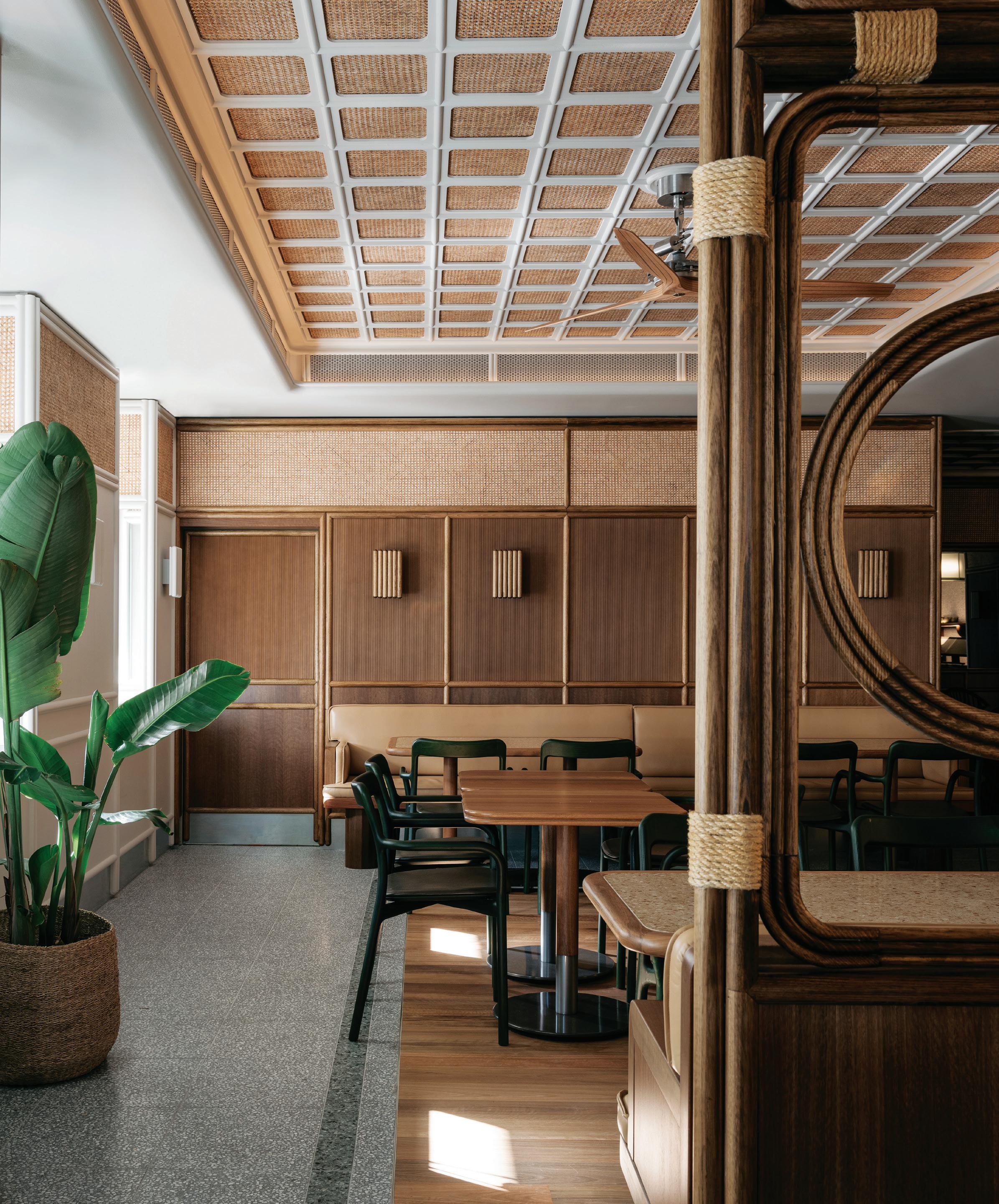
– Jonathon Richards of Richards Stanisich. Opposite: Hotel Rose Bay, Sydney, builds on its historical narrative with Art Deco-era references, photo: Felix Forest. Page 67: The Bell Table by Richards Stanisich, handcrafted by The Wood Room, photo: Tim O’Connor.
becoming the exhibition designer for the New South Wales State Library. He then went to live in London, returning in 2002 with a view to working with Burley Katon Halliday (BKH). But a friend suggested SJB instead. His friend said “they were completely different to BKH. It had a Melbourne aesthetic, darker. So I went to an interview with Kirsten and Andrew [Parr]. I got the job and I started working from 2003.”
All up, Stanisich worked for SJB for 23 years, 15 of them as a partner, while Richards worked there for 15 years, 10 of them as a partner. In time, they became the sole owners of SJB Interiors Sydney.
But for a long time they remained partners with Andrew Parr and Michael Bialek who Richards describes as “a real mentor to both of us, a kind of father figure, a gentleman”. In effect, the many years at SJB were an apprenticeship and one of the benefits was that “there were older people who could teach us the economics of running a business and the financial side of running a design practice – making it profitable so that you could keep doing it”. All of this put them in an excellent position to branch out as an independent practice.
Essentially it meant simply re-branding so that now, just over a year after the launch of their own practice, they retain their clients, the same staff, even the same studio. “It had an emotional impact,” says Richards, “but on a pragmatic level we simply changed the name on the door.”
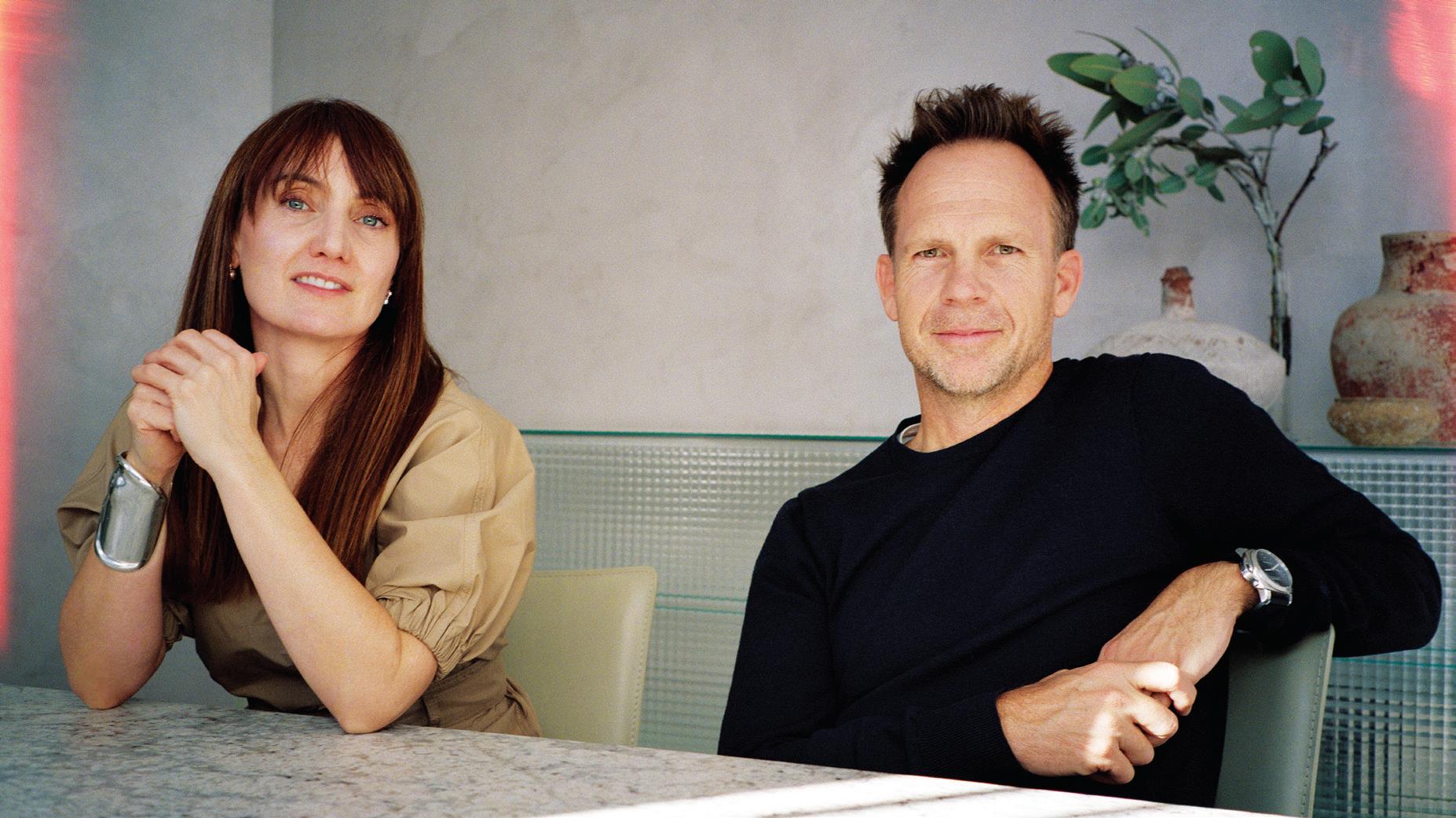
Psychologically, it has certainly made an impact – the kind of impact necessary to refresh the practice and bring it toward new horizons, which now include furniture and product design. Richards says they now feel more “hands-on, there’s a new ownership, a new way of working”. He has noticed that they take extra care when presenting and he and Stanisich have established their own studio space where they can experiment privately with materials, samples and finishes – what Stanisich describes as “a sanctuary space where we can go and think”.
So, what makes the ‘marriage’ work? Is it because they are alike, or because they are actually different and complement one another?
“I think,” says Stanisich, “the main thing is that we have a strong aesthetic together – not just in the look and the feel, but the whole idea of what we are designing and why we are designing.” The fact that they work at a boutique scale means they can change the way they work if appropriate – something more difficult to do in a larger organisation. This is evident, says Richards, in the way they are becoming “more detailed, more tailored” and, adds Stanisich, with “more of an obsession for fabric”.
richardsstanisich.com.au
INDESIGNLIVE.COM IN Fa MO u S 66
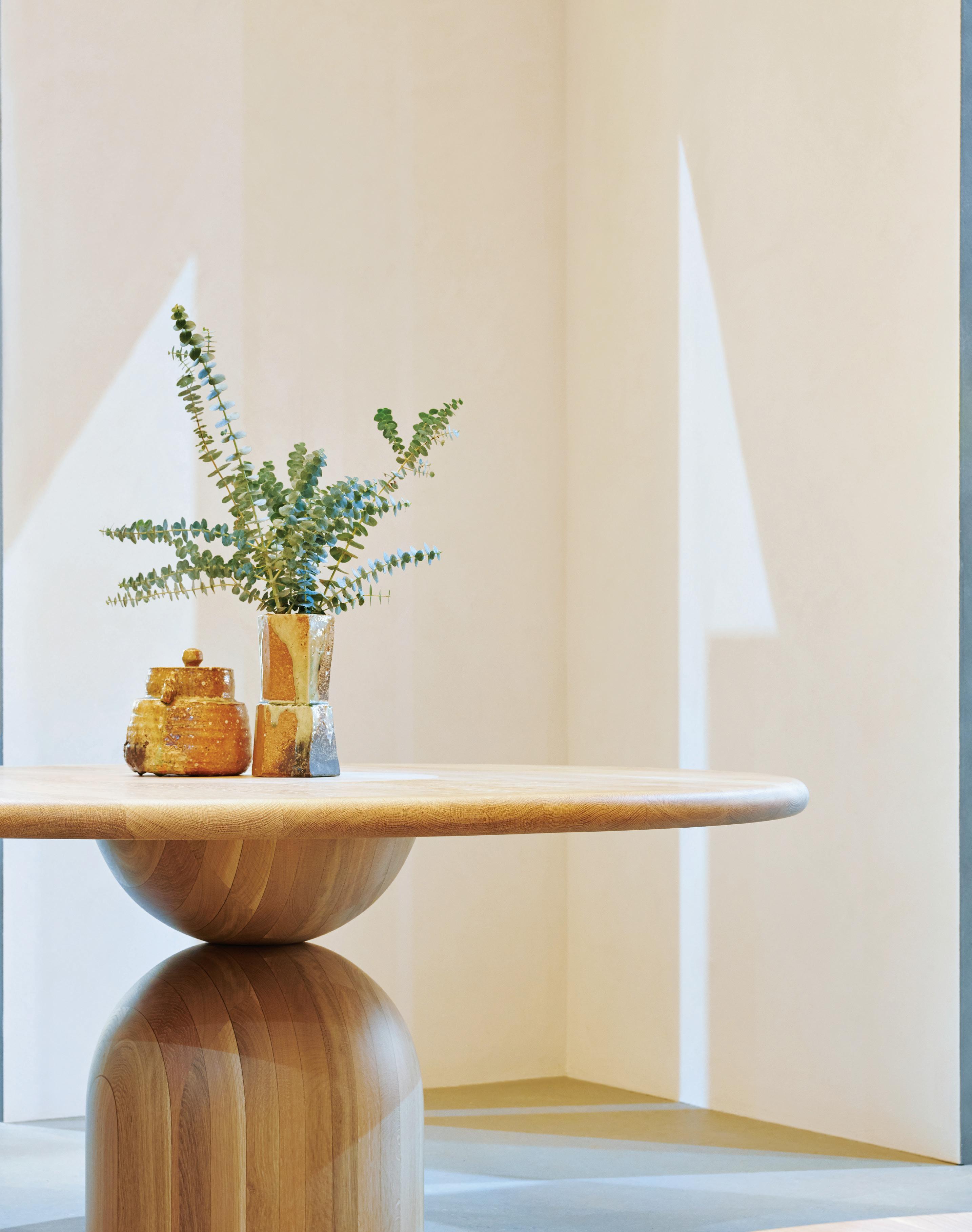
Raw, Primal, Simple
“We like to keep things a little raw and primal — objects so natural that you have an immediate association with the design,” say Richards and Stanisich of The Bell Table. With its sculpted base, plinth footing and carefully softened edges it draws people in to face one another in a joyful and almost primal communion.
–
So Artificial! Stephen Crafti questions the motives behind overly styled spaces that strip out true personality for the “ubiquitous” throw.
Words Stephen Crafti
INDESIGNLIVE.COM IN Fa MO u S 68
In the early 1990s, I was covering a significant architectdesigned home for a magazine. The distinctive house, with its curvaceous white walls and dramatic voids, was filled with the finest Italian designer furniture most could only dream about. With notepad in hand, I witnessed virtually the entire contents carried to the garage. Flimsy and inexpensive white soft vinyl furniture was brought in, not surprisingly, curved. The owner of this home looked on in despair while the photographer and stylists patted themselves on the back!
Decades later, furniture that doesn’t quite ‘fit’ the theme of a photographic shoot continues to be shunned in favour of what’s perceived as the latest and greatest. Houses, along with apartments and even workspaces, become less authentic with the goal to creating generic images that are intended to appeal to the imaginary visitor, be it an editor, a reader, a potential client looking for an architect or designer, or perhaps a buyer. Given how many high-rise apartments look virtually identical to one another, one would think the idea would be to create something new and exciting. But how many versions of a lounge or bed stacked with cushions and the ubiquitous throw can be recreated? Just pause a moment and think about entering an apartment for the first time – whether in reality or on a sales flyer – and seeing something unexpected. It could be an armchair handed down through family generations or a piece of art that speaks of another time in history. Not all antique furniture has to look as though it’s covered in cobwebs!
Stylists and others in the design community certainly have a role to play in this industry. Let’s face it, no one really wants to discover a room full of junk that makes a space feel uncomfortable. And who doesn’t like to see clean windows, beautiful flower arrangements and a few great designer furniture items? But ‘sanitising’ these spaces as though people have never entered them has become more the norm than the exception.
Obviously images need to be controlled to highlight architectural and design qualities. But where’s the ‘voice’ that tells you about the bigger picture of the design? In
an office, for example, not everyone works in a breakout space or a comfy armchair. Work also takes place around workstations with files and plans strewn across tables and benches. Many architects and designers have a tendency to strip an office completely and create empty rooms or, alternatively, bring in the stylists and see a functional space become a showpiece.
Those images make many people feel uncomfortable. If a house is on the market for sale, I would much prefer to experience a sense of the owners, how they use the spaces and the odd little quirks that express human nature. Seeing a house void of personal contents, with ‘props’ orchestrated within an inch of their lives, does nothing for the design senses.
Thankfully, there is now a subtle shift in the way spaces are presented, taking small but incremental steps towards authenticity. We see some stylists and photographers creating unique settings that capture both the spaces and the owners who dwell within. But unfortunately, there are still those stylists who see themselves as designers. Everything gets moved out and a ‘look’ is moved in.
What’s the remedy? I feel it’s a case of two steps forward and one step back. Do architects and designers need to be more vigilant when stylists move in? Do owners, be they sellers or proud homeowners, need to be more forthright when they see their belongings shuffled into a spare room or garage? Or is it simply waiting until the market reacts to these mocked-up rooms – only then might the focus shift?
Fortunately, I have not been a witness to a mass clearing of a house since that day in the early 1990s, when I was then relatively new to this industry. But I regularly walk into homes where an amateur stylist has made their mark. Everything is so artificial, with no sign of life.
Agents or property managers may argue that these makeovers allow people to envisage how a space could be used. But aren’t people more design savvy now? Surely they realise there’s simply no one home.
INDESIGN 69 IN Famous
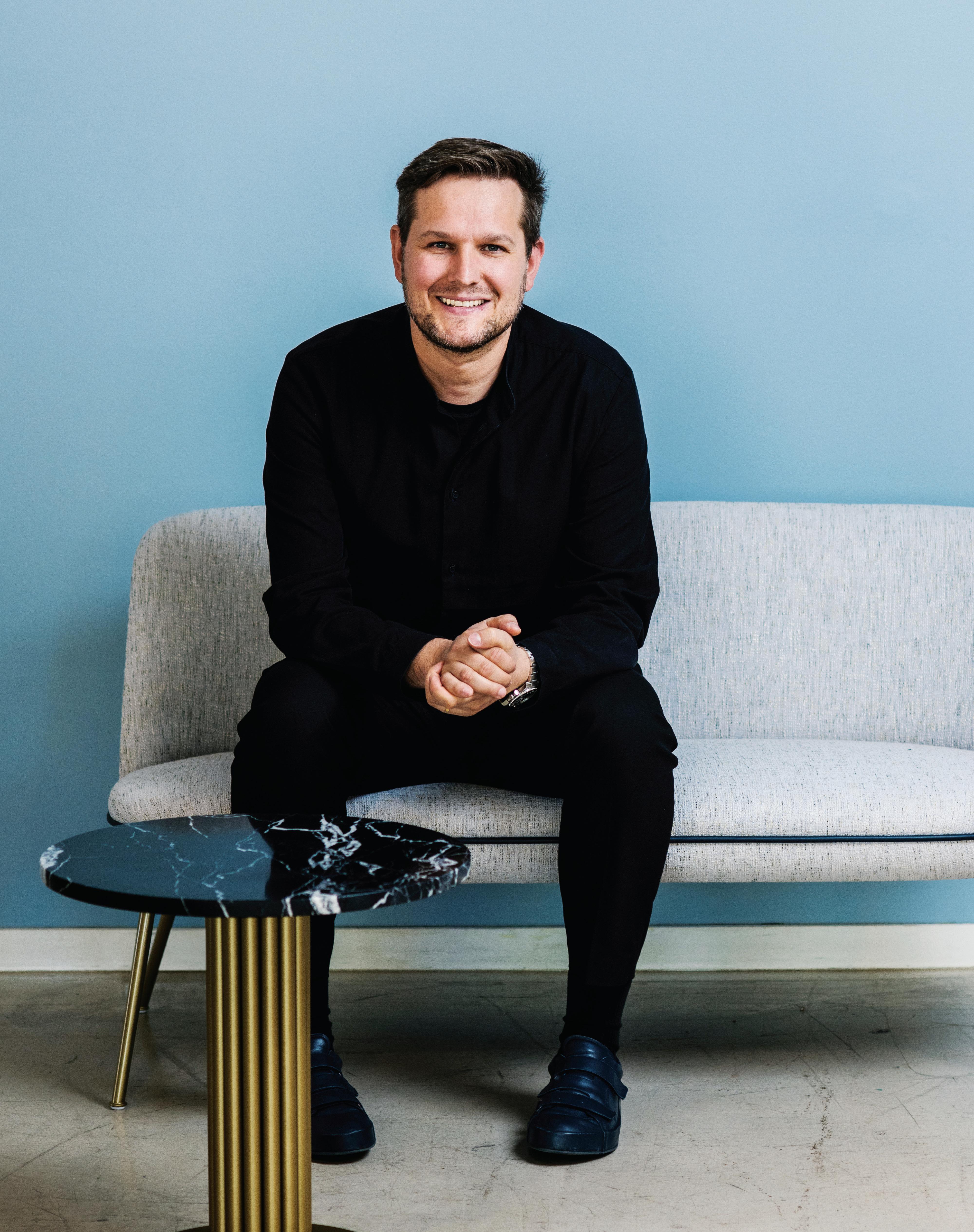
Stephen Crafti is a prominent Australian architecture and design writer.
Reading The Zeitgeist
INDESIGN 71 IN Famous
Words David Congram Portrait Photography Alana Dimou
In a world that feels less and less clear-cut, designer Sebastian Herkner upholds a philosophy of the specific that presents us with a cure for identity crisis.
“When I was a child,” says Sebastian Herkner, “I would travel around Europe with my parents. We would stop at a village, and often this village was dedicated to crafts. This one would be dedicated to ceramics, that one to gloves – and things like that. Even as a little child, I was always interested in the crafts of these places. I think that’s where it all started – my journey into the design world.”
As far as journeys go, this one is fairly enviable. From boyhood reconnoitres of Europe’s company towns to, earlier this year, being awarded one of the design industry’s highest accolades –Maison&Objet’s 2019 Designer of the Year – Herkner’s career trajectory can only be summed up as preternatural.
“He’s made it!” say some. And perhaps they’re right. After all, in the possession of accolades some designers spend half-centuries chasing, it would appear that at the youthful age of 37 Herkner is already flirting with luminary status. The credentials stack up to suggest as much: a German Design Award, Cologne IMM’s Das Haus, a Red Dot, the IF Award, the Iconic EDIDA Award –not to mention stints with Stella McCartney, Moroso, ClassiCon, Cappellini and now Wittmann, among other stalwart brands. Laurels aplenty – but he refuses to rest.
So much so, in fact, it was a stroke of luck I even caught him in Sydney. He had just arrived from Perth, via Europe, Asia and a brief visit to Zimbabwe. He was off again in the morning. I ask if he finds it exhausting to travel so often. “No. It is so important to how I work. Opening myself up to new experiences, people and objects, I find inspiration every time.”
And without fail seemingly every time, he’ll find something more concrete, too. During our talk he excitedly describes Bulgarian cake pans, French secateurs, Malawian woven baskets and Chinese brushes travelling in his suitcase from the farthest-flung climes, eventually finding home back in his Offenbach studio in Germany. From here, they’ll rouse into new life inspiring, say, a chair for Thonet or lamp for Gubi.
Macarons are a recent acquisition – I could just tell.
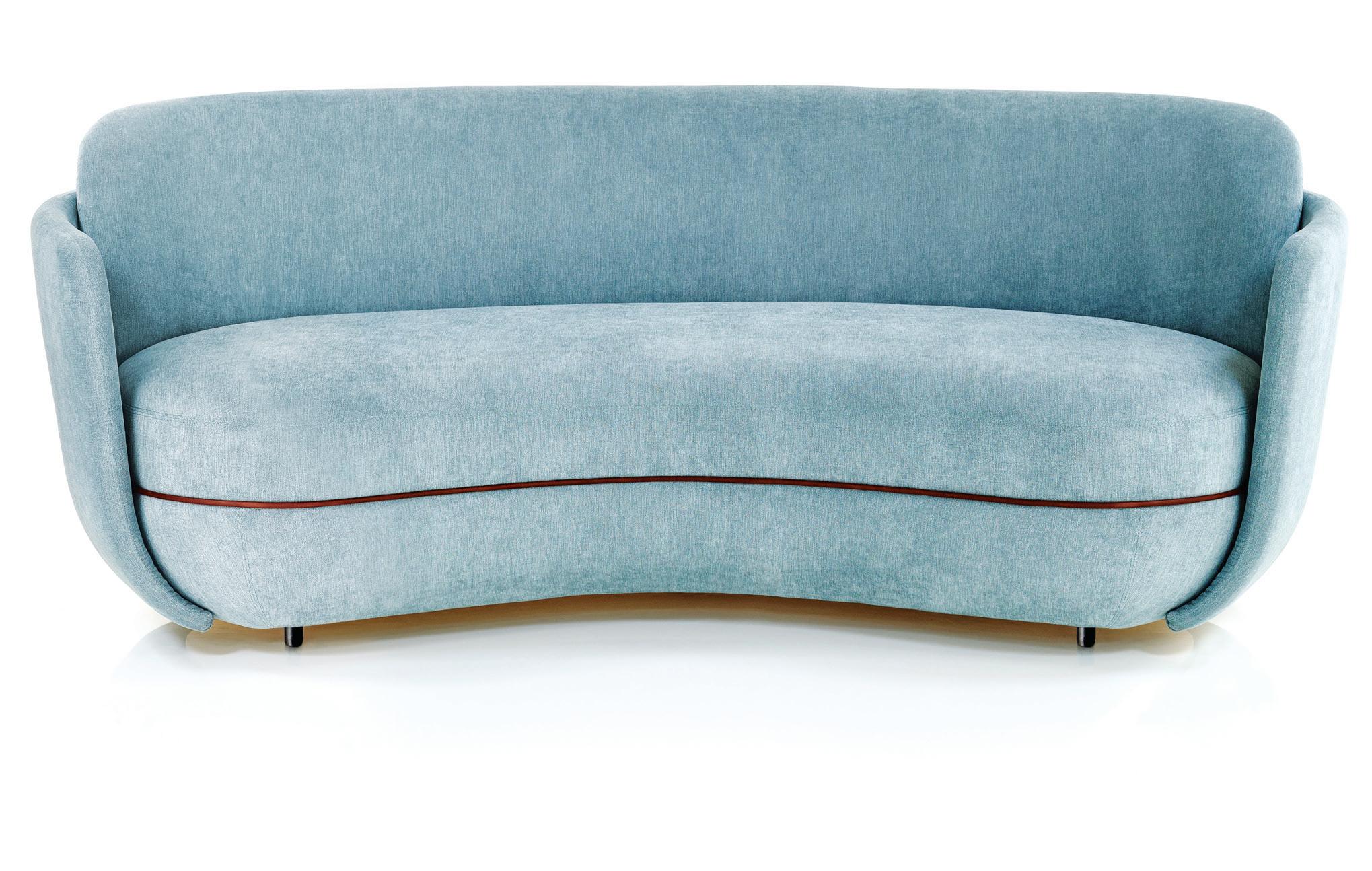
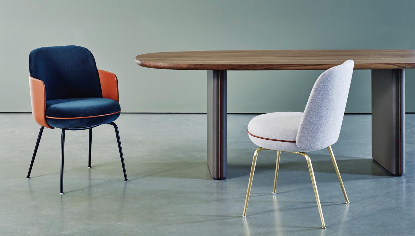
“Do you know Ladurée, the pâtisserie in Paris?” he asks me (and boy, do I ever!). “When I was there looking at the macarons, I thought their form was so perfect – they have a kind of elegance and confidence, you know? – and it was something very similar to what I wanted to achieve for Wittmann’s Merwyn collection.” I look down at my chair. Sure enough, it’s a macaron: two round, flat-
INDESIGNLIVE.COM IN Fa M O u S 72
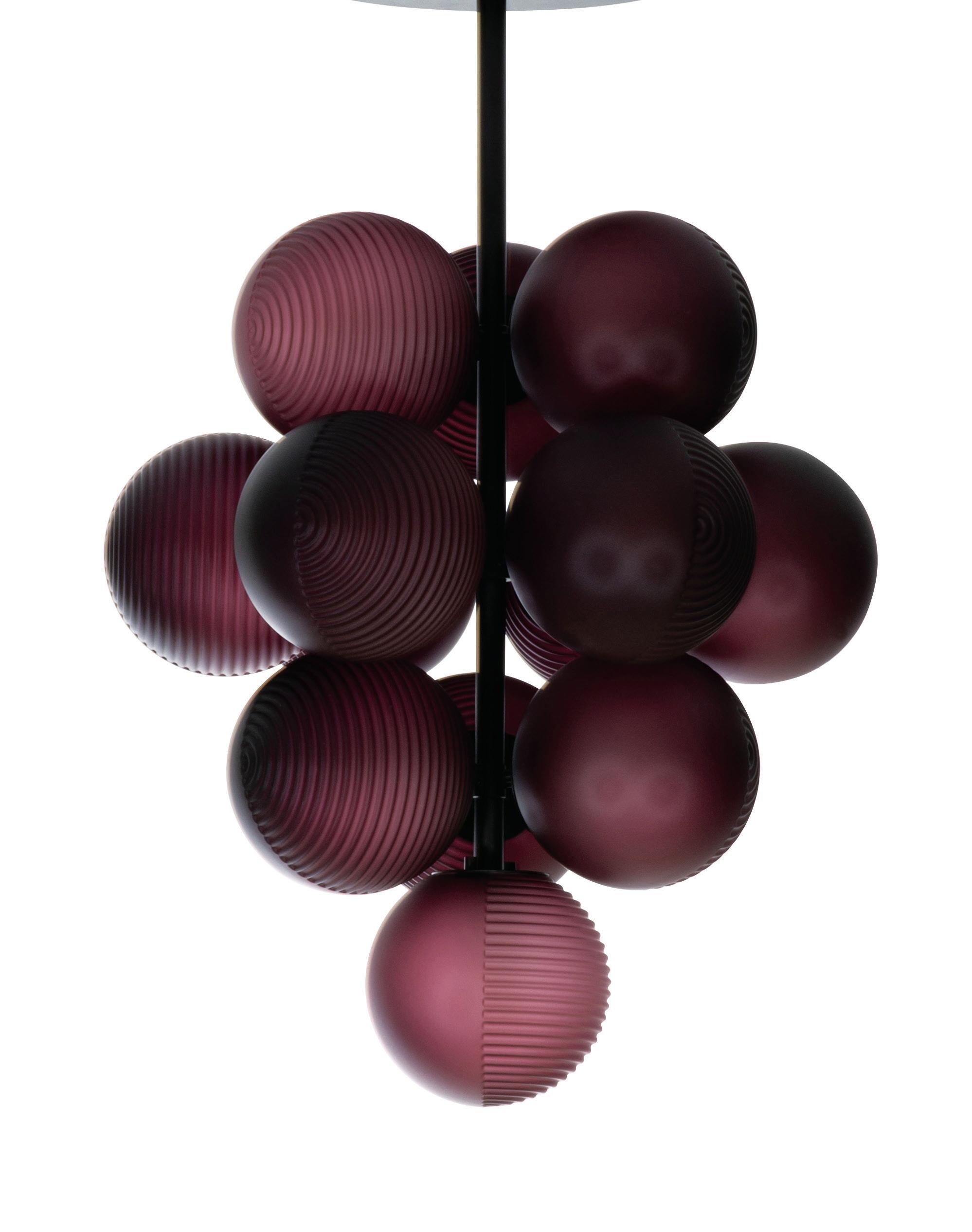
Page 70: “I don’t know if my work is political or if it is about the way we are living. But I know we live in a quite paradoxical world.” – Sebastian Herkner. Above: A development on the Merwyn collection for Wittmann, the Miles Sofa is inspired by the elegant macarons of French pâtisserie, Ladurée, photo: Gregor Titze. Opposite: Herkner’s Stellar Grape lighting for Pulpo is reminiscent of tightly bunched Concord grapes, photo: courtesy of the designer. Page 74: Herkner combines high seating comfort with an optical lightness for Wittmann’s Merwyn collection, photo: Gregor Titze.
“It is so important to how I work. Opening myself to new experiences, people and objects, I find inspiration every time.”
Sebastian Herkner, designer.
top domes sandwiched together and ringed with a strip of leather piping, à la cream. Elsewhere is a table I immediately imagine to be inspired by boiled sweets melting in the sunshine (Pastille Table, Edition Van Treeck), and a lamp evidently taking cues from those tightly bunched Concord grapes with pearlescent, chalky flesh (Stellar Grape lighting for Pulpo).
I need little prompting to learn the back stories. In each instance, Herkner launches right into a narrative so furnished with details – what object caught his attention, the life of the community using it, how it was made – and suddenly it hits me. That is what inspires him. Not travel, not objects, but that curious and fragile nature of happenstance when people, material and place collide. For him, a cake pan is anything but. “What is specific about it?” he asks. Well, it’s a celebration of Bulgaria’s metallurgic ecology; it’s generations of blacksmithing between the mountains of Rila and Vitosha where craft histories of the Mediterranean, the East and Europe converge; it’s comradeship, hospitality, open-heartedness. Not a cake pan in the world, but the whole world in a cake pan.
Germans call this geist. Aristotle called it haecceitas – or roughly, ‘thisness’. Herkner calls it responsibility. “Craft is so much about identity,” he says. “As a designer, it is my responsibility to understand and examine how craft is this element that connects us together and then connects us to a place. We need to respect it.”
“In Offenbach where I studied, and where I still have a studio, you enter the city by driving past a sign saying, German Weather City. The weather forecasting institute is there. But it also says German Leather City, too, because there was, in the past, a production of belts, wallets, shoes and bags and all these leathergoods. Eventually, it lost its identity. All the leather production left. There are still a few beautiful factory buildings, but they’re quickly becoming
apartments, lofts and offices. There is no longer this thing which connected so many people together and made them proud of their town and each other. Craft and design is so important in this – and not just furniture. It can be a bakery, a butcher or even a farm, but it’s all connected with craftsmanship, quality and people.”
As he tells me this, I can’t help being saddened. I think of Friuli Venezia Giulia (the Chair District) where more than 10 municipalities produce a smaller and smaller percentage of the world’s chairs per annum. I think of places like Torino, Leipzig, Bilbao, Lille and St Etienne, where the 2008 crash and the ‘eurozone crisis’ have made it difficult for these once-bustling industrial cities to now round a corner. And closer to home, I think of communities wringing their hands in abandoned steel towns throughout Australia.
“I don’t know if my work is political,” Herkner tells me toward the end of our conversation, “or if it is about the way we are living. When I give lectures, they are about things like quality, patience, craft taking time. But I know we live in a quite paradoxical world. You can buy something on AmazonPrime and you get it the same day. If you don’t like it, you can send it back. Where is the respect for craft and people in this? We just consume it all too quickly. I think this is where the interest in materials has grown a lot recently. We want to be connected back to the thing, that place and the craftspeople’s skills. That’s the paradox. We want these traditional things, the old things. But we are being pulled into the future. I think it is our responsibility to shape what it can be.”
Sebastian Herkner was recently in Australia to launch Wittmann at DOMO.
sebastianherkner.com
INDESIGNLIVE.COM IN Fa MO u S 74


Cla ics newly interpreted: KALDEWEI MEISTERST Ü CK CLASSIC DUO OVAL 3.5MM ENAMELLED STEEL | 30 YEAR GUARANTEE | MADE IN GERMANY @BATHEAUSTRALIA WWW.BATHE.NET.AU | 1300 BATHE
The Place-Makers
Sandra Furtado and Peter Sullivan’s practice might be in its infancy, but they are already tackling the big issues that will have a lasting effect on our cities.
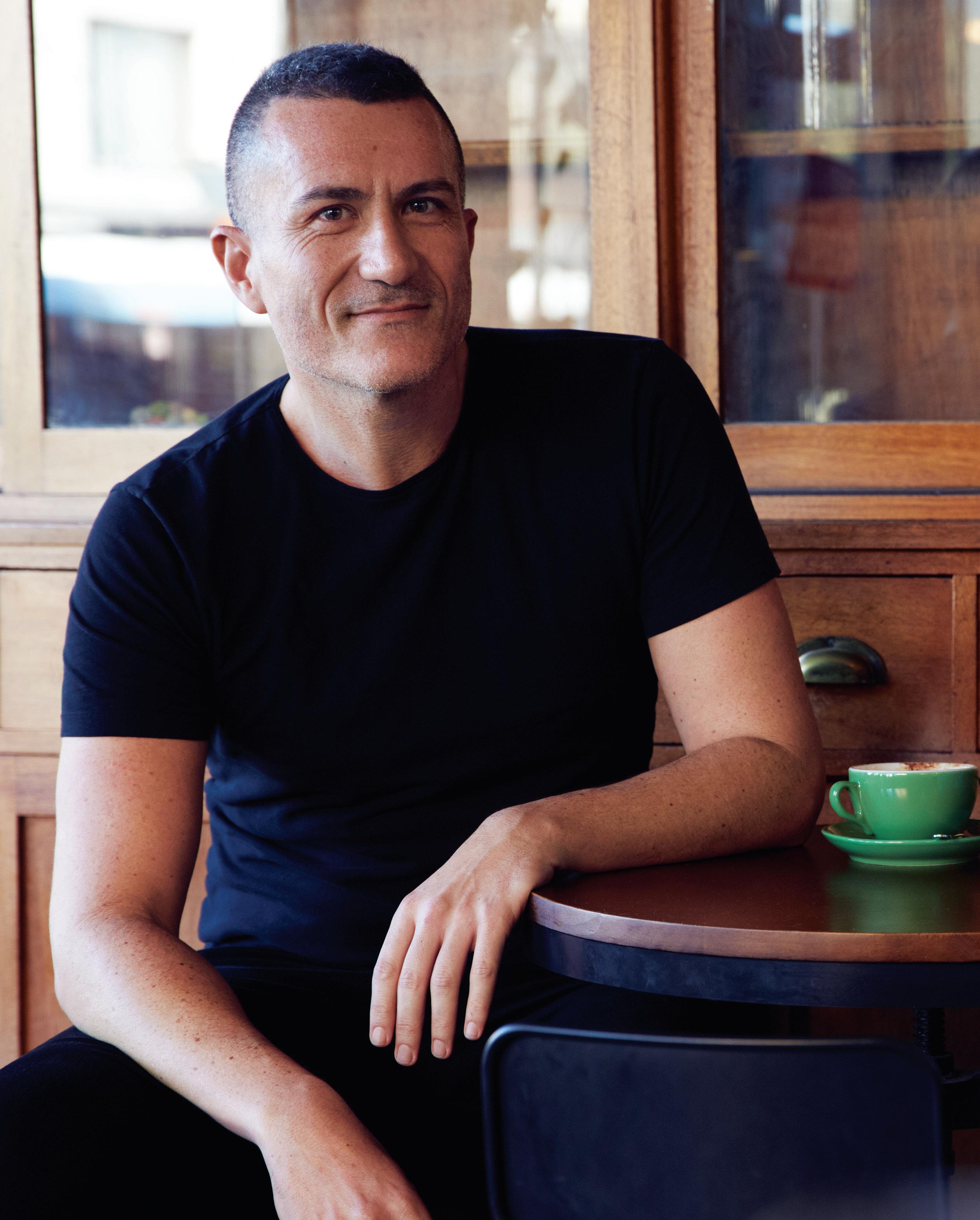 Words Aleesha Callahan Photography Michele Aboud

Seeding Ideas
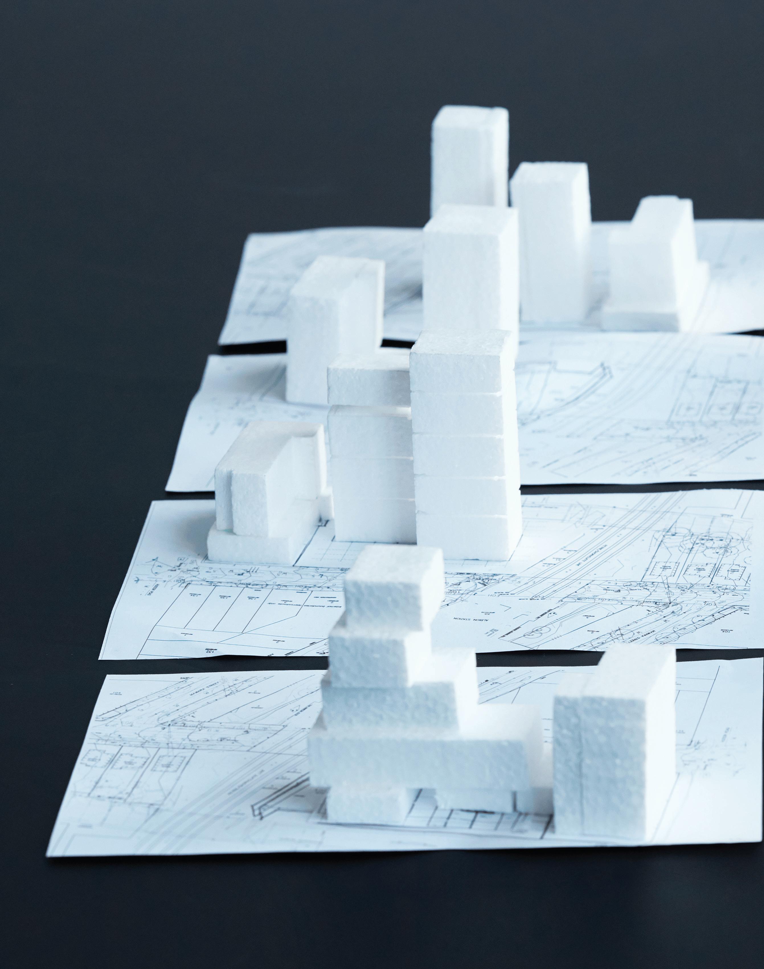
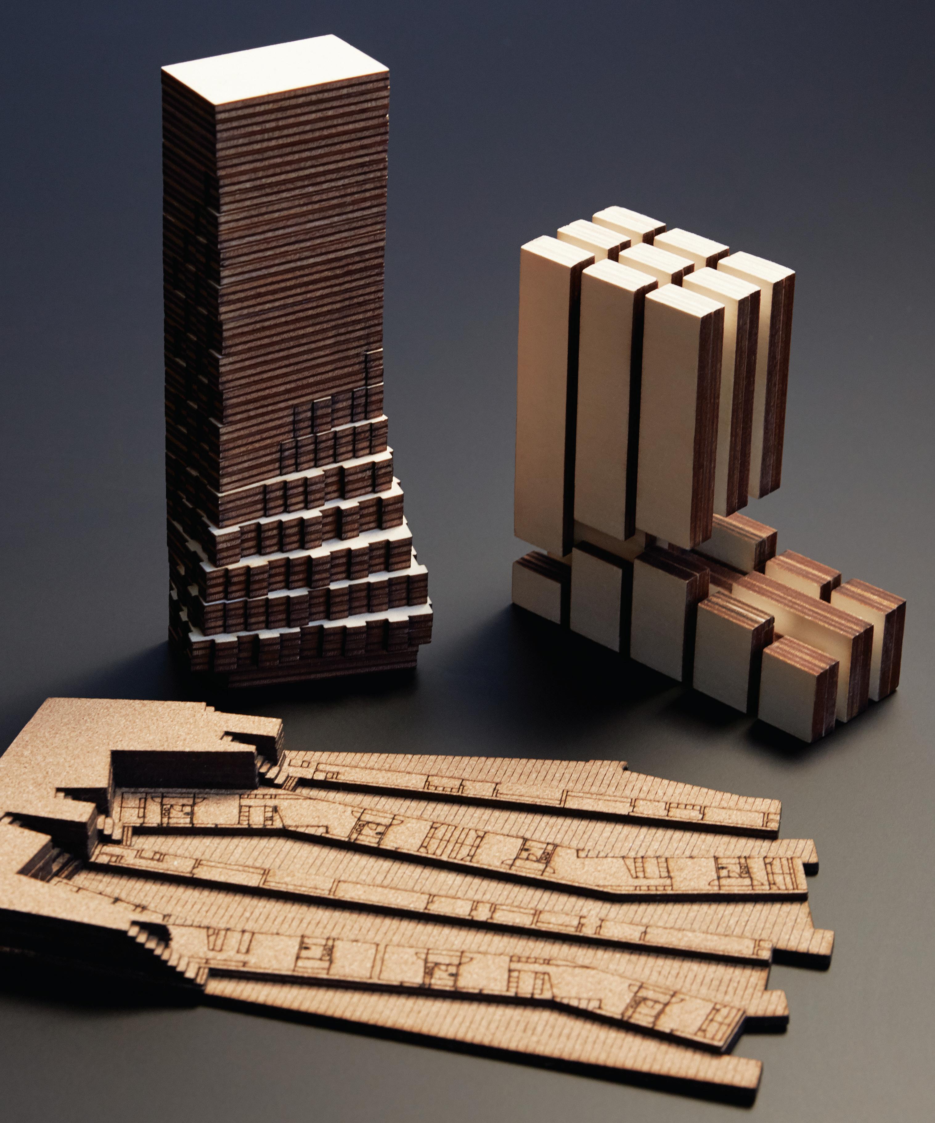
For Furtado Sullivan it’s really important to set up open lines of communication, and as the role of the architect continues to be “eroded” it’s even more important that space and time is given over to idea generation at the start of a project when “you can plant the seed for concepts”, says Sandra Furtado.
–
INDESIGN 79 IN Famous
For an incredibly young practice, Furtado Sullivan brings honed insight, collaboration and a holistic approach to its projects – and our cities are all the better for it. Formed in mid-2018 and helmed by Sandra Furtado and Peter Sullivan, what underpins the newly formed practice is an adept understanding of where architects sit –and need to sit – in the ever-changing built environment.
Top of the agenda is tackling large-scale projects that bring a level of complexity, such as mixed-use commercial and multi-residential towers, alongside urban scale and precinct or place-making work. The types of projects that can truly leave an impact and change entire urban experiences.
The term ‘biting off more than you can chew’ comes to mind when thinking about the sheer intricacy that goes with projects of this scope. For Furtado Sullivan, it’s all about bringing a holistic perspective. Furtado draws the image most clearly when likening a building to a tree. From afar you can see the shape, the form, you get a sense for what it is, maybe even what kind of tree it is. But as you approach other details and elements come into focus: “The colour and texture of the trunk, the sizes of the leaves, the geometry of those leaves. It’s the same with a building: the closer you get, you start to understand it in a new way and see all the details.”
Operating at this level means there are inevitably many stakeholders coming together. It may come as no surprise that a key pillar of the studio is collaboration. As a concept, collaboration seems simple in theory but is not always so in practice. When egos and conflicting agendas collide, it can be all too easy to lose sight of the common goal. The pair recognises that it’s an oft thrown-about term or philosophy for many practices, but they hold steadfast in its importance for their own. How does this ethos materialise in the everyday? “The success of a collaboration comes down to the individuals you work with and how humble you are in taking someone else’s advice. But it’s also how willing the other people are in reciprocating,” says Furtado. “Ultimately, the goal is to build a better outcome,” adds Sullivan.
A hallmark project currently on the books for Furtado Sullivan is One Circular Quay Hotel. The hotel sits within a precinct-wide revitalisation that brings together a consortium of stakeholders. When working to such a large scale the duo explains that it’s critical to look beyond and ensure that the final outcome will become “more than the sum of its parts”.
“There has been really strong collaboration between the architects and each of the developers to bring about a precinct that goes beyond just the boundary line,” shares Sullivan. From the ground plane to the towers above, for Furtado Sullivan it’s imperative to integrate pedestrian activations, place-making, porosity, permeability and intersecting, meandering pathways. In addition to the clever deployment of these architectural devices, the studio is also questioning how to ensure a layer of authenticity. “We’ve been having conversations around: What is the character of the precinct? How do we get people down there and how do we create a language that is cohesive but also has a certain level of diversity?” explains Furtado. All of this is not without its benefits to more than one stakeholder. Most notably, the pedestrian invariably reaps the rewards of a wellplanned precinct. But Sullivan elaborates that there are wins worth noting for other key players: developers, councils, suburbs and cities.
“The more successful the public domain can be, the more successful the development as a whole will be, therefore it will have stronger ties to the city and will bring longevity along with it,” he says, adding, “I think that’s what architects should always be striving for.”
As such a young practice, where do they see things moving into the future and how will they stay one step ahead? For Furtado, it’s about keeping an open mind and being willing to learn. “Cities are evolving every day and there are always new problems to solve. For us, it’s about thinking holistically and understanding that you don’t have all the answers. But you can seek advice, and work with other people to try to continually improve the projects that you’re working on.”
furtadosullivan.com
INDESIGNLIVE.COM IN Fa MO u S 80
“The more successful the public domain can be, the more successful the development as a whole will be, therefore it will have stronger ties to the city and will bring longevity.”
Page 76-77: Through their practice, Peter Sullivan and Sandra Furtado bring a holistic perspective to complex, large-scale projects, considering the urban scale and place-making alongside this. Page 78-79: Models from the studio give us an intimate insight into the process and thinking that underpins the larger-than-life work that Furtado Sullivan undertakes within the built environment.
Introducing Wittmann

Handcrafted furniture with modern character, easy confidence and timeless quality that harks back to the origins of early modernist design.
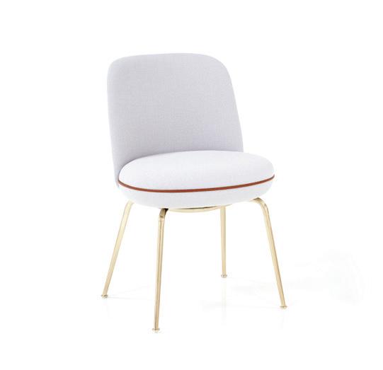
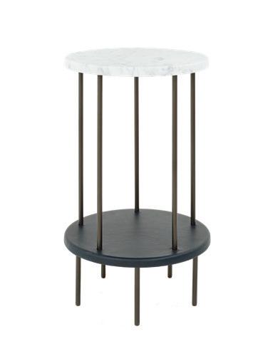
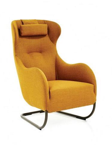
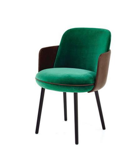
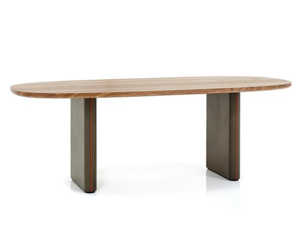
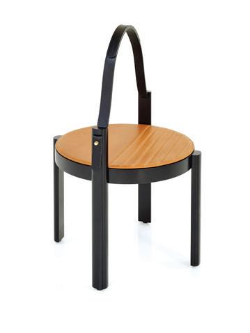
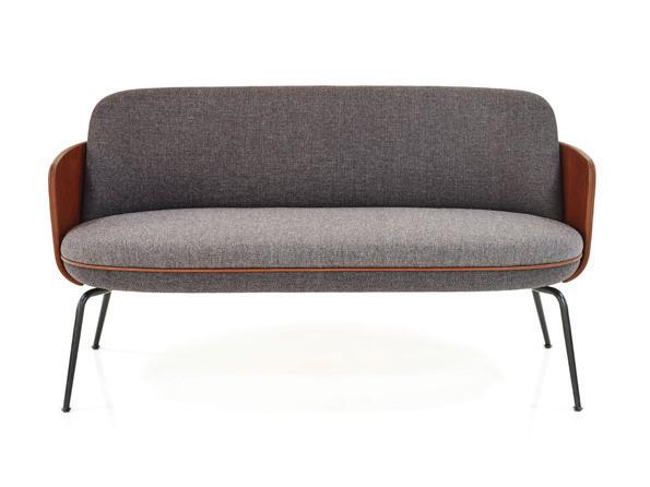
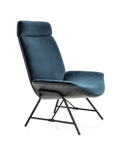
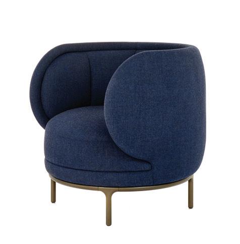
Explore the DOMO collection at one of our seven showrooms across New South Wales, Queensland, South Australia and Victoria or online at www.domo.com.au
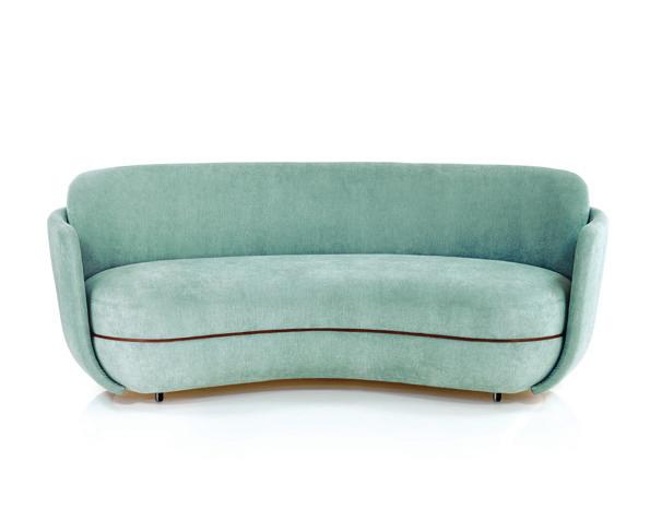
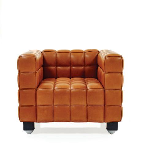
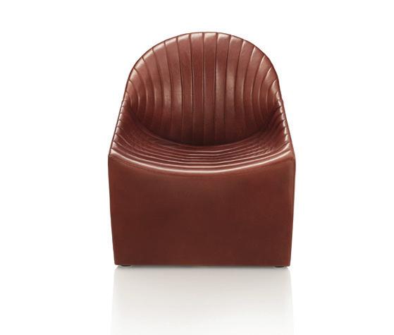
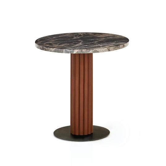
 Vuelta 72 Armchair by Jaime Hayon Grain Cut Side Table by Jaime Hayon
Wings Bed by Jaime Hayon
Melange Highback Armchair by Monica Förster
Kubus Lounge Chair by Josef Hoffmann
Melange Handle Table by Monica Förster
Merwyn Oval Dining Table by Sebastian Herkner
Merwyn Dining Chair by Sebastian Herkner
Jolly Armchair by Jan Armgardt
DD Side Table by Jaime Hayon
Miles Sofa by Sebastian Herkner
Merwyn Carver by Sebastian Herkner
Oyster Lounge Chair by Jorg Boner
Miles Table by Sebastian Herkner
Merwyn Lounge Sofa by Sebastian Herkner
Monkey Mirror by Jaime Hayon
Luxe Living At The Landmark
Multi-residential buildings are increasingly being designed in response to their local surroundings, in turn creating connectivity between urban design and architecture. What’s more, with a higher number of people choosing to live in apartments closer to their workplaces, multi-residential buildings are also being designed to re ect this lifestyle. Bringing into play the very best design brands in the business, The Landmark by New Hope Group and VIMG is a stunning example of the trend.
A distinguished multi-residential structure that is all set to de ne the suburb of St. Leonards in North Sydney, The Landmark has teamed up with Zip Water, and equally prestigious design a cionados, to cra a lifestyle that o ers beauty, comfort and quality – from the front door, right through to those essential living zones like the kitchen.
The Landmark’s architecture, which seeks inspiration from local elements, can be attributed to A+ Design Group in association with Warren & Mahoney. Not surprising, the design also won Gold for the Best Proposed Architecture and the recently concluded Sydney Design Awards. Highlighting features of the building include its signature waves and shi ing angles inspired by Sydney Harbour’s iconic waterways and the changing re ections of the city and sky.
This outstanding property built by Hutchinson Builders is home to a wide variety of ve-star resort-style services and amenities. For instance, in every apartment and Sky Home, luxury has been stepped up with modern and state-of-the-art appliances. In the custom-designed Bo kitchens, a Zip HydroTap provides on-demand ltered boiling, chilled and sparkling drinking water. Alex Lim, head of development, New Hope Group, adds, “Since early 2018, and during all our collaborations with Bo , their feedback for Zip HydroTap was very positive. Also, in our view, it was the perfect match for the kitchen, providing a combination of style, quality and convenience. The idea of instant ltered, and sparkling water was to minimise the need to purchase or cart around heavy water bottles.” Other premium appliances that feature heavily in the apartments include those by Gaggenau, Miele and Sub-Zero.
Every apartment celebrates unhindered views of Sydney’s iconic harbour through the oor-to-ceiling window designs and balconies. The interiors ooze modern and contemporary appeal with seamless connectivity between the di erent areas of the home. Plush carpeting, mood lighting and sleek storage solutions elevate the luxe appeal of the apartments. Overall, The Landmark is an urban vertical village of epic proportions, o ering unprecedented amenities for a luxurious lifestyle.
82 INDESIGN ZIP WATER ZIPWATER.COM
Words Pia Sinha Photography Courtesy of New Hope Group and VIMG
The Landmark by New Hope Group and VIMG featuring kitchens with a Zip HydroTap for on-demand ltered boiling, chilled and sparkling drinking water.
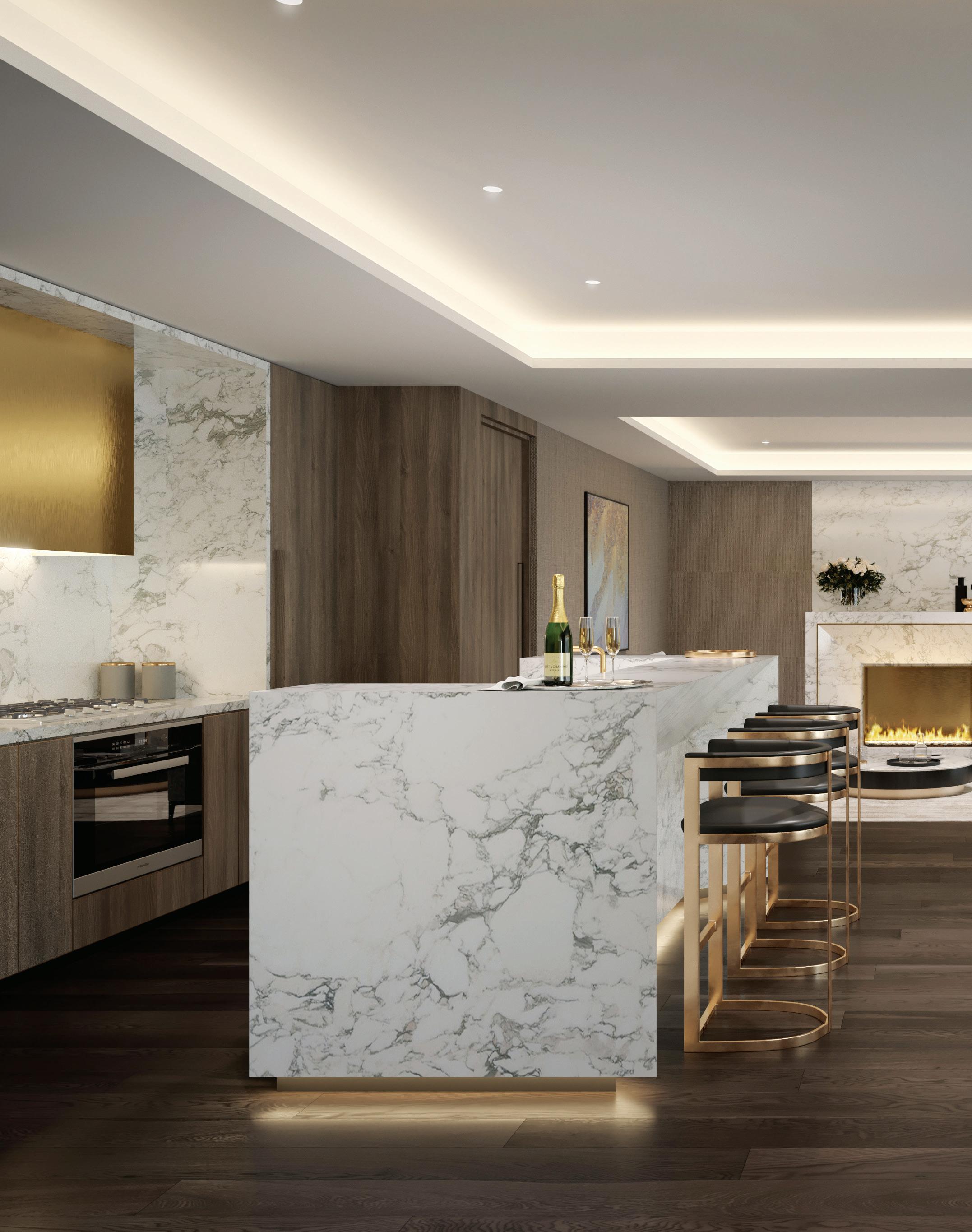

OFFICIAL SUIT PARTNER OF
FARAGE.COM.AU
THE SYDNEY SWANS
Provocative, innovative & ins P iring D esign
INDESIGN 85 IN SITU Situ i N
Commonwealth Bank has long been an innovator in workplace strategy. Now, with the Axle building in Sydney’s South Eveleigh, it offers a template for the future of ‘woke’ working in Australia.
The ‘Woke’ Workplace
INDESIGNLIVE.COM 86 IN SITU
Commonwealth Bank at South Eveleigh Axle – Building 1, Sydney by Woods Bagot with Davenport Campbell (interior design), fjmt with Sissons Architects (base building), Mirvac (developer) Words Paul McGillick Photography Nicole England and Trevor Mein
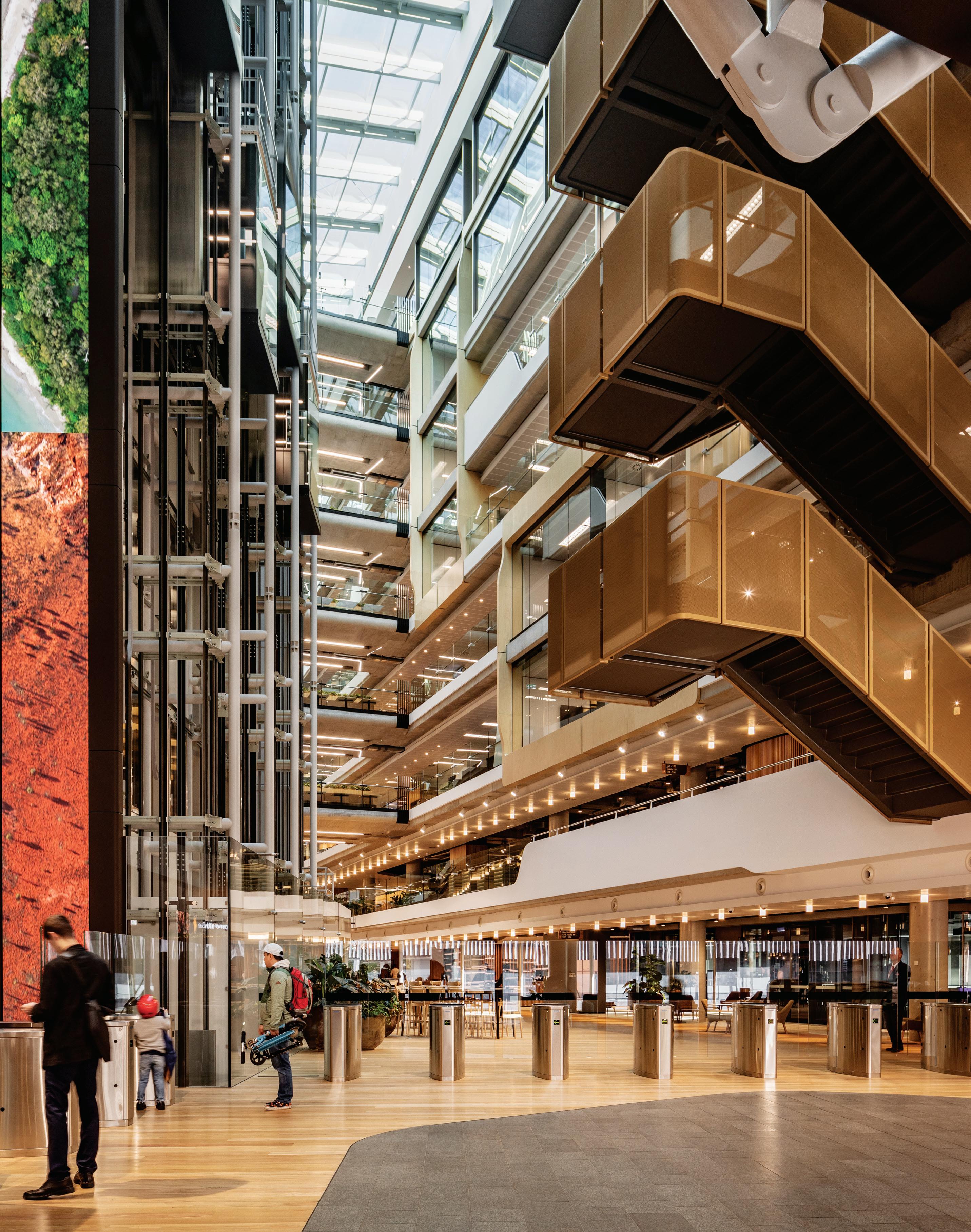
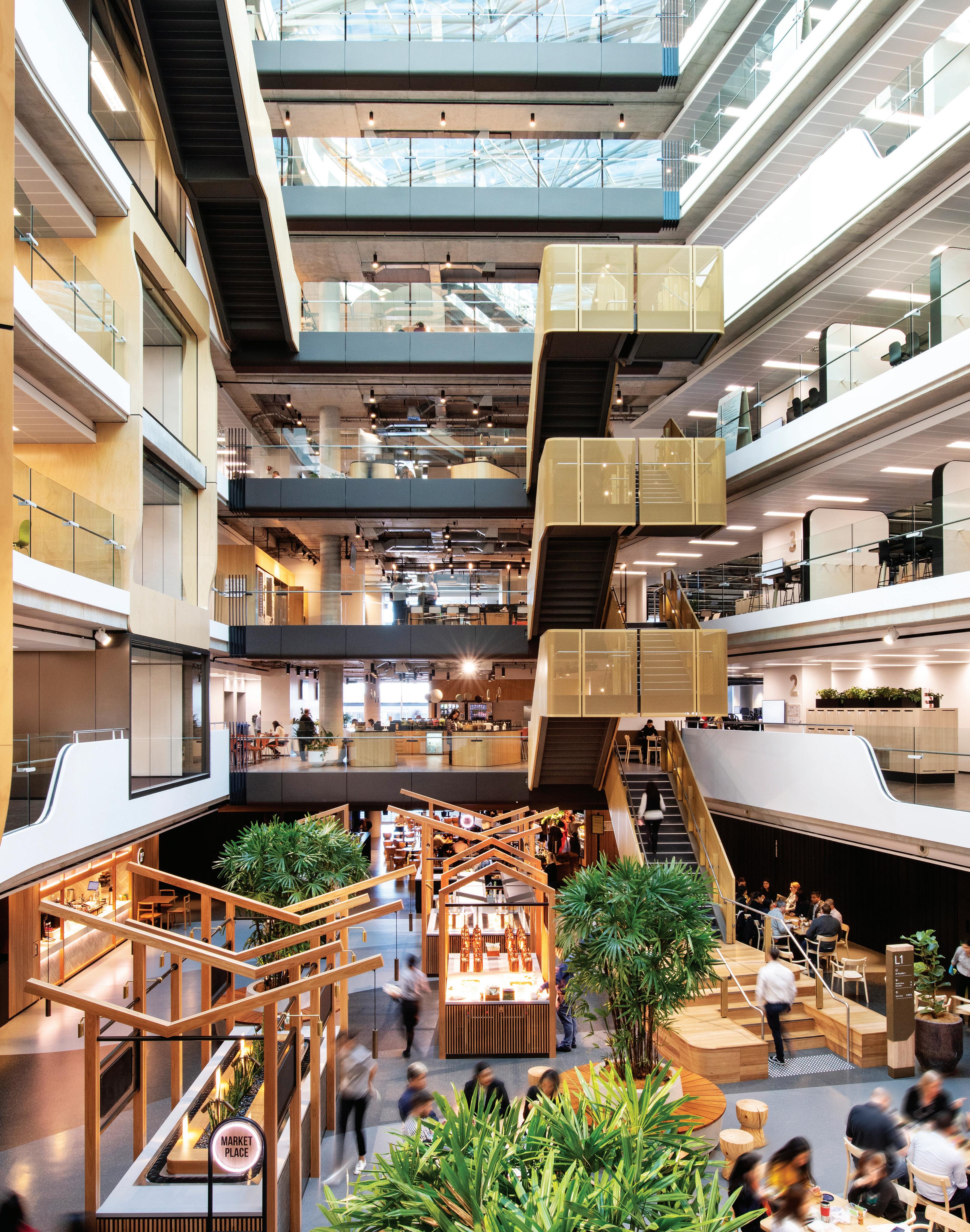
South Eveleigh is part of what was originally called the Australian Technology Park. Positioned on the periphery of Sydney CBD, adjacent to Redfern railway station, it is the site of the old locomotive workshops. Over recent years these buildings have been repurposed to house tech companies and start-ups. The site is actually divided by the railway lines. The northern precinct is now a largely cultural area, while the southern precinct is being redeveloped as a kind of ‘tech-city’ comprising repurposed railway workshop sheds and nine new buildings.
The project is being undertaken by a consortium led by Mirvac and embodies the idea of a complex, once in the forefront of industrial innovation, now reborn as a hub of innovation in the high tech era. Not just that, it takes the idea of digital connection to a new dimension with a masterplan that aims to connect the precinct to the existing suburban fabric and the 7000-year inhabitation of the area by the Gadigal people.
South Eveleigh will be a porous destination – and not just for the day workers who commute in and out, but for the local community. The complex offers extensive retail amenities, cafés, restaurants and recreation facilities such as a scooter park, basketball courts, tennis courts and a gym.
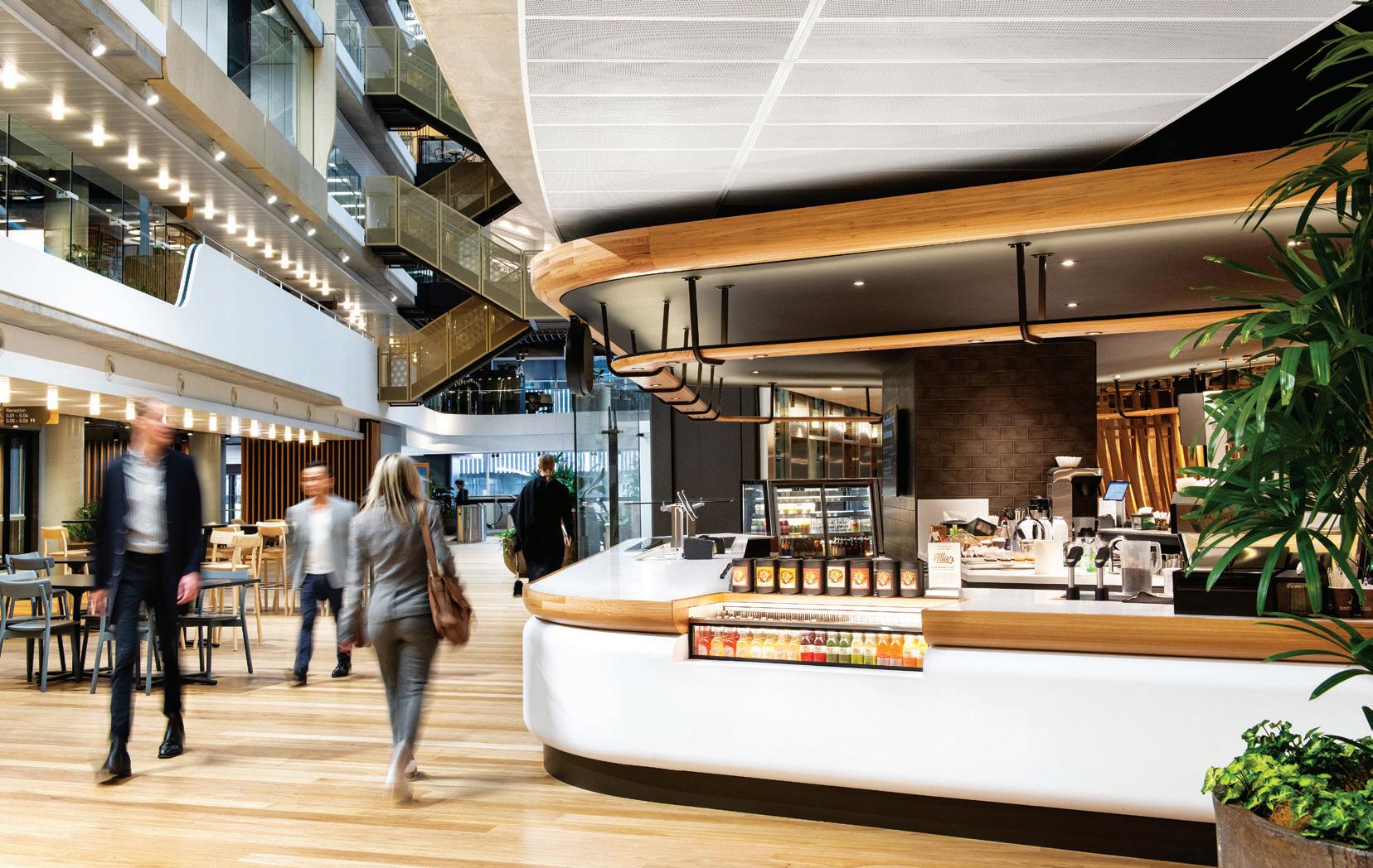
The Commonwealth Bank of Australia (CBA) has now opened the first of two new buildings there: the seven-storey Axle campus, opposite Yerrabingin, the three-storey community centre with café and retail amenities on the ground floor, community facilities (including a CBA-sponsored childcare centre) above that and a rooftop garden with 2000 edible and medicinal plants overseen by the local Indigenous community.
This is very much an exercise in placemaking, both inside the buildings and with their context. Jennifer Saiz, executive group manager for CBA’s Group Property and Security, points out that part of the brief was to ensure this place was activated 18 hours, seven days a week. “It needs,” she says, “to be a destination. The best tech precincts are the ones that are vibrant and alive. Getting the right retail mix means it’s a drawcard not just for the people who work here, but also for the community.”
Saiz points out that CBA is in the process of repositioning itself as a digital leader and the Axle building has been developed as the smartest of smart buildings. At the same time it is also a very human building – in terms of scale, architectural strategy, amenity and workplace philosophy.
“We had scale,” she says, “and we wanted to utilise that scale to create a world-class campus environment. We had opportunities in many different locations and this one fitted the scale we were looking at – about 10,000 people. It was a real campus offering (others were more high-rise offerings which couldn’t fit all of our people), but also an ability to really create a sense of place. It was the perfect opportunity for us to not only create world’s best practice in terms of work space, but to centre it in a location that was completely aligned with the vision of the organisation.” And, she adds, 96 per cent of its workforce can catch one train to Redfern.
The base building is designed by fjmt, which collaborated closely with Woods Bagot, especially on the atrium space – a striking evolution from the earlier Darling Harbour and Olympic Park buildings. CBA sees the atrium as a generator of connectedness and collaboration. What’s striking about Axle is that rather than a
INDESIGN 89 IN SITU
Welcome To The Boab
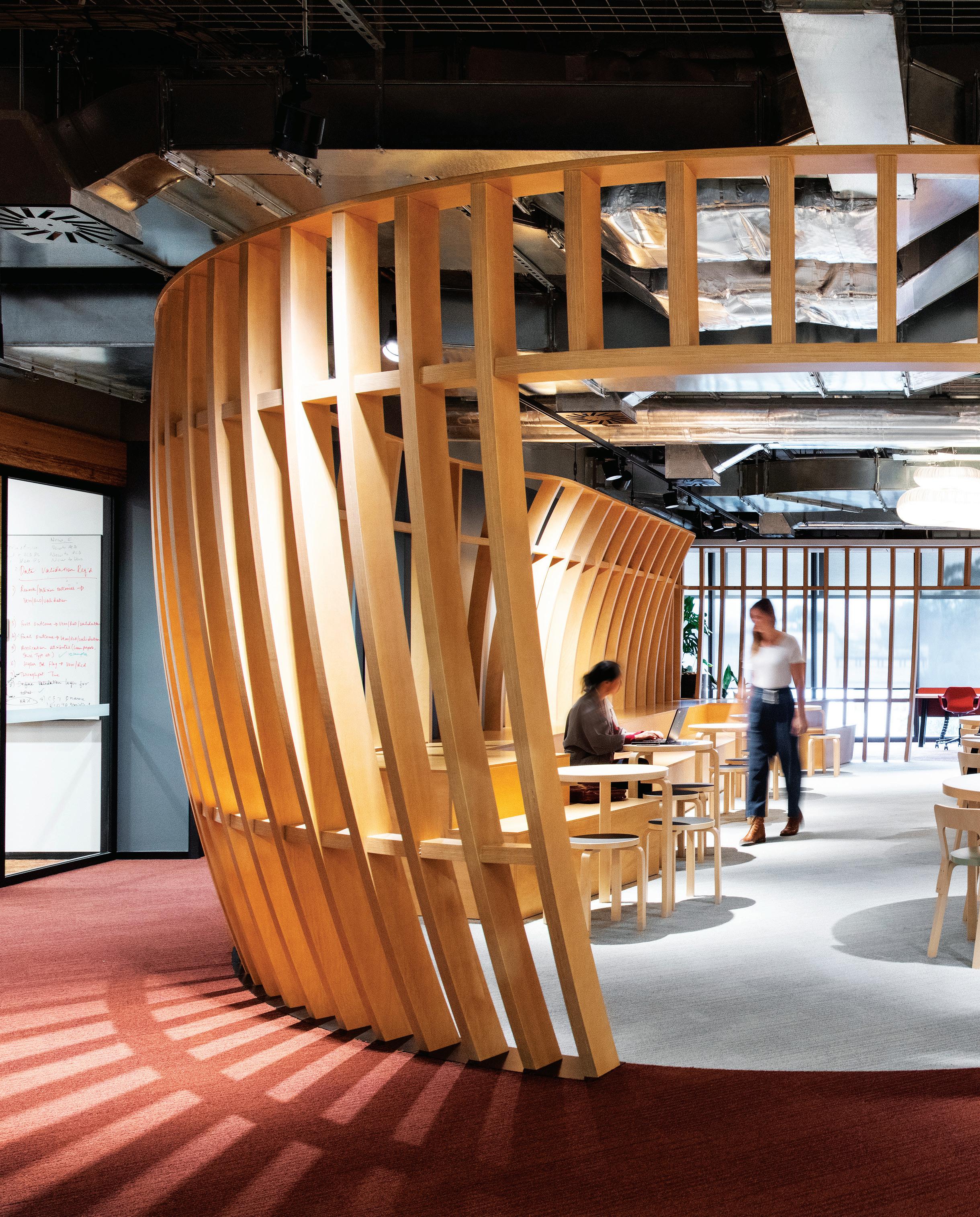
–
The Boab is a micro architectural insertion designed as a placemaking device to anchor the Clubspace and provide a destination for socialising, food and gathering. It adds to the diversity of settings within the Club environment.
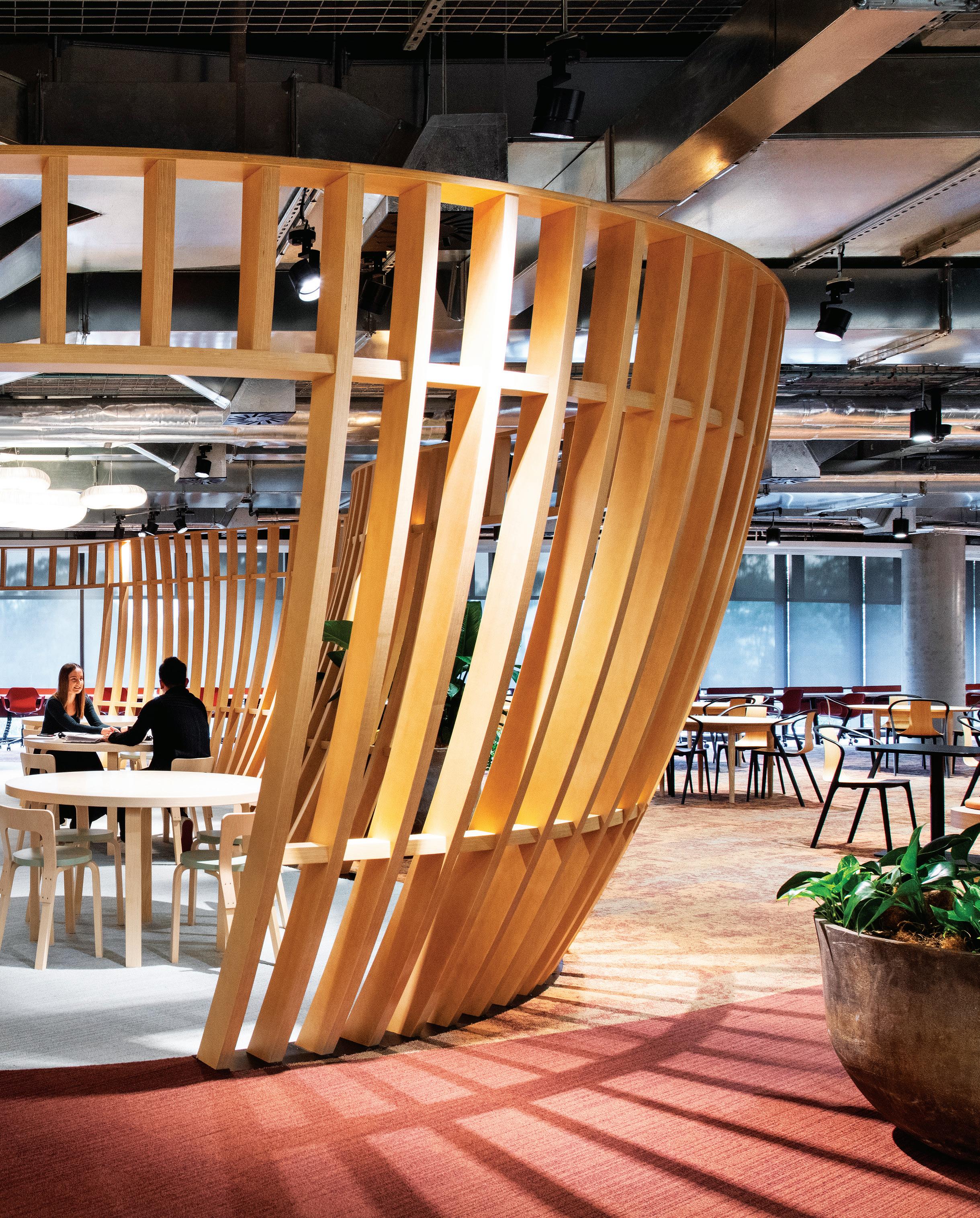
monolithic reveal-all-at-once experience, it reveals itself only as one moves through it. It also softens the 5600-square-metre floorplates, helping to give them a human scale.
The design of the atrium edge saw open collaborative spaces, recessive meeting rooms and expressed timber meeting room pods brought towards the atrium, enabling more varied circulation spaces. It is all part of a strategy to achieve flexibility in the work environment not through diversity, but through simplicity – a strategy epitomised by having separate sitting and standing workstations rather than adjustable ones – a lesson learned from the past.
Also simplified were the work settings. The periphery provides ‘me settings’, then come the ‘we settings’ (you with team members and other people), then as you get closer to the atrium it is ‘us settings’. Digital whiteboards are central to the way the CBA team-based strategy works, but they also serve to break up spaces and create scale.
Axle, says Saiz, is a building focused on “teaching, development and spaces that are focused on intellectual exchange”. The collaborative spaces flow easily into the more focused spaces on the periphery, as do the various work settings. On the upper ground level, for example, is the Club space, rather like a business lounge. This contains settings for quiet, contemplative work, a tech-free retreat with calming ambient music. Then, at its edge, it eases into a café area with settings for informal meetings.
In this building, the smart phone is key to everything – providing access to the building, finding a vacant space, finding a colleague, reporting a fault or activating a locker.
Welcome to the connected workplace.
woodsbagot.com, davenport-campbell.com.au, fjmtstudio.com, sissonsarchitects.com, mirvac.com
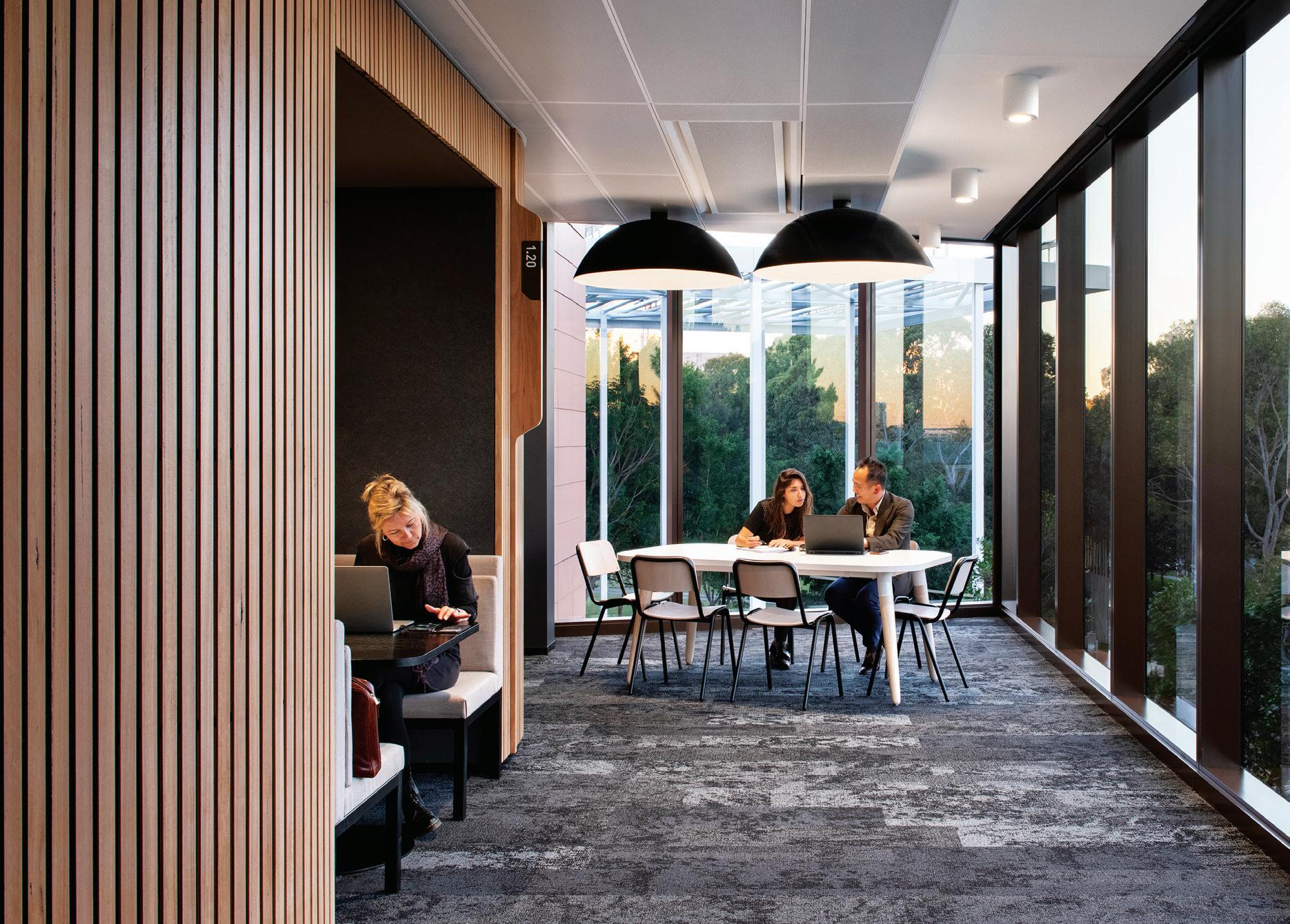
INDESIGNLIVE.COM 92 IN SITU
Page 87: The ground floor entry lobby gives a glimpse of the atrium beyond, photo: Trevor Mein. Page 88: Eating spaces double as social hubs, photo: Nicole England. Page 89: Ground floor atrium with food bar, photo: Nicole England. Page 90-91: The Boab adds to the diversity of multifunctional and social settings within the Club environment, photo: Nicole England. Above: Meeting pods and work areas offer a vital connection to the outside, photo: Nicole England. Opposite: Aurora Retreat, a place to focus or recharge, photo: Nicole England. Page 94: Impressive views, the atrium from top to bottom, photo: Trevor Mein.
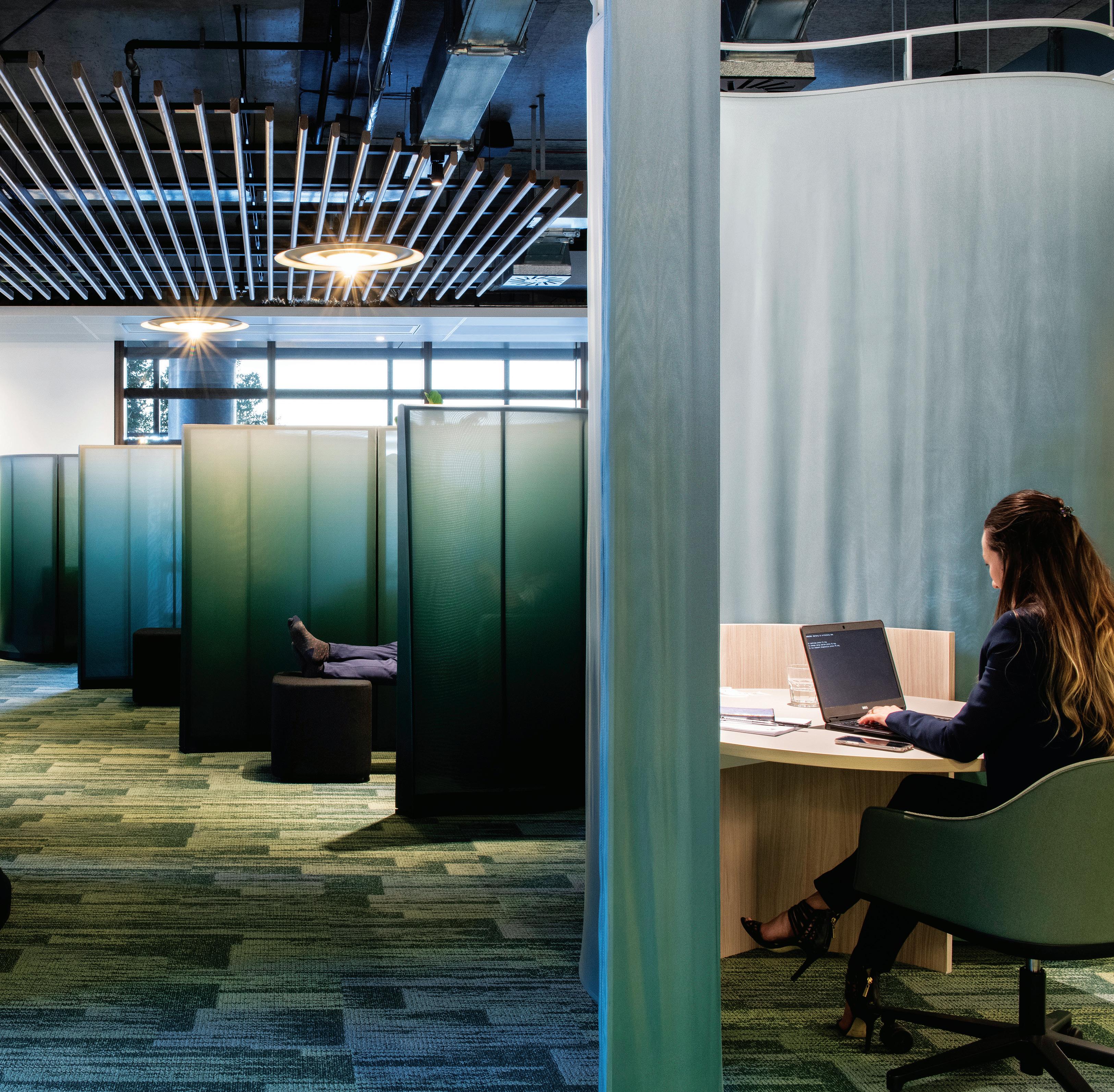
INDESIGN 93 IN SITU
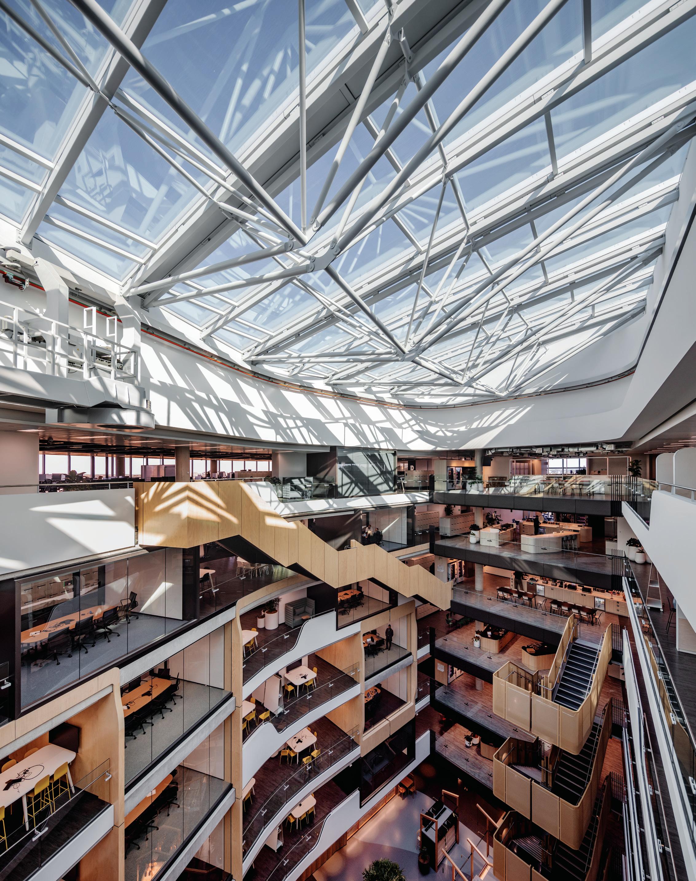
INDESIGNLIVE.COM 94 IN SITU
INDESIGN 95 IN SITU Plan: Level 7 GSP b s e V s n 42 75 75 0 0 20 50 100m AXLE BUI LDI NG, SOUTH EVE LE IG H Lot 8, 9 & 12 at Australian Technology Park Section: East West 0 20 50 100m AXLE BUI LDI NG, SOUTH EVE LE IG H Lot 8, 9 & 12 at Australian Technology Park Bottom Level 7, Axle Building 1 Neighbourhood 2 Mini-hub 3 Super-hub 4 Hub 5 Collab 6 Ideate 7 Super-ideate 8 WC 9 Terrace 10 Print 11 Floor communications room Top East west section, Axle Building 1 Kitchen café 2 Carpark 3 Workspace 4 Learning and development 5 End-of-trip facilities 6 Lobby 7 Café 8 Lower ground 9 Ground plaza 10 Levels 1-7 (bottom to top) 1 2 2 2 3 3 3 3 3 3 4 4 4 5 5 6 6 7 8 9 10 10 10 10 10 10 10 1 1 1 1 2 2 1 4 4 5 5 5 5 5 5 5 6 6 7 7 7 7 8 8 8 8 8 9 10 10 10 11 11
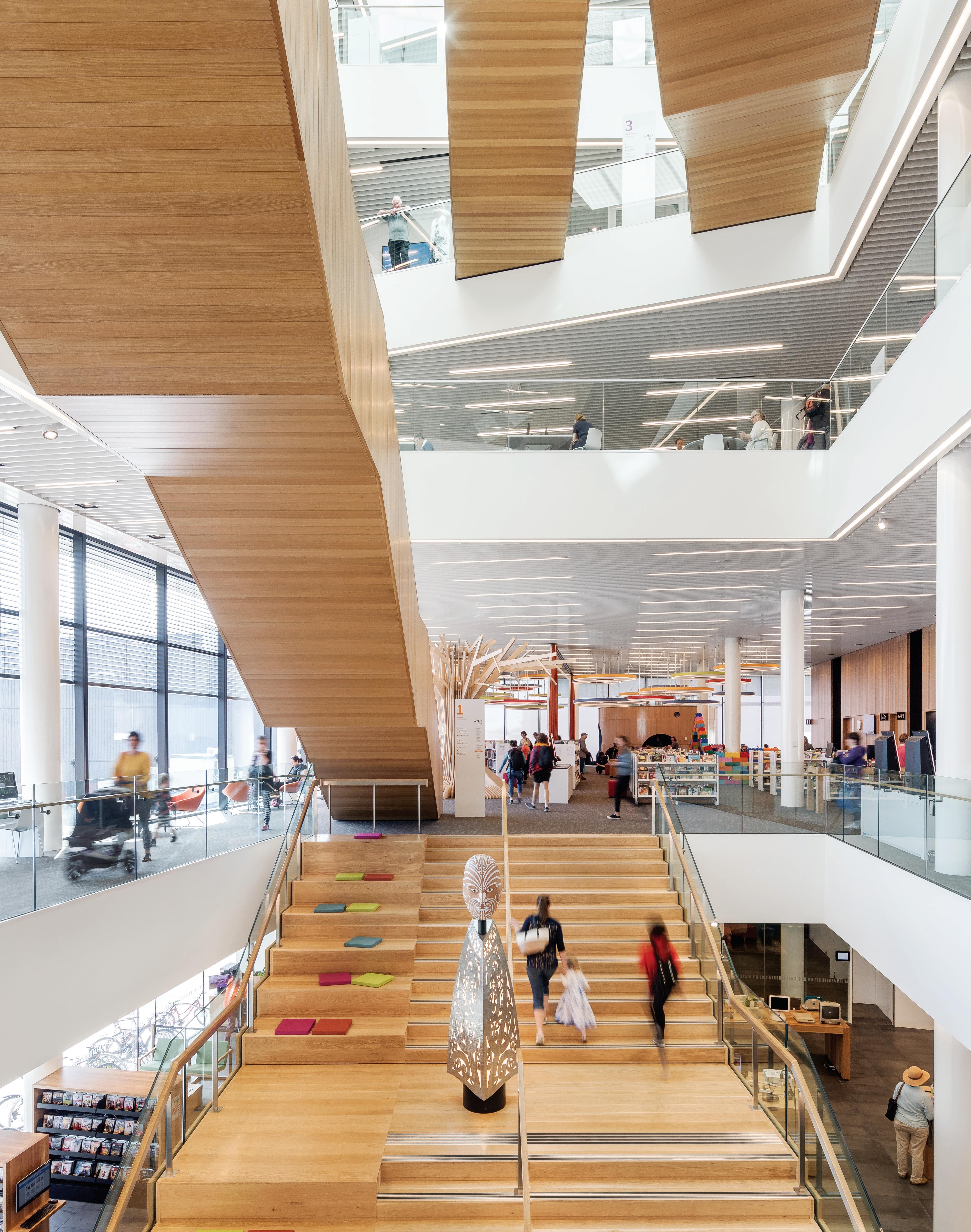
Christchurch Catalyst
Tūranga, Christchurch, New Zealand by Architectus in association with Schmidt Hammer Lassen Architects
Words Andrea Stevens Photography Adam Mørk
INDESIGN 97 IN SITU
For resurgent Christchurch, Tūranga is reinventing how a central library can ignite cultural and social capital in a city still rebuilding.
Opposite: The light-filled atrium draws people up through the building. Page 98-99: A creative play and education space on level one. Page 100: Overlooking Christchurch Cathedral. Page 101: Site plan featuring (left to right) Cathedral Junction, Press Lane, Tūranga, Colombo Street. Page 102: Tāwhaki by Fayne Robinson (assisted by Caleb Robinson) represents an ancient search for knowledge. Page 103: From outside in: orange and purple walls inside form part of Mātauranga – The Ascent of Tāwhaki by Morgan Mathews-Hale. Page 104: A tripartite elevation reduces the apparent height of the building.
Imagination Station
Signalled by the LEGO wall and custom-designed lighting, this creative play and education space is run by Imagination Station, an independent charity offering activities and workshops that extend learning opportunities and styles at Tūranga.
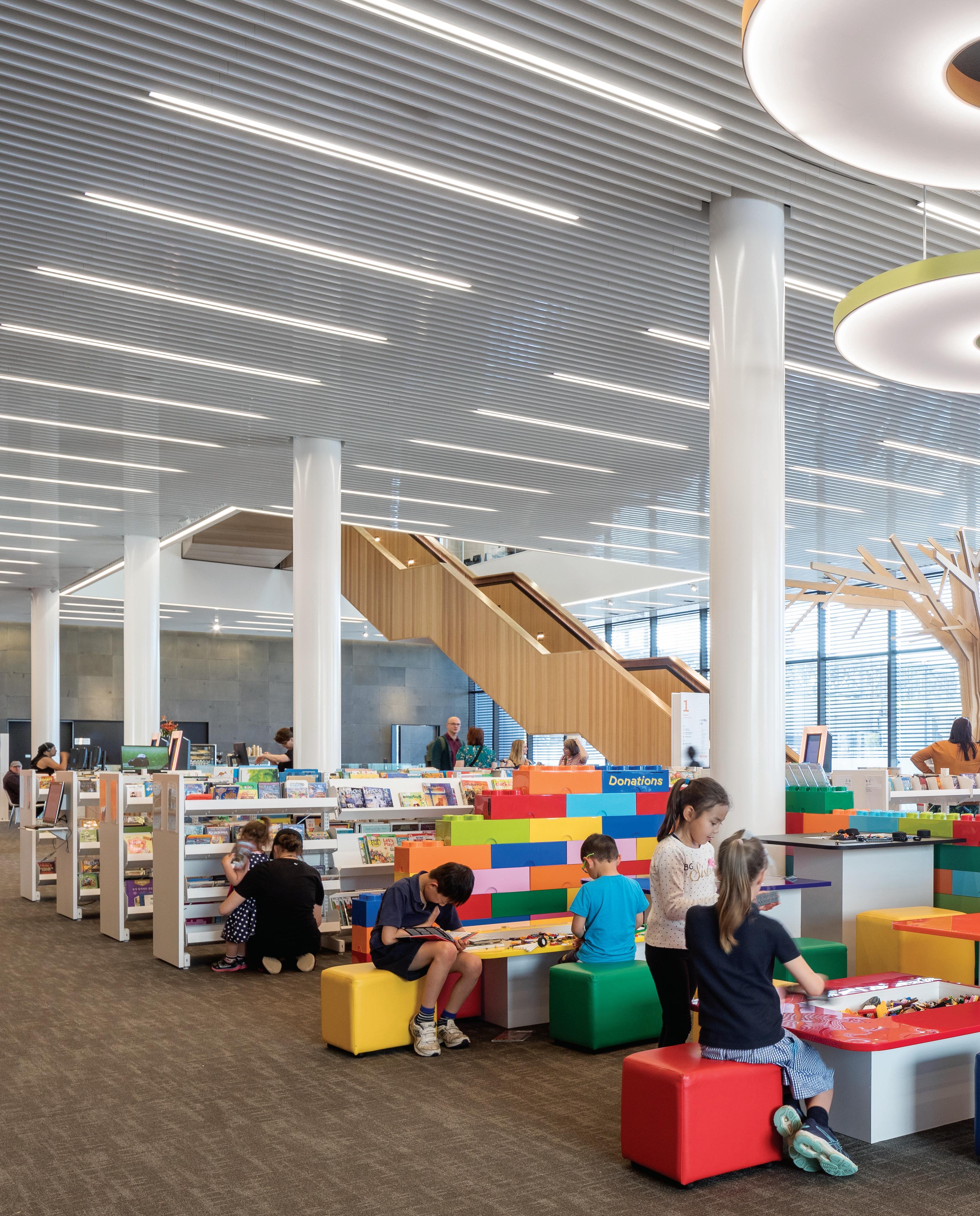
–
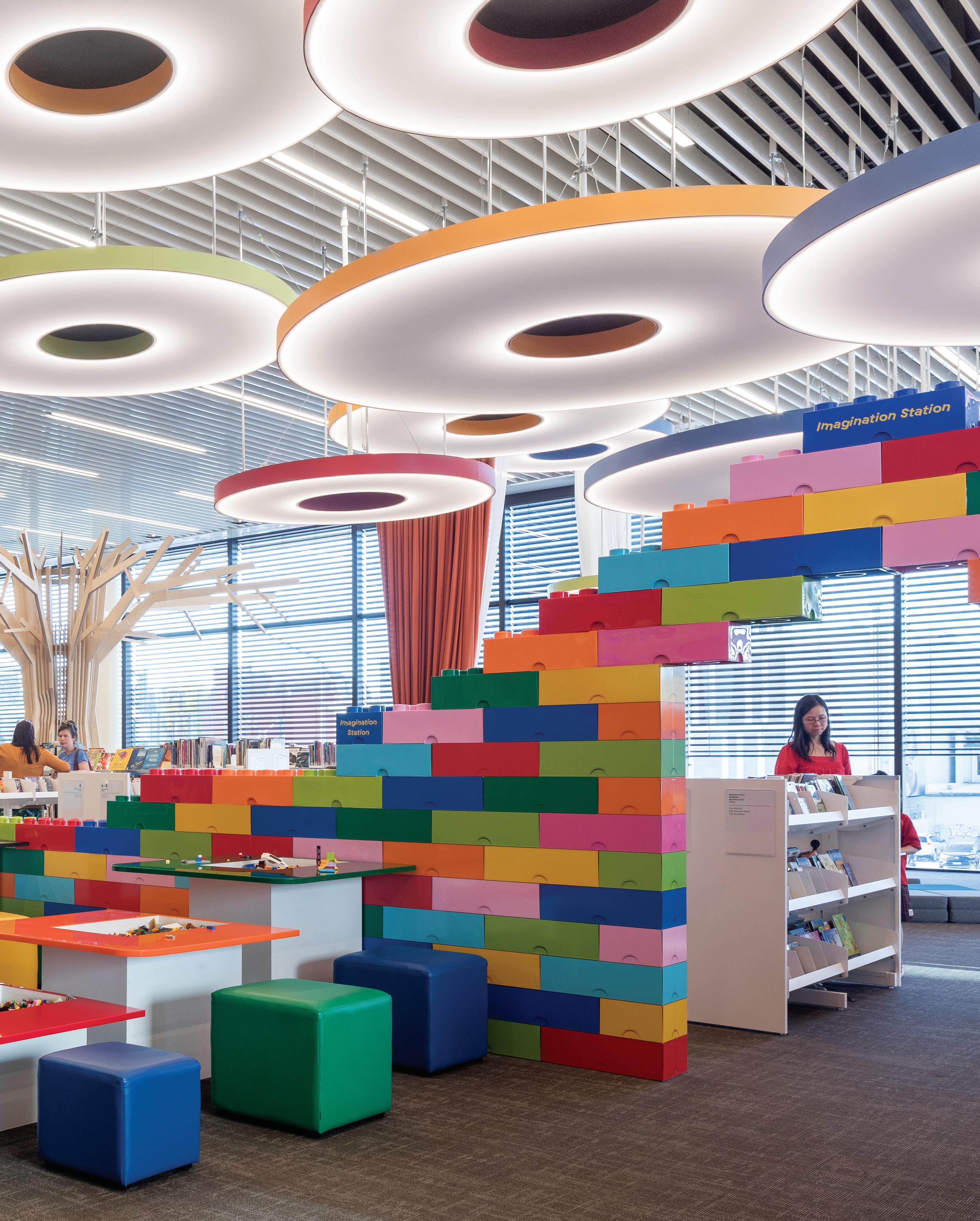
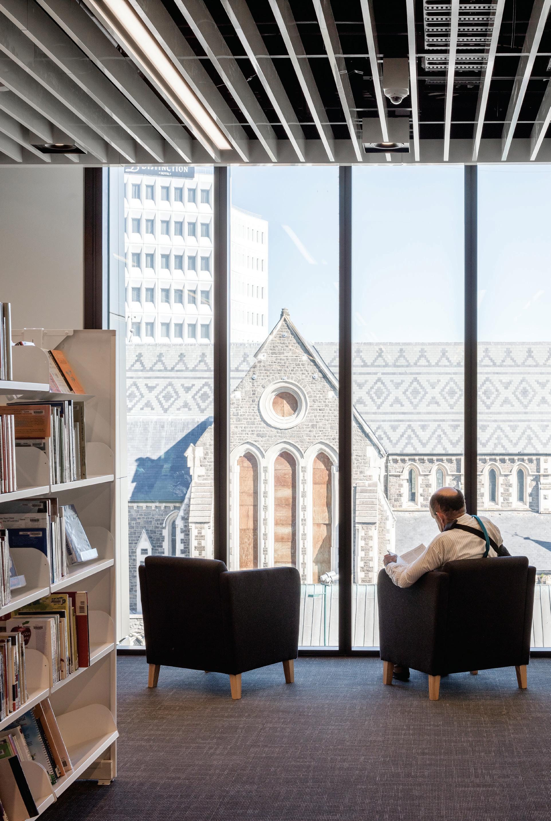
INDESIGNLIVE.COM 100 IN SITU
The Christchurch earthquakes of 2010 and 2011 destroyed most of the major civic, commercial, retail and council properties in the CBD with the associated dispersal of the local business community. Nine years on from one of the world’s most expensive natural disasters, the city has now rebuilt a number of strategic sites and precincts to create a more peopled, connected and sustainable urban centre.
Tūranga central library is a major piece of the rebuild puzzle. This carefully planned revitalisation project on Whitireia/Cathedral Square – the civic and cultural heart of Christchurch – is already attracting a greater number and variety of people back to the CBD. With so many public and private facilities still missing from the city, the project brief was far broader than required of a typical library. Local groups and individuals wanted physical spaces to meet, hold events, create and innovate. Stakeholder engagement was robust and confirmed the library’s highly anticipated role in community activation and repair. Its purpose and programme would also include strong foundations for biculturalism; peopleand place-based architecture. Tūranga, a place for all, would have local identities embedded – legible cultural and geographic histories and futures both in content and experience.
This library hybrid has conventional library spaces, but also spaces for community, civic, social, play, makers and public art. It is elegantly woven into the urban realm of Cathedral Square, repairing one edge of the historic Maltese cross of the colonial city plan and encouraging pedestrians to flow inside and through, to blend with the city itself.
Another key civic signal is Tautoru, the ‘community arena’ – the main lecture and events space positioned on the corner overlooking the square. “The arena is a space for discussion, debate and sharing,” says project director Carsten Auer from Architectus. “It represents the library’s civic nature and is lifted to level one for more visibility and a closer dialogue with the square. The children’s activity zone is also highly visible from the square, one of many gestures to invite and draw people inside.”
Tūranga actively caters for different styles and stages of learning, through social–collaborative settings, play spaces, computer hubs, a sound and recording studio, 3D printing and craft spaces – all in addition to its significant book collection. This free and equal access to resources means this library, built in the post-book era, has never been so popular.
INDESIGN 101 IN SITU
It is elegantly woven into the urban realm of Cathedral Square... encouraging pedestrians to flow inside and through to, blend with the city itself.
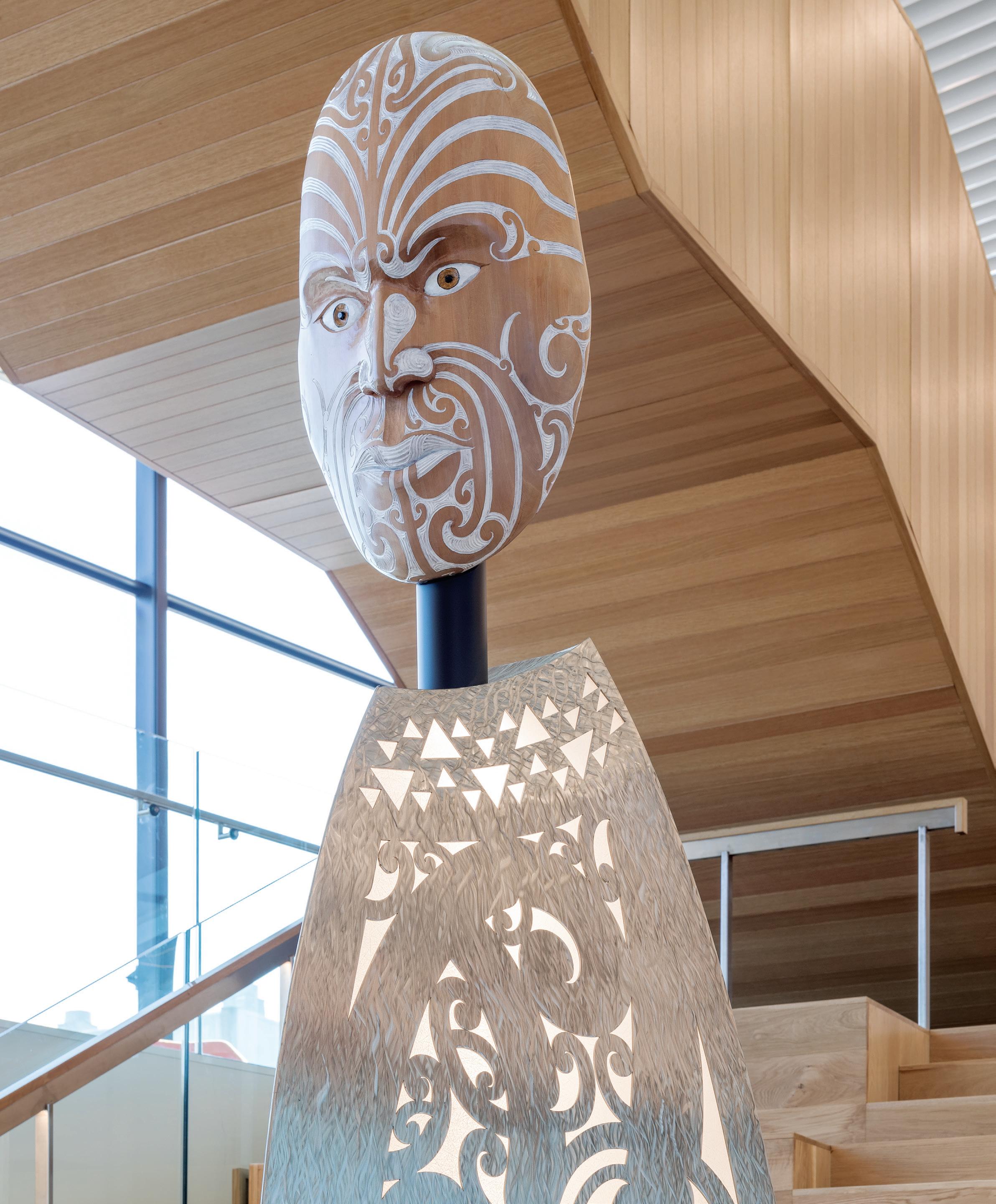
INDESIGNLIVE.COM 102 IN SITU
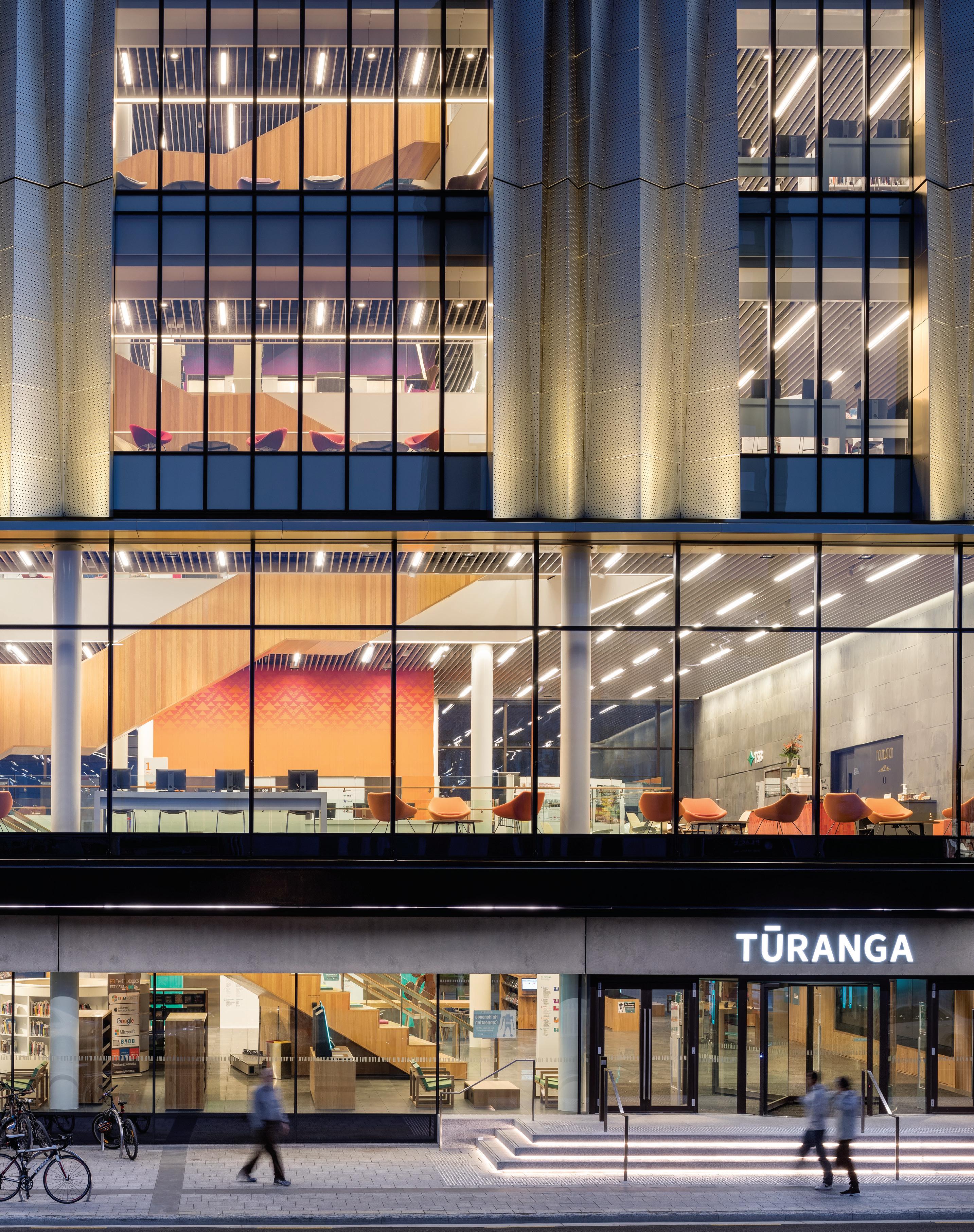
A place of cultural significance
To launch a platform such as Tūranga, the architecture had to be authentic to its place; reflective of its people and landscape, and their values, history and dreams for the future. The creative process began with a bicultural foundation: a collaboration between the library leadership team, the architects and local rūnanga (council) Ngāi Tūāhuriri, represented by the Matapopore Charitable Trust.
“As a significant cultural site, we developed a distinct narrative –a kaupapa that could guide a building,” says Matapopore consultant Keri Whaitiri. “Those early discussions helped inform the design concept, so that the cultural narrative could gradually and naturally transform into 3D object, structure and spaces. It’s a very collaborative process and relies on architects seeing us as design partners, which Architectus and Schmidt Hammer Lassen very much did. We would contribute to design workshops and review design iterations at key stages, so we could be confident the design development aligned with the narrative we first provided.”
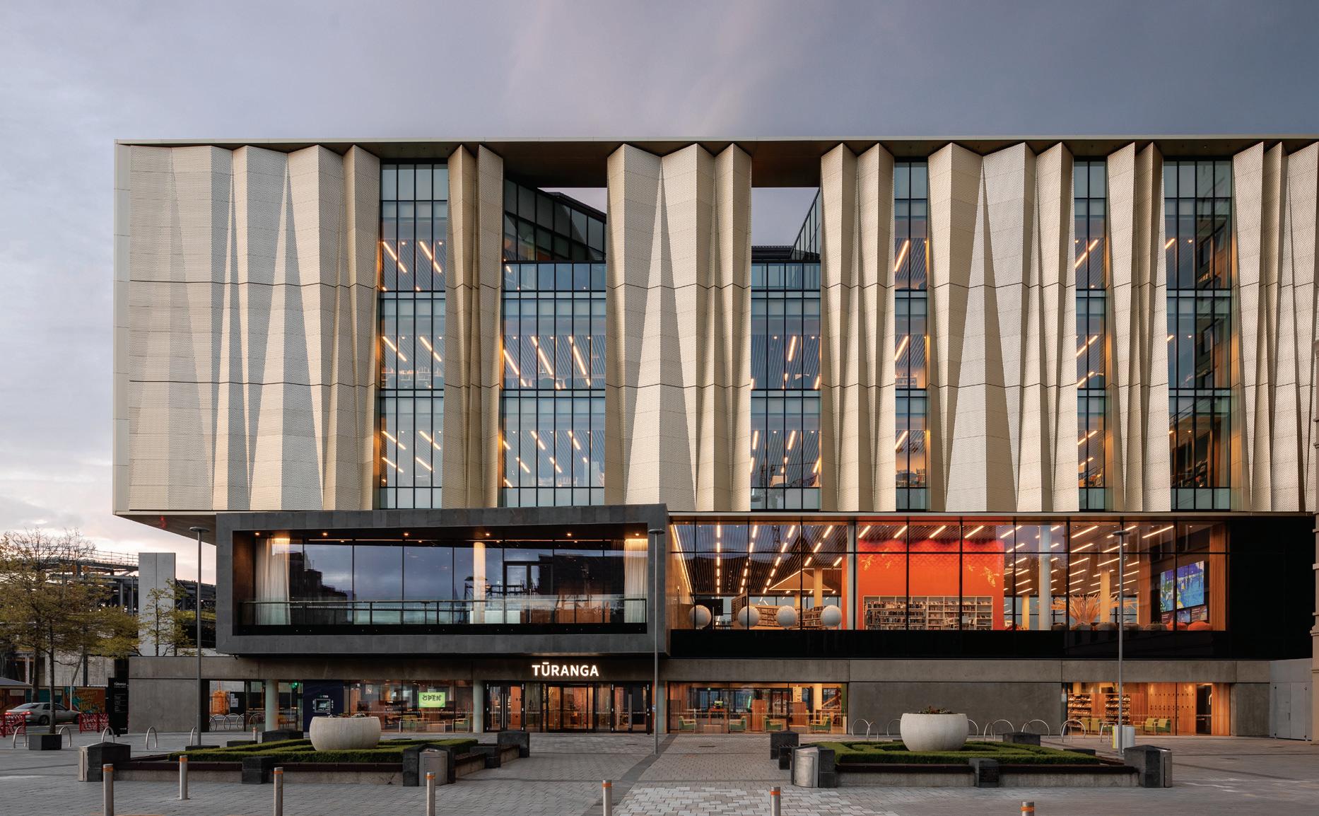
An important part of this contribution was not only what content could be presented, but also how mātauranga or knowledge could be shared and conveyed within the building. “We looked at typical Māori forms of knowledge acquisition, such as creative practices, kanohi ki te kanohi [face-to-face interaction], wānanga [workshops]
and tuakana-teina [intergenerational learning],” says Whaitiri. “The idea of handing down knowledge and whakapapa [ancestral connections] through art and performance is a culturally embedded process. With this dominance of the spoken word in Māori culture, Tūranga needed to also embody creative expression and spatial experiences that would offer a more subtle revealing of mātauranga A catalyst that spurs us on to delve deeper.”
As Auer says: “Starting from the entry into the building, the story of [the Māori mythology being] Tāwhaki’s journey up through the heavens to obtain knowledge informed how we configured the atrium, the staggered nature of the stairs, the colours, and the artwork. The strength of the cultural narrative was fully realised in this ascension upward and out onto the roof terraces to views of significant landmarks for Ngāi Tūāhuriri. That whole spatial sequence grounds and uplifts you whether you are a local or a visitor.”
Tūranga is an elegant weaving and distillation of modern library practices, mana whenua cultural concepts, creative works, Christchurch European histories, and Western architectural approaches. It is as conceptual as it is practical, to stimulate the head, the heart and the hands of everyone who enters.
architectus.com.au, shl.dk
INDESIGNLIVE.COM 104 IN SITU
The future is bright

with Wattyl 2020 Colour Forecast


With a new decade comes new trends in colour. Preview the trends that tap into the duality of life as we live it and how it will colour the landscape of design of 2020.

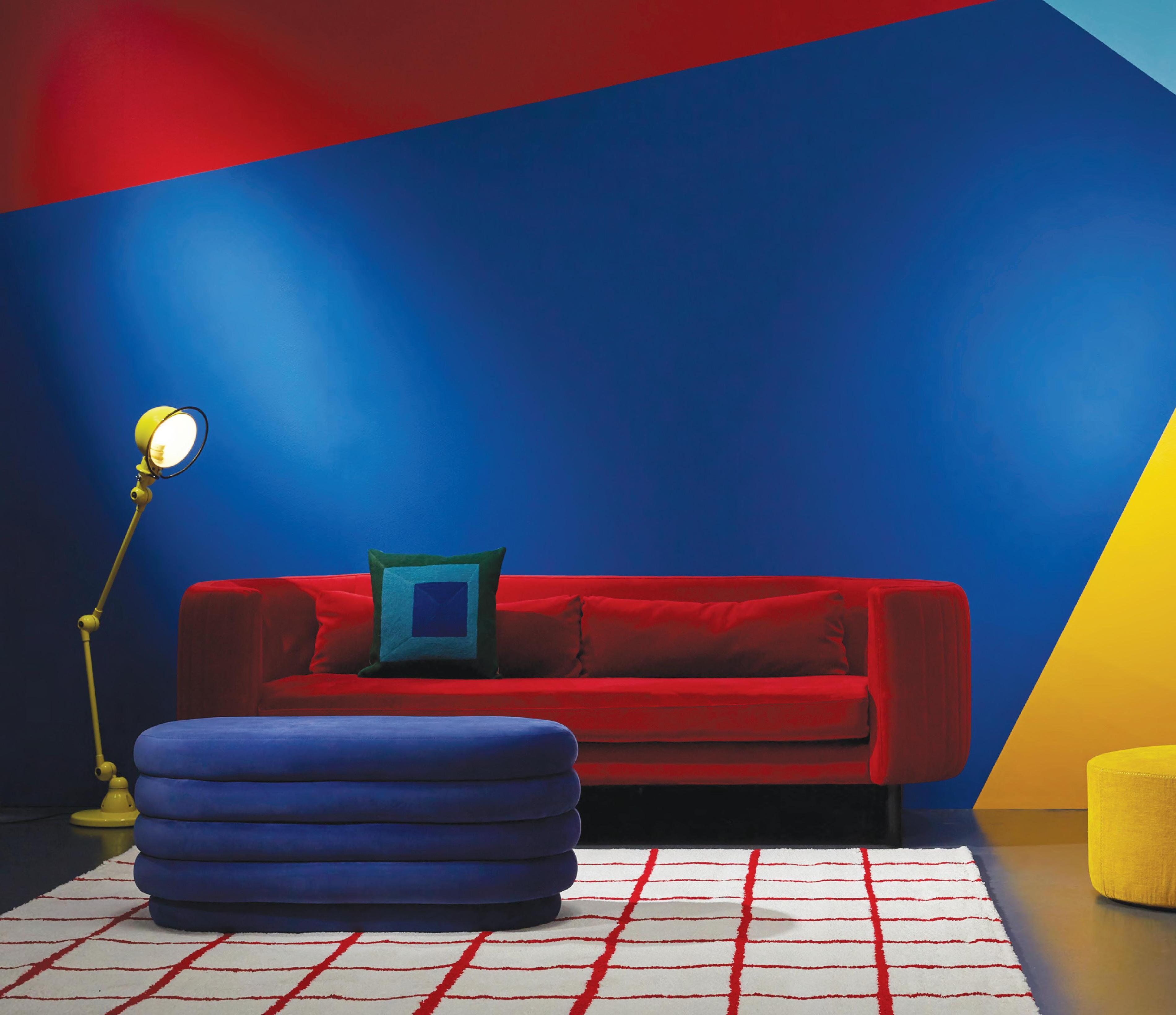
Already have a colour in mind? Matching colour has never been easier with Wattyl Colour Match. Simply scan the colour of any product or surface and match it to the closest Wattyl paint color. It’s that easy.
For more information about Wattyl Colour Match or Wattyl 2020 Colour Forecast visit wattyl.com.au or email wattyl.specifier@sherwin.com.

Set within general residential zoning on Hoddle Street in Melbourne, McCorkell Brown Group’s offices by Ha Architecture achieve a fine balance between appeasing the neighbours and preparing for the next 20 years in business.
Meet The Neighbours
Hoddle Street is one of Melbourne’s busiest thoroughfares, with traffic jams a regular occurrence during peak travel times. However inside the three-level offices of McCorkell Brown Group (situated on Hoddle Street between the main drags of Victoria Street and Wellington Parade), there’s a sense of calm, with double-glazing shielding most of the noise.
For Ha Architecture, it wasn’t the noise that most challenged the design, but the fact that it was situated within in general residential zoning. This meant they would have to appease the neighbours –including an older couple who were concerned the lemon tree in their back garden would be overshadowed by the development.
“Hence, the form of the building, strategically following the Res Code guidelines,” says Ha Architecture principal Nick Harding, who inherited the task of transforming an old distribution warehouse thought to be from the 1940s.
For Harding’s clients, moving from a warehouse-style office located close to the new location was paramount. “We wanted our staff (25 in number) not to be inconvenienced by the move. It’s also a stone’s throw from Bridge Road and the city,” says Damien Newton-Brown, a director of the McCorkell Brown Group. “We were also mindful of car parking, given our staff regularly move between the office and building sites,” he adds.
INDESIGNLIVE.COM 106 IN SITU
McCorkell Brown Group offices, Melbourne by Ha Architecture
Words Stephen Crafti Photography Dan Hocking Styling Beck Simon
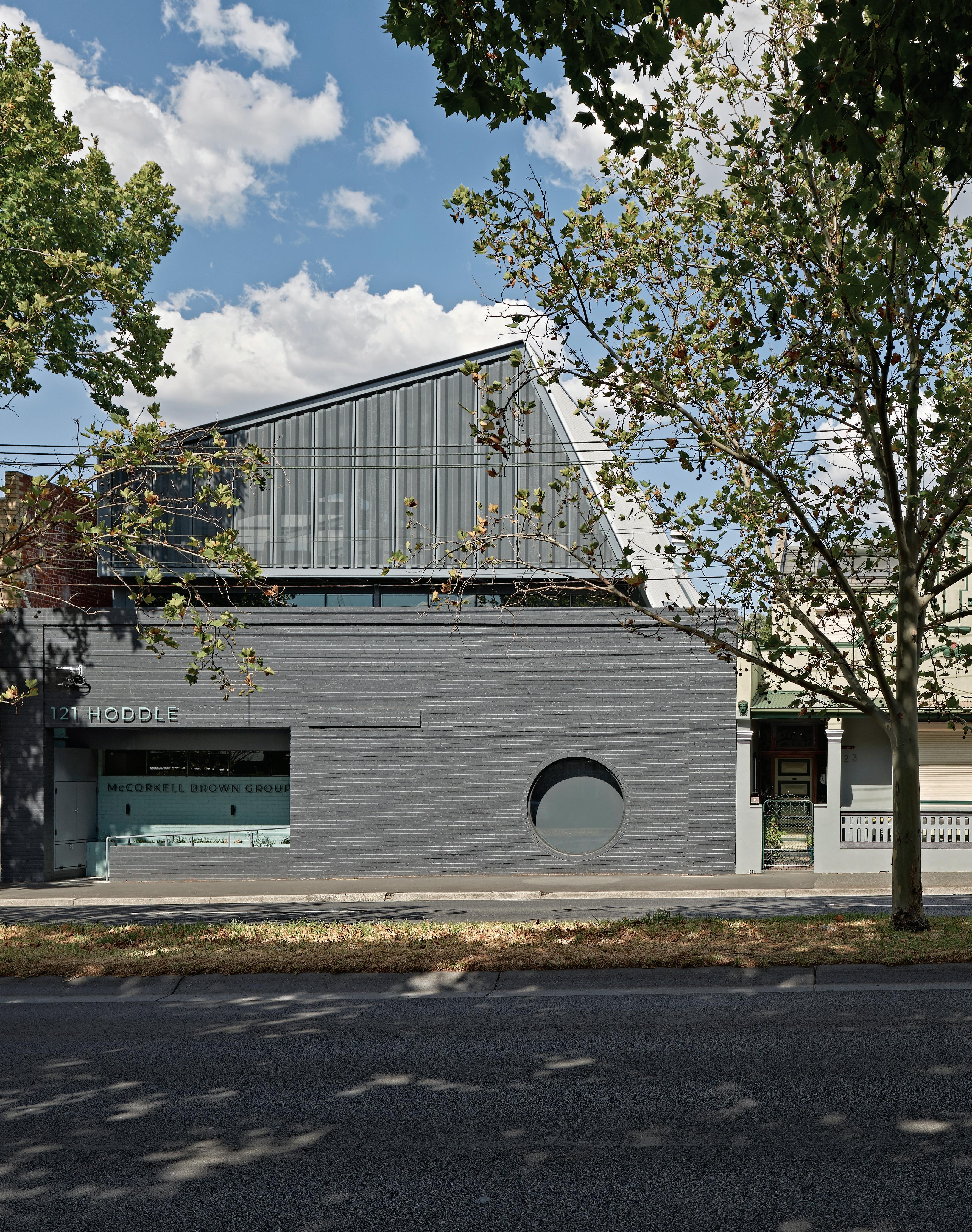
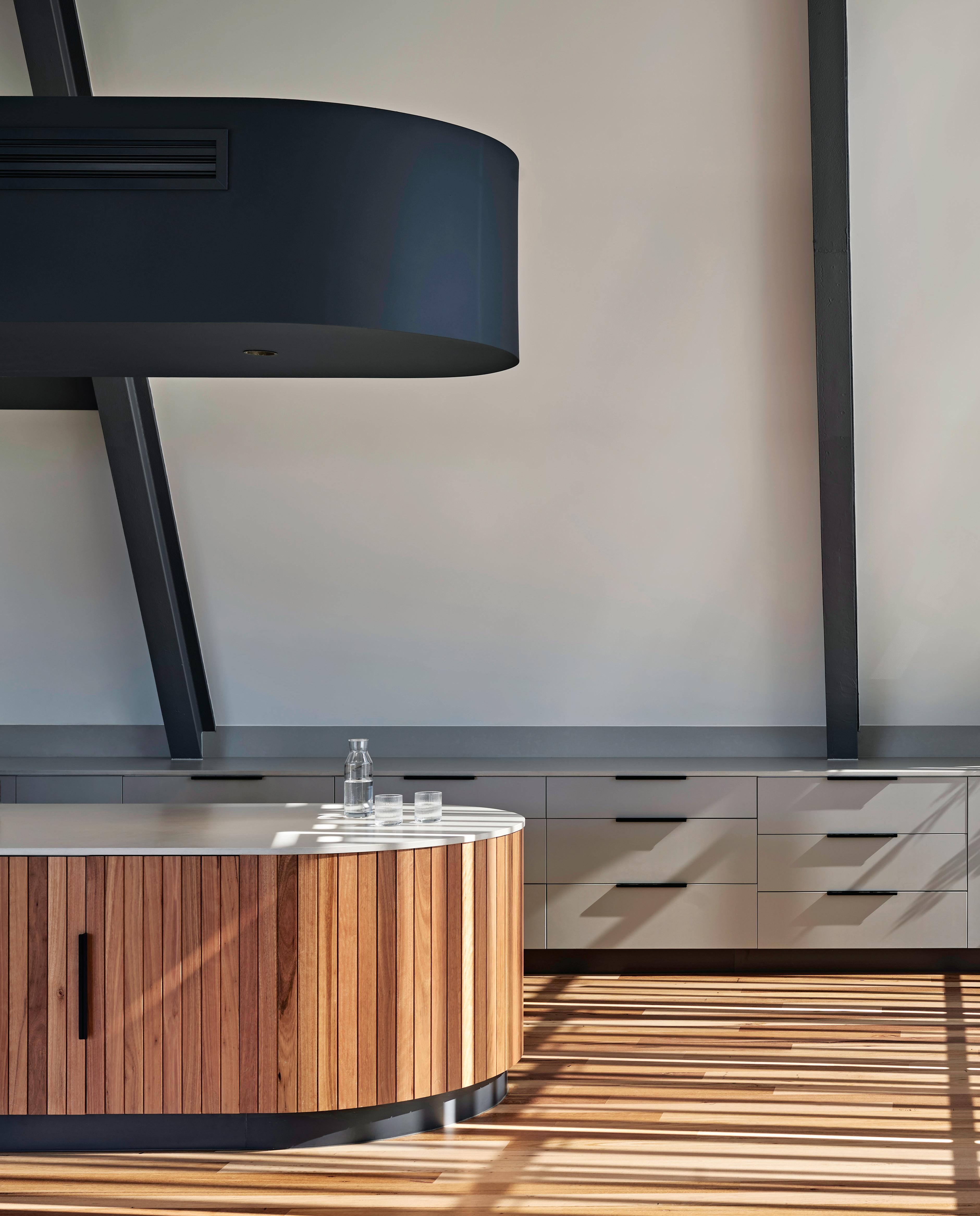
Space To Gather
The communal kitchen on the top floor serves as a lunch space, but is also perfect for board meetings and evening events. Filtering the afternoon’s west sun are automated perforated external louvres.
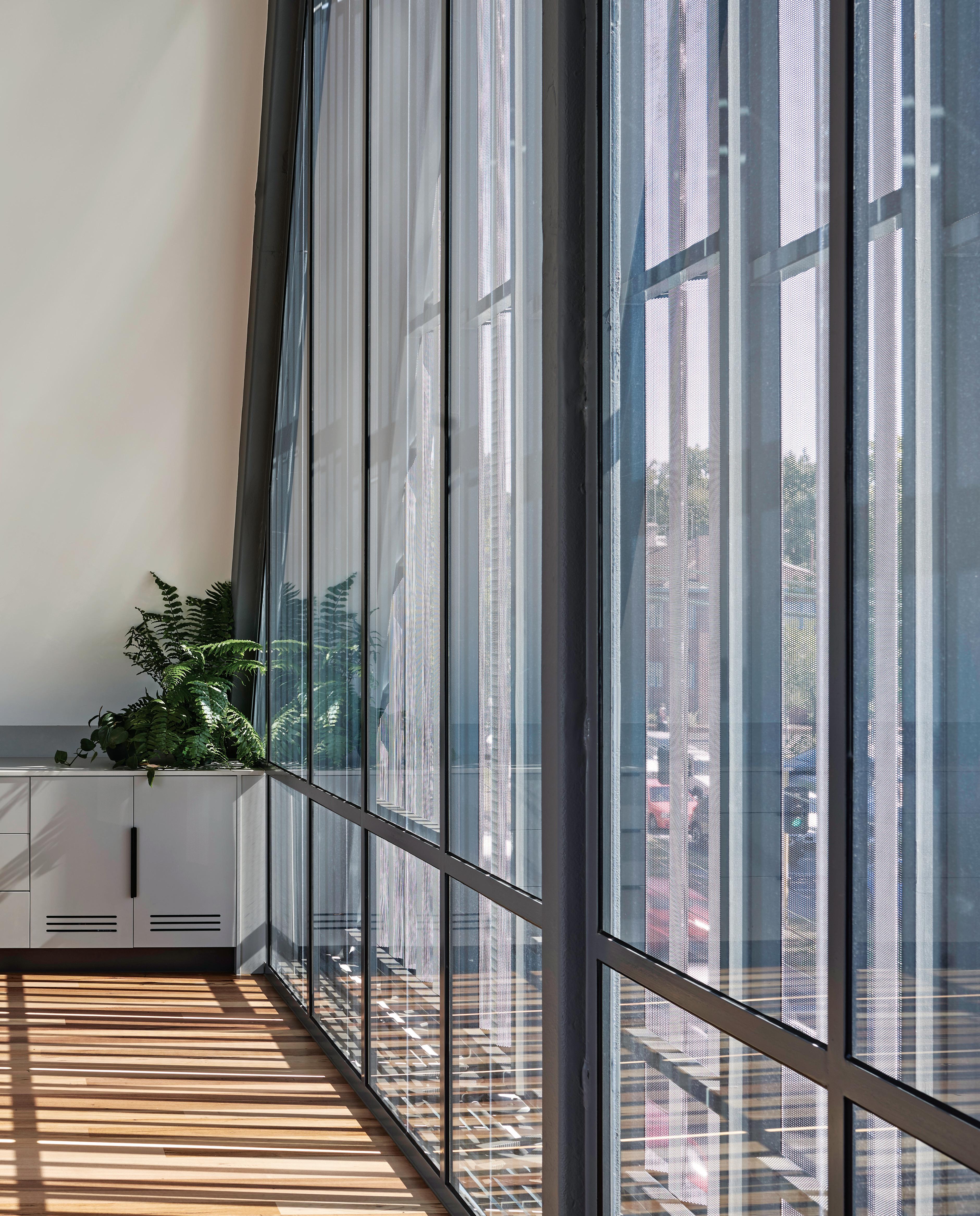
–
Aside from the functional brief given to Harding, Newton-Brown and his colleagues were quite loose in their expectation from the design outcome. “We wanted fairly fluid open-plan offices that allowed for collaboration rather than a series of enclosed rooms,” says Newton-Brown, who was also keen to ensure vertical connections throughout the spaces.
Ha Architecture only retained the boundary walls of the former showroom, with the new office inserted within this shell. A large circular window punctured the existing brick wall bordering Hoddle Street, allows for those meeting in the main boardroom to watch the continual stream of traffic pass by. However, in spite of its address, the interior is relatively quiet, with double glazing on all windows. For natural light, as well as external spaces to be enjoyed, Ha Architecture created a ‘slice’ through the building’s core, with protected terraces orientated to the north. To allow for natural light to penetrate this core, Harding included a series of translucent polycarbonate walls. “We wanted to ensure privacy for neighbouring homes, while not making staff feel dislocated from the elements,” he says.
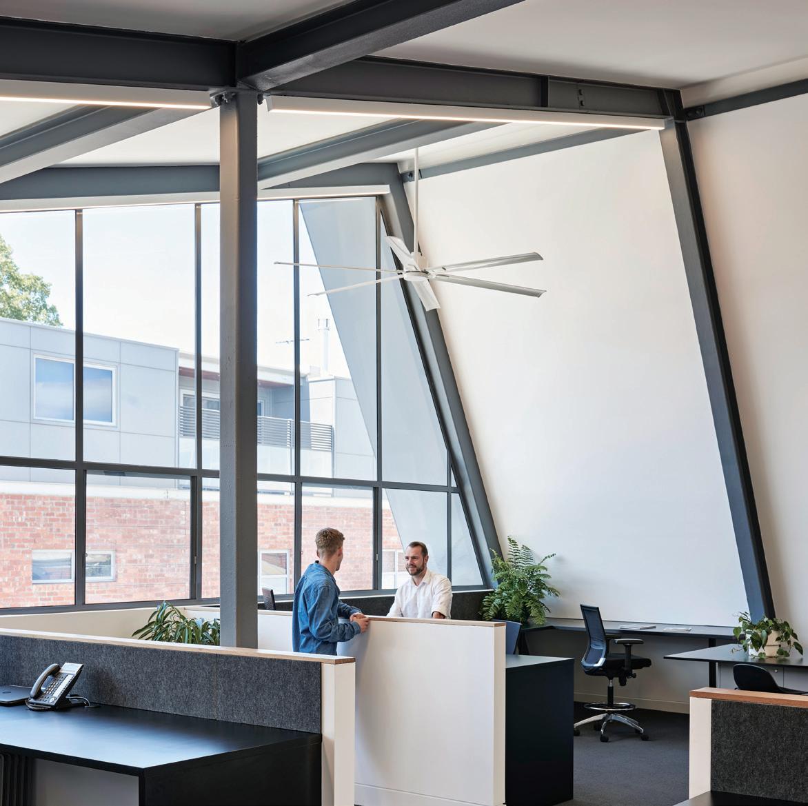
With the brief including expansive horizontal spaces, the floor plates on the top two levels are generous, with unimpeded sight lines and cross-ventilation from east to west. Automated perforated steel awnings framing the western elevation on the top level allow the
kitchen and communal areas to be ‘closed’ down to filter the harsh afternoon sun. “We thought it best to locate the main breakout space on the top level to take advantage of the city views,” says Harding. At the rear of this level are the directors’ offices together with another breakout space.
The middle level is primarily given over to the main work area, with open-plan spaces allowing unimpeded communication – a necessity for team projects. “The location of the central staircase was pivotal to the design, providing for those incidental catch-up meetings or organising ones to occur,” says Newton-Brown, who understands the need for staff to be in continual dialogue, rather than stuck behind closed doors. For Harding, the expression of materials – especially given the group’s specialisation in construction – was also paramount. As a result exposed steel beams placed at intervals of three metres define the various working modules while reinforcing the lightness of the structure.
With 90 years of operation, the McCorkell Brown Group fully understands the need to provide comfortable spaces, whether for educational projects, hospitality projects or in office fit-outs. “The idea wasn’t to maximise all the net letable floor space. It’s a space we intend to occupy for at least the next 20 years,” says Newton-Brown.
h-a.com.au
INDESIGNLIVE.COM 110 IN SITU
Page 107: McCorkell Brown Group’s new office, with its fortress-like façade, eliminates noise from passing traffic. Page 108-109: The communal kitchen situated on the top floor.
Above: The breakout spaces include double-height voids framed by translucent polycarbonate walls that diffuse the light as well as create a ‘veil’ to the neighbouring property. Opposite: The building’s exposed steel structural beams loosely delineate the open-plan office spaces.
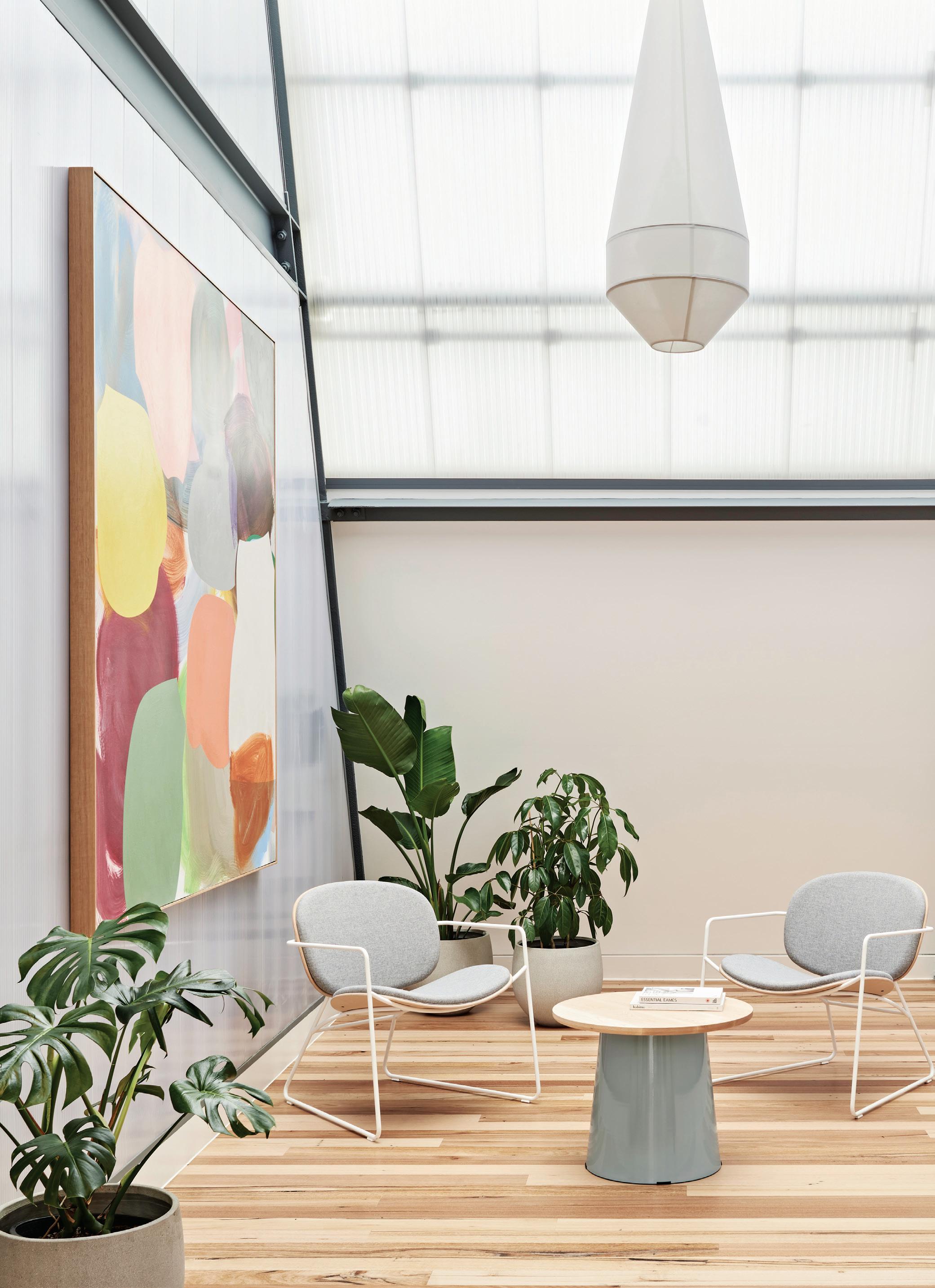
INDESIGN 111 IN SITU
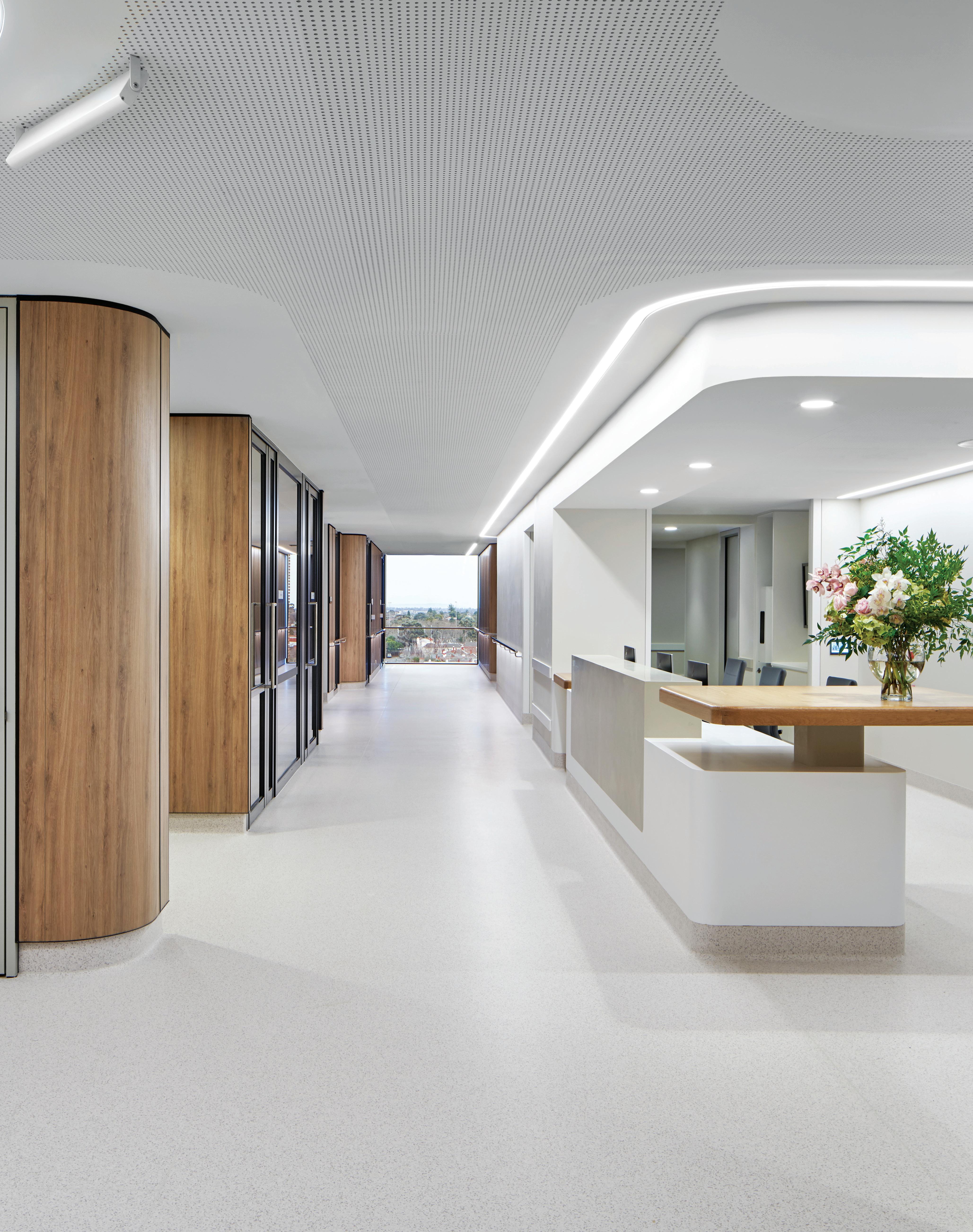
The architects of Cabrini Malvern’s new Gandel Wing have envisaged wards that feel both polished and hotel-like in quality. But it’s the the focus on safety requirements and functional needs of patients and staff that really shines through.
Check Me In!
The New Clinical Building by Bates Smart in Malvern is anything but clinical. The seven-storey building (with an additional four levels below ground) could be mistaken for residential apartments with its timber-battened façade. Forming the new building is the Gandel Wing at Cabrini Malvern, responding as much to the latest changes in technology as it does to the surrounding leafy neighbourhood and its demographics. “We’ve been working on this hospital campus since the 1980s. This time, it was about strengthening connections to our previous centres (Medical Centres Two and Three) as well creating this new wing, including the provision of over 100 new beds,” says Mark Healey, studio director at Bates Smart.
Replacing a two-storey concrete consulting wing from the 1980s, the new wing will accommodate patients in the specialty areas of radiotherapy, cancer, cardiac, maternity, emergency, geriatric care and infectious diseases and importantly, will provide valuable new pathways that allow other areas within the hospital campus to benefit. “We wanted to use the ‘DNA’ of the other two centres
we designed at Cabrini Malvern to feel integral to this latest development: streamlined, contemporary and uncluttered,” says Healey, who was mindful of the demographics in the immediate and broader environment he and his team were working with, reportedly one of the oldest cohorts in Melbourne (City of Stonnington). “We also wanted our design to better connect to nature,” says Healey, who included large floor-to-ceiling picture windows at the end of passages to allow people a sense of the outdoors from within. “It’s also a way of orientating people as they move through the building,” he adds.
From the moment patients and visitors arrive via Isabella Street, into a courtyard-style garden entrance, there’s a sense of both clarity and softness, eschewing any hard rectilinear lines. Lights are thoughtfully placed below handrails along with ceiling lighting that creates a softer environment than what’s normally experienced. “We reduced the lighting to 3000K (the usual is 4000) to create a more calming ambience,” says Healey, who also included soft rounded corners on all levels. The oak timber laminate used for
INDESIGN 113 IN SITU
The Gandel Wing at Cabrini Malvern, Melbourne by Bates Smart Words Stephen Crafti Photography Peter Clarke
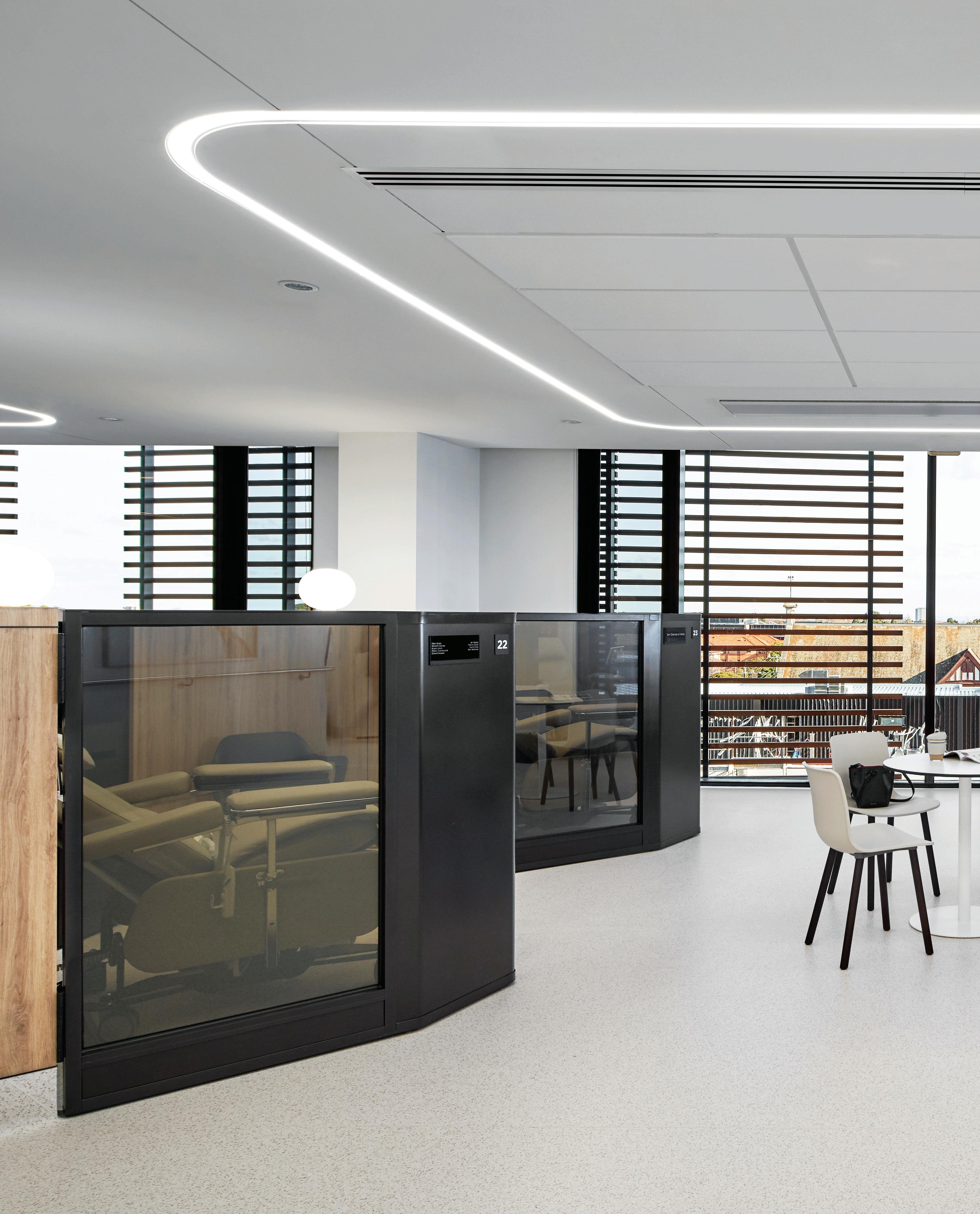
A Ward For Healing
The oncology ward in The Gandel Wing puts the emphasis on comfort and privacy with transparent glazed screens that can be switched to opaque, and views outside from every treatment pod.
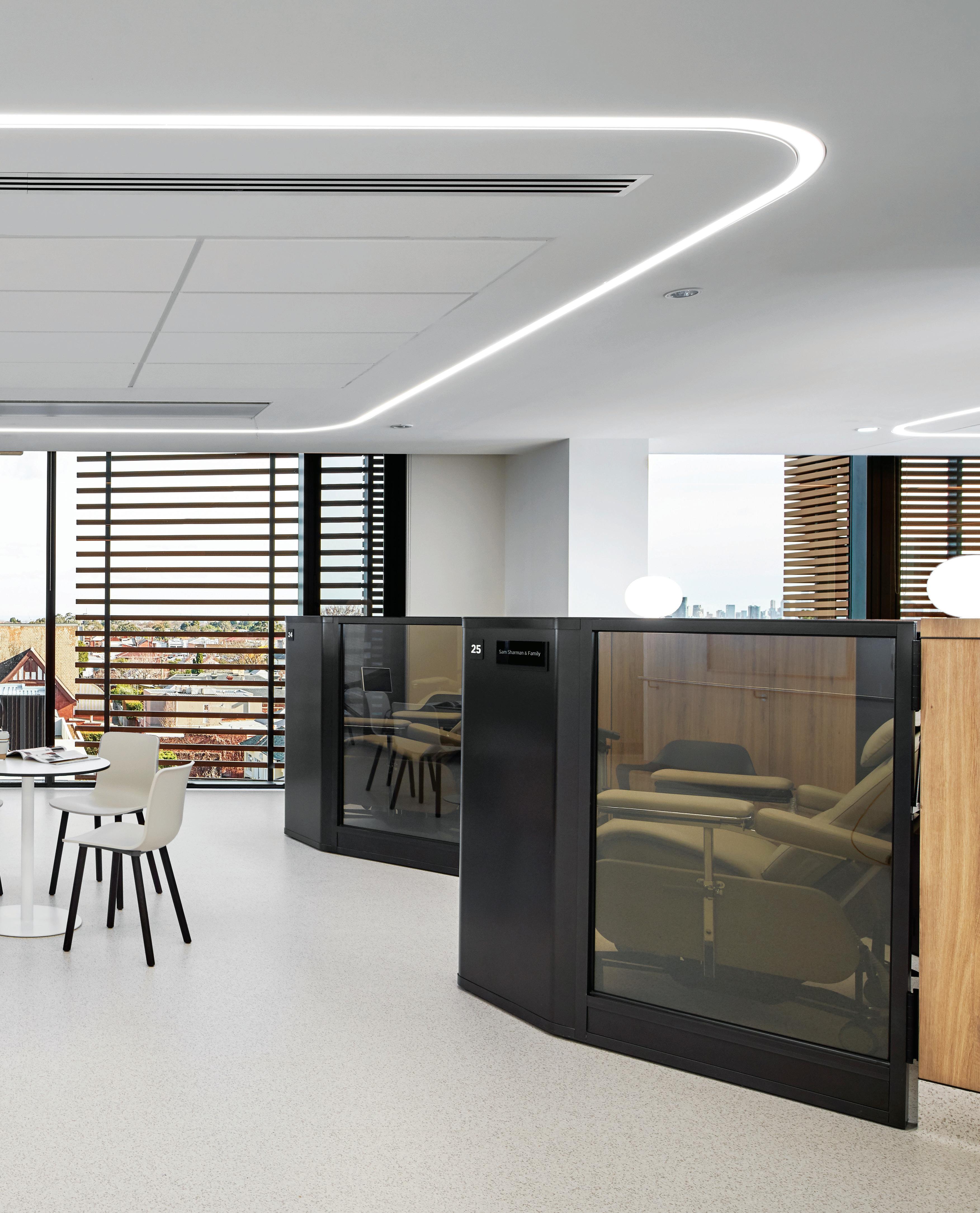
–
the public areas can also be seen within each bedroom suite. Gentle alcove lighting, carefully articulated shadow lines, and unimpeded sight lines between a patient’s bed and their bathroom could not be clearer, with sensory lighting activated when a patient gets up to use the bathroom during the night.
“Evidence highlighted to us that it is at that time when most accidents occur, with patients falling and being disorientated,” says Healey, who created the same rational approach in designing the ensuite bathrooms. Curved walls, seamless vanities and uncluttered floors and walls, void of glass shower screens, ensure patients are as safe as possible at all times of the day and night. The rooms also feel far from clinical, with bronze-tinted glass entry doors and floor-toceiling windows that frame the leafy neighbourhood. The central pod, containing the built-in wardrobes and basin, is as streamlined, with any equipment concealed. “We also took that approach with shelving concealed behind tinted glass,” he adds.
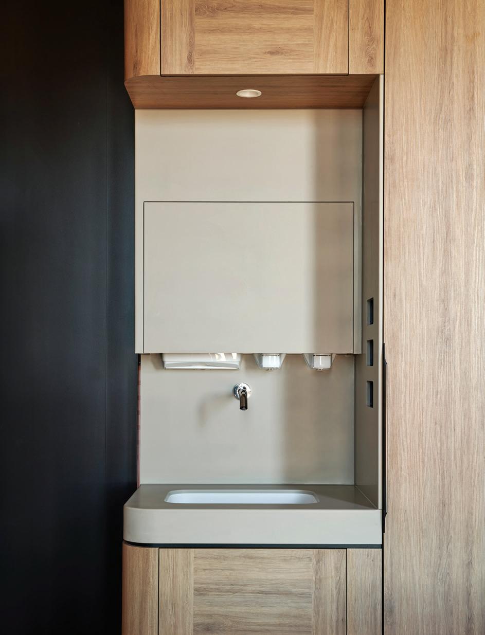
Bates Smart was also keen to increase the comfort of patients needing to use the Infusion Treatment Unit on level four. Twentyeight chairs, the type one might experience in a first-class airport lounge, are discretely arranged behind tinted bronze glass privacy screens that can change in the degree of transparency with the flick of a switch. “We’ve organised these chairs at a forty-five-degree angle
so that patients can control whether they want total privacy, or feel part of being in a larger space, with views beyond,” says Healey. “One of the most important aspects of delivering services such as these is creating the highest level of hygiene possible,” he adds. In addressing all these imperatives Healey refrained from using curtains, instead relying on tinted glass; selected external terracotta baguettes; and carefully curated bed, chair and table placement.
Beds in individual rooms, for example, are orientated to ensure sight lines are through the terracotta baguette rain screen. Likewise, those passing by a room do not see a bed from a doorway. Just as considered are the breakout spaces provided for family and friends and staff. Each level, for example, has a built-in bench-height desk at reception to allow staff to meet informally. There are also rooms where families can meet, along with two courtyard spaces where mothers can feed their babies should they have a toddler begging to be taken outdoors.
“When we’re designing these types of spaces, we’re always mindful of making them feel as normal as possible, a welcoming place that fits comfortably into this neighbourhood,” says Healey.
batessmart.com
INDESIGNLIVE.COM 116 IN SITU
Page 112: Wayfinding through each ward is directed by access to views and natural light; meanwhile a curved timber counter provides an easy and welcoming point for informal meetings and conversations. Page 114-115: The oncology ward is a calming environment for patients needing infusion treatments. Above: Nurse stations are crafted from Corian, while services are all seamlessly integrated. Opposite: A patient room overlooking the suburb beyond. Page 118: Sleek patient bathrooms are thoughtfully designed with safety in mind.
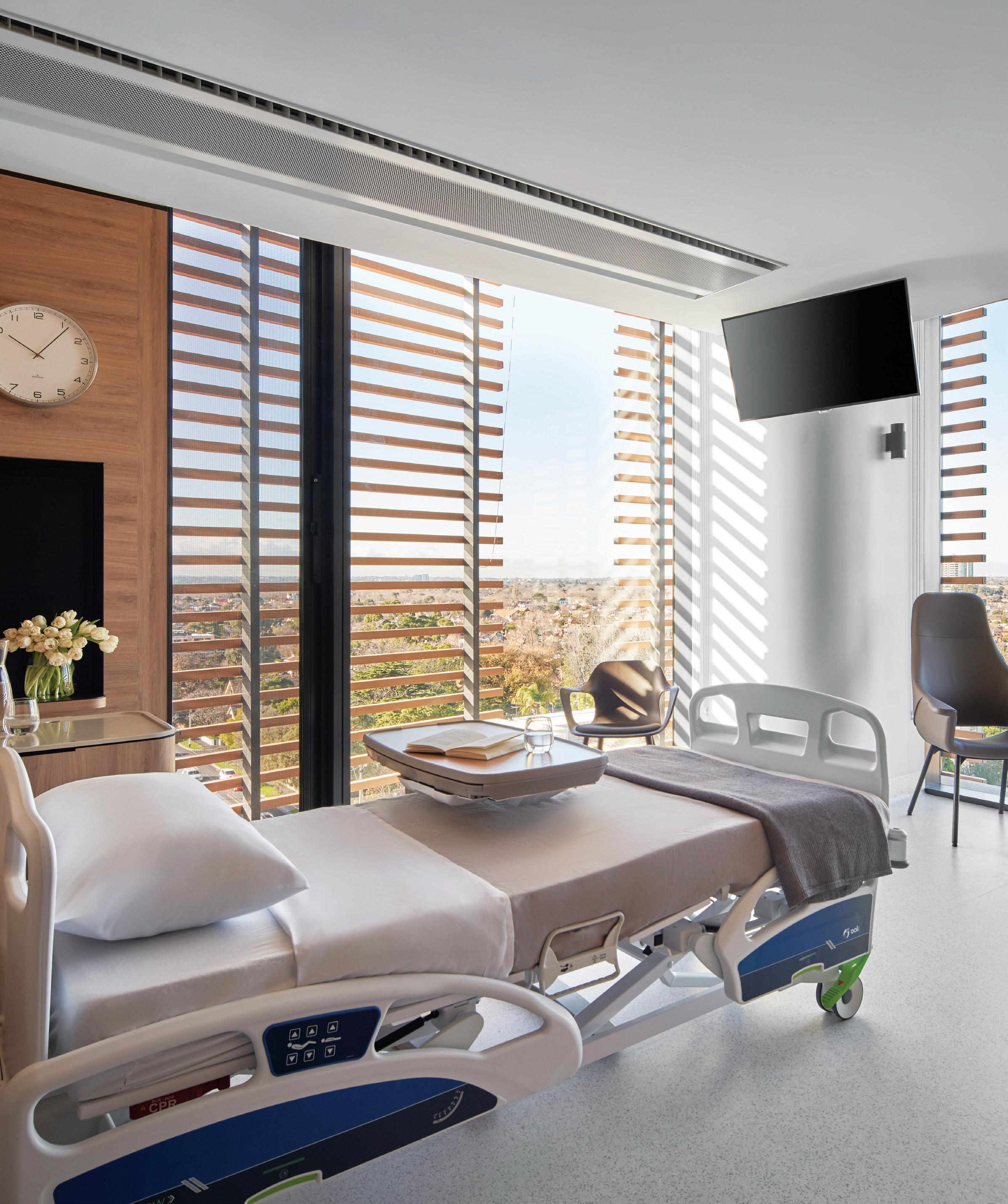
INDESIGN 117 IN SITU
Conscious Design Acts
The bathrooms in the The Gandel Wing put the emphasis on safety with a design that offers a clear line of sight between the patient bed and bathroom –the intention being to mitigate injuries from falls.
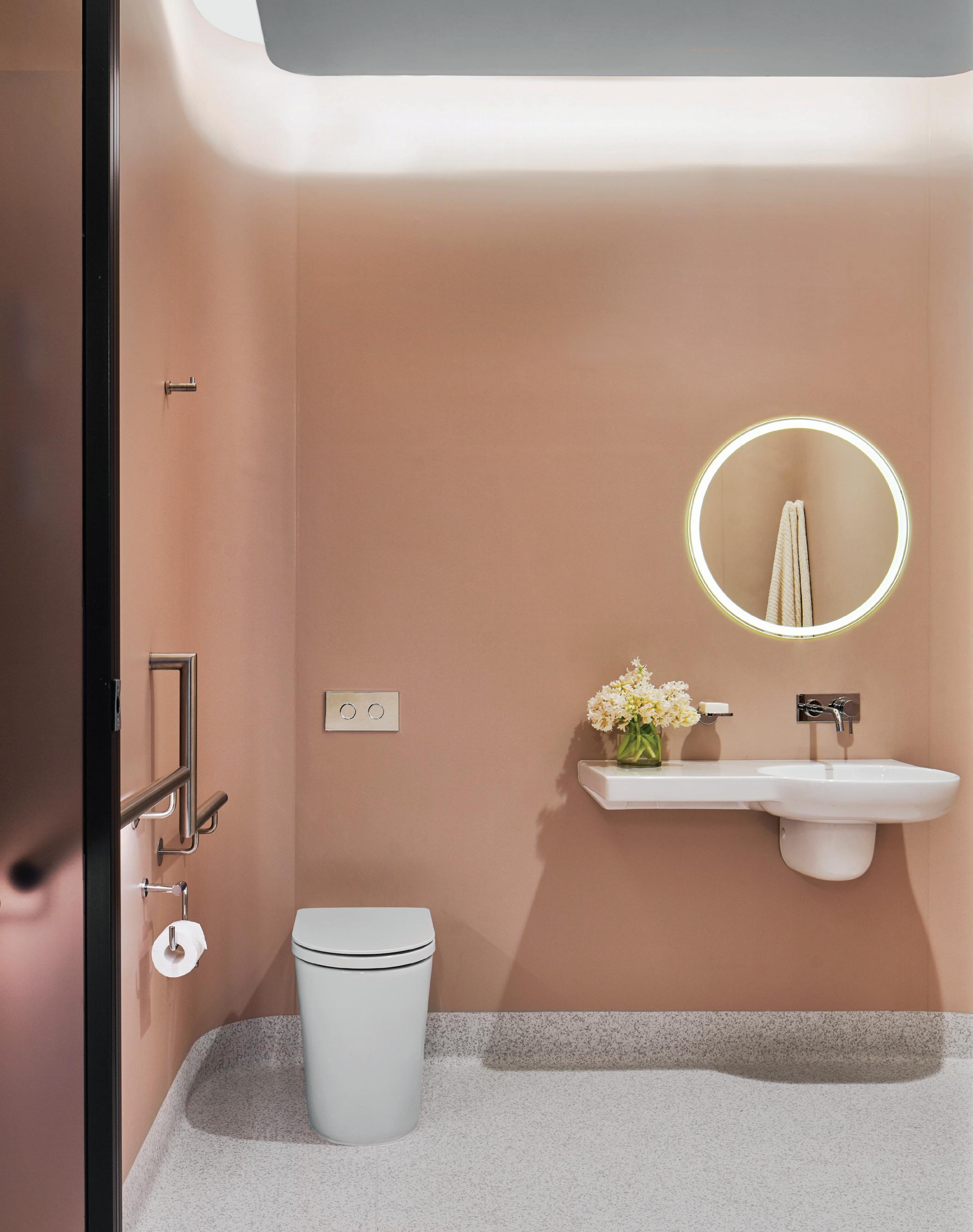
INDESIGNLIVE.COM 118 IN SITU
–
OE Quasi Light: Illuminating Mathematical Forms
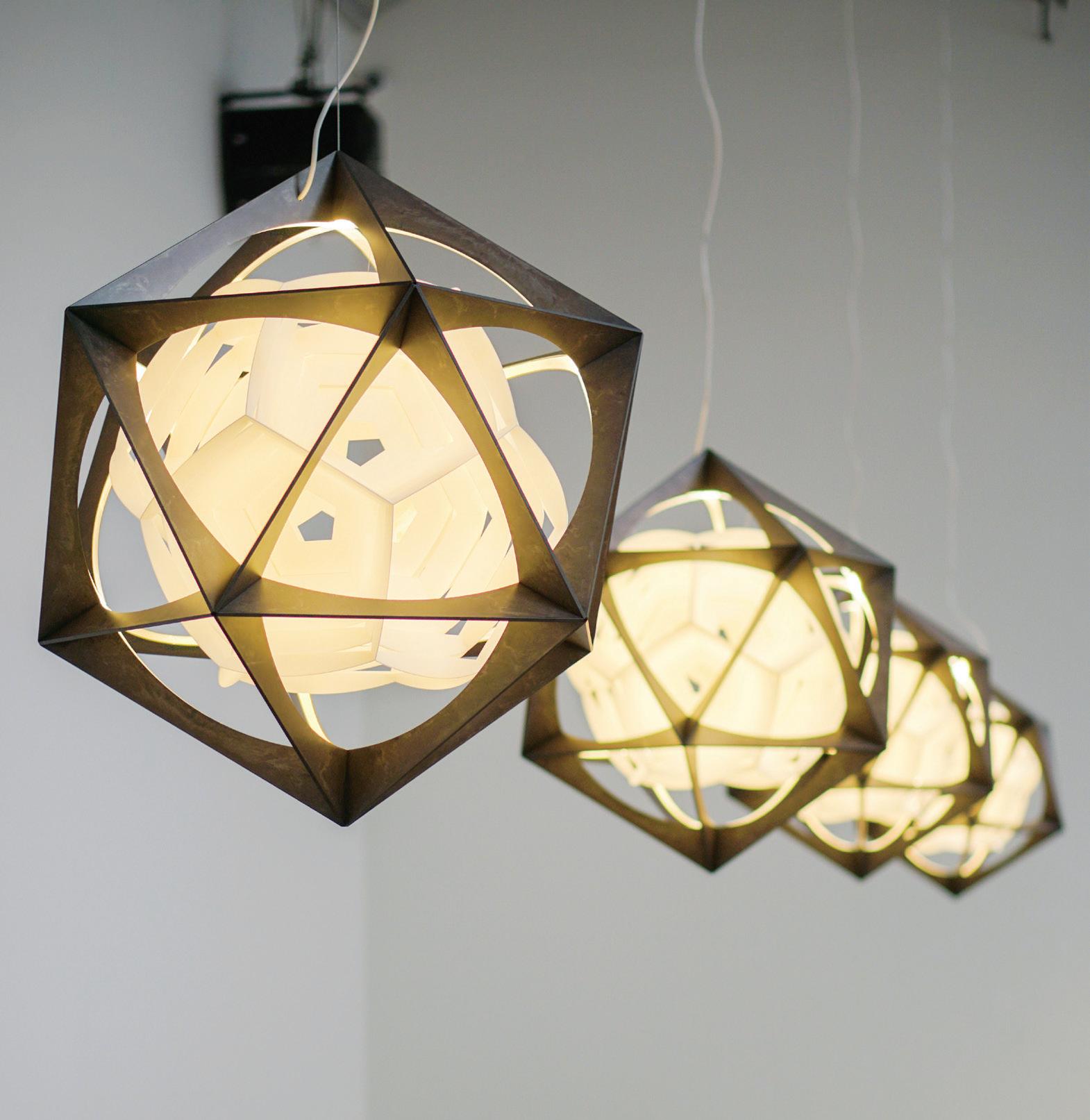
The purity of mathematical forms may not be the most obvious source of inspiration for beauty, but Louis Poulsen is no ordinary design house. It was this appreciation for splendorous mathematical forms that lead to the creation of the new OE Quasi Light.
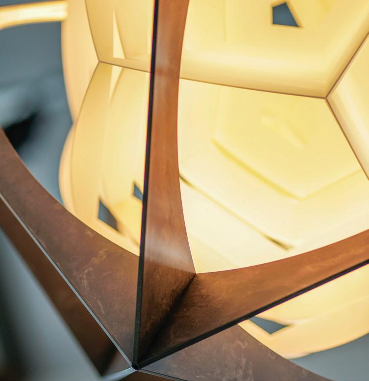
Designed in collaboration with the revered Danish-Icelandic artist, Olafur Eliasson, OE Quasi Light was unveiled at the 2019 Salone del Mobile and is a masterful realisation of the interplay between form and function, and art and design.
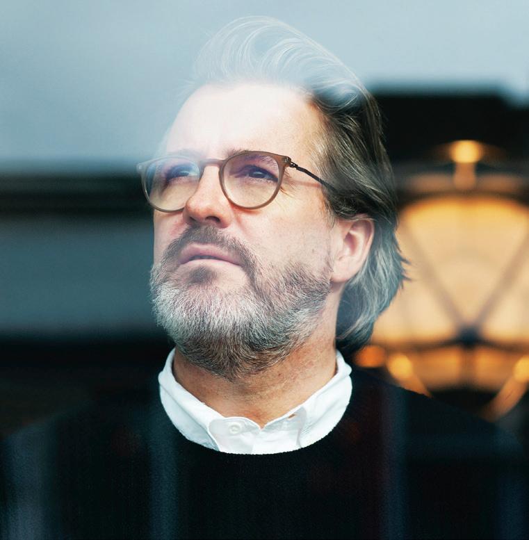
“Light has been central to my artistic practice for over 25 years,” says Olafur Eliasson of the creative partnership with Louis Poulsen. “Light shapes everything; it determines what we do and how we do it. Quality lighting is essential to our lives. A concern for the emotional and physical e ects of lighting is at the core of the lamp that I have conceived for Louis Poulsen. It is my hope that this geometric sculpture will bring new light to your daily life.”
In the design of OE Quasi Light, contrasting geometric shapes nest inside one another to form the lights most basic composition.
The complex shape of a rigid aluminium icosahedron – a form possessing 20 faces and 12 vertices – forms the outer layer of the luminaire. The inner layer reveals the mathematically reversed shape of a dodecahedron (composed of 12 faces and 20 vertices) which seemingly oats inside.
The vertices of the exterior shell are embedded with bright LEDs to direct the light towards the lamp’s core, which re ects the illumination with a spherical distribution. The light’s complex geometric shape is perceived di erently depending on where the observer stands, creating endless interpretations and perspectives that will inspire as well as illuminate.
Sustainability is more important to design than ever before, and Louis Poulsen is at the forefront of this. The aluminium of the OE Quasi Light is composed of 90 per cent recycled material, and other materials used are also entirely recyclable and reusable. With the design enabling future disassembly to replace and recycle parts, OE Quasi Light was created with longevity in mind.
119 LOUISPOULSEN.COM INDESIGN LOUIS POULSEN
Healing With Dignity
Words Mark Healey
INDESIGNLIVE.COM 120 IN SITU
“We must continue to focus on delivering human-centred solutions that encourage a patient’s sense of worth.”
Design thinking invites architects and designers to engage in creative problem solving to achieve human-centred solutions. One would presume that a situation such as that documented in the recent Royal Commission by former Victorian senator, Bernard Cooney, who spent his final years in a residential aged care facility would provide designers with an inspiring set of problems to solve. Cooney was dependent on the design of his room and the furniture within it to carry out even the simplest tasks; his human agency and dignity entirely subject to the design of his dwelling.
Healthcare is currently at an impasse where the increasing demands of a growing and ageing population must be addressed by not only the public but also the private sector, each with their own opportunities and trials in their operating models. My belief is that although often considered for their varying needs and service offerings, the commonality of these two models is human dignity – this should be central to any aged or healthcare design and embedded in the guidelines that we, as professionals, are required to work within. We must continue to focus on delivering humancentred solutions that encourage a patient’s sense of worth.
As a designer, I honour my role as an advocate for human-centred design, but we are often presented with numerous challenges being budgetary or models of care which promote clinical efficiency with little consideration of a patient’s experience. While designers must negotiate this path and the many factors that necessarily underpin a healthcare environment, it is important to filter these to ensure the dignity and humanity of the end user remains at the forefront.
In Bates Smart’s design of The Royal Children’s Hospital in Melbourne, we pioneered by employing the principles of biophilic design and its proven benefits of recovery. Each room has views to nature, with abundant natural light filtering through the leaf-like sun shades. The hospital was designed too for its unique patients – children and their families needing a comforting, supportive environment to promote healing without being child-like.
Similarly, we engaged these ideas at Bendigo Hospital where trees were introduced in the main public internal street, and the vast roof lights invites dappled light to fall through a network of tessellated timber screens. Central to the success of this hospital are the public spaces that incorporate large-scale artworks which provide vibrant
INDESIGN 121 IN SITU
“I am a resident in an aged care facility in Victoria, unable to perform the simplest acts to assist myself or even to adjust my position in the bed-style chair to which I am confined during my waking hours. If I become uncomfortable, thirsty or hungry I press the buzzer which is usually, but not always, placed close to my right hand.”
Written submission by Bernard Cooney for the Royal Commission into Aged Care Quality and Safety 1
positive energy. A work by Noël Skrzypczak references the geological story of the local area, while another by Esther Stewart provides a colourful and joyful point of interest, bringing life to an environment that is often perceived as clinical and sterile.
There is a growing body of research into user experience and the benefits of salutogenic design. This is an evolving science, and designers should be flexible to pivot and thus maintain best practice to create longevity in design outcomes. However, innovations such as these can be a challenge to achieve within large-scale healthcare projects. I could argue this chasm is indicative of a generalised prejudice towards the aged or disabled who are often infantilised through design.
In essence, design language reflects the user; it is the designer’s imagined portrait of the consumer. Healthcare designer Gretchen Anderson noted if we view seniors through the products that are available to them, then they would be viewed as “cranky, stupid, and tacky”. It is assumed that because someone has an impairment then they are also incapable of having experiences. “It is therefore assumed that they will make do with, or perhaps even prefer, a mechanistic, bulky product that smells like a hospital.” 2 Research also suggests that such negative self-perceptions of ageing and health relate directly to poor health outcomes. Yale researcher Rebecca Levy has also shown that “positive self-perceptions of aging can improve memory, thinking and cognition, mood, selfconfidence, overall functionality, and longevity.” 3
Our design for Cabrini Malvern’s recently opened Gandel Wing responds to these principles, setting new standards of design which incorporates a simple, elegant non-clinical design language with highly
resolved solutions. This is embedded within systems that revolutionise safety, ease of movement and use for the occupants. Clear axial views to nature from corridors ensure a highly legible space; direct sight lines between the bed and ensuite minimises confusion; sensor-activated LED lighting to handrails encourages safe passage through the hospital wing; and the colour temperature of general lighting has been set at 3000K to ensure patients are able to rest more effectively. Full-height operable windows allow control over the immediate environment and the rooms have been designed to integrate functional and medical equipment seamlessly, minimising their visual impact so that the patient experience is normalised. The Gandel Wing welcomes patients requiring cancer, cardiac, emergency, geriatric care, infectious diseases, maternity and neurology support to relax and heal in an environment which is connected more closely to nature and detailed to reflect one’s own domestic environment. As designers, we are responsible to create healthcare spaces that enhance the user experience, meeting their needs physically, sensorially and psychologically, all while upholding their dignity.
batessmart.com
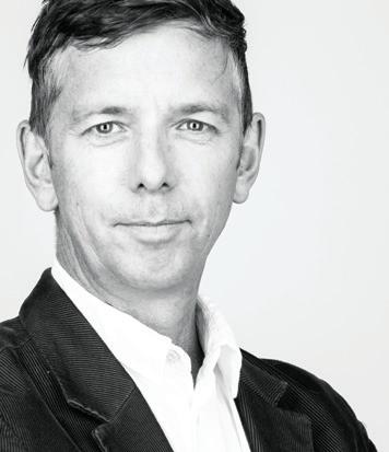
References
1 Written submission by Bernard Cooney for the Royal Commission into Aged Care Quality and Safety: https://agedcare.royalcommission.gov.au/hearings/ Documents/transcripts-2019/transcript-28-june-2019.pdf
2 Frog design mind: product design for the elderly, Anderson, G. (2006), accessed 15 April 2007, www.gizmodo.com/gadgets/columns/ frog-design-mind-169097.php
3 Implicit ageism, Levy, B., and Banaji, M. R. in Ageism: Stereotyping and prejudice against older persons , T. Nelson (Ed.): Cambridge: MIT Press (2002), page 49-75.
INDESIGNLIVE.COM 122 IN SITU
Mark Healey is studio director at Bates Smart in Melbourne.
Silence for Everyone
Don’t take acoustics for granted and upgrade your space with high quality acoustic solutions, lighting and furnishings.
Haworth are pleased to announce that Buzzispace are a Haworth Collection Partner.
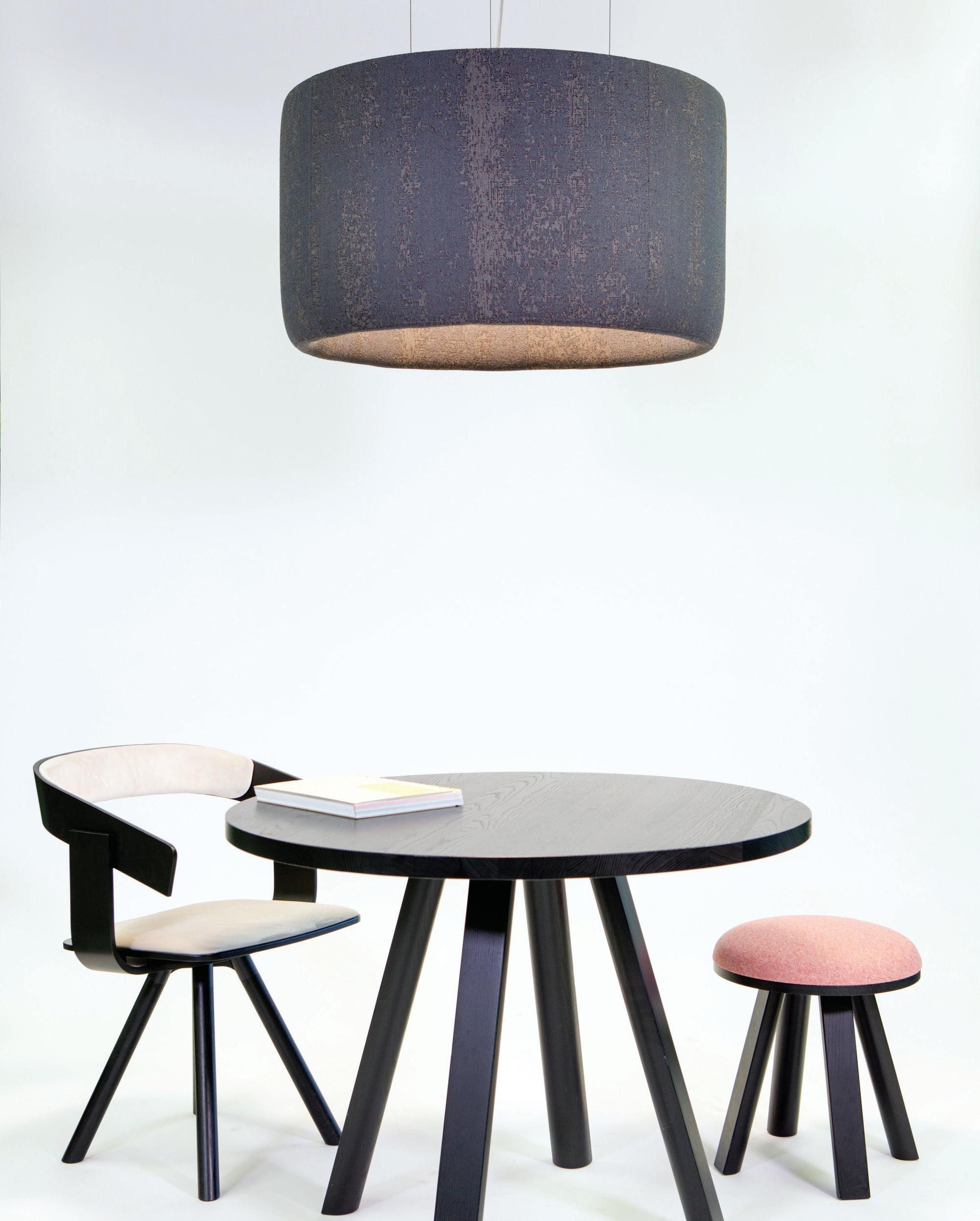
2020


Celebrating the best of the decade

Our region’s architecture & design on the world stage



Entries open soon Make 2020 your year indeawards.com
The ‘Neolith’ Of New Age Façades
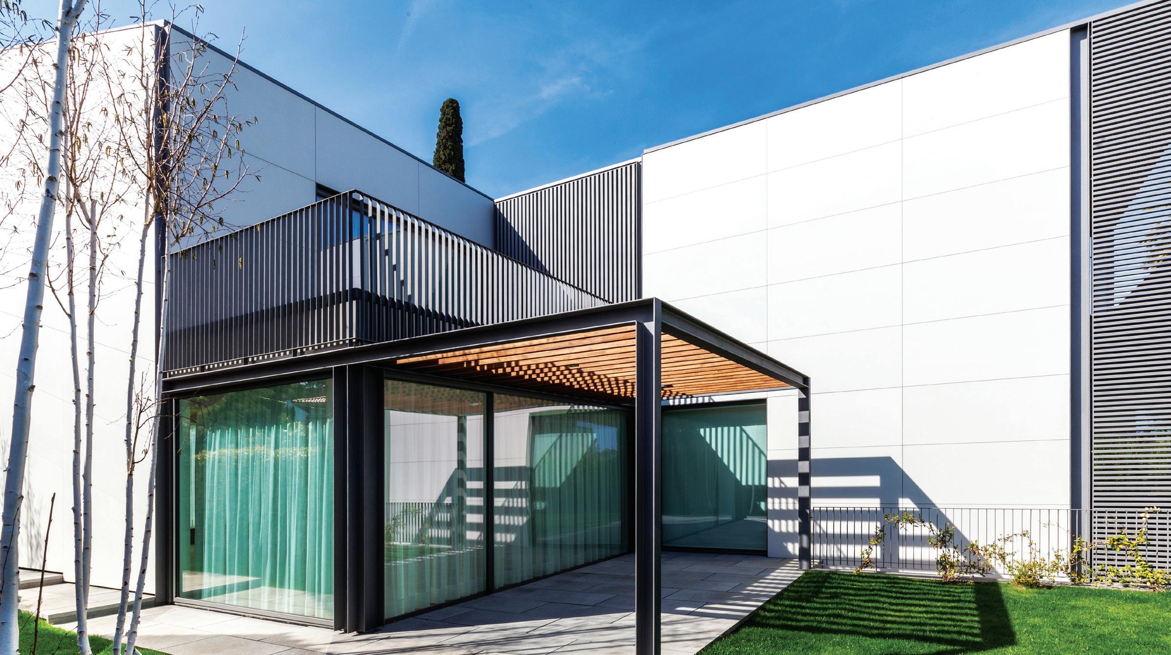
The role of the façade in bringing distinction and personality to a building is, without a doubt, critical to both the autonomous structure and its surrounding built environment. Get it wrong and a building’s purpose and landmark appeal is quickly lost. Working with the right tools – that is material and surface treatment – is critical to the build process and a successful outcome for architect and client.
Enter Neolith façades, a super standard in surfaces that is rede ning design and supporting the creation of original ideas within façade design. Suited to a wide range of cladding applications, Neolith is available in four di erent nishes of Stain, Silk, Riverwashed and Polished.
As a leading brand of sintered stone, Neolith was founded in 2009. The product can be speci ed for a wide range of challenging interior and exterior building projects hinting at its sheer versatility. So, whether it’s a skyscraper façade or a kitchen benchtop, the look and nishing are consistent across applications. Importantly, the product also o ers a unique combination of strength, aesthetics, durability and longevity, ensuring building façades retain their original look and feel for years together.
Sintered stone is 100 per cent natural and composed of granite minerals, glass minerals and natural oxides. Water-based ink is used in place of solvents, to create a more sustainable product o ering, ensuring all slabs maintain the same de nition and design. Neolith also o ers realism, high performance and availability in a variety of formats, making it a go-to material for architects, designers, speci ers and fabricators. And, thanks to its heat and UVresistance, it can withstand the most extreme of weather conditions.
In Australia, Neolith has been subjected to strict safety standards and carries a CSRIO certi cation of AS 1530.1 for combustibility, and AS 1530.3 for ame propagation, heat and smoke release. This means the product won’t emit smoke or toxic materials when in contact with re or subjected to high temperatures. As a waterproof product, Neolith has an absorption level of almost zero and also boasts a scratch and abrasion-resistant surface. Colours appear fresh despite prolonged exposure to sunlight, making it ideal for façade applications. Interestingly enough, every slab of Neolith is composed of 52 per cent recycled material.
Neolith is available exclusively through CDK Stone.
CDKSTONE.COM.AU 126 INDESIGN CDK STONE
Private Residence, Barcelona, Spain by OAB Ferrater, featuring the Neolith Arctic White Satin 6mm+ ventilated façade.
housing, health and cultural imperatives for our cities’ futures
INDESIGN 127 IN DEPTH
DEPTH IN
What’s the rush?


Words Mandi Keighran in conversation with Paul Priestman Image Sydney map, MakeMapsStudio























Today, more than half the world’s population lives in cities, and it is estimated that by 2050, that number will grow to 6.7 billion – or about 68 per cent of the global population. By that time, the number of people aged 80 or over is projected to triple. So, as people live longer, cities across the world will not only be faced with general growth but the specific challenges of an ageing population, particularly when it comes to the way designers and urban planners think about transport systems. “As designers, instead of thinking of these new requirements as limiting the creative process, embrace them and see what benefit it can bring to the whole community,” suggests Paul Priestman. In these near-future “silver cities” (as they are o en dubbed), the boundary between public and private transport will dissolve, cars will disappear, and new kinds of adaptable infrastructure will emerge, suggests Priestman. All of this opens up opportunities to create new kinds of transport systems to support an ageing and growing population and encourage healthier lifestyles, but also contribute to the character of our cities.
Six ways designers could think about the future of transport in our cities, according to Priestman.
Transport systems to encourage active lifestyles
The link between keeping active and healthier for longer through mobility is a particularly interesting area. Recently, we’ve been working on Walk Lines which are like tram lines but without trams. The ‘station stops’ might be cafés and there are walkways, cycleways,
and scooterways. These aren’t only for recreation but for navigating the city. When you can encourage people to walk longer distances to a transport stop, you don’t need to build as many stations and the whole system becomes more e cient as buses and trains don’t have to stop as o en. Replacing roads with these kinds of walking and cycling highways creates a lot of benefits – a more active lifestyle, a healthier population, and a more e cient public transport system.
What’s the rush? Commuting as part of
the work day
We’re designing high-speed trains, planes and spaceships to get people from one place to another as fast as possible – but we are also interested in what happens when the public transport system becomes more than a way to commute. It opens up the question: What’s the rush? In California, the work day is now counted from the moment people leave their home to the moment they return, so the commute is now part of the working day. In the same way people might choose to work somewhere like a café, because it’s more human, a public transport system could become a part of the work day. It’s about creating a space for community, where people want to be together. Transport almost becomes a byproduct.
Cars will become obsolete in city centres
If you look forward 10 to 20 years, I think the centres of most cities will be car free or moving in that direction. If you’re going to be taking out a major part of the existing infrastructure, what does that mean? I do think trains will remain a part of the infrastructure of
INDESIGN 129 IN DEPTH
Ageing citizens and rapid population growth is changing the way we navigate our city centres. While it throws up plenty of challenges, Paul Priestman of PriestmanGoode only sees opportunity.
cities – there aren’t many vehicles that can transport so many people so quickly. I also believe we should embrace walking, cycling, and emerging technologies, like drones. Our Dragonfly project for a drone delivery system was inspired by the congestion in cities caused by delivery vans. We started to think about how we could deliver to different floors in buildings, and how we could re-utilise the rivers and harbours, around which many cities are built, as the distribution centres. We imagined these little leaves drifting off and delivering to people’s houses and workplaces, then perching on a windowsill and waiting for the next job.
Public transport as a city brand
Public transport and vehicles will increasingly become the brand of a city, in the same way that Hong Kong has trams and Copenhagen has bicycles. These transport systems become part of the culture and national pride –many of the trains we’ve designed around the world are on stamps or even bottles of milk. That’s not something that happens often in design. So it’s important that the vehicles we design create a character for the city, just like the buildings or the food. It’s not a tourist’s perspective when we design this character, it’s a modern take on the city. When we designed the New Tube for London, we focused on materials that would age well, like the bronze steppages that are kept shiny through people’s use and identify the edge of the step.
Work with what you have
In cities where overcrowding is a problem, public transport systems need to allow for higher capacity. With the New Tube for London, for example, part of the brief was to create 30 per cent more capacity. You have to use design and technology to make what already exists work better and to encourage people to act more efficiently intuitively – like putting in more doors so that people board faster. I describe it as getting the grit out of the system. We have also explored the idea of seats that transform [and] adapt to different uses during rush hour and off-peak times.
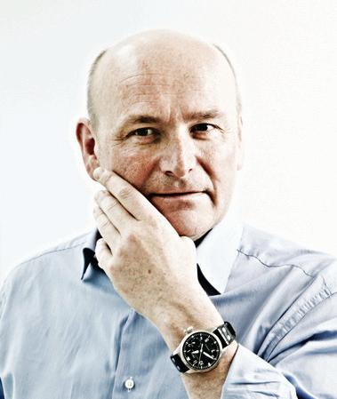
Public and private transport working in harmony
As it becomes increasingly necessary to take the pressure off public transport systems, cities will embrace a crossover between public and private transport. Main infrastructure hubs will be repurposed to encourage people to use other forms
of transport – so, when you come out of a station, there will be electric bikes and scooters instead of taxis and a carpark. It’s to the benefit of everyone. Think about a Spanish city in the evening where people go for a stroll to enjoy the evening – that’s the thing to bring back.
Find opportunities in the challenges
We worked on the transport masterplan for a development for a dementia community some years ago. It was the opposite of a traditional corporate identity for a public transport system, where everything has a similarity in design. Each bus stop had to look very different so that it was more memorable. For people with dementia, that’s something that is necessary. But does that also make it more fun and more interesting for everyone else?
Building community with transport on demand
Isolation and loneliness are big challenges for an ageing population and designing transport solutions that create community is vital. Public-private transport can play a role in bringing a community feel back to transport. Take ‘transport on demand’: instead of having a bus that travels a set route – sometimes empty, users subscribe to an app and designate a pick-up and drop-off point. They then wait for a small vehicle, often with a group of others from the local community, to pick them up. This idea could be taken even further by making the vehicle part of the community – it could become the sports bus or the coffee bus.
Designing for intuitive movement
The biggest challenge when designing trains is getting people on and off more quickly so that the train doesn’t stay stationary for too long. As the population ages and more people perhaps can’t move so quickly, will that impact on our public transport systems? Considerations such as having level access from platform to train are going to become increasingly important, as will be using design to encourage people to intuitively act more efficiently. We’ve been working on the new Hong Kong metro and the MTR is exploring art for wayfinding – for example, people will tend to follow the direction of art that has motion in it. It removes the need to clutter a space with a bombardment of warning signs and allows people to move in a very calm and intuitive way. priestmangoode.com
INDESIGNLIVE.COM 130 IN DEPTH
Paul Priestman is a designer and chairman of PriestmanGoode in London.
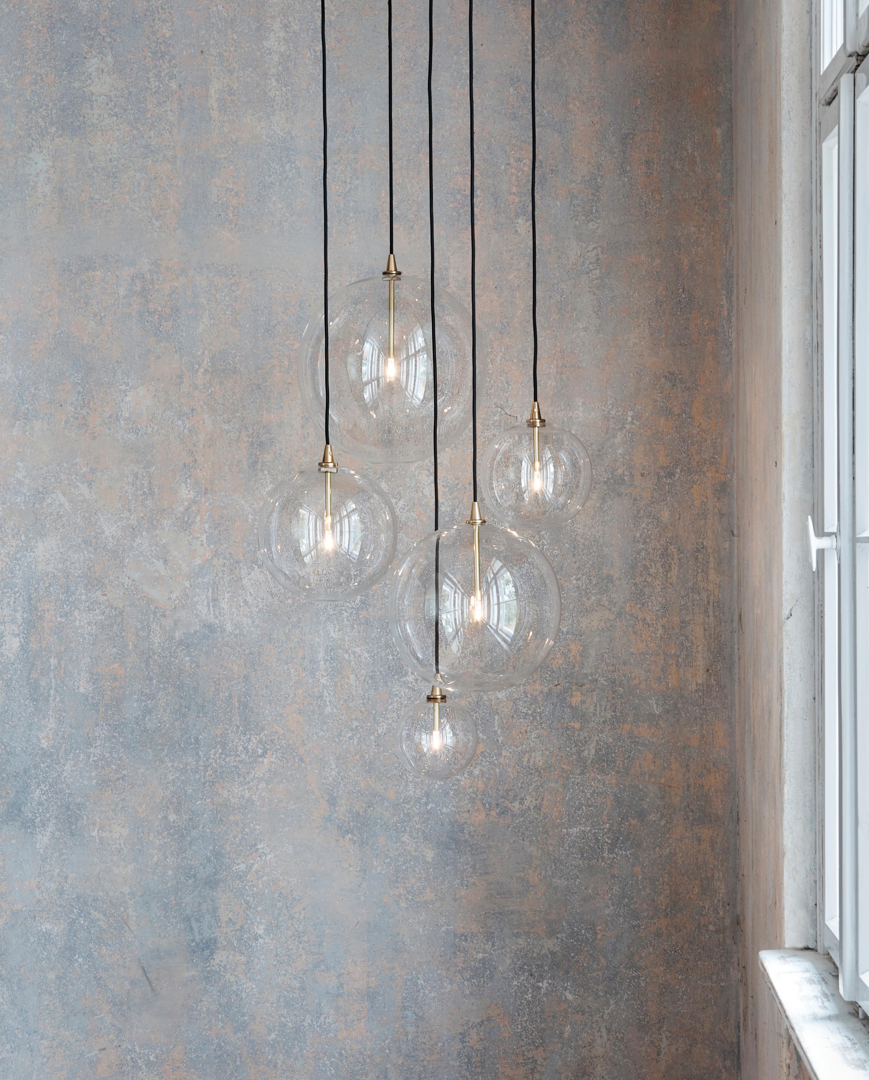
fight for affordable housing
Words Marg Hearn Photography Various
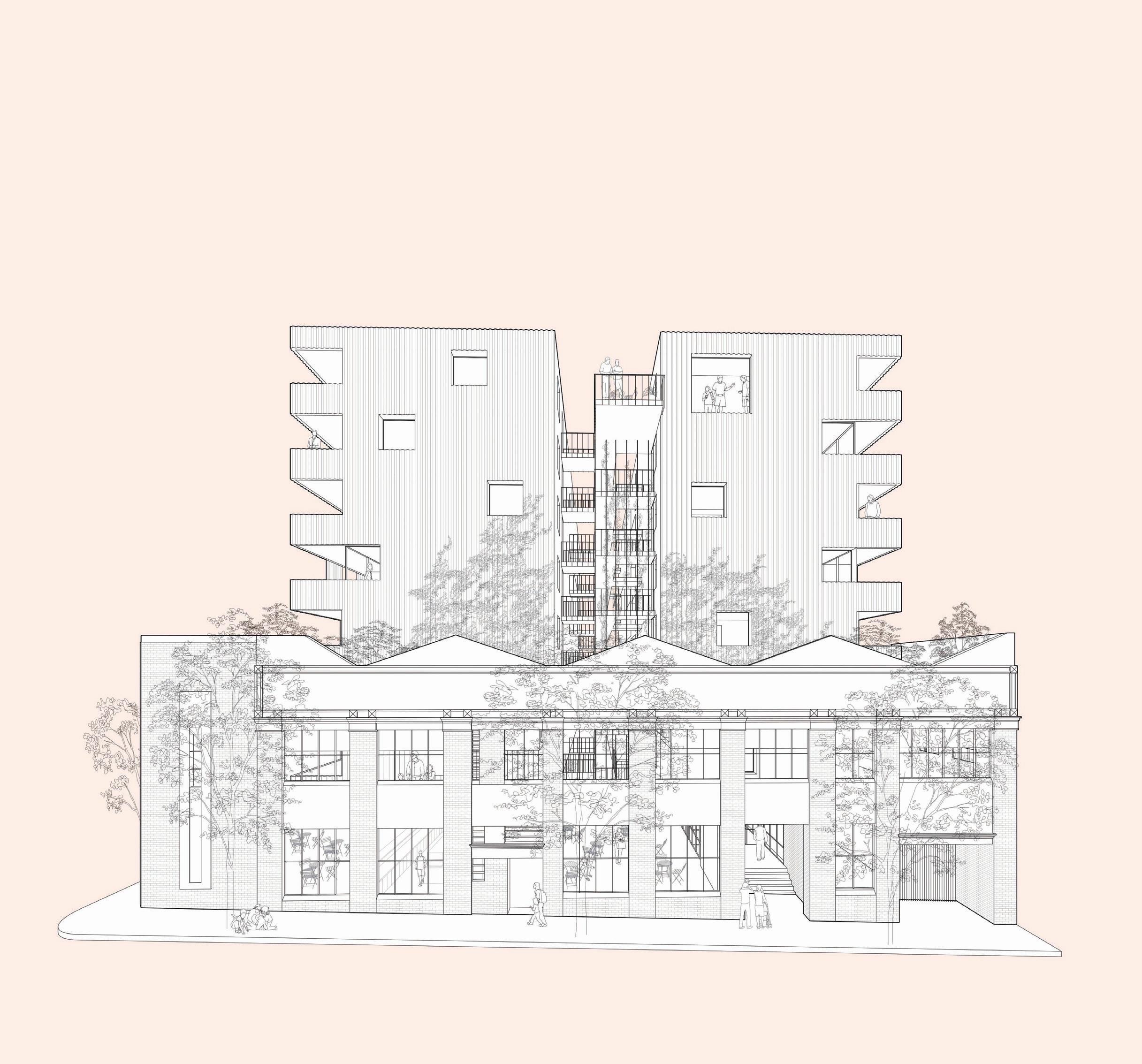
INDESIGNLIVE.COM 132 IN DEPTH
Are we being priced out of our own housing market? Is renting for life really so bad? A growing frontline of architects and developers are addressing the challenge with progressive housing models that offer new avenues for entering the market.
Sector-led pioneering housing typologies for low-to-medium income earners and social housing solutions are emerging from the coalescence of rising living, construction, land and house costs, moderate wage growth, and increased population pressures. From the Assemble Model’s ‘build-to-rent-to-own’, to Nightingale’s not-forprofit ‘housing at cost’, and VincentCare’s integrated homelessness resource centre wrapped around short-, medium- and long-term social housing – we explore three housing delivery models that are centred around sustainability, quality and community.
Home ownership leg-up
Developer Kris Daff, managing director of Assemble, decided to create a new way of delivering housing with a “greater sense of purpose” than Australia’s predominant pre-sale off-the-plan model.
The embodiment of a design thesis, Assemble – socially responsible, medium-density apartments – are influenced by Daff’s interest in multi-family housing models seen in the US and in exploring “rental neighbourhoods”.
Assemble’s build-to-rent-to-own development model primarily targets 20- to 40-year-old low-to-medium income earners who aspire to own a home, as well as an emerging group of 60-plus years, single-person households with a skew to women. This vision will see the return of homes that are affordable in locations close to work for ‘key workers’ displaced to outer suburbs.
“These are the have-nots. They don’t feel like they are being offered a fair way to participate in the housing market like generations before them, when tenure certainty was attainable by ownership more affordably,” says Daff. “We have a generation of Australians who are facing an uncertain housing future and constant dislocation with short-term leasing.”
Compelled to act, Daff’s ‘program’ is structured to overcome “one of the biggest hurdles” to home ownership: the deposit. Under the Assemble Model people get a two-year “head start” to save
during their home’s construction and the tenure certainty of a fiveyear lease at an agreed up-front “market rent”.
To give people the chance of getting a foothold in tomorrow’s housing market today, there’s the option of buying the home at a pre-agreed price once the lease is up, or to exit with bond intact. “A huge commercial imperative” is inbuilt to deliver quality product.
“The Assemble Model allows us to generate a unique alignment with our communities by selling to people who are going to live there – and for the customer to decide whether or not we have fulfilled our promise,” says Daff. “Our design team is very focused on designing for a ‘full life’ on a small footprint in an apartment that’s affordable.”
Around 75 per cent of Assemble’s product “is reverse-engineered” to meet the industry’s affordability yardstick – so that rent or repayments do not top 30 per cent of a household’s income. Yet uncompromised is sustainable design that maximises natural light and cross-ventilation with enduring fittings, fixtures and materials.
The firm’s “commitment to the curation and development of communities” is manifest in the building’s “collection of common areas” – designed for resident interactions such as workshops, art, yoga, kids’ play, library, lounges and landscaped spaces.
Cohort design is another key pillar. “We consider how many households (apartments) can realistically get to know each other in any meaningful way and form community, per lift core, per floor,” says Daff. Market response has attracted people united by “a genuine interest in forming community and having a long-term productive life there.” It’s not for investors.
The first Assemble residents of 393 Macaulay Road, Kensington in inner Melbourne will move in, late 2020. Pacing-wise, the firm expects to deliver 500 homes per year, while containing numbers in each development to uphold the sense of community. assemblecommunities.com
INDESIGN 133 IN DEPTH
Liveable density
We need to think beyond skyscrapers and infrastructure-poor urban fringes to address the shortfall of housing that’s deemed affordable in Australian cities, says Clare Cousins, director of Clare Cousins Architects (CCA).
An ‘ethical housing movement’ instigated by architects and developers to cultivate “smaller, community-focused apartments, which keep footprints efficient but spacious – offset by generous shared amenities – is presenting one viable alternative,” she says. “At the end of the day, the land, construction costs and fees are generally the same in any development – so it’s about what levers do you pull to try and deliver high-quality, reductive design as affordably as possible?
“The challenge has been the average-to-poor overall built quality of apartments in Australia over the last couple of decades – a model of building and flipping it,” cautions Cousins. “We are seeing the fruits of that play out now.”
It was the opportunity to apply ‘housing quality principles’ to create apartments in sustainable locations – so the apartment becomes a desirable typology to live in – that drew Cousins to the Nightingale model. Its not-for-profit approach, which aims to deliver “sustainable housing at cost”, was conceived in Melbourne by Breathe Architecture with the help of Architecture Architecture, Austin Maynard Architects, CCA, MRTN Architects, Six Degrees Architects and Wolveridge Architects.
As both architect and developer of Evergreen Nightingale, one of six buildings in Brunswick’s Nightingale Village precinct, Cousins
says: “To deliver quality housing as cost effectively as possible there has to be consideration given to what we need to live simply and what amenities could be shared.”
Disrupting the way housing is built on a wider scale, Evergreen caters to a diversity of home buyers from entry level Teilhaus (micro) studios of approximately 35 square metres which borrow from the space efficiencies of CCA’s Flinders Street project, to three-bedroom apartments. Like all Nightingale projects, Evergreen adopts the ethos of allocating 20 per cent of stock to affordable inclusionary housing to increase access to high-quality, sustainable housing.
Cousins advocates for “quality buildings that will stand the test of time” rather than regulating minimum apartment sizes, which poses “a barrier to affordability”. “Each apartment is designed to be desirable but is priced to reflect its orientation and height within the building,” she says. The more affordable southern-facing apartments – on lower floors – enables community housing providers to buy a batch outright for their tenancy portfolio.
The delivery of architect-designed ‘housing at cost’ with exceptional communal spaces, thermal comfort, liveability and low running costs does call for resident buy-in to sustainable transport modes and a collective laundry. Commercially, though, while ongoing financial, social and ecological sustainability does weigh into ‘affordability’ alongside purchase price – “because the upfront benefits are invisible, new housing model delivery is a balance between the market threshold and what people are prepared to pay.”
clarecousins.com.au, nightingalehousing.org
INDESIGNLIVE.COM 134 IN DEPTH
Page 132: Assemble Model sketch, courtesy of Fieldwork. Opposite: Nightingale Evergreen by Clare Cousins Architects – view of building with seven levels including rooftop, image: Thurston Empson. Page 136-137: Ozanam House by MGS Architects: east façade looking west. Page 138: Seating arrangements in Ozanam House’s outdoor courtyard enable people to take time out on a chaise or join in a group discussion. Page 140: Level three short-term residential lounge at Ozanam House, all Ozanam House photos: Trevor Mein.
“The challenge has been the average-topoor overall built quality of apartments in Australia over the last couple of decades...”
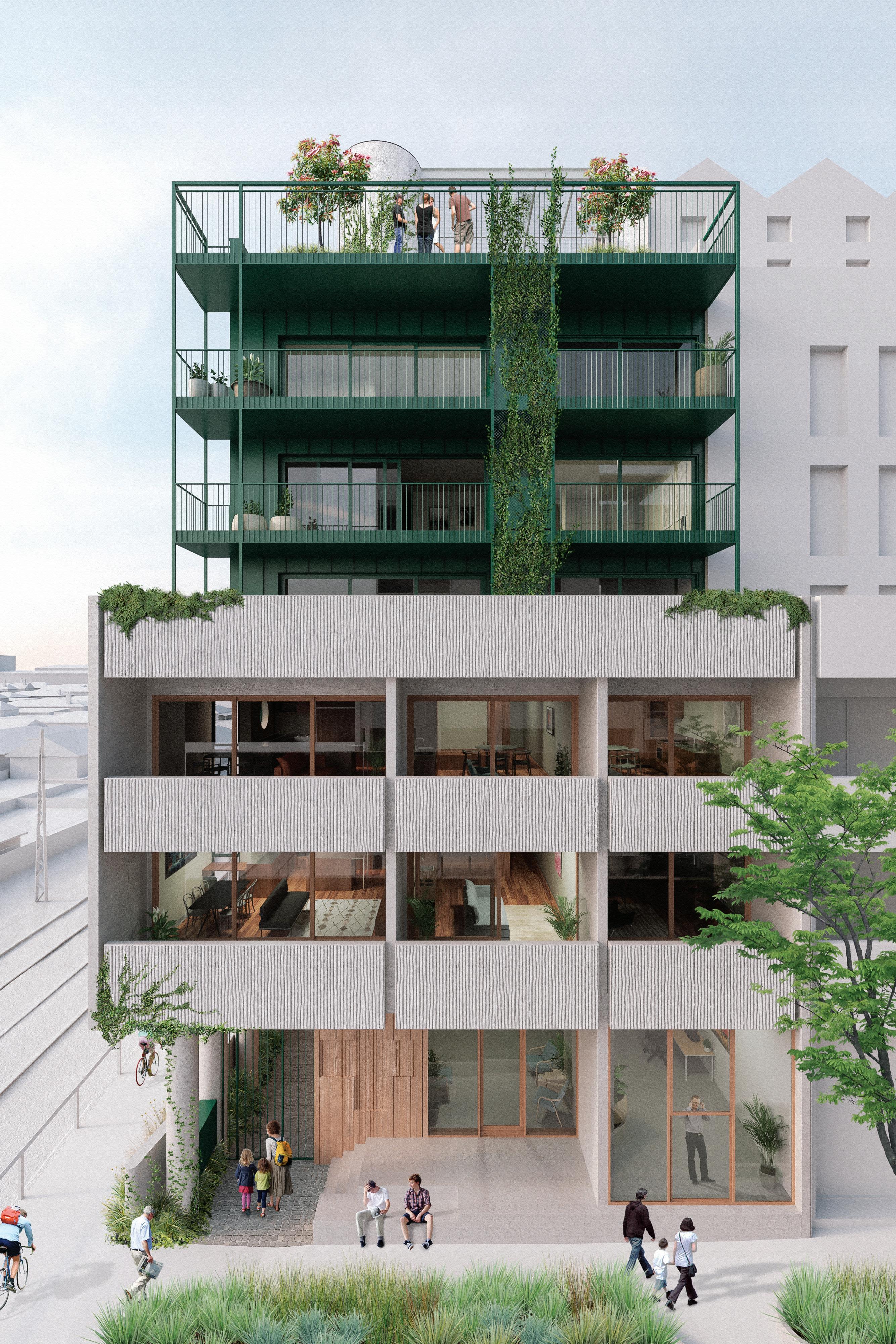
INDESIGN 135 IN DEPTH
In The Neighbourhood
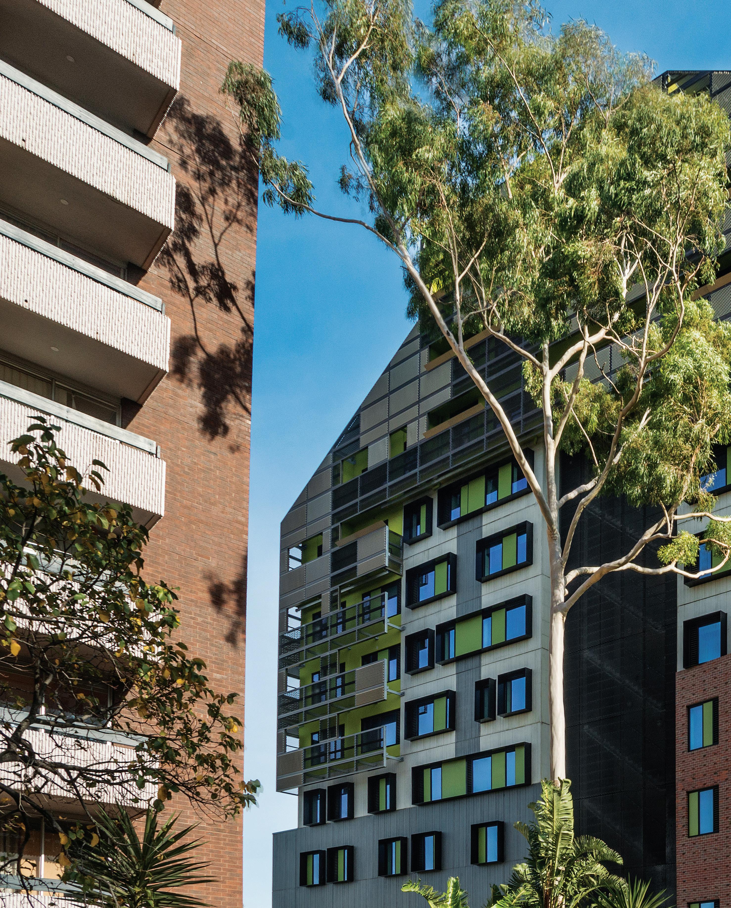
–
The entrance to Ozanam House is located next to an existing apartment building, with the intent of normalising the address. Window layouts play on the idea of spaces for individuals that are part of a bigger collective.
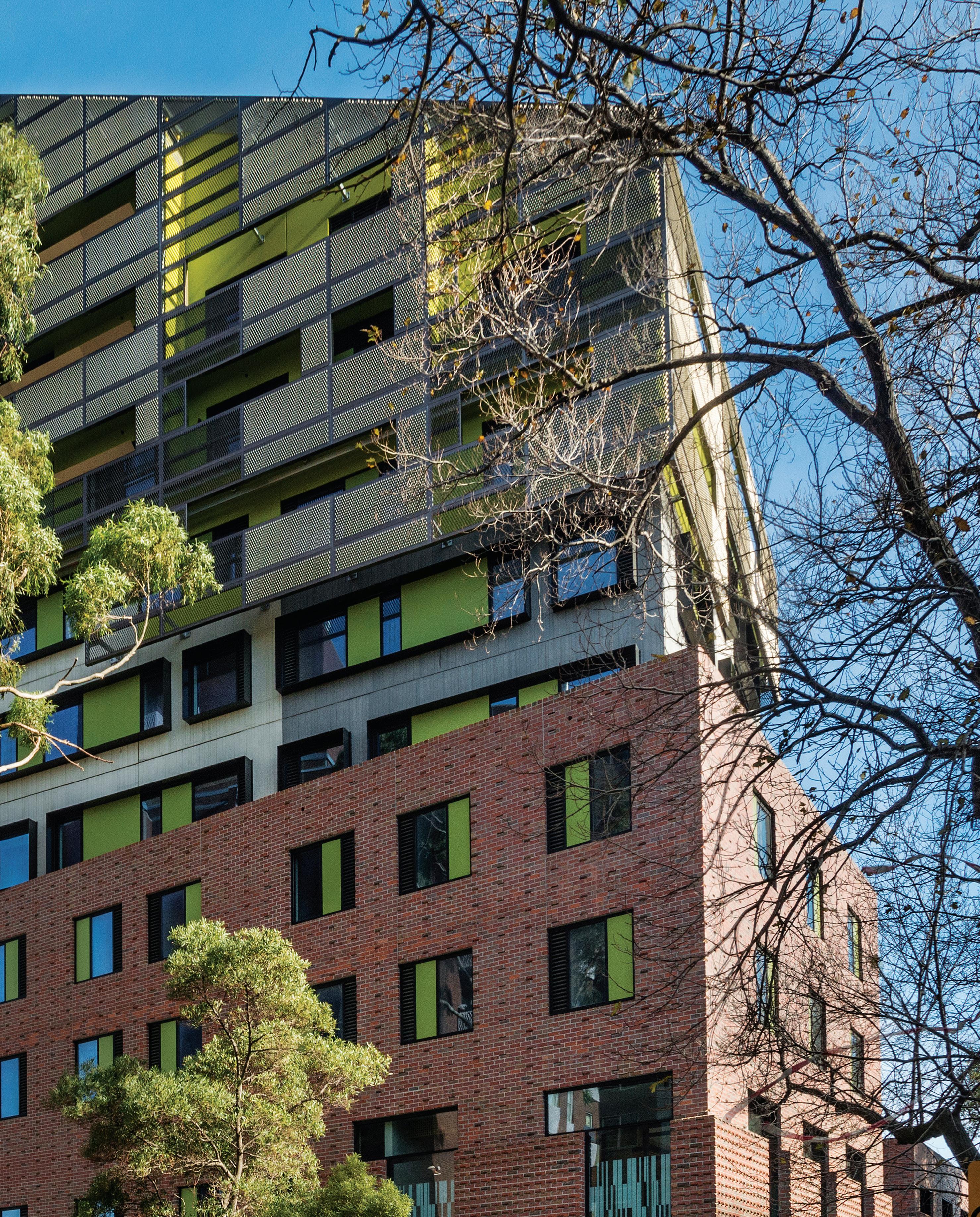
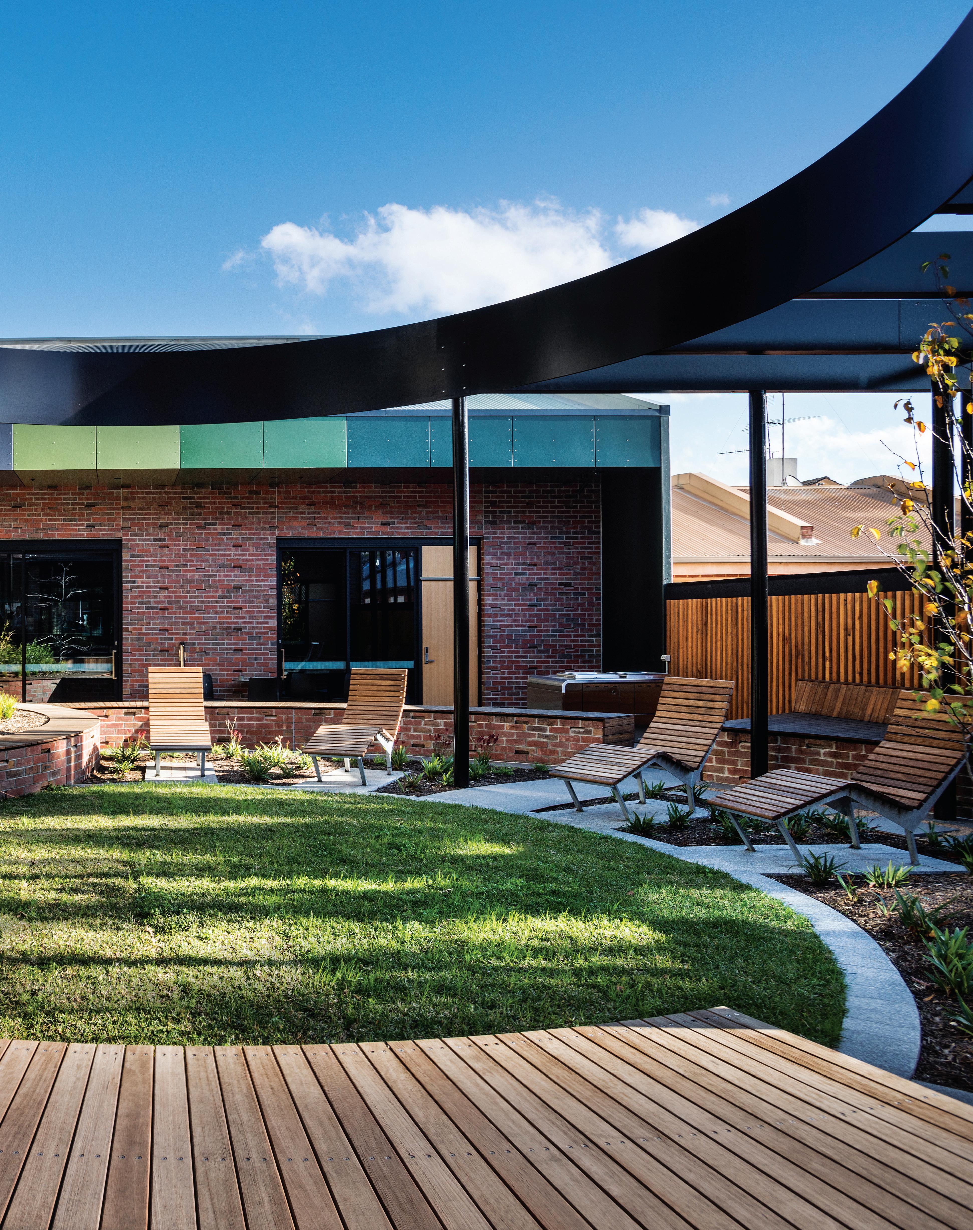
Social uplift
VincentCare’s Ozanam House provides every opportunity for people experiencing homelessness – 25,000 people in Victoria alone (according to VincentCare) – to access housing, health and social support services tailored to their needs. Located north-west of the medical precinct in North Melbourne, the fully integrated accommodation and homelessness resource centre designed by MGS Architects (MGS) “has co-located wrap-around services that are unprecedented in scale”, explains Eli Giannini, director, MGS.
On entry to the ground-floor foyer, health services ranging from optometry, podiatry, GP, dental, psychology and counselling spaces are situated to one side. Opposite, there is a community hub with a social enterprise café, an IT training room and different types of seating overlooking a courtyard and fishpond.
The floorplan follows a “natural progression” that’s linked to the stage of a client’s journey from crisis support through to securing one of the 133 apartments comprising 61 short-term, 48 mediumterm and 24 long-term options.
Joshua Wheeler, MGS director says, “the building is configured so that on arrival people can be offered crisis accommodation and at the same time be assessed in all they need – be it health, counselling, financial, social or employment assistance.”
Maximising engagement opportunities between clients and staff and forming new communities within is supported by amenity and programming. “The building is designed for the individual and the community. It’s not an institutional building. It’s a place where someone is welcome to choose what they’d like to do, indoors or out. That could be to have a sleep, charge their phone, take a shower, do some washing, have a coffee or a meal, have a chat or connect with a staff member, or simply find a spot to be alone.
“Commitment is sought from the client to engage with VincentCare services – befitting their personal circumstances – to deal with issues putting them at risk of homelessness, exiting homelessness or entering housing,” says Wheeler.
There are two distinct entrances to the accommodation, one for the medium- and long-term residents to the side, while access
to short-term lodgings is via the main entrance for clients still finding their feet. “The client wanted to make sure that as people had progressed through the program, that medium- and long-term apartment tenants would have a similar experience to that of a private rental,” Giannini says.
Devised to “counter the tendency for people who have been living on the street to be disengaged and to drift from one centre to the next, the food program is the carrot.” A very clear investment has been made in sourcing local, aesthetic materials alongside quality fittings and fixtures.
“Material quality, light and colour are the three elements that we concentrate on to create a welcoming and warm environment. The fourth is for people to be able to make a space their own,” she outlines.
Furniture and fixture specification by the architects not only makes for a cohesive fit-out, it’s about fostering a sense of pride in place and empowering residents – “who have finally found a place that they can call home” – a choice of ways they can arrange furniture in their own rooms.
Each long-term apartment enjoys views, high ceilings and is decked out with a robe, desk, king-size single bed and kitchenette. The design intent was to conjure the feeling that ‘I’m okay, someone’s got my back’, according to Wheeler. “We were very conscious of using natural timber and stone and fabrics that are incredibly durable but look like real fabric – to counter the institutional feel,” adds Giannini.
So much more than providing a roof, Ozanam House speaks to MGS’ commitment to social housing over the past 30 years, approached by creating high-quality residential apartments “that promote social connection, sustainability, and an ability for the tenant to feel that they have moved into a home not a facility”.
A ready prototype for further simulation, the AUD$47 million centre was delivered by VincentCare with support f rom philanthropic organisations, business and government.
mgsarchitects.com.au, vincentcare.org.au
INDESIGN 139 IN DEPTH
So much more than providing a roof, Ozanam House speaks to MGS’ commitment to social housing.
Connection Through Colour
Echoing the idea of a village, medium and long-term residents at Ozanam House can access a lounge on each floor. Colour is used to help residents create a personal connection to their floor, build a sense of community and reduce social isolation.
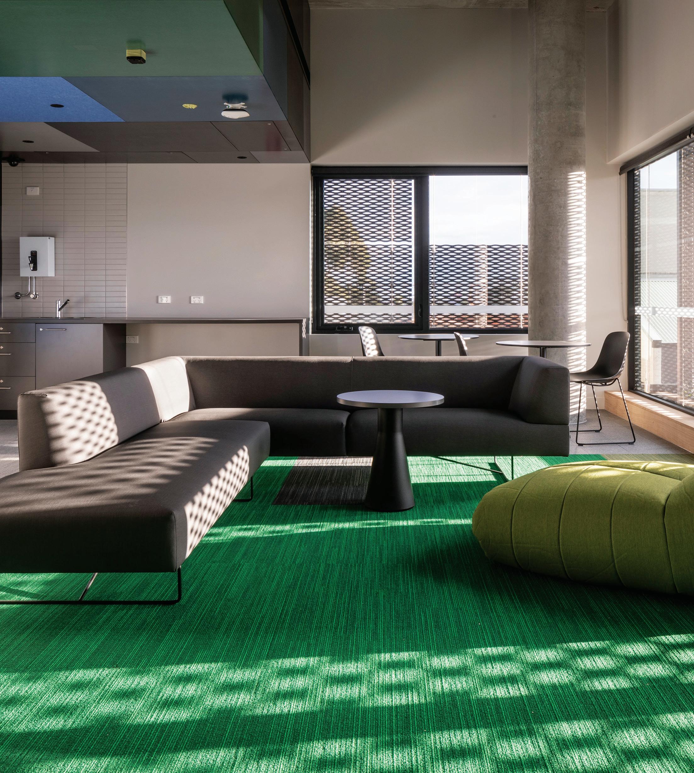
INDESIGNLIVE.COM 140 IN DEPTH
–


SYDNEY 5/50 Stanley Street Darlinghurst +61 2 9358 1155 MELBOURNE 11 Stanley Street Collingwood +61 3 9416 4822
c1 Chair by Colos
Australia’s rack-stack-and-pack syndrome
Words Tone Wheeler
Why are we still looking to suburbia for direction in the design and development of dense urban areas? Tone Wheeler makes his recommendations for a more sustainable urban future.
INDESIGNLIVE.COM 142 IN DEPTH
Imagine asking the Australian car industry to design a modern mini-bus. You’d probably get a stretch limousine, based on a Commodore or a Falcon, all V8 and disco lights. Ask transport experts and you’d get a highly efficient, autonomously guided, electric- or hydrogenpowered 20-seater: safe, accessible and comfortable.
Australia has pursued the same approach in the drive for urban density. A country singularly obsessed with the one-family house makes apartments by jamming units together in a rack-stack-and-pack approach akin to the extra wheels and seats in the limo.
Whilst they hold more people than a row of single houses, they come with all the downsides of suburbia, and little of the upside of urban living. We need to rethink what an apartment block might be to make a liveable city.
Apartments are the fundamental building blocks in achieving sustainability in three ways: buildings can be more energy efficient; they can provide much closer access to employment and services; and they make share transport more viable, thus reducing energy demands. To achieve these interrelated outcomes we need coordinated planning on several levels. Zonings need to be more flexible, public transport needs emphasis and building codes need to promote energy efficiency.
Rethinking the apartment/city relationship in this interrelated coordination falls foul of the three levels of government in Australia: land use planning is the province of localised councils; transport is a state responsibility, addicted to private cars; and the National Construction Code is very weak on energy efficiency (even if a federal minister argues that regulation is a state responsibility, ignoring the first word in the title).
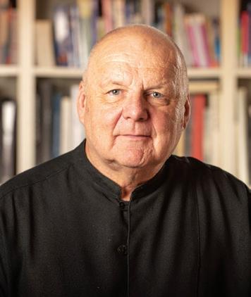
Secondly is the pursuit of ‘home ownership’ at all costs; the ne plus ultra of Australian housing. Whilst it works well for individual houses on separate blocks, by contrast apartments are ideal as single-owner/rental-occupant buildings, ensuring higher standards of construction and maintenance. The word ‘apartments’ is a recent phenomenon in Australia, adopted by real estate agents to denote something better than ‘flats’ or ‘units’ (which are seen as pejoratives for buildings less worthy if they are not individually owned). Designing for build-to-rent could dramatically improve housing quality.
Thirdly, ‘home-grown approaches’ from suburbia are misguidedly applied to apartment designs, giving rise to lots of failed unintended consequences. Some problematic cases from the overly codified NSW ADG (Apartment Design Guide) are balconies, cars, thermal comfort and ventilation.
A hallmark of Australian suburbia is the backyard. For 17 years the most successful television program was named after it. The assumption is that when the house shrinks to a unit, so should the backyard shrink to a
balcony. This completely ignores the advantages that apartments have in immediate access to public streets, parks and playgrounds as their backyards. Requirements force unnecessarily large balconies, used only for clothes drying or storage as the ubiquitous glass balustrades render them un-private and uninhabitable. Affordable housing solutions are better found in three-storey walkups that get by with no balconies at all.
But wait, there’s more: in the ADG 25 per cent of the site is also required to be Communal Open Space. While this has promoted rooftop gardens, no concession is given when the apartments are adjacent to a huge park or a recreation area. Apartments are not autonomous units divorced from their surroundings as suburban houses are, they are part of the urban whole.
Suburbia demands private cars (and garages, freeways, and other space-hungry disasters). But a denser city has many alternatives: walkability, bike paths, better public transport, car-share schemes. Transferring suburban two-car needs into apartments misses the advantages of a walkable city. But when the state is not doing its share of public transport, and when car-share schemes are not acceptable as an alternative, then developers who think like suburban real estate agents demand huge underground, mechanically ventilated car parks.
The passive solar house, all sunlight on thermal mass and openings for cross ventilation, is an ideal of suburbia, more in the NatHERS regulations than in reality. But those requirements are counter-productive in an apartment. The demand for two hours of winter sun in living rooms without adequate shade (a sheer wall is more desirable in a high rise) leads to grossly over-heated spaces in autumn/spring. Doors and windows for cross ventilation will never be opened if it leads to a loss of acoustic privacy. What works at 20-metre separations in suburbia fails when the balconies are adjacent. A ceiling fan in every room is far better, but not encouraged or allowed, as an alternative.
Instead of looking to suburbia for inspiration we should look to cities where apartments are the basis of a successful urban life: a desirable case in point is Berlin where we see large areas of four- to five-storey walkup apartments that have internal landscaped garden courtyards, all connected by trams to low-rise offices and great cultural attractions. Meanwhile in Barcelona, the planned grid of the Eixample has seven- to eight-storey apartments set over shops and offices. Buenos Aires is even higher, where the Palermo and Recoleta precincts have narrow, tall apartments of 12 to 16 storeys. These are set above streets filled with retail and offices, and generous parks with cultural facilities scattered through.
We need to look outwards, not inwards, for inspiration.
environastudio.com.au
INDESIGN 143 IN DEPTH
Tone Wheeler is director of Environa Studio in Sydney.
SYDNEY 5/50 Stanley Street
Darlinghurst +61 2 9358 1155



MELBOURNE 11 Stanley Street
Collingwood +61 3 9416 4822
seniorliving-ownworld.com.au






th E lon E lin E ss
Epid E mic
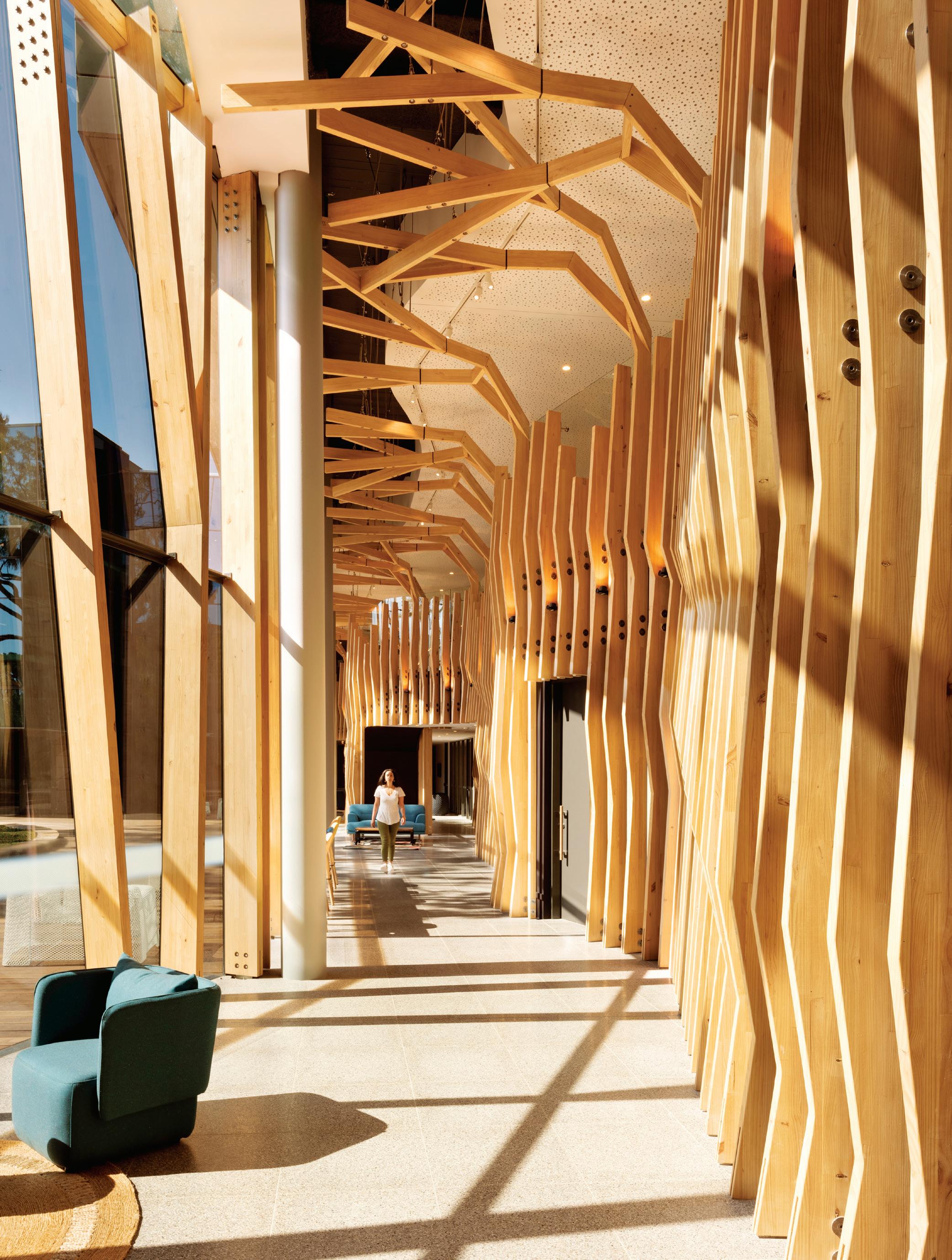
INDESIGN 145 IN DEPTH
Words Leanne Amodeo Photography Various
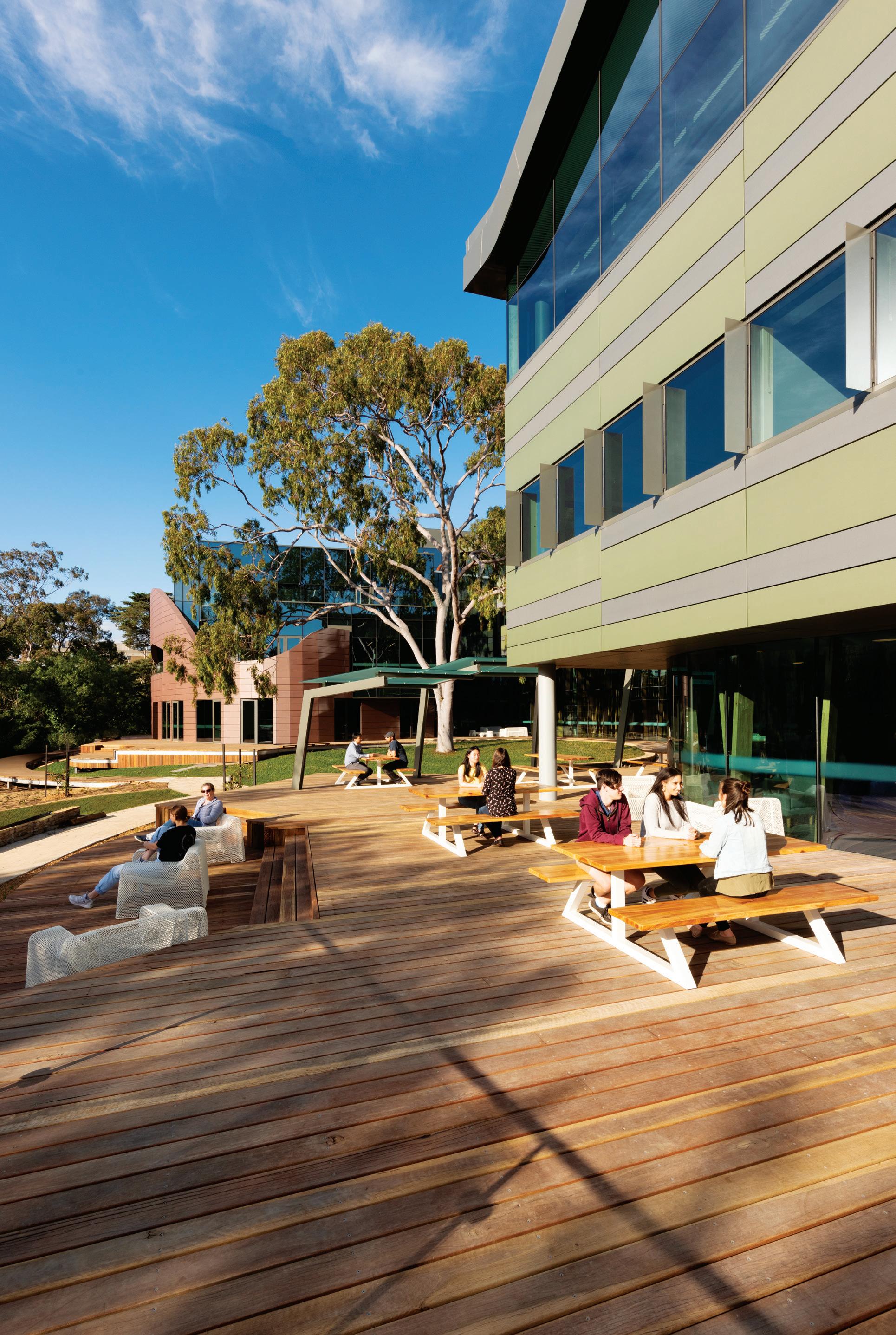
INDESIGNLIVE.COM 146 IN DEPTH
Chances are we’ve all felt lonely at one point or another and for many of us, the feeling is a recurring one. It’s easy to blame the rise of digitalisation, especially in these social media obsessed times when people seem more connected to their devices than each other. But is it really Instagram’s fault? People can feel lonely in a marriage or in a crowded room and often it’s the extrovert at the party who feels the most disconnected. Loneliness is such a subjective experience and that’s why it’s near impossible to define the root of the cause. What’s for certain though, is we could very well have an epidemic on our hands. So much so, the UK government recently appointed a minister for loneliness and closer to home, the Australian Coalition to End Loneliness has been established.
The Australian Loneliness Report (2018) by Australian Psychological Society and Swinburne University found that one in two Australians feel lonely for at least one day a week, while more than one in four feel lonely for three or more days per week. Without doubt, particular groups are more vulnerable than others and one of the most susceptible is young people from the ages of 16 to 25. Architects and designers can encourage happiness and wellbeing via the built environment and if this is the case, then what role can buildings play in alleviating feelings of loneliness?
Billard Leece Partnership’s (BLP) recently completed Orygen and Orygen Youth Health in Parkville is a fine study in designing for the type of meaningful connection instrumental in lessening these types of feelings. The new mental health facility is responsible for providing support and care to young people and the architects ensured they got it right from the beginning by including them in the consultation process. “We found that inclusivity is really important to young people,” says BLP’s interior design lead Tonya Hinde. “And an interior that doesn’t discriminate, is gender neutral, doesn’t have obvious barriers and allows for choice, is key to making that happen.” As a result spaces are defined by a sense of openness; material and colour palettes are tactile, relaxed and non-gendered; and the removal of typical commercial reception and waiting areas sees a more informal model of interaction promoted.
The scheme’s arbour-like promenade, a robust timber structure that brings the outside in, evokes a sensation of being amongst the trees, with the intention of reducing anxiety and depression that can lead to feelings of loneliness. “It also gives young people a sense of protection,” explains Hinde. “Seeking help is a brave thing to do and feeling like everyone’s looking at you isn’t helpful. But having an understanding you’re amongst people without being exposed, is.”
Another group prone to loneliness is the over-65s. And while the Australian Loneliness Report suggests this demographic is not as lonely as young people, the recent Is Australia Experiencing an Epidemic of
Loneliness? study (2018) by Relationships Australia found them at risk, due to a decrease in social support and increase in living alone. Part of the current strategy around combating issues of loneliness in older people is redefining the concept of ageing, which is something the new Global Centre for Modern Ageing (GCMA) is doing. As the organisation’s Adelaide-based CEO Julianne Parkinson explains, “Modern ageing is about building an inclusive future that engages people across all domains of their life and aspires to have them living longer, healthier and happier lives while bringing benefits to communities and economies globally.”
In a recent project in Strathalbyn, south-east of Adelaide, the GCMA worked with the local community to develop key design principles to guide the planning of the area’s new aged care facility and services. “One of those principles, social connectedness, highlights the importance of a life connected to others,” says Parkinson. “And the opportunities the built environment can provide by offering people the choice between spaces in which they can engage with others and spaces where they can retreat from social involvement.” Connectedness is just as important in noninstitutional care contexts too, with many older people choosing ageing-in-place residences.
For Bird de la Coeur, a renovation for two older couples without children was an opportunity to deliver this highly personalised health typology. Essentially a model for two smaller care units that promote wellness, Wedmore House in Melbourne’s inner-south features a courtyard that separates each couples’ rooms, along with an upstairs space for a live-in carer. “Their motto was, ‘Move before you’re ready’,” explains Bird de la Coeur director Vanessa Bird. “Fewer moves and changes promote a greater quality of life and the better your existing networks the more they can support you.”
A two-storey void forms the communal heart of the home, letting in plenty of natural light and fresh air, and doubles as an auditorium for performances, as the couples are part of a local music and theatre group. “This home simply elevates their quality of life rather than enables it,” notes Bird. In this respect, it’s very much a ‘share house for grown ups’ and provides a level of engagement with others necessary for the over-65s, particularly in the event of failing health or a partner’s passing.
Social ties are imperative in combating issues of loneliness for all age groups. And while architecture and design may not be able to save us from an epidemic, it sure as hell has a big part to play in facilitating the connections needed to stamp out feelings of isolation and detachment. The very best examples are dynamic yet sensitive and can empower people to make choices towards improved mental and physical health.
INDESIGN 147 IN DEPTH
Keeping It Relaxed
The scheme at Orygen and Orygen Youth Health is anchored by an arbour-like promenade that meanders through the two-storey interior, encouraging this idea of ‘walking and talking’.
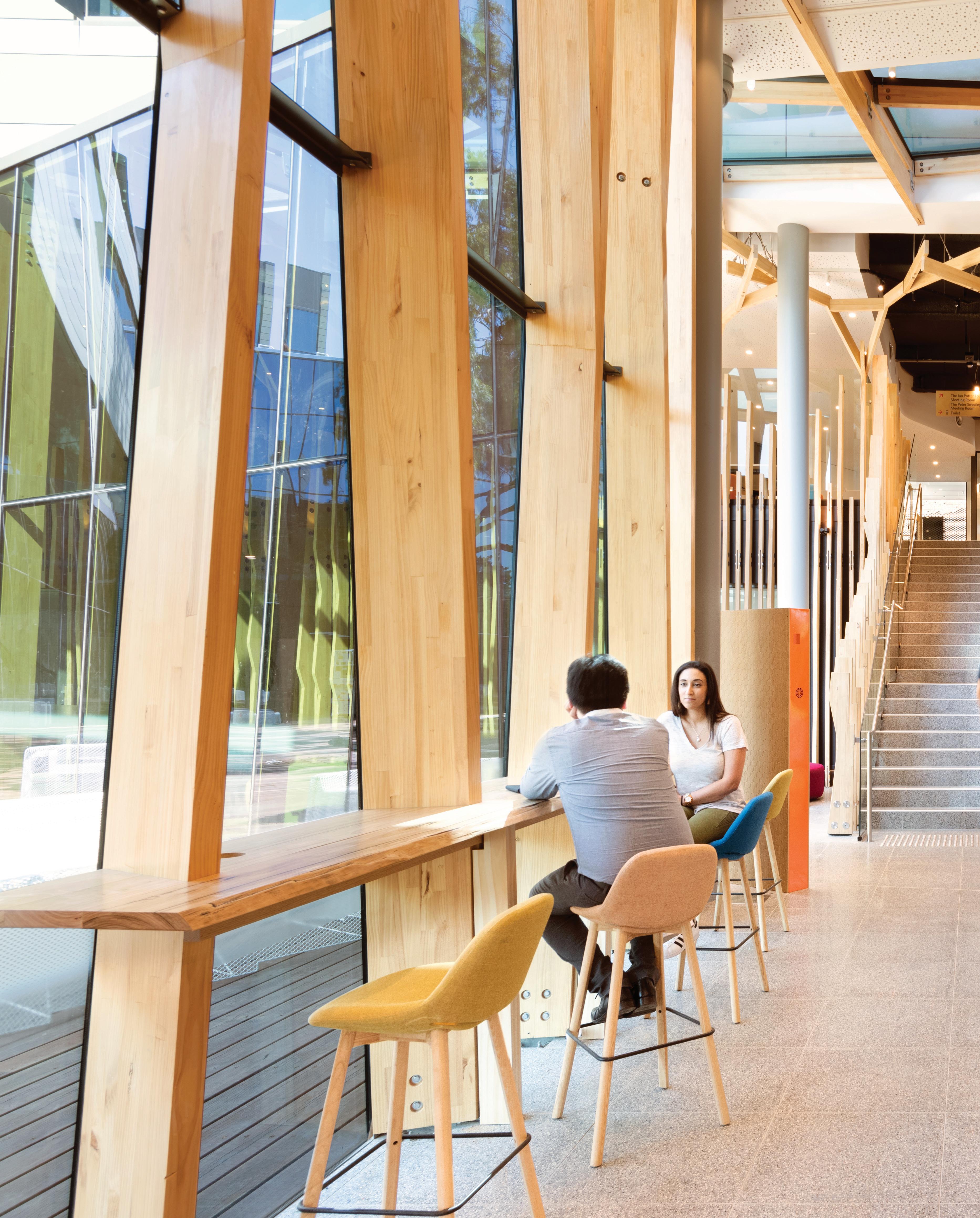
–
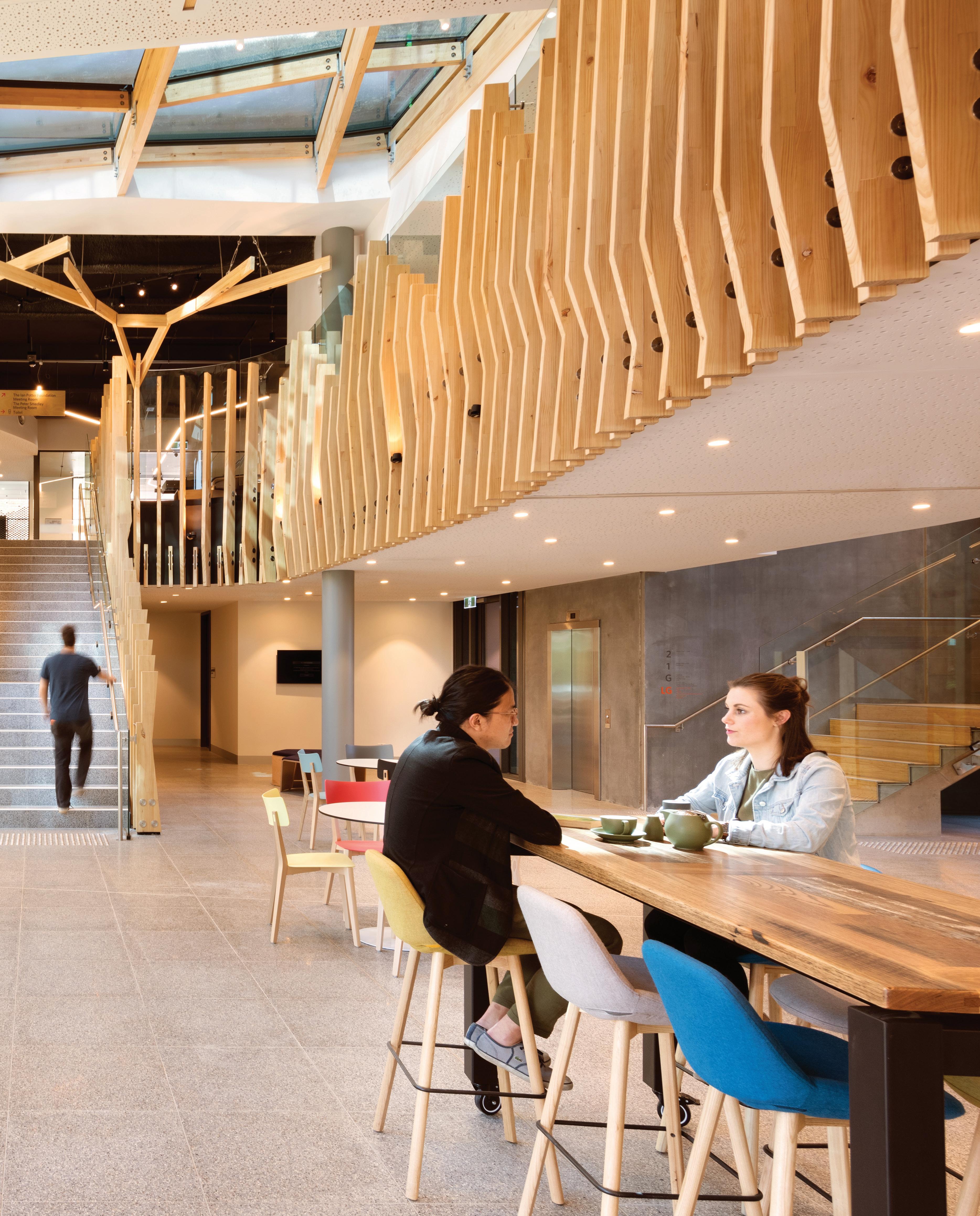
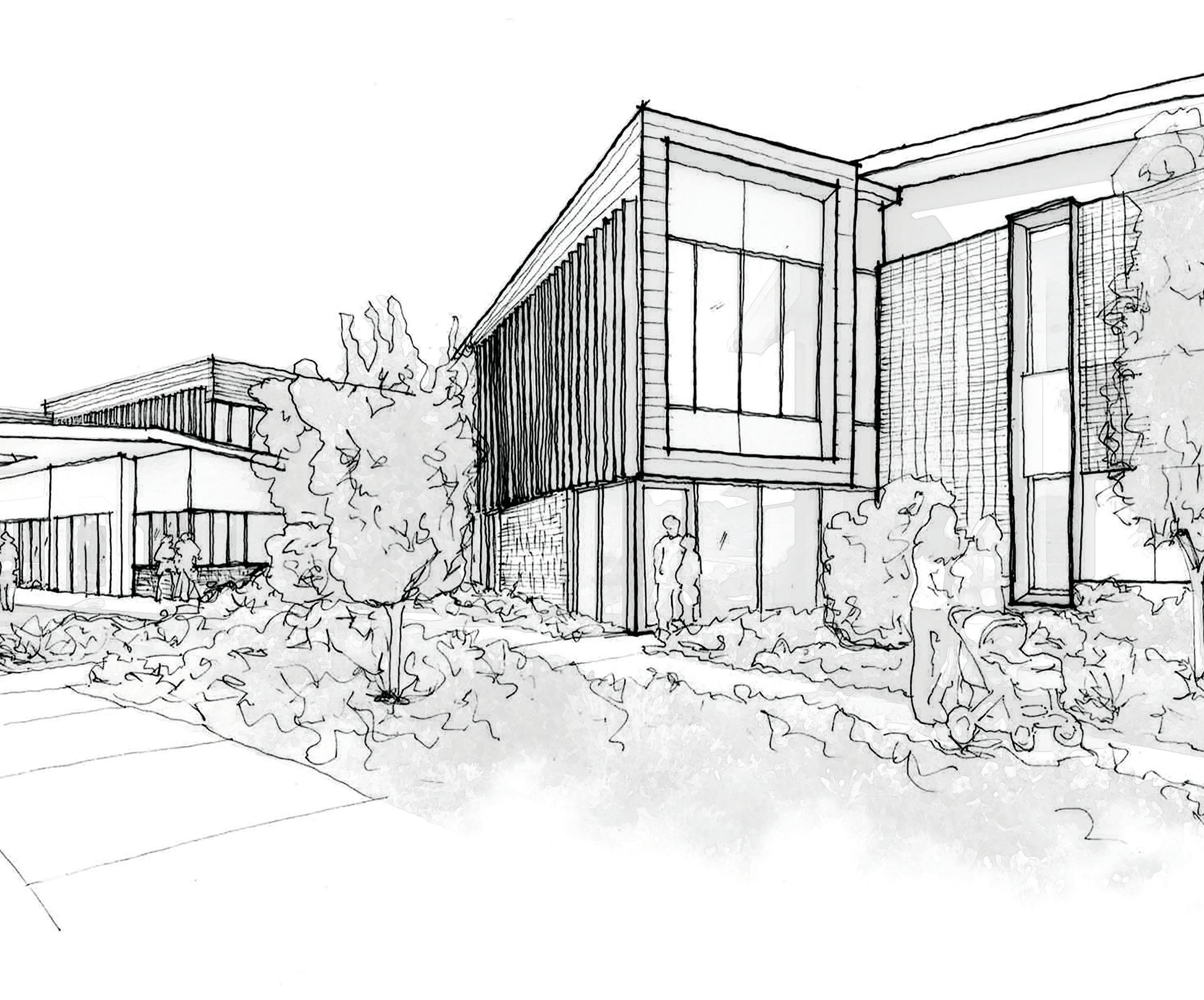
INDESIGNLIVE.COM 150 IN DEPTH
Page 145-149: Orygen and Orygen Youth Health Parkville uses inclusive and universal design to empower young people with a sense of choice and agency, photos: Ian Ten Seldam.
Above: Designer’s drawing of BaptCare residential aged care facility entrance.
Opposite: Early bedroom sketch exploring textures and home comforts, BaptCare sketches courtesy of ClarkeHopkinsClarke.
“We’ve delivered a model that presents residents with choices for both their life and lifestyle, allowing them to age with dignity.”
Connective communities for ageing citizens
The good news all Australians should be happy to hear is that we currently enjoy one of the highest life expectancies in the world. According to the Australian Institute of Health and Welfare, there were 3.8 million Australians aged 65 and over in 2017, which comprised 15 per cent of the total population. And by 2057, it’s projected there will be 8.8 million older people in Australia, making up 22 per cent of the population. There is a sense of urgency, however, around how to more effectively deal with an increasingly ageing population. It’s important seniors not be treated as a burden on society, rather be supported to live lives that are meaningful, happy and connected.
For organisations like BaptCare, the health and wellbeing of older people is their business and the not-for-profit’s newest aged care facility in Melbourne’s Lalor stands testament. Designed by ClarkeHopkinsClarke (CHC), Wattle Grove Community (WGC) is the anchor within the suburb’s ambitious new Mosaic Living Estate. Stage one of WGC, comprising the high-care residential component, has recently been completed and offers a reinvigorated idea of what aged care looks like and how it should function.
As James Kelly, CHC partner for Seniors Living and Care, explains: “We have got to move away from that very institutional look that aged care had in the past. So we’ve delivered a model that presents residents with choices for both their life and lifestyle, allowing them to age with dignity in a place that’s nice and feels like part of a broader community.” Indeed, this connection is vital for seniors living in care facilities as it combats issues of loneliness, as well as provides them with a sense of belonging.
The Mosaic Living Estate itself is intersected by a series of boulevards and linkages, making it fully walkable, and stage one of WGC is firmly integrated within its north-east corner, a stone’s
throw from the retail precinct, childcare centre, wetlands and a sports field. Kelly and the team were mindful the building blend in with the existing vernacular and so it’s likewise two-storey, with a brick, concrete and timber exterior that’s entirely sympathetic and totally lacking in pretension. It is very much a part of the suburban estate and in accommodating a relatively modest 120 beds (four 15-bed wings per floor), makes for an offering that’s cosy and domestic in scale.
Internally, each wing is akin to a household so the user experience is much more intimate and welcoming, while allowing the operator greater servicing efficiency. Both floors feature a ‘main street’ that snakes its way through the building, not unlike a shopping mall peppered with retail stores, cafés, a hair salon and quiet areas for social interaction and relaxation. “We don’t want to force people to come out of their rooms, but we do want people to feel like they have the option to do so,” says Kelly. “It comes back to having choice because this is their home at the end of the day.”
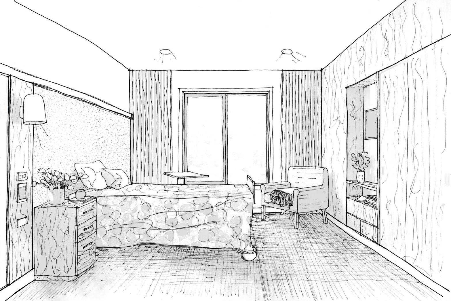
Quality of life is improved via aspirational interiors that take their style cues from a European aesthetic that resonates with the ethnically diverse residents. Terrazzo features on floors, largeformat tiles are in the foyer and deep green and burnt orange accents enrich a striking yet complementary colour palette. It’s tailored to them and with each wing being named after a place many of the residents have a personal connection with – Amalfi, Sorrento, Yarra and Stobi – their sense of belonging is further reinforced. The four large courtyard spaces also let in plenty of natural light, providing another setting for planned or incidental interaction. This is a project that celebrates the benefits of community connection through a design that’s gently persuasive.
blp.com.au,
INDESIGN 151 IN DEPTH
chc.com.au
gcma.net.au, birddelacoeur.com.au,
In Australia density too often speaks to the bottom line: residential units per square kilometre. But the term also encapsulates the possibility for improved space efficiency, liveability, and a nurturing relationship between people and place.
Why is ‘dense’ the dirty word?
Words Aleesha Callahan in conversation with Yoshiharu Tsukamoto, John Doyle and Graham Crist
INDESIGNLIVE.COM 152 IN DEPTH
As the title of this article suggests, dense doesn’t need to be a dirty word. The catch cry of increasing urbanisation often comes back to density, but is it a bad thing if the fabric holding it together brings something more valuable, like social cohesion? These key points came out of a round table discussion between Atelier Bow-Wow’s Yoshiharu Tsukamoto, and RMIT’s Graham Crist and John Doyle – co-curators of the RMIT Design Hub exhibition Super Tight (July - September 2019).
Tightness is different to denseness
Yoshiharu Tsukamoto: The idea of tightness is not just about size and density, there is a relational aspect that comes into play – how people and buildings can interact with one another. It raises questions like, how can architects design to facilitate relational qualities rather than homogenised design?

John Doyle: I think a key difference for us is that density is purely quantitative, and tightness is qualitative. It’s also about reconciling that you can live with less space if you use it in a more sophisticated way, which can be achieved by overlapping functions or relating space together in different ways. Mixed-use is a fundamental necessity for density. Even if the square metres per person are quite high, if it’s done properly you can fold multiple uses into the one space and suddenly you’re being efficient. Density is an artificial number in some ways, it’s so overwhelmingly focused on residential units per square kilometre that we often overlook the fact that if we can collapse the relationship between home and work we can minimise the footprint of the city without necessarily needing to increase the size of it.
Graham Crist: Tightness is scalable. The difference between density and ‘tight’ is that the architecture is about making everything overlap and work hard. The very high-density cities in the world, that also appear very liveable, are liveable because there are spaces created that can be used for so many different things. It’s a super efficient way of city making. Most people are used to seeing the model that only looks at more and more square metres – or has more and more floors added to it – which, as mentioned, becomes purely quantitative. In Australian culture, density is seen as something pejorative, something that needs to be limited. I would rather that it be seen as something that we might actually want to achieve for social reasons, not just economic reasons.
Bringing back social cohesion
YT: Where tightness can succeed is in the fact that it brings back social cohesion to society through shared relationships. This is key, but it’s also up to the people
who inhabit the spaces to bring these to life. As humans we inherently know how to behave, but bringing shared commonalities into our cities is critical and that’s what multi-residential towers should be doing.
It’s about how we can have a sense of ‘commons’. Our social system is constructed on a clear division between private and public but somewhere in the middle is how we could establish this sense of sharing, which has a kind of social capital. There is value in social capital.
GC: It’s impossible to have density without curating a social or community relationship as well. This means giving land up for people to use how they choose to use it. For example, traditionally in Saigon, Vietnam, open public spaces have always been for everyone to use and what is starting to happen now is that as multiresidential towers go up, the shared spaces are being closed off to the public. It’s going to dramatically change the nature of the city.
JD: Many of the multi-residential towers in Melbourne are completely devoid of sharing relationships (apart from things like Airbnb, which doesn’t contribute to community). In Australian multi-residential, that sense of sharing is really only seen through things like a shared pool or a shared barbecue area, these aren’t enough to create the social cohesion that cities need.
Changing the assumption
JD: In Australia at the moment, apartment towers are thought of as only catering to one socio-economic group, which is generally international students or young people. One of the big conversations that we need to overcome is that density is not designed for families.
GC: There’s an assumption in Australia that children don’t live in apartments.
YT: That kind of assumption is something we should challenge, we should tackle. Most people unconsciously accept assumptions like this. So I think it is really important for architects to think about it, to do something, so that it can be changed.
JD: People want architects as problem solvers, but what can often happen is that architects just end up expressing the difficulty of density, perpetuating it by designing in a way that only caters to this assumption.
This interview has been edited and condensed for clarity.
bow-wow.jp, naaustudio.com, antarc.com.au, designhub.rmit.edu.au
INDESIGN 153 IN DEPTH
Yoshiharu Tsukamoto is a founding principal of Japanese studio Atelier Bow-Wow; John Doyle is director of NAAU and lecturer at RMIT University; Graham Crist is a founding director of Antarctica Architects and associate professor at RMIT University.
co-designing community with our first people
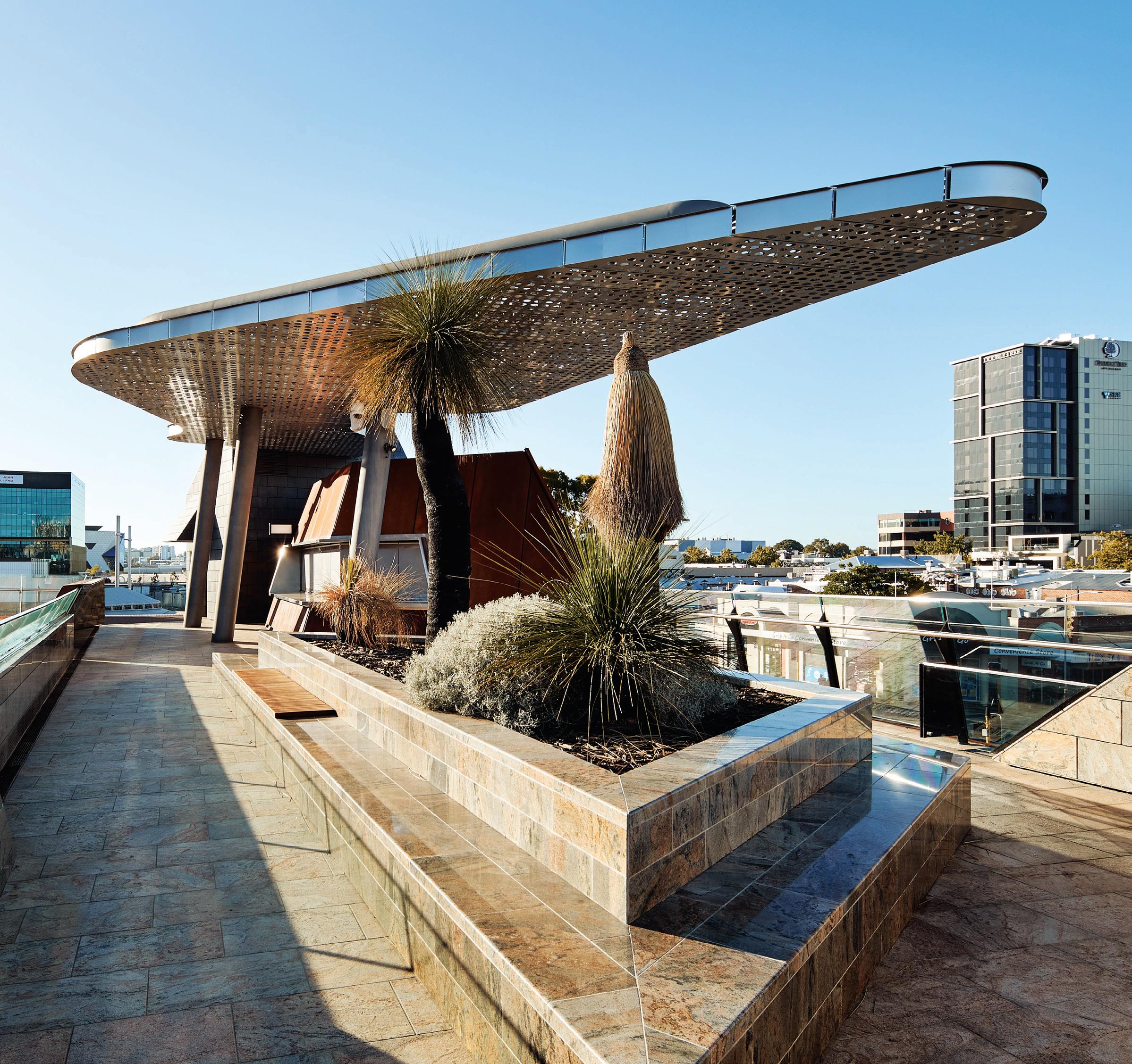
INDESIGNLIVE.COM 154 IN DEPTH
In Western Australia, Yagan Square and Punmu and Parnngurr
Words Rachael Bernstone Photography Various
Located in the centre of Perth and in remote towns in the Pilbara three recent architecturally designed projects share a desire to work collaboratively with and alongside Indigenous people.
Yagan Square – in the heart of Perth’s CBD – was designed by Lyons Architects, iph architects and ASPECT Studios for the Metropolitan Redevelopment Authority (MRA). It was the first project to test a new methodology for Indigenous input into the state’s major projects, called Kaart Koort Waarnginy (or KKW, which translates as Head, Heart, Talking).
KKW was developed by Dr Richard Walley, a Whadjuk man of the Noongar nation, who has been party to many and various engagement methods over the years, on projects including Perth Children’s Hospital and Optus Stadium. “The process of engagement with Aboriginal people has never been set down into a formal structure, and often has been seen as a mechanism of endorsement,” Dr Walley says, “rather than an engagement opportunity that could – and can – lead to strong ongoing partnerships and involvement of Aboriginal people in projects that are being developed on Country.”
Based on traditional Aboriginal ways of communicating, organising, negotiating and making decisions, KKW reflects the Noongar six seasons, and is juxtaposed against the conventional delivery program of major projects. It identifies complementary streams rather than constantly adapting one system to fit the other.
“From this, I created a series of sketches and took them to the elders, who endorsed the ideas and concepts,” Dr Walley says. “I then took them to the South West Aboriginal Land and Sea Council and the Whadjuk Working Party; [they] agreed that the Kaart Koort Waarnginy process was a good way to achieve Aboriginal cultural engagement, not only for major projects, but also across a broader spectrum.”
The recently adopted compact underpinned the entire redevelopment of Yagan Square, under the leadership of the MRA’s past CEO Kieran Kinsella. “That project had a natural and spiritual connection point to deliver the engagement process, and to create a strong cultural narrative to shape and inform the design and the sense of place,” Dr Walley says.
Sean Henriques, acting CEO of the MRA, says the tenets of KKW that underpin Yagan Square – the acknowledgement that the site was a central meeting place, and a place of spiritual and physical sustenance for millenia – can be seen both as ground-breaking and as simple common sense.
“Noongar people have over 60,000 years of stories, heritage, thinking, narrative and governance structures to refer to, and drawing on these helps to make our approach stronger,” Henriques says. “It’s about regular, consistent and honest engagement.”
The competition-winning scheme examined the site’s pre-colonial history – it was part of a chain of wetlands that ringed the Swan River (Derbal Yerrigan) basin – to integrate Indigenous and non-Indigenous history, culture and art. Under the framework set down in KKW, the design team then continued to seek input and refinement of the stories and ideas during ongoing conversations with the Whadjuk Working Group.
“The level of conversation was raw at times, there were some really raw emotions,” recalls architect Adrian Iredale. “One of the benefits of testing the new KKW process was that it enabled us to approach each meeting with a different agenda, so we knew what we wanted to discuss. Also, the formal structure enabled us to go a lot deeper into conversations, and return next time knowing that people would be there to meet with us again.
“It also informed how we incorporated those elements into the design, in that they were embedded in the process,” Iredale adds. “We found that the Whadjuk people were prepared to release more knowledge, because so much trust was built up during this process.”
Many design elements and material choices can be traced directly back to those conversations, including the digital tower, which has 14 column-reeds to represent the 14 Noongar nations; the use of limestone, sandstone and two shades of granite sourced from Noongar country; and Jon Tarry’s Waterline sculpture, which rises up at the top of the site and trickles down to the bottom over steps, cascades and abstracted swan’s eggs.
“We started with a narrative that was enriched and expanded upon, and we deliberately kept the references open and abstract, so that anyone coming to the site can bring their own stories to it,” Kirsten Bauer says of the team’s approach. “There are so many different stories embedded in the design now, and that’s its beauty. The Whadjuk people talk about the Waterline sculpture in a different way to us, which is great; it’s so pluralistic in the way people can respond to it.”
As the first project to emerge from the KKW compact – which sets a new benchmark for Indigenous consultation in Western Australia –Yagan Square represents a significant step towards Reconciliation.
INDESIGN 155 IN DEPTH
Aboriginal Health Clinics have emerged from intensive and lengthy conversations with Indigenous people. What can we learn from their respective cultural consultation processes?
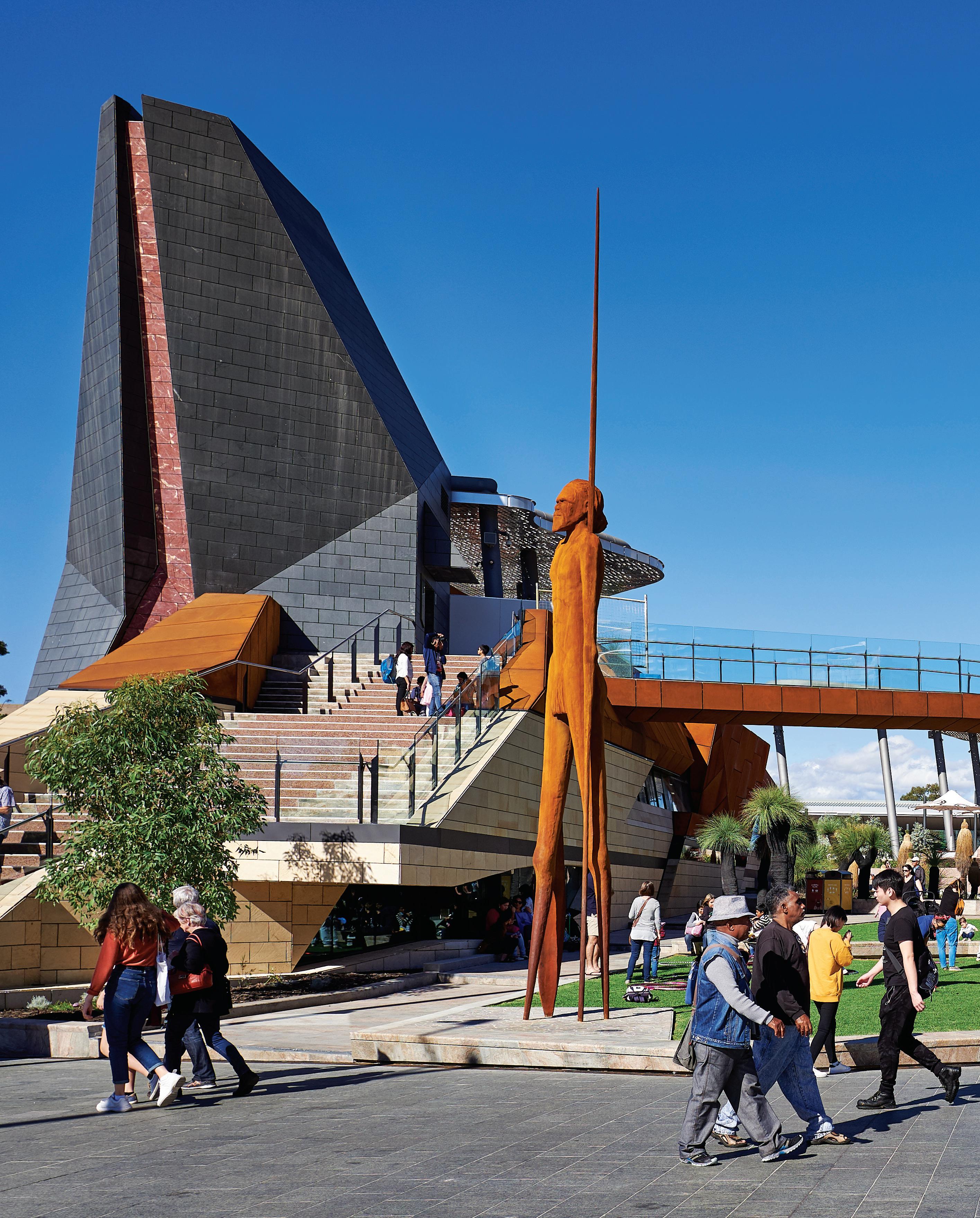
A Place For All People
At Yagan Square, Lyons Architects with iph architects and ASPECT Studios met the challenge to create an intimate, attractive space that can also accommodate large-scale festival events.
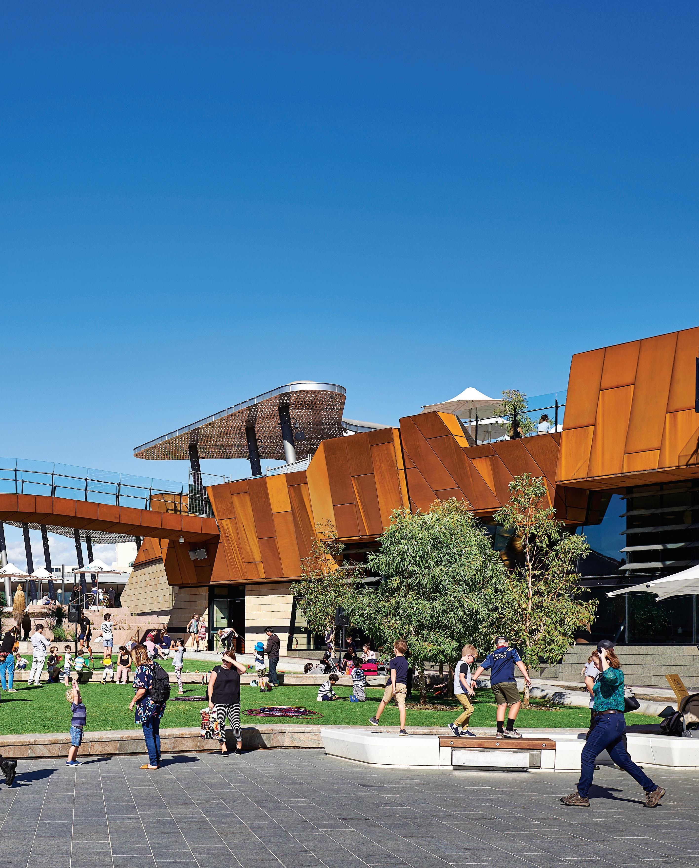
–
An open-source process of co-design
At Punmu and Parnngurr – remote towns located 1000km apart in Western Australia’s Pilbara region – Kaunitz Yeung Architecture recently completed two new health clinics that have garnered worldwide acclaim. Before putting pen to paper, architect David Kaunitz travelled across the Martu Lands multiple times, conversing with residents from both communities.
“The main client representative was Robbie Chibawe, the CEO of Puntukurnu Aboriginal Medical Services, and he came on almost every trip with me, because he saw these projects as an opportunity to engage with the communities,” Kaunitz recalls. “That meant I spent days in the car with him, which gave me a huge advantage, and we spent a lot of time at the front-end of the project, travelling and talking to people. That allows for all sorts of things to happen; it’s a kind of serendipity.
“Because we were there – and there regularly – we were meeting different people each time, and meeting the same people over and over again, ahead of the design phase,” Kaunitz says. “At the end of the day, people are people,” he adds. “If you’ve ever been on a strata committee meeting, you know it’s almost impossible to get consensus. So we go into Aboriginal communities with an open mind and talk to people, working through the process step by step. It starts from first principles to get contextualised.”
And there are no cutting corners when it comes to community consultation, he says. “We want to produce different design solutions for each problem,” Kaunitz explains. “We don’t want to do the same over and over. I describe consultation as being like a spy, working out what people need, what they want, what will work, and it’s my job to use anything at my disposal to work that out.”
As for recent discussions about the decolonisation of space, Kaunitz sees these projects not as Aboriginal architecture, but rather working to deliver the best outcomes for the communities they serve. “What we do can be applied to any culturally rich context, and I don’t like to get drawn into those discussions,” he says. “It’s not my place because I’m not Aboriginal. We are working community by community, helping each one, and each of them is very different.”
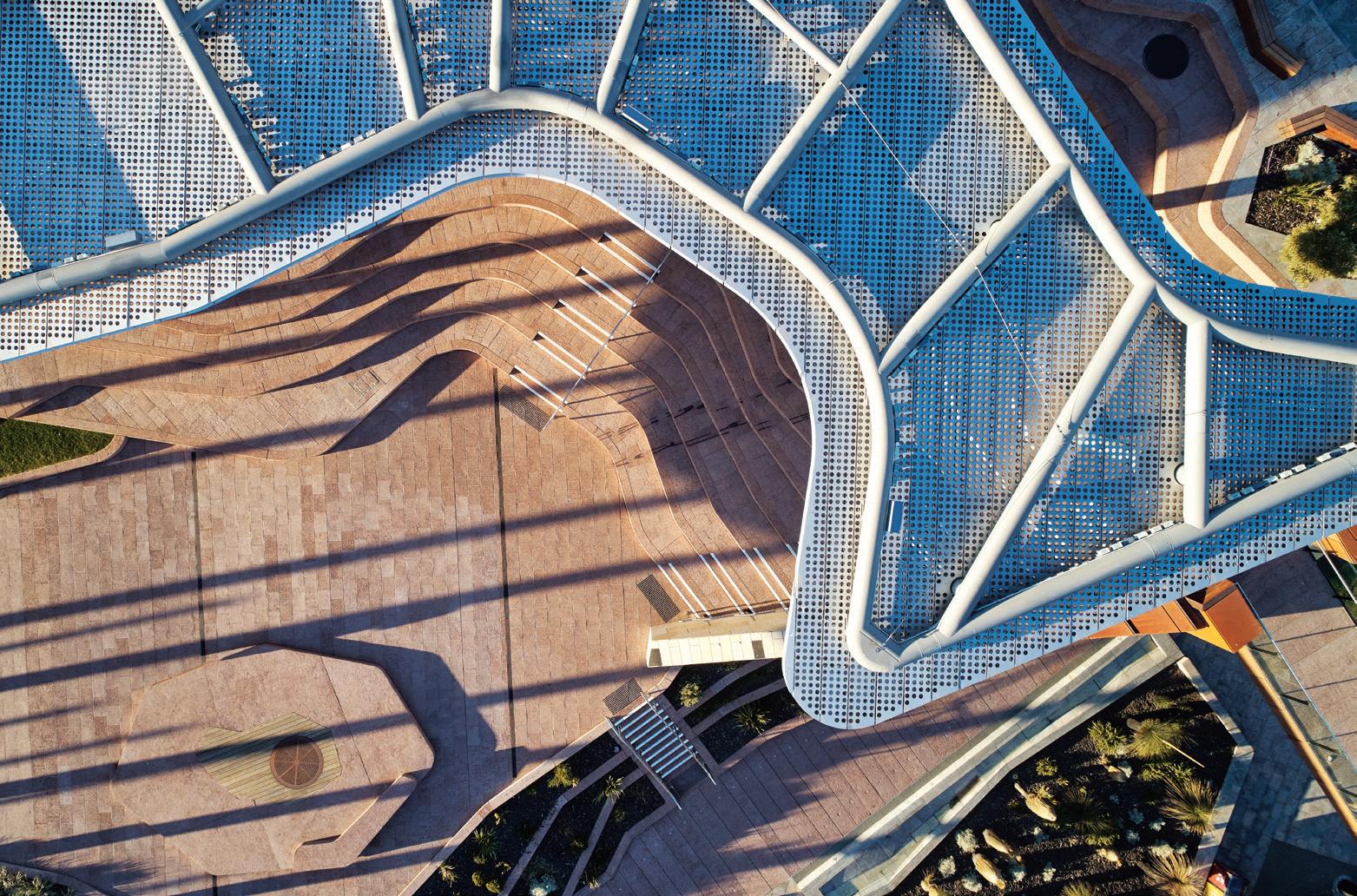
What sets KYA’s approach apart from most other firms is a desire to increase diversity across a range of measures – cultural, ethnicity, socio-economic background, age, gender – and a willingness to “open source the design process”, Kaunitz says.
“We are co-designing – we don’t mind using that term – so we are giving up some of the control,” he explains. “Most architects like to come up with a solution and convince the client, but we trust this process is going to lead to a better outcome.”
Punmu and Parnngurr Aboriginal Health Clinics have collected multiple Australian and international awards - including accolades at the 2019 European Healthcare Design Awards in London, and The Wellness Space award at this year’s INDE.Awards – and for Kaunitz, those accolades are significant. “They show that these projects can stand on the world stage against any other kind of health project, and be successful,” he says. “They aren’t Aboriginal projects; they are architecture for a specific community, that meets and exceeds the brief.”
lyonsarch.com.au, iredalepedersenhook.com, aspect-studios.com, kaunitzyeung.com
INDESIGNLIVE.COM 158 IN DEPTH
Page 154-158: The many facets of Yagan Square whose architectural design concepts responded to the imperative for the site to be an inclusive, welcoming and active cultural and civic destination, photos: Peter Bennetts. Page 159-161: Punmu and Parnngurr Aboriginal Health Clinics place community at the centre of health delivery. In designing these buildings Kaunitz Yeung Architecture has utilised robust and low-maintenance materials and finishes, photos: Brett Boardman.
Vision For Co-Design Outcomes
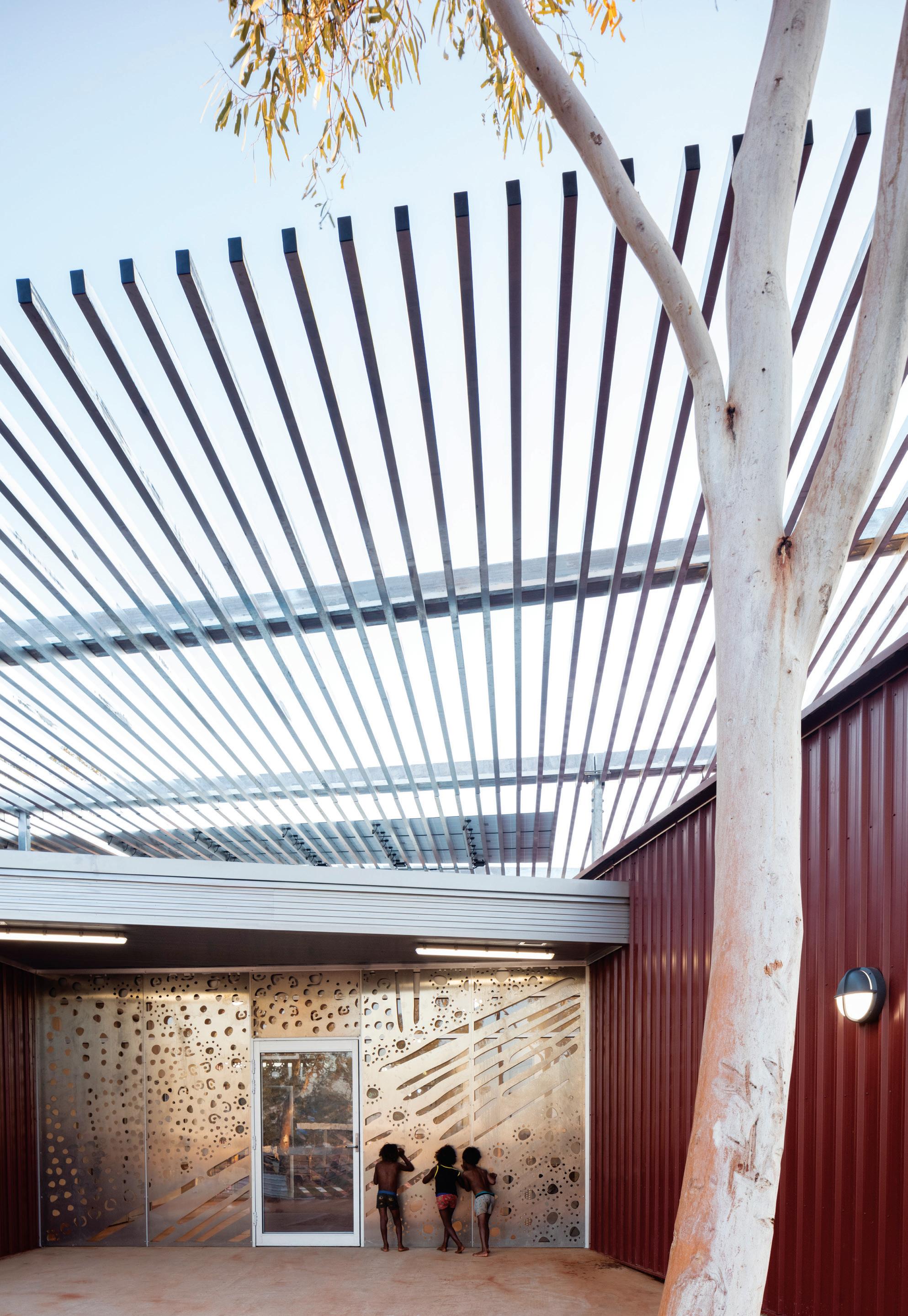
Speaking in federal parliament in the lead-up to NAIDOC week, the first Indigenous Minister for Indigenous Australians, Ken Wyatt, called upon politicians and all Australians to work collectively towards co-design outcomes, to “create and build the best possible joint solution—not a solution that is one-sided but a solution that involves both sides”.
“I want us to think about the way in which we focus on the client,” Minister Wyatt said. “In other words, understand the community and the need; and deal with the issues where you start to have a better understanding of what the challenges are.”
Referring to an earlier speech by Linda Burney, who descends from Wiradjuri people and is the Labor member for Barton, Wyatt said: “We don’t build to the lowest common denominator. We build to a level which is the aspirations of a community –what the families and the children want and desire in order to progress in their own choices of life to better opportunities and options.
“Share the food, share the culture, share the dance, look at the art and hear the stories,” he urged. “Because it’s through our mutual understanding of each other that this nation will become a greater nation… If we don’t, then this is a discussion that will be happening in 20 years’ time.”
INDESIGN 159 IN DEPTH
–
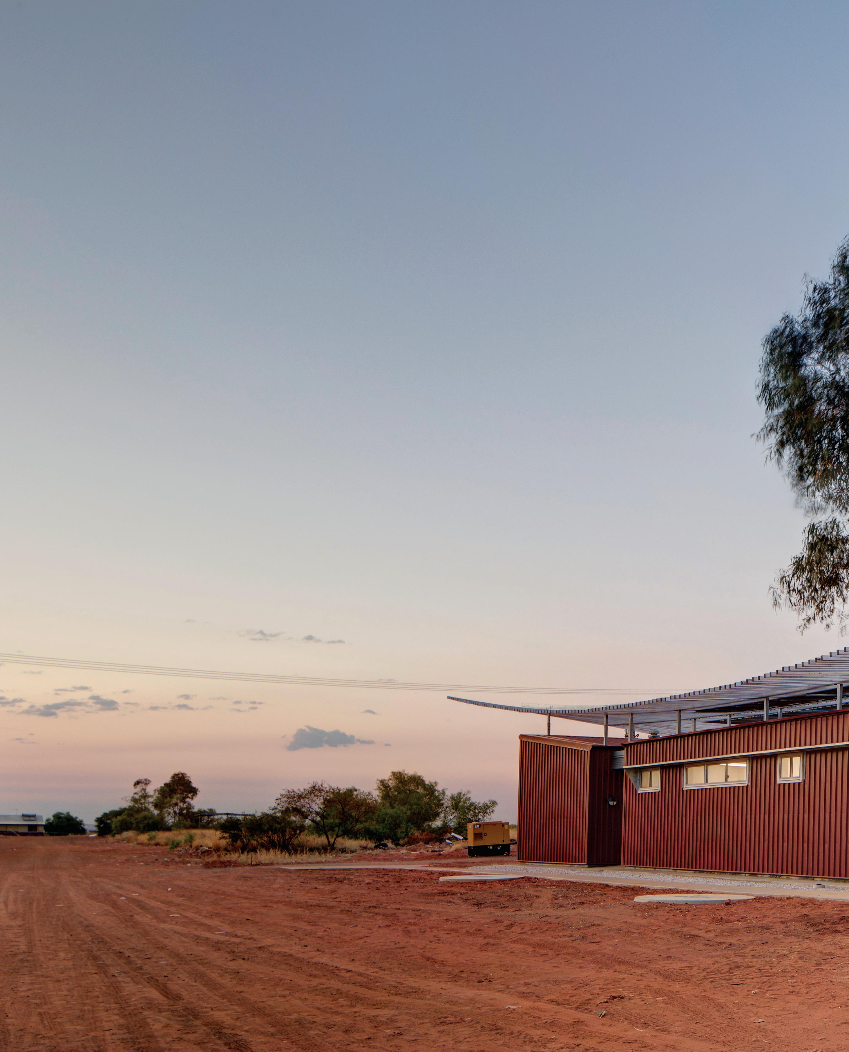
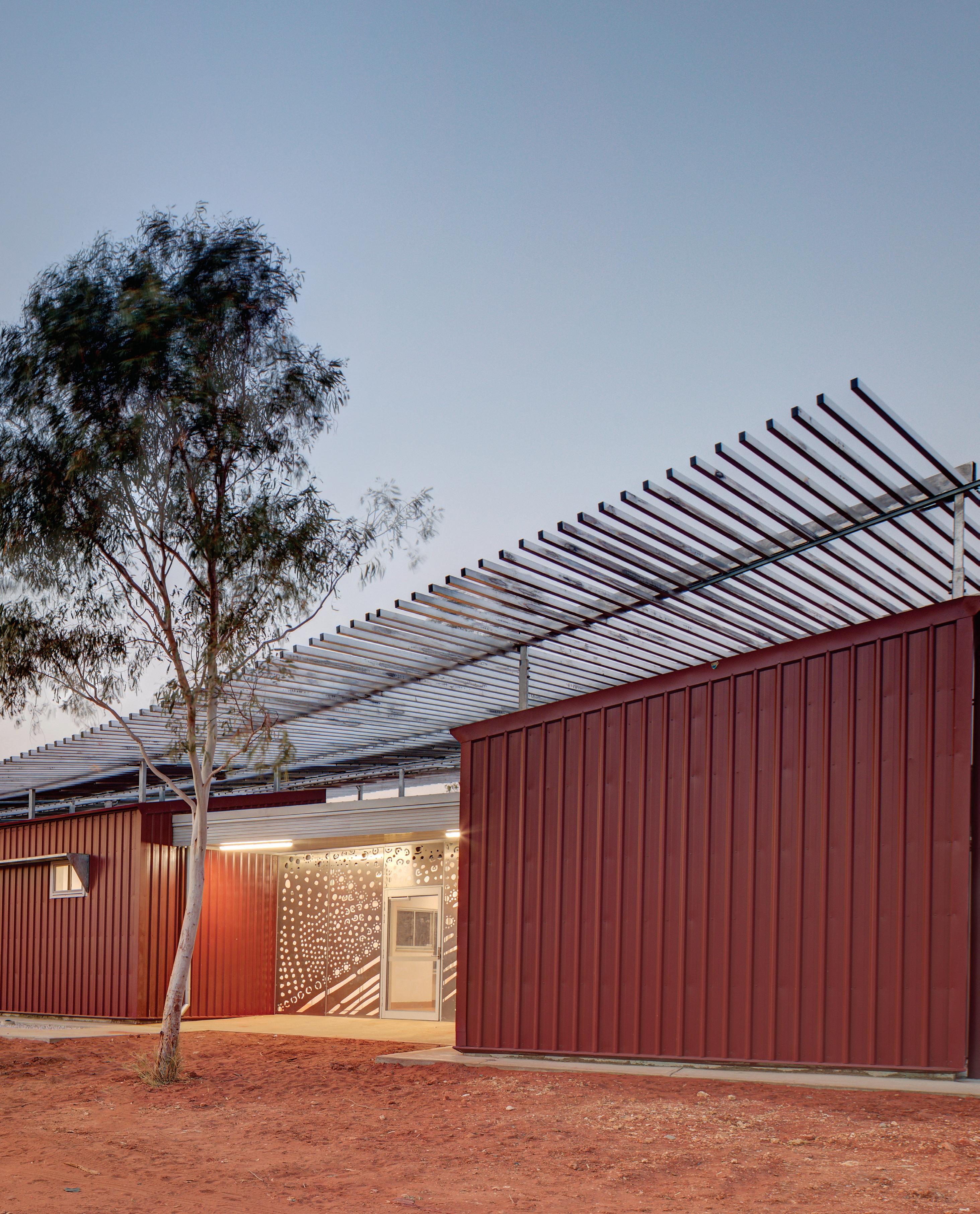 Words Annie Hensley
As Victoria’s largest local government investment, Bunjil Place stands as a fascinating case study for a ‘green field project’ that puts placemaking at its very centre.
Bringing back the town square
INDESIGNLIVE.COM 162 IN DEPTH
Rapid population growth and migration have been the subject of intense media interest of late, focusing on congestion and infrastructure. Less is made of the parallel and almost intangible impact of growth on communities and their places. Australian cities face significant challenges not only to provide essential infrastructure but also to maintain social fabric and sense of identity. The lion’s share of Australia’s population growth is shared between its capital cities, primarily Brisbane, Sydney and Melbourne. A million new residents will call Melbourne home by 2029, with high-density urban infill and traditional urban sprawl continuing to reflect this growth. These are not places of collective memory evolving over generations. Full suburbs emerge in a matter of years out of industrial zones and farmland. It is these areas which are particularly challenging in offering a sense of place and embedding social networks.
The challenge of creating something out of nothing falls upon both developers and local government. Suburban masterplanned communities, such as Rouse Hill, reflect successful developer-driven experiments in nostalgic main street shopping precincts. On the outskirts of Melbourne, the City of Casey has evolved in a more piecemeal fashion, almost entirely without a city centre or civic focus. Until recently, the Fountain Gate mall provided the primary focus for the community with a council building and library placed on ‘island’ sites nearby. Its success as an introverted mall has made a new town centre based on traditional main street models almost unviable. The town square, the essential focus of civic, cultural and community life, needed to be reinvented as a new typology, resulting in the development of Bunjil Place.
As Victoria’s largest local government investment, Bunjil Place has begun the process of growing into its own skin after almost two years in operation. A former duck lake has become an almost instantaneous heart for a rapidly growing community. This was bold placemaking for Victoria’s most populous local government area. Developed as a hybrid building offering theatre, studio, gallery, library, function space and council facilities connected by internal and external public space, the project was a response to a region lacking in both cultural facilities and civic space.
Evolving out of orchards and farmland over the last 30 years, its sense of identity was still embryonic. Extensive engagement with Boon Wurrung elders provided fjmt clues to reinstate identity through traditional stories and culture. The completed project is a statement of a community’s value and aspiration, set within walking distance of Fountain Gate Shopping Centre, of Kath and Kim fame, the only other local alternative for recreation and entertainment.
Locals view Bunjil Place as a compelling, convenient alternative to visiting Melbourne CBD for arts and entertainment, saving considerable travel time. No longer in its debutante phase, the City of Casey faces the next challenge of sustainably delivering on these high expectations while consolidating the precinct as a community and civic heart. A fine balance of commercial and community forces.
The precinct is managed by a significant team of arts, venue and event managers, community officers, curators and marketing team, many employed specifically as the building neared completion. They are informed by visitation and pedestrian movement data, by social media and program attendance, ticket sales and venue hire.
The challenge for the team is that Bunjil Place is still an island, almost a green field project, without the sustaining critical mass of surrounding urban fabric – a range of public places, destinations, fine-grain retail / F&B and local partners (education, cultural, institutional). The connection to the mall may come in time but until then the critical mass of visitors must evolve from the building and plaza itself and from wider regional partnerships.
Traditional placemaking interventions abound. Plaza programs and attendance is excellent in no small part due to continual outdoor programming as well as a sense of welcome, transparency and security.
However, a key to Bunjil Place’s future success lies in diversity and inclusion, a driving theme for the Bunjil Place operations team. Some have learnt Auslan, theatre programs have been designed specifically for children on the Autism Spectrum, the highly popular Diwali festival returns for its second year, youth programs support and entertain the typically young demographic.
Can this highly programmed place continue successfully in the long term? The Bunjil Place team can take inspiration from the Kulturhuset in Stockholm, one of the most successful and long running cultural and community centres in Europe. ‘Any given day the house offers new paths into diversity, might it be a debate, an exhibition, a performance or just finding that special book you always wanted but didn’t know existed.’ The second Boon Wurrung theme incorporated into Bunjil Place is the meeting of many paths – an appropriate theme which truly reflects the project’s current success as an experiment in place infrastructure. Visitation and ticket counts suggest a very high level of success but it is the significant increase in community connection through multiple pathways, the sense of pride and identity, the opportunity to gather without travelling great distances and the provision of places to dwell which truly reflect the achievement of place.
fjmtstudio.com

INDESIGN 163 IN DEPTH
Annie Hensley is a principal at fjmtstudio in Sydney and leader of fjmtcommunity.
The List
South Eveleigh Axle –Building 1, Sydney
Page 86
Interior Design Woods Bagot
Collaborative Interior Design Partner Davenport Campbell & Partners
Architecture, Base Building fjmt, Sissons Architects
Developer, Main Contractor Mirvac
Town Planning Ethos Urban
Civil / Structural Engineer Enstruct
Civil Engineer AT&L
Building Services and Environmentally Sustainable Design (to tender design) Arup

Building Services (construction) Fredon Air NSW Pty Ltd, Heyday5, Quick Plumbing, BSA, VAE Group
Fit-out Building Services (construction) NDY, Arup

Budget $1 billion
Duration 27 months
Woods Bagot woodsbagot.com.au
Davenport Campbell davenport-campbell.com.au
fjmt fjmtstudio.com
Sissons Architects sissonsarchitects.com
Mirvac mirvac.com
Furniture ‘Mekdrive 3’ compactus units, Dexion Commercial. Walter Knoll ‘Bao Lounge Chair’ waiting armchair, Herman Miller ‘Aeron Chair’ task chairs and drafting height stools, Living Edge. Vitra ‘Physix’ meeting room chairs, Vitra ‘Hal’ armchair and studio chair for breakout rooms, Vitra ‘Belleville’ armchairs and softshell chair, Vitra ‘Plume’, ‘Cabin’, ‘Alcove’ working booths and lounges, Vitra ‘Superfold’ café table and cocktail table, Unifor Australia. ‘NRS’ monitor arms, Uplifting Solutions ‘Chilli & Lime’ meeting room tables, Work Arena Mattiazzi ‘Chiaro’ café chair, dining chair, armchair and barstool, District. Ross Didier ‘Fable’ dining chairs, stools and dining tables, Saba Italia ‘Kepi’ armchair, Plank ‘Bon’ side table, Casamania coat hanger, Design Nation. Andersen ‘AC2’ table, PP Møbler ‘PP48’ and Maruni ‘Roundish’ chairs, David Design ‘Coni’ square base tables, SeehoSu. Artek ‘Bar Stool 64’, ‘N65 Children’s Chair’, ‘Chair 65’, ‘E60 Stool’, ‘80B Table’, ‘Aalto Table Round’, mini hub seating, Anibou. Cappellini ‘Tate’ colour stools and low chairs, Hay ‘All Plastic’ chairs, Hay ‘Palissade’ dining armchairs and stools, Fritz Hansen ‘Series 7’ chairs, Nau Design ‘Plum Easy’ lounge chair, Nau Design ‘Kubrick’ bar stool, Tim Webber Design ‘Y’ stools, Cult. Keith Melbourne ‘Cell’ side table, ‘Lamina’ table, ‘Bloom’ table, ‘Gher Arper’ table, Stylecraft. ‘Egg Cup’ stool, Mark Tuckey. ‘Jake’ chair, ‘Crop’ stool, ‘Aurora’ lounge and custom armchairs, ‘Disc’ tables, ‘PBS’ table, ‘Slim Series’ tables, custom work tables, custom bookshelf, Koskela. ‘Krossi’ desks, ‘Perimeter’ double focus booth, Schiavello ‘Nash’ laptop table, Jardan.
INDESIGNLIVE.COM 164 diS S ection S
Your comprehensive guide to the specification schedules for our featured projects.
Mid Med Medical Supplies
consult bed, Mid Med . Axona
Aici ‘Tipu Skid’ base chair and chair trolley, Ke-Zu. ‘Aula’ chair, Wilkhahn. ‘Gilkon’ laptop troller, Wilson & Gilkes . Shelving, Dexion.
Magnetic whiteboards, CFS
Furniture. Teahouse hub
furniture throughout, Space
Furniture.
Lighting
Cockpit and phone booth
lights, Darko. Major Hub light, vboaustralia. ‘Teapot’ joinery light, freestanding light, charge lounge joinery light, Spice Alley espresso

bar lighting, Multi-Function
Room lighting, KKDC.
Level 7 joinery lighting,
Level 1 community zone
lighting, Upper Ground joinery lighting, meeting
room lighting, Mock Branch
lighting, Light Project.
Plasterboard ceiling light, exposed ceiling light, ceiling tile download, Zumtobel.
Exposed ceiling hub light, PC Labs and training room
lighting, Austube. Level 7
lighting, ALMA Lighting
Rock Hub lighting, KODA
Lighting. Terrace hub
lighting, pergola hub lighting, Lightco. Super Hub exposed
ceiling lighting, Perimeter
breakout lighting, Nocturnal
Lighting. Hub exposed
ceiling light, tube ceiling
lights, Erco. Pelmet lighting, Litesource and Controls. UG
retreat space lighting, ACDC.
Atrium perimeter lighting, Euroluce. Meeting room
lighting, Eagle Lighting.
Specialist floor lighting, iGuzzini. Destination Café
lighting, Cult. Dumpling bar lighting, SeehoSu.
Club space lighting, Design
Nation. Booth pendants, EST Lighting.
Finishes Entry rugs, Tappeti. ‘Easy Groove’ birch plywood finishes, Easycraft. Pinnable
wall cladding, furniture linoleum, Forbo. ‘Echopanel’ acoustic panel, Instyle. ‘Click Batten’ finishes, Woodform.
Roughsawn timber battens, CHH Woodproducts. Cork
wall lining, Portugal Cork.
Fabric upholster, Kvadrat. Leather fabric, NSW Leather. Achitonic roller blind fabric, Achitonic. Laminates generally throughout, Laminex, HVG, Polytec.
Likewood laminate, Elton Group. Expanded mesh finishes, copper sheet trim, Armstrong. Interpon and Dulux powdercoating, H Dallas Industries . Paint throughout, Dulux. ‘Hoop

Pine’ faced plywood, Civardi Joinery. Corian laminate, Corian. ‘Quantum Quartz’ reconstituted stone, WK Marble. Reconstituted stone, tiles, Skheme Tiles. ‘Antila’ tiles, Artedomus. Tiles generally throughout, Academy Tiles, Ocean and Merchant, Teranova, Classic Ceramics , Earp Bros. Luxury vinyl tiles, Interface. Vinyl finishes, Armstrong Flooring. Carpet throughout, Interface, Gibbon Group, RC+D. Resilient Flooring, Forbo, Spectrum Flooring.
Fixtures
Wardrobe rail, cupboard and drawer locks, Häfele. Bronze cable caps, Halliday Bailie. D shaped aluminium handle, Madinoz. Leather and cabinet pull handles, Made Measure.
Türanga, Christchurch Page 96
Architect/Interior Designer
Architectus in association with Schmidt Hammer Lassen Architects


Project Manager AECOM, OCTA Project Management
Builder Southbase Construction
Structural Engineer Lewis Bradford Consulting Engineers (design build), WSP Opus International Consultants (client requirements)
Services Engineer Powell Fenwick Consultants (design build), Beca Group (client requirements)
Landscape Designer Rough and Milne Landscape Architects
Acoustic Consultant Marshall Day Acoustics
Façade Engineer Mott Macdonald
Fire Engineer Powell Fenwick Consultants (design build), Aurecon (client requirements)
Signage and Wayfinding Consultant Sanders Design
CPTED Consultant Dr Frank Stoks
Accessibility Consultant Be. Accessible (design build), Barrier Free (client requirements)
Budget $92.7 million
Duration 5 years
Architectus architectus.co.nz
Schmidt Hammer Lassen Architects shl.dk
Furniture
Loose furniture throughout, UFL Group / IMO. Bespoke furniture joinery, Southern Creations. Bathroom furniture throughout, Mico Bathrooms.
Lighting
Energyline lighting, EnergyLight . Downlights throughout, Erco.
Finishes
‘Multirib’ roofing, Roofing Industries. ‘UltraTherm Xtreme’ roofing, Rooflogic. Precast concrete on external walls, Lanyon Le Compt. Exterior stone tiles, ‘Bluestone basalt’ stone floor tiles, bathroom tiling, A+H Tiling. Gold anodised aluminium perforated rainscreen, Metal Concepts. Curtain wall window, shopfront glazing, Alutech. Various glass including double glazed IGU, balustrades and skylight, Metro Performance Glass. Blinds, SP Blinds ‘T&R Interior Systems’ ceiling, Angus Ceilings. Shaw Contract carpet tiles, Jacobsen. Noraplan uni – black flooring, Nora. Various basebuild joinery, American White Oak timber wall panelling, 360 Interiors. Shelving joinery, JB Joinery. Satin Black acoustic MDF wall panelling, Decortech , Asona. Plasterboard, GIB. ‘Fabwall’ fabric in various colours, Asona. ‘E Series’ aluminium partitioning doors, Potter Interior Systems. American white oak clear timber framed doors, Pacific Doors. Laminates throughout, Laminex. Resene and Dulux paints, I.Shephard Interiors.
Fixtures
Hardware, Knobs and Knockers. Signage throughout, Horton Signs.
McCorkell Brown Group offices, Melbourne Page 106
Architect, Interior Designer Ha Architecture
Builder McCorkell Construction
Structural / Civil Engineer Keith Long & Associates
Services Engineer / Environmentally Sustainable Design BESTEC
Planning Consultant
Hansen Partnership
Lighting Light Project
Budget $3 million
Duration 28 months
Ha Architecture h-a.com.au
Furniture
‘Hurdle’ low stools and tray side table, ‘Thimble’ table, Dowel Jones. ‘Scoop’ bar stool, ‘Tondina’ lounge chair, Herman Miller ‘Lex’ task chair, Living Edge.
Lighting ‘Mayu 03’ void pendant, Coco Flip. Linear profile task lighting, Light Project.
Finishes
Timber floors, Tasmanian Oak. ‘Lexicon Quarter’, ‘Guild Gret’ internal paint, ‘Domino’ external paint, Dulux. Easy click partition, Wonderglas GC – Spandek Profile roof sheeting, Ampelite. ‘Seal’ monochrome carpet, Interface. Matte black workstation laminate, ‘Pewter’ kitchen joinery, Laminex. ‘Ash Concrete’ kitchen benchtop finish, Essa Stone / Laminex. Zone ‘Sound’, Feel ‘Secure’ upholstery, Instyle. Lysaght Spandek ‘Shale Grey’ roof sheeting, Bluescope Steel.
INDESIGN 165 dis s ections
–
The Gandel Wing at Cabrini Malvern, Melbourne Page 112
Design Practice Bates Smart
Project Manager Aurecon
Builder Kane
Structural, Civil, Services Engineer Aurecon
Health Planner DesignInc
Quantity Surveyor Slattery
Town Planner Contour Group
Access du Chateau Chun
Building Surveyor Gardner Group
Fire Engineering
Red Fire Engineers
Landscape John Patrick
Acoustics Marshall Day
Environmentally Sustainable Design Cundall


Traffic Engineer GTA
Budget $120 million
Duration 26 months
Bates Smart batessmart.com.au
Furniture
Vitra ‘ HAL’ chairs, Unifor Moments Furniture ‘Cosmo Chairs’ patient chairs, Schiavello. ‘Scout’ sofa, Jardan. Clerical furniture, ECF/HFA.

Lighting Jasper Morrison ‘Glo Ball’ lamp, Euroluce. Wall fittings, Artefact.
Finishes ‘Duropal’ timber laminate, Benchtop City. Corian finishes, CASF. Carpet, Interface. Vinyl flooring, Tarkett.
Fixtures Caroma bathroom fixtures and fittings, GWA.
Ozanam House, Melbourne Page 136
Architect / Urban Design / Interior Design

MGS Architects
Project Manager Accuraco
Construction/Builder ADCO
Structural Engineer Webber Design
Services Engineer Irwinconsult
Landscape Designer Outlines
Building Surveyor PLP
Town Planning/Urban Design
Tract
Acoustic Engineer Marshall Day
Access Consultant Morris Access Consulting
Quantity Surveying, Construction RLB
Quantity Surveying, Design WT Partnership
Budget $45 million
Duration 4 years
MGS Architects mgsarchitects.com.au
Furniture Baseline chair, ‘Pirouette’ flip-top table, Office furniture, Baseline . ‘Volt’ HB stackable chair, Binuance ‘Pure Loop’ swivel with castors, ‘Mini Dandy Stool’, ‘Mini Rod Stool’, ‘Mono Sled’ chair and ‘Sled’ chair, Pedrali ‘Plus 630’ chair, ‘Plus 631.3’ lounge, ‘Brera 387’ high stool and ‘Wow’ ottoman, Pedrali ‘BOLD’ low, dining and twin tables, ‘Caterpillar’ pedestal table, ‘CHUNKY’ table, ‘Planar’ table and bar table, ‘Polygon’ low table, ‘Spy’ high back steel sofa, ‘Pedrali’ Log 366 sofa, ‘Tiller’ lounge chair, ‘Cooper’ three-seat lounge, custom ottoman, Design Nation . A-dec 521 Doctor’s Stool with armrests, A-dec 522 Assistant’s Stool with backrest and foot ring, Alldent P/L . ‘Reverse 55’ coffee table, Zenith ‘Mojo Cushbag Lounge’, Sebel . ‘Chill Out’ sofa, Prostoria ‘Combine Lounge’, Interstudio. ‘Horizon’ sofa, Jardan . Treadmill, upright cycle, crosstrainer, home gym, Life Fitness . ‘Linea’ sliding door cabinet, Planex
Finishes
Ceilings: ‘Antique White USA’ paint, Walls: ‘SW1H7 Antique White USA’, ‘S14A1 Vanilla Quake’, ‘NZ9C8 Whakarewarewa’, ‘S10F9 Hot Ginger’, ‘SG1D9 Nimrod’ paint, Trim: ‘SW1H7 Antique
White USA’, ‘S14A1 Vanilla Quake’, ‘S10F9 Hot Ginger’, ‘SG1D9 Nimrod’ paint, Doors: ‘NZ9C8 Whakarewarewa’, ‘S11G9 Coppersmith’, ‘S10F9 Hot Ginger’, ‘S46B9 Royal Silk’, ‘S46E9 Dulcet Violet’, ‘S32A8 Freedom’, ‘S39C8 Master Black’ paint, Dulux
Fixed & Fitted
2 Zone and 4 Zone
‘Touch&Slide’ induction cooktops, compact fridge/ freezer, Under-mount 60cm Powerpack rangehood, Fisher & Paykel . Bar fridge, Haier Stainless Steel Smart Kettle, Breville . 28L microwave, Samsung . Combination microwave, Electrolux Stacked washer and dryer, electric washer, Maytag ‘Cube’ extension care wall basin, ‘Eco Chrome’ bottle trap, ‘Care 800 Cleanflush’ wall facing toilet suite with Caravelle Care seat, Caroma Hand held shower, smooth hose and grab rail, Enware ‘Coral’ sink, Raymor. ‘Ideal’ standard concept toilet suite, Reece . Single toilet roll holder, Metlam
INDESIGNLIVE.COM 166 dissections
Orygen and Orygen Youth Health, Melbourne
Page 145
Architect, Interior Designer Billard Leece Partnership
Builder Kane Constructions
Structural and Services Engineer Irwinconsult
Services Engineer Lehr Consultants International
Landscape Designer
Land Design Partnership
Façade Consultant
Inhabit
Fire Engineer Umow Lai
Acoustic Consultant Marshall Day Acoustics
Traffic Consultant One Mile Grid
Building Surveyor du Chateau Chun
Quantity Surveyors Donald Cant Watts Corke
DDA Consultant Morris Access Consulting
Wayfinding Consultant Buro North
Land Surveyor Bosco Jonson
Geotechnical Douglas Partners
Lighting Consultant
NDYLIGHT
Foodservice Consultant
Foodservice Consultants
Australia
Graphic Artist Lemon Chicken Por Favor
Budget $54.5 million
Duration 3 years
Billard Leece Partnership blp.com.au
Furniture Gordon Mather Industries
furniture, Grazia and Co. Brunner and Allemuir furniture, Zenith. Artifort and Emu furniture, Ke-Zu. Thinking Works furniture, Stylecraft . Furniture generally throughout, Jardan , Anaca Studio.
Lighting Lighting throughout, Jardan.
Finishes
Ornamenta and Gamma Due wall tiles, Urban Edge. ‘BT Bamboo’ flooring, Ecoflooring. Laminates throughout, Laminex. Flooring carpet riles, Interface. Tiles, Signorino Tiles. Acoustic tiles, Atkar. Feature wall and ceiling, Sculptform. Paint throughout, Dulux. Textiles, Instyle.
Fixtures and Fittings
Joinery, Index + Co. Hot water tap, Billi. Bathroom fixtures, Caroma.
Yagan Square, Perth Page 154


Architect Lyons Architects with iredale pedersen hook and ASPECT Studios

Interior Designer Lyons Architects and Maddison Architects
Project Manager NS Projects
Construction/Builder DORIC Group
Structural Engineer Aurecon Services Engineer WSP
Landscape Designer ASPECT Studios
Retail Architects Maddison Architects with Encycle and Future Foods
Digital Lighting Ramus Illumination
Building Surveyor Milestone Certifiers
Quantity Surveyor Slattery Australia
Art & Cultural Advisors Malcolm McGregor, Material Thinking and Richard Walley
Artist Jon Tarry
Arborist Arbour Carbon
Heritage Consultant Griffiths Architects
Budget $73.5 million
Duration 2 years
Lyons Architects lyonsarch.com.au
iredale pedersen hook iredalepedersenhook.com
ASPECT Studios aspect-studios.com
Furniture
‘Babila’ stool, ‘Centrum’ table, Kfive . ‘Craftsman’ table, Furniture Options
Lighting
Erco lighting, Lighting Options . Coolum lighting, Led Linear
Finishes
‘Recore’ steel, Bluescope Steel . Zinc finishes, VM Zinc . Aluminium finishes, AAF. Stone throughout, Urbanstone . Perforated metal, Locker Group
Punmu & Parnngurr
Aboriginal Health Clinics, Western Australia

Page 158
Architect, Interior Designer, Project Manager, Landscape Designer
Kaunitz Yeung Architecture

Construction/Builder Murray River North
Structural Engineer Chapman Hutchison
Services Engineer
Lucid Consulting
Solar Geniux
Art Screens Di Emme
Art Martumili Artists, Jakayu Biljabu, Minyawe Miller, Sonia Williams, Wokka Taylor
Budget $4 million
Duration 18 months
Kaunitz Yeung Architecture kaunitzyeung.com
Finishes
Tarkett floor vinyl, Trevor’s Carpet. Colorbond
PANELRIB ceilings, Peak Ceilings. Colorbond Trimdeck cladding, Stramit. Colorbond Trimdeck roofing, Crest Roofing. Laminex laminates throughout, joinery and stainless steel joinery throughout, Kenwick Cabinet Works.
Fixtures
Caroma sanitaryware, Galvan’s Plumbing Supplies. Dorf taps, Lupica Plumbing and Drainage Specialists.
INDESIGN 167 dissections
–
Get INspired
5 for 4
Indesign is for creative professionals who are hungry to continue the ideas and thought leadership that inform the best projects, products and practices in the Indo-Pacific region.
Indesign looks for the point and purpose of everything in design, exploring what we do, how we do it and why. Here within you’ll find clever, provocative and insightful conversations with the design industry.

Indesign Our Supporters


It’s thanks to the support of our industry BFFs – that is, our valued advertisers – that we are 79 issues strong.
We like to symbolise our through the magazine and online, to acknowledge the valued partners with whom we work closely, every day. We thank you for your support and sharing in our passion for architecture and design in the Indo-Pacific region.
INDESIGNLIVE.COM 168 33 Abey abey.com.au 75 Bathe bathe.net.au 43 Blu Dot bludot.com.au 28 Bosch bosch-home.com.au 47 Business Interiors businessinteriors.com.au/indesign 60, 126 CDK Stone cdkstone.com.au 8-9 Cult cultdesign.com.au 81 DOMO domo.com.au 12-13, 131 Design Nation designnation.com.au 2-3 Designer Rugs designerrugs.com.au/indesign 131 Farage farage.com.au 25 Gaggenau gaggenau.com/au 123 Haworth haworth.com IFC-1 Herman Miller hermanmiller.com 6-7 ILVE grigiolusso.com.au 124-125 INDE.Awards indeawards.com 18-19 Krost krost.com.au 56-59 Living Edge livingedge.com.au 45 Lladró formfluent.com 16-17, 119 Louis Poulsen louispoulsen.com 23, 141, 144 Own World ownworld.com.au 10-11 Polyflor polyflor.com.au 27 Space Furniture spacefurniture.com IBC Stormtech stormtech.com.au OBC Stylecra stylecra .com.au 35 Tait madebytait.com.au 37 Tarke tarke
.com.au
48-49, 105 Wa yl wa
14-15 Wilkhahn wilkhahn.com.au 4-5 Zenith zenithinteriors.com 20, 21, 82-83 Zip Water zipwater.com
55 Tasmanian Timber tasmaniantimber.com.au 53 TCW t-c-w.com.au
yl.com.au/specifiers
Subscribe to Indesign and receive 5 issues for the price of 4, AUS$55. indesignlive.com/subscribe
SUBSCRIBE TO INDESIGN ADVERTISERS DIRECTORY
CreateperfectharmonyinthebathroomwithStormtech’sawardwinning selection ofarchitecturallineargratesanddrains.Choosefromourextensive rangeofcontemporarygratedesignsfeaturing fullGreentagcertification. ViewourcompleteselectionontheStormtechwebsite,andmatchtheperfect draintoyourdesignneeds.


Visit stormtech.com.au for tools + inspiration. Pictured:Stormtech100ARiLinearDrainageSystem.Marinegradestainlesssteel,100mmwidearchitecturalstylegrate. Grateimpressions withStormtech. ARCHITECTURALGRATES+DRAINS Telephone 1300 653 403 •ExtensiveRange+Styles •LinearThreshold Drainage • Pool Surrounds+Courtyards •Custom Fabrication

Australia 1300 306 960 Singapore +65 6511 9328 stylecraft.com.au Avion collection Supporting Australian Design & Manufacturing at stylecraft


 ©2019 Herman Miller, Inc.


 Pictured with: Precinct Screens, Vox Task Chairs, Wes Armchair, Archie Table, SOL-Dash Mobile Stool & Dress Standing Aid
by ZENITH Design


 Words Aleesha Callahan Photography Michele Aboud


 Vuelta 72 Armchair by Jaime Hayon Grain Cut Side Table by Jaime Hayon
Wings Bed by Jaime Hayon
Melange Highback Armchair by Monica Förster
Kubus Lounge Chair by Josef Hoffmann
Melange Handle Table by Monica Förster
Merwyn Oval Dining Table by Sebastian Herkner
Merwyn Dining Chair by Sebastian Herkner
Jolly Armchair by Jan Armgardt
DD Side Table by Jaime Hayon
Miles Sofa by Sebastian Herkner
Merwyn Carver by Sebastian Herkner
Oyster Lounge Chair by Jorg Boner
Miles Table by Sebastian Herkner
Merwyn Lounge Sofa by Sebastian Herkner
Monkey Mirror by Jaime Hayon


 Words Annie Hensley

