A professional resource for the design curious.
Time To Shine, INDE.Awards
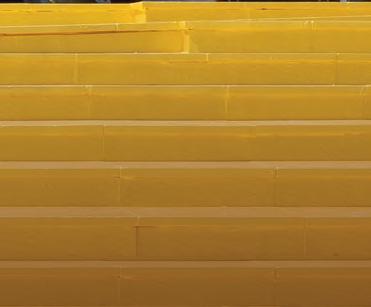
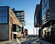
Innovation Precinct, Warren and Mahoney
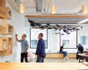
Melinda Huuk, The Studio* Collaborative INDESIGN Luminary Jon Goulder
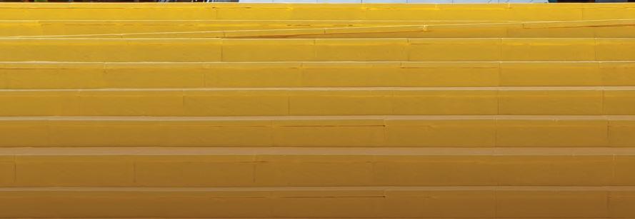
The Imprint, MVRDV
The ‘Workplace Evolution’ Issue.

INDESIGNLIVE.COM
9 > 771443870000 76 Issue #76 / Australia $16.50 / New Zealand $17.50 / Singapore $12.95 / U.S. $21.99
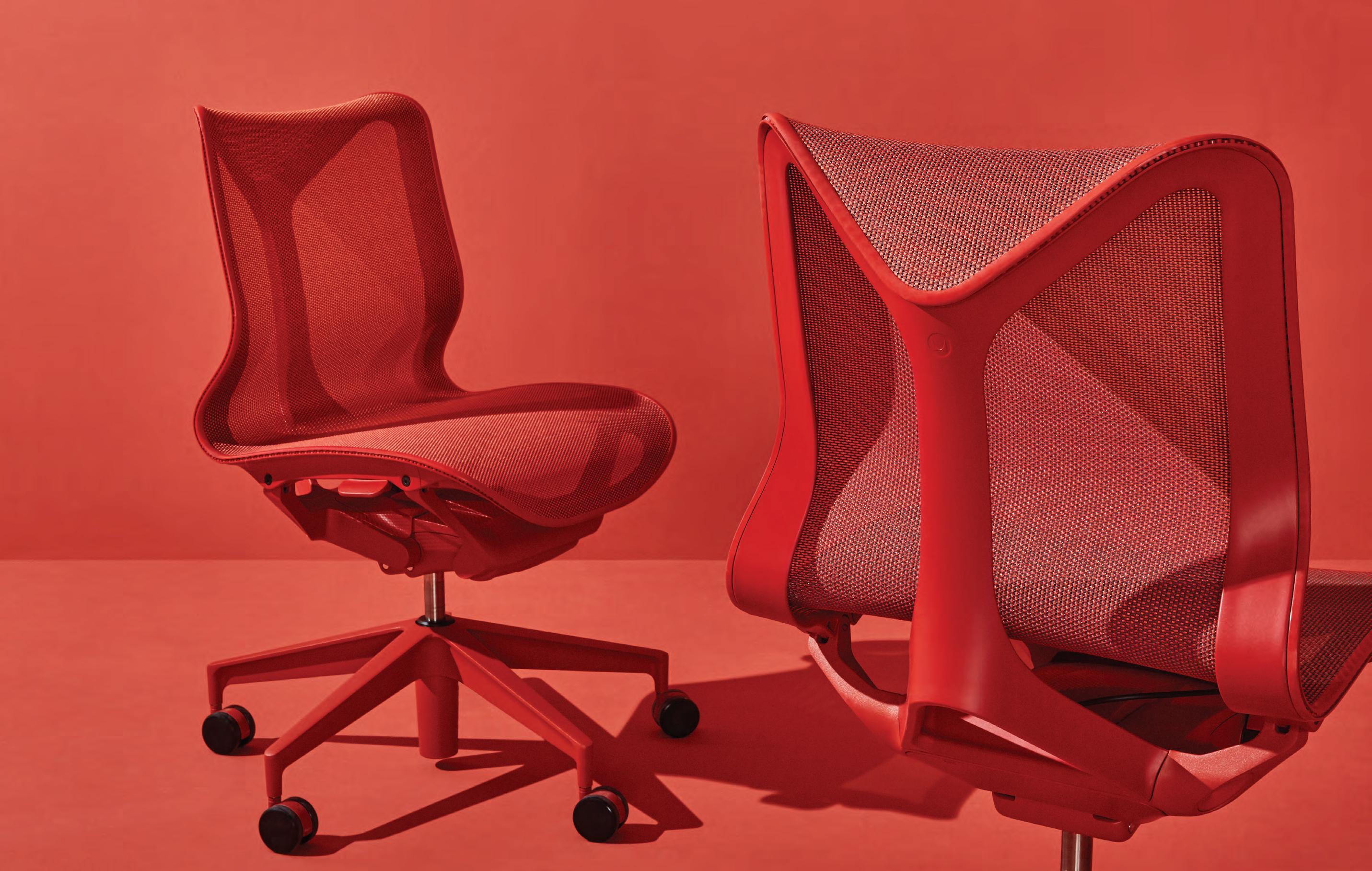
Anywhere Everywhere Meet Cosm – our latest office chair that provides instant comfort, everywhere. hermanmiller.com/cosm

hermanmiller.com.au | hermanmiller.com/asia Foll0w us on | HermanMillerAsiaPacific
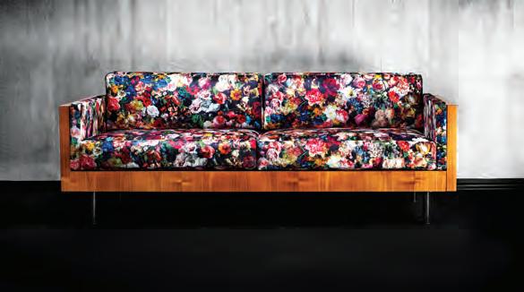
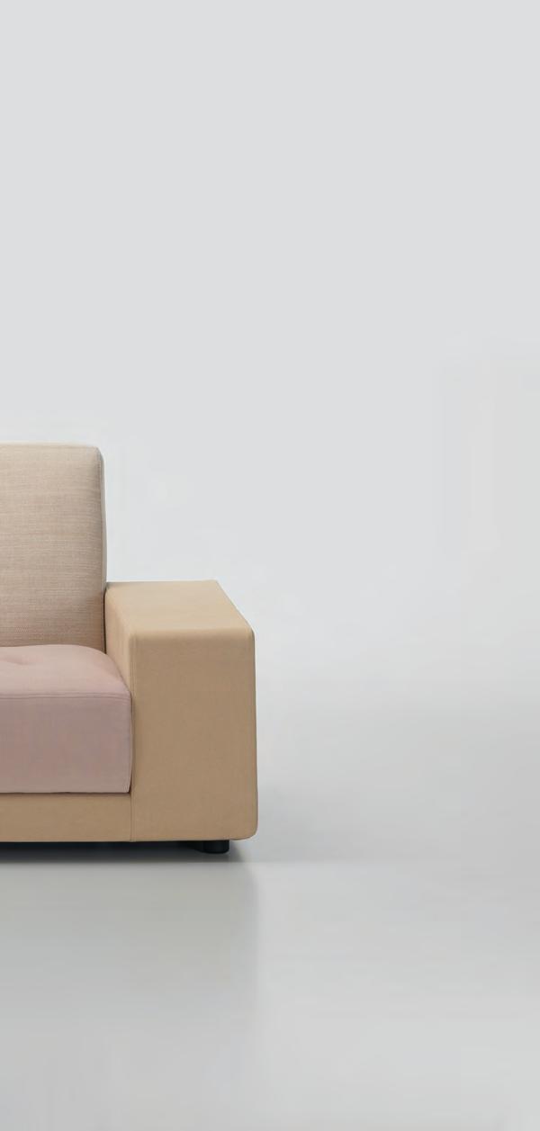
Polder sofa evokes its designer’s native landscape; a patchwork of fields cleft by dykes and canals. Fusing craft and industry with her unique affinity for colour, Hella’s designs are authentically timeless.
livingedge.com.au
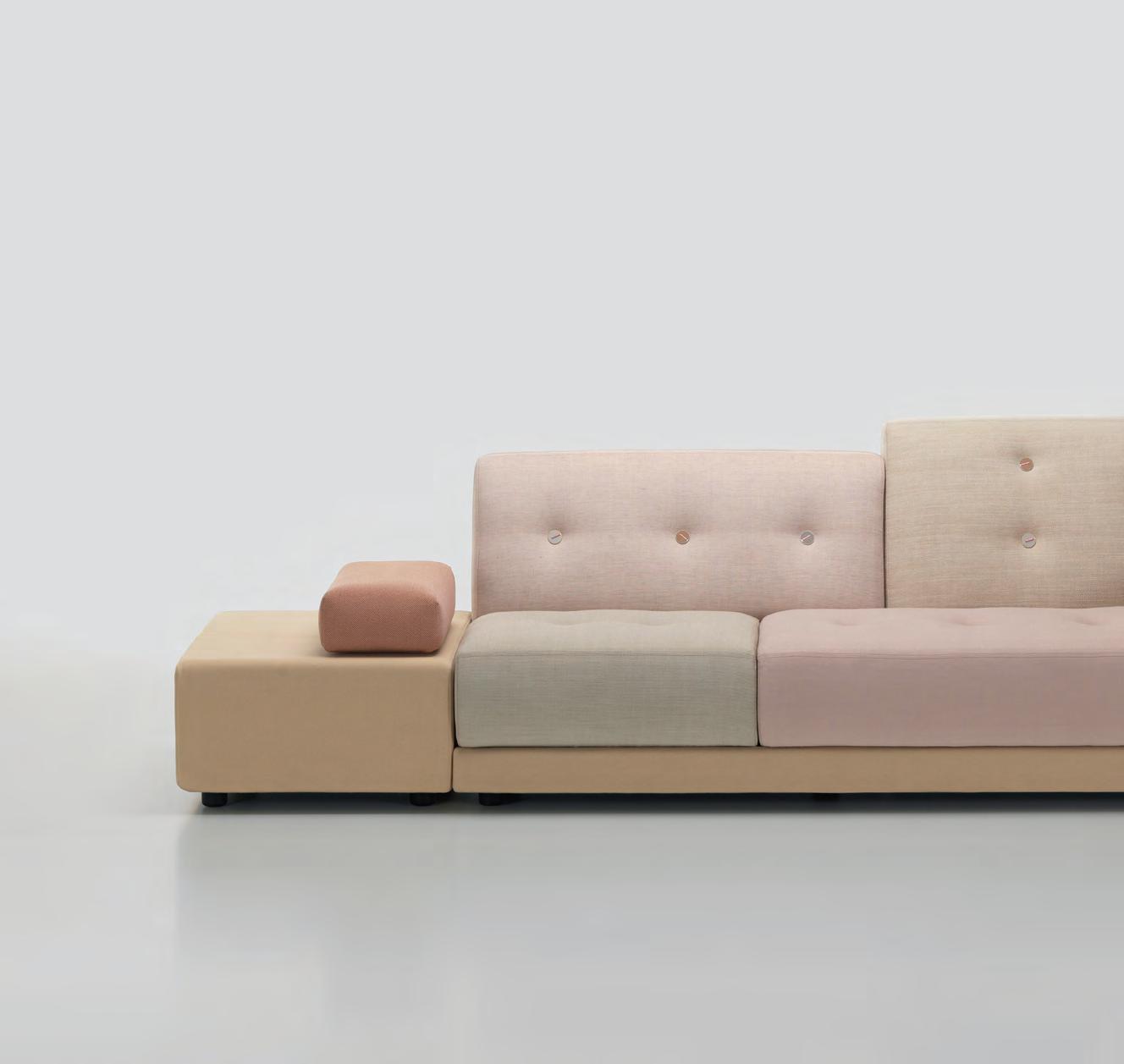
Polder Sofa
Hella Jongerius, Designer – Vitra























KISSEN
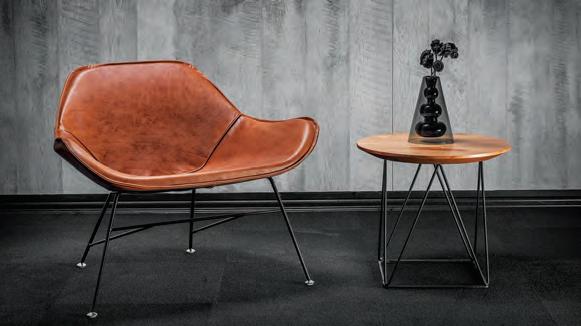
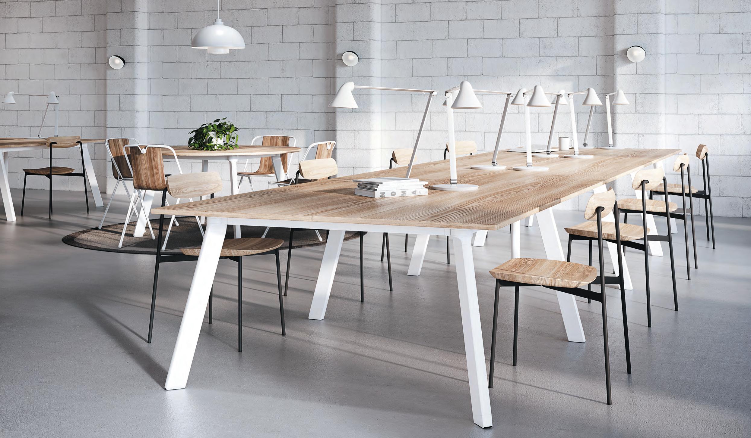
Collection of tables and workstations with a distinct leg profile.
 Pictured: Brunner Crona Light Bar Stools, Halm Armchair & Lapalma ARCO Chair

Your voice, your region, your awards

Time To Shine



Celebrating the most progressive architecture and design in the Indo-Pacific region.





Book your seat at the INDE.Awards Gala 21 June, Melbourne indeawards.com
The Modern Office
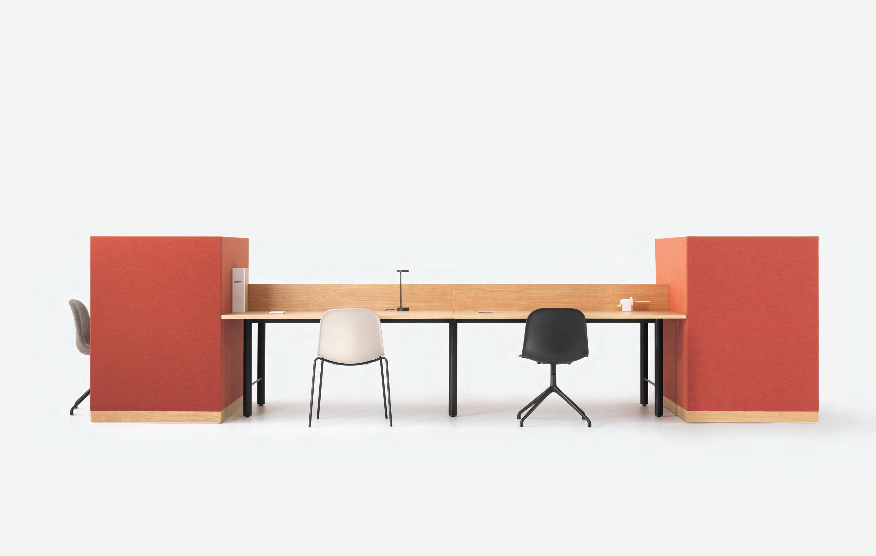 By Simon James Design

district.com.au
Chairman/Publisher
Raj Nandan raj@indesign.com.au
Managing Director
Kavita Lala kavita@indesign.com.au
Editor Alice Blackwood alice@indesign.com.au
Special Edition Editor
Paul McGillick
Indesignlive Editor Aleesha Callahan aleesha@indesign.com.au
Editorial Assistant Andrew McDonald andrew@indesign.com.au

Brand Director Colleen Black colleen@indesign.com.au
Business Development Managers
Danielle Nichols danielle@indesign.com.au
Kim Hider kim@indesign.com.au
Laura Hicks laura@indesign.com.au
Client Liaison
Dana Ciaccia dana@indesign.com.au
Client Success Executive

Brydie Shephard brydie@indesign.com.au
Accounts
Ting Zhang ting@indesign.com.au
Anita Arbita anita@indesign.com.au
Designers
Julia Gee julia@indesign.com.au
Louis Wayment louis@indesign.com.au
Tracey Yee tracey@indesign.com.au
Online Manager Radu Enache radu@indesign.com.au
Web Developer
Ryan Sumners ryan@indesign.com.au
Indesign Correspondents
Andrea Stevens (New Zealand)
Mandi Keighran (London)
Stephen Cra i (Melbourne)
Contributing Writers
Patricia Arcilla, Rachael Bernstone, Aleesha Callahan, Stephen Cra i, Leanne Amodeo, Marg Hearn, Tracey Ingram, Paul McGillick, Thida Sachathep, Andrea Stevens, Sandra Tan, Sophia Watson
Featured Photographers and Illustrators
Tyrone Branigan, Steve Brown, Alex Buccheri, Alun Callender, Ryan Cantwell, Charles Dennington, Simon Devi , Dion Dobeson, Nicole England, Sean Fennessy, Felix Forest, Gareth Gardner, Tom Hu on, Jason Mann, Gilbert McCarragher, Shannon McGrath, Derek Swalwell, Ossip van Duivenbode
Head O ce Level 1, 50 Marshall Street Surry Hills NSW 2010 (61 2) 9368 0150, (61 2) 9368 0289 (fax) indesignlive.com
Melbourne 1/200 Smith Street, Collingwood VIC 3066
Singapore 4 Leng Kee Road, #06–08,SIS Building, Singapore 159088 (65) 6475 5228, (65) 6475 5238 (fax) indesignlive.sg
Hong Kong
Unit 12, 21st Floor Wayson Commercial Building, 28 Connaught Road West, Sheung Wan, Hong Kong indesignlive.hk
Join our global design community, become an Indesign subscriber!
To subscribe (61 2) 9368 0150 subscriptions@indesign.com.au indesignlive.com/subscriptions
Yearly subscription: Australia $55 (incl. GST) International AUD $110
Printed in Singapore
Indesign is printed with ENVIRO Soy-Based Process Black ink, UV Solventless Varnish and on paper which is awarded an Environmental Management Certificate to the level ISO14001:2004 GBT24001-2004 and Eskaboard and Eskapuzzle produced from 100 per cent recycled fibres (post consumer).

All rights reserved. No part of this publication may be reproduced, stored in a retrieval system, transmi ed in any form or by any other means, electronic, mechanical, photocopying, recording or otherwise. While every e ort has been made to ensure the accuracy of the information in this publication, the publishers assume no responsibility for errors or omissions or any consequences of reliance on this publication. The opinions expressed in this publication do not necessarily represent the views of the editor, the publisher or the publication. Contributions are submi ed at the sender’s risk, and Indesign Publishing cannot accept any loss or damage. Please retain duplicates of text and images. Indesign magazine is a wholly owned Australian publication, which is designed and published in Australia. Indesign is published quarterly and is available through subscription, at major newsagencies and bookshops throughout Australia, New Zealand, South East Asia and the United States of America. This issue of Indesign magazine may contain o ers or surveys which may require you to provide information about yourself. If you provide such information to us we may use the information to provide you with products or services you have. We may also provide this information to parties who provide the products or services on our behalf (such as fulfillment organisations). We do not sell your information to third parties under any circumstances, however these parties may retain the information we provide for future activities of their own, including direct marketing. We may retain your information and use it to inform you of other promotions and publications from time to time. If you would like to know what information Indesign Media Asia Pacific holds about you please contact Nilesh Nandan (61 2) 9368 0150, (61 2) 9368 0289 (fax), subscriptions@indesign.com.au, indesignlive.com Digital Print Events Strategic Partners CAREERSINDESIGN MILANINDESIGN @wyallastudiowww.wyallastudio.com.au smart lighting solutions Australian designed and made Bluetooth operated LED lighting INDESIGNLIVE.COM 20 INDESIGN IS BROUGHT TO YOU BY
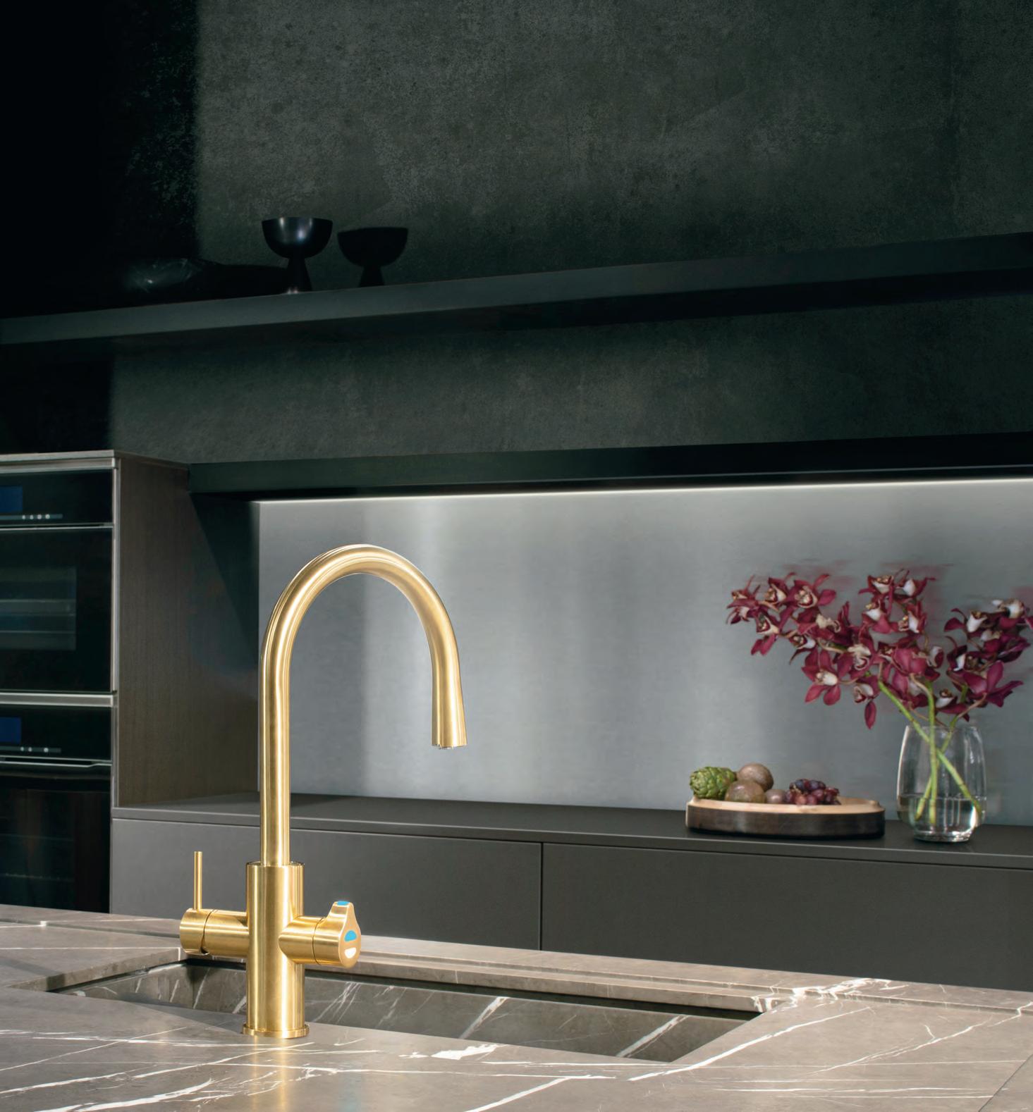
THE NEW KITCHEN ESSENTIAL
All your drinking water needs, All-in-One beautifully designed system. Remove the need for multiple taps in your kitchen with a single, beautifully designed system that delivers boiling, chilled and sparkling filtered drinking water, as well as hot and cold unfiltered water for your sink.
The Zip HydroTap All-in-One offers every water option you need from one multi-functional tap and a single intelligent compact under-bench system. That’s why the Zip HydroTap will be the one and only hydration solution for your kitchen.
Discover more at zipwater.com


THE WORLD’S MOST ADVANCED DRINKING
SYSTEM
WATER
ZIP HYDROTAP | PURE TASTING | INSTANT | BOILING | CHILLED | SPARKLING
And so the waiting game begins! As I write, the INDE.Awards 2019 Jury is sitting down to review the many hundreds of entries we’ve received in this year’s Indo-Pacific-wide awards program. More than any other awards program in this country, the INDE.Awards calls on architects and designers to think big, and look beyond the scope of your immediate locality to have your voice heard, and your work recognised, within a larger regional context.
Speaking recently with Mat Hinds of Taylor and Hinds Architects, (2018 winner of The Building, and Best of the Best for ‘krakani-lumi’ in Tasmania) he reminded me of the immense reach of our region, and the INDEs’ unique capability to span its many continents and bring unity to a diverse industry of creatives.
“As a small practice, coming from a small island on the southern tip of that region, it just goes to show that this awards program does facilitate recognition for work that is on the margins, regionally,” says Mat. “We were completely overwhelmed [by the win]. It allowed us to focus the meaning of the project in a broader regional context. We saw it had potency for an entire region of the world, beyond the community of people who were our client.”
So the question remains, what will this year’s Jury verdict reveal? We can’t wait to see the outcome, and share it with you on 21 June, when the INDE.Awards Gala returns for its third major awards night.
Speaking of iterations, in this edition of Indesign, the ‘Workplace Evolution’ issue, we traverse the full shapeshifting spectrum of the ‘modern workplace’. Together with our returning special edition editor, Paul McGillick, and a few key thought leaders (special thanks to Jerad Tinnin, Gijs Nooteboom and James Calder), we tackle topics of automation and AI, co-working, hybrid working, hotel hot-desking, innovations from Orgatec... Wait, I’m giving it all away. Enjoy the issue and we look forward to seeing you at the INDEs in June.
Indesign Editor, Alice Blackwood
INDESIGNLIVE.COM 22 FROM THE EDITOR
250,950+
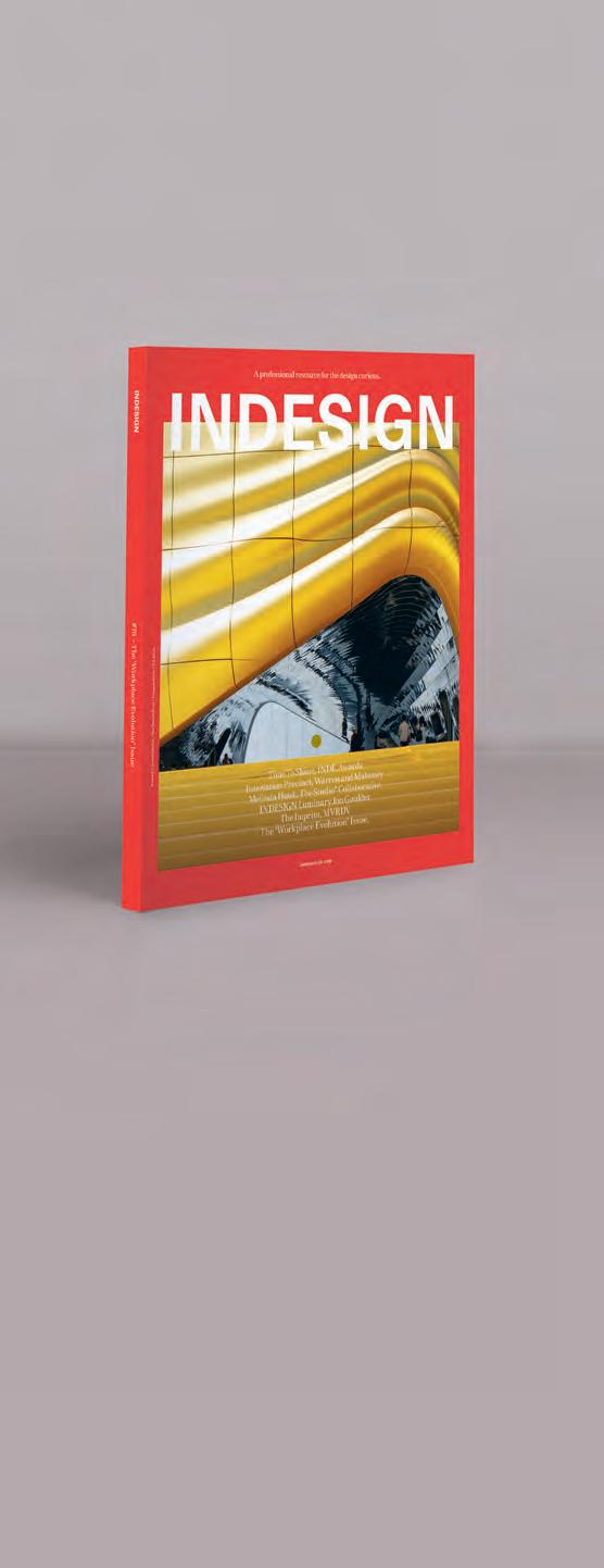
On The Cover
indesignlive.com /indesignlive @indesignlive @indesignlive
readers engaged across print, digital and social...
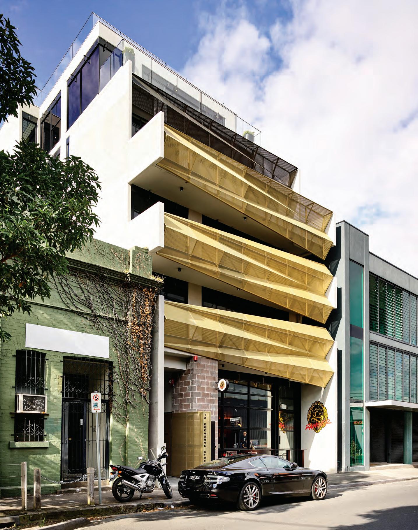
The Imprint at Paradise City, Seoul, by MVRDV, features an arresting splash of gold at the entrance to the nightclub building; it’s bright enough even to catch the eyes of passengers landing at the nearby Incheon Airport. Read the story on page 44.
Photo – cover and page 44: © Ossip van Duivenbode, courtesy of MVRDV.
Correction
The Royal Adelaide Hospital, featured in the Indesign #75 article entitled ‘Human Vs. Nature’ (page 160), was designed by Silver Thomas Hanley in joint venture with DesignInc (STHDI).
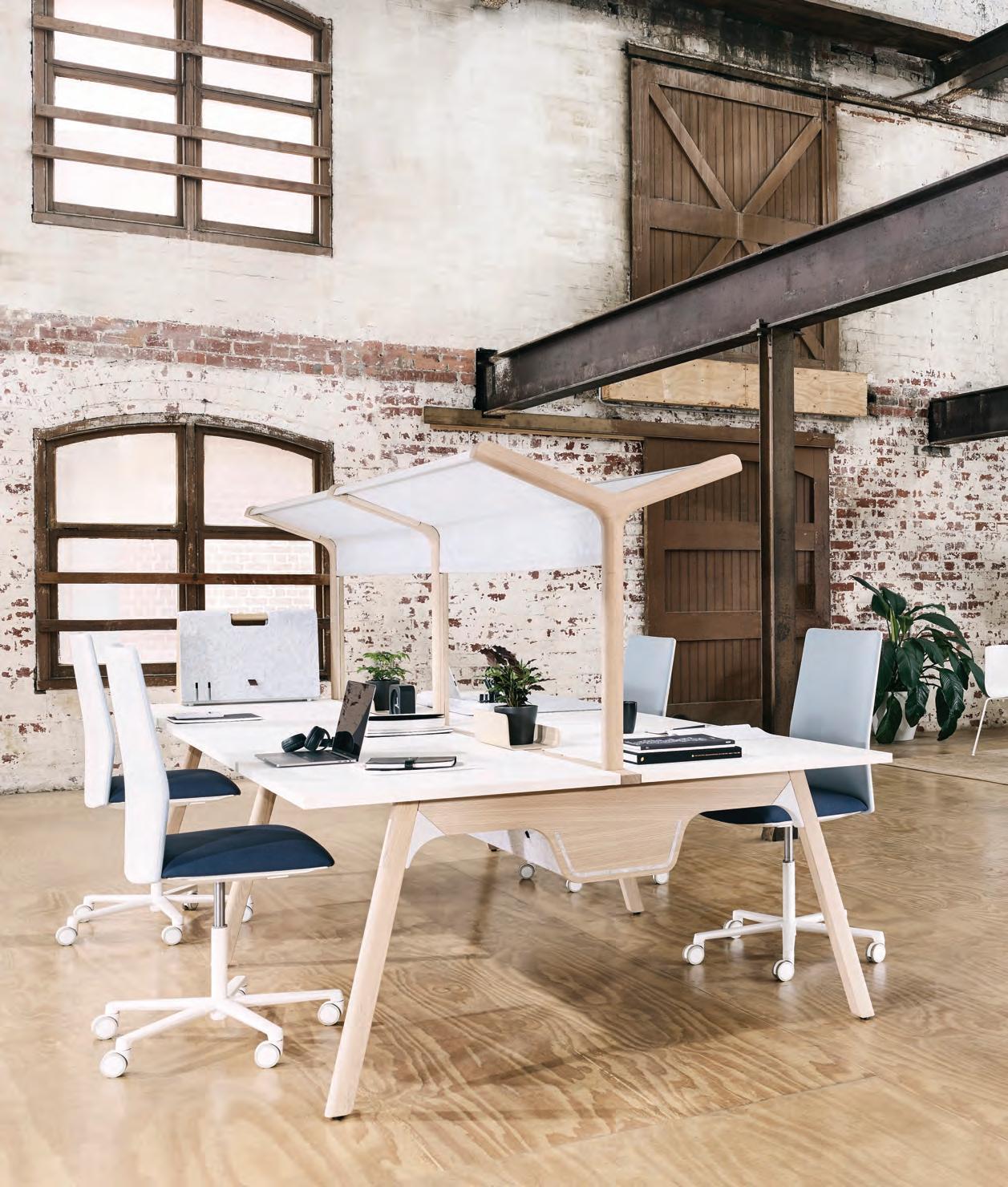
Australia 1300 306 960 Singapore +65 6511 9328 stylecraft.com.au Thinking Quietly Workstation Design by ThinkingWorks
The ultimate industry cheat sheet.
Big thinkers and creative gurus.
INDESIGN Luminary Jon Goulder, Melinda Huuk, Stephen Crafti, Sevil Peach
Provocative, innovative and inspiring design. 89-135
Innovation Precinct, Auckland by Warren & Mahoney & GridAKL tenancy by Jasmax
QT Perth by Nic Graham & Associates and Indyk Architects
Memocorp grand lobby, Sydney by The Stella Collective -
One Microsoft Place, Ireland by Gensler
Agents of Spring, Melbourne by GroupGSA -
K&K Industries, Melbourne by ArchitectsEAT
Welcome to the workplace evolution 4.0. 137-167
With ‘keynote’ insights from Orgatec 2018 by Indesignlive editor Aleesha Callahan, special edition editor Paul McGillick in conversation with Gijs Nooteboom of Veldhoen + Company, and James Calder of Calder Consultants.
In Short
27-54 In famou S
63-84
In SI t u
-
-
-
I n D epth
INDESIGNLIVE.COM 24 CONTENTS
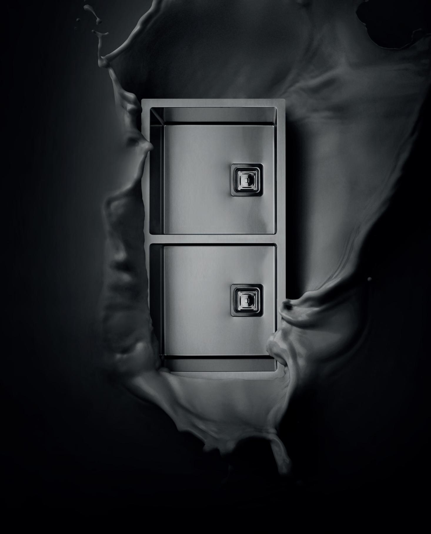
immersed. Abey Australia’s diverse range of sinks provides you with a selection from around the world. Visit an Abey Selection Gallery to immerse yourself in the collection. Barazza Cubo Double Bowl VICTORIA Selection Gallery 335 Ferrars St Albert Park Ph: 03 8696 4000 WESTERN AUSTRALIA Selection Gallery 12 Sundercombe St Osborne Park Ph: 08 9208 4500 NEW SOUTH WALES Selection Gallery 1E Danks St Waterloo Ph: 02 8572 8500 QUEENSLAND Selection Gallery 94 Petrie Tce Brisbane Ph: 07 3369 4777
Be
STAY FLEXIBLE






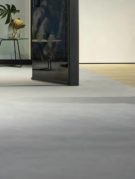
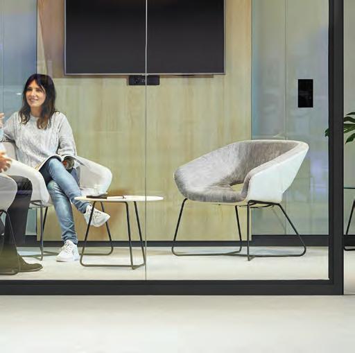
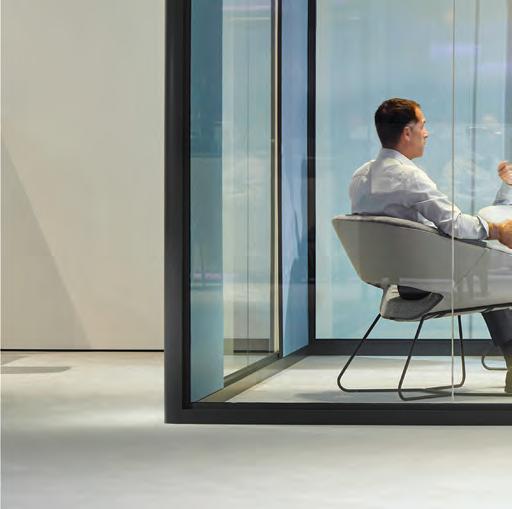
Bosse human space cube 4.0
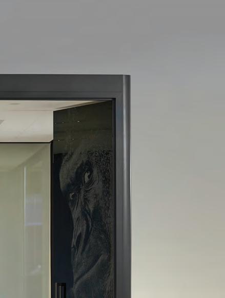
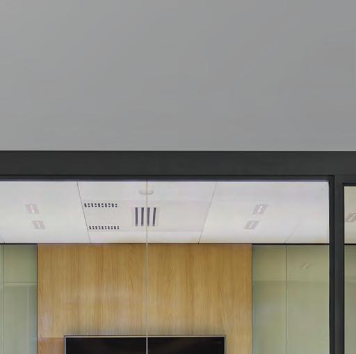
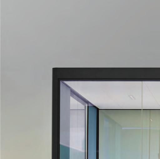
More modern, more flexible, improved acoustics, and nice to look at from all sides. With acoustically effective, electrified, freely configurable panels on the inside and outside. The possibilities for using the Bosse human space cube 4.0 are as varied as your wishes – perfect as a meeting room or individual office, as a quiet area or for teamwork. For further information please write to asia-pacific@dauphin.com.au
bosse.de
Design: Bosse Design-Team, Rüdiger Schaack
the ultimate industry cheat sheet
INDESIGN 27 IN SHORT SHORT IN
Retro Tropicalismo
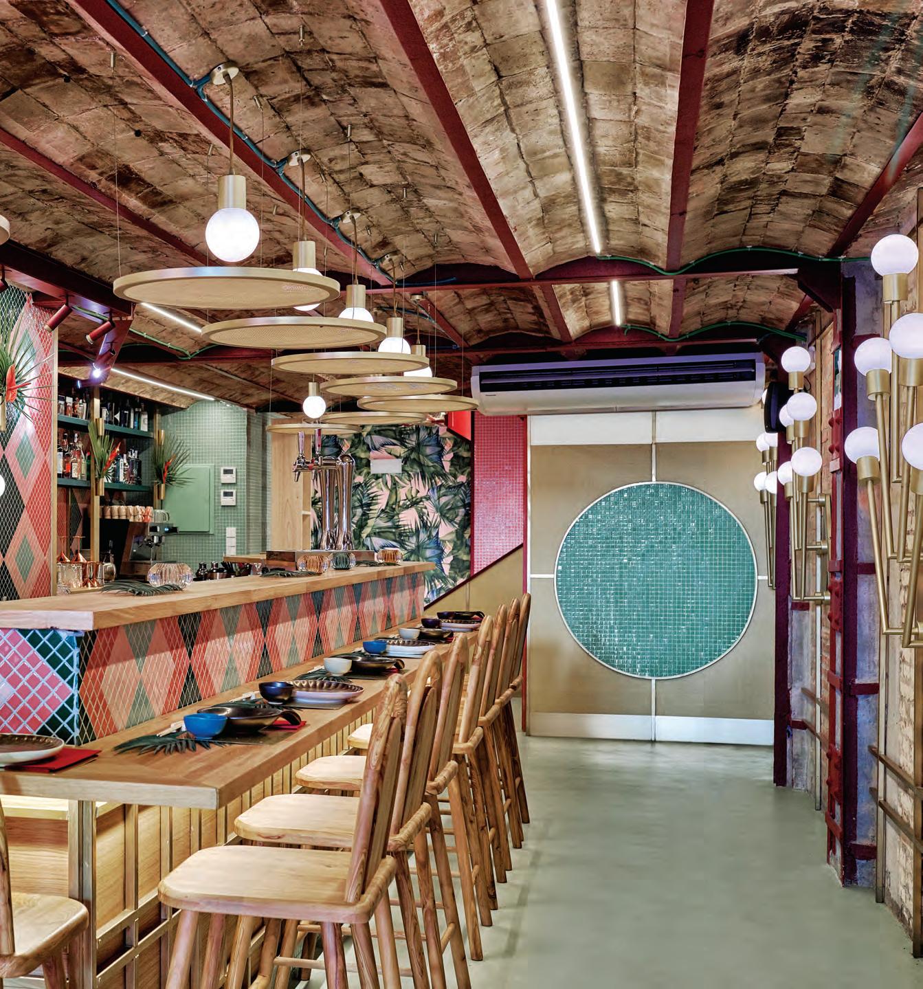
There’s nothing more engaging than a hospitality interior with a clear design narrative, especially one that manages to make you smile. Often times these fit-outs have a strong colour scheme, use a select suite of decorative motifs and incorporate a well-considered materiality, all of which results in an immersive environment that transports the customer to another world. It makes for a memorable experience and that’s why they keep coming back.
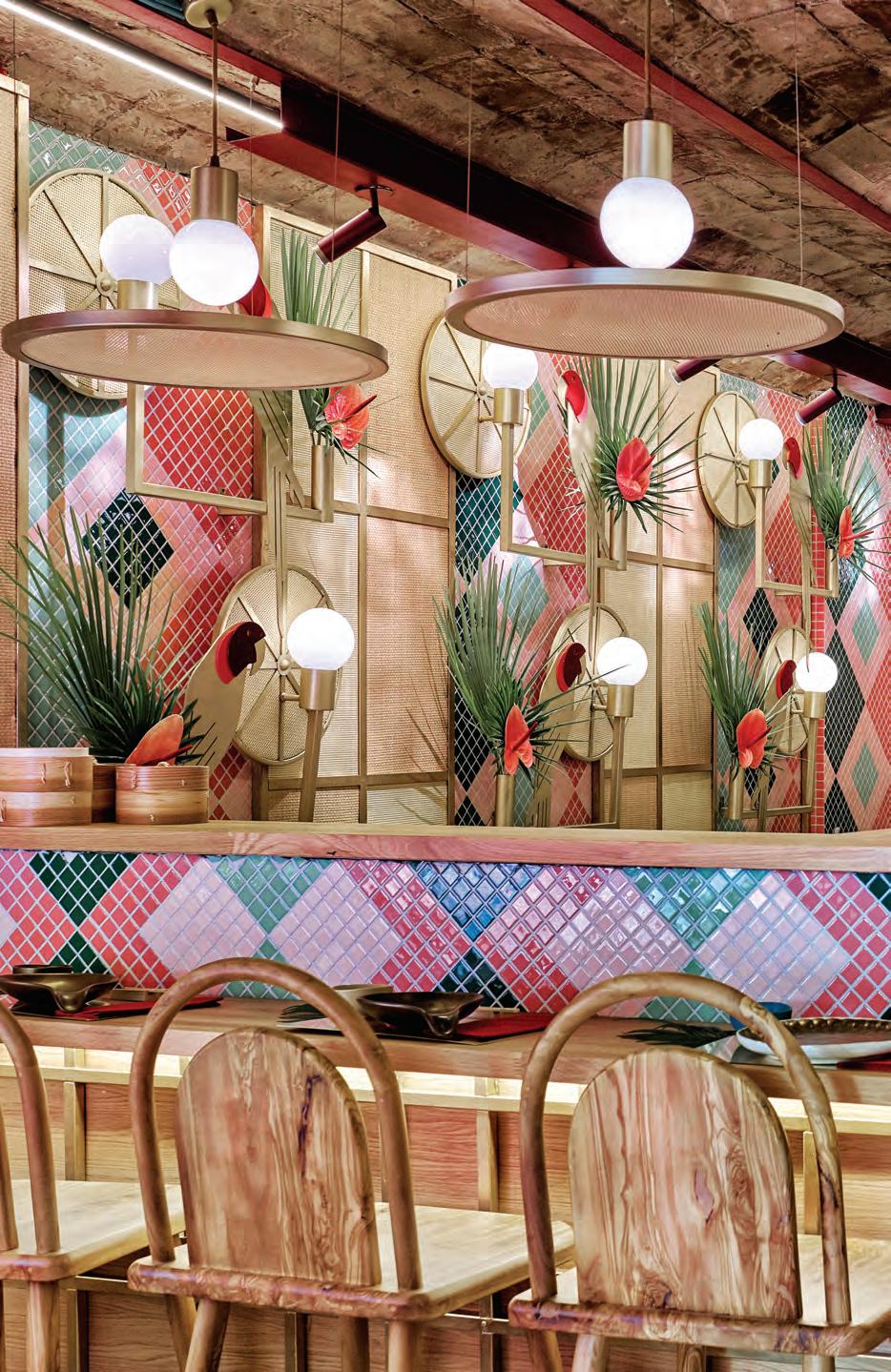
Personifying an interior with the character of a well-known individual has been a popular narrative of late. We’ve seen it with the renovation of Kingsleys in Sydney by Richards Stanisich (re-visit Indesign #74 to see which Hollywood leading man was the inspiration behind this fit-out), and most recently with a newly opened sushi restaurant in Valencia. Kaikaya’s interior design is the work of Spanish creative consultancy Masquespacio, established by Ana Milena Hernández Palacios and Christophe Penasse in 2010, and it perfectly exemplifies their contagiously bright and energetic signature aesthetic.
The restaurant’s fit-out embodies all the spirit of Carmen Miranda and in truth, the designers were inspired by the Brazilian artistic movement of Tropicalismo, a nod to the client’s own Brazilian heritage. A 1970s-flavoured colour palette of green, burgundy, pink and black provides the backdrop for tropical foliage and custom parrot lamps. The use of timber and raffia elements borrows from traditional Japanese interiors to not only temper the scheme’s exuberance, but also to respectfully represent the fusion of two distinct cultures. It’s a playful outcome guaranteed to ensure a fun night will be had by all.
INDESIGNLIVE.COM IN SHORT 28
INDESIGN 29 IN SHORT
Not Your Normal Retail Store
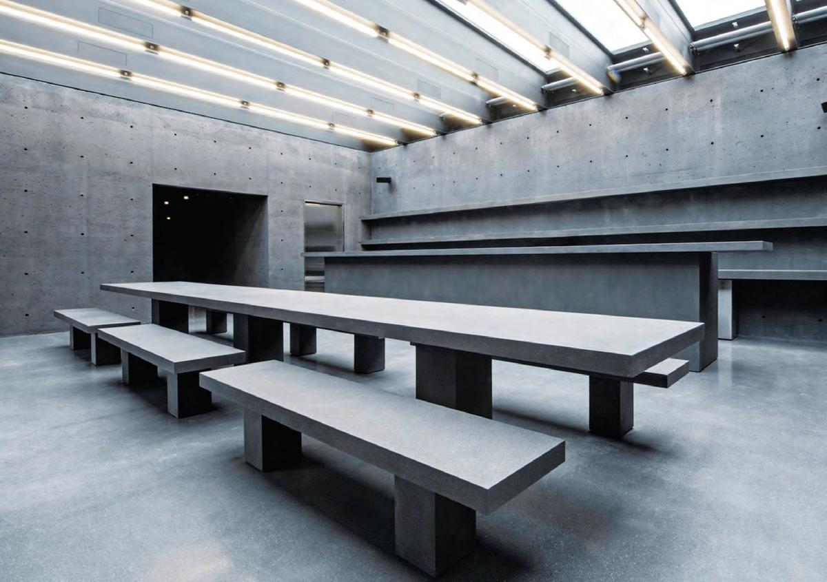
The current retail remit has us designing spaces first and the online presence second – but what if it was flipped? British firm David Chipperfield Architects recently accomplished this for Ssense, an e-commerce label that expanded into a bricks-and-mortar retail store in Montreal, Canada. The store provides a physical counterpart to the online brand, so integrated technology was a priority. Within 24 hours of scheduling an appointment online, products can be delivered and tried on by customers at the store. “E-commerce enables scale but is suboptimal in important ways, especially fostering human connection,” says Ssense CEO, Rami Atallah. “A seamless integration with physical spaces fills the gaps in the customer experience.” Along with spaces for displaying clothing and accessories, the building houses a glassroofed café decorated with concrete benches and tables (above). Wiring is hidden to keep the surfaces as bare as possible. “A grid system is embedded throughout the unforgiving concrete structure, determining the formwork and placement of a hidden convertible socket system for all mechanical, functional, and technical elements,” says Atallah. As Chipperfield tells FRAME, “This is not a sensible project.” But then again, Ssense is not a ‘normal’ company.
Described by architect David Chipperfield as “not a sensible project”, this retail-hospitality fitout defies all the bricks-and-mortar retail convensions.
INDESIGNLIVE.COM IN SHORT 30
–
–
Carme Pinós On Inclusivity
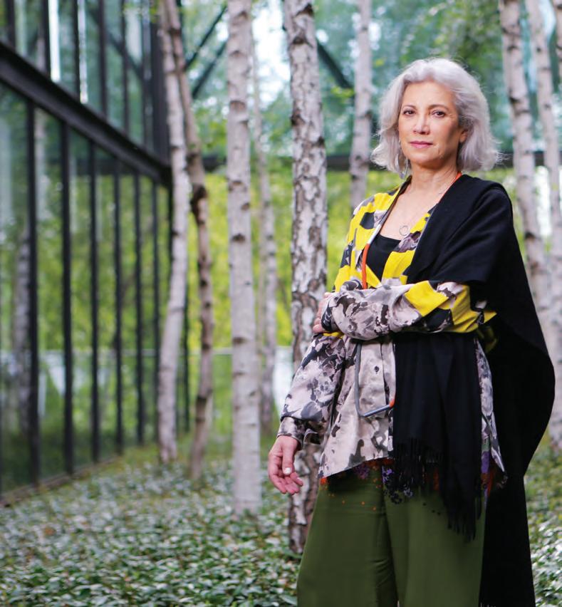
“It should be the goal of designers to foster inclusive social interaction with and within their designs. Whenever I can, I design places where movements and routes intersect and exchange; spaces where people identify as part of a community, but also feel they belong to universality. More and more I see that there is an urgency for architects and designers to involve themselves in public architecture, social housing and urban refurbishment. It’s our responsibility, or at least it should be. Design as a discipline has the power to solve so many problems, and inclusivity is one of the biggest problems we face globally. MPavilion [Melbourne, 2018-19], for example, reveals an open civic space that invites interaction as well as a discourse between people, design, nature and the city. It’s designed primarily to dissolve the lines between architecture and urbanism; an ease of relationships is suggested –material, environmental and human.”
Host With The Most
Indesign Flokk
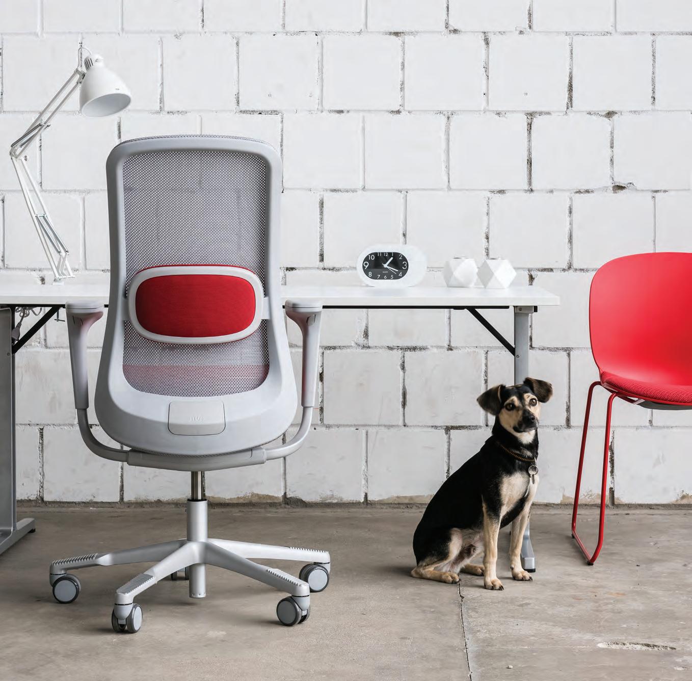
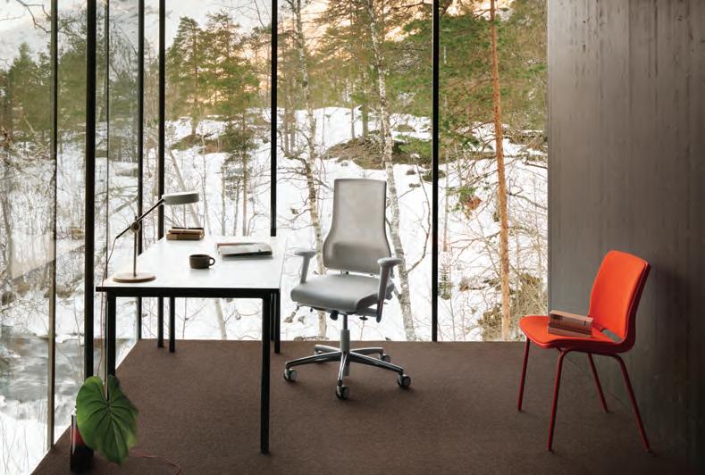
What does it mean to belong in today’s modern o ce environment? Bringing together the best in European design, including HÅG task seating (le ), Flokk’s presentation at Orgatec 2018 was about creating a sense of belonging. The company did this in more than one way: through the design of the stand that focused on a central circle, to the impeccable hospitality o ered throughout the week-long fair. And the products? Visitors got rst-hand experience to work, contemplate and sit in a wide o ering of new pieces. At the end of the day, furniture is one tool in the designer’s toolkit that can aid a positive transformation of the workplace.
INDESIGNLIVE.COM IN SHORT 32

SYDNEY 5/50 Stanley Street Darlinghurst +61 2 9358 1155 MELBOURNE 11 Stanley Street Collingwood +61 3 9416 4822
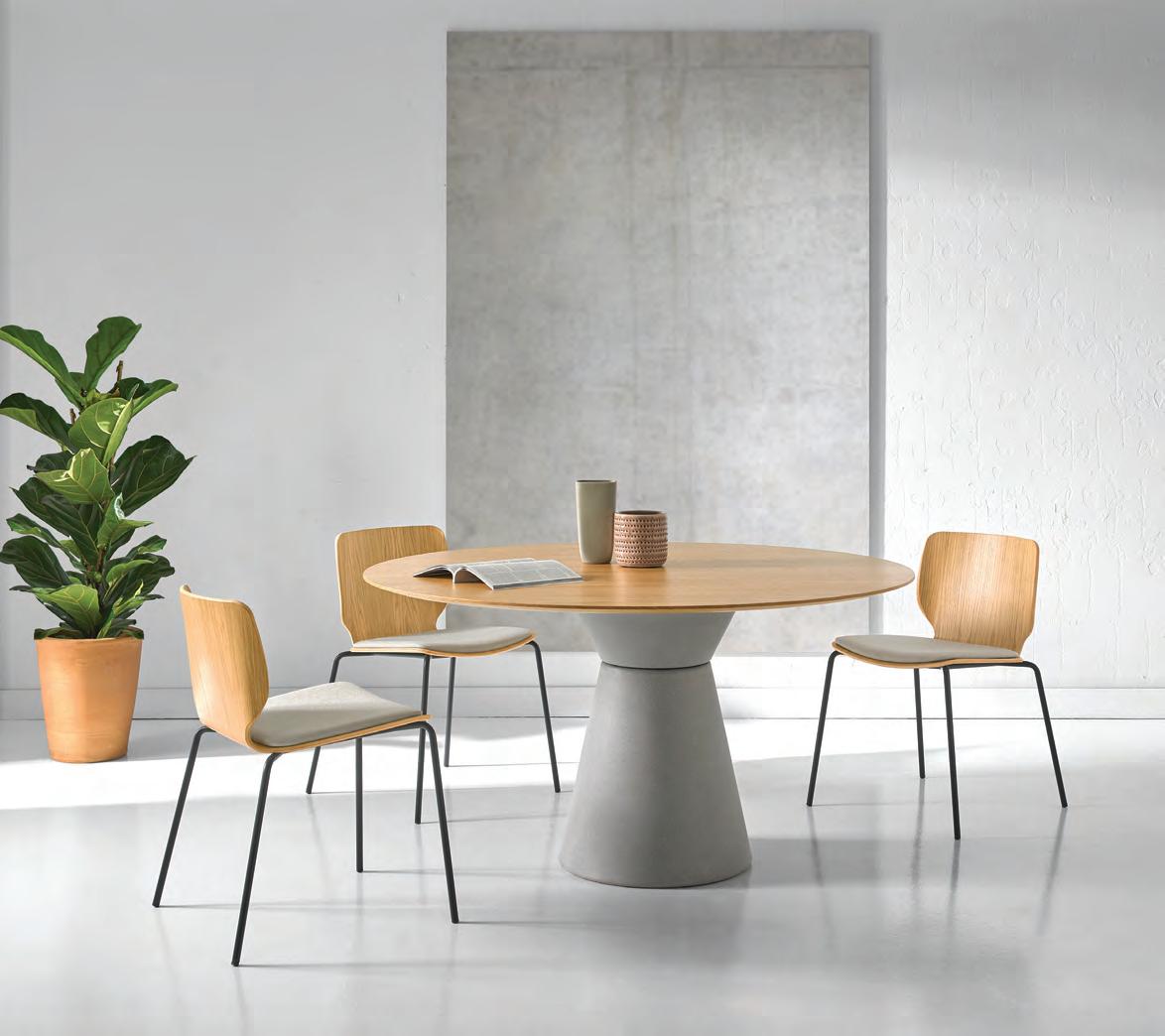
Essens Table & Nim Chair by inclass
Life’s A Beach Chanel SS19
Every year, fashion-philes excitedly await the Chanel Paris Fashion Week Fall/Winter and Spring/Summer showings, desperate to see what Karl Lagerfeld will shock them with next. In the grand tradition of the house, Chanel continued to blow minds, this time transporting us to a literal beach at The Grand Palais des Champs-Élysées for Paris Fashion Week SS19.
Spectacle is generally used as competitive tool – it’s a way to stand out and demand attention. What is interesting about Chanel’s constant emphasis on spectacle is that its doesn’t actually need it. For this legacy fashion house, it’s not about getting attention, rather it’s about maintaining it.
Chanel is one of those rare brands that, for the most part, competes with itself, constantly having to out-do the previous season showing.
Spectacle becomes a valued currency for relevance sake. For previous fashion weeks Chanel has created supermarkets, datacentres, enchanted forests and an actual rocket launch. This latest show saw Chanel set the stage with an idyllic and incredibly realistic beach scene.
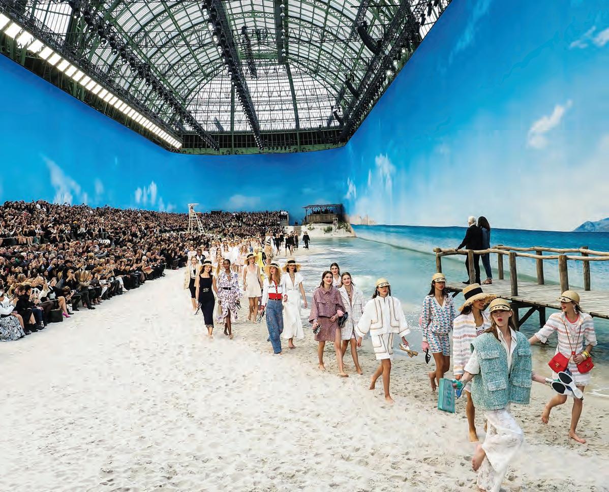
Complete with a jetty (from which Karl Lagerfeld watched the finale), beach huts, sand and lapping waves, SS19 Chanel was the ultimate beach break for fashion-fatigued editors.
Accessories such as straw hats, fingerless gloves and beach ball handbags lent further levity to the proceedings where a line-up of famous current supermodels – Kendall Jenner, Adwoa Aboah, Kaia Gerber and Edie Campbell among them – skipped and played on the shoreline, shoes in hand with smiles on their faces. Life’s a real beach!
INDESIGNLIVE.COM IN SHORT 34
–
–
At SS19 Paris Fashion Week, the house of Chanel really drove home the power of spectacle as a valued currency in contemporary design.
This Time It’s Personal
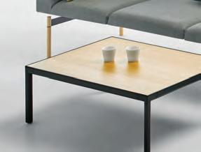
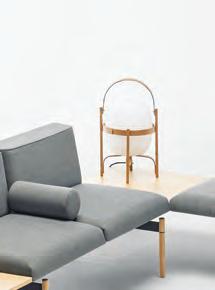
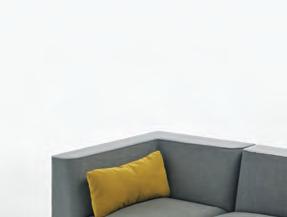
“In creating Plenum, the overall objective was to challenge the concept of traditional o ce furniture and create a feeling of home,” says designer Jaime Hayon. Every one of these items was originally designed for the private home but has proven to t perfectly in numerous public spaces all over the world.” Designed for Fritz Hansen, Plenum is a highback sofa system that caters to evolving workspaces with a premium on “personalisation”. So shapes, organic curves and interesting colours separate Plenum from traditionally square, impersonal o ce furniture. “It is important to remember that my design is made for humans – to be used by humans. I believe that design should provoke emotions. Design should make you feel good and most of all create happiness, whatever the context.”

While You’re Waiting
Indesign Own World
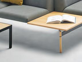
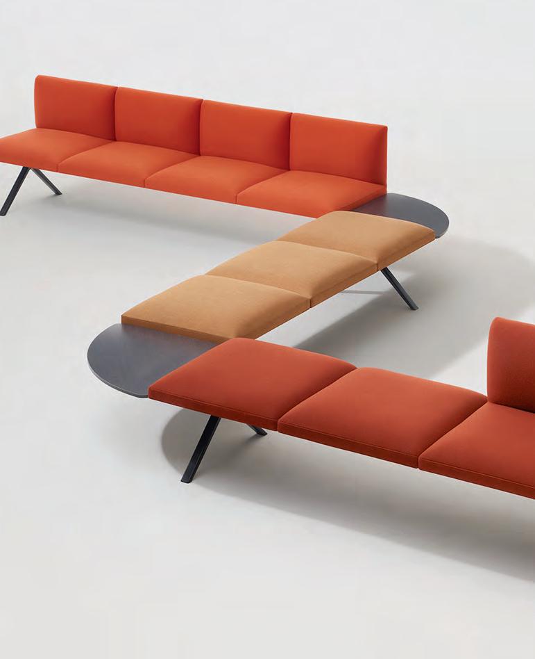
From designer Carlos Tiscat comes Lapse, a comprehensive modular furniture system that transcends the classic seating concept for waiting areas. Designed with a broad range of elements and accessories, the uni ed aesthetic of the modules allows for endless con gurations that all work cohesively, no matter the format. The collection o ers a wide selection of seating modules, side units, connectivity accessories and privacy panels that can be combined to adapt to the required needs of any space. Lapse has been designed to function as a stylish and practical seating solution for waiting areas and lounge spaces in public buildings, o ces and hotels.
Kitchen Confidential
Indesign Abey

For over 40 years Barazza has been at the cutting edge of kitchen design. The iconic Italian brand has cultivated a unique ability to seamlessly incorporate its hobs, sinks and accessories into stainless steel projects.
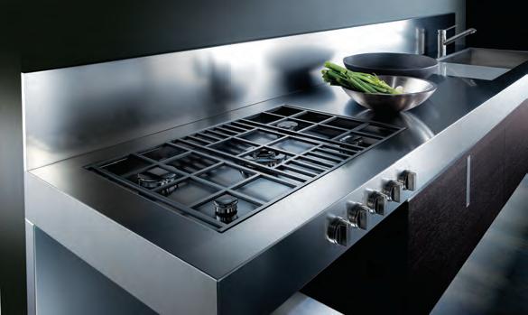
The bene ts are passed directly on to its designer clientele who have the freedom to create functional kitchen pieces that boast clean lines, an unrivalled minimalist style, and a more ergonomic and hygienic nish. Using cutting-edge technology Barazza is all about pushing its capabilities and creativity to the limit.
INDESIGN 35 IN SHORT
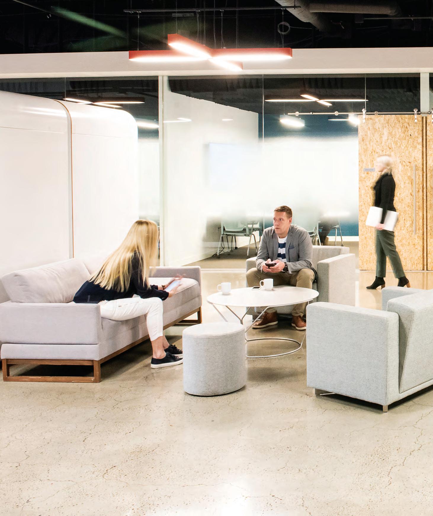
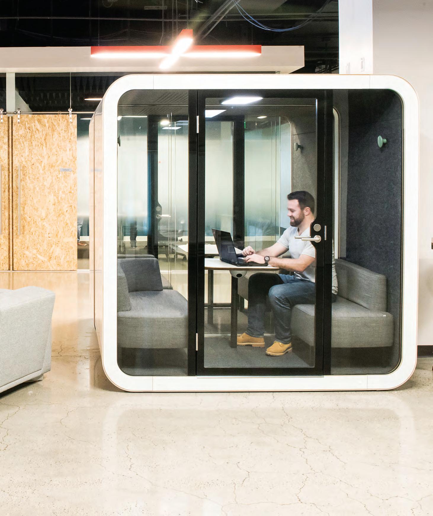
framery

The original and still the number one acoustic booth in the world


Defined By Great Divides
In the design of its headquarters in Shantou, China, AD Architecture has abandoned the typical workplace partition system and instead created a series of large-scale monolithic sculptures to separate and define each space.
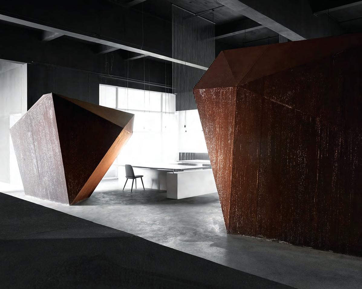
To further comment on the ‘decaying nature of workplace typologies’, the sculptures have been applied with industrialised steel and iron materials which corrode naturally as time passes.
The design of the space has been driven largely by symbolism –down to the finest detail. AD Architecture selected simple materials, shapes and colours to imbue the space with meaning and ultimately express the functional and emotional purpose of each area, housed within a system of ethereal sculptures.
The ‘small attic’, for example, is a space where the team goes to generate ideas. Here, AD has featured a large-scale statue of
a person looking at the door, “as if implying to users that more things are waiting to be explored in this office”, says the firm. If you follow that pathway, you can see a ball constructed by interwoven iron wires. This is intended to express the infinite patterns of their designers’ thoughts. Here, the project team has worked to develop a highly abstract artistic language to create a perceptual and powerful working space for its employees.
At this point you might be wondering if this kind of lofty, almost spiritual design approach is valid – and that’s fair, it’s a little obtuse! But then again... paradigm shifting discoveries aren’t made by playing by the rules. New ideas and models of being (or working, in this case) arise from mutinous actions – like using corroding sculptures as partitions. Surely that’s why a client seeks out a designer: to be challenged, surprised and delighted.
INDESIGNLIVE.COM IN SHORT 38
Water
Wizardry
Indesign Methven
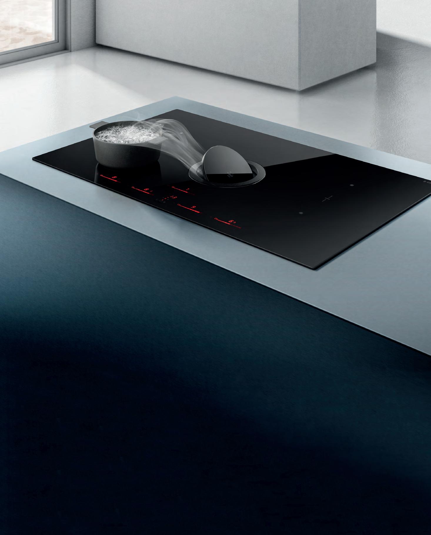
The shower is one of those rare moments in which we can take some much-needed time to ourselves. It’s a cleansing ritual that helps us evolve, giving us a place – and space – to escape, soothe, re ect, recover and transition from one part of our day to the next. Understanding that our showering needs are continuously changing, Methven has created a showering experience that evolves with us.
The VJet Tūroa by Methven’s New Zealand-based design and engineering team is inspired by the familiar forms and materials of its home country. The shower has an intuitive, precisely balanced and distinct design with cleverly hidden channels that create spirals of water, released through individual nozzles. Its smooth handset slider allows the user to activate a seamless transition between sprays –from a rm, invigorating shower spray to a gentle, enveloping warmth and everything in between.
Its exible rail makes for convenient installation, and its nish and faceplate is easy to clean. The stainless steel shower is available in several popular con gurations, ideal for both new builds and renovations. Representing tailored showering technology, the VJet delivers a sliding scale of transformations – from revitalisation to relaxation and renewal.
Essential Evolutions
Indesign District
The ‘modern workplace’ was all the talk at Orgatec 2018, but what is at the very core of that concept? If we look at the landscape, it comprises open plan spaces and agile working behaviours. How do we begin to design a terrain that can marry the two? In what is an increasingly uid and fast evolving environment, New Zealand studio Simon James Design has looked to the very essentials of working.
Exclusive to District, James’ Workplace Essential Collection with its ‘plug-in, customise and arrange’ seating modules, puts the emphasis on minimal design with multiple solutions. Aesthetically speaking, it appears elegantly skeletal, and yet its exibilities are impressive. Users can utilise the system to create privacy, soundproof within large spaces, and even maximise room when oor space is prime real estate.
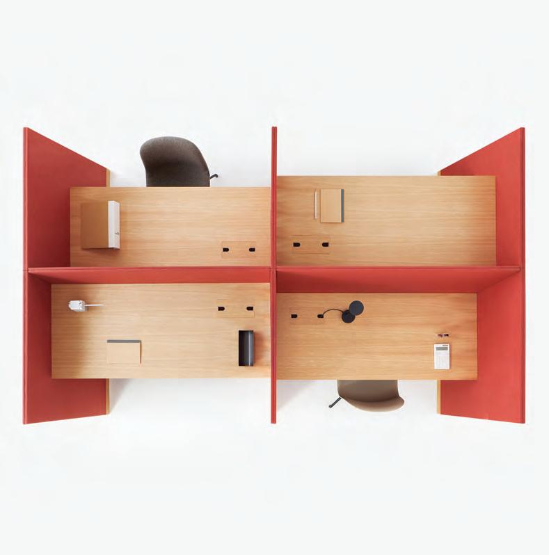
In the face of advancing technology it doesn’t forget the human element, providing a family of products which meets users’ changing needs.
We mentioned its lean lines: that’s thanks to so -wiring that ensures clean, concealed detail and clutter-free work spaces. Could evolution be any more essential?
INDESIGNLIVE.COM IN SHORT 40
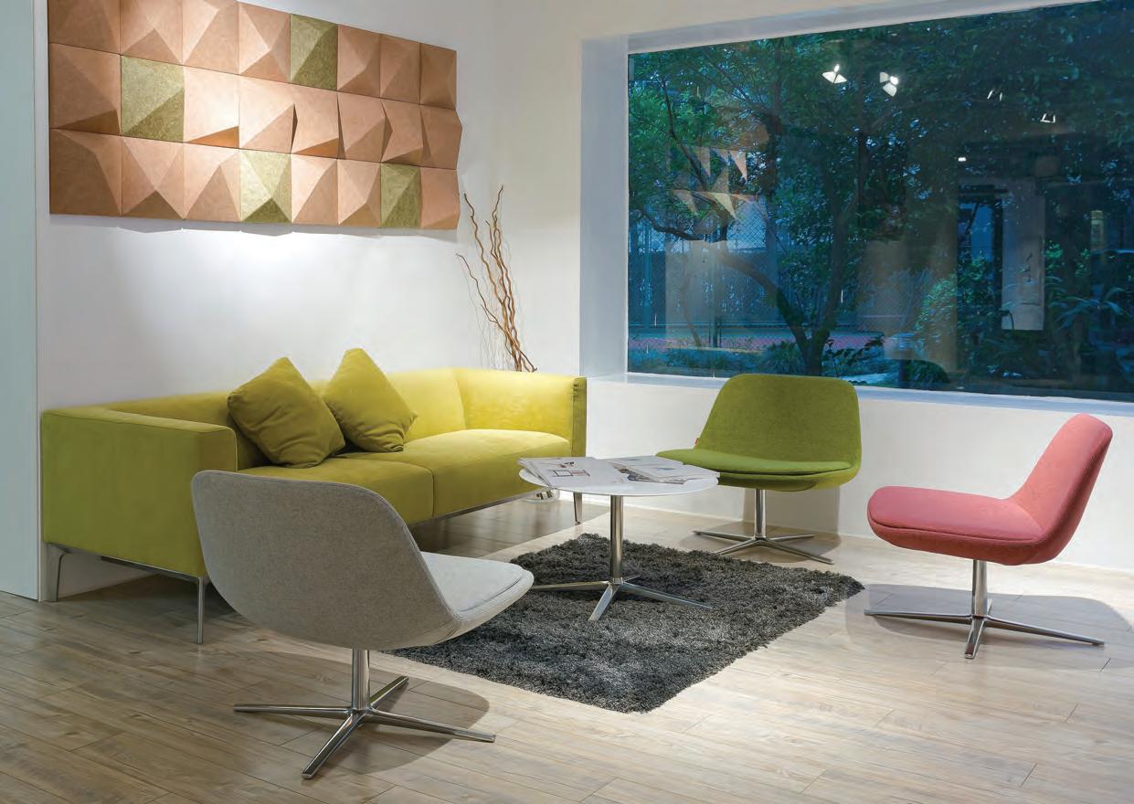
Pure LooP Lounge DesigneD by CLaus breinhoLt for infiniti Design. www.infinitiDesign.it info@infiniti-Design.Com.au
Reviving Regional Identity
When coffee chain giant Starbucks opened its largest store in Shanghai, China, in December of 2017, tea bars across the country pulled up their socks (so to speak). Using design as their instrument for reinvention, they set out to start a fresh conversation with their market of trendy tea-drinkers.
Icha Chateau is an exceptional case in point, elevating its interiors by applying a fringed canopy to its ceilings. Working with Spacemen studio to pull off this impressive overhang, the tea bar and restaurant used 35,000 metres of gold chain in three different shades.
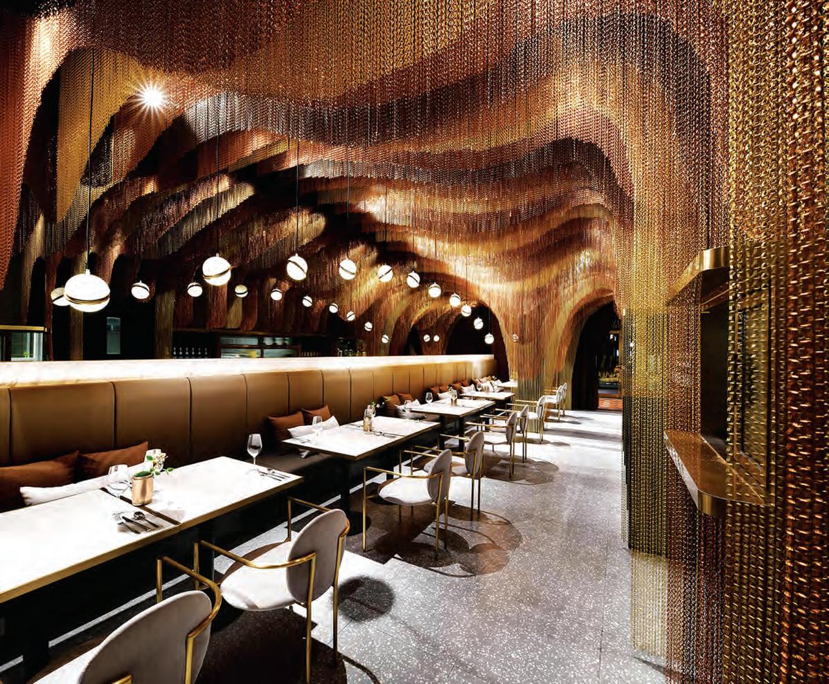
Mimicking the shape of Chinese mountains, the undulating, sculptural planes form various nooks and niches for patrons seeking privacy, while their soft nature invites people to touch and feel.
Grey mirrors, strategically placed behind the sofas enhance the narrow site and reflect the gold cloud, creating a sense of dining within a forest. The sculptural piece is used to mask a structural column, turning it into the focal point where all chains are anchored, while its various levels and hues also conceal the store’s technical equipment. Grey terrazzo, matte black stained timber and grey upholstery fabrics compose a muted material palette that provides a sleek background to the gold canopy above.
The dream-like interior is a celebration of Chinese tea culture. Through well-conceived design devices Spacemen brings history and modernity into play, combatting the dominance of westernised coffee chains to reignite Shanghai’s love affair with its heritage.
INDESIGNLIVE.COM IN SHORT 42
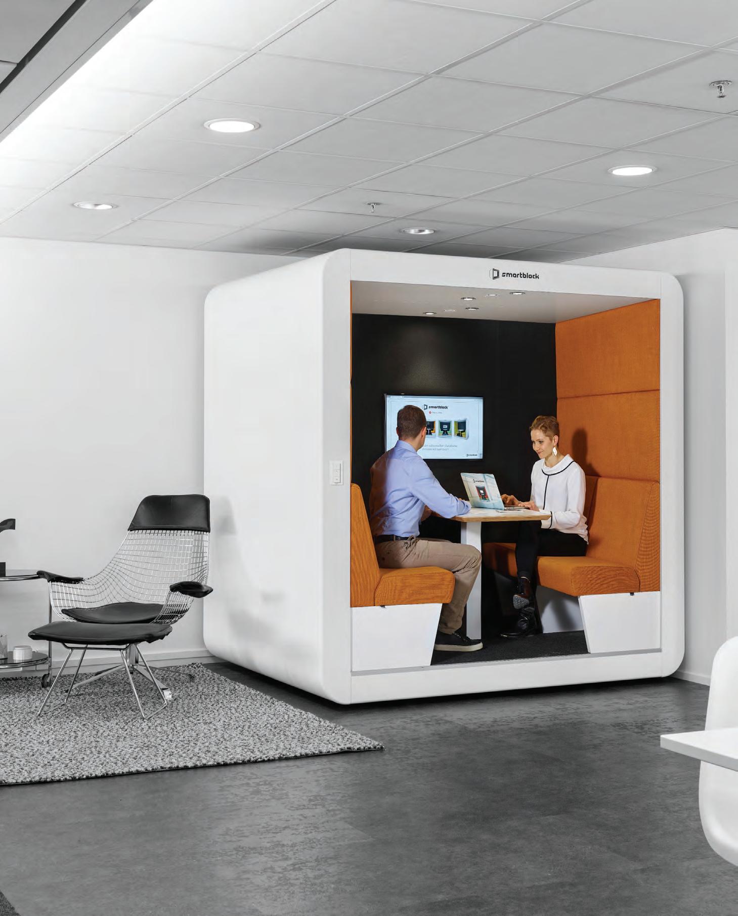
Considered design meets human need. Smartblock is a flexible solution providing choice and mobility in your workplace.

Sydney 02 8070 9314 Melbourne 03 9614 3333t-c-w.com.au
Designing For Tourism The Imprint By MVRDV
Tourism is the lifeblood for many major cities, and in the digital age, the pressure is on to deliver memorable experiences worth travelling for. It’s already been all over the internet, but we couldn’t help but hold up The Imprint for further inspection. It’s really the perfect case in point!
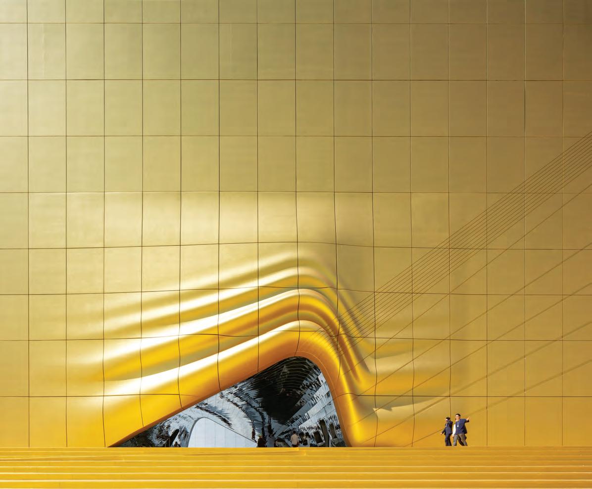
Designed by MVRDV it’s part of the Paradise City complex of six buildings, which will provide a full suite of entertainment and hotel attractions less than a kilometre from South Korea’s largest airport. Given the proposed programme of the two buildings – a nightclub and indoor theme park – the client required a design with no windows, yet one that still integrated with the other buildings in the complex.
The design of The Imprint arises from the simple question: Can we design an expressive façade that connects with its surroundings even
though it has no windows? Here, neighbouring buildings are ‘draped’ over simple structural forms and plazas, almost like shadows, and ‘imprinted’ as a relief pattern onto the façades.
The golden spot is the project’s most obvious and attentiongrabbing element, even catching the eyes of airline passengers landing at nearby Incheon Airport. The golden hue is achieved using gold paint, and is reinforced by the lighting of the façades at night: while the majority of the surface is lit from below, the gold spot is highlighted from above.
“The virgin building has received a splash of gold. This makes it as if the entrance is illuminated at night by a ray of sunlight,” says MVRDV’s Winy Maas, principal and co-founder.
INDESIGNLIVE.COM IN SHORT 44
No Man Is An Island
Indesign Stylecra
As the conversation goes, today’s agile workforce really puts the pressure back on the individual to cultivate expert ‘people’ skills. Now more than ever, the emphasis lies on being able to successfully communicate with dispersed teams, to build strong relationships with the many personalities we must engage with on a day-to-day basis. It’s essential to productivity.
Kiik, designed by Ichiro Iwasaki for Arper, puts the emphasis on connectivity, o ering up a modular collection of seating, tables, ottomans and consoles that act as islands for gathering. And much like a moving continent, it o ers the possibility of endless con gurations. The collection is also exible to location, meaning that people can use it for meet and greets in waiting rooms, airport lounges, education spaces, workspaces and mixed-use spaces.
Kiik’s fundamental elements can be speci ed with tables in triangular, circular, square or rectangular shapes, and seats with/ without backrests. The range is completed by the addition of ottomans and low or raised consoles.
Its upholstery options encompass a wide variety of textures and colours allowing for ultimate creative expression. Designers, in particular, can combine diverse con gurations for a dynamic and eye catching e ect, or convey visually arresting patterns using repeated form. Kiik is ideally suited for any contract use, allowing you to create bespoke spaces that support essential activities of pausing, working and meeting.
Flippin’ Flexible Indesign Ergotron
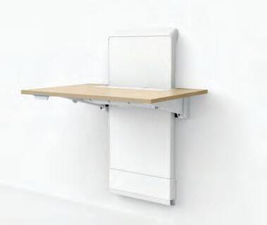
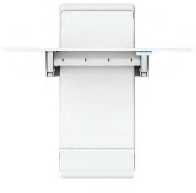
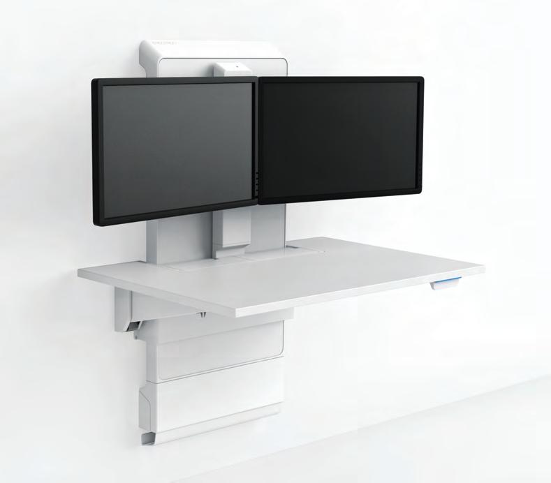
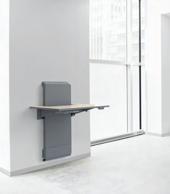
The sit-to-stand market has been inundated with fandangled designs. It’s safe to say the mark is pretty saturated. Breaking new ground in this product space is US-based manufacturer Ergotron. Released in 2018 at Orgatec and NeoCon, the JŪV Wall sit-to-stand work surface combines a slew of features to create something practical and versatile for designers and facility managers alike. It hasn’t gone unnoticed: the new product received rst place in the 2018 Product Innovations Awards, presented during NeoCon. The jury cited the JŪV Wall as enhancing building through sustainability, durability and space optimisation.
Some of those award-winning design features include hidden cabling, an extended seamless height adjustability and a ip top. The JŪV Wall system by Ergotron is focused on bringing simpli ed innovation to the fore. Not forgetting users that don’t fall into the ‘average’ category, the range of height-adjustability can accommodate both taller and shorter people.
When developing the JŪV Wall system, Ergotron’s team of designers looked to the increasing need for wellness and healthfocused products in the o ce. The nonelectric mechanism on the new work surface makes for quick and seamless transitions, while the tabletop itself can also fold down when not in use.
We think it’s a very tidy product that’s deserving of a sit-tostanding ovation.
INDESIGN 45 IN SHORT
Batten For Timber
Indesign Polytec
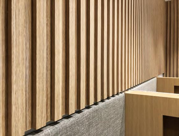
“We are nding more and more of our clients are looking to add levels of design to a space by including clever features,” says Steve Bonarrigo of Polytec. Bonarrigo and team have responded to this growing demand with Steccawood, a pre nished decorative batten solution. “It is perfectly suited as a feature wall or ceiling and with the larger sizes we are seeing it more in select screening applications to divide rooms into multiuse areas,” he notes.
Steccawood is Australian manufactured and provides a warm and rich textural appearance for a wide variety of panelling. It is available in seven standard dimensions and complements Polytec’s pre nished decorative board selections with eleven matching colours. There’s nothing neutral about this decorative batten solution!
Iris Van Herpen takes a multidisciplinary approach to wearable design. It’s seen her collaborate with the likes of architect Philip Beesley, and Benthem Crouwel Architects. We wonder where her recent conversations with MIT will lead?

Materiality Marvel
Dutch fashion designer Iris Van Herpen is widely recognised as one of fashion’s most experimental, forward-thinking creators. Van Herpen has a penchant for combining the most traditional and radical materials and garment construction methods to create wearable work.
She calls this design ethos ‘new couture’. Here, her intent is to “blend the past and the future into a distinct version of the present by fusing technology and traditional couture cra smanship”. She is o en hailed as a pioneer in utilising 3D printing as a garment construction technique. She sees herself as an innovator, using technology as a guiding principle, to explore sculptural possibilities and unfamiliar forms.
INDESIGNLIVE.COM IN SHORT 46
–
–
Dot.Pro
commercial furniture www.workspace.com.au Sydney | Melbourne | Adelaide | Canberra | Brisbane
Designed by Jorge Herrera European design meets
Australian manufacturing
Fluid Ways Of Working
Indesign Wilkhahn
Agile working. More than just a buzzword, designers are increasingly being asked to consider agile working methodologies in their workplace designs. For something to be truly agile in its approach, it must facilitate impromptu and informal spaces for teams to gather, while allowing a sense of ownership and autonomy in adapting the space to a team’s various needs. And this is where thoughtful furniture can truly shine. Preempting the growing need for exible and agile workspaces, Wilkhahn’s latest o ering, presented at Orgatec 2018, is all about simple yet e ective products that foster chance encounters and organic team meetings.
Playful in execution yet imbued with multi-functionality, the new Landing (le ) is part acoustic panel, part table or leaning post. The low-tech, high-performance piece, designed by RSW Rudolph Schellmann Webermann, is the perfect example of furniture being t-for-purpose in an agile o ce.
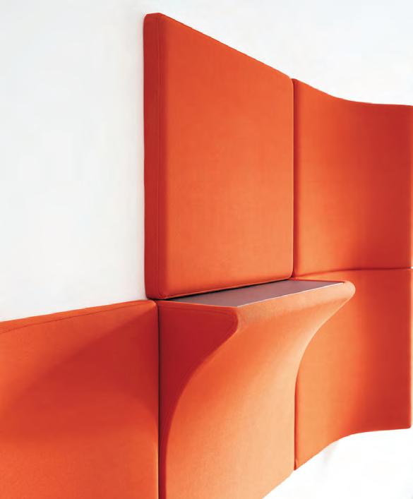

In addition to Landing, Wilkhahn also presented a range of product innovations that address modern o ce needs using integrative design. This means all pieces can work together uidly while cutting down on complexity and creating a visual selfsimilarity. Examples of this in action include cheeky pieces such as the Sitzbock, a pommel horse seat, and the untethered and hi-tech Timetable Li .
The outcome is a furniture brand unafraid to advocate for freedom, expression and exibility in the workplace.
Keep It In The Cube
Indesign Dauphin
The open plan o ce has dissolved the typical hierarchies and old modes of working. But with it has come another issue for designers to solve: privacy and noise. The highly focused work and team collaboration that plays out in our dayto-day working must be catered for with spaces that allow seclusion and focus. Enter the Human Cube range by Bosse, a brand that sits under the Dauphin banner. It’s elegant, transparent, and designed with innovative technology and easy functionality at its heart. The Human Space Cube 4.0, pictured right, gives the highest level of exibility, while the grid construction means it can be installed and modi ed within a very short timeframe. Acoustics are managed through walls constructed from a special, laminated security glass. Used in combination with this are magnetically closable doors, an acoustically e ective ceiling and two acoustic panels. The result is a silent pod that doesn’t sound like a shbowl when you’re sitting inside!
INDESIGNLIVE.COM IN SHORT 48
Pink Homage
Millennials have been categorised as the least religious generation to have ever existed. Here, religious organisations are turning to designers to strike a chord with the group and make faith an appealing experience, where church-goers might take a selfie or post a live Tweet.
Inuce Architecture recently reinvented an 80-year-old Christian church in Fuzhou, south-eastern China, finishing it in a signature Millennial pink with a new rooftop amphitheatre that offers open-air services (perfect for Insta-stories!). The new building is equipped for large congregations of 1500 and contains all sorts of focus spaces like music rehearsal rooms for the choir, offices, classrooms for the Sunday school, and general activity rooms.
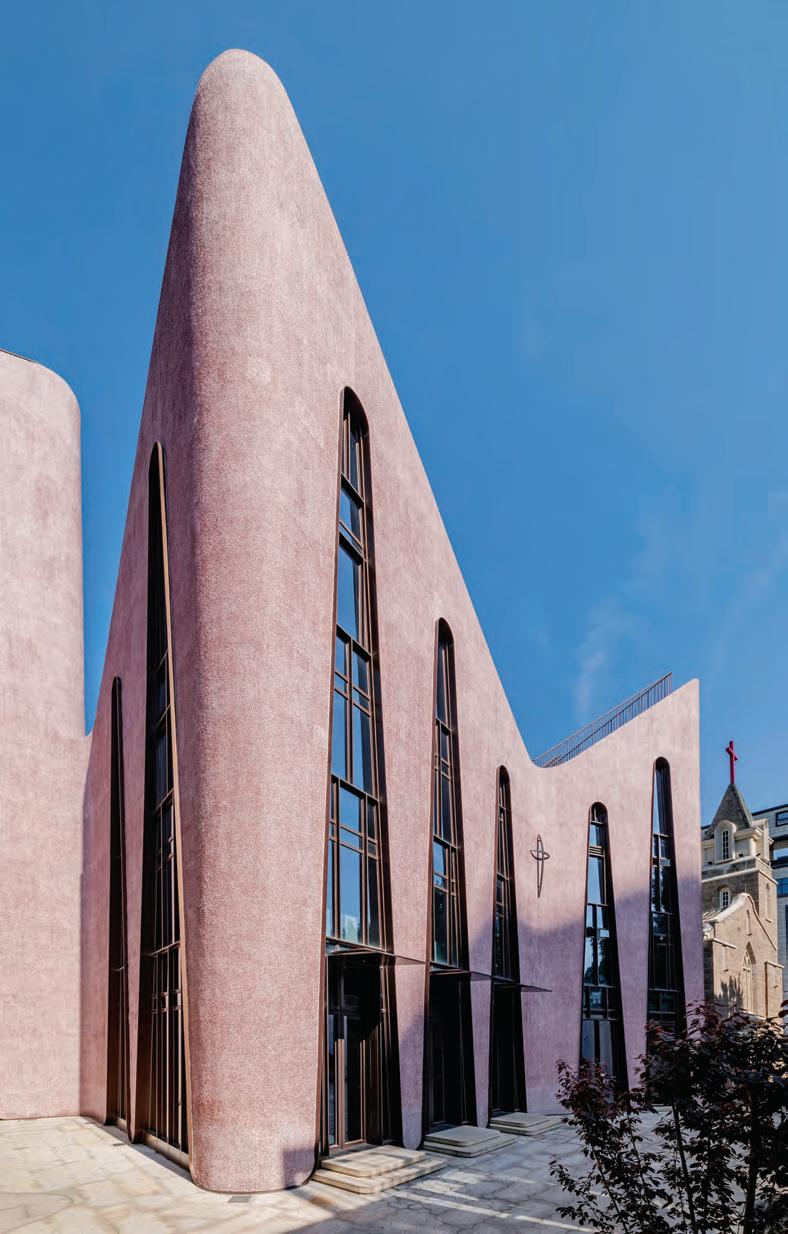
“The new community centre was conceived to embody a change in the congregation’s self-perception and to communicate it to the urban audience and, hopefully, a new set of young believers,” says Dirk U Moench of Inuce. “The new generation’s desire is not only to preserve its heritage and to maintain the status quo, but to translate it into a form that reflects their new standing and showcases their potential for society as Christians today –visibly present and actively contributing.
“Visually, this energetic and youthful colour complements the well-aged gravity of the old church’s granite blocks and expresses the generational change in the congregation’s development,” he says.
To provide additional space for services and to give views across the city, two amphitheatres were created on the church’s two roofs. “When used, it is transformed into a stage of urban proportions, from which the community inevitably shares joy and faith with its ‘larger audience’ near and far, sitting in surrounding offices and hotels,” adds Moench.
INDESIGN 49 IN SHORT

IN DEPTH
RETURNING TO CARRIAGEWORKS, SYDNEY
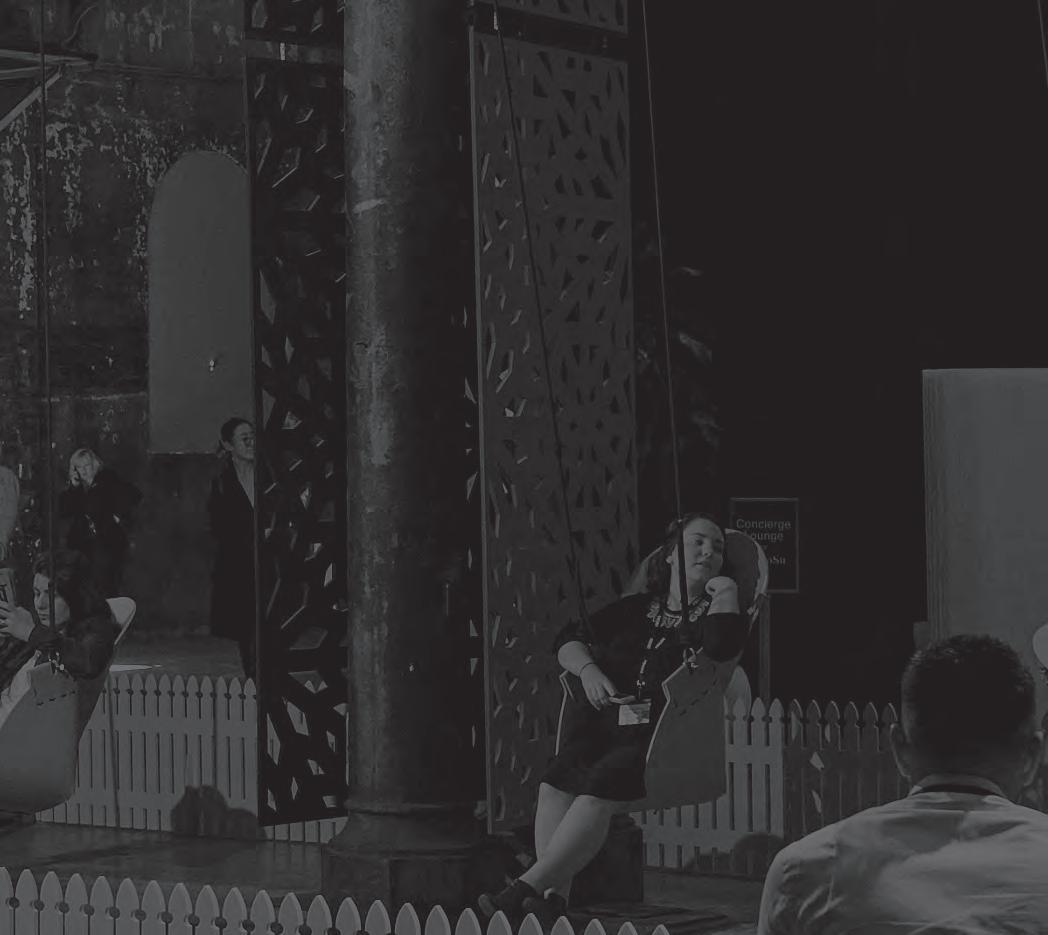
29-30 AUGUST 2019
Apply to exhibit now www.front.design
Produced by
IN DEPTH
Alkmaar Office By Proof of The Sum
To physically bring together its employees, the Netherlands’ Alkmaar City Municipality engaged design rm Proof of the Sum to t 600 civil servants into a space that could only t 200 workstations.
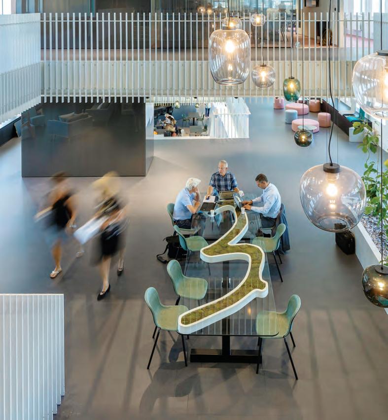
The key to accomplishing this goal was letting employees and managers decide for themselves how, where and with whom they work. This meant that departments no longer had their own territories. “In a time of digitalisation, remote working and proactive visibility close to the residents, the employees needed a central and attractive base,” says Roy Pype, the rm’s founder. But the challenge, he admits, was to create a single place for 600 people while allowing room for the individual with privacy and concentration in mind. This tension informed the design concept where the team made it light, breaking through its clay layers in order to create two large mezzanines and thus form links between the oors.
“We wanted to have the employees make use of the entire space throughout their workday,” says Pype. “That means they can start their day on the third oor, in the network café and service centre, and move around for meetings – even the locker area is designed as an informal consultation space. And for those in need of quiet time, the adjacent oors have rooms devised to host concentrated work and small teams.”
Mad For Hats
Indesign Zenith
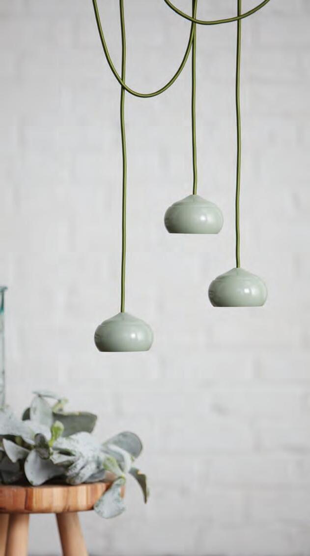
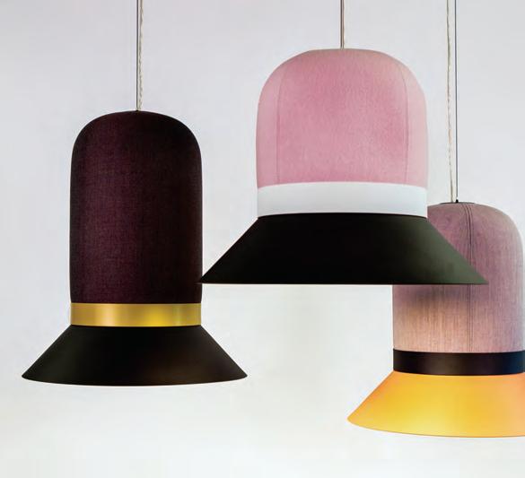
Killing two birds with one stone? That’s exactly what many successful designs set out to achieve nowadays. Multifunctionality. Because why just do one thing when you can combine a few together? Applying this tenet of thought in its design, Alain Gilles’ BuzziHat pendant lights for BuzziSpace are more than just decorative lights, they are also acoustic pendants. Available in a mix of shapes and sizes they can be used collectively to create interest while meeting the needs of di erent sonic requirements. The range can be used in a collection to create a feature, or individually pulled out as a statement piece. Another important variability is the range of colours and material nishes that can be speci ed. The coloured hat can be matched with metal ‘brims’ of black, white, beige and gold.
Acoustically speaking the BuzziHat has undergone extensive external testing and during that research, it was found to signi cantly reduce and di use noise. It is the ultimate dualpurpose design product – with a fashionable twist.
INDESIGNLIVE.COM IN SHORT 52
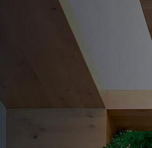
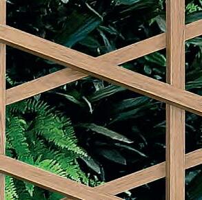
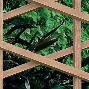
STECCAWOOD


Decorative Battens


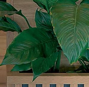


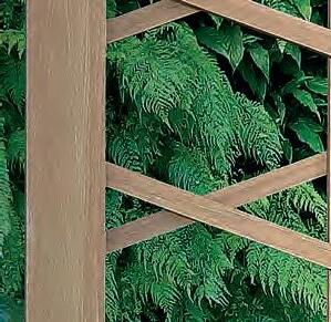




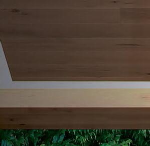
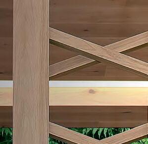


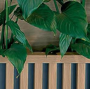


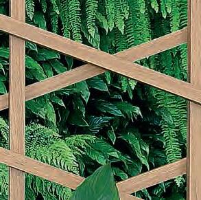

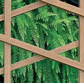
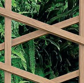
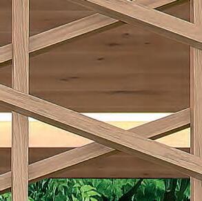
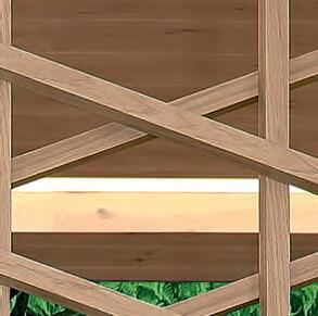
STECCAWOOD provides a warm and rich texture appearance for a wide variety of panelling, ideal for wall and ceiling applications in either a vertical or horizontal setout, STECCAWOOD prefinished decorative battens create strong directional lines that will add a striking feature to any internal commercial space.

Made from E–Zero MDF and wrapped in decorative overlay STECCAWOOD battens impart the realism, warmth and character of timber, providing a durable and cost effective solution.
www.polytec.com.au p 1300 300 547
Keeping It Real United Products
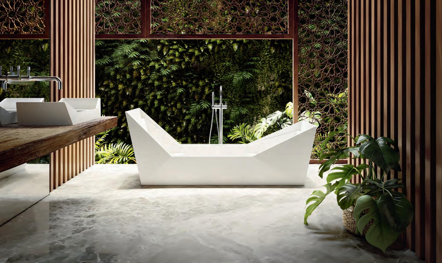
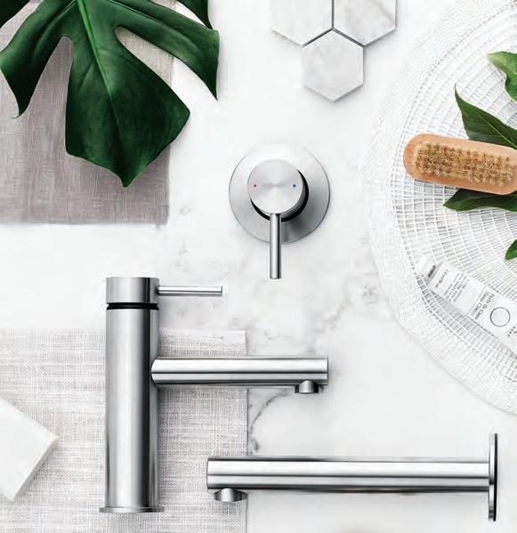
We don’t often get to talk about bathrooms in Indesign, but they’re really the essential of any interior project. And let’s all agree, we can get a bit ‘judge-y’ about bathrooms – they can be the make-or-break of a beautifully resolved fit-out.
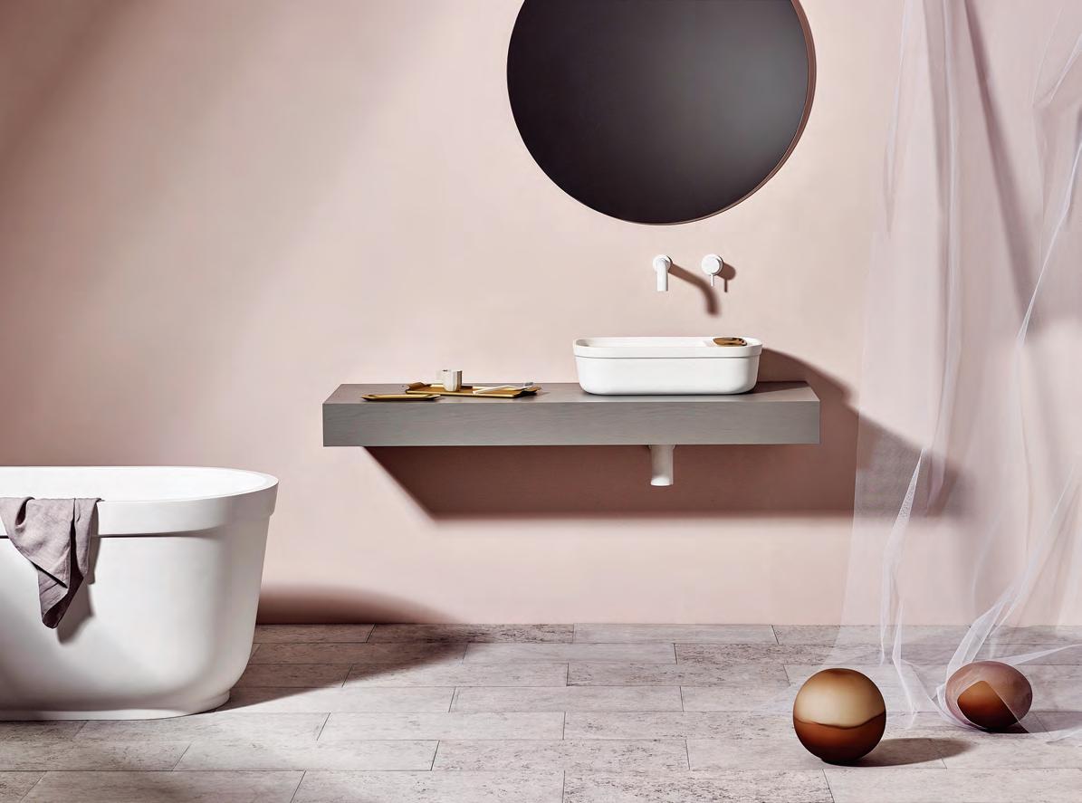
When Stephen Royce set up United Products, it was with a clear view to maintaining independence and creativity integrity. Too often Royce would find his bathroom designs rationalised into obsolescence by hard-nosed marketers and their product development teams.
In founding United Products, Royce was conscious of following his own path. Collaborating with designer Thomas Coward for the brand’s first collection, the two drew from “loads of sketches” sitting in their notepads. Royce was keen to not limit the brand’s portfolio to just his and Coward’s work. If anything United Products acts as a banner for a cooperative of designers (including Nick Rennie, and The Stella Collective’s Hana Hakim), to contribute bathroom and wet area products to the collections.
“I’ve been doing bathrooms and wet area products since I started at university,” says Coward, who designed the Contour Basin and Eve Bath (above) for United Products. “I studied furniture and product design in the United Kingdom but even then I was interested in doing standard furniture – there’s just so much out there. If everyone is designing a chair – and everyone was – then I was going to do wet area products. No one else was doing it and I found that when you’re in a small niche, you’re in your own lane. You’re incomparable.”
United Products services like-minded architects and designers with high-volume project needs. Royce feels their clientele “detects” the company’s youthful and fresh design-led vision – it’s something not always present in the bathroom sphere where collections can pay lip-service to marketing priorities and the bottom line.
“We produce to order on short lead times with our basins made overseas and all joinery and metalwork made in Australia,” says Royce. A simple and all-inclusive vision that is already gaining traction in the local market.
INDESIGNLIVE.COM IN SHORT 54
The difference is Gaggenau.


Grand architecture demands grand interior pieces. Refrigeration is one such design element and should speak to who you are. Every Gaggenau piece is distinctively designed, crafted from exceptional materials, offers professional performance, and has done so since 1683. Make a statement: gaggenau.com.au

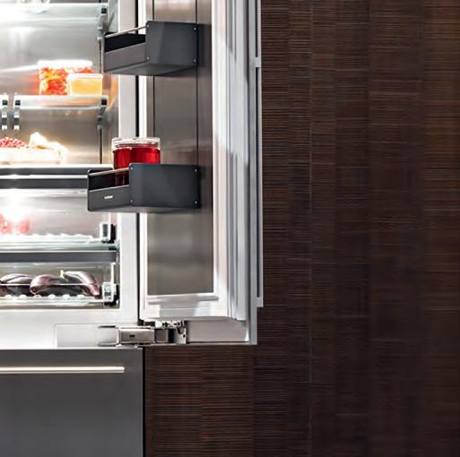
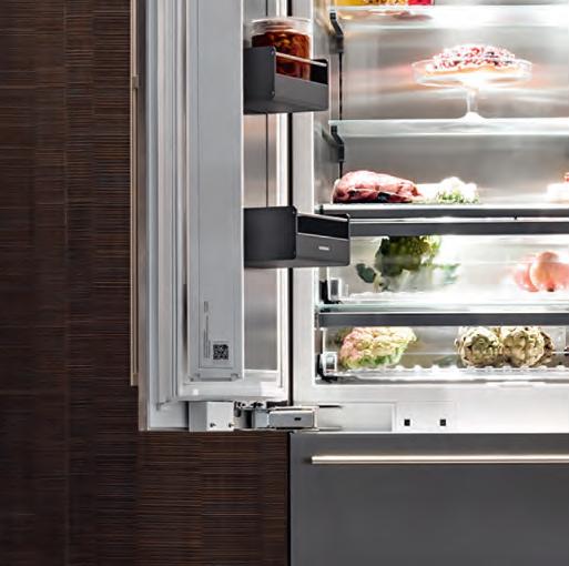
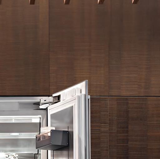
Your imposing architectural statements aren’t always made outside.
Bringing Calm and Control To the Open Plan O ce
Words Alice Blackwood Photography Courtesy of The Meta Collective
THEMETACOLLECTIVE.COM 56 INDESIGN THE META COLLECTIVE
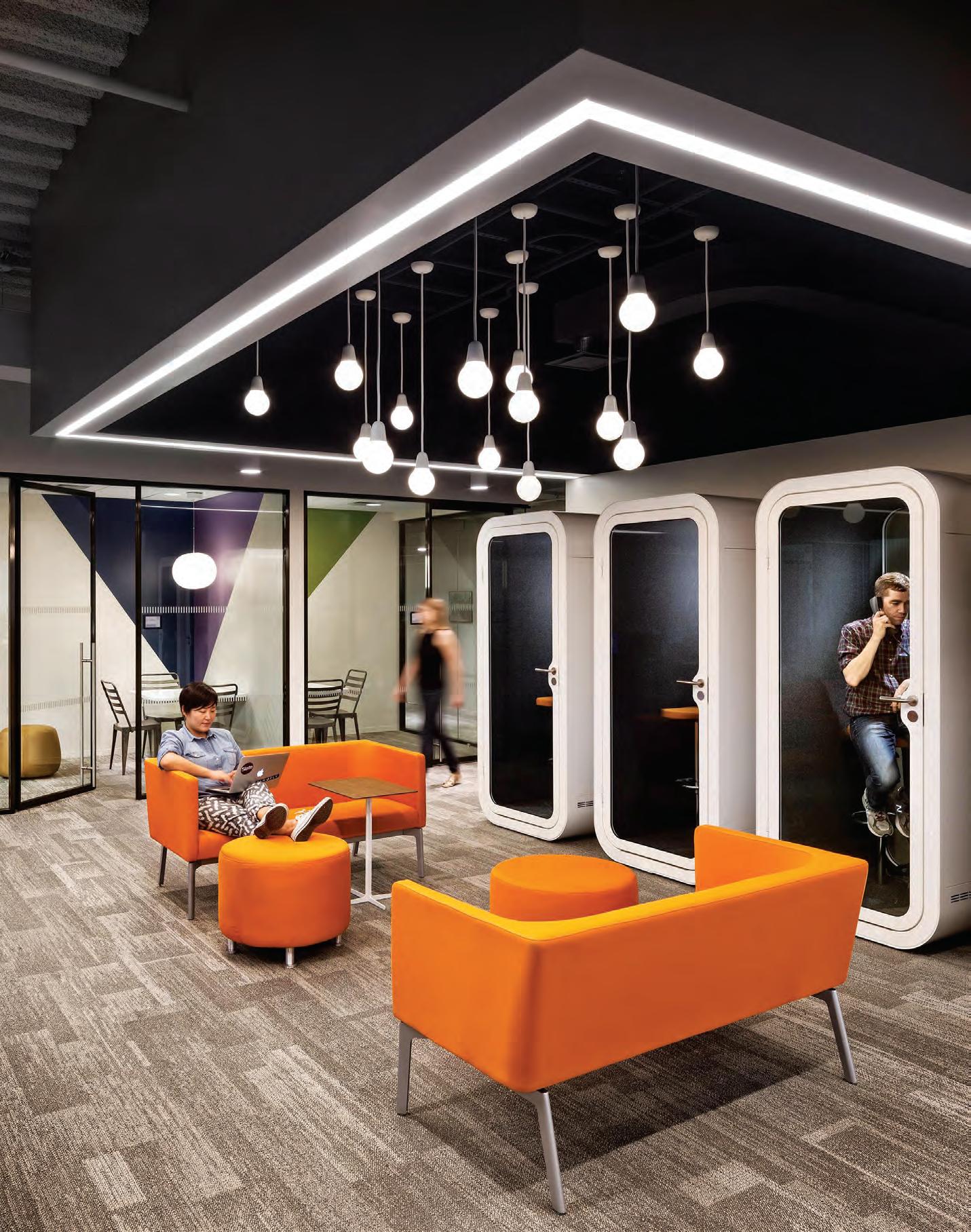
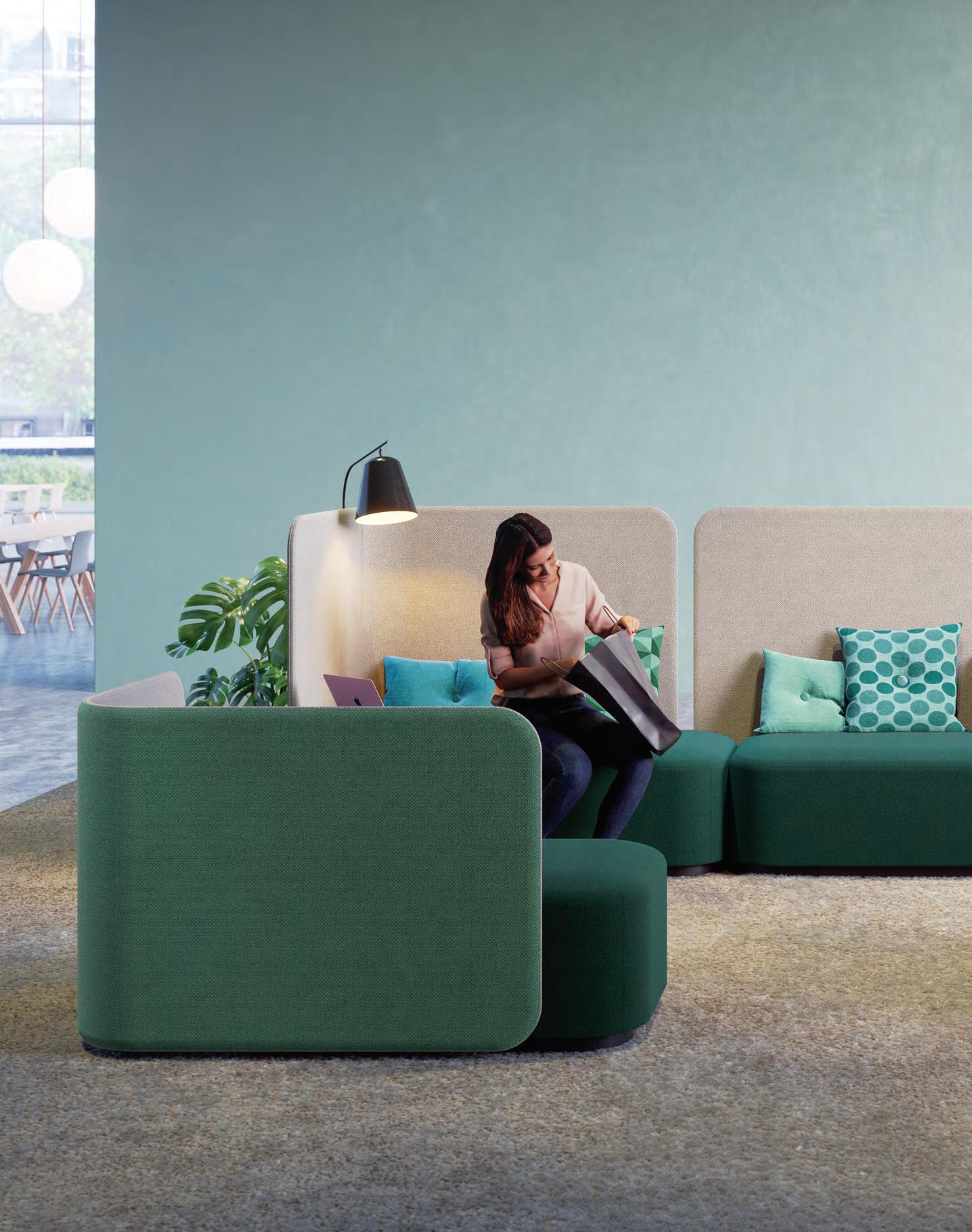
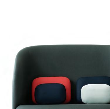
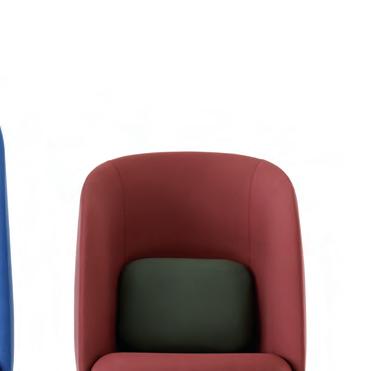
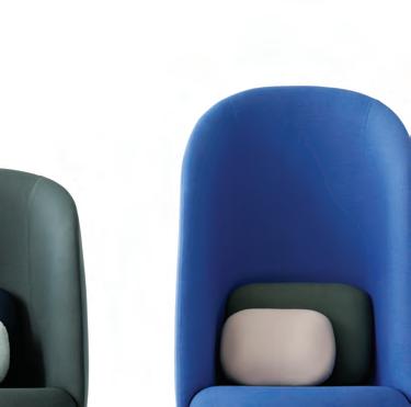
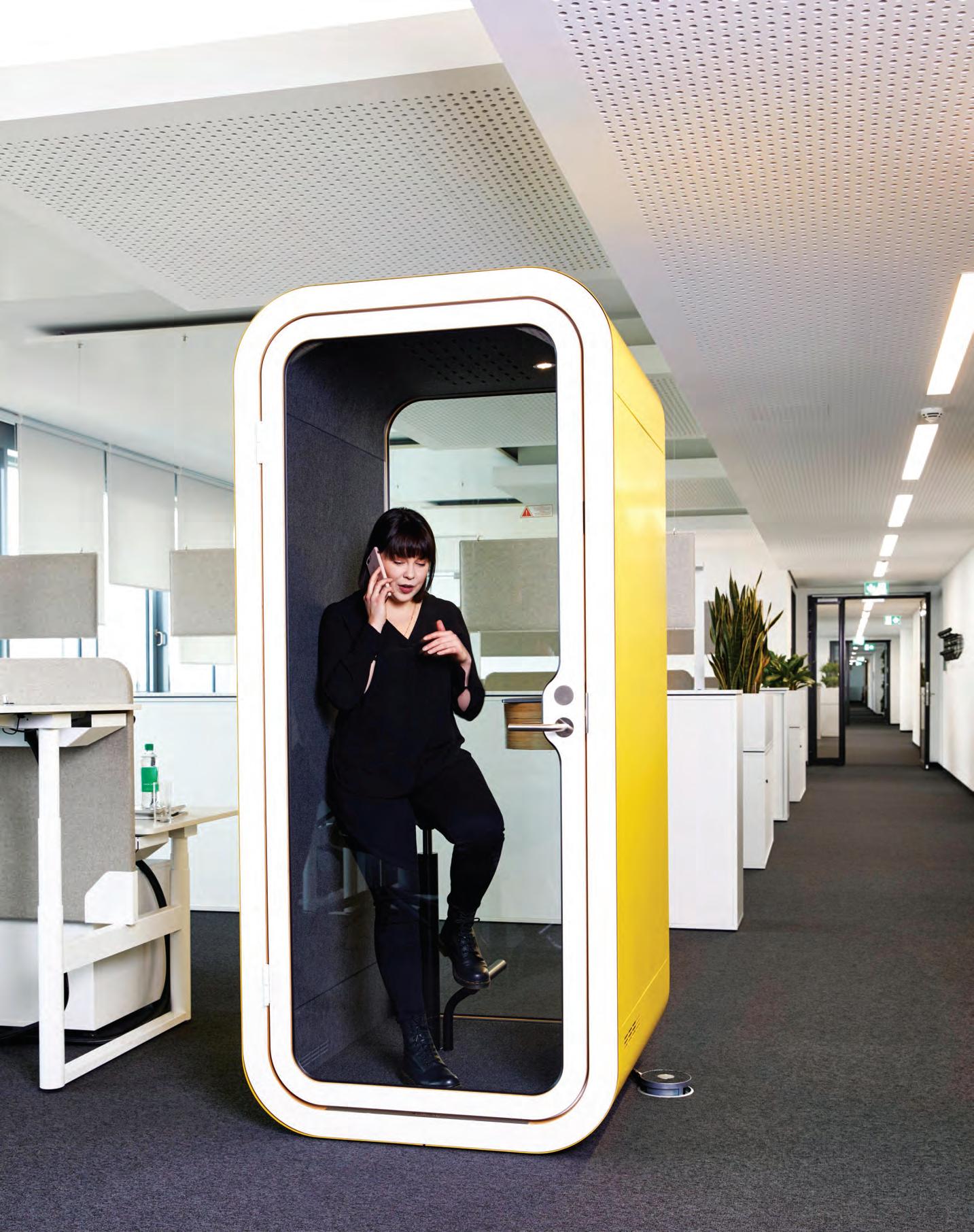
Page 56 and 61: Framery privacy booths o er seclusion to users, while maintaining connectivity with the surrounding o ce. Page 58: Martela PodLounge fuses a so er, residential aesthetic with o ce-oriented elements of seating, dividing screens, lighting and more. Page 59: +Halle’s Easy Nest is an inviting easy chair whose high back and sides curve around to hug you in.
At Orgatec last year the conversation around the ‘modern workplace’ centred on workplace culture, wellness at work and, as an extension of that, the increasing need for greater privacy within open plan o ce environments. Jason Mark, director of The Meta Collective, who was in attendance at the biennial trade fair, says the prominence of these themes really reinforced for him the importance of human-oriented solutions that uniquely respond to users’ needs while also tapping into shi ing workplace trends.
“Without a doubt, open plan spaces have swung a little too far towards high density, with a notable lack of privacy,” notes Mark.
“As a result we’ve ended up with open, noisy and o en chaotic spaces. At the same time, we’re discovering that one in four people can’t compartmentalise background noise.” Mark quotes an interesting statistic on distraction and focus: each person is interrupted every 11 minutes, and some people take up to 25 minutes to refocus. In light of this evidence the gathering call for more ‘calm and control’, through better privacy solutions, comes as no surprise.
Mark concedes that these days most workers have the exibility to work from home, but “human beings are social beings”.
“We want it both ways – we want to connect with our team, but nd it frustrating that there is so much complication and distraction,” he says.
Enter The Meta Collective. Operating since 2014, it specialises in delivering innovative and exciting solutions to commercial markets and in particular the workplace sector. Partnering with key suppliers including Framery, Martela, +Halle and more, The Meta Collective brings design professionals cutting-edge furniture-based solutions that address key areas of concern –including versatile functionality, adaptable aesthetics, and those elements such as acoustic quality which contributes to wellness in the workplace.

Over the last four years with The Meta Collective, Mark and his team have observed the proli c take-up of solutions such as the Framery privacy booths. These sound proo ng meeting rooms can hold up to six people, with wheelchair friendly models available.
THEMETACOLLECTIVE.COM 59 INDESIGN THE META COLLECTIVE
“According to the University of Sydney,” says Mark, “over 50 per cent of o ce workers around the world see it as a challenge to concentrate in open plan o ces. That’s more than one in two people that nd constant interruptions, demands and noise, and this leads to decreased productivity, even unhappiness.”
The pods facilitate con dential meetings, brainstorming sessions, one-on-ones and – importantly – they can be moved around the o ce space, to facilitate exibility and continued connectivity.
On the furniture frontier is +Halle, dedicated to researching, analysing and deep thinking the furniture it produces. The investment has paid o , with pieces like the Easy Nest high back easy chair proving an all-time popular choice among commercial design clients.
Its so , rounded form speaks to the domesticity we see ltering into working environments. It moves away from the traditionally corporate “square block” look, its ‘heartfelt’ design resonating with people looking to enclose themselves within a chair for a quiet conversation or focus time.
Meanwhile, marrying hard-working desking and seating solutions with that so er, residential feel is the Martela Pod Series. This seating-and-meeting product, says Mark, combines the utilitarian requirements of work (power outlets, dividing panels, white boards, chairs and tables) into an aesthetically superior solution that speaks to the rising domesti cation of the workplace.
He also highlights the additions of homely items such as cushions, which can be added to these seating items to create a higher seat, cosier back rest or anything else to allow workers the opportunity to take up a contented spot. The ultimate in cushy, homey comfort… at work.
It’s all part of a larger movement towards humanising the workplace and giving control, privacy and exibility back to its users, says Mark. “It’s about giving people the choice of ergonomic bene ts” that ultimately supports privacy and seclusion within highly connective and social work environments. This new kind of adaptable workplace is already upon us.
THEMETACOLLECTIVE.COM 60 INDESIGN THE META COLLECTIVE
“According to the University of Sydney, over 50 per cent of o ce workers around the world see it as a challenge to concentrate in open plan o ces.”
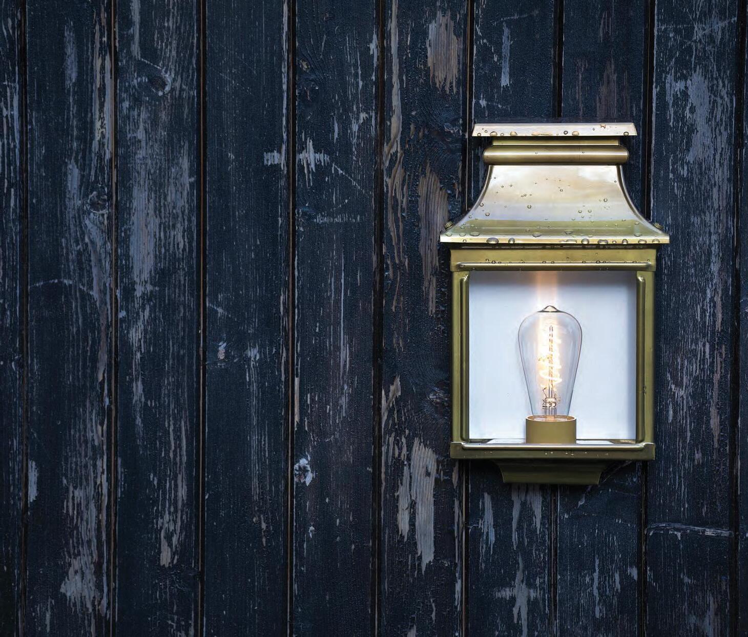
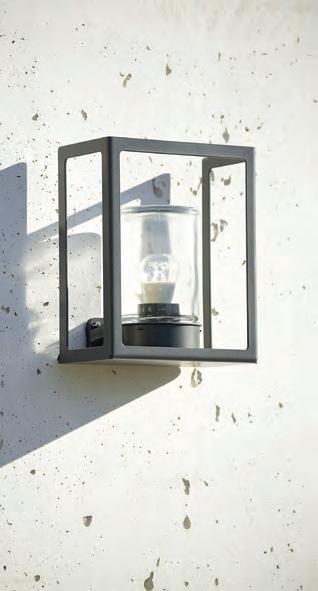
At Special Lights, we bring our passion for design to every project. Our Projects team will work with you to create lighting solutions for your Commercial, Hospitality, Residential and Retail projects, with products for both interiors and exteriors. 586 Crown St, Surry Hills NSW | speciallights.com.au | (02) 8399 2411 A leader in outdoor lighting designs since 1910. See their extensive range at speciallights.com.au Roger Pradier of France
Lights Projects brings together design expertise and leading European brands. More than just Special Lights
Special
Big thinkers and C r eati Ve g U r U s
INDESIGN 63 IN Famous FAMOUS IN
The Late Bloomer
Words Paul McGillick Photography Various
INDESIGN Luminary
Jon Goulder has been a mainstay of the Australian design industry for 20 years, but it’s only now that he considers his career to be taking off. With a new gig at Snøhetta, and blossoming partnerships with the likes of Spence & Lyda and Rakumba Lighting, Goulder is establishing his own unique design language.
He is 47 years of age and with his track record of exhibitions, prizes and outstanding furniture (and now lighting) products, others might be tempted to take their foot off the accelerator and settle back to enjoy the high profile. But Jon Goulder is driven by the sense of continuing evolution and acquisition of knowledge. He loves the challenge.
“Furniture,” says Goulder, “is a great challenge in terms of weight, scale, structure, materials, longevity and originality. I think it has a lot to do with being a fourth generation furniture maker. I didn’t set out to be a designer. I was just a country lad from Bowral, [NSW], I didn’t actually understand what it all meant. But it became my career. It’s a never-ending evolution, a progression of thought.”
Most aspiring designers don’t ever question what it means to be a designer. But Goulder had to discover it for himself. Which is probably why he only exhibited at the Milan Furniture Fair for the first time in 2017 – with the Settlers Chair (made from waterformed, hand-stitched leather on a Tasmanian blackwood frame). It proved a great success.
“I think there’s a maturity now in my work. It’s not coming from what I’ve seen on Instagram or online. I think there’s a certain language there. I always thought that one day I would be worthy of going [to Milan] and exhibiting internationally. Whilst all my peers had always done it, I never really thought it was worth my while or that I was worthy of that. I went in 2017 because Emma Elizabeth [of Local Design] offered me the opportunity. It was at that point that I realised that the world is actually quite a small place and that my practice could hold its own and function quite capably within an international context,” he says.
Probably, at the end of it all, Goulder will look back with T. S. Eliot’s words in mind: “We shall not cease from exploration, And the end of all our exploring, Will be to arrive where we started, And know the place for the first time.”
This, because there is an intriguing logic to his career so far. Trained in the family business, Goulder then went to the Canberra School of Art & Design to work under the legendary George Ingham. He then set up his own consultancy before heading to Perth as head of workshop of Form’s furniture studio at its Midland Atelier where he “learned a lot about facilitating projects, running quite large commercial projects and congregating people and things to deliver projects”. This experience he then took to Adelaide where he had been invited by the Jam Factory’s Brian Parkes to re-think the furniture studio.
“I basically re-built the studio,” he says. “When I arrived it was built on a foundation of romantic woodwork craft. So, whilst still embracing craft I changed the studio to become more of an open house design studio. I saw myself more as a conduit, as a connector. My focus was to develop a furniture program that was relevant to the age we live in. I aimed to show the different models available to an Australian furniture designer. So, we opened our doors not only to woodworkers, but also to industrial designers and others. You don’t necessarily have to have a huge amount of hand skills to develop a design practice. With the support of Brian and a Jam Factory team I also introduced the Jam Factory Furniture Collection – the aim being to develop products available to sell to the market and, in turn, help to sustain and grow studio workshops in the not-for-profit arts and crafts sector.”
INDESIGN 65 IN Famous
Branching Out
Jon Goulder recently pulled up roots at the Jam Factory and moved office to a share-space with international architectural practice, Snøhetta. Two to three days of every week he works as Snøhetta’s senior designer and maker, the rest he devotes to his own studio, located in the same building.
–
“Fiona Lyda and I found that we really enjoyed one another’s company. When I come to Sydney I like to go straight to the Spence & Lyda showroom, home base, have a coffee and enjoy that relationship.”
During Goulder’s four years at the Jam Factory the landscape changed as local designer–makers began to access hi-tech woodworking technology. It enabled them to produce affordable, highly crafted products. This Goulder saw as a major threat because it took away “the niche that I’d held for so long – woodworking – designing objects from wood that others could not produce here in Australia.
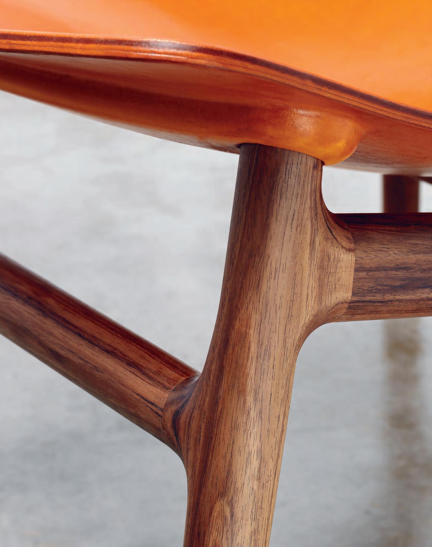
“That was the driver,” he explains, “to look at other materials and how I could evolve as a craft practitioner. Forming leather – and the integration of that into my practice and into quite large-scale forms – was the answer. It started out as Maggie’s Basket [for food writer, Maggie Beer] and then it went to the Settlers Chair and now it’s the Innate Chair.”
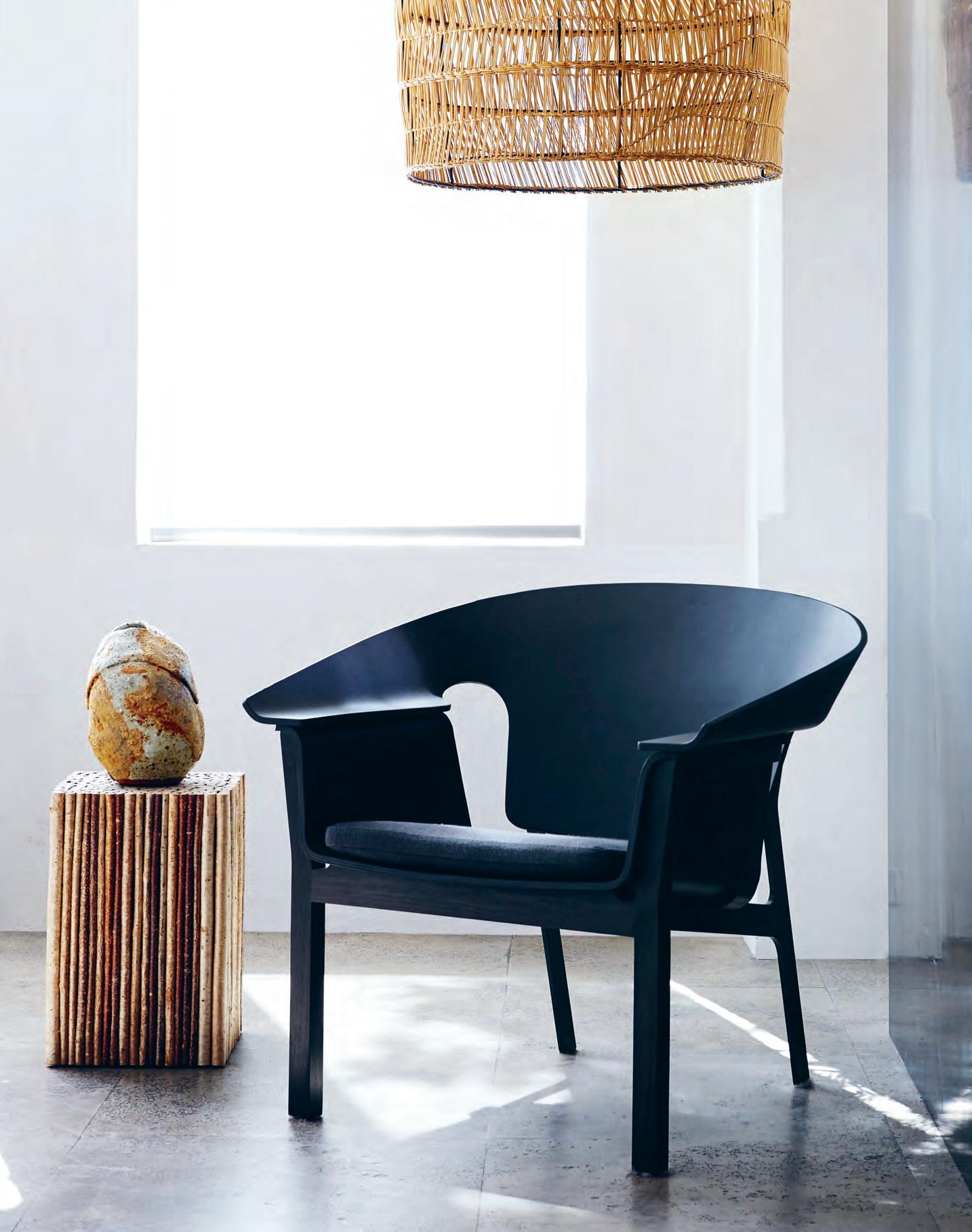
The Innate Chair is part of Goulder’s Innate Collection for Spence & Lyda. It is already into its second iteration and is the result of a hugely satisfying collaboration with Fiona Lyda. Using all-Australian materials (Tasmanian oak and blackwood ), it is a uniquely Australian product which also proved to be a big hit in Milan in 2018.
“When I look around at the [design retailer] landscape I have had opportunities to get involved with many of them, but I don’t think many of them suit my practice. I always cherished my relationship with Uta Rose at Anibou and I was looking for a similar kind of [partnership]. It is more on a personal level, more of a human collaboration,” he says.
“Fiona Lyda and I found that we really enjoyed one another’s company. When I come to Sydney I like to go straight to the Spence & Lyda showroom, home base, have a coffee and enjoy that relationship.”
But that is now just one half of what must surely be a perfectly balanced professional life because friend, Kaare Krokene, from the
trail-blazing integrated Norwegian and international architectural practice, Snøhetta, recently invited Goulder to join the practice in its Adelaide-based Australasian arm. They are “cohabiting” in the city where Goulder has an office in Snøhetta, but also his own studio in the same building. He is senior designer and maker with Snøhetta, integrating product design into projects and bringing “a crossdisciplinary skill set in-house”. He divides his week to work two or three days at Snøhetta and runs his own practice the rest of the time.
With Snøhetta being an international firm, Goulder sees the potential to look at cross collaborations through its offices all around the world.
And he also sees his collaboration with Snøhetta as the beginning of a deeper understanding of his chosen vocation. “After sitting in their office you start to realise just how self-indulgent we craftspeople and product designers can be. And I’m definitely one of them. Working in an architecture firm such as Snøhetta and seeing the turn-over and time frame [on the projects that they are doing], and the community and collaboration within that design studio... it’s quite amazing and humbling for me to be part of it.”
Within the growing diversity of his design practice, Goulder gives the impression of being quietly but confidently relaxed having developed what he calls “an inherent design language”.
“I think it takes 20 years to really get a language, a vocabulary and a history. And from that you can draw and design original work. I think it’s about maturity.”
jongoulder.com
INDESIGNLIVE.COM IN Fa M O u S 68
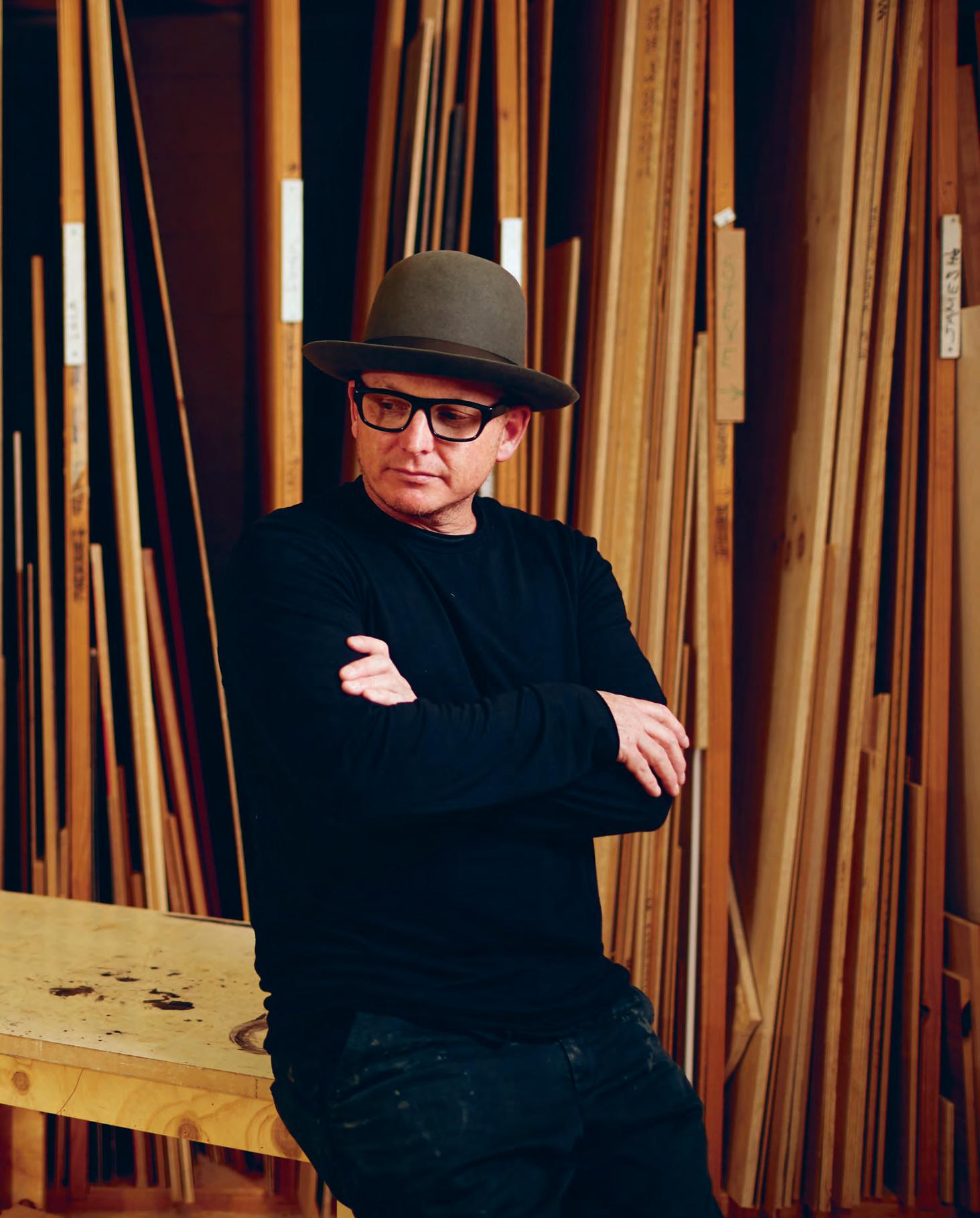
Page 64: Innate Coffee Table Night (foreground) and Side Table Night (background) for Spence & Lyda, photo: Felix Forest. Page 66-67: Jon Goulder in his Adelaide workshop, photo: Ryan Cantwell. Opposite: Innate Chair for Spence & Lyda, photo: Felix Forest. Page 70: The Settlers Chair in detail, represented a new direction for Goulder’s practice, photo: courtesy of Jon Goulder.
“I think it takes 20 years to really get a language, a vocabulary and a history. And from that you can draw and design original work. I think it’s about maturity.”
Jon Goulder, designer.



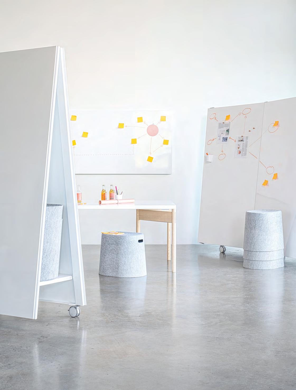
THIS IS HOW WE WORK NOW Mobile • Flexible • Reconfigurable @flinkspace @movingwalls_officetools W: flinkspace.com T: +61 421 817 422
Passion Project
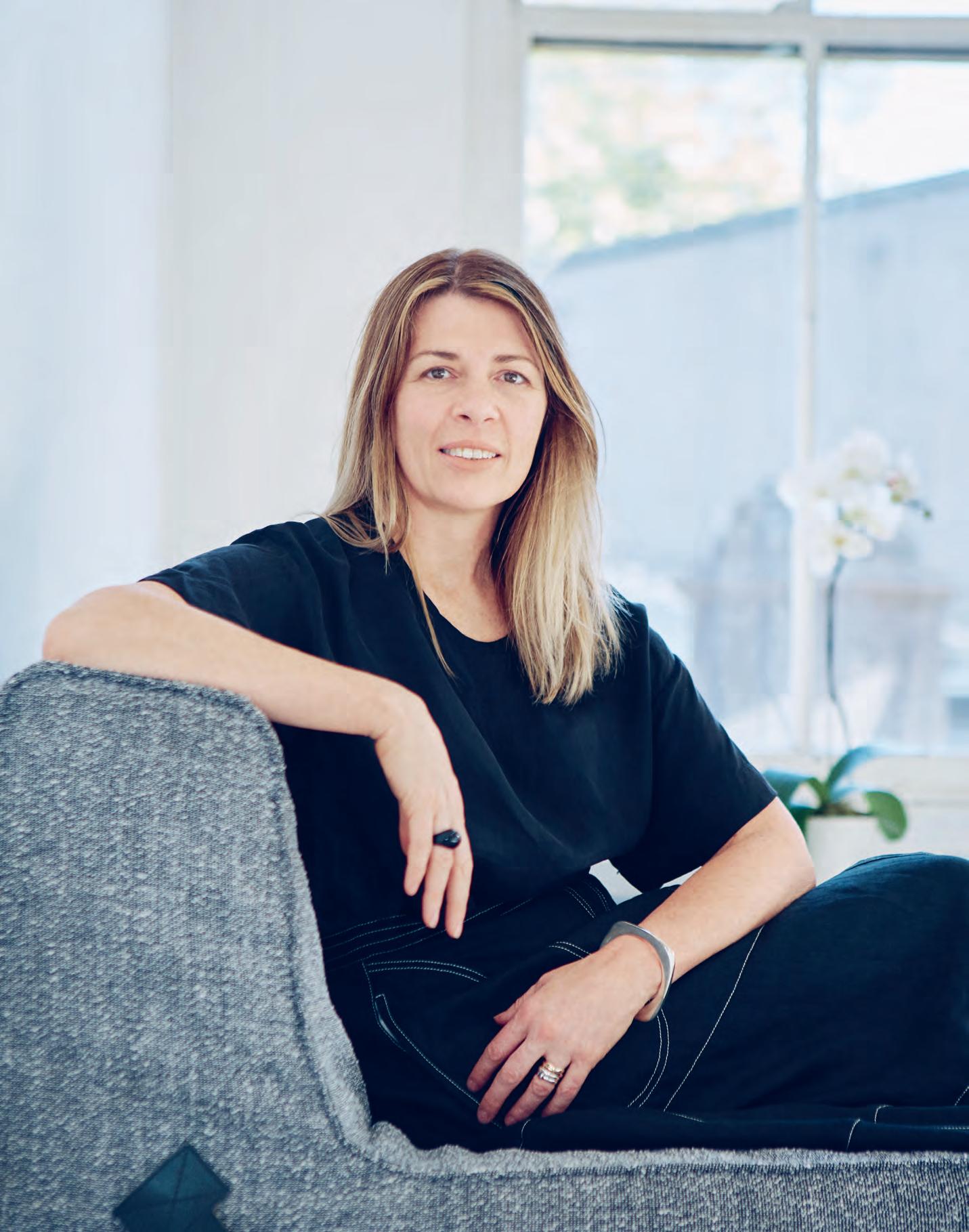 Words Patricia Arcilla Portrait Photography Charles Dennington
On an unseasonably cool day in spring, The Studio* Collaborative office provides welcome respite from the elements. Nestled into a five-storey converted warehouse in Sydney’s Surry Hills, the space is warmed by morning light amplified by whitewashed walls and timber floors. It’s sunny but understated – much like Melinda Huuk, the practice’s founder and director of design and strategy. “We don’t feel the need for this to scream,” Huuk explains. “We’d rather it just be a space where people can come and feel comfortable.”
People centricity has long been a focus for Huuk who, after 20 years, stepped away from an associate role at Geyer to start The Studio* Collaborative in 2017. As the reasons for her transition she cites a desire for a more hands-on role and freedom from the organisational rubric of a large firm; as the head of a team, she found her time divided between design and administrative tasks. “I found coming in, setting up projects, and giving creative direction but not seeing the project through myself very unrewarding,” she says. “The smaller model means we can come in and see the relationships and dreams that we’ve built with clients through from beginning to end.”
At The Studio* Collaborative, Huuk heads up a tight-knit team of eight designers which has spent the past year working with clients including Westpac, Apple, and THE ICONIC. It’s a big win for Huuk, for whom The Studio* Collaborative is the first foray into business. “It was a bit of a baptism of fire, really. My learning curve has been steep and I’m still on it,” she laughs, quickly adding that it’s been worth it, saying: “I don’t know why I waited so long to do it, to be honest.”
Still, she’s grateful for the experience afforded by her prior life at Geyer, and reflects that it has shaped the way she still designs today. Huuk insists that while her environment has changed –and the shift into the pilot’s seat for every project is enormous – little else has changed. “You start to evolve a more efficient way of doing things, but I don’t think the way that I design has changed,” she muses.
Positing that relationship-building between peers and prospective clients alike is more crucial than ever, Huuk notes that procuring work has required a combination of drawing on existing connections and pitching for projects. She admits: “We’ve noticed that when we go
out cold and don’t have somebody fighting for us it’s a lot harder. I want to start diversifying so that we’re not always drawing on our old contacts – I’d like our income streams to come from different places than in the past.”
Which is not to say that she’s had enough of corporate projects. “People often think that corporate clients are boring,” Huuk observes. “But I find them absolutely fascinating because you’ve got such diversity of people trying to come together.” She’s particularly intrigued by the evolution of the workplace into a social space in its own right. “People are drawn to community and connections. Spatial cues can help with networking and building different little ecosystems, and that’s something I find fascinating.”
For the recently completed Westpac Executive Zone and Project Hub, The Studio* Collaborative looked to engender a culture of accessibility, connectivity and hyper-collaboration through openable offices and façades (to allow for varying levels of permeability), informal meeting spaces, dock in offices and team huddles. “The design embraces an approachable vernacular that connects people. A tone that is conversational, modern and expert,” she notes.
To ensure they’re always hitting the right cues, The Studio* Collaborative also holds workshops with clients at the early stages of every project to tighten the brief and find the correct angle. For Westpac, Huuk and team undertook numerous workshops with the executive team, including one-on-ones with the CEO, as well as individual executives in a discovery space. “This enabled them to visualise a new way of working and personalise their ‘kit’ to align with their teams’ work styles,” notes Huuk.
Collaborative in name and nature, the practice also works with experts outside the realm of design – including strategists and culture specialists – to fully understand the ways in which space can influence people.
As her practice enters its second year, Huuk is not only optimistic for the future but also more driven than ever. “You’ve got to have that passion,” she says. “I don’t think there’s a ‘work me’ and an ‘at-home me’: it never really stops. And that’s exciting.”
thestudiocollaborative.com
INDESIGNLIVE.COM IN Fa M O u S 74
For Melinda Huuk of The Studio* Collaborative, good design is about more than just talent, it’s about strategy. Both a designer and entrepreneur, Huuk shares her insights into surviving past start-up phase.
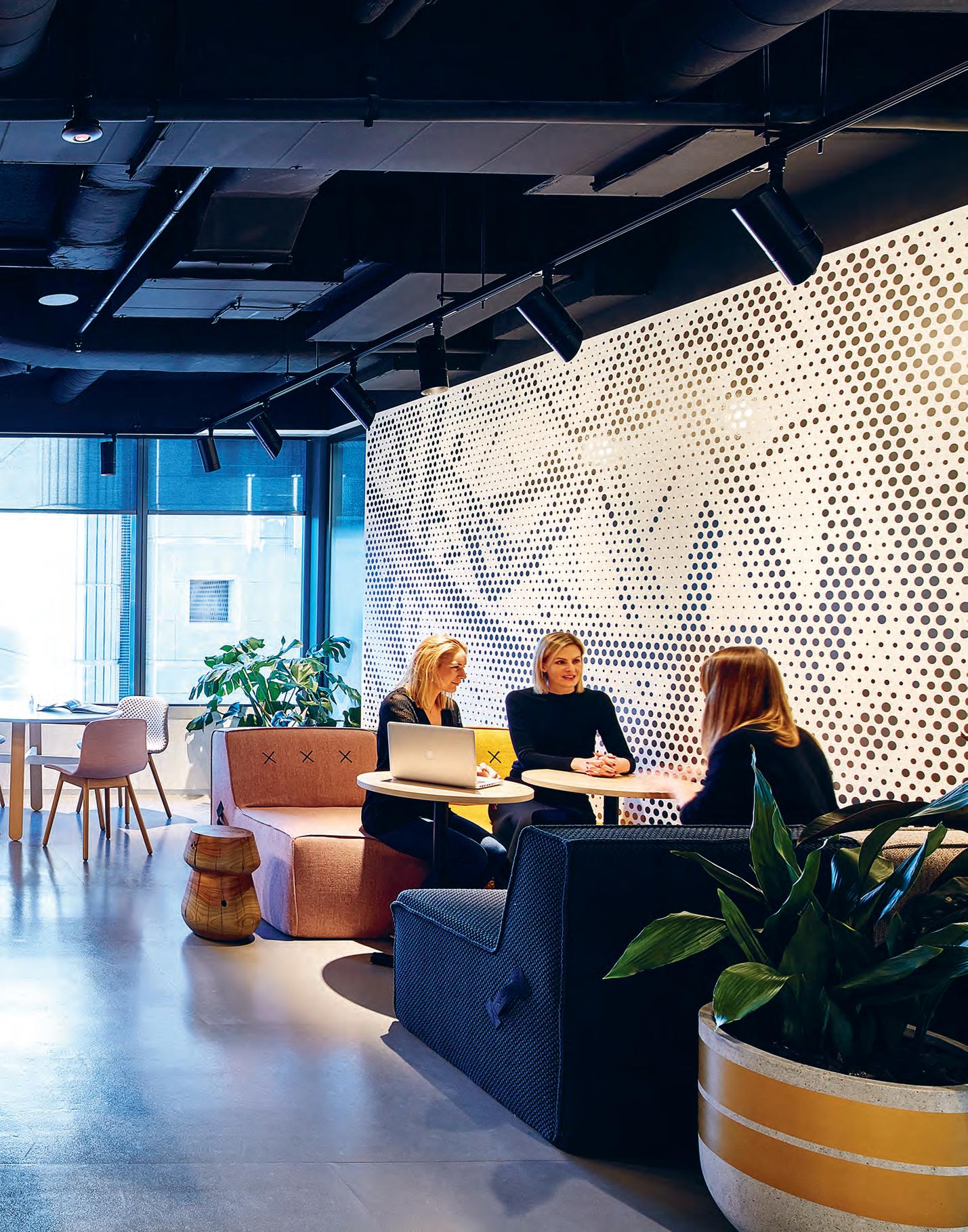
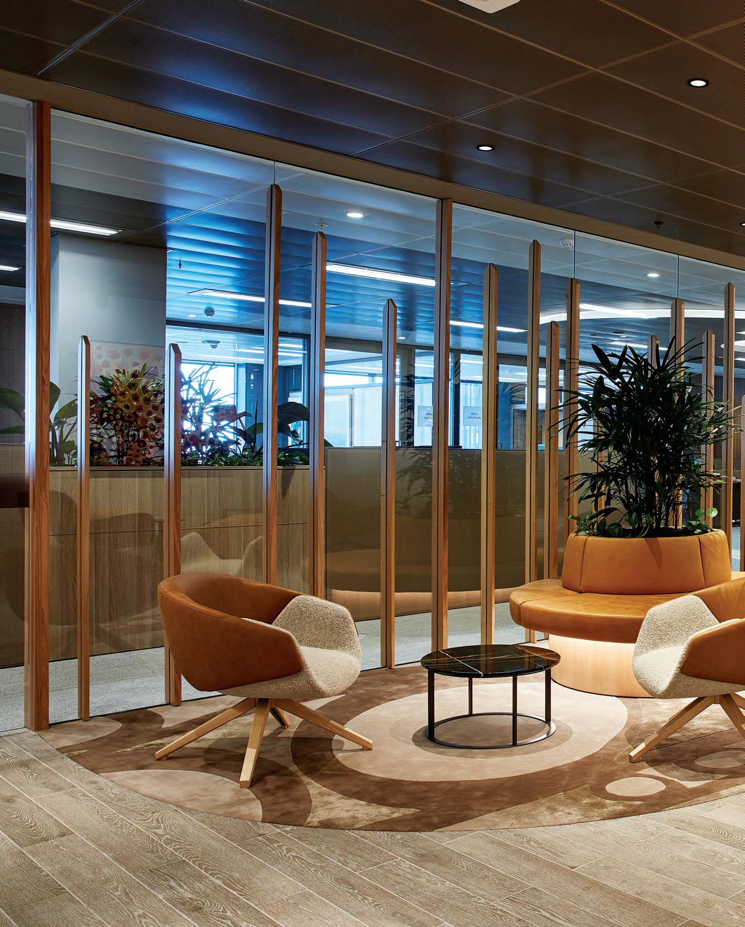
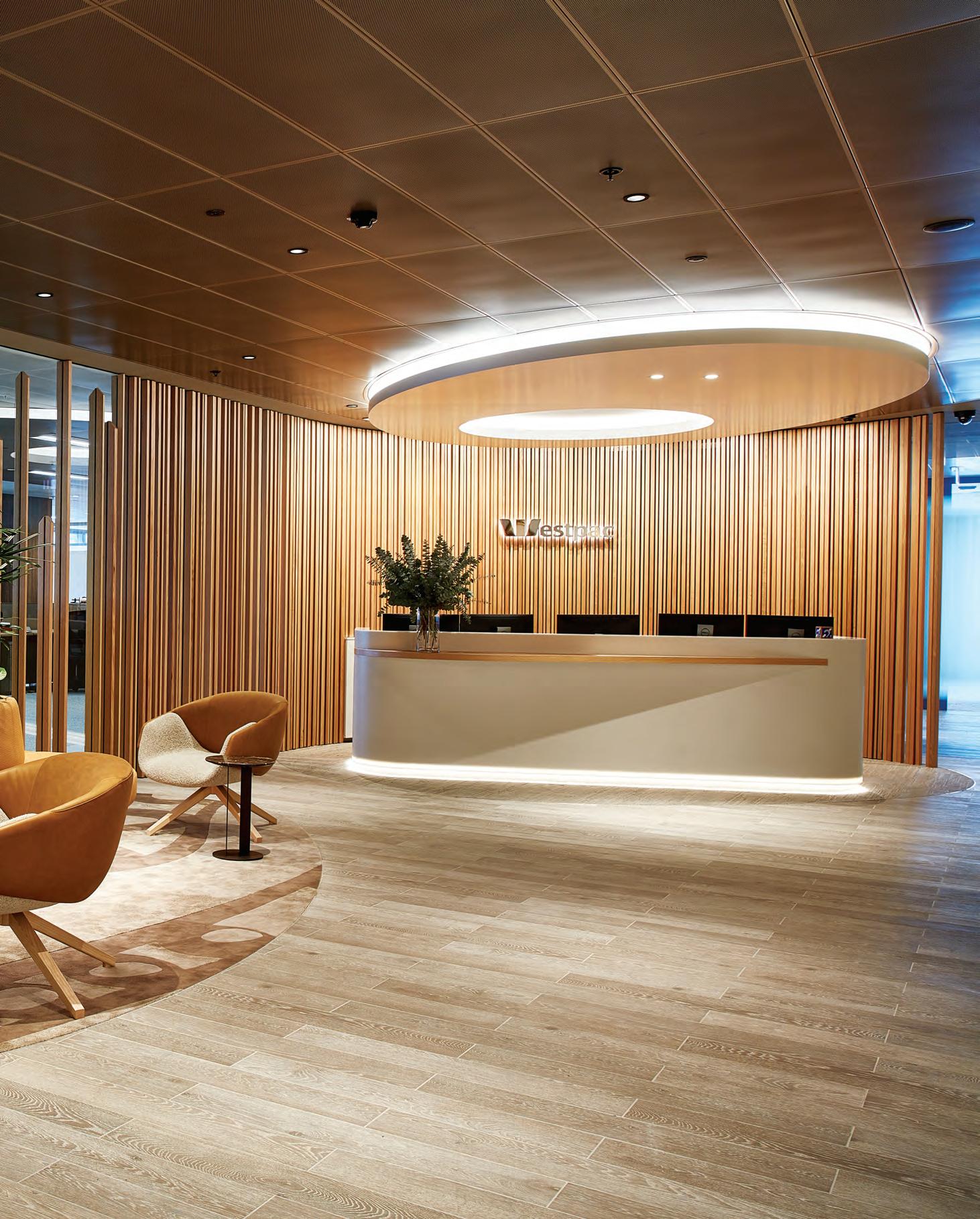
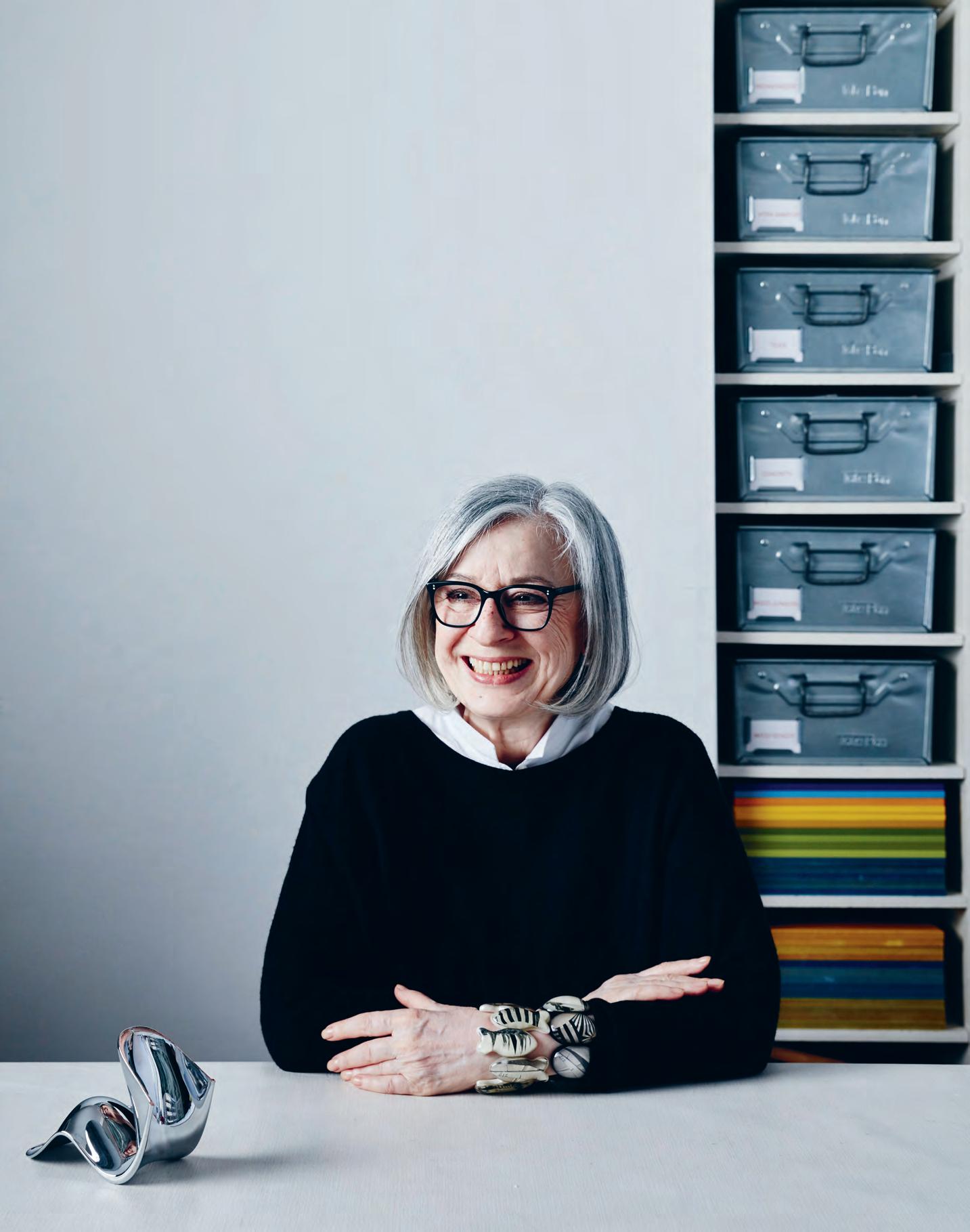
Page 73: Melinda Huuk of The Studio* Collaborative. Opposite: The Westpac Project Hub offers spaces for huddles and showcases with reconfigurable furniture and walls, photo: Steve Brown. Page 76-77: The Westpac Executive Zone Concierge’s warm, textural palette exudes a sense of approachability and humility blended with self-assurance and expertise, photo: Steve Brown.

Celebrating Relationships
Dispersed throughout the Westpac spaces are stories from past and present. “This is a company that is proud of its past yet very future-focused,” says The Studio* Collaborative’s Melinda Huuk. Ante spaces, like the Executive Zone Concierge, showcase Westpac’s relationship with the Indigenous community, with custom rugs designed in collaboration with the National Aboriginal Design Agency and Westpac, taking the designs developed by Indigenous artist Suzie Evan.

–

Too Polite!
INDESIGNLIVE.COM IN Fa M O u S 78
Stephen Crafti argues that 21st century designers are playing it way too safe. After all, there is no shame in aging.
The early 1980s was a milestone period in design. Fashion designer Rei Kawakubo sent ‘shock waves’ down the runway in Paris with her deconstructed oversized clothes. Architecture and design was equally brave with designers such as Philippe Starck bringing a good dose of humour into our lives. Fast-forward several decades and what do we find? Pale pink velvet-covered ottomans placed next to pale grey velvet-covered sofas. It’s become all too sanitary for this writer, with interiors in particular expressing a certain politeness, like never before!
Stylists, decorators and most importantly, clients, have instructed architects and designers from all fields to play it safe. The goal is to present something that won’t ruffle feathers or make the occupants using these spaces – whether they be commercial or domestic – feel ill at ease. Why are words such as challenging, innovative or exciting included in briefs these days? For someone such as myself, who has been writing about architecture and design for almost 30 years, we seem to have entered into a relatively conservative and safe world.
There are always creatives who work outside the box, who couldn’t care one way or the other whether they offend, or more correctly, challenge perceived norms. Those designers often receive architecture and/or design awards for their efforts. However, in the main, things are generally the same: pale pink walls, this year’s colour palette, teamed with neutral furnishings. If one harks back to the post-war period, architects were keen to push new frontiers. Floor-to-ceiling glazed curtain walls, open plan living, metallic feature walls and organic-shaped furniture took people out of their comfort zones of high-backed chairs and lace doilies (not that there’s anything wrong with this if given a fresh and contemporary interpretation). However, rather than using these major shifts in design as an impetus to move forward, too many creatives simply reproduce the past under the guise of the new.
As I regularly say to people, very little is new in the design world, but you certainly know it when it’s finally presented on a plate. There have been numerous architects and designers who have ignited my passion for writing over the many years, from a broad range of design disciplines. However, I am starting to feel that too many site inspections leave me with a sense of sameness. The materials, the spaces and even the furnishings, not to mention the artwork , seem almost identical to the next. Where’s the voice?
I have a saying, however naff it may seem, that I almost prefer to see bad taste, rather than no taste at all. When you enter a workplace shouldn’t it capture the essence of that company and what it stands for? Likewise, when I enter a home, shouldn’t I feel as though I have a sense of the owners living there? After all it’s their place, and not something that has been tricked up by a stylist or decorator to impress.
Much of the work we see at present is touted as aspirational, often with the word luxury attached. We’re expected to be in awe of acres of marble finishes and brass taps. Well I’m not! I would rather walk into a space and see a great idea, something that has a voice, even if it isn’t completely expressed to its full potential. On one of my architecture tours to Belgium, my group and I visited the offices of architects BOB 361. The offices, a combination of residential and commercial spaces, weren’t immaculately presented on the day of our visit. The apartments in particular hadn’t been styled. On one lounge, there was an almost-empty cereal bowl, a sign the occupant did a runner rather than stay for a meet-and-greet. But those apartments, all with built-in concrete benches, were truly sublime. One space included a void that extended over three levels. Challenging and exciting architecture and design transcends the odd bowl left out in haste!
One of the reasons we have become too polite is because of a fear of things dating, whether it’s architecture or fashion. But things should date, whether it’s from the 1950s, the 70s, or from a more recent decade. My fear is that contemporary design in its present form is playing it far too safe! Throw caution to the wind, as some of our most talented designers do, while still delivering highly functional and exciting spaces in the process.
And rather than being preoccupied with things matching (a bugbear of this writer), have some fun and create a voice that unfortunately may offend a more conservative clientele in the short term. Those people will eventually catch up, even if it takes them a few years to get their minds around it. Design should go well beyond what things look like. It should be more about the feel and how it takes us beyond our comfort zone.
INDESIGN 79 IN Famous
Stephen Crafti is one of Australia’s most prominent architecture and design writers.
Embracing Change
Words Tracey Ingram Photography Various
London-based designer Sevil Peach brought the concept of the home office to the world when she started designing office and showroom spaces for Vitra. She believes that companies and spaces alike must be always pitched for change.
Opposite: “Work is a matrix of relationships, friendships and social interactions,” says Sevil Peach, photo: Alun Callender. Page 82- 83: The central atrium with bar, and surrounding workspaces at Rode Olifant in The Netherlands, designed for Spaces by SevilPeach studio, photos: Gilbert McCarragher. Page 84: Finishes used throughout Rode Olifant are sympathetic to the building and complement its historic character, photo: Gilbert McCarragher.
INDESIGNLIVE.COM IN Fa M O u S 80

Dream Jobs
For co-working connoisseurs, Spaces, Sevil Peach transformed the iconic Rode Olifant (red elephant) building in The Netherlands into a modern working environment with all the heritage trims. At the heart of the building lives the café-bar, set within a three-storey high atrium. Surrounding communal workspaces take advantage of generous ceiling heights, and tall windows that flood the space with natural light.

–

“We want to create places and spaces that we would personally like to inhabit.” London-based Turkish designer Sevil Peach is discussing the strategy behind her workplace-oriented studio, which she established with architect Gary Turnbull in 1994. It’s an approach borne of experience. Typified by many a fledgling practice, the pair began by working from home. Despite its challenges, their Victorian terrace house served as the SevilPeach headquarters until 1996, when they moved to their current studio. “What we discovered from that Tardis-like experience was how effectively and pleasantly we would work in varied settings – living room, kitchen, garden – without being tied to a desk or computer,” says Peach.
The design equivalent of going from singing with your hairbrush in the bathroom mirror to performing live for a large audience, Peach and team soon shared their personal experience with the world. Or, more accurately, with Barclays (in 1996) and Vitra (2000). Putting people at the core, those seminal projects paved the way for many more humanised workplaces.
Peach has observed the radical shift associated with a much-used phrase: new ways of working. “When we started in 1994, nobody thought about whether people actually enjoyed being in an office. Today, workplaces are increasingly being compared and ranked –formally through such certifications as the WELL Building Standard and informally through social media. In the age of Millennials, this all plays an important role in a company’s ability to attract and retain the best talent,” she says.
She notes that the transformation is facilitated by advancements in technology. “Although it enables mobility and connectivity, this very same technology means that the office no longer has a monopoly on its traditional role as the productive centre. The workplace already does –and will continue to – fulfil an important business and social need, but it needs to update its form and emphasis.”
To imagine what that form could be, Peach must first predict the future conditions. She believes offices will continue to downsize
in response to a mobile workforce. “Non-assigned team bases will rapidly replace permanently assigned workstations. This requires designers to be the cognoscenti of core human needs: belonging and connection. That said, users should also feel as if the space is theirs.”

Connection can manifest as the exchange of knowledge on a human level, which Peach says is vital to both the success of an organisation and the individual. “Work is a matrix of relationships, friendships and social interactions. Office environments therefore need to provide varied settings that facilitate scripted and serendipitous interchanges, fostering a sense of community.”
The challenge for designers, then, is to anticipate and provide opportunities for encounters such as these.
Flexibility is often touted as the answer to future-proofing workplaces. Indeed, says Peach, companies have to be able to respond to and absorb change – and their spaces should follow suit. “Where once bespoke built-in solutions were the norm, loose-fit has become a requirement of today.” She cautions, however, that ‘loosefit’ doesn’t necessarily mean ‘modular’. Instead, designers should establish the correct fixtures around which everything else can readily change. To do so, Peach looks for generous ceiling heights, abundant daylight, ample views, and the considered and appropriate placement of a building’s cores and services.
SevilPeach recently took part in an international office competition in Sydney, which highlighted an overlooked area within the field: the civic and communal role of the office building. “During the competition, we were impressed by the state government’s insistence that the developer dedicate a certain number of square metres to support business start-ups – through an incubator space, for example. Office developments need to find new ways to engage with the wider community and to give something back. To create new paradigms that will benefit many, rather than just a few.”
sevilpeach.co.uk
INDESIGNLIVE.COM IN Fa M O u S 84


Architectural and Acoustic Linear Timber Systems Modular Design: Certified Timbers: Acoustic Solutions Email info@screenwood.com.au Web www.screenwood.com.au Tel 02 9521 7200
Specifier: Davenport Campbell |
Photo: Katherine Lu

A Problem That Turned Into An Award Winner.
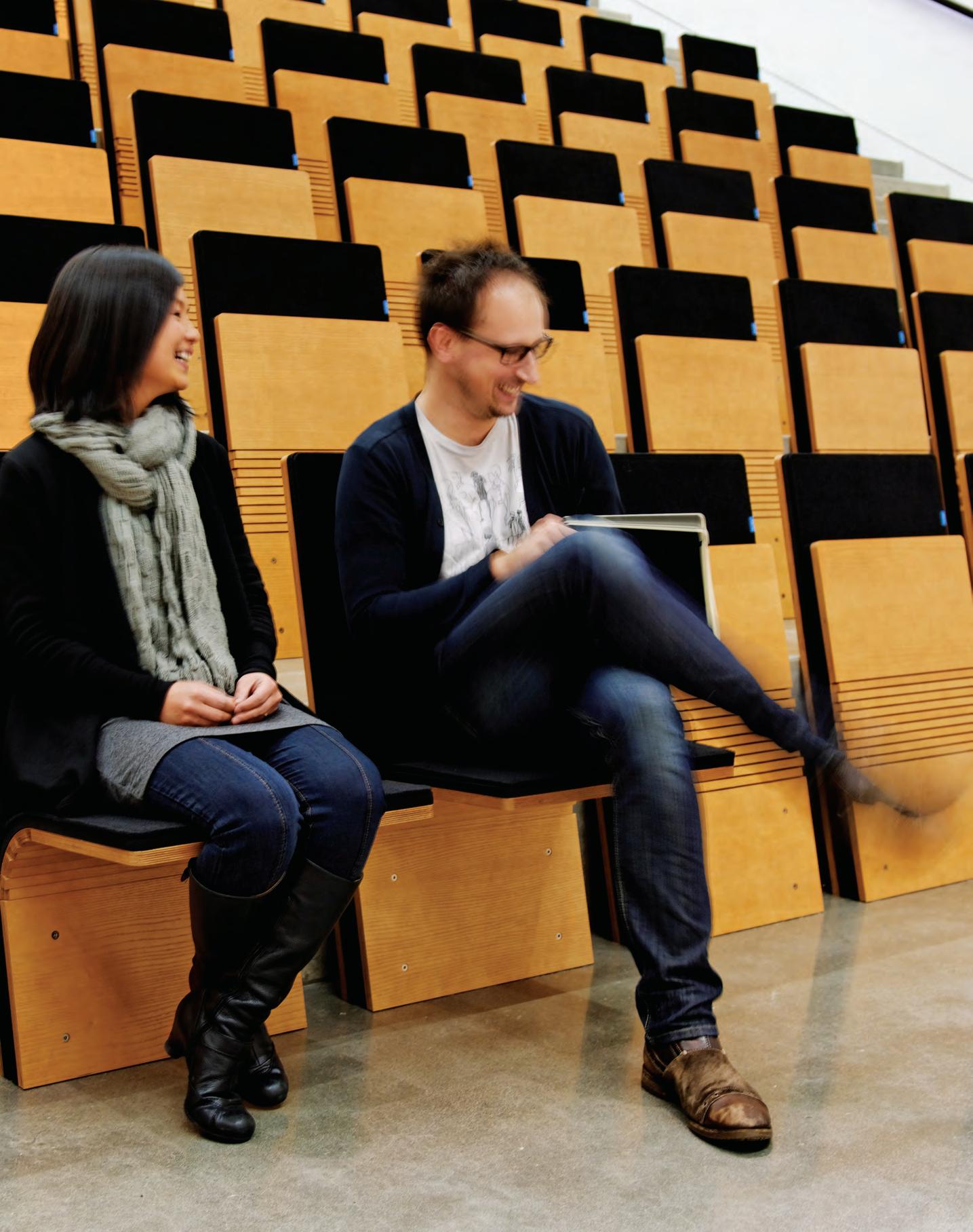
Design is all about solving problems. So what happened when an industrial design studio in Portland, Oregon was presented with a unique challenge of their own? The answer is simple, the studio used design to come up with a solution that turned into an awardwinning product. That studio was Ziba Design and this is the story of its JumpSeat.
Ziba Design had an incredible new theatre space within its Portland headquarters, and rather than going for traditional seats, the studio fell in love with the simple, raw concrete steps. The problem was found in the fact that a city like Portland gets pretty cold and sitting on raw concrete is uncomfortable. The studio tried a couple of straightforward approaches, such as loose cushions, but much was le to be desired.
Thus, an idea was born to blend the comfort and bene t of a theatre seat with the compact slimness of an airplane jump seat. This theatre seat needed to be stylish, intuitive, user-friendly and robust. A complicated mix of needs, but the brief was set.
Ziba Design then began working with seating company Sedia Systems, which specialises in public seating. What started to
emerge was a special mix of timber trapezoidal sections that allowed for ex, paired with some heavy duty sprung steel. The end result? A unique theatre-style seat that can be applied retrospectively to a mix of spaces. And a slew of design awards.
The JumpSeat can support 260 kilograms and comes in four versions, from wall mounted, oor mounted or an independent (moveable) base. Another stellar feature is the fact that in many instances it sits just a mere 100mm thick once installed, so it meets the necessary egress codes while creating instant backup seating.
Seeing the potential of this innovative seating system, The Meta Collective has brought the chair to Australia. Already it is being used across many diverse sites – the Perth Airport, a Courthouse in Victoria, and the new Anzac Legacy Gallery in Brisbane’s cultural precinct.
One of those awards came in May of 2018. The Meta Collective team, on behalf of Sedia Systems, accepted an award from Good Design Australia for Best in Class – Furniture & Lighting. This is just one con rmation of how solving problems through design makes for valuable product solutions.
OFFISCAPE.COM.AU 87 INDESIGN OFFISCAPE
JumpSeat, designed by Ziba Design and produced by Sedia Systems solves many problems in retro tting theatre seats.
Through a unique situation that needed a solution, the JumpSeat was born.


Provocative, innovative & ins P ir ing D esign
INDESIGN 89 IN SITU Situ i N
The ‘workplace revolution’ began in the late 20 th century, except that from today’s perspective it looks more like an evolution than revolution.
Where do we go from here?
Words Paul McGillick
INDESIGNLIVE.COM 90 IN SITU
The re-thinking of workplace design over the last three decades certainly reflects a recognition of the importance of innovation, resilience and agility in a fast-changing and increasingly competitive business environment. But, of course, it also reflects the emergence of new kinds of businesses, technologies and community values.
Among the many extraordinarily innovative new workplaces that have emerged, there have also been a lot that amount to little more than a decorative make-over. True, offices are brighter, more playful and offer more amenity to staff, but how much do they really add to productivity, efficiency and innovation?
Well, the jury is still out on that because we struggle with metrics to quantify the benefits of, say, activity-based working. But intuitively we feel that an intelligently designed workplace results in commercial benefits.
The key thing is to align the business model with the design strategy. This requires an evidence-based return brief from the designers which, in turn, depends upon a thorough understanding of the business and its culture – or the culture it aspires to become.
As we discover in this issue of Indesign , workplace design is increasingly being driven by information technology (rather than, as before, simply incorporating IT into the new workplace) and a growing awareness of the inter-connectivity of business and businesses. This implies ever-greater flexibility and thinking outside the box when we look at how, when, where and why we work.
Andrea Stevens talks of “cross-pollination” in her review of the developing Wynyard Quarter on Auckland’s re-purposed waterfront. And, having been there recently myself, I can testify that this development is astonishing in its vision, mixing as it does freelancers, entrepreneurs, start-ups, established small, medium and corporate businesses – and all of that in a mix of commercial, residential, hospitality, marine industry and public space, not to mention Auckland’s fabulous fish market.
This is an entire precinct (including the interior design of individual buildings) created to serve the contemporary needs of a flexible and fully connected business environment.
Other articles in this special issue touch on other current themes. For example, wellness as a driver of workplace design. The One Microsoft Place project in Ireland stresses “holistic wellbeing” as a driver of productivity and innovation, emphasising the value of connection both inside the building and with the natural world outside, while also embracing workplace diversity as a valuable resource rather than simply some kind of human rights issue.
The QT hotel in Perth is a recent example of a shift in thinking in the hospitality sector. Traditionally, hotels have been amazingly tokenistic in the amenities they provide to business guests, despite the fact that much of their custom comes from business. But this is changing as hotels pick up on the spirit of co-working, providing a range of work and meeting spaces together with the appropriate technological support.
Then, at the other end of the spectrum, we reveal a workplace, Agents of Spring, which is endlessly re-configurable and predicated on the power of play to generate fresh ideas and new levels of collaboration.
If a workplace is to be fit for purpose, then we need to know what the purpose is and that requires inside-out thinking. But it also requires thinking not just outside the square, but outside the business because businesses do not operate in isolation from other businesses, nor indeed from the community at large. As the nature of business activity changes along with the entire relationship between work and life, so the workplace must evolve. In fact, it may even dematerialise altogether.
Paul McGillick is a writer, editor, public speaker, and special edition editor of the Indesign ‘Workplace Evolution’ issue.
INDESIGN 91 IN SITU

Designed to super-charge co-working and collaboration, Auckland’s Innovation Precinct is the new mecca for freelancers, start-ups, small businesses and corporate teams. Could this be ‘the’ case model for hybrid working?

Break The Model
INDESIGN 93 IN SITU
Innovation Precinct, Auckland by Warren & Mahoney & GridAKL tenancy by Jasmax Words Andrea Stevens Photography Various
Opposite: The third building in the Innovation Precinct is a six-storey commercial building, photo: Simon Devitt. Page 93-94: This is situated across the laneway from the heritage Mason Bros building, opened in 2016, photo: Simon Devitt. Page 96 and 98: The GridAKL tenancy by Jasmax defines a strong culture within the Precinct, photo: Jason Mann.


“The
“We have three innate psychological needs – competence, autonomy and relatedness. When those needs are satisfied, we’re motivated, productive and happy,” writes Daniel Pink in Drive: The Surprising Truth About What Motivates Us, his best-seller from 2009. These words have inspired managers and designers the world over in workplace management and design. As wireless, portable technology has supported a move towards agile working, teams and individuals can now have greater control over both their time and work location –a level of independence and choice that sparks motivation and creativity for many.
In parallel to this quiet evolution in the corporate workplace is a not-so-quiet revolution in entrepreneurial businesses. Software as a service means starting up a business has never been easier. Flexible, co-working spaces are experiencing boom times, as freelancers and small businesses plug into shared facilities on a membership basis, scaling a team up or down as they go. They have more freedom compared with their counterparts from 10 years ago, and with a global market, the sky is the limit.
Working styles within co-working, shared offices and the activitybased working (ABW) corporate environment have cross pollinated and been impacted by the same trends in business infrastructure and business style. So much so, it is often hard to tell the difference between the two settings. Corporate workers have become more mobile and flexible, and entrepreneurs can become more corporate.
Auckland’s Innovation Precinct – a council-initiated campus in Wynyard Quarter on the waterfront – brings the two streams together. Freelancers, entrepreneurs, start-ups, established small and medium businesses, and corporate teams all rub shoulders over three buildings and circa 17,500 square metres.
A full range of membership and tenancy options allow for casual, short-term and long-term stays for a creative, innovative coalition of different companies and different disciplines. Some businesses want to co-work on a hot desk, while others take an office or a whole floor on a long-term lease. People mix in the cafés and lounges, at workshops and events, and in the high-quality public and semi-public spaces around each building.
“The design of the precinct breaks down the conventional boundaries between businesses, and between business and the community,” says Blair Johnston, Warren and Mahoney’s lead architect for the Precinct masterplan and buildings. “As a mixed-use area, Wynyard Quarter blends existing maritime industries with residential, civic, hospitality, retail and commercial activities. If you can bring all those things together, and you get it right, you get an activity profile that extends day and night and throughout the week. And that’s an ideal location for an innovation precinct – it needs to feel alive, always working, always safe.”
Earlier this year, the third building in the Precinct opened at 12 Madden Street, a new six-storey commercial building.
INDESIGN 97 IN SITU
design of the precinct breaks down the conventional boundaries between businesses, and between business and the community.”
It joins the heritage Mason Bros building across the laneway (which opened in late 2016) and the Lysaght building around the corner: where it all started in 2015. And in 2020, they will be joined by a fourth at 10 Madden Street evolving the Precinct into a significant centre and destination for our top technology entrepreneurs and global businesses, with a masterplan for six buildings and 48,000 square metres in total.
The foundation tenant ATEED – Auckland’s economic development agency – runs the largest co-working facility in New Zealand. GridAKL spans all three buildings and is run in partnership with Generator, a private shared office provider. They are there to assist fast-growth, high-value technology businesses and entrepreneurs to develop, commercialise and scale. And as the anchor tenants, GridAKL defines a strong culture within the Precinct. They are joined by private business tenants, and project teams lifted out of corporate headquarters and relocated here for the energy, creativity and collaboration the environment fosters.
“Incubating like-minded businesses encourages collaboration and increases networking opportunities,” says Valentina Machina, Jasmax associate principal and interior designer for the GridAKL fitout. “The wide variety of tenancy types support businesses at different stages of growth through the provision of scalable and flexible spaces.”

Part of the magic down at Wynyard Quarter is access to Auckland’s waterfront, being part of an emerging, regenerating part of the city, high-quality urban design and amenity, and the heritage and character of its industrial maritime architecture.
Through the work of Auckland Council and its agencies, Warren and Mahoney, urban designers and interior designers, the Innovation Precinct has developed a strong sense of place and quickly become an iconic events destination for businesses Auckland-wide. Adaptation of industrial warehouses – and their influence on the design of the new high-rise buildings – builds on a rich character for Wynyard Quarter.
This architectural continuity is equally matched by its business continuity where the innovative ‘heavy’ industries from the past 100 years – shipbuilding, heavy engineering, importing and distributing physical goods – are being swapped or joined by the ‘light’ industries of the digital era. The Precinct is a strong physical, cultural and financial environmental set up to foster innovation; an easily accessed business ecosystem in which to plug and play.
warrenandmahoney.com,
INDESIGNLIVE.COM 98 IN SITU
jasmax.com
INDESIGN 99 IN SITU 4 1 43 5 1 2 1 1 42 6 6 7 7 8 9 10 Innovation Precinct Site Plan 1 Entry 2 Internal laneway 3 Feature stair 4 Tenancy 5 End of trip facilities 6 M ahuru Lane 7 Autahi Lane 8 T īramarama Way 9 M adden Street 10 Pakenham Street West
As we travel the world, laptops in hand, hotels become the ultimate recharge station for mind, body and personal device. QT Perth quirks up its local influences to create a destination that invites travellers and locals alike to alight and dock-in.
Hotel Hot Desking
“ We aim to create spaces for QT where you can open up your bag in your room and let your undies fall out, or order a coffee and take your laptop down to the lobby,” says designer Nic Graham.
INDESIGNLIVE.COM 100 IN SITU
QT Perth by Nic Graham & Associates and Indyk Architects Words Rachael Bernstone Photography QT Perth

Urban Oasis
The base building’s hard edges are softened by mesh curtains that vary in weight and texture depending on their location across the hotel’s many spaces. The curtains create playful shadows across the rich timber floors, and contrast beautifully against the rigid structure of the concrete envelope.

–


Work Retreat
From bar and grill to bedroom, guests can retreat and sleep, or plug in and play, from the comfort of QT Perth’s guest rooms, designed by Indyk Architects. In this room, bold wallpaper featuring native black cockatoos is emblematic of the Western Australian landscape and local fauna.

–
Perth is a town of boom and bust economic cycles: the first gold rush of the 1890s gave the city its grand Victorian buildings, a few of which survive in various forms. The 1980s ushered in another golden age when Australia won the America’s Cup yachting race, and entrepreneur Alan Bond lavished his hometown with a Midas touch.
These prosperous decades provided rich inspiration for the city’s newest five-star hotel, QT Perth, designed by Nic Graham and Associates (public areas) and Indyk Architects (guest rooms).

“We look to the past to guide the future, and we don’t mind bringing in vintage touches, but they are not token decorations,” Graham says of the Victorian references throughout, including the heavy timber doors that architect Shelley Indyk specified for the guest rooms. “They convey a sense of memory and place, and they give a residential feel to our interiors, to take away that too-coolfor-school effect.
“We also took our cues from those glorious days of 1980s – when long lunches turned into dinner with lots of champagne flowing – and we wanted to celebrate that,” Graham adds. “A city can never turn its back on a part of history, but we were also mindful that noone wants to see gaudy excess when some people are struggling today.”
From the street, the hotel makes a positive contribution to the city’s built form. It occupies a prominent corner in the newly enlivened east end and the dynamic grid of the façade sets up a delightful order that continues inside. Internally, a secondary steel structure is visible in the main public areas, and it creates a sense of order and rigidity is softened and warmed by flamboyant furnishings, bold commissioned artworks and the vibrant colour palette.
It’s symbolic of the humorous, spirited and relaxed design approach, whereby longtime QT collaborators Graham and Indyk work from a loose brand template and inject local flavour into each new QT project.
“QT didn’t come to us with a brand book: we helped develop the branding strategy for them, and it came about through the work,” Graham says. “It has a very Australian feel; there’s a local story to tell with a slight vintage wink, and there is drama and theatre in each project, which comes from the owners’ background in theatre and cinema.”
Before commencing the design, Graham spent time in the west coast capital and observed a “purity about Western Australia and Perth” that he loved.
“You have to fly over most of WA to get to Perth and so instinctively this design was about red earth meeting blue sea,” he says. “We extrapolated that from mining to fine dining, so in the main restaurant – which is Italian – we’ve got terracotta and turquoise hues, which reacts beautifully with WA’s clear quality of light.”
He was also inspired by the state’s famously unruly flora, which is referenced throughout. “We punked up the wildflowers, and stretched them out and then turned them into gold, in the custom wallpaper for Santini Bar,” he says.
Elsewhere, golden references are tactile and haptic rather than visual and overt. “Nearly everything you touch is gold, and that’s most obvious in some of the bathrooms,” Graham explains. It carries through to the guest rooms, too, where Indyk liberally sprinkled brass detailing in the form of hardware and bathroom fixtures.
Graham says the public spaces were deliberately designed to appeal equally to hotel guests and locals – the appeal is instantly evident. The rooftop bar – which offers views towards the Swan River – is already a popular local gathering place.
And in the vast double-height, ground-floor lobby, the mood is equally welcoming. “I’ve been to a lot of hotels around the world and there are some where you always feel like a visitor, because the spaces are too polished, too vanilla,” Graham asserts. “We aim to create spaces for QT where you can open up your bag in your room and let your undies fall out, or order a coffee and take your laptop down to the lobby, where a friendly person on reception will say hello to you.”
Graham is mindful that design is only part of the equation when it comes to designing successful hotel projects. “It doesn’t matter how shit-hot the interiors are,” he says. “People will remember the attitude of the staff, the fabulous service they receive at every point during their visit or their stay. In that way, design can really only be one part of the hotel stay.”
nicgraham.com, indykarchitects.com.au
INDESIGNLIVE.COM 106 IN SITU
Page 101: The Santini Grill uses Australian design to inspire Mediterranean flair. Page 102-103: The lobby acts as an urban oasis, extending an open invitation to visitors and locals alike. Page 104-105: The guest room design is a balancing act of surprisingly rich yet relaxed details. Above: A destination in its own right, the QT Café rounds out the extensive food and beverage offering at QT Perth.
Inspire great work


Desert At Dusk
Upon entering the grand lobby of Memocorp’s Sydney flagship building, 259 George Street, you’d be forgiven for thinking you’d accidentally wandered into a boutique design hotel. Plush seating and statement furniture abound, while metallic accents offset a powdery palette of pastels that is at once dreamy and inviting. That the lobby, designed by Melbourne practice The Stella Collective, should so strongly evoke a hospitality space is no accident. As director Hana Hakim explains, “Our client wanted to shape the brief around the ritual of hospitality.”
Memocorp tasked The Stella Collective with designing three spaces within the 42-storey building on Sydney’s George Street: the grand lobby, end of trip facilities, and the property group’s own penthouse office. As the designers behind acclaimed hospitality spaces including Melbourne’s beloved Kettle Black, Brighton’s Red Roaster (the UK town’s oldest coffee house), and the newly opened Naim restaurant in Brisbane, Hakim and her team were the perfect fit for the project.
From the beginning, Hakim recognised that a business-as-usual approach to corporate design wouldn’t cut it. “I really think that
everything needs to have the heart and soul of hospitality,” she muses. “This is the place where people spend almost all their time away from their family, and it should be a wonderful experience.” Hakim rejects the notion that corporate environments must be sterile, impersonal spaces, and instead champions a vision of workplaces that support and delight their occupants. “Why can’t we create a work environment that adds positivity to people’s days and lives?” she asks. “Isn’t that why we design?”
This drive to create a genuinely positive environment is evident throughout the tripartite project, but perhaps most clearly in the grand lobby. Here, The Stella Collective inverts the typical understanding of the lobby as a transient zone for passing through to instead deliver a destination space that invites people to linger. Proof that subtle acts are often the most transformative, the lobby effectively dismantles the accepted framework for corporate design and replaces it with a warmer, more fluid approach that eschews showiness and imposition. “It’s not too forceful, and it’s not too distracting: everything just falls perfectly into place,” says Hakim. “Design doesn’t need to be over-the-top at all.”
INDESIGN 109 IN SITU
Memocorp grand lobby, Sydney by The Stella Collective Words Patricia Arcilla Photography Felix Forest
The Stella Collective’s grand lobby for property group Memocorp takes an imaginative approach to dismantling corporate design norms.

Velvet Underground
Formerly the building’s garbage disposal room, The Stella Collective has transformed this zone into a plushend of trip facility, known as ‘Zephyr’. Combining sumptuous textiles with a rich, dark palette and gold accents, it blends the best elements of commercial and corporate design.

–

Taking cues from Bistro Guillaume, the iconic French restaurant and patisserie that moved into the space in 2016, the grand lobby is a mille-feuille of layered details translated from the visual vocabulary of hospitality design. Gone are the hard lines, monochrome palette, and harsh fluorescent lighting often associated with contemporary corporate spaces. In their place is a picture of contemporary luxury that combines striking pieces – a brass bench, a smoke glass-topped coffee table – with comfortable furniture, atmospheric lighting, and a granular focus on detail. Oxblood accents add a further touch of sophistication, as does a dense, high-piled carpet in cool grey veined with pearlescent pink.

In Hakim’s own words, the space is a “desert-at-dusk landscape” whose sensitive, understated approach belies its nature as a bold, radical breaking of the corporate mould.
Still, she speaks modestly – if enthusiastically – about the project, explaining that for The Stella Collective, the goal was not subversion so much as finding the best way to address the client brief in a fresh and functional way. “Our goal was just to make people feel amazing in the workplace and set the tone for creativity,” she says, acknowledging that Memocorp represents a new breed of client whose embrace of the power of design enables a flexible approach. As Hakim puts it: “I have definitely seen a leap of faith in terms of clients now believing what design can do for people. They’re now a lot more trusting.”
With good reason. If the grand lobby of 259 George Street is anything to go by, the menu for corporate design is changing fast –and we can’t wait to see tomorrow’s specials.
thestellacollective.co
INDESIGN 113 IN SITU
Page 108-111: ‘Zephyr’ brings underground cool to end of trip facilities. Opposite: Furniture and accessories were meticulously curated to craft a welcoming space. Above: Gold-tinged furniture and classic design lines echo the nearby Bistro Guillaume. Page 114: Comfortable armchairs invite people to linger in the lobby and savour the space.
An Open Plain
The lobby’s uncluttered open plan was carefully arranged to create an airy, welcoming space. “For me, light is a palette note for use,” explains Hana Hakim of The Stella Collective. “We want to provide as much space and freedom to allow people to just flow.”

–
At Work With Edith
Workplaces are increasingly taking up more homey environs. And no wonder – when we know the average employee spends more time at the o ce than home. So, why not make it comfortable?
From so er touches like upholstered o erings, to more natural nishes like marbles and timber, these increasingly blurred typologies allows designers to blend numerous references in a bold and refreshing manner.
Following this line of thinking, Trabà has released a new edition to its already popular Edith range. The Edith stool follows the same pared back and re ned design principles as the original. Its new, taller version bringing new versatility to the Edith family.

The stool’s simple design belies its thoughtful and considered construction. Through expert cra smanship and careful construction techniques, the stool is built to last. Made out of timber, the chair curves in all the right places with an elegant
tapering at the legs. The sweeping backrest, which can be found on the Edith chair has been carried into the stool design, along with the same natural material palette, ensuring a sense of pure but necessary design decisions.
The Edith chair and stool is a collaboration between Trabà and renowned Italian architect Massimo Broglio. Broglio works across a range of disciplines and scales, always bringing an innovative and pragmatic outcome to his designs.
Functional and sincere in nature, the classic Scandinavian-esque design of the Edith range is perfect for spaces large and small. Both the chair and the stool bring that much-desired domestic style into contemporary workplace spheres, particularly suiting areas such as break-out and informal meeting zones.
With so tactility being paired with warm and naturally inviting materials – what’s not to love about this new age of workplace design?
UCI.COM.AU 115 INDESIGN UCI

In bringing 2000 Microsoft staff into a single location, Gensler has deconstructed the typical working model. Taking its client into unchartered territories, the design team envisaged a new working landscape that moves beyond the corporate norms to embrace ‘island’ life.
Island Mentality
Measuring over 30,500 square metres, One Microsoft Place in Ireland ran the risk of becoming an unfathomable mega campus. The project – which reinforces the tech company’s focus on unification – consolidates over 2000 staff from three buildings into one Dublin location. Treating the workforce like a community, the designers at Gensler – the outfit responsible for the interior – wanted to “unearth a way of connecting everyone and everything”, says Amanda Baldwin, senior associate at Gensler. “How did we do it? We call it ‘deconstructing’. First we abandoned all preconceived rules and ideas about typical workplace buildings. When you eliminate the electrical and mechanical systems, the windows and doors, the roof, the bricks and mortar, the foundations . . . what’s left? Just the land. Or, an island. And so, the idea of the Microsoft Island was born.”
Conceived in close collaboration with the Microsoft team, Gensler’s concept translates “typical island components” into a functional office. The ‘harbour’ is the arrival point; the ‘beach’ is a social space; the ‘lake’ is for reflection, contemplation and gathering; the ‘mountain’ is for learning and discovery; and the ‘grasslands’ is the open-plan workspace, where teams work in ‘neighbourhoods’. Each section is connected by the ‘trail’, a traditional corridor reimagined as a functional working environment.
Radically, there are no designated offices. Bosses sit alongside interns; data scientists and software developers mingle with sales and marketing staff. “Microsoft wanted to shift its employee workspaces from ownership to membership,” says Gensler associate Stuart Templeton. “Instead of having a fixed desk, employees become part of a neighbourhood. This change creates a sense of belonging that triggers collaboration and aids productivity.” To make it work, Gensler had to understand how employees work. “We spent a lot of time discussing and observing how and with whom staff members fulfil their respective roles. This information helped to drive the make-up of the neighbourhoods.” By assessing all the activities in which various groups are engaged, Gensler could provide optimal settings for collaboration, concentration and connection.
Baldwin notes that the evolution of the neighbourhood (in the traditional sense of the word) and its migration from home life to the office reflects the changing needs of today’s workforce. “Employees want a space that inspires them, connects them to nature, is designed with their individual needs in mind, and offers a community-like atmosphere. The neighbourhood concept aligns with the progression of Microsoft’s interior design: its spaces are becoming more relaxed, warm and intimate – less corporate.”
INDESIGN 117 IN SITU
One Microsoft Place, Ireland by Gensler Words Tracey Ingram Photography Gareth Gardner

INDESIGNLIVE.COM 118 IN SITU

The concept also makes strategic sense: “neighbourhoods” allow companies to creatively save square metres, cutting back on the number of individual desks based on how teams use the alternative areas. “You can be more efficient with space without having a negative impact on the productivity or effectiveness of that team.”
An international powerhouse such as Microsoft invariably welcomes diversity. With employees from various nationalities, the company sought to reflect cultural differences within its communityoriented neighbourhoods. “We undertook a great number of workshops and visioning sessions to really understand Microsoft’s employees, vision, motivation and key business drivers,” says Baldwin, “to anticipate and understand the central needs of their human behaviour. This helped us to go above and beyond to provide improvements that employees didn’t even know they wanted or needed.” These included utilisable circulation in the atrium across all floors; variation in the ground-floor plate; and an enlivened welcoming atrium that serves as a gathering place.
A community does more than only work, of course. As we move towards an increasingly 24/7 culture, says Baldwin, it’s imperative that workplaces facilitate how we want to live. To Gensler, this means catering to mixed uses; providing a variety of physical

environments that encourage social vitality; and creating an inclusive and stimulating space that supports productivity and lifestyle aspirations.
The office includes other traditionally off-the-clock amenities, such as an on-site gym, massage treatment rooms, yoga studio, music room and podcast studio. To make sure the added extras are benefits rather than gimmicks, Gensler conducted open discussions with staff and assessed what falls within Microsoft’s wellness agenda. “Holistic wellbeing is becoming a key metric for higher-performing workplaces,” says Templeton. “Implementing programmes that encourage mental health, fitness and outdoor access decreases sick days and boosts happiness and productivity.”
One Microsoft Place is surrounded by lush greenery, which inspired Gensler to ‘landscape’ the interior. “The setting allowed us to manifest the story of the island for the spatial concept,” says Baldwin. “More importantly, it provides a seamless transition from interior to exterior so that people are encouraged to get out and physically interact with nature.”
gensler.com
INDESIGNLIVE.COM 120 IN SITU
Page 116: As visitors descend upon the harbour, the building’s form reaches out to embrace. Page 118-119: The digital waterfall spills over three levels to form a meditative pool at the building’s base. Made up 125,000+ LED lights, it’s symbolic of Dublin’s geological character, signifying the surrounding bay and hills. Above: Small coves and caverns provide cloistered space for quiet, focused working. Opposite: Open clearings provide opportunities for passive collaboration and chance encounters. Page 123: This is an active workplace where movement is both facilitated and enjoyable.


INDESIGNLIVE.COM 122 IN SITU 2 1 3 4 5 6 6 6 6 6 6 One Microsoft Place Floorplan 1 Atrium 1 2 Atrium 2 3 Harbour 4 Void 5 Mountains 6 Trail
You, Me We
One Microsoft Place “rejects a one-size-fits-all floor plan,” says Gensler’s Stuart Templeton. “There are a multitude of ‘we’ and ‘me’ spaces that naturally increase collaboration and support innovation. We also strategically located communal collision zones, where people can grab a bite, drink and socialise when they run into one another. ”

–

What does workplace design look like when the work is play? GroupGSA + artillery challenge the natural order of things with a workplace designed to facilitate strategic thinking and creative problem solving.
The Engine Room
As workplace design distances itself from corporate jungle gyms glamorised by the tech utopias of Silicon Valley – think in-house slides and ball pits, à la Google HQ – it is nevertheless worth pondering the true value of playfulness in the office. After all, as Agents of Spring will attest, all work and no play makes for a narrow-minded business strategy.
The Melbourne-based innovation agency founded by Evette Cordy and her husband, Troy McKinna, consults with companies in diverse sectors, including fast-moving consumer goods, telcos, real estate groups, universities, and start-ups. Its mission: applying strategic play and creative problem solving techniques to better target pressure points within their clients’ businesses.
“People often say the office feels like a children’s wonderland,” says Cordy. “We do want to maintain that playfulness in our work, and for people to feel that when they walk in. But it’s not frivolity –it’s play with purpose. There’s always a method and intent behind our thinking.”
Agents of Spring inhabits a 200-square-metre tenancy in a building of assorted studios on Flinders Lane. The space is impactful through being relatively small, with big ideas expressed through simple detail. “The limited size forced us to be more creative in design so that we didn’t have any dormant space,” says Sonja Duric, principal of interiors at GroupGSA Melbourne. “Everything is activated the whole time.”
Having opted against the pre-built offices on offer in the same building, the project “was really a blank slate when we started, which was awesome,” says Cordy. The space is a triumph of flexibility, easily converted from standard office mode to bustling group activity hub. This functionality is aided by two discreet
storage areas: one small toolshed-like room at the entrance, slowly being covered in Devil’s Ivy, and a long upholstered bench seat spanning the entire windowed length of the space, housing drawers full of creative materials.
“The idea is that it would be a space that makes people feel comfortable, that is warm, raw, and creative,” says Duric. “A feeling of constant curiosity and idea generation needed to be all around you.” Desks are portable and can be disconnected from power, to be stowed in the ‘shed’ or covered with butchers’ paper for brainstorming during workshops. All available wall space is designed to be covered in paper, written on directly, or projected on. “The space really looks its best when it’s got writing on the walls. Whenever I’ve visited, it’s had mapping and ideas everywhere.” Sustainability was paramount to the client, who advocated for designing within a 100-kilometre radius. The mobile Schiavello Climate desks, for instance, are made near Melbourne airport. Created for an agile workforce, Cordy felt these desks resonated particularly well with Agents of Spring’s dynamic, collective ethos.
“Sometimes we’ll have 30 people playing Rock Paper Scissors, or 30 adults playing with balloons for an activity about keeping ideas in the air! But if [you] walk past today, it’s just people sitting behind laptops,” says Cordy. “There’s not a day that’s the same, which makes life more interesting.”
“A number of us at GroupGSA have had the pleasure of participating in workshops, and it just feels so good,” Duric says. “When you’ve designed a space for someone and you want to be in it yourself... I think we can feel that we’ve done a good job.”
groupgsa.com
INDESIGN 125 IN SITU
Agents of Spring, Melbourne by GroupGSA + artillery
Words Sandra Tan Photography Tom Hutton and Nicole England
Page 124-127: GroupGSA’s flexible fit-out for Agents of Spring puts the focus on play with purpose.
Imagination Takes Flight
“Paper planes are a metaphor for our process,” says Agents of Springs’ Evette Cordy, whose son Jasper inspired the installation suspended from the grid in the breakout zone. They also work to accentuate the volume and height of the space.

–


A project carried out with the utmost care, K&K Industries’ sophisticated offices draw on disparate influences of hotel suites, casual dining and retail design to create an entirely bespoke office experience.
Get Smart
K&K Industries, Melbourne by ArchitectsEAT
Words Sandra Tan Photography Derek Swalwell
Opposite: ArchitectsEAT first completed the architectural design for the K&K Industries’ office building, before embarking on its office fit-out. Page 130-131: The ‘bedroom’ is the director’s dedicated space and designed to feel like a hotel suite. Page 132: Bespoke floating timber work stations feature integrated electrical and data lines.
INDESIGN 129 IN SITU
Cremorne on Melbourne’s inner-urban fringe is known for its authentic industrial edge, the gritty backdrop to a fleet of trendierthan-thou cafés and meticulously curated furniture showrooms. With old private allotments butted up against vast heritage warehouses, it is a precinct of predetermined spatial oddities.
After completing the architectural design of K&K Industries’ office building, the ArchitectsEAT team was engaged to create a bespoke workplace for K&K within a 300-square-metre top floor tenancy. Having collaborated with K&K before, the existing relationship between ArchitectsEAT and its builder client enabled a kind of creative professional shorthand.

“There was a common understanding of how the design should sit and what it should do,” says Eid Goh, director at ArchitectsEAT. “And the fact that the client was also their own client was beneficial, because decisions could be made with a level of agility.”
Being a long, narrow property, not unlike a Victorian Terrace home, the office was starved of natural light in some areas. ArchitectsEAT addressed this by making full use of passive solar exposure, using a boundary courtyard to introduce daylight into glazed meeting rooms.
“We aimed to create an environment that is quite uplifting and open. Of course it had to be aesthetically pleasing, but the design should appear timeless. Not like a trend that might come and go,” says Goh. “We controlled the palette quite firmly for that reason.”
Embracing its concrete interior shell, a paired-back scheme of render, grey trim, neutral timber tones and black steel, the only colour within the scheme is a bold blue representing K&K’s corporate branding. “The design took on board their company presence, but we didn’t want to just splash a bucket of paint on the wall – it’s more of a subdued presence in the office space,” says Goh.
The largely utilitarian material palette is punctuated with precious metal accents, turned up to luxe levels in the director’s lounge. Facing the MCG cricket ground, the executive suite includes a boardroom and meeting room and a low lounge with tan leather seats, finished with a plush red carpet and brass trimmings. The director’s quarters also houses a hidden bathroom ensuite, concealed behind a black steel bookcase.
“You push on an element which pivots and rotates, taking you into his personal bathroom,” says Goh. “That was one feature we designed in so that the space could become a home away from home.”
Outside this Get Smart-style room, the staff work area can also be considered a spatial sleight of hand. “It was all about controlling what you see and what you don’t see, while ensuring the functionality is not compromised,” Goh says.
Electrical services are integrated seamlessly, with lighting placed within black channels in the ceiling. Desks appear to float, with columns rather than legs supporting their weight. Since some workstations would be shared by pairs of K&K’s mobile staff, ArchitectsEAT created discreet storage pockets enabling each person to stow their own documents in hidden compartments, giving their teammates a clean slate to return to.
“The nature of the business is that people come and go, and you will probably not get everyone in there at the one time – apart from Friday drinks,” explains Goh. “There’s been very good feedback from the client in terms of the usability of the office, for the nature of their business. It was their own building and space, and it was done with a lot of care.”
eatas.com.au
INDESIGNLIVE.COM 130 IN SITU

Floating Desks
In custom designing the joinery throughout the K&K Industries fit-out – including these bespoke floating desks, ArchitectsEAT looked to introduce spatial experiences from typologies such as hotel suites, ergonomics of casual dining eateries, and retail design.

–
Passion For Distinguished Design
If you’re looking to include beautiful, custom-produced furniture, tables or worktops for your next t-out, look no further than Luxmy. Over the last two decades, the Luxmy Group has grown to be one of Australia’s most well-known independent manufacturers specialising in commercial market needs, operating through a national network of dealers.
The Luxmy team knows the value of proper cra smanship, ensuring every item produced is a design engineered object that delivers superior function and aesthetic quality. From the simplest worktop to the highest-end sofa, all designed products leaving the Luxmy factory employ cutting edge technology and handcra smanship.
Thanks to Luxmy’s vertically integrated business model, the company is well equipped to custom design furniture for commercial projects of all sizes. Recognising that no two commercial projects are alike, Luxmy creates bespoke solutions to suit a project’s unique requirements.
The company is sensitive to the impacts its solutions have on various workplace cultures and, through the delivery of holistic, concept-through-to-delivery collaborative processes,
aim to supply innovative and responsive furniture designs that better enhance workplace environments.
The collaborative approach sees the Luxmy team, with its extensive dealer network, bring designers and end users into the factory, working with every part in the design process to produce designs and solutions that are t to purpose.
Mindful of the impact its products may have on the environment, Luxmy has obtained a variety of green certi cations to ensure its products are suitable for Green Star and eco-sustainable t-outs.
The professionalism, experience and long-term stability of the Luxmy Group stems from its large-scale, vertically integrated operations, backed by highly skilled production teams consisting of board making, joinery, upholstery, drawing and in-house product design and development.

This also means that where budget, regulatory and lead-time constraints are concerned, Luxmy is perfectly positioned to delivery on tight targets with optimum e ciency.
Big in size, big in designer expertise, and big in passion for distinguished design, Luxmy has the furniture solutions for your next commercial project big or small.


LUXMYFURNITURE.COM.AU 133 INDESIGN LUXMY
Luxmy’s custom furniture solutions have established it as a leader in quality, tailored furniture for commercial t-outs.
Innovation Precinct, Auckland
Architect Warren and Mahoney Architects
Project Manager BECA
Builder NZ Strong (Mason Bros), Hawkins (Innovation SA)
Structural Engineer Holmes Consulting
Services Engineer Mott MacDonald
Fire Engineer BECA
Landscape Designer Boffa Miskell
Planning Barker & Associates
Warren and Mahoney Architects warrenandmahoney.com
Furniture
Mason Bros: Furniture throughout, Tim Webber, Fletcher Systems, Aspect, IMO, Simon James Design
Lighting
Mason Bros: Lighting throughout, Christopher Boots, Targetti, KKDC. David Trubridge lighting, PLN Group.
Finishes
Mason Bros : ‘Newmat’ ceiling, Asona . Blackened steel, Rivet . Quietspace, Autex . Carpet, Interface Doors, balustrades, partitioning, internal glass wall finishes, Woods Glass
Fixed & Fitted
Mason Bros: ‘Saturn’ wall switches, Schneider Electric Kitchen fixtures, IMO
Innovation 5A: Base build fittings, Caroma, Bradley, Dorf, Tork Lockers, Precision
GridAKL tenancy at Innovation Precinct, Auckland
Interior Designer Jasmax Jasmax jasmax.com –
Furniture
Sancal, Arper and Andreu
World furniture, UFL . Sean Dix furniture, Zenith . Muuto, Segis and STUA furniture, Unison . Vidak furniture, Vidak . Aspect furniture, Aspect


Lighting
Flos and Lucci lighting, ECC
Various lighting, Vintage Lighting
Finishes
Tarkett flooring, Jacobsens Strandboard flooring, Laminex . Modulyss flooring, Heritage Carpets . Interface flooring, Inzide . Ontera flooring, Ontera . Oak timber parquet flooring, JSC
Timber. Protile Huka Falls flooring, Project Floors
Prime Art Veneer Planked and Planked Rustic joinery and walls, Prime Panels/ NZ Panels . Melteca and Formica joinery, Laminex
Camira fabrics (joinery and furniture), Textilia
Kvadrat fabrics (joinery and furniture), Kvadrat
Maharam . HighMacs joinery, HighMacs NZ Rockcote Multistop and general paints (walls), Resene . T+G wall panelling, JSC Timber
Fixed & Fitted
Zenith HydroTap, Zenith
All door hardware, Dorma
Kaba . Potters aluminium glazing suite (fixtures and walls), Potters
QT Perth
Architect/Interior Designer
Guest rooms: Indyk
Architects
Public spaces:
Nic Graham & Associates
Project Manager
Guest rooms: Client and NS
Project Managers Perth Public spaces: BUILT

Builder BUILT
Services Engineer Wood and Grieve Perth
Structural Engineer
Lindsay Dynan
Landscape Designer Phase 3 Landscapes Perth
Artwork
Amanda Love @ Loveart
Signage Fabio Ongarato
Duration: 3 years
Indyk Architects indykarchitects.com.au
Nic Graham & Associates nicgraham.com –
Furniture
Guest rooms: Furniture throughout designed, Indyk Architects Lobby: ‘QY Collection’ sofas and highback chairs, ‘G+A’ sofas and stools, Stellar Works ‘Scape’ retro armchair by Featherston, Grazie & Co . ‘Cane Lounger’ woven chairs, Worn Store . ‘SP01’ timber back chairs, Space Furniture . Coffee tables generally, ‘Crescent’ black and brass coffee table, Stylecraft . ‘La Cividina’ wire tables, Own World Large cactus, planters, leather footstools, Empire Homewares Perth Santini
Bar & Grill : Custom dining tables, chairs, Stellar Works
INDESIGNLIVE.COM 134 IN SITU
–
Want to know what made the spec schedule for our featured projects? We’ve got you c overed...
Fixed, Fitted & Furnished
Rooftop Bar: Indoor bar stool, Catapult . Outdoor bar stool, Stylecraft . Indoor coffee tables, Steelworks . Andreu World bartop tables, KE-ZU Woven outdoor chairs, Eco
Outdoor. Highback chairs, Maytime
Lighting
Guest rooms: Bespoke nocturnal lighting, LLIGHT, Indyk Architects, Noctural


Public Spaces: Custom design lighting, The Flaming Beacon Santini Bar & Grill: Terracotta light fit tt in gs, Anchor Ceramics, The Flaming Beacon
Finishes
Guest rooms: Bathroom
panels, JEB , Indyk
Architects . Brass handles, Indyk Architects . Bathroom
marble, Nero Marquina
Floorboards, Jarrah
Hallway carpets designed by Indyk Architects and Claudia Damichi, Brintons . Room
rugs, Brintons Lobby: ‘G+A’
custom rugs, Brintons
Custom art cushions, Spacecraft Meeting rooms: Wallpaper to ceiling, Area
Environments NYC Santini
Bar & Grill: ‘Fornasetti’ wallpaper, Radfords
Rooftop Bar : Blue bricks to bar, Surface Studio
Fixed & Fitted
Guest rooms: Gessi ‘Watersino’ brushed gold tapware, ‘Bagutta’ brushed gold basins and bath, Abey
Public spaces: Various joinery, JCS Joinery Perth

Memocorp grand lobby, Sydney
Interior Designer Hana Hakim of The Stella Collective
Project Manager Eric Tse & Jagatjit Padam
Stylist Nat Turnbull
Landscape Designer Plant Mama
Duration: 3 months
The Stella Collective thestellacollective.co
Furniture
Knoll ‘Platner’ arm chair, Dedece . Custom glass coffee table designed by The Stella Collective. ‘Stike’ bar stool, Own World
Lighting
Foscarini ‘Buds Tavolo’ table lights, Space Furniture

Finishes
Custom rug designed by The Stella Collective, RC+D ‘Smeraldo’, ‘Nero Marquina’ stone fit n ishes, Artedomus
One Microsoft Place, Ireland
Interior Designer Gensler
Architect RDK Architects
Project Manager Mace
Builder BAM
Structural Engineer Jones Engineering
Gensler gensler.com
Furniture Furniture throughout, Moroso
Lighting Lighting throughout, Kavanagh Lighting
Finishes Finishes throughout, Terratinta, TileStyle, Ardex, Kährs
Agents of Spring, Melbourne
Interior Designer GroupGSA + artillery
Builder Plan Group
Budget: $110,000
Duration: 4 months
GroupGSA groupgsa.com
Furniture ‘Climate’ workstations, Schiavello . STUA ‘Gas’ task chairs, ESO ‘Rix’ lounge chair, Prostoria ‘Monk’ lounge chair, Stylecraft ‘Crop’ bar stool, Relm
Furniture
Lighting ‘TW’ solid oak pendant lighting, Temperature
Desig n. Lighting generally throughout, Stokes Lighting
Finishes
Upholstery throughout, At Work With Camira Lightbox, Corporate Window Film Co.
Fixed & Fitted Joinery throughout, COS Interiors
K&K Industries, Melbourne
Architect
ArchitectsEAT
Builder Ektora Pty Ltd
Structural Engineer Structural Edge
Services Engineer ECM Group, Integrated Fire, Group II Building Surveyors
ArchitectsEAT eatas.com.au

Furniture Custom built throughout.
Lighting Lighting throughout, Ambience Lighting
Finishes
Paint throughout, Dulux
Fixed & Fitted
Bathroom fit x tures, Caroma
INDESIGN 135 IN SITU
–
–
–
–
Revolutionising The Sit-to-stand
Health and wellbeing in the workplace has been both a pressing issue and a source of much innovation. One area of focus in particular is ergonomics and sit-to-stand desking solutions. Seeing this growing market and the need for ever-more solutions based design, US company Ergoton has released a new sit-to-stand work surface that revolutionises the category.
Current o erings in the sit-to-stand workstation market vary greatly – from aesthetics, style, technology and usability. Wanting a product that is not only seamless and practical, but advanced in its functionality, Ergotron’s JŪV Wall system responds to the need for a versatile and well-designed sit-to-stand desk. The JŪV Wall can be seamlessly mounted to any type of environment and brings with it a wider range of height options, all with a non-electric movement mechanism. The system is wall mountable, making it an easy product to specify in a retro tting scenario. Previously unused walls or zones can now be reinvigorated as either meeting areas or dedicated desk spaces.


Other features that add to JŪV’s versatility are its clever cable concealment, which ensures a minimalist look, and its collapsible surface. Bringing a streamlined design that avoids oor supports,
the JŪV ts easily into all kinds of working environments, while the collapsibility makes it perfect for small or bespoke oorplates. The wide range of non-electric movement in the JŪV means that it can be cra ed for all kinds of bodies, not just those that fall into the ‘average’ bucket. On top of this, by allowing people to quickly and seamlessly move an entire work surface throughout the day, the JŪV promotes wellness as a given. It was this approach that drove Ergotron’s development of the JŪV Wall mount, making it easy for companies to meet wellness criteria. “The JŪV Wall mount brings new energy into the workplace, not only by incorporating beautiful design but also by helping businesses address their corporate wellness objectives by integrating natural movement into their employee workspaces,” shares Dana Lair, product development manager at Ergotron.
The exibility and cra smanship of the JŪV Wall was recognised at NeoCon, where it took out rst place in the 2018 Product Innovations Awards. Ergotron has taken the traditional sit-to-stand desk and given it a new lease on life in more ways than one. The JŪV o ers a clean design with an extended range of non-electric movement, all housed within a minimalistic, wall-mounted system.
ERGOTRON.COM 136 INDESIGN ERGOTRON
Above: Ergotron’s JŪV Wall system responds to the need for a versatile and well-designed sit-to-stand desk.
INDESIGN 137 IN DEPTH welcome to the
DEPTH IN
workplace evolution 4.0.
Brought to you by Founding Partner Celebrating emerging furniture & object designers in the Indo-Pacific region for over 15 years. Join us for exclusive industry mentoring workshops in Sydney, Melbourne and Singapore. Meet and learn from leading designers, industry experts and former winners. For full program and tickets visit indeawards.com/launchpad
SHIFTING INTO


INDESIGN 139 IN DEPTH
‘AI’
By 2030 one-third of basic activities in 60 per cent of occupations could be automated. Productivity will be reflected through engagement and creativity. And our adaptation to this new-world of working will demand a distinctly ‘entrepreneurial’ approach.
MODE
Words Marg Hearn Illustration Alex Buccheri


INDESIGNLIVE.COM 140 IN DEPTH
“The ability to source and manage the right AI tools will be a sought-after quality, and each of us will need to cultivate many of the same skills that characterise successful entrepreneurs today.”
Day-to-day, our decision-making as workplace designers is generally based on qualitative data and “what we think is happening”, says Jerad Tinnin, workplace interior design leader, Woods Bagot. But with the dawn of apps like Strava – which enables amateur athletes to collect, analyse and share their personal activity stats – we’re seeing an appetite for tracking our “quantitative self”, he asserts. “For the first time, we’re starting to get a real picture inside our brains and our bodies – giving us insights to make decisions that are right for us.”
In the workplace, it’s the current “fixation on the routine activities – at the computer pumping out stuff, how many widgets we make per hour”, that are now most prone (in professional roles) to being succeeded by artificial intelligence (AI) and automation, Tinnin says.
Disruption of the legal fraternity by ROSS Intelligence (built on IBM Watson’s cognitive computing platform) is one example of a routine research task and service offer, upended by AI.
And within the next five years, Dennis R. Mortensen, CEO and founder of x.ai scheduling software, predicts thousands of single purpose AI software solutions will hit the market. He believes that, “businesses in different industries and most likely down to individual job functions and actually specific processes within them, will be affected – from no effect to being fully replaced by AI.” Many of the tasks being replaced are not core to our jobs and distract us from our real work, instead “the software will augment our own intelligence and make us even more capable of doing the job we were hired to do”.
Tinnin envisages roles that explore the idea of “what makes us human” will be less affected. This new frontier* will see a “shift towards the more strategic work that’s about engagement with people, building connections, helping people solve their problems and centred around emotion, empathy, consultation and creativity,” he says. “We will need to rethink what work is and how we measure what we’re doing.
“With the rise of AI and automation, we will need to be more strategic, to design environments where people feel inspired to be creative. Only through understanding what the future tasks will be can we start to develop the work settings that support it.”
Already there have been changes to workplaces with more breakout and collaborative spaces, but we don’t know that they will serve the future skills required, contemplates Tinnin. There’s limited evidence to “validate” a particular environment as being a ‘creative’
one, he says. However with apps measuring workplace comfort and engagement beginning to enter the market: “Capturing and understanding feedback of one’s own physiological and psychological responses to an environment will enable us all to choose environments conducive to our future work,” he says.
Work effectiveness is currently tied to the notion of routine tasks, traditionally performed at workstations and measured as productivity. If those routine tasks are overtaken by AI, Tinnin says, “productivity is no longer a relative measure of effectiveness. Could this spell the death of the desk?
“Measuring productivity can be like rearranging deck chairs on the Titanic. People are moving, there’s a blur of activity, but is it meaningful? Is it going in the desired direction?” In the future, he says, work effectiveness will be measured through an individual’s emotional connection with their work.
An “overwhelming” amount of data will be generated by Industry 4.0. “While it carries the risk of being used to manipulate people, designers will embrace it for creating better experiences,” Tinnin forecasts. This use should always return a benefit to people, he cautions. “As designers we therefore have a real responsibility to help figure out what to do with the data – to make the right decisions and be a part of the evolution of these systems.”
To allay concerns around data use, he says one scenario could give individual workers the option of maintaining their data, and choosing what (if any) they wish to share. That may involve indicating where in their workplace they feel really engaged, stimulated, happy, creative or downright depressed. “We can then start to build a quantitative dataset that tells us what type of environment is needed,” he says.
For those designing workplaces, as routine work becomes more automated, Mortensen believes “the ability to source and manage the right AI tools will be a sought-after quality, and each of us will need to cultivate many of the same skills that characterise successful entrepreneurs today.” Likewise, Tinnin says the role of the designer will also need to evolve “to help clients to understand their new premium”.
woodsbagot.com, x.ai
INDESIGN 141 IN DEPTH
* McKinsey Global Institute, Jobs lost, jobs gained: workforce transitions in a time of automation, December 2017.


INDESIGNLIVE.COM 142 IN DEPTH
“ With the rise of AI and automation, we will need to be more strategic, to design environments where people feel inspired to be creative. Only through understanding what the future tasks will be can we start to develop the work se ings that support it.” Jerad Tinnin

Workplace design works best when driven by a purpose. Change recycling behaviour with Method. Use the code INDESIGNFREE for free freight. AU only, valid until 31 May 2019* methodrecycling.com
Green is the new black. Acoustics are all the rage. Open plan doesn’t work. There were plenty of surface-level observations bandied about at Orgatec 2018, but dig a little deeper and these ‘trends’ offer up more meaningful insights into where our workplaces are heading.
Words Aleesha Callahan
Bite The Buzz Orgatec 2018
INDESIGNLIVE.COM 144 IN
DEPTH
The rising demand for flexible and diverse spaces
“When you look at the history of the office, we’ve been here before. The factories of the past were open plan and then came the cubicle. We’re moving through the same cycles,” shared designer Jonathan Olivares on the Vitra stand. What lessons can be gleaned from our past, or likewise from the latest research? Our desire for sparkling open plan interiors has been at the sacrifice of quietness. Certainly it’s a good thing that the traditional hierarchies of the ‘top dog’ corner office have abated, or even disappeared altogether, but this newfound egalitarianism has had knock-on effects in other areas. Namely the lack of diversity, flexibility and ability to take ownership of a workstation.
This is where the designer can get stuck in – by designing workplaces that offer variety and a level of ‘unfinishedness’. And on top of that, consideration must be given to acoustic respite. For designers to stay ahead they must empower the end user to commandeer spaces and create their own personalised zone to work in.
Already seeing the need for this, there were plenty of brands at Orgatec that released products responding to this – from Arper’s new Cila stool that is like a desk-slash-chair, through to BuzziSpace’s BuzziBracks, a pop-up office with curtains. Acoustic solutions were also in plentiful supply with everything from panels to lighting and pods.
Experience economy infiltrates the workplace
The ‘experience economy’ was first coined in 1998 in an article written by James Gilmore and B. Joseph Pine II. It’s some 20 years later and it’s safe to say that the experience economy has well and truly made its way into our retail and hospitality design. What about the workplace?
Offices are no longer the stuffy corporate headquarters they once were. In this unshackling of the corporate workplace, there is room for the experience to wiggle its way in. This encompasses not just the employee experience, but the client experience as well. Notable on the stands at Orgatec, unlike other trade fairs (ahem Milan!), was a marked sense of hospitality. This welcoming nature
was baked into the entire Orgatec event. Brands offered food and refreshments alongside furniture that was not merely on show but there to facilitate meetings and friendly catch ups.
Creating an office dynamic will become increasingly important as more people begin to work from home, or work remotely. What’s the easiest way to entice workers to come in and linger? Give them a reason to stay with fully stocked, beautifully resolved kitchens, alongside spaces for more light-hearted, even playful breaks. Vitra has cottoned onto this line of thinking by bringing in a range of partner brands to exhibit alongside them, including the luxury German kitchen manufacturer bulthaup.
It’s safe to say that experiences will continue to be the way forward and offer a space for pure creativity to come to life.
The future is set on AI and automation – how is the industry keeping pace?
Technology was, of course, a hot topic in the Orgatec halls. Some stand-out integrations could be seen on the Wilkhahn stand with the company launching 10 new products. Many included fully integrated wiring and untethered or uncorded products, the Time Table Lift being a crowd favourite.
But one area noticeably lacking was any discourse around automation, even AI was limited to a few choice displays. It’s predicted that as many as 800 million jobs worldwide will be lost to automation by 2030. What does that mean for the workplace and how are our spaces and furniture preparing for such a gargantuan shift? Perhaps it’s too early to speculate and in turn design appropriately to this proposed future. One possibility to contemplate is that as jobs are increasingly handed over to machine learning and autonomy, the roles left will be those that require deep thought, ideation and analytical precision. It follows, then, that our offices will need to offer more places to retreat and think.
Maybe by the time Orgatec 2020 rolls around, this will be the new line of workplace explorations.
Aleesha Callahan is Editor of Indesignlive.com with Indesign Media Asia Pacific.
INDESIGN 145 IN DEPTH

getting interpersonal
An agile workforce puts the pressure back on the individual to expertly communicate and perform within a team of dispersed personnel. How can workplace design help improve our people skills in this era of ‘the team’?
Words Leanne Amodeo Photography Various
INDESIGN 147 IN DEPTH
In today’s workplace where technology is king and the digital realm is as important as the physical, there’s a renewed focus on people. It may seem like a contradiction; many would argue, after all, that the rise of social media has managed to push us further apart rather than bring us closer together. But the reality is that advancements in new technologies have enabled better communication. Those physical obstacles that once stood in the way of pulling together the best team possible are no longer an issue. It no longer matters that a potential candidate is based in Toronto or Milan while the rest of the team lives in Sydney. These days it’s pretty much assumed that a small percentage of any workplace’s employees work remotely.
The Industrial Revolution 4.0 has disrupted industry, building on the automated production and digitalisation of the third revolution and blurring the lines between digital and physical spheres, while championing artificial intelligence. Against this backdrop, the idea of the ‘team’ has suddenly been redefined. Because of a new humancentred workplace, the emphasis is on inter-personal relationships and creating community, with the most successful organisations understanding that the need to empower employees to work collaboratively will generate improved results.
As the former global head of experience and real estate at Atlassian and founder and CEO of thinkMESH, which helps companies acquire, create and curate community-focused environments, Brent Harman knows a thing or two about office dynamics. “If you look in the dictionary, you’ll see the definition
of environment isn’t purely about the physical, it also encompasses social or cultural interactions that have impact on an individual’s life,” he explains.
“Equal importance needs to be placed not only on business connections, but on social and cultural ones as well. I don’t believe you can start a relationship by conference call, but I think you can maintain one by it. Humans want to belong , so personal interactions are important and that has to be the starting point because you can’t just create a space and expect it to make sense to people and somehow have it help them to become more productive,” he says.
Indeed, Harman believes the currency of the future will be human relationships and connection and all workplaces will be community-driven. “I think our banks will be half the size they currently are in seven years’ time, although they’ll still need to generate the same amount of work, if not more. And what we’ll be asking is, ‘Why does this space exist?’ ” he says. While the answer is open to opinion, things that need to be considered are whether a space is in service to the broader community or if it’s there to service the community within the building, in order to properly accommodate all end users.
So how are designers and architects currently approaching workplace design to better support the rise of the team? Firstly, they acknowledge the workplace is actually a group of like-minded individuals working together towards a shared goal.

INDESIGNLIVE.COM 148 IN DEPTH
“If you look in the dictionary, you’ll see the definition of environment isn’t purely about the physical, it also encompasses social or cultural interactions that have impact on an individual’s life.”

INDESIGN 149 IN DEPTH
Page 146-149: Uber’s Perth headquarters channels the relaxed, laid-back style of a trendy Manhattan loft apartment, making its working spaces conducive to easy interaction among individuals, photos: Dion Robeson with interior stylist Anna Flanders and furniture supplier District Furniture. Page 151-154: 1 Martin Place in Sydney brought together many firms in a permeable collaboration process that saw an empowered team pull off a challenging project, photos: Tyrone Branigan.
And secondly, they realise that a compelling design solution needs to be engineered around this framework. In the case of Uber’s Perth headquarters (and its first Australian outpost), designed by Geyer, this involved ‘de-corporatising’ the workplace by breaking down the traditional office environment in order to create flexibility.
“We’re so used to working with corporates,” says Geyer’s Perthbased design manager, David Rey. “And all of a sudden, we had this brief come through for a cool, fun place that was inviting, could support team growth, but also signifies to people that Uber has grown up as a company.” The scheme makes the most of an irregular floor plan by providing different settings, including small retreat spaces with hanging swing chairs and a meeting area that doubles as a dining room, all of which accommodate hybrid working practices, from autonomous research to group brainstorming.
Rey further explains, “Team members don’t work from assigned desk spaces, so we had to give them a new workplace that supports their existing working style, essentially creating an environment where each person feels like they can go from working on the sofa at home to doing the same thing at the office. This ‘work anywhere’ idea was integral to the overall workplace dynamic, which is why having the ability to move between open and enclosed spaces is really important to them.”
As a result, it’s a relaxed environment with all the appeal of a trendy Manhattan loft apartment. The atmosphere is sunny and laid-back, conducive to easy interaction amongst team members and an overall sense of happiness and satisfaction. Employees enjoy going to the office and so work all the more diligently, proof that using design to humanise the workplace does benefit the team and is also good for business.
Prioritising community is not to be underestimated in the new human-centred workplace and organisations are opening up to
extending more opportunities for interaction beyond their four walls. In the recently completed renovation of Sydney’s 1 Martin Place’s ground and mezzanine levels, Siren Design, Adriano Pupilli Architects (APA) and Graphite Projects collaborated to make these ‘third places’ more inviting for the building’s tenants. Providing their employees with in-between spaces in which to work and socialise not only builds morale, but also empowers them to choose how they work and where they work. “We wanted to create a space that’s non-hierarchical and all about community, where conversation is the main activity and everybody feels welcome,” says Siren Design’s founder and CEO Mia Feasey.
For Pupilli, it was imperative the mezzanine read as a semi-public space where people could meet their neighbours. So the scheme is driven by the concept of a portico, expressed as an impressive ceiling sculpture made of tens of thousands of dowels that visually unifies both floors’ quiet nooks and thoroughfare zones. It also reflects the dynamic nature of the interior, as does the mobile furniture and joinery, which provides flexibility and allows particular areas to be curated and personalised.
If the goal was to bring people together, encourage them to engage in cross-industry collaboration and have them enjoy their work life that bit more, then Siren Design, APA and Graphite Projects have resoundingly achieved this. It must also be said that the community spirit that drove their collaboration is responsible for an outstanding outcome. Having greater permeability between organisations has its benefits, not least of all because the best skill sets are being brought to the table. At the heart of this is an empowered team, which is ultimately key to the future success of all businesses.
thinkmesh.com, geyer.design, sirendesign.com.au, adrianopupilli.com.au, graphiteprojects.com.au
INDESIGNLIVE.COM 150 IN DEPTH
Prioritising community is not to be underestimated in the new human-centred workplace.

Social Conceirge
In 1 Martin Place, a gallery at the entrance signifies that there’s always something happening and the café on the mezzanine activates that level by providing opportunity for social interaction. Mobile furniture allows people to reconfigure particular areas and because of the buzz and constant movement created by the café, everyone feels a sense of connection even if they’re sitting on their own.

–


INDESIGNLIVE.COM 154 IN DEPTH
“ We wanted to create a space... where conversation is the main activity and everybody feels welcome.” Mia Feasey
Collection
indesignlive.com/collection


Powering projects with the best design products.


The IndesignLive Collection is your gateway to the best design products in the world. We put the simplicity back into commercial specification by cutting through the clutter and prequalify the best performing design products available, offering you a smarter way to specify.

We still speak about the workplace revolution, but revolutions don’t normally last 20 years. Is it all over and we’re simply moving the furniture around?
Workplace Therapy
INDESIGNLIVE.COM 156 IN DEPTH
Words Paul McGillick in conversation with Gijs Nooteboom
Gijs Nooteboom is a managing partner with Veldhoen + Company which began the ‘revolution’ with the legendary Interpolis in the mid-1990s – the world’s introduction to activity-based working. He identifies a number of key issues in workplace planning today.
Evolution not revolution
“I think we are still in evolution because this process of moving from traditional towards new ways of working is very slow. You have to distinguish between the physical and the mental space. The physical space may seem to go faster, but it doesn’t mean that we as a workforce have really changed to a new mental model because many organisations are copying and pasting solutions from 20 years ago.”
It’s all in the mind
When it comes to new ways of working, change management is crucial so that staff know from the outset what’s been done, why it’s been done, and how to work effectively in the new workplace. “There are a number of layers to it,” says Nooteboom. Investment in leadership, organisational and team development and individual development is crucial. “You can give people the freedom, but if you just give them freedom – like, ‘Ok, you choose whatever you want and wherever you want to go’, nothing is going to change on Day One. Only the two or three courageous, rare guys or girls think, ‘Oh, that’s nice, I’m going to do that. What are you doing? We ought to be here from 9 to 5. Why are you leaving at 3? Why are you coming at 10?’ ”
Follow the leader
Clearly, there’s more to it, reflected in the current emphasis on change management: preparing staff for change and providing ongoing support. But, for Nooteboom, the core issue is leadership.
“If all the leaders went to psychotherapy first, then they could help their teams make changes. It’s too easy for top management to send everyone to change management. But if they don’t change, their people – those who report to them – will have to ask permission. So, changing this whole mindset to really focus on the outcomes rather than presenteeism is a quantum leap.”
Building trust
So, for change to work, we first need cultural change and that, says Nooteboom, requires trust.
“It goes all the way back to Interpolis where it’s all about trust. If trust is at a low level in an organisation, you will never make the leaps you are dreaming of. And it is a tough road to travel, to build trust in an organisation. It demands a lot from the executives and different management levels to build that level of trust between themselves, and between them, their teams and the team members.
“Once you, as a CEO, talk about trust with your executives, your executives are going to talk about it with their management teams.
The management teams are going talk to the team leaders, the team leaders to the team members. It is a model that comes from the top, but only by getting the dialogue going.
“It’s a tough journey because of the level of vulnerability it demands of top management who are not used to reflecting on themselves. If you ask where the future goes, it goes where there is shared power, shared understanding, shared vulnerability and a high level of accountability from the top executives.”
Hybrids and herd mentality
Hybrids are a mix of workplace strategies, often justified by saying that they cater to the diversity of the workforce. But hybrids can be a default position, avoiding the hard work of reflecting critically on the business and its culture.
“There was already hybrid thinking in the 1970s, when you had hot-desking starting up. People who run these programmes are very fearful to make a quantum leap – going from traditional, not via the hybrid model, but immediately to spaces where nobody has an assigned work point, where [you have] no claim on an office, where it is all based on the purpose for you being here.
“Most of the hybrid discussions aren’t valid. Before you choose a hybrid, be very clear on why the hybrid suits you, versus other options. What we see in the marketplace is that many organisations are not as thoughtful as they should be in choosing the workplace that suits them best. They make the choice based on what they have seen and heard, instead of looking inward and deciding, based on their purpose and organisation, what suits them best.
“If you really think about tomorrow, the workforce will be invited to look at how we can improve, renew, invent new processes, adding value to our organisation, instead of doing what we did yesterday but in a different suit.”
Real change
So, it’s not a matter of one-size-fits-all or top-down solutions, but an inside-out process which starts with questions like: Who are we and what do we want to become?
“Real change is not about how to use the space, because everybody can learn that, but the transformational bits, which means getting that different operating system in your head. That’s growing your level of maturity, trusting that your people are as willing as you are to deliver the best outcome. And that they are only asking for support to help with that outcome, instead of being continuously directed and controlled. “It’s a continuous evolution of education; asking, ‘Have we really achieved what we were after? Where do we have to improve, what kind of dialogue do we have to organise, nurture and fuel to create this mindset?’ ”
INDESIGN 157 IN DEPTH
Gijs Nooteboom leads the ANZ branch of Veldhoen + Company, advising leadership teams and project directors on new ways of working.
Words Paul McGillick Photography Various
learning to share
The Australian workplace is forever buzzing with new catchwords to label the latest shifts in workplace design. True, Australia is widely regarded as among the most innovative countries in the world when it comes to workplace design. But this disguises the fact that it often entails little more than a fresh set of fittt i ngs, furnishings and fit n ishes, turning the office into a kind of business class airport lounge.
This is not sleight of hand on the part of designers, but a failure to own the problem – namely, to understand the business in question, its culture and aspirations and only then to devise an appropriate physical environment. It is, says Gijs Nooteboom from Veldhoen + Company, a failure to discern the difference between a workplace strategy and a project methodology.
Veldhoen are workplace strategists, not designers, and insist on putting the horse fit r mly in front of the cart. In other words, get the workplace culture right before you install the furniture. While they introduced activity-based working (ABW) back in the 1990s, their Australasian operation does not even work from an ABW dedicated office, but from Spaces, an inner Sydney co-working facility – surely sending a signal about where they think the workplace is heading.
So, what is co-working, what are its benefitts and are there any potential pitfalls?
The Veldhoen base in the Netherlands was the fit r st “office without desks” which, says Nooteboom, had to accommodate their three dynamics of socialising, knowledge-sharing and project management. But, he points out that they had to apply change management to themselves if they were to advise clients.
“We felt we needed to change, to re-discover our own ways of working,” he says. “We thought that if there was one co-work location we should test it was Spaces. We can bump into like-minded people believing, as we do, that sharing is the new norm. We are an ‘outgoing’ company because most of the day we are with clients, but we need a place where we can work in a very focused way, but also work in a very collaborative way. We are also too small – just 10 people –to have our own space in an economical way, as are many companies. So, why not share the costs of a bigger space with the right facilities?”
So, there it is in a nutshell. But co-working is really part of a bigger picture because, on the supply side, developers are now starting to respond to a changing marketplace. As specialist workplace consultant James Calder points out, “There is a whole range of new shared services that are starting to emerge… it is not exactly revolutionary, but I think it could be quite powerful in the market and in how people use space.”
INDESIGNLIVE.COM 158 IN DEPTH
Co-working seems to be the golden arrow for enterprises looking to improve productivity and collaboration. What makes it an effective and successful working model?

INDESIGN 159 IN DEPTH


Tenants are now requesting services or shared amenities that they are willing to pay for. Calder comments that “we are starting to see that people who, in the past, have just provided space to be rented per square metre, are starting to offer a whole range of new shared services”.
At the same time, though, specialised co-working facilities are becoming far more sophisticated and a long way from the rudimentary amenity offered by Dexus, for example, when it pioneered the concept just a few years ago. “What you’re getting,” says Calder, “is that co-working is evolving rapidly and starting to latch on to higher-end market segments rather than the grungy start-ups.”
Still, the co-working phenomenon has its own momentum, much of it originating in London where the three Interchange sites, for example, have been designed by name architects such as Tom Dixon, José Selgas and Lucía Cano and offer the ultimate mix of work, life and play, blending business hubs with social and cultural activity.
WeWork now boasts around nine individually designed locations in Australia, with six more announced (at the time of writing). At the same time, Work Club Global (with two sites in Sydney and one in Melbourne), like WeWork, has extended the membership concept basic to the co-working model to an international level with a network of bespoke amenities around the world accessible to all members.
“However,” says Nooteboom, “these kinds of environments must keep an eye on high quality, a high level of flexibility (which means you can sign up for a month or three months, and don’t have to sign up for a year or two or five), you must have all the equipment in place
from enclosed to unenclosed spaces with the virtual connection to the world (video conference, tele-conference etcetera). I think that’s still a hard concept to deal with because 75 per cent of the space is still occupied by offices, and only 25 per cent of the space is a community space. However, the community space will evolve more and more.”
And while all this is happening in the commercial sphere, coworking is also spreading to the educational sector. When its new Southbank building was opened some years ago, the State Library of Queensland established The Edge as a creative and interactive hub. More recently Studio Tate in Melbourne has re-worked a former boarding house at Caulfield Grammar School. Taking the village square as its inspiration, it has created an environment mixing independent work with collaboration. Schools, of course, have long mixed these things. And progressive schools such as the Steiner schools have based their heuristic principles on that mix. But what we will see more of is purpose-built school environments offering ‘hybrid’ learning amenities.
In the meantime, given the cost of city real estate, the importance of global networks, the need for flexible business models and a recognition of the role of collaboration and diverse work styles in the success of any business, co-working will increasingly characterise the contemporary workplace.
veldhoencompany.com, calderconsultants.com, wework.com, studiotate.com.au

INDESIGNLIVE.COM 162 IN DEPTH
Page 159-161: WeWork at 401 Collins Street, Melbourne, epitomises WeWork’s approach to evolving a space into an experience, with a view to increasing its tenants’ productivity, innovation and collaboration, photos: Shannon McGrath. Page 162-164: In Studio Tate’s Caulfield Grammar co-working space uplifting pastels and layerings of textures and finishes offer a playful yet calming transition between spaces that cater to independent and collaborative work, and group gatherings, photos: Sean Fennessy, artwork (page 162): Backflip by Julia Gorman.

Play On The Park Bench
In Studio Tate’s Caulfield Grammar co-working space, a circular bench seat takes its cues from the park bench. A convenient perching point for people as they transition through the space, it embodies a youthful approach to seating and meeting, and responds to the overarching theme of the traditional village square.

INDESIGNLIVE.COM 164
–
A Legacy In Flooring
Specialising in porcelain stoneware for over 20 years, Rocks On has become the go-to name for supplying exclusive, luxurious hard surface solutions to design-conscious customers. Australian-owned and operated, Rocks On sources high quality, technologically advanced products from around the globe.
A pioneering technological innovator since day one, Rocks On was the rst company in Australia to introduce large-scale slabs of porcelain stoneware – now a staple in the industry. This legacy, which powered a new movement in ooring whereby technological innovation and design excellence could work hand-in-hand, still drives the brand today. This passion can be found in Rocks On’s zirconia-infused porcelain – a diamond-hard surface that is totally scratch resistant.
There’s also its o ering from Panaria Group. Based out of Italy, Panaria Group is a legend in the porcelain tile domain, being the only tile manufacturer to o er Protect technologyan advancement in cleanliness originally designed for the medical industry.

This technology keeps stoneware squeaky clean to a seriously impressive degree, with 99.9 per cent of bacteria unable to survive on the surface of the tile.
For nursing homes, kindergartens, airports, and other public, high-use areas where germ protection in necessary, Rocks On o ers this totally unique and industry leading solution, which is clean, safe and everlasting.
Not just purveyors of impressive surface technology, Rocks On’s project speci c approach means that whether you’re designing high rises, shopping centres, hotel resorts inside and out, it will have a stylish solution ready to go. Rather than settling for a one-size- ts-all approach to projects, Rocks On’s architectural specialists employ their nely tuned expertise to create unique solutions speci cally designed for each project.
Working exclusively with green certi ed manufacturers, it’s little surprise Rocks On is the designer’s choice for hard surface solutions. Walls, oors and surfaces of all kinds deserve the elegant, clean nish your design demands, and Rocks On is the team to get it done.
ROCKSON.COM.AU 165 INDESIGN ROCKS ON
Hybrids Are The New Reality
It’s unstructured, complex and fluid – how do we begin to define hybrid, so that we might ‘design’ to it?
Words James Calder
INDESIGNLIVE.COM 166 IN DEPTH
In the field of workplace design we are brilliant at using terms that bamboozle the non-expert and provide the grist for countless inane newspaper articles with misleading headlines. Open plan, hot desking, activity-based working (ABW), and now agile, are all buzzwords that strike fear into the heart of office workers and do little to enlighten the workplace model they profess to describe. And to further cause discomfort, the real estate industry is always ready to grab and over-simplify the next fad and anoint it as the new model that will change the world or work.
The reality is that there are good and bad workplaces of every type and there is far more variety than these simplistic terms can begin to describe. Perhaps we should adopt the Inuit approach (50 words for snow) and create more meaningful terms?
Over the last 30 years we have seen five main workspace models: enclosed offices, open plan, hoteling, activity settings and agile team space. Most of the current workplace research we are undertaking highlights that it makes no sense to choose just one model and that a combination of these models often makes more sense – a hybrid workplace. This is, of course, a disaster for organisations that have embraced ABW as the final evolution of the workplace, where the new agile processes demand small teams of six to eight people working face-to-face with an owned desk. And there are also hybrids of agile processes, with some teams working partially or completely remotely.
The hybrids naturally need to vary according to the workstyle and culture of the organisation. The modern legal workplace is often polarised by fully cellular or open plan models whereas a hybrid of the two may make more sense for many firms, as preferences and the slightly different workstyles of the practice groups means that a homogeneous model is not optimal.
The legal workplaces based on the cellular model are now adding small pockets of open space to better let light into the corridors and provide diversity for groups that need the osmosis that occurs in a quiet, open space. There are a few lawyers in open plan environments that would probably work better in an office where their state of flow can be protected.
The ABW workplaces are often now having to deal with agile teams so are becoming a hybrid of shared and owned space. Project teams now exist in most organisations so creating hybrid environments with increased flexible and reconfigurable team spaces, where teams can occupy designated space for the life of the project, is in some cases becoming business critical. We are even beginning to see new academic workplace models emerge, where hybrid models are ideal for coping with the often extreme workstyles of research (office), teaching (recording studio), administration (activity settings ranging from concentration to collaboration spaces) and touch-down spaces.
All of this additional complexity of hybrids is demanding more people to help manage the space as it flicks from one model to another. New and more comprehensive change management and communications are required to help the users to transition and use the space to its maximum benefit.
This of course presents a new challenge for the workplace designer, operations manager, experience team and furniture industry. We now not only need a new range of products such as vertical surfaces and screens, but additionally a new model of arrangement as the immediacy of spaces for interactions and concentrated work becomes critical. We also now need to have activity worksettings and agile spaces side by side, with the ability to reconfigure quickly as teams change and evolve. The idea that the furniture stays put and the people move (nirvana for facilities managers!) is no longer practical in the high performance workplace, where speed is paramount. So not only do we have the complication of hybrid workplace models, we also need to transform from one model to another in real time, with this completed by the users themselves. Plenty of opportunities to keep the workplace design community busy. Now, back to developing those 50 words to describe open plan…
James Calder is CEO and founder of Calder Consultants. For more information on agile processes see: ‘The history and future of agile working’ – calderconsultants.com
INDESIGN 167 IN DEPTH
Get INspired
5 for 4
Indesign is for creative professionals – aspiring and established – hungry to continue the ideas and thought leadership that inform the best projects, products and practices in the Indo-Pacific region.
Indesign looks for the point and purpose of everything in design, exploring what we do, how we do it and why. It is the only place you’ll find clever, provocative and insightful conversations with the design industry.

Indesign Our Supporters
It’s thanks to the support of our industry BFFs – that is, our valued advertisers – that we are 76 issues strong.
We like to symbolise our through the magazine and online, to acknowledge the valued partners with whom we work closely, every day. We thank them for their support and sharing in our passion for architecture and design in the Indo-Pacific region.
INDESIGNLIVE.COM 168 025 Abey abey.com.au 088 Apaiser apaiser.com 071 Big River Group bigrivergroup.com.au 169 Cosentino cosentino.com/en-au 006-007 Cult cultdesign.com.au 026 Dauphin bosse.de 018-019 District district.com.au 039 Elica shop.elica.com.au 136 Ergotron ergotron.com 072 Flinkspace flinkspace.com 107 Flokk flokk.com 050-051 FRONT front.design 055, OBC Gaggenau gaggenau.com.au IFC-001 Herman Miller hermanmiller.com/cosm 008-009 ILVE ilve.com.au 016-017 INDE.Awards indeawards.com 041 Infiniti infinitidesign.it 012-013 King Living kingliving.com 014-015 Krost krost.com.au 138 Launchpad indeawards.com/launchpad 002-003 Living Edge livingedge.com.au 133 Luxmy luxmyfurniture.com.au 143 Method methodrecycling.com 053 Polytec polytec.com.au 086-087 O scape o scape.com.au 033 Own World ownworld.com.au 165 Rocks On rockson.com.au 085 Screenwood screenwood.com.au 031 Space Furniture spacefurniture.com 062 Special Lights speciallights.com.au 023 Stylecra stylecra .com.au 043 TCW t-c-w.com.au 155 Indesignlive Collection indesignlive.com/collection 036-037, 056-061 The Meta Collective themetacollective.com 004-005 Tongue N Groove tngflooring.com.au 115 UCI uci.com.au 047 Workspace workspace.com.au 020 Wyalla Studio wyallastudio.com.au 010-011 Zenith zenithinteriors.com 021 Zip zipwater.com
Subscribe to Indesign and receive 5 issues for the price of
indesignlive.com/subscribe
4, AUS$55.
SUBSCRIBE TO INDESIGN ADVERTISERS DIRECTORY


A product designed by Cosentino ® On Top
TOPS ON TOP Feel the new velvety texture n Discover more at silestone.com | Follow Us F T VISIT OUR SHOWROOMS IN Adelaide | Brisbane | Melbourne | Perth | Sydney
Cindy Crawford on Silestone Eternal Calacatta Gold
Your art collection will get jealous.
The difference is Gaggenau.


Grand architecture demands grand interior pieces. Your wine climate cabinet, much like your collection, speaks to who you are. Every Gaggenau piece is distinctively designed, crafted from exceptional materials, offers professional performance, and has done so since 1683.


Make a statement: gaggenau.com.au


 Pictured: Brunner Crona Light Bar Stools, Halm Armchair & Lapalma ARCO Chair


 By Simon James Design


 Words Patricia Arcilla Portrait Photography Charles Dennington
