Lookboxliving Issue #46

Page 1

#46

SINGAPORE

S$8.0 0

YOUR SOURCEBOOK FOR HOME INTERIORS, DESIGNERS AND PRODUCTS

SHORTLIST BOUTIQUE HOTELS WE’RE EYEING FOR THE NEXT LONG WEEKEND

STYLE KIT A BLACK-AND-WHITE

HOME THAT’S NOT MONOTONOUS

The cure to

SPOTLIGHT PLAN OUT THE ULTIMATE WALK-IN WARDROBE

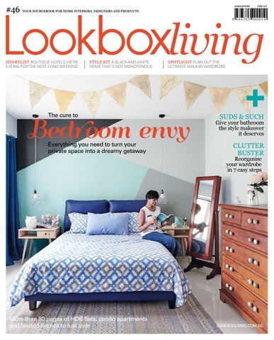
Bedr oom envy Everything you need to turn your private space into a dreamy getaway

SUDS & SUCH

Give your bathroom the style makeover it deserves

CLUTTER BUSTER

Reorganise your wardrobe in 7 easy steps

More than 80 pages of HDB flats, condo apartments and landed homes to lust over

LOOKBOXLIVING.COM.SG

Clear your closet clutter Before you start to organise your wardrobe, declutter first, says Nathalie Ricaud from Get Organised & Beyond (www.getorganisedandbeyond.com). As a Professional Organiser, her job is to help homeowners set and achieve their organising goals. Here, she shares 7 steps to a decluttered wardrobe.

STEP 1 Reflect on your lifestyle, personal style preferences, the type of clothes that fit your body, and the colours that match your skin, hair, and eyes. Reflect on how you spend your time before you start the physical process of decluttering. STEP 2

TEXT JASMINE GOH

Gather your clothes from everywhere throughout the house, including those in the ironing pile and the laundry basket. STEP 3 Go through each individual item to sort the entire pile into categories. Place anything that is torn or no longer in good condition in a ‘Discard’ category. Keep your categories broad, based on occasions or by clothing type, so that you don’t spend too much time assigning an item to a category. STEP 4 Once your clothes are sorted into categories, take a closer look through each category. For each item, ask yourself: Does it fit me? If it doesn’t, will I alter it? Items that answer ‘no’ to both should definitely go into the ‘Discard’ category. For items that you want to alter, give yourself a deadline of two weeks to get it done. STEP 5 Go through each category again, this time asking yourself: Is it comfortable? Does it make me feel good? Items that answer ‘no’ to either question should go into the ‘Discard’ category.

40 | LOOKBOXLIVING.COM.SG


SHORTLIST

TRENDS

Tie and Belt Hanger from Howards Storage World

Nathalie recommends where to shop: Howards Storage World www.hsw.com.sg Muji www.muji.com.sg Daiso www.daisoglobal.com/store

Design by Rezt & Relax

IKEA www.ikea.com/sg Japan Home www.japanhome.com.sg

STEP 6 Decide on the number of clothes you should keep based on your lifestyle and your storage space. This isn’t about hitting a benchmark number, but coming to an understanding of what you really need. If you have more items than you need in a category, keep only your favourites and get rid of the others.

Umbra www.yeoteckseng.com.sg/ portfolio/umbra/

STEP 7 Ask yourself this last question before you place your clothes back into the wardrobe: Can I pair this item with any other item that I have? If the answer is no, draw up a list of items that you need to complete your outfits. Give yourself a deadline of two weeks to purchase them. In the meantime, keep these items in a container out of your wardrobe. If you haven’t got your complete outfits or alterations done by the deadline, it’s unlikely that you will, and these items should go into the ‘Discard’ category.

Nathalie Ricaud from Get Organised & Beyond (www. getorganisedandbeyond.com) Bamboo Drawer Organisers from Howards Storage World

“Clutter is often the result of indecision. If there’s something that you don’t like, don’t use, or don’t need, make the decision on the spot to put it aside, instead of back into your closet.” – Nathalie Ricaud

LOOKBOXLIVING.COM.SG | 41


Designed with Portuguese passion Portuguese brand Mambo Unlimited Ideas uses traditional techniques to create contemporary homeware and furniture. TEXT REDZMAN RAHMAT

Think of Portugal and you’ll think of a country that’s rich with culture and heritage. Portugal is famed for its centuries-long tradition of craftwork like ceramic tile making and fabric weaving. At the same time, the southern European country is a nation that’s bursting with young creative energy. A new breed of Portuguese design studios has begun to combine the old and the new, bringing fresh design ideas and time-tested design techniques to the world. One of the successful brands that have emerged from

Editor’s Picks

There’s no shortage of ingenuity or quirky detailing in Mambo Unlimited Idea’s furniture pieces. We picked 3 that caught our eyes.

44 | LOOKBOXLIVING.COM.SG

Croix Chair

the burgeoning design scene in Lisbon, the capital city, is Mambo Unlimited Ideas. By taking the traditional artisanal craftsmanship and modernising its processes, the proudly Portuguese company is leading the new wave of European furniture revival. Designer Claudia Melo was in town to represent the brand during Maison&Object Asia this year and she explains how her company is representing the younger, more modern aspects of Portugal’s design industry.

The ultra slim sled legs on the Croix chair are the perfect contrast to the plush seat. We especially love the seams that run on the back of the chair in a sharp, triangular pattern.

Ivy Chair

We love the retro vibes exuding from the Ivy chair. The backrest is designed as a separate piece, so you can use two entirely different fabrics on the back and on the seat.

Jules Lamp

The Jules lamp – available as a suspended lamp, a table lamp and a floor lamp – pairs a lacquered metal “cage” with soft cotton shades. We love how the thicker metal bars contrast beautifully with the thinner, colourful inner bars.


SHORTLIST PROFILE

Claudia Melo

from our homeland. The legs of the tables and chairs are mostly solid wood, and it’s from a Portuguese tree that’s almost like walnut. It’s the same for our fabrics. We use 100% wool from Portugal that’s hand processed and dyed here. The weaving technique to create these fabrics is a traditional technique that’s done only in Portugal.”

INCORPORATING DESIGN INFLUENCES FROM AROUND THE WORLD

TAKING PORTUGUESE CULTURE AND MODERNISING IT “We work a lot with our heritage in Portugal. We study ancient techniques and see how we can use them to achieve new and exciting designs and applications. For example, the Portuguese have a well-known heritage of designing and manufacturing tiles. We take these techniques and create new models and patterns, like three-dimensional tile designs. Then we use the patterns in unconventional ways, like on a tabletop. At the end of the day, our techniques are very Portuguese but the designs and applications are very modern.”

USING TRADITIONAL MATERIALS IN UNCONVENTIONAL WAYS “We only use a single type of marble, and it’s a Portuguese one called Estremoz marble. Other materials like brass and copper are also sourced

“I’m not so much inspired by the Portuguese culture as I am by its techniques and colours. When it comes to design, I like to look at the 60s and the Art Deco eras. I also look at other countries and cultures for ideas. I travelled a lot as a kid and I’ve experience many different cultures. I tend to keep these influences and inspirations at the back of my mind, in my subconscious. They are all inside me, and when I create something, these ideas creep into my creations. So you can see a variety of influences, like Asian or Indian in my designs.”

MIXING, MATCHING AND LAYERING TEXTURES “I feel like each time you create something, you need to compile different layers and textures. Each product has different depths, thickness and textures. It’s the same with materials I use. For example, I design the chairs in a way that you can use two different fabrics on one chair. That’s our concept; you can easily identify the Mambo brand by the use of different materials in a single piece of furniture.”

PRETTY CREEPY CRAWLIES True to form, Mambo Unlimited Ideas has incorporated the unexpected into its product collection. In this case, the company works closely with master ceramists to hand-make and hand-paint oversized ceramic insects and fruits. “We were exploring all our options. We’ve seen how other designers take big animals and downscale them to fit inside the house and we wanted to do something different. So we took small animals, specifically insects, and scaled them up to a bigger size.” The swarm of insects, including ants, beetles and praying mantises, are given bright coats of paint that really pop. “They’re really fun and funky, something that you want to put on your walls or on the coffee table. They make you feel happier and connected to something friendly and familiar.” The popularity of the ceramic bugs have led to a spin-off collection of ceramic fruits, similarly upsized and featuring electric hues.

www.mambo-unlimitedideas.com

LOOKBOXLIVING.COM.SG | 45


Sweet Dreams

Browse these 8 online stores to shop for bedding that both you and your little one will love for sleep and snuggles. TEXT JASMINE GOH

www.snurkbeddengoed.nl/en Based in the Netherlands, Snurk creates fun and original duvet sets that engage people in conversation. The designs for children are equally inspiring and might even encourage sweet dreams. The company manufactures their bedding in a variety of international bed sizes, so be sure to pick the right size for your child’s bed. Worldwide shipping available

www.castleandthings.com.au Made in Australia, the cotton bedding products by Sydneybased design studio Castle are perfect for injecting a spot of sunshine in the bedroom. Fluorescent yellow dots, heart prints in peach, and brightly coloured pom-poms are used in all the right places to create a fun and beautiful line of textiles. The sheets come in smaller sizes fit for cots and children’s beds. Worldwide shipping available

48 | LOOKBOXLIVING.COM.SG


SHORTLIST

SHOP THE WEB

www.ferozadesigns.com Founded in Singapore, Feroza designs their cotton bedding using hand block printing techniques that are common in India. Their signature product is the dohar, a traditional Indian summer blanket made of three layers of soft cotton voile. Only the middle layer is handprinted, resulting in a lovely muted colour effect. Besides the kid-size dohar blanket, there are also cotton quilts and pillows suitable for growing toddlers.

www.piccolo-house.com Piccolo House started with modular beds and play desks crafted from solid wood and finished with non-toxic paint. It has now expanded their collection of nursery furniture and accessories to include peel-off wall decals, beautiful loomed rugs, and stylish bedding sets carefully sourced from kid-friendly design companies.

www.bynord.com/en The motifs and colours you find here are in some way or other related to the natural landscape of the Nordic lands. Think monochromes and furry woodland creatures. Danish design company By Nord uses organic materials in their range of bedlinen and duvet sets. The Kids collection of blankets, bedlinen and cushions are tastefully designed with prints of irresistibly adorable baby animals. Worldwide shipping available

LOOKBOXLIVING.COM.SG | 49


Style Kit Homes We Love

Strike a balance

Home

3-bedroom condominium

Floor Area 1,300 sqft

THIS NEWLY REJUVENATED 3-BEDROOM CONDOMINIUM APARTMENT HAS BEEN GIVEN A FRESH NEW LEASE OF LIFE FOR THE TIGHTKNIT FAMILY THAT JUST MOVED IN.

TEXT REDZMAN RAHMAT IMAGES COURTESY OF MINIMOLOGY

T

he owners of this apartment – a couple, their daughter and two dogs – asked for a home design that isn’t driven by trends. In other words, no Industrial furniture, Scandinavian flourishes or other fleeting design elements. Elden Lim from Minimology responded accordingly, coming up with a design proposal that focused on cultivating a laidback, time-tested homely vibe. “I took cues from the clients’ habits and what they enjoy doing in their free time,” he elaborates. “They’re a very tightknit family and they spend a lot of time together, usually hanging out in cafes and treasuring their moments with one another.” In a bid to reflect this in the interior design, Elden created cosy spaces throughout this apartment where the family can gather around. Aesthetically, he wanted to create a home that has a strong design outlook but is individualistic enough to stand the test of time. “Instead of following a certain ‘look’, I focused on developing the right ambience in each room. I used a lot of earthy colours and natural textures to make the home feel very grounded,” says Elden. He also took design cues from several sources: the ceiling has a black-and-white

Left: Stepping into this apartment, you’re greeted by the display area cum shoe cabinet, backed by a burnt orange wall that sets the precedence for the rest of the home.

76 | LOOKBOXLIVING.COM.SG

Opposite: The living room takes its design cues from the interior of a country chic lodge. Earthy colours like beige and taupe, roughhewn textures like the Craftstone walls, and even a faux fireplace with kiln dried logs help to complete the look.


LOOKBOXLIVING.COM.SG | 77


78 | LOOKBOXLIVING.COM.SG


STYLE KIT

HOMES WE LOVE

DESIGN NOTES

Future-proof your child’s bedroom with a design that they won’t easily outgrow. Keep the space young and light-hearted but at the same time, try not to be too focused on a certain trend, colour or passing obsession.

Left: This kid’s room is designed to be every child’s dream space. A loft bed capitalises on the apartment’s 3-metre high ceiling, and incorporates shelves and storage. Instead of a ladder, raised platforms become a flight of stairs leading up to the bed. Opposite: Although the dining room is relegated to a nook next to the living room, the designers made the most of the space they had. Now, this dining area is reminiscent of a cosy booth seat in a European diner. The bold scarlet wall helps to complete the look without overpowering the space.

outline that’s reminiscent of Coco Chanel’s aesthetic, the Craftstone wall in the living room is inspired by a “treehouse” and a faux fireplace brings to mind images of chic country lodges. One of the most unique things about this apartment is its floor plan. Because it’s in a relatively older condominium, some of the rooms have awkwardly angled walls. But instead of working around these obstacles, Elden incorporated them into the design. Take the dining space for example; it’s a compact space tucked away in a nook next to the living room. Elden observed that it could only accommodate a round dining table, so he customised a bench that would maximise seating space. He then anchored the space with a sanguine scarlet wall. “It’s like a cosy little booth seat in a small café, and the family loves the fact that they can huddle closely together,” he says.

“Colours are used very consistently in this apartment. They all come from the same family but are still strong enough to have their own identity. We don’t want the colours to overwhelm.” – Elden Lim, designer

The bold colour in the dining room is just one example of Minimology’s penchant for introducing vibrancy with hot hues. Elden points out that each room has its own colour

LOOKBOXLIVING.COM.SG | 79


“The homeowners know what they want in their home, and this is good because we can come up with a strong design direction. It also helps that they are very creative people and they’re open to using bright colours.” – Elden Lim, designer

Below: The original layout of this apartment is marked with awkwardly placed pillars and weirdly angled rooms. The designers compensated by reworking the floorplan, boxing up the pillars and keeping the design as linear as possible.

DESIGN NOTES

When the bedroom wall sports such a vibrant colour, keep the rest of the design muted with neutral colours. This room strikes the right balance with an electric blue wall paired with the earthy floors and cabinetry.

Opposite: The bed in the master room rests on a platform, which raises the bed high enough to afford a view out the window. The platform also houses storage space. Also of note are the cobalt blue walls that identify the character of this room.

identity: the entrance foyer sports a welcoming burnt orange, bold scarlet identifies the dining and living rooms, and a cobalt blue takes precedence in the master bedroom. “The colours we used are all strong, but they don’t take away from the character of the place. We tried different colours, especially in the bedroom, and we decided that this shade of blue strikes the right balance,” says Elden of his choice of colours. It’s not just about design looks, Elden placed equal emphasis on how each room functions. He points to the daughter’s bedroom as an example. “We don’t want her to outgrow her room so quickly, so it’s an age-appropriate room. We built a loft bed with steps that lead to the top and we included plenty of storage space.” This home strikes the right balance between functionality and aesthetics. From the use of complementary colours to well considered floor plans, the design team and Minimology breathed new life into an old apartment.

MINIMOLOGY 7 Gambas Crescent #05-19 Ark@Gambas Singapore 757087 Tel: 6635 2221 www.minimo.sg enquiry@minimo.sg

80 | LOOKBOXLIVING.COM.SG


STYLE KIT

HOMES WE LOVE

LOOKBOXLIVING.COM.SG | 81


A SPLASHING GOOD TIME

3

Your bathroom may be a small space but that doesn’t mean it has to be starved of style. Here are 4 great looks that you can re-create for your home. 2

TEXT JASMINE GOH

1

6

4

5

BRIGHT AND SHINY KNOW THE BASICS 1. PURAVIDA FREESTANDING BATH MIXER The combination of white and chrome finishing in the PuraVida range blends seamlessly to brighten up your bathroom.

2. LH QUARTZ VENAS BLANCO This marble lookalike is made from engineered quartz, providing a nonporous and bacteria-free surface that’s ideal for the bathroom.

Available from Hansgrohe www.hansgrohe.com.sg

Available from Lian Hin www.lianhin.com

3. VOLAKAS HEXAGON MOSAIC Tile it up with these hexagonal mosaic stone tiles that sport lovely grey speckling. Available from Hafary www.hafary.com.sg

4. KLUDI AMBA BATH AND SHOWER MIXER The Kludi Amba range consists of bathroom fittings with sensual aesthetics. The bath and shower mixers have smooth, rounded surfaces that are sleek and harmonious. Available from Hafary www.hafary.com.sg

5. CL1 BASIN MIXER This faucet features a sleek, sporty design language with its graceful contours and polished chrome finish. Available from Dornbracht www.dornbracht.com

6. REMOTE FLUSH ACTUATION TYPE 10 Flush the toilet even when you’re two metres away from the cistern with this remote flush actuation. Besides the flexibility in placement, it is smaller than conventional actuator plates and hardly disrupts the overall look of your bathroom. Available from Geberit www.geberit.com.sg

108 | LOOKBOXLIVING.COM.SG


SPOTLIGHT

BATHROOM THEMES

3

1 2

5

4

6

COLOUR POP 1. LH QUARTZ APRICOT (RIGHT) AND ORANGE CLOVE (LEFT) Engineered quartz surfaces in these citrusy hues will give your bathroom a bright dash of colour.

2. VOLA HV1 BASIN MIXER Designed by Arne Jacobsen in the 60s and still relevant today, this minimalist faucet now comes in 18 different colours and finishes.

3. WONDERWALL RED These bold patchwork tiles and scarlet rectangular tiles are part of the Wonderwall series, and when paired together, suggest a fun yet sensual bathroom.

Available from Lian Hin www.lianhin.com

Available from Volume 5 Home www.volumefivehome. com

Available from Hup Kiong www.hupkiong.com

4. APE CERAMICA LOFT NARANJA (RIGHT) AND LOFT SOL (LEFT) Measuring 100 by 300 mm, these zesty tiles can be mixed and matched for a snazzy subway tile feature wall. Available from Hafary www.hafary.com.sg

5. AXOR CITTERIO E BRUSHED BRONZE From polished nickel to brushed bronze, Axor One products can be customised in 15 scratchresistant finishes to complete the look in your bathroom. We’re partial to this on-trend bronze hue.

6. REFIN FRAME MAJOLICA MODULO Jazz up your walls with these porcelain tiles that feature classic majolica and textile design techniques using distinct graphic elements. Available from Rice Fields www.rice-fields.com

Available from Hansgrohe www.hansgrohe.com.sg

LOOKBOXLIVING.COM.SG | 109


2

1

3

5

4

KNOW FRESHTHE ANDBASICS NATURAL 1.AXOR URQUIOLA COUNTERTOP WASHBOWL Designed by Patricia Urquiola, this washbasin has handles that pull double duty as a towel rail.

2. SIGMA 01 ACTUATOR PLATE The flush control interface in your bathroom can look as good as this water-saving dual flush actuator plate in white.

Available from Hansgrohe www.hansgrohe.com.sg

Available from Geberit www.geberit.com.sg

3. LH MARBLE VOLAKAS Put up a feature wall in your bathroom with this gorgeouslooking marble. Available from Lian Hin www.lianhin.com

4. ATLAS CONCORDE ETIC NOCE While this sure brings to mind a rustic wood cabin, this look is created using coloured porcelain tiles that closely resemble the charming look of actual wood planks. Available from Rice Fields www.rice-fields.com

110 | LOOKBOXLIVING.COM.SG

5. EURODISC JOY WHITE The Eurodisc Joy faucet is operated using a joystick that can be easily manoeuvred with just your fingertips. From Grohe www.grohe.com/sg


SPOTLIGHT

BATHROOM THEMES

1 3

4

2

7

6 5

KNOW THE BASICS MASCULINE MOOD 1. FIMA CARLO FRATTINI SFERA SHOWERHEAD Instead of your typical showerhead, this magic ball-like design will no doubt give your bathroom the statement piece it needs. Available from Hafary www.hafary.com.sg

2. LH MARBLE BLACK MARQUINA Compared to granite and quartz, marble is a more delicate stone but remains well loved for its elegant and shiny appearance. This black marble with its beautiful white veins will make a gorgeous feature wall in your bathroom. Available from Lian Hin www.lianhin.com

3. NEOREST SHOWER TOWER With a rainshower, handshower, and three body sprays, this all-in-one shower tower has no knobs, using push buttons as controls instead. Available from TOTO www.asia.toto.com

4. LISSE BASIN MIXER The upward tilt of the lever gives this faucet an interesting shape while its smooth backward movement makes it friendly for use. Available from Dornbracht www.dornbracht.com

5. AXOR STARCK ORGANIC BASIN MIXER IN BRUSHED BLACK CHROME Designed by Philippe Starck, this uniquely shaped faucet boasts watersaving capabilities with its volume and temperature controls adjusted independently of each other.

6. GIGACER CONCRETE GRAPHITE Despite looking like a non-finished cement surface, this is actually made of large porcelain slabs. The bush-hammered finish is slip-resistant, making it ideal for bathroom floors.

7. G.FERRETI SIXTYFOUR BATH MIXER Matt black fittings exude mystery and glamour, and are sure to set your bathroom apart from the others. From Living Phenomenon www.lpheno.net

Available from Rice Fields www.rice-fields.com

Available from Hansgrohe www.hansgrohe. com.sg

LOOKBOXLIVING.COM.SG | 111


SUDS & SUCH

Our pick of the snazziest materials and chicest accessories to make your bathtime fun and memorable TEXT AND STYLING JOSEPH LIM PHOTOGRAPHY RAYMOND TOH, VINEYARD PRODUCTIONS ART DIRECTION BETTY WONG

ON LOCATION The 30sqm Studio Room at Carlton Hotel Singapore provides total pampering all thanks to its freestanding bathtub where you’ll enjoy panoramic views of the surrounding cityscape. Modern trappings, plush bed, mini bar and other conveniences are all within easy reach. www.carltonhotel.sg

112 | LOOKBOXLIVING.COM.SG

Above, left: Suzanne Sobelle bath mat, $12.90, and Charles Millen green bath towel, $29.90, both from Robinsons; Tizamuka Kak stool, price on enquiry, from Made&Make On vanity: Porcelain terrarium, $138, from Garcon Plant Factory; tall white wire plate, $89, from Commune. Books and white hand towels are stylist’s ow.

Clockwise from left: ‘YGA057-2’ brown hexagonal mosaic, $16 p/sqft, from Hafary; ‘Narbonne Bianco’ White tile, $6.60 p/sqft, from Hup Kiong; ‘A-411B’ Modern Peranakan tile, $3.50 per piece; ‘Vestige Natural’ lumber tile, $6.20 per piece; ‘RMX402’ gold mosaic, $18 p/sqft, all from Hafary; Red spider marble, price on enquiry, from Hup Kiong; Archipelago brass turtle soap dish, $65, Robinsons

Facing page, from left: Porcelain terrarium, $138, from Garcon Plant Factory; Archipelago Agate box, $79; John Lewis soap pump, $49 and The Aromatherapy range hand and body wash, $39, all from Robinsons; Barbershop range scented candle, $33.90, from Yankee Candle; Nordstjerene rectangle green marble tray, $120, from Made&Make; John Lewis soap dish, $39, from Robinsons


SPOTLIGHT

STYLISH BATHROOMS

SWEET PAMPERING Turn the act of washing hands into a treat with delightful products for bodily pampering and add a pocket of greenery for your vanity’s personality.

LOOKBOXLIVING.COM.SG | 113


114 | LOOKBOXLIVING.COM.SG


SPOTLIGHT

STYLISH BATHROOMS

SENSORY SEDUCTION A traditional bath tub soak can be made more indulgent with products that tantalise the body and deliver music to soothe the mind.

ON LOCATION The 34sqm Premier Club Room located on the new wing of Carlton Hotel still feels spacious and welcoming, thanks to its modern design language. A luxurious sunken bath allows one to enjoy a soak and catch up on movies on the widescreen TV.

Facing page, from top left, clockwise: Scented candle, $39.90, from Kikki.K; ‘Ardesia Mix Cenere MS Lisca’ herringbone mosaic, $24 per piece; ‘Moving Black’ Hound’s Tooth tile, $4.20 per piece; Geo Es Terra rectangle tile with hexagonal patterns, $7.80 per piece, all from Hafary; Espresso cup (set of four) by Arne Jacobsen for Design Letters, $64, from Dream; Black tile with graphic steps, $4.20 per piece; Vanguard Cube tile, $4.20 per piece; ‘HR26012’ blue hexagonal tile, $1.20 per piece; ‘Tredi Sabbia’ hexagonal tile, $5.80 per piece, all from Hafary

Above, left: Elephant soap dish, $38; The Aromatherapy range hand and body wash, $39; The Aromatherapy hand and body lotion, $39, and Charles Millen hand towels, $4.90 (green), $5.90 (grey); all from Robinsons; Barbershop range scented candle, $33.90; and candle warmer, $69.90, both from Yankee Candle Above: Sony portable wireless speaker with Bluetooth SRS-X55, $299, from Sony; Poetic centrepiece by Jaime Hayon for Cassina, $873, from Dream; The Aromatherapy range hand and body wash, $39; John Lewis bath towel, $69; Archipelago brass turtle soap dish, $65, all from Robinsons; Barbershop range scented candle, $33.90, from Yankee Candle

www.carltonhotel.sg

LOOKBOXLIVING.COM.SG | 115


Neon brights

An unexpected dash of electric colours brings a touch of whimsy to this Scandinavian-styled family home. Its occupants, a married couple with one child, favour a simple Scandi style but also wanted a cheerful touch to their brand new HDB flat. To that end, the Linear Space designers utilised colour in small but impactful doses. From the carefully curated selection of colourful furniture to custom-built fixtures in bold tones, every bit makes a visual statement against the laid-back white palette. TEXT DISA TAN

ELEMENTS OF SURPRISE

SCANDI DANDY

Colours turn up in the most unexpected places in the living zone with a bold shot of yellow peeking out from the laminate backing of a thin, full-height shelving unit. It provides just the right intensity of visual interest and doesn’t take attention away from the Craftstone feature wall. Linear Space designer Yiap Yi Yun also put in a restrained hand when it came to the display ledges mounted onto the white brick wall. The floating metal shelves are super thin to encourage a lightweight and airy appeal.

A raised platform provides a clear-cut solution in segregating the living, dining and study areas. It features a gorgeous woodgrain flooring and recessed lighting that usher in a warm contrast against the pristine white backdrop. Not only do these two elements work well together, they draw a Scandinavian aesthetic that suits the homeowners’ design preferences just fine.

122 | LOOKBOXLIVING.COM.SG

Project Type 5-room HDB

Floor Area 1,050 sqft


SHOWCASE

LINEAR SPACE CONCEPTS

WINDOW DRESSING The strongest focal point is no doubt the neon blue window frames that look into the kitchen from the rest of the communal areas. These sliding windows are here for good reason; they not only minimise the draft of heavy cooking smells wafting around, they also allow light into the kitchen. It also functions as a serving station.

LOOKBOXLIVING.COM.SG | 123


“We converted one of the communal areas into an enclosed work and study area. The entrance has been relocated and now it is part of the master bedroom.�

124 | LOOKBOXLIVING.COM.SG


SHOWCASE

LINEAR SPACE CONCEPTS

REJIG THE ROOM The homeowners wanted a more flexible arrangement in the connected study and living areas as they would like to work, relax and entertain separately. To make that happen, Linear Space designer Yiap Yi Yun divided the two areas with sliding and bi-fold doors. Not only do these doors effortlessly turn the study area into a private space, the homeowners can now treat the living and dining zones as one cohesive area to host company.

FLEXIBLE SPACE The study room, which remains a neat and lightweight space with a view out the window, is actually carved out from a spare common bedroom. The futureproof design means that it can be quickly cordoned off and revert to a private room. Complementing this versatility is a considered selection of furniture, including brightly coloured high chairs and a matching slim desk.

SPACE SAVERS To better maximise the space in the master bedroom, Yi Yun aligned the custom-built fixtures along the wall. She worked in a bay window seat with hidden storage underneath and a vanity with cabinets. These bespoke touches comprise the best of both worlds: smart functionality and space-saving attributes.

“Most of the surfaces in this home have a matt finish. It is a good look to fulfil the understated quality of the Scandinavian style.�

LINEAR SPACE CONCEPTS 144 Upper Bukit Timah Road #03-13 Beauty World Centre Singapore 588177 Tel: (65) 6462 3360 Fax: (65) 6462 3379 enquiry@linearspaceconcepts.com www.linearspaceconcepts.com

LOOKBOXLIVING.COM.SG | 125


Turn static files into dynamic content formats.

Create a flipbook
Issuu converts static files into: digital portfolios, online yearbooks, online catalogs, digital photo albums and more. Sign up and create your flipbook.