8 minute read
ART WITHIN SURFACES


© Toyo Aluminium
A Vortex of Colours to Challenge the Perception of the Viewers
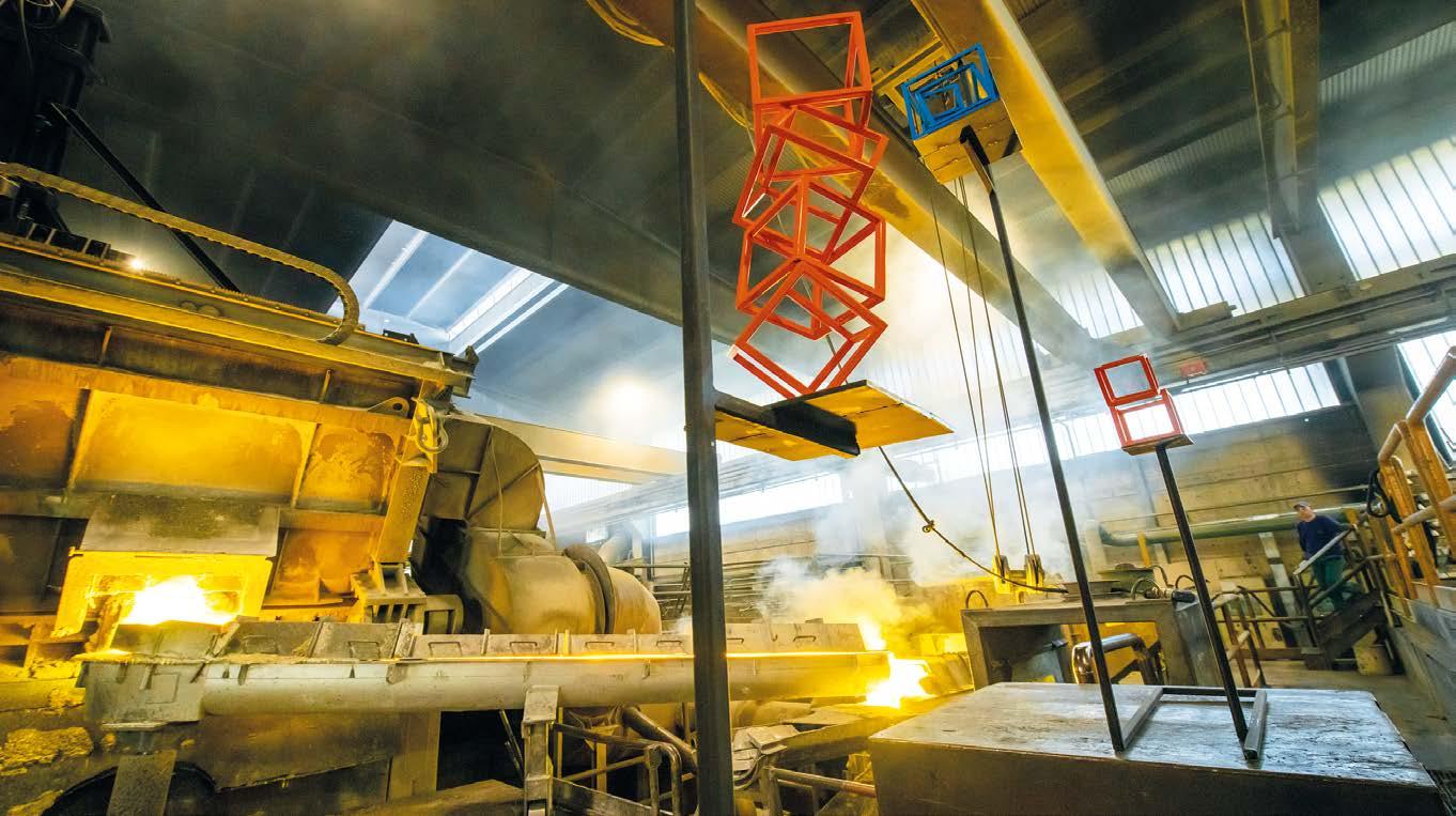
The pigment for automotive coatings CHROMASHINE® has been used by the Japanese architecture and design studio we + in order to create special colourful reflections on the vertex-shaped aluminium art-installation “Resonance: Vortex to diversity”.
Art can be a subjective experience, with viewers understanding several references and meanings – that were not supposed by the original intentions of the artist – according to their own personal background and feelings. Sometimes, however, the creators of artworks want to play with the perception of viewers, so they produce an installation that actively changes its shapes or colours. It is the case of “Resonance: Vortex to diversity”, a vertex-shaped aluminium art-installation that has been created by Toshiya Hayashi and Hokuto Ando, the founders of the Tokyo-based architecture and design studio we +, and presented on occasion of the 2022 Milan Design Week – which took place from 6th to 12th June. The sculpture, part of the Superstudio Più exhibition, has then been coated with CHROMASHINE®, a particular metallic pigment developed by the Japanese paints and coatings manufacturer Toyo Aluminium. The innovative interference colour aluminium pigment used to paint the installation generates a mix of colours and lights that changes according to the direction from which the viewers observe the sculpture, creating a new and diversified object. The metallic pigment CHROMASHINE employs aluminium flakes as base material and its surface is covered with a silica layer and plated with metal particles. The difference in optical paths between the light reflected from the plated layer and the light reflected from the aluminium flakes causes then a strong interference in the perception of colours.
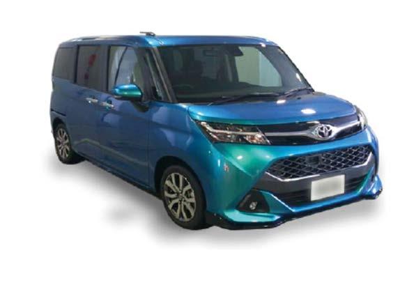
The colour-changing vortex shape, a phenomenon that occurs in nature when different elements come into contact, ideally recalls the joyful encounter of different cultures, traditions and values. The mission of the Japanese studio, as a matter of fact, is to explore alternative possibilities to commercial design, in order to create strong connections between nature, society and spirituality. Toyo Aluminium uses this peculiar pigment also in coatings for the automotive industry, as a tool to provide customised car body parts with exceptional aesthetic effects: “When the car is viewed from the front, it is turquoise green. When it is viewed at an angle, the colour changes to light blue. In addition, the design that we created for the special project in cooperation with the freelance announcer Ms. Renko Sakai includes also the CHROMASHINE® logo and a QR code that redirects to our company website on the sides and rear of the car”, has stated Kaoru Kusumoto, the president and representative director of the company.
© Toyo Aluminium
CHROMASHINE® TGR20X applied to an automotive. When the automotive is viewed from the front, it is turquoise green. When it is viewed at an angle, the color changes to light blue.
ART WITHIN SURFACES
LeRond’s Works of Art on Show in Places where Shapes and Colours Come to Life
Monica Fumagalli ipcm®
The ipcm® editorial staff went back to interview Giovanni Lamberti, AKA LeRond, to explore how artistic perception has evolved during the pandemic and what the future holds in terms of working with materials and colours. At the end of the year, this multifaceted art-designer will gather his works into a solo exhibition based on the profound and suggestive link between the place of birth of his chosen materials and their processing.
It has been more than a year since our last interview. How has your work evolved during the pandemic and what do you have planned now that people have returned to visit museums, galleries, and art exhibitions?
Yes, time goes by fast. I remember the contents of our last interview1 very well. The pandemic, which, by the way, is not definitively over yet, has been conditioning the actions of each person and, therefore, also of us artists. Indeed, the latter, who have a duty to “strengthen and maintain beauty”, as philosopher Tzvetan Todorov wrote in his wellknown essay “Les Aventuriers de l’absolu”2 , should do so even more in times like these. In fact, unlike most artists, who have represented the COVID-19 pandemic and its effects more or less directly in their works, and unlike what I did on the occasion of the 9/11 terrorist attack, where I represented the drama of that moment by creating and completing a work on that same day, I must admit that this time, after an initial period of bewilderment, I
1 https://www.ipcm.it/en/open/ipcm/2021/68/142144.aspx 2 Tzvetan Todorov, Les Aventuriers de l’absolu, Robert Laffont, 2006
continued my research – even I was surprised by this – by keeping on increasing the level of “beauty” of my creations. In the last few months, we have also been able to participate in events and finally savour again the pleasure of the relationship with others, so essential for an artist. In fact, I have already participated in some collective exhibitions and experienced renewed sharing with some colleagues.
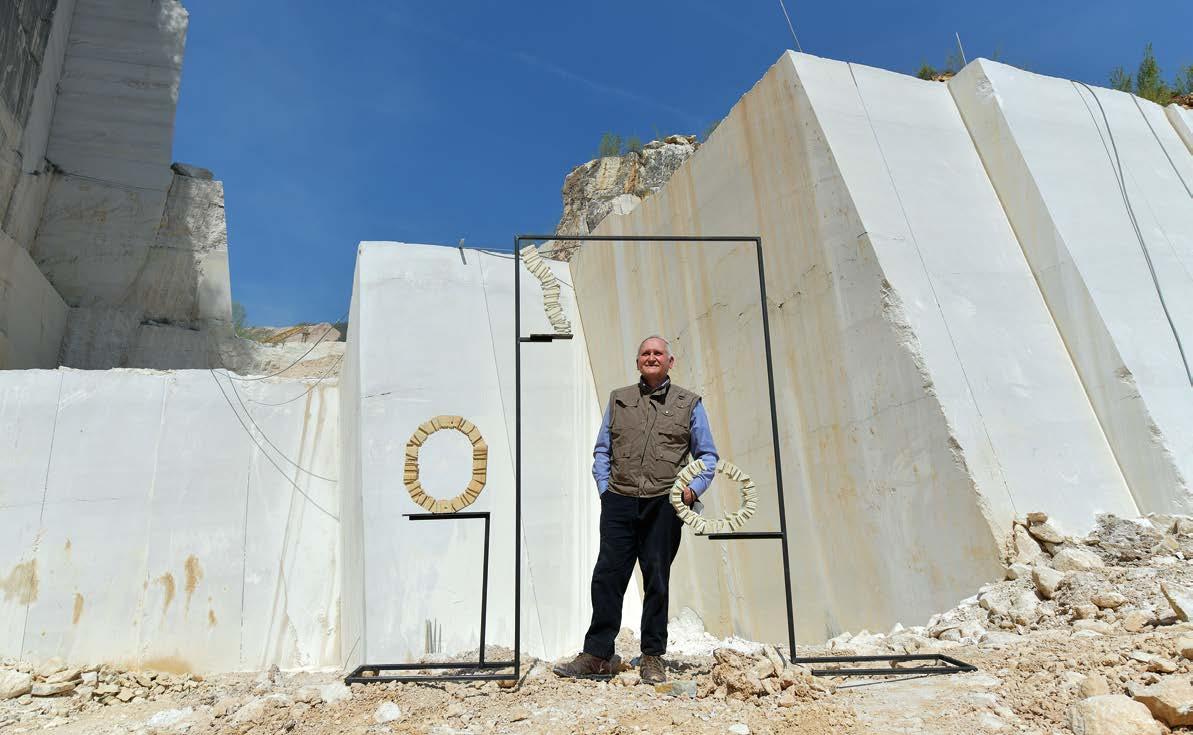
One of the upcoming events is your December exhibition, a prelude to a year full of projects for the cities of Brescia and Bergamo, in Italy, which together will be Capital of Culture 2023. What will it be like?
As far as solo exhibitions are concerned, which obviously require much more commitment than collective exhibitions, I am going to hold one in December at the ancient parish church of Urago Mella, in the province of Brescia, a location that is particularly suitable for displaying my works and that has been used exclusively for exhibitions, events, etc. for some time now. As this is part of the broad panorama of events connected to the nomination of Brescia-Bergamo as Capital of Culture 2023, I intend to repeat it, even partially, in other locations in 2023.
The works on show will be made of wood and iron: can you explain the choice of these materials, which are among your favourite ones?
I confirm that the materials used are wood and iron. More specifically, I have largely opted recycled wood, while iron, in the case of this event, is not. All the works presented, with the exception of the large ones (about 2 m), which will be placed on the ground with ad hoc supports, will be positioned on special suspended iron structures in harmony with each other. Naturally, these display solutions, together with the appropriate light fixtures, are the result of the specific professional work of architect Stevan Tesic of Studio DI_aRCHON ass_, which proved to be particularly useful and high-profile.
Putting your works of art in the origin places of the materials constituting them emphasises once again the link between industry – in its etymological meaning, i.e. human activity aimed at the production of goods – and art. Do you think this link will continue to strengthen or it will be lost as new production technologies become increasingly automated and digital?
The materials used are directly related to
CHEMICAL SPECIALITIES FOR WASTE WATER TREATMENT & METAL SURFACE TREATMENT
RELY ON OUR CHEMICALS TOREALIZE a total “USE AND REUSE” of water!
MST CHEMICALS is a leader in developing a wide range of chemical products and solutions for Waste Water Treatment & Zero Liquid Discharge (Z.L.D.) for metal finishing lines: cupping lubricants, bodymaker coolant, washer chemicals & mobility enhancer, waste water treatment chemicals, Zero Liquid Discharge plants, state of the art chemical controllers.
the place where they are “produced”: wood was recycled from marble quarries in the Brescia area: it was used as a support for boulders waiting to be vertically sectioned and cut in a more or less regular manner. It was then reworked by me in different solutions and shapes, including circular ones. Iron, on the other hand, is linked to foundries, which are no less frequent than marble quarries in the territories of the province of Brescia, and it is normally cut and welded into geometric shapes. The works and their structures of similar dimensions are therefore contextualised in marble quarries and foundries respectively. This creates a congenital, reciprocal link: in quarries, recycled wood is “cut”, while in foundries, iron is “produced”... How could this link be lost? Although I think that technological evolution will certainly lead to the weakening, perhaps even a very significant one, of this link, my intention is not only to represent it, but also to strengthen it and, ultimately, to testify respect for it and for what will be developed.
In the paint industry, we speak of “emotive” finishes, i.e. coatings that have not only a functional but also an aesthetic value, evoking special feelings in the observers of the painted object. In the world of art and design, this aspect can be said to be inherent to the creative act. What do you think about the fact that the emotions created by an artist through shapes and colours can be “industrialised”?
I understand art as a means of building the world through the creation of sculptural works that look out at us every day, reminding us of the beauty and work of the human being as a builder. It is precisely in this context that the so-called “emotive” finishes can be employed, obviously always in harmony with what is being created. They undoubtedly offer an added value that increases emotional pathos for those who see them and touch them, but also for those who create with them. This brings us to a final consideration in relation to the “industrialisation” of works of art and of emotions in general: technology will increasingly lead us towards these forms of generalisation, where interests of various kinds intersect, but what must somehow remain, although not necessarily appearing in a blatant way, is the “touch” of the artist, resulting from the difficult balance among technique and execution... and imperfection.
I wanna give a special thank to the foundry FORELLI PIETRO SRL and to the marble quarry LAZZARINI ANGIOLINO SRL for opening their location to me.
© LeRond