trendbook A P U B L I C AT I O N B Y I TA L I A N B A R K . C O M + S O M A
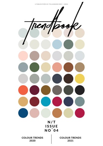
N/T ISSUE NOËš04 COLOUR TRENDS 2020
COLOUR TRENDS 2021
N/T ISSUE NOËš04
Published by ITALIANBARK italianbark.com + SOMA Š 2019 Elisabetta Rizzato All rights reserved. For personal use only, produced for educational and news reporting purposes. No part of this publication may be reproduced, distributed, or transmitted in any form or by any means, including photocopying, recording, or other electronic or mechanical methods, without the prior written permission of the publisher, except in the case of brief quotations embodied in critical reviews and certain other noncommercial uses permitted by copyright law. For permission requests, write to: info@italianbark.com
News Trends NO TRENDS NOTE TOPIC NO THANKS
people C R E A T E D
B Y
Elisabetta Rizzato Elisabetta is an Italian Architect and the creator of Italian design blog ITALIANBARK. Besides being a web content creator, she runs her interior and design studio. She has contributed to several international publications, forecasting interiors and design, while regularly traveling to the latest design events.
C O N T R I B U T O R
Ana Luiza MagalhĂŁes Ana Luiza is a natural communicator, passionate about design, media and cultural diversity. She holds a MA in Media Industries from the University of Leeds, Leeds, UK. She worked in advertising and design agencies in Brazil and UK. in 2017 she moved from London to Milan. Together with Marlon, she is part of SOMA_ studiomilano.
C O N T R I B U T O R
Marlon Chiumento Marlon Chiumento is a trend specialist and holds a degree in industrial design from the European Design Institute (IED) in Milan, Italy. He worked for design studios and furniture brands in Italy and Brazil. He also worked as a trend lecturer in several Brazilian educational institutions. Together with Ana Luiza, he is part of SOMA_ studiomilano.
contents 08
108
/ Colour Trends Ph courtesy Cersaie 2020
/ Pantone + Interior Colour Trends 2020/21
124
138
/ Colour Trends 2021/22
/ Sustainable Colours
new colours FOR A
NEW DECADE 6
C
olours have never been more important in design than now. In a fast-paced world, with loads of information and products available, colours are one of the best tools to draw people’s attention and stimulate their senses. In times where consumers are looking to purchase a story and a mindset, colours become key to communicate the right message and mood.
But how can we predict which will be the colours of the future? Although powerful, colours can be highly subjective, especially through the lens of different generations. Brands and professionals within the design, architecture and fashion industries have been asking themselves this question and trying to provide an accurate answer. The answer to this question is in society itself. Whenever creating or choosing a colour for the years to come, we must interpret the trends in society and ask what will be relevant to people in the future. What are their hopes, dreams and needs? Colours are never only about shades/hues, they are mostly about trend analysis and behaviour. Colour influences can come from many different places: the film industry, social media, new artists, different areas of design, fashion, lifestyles, playstyles, new technologies, materials, texture among others. In this publication, you will find a compilation of colour choices for 2020 from well-known paint brands and some predictions about colour trends for the 202122 years. All choices and predictions show an optimism for the new decade, a strong desire to build human connections and stimulate creativity, to bring nature indoors and to promote well-being. In the last section, we are sharing with you some paint alternatives dealing with the growing concern about climate change and the environmental crisis.
7
COLOUR TRENDS 2020/21
N/T 4
/ COLOUR TRENDS 2020 8
N/T 4
I TA L I A N B A R K + S O M A
9
COLOUR TRENDS 2020/21
N/T 4
colour PALETTE 12
N/T 4
I TA L I A N B A R K + S O M A
13
COLOUR TRENDS 2020/21
N/T 4
"
COLOURS THE SMI O F N AT U
20
N/T 4
I TA L I A N B A R K + S O M A
ARE ILES URE
"
leigh Hunt 21
COLOUR TRENDS 2020/21
N/T 4
JOTUN
2020 COLOURS Jotun launched twelve new shades for 2020, all designed to inspire a specific emotional reaction. The edge of a new decade is, according to Jotun’s Global Colour Manager Lisbeth Larsen, “a specially meaningful time of transition, when the colours we surround ourselves with can carry extra resonance.” Jotun Colour palette for 2020 was designed to convey hope and determination so characteristic of new beginnings. They represent our aspirations to learn and travel more, our desire to be more mindful, to express our creativity and to be closer to nature: from desaturated sage green to serene blues, from trend earth colours, such as the burnt and desaturated orange, to grounded red, from very light colours replacing total white to lively red.
22
N/T 4
I TA L I A N B A R K + S O M A
23
COLOUR TRENDS 2020/21
N/T 4
colour PALETTE 24
N/T 4
I TA L I A N B A R K + S O M A
25
COLOUR TRENDS 2020/21
N/T 4
LOC AL GREEN 8546 26
N/T 4
I TA L I A N B A R K + S O M A
HUMBLE YELLOW 11173 27
COLOUR TRENDS 2020/21
N/T 4
D AY D R E A M 2 0 142 28
N/T 4
I TA L I A N B A R K + S O M A
S TAT E M E N T B L U E 4863 29
COLOUR TRENDS 2020/21
N/T 4
Trend #1 “People want to play” As we increasingly live our lives through the prism of social media, there’s a growing desire to find delight in the real world, to break away from old routines and create stimulating and unexpected environments. The home can be a place that allows us to take pleasure in real-time experiences that delight our senses and make us feel truly alive. by Dulux
colour PALETTE P L AY 62
N/T 4
I TA L I A N B A R K + S O M A
63
COLOUR TRENDS 2020/21
N/T 4
Trend #2 “People are seeking meaning� In our busy digitalised world that can feel superficial, we lack depth and meaning. The rapid advancement of technology is making us question our purpose. There is a growing desire for homes where we can live simply and focus on the things we value, without meaningless distractions. We need spaces where we can re-channel our energies and renew our sense of purpose. by Dulux
colour PALETTE MEANING 64
N/T 4
I TA L I A N B A R K + S O M A
65
COLOUR TRENDS 2020/21
N/T 4
Trend #4 “People want to care” Modern life and our increasing dependence on technology and social media make us feel often disconnected from our relationships, our well-being, our communities, the built environment and the natural world. There is a growing desire to make real connections – with people, with nature, with our cities. By creating homes where we can enjoy good food, restful sleep and contact with the natural world, we are able to nurture the relationships that matter to us. by Dulux
colour PALETTE CARE 68
N/T 4
I TA L I A N B A R K + S O M A
69
COLOUR TRENDS 2020/21
N/T 4
70
N/T 4
I TA L I A N B A R K + S O M A
71
COLOUR TRENDS 2020/21
N/T 4
colour PALETTE HEART 82
N/T 4
I TA L I A N B A R K + S O M A
83
COLOUR TRENDS 2020/21
N/T 4
"
COLOUR IS M OBSESSION TOR
84
N/T 4
I TA L I A N B A R K + S O M A
M Y DAY- LO N G N, JOY AND MENT
Claude Monet 85
"
COLOUR TRENDS 2020/21
N/T 4
GREY BROOK 98
N/T 4
I TA L I A N B A R K + S O M A
U T T E R LY BLUE 99
COLOUR TRENDS 2020/21
N/T 4
B O M B AY PINK 100
N/T 4
I TA L I A N B A R K + S O M A
DESERT FORTRESS 101
COLOUR TRENDS 2020/21
N/T 4
/ PANTONE INTERIOR C TRENDS 20 108
N/T 4
I TA L I A N B A R K + S O M A
E+ COLOUR 020/21 109
COLOUR TRENDS 2020/21
N/T 4
PANTONE
CL A SSIC BLUE 19- 4 0 52 For more than twenty years, Pantone’s Colour of the Year has influenced product development and purchasing decisions in several industries, such as fashion, home furnishings, industrial design, product packaging, as well as graphic design. Pantone 19-4052 Classic Blue – a hue evocative of the sky at twilight, is Pantone’s Colour of the Year 2020. According to their research, this enduring blue highlights our desire to build a reliable and stable foundation as we walk into a new decade. As technology continues to race ahead of our human ability to process it all, Pantone presents this blue as non-aggressive and easily engaging hue. Their idea is to convey calm, confidence, and connection providing a relaxed interaction and always reminding us of the coming of a new day.
110
N/T 4
I TA L I A N B A R K + S O M A
111
COLOUR TRENDS 2020/21
N/T 4
ITALIANBARK + SOMA
INTERIOR COLOUR TRENDS FOR 2021 S TARTING FROM PANTONE 2020 In the verge of a new decade, Pantone Classic Blue seems to be the response to our quest for peace and tranquillity. This colour is timeless and elegant in its simplicity. In this section, we are disclosing 8 colour trends for 2020/2021 starting from the Pantone of the year. We believe these colour combinations will be on-trend very soon both in interiors and in design.
114
N/T 4
I TA L I A N B A R K + S O M A
115
COLOUR TRENDS 2020/21
N/T 4
/ COLOUR TRENDS 2021/22 124
N/T 4
I TA L I A N B A R K + S O M A
125
COLOUR TRENDS 2020/21
N/T 4
COLORO + WG SN
KE Y COLORS S/S 2021 Coloro is a colour system available to professionals in the textile and fashion industry. Together with their partner WGSN, Coloro develops the key colour trends for each season. They have already unveiled the key trend colours for S/S 2021 and for A/ W 2021/22. For S/S 2021, Coloro developed a palette from the vantage point of sport and well-being. Each colour is representing a step of the sport ritual and are defined as Quiet Wave; A.I. Aqua, Oxy Fire, Lemon Sherbet and Good Grey.
126
N/T 4
I TA L I A N B A R K + S O M A
Quiet Wave This clean and technical colour embodies the mental preparation required before exercising. It is described as a clinical green and a long term version of the familiar Neo Mint.
Q U I E T WAV E
C O L O R O 0 7 2 – 6 9 –2 4 127
COLOUR TRENDS 2020/21
N/T 4
Golden Harvest Golden Harvest blends three colour trends – beige, ecru, and yellow - and it has a calm and nostalgic appeal. It calls us to mind the earthen clay buildings and Sahara landscapes of Morocco, as well as the retro gold-tinted filters that has become ubiquitous on social media. According to Coloro, this shade will work well for interiors, particularly upholstered furniture and soft dÊcor.
GOLDEN HARVEST C O L O R O 0 3 4 -7 0 - 2 1 134
N/T 4
I TA L I A N B A R K + S O M A
Bloodstone This rich colour is inspired by the hematite mineral found in iron ore underneath the earth’s surface. Therefore, Bloodstone also calls us to mind heritage themes, combining elements of classic brown and red. According to Coloro, Bloodstone will appeal across a range of categories, from fashion to interiors.
BLOODS TONE
C O L O R O 0 1 1-2 7-2 6 135
COLOUR TRENDS 2020/21
N/T 4
/ SUSTAINA COLOURS
138
N/T 4
I TA L I A N B A R K + S O M A
ABLE
139
COLOUR TRENDS 2020/21
N/T 4
COLOUR S OF THE FUTURE
S U S TA I N A B L E COLOURS The colours of the future are definitely not only about shades. In the verge of a new decade, colours also reflect our growing concern about climate change and well-being awareness. Companies are either updating or creating products and collections that answer consumers’ aspiration to feel good about the environment and about themselves. All the paint companies featured in this publication offer low or zero VOC products and/or collections. VOC stands for "volatile organic compounds�, which are carbon-containing compounds emitted as gasses into the air. These gasses are very harmful to the environment and to people. One of the primary contaminants of indoor air are indeed paints, varnishes, and solvents that contain volatile organic compounds. At the same time, new eco-friendly paint options are emerging and becoming more popular. These include for example recycled paint, milk protein paint, plant or mineral-based paints and ceramic paint.
140
N/T 4
I TA L I A N B A R K + S O M A
141
COLOUR TRENDS 2020/21
N/T 4
created
148
N/T 4
I TA L I A N B A R K + S O M A
d by /WEBSITE somastudiomilano.com /SOCIAL MEDIA Instagram @somastudiomilano Facebook somastudiomilano LinkedIn somastudiomilano Pinterest @somastudiomilan
149
COLOUR TRENDS 2020/21
N/T 4
JOIN OUR TREND MEMBERSH 150
N/T 4
HIP
I TA L I A N B A R K + S O M A
WHAT IS THE MEMBERSHIP ABOUT? Our membership is carefully crafted to deliver exclusive, non-sponsored and on-demand content on the latest trends and innovations in interior and design.
WHAT DO YOU GET? /Weekly updates on the latest trends in interior & design: exclusive reports, e-books, trend webinars, members-only newsletter and blog posts and more /Full coverage of the main European fairs and events /One free consultation session with our team of experts /Exclusive deals on IB Shop
Learn more about our membership here. Use the code “10NEWSUB� and get 10% OFF
151
A P U B L I C AT I O N B Y I TA L I A N B A R K . C O M + S O M A
N/T ISSUE NOËš04
COLOUR TRENDS 2020
COLOUR TRENDS 2021