JamieTurpin











AGE GROUP 13 - 18 years old
Teenager who wants to learn about graphic design and what it entails.
GENDER Not Specified
Create a Final Methodology Book exemplifying my personal design process to create a visual composition for the target audience. You will chose the format that is best suited to communicate your methodology to a young audience of aspiring designers. You will need to follow your own methodology (in its full expression) to generate ideas for this final piece. DO NOT Skip steps. You will be graded separately for the finish methodology book and for the process book describing the methodology followed to arrive at your final design. It needs to be comprehensive.
* * * * * *
Your definition of graphic design.
Your updated design methodology.
Visuals to illustrate key points.
Design, print, and assemble the product.
Provide digital photographs of the final solution.
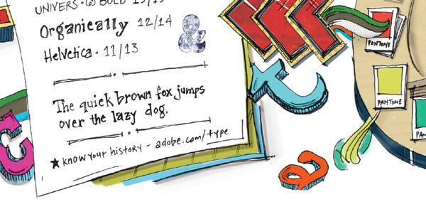
Formal choices: size, color, typography and layout.
To begin, after I identified the problem on how to exemplify graphic design to a teenager’s eyes, I instantly reached out to my niece, Tori, who is 13 years old and actually wants to be a graphic designer. I utilized her for my research and began to understand what a typical teenager likes to see and interact with in regards to an educational product piece that would portray what graphic design is. When working on the inspiration boards, I contributed mood setting images, product images, typography images, and color identities to help set the overall setting and sensory aesthetic approach for the design problem.
appropriate tone and end user in mind. The inspiration images helped me develop my thoughts for creating the thumbnail sketches.
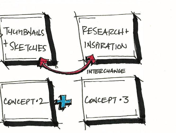
For research and inspiration, I began with multiple resources to gather inspiration from magazines, the internet, and existing environments. When gathering inspiration to help my thoughts flow, I consider all aspects of the design problem within the
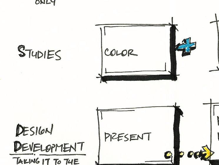
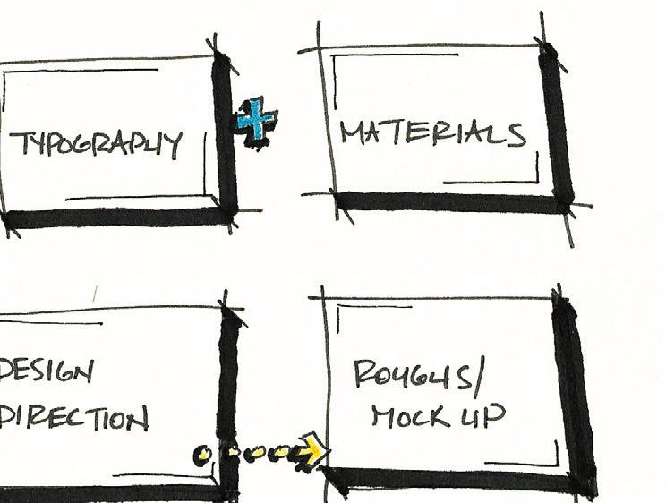
During concept development, my thumbnails and inspirational images allow me to visualize what my conceptual design intentions are. Concept development and studies intermingle together to support the different design intentions for the design problem. My conceptual thoughts are separated by color, typography, and material and product studies. The studies help me fine tune my thumbnail sketches and form 3 - 4 design concepts. The design concepts have applied color by marker or color pencil, have the appropriate materials called out, and have added typography to help set the style of the concept. Then I formed an analysis of the different compositions to get a feel for what would be a successful solution for the end result for the target audience.
Overall, I enjoyed the design process and getting the opportunity to execute the problem to an audience that involved my niece. Having the opportunity to utilize an actual person for research was a great approach for this project. By receiving an actual target audience’s insights and direction was definitely a plus for me in order to execute this project at a superior level.
*
Superior story telling approach exploiting my design process
Simplistic but yet visual design
Appropriateness of the visuals to the written context
Effective utilization of the design principles
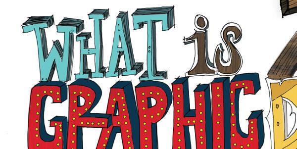
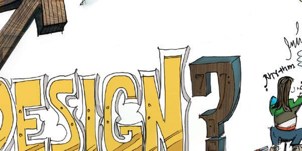
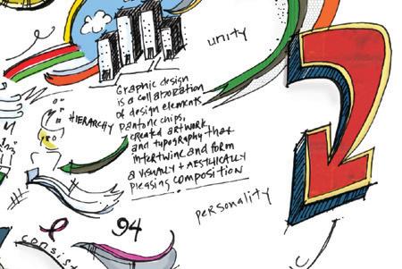
Graphic design, interior architecture and product design are all related in some sense. They share basic design principles whether relying on rhythm, balance, or positive & negative space and they all speak the same language. It’s the end result that makes them different from one another. What is graphic design? In my eyes, graphic design is a collaboration of design elements such as pantone colors, created artwork, and typography that interact and form a visually and aesthetically pleasing composition. Literally, graphic design is the art that communicates visualized ideas of type and image. “But if you use any visual medium at all if you make a poster; type a letter; create a business logo, a magazine ad, or an album cover; even make a computer printout you are using a form of visual communication called graphic design.”1 Graphic design responds to individual and business needs, embraces
concerns both economic and ergonomic, and is formed by many disciplines, such as art, architecture, literature, and language. Both economic and ergonomic, and is formed by many disciplines, such as art, architecture, literature and language.
So where do I fit into the equation? My under graduate degree in interior architecture has influenced my passion for graphic design which has continued to grow rapidly over the past several years. Graphic designers are closer to architects than to artists: “An architectural design defines a living space; the space between the walls is as real and as significant as the walls themselves. In [graphic design] the value of space derives from its relationship with the [elements] that surround it and vice versa.”2 A building’s purpose and size are the architect’s first considerations. Similarly, determining a document’s purpose and its page size are the first decisions a designer must take. Every day I am visually drawn to typographic style, horizontal grid use, column structure, and margins whether it is in
the latest HOW magazine or AIGA’s website.
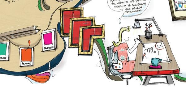
I am visually and aesthetically attracted to branding projects that start with logo identity, carried on with consistency to the website design and on to the interior atmosphere of an existing environment. Branding projects speak uniformity of design that is carried from the beginning to the end.
Graphic design begins by creating the branding which generates the identity, logo design, and the design of the website. In return, the brand is carried into the interior of the space. Along the way, the design is consistent with the branding and style, but allows the design in the beginning to speak its personality and what it is. From experience, graphic design is a form of problem solving that communicates the design idea of a composition of pantone colors, artwork images, layout design and typography in numerous styles of medium from print to websites for a client, business or personal use. Literally, I breathe, eat and sleep graphic design, from reading the daily
newspaper in the morning, turning on my Mac at work, to seeing the containers of color pencils and markers at my office desk. At lunch posted on the wall at the local café is an inspiring poster design announcing the next up and coming local band at the neighborhood coffee shop; as I view the menu to place my order I suddenly notice I am paying more attention to the sans serif typeface rather than actually placing my lunch order. On the commute home, the graphics on the side of the brick façade attract my eye to allow the harmony of the announcement to speak out, the tall buildings downtown start playing a rhythm with my mind as they resemble the shapes and forms of letters; as I open the door to my loft, the numbers on my door communicate their own modern rhythm but yet vintage style. I’ve been immersed in the world of graphic design. In closing, graphic design is a composition in a medium format that is produced by drawing or writing tools and printing devices.
“Designers create, choose, and organize these elements typography, images, and the so-called “white space” around them to communicate a message. Graphic design is a part of your daily life.”3 Graphic design is essentially consistent design that carries branding throughout a business, a fresh look for a startup company in need of a new website, redesign of a corporate identity, package design for the local retail boutique, or new typography for an existing environment Visually, I
live in a world of type and images that exemplify the messages of different styles of graphic design.




It’s not an 8 to 5 job anymore; it is a lifestyle that I absorb myself in.
1 Sharon Helmer Poggenpohl, “What is Graphic Design,” www.aiga.org. (accessed January 25, 2011).
2 Sean Morrison, A Guide to Type Design, (Prentice Hall, 1986) 79.


Since the target audience is someone in their teens, I felt my 14 year old niece, Tori would be a good resource to contact. Tori wants to be a graphic designer when she gets older. [I plan to take her to SCAD next Spring or Summer to help her get exposed to great design schools.] Tori lives in the Fort Worth, Texas area. I bought her the Adobe CS5 Design Suite for her about 5 months ago for her birthday.
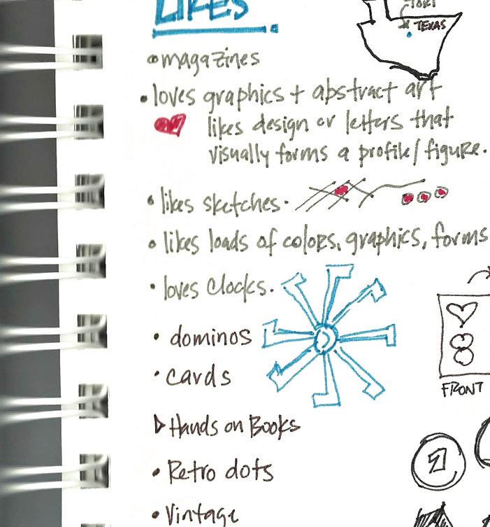

01 The target audience learns by the hands on experience.
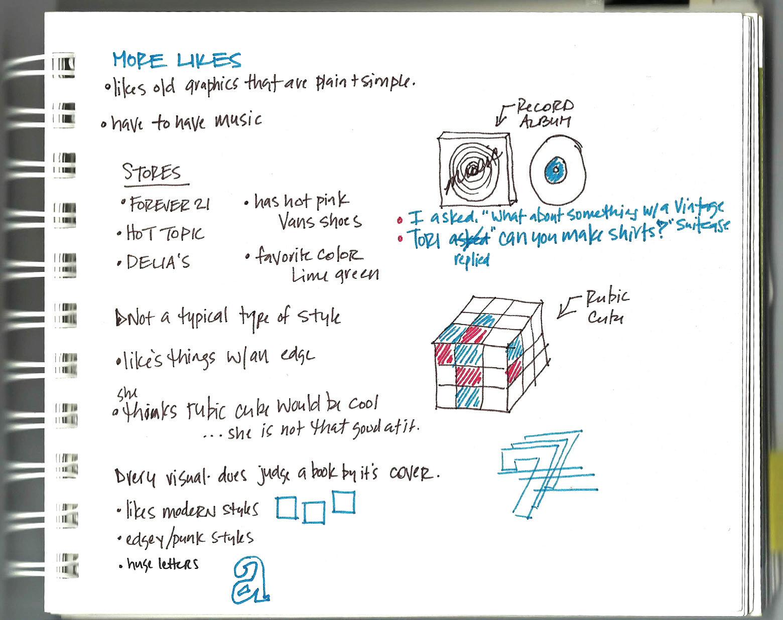
02 Teenagers like images - they do not read something unless the picture or graphics catches their eye.
03 Basically they judge the book by it’s cover.
04 Teenagers have loose imaginations, they have not been molded by the corporate world yet.
05 Teenagers appreciate products with a fun personality, not something that is forced for them to look at.
Fig 1. Tori, in the center, with her friends.

vintage, graphics, interaction, loads of colors, sketches,fun personality pieces, organized chaos

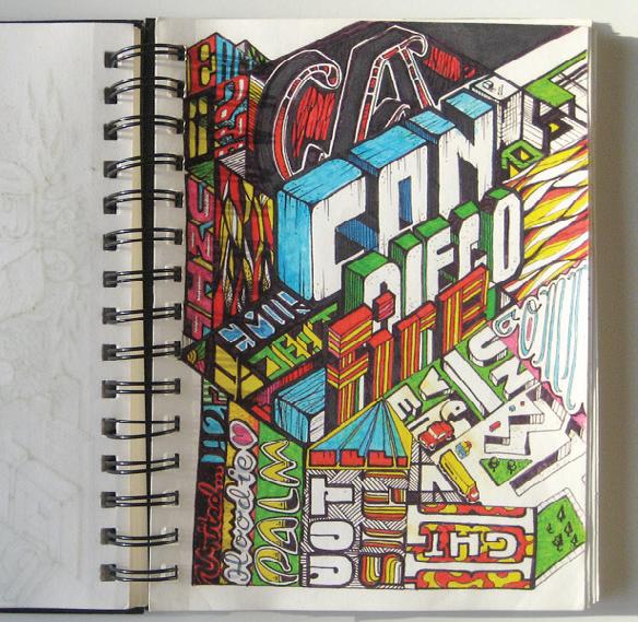




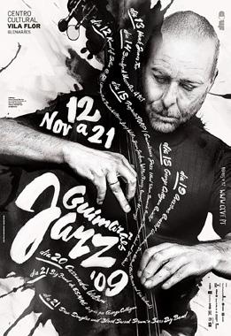
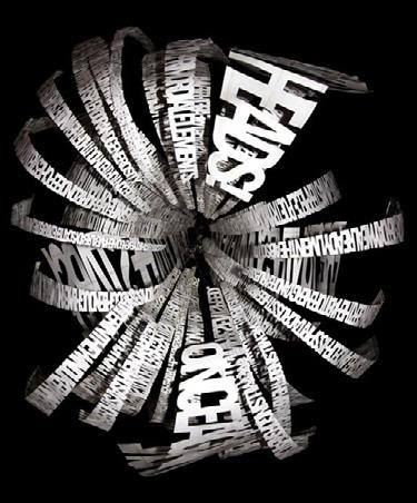
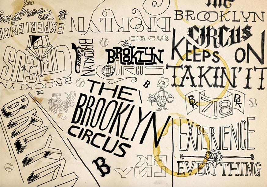
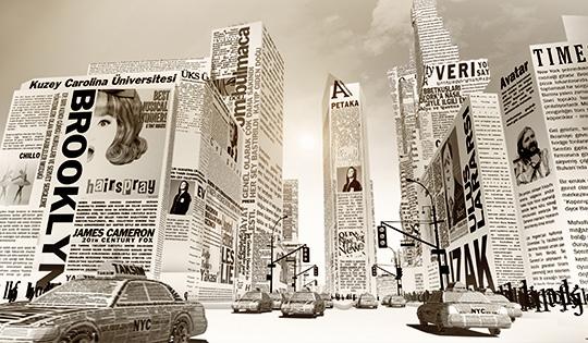
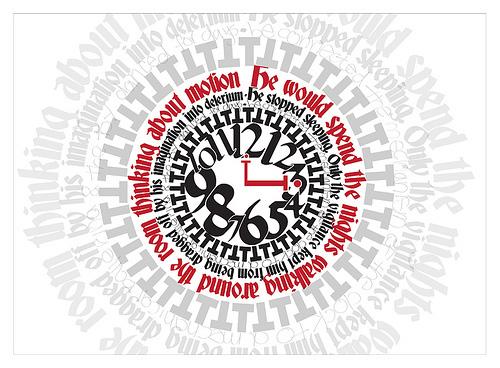
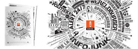
letters, forms, color, edgy style, loose style, fun personality pieces, organized chaos
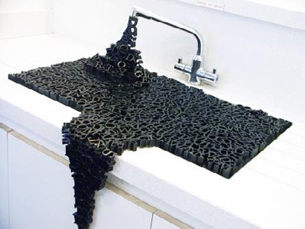
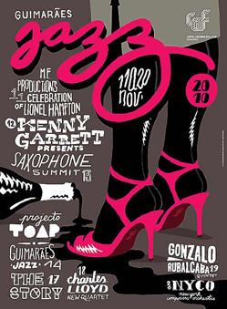

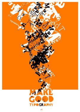
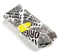
numbers, color, type, forms, interaction, not the typical, loose sketches
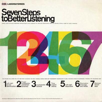
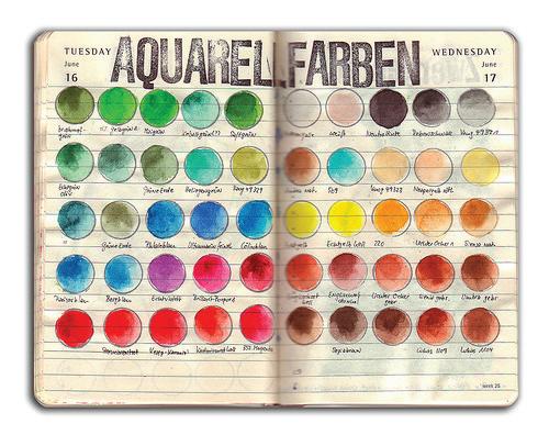

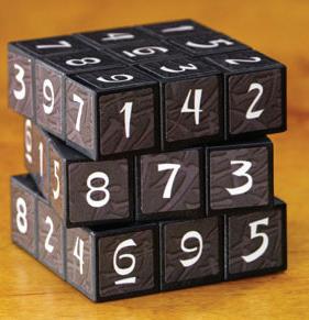
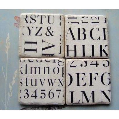
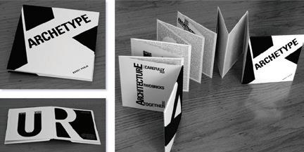
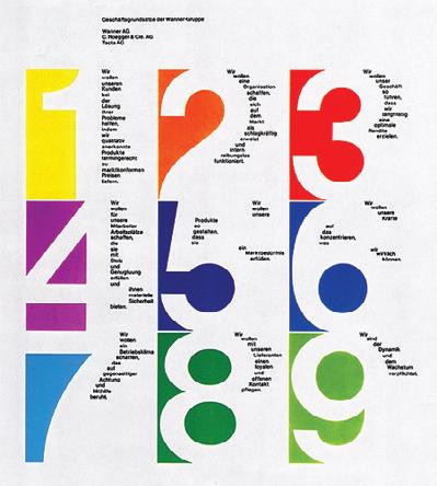
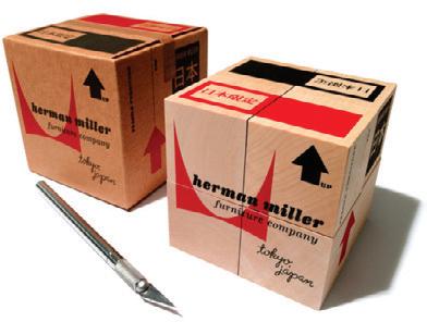
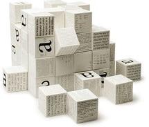
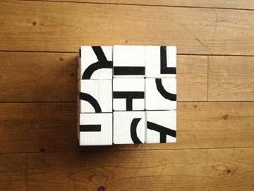
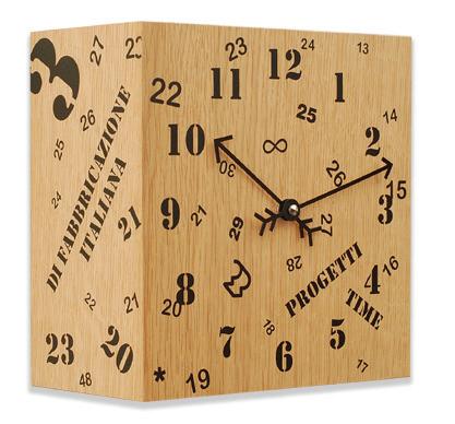
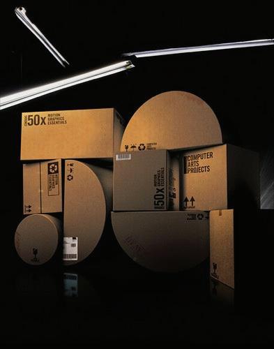
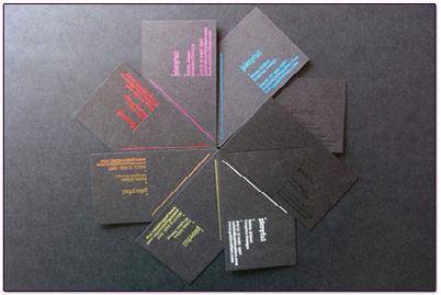
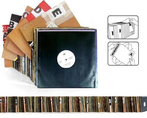

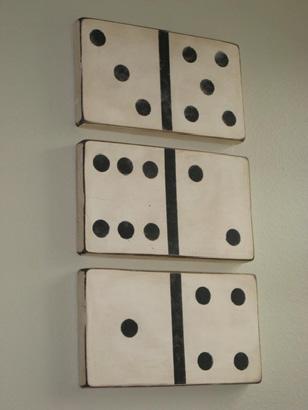
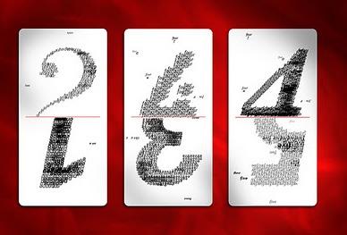
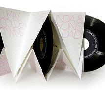
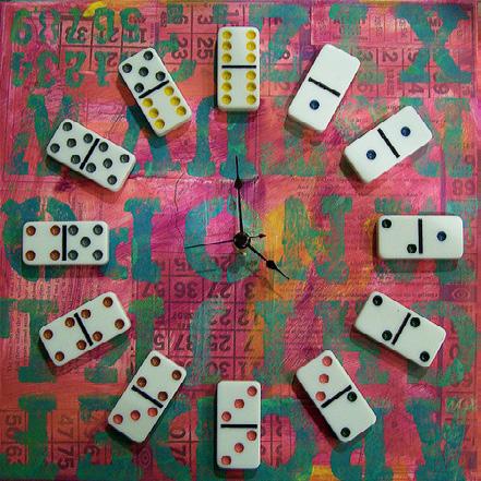
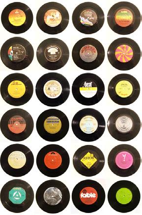


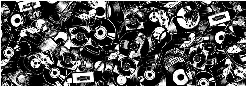
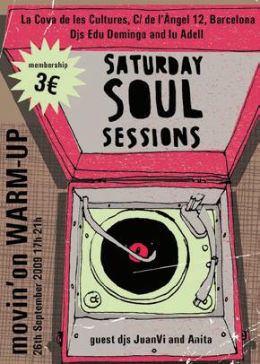
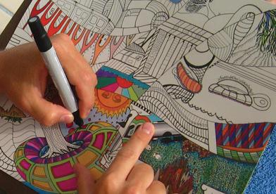
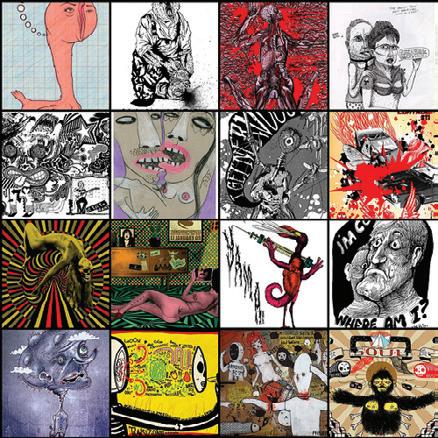
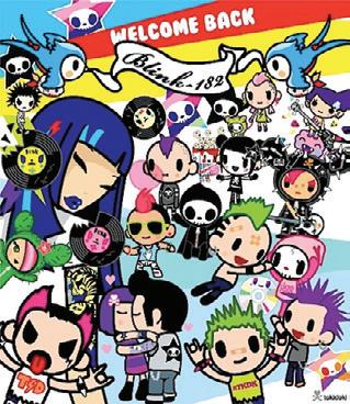


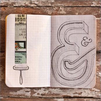
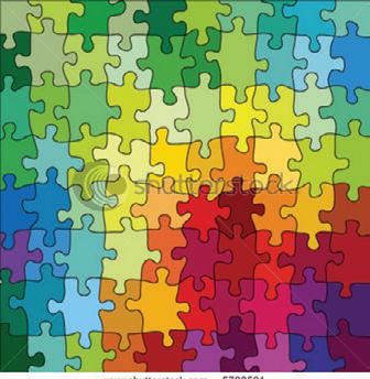
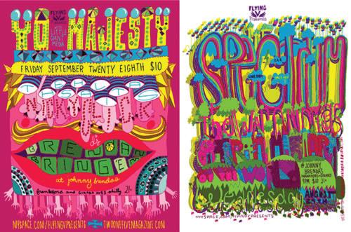
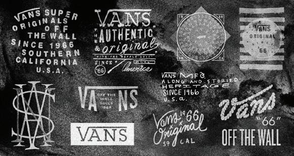
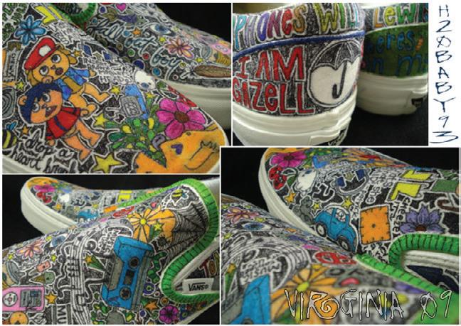
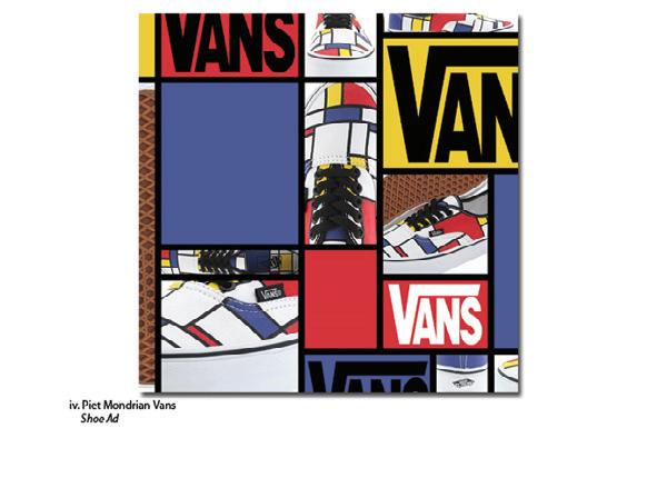
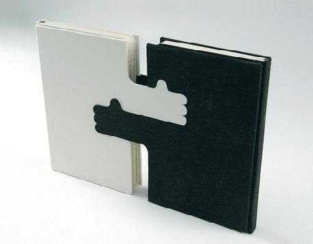
Utilizing the inspiration that was gathered, I was able to brainstorm and create thumbnail sketches that form an end product for the suggested target audience.
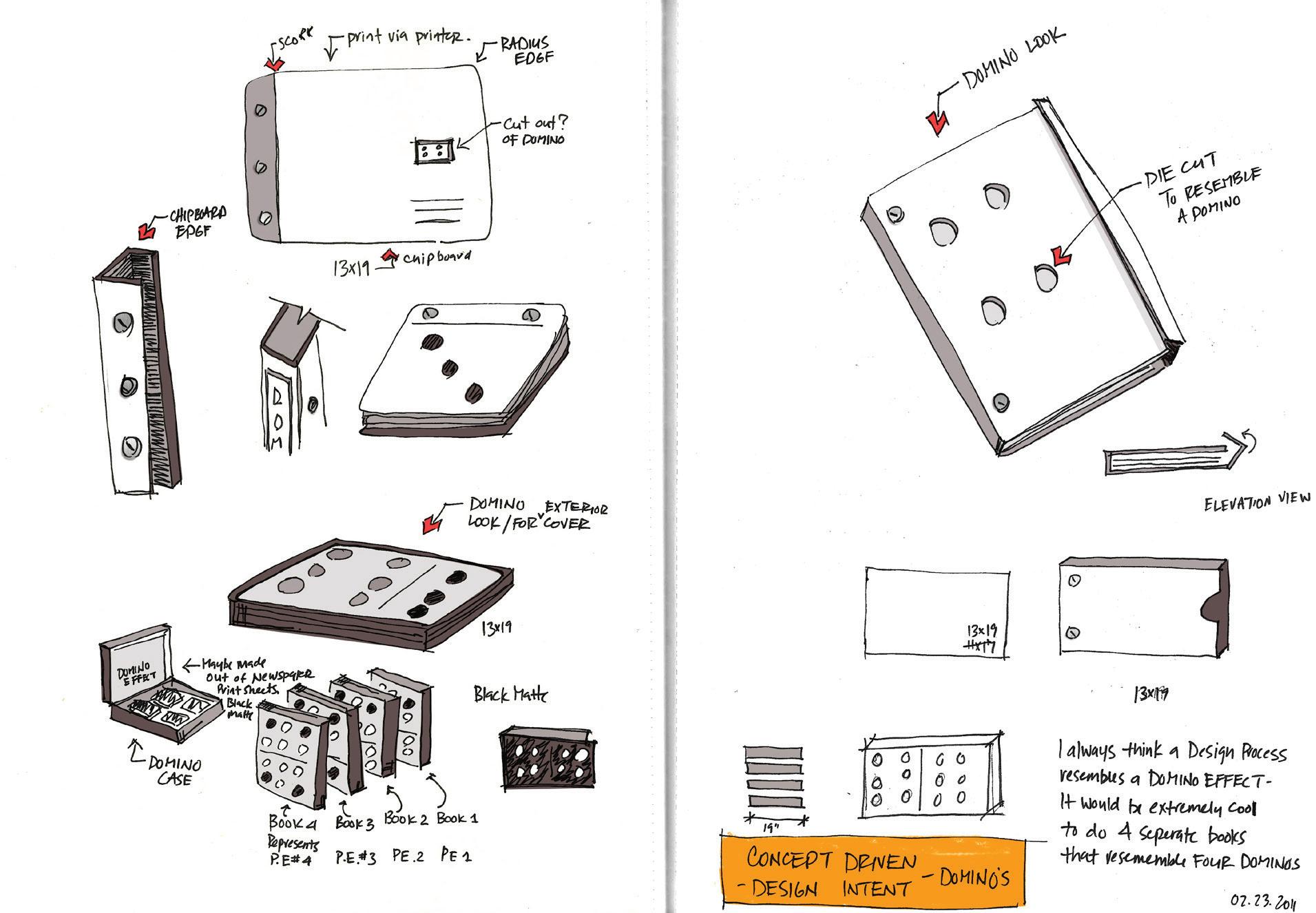





I Kept in mind that the target audience does “judge a book by its cover,” visual aesthetics, scale, interaction, and style are superior principles to consider when developing my thoughts for the final piece.


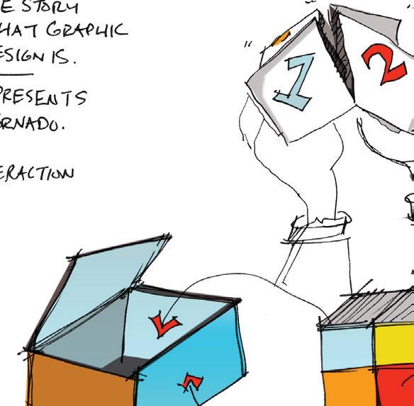
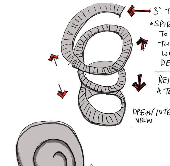


As the review board scrolls through my work, they will notice the eclectic personality this process book articulates. This is based upon the target audience and their attention span. I want to provide random thoughts and ideas throughout the book to keep the audience involved and entertained.


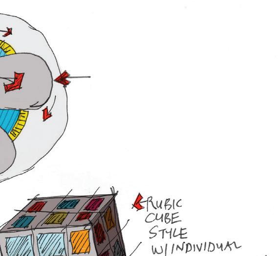
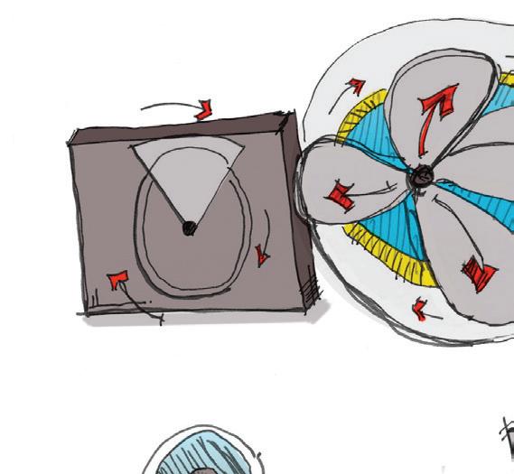

1

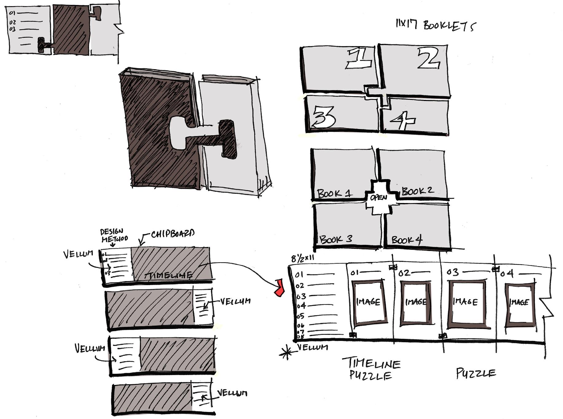
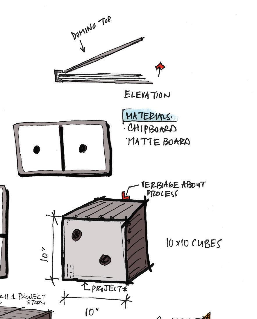
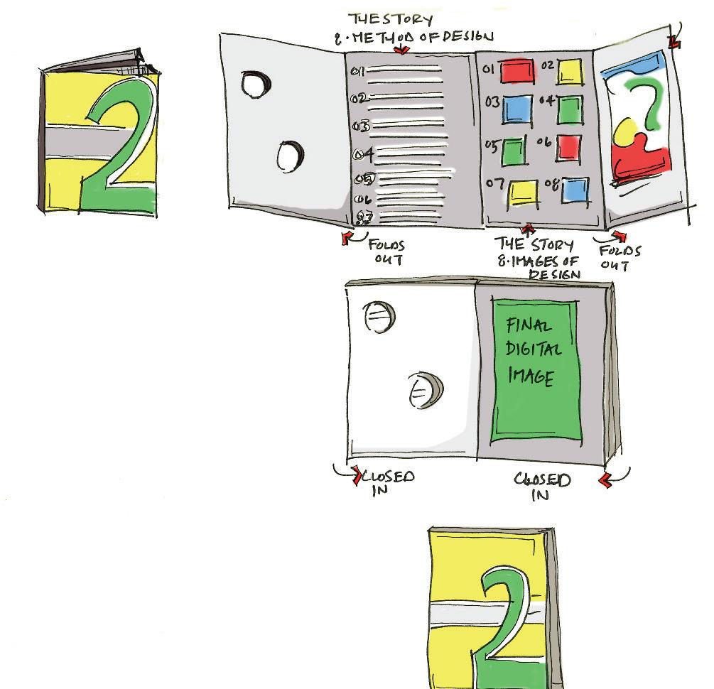
Interaction Book for the target audience that exploits a visual story of the design method. Also articulates a domino concept for each process book that is intermixed with graphic and text integration.
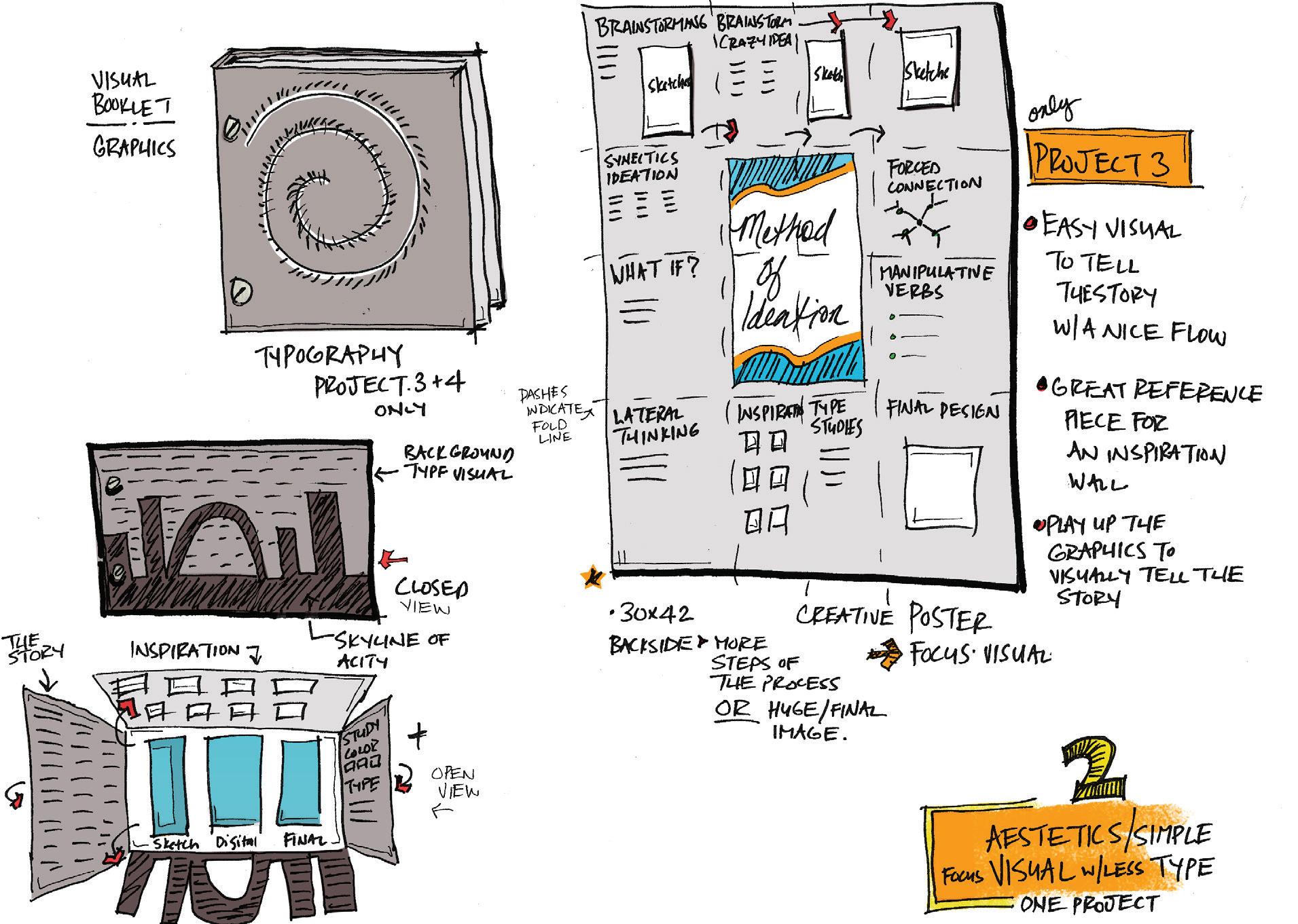
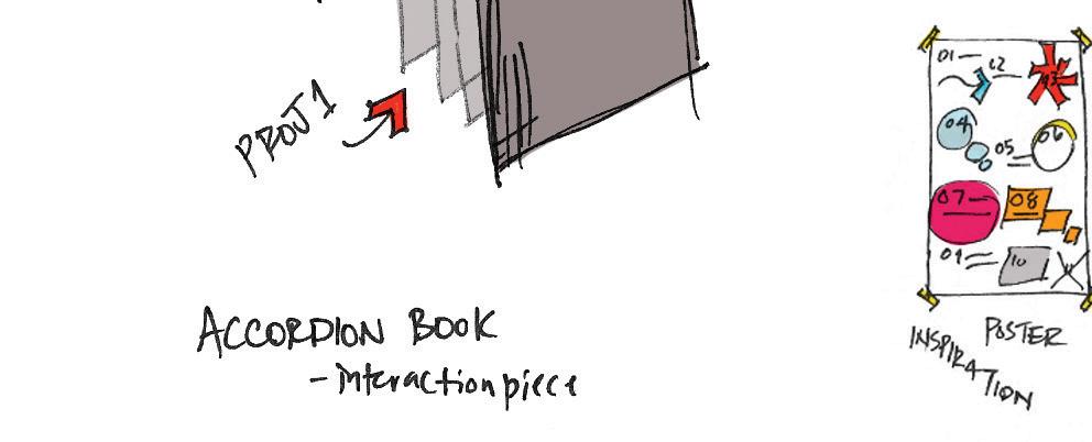
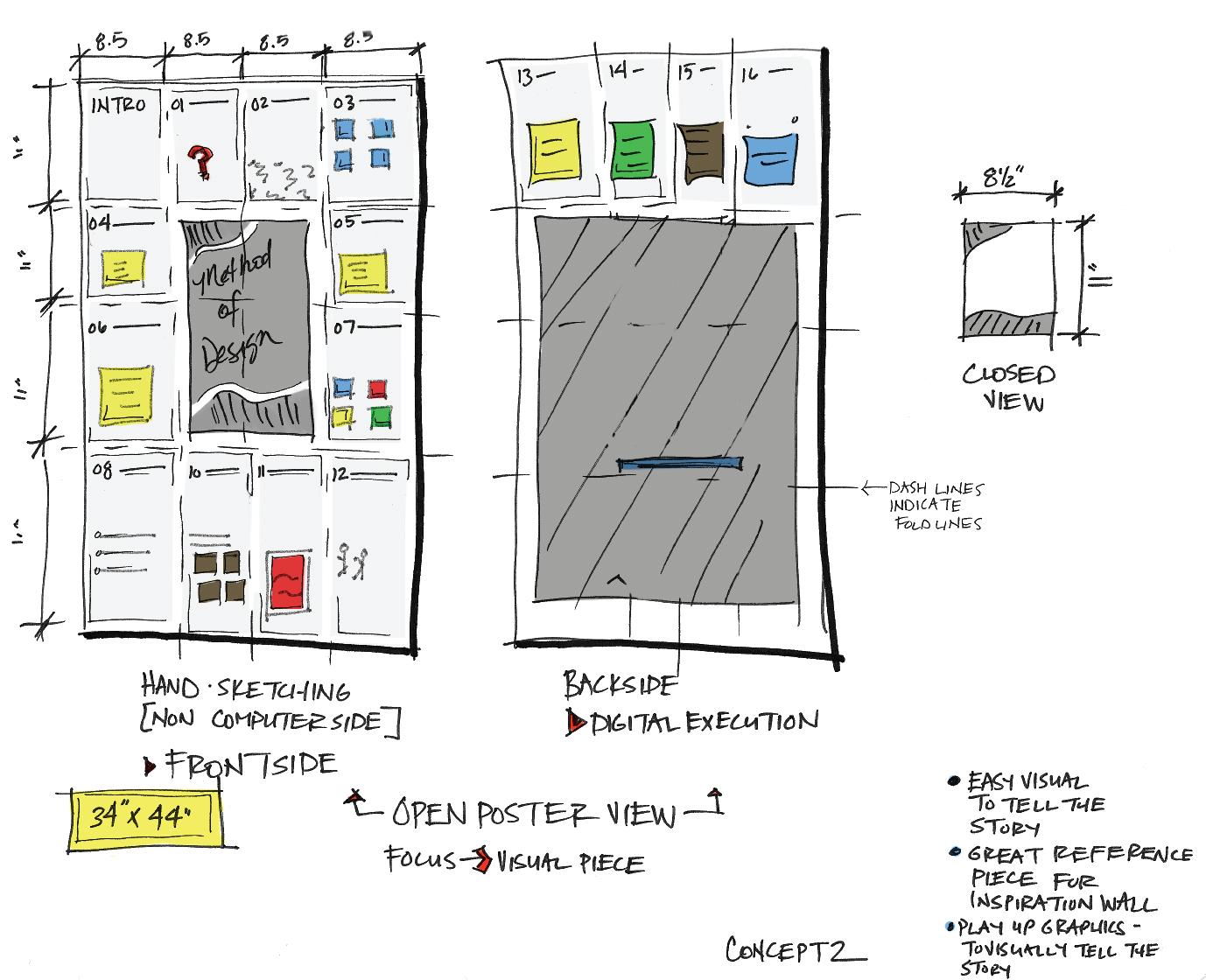
A creative visual poster that plays up the graphics to visually tell the story. This poster can be utilized as a superior composition for an inspiration wall.

Simplistic visual layout that leads one through design methodology. Exploits pure aesthetic colors that attracts the target audience while leading their eye from one panel to the next with a successful story flow.

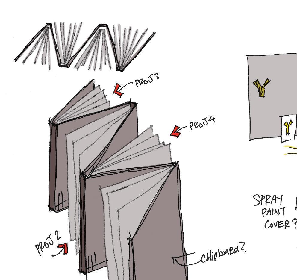
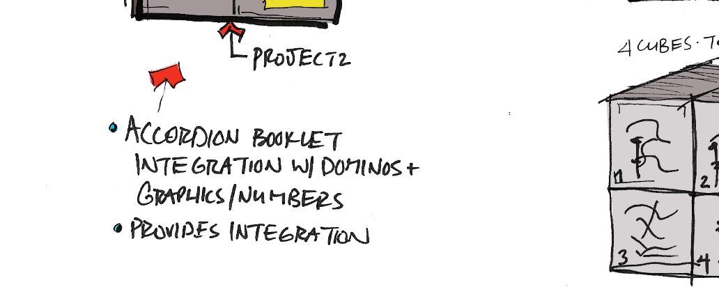
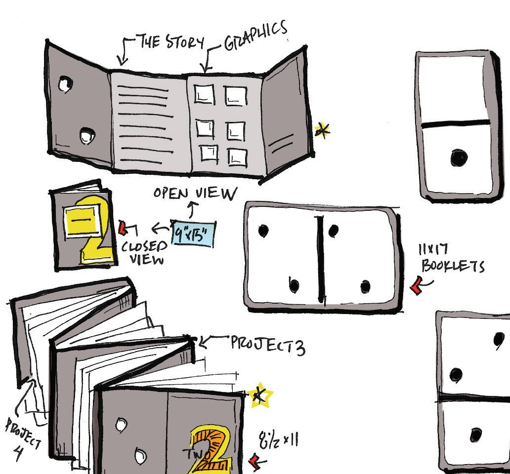
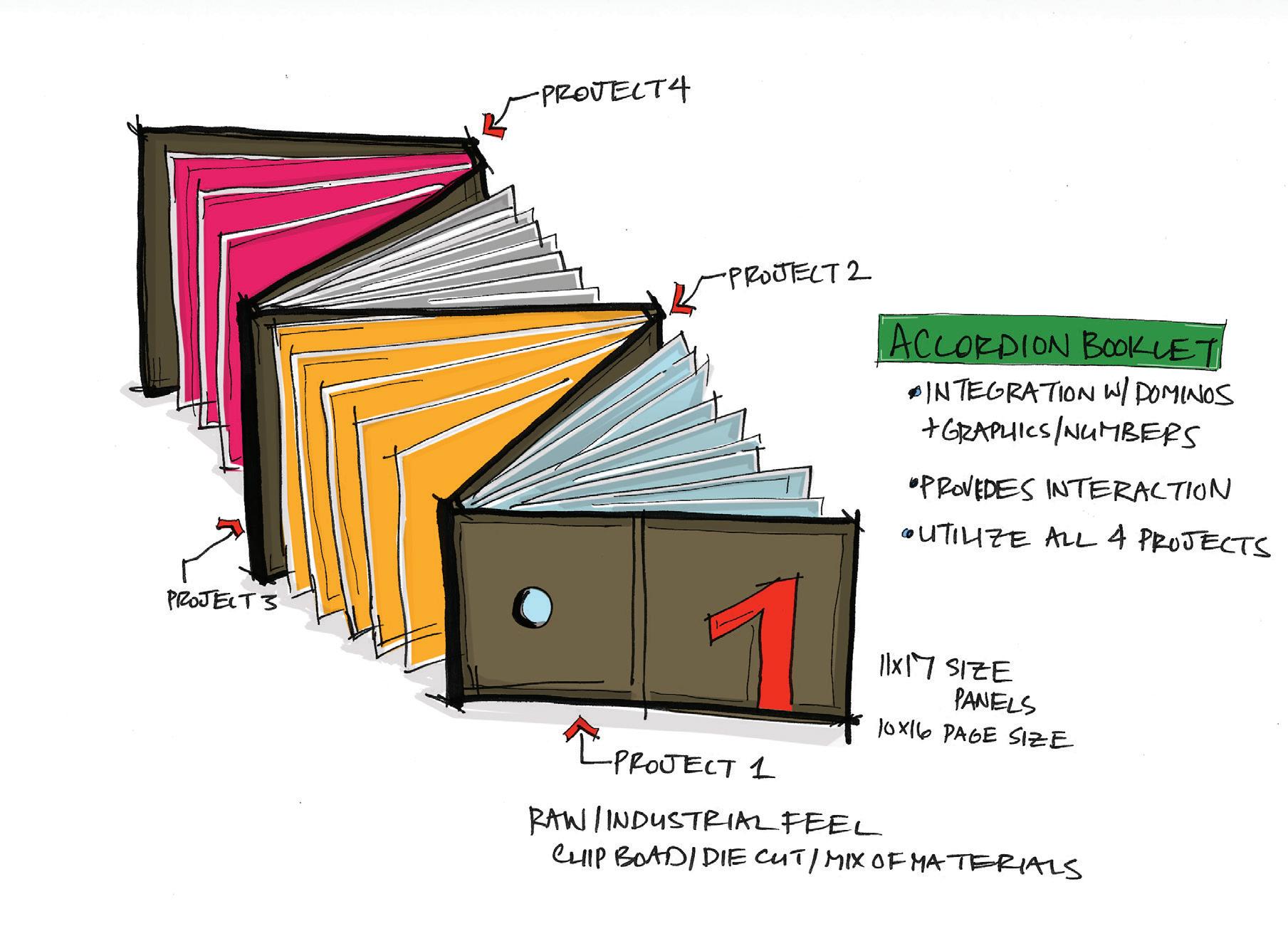
Accordion booklet design with the intent of incorporating all four projects within the master accordion design panels. The overall feel to the exterior panels integrate a dominos graphic that is die cut to create a unique statement for the target audience. The graphics and typography provide an innovative approach to the book while letting the materials speak what they are and the media it represents.
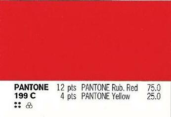
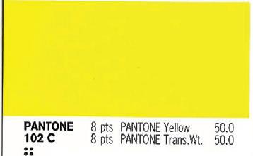
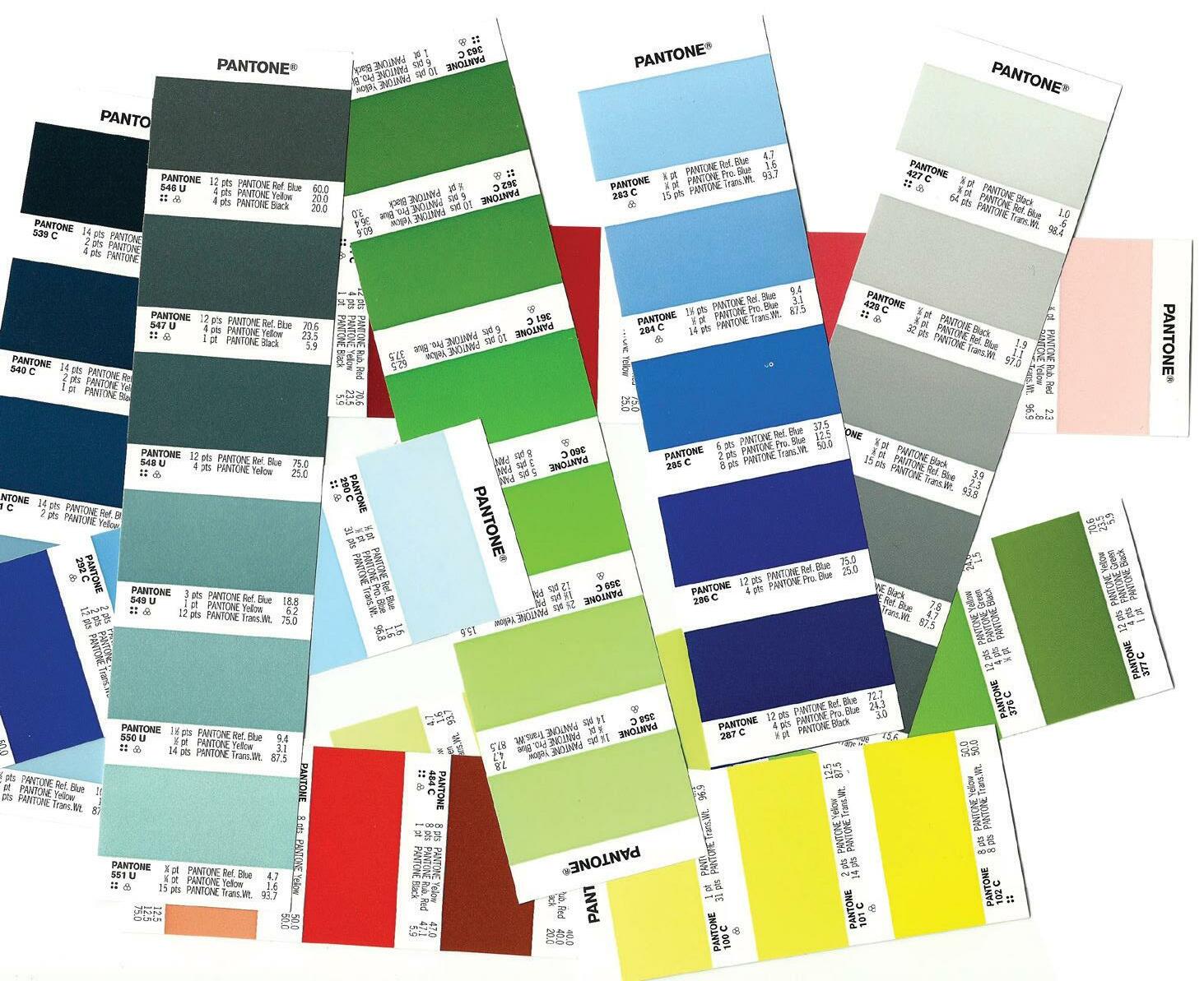
Yellow is the color of sunshine. It is associated with joy, happiness, intellect, and energy. Cheerful sunny yellow is an attention getter. It is the most difficult color for the eye to take in. Red is an emotionally intense color, it stimulates faster heartbeats and breathing. It is also the color of love. Red clothing gets noticed and makes one appear heavier.
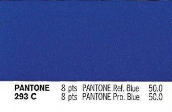
Blue is the color of the sky and the ocean, blue is one of the most popular colors. Peaceful, tranquil blue causes the body to produce calming chemicals. People are more productive in blue rooms.
Orange combines the energy of red and the happiness of yellow.
Orange represents enthusiasm, happiness, creativity, determination, attraction, success, encouragement, and stimulation.
Green symbolizes growth, harmony, freshness, & nature. It is the easiest color on the eye and can improve vision. It is a calming, refreshing color. Dark green is masculine, conservative, and implies wealth.

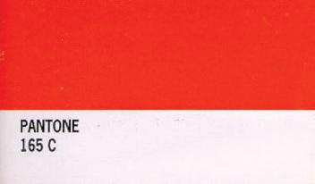
 PANTONE
165 C
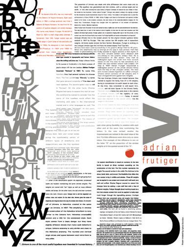
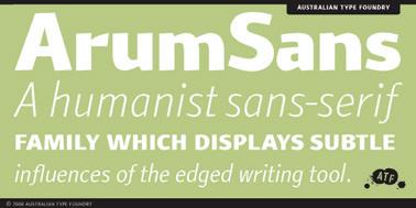
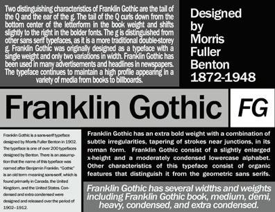


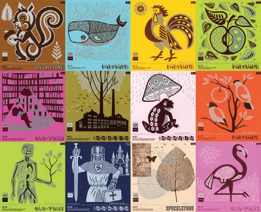
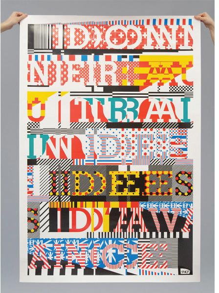
The final process book development has been a very exciting experience for me. The target audience is set for someone in their teens, wanting to know what graphic design is. This really hit home for me, my niece Tori, is 14 years old and wants to be a graphic designer. This past summer, I taught her some basic techniques in Photoshop. She immediately wanted to learn more so five months ago, I bought her own Adobe CS5 Design Premium. For research, I utilized Tori and really wanted to understand what teenagers like today and what they don’t like. For the most part, teenagers are very visual, judge a book by it’s cover and like loose sketchy illustrations. For inspiration, I gathered a few images from the direction and style Tori provided me. Next is some feedback from my peers:
Thomas Creamer: “Domino’s and Puzzles, you just struck a nerve. I am terrible at both. I don’t think I could even do the four piece puzzles as a kid. These are great themes and templates to use for this project, with strong parallels to design concepts and methods. I hope your book is loaded with sketches, random, or seemingly random pages of your sketches. I would even mind a sketch based book, with some copy type and design elements to bring it together, but not overpower. That’s just me though, I like hand made type, and your style so I just thought it would be a nice compliment to each other. Have put some great ideas into the book construction, making them a piece of art, or design, which ever you want to proudly call it. I like all the directions, my favorite would be the puzzle, even though I would never be able to do it or figure it out, I still get it and think that would really make for a strong additional element of design.”
Marvin Eans:
“I think all of your ideas are strong. I think I am drawn to the puzzle concept. I believe our methodology is just that. Connecting all the right piece to create an amazing final product. I think this concept would relate and work great for you book.”
Mary Leiser:
“I kind of think three and four are my favorites as well. There is a lot of opportunity to play up the cut outs in three and the book style of four is very interesting. 4 doesn’t seem to go with your idea of less text more visuals as much as the other with all of the pages it seems to involve. Would you be putting more images in there than text?”
“I like all four of your ideas. I think they are all strong. I think 3 and 4 are my favorites. I can see both of those being fun and interesting to interact with. I think the forms of 3 and 4 are really interesting and would be fun to interact with. But I did go back and look at all the concepts and I also think the interaction in concept 1 is great too. I don’t think I realized that it was an interactive book before. Sorry about that. Can’t wait to see which direction you choose.”
“I do like all your ideas too!
I really like concept 1 3 and 4! I like the holes on one...
I wonder if you could incorporate that in 4. Three would be great for young kids. Visually I like your research on the old school look. The Vans. All that is in!”and how I execute it to the fullest.”
Thomas Creamer: “SKETCHES SKETCHES SKETCHES- PUT PAGES AND PAGES OF SKETCHES IN YO BOOK, THEY SELL THE VIEWER ON YOU AND YOUR STYLE.”
Tori LaZear: [niece] email from 02/27/2011
“Hey Aunt Jam, I really like ideas 2 and 3 the best. The 4th idea is cool, but looks like their might be too much reading involved. The poster idea would be really cool to have in my room. [:”
phone call on 03/05/2011
Tori: “This is really looking cool. I like how each step really shows me what I need to do. I think the 7, 8, 9 look really cool on how they really relate to what I am studying.”
Jamie: “Is there anything you would change or want me to show more of? I guess what I am asking is this something you would place in your room with the direction I am going?”
Tori: “Yeah, I think it is looking cool.”
Overall, I feel very confident about the direction I am going with this project due to reaching out to the target audience and really listening to what they like. I recently updated my design methodology and feel it is accurately molded into the process I follow today. This course has allowed me to step back and take a deep look into really allowing myself understand what my design process is and how I execute it to the fullest.
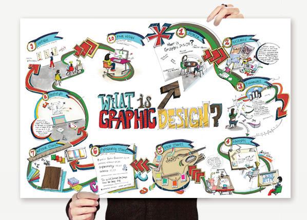
I am moving forward with Concept 2 – The Inspirational Design Poster. To the right, is a rough sketch for the front side of the poster on how it will be laid out.
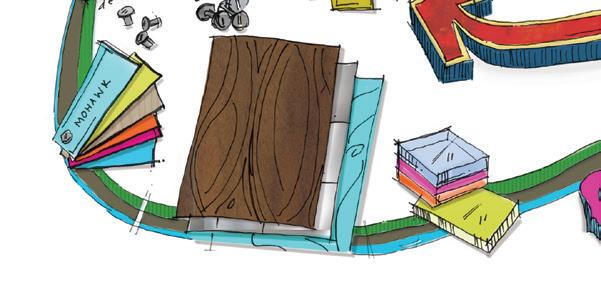
PRINT SIZE 13" x 19" on Mohawk Poster Paper.
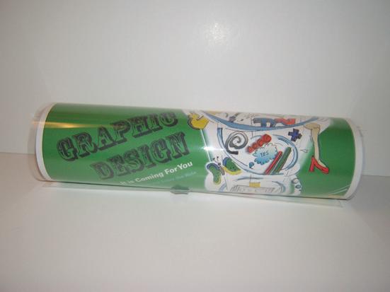
PACKAGING I plan roll the final print and place in a triangular shape tube.
DETAILS The entire poster will be hand sketched and rendered in Photoshop. I will execute Practical Exercise 1 to exemplify my design methodology.
Employing ‘What is Graphic Design?’ essay will be part of each step. For example, in Step 1: the first paragraph forms the picture frame on the wall. The essay will be typed out in Illustrator and placed accordingly to follow the design methodology on ‘What is Graphic Design?’ The essay portion of the poster will be legible.
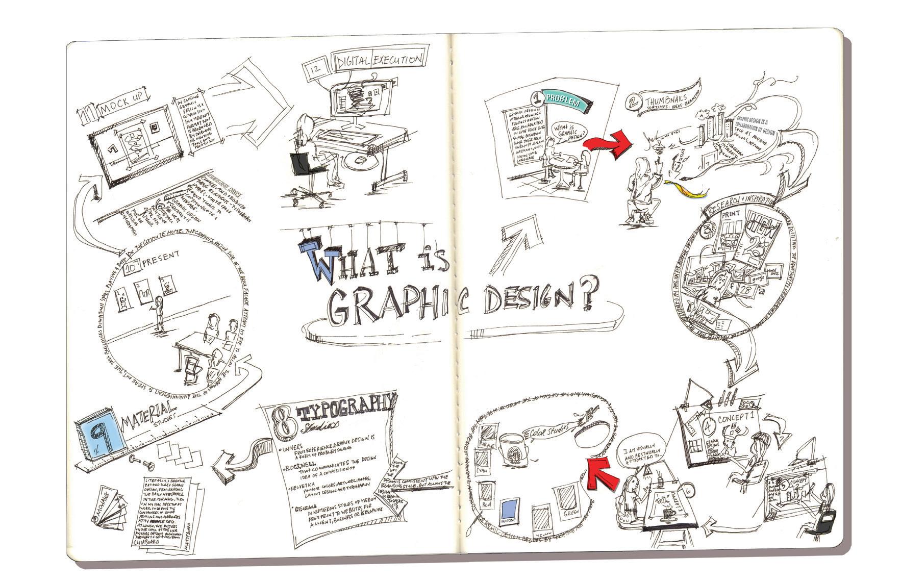
FRONT PANEL I will exemplify my design methodology. It will be set up for a landscape view.
BACK PANEL Will be the WOW factor to the poster. It will have the final composition beautifully rendered. It will be set up for a portrait view.
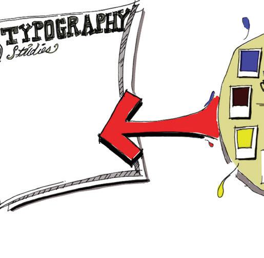
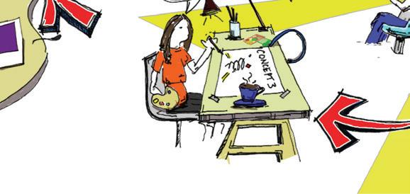
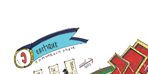
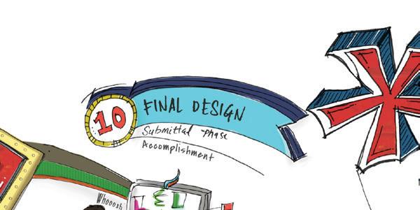
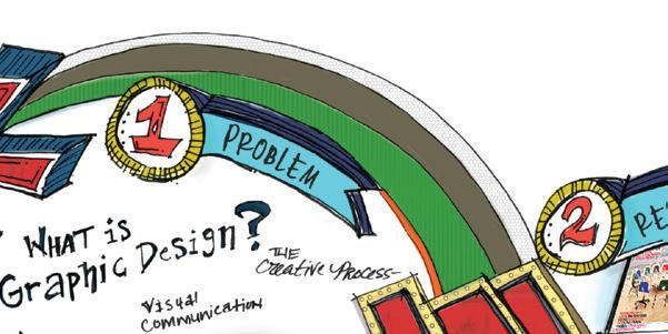
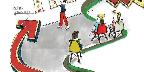
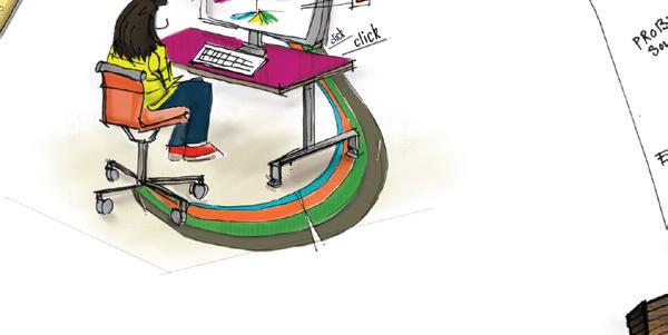
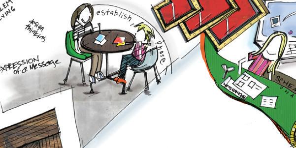
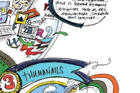
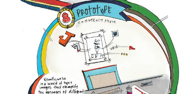
The design method is for the target audience to utilize in college or at home. The front side is sort of their secret to the design process. The back side is for the teenager to flip over when company is over. So now one will know their little secret to their design process. The design methods are illustrated in clockwise direction.
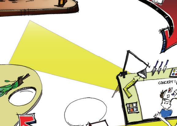
Front Panel: Design Development

“But if you use any visual medium at all you make a poster; type a letter; create a business logo, magazine ad, or an album cover; even make computer printout you using form of visual communition called graphic Literally, graphic design is the art that communicates visualized ideas of type and image. In my eyes, graphic design is collaboration of design elements such as pantone colors, created artwork, and typography that interact and form visually and aesthetically pleasing composition.





Graphic design responds to individual and business needs, embraces concerns both economic and ergonomic, and is formed by many disciplines, such as art, architecture, literature, and language. So where do into the equation? My undergraduate degree in interior architecture has in uenced my passion for graphic design
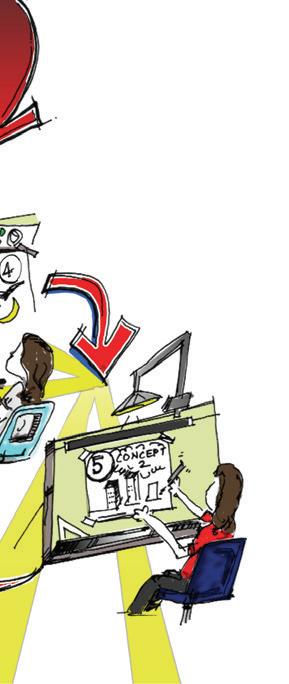

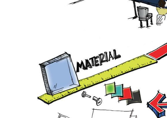

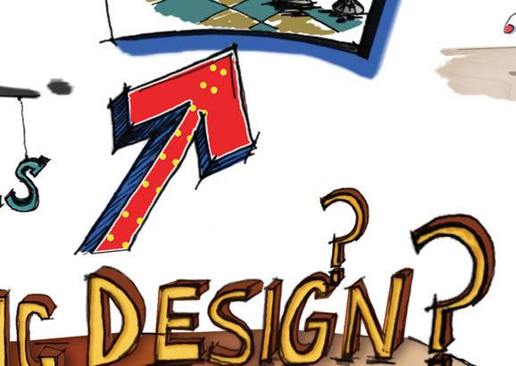

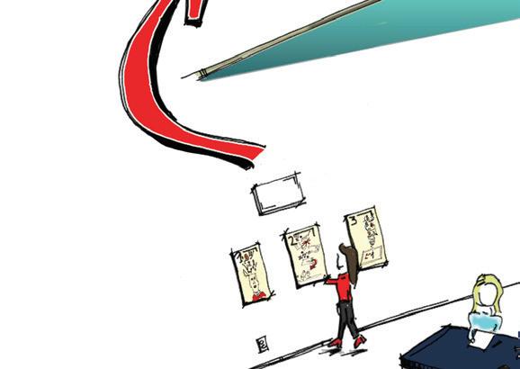


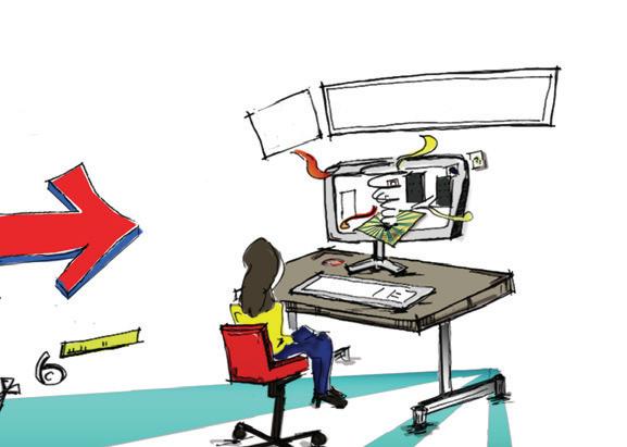
On the commute home, the graphics on the side of the brick façade attract my eye to allow the harmony of the announcement to speak out, the tall buildings downtown start playing a rhythm with my mind as they resemble the shapes and forms of letters; as open the door to my loft, the numbers on my door communicate their own modern rhythm style been
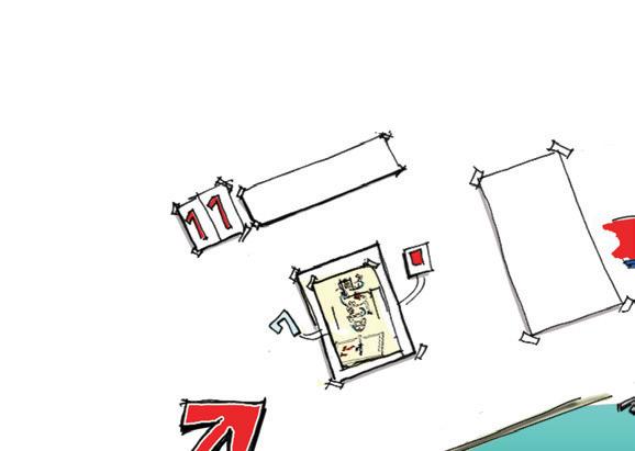

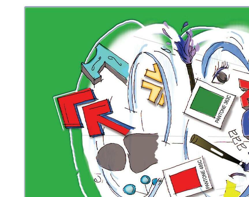

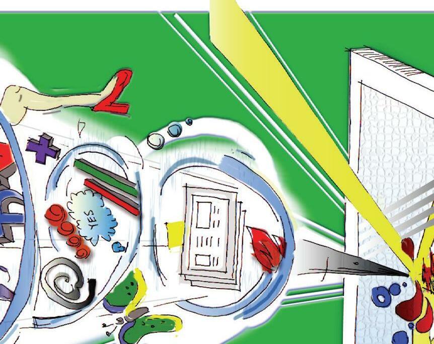
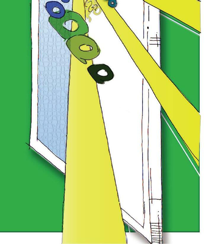
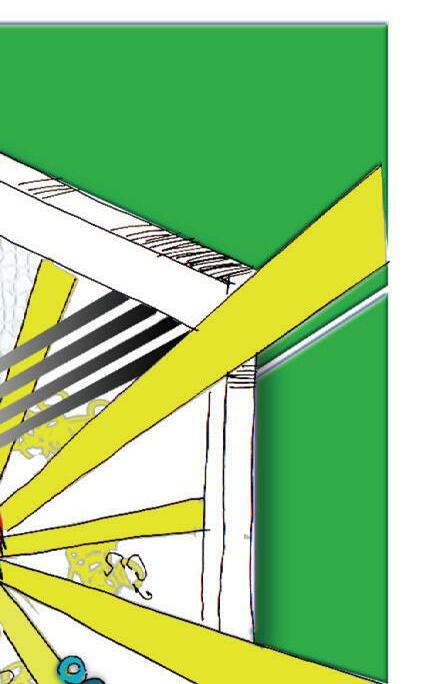


One typeface for all banners.
Step 1 and 2 need to flow with the banner. Guide with headers to provide a consistent flow.
Step 3 gets lost due to too much shadow
Consistent typeface number for step.
Step 11 and 12 appear random
All uppercase type
Type around circle is not legible. Is it suppose to be or is it to help distinguish the form?
On the front panel of the poster - The type going into the vortex... not working that great. It needs to follow the movement of the illustration.
Add a background color to help the sketch POP better for the target audiences eye.
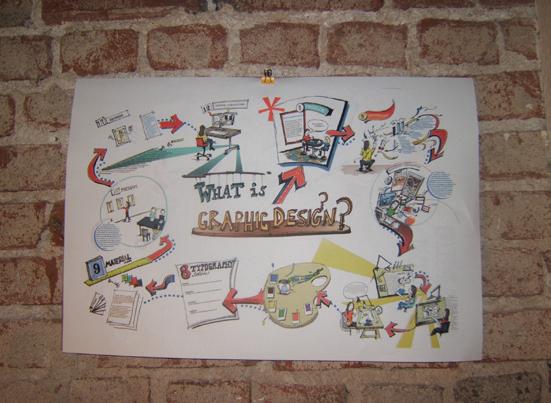
Rolled up view: The view needs to be inviting. Need to provide a piece on what is on the inside and utilize it as a teaser. This photo should be very enhancing and not look like an afterthought.
The presentation needs to be on a white or black background and not have the surface compete with the visual intent.
Background is too muddy.
Bad Photograph: Hot spots, can’t see poster title, and seam in background distracting.



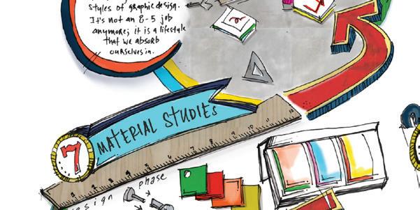
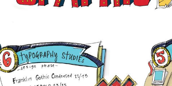
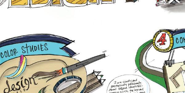
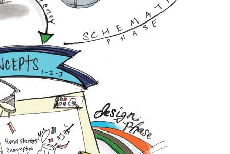
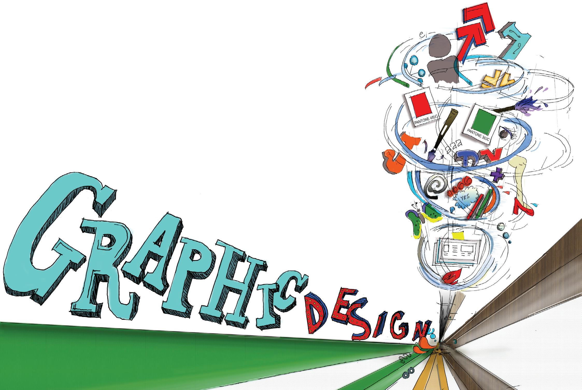
The development of the final methodology book has been a very explorative process for me. I am fortunate that I had the opportunity to incorporate my sketching skills into the final poster design. However, I do feel the poster sketching style could have been exemplified in a better defined manner, but once again, time is my enemy. Overall, I am satisfied with final poster turned out, but I always feel the illustration explorations can be exploited in a more superior manner.
The Final Design Process book has been a great experience for me. I truly value and love creating design processes developing the methods at a superior level. The research, thumbnails, concepts, studies and design development are a significant form for problem solving. Due to one’s extensive research, design and development the final outcome is always unpredictable in an extraordinary way.
