“The details are details. They make the product. The connections, the connections, the connections. It will in the end be these details that give the product its life.”
– Charles EamesDesign Purpose
Schematic Design
page 19 Page 26
4
Production Outcome
digital development studies analysis nal design nal application
Design Development
page 10
original typeface design
Course: GRDS 709 – OL
Professor: Merrick Henry Quarter: Winter 2011
the challenge: problem objective
The project’s objective is to exploit and create one’s own typeface. For this project, the creative process begins with the idea which culminates in the outcome: to make one aware of the properties that bring unity to any typographic system. Overall, this project is designed to encourage an understanding of the abstract properties inherent in existing typographic forms.
To start, I began the design process by researching and observing different typography styles and forms. I selected a few of my favorite typefaces such as Univers, Rosewood, and Helvetica to dive in for a closer look at what actually makes and forms a good typeface design. Consistency, detail form, and line weights are a few characteristics that I gathered from the research. From all of the inspiration images I accumulated, I was able to develop my brainstorming thoughts and ideas which formed numerous thumbnail creations that support my brainstorming. While creating the thumbnails, I focused on a few letters at a time to see if the type was forming creative characteristics for a display or decorative type. I had a strong idea of the end product and I was also conscious of the end use of the design. A few of the challenges were to exemplify
target audience
Age Group: 13 68 Gender: Male & Female Personality: Enjoys Typography and Design Interaction
design outcome
uppercase only due to our schedule and time. I continued my design development by drawing a few characters that combined vertical, horizontal, diagonal, and curved strokes.
Next, I selected a few thumbnails and developed the sketches into further de ned conceptual drawings that exemplify my design intent. I took this opportunity to de ne speci c traits of the typeface weight, width and overall texture and color.
Then, my conceptual development led me to form studies on color, typography and material that would be incorporated in the digital compositions. The digital development identi es and illustrates the placements for the display, primary and secondary type along with visually forming the grid structure for each design layout. The type and color selected during the studies are exempli ed on the digital roughs to form the overall visual aesthetic of each composition.
After my analyses on adjustments and revisions were noted on the rst round of digital solutions, I began executing my nal design which was visually supported and in sync throughout each phase of my design process.
My nal design is exploited at a superior level by exemplifying my design goals and objectives for the typeface weight, width and overall texture and color combined with legibility which allows the form to be viewed as decorative type and interesting while the target audience is drawn to the nal type. I passionately enjoy telling the design story for the Eames typography design process.
Finally, my design provides a consistent rhythm for each letter pro le to articulate Ray Eames dot pattern. The overall design exempli es consistent rhythm, legible stroke weights, and balance with a contrasting utilization for the positive & negative of the nal forms.
research
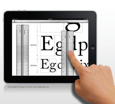
Typography studies exemplifying form, uniform detail and successful use of line weights.




research
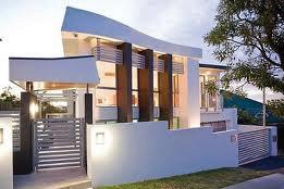
Architectural inspired furniture designs that resemble typeface forms.


inspiration


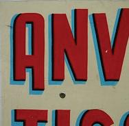
Product forms that resemble and speak typeface design.




brainstorming
Next, I brain dump all of the ideas and thoughts that I have in my mind that relate to the project onto paper.

design intent
Exempli ed are thumbnail sketches from my Moleskine that illustrate my design thoughts and clever typography ideas that voice a harmonious personality that employs a vintage modern tone.


conceptual intent
Exemplifying a decorative type that employs a retro, vintage tone. This conceptual type employs sans serif characteristics with its geometric personality that exploits consistent character weights, form, rhythm and details.
The intended use for this typeface design –signage, magazines or posters in a vintage setting.


Color palette – turquoise, red, yellow and gray.
conceptual intent

Illustrated is symmetrical type that is intertwined with my creative handwriting that resembles the nature of Helvetica type. The display type is symmetrical in form, has consistency in its characters and utilizes its stroke weights in a successful manner.
The intended use for this display type –on illustrations, magazine covers or as typography that resembles ones personal handwriting style.

Color palette – open to end user.

conceptual intent
To the right, I am exemplifying a vintage personality for display and/or decorative type. This typewriter style personality exploits consistency, uniformity, unique stroke weights, and ow.

The intended use for the typeface design –magazines and posters in a vintage environment.
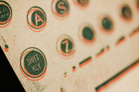
Color palette – minimal color with 1 color strongly emphasized. My personal color of choice for this typeface is turquoise.
conceptual intent
Illustrated is display and/or decorative type that is intertwined with a retro vintage persona. The display type is symmetrical, uniform, and exploits a playful personality with the utilization of different stroke weights.


The intended use for the display type –signage, magazine covers or posters in a branded environment. Color palette – turquoise, red, yellow, orange, blue, green, black, gray and white.

conceptual intent
Shown to the right is a decorative typeface that’s in uenced by the modern designers of their time period, Charles and Ray Eames. The furniture’s personality exploits consistency, modern characteristics, detailed stroke weights with a balanced ow.
The intended use for this typeface design –product design, interaction design components and print design. I suggest utilizing vintage colors that echo the design intent.

conceptual intent
Illustrated is a timeless serif type that exploits a decorative persona that is re ected by Ray Eames’ Small Dot Fabric. The decorative type is symmetrical in form, has a consistent personality and exploits a successful engaging level of stroke weights.

Intended use – decorative type exempli ed on magazine covers, announcements and posters that support the Eames’ branded environment. Color palette – vintage color palette.


intertwining concepts
Moving forward with intermingling concepts 05 and 06 to exploit Eames’ style at its fullest level.


typeface development

After studying the different forms of Charles and Ray’s furniture creations, I feel the Eames Molded Plastic Armchair with wood dowel base, Eames Lounge Chair, Eames Walnut Stool and
Ray’s Dot Pattern create very unique forms and shapes that would be utilized to the fullest extent for forming decorative type.
Ray’s Dot Pattern Fabric

Ray’s Pattern Fabric


Eames Walnut Stool


Eames Identity Icon


feedback
Directional, motivational and painful insights that my peers shared with me on their views of my concept.
Tom Creamer
“Wow this looks tough! I like this concept frr shrr and you have included some nice research visuals to help the viewer better understand the full concept and direction you are headed. Oh yeah, and Im sure they help you too right.
It would be great if you could incorporate some angles into the words too, like a chair/letter that is at an angle slanted left or right, and then you have like a lamp or table that is at and straight to the viewer, it could really give each word formed a “cool” effect. Like angles of furniture you see depending on where in the room you are standing nice works”
Jennifer Oliver
“Hi Jamie! This is such a cool idea--and could go in so many directions. From some of your reference material, I wonder if you could pull some of the details from the pieces (like the balls from the coat rack) and include them in the alphabet--maybe these balls become ball terminals on some of the letters (?) Maybe the ‘I’ looks like the pro le of the turned wood stool?
Just some thoughts--great start, though!”
Marvin Eans
“I enjoy the styles you provided for you different concepts. It it will be interesting to see how you integrate the themes into the typefaces. With you background in interior you could offer some great design solutions. I think it would be interesting to see some of the interior design concepts fused with this typeface design project. Look forward to seeing the progression.”
Denise Gross
“I really nd your concept interesting. I can see how a typeface can develop from this.
I hope that whichever way you go, you will keep your hand sketched style. It would be a real shame not to have that as part of the letterforms. Can’t wait to see more!”
Professor Merrick Henry
“The visual research and supporting materials are very inspiring. I wonder while looking at the architectural qualities if you need to be so literal with the visual representation of your forms. Could you possibly just pull in a slight resemble of the designer? I nd the modular design to be very nostalgic of that period and my concern is how decorative the forms will get where visibility and legibility is hindered.”
Dena Wallace
“I think this is a really cool idea. Your research gives a lot of great, stylized shapes to draw from for your letters. I think you can push this idea to make some really interesting shapes. I look forward to seeing more!”
Dyan Gulovsen
“I want to see more on how you incorporate Charles and Ray Eames furniture style into the lettering- very interesting concept look forward to seeing the results. Good Luck.”
design development


Exemplifying a retro/vintage style for decorative type. The development illustrates a successful use of positive and negative space within the forms. The stroke weights are drawn at engaging balances that provide nice depth for each character. The rhythm of the geometry and use of hierarchy form an unexpected balance of the characters.


design development



I’m exemplifying a typeface that resembles a typewriter key design in black and white to relate to the positive and negative pro le the shape forms. The stroke weights are drawn at a nice articulating balance. The pop of color type is successful due to the how it plays and ows with the rhythm, line weight consistency and unity.

design development

Charles and Ray Eames are considered the most signi cant and collectible furniture designers of the 20th century. After I intermingled the concepts 05 and 06, I want the typeface design to take form and resemble Charles and Ray’s pro le of their furniture designs. The geometric, modern style of Eames’ furniture are unique forms that speak custom typeface. Their furniture exempli es a successful balance with height, widths, texture and color. I want the type design to carry these characteristics too.


Make consistent to provide a rhythmic ow to the type design


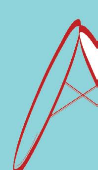


“K” character style does not ow with the others.


Fun, Whimsical, Glowing, Vital, Tangy, Energizing, Loud, Friendly, Gregarious
Classic, Cool, Practical, Timeless, Quality, Quiet, Ghostly


Mysterious, Bold, Basic, Strong, Magical, Classic, Elegant, Prestigious
Exciting, Energizing, Dynamic, Dramatic Provocative, Aggressive, Powerful
Pure, Clean, Sterile, Innocent, Silent, Bright, Glistening, Airy
Professional, Classic, Enduring, Sophisticated, Solid, Expensive
Fun, Whimsical, Glowing, Energizing, Gregarious, Vital
Earthy, Strong, Stimulating, Provocative, Energizing, Dynamic

Rich, Comforting, Acidic, Energy, Luminous, Cheerful, Enlightening
Calming, Cool, Constant, True, Dependable, Happy, Restful
Calming, Eclectic, Constant, Restful, Dependable, Vibrant

Cheerful, Enlightening, Soft, Sunny, Warm, Friendly
Pure, Clean, Silent, Glistening, Airy, Bright, Lightweight
feedback
Another round of feedback that my peers shared with me. Very bene cial, directional feedback that allows me to learn from this project.
Dimitri Koumbis
“I think the direction you are moving in is great. What really stuck out to me was the wire pieces, the “dot” gures and the iconic stool/ seat. Maybe you could just work around those ideas or maybe one of them to make it a bit more consistent. I think if you have a few of the letters illustrated and the rest are just simply drawn, it would be ne.
Good luck and I am looking forward to the nished product!”
Raazia Hussain
“You have a great concept to ground your typeface in. Right now I feel that each character that you’ve developed is unique in itself, but is not working as a group or the alphabet. Can you take any one element and make it consistent in all? My favorite letters from your set are M and W. They have a very different character (no pun intended) and remind me of a suspension bridge. Even the swollen ends that you have in some of your letters can be worked into all.
Good luck, Jamie!”
Denise Gross
“Great work so far and your process book looks great.
I think i am with Dimitri on this with the A looking a little out of place. Like he said, maybe if you just add the wire and “dot” gure to it. Or when I look at your sketches the other element that I think that would be interesting to have consistently in each letter is the cross marks that are in the M and W.
It seems like there needs to be something that ties them together so that you know they are from the same alphabet. That being said, you may want to wait to really try to develop that until you get a few more of them in Illustrator.
The other thing you might want to think about is when you scan them, play with the levels to make them pure black and white in Photoshop, and then color select, create paths and copy those paths over into Illustrator. If you do that you will keep your hand rendered look. There ends up being a lot of points on the paths but it allows you to have that hand rendered look. I did that on some of the ones I was experimenting with and it looks like I just scanned them in when they are really vector art.”
Amberlee Isabella
“I echo everyones comments. Great concept just carry it all the way though. Dig to nd those common elements as you progress. The wire frames stand out to me the most right now as the solution to this. Even if the piece is curved or straight the metal details are dominate.”
Good luck!”
Dimitri Koumbis
“I like the use of the thick/thinness of the characters, BCD. The A seems a bit out of place, so maybe you could incorporate that element into it? Also, try adding some stroke weight to the I, so it looks like it is part of the group too.”
Love this!”
Submittal for Course Winter 2011
Professor Henry Project Feedback: “Jamie, The visual research and process journey was richly developed The ideation across the board was sound and you’ve managed to pull interesting aesthetics together without blinding your reader on extra detail and busy design. The forms that are disjointed are, ‘A’, ‘D’, ‘H’, ‘I’, ‘M’, ‘N’, ‘O’, ‘T’, ‘U’, ‘V’, ‘W’ and ‘Z’.
Do you know why? The rest of the design seems to have something in alignment and the consistency give them that alignment. This is what typeface design is all about; no matter if it’s for decorative or continuous body reading. The devil is in the design and I want you to nd it. Thank you for a rich quarter, I appreciate your effort and hard work.”

Eames Typography


Final typeface development that I created as a re ection of being in uenced by Charles and Ray Eames.

product development


Since the typography is in process of being nalized, the next step it to develop what type of application the typeface will be utilized on.
in uence

thumbnails
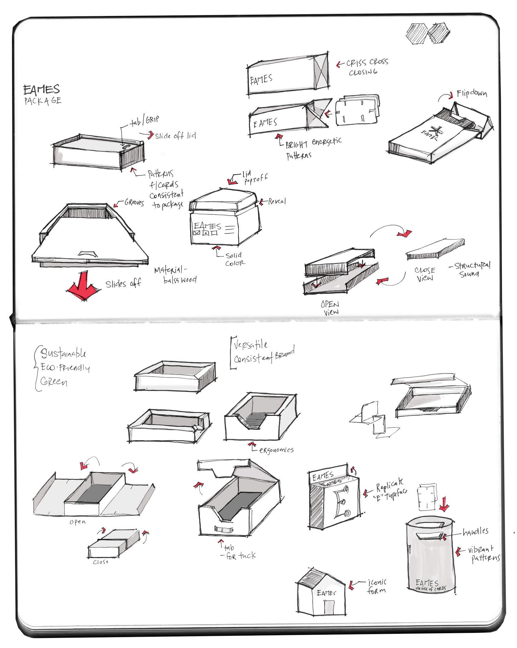
Shared below are further thoughts and development for the packaging.

design development


The intent for the package design is to provide a solution that utilizes sustainable material, speaks a consistent vintage tone, and provides product interaction for the end user.
vintage pattern
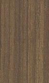
walnut wood mohawk loop antique vellum, 18 pt

Package Design
[Au Natural/Vintage Tone]
mock up study model


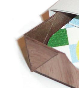
I formed the study model at full scale to observe the connections, scores, and folds a bit closer to make sure the functionality of the concept works effectively.
I learned that I need an extra ¾” panel on the panel as I noted in my concept drawing. The baker’s thread represents an elastic cord, which is necessary to support the house of cards products. The mock up model shown is for mass study only; the materials thickness is not the correct intent of the nal materials I plan to utilize.

mock up study model


Directional feedback from Professor Abadie:
“Jamie, Thanks for the update. Question - page 30 - the actual area where the cards will sit - will you need to add some sort of ribbon for the cards to sit on and the user to be able to pull on to get the cards out? or...some sort of thumb cut to help get the cards out? I am thinking that the cards will t nicely into that area so you don’t want people having to ip over to get them out or having to use their nails against the box wall to pry them out. (hope this makes sense)”


Directional feedback from Jane Dorn:
“Hi Jamie, When I grow up, I want to save a bunch of dollars so I can purchase an original Turpin Moleskine for my art collection. Just sayin’.
I agree with Trudy re: the need for an unobtrusive way to remove the cards from the box. Looking forward to seeing how you resolve that!
I noticed a few problems with the page #s throughout (duplicate and missing numbers), but am guessing you will be nalizing those once nal images are placed, etc.”


house of cards [12] Retro Designs



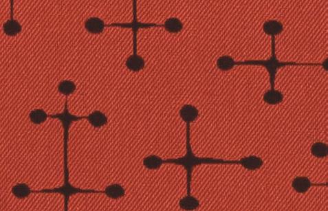


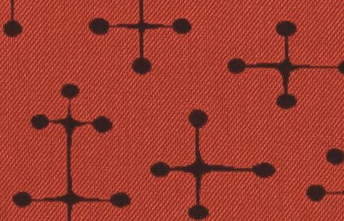
The frontside exempli es the typeface that I created. The backside provides an image of Charles and Ray’s furniture that in uenced the design direction for the typeface.













nal analysis
Overall, this project turned out to be very innovative and explorative for me. In the beginning I had a hard time guring out what the typeface actually wanted to be, but while I was researching for inspiration I came across Charles & Ray Eames, and their furniture pro les and designs started speaking typeface design to me. I eagerly moved forward with utilizing different forms of their furniture pro le designs. After I determined the typography design intent, immediately the alphabet was formed by utilizing different furniture pro les of unity, rhythm, and hierarchy that the Eames’ designs articulated.
Each character pro le speaks its own personality through line weights, form, and texture. I feel that exemplifying the curves in Illustrator into a nice contour form was the hardest for me due to wanting to make sure the overall shape was aesthetically pleasing and consistent in form. I am ecstatic to have the opportunity to incorporate my favorite designers into the mix of typography and to exploit my passion for furniture design as the typography design.
eames typography

The meaning behind the name: I decided to utilize the name Eames since majority of Charles and Ray’s furniture is identi ed with their surname somewhere within the identity of the piece. Some of the Eames’ furniture is called out in very simple contexts such as the Eames Lounge Chair, Eames Storage, and Eames Molded Plywood Chair. I felt being consistent with their idea of simplicity is the key for naming the typeface design.
Jennifer Oliver
“Jamie, this is looking great!! Including some of the elements from the fabric was a great idea, and I love the way the metal crossbars work to connect the forms.”
Dena Wallace
“I think you have created a really interesting and original typeface. I really love it in red! My favorite letters are K and Z. I feel these are some of your most interesting shapes and immediately bring to mind furniture. I am looking forward to seeing the nished
“I don’t know about you, but I have a new healthy respect for decorative typefaces! I think they can be super dif cult to design!
Your’s looks great! You really worked it out. It is unique and very different. I love it. I think there are many different uses for it, especially in the “decorative” category.”
“Eventually everything connects – people, ideas, objects.
The quality of the connections is the key to quality per se.“
— Charles Eames
