FOREWORD
BY JENNIFER GUERRINI MARALDI
TIM ALLEN has a consummate understanding of his craft and the ways in which it can push and prod at the viewer’s nervous system. The work has always had a profound and transportive effect on me.
We were first introduced to each other by a mutual friend, the artist Juan Bolivar. Standing before Tim’s vast canvasses in his even vaster East London studio, I felt elevated, physically and emotionally. In these mesmeric compositions, there is rarely anywhere to firmly plant one’s feet and something melodic is conjured, an imagined ambient crescendo.
These are not simple conceptual studies, intended to be considered or solved by an audience. These paintings mimic the complexities of life and are, as a consequence, equally inexhaustible and unresolvable. Tim is a world builder, a merchant of sublime experiences and hallucinogenic aesthetics. There is something truly alchemical about his technique. It is often said of Lucian Freud that paint would, in his hands, undergo a process of transubstantiation, transforming from pigment into flesh. Tim’s subject is, of course, the landscape rather than the figure, but the effect is much the same. As Matthew Collings so aptly described Tim’s work in the exhibition’s catalogue essay, “These paintings are about what they are made of.”
It is with the utmost delight and anticipation that I introduce the work of Tim Allen to JGM Gallery’s audience. My intention is to replicate for our community of clients and visitors that same transportive feeling I had when I was first shown his paintings.
Jennifer Guerrini Maraldi, 2022.
5 6
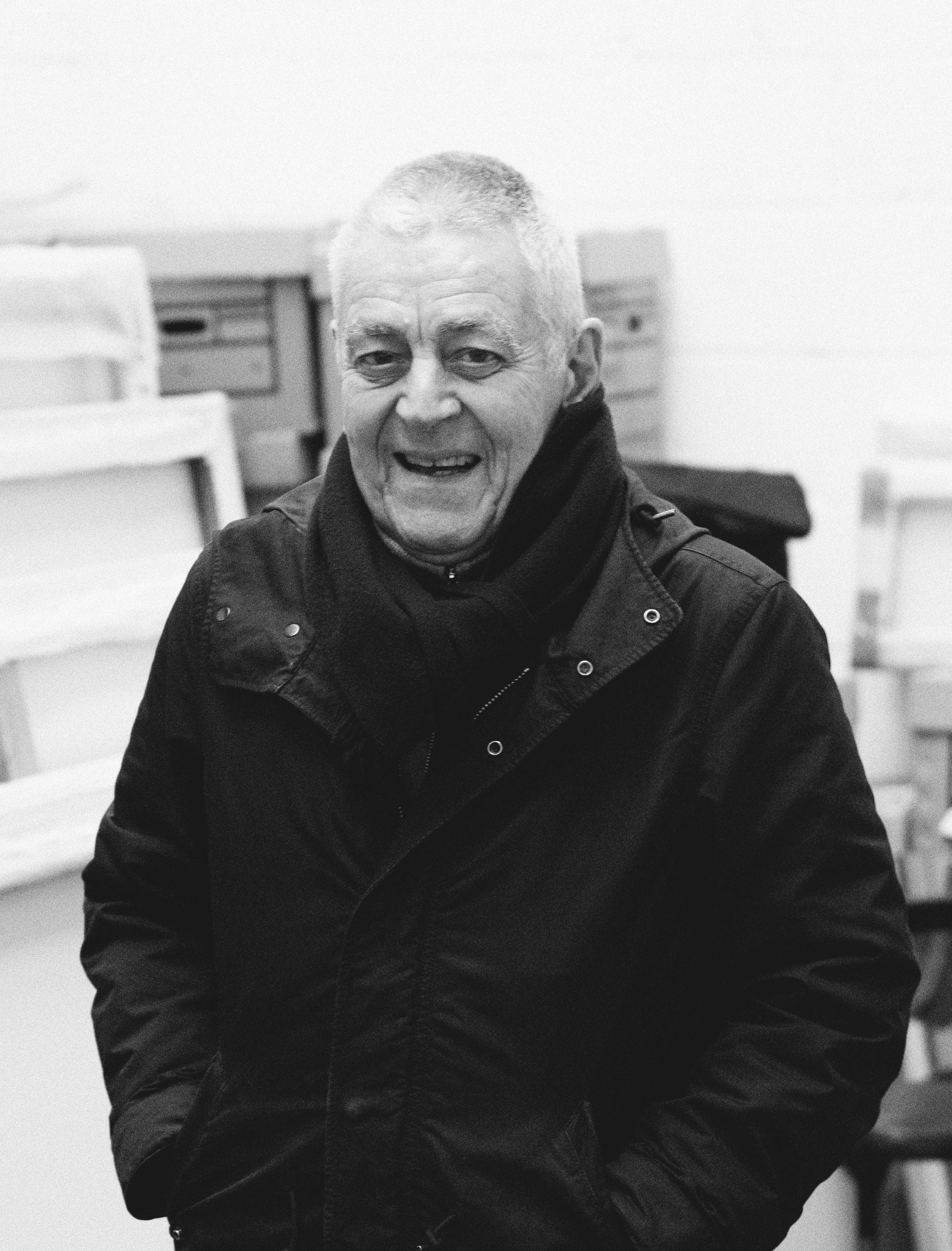
Image courtesy of Julius Killerby.
WHAT IS THIS STRANGE RELIGION?
AN EXAMINATION OF TIM ALLEN’S WORK BY MATTHEW COLLINGS.
MATTHEW COLLINGS IS AN ART CRITIC, WRITER, BROADCASTER & ARTIST. HE HAS PREVIOUSLY WRITTEN AND PRESENTED CHANNEL 4’S THIS IS CIVILISATION AND BBC’S RENAISSANCE REVOLUTION. SINCE 2015 HE HAS BEEN A REGULAR ART CRITIC FOR THE EVENING STANDARD
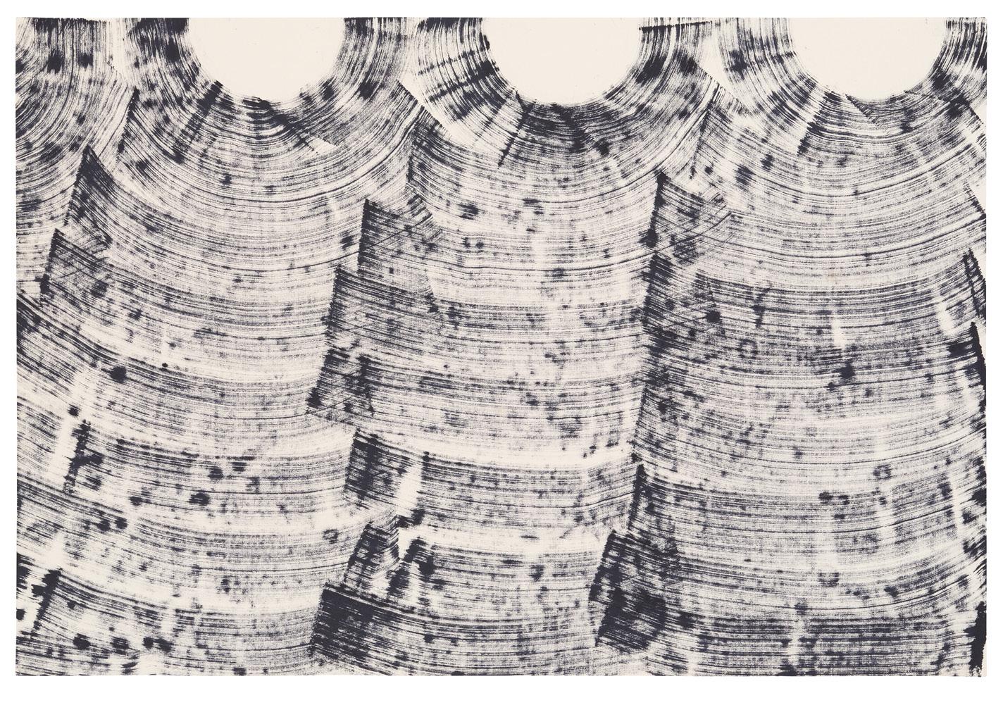
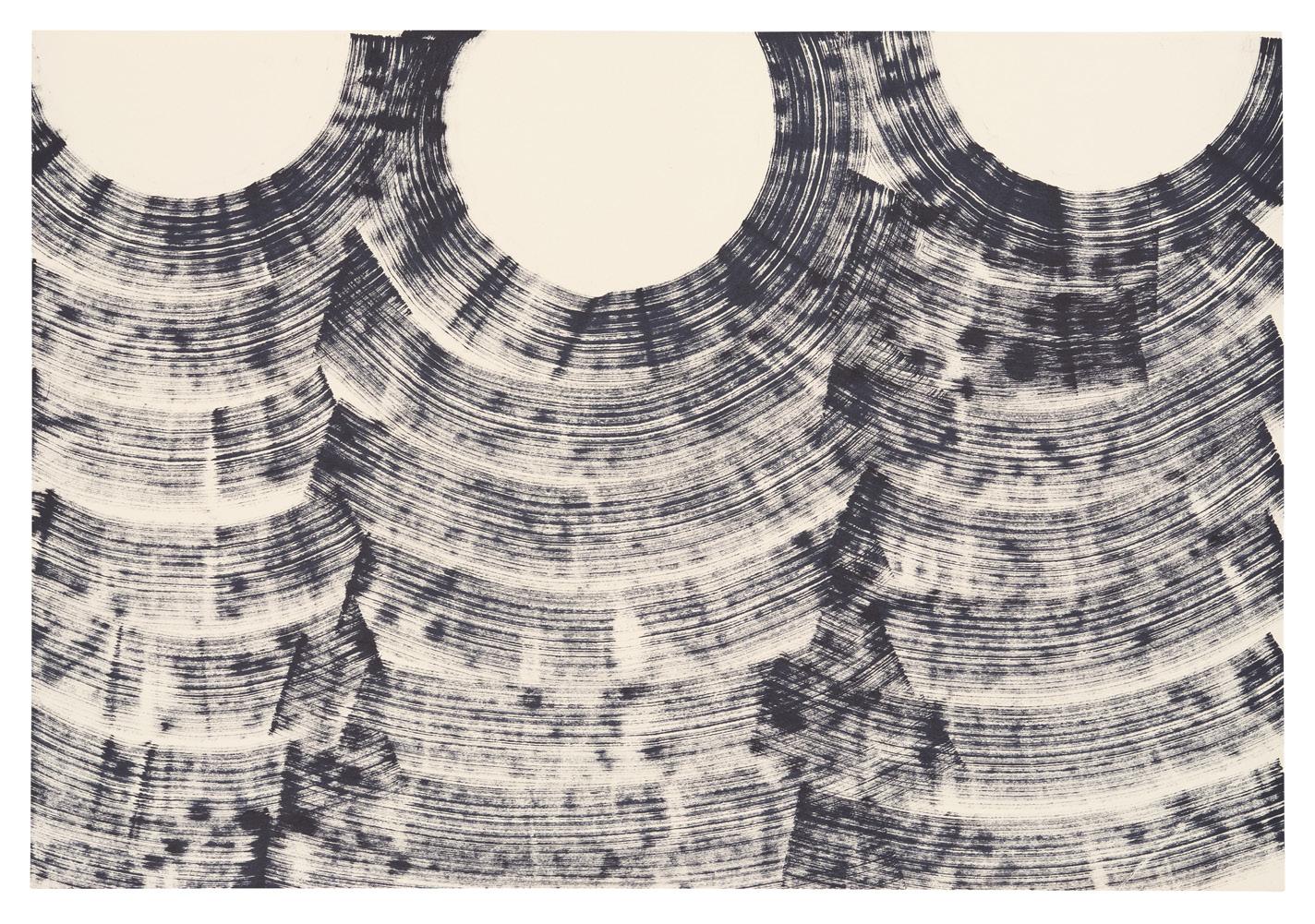
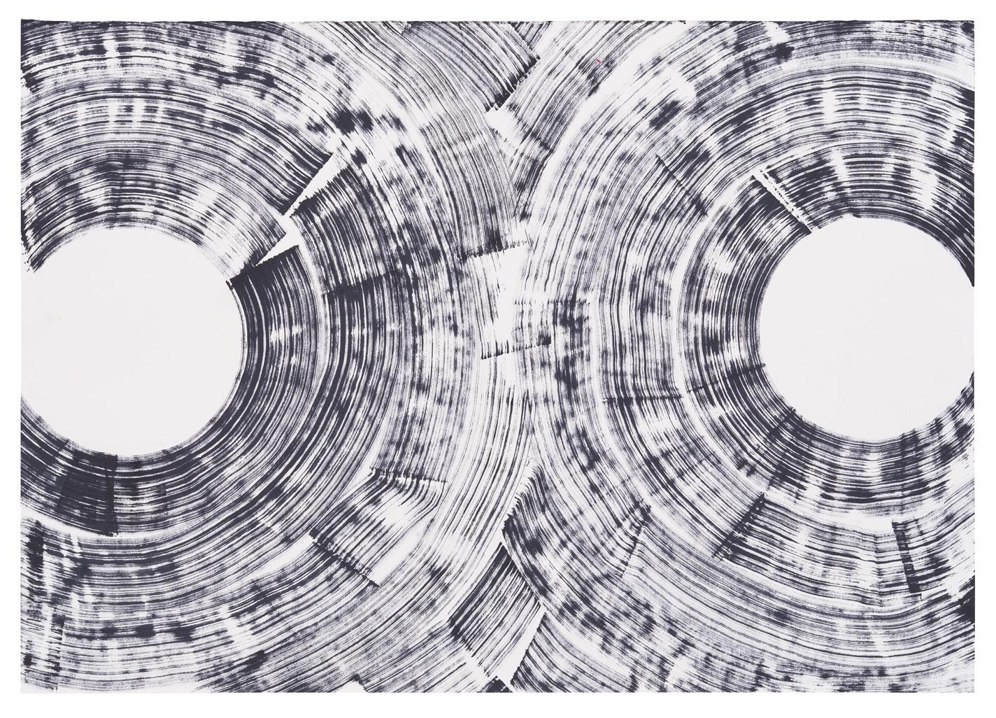
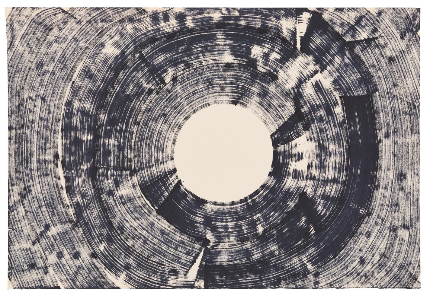
THESE PAINTINGS are about what they are made of — openings, illusions, circles, lines, horizons, streaks, solid flatness, breaks, continuities. The nature of the illusion is rushing movement, down a hole, through an opening, a cosmic distance, a snapping-to. We go towards ecstasy. We’re transported. If the works are about light and looking, perceptual psychology, visual intelligence, curiosity about looking, they put all this into a certain framework. It is the realm of Big Paintings.
Big and broad, like from long ago, the 1960s and 70s continuing the 1950s. But with a postmodern feel because of the contradiction in each of the paintings between brushy openness and a carefully bounded hard edge. As if a language game is being played. Is it a mere game? The paintings are deep even if they have this device, the use of which could be mistaken for shallowness or a trick or glib. It’s a device yes. But only like masking tape in paintings by Barnett Newman is a device.
Newman said the one great thing of all the many recorded sayings of the Abstract Expressionist painters: “Aesthetics is for artists as ornithology is for the birds.” It’s witty because of the double meaning of “for the birds” (the American idiomatic phrase meant useless, meaningless or only believed by the gullible). And it’s a deep idea, it communicates an important notion about art being an independent mode of knowledge, independent even of the knowledge-system that began to be constructed in the late eighteenth century to explain it.
In our time, no one expects or wants artists to be deep, although we pretend we do. We really want them to be cute and say cute things. Whether they are young or old, they should have the manners — we think — to only say things that anyone not intellectually developed can easily get. Tim’s paintings seem to me to be a playful participant in our own funny and shallow conversations, and at the same time, continuous with the seriousness of the art of the past. With our own seriousness, which we still have somewhere.
Another artist his recent paintings remind me of, is the sculptor Lee Bontecou. Her abstract canvas and metal constructions of the early 60s came out from the wall several feet and presented a black hole, an opening into a void. Sinister, mesmerising, beautiful. If you went through, you’d go into infinity. It was like any black circle in international abstract art, from Kandinsky to Victor Pasmore, but exaggerated and hyperbolised. Maybe a progenitor of Anish Kapoor’s black-void illusions. Anish’s are industrial finish hi tech objects, while Lee’s were industrial-referring but obviously Art. They were deeply “made” objects. You could see everything and feel your way through all the stages. The same with Tim’s streaks and flows, and the maskings and overlays, all his painterly engineering.
He recently titled some paintings after lyrics on Iggy Pop’s American Caesar (it came out exactly thirty years ago). I recognised them immediately and loved their rightness for the mood of Tim’s whole body of work. They make me laugh with delight again looking at his latest pictures. The track, Caesar, is so magnificent and funny. It tells the listener all about movies featuring the Romans when Iggy was young (the Romans in movies always had a soundtrack in a minor key). But it also tells the listener about a new real magnificence. Not just an old camp one. And the two are clearly different as concepts, one silly, one moving, but they are joined in Iggy’s song, and can’t be separated. Just as with Spartacus and Ben Hur there can be an unexpected emotional impact, along with all the absurdity of the scripts.
The Romans is surely also Jesus. And since the “fiery pit” is in Iggy’s narrative (“Throw him in the fiery pit!”) then The Romans is also the Old Testament. Among the earliest known Christian artworks, catacomb graffiti, is a picture of the scene in the Book of Daniel, of Hebrew youths cast into a fiery furnace by Nebuchadnezzar because they refuse to worship a golden idol. The Old Testament appears in Christian Art because the scenes in the New Testament are fulfillments of prophecy. Religion is considered to be for the birds. But all Art comes from it.
Fundamentalist distortions of religion distort our sense of its power as poetry and philosophy. Religion isn’t malignant. We’re all going to die any day now from eco catastrophe, if not before that, from World War III. And both threats came not from religion but from the neoliberal inheritors of the Enlightenment. The vast majority of religious people in the world now get beauty, spirituality, morality and kindness from it. This magnificent invention.
Tim is funny like Iggy about magnificence. Funny and real. He paints to make you look. Not to prove an academic point from the colour and design class. But so you can be transported by looking.
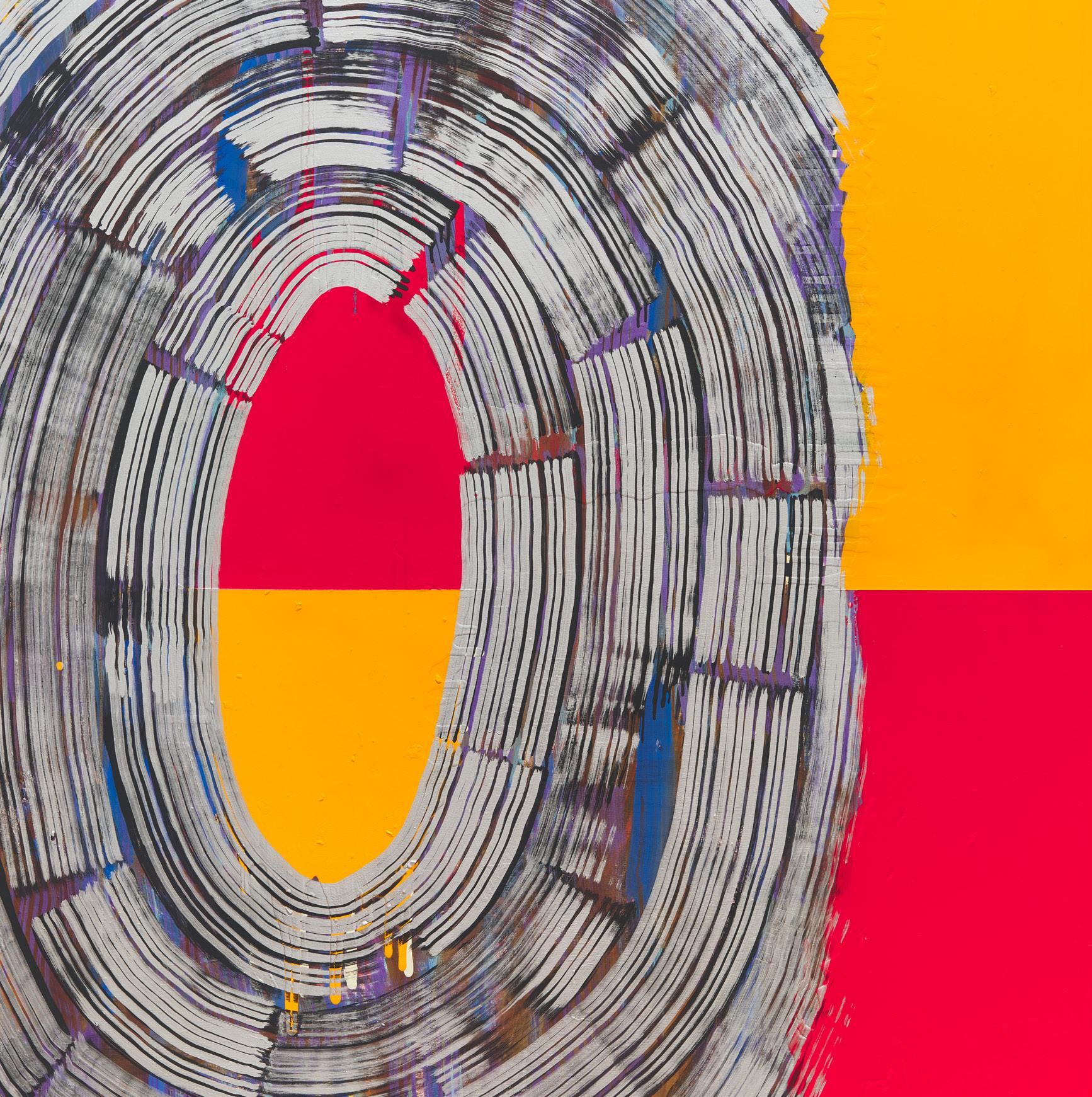
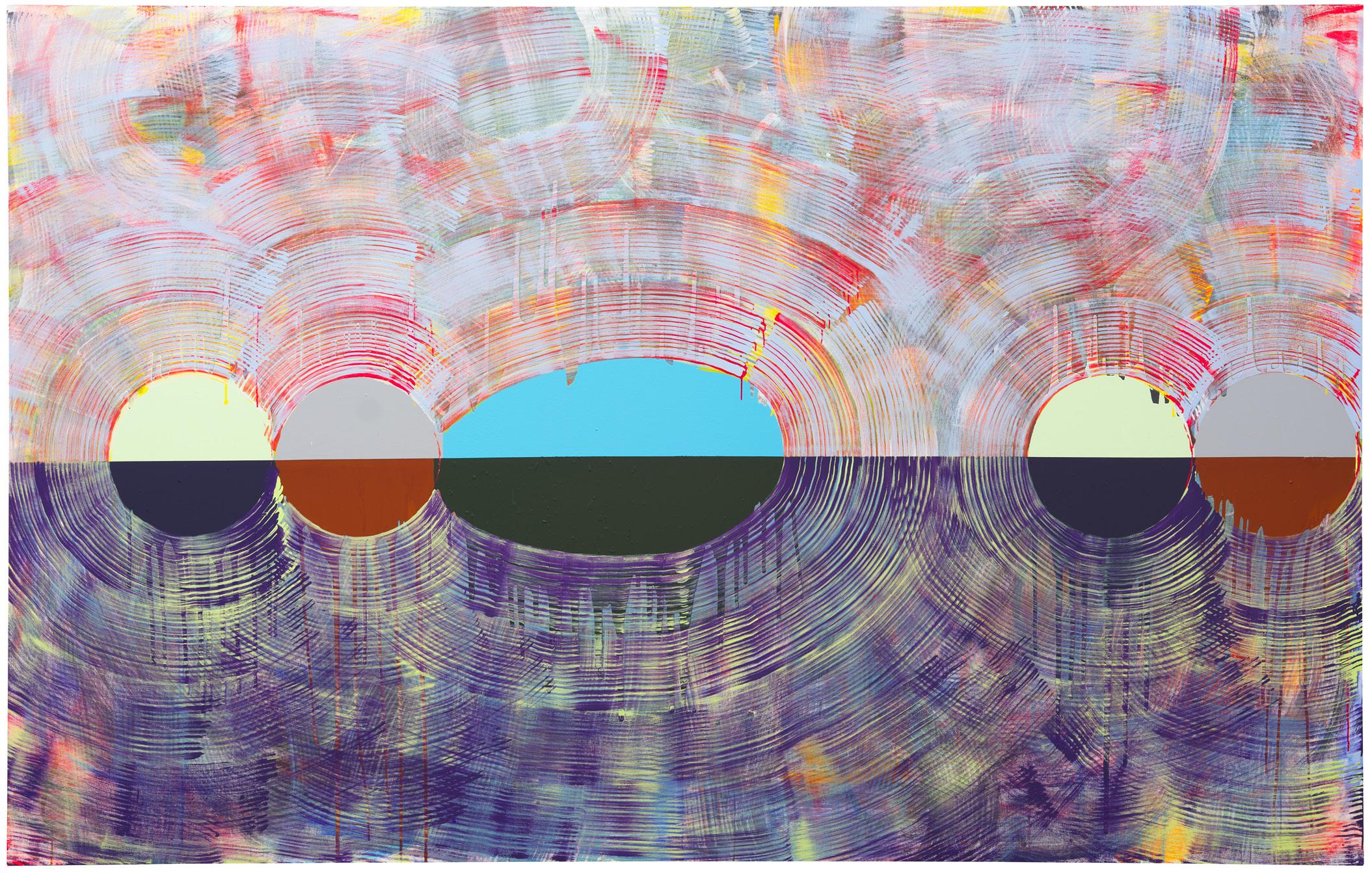
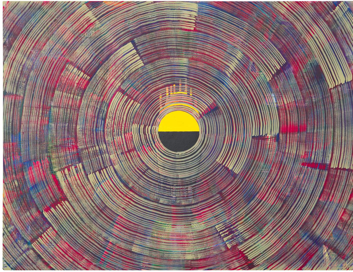
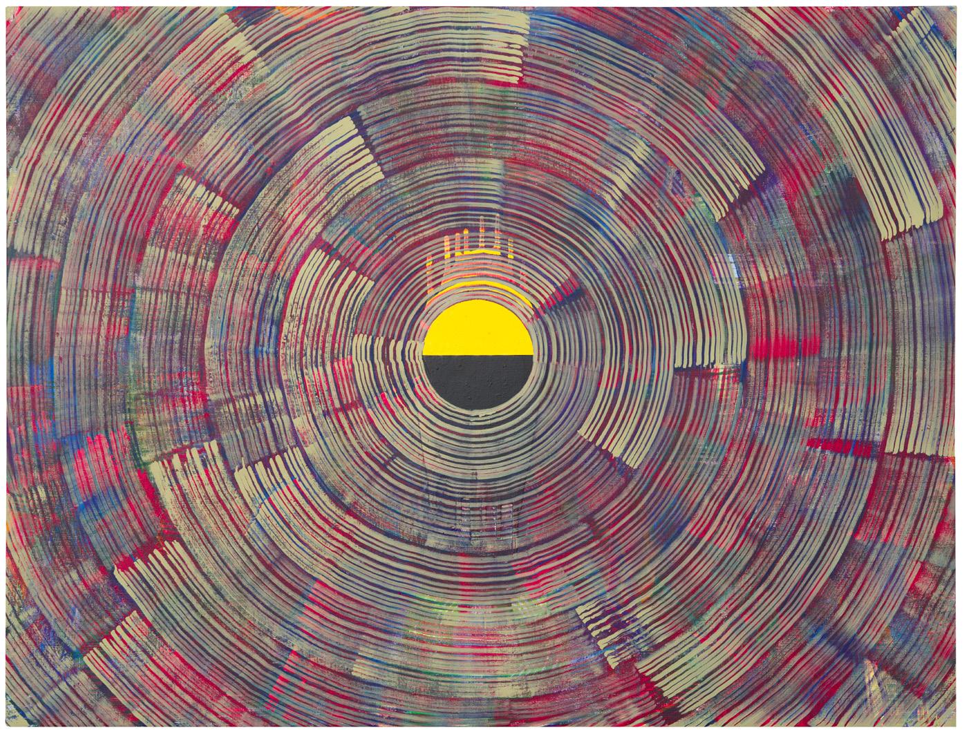
Above: Tim Allen, Inside Out,
acrylic
Image
7 8
2021,
on
canvas, 213cm x 340cm.
courtesy of Daniel Browne.
“...
Tim’s paintings seem to me to be a playful participant in our funny and shallow conversations, and at the same time, continuous with the seriousness of the art of the past. With our own seriousness, which we still have somewhere.”
- Matthew Collings, 2023
Right: Tim Allen, Old Gods 3 - Throw him in the Fiery Pit, 2021, acrylic on canvas, 213cm x 152.5cm. Image courtesy of the artist & Nelson Cunha.
Below: Tim Allen, As I Went Out This Morning, 2021, acrylic on canvas, 123cm x 160cm. Image courtesy of Daniel Browne.
9 10
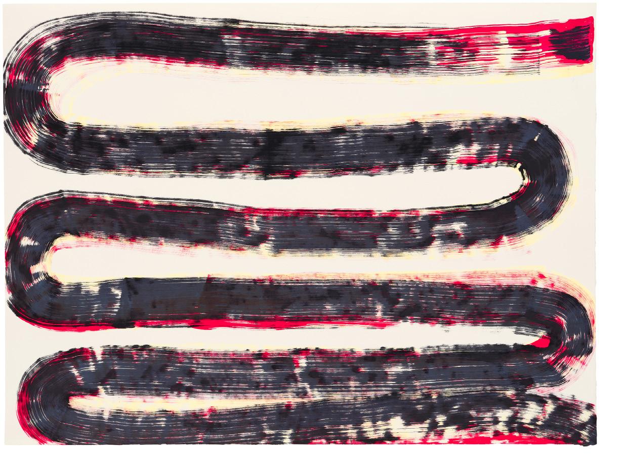
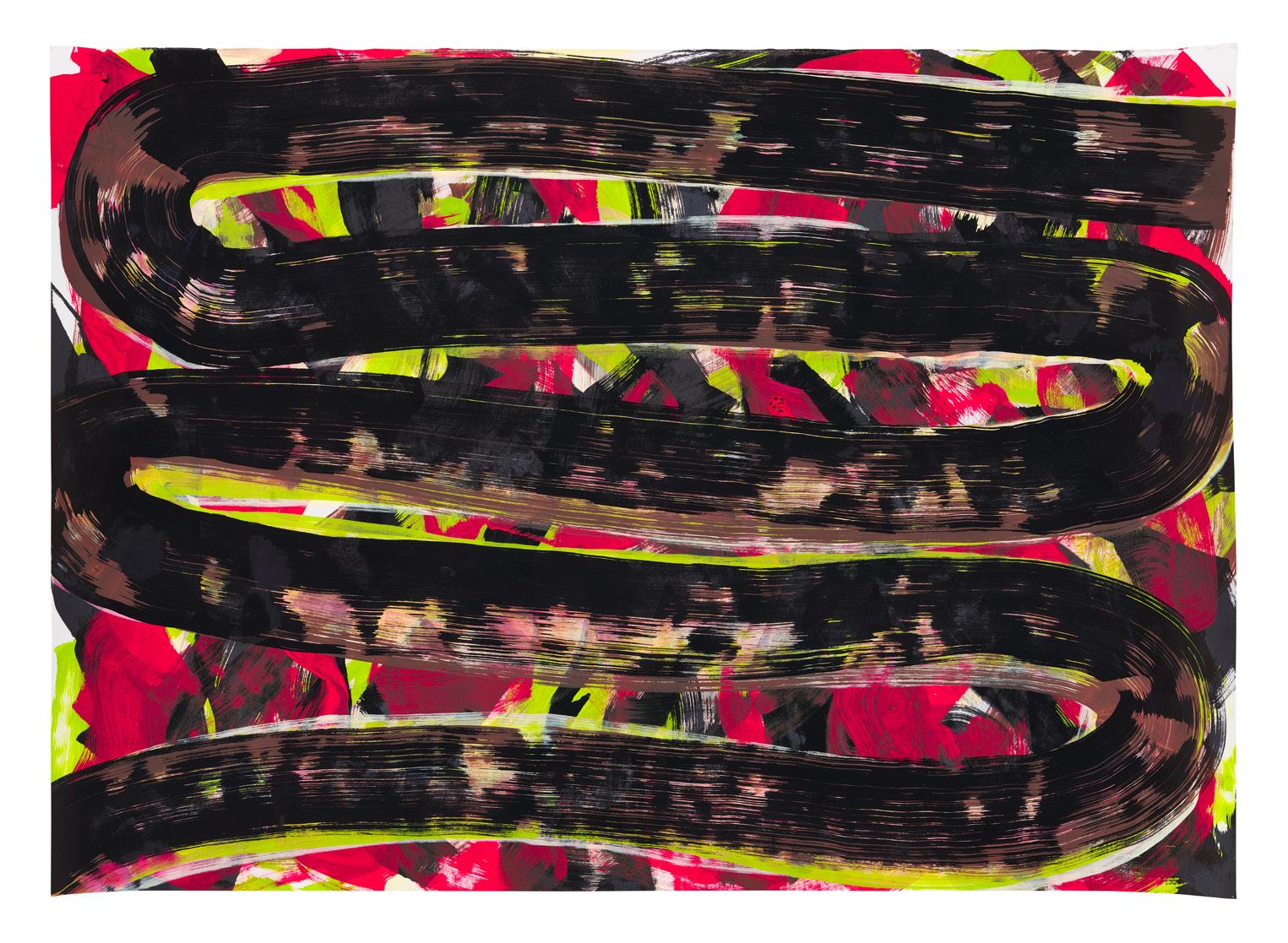
Left: Tim Allen, Snake Dance 2022, molotow marker on paper, 50cm x 65cm. Image courtesy of the artist.
PREFACE BY
JULIUS KILLERBY
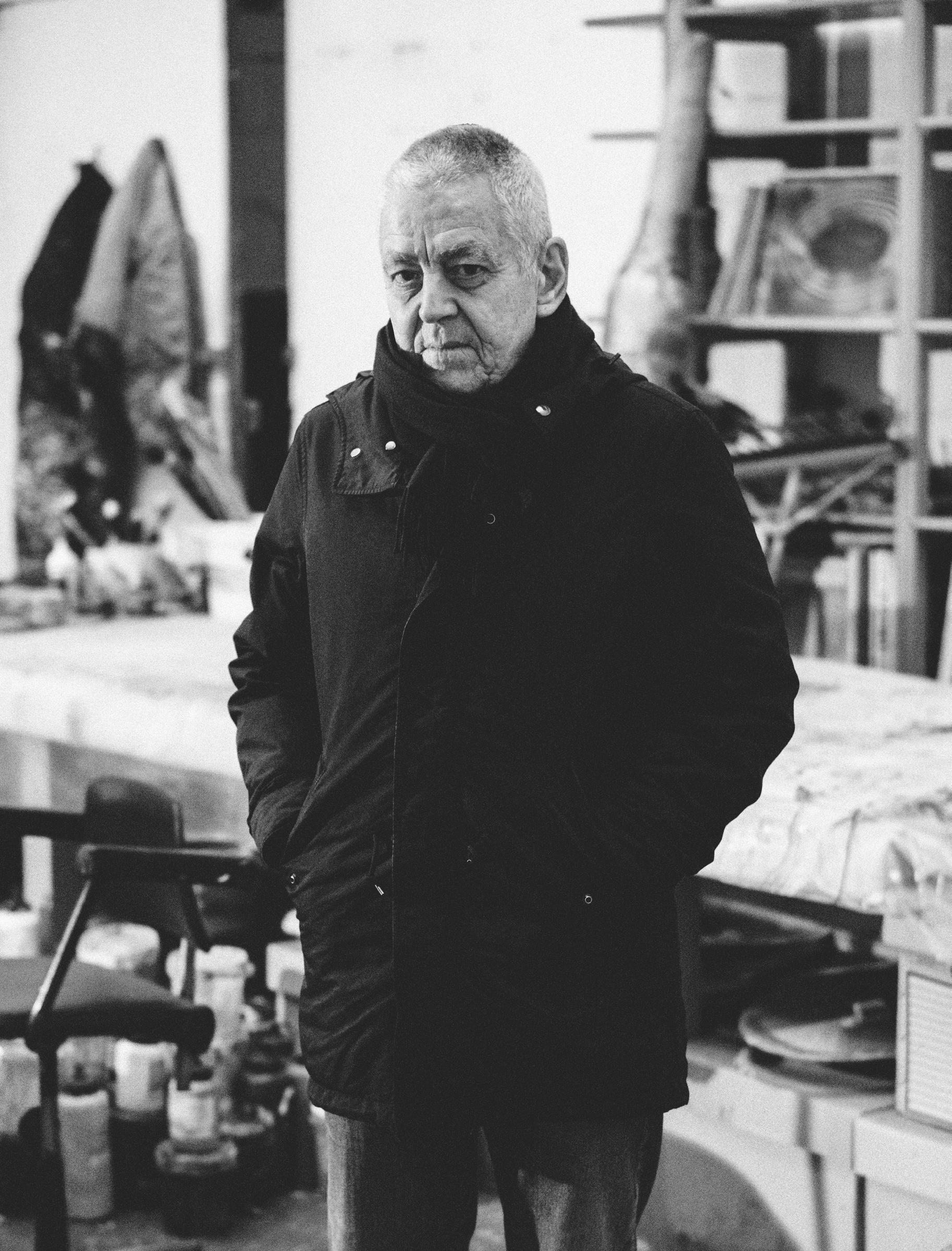
AS WE WALK through his East London studio Tim Allen pulls out dozens of canvasses, casually remarking “Oh yeah… this one” and “Ah… that’s where that was”. It’s as though these vast, mesmeric, paintings, mean nothing more to the man who created them, than would a missing pair of socks. We stop this haphazard curation, barely retaining our path back to the studio’s centre. The entrances and exits are almost blocked by this game of Tetris gone awry. One wonders how this seemingly lackadaisical man could be so prolific.
Tim and his work are, on the face of it, rather incongruous. His cadence is soft and steady, though his aesthetic is noisy and electric. His stature is slight and yet much of the work is colossal in scale. Contradictions permeate the work itself. He paints space which is detailed and complex, though it has little relation to the real world - ostensibly at least. That is, representation is the starting point – a landscape or perhaps a building – but once finished, there is little trace of the painting’s representational genesis. Indeed, landscapes and buildings were the artist’s subject earlier in his career. Adrian Searle, the art critic for The Guardian wrote in 1999 that
“… Tim Allen painted complex, compound buildings, filled with images, imagined places, a dreamy and luminous kind of weather. And then the atmosphere and the evanescent light in the paintings overtook the imagery, until there was nothing recognisable left.”
There is, then, both a sense of place and a sense of oblivion. This ability to make two configurations equally compelling is a compositional tour de force and the key to much of the magic in Tim’s work.
Various effects are achieved with the parallel brush strokes, each carrying their own conceptual implications, none of which Tim is willing to confirm or deny. At a glance, they imbue the work with a melodic quality as they mimic blank musical staves. In a review of Tim’s work, published in 1993, Stuart Morgan made a similar point,
“In a large painting by Tim Allen, it is hard to decide which is more interesting: the intermittent, horizontal striations that look like a jittery musical stave or the effects of colors that never stop trying to break through the surface.”
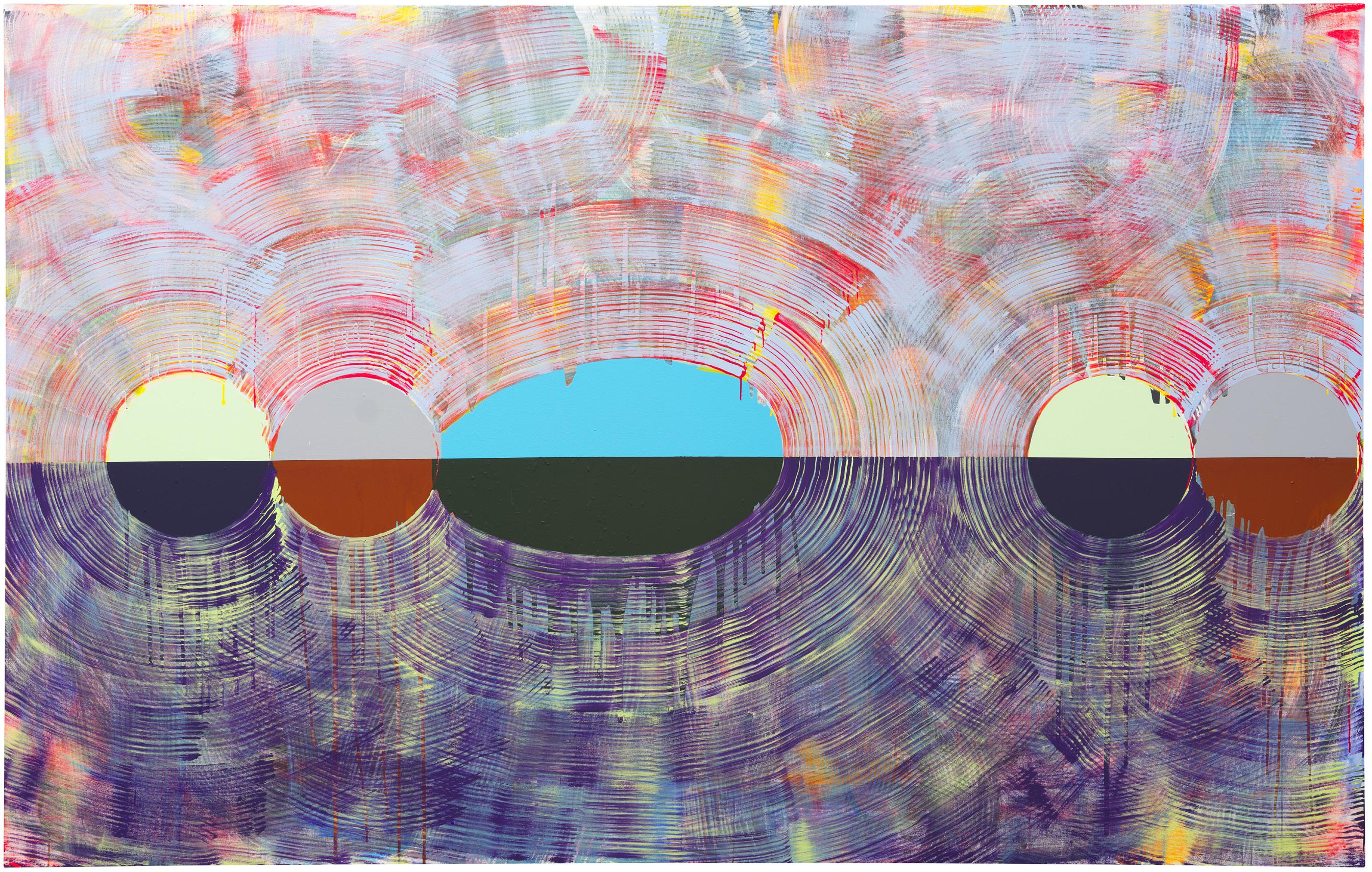
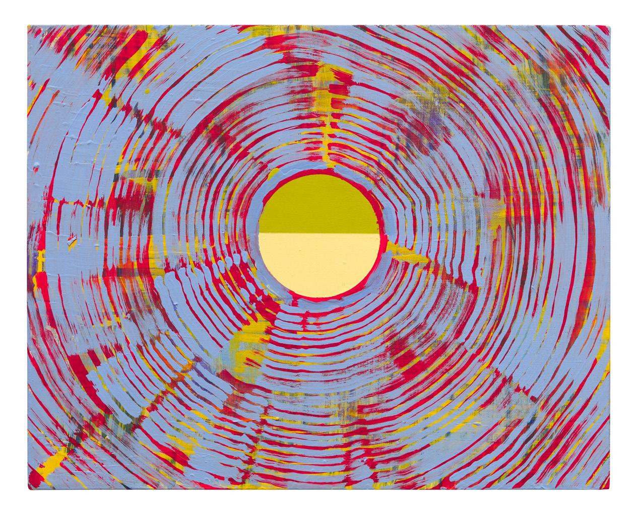
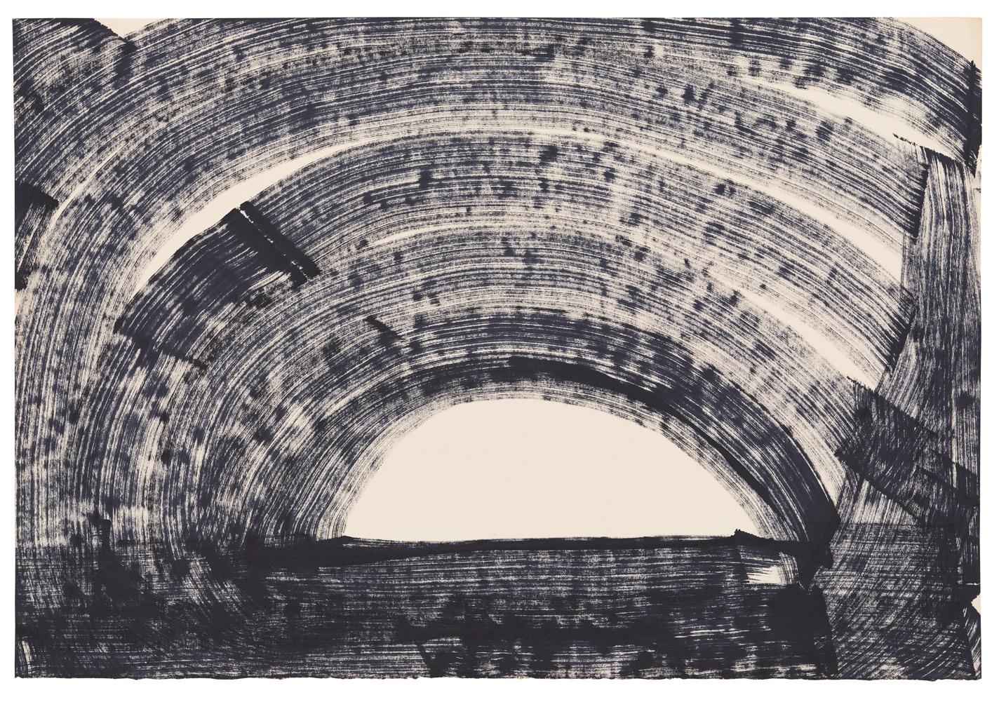
Whatever is left of the painting then – the solid base colour, the flecks of pigment – can be thought of as the image’s notation. But something else in the work contradicts this musical levity. There is an opacity to the grainer’s brush markings which overwhelms the landscape underneath. One wonders whether Tim’s childhood years in the polluted streets of Manchester & the Northeast seeped into his visual lexicon. This reading is reinforced by the artificial, almost metallic, palette of many of the paintings. Conventionally, a landscape is detailed and the space between the details and viewer is empty. Tim inverts this convention: a landscape, in his hands, is reduced to a mere horizon, while the air between us and the horizon is made visible by the grainer’s brush marks. Empty space is complexified and, in this, there are similarities with the later, more abstracted, Turners.
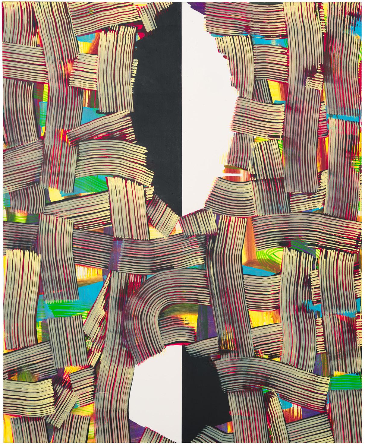
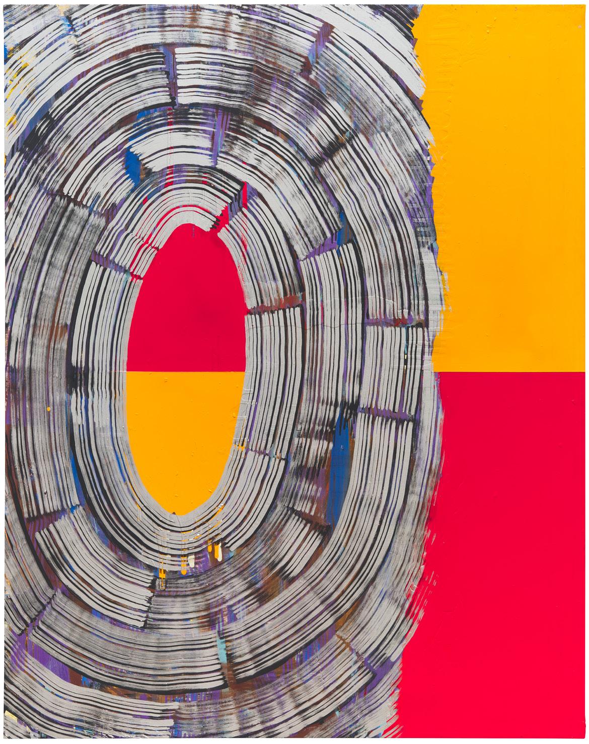
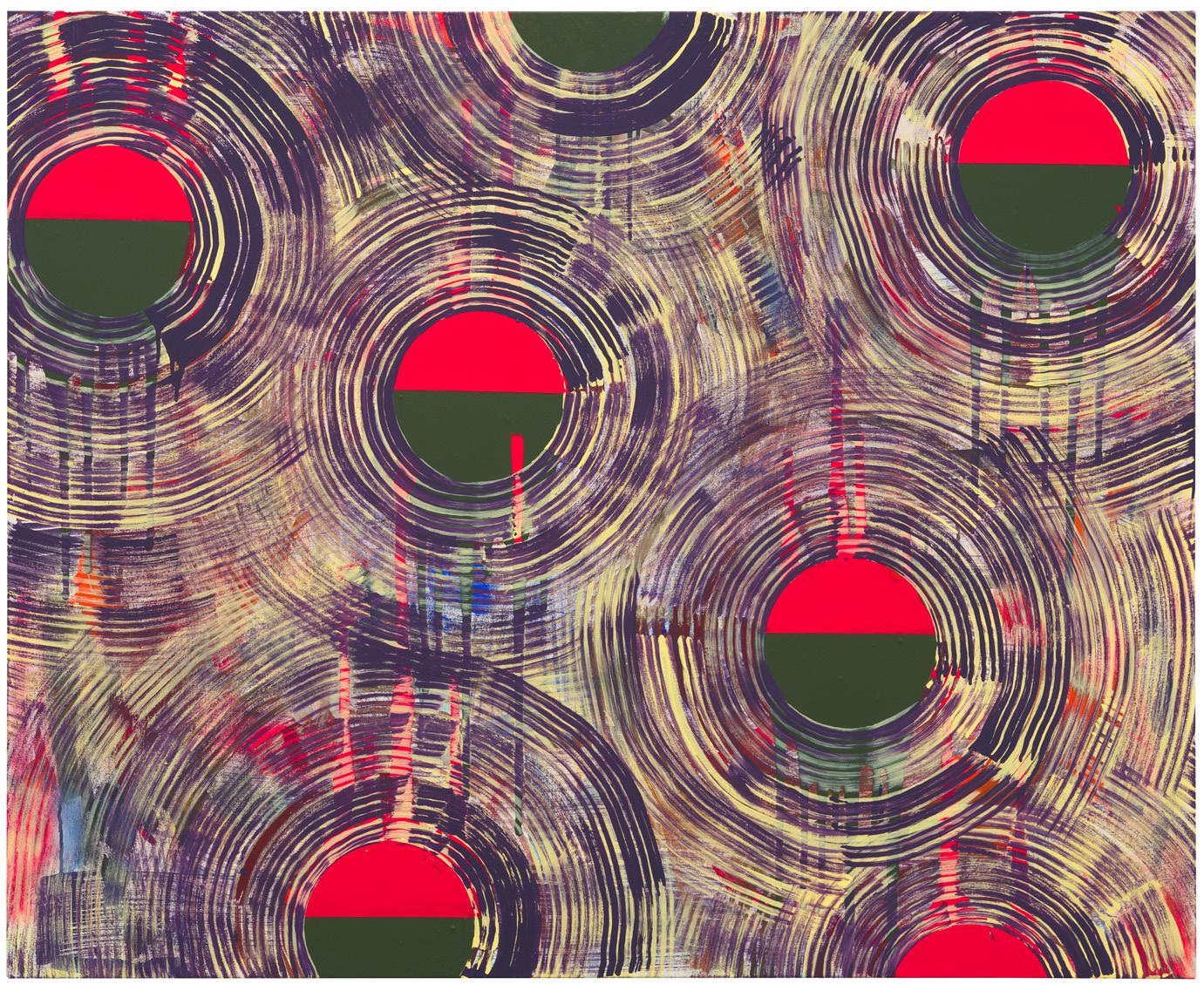
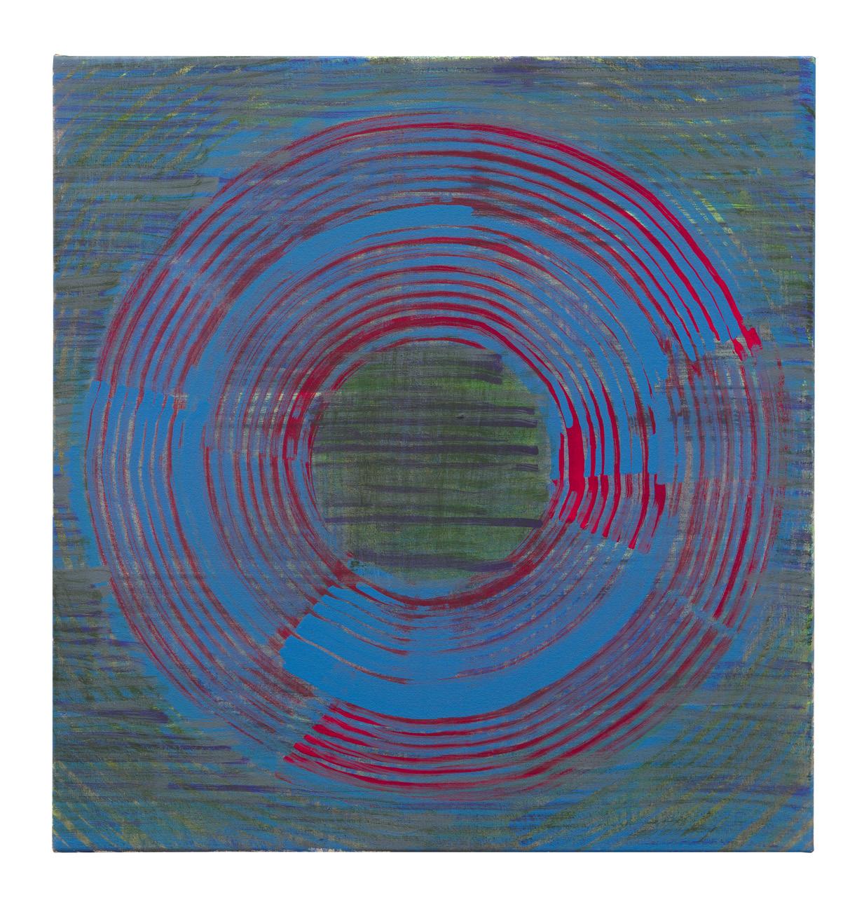
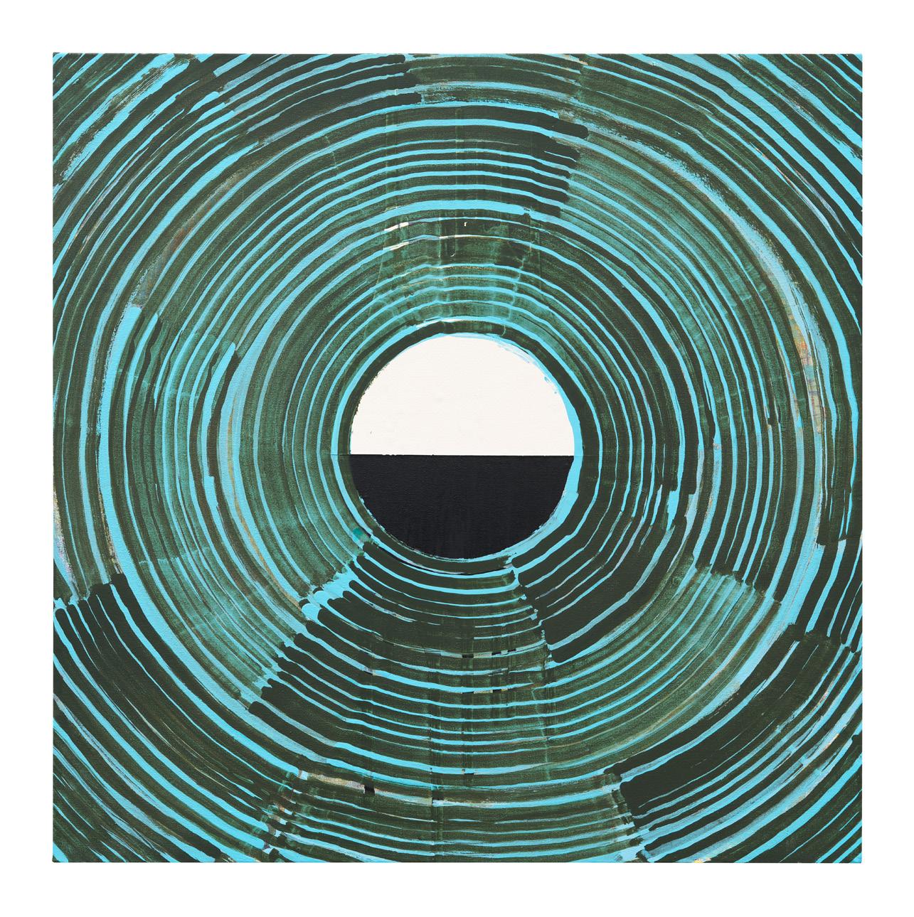
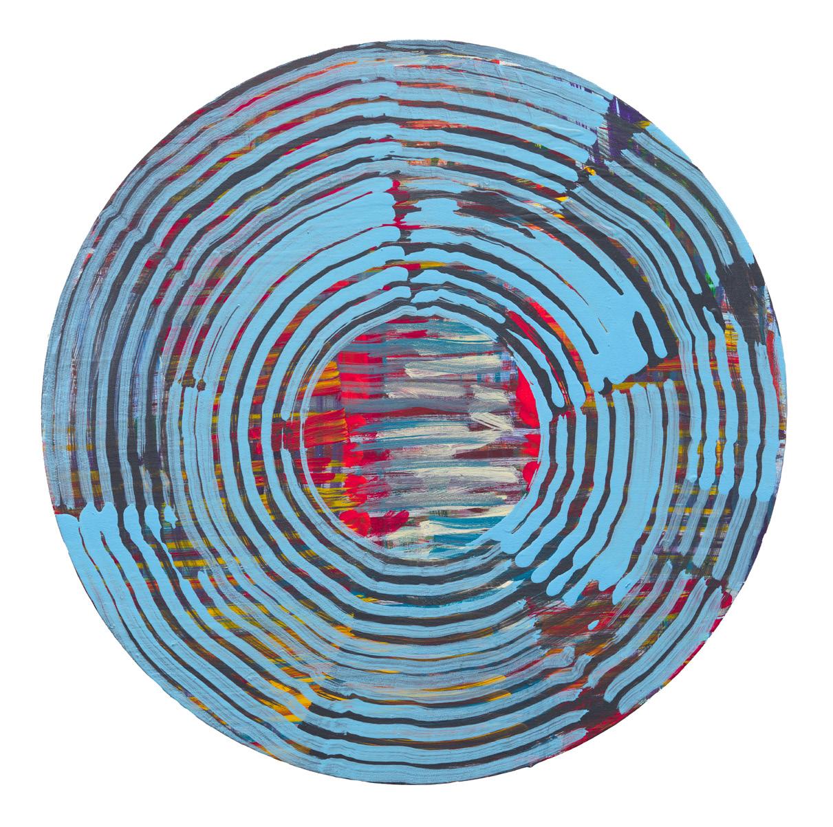
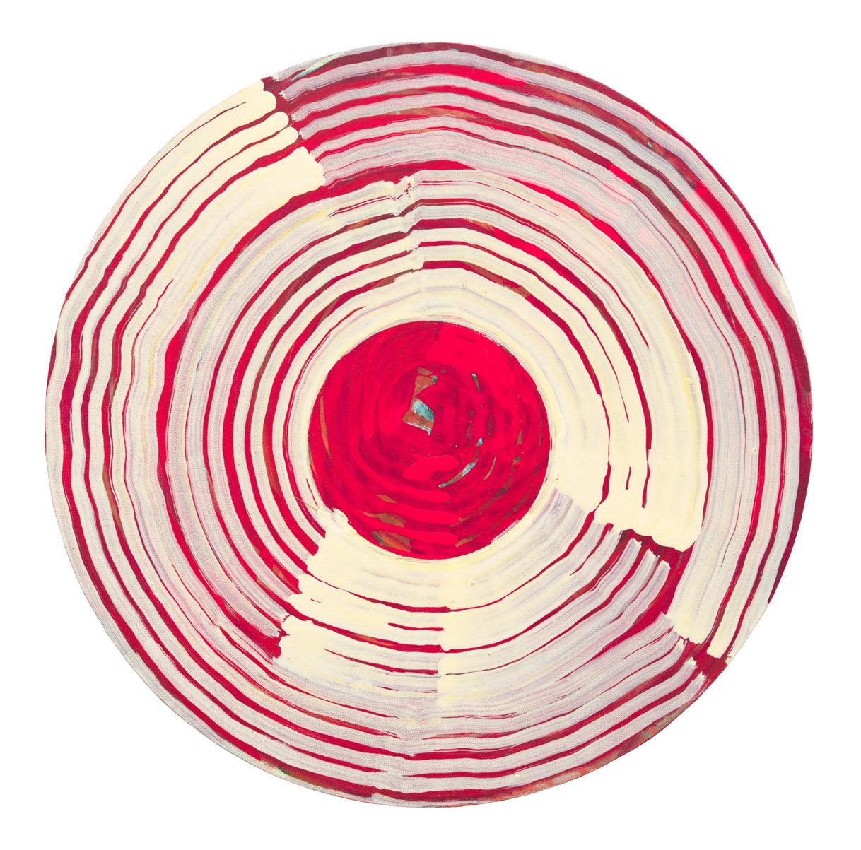
In a purely formal sense, the areas of solid colour balance what would otherwise be a noisy and unintelligible surface. They clarify the composition and allow the eye a momentary rest from the hallucinogenic spirals. These areas often include a horizontal line, establishing rectangles on the top and bottom halves of the canvas. Though there are no tonal gradations in these areas, the horizontal line is enough to create a sense of receding space. In fact, without these lines, a landscape might not be implied at all. The only shape that recurs as frequently as the rectangles are the circles which Allen renders with his grainer’s brush. The sense of time passing is accentuated by these apertures. There are obvious similarities that one could draw with a clock, or a rotating globe, but more than anything else, the brush strokes themselves convey this feeling of transience. Unlike the uniformly applied areas of solid colour, the grainer’s brushstrokes create a timeline of movement, revealing the chronology of Tim’s process.
Ultimately, these paintings have the aesthetic quality of a black hole and are sublime expressions of the relationship between time and space. When and where we are, however, is never clear.
Tim Allen in his East London studio, 2023. Image courtesy of Julius Killerby.
13 14
JULIUS KILLERBY Do the marks you make, the parallel brush strokes in particular, do they have any relation to something in the real world? Do they signify something like light or are they pure abstraction?
TIM ALLEN I’m not sure if there is such a thing as pure abstraction, really, but certainly the parallel lines allow for a kind of layering which I hope echoes light effects or spatial effects which you can find in nature.
JK When you say there is no such thing as pure abstraction do you mean that everything is related to the real world in some sense?
TA Yes, I think that’s a good way of putting it. I think the brushstrokes that I use generate something that’s akin to the way that we experience the real world - in a direct kind of way - because they allow a complex layering which is very similar to how we sense depth or sense space. There’s a sense of tracking that maybe allows the viewer to go on a journey with the work which is similar to the way that we experience the world.
JK So they almost mimic the complexity of life without, strictly speaking, representing something?
horizon lines, or they featured a kind of aperture or a vignette in the surface of the painting. So, you know, a hole basically in the fabric of the painting. As time went on that vignette which was initially painted in quite an illusionistic way involving something much more soft-edged and atmospheric, gradually became more confrontational and as a result became more hard-edged and I guess simpler in one sense. But the relationship between the surrounding space of the painting and the insert - or the window, if you like - that became more problematic as a result of the pointing up of the difference between the two.
JK It’s almost as if you’ve inverted the conventional approach to landscape. Usually, the landscape itself would be the more detailed area and the air between the viewer and the landscape is empty. Whereas you’ve made the space between complex and you’ve heavily reduced and simplified the landscape underneath.
TA Yes, at one point I used to think of it as being a view, some depth back from the picture plane. In contrast, the ground itself was more like encountering the raw material of what you were viewing at a distance, but seen right up close. It was kind of the raw ingredient of the view. That’s speaking about those paintings from a landscape oriented position though that’s not all there is to them. The way that the images are structured or the way that the images have a conversation
internally, inside the painting, I hope allows for quite a broad range of interpretation. What I’m saying now, that’s only my view point. There may be other ways of looking at the paintings. I like the paintings to have an initial punch but I also need them to render up something much more subtle, complex and slow for the viewer.
JK Do you plan your paintings or are they mostly improvised?
TA They’re always improvised. That’s maybe the only constant thing.
JK So you never go into a painting with an image in mind?
TA I think that’s particularly true of this painting (points to Mirror) but there are other paintings in which the ground is actually quite varied and there are lots of things happening in the ground. So, what’s left to filter through the top layers varies enormously across the picture.
JK Do you paint on a large scale so as to immerse your audience in the world you’ve painted? Do you want your audience to experience the work as much as you want them to analyse it?
TA Yes, I think immersive is the right word for that. I’ve always liked making big paintings.
JK Do you see the smaller works more as conceptual studies, then?
TA Yes, I do all that. I can’t envisage working without music actually. These days I tend to listen through wireless headphones.
JK Well given your style is quite improvisational, I imagine the music effects how and what you paint quite a lot.
TA I don’t know... I don’t know if it does or not. It certainly effects how I feel when I’m painting. Sometimes I might be playing something ambient which is almost subconsciously there in the work. I mean once I really start painting I can actually... you know... if something finishes I might not put it on again for a while and just work in silence. I find that the older I get the more often that happens. But yes, music is crucial. My life has revolved around music just as much as art really.
TA Yes.
JK Is it important to you that your work is correctly interpreted by your audience?
TA Well I’d like my work to be open to interpretation, so although there are maybe clues or aspects to the work which are quite easy to understand or to follow, there are other aspects to it which allow for a very broad range of readings.
JK In your paintings there’s often a small area that’s a very heavily reduced abstraction, usually something geometric and solid in colour, and it seems very different to the grainer’s brush markings, which cover the rest of the canvas. What does the more reduced area signify because, for me, that’s what seems to hint at a landscape?
TA Yes, that’s had quite a genesis. In a very simplistic sense it relates to a lot of hard edge abstractions that I made in the late ‘70s (1976-1979), which were, I hope, not completely generic. But compared to the work I’m making now they certainly belong to the tradition which was already well established with painters like Ellsworth Kelly or Brice Marden. So, there’s that combined with the fact that from about ‘85 through to ‘90, I began a series of paintings which were either
TA Well, I might have a very generalised idea of an image. There might be a particular motif that I’m exploring. All these paintings just start. I just start and see what happens. I’ll lead the audience toward something that I might have in mind, but it’s very open to change. In fact, the more it changes, the more complex the painting becomes, and the richer the experience is for the viewer. Well, that’s the hope anyway. The improvisation is absolutely crucial. You know, it could start off as something landscape orientated, or it might start off in the complete opposite direction to the eventual outcome, something that’s more abstract, but that can really change enormously in the process of painting. I’m not sure if I could keep my interest with a painting that was completely predictable.
JK The two most common shapes are circles and rectangles. At least for me, the rectangles create a sense of space and the circles make me aware of the passage of time. Would you say that that’s an accurate reading?
TA Yes, I think that’s a very interesting way to put it because, especially with these current paintings, I became very conscious when painting them that for some reason they seemed to generate a more specific sense of time or of time passing. I think the kind of - for want of a better word - rippling quality surrounding the circular forms, in itself generates a feeling that is about locating yourself within the passage of time, and moving across the painting spatially. So you move across the painting and you become aware of the relationship that you are having with time passing; the flow of time, the flow of impermanence.
JK The circles are also painted in a way that you can see the beginning and the end of the brushstroke. The paint, for example, becomes thinner when you reach the end of the stroke. Whereas the solid base layer, which forms the rectangular area, doesn’t give any of the process away, because the paint is applied flatly.
TA No. I think they all work in their own way, but there is something about making a big painting... I’m not sure what it is. It’s just an instinctive thing really. I just enjoy it.
JK Would you agree that there’s a hallucinogenic element to your work?

TA Yeah. Yeah I would say that’s... the problem with the word “hallucinogenic” is that it seems to imply something that isn’t real, whereas in fact most of one’s experience with making paintings is that you’re trying to convey a real experience. Something which can’t be replicated in any other way. And although, like all experiences, it’s kind of short-lived and moves on very quickly, I would hope that... well I guess that the idea of transport is important, the idea that you can be transported from one state to another. But is that an hallucination, I’m not sure it is. It’s a useful word because it does relate to states of consciousness and I think that’s important in the work. But, as I said earlier, I don’t think it conveys the sense of real experience that I want to convey.
JK Tell me if you agree with this, Tim. I would say that there is a very musical quality to your work. I get that from the parallel lines as well because it reminds me of blank musical notation. Then, for me, the other aesthetic elements in the painting become the musical notes. Is that intentional at all?
TA If you go back quite a long way, a lot of the work was much more like staves, as you suggest, than it is now. There was a review, actually, quite some time ago now, written by Stuart Morgan, where he focused on that aspect of them and made parallels, not just with musical staves, but also written language, different kinds of alphabets and so on. I think it’s definitely an aspect of the work but I wouldn’t have said it was a primary aspect these days. I think my handwriting’s my handwriting and the graining brush mark is being made to do more than it used to.
JK Well what music do you listen to when you paint?
TA All sorts.
JK At least with my own practice I find that you can listen to different songs so as to borrow different kinds of emotions. If you’re needing a bit of an energy kick, play Voodoo Child for example.
JK You were a musician yourself?
TA I did play, yeah.
JK What did you play?
“I like the paintings to have an initial punch but I also need them to render up something much more subtle, complex and slow for the viewer.” - Tim Allen, 2023
Opposite page: Tim Allen, Becoming 2014 acrylic on canvas, 153cm x 201cm. Image courtesy of Daniel Browne.
Below (right): Tim Allen, Land Of Milk & Honey, 2009, acrylic on canvas, 191cm x 155cm. Image courtesy of Daniel Browne.
15 16
TA Guitar, keyboards, harmonica, writing, singing, you know... the whole lot really. It’s all on Spotify.
JK Under the name, Tim Allen?
TA No it’s under the band’s name, which is Drifting Robots.
JK That’s a good band name. You’ll often have quite suggestive titles for some of your works. The work behind us is titled Mirror for example. It makes me wonder if there is a narrative element to your work.
TA I talked about this a bit on Gary Mansfield’s podcast, The Ministry Of Art I talked about writing song lyrics and how that kind of moved into titles and writing for it’s own sake. Kind of poetry I suppose. Certainly with titles I wanted to be able to push something quite complex. So you initially encounter a title with a painting and its problematic. Quite often it’s very difficult to make that relationship between the title and the painting work. It throws you into engaging with a painting in a way that it wouldn’t otherwise and it allows you to interpret it in a way that you might not have done without that title.
JK It pushes the audience along in the interpretive process?
TA Yes, yes I think so. You know you’re looking at them thinking “What does that mean... why is it called that?” And in trying to work that out you live with, or you engage with the painting in a way that you wouldn’t have otherwise been able to. And you can also begin to discern a more complex relationship with what those forms might be leading you to. I was about to say “referring to” but the paintings aren’t symbolic. It’s very hard to explain, which is probably a good sign, but they’re certainly on the border between abstraction and figuration. It’s a kind of shuttling process backwards and forwards and that’s where I like to be, you know, with a foot in both camps.
JK I think having that foot in both camps, at least for the audience, makes you more aware of the paint itself... and the illusionistic qualities of the paint because you can so easily hover between the illusion of representation and straight abstraction. I mean, for me, that’s why I don’t find photorealism too interesting, whereas I find someone like Jenny Saville very interesting because you’re much more aware of the work as a construction.
TA Yeah, thinking about photorealism, I mean it brings to mind someone like Malcolm Morley for me and the way that he began to disrupt what were initially extraordinarily illusionistic paintings and then he began to insist upon their materiality. And of course with him they were kind of mad... I haven’t really thought about him for a while. He’s quite an interesting artist, I think.
JK Who are some of your favourite artists?
TA Well I’ve always rated Brice Marden. It’s one of those questions where, you know, I’d give you a different answer tomorrow... or yesterday.
JK Well my follow on from that was going to be are your favourite artists also the ones who have had the most influence on your work?
TA Hmmm I don’t know. I haven’t really thought about that for a long time. I mean I hope that now the paintings are beginning to establish their own identity. There’s just so many artists really. I think that whole European landscape tradition which then moved out into America and Russia around the late 19th century and then, I suppose, moved into Impressionism... I think that’s still very potent for me. I still love discovering new artists who worked in that tradition that I might not have known. Interestingly, recently one of, I think, the greatest landscape painters, Kuindzhi, who is a Russian... well actually it turns out he wasn’t Russian. He was Ukrainian and there’s a museum which has been really badly damaged and I know that he didn’t do many paintings, just because they took a very long time to paint. I hope that the work has survived. I don’t really know... I just remember reading it in the newspaper where they happened to mention his name. You realise how vulnerable Art is. It’s like going back to the Iraq War and the extraordinary buildings and works of Art that were destroyed by the War.
JK Do you remember which artist was your foot in the door for first getting you into Art?
TA Well, again, I talked about this a little but on Gary’s (Mansfield’s) podcast. It took a while to get past Picasso. And then, when I was about sixteen or seventeen, I saw a reproduction of Woman I by de Kooning, in Herbert Read’s
History of Modern Art and I thought why is that good? It’s so horrible. And I just worked with it, and it obsessed me. I couldn’t get it out of my head even though I didn’t like it at all. And I don’t know what happens, you know, it’s like learning a language. Suddenly you wake up and you can speak it and that’s what happened. I suddenly could understand it and it was one of the greatest paintings, full of incredible stuff. Ever since that experience I’ve never really had a block. I might not like something or I might like something, but that’s not the same as understanding it or being able to see its place in the Pantheon.
JK Well do you think how broadly understood or easily understood an artwork is at least one barometer for its success?
TA Well understanding depends on who’s looking at it doesn’t it? And you get many different kinds of people and different kinds of understanding.
JK No, of course, but I think an artist is always trying to convey an idea, a feeling, an emotion, or something more specific. And I think if the viewer has to labour over a work much longer I wonder how much that’s an indication of the artist falling short of their goal.
TA No it just means some artworks are harder to get to than others. And, you know, this idea that Art has to convey an idea. I mean I’m not sure about any of this. Obviously Art does convey ideas but is that it’s only function? It always seems to me that one of the great things about Art is that it suspends ideation. It opens your mind. That’s not to say that ideas aren’t involved because that’s part of the richness of looking at Art, but it’s not the only thing, it’s something that’s... I nearly said bigger than that but... I don’t know.
JK How do the paintings being exhibited at JGM Gallery this March differ to your previous work, do you think?
TA Well the majority of the work in this show is relatively recent and features a kind of marriage of the horizon line motif with the aperture or vignette. So they’ve been brought together in a way that I hope is new for me. I haven’t quite worked out what they’re about yet really but it does seem that the sensations I get off them are what I was talking about earlier: this relationship with time, that they’re as much to do with time as they are to do with space.
JK Do you generally only see the progression in your work in hindsight?
TA Yeah I think some aspects of the work take years and years to understand. Stuff that you might have rejected once you now look at again and think “That makes sense” or “That’s what that was about”. Or, you know, you can have whole periods of work that you went off for a couple of decades. This is all stuff that I’ve found happens as I’ve got older, that once you’ve been working for a long time, you can move in and out of these different periods and something that you did ten years ago might suddenly come round again. Or twenty years ago or, as it is now, fifty years ago. You know, when you work over a very long period of time your relationship with your work becomes more profound... or at least you understand it more... maybe. But at the same time as saying that, quite often, as I have been in this conversation, I’m at a loss to really be able to understand or explain it. If you could explain everything you wouldn’t paint it. You want to create experiences for other people that can’t be duplicated. Each painting is a unique thing.
JK I guess that gets to what we were saying before. If every painting was just conveying an idea or had a very specific narrative element, why not just write about it, rather than paint it. When we met the other week you were explaining the social and cultural history of Durham to me, which is where you grew up. Could you explain that again?
TA Well it’s quite a complex place. It’s a medieval city. It was, at one point, the greatest pilgrimage centre in Europe until Thomas Becket got whacked in Canterbury. So culturally it was actually a real focus in the North of England and at one point it was a palatinate, which meant that it was ruled by a Prince Bishop who was the only person in the country apart from the King who could print his own money. So it had this kind of independence. Anyway, I don’t know what the relevance of all this is but what is crucial is that I grew up immediately outside one of the greatest buildings in the world and the Cathedral there is probably the best Norman building in the World and certainly one of the greatest Cathedrals. And, as a place to grow up as a child, it was amazing really. Really inspiring and it continues to be inspiring. Also, I guess socially, it was quite complicated because certainly still as I was growing up it was the headquarters of the mining union. It was at the centre of the Northeastern coalmining industry, which as we know, changed the world, transformed the world via the Industrial Revolution. So the
city itself was surrounded by pits which are, of course, closed now. There are villages which are just in dire, dire poverty and that conflicted massively with the university which was obviously one of the most substantial and oldest universities in the country, apart from Oxford and Cambridge. And so, there was that conflict, plus into that is thrown a kind of Church of England hierarchy, second only to Canterbury probably. So, as a social mixture it was really very complicated and confrontational a lot of the time, and that made it a very unique place to grow up.
JK Did it seep into your work at all?
TA Yes, I’m sure it did. Defining how is something else but I’m pretty sure it did.
JK Of course you could over analyze it but for me making the air visible - which is partly what I think you do in your work - seems consistent with an upbringing in a polluted city. The sense of scale, I imagine, was also partly influenced by your upbringing in Durham.
TA I think, yes, definitely the sense of scale. I think visually it was a very powerful place. A very powerful place to live, especially as a teenager.
JK Was it the kind of environment where you were encouraged to be an artist?
TA Yes, it was. I was very lucky in that respect. Both my parents were absolutely encouraging. My mother had been to art school. She was at Manchester during the Second World War.
JK When did you first want to become an artist?
TA I don’t know. I always knew... well I never really considered anything else. I could’ve written instead maybe, or played music.
JK You’ve previously painted with both oils and acrylics. In relation to your work, what are the pros and cons of both mediums. What do you get from acrylics that you don’t get from oils and vice versa.
TA Well I started with acrylics and then went into oils and then came back to acrylic. Acrylics is about speed. You can work very fast. In a warm temperature you can layer it and layer it, which I like. It makes it closer to calligraphy
or something like that where you can work spontaneously and generate quite a speed. With oil paint you kind of have to pace it because of the drying time. It’s a very different approach. The return to acrylic happened quite naturally over quite a long period of time. I had some technical issues with some of the oil paintings from the 1980’s.
JK Did they begin to deteriorate?
TA Yes, it was mostly to do with priming and sizing. I started to use acrylic as a straightforward primer where you don’t have to use conventional or traditional sizing. This was as a result of damage to the paintings incurred with huge temperature changes in the studio I used to be in... it’s actually not totally dissimilar to this one. You’ll have noticed I’m beginning to shiver (both laugh). So massive differences in temperature or humidity. All those things cause a lot of canvas tension and so if you don’t have the primary layer - the sizing - right, then it doesn’t matter what you put on top, it’s going to deteriorate and crack. So I went back to acrylic because it gets rid of that problem. But, you know, I love oil paint. I love all kinds of paint actually. It’s just swings and roundabouts. Who knows, I might get round to using oil paint again.
JK Are you excited to be showing this new body of work in London at JGM Gallery?
TA Yes, I’m very excited. I’m really looking forward to it.
JK And a broad and pretty unfair question Tim, but why do you think Art is important?
TA Because it opens people’s minds. That, in itself, is a crucial part of life. (Pauses)
JK Well if you were to stop painting today, what would you be losing?
TA Just about everything (laughs). Well, not completely because obviously, you know, you make the best of whatever you can. But I’ve been painting too long now to consider... I’m not going to stop now.
17 18
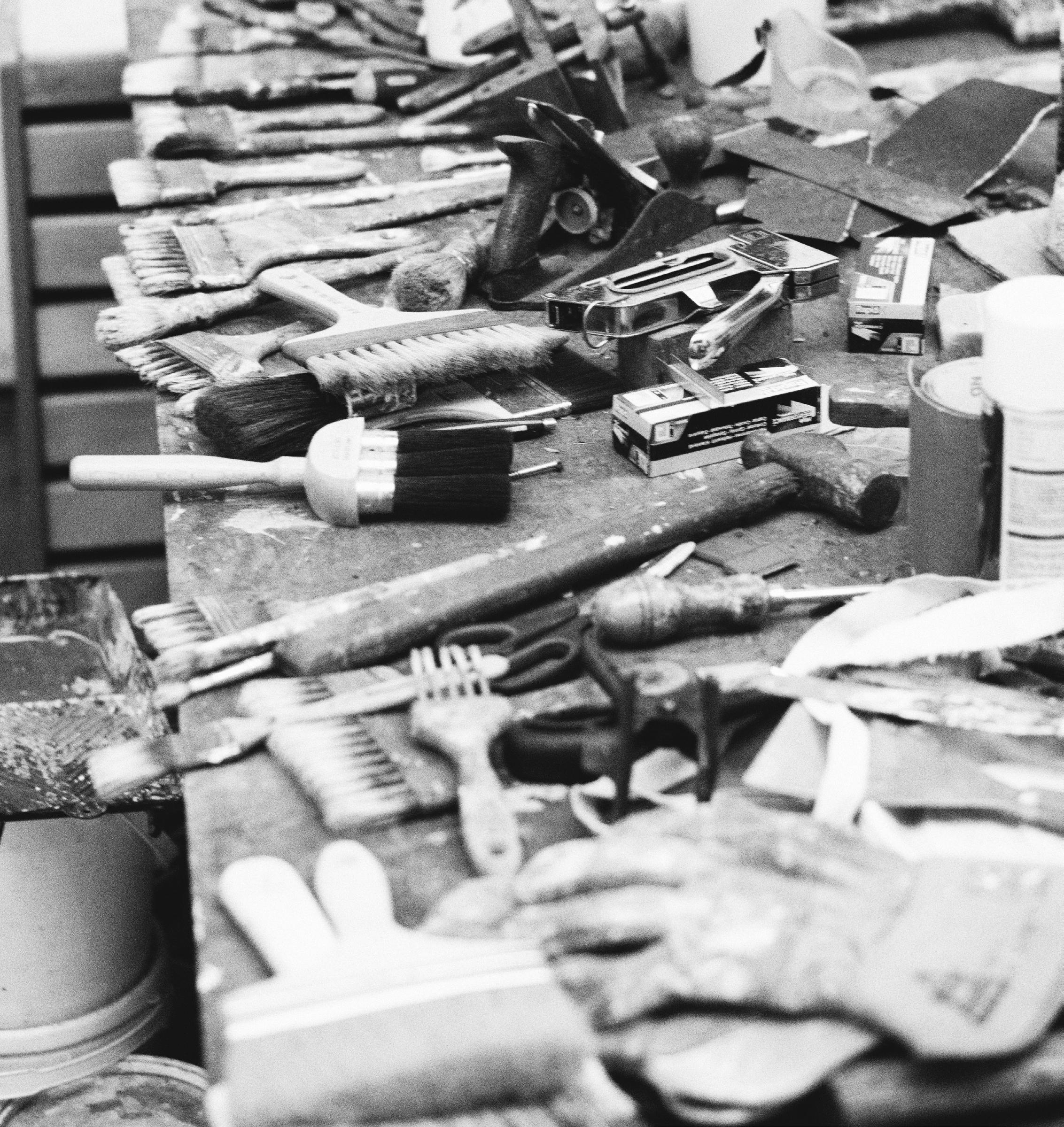
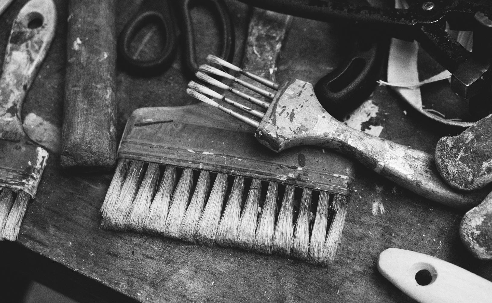
Tim Allen’s grainer’s brushes, 2023. Image courtesy of Julius Killerby.
As I Went Out One Morning
2021
Acrylic paint on canvas
123cm x 160cm
Image courtesy of the artist & Daniel Browne
Becoming 2014
Acrylic paint on canvas
153cm x 201cm
19 20
Image courtesy of the artist & Daniel Browne
Mirror
2013
Acrylic paint on canvas
196cm x 155cm
Image courtesy of the artist & Daniel Browne
Land Of Milk & Honey
2009
Acrylic paint on canvas
191cm x 155cm
Image courtesy of the artist & Daniel Browne
21 22
Untitled I
2020 Acrylic paint on canvas
112cm x 137cm
Glory Daze
2021 Acrylic paint on canvas
123cm x 158cm
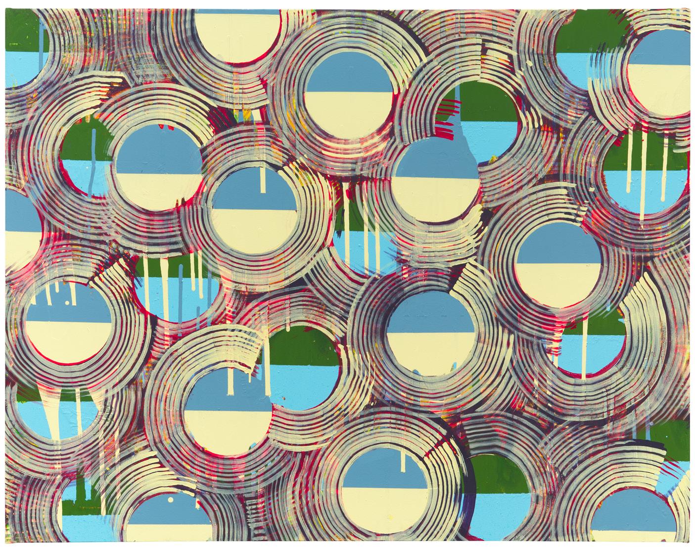 Image courtesy of the artist & Daniel Browne
23 24
Image courtesy of the artist & Daniel Browne
Inside Out
2021 Acrylic paint on canvas 213cm x 340cm
25 26
Image courtesy of the artist & Daniel Browne
Peace Piece
2022
Acrylic on canvas
85cm x 180cm
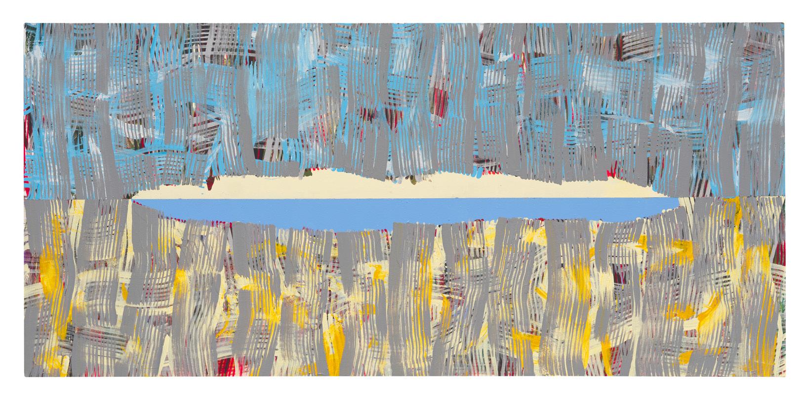
Image courtesy of the artist & Daniel Browne
Untitled II
2020
Acrylic paint on canvas
50cm x 62cm
Image courtesy of the artist & JGM Gallery
27 28
 Vuillard 2019 Acrylic paint on canvas 66cm x 63cm
Image courtesy of the artist & Daniel Browne
Clear 2020 Acrylic paint on canvas 70cm x 70cm
Vuillard 2019 Acrylic paint on canvas 66cm x 63cm
Image courtesy of the artist & Daniel Browne
Clear 2020 Acrylic paint on canvas 70cm x 70cm
29 30
Image courtesy of the artist & Daniel Browne
Untitled III
2022
40cm diameter
Untitled IV
2022
40cm diameter
 Acrylic paint on canvas
Image courtesy of the artist & Daniel Browne
Acrylic paint on canvas
Acrylic paint on canvas
Image courtesy of the artist & Daniel Browne
Acrylic paint on canvas
31 32
Image courtesy of the artist & Daniel Browne
Untitled V
2022
Acrylic paint on canvas
40cm diameter
Untitled VI
2022
Acrylic paint on canvas
40cm diameter
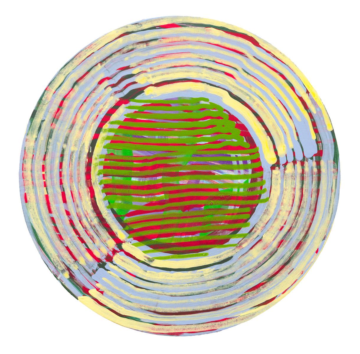
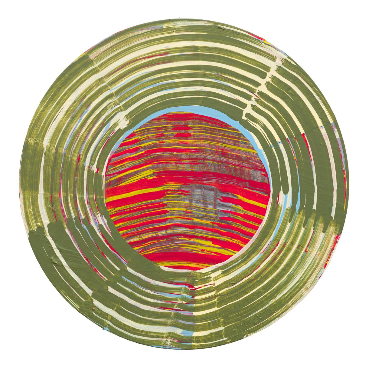 Image courtesy of the artist & Daniel Browne
33 34
Image courtesy of the artist & Daniel Browne
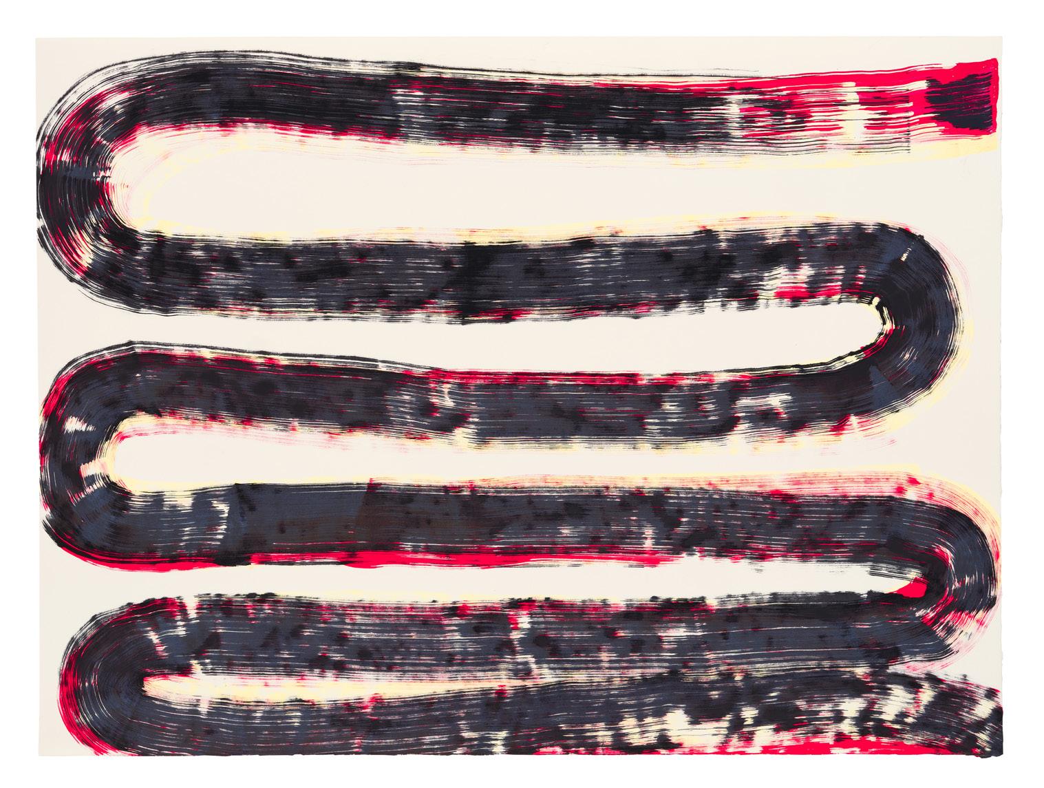
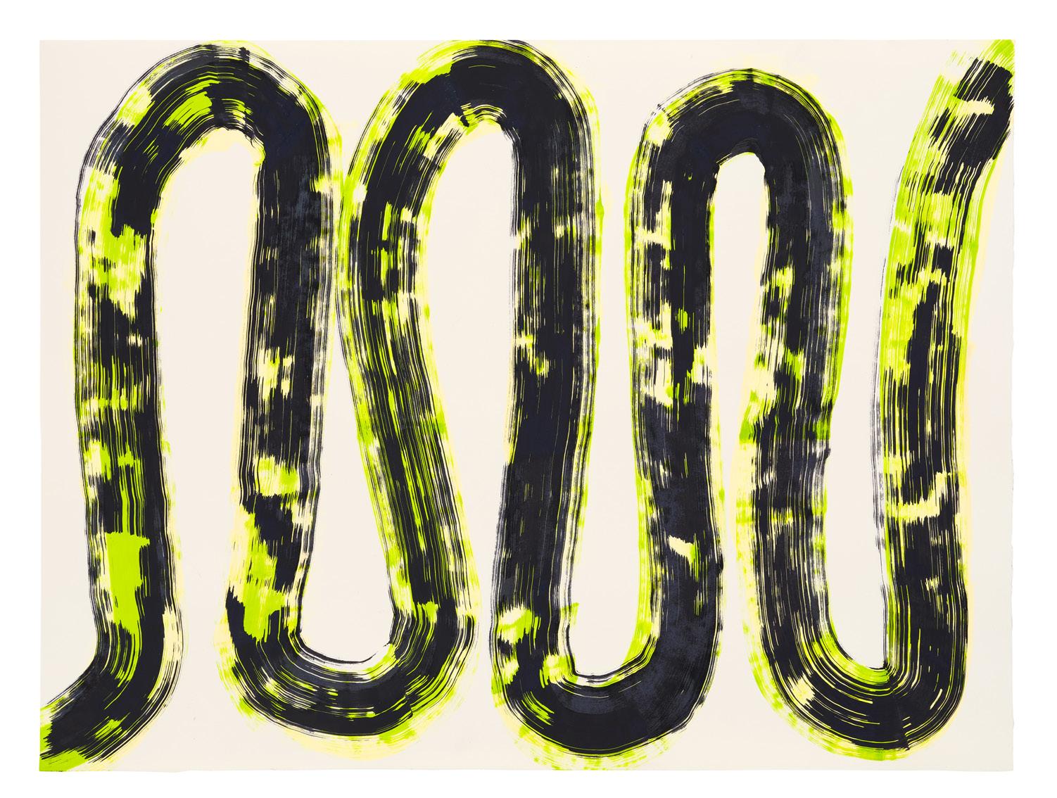
 Snake Dance 2022 Molotow marker on paper 47.5cm x 64cm
Image courtesy of the artist & Daniel Browne
Snake Spring 2022
Molotow marker on paper 42cm x 59cm
Snake Dance 2022 Molotow marker on paper 47.5cm x 64cm
Image courtesy of the artist & Daniel Browne
Snake Spring 2022
Molotow marker on paper 42cm x 59cm
35 36
Image courtesy of the artist & JGM Gallery
 Snake Spring (Mix) 2022 Molotow marker on paper 42cm x 59cm
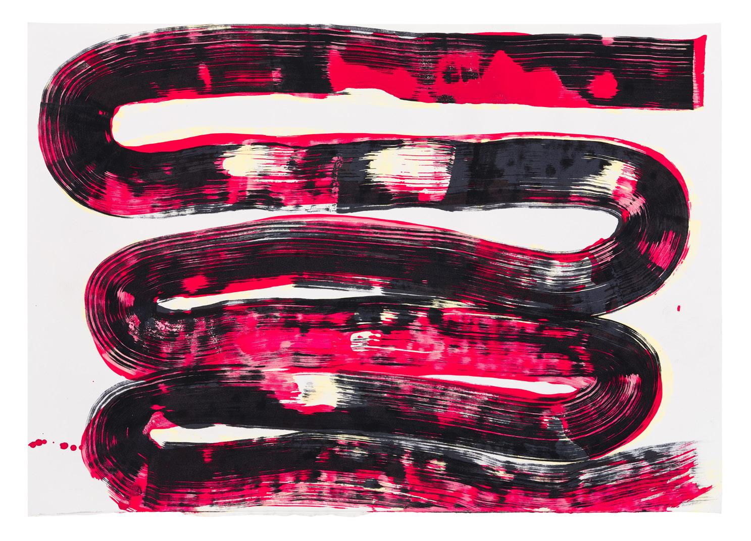
Image courtesy of the artist & Daniel Browne
Jewel Snake 2022 Molotow marker on paper 47.5cm x 64cm
Snake Spring (Mix) 2022 Molotow marker on paper 42cm x 59cm
Image courtesy of the artist & Daniel Browne
Jewel Snake 2022 Molotow marker on paper 47.5cm x 64cm
37 38
Image courtesy of the artist & Daniel Browne
 Stark Snake 2022
Molotow marker on paper 47.5cm x 64cm
Image courtesy of the artist & Daniel Browne
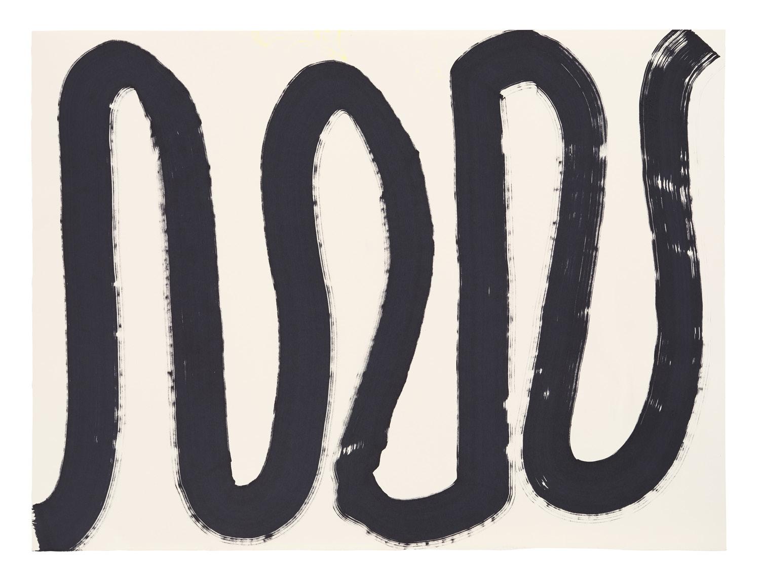
Black Snake 2022
Molotow marker on paper 47.5cm x 64cm
Stark Snake 2022
Molotow marker on paper 47.5cm x 64cm
Image courtesy of the artist & Daniel Browne
Black Snake 2022
Molotow marker on paper 47.5cm x 64cm
39 40
Image courtesy of the artist & Daniel Browne
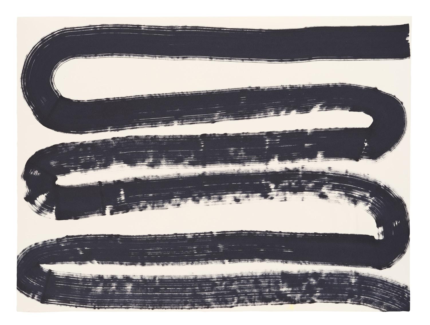
Curtain Call 2022
Molotow
Curtain Call II 2022
Molotow
 marker on paper 38cm x 56cm
Image courtesy of the artist & Daniel Browne
marker on paper 38cm x 56cm
marker on paper 38cm x 56cm
Image courtesy of the artist & Daniel Browne
marker on paper 38cm x 56cm
41 42
Image courtesy of the artist & Daniel Browne
Peripheral 2022
Molotow marker on paper
42cm x 59cm
You Want It Darker 2022
Molotow marker on paper
42cm x 59cm
Image courtesy of the artist & Daniel Browne
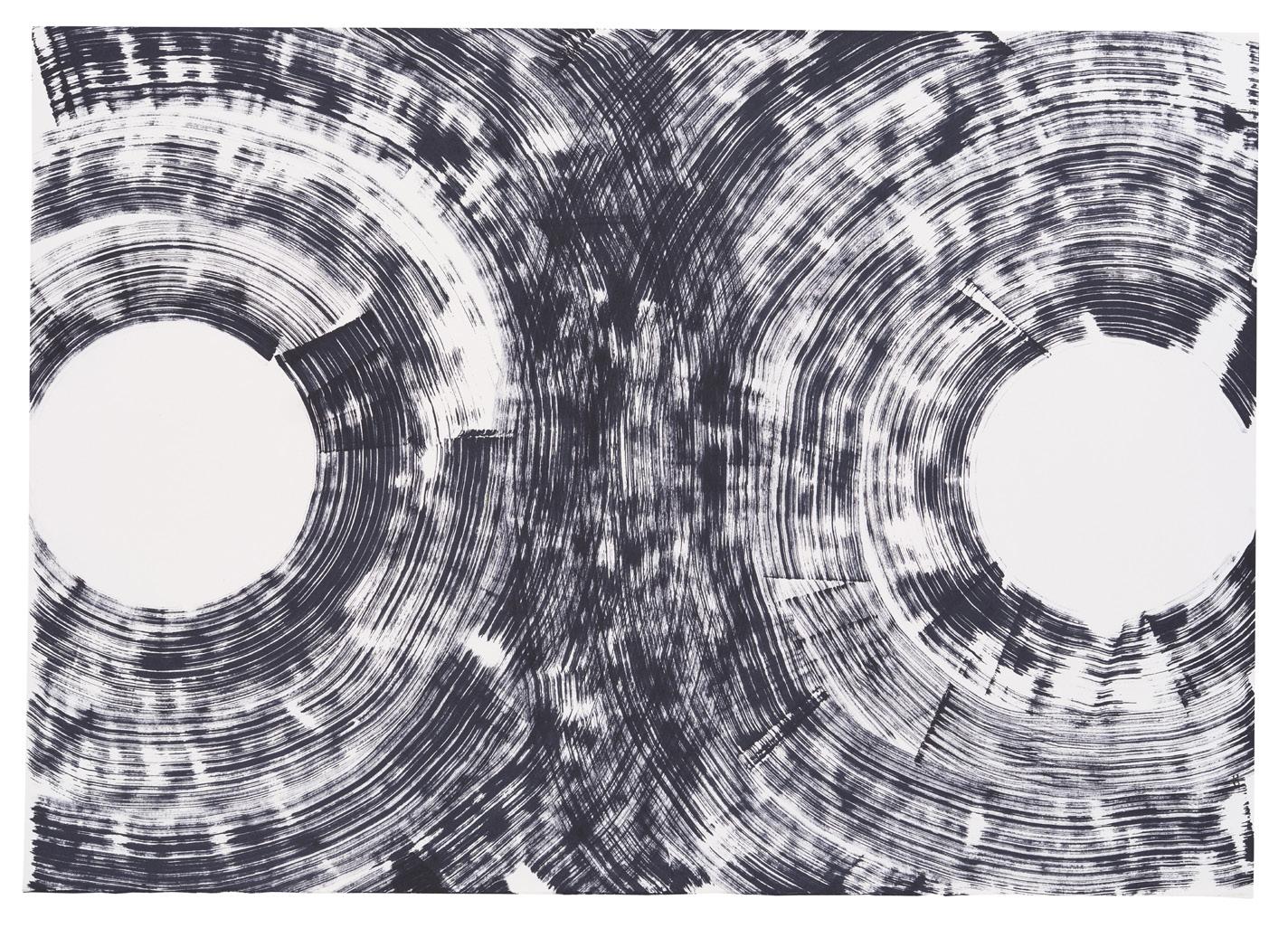 Image courtesy of the artist & Daniel Browne
43 44
Emerging
2022
Molotow marker on paper 38cm x 56cm
Image courtesy of the artist & Daniel Browne
Rise 2022
Molotow marker on paper 38cm x 56cm
45 46
Image courtesy of the artist & Daniel Browne

 Front cover: Inside Out (detail) 2021. Image courtesy of Daniel Browne.
Back cover: The Water In The Well poster, 2023. Image courtesy of Tim Allen & Julius Killerby. Editorial design: Julius Killerby.
Julius Killerby & Daniel Browne.
2023 JGM Gallery, Tim Allen, Julius Killerby & Daniel Browne. All rights reserved.
Front cover: Inside Out (detail) 2021. Image courtesy of Daniel Browne.
Back cover: The Water In The Well poster, 2023. Image courtesy of Tim Allen & Julius Killerby. Editorial design: Julius Killerby.
Julius Killerby & Daniel Browne.
2023 JGM Gallery, Tim Allen, Julius Killerby & Daniel Browne. All rights reserved.