1 minute read
What’s wrong with this picture?
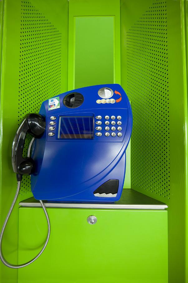
Iphotographed this clash of colors in an ultra modern phone booth in the Amsterdam airport. I like everything about it except for one thing -- the white instruction placard is visually annoying. Our attention is drawn to the lightest part of an image first, and it returns there again and again. If the light part of a photo isn’t part of the subject, it’s most likely distracting. Our attention should be focused on the subject. To a smaller degree, but still important, the black sticker in the upper left corner of this image is also distracting. The picture on the next page shows what a big difference it is when the distracting elements are removed. Now the background is entirely complimentary.
Notice I replaced the white placard not with a solid color, but instead with a gradient of green. I thought that was more visually pleasing than a solid color.

To do that, I used the pen tool in Photoshop to make a precise selection of the area in question. I then selected the eyedropper tool in the tools palette and took a color sample from a light green area. This put the sampled color in the foreground color box seen at the bottom of the tools palette. Then, holding down the option key (alt key on a PC), I took another color sample, this time in a darker green area of the image. This placed the darker green color in the background color box, also seen in the tools palette.
Finally, I chose the gradient tool and dragged the cursor from the top of the selection to the bottom. That covered the white placard with a gradient of green. §


