12 minute read
WEEK 8: MINIMALISM
Thoughts on readings-- ‘To the Minimalist Work’:
The ‘One thing’ is the main element of the site, with utmost importance and ultimately belongs to its context. Therefore it has to make sense and essentially complement the site it is to provide for. It has a presence, but is invisible, in the sense it may be felt only if sought after. A strategy to incorporate this element is repetition. The thing also gives the place its presence (so it seems to blend together with the subject it serves).
Advertisement
Thoughts on readings-- ‘TACIT’:
Redefining ‘silence’, not as a void but as a element with presence despite not having an obvious display to any of the senses. It seems to be subconscious. It is part of the ‘context’, as in, it has meaning and purpose to be implemented within John Cage’s 4’33”. It doesn’t distract from other elements in the context, but it is still sensed and noticed. The impression I got from this is that it is a rather passive-aggressive element, neither ‘here nor there’, it is not powerless but does not seek to seem strong either. Rather, the ‘strength’ or ‘impact’ of minimalism comes from an absence of. It is not hostile in nature, but comes as a rational, calm and collected force. Its movement is repeated for consistency, hence the rationality.
Thoughts on Lecture on Minimalism by A.Selenitsch
Thing(s) are reduced and repeated, which gives it a ‘reductive’ look. Hierarchy should be absent, minimalism doesn’t seek to overpower the elements/context it is placed in nor does it seek to overpower itself. Repetition, if used, should be used with careful consideration to the composition because this may end up causing the minimal component to suddenly gain a more impactful solidity in a composition.
It is a element in neutrality.
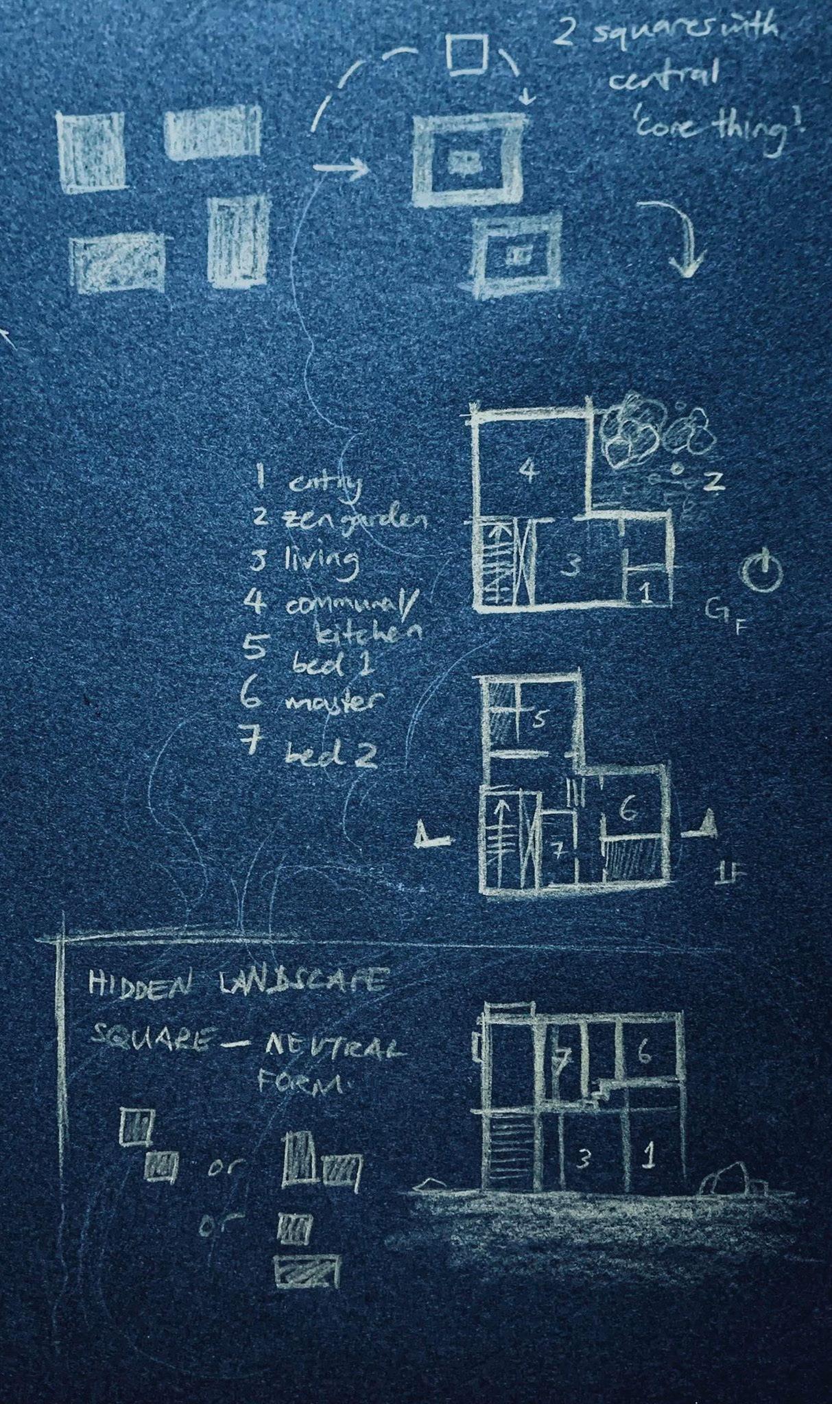
‘White noise’- sound that is heard when there is an absence of the positive sounds that are more overpowering, but white noise also adds to the context, as a single element, that complements and supports its ‘context’ (in this case, background noise) instead of overpowers or distracts listeners from it. Context response: Since there was no given specifications on context, firstly the house is managed for a small family of 2-4, with an immediate surrounding of open land or perhaps being surrounded by minimal forestation, which would allow for serene acoustics. Concrete is the main material, which could seem plain but ultimately I was going for a ‘timeless’ feel, where it would remain a constant throughout all seasons but still have a reflective hue when daylight changes colour on it, from dawn to dusk.
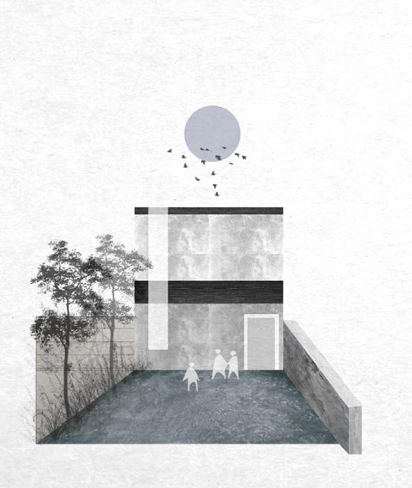
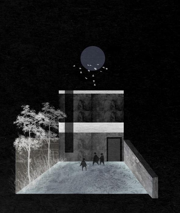
In general I like to start ‘simple’ and craft my way to compaction which probably makes for a condensed building. Some of these influences on my design decisions come from the monochrome aesthetic which I find myself drawn toward, due to the sharp contrast in elemental transition. It is brutal, straightforward and honest, traits I also identify myself as an individual. The contention strives for ‘perfection’, but not without mistakes. I realize my design thinking is often driven by conflict - I want perfection but I know I must accept mistakes otherwise the design will never develop-- and to me, a design that can’t accept mistakes means it cannot take the first step to finding its most ‘perfect’ state. In trying to achieve this, a reductive approach allows me first tackle the main intent/priority of a design before I try to ‘decorate’ it or support it with other components.
In regard to socioeconomic status, my first thoughts usually go to imagining clients who have a similar number of occupants to my household but have had very different living experiences or history. They tend to live a clean lifestyle, uncluttered spaces, with a typically peaceful family/friend dynamic. There is little conflict and disability and they have ‘lived comfortably’ for most of their lives, demonstrated in the ‘boring’ planning of the floors, minimal stairs etc . This is emulated through the cubic, almost symmetrical form, through the occupant’s Archaeology. At its core, the Paradox, the design here is simply a dream for some kind of localized peace.
We can deduce from the drawings and realizations above that, the outcome is ultimately selfish and unrealistic even though the design responds to the imaginary client’s needs and wants; I have projected my own past wishes onto the client because I was given the freedom to do so (not many specifics required by the task) and this is the typical result of living in my own head for too long.


Context:
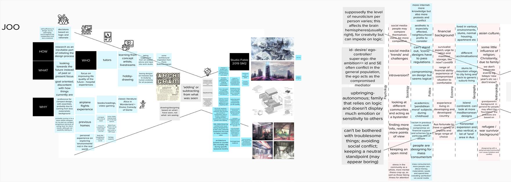
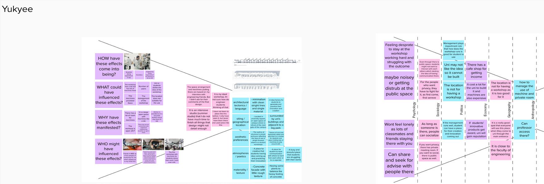
I found that Yukyee is quite people-oriented in her design decisions, Danni and Kay as well, except the user may be prioritised on a slightly lower level than other ideas they may choose to encapsulate in their designs, as they also have a brought influence from social media and religion (or lack thereof). Thinking of the different categories in the funnel diagram for context helped with personal awareness as to where some of my past decisions came from, such as whether it was psychological or came from being exposed to political issues or a hybrid of both. I was previously aware of some of the fields because I was interested to find out psychological trends in artists, how ultimately their success was affected by their mindset and what kind of mindsets they had.
There was a broad spectrum as of course, no two individuals are overly similar however I discovered the degree of egos and neuroticism that tends to be more distinct in creative fields, especially art, music and any design fields. While it doesn’t seem to be necessarily a bad trait, I suppose the extent that a person has of it, could influence if they are geared toward more orderly, Apollonian type of design decisions, as compared to the Dionysian.
Additionally what I didn’t notice before was that family history could have impacted how I developed as a person, which in turn also influenced design thinking. A lot of the seemingly brutal or rigid ‘rectilinear’ forms I tend to lean toward in many of my studio projects probably stem from this category of context due to a strong reminder being passed down- that we have to ensure we do anything to keep our position and not lose another home, or not have to flee elsewhere to survive.
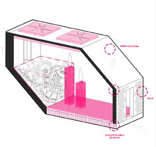
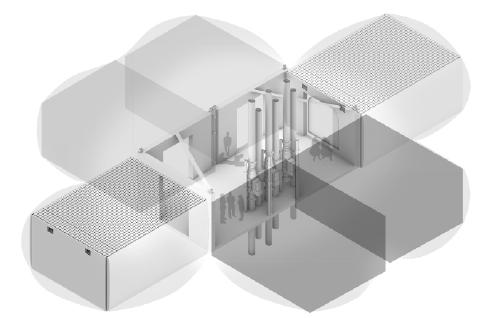
Exposure to vastly different politics and economic situations due to having lived in a developing and developed country may also have contributed to some flexibility; while I prefer the rectangular, I can adapt my projects and don’t mind scrapping the former to convert a new version, as long as there is enough evidence or logic to do so. Time limitations are generally not an issue as long as a third-party does not request a major change one day or few hours before submission, but even then, there have been times I willingly changed despite the crunch time (example below, a scheme changed in 1-2 days, scraps from Studio Fable).
Ultimately this has me even more aware that designers can have similar processes, but there will always be something that is a different priority as part of the workflow or end product, which is what will distinguish them from other designers.

_Subject Readings for Insights
Mark Burry, 2011, Geometry Working Beyond Effect, in: George L Legendre, ed, 2011, Mathematics + Space, AD Profile No. 212, London: Architectural Design /John Wiley & Sons, pp. 80-89.
Missingham, Greg & Alex Selenitsch, 2002, Transplants, Transferences and Translations: Exchanges of strategies and design ideas, gardens and cross-cultural considerations, in: John Macarthur & Antony Moulis, eds, 2002, ADDITIONS to architectural history: XIXth annual conference of the Society of Architectural Historians, Australia and New Zealand, [available CD-Rom], Brisbane.
Makoto Sei Watanabe Architects. n.d. “MAKOTO SEI WATANABE.” Www.Makoto-Architect.Com. Accessed April 22, 2020. https://www. makoto-architect.com/.
Pintos, Paula. 2019. “Cabin Rones / Sanden+Hodnekvam Architects.” ArchDaily. March 19, 2019. https://www.archdaily.com/913345/cabinrones-sanden-plus-hodnekvam-architects.
Shuang, Han. 2018. “His House and Her House / Wutopia Lab.” ArchDaily. March 13, 2018. https://www.archdaily.com/890513/hishouse-and-her-house-wutopia-lab.
Watts, Peter. 2017. “Use These Story Structures to Make Messages People Talk About.” Medium. November 3, 2017. https://medium. com/fassforward/use-these-story-structures-to-make-messagespeople-talk-about-cee6ad96bc62.
Yamada, Ryo. n.d. “Vertical Landscape.” Ryo Yamada. Accessed April 22, 2020. https://www.ryoyamada.com/vertical-landscape.
Zumthor, Peter. 2009. “The Therme Vals / Peter Zumthor.” ArchDaily. February 11, 2009. https://www.archdaily.com/13358/the-thermevals.
MISC. REFLECTION
_What is your definition of ‘logical’ as opposed to ‘illogical’?
‘Logical’ to me, is just ensuring that there is a sequence to an idea or outcome, no matter how abstract that sequence may sound. However if something is done for ‘no reason’ or ‘why not’, that is my perception of ‘illogical’, simply because that shows a complacent attitude and lack of clean understanding as to why someone is doing/producing/showing something in the first place. Generally this comes off to me as superficial, and I have a tendency not to take such aspects seriously, which can possibly be detrimental? (I have yet to suffer consequences from ‘advice’ I don’t take seriously though, but there is always a chance.) I could change this skeptical mindset of mine but so far I have not been affected by it in any way, so it probably is working for me.
_If certain animate objects hold a clearer source of inspiration and is more interesting than actual figures, what are the different qualities between them?
The thing with observing animate objects or living subjects is because these can be understood in real time, and it is very difficult for both memory and time to capture the same moment of action that comes from that subject. For example, when observing the way Person A walks, would of course differ to Person B. However the first time Person A is walking, although the action is repeated in the future, the time Person A is walking say, at 12PM the same day, is not the same as 3PM the same day as well. There will always be factors that change every movement and animate objects will always possess the ability to have varied reactions, even if they are trying to repeat the same action. With actual figures, honestly it is very hard to draw inspiration from them because what I see and research from them (eg. master studies, precedents etc), is that I am seeing an ‘end product’. I am seeing their already-gained success and this does not motivate me one bit, because I have personally seen many of my peers have had opportunities fall into their laps out of luck, and so I cannot help but also be skeptical- which of these figures that are widely admired, are actually not worth admiring, because it ‘fell into their lap’? I can only find inspirations in figures that have shared their hardships less superficially- where there seems to be some evidence that their success ie my inspiration, is not luck-based. This mindset comes from personal experience- while luck determines where you are born and how you are born, I firmly believe that I have gotten this far in my life today due to only hard work and nothing else, so I also need my inspirations (if masters) to have had situations that can be empathized with, or else I’d draw inspiration and value from the next best thing- generic living beings.
_Why do these elements have qualities of dimensions that cause certain inspirations/feelings?
One of the more prominent feelings I have when observing others, the way they move, talk etc, is kind of bittersweet. This is likely because I was brought up not to value material items (take care of them to preserve their usage but not love them), and things like photographs were not often taken in my childhood. As a result of a not-so-advantageous beginning, our family treasures memories of experiences above all else so an observational eye and long term memory tends to run fairly well in us. Time is something we also value heavily, and this ties in with the bittersweet feeling, because it can be felt that one moment in a certain time is not the same as the next. It is quite hard to describe but the closest word to it is that it’s a ‘fleeting’ experience and one where ‘every second literally counts’. You can’t get the same kind of emotional impact from staring at the screen at information of actual figures you’re supposed to look up to, only, it’s difficult for me to admire one subject for a long time probably because I don’t actually value the information on a subconscious level (meaning there is not much impact felt/not memorable).
I think this has affected my approaches in design in general, as I’m always trying to find new, better ways to resolve problems and I am not attached to any single kind of process. Because there is no emotional attachment with my approaches and methods, or even the end product of my work itself, I find it very easy to simply ‘throw ideas away’. This is a interesting realization; I actually see myself as quite a loyal person in real life but when it comes to design, if I can do anything to better myself or the design, I would immediately throw the ‘old’ idea without hesitation. In this sense, I appreciate and respect the process and product but do not love it. Although I suppose being completely unfaithful to the design process and approaches, is also an approach in itself, since there are no ‘hindrances’. I’d like to create the most entertaining, beautiful concept someday, regardless which design field that concept would lie in; so I feel that in order to do so, ideas are also just as fleeting as observing animate objects. Continuing on from here, it is usually perceived as good to ‘think outside the box’ and not be so conforming in some designs. When I can throw ideas away with no attachment, I feel like this helps also break a cycle of conformity, like breaking chain links apart.
52


