14 minute read
Miroslav Pristavka, Agata Kielesinska, Hristo Beloev, Pavol Findura, Petr Bartos, Ursula Malaga-Tobola

from Agricultural, Forest and Transport Machinery and Technologies (ISSN: 2367– 5888) vol VIII, 2021
by kangalov

Implementation of Statistical Control to Production Process
Miroslav Pristavka, Agata Kielesinska, Hristo Beloev, Pavol Findura, Petr Bartos, Ursula Malaga-Tobola
Advertisement
Abstract: Statistical process control (SPC) is a preventive approach to quality management. It aims to maintain the process at a stable level over the long term by collecting available data. SPC offers a number of tools to achieve this goal. The aim of this paper was to describe the essence of some selected tools and to analyse the possibility of their implementation in the environment of ZF Slovakia organization. We used a cause and effect diagram to solve the problem of an incapacitated measurement system. A histogram was constructed based on the measurement results of the damper component. Using the analysed SPC methods and related data, certain areas that offer room for improvement will be defined. Keywords: statistical methods, quality, quality management
INTRODUCTION
Today, quality is considered one of the most effective tools for competitiveness. Manufacturing organisations take several features into account when selecting new supply partners. In addition to the price of the offered semi-finished product or component, geographical location, quality appears at the top of the indicators of the supplier's ability to deliver the desired product. (Hrubec, Cservenáková 2018)
In many cases, quality is seen as synonymous with increasing costs. Most of the time, this is because a quality product is considered to be one that has been subjected to many additional checks. This is, of course, a mistaken view, because quality should not be additionally checked, but produced. If we would like to develop this attitude further, the emphasis should be on prevention - on anticipating those factors that prevent us from producing a quality product. And that right first time. So, as far as the attitude to industrial quality is concerned, instead of asking "Did we get it right?" it is more relevant to ask the question "Can we make it right?" or "What do we need to get it right?". (Korenko et al., 2019)
However, estimating some impacts could be difficult and even impossible without mathematical calculation. And it is precisely in this ability of the organisation that lies an enormous opportunity to increase the quality of production and thus competitiveness in the market. (Markulík et al.,2019)
Statistical process control offers a range of tools that allow you to estimate how a process will behave over a broader period of time by analysing a specific time period of a process. Based on this knowledge, the process can then be corrected.
MATERIALS AND METHODS
Statistical quality management represents a huge potential for increasing the efficiency of an organisation through quality improvement. Understanding some of the methods requires a certain level of knowledge, which those responsible acquire through additional self-study or by attending external or in-house training. The introduction of SPC thus not only improves the quality management system but also develops the working capital entering the system.
The aim was to describe the essence of selected statistical methods and to demonstrate the possibility of their implementation in the production process. The possibility of their use in the industrial environment of the ZF Slovakia organization was presented by means of concrete examples.
An important point in the implementation of SPC is the collection of data. The data formed the basis of the description for the practical implementation of SPC methods.
As for the software used, for us it was MS Excel, which we used as a spreadsheet editor, and Minitab 18 for statistical calculations.
A cause and effect diagram is a useful tool for clearly plotting and analysing the root
cause. It has a strong potential application in the analysis of customer complaints or scrap impact factors as well as various other production and non-production problems.
Steps in creating a diagram: the problem to be addressed is identified. This problem represents the head of the fish skeleton, the problem solving team names all the causes of the problem that come into consideration. These problems form the branches (bones) of the diagram and may also have sub-causes (branches). (Terek, Hrčiarova, 2004)
The basis of the procedure is to sort the whole data set into so-called classes, i.e. partial intervals of selected length. An interval is defined for the whole set, the boundaries of which are defined by suitably rounded numbers. The boundaries of the classes are also chosen as suitably rounded numbers. All the values obtained by measuring the quantity to be monitored shall be divided into groups belonging to the appropriate classes. The number of numbers in a given class indicates the frequency with which the observed variable takes on values within a defined interval. (Hrubec et al., 2009)
If the observed quality characteristic has a normal distribution, then the histogram should have a bell-shaped pattern, which indicates that only random influences are acting on the process and that it is in a statistically manageable state. Any deviation of the histogram from this shape then signals the likely action of definable influences. If tolerance limits are plotted in the histograms, an estimate of the process capability can be made and, in the case signalling an uncapable process, possible solutions to increase capability can be considered. (Škultéty, 2021)
The normal (normal, Gaussian, bell-shaped) distribution of a variable is characterized by the fact that 68.26% of the population is contained within an interval of no more than one standard deviation from the mean. 95.45% are within an interval of at most two standard deviations and 99.73% are within an interval of at most three standard deviations. (Oakland, 2008)
RESULTS Cause and effect diagram
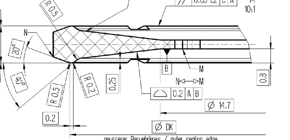
In the ZF measurement lab we solved a problem with the measurement system measuring the plastic pad with a contour gauge (Fig. 2). The evaluated characteristic was the curve profile according to Fig. 1. As expected, the measuring station should be able to measure this characteristic, however, when calculating the capability of the measurement system, we got a value of the total scatter band (SM %) above 40%, which indicates that the measurement system is not capable.
Fig. 1 Specification of the profile
We analysed the problem by means of a short spontaneous brainstorming session, to which the laboratory staff and the metrologist were invited. The factors that could have influenced the problem were written down in a cause and effect diagram (Fig. 3). Since it would be laborious and time-consuming to test each factor separately, we decided to vote for the most likely causes affecting the outcome. (Škultéty, 2021)
Each worker was given the opportunity to vote for the four causes they thought most likely. It was decided that we would address the three factors that received the most votes first. The collective ranked the following as the most likely causes: an uncalibrated sensor, too much variability in the dimension of one part, and improper fixing of the part. When verifying these factors, it was found that the observed dimension does indeed have some variability in a single part, so it was necessary to mark the exact measurement path on each part. The sensor was calibrated, and the machine itself was found to be accurate. After repeating the fit analysis, the results were still not satisfactory. Therefore, we decided to fine-tune the measurement program at the level of feature sensing in the software. After the third attempt, the R&R result was satisfactory and the measurement system was declared fit.
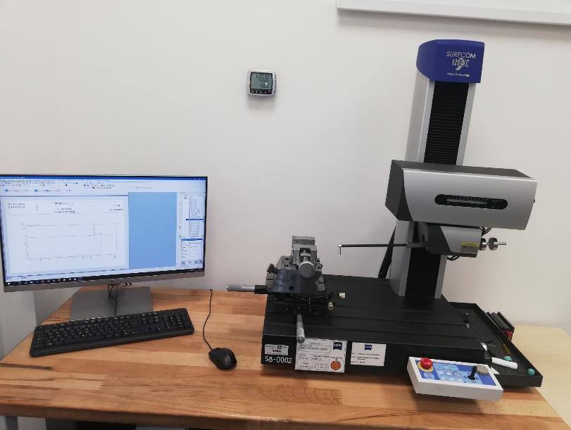
Fig. 2 Measuring station
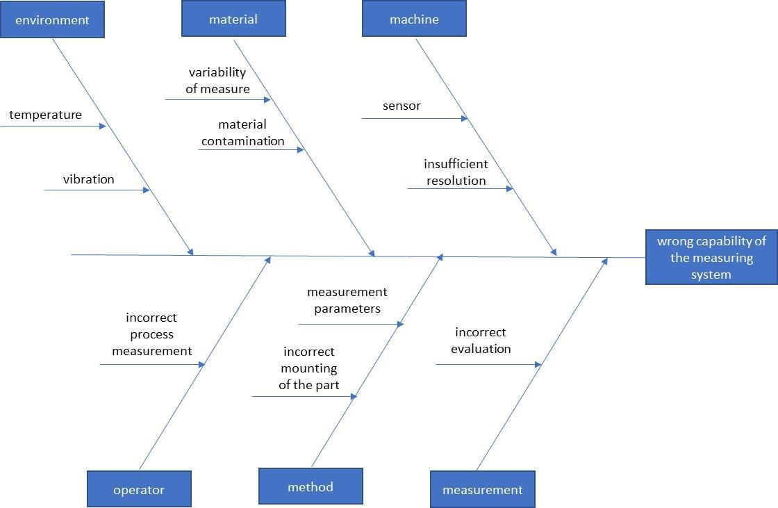
Fig. 3 Cause and effect diagram for insufficient capability of the measuring system
Many times more than one factor can act on a certain problem at the same time and the essence of the problem lies in more than one cause, or in their interaction with each other. Further, that the root cause can sometimes be hidden deeper. In our case, the causes in the example were plotted at most to the second level. However, sometimes it is necessary to go deeper, many times to the fourth-fifth level, in finding the cause. Method 5Why? (5Why?) can serve as a good guide in this case, where the questioner tries to find out the root cause by repeating the question "Why did this happen?" until the true root cause is found.
Asking the question "Why?" five times in a row results in finding the deepest cause of the problem. This is an excellent team-building tool that keeps the focus on solving the problem. The 5Why? can be supported by brainstorming, nominal group, force field analysis, and cause and effect diagram to get to the root cause. (Markulik, Turisova, Nagyova, 2019)
The advantages of Ishikawa's diagram would be its simplicity and spontaneity. For its application, many times a blackboard and a marker, or paper and a pen, are enough. It does not require any special training and the staff involved are able to master it after the first use.
I would point to the disadvantage that, in the wider circle of application, workers sometimes tend to identify irrelevant or unlikely factors as root causes. Further, that the diagram itself, while revealing the interaction of various factors, does not assign any weight to them. Therefore, the likelihood of causes needs to be prioritised in some way.
Histogram
The main area of use of the histogram in the ZF organization appears to be the processing and visualization of measurement results. Mainly analyzing the measured values of dimensions in input, process and output control. The histogram is very often part of process capability reports.
As an example for the use of a histogram, one could analyze data from a 3D measuring machine that recorded the symmetry of a shock mount (Fig. 4) over an extended period of time. Symmetry itself is a geometric tolerance that should generally not take on negative values. However, for the sake of indicating the direction of asymmetry, the sign in front of the data is retained in this case, where a negative number indicates a leftward displacement, a positive one a rightward displacement.
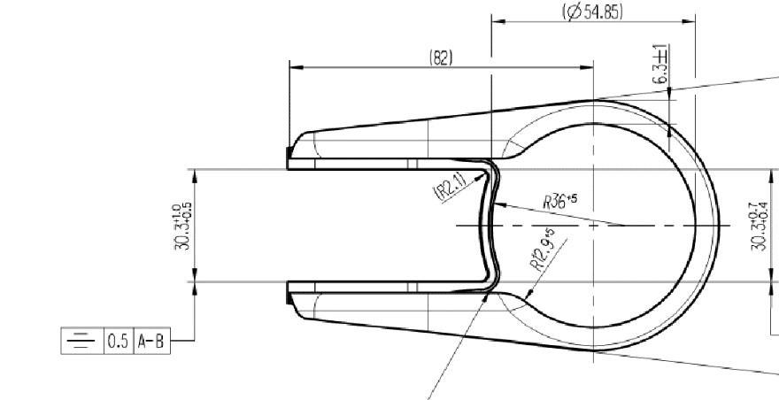
Fig. 4 Symmetry specification according to the drawing documentation 100 measured values were analysed. The measured data were entered in Table 5. A histogram (Fig. 5) was constructed based on this data. Most spreadsheet software is capable of constructing a histogram. For our work we used Minitab software, version 18, which was developed specifically for statistical calculations and finds its application in the field of quality.
Table 1 Measured values
No. Measurement values 1-10. -0,068 -0,131 -0,005 0,018 -0,066 -0,011 0,071 0,278 0,162 0,177 11.-20. -0,036 -0,057 -0,078 0,114 0,014 0,002 0,165 0,055 0,069 0,019 21.-30. 0 -0,032 0,028 -0,035 -0,001 0,236 0,047 0,016 0,092 0,099 31.-40. -0,022 -0,018 -0,024 0,036 0,215 0,025 -0,046 0,123 0,078 0,162 41.-50. -0,064 -0,059 -0,077 0,039 0,186 0,215 0,018 0,093 0,226 0,12 51.-60. 0,064 -0,043 -0,035 0,006 0,005 0,079 0,04 0,156 0,072 0,179 61.-70. -0,009 -0,037 -0,089 0,072 0,009 0,07 0,197 0,131 0,081 0,013 71.-80. -0,005 0,007 0,008 0,011 -0,002 0,182 0,128 0,177 0,211 0,068 81.-90. 0,037 0,022 -0,094 0,11 -0,044 0,209 0,118 0,143 0,099 0,138 91.-100. -0,032 0,024 -0,072 0,078 0,033 0,2 0,142 0,065 0,248 0,253
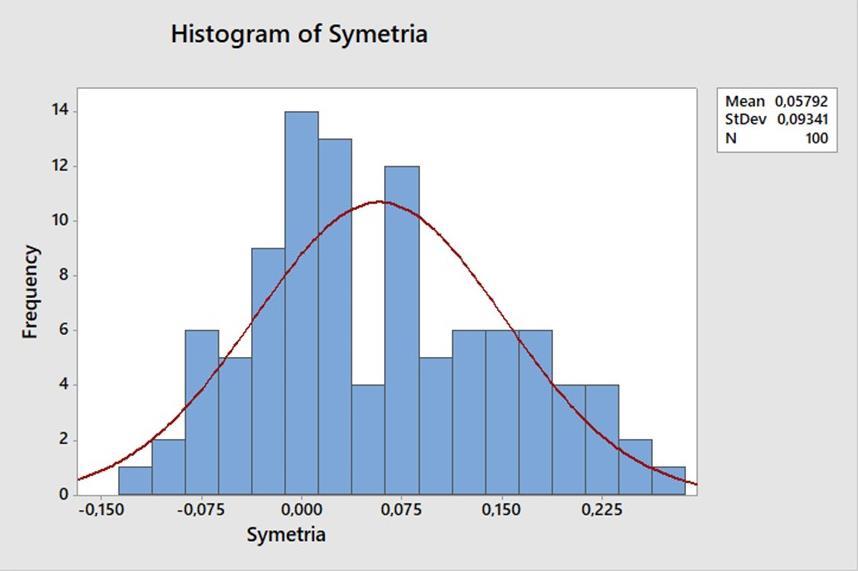
Fig. 4 Histogram
The measured data in the region of 0.05 mm. This may be due to an insufficient number of measured values. It is also clear from the histogram that a few parts had symmetry measured out of tolerance.
We would like to note that even though the measured data has been available for a long time and the 3D measuring machine is set to store the measurement data by default, that particular data has never been displayed as a histogram before. This is a pity, because a clear histogram could help the involved staff to solve possible problems or to analyse definable causes.
CONCLUSION
It should be noted that ZF uses most of the above methods... However, their use is many times "out of habit", without deeper meaning for the staff involved. This is where I see the main focus of improvement opportunities.
A clear list shall be kept of supplier complaints. However, with an up-to-date Pareto analysis, the Supplier Development Department would be able to react promptly to the most
serious problems and focus on the most problematic hotspots in terms of suppliers, materials, geographic regions and other aspects. Based on the 80:20 imbalance principle, maximum results could thus be achieved with minimum effort.
Our suggestion regarding the cause and effect diagram and the flow chart is to familiarise a wider range of staff with these tools. Their simplicity and spontaneity make them applicable to a wide range of problems.
The ZF organisation has appropriate facilities for data collection. Control plans prescribe monitoring of the process at prescribed intervals. Many modern measuring instruments are able to record results over a long period of time and, thanks to suitable interfaces, to process them. The same applies to production machines. The main problem we see is that the data collected is often only available to a small number of workers. For example, if a quality planner needs to prove the delivery capability of a certain purchased component to a customer, he always has to bother the input quality worker with his request. Although sharing such data requires minimal effort thanks to modern information technology. However, it requires a standardised process.
Another option for improvement is real-time online data processing. Most of the company's analyses are done based on customer requests or when a problem occurs. In the case of online processing of results, problems could be avoided because any process anomalies would be able to be captured by histograms and control charts as soon as they occur.
However, as we said at the outset, any quality tool becomes meaningless if it is not properly understood. It is therefore most important to guide staff to understand and use the appropriate tools on a daily basis. Training and seminars are certainly helpful, but it is the day-to-day problems and the example of more experienced colleagues that most influence development.
ACKNOWLEDGEMENT
This paper was created with financial support of the grant project VEGA no. 1/0102/21 - Reducing chemical loads and degradation of agricultural and forestry soils by selecting appropriate agri-technology with regard to climate change.
This paper was created with financial support of the grant project KEGA no. 016SPU4/2021 - Implementation of modern educational approaches and tools to enhance creativity and practical skills of graduates with special focus on agricultural and forestry science using.
REFERENCE
[1] Gašparovič, D., Žarnovský, J., Beloev, H., Kangalov, P., (2015). Evaluation of the
Quality of the Photographic Process at the Components Dimensions Measurement //
Agricultural, Forest and Transport Machinery and Technologies, 2015, Vol. II – Issue 1, pp. 17-24, ISSN: 2367 – 5888 [2] Filip, L., (2019). Effective quality management. Prague: Pointa. 238 p. ISBN 978-8090753-05-1 [3] Hrubec, J., Cservenáková, J., (2018). Production quality engineering. Nitra: Slovak
University of Agriculture. 174 p. ISBN 978-80-552-1793-2 [4] Hrubec, J., Virčíková, E., et al., (2009). Integrated management system. Nitra: Slovak
University of Agriculture. 535 p. ISBN 978-80-552-0231-0 [5] Hrubec, J., (2001). Quality management. Nitra: Slovak University of Agriculture. 203 p.
ISBN 80-7137-849-6 [6] Kapsdorferová, Z., (2014). Quality management. Nitra: Slovak University of Agriculture. 152 p. ISBN 978-80-552-1250
[7] Koch, R., (2011). Principle 80:20. Bratislava: Eastone Books. 260 p. ISBN 978-808109177-3 [8] Korenko, M., Krčálová, E., Mareček, J., (2019). Complex quality management. Nitra:
Slovak University of Agriculture. 118 p. ISBN 978-80-552-20840 [9] Markulik, Š., - Turisová, R., - Nagyová, A., (2019). Tools to support process quality management. Košice: Faculty of Mechanical Engineering, Technical University of
Košice. 104 p. ISBN 97880-553-3465-3 [10]Nikolov, M., Kangalov, P., (2018). Total Productive Maintenance as Quality Providing
Tool for Repaired Machines. // Proceedings – Agricultural Machinery, Year II, Vol. 1/3,
June 2018, pp. 40 – 42, ISSN: 2535-0269 (Print), ISSN: 2535-0277 (Online) [11]Oakland, J., (2008). Statistical Process Control. Oxford: Butterworth-Heinmann. 458 s.
ISBN-13: 978-0-7506-6962-7 [12]Paulová, I., (2013). Complex quality management. Bratislava: Iura Edition. 160 p. ISBN 978-80-8078-574-1 [13]Škultéty, A., (2021). Preparation and Implementation of Production Process Statistical
Control. [Bachelor thesis], Nitra, 2021. [14]Terek, M., Hrnčiarová, L., (2004). Statistical quality management. Bratislava: Iura
Edition. 234 p. ISBN 80-89047-97-1 [15]ZF1: 2020. ZF organisation [Online] 2020. [Date: 30.12.2020]. Available from: https://www.zf.com/slovakia/sk/zf_na_slovensku/zf_na_slovensku.html
CONTACTS
Miroslav Prístavka, Institute of Design and Engineering Technologies, Faculty of Engineering, Slovak University of Agriculture in Nitra, Tr. A. Hlinku 2, 949 76 Nitra, Slovakia, e-mail: miroslav.pristavka@uniag.sk
Agata Kielesińska, Czestochowa University of Technology, J.H. Dąbrowskiego 69, 42-201 Czestochowa, Poland, agata.kielesinska@pcz.pl
Hristo Beloev, Department of Agricultural Machinery, Agrarian and Industrial Faculty, University of Ruse, 8, Studentska Str., 7017 Ruse, Bulgaria, e-mail: hbeloev@uni-ruse.bg
Pavol Findura, Institute of Agricultural Engineering, Transport and Bioenergetics, Faculty of Engineering, Slovak University of Agriculture in Nitra, Tr. A. Hlinku 2, 949 76 Nitra, Slovakia, e-mail: pavol.findura@uniag.sk
Petr Bartoš, Department of Agricultural Machinery and Services, Faculty of Agriculture, University of South Bohemia in České Budějovice, Na sádkách 1780 370 05 České Budějovice, Czech Republic, bartos@zf.jcu.cz
Ursula Malaga-Tobola, Department of Production Engineering, Logistics and Applied Computer Science, Faculty of Production and Power Engineering, University of Agriculture in Kraków, Poland, umalagatobola@gmail.com


