SPOTLIGHT ON ROBIN DALY COLOR & DESIGN

TO LEARN MORE about color palettes in relation to home decor, we spoke to Bellingham’s veritable expert: Robin Daly of Robin Daly Color & Design. She got her professional start with her family’s home decor and paint business, meaning that design is truly in Daly’s DNA. Moreover, she worked on projects in more than 5,000 different homes during this career era alone. Daly also holds the former job title of “Paint Princess,” having played a major role in developing a full-spectrum, artisan paint lineup for C2 Paint. Finally, she moved to Bellingham and opened up her own interior design business in 2019.
Daly sees design work as akin to storytelling, as her goal is to create spaces that “reflect back to the client” and express who they are. Everyone has access to resources like HGTV and Pinterest, but designers like Daly are able to help clients sort through information overload and make choices that best correspond to their vision and lifestyle. Moreover, because of her experience with customer service, Daly’s professional approach entails collaboration at every step of the way.
“It's a very intimate relationship,” Daly says. “You want working with your designer to be something exciting, where you're working to create something new, or solve a problem. It’s the designer’s job to bring you those solutions— and most of the clients that I work with want to come along on the journey.”
As Daly says, design is like telling a story, and that story is ultimately about you. So, things like treasured artwork and heirloom objects are essential for building your narrative— but the challenge lies in getting these elements to look cohesive together (or, as Daly, puts it, “getting them to talk to each other”). One method for creating this cohesion is to group similar objects, either by color palette or overall vibe, to create “mini-stories” in different areas of your home.
Daly says that, for example, “The bathroom might have a … specific vibe, and [that vibe] might be ‘handcrafted’. So you might have a linen Turkish bath towel instead of a fluffy towel. And you might have a hanging piece of macrame because it's handcrafted. The theme, or the vibe, or the story lives in that contained space.”
Layer Colors
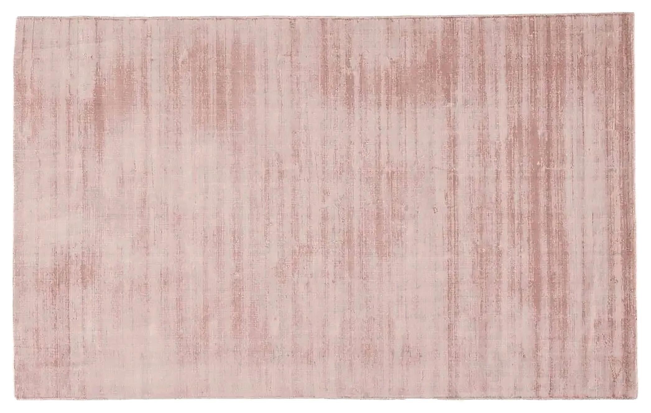
Just like ingredients in a recipe, colors take on different feelings depending on what they’re paired with. For example, a green velvet sofa becomes neutral if paired with an area rug featuring bolder gold, navy, and reds. If that same sofa were paired with subdued grays or browns, the resulting atmosphere would be totally different.
Daly sometimes even recommends that clients introduce more than one neutral to their room’s color palette for added richness.
“Sometimes, I encourage people to have two neutrals, a cool neutral and a warm neutral,” Daly says. “So let's say you have gray floors; bring in sand so that you have cool and warm. And then you can then add colors to that, and it creates a more sophisticated palette.”

Seek Out Commonalities
It might seem counterintuitive, but the first step to deciding on a color palette doesn’t actually involve decision making. Rather, Daly advises clients to browse home decor inspo on Pinterest or Houzz, create a designated folder, and throw in every photo that catches their eye.
“Don't analyze it, don't go back to it— wait a week or two and then go look at it again. You're going to see some throughlines,” Daly says. “You're going to find, ‘Oh, you know, I keep looking at rooms that have walnut wood,’ or ‘I keep looking at rooms that have moss green.’”
Create Mini-Stories
Picture this: You’ve collected artwork from all over the world, and this collection is highly important to you. Unfortunately, some of these pieces clash— or they simply don’t fit with your home’s overall atmosphere. You want your decor to look intentional, but you’re also (rightfully) unwilling to compromise on sentimental items. What’s the solution?
48 BellinghamAlive.com
COLOR CRASH COURSE: SIX TIPS FOR FINDING YOUR PALETTE
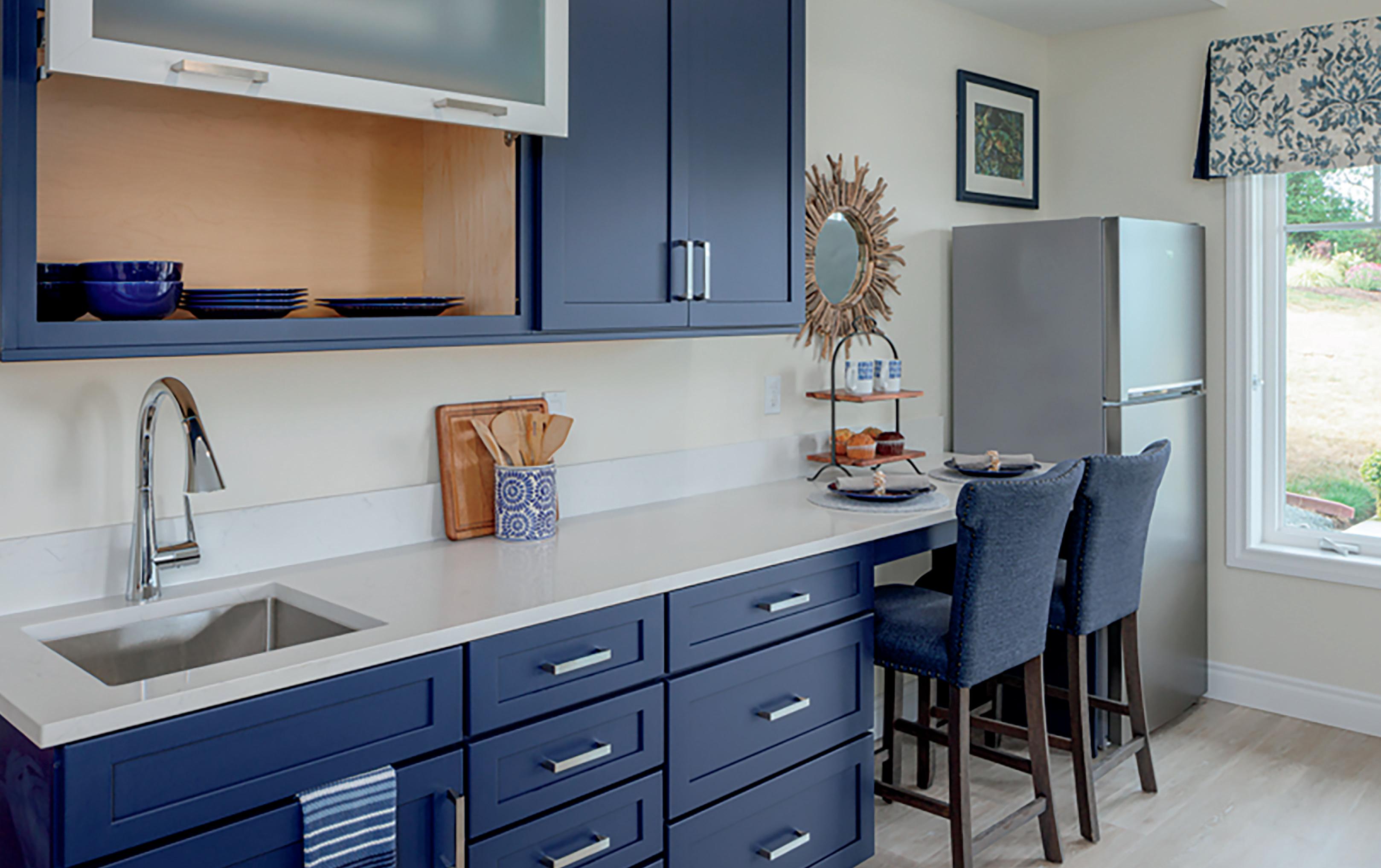
Photo by Snowberry Lane Photography
Choose According to Mood
“Color is something that we all respond to,” Daly says. “It affects us physically, as well as with our cones and rods in our eyes. And so a lot of times people will come into a space and they'll be like, ‘Ah, this feels great,’ rather than, ‘This looks great.’ You're creating a feeling.”
Different colors can even be used to create different emotions; for example, green is considered a healing color, whereas blues are considered to be restful. Daly cites yellowgreen draperies that she chose for a predominately blue room. The addition of warmer colors created excitement to the space, whereas bluish-green accents would have felt too subdued.
Light with Intention
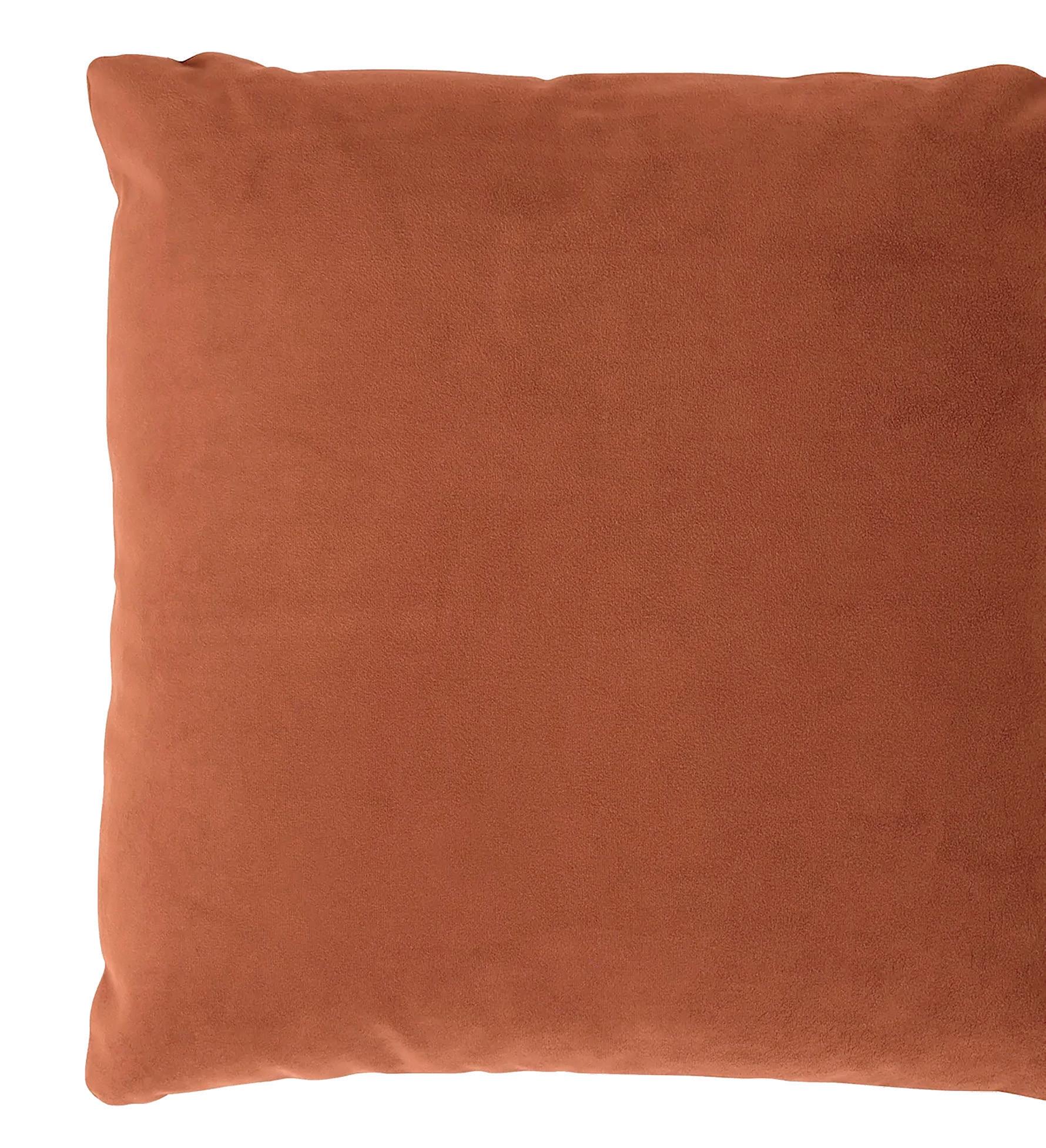
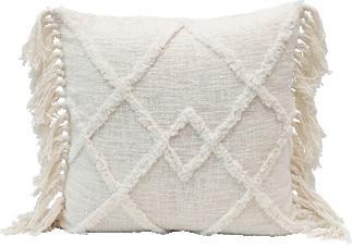
Sticking with a color palette might introduce cohesion, but it won’t make the atmosphere of your room feel fully complete. Rather, the key to creating an inviting space is to accent it. Daly says that pillows and window treatments will add additional interest and luxury.
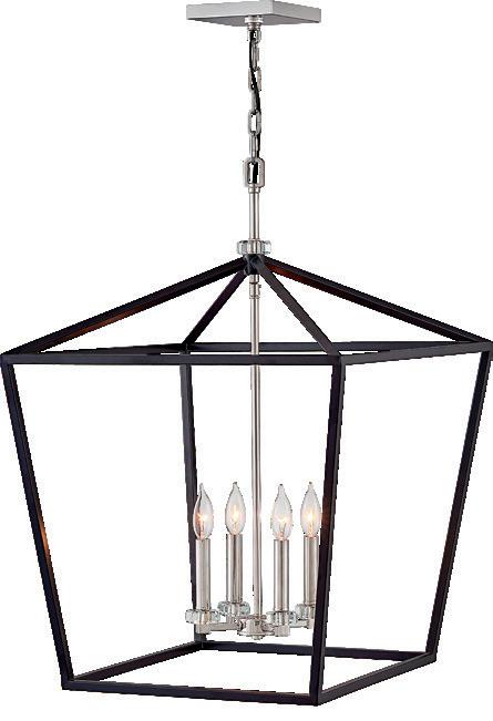
Moreover, the devil is truly in the details when it comes to lighting accents. Rather than relying on harsh overhead lamps, Daly likes to introduce warm, directed pools of light according to function.
“We might find a lamp that's very directed, where light comes over our shoulder so we can read a book but it keeps the atmosphere going on,” Daly says. “Think about a reading lamp in bed. You don't want to bother your partner so much, but you just want the light for your side of the bed, right?”
As for the bulbs themselves? Buyers beware: Daylight bulbs might seem like the right choice by name alone. However, they result in a bluish cast that can feel sterile rather than inviting.

Test Your Paints
We couldn’t talk about color palettes without talking about paint— and yes, there is a right (and wrong) way to choose colors. Firstly, Daly recommends selecting paints at the end of your design process. Paint colors can be customized, whereas options for fabrics and other decor elements are more limited. (Who knows— your fabrics and furniture might even provide the inspiration for your paint color!)
Secondly, our eyes can’t properly translate a 4-by-2-inch paint chip to an 8-by-12-foot wall. Daly thus recommends that her clients paint a life-sized version on their wall before making a final decision.
“What happens is, your eye is reading the relationship of the tiny paint chip to the big wall,” Daly says. “So you can't really see that color accurately. You're not seeing it in a lifesize example. This is what I advise clients: Four feet wide, four feet tall. Two coats.”
BONUS:
PIN DOWN YOUR DESIGN STYLE
Still not sure where to start? Daly’s website offers a free worksheet to help you further narrow down your home’s ideal vibe. To learn more or book a consultation, visit robindalycolor.com.

RULES OF COLOR (AND WHEN TO BREAK THEM)
ART TEACHERS EVERYWHERE say the same thing: You have to know the rules before you can bend them. Tried and true methods provide groundwork that you can use as a launching pad to explore new and interesting things! To learn where we should start with color (and then where to go from there), we reached out to BreAnne Green, owner of beloved home store Greenhouse in Downtown Bellingham.
Green’s qualifications go beyond theoretical knowledge–Greenhouse also offers home staging and design, and has staged over 400 homes in the past three years. Green herself has personally designed and furnished more than 23 homes on HGTV’s series, “Unsellable Houses.”
“Creating 23 unique color palettes and designs expanded my horizons beyond what I had previously done with curating looks in the store or in individual homes,” says Green. “What I have learned over the years is that no matter what the current trends are, color is absolutely necessary in every room to bring balance and harmony to the space.”
Rule of Three
Green’s number one, nail-it-down, always-keep-this-inmind rule is to establish a kind of “food pyramid” of colors.
“You have a base color that is dominant, a secondary tone that sets the feel, and then finally a third color that connects both the base and secondary tone and is more of a small pop of color,” she says.
Your base is going to be the biggest or heaviest part of the room, like the walls or the sofa. Your secondary color should be complementary and highly present throughout the space. Your third color should be used on details, like baseboards and decor, to tie everything together.
On the other hand, Green also gave us some examples on how to break free of common color ruts in interior design.
Too Hot, Too Cold
“One of the reasons why gray, white, and black gained so much in popularity in the last few years is because we were coming out of a phase for years where only warm tones were used,” says Green. Instead of going to all cool or all warm tones, strike a balance!

August 2023 49
Photo by Snowberry Lane Photography
Avoid Oppressive Color Consolidation
“Stay away from using the same color sofa and accent chairs. Having more than one piece of furniture in the same [color] fabric or leather is too heavy for the room. Instead… add in your secondary color with your accent chairs, then add your third pop of color with your rug or accent tables.”
Moderate your Modern
“On season 2, episode 2 of ‘Unsellable Houses,’ I challenged myself to come up with a new look for the incredibly popular and overdone ‘modern farmhouse,’” Green says. “While [the Modern Farmhouse design] has so many appeals, ultimately the black and white color palette is too cold and doesn’t lean into any of the warmth that the PNW has to offer.”
She recommends spicing these types of design schemes up with a warm wood, or pops of yellow, blue, and green.
BEYOND COLOR SCHEMES: THE IMPORTANCE OF TEXTURE
WHEN DESIGNING INTERIORS, color can be an excellent starting point. Color is aspirational! It tells everyone the energy you want to set in a room. But equally important to the mood of a space is the feel. Texture holds visual, physical, and logistical influence over any design. Take a white or extremely pale color palette; generally it will set a calm, clean, and spacious vibe. But a futuristic and mod room can be white, with smooth transparent glass, shiny molded fixtures, and be cool to the eye and touch, while a farmhouse chic room can be white, with rough painted pale wood, rustic linen drapes, and invoke a homely, warm welcome.
To elaborate on making these texture decisions while designing, we spoke with Sandra Hurtley, a designer whose attention to detail makes her exceptional at crafting layered texture in her spaces. Learn more about Hurtley and see her work at positivespaceinc.com.
Q&A WITH SANDRA HURTLEY OF POSITIVE SPACE INC.

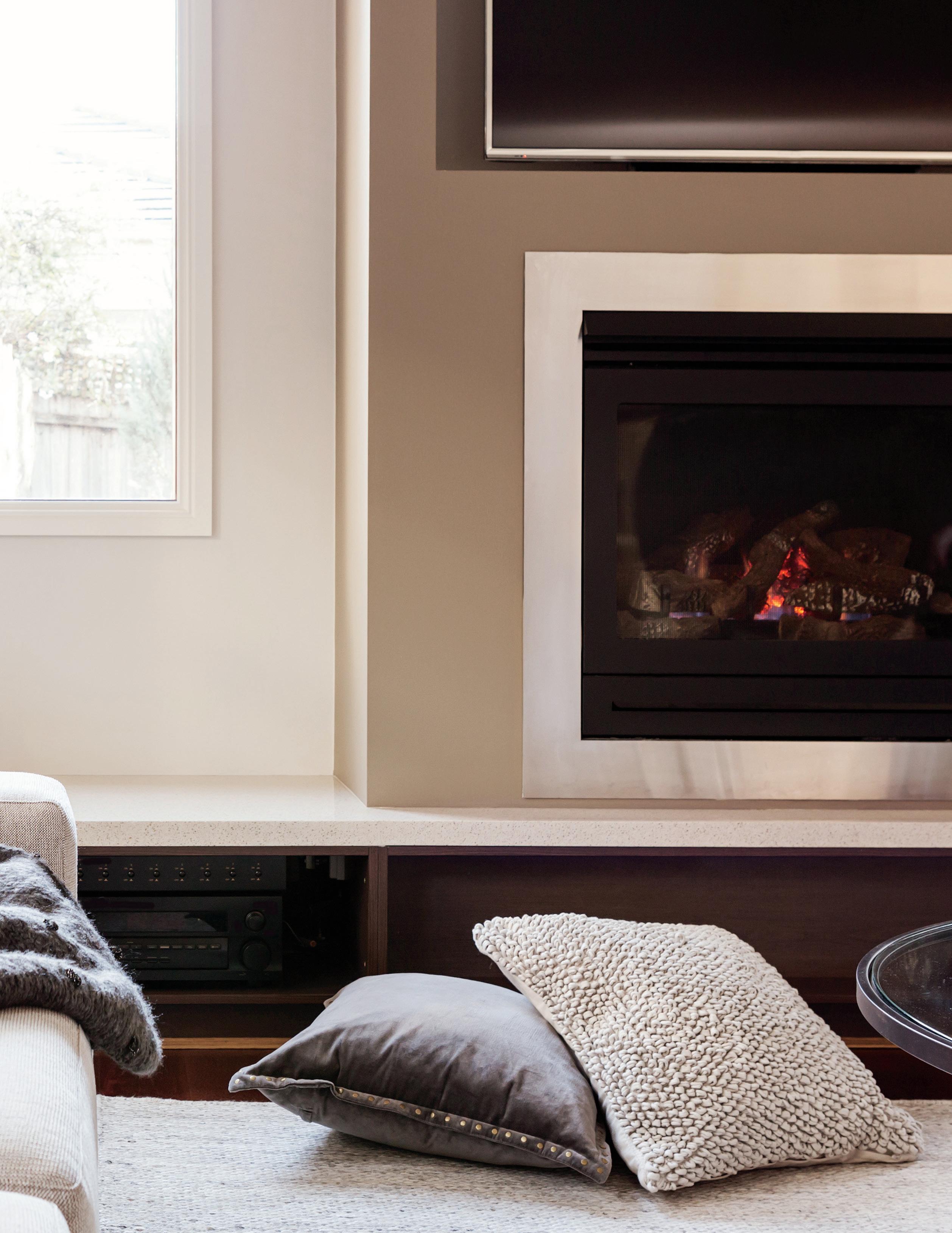
big role in the look and feel of a space. Texture determines whether it’s cozy or formal, organic or modern. A space can feel completely flat until you start to add pillows or an area rug with texture. Layering texture is what gives depth and interest. It’s a balance and extremely important.

What are your favorite types of texture in design? And how do you put them to use?
Hi there! Please introduce yourselves to our Bellingham Alive readers.
My name is Sandra Hurtley and I am the owner of Positive Space Inc. I graduated from Heritage School of Interior Design in 2008 and started Positive Space in 2010 in Vancouver, British Columbia. I have been back in Whatcom County now for six years. I have lived in many beautiful places, but Whatcom County is where I grew up and I’m so happy to be back. I live at the beach and love our quality of life here in the “upper left.”
So, if you could ballpark a value on it, how important is texture to successful interior design, and why? Often, the best designs look “effortless.” In reality all good design follows a formula using the elements and principles of design. Texture is one of the seven elements and plays a very
I love texture on walls— think seagrass wallpaper or a Venetian plaster fireplace. Also, light fixtures with a lot of texture always make a big statement and become a focal point. Fabrics are a great and easy way to incorporate texture through draperies, furniture, and accessories. I love choosing fabrics!
Any tips for using complementary or contrasting textures?
Have an idea of the overall feel you are trying to create and think about how all of the elements of the room will work together. Good design has layers. Try not to overdo it, texture is visual as well as tactile.
Any other parting thoughts about using texture in interior design?
Texture is one of the elements that people respond to the most. If a fabric is soft velvet or a tile is smooth marble, it is irresistible to touch. Consider the style of space you are trying to create and always consider where the texture will come from.
50 BellinghamAlive.com
Photo Courtesy of Sandra Hurtley
Photo by Snowberry Lane Photography
LOCATION AS INSPIRATION

THE IDEA OF “bringing the outside in” is popular here in the North Sound, and for good reason— our immediate environment affects us more than it would in a major metropolitan area.


Even Daly agrees: “It's a more visceral reaction because the sky is bigger, it's bluer. The water, the trees, the trail systems … so many of us can get out to nature so much easier. It's more in the DNA up here than being in a big city.”
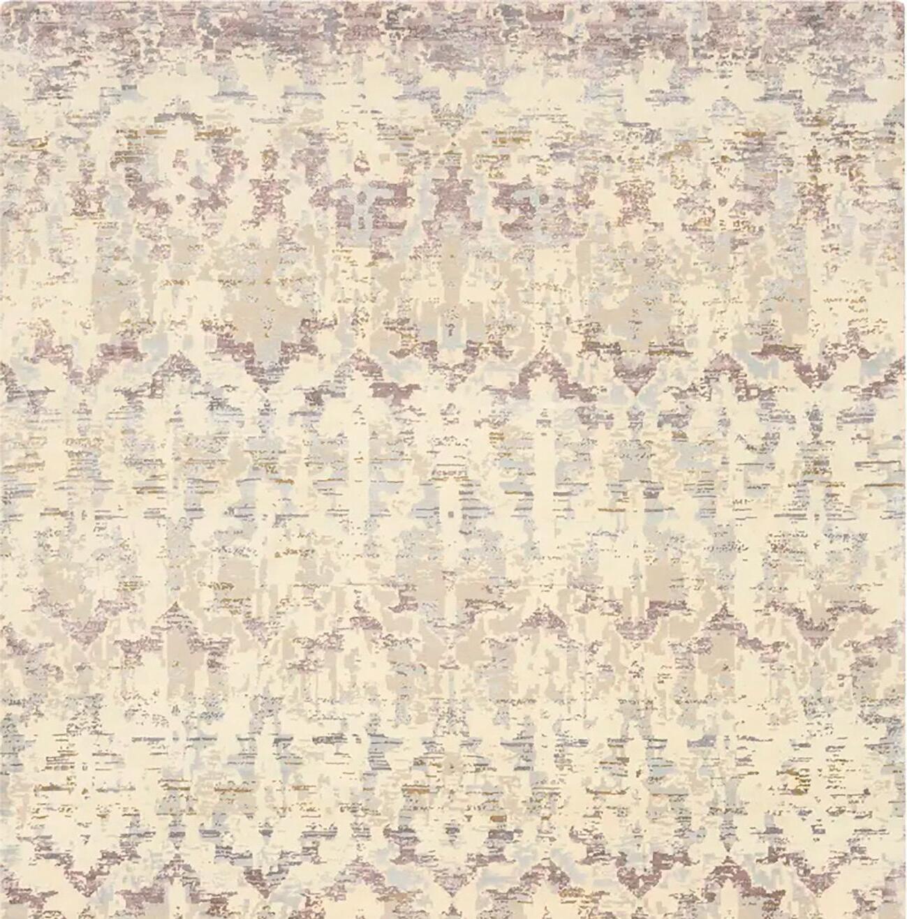
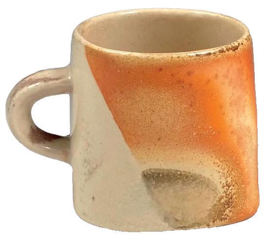
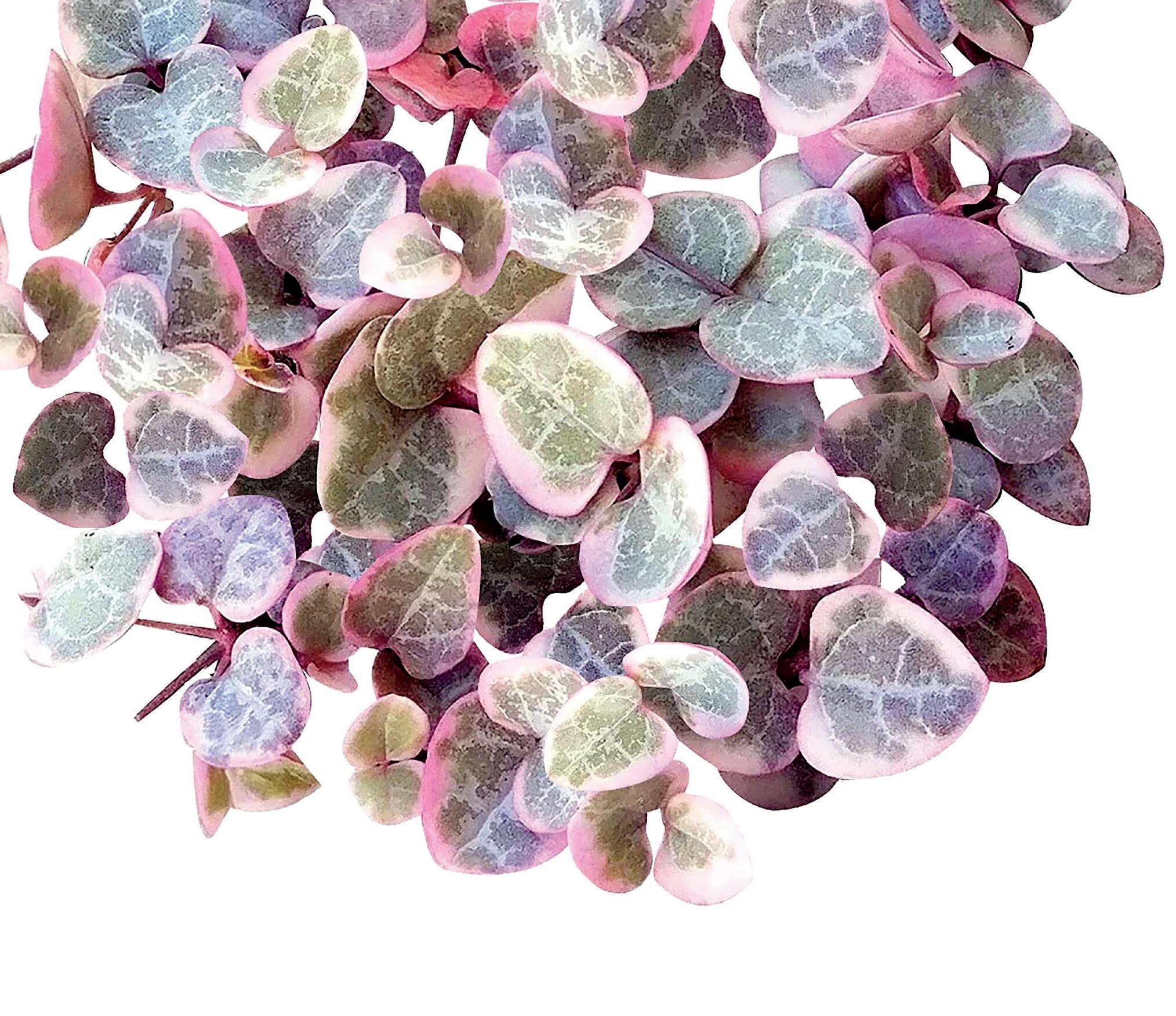
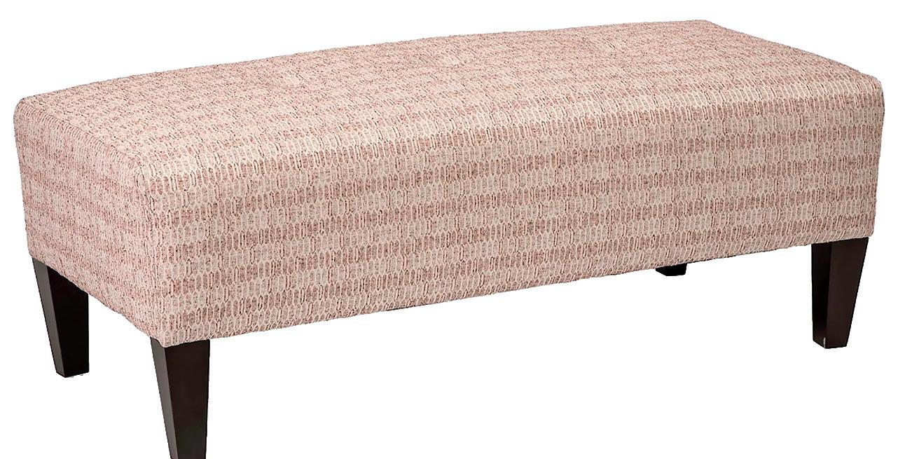
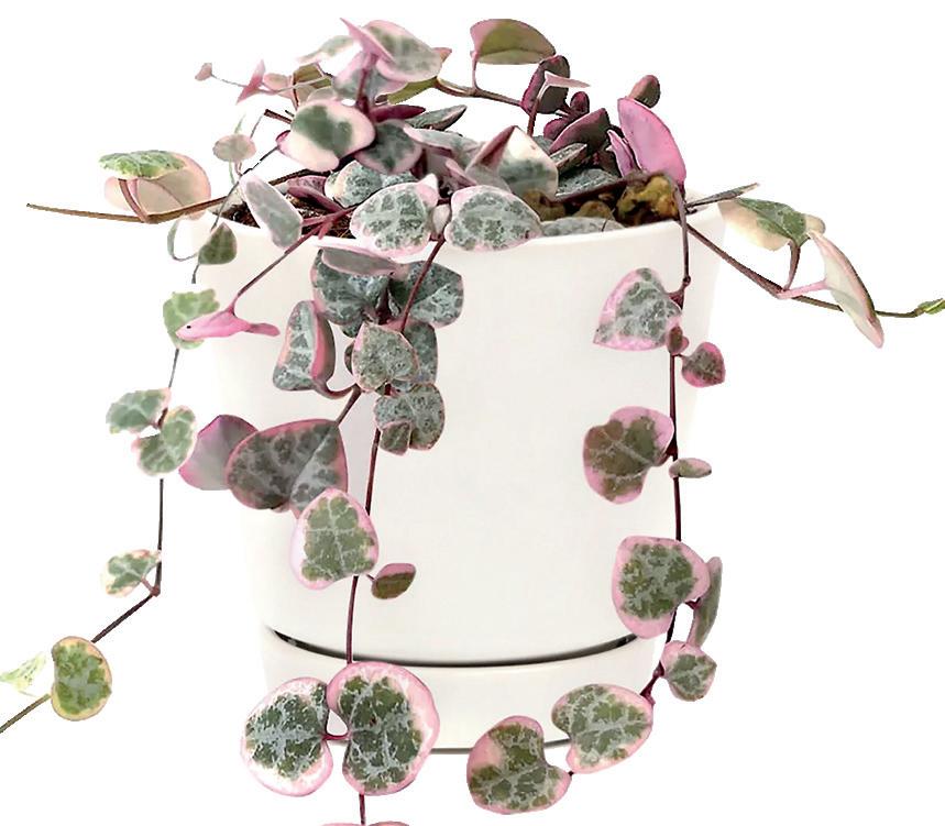
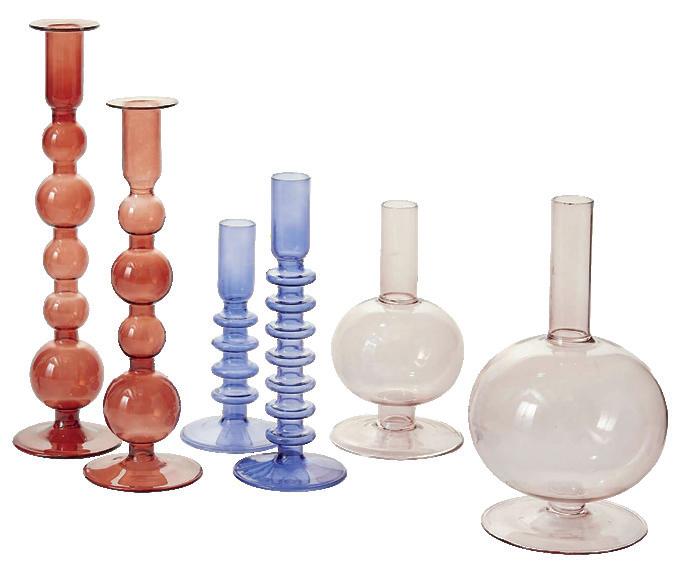
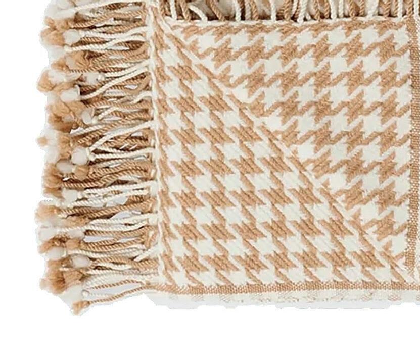
If you’re building a PNW-inspired color palette, your initial choices might be obvious: blues, greens, and browns. Yes, these colors are obviously stunning— but they’re not your only choices. Here are some of our ideas for incorporating every shade of the North Sound into your own decor.

 WrittenbyCocoaLaneyandKristenBoehm2023

