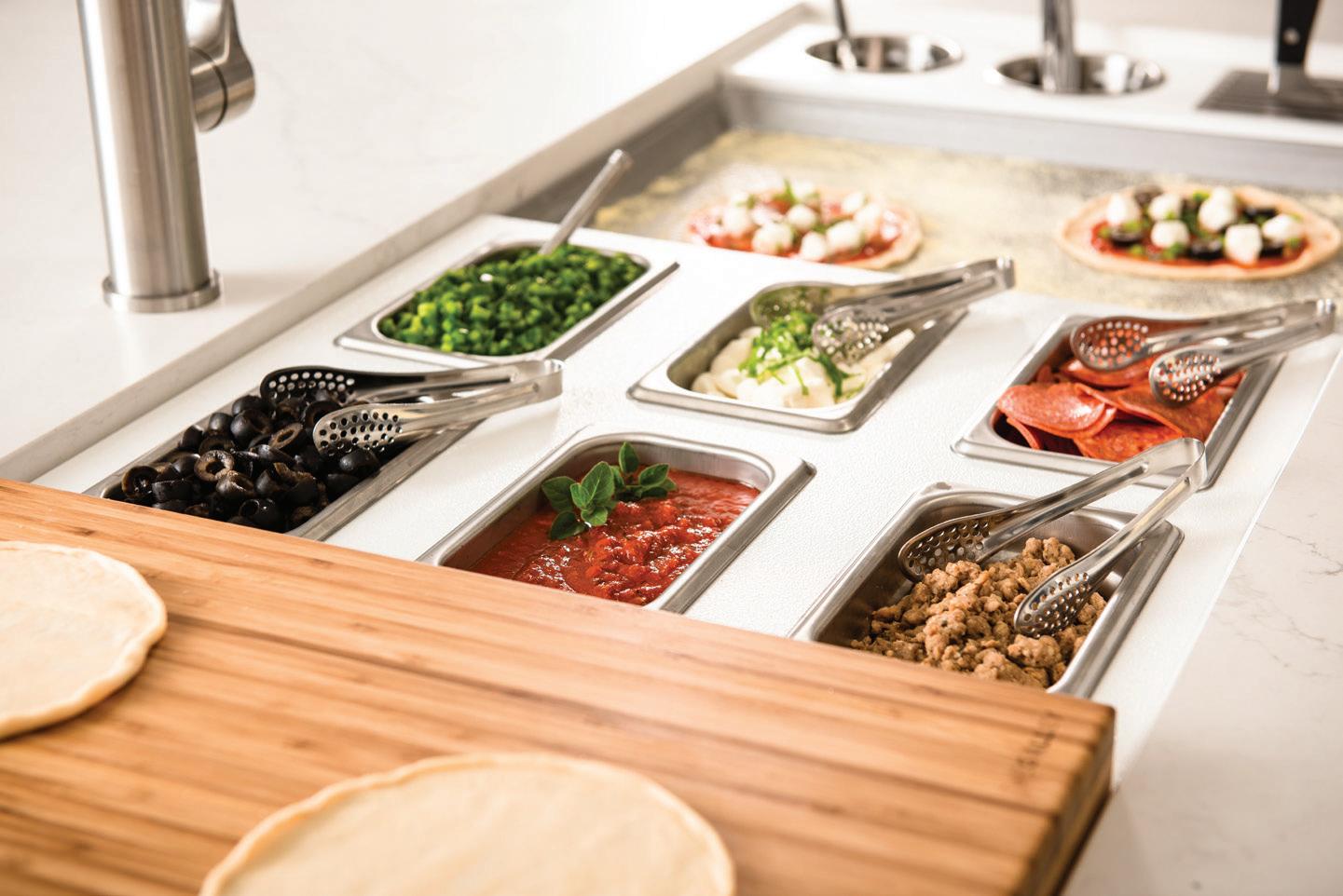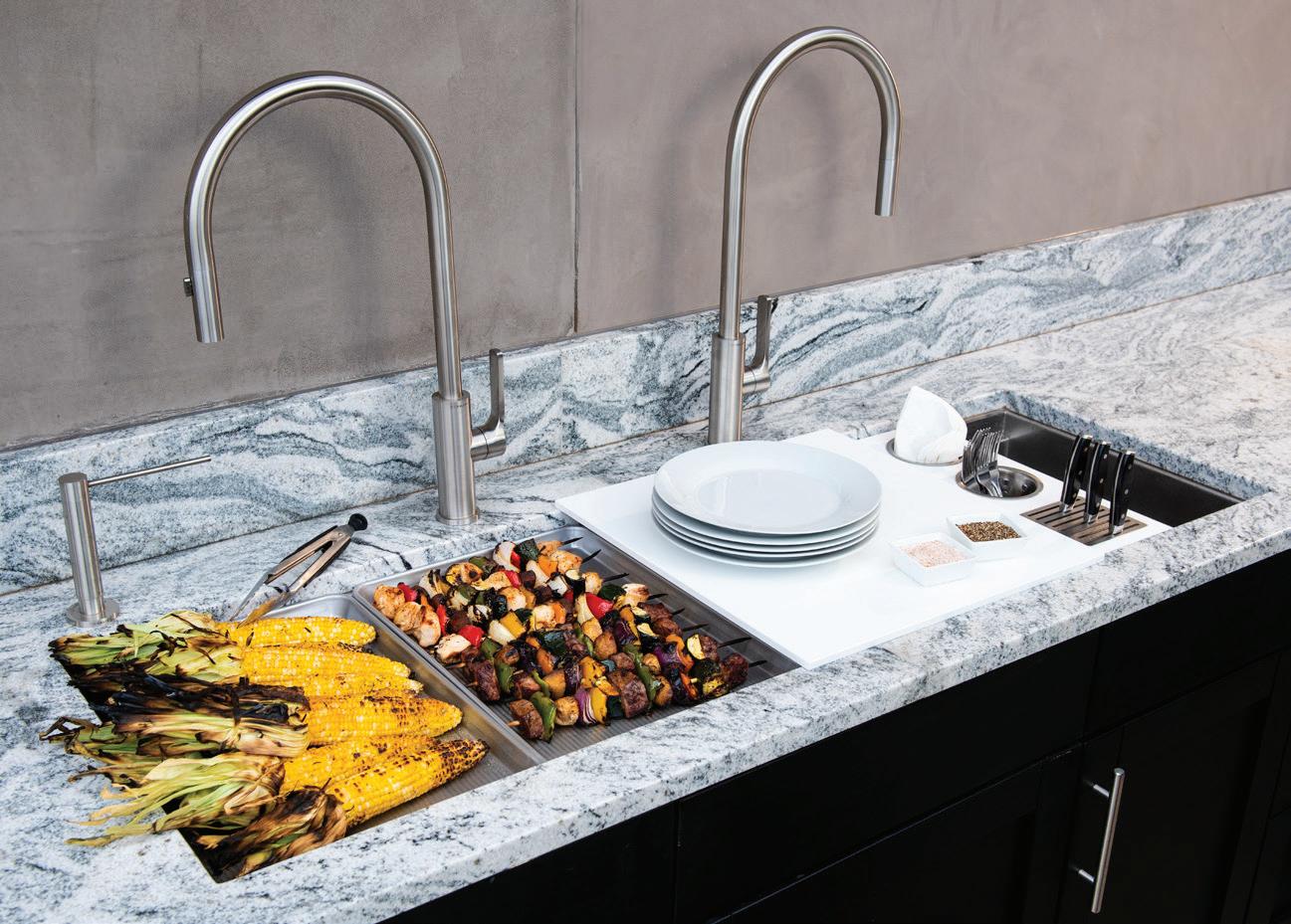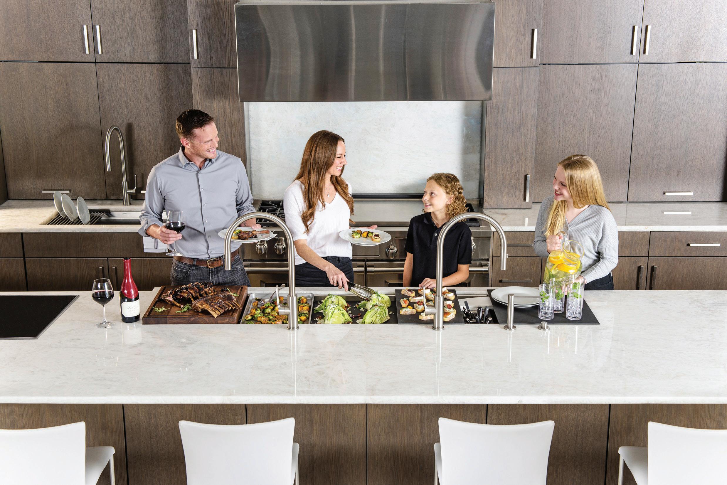


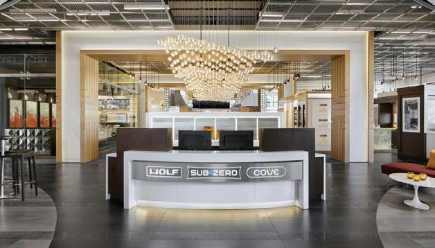
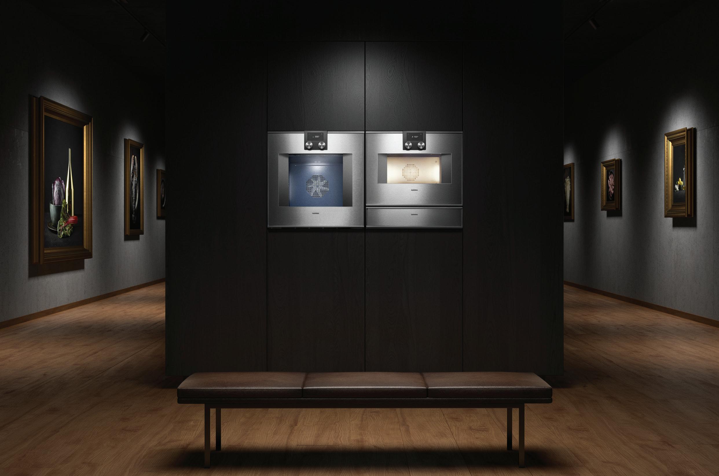
The Sub-Zero, Wolf, and Cove Showroom is a creative and collaborative space. Chef demonstrations and interactive products will inspire you, while knowledgeable consultants will guide you through your entire kitchen project. Delicious moments, spent cooking with the ones you love, start here.

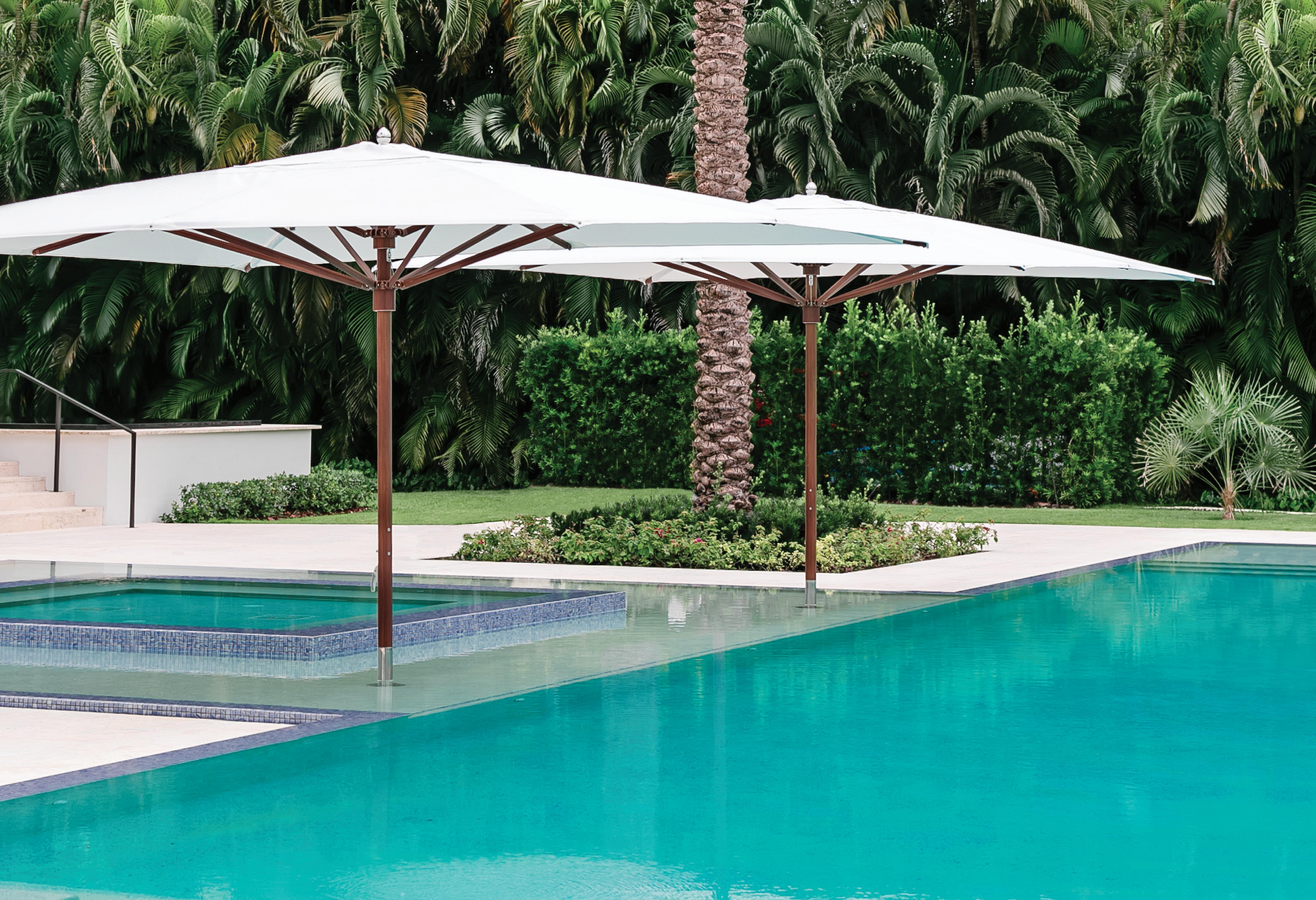 OCEAN MASTER MAX CLASSIC TUUCI.COM


TREASURE ISLAND Waterfront home nestled on Lido Isle gets a contemporary spin
ARCHITECTURE: BRANDON ARCHITECTS
INTERIOR DESIGN: ERROL DEJAGER
AS SIMPLE AS BLACK AND WHITE A clean color palette creates a sense of serenity in this light-filled Bakersfield home
INTERIOR DESIGN: BREEGAN JANE
ELEVATED LIVING Modern design meets warm, welcoming accents in a penthouse perched above Marina del Rey
INTERIOR DESIGN: MASS BEVERLY 62
ANOTHER LEVEL Bold accents and family functionality were the focus of this Santa Clarita gem
INTERIOR DESIGN: JOHN MCCLAIN
EDITOR'S MESSAGE Making the case for SoCal winters
DETAILS New finds, hot trends, our picks
CREATORS
A look at the talent that fuels the SoCal design scene
GARDENS Lush landscapes, inspiring design, peaceful retreats
HOME Design inspiration, curated style, new discoveries
REAL ESTATE Southern California's housing hot spots
GOING PLACES Golden State destinations and the world beyond
DINE + DESIGN Form, function, and food
CULTURE Explore, imagine, experience

but I stand behind it: Winter in Southern California is my favorite time of year. Of course the lush, golden summer months have their upsides. Who doesn’t love a lazy day at the beach, or hiking along the coast overlooking an endless stretch of ocean?
But for me, the onset of winter brings SoCal’s beauty into sharp focus. Without the bright glare of the summer sun, the sky looks bluer, accented with cheerful, cotton-like clouds. After the rains (rare as they are these past few years), the sight of green grass and vibrant orange poppies warm my heart. And when nighttime temperatures drop, the lights of the city seem to glimmer even more brightly—an invitation to revel in the city’s many culture and entertainment options.
It’s a different side of our glorious region, and a good reason to appreciate how wonderful a cozy night can be. Our homes become shelters in a different way, with even more opportunity to revel in the design details that make a home feel wonderfully lived-in.
In this issue, we’re giving several nods to the glory of winter, from accent chairs in cool, creamy tones to cutting-edge fireplace mantles. But don’t forget that color pops against neutral tones, so we’ve also featured the 125th anniversary of Judson Studios iconic stained glass and the jewel tones of Mira Mara ceramics.
So grab a fuzzy blanket, pour a hot cup of coffee, and curl up with our new issue. We’ve got everything you need to brave California’s coolest season.
Nichol Nelson Editorial Directornnelson@socaldesignmag.com

PRESIDENT AND PUBLISHER
Shelby J. Russell | srussell@lamag.com
VICE PRESIDENT, CUSTOM CONTENT Mitch Getz | mgetz@lamag.com
DIRECTOR OF SALES Carly Allen | callen@lamag.com
SOCAL DESIGN MAGAZINE ACCOUNT DIRECTORS
Julia Andretta | jandretta@socaldesignmag.com Jan DiNuoscio | jan@capturemagazine.com
LOS ANGELES MAGAZINE LUXURY GOODS DIRECTOR
Samantha Greenfield
ACCOUNT DIRECTORS
Brittany Brombach, Mia Pierre-Jacques, Ryan Sommer, Lauren Welling, Shana Wong
ORANGE COAST MAGAZINE
EXECUTIVE VICE PRESIDENT
Linda Goldstein
ACCOUNT DIRECTORS
Randy Bilsley, Edward Estrada, Richard Lockhart
PASADENA MAGAZINE ACCOUNT DIRECTORS Jennifer Gunn, Dominique Jackson
MARKETING SERVICES
DIRECTOR, STRATEGY & PARTNERSHIPS
Suzy Starling | sstarling@lamag.com
EXPERIENTIAL MARKETING
Traci Takeda
CREATIVE SERVICES ART DIRECTOR
Sheila Ramezani
Marie-Josee Carpentier, Catherine Donahue, Jared Polter
EDITORIAL
EDITORIAL DIRECTOR
Nichol Nelson | nnelson@socaldesignmag.com
CONTRIBUTING WRITERS
Karine Monié, Maile Pingel, Jessica Ritz, Kelly Vencill Sanchez
ART + PRODUCTION
CREATIVE DIRECTOR
Donna Giovannitti
PHOTO EDITOR
Lauren Schumacher
PRODUCTION DIRECTOR Sue Branica
LOS ANGELES MAGAZINE, LLC 644 S. Figueroa St., 3rd Fl. Los Angeles, CA 90017 323-801-0100 FAX: 323-801-0104
OFFICE COORDINATOR Cassandra Katris
ENGINE VISION MEDIA CO-FOUNDER Mark Geragos
CO-FOUNDER Ben Meiselas
VOLUME 1, ISSUE 2. SoCal Design is published quarterly by Los Angeles Magazine, LLC. Principal office: 644 s. Figueroa St., 3rd Fl., Los Angeles CA 90017. Postage paid at Los Angeles, CA, and additional mailing offices. The one-year domestic subscription price is $19.95. POSTMASTER: Send address changes to SoCal Design, 1965 E. Avis Dr., Madison Heights, MI 48071. Not responsible for unsolicited manuscripts or other materials, which must be accompanied by return postage. SUBSCRIBERS: If the Postal Service alerts us that your magazine is undeliverable, we have no further obligation unless we receive a corrected address within one year. Copyright © 2023 Los Angeles Magazine, LLC. All rights reserved. SoCal Design® is a registered trademark of Los Angeles Magazine, LLC. Reproduction in whole or in part of any text, photograph, or illustration without written permission from the publisher is strictly prohibited. SUBSCRIBER SERVICE: 866-660-6247. GST #R133004424. PRINTED IN THE USA.
Poggenpohl Southern California 3311 Hyland Avenue, Suite B Costa Mesa, CA 949-990-4233 info@poggenpohl.la
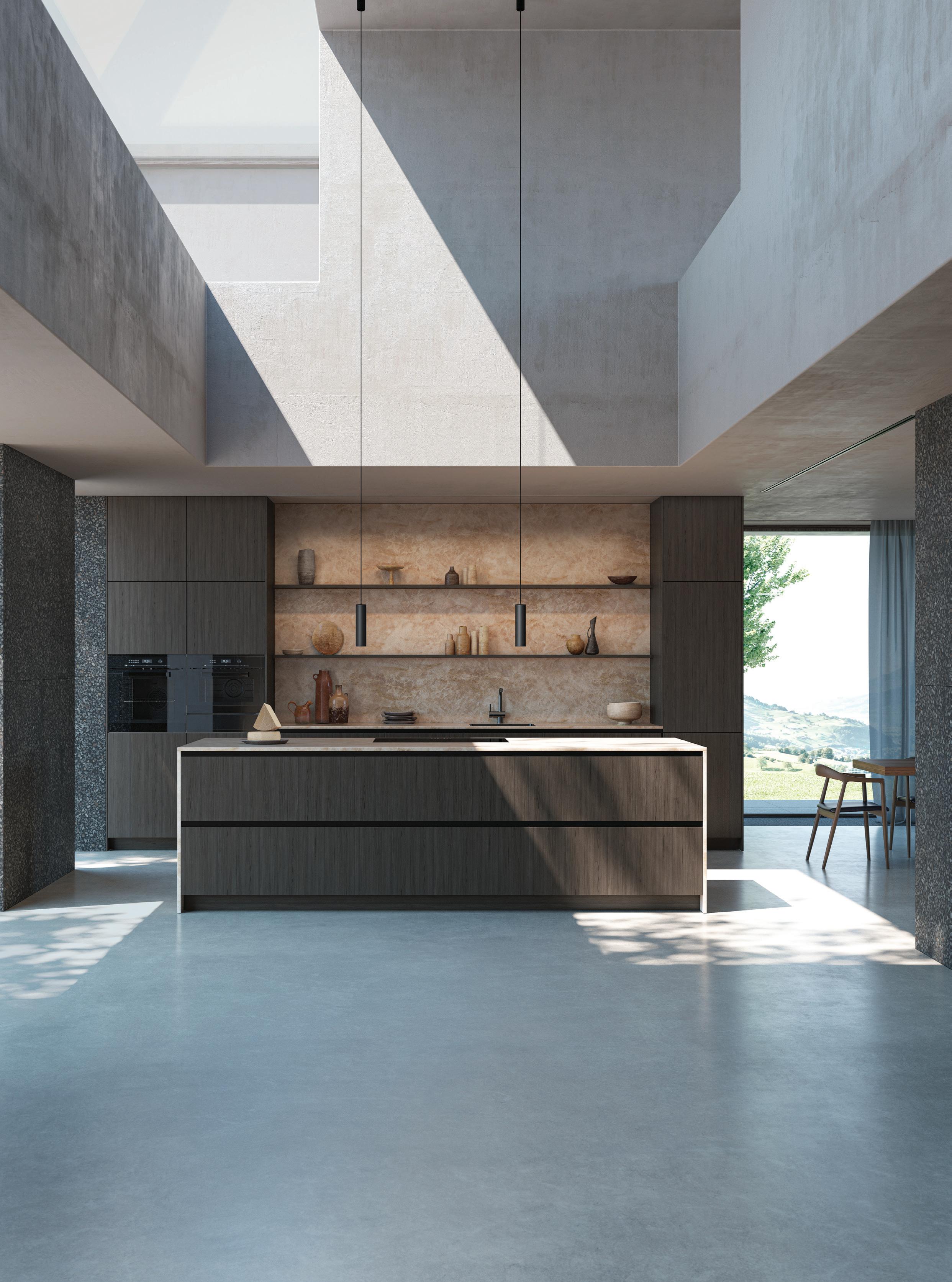
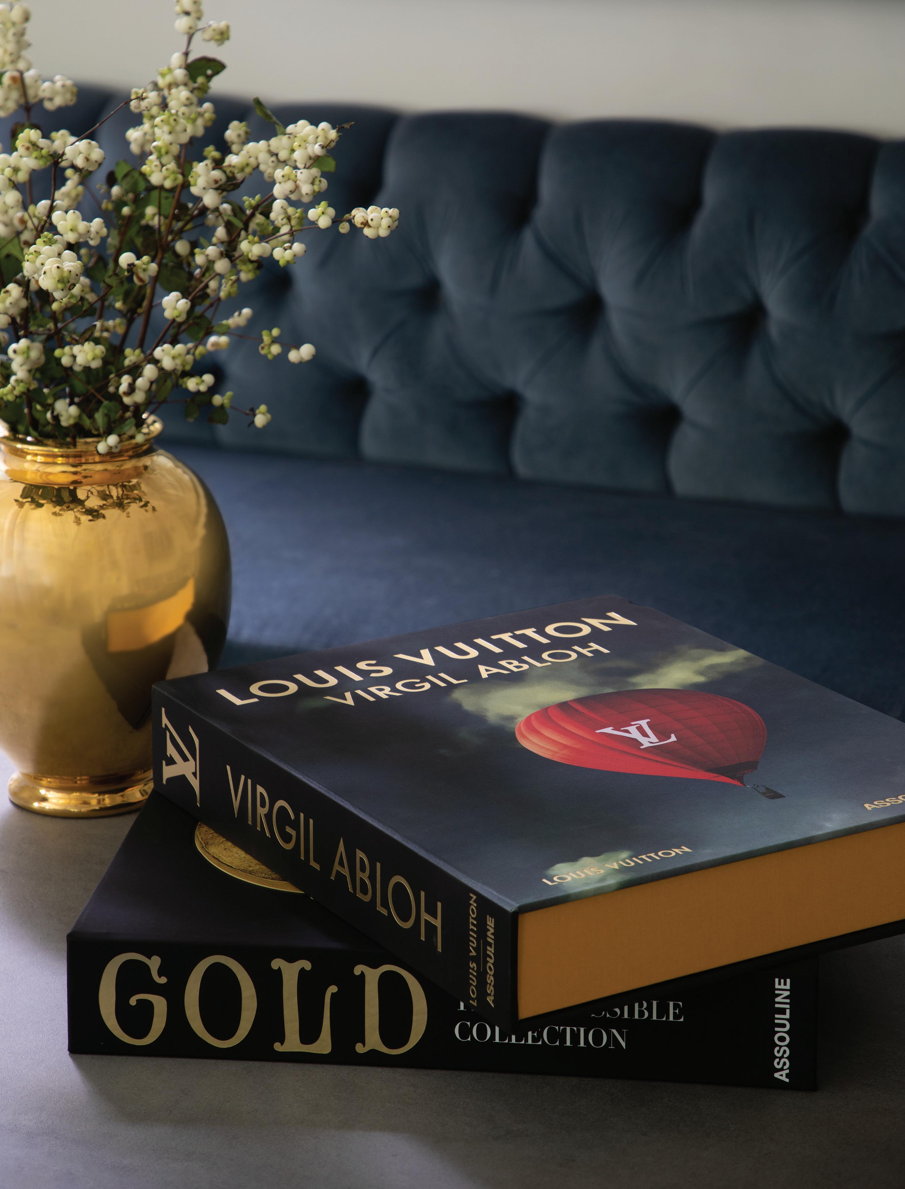

SURE, A FRIENDLY GAME OF POOL or a livey ping-pong match is always a good time, but the large, bulky game tables of yesteryear can be an eyesore in the middle of a beautifully designed room. Worry not—11 Ravens aims to change that, offering a diverse collection of bespoke designs intended to enhance—not detract from—their surroundings.

Launched 10 years ago, the company creates custom designs for a huge array of games, spanning from shuffleboard to foosball to mahjong, and all can be customized with a selection of textiles, finishes, and colors. Each game table is made to order in the company’s factory in Anaheim, then wrapped and crated for delivery and on-site installation. So say goodbye to dusty green velvet—your next game night just got upgraded. ■
11 RAVENS Pacific Design Center 8687 Melrose Ave., B-117 West Hollywood 11ravens.com
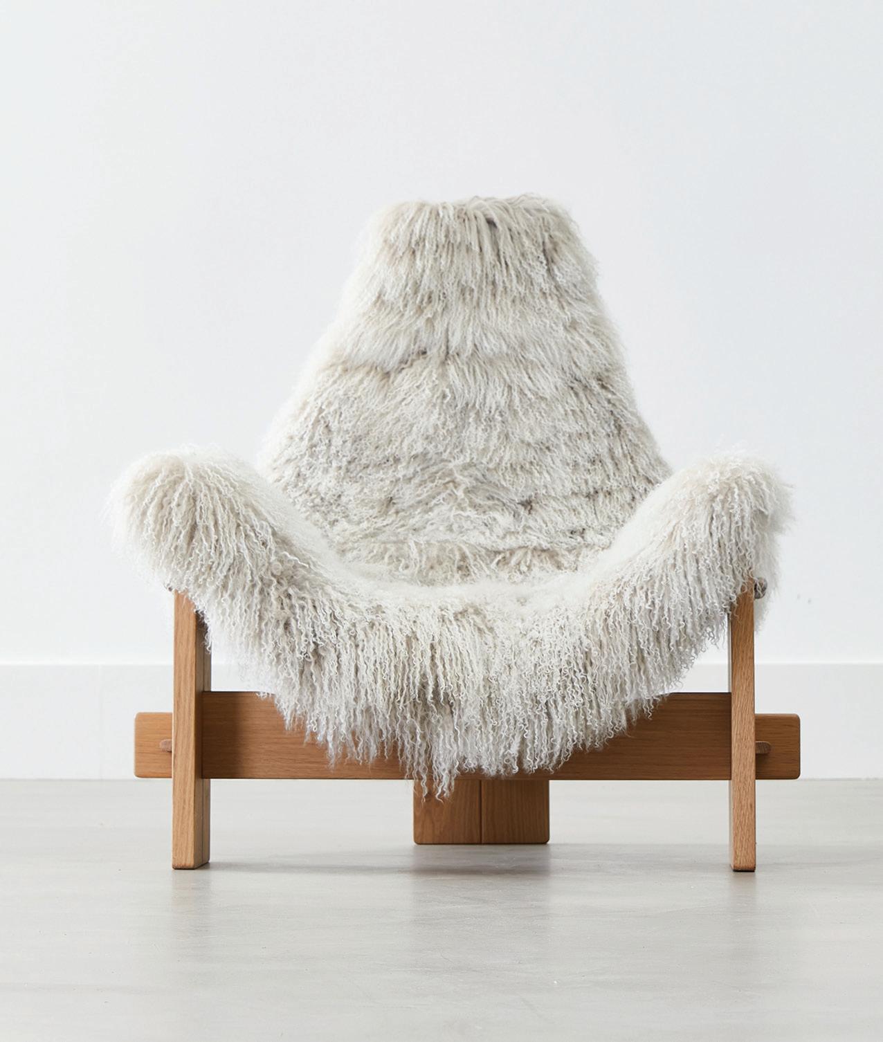
This oak T-frame chair is upholstered in dreamy soft sheepskin coupdetatsf.com
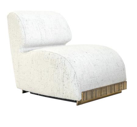
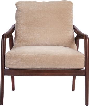
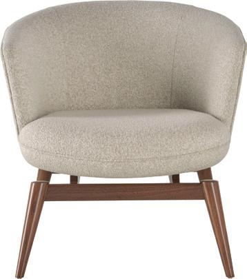
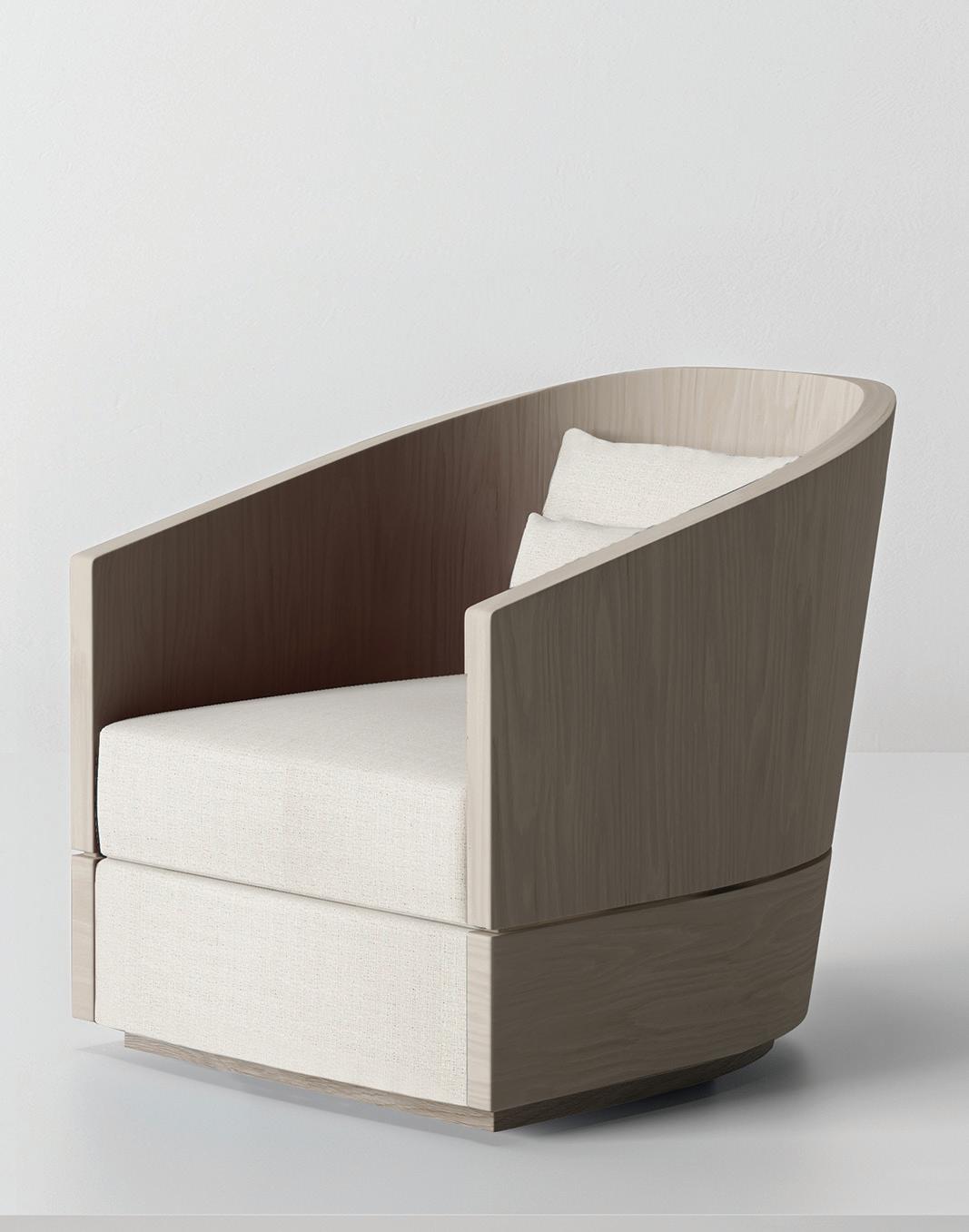
SOMETIMES A ROOM DEMANDS A VIBRANT POP OF COLOR, BUT THERE ARE TIMES YOU WANT A BEAUTIFUL DESIGN IN A NEUTRAL SHADE. INSPIRED BY A PALETTE OF WINTER WHITES, WE’VE ROUNDED UP SOME OF OUR FAVORITE ACCENT CHAIRS IN HUES REMINISCENT OF FRESHLY FALLEN SNOW
lCONNATE HOME Grant Lounge Chair High design covered in cozy mohair connatehome.com
j BAKER FURNITURE
Coupe Lounge Chair by Barbara Barry This instant classic would fit almost any decor bakerfurniture.com
j FBC LONDON Angelina Lounge Chair A seat that practically screams comfort fbc-london.com
j MCGUIRE Knot Lounge Chair
This rustic sloping walnut frame is secured with leather bindings bakerfurniture.com
Pricing upon request
THONET
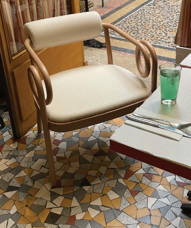
Loop Lounge Chair A study in seduction gebruederthonet vienna.com
jFBC LONDON Sol Armchair
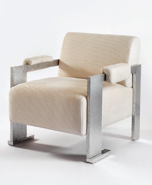
Futuristic design with plenty of texture fbc-london.com
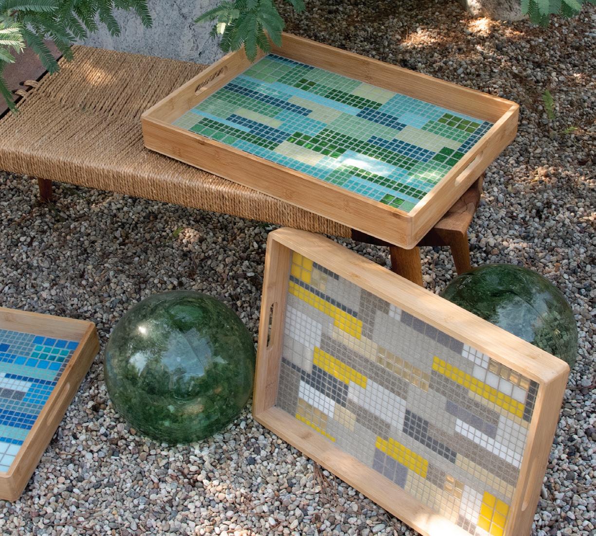
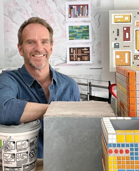
WHEN STEVE NELSON found himself with time on his hands after getting furloughed from his job designing retail spaces for Disney soon after COVID-19 hit, he didn’t reach for the sourdough starter. Instead, he began experimenting with mosaic. Over the years, he’d crafted furniture as a sideline while designing stage sets and interiors for shops and hotels like the Delano in Miami and the Mondrian in L.A., but mosaic was an entirely new medium.
Undaunted by his lack of experience, he started big, with a two-by-four-foot wall panel inspired by the mid-century mosaic murals that adorn several arrivals tunnels at LAX. “I was at home wondering what to do, and I started thinking about travel and the airport,” Nelson explains. “I considered doing a watercolor, but I was obsessed with those murals and thought, 'Why don’t I make a miniature version of them?' " After studying the proportions and palette of the 1961 originals, which were designed to evoke the varied landscape of the U.S. as seen from the air, he got to work using 3/8-inch glass tiles, glue, and a piece of board.
As the months stretched on, and the furlough turned into a layoff, Pasadena-based Nelson stayed busy laying out patterns on his computer and perfecting his technique using glass and
reflective mirror tiles as well as different types of grout. And he began adding more pieces to his repertoire, which now range from tables and plant stands to lamp bases, vases, and serving trays under the label Nelson Mosaic. One caught the eye of a friend, acclaimed L.A. jewelry designer Suzanne Felsen. She and her husband promptly commissioned an outdoor table similar to Nelson’s LAX panel for their new deck. and later purchased four trays. “They’re so unique and have so much personality,” says Felsen. “They’re mid-century in style but they work with Spanish and contemporary spaces.”
Citing the work of influential California designers Evelyn and
Jerome Ackerman, Nelson says, “I like the idea of bringing mosaics back to their mid-century roots. These days, you see decorative mosaics with flowers and dolphins, but the mid-century pieces are so beautiful, and the colors are so great. I especially love doing abstract patterns.”
With the reopening of entertainment venues and theme parks, Nelson has returned to Disney to consult on several entertainment projects. But he continues to produce pieces like a vase whose details bring to mind early patterns by Mondrian and an Op art-inspired side table featuring orange and yellow lines against a gray background. Then there’s the tray that playfully recreates the yellow-and-white mosaicclad facade of Redondo Beach’s iconic Tiki Apartments, a commission from a couple of tikiloving friends. Without a doubt, it looks like what Nelson calls his “pandemic hobby-turned-side hustle” is here to stay. inelsonmosaic.com ■
“They’re midcentury in style but they work with Spanish and contemporary spaces.”
What started as a pandemic hobby for Nelson has become a fullfledged passion for mosaicsIMAGES: STEVE NELSON; PAULA SPENCE
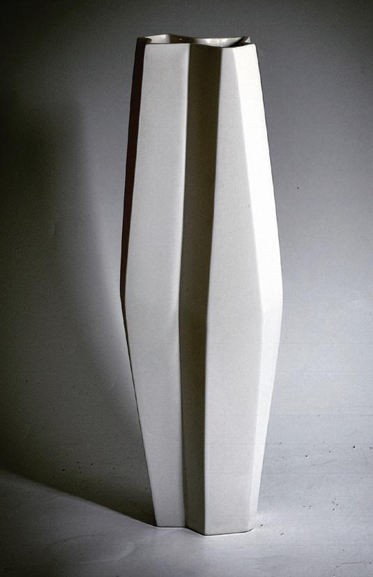
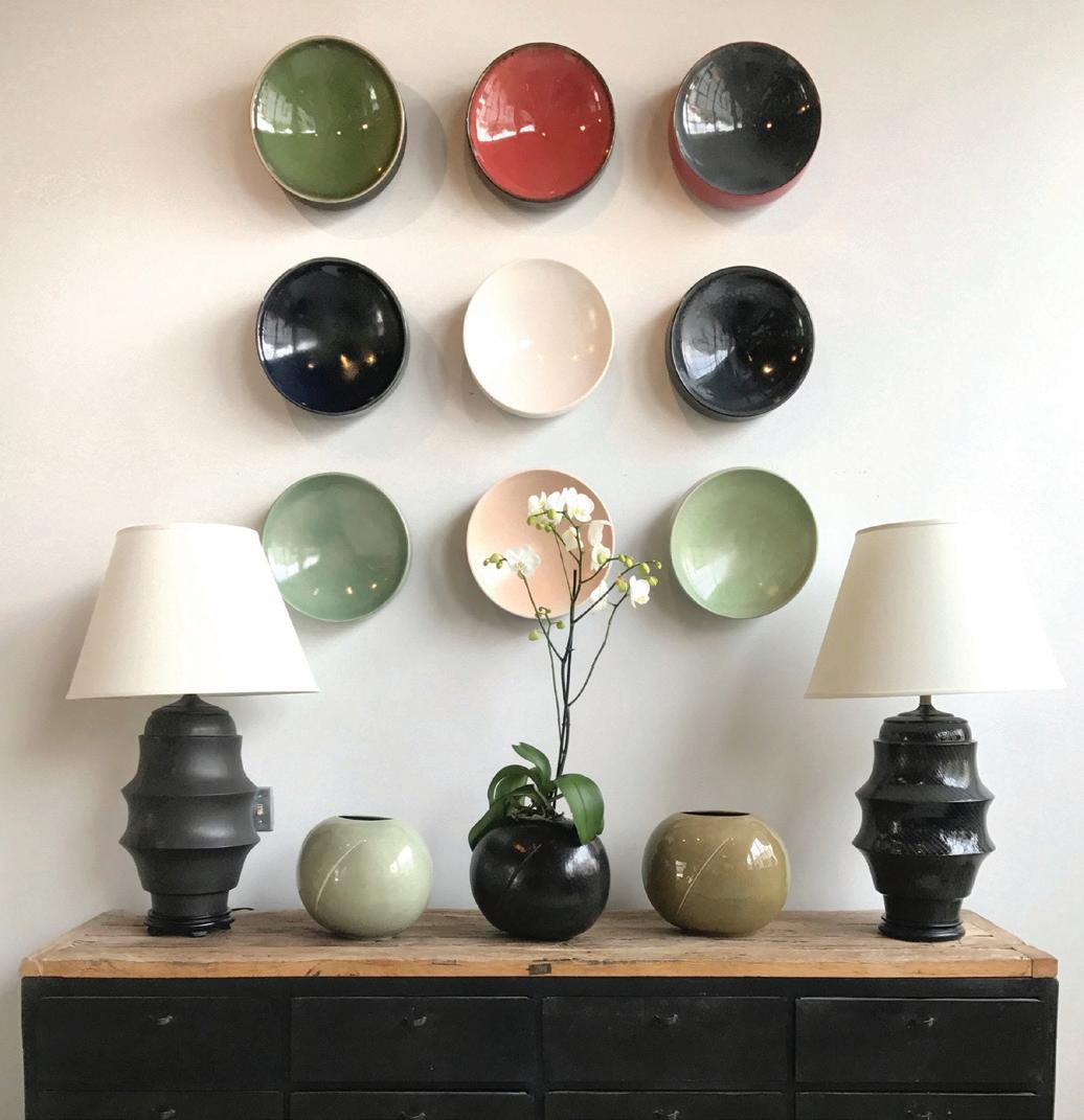
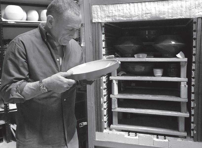
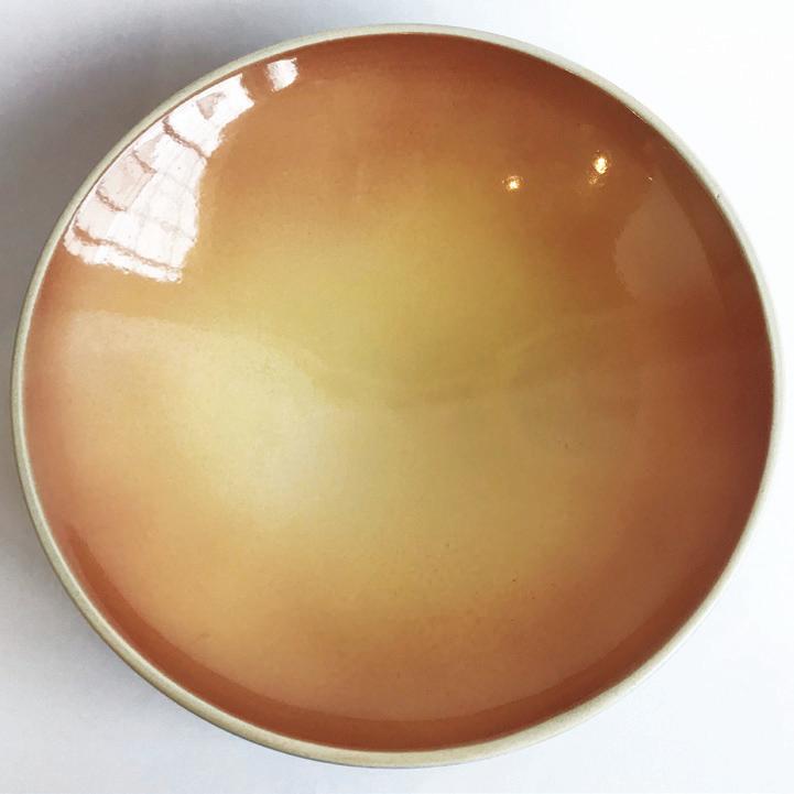
CERAMIC ARTIST MIRI MARA UNDERSTANDS THAT FUNCTION DOESN’T HAVE TO COME AT THE PRICE OF BEAUTY. WORKING FROM A STUDIO IN CARPINTERIA, CALIFORNIA, MARA TURNS OUT DAZZLING VASES, BOWLS, AND CUPS WORTHY OF DISPLAY. HIS PIECES ARE HAND-FINISHED WITH TEXTURED DESIGN, LAYERS OF GLAZE, AND MULTIPLE FIRINGS
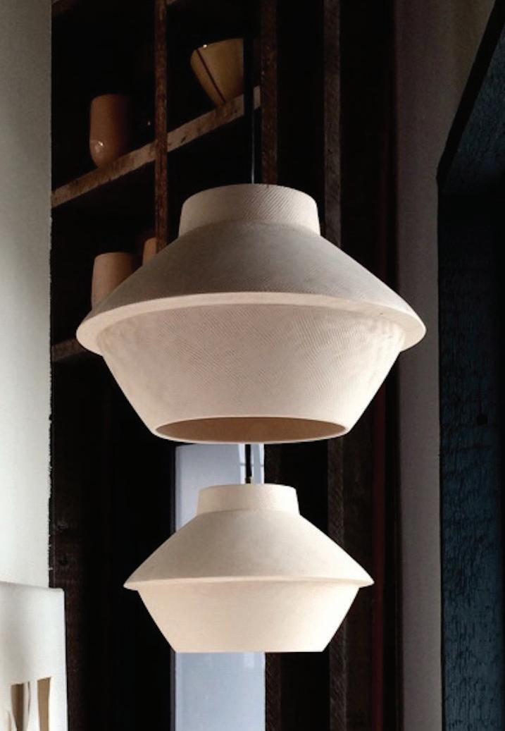
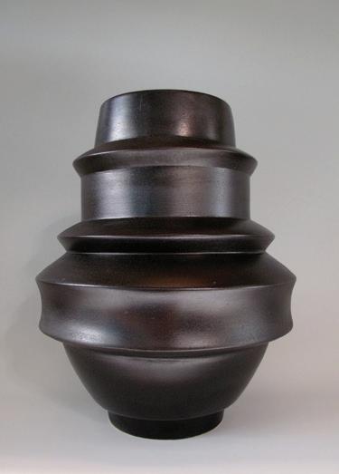
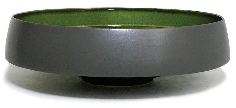
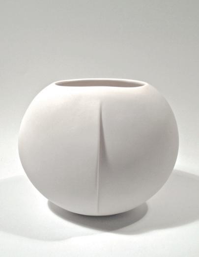
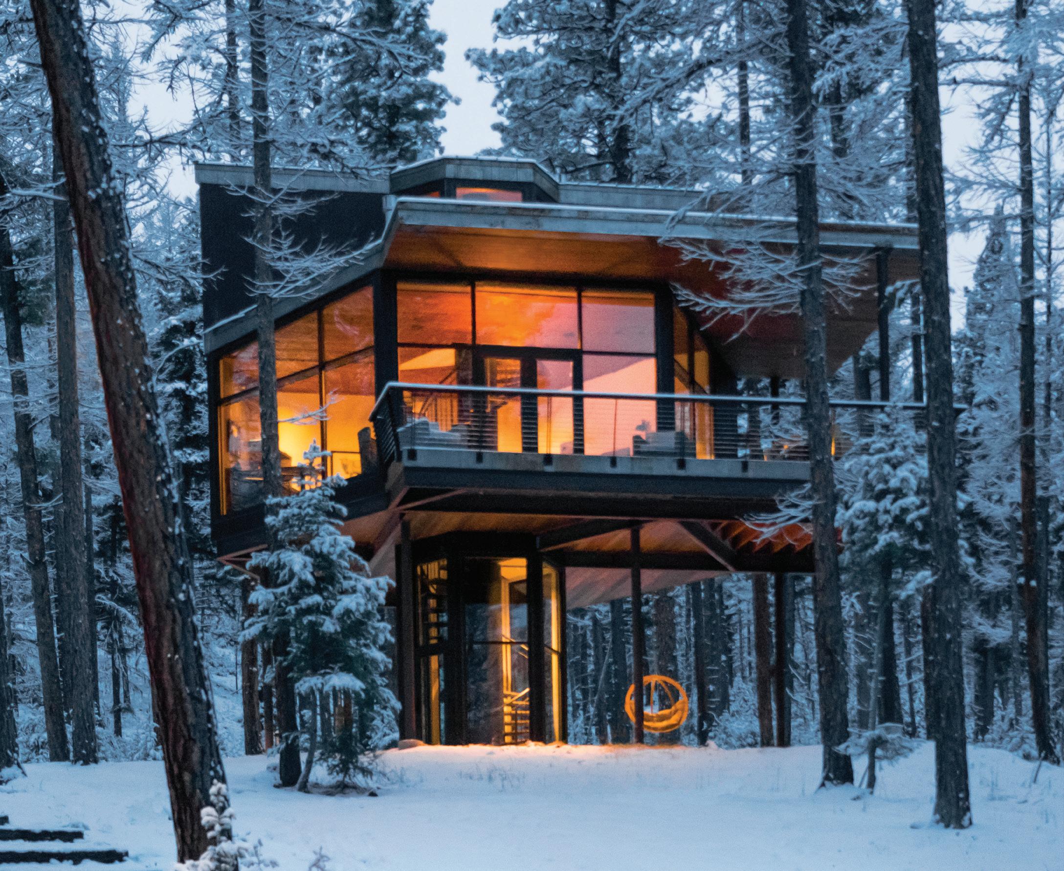
THIS IS NOT YOUR KID’S BACKYARD TREE HOUSE.
Rare is the resort that can boast impeccable architectural design, unmatched privacy and world-class amenities. Rarer still, one that provides all this and a nonstop parade of Montana’s finest wildlife just beyond your window. But that’s the promise of each and every Haus at the green o. Exquisitely designed with floor-to-ceiling views and materials in perfect sync with your surroundings, you’ll discover out here, the line between where nature ends and luxury begins is very fine indeed. Please join us.
thegreeno.com I Greenough, Montana I 888-957-0374












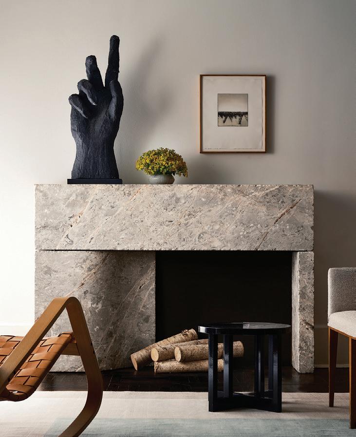
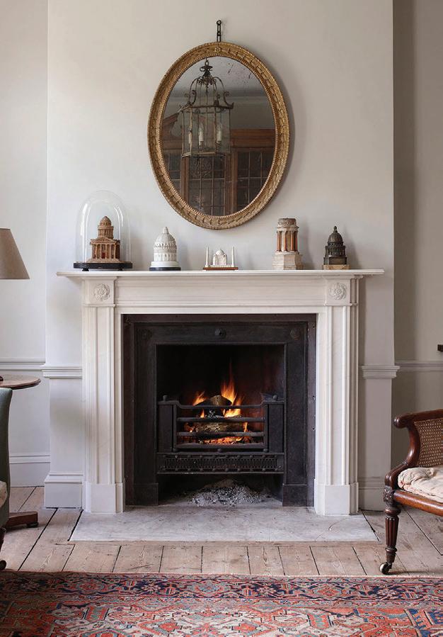
A classic white marble design with a simple shelf that sits above carved paterae
STRIKE BY CHAD DORSEY MALIBUThis bespoke fireplace showcases art wonderfully
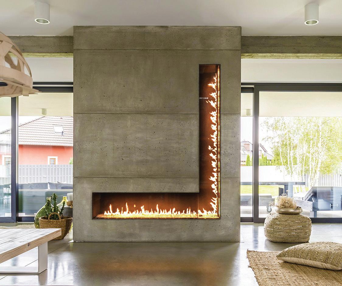
This customdesigned L-shaped beauty was designed to draw attention
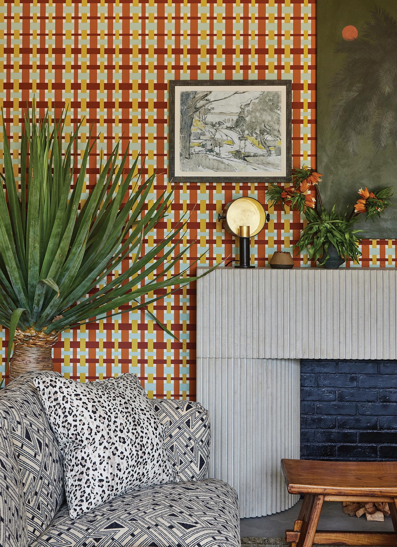
l STRIKE BY CHAD DORSEY SAUSALITOThe deep fluting of the sturdy facade delivers texture to any room Pricing upon
EVERYONE LOVES TO CURL UP ON A SOFA IN FRONT OF A ROARING FIRE, BUT THE MANTLES THAT FRAME THAT COZY HEARTH RARELY GET THE ATTENTION THEY DESERVE. THIS COLLECTION REPRESENTS THE WIDE RANGE OF STYLES AVAILABLE TO ELEVATE YOUR FIREPLACE INTO A WORK OF ART. LET THE FLAMES BEGIN


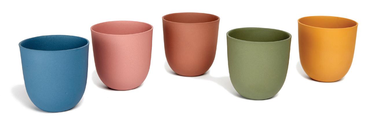
1. COMMUNE DESIGN
These H for Hannah tumblers are crafted from earthenware clay communedesign.com. $245
2. JB BLUNK
Serve anything from cheese to cookies on this elegant throwback walnut slab jbblunk.com $315

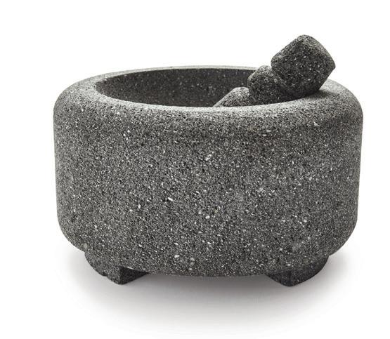
3. MASIENDA
The Molcajete Mortar and Pestle is made from fine-grained lava rock for effective grinding masienda.com $95
4. PUIK
The Rare & Radient Carafe and Glasses are mouth-blown crystal glass puikdesign.com $59

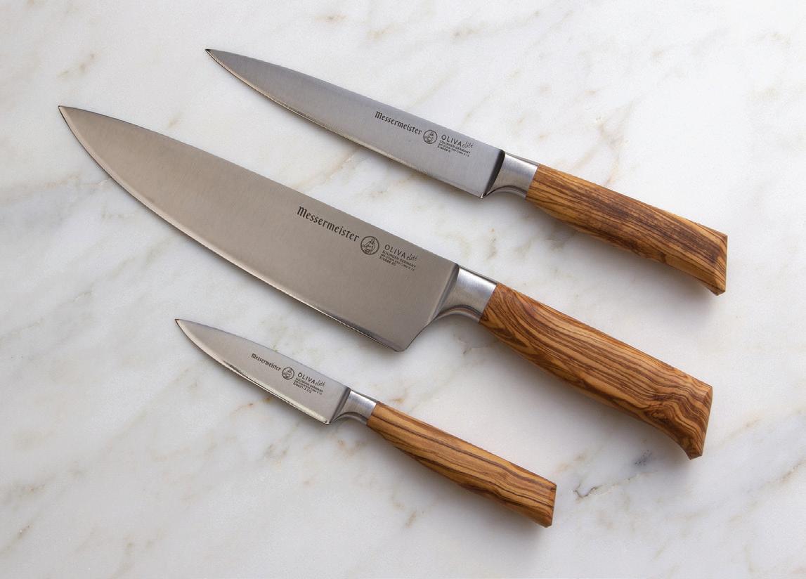
5. MESSERMEISTER
The luxe Oliva Elite collection of knives features Mediterranean olive wood handles messermeister.com $135
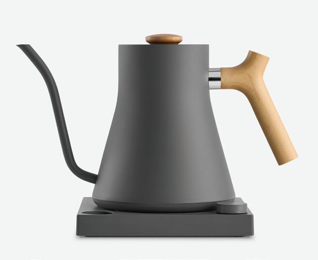
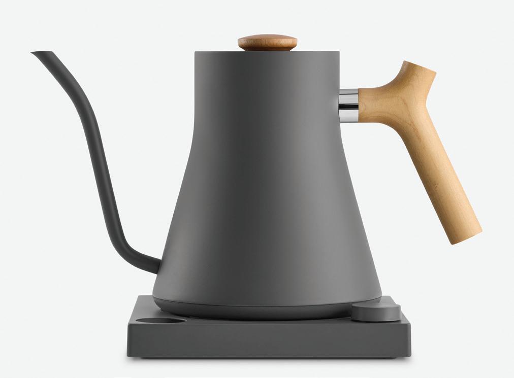
This slate gray tea kettle is offset by a sunny maple handle fellowproducts.com $195
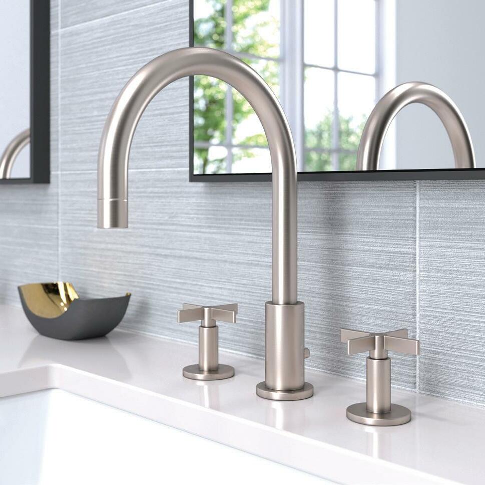
LET'S FACE IT: YOU STAND IN FRONT OF YOUR BATHROOM SINK EVERY DAY. SO WHY NOT ENJOY THE VIEW?
This sleek faucet delivers on the bling maestrobath.com
k DELTA ZURA
Touch-free activation makes this a sexy and sanitary choice deltafaucet.com
Pricing upon request

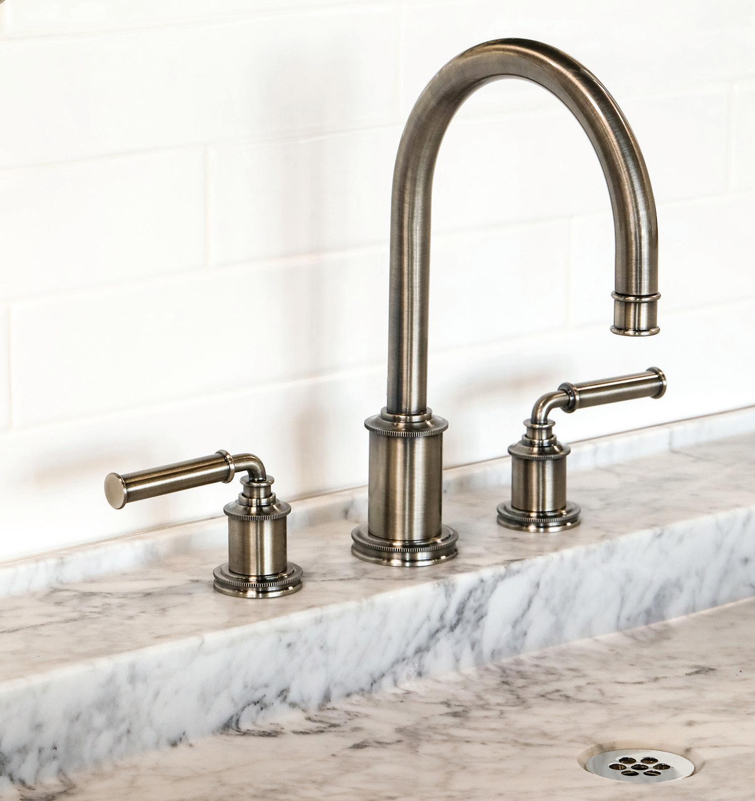
jNEWPORT BRASS TAFT
An antique nickel finish softens up modern powder rooms newportbrass.com
iGESSI ANELLO
This sleek copper faucet exudes feminine elegance gessi.com


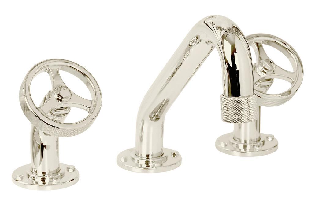
l NEWPORT BRASS TOMLIN
An ode to clean industrial design newportbrass.com
k WATERSTONE ARGONAUT
Distinctive spoked side knobs lend visual flair pirch.com

ESTATE EXPERT STACY CADENASSO SHARES WHAT'S HAPPENING IN THE EXCITING—AND EVERCHANGING—OJAI MARKET |
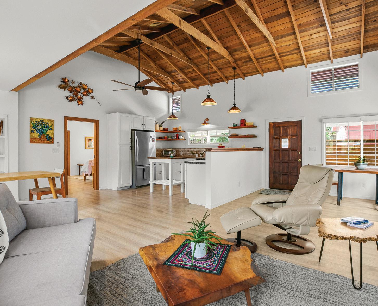
BY KARINE MONIÉAS AN OJAI RESIDENT of 27 years, Stacy Cadenasso has witnessed the transformation of a once-sleepy city. Incoming restaurants, wineries, organic farms, and shops have given the scenic area a new sense of vitality. The high-end market is hot, with buyers eager to live in a city with so much to offer. Cadenasso has 15 years of real estate experience in the area, so we asked her about the state of the Ojai real estate market.
What has changed in Ojai over the last 10 years? Ojai was first inhabited by the Chumash Indians who gave the city its name, which means “Valley of the Moon.” In the present day, being in Ojai can be a very grounding experience, from the farm-to-table cuisine to the Ojai Valley Inn’s spa treatments to the abundance of its natural beauty. All in all,
Ojai has evolved into an amazing small town with a big heart and soul.
How competitive is the high-end market? Inventory is down like in the rest of the country, but Ojai has maintained an increase in prices year-over-year for the past several years. The high-end market is very competitive and selling well, especially if the home is turnkey and in a desirable area, such as Arbolada, East End, Persimmon Hill, or Rancho Matilija. Patina Farm notably sold this year off market for a hefty amount along with many other gorgeous homes. People are seeking everything, from single-family homes or farms to second homes and investment properties.
Any hot areas/neighborhoods for 2023? Meiners Oaks and the Topa Topa neighborhoods have both been hot areas of Ojai this past year and appear to continue being desirable going forward. The downtown area always remains attractive, too, as people like the close proximity to shops and restaurants.
How has Airbnb impacted the market in Ojai? Short-term vacation rentals are limited to a 30-day minimum in Ojai proper, so it hasn’t impacted the local market too greatly. The unincorporated areas do not have this restriction, so it has changed some of the availability for renters looking for long-term housing, but it has been a welcome relief for people looking for an affordable way to spend a few days in Ojai. Overall, there is not enough housing or hotels, so a solution for both is needed.
What should people be looking for when they seek out a realtor? Your wisest bet is to work with a local agent who knows the ins and outs of the area, who has been in business for a while, and can show some recent reviews of satisfied clients. Homebuyers and sellers should do their homework and confirm their agent has a California Real Estate license and has a proven track record. I’d be wary of using a third party (online real estate sites) to find an agent or an agent who is being pushy and you are not comfortable with. Buying real estate is usually the largest purchase someone makes in a lifetime and it should be a pleasant experience. ■

AT HOUSE OF SPOILS , Max Samis is on a mission to prove that galleries don’t need to be intimidating.
Situated in Venice, California, in a little alley called Park Row, House of Spoils is both an art gallery and a creative studio. It’s nestled in a red brick building which used to be a commercial packing space in the early 1930s, and features roll-up garage doors and wooden beams. But it’s the collection of curated photographs inside that makes the space special. Its founder, Max Samis, wants to shift the perception of art as elitist, and bring photography to the public at large.
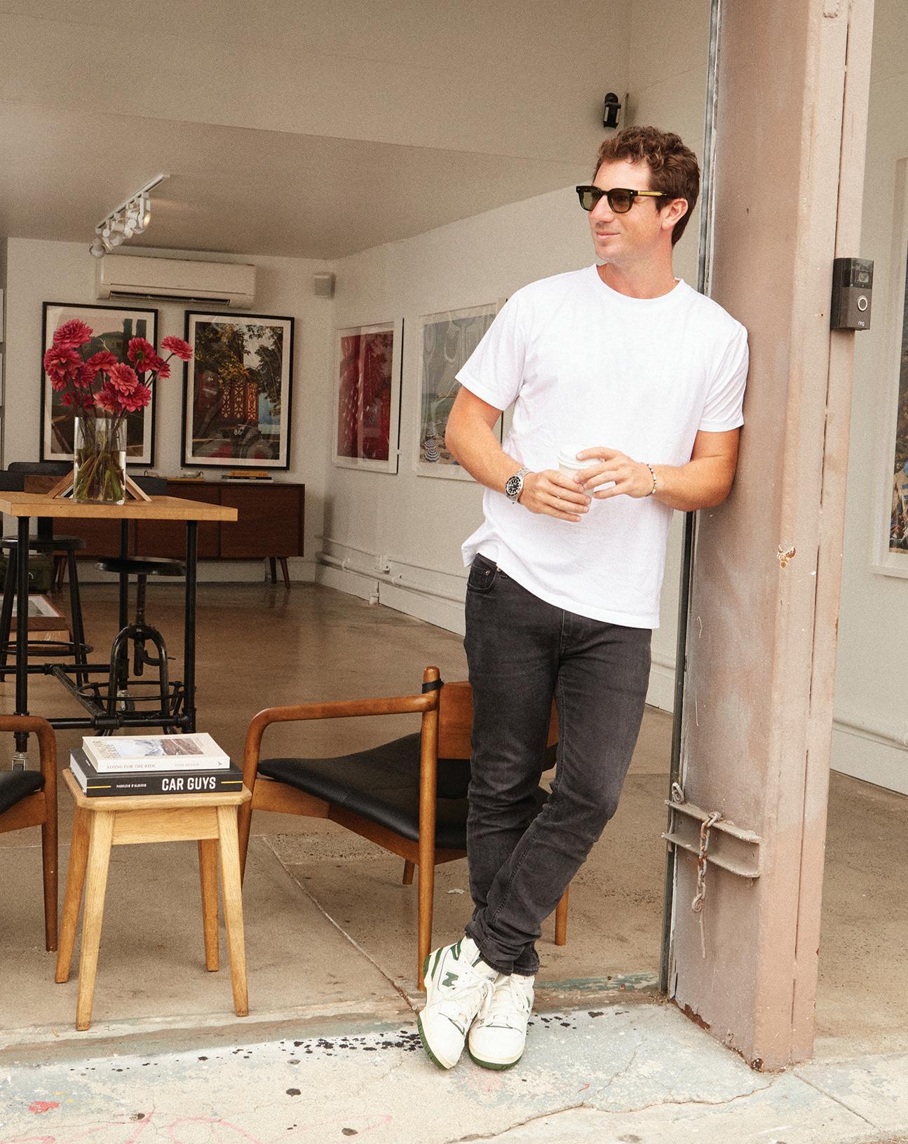
“We’re trying to create a unique vibe in the gallery world that’s a little less serious than most people are used to when they think of an art gallery,” Samis says. “There’s a surf rack in the bathroom and a disco ball hanging from the ceiling. We serve coffee, wine, beers, and cocktails to customers on weekends. There’s always music playing that you can hear down the street and usually a dog or two hanging out. There might even be a classic 911 or a motorcycle parked inside.”
“I started looking for a permanent gallery space at the end of 2018,” Samis recalls. “I remember being pretty fired up about how raw the space was when I first saw it and knew we’d be able to make it work.” A photo gallery and event space is situated in the lower level of the building, along with a design studio that houses a line of collectible edition artworks. “There’s always some sort of work in progress,” Samis says. "You might find anything from a crate of art waiting to be couriered out to a client’s home or new samples my team is reviewing.”
Upstairs, the loft—where the main office is located—is furnished and adorned with a few desks, a couch, cameras, miscellaneous photo equipment, artifacts from some recent travels, and more artworks in various stages of production or transit.
“We have a pretty open-door policy with friends who work in the neighborhood,” says Samis. “Especially our photographers who are always
in and out of Los Angeles on shoots.Customers often end up accidentally wandering upstairs thinking the loft is part of the gallery and then end up hanging out,” he says.
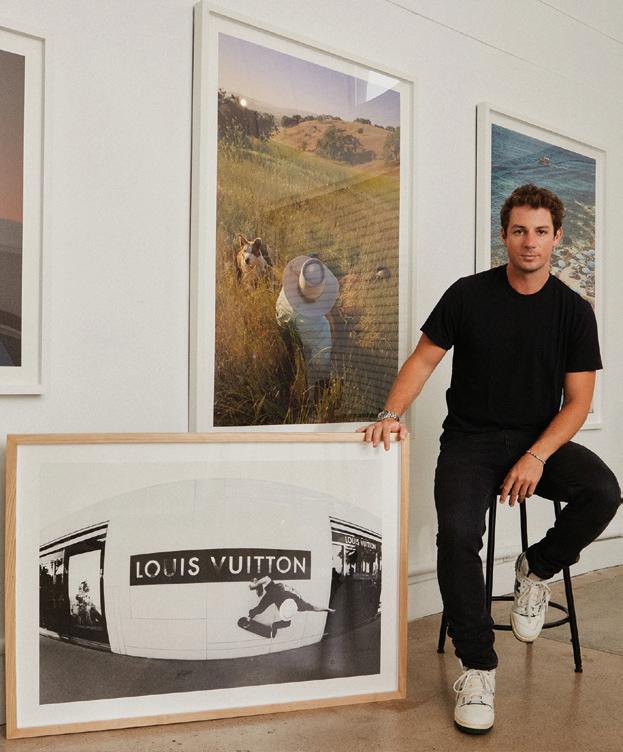
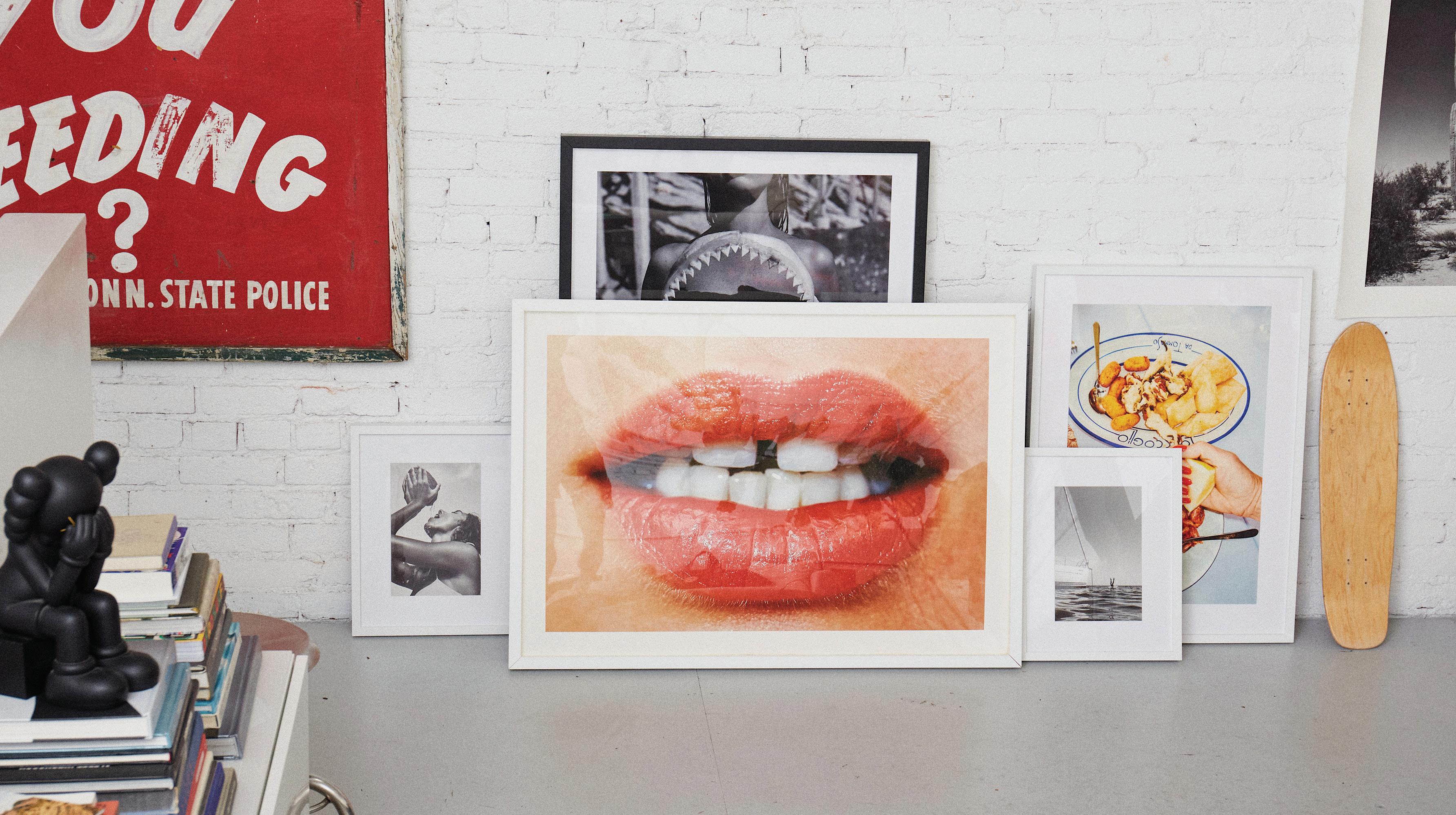
This warm atmosphere is exactly what Samis had in mind for this project. A flag from his expedition summiting Mount Kilimanjaro, signed by each member of the team; an original Hannah Polskin, gifted to him by the artist; and his motorcycle helmet, worn while riding a mini motorcycle across Africa on the Mongol Rally—these are just a few of the elements that make the space so personal.
“I grew up going to art galleries and have always had art on my walls,” remembers Samis. “But galleries can be cold, and it’s rare that your average person can walk into one off the street and have the experience of being able to take something that they love home. I wanted to create a space for our community to interact with our team and our artists, to get really excited about the work on display and the stories behind it and to then actually be able to purchase what they saw.”■
Accessible by private appointment during the week and open to the public from 11 a.m. to 4 p.m. on weekends
PAINTED IN LARGE SCRIPT on the wall of a workroom at Judson Studios in Los Angeles are the words “No steps backward.” The motto, like the building, dates to founder William Lees Judson, but the sentiment is just as relevant today. As the venerable stained glass firm celebrates its 125th year, it continues to push the boundaries of the medium with breakthrough techniques and collaborations with contemporary artists.
Though the process of fitting together pieces of colored and fired glass with strips of lead hasn’t changed much since the Medieval era, Judson’s designers and craftspeople can often be found drafting elaborate compositions on the computer, cutting glass with a water jet, and manipulating pieces of glass and “melting” them in state-of-the-art kilns using a new process called fusing. “We used to say the latest invention in stained glass was the glass cutter, and that was about 500 years ago,” says David Judson, the fifth-generation member of his family to run the studio. “Today we’re using technology so we can spend more time on the end product. I love the traditional work because it’s about mastering the craft, but fusing is taking that craft to a different level.”
ON ITS 125TH ANNIVERSARY, SOUTHERN CALIFORNIA’S JUDSON STUDIOS BUILDS ON A VIBRANT LEGACY TO LAUNCH A STAINED GLASS REVOLUTION
 BY KELLY VENCILL SANCHEZ
It’s an evolution that David’s great-great grandfather could scarcely have imagined when he and three of his sons established their stained glass studio in downtown L.A. in 1897. When they moved to their current headquarters, a shingled building in the Garvanza neighborhood of northeast L.A., in 1920, their handiwork
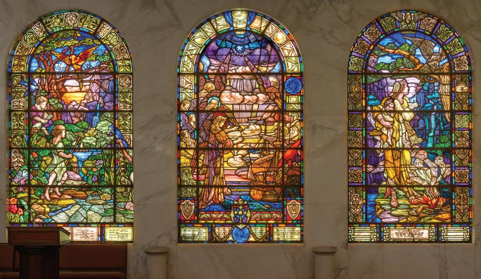
Mausoleum of the Golden West.
Inglewood Park Cemetery; 1933
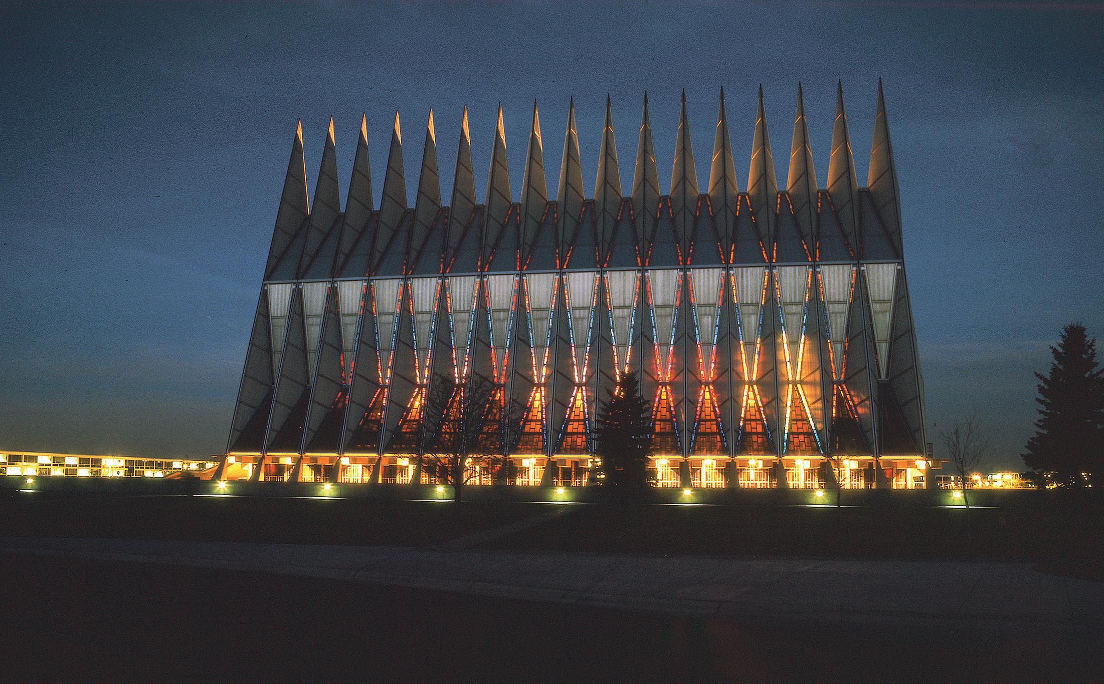
adorned Pasadena mansions as well as the rotunda of L.A.'s Natural History Museum. The studio would go on to create art glass windows and laylights for Frank Lloyd Wright’s Hollyhock and Ennis houses, faceted glass panels for the U.S. Air Force Academy’s Cadet Chapel in Colorado Springs, dazzling domes for Las Vegas casinos, and windows for scores of religious institutions across the country
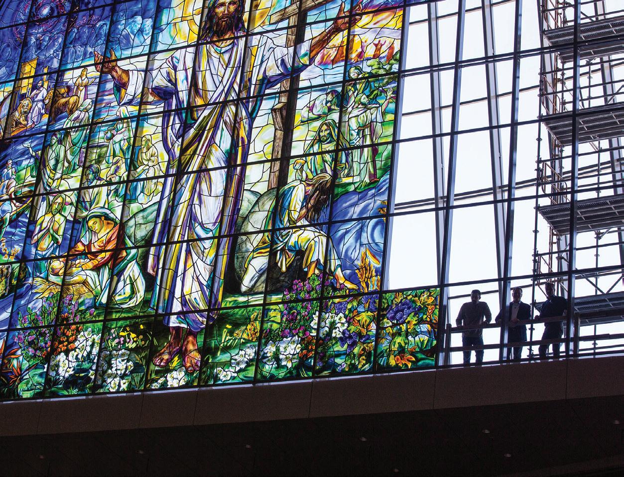
Though restoration, long a mainstay for the studio, accounts for anywhere from 20 to 50 percent of its current work, fusing represents an exciting new direction. It all started when the studio was vying for the chance to create its most technically challenging project to date: a massive window for the Church of the Resurrection in Leawood, Kansas. “I told my artists, ‘I don’t know how we’re going to do it, just design the window,’” David recalls. Judson won the commission.
Completed in 2017, the project launched an ongoing partnership with artist Narcissus Quagliata, a pioneer in glass fusing who helped guide the Judson team to create a window measuring almost 36 feet tall by 100 feet wide and made up of 161 fused-glass panels. To accommodate the undertaking, the studio acquired a second facility just up the road in South Pasadena.
And because the mouth-blown and machine-rolled glasses traditionally used in stained glass manufacture heat and cool at different rates, Judson needed an entirely new material for its fused creations. So David reached out to Bullseye Glass,
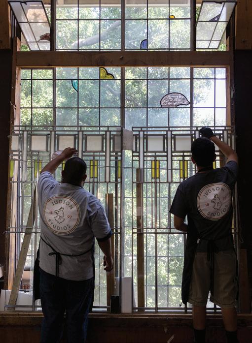
Cleaning the restored windows for Unity Temple; 1917
Rotunda of the Natural History Museum of Los Angeles. Judson created both the glass dome and the globe being held by Julia Bracken Wendt’s Three Muses; 1914
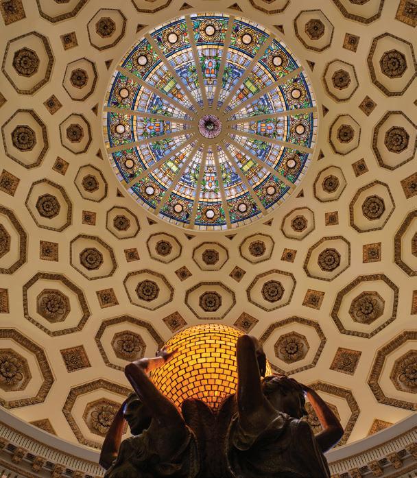
which produces a revolutionary product that allows multiple colors to be heated together in a kiln without cracking. “It’s not traditional glass where you take a sheet of glass, cut it, paint on it, and put it together. Now we can assemble different colors and fuse them together, which allows it to capture the light differently,” he says. “That opened up a whole new world to us.”
That new world is attracting contemporary artists like Amir H. Fallah, David Flores, Sarah Cain, and James Jean, with whom it’s creating a 14-foot-high, three-dimensional colored glass pagoda. “For years, artists who wanted to work in glass went to Europe to do it,” says David.
“I said, ‘How do we change that? We’re in Los Angeles—we should be cutting-edge.’”
Fallah, whose work explores the immigrant experience in America, had never worked in glass before he started collaborating with the Judson team. They’ve since created works that include a site-specific installation for the Los Angeles County Department of Mental Health in Koreatown. “It’s kind of a no-brainer to work with Judson because they’re combining an ancient technology with more modern and experimental glass techniques," Fallah says.
Ensuring that Judson continues to innovate while respecting tradition is a balancing act, but David believes the possibilities of glass are limitless. “Everyone has preconceived notions about what stained glass is, but the material is so versatile,” David says. “Glass can do things that other materials can’t. We want to maximize that potential.” ■
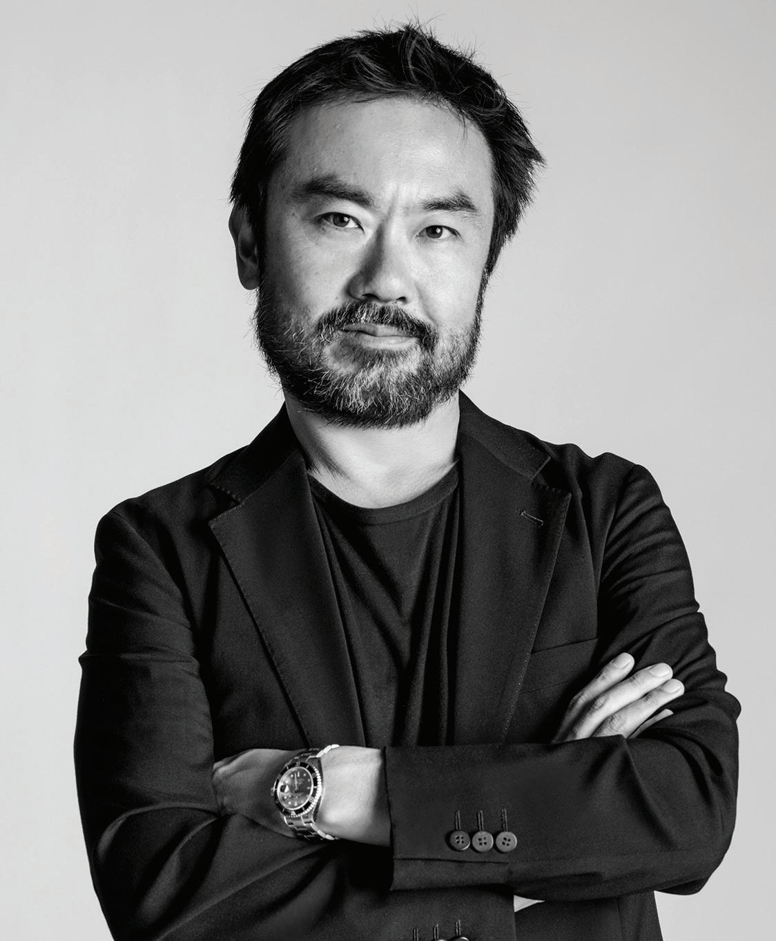
OUR CONVERSATION with the architect—the ‘Y’ of venerated L.A.-based firm EYRC—reveals what changed in his own home during the pandemic and how his Japanese heritage is shaping new projects.
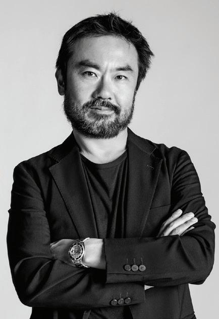
How did your own home, a midcentury ranch house in Mar Vista that you renovated with your wife and firm colleague, Patricia Rhee, see your family through the pandemic?
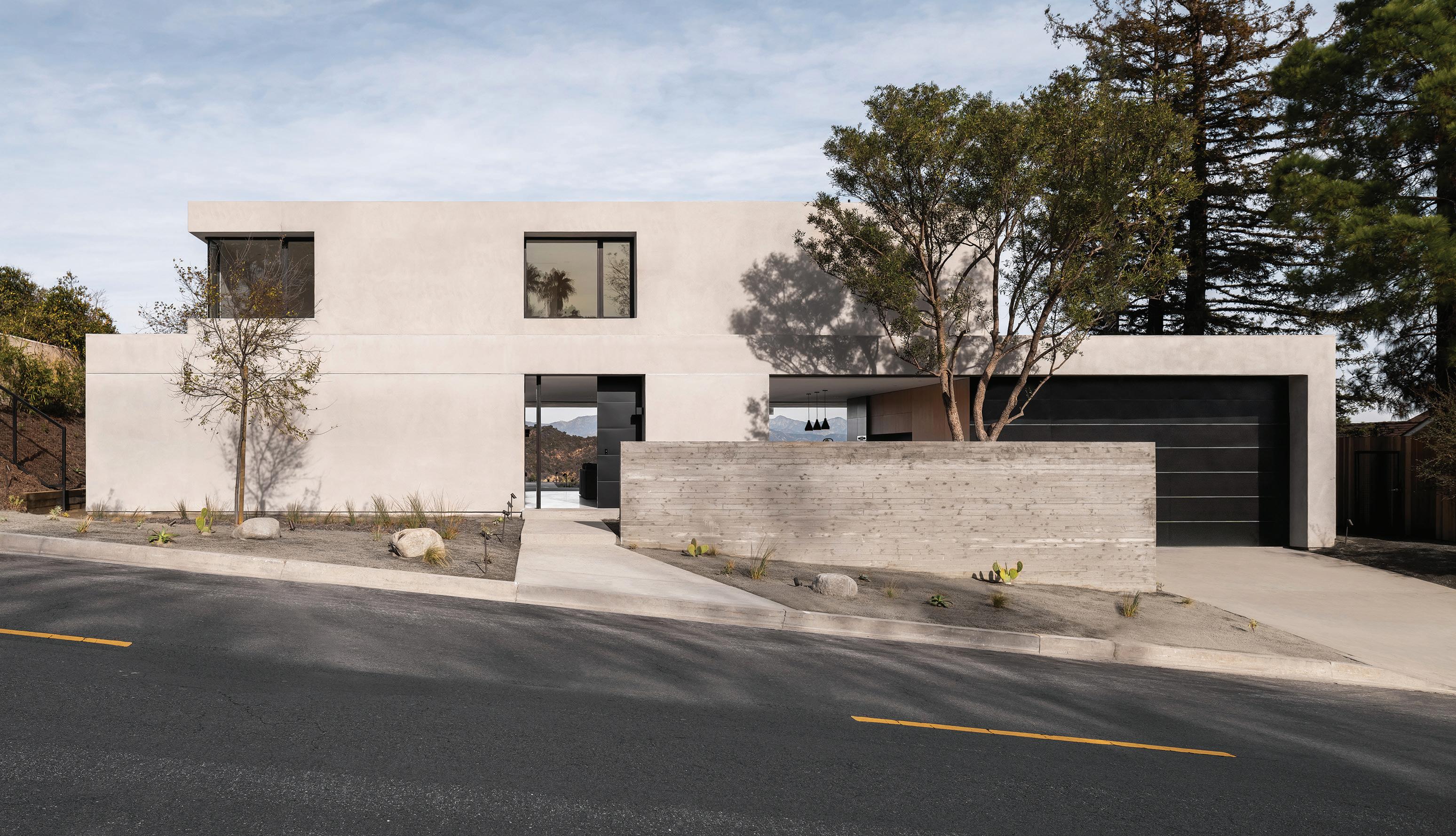
We made a couple of minor changes, but it was really a validation of what runs through our studio and the things we preach to clients, like the importance of the connection between indoor and outdoor spaces. We’d done a modest remodel but added decks, and those are what transformed during Covid. One was enlarged and the rear deck became my office. I’d wake up, take my laptop and coffee out there, and work all day long. I kept my sanity because I was adjacent to my garden; it was soothing, meditative. Biophilia is a real thing.
But you’re considering an ADU?
When it’s raining or cold, we’re one room short. And ADUs are an interesting opportunity for architects. They’re not just allowed, but encouraged now, and they increase the flexibility of a house. I have different versions in my head but want to stay small and sustainable. I used to be a journalist and the editorial eye—and the curiosity—still help me as an architect.
Have the last few years changed your thoughts on architecture? The silver lining of the pandemic is that it was
BY MAILE PINGELa jolt, it shook things up. We’d enjoyed a boom time for a long time, with great access to things and a great clientele— it was really an embarrassment of riches. We didn’t get lazy, but maybe it was a little easy, maybe we fell back on what was comfortable. Now, there’s a little more uncertainty in economics and in politics, and the pandemic has changed the balance between life and work. But that’s interesting. How do we recalibrate what we do? How do we redeploy our talents? It’s possible, but we’re going to have to get out of our comfort zone.
We have several residential projects from Malibu to Palm Springs, and we’re doing a super exciting artist studio/ residential space in Sausalito. It’s a community or compound about the creative exchange between California and Japan, and how the two can cross-pollinate.
And tell us about your travels to Japan.
I’m a SoCal kid but I was born in Japan and although it’s always been part of my life, as I mature, I want to bring that forward in my work. I went back to Japan four times last year, and it’s always like going into my garden—it slows my heart rate, I can see things. On any trip, I’ll seek out colleagues whose work I admire, people like Hirotaka Kidosaki and Hiroshi Sugimoto, to visit their work in person. Japan is an existential journey for me, and one that overlaps with design inspiration.
■
"
PUT YOUR NECK ON HERE and your feet fully on here," Thomas Hayes instructs. The designer and craftsman points to either end of a sumptuously oversized daybed swing constructed of brass, wood, and leather that's installed in his Hollywood showroom. Other than, say, a hammock, it's rare for an adult to have this kind of chill-out moment. This brief experience is enough to understand why his clients of means part with significant amounts of money and wait many months to bring this prized piece into their homes. If you're going to play in the Los Angeles sandbox of high-end bespoke furniture, Hayes's swing might be the ultimate toy.
In contrast to his meticulously handmade wares, Hayes's direct attitude is refreshingly unvarnished. "I want to do the very best, and I charge for it," he explains. "That's what allows me to be able to do right by people — as long as they're kind." Everything is fabricated on-site (and a stone's throw from the Paramount lot) at the Thomas Hayes Studio compound he's occupied since 2008. Processes for goods that are both custom and from his established line cannot be rushed, and the demand for his signature stools in particular is high thanks to high-profile clients such as L.A. interior designer Martyn Lawrence Bullard and lifestyle maven Athena Calderone,

whose internet-famous Brooklyn kitchen showcases the Iron and Rolled stools that are inspired by Cleo Baldon's designs.
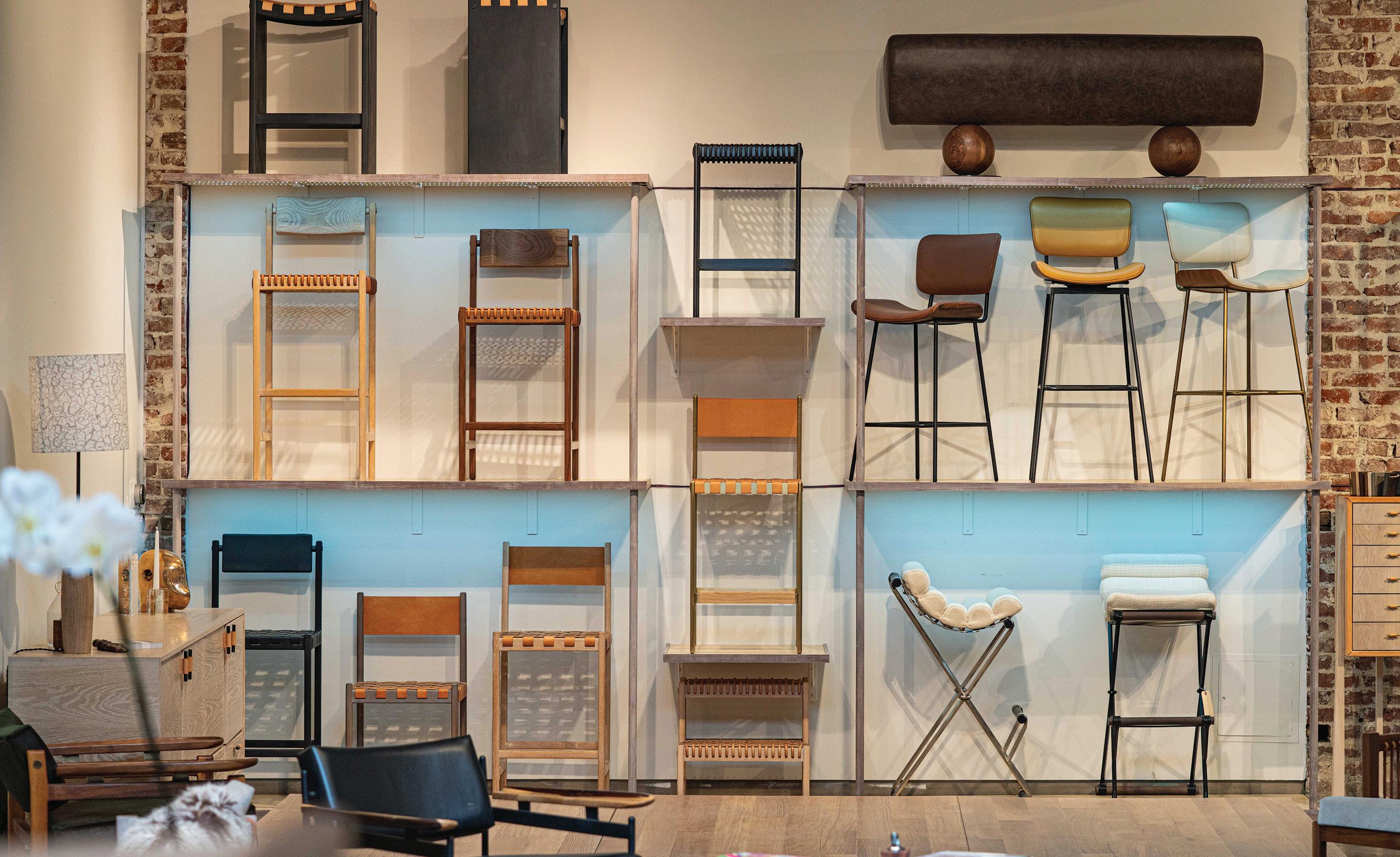
Hayes grew up in the Bay Area, where an Eames stool he encountered became a gateway to an obsession with modern furniture and its history. He dived headfirst into his own education through trial and error. Before introducing original designs under the banner of his eponymous business, Hayes's previous gallery, Noho Modern, featured significant works of impeccably restored decorative arts and design. Brazil's furniture design heritage became a particular passion, resulting in an ongoing influence in his reinterpretation of organic modernism. This sensibility is reflected in Jacqueline, the most recent seating collection Hayes developed with interior designer Jacqueline Downs that incorporates soft curves and an inviting tactility. Hayes also thrives when collaborating on projects with creatives in other mediums, including Miami-based Samantha Gallacher of Art + Loom rugs and Texas fiber artist Lauren Williams.
While Hayes has spent the last decade refining his portfolio, he's still a risk-taker at heart who's always open to compelling experiments. "If I like the idea and can make it part of my conversation, then I'll figure it out," he says. thomashayesstudio.com ■
A HOLISTIC APPROACH TO GARDENS HAS WON L.A. LANDSCAPE ARCHITECT PATRICIA BENNER A LOYAL FOLLOWING—AND NURTURED HER OWN SPIRIT, AS WELL
BY MAILE PINGELLOS ANGELES-BASED landscape architect Patricia Benner, who also has an office in the Bay Area, has created some of the city’s most beautiful green spaces. From terraced canyon gardens to lush but lawn-less examples, Benner’s projects share the common threads of classical design, structure, and what she dubs “gusty foliage.” Here, we ask her about childhood influences, changes she’s seeing in the field, and a few of her favorite resources.
What is essential to you for a successful garden?
Foliage form, texture, and color in a planting palette. I love the impact of acanthus or artichoke contrasted with a mass of finely textured grasses, and delight in the piquant effect of lime-green leaves against a cool, dark-green background. Having come from the East Coast with its distinct seasons, I’ve attuned myself to the more subtle rhythms of California and seek to bring seasonal interest into the mix. Classical principles inform my designs, but I’ll also go for the unexpected in the right situation.
How has your mother’s work as a garden designer influenced your own approach?
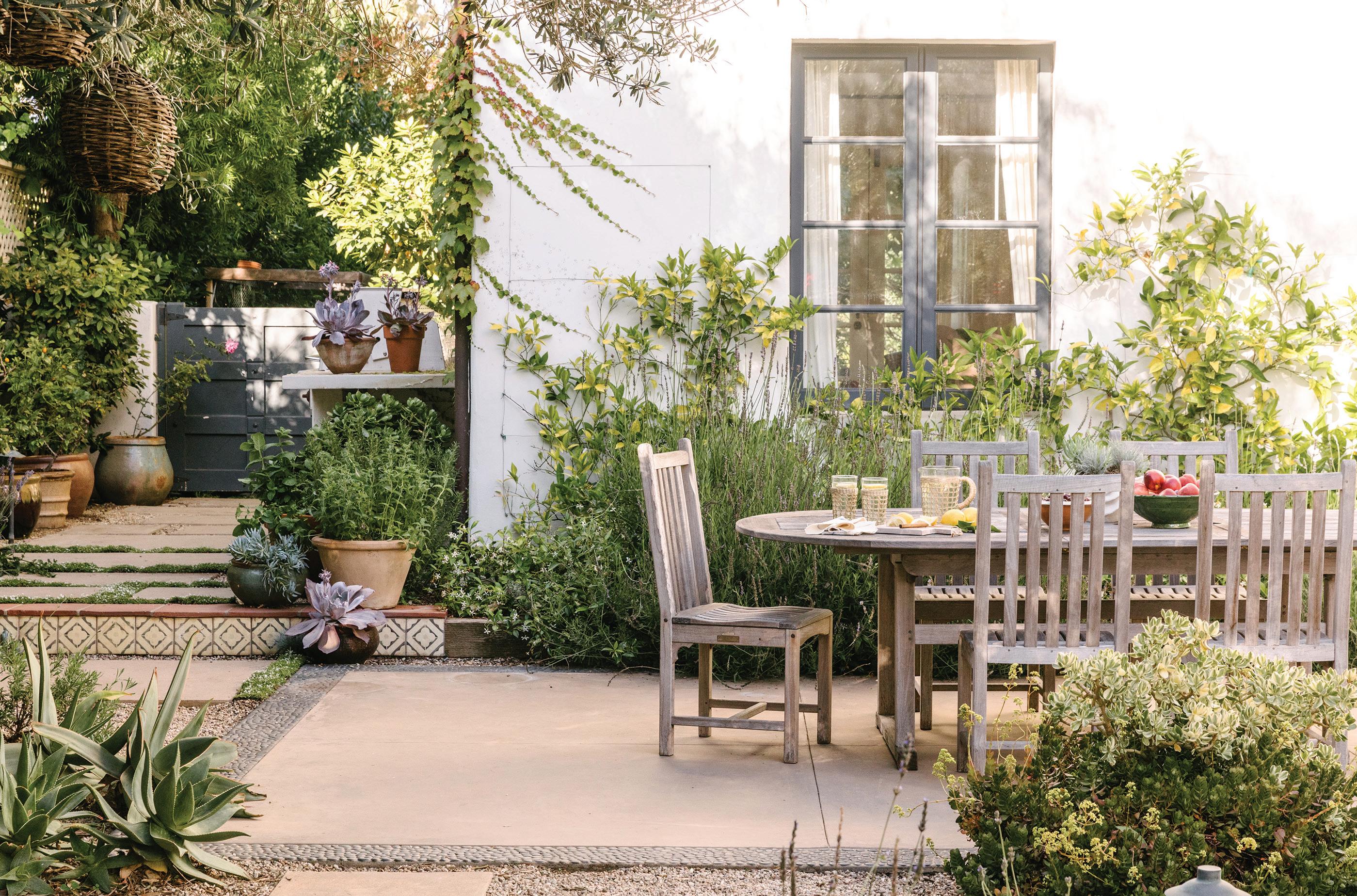
I grew up in her lovely garden, and she was constantly taking me and my siblings to garden tours in New England and the New York metropolitan area—sometimes to our adolescent chagrin! She taught me about effectively structuring a garden, using foliage composition to develop texture, and how to amplify the delights of seasonal interest. She lived and breathed gardens and most certainly passed the garden-lover gene to me.
JESSICA SAMPLEBeautiful performance fabrics, sophisticated furniture, advances in heating systems, and new technologies that are making it possible for outdoor rooms to be an extension of the interior. Large steel windows and new types of sliding and bifold doors break down the opacity of a home’s envelope, with some residences becoming like pavilions in a garden.
Last summer was the first time I noticed genuine and sustained client interest in moving toward sustainability. With water bills rising, they’re motivated to reduce usage. I start the conversation with the concept of a water budget and describe how each plant has its own water-use factor. Clients are often surprised that their beloved hydrangeas and roses aren’t necessarily the culprits. They can keep those favorites in limited quantities and still conserve significant water if they substantially reduce the footprint of their lawn.
The Theodore Payne Foundation in Sun Valley is the best place to learn about and buy California native plants. They have demonstration gardens and a nursery chock full of plants to try. If you’re heading up to Santa Barbara, The Well in Summerland is great for antique and custom garden furniture, pots, and objects. And I love books, especially those by Piet Oudolf, the Dutch landscape designer who creates sumptuous meadows with perennials and grasses masterfully contrasted with swaths of clipped forms. Two of my favorites are Planting the Natural Garden and Designing with Plants ■
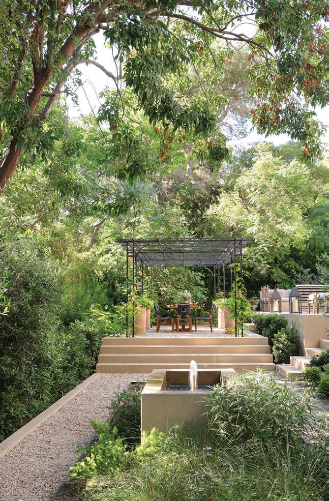
j To increase the living space of a Rustic Canyonn home, Benner designed multiple outdoor "rooms" on different levels
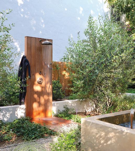
l An outdoor shower is the first stopping point after a day at the beach
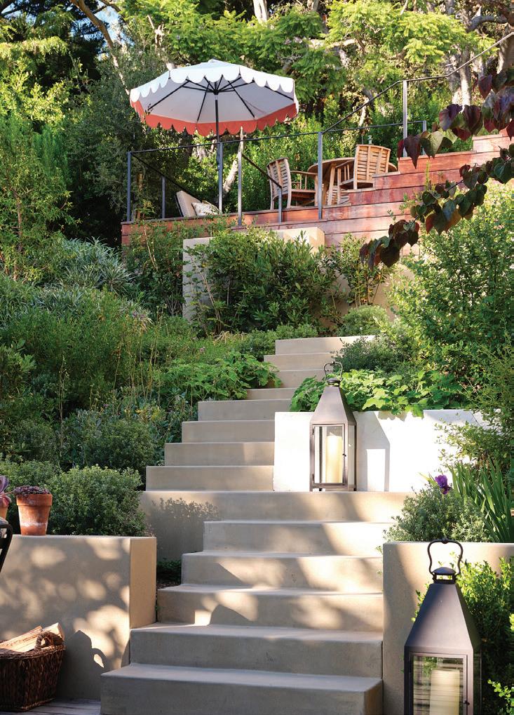
p A steep slope connecting the upper and lower gardens became a stairway with “an unfolding series of lovely viewpoints,” says Benner
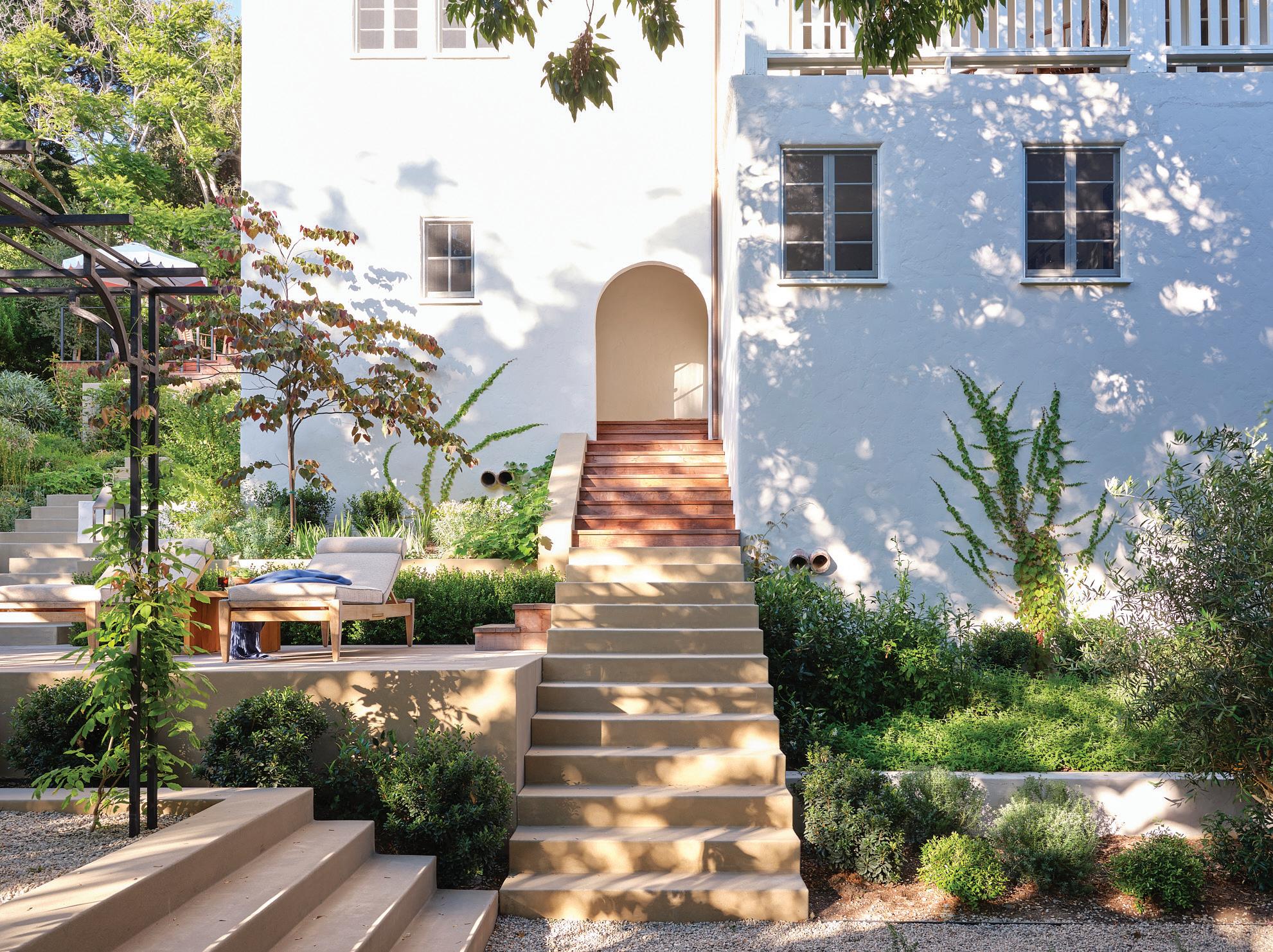
l The dining pavilion is defined by a custom iron trellis

AT FIRST BLUSH, labeling a resort property “America’s Private National Park” might seem like a bit of a reach, but the green o resort, situated outside of Missoula, Montana, can back up its claim. The destination sits on 37,000 acres of dense pine forests and lush green pastures, punctuated by the roaring Blackfoot River. The property, which is also a working ranch, is a destination for people who love nature and want to experience it in style. The green o delivers with beautifully designed accommodations, an extraordinary—and exclusive—culinary program, and an extensive list of outdoor activities ranging from trail riding to guided fly fishing. But for all of its polish, it’s surprisingly

grounded—and that’s a good thing. While the service is topnotch, there is a genuine quality to all of the staff, and the resort’s no-gratuity policy eradicates any sense of “other” as you interact. Instead, you feel as though you’re a part of an exclusive community, not just a paying guest.
“People who come to both the green o absolutely appreciate the finer things in life, but they aren’t afraid to get their hands a little dirty,” says Larry Lipson, co-owner and managing director of the resort. “They want to experience things in the outdoors they’ve never tried before—all the time knowing that they can retreat back to a stellar accommodation, with all the creature comforts they’re used to enjoying.”
The green o is an extension of Paws Up, a high-end, family-friendly resort that opened to much acclaim in 2005. The owners pioneered the idea of glamping, setting up three canvas tents filled with luxe furnishings and an upscale twist on traditional cowboy decor. Guests came in droves, and these days, Paws Up boasts 36 tents, some of them with multiple bedrooms. But as the resort’s popularity with families exploded, the Lipson family saw an opportunity to carve out a luxury property for an adult-only crowd.
The Lipson family collectively designed the entire property, including the Social Haus and the 12 private “Hauses.” All of the accommodations share a clean, Scandinavian style that is at once fresh and timeless. But each residence has its own spin—there are three distinct models, all constructed with sustainability in mind. The Tree Haus is perhaps the most
iconic, with enormous glass walls that offer incredible views of the dense pine forest below. “We wanted to preserve as many of the trees as possible—around the Hauses and throughout the resort,” Lipson says. He succeeded: fewer than six mature pines were cut down in the building of all of the structures on the green o property.
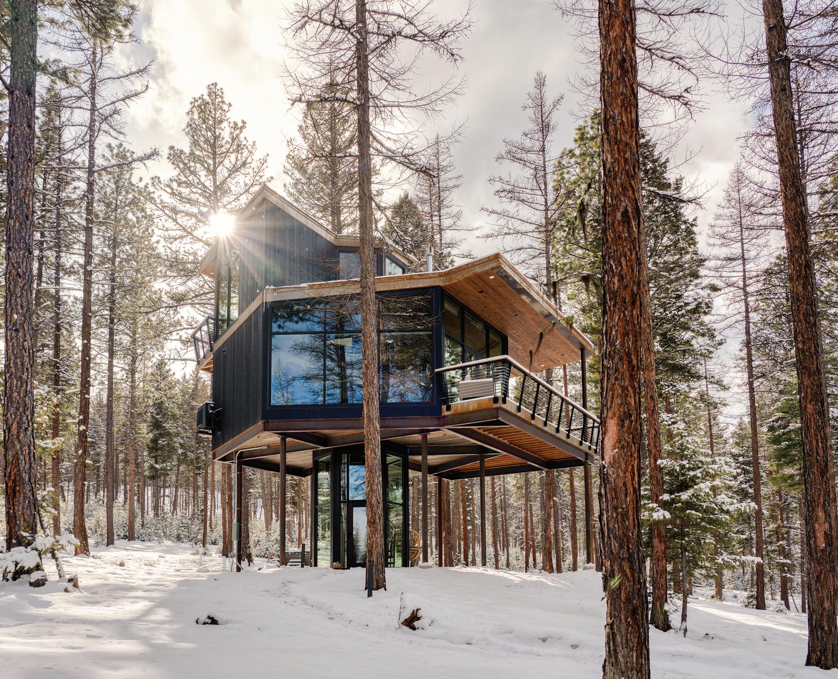
“The goal was to create the appearance that the buildings were dropped right into the middle of the forest with an absolute minimal footprint and no impact on the surroundings,” says Lipson.
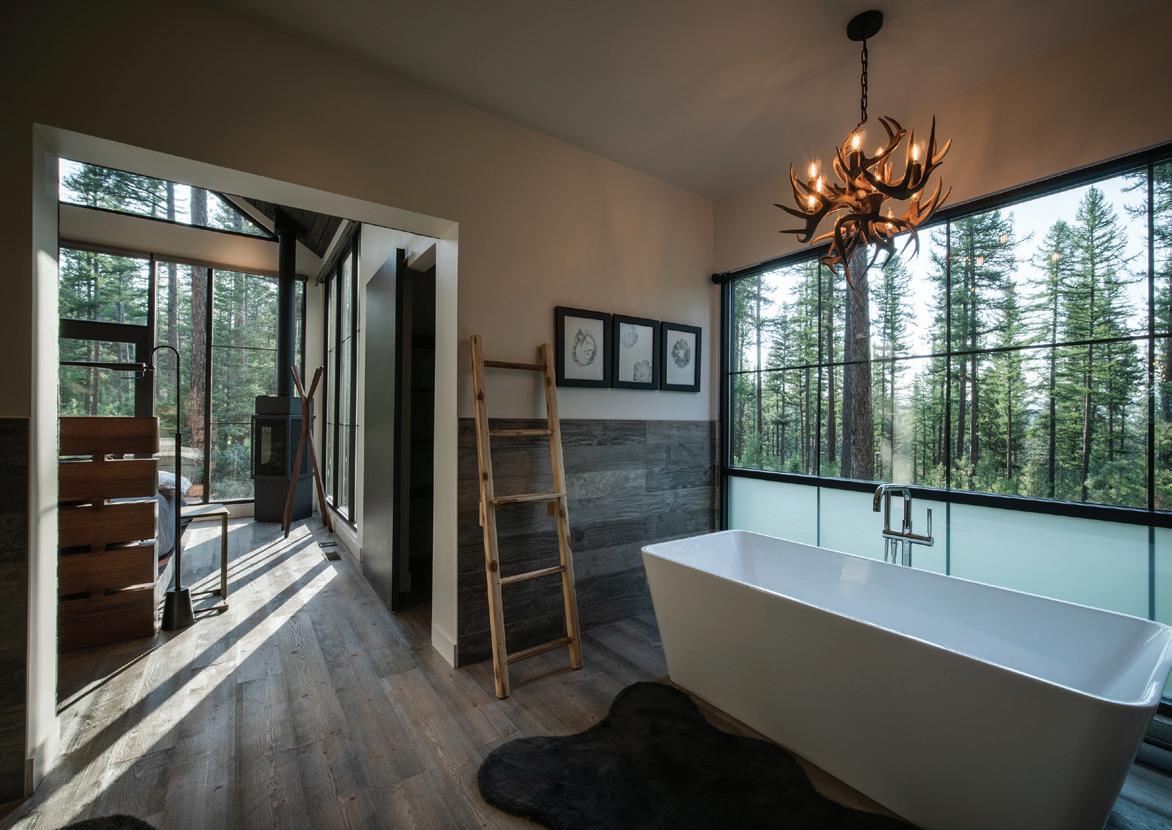
lEven the deep soaking tub offers impressive views
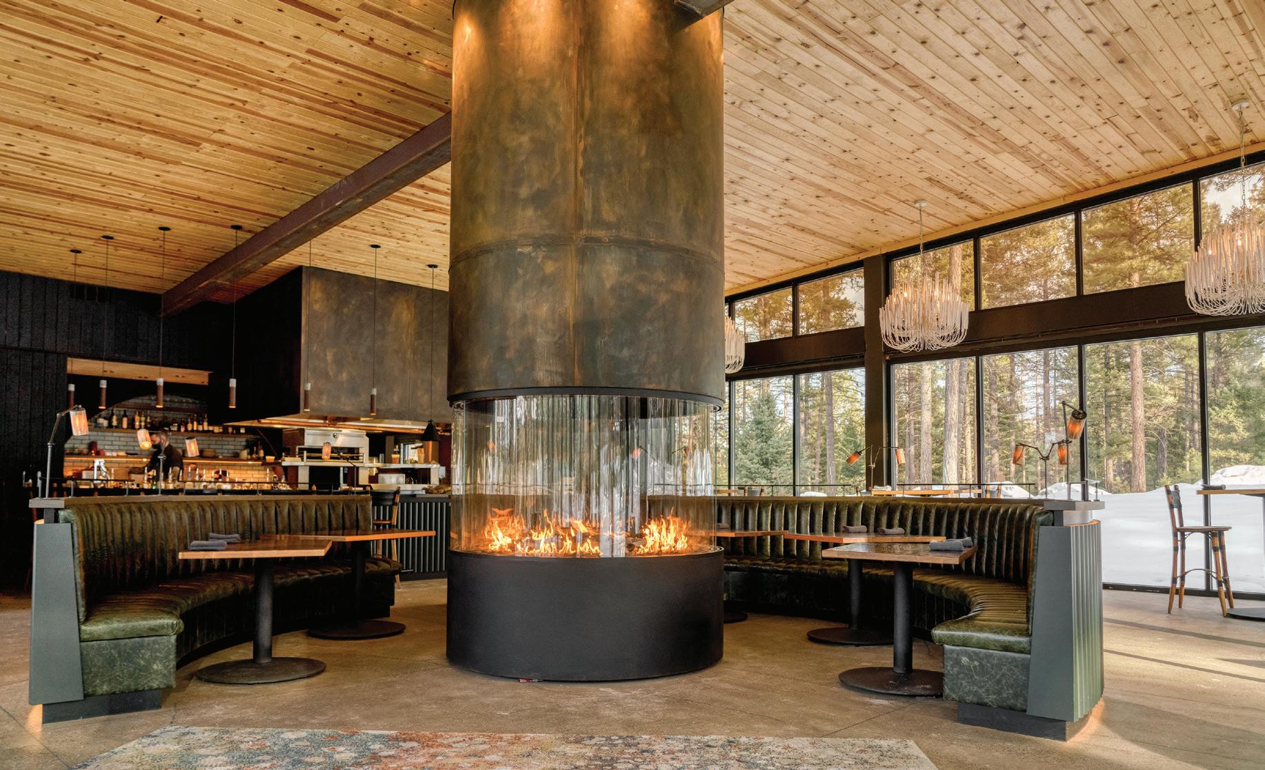
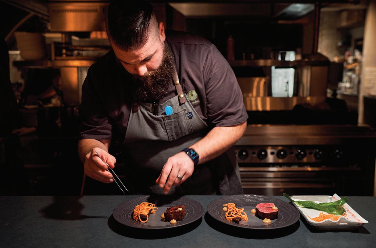
Green o guests dine at the Social Haus, which serves as a gathering place as well as the resort’s exclusive restaurant. The warm interiors were designed by Kristen Becker of Mutuus Studio, and here, guests are treated to a nightly multi-course tasting menu that rivals anything you’d find in New York or Los Angeles. Executive Chef Brandon Cunningham delivers a new tasting menu every day, tailored to seasonal ingredients sourced nearby. The restaurant only seats 24 (the capacity of the resort) so the experience feels incredibly intimate, with highly personalized service.
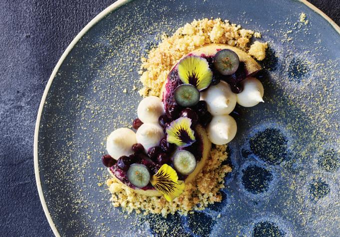
The scale of culinary ambition is astonishing, with a dazzling lineup of colors, flavors, and textures coming out of the restaurant’s open kitchen. The dishes are refined, but like the resort itself, there is a sense of adventure and playfulness in the food. Guests were delighted by the appearance of a make-your-own wagyu beef slider in one of the meals, and raved about a dessert of pickled huckleberries with a sweet corn crumble. Pair your meal with curated wines, or opt for one of the signature cocktails from the full bar.
The names of the dishes are understated, which only makes the culinary wonders that arrive at your table all the more delightful. A bar snack casually labeled "Chips and Dip" is, in actuality, a generous portion of golden, housemade potato chips dusted with an addictive onion-based seasoning. And the dip? It puts ranch dressing to shame with a sprinkle of edible flowers and a generous dollop of caviar—salty, tangy, creamy, crunchy perfection.
Why go through the effort to create an entirely new lineup of dishes each night? Cunningham explains it this way: “We really want to create a sense of mystery, surprise, and delight when it came to each night’s tasting menu. Luckily for us, it has been received very well.”
“The guests of the green o are seasoned travelers who have eaten at some of the finest restaurants around the world,” says Lipson. “What truly surprises these patrons about the Social Haus is experiencing such an incredibly high level of culinary detail, originality, and creativity deep in the Montana forest at the end of a dirt road.” But that unpaved road is exactly why guest seek out this place. After all, if you’re spending time in the nation’s private national park, you want to keep your experience on the wild side. thegreeno.com ■
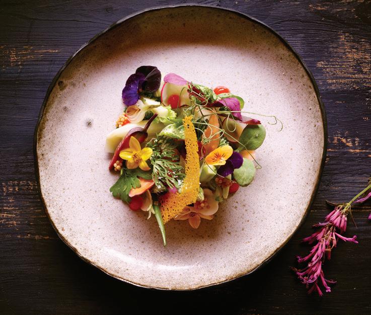 k Cunningham uses local meat and produce whenever he can
i A grand central fireplace anchors the property's Social Haus
IMAGES (LEFT): DAN GOLDBERG; BOTTOM: STUART THURLKILL
j Executive Chef Brandon Cunningham creates an entirely new tasting menu for green o guests each evening
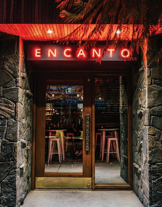
ONE OF THE MOST STUNNING restaurant interiors in Los Angeles is nearly hiding in plain sight. Encanto Restaurant and Bar isn't tucked away on an under-theradar side street, or intentionally hard to find. Instead, it sits on a bustling stretch of Hillhurst Avenue in Los Feliz. But what used to be known as the low-key, family-friendly neighborhood restaurant Mexico City has quietly undergone a dramatic transformation over the past three-plus years.
"I know it looks like it's been here since the building was built in 1967, but all of this is new," says co-owner and multidisciplinary designer William Emmerson, pointing to exterior features that extend from the afrormosia wood and brass-adorned soffit to the stone cladding that matches the original. It's a delicate dance to update a venue where locals have developed attachments. So, Emmerson and team reconstructed the midcentury building with a scheme that retains a sense of continuity in the streetscape and community. "I call this the 'Batman sign,'" the London native says of the illuminated rooftop sign that's been a presence on Hillhurst just
south of Los Feliz Boulevard for 55 years. "Encanto" in neon was added to the top portion and the entire piece was cleaned and restored, but also aged "so that it didn't look too new," he adds.
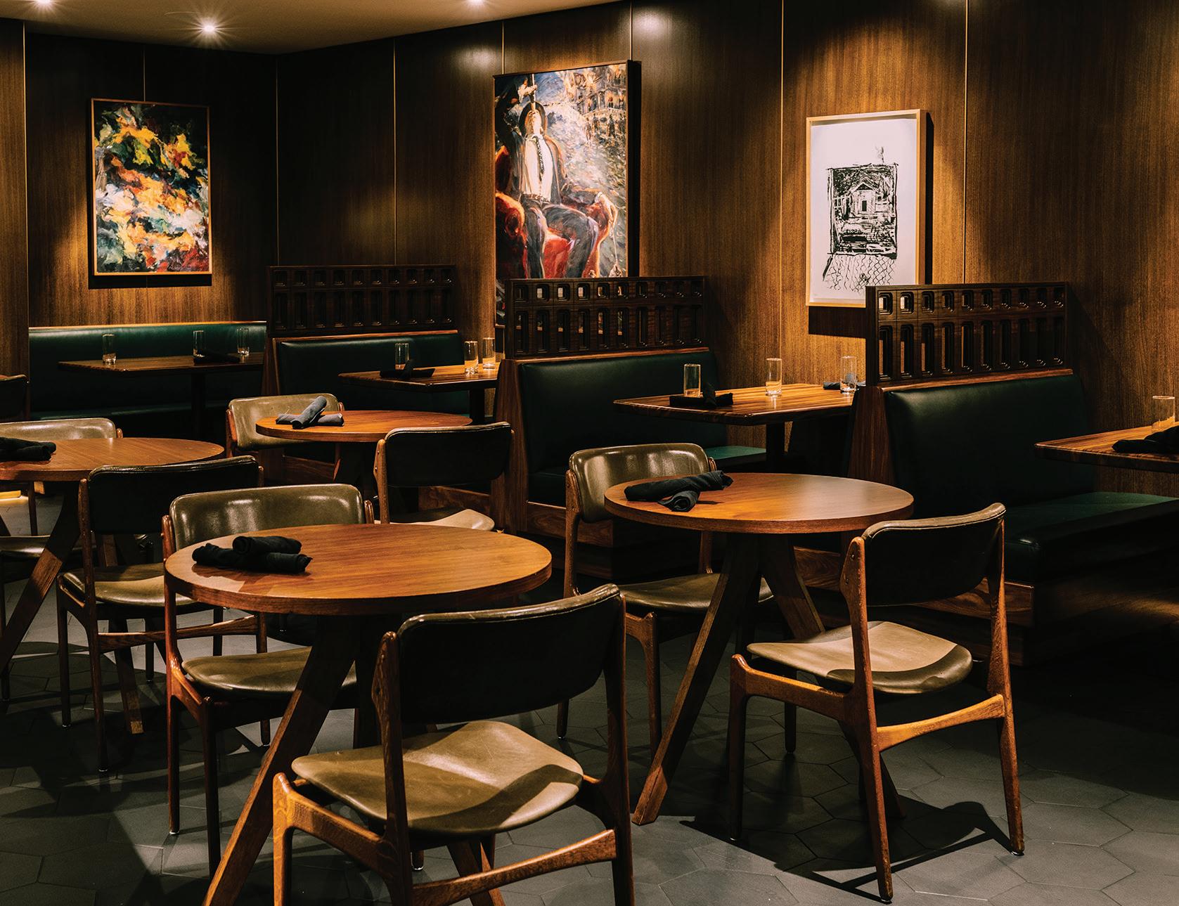
Inside it's a different story. There might still be comfortable banquettes where friends chat over chips and guacamole and craft cocktails, but the former Mexico City is nearly unrecognizable as Encanto. The warm supper club feel — thanks to elements such as custom Ipe wood wall panels and Indian limestone surfaces — makes for a fitting backdrop for the restaurant's contemporary Mexican food and beverage program.
The 24-seat oval bar topped with hand-forged pewter reflects Emmerson's focus on bespoke elements, while black nickel-plated bar stools from Amsterdam reveal his expertise in vintage furniture that he developed as the owner of the erstwhile Emmerson Troop furniture gallery on Beverly Boulevard. The art on display alone arguably merits a visit, with gems including works by Jasper Johns, Ellsworth Kelly, Charles Garabedian, and Peter Lodato. L.A. ceramic artist Alex Reed fabricated the installation that Emmerson dubs "The Great Divide."
Here, Emmerson's M.O. is "stealing from the past to make a timeless environment, and the ability to lose yourself within a space that's seductive and moody," he says of Encanto. In a trend-driven world of quickly dated restaurants, that takes a certain kind of magic. ■


LIDO ISLE'S DISTINCT CHARM AND DENSITY IS THE IDEAL SETTING FOR BRANDON ARCHITECTS AND ERROL DEJAGER'S CONTEMPORARY TWIST ON A TRADITIONAL WATERFRONT RETREAT

BUILDER: BRANDON ARCHITECTS
DESIGNER: ERROL DEJAGER
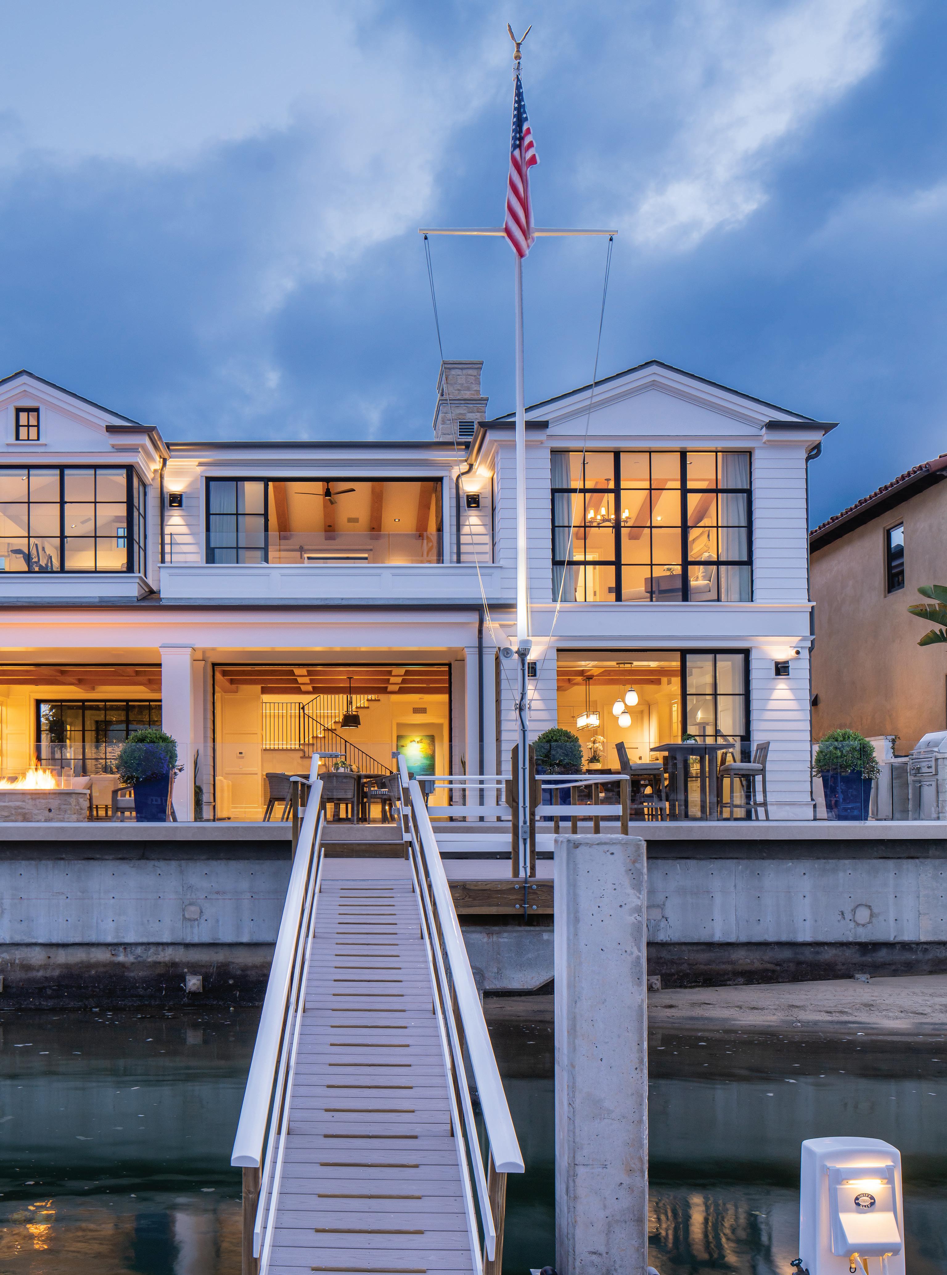
Constraints often lead to creative resourcefulness. Such is the case at the home on Lido Isle in Newport Beach that Brandon Architects designed in collaboration with interior designer Errol Dejager. That said, the team started with a good challenge that nonetheless required navigating HOA regulations and design guidelines. The approximately 60-foot-wide lot "is one of the larger lots on the island," explains Brandon Architects project manager Caitlin Smith, who worked closely with firm founder Christopher Brandon on the project. So, the designers set out to devise an alternative to the sideoriented entrances typically seen in the neighborhood that would bring a degree of intrigue and enhance the welcoming feeling at this waterfront oasis.
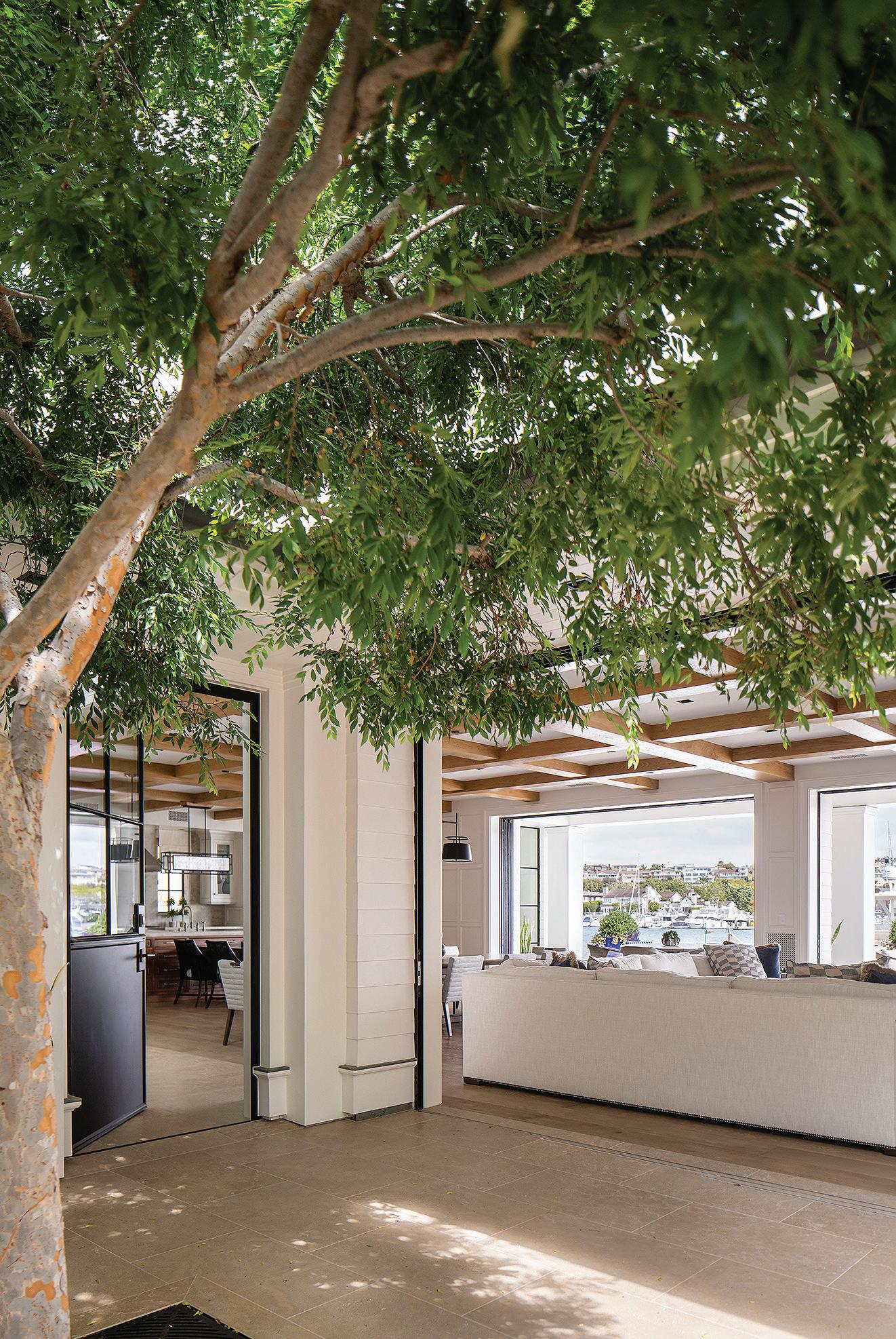
The resulting landscaped serene entry courtyard allows the layout to "to get that indoor-outdoor flow," Smith says. Costa Mesabased Brandon Architects, who have built multiple residences on
Lido Isle and are well versed with its HOA regulations, also sought "to maximize that water frontage," she adds. The 5,600-square-foot house is firmly anchored on its site, yet has a lightness that echoes the symbolism of the waterfront setting. To support the client and his family's passion for boating and entertaining in their weekend home, water is always in view. This main draw starts from the courtyard approach where Euroline steel and glass pocketing doors bring the outside in, and vice versa.

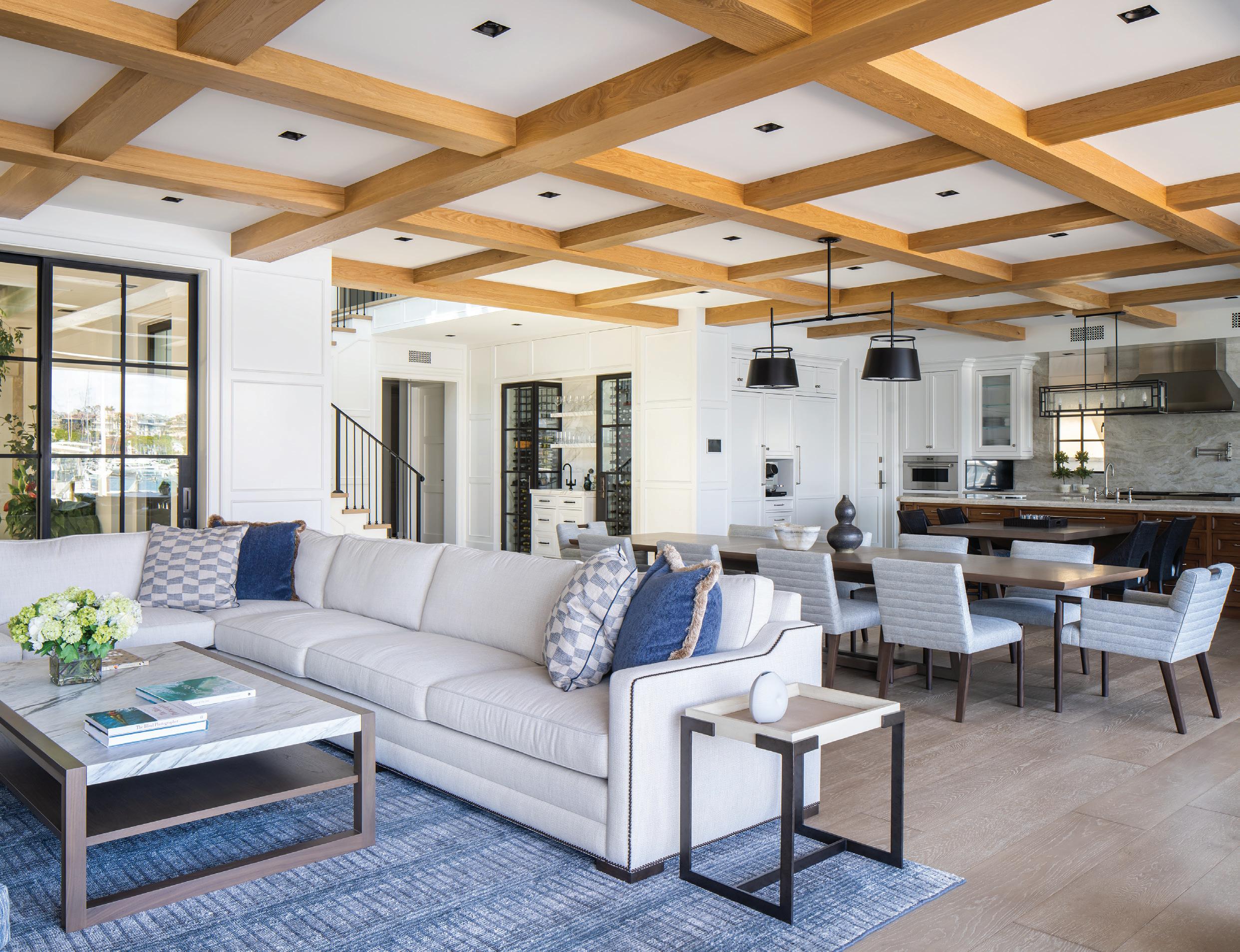
"The gist of it is everything has to be kid-friendly and as user-friendly as we could make it," Dejager explains. The home is envisioned as a relatively quiet retreat from Los Angeles, so the furniture is comfortable, calm, and neutral, with soft gray and blue accents to reference the most notable natural feature situated just outside the walls. With five bedrooms and six-and-a-half bathrooms, Dejager's touch dials the spacious interior volumes
k The great room stylishly and comfortably supports large gatherings of family and friends. Interior designer Errol Dejager says everything had to be extremely "kid-friendly and as user-friendly as we could make it"
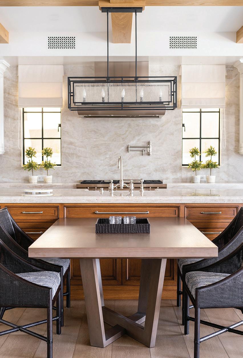
i Kitchen counters and backsplashes are Perla Venata quartzite from Ollin Stone
i The waterfront vistas dictate sight lines throughout the home
THE HOME IS ENVISIONED AS A RELATIVELY QUIET RETREAT FROM LOS ANGELES, SO THE FURNITURE IS COMFORTABLE, CALM, AND NEUTRAL, WITH SOFT GRAY AND BLUE ACCENTS TO REFERENCE THE MOST NOTABLE NATURAL FEATURE SITUATED JUST OUTSIDE THE WALLS
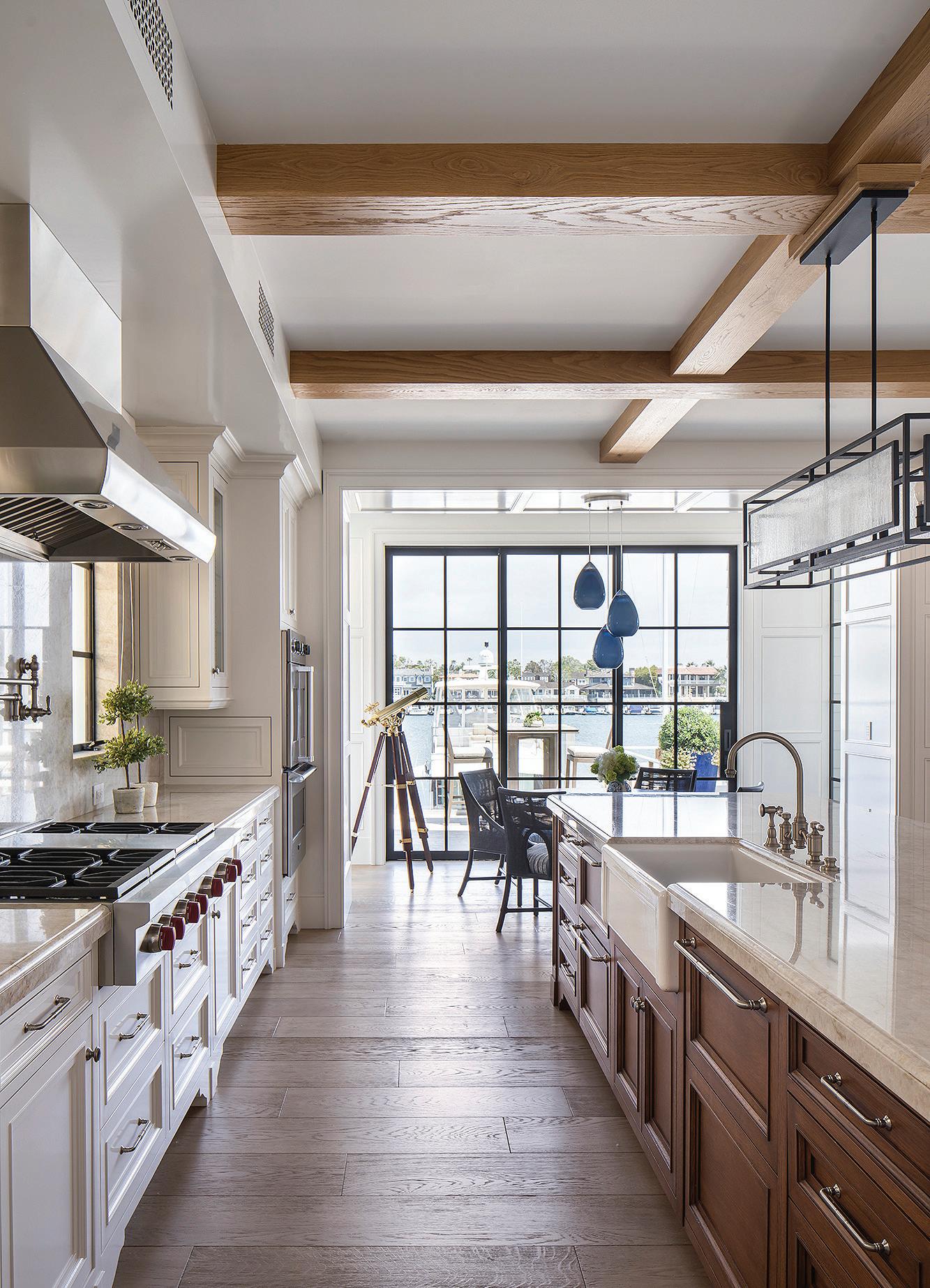
down into a human scale. Interior paneling in the foyer, for instance, helps achieve this goal.
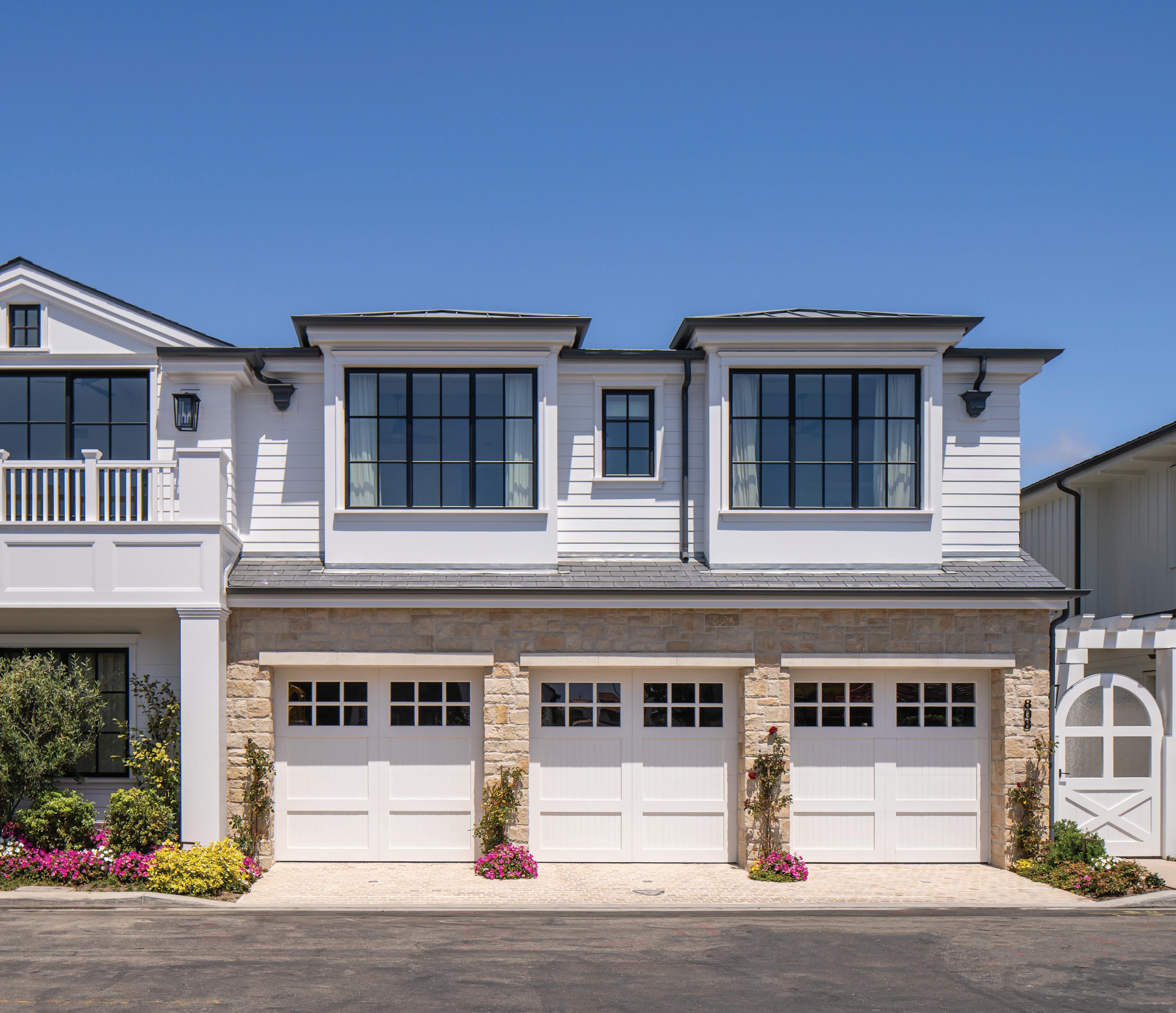
"I always like to have a sense that the interior relates to the exterior," says the designer, who maintains studios in Newport Beach and Beverly Hills. "Hopefully there's a flow between the interior and exterior with finishes, and in terms of color and tone." The street-facing elevation contains a three-car garage and stone cladding to add earthy texture to the contemporary updating of a traditional beach house aesthetic, and landscaping to soften the interface with the street.
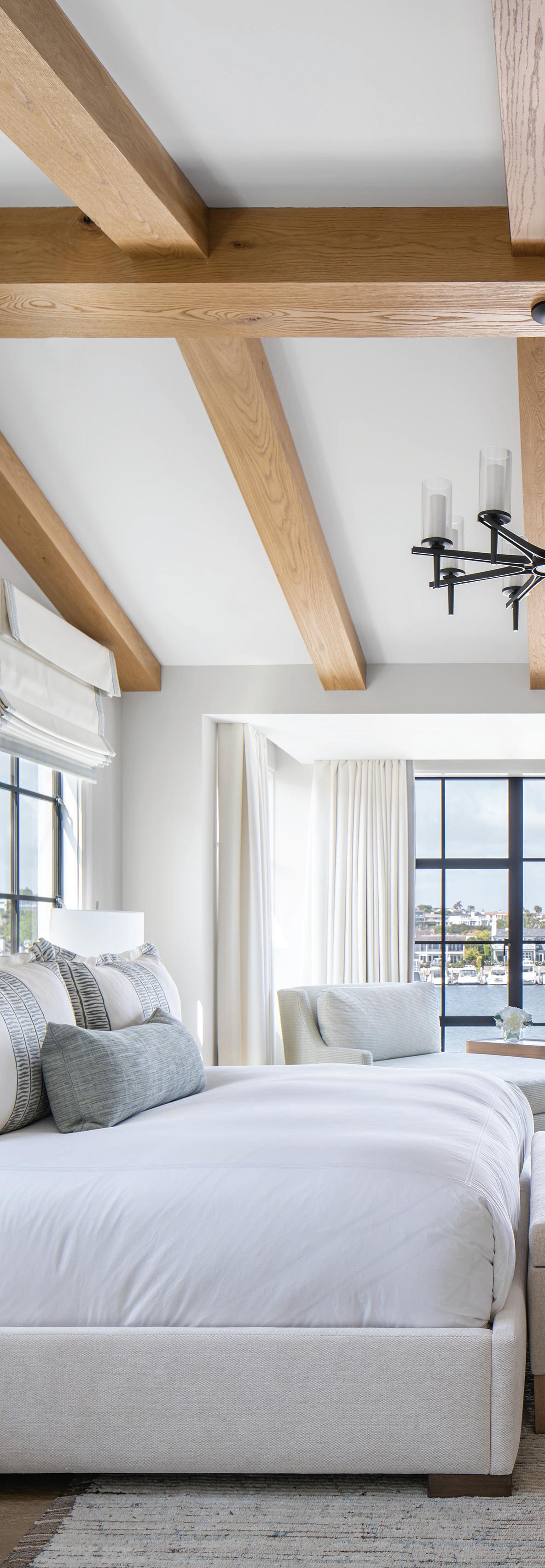
Inside at the ground level, the brief included providing the family with the ability to entertain as many people as possible. A graciously hospitable gesture begins in the foyer, where a wine cellar and wet bar stand opposite the entrance and help establish a very inviting setting, Smith notes. This ethos continues throughout the downstairs great room, which extends the width of the parcel and embraces the channel views. A custom white sectional sofa upholstered in Perennials Fabrics is sized for the large room, and two families can easily fit around the Altura dining table in the center of the space that's warmly accented with contrasting wood beamed ceilings. "The paneling unifies the whole space," Dejager says. The open kitchen and roomy Taj Mahal quartzite-topped island means many cooks can be in the kitchen, plus a butler's pantry tucked behind the wine cellar adds to the efficiency. The owners' pets even have their own domains, with a nook integrated beneath the stairwell and a dedicated dog run.
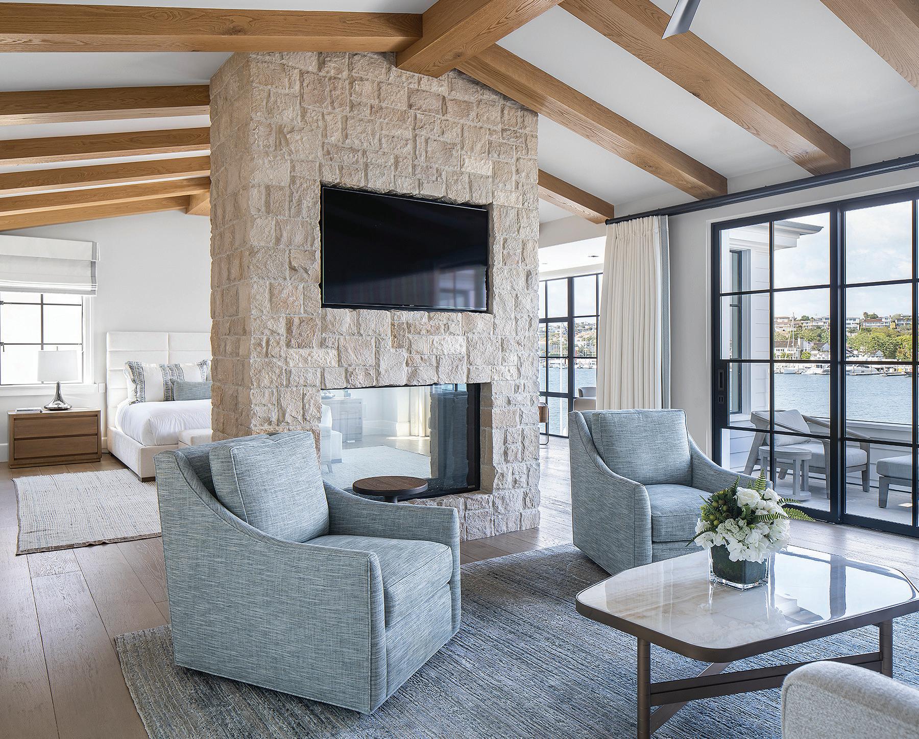
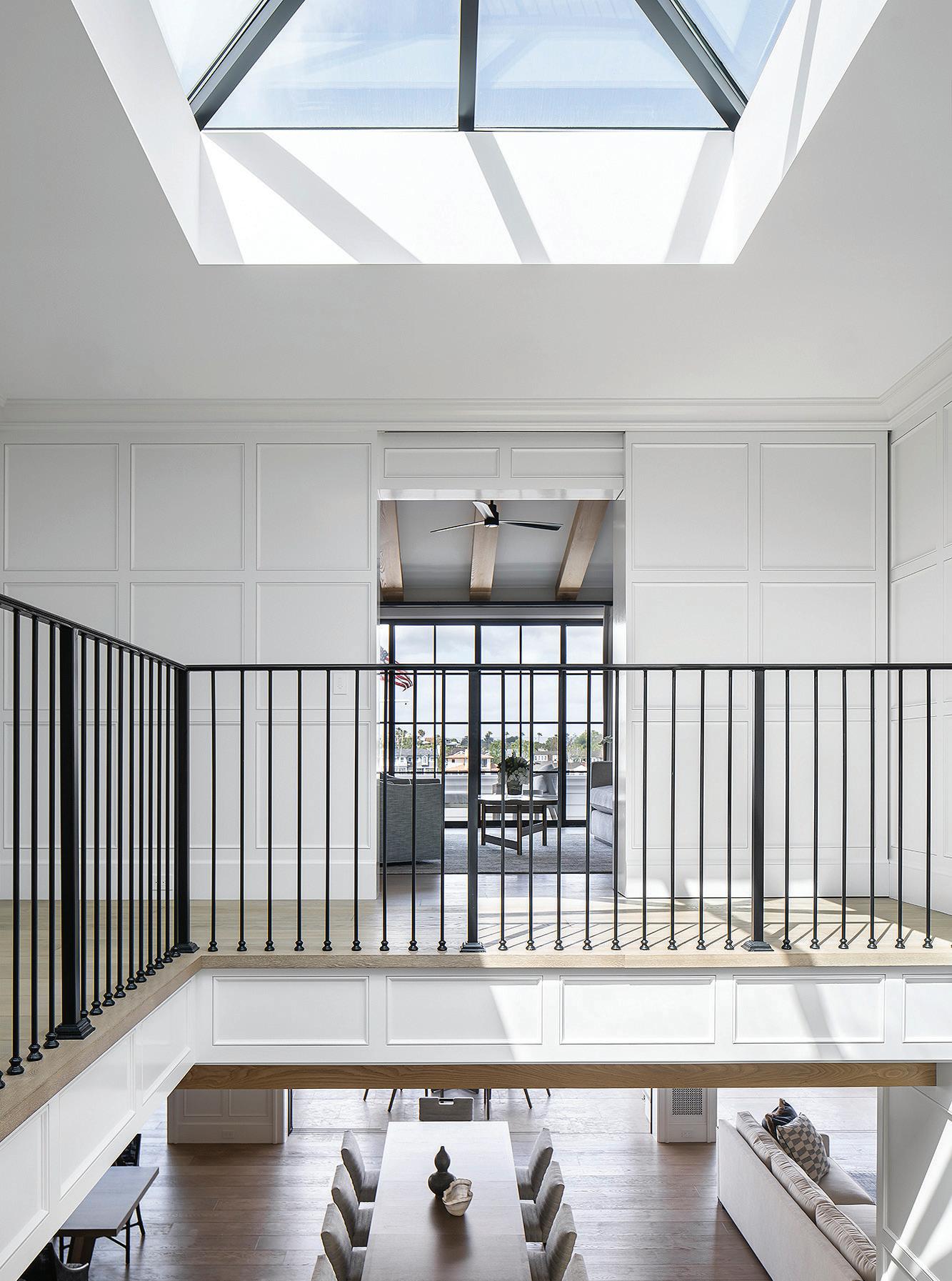
Natural light is a constant presence throughout thanks to the large skylight above the stairwell. A paneled sliding door camouflaged into the wall at the top of the stairs conceals the dramatic primary suite, which holds separate zones and ample privacy while allowing for family warmth and comfort. A fireplace separates the bedroom from the lounge area beneath a vaulted ceiling, which opens up to a balcony boasting stunning views. His-and-her bathrooms designed in contrasting styles are situated on either side of the suite, and the channel vista from the gym's slightly projecting bay
NATURAL LIGHT IS A CONSTANT PRESENCE THROUGHOUT THANKS TO THE LARGE SKYLIGHT ABOVE THE STAIRWELL
j Beamed cathedral ceilings enhance the airy openness of the primary bedroom, which is anchored by a custom bed frame upholstered with Pierre Frey's Fidji fabric
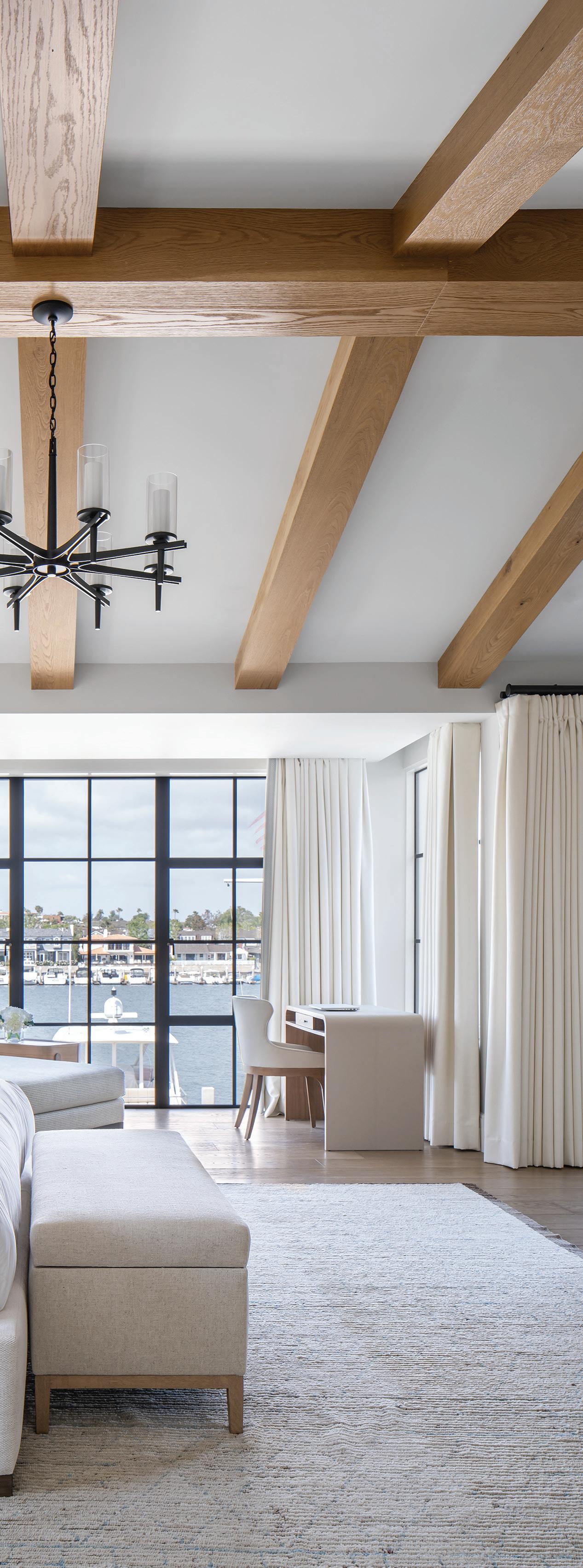
kkA stone-clad fireplace separates the primary bedroom from the lounge area, which offers sweeping views of Newport Bay and beyond
k "I always like to have a sense that the interior relates to the exterior," Dejager says. Wood paneling in the foyer and stairwell is an example of this design approach, and a pocket door neatly camouflages the primary suite entrance
lThe relatively larger Lido Isle lot meant the Brandon Architects team could get creative with the site planning. A courtyard centered around a mature elm tree leads to the home's entrance that also immediately introduces the view, while fully pocketing doors maximizes indooroutdoor flow

window makes exercise far more pleasurable.
Lido Isle has its own unique type of relaxed waterfront density, so it's fitting that the clients wanted to maintain that casual feel, "so friends and family can use the house without it feeling overly done," Smith says. In lieu of a conventional yard, outdoor waterfront areas are furnished and outfitted to gather at all times of day and seasons, complete with cooking amenities, a dining table, and fire pit. The dock is a mere stone's throw from the house, too, so a boat ride is always a distinct possibility. Figuring out whether to watch the sunset while cruising out to Newport Bay or sitting on the home's patio is an enviably tough choice with only right answers. ■
Furniture: dining table and chairs
- Restoration Hardware (West Hollywood, CA)
Lighting: chandelier and sconces
- Restoration Hardware (West Hollywood, CA)
Window Treatment: drapery panels - Restoration Hardware (West Hollywood, CA)
Furniture: vanity stool - Williams Sonoma (Los Angeles, CA)
Hardware: Restoration Hardware
(West Hollywood, CA)
Mirror: lighted - Modern Mirrors (modernmirrors.com)
Wall Covering: York Wall Coverings (York, PA)
ENTRYWAY
Lighting: chandeliersRestoration Hardware (West Hollywood, CA)
Rug: Nourison (Saddle Brook, NJ)
Furniture: armchairs, whiteLulu and Georgia (Los Angeles,
CA); coffee table - Burke Decor (Los Angeles, CA); side tables
- Restoration Hardware (West Hollywood, CA); sofas, blue - CB2 (Los Angeles, CA);
Rug: Restoration Hardware (West Hollywood, CA)
Mirror: Delacora at Build with Ferguson (build.com)
Sink Vanity & HardwareRestoration Hardware (West Hollywood, CA)
Wall Covering: Schumacher, Pacific Design Center (West Hollywood, CA)
Furnitures: sofas - CB2 (Los Angeles, CA)
Lighting: nightstand lampsBurke Decor (Los Angeles, CA); sconces - Circa Lighting (West Hollywood, CA)
Rug: West Elm (Los Angeles, CA)
Stonework: fireplace surround - Stone Mountain Castings & Design (Draper, UT)
kThe approximately 60-foot-wide parcel accommodates a three-car garage and landscaping softens the street-facing elevation clad with stone and wood for a contemporary yet traditional feel
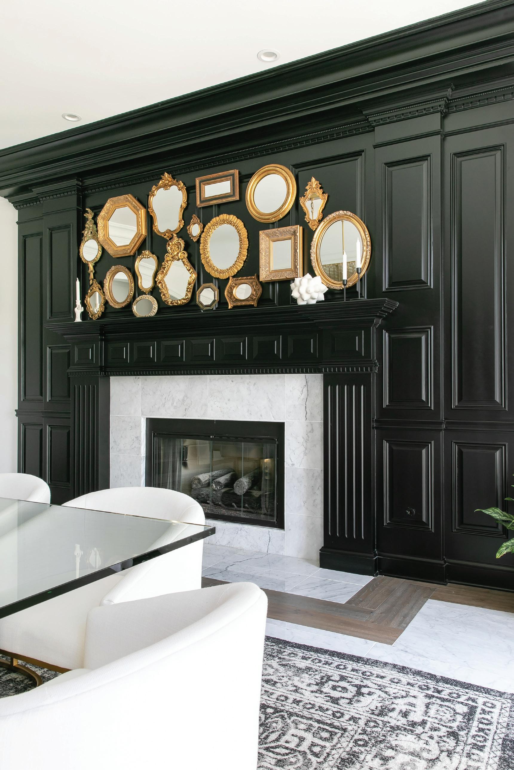
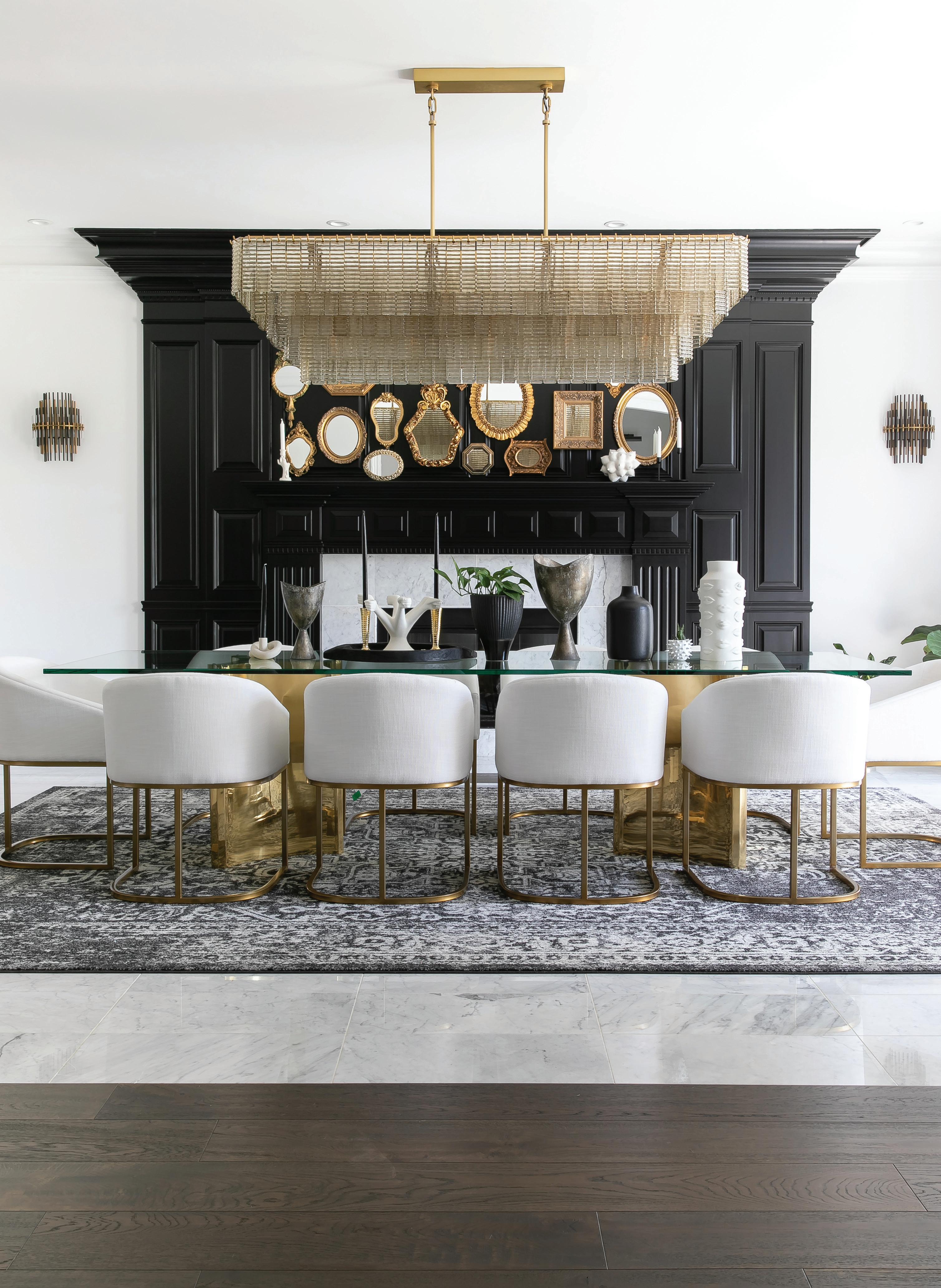 A black paneled fireplace wall creates drama and scale in the dining room
Designer Breegan Jane taps her own Central Valley roots to create an airy new home for a Bakersfield family
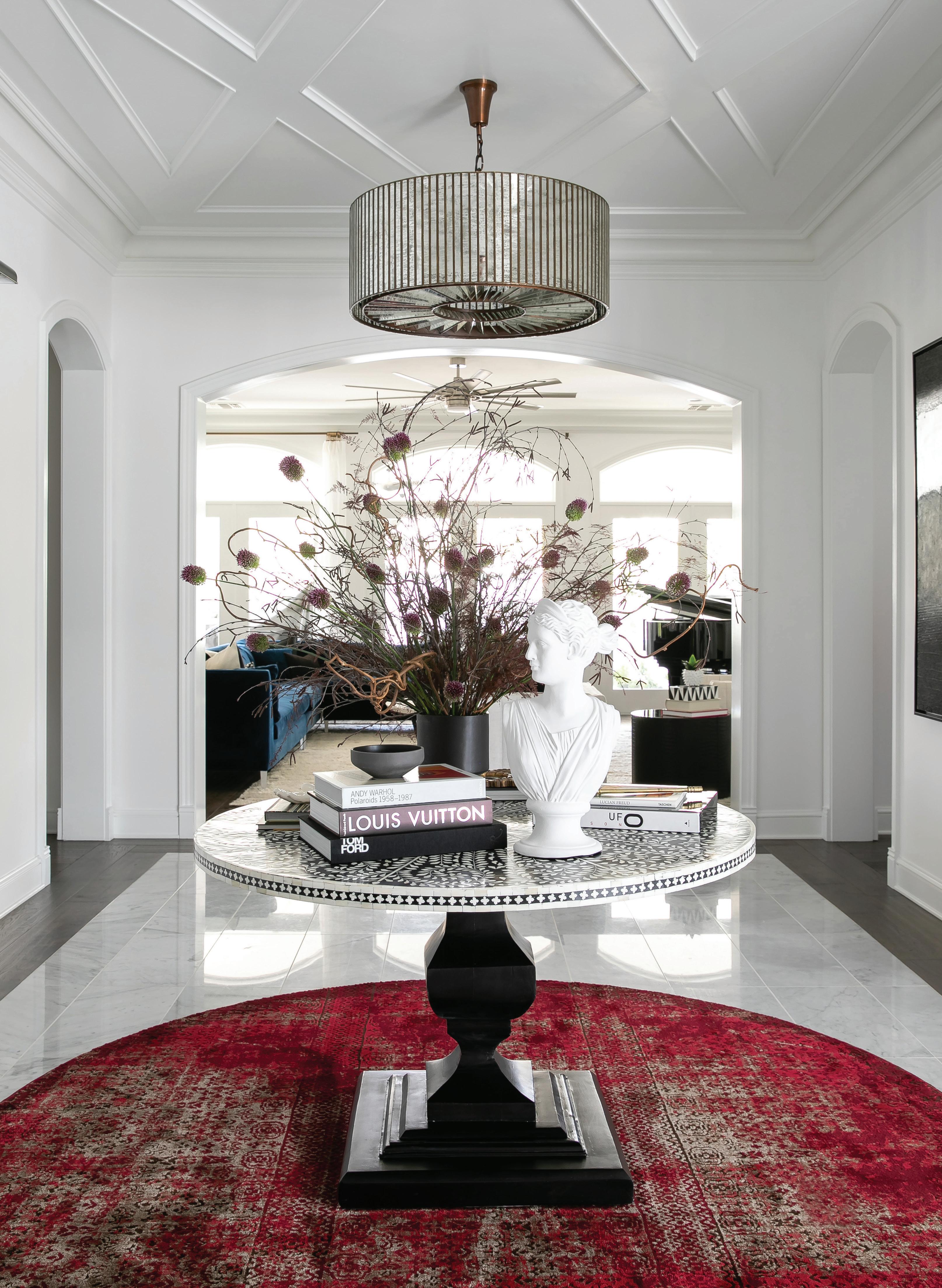
words MAILE PINGEL | images RYAN GARVINThe entry takes its cue from hotel lobbies, creating a welcoming tone that invites guests into the home
Gold accents— such as vintage frames fitted with mirrors—add sparkle to the primarily neutral spaces
my design clients and television work don’t usually overlap, but I met these homeowners through Extreme Makeover: Home Edition,” says L.A.-based interior designer Breegan Jane, one of HGTV’s most popular hosts. Her clients, longtime Kern County residents, run a healthcare business while juggling parenthood, and longed for a house that felt permanent.
"This couple has worked hard to make it, and this is their forever home,” Jane says. What she gave them are contemporary spaces with the spirit of a boutique hotel. “One of our signatures is approachable luxury,” explains Jane. “I’m often asked to do interiors with a traditional feel, but this couple wanted a twist, something young, fresh, and fun.”

But the project required the designer to frequently commute from her home in Los Angeles to Bakersfield, a drive that can run well over two hours each way. Far from complaining about the treks, the designer says she didn’t mind one bit. “My grandmother lived there, and I loved visiting her,” she recalls, wistfully remembering the property’s abundant apricot trees. “There’s such a sense of family and history in the Central Valley,” she says.“You get quieter communities and so much more space.”
Embracing the home’s generous proportions, Jane established a feeling of grandeur in the foyer, which boasts marble floors and crisp moldings, by employing one of her signature elements, the center table. (Expect to see one in the new Venice Beach home she’s currently designing for her own family.) “We’re emulating hotel design with a table and bouquet that say, ‘Come in!’” To “push the boundaries a little bit,” she added a bold strike of color with a red rug that reenforces the round shape of the table (an Etsy find) and the twin drum chandeliers that hang above it. A bust of the goddess Diana adds a classical, but playful note. “It’s a bold hello, but a welcoming hello,” says the designer.
To carry the resort-like feel into the entertaining spaces, Jane opted for white walls and a palette of black, cream, and gold, with only occasional moments of color, like the living room’s navy-blue sofas. “You want to come home and be able to decompress, and I find a clean color palette is the best way to get a serene feeling,” she says. The focused use of color and patterned textiles also draws guests further into the room. “That’s the power of striking accents. It doesn’t matter if your space is filled with bright colors or muted tones, incorporating beautiful additions like pillows or stunning hardware elevates the design and keeps it interesting."
A navy-blue sofa subtly shakes up the black and white palette and adds visual interest
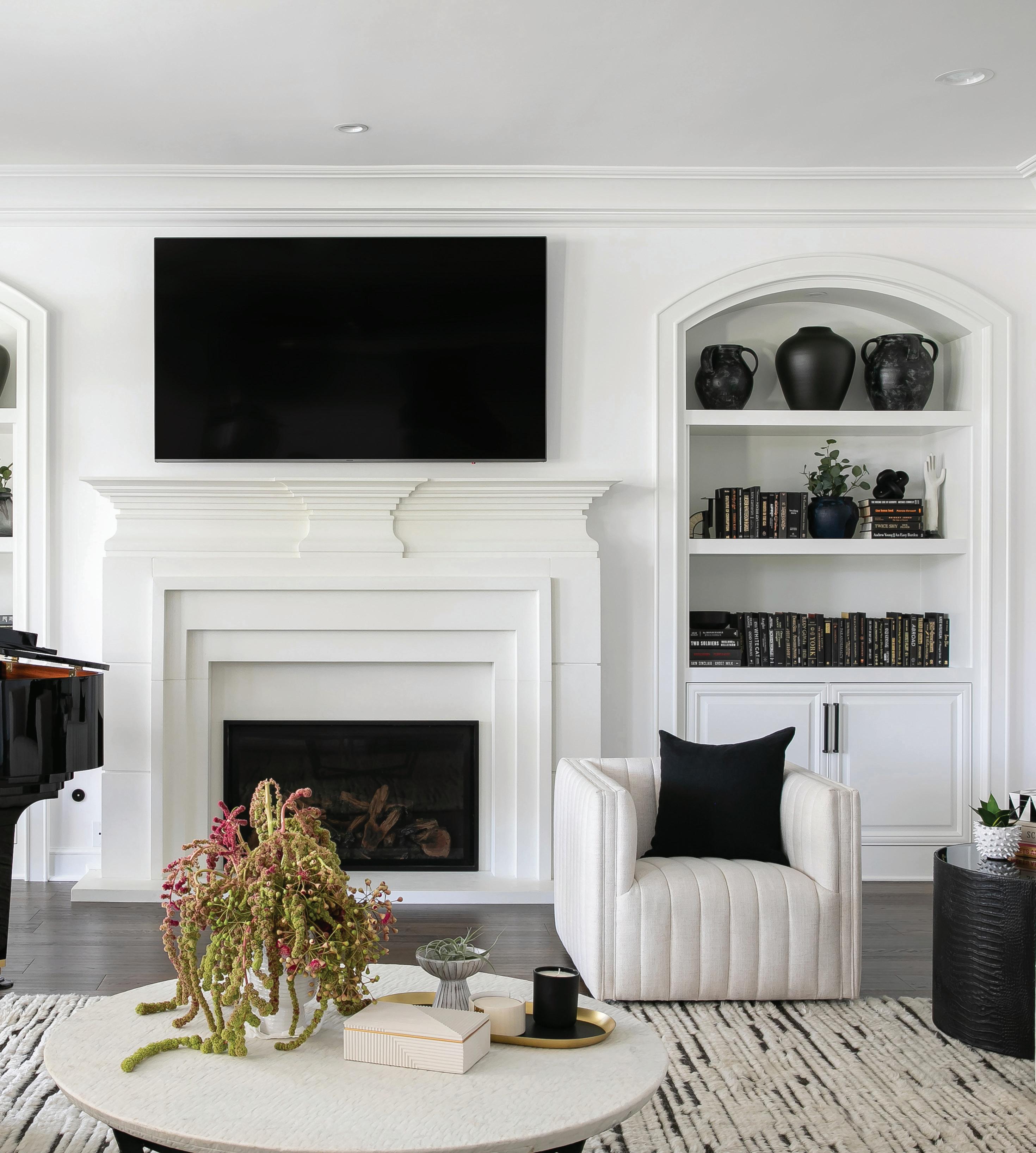
“You want to come home and be able to decompress, and I find a clean color palette is the best way to get a serene feeling,”
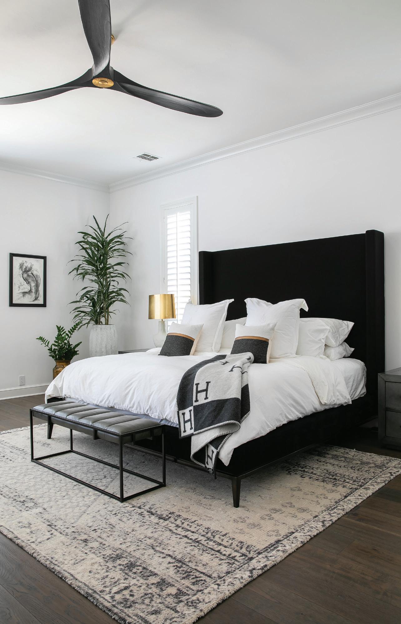
The clean lines of the primary bedroom’s furnishings create a calming, uncluttered feel
The living room is also home to the family’s grand piano. “They can be difficult to design around, but I always appreciate clients who have them,” she says. “It’s so nice when friends are over and someone sits down to play.”
The adjoining dining room was designed to be equally welcoming and alluring. “It took months to gather all of those gold frames,” Jane says, gesturing to the fireplace wall’s display of 17 unique mirrors. “They have an antique quality, but look fresh against the black paint,” she says. “With neutrals, my eye is always drawn to sparkle, and if you want to create visual movement in your space, adding metallic elements will almost always do the trick!"
To juxtapose the historic look of the paneling, Jane chose sleek barrel-back chairs and a glass-topped table, as well as a photorealistic figural work by Brussels-based artist Dan Laurentiu Arcus. In fact, helping the homeowners find artworks for the house was one of Jane’s favorite tasks. One of her go-to resources was the Los Angeles Public Library’s digital collection, which allowed her to search for subjects related to the project (in this case, vintage agricultural photos that she ordered, printed, and custom framed). But she also found many works on Chairish, including pieces by West Coast artists Kristina Rose Baker, David Orrin Smith, and Susannah Carson.
In keeping with the boutique hotel feel, Jane divided the large primary bedroom into two spaces, anchoring one side with a black velvet-upholstered bed and a figural painting by Yuri Pysar, and the other with white couches that flank the fireplace and television. “The lounge area creates a space to collect yourself; a place to sit comfortably other than the bed,” she says. She created a lounge area for someplace to sit comfortably other than the bed. Adjoining the room are the couple’s bathroom, walk-in closet, and a dressing area with a glamorous Art Deco-style built-in vanity. It’s an amenity that Jane, who returns to the small screen this spring with HGTV’s Dream Home, understands, adding simply, “I wanted the wife to feel like a superstar." ■
ENTRY
Accessories: Bunny Williams Diana bust - Ballard Designs (Atlanta, GA)
Furniture: bone inlay floral dining table - Etsy (etsy.com)
Lighting: Vitti mirrored drum chandelier - Restoration Hardware (West Hollywood, CA)
Rug: round karma - Rugs Direct (rugs-direct.com)
Accessories: ceramic vase and pot, pure black - West Elm (Los Angeles, CA), sourced by HERE Design & Architecture (Los Angeles, CA); ceramic vase with handles - Trouva (trouva.com); Joshua vase, black - Pottery Barn
(Los Angeles, CA), sourced by HERE Design & Architecture (Los Angeles, CA); matte terracotta vase - Terrain (Century City, CA)
Furniture: Decker right arm sofa, blue - CB2 (West Hollywood, CA); Felix round coffee table
- Burke Decor (Los Angeles, CA); Roz swivel chair, whiteLulu and Georgia (Los Angeles, CA); I-beam round side table
- Restoration Hardware (West Hollywood, CA); Berkeley glass side table, black - Bellacor (Minneapolis, MN)
Rug: Morse hand knotted wool - Restoration Hardware (West Hollywood, CA)
Artwork: prints - Bay Photo Lab (Scotts Valley, CA)
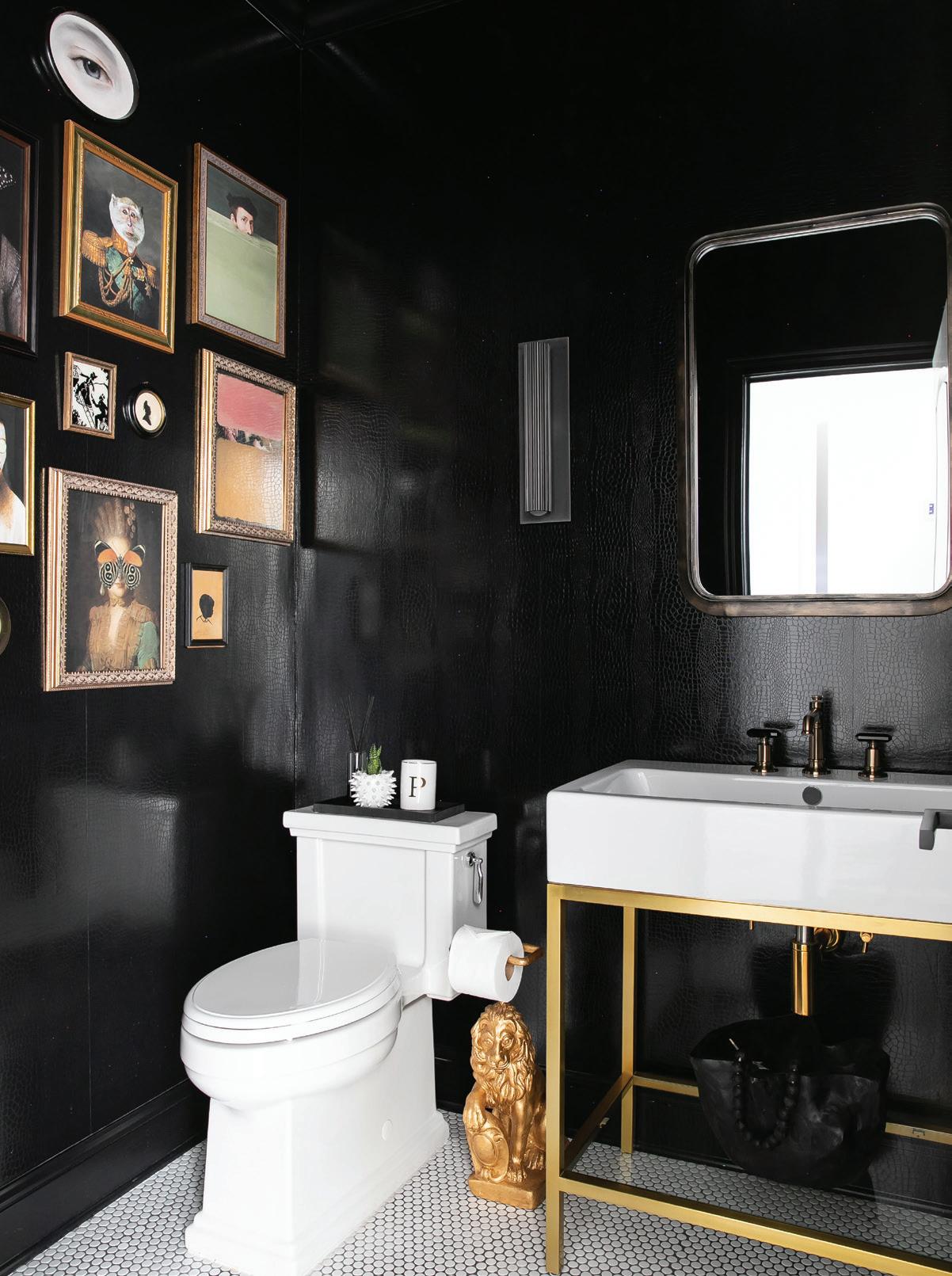
Fixtures: Hudson metal console, universal contemporary water supply kit, and universal contemporary P-trap, aged brass - Restoration Hardware (West Hollywood, CA); lavatory faucet, luxe gold - Invari by Brizo (Indianapolis, IN)
Lighting: Devenport sconce, bronze - Restoration Hardware (West Hollywood, CA)
Mirror: Delacora rectangular urban distressed, dark bronzeOverstock.com
Wallcovering: crocodile 3D embossed - Wayfair (wayfair.com)
Artwork: oil painting by Dan Arcus, Artfinder (artfinder.com)
Furniture: Dalton rectangular
dining table, brass with glass - Restoration Hardware (West Hollywood, CA); Emery barrelback slope fabric armchair, burnished brass and white, RHModern, (West Hollywood, CA)
Lighting: Sirene linear chandelier, brass with smoked glass; Convessi linear chandelier, bronze/lacquered burnished brass; and Emile sconce, burnished brass - Restoration Hardware (West Hollywood, CA)
Rugs: Kazak runner, red and cream - Rugs.com; Dacula modern abstract,l silk, ivory/gold - Wayfair (wayfair.com)
Window Treatment: raw silk rod-pocket, natural - Restoration Hardware (West Hollywood, CA)
Artwork: oil painting by Yuri PysarArtfinder (artfinder.com)
Furniture: Curvo sofa, nomad snow - CB2 (Los Angeles, CA)
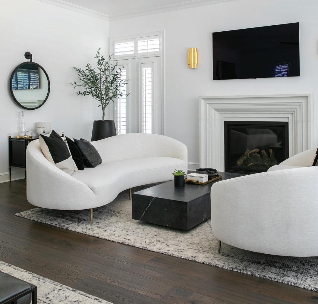
Lighting: table lamps, white base and brass shade - Burke Decor (Los Angeles, CA); Arabelle sconce, gild - Circa Lighting (Los Angeles, CA)
Mirror: Cru cast aluminum, aged blackBurke Decor (Los Angeles, CA)
Rugs: distressed Ensi, stone white - West Elm (Los Angeles, CA)
Stonework: Essex fireplace mantel, alabaster - Stone Mountain Castings & Design (Draper, UT)
Artwork: oil paintings and drawings by various artists - Chairish (charish.com)
Cabinetry Hardware: Lambeth crystal hexagonal pulls, glass and brass - Restoration Hardware (West Hollywood, CA)
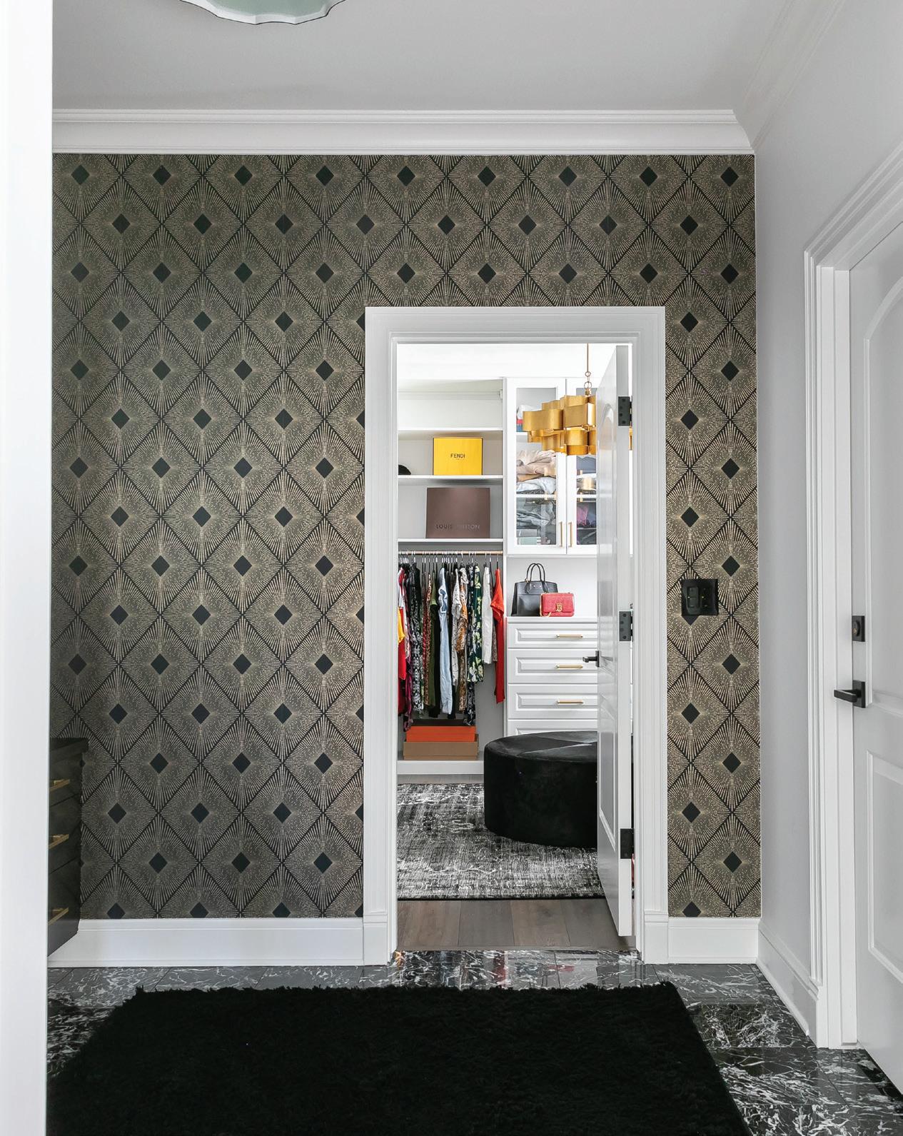
Furniture: acrylic stool with black linen seat - William Sonoma (Los Angeles, CA)
Lighting: wit pendant, aged brass - Tech Lighting by Sean Lavin at Circa Lighting (West Hollywood, CA); grand lotus chandelier, antique gold - Shades of Light (Richmond, VA)
Mirror: Luna round lighted bathroom vanity - Modern Mirrors (modernmirrors.com)
Rug: Moroccan runner, cotton and woolEtsy (etsy.com)
Wallcovering: York “Harlowe NW3593,” black and gold - DecoratorsBest (decoratorsbest.com)
The
iA vestibule between the primary bedroom and the closet now features a built-in vanity
lThe primary bedroom’s sitting area and fireplace reflect the boutiquehotel spirit of the home’s design
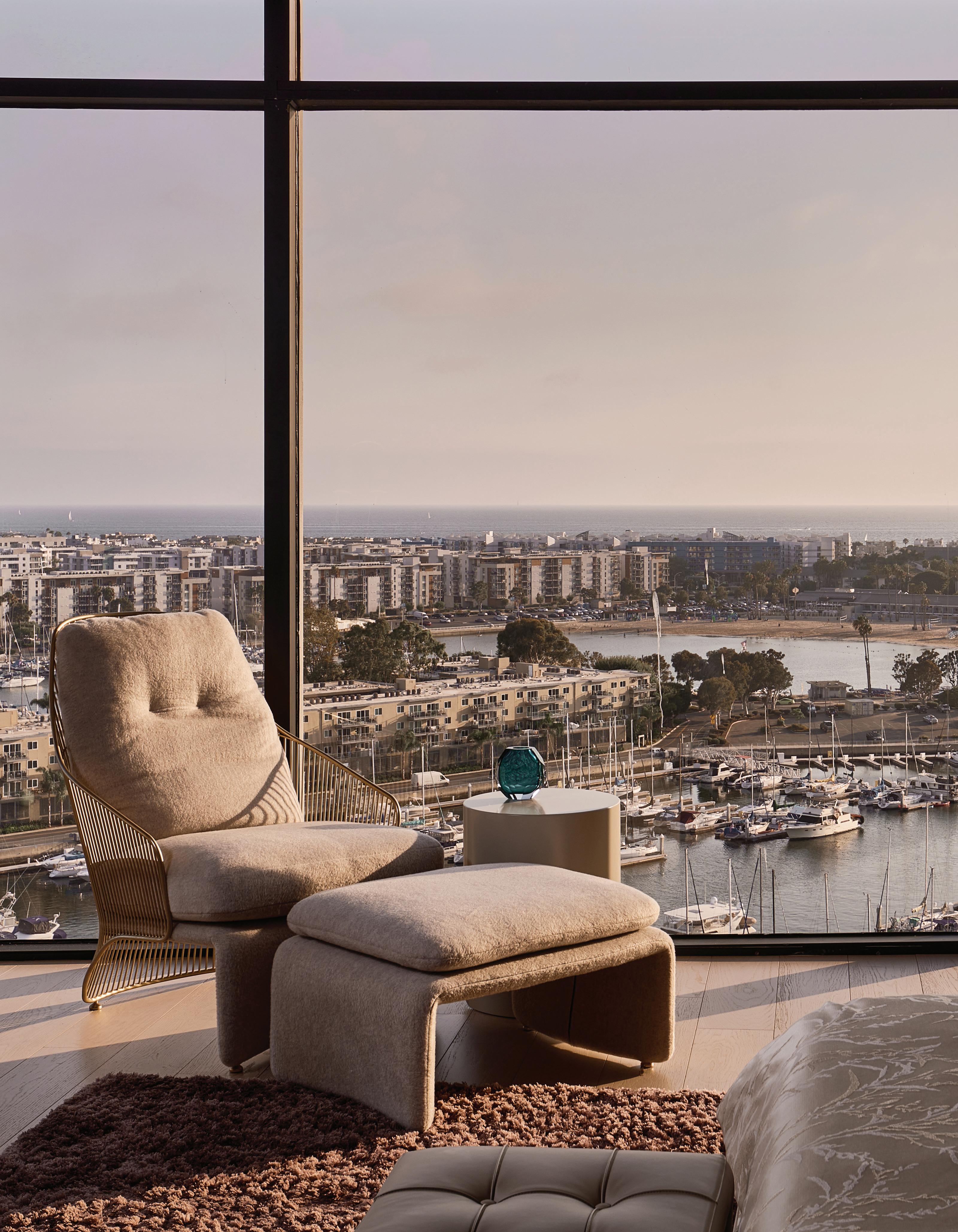
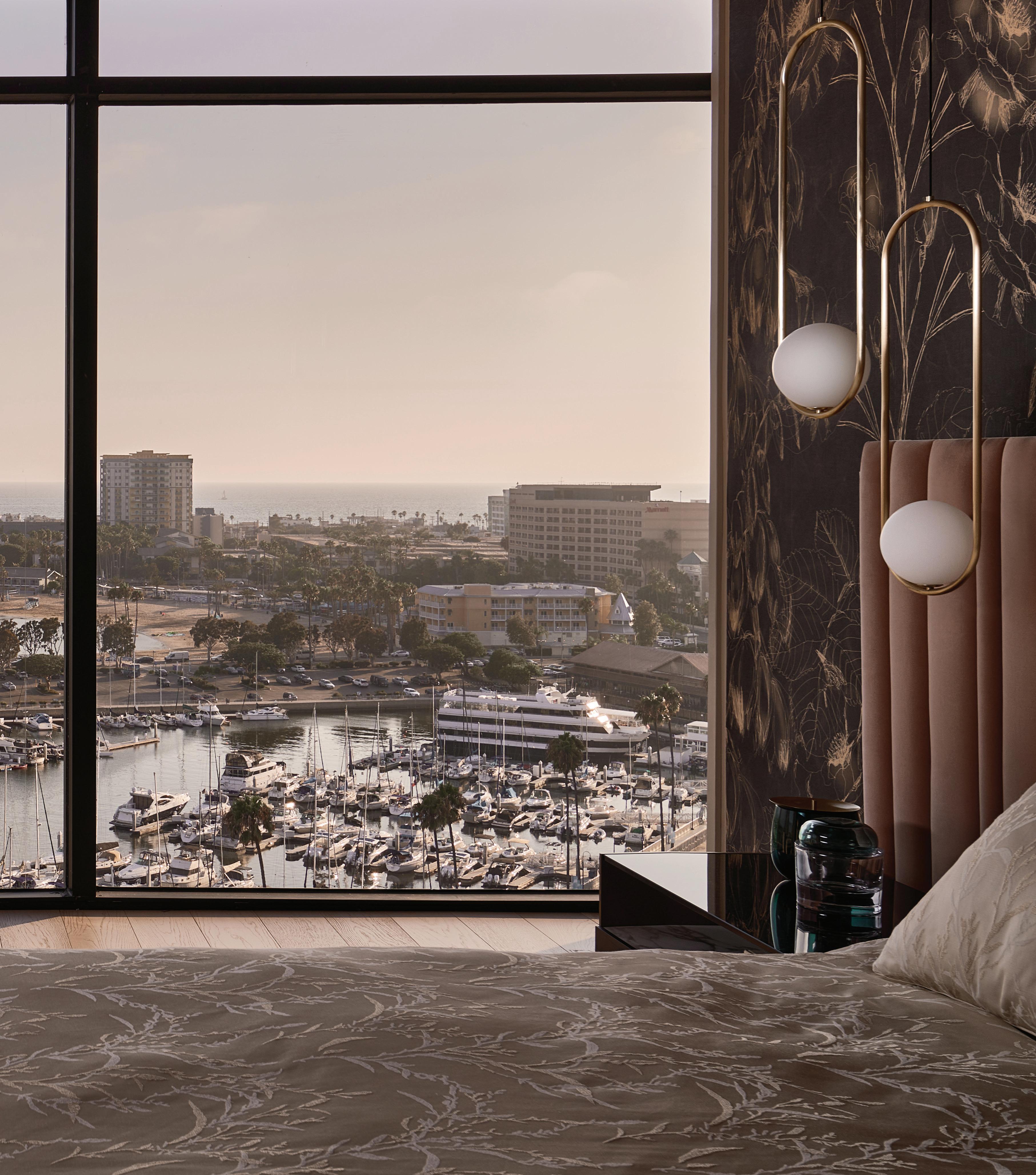
“These towers were here before everything else existed in the marina area,” say Vince Dwyer and Stephanie Jesman. The duo represent MASS Beverly, a firm launched in 2014 by Mary Ta, founder of the Minotti Los Angeles showroom, and Lars Hypko, an expert in the application of highend custom furniture systems. Both Ta and Hypko also contributed to this project.
Inside, a contemporary aesthetic prevails. The spacious, semi-open plan was made possible by the conversion of a neighboring penthouse, effectively doubling the square footage. The project, which took 18 months to complete, was a carefully considered process where each detail, from furniture to lighting, was carefully considered. One of the biggest challenges was capturing the homeowner’s diverse taste and references. “Although she likes modern, she is very eclectic and wanted
a soft, feminine appeal,” remembers Dwyer. “It is a different-than-typical aesthetic and was an exciting challenge.”
The intention was to create an environment that would uniquely represent the owner in a space that is both an invitation to entertain and a haven of peace. “The client was definitely our inspiration,” says Jesman. “We looked to her personal affects, how she dresses, her personality, and where she is from—India.”
The designers used a diverse mixture of materials including brushed brass, glass, onyx, and metal. “We have many layers in suede, mohair, and velvet,” describes Dwyer. “They reflect a sense of luxe the owner likes, with a sophisticated edge.”
Pieces of furniture and lighting by brands distributed by MASS Beverly adorn the spaces, which blend European sensibility and the American lifestyle, as well as artisanal methods and technology.
In the living room, a GTV Design sofa and Minotti armchairs surround a Gallotti&Radice coffee table with a
When the panorama is grandiose outside, the only way to keep attention inside is to create interiors that are just as eyecatching. This is exactly the challenge facing the designers of this two-story, five-bedroom penthouse located in the Marina City Club Towers. Built in 1963, both buildings boast breathtaking views of the harbor and the ocean beyond.
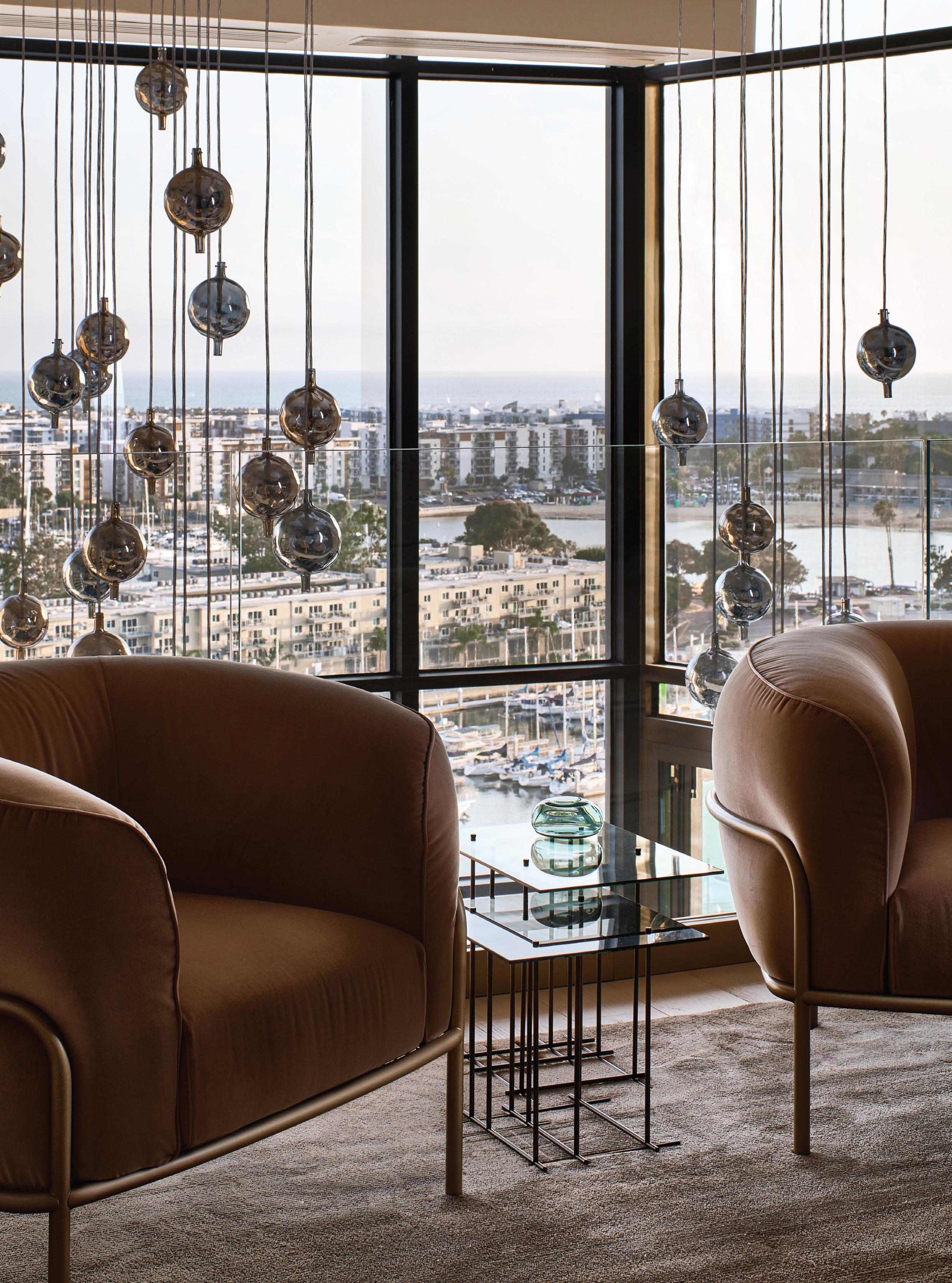 j The penthouse offers spectacular views of the harbor and the ocean
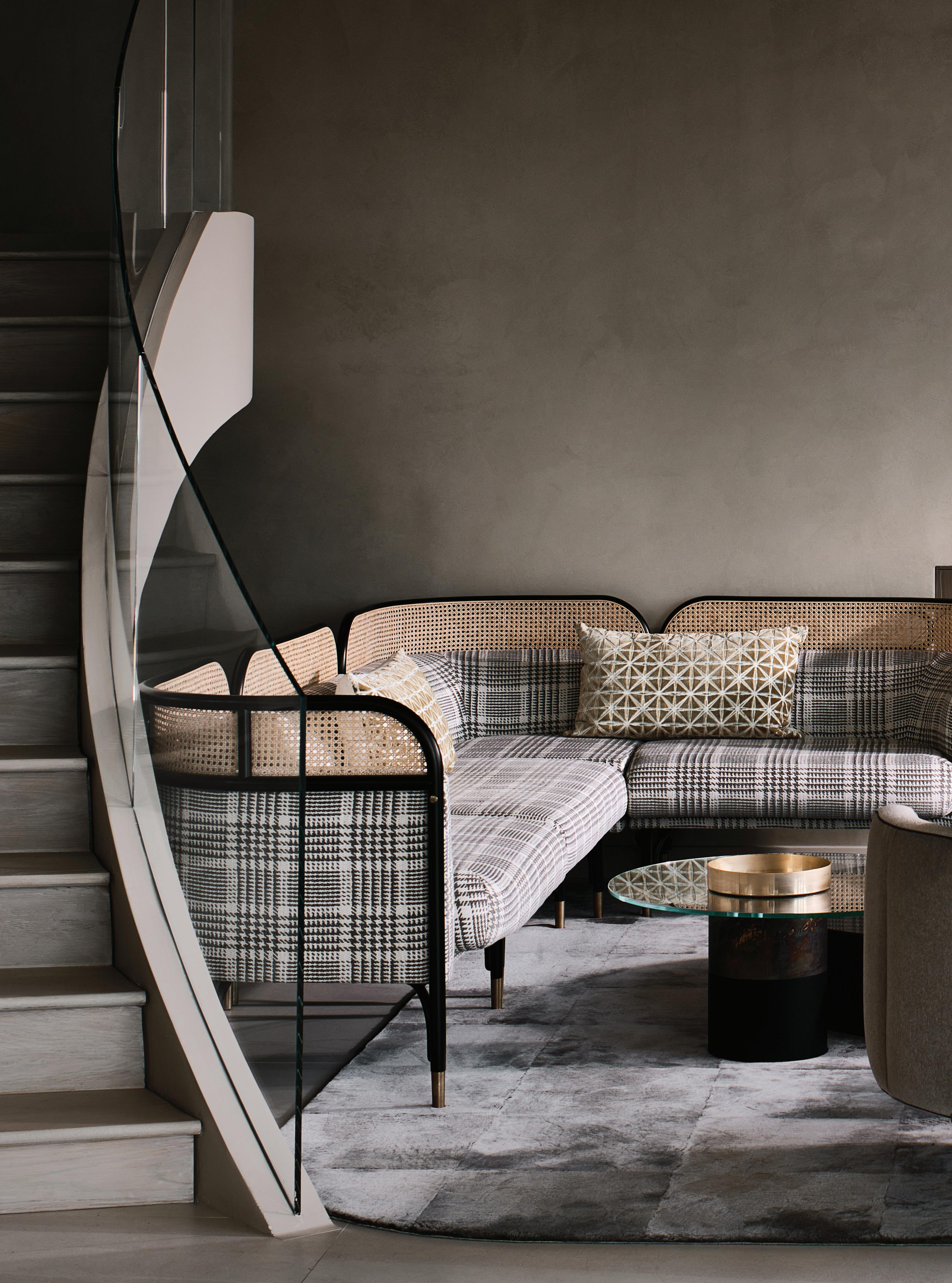
In
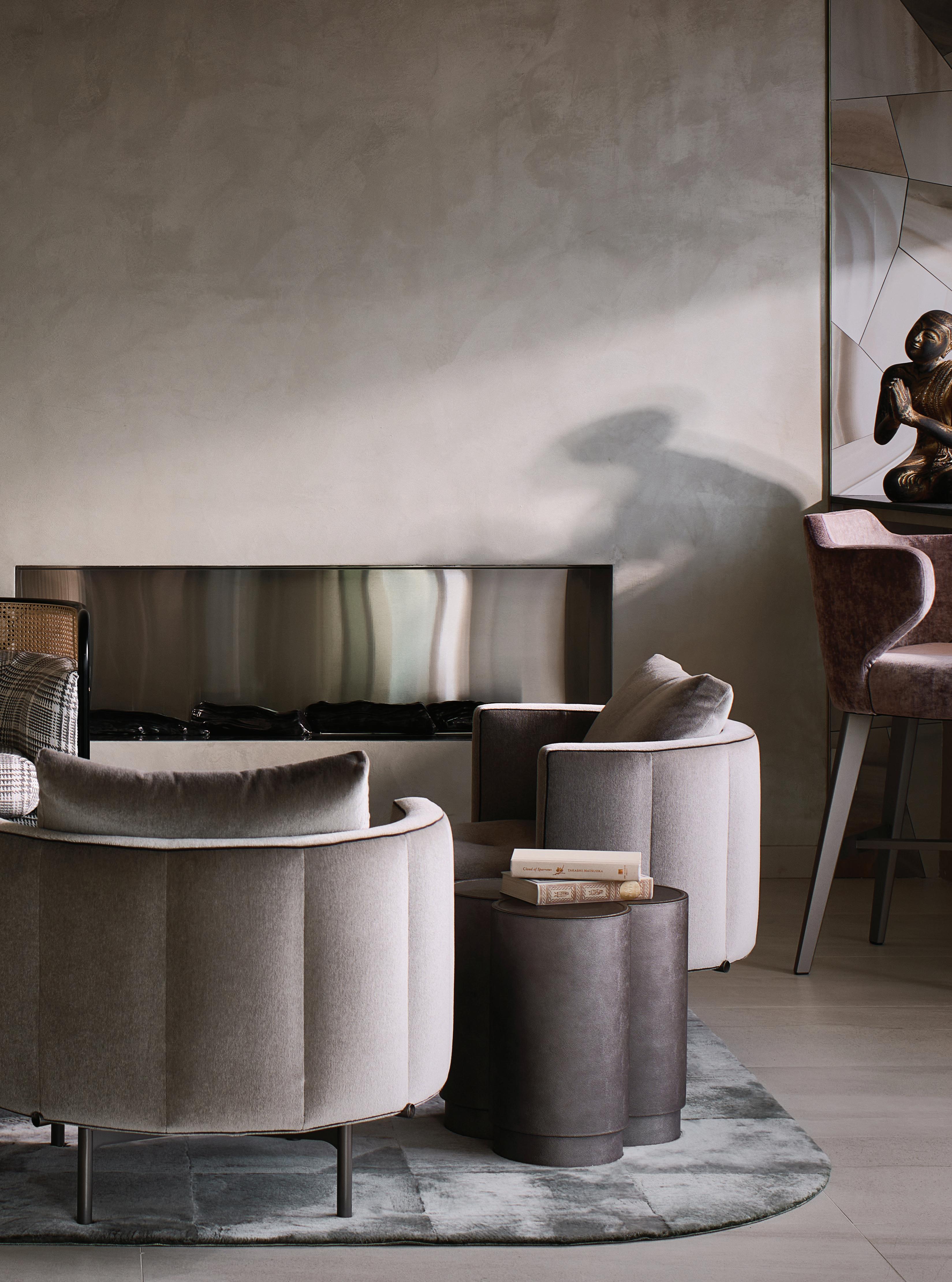 the living room, a GTV Thonet sofa and Minotti armchairs combine with a Gallotti&Radice coffee tablete
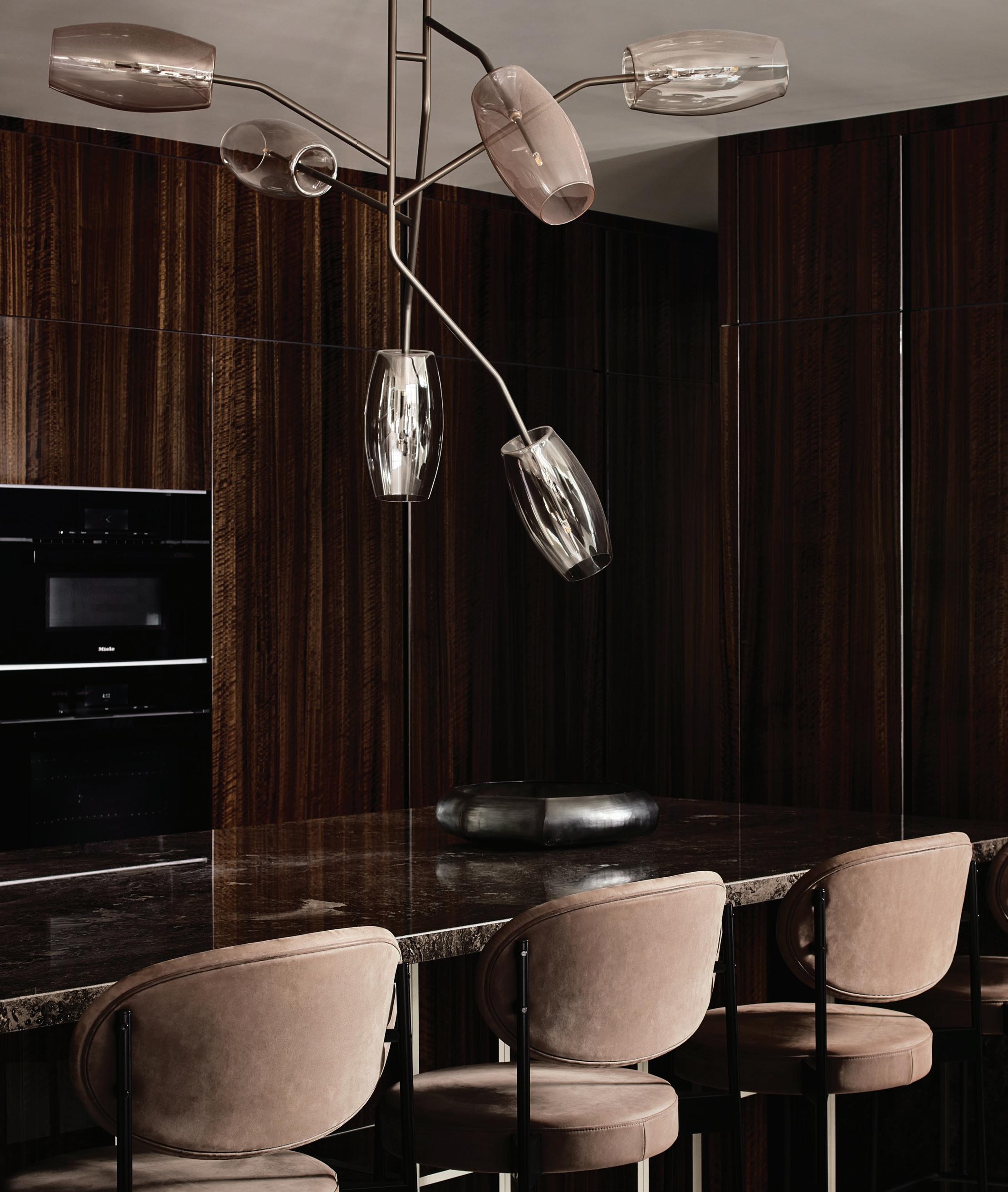
side table by Giobagnara. The kitchen was outfitted with Henge bar stools meant for casual breakfasts or evening cocktails in front of the island, illuminated by eye-catching Melogranoblu hanging light fixtures.
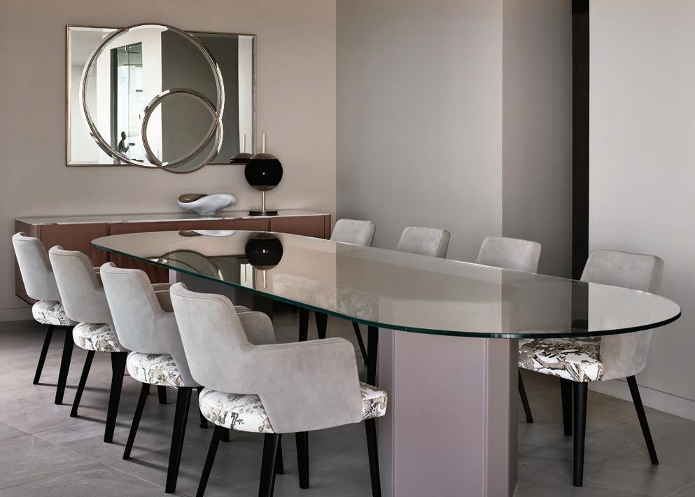
In the dining room, bright tones were paired with complimentary black accents and furnished with a Minotti console as well as Gallotti&Radice chairs and table to anchor the center of the space. Double-height ceilings mean plenty of natural light to illuminate the Rimadesio shelving, geometrical Florim wall tiles, Melogranoblu lights, and Ernestomeda cabinetry. The main bedroom, on the other hand, is more subtle, though still full of personality. Here,
n The dining room is furnished with Gallotti&Radice
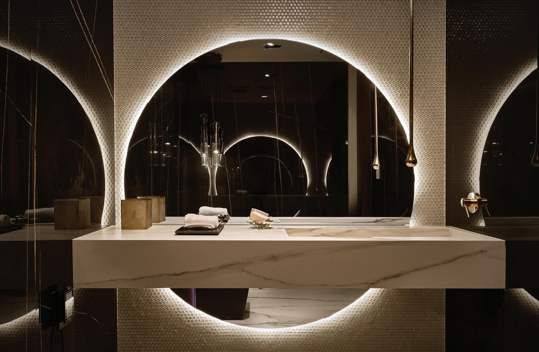
iIn the bathroom, the mirror is by Antoniolupi, the bathroom sink is by Florim, the faucet is by Gessi, and the light pendant is by Gallotti&Radice
Wall&Deco wallpaper, a Matthew McCormick light, and Minotti chair and ottoman are the stars of the show. In the bathroom, an Antonio Lupi mirror plays with light and shadow.
In terms of color, the homeowner’s love for gold, purple, and pink guided the final selection. “We gave her champagne, rose gold and amethyst tones,” say Dwyer and Jesman. “She didn’t want it to feel like it was old, but new modern with a classic feel.”
Bringing this apartment to life also involved a search for balance between the creative minds who collaborated along the way. “What was fun is that my design partner on this project, Stephanie Jesman, and I have very different aesthetics,” notes Dwyer. “[While] being the man I [introduce something more] feminine [into] my design whereas Stephanie can have a very masculine edge. The client really liked the way we worked together and how we were able to harmonize our visions to create the space of her dreams.” ■
BAR Cabinetry: Ernestomeda (Montelabbate Pesaro PU, Italy)
Lighting: Melogranoblu (Grassobbio BG, Italy)
Plaster: Metropolis by Ivas (San Mauro Pascoli FC, Italy)
Shelving: Rimadesio (Giussano MB, Italy)
Tiles: Florim (Fiorano Modenese MO, Italy)
Fixtures: faucet - Gessi (Anaheim, CA)
Lighting: pendant - Gallotti&Radice (Cermenate CO, Italy)
Mirror: Antonio Lupi (Cerreto Guidi FI, Italy)
Sink: Florim (Fiorano Modenese MO, Italy)
Accessories: sway bowlSkLO, (Healdsburg, CA)
Furniture: consoleMinotti (West Hollywood, CA); dining table and chairs - Gallotti&Radice (Cermenate CO, Italy)
Lighting: table lightNahoor (Collebeato BS, Italy)
Mirror: client’s own
KITCHEN
Furniture: bar stoolsGebrüder Thonet Vienna (Vienna, Austria)
Lighting: Gallotti&Radice (Cermenate CO, Italy)
Furniture: armchairs - Minotti (West Hollywood, CA); coffee table - Gallotti&Radice (Cermenate CO, Italy); side table - GioBagnara (Genova GE, Italy); sofaGebrüder Thonet Vienna (Vienna, Austria);
PRIMARY BEDROOM
Furniture: bedGallotti&Radice (Cermenate CO, Italy); bench - Porada (Cabiate CO, Italy); chair and ottoman - Minotti (West Hollywood, CA); tables - Misuraemme (Mariano Comense CO, Italy)
Lighting: Mathew McCormick at Minotti (West Hollywood, CA)
Rug: Carpetlinq at Studio Piet Boon (Oostzaan, Netherlands)
Wall Covering: Wall&Deco (Cervia RA, Italy)
Tucked away in the Santa Clarita Hills stands a three-story home designed with a masterful mix of modern lines, bold accents, and family functionality

the connection between him and the homeowner of this Spanish-inspired home was electric from the get-go. McClain, the creative director and CEO of his eponymous interior design studio, remembers their first meeting fondly. “The family was so gracious, open, and willing to embrace all this home and life could offer,” he says.
Built in 1985 and spread over three levels, the 2,930-square-foot, four-bedroom property is the primary residence of a professional lawyer, her teenage daughter, and their beloved pets. McClain and his team were after a grand transformation, which meant a renovation that spanned almost a full year.
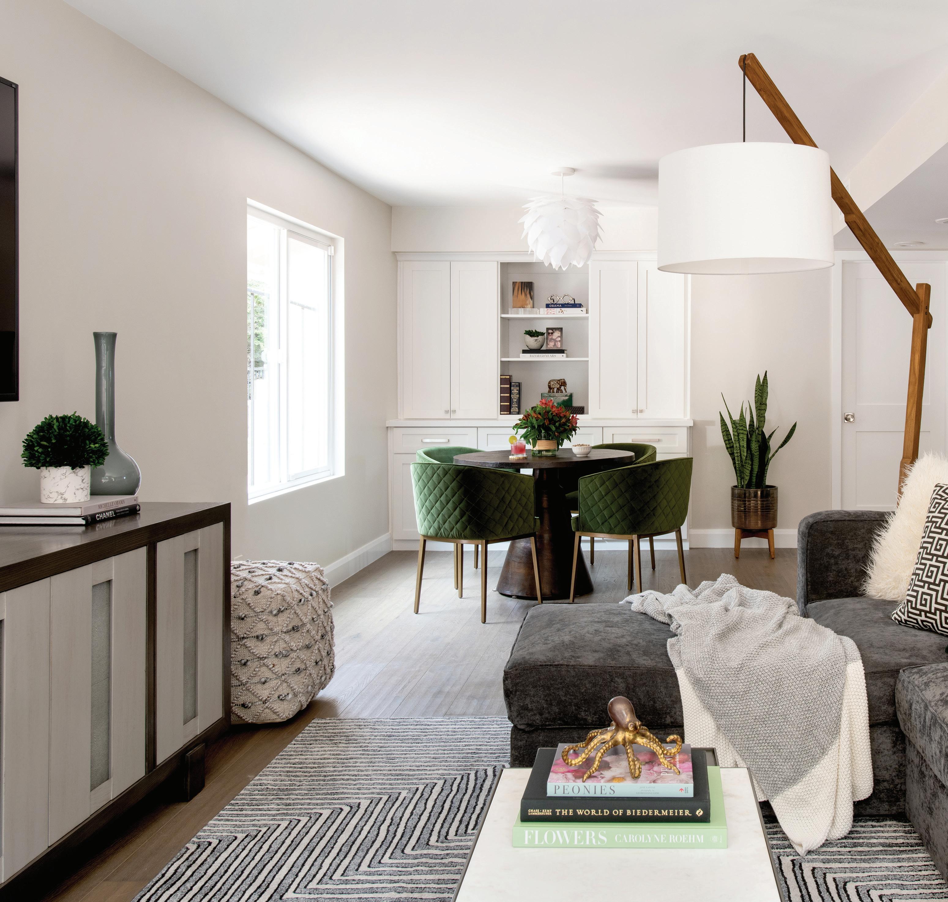
“Every space and surface was addressed,” says McClain. “One of our greatest challenges was the sheer number of levels. The original layout had a total of seven levels, including three floors, two sunken living spaces, and two elevated areas. We were able to fill in the two sunken spaces to create a far more functional and open living space.”
These changes have completely modified the way mother and daughter live in the different areas, especially the main living and the light-filled dining areas. Considered the heart of the home, the kitchen — which comprises plenty of cabinets — also went through a complete overhaul.
Aware that the family wanted to live freely in the new space, McClain was determined to use materials he deems “indestructible.” “There was zero need for anything delicate or

Aware that the family wanted to live freely in the new space, McClain was determined to use materials he deems “indestructible.”
“There was zero need for anything delicate or precious,” he says
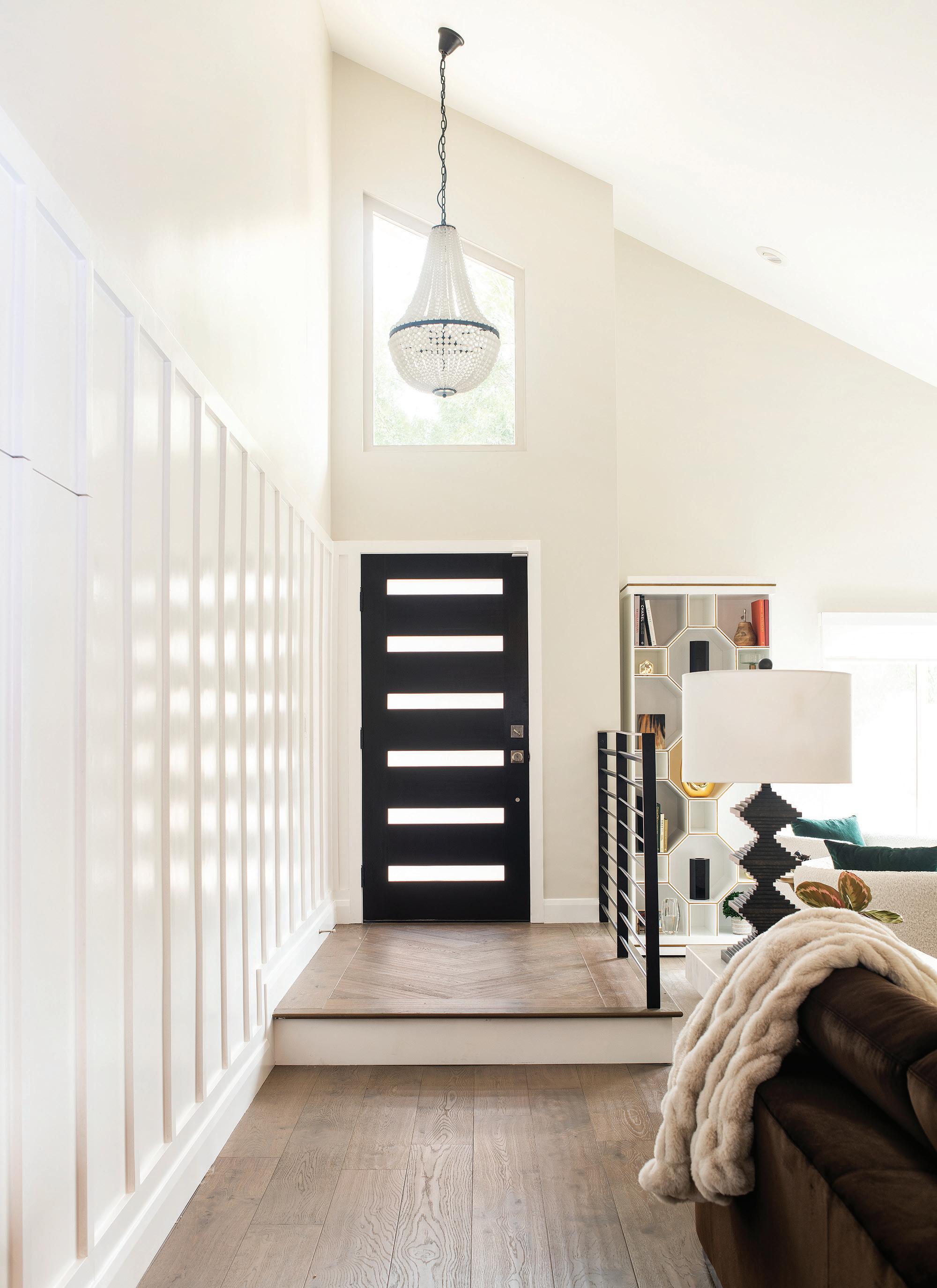
As you enter the Foyer, board and batten wall details hide a secret coat closet, and guests are welcomed by a brushed glass chandelier from Noir
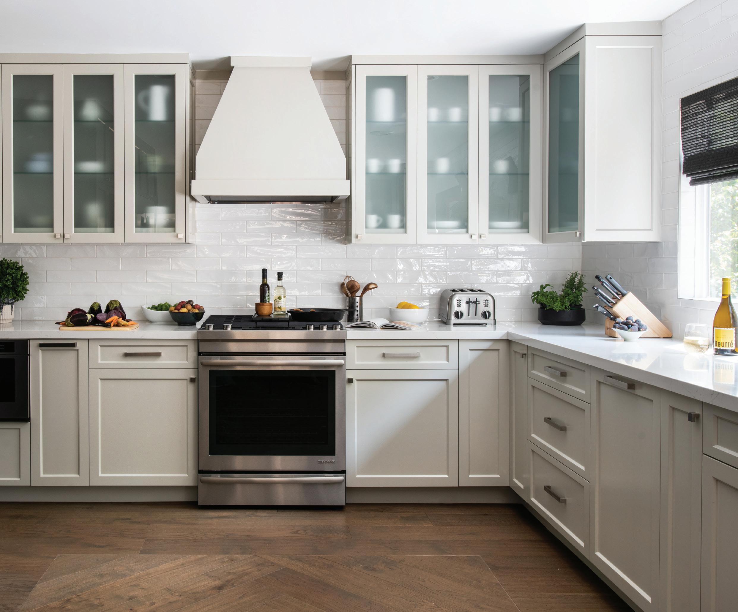
kThe kitchen went through a complete overhaul. Custom cabinetry is painted in a grey finish and shows just a hint of what lies within through frosted milk glass
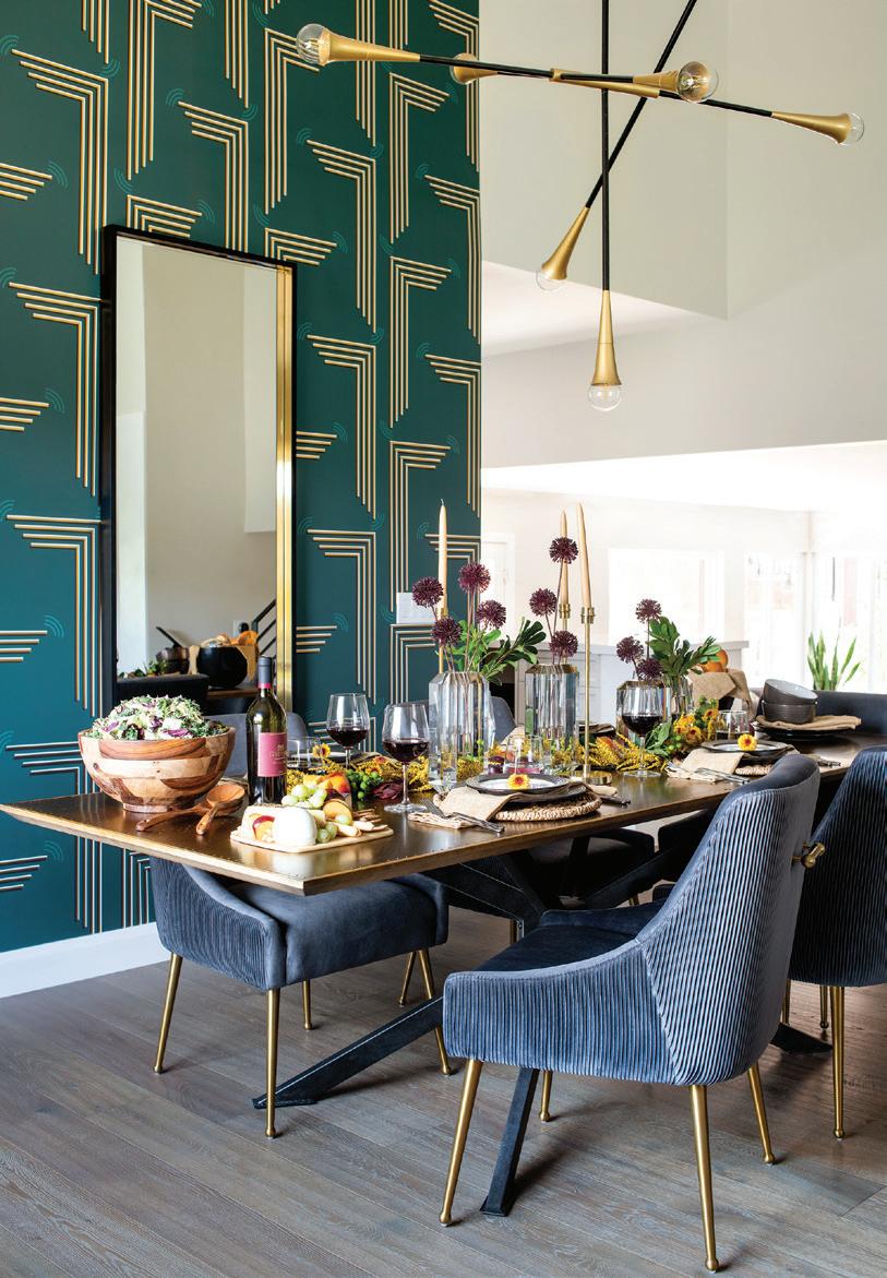
jjA striking green accent wall pulls together the rest of the dining room’s design elements
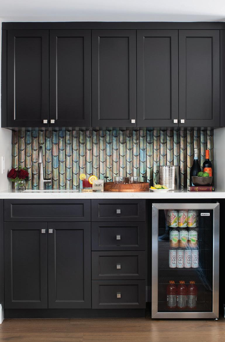
jNo one needs to travel far to quench their thirst due to this lovely little beverage bar at the base of the stairs
Our universal goal is to create an atmostphere of welcome and relaxation whenever our clients come home,” explains McClain
precious,” he says. “All of the upholstery is commercial-grade, heavy-duty fabric with protectants and most of the rugs are machine washable. Every single item was selected with the knowledge that it would be appreciated and used daily.”
A color palette of black, white, brown, gray, and green lends a sophisticated, timeless feel. “This classic combination provides an aesthetic that will be as appropriate in 30 years as it is now,” says McClain. He added mixed metallic accents, bold pops of color, and geometric patterns to provide visual interest.
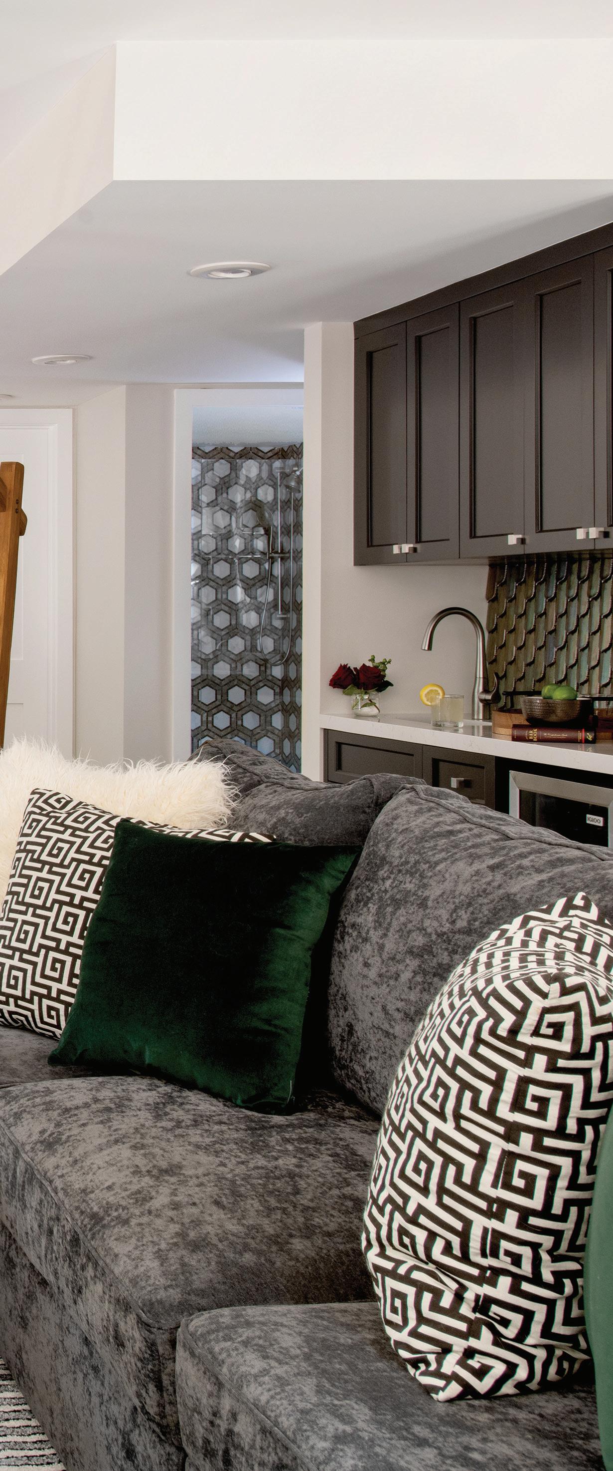
The renovation took into account the family’s need for entertainment space for family and friends, but McCain made sure to make some space for peaceful solitude. Aesthetically and functionally, the house features a true sense of balance.
“Our universal goal is to create an atmosphere of welcome and relaxation whenever our clients come home,” explains McClain. “We achieve this through multiple clever closed storage solutions, which reduce visual clutter, comfortable yet elegant seating options, and thoughtful furniture placements to create frustration-free passage and flow.”
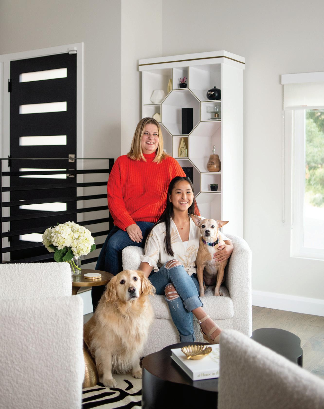
But although the designer and homeowner connected instantly, the project did have some challenges. The main bedroom — where the desire for luxury and retreat was paramount — required inventive thinking.
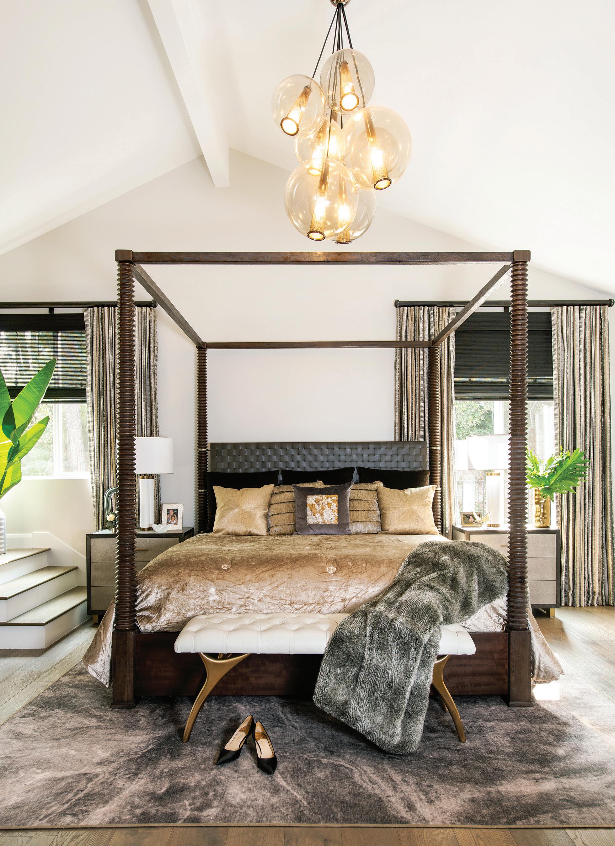

“There was only one appropriate head wall, but it was flanked with a small staircase to one side and access to the closets on the other,” recalls McClain. “To accommodate all the quirkiness, we created the illusion of uniformity by installing bamboo roller shades at the same height and commissioned custom drapery with three panels of equal length and the fourth much shorter to clear the stairs.”
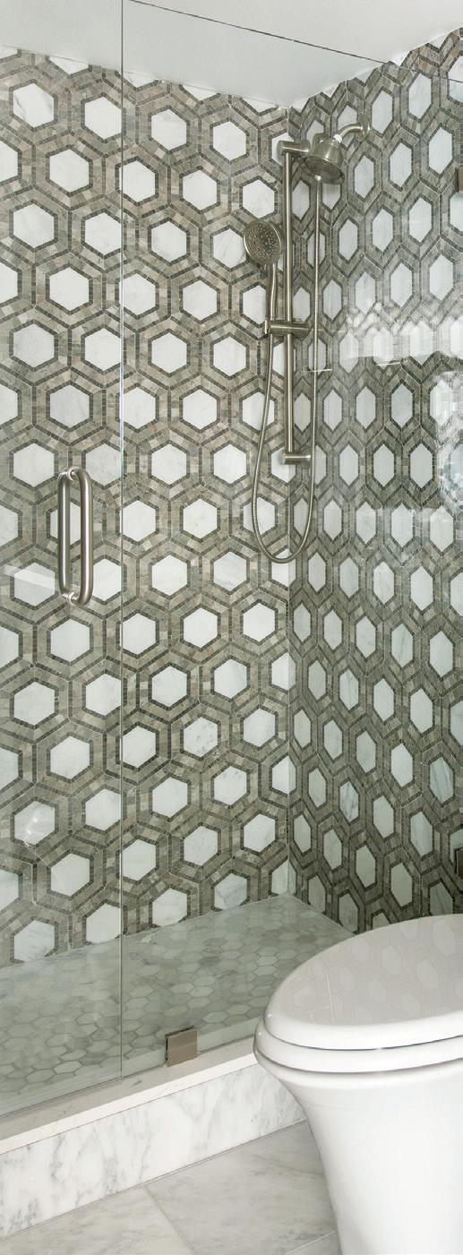
Passionate about design since a young age, McClain approaches a home as a reflection of the persons who live in it, and as such, he invariably highlights the unique character of the space.
“I have loved design from as far back as I can remember,” he notes. “From rearranging my childhood bedroom furniture to helping my grandpa build family homes, design is part of my DNA.” ■
Furniture: dining chairs, pleated velvetTOV Furniture (High Point, NC); dining table - Four Hands (High Point, NC)
Lighting: modern pendant - Nuevo (Toronto
Mirrors: mixed metal - Crate and Barrel (Los Angeles, CA)
Wall Covering: custom designedRevolution Interiors
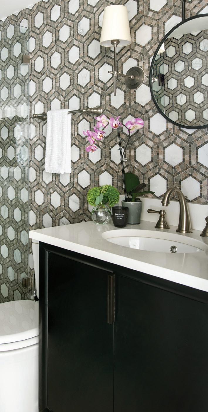
Lighting: chandelier - Noir Trading, Inc. (Gardena, CA)
Appliances: JennAir (Benton Harbor, MI) Stonework & Tile: custom
Artwork: Leftbank Art (La Mirada, CA)
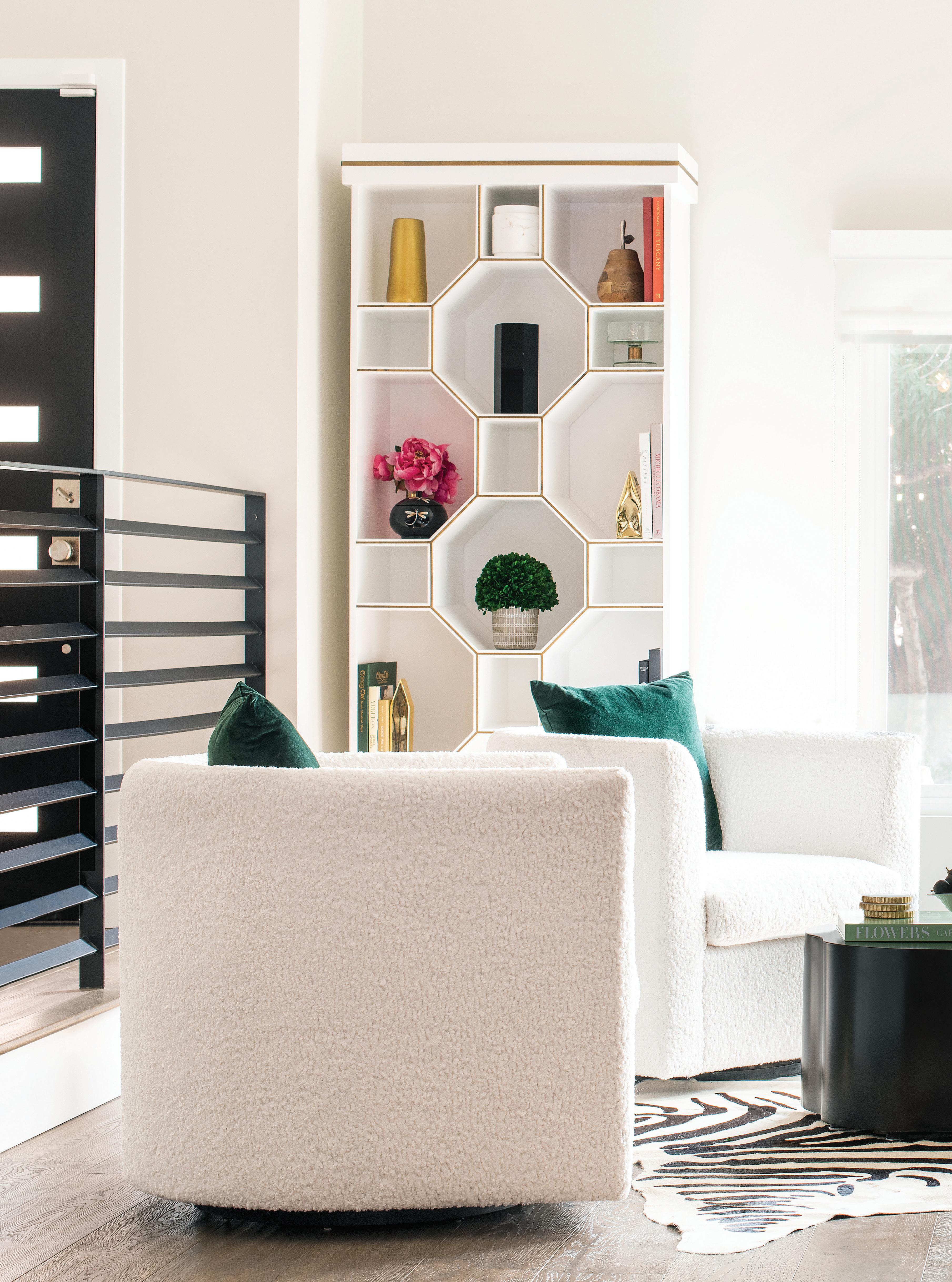
Furniture: Bradley octagon bookshelfGilded Home by John McClain at Treniq (treniq.com); cocktail tables - Sunpan (Toronto, ON); coffee table - Arteriors (West Hollywood, CA); drink tablesCurrey and Company (Atlanta, GA);
poufs, emerald green - Safavieh (Port Washington, NY); leather benchUniversal Furniture at Interior Illusions (West Hollywood, CA); swivel chairs with faux shearling - RC Home
Accessories: West Elm (Los Angeles, CA)
Furniture: accent tables - West Elm (Los Angeles, CA); vanity - custom Lighting: Visual Comfort Mirror: Uttermost Tile: TileBar (Paramus, NJ)
Bedding: - Lili Alessandra
Furniture: four-poster bed - Theodor Alexander; shagreen dressers - Interlude Home (Los Angeles, CA); bench - Sunpan Lighting: caviar pendant - Arteriors (West Hollywood, CA)
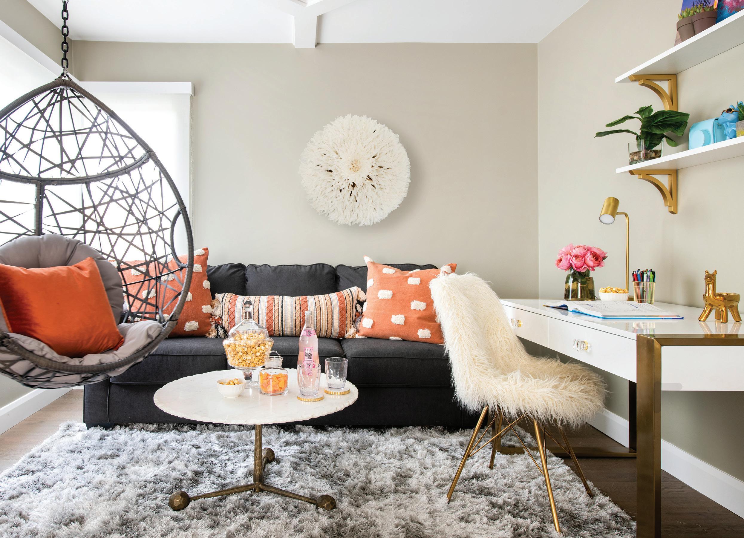
Paint: Dunn-Edwards Paints; bedrooms - “Play on Gray DE6228”; cabinetry and railings - “Black Bean DE6385”; ceilings and trim - “Warm White DEW380”; kitchen cabinetry - “So Chic! DET614”; walls - “Foggy Day DE6226”
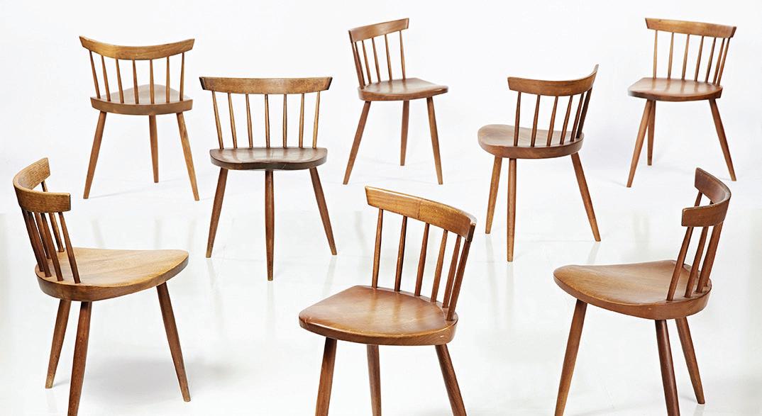
1919 Bay St., Los Angeles 213.947.3784 billingsauction.com
BILLINGS offers live in-house auctions of modern art and design at its brick-and-mortar space in the heart of downtown L.A.’s Arts District. Representing a wide range of American and international art and design, its catalog is often heavily weighted in mid-century modern selections with offerings from the 1960s through the early 2000s. Those unable to attend in person can bid online by registering at liveauctioneers.com.
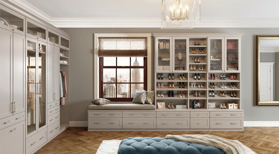
Multiple locations 888.336.9707 californiaclosets.com
Founded in 1978, California Closets is the leader and design authority in premium space management, delivering customdesigned organizational solutions and exceptional service. The company believes home is more than just a place—it should be a source of creativity, comfort, and connection. From beautiful walk-in closets and entertainment centers to versatile pantries and home offices, California Closets designs custom storage solutions that add value to your life and home by making space for what belongs.
28341 Marguerite Pkwy., Mission Viejo 949.220.0656 pirch.com
PIRCH brings you the best in kitchen, bath, and outdoor design from the world’s most coveted brands. Their showrooms allow you to fully experience a vast array of products, so you can be sure you make the right choices. With the guidance of expert sales consultants, you can discover kitchen appliances, plumbing, hardware, and outdoor appliances that stretch your imagination.
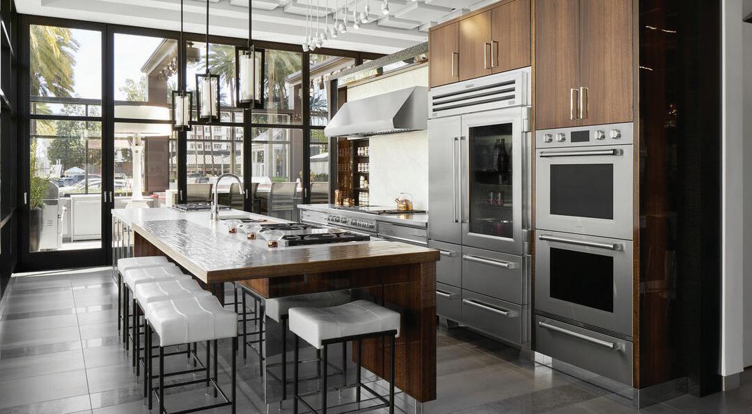
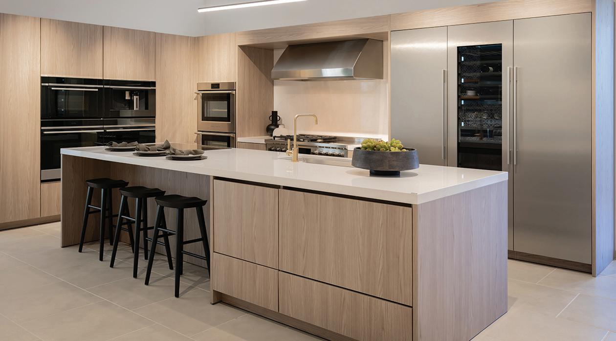
655 Anton Blvd., Costa Mesa 657.269.5874 subzero-wolf.com
Begin at a Sub-Zero, Wolf, and Cove showroom: Sub-Zero, the preservation specialist; Wolf, the cooking specialist; and Cove, the dishwashing specialist. You will be paired with a dedicated consultant to help you through every phase of your project— from gathering initial inspiration to getting the most out of your carefully selected appliances once they are home. The showroom will provide everything you need to start, ensuring the entire experience is catered specifically to you.

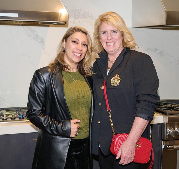
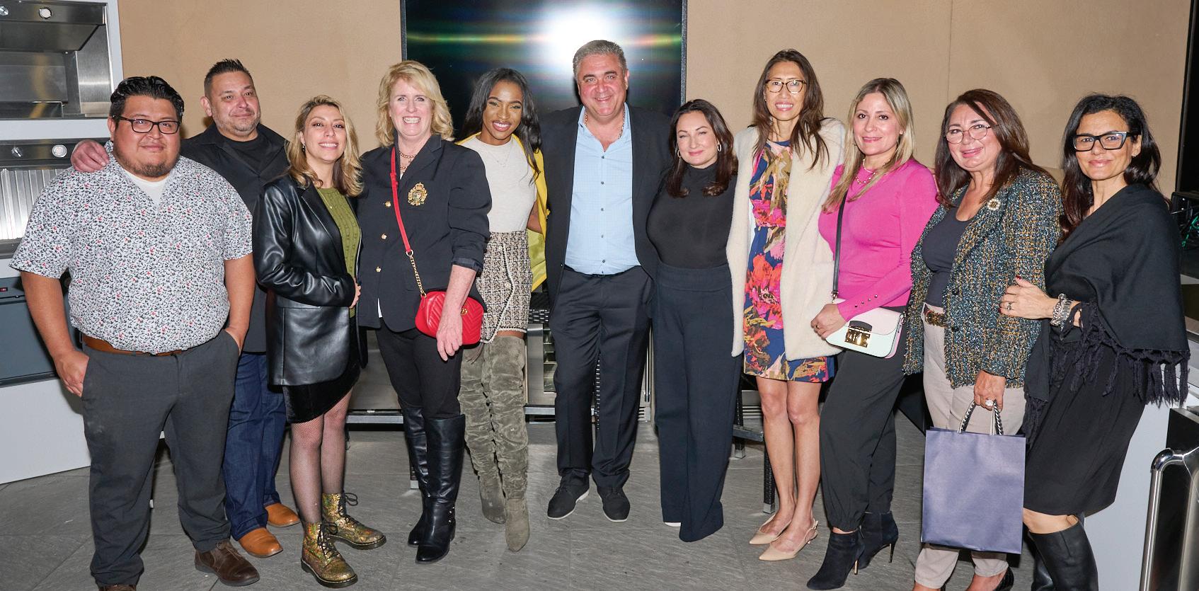
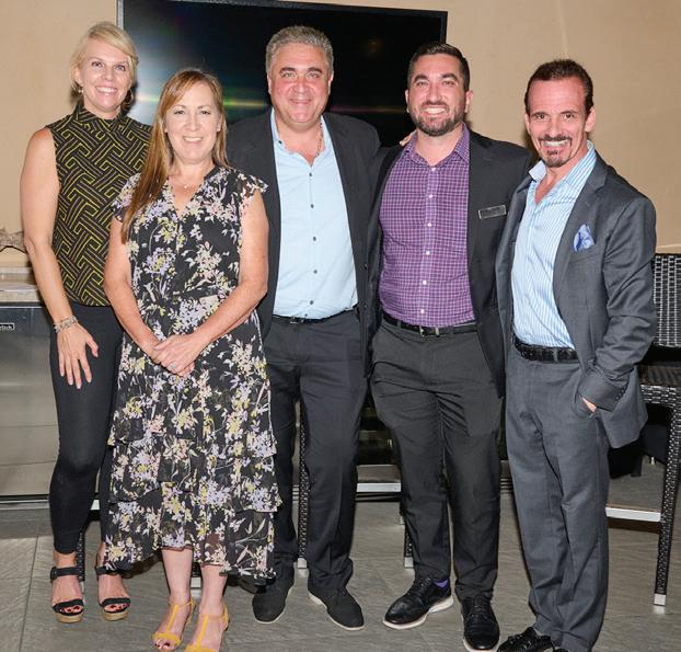
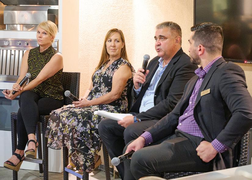
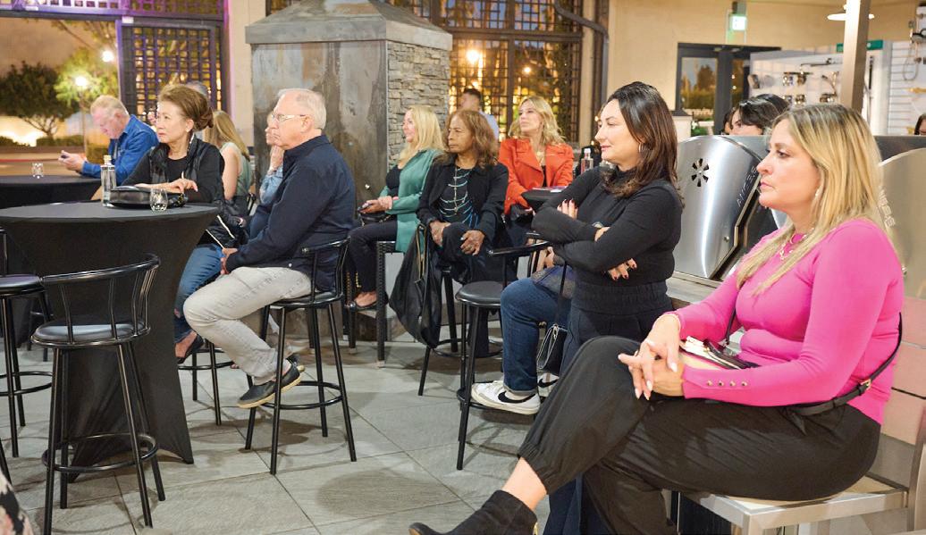
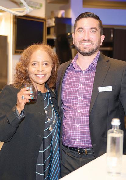
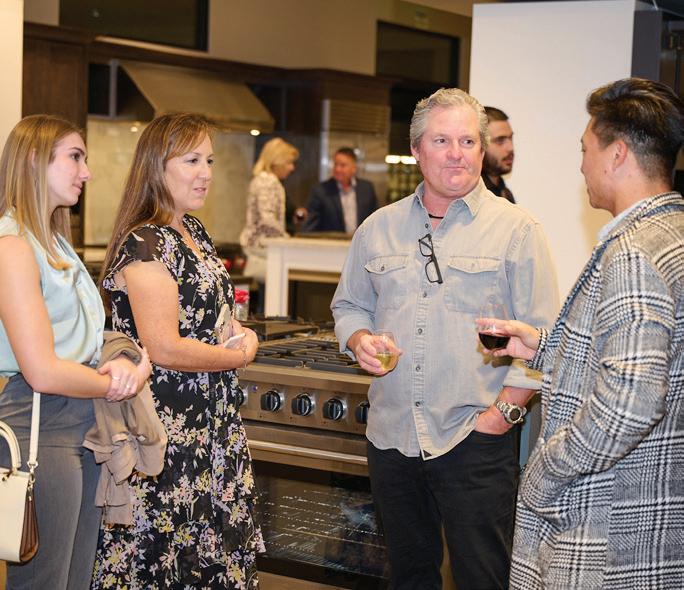
Universal Appliance and Kitchen Center at South Coast Plaza hosted a special Designers & Architects Anonymous session for architects, designers, builders, and developers to learn how to navigate the challenges and struggles in getting the product they need.

FORGET
BY KELLY VENCILL SANCHEZCARBONSHACK began in 2017 with a lofty vision: to create and promote zero-emission homes that inspire their users to become better stewards of the environment. Since then, the Los Angeles-based team of architects, designers, and tradespeople headed by Stephen Pallrand has continued to raise awareness about eco-friendly strategies in residential design. Whether it’s using non-VOC paints and finishes, reducing a home’s embodied carbon footprint by choosing repurposed and salvaged materials, or switching from natural gas to electric for home heating and cooling, the message is to do something.
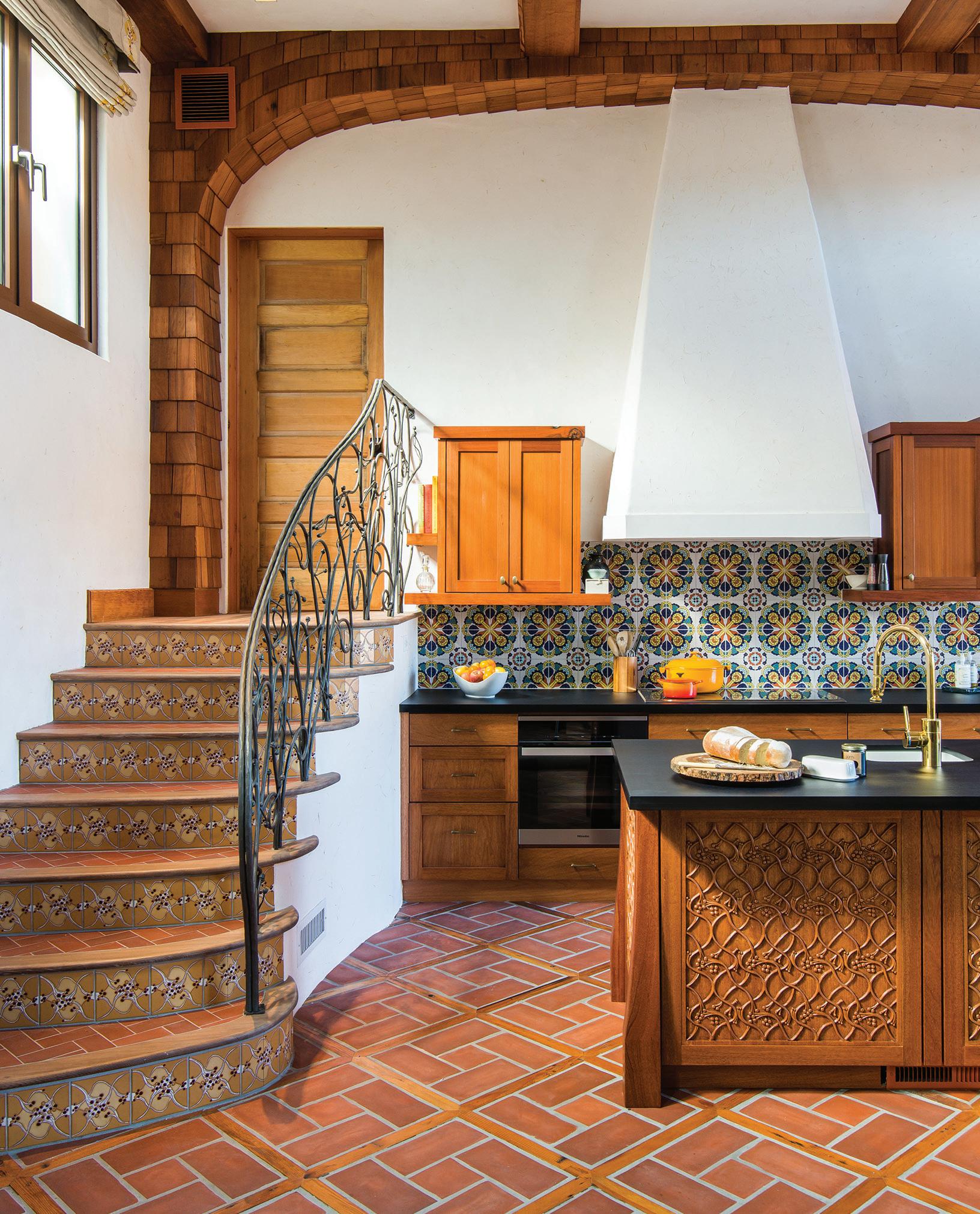
The firm’s case study for building green is Casa Zero, Pallrand’s own home in Mount Washington. Designed to take into account the entire life cycle of the structure and everything in it, the new, all-electric dwelling is constructed of reclaimed, recycled, and low-impact construction materials and is equipped with features such as solar panels and a heat pump water heater. “The goal was to see how low could we get the footprint of a newly constructed home,” explains Greg Roth, CarbonShack’s senior interior designer.
Historically, the building sector has been a major contributor of greenhouse gas emissions around the world. According to the nonprofit research organization Architecture 2030, the built environment produces close to 50 percent of annual CO2 emissions globally. Of these, building operations are responsible for 27 percent, while building materials and the construction process are responsible for an additional 20 percent. “Sustainability is important and crucial for our industry,” Roth notes. “We’re showing that it can be done beautifully.”
Pallrand, who launched CarbonShack as an offshoot of his sustainable designbuild firm Home Front Build, contends that a home is only as eco-friendly as its inhabitants. To make the process of building green easier to understand, CarbonShack created the interactive “Embodied Energy Calculator,” which allows professionals and non-professionals alike to tally a home’s embodied energy (aka the greenhouse gas emissions generated by the harvesting, manufacturing and transportation of materials, the construction process itself, and the disposal of these materials) and compare the CO2 savings gained by swapping out a particular material for another. Their companion website, sustainablebuild.org, meanwhile, is a tool for calculating how much energy a home generates yearly and how that number can be lowered by transitioning to energy-efficient technologies and appliances.
In October, CarbonShack opened a showroom featuring sustainable interior products, including lighting, textiles, and furnishings. Notes Roth, “Finishes are as important as the systems that go into the home, and we wanted to highlight that.”
But he emphasizes that helping to save the planet doesn’t have to be an all-ornothing proposition. “It can be overwhelming as a homeowner if you have a historic home or even a new home prospect,” he says. “We’re not advocating orthodoxy. We’re saying: do something. One small step can make a difference.” carbonshack.com
The Galley Workstation is not a sink. It is a customizable system that makes life in the kitchen easier, more efficient and more enjoyable. Effortlessly transition from prep, to cooking, to cleaning using this highly functional culinary system. Unlike a conventional kitchen, there’s plenty of room for your favorite people to join in the action with you. Everyone congregates to the kitchen. Might as well make the best of it.
