

LANCE M. GILLESPIE
(480) 267 - 7405 | lancepmg@gmail.com
ABOUT ME
I am a highly motivated recent Bachelor’s graduate in Interior Design with a minor in Sustainability. I have a strong background and certifications in Entrepreneurship as well as Graphic Design. I am experienced in fast paced work environnments with the ability to work with people and problem solve in a quick and efficient manner. Strong emphasis in communications both verbal and written.
EDUCATION
• May 2019 | Diploma (Emphasis in Business & Graphic/Web Design) | Show Low High School
A 4-year dual enrollment program of study done with college courses and certifications specializing in business and graphic/web design.
• March 2022 | Minor in Sustainability | Arizona State University
An 18-credit hour devotion of study to the sciences surrounding sustainability. In my chosen courses I studied issues and solutions both in the micro and macro levels of design. This included heavy research into solution types and overall impacts as well analysis of applicable solutions.
• May 2023 | Bachelors of Science in Design | Arizona State University
This is a 4-year long program of study that takes a unique learning and research approach for the exploration of how people inhabit, interact with, and transform interior environments.
EXPERIENCE
• April 2021 - May 2023 | Student Success Ambassador | Education at Work - Tempe, AZ
Promoted to a student success position working directly with staff and nonprofit partners to ensure success for the workplace and workforce. Worked closely with administrative staff to schedule and conduct interviews, prepare rosters of students for training, and run recruitment outreach. Also assisted in the orientations and training for incoming employees.
• May 2022 - February 2023 | Intern then Junior Designer | Mackenzie Collier Interiors - Phoenix, AZ

Worked closely with a lead designer to accomplish goals in space planning and drafted floor plans as well as material selection. Assisted and partook in client communications/meetings as well as internal marketing strategies. Experienced each phase of the design process with the use of programs including Acrobat, AutoCAD, Illustrator, InDesign, Material Bank, Photoshop, Revit, SketchUp & Slack.
HARDWARE & SOFTWARE AWARDS & CERTIFICATIONS
• (2015-2019) | Show Low High School Merit | Academic Letter Awards and Certificate
• (2016-2019) | Northland Pioneer College Merit | President’s List Certificate
• (2019) | FBLA AZ State Competition | Graphics Design 5th Place
• (2019) | Certificate of Proficiency in Business | Entrepreneurship Fundamentals
• (2019) | Certificate of Arizona Technical Skills | Standards for Business Management
• (2019) | Certificate of Arizona Technical Skills | Graphic and Web Design
• (2019-2023) | Arizona State University Merit | Dean’s List Certificate
• Proficient in Mac/Windows
• Proficient in Adobe including: Acrobat, Photoshop, Illustrator & InDesign
• Proficient in the Microsoft 365 Suite including: Excel, OneNote, Powerpoint, Sharepoint, Teams, & Word
• Proficient in Miro
• Proficient in SketchUp
• Experience with Social Media Management Tools
• Proficient in TwinMotion
• Working Knowledge of AutoCAD & Revit
• August 2019 - April 2021 | Microsoft Ambassador | Education at Work - Tempe, AZ
Provided customer services in the form of technical support on Microsoft products and services including but not limited to Microsoft 365 (formerly Office 365), Windows 10, Accounts & Billing, and various Microsoft-based devices. This was done through Education at Work, a nonprofit organization dedicated to assisting students in fostering good work habits while earning tuition assistance.
SKILLS
• Active Problem Solving
• Appointment Creation
• Cleaning/Organization
• Coordination
• Customer Service
• Graphic Design
• Making Copies & Scans
• Management
• Networking
• Professionalism
• Proofreading
• Purchasing & Mailing
• Report Creation
• Spatial Planning
• Strategic Planning
• Supply Management
• Teamwork
• Training
• Transcribing
• Verbal Communication
TABLE OF CONTENTS
• General Information (Slides 2-3) | Resume & Contents (2023)
• Design Resume (Slide 2) | Experiences & Skills
• Table of Contents (Slide 3) | Portfolio Item Order
• Residential Design (Slides 4-10) | Pine Street Project (2020)
• Remodel (Slides 4-6) | Entire Structure
• Accessory Dwelling Unit (Slides 7-8) | Lower Level Remodel
• Bedroom Design (Slides 9-10) | Room Renovation
• Hospitality Design (Slides 11-15) | One Camelback Project (2021)
• Hotel Design (Slides 11-12) | Concept & First Floor
• Restaurant Design (Slide 13) | Dining & Kitchen Space
• Hotel Room Design (Slides 14-15) | Rooms & Stacked Floor Plan
• Retail Design (Slides 19-23) | Roosevelt Project (2021)
• Phases & Site Information (Slide 16) | Roosevelt Projects
• Live/Work Units (Slides 17-18) | Community Center Adjacent
• Main Facility Design (Slides 19-23) | Community Center
• Healthcare Design (Slides 24-29) | Mountain Park Health Center Project (2022)
• Health Identity (Slides 24-25) | Mountain Park Health Center Brand
• Concepts for Healing (Slides 26-27) | Healthy Habitats
• Main Facility Design (Slides 28-29) | Environment Mapping
• Workplace Design (Slides 30-37) | NEXT Project (2022)
• The Client & Product (Slide 30) | NEXT Competition Details
• Emotional Design (Slides 31-34) | The Emotional Workplace
• Technical Detailing (Slides 35-37) | Specifications & Typologies
• Institutional Design (Slides 38-45) | Children’s Museum of Phoenix Project (2023)
• Proposal Requests (Slides 38-39) | Children’s Museum RFP
• Creative Developements (Slides 40-42) | Accessibility & Flow
• Exploration Through Art (Slides 43-45) | Art/Exhibit Creation

Residential Design

PROJECT DETAILS (2020)
• Project Designers – Lance Gillespie & Carolina Pacheco with Instructor Jordan Snittjer
• Programs Used – Adobe (Illustrator, Photoshop), Preview, Revit, SketchUp, SU Podium
SITE ANALYSIS
The project is located in San Francisco just under five miles away from the Golden Gate Bride. In the same neighborhood as the “Full House” house, this building is in a popular area for tourists and city traffic. Codes for this project were followed in accordance with the local codes. Below are some features of the existing building:
• Single Family
• Built in 1880
• 3,200 Sq. Ft.
• 4 Bedroom

• 4 Bathroom
EAST ELEVATION
The site is located at 2821 Pine St. San Francisco, CA 94115
DELIVERABLES PRODUCED
• 3D Models
• 3D Renders
• Client Creation
• Custom Built-In
• Concept Creation
• Demo Plan
• Elevations
• FFE Creation
• Floor Plans
• Program Pieces
• Material Boards
• Project Goals
• Rendered Drafted Plans
• Sections
• Site Analysis
GENERAL CLIENT REQUEST
• Two Entrances (Public and Private)
• Large Living Spaces
• Open Kitchen with Breakfast Bar
• Large Dining Space
• Laundry Room
• Gym/Workout Space
• Lots of Storage Space
• Office Space with Private Entrance
• Half Bath in Living Space
• Seperate Bathroom for Children
PUBLIC/PRIVATE BUBBLE DIAGRAMS
In the process of speaking with the client I also identified general adjaceny requests and areas of privacy. Below are the products of using bubble diagrams to designate space as well as the colors used to identify the level of privacy requested:
BUBBLE DIAGRAM OF LEVEL 1
BUBBLE DIAGRAM OF LEVEL 2

BUBBLE DIAGRAM OF LEVEL 3


THE ENTRY SEQUENCE
The entry sequence is the first impression that visitors have of a home, and it sets the tone for the entire experience. For this reason, I paid particular attention to ensure that it was both functional and aesthetically pleasing. This included creating a clear and unobstructed pathway from the entry to the main living area, selecting finishes and lighting that complemented the overall design aesthetic, and incorporating storage solutions for coats, shoes, and other items.
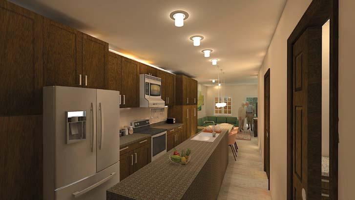
The kitchen and respit spaces are also critical areas in any home, as they are often where people spend the majority of their time. I focused on creating a functional and inviting kitchen space that would be both practical for cooking and entertaining, as well as aesthetically pleasing. This involved careful consideration of the layout and flow of the space, selection of high-quality materials and finishes, and incorporation of storage solutions to maximize functionality.
I created comfortable and welcoming spaces that would promote relaxation and well-being. This involved selecting materials and finishes that would contribute to a calming atmosphere, designing layouts that were both functional and visually appealing.

RENDER OF THE DINING

RENDER OF THE KITCHEN RENDER OF THE ENTRY

AN UPDATE ON THE CLIENT & PROJECT...
• Who are they? | An Elderly Couple | 2 Individuals with Occasional Need for Assistance
• The parents of one of the clients in the previous project has plans to move into the living space with the client, and has requested an accessory dwelling unit on the bottom floor be added.


• What are their interests? |Social Gatherings | Family Bonding Time
• All members of the household are social and enjoy having people over. This may be friends, family, or business personnel
• Do they have rituals? | Family Meal Time | Working Together
• The whole family enjoys coming together for meals and exercise. Sometimes the family will extend invitations outside of the household meaning that they enjoy large spaces to conversate and eat.
FEATURES OF THE ACCESSORY DWELLING UNIT
The space includes a private front entrance, connection to the existing structure, as well as a connection to the back yard. A service side yard limits travel through unit.
ENLARGED EAST SECTION OF ADU ON LEVEL 1
CONSIDERATIONS FOR AN ACCESSIBLE ADU
When designing for accessibility, it’s important to consider not only the immediate needs of the occupants, but also any potential future needs as they age or their abilities change. This means incorporating features that will allow them to age in place and maintain their independence for as long as possible. For example, I may include lever-style door handles instead of knobs, which are easier to grasp and manipulate for those with limited dexterity.
In addition to physical features, designing for accessibility can also include creating a welcoming and comfortable atmosphere. This could involve using color schemes and finishes that are easy on the eyes, selecting furniture and fixtures that are ergonomically designed, and incorporating art and decor that reflects the personality and interests of the occupants.
Overall, designing for accessibility requires attention to detail and a commitment to creating a safe and comfortable space for all occupants, regardless of their age or abilities. As an interior designer, it’s my responsibility to ensure that the space not only meets their functional needs, but also enhances their overall well-being and quality of life.
RENDER OF THE LAUNDRY/OFFICE


RENDER OF THE BATHROOM RENDER OF THE BEDROOM

AN UPDATE ON THE CLIENT & PROJECT...
• Who are they? | A Couple & 2 Children | 2 Individuals Going to School from Home during Pandemic
• The Couple is looking to renovate their bedroom master since their last project when they took over the second master to create an accessory dwelling unit.
1. Brenda (48) - Stay at home mother in charge of cooking, cleaning, and laundry for the household.
2. Cesar (48) - Currently working long hours in the office and at home.
• What is Done in the Space? | Getting Ready, Relaxing & Sleeping | Space Representing Both Individuals
• Both Individuals like to get ready in the space together. A vanity outside of the bathroom is requested.
• A space to get light amounts of work or reading done together near windows.
• An entertainment center with a fireplace for relaxing.
FLOOR PLAN OF LEVEL 3
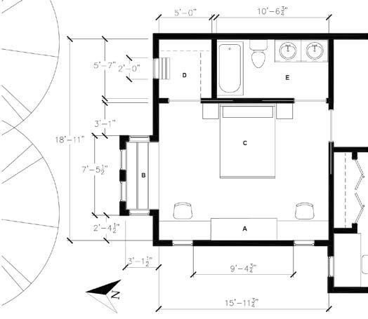
A: A custom built-in electric fireplace with mantle and workstations on either side.
B: Window seat with storage and custom cushion
C: Queen size bed with nightstands on either side and lighting built in.
D: Primary walk-in closet with bench and pocket door
E: Primary bathroom with double vanity, bathtub, toilet, and a pocket door.
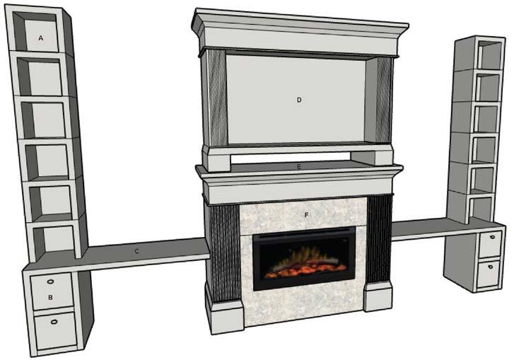
AXON OF THE MASTER BEDROOM CUSTOM BUILT-IN
FEATURES OF THE DETAIL
This custom built in fireplace entertainment center is designed to be made with various wood/stone finishes and is depicted with the Erden Recessed Electric Fireplace Insert by Wrought Studio. This unit is made to update with the space and interchange materials based on design, making this a good unit to make various schemes for. Below are the callout for this custom piece:
A) 1’ Cube Storage Shelving
B) 1’ Cube Drawers with Oval Handels
C) Workspace at 28”
D) Television Section of Entertainment Center
E) Entertainment Storage for Systems
F) Interchangeable Stone/Resin Material
BEDROOM COLOR SCHEMES
When working on a design project, it’s not uncommon for clients to have different preferences and ideas for how they want their space to look and feel. To address this challenge, I came up with a solution to create a few schemes that were based on shared color desires. This means that I identified colors that both clients liked and used them as a starting point for the design.
However, I also ensured that each scheme included the same base elements that had been approved for the design. By doing this, I was able to create a few design options that both clients could potentially be happy with. This approach also allowed the clients to see how different color schemes could impact the overall look and feel of the space, which may have helped them to make a more informed decision about which scheme to choose.
Overall, this approach shows that as a designer, I was able to be flexible and creative in finding a solution that met the needs of both clients, while still adhering to the constraints of the approved design elements. The schemes are as follows
A - Monochrome Green, B - Complimentary Navy & Beige, & Finally C - Split Complimentary Orange & Purple.
RENDER OF BEDROOM IN SCHEME B - COMPLIMENTARY


RENDER OF BEDROOM IN SCHEME C - SPLIT COMPLIMENTARY RENDER OF BEDROOM IN SCHEME A - MONOCHROME

Hospitality Design
PROJECT DETAILS (2021)
• Project Designers – Lance Gillespie, Kelsey Haught, & Rachel Vrlenich with Instructors Brie Smith, Amanda Ahlman, Ali Chopra, & Jennifer Grysho
• Programs Used – Adobe (Illustrator, Photoshop), Preview, AutoCAD, Revit, SketchUp, SU Podium
SITE PLAN

The site is located at 1 E Camelback Rd, Phoenix, AZ 85012.

SITE ANALYSIS
The project is located in Phoenix and previously used as an office building with a businesses on the ground level. The building will be designed to transition into a hotel with a bar and restaurant. Some of the current building details are as follows:

• 200,000 Sq. Ft.
• Near Shopping Center
• Near Public Transit
BRAND CREATED
The Pineapple Palms Brand Concept and Logo was created individually of group work. It is the overarching brand for the bar and restaurant and is reminiscent of the oasis feel while focusing on elements that are local to the region such as palm trees.

THE MOOD OF THE EXTERIOR
DELIVERABLES PRODUCED
• 3D Models
• 3D Renders
• Brand Creation
• Custom Built-In
• Concept Creation
• Elevations
• FFE Creation
• Floor Plans
• Program Pieces
• Material Boards
• Project Goals
• Rendered Drafted Plans
• Sections
• Site Analysis
• Site Exploration


 THE MOOD OF THE INTERIOR
THE INSPIRATION OF THE BAR & RESTAURANT


The experience of the oasis was carried through for the bar and restaurant with food inspired by those found in the South American tropics as well as the American Southwest. With both regions sharing similar ingredients a wide variety of options is available for guests from spicy to sweet on any occasion.

FLOOR PLAN OF LEVEL 1

THE INSPIRATION OF THE INTERIOR
The second floor design will be carried through to the level above and will be based off rays of sunlight. Each room type will be a different color relating to the colors associacted wiVth the sun. In consideration of the feelings one may want to express in each suite, color theory was used to reach the desired effect.

THE INSPIRATION OF THE INTERIOR DIAGRAM
RENDERED FLOOR PLAN OF LEVEL 2+

 RENDER OF THE GUEST LOUNGE
INSPIRATION OF THE SUITES


The Red Scheme is present in the executive suite and represents feelings of empowerment, romance and stimulation.


The Terracotta Scheme is present in the king suite and represents feelings of embrace, earthiness, abundance and warmth.


The Amber Scheme is present in the double queen suite and represents feelings of openness, welcome and honesty.


RENDER OF THE EXECUTIVE SUITE

RENDER OF THE KING SUITE
RENDER OF THE DOUBLE QUEEN SUITE
Commercial Design
PROJECT DETAILS (2021)
• Project Designers – Lance Gillespie, Landy Maxfield, Stephanie Reuter & Emily Vance with Instructors Cheri Jacobs, Nathan Korkki, Alyssa Hitt, & Jillian Kelley
• Programs Used – Adobe (Illustrator, InDesign, & Photoshop), Preview, AutoCAD, Revit, & SketchUp
SITE PLAN
The site is located at 214 E Roosevelt St, Phoenix, AZ 85004.
SITE ANALYSIS
The projects are located in Downtown Phoenix on Roosevelt Row and include a community center as well as two live/work units. Navawool was part of Phase 1; created and considered for the International Design Educators Council Competition of 2021. The other two brands were designed in Phase 2 with all three projects having original brands and concepts they are based on. Below are some highlights of the project:
• Community Center and Live/Work Units are to Communicate in their Business and their Design
• Provides Education and Resources to the Community
• Serves Underrepresented Communities
BRANDS CREATED
The three brands created all differ in objects or services provided, however they are united in their sharing and search for sustainable practices. Below are the brands:
• Navawool - Navajo Textile Maker

• Thrift Tailor - Thrift Store with Tailor Services

• rUSE - Community Center with Education, Lounge, and Retail Spaces

PRODUCED

BRANDING & CONCEPT

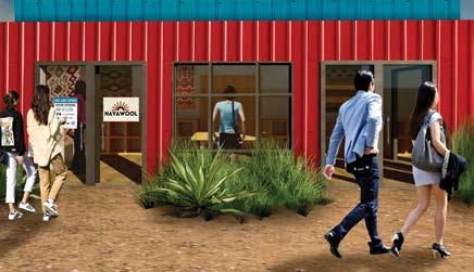


Navawool brings the culture of the Navajo tribe to regions outside of the Navajo reservation to learn about modern solutions, educate in authenticity and share experiences to be cherished abroad. Centered around honoring the past while bringing the Navajo culture into the 21st century, Navawool pairs the use of natural materials and sustainable design to create works of art that last the test of time. With authentic Navajo weaving and cuisine demonstrations Navawool aims to share the customs and traditions of local indigenous peoples in America with the surrounding communities.


MATERIALITY CONCEPT


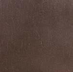
Materials chosen are ecofriendly and some are even recycled. This choice was made as the clients stressed a desire for sustainable design. The materials also reflect the clients’ spirituality. The 1st floor represents Mother Earth with its rich woods, metallic accents, and leather furnishings. The space is earth-toned, dark, and heavy to represent fertile soil and a sense of groundness. The second floor takes its inspiration from Father Sky. The materials are light and airy. This space includes light-colored pieces that feel porous. The materiality also has many fluffy elements to invoke feelings of being on air or a cloud.




RENDERED


PLAN OF LEVEL 1


RENDERS OF NAVAWOOL

BRANDING & CONCEPT


Thrifty Tailor is a retail store that sells second-hand clothing and provides tailoring services. The business aims to combat fast-fashion and make sustainable choices both easy and possible. Clothing items both sold in store and brought in by customers can be adjusted to better accommodate their fit, making the items even more sustainable as they will not soon become unwanted.


MATERIALITY CONCEPT


Thrifty Tailor uses materials that are good for the environment or in some cases will reuse materials that may not be so good for the environment to ensure that if it is not being degraded that it is serving a purpose. Reclaimed wood and odd buttons are used for the flooring to make use of materials once used in a new purpose.


RENDERED FLOOR PLAN OF LEVEL 1


RENDERED FLOOR PLAN OF LEVEL 2


RENDERED ELEVATION OF THRIFTY TAILOR


BRANDING & CONCEPT

As many products and services in the modern world continue to suggest alternative sustainable solutions, rUSE aims to educate and provide resources for the Arizona community that makes it easy to choose the items that are sustainable and fit their needs. By providing a community space that starts conversations about various sustainable issues while allowing the community to collaborate, learn and grow closer to their interests in many mediums we hope to bring light to information that is or can seem to deceive.
RENDER OF THE INTERACTIVE ENTRY
SUSTAINABILITY GOALS FOR THE COMMUNITY CENTER



The Problem:
There are various retail products that pollute our planet.
Our Solution:
rUSE wants to minimize our retail footprint by using only sustainably sourced products and materials. Our retail uses only reusable or biodegradable bags and containers.
The Problem:
Pollution efforts bring lots of trash out of our oceans and other bodies of water like the cannels in Phoenix. What is done with the waste? Many items that are widely thought to be recyclable are not actually recycled.


Our Solution:
rUSE wants to educate people on what is not truly recyclable and what they can do to repurpose those items. The design of rUSE is like a gallery of how these items could be repurposed (i.e. a 3D ceramic wall feature)

The Problem:
There’s a lot of great non-profit organizations that are working to clean up pollution such as American Forests, One Tree Planted, 5 Gyres Institute, and Blue Sphere Foundation that need financial support to continue.
Our Solution:
rUSE creates an art piece made of pollution items with the community’s help. Once the piece is complete it is auctioned off with the proceeds going entierly to a non-profit organization that aims to tackle pollution issues.
ADJACENCY/FLOW BUBBLE DIAGRAM OF ZONES LEVEL 1
ADJACENCY/FLOW BUBBLE DIAGRAM OF ZONES LEVEL 2
RENDERED FLOOR PLAN OF LEVEL 1

RENDERED FLOOR PLAN OF LEVEL 2

THE POLLUTION ZONE CONCEPT & MATERIALITY

The rUSE education space aims to create a space where community members can showcase and converse over sustainable methods. This comes in the form of classes that allow the community to play off of existing solutions and innovate new solutions while sharing what has been successful in the past. Fees for classes have the opportunity to be reduced by those donating significant time to the sustainability effort in the local community.
RENDER OF THE ENTRY/MAKER SPACE


THE LAND ZONE CONCEPT & MATERIALITY
With many resources sold and distributed daily, rUSE aims to provide items that are locally sourced by community vendors and require less waste. By providing donation spaces for reusable items and maintaining the reuse of items that are not sustainable or do not have a small life cycle we hope to push the longevity of typical one-time use items. Thus creating a smaller impact on the world at large and allowing for the local community to grow and prosper with healthy and trusted local items.

RENDER OF THE ENTRY/RETAIL
THE WATER ZONE CONCEPT & MATERIALITY


For any community to grow they need a way to communicate and a safe space to do so. rUSE aims to provide a safe comfortable space for people to collaborate and share experiences or goals. This is why we have created the lounge which includes the community conversation pit, as well as a coffee and tea bar to stay energized as we change the world.
THE AIR ZONE CONCEPT & MATERIALITY
The final region of the rUSE is at the back of the building and it includes the restrooms, dining area, outside bar, administrative spaces and the secret loft entrance. A special feature of the dining space is the reused tires that are repurposed as swings to minimize the amount of air pollution that would be a result of tire fires and bring attention to this issue. The secret loft space is mainly for employees and private collaborations, but open to the public when not in use.
RENDER OF THE COMMUNITY CONVERSATION PIT

RENDER OF THE DINING SPACE

THE INSPIRATION OF THE RAIL

As a feature to the community collective the rail shown was created to mimic the sunset of Arizona. Made of perforated metal and printed with custom imagery this rail is a unique item to the space that helps to add color to the spaces above. With the open concept of the interior, our team wanted to create a feature that added dimension and a bit of fun. This rail leads to the hidden conversation pit for staff on the second floor.

MATERIALS FOR RAIL DETAIL


SECTION OF RAIL DETAIL AXONS OF RAIL DETAIL

Healthcare Design
PROJECT DETAILS (2022)
• Project Designers – Lance Gillespie, Landy Maxfield, & Stephanie Reuter with Instructors Jose Bernardi, Sonja Bochart, Alyssaa Robinson & Scott Ross Steffes
• Programs Used – Adobe (Illustrator, InDesign, & Photoshop), Preview, AutoCAD, Revit, SketchUp, & Twinmotion
SITE PLAN

The site is located at 3830 E. Van Buren St, in Phoenix, AZ.

SITE ANALYSIS
What we observed from our site visits to the Gateway Mountain Park Health Center is that there are many nearby neighborhoods as well as an elementary school and a community college. Many in the region seem to use public transportation and amenities like sidewalks. There are very limited amounts of “green spaces” or parks in the area and the transition from the street to the clinic has design opportunities. There is also an ability for the clinic to use its space to create additional resources.
DELIVERABLES PRODUCED
• 3D Models
• 3D Renders
• Brand Creation
• Custom Built-In
• Concept Creation
• Elevations
• FFE Creation
• Floor Plans & RCPs
• Program Pieces
• Flow Diagrams
• Material Boards
• Project Goals
• Rendered Drafted Plans
• Sections
• Site Analysis
• Site Exploration
• Sound Study
• Sun Study
BRAND IDENTITY
The Mountain Park Health Center Gateway Clinic is active in its community outside of just providing affordable healthcare. They host a variety of volunteer opportunities, notably the food bank on Saturdays. MCPH provides affordable healthcare in a respectful, understanding, and caring way. They provide resources and support to the local area by:

• Advocacy
• Communication
• Assistance
• Donation Funds
• Tele-visits
• Volunteer Opportunities
DESIGN CONCEPT
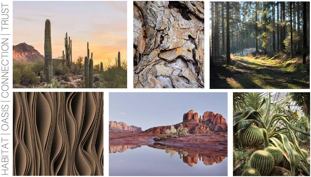
Currently, the health clinic has brand standards that have been requested to keep the same as they are satisfied with what they have created. Given that we respect this decision and want to stay true to the brand we have only played with ways to link their current branding to our design concept. Our approach is centered around the ability of the clinic to connect with its customers by making a unique experience that helps the user to feel comfortable and safe. This is why our design focuses on major habitats seen in Arizona and is centered around creating environments which people can feel a connection with. We believe that if a person feels a connection with the clinic, this will help in their healing process.
REFRESHING THE BRAND
Different users call different landscapes home. Some feel most at ease in a forest, whereas others are most familiar with a desert-scape. We designed this clinic to provide a variety of landscapes in our spaces so that anyone could connect with a piece of their surroundings. Arizona has such a diverse landscape so to represent that in our design we chose the most predominant habitats in the State.
COLOR RATIONALE

Mountain Park Health Center uses a split complementary color scheme for its branding colors. We took a muted version of those colors to create a space that speaks to our concept of habitat and oasis. We kept the similarity in colors firstly, because of the client's request to keep the colors that they love. Secondly, these are colors that repr sent the habitats of Arizona. This color palette connects users to the locality of the spaces.

CONCEPT MAPPING

In our design, we pulled elements from our local habitats that embodied a sense of oasis, connection, and trust. We used patterns in nature throughout our design that were tied to Arizona to accomplish these goals.
THROUGHOUT MATERIALITY DESERT MATERIAL ZONING

These are the main, reoccurring materials in the project. They’ve all been chosen for antibacterial, and antimicrobial properties, their cleanability, and/or durability. We also chose them for their sustainability. In every choice, we have kept in mind the needs of the clinic and our concept’s vision. Sherwin-Williams Harmony Paints improve air quality and are antimicrobial. The featured carpet, rubber flooring, and millwork are durable and able to withstand the high foot traffic of the clinic. The rubber, leather, and vinyl are considered clinic-safe for cleanability, durability, and antibacterial properties. All metals included in the facility are antimicrobial.


ZONE MAPPING
This palette is chosen for the public areas because it is the most familiar habitat in the clinic’s region. This will provide a smooth transition from the desert exterior landscape to the interior.

FOREST MATERIAL ZONING
The forest palette is exclusively in thepatient areas to provide a sense of security. The forests can often be sheltering places. Patients want to have privacy when they talk about sensitive things with health and feel heard and protected by their medical provider.

RED ROCK MATERIAL ZONING
This palette is chosen exclusively for the communicating stair and elevator to make this a special moment. The red rocks of Arizona are a highlight in the state. Their natural shape draws the eye upwards. Similarly, our stair ascends in that natural way around the elevator.

MOUNTAIN MATERIAL ZONING
This is the staff palette. Mountains surround the Phoenix valley, protecting our cities. Similarly, the staff works hard to help their patients. The staff zones surround the clinical areas providing medical help.
RENDERED FLOOR PLAN LEVEL 1


CUSTOM CHECK-IN DESK

CUSTOM MA WORKSTATION
RENDERED FLOOR PLAN LEVEL 2

CUSTOM CLASSROOM DESKS
RENDER OF THE LOBBY
RENDER OF THE PUBLIC CLASSROOM

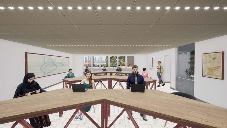

RENDER OF THE MA WORKSTATIONS
RENDER OF THE PINE EXAM ROOM

RENDER OF THE BIRCH EXAM ROOM
RENDER OF THE DESERT EXAM ROOM
RENDER OF THE JOSHUA TREE EXAM ROOM


RENDER OF THE MOUNTAIN EXAM ROOM

Workplace Design
PROJECT DETAILS (2022)
• Project Designers – Lance Gillespie with Instructors Cheri Jacobs, Cheyne Brown, & James Bailey
• Programs Used – Adobe (Illustrator, InDesign, & Photoshop), Preview, AutoCAD, Revit, SketchUp, & Twinmotion
SITE PLAN
The site is located at 101 Seaport Blvd. in Boston, MA - Suite 600.
SITE ANALYSIS
This project was located in Boston which has had increasing levels of mental issues and remains a hub for innovation. This provides an ideal location to develop and test products as well as ideas. Some key information about the site:
• The space is the sixth floor covering roughly 12,000 Square Feet
• The space faces the harbor on the North corner of the highlighted building

BRANDING
While this is a tech company it is more important than ever that humanity understands its roots while they advance by using mental health to enable the individual. NEXT is combating the worldwide mental health crisis with the production of telepresence robots that help professionals connect with patients virtually. The goal of the products is to make these services more widely accessible and engaging.


DELIVERABLES PRODUCED
•
•
• Rendered Drafted Plans
• Sections
•
•
• Workplace Typologies
Given the clients sector of business within the tech industry and values the logo reflects both mental health and technology:
1. The form around the business name is an organic representation of the human brain.
2. The color of the brain form is Baker-Miller pink as a representation of color influences behavior.

3. There is a break in the brain form to represent breaking barriers and thinking outside of the norm.
4. The six breaks in the brain form represent the six emotional states considered in the space design.
5. The text in the logo connects with the idea of a computer chip as a link to the technology side of the company.
DESIGN CONCEPT

The environment will be curated with various emotional designation zones for people to nonverbally communicate how they may be feeling with thoughtfully designe workstations to embrace the user. In crafting spaces that support the expression of various emotions we can allow these to become drivers rather than obstacles. Diverse regions in between will support team functions with areas of mixed emotions and ranges in furniture types. Pathways and environments will emulate the emotion they are tied to in color, form, and texture for a dynamic and engaging experience.
COLOR & FORM RATIONALE
Step 1 Step 2 Step 3 Step 4 Step 5
Began to research colors related to emotions to help support the emotional zones.
DESIGN INSPIRATION BOARD


Created zones based off the six main emotions. Happiness, Surprise, Anger, Disgust, Saddness, and Fear.
Chose shades relating to the emotion with a compliment to it’s shared emotion type.
Used facial features to inspire forms.
Zone Emotions Colors Facial Form Inspired Form
The Astonished Zone
The Capricious Zone

Happiness & Surprise (Yellow & Blue/Green)
Anger & Disgust (Red & Purple)
The Mercurial Zone
Saddness & Fear (Blue & Green)
Arches & Circles
Sharp Angles & Triangles

Many Edges/Forms
The first sketch shows initial observations of the site with bubble diagramming. The second sketch shows layout of emotional zones with the correlating path. In the third sketch the floor plan almost complete with material and lighting.


1 2 3
Key Takeaways:
1. The Sun Path & Best Views.
2. There are 3 main zones with unique acoustics, forms and materials.


3. Paths are dynamic and push office engagement.

RENDERED FLOOR PLANS & MATERIALITY


ELEVATION OFF THE ENTRY SEQUENCE
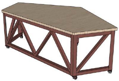
From the floor plan it can be seen that there is not a straight entry into the space. The entry is angled by 45 degrees to create visual interest in te space. This elevation shows how the wall seen from the elevators would indicate and invite guests or workers to the office. The reception space features a custom desk that flows with the pathways. This helps to ensure guests will be welcomed on arrival and the waiting area is combined with the product mock-up space to further intrique quests about the robots and allow a space to test them.

RENDER OF THE RECEPTION

DESIGN CONCEPT OF THE HOME OFFICE LAB

The home office lab is designed with medical professionals in mind as to how they may set up and work with clients virtually. Products would be kept on hand for showing clients how to use and suggest the best product.

RENDER OF THE HOME OFFICE LAB

LIGHTING & MATERIALITY


NEXT aims to try and foster an inclusive and mentally healthy creative platform for their workers by having spaces that allow for different emotional states and or work modes. The Home Office Lab rentals for employees to navigate their health.

DESIGN CONCEPT OF THE ASTONISHED WORKSTATIONS

The Astonished Zone is mainly a conbination of the emotions of happiness and surprise. It is centered around being more open and facilitating communication across the majority of the office.
RENDER OF THE ASTONISHED WORKSTATIONS
ACCOUSTICS & MATERIALITY
The Astonished Zone outfitted with SPRK flooring and Black Satin finishes. This zone features round suspended accoustic panels with all spaces using Steelcase V.I.A. modular walls and accoustic glass. Accoustic dividers are used throughout.
DESIGN CONCEPT OF THE CAPRICIOUS WORKSTATIONS
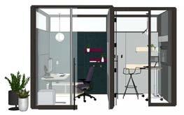


The Capricious Zone is a combination disgust or anger. These meanings are not always as literal but have been translated into a slightly more private zone with some communication.
DESIGN CONCEPT OF THE MERCURIAL WORKSTATIONS


In the last zone sadness and fear combine for a focus space. This space is meant to helps those who get distracted or need space to be in their emotions and get work done. A benefit of the zone is tracking frequent users for check in’s.
RENDER OF THE CAPRICIOUS WORKSTATIONS

RENDER OF THE MERCURIAL WORKSTATIONS

ACCOUSTICS & MATERIALITY
The Capricious Zone outfitted with Code flooring and Brushed Aluminum finishes. This zone features triangular suspended accoustic panels with all spaces using Steelcase V.I.A. modular walls and accoustic glass. These work stations include wrap round privcy panels. Accoustic dividers are used throughout.
ACCOUSTICS & MATERIALITY


The Mercurial Zone outfitted with Space for All flooring and Brushed Brass finishes. This zone features polygon suspended accoustic panels with all spaces using Steelcase V.I.A. modular walls and accoustic glass. These work stations include wrapping privacy panels with arched cover. Accoustic dividers are used throughout.

FURNITURE SPECIFICATIONS
LIFE SAFETY CODES
2015 International Building Code
2020 Massachusetts Energy Code
2015 International Existing Building Code

2015 International Mechanical Code
Ma State Building Code 9th Edition
Applicable Codes
• Standard for the Installation of Sprinkler Systems 2013 of MA

• 527 CMR 12.00: MA Electrical Code
• 2015 International Mechanical Code
• National Fire Alarm and Signaling Code 2013 of MA
MATERIAL SPECIFICATIONS
• 527 CMR 1.00: MA Comprehensive Fire Safety Code
LIFE SAFETY PLAN
WORKPLACE TYPOLOGY | FOCUS - PRIVACY WORK
Focus - Privacy Work | Occupancy - 1 | Sq. Ft. - 37.5
Key Design Features and Materials
• This is a private space for in-person workers
» Work Modes: The space is an unassigned and introverted workmode that can be reserved and informs when it is in use
» Space Planning/Layout: Space to be of modular design at 5’ 0” x 7’ 6”
» Organizational Identity: Provides a brandized space with privacy to make users comfortable for virtual meetings
» Attracting & Retaining Talent: Having an aesthetically pleasing support space such as this helps with attracting and retaining talent
Furniture Plan Scale: 1/4” = 1’ 0” RCP Scale: 1/4” = 1’ -
1) Wall behind door to be brandized accent wall for those taking virtual meetings in the space
1) Double wall sconces to provide lighting for video confrencing
• Accoustic ceiling recommended with selection to be chosen based on space design
1) Standing desk to provide comfort and versatility
to be fitted with an electronic reservation machine on the immediate exterior of the room
WORKPLACE TYPOLOGY | COLLAB - MEET ANYWHERE
Collaboration - Collab from Anywhere |
Key Design Features and Materials
• This is a open space for in-person & hybrid workers
» Work Modes: The space is an unassigned and synchronus workmode that can be reserved and informs when it is in use
» Space Planning/Layout: Space to be of modular design at 10’ - 0” x 10’ 0”
» Organizational Identity: Allows users to interact with each other and virtually to achieve goals for an organizationl identity of flexibility
» Attracting & Retaining Talent: Having an aesthetically pleasing support space such as this helps with attracting and retaining talent
2) Built in electrical ports for charging in table
3) Space to be fitted with an electronic reservation machine
1) Diffused task pendant lighting to be installed in the center of the space and should be between 18” - 20” in Diameter


• Accoustic ceiling recommended with selection to be chosen based on space design
1) 360 Meeting Owl & Monitor to be provided for virtual collaboration
2) Built in electrical ports for charging in table
3) Space to be fitted with an electronic reservation machine Space may be fitted with dividers on select sides depending on chosen privacy and layout
WORKPLACE TYPOLOGY | COLLAB - DUO DARKNESS POD WORKPLACE TYPOLOGY | FOCUS - DARKNESS POD

Focus - Darkness Pod | Occupancy - 1 | Sq. Ft. - 25
Key Design Features and Materials
• This is a semi-private space for in-person workers
» Work Modes: The space is an unassigned and asynchronous workmode that is open to all and informs visually when it is in use
» Space Planning/Layout: Space to be of modular design at 5’ - 0” x 5’ - 0”
» Organizational Identity: Understanding and accomodating need for dark workspaces and providing solutions
» Attracting & Retaining Talent: Provides an adjustable space with privacy to make users comfortable and considered
Collaboration - Double Darkness Pod | Occupancy - 2 | Sq. Ft. - 50
Key Design Features and Materials
• This is a semi-private space for in-person workers
» Work Modes: The space is an unassigned and synchronous workmode that is open to all and informs visually when it is in use
» Space Planning/Layout: Space to be of modular design at 5’ - 0” x 10’ - 0”
» Organizational Identity: Allows users to interact with each other to achieve goals for an organizationl identity of comfort and flexibility
» Attracting & Retaining Talent: Providing a range of collaboration spaces to facilitate comfort and flexibility
Furniture Plan Scale: 1/4” = 1’ 0” RCP Scale: 1/4” = 1’ 0”
1) Cover with curtain provides escape from glare when doing work on computers
• Space is to be in an open workspace area
• No lighting solutio needed as it is a dark space intended to remove issues with glare
• Accoustic ceiling recommended with selection to be chosen based on space design
3D Axon Not to Scale
1) Cover with curtain provides escape from glare when doing work on computers
2) High back allows full coverage and provides a space within a space
3) Curtain allows for flexibility and privacy
4) Side tables provide workspace for a device
5) Built-in outlets provide power to the user
1) Cover with curtain provides escape from glare when doing work on computers
• Space is to be in an open workspace area
• No lighting solutio needed as it is a dark space intended to remove issues with glare
1) Cover with curtain provides escape from glare when doing work on computers
2) High back allows full coverage and provides a space within a space
3) Curtain allows for flexibility and privacy
4) Side tables provide workspace for a device
5) Built-in outlets provide power to the user

WORKPLACE TYPOLOGY | COLLAB - CREATIVE MEETING WORKPLACE TYPOLOGY | SOCIAL - TETHERBALL ARENA
Key Design Features and Materials
• This is an open space for in-person workers
» Work Modes: The space is an unassigned and synchronous workmode that is open to all and informs visually when it is in use
» Space Planning/Layout: Space to be of modular design at 15’ - 0” x 15’ - 0”
» Organizational Identity: Allows users to interact with each other to achieve goals for an organizationl identity of comfort and flexibility
» Attracting & Retaining Talent: Providing a range of collaboration spaces to facilitate comfort and flexibility Furniture Plan Scale: 1/4”
1) A moveable unit with a TV screen provides space to present ideas
2) A moveable unit with a whiteboard allows for creative collaboration
3) Side tables/stools allow for increased occupancy

• Space is to be in an open workspace area
1) Diffused task pendant lighting to be installed in the center of the space and should be between 25” 30” in Diameter

• Accoustic ceiling recommended with selection to be chosen based on space design
1) High back allows full coverage and provides a space within a space
2) Nesting tables allow for flexibility

WORKPLACE TYPOLOGY | COLLAB - ROOM IN A ROOM
Collaboration - Room in a Room Meeting | Occupancy - 4 | Sq. Ft. - 100
Key Design Features and Materials
• This is a semi-private space for in-person workers
» Work Modes: The space is an unassigned and synchronous workmode that is open to all and informs visually when it is in use
» Space Planning/Layout: Space to be of modular design at 10’ - 0” x 10’ - 0”
» Organizational Identity: Allows users to interact with each other to achieve goals for an organizationl identity of comfort and flexibility
» Attracting & Retaining Talent: Providing a range of collaboration spaces to facilitate comfort and flexibility
Social - Tetherball Arena | Occupancy - 2 to 30 | Sq. Ft. - 706
Key Design Features and Materials
• This is an open space for in-person workers
» Work Modes: The space is an unassigned and asynchronous workmode that is open to all and informs visually when it is in use
» Space Planning/Layout: Space to be of modular design at 5’ 0” x 7’ 6”
» Organizational Identity: Provides a bonding experience while allowing everyone to be included and have a space
» Attracting & Retaining Talent: A fun and unique game for the workplace helps with attracting and retaining talent
1) Side tables provide workspace for a device
• Space is to be in an open workspace area
1) Diffused task pendant lighting to be installed in the center of the space and should be between 18” 20” in Diameter

• Accoustic ceiling recommended with selection to be chosen based on space design
1) High back allows full coverage and provides a space within a space
Floor Plan Scale: 1/8”
1) Walking path providing a safe space to walk around matches
2) Built in seating to provide space to watch and socialize
3) Extra stools added by preference for additional seating
Scale: 1/8” = 1’ - 0”
• Space is located outdoors and does not require a ceiling shade elements could interfere with the ball swing
1) Seating area to be cast in place using walkway stone
2) Court built to tetherball court standard of 10’ in radius with a 10’ pole that is removable for events.
WORKPLACE TYPOLOGY | RESPITE - THE QUIET FLEX SPACE
Respite - The Quiet Flex Space | Occupancy - 1 | Sq. Ft. - 56
Key Design Features and Materials
This is a private space for in-person workers
» Work Modes: This is an unassigned and introverted workmode that can be used for private moments, personal calls & religious practices
» Space Planning/Layout: Space to be of modular design at 7’ - 6” x 7’ - 6”
» Organizational Identity: The space is to use neutral colors/materials in order to appeal to a wider range of uses based on organizational identity
» Attracting & Retaining Talent: Spaces for private moments outside of work necessity help to attract and retain talent as the users feel supported
1) Chair selection can change keeping in mind intended use and versatility. (i.e. easy use for mothers or those with disabilities)
Space to allow for a comfortable armchair, side table, and a yoga mat to be rolled out
1) Indirect ambient pendant lighting to be installed in the center of the space and should be between 12” 15” in Diameter
• Accoustic ceiling recommended with selection to be chosen based on space design
1) Plants on the side table or hanging on the wall to add an element of clean air and greenery to the space forhealth benefits.
• If a window is present in the space consider window coveringss for privacy
• Space to be fitted with an electronic reservation machine on the immediate exterior of the room
Institutional Design
PROJECT DETAILS (2023)
• Project Designers – Lance Gillespie, Stephanie Reuter & Winter Brown with Instructors Kirsten Keane, Nathan Korkki, & Chunyao Liu
• Programs Used – Adobe (Illustrator, InDesign, & Photoshop), Preview, AutoCAD, Revit, SketchUp, & Twinmotion
SITE PLAN
The site is located at 302 W Monroe St, Phoenix, AZ 85003.

SITE ANALYSIS
The Monroe Abbey, formerly known as Phoenix First Baptist Church, has had long 100 year history which is significant in the relatively young city of Phoenix. The First Baptist Church occupied this building for only 38 of those years, and after the congregation left, the site was left empty for decades. In this time it was added to the National Register of Historic Places, and about two years later in 1984, there was a fire which consumed the roof. As a result, for the last nearly 40 years the central auditorium of the Abbey has been left exposed to the natural elements.
Following the fire, the former First Baptist Church has taken on a new identity, and it has become what we now know as the Monroe Abbey. This allows for an entirely new purpose and vision to be brought to this space. Situated right in Downtown Phoenix, the Monroe Abbey is surrounded by a wealth of vibrant art, culture, and people.
THE CLIENT
The Children’s Museum of Phoenix, is “a place where children play to learn, and grown-ups learn to play.” Exhibit spaces and programs should put an emphasis on nurturing the many developmental stages of children: social, cognitive, physical, and emotional. The Museum is a place that intertwines playing with learning in a unique environment that can help children learn about themselves, the world, and their community.

DELIVERABLES PRODUCED
• 3D Models
• 3D Renders
• Betterments Package
• Brand Creation
• Childhood Developement Research
• Concept Creation
• Custom Built-In
• Elevations
• FFE Creation
• Floor Plans & RCPs
• Program Pieces
• Flow Study
• Fundraising Package
• Historical Timeline
• Material Boards
• Project Goals
• Rendered Drafted Plans
• Request for Proposal
• Sections
• Site Analysis
• Site Exploration
• Social Media Suggestions
• Sun Study
Our primary goal is to build a strong connection with the guests by utilizing the idea of exploration as one of guiding principles. Through exploration users will be able to explore different art principles and immerse themselves in a space that encourages unlimited creativity. Our biggest drivers include a strong community connection, sustainable principles, and an allinclusive environment that engages with those of all ages. We intend to promote these principles by creating a space that is able to draw people in from the inner Phoenix community, as well as from all over.
HISTORIC PRESERVATION



To preserve the current structure while modernizing it on a strict need basis our firm would like to focus on an adaptive reuse model of historically preserving The Monroe Street Abbey. We believe this would best suit your organization’s intent of appreciating the historic structure for which your locations have their roots while still providing a refreshing and new experience for children and families of various ages and capabilities.
Timeline
PROJECT DELIVERY
The design project delivery method that we recommend is an Integrated Project Delivery (IPD). This method is a collaborative approach to project delivery that involves the owner, design team, and construction team working together from the start of the project to ensure that the project is completed on time, within budget, and to the owner’s satisfaction. It creates a process that collaboratively harnesses the talents and insights of all participants.
Artistic Expression
Sustainability Locality Inclusivity


DESIGN CONCEPT
Through the local expressions of Downtown Phoenix in both the natural and built environments, this concept bridges the historic site with the present day. It also connects young explorers to their community through a focus on public art. In this concept we played with exploration of the city of Phoenix through art, locality, and the people.
DESIGN MOOD BOARD

CHILDHOOD DEVELOPMENT RESEARCH


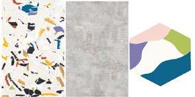
Colors and patterns that draw from the expressive nature of Downtown Phoenix.


ACCESSIBILITY & WAYFINDING

The courtyard centerpiece helps circulate the traffic between the levels. It also provides ADA access to both sides of the building since the west wing is about two feet lower than the rest of the building. That is why the elevators and ramps are in the central part of the building where it is easy to find and public.
Custom and consistent signage featured below will be throughout the museum. These signs rely on symbols rather than just text to create wayfinding that breaks away from any language barriers. Splatter paint is also used as a wayfinding tool to subtly indicate where to go. We placed the material on landmark areas, such as the reception desk in the lobby, doorway casings, and key seating spots. This will subconsciously clue visitors to their next adventure within the space acting as portals to new adventures.
BUBBLE SPACE PLANNING LEVEL 1


BUBBLE SPACE PLANNING LEVEL 3
BUBBLE SPACE PLANNING LEVEL 2


BUBBLE SPACE PLANNING LEVEL 4


RENDERED FLOOR PLANS & MATERIALITY LEVEL 1
The first level includes several points of entry, the four double doors on the front facade for visitor entry, the art gallery entry which is a public/ community entrance, the storage doors for employees, and the basement level stair entry which is for employees only as well. This level has several public-facing spaces, including the lobby, art gallery, and the courtyard. The daycare and its amenities are also included on the level for ease of access.
RENDERED FLOOR PLANS & MATERIALITY LEVEL 2
The second level contains the two exhibit spaces as well as the cafe and the first level of dining. The courtyard component links the two sides of the building to create accessibility as the west wing is about 2 feet lower than the east side. The ADA-accessible ramp makes it easy for all guests to enjoy both exhibits.
This level also has the first floor of office space which includes some desking, meeting space, a private office, a separate restroom, and a kitchenette break room.
RENDERED FLOOR PLANS & MATERIALITY LEVEL 3
The third level has rooftop space on the west side, which could feature a mural (see betterments section for more details). It also has a creation space which has a large wall for painting as well as other creative activities. The second level of dining is also included on this floor. This dining level features the rose window, a prominent symbol of the historic building. This floor also has a second level of offices which includes more loose desking, an open kitchenette, lockers, and more informal meeting space.


RENDERED FLOOR PLANS & MATERIALITY LEVEL 4
Level 4 is the top level of habitable space. There is room for leasable space that can double as additional dining, a birthday party area, or a reception zone. Also included on this floor is an interactive area for an outdoor exhibit, a storytime area, and a quiet zone. This floor is also great for hosting events, such as First Fridays, wedding receptions, etc. It would be a very flexible space with easily moveable furniture.
RENDER OF BIRD’S-EYE VIEW
RENDER OF THE COURTYARD


RENDER OF THE LOBBY
RENDER OF THE TALK TUBES

RENDER FROM THE DINING AREA
RENDER OF THE AGES 0-5 EXHIBITS
RENDER OF THE ROSE WINDOW
RENDER OF THE AGES 6-10 EXHIBITS


RENDER FROM THE CREATIVE STUDIO
FUNDRAISING EVENTS


Three seperate fundraising event ideas have been developed with this proposal including a charity walk around murals in Downtown Phoenix, Gala’s with Auctions and Sales of Engraved Tiles to go into the museum accent patchwork. Below is a schedule of social media posts to gain engagement as well as some drafted posts for examples. Towards the bottom you will see a three-year timeline our group is suggesting for the events taking into consideration weather in the area. There would be two galas a year, one in spring and one in fall. Charity walks would be scheduled every four months and sales of tiles would be highlighted at events and online regularly.

RENDER OF THE ROOFTOP MURAL


FUNDRAISING OUTREACH
• Mega Change MondayShowcasing developments in the project to spark excitement.
• Teaching Tuesday - Sharing how things are coming together to fuel intrigue.
• Wacky Wednesday - Posting wacky items being chosen for the museum and asking for suggestions to create a conversion.
• Throwback Thursday - Creating side-by-side images spaces as they get completed to create curiosity.
• Fundraising FridaySpotlighting the top donor since the last post and their chosen tile plaque.

• *Show Up Saturday - Leading up to an event posts will begin for getting participants and a post on the Saturday of the gala/walk will help gather the community.


