5 minute read
NATIONAL TREASURES
from psyvm9hyr3mo9
N C E CANADIA G L EBRATIN
DESIGN 150th
Advertisement
Here at Style at Home, we love to showcase homegrown talent. So this month our expert design editors, Ann Marie Favot and Morgan Lindsay, tell us what strikes their fancy about these rooms by Canadian designers.
TEXT MARIANNE DAVIDSON
Kelly Deck
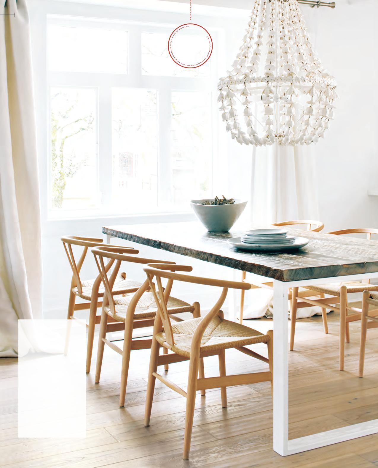
KELLY DECK DESIGN VANCOUVER
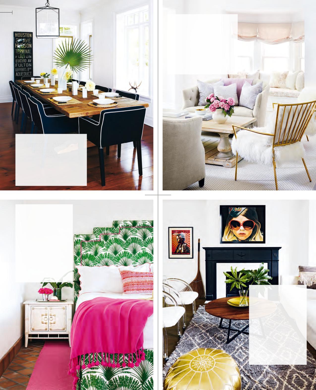
“The delicate details in this dining area are what catch my eye. The chandelier adds a hint of femininity, and the handcrafted ceramics keep it down-to-earth. I love that this space is functional and fuss-free, and that the design won’t detract from the joys of sharing a meal.” – Ann Marie
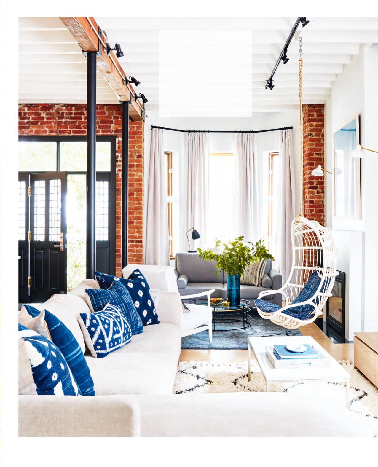
Jacquelyn Clark
LARK & LINEN INTERIOR DESIGN TORONTO
“I love everything about this dream home. This room showcases an eclectic mix of contemporary, beachy and industrial elements. Jacquelyn created a traditional sitting area by the fire alongside a casual TV zone, with both being equally inviting.” – Morgan
STACY BEGG DESIGN TORONTO
“The distinctive materials, such as velvet, linen, grasscloth and bamboo, that are incorporated into this room give it a unique flair. It is truly one of a kind.” – Morgan
Lindsay Mens Craig
SARAH RICHARDSON DESIGN TORONTO
“From the plush and cozy textures to the playful colour palette, this room looks irresistibly comfy to me.” – Morgan
Orsi Panos
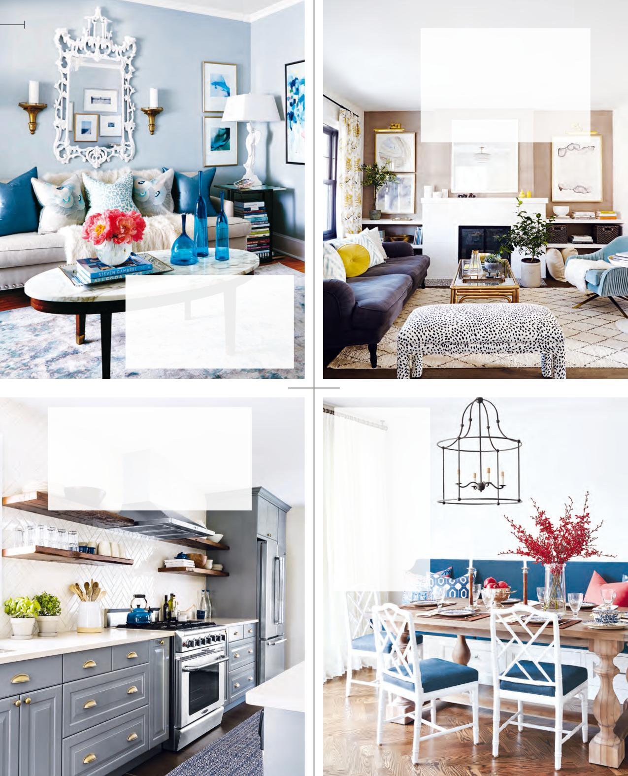
ORSI PANOS INTERIORS WHITBY, ONT.
“With its mix of chrome and bronze hardware, bright countertop, patterned backsplash, wooden shelves and dark cabinetry, this kitchen expertly brings multiple design concepts into one.” – Morgan
Robyn Madeline
ROBYN MADELINE INTERIORS TORONTO
“I think ‘effortless elegance’ is the best way to describe this eating area. I picture this table being set for both a casual brunch and a fancy feast.” – Ann Marie
Sophie Burke
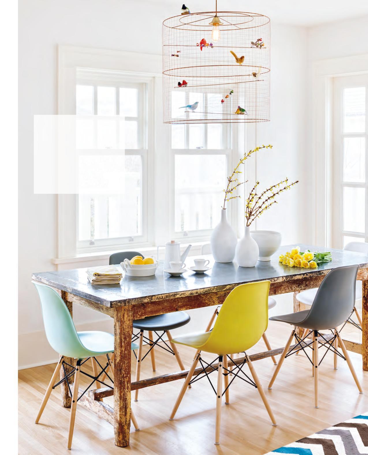
SOPHIE BURKE DESIGN VANCOUVER
“The playful combination of an old wood table (found at a flea market) paired with multicoloured modern dining chairs makes this room perfect for relaxed dining. The statement pendant light fixture sets the design apart from any other.” – Ann Marie
Ingrid Oomen & Vanessa Kwan
QUMMUNICATE TORONTO
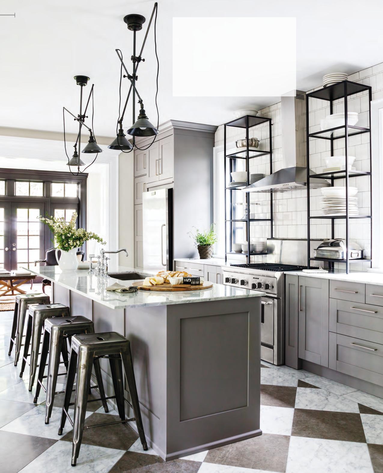
“This room boasts a brilliant use of inexpensive big- box-store shelving units, which have a custom look when placed on the marble countertop. What a fantastic idea! The floor tiles draw interest and keep this high-end kitchen looking fresh.” – Ann Marie
PHOTOGRAPHY (OPPOSITE), DONNA GRIFFITH; PHOTOGRAPHY, STACEY BRANDFORD Shirley Meisels
MHOUSE TORONTO
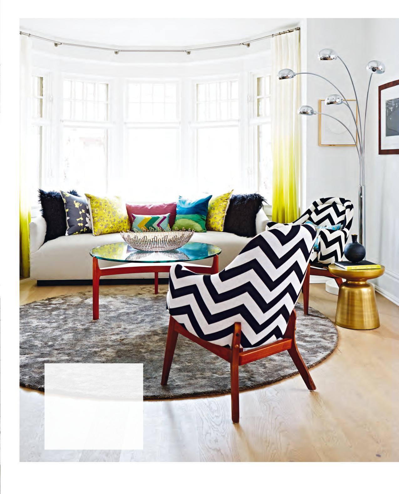
“I love it when designers think outside the box. Here, a round rug makes a huge impact, complementing other circular features in the design. A mix of bold colours and patterns completes the look in this whimsical and dramatic living room.” – Ann Marie
Jennifer Ferreira
FERREIRA DESIGN TORONTO
“The black and white piped chairs and simple hanging glass lantern make this room seem so sophisticated.” – Ann Marie
Anne Hepfer
ANNE HEPFER DESIGNS TORONTO
“I admire designers who dare to make bold statements like this bright colour combo. It is so perfectly tropical – cheers to the pink trim on the headboard and bedding!” – Ann Marie
Margie Doyle White
DOYLE DESIGN TORONTO
“I simply adore the use of the unexpected gold chair in this soft and neutral space. So romantic and glamorous!” – Morgan
Montana Burnett
MONTANA BURNETT DESIGN TORONTO
“The black fireplace and graphic artwork create an eye-catching focal wall that sets the stage for the rest of this clean and simple modern room.” – Morgan
Melanie Hay
MELANIE HAY DESIGN TORONTO
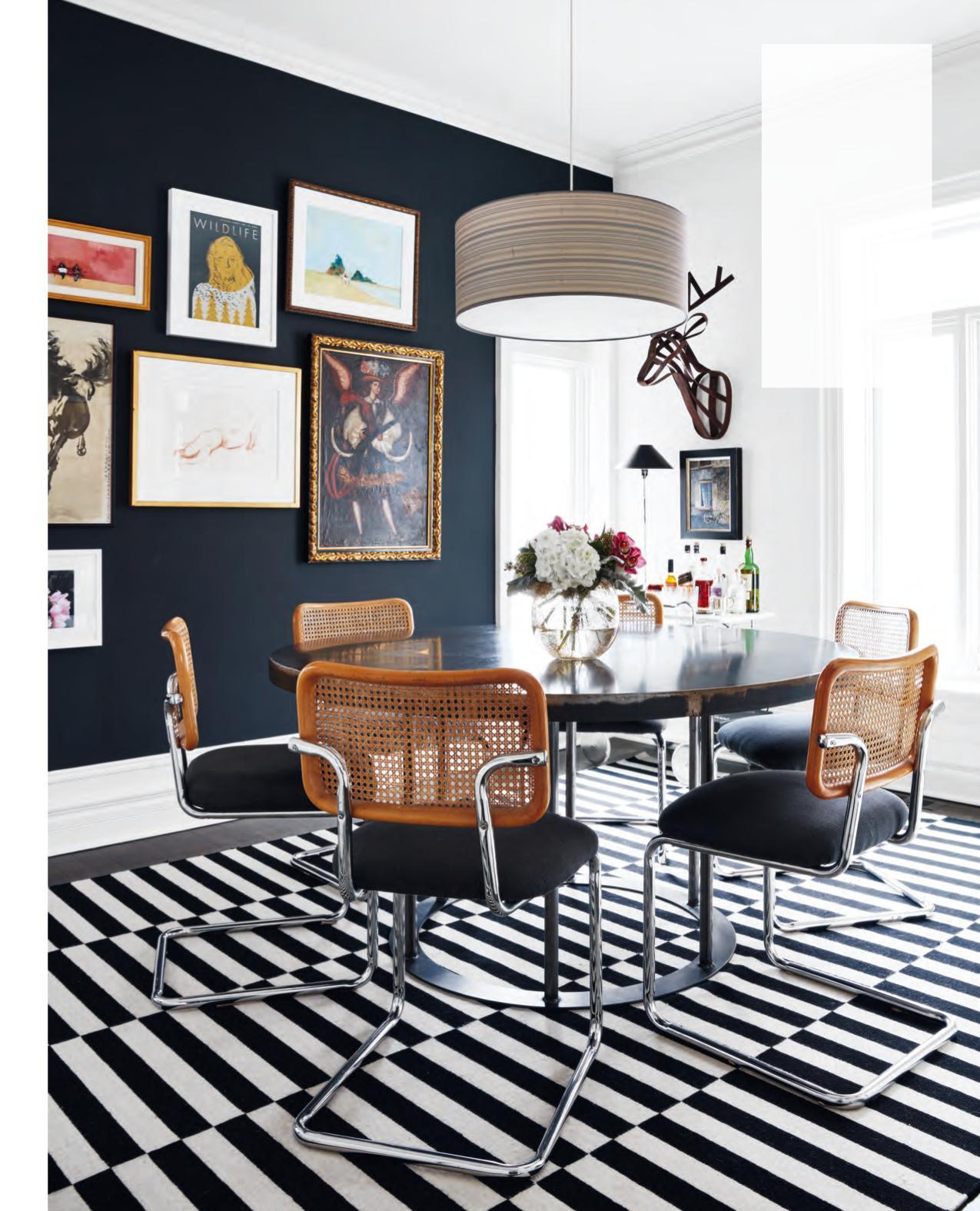
“This room is traditional yet modern – a style mix I crave! The round table and chandelier add movement to the space, while the hit of wood on the dining chairs and the curated art collection provide contrast to the black and white theme. And let’s not ignore the area rug – it makes the floor pop!” – Morgan
Jessica Waks
JESSICA CLAIRE INTERIORS TORONTO
“The playful combinations of bold and simple patterns used in this room call to me. Its charismatic and luxurious appeal makes it the perfect spot to sit back and enjoy some tasty predinner cocktails.” – Morgan
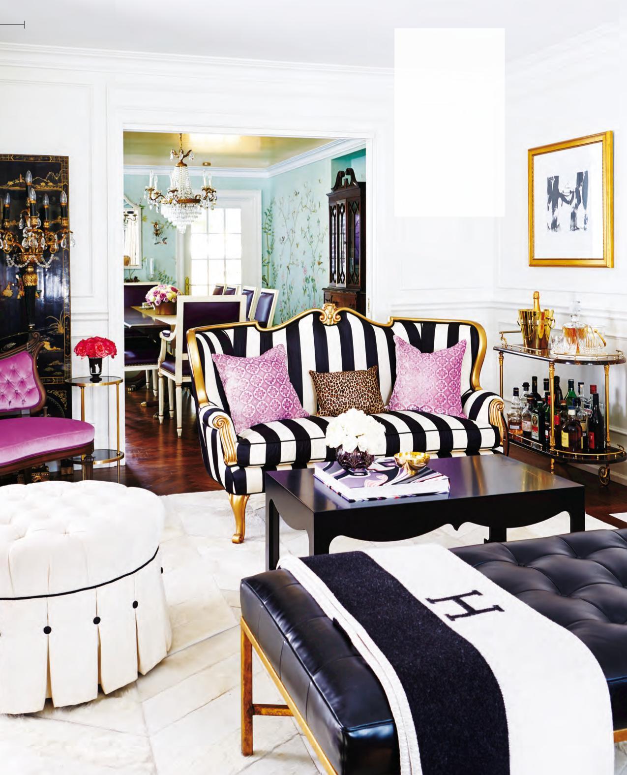
PHOTOGRAPHY (OPPOSITE), STACEY BRANDFORD; PHOTGRAPHY, DONNA GRIFFITH Christine Dovey
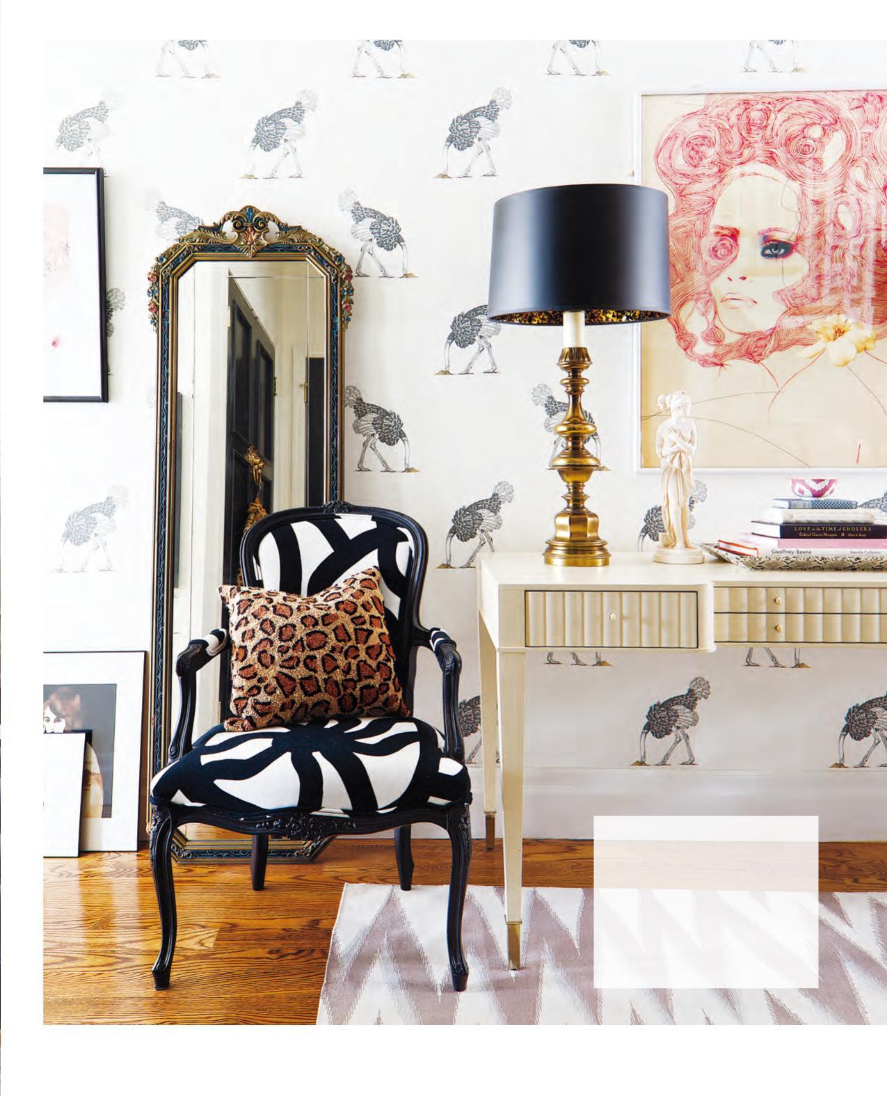
CHRISTINE DOVEY STYLE TORONTO
“Whimsical wallpaper and unexpected artwork paired with traditional furniture and bold patterns make for a bright and playful design that I can only describe as fantastic!” – Ann Marie
etc.
FEATURED PRODUCTS FROM OUR ADVERTISERS
DON’T MISS THESE ROOM TRANSFORMATIONS FROM TODAY’S HOTTEST DESIGN BLOGGERS
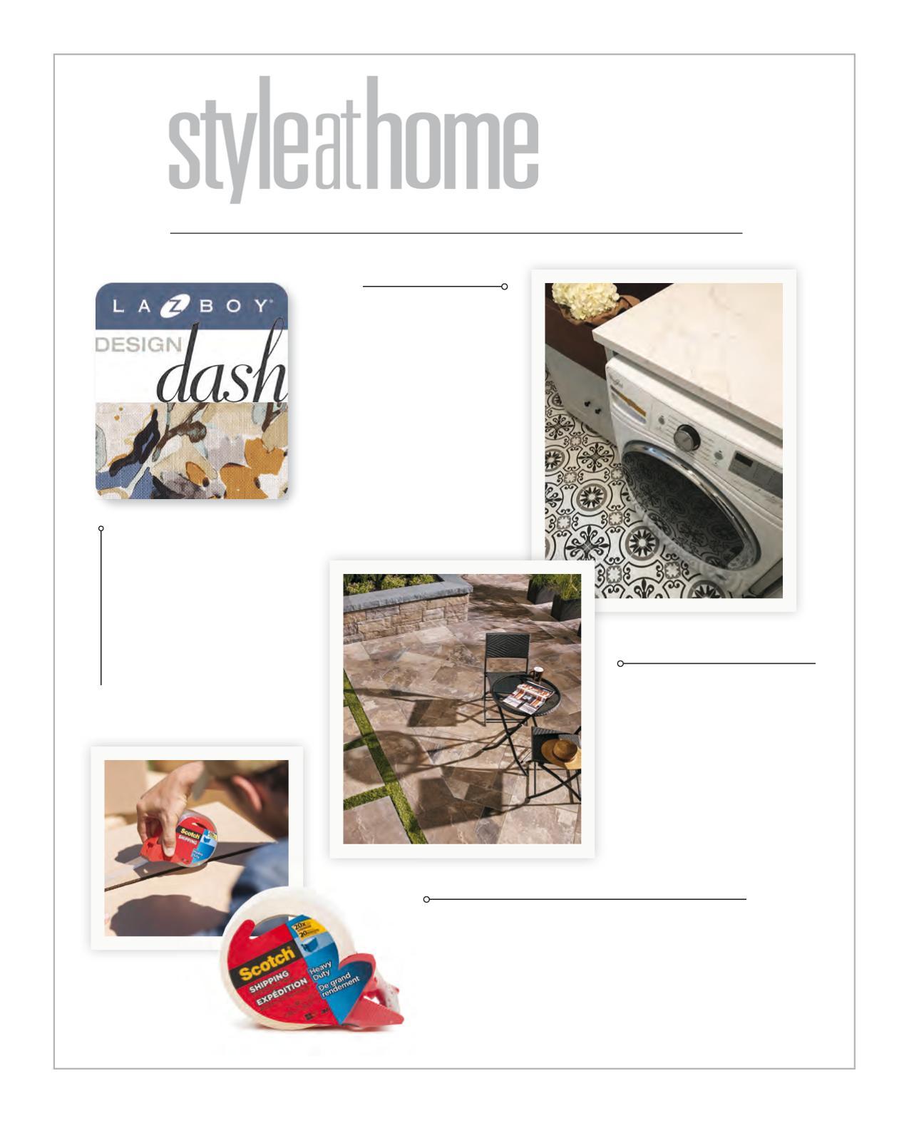
La-Z-Boy dared eight bloggers to design a room starting with a custom designed sofa. View their rooms and vote for your favourite to win your own dream room fi lled with La-Z-Boy furniture. design-dash.com
NEW EXTRA MATTE SURFACE
Silestone Suede is the most advanced matte fi nish available in quartz surfacing, with a unique velvety touch. It has all the Silestone characteristics that set the brand apart: high resistance to impact and scratching, and easy cleaning. Discover all +20 colours with the Suede fi nish on ca.silestone.com
PERMACON PROVENCE SLABS
Experience the elegance of natural stone without the inconvenience. The textures and brighter, long-lasting colours are designed to stand the test of time. Elegant and aesthetically pleasing, Provence slabs have a smooth and natural fi nish. permacon.ca
BE HANDS ON WITH SCOTCH™ BRAND
One strip of Scotch® Heavy Duty Shipping Packaging Tape is all you need to seal seams and keep boxes closed. With 20 times the holding power and strength of acrylic tapes* to resist splitting and tearing, it provides high performance on shipping. Armed with Scotch™ Brand, you’ve got this. scotchtape.ca
* compared to acrylic tapes based on ASMD3654.
JULY 2017
PHOTOGRAPHY, ROBIN STUBBERT; STYLING, ANN MARIE FAVOT & MORGAN LINDSAY RED HOT SUMMER
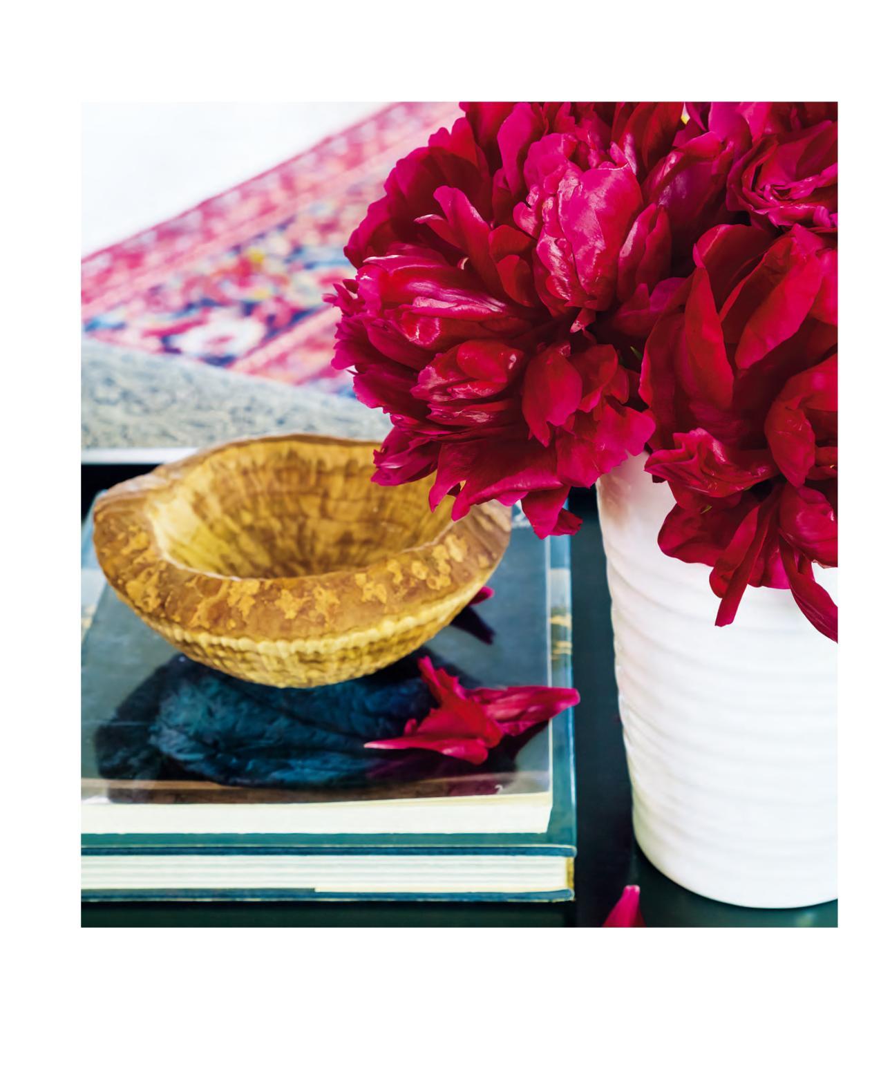
This is the month we look to for easy stress-free days in the sun and sultry nights under the stars. Our decorating aligns as we adorn our rooms with simple white pieces and crisp bright accents to beat the heat.


