5 minute read
SO FRESH AND SERENE
from psyvm9hyr3mo9
TEXT CHRISTY WRIGHT
PHOTOGRAPHY STACEY BRANDFORD
Advertisement
STYLING ANN MARIE FAVOT
A Toronto residence goes from frumpy to finessed with a zingy mix of cool colours, attention-grabbing wallpaper and charmingly mismatched furniture.
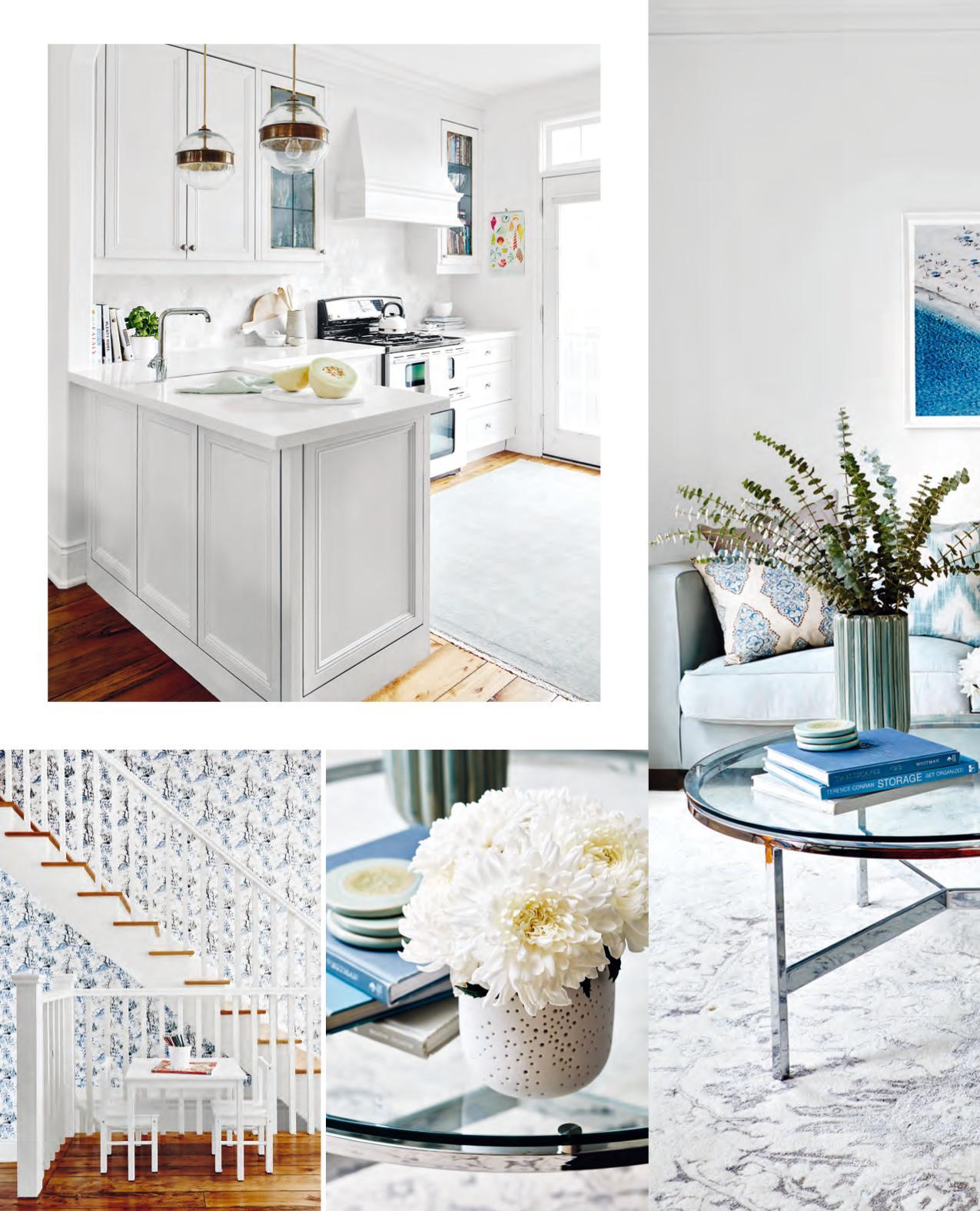
OPPOSITE While most of the finishes throughout the open-plan main floor of this Toronto home are chrome, designer Jacquelyn Clark opted for something different in the kitchen. “The antiqued brass on the pendant lights adds wonderful warmth to the stainless steel appliances and otherwise crisp accents here.”
DESIGN, Lark & Linen Interior Design, larkandlinen.com; CONTRACTING, Decco Renovations.

LEFT “I love incorporating a living room item like an area rug because it lends a soft, plush place to stand while washing dishes,” says Jacquelyn of the kitchen, where her signature traditional-with-a-twist style shines.
The Silhouette P5250-24 CABINETRY PAINT, Para Paints; COUNTERTOPS, Caesarstone Canada; BACKSPLASH TILES, Creekside Tile; PENDANT LIGHTS, Black Rooster Decor; FAUCET, Kohler; RUG, RH Restoration Hardware.
BOTTOM, FAR LEFT Jacquelyn created a space opposite the din- ing area where the homeowners’ kids can eat, colour and do homework. “Because the furniture is white and tucked away, it doesn’t command major attention,” says the designer.
WALLPAPER, Primavera; TABLE, CHAIRS, IKEA.
Lark & Linen. “It was lacklustre,” she says, “and it didn’t match the personalities of its owners, a vibrant couple with two young kids.” The space required some serious resuscitating – but it exhibited promising vital signs. “There were lovely elements like curved archways, crown moulding and stunning barnboard floors,” says Jacquelyn. “My job was to play these up and breathe some new life into this home.”
So she sat down with the owners, who had fallen for her blog, to assess how to get the 1,700-square-foot Toronto home’s pulse rate up. Yes, its murky yellow walls had to go, but other than that, the homeowners had very few requests. “One of the words they kept going back to was ‘fresh’, so I ran with it,” says Jacquelyn. “And beyond that, they essentially gave me carte blanche to do as I saw fit.”
So Jacquelyn began a reboot with minimal, mostly kitchencentric renovations. A breakfast bar that was never used (other than as a place where junk mail went to die) was removed and, with it, two sinks that had been installed in an awkward L- shape in a corner. “I replaced
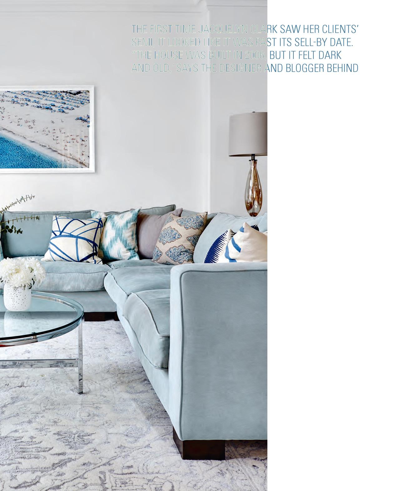
LEFT The designer describes the living room’s corduroy sectional – a piece the homeowners already owned – as “dangerously comfortable.” She dressed it up with patterned toss cushions that comple- ment the beachy artwork.
Lounge Around P5165-14 WALL PAINT, Para Paints; COFFEE TABLE, Elte Market; RUG, Imperial Carpet & Home; PRINT, Black Rooster Decor; TABLE LAMP, Shelter; geometric TOSS CUSHION COVERS, ikat TOSS CUSHION COVERS, KLine Deco; Moroccan-style TOSS CUSHION COVERS, Pill-o-matic.
“Herringbone floors just went in!”
those with one enamelled cast iron beauty,” says Jacquelyn. The Oriental White marble-tiled backsplash and Caesarstone countertops completed the major installations, and then Jacquelyn focused on the fun: furnishings and paint colours.
Yellow walls were overhauled with crisp white, and the wishywashy caramel-coloured kitchen cabinets were sprayed a pale blue-grey shade chosen with the owners’ sectional in mind. “It was the only item of furniture they wished to keep, and its beautiful minty seafoam green shade served as the jumping- off point for the watery palette throughout the main floor,” says the designer.
It’s a palette not restricted to only paint. “Wallpaper is making a serious comeback,” says Jacquelyn, “and with good reason. It’s an incredible way to add wow factor.” She applied it to only small areas, like the wall going up the stairs and a landing, so it makes an impact without breaking the bank.
Against this graphic backdrop, Jacquelyn layered in furnishings which, together, have a curated, collected-over-time feel even though, except for the sectional, they’re all new.
“I like using classic pieces in a modern way,” she explains. “I call it tradition with a twist.
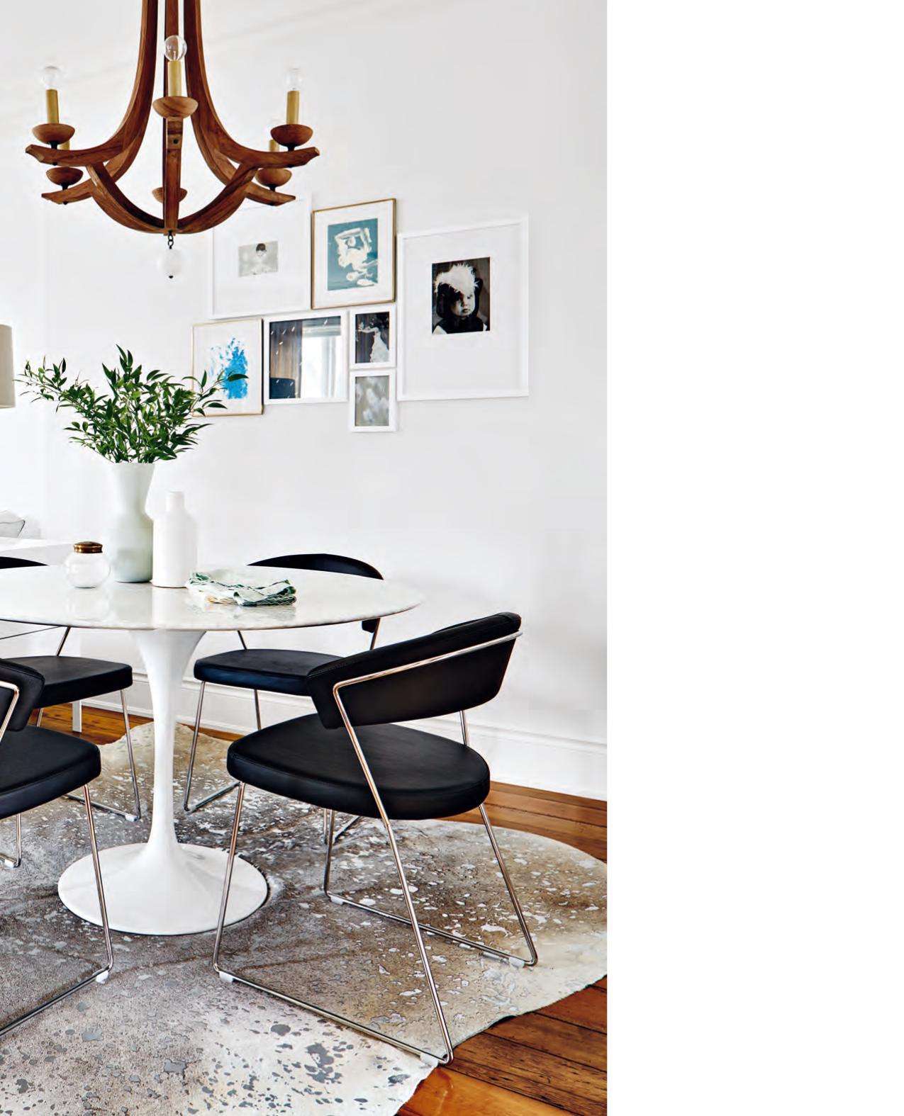
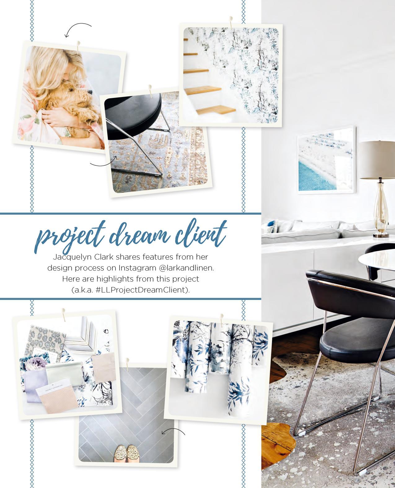
LEFT Jacquelyn relied on a rug to delineate the dining area. “It’s smack dab between the kitchen and living room, so it is a bit of a thoroughfare. The organic shape of a hide rug anchors the space and is a bit of a departure from the more expected rectangular rug, which would have felt too serious here.”
DINING TABLE, RUG, Black Rooster Decor; DINING CHAIRS, Calligaris; CHANDELIER, Arteriors Home.
Good design should surprise you and keep you on your toes.”
Jacquelyn’s compelling use of diverse materials is especially apparent in the dining room, where sleek glossy marble, rustic rough-hewn wood and traditional crown mouldings demonstrate her deft ability to mix disparate elements in a dynamic way.
The homeowners agree. “I had resounding yeses from them at every meeting, and they are thrilled with the results,” says Jacquelyn. “They were dream clients who trusted me from the get-go to bring their home back to life...and I think I did.”
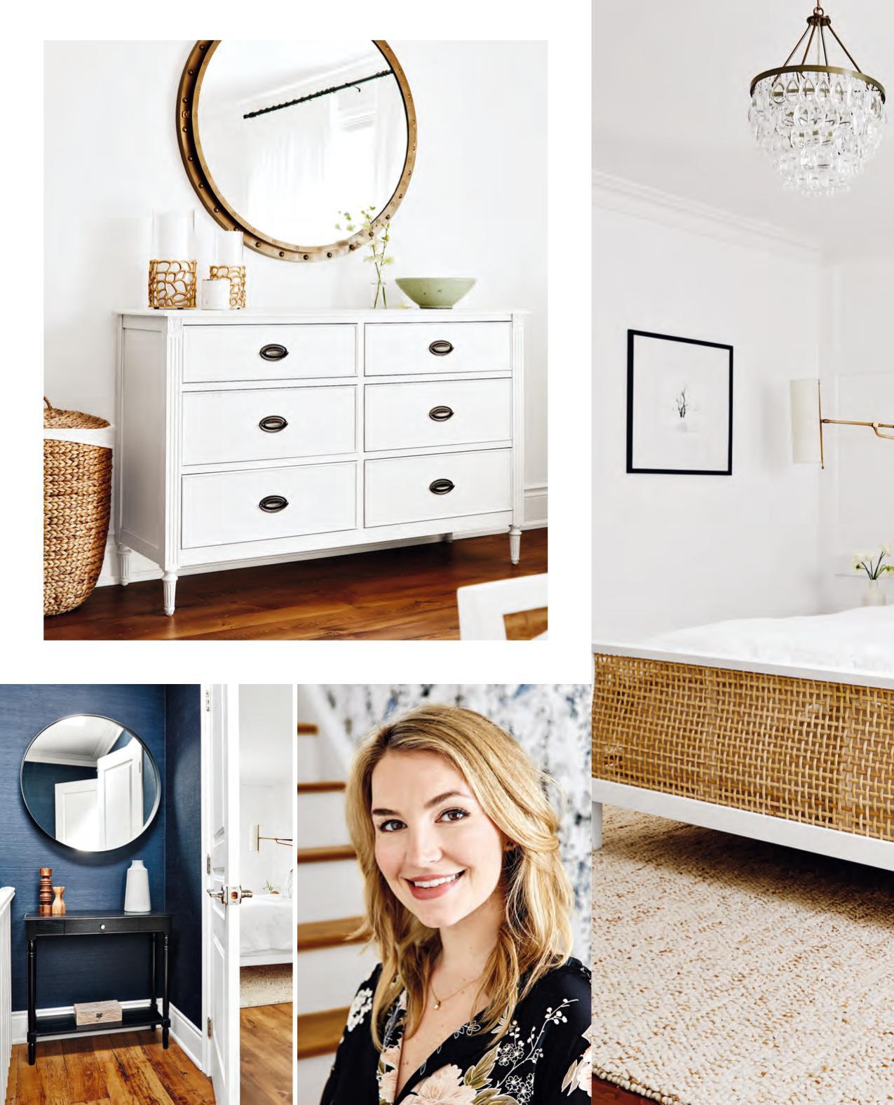
OPPOSITE, BOTTOM LEFT The upstairs landing leads to the master bedroom. “I used a gloriously rich navy grasscloth to establish a moody feel,” says Jacquelyn (pictured opposite). “I love the idea of walking through this dynamic space to get to the white sleeping sanctuary. It’s a lovely journey.”
WALLPAPER, Crown Wallpaper & Fabrics; CONSOLE, Wayfair.ca; MIRROR, CB2.
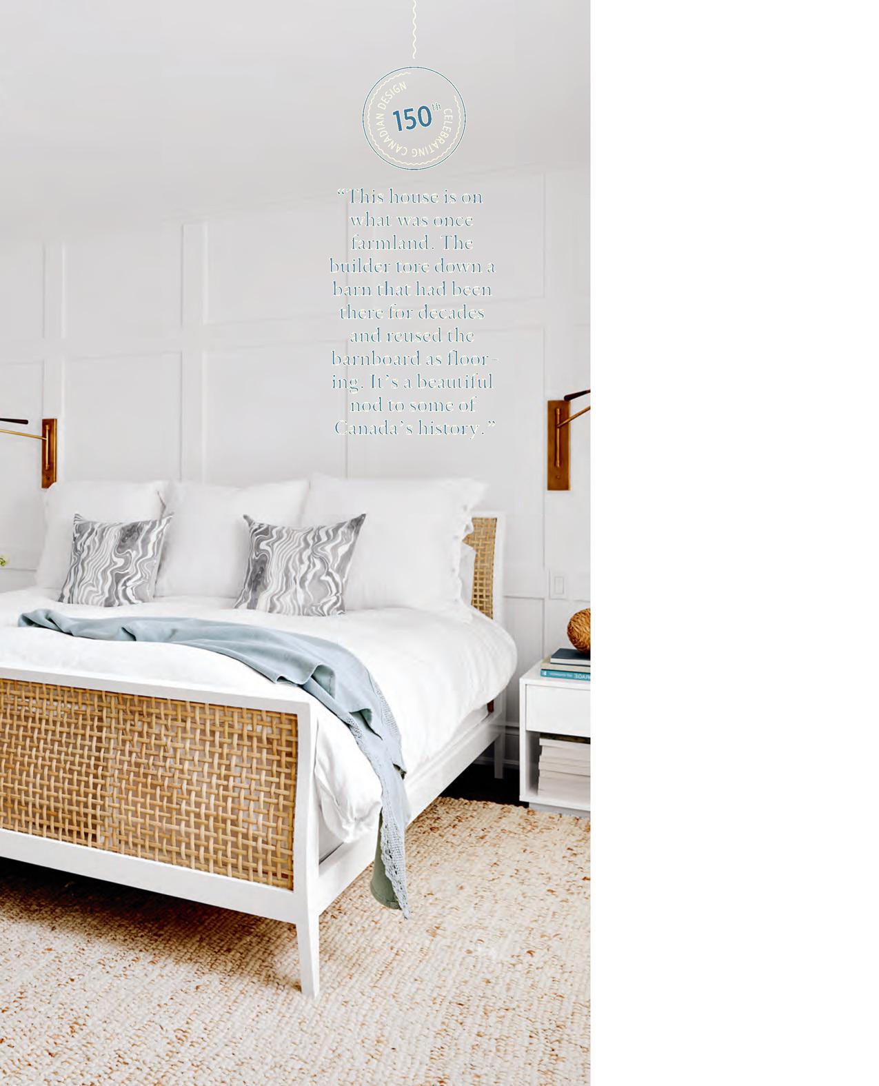
LEFT & OPPOSITE, TOP In the master bedroom, Jacquelyn added panelling to one wall. “It’s an inexpensive way to layer texture into an all-white space,” she says. The brass sconces, however, are the stars of the show. “Their oversized scale is unexpected but captures attention.”
Distant Gray 2124-70 WALL PAINT, Benjamin Moore; BED FRAME, CB2; DRESSER, MIRROR, BED- DING, RH Restoration Hardware; RUG, West Elm; SCONCES, Circa Lighting; PRINT, Minted; TOSS CUSHIONS, Rebecca Atwood.
FOR SOURCES, SEE OUR WORKBOOK


