4 minute read
ON THE BRIGHT SIDE
from sbtuurxbussv
ON THE BRIGHT
SIDE
Advertisement
TEXT KATHLEEN DORE
PHOTOGRAPHY JANIS NICOLAY
There may be about 7,000 kilometres between British Columbia and Scandinavia, but the two regions come together style-wise in this Vancouver home.

of West Coast modern YOU’VE Karen also has an affinity for streamlined HEARD style, but how about West Coast ScandiScandi navian interior design, with its emphasis on natural light, pale wood tones and white navian? Homeowner Karen Boriss got the idea to walls with pops of colourful accessories. inject some Nordic nuance into the 3,200-square- The contemporary white-plus-bright palette foot home she and her husband, Alex Holmes, suits the thoughtful open-concept floor plan were building in Vancouver’s Cambie Village the couple wanted for the house they share neighbourhood when she noticed a similarity with their two young children. “The design is between the regions’ climates. “Vancouver focused on encouraging family time, having doesn’t have the snow and the cold, but it has good flow and creating a place to enjoy raising grey skies for so much of the year,” she says. our kids,” says Karen. “Our main living area is
PREVIOUS PAGE
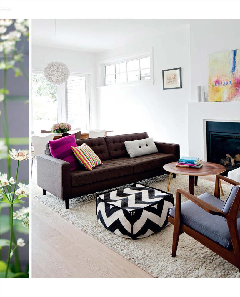
Bright pops of colour perk up the living room’s subtle palette and can be switched out with little fuss.

DESIGN, Sublime Interior Design, sublimeinteriordesign.com; ARCHI- TECTURE, EDG Homes, edghomes.ca; CONTRACTING, Mercia Construction; Behr Pop ped Corn W-B-200 WALL PAINT (throughout), The Home Depot; SOFA, EQ3; Jens ARMCHAIR, Design Within Reach; POUFFE, West Elm; Birds on a Wire ARTWORK, Deb Chaney; pink TOSS CUSHION, 18Karat; grey TOSS CUSHION, Vancouver Special.
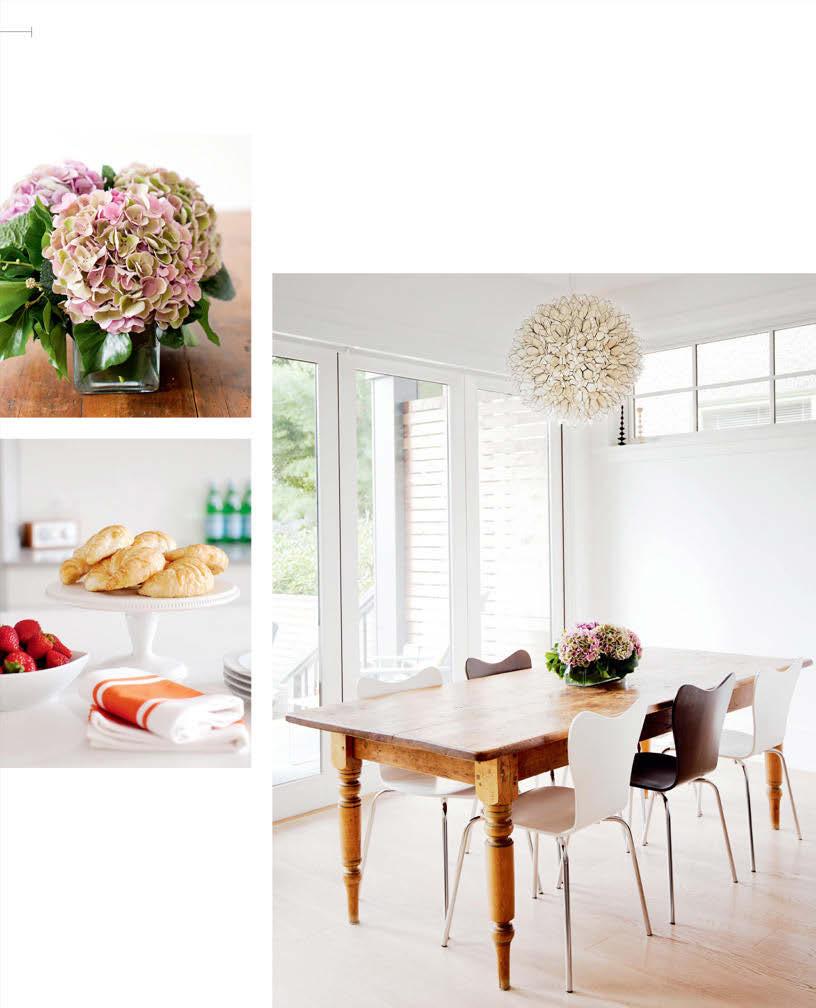
“I was struggling with what to hang above the dining table, but as soon as I saw this pendant light, I knew it was perfect,” says homeowner Karen Boriss. When the bifold doors are open, the dining area is transformed into a true indoor-outdoor space.
DINING CHAIRS, West Elm; CANDLESTICKS, Walrus.
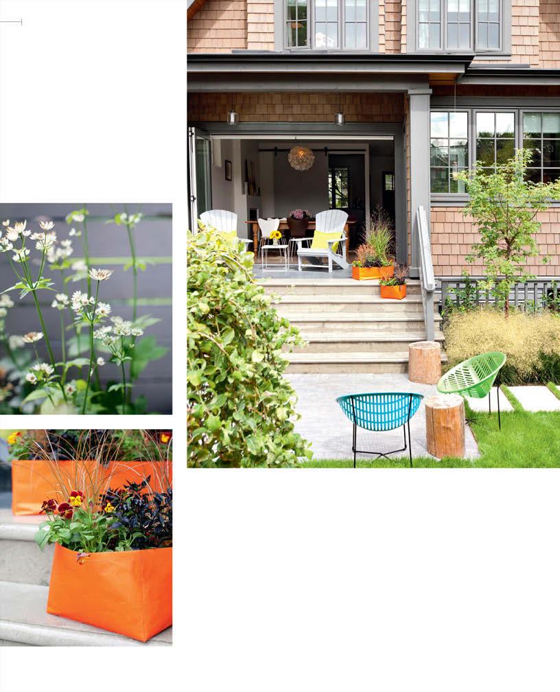
RIGHT The new house has a heritage feel, thanks to cedar shingles. Landscape designer Dave Demers gave the family the backyard design they dreamed of. “I wanted my kids to have a place for free play. There’s a sandbox, a vegetable garden and the lawn and patio where they ride their bikes – all in a clean, modern space,” says Karen.
LANDSCAPE DESIGN,
Cyan Horticulture; Solair CHAIRS, Vancouver Special.
BOTTOM Orange planters – made in part from recy cled materials – add a hit of bold colour on the smooth concrete steps.
Orange BINS (used as planters), Studio Brovhn.

all about cooking and eating, reading and hanging out – without any screens.” For this reason, there’s no TV at the heart of the main floor.
Karen and Alex also wanted a big, welcoming kitchen that complemented the home’s overall aesthetic. “We designed the kitchen without cumbersome upper cabinetry, so it’s airy and full of light,” she says. A long span of floor-to- ceiling cabinetry wraps around one corner of the room, making up for the lack of uppers on the other side. Karen used glossy white doors and drawers on the lowers, but opted for a soft grey Shaker style on this pantry wall for a striking modern-traditional feel. A similar mix of old and new is steps away in the dining area, where Karen’s prized harvest table (a family heirloom) is paired with sleek black and white chairs and a capiz shell pendant light.
Natural light floods the space, thanks to the glass bifold doors in the dining area and the kitchen’s wall-to-wall windows. The effect is a seamless connection between indoors and out, a characteristic common to both West Coast and Scandinavian architecture. “It also makes the dining room an indoor-outdoor eating area,” says Karen. “The doors open right up, and we do a lot of entertaining outside.” And if it rains, no problem – Karen and Alex have thought of that. “We have a covered porch with skylights that let light into the house.” That’s Scandinavian…Or is it West Coast? Or both? Whatever you call it, it’s smart, stylish and stunning.

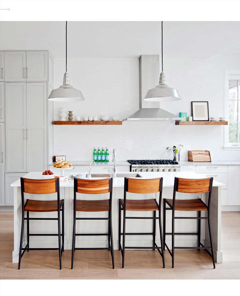
High ceilings, plenty of white, simple reclaimed wood shelves and a wall of windows provide the spacious kitchen with an even greater sense of expansiveness. “Getting rid of upper cabinets meant we had to be really creative to get the same amount of storage,” says Karen. “With the addition of the pantry, it’s worked out perfectly. We love it.”
CABINETRY, Pacific Rim Cabinets; Silestone COUNTERTOP, Caesarstone ISLAND COUNTERTOP, RJS Stone Tops; oval Thassos White marble BACKSPLASH TILES, Marble ’n Things; STOOLS, West Elm; PENDANT LIGHTS, Design Within Reach; VASES, Walrus; RADIO, Vancouver Special; BREADBOX, Williams-Sonoma.


