6 minute read
OUTDOOR LIVING
from sbtuurxbussv
outdoor living TEXT 1,200 SQ. FT. courtyard urban JENNIFER HUGHES
PHOTOGRAPHY Landscape architect Myke Hodgins turns ANGUS MCRITCHIE a yard in the city into a low-maintenance
Advertisement
STYLING
NICOLA MARC hangout dressed up for entertaining.
As this Montreal family grew and matured,
the sounds of kids splashing in the backyard gave way to silence. The pool was definitely underused, and on a relatively small 1,200- square-foot lot, it had become a labour- intensive waste of space. The owners called in landscape architect Myke Hodgins to come up with some alternative designs that would turn their yard into a more grown-up retreat. “The couple initially wondered if they should keep the vinyl kidney-shaped pool or fill it in. My team presented them with several options, and this is the one they loved the most,” explains Myke.
To avoid having to fill in so much of the ground when the pool was removed, Myke designed a multi-level plan with the lowest part at the centre of the yard where the pool
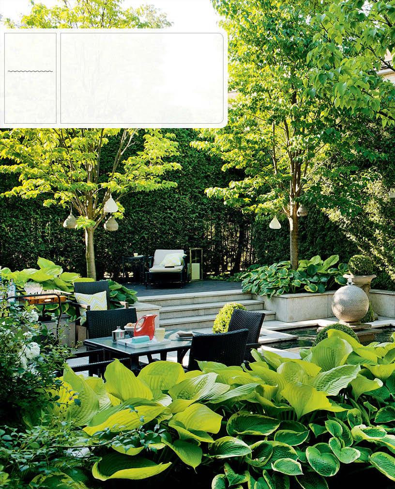
LEFT The four corners of the lower terrace are defined by Japanese tree lilacs, which fill the yard with fragrance in late spring.
LANDSCAPE DESIGN, Hodgins & Associés, heta.ca; TOSS CUSHIONS (throughout), HomeSense.
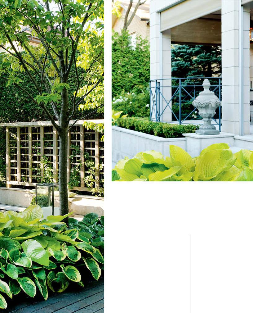
ABOVE A large covered terrace with a dining area allows for pleasing views into the garden during dinner parties. The huge leaves of ‘Frances Williams’ and ‘Sum and Substance’ hostas provide lush division along a low wall.
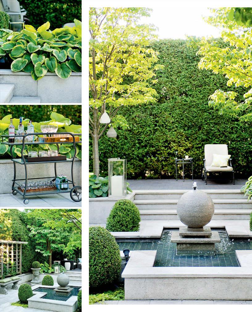
LEFT The cross-shaped water feature is anchored by clipped boxwoods at each corner with vibrant chartreuse lysimachia at their feet. The orb-shaped fountain is modern and sculptural.
OPPOSITE, TOP ‘Frances Williams’ and ‘Sum and Substance’ hostas in raised flowerbeds.
OPPOSITE, MIDDLE A stocked bar cart is ready for entertaining.
Duralex GLASSES (on bottom shelf), Arthur Quentin.
OPPOSITE, BOTTOM Landscape architect Myke Hodgins suggests planning a place for the eye to rest in small spaces. Here, it’s the bench. “You may not sit there, but your eye will!” he says.
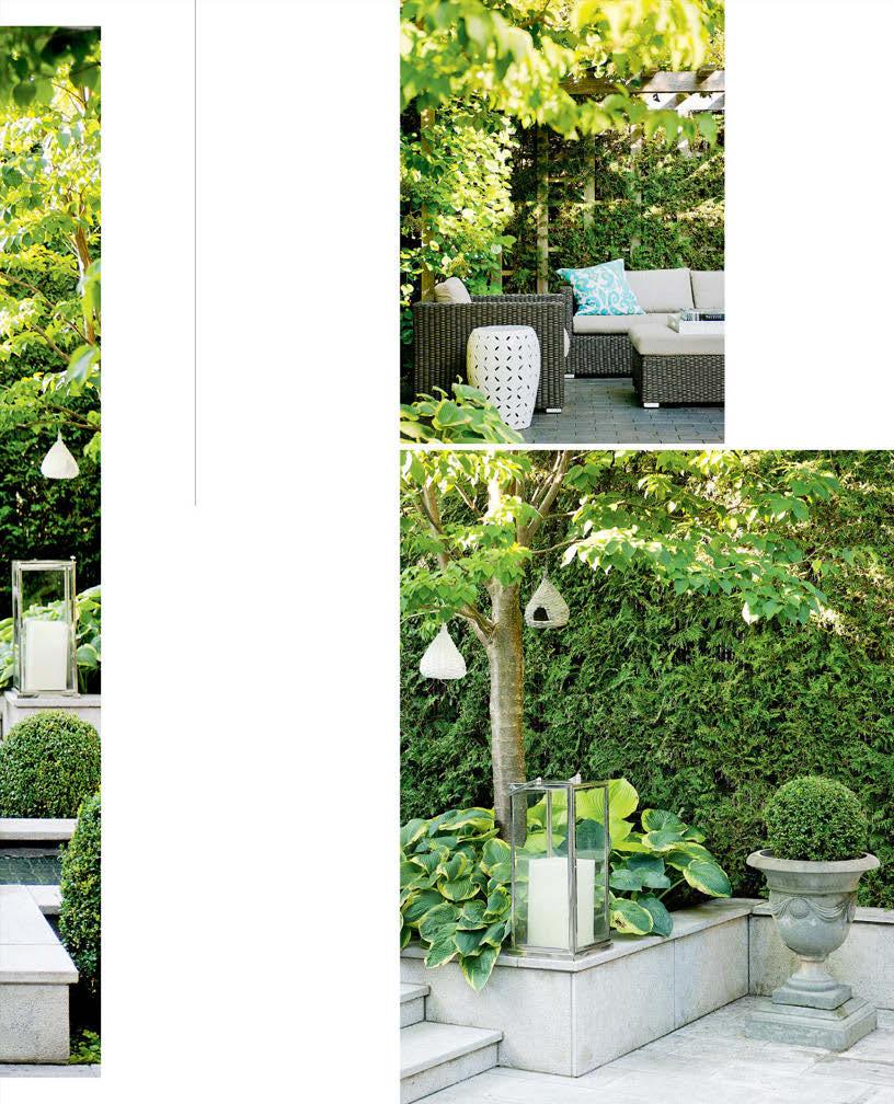
RIGHT, TOP The raised sitting area is a destination for lingering on warm evenings or finding shelter from the hot afternoon sun.
Resin wicker SOFA, ARMCHAIR & OTTOMAN, Jardin de Ville; white TRAY, HomeSense.
RIGHT, BOTTOM A lantern with a battery-operated candle casts a gentle glow in the evening.
had been. Now a cross-shaped fountain is an entirely more sophisticated water feature. Building on its shape, Myke laid out the space in a cross design with two axes: one from the house to the trellis at the back of the yard, and the second a raised sitting area at one end and a lounge at the other.
“We aimed for a European courtyard feel,” says Myke. Low limestone walls provide the structural framework of the new design and, for contrast, the raised areas are paved with dark brick. A tall cedar hedge offers privacy from neighbouring yards as well as a verdant backdrop. Four Japanese tree lilacs are planted in strategic spots to create a division between the upper and lower terraces. Plantings are predominantly green, with plenty of lush, leafy choices like hostas, boxwood and smoke bush, as well as climbing hydrangea on the pergola.
Now the family spends quiet evenings dining on the terrace and enjoying cocktails in the sitting area under the pergola. And the only splashing sound is the soft, soothing trickle of water from the fountain. This backyard has definitely grown up, too.
outdoor living
1.5 ACRES
TEXT JENNIFER HUGHES
PHOTOGRAPHY ANGUS MCRITCHIE
retreatcountry
Landscape architect Stuart Webster trans - forms this grand backyard into an elegant week end escape for a busy couple.

It’s easy to see why Montreal-based interior designer Scott Yetman
and husband Jean Michel Lavoie named their country home Sans Souci, French for “without a care.” The house, a 1950s-era bungalow, sits on six acres in Knowlton, Que., that include an oval-shaped swimming pool, a tennis court and extensive gardens. The couple had been visiting the home as guests for years before they bought it. “It belonged to an elegant elderly couple, and we’d go there for cocktail parties and tennis matches,” says Scott. When it came up for sale in 2009, they jumped on it. Scott transformed the house, previously goldcoloured brick with big picture windows, into a classic structure in crisp white and black. The pair now uses it as a weekend escape from their busy city careers, as well as a place to entertain family and friends.
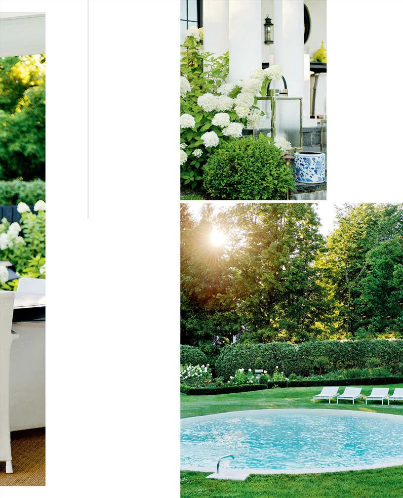
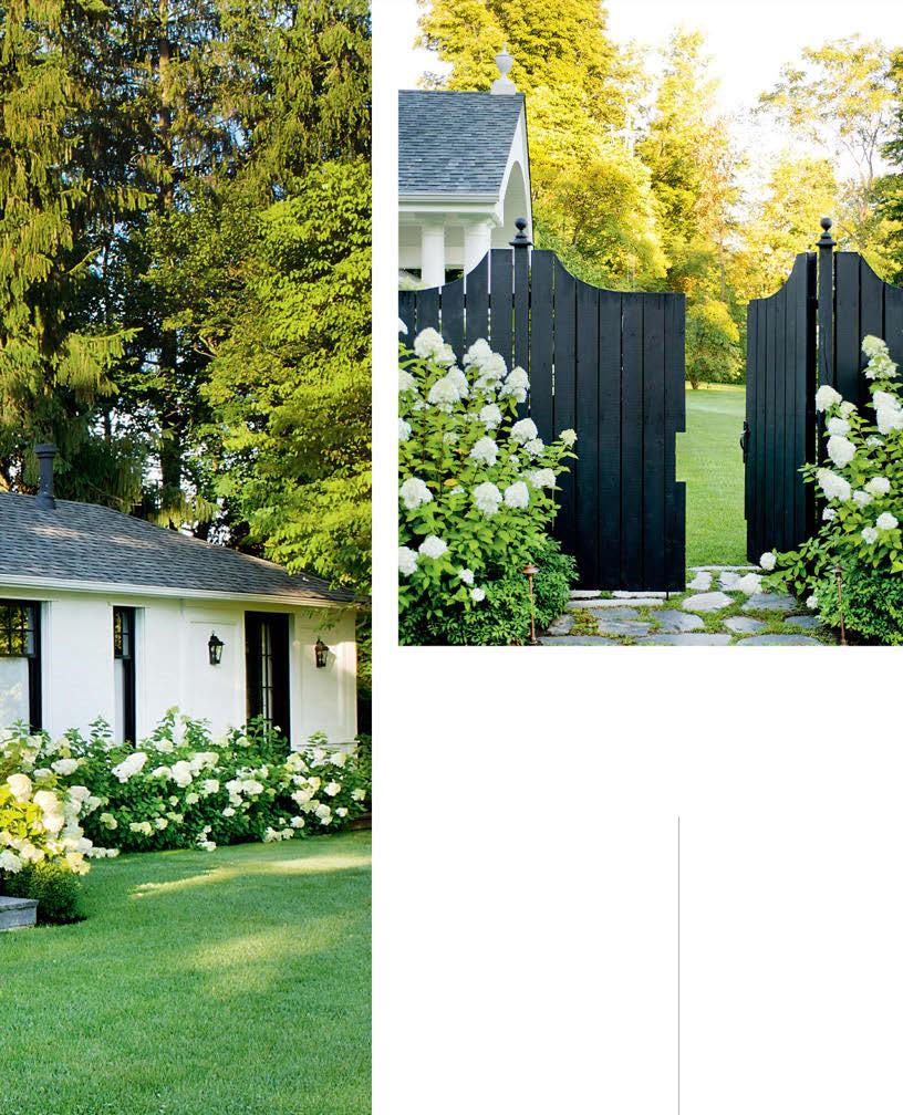
LEFT The house’s crisp white and black scheme is carried out into the garden with its primarily white and green palette.
DESIGN, Scott Yetman Design, scottyetman.com; LANDSCAPE DESIGN, Stuart Webster Design, swdla.com; CONTRACTING, D.R. Albers Construction; SOFAS, Jardin de Ville; TOSS CUSHION FABRIC, Télio; TOSS CUSHION SEWING, Scott Yetman Design; URNS, Celadon Collection.
ABOVE Homeowner Scott Yetman designed the black-painted cedar fence to fill in areas where the mature hedge wasn’t growing.

OPPOSITE, TOP A low boxwood hedge provides the structural framework of the potager, with a pea gravel path offering access to the different beds.
OPPOSITE, MIDDLE Bold black and white striped Louis XV-style chairs are a comfortable spot for relaxing on the terrace.
Outdoor CHAIRS, Télio.
OPPOSITE, BOTTOM Hydrangeas, with their robust white blooms, surround the entire house.
RIGHT, TOP The wide steps from the terrace are lined with lanterns and planters.
LANTERNS, Celadon Collection.
RIGHT, BOTTOM The existing oval pool was left as-is; the only alteration was to remove some concrete paving from around it. Now the grass comes almost to its edge. “It has more of a Hamptons look this way,” says Scott.
For the grounds, they requested the help of landscape architect Stuart Webster. “The gardens were treated the same way as the house redesign,” says Scott. “We sought out Stuart for his European architectural approach to garden design.” The plan, which landscape designer Eva Novoa helped Stuart devise, incorporated a mature cedar hedge that encloses the 1.5-acre backyard. A sweep of hydrangeas planted in front of the hedge further encloses the space and lends lushness.
The oval pool in the centre of the yard also provided much of the design direction. “The landscaping revolves around the pool,” says Stuart. “We expanded on its shape, both structurally and visually.” Curved flowerbeds and a pea gravel path mimic the roundness of the pool. Even the grass around it is mowed so that it has the same circular pattern. “We’re a bit manic about the grass!” says Scott.
In another corner of the yard, Stuart designed a potager for growing vegetables and herbs, as well as flowers for cutting. And off the back of the house, a large covered terrace boasts a commanding view of it all and offers a prime spot for relaxing and entertaining. Sans souci indeed!
