
LEONARDO BRAMBILLA
GRAPHIC DESIGNER Portfolio

LEONARDO BRAMBILLA
GRAPHIC DESIGNER
HERE I AM
I am Leonardo and I am a flexible and proactive Graphic Designer with more than 6 years of experience gained in both corporate and advertising agency environments.
Throughout my work experiences, I have learned the importance of teamwork and challenging oneself, as each experience contributes to personal growth.
I am a curious person always eager to improve myself by acquiring new skills.
I am looking for a new work experience and professional path that will allow me to develop my skills and that will be able to stimulate my creativity.
MORE ABOUT ME
Since my childhood I have been passionate about football and I have been playing it at competitive level since I was 10. I also practiced karate for 8 years, achieving the first level of the black belt.
I like to read, especially biography of famous people to inspire me, and drawing while listening to music.
I’m also passionate about travelling and photography: I like to discover new places and take pictures of little details.
In 2022 I did the Primitive Camino and it was one of the best experience of my life.
Italian Mother tongue French Beginner. I’m learning it by myself.
English Interm./Advanced Dutch Beginner. I’m learning it by myself.

PERSONAL EXPERIENCE
9.2018 - on going | Graphic Designer & Marketing Assistant at Abati Group
9.2018-10.2021 | Junior role / 11.2021 - on going | Senior role
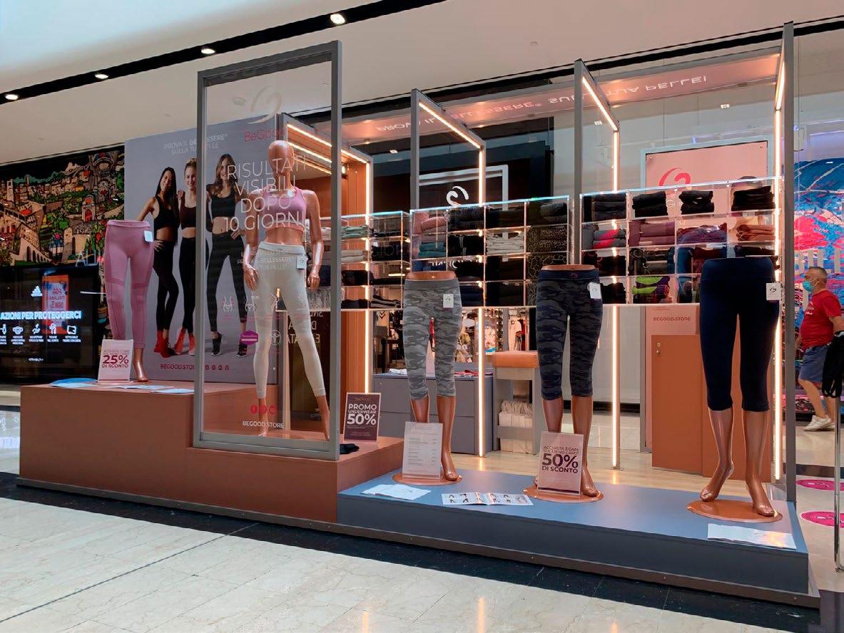
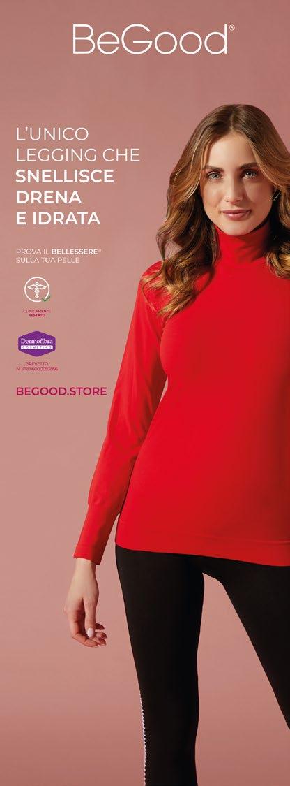
Online: website banners and sliders (Resistex, BeGood, Abati Group); Packaging: garments packaging, shopper & countertop displays (BeGood);
Stand & Store: graphics for thee setup of trade fair stands (Resistex, BeGood) and Temporary Store (BeGood).
Photoshooting assistant: e-commerce photo selection and editing.
E-commerce (Prestashop): creation of product pages, implementation of discount codes and blog posts.
Mail Marketing: creation of both graphic and textual content, setup and programming of DEMs and newsletters. Creation of editorial plan for DEMs and newsletters.
Social (Facebook & Instagram): creation of social content (post, stories, contest, campagne adv);
Meta Business Suite: programming social posting and social shop.
2.2018 - 8.2018 | Graphic Designer Internship at Abati Group
Company logo and brand identity restyling (Abati Group, Tecnofilati, Abafil);
Offline: layout of catalogues, brochures, flyer and price lists (BeGood); Online: website banners, social post (BeGood).
11.2017 - 2.2018 | Graphic Designer Internship at Zamprediverse
Publishing: layout of books, albums and brochures (Rai Eri, Mondadori); Online & Offline: visual flyer and poster for events, social post, adv and website banners (Bianchi, Bianchi Café & Cycle, Giro d’Italia, Mondadori); Photo-editing (Duchessa Lia, Milan).
EDUCATION
Basic Concepts of Digital Marketing at Google Digital Training
2.2022 - 7.2022
Basic Photography Course at MAG23 Bergamo, Italy | 6.2017 - 7.2017
Bachelor Degree in Communication Design at Politecnico di Milano (Italy) Milan, Italy | 10.2014 - 9.2017
Scientific Diploma at G.Bruno High School Cassano d’Adda, Italy | 9.2007 - 7.2012
TECHNICAL SKILLS
Adobe Indesign
Adobe Illustrator
Adobe Photoshop
Adobe Lightroom
Photography Mailchimp Prestashop Wordpress (basic)
Meta Business Suite (basic)
YOU CAN FIND ME HERE
+39 334 1118456
lbrambilla09@gmail.com

PUBLISHING
• Abati Group | Company Profile
• HumanWellness | Company Profile
• Visual Book | The Importance of Being Morrisey
Abati Group Company Profile


 Professional project | Abati Group, 2021 Adobe Indesign, Adobe Illustrator, Adobe Photoshop
Human Wellness Company Profile


Visual Book
A work of editorial design in which I worked on the visual aspect of the artifact with the aim of conveying the personality of the protagonist through the choice of materials, typefaces, and colors.
The book is titled ‘The Importance of Being Morrissey’: a collection of 28 interviews given by Steven Patrick Morrissey, one of the greatest lyricists and innovators in British pop music, starting from 1982.
Due to its significance for the musical evolution of British pop and beyond, identified in his music, and everything closely related to it, the key to interpreting my project.
divided the contents into two categories: musical topics and various topics.
The contents of the first category are placed on the right-hand pages, which I laid out with a balance between font size and line spacing that enhances readability; the themes of the second category are on the left-hand pages, which are less readable due to the 1:1 ratio between font size and line spacing, making the text visually heavy.
The contents are presented on the pages in a way that, despite their division, follows the logical thread of the original interview discourse.
This particular arrangement ensures that, during reading, when facing a double page, one moves from right to left, and vice versa, following the order of the textual blocks, proceeding from top to bottom.


Educational project | Politecnico di Milano, 2017 Adobe Illustrator, Adobe Indesign


LOGO DESIGN
• Abati Group | Tecnofilati, Abafil
• MIJET
• MIGRA Museum
Abati Group
The project involves the restyling of the Abati Group logo, followed by the coordinated restyling of the individual companies within the group (Tecnofilati and Abafil).
The restyle was carried out with the aim of refreshing the group’s image, using a modern style that conveys the solidity of the group and its ongoing ambition for growth.
Abafil & Tecnofilati
The project involves the restyling of the Abati Group logo, followed by the coordinated restyling of the individual companies within the group (Tecnofilati and Abafil).
The restyle was carried out with the aim of refreshing the group’s image, using a modern style that conveys the solidity of the group and its ongoing ambition for growth.
MIJET
This is an individual project born from the need of the music group ‘Mijet’ to have a personal logo.
The logo serves as a visual expression of the music: the construction of the grid partially recalls a musical score, within which the varying thickness of the lines, with different inclinations and ligatures, expresses the idea of a diverse, irregular, and undefined musical genre.
Pantone 88-8 U Pantone 136-6 UMIGRA Museum
For the creation of this logo, we drew inspiration from the imagery associated with the acronym ‘Migra,’ evoking the concepts of travel, migration, open spaces, lightness, curiosity, and dynamism. We developed three different yet coordinated logos, using an irregular triangle as the base and combining it with its variations achieved by repeating it at different angles.
The result is three shapes reminiscent of the wings of three birds in flight. In choosing the colors, we leaned towards shades like green, yellow, and purple, which, when overlapped, create a third color at each intersection.
Educational project | Politecnico di Milano, 2016
Adobe Photoshop, Adobe Illustrator, Adobe Indesign

CORPORATE IDENTITY
•
MIGRA Museum
MIGRA Museum
The brief involves creating the visual identity for an imaginary museum dedicated to contemporary graphic design, conceived as both a physical and virtual space. Physical in that it is imagined to be located in Milan; virtual because it is envisioned as a highly active museum on the web.
The visual identity of the graphic design museum encompasses both the logo design process and the creation of the entire coordinated visual representation of the institution.


Educational project | Politecnico di Milano, 2016
Adobe Photoshop, Adobe Illustrator, Adobe Indesign


WEB & ADV
• Bianchi Café & Cycle | Bianchi
• MIGRA Museum
Ultimate visual of Miguel Soro Event
Bianchi e Bianchi Café & Cycle
These visuals are part of the Bianchi and Bianchi Café & Cycle project, focusing on creating a poster to promote the live performance of the Spanish artist Miguel Soro at Bianchi Cafe Cycles and the 2017 Christmas visual campaign for Bianchi.
The visuals draw inspiration from the client’s color palette and style guidelines, while also setting themselves apart from other designs by adopting a modern, dynamic, and club-inspired style, especially in the case of the visual associated with the event at BCC.

Other proposals

 Professional project | Zampediverse Srl, 2017 Adobe Photoshop, Adobe Indesign

 Facebook Cover Miguel Soro Event
Website Homepage Banner Miguel Soro Event

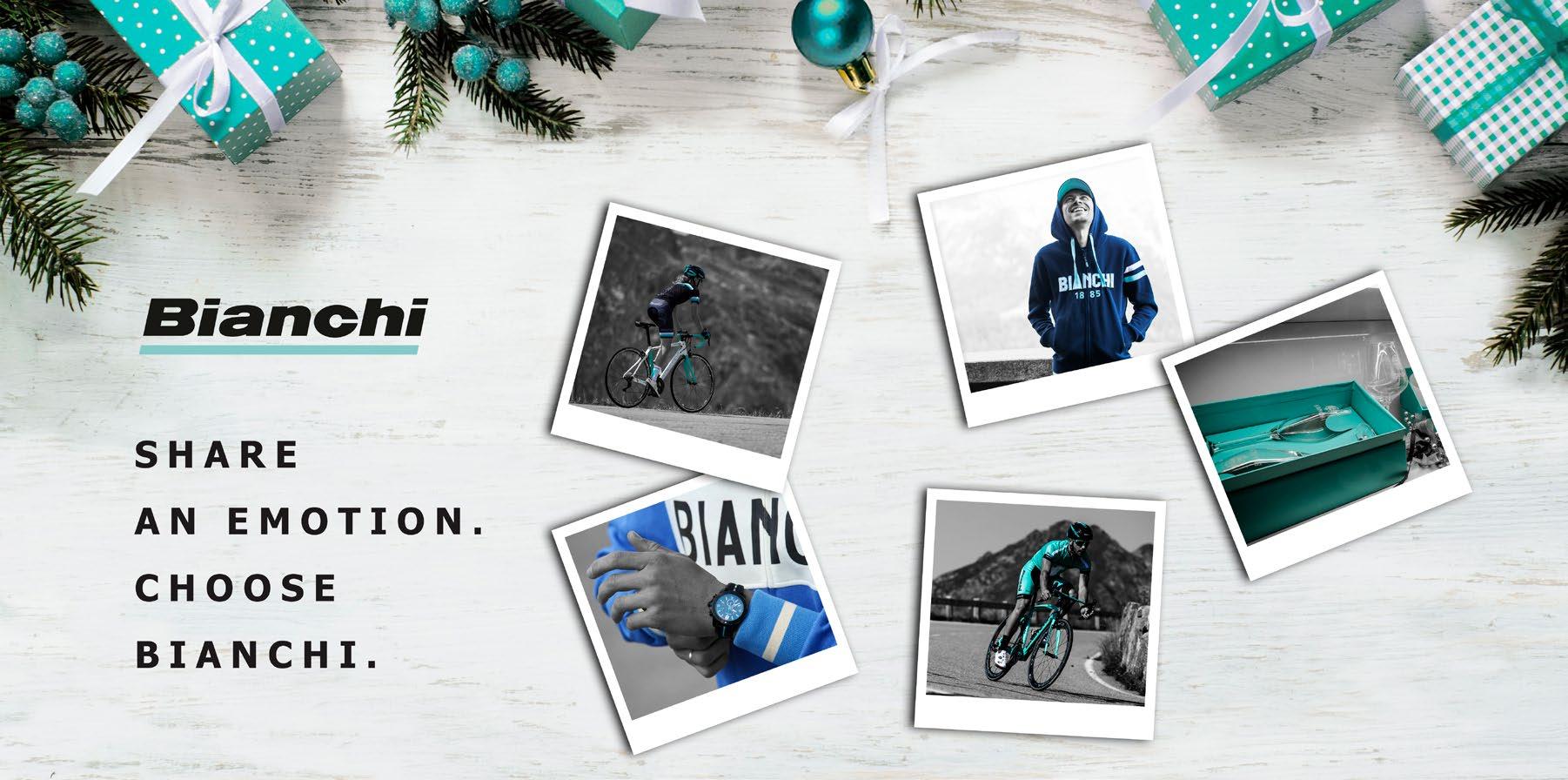
 Facebook Cover Christmas 2017
Website Homepage Banner Christmas 2017
Social Post Christmas 2017
MIGRA Museum
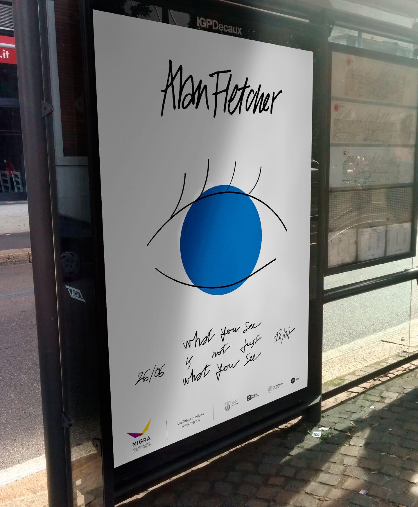
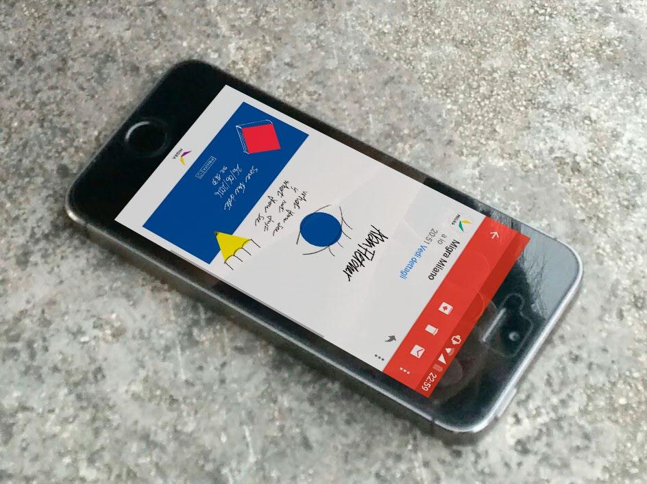
In this part of the project, the organization of an exhibition at the MIGRA museum dedicated to Alan Fletcher, one of the most prominent British graphic designers, has been carefully handled. This involved the creation of an advertising campaign to promote the exhibition, including the design of posters, web banners, and both physical and digital invitations.
For the visual identity of the exhibition, we considered the irony, creativity, and irreverence that characterize much of Alan Fletcher’s work, particularly a series of personal projects, illustrations, and experiments with color and form. Inspired by the title of his book “The Art of Looking Sideways,” we utilized primary shapes and colors, combining them with different illustrations each time. The intention was to convey a sense of constant evolution and dynamism, avoiding the impression of a fixed and static view.

Educational project | Politecnico di Milano, 2016
Adobe Photoshop, Adobe Illustrator
Advertising Posters






Stand Resistex
The project involves creating graphics for the exhibition stand used by Tecnofilati and Resistex at ISPO Munich 2019.
This included selecting images and preparing detailed drawings of individual walls at a 1:1 scale, which were then provided to the stand builder.


Professional project | Abati Group: Resistex, 2019
Adobe Photoshop, Adobe Illustrator


Store BeGood
This project is part of the larger one concerning the creation of the BeGood Store at Oriocenter in 2020.
My role involved selecting the images, creating the graphics for the panels, and preparing the corresponding 1:1 scale renderings to be provided to the set designer.


 Professional project | Abati Group: BeGood, 2020 Adobe Photoshop, Adobe Illustrator
