Liliana Davie
Project overview Project duration: August 2022 to October 2022
The product: Changes. Is a pre-teen empathy app with simple features and functionalities that will make it easier for the age range the app is geared towards. Understanding emotions and empathy and deeper meaning of how users can reflect their emotions amongst themselves and others. As well as using the app to write out their thoughts.


Project overview
The problem:
How can pre-teens understand the deeper meaning of the many different emotions they feel?
The goal:
Giving tools and support to help pre-teens with their emotions and empathy through videos, articles, and journaling.
Project overview
My role:
UX designer designing an app for Changes.from conception to delivery.
Responsibilities:
Conducting interviews, paper and digital wireframing, low and high-fidelity prototyping, conducting usability studies, accounting for accessibility, and iterating on designs.
User research: summary
I conducted interviews and created empathy maps to understand the users I’m designing for and their needs. A primary user group identified through research was children to pre-teen who have big milestone in their life such as moving to new schools.

Persona 1: Chloe
Problem statement:

Chloe is a 7th Grade Student who needs a way to understand how to express herself to her family because She tends to bottle up her emotions and does not know how to express herself.

Persona 2: Rae
Problem statement:

Rae is a 5th Grade Student who needs a place to understand their emotions because she is transitioning into middle school which is an exciting and anxious experience for her.

Competitive audit
An audit of a few competitor’s products provided more context on websites and app geared towards children and pre-teens to address with the Changes. app.


Ideation

When coming up with quick ideas for the app I wanted to address how the app can be perceived for the intended audience which were pre-teens. Knowing the app’s focus is on emotions. I designed to keep up with the user with personalized touches, simple straight to the point task.

Digital wireframes

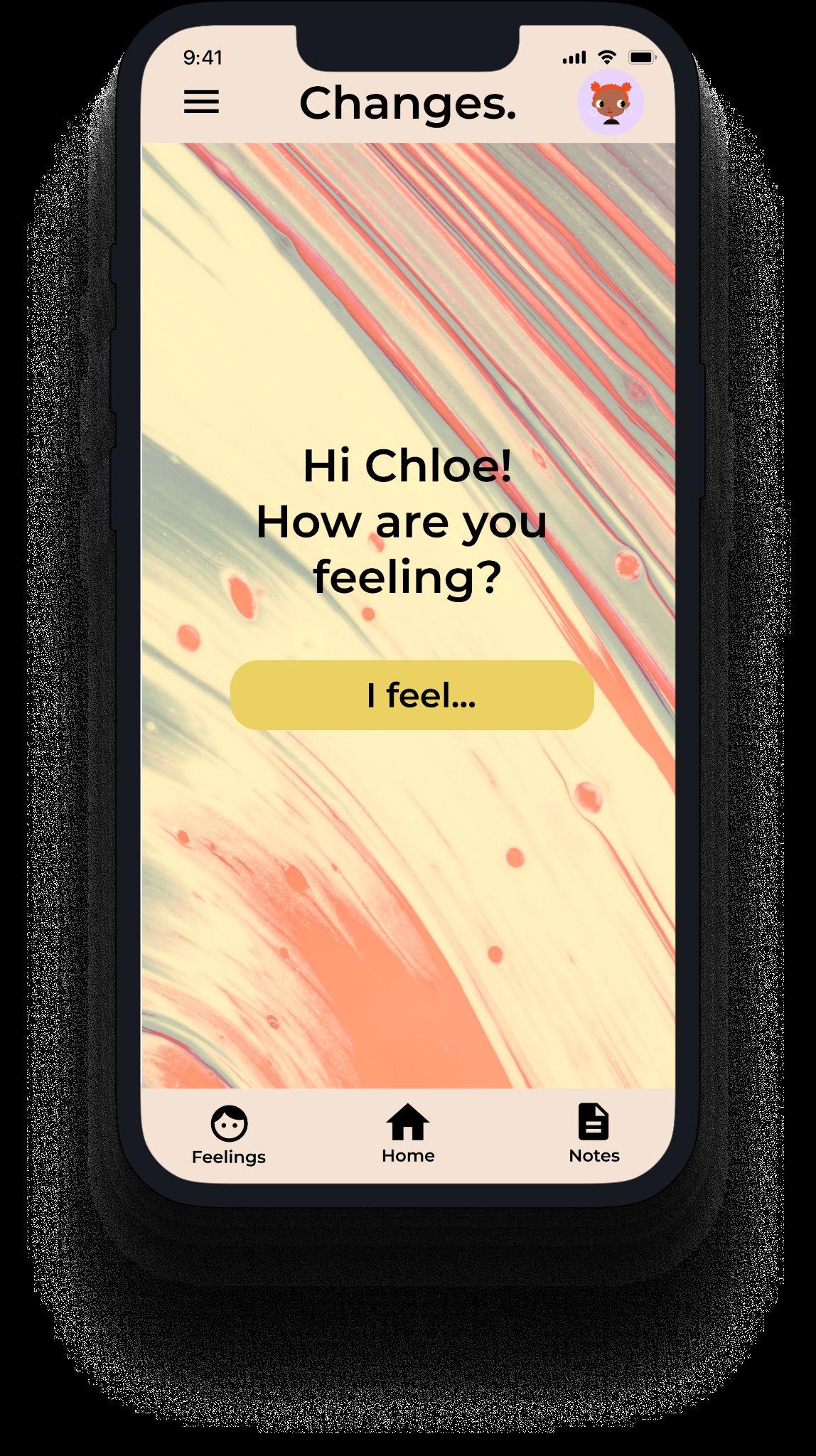
After ideating and drafting some paper wireframes, I created the initial designs I wanted the app to check-in on how the user is feeling when first opening the app. These design allows the user to follow a flow everytime they first open the app.
When the user opens the app the first option is to check-in.

Low-fidelity prototype
To prepare for usability testing, I created a low-fidelity prototype that connected the user flow from how the user feels, to the meaning of the user's emotions, to the notes screen.

Link to Low-Fidelity Prototype

Usability study: parameters
Study type:

Usability study: findings
Interactive Notes Articles
Users want more interactive text and icons.
Users wanted more buttons to remind them to take notes.
Users wanted the articles to have different sections for each emotion.

Before usability study
Mockups
For the homepage design, I did not change too much from the usability study before many of the users liked the instant check-in when opening the app. All that was changed was the details with the aesthetic.


After usability study

Before usability study
Mockups
In the first round of usability, study users wanted a more personalized touch for their notes. To keep a more accessible approach users can look up their archived entries quickly, and have a visual calendar to see the dates they have written in as well.


After usability study

Mockups


Mockups


Mockups


High-fidelity prototype
The final high-fidelity prototype addresses user pain points of incorporating more of style layout that would suit pre-teens, emphasizing on writing note,and more attention to the videos and articles.

Link to High-Fidelity Prototype

Accessibility considerations
1 2
The use of the hamburger for users to get to other parts of the app if they are unable to locate them on the homescreen.
Used icons to help make navigation easier.

Design
Sitemap

Finishing up the app design for the responsive website. I wanted to do a hierarchical structure website, keeping the options, simple, and straight to the point for the user which matches the mobile app.

Responsive designs


The designs for screen size variation included
mobile, tablet, and desktop. I want to keep both
hand held devices very similar. Making the desktop design more options for the user.
Takeaways
Next stepsGoing forward
Takeaways
Impact: Understanding emotions and empathy and deeper meaning of how users can reflect their emotions amongst themselves and others.

What I learned:
One quote from peer feedback:
"I love the use of color and texture throughout the mobile app."
While designing Changes. app, I learned the importance of paper wireframes it helps with time and cost. Usability studies help the designer in what needs to be done. Also, designing for responsive designs puts into perspective how sizing helps a lot.
Next steps
1 2
Have more usability studies to see if the pain points users experienced have been addressed.
Continue to work on the layout to ensure user accessibility.

Let’s connect!

Thank you for your time reviewing my work on the Changes. app! If you’d like to see more or get in touch, my contact information is provided below.
Email: Lilydavie99@gmail.com Website: https://issuu.com/liliana_davie
