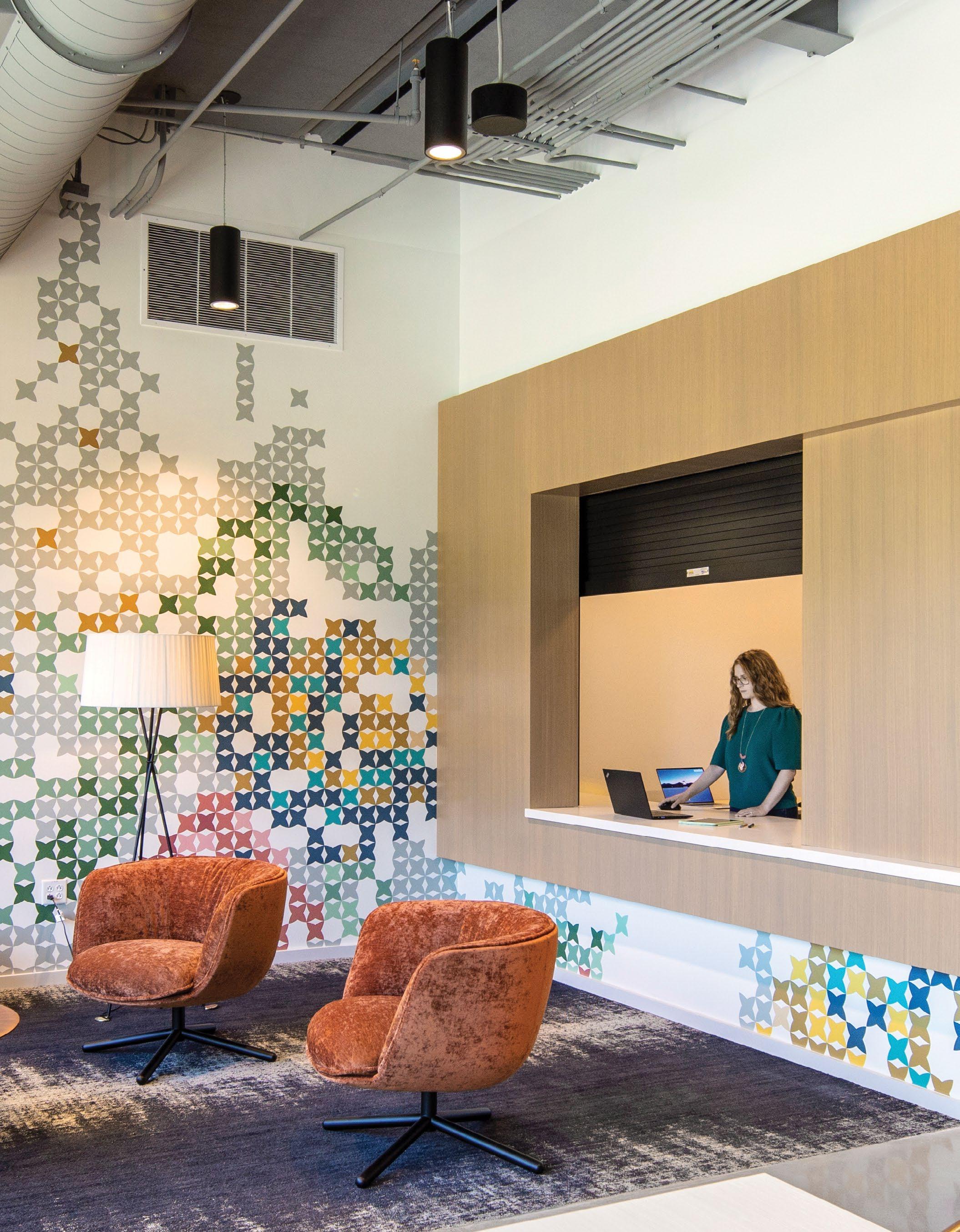
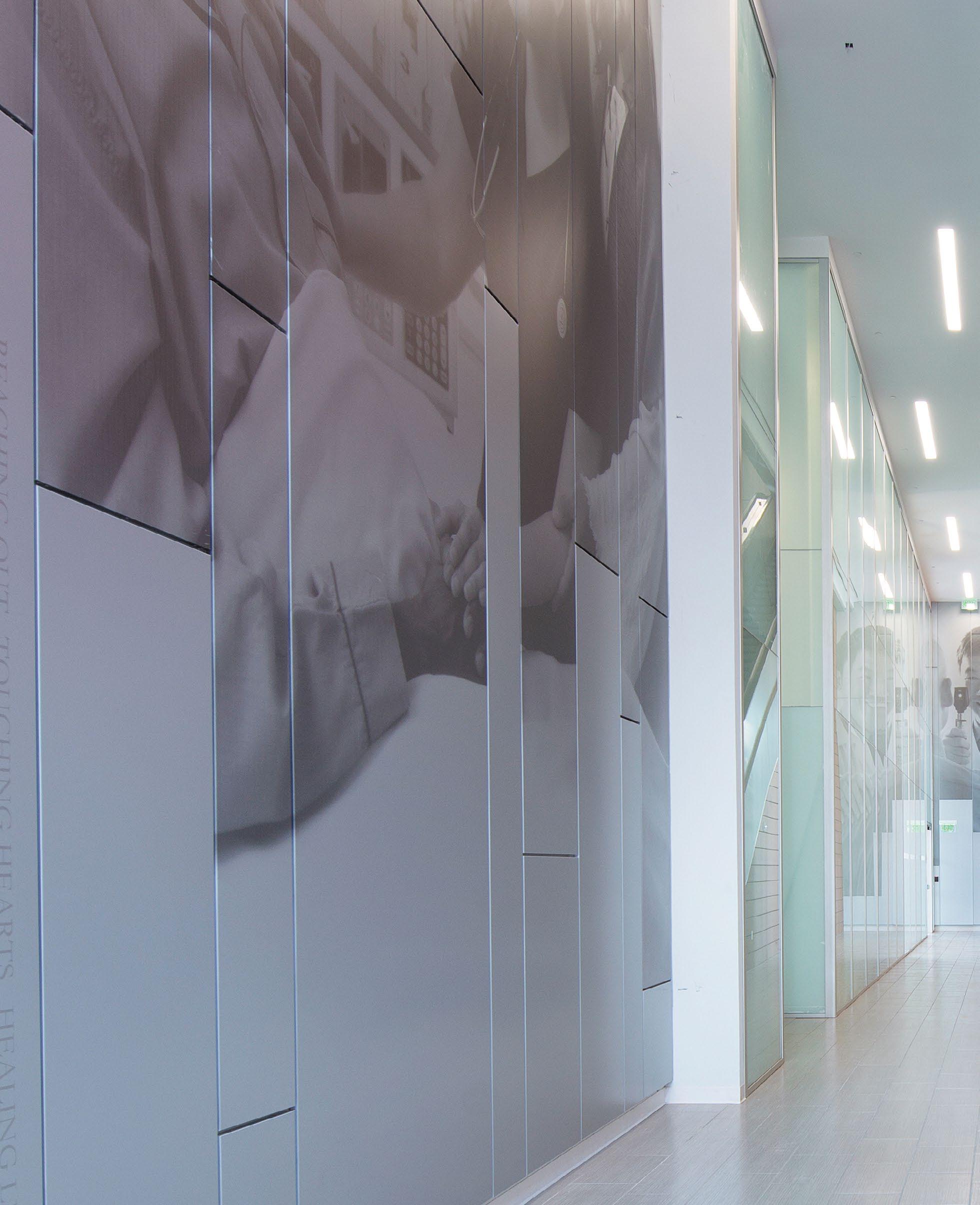
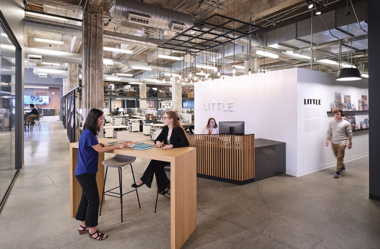
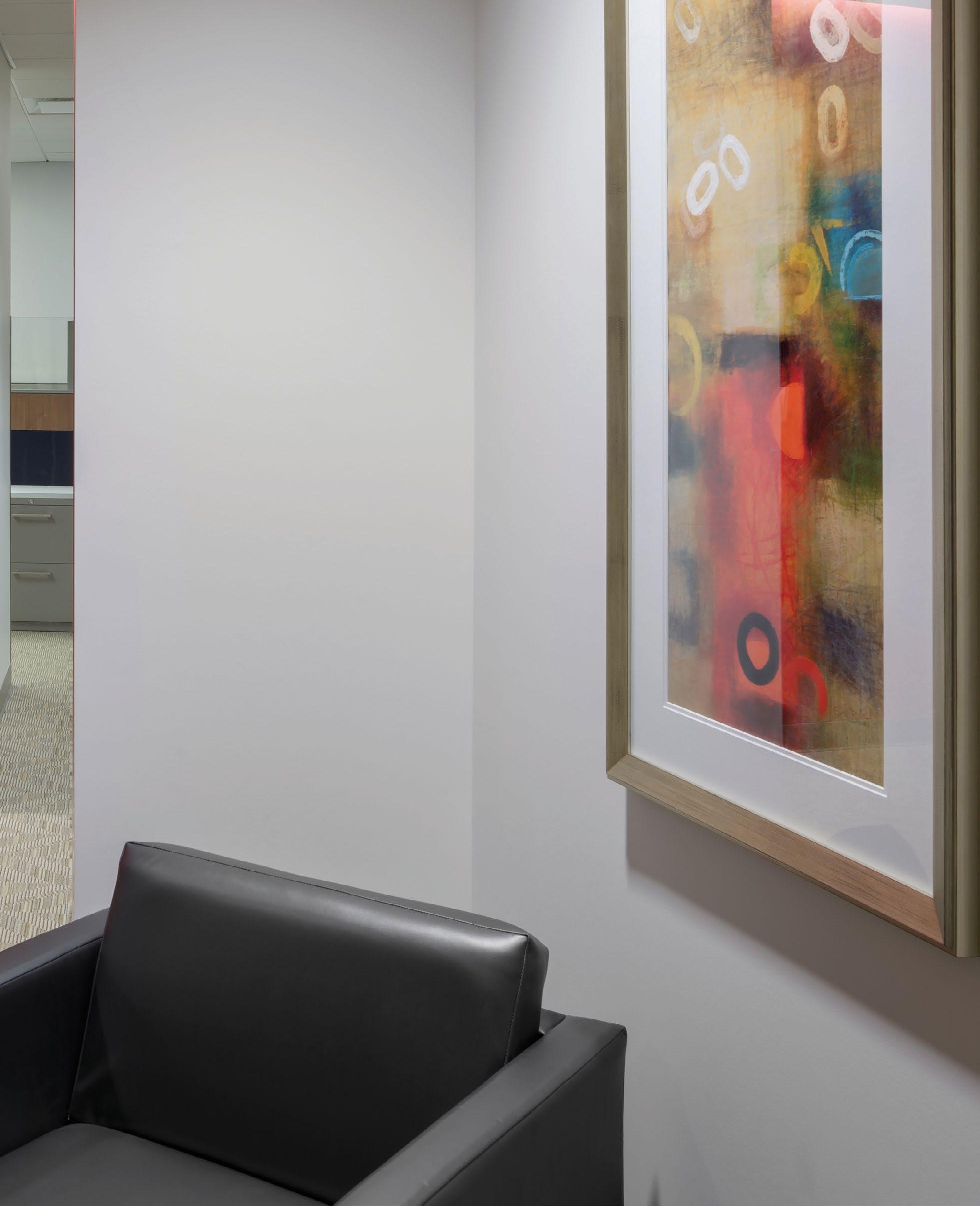
As part of a transdisciplinary design firm, the Brand Experience Studio at Little offers complete, integrated branding from outset to evolution. We help our clients make bold moves that matter through design work rooted in powerful storytelling, personalized experiences and seamless brand integration.
From project inception through building occupancy, our design process is characterized by intense collaboration amongst each design discipline, our clients and end users. We leverage each design discipline to maximize every project’s potential. We fuse our diverse knowledge with that of our clients to create solutions that measurably elevate the performance of the people and organizations we serve.
At Little, we embrace a collaborative approach because we are stronger as a team than we can possibly be as individuals.
Brand Experience Studio
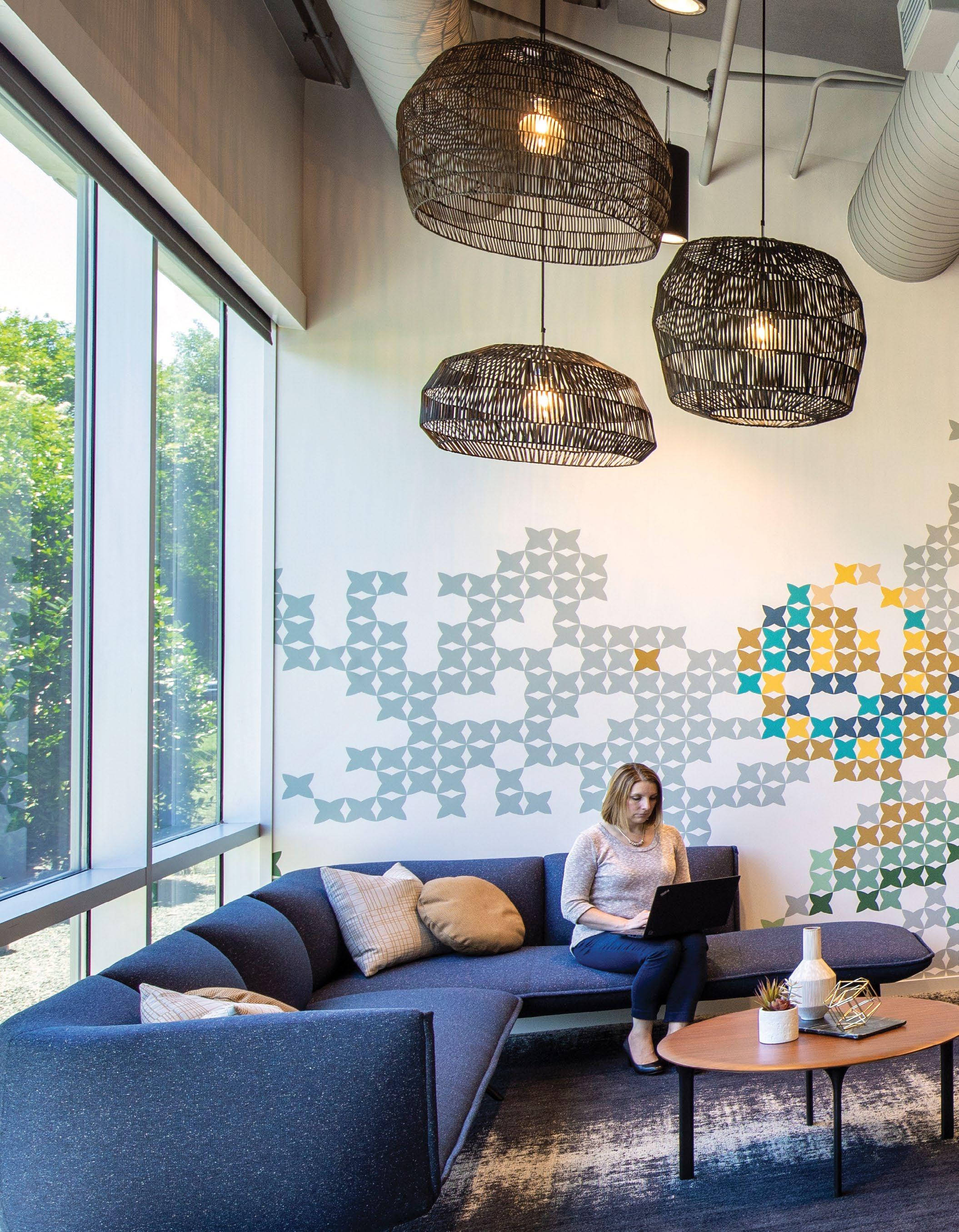
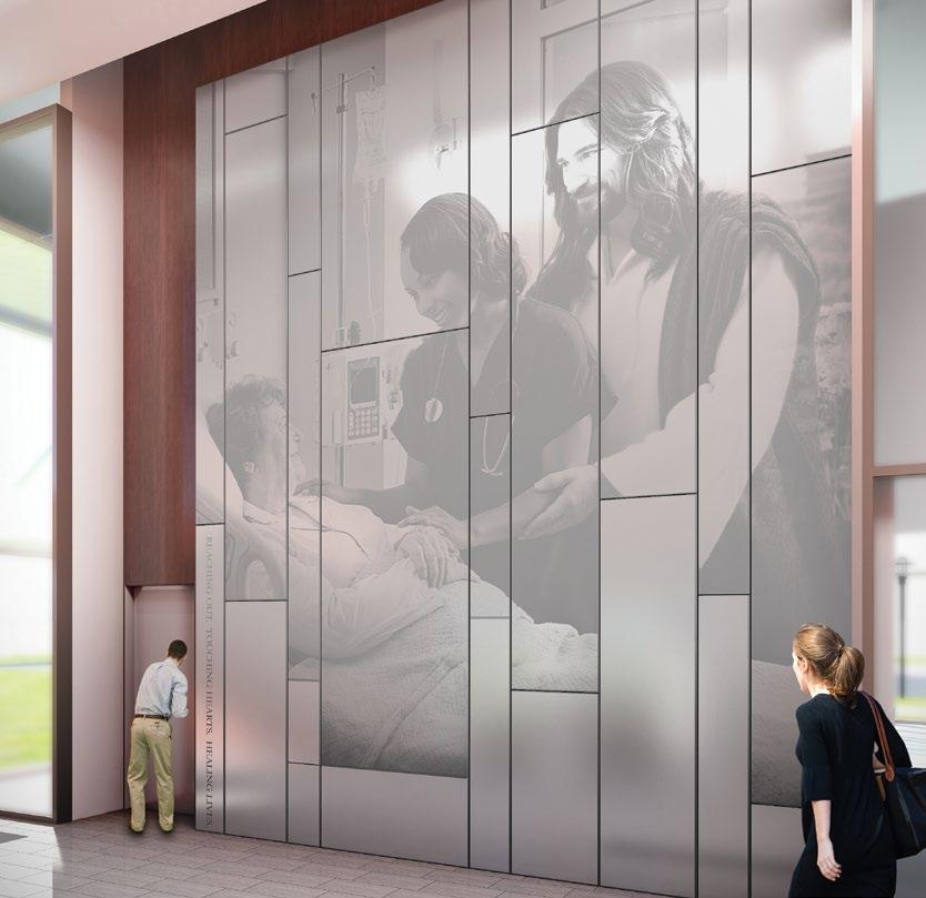
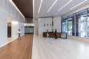
Everything Connects
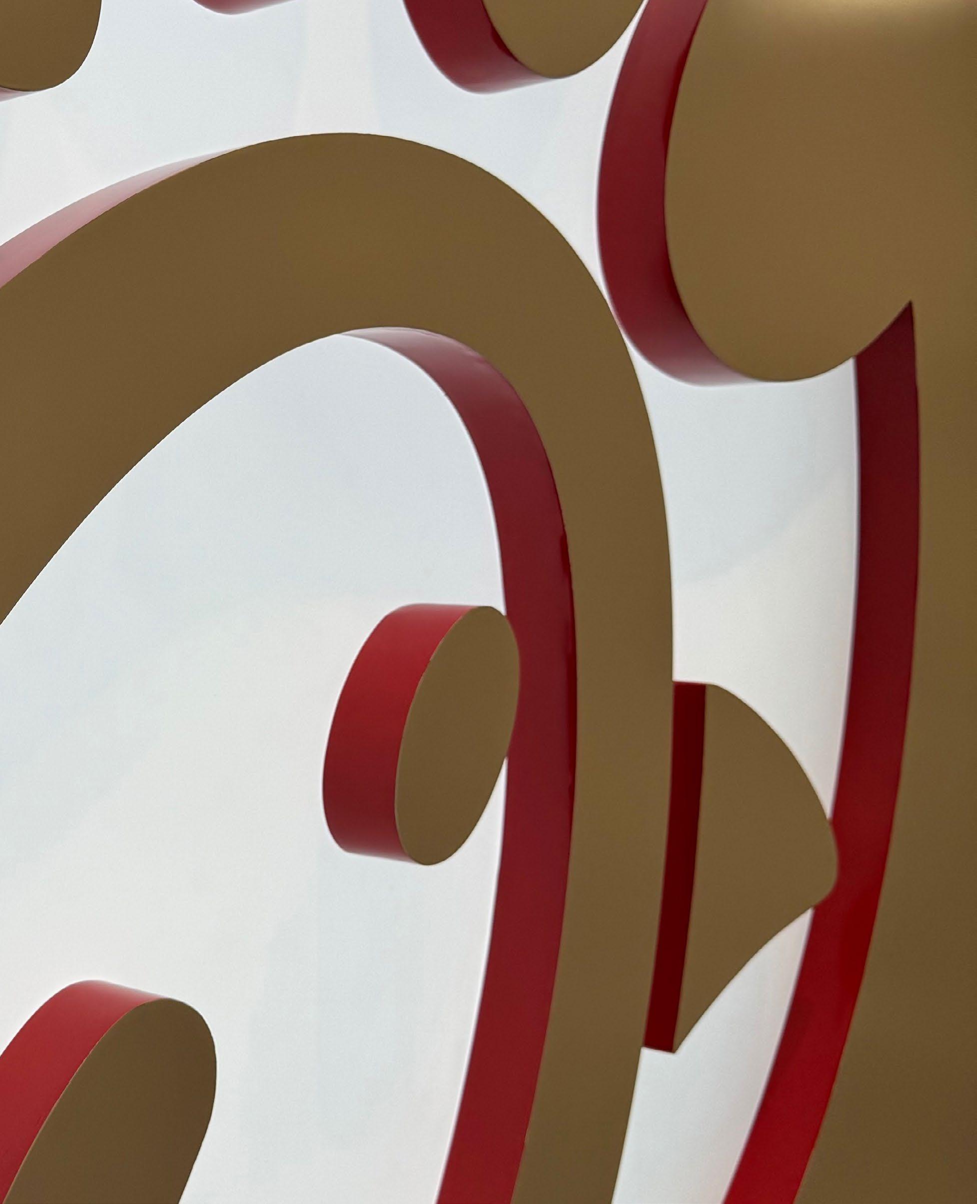
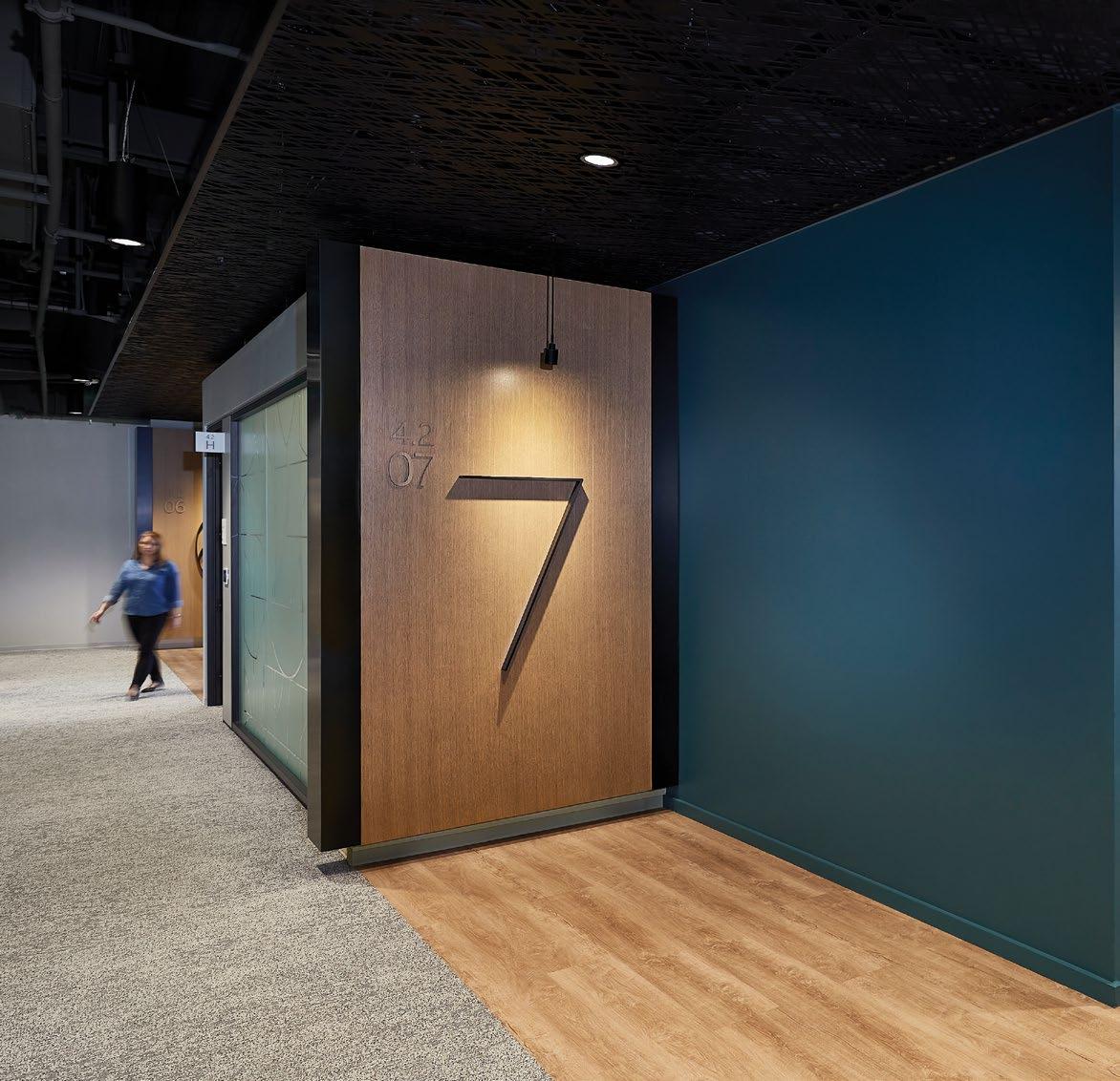
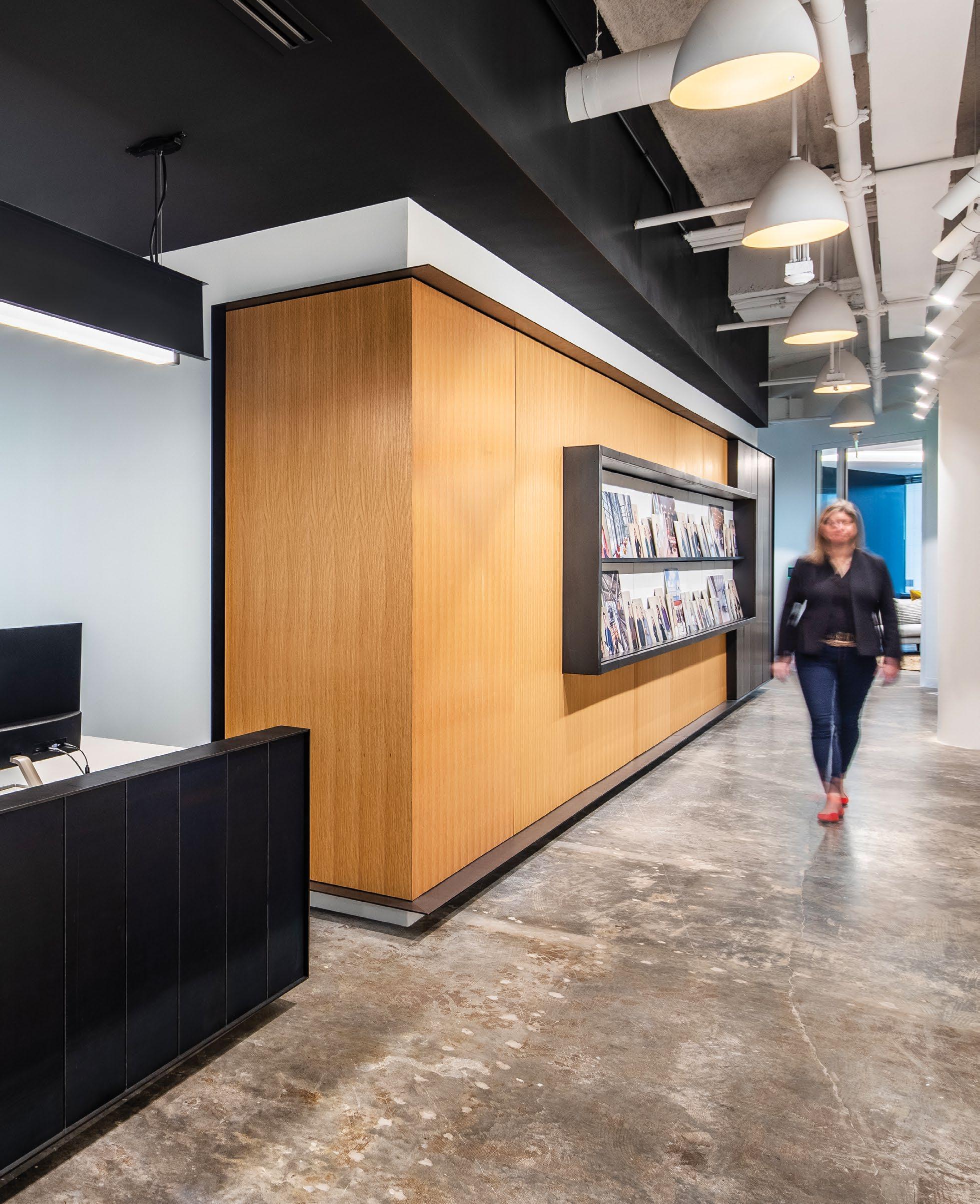
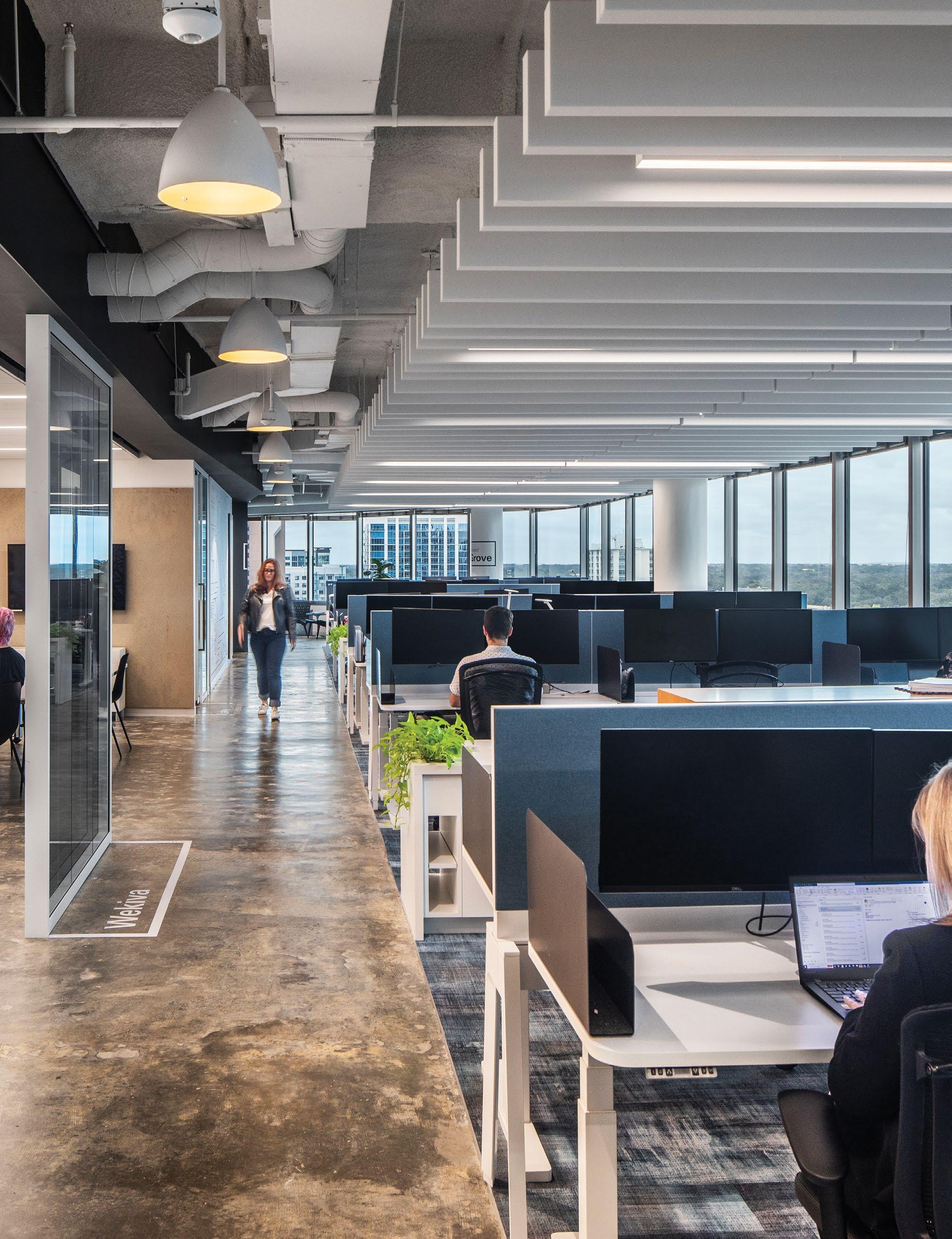
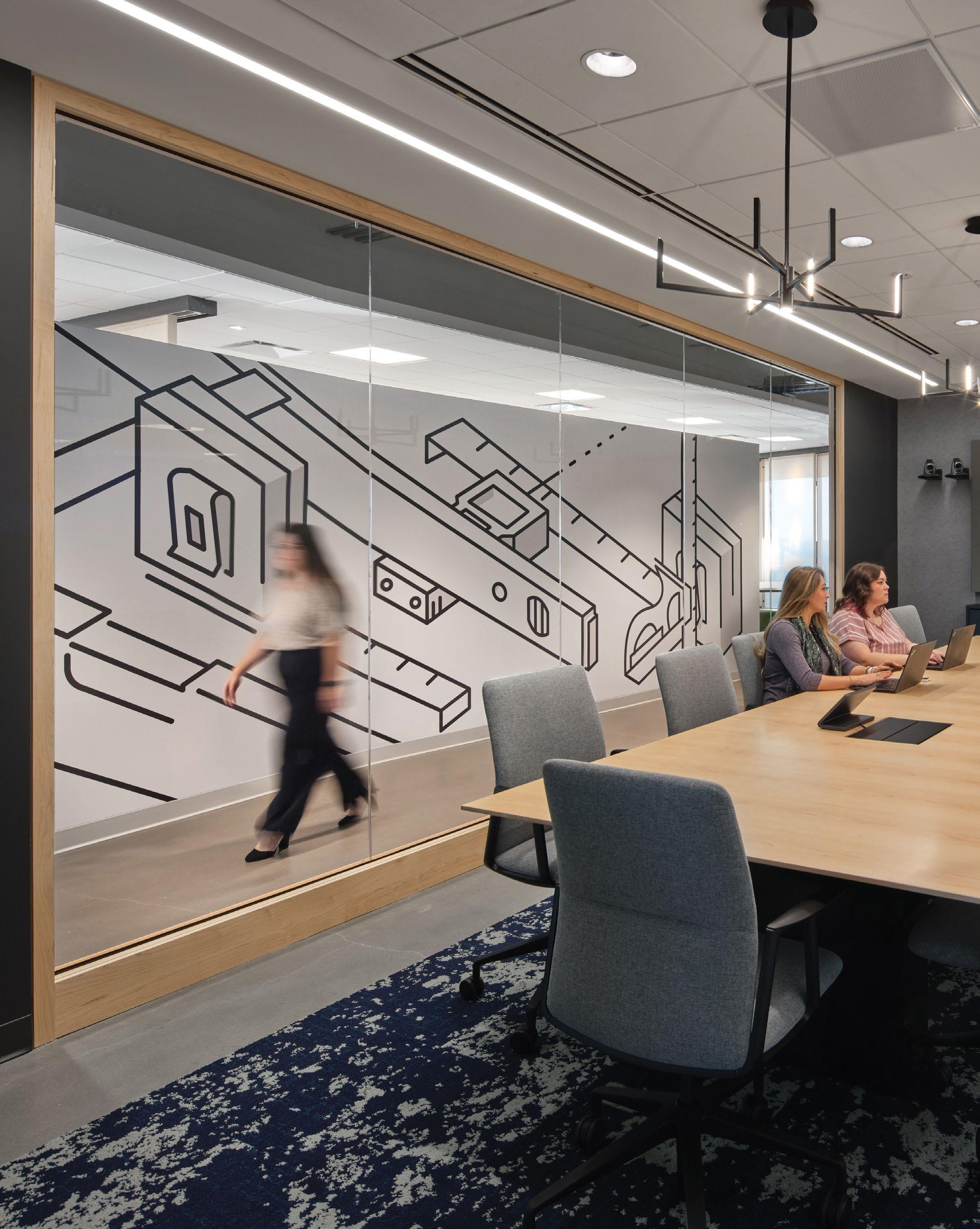
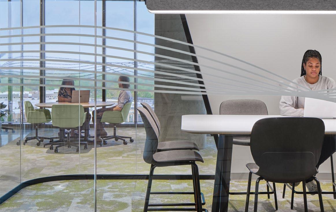
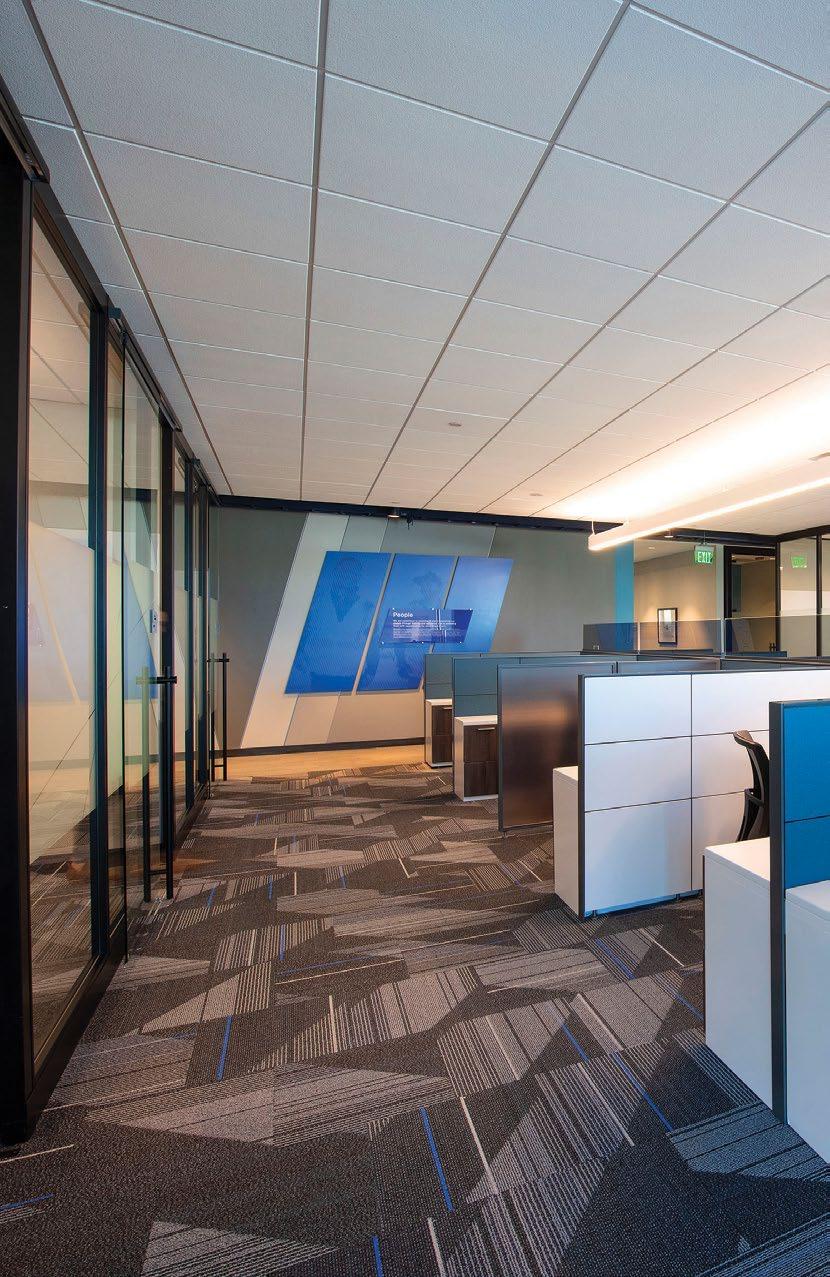
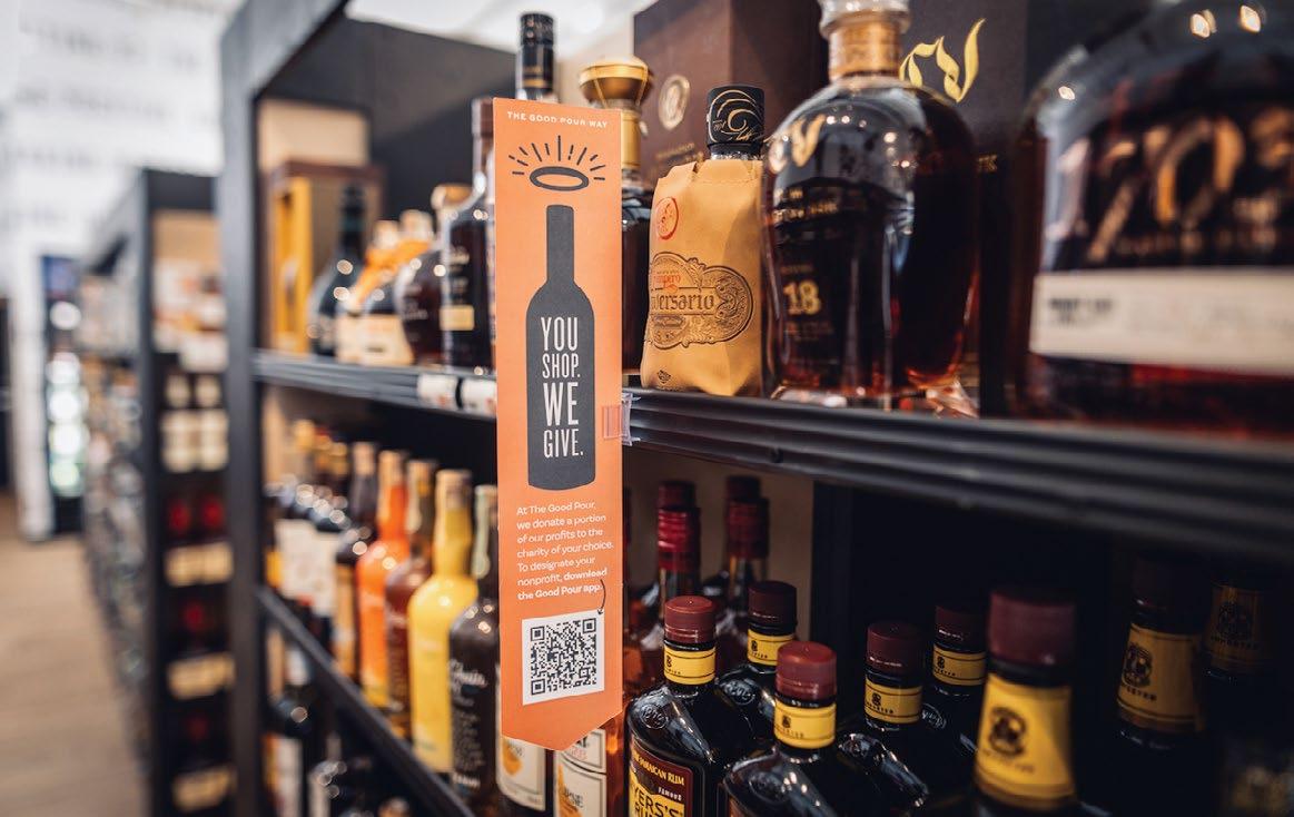
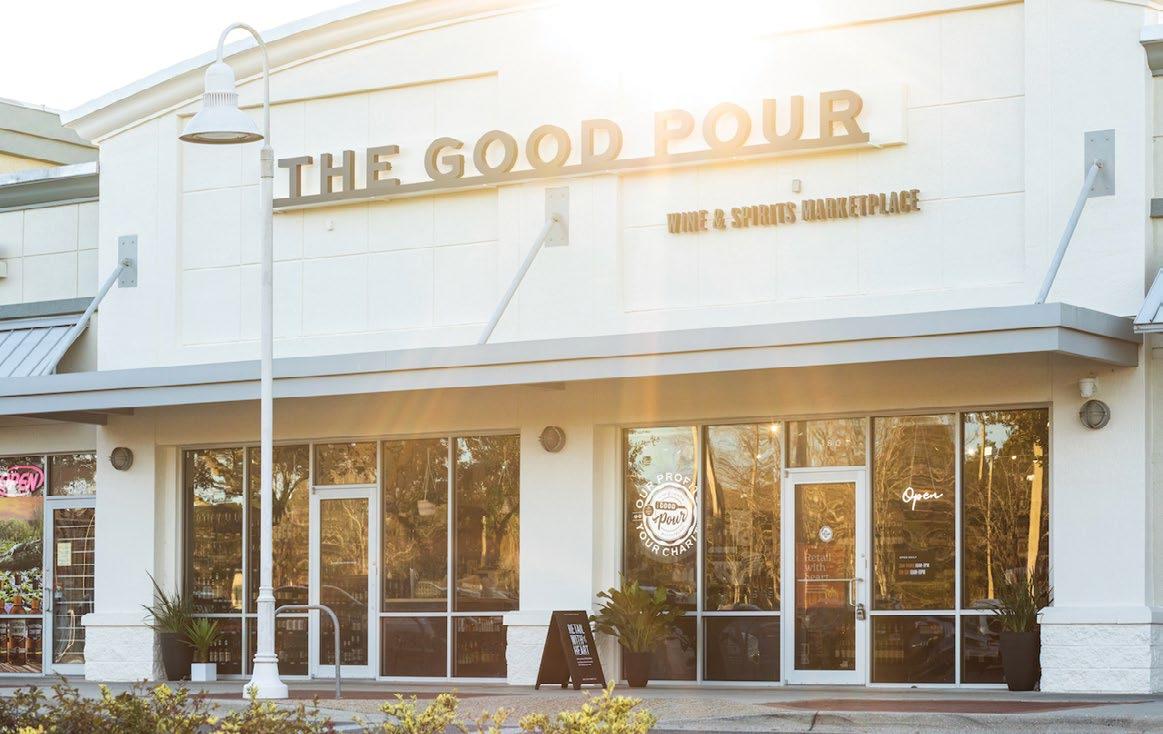
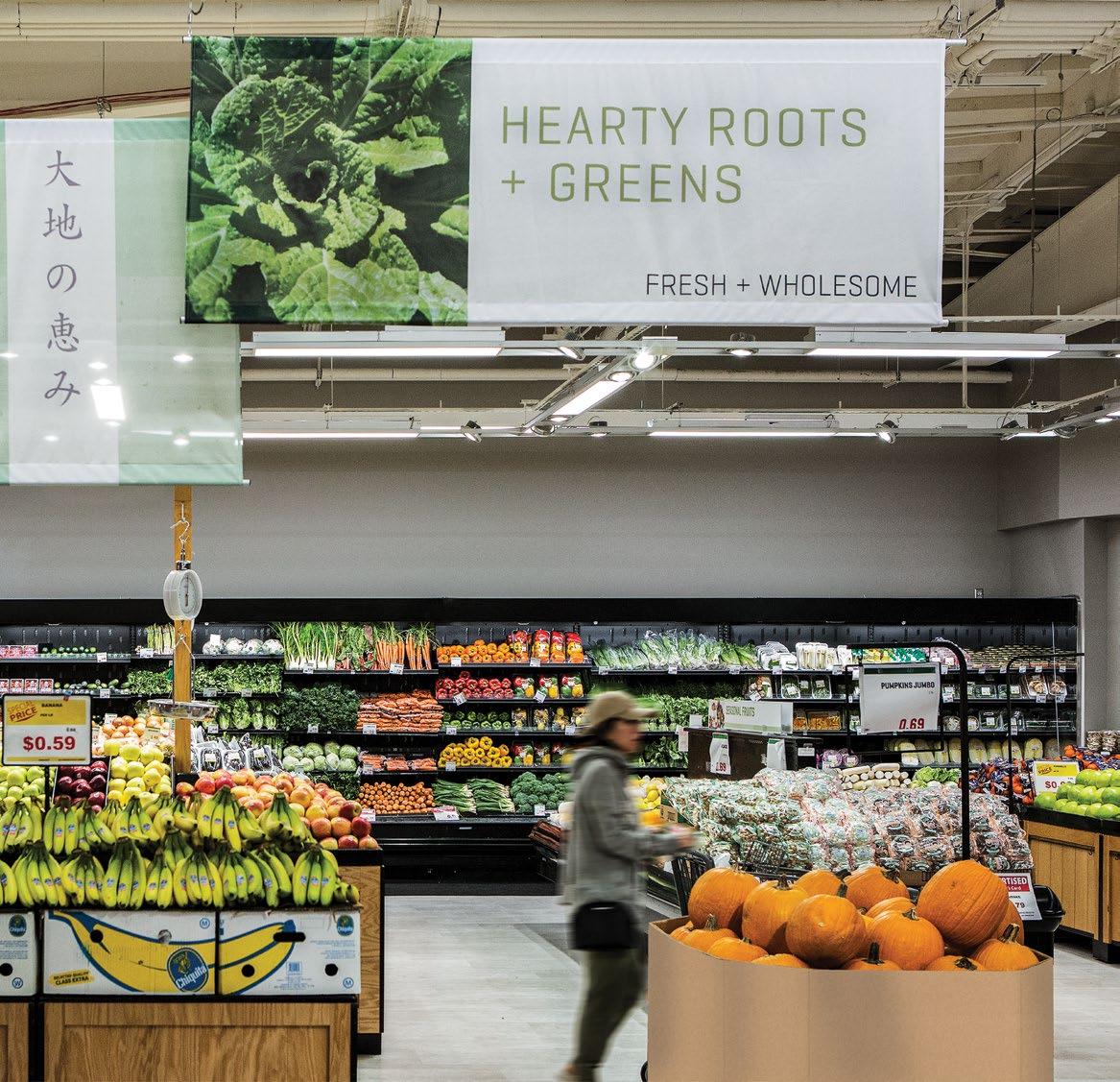
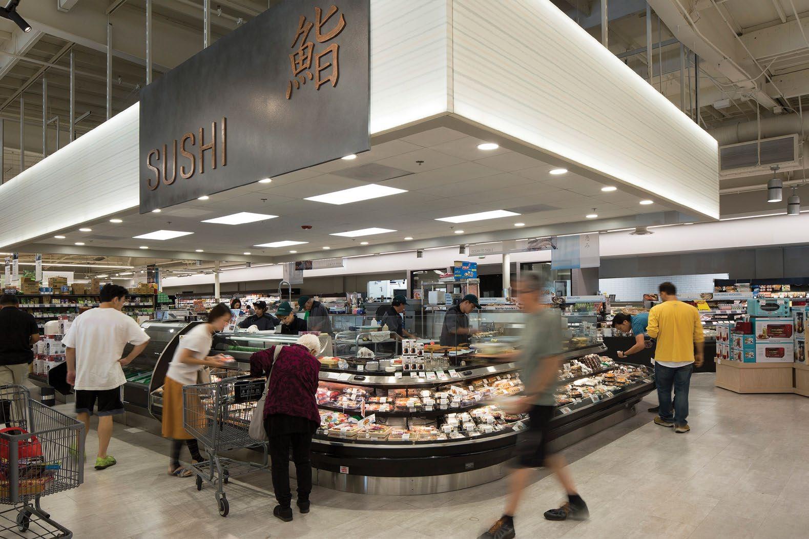
When organizations align their brand communication efforts with a space’s overall architectural narrative, the results project cohesive experiences with coordinated design functionality..
Everything Engages
The best user experiences foster deep engagements with brands and their stories. We focus on curating your spatial experience by making it more relevant, memorable and effective.
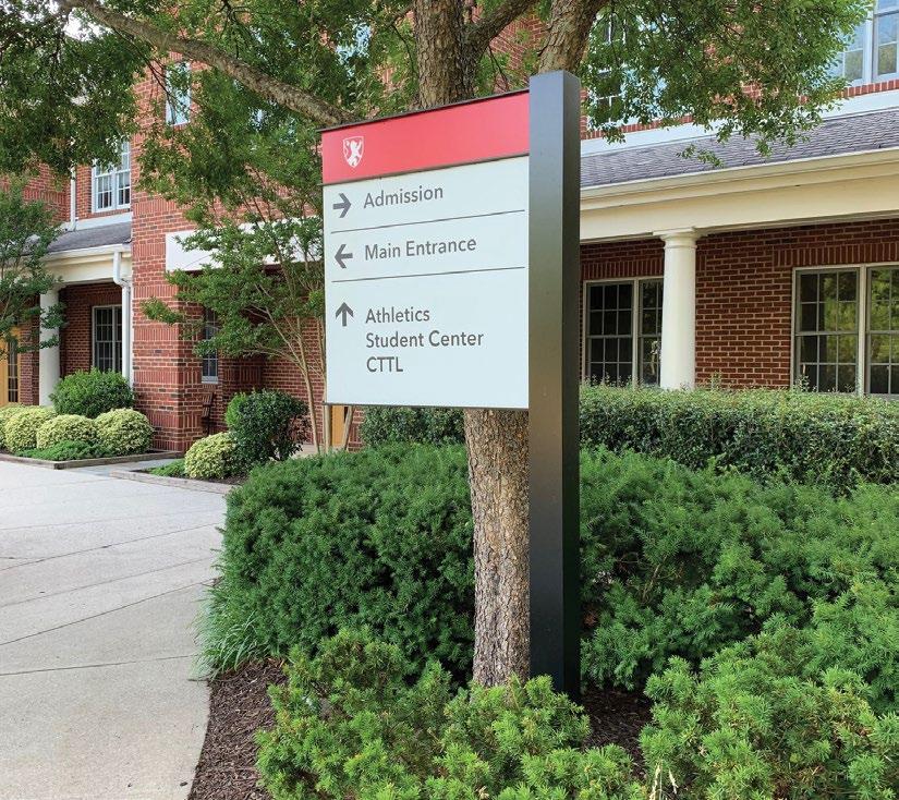
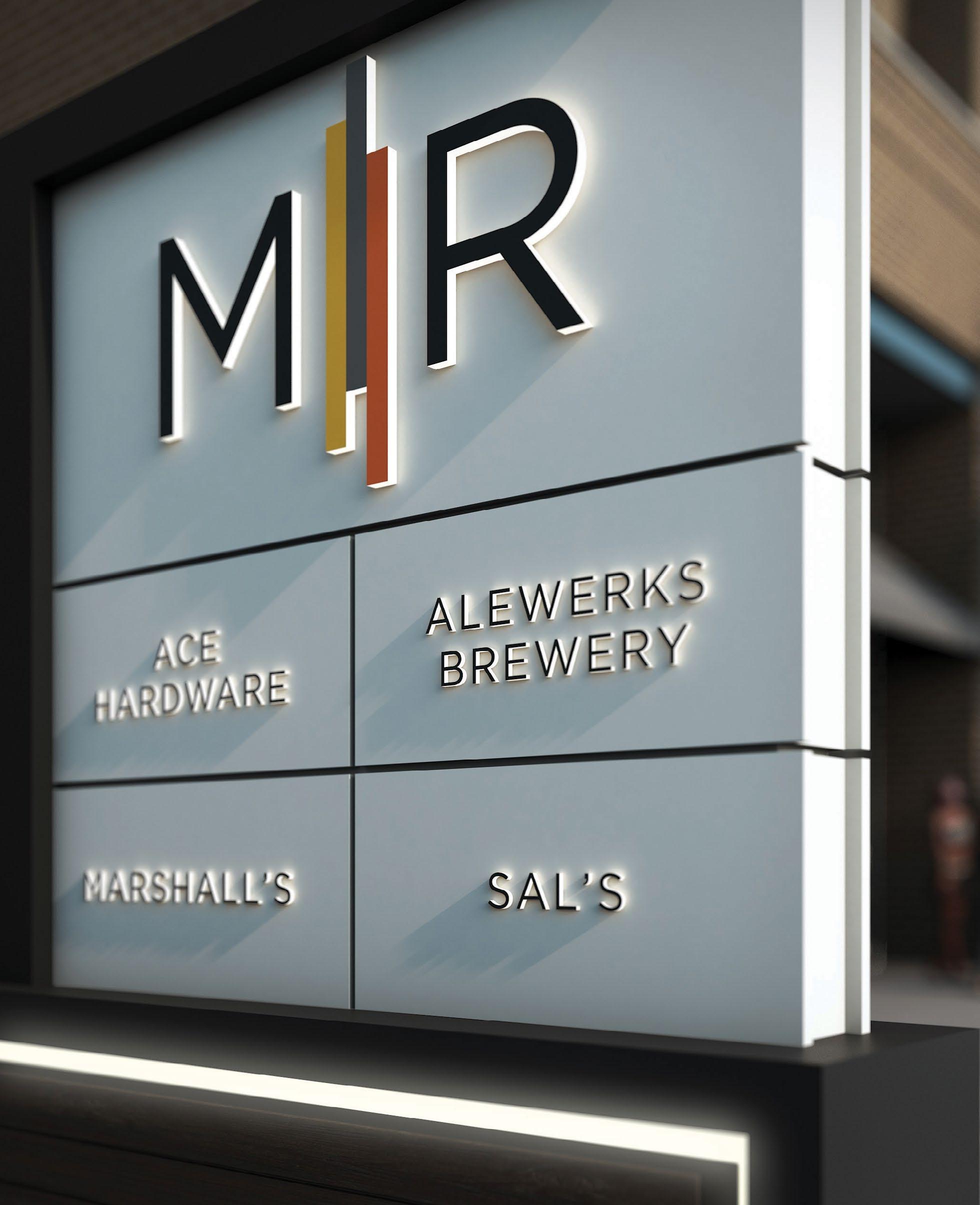
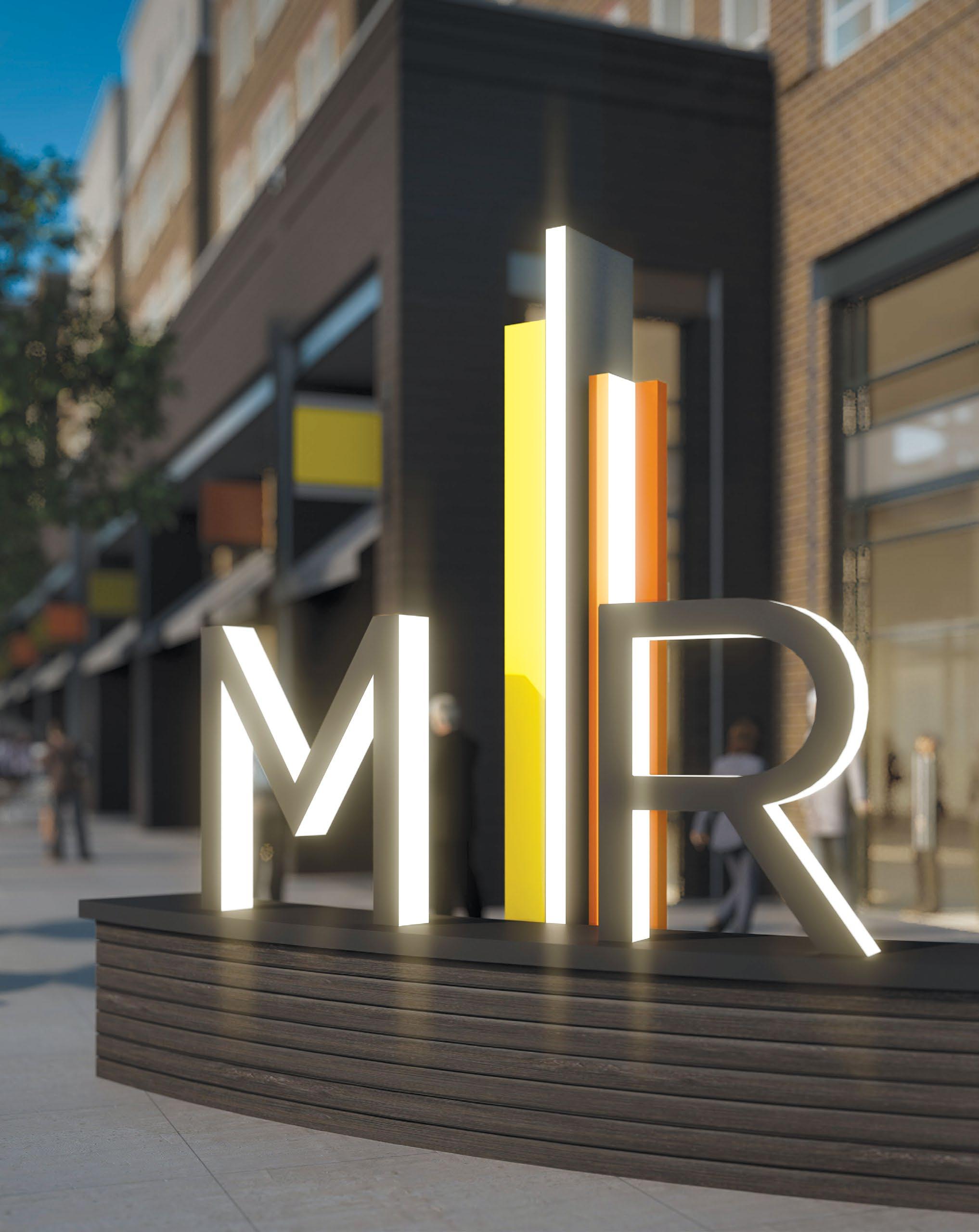
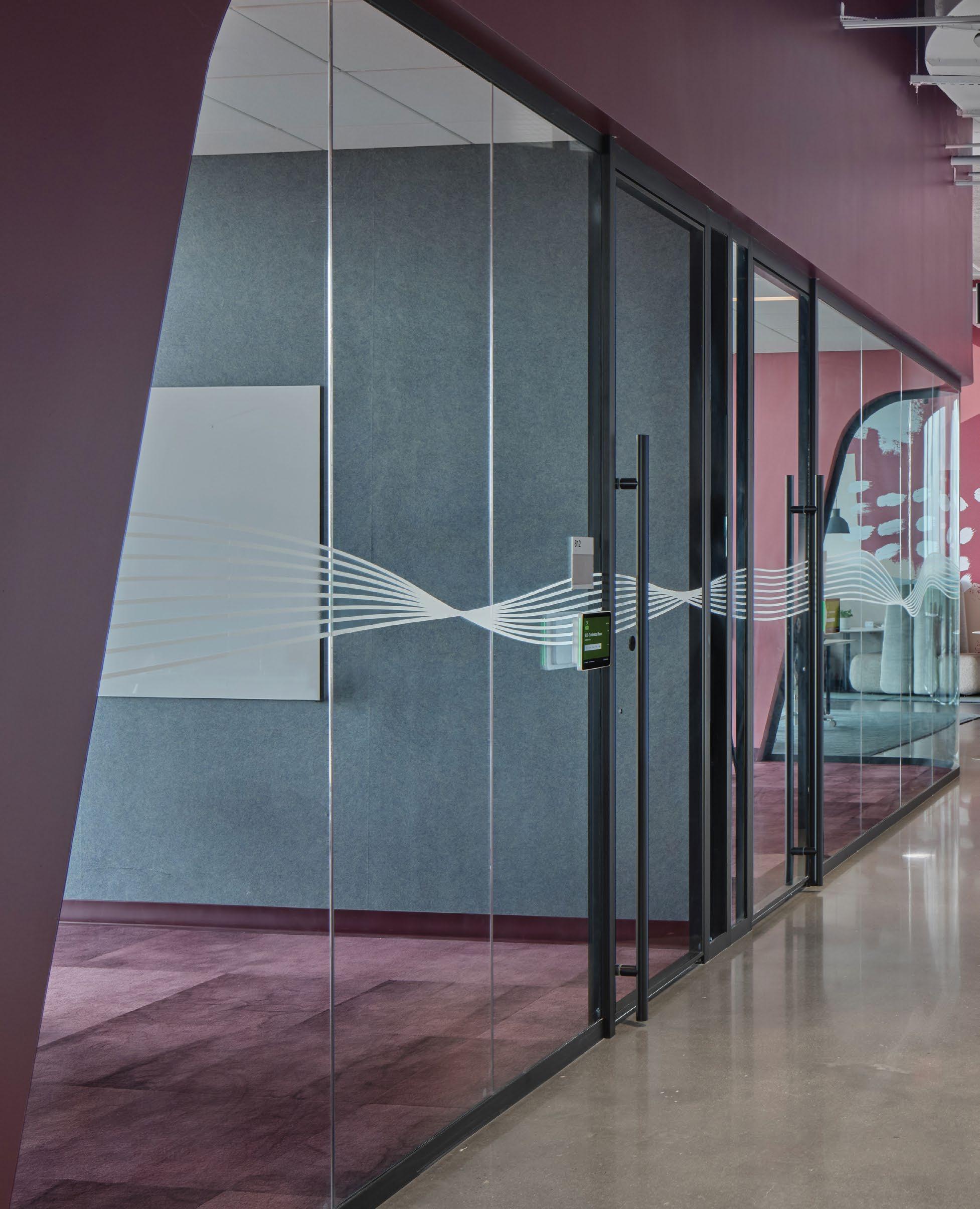
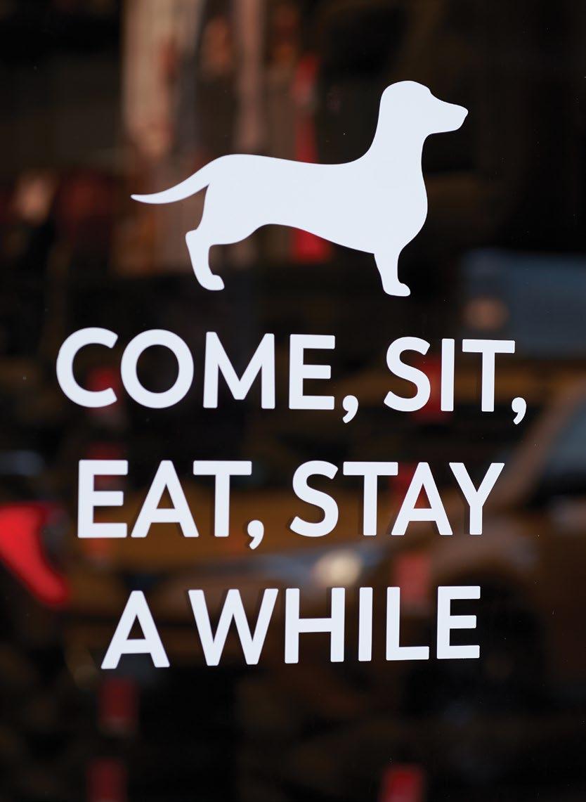
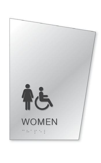
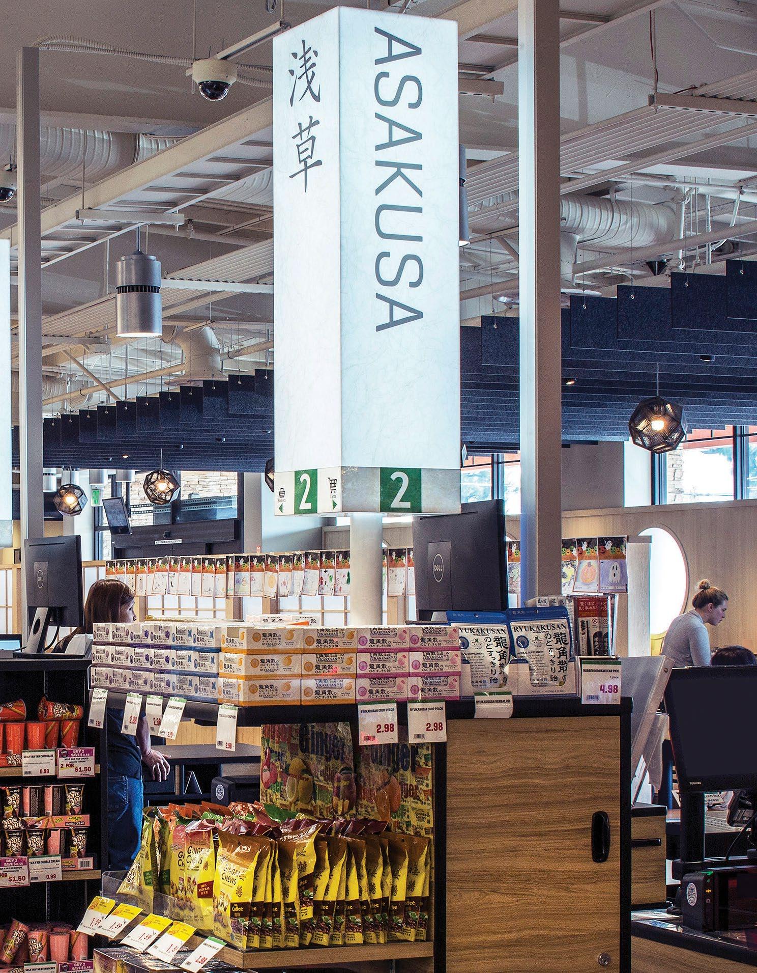
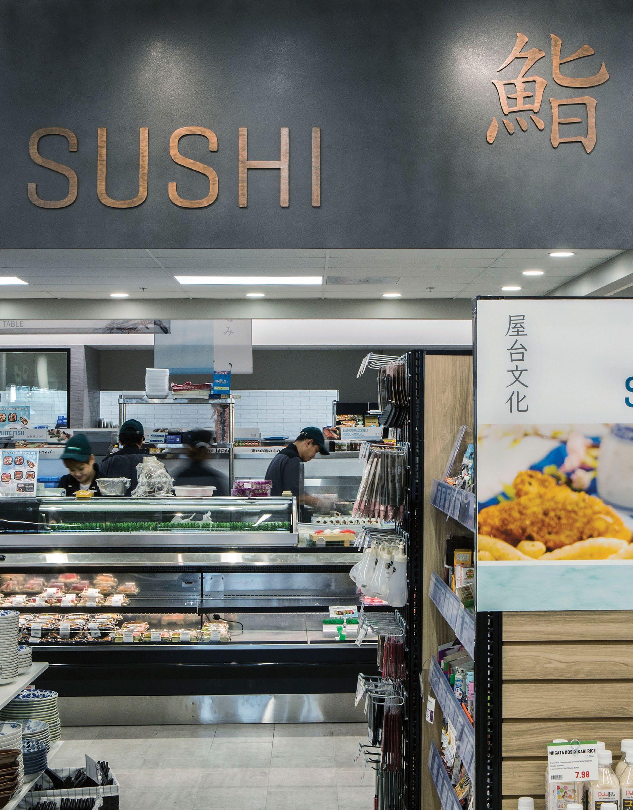
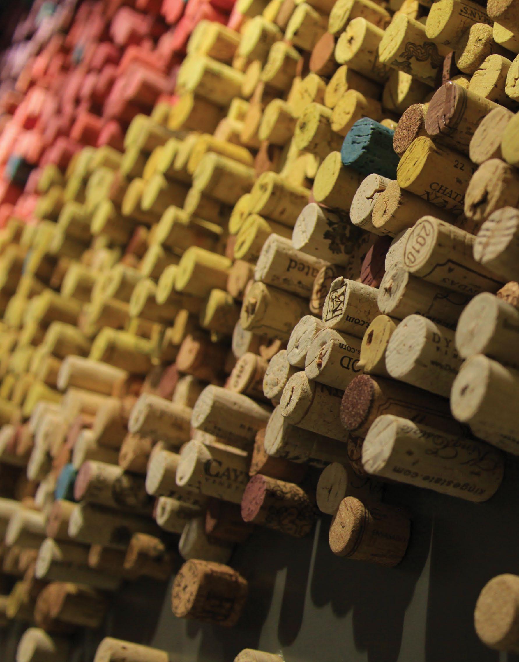
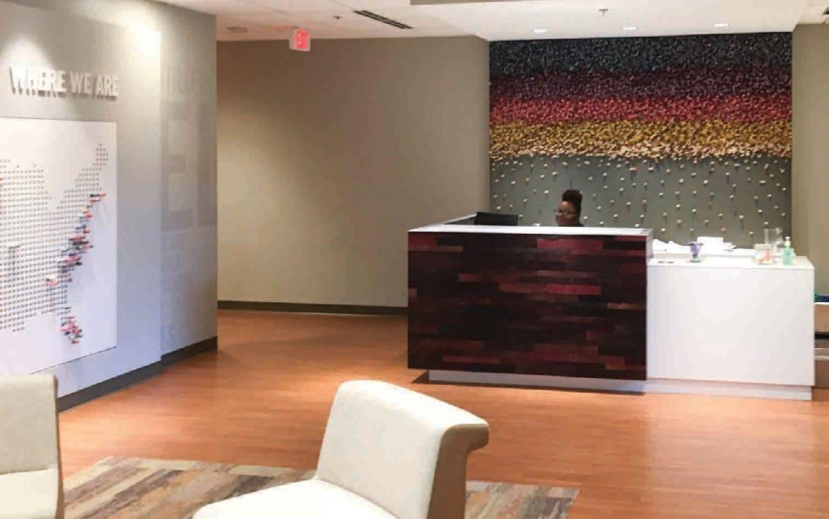
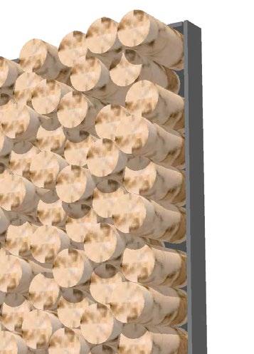
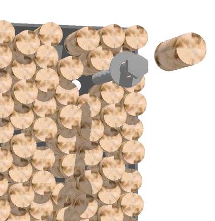
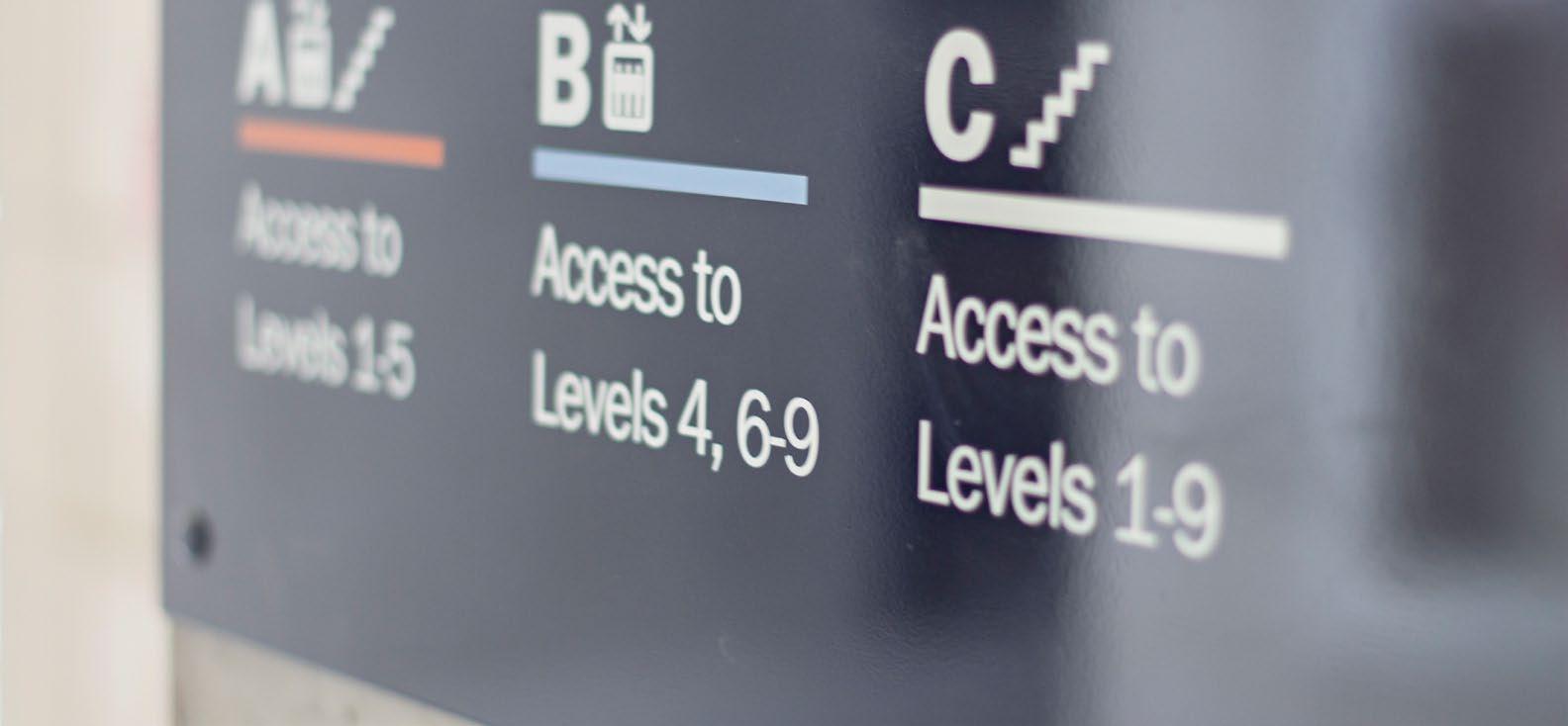
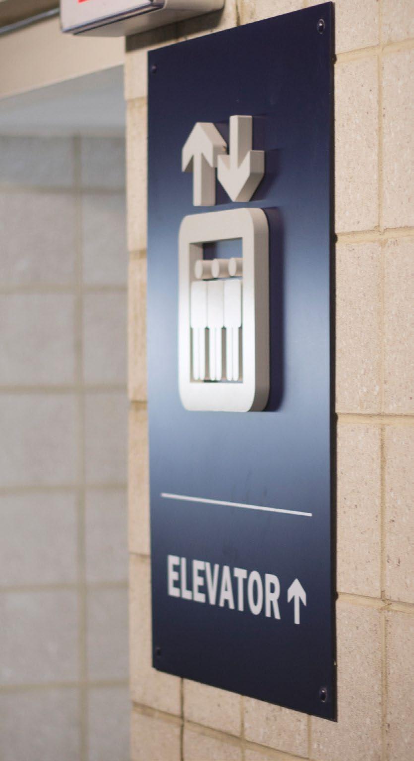
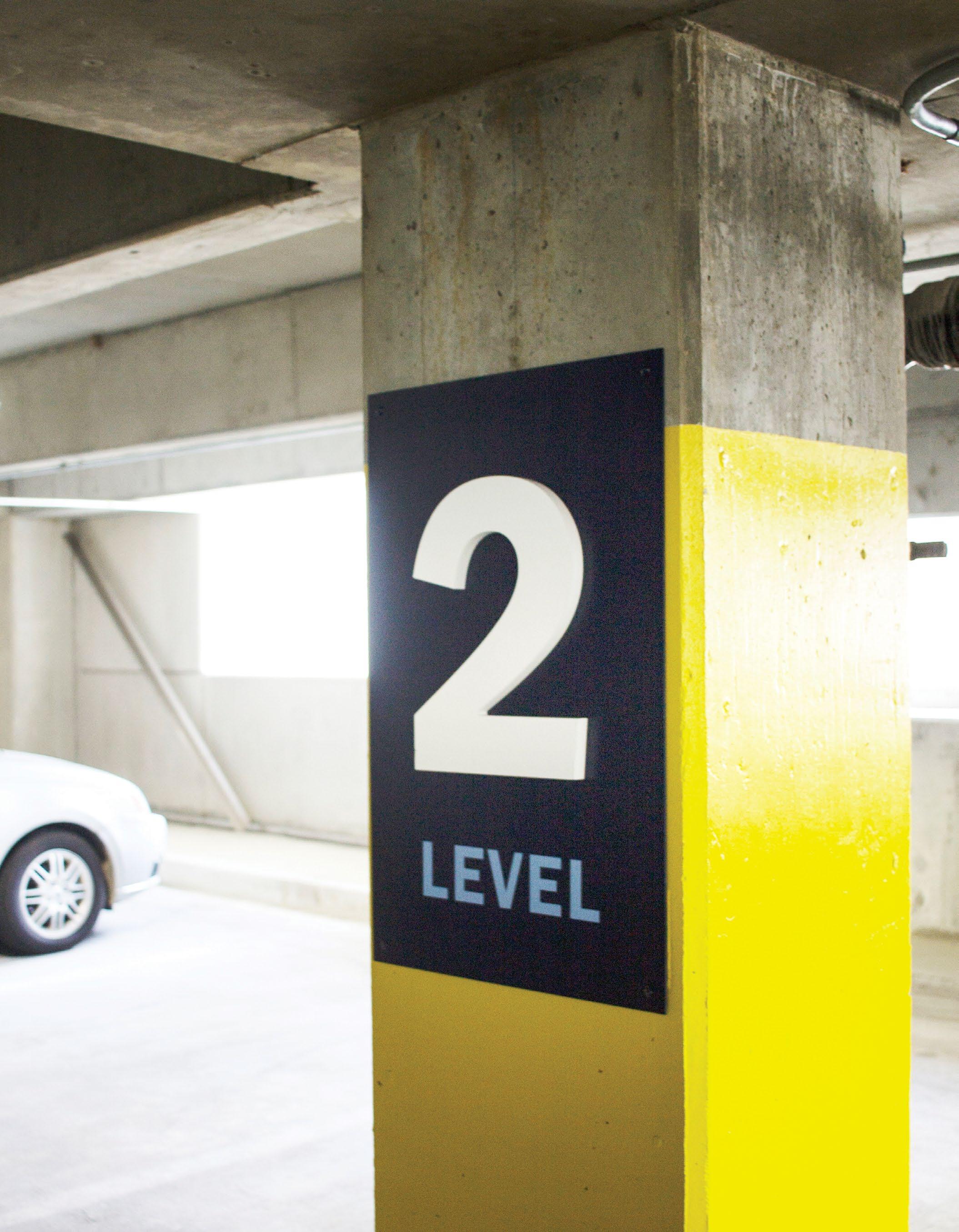
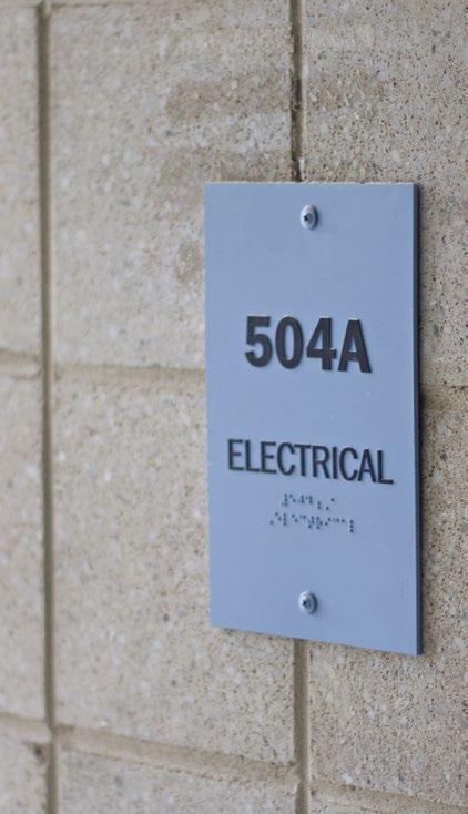
Sign Design, Base / ADA Compliant Signage, Digital Signage, Wayfinding Strategy
PEOPLE IN SIX LOCATIONS
CHARLESTON, SC
CHARLOTTE, NC
DURHAM, NC
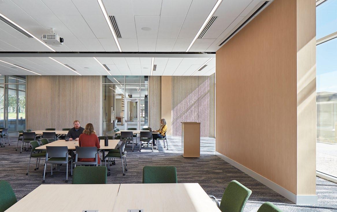
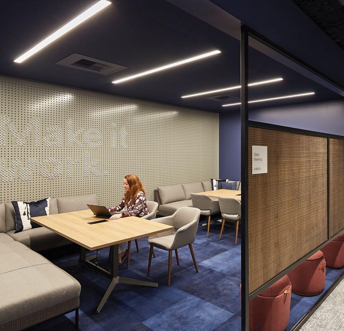
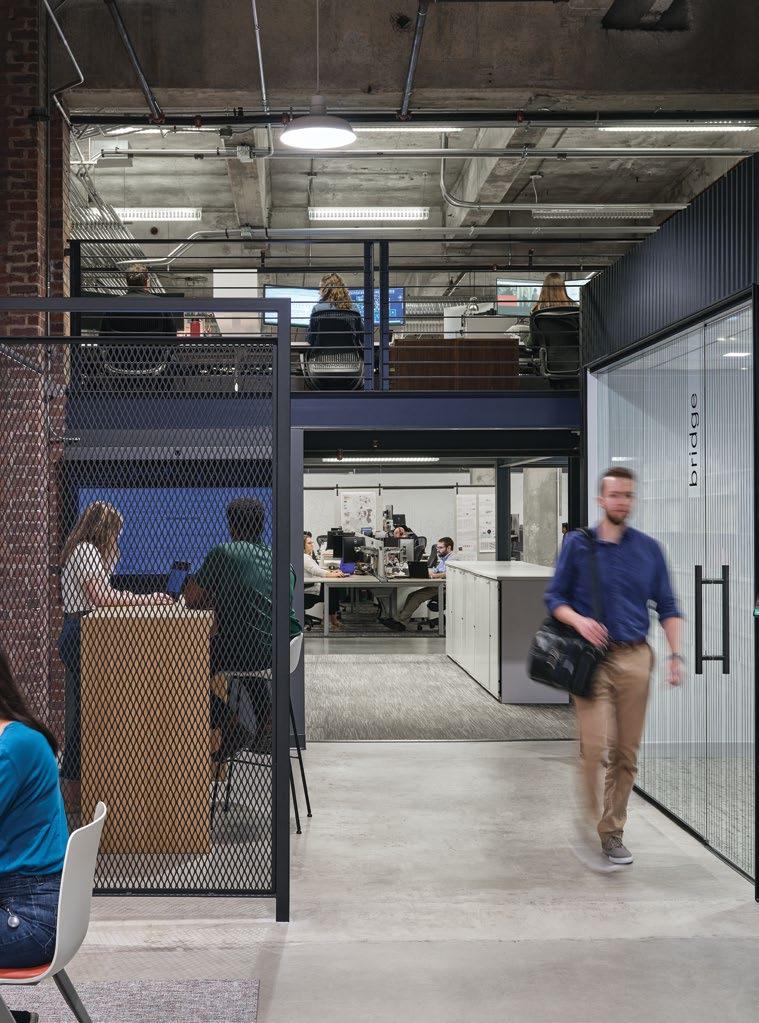
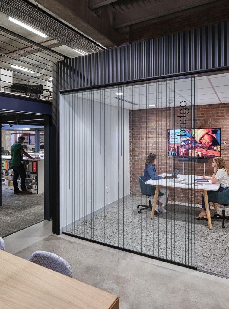
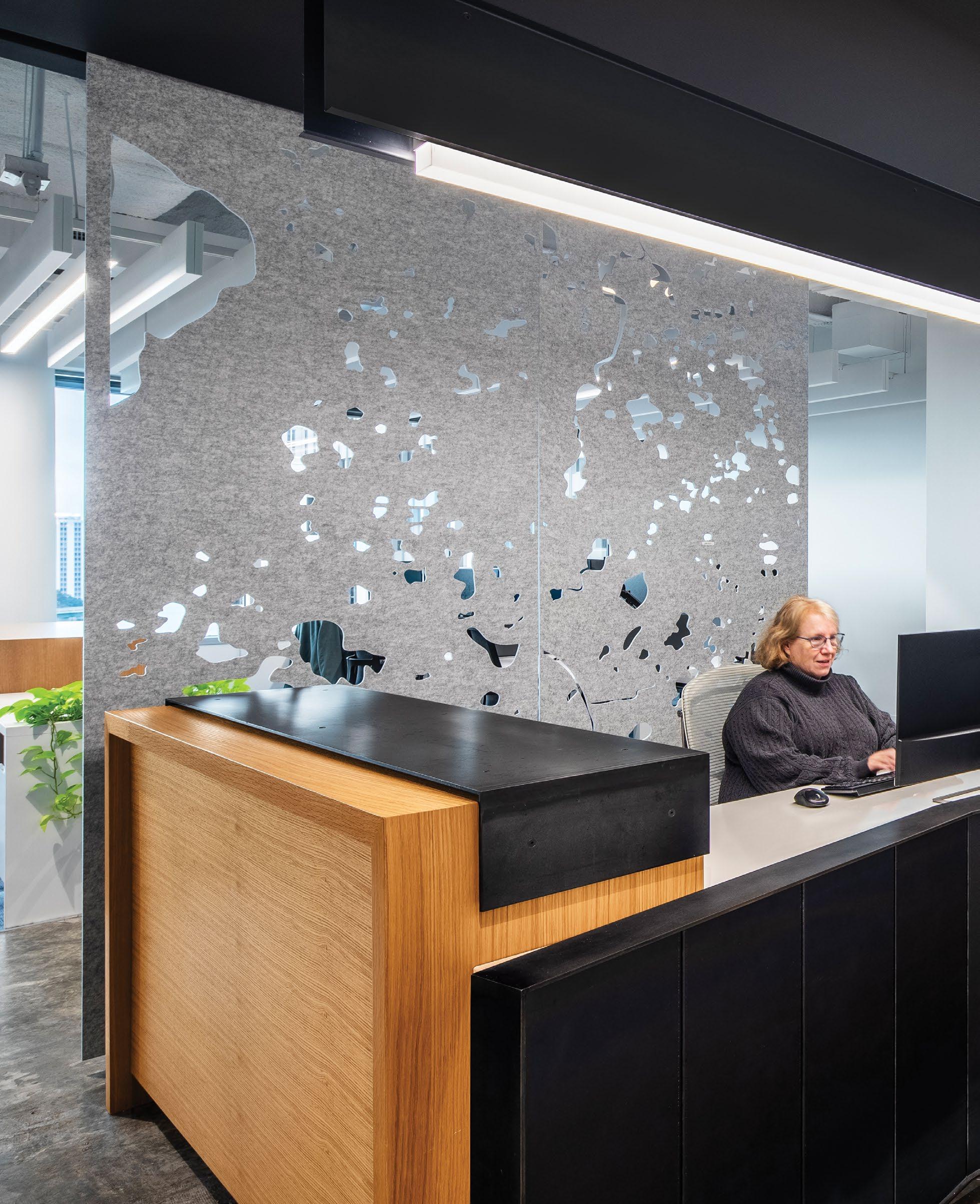
WORKPLACE
OFFICE
INTERIORS
MIXED-USE
CRITICAL FACILITIES
SCIENCE & TECHNOLOGY
COMMUNITY
CIVIC
JUSTICE SCHOOLS
HIGHER EDUCATION
HEALTHCARE
ACUTE CARE
SPECIALTY CENTERS
MEDICAL OFFICE
BUILDINGS & CLINICS
RETAIL
FOOD SERVICE
STORE DESIGN
MULTI-USE & ADAPTIVE REUSE
NEWPORT BEACH, CA
ORLANDO, FL
WASHINGTON, DC
SERVICES
ARCHITECTURE
INTERIOR ARCHITECTURE
ENGINEERING
Mechanical
Electrical
Structural
Plumbing
SITE DESIGN
Landscape Architecture
Civil Engineering
Land & Master Planning
Urban Design
Entitlements Consulting
COLLABORATIVE SPECIALTIES
Regen CoLab
Advanced Building Technologies
Visual Impact Studio
Smart Building Studio
Brand Experience Studio
Jason Richardson
Studio Principal Charlotte, NC
Kelley Deal
Design Principal Durham, NC
Jen Boyles
Art Director Charleston, SC
Emma Wallace
Art Director Durham, NC
Our Team
At Little, we deliver results far beyond architecture — results you wouldn’t expect from a traditional architecture firm. We strive for measurable outcomes that increase brand awareness and create a place that is vibrant, connected and engaging.
Diversity Excellence Integrity Knowledge Opportunity Personal Growth Professional Growth Respect
Focused Diverse Involved Ambitious Inclusive
Comprehensive Local
Inspired Diverse Engaged
together to narrow our project’s goals.
1 - STRATEGY
We begin every project by getting to know you, setting goals and defining the project scope. After gaining a thorough understanding of your brand and project needs, we establish precise, measurable goals for brand communication systems, outline parameters for success and develop a roadmap for the design process.
2 - DESIGN
Through collaboration between our team and your key stakeholders, we will walk you through the design process, creatively considering the project context and developing unique solutions to meet your needs.
3 - IMPLEMENT
Finally, our team of experienced designers will work closely with architects, contractors and fabricators to ensure the design intent is met and produced with the highest level of craft.
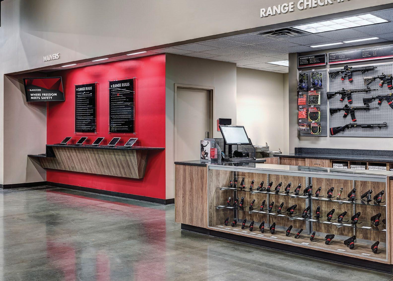
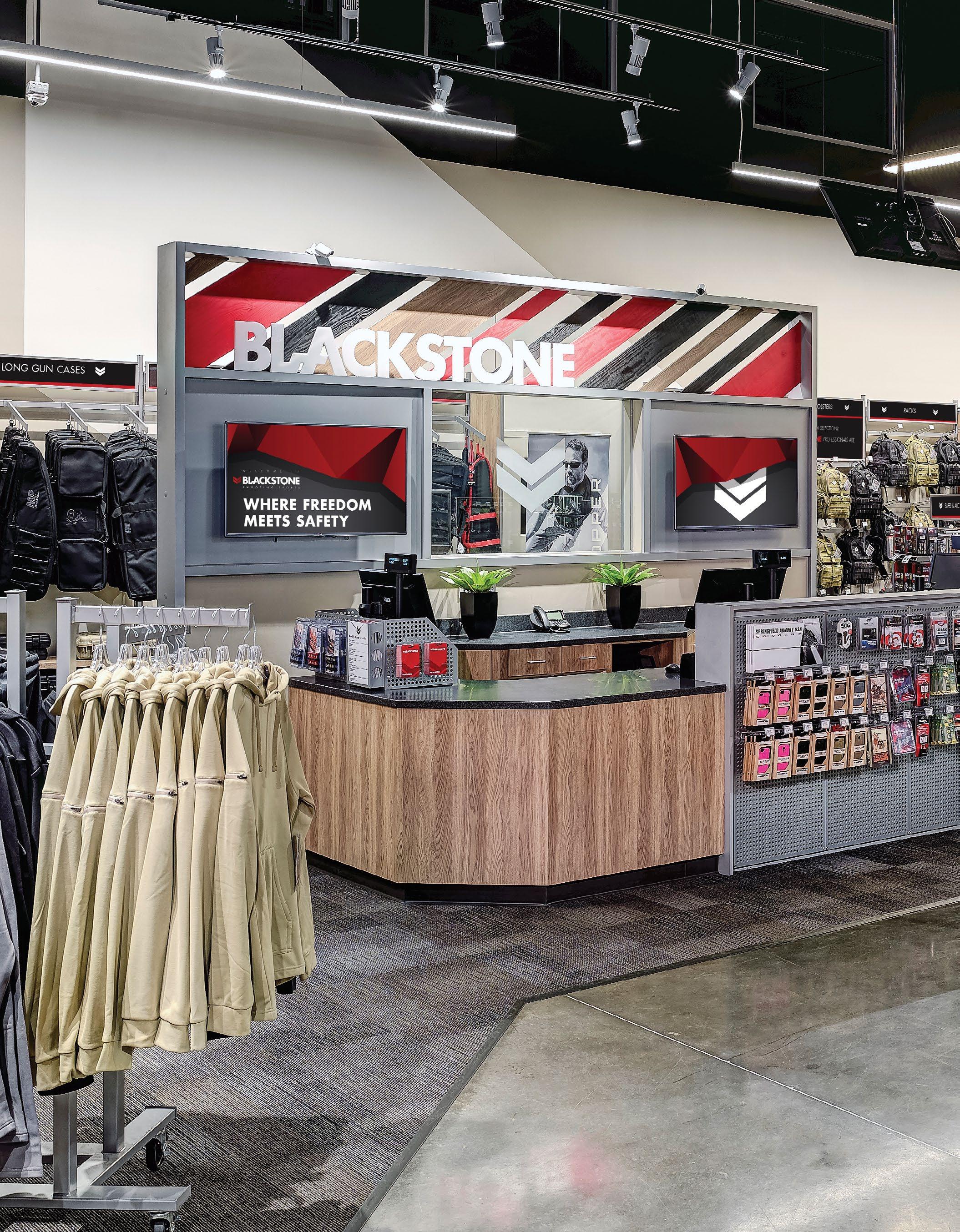
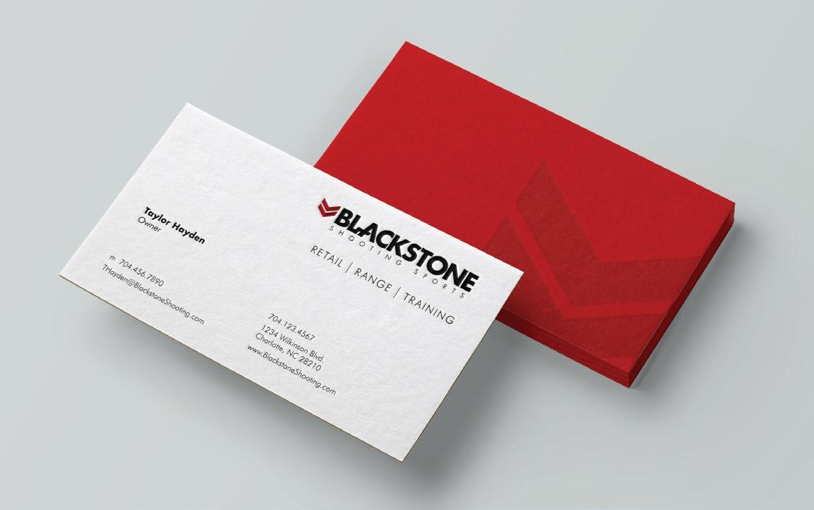
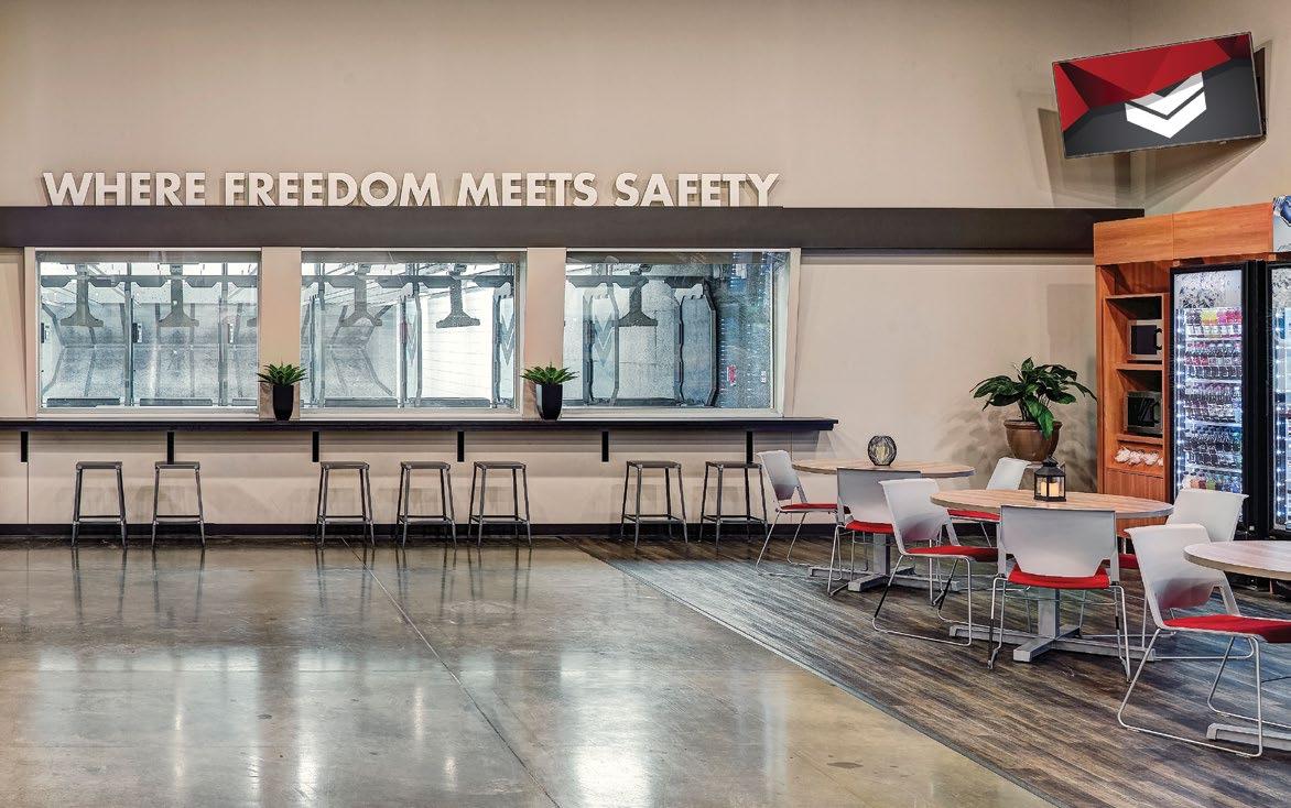
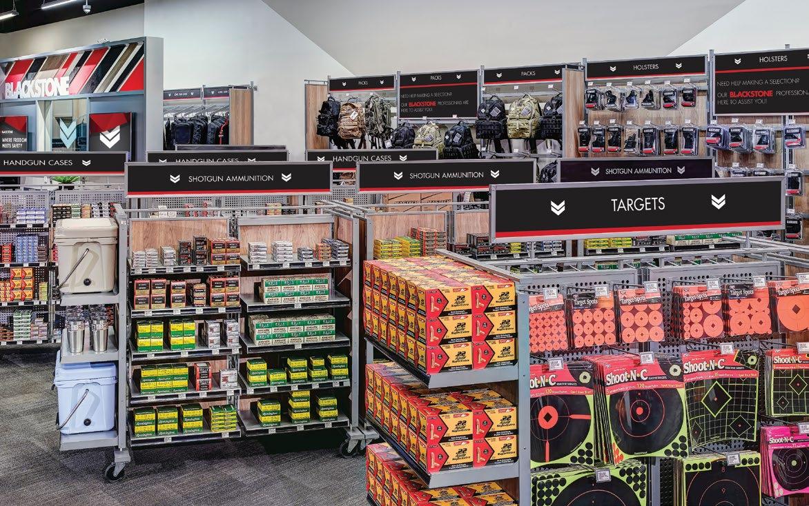
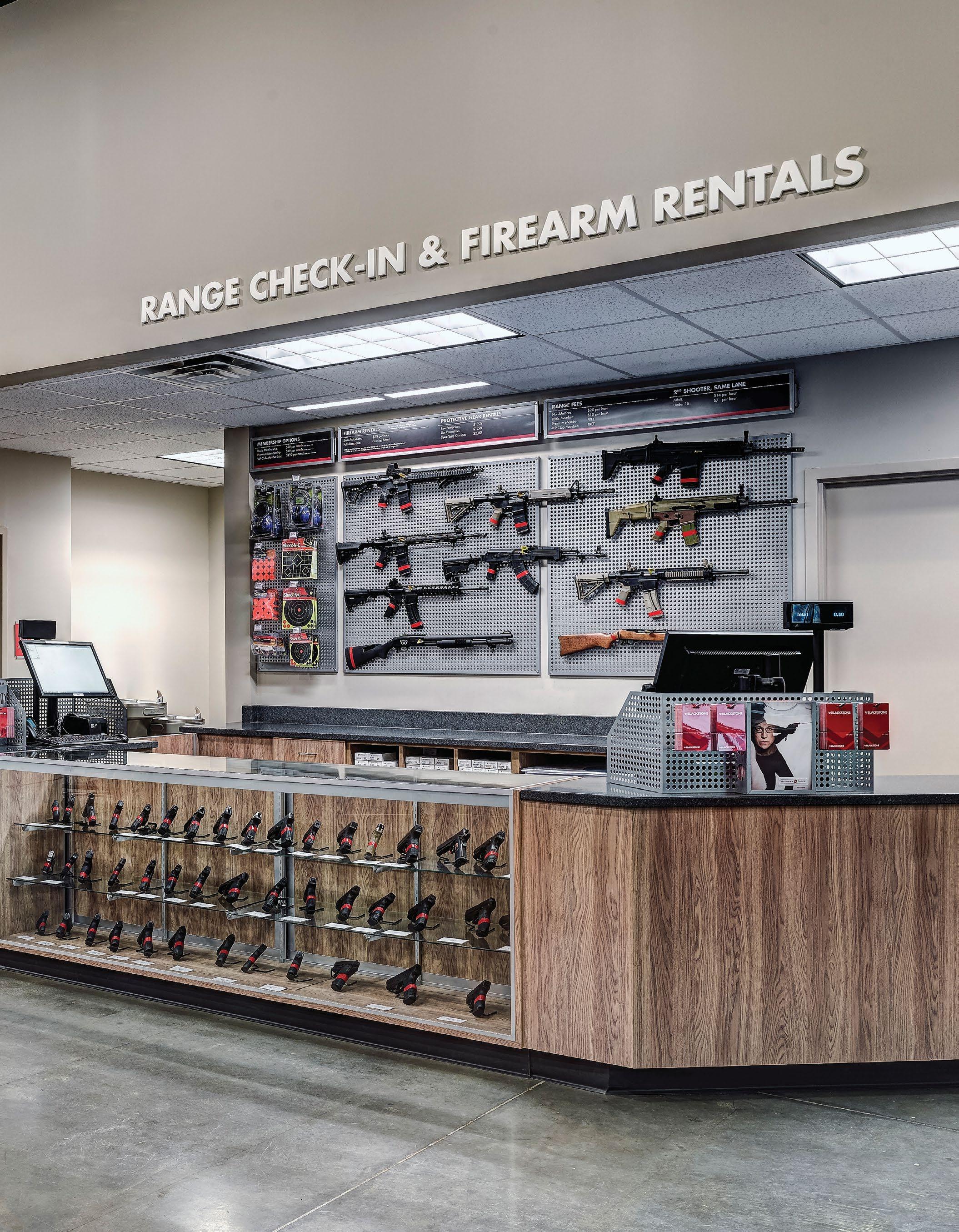
Starting a company is not easy, especially if it’s one that is trying to redefine the market. Blackstone, a shooting sports startup looking for innovative approaches, hired Little to create and position the brand and differentiate their shooting range experience.
The result is a brand identity positioned on the higher end of the spectrum and a hospitality focused retail environment suitable for events and socializing. The insight gained about the customer needs led our team to create a branded experience unlike anything on the market.
Currently Blackstone Shooting Sports is expanding the franchise regionally.
C — Store signage and dimensional graphics denote specific areas.
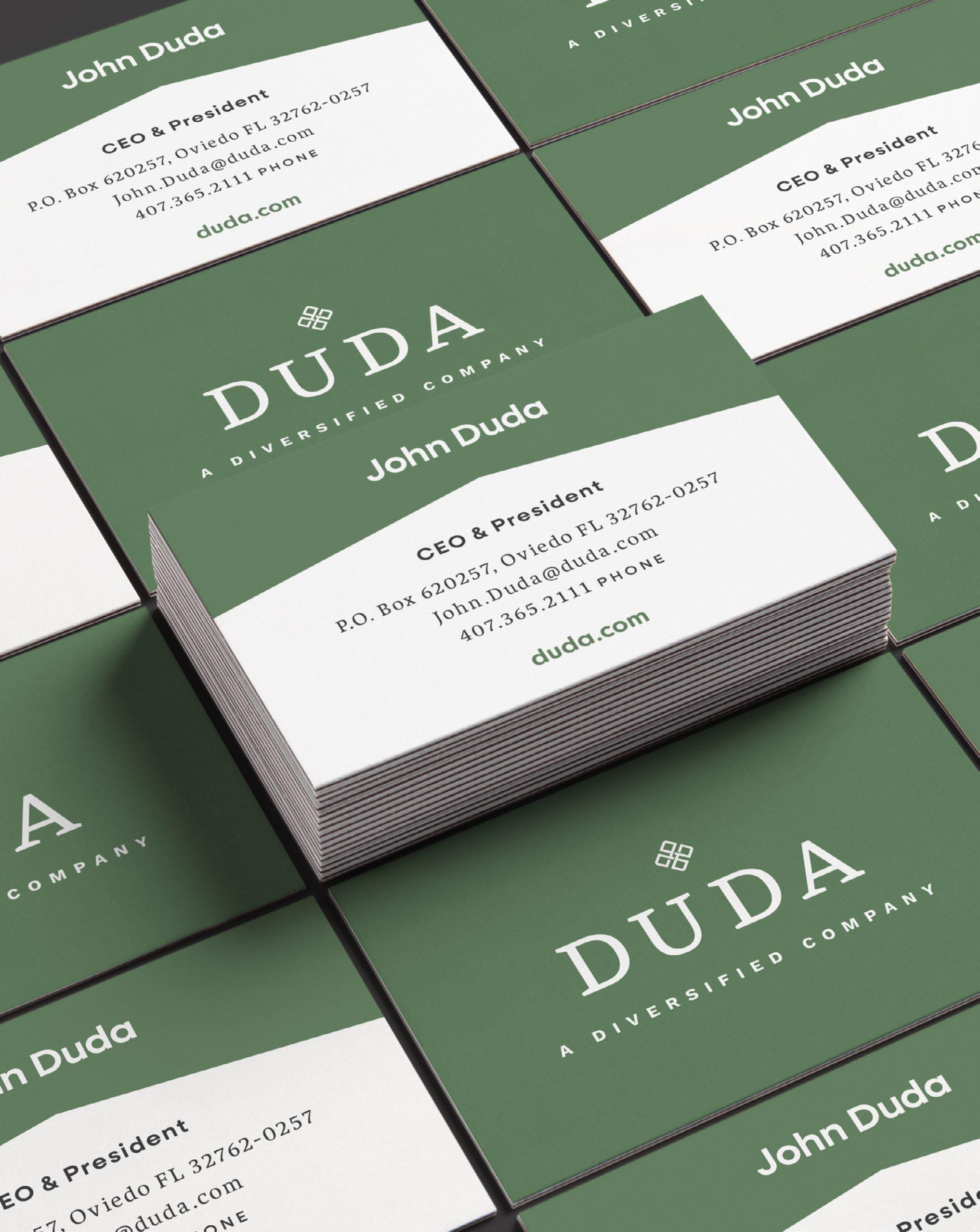
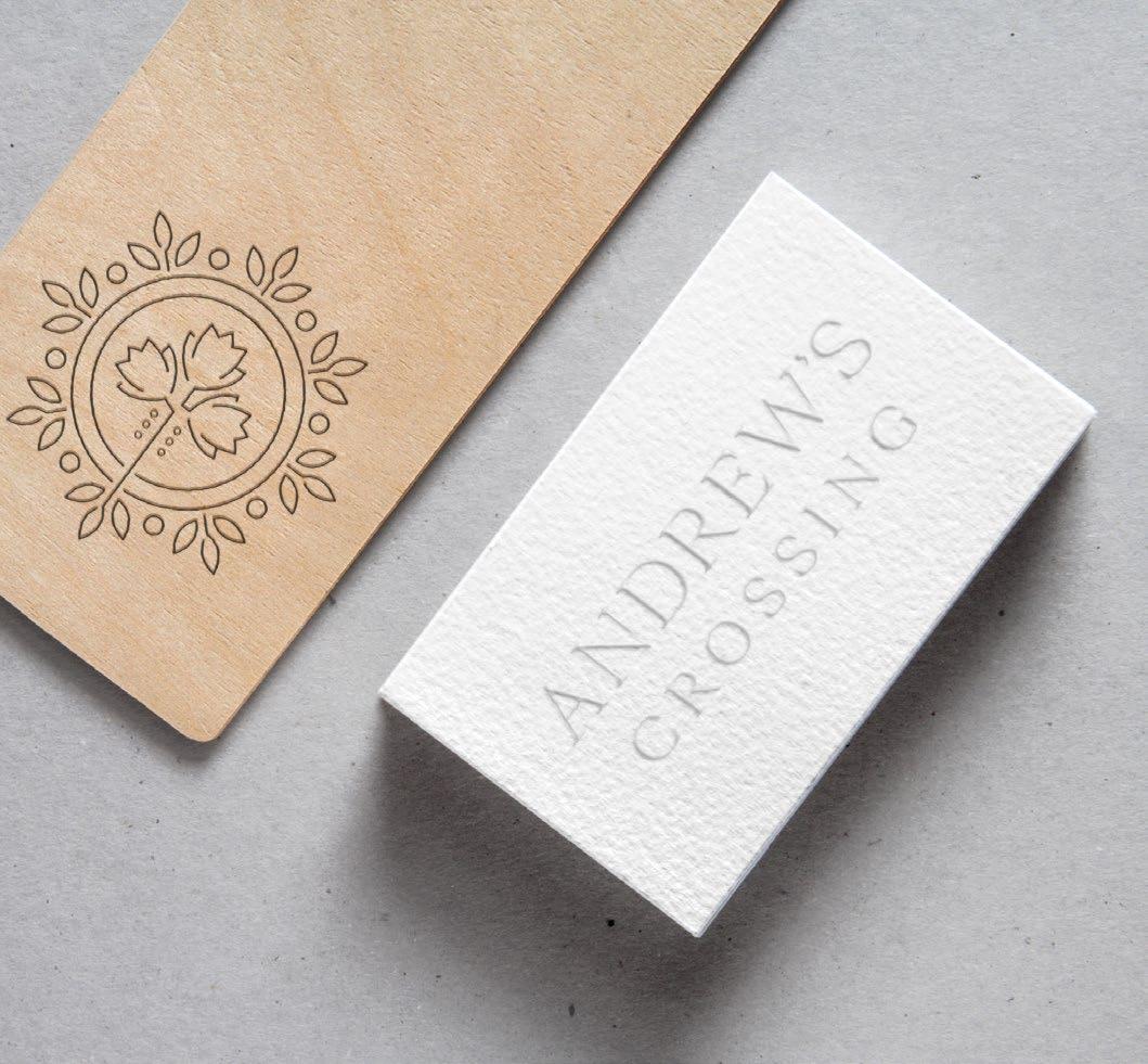
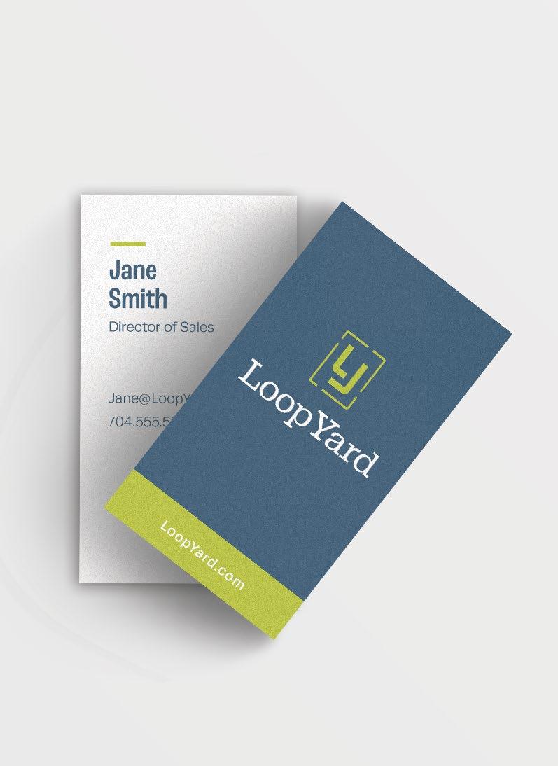
A — Business cards.
B — Launch motto.
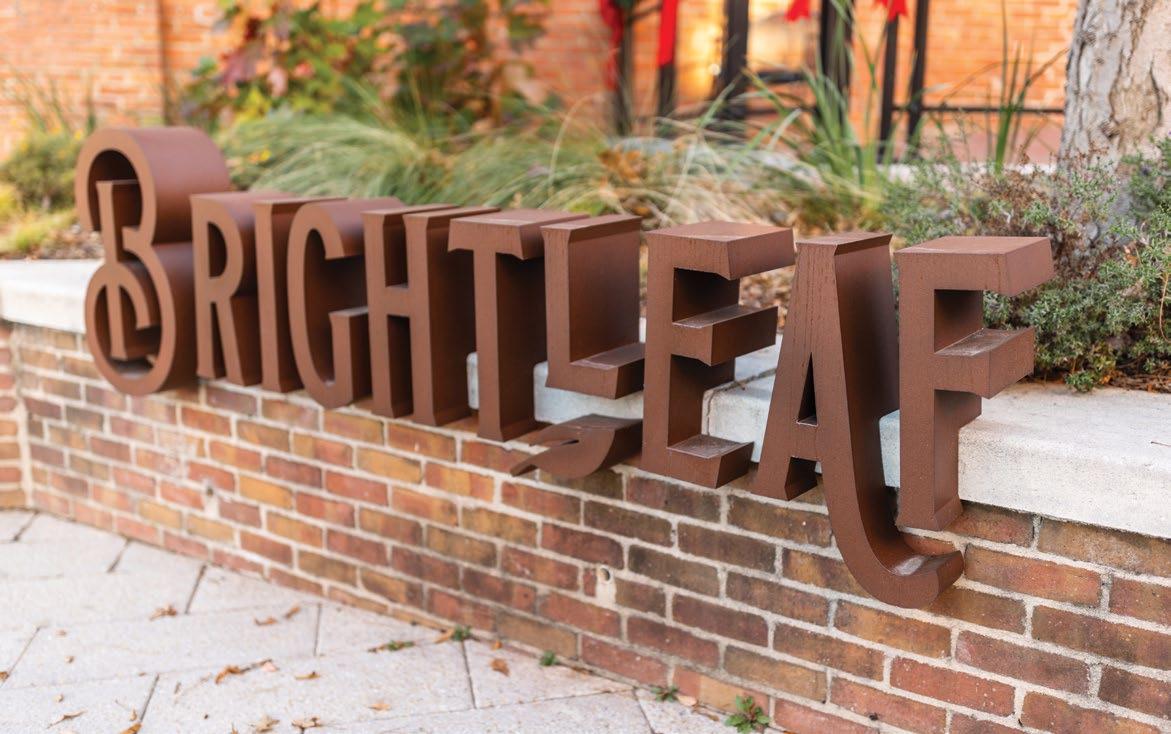
A new leaf.
Updating an Icon
Historic Revitalization
“These renovations have defined a new beginning for the Brightleaf district through the common language of sustainable materials, prioritizing the pedestrian, and celebrating historic warehouse architecture. In addition to reinvigorating the public district, the work has successfully attracted new businesses to the area.”
Services
Branding & Marketing
Brand Development, Standards, Print Materials
Site Signage
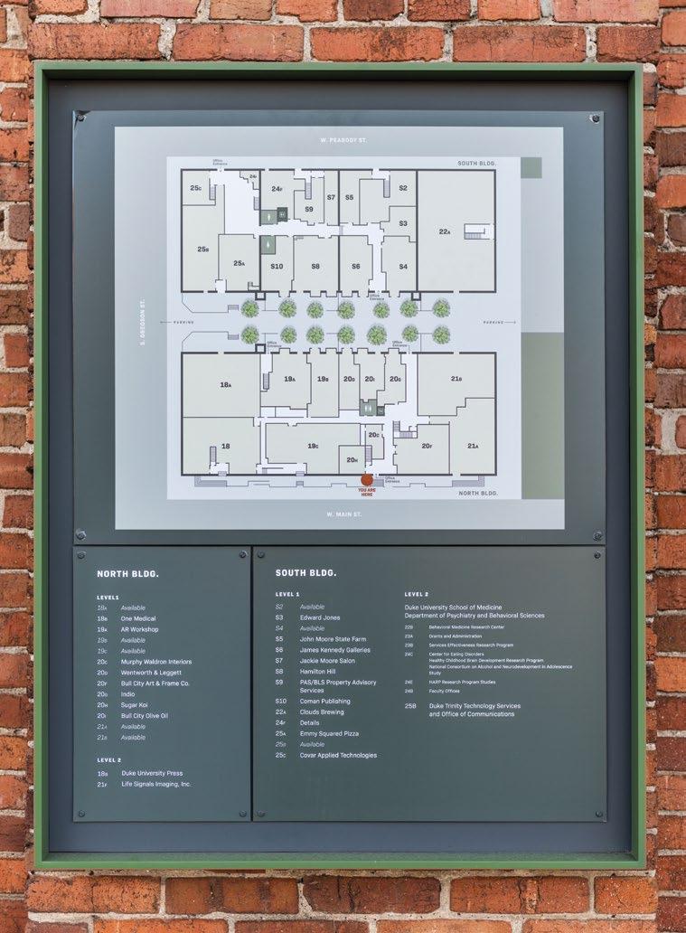
Monument Signs, You Are Here
Maps, Seasonal Banners, Parking
Signage, Base Building Signage
Additional Engineering, Site Design
30%
Increase in New Leases
ASANA PARTNERS
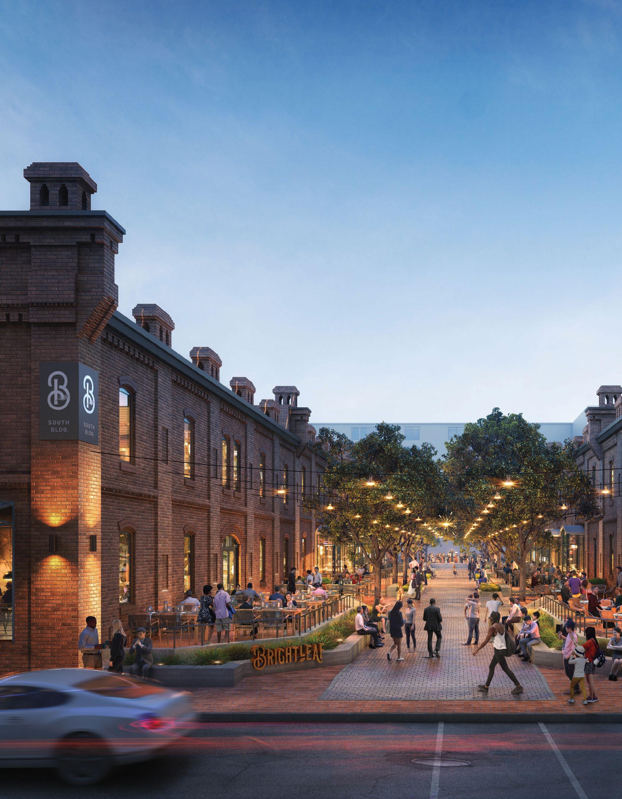
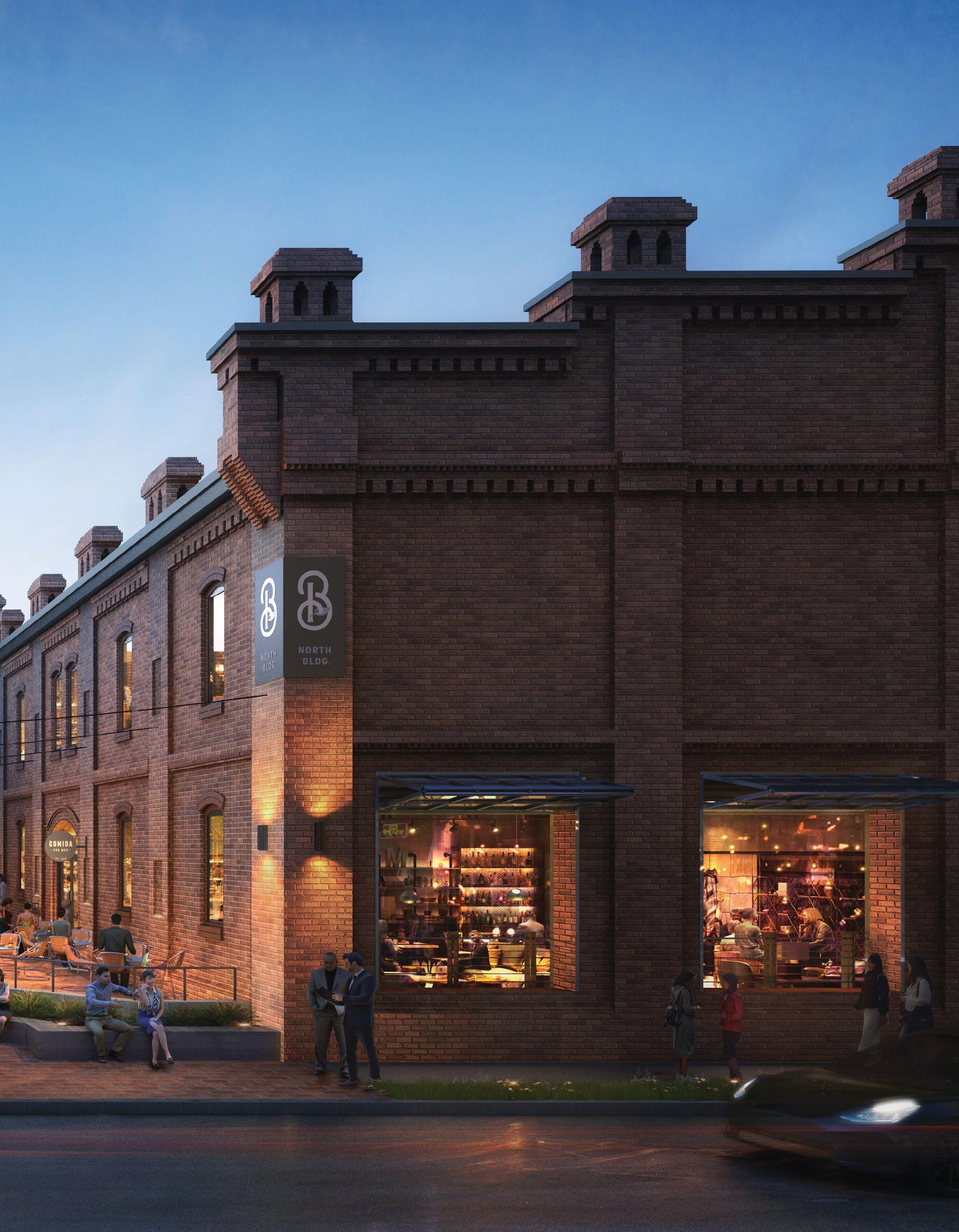
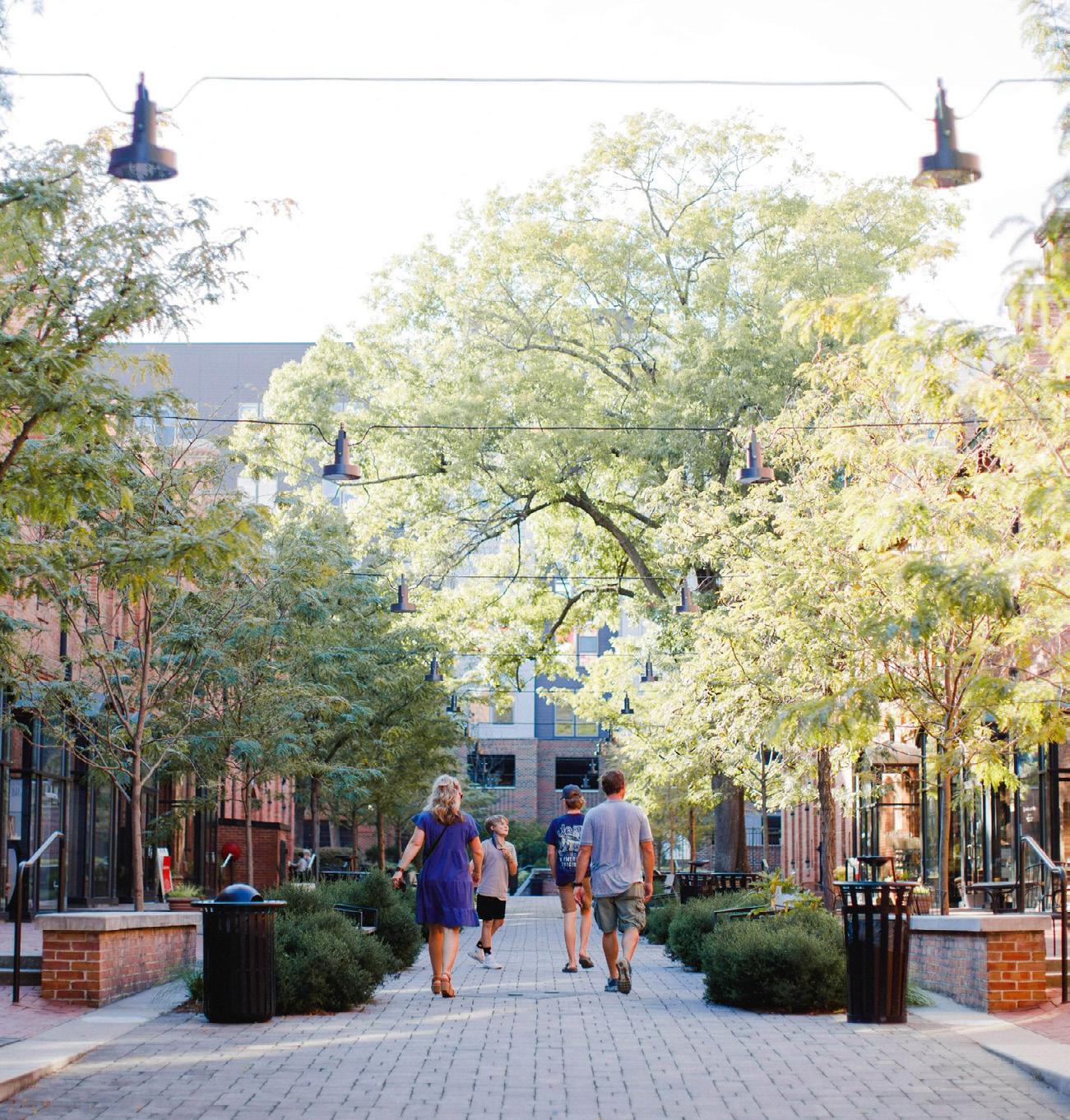
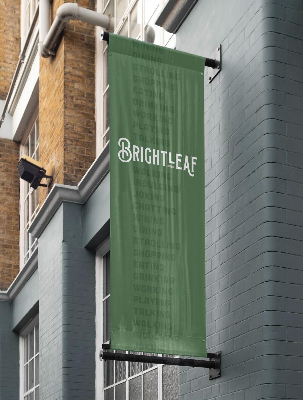
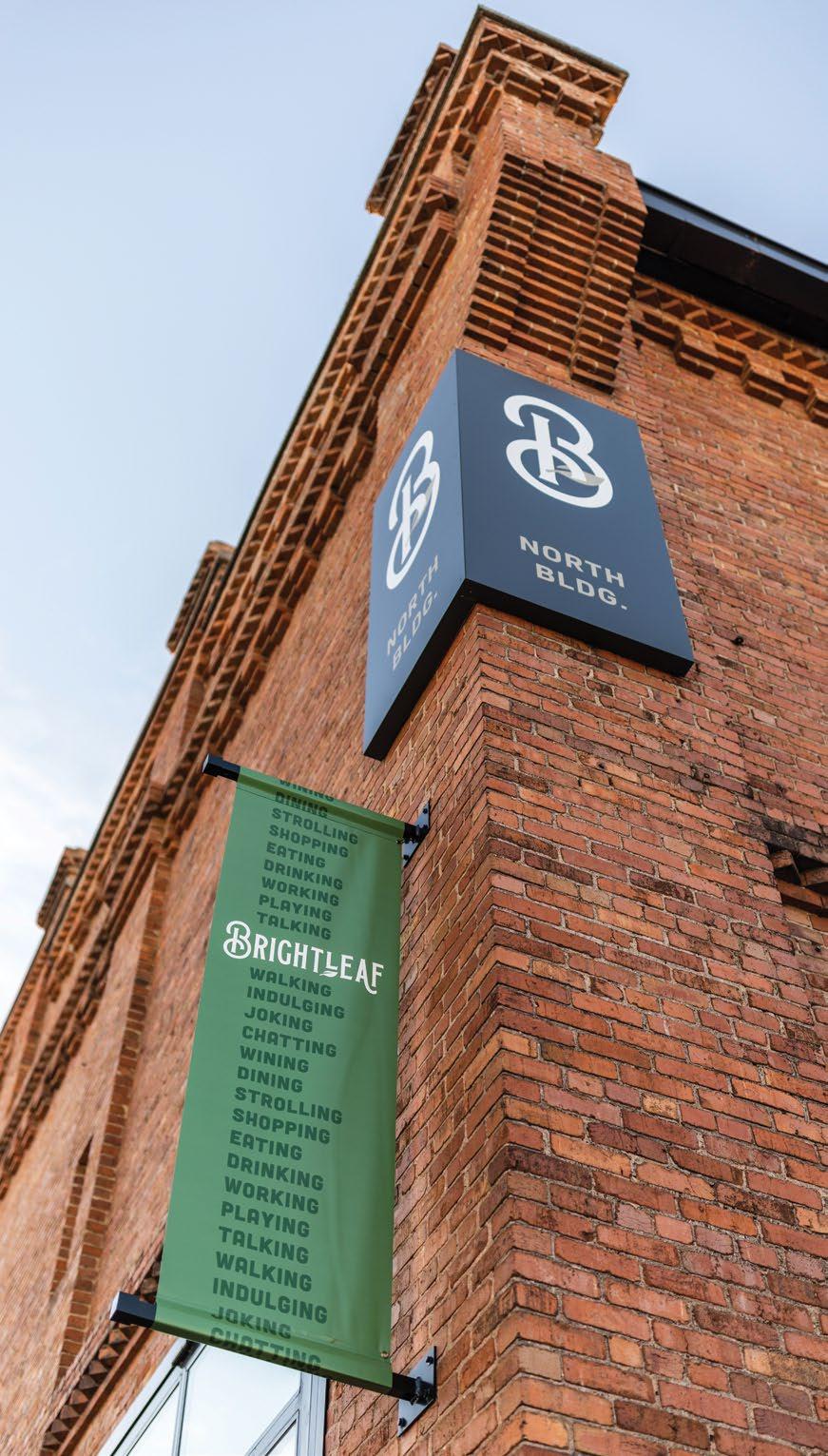
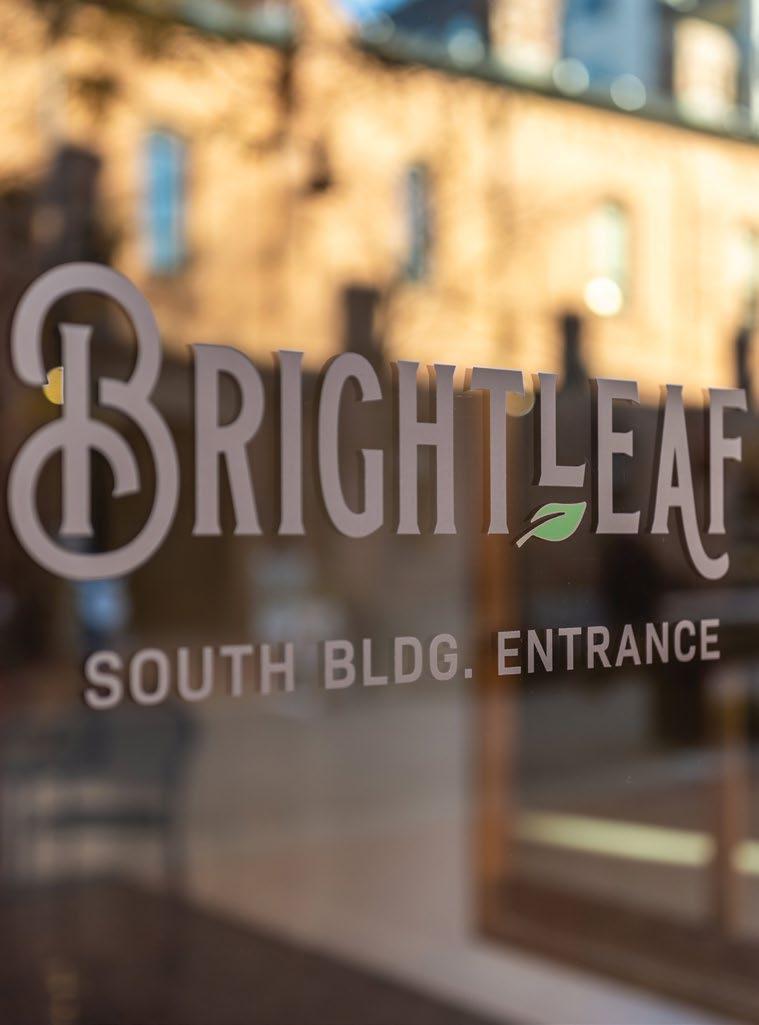
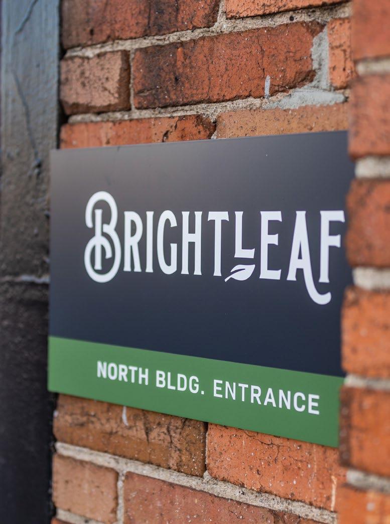
Brightleaf features a unique mix of locally-owned restaurants and shops in a pair of historic tobacco warehouses in Downtown Durham.
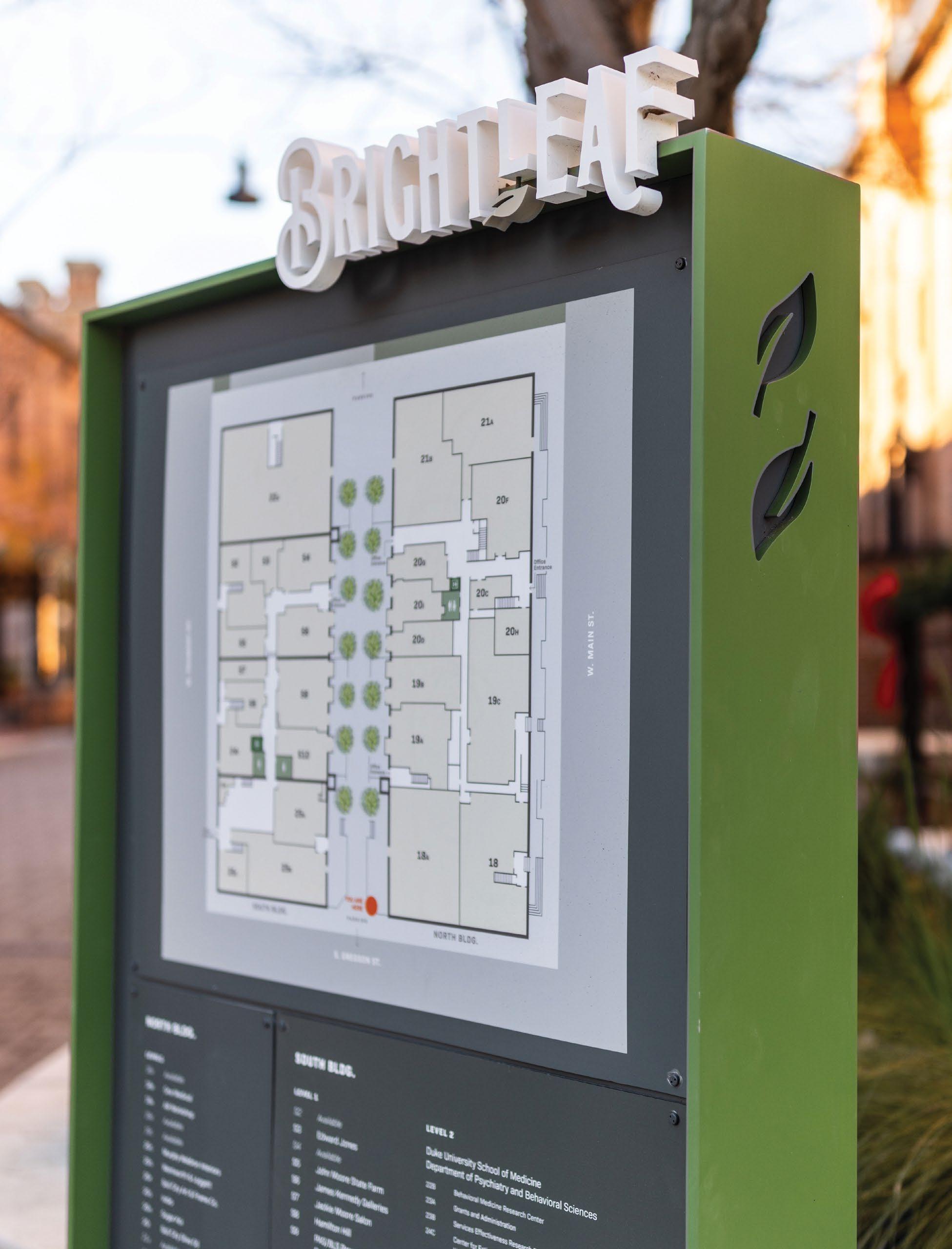
The property was originally renovated in the 1980’s to become the destination it is today. Little’s Brand Experience Studio created a new brand identity, supported by a new wayfinding package and placemaking signage. This was collaborative project with Little’s architectural and landscape teams updating the center courtyard and Main Street presence with new landscaping and lighting.
Monument signs integrate into the new landscaping.
Updated banners and hardware activate the entrance to the center courtyard.
Updated wayfinding through signs and maps helps visitors find their destination.
An Updated Story
Brightleaf holds a place in Durham’s heart as an iconic landmark. Refreshed site furniture, landscaping, and architecture compliments that history and is reinforced with colorful signage and banners to help redefine the district’s boundaries.
A — A look at Brightleaf’s main corridor with updated landscaping and site furniture.
B — Corner-wrap signage provides visibility from multiple points of view.
The Brightleaf brand pulls elements of the property’s history into a modern, legible system.
NAMING STUDIES ENCOURAGE THE EXPLORATION OF POTENTIAL WAYS TO EXPRESS THE ESSENCE OF THE PROJECT.
Prime Meridian Arroyo Bombora Makara The Divide Bunulu
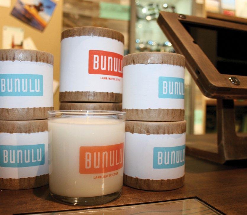
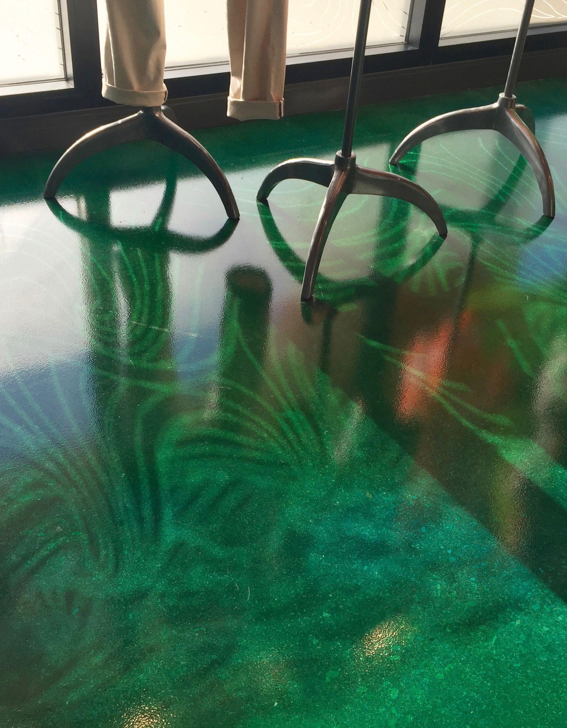
The retail concept store exudes a rhythmic, lovely energy with nods to coastal living.
When Florida retailer Beall’s wanted to launch a new brand to coincide with its 100-year anniversary, Bunulu was born. Bunulu- the Australian aboriginal word for “place of water”- represents an active coastal lifestyle.
Little worked with the client through the research and positioning process to develop a name, brand platform, identity, and assets, then implemented the new brand into a retail concept store.
A — At the entry, driftwood shutters and waterinspired glazing graphics, strategically placed to create an ever-changing pattern from light on the interior floor.
B — Bunulu scented candles; custom scent developed by Little.
C — Fitting rooms include full scale local coastal photography for an Instagram moment.
D — Ever-changing pattern on the interior floor.
“
A unique, soulful, and comfortable approach to style.
”
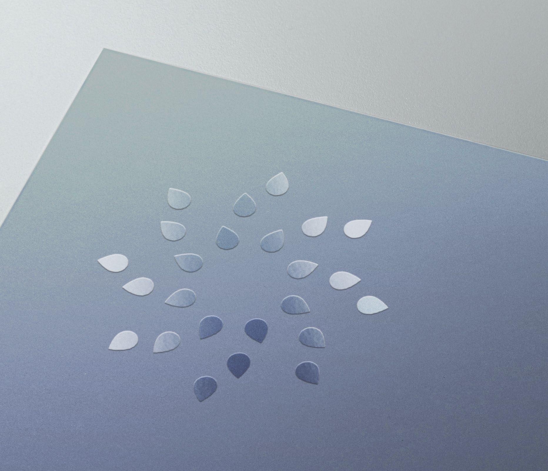
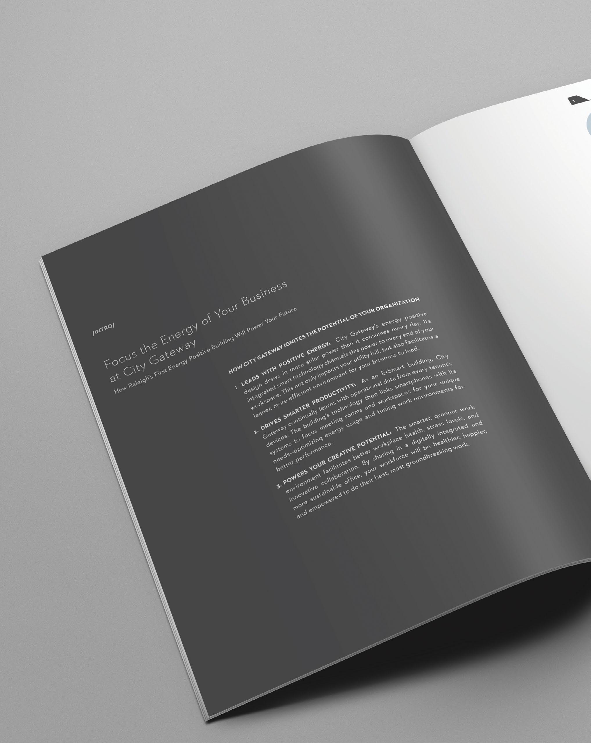
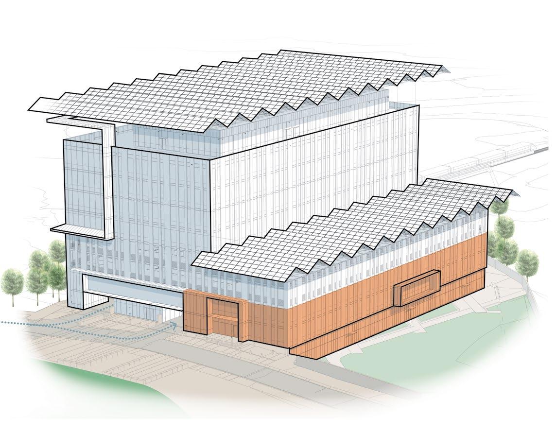
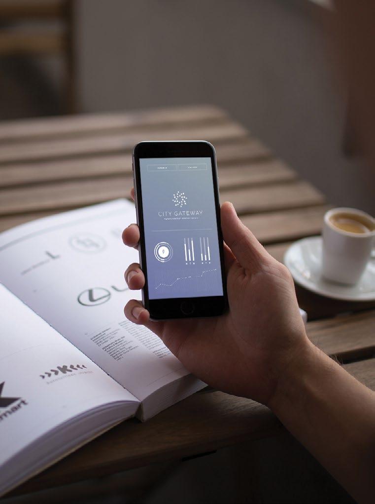
THE FUTURE OF RALEIGH IS GLOWING WITH POTENTIAL, LEADING
NORTH CAROLINA TO A BRIGHT FUTURE OF BUSINESS INNOVATION— AND CITY GATEWAY WILL LIGHT THE WAY.
CITY GATEWAY
Empowering the Future of Raleigh
Services
BRANDING & MARKETING
Brand Development, Standards, Print Materials
The drops of water appear to be moving in unison, powered by the wind, while emphasizing the radial energy of the sun. This hints at a progression toward sustainability and a brighter future.
We designed the icon to be used as an overlay and in a series of brand patterns.
GROWTH-MINDED
COMMUNAL AND OPEN
INTEGRATED WITH NATURE, TECHNOLOGY & PEOPLE
Leasing materials were designed in the brand voice, providing consistency from the first impression.
Looking Forward
Primed for growth. Refined with technology.
Ignited by new ideas.
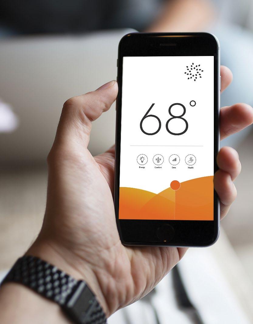
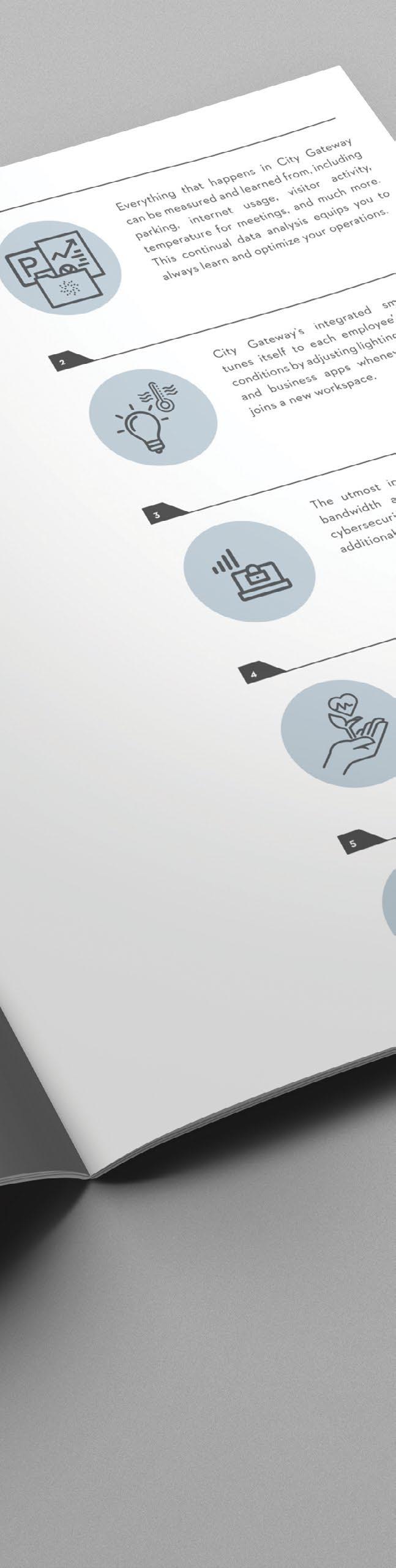
Building a family of collateral with simple visuals and easily understood messaging about City Gateway’s cutting-edge features allowed both the client and leasing agents to deliver accurate information to tenants in a way that visually matched the caliber of the architecture.
Little prepared several documents targeted at a variety of end-users, all designed to start a conversation and explain amenities, opportunities, and differentiators easily and quickly.
GEORGE WASHINGTON 1700 PENNSYLVANIA AVENUE
WASHINGTON, DC
Lorem ipsum dolor sit amet, consectetuer adipiscing elit, sed diam nonummy nibh
euismod tincidunt ut laoreet dolore magna aliquam erat volutpat. Ut wisi enim ad minim
veniam, quis nostrud exerci tation ullamcorper suscipit lobortis nisl ut aliquip ex ea
commodo consequat. Duis autem vel eum iriure dolor in hendrerit in vulputate velit esse
molestie consequat, vel illum dolore eu feugiat nulla facilisis at vero eros et accumsan et iusto odio dignissim qui blandit praesent luptatum zzril delenit augue duis dolore te feugait nulla facilisi.
Lorem ipsum dolor sit amet, cons ectetuer adipiscing elit, sed diam nonummy nibh
euismod tincidunt ut laoreet dolore magna aliquam erat volutpat. Ut wisi enim ad minim
veniam, quis nostrud exerci tation ullamcorper suscipit lobortis nisl ut aliquip ex ea commodo consequat.
Lorem ipsum dolor sit amet, consectetuer adipiscing elit, sed diam nonummy nibh
euismod tincidunt ut laoreet dolore magna aliquam erat volutpat. Ut wisi enim ad minim
veniam, quis nostrud exerci tation ullamcorper suscipit lobortis nisl ut aliquip ex ea commodo consequat. Duis autem vel eum iriure dolor in hendrerit in vulputate velit esse
molestie consequat, vel illum dolore eu feugiat nulla facilisis at vero eros et accumsan et iusto odio dignissim qui blandit praesent luptatum zzril delenit augue duis dolore te feugait nulla facilisi.
Lorem ipsum dolor sit amet, consectetuer adipiscing elit, sed diam nonummy nibh euismod tincidunt ut laoreet dolore magna aliquam erat volutpat. Ut wisi enim ad
The icon is constructed from 24 symbols, representing water, plants, and light.
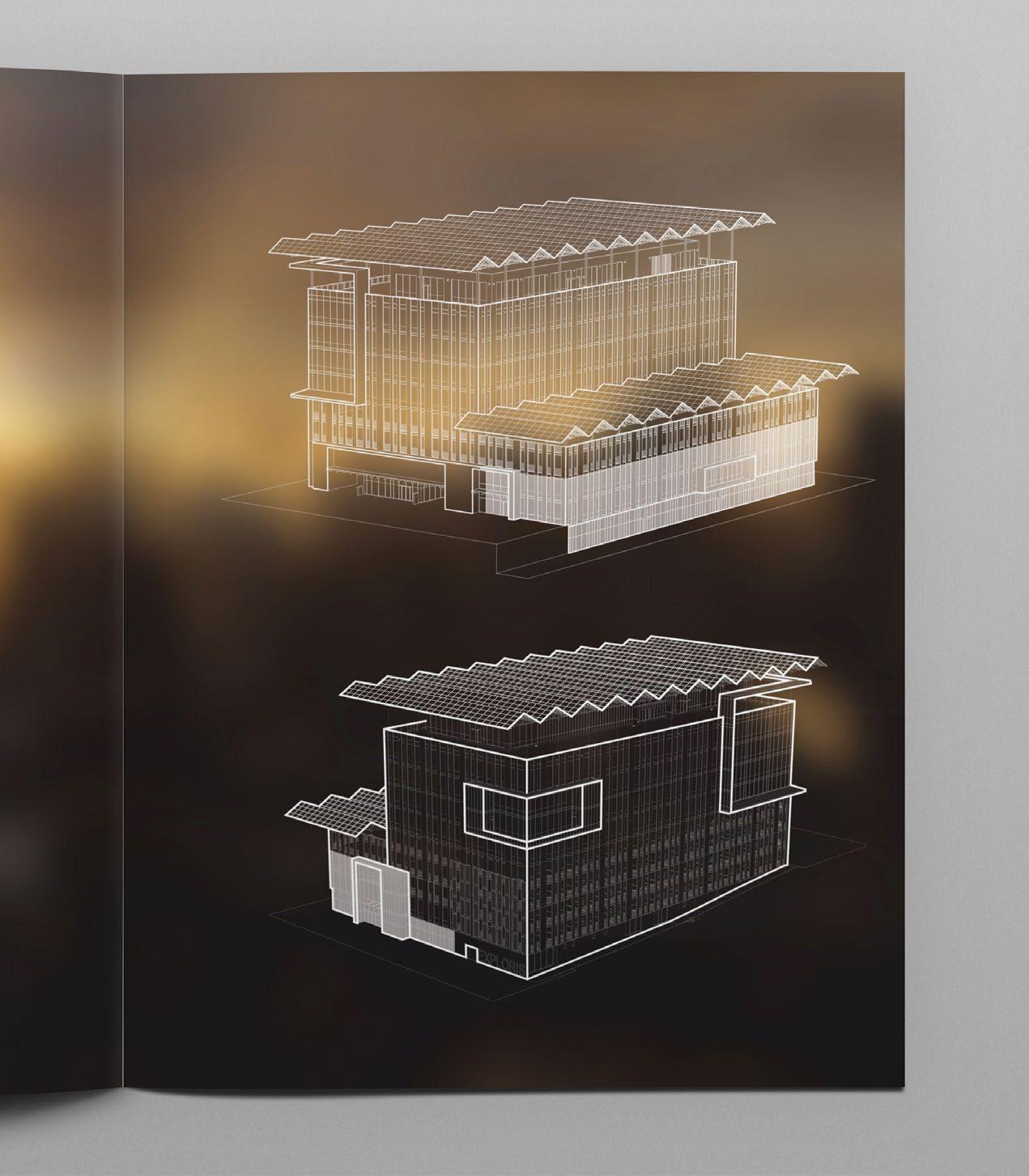
Custom designed axon views for the site.
Sustainable features.
City Gateway will be energy positive by generating more power on site than the building requires. This mixed-use building is expected to use 60% less electricity than a comparable building.
Raleigh’s first energy positive building will allow for ease of business, learning and living. Little created a leasing lookbook showcasing how city gateway will power your future.
Brand standards addressed visuals from printed collateral & building signage to its digital presence.
Rooted in family.
Preparing for the Next 100 Years
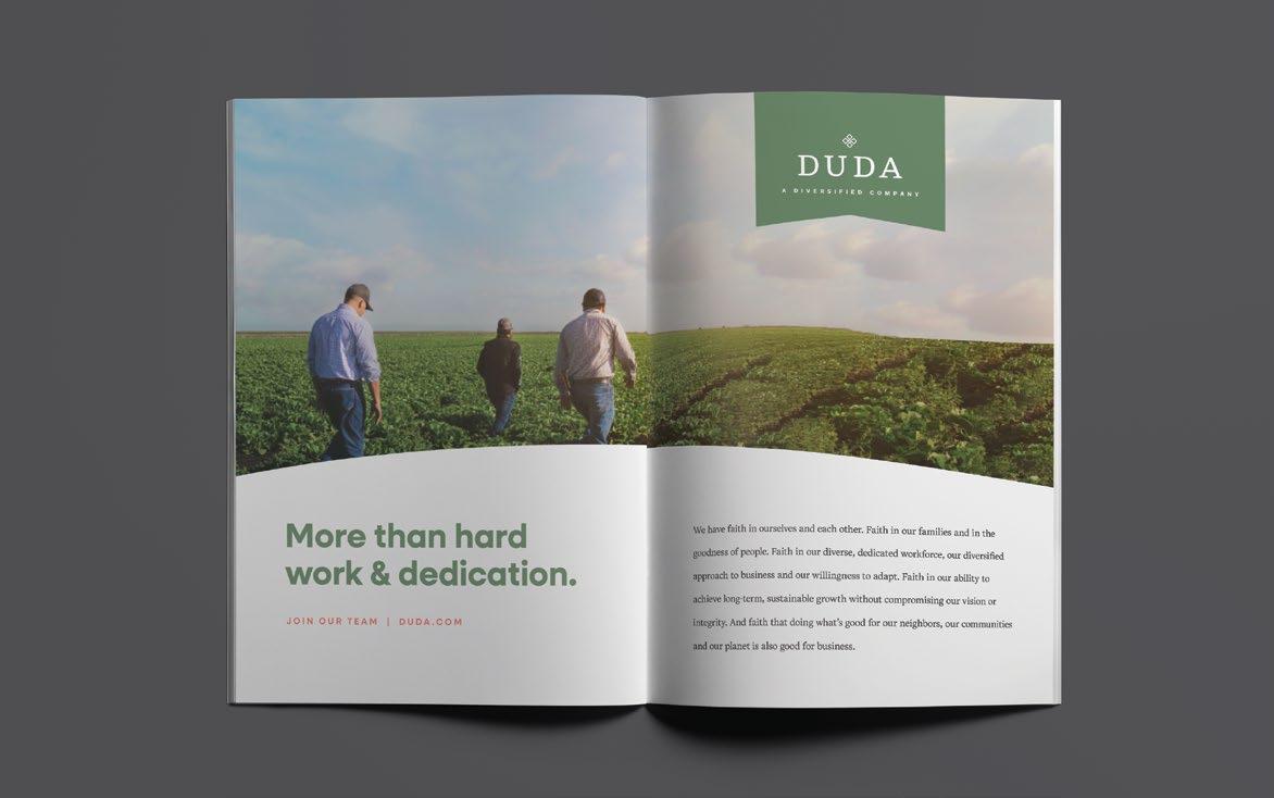
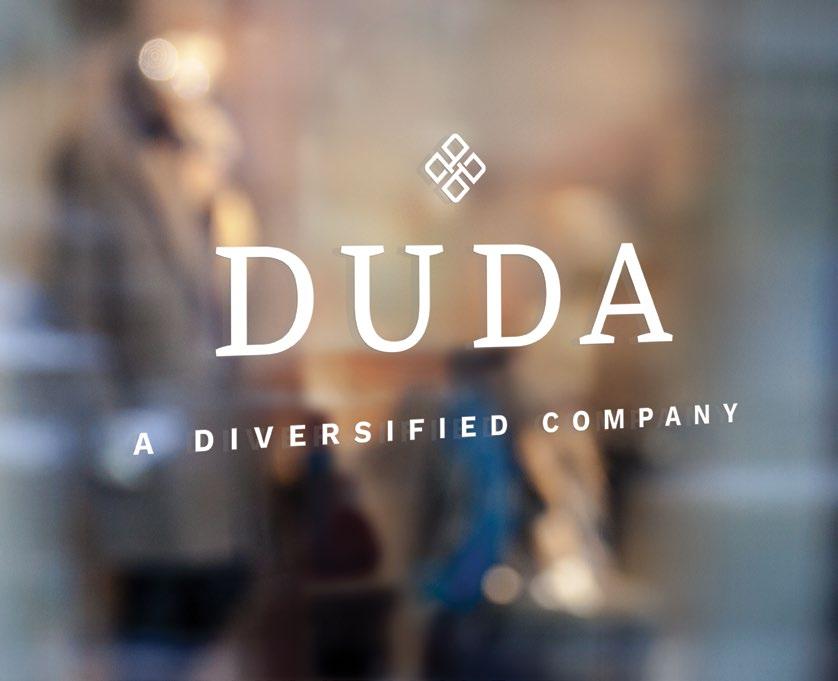
DUDA
Oviedo, FL
Organic Forms
Underlying Grid
Cultivating a legacy.
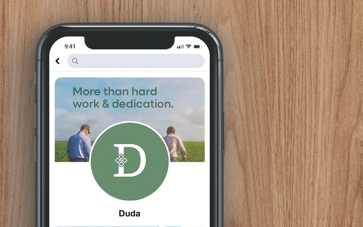
It takes more than hard work and dedication to build a powerful brand.
Little and DUDA collaborated to develop core concepts, derived from the Mission, Vision and Values. Full of possibilities, the new logo speaks to the fact that while keeping up with the times, we’re not risking our values and standards. Our symbol has been customized and modernized from a traditional Slavic icon meaning “Strong Family.”
Presentation templates were included in the full suite.
Subtle cues and supporting elements make a cohesive package.
A secondary mark reinforces the brand when used in smaller applications.
Our symbol means strong family. Rooted in our history and present in what we’ve built.
On our lands, in our communities and with our people.
The values DUDA lives and works by were carved in stone long before Andrew Duda brought to market his first celery crop in 1926.
And while much has changed in the last century, their core philosophy never will. This new brand will support DUDA in their next hundred years.
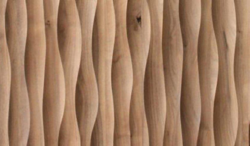
While crafting the brand, our team is always considering how materials and form can be used in spaces.
A Complete Family
Community is the core of what DUDA builds and Andrew’s Crossing is the next step. This mixed-use development will highlight each of their diverse business units - home builders, commercial property and growers.
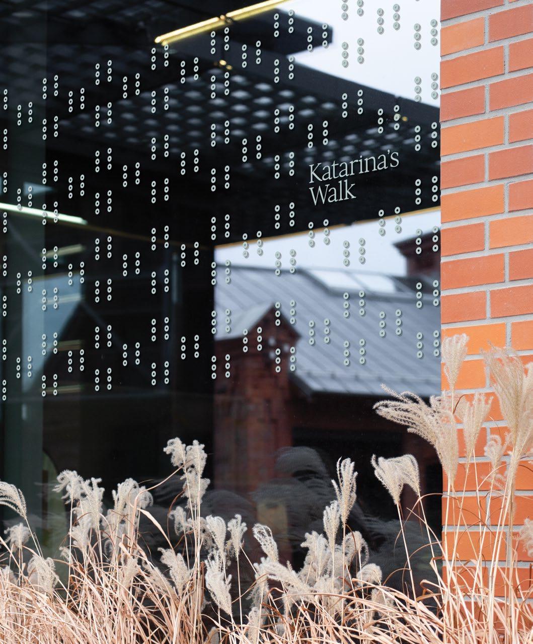
The mark utilizes Slavic designs in a modern way with a soft, marine inspired color palette.
Education Heroes
Growing Up After 25 Years.
Orlando, FL
1998 to 2024
After working with A Gift for Teaching to expand their reach, Little recommended a tweak to “Pencil Boy” to clean up the original. This refresh launches the organization into the next chapter.
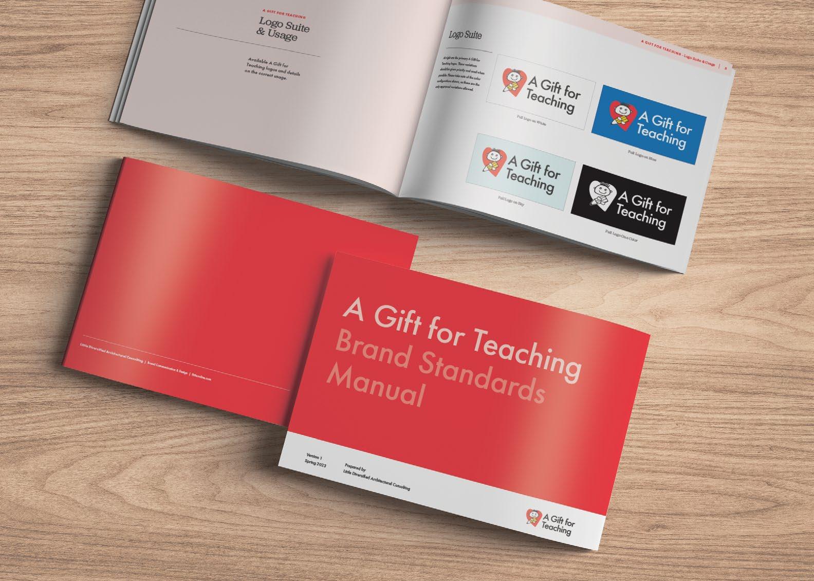
A — With the refreshed brand, Little delivered a comprehensive brand standards manual.
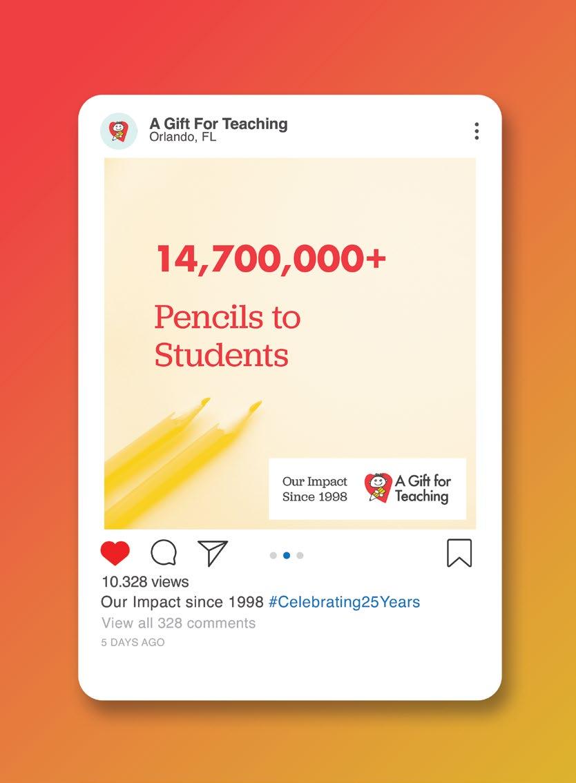
B — To aid in the rollout we studied brand applications, including stats and social media posts.
Sub-brands for A Gift for Teaching allow Pencil boy to take on new challenges.
Original Pencil Boy
Refreshed Pencil Boy
5 ! 2 5 !
A playful suite of illustrations to celebrate 25 years.
bring in pops back side of the statement text.
Empowering Educators
During the refresh, we created a set of secondary illustrations and patterns that are used to celebrate the organization’s 25th year. The new truck shows off the accomplishments, including more than $169 million worth of educational supplies have been placed directly into the hands of local students.
Community & innovation
Revolutionizing Holistic Health
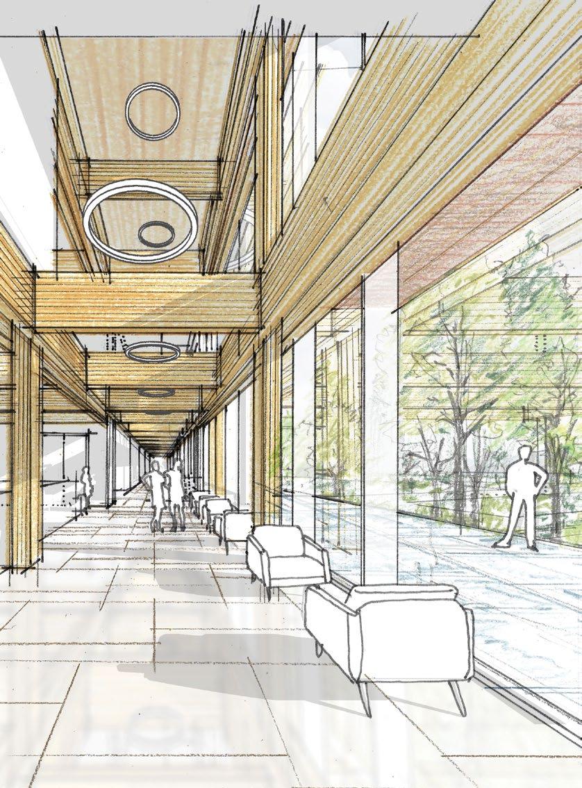
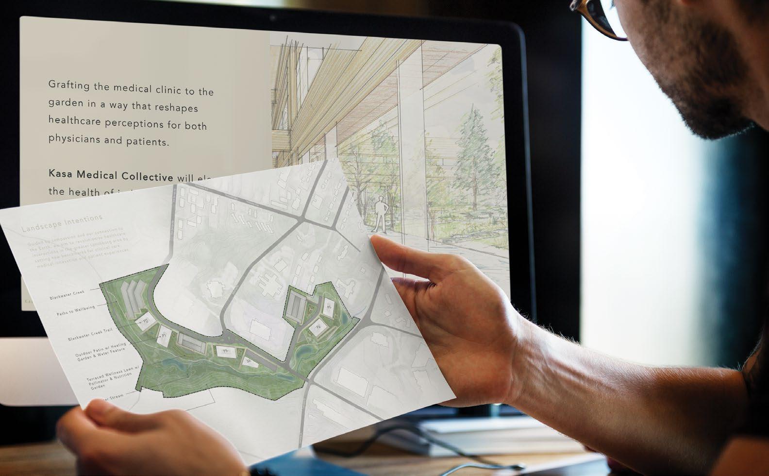
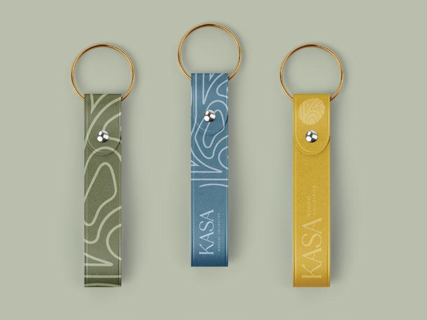
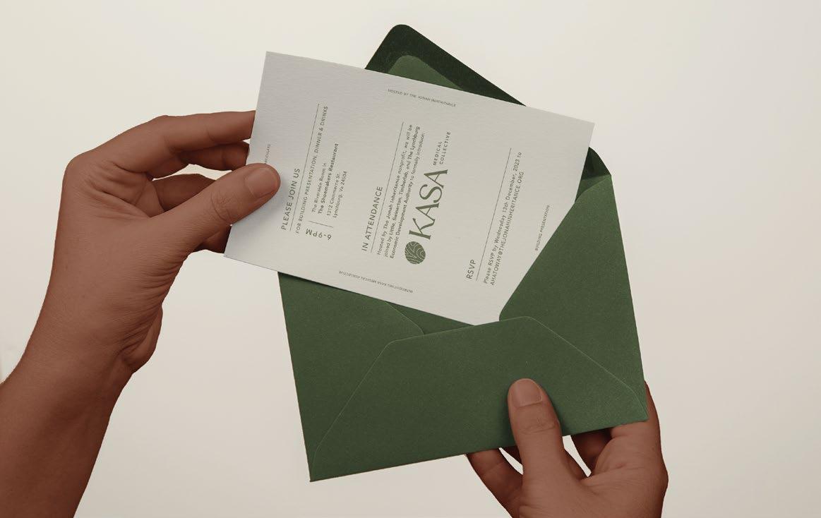
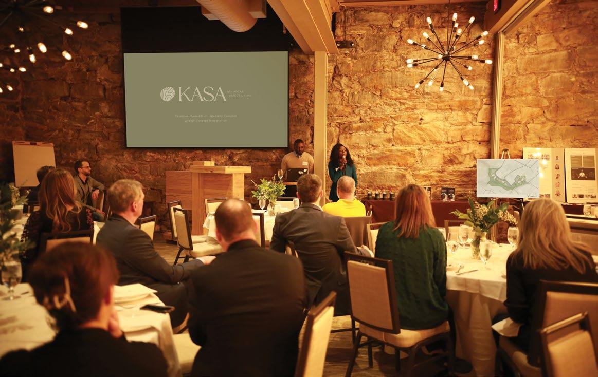
KASA MEDICAL COLLECTIVE
Lynchburg, NC
Guided by compassion and our connection to the earth
Kasa Medical Collective was born out of client’s dream of providing a medical campus for his community in Virginia that was both a hub for family medical care and a benchmark for environmental impact. Little began with creative research aimed at a name and brand, landing on a message pulling from our client’s Nigerian roots and community-oriented promise.
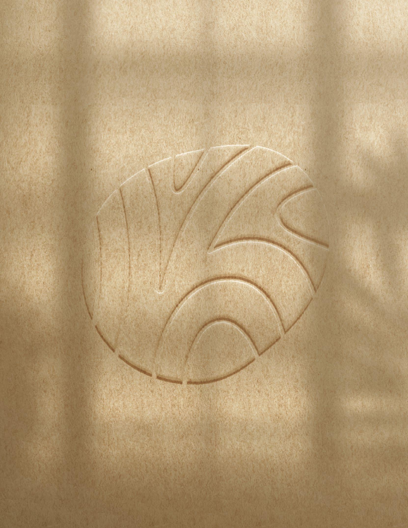
A brand icon was designed combining rings of local tree species, Nigerianinspired typography, and the unique fingerprint of each end user.
Icon Studies
Brand elements were studied across different scales, media, and levels of contrast.
A final brand identity was designed down to each detail, uniquely specific to the family of individuals comprising this medical collective.
typeface customised to highlight the hooked as a nod to Hausa
oval shape curves into nook of K
follows the line of the A
Kasa, a Hausan translation of earth, became a metaphor suggesting a strong, stable foundation in one’s life and connection back to the earth.
Whole family and whole person care.
A destination for comprehensive healing & medical collaboration.
Kasa Medical Collective is a uniquely-design campus bringing together medical professionals from a variety of niches for a variety of end-users.
A consistent brand language was designed to establish a clear unifying voice, soft and approachable but easily recognizable.
“Kasa Medical Collective will elevate the health of individuals and the environment, whilst establishing the campus as the cornerstone of wellbeing for Lynchburg.”
A — A warm color palette unifies brand elements, staying away from the cold & sterile expectations associated with typical healthcare environments.
B — Textures, transparency and legibility were all considered throughout the design of the brand.
Brand patterns and secondary color palettes were designed as part of the family of graphic assets.
Understanding that a clear visual language can help increase engagement, Little designed initial collateral for the campus’ first impression among potential tenants.
Initial introductions to the concept became a series of workshops to gather crucial input from the community.
A new perspective on mental health.
KATIE BLESSING CENTER
Charlotte, NC
White
on Teal
Full Color on Sky
Reduced Color on Aqua
White on Black
White on Teal
Full Color on Sky
Reduced Color on Aqua
White on Black
White on Teal
Full Color on Sky
Reduced Color on Aqua
White on Black
Color on White
Reduced Color on Teal
Full Color on Sky
Reduced Color on Aqua
on White White on Black
Color on White
Reduced Color on Teal
Full Color on Sky
Reduced Color on Aqua
on White
White on Black
Color on White
Reduced Color on Teal
Full Color on Sky
Reduced Color on Aqua
on White
White on Black
A — Studies in animating the logo to convey care and compassion.
B — A complete brand standards manual defines logo elements, color palette and typography.
Creating an accessible center to help kids who need mental health support.
Our kids need your help.
REVEAL LINE STYLES
Our team crafted a complete brand package to launch what will be North Carolina’s largest and most advanced pediatric behavioral health care facility offering full continuity of services in one campus.
GRADIANTS
The Katie Blessing Center’s goal is to eliminate barriers to healthcare access here in Charlotte, North Carolina, and to set an example for what can be done across the country.
In addition to an approachable logo, we crafted a warm brand through welcoming images and a soft color palette.
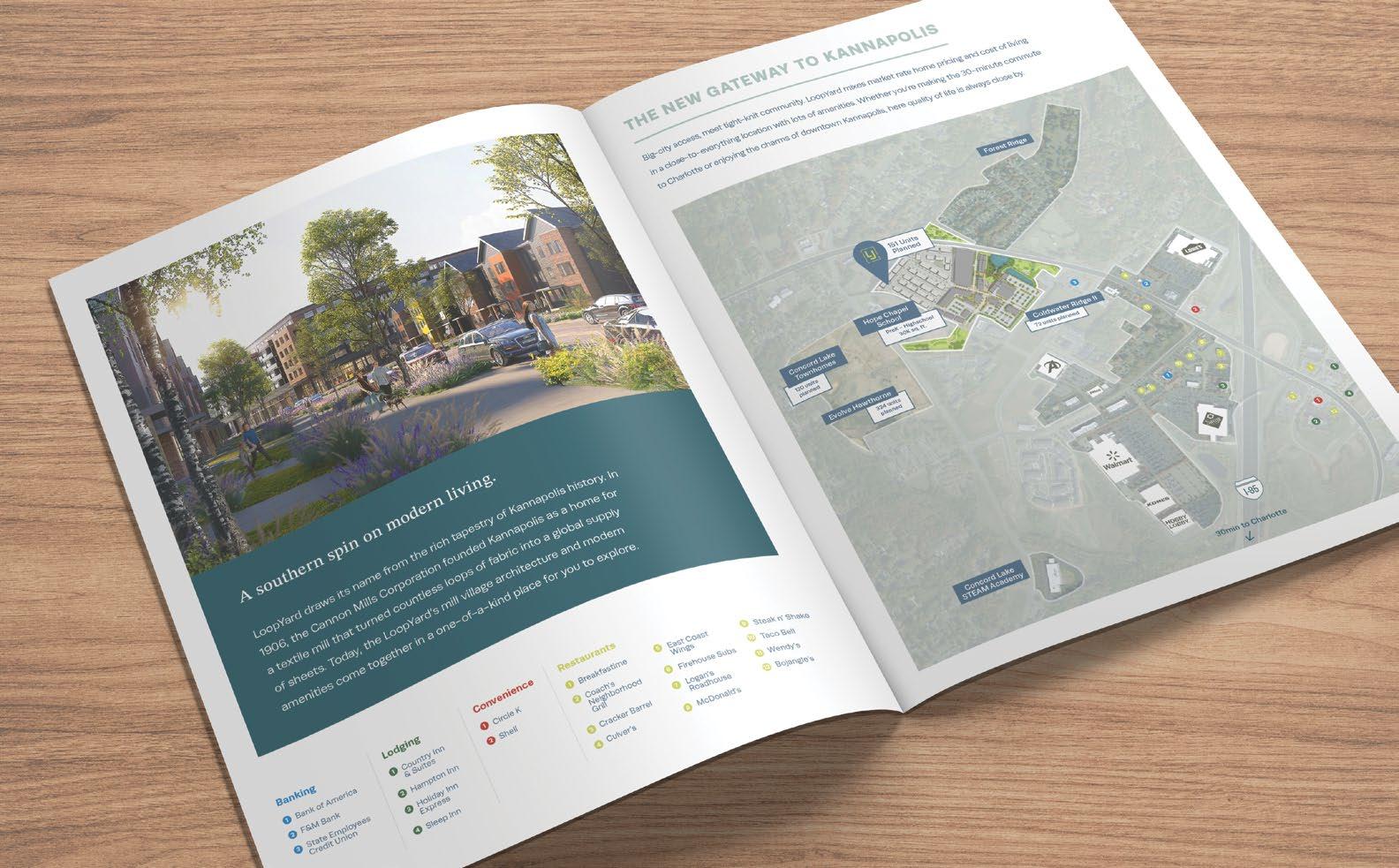
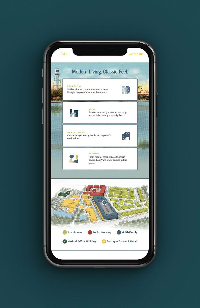
A Southern Spin on Modern Living.
LOOPYARD
Kannapolis, NC
Modern living. Classic feel.
Building a brand to appreciate Kannapolis history and celebrates its future.
Using the rich tapestry of Kannapolis history, LoopYard weaves residential and retail spaces into a diverse, tight-knit community. Here a new take on mill village architecture re-imagines the legacy of the Cannon Mills textile company that gave Kannapolis its name.
A — Print collateral was created as a leave-behind during conferences.
B — A mobile-first website developed as a living tool to share LoopYard updates.
Textile Legacy
Located 30 minutes from Uptown Charlotte, LoopYard seamlessly connects old and new NC.
Big-city access, meet tight-knit community. LoopYard mixes market rate home pricing and cost of living in a close-to-everything location with lots of amenities. Our team developed a brand that exudes accessible unity and includes textile motifs.
A Fresh Start
New Life for a Classic Icon
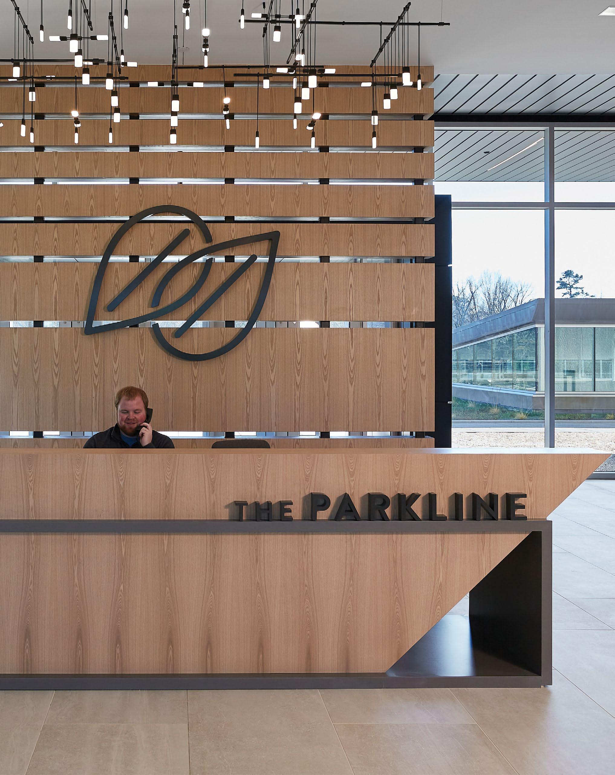
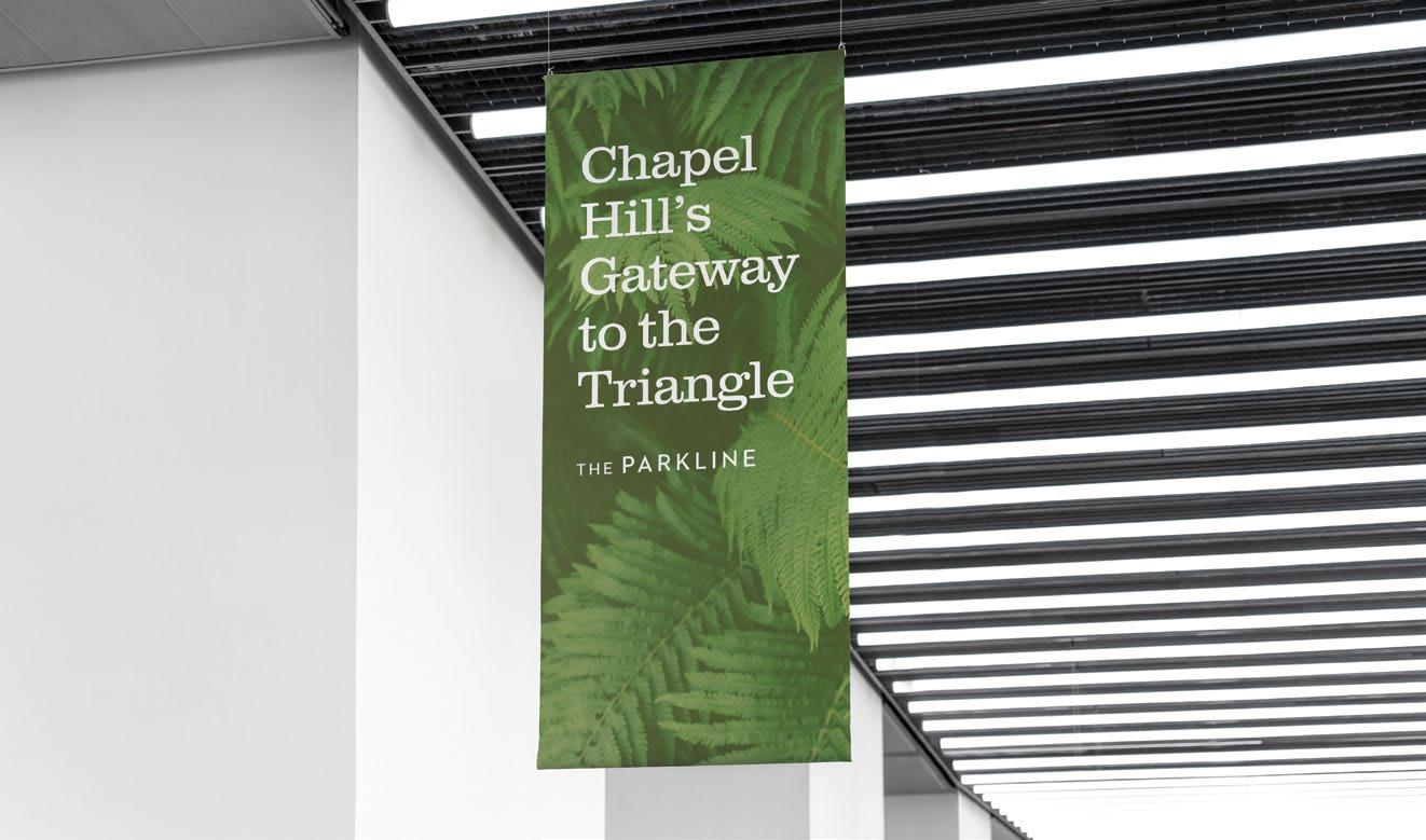
THE PARKLINE FOR SECU Chapel Hill, NC
A custom entry desk references the building’s unique angle, which is also represented in the logo.
A Fresh Start
This iconic property between Durham and Chapel Hill was designed by A.G. Odelle Jr. and Associates in the 1960’s. Little was engaged by the new owners, State Employees Credit Union, to brand the site and establish it in the present while not losing the character of the past.
The new brand includes a logo that references the unique angle of the building and the link between Chapel Hill and the surrounding Triangle cities.
DESIGN AWARDS
Rethinking the Future Award
USBGC Climate Champion Award
ASLA Southeast Regional Conference Merit Award
AIA Triangle Honor Award
AIA North Carolina, Design Award
AIA Orange County, Design Award
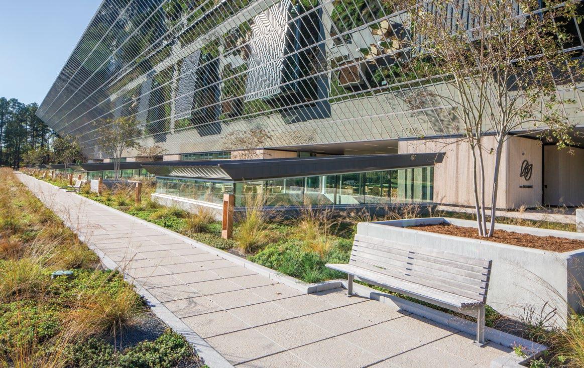
A large concrete plaza became a 90,000 sf green roof that stitches together the park-like campus.
Subtle brand reinforcement with material colors.
Branded banners and signs reinforce the link between the cities.
“ Reinforcing the link between the cities.
Monument sign along main frontage
Building directory signage at ground level.
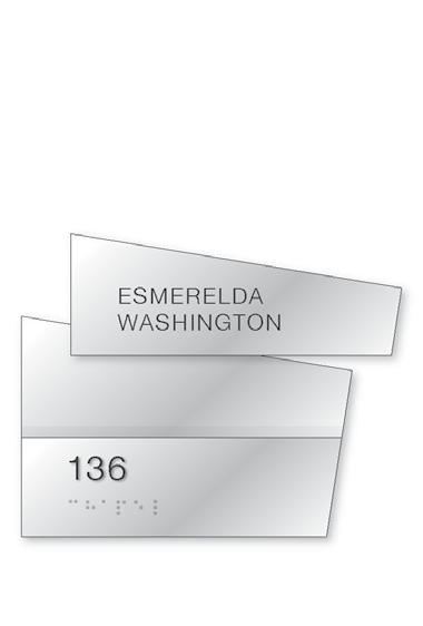
ID01 Room ID Sign
ID02 Service
Hit the books
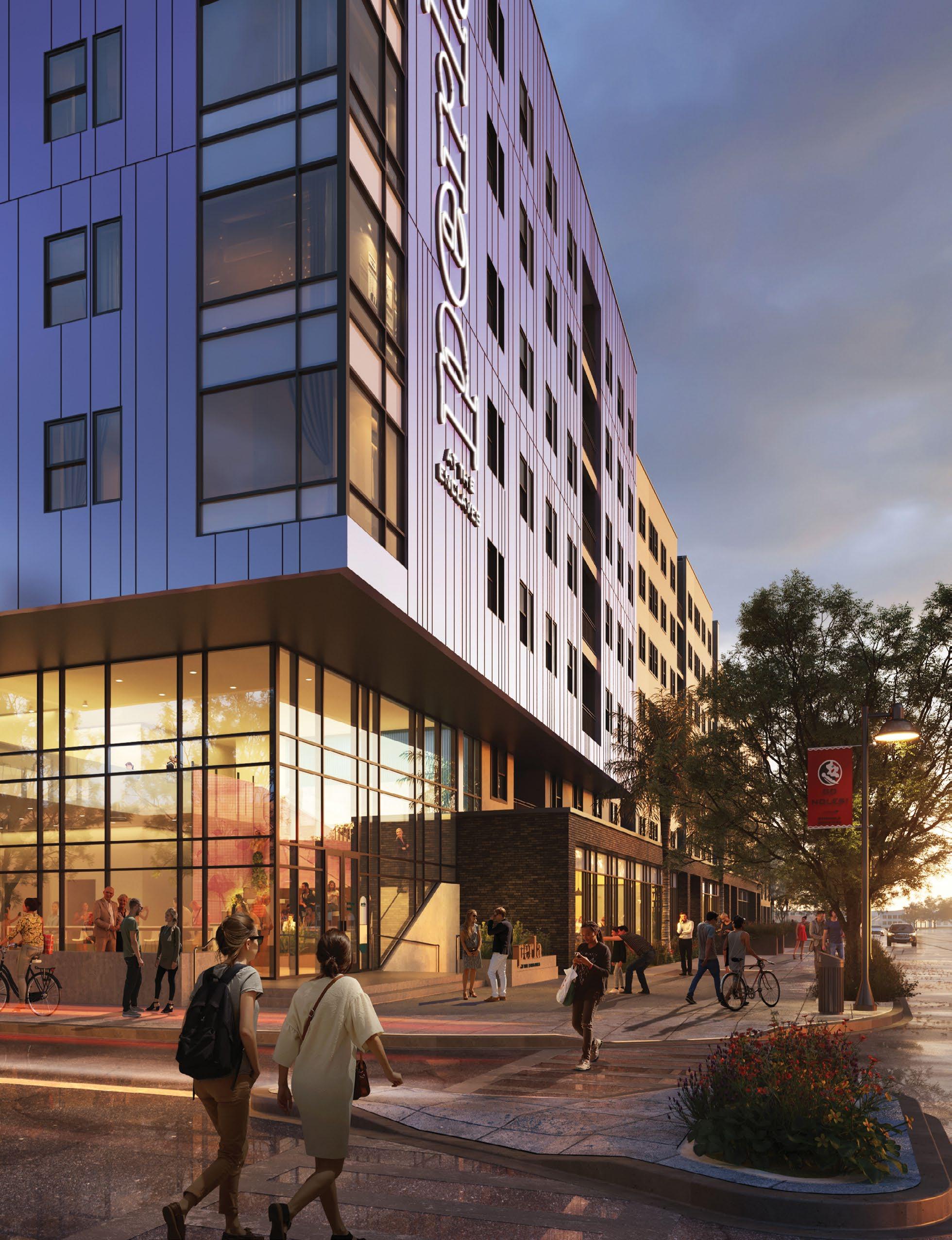
A New Type of Student Residence
PERLA AT THE ENCLAVES
Tallahassee, FL
For studying & living.
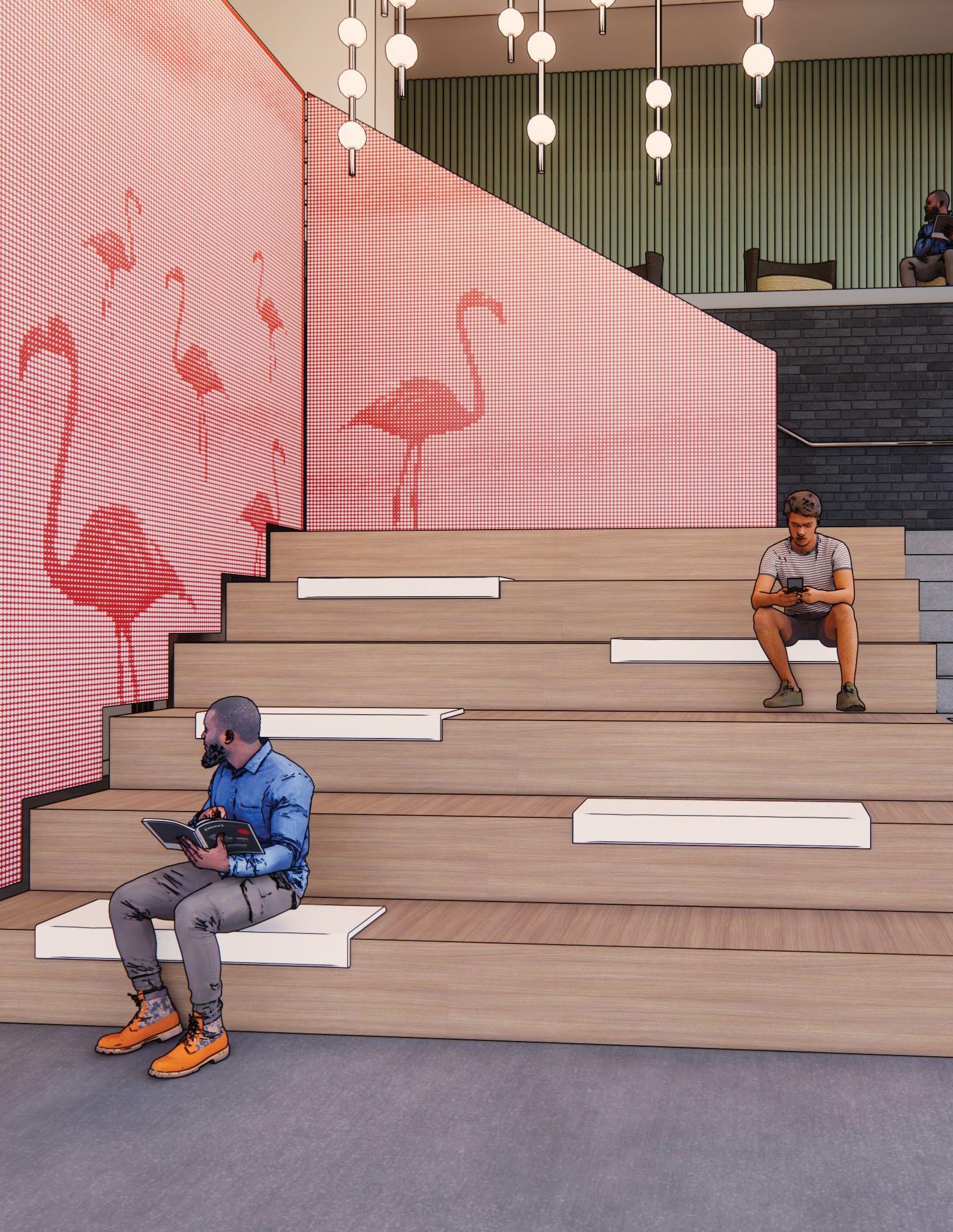
A seven-story mixed-use development, called Perla at the Enclaves, is planned a short walk from Doak Campbell Stadium at Florida State University.
The building is unique to the area and brings more than 220 student apartments, as well as retail space opportunities. From the inside out, the Perla is a modern representation of Florida’s oyster farming heritage.
An oyster-inspired color palette with a custom iridescent gradient.
Branded entrances help visitors locate the apartments.
An internally lit, programable sign is positioned so it’s visible from campus.
West View
North View
Iridescent metal-shifting panels reinforce the brand.
Given the large footprint, our integrated team created a cohesive wayfinding system.
Native flora and fauna are used to identify study rooms, each with an accent color to orient residents. A feature stair in the eastern lobby includes a custom perforated metal screen displaying flamingos.
Mockingbird Adelie
Refreshing an Institution
Potomac, MD
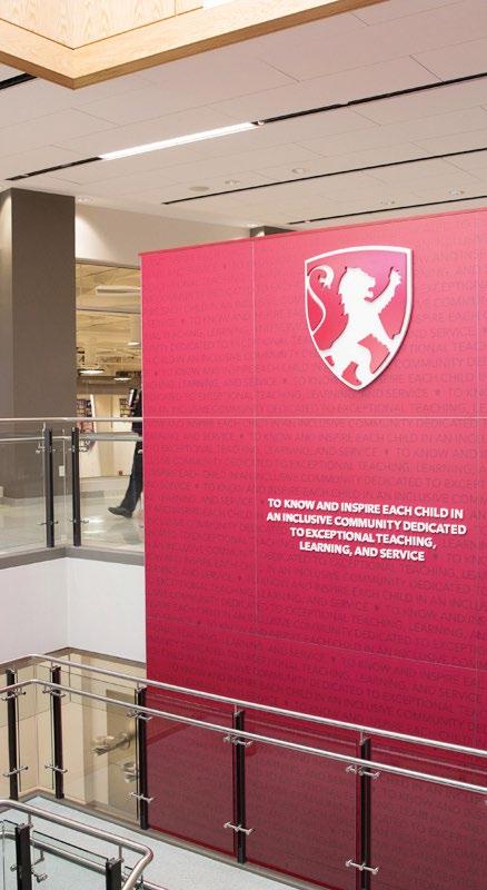
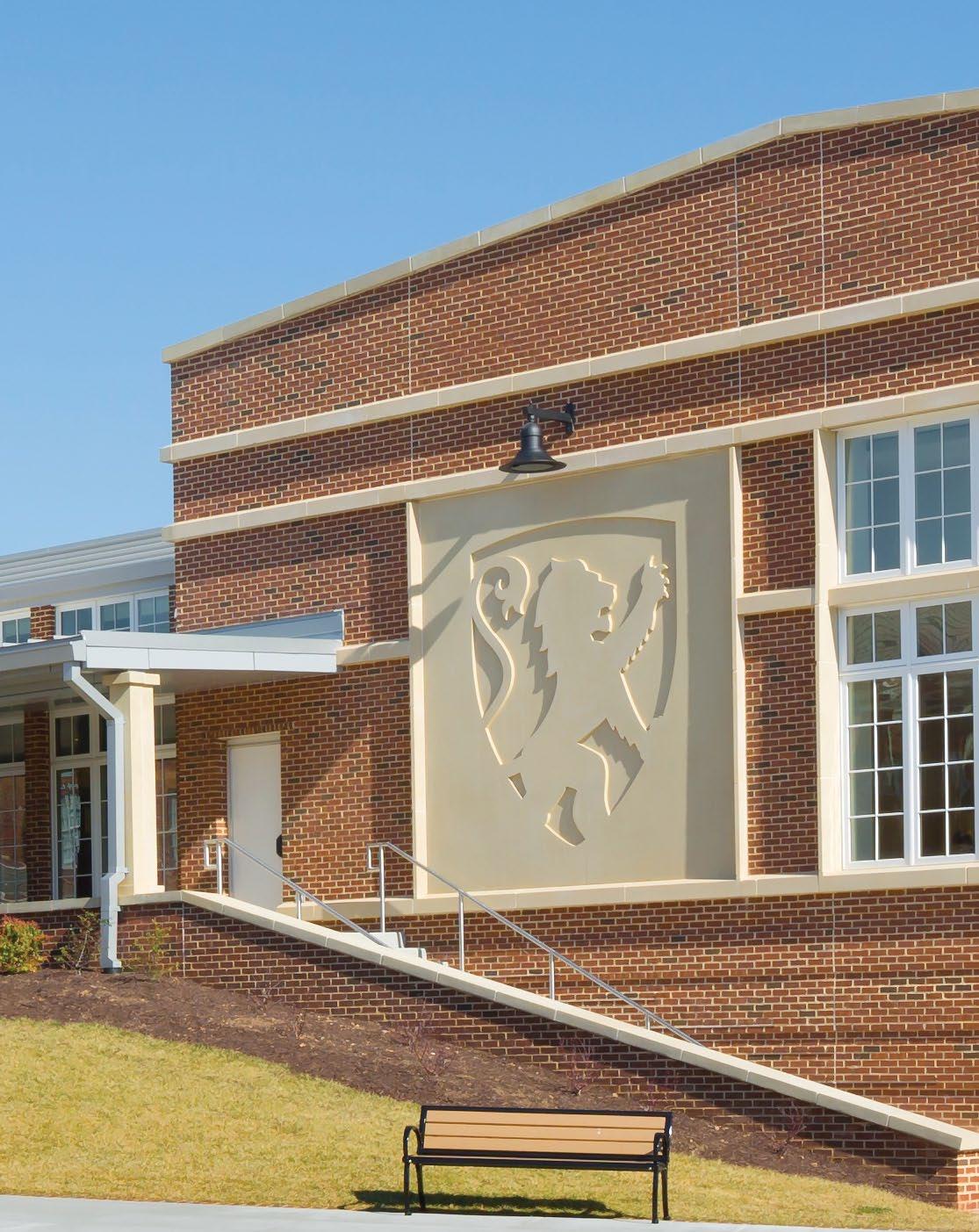
ST. ANDREW’S REBRAND
architecture clearly defines the relational structure for our master well as our stand alone structure should be used as a addition of all future subbrands maximize consistency, clarity and to internal efficiencies.
Focusing on the episcopal shield to create new academic and athletic brand identities that convey a sense of heritage and educational quality. Little studied the competitive landscape to identify opportunities for differentiation.
PARENTS ASSOCIATION
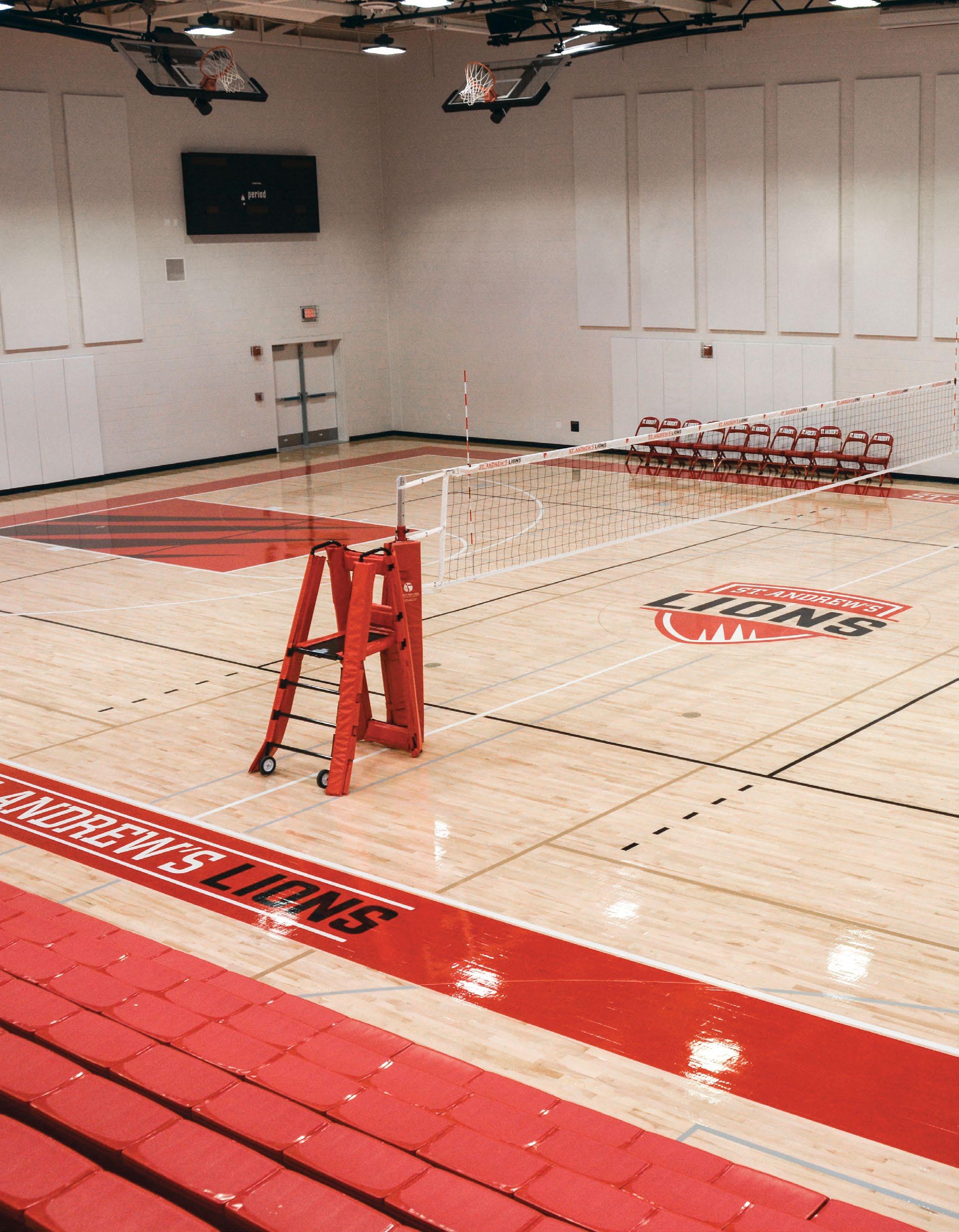
Little developed a comprehensive brand identity system including logo, collateral materials, wayfinding and branded signage for the new student center.
A unified brand.
As one of the youngest K-12 schools in the DC area, St. Andrews engaged Little to develop a new brand identity that would help them attract more students in a very competitive market.
The new academic and athletic brand identities convey a sense of heritage and educational excellence. Storytelling elements within the new space provide opportunity for student achievement and donor recognition.
From floor to the walls
A full set of branded graphics were developed for the gymnasium.
A — The history wall, Hall of Fame, and environmental graphics celebrate legacy and school spirit.
B — A feature wall at the Student Center entry celebrates the school’s mission.
Aligning a brand to reinforce history
Embedded exterior brand element.
A Comprehensive System
Little’s collaborative process of holistic design and planning between Architecture, Interior Design, and Brand Experience both reinforced and strengthened the new brand within its physical environment.
A clear hierarchy was developed for the new athletic brand.
The new brand was extended to a new wayfinding program developed to help visitors easily navigate the campus.
Vehicle fleet wraps were updated help project the new brand to the community.
Brumbaugh
THE BABY GROCERY STORE supermarket
DOLLAR ROWS retail
ATOMIC BURGER restaurant*
THE HOME DEPOT DESIGN CENTER retail
METROPOLITAN shopping center
QUADRANGLE business park
WHITE HORSE FARM agriculture
GOLDEN EAGLES LACROSSE education
36 CLEAR commercial real estate*
*
CAPISHE restaurant
TRUE RUNNER retail
MORAZUL retail
Experiential Graphics & Branded Environments
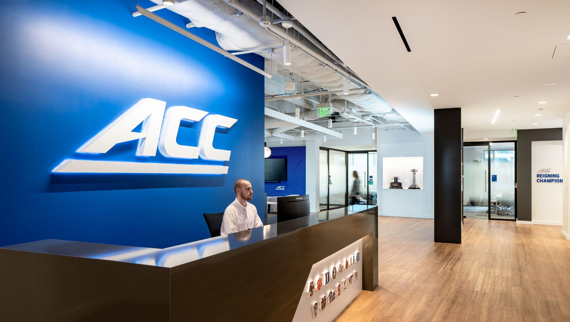
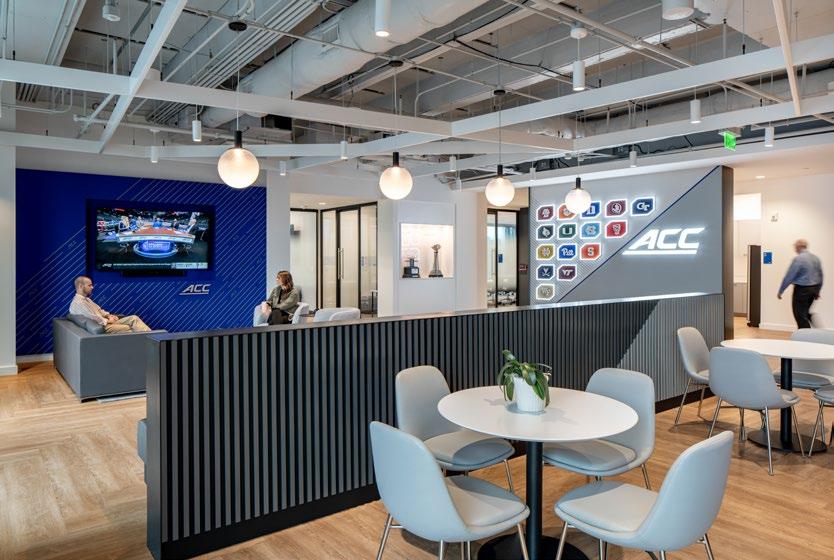
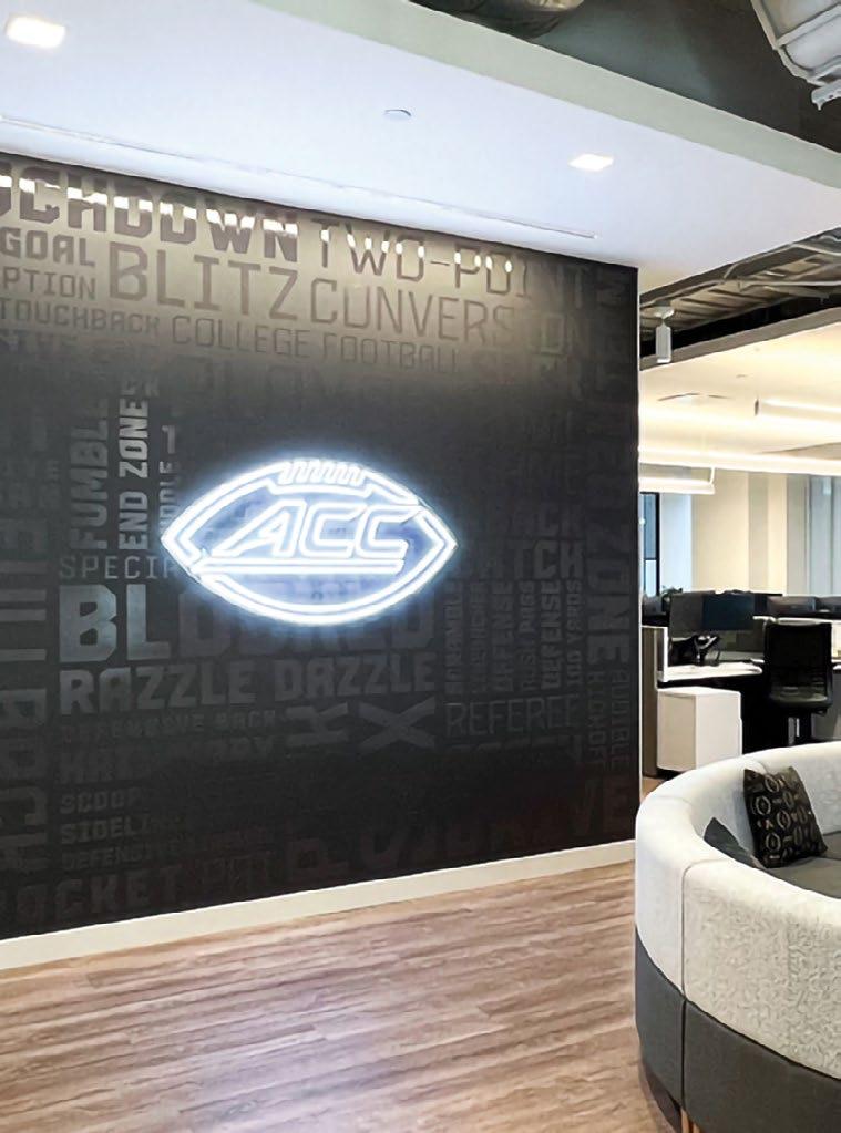
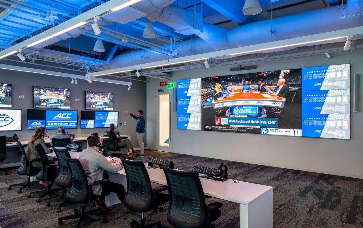
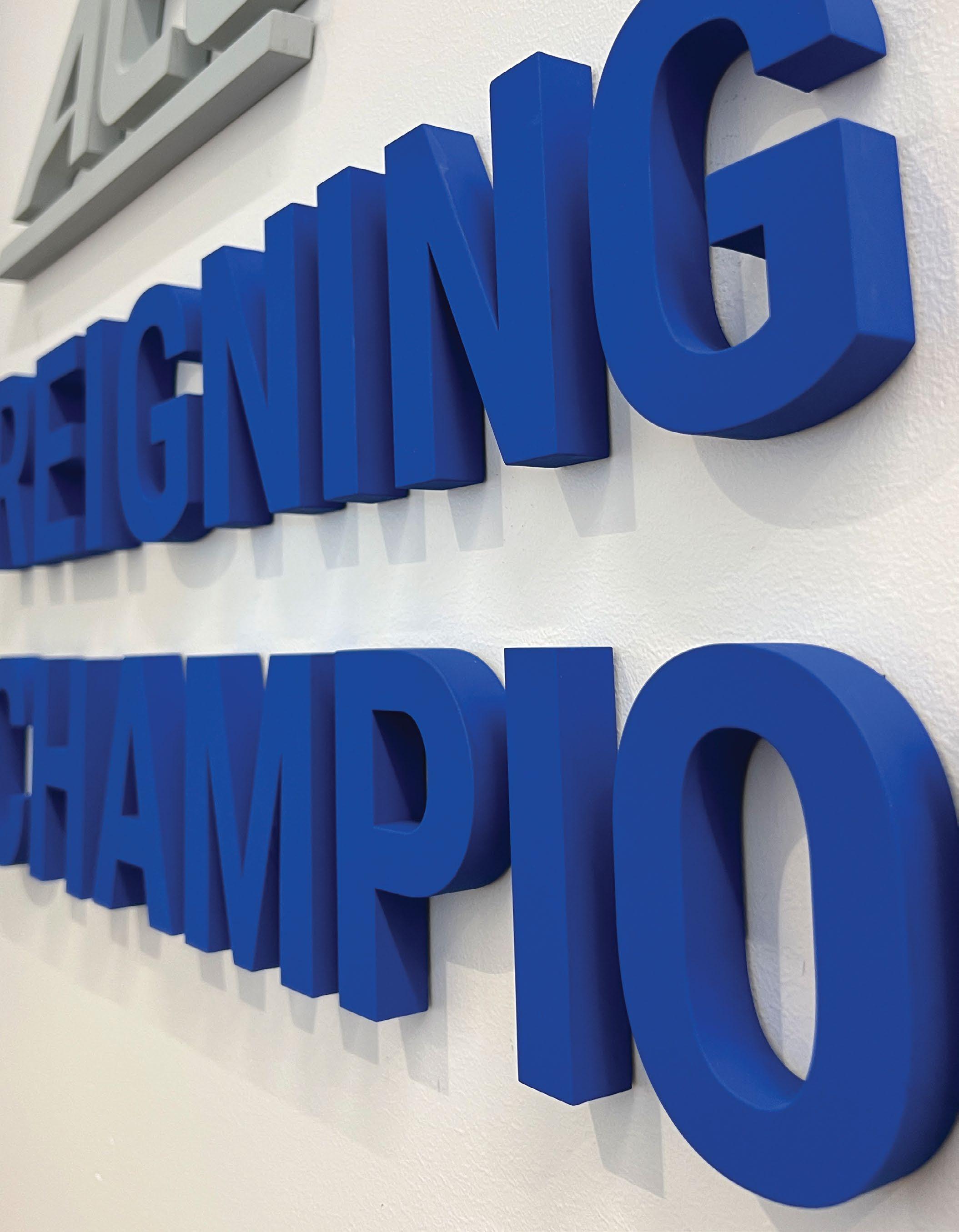
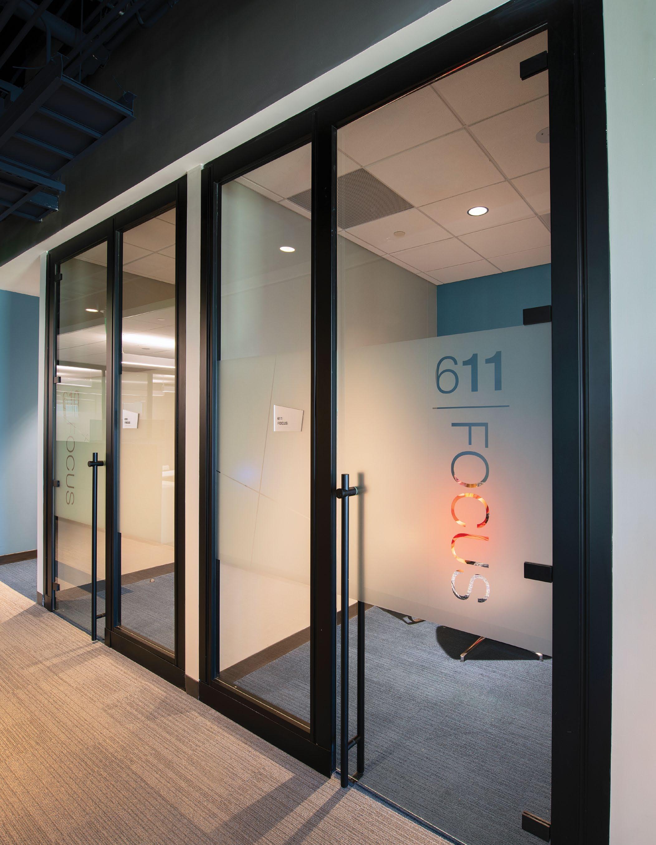
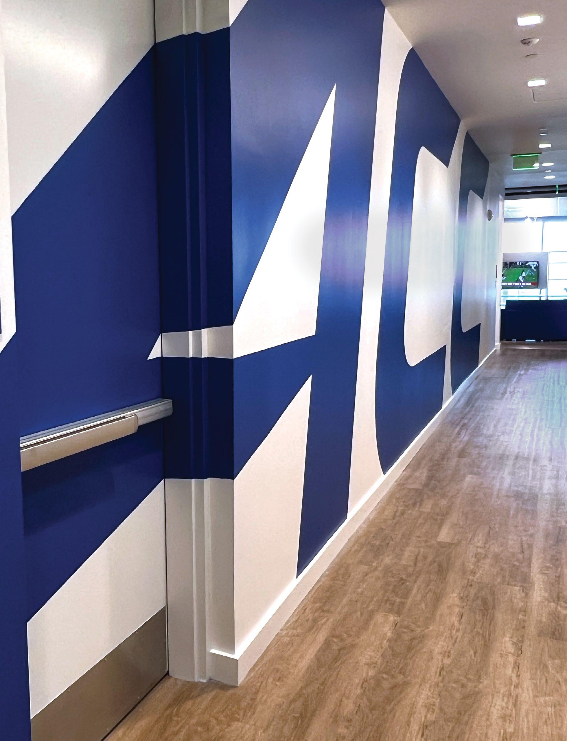
ACC HEADQUARTERS
A new home for a conference of legends.
The Atlantic Coast Conference, who called Greensboro, NC home for decades, announced a move to downtown Charlotte, bringing with them both a strong legacy and an intense focus on the future.
Little created a front door to the conference with bold messaging, a visual and dimensional activation of the brand, and future-focused stories of the student athlete.
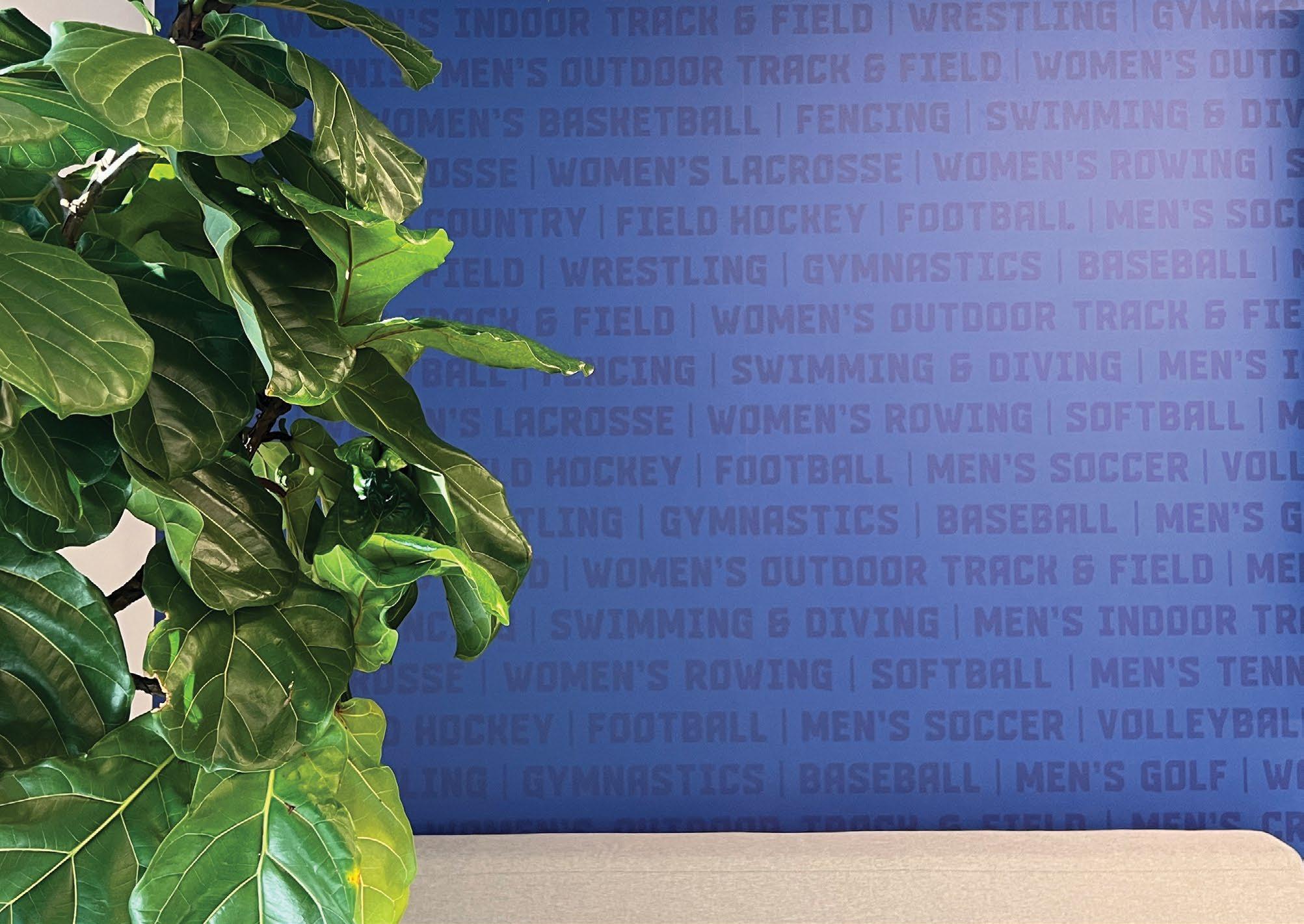
15 schools. 27 sponsored sports.
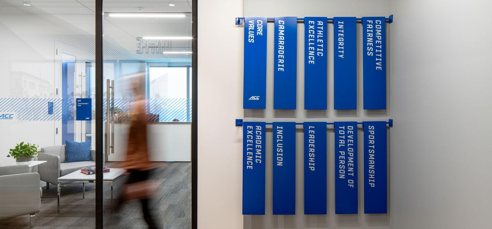
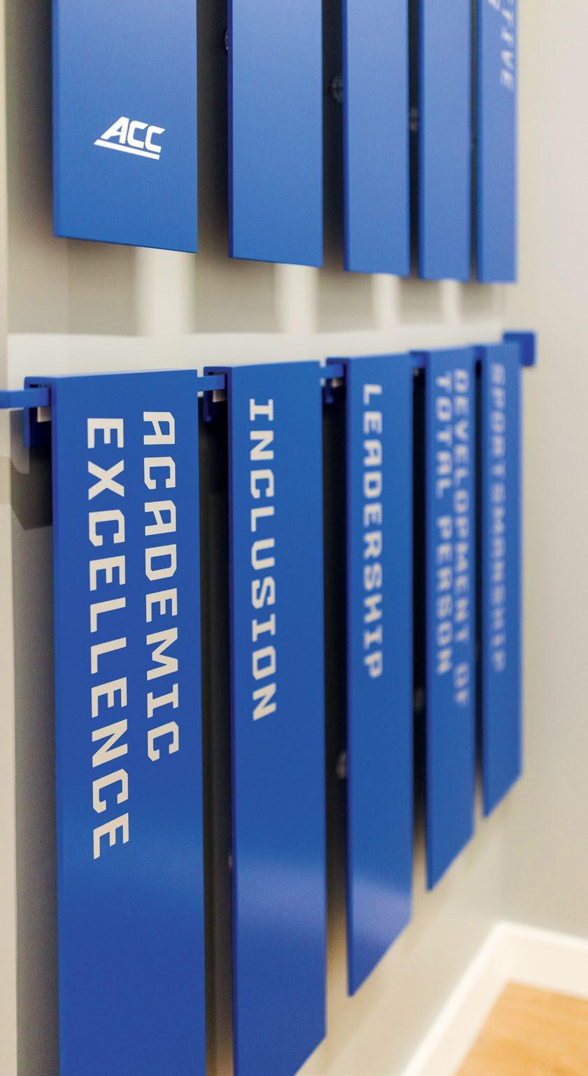
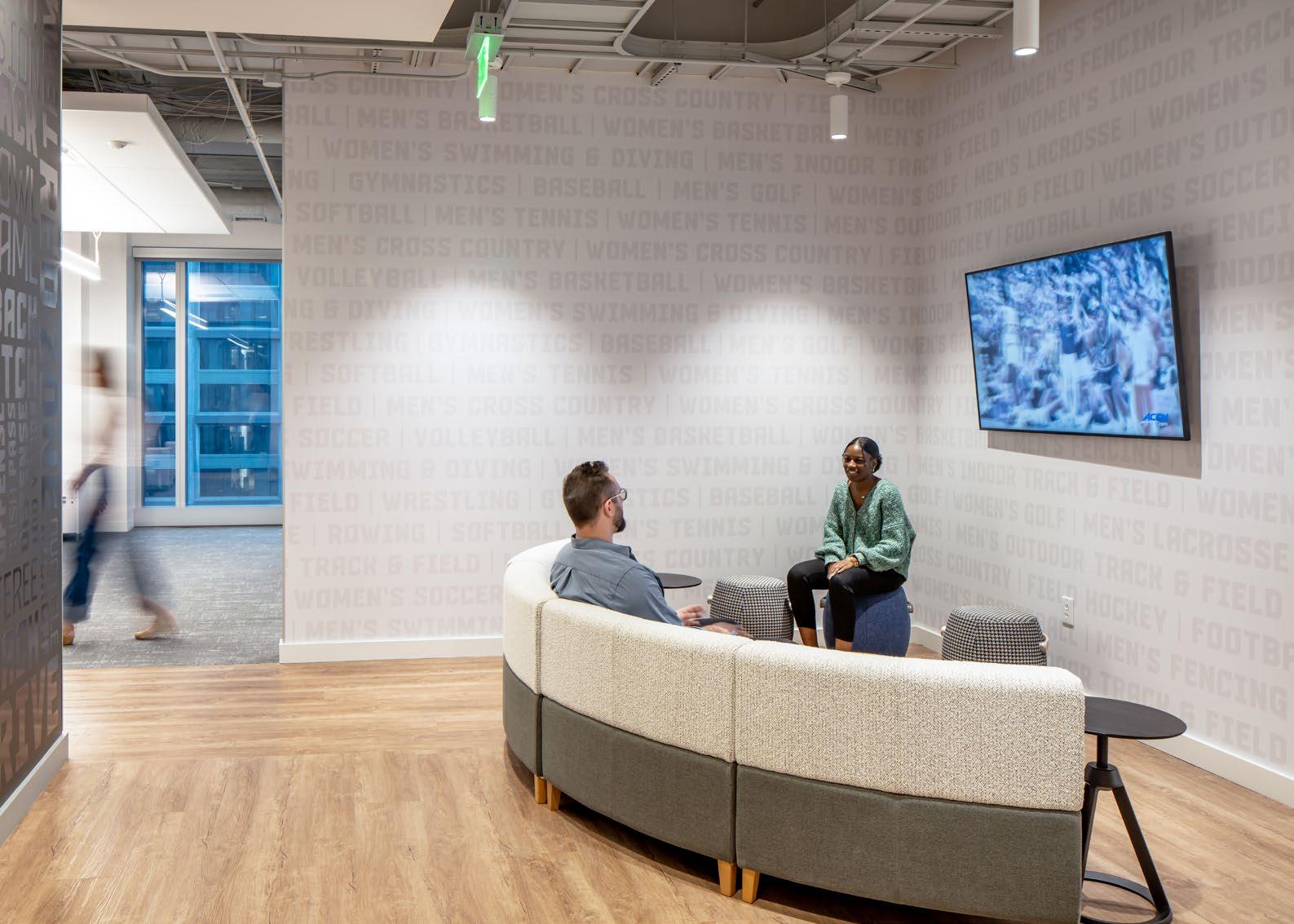
Balancing a brand that plays home to 15 schools (and growing) - a brand that sponsors 27 different sports, that prides itself in core values encompassing athletic excellence as well as integrity, academic excellence, and the development of a total person, became the focus for a family of environmental graphics that boldly aimed to represent every end user. The publicfacing side of the office showcases dynamic messaging and oversized supergraphics, while the staff-focused areas play home to subtle but ever-present reminders.
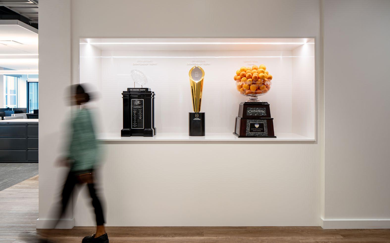
A — Custom trophy cases were designed for easy access and built around the office showcasing the everevolving championship winners.
B — A new custom felt backdrop creates an anchor element in the ACC’s “living room.”
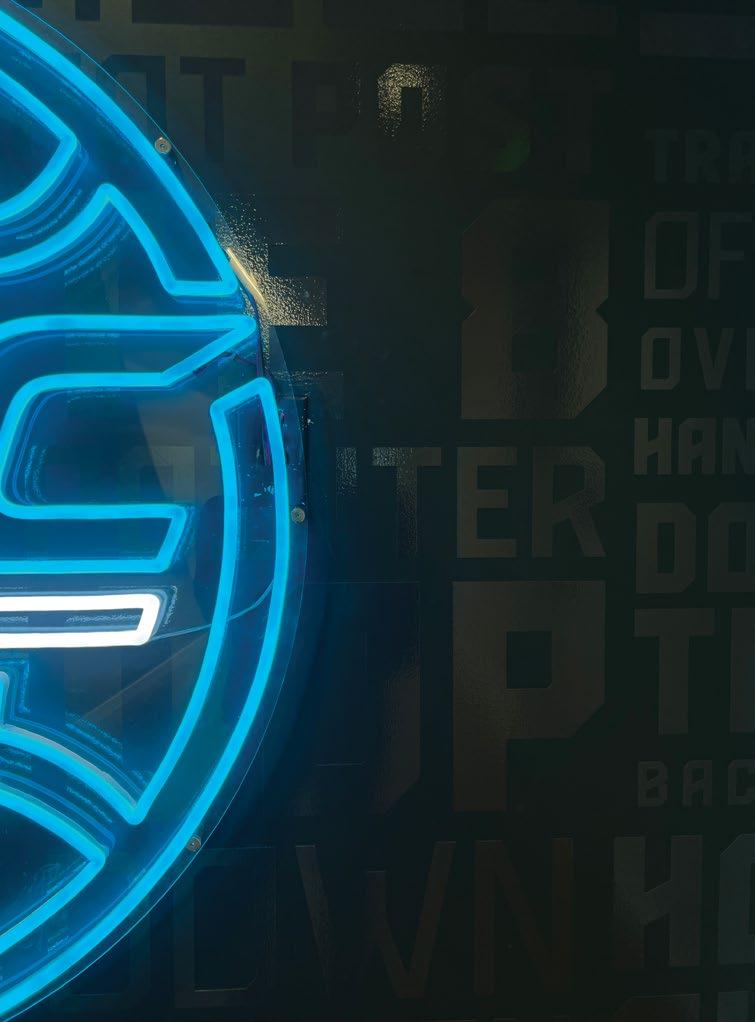
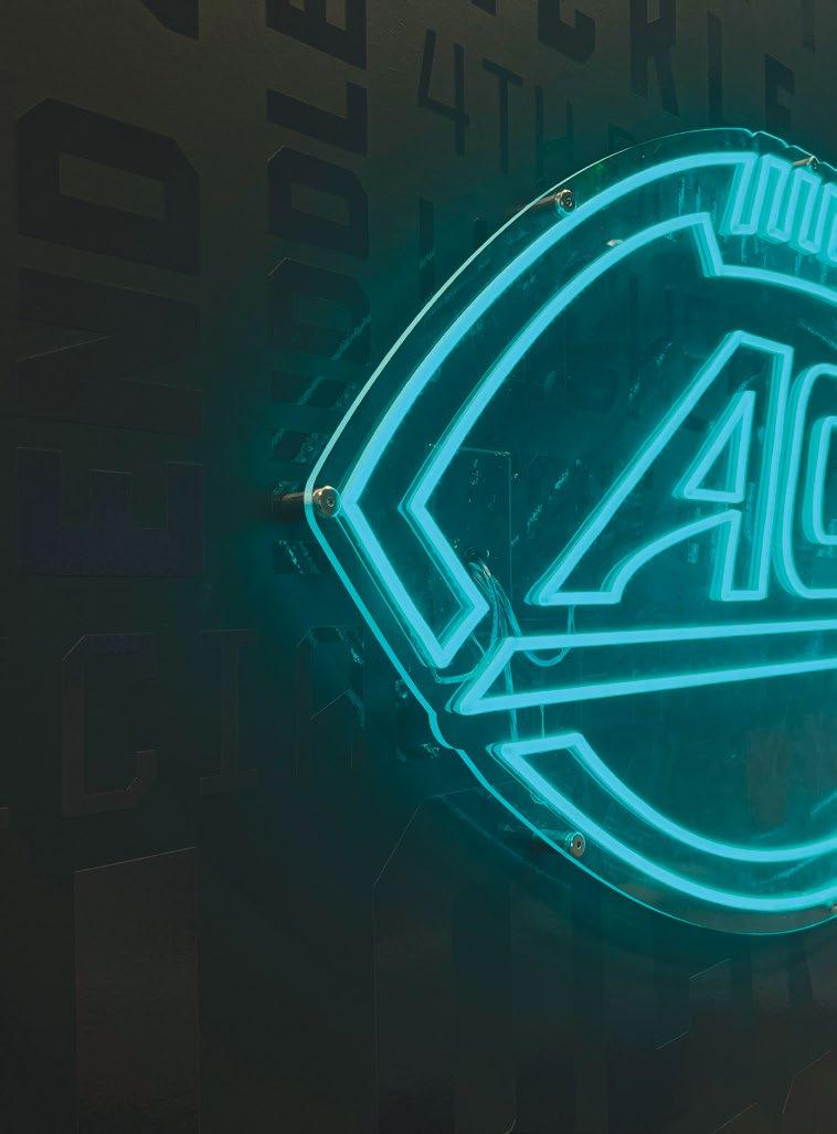
Light from custom neon fixtures subtly picks-up on the high gloss finish of custom messaging.
A — Large-scale, high-energy focals create a strong first impression to the office for visitors and staff alike.
B — Magnetic. changeable panels feature the ACC’s core values as a constant reminder for visitors to the commissioners suite.
C — Custom wallcovering in collaboration and board rooms repeat the focus of the Atlantic Coast conference - the 27 sports represented.
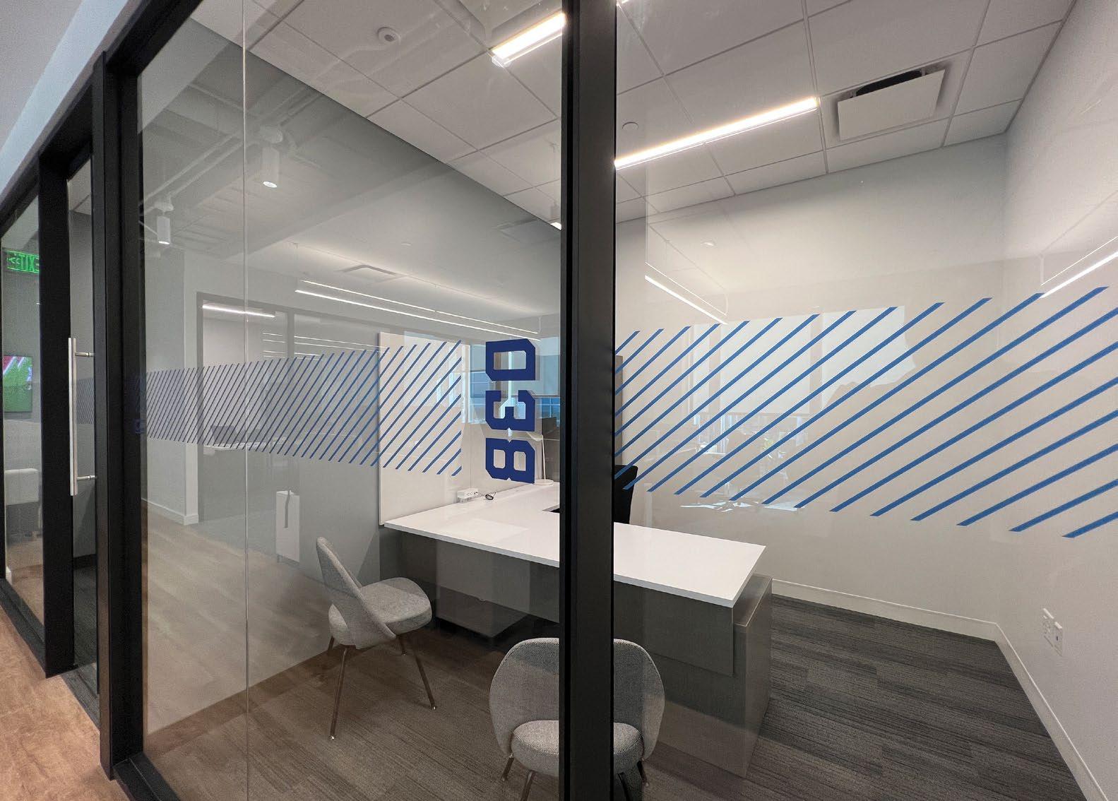
D — Custom film extends graphic features of the bold, dynamic brand into functional distraction bands and room numbering.
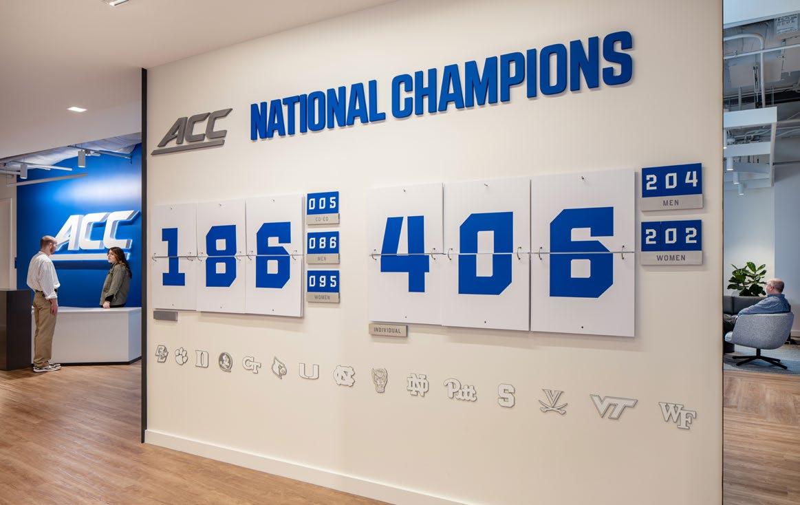
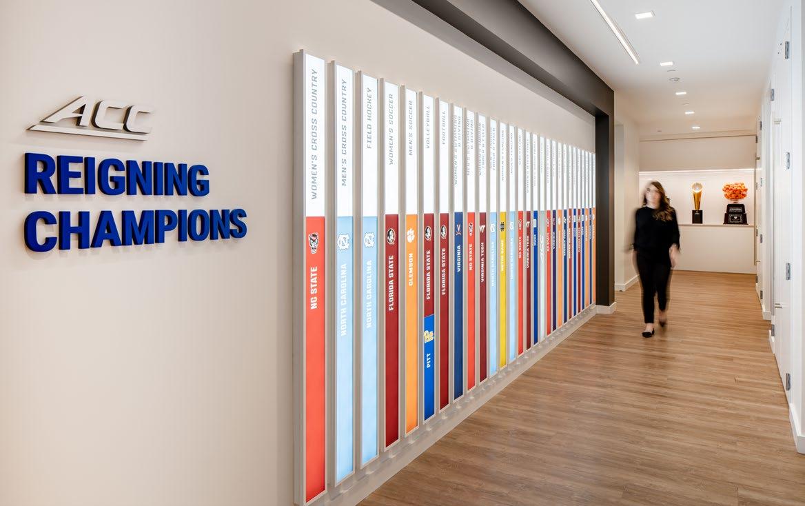
A dynamic “trophy tracker” is constantly updated as the ACC grows.
The ACC’s signature blue is used sparingly to call attention to high-intensity areas, while a sophisticated neutral palette adds interest to heads-down staff workspaces.
Individually controlled and changeable, each lightbox is designed to highlight the newest and current Reigning Champions in each sponsored sport.
…in the classroom, in competition, and in life.
Multi-layered Storytelling
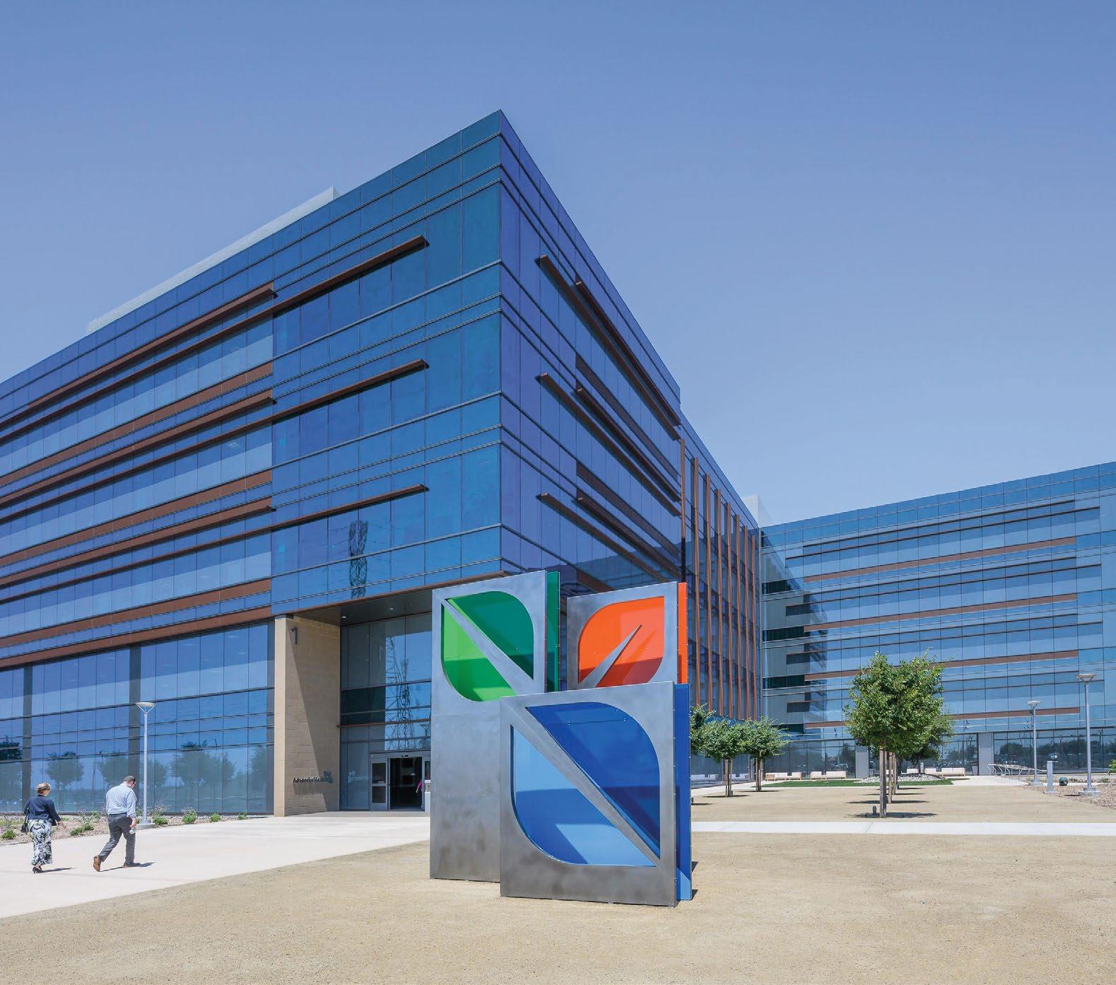
ADVENTIST HEALTH
Roseville, CA
A New Shared Services Campus
Adventist Health’s new 275,000 SF shared services campus in Roseville, CA brings several Northern California offices together under one roof to create a more collaborative, sustainable and healthy culture.
The strategy was to tell Adventist Health’s stories through the framework of the whole person: mind, body, spirit and social. With these categories being broad and varied, our goal was to create a journey for personal discovery for employees and visitors as they navigate through and utilize the campus.
Whole person health.
Storytelling design features often span several categories of whole person health, strengthening their connections and impact upon users within the space.
Design strategy was based around four dimension of whole person health.
MENTAL
Engaging the Mind
Stories that stimulate the mind and invite guests to engage with our values.
1 3 2 4
SPIRITUAL
Engaging the Mind
Stories that infuse spirituality, faith and connectedness.
PHYSICAL
Healthy Living
Stories that demonstrate the Adventist Health philosophy of living well.
SOCIAL Connections
Connect employees in Roseville to the hospital . staff / patients they serve.
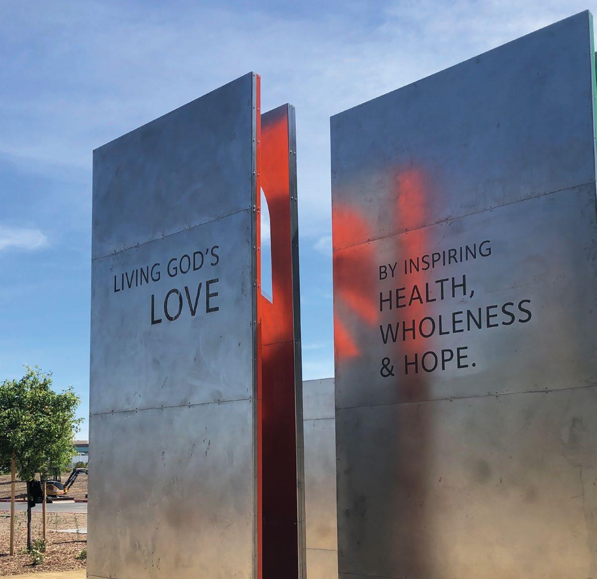
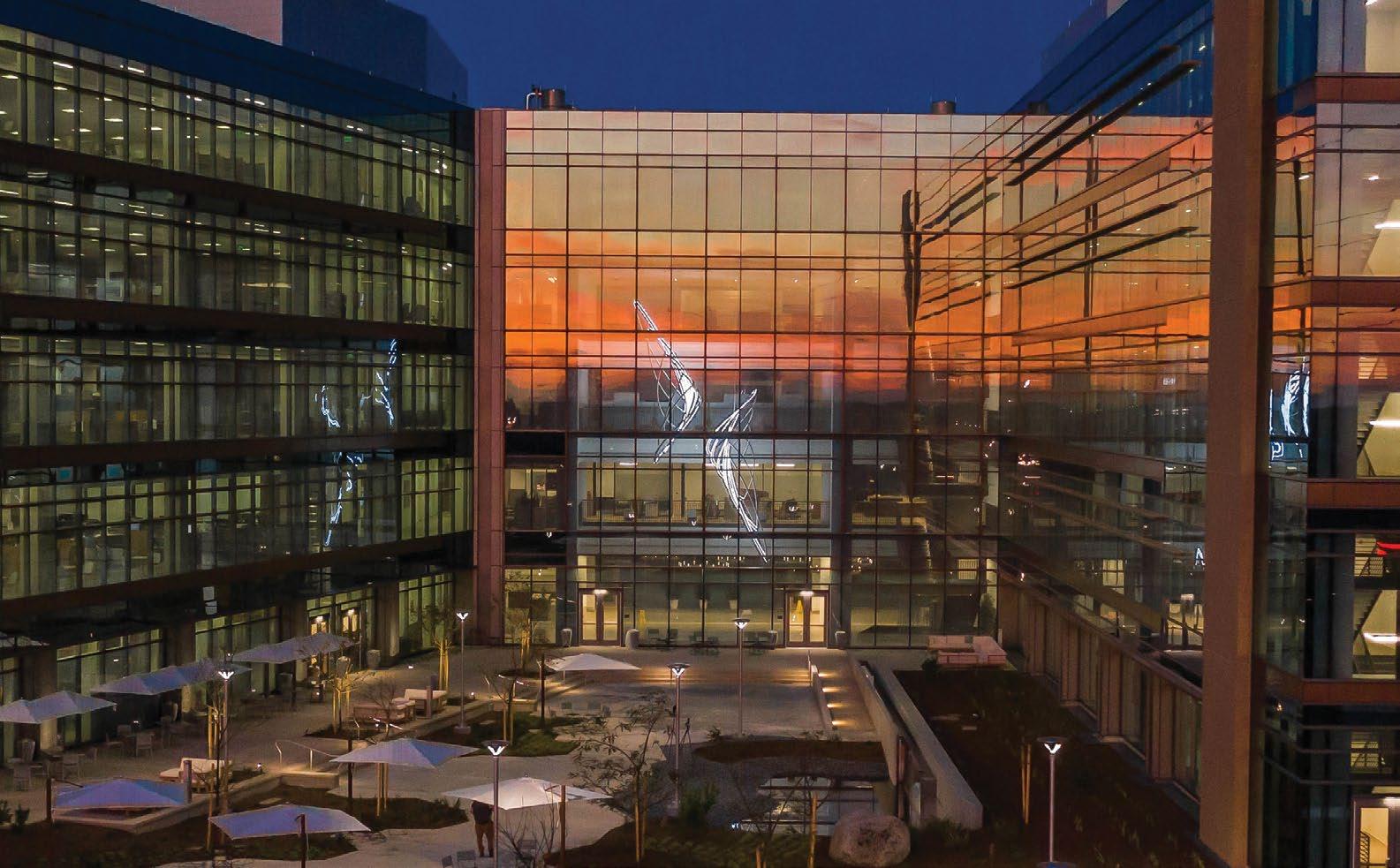
Creative lighting design washes the colored panels, translating the sculpture into beacon for the site.
The back surface real estate is utilized to reinforce the client’s mission for all exiting the building.
Little delivered a complete interior and exterior signage program to guide visitors through the site while providing wellness encouragement along the way.
The team rolled out a new monument standard for the client.
The look and feel of a full wayfinding and interpretive signage program was designed to complement the new brand.
Interpretive signage is spread throughout campus to highlight wellness features, three gardens and a mile trail throughout campus.
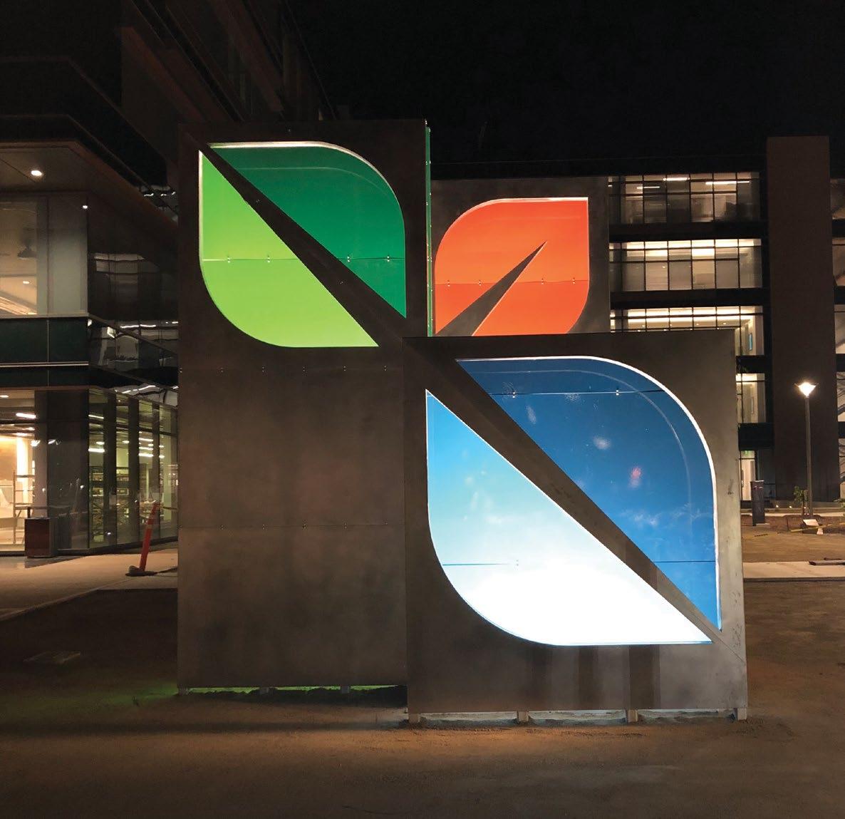
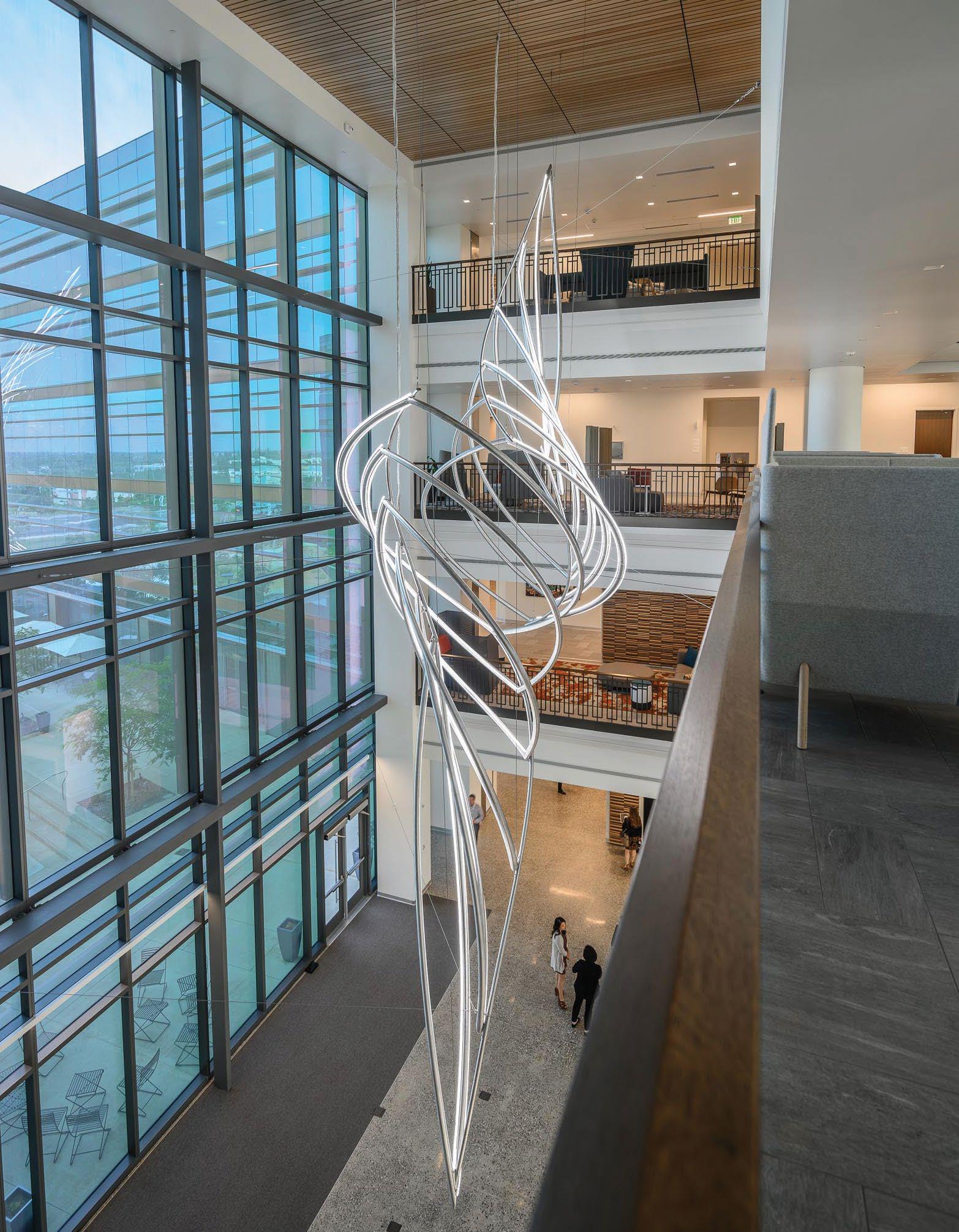
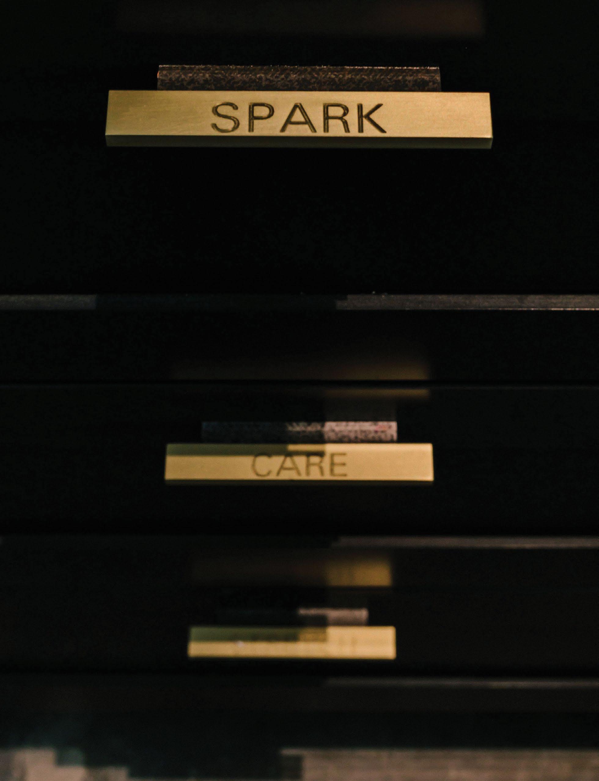
A — A “Spark”, revealed within the negative space of the brand identity, is interpreted into a four-story atrium feature.
B — The sculpture presents building occupants with many evolving viewpoints, while providing a public facing icon.
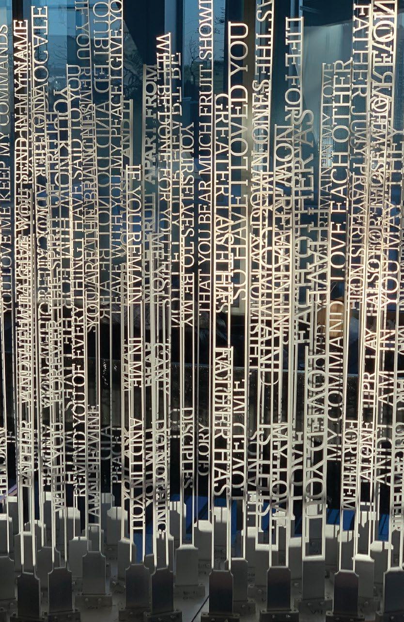
C — Key scripture is typeset into an anamorphic sculpture that reveals the permanent message of “love”.
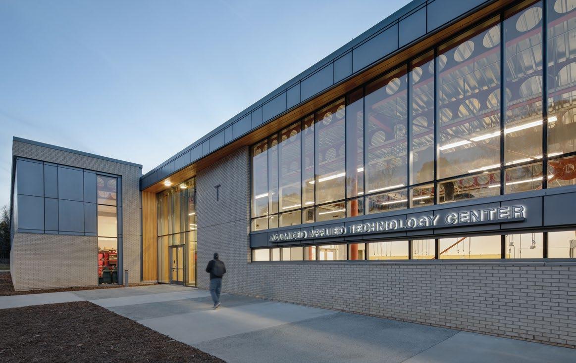
Creating a Regional Resource
ALAMANCE COMMUNITY
COLLEGE ADVANCED APPLIED TECHNOLOGY CENTER Graham, NC
Supergraphics explain new areas of study to prospective students and families.
Preparing Future Generations
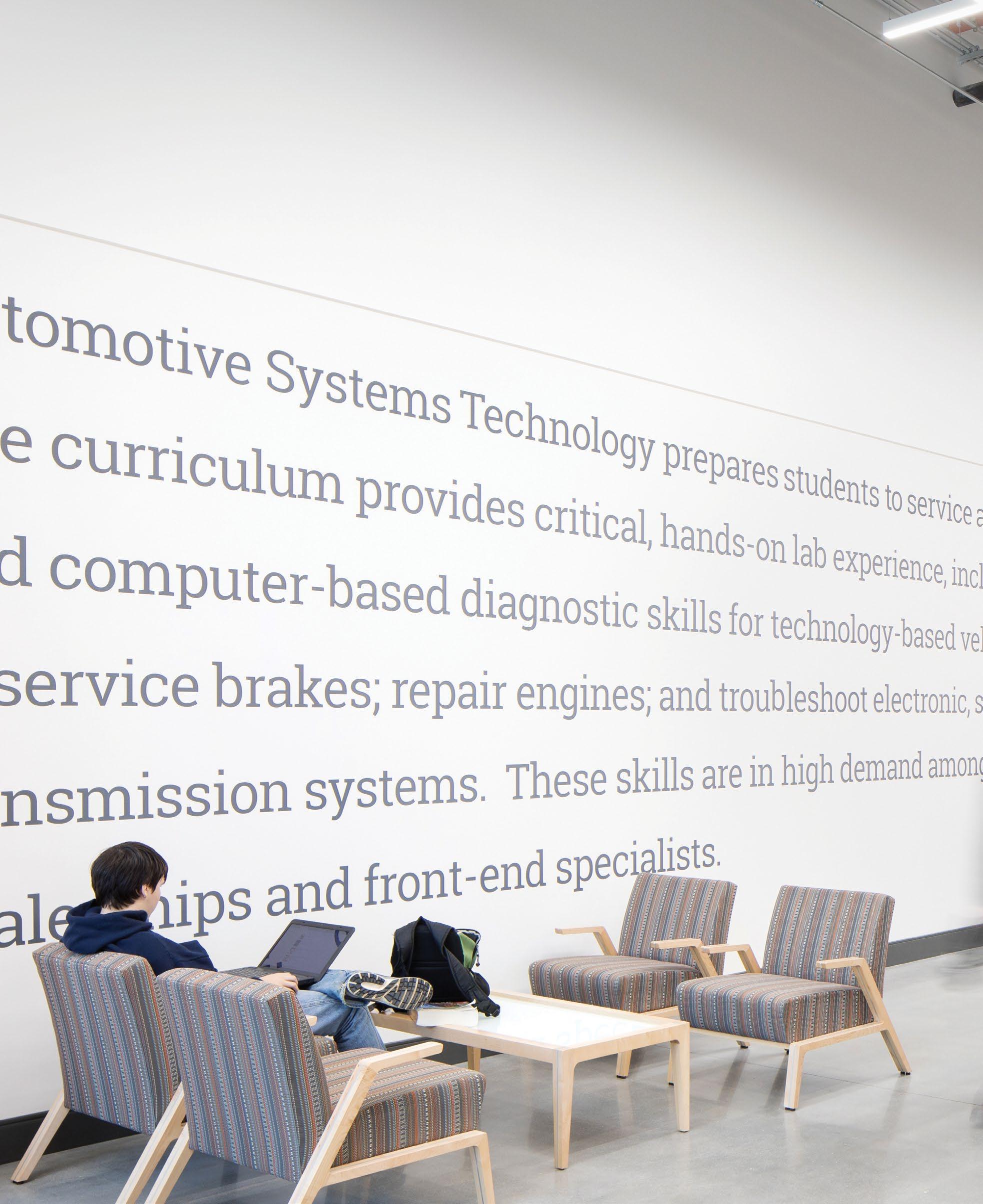
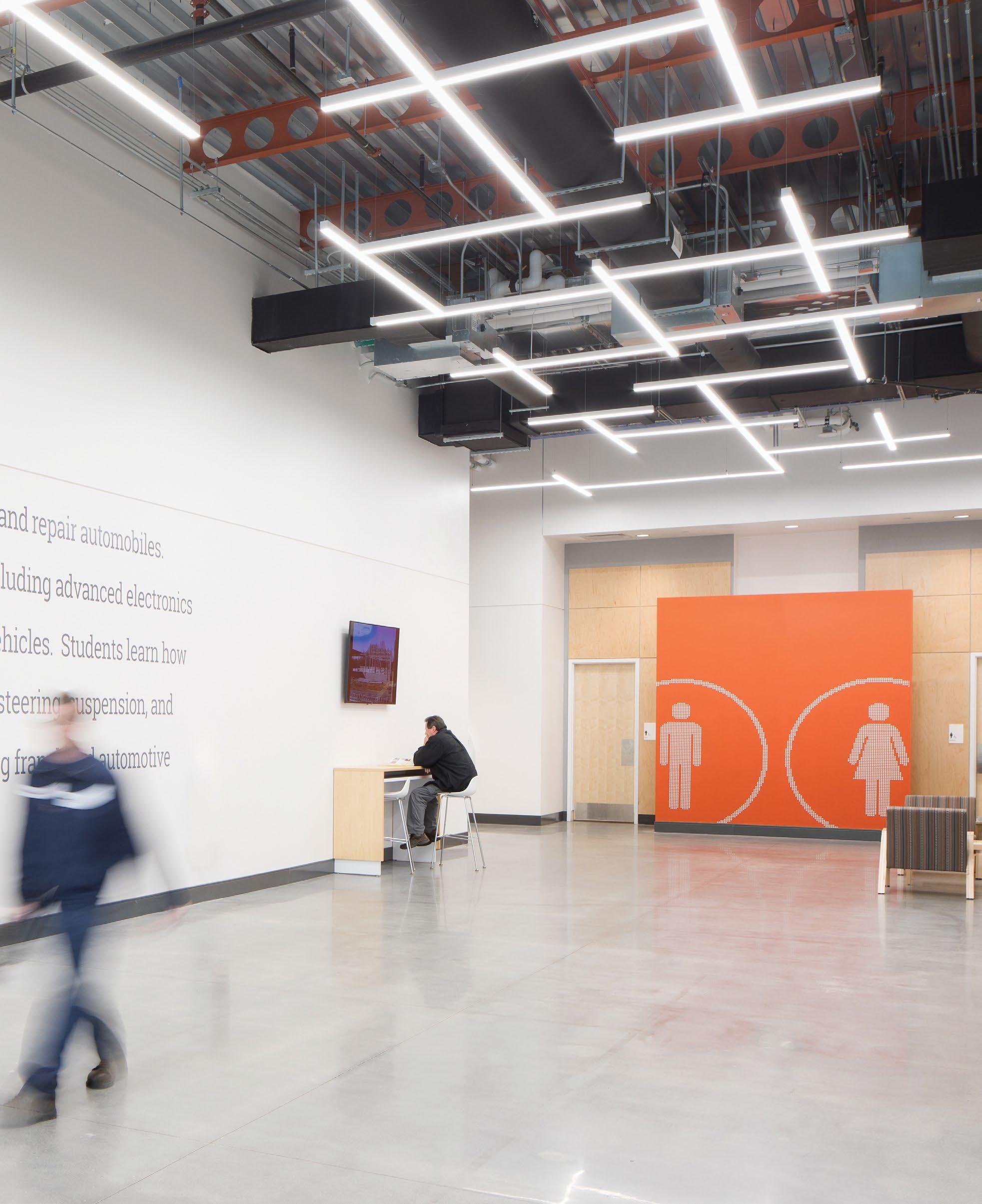
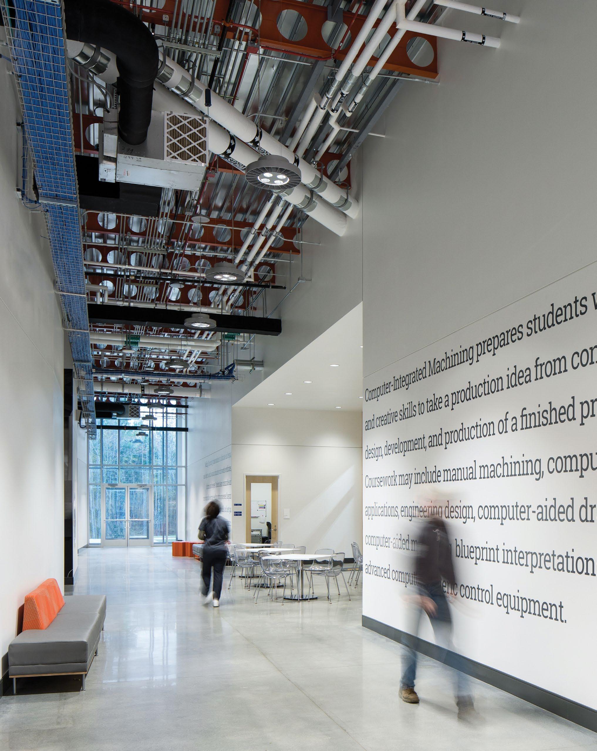
The new 50,000 square foot Advanced Applied Technology Center at Alamance Community College houses leading-edge facilities for programs in Automotive Systems Technology; Welding Technology; Computer Integrated Machining Technology; and Air Conditioning, Heating and Refrigeration Technology.
The state-of-the-start technical learning and training center will attract students, maximize the learning experience and prepare students for careers in highly-skilled fields.
The building was designed around the needs of the curriculum.
Graphics showcase the school’s history using images from ACC’s archives.
Murals were designed to match the scale of the space while also creating a learning opportunity at each lab.
Little’s expertise was instrumental in the ease of our process and the realization of a first class instructional building. ” “
Bright graphics pull from the colors of the equipment in each of the labs.
6 | SPACE
5 | SKY
4 | MOUNTAIN
3 | CITY
2 | COAST
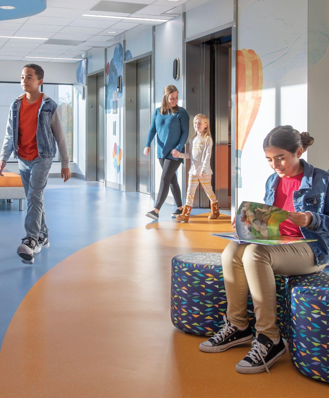
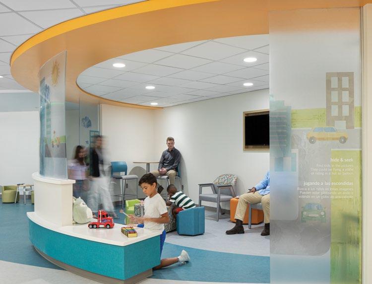
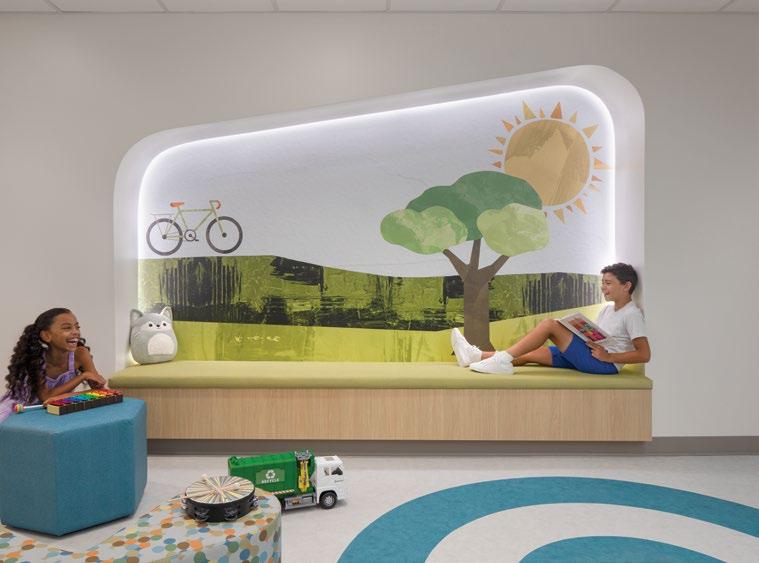
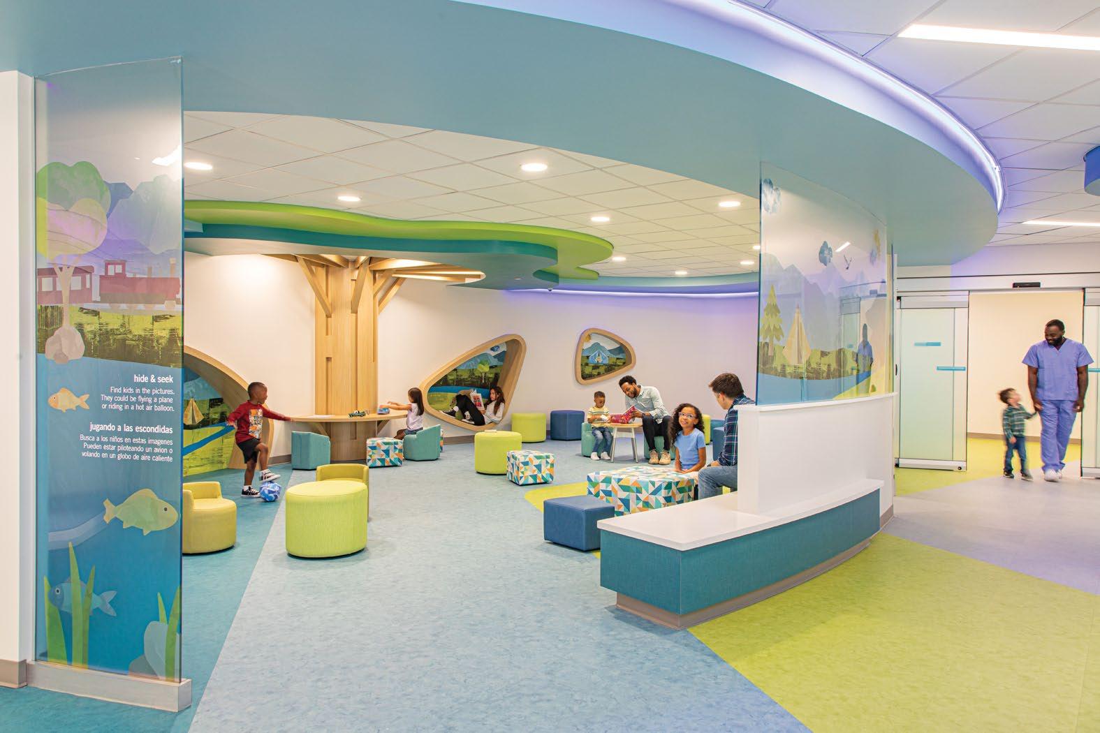
A Healthy Community
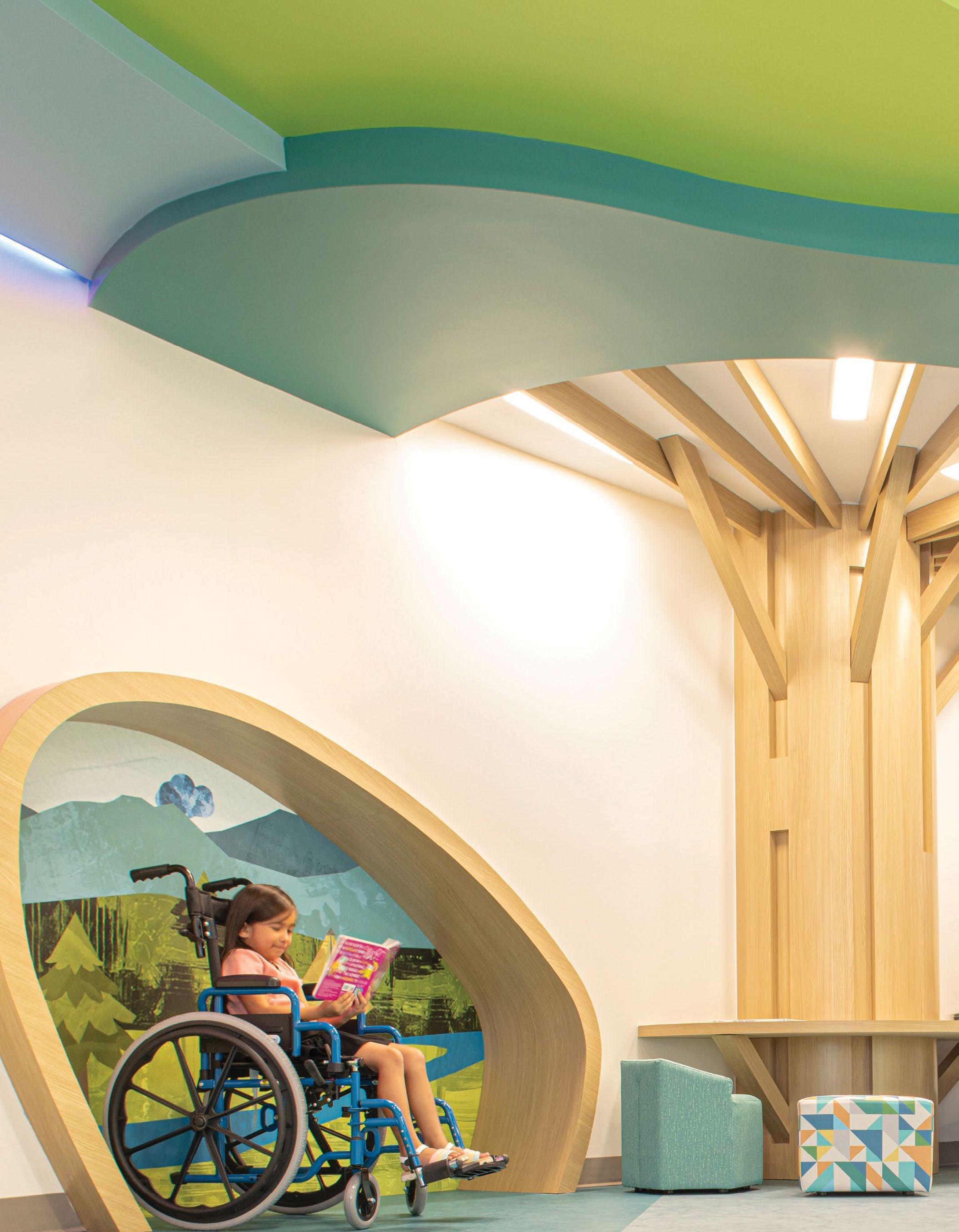
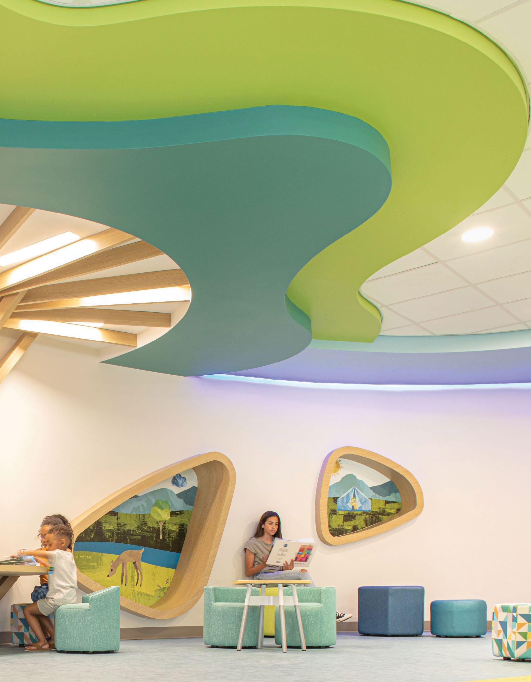
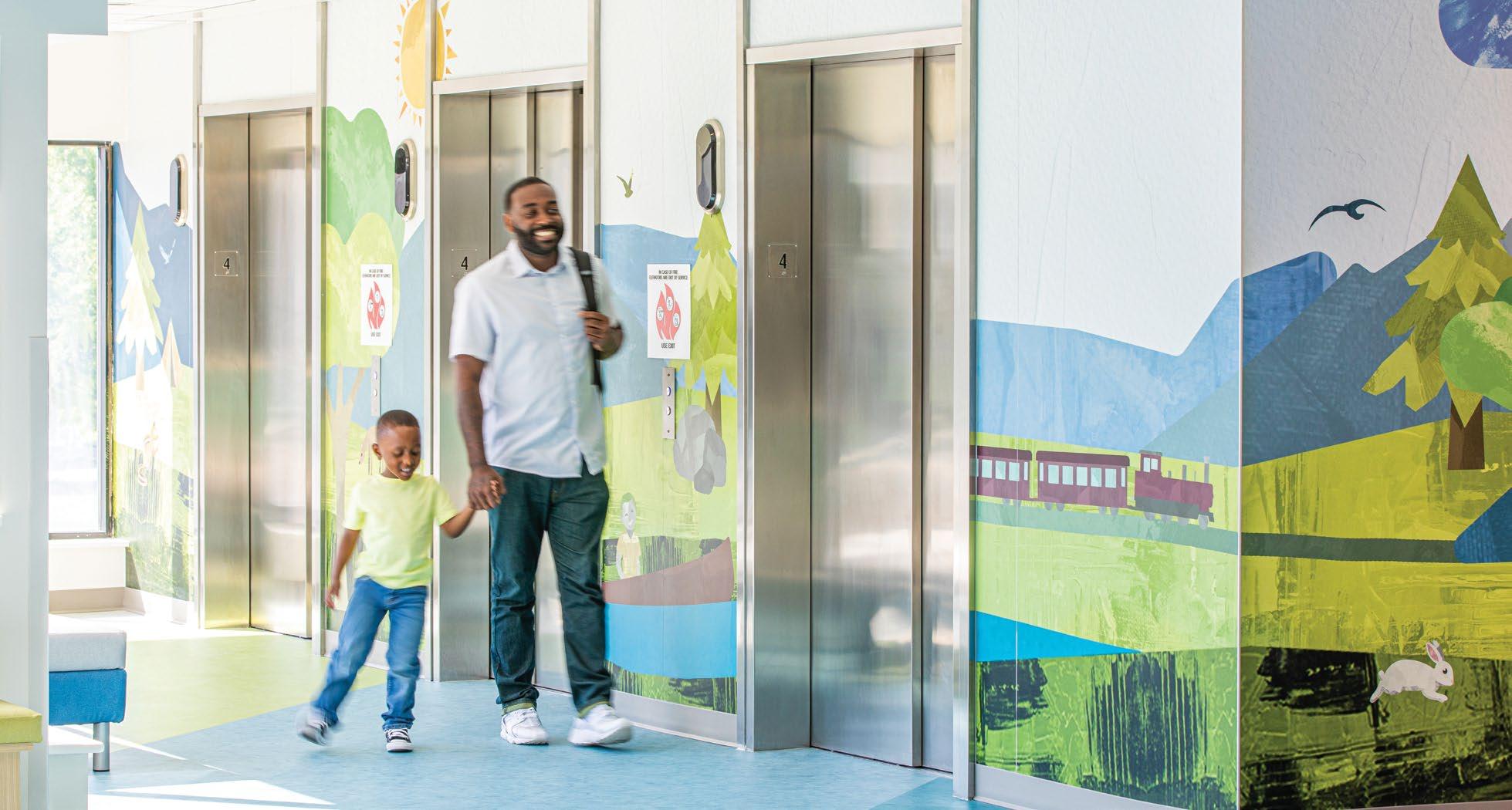
ATRIUM HEALTH LEVINE CHILDREN’S HOSPITAL
Charlotte, NC
A place for healing.
With curving walls, circular seats, and undulating floor patterns, the design is intended specifically to reduce anxiety and provide comforting distractions. The integrated custom-illustrated wallcoverings provide visitors with a welcoming environment.
DESIGN AWARDS
IIDA Carolinas Design Works Awards - Honorable Mention
A — Each elevator lobby greets patients with the floor’s theme.
B — The waiting lobbies provide much needed distractions for families.
“Stepping stones” mark patients progress during physical therapy.
A Collaborative Cohesive Space
The themed illustrations are integrated to every floor and provide a hide-andseek game for the patients. Each floor has a new theme - Coast, City, Mountain, Sky, and Space - with the illustrations all designed to create a cohesive space.
“The
before and after is nothing short of amazing. The space has a great vibe and will be a blessing for our community.”
DENTON WILSON Vice President Planning, Design & Construction, MCP
5
A full wall illustration in procedure rooms to help ease patients nerves.
Expanded exam rooms include on-theme murals. Our holistic integration of design elements improves the patient, family and staff experiences.
Surprises around every corner.
Modern. Southern. Style.
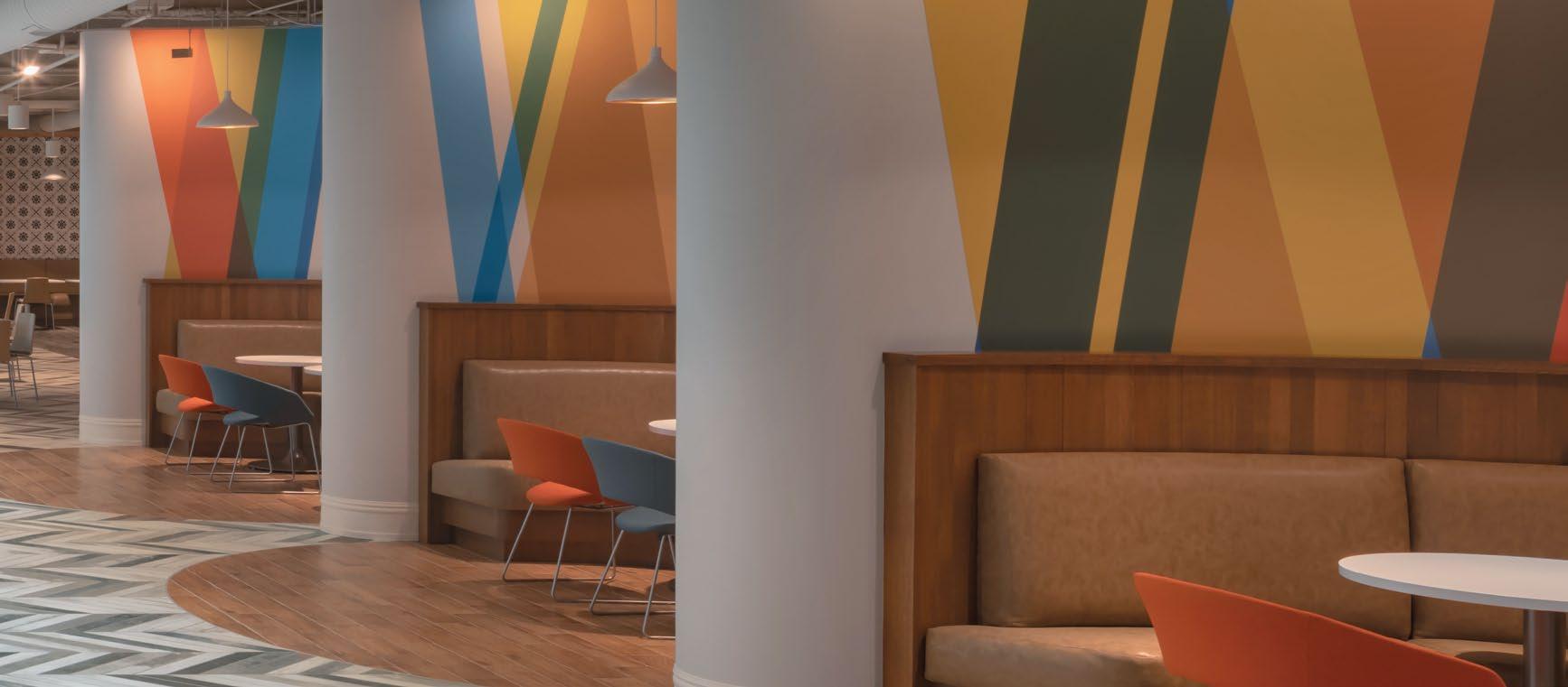
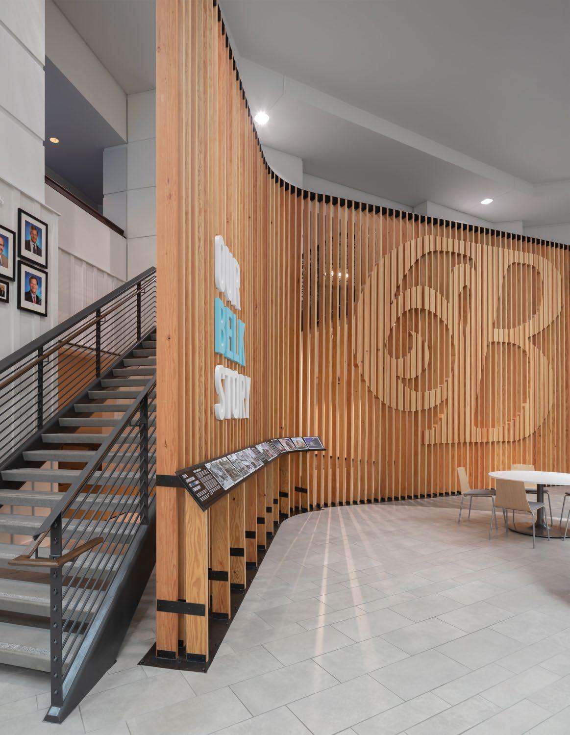
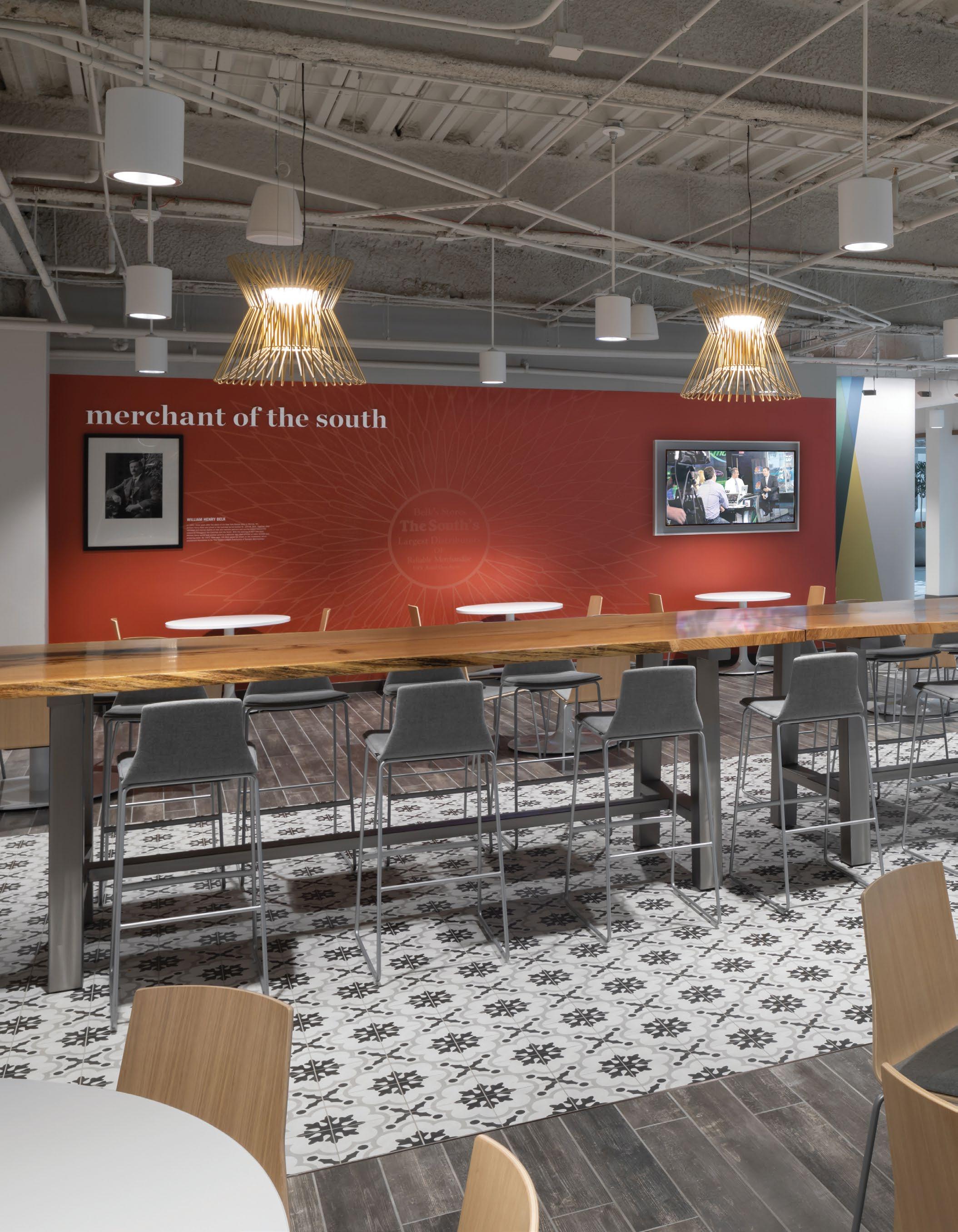
BELK HEADQUARTERS
Custom wooden ‘bloom’ sculpture and history wall at The Big B Coffee Bar
Redefining the Belk brand from a big-box retailer to a retail fashion house included a renovation of their headquarters to change how their associates work and build a culture around the brand’s new vision.
The design of the space was filtered through the lens of fashion and textiles and includes several environmental elements that help Belk tell their unique brand story. These include a custom 12' wooden lighted ‘bloom’ sculpture, backdropped by an 18' slatted history wall, both inspired by legacy logos.
A — Custom weave pattern wall graphics in seating areas
B —18' Douglas Fir brand history screen wall
Environmental graphics in the dining area pay tribute to
Belk’s Southern roots
A New Retail Experience
Dimensional signage inside the store is visible from outside drawing visitors in.
Put the Brand To Work
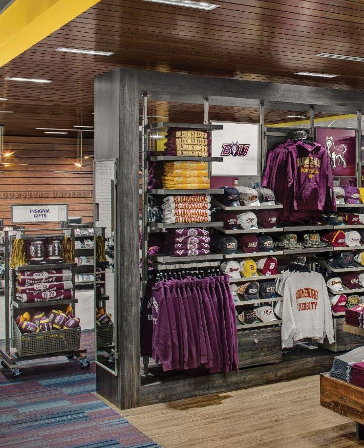
Working with limited visibility in an off-campus spirit store, Bloomsburg University tasked Little with helping excite shoppers, students, and visitors from the outside-in.
The team, a completely integrated group of graphic designers, architects and visual merchandisers, put the brand to work and used every opportunity to display merchandise, mascots and school pride.
Tone-on-tone signage integrates with the sleek cash-wrap design.
Dimensional logos use the brand’s bright colors to guide users to key areas.
Focal walls inside the store also function as exterior signage, visible through the storefront.
Icons and pictograms aid with key messages.
Total integration.
In a school book or spirit shop, visual noise can create challenges with signage and wayfinding. The graphic and interiors palettes were designed together to ensure finishes accented graphics, and signage emphasized the interior design. Merchandise was used to bring the brand to life, keeping the environmental graphics clean and subtle.
Little designed a family of environmental graphics, including “evergreen” wall murals and changeable signage, all tools of the store’s communication strategy with different purposes and lifespans.
Expanding the Campus
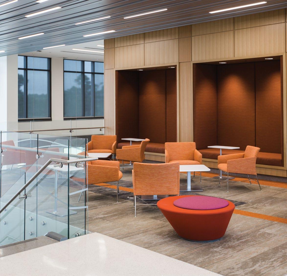
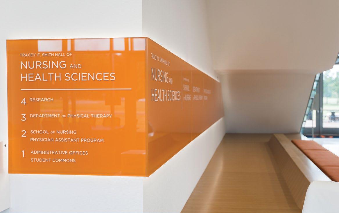
CAMPBELL UNIVERSITY
SCHOOL OF NURSING & HEALTH SCIENCES
Buies Creek, NC
DESIGNED FOR THE WHOLE PERSON
As a smaller private college located in a region with highly competitive nursing programs, Campbell University needed a state-of-the-art facility to use for recruitment into their Health Sciences and Nursing Program.
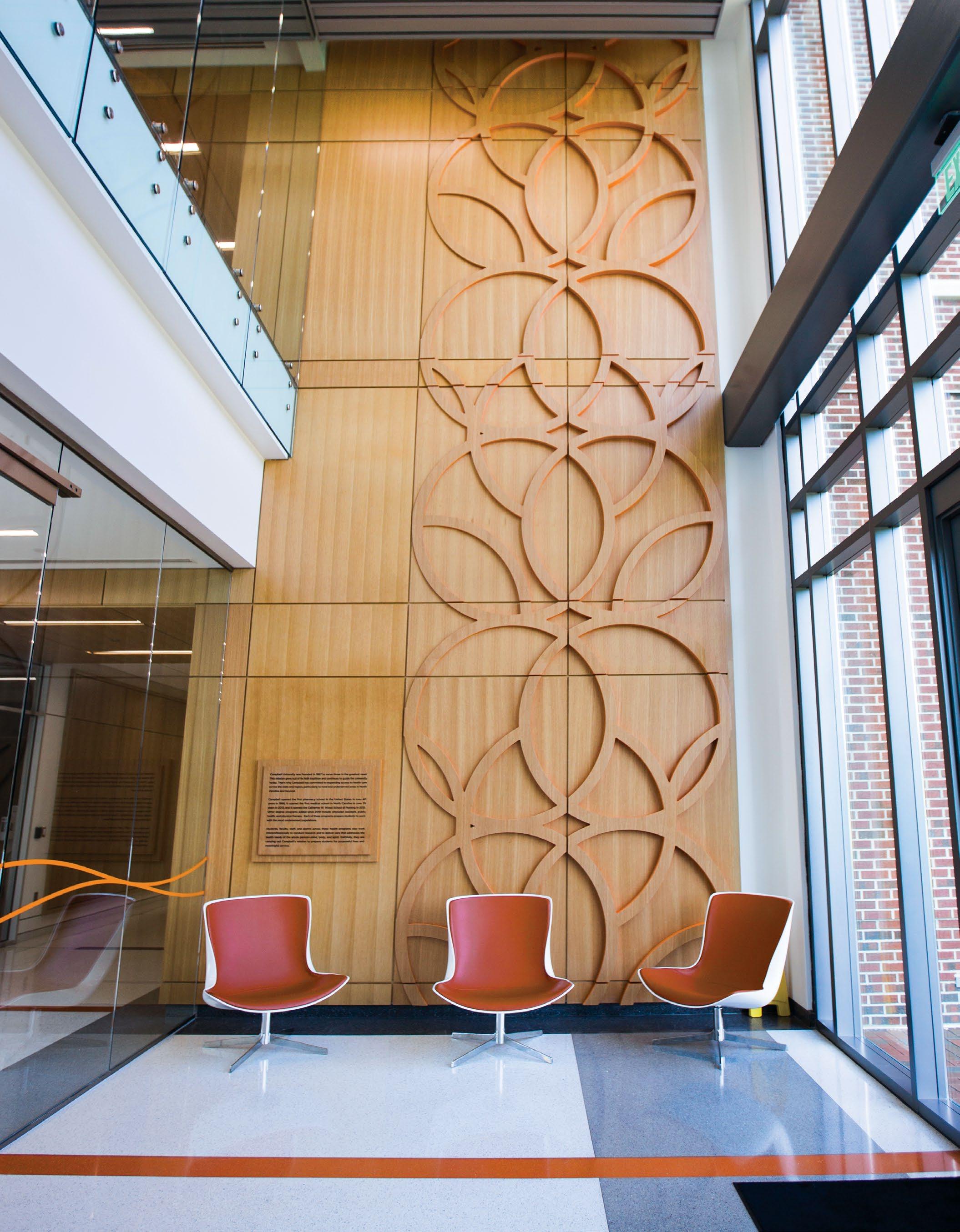
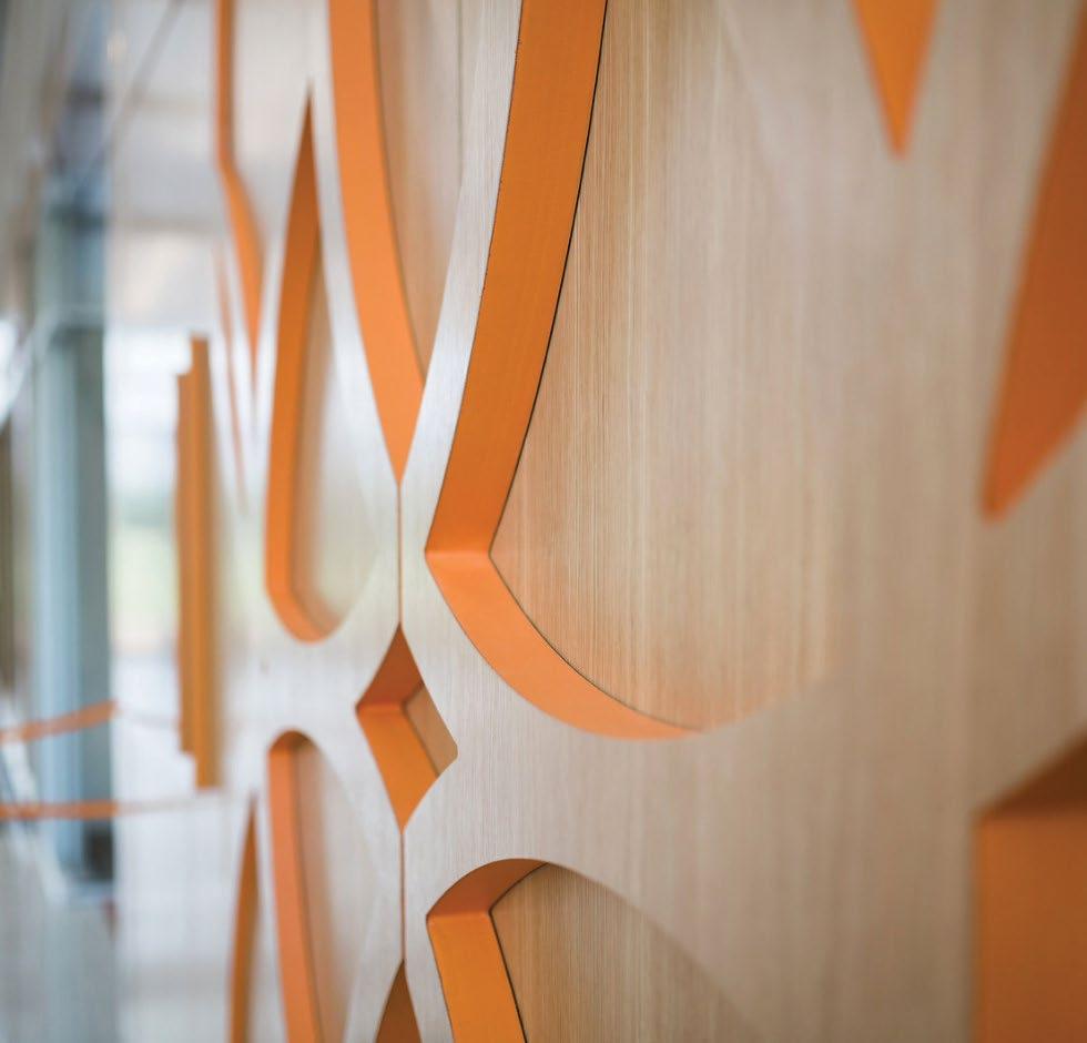
The entrance features a custom-designed screen, pulling reference from the human anatomy, as well as the Holy Trinity, to create a memorable impact upon arrival.
The pattern designed as part of the building’s identity is also picked up in base building signage.
Interior finishes support the brand palette, and are complimented by the environmental graphics.
Hints of orange tie the building back to Campbell while keeping the overall aesthetic mature and professional.
Mind, body, and spirit.
Designed as one, the brand package and interiors palette create a cohesive and sophisticated environment.
Campbell’s brand is elevated and used sparingly to highlight key features throughout the building while signage and graphics seamlessly integrate with the architecture.
“We communicated our mission, vision, beliefs, and thoughts about community. Little heard our voices and the result is evident the minute you walk in the building.”
DR. NANCY DUFFY Professor & Director of School of Nursing
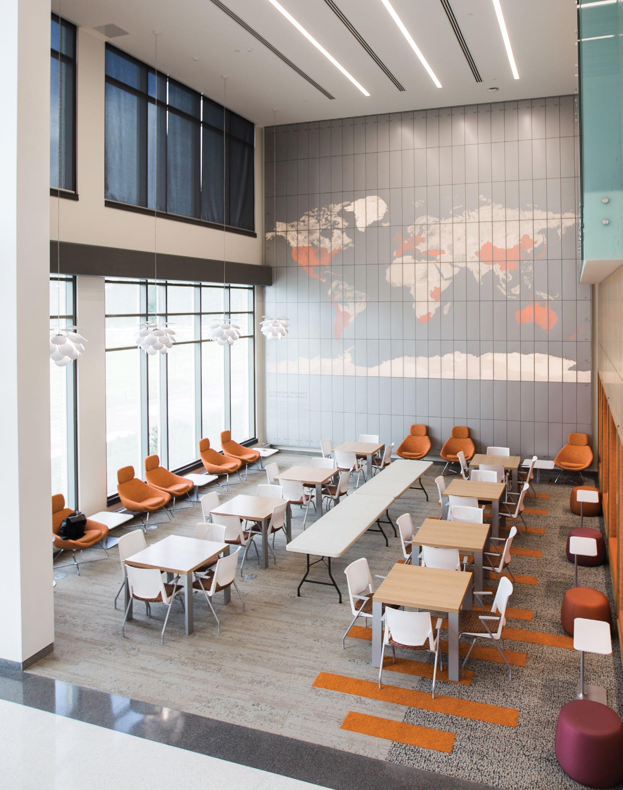
The Light of the World
The faith-based University also aimed to express their mission of alignment with the scriptural metaphor of The Light of the World, emphasizing their commitment to being a regional resource with a global impact.
A lit geographic installation showcases the extent of Campbell’s global reach, highlighting locations where students have studied abroad and graduates have served, connecting the students to the school’s mission. As the school’s global impact continues to spread, the map will continue to be updated showing its growth increase each year.
Signage and graphics seamlessly integrate with the architecture.
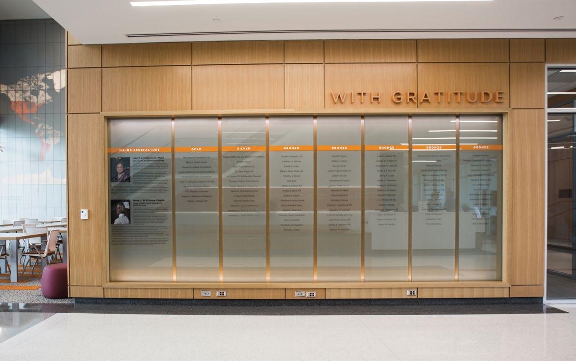
An internally illuminated donor wall recognizes three tiers of benefactors.
Murals on upper levels pick-up the same forms and layers seen throughout the building.
A regional resource with a global impact.
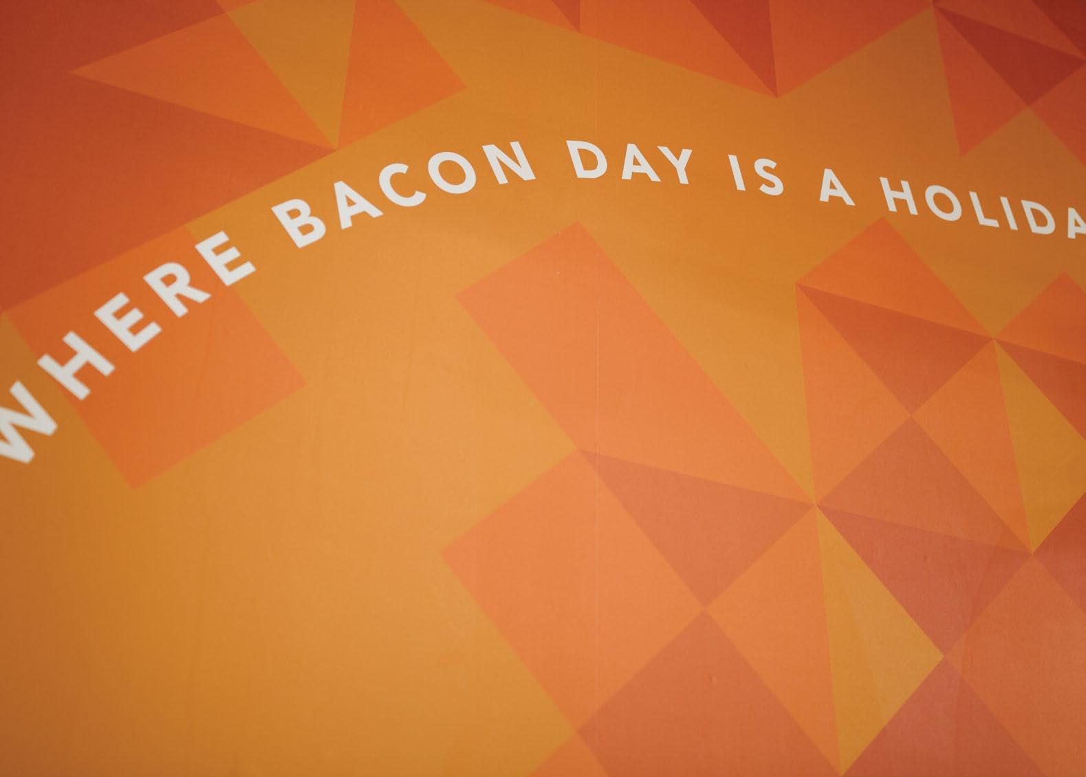
WHERE BACON IS A HOLIDAY
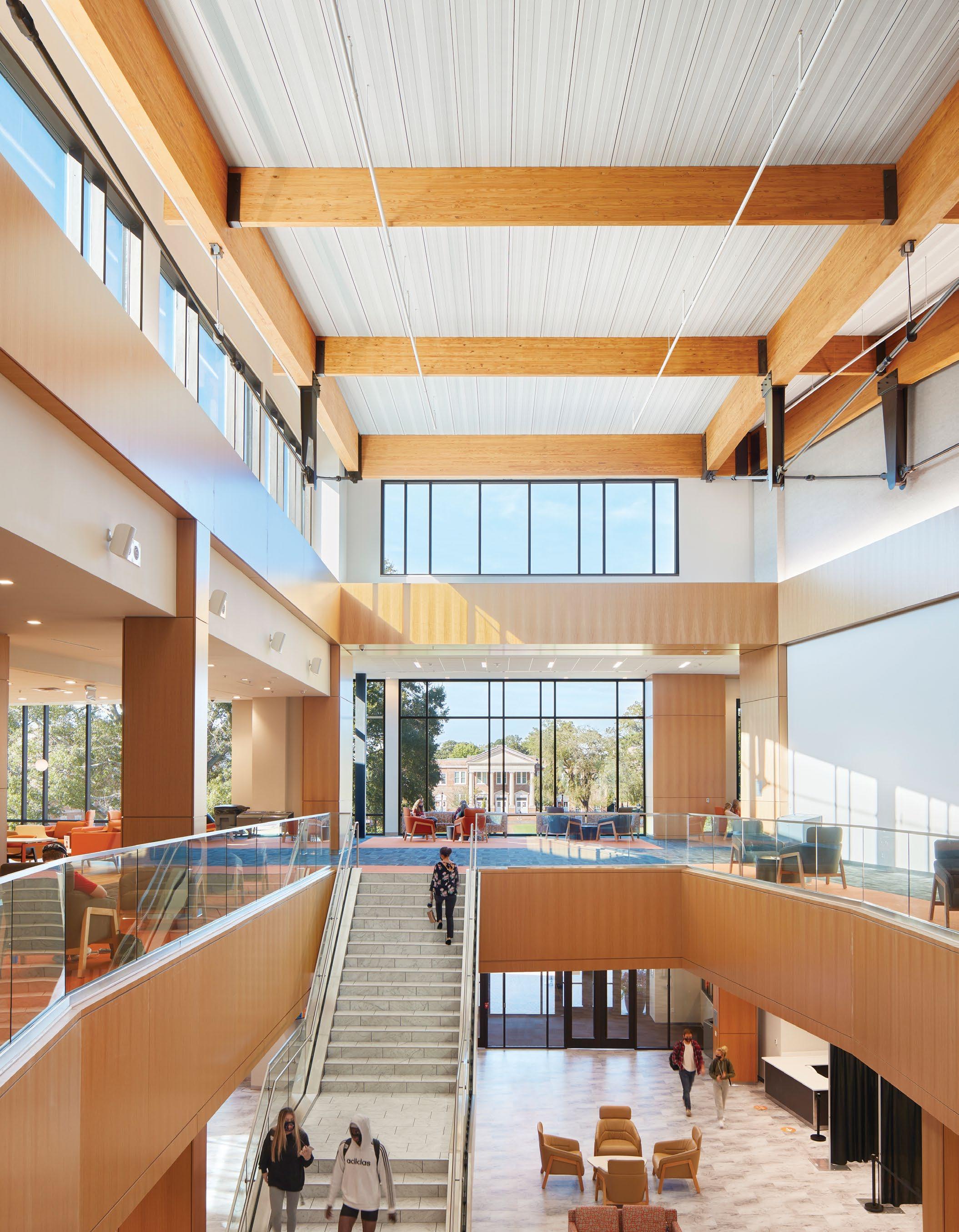
CAMPBELL UNIVERSITY STUDENT UNION
Buies Creek, NC
DAY HOLIDAY
The 2-story fitness center features a large mural of Gaylord the Camel.
Graphics and wayfinding work together to become a functional part of the environment.
Amenities named by students bring school pride to life with more than just a logo.
Warm tones in a large open space provide warmth but allow plenty of room for activity.
Dining venues throughout the destination were individually named by students.
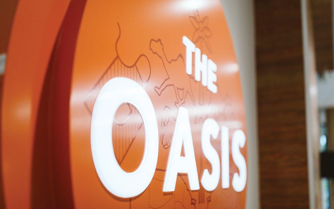
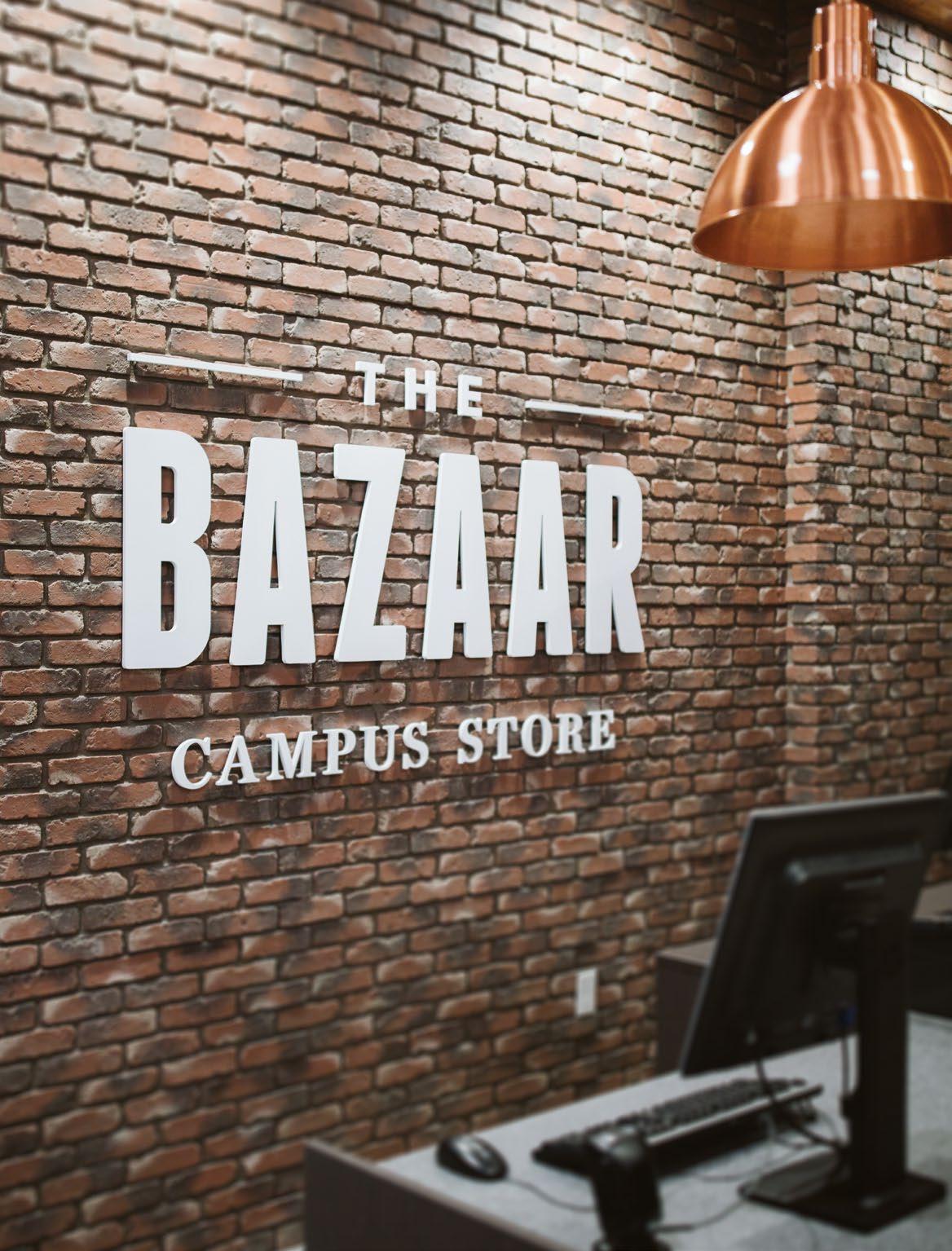
In keeping with destinations found in a desert (as Campbell is home of the Camels), a new brand was created for the student-named spirit shop - the Bazaar.
Where Camels come to Campus.
A — The murals in the fitness center become visible, especially at night, as they glow through the windows.
B — Students provided Campbell “inside jokes” to incorporate into the Spirit Shop mural.
An Uplifting Story
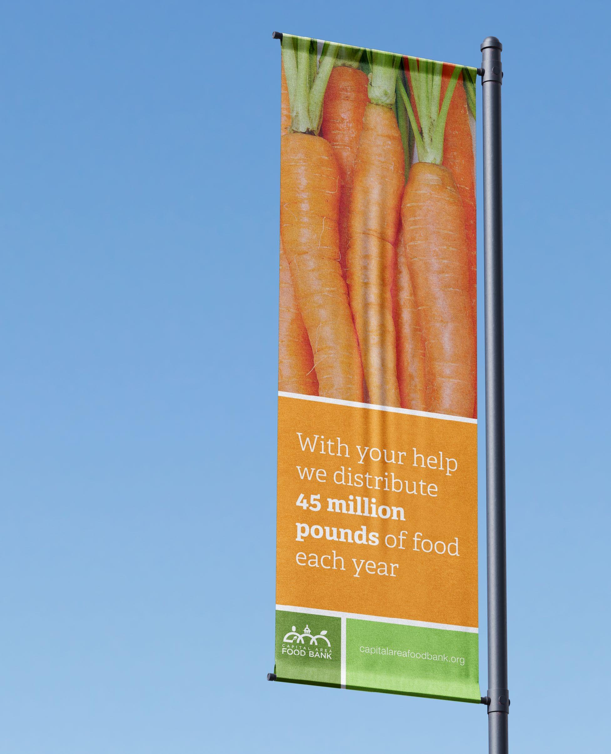
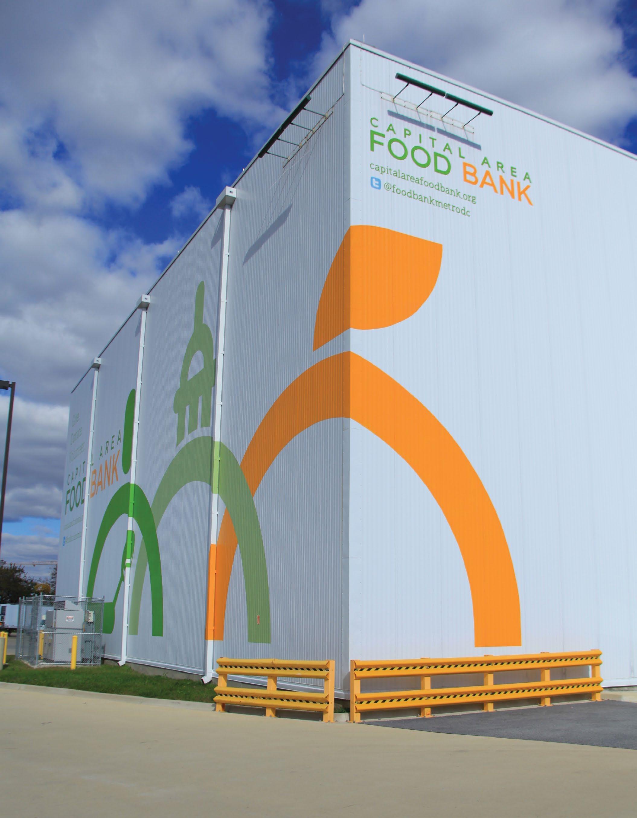
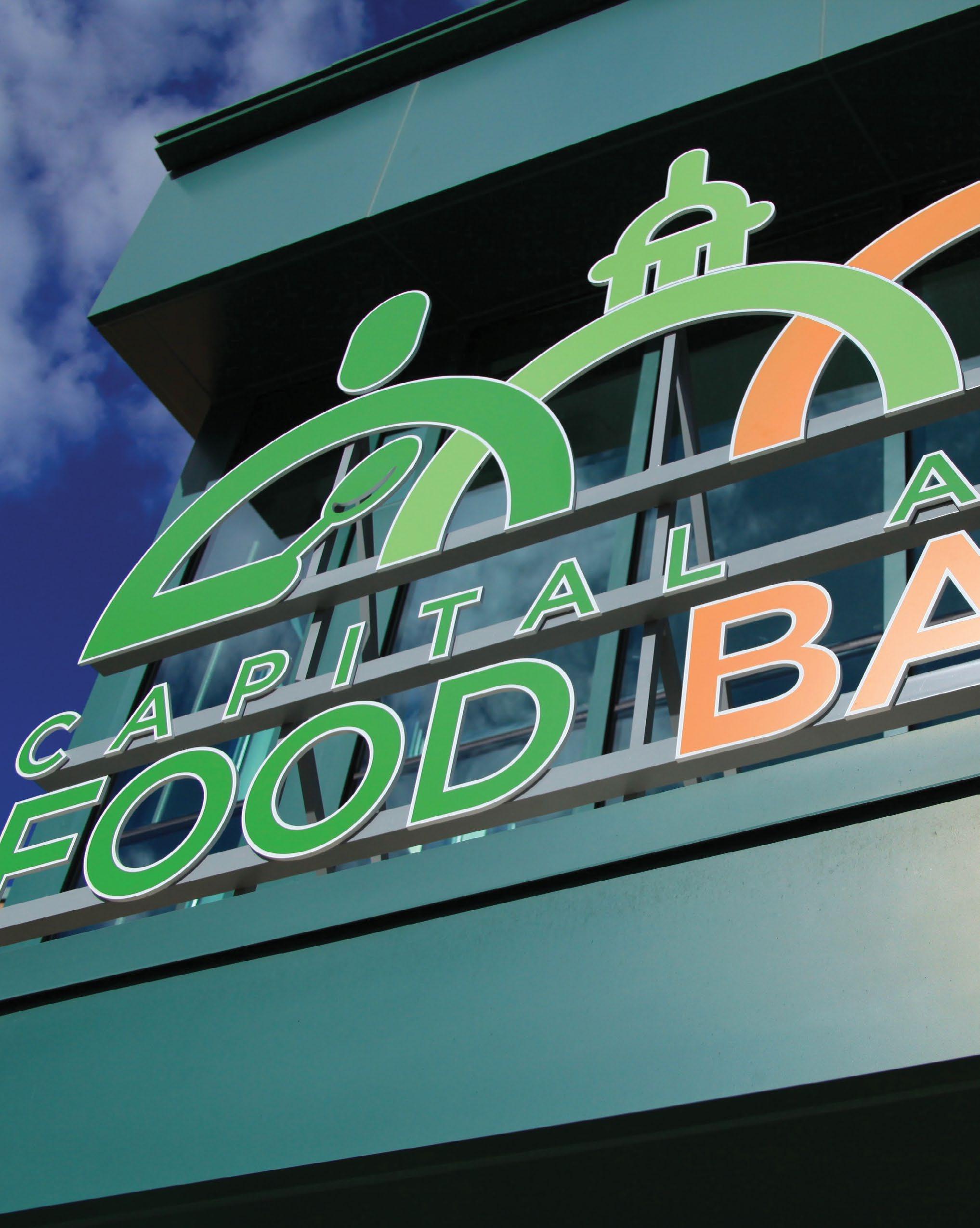
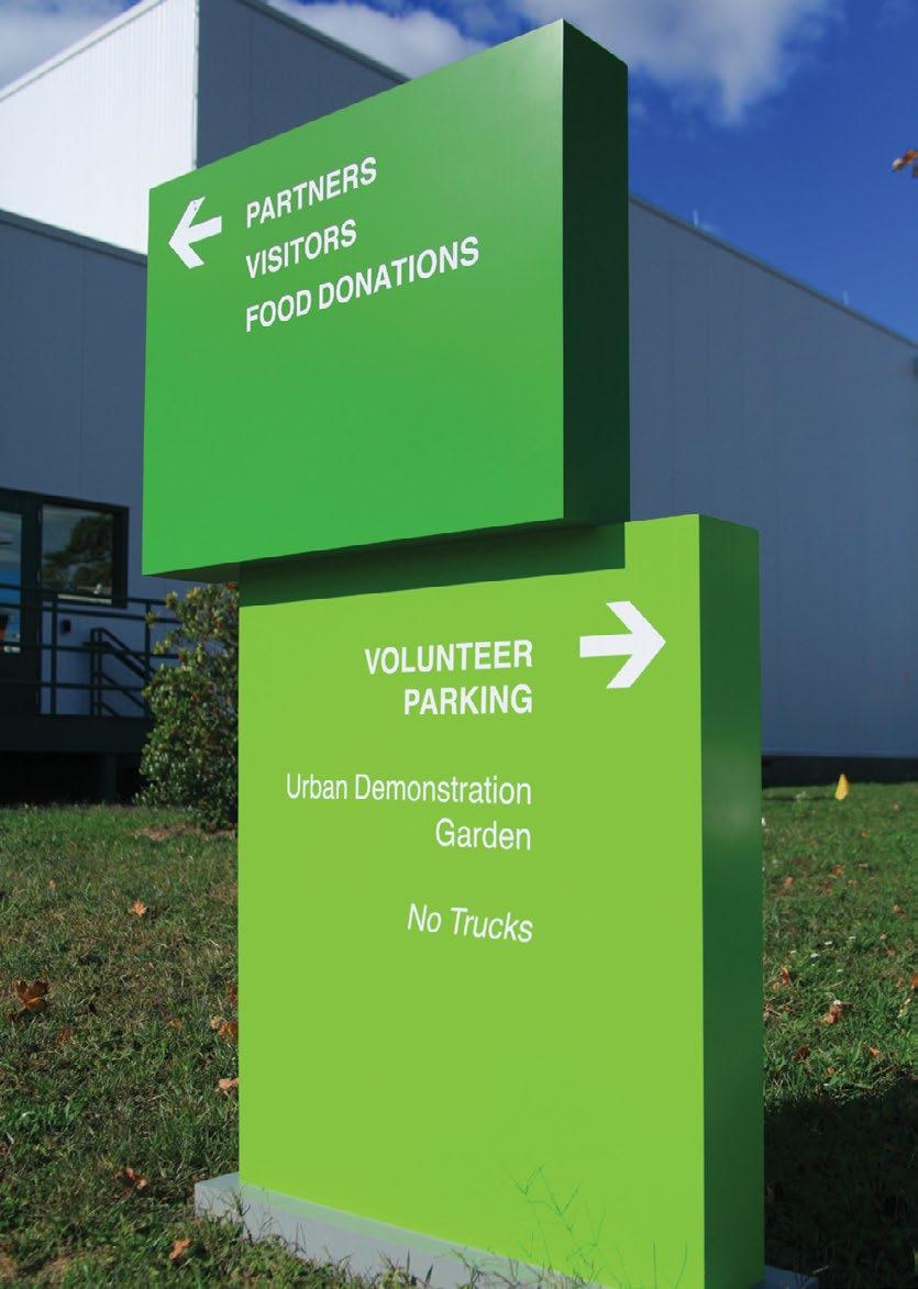
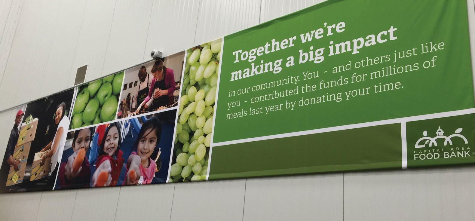
CAPITAL AREA FOOD BANK
Washington, DC
A giant mural to promote brand awareness adorns the façade facing the commuter train line.
Focusing on the mission.
As the largest hunger-fighting organization in the greater DC metro area, Capital Area Food Bank not only provides meals to thousands of families, they also recruit new volunteers, community advocates and teach lawmakers about their positive impact in the community using their main office & warehouse as a stage for tours, events and lobbying efforts.
Little provided a combination of brand communication and interior architecture services to create a branded experience that helps increase awareness, recruitment and provide a backdrop for tours and community events.
The Building is the Message
A branded wayfinding system helped users find the correct destination around the site.
A large canopy sign signifies your arrival and matches the scale of the building.
Transformed Brand Identity System.
The existing dark and somber color palette –with limited options– was discarded in favor of a bright and uplifting color scheme with a typographic family that offers greater variety. The unifying graphic metaphor is the notion of “boxes” which represent the basic process needed to effectively deliver meals to people in need. Finally, in order to keep an uplifting theme, storytelling standards focused on the results of their community work: happier families, rather than focusing on the negative aspects of the hunger problem.
A — Banners were used to acknowledge and give thanks to volunteers.
B — The brand promise was expressed in a dimensional typographic application at the main waiting area.
Good food today. Brighter futures tomorrow.
A Modern Brand Meets a Rich Legacy
Charlotte, NC
CHARLOTTE COUNTRY DAY SCHOOL
Is Key
After investing in a new brand and looking at signage to improve visitor experiences, as well as unite decades of growth across two campuses, Charlotte Country Day School used exterior and interior wayfinding to bring the school’s brand front and center at every turn.
Little studied over ten user types and their potential journeys throughout each campus, looking at key decision points, information needed from entry to exit, and how to elevate the signage system with a master wayfinding strategy and updated brand palette.
A Family Of Details
With parents and students of every level from Pre-K to 12, the campuses had information to convey at every level. Little developed a strategy of changeable, semi-changeable, and ‘evergreen’ messaging, with multiple levels of hierarchy, all designed as a family of information to convey a sense of refreshed clarity and consistency.
A — Flexible / movable sandwich board signs for pick-up / drop-off and events
B — You Are Here Map kiosk.
C — Base building signage.
D — An interior family of base building and wayfinding signs.
E — Changeable messaging on Classroom ID signs.
F — Kiosk Drawing
1
2
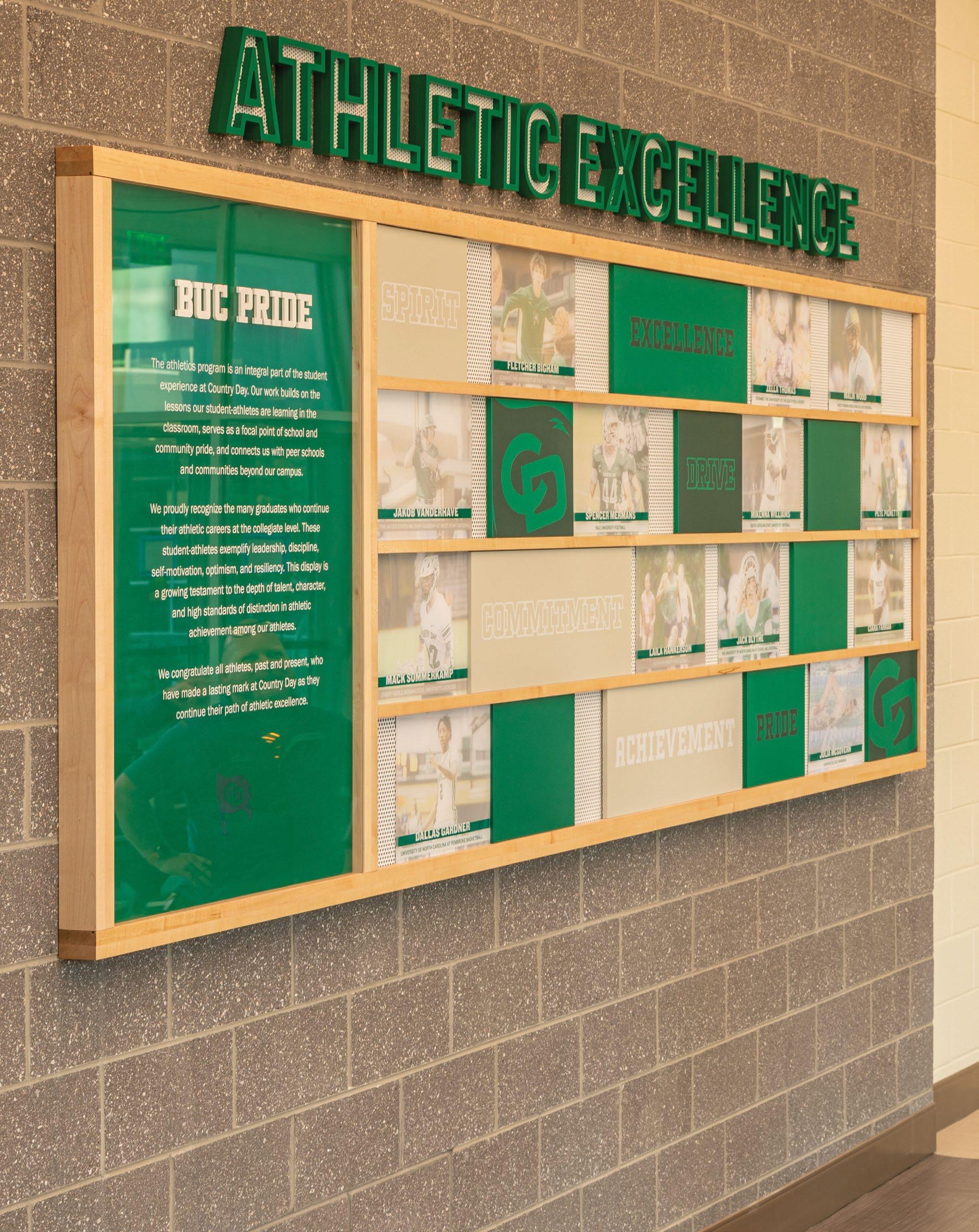
Graphics showcase the school’s values and achievements to foster school spirit and a sense of community.
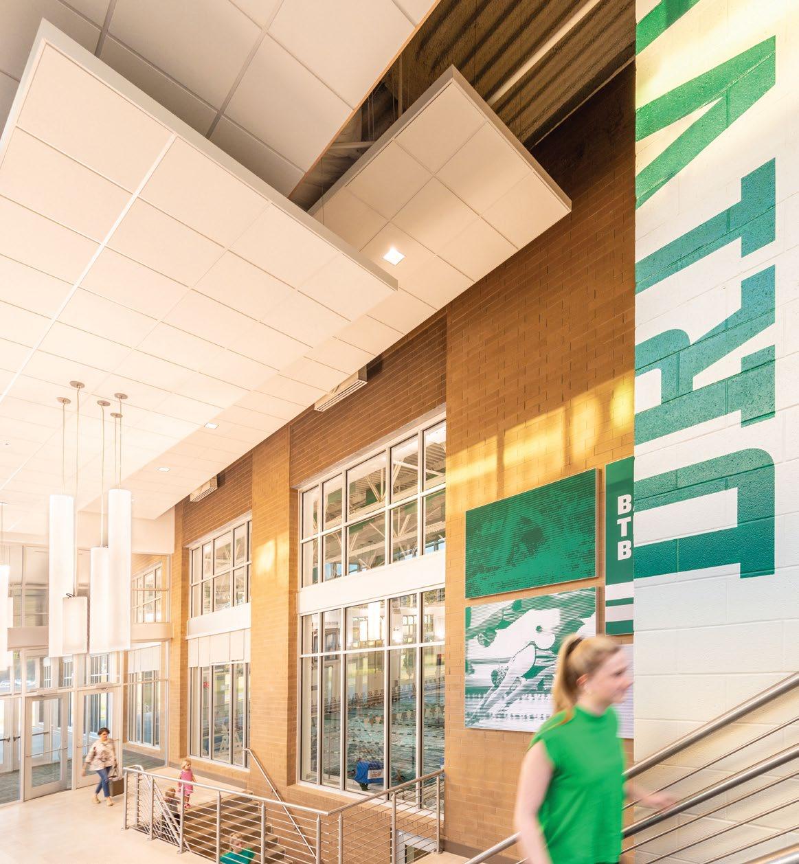
ACHIEVEMENT
Athletic Pride
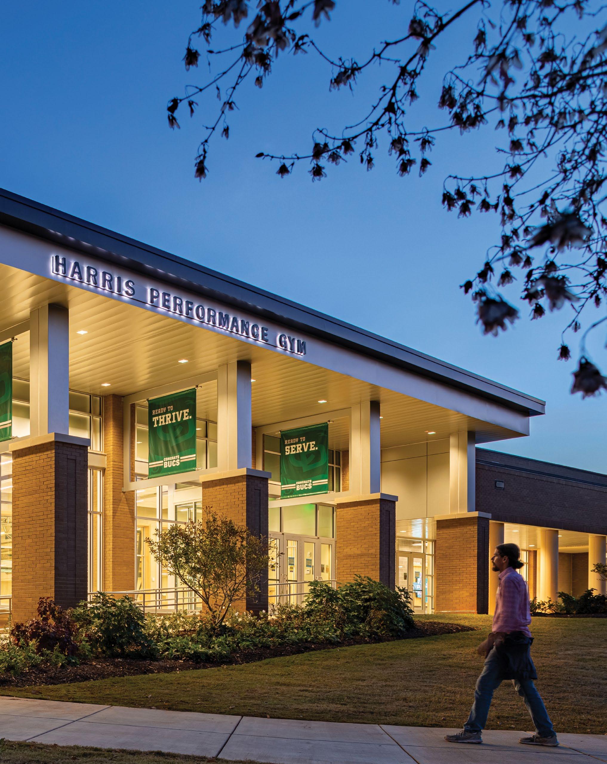
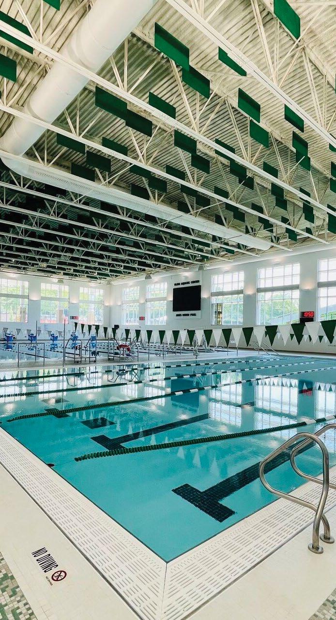
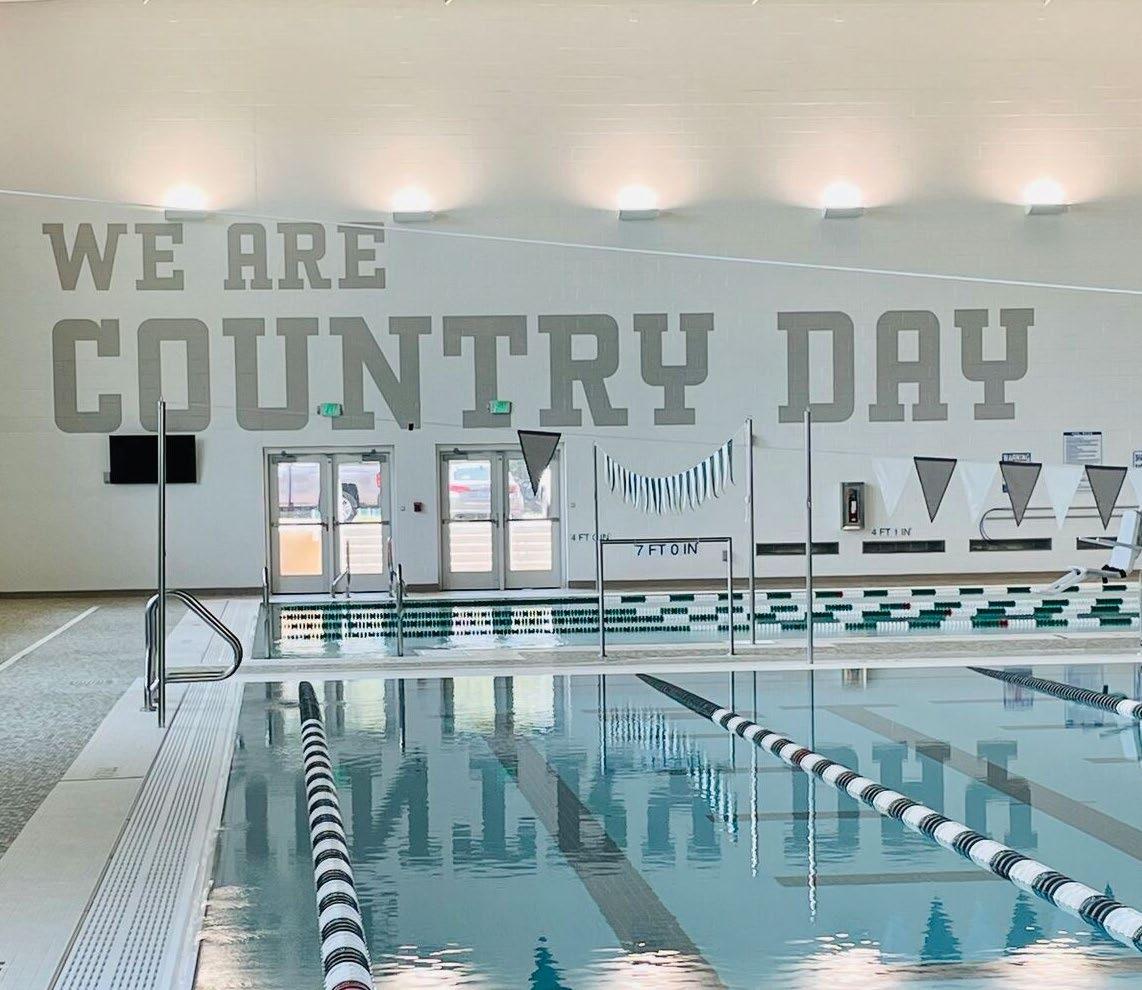
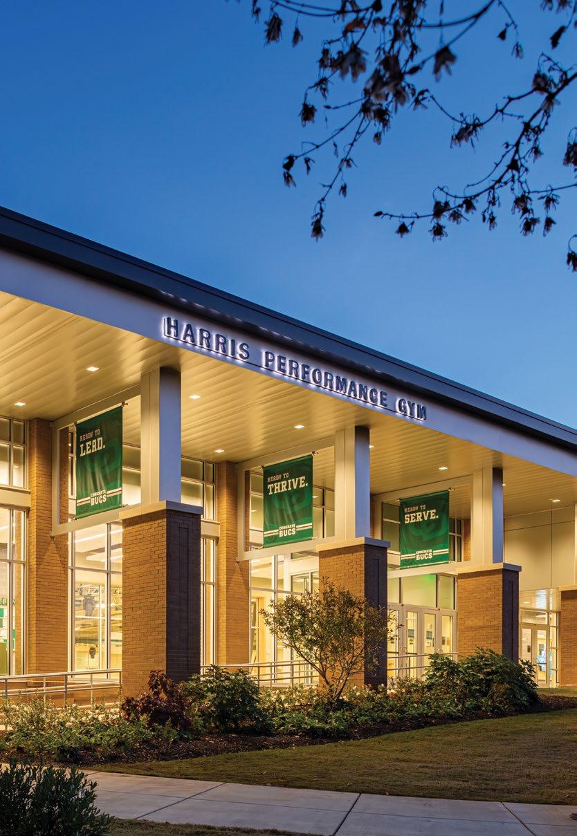
The Charlotte Country Day School Gym and Natatorium unites school spirit and a legacy of student athleticism for generations to come. Static and digital experiences create a sense of permanence while staying flexible to everyday stories and an ever-changing future. Using a variety of media and scales, the brand is brought to life, adding a layer of school pride to a state of the art facility.
A — A changeable, modular donor wall provides a framework for recognition.
B — The brand palette is used to personalize everything from bunting flags to acoustic panels to floor tile. The entire space is CCDS.
“We Are Country Day” serves as an inspired reminder, giving energy to athletes as they compete in the large natatorium.
Large graphic elements are applied to every surface, carrying the brand throughout corridors and common spaces.
A modular display is designed to be easily updated.
Adaptable Billboard
Little helped develop a modular system that can adapt with the school. This gives Country Day a billboard where they are able to highlight senior athletics and showcase where they are going.
Making the Grade
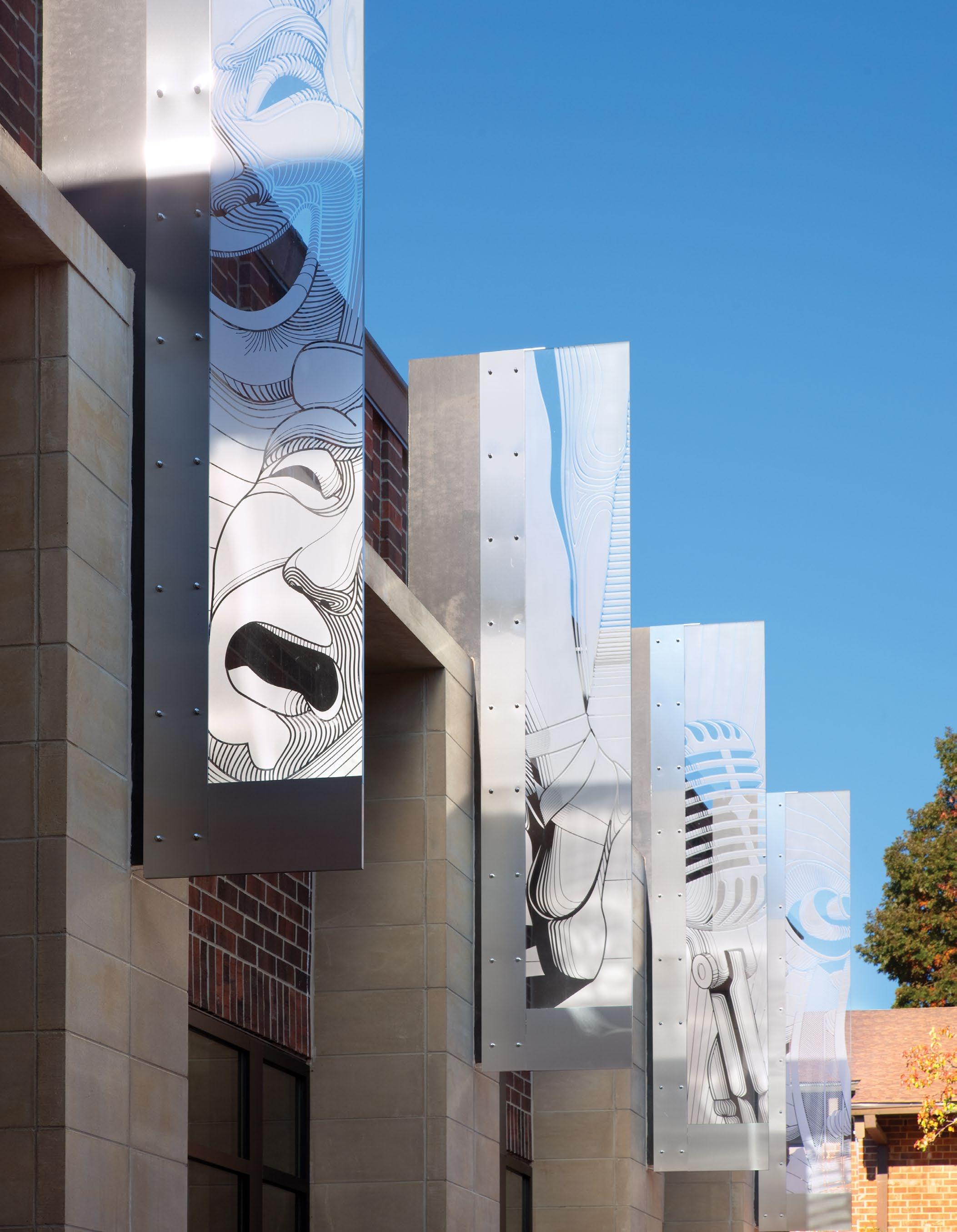
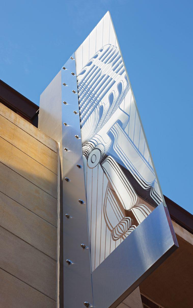
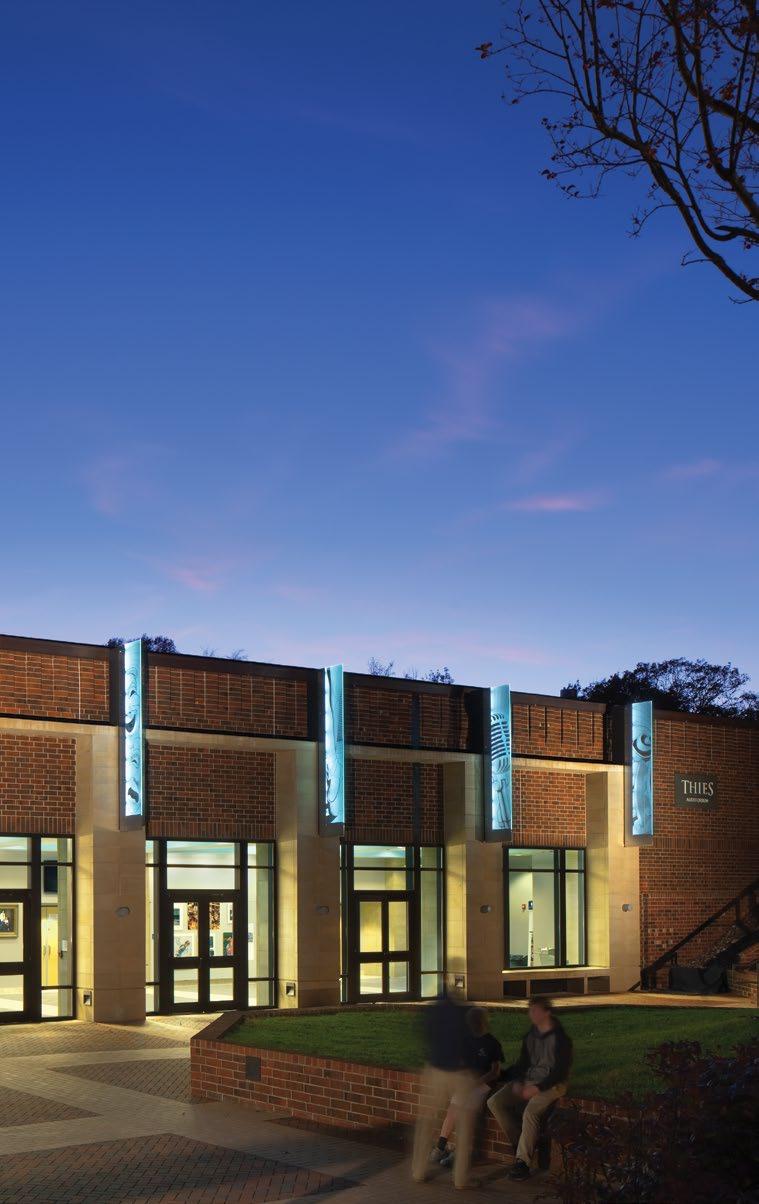
CHARLOTTE LATIN SCHOOL
Charlotte, NC
The custom illustrations represent each of the performing arts.
Center stage.
Charlotte Latin, one of the most prestigious private schools in the city, wanted to create a memorable entry experience for their new Performing Arts Center.
Aside from designing a beautiful building and entry plaza,
Little developed an identity with custom-made illustrations etched on internally illuminated vertical glass fins.
The result is a building that is a beacon on campus and an exterior plaza where patrons can feel the excitement as the crowds congregate before each show.
Finding The Way
A comprehensive wayfinding system was developed to help students and families navigate to important destinations and to visually unify the entire campus.
A — A comprehensive campus wayfinding system was developed.
B —The custom post and panel signs have a subtle dimensional icon at the bottom and a rounded header on top.
C —The glass fins were integrated with the architecture by a metal structure with bolts.
D — Internally illuminated exterior signage also improves visibility during evening shows.
E — Custom illustrations were designed for each art program.
Vehicular
Pedestrian
Charlotte Latin - Performing Arts Center Banners
Elevating the Signature Experience
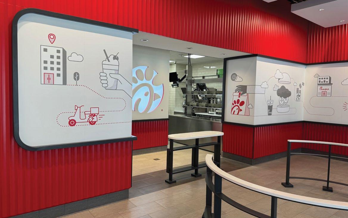
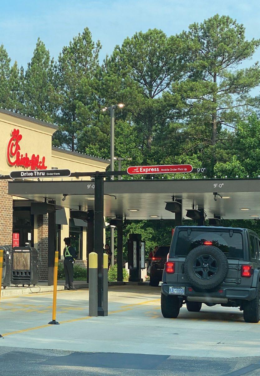
Layering of materials adds to the variety of scale in Chick-fil-A’s delightful details. Exterior Storefront
Worked with fabricator to ensure final details aligned with concept direction.
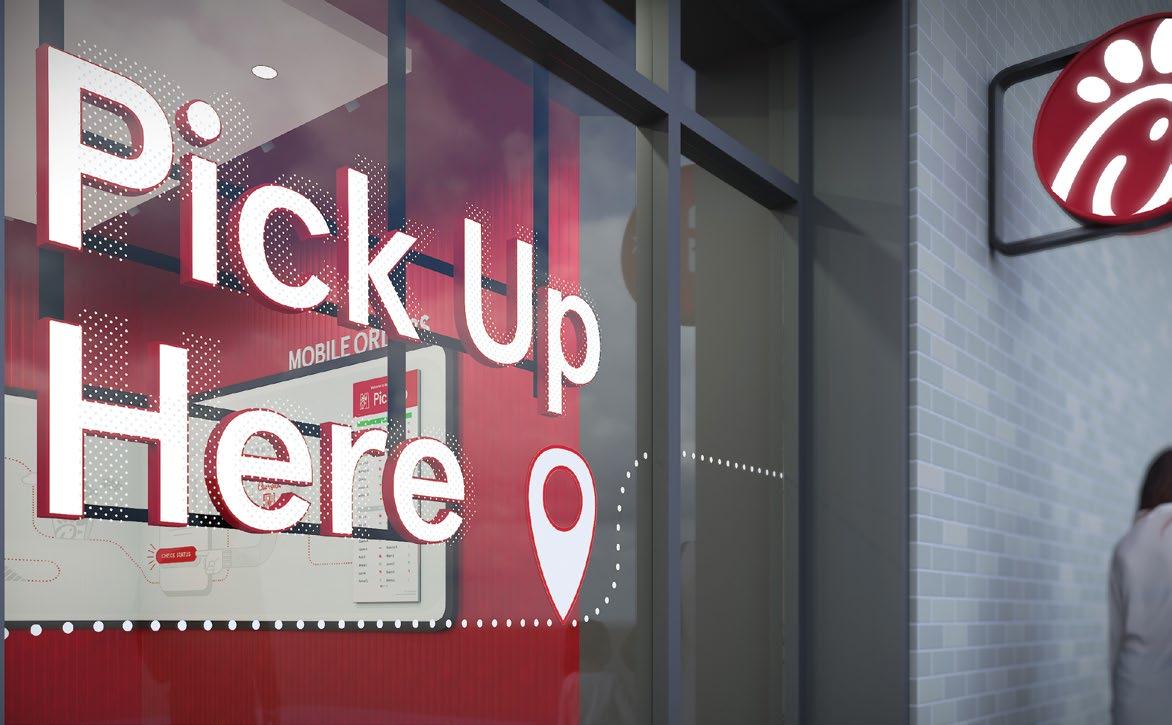
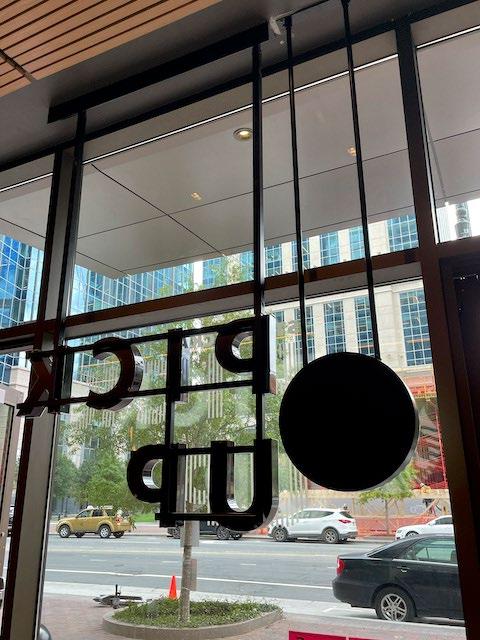
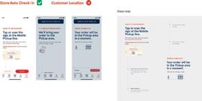
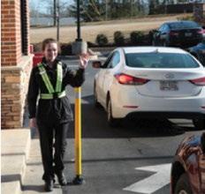
Little helped develop signage that communicates the mobile customer experience and encourages digital interactions with Chick-fil-A.
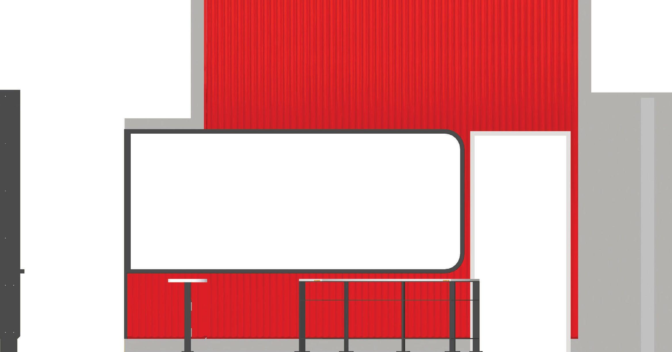
Interior: Mobile Orders
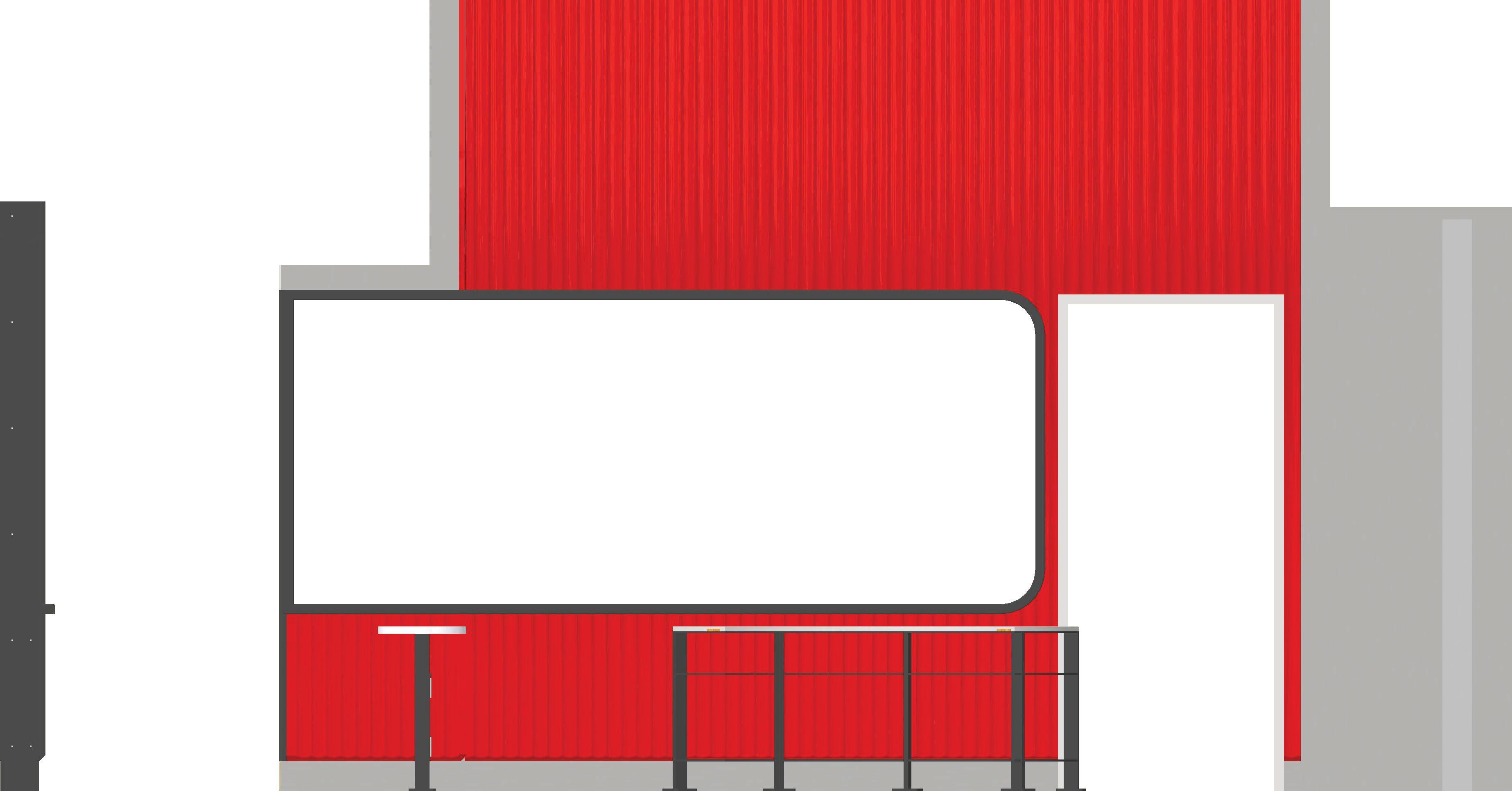
Install Dimensions
Order of Install
1. SCI to install wallpaper, note the dimensions specifying the height from bottom of graphic to top of stroke (2’ 4 3/4”) and distance from right edge of graphic (7”).
2. AV team to install the TV, note the TV is centered within the route line and phone graphic. Target height to bottom of TV is 4’4” A.F.F.
3. SCI to install G4a, align right edge of letters to right edge of TV
4. SCI to install G5b, centered within TV and match distance from route line to TV to ensure the route line is centered between TV and panel.
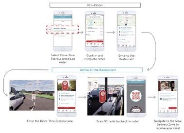
Mobile Thru
Little’s Brand Experience Studio’s long history with Chick-fil-A became the perfect foundation to help expand the brand’s digital experiences without sacrificing consistency across all wayfinding applications.
Little studied all points of a user’s journey. Designing and overseeing a prototyping study for both the Mobile Order Drive-Thru and Mobile Order Walk Up (Carry Out) experiences to ensure cohesion across all points of contact with the brand.
The signage family is able to grow and adapt for different site conditions.
Lane designation sign.
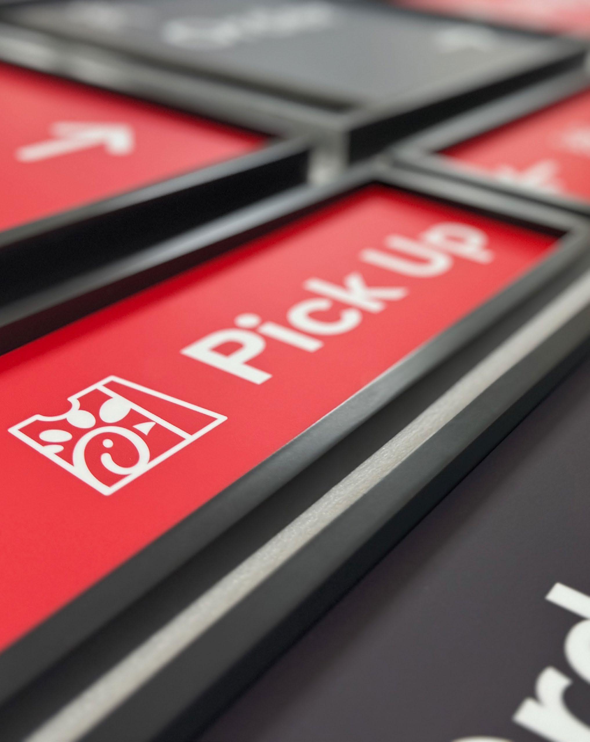
Signage utilizes iconography to add clarity and brand details across the site.
A — The team at Little helped develop diagrams and guidance to convey to operators and team members how to utilize the sign system.
B — Little worked with Chick-fil-A to test the signage package for multiple locations to develop multiple tier package levels.
Thinking Outside the Office
One mural connects three smaller focus rooms.
Designing a Journey
Private spaces become destinations on the journey, winding their way through the common space.
Spreading across three levels, the thematic concept not only inspired the palette, but also aided with wayfinding, guiding users from east to west, and north to south, moving from floor to floor.
Putting storytelling to work through wayfinding
and activity zones.
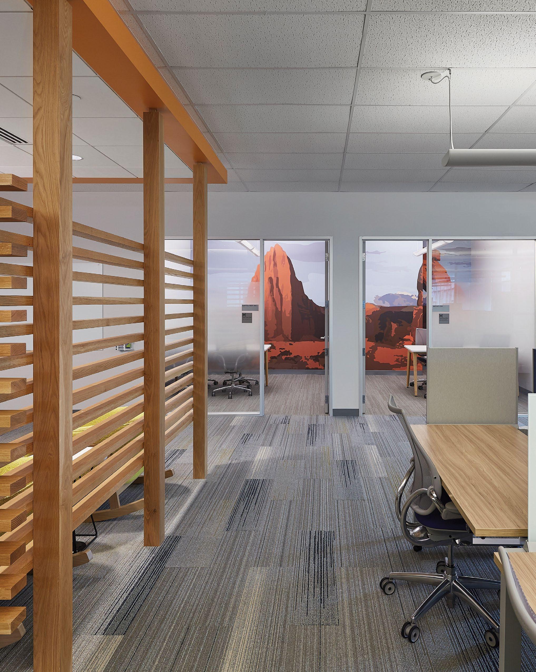
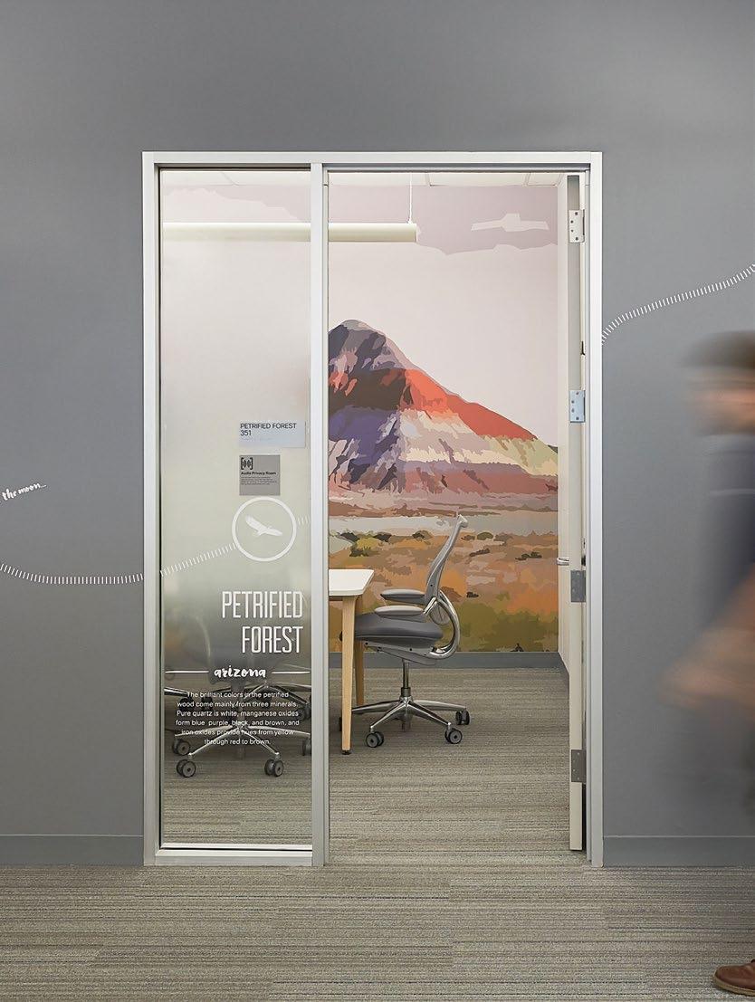
Over 50 different murals, all paying homage to the distinct look of the National Parks, play a role in placemaking and wayfinding.
Circulation areas connect each destination and therefore take on the role of the “road trip” while collaboration areas become the rest stops throughout the day, all helping draw energy to common spaces.
A, B — Path shown across elevations.
C — Sample of a conference room mural and the view from outside.
LOS ANGELES
JOSHUA TREE
LOS ANGELES
JOSHUA TREE
Work + Play
08.03.2017
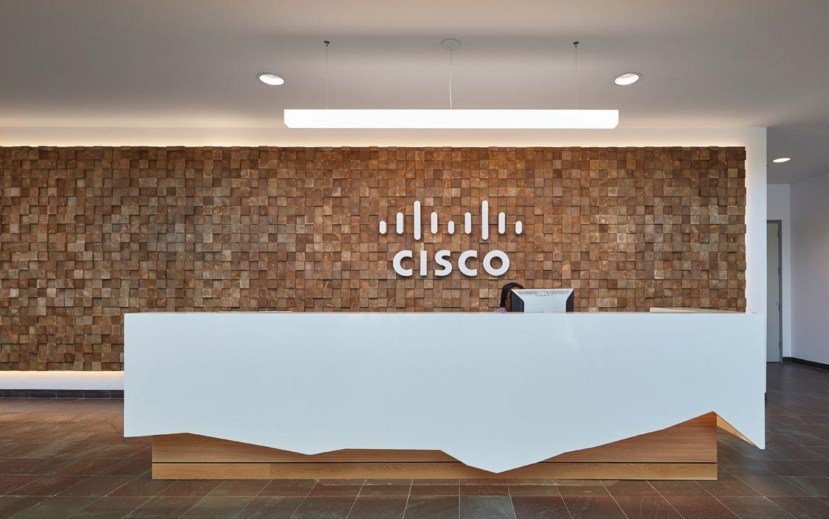
Rather than using Cisco’s brand to excite employees and visitors, Cisco leaned on Little to create a distinct experience to engage users throughout the workday.
A — Murals were designed to be experienced from multiple points of view.
B — E-Cafes were branded on each floor to help reinforce the theme and locations.
An airstream-inspired casual meeting space.
Subtle cues to the concept are pickedup in the lobby.
Collaboration spaces play dual-function as “gamestops.”
PatientCentered
Care is in the Details
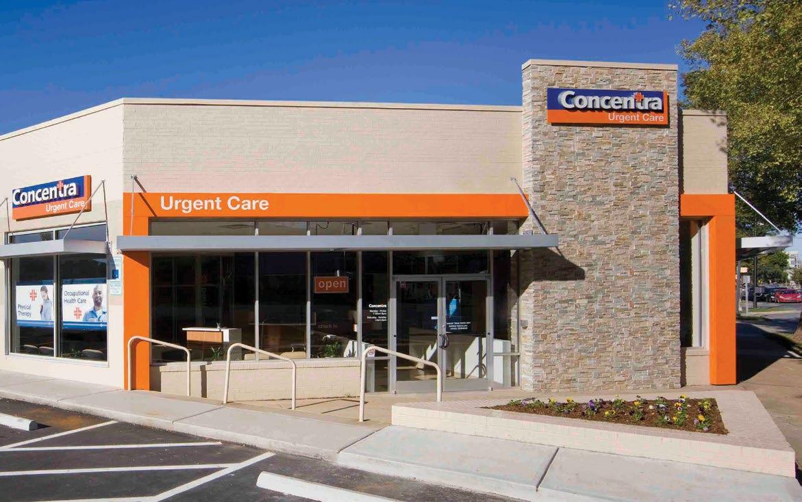
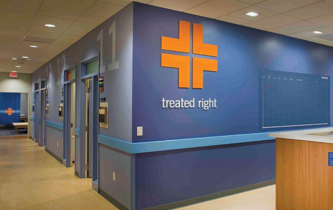
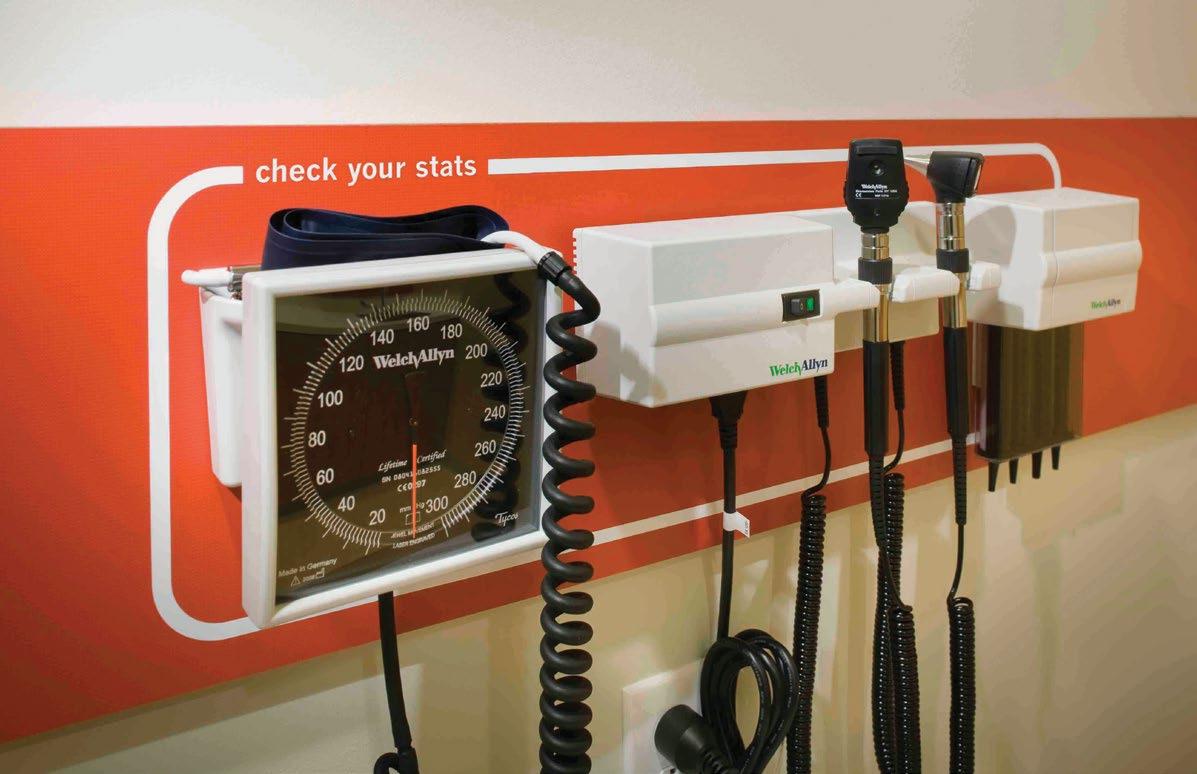
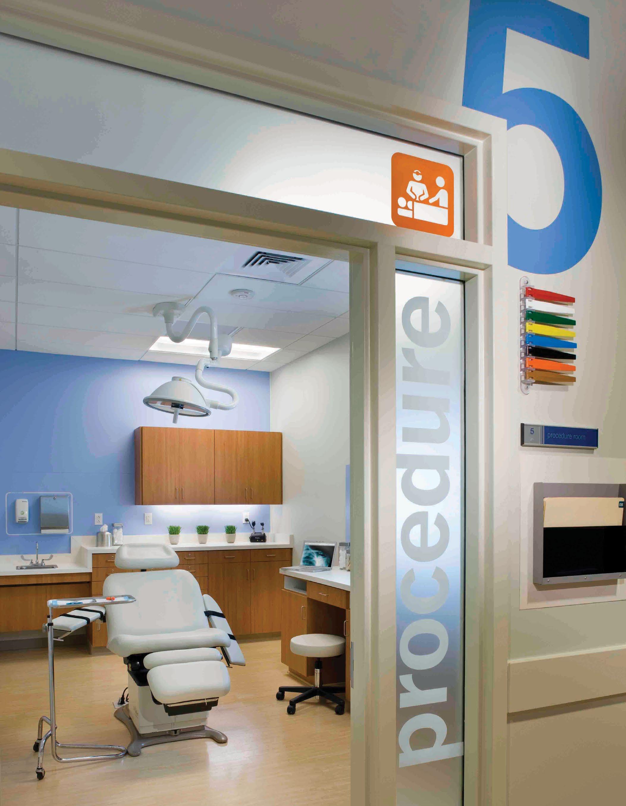
CONCENTRA URGENT CARE
National Prototype
A kit of parts.
Looking for consistency across all brand application, Little designed a kit of partsgraphic assets - that represent the Concentra look and feel. Whether on packaging, printed collateral, digital application or across various locations, working within the provided assets creates cohesion.
A — Brand identity standards.
B — The smallest details can say a lot about your brand.
A full suite of paperworks and brand standards was developed.
Applying the brand identity consistently across all channels is a key ingredient to maintain integrity.
Exterior trade dress includes an orange archway that has become iconic.
The design of the clinic was focused on creating an environment that improved the patient experience by decreasing anxiety and providing comfort. Small and large gestures reinforced this philosophy.
Clear and consistent wayfinding provides a sense of orientation; residential cues in materials and finishes make the space more welcoming.
An icon system was used to aid patients with limited English proficiency.
A Local Hub with a Global Legacy
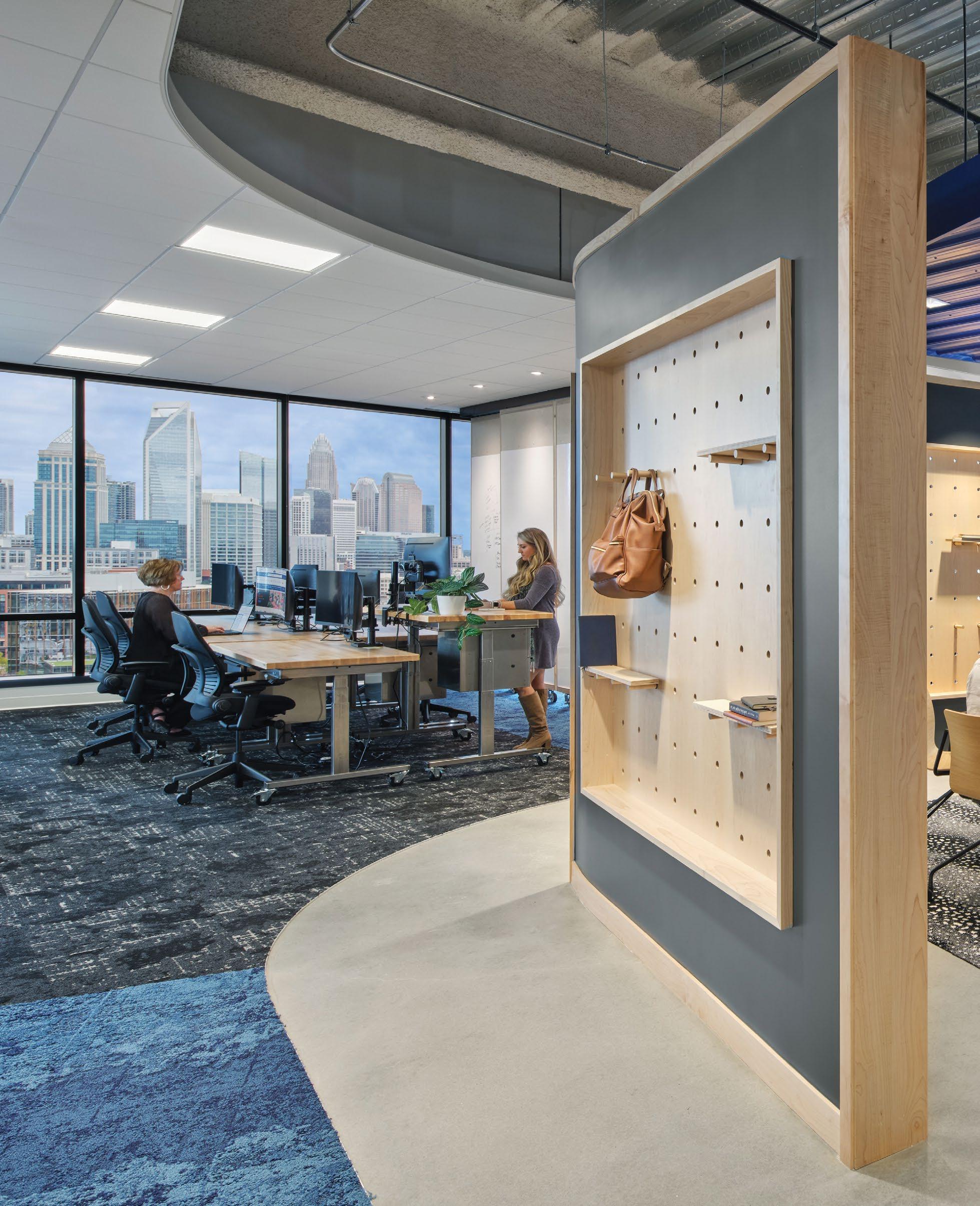
Disrupting the Grid
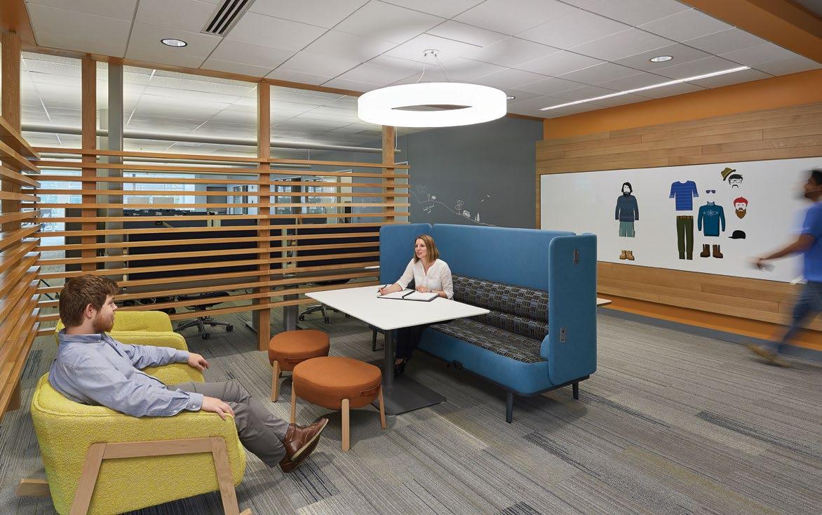
Hospitality Driven Workspaces
With the highly competitive talent market, the design team ensured the client had a workspace that would function seamlessly and appeal to current and prospective employees.
Beginning with the implementation of extensive corporate workplace standards – including team-based work areas and an open desk solution – the space also adapts a regional, hospitality feel that fits the local business. The team paired this with private focus and functional meeting spaces to achieve balance in a modern collaborative environment that works well for a technology workplace.
— Custom mural by Taylor White.
—
A
B
“Woven” wood focal wall in collab lounge.
Large bent-metal neighborhood identifiers compliment a series of 8 primary accent colors used across 5 levels for wayfinding.
A hospitality aesthetic was used to maximize employee comfort, using various textures to bring messages to life while helping with acoustics.
Woven together.
Challenged to “disrupt the grid,” both literally and figuratively, the design relied heavily on environmental graphics to incorporate local relevance with a Raleigh-based muralist, maps, and connections to surrounding cities.
Little’s Brand and Interiors teams worked seamlessly, embedding conceptual cues at every turn from screening elements to room identification signs.
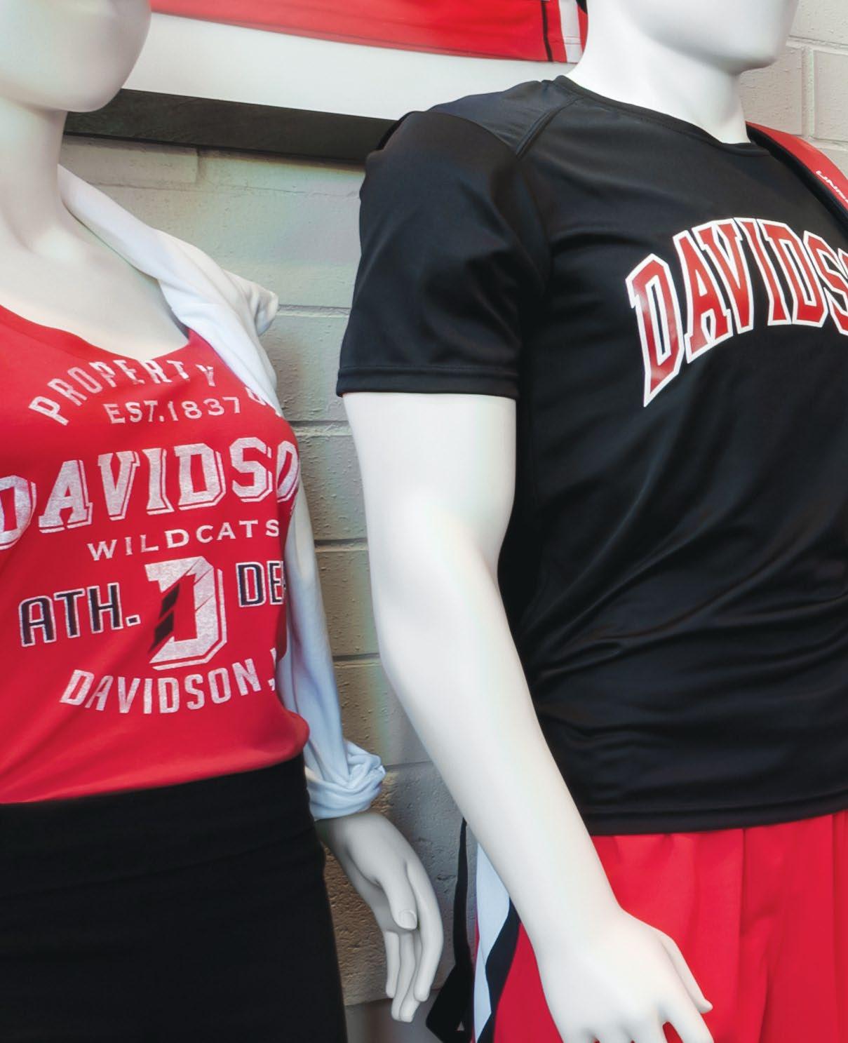
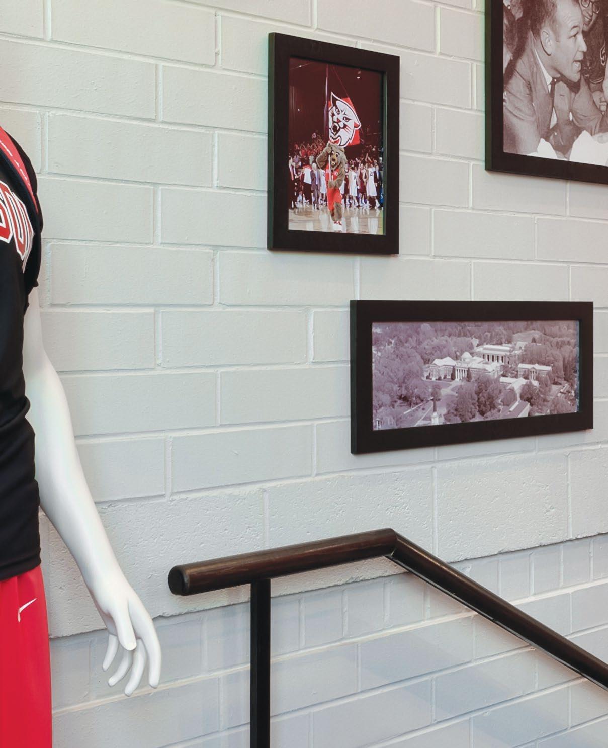
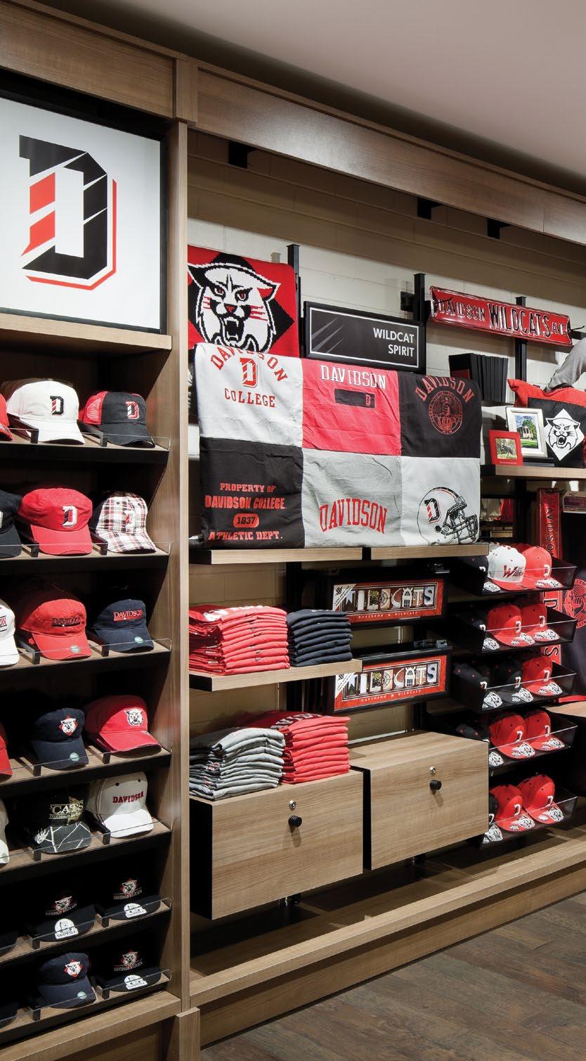
School Spirit
DAVIDSON
Davidson, NC
COLLEGE STORE
A Comprehensive System
The graphics program for Davidson College’s new spirit & book store utilizes mega-graphics, branded signage and awnings, as well as a historical legacy exhibit to both elevate school pride and solve some of the inherent navigational issues for the space.
From the outside in.
A user’s first impression of the Davidson College Store begins prior to setting foot inside the front door. Using exterior signage, viewpoints through storefront and bold graphics glowing from within the windows. Little’s design adds excitement and interest, building momentum from the outside in.
A — Exterior trade dress elements include integrated architectural logo, illuminated ID signage and branded awnings.
B — Branded signage and merchandise bring the retail space to life.
C — Suspended collegiate banners reinforce the school’s core values.
Flexible Innovation
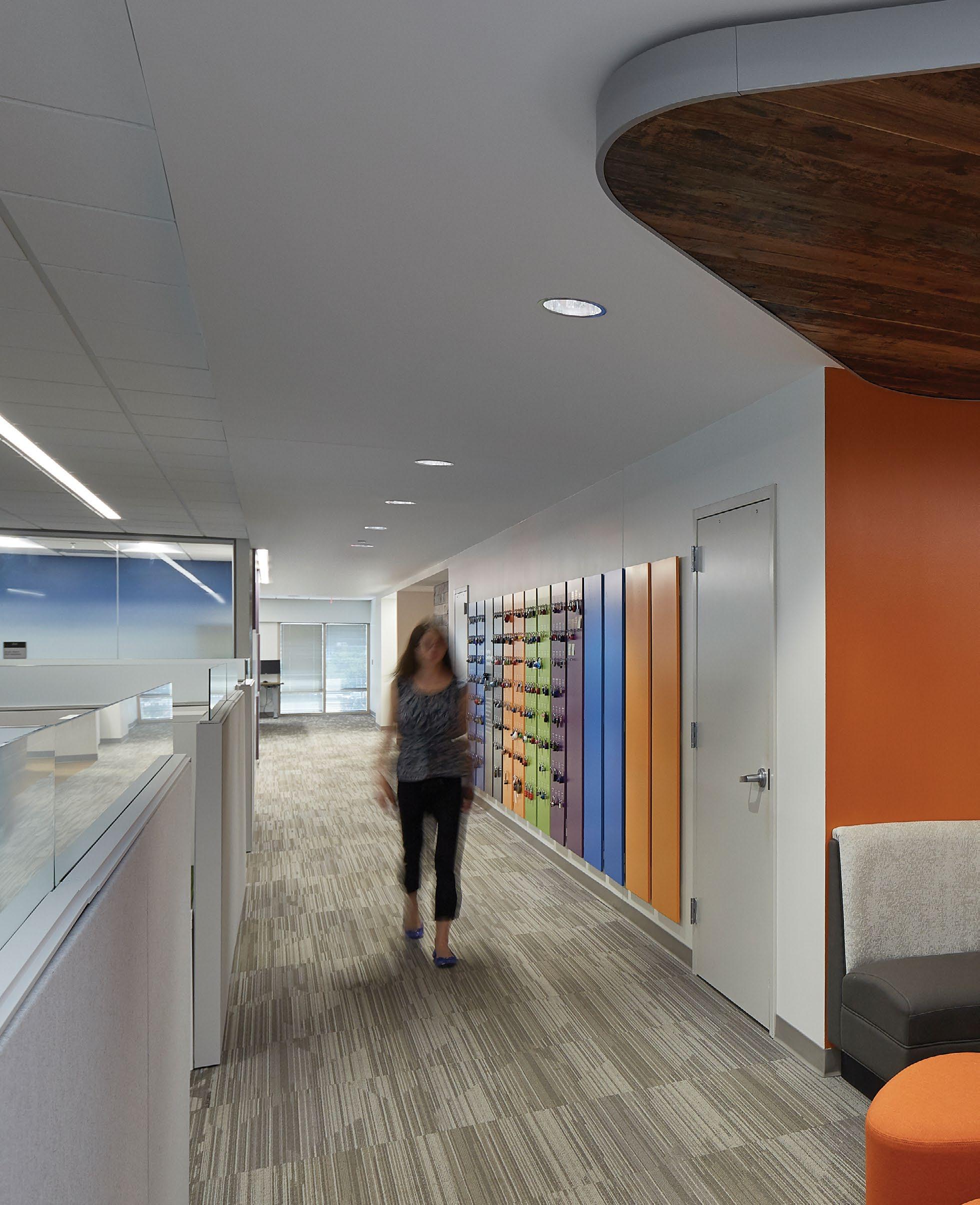
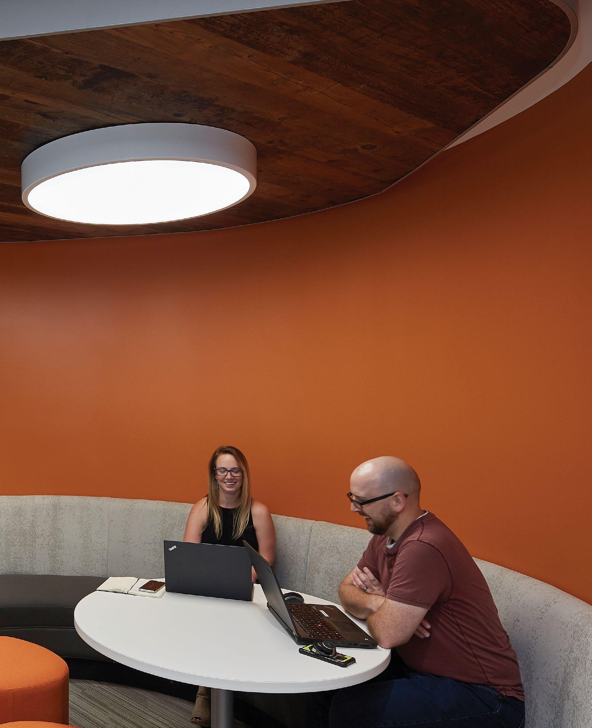
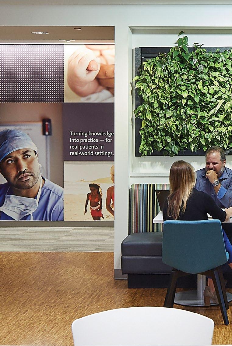
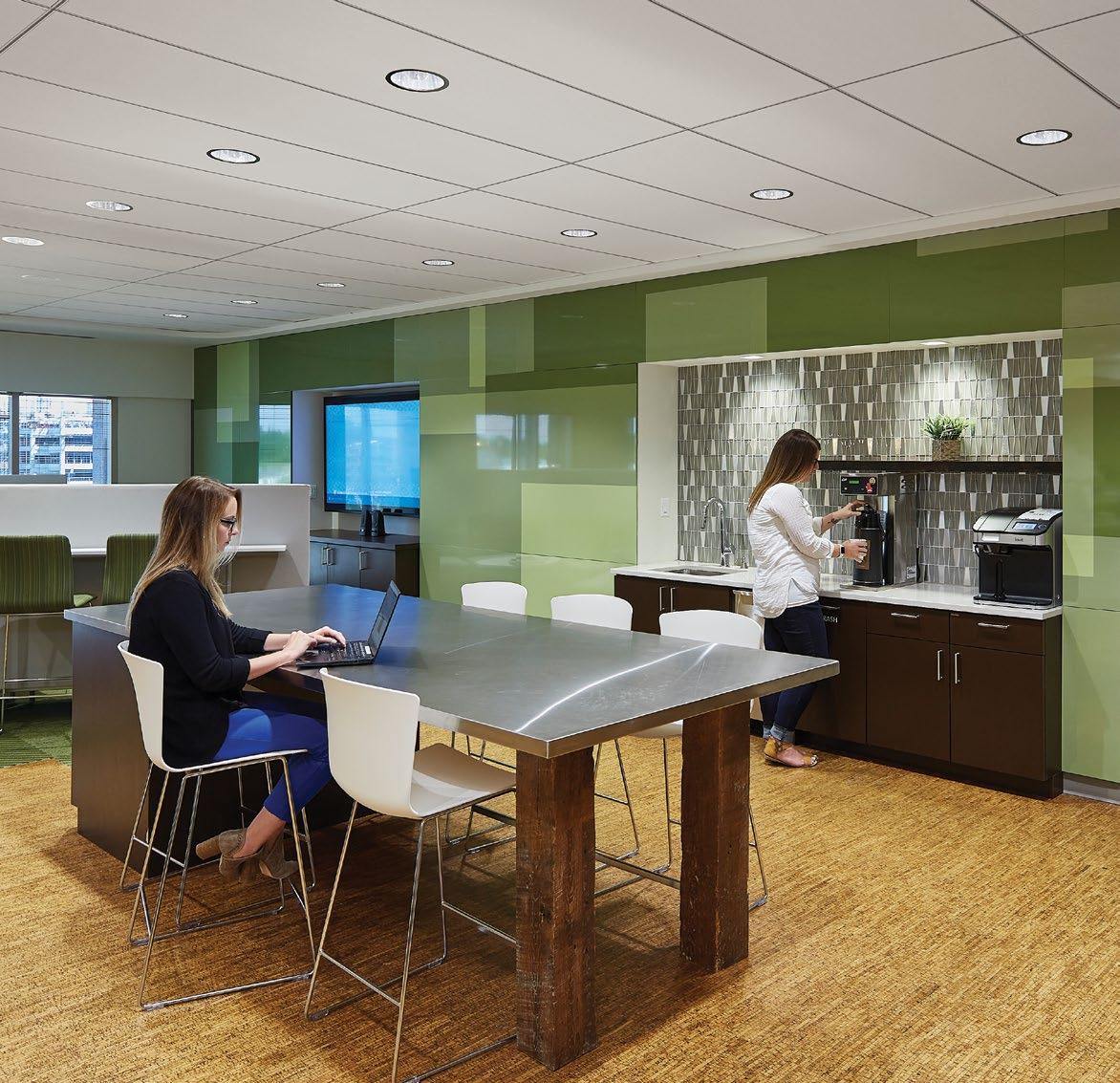
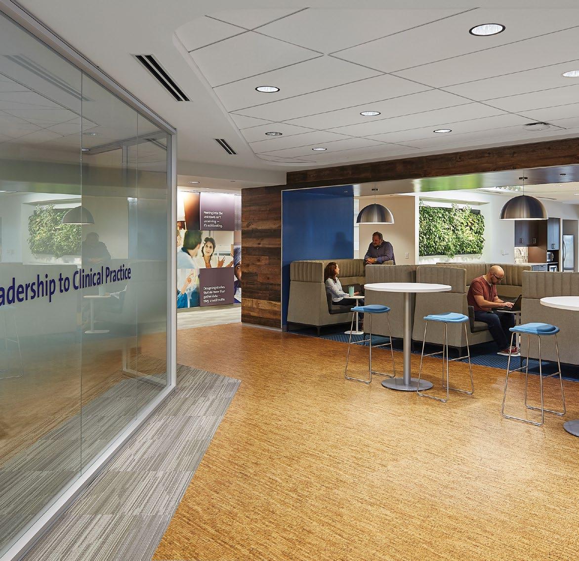
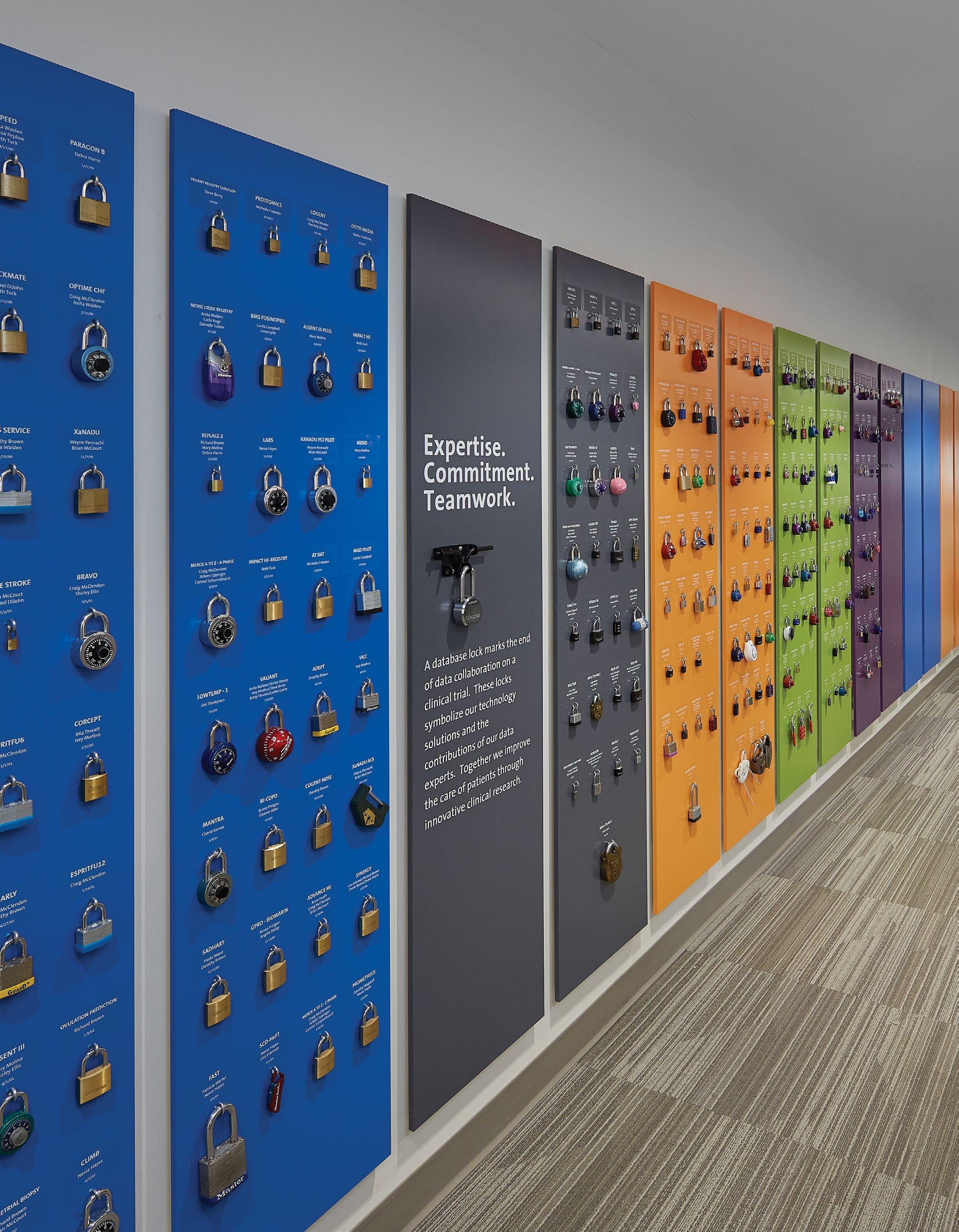
DUKE CLINICAL RESEARCH INSTITUTE Durham, NC
Re-Strategizing a Workplace
Duke Clinical Research Institute
asked Little for help in developing a pilot re-design of their workplace.
Their goals were to create a flexible, distinctive, inspirational and fun work environment that enabled collaboration, innovation and productivity, in hopes of connecting people and projects that impacted clinical research.
The office, home to researchers and scientists, was overwhelmingly proud of the patients and families their studies impacted, and wanted to show that in their space.
Modular patterns are picked-up again on a wall of custom millwork in the staff break area.
A modular mural mixes key values with images of research team and patients, depicting the full life of a typical research project.
The Key to Success
When a research project is complete, the team earns a lock to serve as their trophy. These locks have been collected for decades and are now proudly displayed alongside the name of the project and team responsible, with plenty of room for growth.
Where Faith & Healing Meet
FLORIDA HOSPITAL BEDFORD EXECUTIVE TOWER
Orlando, FL
A nod to both DNA and stained glass found in churches, custom screens were placed on each level, brought to life by natural light.
Hero Wall
Level 3
PLACEHOLDER IMAGE TO BE REPLACED BY FINAL PHOTOGRAPH NOTES:
Two Brands with One Goal
Located adjacent to the headquarters of its parent company, Adventist Health System, the Florida Hospital Bedford Executive Tower was designed to be the connection between the two brands, bringing to life the intersection of faith and healing. Photographic murals direct-printed to metal panels at main circulation areas.
Interior signage was designed to blend the architecture of the building with the existing exterior sign standard.
Materials, forms and colors tie together the finish palette with the brands.
Supergraphics in the stairwells were designed to align with the core values of the faith, promoting a healthy lifestyle.
The building’s lobby plays host to an interactive timeline featuring significant milestones throughout the hospital’s past and ending with an interactive display to highlight ongoing events and achievements in the future.
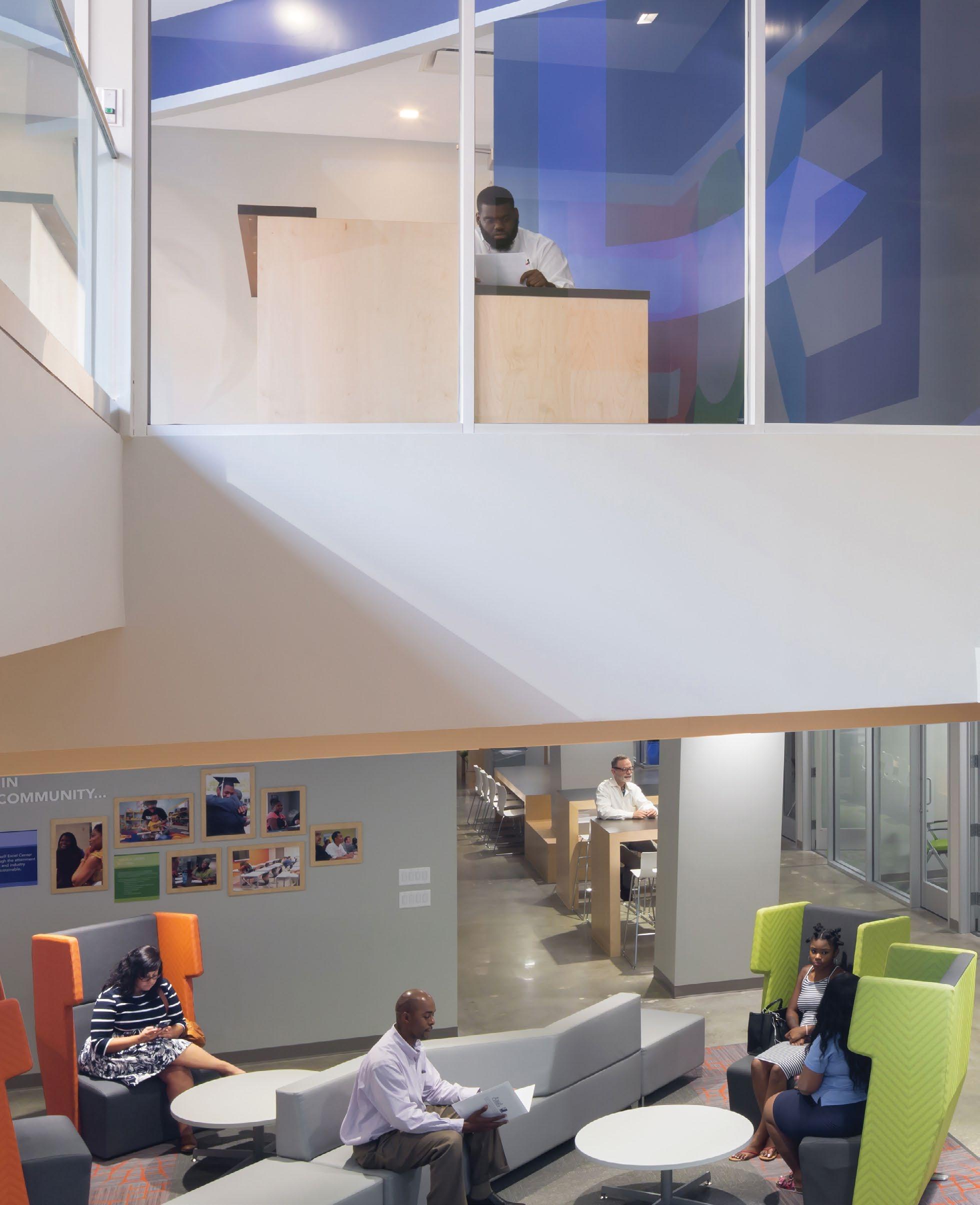
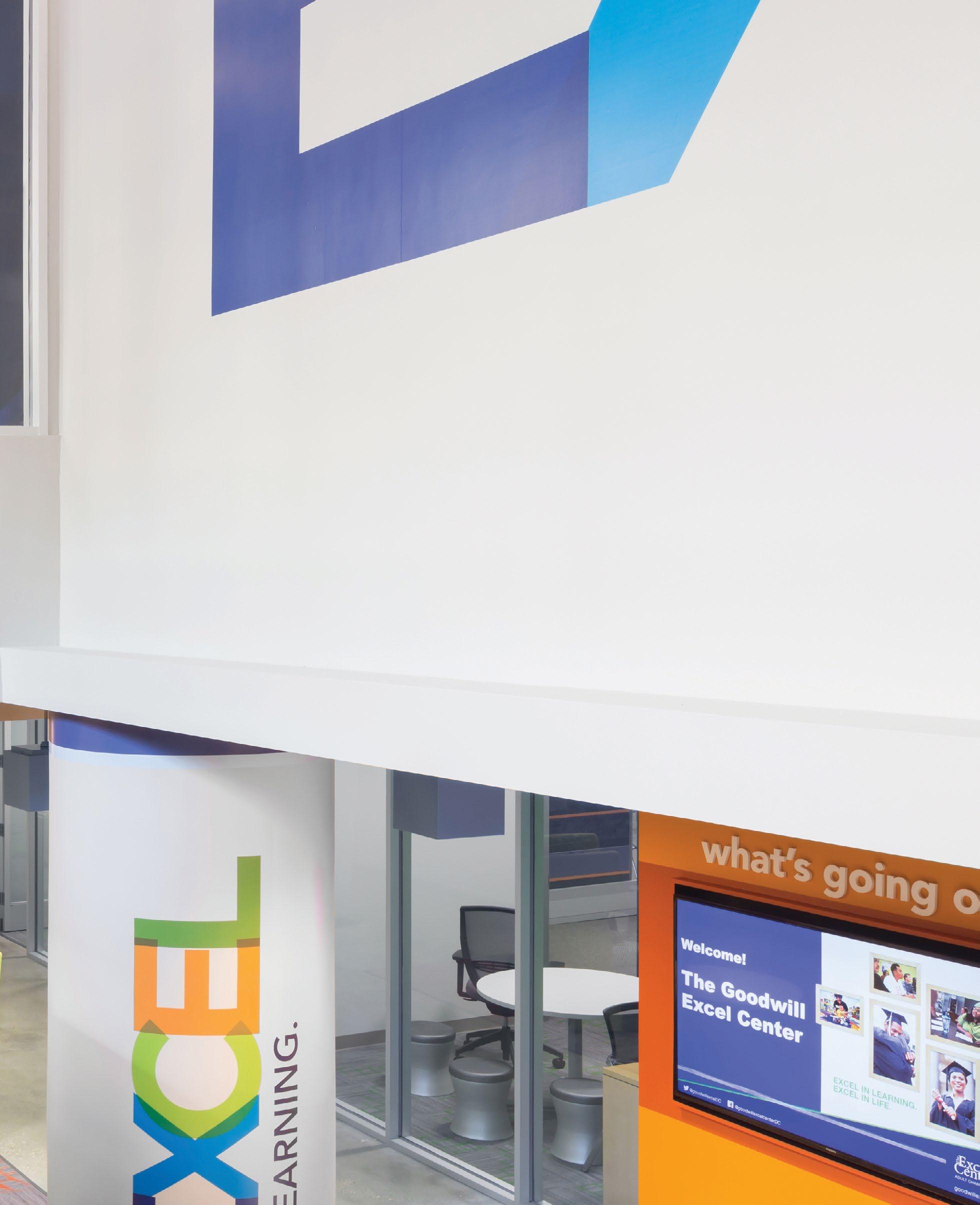
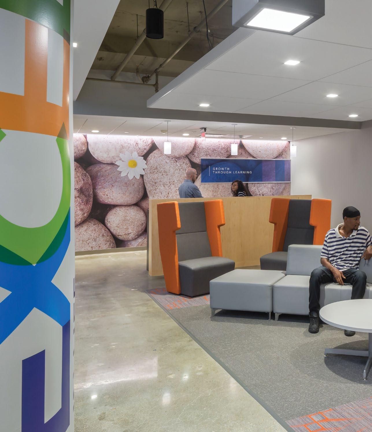
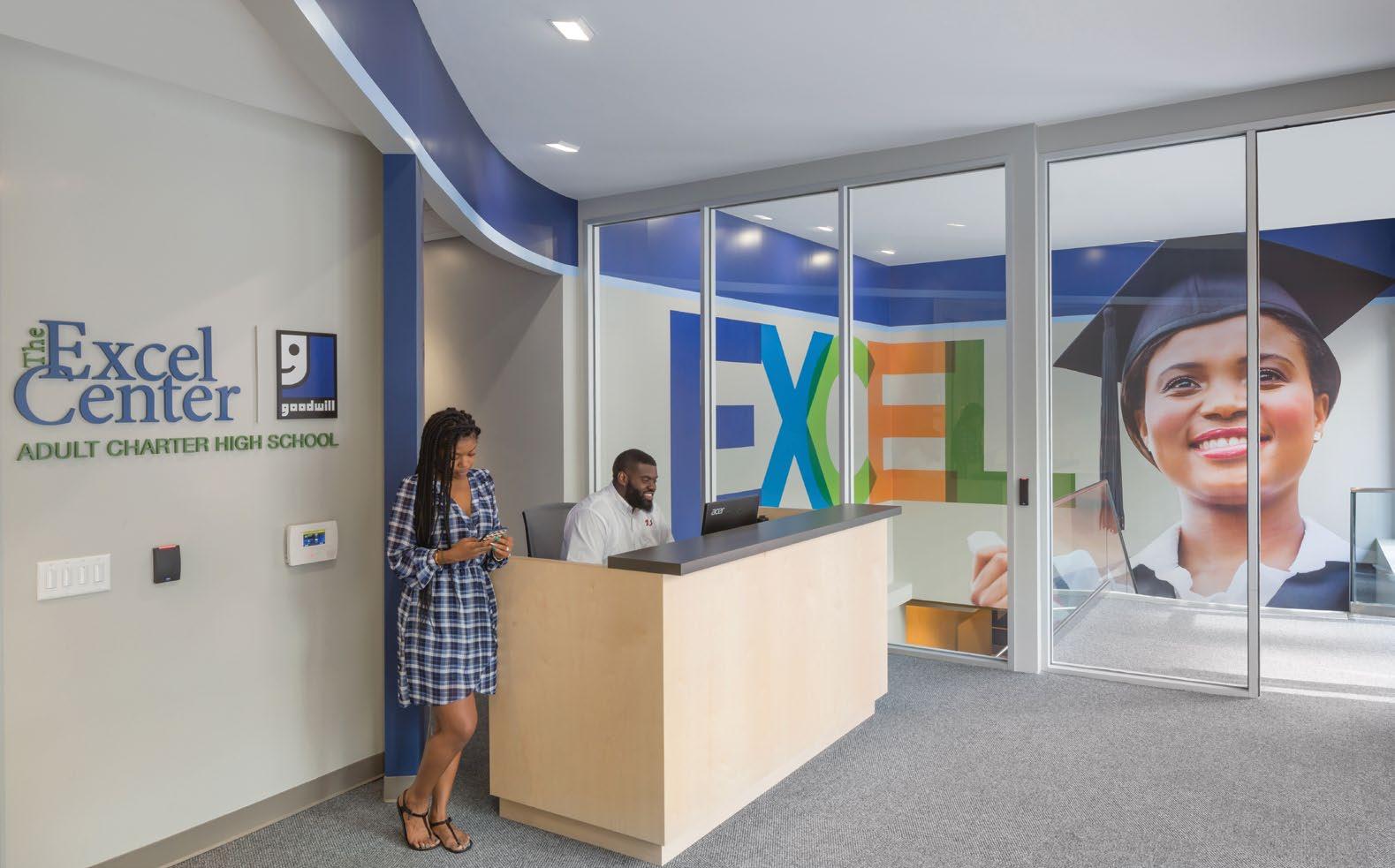
Excel in Learning
GOODWILL EXCEL CENTER
Washington, DC
A — Biophilic imagery and inspirational messaging inspire students and faculty.
B — Common spaces encourage a collaborative learning experience.
C — A two-story supergraphic projects the Goodwill Excel Center’s brand to the community
D — Large scale wayfinding uses color to activate the space.
Supporting Community
To promote Goodwill’s mission of supporting community wellness, the renovated space incorporates a number of sustainable and WELL building features to help reduce the building’s carbon footprint and increase the health and productivity. Additionally, the space includes biophilic and inspirational environmental graphics that inspire students to thrive.
In the heart of Durham
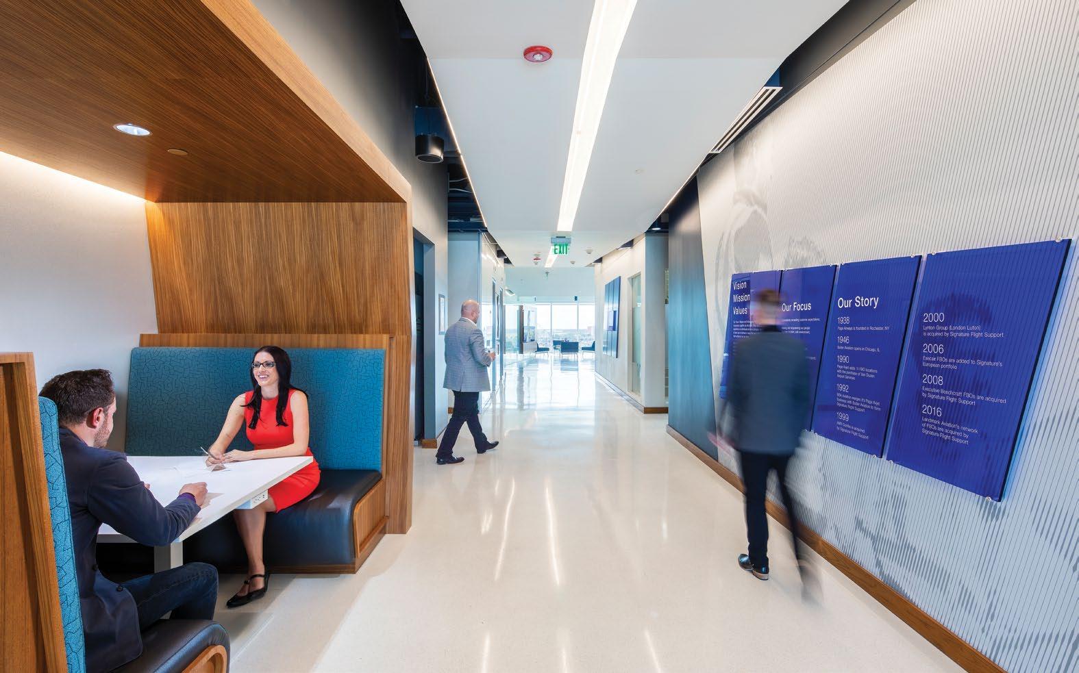
Flexible project displays create a second function out of screening elements designed to break-up the open workspace.
Great Location with History
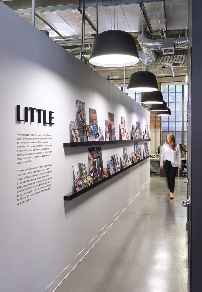
Durham’s American Tobacco District is known for its entrepreneurial and collaborative spirit, and our office sits right in the heart of it. Our Durham office has a work hard, play hard mentality, so it’s not surprising to find us at our office-wide monthly gatherings called the “Draughting” Table where we unwind and visualize the future of design.
Open Office Mural
A picture worth a thousand words
A tonal mural wraps around workstations and hugs Little’s office, filled with inside jokes and cultural cues from the firm’s 60 year legacy.
” “
A culture of collaboration.
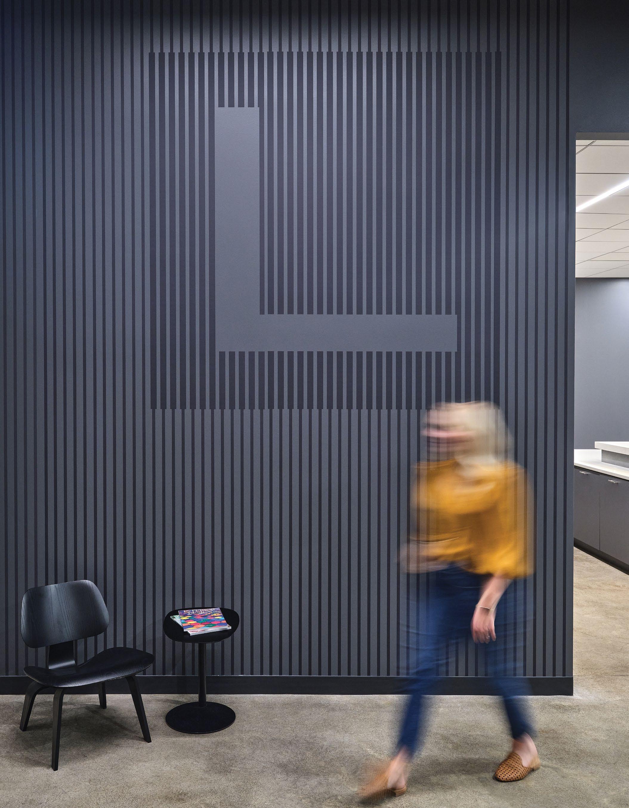
The linear pattern on the office’s largest conference room is designed to gradually be replaced with Little’s most prestigious award wins.
The City Beautiful
Driven by our HEWS.
The spatial framework of this office renovation is organized around specific areas of measurement related to Health, Energy, Water and Social concepts, or H.E.W.S. This framework served as the drivers of design, aligning with our support for, and championing of, the benchmark certification standards of WELL Building, LEED, and the petals of the Living Building Challenge.
Little’s story begins there and is best told by experiencing the space and discovering the inextricable connections between the firm and our environments.
What’s in it for the other person?
Our founder, Bill Little, compelled us to always consider, “What’s in it for the other person?” In designing our Orlando office and storytelling within around a goal we have for every project - to do good through regenerative design that achieves a successful balance between environmental, economic, and social factors - we like to think we’ve considered every other person.
By the people, for the people.
Little’s culture is on display in a changeable display of our design teams and their proudest project work.
A graphic mural becomes a backdrop to workstations, embedded with brand cues and stories of
Little’s Orlando office culture.
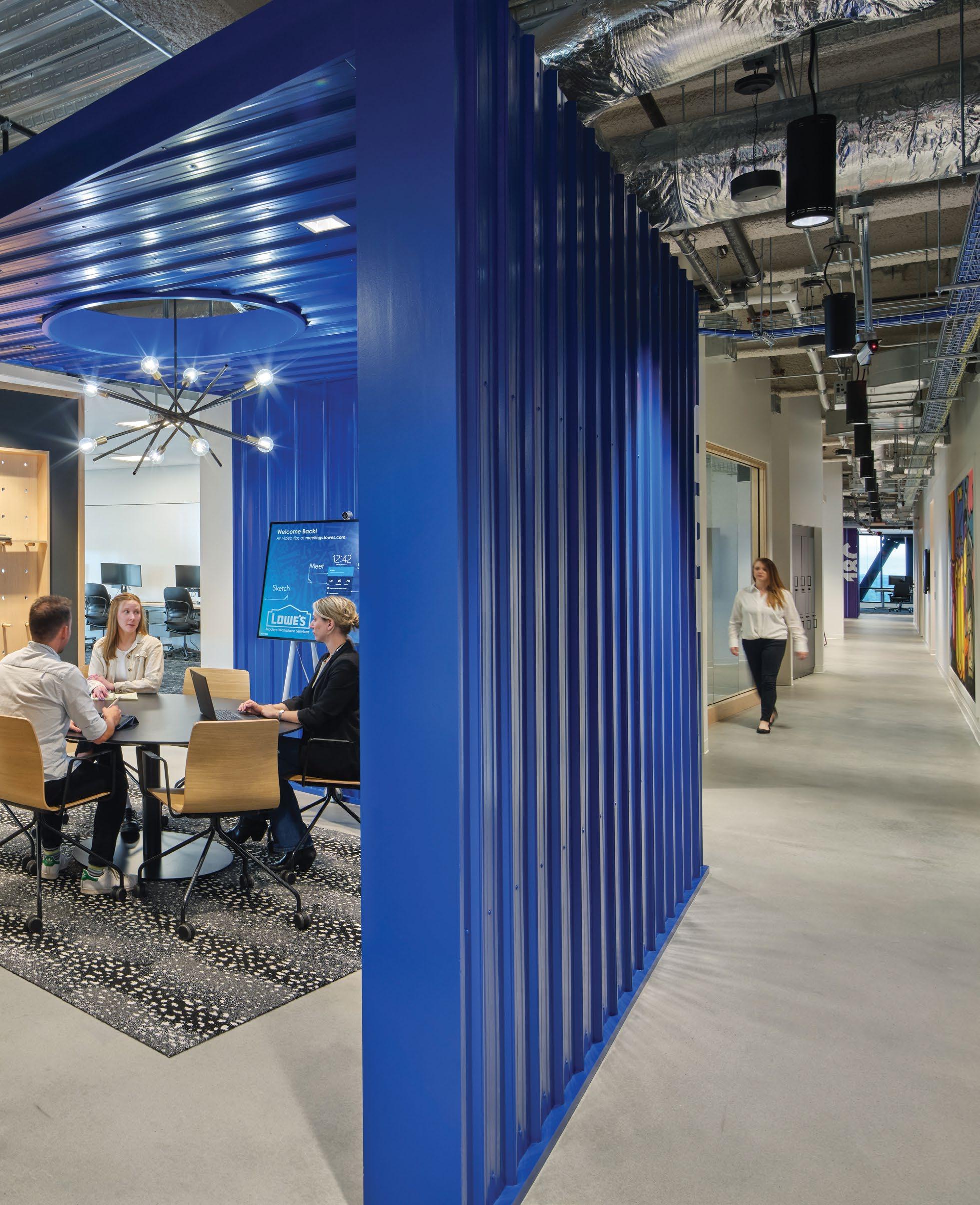
Where Hardware Meets Software.
Creating opportunities for unique experiences.
Lowe’s is a master resource, instilling and exuding confidence based on knowledge and expertise. Having been in the home improvement industry for over a century, Lowe’s engaged Little to create a transformational Global Technology Hub in Charlotte, North Carolina.
Through creative partnerships, a rich product story, and an innovate-ordie mindset, Lowe’s saw their vision come to life - a magnet for diverse technology talent and a neighborhood partner for the community.
DESIGN AWARDS
CORE Net Carolinas
Project of the Year >100K SF
Product as architecture.
Playful. Creative. Unexpected. Little’s Brand Experience Studio was tasked with bringing a connection to Lowe’s stores & products through unexpected moments of surprise.
The result is a family of environmental graphics and architectural elements that put a spin on home improvement products. The brand’s personality is embedded in hidden stories to discover, brought forward in creative, inventive wayfinding elements..
“Our biggest asset remains our associates. And what the building does is enable them to do their best work.”
SEEMANTINI GODBOLE Chief Information Officer and Executive VP, Lowe’s
Putting the details to work
Using product categories as wayfinding themes, each floor is adorned with a different mural illustrating families of tools that serves as both a consistent backdrop for meeting rooms but also a subtle cue in differentiating one level from another.
Rethinking the every day.
Keeping up with the times and continuing to evolve became a key message in the Lowe’s Tech Hub.
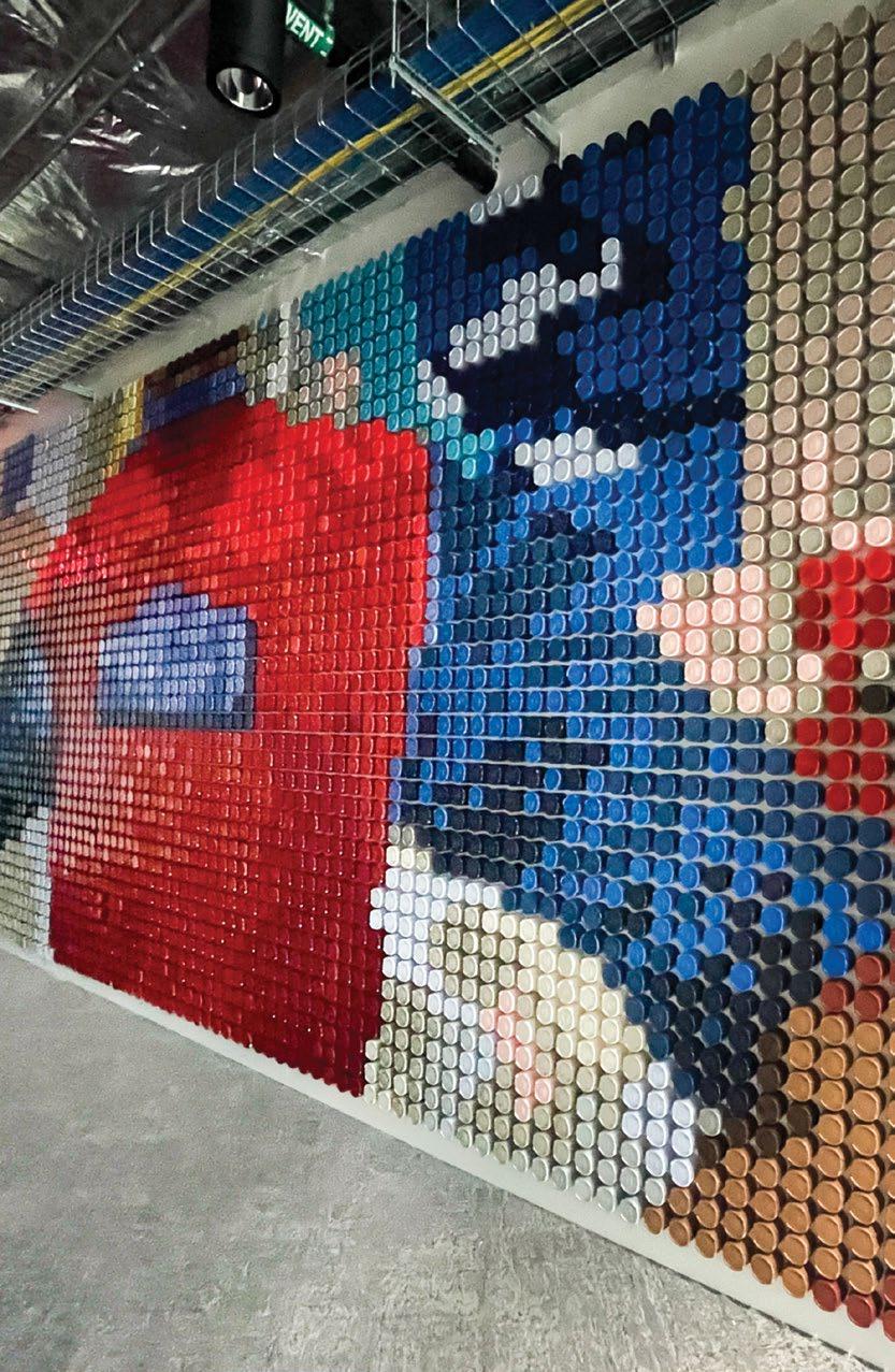
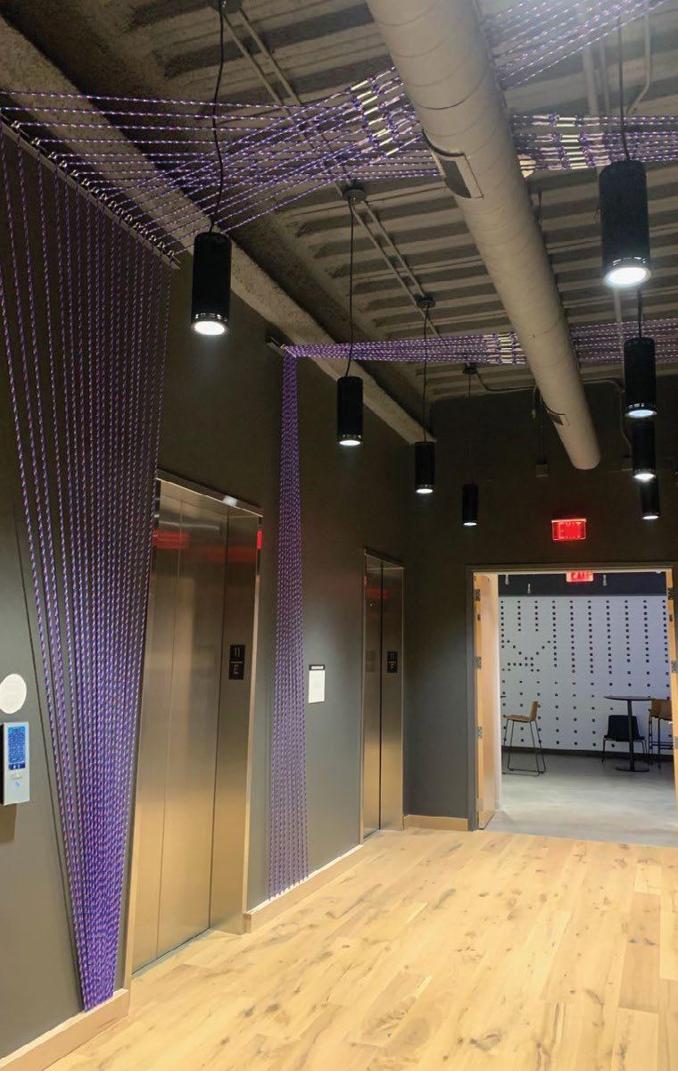
Thousands of dowel pins create a brand wall. Paracord in dozens of colors become wayfinding elements. Code written specifically for the Lowe’s website becomes a mural only the brightest employees can read. Unexpected uses of every day products guide users around every corner.
The iconic Lowe’s red vest comes to life via 5,000+ spray paint lids mounted to changeable hardware - an everevolving mural of product pixels.
Light switches become an interactive brand mark.
Black washers on steel pegs can be moved into different layouts, designs, icons.
An oversized logo becomes a warm super-sized backdrop.
Elevator
Uniting Brand with Architecture
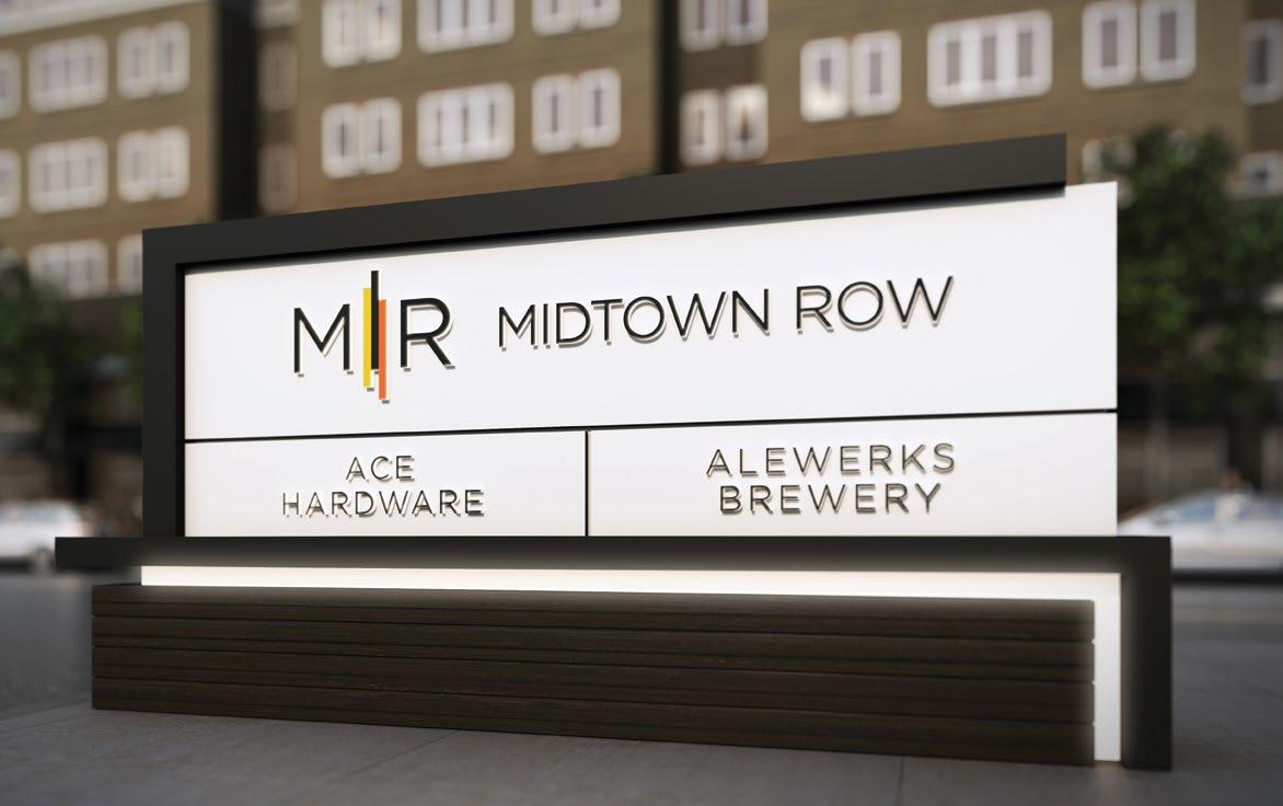
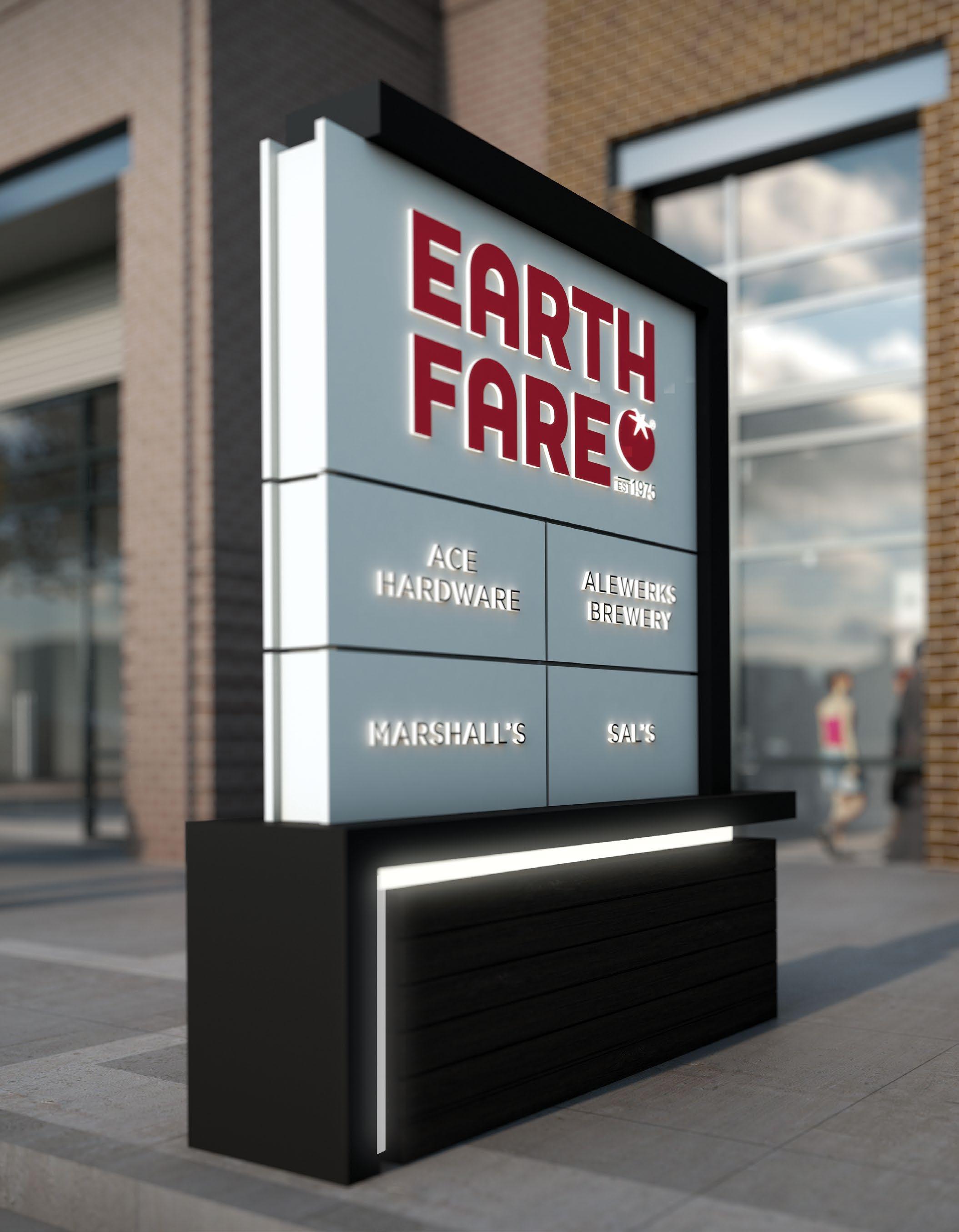
MIDTOWN ROW
Williamsburg, VA
An illuminated monument sign gives identity to the property at first glance.
Architectural Details
Materials, form and color from surrounding architecture are folded into the signage design to foster campus cohesion.
The signage for this mixed-use development needed to both identify the new community and draw visitors in. Little collaborated with our inhouse architects, the developer client, landscape architects and an out-of-house student housing architect in order to develop a signage program that would tie together disparate buildings.
MIDTOWN ROW
Little translated the client-provided brand identity on the left into the icon on the right so that the brand would best represent itself on monumental signage.
Architectural details are pulled from buildings across the development and incorporated into signage in order to unify the look and feel of Midtown Row.
MIDTOWN ROW
A horizontal orientation tenant sign was developed for oncoming perpendicular facing traffic.
Interchangeable panels allow for easy tenant signage updatability.
Lit accent bands flow through all signage, making them beacons for the development.
A Sense of Place
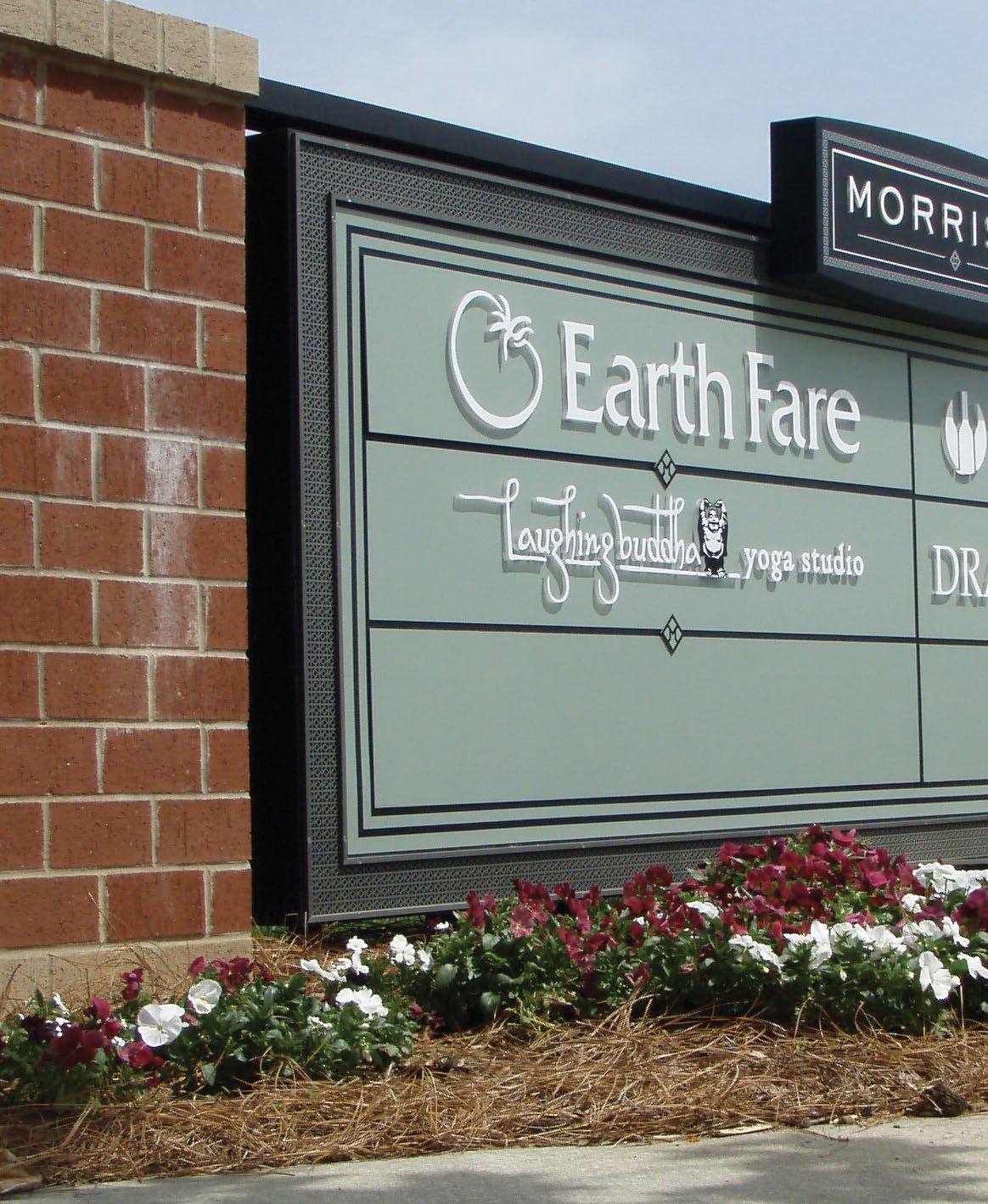
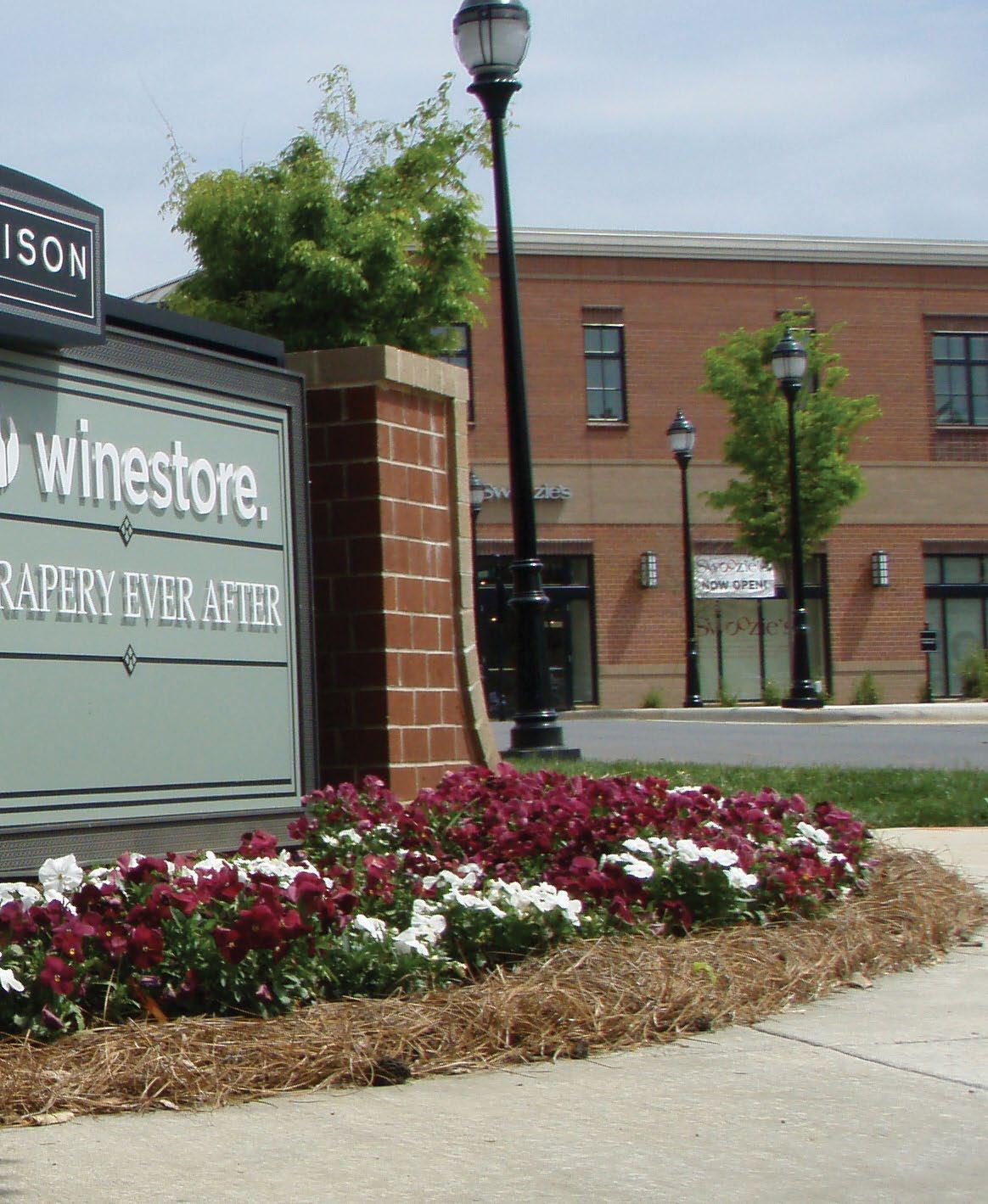
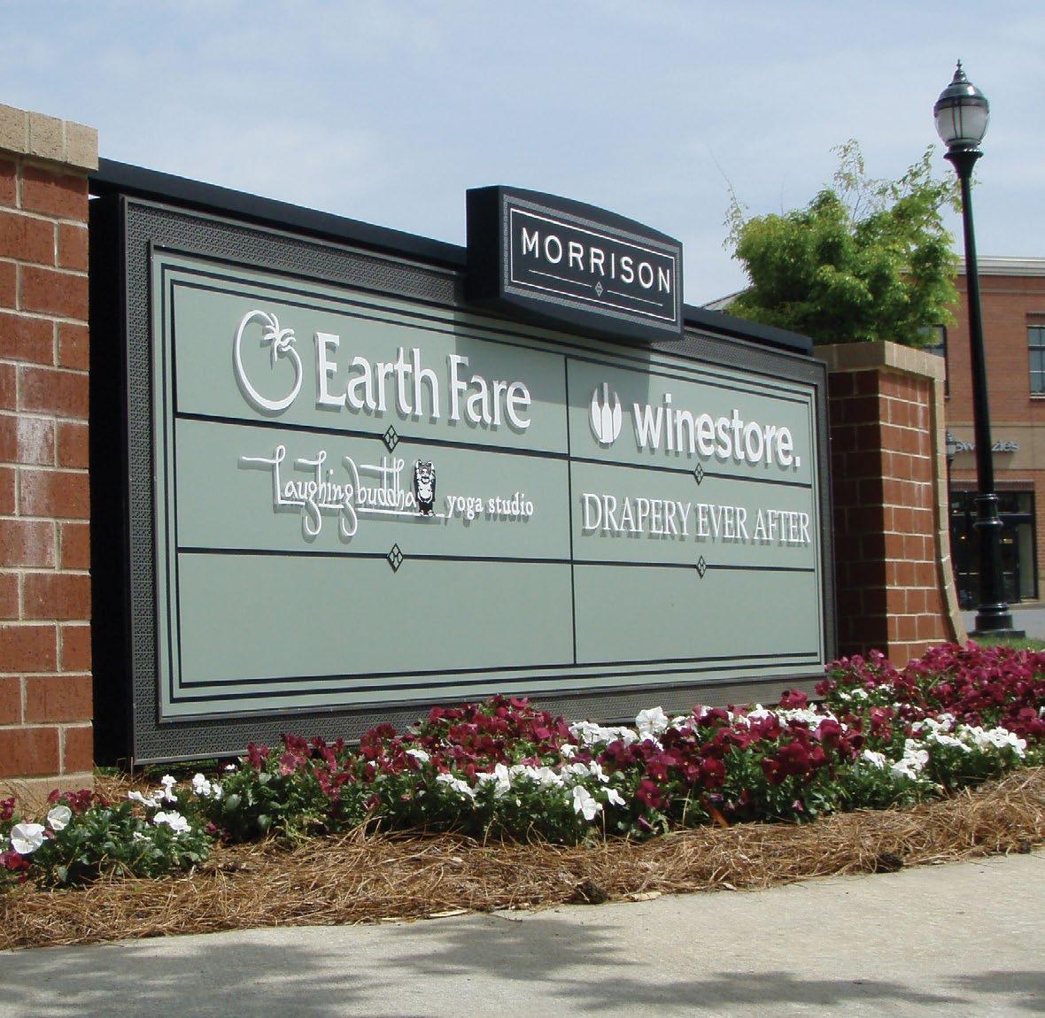
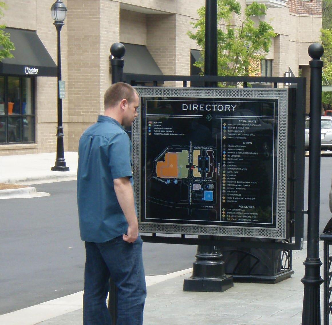
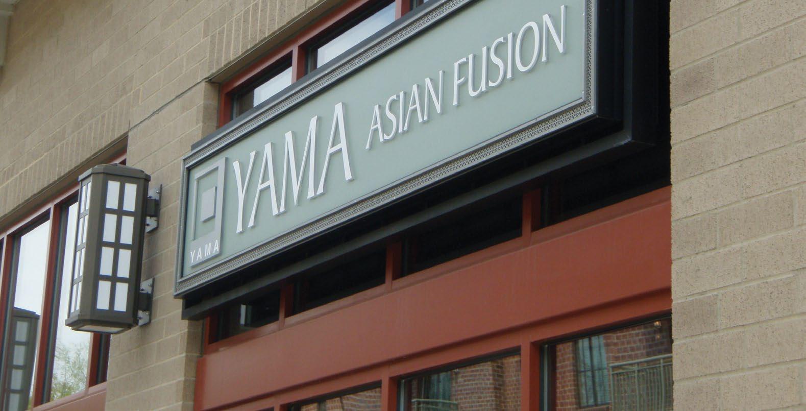
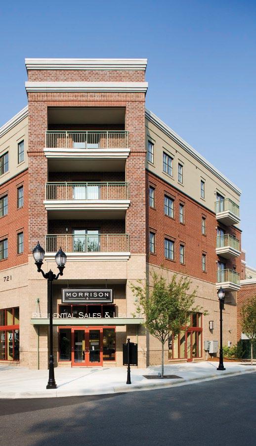
MORRISON MIXEDUSE DEVELOPMENT
Charlotte, NC
Signs use a refined material and color palette. Tenant signage standards were developed to maintain a coordinated look throughout the center.
Wayfinding through signs and maps helps visitors find their favorite destinations.
Distinctive and Unique
An
upscale and distinctive brand identity was used to differentiate the development within
the heart of trendy SouthPark neighborhood of Charlotte.
Little integrated multiple design disciplines— landscape architecture, engineering, architectural design and experiential graphics— with a unified vision to ensure that all design decisions reinforce Morrison’s brand principles.
Little’s Brand Experience team collaborated in the creation of a new brand identity, supported by experiential and wayfinding graphics systems including a detailed tenant criteria document to assure cohesion throughout the site.
B
Encourage Collaborative Learning
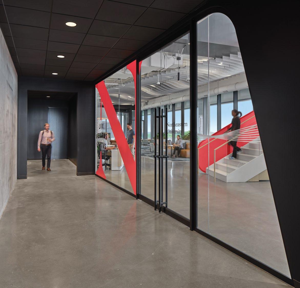
NORTHEASTERN UNIVERSITY
CHARLOTTE CAMPUS
Charlotte, NC
Reimagining The Campus Experience
A NEW HOME
Northeastern University boasts a renowned, experience-powered approach to learning and innovation. When its Center for Health Sciences moved from its Uptown location in the city’s financial district, the school knew it wanted to reimagine its campus experience.
ALLURING DESTINATION
Little crafted a transdisciplinary design solution that doubled down on modern, flexible environments where students and faculty could learn, socialize, and collaborate. This transformed a high-rise office space into a dynamic instructional space seamlessly integrated into the bustling South End neighborhood.
DESIGN AWARDS
American School & University Educational Interiors Showcase, Collegiate Citation
Charlotte Business Journal, Heavy Hitters, Finalist
Draws people to campus.
Overall, the new design reflects the spirit of NU and its surrounding community, creating a vibrant and welcoming space.
The facility is purposefully designed to entice both students and faculty to make use of it beyond regular school hours. The new design reflects the spirit of Northeastern and its surrounding community, creating a vibrant and welcoming space that sets up students for success in the healthcare field. Strengthening culture and community within the university by creating closer connections between students and faculty.
Northeastern university’s final interview question: “Can you deliver the most vibrant solutions we’ve never seen before?”
Little’s resposnse: “Yes, absolutely”
The stair design serves as a dynamic centerpiece that enriches the campus environment and enhances the educational experience.
Embedding Brand Identity
The space needed to feel like Northeastern, but in a new and exciting way. We used the Northeastern brand to bring the space to life, speaking the visual language of the university throughout.
The monumental stair at Northeastern University’s Charlotte Campus and the Cape Fear Valley Medical Center expansion—were honored for their outstanding achievements in creative design, technical innovation, best practices, and contributions to the public and the engineering profession.
Color-based destinations help users orient in the space.
Paint, wallcoverings and glazing film coordinate for a vibrant space.
Woven motifs tie together the eclectic South End personality with the Northeastern brand.
Eclectic flexibility
Incorporating references to the surrounding South End community throughout.
Housed within The Line building, the project transforms high-rise office space into dynamic instructional areas, serving over 400 students and providing multi-purpose educational and training spaces for nursing, speech pathology, and health sciences programs.
Adapting to the ever-evolving higher education learning landscape.
Unexpected patterns and oversized brand applications tie together the South End neighborhood and Northeastern University.
A red “ribbon” flows through the space, starting at the stairwell .
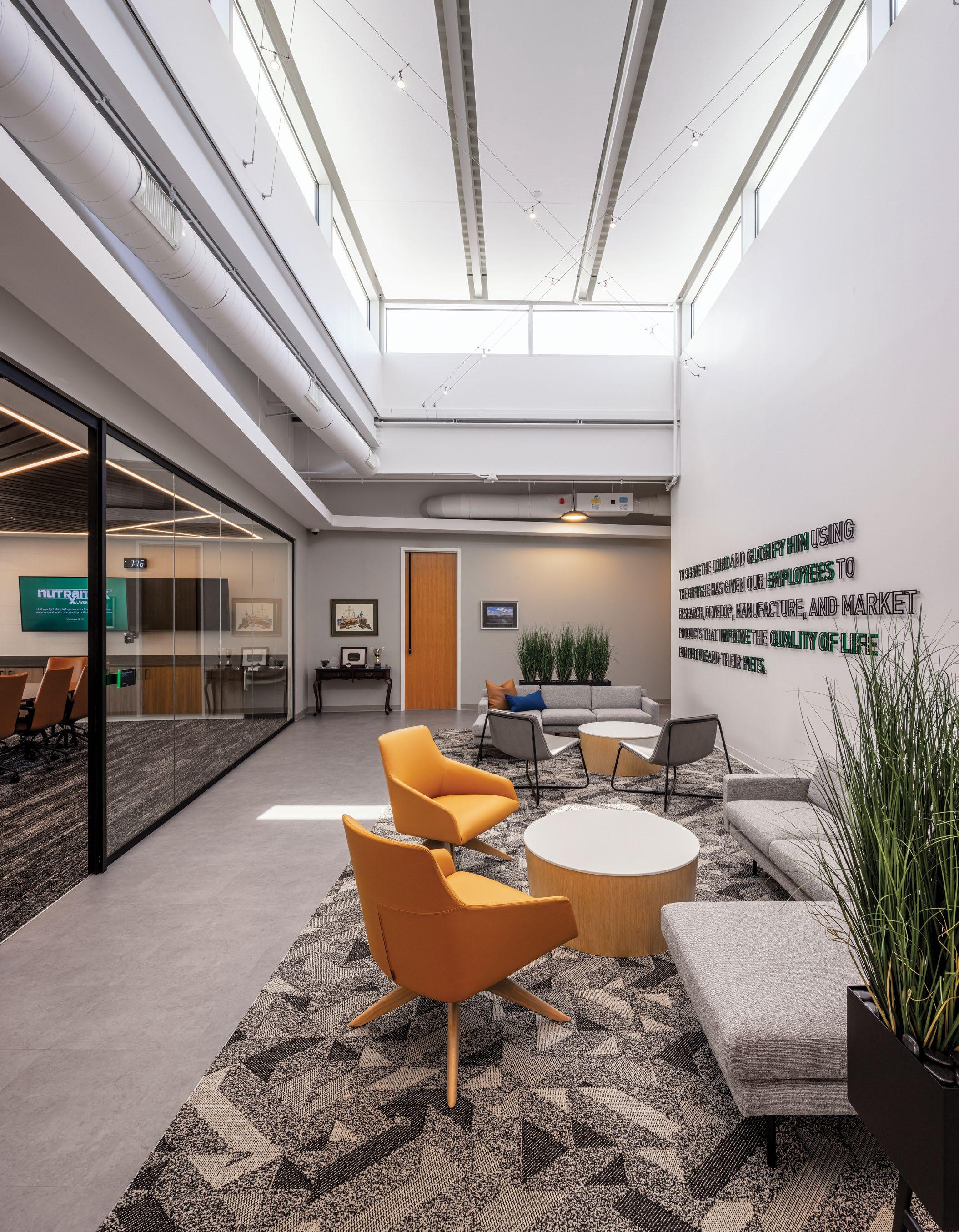
Quality of Life Faith, & Family
Exceeding the Standard
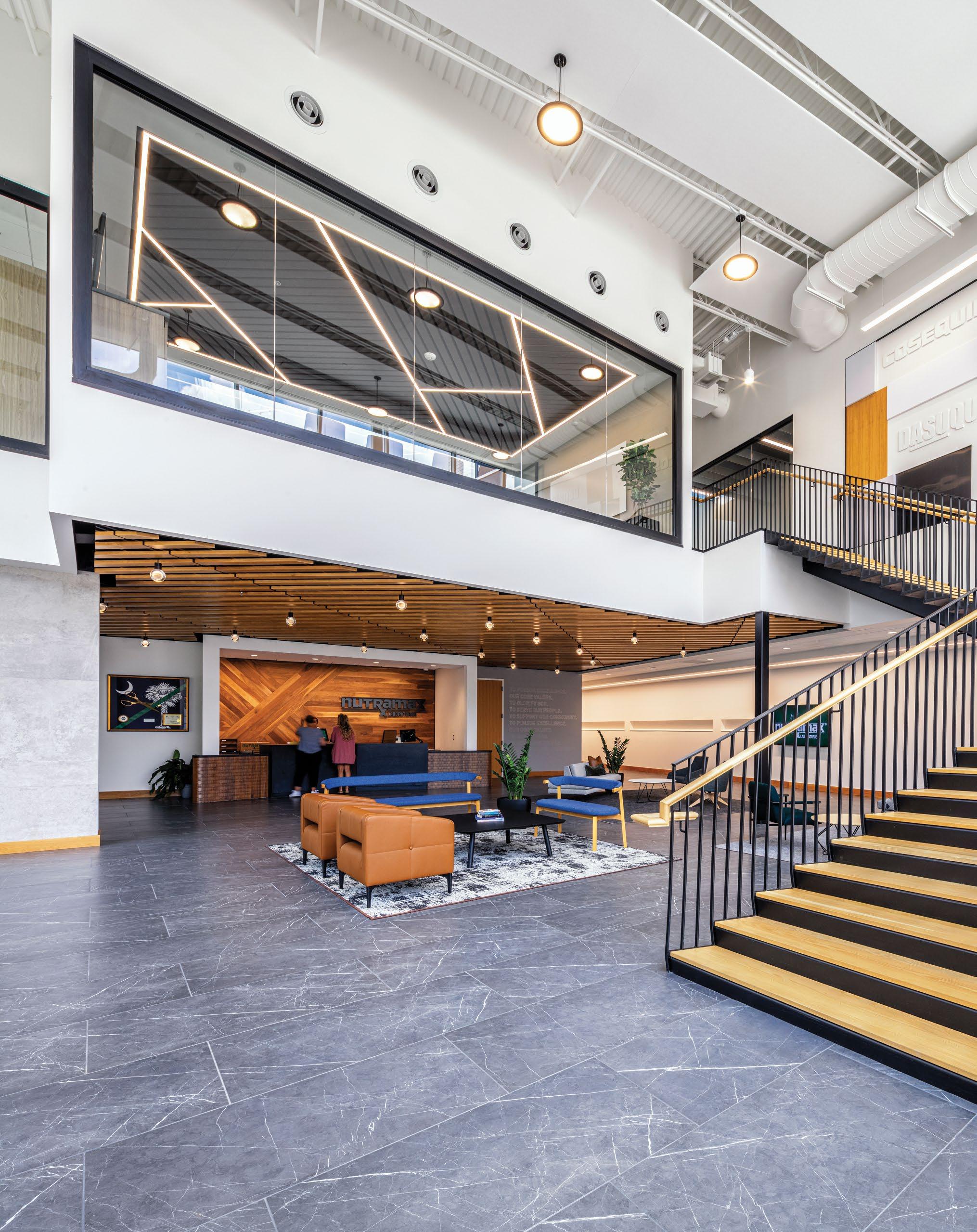
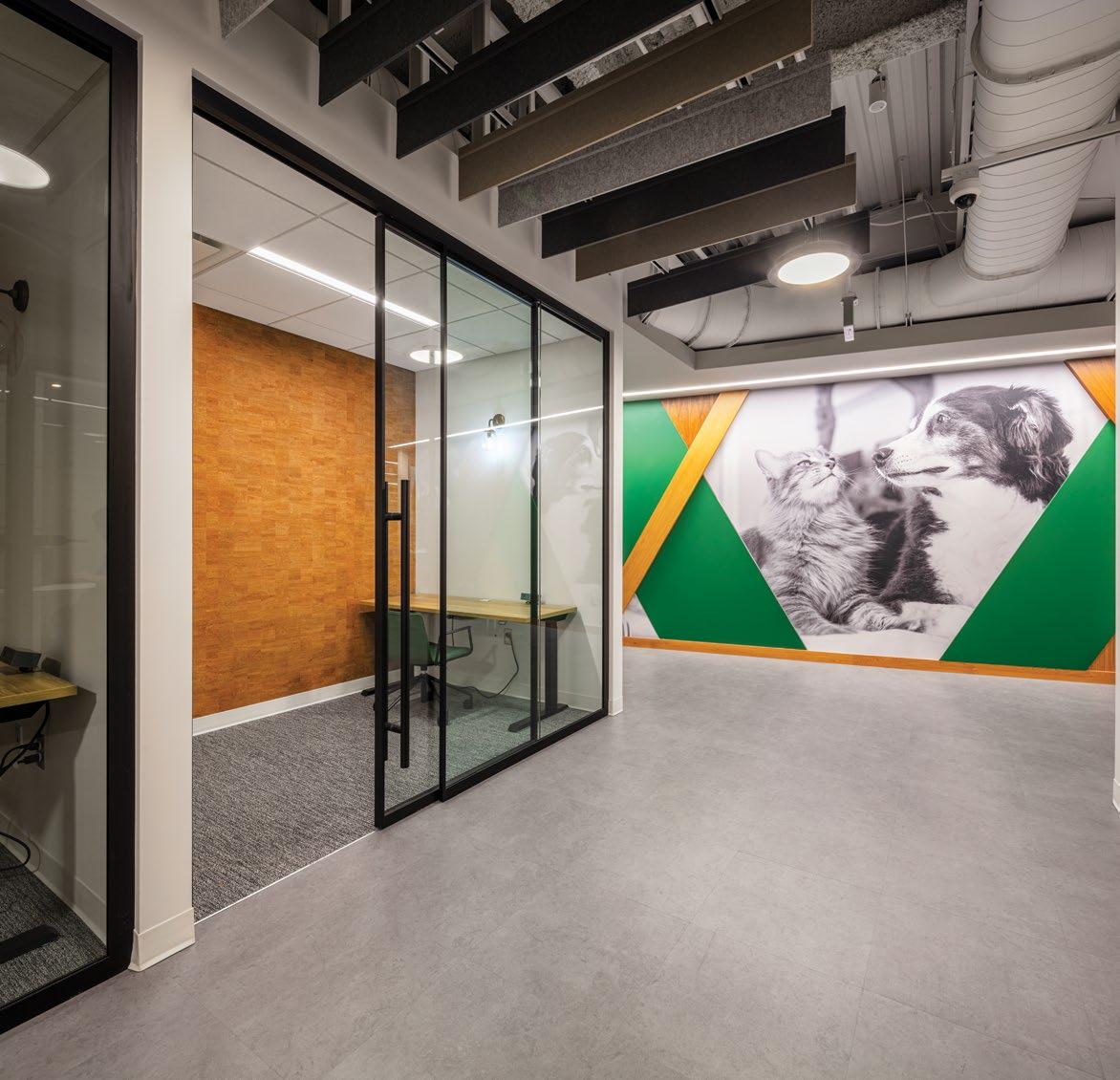
Branded graphics celebrate Nutramax’s rich history while also expanding into the future.
Amplifying core values.
Little integrated multiple design disciplines - architectural design, engineering and experiential graphics - with a unified vision of celebrating Nutramax’s core principles.
Experiential design celebrates how Nutramax fosters a spirit of faith, family and improving the quality of life for people and their pets.
Utilizing warm materials with accent graphics to highlight core brand values.
Graphics celebrate improving the quality of life for people and their pets.
The Epicenter for Dog Owners
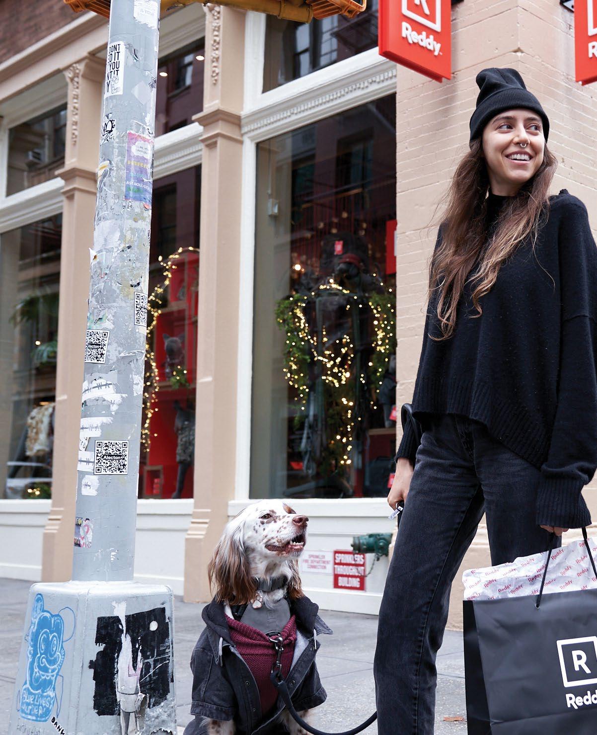
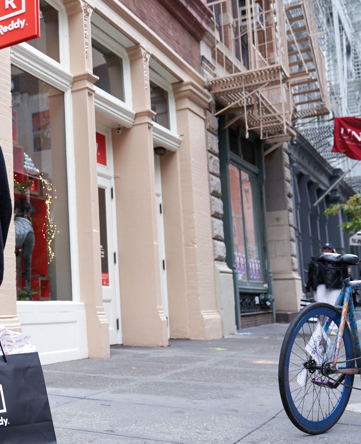
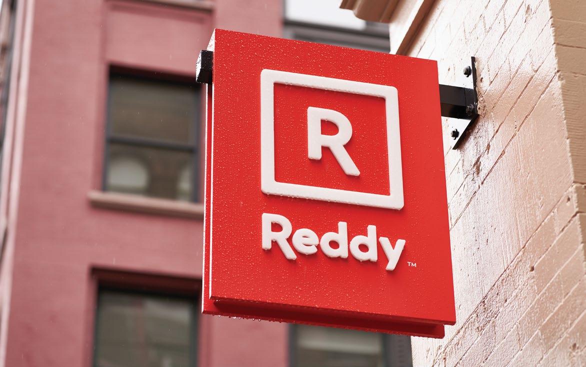
REDDY SOHO BY PETCO
New York, NY
A new urban basecamp.
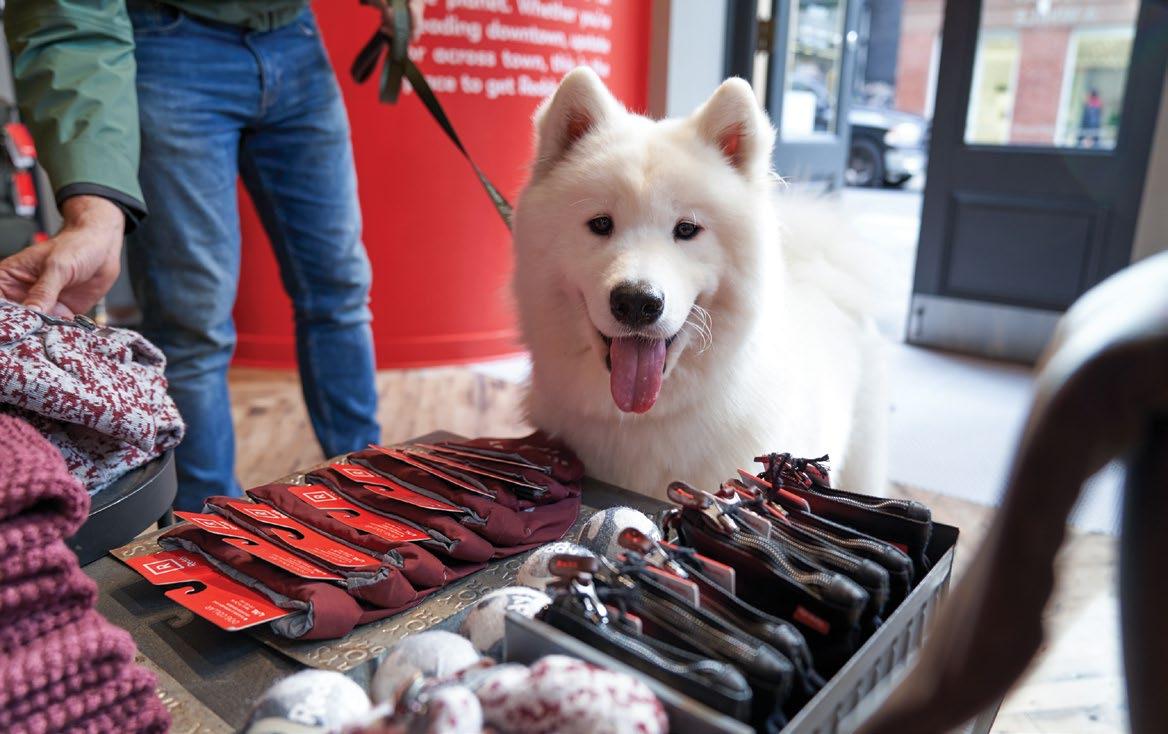
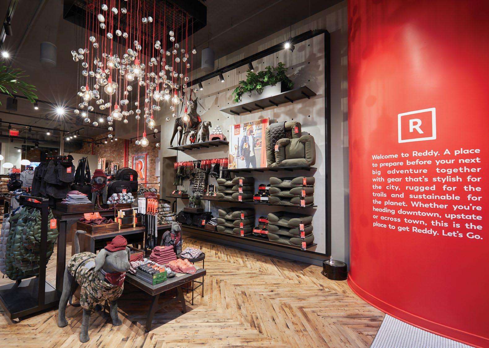
Reddy SoHo is the first concept flagship for Reddy, Petco’s lifestyle and fashion brand for dogs.
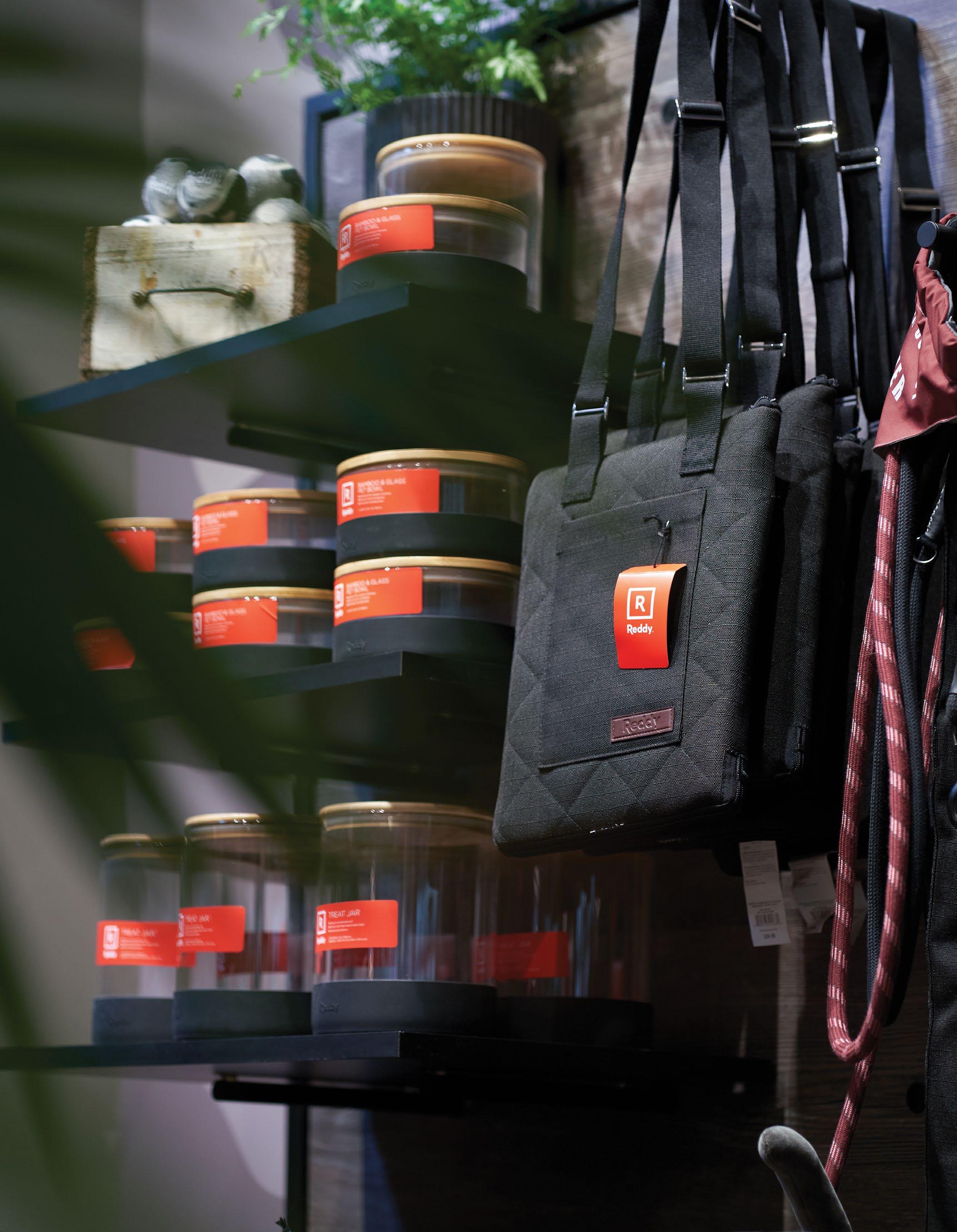
Located in Manhattan’s SoHo district, the new store has an urban boutique feel, with an industrial design complemented by Reddy’s signature bold color palette, patterns and textures. Designed to offer an elevated shopping experience, the store features Reddy merchandise and an array of exclusive, pet-centric experiences.
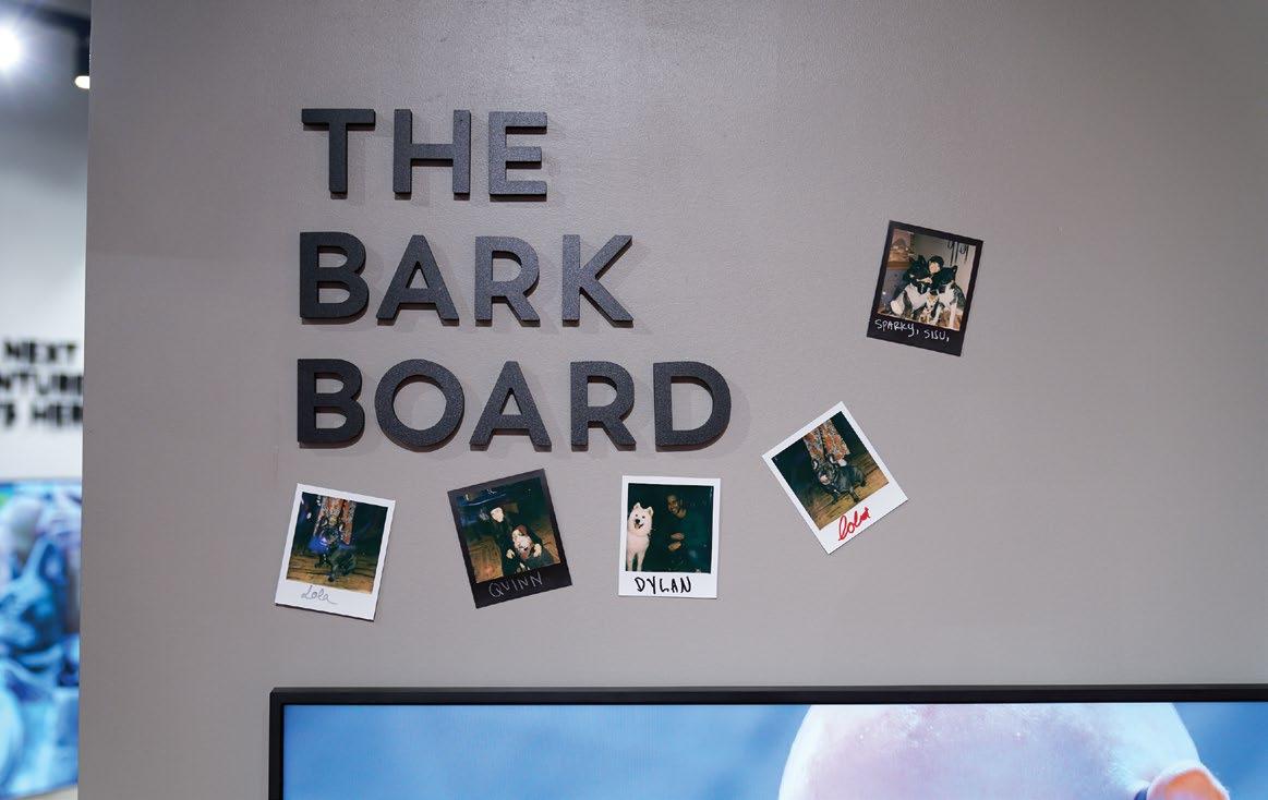
There are multiple store elements that integrate physical and digital. The dog fit station is the ideal spot for a selfie, creating a perfect Instagram moment with Reddy’s branded camo pattern and hashtag backdrop. Further into the store is the “Bark board” a Polaroid selfie wall and community exchange, a retro approach to sharing, beyond that point there is the “Adventure Concierge” a touchscreen terminal where dog owners have access to services and resources to plan the ideal adventure with their pets, friends or breed group.
Branded exterior ID signage introduces the new brand to the neighborhood.
The bark board encourages connections in the local community.
Store perimeter used for visual merchandising and storytelling.
A New Brand Experience
Multiple engaging store elements integrate physical and digital experiences. A focal wall as you enter serves as a call to action for the City’s proudest pet owners, the perfect introduction to a new brand.
A — Mission statement feature focal wall displayed prominently upon entry
B — Messaging with a touch of whimsy.
B
Wayfinding via supergraphics helps orient users immediately after getting off the elevators.
A Bright Future
In an effort to transform what they make, how they work, and the way they give back to the community, this legacy organization needed a major renovation to its 13-story urban corporate headquarters and adjacent plaza.
The design team immediately saw an opportunity to create a transformative workspace to foster innovation, collaboration, and connectedness
Semi-transparent scrims help divide circulation and lounge spaces.
View from elevator lobby.
Designing for the Future
The building’s workspace, designed to promote wellness, is open to allow more daylight and create views to the outdoors. Natural materials and textures add warmth and familiarity, while graphics are used to reinforce the company’s new brand and assist with wayfinding. For example, colorful brand drivers are inset into corners throughout the office, picking-up on brand values and unique color palettes.
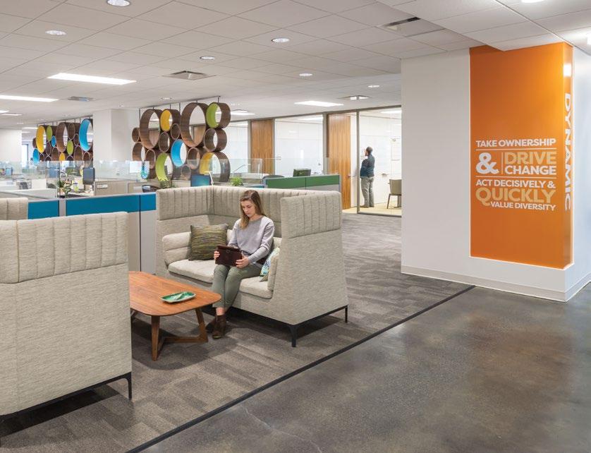
PASSIONATE PEOPLE ACCOUNTABILITY VISIONARY COLLABORATE AMBITIOUS RESPECT TRAILBLAZERS ORIGINALITY FRESH THINKING IMAGINATIVE UNEXPECTED DIVERSE ENGAGED UNCONVENTIONAL BOLD SUSTINABILITY HAVE FUN CREATIVE CONNECTED PURPOSEFUL CONFIDENT REWARDS DRIVE CHANGE INNOVATIVE OWNERSHIP LEADERSHIP DOING THE RIGHT THING ONE VOICE FAMILY OF COMPANIES CHALLENGE EACH OTHER PASSIONATE PEOPLE ACCOUNTABILITY VISIONARY COLLABORATE AMBITIOUS RESPECT TRAILBLAZERS ORIGINALITY FRESH THINKING IMAGINATIVE UNEXPECTED DIVERSE ENGAGED UNCONVENTIONAL BOLD SUSTINABILITY HAVE FUN CREATIVE CONNECTED PURPOSEFUL CONFIDENT REWARDS DRIVE CHANGE INNOVATIVE OWNERSHIP LEADERSHIP DOING THE RIGHT THING ONE VOICE FAMILY OF COMPANIES
CHALLENGE EACH OTHER PASSIONATE PEOPLE ACCOUNTABILITY VISIONARY COLLABORATE AMBITIOUS RESPECT TRAILBLAZERS ORIGINALITY FRESH THINKING IMAGINATIVE UNEXPECTED DIVERSE ENGAGED UNCONVENTIONAL BOLD SUSTINABILITY HAVE FUN CREATIVE CONNECTED PURPOSEFUL CONFIDENT REWARDS DRIVE CHANGE INNOVATIVE OWNERSHIP LEADERSHIP DOING THE RIGHT THING ONE VOICE FAMILY OF COMPANIES CHALLENGE EACH OTHER PASSIONATE PEOPLE ACCOUNTABILITY VISIONARY COLLABORATE AMBITIOUS RESPECT TRAILBLAZERS ORIGINALITY FRESH
11
HAVE FUN CREATIVE CONNECTED PURPOSEFUL CONFIDENT REWARDS DRIVE CHANGE INNOVATIVE OWNERSHIP LEADERSHIP DOING THE RIGHT THING ONE VOICE FAMILY OF COMPANIES CHALLENGE EACH OTHER PASSIONATE PEOPLE ACCOUNTABILITY VISIONARY COLLABORATE AMBITIOUS RESPECT TRAILBLAZERS ORIGINALITY FRESH THINKING IMAGINATIVE UNEXPECTED DIVERSE ENGAGED UNCONVENTIONAL BOLD SUSTINABILITY HAVE FUN CREATIVE CONNECTED PURPOSEFUL CONFIDENT REWARDS DRIVE CHANGE INNOVATIVE OWNERSHIP LEADERSHIP DOING THE RIGHT THING ONE VOICE FAMILY OF COMPANIES CHALLENGE EACH OTHER PASSIONATE PEOPLE ACCOUNTABILITY VISIONARY COLLABORATE AMBITIOUS RESPECT TRAILBLAZERS ORIGINALITY FRESH THINKING IMAGINATIVE UNEXPECTED DIVERSE ENGAGED UNCONVENTIONAL BOLD SUSTINABILITY HAVE FUN CREATIVE CONNECTED PURPOSEFUL CONFIDENT REWARDS DRIVE CHANGE INNOVATIVE OWNERSHIP LEADERSHIP DOING THE RIGHT THING ONE VOICE FAMILY OF COMPANIES CHALLENGE EACH OTHER PASSIONATE PEOPLE ACCOUNTABILITY VISIONARY COLLABORATE AMBITIOUS RESPECT TRAILBLAZERS ORIGINALITY FRESH
PASSIONATE PEOPLE ACCOUNTABILITY VISIONARY COLLABORATE AMBITIOUS RESPECT TRAILBLAZERS ORIGINALITY FRESH
THINKING IMAGINATIVE UNEXPECTED DIVERSE ENGAGED UNCONVENTIONAL BOLD SUSTINABILITY HAVE FUN CREATIVE CONNECTED PURPOSEFUL CONFIDENT REWARDS DRIVE CHANGE INNOVATIVE OWNERSHIP LEADERSHIP DOING THE RIGHT THING ONE VOICE FAMILY OF COMPANIES CHALLENGE EACH OTHER PASSIONATE PEOPLE ACCOUNTABILITY VISIONARY COLLABORATE AMBITIOUS RESPECT TRAILBLAZERS ORIGINALITY FRESH THINKING IMAGINATIVE UNEXPECTED DIVERSE ENGAGED UNCONVENTIONAL BOLD SUSTINABILITY HAVE FUN CREATIVE CONNECTED PURPOSEFUL CONFIDENT REWARDS DRIVE CHANGE INNOVATIVE OWNERSHIP LEADERSHIP DOING THE RIGHT THING ONE VOICE FAMILY OF COMPANIES CHALLENGE EACH OTHER PASSIONATE PEOPLE ACCOUNTABILITY VISIONARY COLLABORATE AMBITIOUS RESPECT TRAILBLAZERS ORIGINALITY FRESH THINKING IMAGINATIVE UNEXPECTED DIVERSE ENGAGED UNCONVENTIONAL BOLD SUSTINABILITY HAVE FUN CREATIVE CONNECTED PURPOSEFUL CONFIDENT REWARDS DRIVE CHANGE INNOVATIVE OWNERSHIP LEADERSHIP DOING THE RIGHT THING ONE VOICE FAMILY OF COMPANIES CHALLENGE EACH OTHER PASSIONATE PEOPLE ACCOUNTABILITY VISIONARY COLLABORATE AMBITIOUS RESPECT TRAILBLAZERS ORIGINALITY FRESH
PASSIONATE PEOPLE ACCOUNTABILITY VISIONARY COLLABORATE AMBITIOUS RESPECT TRAILBLAZERS ORIGINALITY FRESH THINKING IMAGINATIVE UNEXPECTED DIVERSE ENGAGED UNCONVENTIONAL BOLD SUSTINABILITY HAVE FUN CREATIVE CONNECTED PURPOSEFUL CONFIDENT REWARDS DRIVE CHANGE INNOVATIVE OWNERSHIP LEADERSHIP DOING THE RIGHT THING ONE VOICE FAMILY OF COMPANIES CHALLENGE EACH OTHER PASSIONATE PEOPLE ACCOUNTABILITY VISIONARY COLLABORATE AMBITIOUS RESPECT TRAILBLAZERS ORIGINALITY FRESH THINKING IMAGINATIVE UNEXPECTED DIVERSE ENGAGED UNCONVENTIONAL BOLD SUSTINABILITY HAVE FUN CREATIVE CONNECTED PURPOSEFUL CONFIDENT REWARDS DRIVE CHANGE INNOVATIVE OWNERSHIP LEADERSHIP DOING THE RIGHT THING ONE VOICE FAMILY OF COMPANIES
CHALLENGE EACH OTHER PASSIONATE PEOPLE ACCOUNTABILITY VISIONARY COLLABORATE AMBITIOUS RESPECT TRAILBLAZERS ORIGINALITY FRESH THINKING IMAGINATIVE UNEXPECTED DIVERSE ENGAGED UNCONVENTIONAL BOLD SUSTINABILITY HAVE FUN CREATIVE CONNECTED PURPOSEFUL CONFIDENT REWARDS DRIVE CHANGE INNOVATIVE OWNERSHIP LEADERSHIP DOING THE RIGHT THING ONE VOICE FAMILY OF COMPANIES CHALLENGE EACH OTHER PASSIONATE PEOPLE ACCOUNTABILITY VISIONARY COLLABORATE AMBITIOUS RESPECT TRAILBLAZERS ORIGINALITY FRESH
PASSIONATE PEOPLE ACCOUNTABILITY VISIONARY COLLABORATE AMBITIOUS RESPECT TRAILBLAZERS ORIGINALITY FRESH THINKING IMAGINATIVE UNEXPECTED DIVERSE ENGAGED UNCONVENTIONAL BOLD SUSTINABILITY HAVE FUN CREATIVE CONNECTED PURPOSEFUL CONFIDENT REWARDS DRIVE CHANGE INNOVATIVE OWNERSHIP LEADERSHIP DOING THE RIGHT THING ONE VOICE FAMILY OF COMPANIES CHALLENGE EACH OTHER PASSIONATE PEOPLE ACCOUNTABILITY VISIONARY COLLABORATE AMBITIOUS RESPECT TRAILBLAZERS ORIGINALITY FRESH THINKING IMAGINATIVE UNEXPECTED DIVERSE ENGAGED UNCONVENTIONAL BOLD SUSTINABILITY HAVE FUN CREATIVE CONNECTED PURPOSEFUL CONFIDENT REWARDS DRIVE CHANGE INNOVATIVE OWNERSHIP LEADERSHIP DOING THE RIGHT THING ONE VOICE FAMILY OF COMPANIES CHALLENGE EACH OTHER PASSIONATE PEOPLE ACCOUNTABILITY VISIONARY COLLABORATE AMBITIOUS RESPECT TRAILBLAZERS ORIGINALITY FRESH THINKING IMAGINATIVE UNEXPECTED DIVERSE ENGAGED UNCONVENTIONAL BOLD SUSTINABILITY HAVE FUN CREATIVE CONNECTED PURPOSEFUL CONFIDENT REWARDS DRIVE CHANGE INNOVATIVE OWNERSHIP LEADERSHIP DOING THE RIGHT THING ONE VOICE FAMILY OF COMPANIES CHALLENGE EACH OTHER PASSIONATE PEOPLE ACCOUNTABILITY VISIONARY COLLABORATE AMBITIOUS RESPECT TRAILBLAZERS ORIGINALITY FRESH
PASSIONATE PEOPLE ACCOUNTABILITY VISIONARY COLLABORATE AMBITIOUS RESPECT TRAILBLAZERS ORIGINALITY FRESH THINKING IMAGINATIVE UNEXPECTED DIVERSE ENGAGED UNCONVENTIONAL BOLD SUSTINABILITY HAVE FUN CREATIVE CONNECTED PURPOSEFUL CONFIDENT REWARDS DRIVE CHANGE INNOVATIVE OWNERSHIP LEADERSHIP DOING THE RIGHT THING ONE VOICE FAMILY OF COMPANIES CHALLENGE EACH OTHER PASSIONATE PEOPLE ACCOUNTABILITY VISIONARY COLLABORATE AMBITIOUS RESPECT TRAILBLAZERS ORIGINALITY FRESH THINKING IMAGINATIVE UNEXPECTED DIVERSE ENGAGED UNCONVENTIONAL BOLD SUSTINABILITY HAVE FUN CREATIVE CONNECTED PURPOSEFUL CONFIDENT REWARDS DRIVE CHANGE INNOVATIVE OWNERSHIP LEADERSHIP DOING THE RIGHT THING ONE VOICE FAMILY OF COMPANIES CHALLENGE EACH OTHER PASSIONATE PEOPLE ACCOUNTABILITY VISIONARY COLLABORATE AMBITIOUS RESPECT TRAILBLAZERS ORIGINALITY FRESH THINKING IMAGINATIVE UNEXPECTED DIVERSE ENGAGED UNCONVENTIONAL BOLD SUSTINABILITY HAVE FUN CREATIVE CONNECTED PURPOSEFUL CONFIDENT REWARDS DRIVE CHANGE INNOVATIVE OWNERSHIP LEADERSHIP DOING THE RIGHT THING ONE VOICE FAMILY OF COMPANIES CHALLENGE EACH OTHER PASSIONATE PEOPLE ACCOUNTABILITY VISIONARY COLLABORATE AMBITIOUS RESPECT TRAILBLAZERS ORIGINALITY FRESH
PASSIONATE PEOPLE ACCOUNTABILITY VISIONARY COLLABORATE AMBITIOUS RESPECT TRAILBLAZERS ORIGINALITY FRESH THINKING IMAGINATIVE UNEXPECTED DIVERSE ENGAGED UNCONVENTIONAL BOLD SUSTINABILITY HAVE FUN CREATIVE CONNECTED PURPOSEFUL CONFIDENT REWARDS DRIVE CHANGE INNOVATIVE OWNERSHIP LEADERSHIP DOING THE RIGHT THING ONE VOICE FAMILY OF COMPANIES CHALLENGE EACH OTHER PASSIONATE PEOPLE ACCOUNTABILITY VISIONARY COLLABORATE AMBITIOUS RESPECT TRAILBLAZERS ORIGINALITY FRESH THINKING IMAGINATIVE UNEXPECTED DIVERSE ENGAGED UNCONVENTIONAL BOLD SUSTINABILITY HAVE FUN CREATIVE CONNECTED PURPOSEFUL CONFIDENT REWARDS DRIVE CHANGE INNOVATIVE OWNERSHIP LEADERSHIP DOING THE RIGHT THING ONE VOICE FAMILY OF COMPANIES CHALLENGE EACH OTHER PASSIONATE PEOPLE ACCOUNTABILITY
The bright brand palette pops against the industrial interior. Murals match the wayfinding color palette.
ORIGINALITY FRESH THINKING IMAGINATIVE UNEXPECTED DIVERSE ENGAGED UNCONVENTIONAL BOLD SUSTINABILITY HAVE FUN CREATIVE CONNECTED PURPOSEFUL CONFIDENT REWARDS DRIVE CHANGE INNOVATIVE OWNERSHIP LEADERSHIP DOING THE RIGHT THING ONE VOICE FAMILY OF COMPANIES CHALLENGE EACH OTHER PASSIONATE PEOPLE ACCOUNTABILITY VISIONARY COLLABORATE AMBITIOUS RESPECT TRAILBLAZERS ORIGINALITY FRESH THINKING IMAGINATIVE UNEXPECTED DIVERSE ENGAGED UNCONVENTIONAL BOLD SUSTINABILITY HAVE FUN CREATIVE CONNECTED PURPOSEFUL CONFIDENT REWARDS DRIVE CHANGE INNOVATIVE OWNERSHIP LEADERSHIP DOING THE RIGHT THING ONE VOICE FAMILY OF COMPANIES CHALLENGE EACH OTHER PASSIONATE PEOPLE ACCOUNTABILITY VISIONARY COLLABORATE AMBITIOUS RESPECT TRAILBLAZERS ORIGINALITY FRESH THINKING IMAGINATIVE UNEXPECTED DIVERSE ENGAGED UNCONVENTIONAL BOLD SUSTINABILITY HAVE FUN CREATIVE CONNECTED PURPOSEFUL CONFIDENT REWARDS DRIVE CHANGE INNOVATIVE OWNERSHIP LEADERSHIP DOING THE RIGHT THING ONE VOICE FAMILY OF COMPANIES CHALLENGE EACH OTHER PASSIONATE PEOPLE ACCOUNTABILITY VISIONARY COLLABORATE AMBITIOUS RESPECT TRAILBLAZERS ORIGINALITY FRESH PASSIONATE PEOPLE ACCOUNTABILITY VISIONARY COLLABORATE AMBITIOUS RESPECT TRAILBLAZERS ORIGINALITY FRESH THINKING IMAGINATIVE UNEXPECTED DIVERSE
Department names and level identifiers became part of the interior architecture.
Local Connection
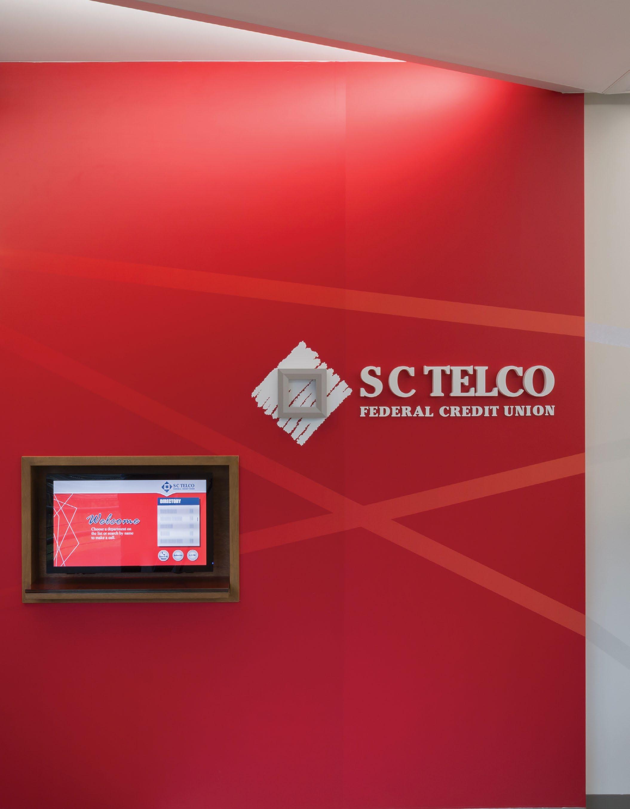
SC TELCO FEDERAL CREDIT UNION
Greenville, SC
The lobby introduces warm materials and the bright brand to visitors at this kiosk.
Bringing our values to life.
Originally started as a telephone company, SC Telco has evolved into a financially viable credit union committed to improving the lives of its members.
Paying homage to its roots, the interior and graphic design conceptually reference telephone poles, network wires and series of connections.
Angles inspired by telephone wires are picked up in everything from graphic films to custom millwork.
Graphic films utilize conceptual patterns and feature room names.
BRANDED GRAPHICS Environmental Graphics Concept 2
SC Telco didn’t want their core values hidden, their roots forgotten, or their employees to lose sight of why they’re so appreciated and crucial to the integrity of the company.
1 RED TRANSPARENT VINYL FILM APPLIED TO GLASS, SECOND SURFACE. COLOR TO MATCH PMS 186.
2 CUT VINYL COPY AND GRAPHIC APPLIED TO WALL, COLOR TO MATCH PMS 877.
3 1/4” REVEAL IN WALL TO END GRAPHIC WALLCOVERING AT LEFT EDGE.
4. 1” THICK DIMENSIONAL WHITE LETTERS, FLUSH-MOUNTED TO WALL. FINISH TO MATCH WALL BEHIND.
Local topography is picked-up on signage, murals depict some of the employees’ favorite things about coming to work, and new hires are prominently displayed on a wood slat wall as their colleagues get to know them.
5 TOPOGRAPHIC MAP GRAPHIC OF GREENVILLE, SC APPLIED TO PRINTED VINYL FILM. LINES IN GRAPHIC TO APPEAR CLEAR; RED TO MATCH ADJACENT FILM - RED TRANSPARENT, COLOR TO MATCH PMS 186.
126 NORTH ELEVATION
TELCO FEDERAL CREDIT UNION INITIAL CONCEPTS
GRAPHICS
1 GRAPHIC WALLCOVERING WITH COLOR, GRAPHIC, AND TEXT, APPLIED TO WALL. WALLCOVERING TO WRAP CORNER.
2 1/4” REVEAL IN WALL TO END GRAPHIC WALLCOVERING AT LEFT EDGE.
REVEAL IN WALL TO END GRAPHIC WALLCOVERING AT LEFT EDGE.
3 CUT VINYL COPY APPLIED TO WALL.
126 SOUTH ELEVATION
4 PRICING ALTERNATE : FULL GRAPHIC WALLCOVERING APPLIED TO WALL WITH COPY AND BACKGROUND COLOR INCLUDED.
Base building signage uses subtle patterns and brand colors.
New employee photos and bios are displayed on a wood slat wall.
Value Driven
One of SC Telco’s early requests as Little studied directions to take on brand focal walls was to make sure the company’s core values were proudly displayed and visible to visitors and staff.
Key circulation paths are adorned with bright reminders of the important attributes that set SC Telco apart from its competitors.
CHA M P I O N
Focus Toward the Future
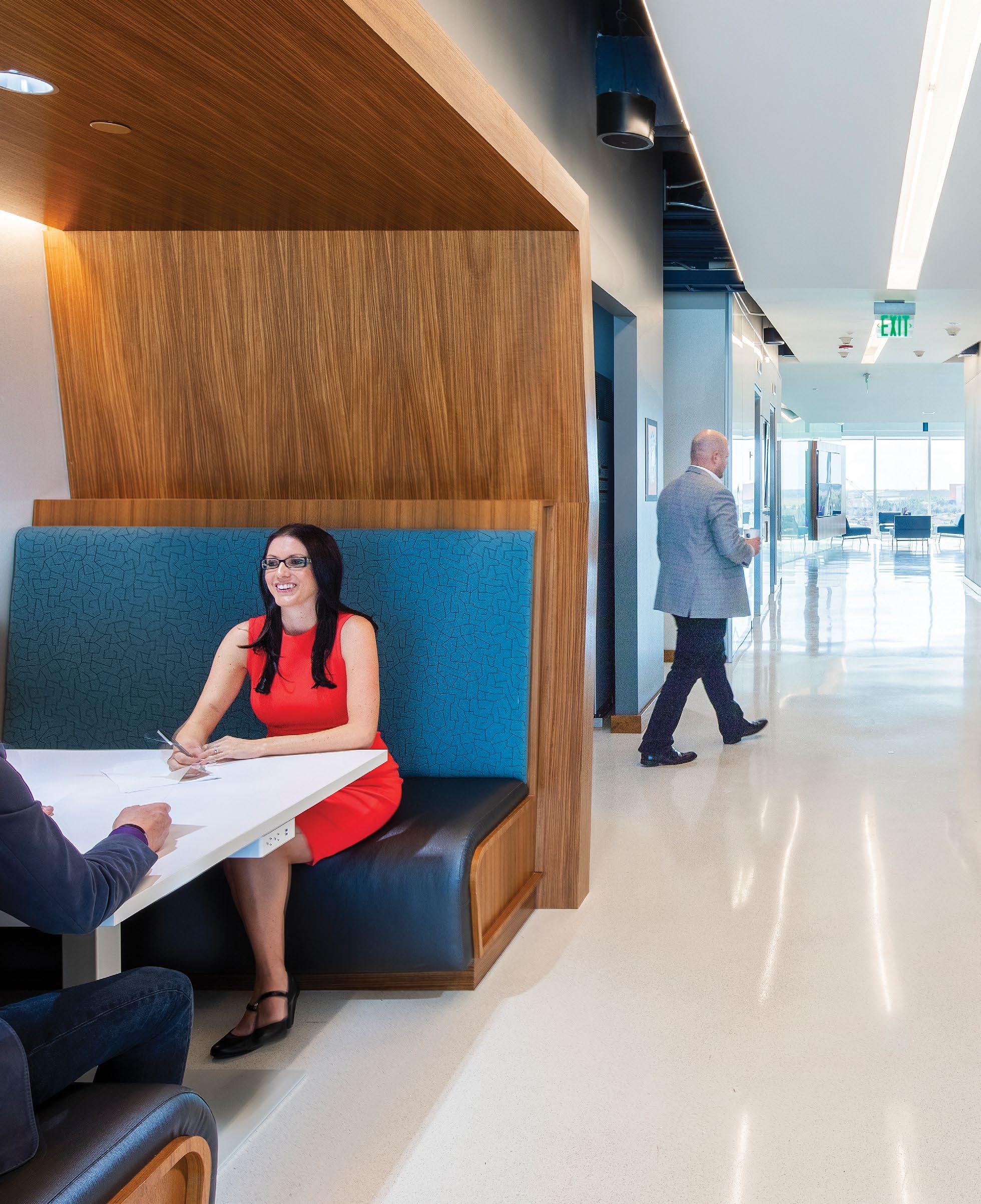
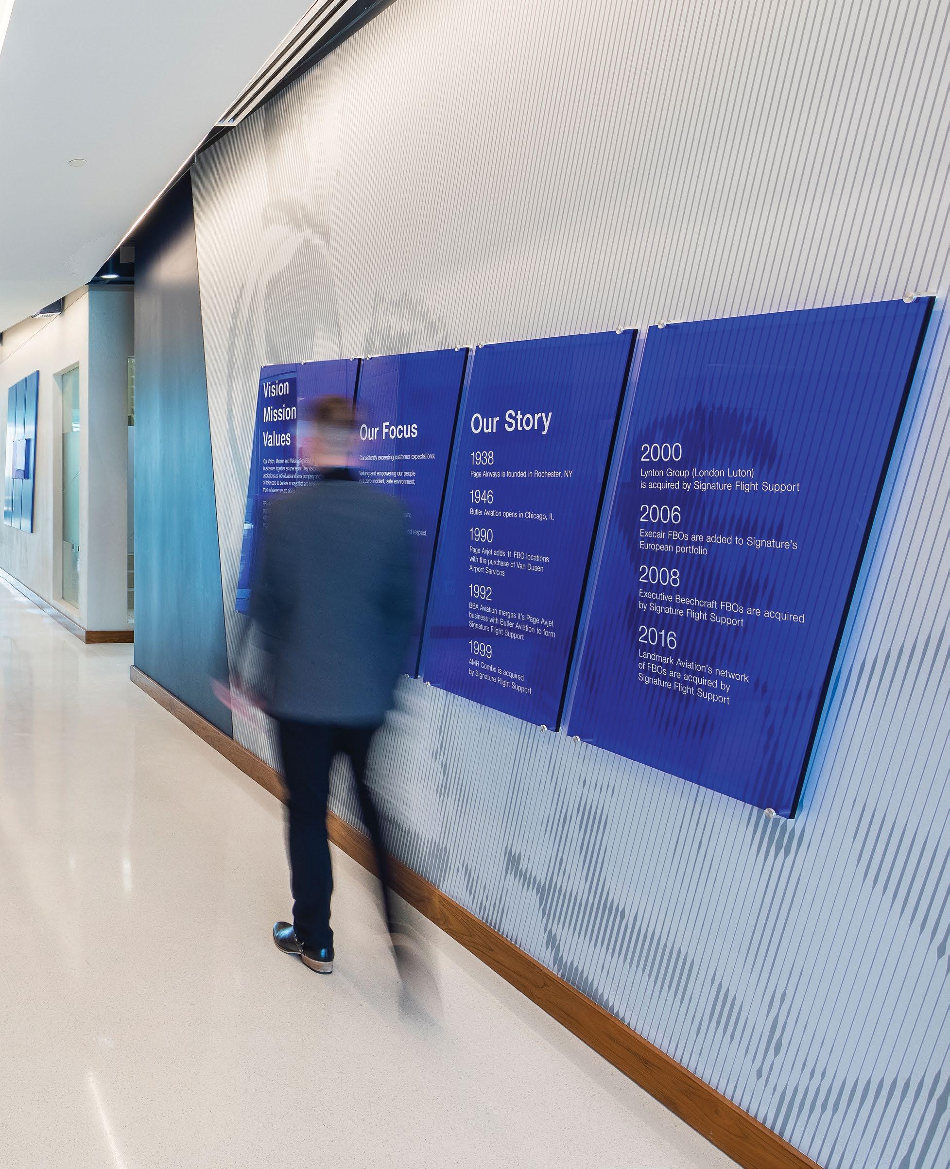
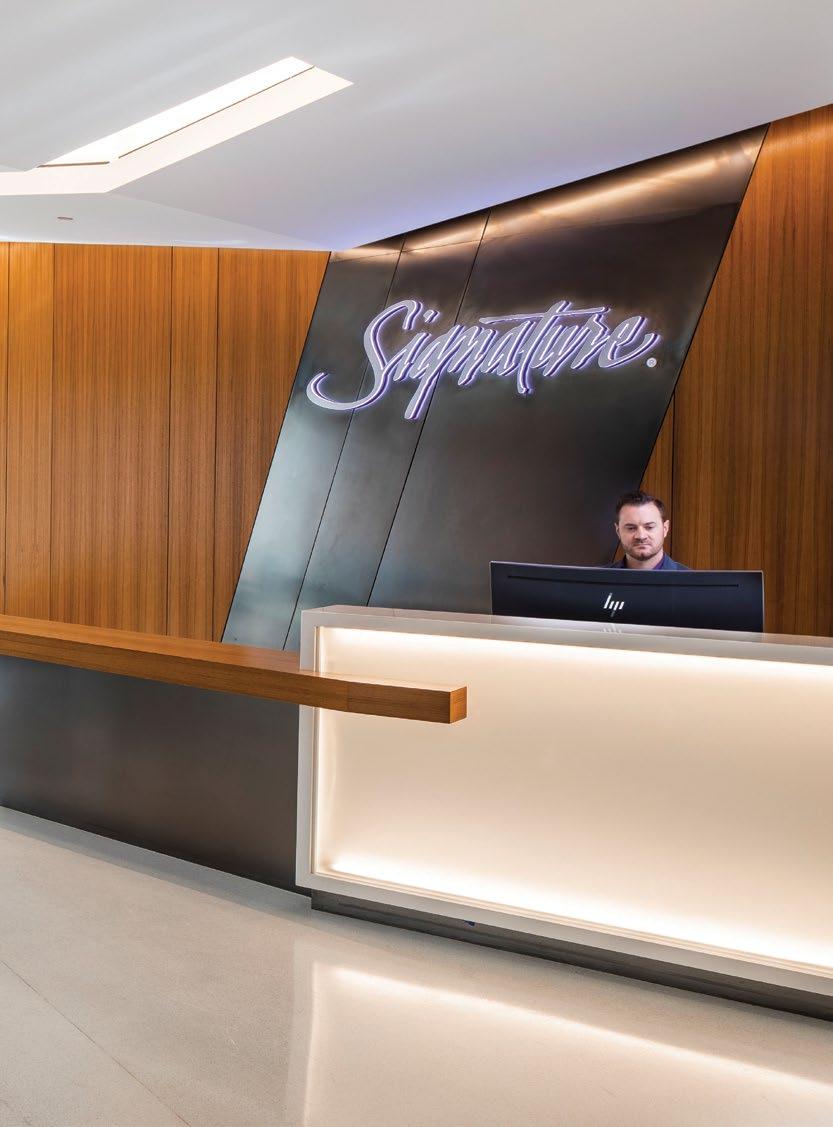
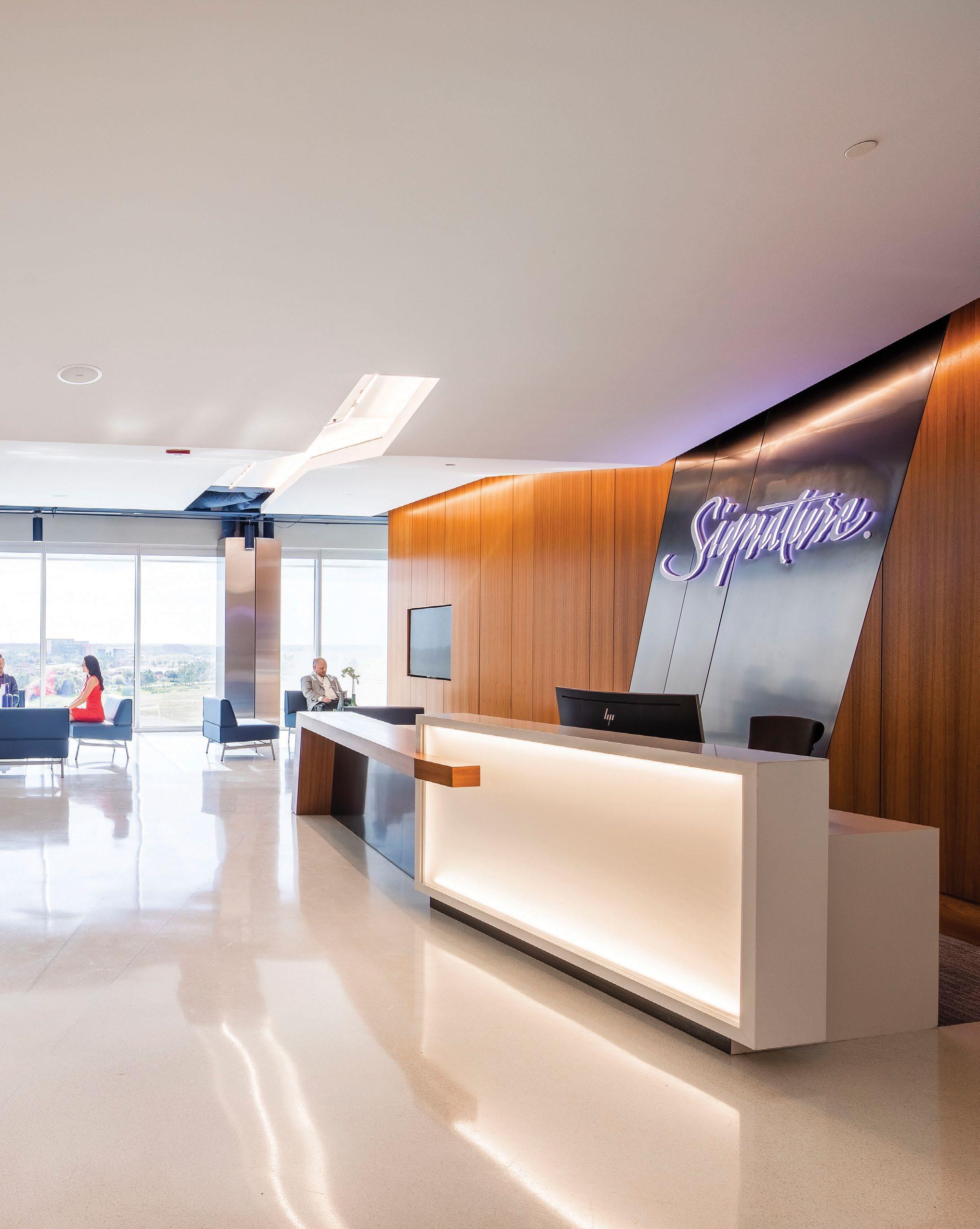
SIGNATURE FLIGHT SUPPORT
Orlando, FL
Signature Flight Support’s goal for their new HQ office was to free themselves from the association and history of their parent company, BBA (British Belting and Asbestos), and focus towards the future.
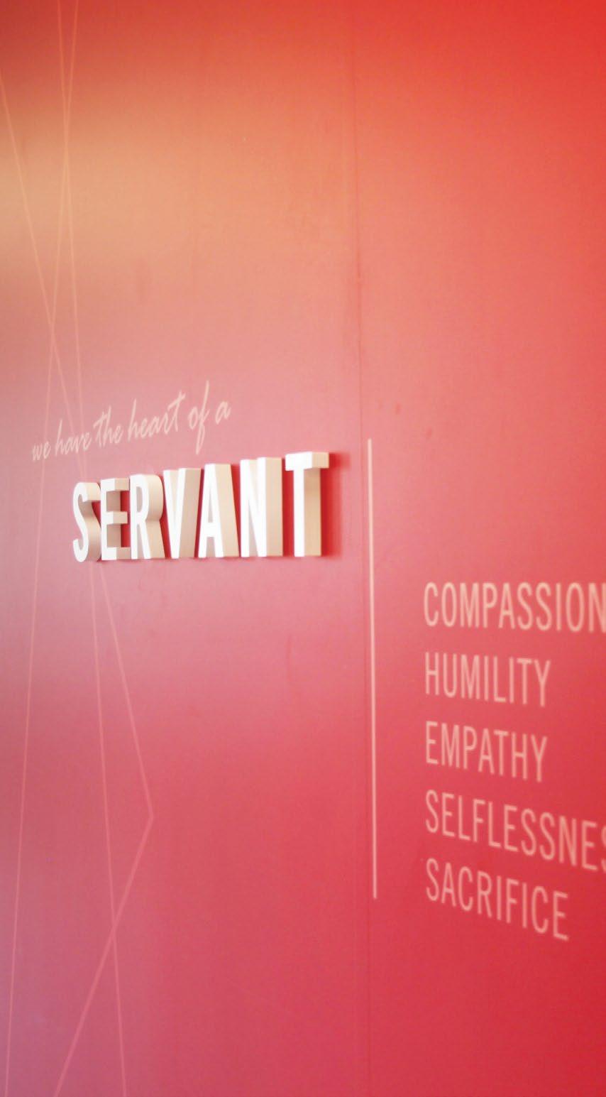
Guided by the following design drivers: vector, fold and connect, Little helped this private aircraft service provider reinforce an evolved brand within their space. A series of branded installations throughout the office and lobby instills the importance of their mission and values in both employees and guests.
Iconic angles become architectural elements at reception.
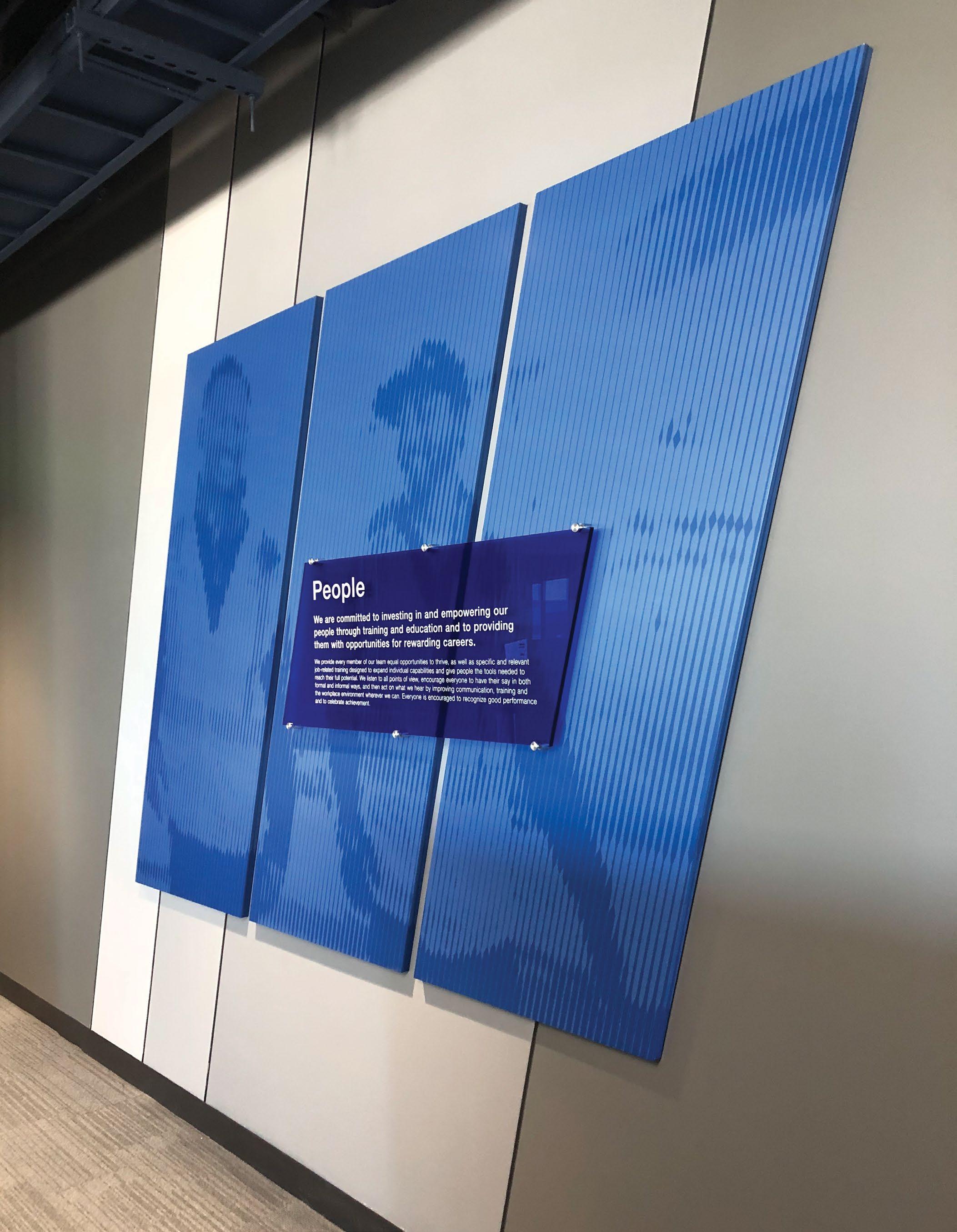
The client’s core values are paired with corporate imagery and located in thirteen high visibility locations.
The design team translated aspects of Signature Flight’s brand book into design features for the environmental program.
Angles
Explanation and usage
Angles
Privacy window film picks up subtle branding with angles incorporated into a graphic pattern as well as room identification
Brand angles inform custom signage design. Magnetic nameplates are interchangeable between workstation and office signage.
Explanation and usage
The angles shown throughout this book are an intentional salute to the familiar shapes in the aviation industry, from the shape of an aircraft's wings and tail to its cockpit windows. Use these angles in colors from the Signature palette to define and add graphic emphasis.
The angles shown throughout this book are an intentional salute to the familiar shapes in the aviation industry, from the shape of an aircraft's wings and tail to its cockpit windows. Use these angles in colors from the Signature palette to define and add graphic emphasis.
Vector, fold and connect. Design drivers bringing the brand to life.
A — Oversized room naming and numbering, reflects aviation wayfinding.
B — Mission, Vision, Values, as well as the client’s story, are all represented in an installation in a public facing lounge.
C — Core Value installations are strategically located throughout the space.
Pour more into what matters.
In the Spirit of Philanthropy
THE GOOD POUR
Gainsville, FL
Pour Board
Make an impact.
The Good Pour is the first-ever wine and spirits market dedicated to giving back to their community by donating a portion of every purchase to the philanthropy of a customer’s choosing. Determined not to blend in with others in their field, The Good Pour’s brand and message were paramount in the design of their store, differentiating them and clearly communicating their mission as part of the retail experience.
THE POUR BOARD
When you shop at The Good Pour, a portion of our profits go to the charity of your choice. No games. No gimmicks. We believe it’s just a better way of doing business. And if actions speak louder than words, we think numbers speak loudest of all. That’s certainly the case with the Pour Board, which keeps track of our collective impact and helps us stay focused on our mission to build a culture of philanthropy and make the world a better place. Cheers to that.
Let’s raise a glass to the good ones.
B A
High contrast, witty messaging became a constant as The Good Pour developed a plan for roll-out - creating elements that were scalable and flexible but remained constant in their boldness drove a family of environmental graphics brave enough to match the mission.
A — Studies using digital media, analog counters and products like bottle corks were designed as visual displays of the brand’s follow-through.
B — A custom cashwrap counter, designed with a cork in mind, is another opportunity for cheeky messaging.
A custom illustration becomes a wall graphic, as well as finding its way into tissue paper, packaging, and other printed collateral.
Shelf level signage became another opportunity to establish brand consistency and explain the mission to shoppers.
Bold, modern signage on the building’s exterior remains constant location to location.
A — The brand’s manifesto wraps the perimeter of the store as a constant reminder to shoppers.
B — Signage becomes integrated with fixtures throughout. REFINEMENT | 08.29.2022
Entertain Excite Educate
East Meets West
TOKYO CENTRAL
Yorba Linda, CA
The client’s vision for Tokyo Central market was to become the go-to destination for highquality Japanese food and specialty items, and perhaps more importantly, to connect with the community in a meaningful way.
With appreciation and emphasis on Japanese craftsmanship, the design team closely considered each element - the touch and feel of materials, the interplay of organic materials vs. inorganic, the positive vs. negative space, (or rather, the yin and yang).
Busy layers of a Tokyo market are replicated in layers of merchandise, signage, and murals.
Dual layered fabric banners identify each department.
Each department was given a unique personality with photography, a textural pattern, and color.
Deriving inspiration from the traditional, vibrant outdoor markets of Tokyo, wayfinding and interior signage interplay among one another.
We leveraged the idea that the space should emulate an overall sense of zen and joy as a common thread that would connect each separate entity within the store, and allow customers to physically experience the culture of Japan.
A — Community events, such as calligraphy classes are held in a public cafe space.
B — Destinations have highly visible signage.
Bringing cultures together.
A — Overview of department banner signage designs.
B — Product ID’s of various sizes and unique product information poster. Templates were designed to allow flexibility for store merchandising.
SUSHI
SUSHI
HAWAIIAN PRODUCTS
Farm to Table
TOTAL WINE & MORE HEADQUARTERS
Bethesda, MD
A gradient of wine corks lives behind reception.
Corks were customdyed to match brand colors.
NOTES
1
2
3
graphics are sandwiched in oversized panels of acrylic, designed to be updated quarterly as the store’s reach grows.
B — An interactive map wall using corks highlights Total Wine & More’s national presence.
Using product as wayfinding.
From vineyard to store shelves.
A series of illustrations were created highlighting the full story of a product’s origin to store shelves for varieties of wine, beer and spirits.
Each floor was assigned a specific product offering, helping with wayfinding and bringing the full range of products to life. Product stories were told through dimensional pixel murals, photographic life cycle stories, and tonal wall illustrations of key ingredients.
Elevator Lobby Product Story
Multi-Purpose Wayfinding
UNC CHAPEL HILL, CRAIGE PARKING DECK
Chapel Hill, NC
Less Is More
In a parking deck that’s used by visitors, students, faculty, and fans for athletic events, with stairwells and elevators that all deliver to varying levels, wayfinding is key. Little was tasked with creating a signage system that was easy to read, easy to remember, durable and on-brand.
The wayfinding system emphasizes pictograms and as little information as possible, giving users the information they need as they need it.
A — Detail of an infographic used on elevator signage.
B — Pictograms are dimensional, overscaled and reflective, making them as legible as possible to pedestrians and vehicular users alike.
Level ID markers are over-scaled and reflective while using UNC colors to stay on-brand.
Interior base building signage uses a slightly different color palette to distinguish it from vehicular wayfinding.
Overhead signage replaces years of layered banners and signs that once cluttered deck entrances.
Elevator identifiers are color-coded and alphanumerically tied-back to an adjacent infographic.
From A to Z and back again.
Color-coded signage and You Are Here Maps were designed to break down complexities in the parking deck’s accessibility and vertical circulation.
While staying visually on-brand with the University was a priority, the hierarchy of information prioritizes directional wayfinding and legibility.
BELOW— Level ID signs positioned adjacent to elevators on each floor communicate vertical circulation opportunities.
Visitors to the new ACC Headquarters are immediately hit with the weight of the conference by way of a large supergraphic at reception.