BRAND GUIDELINES
JUNE 2023


JUNE 2023

WP&D provides opportunities for connection and professional growth to women at all stages of their career in urban planning, development, and related fields. Our members work in government, private, and non-profit sectors across a wide range of fields including transportation, real estate, municipal planning, public policy, construction and design, community development financing, and more!
This brand guideline document explains how and when to use the new brand and logo. Please reach out to WP&D with any questions about the guide or logo files.
Digital artwork: Please use the RGB version of png, or jpegs. If needing a file with a transparent background please use the png file format.
Printed artwork: For projects being printed we recommend asking the vendor for their preferred file type and specs to ensure the best quality printing. If unsure, use the CMYK versions.
Vector artwork: Please use the eps versions, but do not edit the vectors themselves.
ADVANCING LEADERSHIP.
FOSTERING RELATIONSHIPS.
PROVIDING EDUCATIONAL OPPORTUNITIES.


Calling Chicago home, WP&D’s new logo integrates shapes and imagery from the Wells Street Bridge located downtown. The WP&D logo is a clean, simple and recognizable mark to be used on marketing assets, websites and other promotional materials.
(LOGO PROVIDED IN MULTI-COLOR, BLACK, AND WHITE)
This secondary logos are to be used with the following reasons. Both have been provided in multi-color, black, and white.
1.
#1 can be used like the Primary Logo, however consideration must be given with the logo’s white version as the logo mark becomes see-through.
2.
#2 should only be used when Women in Planning and Development is spelled out somewhere near or with this secondary logo. Consideration must also be given with the logo’s white version as the logo mark becomes see-through.


Do not use or edit the logo in the ways shown below.
Do not change the logo colors / use unapproved colors.
Do not apply gradients, shadows, or other effects.
Do not alter the logo by changing or adding elements. Do not change the arrangements of the logo.
Do not skew or stretch logo. Always scale it proportionally.
For digital materials and assets please reference the HEX and/or RGB values. For printing, reference the CMYK values, or if requested by the printer please reference Pantone values.
#a6543e
RGB: 166, 84, 62
CMYK: 26, 74, 79, 15
#28152f
RGB: 39, 22, 47
CMYK: 78, 86, 49, 64
#ffffff
RGB: 0, 0, 0
CMYK: 0, 0,0, 0
#000000
RGB: 0, 0, 0
CMYK: 0, 0,0, 100
#98a639
RGB: 152, 166, 57
CMYK: 45, 21, 100, 2
#a2cced
RGB: 162, 204, 237
CMYK: 34, 9, 0, 0
BRICK Black at 15% ROAD PLUM TRAIL WHITE LAKE BLACKUsage of the fonts below are within the logo. Montserrat is the primary font, but should be used for headings and callouts where possible. Cormorant Regular is the ampersand font in the logo. It should be used for all body text.
PRIMARY FONT
SECONDARY FONT
abcdefghijklmnopqrstuvwxyz
ABCDEFGHIJKLMNOPQRSTUVWXYZ
Imagery used to represent the WP&D should reference brand colors, diverse groups of professional women, and Chicago and its surrounding areas where possible.


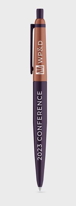
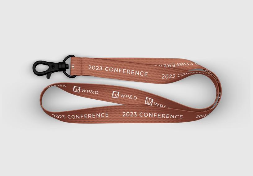
Ideas for printed and digital marketing collateral using the new brand:


