Portfolio. LONG HOANG GRAPHIC DESIGN /2023 Selected Works @longhoangxd www.longhoangxd.com

This publication contains a compilation of curated works by Long Hoang from 2019 to 2023. For further information, please contact : LONG HOANG +61 404 360 427 www.instagram.com/longhoang.ux longleconghoang@outlook.com www.linkedin.com/in/long-hoang-2910
Education
Master of Media
Immersive Media Technologies, University of Adelaide.
GPA 3.5 / 2021 - 2023
Bachelor of Design
UX Interaction Design, Swinburne University of Technology
GPA 3.5 / 2019 - 2021
Experience
Apr 2023 - Aug 2023
Graphic Design & Content Creation
Coordinator / MARLII LAB
Jul 2020 - Dec 2021
UX/UI Designer / ETC Technology Systems JSC
Sep 2019 - Dec 2019
Studio Photographer / Australian Imaging & Photo Group Pty LtdCorporation
UX/UI Design
Branding Design
Photography
Social Media Design
Expertise Software
Adobe Illustrator
Adobe Photoshop
Adobe XD
Figma
Soft Skill
Communication
Team Management
Attention to detail
Language
Vietnamese
English
Long Hoang.
UX/UI Designer, Graphic Designer

Coordinated based in Adelaide.
Armed with a Swinburne University of Technology degree in UX Interaction Design, I’m a driven professional dedicated to excelling in web and interaction design. Currently pursuing a Master’s in Immersive Media Technologies, I’m keenly interested in the emerging realm of Extended Reality (XR). Merging my UX foundations with advanced XR concepts, I’m honing my skills in crafting intuitive XR UX/UI.
Branding
iGuide
5 Long Hoang Contents. 06 07 19 22 24 26 30 34 36
Design
for Vietcubic
for Curvecrete
Branding
Branding
Digital Design
Print Publication
iGuide Interactive Publication
Email Marketing
Social Media Design
Competition Project
UX/UI Project Experimental Work
Vietcubic Branding Design.
01
Role Type : UX Interaction Design Student : University Project / 2019
Overview:
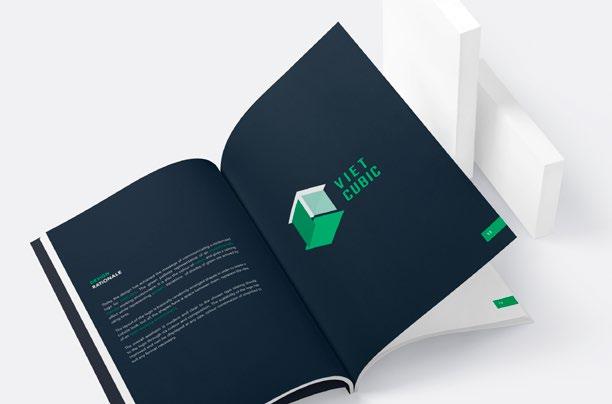
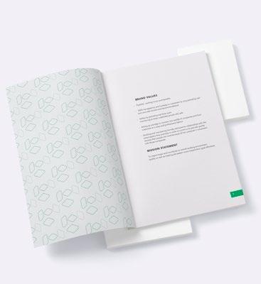
During my second year at university, I undertook the challenge of reimagining the brand identity for Vietcubic, an organization committed to reshaping the employment landscape through multidimensional reviews, feedback, and support. The main deliverables for this project were a refreshed brandmark and a comprehensive brand guideline.


Objective:
To convey Vietcubic’s dedication to assisting new graduates in navigating the employment ecosystem, while also signifying its multifaceted approach to recruitment issues.
7
Long Hoang
Logo Design
Brandmark:
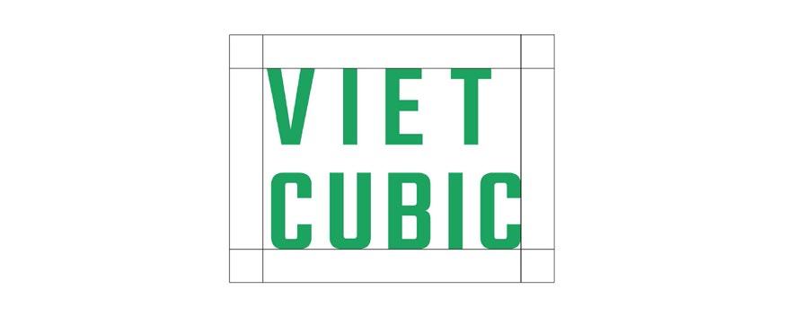
The reimagined brandmark emphasizes modernity, yet maintains the essence of Vietcubic’s vision. Consisting of spaced, randomly-arranged shapes, it embodies the design of a cubicle - representing both the employment sphere and the idea of an open, collaborative working environment, hinting at flexibility, adaptability, and room for innovation.


Color Palette:
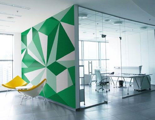
Predominantly green, the palette signifies environmental consciousness and sustainable growth. Green’s association with nature not only evokes a sense of calm but also symbolizes growth and potential. Through careful utilization of tints, various shades of green were incorporated, amplifying the visual appeal.
8 Portfolio
Business Card & Stationary
Role Type : UX Interaction Design Student : University Project / 2019
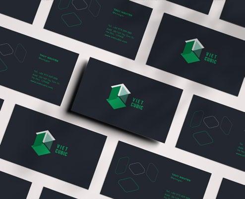
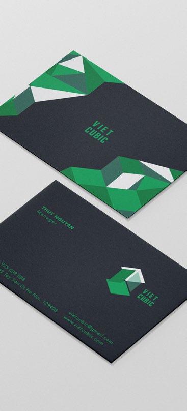
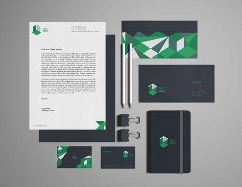
In alignment with Vietcubic’s rebranded identity, the business card and stationery design served as tangible representations of the company’s commitment to professionalism, growth, and sustainability. These pieces are often a company’s first point of physical contact with stakeholders; thus, their design was paramount in ensuring consistency and brand recall.


9
Long Hoang
Posters & Flyers
Role Type : UX Interaction Design Student : University Project / 2019
Product Design / Graphic Design
Illustration / Branding
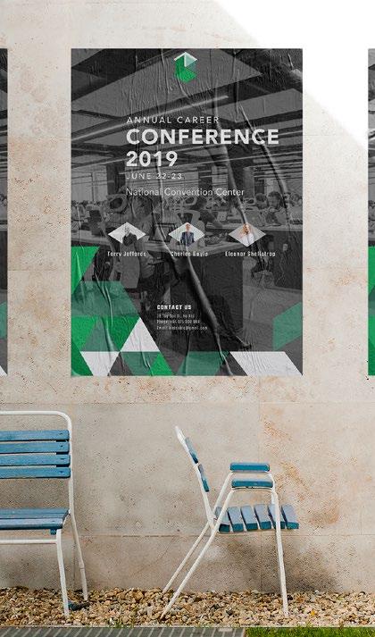
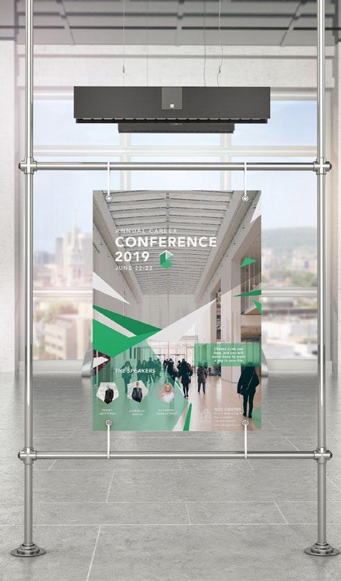
Tailored for two distinct audience segments, one targeting office professionals and the other reaching out to a broader demographic, the poster was a key element in amplifying Vietcubic’s outreach and showcasing its commitment to the employment sector.


10 Portfolio
Merchandise & Book Layout
Click here to view the interactive digital publication: https://issuu.com/ longleconghoang/docs/brandbook
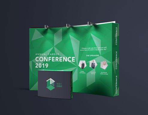
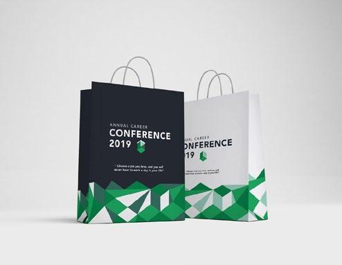
While the brand guidelines covered a myriad of applications including signage, vehicle livery, uniforms, conference stands, stationery, and advertising billboards, the primary focus was on the business card design and a specialized poster for the Annual Career Conference.


11
Long Hoang
Curvecre Branding Design. 02
Logo Design
Role Type
: Graphic Designer
: The Design Bureau of Swinburne/ 2021
Product Design / Graphic Design
Illustration / Branding
Overview:
Embarking on a journey to strengthen Curvecrete’s visual identity, the project focused on crafting an emblematic icon to work in harmony with their existing brandmark. Curvecrete, renowned for its groundbreaking use of robotic systems in constructing environmentally conscious curved architectural panels, required a brand image that mirrored their innovation and commitment to sustainability
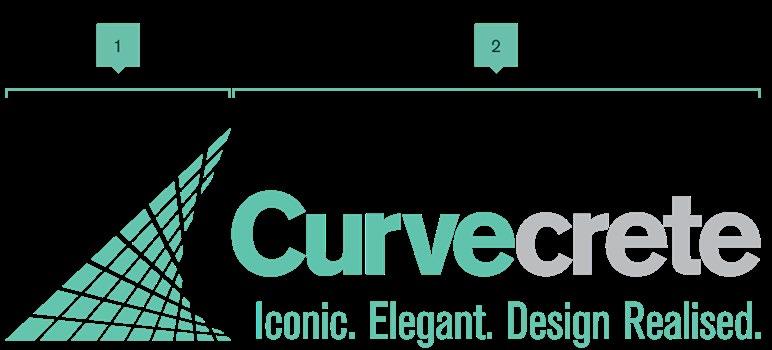
Logo Symbol & Type: Taking inspiration from the distinct curved panels produced by Curvecrete, the symbol mirrors the company’s core product. The name ‘Curvecrete’ has been segmented with precision — “curve” in a vibrant turquoise green to underline the brand’s eco-conscious ethos and “crete”, in a concrete grey to symbolize the primary material. The typeface, Berthold Akzidenz BE, exudes modernity while ensuring legibility.
Long Hoang

13
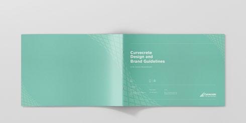
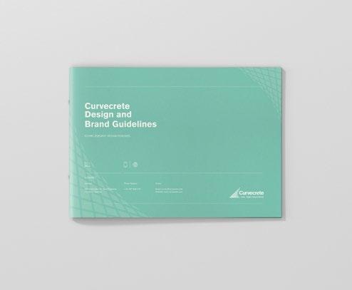
Brand Identity Guidelines

Crafted meticulously, the brand guidelines serve as a bible for brand consistency and adaptability.


Role Type
: Designer : Corporate / 2027
Product Design / Graphic Design
Illustration / Branding
Click here to view the interactive digital publication: https://issuu.com/ longleconghoang/docs/ curvecrete_brandguidline_ onlineview
14 Portfolio
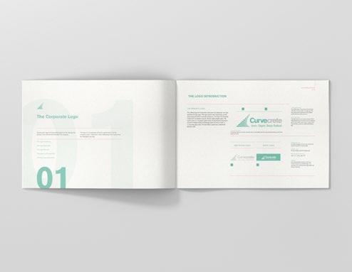
Corporate Logo: A deep dive into the anatomy of the logo, its clear space, variations, and usage guidelines.
Corporate Typography: Specifications about typeface, hierarchy, and usage.
Color Palette: Details on primary and secondary colors, along with their respective codes.
Toolbox of Visual Elements: A set of design assets and elements to be used across brand touchpoints.

Application Mockups: Demonstrative application of the brand’s identity across diverse platforms.

15 Long Hoang
Business Card

Role
Type
: Designer
: The Design Bureau of Swinburne/ 2021
Product Design / Graphic Design
Illustration / Branding
Mockup Applications:
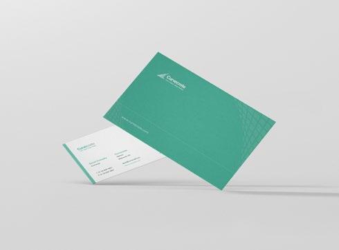
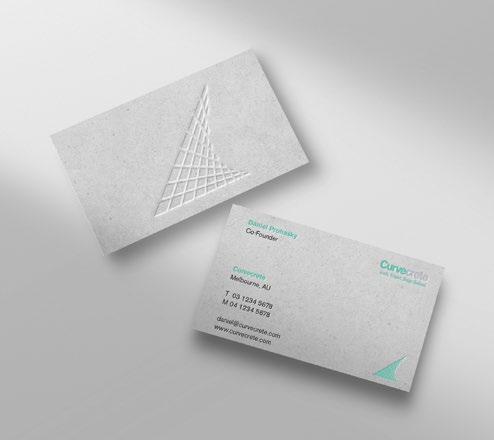
Conceptual designs display the brand’s identity on letterheads and business cards. A notable application is the Curvecrete logo’s embossment on a concrete texture, bringing the tangible feel of the brand’s product to its stationery.
The guidelines provide a clear roadmap for translating the brand onto merchandise and digital platforms like Instagram.

16 Portfolio
Social Media Design

Role
Type
: Designer : The Design Bureau of Swinburne/ 2021
Product Design / Graphic Design
Illustration / Branding
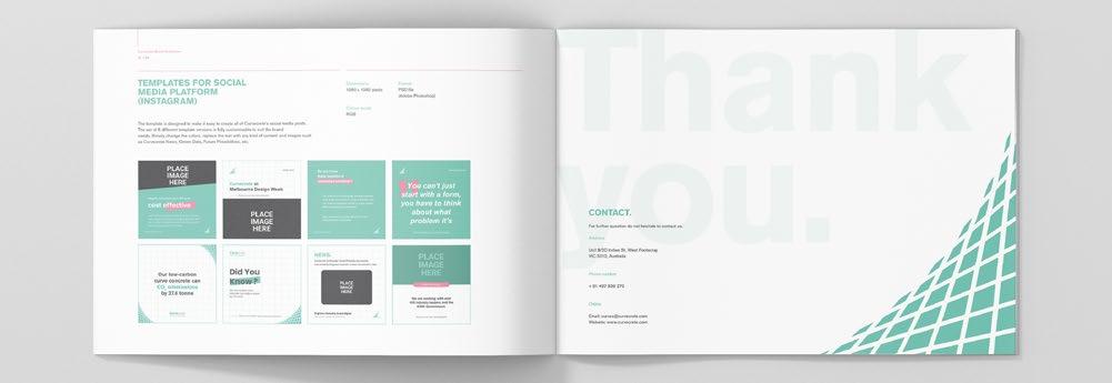
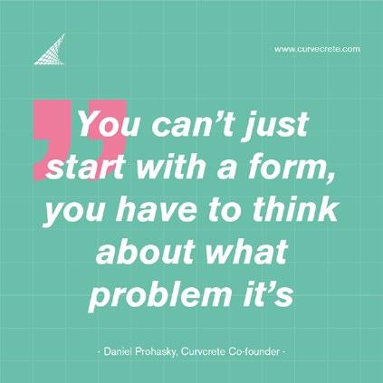
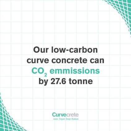
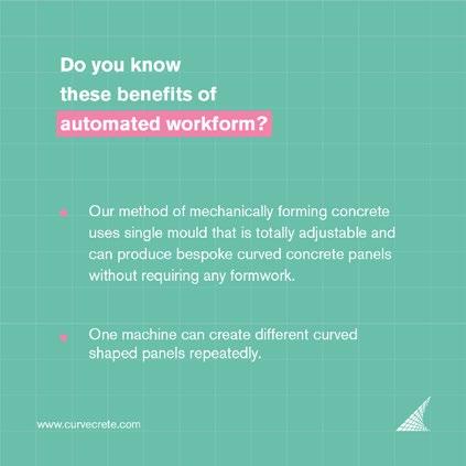
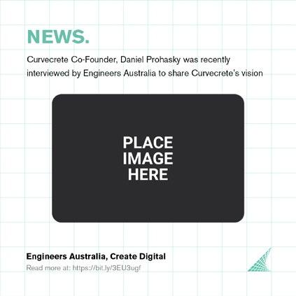
A series of eight versatile templates were crafted to streamline Curvecrete’s digital presence. These adaptable templates can encapsulate a variety of content—from “Curvecrete News” to insights on “Green Data” and visions of “Future Possibilities”. With easily modifiable color schemes and text placements, the templates ensure brand consistency across all social media touchpoints.


17 Long Hoang
Design.
Digital
03
iGuide Project
Print Publication
Overview:
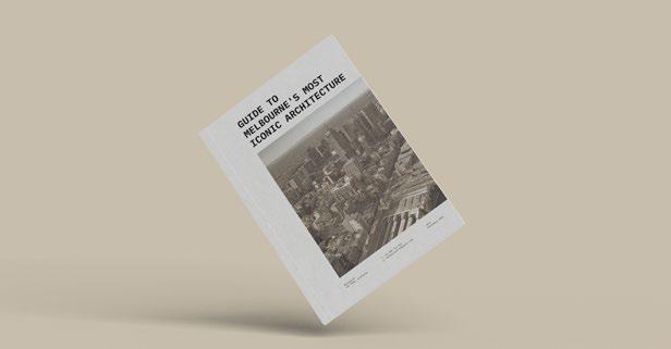
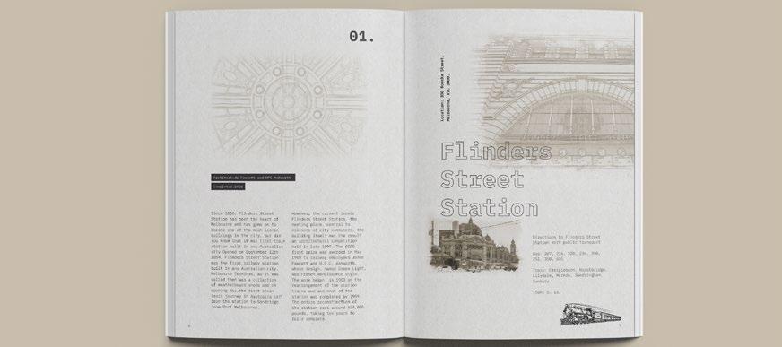
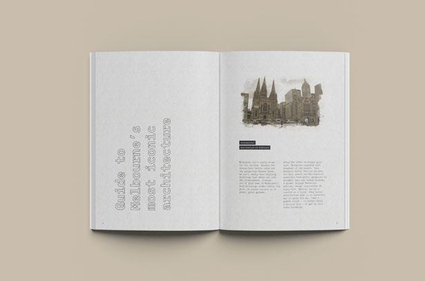
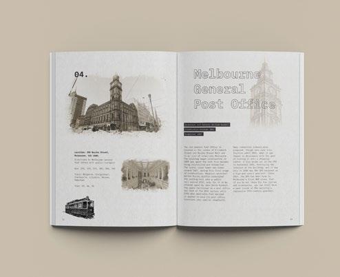
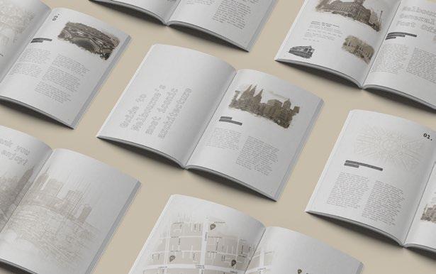
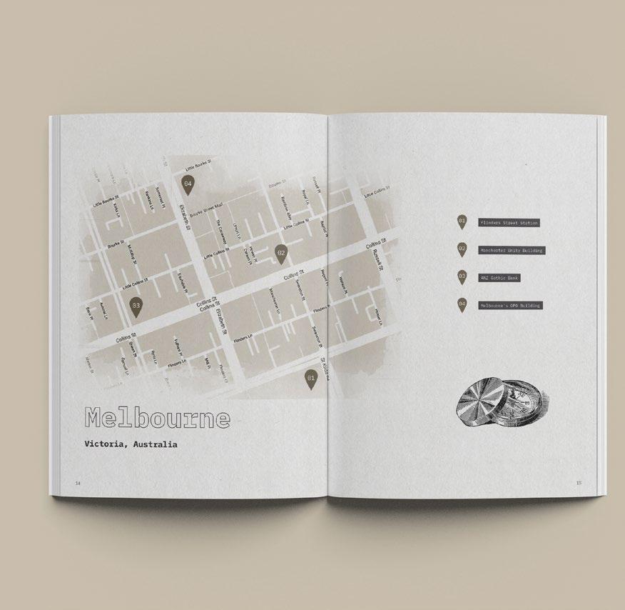
The iGuide Project is a meticulously designed print publication that offers a unique perspective on Melbourne’s architectural wonders. Tailored for the domestic tourism market, this guide is a tribute to the city’s rich architectural heritage, focusing on iconic landmarks within Melbourne’s CBD.


Role Type
: UX Interaction Design Student : University Project / 2021
Click here to view the interactive digital publication: https://issuu.com/longleconghoang/docs/typography_ publication
19
Hoang
Long
Illustrations:

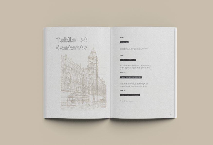
Complementing the photographs are illustrations crafted based on the original blueprints used by the architects. These sketches provide a unique insight into the design and planning of these iconic structures.
Imagery:
The images chosen for this guide are not mere photographs; they are a testament to the architectural brilliance of Melbourne. Close-up shots emphasize the intricate details and craftsmanship of each building. To enhance the vintage feel, these images undergo a transformation using monochrome filters, giving them a timeless appeal.


20 Portfolio
Digital Artistry:
A significant portion of the visual appeal of this guide comes from the digital enhancements made to the images. Using Adobe Photoshop, the photographs were transformed with an architectural watercolor effect, converting them into a blend of sketches and watercolor artistry. The gradient tool was employed to infuse the desired retro color effects, making the images appear aged and classic. To further the vintage feel, a paper-textured background was chosen, ensuring that the watercolor effect seamlessly blends with the overall design.


21 Long Hoang
Interactive Publication

Role Type : UX Interaction Design Student : University Project / 2021
Overview
Product Design/ Graphic Design
Illustration/ UX UI Design
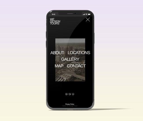
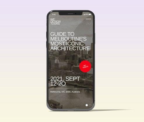
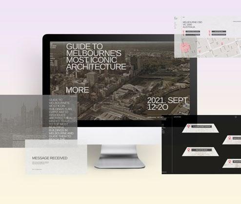
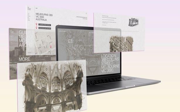
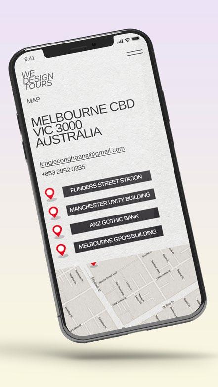
This project showcases the transformation of a static print publication into a dynamic, interactive website for promoting tourism. The design language is largely retained from the print publication, with a few adjustments made for digital interactivity.


22 Portfolio
Mobile View:
For the mobile version, the content and format were adapted from the print guide. A unique navigation menu was designed, initially planned as a slide-in drawer. Instead, an animated burger menu was created that smoothly transforms into an exit button when clicked. The navigation menu slides in concurrently. This dynamic approach continues throughout the site using Adobe XD’s component tool for adaptable content without needing new elements for each variation.
Desktop View:
Transforming a print tourism guide into an interactive website, this design project retains its original design language while introducing digital interactivity. In the desktop version, fluid animations are emphasized for an engaging experience. The layout mirrors the print guide, adding a standout red “Get Tickets” button against a neutral palette. A fixed navigation bar on the right aids user navigation.


23
Long Hoang
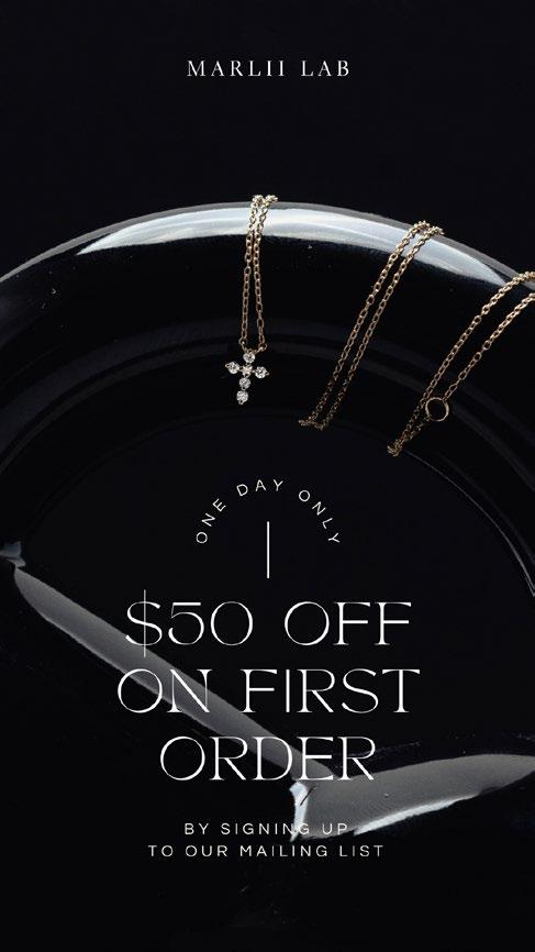
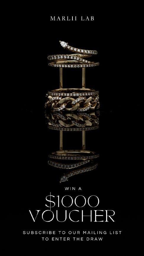
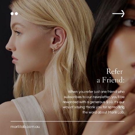
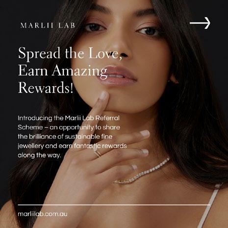
Email Marketing
Role Type
: Graphic Designer : MARLII LAB / 2023
Overview:
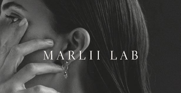
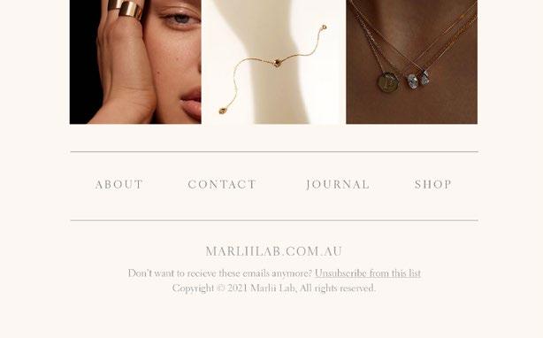
As a visionary contributor to MARLII LAB’s journey towards redefining fine jewelry, I was entrusted with the captivating task of crafting their email marketing campaigns. Operating within the contours of their established brand guidelines, I embarked on a design odyssey that harmonized their commitment to sustainable luxury with an emphasis on empowering narratives.


Photography / Graphic Design
Illustration / Branding
24 Portfolio
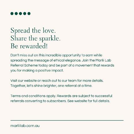
Infused with elegance, MARLII LAB’s voice became my guide. Merging polished language with empathy, I composed emails that celebrate individuality and ethical luxury. The result? A collection of messages that reflect their dedication to both the planet and the modern woman.

In every email, I crafted a visual and textual symphony that encapsulates MARLII LAB’s essence. These designs don’t just showcase jewelry; they embody a movement towards a more conscious and stylish world, echoing the brand’s mission amidst the world of luxury.


25
Long Hoang
Photography & Social Media Design.
Role Type
: Graphic Designer : MARLII LAB / 2023

Photography / Graphic Design
Overview:
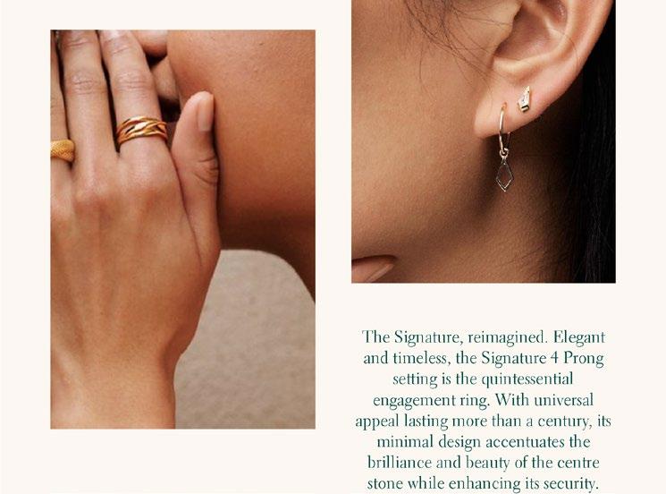
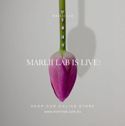
At MARLII LAB, my creative journey extended beyond email marketing to encompass the artistry of jewelry photography and social media design. Tasked with capturing the essence of fine jewelry and engagement rings, I embarked on a visual expedition that aligned perfectly with the brand’s sophisticated voice.

Illustration / Branding 26 Portfolio
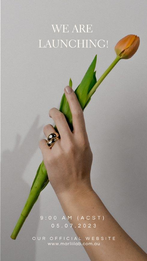
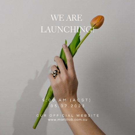
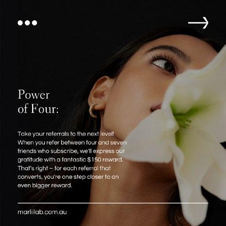
This venture reached its zenith during a remarkable campaign where I ingeniously employed tulip flowers as props. Every petal served as a vessel, cradling the jewelry and harmonizing with MARLII LAB’s tone of empowerment and conscious luxury.


27
Long Hoang
Photography & Social Media Design.
Role Type
: Graphic Designer

: MARLII LAB / 2023
Photography / Graphic Design

Illustration / Branding
The imagery crafted wasn’t just about aesthetics; it was a portrayal of MARLII LAB’s ethos. I sought to weave their sophisticated language into every caption and layout, creating a harmonious synergy that resonated with their audience. It wasn’t merely about products; it was about celebrating individuality, values, and the art of handcrafted excellence.
28 Portfolio
With each click of the camera, I sought to magnify the allure of MARLII LAB’s creations. Transforming precious metals and gemstones into timeless stories, I let the jewelry speak through meticulously curated images.
The result was a visual narrative that breathed life into the brand’s commitment to both sustainability and elegance. Each image served as a bridge between the tangible radiance of jewelry and the intangible allure of MARLII LAB’s mission—a bridge that found its home on their social media platforms.


29
Long Hoang
UX/UI Projects. 04
Self-guided Walking Tour App.
Role Type
: UX Interaction Student
: Swinburne University / 2020
Product Design/ Graphic Design
Illustration/ UX UI Design
Overview:
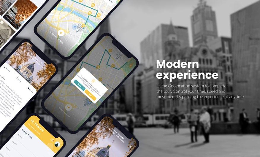
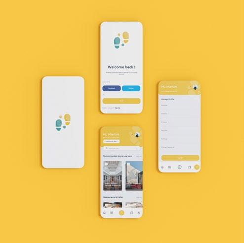
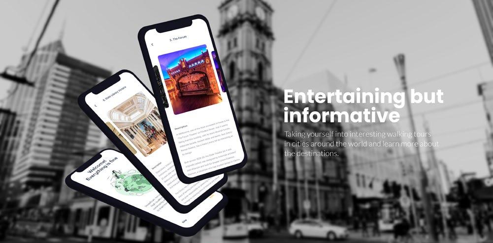
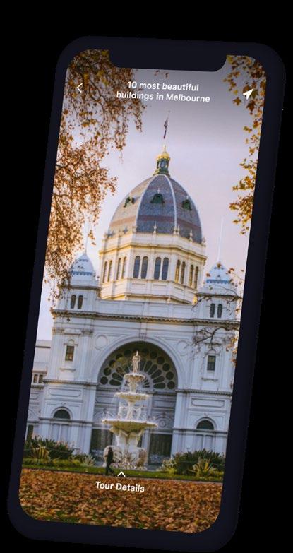
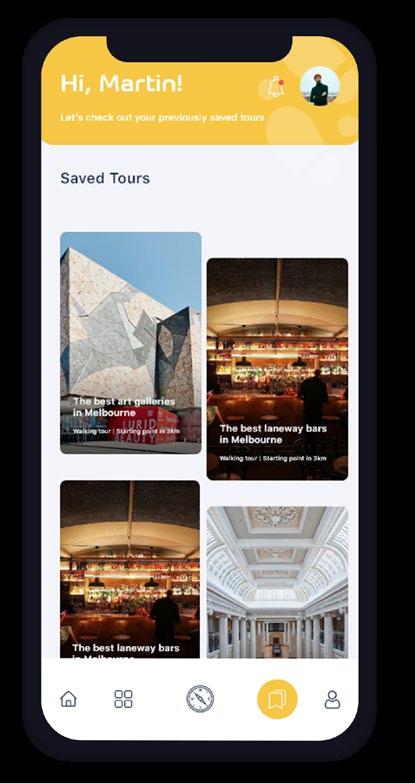
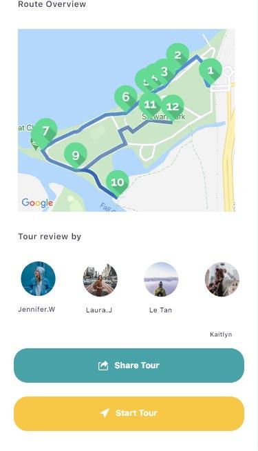
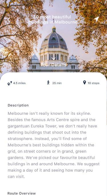
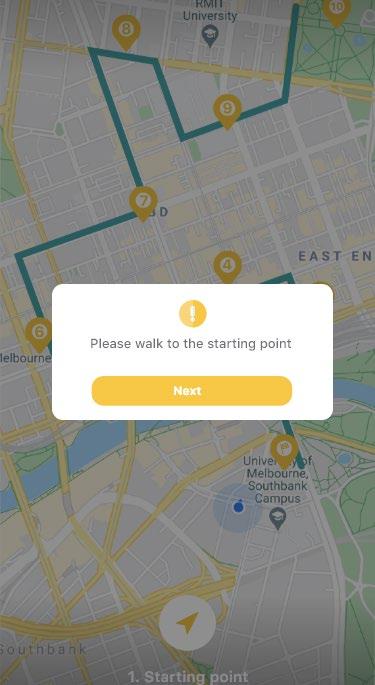
SteppiTour provides self-guided audio walking tours. A wide range of different tours from “Architecture and history” tours to tours created for Food lovers and Art lovers.
Creating the user experience and interface for SteppiTours was an exhilarating journey that encompassed the essence of exploration and community. As a UX/ UI designer, my mission was to craft an intuitive platform that seamlessly melds self-guided audio walking tours with the spirit of connection.

31 Long Hoang
Self-guided Walking Tour App.

Role Type : UX Interaction Student : Swinburne University / 2020
Diverse Tour Themes, Unified Experience
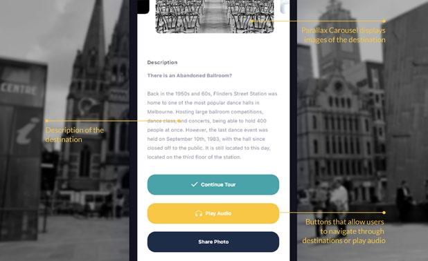
In shaping the interface, my focus was to ensure that users effortlessly navigate through a diverse spectrum of tour themes. From architecture and history to culinary and artistic journeys, the design principles remained consistent, ensuring a unified experience across the diverse range of tours.

32 Portfolio
Virtual Tours: A Window to Unseen Wonders

The introduction of virtual tours allowed me to emphasize the anticipation that comes with travel. Users can preview the essence of their chosen destination before embarking on their physical journey. My design aimed to capture this essence visually, creating an engaging bridge between the user and the destination.


33
Long Hoang
Self-guided Walking Tour App.


Role Type : UX Interaction Student : Swinburne University / 2020
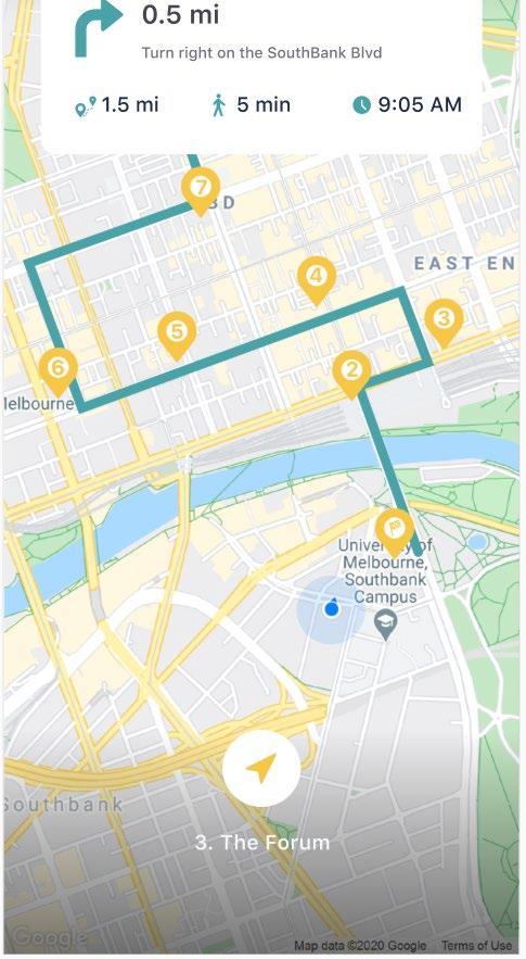
Seamless Roaming and Freedom
The ‘free roam’ feature was a pivotal aspect of the design. For users who embrace spontaneity, the interface needed to be both guiding and accommodating. I worked to design an experience that smoothly transitioned between structured tour routes and user-directed exploration, fostering a sense of empowerment in every choice.
34 Portfolio
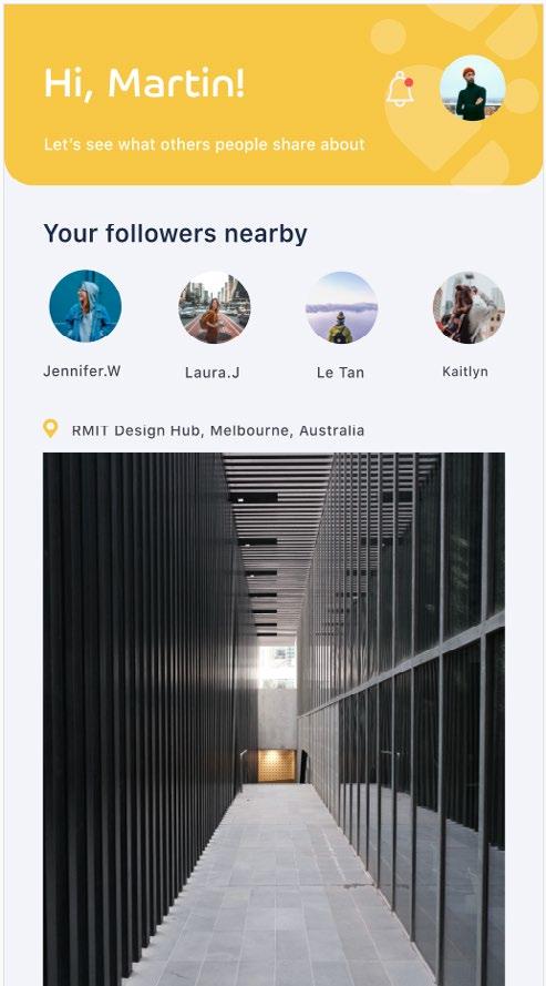
Community-Focused Engagement
The incorporation of a social media platform was about more than just design—it was about fostering connections. My design aimed to facilitate seamless sharing of experiences, images, and conversations. Creating an interface where architecture and photography enthusiasts could find common ground and exchange perspectives was a gratifying challenge.

Crafting Engaging Audio Guides
One of the most immersive elements of SteppiTours is the audio guides. My design work focused on ensuring users could control their experience with ease. From playback speed adjustments to pause and play functionality, every interaction was crafted to enable users to truly own their journey.


35
Long Hoang
Traffic Police Administration App
Role Client : UX/UI Designer for ETC : Traffic Police Department
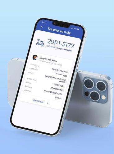
Overview:
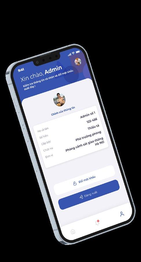
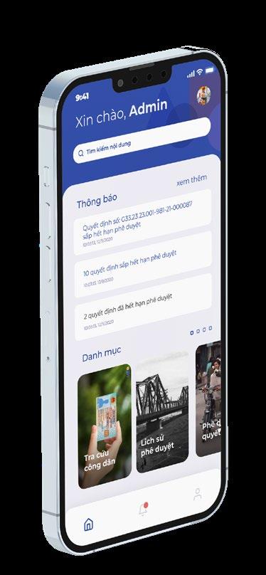
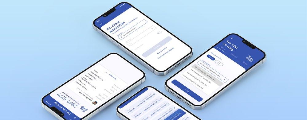
In designing this admin mobile app for the Traffic Police Department, my goal was to create an interface that is user-friendly, secure, and efficient. By focusing on the specific needs of the officers, I aimed to create an app that simplifies their tasks and provides a seamless experience, ultimately supporting their critical role in maintaining road safety and ensuring proper vehicle documentation.


36 Portfolio
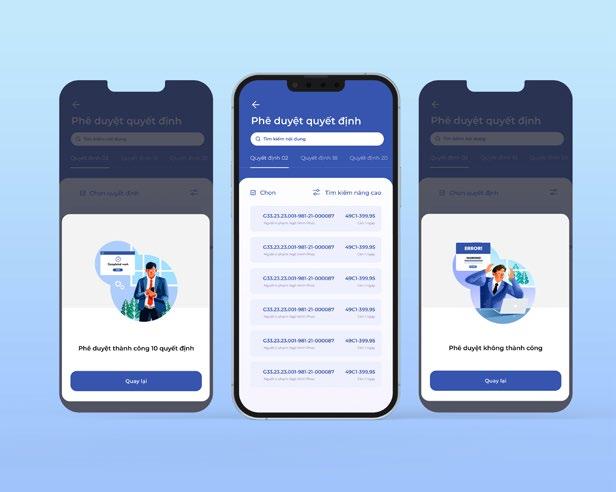
By keeping the layout clean and organized, I made sure that the officers could easily navigate through the app without getting overwhelmed by a cluttered interface. To encourage user engagement, I designed intuitive and responsive elements, providing an attractive and interactive user experience.


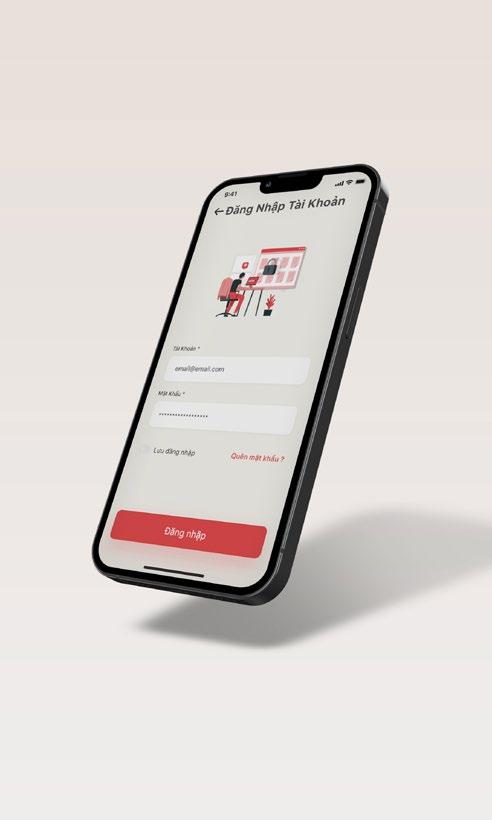
Recognizing the need for security, the app implements multiple authentication layers such as password entry, fingerprint recognition, OTP, and QR code validation, considering it handles sensitive information like driver’s licenses, vehicle registrations, and officers’ personal data. A user-friendly search engine, equipped with a free text search bar and a flutter tab bar for document categorization, enables officers to quickly access specific information. The notification interface is visually appealing and informative, and a history of approvals is included for easy review of past decisions.

37
Long Hoang
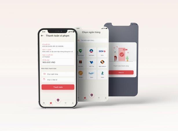
Traffic Fines Payment Mobile App
Overview:
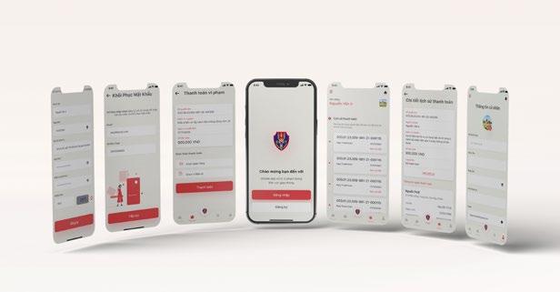
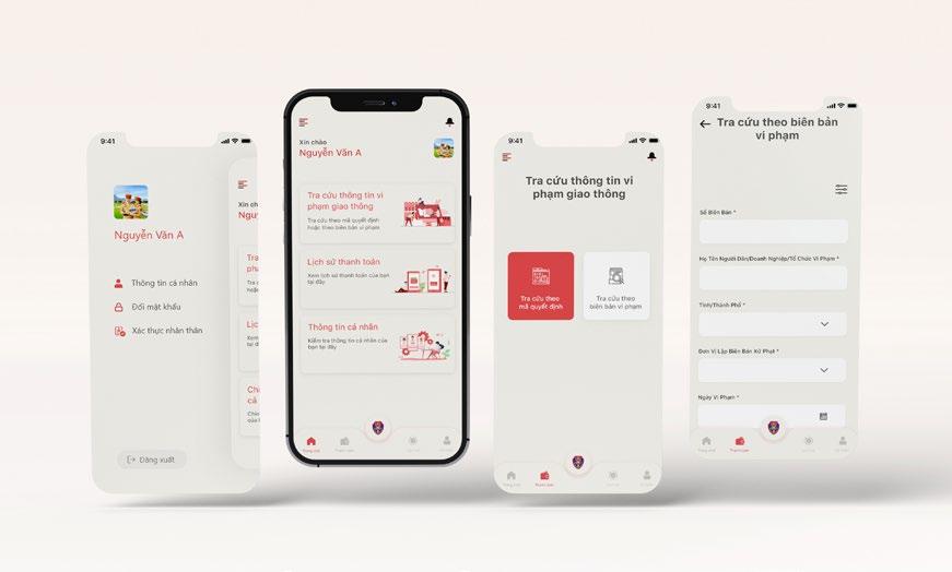
As the UX/UI designer for the Traffic Fines Payment Mobile App for the Traffic Police Department, my goal was to create an app that offers a convenient, secure, and user-friendly experience for citizens of Vietnam who need to pay traffic fines. In light of the app’s objectives, I focused on simplifying the payment process, ensuring data privacy and security, and creating an appealing interface that fosters user engagement.


Role Client
: UX/UI Designer for ETC
: Traffic Police Department
Product Design/ Graphic Design
Illustration/ UX UI Design
38 Portfolio
I prioritized a seamless user experience and easy transactions by allowing users to link their debit/credit cards or e-wallets to the app, facilitating effortless payments without repetitive data entry. The app’s UI/UX design features a visually appealing color palette inspired by police uniforms, enhancing user-friendliness. Its organized layout, clear navigation, and intuitive icons encourage interaction and build trust.

Additionally, I integrated a Payment History section, enabling users to access their past traffic violations, fines, and payments, promoting responsible driving. Security of personal and payment data was paramount, achieved through fingerprint recognition, OTP, and QR code validation, bolstered by collaboration with developers for robust encryption and data protection. Visual cues were incorporated to reassure users about data safety and privacy commitment.

39
Long Hoang

Long Hoang +61 404 360 427 www.instagram.com/longhoang.ux longleconghoang@outlook.com www.linkedin.com/in/long-hoang-2910 Based in Adelaide, South Australia
