
Introduction
THE DESIGN GUIDELINES SAY HI.
These guidelines describe the visual and verbal elements that represent Curvecrete’s brand identity. This includes our name, logo and other elements such as color, type and graphics.
Sending a consistent and controlled message “Who we are” is essential to presenting a strong, unified image of Curvecrete.
These guidelines reflect Curvecrete´s commitment to quality, consitency and style.
Curvecrete’s brand identity includes the logo, name, colors and identifying elements, are valuable company assets.
Address
Unit 8/2D Indwe St, West Footscray VIC 3012, Australia
Phone number
+ 61 497 839 270
Online
Email: curves@curvecrete.com
Website: www.curvecrete.com
Table of Contents
The Corporate Logo
Curvecrete’s logo is the key building block of the identity, the primary visual element that identifies the company.
The logo is a combination of the the symbol itself and the company name – they have a fixed relationship that should never be changed in any way.
The Logo Introduction
The Logo Application
The Logo Elements
Clearspace and computation
Incorrect Logo Applications
THE LOGO INTRODUCTION
THE PRIMARY LOGO
The official logo of Curvecrete comprises two elements, the logo symbol and logo type. The logo symbol was inspired by curved shaped panels that Curvecrete produces. The logo title Carefully chosen for its modern and yet refined, highly legible style. The word curve is in turquoise green color to represent Curvecrete’s environmentally friendly technology while the word “crete” is in concrete grey color. The font that is used here is Berthold Akzidenz BE.
1) The Primary Logo
The primary logo is a full colour versionb used on white backround. For coloured backrounds you will find an alternative below.
GREYSCALE LOGO WHITE LOGO
1) The Logo Symbol
The official logo of Curvecrete comprises two elements, the logo symbol and logo type. The logo symbol was inspired by curved shaped panels that Curvecrete produces.
2) The Logo Title
Carefully chosen for its modern and yet refined, highly legible style. The word curve is in turquoise green color and the word “crete” is in grey color The font that is used here is Berthold Akzidenz BE.
3) Greyscale Logo will allows designers to have more control over how the logo will look once printed
4) White Logo
For use on dark coloured backgrounds.
Recommended formats are: .eps | .ai | .png | .jpg | .tiff
Attention
Use of any stylized, animated, hand drawn or other versions of a unofficial logo is not permitted. This undermines the logo system and brand consistency.
LOGO CONSTRUCTION, CLEARSPACE AND COMPUTATION.
It is important to keep corporate marks clear of any other graphic elements. To regulate this, an exclusion zone has been established around the corporate mark. This exclusion zone indicates the closest any other graphic element or message can
be positioned in relation to the mark.of the the symbol itself and our company name – they have a fixed relationship that should never be changed in any way.
Iconic. Elegant. Design Realised.
CLEARSPACE
Full Logo
DefinitionWhenever you use the logo, it should be surrounded with clear space to ensure its visibility and impact. No graphic elements should invade this zone.
Computation -
To work out the clearspace take the height of the logo and divide it in half. (Clearspace = Height / 2).
APPLICATION ON A BACKGROUND
MINIMUM LOGO SIZES
Full Logo
Minimum Size: 20mm x 3.33 mm
Logo Symbol
Minimum Size: 5 mm x 5 mm
CORRECT LOGO PLACEMENT
-
The Curvecrete logo is recommended to use one of the styles that are shown on the right.
INCORRECT LOGO APPLICATIONS
The official logos may not be altered in any way. Takes steps to ensure that the logo is used correctly by following the information in this guide and always using the artwork provided here for Curvecrete.
Recommendations
1) DO NOT rotate the logo.
2) DO NOT distort or warp the logo in any way.
3) DO NOT change the logo colors.
4) DO NOT change the typography.
5) DO NOT create or add Gradient colors
6) DO NOT add a drop shadow or other special effects.
7) DO NOT display the logo as an outlines.
8) DO NOT resize any individual part of the logo.
9) DO NOT reverse the logo.
Iconic. Elegant. Design Realised. Iconic. Elegant. Design Realised. Iconic. Elegant. Design Realised. Iconic. Elegant. Design Realised. Iconic. Elegant. Design Realised. Iconic. Elegant. Design Realised. Iconic. Elegant. Design Realised. Iconic. Elegant. Design Realised.Corporate Typography
Typography plays an important role in communicating an overall tone and quality. Careful use of typography reinforces our personality and ensures clarity and harmony in all Curvecrete communications.
We have selected The Berthold Akzidenze-Grotesk BE font family, which helps inject energy and enthusiasm into the entire Curvcrete communications, as the primary and secondary corporate typefaces.
The Corporate Fonts
Primary Font
Secondary Font
Font Hierachy
Every page should explode, either because of its staggering absurdity, the enthusiasm of its principles, or its typography.
 — Tristan
Tzara
THE PRIMARY CORPORATE FONTS AND TYPOGRAPHY
THE FONT
The typeface Akzidenz-Grotesk® BE was first published in 1898 by Berthold. The Berthold Akzidenze-Grotesk BE font family is supplied with the regular, medium, condensed, italic and
bold weights. The regular and bold weights can be used as the primary fonts for body text and heading while the condensed and italic form can be used as a secondary one.
AkzidenzGrotesk BE
PRIMARY FONT AKZIDENZ GROTESK BE
DESIGNER : H. BERTHOLD
TYPE EXAMPLES AKZIDENZ GROTESK BE 01234567890 Figures
Corporate Color Palette
Color plays an important role in Curvecrete’s corporate identity program. The following colors are recommendations for various media. A palette of primary colors has been developed, which comprise the “One Voice” color scheme.
Consistent use of these colors will contribute to the cohesive and harmonious look of the Curvecrete brand identity across all relevant media. Check with your designer or printer when using the corporate colors that they will be always be consistent.
The Corporate Colors
Primary Color System
Secondary Color System
Color helps to express light—not the physical phenomenon, but the only light that really exists, that in the artist’s brain.
 — Henri Matisse
PRIMARY COLOR TURQUOISE GREENCOLOR CODES
CMYK : C60 M0 Y41 K0
Pantone : P 133-5 U
PRIMARY COLOR PALETTE
-
Explanation
Curvecrete company has two primary colors: Turquoise Green and Charcoal Grey. These colors have become a recognizable identifier for Curvecrete.
Usage
Use them as the dominant color palette for all internal and external visual presentations of the company.
PRIMARY COLOR FOR TEXT CHARCOAL GREY
COLOR CODES
CMYK : C0 M0 Y0 K11
Pantone : 179-2C
Web RGB : R106 G191 B170
Web : #6ABFAA
Web RGB : R228 G229 B230
Web : #E4E5E6
SECONDARY COLOR PALETTE
-
Explanation
The Secondary colors are complementary to our official colors, but are not recognizable identifiers for our company. Secondary colors should be used sparingly (less than 10 % of the palette in one piece). 03
Usage
Use these secondary colors to accent and support the primary color palette.
COLOR CODES
CMYK : C0 M0 Y0 K20
Pantone : P 179-3 U
Web
RGB : R209 G211 B212
Web : #d1d3d4
COLOR CODES
CMYK : C0 M62 Y7 K0
Pantone : P 75-3 U
Web
RGB : R242 G130 B169
Web : #F282A9
COLOR CODES
CMYK : C29 M84 Y0 K50
Pantone : P 85-15 U
Web
RGB : R109 G36 B93
Web : #6d245d
Toolbox of visual elements
The following toolbox of visual elements contains graphic assets that have been developed as a harmonious extension of the Curvecrete brandmark/logo.
Toolbox of visual elements
These are designed as a practical set that can be used across Curvecrete’s branded materials.
-
TOOLBOX OF VISUAL ELEMENTS -


Explanation
These additional visual assets are designed based on the symbol of Curvecrete’s official logo. The placement, size and colour of these visual assets are changeable. These visual elements will allow designers to solve a range of design problems they may face when creating posters, advertisements, vehicle livery, stationery, merchandise, websites, brochures, etc.
EXAMPLES FOR TOOLBOX OF VISUAL ELEMENTS USAGE
A: Turquoise green visual assets placing at the bottom right corner.
B: Turquoise green visual assets placing at the bottom right and top left corner.

C: Turquoise green visual assets placing at the top right corner.


D: White visual assets placing at the top left and bottom right corner.


Application Mockups
Application Mockups: indicative designs to show how the Curvecrete identity would appear on various items such as stationery, promotional merchandise and social media platforms (Instagram).
Letterhead Conceptual Design
Business Cards Conceptual Design
Logo Embossed On Concrete Material
LETTERHEAD CONCEPTUAL DESIGNUSAGE
EXPLANATION
This shows the approved layouts with the primary elements of Curvecrete system for the frontside of the letterheads.
The letterhead will be used for all official communication that is going out of Curvcrete company.

BUSINESS CARDS CONCEPTUAL DESIGN
This shows how the Curvecrete branding could be applied to a business card design.


The business cards will be used for all official contact and communication of Curvecrete company.

LOGO EMBOSSED ON CONCRETE MATERIAL


-
EXAMPLES FOR LOGO EMBOSSED ON CONCRETE MATERIAL
Examples
A: Full logo version embossed on concrete material
B: Logo symbol embossed on concrete material
This shows how Curvecrete’s logo and symbol would appear on concrete material.TEMPLATES FOR SOCIAL MEDIA PLATFORM (INSTAGRAM)
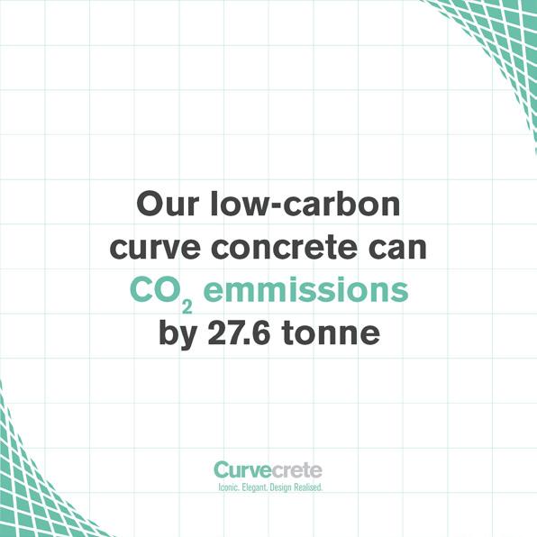
The template is designed to make it easy to create all of Curvecrete’s social media posts. The set of 8 different template versions is fully customisable to suit the brand needs. Simply change the colors, replace the text with any kind of content and images such as Curvecrete News, Green Data, Future Possibilities, etc.


