
Our vision and values
At Frost’s, our vision has always been clear: to provide a level of service that goes beyond expectations, setting new standards in estate agency.
Since opening our first branch in St Albans in 1992, we have grown into a trusted market leader with four closely connected branches across Hertfordshire.
With over 30 years of local expertise, we continue to evolve, embracing innovation in our service and marketing to deliver the best possible results for our clients.
Our values are rooted in the founding principles of Better Service, Better Marketing, Better Results - a commitment that remains at the heart of everything we do. This dedication is reflected in our brand commitment:
Our people care. Our Heritage matters. Our Service drives results.
We take pride in our strong community connections, our people-first approach, and our relentless pursuit of excellence, ensuring every client benefits from the experience, care, and expertise that define Frost’s.
The logo
The logo is the cornerstone of our identity and must be used on all communication material. Where possible the full colour version of the logo should be used. White and black versions of the logo are available. These can be used if the colour version is not appropriate or special print finishes are required.
N.B. Ensure the logo is legible on the background.
COLOUR
BLACK
GREYSCALE
Keeping the logo consistent
It is important that all our collateral has a clean and crisp look. It is always a good practice to leave an area of ‘breathing space’ around the logo to ensure that the brand is clearly visible in the surrounding design or text areas.
DO NOT ADD EFFECTS DO NOT ROTATE
DO NOT DISTORT
DO NOT REMOVE THE BACKGROUND BLOCK
DO NOT CHANGE THE COLOURS
DO NOT CHANGE THE RATIO OF THE TEXT AND THE COLOUR BLOCK
Typography
The brand typeface pairing is Taviraj for headlines and Red Hat Display for body copy.
Typography and a consistent use of typeface is a key element in creating a cohesive look across the brand identity.
Do not use Taviraj as body copy.
Taviraj Thin
ABCDEFGHIJKLMNOPQRSTUVWXYZ
abcdefghijklmnopqrstuvwxyz
1234567890 // !@#$%^&*()
Taviraj Extra Light
ABCDEFGHIJKLMNOPQRSTUVWXYZ
abcdefghijklmnopqrstuvwxyz
1234567890 // !@#$%^&*()
Taviraj Light
ABCDEFGHIJKLMNOPQRSTUVWXYZ
abcdefghijklmnopqrstuvwxyz
1234567890 // !@#$%^&*()
Taviraj Regular
ABCDEFGHIJKLMNOPQRSTUVWXYZ
abcdefghijklmnopqrstuvwxyz
1234567890 // !@#$%^&*()
Taviraj
Taviraj Medium
ABCDEFGHIJKLMNOPQRSTUVWXYZ
abcdefghijklmnopqrstuvwxyz
1234567890 // !@#$%^&*()
Taviraj Bold
ABCDEFGHIJKLMNOPQRSTUVWXYZ
abcdefghijklmnopqrstuvwxyz
1234567890 // !@#$%^&*()
Taviraj Extra Bold
ABCDEFGHIJKLMNOPQRSTUVWXYZ
abcdefghijklmnopqrstuvwxyz
1234567890 // !@#$%^&*()
Taviraj Black
ABCDEFGHIJKLMNOPQRSTUVWXYZ
abcdefghijklmnopqrstuvwxyz
1234567890 // !@#$%^&*()
Typography
Red Hat Display should be used for body copy.
Typography and a consistent use of typeface is a key element in creating a cohesive look across the brand identity.
Red Hat Display Light
ABCDEFGHIJKLMNOPQRSTUVWXYZ
abcdefghijklmnopqrstuvwxyz
1234567890 // !@#$%^&*()
Red Hat Display Regular
ABCDEFGHIJKLMNOPQRSTUVWXYZ
abcdefghijklmnopqrstuvwxyz
1234567890 // !@#$%^&*()
Red Hat Display Medium
ABCDEFGHIJKLMNOPQRSTUVWXYZ
abcdefghijklmnopqrstuvwxyz
1234567890 // !@#$%^&*()
Red Hat Display SemiBold
ABCDEFGHIJKLMNOPQRSTUVWXYZ
abcdefghijklmnopqrstuvwxyz
1234567890 // !@#$%^&*()
Red Hat Display Bold
ABCDEFGHIJKLMNOPQRSTUVWXYZ
abcdefghijklmnopqrstuvwxyz
1234567890 // !@#$%^&*()
Red Hat Display ExtraBold
ABCDEFGHIJKLMNOPQRSTUVWXYZ
abcdefghijklmnopqrstuvwxyz
1234567890 // !@#$%^&*()
Red Hat Display Black
ABCDEFGHIJKLMNOPQRSTUVWXYZ
abcdefghijklmnopqrstuvwxyz
1234567890 // !@#$%^&*()
Red Hat Display
The URL
The URL is an important directional tool for the customer and there is also a set style for the URL to be presented on all materials.
To be used across all communication including letters, campaigns, brochures and email signatures.
The URL should always be in lower case, with no preceding www.
TAVIRAJ, MEDIUM
The slogan
A customer facing statement that summarises what Frost’s stands for. It encapsulates our brand values.
To be used across all communication including letters, campaigns, brochures and email signatures.
TAVIRAJ, REGULAR
Colour Palette
Colour is an essential part of our brand and marketing collateral.
There are primary colours, plus secondary colours to provide designers with a broader working palette.
Try to refrain from using too many colours on the same piece of work.
PRIMARY RED
SECONDARY
COLOURS
C:43 M:37 Y:46 K:40
R:113 G:110 B:99 #716E63
PANTONE 1945C
C:23 M:100 Y:59 K:17
R:145 G:29 B:65 #911D41
C:20 M:96 Y:63 K:32
R:129 G:36 B:55 #812437
C:14 M:13 Y:15 K:13
R:201 G:198 B:195
#C9C6C3
C:58 M:48 Y:55 K:41
R:91 G:90 B:83 #5B5A53
C:7 M:9 Y:11 K:0
R:237 G:231 B:226 #EDE7E2
C:37 M:32 Y:38 K:23
R:144 G:139 B:130 #908B62
C:1 M:1 Y:2 K:8
R:238 G:237 B:235 #EEEDEB
#5A6761
C:7 M:18 Y:26 K:16
R:204 G:189 B:171 #CCBDAB
#A795A3
C:62 M:22 Y:25 K:22 R:106 G:138 B:152 #6A8A98
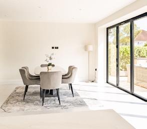
Imagery
Imagery representing Aspirational interiors/homes, quality/professional and featuring unusual angles and lighting, atmospheric, include life-style details and moments, natural, non posed interactions. Images should also depict a diverse range of people, use of warm neutral tones which reflect and complement the brand colour palette.


Imagery
CORRECT STYLE OF IMAGERY - warm tones, cosy interiors, aspirational homes, people unaware of camera to give shots a candid appeal.


INCORRECT STYLE OF IMAGERY - cold or clashing colour tones, basic furnishings, rooms which look like sets rather than real home environments, camera aware models that make the photos feel ‘set-up’ rather than candid.


The brand in action
Particulars
Visualisations shown - to be updated with actual collateral as it is developed.

Beaumont Avenue

£1,300,000


The brand in action


The brand in action
Visualisations shown - to be updated with actual collateral as it is developed.

