LUM


Editor in Chief
Debra Herrick, PhD
Art Director
Arturo Heredia Soto
Arts Writing Fellow
Ryan P. Cruz
Writers
Sarah Cunningham
James Glisson
Rachel Heidenry
Madeleine Eve IgnonCamille Lubach
Halim Madi Christina McPhee
Grace Miles
David Pagel
Tom Pazderka
Gabriel Ritter Allison Schifani
Copy Editors
Grace Miles Evelyn Spence Publishers
Arturo Heredia Soto
Debra Herrick
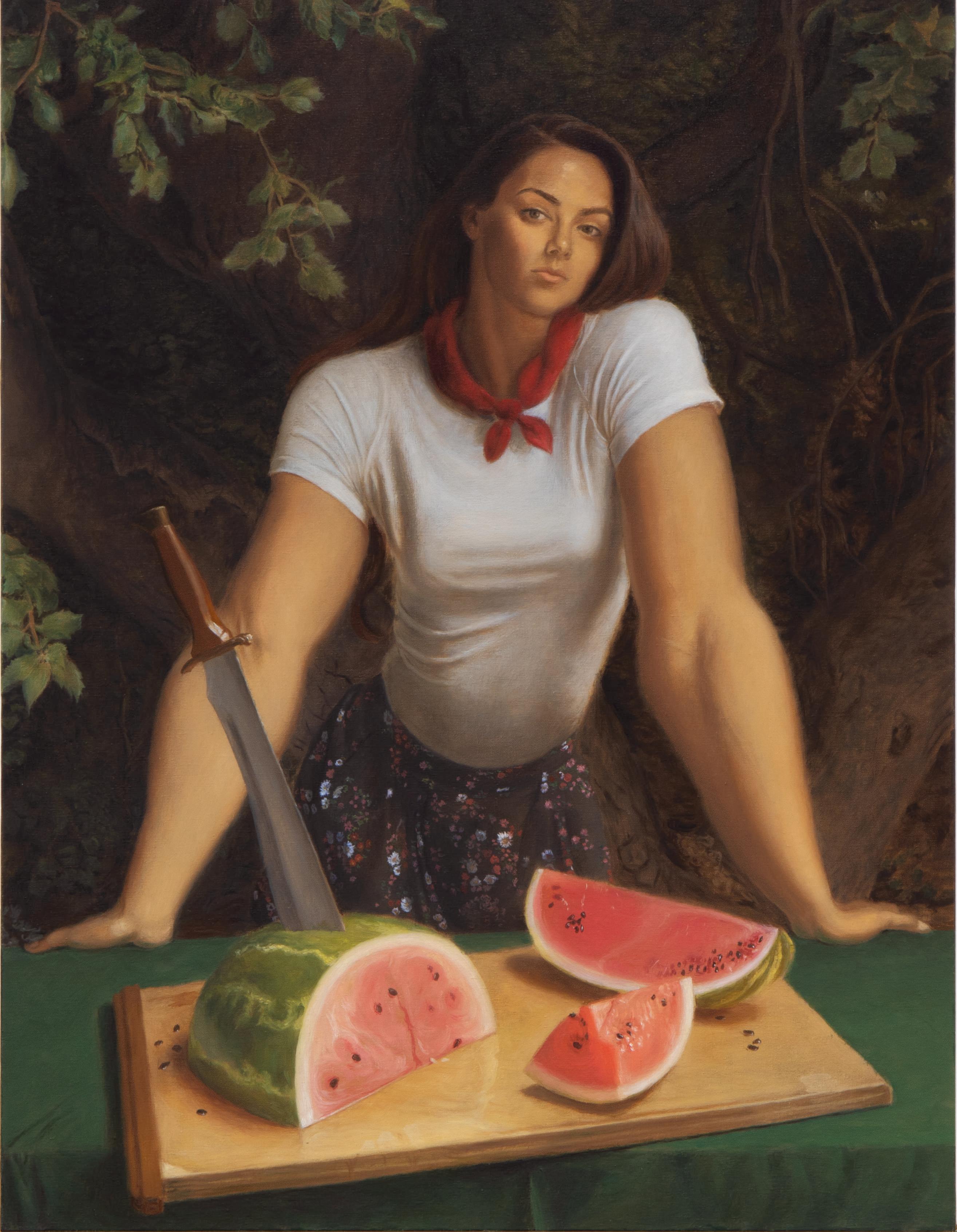
Jansson Stegner, Watermelon, oil on linen, 2021
Glasshouse Farms
Randy Greif Sophia Taylor
Published by California Culture Press, Santa Barbara, 2022 Printed in California
All content in this publication is the property of the publishers and may not be reused in any way without written permission from Lum Art Magazine.
Lum is a contemporary art magazine for California’s Central Coast, published by California Culture Press, Santa Barbara.
Publishing Sponsor
The Lisa McCann Group
Arts Writing Sponsors
John C. Connelly & Frederick Janka Nancy Gifford Michael VanStry
Friends of Lum Art Magazine: Luciana Abeit, Betsy Atwater, Susan Bradley, Rafael Perea de la Cabada, Dorothy Churchhill-Johnson, Marcia Cohen, Adrienne De Guevara, Jeanne Dentzel, Leslie Dinaberg, Rita Ferri, Elizabeth Gallery, James Glisson, Ruth Ellen Hoag, Lynn Holley, Kim L. Hunter & Paulo Lima, Betsy Ingalls, Esther Jacobsen Bates, Cynthia James, Cassandra C. Jones, Kerrie Kilpatrick Smith, Emily Merrill, Jennifer Peck Wheir, Anaïs Pellegrini, Silvia Perea & Juan Heras, Hank Pitcher, Belle & Bert Regeer, Joan Rosenberg-Dent, Kathleen Scott, Wanda Venturelli, Ava Werner, Jeff Wozniak, John Wullbrandt, Sarah York Ruben, Jana Zimmer
Join the Friends! Visit lumartzine.com/shop
Funding support was provided by the city of Santa Barbara’s Community Arts Grant Program.
Advertising
To advertise, contact editor@lumartzine.com.
Tax-Deductible Donations
Lum Art Magazine is fiscally sponsored by the nonprofit Santa Barbara Arts Collaborative. To make a tax-deductible donation, contact editor@lumartzine.com.
If you are in a position to support the vitality of your arts community, please consider giving to Lum. Donations can be made at lumartzine.com/shop or via Venmo: @lum-art-mag. Checks can be mailed to 684 San Marino Dr., Santa Barbara, CA, 93111.
Follow Instagram: @lumartmag Facebook: Lum Art MagazineWebsite: lumartzine.com
10008000 colectivo de arte multidisiplinario
Collecting Shadows Cara Lasell Bonewitz by Rachel Heidenry
Lum Art Prize Alberto Lule by Ryan P. Cruz
A Whole Other Way Dane Goodman by David Pagel
The Good Land Jansson Stegner by Sarah Cunningham
Fierce Poise: Helen Frankenthaler book review by James Glisson
835 Kings Road Mona Kuhn by Christina McPhee
Making Public Alex Lukas by Allison Schifani
Refections on Mystery Ron Robertson by Halim Madi
Layers of California Cynthia Ona Innis by Grace Miles
A Vivid Vision 6oldie the Artist by Ryan P. Cruz
Thinking in Images Ideology & Visual Representation by Tom Pazderka
Submitting to the Sublime Stephanie Washburn & Jane Mulfnger by Madeleine Eve Ignon
The Rondo A Community of Oddballs by Camille Lubach
Gallery Guide
Editor's Pick
Ishi Glinsky: Upon A Jagged Maze with words by Gabriel Ritter
Painted interiors. Woven seaweed. Toasterinspired papier-mâché. Ojai-based artist Cara Lasell Bonewitz draws inspiration from organic materials and everyday shapes. Born in Pittsburgh, she and her family moved to Ojai when she was fourteen. After high school, she went back East for college, spending years in New York, before attending graduate school at the Glasgow School of Art in Scotland. In 2018, she decided she was finished with the gray weather and moved back to Ventura County, setting up a studio in Ojai. Since then, she’s been immersed in the regional arts community, organizing programs like Joyride: Ojai, a socially distanced outdoor exhibition featuring work by local artists in fall 2020.
In her studio, Bonewitz is constantly moving between pieces, sampling different concepts and materials simultaneously. In mediums ranging from installation and fiber to drawing and photography, her works are often labor-intensive undertakings that explore ideas of transience and nostalgia. Regardless of the material, her artwork ponders the question: How do you capture the passing of time?
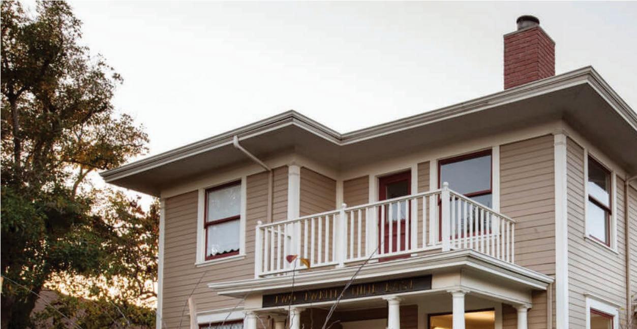
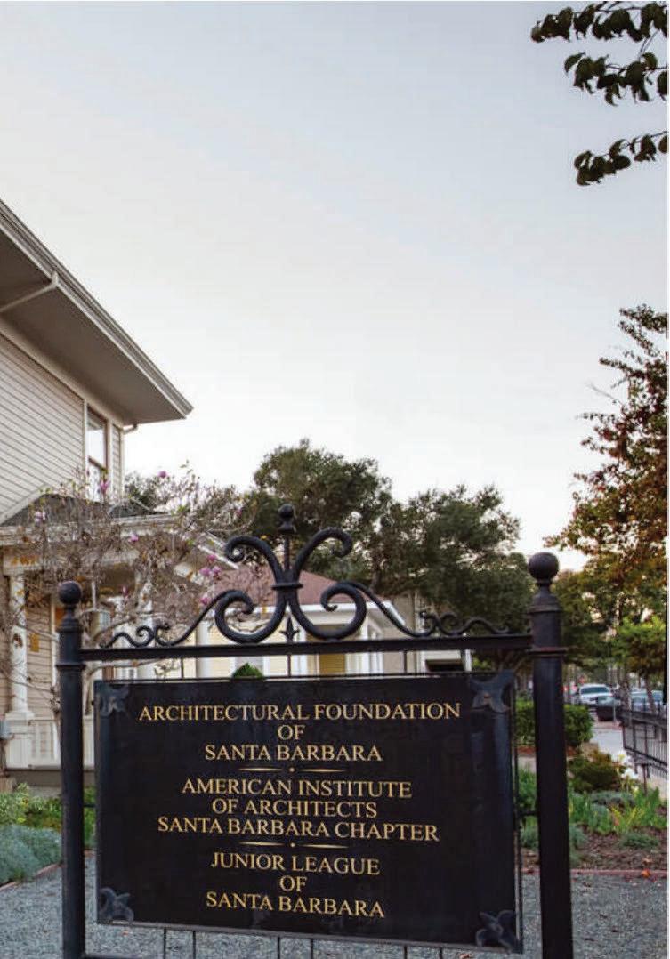
In a recent exhibition at the Architectural Foundation of Santa Barbara, that question is addressed through a series of paintings, papier-mâché sculptures and watercolors. Titling the exhibition A•BOD•E, Bonewitz explores both the idea of home and the body, thoughtfully detailing the relationships between personal belongings, architecture and the shadows and shapes that inhabit them.
In Mom and Dad’s Closet (mostly Mom’s) (2014), we peer into a personal wardrobe, where a fringed white vest stitched with colorful embroidery and a checkered green jacket hang amid brown coats. In XO (2022), we stare at a bedside table, where stacks of books with red, black and white covers lie beside a lamp missing its shade. And in Summertime in London (2015), we
encounter a stairwell, lined with windows casting presumed shadows across the space.
In these paintings of corners, hallways, passageways and closets, Bonewitz captures the intimacy of space. As viewers, we encounter glimpses, our eyes zooming into rooms not fully revealed. Shown in the Architectural Foundation Gallery – a modest, lightfilled room in a historic home built in 1904 – the relationship between spaces and those who inhabit them becomes even more pronounced.
But while people are felt throughout Bonewitz’s painted interiors, no bodies are actually depicted. Instead, we encounter remnants: coffee mugs, shoes lined up in a row, a glowing desk lamp, bottles of nail polish. Human activity is felt, not shown, rendering time ambiguous. Has something just happened? Is something about to? By focusing on the seemingly mundane, time feels both frozen and continuous.
Perhaps the works that most strongly capture this duality are found amid Bonewitz’s watercolor series Collecting Shadows. Created during a year in which she was constantly moving between places, these abstract compositions of interiors in hues of blue, gray and black are as much about what is left out as what is shown. In Collecting Shadows – Fifth Morning (2015), more than half of the paper is left unpainted, the white space acting as both light source and ceiling. As the title suggests, the shadows captured are fleeting; they will never fall upon the fireplace or wooden dresser in exactly the same way.
In many ways, this balance between transience and permanence defines Bonewitz’s practice, both in the subject matter she chooses and the materials she works with. Her white papier-mâché and plaster sculptures – the abstract shapes themselves referencing specific architectural details, her own body or personal mementos – look like bones or fossils. They give the
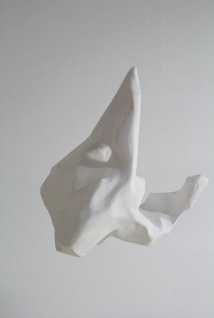
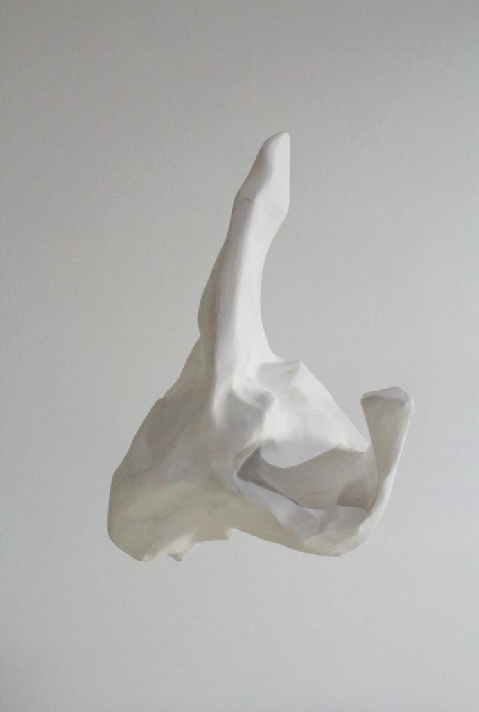
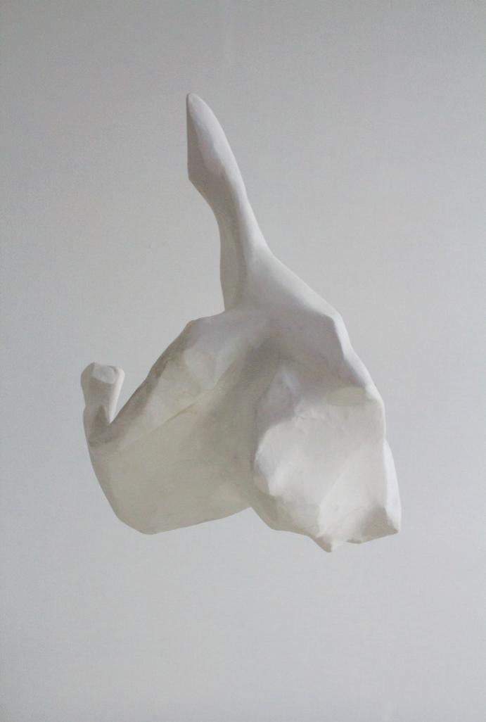
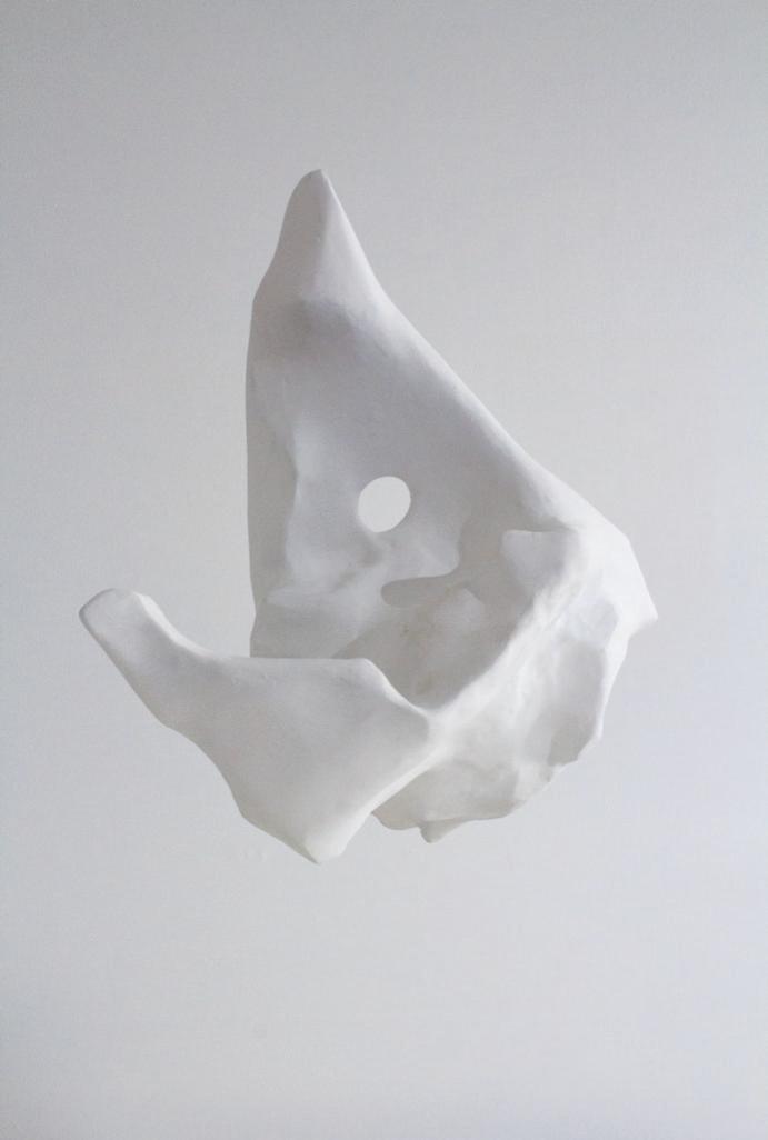
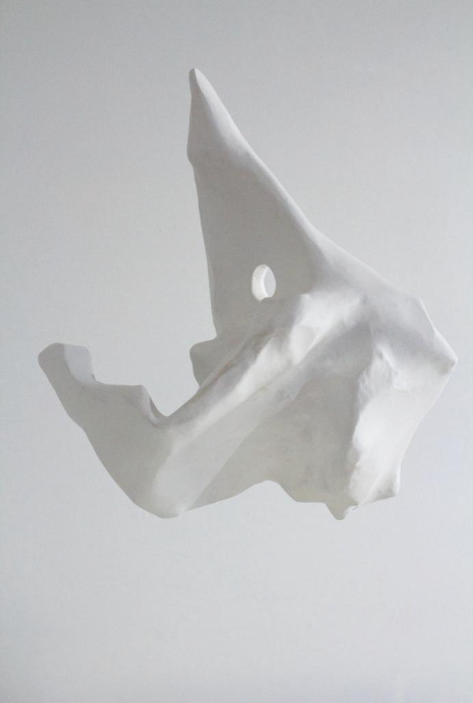
impression of hardness, when, in fact, they are quite delicate.
In another series, Seaweaving, recently exhibited at the Ventura College New Media Gallery, Bonewitz collects seaweed from local beaches, weaving it while it is still wet, and letting it dry on the loom. She then transforms the organic material into large-scale installations that will inevitably decay, the seaweed gradually changing in color, texture and weight. As in many of her paintings, these works are all about the shadows, the strands of seaweed casting their own hues and shapes along the walls. They are also about time, the collection and manipulation of the materials existing in contrast to their natural state.
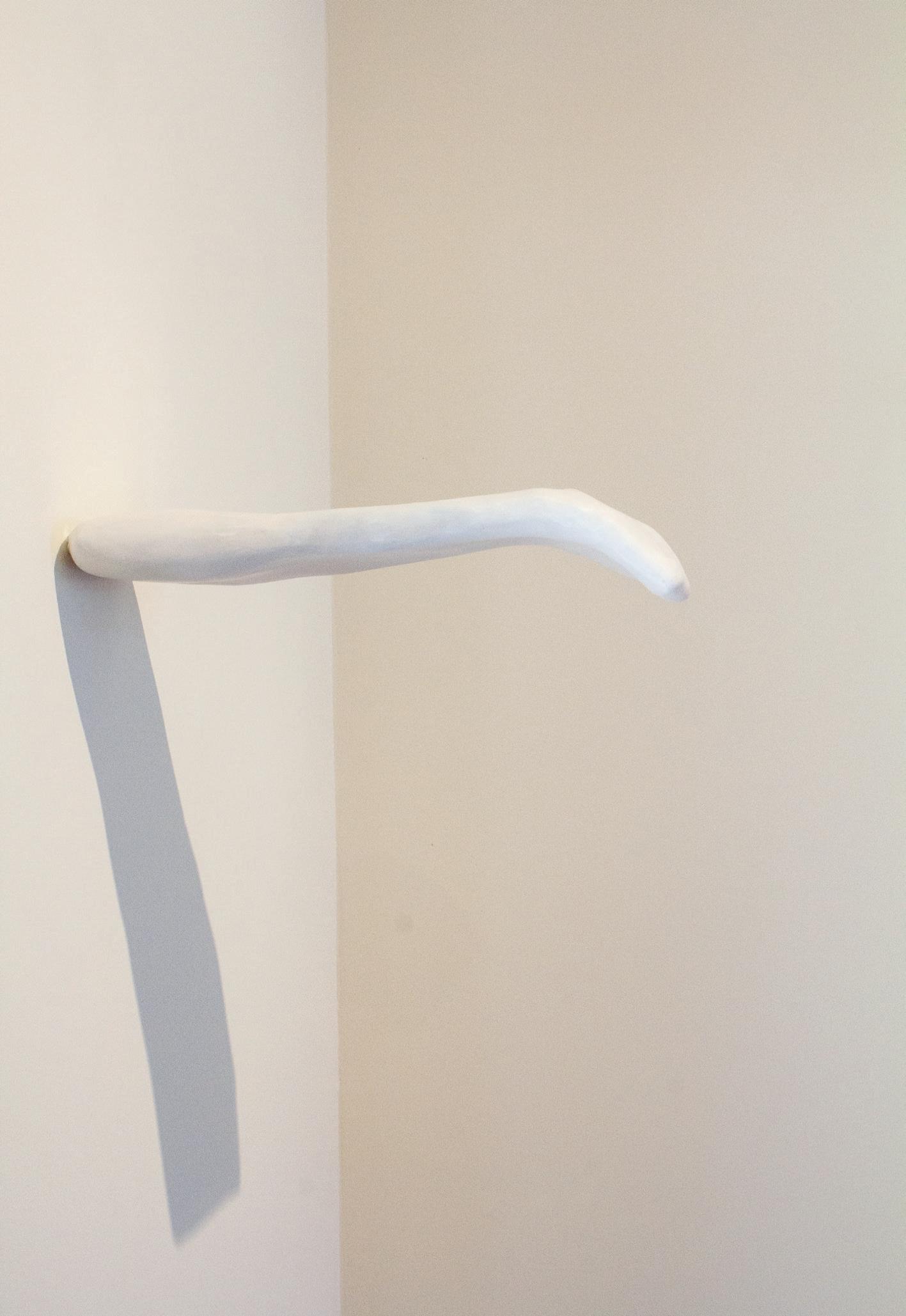
Whether papier-mâché or seaweed, a fragility is threaded throughout Bonewitz’s artworks – one that
feels equally delicate and strong. In Toaster Arm (2022), a papier-mâché piece inspired by the ridge of a toaster and installed at the Architectural Foundation so that it juts forth from the wall, this duality is felt once again. The piece exudes strength even when its placement feels tenuous.
Presence and absence. Still and unceasing. Fragile and strong. Bonewitz’s work is an interplay of contrasts. Time is the unifier, the question and answer that ties all of the series together.
Cara Lasell Bonewitz, Toaster Arm, papier-mâché, plaster, acrylic, 2022
Alberto Lule describes his journey into the U.S. prison system as a trip into an alternate dimension. From handcufs to holding cells, guided through labyrinthine tunnels, cut of from all communication with friends and family, prison tries to strip away any sense of identity until you are just a number in a system.
“Prison is parallel to this universe,” Lule says, now at home in his new reality as an MFA student at the prestigious
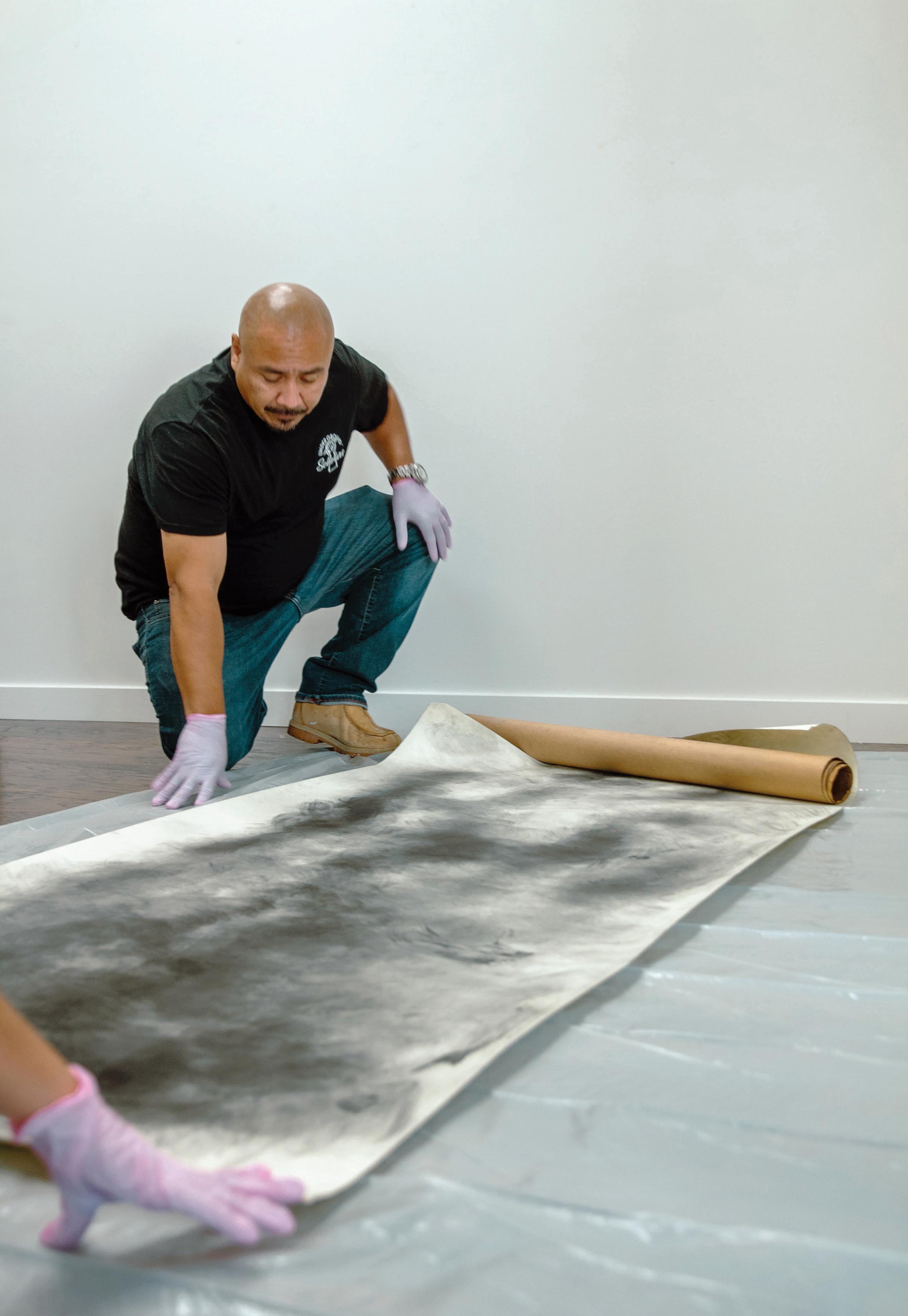
Alberto Lule with his piece Investigation #19, forensic fngerprint powder on paper, photographed by Carla Zarate Suarez
Claire Trevor School of the Arts at the University of California, Irvine, and already a celebrated artist both in his hometown Santa Barbara and his new digs in Los Angeles.
“You are kind of living in this parallel dimension where everything seems to be upside down,” he says. “If you're Black and Brown, you are the majority.”
Nearly two decades ago, Lule found himself thrust into this “alternate dimension” when he was sentenced to thirteen years in a California prison. He was young, his thoughts driven by the invincible courage of a hardheaded teenager who hadn’t yet lived enough to learn life’s big lessons.
“When you have your whole life ahead of you, you don't think too well,” he laughs.
In prison, he adjusted as well as he could at frst. Getting locked up was par for the course when you were doing the things he was doing, he says, and it was one of two logical places he would end up – prison, or the cemetery. He made friends, worked out in the yard, and navigated the complex political climate among inmates in California prisons.
But as the frst four years dragged along, Lule found himself wanting more. He started looking for things that would take him out of the “prison mental space,” eventually picking up a pencil and learning to draw. His creativity transported him beyond the walls of his cell. He devoured art books and started using his drawings as currency for commissary or clout among his cellmates.
His early works were simple drawings, tattoo designs and custom commissions, but the freedom he got from art soon spread to other avenues. He began to change the way he thought, studying philosophy and other subjects, and eventually enrolled in the prison’s college correspondence courses. He realized he could overcome the efects of his physical imprisonment by coming to terms with the identities that had been imposed on him: a child of
illegal immigrants, a gang member, a prisoner. By the time he was up for parole, Lule had chosen his own identity: artist.
Upon release, he enrolled in Santa Barbara City College’s (SBCC) transitional program for formerly incarcerated students, where he fourished in his new environment. There were times he felt like an outsider on campus, older than his classmates, but he kept charging forward. At SBCC, he met his mentor, sculpture professor Arturo Ramos, one of the frst people who really believed in and supported his art career. Just like in prison, he kept his head down and focused on his goals, and by May 2018, he was graduating with four associates degrees, and had been accepted into multiple University of California campuses. He was selected as his class commencement speaker, and during his speach, he announced he would be studying for his bachelors at the University of California, Los Angeles.
In Los Angeles, Lule’s skills had matured to the point where he was ready to execute full exhibitions that explored mass incarceration, challenging the ideas of what people called beautiful. His 2019 installation, The Privatization of Correctional Institutions, displayed “readymades,” everyday items created out of necessity in prisons: a lighter fashioned from a pencil, a paperclip and a scrap of electric wire; a shank made from a plastic pen and a sharpened strip of metal; a tattoo gun MacGyvered together with a staple for a needle.
Lule’s striking series, Prison Readymades, includes a mannequin outftted in a California Department of Corrections prison uniform, denim overshirt and bright orange pants (PRISONER emblazoned down the leg) and a full-size recreation of a jailhouse visitation booth, with a plexiglass window separating two cold steel tables and a pair of phone receivers on either side.
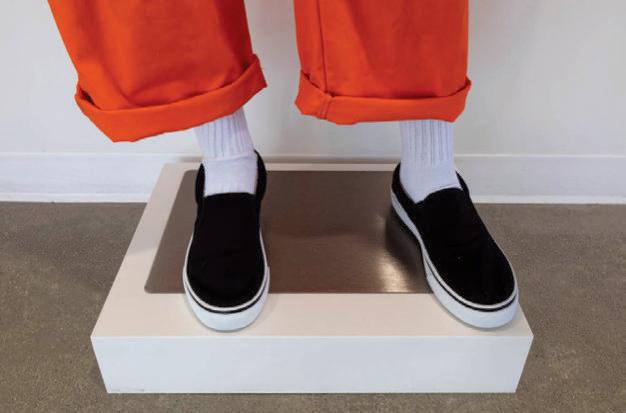
The mannequin looked as if it belonged in the glossy front window of a high-fashion district, and though
the clothes were quite literally ripped of the back of a California state prisoner, it evoked a sense of “cool.” So much so that people have asked to buy the clothes of the mannequin. But the reaction proves the deeper point to Lule’s work: the commodifcation of the bodies and works of the oppressed, and challenging who decides the cultural value of art.
“I'm trying to abolish the old modes and strategies of displaying artwork,” Lule says. “One of the things that I like to do is compare and critique institutional spaces.” Museums and galleries represent institutions that have power, he says, and can be seen as “authorities of culture.” “What society thinks is beautiful is controlled by these institutions,” Lule says.
Lule’s replication of a prison visitation booth can be jarring to those who aren’t familiar with life behind bars. But as the gallery’s visitors engage with the simulated experience, sitting on each side, touching palms through the window and talking through the crackled static of the plastic phone, they are forced to imagine what it would be like to have their communication with the outside world stripped down to a controled and dehumanizing interaction.
“I think the issues I’m bringing up are important – they are visceral – and I have to do everything I can to bring
you into this experience,” Lule says. For many viewers, it is a chance to reckon with the U.S. criminal justice system, Lule adds. If somebody wrongs another, does that warrant them losing their freedom? Maybe. But their humanity? That gets even
harder to pin down. At what point does the punishment account for the transgression, and are we okay with how these decisions are made and executed?

In Lule’s own life, he has seen frsthand how easily his body and image can be controlled by institutions. When he was arrested, his name was blasted in local newspapers, and he felt like he was treated as a character in a salacious storyline. Any rumor or allegation repeated in court was printed again and again, without any chance for Lule to speak for himself. Once the case was settled, and he was found not guilty on the most severe of the prosecutor’s accusations, he felt betrayed that no newspaper cared to follow up.
At UCLA, he used his surroundings to shed a light on the power dynamics between these institutions, specifcally between education and incarceration. As co-chair of the Underground Scholars Initiative, he advocated for and helped lead a group of formerly incarcerated students pushing to reverse the school-to-prison pipeline.
“The university gives power to people,” he says. “Prison is a place of
punishment. They’re not that far of; they are two sides of the same coin.”
As he approached his graduation from UCLA, Lule began receiving residences in Los Angeles. His work was recently included in We Live, Memories of Resistance at the Oxy Arts Gallery at Occidental College and Language Games at the Fullerton College Art Gallery. In 2020, he was also the recipient of the Kay Nielsen Memorial Award from the Hammer Museum and a residency from Tiger Strikes Asteroid Los Angeles. His work in these galleries expands on his previous exhibitions with readymades and a new series of abstract installations made with forensic fngerprint powder – the use of materials created to investigate and imprison individuals now used to create something beautiful.
In his live performance piece, Investigation: Leaving the Print, Lule strips down to his boxers and recreates the process of being booked into jail, laid face down, hands behind your back. He records the performance with his own body, rubbing forensic powder onto plexiglass with his bare skin as he goes through the steps to the procedure. The performance, he says, explores “the role of agents of authorities and their control over bodies.”
When he was deciding where to study afer UCLA, he said he was blessed to have a wealth of options. He was accepted into graduate programs at UCLA, UC Berkeley, UC Irvine and CalArts. Despite the temptation to go to Berkeley or CalArts, he settled on UC Irvine’s art program. “It’s empowering to have options. Anybody would want to have those types of decisions in your life.”
Most recently, he has come into
another role, teaching art to seventh grade students in the Los Angeles Unifed School District at UCLA’s Community School for Visual and Performing Arts. In class, the kids call him “Mr. Berto,” and he laughs when he says they call him their new favorite teacher because he looks “cool.”
Lule’s artwork and writing have progressed immensely since he frst arrived in Los Angeles. He’s always working so when he spends time outside the studio, he soaks up the city for inspiration. "I drive around a lot,” he says. “I like to see things. I like to watch people, I don’t like to be in my studio.”
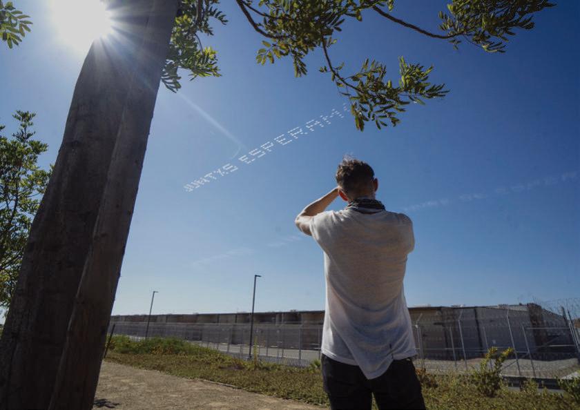
This fall, Alberto Lule will be honored at an art talk at the Atkinson Gallery, Santa Barbara City College, in partnership with the Carolyn Glasoe Bailey Foundation and Lum Art Magazine.
*The Lum Art Prize feature is sponsored by the Carolyn Glasoe Bailey Foundation.
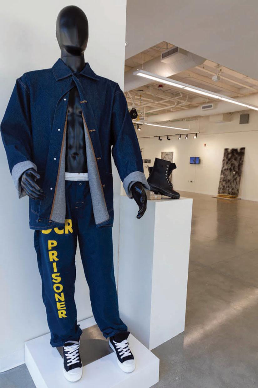
opposite page, top lef: Alberto Lule & Guadalupe Rosales, JUNTXS ESPERAMOS, NO SON OLVIDADOS, Otay Mesa ICE Detention Facility, In Plain Sight, a coalition of 80 artists fghting immigrant detention and the culture of incarceration conceived by Cassils and Rafa Esparza, Cassils Studio, 2020; bottom right: Alberto Lule, installation view, The Privatization of Correctional Institutions, Vama Gallery, Los Angeles City College, photographed by Andrew Giorsetto
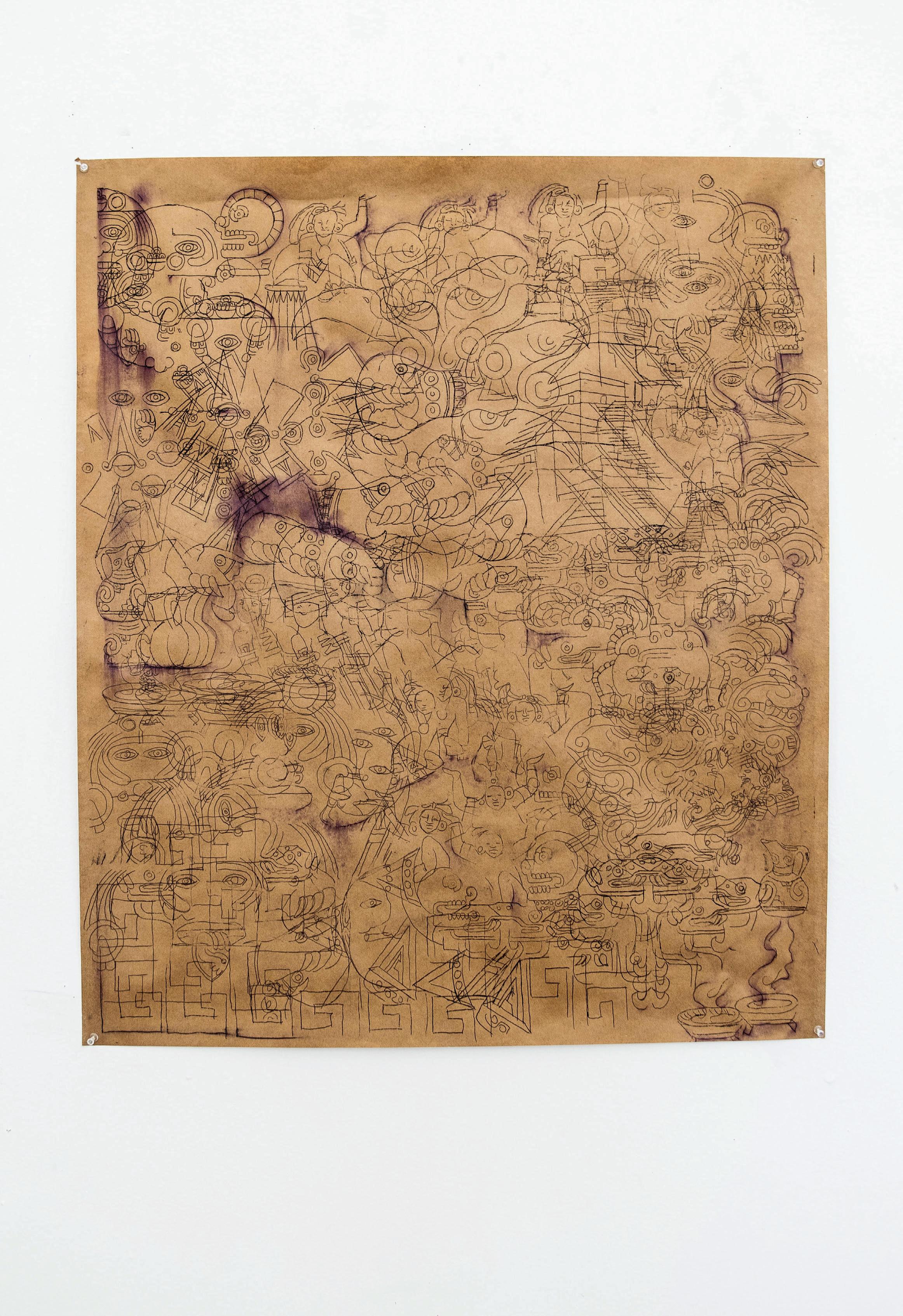
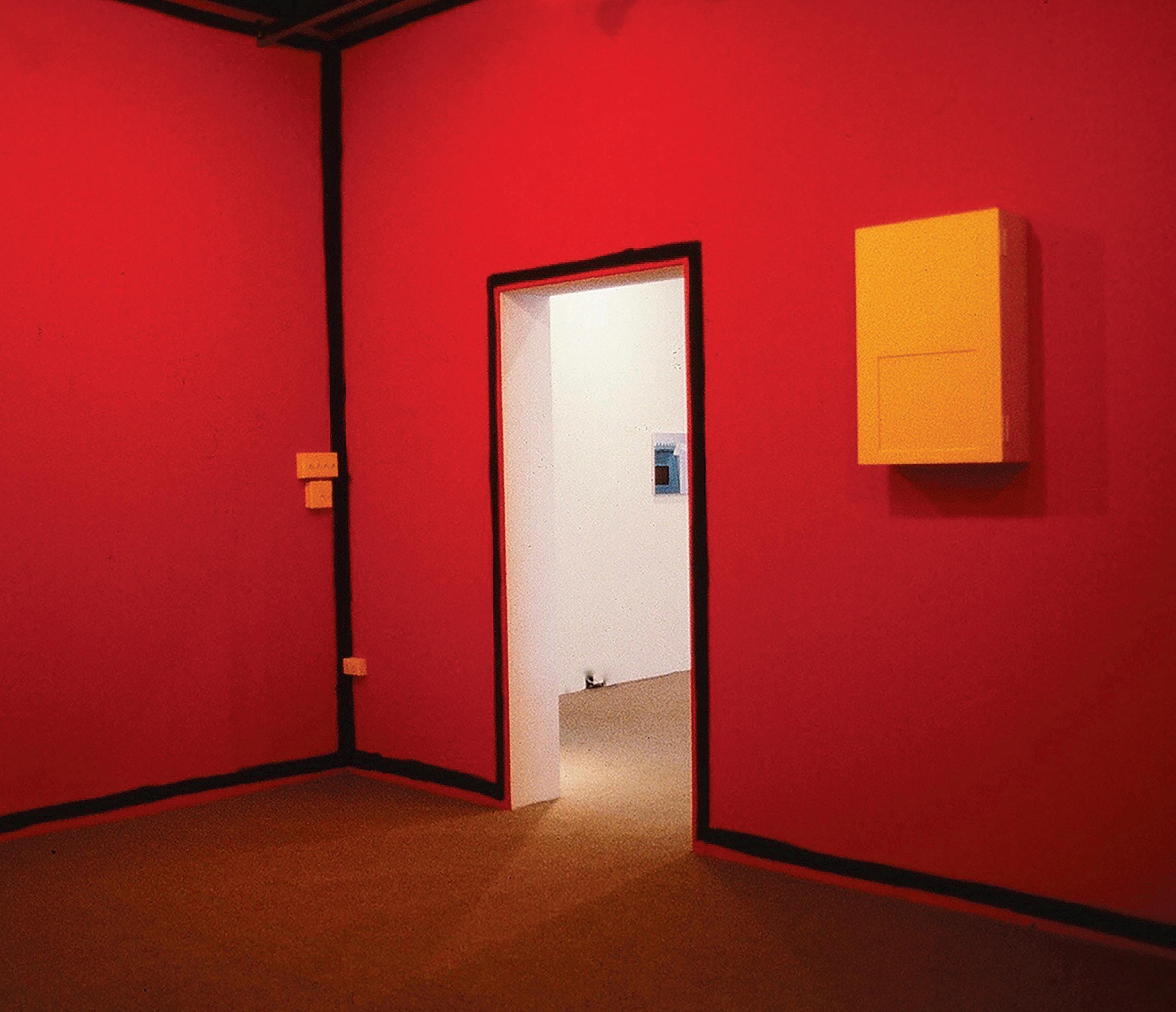
“Right now, I’d never let anyone into my studio,” Dane Goodman declared, just a few minutes into my call to see if I could set up a time to get together and talk about what he was doing in his studio. As always, his tone was friendly and anything but ofputting. It wasn’t as though he had something to hide or some secret to withhold – it was just that invitations to his studio were of the table, an activity so far removed from the realm of possibility that it was not worth thinking twice about.
At the same time, Dane was perfectly happy to discuss what he was up to in his studio and what was going on in his mind – not to mention in his heart and soul – in the same welcoming way that he has always talked about art and his relationship to it, whether that art was made by him or someone else. He spoke with warmth and inquisitiveness, unguarded, explaining that he had recently committed to an exhibition at the Atkinson Gallery at Santa Barbara City College.
The solo show, scheduled for fall 2023, will be something of a homecoming, because from 2004 to 2012, Dane served as the frst fulltime director of the gallery, organizing an impressive list of exhibitions during his tenure. For his own show, he promised himself and the current gallery director, John C. Connelly, that he would make all new works. He wanted to do something new, to look forward, not back.
So, what he was doing in the studio was exploratory, in the most profound sense. There were sketches and studies and inklings of intuitions and ideas that had not yet gelled; nothing even close to fnished and everything at the very beginning of a process that not even Dane knew where it would take him, each of its stages riddled with doubts and discoveries, double-backs and do-overs.
And if, over the next year, he managed not to fall back into previous practices and also managed to keep expectations – from others and himself – at bay, he just might arrive at what he loved about art: the kind of soul-stirring joy at the beauty and strangeness of things he never expected to see – nor even imagined existed – yet somehow, still

capturing something essential about what it feels like to be alive today, in a world as fraught with uncertainty as it has ever been.
“Sometimes I even regret telling people I have the show, especially when I think of Paul Thek, who insisted that you never schedule a show until the work you want to exhibit is fnished,” Dane confessed.

“Even when Marie” – Schoef, Dane’s wife of 40 years –“and I are working in our separate studios – we knock on each other’s doors. We’ve always been that way, thinking ‘that’s your space.’”
For Dane, his studio “is where I fgure things out. I don’t have a lot of people in there. I keep it sacrosanct. If I have something I feel good about I might invite people in. But not when I’m in the middle of things. When I’m not frm on it, I don’t want people’s ideas to infuence me. I don’t want to have any obligations or expectations. In the end, the process is the best part. I want the work to come about however it comes about. So, it is my own.”
That integrity is essential to everything Dane does as an artist. It’s not that he thinks that what he has to say is so special and pure and unique that other people’s ideas and comments would sully its precious perfectionism. It’s just that the kind of conversation he is interested in having with himself requires silence – and stillness – and would be drowned out – or shouted down – by other voices.
What Dane is afer, especially when he is embarking on a new body of work by exploring a new set of concerns, is the chance to fnd out what is most important to him: the feelings and beliefs that are integral to his identity as, he says, “a human being on this complicated, beguiling planet.”
That outlook excites me because unlike so much art being made today, Dane’s begins with the conviction that the self does not yet know itself, and that, in the process of
making something, the self might discover something important about itself, which is never settled or fnished or fxed, but developing – changing and opening by paying attention to its surroundings. For Dane, that means devoting his attentiveness to the materials and imagery he is working with, both internal and external.
The external stuf is obvious: the pencils, pigments, putty, paper, wire and wood that fll his studio and give it the feel of a backyard workshop inhabited by an inveterate tinkerer – a dyed-in-the-wool do-it-yourselfer who keeps the tables, shelves, workbenches and odds and ends just tidy enough to allow him to focus on the task at hand, but not so tidied up that you feel as if you’ve stepped into a spread in a design magazine. The internal elements to which Dane pays attention are more elusive, subtle whispers that fash and fit through his mind’s eye when he’s not interrupted by visitors.
“In art,” he explains, “you have this opportunity to be in the world in a whole other way – not in the usual logical or linear sense. Some art works that way, and I’m ofen drawn to it. But it doesn’t have to stick to such rational, explicable ways of making sense of things. That’s where my work takes me. I am comfortable with ambiguity.”
Dane doesn’t seek out ambiguity for its own sake, or cultivate ambivalence because that’s easier than arriving at any kind of clarity. He dives into that world because he knows, from experience, that it’s the ground out of which the most profound and intimate insights emerge, neither logically nor predictably, but nonetheless powerfully, even undeniably.
“It’s amazing,” he says, “that humans have made trillions and trillions of things. And then, for example, I’ll come across something Ron Nagle has made, and I’ll go: ‘That’s perfect!’ I don’t know why or in terms of what I judge it to be perfect, but his little sculpture stops me in my tracks and elicits profound joy. It’s stunning.” Such qualities of “immediacy and freshness and unencumberedness” set
Dane wondering about the mysteriousness of it all. “I can go back to it again and again and every time I say to myself, ‘What is that?!?’” Not knowing is not a problem. In fact, it’s part of the pleasure. And essential to the mystery.
“A lot of my work is very simple,” Dane says. “I try to call out an image that has a lot of resonance for a lot of people. Really common things –snowmen, jack-o-lanterns, shovels, beds, pillows. But my images are also refned. I’ve edited out countless others.” That’s what takes so much time – alone and focused in the studio.
And that’s where another side of Dane’s need for solitude comes in. Some visitors don’t get past surface appearances. He says they “don’t fully consider what I’m trying to do.” The last part of that phrase is important. Dane is not a snob. He is not saying that he is more sophisticated or intelligent or insightful than just about everyone else, nor that his perceptual acuity is sharper or more developed. It’s just that he knows that he is in the best position to fgure out how it is with him, and what that means for the art he is making. No one else can do that for him. Insight is a matter of frsthand experience.
That’s what transpires in the studio, in works that he works out in due time. Then, when he has a good sense of what they have done for him and continue to do to him, he takes them out into the world and presents them to others. That’s where exhibitions come in. And it’s important to Dane that his works are democratic: unpretentious, accessible, open to as broad a swathe of the population as possible. He doesn’t want the particularities of his story – his personal history – to get in the way of any viewer’s relationship to what he has made.
In all his works, he says, “I’m mulling around meaning. But I don’t believe a viewer has to have any awareness of that. I’m trying to give a visual experience. That’s how art works. It starts things. I learned that from Oliver Jackson, who insisted when he was fnished working on a piece it was no longer his. Works of art have a life of their own.”
Dane refects: “I like doing things that might be perceived as dumb, trite, old-fashioned.” Just out of grad school, he worked for years to make photographs with the clarity of Ansel Adams using an SX-70 Polaroid camera, works with a subtlety, detail and tonal richness at odds with the snapshot casualness common to point-and-shoot Polaroids. “That’s where I learned,” he says, “that it doesn’t matter what medium you are working in, all you have to do is believe something. Have a vision.”
He has been cultivating that vision for 50 years. And it’s not getting old. “I’m trying to be clear about who I
am. Where I am,” Dane says. “I could do angry. Today there’s plenty to be angry about. But I feel that there are so many people doing that. Some very powerfully. The world doesn’t really need me doing more of that. So, I ask myself, ‘What can I do? What does the world need?’”
Dane answers that question in his work, visually not verbally, aesthetically not argumentatively, experientially
not conceptually. Making time and space for refection and introspection – both his own and ours – he makes room in the world for what is in desperately short supply: honesty and insight, gentleness and wisdom, empathy and compassion. And you don’t need to be invited into his studio to know the value and transformative impact of all that.
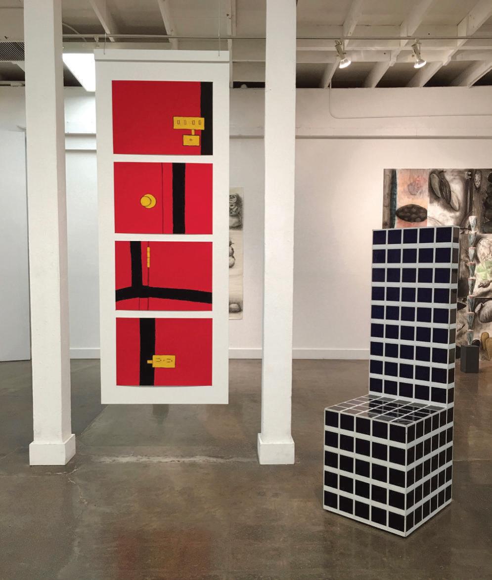
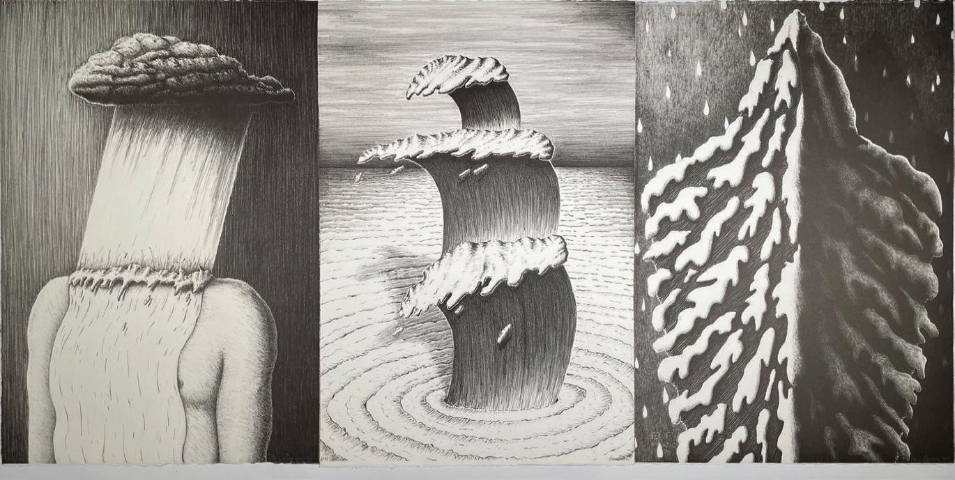
above: Dane Goodman, Water Suite, lithograph triptych below: Dane Goodman, Consorts, installation view, Estrada Fine Art
Jansson Stegner paints people – just, not real people. He clarifies that his paintings are not portraits, but rather the culmination of composites of studio based studies, internet searches and his imagination. Lately, however, Stegner is shifting his approach toward portraiture and occasionally using a single sitter for his nevertheless highly stylized figures. Stegner credits his youthful infatuation with comic books for his interest in art and particularly exaggerated depictions of the human form.
In a recent conversation with Sasha Bogojev for Juxtapoz magazine, Stegner says, “To make a painting interesting, you need to blend familiarity with unfamiliarity or strangeness with normalcy. Too much normalcy and it’s boring. Too much strangeness and it’s unrelatable.”
Since his grad school days at the University of Albany in the late 1990s, when I first met him, Stegner has been honing what he calls “weird figuration,” a distinctive lexicon of corporeal distortions – extreme elongation of the body, oversized torsos with small heads, and, most notably, a pointed reversal of typical male/ female musculature. He lists Schiele, Dix, Grosz, Balthus, El Greco, Ingres, Ensor and Neel as inspirational artistic predecessors who likewise employ hyperbolic figuration.
– rather than via a specific narrative or landscape. While his newest paintings continue to center the figure, more background details emerge, particularly ones that both reflect and reimagine the good land of the Central Coast. Stegner’s still sparing use of details gives them heightened importance as narrative allusions, allowing the viewer to envision what lies beyond the edges of the plane.
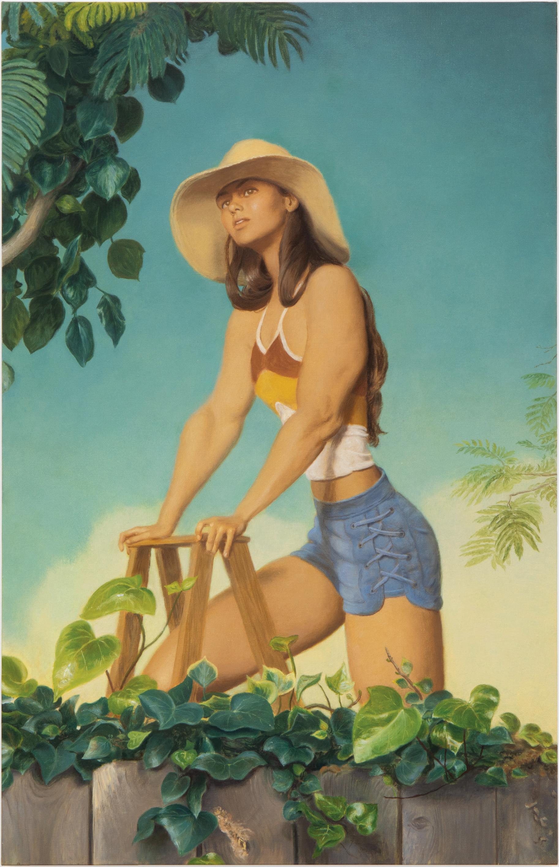
opposite page: Jansson Stegner, The Backyard, oil on linen, 2021
Born in Denver and raised in Minneapolis, Stegner relocated to Goleta in 2019 after nearly 20 years in New York City. Readers here on the Central Coast will recognize the name of his recent solo show, The Good Land, at Nino Mier Gallery in Los Angeles as a call out to his newfound hometown. In most of Stegner’s oeuvre to date, the background is often a wash of color with little or no contextual details. Instead, the viewer is invited into Stegner’s far reaching fictive world through his characters – a languid cop slipping off his chair or an athletic champion posing with her volleyball
In Watermelon, on the cover of Lum Art Magazine 06, 2022, Stegner fuses still life and portraiture in an abundantly verdant scene, but it’s one that’s not quite bucolic. That “not quite” is at the core of his work; he illustrates people and things that are simultaneously straightforward and not quite what they seem. On the surface, the female subject stands behind a table serving freshly cut watermelon to the viewer. However, something about the simple scene feels awry. With clear delineation between the edge of the table tipping from the figure towards the viewer in the lower third of the painting and the lush background in the upper two thirds, Watermelon can almost be read as two discrete paintings in one. Below, a memento mori still life in which the watermelon’s once sweet life bleeds out, dripping over the lip of the cutting board into darkness. Above, a portrait of a strong woman looking somewhat defiantly at the viewer. The subject’s stance, with her inner arms turned forward and weight on the heels of her hands as she leans on the table, parallels the barmaid’s pose in Edouard Manet’s A Bar at the Folies-Bergère. Yet here, in contrast to Manet, Stegner has no interest in depicting ordinary life nor average people. In keeping with his earlier celebratory paintings of female athletes, Stegner’s subject is heroically muscular, her arms and shoulders impressively large and her waist narrow.
Exaggerated further by foreshortening, her self-possessed power invites a re-reading of the enormous knife stuck upright in the dome of
the juicy fruit as the sword Excalibur. Potentially she is both the magician who lodged the blade in stone and the rightful regent who will unsheath it. This ambiguous duality typifies Stegner’s storytelling through his characters. Likewise, the figure is clad in the tight-fitting cotton blend jersey of a contemporary athlete while the artistic style, medium and symbolic references of the painting have historical allusions. Stegner puts past and present in constant dialogue with each other, disrupting linear time and creating an even deeper level of confusion.
When he moved to California, Stegner told me he was excited to see how the new landscape would impact his work. At the time, he was completing a new suite of paintings for an exhibition at Almine Reich in NYC, which opened in early March 2020. I vividly remember Eagle Hunter, among the first works Stegner completed in his new studio, as depicting not
only Southern California’s landscape but its storied light.
In The Good Land exhibition, Stegner’s new landscape continues to add depth to his pseudo portraits with a particular interest in the garden and its abundance. In The Backyard, a strapping young woman atop a ladder looks into the far distance. From the viewer’s vantage point below, she is above the clouds with only blue sky behind her. Her knees are hidden by the fence which – like the watermelon cutting board – takes up the bottom third of the painting and separates the foreground from the rest of the image. In the flattened space, she appears to be growing from the vines that entwine the fence rather than climbing the ladder behind it.
Through this minimal use of landscape, Stegner creates a scene with multiple possibilities, suggesting the subject is looking to escape the garden by jumping the fence, ascending to heaven, or picking (the forbidden) fruit from the (barren) tree. However, Stegner’s most overt reference to the Garden of Eden is in Along El Sueño Road, in which another preternaturally strong woman looks knowingly over her shoulder at the viewer as she plucks a bloom from the flowering tree that surrounds her. While Stegner rejects critique that his work is gratuitously erotic, he does make sexy work – sexy in luscious paint, sexy in his subjects’ powerful bodies, and, here, sexy in her direct gaze that demands in return, “Look at me.” In this piece, Stegner simultaneously borrows from and upends both art historical depictions of Eve and pin-up posters – another popular art form that employs pronounced proportions – to illustrate self-knowing sexuality as powerful rather than shameful.
While more lithe and lean than his female counterparts, the male subject in Orange Picker also appears larger than life through Stegner’s signature use of elongation and his position in the extreme foreground of the picture plane. His superhuman size and figural distortion is emphasized even more in comparison to his fellow harvesters, who are depicted with standard proportions and Lilliputian scale. Although this painting contains the most contextual information, with the orchard and farmhands, Stegner uses a low vantage point to exaggerate the man’s height and to illustrate him transcending earthly concerns with his long torso and delicate head against the sky, similar
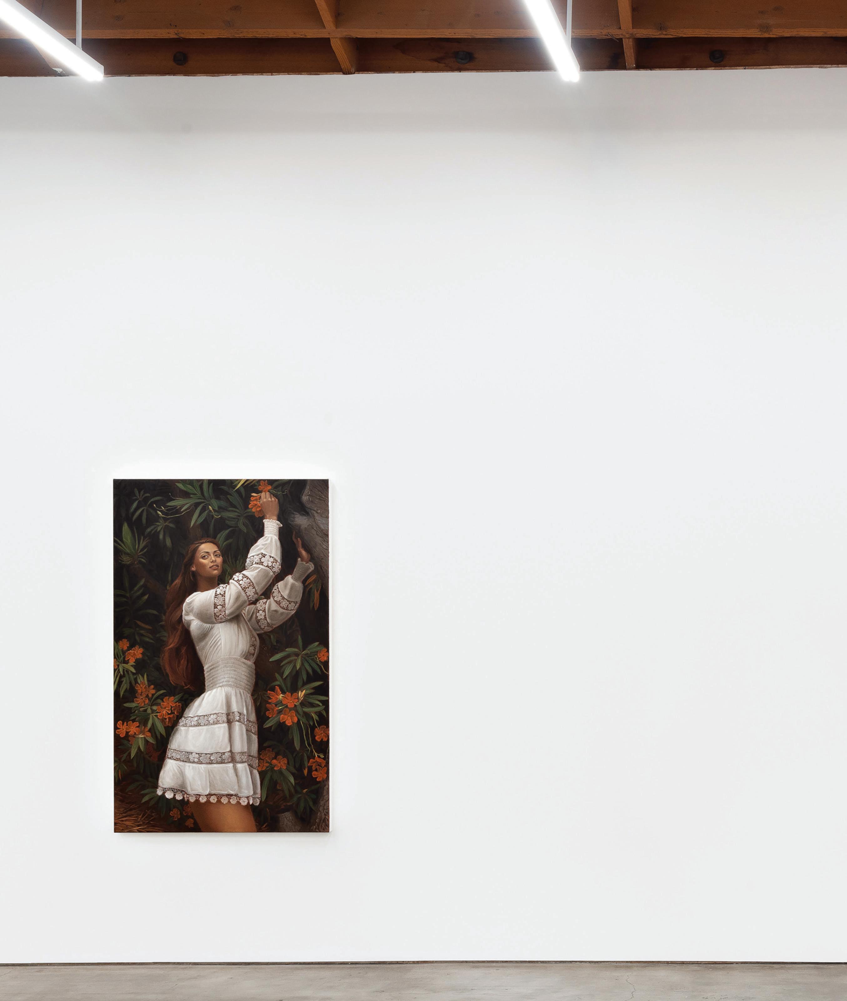
to The Backyard. The vignette of gray clouds emphasizes the brightness of the figure, but also hints of something amiss in this pastoral paradise.
Further exploring the metaphorical storm in Lifeguard, Stegner depicts a dark foreboding sky and swirling sea foam rather than a sunny day at the beach. The juxtaposition of the contemporary (the figure in her red flip flops) and the historical (the dark blue green of the stormy sea) is especially pronounced in this piece. Although the darkness implies risky conditions at sea, the titular lifeguard turns her attention inland toward the light and reclines leisurely on the large rock in the lapping tide. In a move away from Stegner’s personal phenotypes, the woman embodies both the robust physique of his female athletes and the languorous pose of the male police officers in his earlier work. Using this contradiction in his own lexicon, Stegner again establishes a duality in which his subject is both the savior and the siren, a real life superhero who may dive to our rescue or seduce us into dangerous waters.
As someone who has watched Stegner’s practice
Lucia at the Patio Door stands out in this collection of paintings for its specificity of a fixed person, time and place while continuing to explore his signature “weird figuration” and garden metaphors.
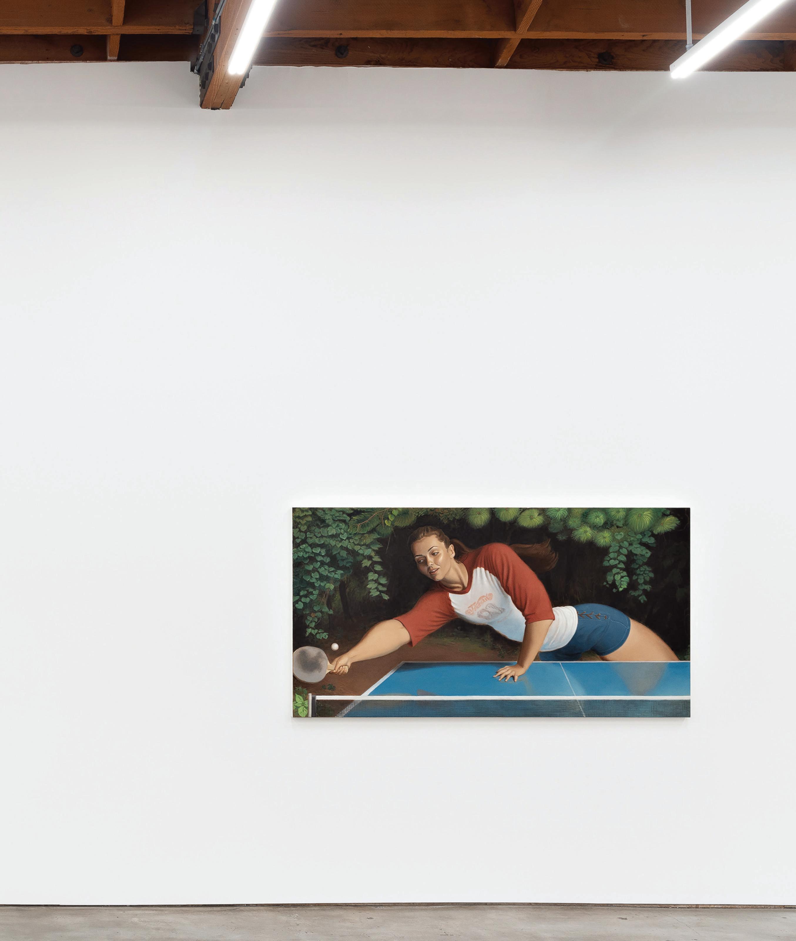
Like Stegner’s female athletes, Lucia is tall and muscular with broad shoulders and bulging thighs undulating in contrast with her small head, slim waist and too tiny feet. She stands in the light at the threshold of a sliding glass door, a vertical sliver of which reflects the garden outside. Stegner thereby employs a formal structure similar to Watermelon or The Backyard using a delineated foreground plane to present a painting within a painting although the setting is contemporary. Lucia’s tight fitting floral pants bring the natural world inside, emphasizing – as with all The Good Land paintings – the connection between humans and the natural world. Having visited Stegner’s then home, I recognize the exacting details of the stair railings and the midcentury style coffee table in the dark recesses of the interior, but, even without that knowledge, all viewers will recognize that this scene is fixed in the present without the
Jansson Stegner, Good Times, oil on linen, 2021
evolve over more than twenty years, his subjects – however transformed – have always been recognizable, beginning with images of his now wife and more recently of his teenaged son. Therefore, his recent embrace of single sitter portraits (identified with the person’s name in the title) is especially interesting to me. In particular,
ambiguity of time that characterizes Stegner’s other paintings in the exhibit. Stegner’s shift to depicting specific people in contemporary settings roots all of the work in The Good Land more firmly in the present and encourages viewers to explore the extraordinary in ordinary life.
There are a couple of reasons to read biographies. They share revelations gleaned from patient research in archives or unearth letters that bear out the subject’s thinking. Alternatively, a biographer might track down people who had not been previously interviewed – the childhood friend, or the boyfriend or girlfriend from college. These can be scandalous and cutting or sad, revealing hidden traumas. Then, there are biographies built around dazzling reinterpretations of the novels, letters or flms by the subject. A gifed close reader can discover formerly hidden patterns and new intersections between life and art.
There’s a third pleasure to take away from a biography. It is less about new facts or reinterpretations, and more about the mood. It’s the Bildungsroman of the heroine in the current of a life unfolding, of opportunities and setbacks; there’s a what’s-aroundthe-corner excitement. Elizabeth Hardwick’s Sleepless Nights (1979) has this quality, as does Joan Didion’s Goodbye to All That (1967). Both pieces of writing are autobiographical yet also quasi-fction or even speculative non-fction.
While the book under review, Fierce Poise: Helen Frankenthaler and 1950s New York, is infected with citations, quotes and the apparatus expected of a scholar like Alexander Nemerov, a professor at Stanford University, it is also imbued with mood and tone, like Hardwick or Didion. Nemerov’s narrative turns on Frankenthaler’s paintings, her compulsion to make them, and her ambition, but it is also about all that could have derailed her painting. An instructive comparison is with Mary Gabriel’s magisterial Ninth Street Women (2018), which covers much of the same ground, but weaves Frankenthaler’s early years in with that of other pathbreaking women in her circle, and,
while compulsively readable, does not have the same expectant mood.
There is a sediment of facts that cling to most introductions to Frankenthaler. She came from a wealthy German-Jewish family and grew up in an Upper East Side apartment with servants. Her father Alfred Frankenthaler was a respected and successful attorney. He later sat as a New York state appeals court judge, where he dealt with mortgages during the Great Depression. Her parents doted on her and encouraged art making. She attended the city’s elite private schools, Horace Mann, Brearley and fnally Dalton, where Rufno Tamayo taught her painting. In 1949, she graduated from Bennington College, then a center of intellectual ferment, bustling with German intellectuals who had fed the Nazis. Not long afer arriving in the city, she dated the career-making (or breaking) critic Clement Greenberg, who was nearly twenty years her senior.
There is one more fact that is always listed. On Oct. 26, 1952, in a single three-hour session, Frankenthaler painted Mountains and Sea, which moved New York School abstraction past the innovations of Jackson Pollock’s drips. Frankethaler’s technique of pouring turpentine thinned paint onto raw canvas sparked what became the Washington Color School that included Jules Olitski and Morris Louis. A woman led, and the boys followed behind.
To understand what makes Nemerov’s lapidary approach, let’s walk through the chapter “Mountains and Sea,” the facts of that afernoon, their emotional tenor and his speculation about her intellectual framework. His treatment is novelistic and has all the lightness of touch of Frankenthaler’s abstractions.
We learn that Frankethaler has just moved into a new studio one block from her apartment at London Terrace Gardens on 23rd Street between Ninth and Tenth avenues. We learn her studio mate, Friedel Dzubas, is there too.
Frankenthaler thins paint with turpentine and pours for about three hours, channeling the memories of the rocky Nova Scotia coast from her summer vacation with Greenberg and the watercolors she made there. Afer she stopped, she called Dzubas over. They knew the painting was a breakthrough; and Greenberg, who saw the painting soon thereafer, did too.
This triumphant studio session, an interlude of determination and focus, is read against Frankenthaler’s professional despair, political setbacks and emotional turmoil. She was half-heartedly looking for a fulltime job, and, like many New York School artists, she supported Adlai Stevenson in the 1952 presidential election. Stevenson was defeated by Eisenhower about a week afer she paints Mountains and Sea. While she was not out and out political, she did not like Nixon, Eisenhower’s running mate.
While Frankenthaler did not wish to be a mother, she did long for direction, sometimes feeling listless. Her two sisters had growing families. A month before Mountains and Sea, she broke down in tears when seeing of a friend, Sonia Rudikof and her family, as they boarded a ship to England. “I felt that my own life had stopped,” Frankenthaler wrote, “as I stood on the deck and posed for the pictures and saw all the people going someplace.”
There is more to the story than the heroine at a low point overcoming doubt. Nemerov also considers Frankenthaler’s time at Bennington where she learned from stellar faculty such as poet Howard Nemerov (Alexander Nemerov’s father) and the painter Paul Feeley. European intellectuals feeing the Nazis also taught there. Peter Drucker, one of the fathers of the MBA, and Eric Fromm, the psychoanalyst and public intellectual, taught there in the 1940s. Frankenthaler studied sociology under Fromm, and his ideas around freedom within the conformity imposed by society. Nemerov quotes from Fromm’s Escape from Freedom:
Whether it be the fresh and spontaneous perception of a landscape or the drawing of some truth as the result of our thinking, or a sensuous pleasure that is not stereotype, or the welling up love for another person – in these moments we all know what the spontaneous act is and may some vision of what human life could be if these experiences were not such rare and uncultivated occurrences. (14–15)
One might make the mistake of thinking Fromm was describing a Frankenthaler painting with its spontaneity and its conversion spills and accidents into marks on the canvas. Not being intellectual, not being caught in rationality or ideology could also be a “theory” of
painting. Mountains and Sea is a moment that is lifed above stereotype and mundane into a limited version of freedom, one passing and as evanescent as the clouds of pigment on her canvases.
Indeed, Frankenthaler rejected theorizing, “No painting is good ‘intellectually’” (75); when asked by a reporter about the meaning of her work, she replied curtly, “You want clues? There are no clues.” Nonetheless, she had a strong idea of the efect the painting should have. She ofen praised a successful work of art by saying it gave her a “charge.” In evaluating her paintings, she discarded anything that felt labored. It should give the impression of happening all at once.
For all that she closed of from the intellectual, she did acknowledge that her paintings abounded in feeling – though not personal or biographic. These are not diaristic jottings of her day. Nemerov is particularly convincing when he claims the 1950s abstractions are private and public, probings and emanations of emotions but not the emotional life of the artist herself.
If this seems like double-talk, it is similar to an actor whose inner person is not the same as her performance, even if from outside they appear to be the same. Frankenthaler said that the painting Blue Territory (1955) contained “inner amorphous worlds or depths exploding on the surface and in perspective.” It is an undersea vent releasing pressure from deep within the earth, a conduit for emotion to fow through.
While this reviewer has focused on the paintings, the momentum of this book comes from the personal bramble that the artist cut through in her twenties. There was her mother’s suicide afer her Parkinson’s disease became unbearable, and Frankenthaler’s decision to keep herself at remove from the ensuing family drama that forever stained her relationship with her sisters. There was the fractious fve-year long relationship with Clement Greenberg, and his stalker behavior afer she ended things, which culminated with him slapping her at a party and causing her to break down in tears. (She continued to be friendly with Greenberg until his death.) There was also her marriage to the artist Robert Motherwell, which lasted from 1958 to 1971, and began as a union of determined artists shaping their lives around the studio. She took on the awkward role of stepmother to Motherwell’s daughters from a previous marriage.
What comes out from these episodes is how much the stuf of life pulls artists away from the steely focus required to make something original and to sustain a career, but Frankenthaler was never defected for long.
Mona Kuhn, 835 Kings Road, Installation view, Art, Design & Architecture Museum, University of California, Santa Barbara, photo by Tony Mastres
 by Christina McPhee
In835 Kings Road at University of California, Santa Barbara’s Art, Design & Architecture Museum (AD&A), Brazilian artist and photographer Mona Kuhn expands the territory and the erasures of the archive through a photographic/cinematographic study of the R. M. Shindler home in Los Angeles at the eponymous address. The R. M. Schindler Papers, itself an archive, has been archived at AD&A since 1968. Their contents span from 1916 to 1953, the year the architect passed away.
In the early 1920s, a young Austrian architect Rudolf Schindler arrived in the area, fush with inspiration from the indigenous Native American structures he had observed in the American Southwest. Shindler sought to build a home on Kings Road, declaring: “Our rooms will descend close to the ground and the garden will become an integral part of the house. The distinction between indoors and the out-of-doors will disappear. The walls will be few, thin, and removable.” Recasting precedent by engaging indigenous typologies, Schindler styled the home in what would become known as iconic California design.
Kuhn was in residence at the Schindler House, shooting a
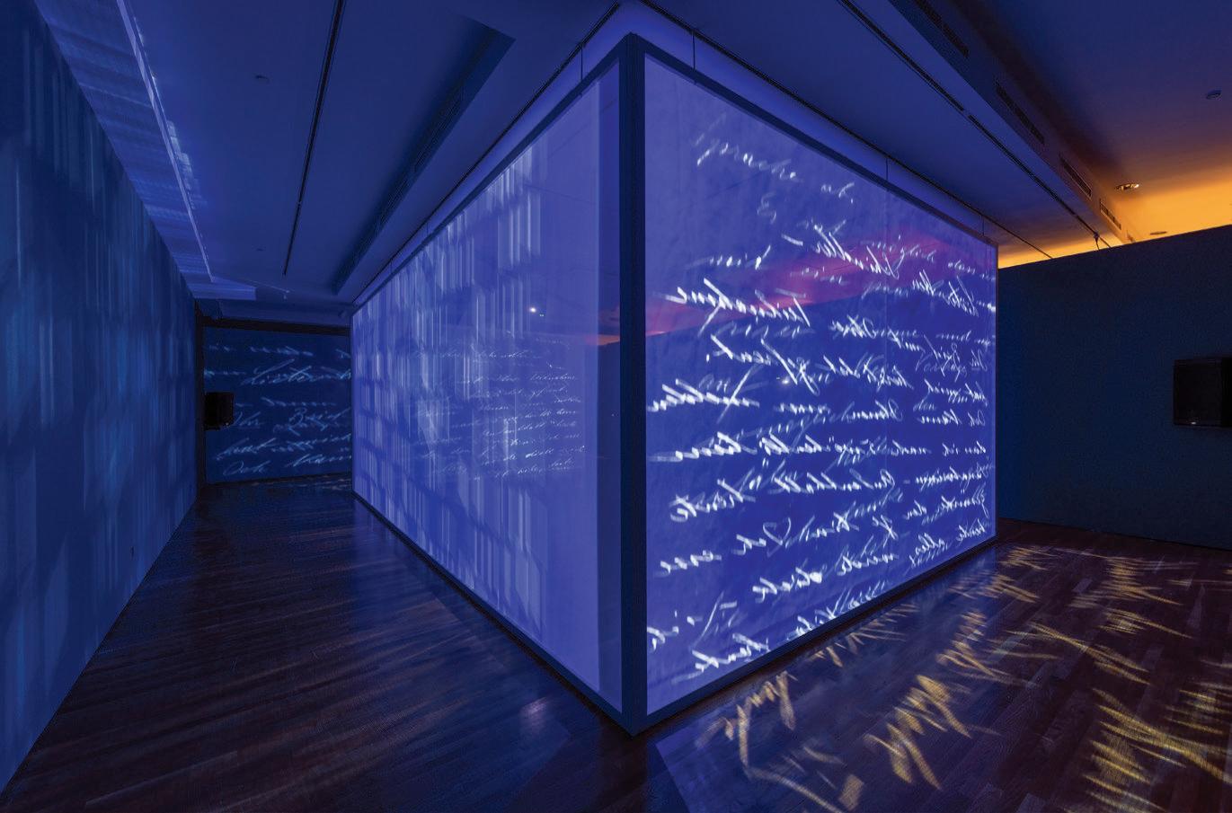
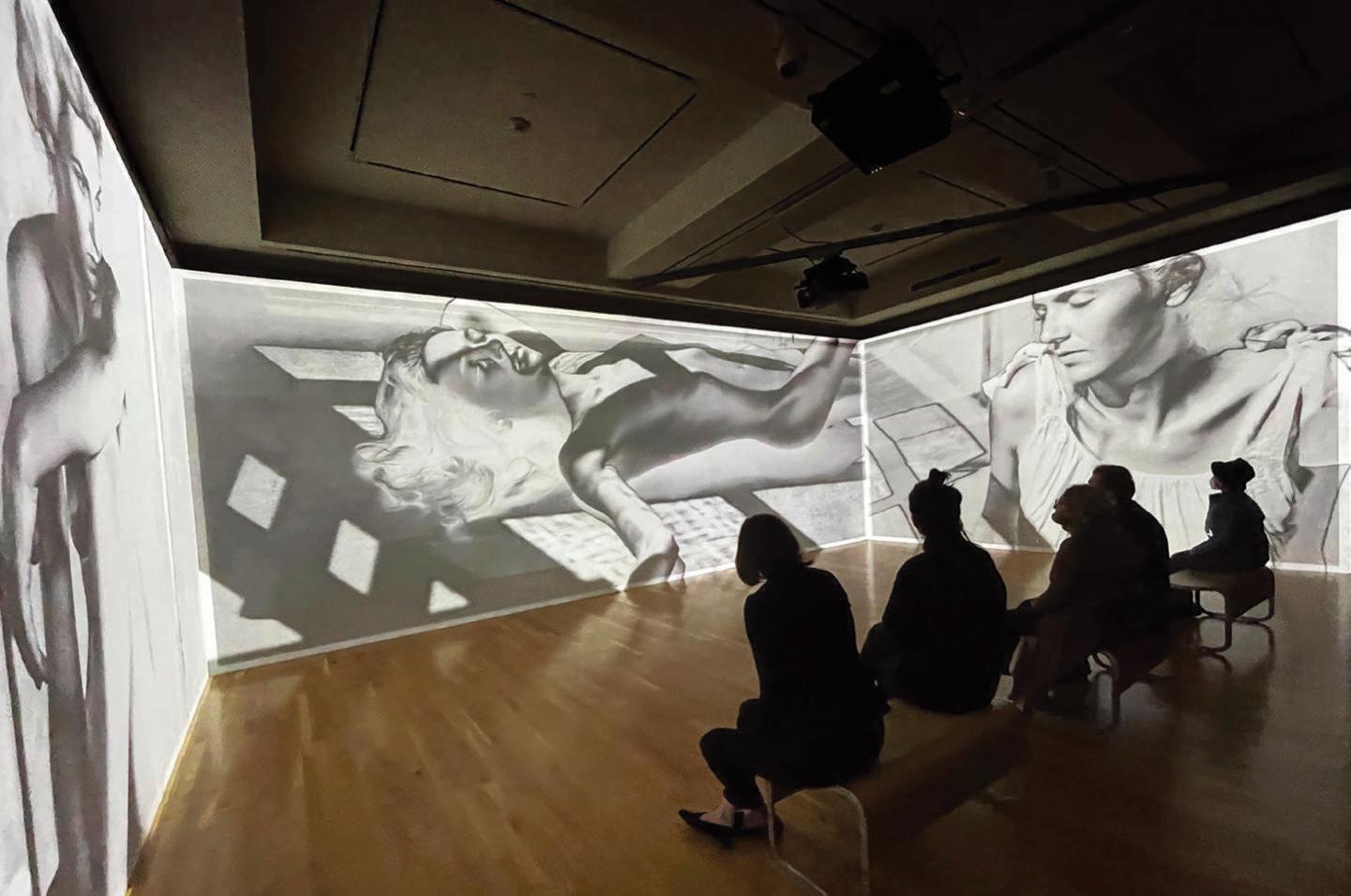
large body of still photographs of the home and grounds alongside portraits of an unnamed woman who appears to reside there. These photographs were compiled into a book, Kings Road, in collaboration with Steidl Verlag. Then, for 835 Kings Road, Kuhn cast those stills into animation, and interwove shots of textual ephemera from the R. M. Schindler Papers. Using multiple channels of video, she set these images to an original score by composer Boris Salchow. Slippage and repetition from the Kings Road book to the 835 Kings Road exhibition, combined with operatic video installation, efectively entangles us, makes us more than visitors; we are intruders – we’ve broken in. Why is this fgure of a solitary young woman appearing on repeat? Why are we sharing ‘her’ space? Scrolling shots of Schindler’s ephemerae, views of luscious plants, and concrete slab construction don’t restrict her; like a ghost, she seems to move right through walls. To the fgure, Kuhn applies streamline-moderne solarizations à la Man Ray. An antique gesture, to undo a century of time? Is the fgure Mona? Is she us?
In an interview with the exhibition's curator, Silvia Perea, Kuhn notes how “we are in this world for a minute, and there is nothing more important than connecting with each other because, in doing so, we pass on important things.” This is repertory, reconnaissance and common wisdom.
Kuhn’s installation ofers, beyond her photography, an architecture of reverie in open time.
Through the exhibition's design, Perea sets the stage for this spectral display with research materials that illuminate Schindler’s vision. Vitrines on early infuences in Austria and the Americas lead to displays of his spare drawings for the house, together with writings and interviews with critic Esther McCoy. Quotes speak to Schindler’s desire for open improvisation in the domestic space: “The ordinary residential arrangement providing rooms for specialized purposes has been abandoned.” For Perea and Kuhn, video requires a def swerve from Schindler’s rooms, no matter how open, towards ephemerality and temporal layering. Perea makes sure that the ‘entry code’ to the property is in the form of a letter from Schindler’s archive.
Among his writings, Kuhn unearthed what could only be described as a break-up letter to a lover, copied in Schindler’s elegant hand. For 835 Kings Road, Kuhn crafs an imagined identity for this mystery lover. She projects the lady revenant, catching some sun, clad in Roaring Twenties fashion. Ghostly girlfriend, her silhouette reverbs. Video projections of the cast shadows from vine tendrils catch onto calligraphies, stamps, signatures. Forensic bits, archival debris, foating evidence, all give rise to the question: who, exactly, is living at Kings Road?
The word archive, as Rebecca Schneider has observed, derives from the Greek ‘archon’ or ruler. Schindler hoped the house would announce his practice as authoritative; afer all, the house of the archon identifes the archon as king. But the house is leaky, porous, prone to variations in light and darkness, to what cannot be seen as equally as what can, and to whomever can fgure out a way in. The discovery of such an intimate letter gives Mona Kuhn, a century on, a way to invade the Schindler House.
As I walk alongside the scrims, my body casts live shadows among projections. Did Schindler also desire this? His
design is open to its own decreation. The video layers never acquire a cross section, nor elevation, nor foor plan, for more than a moment, as all cinematically melts in montage. Lust for the index is frustrated. The archon’s house is ofcialdom, it’s defned by the archive, itself defned by what it cannot be. Dilemma: a museum must open up to all kinds of live bodies and memories and movements and cybernetic shifs. 835 Kings Road has a consistent vulnerability to breach.
Schindler would take risks as he embraced the implications of open space, in design as in life – he will have held, always, a space for living. The Schindler House in its heyday entertained couples and coupling, children, friends, lovers and rivals. Photos of Schindler himself from the late twenties project a dreamy revolutionary élan (his portrait never appears inside 835 Kings Road). The tension of the archive, according to Foucault, is the future anterior: “it will have been (done).” In this way, Kuhn makes what would have been into a kind of undoing.
Follow the evidence at 835 Kings Road. Perea has made an exacting and bold articulation of curation. Thanks to Perea’s invitation, extended both to the artist and to us, we can receive, and unmake, an experience of 835 Kings Road as an excessive and luxurious addition to Schindler House. Its confation of archival ephemera with performance makes the video installation behave like a lean-to on the archon and his house. The installation itself is a subtle and extensive commentary, both disappearing and adhering into Schindler’s legacy as it lives on through our participation in the museum itself, a Russian-doll-like site for the house of Schindler. This is a tour de force for curation, owing to Perea’s insistence in showing how the space of the Schindler House and its ephemeral structure created in the museum are liminal and bordered while still open, transgressive and vulnerable. She demonstrates how Schindler’s archive, alongside its remnants, holds disappearance within its own self as an ontological experiment.
Mona Kuhn, 835 Kings Road, installation view, Art, Design & Architecture Museum, University of California, Santa Barbara
In an essay entitled “What is the Social in Social Media?” theorist Geert Lovink writes about the contemporary difculty of locating the social – or more specifcally, the political opportunities and radical possibilities once aforded to the social – in the age of networked social media. Twitter, Instagram, Facebook: these platforms and others, in his reading, pose difcult questions about the power of public utterance, once considered essential to political action.
To speak, to allow to speak, to silence –these, in many intellectual traditions both modern and ancient, have been exercises of power. But of course, these days, so many seem able to speak, whenever they want, about whatever they want, on all kinds of platforms that might loosely be described as public, and promote themselves as social. Or, in Lovink’s words “the silence of the masses that Baudrillard spoke about has been broken. Social media has been a clever trick to get them talking.”
The work of Santa Barbara-based artist Alex Lukas is similarly concerned with the social, as well as the persistent question of what it means to make public. However, his chosen venues and forms are typically not found within the bot-driven, datamined din of social media. Instead, he’s spent his career thus far working across media: print, audio and sculpture, in addition to combinations and reworkings of multiple forms.
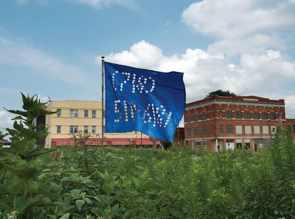
In one piece displayed at STNDRD, in Granite City, Illinois, his media consisted of a large blue tarp and the cellular
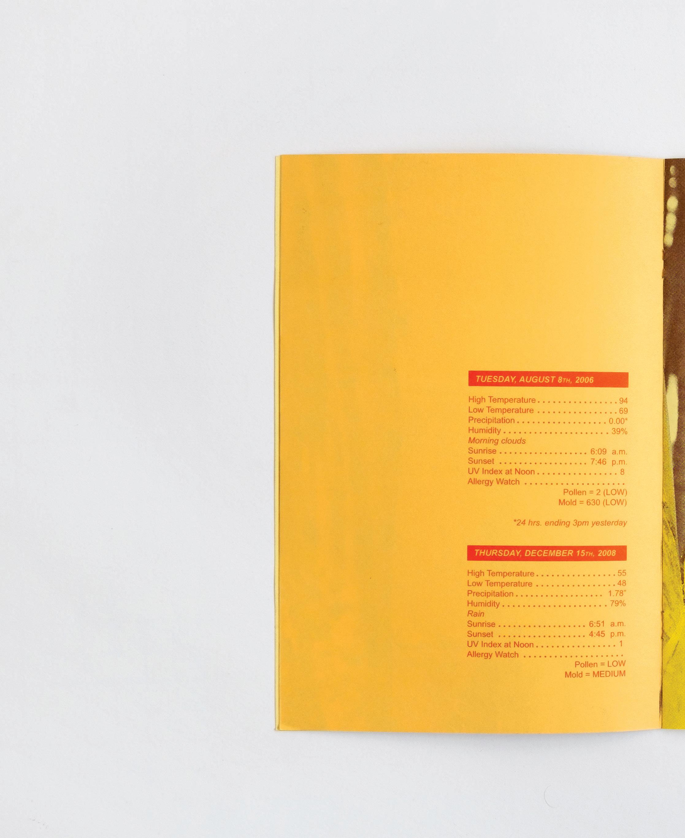
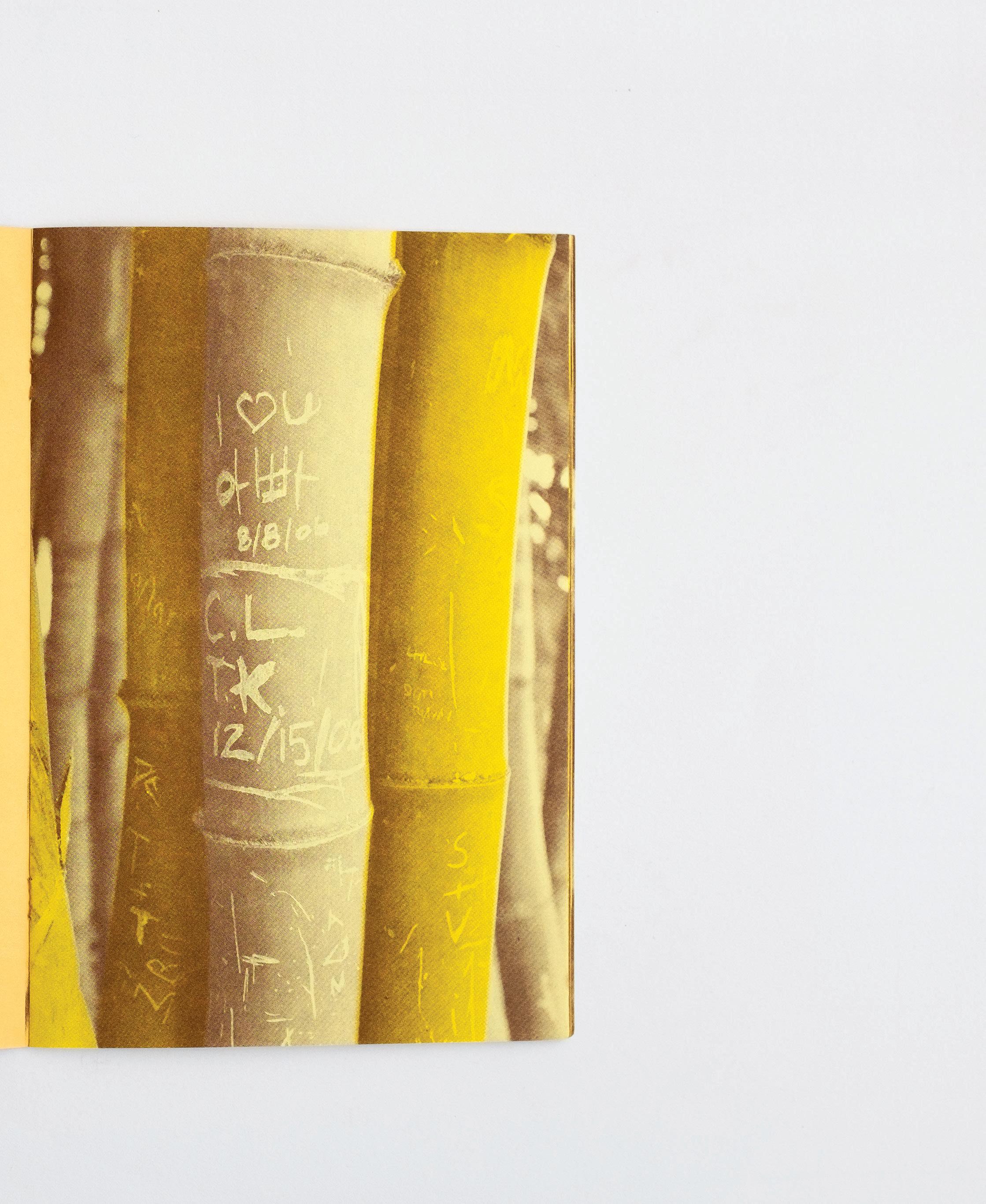
Alex Lukas, Written Names Fanzine, Issue #3: Names and Dates Carved into Bamboo, San Marino, California, three-color risograph with photocopy, 20 pages, 9.5 x 6.5 in., edition of 100 or so, 2017
telephone network. Lukas perforated the tarp with holes that enumerated his actual phone number – the public could call if they wished.
Lukas traces the roots of many of his creative concerns to growing up in Cambridge, Massachusetts in the ‘90s. That period was a strange interregnum in which the lasting impact of deindustrialization could still be felt in parts of the city that were soon to become fodder for gentrifcation. This tension manifests itself in Lukas’ art through his investment in spaces that remain less ordered, less visible, and thus ripe for intervention, illicit and otherwise: ripe for becoming public but not yet obviously so.
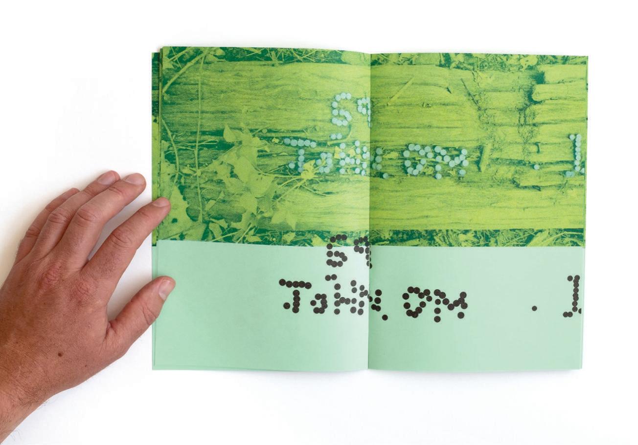
Tied to the punk, do-it-yourself ethos of this period is his ongoing zine project. Written Names Fanzine is a print publication “dedicated to occurrences of localized, unsanctioned public name writing.” Its issues explore the surfaces and spaces employed for the inscription of individual names. Issue 5 is titled Petroglyphs and Names Written in Stone. Issue 3: Names and Dates Carved into Bamboo. Issue 6: Names Written in Nails Embedded in Railroad Ties.
The zine, in a persistent form beloved by ‘90s counterculture, is deeply entwined with what sometimes feels forgotten when we seem perpetually called to post, tweet, like and comment: the intoxicating pleasure of making and changing our worlds when no one is watching. As a print collection, the issues double the publication of these names, lifing them from their sites of original writing and ofering them anew in paper.
Across his work is an urgent interrogation of where publics and their discontents form, how we are called into being as a member of a public or excluded from such membership, and how one makes public, the intimate and the internal. You could call it a sociality subtly removed from what might be traditionally considered the public sphere.
These questions push him to both enter into and investigate ofen neglected, but nonetheless shared spaces, from the graveyard to the highway. In one of his more recent collections, Town Website,
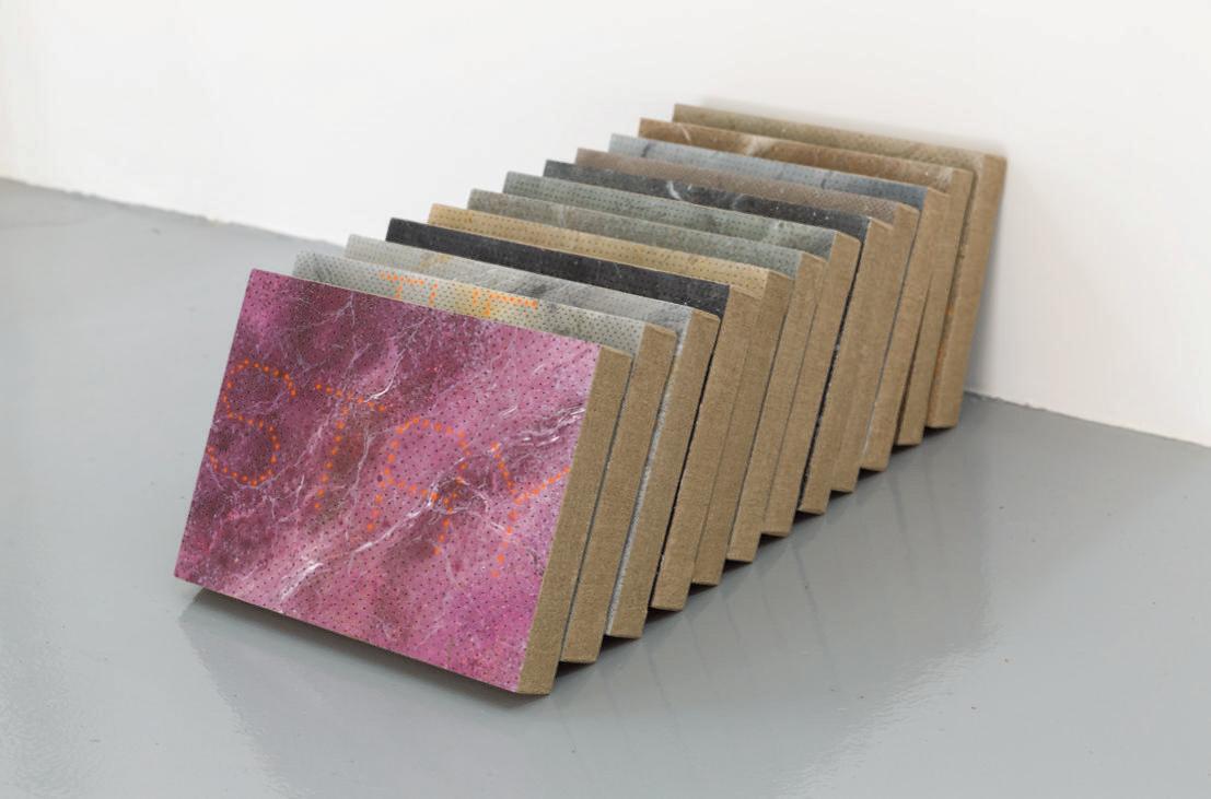
Lukas presented twelve small paintings started in the spring of 2020 in his parents’ Massachusetts basement and continued in 2021 on his kitchen table in Santa Barbara.
The series pulls from pandemicrelated text in the public sphere: public health warnings, headlines,
30-minute appointment, the works were rotated so that each visitor experienced a diferent show, “mirroring the fashing display of a Variable Message Sign.” These paintings thus slow the rapid cycling of pandemic messaging and instead emphasize the pandemic’s lasting impacts, working on one hand as
the present. Taking inspiration from N.K. Jemison’s series of sci-f novels, The Broken Earth Trilogy, Lukas’ Stone Proposal 7 ofers a collection of small drawings that envision “large blocks of stone in a yet-to-be-known museum, sculpture park or future archive.”
Alex Lukas, Written Names Fanzine, Issue #1: Names Written in Nails Embedded in Railroad Ties, Cambridge, Massachusetts, three-color risograph with photocopy, 20 pages, 9.5 x 6.5 in., edition of 100 or so, 2016
roadside message boards. Lukas isolates sections of those texts and then transposes them onto slabs of granite and marble, thus taking the temporary and emergent nature of pandemic communication and securing that lexicon in a monumental gesture.
These paintings were displayed by reservation only. Between each
memorial and historical archive, and as a slowed performance of perpetual messaging on the other.
Town Website treats the competing temporalities of the ongoing pandemic and wonders about the more permanent traces it is carving into the world. It is also part of Lukas’ ongoing imagining of possible futures and possible future spaces far beyond
As with Written Names, here too Lukas points us toward future publics and future public places that remain unknown to a present producer – to Lucas himself and to his contemporary audience. And as with the names that appear in the zine, or the texts of pandemic messaging in Town Website, Stone Proposal 7 is rooted, ultimately, in text, this one literary rather than personal
or municipal. The legacies of text across genre are, in his work, a way of thinking about the changing nature of social forms and public engagement.
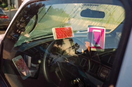
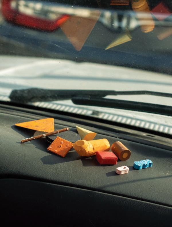
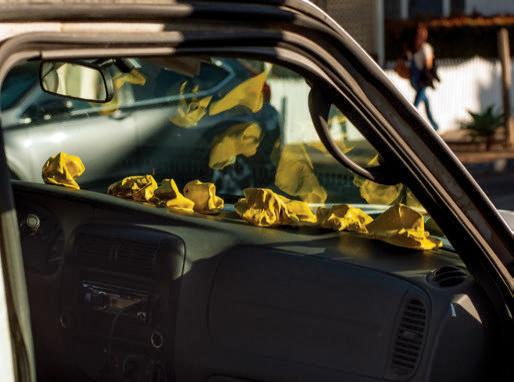
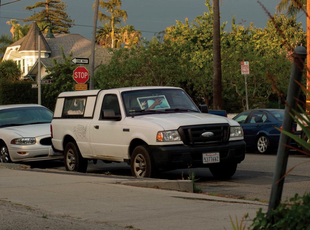
Though his art revels in such speculative glimpses into the far future, Lukas is by no means uninterested in shaping shared public space in the present. In this efort, fnd his CA53776v2.gallery: a rotating exhibition he curates on the dashboard of his 2007 Ford Ranger, parked in the 300 block of W. Anapamu Street. This gallery, which also employs public text in the form of its title, his license plate number, launched in the spring 2021.
The project questions where, exactly, the space of art is now, where it could be, and where it might have always been – and in doing so, also questions the location of the public to whom art aims its speech. Like much of his work, it probes the way art might push into public spaces beyond the museum or gallery, and how that which is public might cross into intimate, domestic and quotidian spheres.
If we are increasingly consumed in the deluge of public speech in virtual space, Lukas pushes his own publics to seek out, explore and engage in what the cyberpunks would have called ‘meatspace.’ Where some among them used the term derogatorily, Lukas seems to delight in the remaining – if quickly disappearing – possibilities aforded by even the most mundane parts of our very real, material environments: roadsides, dashboards, parking lots, kitchen tables, tree
trunks, railroad tracks. His work suggests that there are still ways to make and take these spaces, to write them, and in so doing, rewrite and refgure ways of being in, shaping and forming part of the public.
body, than living it, and living through it, together.
In the heady, heart-breaking noise of the moment, this quiet commitment to publication as an essential act of living
opposite page, from lef: Kareem Worrell, Interior No. 4, 2004 (printed: 2021), digital print, installation view, CA53776V2.gallery, 2021
Imin Yeh, Road Snack Sculpture, watercolor and acrylic paint on paper, yupo, tracing paper salt, glue, gloss medium, installation view, CA53776V2.gallery, 2021
Madeleine Eve Ignon, Strewn, paper, plaster, paint, and colored pencil, 2020 (above)
Kevin Clancy, autohaptic transmission, cast hydrocal, dichroic flm, resin, magnetic phone car mounts, 2021 (below)
In seeking the social in social media, Lovink writes that the platforms on which the public now publishes are, ultimately, “devices of capture,” “totally indiferent to the content of what people say.” He goes on: “This is not about participation, remembrance and forgetting. What we transmit are the bare signals indicating that we are still alive.” Perhaps Lukas would agree. But the transmissions with which his work plays are less about indicating the fact of life or capturing its data
with, rather than tweeting at, the social world feels vital: an invitation to make novel, caring, and joyful publics whose lasting traces might yet surprise us.
this page, above: Alex Lukas, installation view, STNDRD, Granite City, Illinois, cut tarp, photographed by Sage Dawson/STNDRD
below: Alex Lukas, Town Website, installation view, Riviera Parking, Santa Barbara, California, 2021, photographed by Ian Byers-Gamber



the last two verses read: “The spreading wide my narrow Hands / To gather Paradise.” Within his studio, Robertson is gathering paradises for us to witness.
by Halim MadiAftting prelude to Santa Barbara artist Ron Robertson’s body of art is his website, where colors compete for attention while angels and samurais peek out of small squares, the four elements colliding and combining. It’s hard to pick a link to click on. Choosing a path means foregoing others, just as Robertson’s body of work thwarts such singular paths.
In person, experiencing one of Robertson’s assemblages is akin to examining a cabinet of curiosities; the work invites conversation between very diferent objects. The word “assemble” fnds its root in the Latin “simul,” which
means “together,” and the artist’s oeuvre is a similar encouragement to consider the “togetherness” of what we perceive as disparate.
Robertson’s life is itself an illustration of how disparities can coalesce into a fascinating whole. For a decade, he studied printmaking and stone rubbing in Japan before returning to Santa Barbara to work as a commercial abalone diver. His artist statement holds that “the generalist, as opposed to the specialist, is able to perceive and live life more fully.”
Such ethos echoes Emily Dickinson’s seminal “I dwell in possibility,” in which
Robertson’s assemblages are not a fsherman’s net casting. They are a diver’s silent, humble movement through the sea. His relationship with the ocean seems to have infuenced more than the texture of his pieces. His assemblages command attention the way something larger than oneself does.
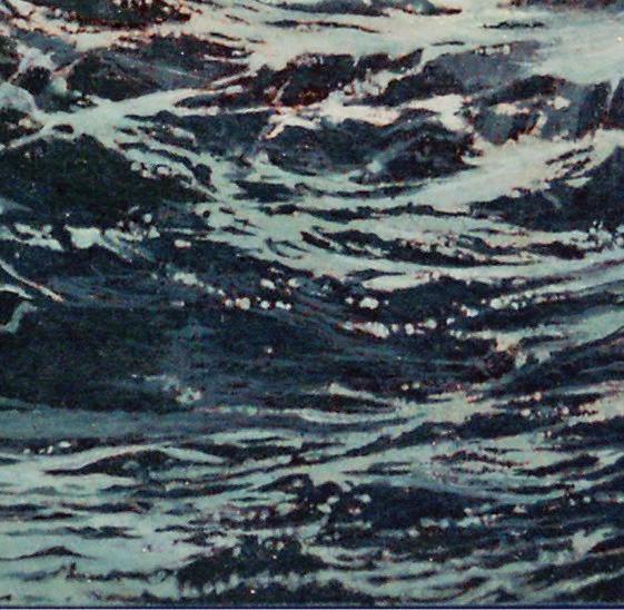
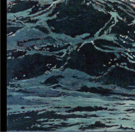

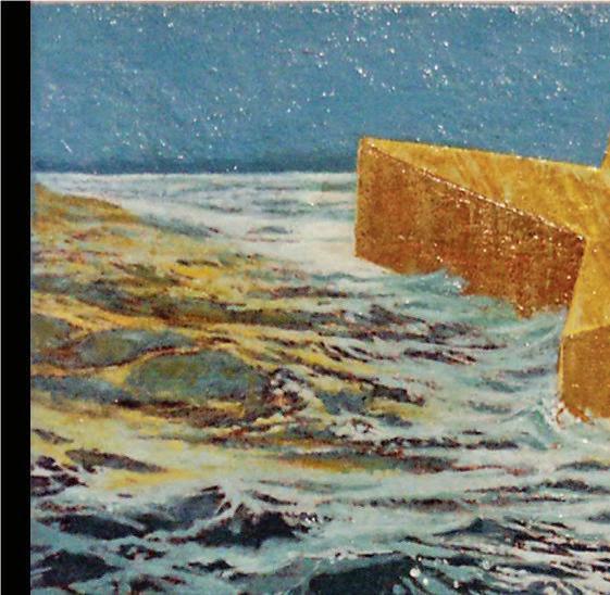
During my frst encounter with the work, my inner world was silenced for a moment. Facing Poseidon's Gem: Atlantis, suddenly, I was placed in a diving bell and told to look out and consider the largesse of a mystery. One can sense, through the rusty texture, Robertson’s intimate knowledge of the ocean’s powers.
In Penelope, the rusty female fgure in the middle of the assemblage surrounded by two moats of found fotsam further recalls the sea’s ravages. Here, Robertson turns Penelope’s dreading of Odysseus dying at sea into an emotionally charged barrage.

Robertson’s relationship to art is inseparable from matter and medium. His choice of oil, sculpture or physical objects has as much to do with what’s communicated as the subject matter at hand, and his use of medium is not an injunction. Rather, it’s a conversation, wherein matter is given room to express what it wants. He explores the voice of materiality best in a series of paintings titled Paper & Rocks
Wrapped among one another, sturdy rock gains a sense of malleability and dances in the paper’s arms like a metaphor for the transformative potential of embracing what is diferent from oneself.
Part of me wanted the pieces to be larger, wall-sized, overpoweringly immersive – most of his pieces are around 20 x 20 inches. But as I grew more familiar with the work, I realized it couldn’t be otherwise. Robertson’s artistic sensibility was shaped by a decade spent in Japan, where cultural history honors the atemporality of existence. Hundreds of hours spent underwater, too, have no doubt altered the nature of his attention. His work and the size of his pieces are a reminder that portals to wonder can be very small indeed. That, if we listen and look carefully enough, worlds can unfold where we stand.
Themes recur in the work like Jungian archetypes. The dragon, the angel, Eve, the rocket, the Samurai. Shapes repeat like a litany to materiality. The cross, the shrine, the porthole. By revisiting each repeatedly, Robertson operates the visual equivalent of Roland Barthes’ semiological breakdown of our common mythology. What is a shrine when it hosts a broken disk with “love” written on it, as in the assemblage Love Is. What is a dragon when it’s portrayed with a fy half its size next to it, as in Dragon/Fly? What is a cross when Robertson frames two pieces of wood his grandchildren assembled?
One can see the impact of semiology on his work in This Is a Star – a take on René Magritte’s This Is Not a Pipe. In Floating Star, he expands on the 10-sided shape we associate with a star, rather than the burning globes in
space. He draws a yellow “star” foating on ocean waters, like a symbol lost at sea. Again and again, Robertson seems to reappropriate everyday symbols to question established perceptions.
Similarly, the way Robertson turns the shrine into a new medium of expression or the porthole into a new canvas, infuses new meaning into objects made stale by cultural regimens. Like a tinkerer, he tests these objects’ ability to hold new purpose. He examines their resistance as symbols, expands their potential and bends their limits as cultural signifers. In The War Machine/ The Rainbow Machine, a slot-machine sculpture shows a face of destruction on one side and a playful arrangement with all seven colors of the rainbow on the other – a consummate tinkering between the dualities of our humanity.


Robertson contemplates reality with the discerning eye of a generalist who embraces complexities. At times, the lucidity he’s developed turns him into
hold a prescience and beget a refection beyond our individual existence.
Robertson’s aesthetic sensitivity has transformed over the years. The warmth of colors and the wisdom of his object placement is the culmination of his sensibilities and mastery. His journey on this planet, through its diferent bodies and continents, its histories and art periods, and into his and our collective psyches, is one thoughtful dive into the questions and tensions that shape our lives.
This year, Robertson and his family have set out to donate his vast body of work to community organizations, including Santa Barbara Arts Fund, Santa Barbara Community Arts Workshop, Santa Barbara City College, Westmont College, Santa Barbara High School, Pacifc Pride Foundation, Sarah House and Vita Art Center.
a historian of the future. On his Space Flotsam, he comments, “Like beach combing, space combing may be a form of recreation in the future.” Likewise, in the collection Relics, his comment on the piece Keys reads, “In the future, keys will be archaeological relics.” Pieces like these
 by Grace Miles
There are ofen aspects of an artwork that are impossible to capture with a camera lens; some quality of color or light or tangible substance that vanishes the moment a picture is snapped. It doesn’t look like that, you think, frowning at the oddly lit, washed out image on your phone screen. Maybe you then feel frus trated that you can’t save or share the artwork in a way that feels like you’re doing it justice. But could an
argument be made for the unique signifcance, or the singular intima cy, of such an artwork experience that defes replication?
Before the luminous abstract landscapes of Cynthia Ona Innis, the human eye savors all the nuance that a camera lens stifes. Glossy sheens of paint and glimmering strips of metallic fabric reveal themselves as one moves around the painting, a mere tilt of the head igniting colors
and textures across its surface. Such visual manipulation is Innis’ way of echoing the changeable essence of nature itself, using layers of acrylic paint and dyed fabric to simultaneously incorporate multiple perspectives of the same natural landscape. In this abstract fashion, she lets the boundaries between the past and future, the visible and invisible, blur into one.
Born in San Diego to an architect
and a foral designer, it was perhaps simply in Innis’ nature to view the world with a keen eye for design and detail. Afer attending an art magnet high school, she was admitted to the University of California, Berkeley, as a declared art major. While an undergrad, she studied under the guidance of Joan Brown, a tenured art professor and prominent artist of the Bay Area’s Figurative Movement who would have great infuence over Innis’ journey as an artist. With Brown’s assured declaration – You’re a painter! – Innis eventually adopted the medium as her primary art form. It was also during this time that Innis worked as a seamstress, which has led to her skilled afnity for incorporating myriad fabric textures into her art.
Upon graduating from Berkeley with a BFA in 1991, Innis pursued her MFA across the country at Rutgers University in New Jersey. At this advanced graduate level, her education moved away from technical art instruction and focused more on developing a deeper, more philosophically inclined understanding of what it meant to be an artist. Upon completion of the program in 1994, Innis returned to California’s Bay Area, where she taught art classes at numerous San Francisco colleges and continues to exhibit her work in solo and group exhibitions throughout California and beyond. Innis’ latest body of work examines the landscapes of coastal California, as recalled through the dreamlike flter of memory. Because the series
was started while the state was amid the initial lockdowns of the COVID-19 pandemic, Innis was unable to physically travel to many of the locations she wanted to paint. Therefore, she had to rely on her memories of those places, adding a compelling dimension to these works that essentially become abstract renderings of an already abstract image in the mind.
A number of these landscapes depict scenes and locations throughout the Santa Barbara area, utilizing color and nebulous forms to capture their likeness. Anyone acquainted with California’s gloomy coastal fog will fnd something familiar in the moody grays and lavender of Overcast, where traces of storm, sea and sand seem to coalesce.
The twilight-hued Santa Ynez uses tight bands of navy blue and seeping stains of violet to express the simmering energy that exists between the Pacifc Ocean and the Santa Ynez mountains, as the neighboring forces compete for prominence in the local topography.
In Summerland, seashell pink and tangerine orange summon a warm sense of beach town respite, an idyllic vision of its namesake. With the maritime theme further emphasized by incorporating bits of sailcloth within the composition, a sof blue sky appears to cradle an ocean tinged with the last rays of sunset.
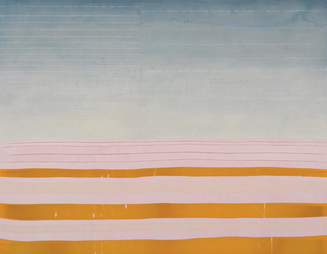
Innis maintains that her paintings are
“not one liners,” and their meaning is “not always obvious.” Between the layers of paint and fabric, she leaves room for viewers to analyze and explore, coming to their own conclusions about what a piece might signify. Similar to how Innis draws from her own memory and experience to create the paintings, viewers are invited to connect with the paintings in ways that are unique to them.
When displayed together in a gallery or exhibition, Innis’ landscapes are carefully arranged to be in conversation with each other, contributing to a greater narrative that wouldn’t be the same absent any one piece. Their resistance to standard photography only reinforces their likeness to the landscapes they were inspired by – defned through subtle layers of color and texture, forever changing as light and terrain shifs, and best experienced in person.

opposite page: Cynthia Ona Innis, Point, acrylic and fabric on wood panel
this page, from lef: Cynthia Ona Innis, Overcast, acrylic and fabric on wood panel; Summerland, acrylic and fabric, sewn and stretched

Marcus Addison, known through his work as 6oldie the Artist (pronounced ‘gold-ee’), speaks fuent popular culture. He speaks Black culture, music culture, flm, TV and sports culture, and in a few short years, his bold and socially conscious artwork has evolved into a way of communicating through the language of pop culture on the Black experience in America.
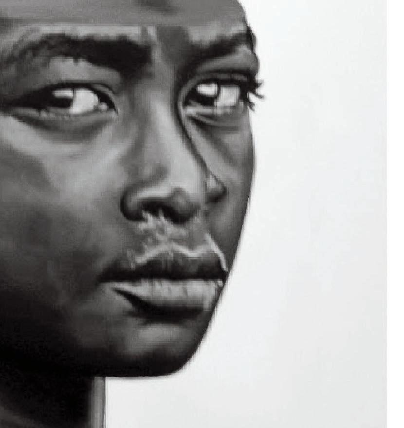
“I think it is just who I am as a person,” 6oldie says, sitting at a table in a sunny courtyard near the Santa Barbara Ofce of Arts & Culture afer installing his ongoing show A Vivid Vision at Santa Barbara City Hall Gallery. Originally from Montgomery, Alabama, then Birmingham, and now Los Angeles, 6oldie speaks in an easy Southern drawl, his eyes deeply intent and his words chosen carefully. As we talk, there’s a recurring theme of light amid darkness and how the two are interconnected.
“Whether I am doing art or not, I want to be a light in the darkness. I want to add to my environment, I want

to change the narrative,” he says.
In A Vivid Vision, curated by Arturo Heredia Soto, 6oldie depicts iconic fgures in a vibrant series of colorblocked paintings, including portraits of Black American civil rights leaders such as Malcom X, Martin Luther King, Jr. and Rosa
The City Hall exhibition should be viewed within the context of recent grassroots community advocacy in Santa Barbara to bring Black perspectives to the forefront of the local arts community, raising awareness of the region’s Black cultural history with shows featuring BIPOC artists, such as the work of Healing Justice
complexity. In his signature unpretentious hand, he presents an idealistic vision of diverse cultures and people in a playful, surrealist representation.
Over the heads of Black cultural icons and anonymous portraits, 6oldie places a golden crown. “The crown pays
symbol of the lightbulb to portray enlightenment, energy and power. Even his linework pieces, with black outlines and just a pop of red, highlight the connection that 6oldie seeks to share: empathy for the daily struggles we each experience.
In addition to his current Santa Barbara City Hall show, 6oldie’s work has been exhibited at the Santa Barbara Arts Fund and the Melanin Gallery, Healing Justice SB. 6oldie has also recently returned from a trip to Birmingham for the World Games, where he painted a mural for the summer games. As an artist, he continues his evolution, debuting a new clothing label called Nothing Impossible, Anything Possible. His signature lightbulbs are emblazoned on everything from denim jackets to hand-painted Air Force Ones.
6oldie, 6olden Child, watercolor
Parks and music and sports superstars like Biggie, Tupac and Pelé. 6oldie drops references like Easter eggs for hip-hop heads and those “in the know.” Many of the techniques and symbols he uses are pulled directly from the artists he admires most. 6oldie reworks well-known images by the likes of American artists Jean-Michel Basquiat and Keith Herring as a master producer chops a sample, giving a fresh take on an old classic.
Santa Barbara, Melanin Gallery and The Arts Fund, Santa Barbara, where 6oldie has also exhibited his work.
In the paintings and prints on view in A Vivid Vision, Lule depicts people – usually young and Black – in common settings and doing regular things drawn from his everyday life. In visual rifs on popular music and magazines, patterns lifed from nature and scenes spun from his social life, 6oldie imbues his pieces with ludic
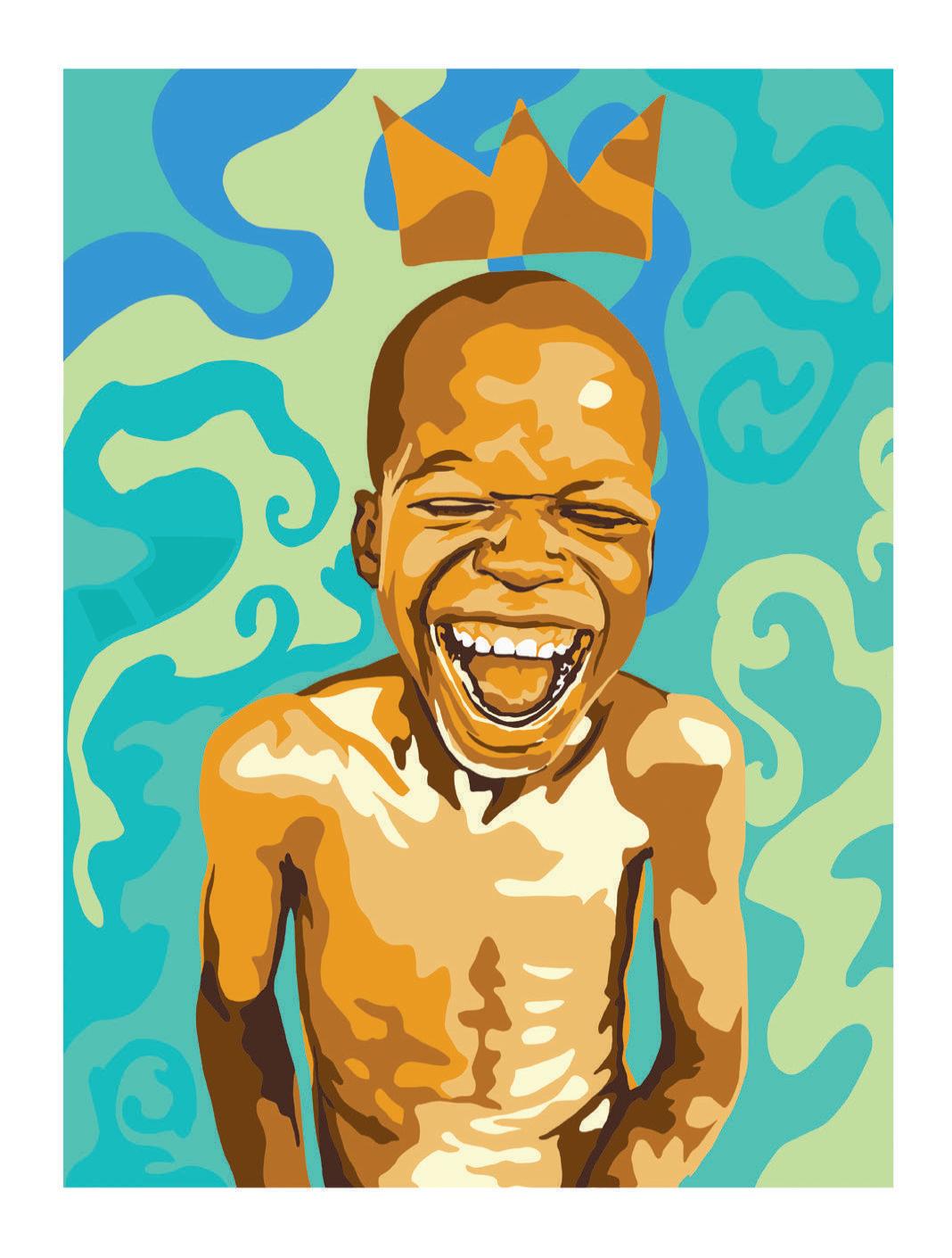
homage to Basquiat and represents achieving cultural recognition and status as to be painted as royalty,” 6oldie says. It’s also a nod to how succesful Black artists and athletes are ofen treated as social leaders. “If you look at Black popular culture, these are the kings and queens and these are the fgures that everybody looks to,” 6oldie says.
Drawn in a similar handstyle as the crowns, 6oldie also uses the
It’s his latest evolution on a journey to change the narrative and inspire younger artists of color. Along the way, 6oldie is thankful for where he is, especially remembering where he came from. “I come from humble beginnings,” he says. “Just to have come from that environment and to be here, I think I’ve already achieved success.”
*This artist feature is sponsored by the Lisa McCann Group.
It is no secret that visual culture exists as a supplement or modifer to existing ideologies. Centuries and millennia of the creative arts have seemingly not been able to crack through the veneer of political and socioeconomic power wielded from the commanding heights of culture.
To illustrate this point, one simply has to look at what visual culture looks like within specifc political and social paradigms, from high to low art.
By high art, I mean what is typically considered the fne arts: painting, sculpture, installation, conceptualism, academic art, flm and so on. Low art (if there is such a thing) is everything else that does not neatly fold into the defnition of high art, from pottery and kitsch to Sharknado.
High art functions the way it does because it is a potent signifer of power due to its ties to money. In his now classic Ways of Seeing, art critic John Berger observed that much of Western art can be thought of as subtle, but nonetheless powerful, images of power and possession belonging to the wealthy elite.
These were later appropriated and reevaluated by critics as expressions of beauty or historical documentations, basically anodyne propositions masking the true import of the images depicted, so as to dull their impact on society at large.
These images of power reach far back into time, and we can think of ancient art in a similar way. But for the purpose of this text, we’re going to have to
narrow the focus, so we’ll stick to the art of the Western tradition.
Classical art and the ideology of belief
Patronized by the Catholic Church starting in Medieval times, the role of Western artists was to depict whatever the church’s commissioned ideas were. The Catholic Church was one of the largest patrons of the arts in the Middle Ages, and as such, it had the power to dictate the direction the arts ought to take, what was to be depicted and what ought to be lef behind.
The artist was a tool of the church by which to communicate ideas to a largely illiterate populace. The lack of artistic freedom was ofen derailed into other, more subtle ways of communication. It was around the time of the rise of the Renaissance masters like Michelangelo, Leonardo and Raphael, that geometry and perspective entered into the art of rendering space.
The early masters such as Giotto attempted but largely failed to visualize space as anything other than two dimensional. Giotto sits on the cusp of a major shif in artistic depiction, from subjective to objective space, straddling both at the same time.
By the time artists like Raphael entered the picture, objective space had been more or less mastered by the use of geometry and two-point perspective, lending an aura of realism to an art form that had struggled to regain what had been lost since the age of Rome.
But geometry had also allowed for another even more subtle form of
aesthetic communication to enter the frame. Through the use of geometry, subtle relationships between fgures within the objective space of the realist painting could be made and produced. Triangulations, number relationships, diagonal lines, mathematical formulas and occult symbols, all of these and more, could be defly placed into the design of paintings in order to communicate meanings beyond the ones lying directly on the surface.
This was an important development because the idea of hidden symbolism as the result of geometric formulations produced not only a more “beautiful” or realistic art, it gave the art form itself a hidden power to efectively communicate that which is incommunicable – and to do so in a way that, at least partially, was legible to lay people.
Occult symbolism exists as one very specifc way to understand a world deeply rooted in mysticism and metaphysics. To mystics, Gnostics and many Catholics, geometrical symbols like pentagrams, hexagrams, spirals, golden ratios, squares, triangles, enneagrams and sigils are renditions of what constitutes the real world in its hidden form.
In essence, these diferent forms of mathematics were applied to visual culture, forming a contemporary understanding of the religiously driven world. In a very real sense, these metaphysical depictions were externalized descriptions of how the world was organized.
As the Middle Ages gave way to the Renaissance and eventually the Enlightenment, the role of the artist remained pretty much the same. What changed was the patronage system.
The rise of the merchant class in places like Flanders, the Netherlands, and Italian city-states like Florence, shifed the focus of artists from depictions of religious dogmas to portraits of direct wealth and power (the newly minted elites).
Artists such as Rembrandt and Franz Hals, for example, were tasked with painting the upper classes as a modern form of propaganda, albeit subtle.
Geometric and mathematical riddles were replaced by a more direct, almost photographic form of representation.
The use of the camera obscura and other visual techniques and tools for reproducing images foregrounded what was directly seen. The sitter, the sovereign individual, had become the allencompassing subject.
Dominated by the rise of science and capitalism, the age provided its own ideology through visual representation, its own symbolism and occult power deployed through a diferent, much more abstract use of mathematics and geometry: the chart.
The chart, with its communicative power of a sigil or a Nicholas Poussin painting, allows for a hidden dimension within the totality of capital relations. The chart isn’t simply a record of market dynamics, stock prices across the dimension of time, or a way to predict future movement based on past performance. Rather, it is a complex system of cues that give the capitalist ideology grounding in visual culture.
It is the chart’s visual symbolism that helps fx capitalism in reality. The chart ensures a description that is at once complex and immediate. It is able to capture complex mathematical formulas and visualize them in a linear format, moving abstract ideas into concrete form. The chart captures relationships, quantities, movement, volatility, time, price, and so on and so on. More importantly, the chart ofers the initiated a hidden view into the halls of its own form of religion, the market.
As in Renaissance allegorical painting, the chart can be read on two levels: frst, the surface level, with its lines, bars, indicators, numbers – this is its primary visual level – and second, the hidden, occluded level, where the same lines, bars, indicators and numbers form a diferent sort of language that is necessary to learn if one is to be able to read the chart properly.
Technical analysis or “chartism,” as the practice of reading charts is called, is used to predict price movement, market reversals, points of entry and exit, and to map past price action.
Bars or candle sticks are to the price
chart what the alphabet is to language. While there may be diferent possible interpretations to the movement of a chart and its indicators, there is always a specifc reading of a bar, while a sequence of bars gives the technical analyst a more specifc indication, a word if you will, of the possible movement of price. The importance of the chart to capital cannot be overestimated. It is today what the importance of Caravaggio was to the Baroque period.
While religious movements and capitalism have had long periods during which their visual cultures were integrated within the larger culture, mass movements have fared far worse in their short but intense periods of activity.
The advent of modernism gave the twentieth century and mass movements a mode of visual representation. But almost immediately, the problem of modernism came in the form of a question: How does one efectively illustrate the abstraction of modern human existence?
This question is a subset of a problem that modernist political and social movements face in communicating their ideas efectively through visual means. There is no version of the sigil or the chart in socialism or communism, thus making interpellation of the subject virtually impossible.
There is no great sublimation, no great art to turn to that might provide the necessary grounding in the symbolism of socialism. All past attempts were hideously appropriated relics of ancient visual culture, reaching back into time, rather than forward into the future, substituting crude and cumbersome realism for a more nuanced symbolism. Even twentieth century modernism, with its ideological abstraction, was better associated with the rapid rise of fascism than of communism.
To this end, modernists like the futurists, surrealists and Dadaists, and later, the conceptualists and situationists, deployed various techniques meant to free art of its capitalist shackles, from shock value to philosophical interventions. In the U.S., abstract expressionism became the largest project of abstraction, tackling concepts like emotion, speed, science and philosophy.
But even before abstract expressionism, art critic Clement Greenberg identifed the central issue with what he called the “avant garde.” The artists of the avant garde simply could not move beyond the relationship to capital. Capitalism provided money and collectors who had it provided legitimacy. Any art formulated within this structure was always going to be subject to its rules.
Another problem for abstraction and thus for modernism was that it laid everything out on the surface. There was never a hidden meaning behind correlative notions of line, color, thought or concept. Most of these issues were handled separately, individually, and to their own ends. Having to wrestle with the fratricidal, self-own politics of constant and terminal revolution, always overturning that which came before, modernism became a victim of its own success, never fully developing into a system or language.
Though abstraction does function as a type of visual language, its opacity and orientation toward the surface prevents it from burrowing deeper into the subconscious. That is not to say that it is inefective in visualizing certain types of mood, emotion or experience. But perhaps the surface level of abstraction was always the point.
The abstract artists of the day were very direct in their ideas. What is there is there and nothing more. Reading into a picture would have been sacrilegious for artists like Pollock, Stella and Frankenthaler. Modernism’s aim was to be the universalizing language of a globalized world. Its failure points to the project’s incompleteness.
Then again, every philosophical or political project is in essence incomplete. They must be in order to generate and spawn new ideas and the projects that will inevitably take their place.
On the other hand, visual language can and does ofen remain constant over centuries, even millennia, but only if the underlying conceptual foundation holds fast outside the contemporary value proposition of the day.
At the end of a long road near the junction of highways 150 and 33 in Ojai, there is a round studio building where the Taf Gardens and Nature Preserve host artists in residence. Here, Stephanie Washburn and Jane Mulfnger were in residence from fall 2021 to spring 2022. Taf Gardens, and the studio within it, exist in a rich and mysterious space between the wild and controlled, and the natural and ordered. Inside the studio, just beyond a rather sobering sign to watch out for rattlesnakes, Washburn and Mulfnger’s respective bodies of work invite you to contemplate the natural world and the sublime.
The space is intimate and humble, a miniature cathedral. Both artists,
who also teach full time in the art departments at Santa Barbara City College and UC Santa Barbara, went back to basics during their time at Taf, paring down their multimedia practices in favor of simpler materials like graphite and acrylic paint.
Washburn lives and works in Ojai, and was witness to the devastating Thomas Fire when it scorched the area in 2017. The terror and destruction of that event profoundly changed her life, her perspective and her community. She writes, aptly: “Our relationship is within, not with, nature. There are no inanimate objects.”
Her subtle graphite drawings, hung far of the wall in the Taf Gardens studio as if they were foating, cast shadows like transparent headstones.
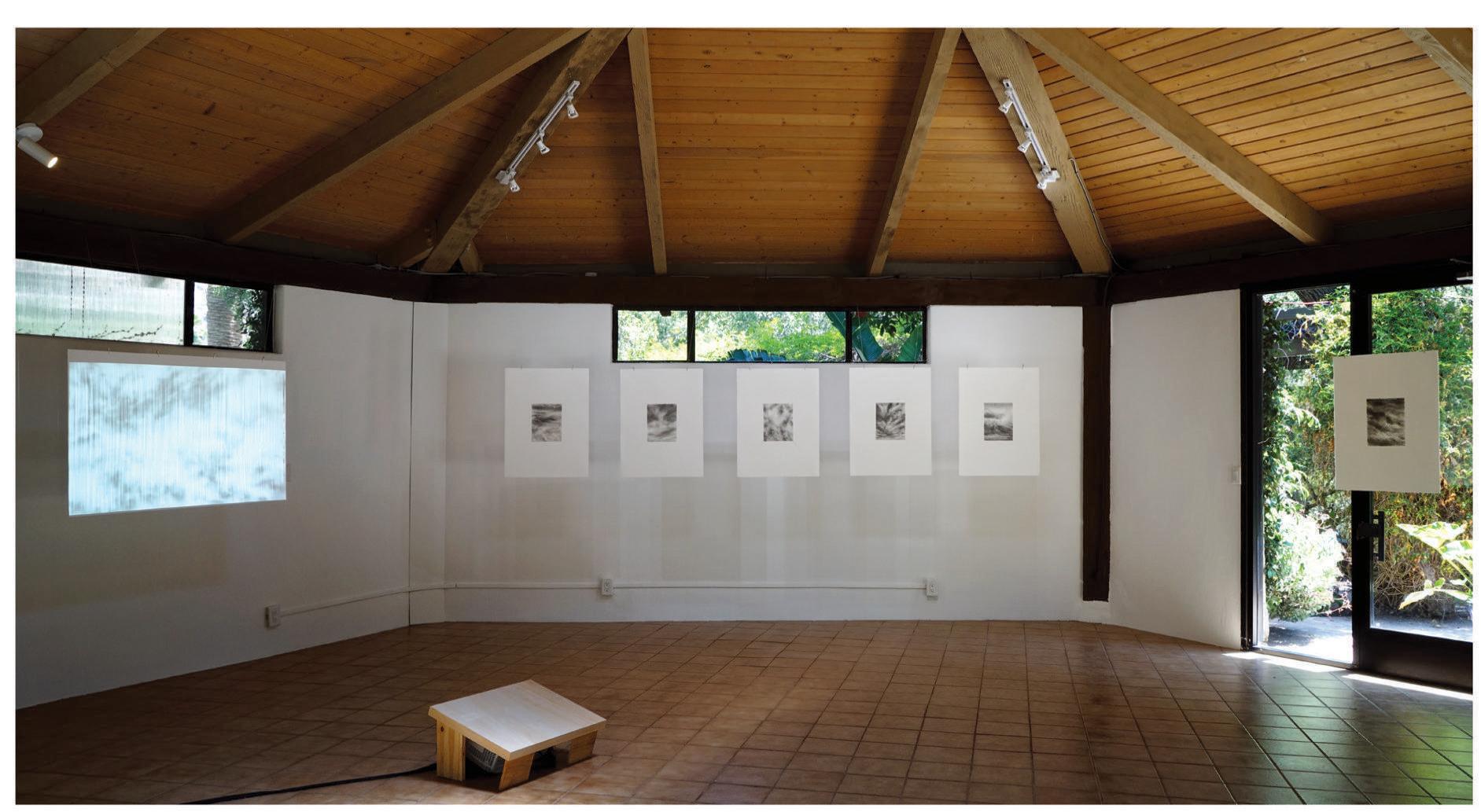
Each feels like a living memorial, animated by sublime grief and asserting their presence as both drawings and sculptures. They are viscerally afecting and quietly alive, and they demand a moment of repose and slowness to contemplate them. The greyscale of her skyscapes allows them to be any sky, anywhere, and to occupy an abstract conceptual space. But that lack of color also recalls the disturbing orange that was present in the Ojai sky.
Washburn’s works are ventilated by cuts in the paper body that, as she puts it, “penetrate the imagery with physical air and leave the paper's structural integrity just barely intact.” Confronting one of them closely in the space at Taf, I was unaware of the cuts at frst. I then became unsettled
Stephanie Washburn, Cut Sky 5, lef, Cut Sky 4, right, graphite on paper
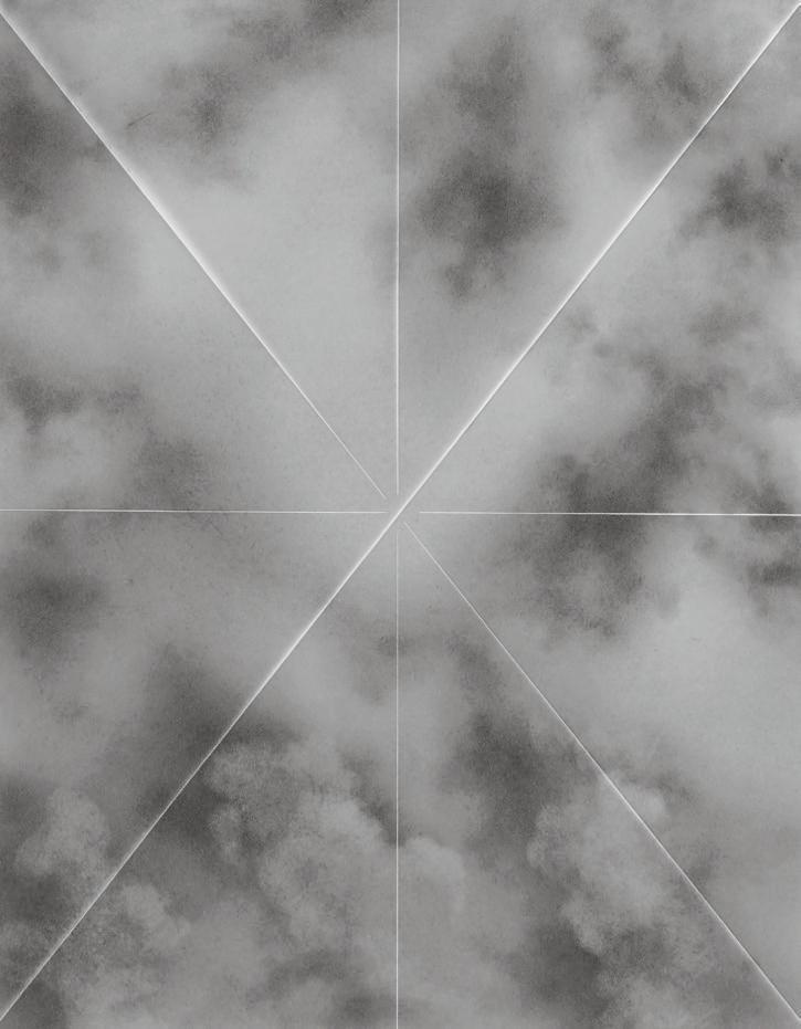

by them, unsure if the paper could stand the cut. We’re taught as artists to preserve our works, to enable them as much as we can to be whole and live beyond us. The vulnerability and precarity of Washburn’s graphite pieces is arresting. The cuts bring them more into a physical, bodily space, asking: what if a wound is laid bare and witnessed and nothing is done to fx it?
The cuts are exploratory and precise. They evoke scars. Their healing is halted and suspended, like a quick breath of air caught in the chest. In multiple stacked parallel lines (which create an efect similar to natural light streaming through Venetian blinds), or in an “x” or starburst shape, the cuts grant us and the works themselves an expanded physical and mental space. I think of Lucio Fontana’s Cut series from the mid twentieth century as a potential point of comparison; it’s interesting to consider the physical act of cutting or slicing and the spectrum of intentionality behind that act.
At a time when the hypermasculinized (and of-mythologized) action painting of Jackson Pollock and the Abstract Expressionist movement were dominating the landscape of American art, Lucio Fontana, an Argentine-Italian artist, cut and perforated the surfaces of his canvases rather than painting on them. His works vibrate with defance, violence and destruction; he wanted the cut to
be the central focus of the piece. In Washburn’s works, the artist’s hand is like a surgeon’s, rather than a hand committing a violent or dissident act. Her incisions are def and, crucially, caring. She honors her hands’ ability to create and destroy, and crafs a compelling relationship between those two acts.
A surgeon cuts to gain access into the world of an ailing body, to see inside. A surgeon doesn’t make any more cuts than she has to, but ofen more than one is necessary. She cuts to identify and extract what causes pain.
If, as art critic Peter Schjeldahl wrote, Fontana “meticulously violated” his canvases, Washburn is doing something more akin to performing tracheostomies – she’s bravely creating conditions that allow them to breathe. The cuts somehow render the images human.
Washburn’s video piece, a collaboration with mezzo soprano Rebecca Comerford, brings the drawings to life even further by animating their slits with wind and sound. Comerford activates her breath and voice in relation to the movement of the drawings. As she breathes, so do the drawings. We see the wind move and penetrate the cuts in the paper. Washburn writes, “The work activates a visceral awareness of the material support, and an uneasy sense of both delicacy and physical violence, to the
Romantic skyscape imagery.”
She writes of the duality of the space and her approach to making during her time at Taf: “On a residency in paradise, I made drawings about the sublime, feelings of grief, and a quiet apocalypse.” Ojai has always been a place that attracts artists, and its recent history makes the complicated role of the artist come into even starker relief.
Mulfnger’s series of paintings, They Became Evanescent, also explores the sublime and inefable in nature. Mulfnger made the near daily journey to Taf from Santa Barbara, contemplating what she wanted to paint as she drove. Each painting includes a piece of text from an archive she has been amassing of language and phrases that describe weather phenomena. The phrases she chose to work with range from artful and poetic to bluntly and clinically descriptive.
As we have all witnessed over the last decade or so, the ways we (the media, poets, scientists, etc.) describe and name weather has the power to evoke many emotional reactions. It can inspire fear through its novelty and dialed-up drama (I’m thinking of polar vortex, which, at least at the time when the media debuted the term, sounded more like the name of a cheesy Hollywood disaster flm than a weather event). Language can also be
comforting or grounding if it’s based in reliable science, or it can conjure the nuance of poetry or song.
Each of Mulfnger’s small square paintings deal with a piece of text – a phrase such as “full fury” or “transpolar drif”– that is embedded within the layers of the abstract landscape, though the images don’t correlate directly to the text. “I tried my best to ignore the text,” Mulfnger said, instead letting each image evolve separately from it as she chased the “reminder of an atmosphere.” In all her work, Mulfnger is interested in verticality and horizontality, and the square, she says, “gives equal attention to both.” The shape gives these pieces stability and centrality, leading your eye to the text that sits in the middle of the picture plane.
Mulfnger’s installation and conceptual work ofen faces outward, creating a dialogue with her audience. These recent works are more intimate and inward; they speak to the complicated meanings and anxieties of the existential cultural and ecological moment we’re living in and through.
Mulfnger’s new paintings vaguely bring an artist like Ed Ruscha to mind, insofar as both artists are combining and dealing with text and landscape – although, importantly, Ruscha’s textlandscapes mainly deal with text on top of landscape, whereas Mulfnger makes a noteworthy conceptual and formal choice to embed and almost bury the text in layers of paint and color using custom vinyl. The words, only visible at close range, dissolve and disappear into the saturated weather Mulfnger alludes to, or emerge to declare their dominance over it.
A useful comparison for Mulfnger’s paintings might be individual cards of opening title sequences in flm. At the beginning of many Westerns, for example, the text is literally situated within or on top of the sweeping desert landscape. In some recent sequences, the text is more directly relating to what is happening in the image, letters sitting on a building or disappearing behind a bus. Mulfnger’s ‘mise en scènes’ are more tightly cropped in their composition and looser in their references (and the
square dimensions evade a straight comparison to the contemporary screen) but you might look at one and see a frame of a painterly opening sequence called ‘Cold Front’ or ‘Easterlies.’
Mulfnger’s paintings look out onto nameless but richly colorful mountains and seascapes that carry and hold human-made language attempting to describe the indescribable. Like Washburn, Mulfnger has created a body of work that responds not only to the immediate landscape of the Taf Gardens and Nature Preserve, but to all that is sublime and evanescent.
Jane Mulfnger, counterclockwise, from top lef: Bright Periods; Easterlies; Directional Sheer; Atmospheric Tumult; Rain at First; Electromagnetic Spectrum, acrylic on paper, 2022

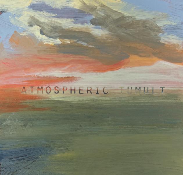
Arts writing and publishing is an essential component of a vibrant arts & culture community. Help sustain a contemporary art & culture magazine for our region!
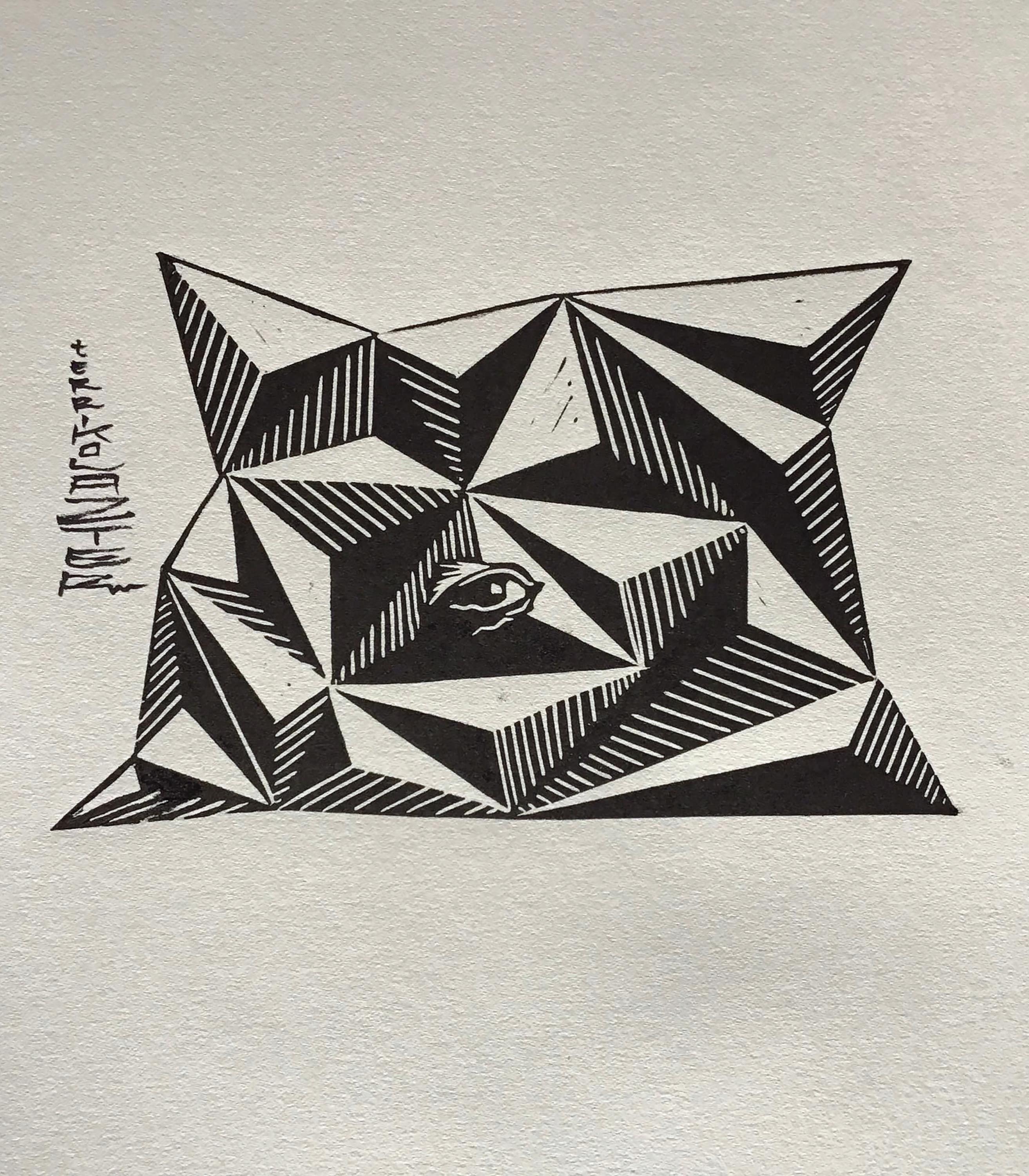
 by Camille Lubach
You might have passed it before. Succulent tendrils weaving in and out of semi-closed shutters, an unnerving doll head peering down from its perch on an ancient wooden ladder. Is it an apartment? A bar? A voodoo church?
A conversation with Michael E. Long, Santa Barbara artist and current tenant of 202 W. Canon Perdido, throws out that last hypothesis. Long is responsible for a large part of what he calls the “eccentric accoutrement” found in the exterior of the building. It turns out curious postulating about the interior is not uncommon. Long admits that he is almost reluctant to explain to passersby what the heck is going on.
Part of the magic of the ofce/ lounge/gallery is its enigma. Nevertheless, Long, together with fellow artists who hold keys to the bewildering alcove, are willing to share some of that magic in celebration of their ten year anniversary as a collective in a fall exhibition at Santa Barbara Community Arts Workshop.

The Rondo. In Italian, a rondo signifes “an instrumental composition typically with a refrain recurring four times in the tonic and with three couplets in contrasting keys” (Merriam Webster). Afer entering a short foyer stufed with what Long calls a “curated catchall,” the musicological name starts to make sense. The place is pulsing
with groovy tunes and creativity. It is not surprising that, in the ’60s, the Rondo was a folk music bar.
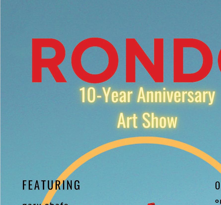
The Rondo’s incubation began at Elsie’s Tavern, where artsy young folks like Long, Ethan Turpin, Matthew Straka, and Tom Schultz inadvertently connected with Santa Barbara legends like the late Gary Chafe. The Rondo’s evolution from local haunt to artist hangout was spurred by Chafe and his giant portfolio of works.
Chafe’s overfowing folders and shelves demanded a group efort to organize it all. In between hanging (“in every conceivable place,” remembers Long) and categorizing, the roots of the building reemerged in the form of Friday night afairs involving music, Moscow Mules and lively conversations. Long’s love for found objects complemented the many chotskies owned by Chafe, and
the curious conglomeration of thrif store taxidermy and artist prints began to transform and expand.
The Knights of the Rondo were born. Each with diferent interests and aesthetics, the young artists’ admiration for Chafe’s body of work inspired their own production. Long with his dioramas, Turpin’s installations, Straka’s photos and Schultz’s collages – the artists thrived in what had become, according to Turpin, an “unofcial fraternal order.”
Long’s dioramas hang above the bar, by the entrance, and behind the infamous “icebreaker” – a functioning toilet just barely enclosed by a thin partition.
Regulars at Friday night gatherings don’t bat an eye before popping a squat at the unorthodox commode.
The architectural dream boxes
meticulously constructed by Long hold a certain familiar peculiarity that is matched by the Rondo. Found objects come into play again but this time in miniature. Beyond his representations of recurring dreams, Long takes commissions of local haunts like the Blue Owl and the Mercury Lounge.
Ethan Turpin’s hypnotic radial etchings and visceral video installations both thrill and educate viewers on wildfres, climate change and ocean plastics. Born in Santa Ynez Valley, Turpin has always had “a foot in creativity,
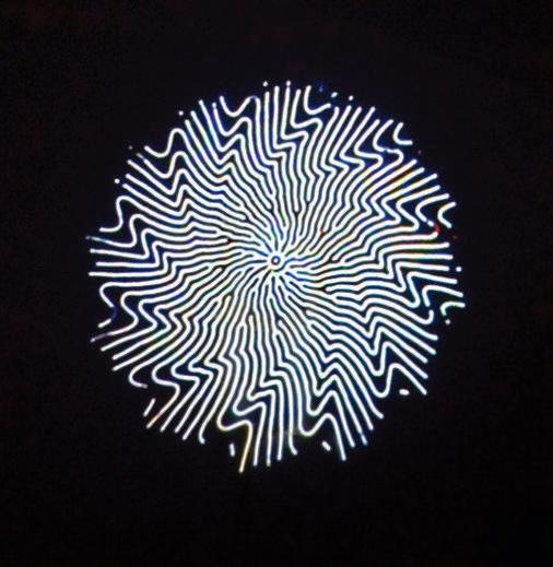
a foot in frefghting.” Turpin's multidisciplinary works deal with fre through media and education that “confronts where and how we live via safe simulations.” For Turpin, the Rondo is a quiet place to work exploring our changing environs.
Photographer Matthew Straka says the Rondo is a “harbor for artists of the beaten path.” Straka’s portfolio features playful compositions: a cactus in a bathtub, a pair of abandoned orange sneakers, fowers poised as if having a chat. A self-described collector, Straka is currently using cigar boxes to frame his photographs. He admits to an accumulation of paraphernalia in his corner of the Rondo.

“A lot of people think that we curate in bad taste,” Straka laughs as he explains how visitors ofen bring “gifs” in the form of, say, a lone antler. His description of the type of folks that frequent the Rondo is both amusing and accurate: “a community of oddballs.”
It is unfair to say that Straka’s designated space in the Rondo is the only area flled to the brim. The Rondo as a whole boasts unexpected
and occasionally disquieting ephemera.
“It carries on the tradition of ‘what the hell is going on,’” Straka says. Perhaps a phrase muttered under your breath as you squint through the doll-head surrounded window.
Tom Schultz clearly remembers the origins of the Knights of the Rondo. “Gary was a real fxture for that neighborhood and for Old Santa Barbara,” he says. The mountain of cleaning and sorting of Chafe’s work was driven by a shared admiration of the way Chafe lived and breathed art.
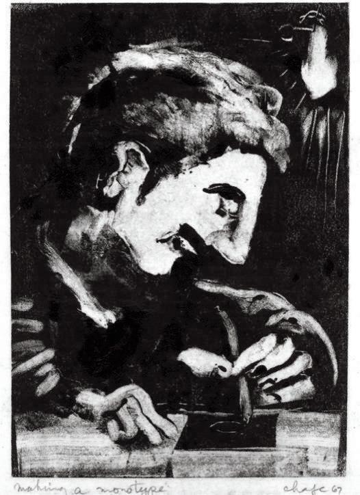
Schultz, who now lives in Solvang, has taken a break from the frenetic art production that takes place on 202 W. Canon Perdido St. However, the ten-year anniversary of the Rondo calls for some new collage pieces.
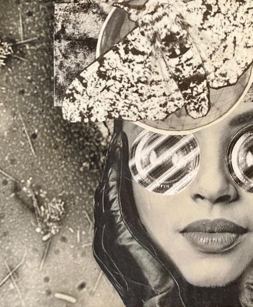
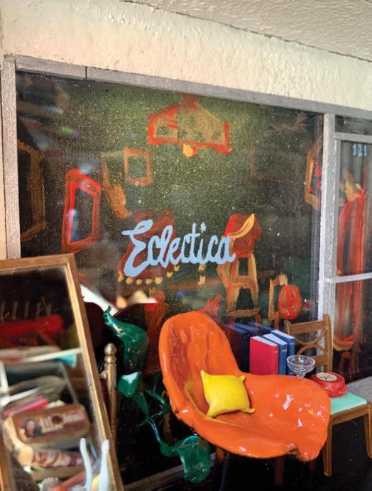
The Rondo anniversary show is set to showcase four very diferent artists linked by a remarkable piece of real estate and their respect for the late Gary Chafe.
Counterclockwise from top lef: Untitled, detail, Tom Schultz; Matthew Straka, Abandoned Van; Michael E. Long, Eclectica (diorama); Gary Chafe, Making a Monotype; Knights of the Rondo (from lef) Tom Schultz, Matt Straka, Gary Chafe, Michael Long and Ethan Turpin; Ethan Turpin, Feedback Ripples
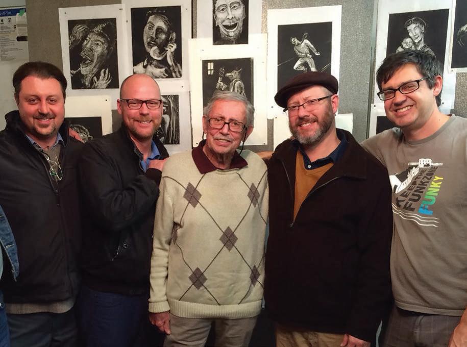


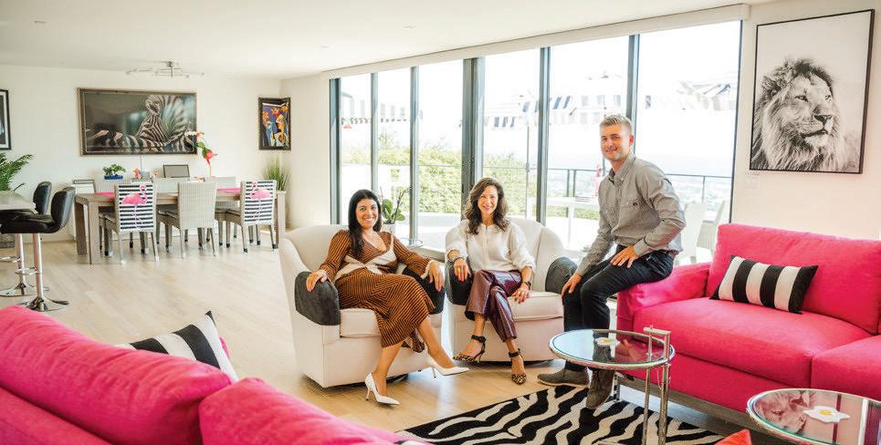
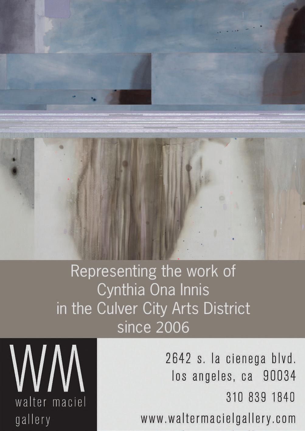
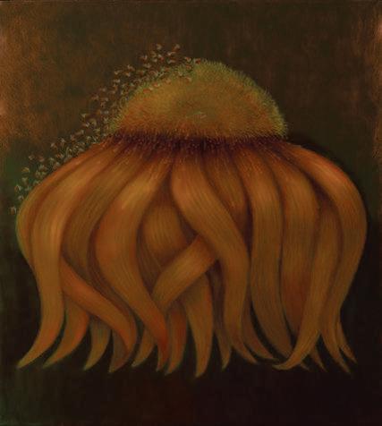

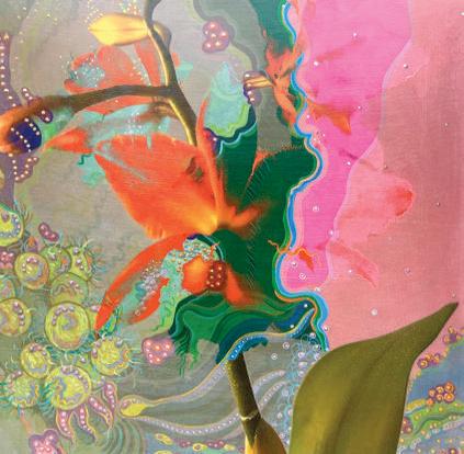
My work explores plants that could have existed in prehistoric times or in exotic corners of the world. Birds and bees are foragers of specimens appearing in fctitious feld notes, a guide into a dreamlike setting, luminous and at times slightly menacing, with a reference to current environmental impacts. 130 Cedar Lane, Santa Barbara, Cynthia James, (805) 698-8790, cjamesfneart.com
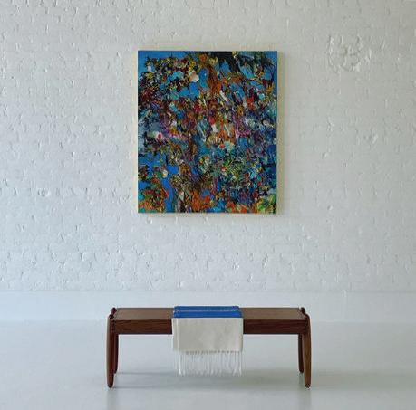
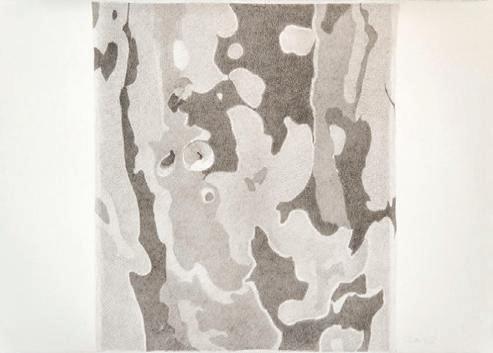
Located in downtown Santa Barbara, Marcia Burtt Gallery features contemporary landscape paintings, photographs, prints and books. 517 Laguna St., Santa Barbara, (805) 9625588, marciaburttstudio@gmail.com, artlacuna.com
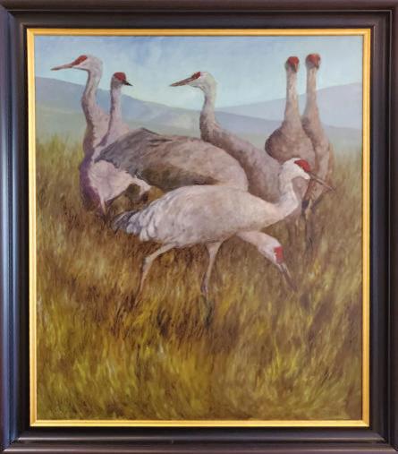
Left Field is a contemporary art gallery located in Los Osos, a small town on the Central Coast of California, halfway between Los Angeles and San Francisco. The gallery presents exhibitions with the primary goal of bringing to the region contemporary art not otherwise seen here. 1036 Los Osos Valley Road, Los Osos, Nick Wilkinson, gallery director, (805) 305-9292, leftfeldgallery.com
Cynthia Martin Studio
Cynthia Martin is an abstract, conceptual artist. One recent series of lush acrylic “landscapes,” many from photos of the Santa Barbara coastline, lure the viewer with color into their deconstructed stripes. Often, they demand a closer look with the titles and sometimes the realization that their high gloss is created with automobile paint. Since her graduate days at UCSB, her concerns have been about the environment and its intersecting social and political issues. cynthiamartin@cox.net, cynthiamartinpaintings.com
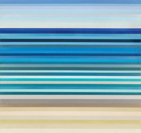
Painting what touches my heart with hopes of touching yours. Gallery
representation with Linden Studio & Gallery in Carpinteria and Mischief in Montecito. Linden Studio and Gallery, (805) 698-5589; Mischief, 1225 Coast Village Rd Suite B, Santa Barbara, (805) 565-9588, IG: @kimsnyderartstudio, kimsnyderartstudio.com
Sullivan Goss Gallery has represented the work of American artists since 1984. The contributions of American artists from the 19th century to the 21st century can be found in Sullivan Goss’ expansive galleries in downtown Santa Barbara, California. 11 E. Anapamu St., Santa Barbara, Nathan Vonk, Owner, sales@sullivangoss.com, sullivangoss.com
Walter Maciel Gallery features the work of emerging, mid-career and established artists who participate in national and international exhibitions and art fairs. The primary focus of the gallery is to promote the careers of artists through solo and group exhibitions, museum relationships, art fairs and important private collections. 2642 S. La Cienega Blvd., Los Angeles, (310) 839-1840, waltermacielgallery.com
Smith’s paintings refect the complex counterbalance of asymmetries found in the dynamic forces of nature. She explores balance, examining patterns in our environment. Subtle variations of complementary hues and warm and cool rhythms of light create an equivalence on all sides of the canvas. She is not just recording nature, but feeling its rhythms and changing seasons, infuenced by her solitary walks and direct relationship with the environment in California. 593
Los Feliz Dr, Santa Barbara, (805) 5701663, KerrieSmithStudio.com
The Gallery/Conference Room of
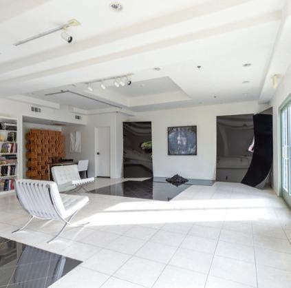
the AFSB is a dynamic space within a historic setting for curated exhibitions of contemporary art, photography and design. Four solo exhibitions and one group exhibition are presented annually. Local artists, architects, photographers and designers are invited to submit work in a wide range of content, mediums and styles. 229 E. Victoria St., Santa Barbara, info@afsb.org, (805) 965-6307, afsb.org
Located in the heart of downtown San Luis Obispo at the historic J.P. Andrews building (1894), Osos Contemporary is a 2,000 sq ft art gallery and studio space operated by professional artist Mark Warren Jacques. Osos Contemporary offers fne art and ephemera for sale at its physical gallery space and online through its website and social media platforms. The exhibition space is free, all ages and open to the public. 967 Osos St., San Luis Obispo, Mark Warren Jacques, owner, ososcontemporary@ gmail.com, ososcontemporary.com
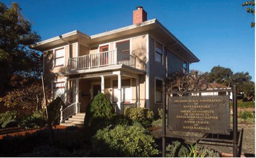
The Ojai Institute is an artist-residency program in Ojai that extends the dialogue between artists and the public through exhibitions and programs.
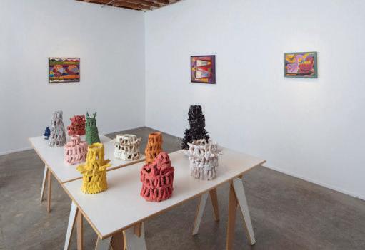
248 S. Montgomery St., Ojai, theojaiinstitute.org, cgbfoundation.org
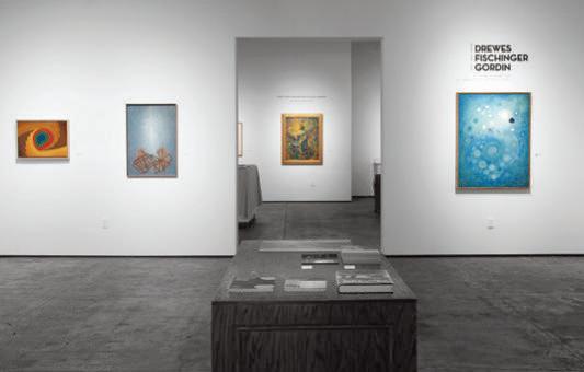
Ishi Glinsky: Upon A Jagged Maze Art, Design & Architecture Museum, UC Santa Barbara, September 1, 2022 – January 22, 2023
Editor's Note: We asked the curator of this exhibition to tell us about the show through a personal lens. What can you tell Lum readers that they won't fnd in the exhibition text?
encountered Ishi Glinsky’s monumental sof sculpture Coral vs. King Snake Jacket (2019) in March 2021 at the Chris Sharp Gallery in Los Angeles afer completing a road trip from Minnesota to California. Upon entering the gallery, I was completely amazed by the work’s size, scale and attention to detail, but most importantly, the tapestry of stories that were woven into the jacket in the form of oversized patches referencing a mix of Indigenous movements, punk rock/noise bands and the artist’s own biography. These stories, like the work itself, are a testament to Native American survival and speak volumes about Indigenous resilience and resourcefulness. What also struck me was the punk, DIY attitude the jacket embodied in its form and materiality.

It is rare for me to be awestruck by a work of art, but Ishi’s Coral vs. King Snake Jacket afected me so much that I immediately requested a studio visit with the artist. Following my initial meeting with Ishi and seeing his range of painting, sculpture and works on paper at the studio, my curatorial mind began racing to see if an institutional purchase or exhibition might be possible. Fast forward to September 2021 afer I formally accepted the director position at the Art, Design & Architecture Museum, and one of my frst calls was to Chris Sharp and Ishi inquiring if they might be interested in collaborating with me on Ishi’s frst solo museum show at UC Santa Barbara. This sparked a frenzied year of exhibition prep and research aided by Kendall Lovely, curatorial research fellow, while simultaneously bringing myself up to speed on the needs of the museum, its staf and the UCSB campus more broadly.
As a curator, sometimes you happen to be at the right place at the right time for an artist or artwork to fnd their way into your life. Thanks to Ishi’s generosity and sustained practice, that initial encounter grew into something much larger than any one individual or a single artwork.
— Gabriel Ritter, director, AD&A Museum
