Midas Magazine PANDORA'S BOX: Vol. 3, Issue 2

Page 1

MIDAS

spring 2023 • volume 3 issue 2 • pandora’s box
made by students at the University of North Carolina at Charlotte

SPRING 2023 STAFF

EDITOR IN CHIEF

Krishma Indrasanan

MANAGING EDITOR

Sanura Ezeagu

CREATIVE DIRECTOR

April Montgomery

DESIGN DIRECTOR

Christa Wickman

WRITING DIRECTOR

MICAH

WRITING

Monique Delagey

Juliet Meyers

Ilysia Pitzer

Nanthana Sureshkumar

Andrea Villamarin

PROMOTIONS

Bianca Rodriguez Castillo

Bethany Collins

DESIGN

Tiana Cohen

Aliyah Valcin

Aily Valencia Cervantes

Troy Vong Nguyen

PHOTOGRAPHY

Zachery Allred

Abbas Omotosho

Seth Rodriguez

CONTRIBUTORS

Carissa Bermudez, Melvin Bonilla Jr., Isaac Colson, Ansley Dennis, Christina De Guzman, Caromis Ferrer-Ramos, Joseph Flucus, Arin Garcia McCormack, Michael Graham, Claire Hambrick, Jaylen Harell, Samára Hawkins, Akshi Kumar, Zach Langan, Devon Lemasters, Saina Macha, Danielle Montgomery, Dana Navarro, Tailin Postema, Xavier Pratt, Jamie Roldan-Moquete, Ramon Sanchez, Souroja Sen, Health Tillman, Julia Williams

2 3

MIDAS MAGAZINE PRESENTS:

PANDORA’S BOX

4 5

a letter from the editors

Krishma Indrasanan

Editor-in-Chief

Pop quiz!

What is the color of the sweater in the infamous The Devil Wears Prada scene where Meryl Streep’s character verbally dresses down Anne Hathway’s Andy Saches?

In the words of the infamous Miranda Priestly, “no, it’s not just blue, it’s not turquoise, it’s not lapis—it’s actually cerulean”. Even for those of us who didn’t guess cerulean, the message is not lost: the devil is in the details (pun intended).

My personal favorite line is Miranda articulating “that blue represents millions of dollars of countless jobs, and it’s sort of comical how you think that you’ve made a choice that exempts you from the fashion industry, when in fact, you’re wearing a sweater that was selected for you by the people in this room…”. In the seventeen years since the premiere of The Devil Wears Prada, Miranda’s point has only become more relevant in the face of fast fashion, shorter fashion cycles, microtrends, influencers, and spcial media. The trends are constantly changing—perhaps by the time you read this the ultra-mini platform Uggs will be ‘cheuggy’ again—but the universality of color never changes.

Red is passion or anger- some emotion with a deep vitality; green is refreshing, peaceful, and lively; blue can be thoughtfulness or melancholy depending on the shade. Black oft gets categorized as dramatic, gothic, or moody. found it to be such a strange phenomenon that somehow over the course of thousands of years and billions of different people in different languages, there is a commonality when we say we feel “blue” or that we “see red”.

This issue of Midas sought to reflect upon that- we wanted to ask what your color is but that conversation lead to a broader question: what is color? To you, dear reader? To your family, friends, and loved ones? To almost any of us?

On pages 10–17, Auras hypothesize that perhaps our energies and personas are informed by a series of spiritual and cultural influences. Nathana Sureshkumar lets us know it could be the years of streamlined visual tropes that unconsciously shape the way we view the world in The Colors of Film (pages 18–21).

Contrarily, maybe real life affects art and not the other way around—Juliet Meyers’s Mural Culture (pages 34–41) highlights the vibrancy of Charlotte’s street art and how it fights against the negative preconceptions about ‘graffiti’ instead of being called as it is–art. And some much-needed color to the boring greige overtaking everyone’s Instagram ready-homes and offices (but you didn’t hear that from me).

This time last year, when it came time to decide on a theme for our Fall 2022 issue, we originally selected to do color. Of course, that did not happen—nostalgia felt like a more appropriate touchstone for that issue at that moment in time.

However, this semester felt like the perfect moment to confront color and its place in our lives. At the time this letter is being written, the world has passed a one-year anniversary of a deadly war, eggs are exorbitantly priced, spy balloons are all the rage and HBO thought it would be a good idea to release Velma while shelving the entirety of Westworld (I’m not mad about it-I swear). The common sentiment between my peers and me is that each year the water rises higher and higher while the crows fly closer overhead.

As much as we may desire, we cannot control or fix events that are larger than us, especially in this material, industrial world. But we can find beauty and joy in it. When I was writing

Sanura Ezeagu Managing Editor

remember watching our creatives work outside of April’s (Creative Director) house, scrambling to get their vision across. It was night and in the middle of the street our models surrounded the car. As many cars drive by and stop in curiosity, the neighborhood security watch walks by and asks us what a whole group of black, college students is doing in the middle of the street with a light attached to a broomstick, and someone bathed in silver. As Micah and April try to explain what we were doing, the guard stops us, and instead of getting side-eyed and possibly a lecture he proceeds to praise us

“I’m proud of you all” as college students willing to challenge our creative boundaries. “Do you want to get in on this?" we asked, and he happily jumped into the car as we took a couple of shots of him. As the night ended had to leave to pick up my younger brother from his friend’s house. On my ride I kept reminiscing about what just happened; walking into the house while the sun was still up and everyone sitting down laughing, singing, and having a good time. Just imagining a concept versus seeing everything we wrote on paper come to life is such an amazing feeling.

In a room full of ideas, that night felt like Pandora’s Box being opened. Sketches came to life and words turned into action. Every good, bad, and ugly idea came out into the open.

this letter (aka the twentieth draft of it), kept returning to aestheticis—not in the highly-curated Anthropology way but in its purest form: art for art’s sake

The original Aestheticism Movement (the 1880s–1890s) was a refugee from their reality, but I’d like to think of our aestheticism as a rewrite of our reality—one where color felt like the right prescription for our generational blues. So thank you for reading through my Ted Talk and welcome to Midas Magazine’s Pandora’s Box for Spring 2023.

I went back to the time when Micah and I were in our closet of an office, discussing the possibility of executing a shoot like this. We sat down and talked about Beyonce’s Black Is King and poetry and the visuals of how this shoot will go. As I see Micah and April applying glitter silver glitter to one of our models a sense of pride washes over me. Everything we said and wrote down at the beginning of this semester was coming to life.

So why Pandora's box? Just like the myth this semester we decided to truly open ourselves and let everything reveal itself. We pushed ourselves the hardest we’ve ever pushed and this is still the beginning. Despite the myth being a tragedy we want to challenge the idea that within those evils there’s always greatness just like our name Midas. Our whole brand is to display amazing work and with this specific issue bring color to our meek world. And just like Pandora, we can hopefully open that box to let hope out into the world.

6 7

Primary

COLORS

Color is a state of mind—it is the physical expression of the sensations we feel. It is more than what your eyes can see and what you believe to be “beautiful” or “unique.” Underneath is a personal experience that speaks in a voice only you can hear. It ignites a blaze of emotions that don’t quite fade even as the colors do.

was six years old when I watched The Wizard of Oz for the first time. The yellow brick road mesmerized me on the screen. I was giddy with excitement as I sang along, clicking my imitation red ruby slippers, “Follow the yellow brick road… follow the yellow brick road…follow, follow, follow, follow.” distinctly remember this feeling of warmth and a vibrant, sunny delight that engulfed me entirely. The reds, yellows, and blues rooted an innocent glamorization of the world within me. Our primary colors paint the most profound strokes of our earliest years symbolizing our deepest emotions and integration as a fresh canvas. It is a stepping stone to look through the lens of a world of shades and hues—a defining moment. We are shaped by these reactions of fondness. Color becomes a means of communication when conventional language is limited.

In Western culture, these colors embody our childhood—think Sesame Street. Our sources of entertainment included talking multi-colored Muppets distinguished by teaching colors to young children. Through Sesame Street, great sums of individuals within the culture, myself included, grasped the language of color. Elmo, Big Bird, and Cookie Monster often come to mind. A furry scarlet monster with an aggressive alter ego, a lemon-colored and happy-go-lucky bird, and an electric sky-blue monster that becomes sad without cookies. They made emotions tangible for the childish version of ourselves.

Characters similar to these were tools that enabled us to understand what we felt when we couldn’t voice them as we do now. They were a source of commonality in a vast, indeterminate world.

Red is…

The apple, ladybug, and firetruck learned in primary school.

When going too fast, it tells you to stop.

The cherry-colored folder that could be Math, English or History.

Roses, not violets, in a children’s rhyme.

It is irritation after losing recess from bad behavior.

Red is an angsty ten-year-old.

Yellow is…

Transparent, neon ink on a page.

Slides at the park that hand out blisters and burns. It is Spongebob ice cream with misplaced eyes. Between stop and go.

The endless possibilities as you dream.

Yellow is the sun, the moon, and the stars.

Blue is…

Looking up at the sky.

A candy-coated tongue.

It is the sound of rain on a windowsill.

CapriSuns as you play outside.

Tears on a wounded night.

Blue is a reminder of better days.

Primary Years: Primary Colors Auras As Seen on TV 9 10 20
9 8
WRITTEN BY: ILYSIA PITZER DESIGNED BY: CHRISTA WICKMAN

HOW COLORS AND CULTURE CONVEY WHO WE ARE

If colors could encapsulate who you truly are, what would you see? Would the self-pity and isolation radiate in a blurred indigo hue? Does a bright metallic red surround your being with the frustrations never allowed to be shared? Or would you see beautiful hues of violet for your wisdom and understanding? Does the color pink showcase your gentleness and loyalty? The colorful, energetic fields that surround you, that change and interact with your environment and with others, manifest into your true self. Your past, present and future all make up your aura.

Writer Monique Delagey • Photographer Zachary Allred • Designer Troy Vong Nguyen • Makeup Artists Tailin Postema, Carissa Bermudez, April Montgomery • Models Ansley Dennis, Dana Navarro, Akshi Kumar, Souroja Sen, Christina De Guzman, Saina Macha, Danielle Montgomery, Julia Williams, Carissa Bermudez, Sanura Ezeagu, April Montgomery
10 11

THE PAST

The ancient history of aura has been seen in various philosophies for centuries. In Hinduism and Buddhism, aura is called the ‘pana’ or life force and is related to the seven chakras, the energy points of the body, mind and spirit. Unseen, they advance along the spine and determine the connection to the physical and spiritual. It begins with the root chakra in your lower body, representing red, and ends with the crown chakra at the top of your head, purple. Each energy point can reveal the contents of your physical, spiritual and emotional state.

In Islamic and Biblical texts, aura can be depicted as a light symbolizing divinity or holiness. It has been seen numerous times in religious art as halos surrounding the heads of saints. In Sanskrit, the word ‘leśyā’ or ‘light,’ can be found in the Indian religion Jainism, directly associated with the aura of the soul. But not only is ‘leśyā’depicted by color; we can find it in all five senses.

Leśyā is a karmic matter, so the aura of your soul depends on your objectively good or bad actions. If you have committed good deeds, your aura will be soft and natural, ranging from welcoming hues of bright red to white. Bad deeds or emotions such as ill will or envy result in bitterness and harsher tones of color.

Aura has further been shown to represent connection and unity. In Chinese culture, it is linked to the concept of qi or the vital energy that flows through all living things.

Aura is found in indigenous healing practices in Latin American culture. It is known as “energía” or “espíritu” and can be cleansed through shamanic practices to restore harmony. For the Native American community, aura connects human beings to the natural world. The practice of “hozho” is a Navajo tradition that restores the aura to its natural state through prayer and sand painting.

“Ifa,” the Yoruba tradition of Nigeria, connects the individual to the spiritual energies of the natural world, promoting a balanced aura.

Aura appears in Theosophy, the belief in spiritual transcendence and pursuit of ‘divine wisdom.’ Gaining their information from sacred texts and Indian and Middle Eastern philosophies, Theosophy eventually grew to inspire the New Age movement we see today, thus leaving us to grasp the hidden meanings in spirituality and defining aura itself.

There is skepticism surrounding the idea of aura. Most lie in the belief that they are only due in part to the effects of the brain, like hallucinations. Other examples to argue the existence and sight of aura are evident in individuals with synesthesia. Through the influence of psychedelic drugs, some perceive what others believe to be the colors of aura.

Ultimately, advocators for aura find it to be a complex communication from the universe to our human experience.

THE ANCIENT HISTORY OF AURA RUNS DEEP. BUT THERE IS ONE THING THEY ALL HAVE IN COMMON; THE DESIRE TO FIND THE REALITY OF WHO WE ARE.
13 12

THE PRESENT

Perhaps aura has become so integrated into our lives because we share the same desire we’ve had for centuries. The desire to define the human soul. We are afraid of the unknown, of being misunderstood. Aura explains the parts of ourselves that we cannot.

The current aura can be defined to us by those with clairvoyance, psychics, who can visually depict aura. Methods such as meditation and energy healing are used to perceive and work with aura. Or it is captured by aura photography. The light sensors within the camera catch the electrical output you produce to create an image of the aura surrounding you. Once taken, the photographer can explain each color’s meaning to the client.

Auric colors are complex and contain multiple meanings, but in the simplest terms, they can be understood as such:

red: courageous, passionate, ambitious, grounded.

pink: loving, generous, loyal, self-aware.

magenta: inspiring, motivated, strong, generous.

orange: creative, confident, social, optimistic.

yellow: friendly, intellectual, patient, enthusiastic.

green: compassionate, nurturing, peaceful, connected.

blue: empathatic, supportive, sensitive, trusting

purple: charming, imaginative, playful, intuitive.

white: wise, protective, energized, positive.

The most important thing to understand about the aura is that it changes over time. You are never chained down to a certain identity. As you learn and grow, so does your aura.

Through important realizations and spiritual awakenings, your aura shifts toward who you are meant to be.

Aura is internal, yes, but it is also influenced by the external world, which affects us. So this poses the question; how do the colors of our culture connect with the colors of our aura?

14 15

THE CULTURE

Our cultural environment shapes our auric identity. Everything we know is based on our culture, where we are from, how we grew up, how we view ourselves. Especially how we interpret the meaning of these colors. The symbolism of color differs in each country. For example, white and red are worn to funerals in many Eastern countries, while white is used predominantly in the West for weddings. Through emotion, individuals who grow up in America find red to symbolize aggression or assertiveness, while those in India incorporate the color anywhere in acts of love, celebration, or bravery.

Growing up American with immigrant parents, I always found myself having to choose between one cultural meaning or the other. Speak English at school and Afrikaans at home. You feel like you can never have both, always putting one over the other. And then there is the universal experience– a disjointed connection, visiting a country whose culture you’ve somewhat adopted. Being with family in South Africa made me realize I could never truly know their experience or culture. And they could never know mine. In this realization, I grounded myself through color.

I found connections to color in the natural environment. My memories gather like solitary trees. The ancient and untouched green tones of the South African mountains pushed into vast tones of blues and whites of the sea. Over the horizon, you can see the bright orange circle of the sun falling and then a million stars in a field of darkness. The vast blue represented new beginnings, a state where I could find peace. In the green, I found ancient wisdom, and in the orange, found hope. I saw how the landscape reflected its people, in their hope, determination and willfulness to keep moving forward. Just like the varying colors that encapture who we are, we can be complex and multifaceted. Maintaining a hand in both cultures can open our minds and expose ourselves to so many more perspectives. Countless other individuals can attest to this experience, including Charlotte student Akshi Kumar.

Akshi grew up American in an Indian household, experiencing two different cultures connected to make up her individual auric energy.

“ Pink and orange,” Akshi describes her aura to be, “Some mixture between the two because love is a really big part of my life and it’s something that strive to do everything with. When I look at the color orange, I just feel automatically happy and inspired and motivated.”

Akshi’s experience with how colors are viewed in American versus Indian culture contrasts but ultimately inspires who she is as a person. She recounts colors such as red, yellow and orange; all the vibrant colors she continues to see prominent in Indian culture. But she also understands how the meanings of these colors differ.

“At many Indian weddings, women, when they’re getting married, wear a red lehenga. For me, that represents union and family, and it’s strange because most cultures view red as anger, while others view it as love. kind of view it as family. So it connects love,” Akshi remarks. These cultural differences made a huge difference between her American and Indian cultures. Understanding the symbolism of color and cultural awareness is important in order to understand how Akshi’s experience differs from others.

JUST LIKE THE VARYING COLORS THAT ENCAPTURE WHO WE ARE, WE CAN BE COMPLEX AND MULTIFACETED.
17 16

The significance of colors can be as simple as a country’s flag to its complex social structures. In Belgium and China, the color blue is seen as feminine, while in the U.S. it is masculine. Cultural events such as the world cup create a contrast between countries, such as the colors of France versus Argentina. The subjectiveness of cultural colors can create a connection to all aspects of life; life and death, power and commitment, love and defeat. In South Korea, the color white is an essential color to their culture and outlook. Represented in their flag, white can indicate multiple symbols such as tranquility, purity, strength and power.

UNC Charlotte student, Michelle Cho, recalls being taught these meanings growing up in the U.S. with South Korean culture. Michelle speaks on the significance of traditional South Korean colors like white. She encapsulates the struggle of not being fully immersed in the culture, living in a different country.

“It didn’t really have much meaning for me when I was growing up, just because I didn’t really think about my country that often...” Michelle Cho states, “you’re kind of given a watered-down version of your own culture just because you’re not directly exposed to it.” Michelle finds that she started seeing more of the color white being used traditionally in college. She was able to find others who shared her experience.

“When you grow up, you go to college, you start being surrounded by more people from your own country, and then you start associating more meaning to it,” she said. Michelle began to see the manifestation of herself in a community. She saw that her experience was unlike many of those around her. When she found others with a similar background, Michelle was able to share a deep love for her country and her unique identity. Knowing two cultures, you don’t fully relate to your American culture, but you don’t fully connect to your heritage either. But there is a beauty in this variation.

“White has so much meaning in my country, just because every time talk to my parents about it, they say it’s always associated with strength and power, but it’s also associated with death, life, purity and innocence. It just has so many different meanings behind it.” In Korean shamanism, aura can be closely associated with “eum,” which is the Korean word for “energy” or “spiritual essence.” In order to protect and heal the aura, they incorporate the color white. An integral part of South Korean culture, this color has many values.

Aura and the symbolism of these colors are multi-faceted. So why must our identity just be seen as black and white? We are complex, just like the colors that represent us. Michelle spoke of the simple truth; that your identity does not have to be hindered just because it is more complex. This contrast is what makes your aura remarkable.

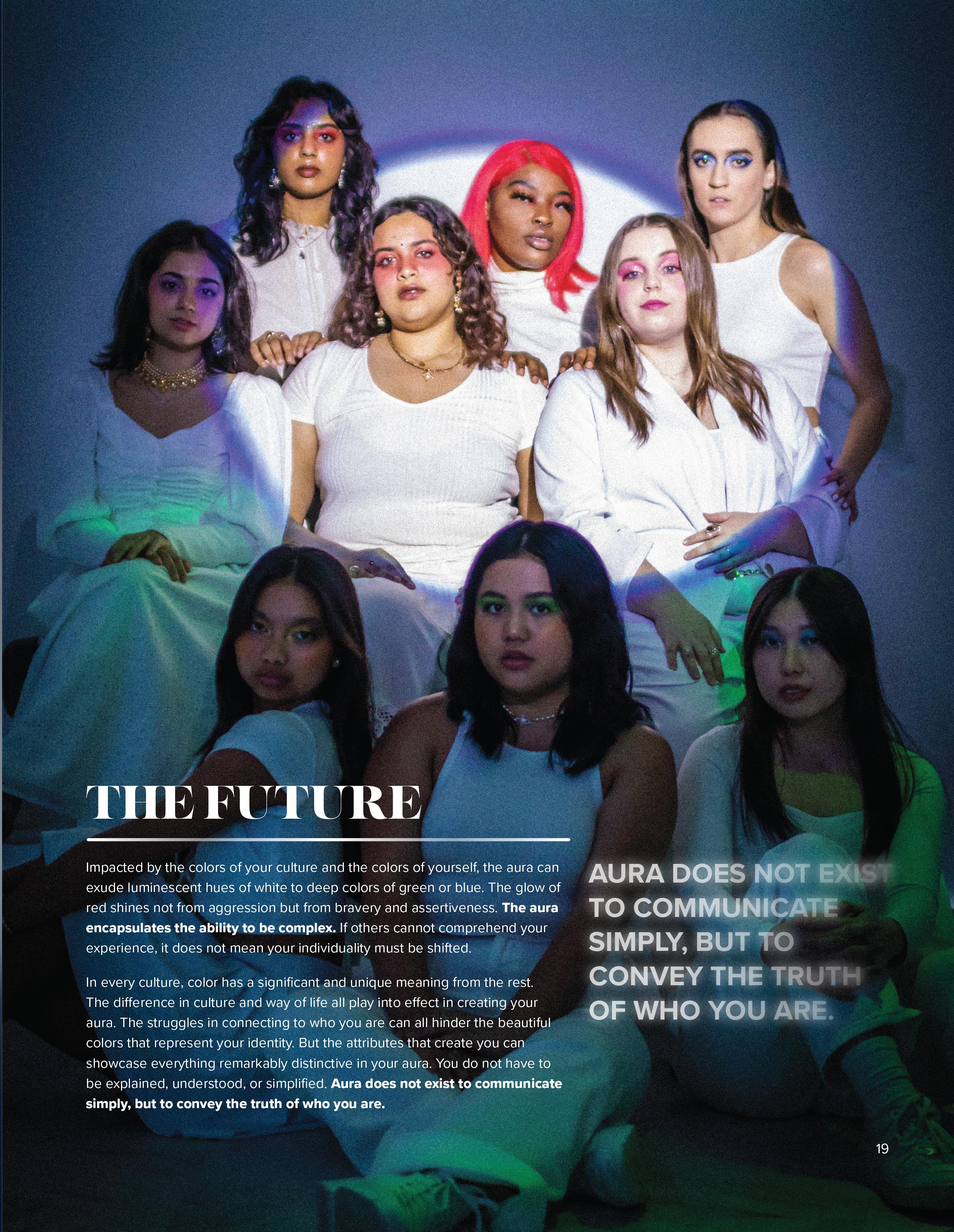
Impacted by the colors of your culture and the colors of yourself, the aura can exude luminescent hues of white to deep colors of green or blue. The glow of red shines not from aggression but from bravery and assertiveness. The aura encapsulates the ability to be complex. If others cannot comprehend your experience, it does not mean your individuality must be shifted.

In every culture, color has a significant and unique meaning from the rest. The difference in culture and way of life all play into effect in creating your aura. The struggles in connecting to who you are can all hinder the beautiful colors that represent your identity. But the attributes that create you can showcase everything remarkably distinctive in your aura. You do not have to be explained, understood, or simplified. Aura does not exist to communicate simply, but to convey the truth of who you are.

THE FUTURE
18 19
AURA DOES NOT EXIST TO COMMUNICATE SIMPLY, BUT TO CONVEY THE TRUTH OF WHO YOU ARE.

TV ON AS SEEN

How do films create

colored perceptions of places?

Have they never seen the true colors of my country

yellow

Secondary

COLORS

We experience complexity beyond what simple red, yellow, and blue can capture.

Yellow is no longer just happiness, it’s caution and hope; red is embarrassment and passion; and blue is loneliness and tranquility.

Primary colors merge and create new meanings for familiar feelings. Combinations of sadness and anger create rage, an orange-ish color; happiness and sadness form envy, generally green; sadness, happiness, and anger produce fear and nostalgia, shades of purple. There is no definitive way of coloring these feelings; the shade is often dictated by the intensity of the emotion.

The age of social media as we turned into pre-teens outlined a different translation of what it meant to be “green with envy.” It contributed to the exhausting nature of engaging in the digital world of comparison. We were driven to achieve and improve on qualities that didn’t need fixing but became tickled pink when it paid off via likes and comments of acceptance. Surely a learning experience. We thought we were the center of the world with the golden opportunity to flaunt our lifestyle and adventures.

It was then that we got a taste of loneliness and embarrassment when the engagement didn’t add up to the effort. Or when bullying and peer pressure were the new normal. Social currency was high for some and low for most—that made you a black sheep in the middle school hierarchy. The need to be something more consumed you. Like a bruise, it started out a deep plum and faded into a viridescent shadow.

People will often say “the grass is always greener on the other side” but how can we know what’s on the other side? There was always someone with something greater than ourselves. Lives that weren’t ours seemed more desirable because curiosity made them seem so. We have our own lens of color that is like no other. For me, the grass was an emerald shine compared to my dark viridian. It ate away my conscience that couldn’t achieve “greener” and “better.” Something unreachable that wasn’t mine to have. There comes a realization that it is not yours to determine how much greener the other side may be and your perception shouldn’t impose on another’s.

Life felt like a movie waiting for the next act, the climax.

There was a newfound sense of anticipation for what was to come. The prospects and freedom. Most of us couldn’t wait for when we could make our own decisions. We craved adulthood but didn’t consider the process of getting there or all the demands that came with it. It included consistently daydreaming about buying all the things we desired and having a voice to speak for ourselves. This eagerness glowed rich saffron that transformed into a lavender bloom of fear for the future. A looming anxiety that the setbacks and challenges would remain. Nothing would change and it would have been in vain. That even in adulthood, we wouldn’t have the power to be anything we wanted. These emotions were a peachy lilac sunset epitomizing the end of an era and the start of a new beginning as it rose again.

Primary Years: Secondary Colors Piece by Piece: The Fabrication of Freedom Alien-Nation The Charlotte Mural Walk 25 26 32 38
25 24

The day my now ex-boyfriend broke up with me was the cherry on top of the terrible ice cream sundae that encompassed January 2023. But I believe I’m getting ahead of myself,

so let’s roll back the clock

First, I was in and out of the doctor’s office for a painful illness that wouldn’t go away for two weeks. It didn’t matter how much pain medicine I took; no dose was strong enough It put my life to a halt, as I was in so much pain could not stand or eat, much less walk to my classes and be able to sit through my lectures without doubling over. You can imagine how much work I had piled up on my Canvas to-do list.

Then, someone in my old group of “friends” said something offensive about my race, and when I said I was offended, nobody seemed to care. So I cut them off. I couldn’t keep being around people who never respected me enough to see me as someone worth listening to. The final blow was the breakup. My ex-boyfriend broke up with me after using me as if were an object. The disgust and repulsion I felt from what he did wouldn’t go away no matter how many times scrubbed my skin raw. My confidence and sense of self shattered into a million pieces that day. The weeks after that were just as hellish; over time, the rose over my eyes faded away, and I saw him for what he really was. He lied to me. He never trusted me, even though I’ve never given him a reason to mistrust me. Despite everything was going through, I did so much for him to show that I cared, but somehow he couldn’t do the same for me. I agonized over what I did wrong until he told me that it was all him, and not me. Still, hurt so badly knowing that someone I loved never cared for me as much as I did for him.

Now picture this:

in the days after the breakup, after everything I spent days and nights curled up underneath all my blankets, holding onto my stuffed IKEA polar bear with a death grip, all while having Olivia Rodrigo’s ‘Traitor’ playing on my phone over and over on repeat. Fresh tears streamed down my face and ran into my hair as I stared up at the ceiling. I was a little more than halfway through the ninth loop of ‘Traitor’ when I realized that I lost so much of who was. I felt like I was drained of everything that made me… me. It was time for a change.

27

Ihadtoturntomy STYLE

So I turned to what every person does after a break-up: I dyed my hair. An appointment at the campus salon got my hair lightened and dyed to a deep coppery red; something that I was on the fence about getting. Afterwards, I realized that I love how it turned out. Next, lightened my eyebrows. I sat in front of my mirror and brushed bleach onto my brows, carefully holding a tissue over my eyes. In minutes, black hair above my eyes turned into reddish brown, then orange, then a dark blonde. But afterward, even as I stared at myself in the mirror, I thought this change wasn’t enough. It helped me, of course, but not enough. Despite the red hair framing my face instead of jet black, and my newly-lightened eyebrows blending into my skin, I still felt the same as before.

A new realization hit me like a truck when I was moping in my room one lonely evening, making fruitless attempts at being productive and catching up with my work. I caught sight of the pastel-colored clothes in my closet; realized once again, I had to turn to my style.

My fashion constitutes a more meaningful part of who am; whenever look back at old pictures of myself, I notice how the clothes I wore reflected the state of my life then. As I grew and changed as a person, the clothing that I wore did as well. T-shirts, sweatshirts, and skinny jeans in dull colors like steel blue and gray were all wore when I was less confident. On the flip side, ruffled blouses and short skirts in colors like pink, baby blue and sage green were what wore when my self-worth and state of mind improved. Not only was I more daring with my clothing when I was confident, but I also noticed that wearing bolder styles made me feel so much better about myself.

The next chance I got, I opened my closet and began to appraise the clothes with my infamously critical eye for fashion. Going through each plain, pastel piece in my closet made me realize that these clothes already felt like they belonged to someone else, not me. My eyes fell upon a baby blue cotton dress that reminded me of what my ex-boyfriend said about my style; he liked it best when wore simple, soft-hued clothes.

With Pinterest as my trusty sidekick, I began to research the hottest fashion trends on the runways of places like New York, Paris, and Milan, with a variety of fashion houses like the famously punk Vivienne Westwood to the brightly colored and patterned Gucci, and even the delightfully avant-garde Iris Van Herpen. These clothes and learning about the latest styles brought familiar comfort and joy at a time when I needed it the most.

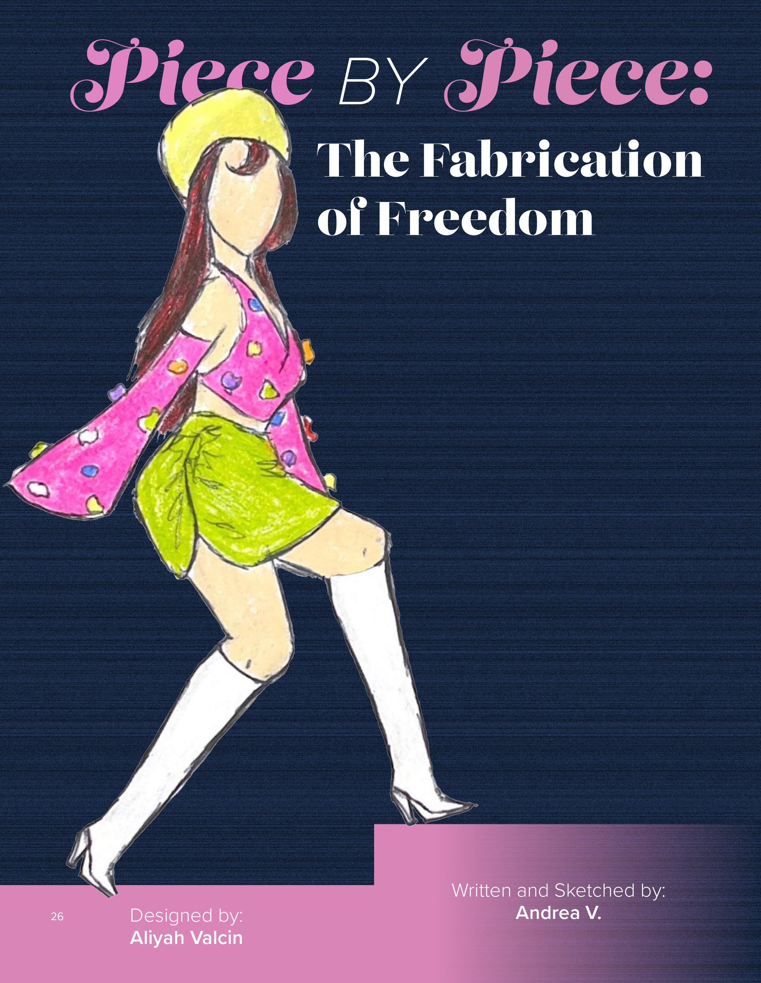
My earliest memories of fashion as a child involved me making paper dresses for my dolls, or making sketches of the clothing I wanted to design with crayons. With the power of Youtube, I taught myself how to design; to hand stitch; to machine stitch; to use a pattern- to sketch; to sew buttons, and to drape, out of what I can scrounge up at thrift shops, dollar stores, and craft stores, even though a professional seamstress would weep at my work. love the fact that can make it look like anything I want it to be: the brightest of magentas and the richest of olive greens The possibilities are only limited by what I can think of.

Outfit 1:

This one is a gray NASA sweatshirt, medium-wash skinny jeans, and plain white shoes. In my freshman year of high school, I wore variations of this outfit because I was afraid of being picked on if I stood out. Although it reminds me of the times in my life when I was not so confident, it does serve as a helpful reminder; when you’re at the bottom, the only way to go is up.

28

Outfit 2:

The mustard yellow cropped tee underneath my oversized jean jacket matched the yellow stripes on the navy blue leggings, which had one pant leg fraying on the hem. like to think this outfit sums up who I was then; peeking out of my shell and learning to be more social, one layered outfit at a time. I was happy with it for a while, but at some point, the muted colors that filled my wardrobe just began to feel wrong. That sense of wrongness became the catalyst for my next style change.

Outfit 3:

This was my pink post-quarantine persona, which my classmates helpfully described as “soft e-girl”. The white fur trim on my white cardigan contrasted with the ruffles on the blouse I wore underneath, and the pink tennis skirt sat at my waist and flared outwards, topped off with leg warmers, platform mary-janes, and a beret, all in shades of white and pink; the entire outfit made me appear soft and more feminine overall; chronic people pleaser who was deathly scared of being disliked, ever. After I graduated, promised myself that I would become more outgoing and social, that I would be truer to myself, and I knew my style had to change to match.

Outfit 4:

There’s a fun story behind this outfit; the top used to be a very pale pink, almost white, but it came out with grayish blue stains when I accidentally tossed it in with a dark pair of jeans. At first, I was disappointed; it was a new top, and I couldn’t believe that I already ruined it. But then a lightbulb went off in my head, and I realized that could fix it with a little clothing dye and patience. The sense of euphoria that filled me when I saw the shirt after fishing it out of its bright magenta dye bath helped me realize that my style, along with my personality, had begun a transformation once more.

Piece by piece I sketched, sewed, and constructed myself back together. I took my fashion and found my freedom. And you can too. You can turn your darkest period into light. You can find salvation in your hobbies. And you can wear and express yourself however the hell you want because you deserve that. You deserve to be seen, valued, and heard. I see you. Now go put on your favorite outfit and hit the town.

With Love, Dre

Photographer: Seth Rodriguez

Designer & Make-up: Aily Valencia Cervantes

Set Design: Heath Tillman

Models:

Muerto - Ramon Sanchez

Muerto II - Melvin Bonilla Jr.

Alien Authority - Zach Langan

ALIEN-NATION

"Discrimination and brutality by police officers leveled against minority groups is an ever-present issue within our country. Police “culture” consists of no more than upholding the status quo of far-right institutional methodology and demeaning those that have a rich cultural heritage in order to meet a quota. Here, we take a different approach to the terminology of “alien”—police officers are presented as threatening extraterrestrial creatures and Mexican-American men are shown as the victimized “muertos”, or dead men walking."

32 33
– Seth Rodriguez
35 34
36 37

Almost every corner of Charlotte is adorned with vibrant murals covering the architectural landscape. Whether driving to the grocery store or a local coffee shop, even first-time visitors to Charlotte are sure to see bursts of color created by the local mural community. While the mural selfie has become synonymous with the “aesthetic” Instagram feed, it is pertinent to acknowledge those that bring color to our lives on a daily basis. A variety of messages are conveyed through the pieces in Charlotte, including the celebration of diversity throughout the city, raising awareness of social issues, and even conceptualizing our existence through texture. Even though we are constantly surrounded by this mural community, we have only a superficial understanding of it. Local artists are what bring the Charlotte community to life.

39 38

in essence,

taking a photo op with a mural without seeing the message in the media is like buying a book and not even cracking the spine.

Linguistically, mural comes from the Latin word “murus”, which means “wall”. Murals originated 30,000 BC, with the first sight of wall art was in the Chauvet Cave, France. The origin of murals today can be traced back to graffiti art that was prevalent in New York in the 1920s and 30s, becoming more prevalent as hip-hop culture developed.

The stigmatization of street art has existed for many decades.

With much rhetoric viewing graffiti art as a nuisance, while appreciating murals, it is imperative to draw attention to the fact that murals as an art form originated with graffiti artists. As street art spread throughout various metropolitan cities, it was no surprise that walls of color eventually reached Charlotte. Through my research and seeing these murals in real-time, I gained a new appreciation for the diversification of messages artists can express through public art. Every day, I sat at my computer for hours, listening to testimonials and reading the “About the Artist” section. Art is integral and necessary to prevent a community from stagnating.

The History Of Street Art

At 1501 S Mint St. is the “Mamba Mural”, which pays tribute to legendary basketball icon Kobe Bryant and his daughter, Gianna Bryant, who both tragically passed in a helicopter accident on January 26th, 2020. During his 20-year NBA career, Bryant played for the Los Angeles Lakers. When viewing this mural, the concept of parasocial influence and the power of idolization come to mind.

Let me explain.

The word “parasocial” often has a negative connotation. Hell, I think of myself back in 2010 with my Justin Bieber posters plastered on my wall, thinking I could be the “One Less Lonely Girl”. We develop parasocial relationships with athletes, musicians, and other public figures because they inspire us. We look to them as people who represent us, our interests, and in that way, they become part of who we are. Not having anyone to look to as an inspiration is actually a negative thing. When we lose someone we idolize, it shows us how a scenario can halt our dreams at an instant.

Kobe Bryant’s legacy transcends decades. I was in elementary school from 2005-2010 and remember hearing the kids who played basketball on the blacktop yell “Kobe!” before making a shot. Back in the classroom, same thing. A stack of crumpled up paper balls sit idle next to the trash can due to various failed “Kobe” shots.

That was almost 20 years ago.

The reaction to his passing exemplified how a public figure can have multi generational influence. A spectrum of people, from retired basketball players, middle-aged sports fans, and the new generation of kids on the blacktop, mourned the death of Kobe and his daughter. Someone who evokes that kind of reaction among such a wide spectrum, should be permanently celebrated.

take a glimpse
40 41
Mamba Mural

paintedAt111E7thSt.isthe“Perspective”mural bymother-daughterduoDuarte thatDesigns.Seeingthismuralremindedme adulthood.childhoodfundoesn’thavetoendat WhenIthinkofmychildhood, onIrememberclimbingtreesandswinging whenbranchesatthepark.Interestingly, researchingtheinspirationforthis ofmural,Idiscovereditwasbasedonaphoto grayawomanswingingfromabranch!The complexionofthewomansurrounded thatbysparksoforangeandpurpleremindsme asachild,Iwasnotfixatedonhow Ilooked.Rather,Ilivedinthemoment. fromThisperspectiveisreminiscentofthequote motivationalspeakerDr.WayneDyertothesideofthemural,whichreads

At111E7thSt.

onInourprimaryyears,wearefocused older,thecolorsaroundus.Asweget consciousness.wearebombardedbyawaveof Westarttofocusonhowourcolorsmakeuslooktoothers. seeIthinkthisisamuralpeopleneedto whentheyfeelburdenedwith responsibilities,thestressthatcomeswithadulthood, andotherfacetsoflifethatdrainchildlikehappiness.

Itisokaytonotbeinthe “hustle culture” mindset 24/7. Takea momentto swingon some branches.

DuarteDesignsMural

At 618 N College St. is a dotted mural that reads “Equity” by Nick Napoletano. Napoletano’s murals aim to cultivate change through art. Napoletano highlights the issues and inequities in this area of Charlotte and how it relates to the current state of the country. As Napoletano painted this mural, he listened to stories of the homeless gathered on the sidewalks. The man in gray in the right lower corner trying to paint over the color, I believe, symbolizes government officials and leaders trying to mask their responsibility in socioeconomic issues that historically disadvantage lower-income communities.

The term equity also has multiple definitions, including that we recognize imbalances and unequal opportunity. I believe this relates to systemic structures that place POC in a multigenerational cycle of poverty and inequality, which is applicable to this area of Charlotte and other metropolitan areas.

Painting over inequities is the same as aiding and abetting them.

“Instead of implementing legislation that will uplift communities, it is easy for leaders to ignore or “paint over” them. “

Mad About Murals II Equity Mural Video

43 42

is the “Delight in Dancing” mural by the duo Pichiavo. The mural is of the Greek Goddess Terpsichore, the goddess of dance and chorus, an appropriate addition to the wall of Charlotte Ballet.

An adjacent addition to the mural is the string of graffiti art, while using the same color scheme, contrasts the portrait of the Greek goddess. Reminiscing on the name of the mural, I think of the combination of histories of two separate art styles and imagine them “dancing” around each other.

The word “graffiti” was, and still in some cases, is synonymous with “vandalism”. As noted earlier the mural culture we see today derives from graffiti artists. While social implications of graffiti art have somewhat improved, the city of Charlotte actively criminalizes graffiti art. According to the Charlotte Graffiti Abatement, “The City’s graffiti program emphasizes anti-graffiti education, ordinance enforcement, and prevention.”

Are we really spending our resources on this? ? ?

While many agree that it’s not okay to plaster art on private spaces without permission, which is another topic, graffiti itself is wrongly associated with crime. In addition to social unacceptance, there has been a severe lack of recognition for the art form. Through commissio-ns to “beautify” neighborhoods in areas suffering from gentrification, murals can contribute to the gentrification process. It’s interesting how closely related arts can offer such contrasting perspectives. Obviously, this is not anattack on murals or mural artists in particular. There is always a place where a diverse set of art should be showcased. Just a thought to ponder.

More Than Pretty Art Street Art Gentrification

“Muralsare alanguage EVERYONE speaks.”

We can feel different emotions, reflect on our past, and even recognize issues within our community through murals. Whether it’s showing off someone you admire, bringing back childhood memories, or highlighting systemic issues. Everything touched on above doesn’t even begin to scratch the surface of the adventures and stories behind the Charlotte murals.

One piece of art can have one meaning to one person, and a completely different meaning to another. What matters most is that it makes you feel something, whether it makes you smile during your morning walk, pointing to it in the car with your friends, or pondering deeply about its message. Street art is what keeps Charlotte from being gray.

At 701 N.
Tryon St.
44 45

Depcited are 20 murals and their locations across Charlotte. For more details about Charlotte’s Murals or to view the definitive guide to Charlotte’s murals scan the QR code.

1. Balloon and Canoe: McMonster in alley 2. Technicolor Portal: E. Trade and S. Brevard 3. Queen Charlotte Explosion : 105 E. 5th Street 4. Panthers Mural : S. Graham St and MLK Blvd 5. Rooftop Skyline Mural : 400 S. Graham Street. 6. Behind the Curtain: 220 N. Tryon Street 7. Strange Fruit: Spirit Square 8. La Patria : 1015 Seigle Ave 9. Ribbon Portrait 3221 N. Davidson Street 10. Gold Mine and Skyline : Max and Lola Bodega 11. Neptune : The Nook 12. Ascent : Uptown Apartments 13. Woman Empowerment : AerialCLT 14. Equity : Hal Marshall Annex 15. Black and White Mural NoDa Company Store 16. Ink Floyd : 1101 E 36th St 17. Charlotte Panther : 1600 S. Mint Street 18. Golden Skull Mural 927 Central Avenue 19. Owl : Somain Townhomes 20. Magic Carpet Mural : Rail Trails Near 2151 Hawkins Street, 2833 Griffith Street, Uptown on MLK Blvd.
70+ Charlotte
47 46
street murals, mapped

Tertiary

COLORS

The vibrant shades of pink and purple that once dominated my teen years don’t compare. I remember the two-tone violet and magenta zebra-printed robe I wore every chance had with the comforter set to match. They emitted confidence and kindness with the warmth they formed around me. It was as if I radiated these colors everywhere I went, they became a part of my being.

Societal pressures pushed me into a box of conformity to love pink. For a while, I rejected it because it was perceived as girly, a representation of weakness. Like the last person chosen for a team. I gradually changed all the blush-colored things in my adolescent room to an abundance of colors to hide the bitterness for the previously admired one. It wasn’t until well into my teen years that I rediscovered my adoration for the rosy color.

My femininity was a cactus that flourished in neglection until it bloomed into a flower of womanhood. I reclaimed that femininity and love for flamingo-colored things by putting myself inside the box of conformity at my own will. was done with the negative associations of womanhood.

Yet it wasn’t the same the second time around. Pink was still pink, but different.

It didn’t arouse emotions within me, it existed as it was. The world changed in front of me as I grew. I lost something I had just found again.

The magnitude that emotion is felt wanes as we grow older. There is a lack of color in adolescence. Maybe I feel less saddened than I did as a child, but at what cost?

Between the intense bursts of yellow and blue, everyday life is achromatic. Though colors multiply as we grow, we tend to lose them as we go. The amalgamation of color has fostered an indescribable sense of loss for the color once knew.

Primary Years: Tertiary Colors Rebel Renaissance The Myth of Monochromy: Rebel Renaissance 49 50 56
The authenticity of my emotions has disappeared and as a direct consequence, so has the freedom of my expression.
48 49

"Rebel Renaissance is my love letter to plus size women. To see ourselves as full of love, light, and celebrating our beauty. In this shoot wanted to highlight plus size models and capture them in a way I haven’t seen before. I wanted to flip the typical greek sculpture imagery on its head. While aphrodite wasn’t always depicted as a size zero, there is still no sculpture from the past that looks fully like me. Even if the artists of the past didn’t want to capture the beauty of a plus size black woman, I am hoping that I can help pave the way with creating this art today."

– April Montgomery Photographed by April Montgomery Modeled by Bethany Collins, Jamie Roldan-Moquete, Devon Lemasters, Caromis Ferrer-Ramos, Arin Garcia McCormack Hair Styled By Krishma Indrasanan
51 50
Designed by Tiana Cohen
52 53

Look at me. take in every inch of flesh. every curve. every angle. everything.

Cherish all that you see. all that you can feel, all that you can touch, all that you can squeeze.

I am meant to be kissed by daylight, remove me from your darkest memories.

I am not meant to hide, or be hidden in plain sight. I am meant to be seen.

My chubby fingers can cusp the face of a lover, Wipe the lip of a messy child, Strike an enemy across the cheek, And gently hold a pen to paper as the ink speaks to the page.

My hands can reach up towards the sun. Conducting the star to rise and crack the cloudy sky. My body is a prized painting. My beauty is otherworldly.

Let your lips drag across my skin, And appreciate the artwork in my gallery.

55 54

The Myth of Monochromy: Rebel Renaissance

True or false: the Greco-Roman style of sculpture is known for its use of pristine white marble and stone.

False.

When we imagine the words ‘Greco-Roman’ today, it evokes one very particular type of imagery: sweeping Grecian vistas framed by towering columns, fashionable togas, chitons, Roman buildings that were famous for their elaborate arches, frescos, and of course- statues.

The common denominator?

The columns were alabaster, the togas were in creams, and the arches and carved statues- call it eggshell, pearlescent, or porcelain- but simply put, they were all white. This may seem completely normal- after all, haven’t the Greco-Roman statues always been white? Well… not exactly.

Aside from becoming ubiquitous with the term ‘GrecoRoman’, these statues went on to inspire the hundreds of years of art that inform our modern ideas of antiquity, classic beauty, and even race. Somewhere along the line, one little white lie (pun intended) had taken a life of its’ own and convinced us that classic art and the height of beauty is white—when in fact, the Greeks and Romans were just as colorful as us. In fact, polychromy (the antonym to monochrome) originates from ancient Greek and refers to the use of multiple colors in paintings, pottery, statues, etc.

The convenient answer is that time is the culprit; exposure to the harsh elements after thousands of years faded away the paint. But that’s a bit of a half-truth; for comparison, Egyptian and Roman civilizations overlap, as did their art—yet, we perceive Egyptian art to be colorful but the Roman aesthetic is overwhelmingly neutral. Albeit, the arid Egyptian climate preserved color better than the Mediterranean humidity, even then Roman statues had been discovered with flecks of paint, proving its existence. Yet we perceive Egyptian art as colorful but the Roman aesthetic is majorly white.

In a piece for the New Yorker, Jan Stubbe Østergaard, a leading expert of polychromy and curator at the Copenhagen says “nobody has a problem hailing Neferiti as a spectacular piece of world art, and nobody says that it’s unfortunate that it’s painted. Because it’s not Western”.

This idea of color being non-Western is one that dates back to Johann Joachim Winckelmann, a.k.a the Father of Art History. Winckelmann, a German art historian, became known for "The History of the Art of Antiquity" (1764) where he infamously wrote “the whiter the body, the more beautiful it is”. Now, one man’s word alone wouldn’t be enough to shape how art historians viewed polychromy; what had helped was the rediscovery of Pompeii in 1764 that catapulted GrecoRoman statues back into the spotlight.

With everyone talking about these statues, Winckelmann’s ideas became all the more relevant—he even dismissed the evidence that proved otherwise; in Naples, a distinct reddish color of a statue of Artemis had to mean that the sculpture couldn’t be Greek, it was Etruscan, i.e, inferior to the Greeks in Winklemann's eyes.

It seemed like Østergaard’s critique was right; all of a sudden the art history world exalted the lack of color in Greco-Roman art, and that it signified elegance—superiority over the inclusion of color.

Why does any of this matter?

The ancient Greek and Roman civilizations have fallen; the statues sit behind a thick inch of glass in carefully preserved exhibitions—what good is it to question if the Grecians were more Forever-21 over the mature neutrality of a Banana Republic?

Well starting with the previous sentence—assigning ‘maturity’ to neutral colors makes sense but when has color ever really been assigned to maturity? We perceive color to be childish (think bubble-gum pink or vinyl yellow of a McDonald’s smile); or effeminate (real men only use bedsheets in Hurricane Navy Blue™ and Masculinity Grey™).

In 2018, the BBC opted to hire a British-Ghanian actor to play Achilles in its’ series "Troy: the Fall of a City"—much to the outrage of many nationalist and white supremacist groups. The common cry was “it’s not historically accurate”. Right off the bat, the BBC could’ve cast a polar bear and it would be as historically accurate as casting a white (i.e, western European) actor since Achilles is about as real as Thanos. In good faith, we could debate that he wasn’t Ghanian, sure but he wasn’t white and neither were the Greeks.

Tim Whitmarsh, a professor of Greek Culture at Cambridge wrote in a think-piece for Aeon “this agenda has been promoted with gusto by sections of the alt-Right who see themselves as heirs to (a supposed) European warrior masculinity” about how “the Greeks as paragons of whiteness” is a wholly modern concept.

Many of these groups fail to consider that neither the Grecians nor Romans viewed race the way we did in a post-colonial and trans-Atlantic slave trade world. They weren’t pacifists by any means, but they discriminated against ethnicity—not by relativity to blackness or whiteness. For example, the Grecians exalted the Ethiopians as the Romans strode close to the Egyptians. As best said by every local edge lord ever: “I don’t discriminate, I hate everyone equally”.

At the height of their civilizations, Greece spread as far as southern France and Turkey whilst Rome covered everything from Scotland to north Africa to Iraq. In an empire of that size, it would be impossible to assume the average Roman was ‘white’ in a modern-Aryan context.

So to believe that the Greco-Roman sculptors were ‘white’ and therefore created intentionally colorless creations as a tribute to white beauty is not just historically misguided but downright fan-service for white supremacists (check out what the Third Reich did with Roman statues).

But it seems this narrative is finally changing- in 2003, Vinzez Brinkmann and Ulrike-Koch Brinkmann reconstructed the original polychromy of statues that would headline Gods of Color, an exhibition that saw millions of visitors. Just last July, the Metropolitan Museum of Arts (MET) opened Chroma: Ancient Sculpture in Color in partnership with the Brinkmanns, fulfilling the mission to prove “ancient sculpture is incomplete without color”.

While the Met exhibit is open until March 2023, we here at Midas felt inspired to bring color a little bit closer to home.

Brinkmann mentions that “this strange concept of colorless sculptures” is a Renaissance creation, not a Greco-Roman one- thus Rebel Renaissance was born.

For far too long, minorities have been excluded from the ideal; plus-size women can be sexy but never elegant, people of color can be vibrant but not classic, and the smallest ‘imperfections’ of skin, hair, height, weight, and color disqualifies you from being ideal. If monochrome is a myth, if classical beauty is a myth, then who's to say we can't rebel against it?

56 57

Celestial 59 60

Primary Years: What is Color?

What is

COLOR?

Even as adults, we can’t have it all figured out. We look back at our earlier years and see life’s ease when we explored through our primary colors. Color is not the same, the world is not our playground anymore. Every day I wake up seeing vermilion because of the responsibilities demanding to be heard. I dream in purple-blue hues thinking of the nostalgia my younger years bring me, a special type of yearning.

A riot of color has erupted inside of me with nowhere to escape.

We don’t have the luxury of feeling as open as we did. It is through art that I can feel freely. As write, the colors tumble out ready to paint with emotion and start a new revolution of color in a lacking world.

There is beauty in neutrals.

The kind found in the destruction of our once-colorful reality. Black, white, brown, and gray are formed by our primary colors, they too are the foundation of everything we know. Neutrals amplify their surroundings providing a space for all other colors to be recognized. The colors never stop mixing and somehow you evolve into the authentic union of the past and present versions of yourself.

At some point in time, color and emotion become distinct parts of a puzzle not dependent on one another, though still interconnected. Color is second nature, don’t seek it out like the focal element it was. A distant, unspoken language that has gone untouched for so long.

What is color? It is about knowing that your canvas is your own and finding clarity in how it looks.

59 58

CELESTIAL

writer MICAH creative direction MICAH, ABBAS OMOTOSHO, APRIL MONTGOMERY photographers
60 61
ABBAS OMOTOSHO & APRIL MONTGOMERY film SAMÁRA HAWKINS designer TROY VONG NGUYEN models HEALTH TILLMAN, JOSEPH FLUCUS, XAVIER PRATT, MICHAEL GRAHAM, JAYLEN HARRELL, ISAAC COLSON, DEVEN R. KNIGHT, DREW MOORE, MICAH

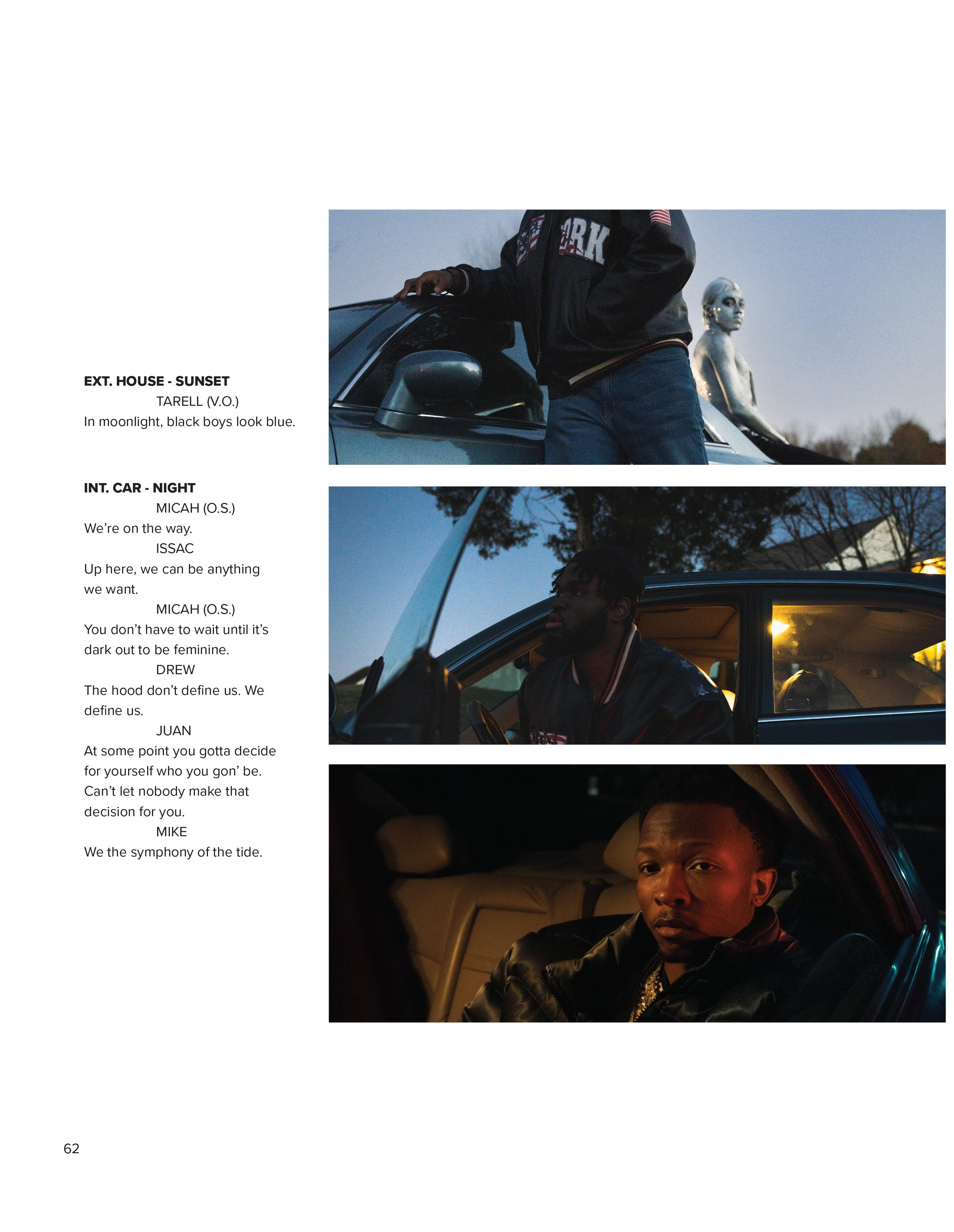
EXT. HOUSE - SUNSET

TARELL (V.O.)

In moonlight, black boys look blue.

INT. CAR - NIGHT

MICAH (O.S.)

We’re on the way.

ISSAC

Up here, we can be anything we want.

MICAH (O.S.)

You don’t have to wait until it’s dark out to be feminine.

DREW

The hood don’t define us. We define us.

JUAN

At some point you gotta decide for yourself who you gon’ be. Can’t let nobody make that decision for you.

MIKE

We the symphony of the tide.

EXT. OUTSIDE - NIGHT

XAY

We reflect the image of God themself.

MIKE Mozart wanted to be Boulogne. BARRY (V.O) It’s about the performance of masculinity.

63 62

MICAH (O.S.)

Zayden and Jiraiya, long when my physical is no longer here. Look to the moon. --END--

64 65
67 66 f in.

Founded in 2020 by Claire Hambrick in her freshman year, Midas Magazine is UNC Charlotte's premier arts and culture magazine. Drawing inspiration from the ancient mythos of King Midas and his golden touch, Midas Magazine seeks to highlight the four pillars of artistry, identity, community and lifestyle. Our mission is to illuminate the talents of the UNCC student-body population as well as the burgeoning arts and culture scene found in the greater Charlotte area. Since 2020, we have released six issues amplifying the authentic voices within our community.

Midas Magazine a nationally-award winning student production that is entirely student-led and created, with the support of Niner Media's professional staff and the funding from the Student Activity Fees Commission.

As part of UNC Charlotte’s Niner Media, Midas Magazine joins other student organizations such as Niner Times, Nova Literary Arts Magazine and Uptown Audio. You can visit @UNCCMEDIA on Instagram to learn about Niner Media as a whole and our upcoming events.

In order to get involved with Midas Magazine, you can join our Writing, Design, Creative, and Promotions department. For questions and concerns regarding applications or involvement, please make sure to email us at midasmagazine@uncc.edu

We look forward to visiting you soon—see you at our next launch party!

Love, Midas Magazine

Midas Magazine Issue 3 Volume 2: Pandora's Box was printed by iTek Graphics on 8.5" x 11" 80 pound satin cover with gold foil and 80 pound satin text. This issue was created with Adobe InDesign, Adobe Illustrator, Adobe Photoshop, and Adobe Lightroom.

See you in fall 2023!

68 69
midas.mag midas magazine midas.magazine Connect with Midas Magazine!

Turn static files into dynamic content formats.

Create a flipbook
Issuu converts static files into: digital portfolios, online yearbooks, online catalogs, digital photo albums and more. Sign up and create your flipbook.