Selected portfolio 2021-2024
Min-Chien Feng
01 PRODUCTION DESIGN
Selected projects in theatre, exhibition and film
HUH?! : The GOF
Immersive installation, London, 2024
Welcome to the HUH?! : The GOF, an immersive installation about a sentient fog.
The GOF was created over a three-day workshop process, a collaboration between Boundless Theatre, Produced Moon and Jesper Pedersen with a group of young artists from Boundless Youth Collective, working with designer Min-Chien Feng.
Concept and development
In 1977 NASA launched the Voyager space probe and onboard was a Golden Record. The Golden Record is a 12-inch plated copper disc full of songs, images, diagrams and greetings intended to communicate a story of our world to the extraterrestrials who might find it. Voyager (and the Golden Record) are currently in the constellation of Ophiuchus, at a distance of 24,334,725,554 kilometres from Earth.
Over our three-day development, we imagined an alien civilisation receiving the Golden Record and created the GOF. We considered how the GOF might respond to our sounds and images from Earth. We asked - ‘‘what this community of extraterrestrials might want to say to us?’ ‘How might they want to share their lives? Their world?’
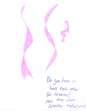
Ideas and prophetic shapes of GOF
Who are the GOF? Initial ideas and models of GOF during the three-day workshop.
IInstallation
This scratch installation is the result: a message from an alien civilisation, in response to our own Golden Record. Step inside to meet the GOF, and hear what they have to say.
The GOF is an early stage of development for HUH?!, an international collaboration about alien communication and understanding.
HUH?! will be a piece of concept touring, a new lower-carbon approach to international collaboration where ideas and objects move, but people don’t.
In HUH?! An egg appears in a room: it is a message from outer space, a communication from an alien civilisation. Audiences will be invited to collaborate, play, and puzzle together, to explore and understand what is being said to them, and what they might want to say back.
The space and design
Imagine the space as a playground where the GOF appeared and left three objects to communicate with us. The three objects represent light, sound and touch which create a dynamic and sensory engagement for you, our visitors.
The concept of using senses as a means of design language is straightforward. Using senses as communication channels invites a stimulating, multi-sensory experience, accessible for different audiences to engage with in different ways. We used recycled newspaper as the key material for the objects, embedding creative sustainability in the project and exploring the role media plays in delivering messages.
Hidden messages are woven into the tapestry, window and door, adding an element of mystery and intrigue, inviting a deeper engagement with the installation. Engage your creativity, decode the messages and discover the space, immersing yourself in the interactive world of the GOF.
Click here to watch
Credits for The GOF
Concept & Direction
Boundless Theatre, Jesper Pedersen & Produced Moon
Producer - Molly Jennings, Stanley Arts
Technical manager - Nicolas Petersen-Gyongyosi
Documentary editor - Gorga M’llaurie
Documentary film maker - Alex Ryland-Jones
Designer - Min-Chien Feng
Artists from Boundless Youth Collective: Michael Sookhan
Umar Kamara
Purity Godwin-Malife
Kathryn Webb
Katie Penfold
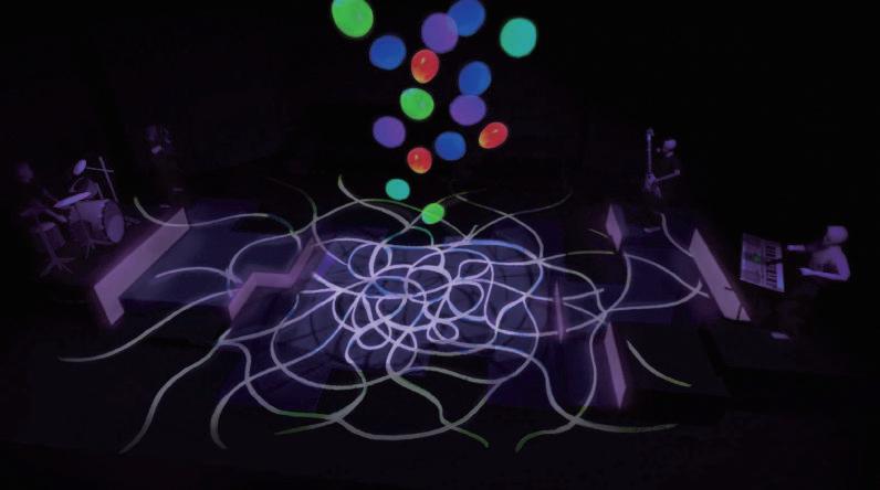
KISS
A devised musical, London, 2022
The performance invites us into a world where Love can be taken as a pill. What if we could administer a Love pill to couples in need to rekindle their relationship? What if we could treat perpetrators of hate crimes with this pill? And what if we summoned the UN to consider a Love bomb replacing the A-bomb ?
With some funky, jazzy and sexy tunes, this show celebrates our aching need for more love and the values that bring us closer.
Concept and practice
Coming from an interior design background, this is my first project collaborating with director, actors, musicians and creative designers.
We began by tracing the marks of the movement that actors left on the floor, creating a gradient burgundy red and granular textured background. The initial idea of the set comes from picturing the feeling of a burst of excitement, a beating heart, and a passion for love.
The burgundy red floor and glossy black lines, which were sketched and splattered following the trace of the
Steel decks are stacked up against the short sides of the space. With the translucent 0.5mm polycarbonate board on the front side, it creates a dance pool with a lightbox effect.
1) Evolution of the pattern of floor
2) Sketch of building a stage by steel desks
3) Model box of the set
Challenges
Moving towards the final act, when the love bombs/balloons are dropped onto the stage, were able to experiment with the material of the set.
We chose to add UV paint to the painted floor in order to create a surprising effect for the audience. The UV paint allowed us to potentially reveal a secret pattern/image based on the scene. The painting would be triggered by the UV light when there was only UV bulbs lit, and some regular spectrum light surrounded it. It allowed us to change the space and the set radically and create a surprise effect for the audience.
4) UV experiment of the set and painted floor
5) CAD plan for the painted floor and steel desk
6) Process of the painted floor
The Manikins: a work in progress
Collaborate with Jack Aldisert
The Manikins: a work in progress is a 1-1 interactive play aimed to immerse the audience through intimate interactions and dialogue. This practice is a collaboration with a director from MFA Advanced theatre practice.
The challenge of this production lies in constructing a space that creates illusions and switches between different scenarios in a short time, leaving participants uncertain of what is truly happening. The play incorporates two scenarios that oscillate back and forth, further adding to the confusion. The actors switch roles, intentionally causing disorientation and challenging the participants' perception. Engaging in a conversational cat and mouse game with the actors, the audience is continuously immersed in a perplexing journey where the lines between truth and illusion are intentionally blurred.
In short, The Manikins explores how audience members react and engage with the challenges of an interactive scenario, while making them feel like the main protagonist. The physical environment designed through scenography, mirrored the psychological or emotional states of the characters - further blurring the lines between reality and illusion. Throughout the play, scenography created a sense of disorientation, uncertainty, multiple viewpoints, thereby heightening the audience's engagement and cognitive involvement.
Immersive theatre 2023 - ongoing, London
Concept of the set
In order to create a space which blurs the boundaries between reality and dreams, while representing the ambiguity and highly uncontrollable/ improvised characteristic of the play, scenography plays a vital role in creating an atmosphere that simultaneously provides comfort and discomfort to both performers and audience members.
There are some requirements that are non-negotiable in this production:
• How will we switch scenes and the space in an instant to create the illusion?
• How do the participants differentiate dreams from reality when the rooms are identical?
Back to asking the participant to imagine the space through given instruction, can take an e pt space and call it a bare stage A an walks across this e pt space whilst so eone else is watching hi and this is all that is needed or an act o theatre to be engaged The e pt space rook
Drawing upon the concepts presented in Peter Brook's ‘The pt pace that theatre exists within the audience's mind, the original concept of the set for our performance revolves around the creation of two identical rooms. This design choice serves to emphasise the intriguing question of whether the audience is experiencing their imagination manifested in reality or if they are immersed in a dreamlike state of illusion. By embracing the idea that theatre is a conceptual art form, the set will aim to provoke thought and blur the boundaries between perception and imagination, encouraging the audience to engage with the ambiguity of the performance space.
Why red curtains
he ina scene o ‘Twin eaks takes place in what appears to be a theatre, with an audience seated in front of red curtains. The curtains then part to reveal a stage, where the show's protagonist, Agent Dale Cooper, is engaged in a strange and surreal conversation with a character known as "The Fireman". The use of the red curtains in this scene creates a sense of uncertainty about the nature of reality and the boundaries in between. It is often associated with surrealism, the subconscious, and the supernatural - and becomes symbolic of the veil between the physical world and the supernatural realm.
The ambience that the director, David Lynch, is trying to deliver in this scene is one of disorientation, surrealism, and mystery. Thus, by using the red curtains and other symbolic imagery, Lynch creates a sense of ambiguity and uncertainty that challenges the audience's perception of reality. The scene also highlights the importance of storytelling
Back to the primitive idea of red curtains, theatre curtains serve the purpose of hiding equipment, gear, rigging and technical hardware that is present from the audience's view. While it creates the sense of ambiguity and uncertainty, audience members are left wondering whether they are witnessing a dream, a supernatural event, or a performance. This ambiguity is further reinforced by the use of non-linear storytelling, improvisation and surreal imagery throughout the play.
Theatre exists to allow the unsaid to breathe and to sense a quality of existence that provides the never-ending fight a purpose. When there are no physical sets or walls present, a new kind of ambiguity arises. The vagueness of why using scenography to create ambiguity in space if one can just use actors, brings my understanding of scenography and the contradiction with other professions to the next level.
Using scenography and actors are both valuable means for creating ambiguity in different ways. Whether semantic, visual, or cognitive differences, etc. While actors can certainly contribute to ambiguity through their performances, scenography provides a different opportunity to enhance and deepen the sense of it at a theatrical level. By this, scenography allows for the creation of immersive and evocative environments that set the tone and atmosphere of the performance. Through the careful selection of props, lighting, set design, and spatial arrangement, scenography can establish a sense of ambiguity from the very moment the audience enters the space. It helps create a visual and sensory context that supports the narrative and thematic elements of the performance. Not counting the arrangement of props, the incorporation of symbolic elements, and metaphors - these visual elements all work in perfect harmony with the actors' performances to add depth and nuance to the storytelling, allowing audiences to engage in active interpretation and speculation.

In summary, while actors play a crucial role in embodying and expressing ambiguity through their performances, scenography adds another layer of complexity and richness to the overall experience. It provides a visual, spatial, and symbolic framework that enhances the ambiguity within the narrative, engages the audience's senses, and deepens their interpretation of the performance. Hence, combining both scenography and performance allows for a more comprehensive exploration and expression of ambiguity in theatrical productions.
THE NOSE KNOWS NO BOUNDARIES
This project was selected and exhibited in Prague Quadrennial 2023: [UN] Common Design Project
Collaborate with: Sasha Balmazi and Mana Sadri-Irani
Audio description, vocals and song: Loré Lixenberg
Special thanks to Dr Simon Donger and Ella Marchment
The work is uncommon in that it is a unique board game complemented by a notional white card model, both of which constitute a scenographic script for others to adapt and realize in the form of improvisations in cos-
firstly, by incentivizing playful processes of shared authorship, creative heterarchy and collective direction; disrupt their regulatory power over bodies. This scenographic proposal dislodges the operatic event from its jewelled architectural box to make the genre accessible and a tool to interrupt urban alienation and its exhausting mobilisation of people.
Concept and practice
Each of us comes from a different country and creative background (architecture, interior design, and film). As such, we wanted to create a design proposal that would be relevant and applicable to different cultural contexts and be accessible to a variety of disciplines using the visual language of scenography as a common denominator. In addition, during the pandemic, all of us experienced lockdowns during which many common spaces and activities became uncommon: their mundanity became somewhat rare and precious.
Drawing from these diverse and shared experiences, we have created a rare design proposal promoting an unusual process of performance-making and a unique performance experience out of the most mundane and pedestrian elements of everyday life. Many forms of performances took place on the streets before Kheimeh-shab-bazi and Tazieh in Iran.
1) environment by becoming and camouflaging with street objects.
2) Environmentally sustainable meterial for prototype of costume
However, there are still forms of street performances, some of which employ music and singing: from carnivals to religious parades where musicians and singers walk the streets accompanied by audiences who participate to different degrees. These audiences are not selected whilst these performers are often not directed by a pre-conceived structure but rather improvising and negotiating their paths amongst the crowds.
Such principles became the basis for our project. In addition, we wanted to incorporate the collectively accessible and improvisational potential of street performance in the very process of making and preparing performance. To this end, we created a board game (without a board) which removes the need for rehearsals, makes every performance unique and enables performers and designers to prepare a performance without the overseeing eye of a director or any authoritative figure.
To complement the board game, we have created a white card model that remains intentionally incomplete as it is not a didactic or predictive artefact but one that functions as a springboard for others to adapt in view of realizing their own version of the work in performance.
Opera is an exclusive form of performance which is only common for a fraction of the population. The prohibitive cost of attending opera and its intimidating houses make it largely unappealing and inaccessible for most people.
translating the opera in the form of street theatre, merging art and life to intervene in both, upsetting their respective conventions and generating inventive ways of reclaiming the streets. Based on the absurdist short story by and authority. It follows the tale of a Collegiate Assessor, a bureaucrat who wakes up one morning and realises that his nose has disappeared – only to find that his nose has become an independent being, of a higher rank than he is.
In this exhibition, we are presenting the pages of a manual, the playing cards and a model platform that can be folded for a board game that would result In a performance intervention for a minimum of 2 persons.
This is followed by photographs of a conceptual model of an illustrative non-existing street with performers and costumes In scale 1:25.
4)
Pick a card and turn it around to see the character you will play and the type of costume you will make and wear depending on the elements found on the street you pick.
5) Illustration for the card
Choice of materials
In our creative process, we aimed to make a costume prototype using everyday object / materials like boxes, plastic waste, and even an empty bin, for environmental sustainability. Our material choices, such as durable polycarbonate, wires, and 3D printing materials, were picked to not only to contribute to zero waste design but also ensure its consistent aesthetics. We took things a step further by designing a folding platform, turning the costume into a cool board game with manuals and cards.
6) 3D printed figures and exhibition display
Feedback from participants in trial board game
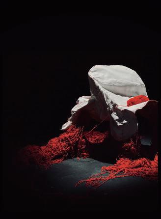
The Tangled and Unseen
The ambiguity among material, body and space in scenography , London, 2021-2023
This project explores how materials can be utilised to create a sense of uncertainty and challenge the perceptions of the audience. The chosen material, red yarn, becomes a medium for connecting individual experiences and evoking emotions on a deep level. The interaction between the material and the human body unfolds in a dynamic dance, blurring boundaries and inviting personal interpretation. The chapter also examines the challenges posed by this exploration, raising questions about communication through movement, the significance of space, and the transformation of symbolism. Ultimately, it offers a transformative experience, expanding the understanding of materiality and revealing the inherent ambiguity in how viewers perceive materials.
Red has always held a special significance for me, with its strong sensory and symbolic meanings and how it evokes visual stimulation. When we were tasked with selecting a material at the early stage of the course, I was immediately drawn to the red thread on my wrist which happened to be the only accessory I was wearing. As I looked deeper into its texture and characteristics, the thread transformed into red yarn as its materiality intrigued me by sparking a sense of familiarity in my culture recognition.
The ambiguity among material, body and space in scenography
dance. In Butoh, dancers express emotions and stories through their body movements, seamlessly merging their physicality with the artistic medium.
Similarly, during our workshop, the material we chose became a means for connecting our sensations and bodies. As we immersed ourselves in the exploration of materials we were reminded of the transformative power of dance, and the philosophy of Butoh resonated with our exploration of materials.
Dynamic between Materials and
Individuals
Throughout the engagement with the red yarn, there is a deeper connection between our bodies and the sensations evoked following it. It became a tool for expressing individual experiences and connecting with others on an emotional level. Beginning by manipulating the red yarn, I slowly unravelled and weaved it through my fingers, wrapped it around bodies, overlapped on other materials, or left trails across the whole space. A mess of red yarn had even been tangled around my wrists, becoming an extension of my limbs, as if my movements were tied to its presence.
During moments of stillness, the red yarn hangs in the air, forming patterns and suspensions. The stillness of the body is reflected in the suspended yarn, creating a feeling of tension and deep reflection. Time seemed to slow down while the red yarn became a medium and body as a container, outwardly the red yarn and myself shared a contemplative moment. However, with a sudden instruction from the choreographer, a burst of energy from the inner part breaks free from the stillness, the red yarn then comes alive with dynamic movement. It dances and twirls around the bodies, tracing their quick motions with a vivid trail. The yarn becomes an expression of emotions, conveying a mix of chaos, passion, and liberation, which creates tension in the room by engaging with others' movement and material.
In short, the contrast of the materiality and movement in the practice has been highlighted. Assations, in ways it blurs boundaries between the physical and the metaphorical.
Challenges
There were moments that constantly provoked me to question both the workshop itself,and the underlying theoretical concepts that accompanied it.
• How can one effectively communicate ideas and emotions through movement, utilising our bodies while the red yarn becomes a subject and the body an object?
•ing within the space contribute to audience perspective?
• Does the symbolism of the red yarn remain in the exploration? Has it been transformed into another meaning?
• At what point in the workshop did one actively engage with the space and allow the red yarn to guide movements, creating dynamic relationships between bodies, materials, and the spatial environment?
• How does this interaction with the space and the utilisation of the yarn contribute to the exploration of ambiguity? In what ways does it challenge conventional boundaries and create opportunities for audience interpretations?
Concept, Material and Space
Interaction creates tangible and intangible spatial structure, which forms relations between individuals or among objects. The origin of red thread can be found in multiple cultures and has evolved into a modern practice incorporating different rituals and meanings. Throughout history and various philosophies, the red string has served as a symbol of protection, faith, good fortune, strength, and connection. Its significance, whether in tangible or intangible form, has made it a potent tool in many cultures. In addition to its symbolic value, the red string in this work also represents a spatial dynamic shaped by sensation and perception. Individuals interpret and respond to their environment based on their sensory experiences and personal understanding of the red string's symbolism.
between folds of cast bronze or aluminum and coils of wool and silk which are knotted, braided, looped, and woven.
The artist challenges traditional expectations and introduces a sense of illusion or unexpected strength, creating confusion for spectators, and offering new perspectives toward materials that we are familiar with. Similarly, in the Butoh workshop, the focus is on the materiality of the red yarn and its interaction with the human body and the surrounding space. Both Barbara's work and the Butoh workshop share common traits in exploration of materials and interplay with contrasting elements or movements.

Overall, the workshop became a transformative experience, where first recognition of how the body can become a platform, connecting with various materials, other individuals and space. It became an embodiment of emotions, memories, and connections. Through the exploration, it not only deepened our understanding of the materiality of red, but also unearthed personal narratives and discovered new ways to express ourselves through the interplay of sensation, body, and material. Additionally, the confusion and doubts about the material itself and the contrast against its materiality, reveal the uncertainty and the ambiguity of how the viewers perceive materials.
02 SPATIAL DESIGN
Selected projects in residential and commercial space
青花驕 CHIN HUAJIAO
Restaurant, Taipei, 2020
This project employs neutral tones of gray, black, and white as the base, complemented by a primary color of teal. Teal not only resonates with the brand's essence of "youthfulness" but also connects to the collective memory of Taiwan. Early Taiwanese architecture often featured teal-painted door frames and iron windows, making teal a representative color in Taiwan's spatial memory. The design concept begins with "framed scenery," created using modern Oriental ink painting techniques. Through the interplay of negative space, reality and illusion, and light and shadow, this project becomes a vivid canvas where designers blends and spreads the ink and colours.
CHIN HUAJIAO
Spicy hotpot restaurant, Taipei, 2020
Material board
Teal-painted door frames
During my time in the architect studio, I am responsible for crafting compelling concept proposals, designing site plans, and holding client meetings. My duties also encompass finalising material boards, managing budgets, customising bespoke furniture, and producing 3D renderings. Furthermore, I excel in detailed drawing, project management, space planning, colour theory.
王品 THE WANG
Restaurant, Taipei, 2020
The Wang, a high-end steakhouse, exudes luxury and sophistication with its meticulously designed interior. The space features a harmonious blend of modern elegance and opulent materials, creating an inviting yet exclusive atmosphere. The focal point of the restaurant is the intricate wall treatments, showcasing a combination of textured metallic panels and sleek stone surfaces. These materials are arranged in geometric patterns, adding depth and dimension to the space. The use of mirrored elements amplifies the sense of space, reflecting the ambient lighting and adding a touch of glamour.
The seating area is thoughtfully arranged with plush, high-backed chairs and semi-circular booths that provide both comfort and privacy. The upholstery, in neutral tones with subtle patterns, complements the overall color palette of the restaurant, which is dominated by shades of gold, silver, and black. The tables are adorned with minimalist decor, allowing the focus to remain on the architectural details and the culinary experience.
Steak house, Taichung, 2020
BEEHIVE
Night club, Shanghai, 2019
DOZO Izakaya
Japanese bar, Cambodia, 2020
Seleted detailed drawing from DOZO Izakaya
Graduate Showcase
04
) +,-.+/, 1). )3 -
!"#$%#&'()*'+,+- )#,.',-(/012
Exhibition Design, Taipei, 2018
@($A1$8&&BCDEBFGH=I,J&KBKDGGFGL=M,N
%BC"C BEFEGEHI"EJ"FKJCL"HI"K"MHNOJC" QOKLNKGC"GBCJEJ"LCJEQI "HS"TU"SEIKV"JCTCJGCOW" /G"OC NEOCL"JGNLCIGJ"GH"YOHLNMC"K"VKOQC JMKVC" EIGCOEHO"YOH CMG"GBKG"C KTEICJ"KVV"KJYCMGJ"HS"KI" EIGCOEHO"CI\EOHITCIG"SOHT"MHIMCYGEHI"GH" MHTYVCGEHIW"
%BC"C BEFEGEHI"LE\ELCJ"JGNLCIG J"^HO_"EIGH"SHNO" HOECIGKGEHIJ` """9NTKIEJGEM" """ NVGNOKV"KJJCG """aNGNOC > """ HTTCOMEKV"
%BC"SHNO"HOECIGKGEHIJ"KOC"MVKJJESECL"FU"GBC"LCSEIEGEHI"HS"^HO_`
,5116789:;<=;>1
>EJMNJJEHI"HS"GBC"H\COKVV"MHIJGONMGEHI"HS"GBC"MHTTNIEGUW 9H^"GH"HOQKIEbC"GBC"OCVKGEHIJBEY"FCG^CCI"GBC"MHTTNIEGU"KIL"GBC"OCJELCIGJc ?BKG"KOC"GBC"ICCLJ"HS"K"QOHNY"EI"K"JYCMESEM"KOCKd"^BEVC"OCIC^EIQ"GBC"MHTTNIEGUc" &CIH\KGEHI"EJ"IHG"HIVU"KFHNG"OCSNOFEJBEIQ"GBC"KYYCKOKIMC"HO"OCMHIJGONMGEIQ"GBC"JYKMC"FNG"KVJH"GBC"^KU" GH"MHIGEINC"GBC"\EGKVEGU"KIL"MNVGNOC"HS"GBC"MHTTNIEGUW
?511)7@=7A9@19<<B=1
>EJMNJJEHI"HS"BH^"GH"GOCKG"MNVGNOKV"KJJCGJ"HO"MKOOU"HI"MNVGNOKV"MHIGEINEGUW 9H^"LH"EIGCO\CIGEHIJ"ETYKMG"HI"HVL"JYKMCc
?BKG"JBHNVL"^C"MHIJELCO"FCG^CCI"GBC"IC^"KIL"GBC"HVLc
4JEIQ"MHIGCTYHOKOU"LCJEQI"KYYOHKMBCJ"GH"YOHJYCO"HO"GCVV"K"IC^"JGHOU"HS"TCKIEIQSNV"FNEVLEIQJW
/C.D3-+/)1E/,F+,DC
aOKTC"HS"LCJEQI"VKUHNG" /LCIGEGU"*UJGCT
LCJEQICO"EISHOTKGEHIJ
LCJEQI"LCGKEVJ
OCILCO
LEKQOKT
JCMGEHIJ
)511 7=7AB
>EJMNJJEHI"HS"GBC"YHJJEFEVEGU"HS"JYKMC"EI"GBC"SNGNOCW
9H^"LHCJ"IC^"TCLEK"EIGCO\CIC"EI"LKEVU"YKGGCOIJc
^BKG"JBHNVL"GBC"QCICOKGEHI"YEMGNOC"KFHNG"VE\EIQ"JYKMC"NILCO"GBC"LC\CVHYTCIG"HS"GBC"MEGUc %BOHNQB"GBC"GOKMC"HS"VESCd"NI_IH^I"ETKQEIKGEHIJ"HS"JYKMC"KOC"SHOTCLW
E511) 88BA>;9@
>EJMNJJEHI"HS"QCICOKGCJ"IC^"KYYOHKMBCJ"FKJCL"HI"LESSCOCIG"FNJEICJJ"JGOKGCQU"KIL" MNVGNOCW
9H^"GH"NJC"JYKMC"LCJEQI"GH"TK ETEbC"MHTTCOMEKV"FCICSEGJc
?BKG"_EIL"HS"FNJEICJJ"FCBK\EHNOJ"NJNKVVU"KSSCMGJ"JYKMCc
HIJELCOEIQ"GBC"MHC EJGCIMC"FCG^CCI"EIGCOCJGJ"KIL"MNVGNOCJ"EI"LESSCOCIG"OHVCJW
D.E ,+1 +,D3 aVC EFVC"SHO"MHTFEIKGEHI"KIL"KYYVEMKGEHI
%BC"LEJYVKU"JCGJ"KOC"MHIJGONMG"FU"\KOEHNJ" GUYCJ"HS"OKFFCG" HEIGJ"GH"SHOT"KI"EILCYCI
LCIG"SOKTCW"
/G"MHTFEICJ"FKM_VEG"SEVT"KIL"5#>"GH"LEJYVKU" LCJEQI"VKUHNGW "&KFFCG" HEIG /IGCQOKGCL"5#>" ,+3,1
HOECIGKGEHI
>CJEQI"KYYOHKMB" " HLCV"LEJYVKU
3 6/?/-/. 1 1,)-/ //IGCOKMGEHI"KOCK"
%BC"C BEFEGEHI"JGKOGCL"^EGB"K"SHONTd"CJGKFVEJB EIQ"K"YVKGSHOT"SHO"JGNLCIGJ"GH"MHTTNIEMKGC" JHTC"GHYEMJ"^EGB"CKMB"HGBCOW"
>NOEIQ"GBC"SHONTd"JGNLCIGJ"EIGCOYOCGCL"GBCEO" QOKLNKGEHI"LCJEQId"KIL"GCKMBCOJ"YOHYHJCL" LEJMNJJEHIJ"KIL"MHILNMGCL"MHI\COJKGEHIJW" %BOHNQB"GBC"KMGE\EGUd"MHTTNIEMKGEHI"FCG^CCI" \EC^COJ"KIL"LCJEQICOJ"FCMKTC"CKJECOW"
%BC"C BEFEGEHI"EJ"IHG"KI"CILd"FNG"K"FCQEIIEIQ" HS"LKOEIQ"GH"LOCKT"KJ"^CVV"KJ"GBHJC"^BH"KOC" MKYKFVC"HS"TK_EIQ"LOCKTJ"MHTC"GONCW
&# "
CSHOC"C BEFEGEHI JJCTFVC" "/IJGKVV
"
BCM_"EI" " OCCGEIQ"KOOE\EIQ
&# " /IGOHLNMGEHI" "/ISHOTKGEHI
&# "
/IGCOKMGEHI" " HLCV"LEJYVKU
&# "
HTTHLEGECJ"HS"C BEFEGEHI
&# " *YHIJHOJ
&# " *EQIKGNOC
&#
03 SKILLS
3D rendering, illustrator and photoshop practice
!"#$%&'($))*&!+",-*./&0$1"23 456789:;<;=>&:4:6;?9:7<@=A
05
Post Script
(&@AB@!'%)$A#C'()
!"#!$%
Graduate Project, Taipei, 2018
BC3#&32.",#D&47:E
!"#$%&'(')
!"#$%&'()'*+%#$%,*$-.%(/%+0%1/.-')'*.1*2-%.-$#)/%2"-$#$3%!"-%+(2#4*2#(/%(5%#2% ,-)*/%5'(+%*%61'#($#20%#/%'-7#.-/2#50#/)%#88-)*8%$2'1621'-$3% *+,-.$/0$+$10231-$+45627-5714+8$96/0-:-$20$!+2;+0<$=2>-/04? 9%20&-%(5%6#4#8#*/%*'6"#2-621'-%2"*2%"*$%/(2%,--/%51880%$21.#-.%*/.%'-6('.-.3 !"-%&#)-(/'0%#2$-85%#$%4-'0%.#$2#/62#4-:%;2%#$%-4-/%+('-%#/2-'-$2#/)%2(%(,$-'4-%"(<%2"-0% 6(-=#$2%<#2"%,1#8.#/)$%*/.%-/4#'(/+-/2$3 >(%+*22-'%"(<%2"-0%6(/$2'162-.:%2"-$-%&#)-(/'#-$%6*/%*8<*0$%5#/.%*%"($2%2(%&*'* $#2-3%?*0,-%#/%2"-%1&6(+#/)%5121'-:%2"-%$1'5*6-%#$%/(%8(/)-'%$1#2*,8-%5('%&-(&8-%2(% '-$#.-3%@-%+1$2%,1#8.%*%&8*25('+%5'(+%*/0%-=#$2#/)%$2'1621'-%2(%8#4-%(/3%!"-%$A0%(5% 2"-%6#20%,-6(+-$%2"-%6#20%#2$-85:%*/.%2"-%&#)-(/'0%#$%2"-%&'(2(20&-3
"#$%##"&'(&)(*+,($&, "#*,'$,(.,/0*"&'#+"1(2,*3,,'(044,4(#10$,#(0'4(, "#*"'5(#*.%$*%.,6( 7&(0$+",8,(*+"#(9%,#*:(3,($.,0*,4(&%.(;,*+&4&/&5",#(*&($&'4%$*(&%.(.,#,0.$+:('0;,/<( >**."2%*,# (#&.*(2<(80."&%#( 044"'5(*<1,#6(>//(*<1,#(&)(4,#"5'(1.&5.0;(&.(,/,;,'*#(0.,(20#,4(&'(*+,( >**."2%*,# ($+0.*(2,/&36( ,(+&1,(*+"#(1.& ,$*($0'(%.5,(1,&1/,(*&(&2#,.8,(0'4(80/%,(&%.(,8,.<40<(#%..&%'4"'5#:(,#1,$"0//<(*+&#,(0.,(*0B,'( )&.(5.0'*,4(&.(4,/"2,.0*,/<("5'&.,4:(/"B,(*+,#,(,8,.C, "#*"'5(044"*"&'#(0.&%'4(%#6
( ( ( ( ( ( ( ( ( ( ( ( (
((((> F
(((( FK > N
((((US>
( ( ( (
((((F 7FK K(R> S
(((( >KN > (UY>SF
((((K 7 Y(> 7
(((( FKY>UU
((((Y NF K
^(((( 7RK NF (
HGGW$
7+,(#"*,("#(0(1.,$"&%#($%/*%.0/(+,."*05,:(3"*+(0(#1,$"0/( 5,&5.01+"$0/(/&$0*"&'($&'',$*"'5( ,1"'5( #/0'4(0'4( *+,(;0"'("#/0'46(R%*("*(+0#('&*(2,,'(3"#,/<(%#,4(0'4( 1/0'',46( K,#&%.$,(#$0.$"*<:(,;"5.0*"&':(U*05'0*"&'(&)(%.20'( )%'$*"&'#(0'4(("'04,9%0*,(,4%$0*"&'0/(.,#&%.$,#( +08,(2,$&;,(*+,(;&#*(#"5'")"$0'*("##%,#(&'( ,1"'5( #/0'46
J! HXH H$G >$*"8"*",#(3+"$+(5,',.0*,4(2<(.,#"4,'*#
YJM $ Y,&1/,(50*+,.(*&()&.;(#,**/,;,'*#6(>#(*";,(5&,#(2<:( *+,(.%"'#(2,$0;,(0(;0.B,*(3+,.,(.,#"4,'*#($&'4%$*( $&;;,.$"0/(0$*"8"*<6
GHZ G$$H#Z(G%"
7+,($.%;2/"'5(.%"'#(&)(*+,()&.;,.(#+"1<0.4(0**.0$*( +%'4.,4#(&.(,8,'(*+&%#0'4#(&)(40"/<(8"#"*&.#(*&(*0B,( 1"$*%.,#6
"M G "%
7+,(.,%#,(&)(1%2/"$(4,#,.*,4(#10$,6(7+,(/&$0/(2%.,0%( ,'4&3,4(*+,(#"*,(3"*+(0(',3(;,0#%.,(2<(+&/4"'5( #&;,(0$*"8"*",#:(#%$+(0#()0.;,.#(;0.B,*(0'4($.,0*"8,( 3&.B#+&1(*&(0**,'4(&'(3,,B,'46(7+,.,)&.,("*(0/#&( 1.,.,4(3"*+(*+,(,$&'&;<(0'4(4,8,/&1;,'*( #%..&%'4"'5("*6(
&$0*"&'(&)(.,#"4,'*#(0$*"8"*",#
&$0*"&'(&)(*.0'#1&.*0*"&'
J#J VGHG
0.2"$(&)(>5,''0(U+"1<0.4(K,/"$#
7+,(#+"1<0.4("#($&;1&#,4(&)()&%.(.&3#(&)(.%"',4( $&/%;'#( >RS 6( ,(0'0/< ,4(*+,(#"*,(20#,4(&'("*#( 0.$+"*,$*%.0/(*, *%.,#:(#%$+(0#()"5%.,#(0'4(5.&%'4( 011.&0$+,#6
&.B"'5(3"*+"'(*+,#,(.,#,0.$+().0;,3&.B#:(3,( 4"#$&8,.,4(0(5,',.0*"8,(#10$,(0;&'5(*+,($&'*"'%&%#( .,0##,;2/"'5(&)(;,*+&4#(0'4(;0*,."0/#6 *("'#1".,4(%#(*&(1,.)&.;(*+"#(1.&5.0;(0#(0'(, +"2"*"&'( *+0*(.,)/,$*#(*+,(#%2 ,$*(0'4(;,*+&4&/&5",#(&)(&%.( .,#,0.$+("'(2&*+("*#()&.;(0'4("*#($&'*,'*6
!"#$%&$"#!'"()(!"#$*%+#!'"
!"#$%#&'"#()*+'%),*-%.%(-/0*
!"##%/&*1'&0*%#$'-"#2%#& 3-4(#'.%*%5'.&'#4*(/&'$'&'%.
6#7%/&*+8#/&'"#()*.9(/%*'#&"*&0%*.0'9:(-,
!"#$%&'())*+(,!"#$%&'#()#&'%*&$*+$,(*-(./$+*(/0$.$0'.'#$*+$'#/,*(.(1$01/2%*0%0$ 3%'"$'"#$0"%,1.(45
.-"'!"/$&$.$+&'+/'$&."*0"&.$+&
67$8#9#&-.-#$'"#$0%'#$3%'"$.$4#0%-&$.,,(*.:";$<$=#3$2>%?4%&-$'1,#$@
A7$644%&-$<.''.:"/#&'0@$*&B$.0%4#B$'"(*>-"B$>&4#(B$3%'"%&B$#':B$2.0#$ *&$/.%&'.%&%&-$'"#$*(%-%&.?$0'(>:'>(#$*+$'"#$0%'#5
C7$8#:.??%&-$D%0'*(%:.?$/#/*(1$'"(*>-"$0,.'%.?$4#0%-&5
E/,*('$ &.'>(.?$#?#/#&'0
%M"ZMJY
U"5+*#,,"'5(S%/*%.0/(10.B Y.&5.0;#(0.,(0**0$+,4(*&(*+,(#"*,("'(0((;%/*"C1&"'*(;0'',.(0'4(0.,( $&'',$*,4("'(4".,$*"&'0/(#,.",#(&.(4"8"4,4(2<(%'"*(#<#*,;#6 YJH#(X$#W$G( N0//,.<:($0),:(#9%0.,:(2&&B#*&.,:($"*<(50.4,':(&%*4&&.(*+,0*.,6 G$!"#[JMV(X$#W$G F'*.0'$,(0'4(.,$,1*"&':(#*%4"&()&.(.,'*:(/0'4#$01,:(#*.&//"'5(*.0"/6 7+.&%5+(*+,(4,#"5'(011.&0$+,#:("*("#(#%55,#*#(*+0*(*+,(.,0/( $+0//,'5,("'()0$"'5(+"#*&.<("#('&*(+&3(3,($&;,(*&(.,C,'505,("*:( "'*,.1.,*("*:(&.(.,3."*,("*:(2%*(+&3(3,($&;1.,+,'4("*#(4";,'#"&'#:( 1."'$"1/,#:(10**,.'#:(,8,'("*#(;&8,;,'*#6(
>KF>(^ R&&B#*&.,#(0'4(#*%4"&(0.,($&'',$*,4(2<(*.0"/
U$0))&/4(C( 7+,(#<;2&/(&)(*,;1&.0.<(#*.%$*%.,
0'4#$01,
((((F 7K> SF
((((KFSFY7
((((N> FK
(((( > US>YF
((((S> F( (N>K F
((((U >KF
((((R U7 KF
((((U7
^((((U7K N(7K>
U9%0.,( ( %*4&&.(*+,0*.,
N0//,.<( (F +"2"*"&'
S0),( (4"''"'5(#10$,
>KF>(
>KF>(
>KF>(
>KF>(
U 7F( F U$0/,(
U9%0.,( ( %*4&&.(*+,0*.,
>KF>(^
>KF>( S0),( (4"''"'5(#10$,
>KF>(