Issue 225 03/04 2023
u pfront
News and highlights from the world of commercial interior design
t h I ngs I’ ve L earnt
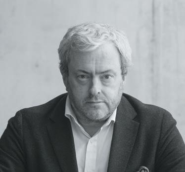
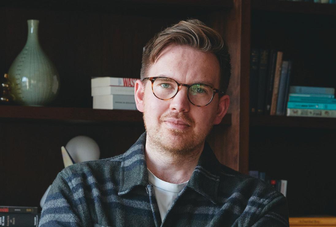
Studio Moren’s Co-Head of Interiors, David Harte, shares his five career takeaways

h e I ght of D es I gn
Spatial designer and artist Simone Brewster on the item that inspired a career in design
p ara D ox I ca LLy s peak I ng
Neil Usher on the significance of ‘alpha’ and ‘beta’ workspaces
I n c onversat I on W I th : k ar - h Wa h o Head of Interiors at Zaha Hadid Archirects explores the value of time and designing dramafilled spaces
I n c onversat I on W I th : c har LI e n orth
North discusses heading the recently rebranded AIME Studios, creative wing of Ennismore
t he a sk
Tina Norden discusses ‘hospitality design’ writ large
c ase s tu Dy : p ILL oW M aur I ts , a M ster Da M
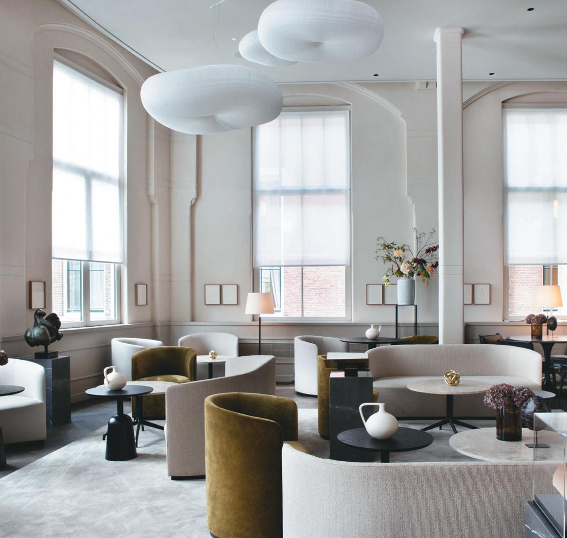
Designed by Studio Linse, Amsterdam’s newest five-star hotel and former university building is a feast for the senses
1
14 24 25 26 28 36 44 46 46 62 28
case stuDy: pWc, BeLfast BDP channel the spirit of Belfast and unpick new ways of working
c ase s tu Dy : M astercar D , D u BLI n IA Interior Architects cement the corporation’s position in Ireland with a people-centric office
c ase s tu Dy : o ne e LMWoo D , B e L fast Hawkins\Brown’s work with Queen’s University to reimagine the student experience
c ase s tu Dy : 21 s paces , D u BLI n Slater Design stick to a refined palette at this branding and design agency in Ireland’s capital
p os I t I ve I M pact : c I t I zens D es I gn
B ureau
Katie Marks shares Citizens Design Bureau’s progressive housing model, informed by coworking
c reat I ve t h I nk I ng : u n LI ke Ly s av I our Steve Gale speaks from an imagined future
M eet t he J u D ges
We introduce the Mixology23 cohort scoring this year’s entries
e vents
Our roundup where to go and what not to miss across the industry’s leading events
g L o Ba L p erspect I ve Harry McKinley voices the uncomfortable truth on women in the workplace
t he J oys of M ax IM a LI s M
Our take on why the ‘more is more’ approach to design should continue to be celebrated
M ater I a L M atters
UK-based Ekho Studio share their four favoured materials
I nnovat I ve M ater I a L s
Fish scales form the basis of this surprising and pioneering material
t he f I na L W or D
Criteo’s Mike Walley shares his views on what coworking spaces are missing today
2 54 62 68 74 80 84 86 92 102 104 110 111 112 68 36
74
Get in touch
MAnAging editor Harry McKinley harry@mixinteriors.com
deputy editor
Chloé Petersen Snell chloe@mixinteriors.com
MAnAging director Leon March leon@mixinteriors.com
director Marcie Incarico marcie@mixinteriors.com
buSineSS developMent
MAnAger Kate Borastero kate@mixinteriors.com
Account MAnAger Stuart Sinclair stuart@mixinteriors.com
The Cover
Logo
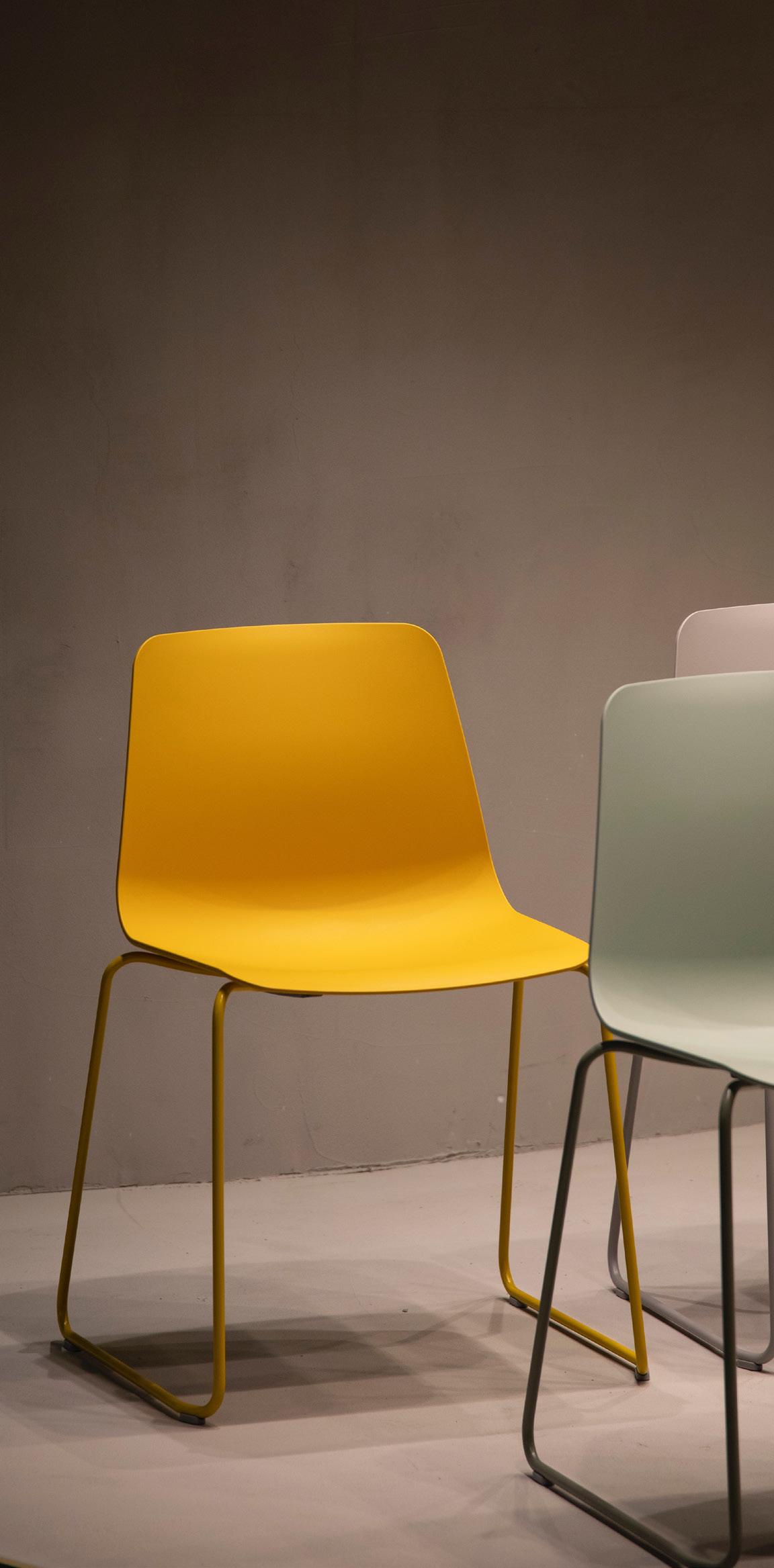
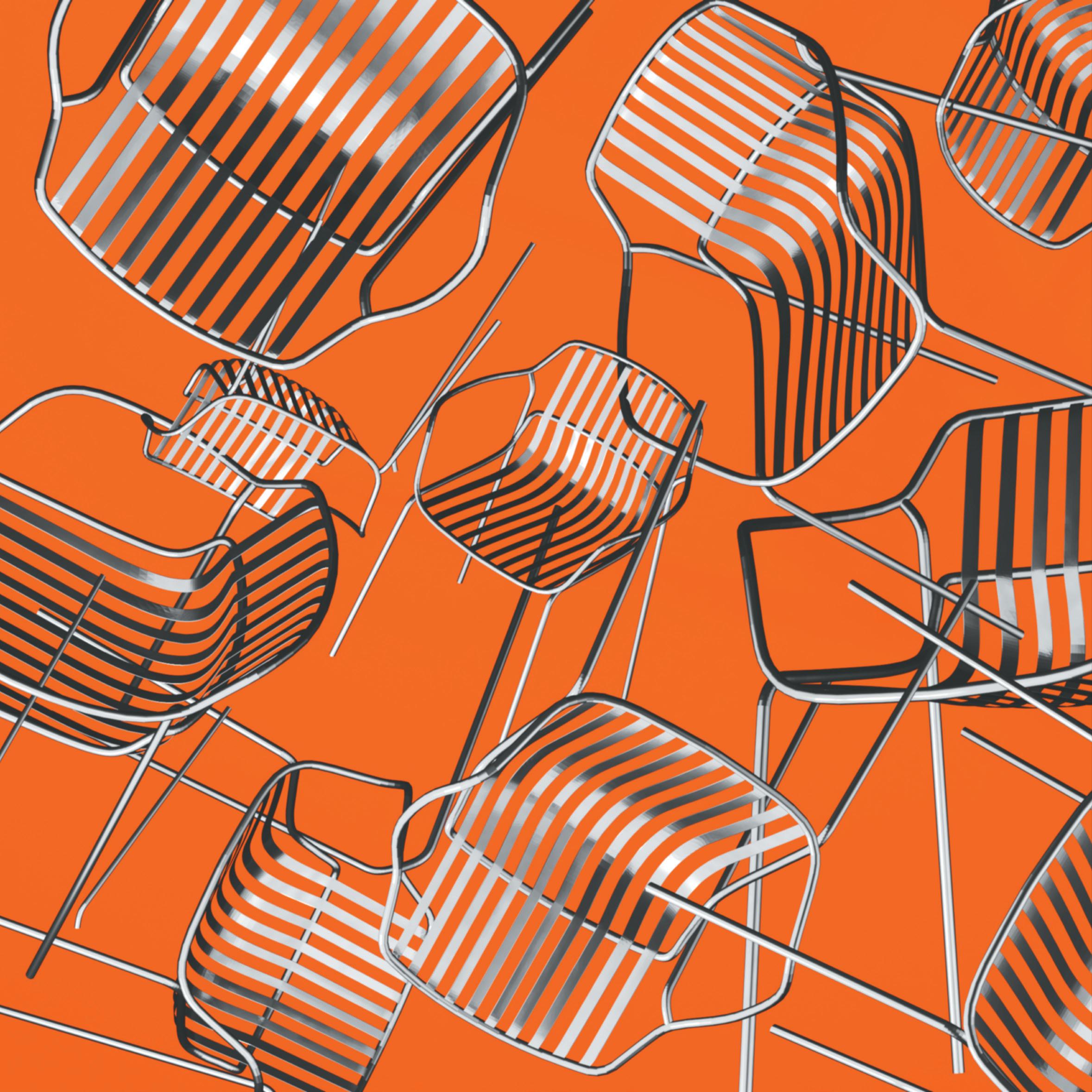
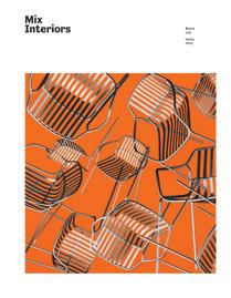
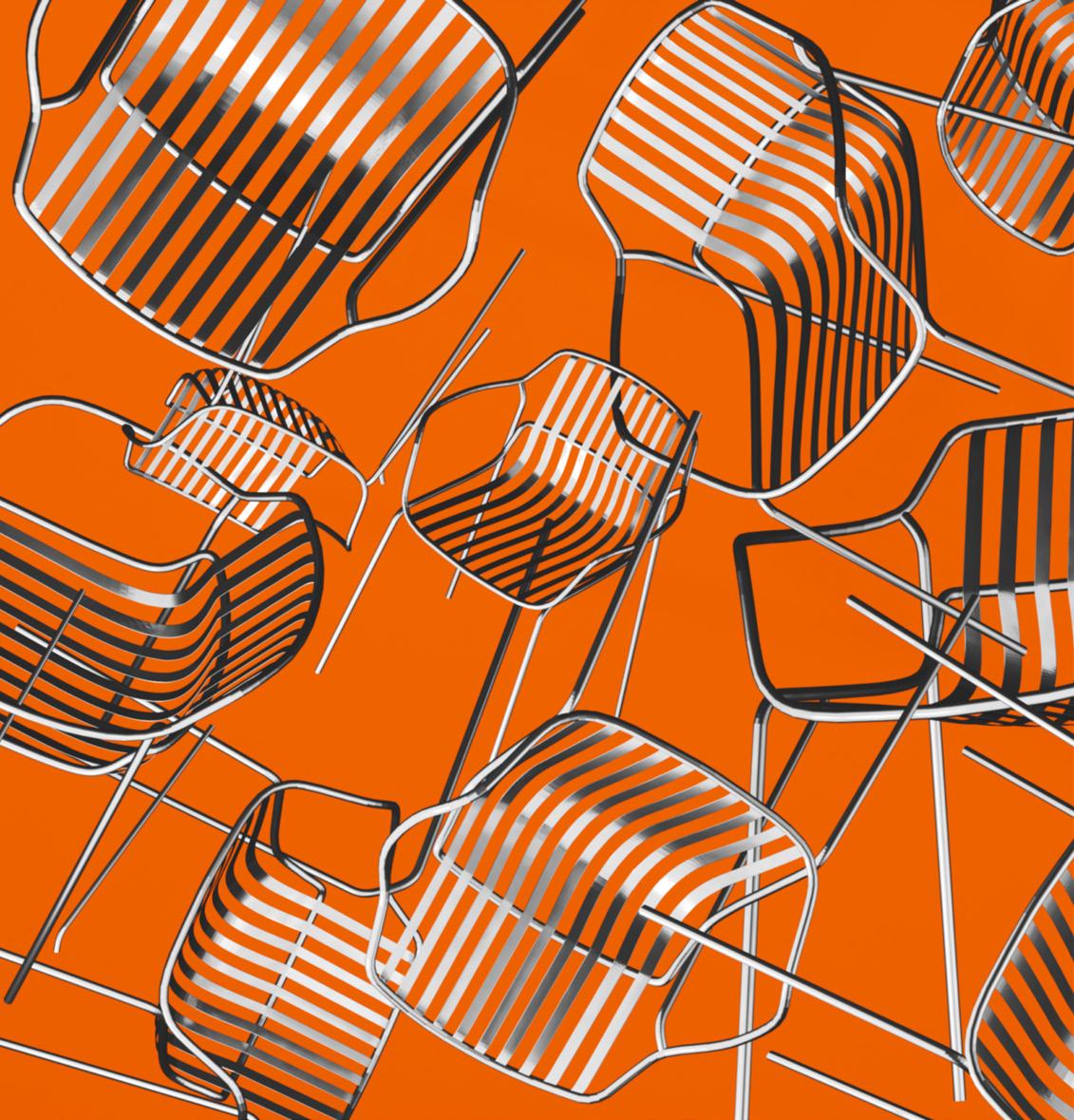
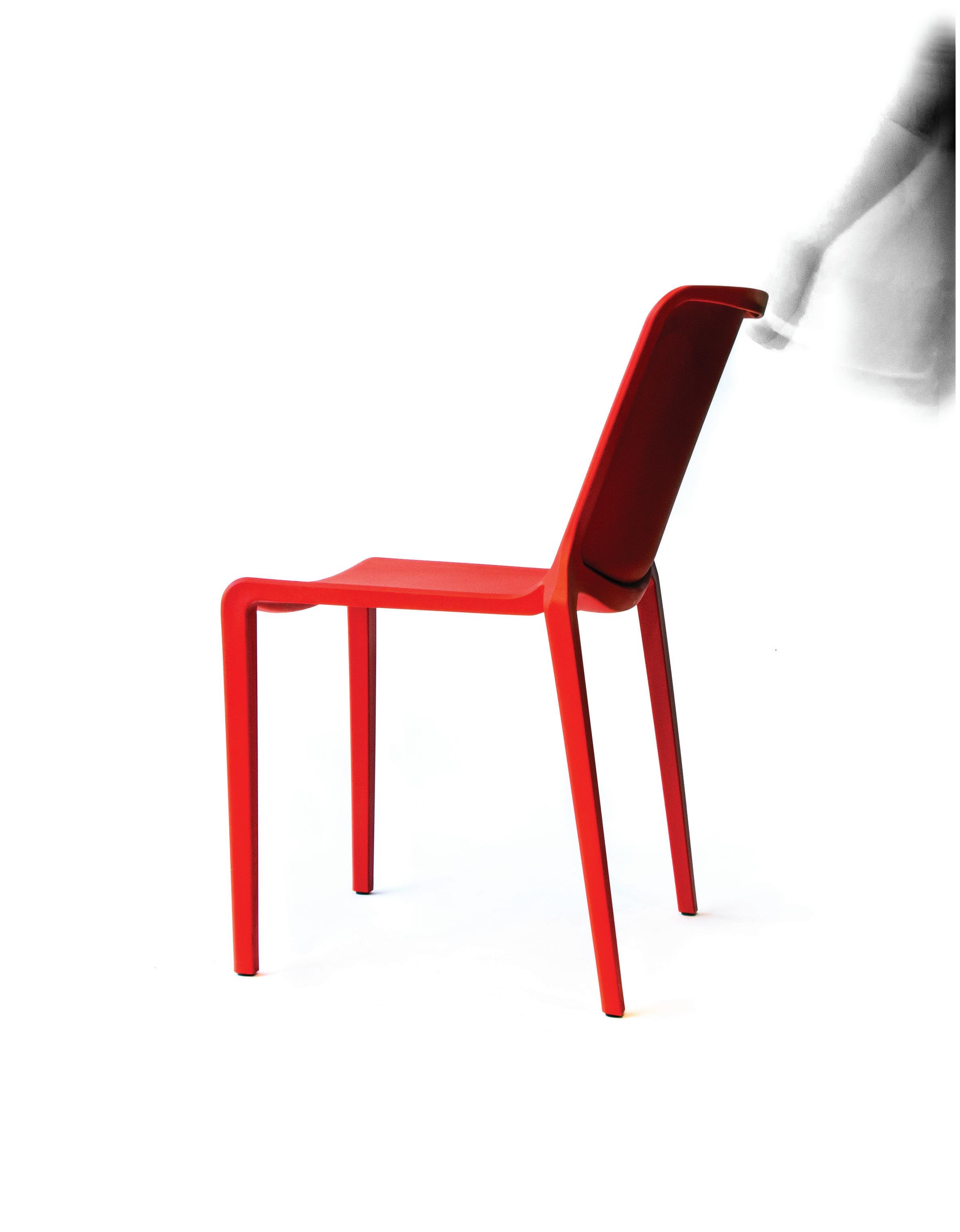
The issue’s cover design launches Brunner’s Crona Steel stacking chair into the air, causing its slats and frames to entangle and bisect. The resulting composition gestures to ‘M’ ‘I’ ‘X’ without being explicit, allowing the geometry of the furniture to speak for itself.
gensler.com

cover IMage Crona Steel combines a robust tubular frame with a refined flat steel shell, expertly crafted to ensure even weight distribution for ultimate comfort. With a captivating range of seven striking colours and detachable upholstery, this elegant collection of stackable dining chairs, bar stools, lounge chairs, sofas, and folding tables fulfils a variety of outdoor seating requirements.
brunner-uk.com

Subscribe to Mix
To ensure that a regular copy of Mix Interiors reaches you or to request back issues, call 0161 519 4850 or email lisa@mixinteriors.com
AnnuAl SubScription chArgeS UK single 45.50, Europe 135 (airmail), Outside Europe 165 (airmail)
AddreSS Unit 2 Abito, 85 Greengate, Manchester M3 7NA Telephone 0161 519 4850
eMAil editorial@mixinteriors.com
WebSite www.mixinteriors.com
heAd of operAtionS Lisa Jackson lisa@mixinteriors.com
eventS & editoriAl executive Yasmin Waters yasmin@mixinteriors.com
deSigner Tamzin Bell
founding publiSher Henry Pugh colu M ni S t S Steve Gale, David Thame Tina Norden, Mike Walley, Neil Usher
contributor S
Dominic Lutyens
Lauren Jade Hill
Printed
1757-2371
4
tWitter @mixinteriors inStAgrAM @mix.interiors linkedin Mix Interiors by S&G Print ISSN
Welcome
I’ve long delighted in orange, my favourite colour; not because, being ginger, it’s in my genes, but because of how it makes me feel and what it symbolises. Colour psychologists will tell you that it stimulates productivity and creativity, that it’s also emblematic of optimism and change. It’s a fitting hue for our cover then (featuring Brunner and designed by Gensler), for though we don’t theme our issues, if there was a through-thread in this one it would be just that: change, in its myriad forms.
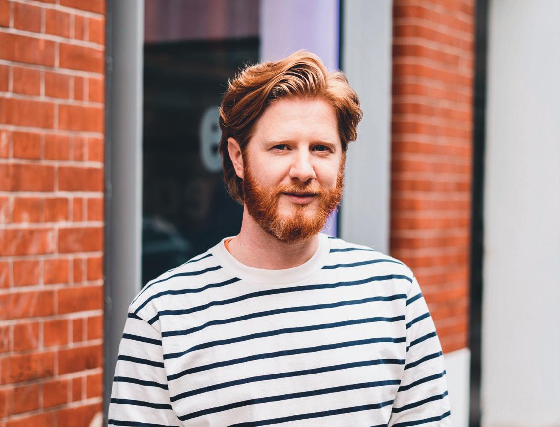
Our lead interviewees are both experts in change. For Zaha Hadid Architect’s Kar-Hwa Ho, design should always be reflection of society as it is today, which is why it must be adaptable and purposeful. For Charlie North, navigating change is a more immediate preoccupation – leading the newly rebranded design studio from Ennismore, now AIME.
In a first, we’ve taken a destination-centric approach to the bulk of our case studies this issue too. We look to the island of Ireland, a place defined by change; sometimes rapid and seismic, sometimes slow but meaningful. The projects we’ve explored all grapple with change in some capacity, be they workplaces devised for a different time and different expectations, or a university hub in my own native city of Belfast, that aims to reimagine the student experience for the better.
In our regular Positive Impact feature, Citizens Design Bureau’s Katy Marks posits radical change is needed in how we consider housing – reflecting on her own experience as the original coworking pioneer to chart a new socially-minded, community-centred model.
Change will soon visit itself upon Mix also; evolution something we embrace, as we consider how to best serve you, our reader, across our print and digital channels, as well as ensuring our brand speaks to today’s design landscape and tomorrow’s appetites. The future is bright then, although I do promise – despite my own affection – it won’t only be orange.
5
h arry M c k I n L ey M A n Aging e ditor MIx InterIors / iSSue 225




One of a kind
In an urban quarter on the outskirts of Berlin’s Brandenburg Airport and southeast of the city centre, aLfons & aLfreDa is putting its vision of a sustainable and humane working environment into practice.
Translating to ‘brick’ in Latin, teStA in Schönefeld will turn one million recycled bricks into the bones of three self-sufficient office buildings and a hotel complex on the outskirts of a green central area, featuring its own gastronomy, gym and local amenities.
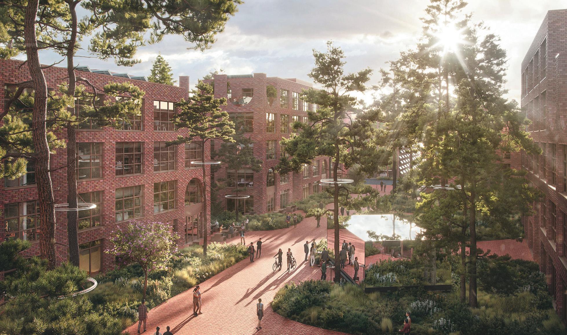
From the smallest units – the individual bricks – to the overarching infrastructure, this futuristic community will demonstrate the capabilities of contemporary architecture married up with the strictest sustainability principles. On the workspace exteriors a perforated façade will be interspersed with striking round arches, both framing and contrasting with the other
outdoor areas – in turn creating an inspiring, relaxing environment surrounded by forests and heath.
Testa’s vision will flow through the workspace interiors with raw, robust surfaces and versatile areas that form the basis of a timeless office from both an aesthetic and functional sense. Modern heat pumps, photovoltaic surfaces, wastewater heat recovery and numerous solar façade parts will make it possible for fossil fuels to be dispensed, resulting in cost efficient office space that is mostly self-generating. Meanwhile, a modern floorplan will bring the outside in with three-metre windows, loggias, balconies and roof terraces to complement a series of open spaces, quiet rooms and closed individual retreats for brainstorming and productivity.
aLfons-aLfreDa.coM
14 upfront
Art through architecture
Unveiled at MIPIM 2023, leS gAletS is a project by oMA’s eLLen van Loon and Laurence BoLhaar, set to transform Montpellier, France, in the lead up to their bid for European Capital of Culture in 2028.
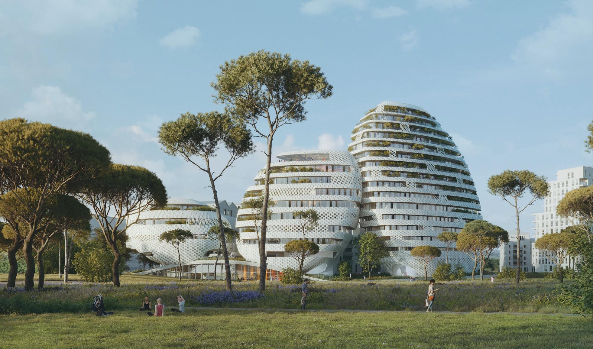
“Our design for Les Galets celebrates the proximity to the sea and the site’s former existence as an ancient Roman port. Montpellier’s tradition of building follies dates back to the 18th century; our project will be a new chapter,” says van Loon, Partner at OMA.
Mayor of Montpellier, Michaël Delafosse announced Les Galets as one of four follies – and 13 architectural projects – in the city’s pipeline. Chosen for their audacity and creativity as much as for their architectural and environmental qualities, the structures will reflect
Montpellier’s vision as a ‘city for tomorrow’ and illustrate the cultural, tourism and economic influence of Montpellier across the world. Les Galets will add 12,500 sq m of housing and office space to the city as well as a public event venue, rooftop terrace and a second rooftop dedicated to sports.
Known for buildings of spectacular and iconoclastic shapes, van Loon’s impressive portfolio includes Manchester’s latest cultural arts hub Factory International, the renovation of Europe’s largest department store Kaufhaus des Westens (KaDeWe) in Berlin and the BLOX project at the Danish Architecture Center (DAC) in Copenhagen.
oMa.coM
16 upfront
Onward and upward
Contracting and interior fit-out group, WILLMott DIxon, is set to deliver two new buildings on oxford brookeS univerSity’s Headington Hill campus. Intended to sit respectfully within the site’s parkland conservation area, the £60 million addition will house a new teaching block, faculty office space and an engineering building – transforming the space for science, technology, engineering and mathematics (STEM) subjects on campus.
Designed by aDp archItecture, the flexible space will be built to complement the original Grade II-listed estate and support the university’s commitment to environmentalism. “The sustainability credentials of this building indicate Oxford Brookes’ forward-thinking approach – we are thrilled to be part of their journey,” says Richard Poulter, Managing Director of Willmott Dixon, South. A social core at the heart of the three-

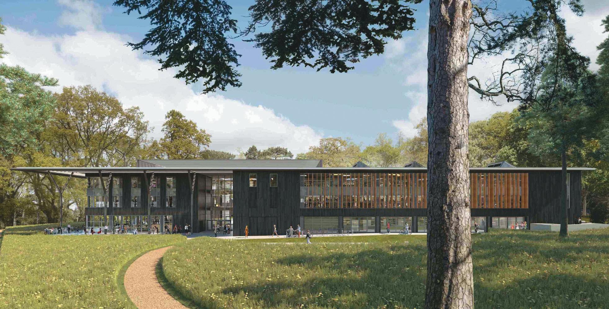
storey teaching building will also facilitate informal learning, encourage engagement and promote wellbeing.
Serving as more than a physical space for students and staff to learn, the buildings will support Oxford Brookes’ vision of ‘making and thinking through collaboration and collocation’ and reflect their commitment to growth. “This state-of-the-art facility will provide Oxford Brookes University with innovative facilities that allow their students and staff to meet the future requirements of industry and entrepreneurism,” says Jerry Woods, Director of Estates and Campus Services at the university. Willmott Dixon will complete the facilities in time for the 2024/25 academic year – a welcome return for students and staff alike.
18 upfront
WILLMottDIxon.co.uk

One man’s trash
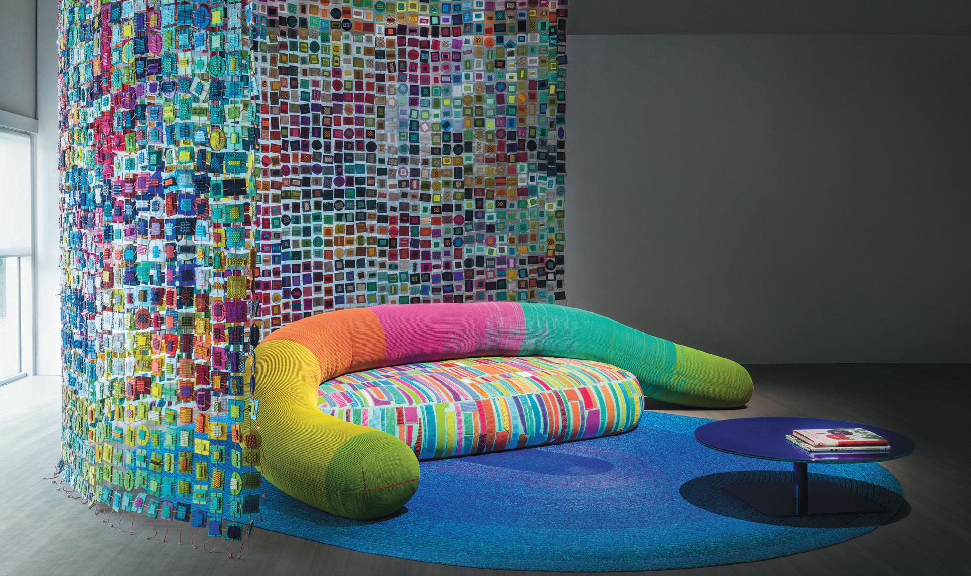
With a name rooted in Buddhist philosophy and ancient Japanese expression, ‘MottAinAi’ demonstrates regret in having wasted something of value. At paoLa LentI, this non-waste notion overlaps and intertwines with sustainability – a value at the forefront of its latest collection.
Textile remnants are given a new lease of life in Mottainai, by turning leftovers into a contemporary patchwork material with personality. Over the years, Paola Lenti has preserved, catalogued and divided by colour and shape thousands of material remnants, trusting that sooner or later the idea that could give them a new shape would come. Those same leftovers and fragments tell a new story today in the form of a bold collection that reduces landfill while serving as a material to upholster new furnishings.
Mottainai’s assembly features a Tricot indoor rug consisting of a thick mélange knit, Elsie chairs and ‘little’ armchairs – upholstered with offcuts of exclusive indoor fabrics – and the Ami seatings, woven by hand with multicolour elements obtained by sewing together production leftovers of Chain and Chain Outdoor tubular knits. Adding to the family is the Diatomee rug, made up of Brio fabric pieces sewn onto a layer of twicerecycled synthetic felt.
Founded in 1994, Paola Lenti is globally recognised for the innovative twist it gives to design products and its interpretation of colour. Over three decades of activity, the company has created a collection of exclusive fabrics and technical materials available in hundreds of hues.
paoLaLentI.It
20 upfront
Made from Rinasco® material with 100% recycled polymers.
ELITE OFFICE FURNITURE UK LTD
T. +44 (0)1405 746000 Head Office, Factory & Showroom.
T. +44 (0)20 7490 4909 London Office & Showroom.
www.elite-furniture.co.uk
E. sales@elite-furniture.co.uk
E. londonshowroom@elite-furniture.co.uk
Elite_Furniture
Elite Office Furniture LTD
@EliteOfficeFurn
eliteofficefurniture
EXPLORER
A world’s first
What do BJarke IngeLs group, technology pioneers Icon and Texas-based hotelier LIz LaMBert all have in common? They’re the masterminds behind the world’s first 3D-printed hotel on the infamous nomadic campsite, el coSMico, in Marfa, Texas.
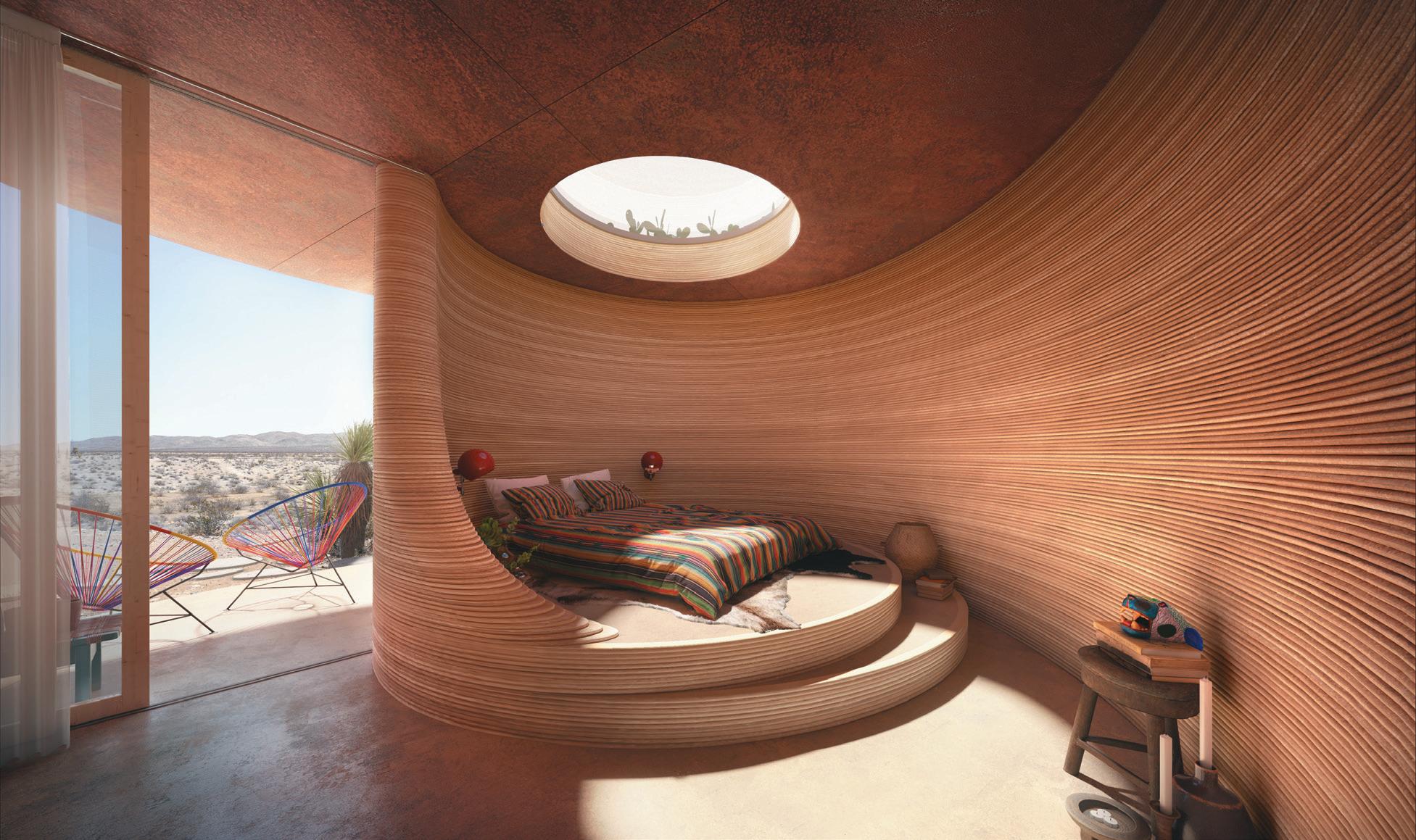
Coming to fruition next year, El Cosmico will celebrate the convergence of creative culture amidst minimalistic landscapes, through the formation of large-scale structures which appear as domes, arches, vaults and parabolic forms. The structures will appear in an adobe-like colour, with wall textures comparable to geological strata in exposed cliffs. With views overlooking the Davis mountains, guests will have access to an infinity pool, open-air spa and shared communal facilities across the 60-acre site.
“Our collaboration has allowed us to pursue the formal and material possibilities of cutting-edge 3D printed construction, untethered by the traditional limitations of a conventional site or client,” says Bjarke Ingels’ namesake, founder and creative director. “Organic shapes, Euclidian circular geometries and a colour palette born from the local terroir makes El Cosmico feel as if it’s literally erected from the site it stands on.”
The designers are also working on an outpost at The Long Center, Austin, in the form of a 3D-printed pavilion for entertainment. Inspired by Uruguayan engineer and architect Eladio Dieste, sinuous curves at the foot of the pavilion will provide structural stability and social niches for the audience and performers.
BIg.Dk
22 upfront
Things I’ve Learnt
Lesson 1: never stop askIng questIons
Design isn’t a science, it’s always evolving – and asking questions is a crucial part of that process; it’s my firm belief that designers should never stop learning and that there’s never a bad question to ask. At the moment, it feels like we’re learning and asking more questions than ever before, pushing ourselves, our teams, suppliers and clients when it comes to ESG.
Lesson 2: kInDness goes a Long Way
Life has its ups and downs, you never know what’s going on with those around you and being kind can have a profound impact on them. Always remember to treat people the way you would like them to treat you, irrespective of who they are – be it a colleague, supplier, contractor or client.
Lesson 3: get out of your coMfort zone
Be scared, be nervous and do things that make you feel uncomfortable. Some people (me included) can be quite shy or get anxious in some situations, but I’ve learned over time that the best way for me to overcome these things, is to just go for it.
Lesson 4: take rIsks When DesIgnIng
Most of us don’t like criticism and this sometimes stops us from pushing ourselves, our thoughts and our work to be the best it can be. Don’t ever be afraid to try something new or push boundaries – the more exploration we do in the design process, the more exciting and unique the final result will be.
Lesson 5: Be InspIreD Wherever you go
Our lives are filled with experiences that shape us and, in turn, inspire us. We often get so wrapped up in what’s going on in our daily lives, that we neglect our instinct to explore. Visit galleries and exhibitions and travel if you can, inspiration often comes from the most unexpected places.
DavID harte Co-Head of Interiors, Studio Moren
harte brings extensive hospitality experience to the broad range of interior design projects that he leads across the hotel, extended stay, coworking, coliving, build-to-rent and brand development sectors.

24
The Height of Design
With sIMone BreWster, ArtiSt & deSigner
the IteM:
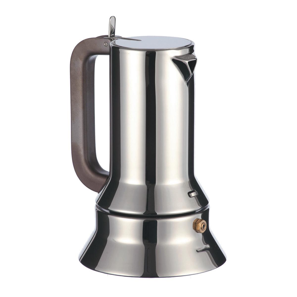
Richard Sapper 9090 Expresso Maker for Alessi
the Why:
There are some designs that become classics because of how they look, and others because of how well they work. There are a rare few that score on both charts, and these are the ones that become classics. This coffee maker is a classic because it does more than what it claims to and it does it so seamlessly and so well. Each component has a purpose and works within the body of the piece, but the object itself is also quite beautiful in its functional simplicity. It communicates that it’s a functional thing; Sapper cleverly injected a narrative into the silhouette. With its wide base, stepping up to a slim body and its polished stainless steel finish, he wanted it to look like a powerful steam engine. It communicates with us, telling us what to expect of it before we interact with it and leaves us satisfied because it delivers.
What Do you thInk has Been the IMpact?
Often, if we see a popular product that is heavily based in aesthetics, we soon find the market flooded with products trying to replicate its visual language. If an item simply sits in innovation, heavily working with a new process, we either see a burst of products using this technique or attempts to re-work or develop the technique. However, when an object marries these two factors (elegance and innovation) you often find it generates its own space. There is an element of invention and a sense of beauty that makes it stand out over time and over its competitors. The design itself is considered a classic and is in the permanent collection at MoMA. But the point of the product was to be a useful and beautiful kitchen accessory. If you’re a coffee drinker I think it’s easy to see its impact on a daily basis.
the personaL connectIon:
I’ve been obsessed with Italian company Alessi since I was 16 and that’s when I first came across this design. It sent me on a journey. I looked at everything Alessi I could, but it was pre-internet and so I ended up writing to the company to ask them about their products. They actually wrote me back and sent me two books, a catalogue of their collections and a small blue book with the story of Alessi and how they came about. I noticed that Sapper’s Expresso Maker was a product, but it could almost be architecture. The Aldo Rossi Coffee Maker, La Cupola, had the same effect. It looked like a building, but it was also playful. I realised
that these architects had made beautiful objects. At 16 I had already set my heart on studying architecture and when I realised that Alessi worked with architects, it made me more determined. I thought, “once I’m an architect, I’ll work with them”. Maybe one day I will.
hoW Does It InspIre you anD your Work?
This item speaks to me about perfection and bringing together beauty and function. Like this piece, I aspire for balance and precision within the aesthetic language of my work. I want the pieces I design and create to feel as if they are well crafted, holding a narrative within them. The idea of an object having a narrative, and something to communicate beyond its functional self, was something that came to me through this piece. It was the first time I really became aware of the power of the everyday item to speak to its user and to a spatial environment. I think this desire to communicate through objects is something that lives heavily in my work.
BreWster is a Londonbased spatial designer and artist, creating furniture and environments. She holds a degree in Architecture from the Bartlett School of Architecture, University College London and an MA, Design Products, from the Royal College of Art.
sIMoneBreWster.co.uk

25
We’re all busy – or just claiming to be. In the modern world of work, busy is an absolute requirement. We’ve perfected the furrowed brow, the direction of our attention to an outstanding task, the got-to-run impatience of someone in demand.
The outcome of our busyness is ‘productivity’. Taskrelated activity is why we’re recruited, how we’re appraised, remunerated and how decisions on our advancement are made. Organisations and roles are fundamentally designed for the getting done of stuff. Relationships, processes and technologies are built around this. We’ll term this alpha work, as in almost all cases it’s our first and main priority. We deliver alpha work through team co-ordination and co-operation.
We once designed workplaces for alpha work. Everything else, the non-productive stuff, was considered a bonus; until COVID, during which we quickly understood that alpha work was possible from a non-office location, which is why most people felt ‘productive’ even when not in the office. Organisations able to measure productivity objectively, confirmed this. Now, while a degree of face time for co-ordination and co-operation is still deemed useful, it demands a day a week in the office at most.
Yet there’s another type of work, which we’ll call beta work. It’s unplanned, slower, less likely to produce immediate results and relies on relationships. We can’t plan it in our alpha-rammed diaries. We’re not recruited for it or measured on it. We can’t give it
Work: it’s all Greek to me
priority because we’re too busy with alpha work. Yet beta work is true collaboration and it drives innovation. All the processes and technologies we use today to drive alpha work were the result of yesterday’s beta work. It’s not optional, it’s critical.
Neither is better than, or preferable to, the other. All alpha work = no innovation, and a slow, barely noticeable demise. All beta work = great ideas, no delivery and a rapid demise. We need them both.
We could be forgiven for thinking that – though we go to work to do the ‘alpha’ – all the workplace industry needed to do was design and deliver lots of quirky spaces for beta work to happen more in the office. We’re seeing a lot of schemes working to this assumption. But like excellent connectivity, Milanese coffee and free apples, a range of work settings isn’t a reason to show up, but merely an expectation of what will be there on the off chance we do.
So, if we won’t come to the office for alpha work more than a day a week, and we won’t come for a design someone won a statue for, what will we turn up for, that might prompt some unexpected future-busting beta work? A gravitational space that we can’t stay away from; that we want to be in, where surprising things happen, surrounded by the amenities we expect.
Alpha and beta work probably add up to something conceptual. It’s no longer enough to think of everything we do as just ‘work’. Or productivity might kill the office yet.
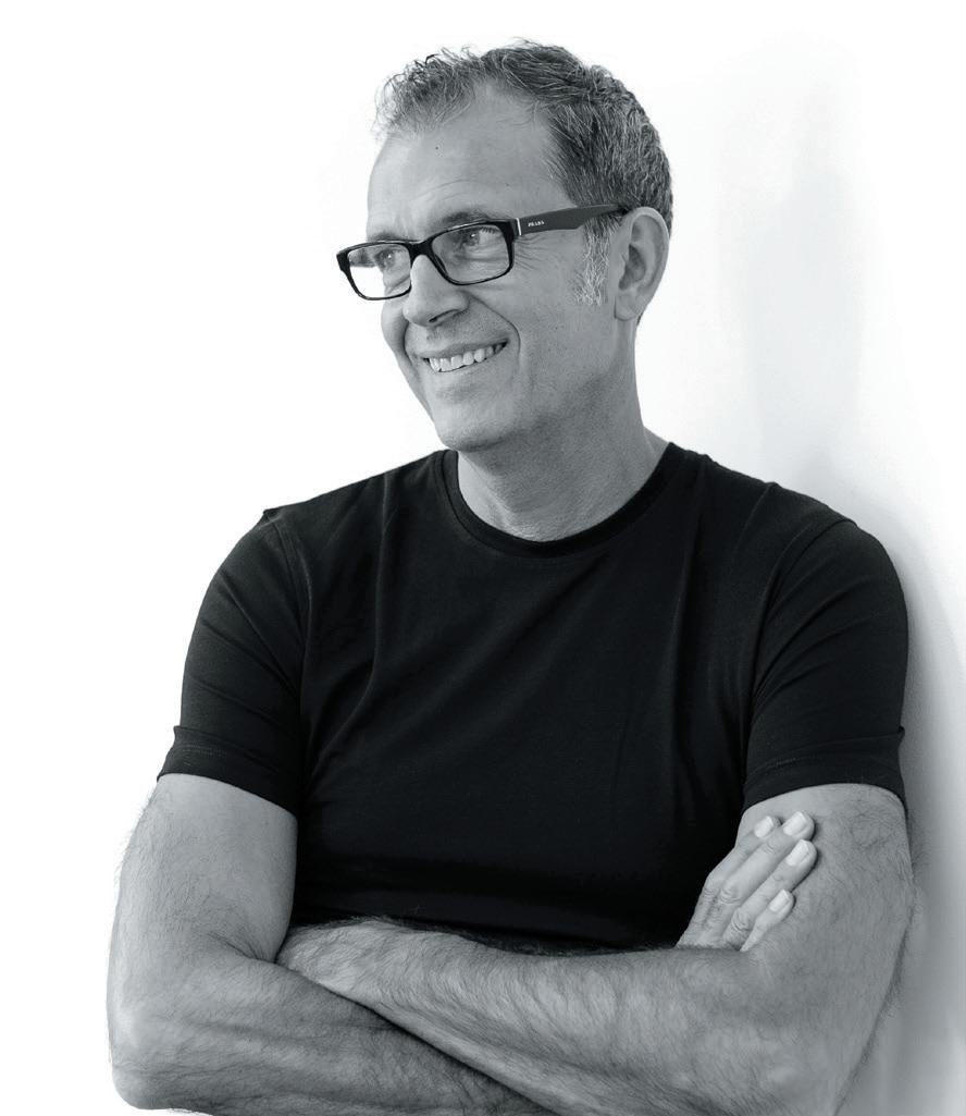
n e IL u sher is Chief Workplace & Change Strategist at gospace aI and author of The Elemental Workplace and Elemental Change
26 paraDoxIcaLLy
WIth
speakIng
neIL usher
Visit our London HQ & Showroom info@kieurope.com kieurope.com/hatton

28
Fluid Space
Head of interior architecture at ZAhA hAdid ArchitectS, k ar - h Wa h o discusses an optimistic future, the value of time and creating environments for life’s dramas.
The London lobby of Zaha Hadid Architects is much as you might imagine: a near white void, punctuated by a rippling black sofa and a cluster of scale models. There’s a white table in there somewhere, polished and immaculate, disappearing into the walls and floor. On first impression it isn’t a space for this editor – rain sodden and carrying most of Clerkenwell’s pavement detritus underfoot. A few minutes after arrival, my thoughts hover less on the person I’m there to meet and more on the job I’ve created for the cleaners.
I needn’t have worried. After all, as Kar-Hwa Ho, the studio’s Head of Interior Architecture asserts, ZHA really isn’t about the stifling purity or austerity some might assume, but humanism; spaces and buildings designed with people in mind, presumably in all their messy, unpredictable, sometimes dripping reality.
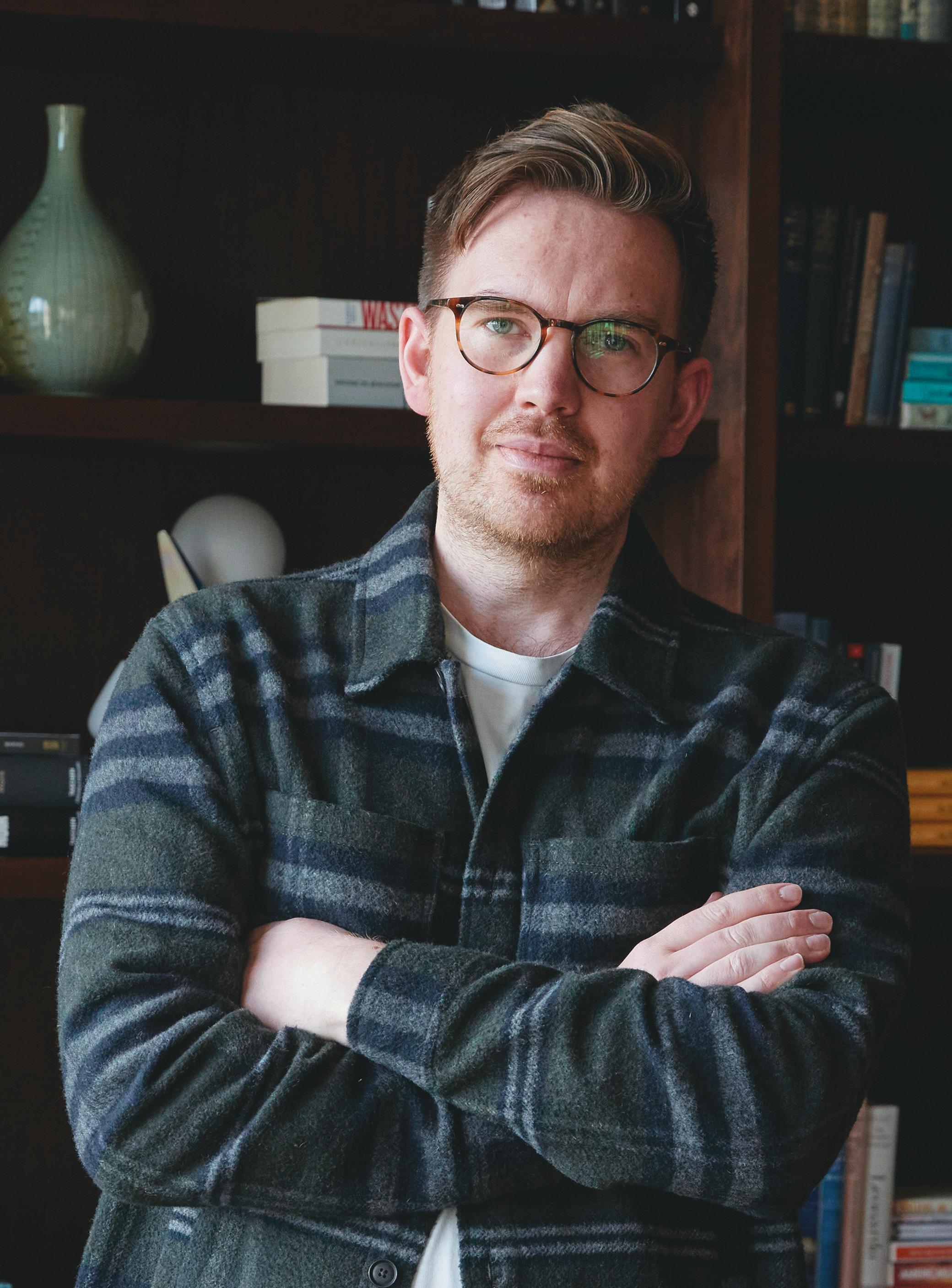
Kar himself (who insists on doing everything on a first name basis) isn’t particularly starched, head-to-toe in navy; a comfortable knit with chinos. Originally from Singapore, he has a gentle, thoughtful air, with grey
flecked hair and tasteful glasses. He knew ‘early days’ Hadid personally, having studied under her at the AA –then oblivious to the fact that, in later life, he’d work at the powerhouse practice that bears her name. Although starting out as student and teacher, the relationship between them was not a fleeting one and endured over the years. When Kar returned to Singapore for his mandatory military service, they kept in touch. In between terms at Harvard University Graduate School of Design, he returned to London for a summer placement under her tutelage and, after career-building stints in New York and Paris, Hadid would ultimately ask him to join her studio in the interior architecture department – which he now heads.
“Looking back, Zaha was one of a few architects trying to break out of the context of always looking to the past. What attracted me to her, and then the studio, was that there was a vision for the future – a no holds barred, no hostages taken vision,” Kar explains, perched at the foyer table, a coffee pot and warped white cups having appeared, as if from the rarefied air. “There was
29 IntervIeW: kar-hWa ho
WordS: harry MckInLey
humanism and optimism in her vision. It was never about style for style’s sake, it was about trying to capture the emotive quality that architecture has on a person.”
Kar is measured and cerebral, a thinker who pauses before he speaks and is clearly drawn more to important ideas over superfluous detail or minutiae. Words, after all, are a sometimes clumsy way of addressing architectural thoughts, only ever a ‘substitute’, as he attests, for something that ‘must be understood in its own medium.’
While dwelling on the past could easily descend into a form of hero worship for the woman who became a rare architectural household name, understanding her legacy is important. Though Zaha Hadid passed away in 2016, as with many namesake studios, her vision remains –even if there is now a wider group of custodians shaping and reshaping it. It informs how the practice works today and will inform how it works into the future.
In this, there are foundational misconceptions that warrant shattering, not least that Zaha Hadid Architects deals in creating the ‘iconic’ or aesthetic. Its projects are better considered as purposeful, the visual stature and impact they provoke a by-product of a thoughtful approach, not the starting ambition.
“It’s crucial not to see the works as being about a ‘big statement’,” explains Kar, “divorced from that humanist vision. We don’t just set out to create something different, it comes from very careful study, based on a client brief. Though each might feel unique, that’s a result of each brief requiring its own response. We’re trying to investigate the deeper values and emotions that are in a building, be it inside or outside, and it shouldn’t be written off as stylistic or form driven. If anything, as architects we’re always conscious of falling into the trap of being stuck in a certain way of doing things. Zaha’s credo was always to push yourself.”
30
aBove IMage:
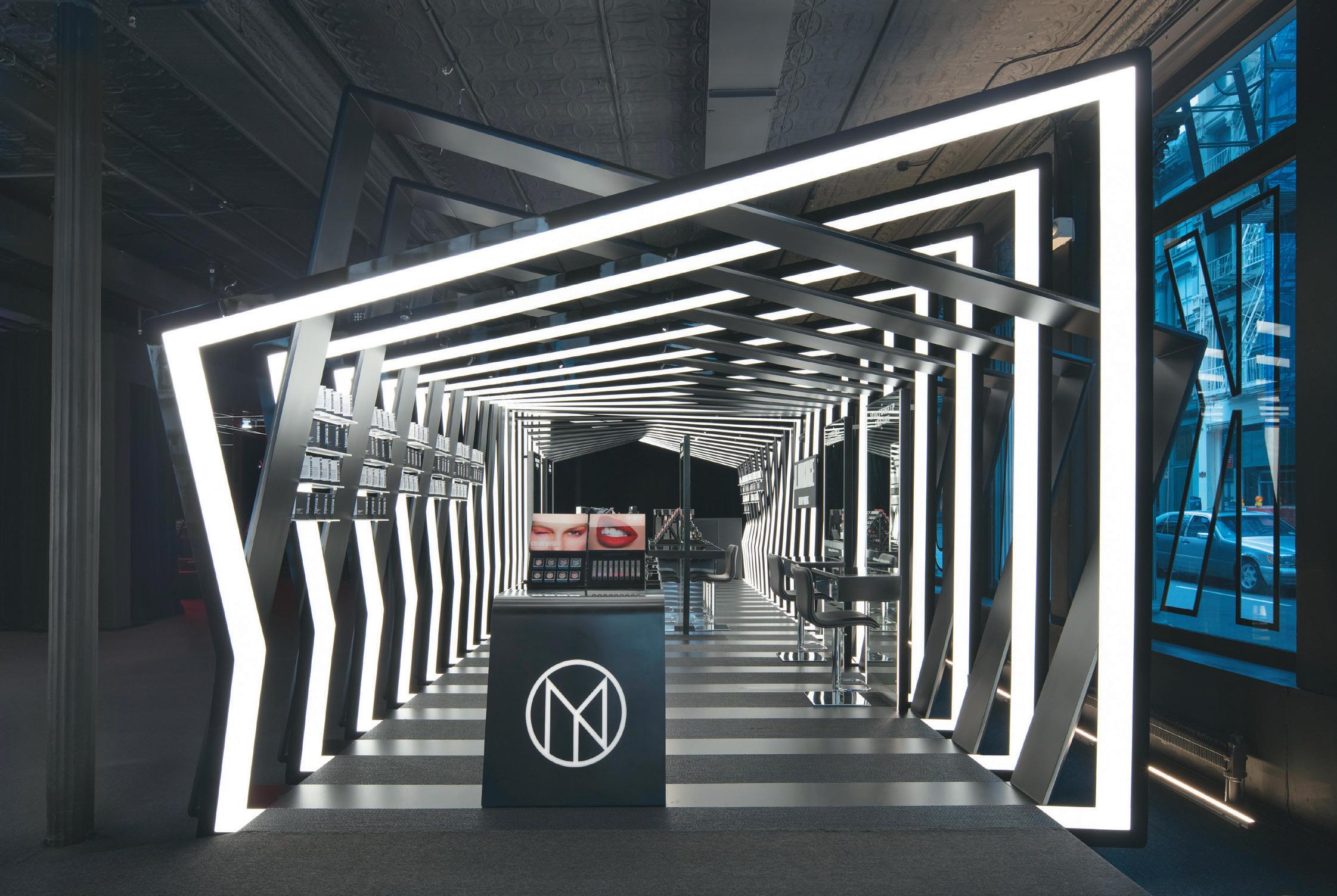
Il Makiage, New York | Paul Warchol
Though Hadid’s early work was aggressively angular and ferociously rigid, today the studio is most associated with fluidity – surging, spiralling, sweeping lines that are at once organic and neoteric. There’s a famously technological dimension to its process of design; algorithms deployed to create parametric curves. It all feels rather sci-fi but, when interrogated, isn’t rooted in some grandiose view of tomorrow, but in how we navigate the world today.
“Curves speak to fluid space and the notion that things are not always segregated,” says Kar. “You move through your life quite fluidly and, more and more, the functions of that life are becoming conflated. The fact that interior architecture allows for spaces and forms to flow together is really what allows for the drama of life, as we understand it today. As designers, our usefulness is in creating that which reflects how people’s lives really are and enabling a person to live the best version of that life.”
It’s an exciting time then for Kar who, like most of us, sees the walls between sectors crumbling; the once linear structure of our days and weeks now complex and serpentine. Work is now ‘fluid’, he notes, both in where and how, with design responding to that; in retail it’s about looking at how the rituals and ceremonies we associate with the home can be translated; while, at home, it’s now a case of considering how a pocket of a room can become an office. As a designer, it means looking at what all of this means from a wider angle and addressing it.
“I think there’s always an innate curiosity in all of us as humans and, after the pandemic, this is even more acute,” he remarks. “There’s this conflict about wanting to be out there in the world, interacting with people, but also –because of the pandemic – wanting to be by yourself and pushing everybody away. There’s a balance to be found between the two. That’s the challenge these days and the motif we’re exploring that all of this fits into.”
Our own rendezvous has faced minor hiccups: changed meeting schedules, fluctuating train times and project deadlines. The simple, modern route would have been to kick the whole thing onto a video call, which certainly would have spared the pristine lobby floor. But, like words and architecture, it would have been a less noble substitute. The snags, and the dogged determination to overcome them in favour of sitting face-to-face, speaks to two themes that preoccupy Kar: the value of time and the meaningfulness of experience.
“The notion of time is unrecognisable from 100 years ago,” he says, perhaps resisting the temptation to glance at his watch. “It almost has a monetary value now. Compare the convenience of Amazon with the storytelling of highend retail and the difference between them is an equation of time and experience. Buy something online and it gives you time to spend on something else, so a greater rate of renumeration. The question then is the role design can play in that, be it creating a seamless, functional experience or a longer journey that still delivers value, because though it might take more time, someone leaves with a meaningful memory.”
Could it be that the key to successful interior architecture then comes down to unambiguously understanding what people want and what they value? “Well, there’s the idea of the design nomad and that we’re all tribal,” says Kar.
“We all want to belong and tribes, by their very nature, share the same concerns and ideas. So identifying them informs the creation of a visual language, even if, as a space, it’s a three-dimensional one.”
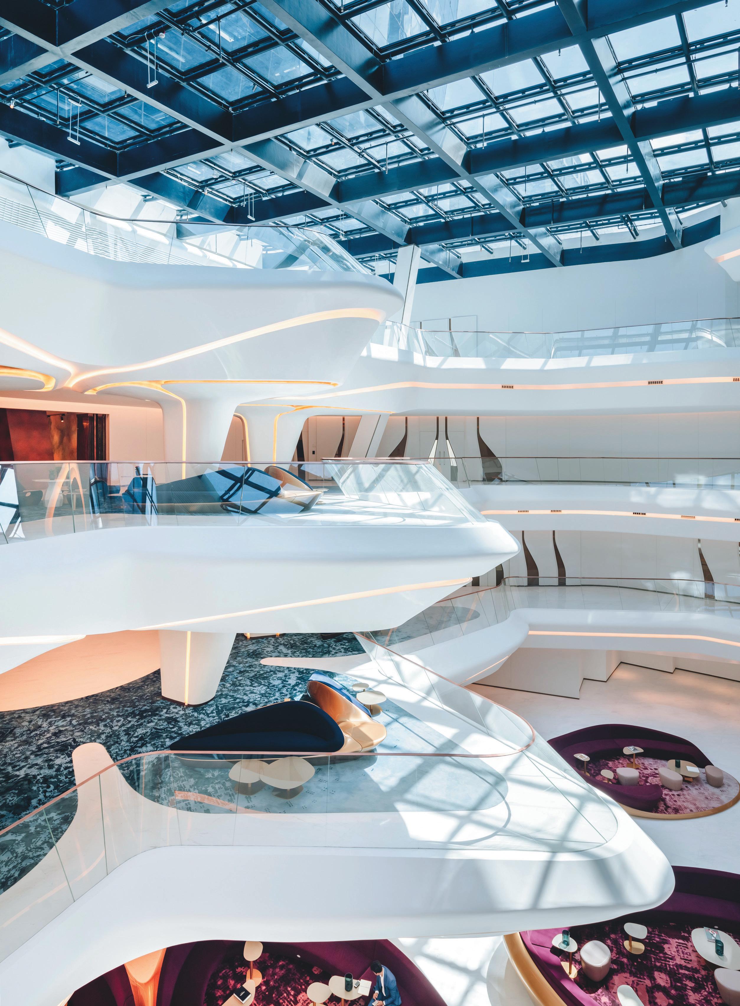
opposIte page: OPUS Hotel, Dubai | Francisco Nogueira
32
33
ZHA is currently working on a major project in Hangzhou, China, for which the studio will develop both the exterior and interior of several buildings – including a retail component. It’s a gift for Kar, because it means total control of the continuity of the experience, one of the central philosophies of the studio being that design doesn’t begin or end at the threshold between inside and out. It also means greater collaboration between teams and disciplines, the aspect of design that Kar finds most rewarding.
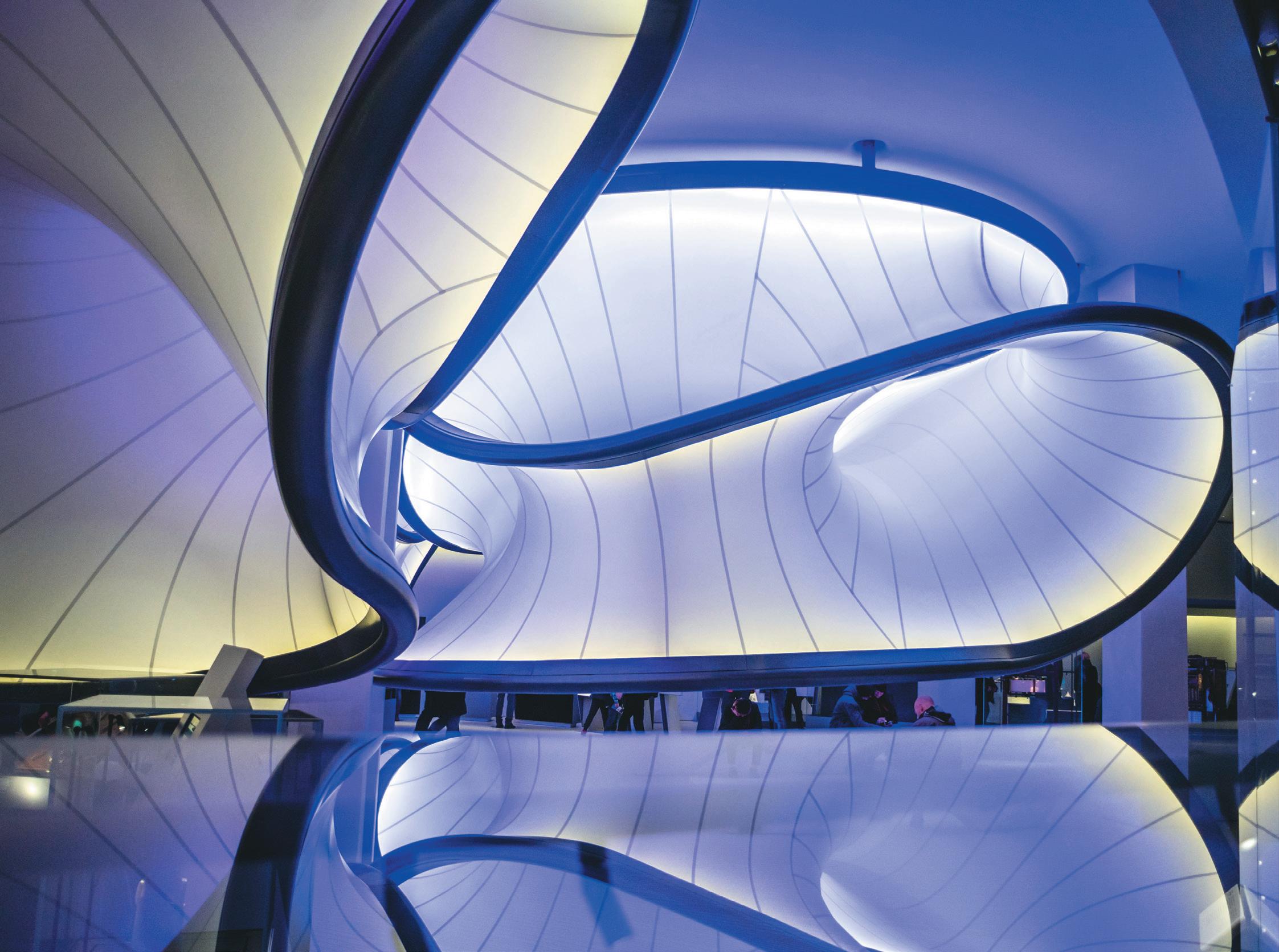
“The best thing about being an architect is working with others, because it helps you find yourself and reinforces your identity, as part of a journey. We don’t start a project knowing what it will look like and then work backwards, we don’t know what the result will be. We have an idea of direction and then over time see all of the discrete parts
come together into a whole. When the result is more than you expected at the beginning, it’s personally validating and validates the collaboration between people.”
Wrapping up, talk turns from future projects to the future broadly. There is, after all, sometimes the sense that ZHA’s work is both a channelling of the zeitgeist and a reflection of tomorrow’s world. When put to him, Kar nods and smiles in the way that suggests a nice idea with which one doesn’t quite agree.
“I’m certainly not an oracle” he laughs, coming full circle. “I don’t know what the future is and that’s the exciting thing. But we’re not trying to predict the future, even if there’s a vision for it. It all goes back to emotion and feeling, the search through architecture to make the invisible visible.”
34 aBove IMage: Mathematics Gallery | Matt
Danby
36
North Star
c har LI e n orth talks leading AiMe, the rebranded design studio by hospitality behemoth, enniSMore.
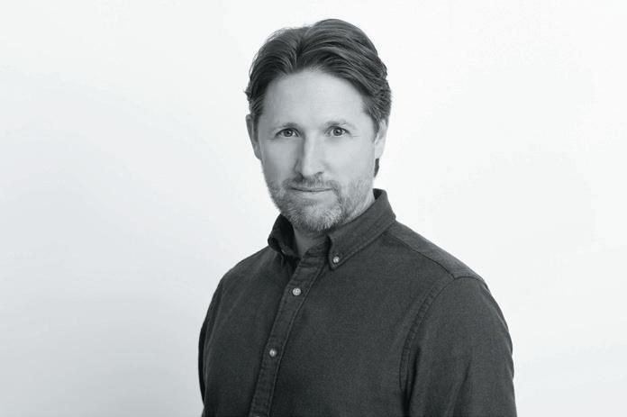
Ambition, a highly focused attitude, the lure of the metropolis – London, that is – and experience chalked up with two of Britain’s most successful interior designers have helped propel Charlie North to the top of his profession. A measure of good luck has contributed to his meteoric rise, as he also acknowledges. He cut his teeth in the noughties with legendary, larger-than-life interior designer David Collins, founder of the eponymous studio (who died in 2013), and Martin Brudnizki, no less.
In 2017, North and Alex Prior joined forces to head up Ennismore Design Studio, the in-house creative studio of London-based hospitality group Ennismore, founded in 2011 by Sharan Pasricha. The studio has since greatly expanded: it now works with a bigger roster of brands and offers a graphic design service, overseen by Prior, that complements the interior design arm. This year Ennismore Design Studio was rebranded AIME Studios, the first word being an acronym derived from four verbs: Analyse, Ideate, Make and Evolve. “We thought of these as they represent the four key stages of our creative process,” explains North.
Elaborating on this, the studio states: “Our design process is rooted in research of our surroundings and the history of our buildings, which allow us to create unique experiences showcasing the brands we work with”. Although this could read like a set-in-stone mission statement, the studio professes to taking a fluid, organic approach. It defines ‘Evolve’ as the constant pursuit of originality coupled with a need to be self-critical: “We don’t cookie-cut… We’re not afraid to be critical of our previous work”.
“We do a lot of work upfront to set the scene, we research a lot,” stresses North. “When we start a new project we ensure we understand the brand, the building we’re looking at and its neighbourhood.”
Including work undertaken both by Ennismore Design Studio and AIME Studios, this team, which now comprises 30 interior and graphic designers, has collaborated with 12 brands and designed hotel rooms, restaurants, bars and meeting and event spaces in 22 properties to date.
37 IntervIeW: charLIe north
WordS: DoMInIc Lutyens
Among AIME Studios’ more prestigious projects is Gleneagles Townhouse – Scottish hotel Gleneagles’ Edinburgh outpost that boasts a 33-bedroom hotel, members’ club and restaurant – which opened in 2022. The studio has also designed the interiors of all hotels owned by The Hoxton. One opened in Shepherd’s Bush, West London in December 2022, while two others in Berlin and Brussels – the latter incorporating 198 rooms, a double-height lobby, restaurant and rooftop terrace – will open in May 2023.
Asked if anyone inspired North to be a designer when he was growing up, he cites his multi-talented grandmother, who lived near his parents’ home in Hertfordshire, as a major influence: “She’d worked as a landscape architect, cake-maker and designed furniture. She was very creative.”
North did a BA in interior design at Bournemouth University in the early noughties, a course he would clearly recommend to others: “It was pretty comprehensive and well-rounded – it covered history of art, construction, technical drawing, model-making and how to run a business. I’ve always thought some courses fell short of teaching business skills, but we learnt them too.” It was a four-year sandwich course, which led him to break into the profession at a high level. “In the third year, we did a professional placement, so we had to find a job. I chose to go to London because I grew up near there. I wanted be in the Big Smoke. The company I chose – it was a paid internship – was David Collins Studio.”
This was perhaps an unusually bold, self-confident move for one so young, so what made North aim so high? “My mum bought me a book on London-based restaurant
38
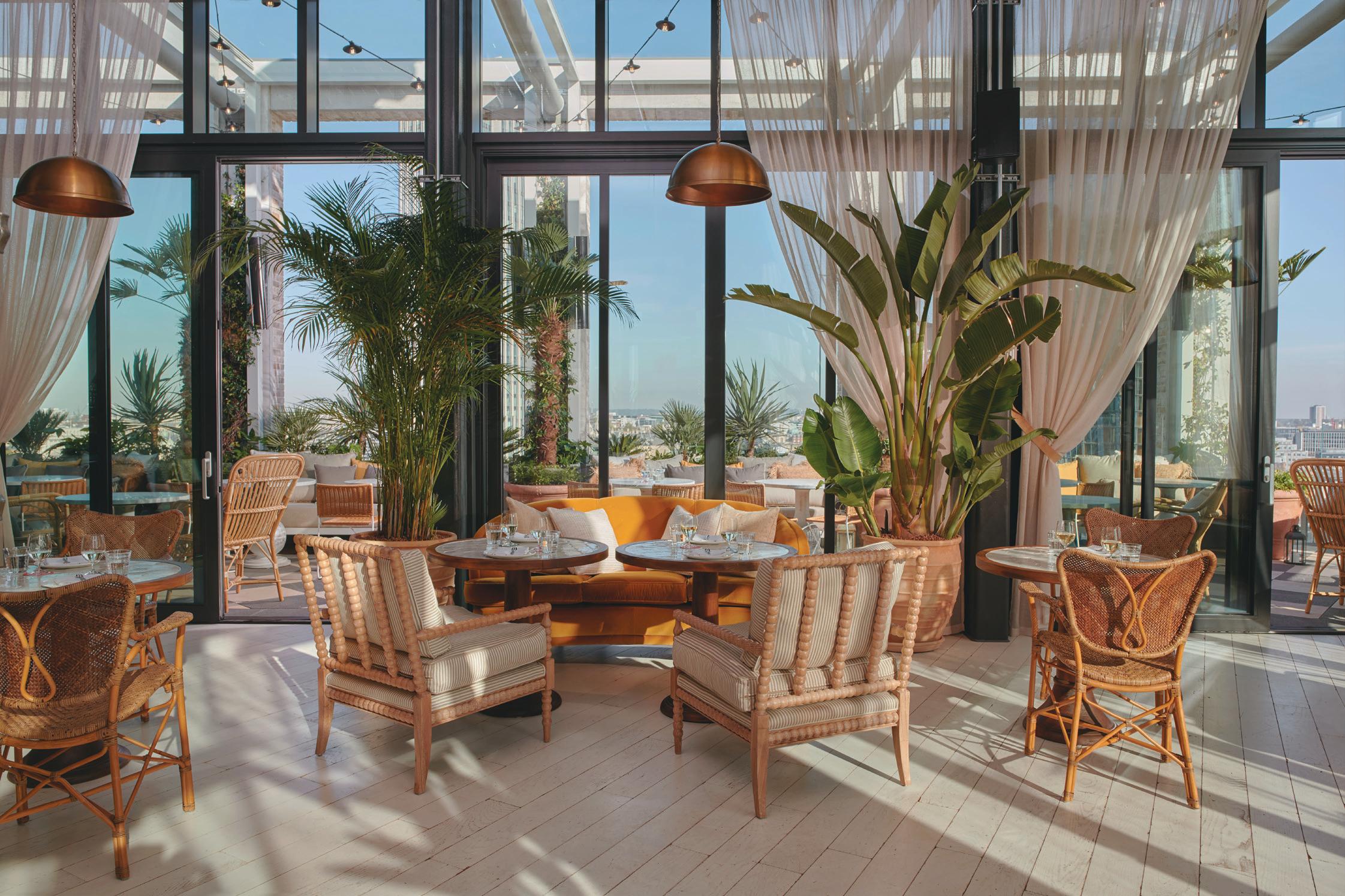
aBove IMage: The Hoxton Seabird
designers and David Collins jumped out at me,” he recalls. “David was great to work for, a huge inspiration. He could be slightly intimidating but what a way to cut your teeth at the beginning of your career – a baptism of fire.”
Was Collins nurturing? “Yes, he and Iain Watson [then the studio’s commercial director, now its CEO] invested their time in me. They gave me a great opportunity and saw I was working hard and appreciated that. When I graduated, they offered me a full-time job. I was thrown in at the deep end. The first big project I was quite an important part of was a residential property in Holland Park. I was working with site contractors and project managers. I was drawing packages on CAD for hospitality projects as well as hand-drawing sketches of furniture we were designing. At the time, David was doing restaurants for Fortnum & Mason stores. I was involved in the early stages of those.”
North’s computer skills proved useful at this point: “Even though CAD was in full swing, 3D computer-modelling was only starting to go mainstream,” he says.
On leaving David Collins Studio, he travelled for three months in South Africa. He was in for a shock though when he returned to the UK, which he can laugh about now in retrospect. “I came back just as the 2008 recession hit. There weren’t a lot of opportunities at the time,” he says with jokey understatement. “Martin Brudnizki was one of the only people hiring at the time. I read he’d just designed a Jamie Oliver restaurant in Oxford. When I first joined his studio, I worked on Cecconi’s in West Hollywood, Los Angeles. I had to quickly learn about American design and adapt to using
imperial rather than metric measurements. The next big project, which I ran almost on my own, was the Oxfordshire residence of [Soho House founder] Nick Jones and his [TV and radio presenter] wife Kirsty Young. They were very involved in the design process. I worked with Susie Atkinson who was more responsible for the soft furnishings side.”
For AIME Studios, a key objective is to knit together historic and contemporary features. “Our main aim is to create a place where you can relax and appreciate the architecture around you,” says North. “Yet we’re also designing for brands, so it’s important that we respect their DNA.”
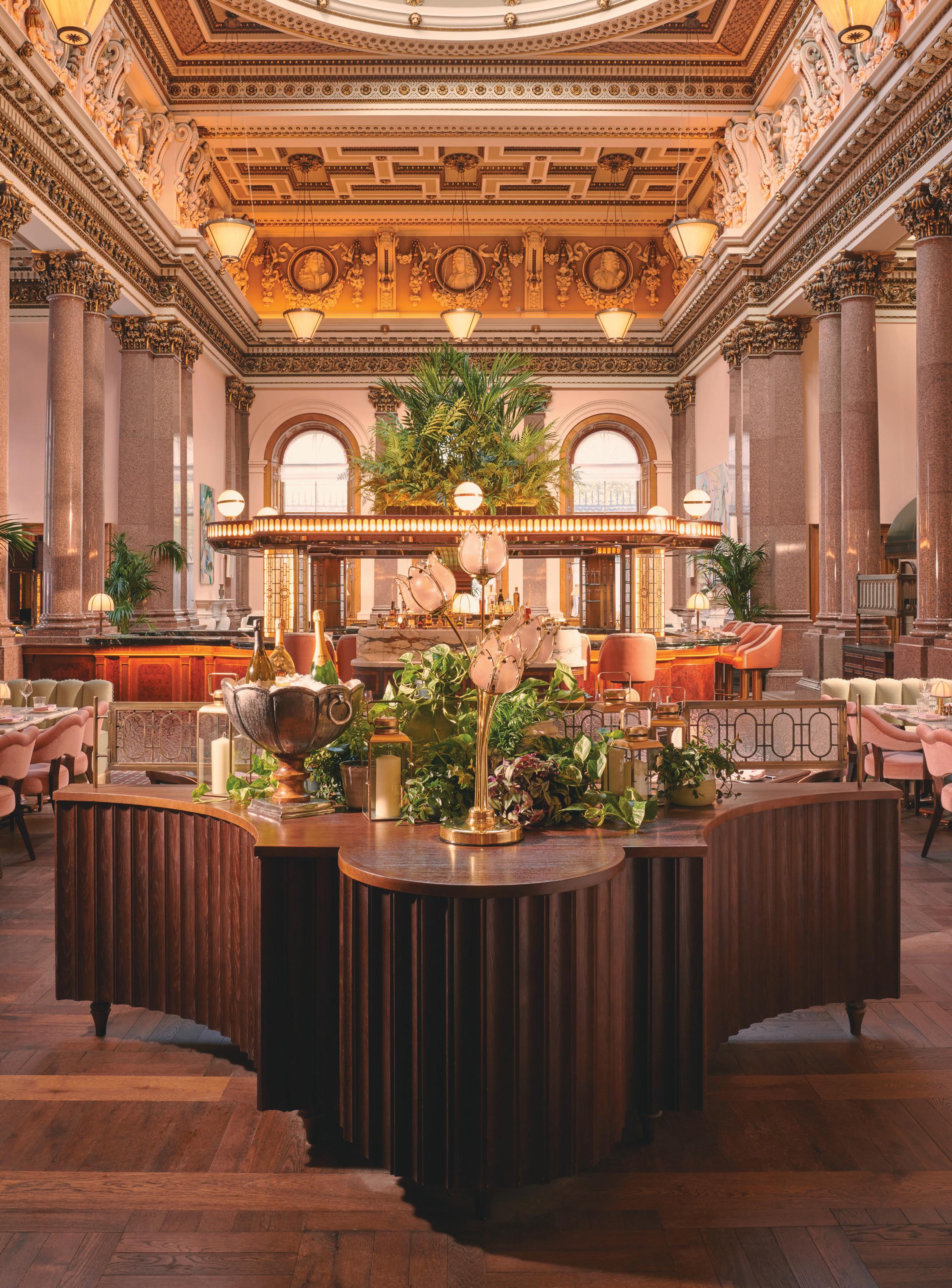
At Gleneagles Townhouse, an 18th-century former bank, original decorative mouldings, fireplaces and wood-panelling have been preserved, their splendour enhanced by such flamboyant flourishes as canopy headboards in the guest rooms. “One contemporary touch,” says North, “is the inclusion of artwork by local Scottish artists as this has a sense of place and engages with the local community.” One artist, Glasgow-based France-Lise McGurn, who has painted a mural in dreamy pastels on the ceiling of Tate Britain’s spacious, subterranean Djangoly Café, has contributed a huge piece to the hotel’s opulent interior. “It’s a great way to make Gleneagles feel current but in a traditional setting.”
North talks about the importance of ‘touchpoints’ – his word for objects or elements that connect the guest with the brand. “It could be a personal note addressed to guests that they find in their room just after checking in.”
opposIte IMage: Gleneagles’ Townhouse
40
41
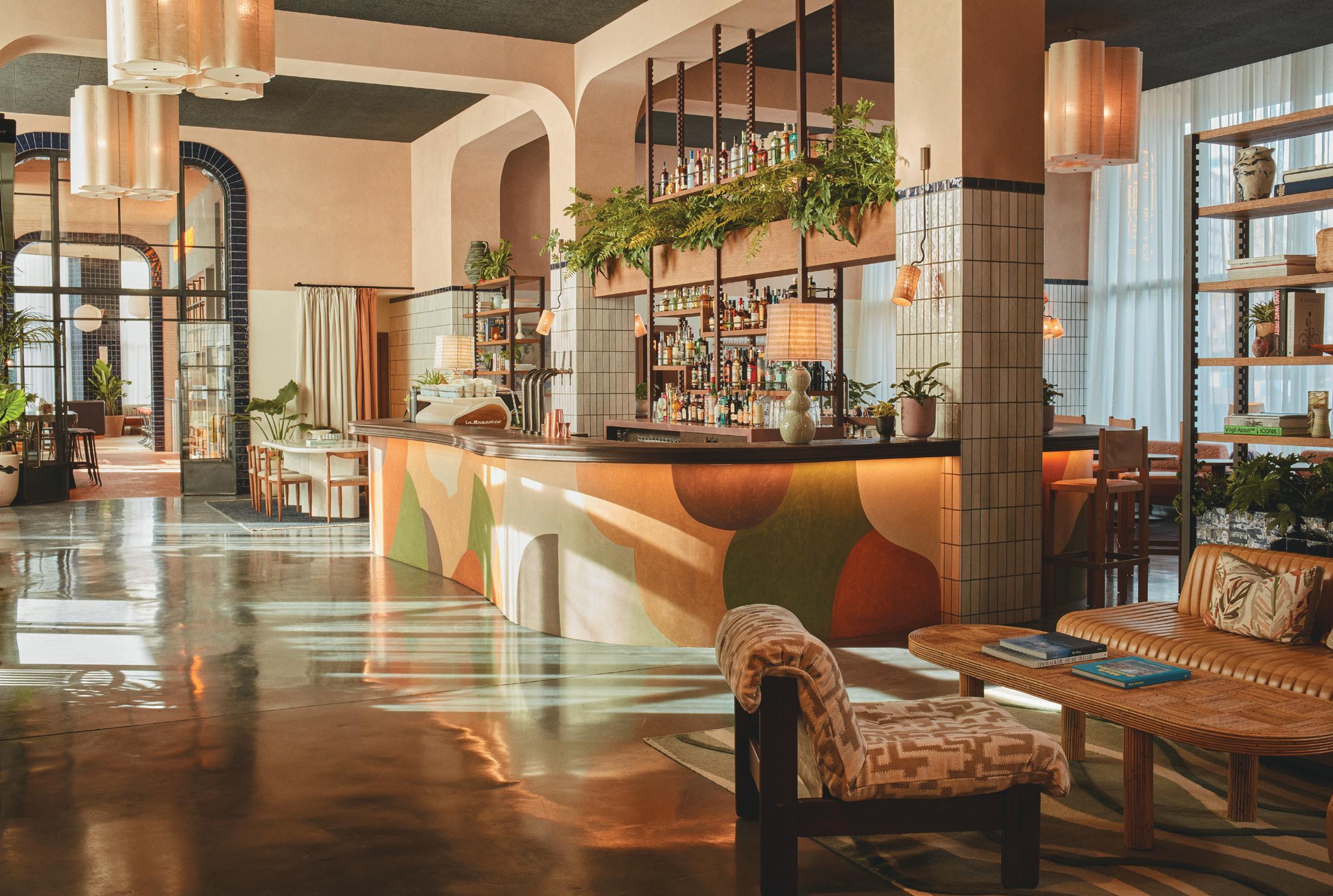
Shepherd’s Bush might not seem an obvious setting to inspire interior designers of upscale hotels. But AIME Studios took a retro route when dreaming up the inviting interiors of The Hoxton there. While it’s impossible to ignore the presence of the nearby 1960s W12 shopping centre flanking one side of Shepherd’s Green Bush, the hotel’s interior celebrates another local landmark – the London Transport Museum Depot, which stores many of the museum’s historic artefacts, is open to the public and is not far off in Acton. The hotel’s interiors have curved walls that reference the forms of train carriages, while its colour scheme has a distinctly 1970s vibe, conveyed by vintage furniture, peach-toned walls and a predominantly earthy palette.
But glamorous elements contrast with these utilitarian features: in the lobby there’s a bar fashioned from maple and marble. AIME Studios has allowed room for whimsy with such individual features as mirrors in curvy shapes with tubular metal frames in rust – suggestive perhaps of tubular fittings found in tube carriages.
Finally, does North have interests outside his work that feed into the eclectic style evident in AIME Studios’ highly varied projects? “My wife, Robyn, who works in luxury hotel marketing, and I have a shared passion for photography and hotels. I’ve got my dad’s vintage Pentax camera, which we use every time we go on holiday. We love sightseeing and taking photographs. One hotel we’ve visited is Castello di Reschio in Umbria, Italy, a beautiful property comprising several crumbling buildings. The owner has done an incredible job restoring it. Inside the hotel are exposed stone and timber trusses and a candlelit spa. Yet its interiors feel very contemporary. We also recently went to Paris and stayed at another hotel, Château Voltaire. The rooms are simple and pared-back but enlivened by vibrant carpets.”
So, while he’s travelling, North is conveniently building up an archive of images, some posted on his Instagram page, others perhaps mentally filed away in his mind for future inspiration. It’s the perfect hobby for one passionate about wonderfully atmospheric hotel interiors.
42
aBove IMage: The Hoxton Barcelona

There’s an idea that actually – whether it’s a workplace, BTR, retail or a hotel – everything should be viewed through the prism of ‘hospitality design’. It has crept up on us slowly but now seems to be everywhere –hospitality being namechecked in the design approach for most sectors. As someone who has worked in hospitality for most of my career that is music to the ears.
Hospitality design has traditionally been more adventurous and more experimental. The sector has been driving innovation not just in the way spaces look, but also how they engage with the guest and what they offer the user. The fact that the industry is ultracompetitive enforces this drive. Maybe as office spaces jostle for occupants, flats are a harder sell and retail IRL is flagging, this competitive environment is driving creativity and putting hospitality into focus.
We are designing spaces for people to enjoy themselves in, spaces occupied temporarily and not every day, that by their very nature want to feel special. They are transient and as a result more able to be unique – and for clients to allow them to be. Importantly, they are all about the experience, including the service. So it is curious that these attributes are now in demand for sectors that are traditionally far removed from being daring or from ‘looking after us’.
Is everything now hospitality?
Hospitality spaces are there to make us feel good, so perhaps there is a clue in that. If we can work from home with all our creature comforts, what will make us come back to the office? That brings us to a fundamental point that hospitality design has always been about people: welcoming them, wowing them, spoiling them, challenging them. If we can bring some of this into other spaces, that may not be as desirable – say the office – that will surely assist in the challenge of getting people to come back to them, now they have the choice not to.
Our lives are much more faceted than they were. We work differently, we socialise differently and we have higher expectations of our surroundings. Rather than seeing the café in the lobby or breakout areas as detracting from work, we acknowledge that for some people these types of spaces encourage productivity.
Would it not also be nice to live in a home that feels like a boutique hotel, with a concierge and amenities? With the rise of well-designed, amenity-heavy BTR, this is now more affordable for a wider group of people. It gets more interesting when it starts to stretch into hospitals, community centres and less office-bound workplaces. Even the canteen in a factory can be inspired by a terrific restaurant – good design, as we know, doesn’t have to cost more. And that neatly leads back to the starting point, as we all have our favourite cheap and cheerful corner place, with great food and staff that know our name. That is hospitality, in a nutshell.
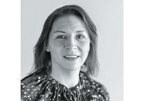
t I na n or D en is a principal and co-owner at conran anD partners
44
the ask WIth tIna norDen
This is LVT. This is Plusfloor.
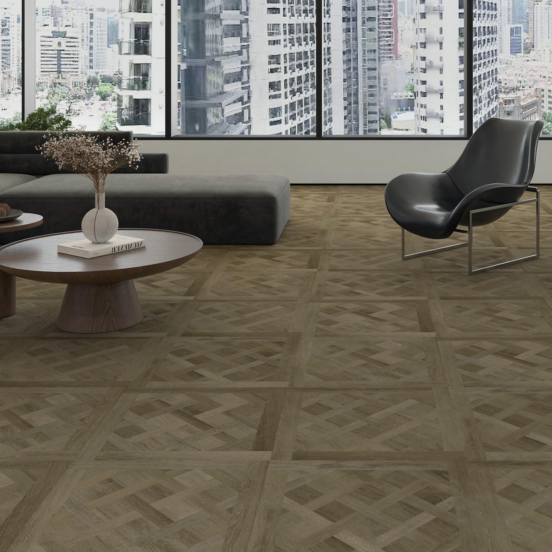
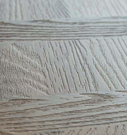
Plusfloor’s LVT Versailles panel. Single format glue-down panel / TrueGrain embossing / Four trending colours
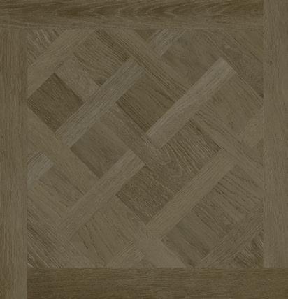
Water-resistant/ Easy maintenance / Suitable for commercial and residential use
610 x 610 x 2.5mm
A study in serenity
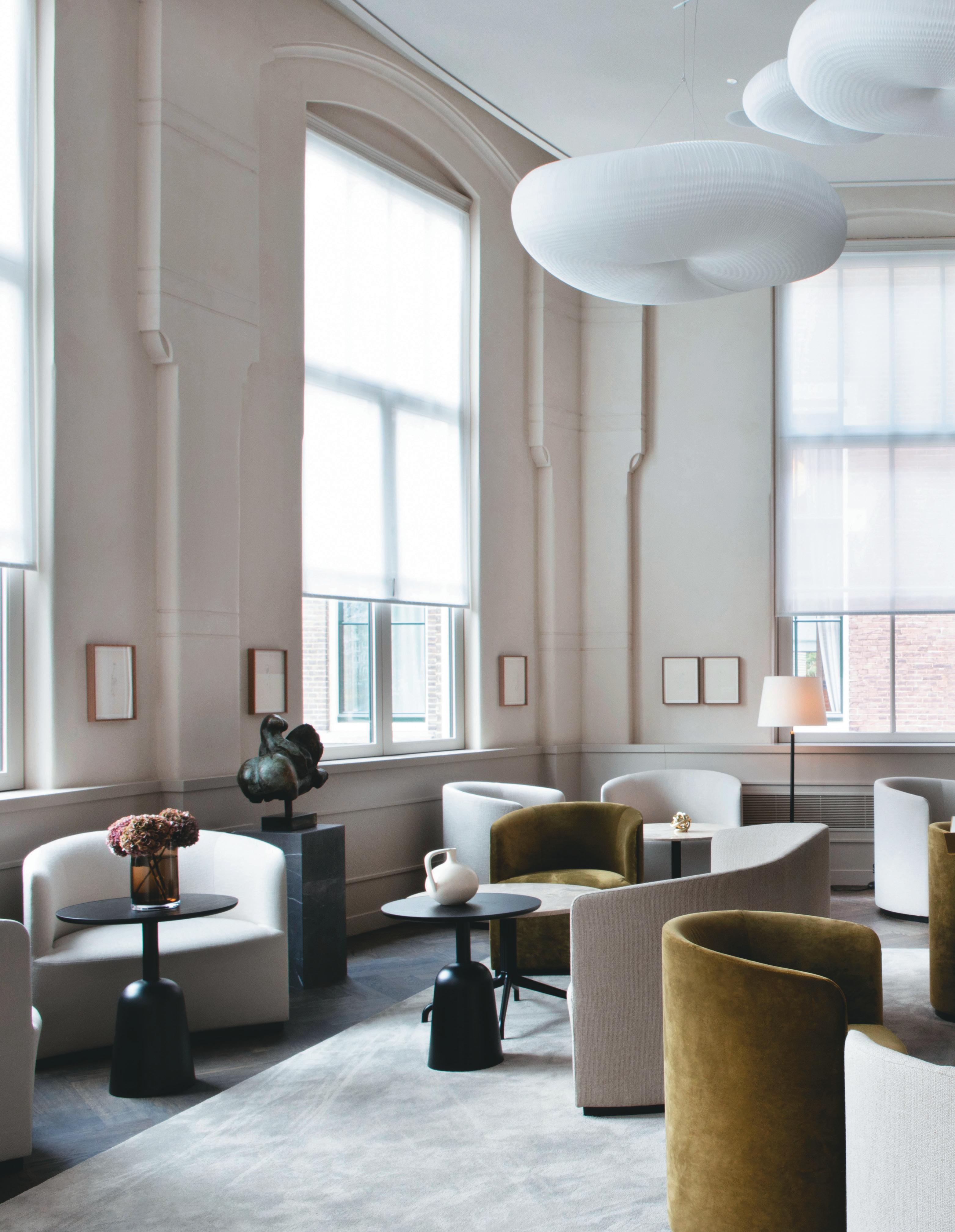
The park-side setting of Amsterdam’s newest five-star hotel sets the tone for a serene, Studio linSe-designed former university building.
WordS: Lauren JaDe hILL
 case stuDy: pILLoW MaurIts, aMsterDaM
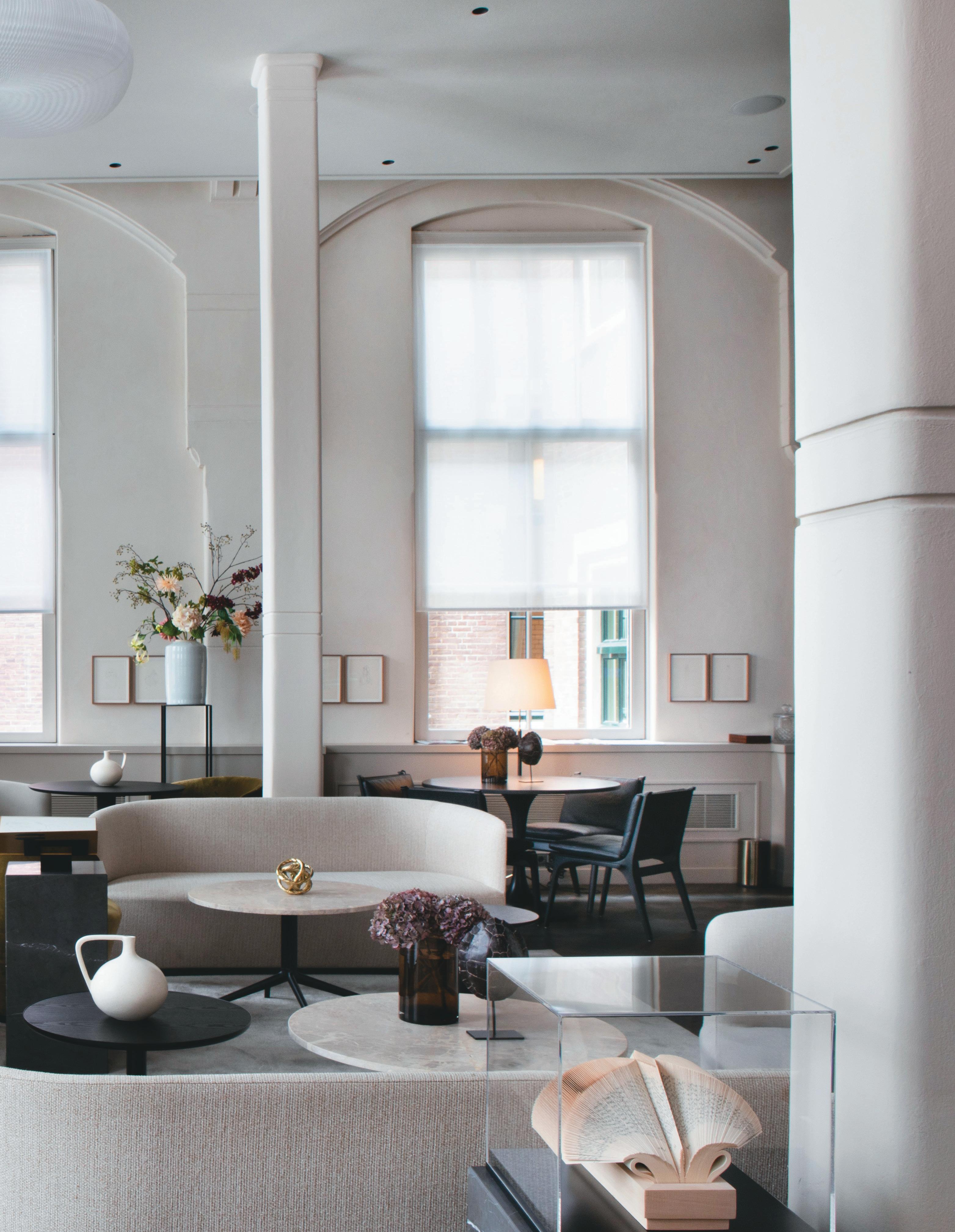
Away from Amsterdam’s city centre, the Dutch capital’s cultural east end, Amsterdam-Oost, enjoys a growing reputation as one of the city’s most happening areas. This is the appealing setting for the end-of-2022opened, five-star Pillow Maurits at the Park hotel, which sits on the edge of the neighbourhood’s tree-filled Oosterpark – alongside one of the city’s largest cultural sites, Tropenmuseum. This is the sixth and newest hotel for the Pillows Hotels brand, which is growing its presence across the Netherlands and Belgium.
When this building — originally designed by architect Jan Bernard Springer — became available, the owner of Pillows Hotels, Alex Mulder, jumped at the chance to take it over, having grown up on this side of Amsterdam, as a child often cycling past and looking up at the imposing site. The 1908 former university building, which had long been out of public use, then underwent an extensive transformation, beginning with the
restoration of its existing structure. Award-winning firm Office Winhov led the architectural transformation of this heritage site and the interior design practice Studio Linse undertook the design of each storied space inside.

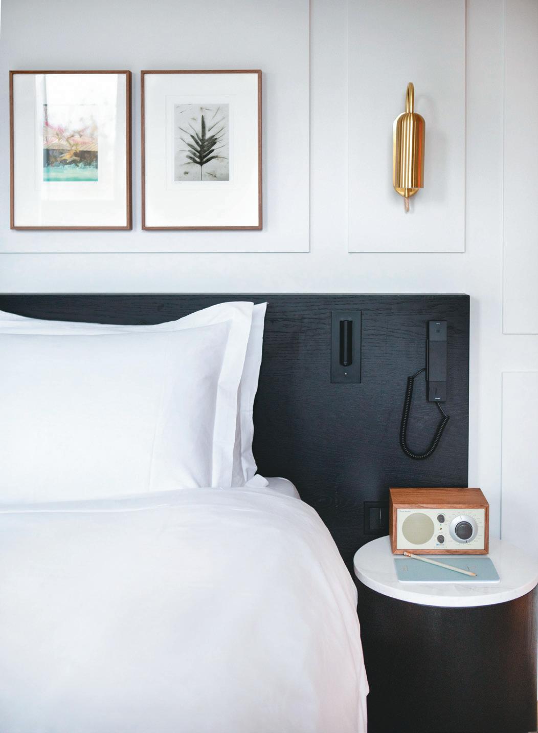
Restoration of this building distinguished by its original brickwork and exterior gables, interior tiling, high ceilings and tall windows also saw the creation of a sensitively designed new wing. Within both the new and old sections of the site, the interiors have been designed to strengthen the building’s connection to Oosterpark, with Studio Linse bringing softness, warmth and serenity into a space now encompassing 88 guest rooms, a lounge, restaurants, a bar and urban spa.
“We wanted to create a calm, comfortable interior that embraces you in an elegant and restrained way,” says the founder of Studio Linse, Paul Linse. “I try to find a strength in less. The main objective here was to turn
48
prevIous page: A vision of contemporary comfort
Left: Blue and orange tiles decorate the walls
this university building, which was also a laboratory, into a tactile place that feels open and inviting.” For this project, the design studio leaned towards its signature style of ‘noble simplicity’ to harmonise with original details of the listed building, where blue and orange tiles decorate the corridor walls and stained-glass windows feature in the brick and tile stairwells.
“We began by looking at making the interiors flow naturally as a hotel,” says Linse. “Then we looked at decorative aspects to create space that is simple and restrained, but in its own rich and tactile way. We wanted to bring the textural quality of the park inside while keeping the colours similar in tone for a sense of calm. Together, I think this calmness and tactility make for a softer, warmer space.”
These interiors feature the rugs of 1839-founded Dutch manufacturer Van Besouw, with contemporary furniture in white, black, grey and natural tones then inviting you into each light-filled area. “Rather than having iconic individual pieces of furniture, it was more about creating the feeling of the interior as a whole,” Linse explains. “I’m most interested in how people feel in that space. We wanted to make it more about the totality.”
Artwork is an integral element to the overall feel of the finished hotel’s interiors. The works of prominent artists, selected from the owner’s personal art collection, feature throughout the corridors and public spaces including Fitz’s Bar, which is now home to a 1943 print of Dora Maar by Picasso. The Dutch artist Raphaël Hermans then created a series of parkland-inspired prints for each guest room.
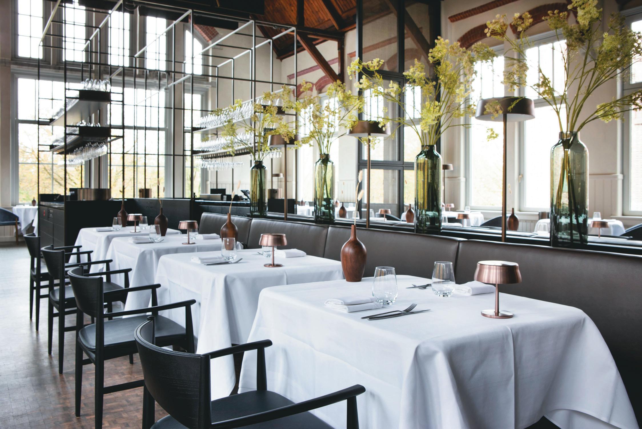
The hotel’s fine dining restaurant, Van Oost — helmed by chef Floris van Straalen — takes over a cavernous 15-metre-high hall with tall windows amid the park’s
BeLoW IMage: Clean lines adorn the bedrooms
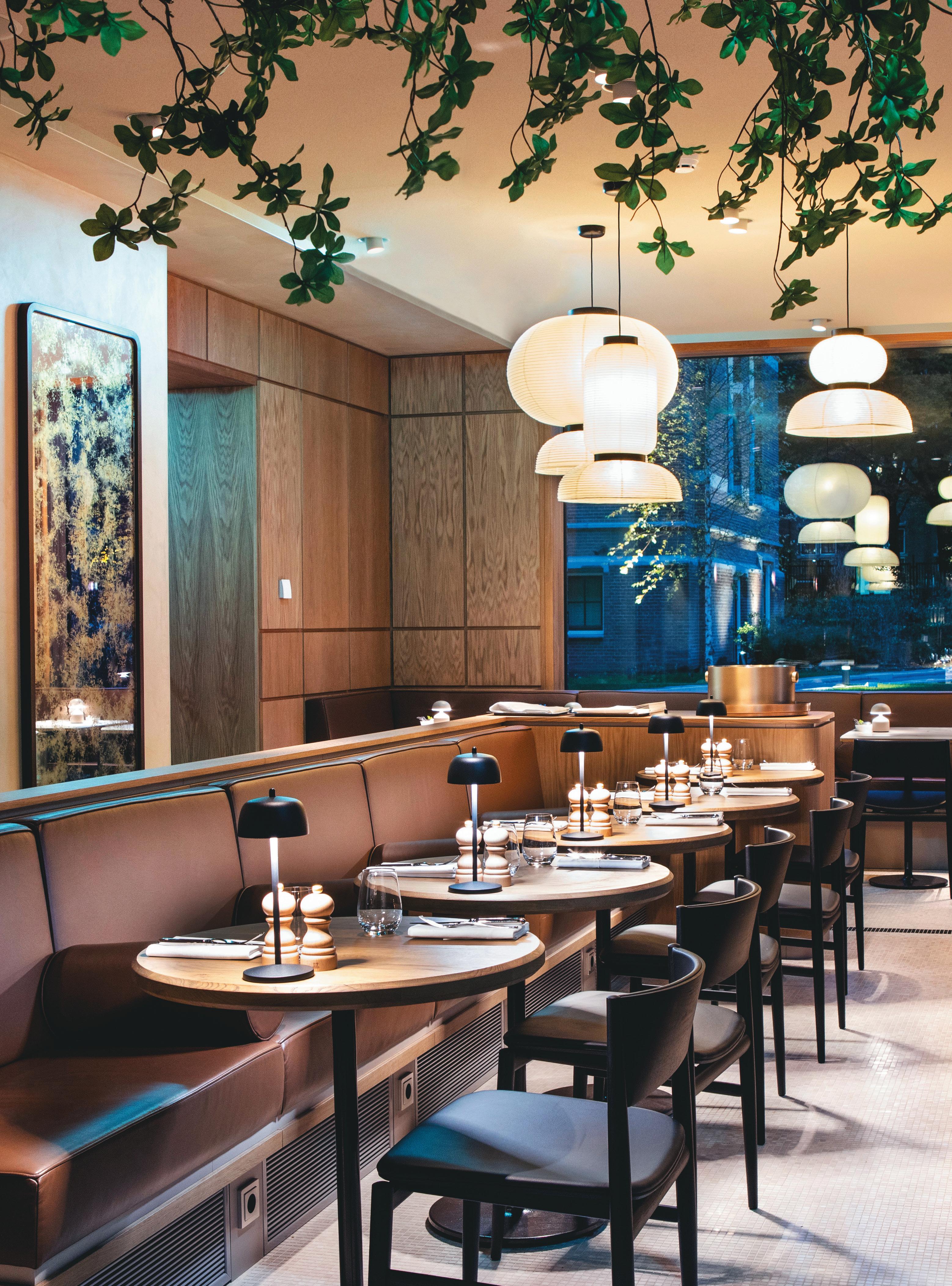
IMage on opposIte page: Lighting variation lends itself to the ambience
50
51
trees, industrial elements still visible in the gabled ceiling and a contemporary open kitchen. The more laidback Spring Café Brasserie opens out to the park, with floor-to-ceiling windows and contemporary décor incorporating natural materials and a full-size tree.
Fitz’s Bar takes on a low-lit, speakeasy style, with wood-panelling and splashes of red in the sophisticated furnishing. In the warmer months, the hotel will open up its panoramic rooftop bar. Just off the entrance, the guest-only Living Room provides a tranquil space, featuring a library wall and abundant artwork, for work or relaxation. More serenity can be found in the hotel’s urban spa, which is sleekly designed in natural tones with health-giving facilities including a privatised sauna, hydromassage bed and gym.
Which of these spaces stands out most to Linse? “I’m really happy with how the hotel’s guest rooms embrace you. But if I were to pick one standout space it would have to be Van Oost,” he says. “During the day, especially in spring and summer, if you sit there and look around you, all you see is trees and birds – it’s really wonderful.”
aBove IMage: An abundance of light
52
Destination Focus: Island of Ireland
The island of Ireland is a hotbed of innovation and a ferment of ideas. In terms of development, it is also mostly a tale of two cities: an increasingly European, progressive Dublin and a remade Belfast, which has transformed its troubles into tourism and is now seeing ferocious economic growth.
It is against this backdrop that creativity in interiors is prospering – thanks to global, powerhouse employers, hungry for workspaces that are fit for the future; educational institutions that are eager to attract the best and brightest with imaginative and inventive environments; and design firms themselves, which aim to showcase prowess and clout, through both their client work, and their own impactful, beautifully realised studios.
This issue we explore examples of all of these, with some of the latest projects demonstrating why the Emerald Isle is far from green when it comes to design.
53
Building better
case stuDy: pWc BeLfast
At pWc’s Belfast workplace, Merchant Square, BDp envision the workplace of the future, for today.
WordS: harry MckInLey
photogrAphy: phILIp vILe
IMage on
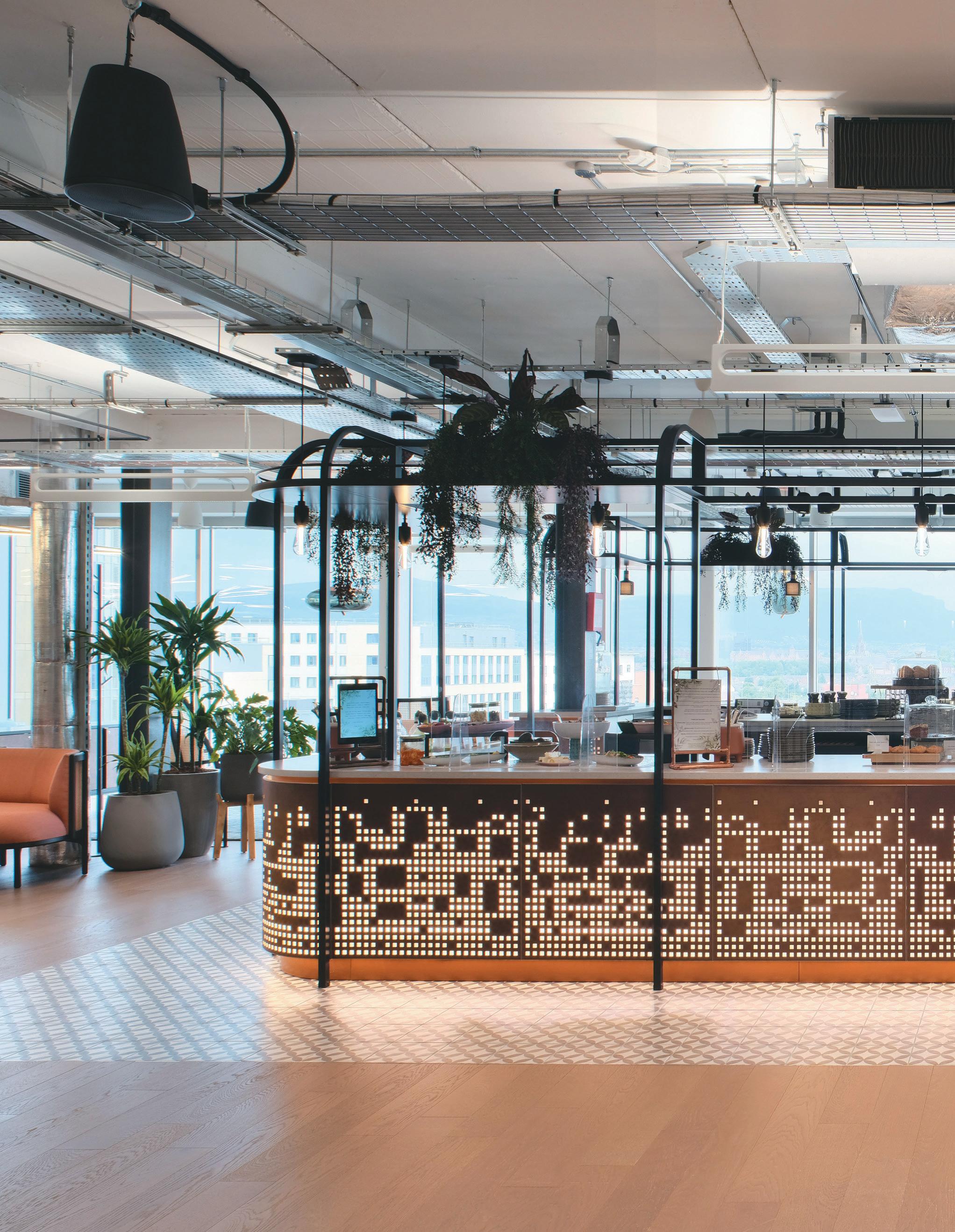
prevIous page: A clever play on lighting
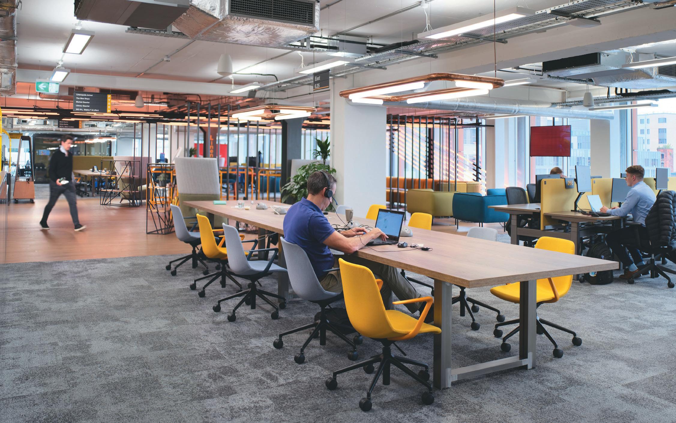
aBove IMage: Flexible desks for different working styles
The daffodil yellow Samson and Goliath cranes are among Belfast’s most recognisable icons. They stand as totems to the city’s once global importance as a centre of industry, looming over a shipyard that birthed the Titanic and handsome warehouses that date to Belfast’s ‘world linen capital’ epoch.
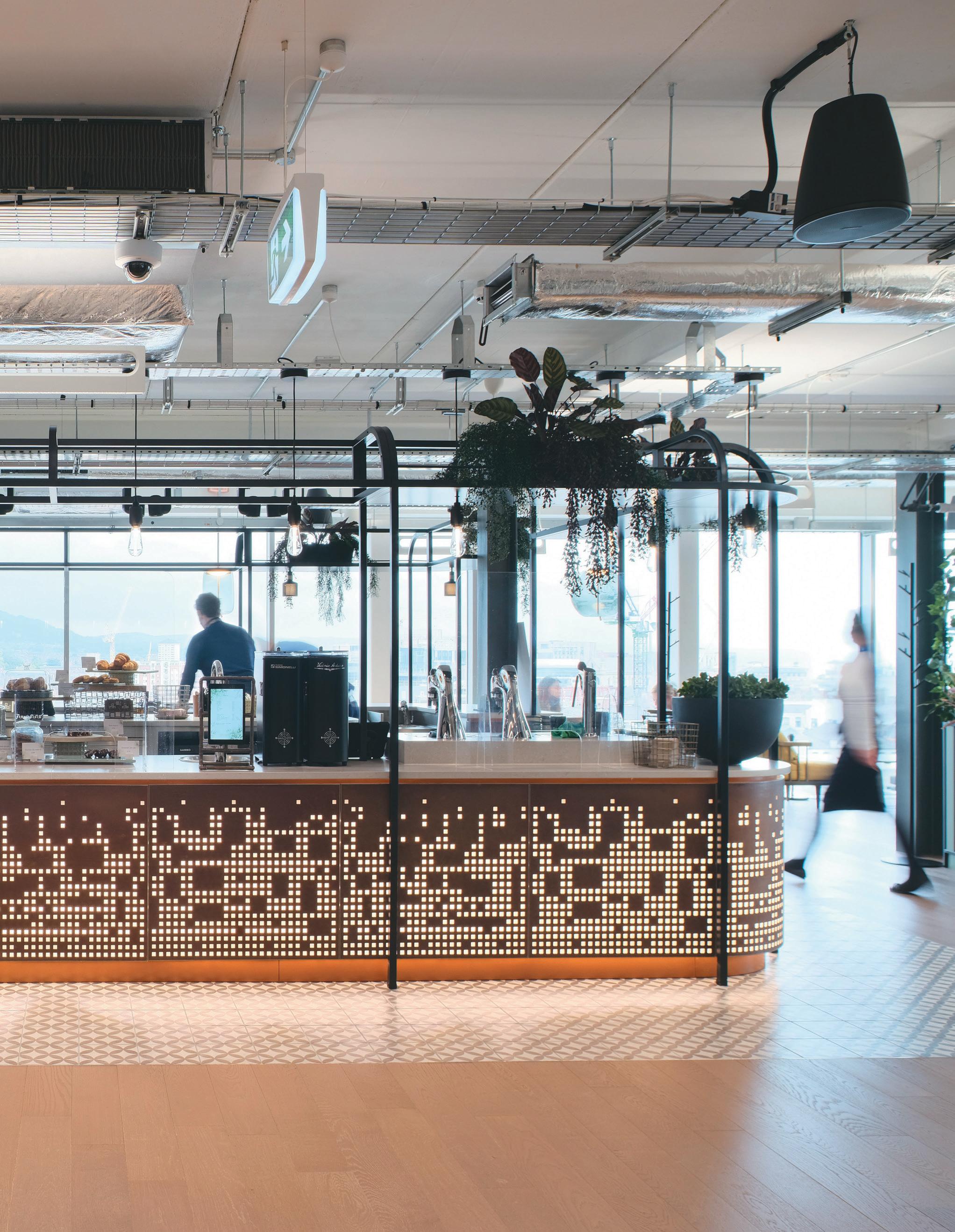
Today though, it isn’t gilded ocean liners and genteel fabrics that drive economies, it’s the likes of PwC, one of the Big Four accounting firms and comfortably one of Northern Ireland’s top 20 employers. PwC’s Belfast HQ is the company’s largest workplace outside London, spread across the 9-storey Merchant Square building and with room for almost 3500 staff at full occupancy. From its ninth-floor social space – a wraparound café with floor-to-ceiling windows – there are panoramic views over the city centre to the swelling Belfast hills beyond; those emblematic cranes now framed as a living postcard.
In what was Belfast’s largest private-sector office letting deal at the time, PwC moved from a River Lagan-hugging complex to its new home to accommodate a briskly expanding team and to better connect with the energy and dynamism of the city – now just a few minute’s amble from City Hall and the arterial Royal Avenue. On design, BDP was drafted to devise a workplace fit for the future, with wellness, sustainability and adaptability at its heart.
“The development of Merchant Square is the blueprint for the future workplace and addresses many of the questions about the role of the office,” says BDP Interior Design Associate, Paul Stubbings. “The variety of spaces and settings, coupled with the innovative application of technology throughout the building, supports the firm’s ‘Empowered Flexibility’ initiative, providing employees with the freedom to choose to work in a way that suits them.”
56
58
This flexibility means the banishing of allocated offices and banks of assigned desks and, in their place, community spaces and anchor points, where different departments and teams are vaguely – but not strictly –positioned. Order is maintained through the neat use of technology, with an app for meeting room bookings and large digital Freespace boards, with real-time illustrations of which areas are free or taken. Digital lockers are also available for 72-hours at a time, for ditching belongings. This commitment to tech solutions extends to a fifth floor ‘tech bar’ where employees can avail of instant help with troublesome devices or hiccupping software, and even hit ID-activated vending machines stocked with chargers and spare cables.
With team members expected in 60% of the working week, Merchant Square is positioned as a lively community hub, as much as a place of productivity; a centre of both working life and social life. Internally, this means cultural and lifestyle programming – from
yoga and language classes to sports screenings and a running club – while the ninth floor is also a space to host meetings and events for those outside the organisation, including local social enterprises and charities. It’s all part of a drive by PwC and BDP to ‘humanise’ the workplace and, in turn, encourage users back – offering facilities and services that enrich. It’s not just in the programming then, but baked into the concept and design of the project, with gently-lit, infinity-roofed respite rooms; treatment spaces that can be used for counselling services or a muscle-pummelling massage; and even a multi-faith prayer room with a built-in sound system. The PwC logo itself can only be found as part of the interior twice: in the grand lobby and in the client-welcoming café, an attempt to shirk off any overt or oppressive ‘corporateness’.
At Merchant Square the expectation of staff is rewarded with a building that operates in service to them. At the scan of a QR code, food and drink can be ordered
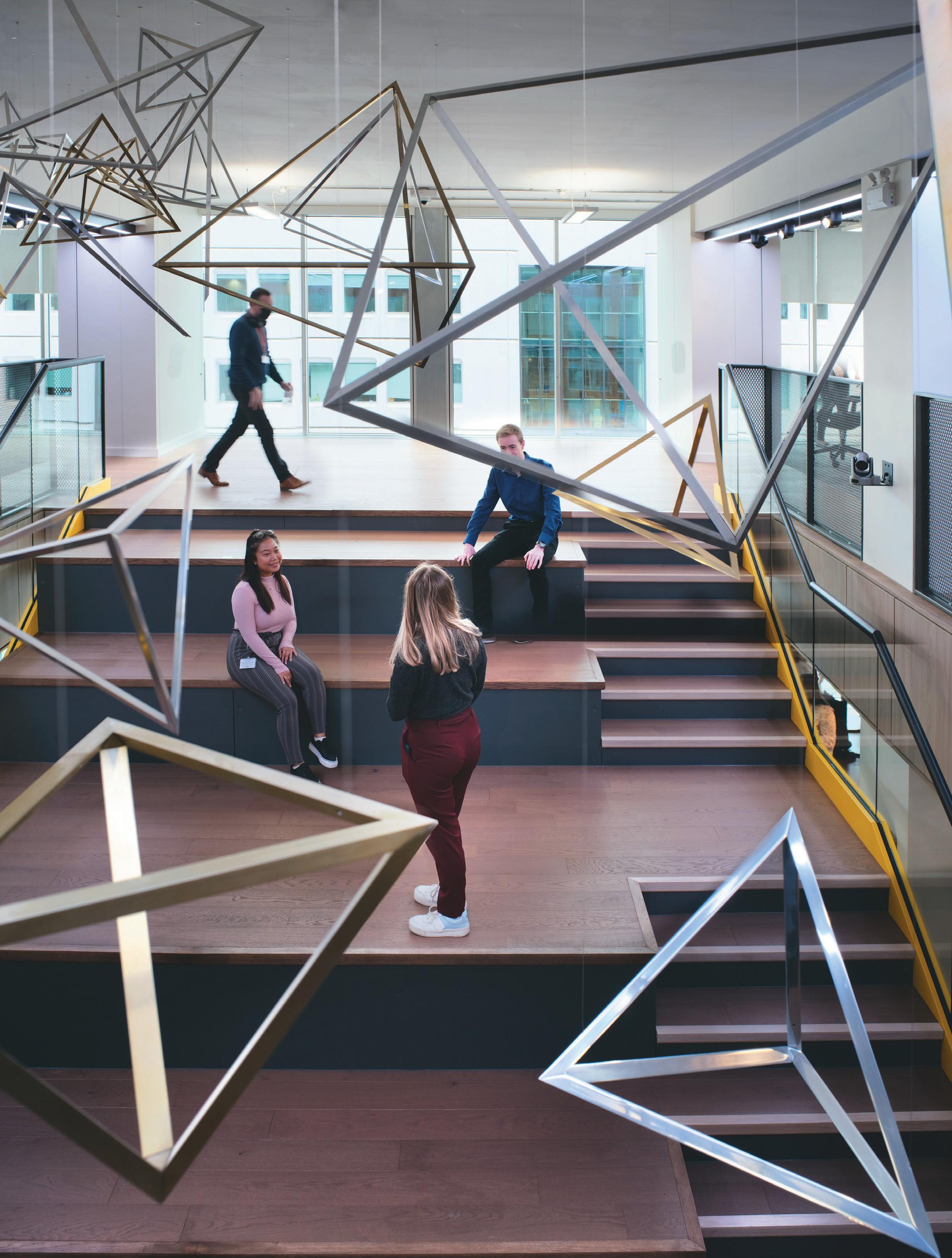
opposIte IMage: Bold geometric shapes
59
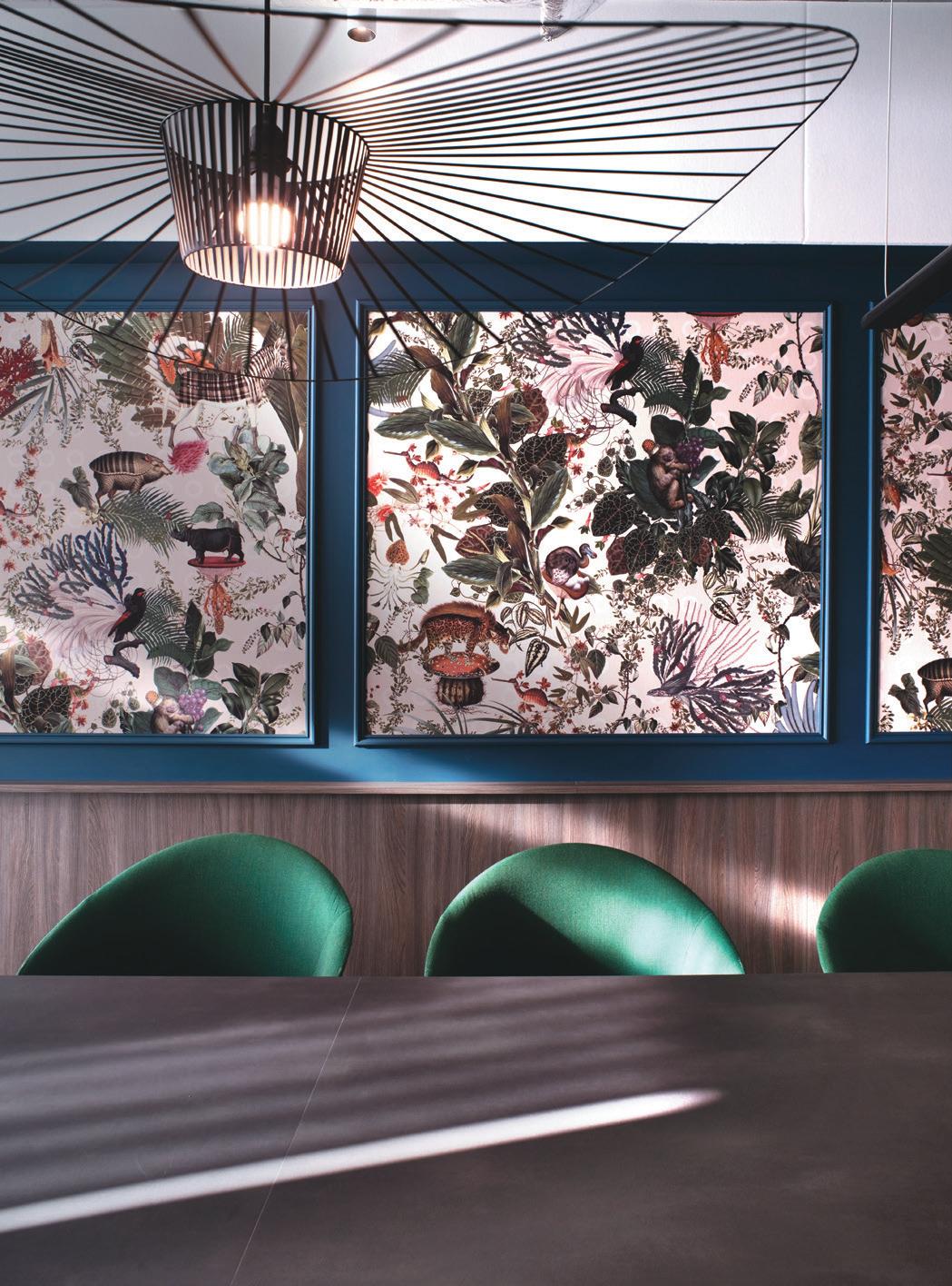
directly to meeting rooms prettified with tropical Moooi wallpaper. Something not quite right? Codes are similarly dotted at various points on floors, for employees to report any ad hoc niggles.
More broadly, it celebrates and emphasises a sense of place – contemporary lighting in the shape of the Lagan, motifs inspired by the Giant’s Causeway and a ‘secret garden’ that draws influence from the Victorian Botanic Gardens of South Belfast. The ‘wee steps’ (a throughway between three floors that doubles as seating) are a wink to Samson and Goliath, intended to support agile working and create flow not just between spaces, but ‘mindsets’. The Harland & Wolff crane gantries are also a reference in the designs for the Service Hub.
“Ultimately, the success of a new office will not be measured on architectural and design excellence, but on the impact it has on the people who use it,” explains Stubbings. “The effect it has had on PwC’s employees has been transformational. Equally, PwC’s aspiration for the office to be a catalyst for ‘Creating Communities’ within and beyond the organisation, is a powerful statement, the success of which can already be evidenced in the impact it has had on the area of the city centre and the transformational connections being created with local communities.”
top IMage: A blend of blues
BottoM IMage: Tropical Moooi wallpaper
60
Once and future
MAStercArd’s European Tech Hub lands in Dublin, designed by Ia InterIor archItects to work for the future.
WordS: chLoe petersen sneLL
 case stuDy: MastercarD DuBLIn
photogrAphy: DonaL Murphy
64
A short tram ride outside of Ireland’s bustling capital lies Mastercard’s only European Tech Hub, located at the bottom of the Dublin mountains in Leopardstown. The new, state-of-the-art campus is the headquarters of the company’s global research and development division and positions them as a tech firm fit to rival southern suburb neighbours Microsoft, with the space to accommodate optimistic expansion plans.
The arrival of the campus marks Mastercard’s commitment to Ireland and is testament to the enduring nature of Dublin as one of Europe’s leading tech hubs. Ireland began to establish its tech credentials with the arrival of Google, which moved its European headquarters to Dublin in 2004. Now, the city’s docklands area has garnered the nickname ‘Silicon Docks’, home to the likes of Amazon, Meta, Hubspot and Salesforce.
Designed by IA Interior Architects, Mastercard’s five-storey workplace was created using positive environmental design principles, focusing on neurodiversity, sustainability, wellbeing and collaboration. Collaboration in particular is championed, and the new building supports the company’s ‘Future of Work’ approach to where and how their employees collaborate. The project at One South County is the first business in Ireland to achieve a LEED Platinum certification – and it’s clear this new scheme isn’t about showing off, it’s about crafting a genuinely healthy space to work.
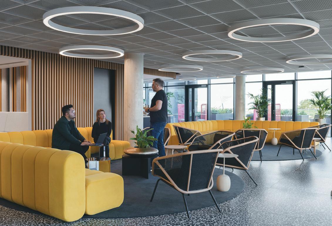
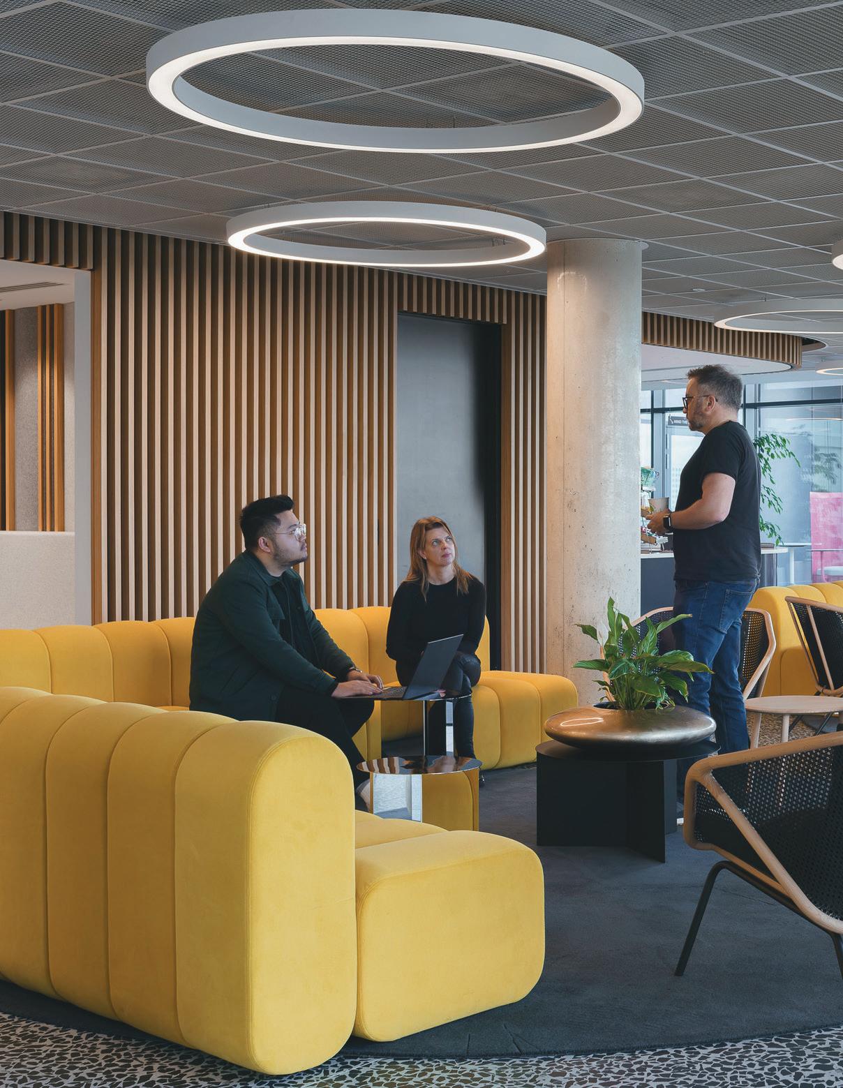
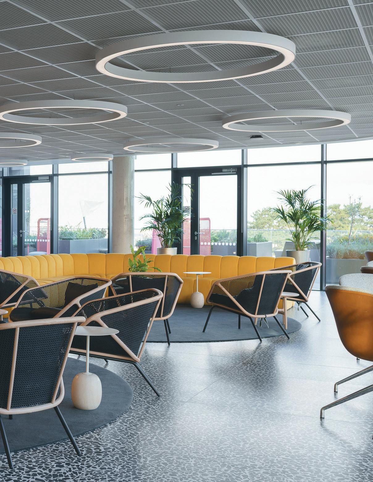
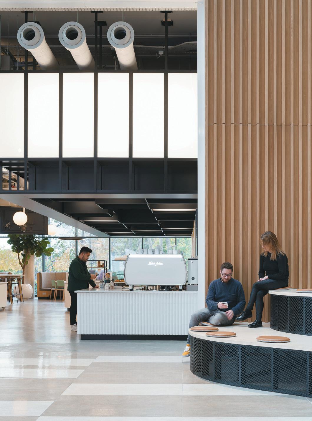
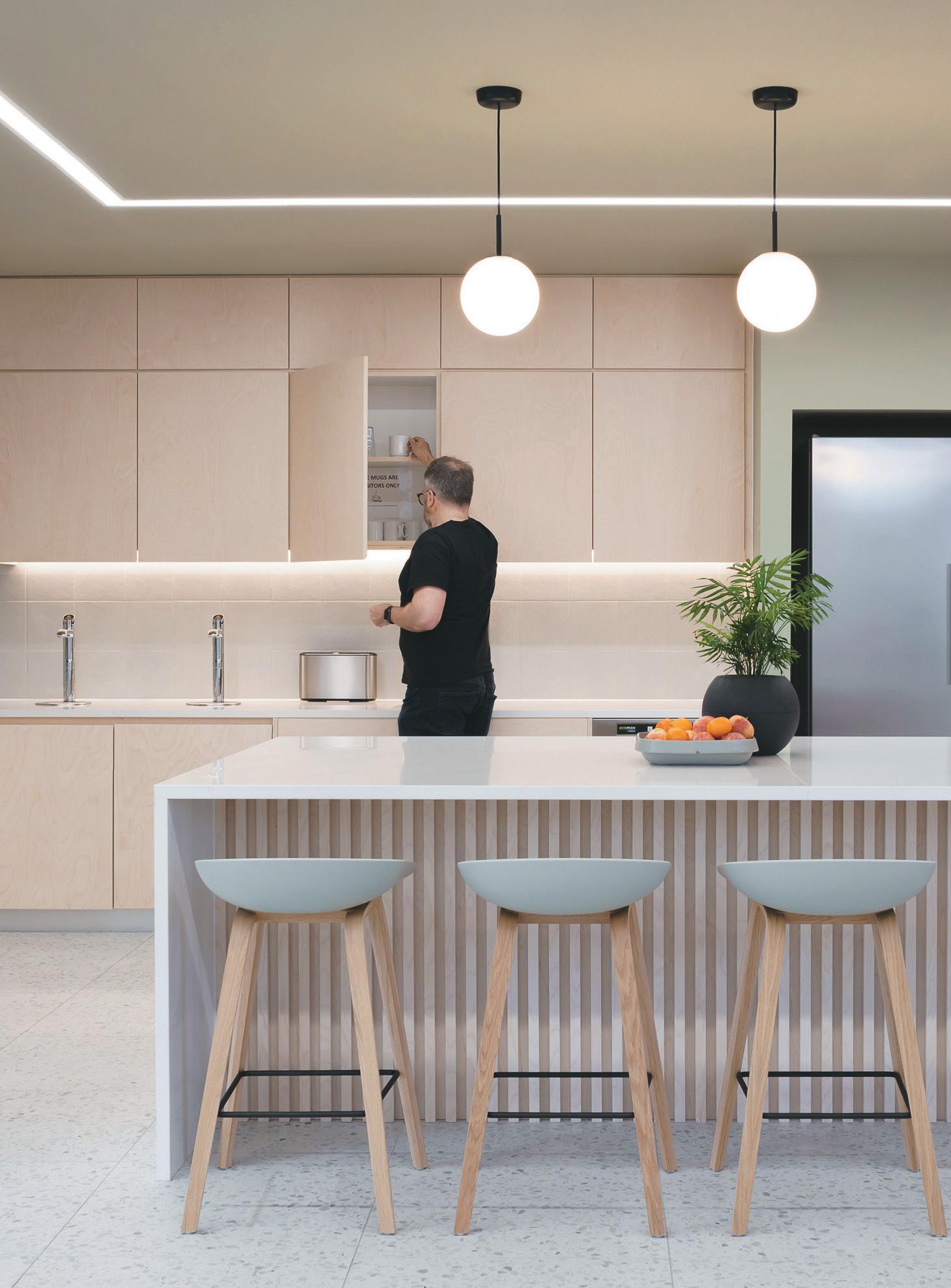
Diversity within the design was important for both Mastercard and IA – this was achieved by creating a variety of space types, soft tones across floors, and subtle colour coding that extends to the diverse and plentiful furniture choices. Floors are linked together by spacious seating areas, constantly animated by chance meetings between workspaces. A braver choice of colour and materiality is found on the fourth-floor barista café, in black and white terrazzo flooring and curved, Mastercard-yellow BOB sofas by Blastation overlooking a vista of mountains, sea and parkland. The yellow-circle motif is repeated downstairs in the full-service kitchen and canteen, which doubles as a Town Hall location, accommodating up to 400 people and featuring one of the largest AV screens in Europe.
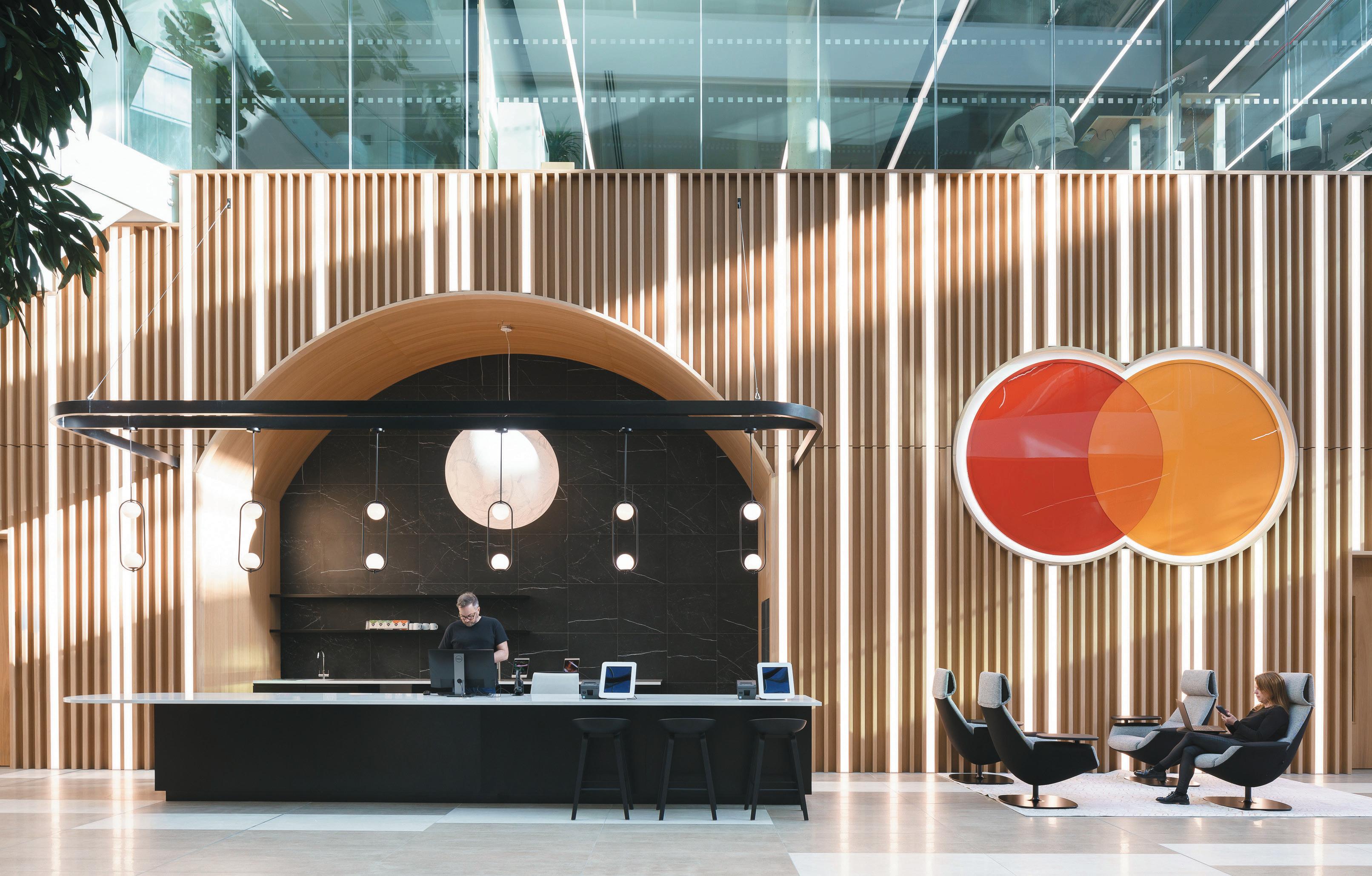
“Due to lockdowns and other restrictions, we chose finishes, furniture, and fabrics based solely on online images, which was far from ideal,” says Cornelia Murphy, IA Dublin’s managing director, “and we’re grateful that the design decisions we made ultimately turned out well. We did make some bold design choices – the yellow sofas and huge light installation in the lobby for example – but Mastercard supported these, and they are feature items enjoyed by the team.”
cLIent Mastercard
archItect
IA Interior Architects
InterIor DesIgner
IA Interior Architects
fLoorIng
Interface, Tilestyle
furnIture
MJF Interiors, SIG Interiors
JoInery Specialist Group
LIghtIng
Premiere Electrics
IMage on prevIous page: Barista café
opposIte page, cLockWIse froM top Lobby area featuring moonlike pendant lighting
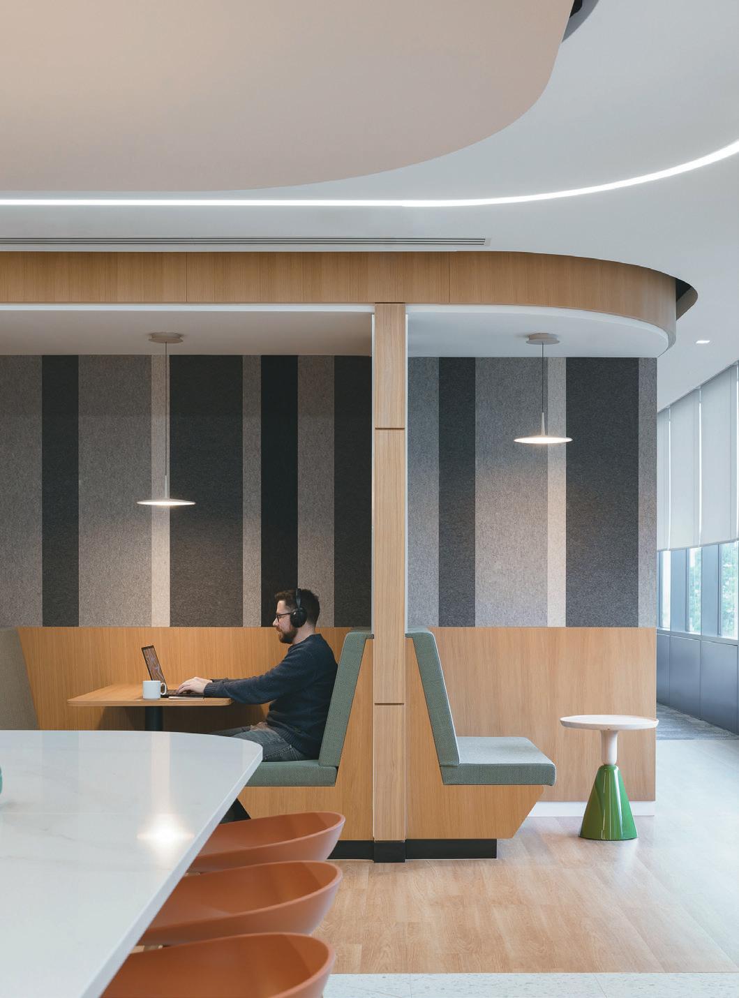
Booth-style seating
Town Hall and café
65
A full-storey atrium makes a confident first impression, in part due to the bespoke moon-like pendant above reception, which Murphy assures us weighs a tonne and was a logistically challenging (albeit impactful) design choice. Circles and curves are certainly an intentional theme throughout the building, playing out in the furniture, lighting and internal architecture.
As an industry behemoth with a huge, global reach, incorporating a subtle sense of locality into the space was important to Murphy and her team. There was some flexibility in the global guidelines, she notes, and enough to allow the scheme to fit in with the surrounding environment. The obvious nods come in the shape of towering graphics of Ireland’s picturepostcard-worthy green hills and dramatic coastlines lining the stairs in between floors, and a vibrant, handstitched ‘shamrock’ acoustic wall.
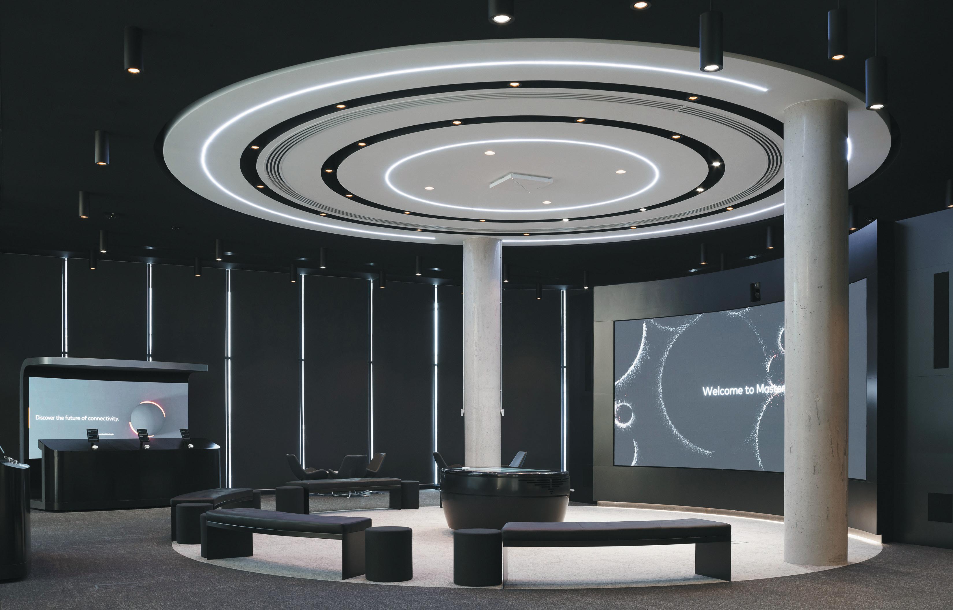
Innovative specialty spaces include Mastercard Experience Centre, which is accessible before the turnstiles and showcases what the tech giant is so keen to promote: their latest commerce innovations. Inside, visitors discover a circular theatre space, wrapped around a curved presentation screen. “We built the ceiling’s plywood frame on the ground and then lifted up the entire structure – another fun challenge!” Murphy adds with a laugh. Worth the hassle, and reflected in the similarly curvaceous seating and sleek pebble-like podium, reminiscent of an alter and pews. When dimly lit, the room is punctuated by an on-brand orange glow from the ceiling and walls.
On the workspace floors, health and wellness was paramount throughout the design, incorporated through planning and materiality strategies which include new interconnecting stairs, a micro-farm hub, gaming areas, wellness rooms, and health/fitness facilities. Wellness tenets included prioritising high-quality natural light, generous workspaces, abundant planting, quiet spaces and nimble ‘hideaway’ rooms and corners scattered throughout the floors.
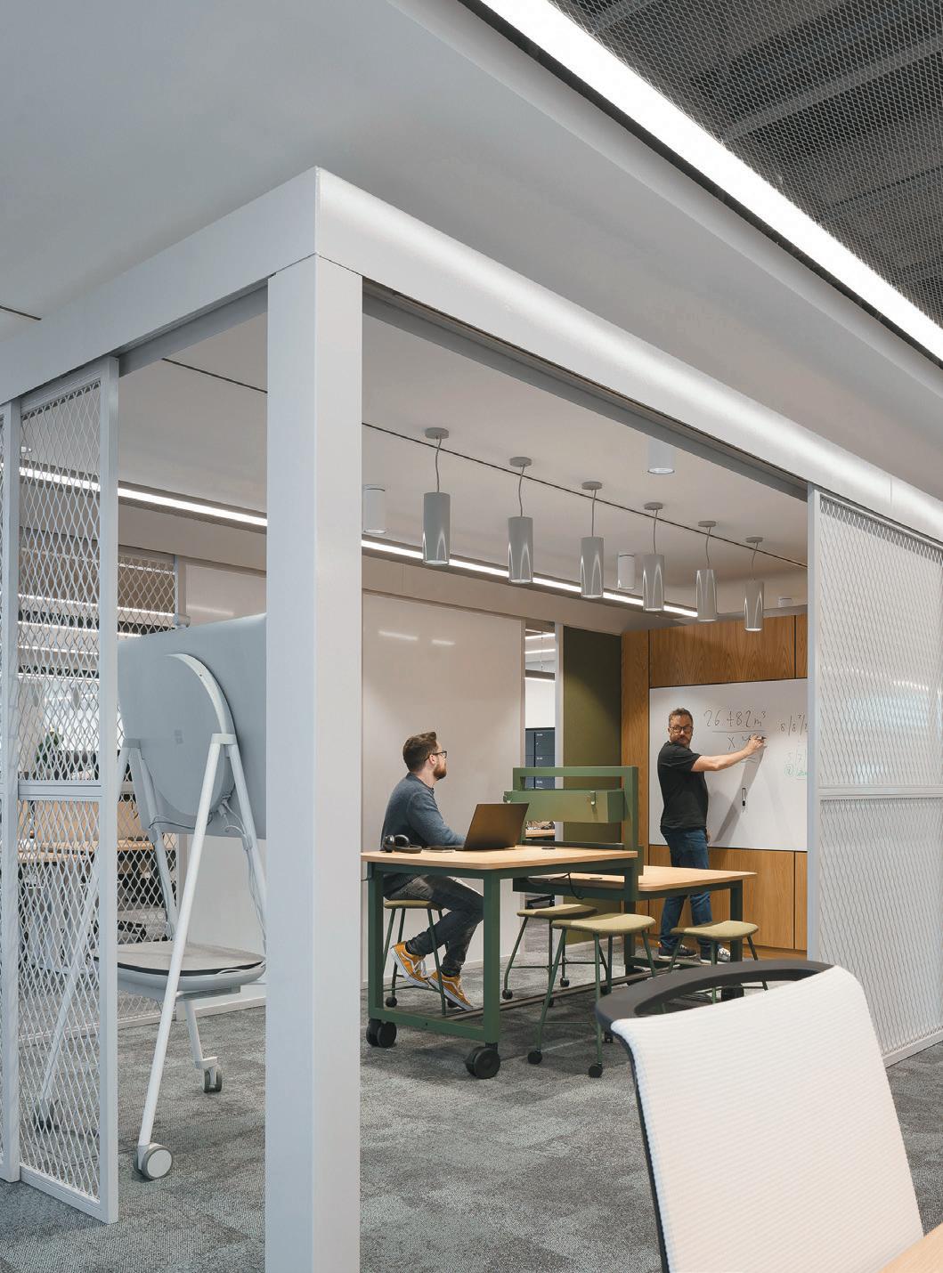
An agile, “frictionless workplace” concept enables users to add, move, or take away dividing panels to control acoustics and privacy, plus access to writable surfaces and colourful portable seating. Purpose-built collaboration zones sit in the middle of each team ‘neighbourhood’ to encourage conversation and creativity – which Murphy affectionally refers to as ‘mosh pits.’
While designing for functionality, above all the team considered the importance of inclusivity for all, including people with different neurological preferences or sensitivities. “This meant carefully selecting finishes, colour schemes, patterns, considering natural light and lighting design, comfort levels, wayfinding, and acoustics,” Murphy explains. “All of these elements can impact people with different sensitivities to sensory stimuli, whether they are hypersensitive or hyposensitive. The goal was to create an environment and experience that is truly inclusive for everyone.”
opposIte page, cLockWIse froM top Mastercard Experience Centre
Neutral palette in kitchens
Purpose-built collaboration zones
66
67
Contrast or compete
case stuDy: one eLMWooD
At Queen’S univerSity’S one elMWood, haWkIns\BroWn consider the marriage of form and function for the next generation, and beyond.
 WordS: harry MckInLey


70
IMage on
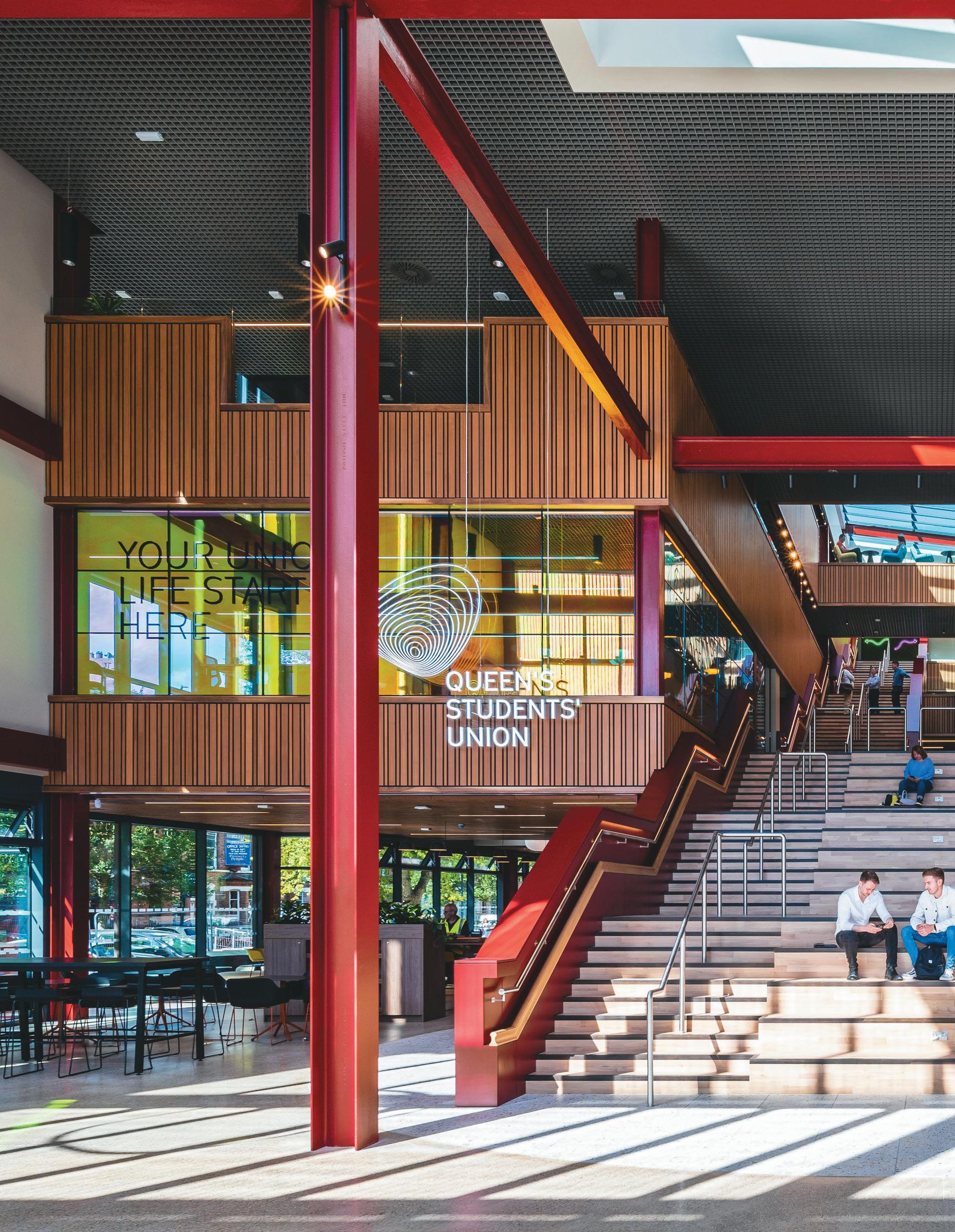
prevIous page: The heart of the campus at Queen’s University, Belfast
opposIte
top IMage: Low and high seating configurations
BottoM IMage: View of the Lanyon building
The imposing Lanyon building and its manicured lawns are the showpiece of Queen’s University, Belfast –gracing glossy brochures, the subject of the university’s website banner and even emblazoned on tourism posters at Belfast’s airports. Dating from 1849, Lanyon is one of the city’s most important landmarks, bordered by well-mannered, tree-lined streets and part of an intellectually-minded area that also includes the Ulster Museum, mere metres away.
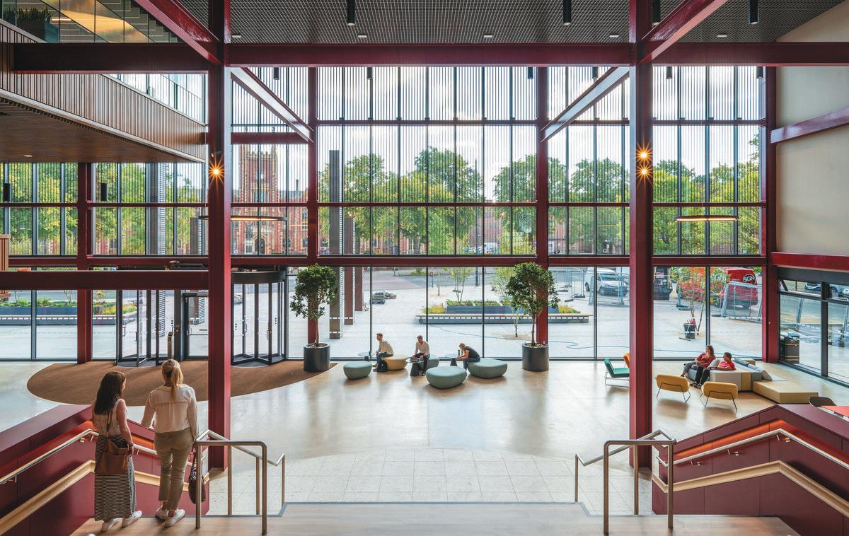
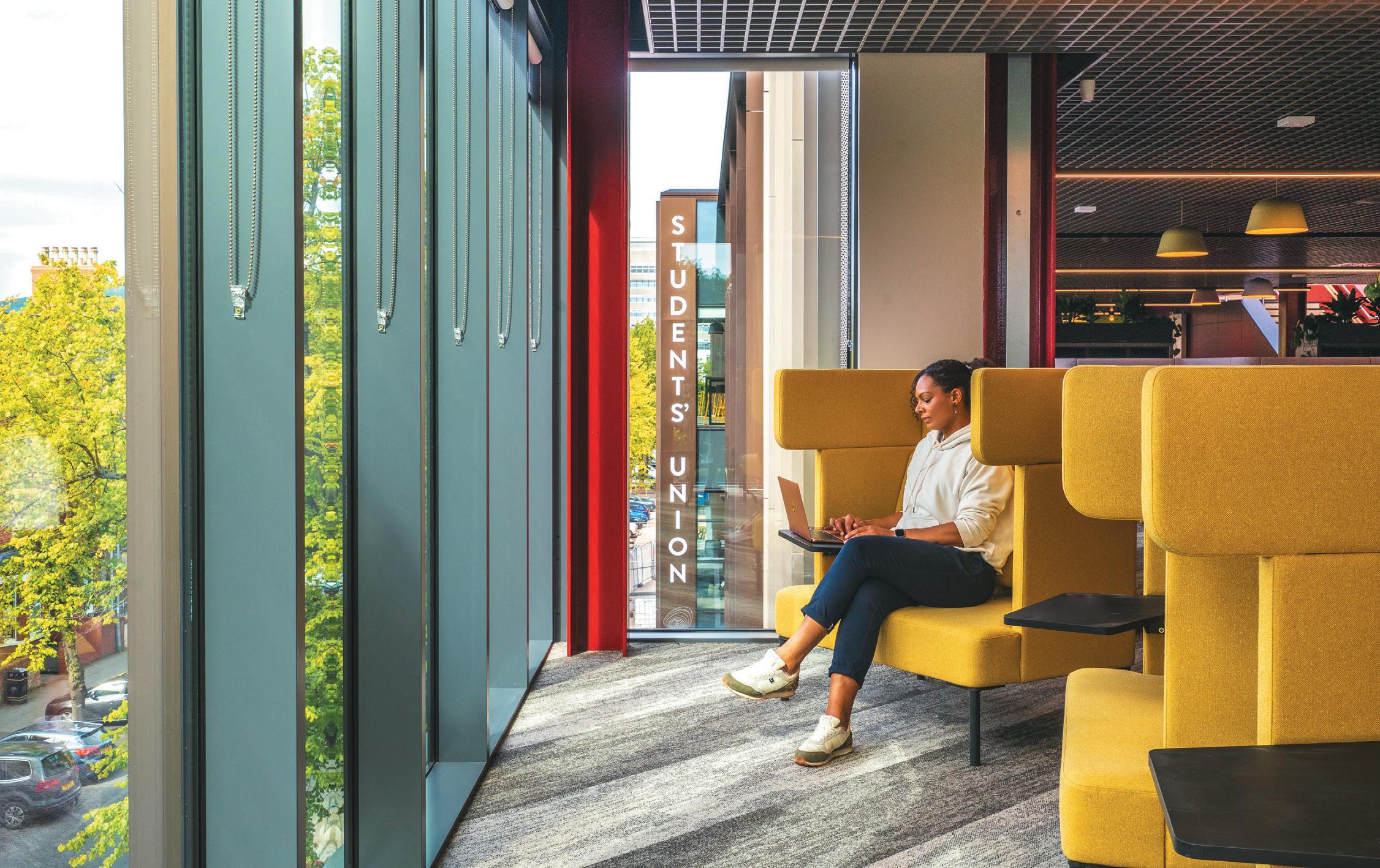
The same could not be said of the former Students’ Union building that once sat opposite; tired, architecturally humdrum and, inside, devoid of any creativity-stirring personality or design chutzpah. When Queen’s made the decision to raise it then, in favour of an ultra-contemporary new build (One Elmwood), Hawkins\ Brown was gifted a clean slate.
“Our brief was to create a new heart for the campus, locating the Students’ Union and University Services in one place for the first time,” says Julia Roberts, the practice’s Education and Research Sector Lead. “It was an opportunity to establish a single focal point that would become the epicentre of life on campus and the heart of the student community.”
Hawkins\Brown – in partnership with the Belfastbased RPP Architects – opted not to compete with Lanyon or challenge its architectural dominance, but to ‘complement’; devising something that would act as a counterpoint both in style and ideology. On the former, it means a vast, multi-storey glass frontage that looks out to Lanyon while, on the latter, an emphasis on today’s cultural and social mores; as opposed to centuries-old orthodoxy. One Elmwood also doesn’t just take into account the wider Queen’s University estate, it equally considers the flanking, mostly late 19th century residential streets and other historic sites nearby.
“The new building respects the listed buildings that immediately surround, both in terms of building line and massing,” continues Roberts. “The bay windows on Elmwood Avenue take reference from the projected bays on the Lanyon building, while the vertical emphasis of the facades references the surrounding buildings, such as the Catholic Chaplaincy.”
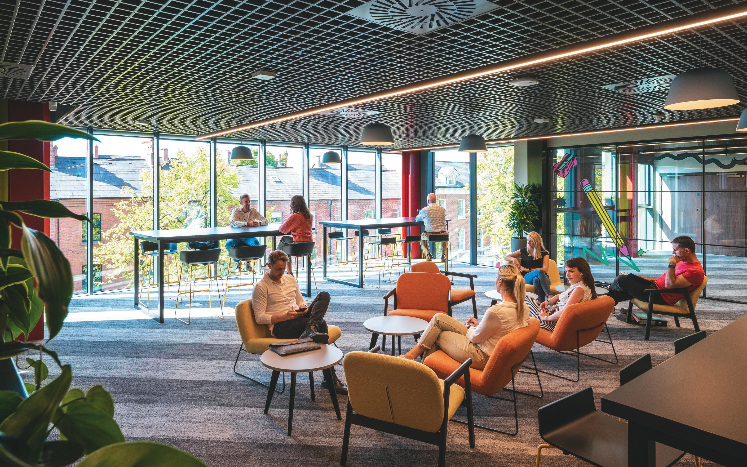
On the ideological and practical front, inclusivity is an important theme. As a modern hub servicing diverse users, there was an understanding from the outset that the project would have to be future-proofed and work
71
for all. Attention has been paid to clear wayfinding, to reduce ‘confusion or distress’ that may be caused to students or staff navigating the building. In terms of offer, there’s an alcohol-free social space – leading out to a compact roof terrace – for those who wish to congregate with peers, minus the beers.
Overall, One Elmwood has been conceived as an immense ‘container’ within which different functions and needs are facilitated. It’s less a consolidated collection of rooms and more a box, within which different spaces are, as the studio describes, ‘hanging’.
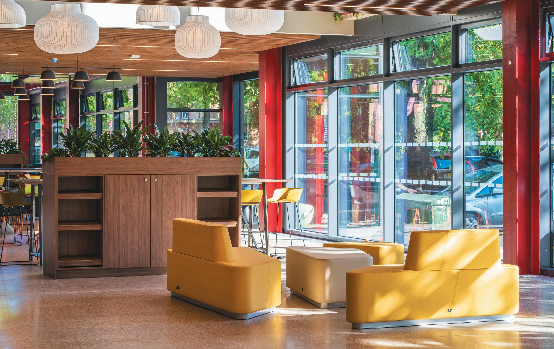
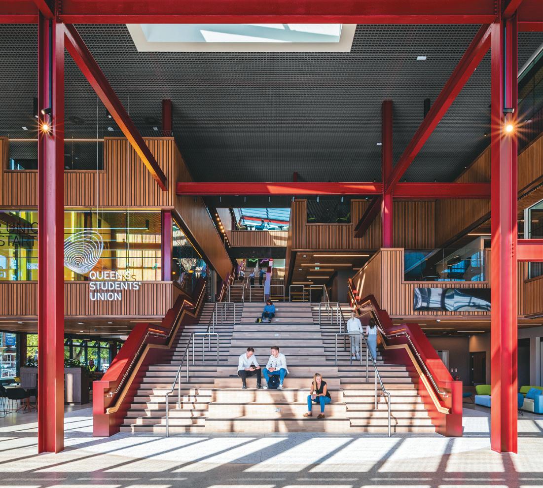
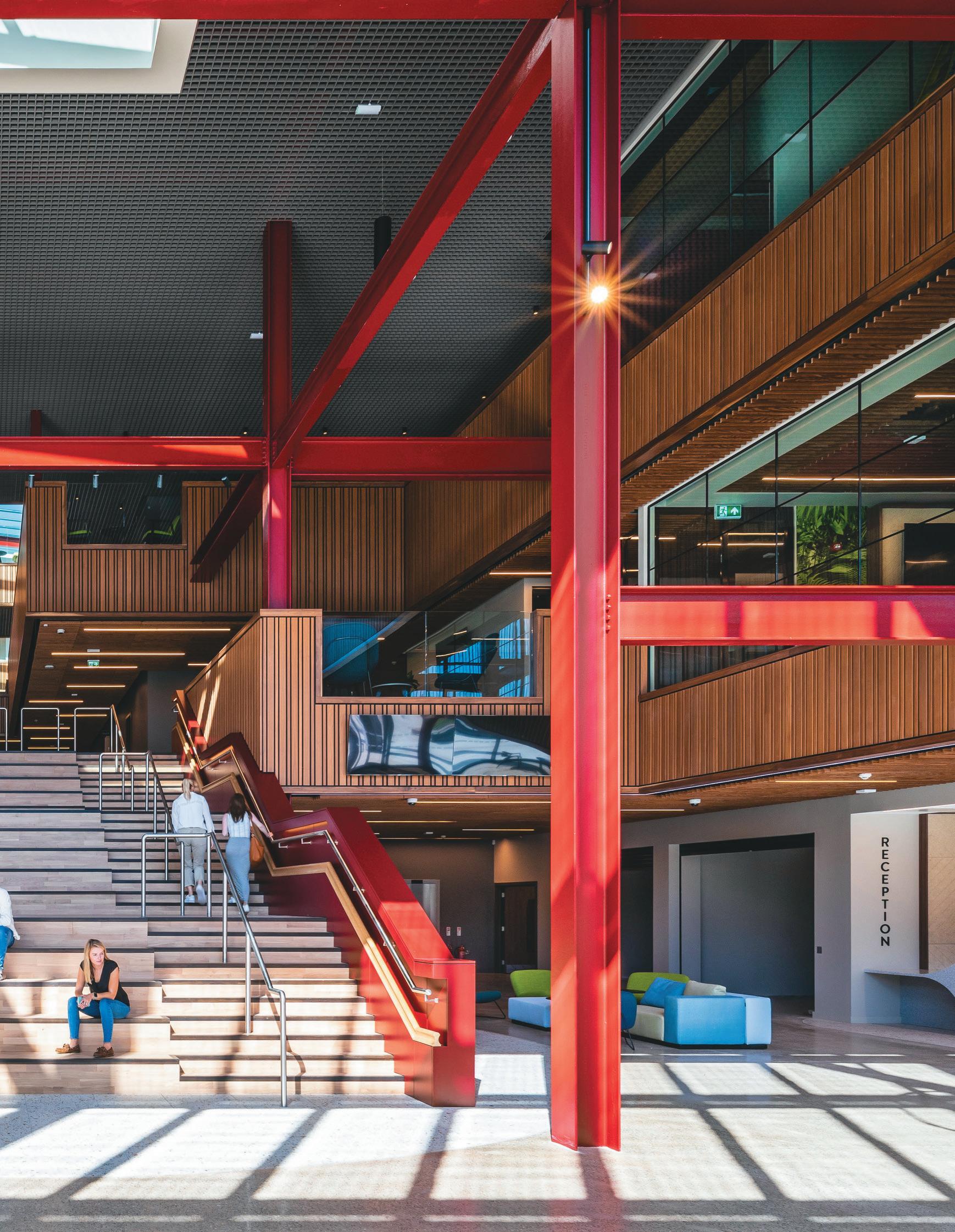
A large, flexible, full-height foyer is both an arrival area and a forum to meet and relax – bordered by shops and cafes the deeper one ventures at ground level. A wide social staircase, that doubles as seating, leads users up and into the building, where spaces become more contained upon ascending – the openness of the entry giving way to smaller staff offices or quieter student workspaces. Suspended walkways and mezzanines are peppered with tables and chairs, creating regions that are not only part of a journey through the building, but functional and purposeful; part of the broader vision for a ‘permeable’ destination with ‘multiple thresholds’. There’s a maturity to the colour palette and materiality: deep reds and fetching timber detailing.
opposIte
top IMage: Bay windows reference the adjacent Lanyon building
BottoM IMage: Yellow upholsteries brighten the interiors
“Furniture is used instead of fixed walls to break up the larger floor plates, while scenario testing was carried out early on, to test the floor plates’ adaptability,” says Roberts, on the ambition to build less, but at a higher quality, while also allowing for agility and evolution in how specific spaces are used.
While One Elmwood’s second floor features one of the longest bars in Belfast – ticking the box of a day-to-night hangout spot – it’s in the other primary touchpoints that the project perhaps most represents innovation in thinking and approach; a commitment to delivering positive outcomes for fee-payers. Hawkins\Brown worked closely with Queen’s on a progressive new strategy for student services, co-locating various functions and departments to help break down barriers to access – be it financial assistance or mental health support. The result is a single space that operates as a kind of ‘triage service’, supporting the student experience from enrolment onwards.
“We took great care in creating an inviting, functionagnostic space where students can access the support they need without feeling exposed or intimidated,” concludes Roberts. “Our experience designing One Elmwood has spurred us into embarking on further research, investigating the impact of architectural design on inclusivity and student wellbeing.”
72


73
A new slate

case stuDy: 21spaces
21spaces layers hospitality and workplace design at dublin’S MeSpil roAd, a new home for branding and advertising agency sLater DesIgn.

WordS: chLoé petersen sneLL
photogrAphy: ruth MarIa Murphy
From the outside, Slater Design’s workplace blends into a row of Georgian Dublin terrace houses. No signage, no flashy reception on display to passers-by. Across a charming grassy canal, the antithesis looms in the form of LinkedIn’s European HQ, which takes up five new imposingly slick buildings. A different approach to workplace, perhaps, but both with a shared goal of enticing team members back into the office.
“The design arose out of a post-COVID era where we were tasked with designing for a completely different way of working,” explains 21Spaces’ Jean Delaney. “This meant that while it had to deliver a high level of functionality from a workspace perspective, it also had to feel like a home-from-home environment, where staff could readapt to the working world once again.”
All three levels of Slater’s new office are connected through a refined and considered material palette, utilised in different ways across each floor to zone and create focal points within each area. Decadent Georgian details have been restored, a background to bold pops of colour and modern accessories that punctuate throughout – creating an identity that speaks to Slater’s painfully-hip creative work.
“Although highly functional, we wanted each space to feel warm and inviting to both staff and visitors alike,” Delaney adds. “This involved a certain layering
of hospitality and workplace design under the same umbrella. We established a datum that would encompass each zone and enable a balance of detail across each level. This method and the considered use of materiality is consistent within the Georgian shell but also in a new contemporary extension. It enabled period and contemporary design to seamlessly flow together.”
Every floor was required to deliver a high level of flexibility so that team members could meet, collaborate and find space to work independently. The first and top floor are light and airy and utilise more muted colours, with oversized contemporary artwork hanging above period fireplaces. 21Spaces designed these floors in line with biophilic design principles, combining as much light and natural materials as possible to enhance the occupants’ wellbeing.
As we travel downwards through the building, the tones gradually darken, with the boldest use of colour visible in the basement floor – where a hospitality focused approach takes centre stage.
An indie leader in food and drink branding and design, Slater Design’s founder Iain Slater was keen to create a place where his staff could be inspired, as well as his clients. “I wanted to create a client-led experience, which I think is unusual these days,” Slater reflects, recalling a time in an old office when a chef client came
IMage on prevIous page: Slater Design’s take on a reception space
opposIte page, cLockWIse froM top: Dark interiors complement the basement diner
Refined and considered material palette
Sunken lounge meeting space
76


77

78
in to discuss a new project. Inspiration took hold, and when the chef wanted to show off their cooking to inform the design work, all the team could muster up was an old microwave and kettle.
Now, a dramatic extension houses an industrial, stainless-steel kitchen and dining space, with a clear line of sight through to a casual meeting room complete with sunken lounge seating and views to the garden beyond. Tiled flooring carries through from the garden patio, into the lounge and on to the kitchen and dining room, creating cohesion in the long, thin floor plate. In the meeting room, unfinished white brick covers the walls, mirrored in the sunken area’s flooring, and contrasted by bold orange upholstery and wooden furniture. Japanese and Scandinavian influences are clear, and a simple courtyard sits behind glass in the middle, breaking up the space and allowing light to permeate the basement.
“Play on materiality was key to this project becoming a successful one, and we took risks in the use of colour and materials throughout,” says Delaney. “We were bold in our approach towards this – the sunken lounge for example – and it was something we put a huge amount of consideration into. We could have played it safe, but the brief demanded that we thought outside of the box.”
Indeed, for 21Spaces, finishes and furniture selections defined the scheme. “We had to merge two chains of thought when considering [FF&E] in that we were designing to deliver a creative work studio, but simultaneously creating a space that could impress visiting clients and would be suitable for hosting events on occasion,” says Delaney. “Because of this, there was a layered approach to selections across each floor. We focused on creating a calm, honest and refined base of materiality – and then layering this with personality.”
Through these thoughtful design choices and a sympathetic refurbishment, 21Spaces has created another chapter of life for this period townhouse, without losing the charm that once made it a home – though it may be once again, Slater laughs. “My daughter tells me I have 10 years in this place before she’s moving in.”
cLIent
Slater Design Studio
archItect
DMVF
InterIor DesIgner
21Spaces
fLoorIng
Bearfoot Flooring
furnIture
Truwood, Michael Farell
Kitchens, MJ Flood Interiors, Minima
LIghtIng
Britelux Lighting
opposIte IMage: Pops of personality against a monotone backdrop
79


80
What can housing learn from coworking?
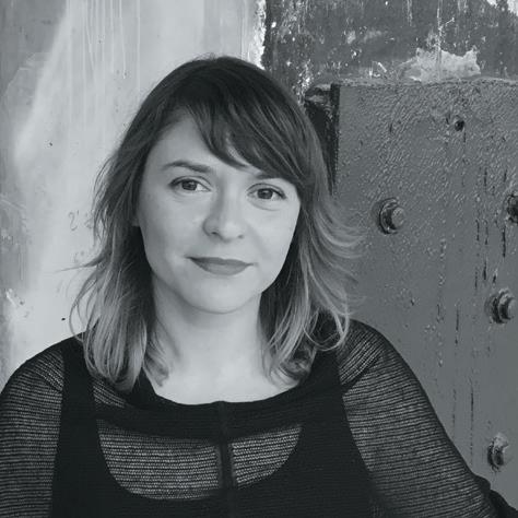
citiZenS deSign bureAu’s Director, katy Marks, on building meaningful, socially positive community.

Few people would argue with the suggestion that Britain’s current housing model is in urgent need of a rethink. As emerging generations overwhelmingly lose hope of home ownership, and the definitions of ‘affordable housing’ grow ever more implausible, it’s clear that we must find alternative approaches.
Having been instrumental in establishing the now ubiquitous coworking model that has transformed workplace culture, our architecture practice, Citizens Design Bureau, is exploring ways to translate some of this thinking into the context of housing – by finding innovative ways of building affordable, creative communities.
In the early noughties, with a group of three friends and an evolving community of volunteers, I set up what was London’s first coworking space and the place that coined the term. At that time, there were numerous examples of small groups of artists, professionals and makers working out of the same space, but they were still individualised desks and workshops, within an open plan setup, needing lots of space for relatively few people. They were therefore stuck in out-of-town locations because city centre properties were too expensive. At the same time, there were emerging examples of corporate environments developing the practice of hot-desking – not having your own permanent desk, but effectively time-sharing at different points in the day or week, within the same company. The concept of coworking that we developed at The Hub brought these ideas together, densifying the use of space to create vibrant, commercially viable communities in city centre locations, with the added value of workshop, meeting, socialising facilities and collaboration opportunities that the concept encapsulated. Since then, under the name ImpactHub, it has grown into the largest network of non-profit coworking spaces in the world, and spawned a whole industry.
Today it seems glaringly obvious, but in 2005, when it first opened, there was initial reluctance to embrace the idea of completely different companies sharing a
81 posItIve IMpact
single space, without designated desks. That trepidation, however, didn’t last long and coworking took off. In the meantime, we learned a lot – not least because our own professional trajectories showed us that coworking spaces only seemed to work well for businesses at very early stages or at very small sizes, or for people who were more nomadic and had a basecamp elsewhere. It was difficult for larger groups to work effectively in a shared space. They needed more privacy, acoustic separation, storage and the likes in order to function.
Our design approach adapted to recognise that all small organisations experience a cycle of flux – growth, shrinkage and re-growth over several years – and that we needed to create workspace communities that provided a variety of spaces, within which emerging companies could circulate, while also providing social spaces. This approach led to the emergence of richer communities – at Hackney Downs Studios, for example, where there were workspaces of all sizes, encompassing offices, studios and workshops, as well as a café, shops, a gym; even a community theatre, veg box scheme and a weekend market.
Interestingly, the coworking model rapidly expanded into both commercial and non-profit permutations. The idea chimed with the zeitgeist, with young people in particular realising that ‘work’ as they understood it really wasn’t working at all and that the traditional 9–5 office environment didn’t reflect their personal or professional aspirations.
As we began to look at workspace models that could respond to the ebb and flow of emerging enterprise, we realised that, at the root, these ideas were fundamentally about how to foster different types of creative and sociable communities. In order to do that really well, we needed to go beyond looking at workspace business models and start to explore models of housing and how they impact on the emergence of creative communities, whilst responding to the issue of affordability.
Recently, MP Michael Gove talked about how the ‘leasehold’ model is essentially a hangover from feudal times, when land and property eventually defaulted to the ownership of the ‘lord of the manor’. There are numerous models that have emerged in recent years that go some way to responding to this. Shared ownership, for example, partially addressed the issue of affordability, but it is limited by the fact that the affordability is only available to the first owner. Once a buyer has managed to ’staircase’ to 100% ownership, all subsequent owners pay full market rates.
Another is ‘coliving’, which has emerged as a fairly crude and, some might say, cynical translation of the ideas of
coworking into living space. Individual studio units can be as small as 12 –15 sq m, with some shared facilities. The concept of community feels commodified in the coliving model and, again, it suits people at a very particular stage in life and so is characterised by transient, short-term resident groups, rather than an evolving community.
The emergence of community land trusts and cohousing schemes is a brilliant development, but they remain frustratingly fringe ideas, because there is little public funding to support this approach and minimal commercial incentive to attract private investment. The current government’s reluctance to commit to renewing the Community Housing Fund to support schemes like this is a huge problem and leads to voluntary groups often working on these, with barely any resources, over many years, in response to the lack of affordable land.
There is therefore a huge gap in the market for commercial developers to innovate by responding to a growing demographic of families and professionals who need affordable housing that also responds to the cycles of change and growth that so many households go through – as babies arrive, teenagers leave, grandparents come to stay, carers are required and home-working demands space. Our current housing stock, and the financing and operational models that support it, do not adequately address this.
At Citizens Design Bureau, we are currently developing a set of new housing models that are designed to enshrine affordability in perpetuity, while also embedding the capacity for individual households to swell and shrink in response to changing circumstances. This is an evolution of shared ownership, such that the share owned by the resident is not just a nebulous percentage of the whole, but a whole asset that can be bought and sold independently, and can also can be coupled or decoupled with adjacent additional space. The resident therefore pays for a small unit and owns it outright, but has the opportunity to live in a larger unit, on a rental basis, if they wish. This means that even a small family can own a flat at an affordable rate and expand their home as they need to, without huge capital expenditure or having to move house. Crucially, if and when they do want to sell up and move, they sell only the asset that they own and the rental portion defaults to the developer/housing association/community land trust so that the cycle of affordable access to flexible housing exists in perpetuity.
We believe that such models have the potential to foster vibrant communities, addressing the needs of a huge proportion of society, while still remaining viable and appealing to commercial developers.
82
prevIous page: Jackson’s Lane Theatre | Fred Howarth
cLockWIse froM top
Left, thIs page:
Little details at Café Royal | Luke Brown
Manchester Jewish Museum | Philip Vile


St Peters in the Forest Church | Etienne Clement

83
The effects of the climate crisis and the future of remote working are the two big challenges for professionals involved in workplace design. How will we respond to these? Fortunately, I can offer a crystal ball in the shape of my journal entry from the future-dated Christmas Eve 2030. If you prefer the future to be a surprise, look away now.
24th December 2030: Dear journal…
Rents for any space below class A specification have still not recovered and vacancy rates remain high, but the positive side is the growing trend for repurposing commercial property for housing. This is encouraged by our coalition government (held together now by the Green Party) that points at success in cities like Chicago and Berlin, where tax incentives and amended regulations have yielded impressive results. Planning consents are a breeze for projects that demonstrate reduced embodied carbon. New builds have slowed right up.
On the downside, some of the new residential areas already look a bit down at heel, as the boroughs struggle to keep the streets clean with the reduced tax revenue compared to the days of big commercial tenants. It is taking a while to lease the ground floors usually occupied by retail and eateries, but this should change as confidence builds in the mainly young occupants with active social lives. Some have children and primary schools are springing up for the first time, filling streets with the sound of kids playing. How long does it take to build a neighbourhood?
Grey sky thinking
Class A offices are still being completed, with rents holding firm, but the developments are smaller, more sustainable and located in the livelier parts of town, not so much in the old central business areas. Commercial tenants have had a decade to do their sums and most now want to occupy a smaller footprint in mid-town that is less workhouse, more showcase, with great meeting facilities and far fewer desks. It is fashionable (and economically sensible) to promote local street amenities, cafés, restaurants, bars, shops etc. instead of offering the in-house facilities expected before the pandemic. They call it a working community.
People who attend the office part-time are now a common breed, the fear of extinction has receded. It is now normal for employees to consider remote working almost as a human right, despite the pushback from major employers, and the trend continues for families to leave the city for the countryside once the tiddlers are approaching secondary school.
Greener offices and less commuting seems like progress, but now many organisations have a bigger crisis to tackle, which is the spawning of two separate tribes of people that self-segregate into office dwellers and remote workers. This is a huge management challenge that bears on leadership, culture and alignment. Great technology helps, but this is more about ‘wetware’ than software. Some companies see this as an existential threat to their culture and their competitive edge. I wonder how it will look in 2040?
s teve g a L e is head of business intelligence at M Moser assocIates

84
creatIve thInkIng WIth steve gaLe


Say ‘hello’ to the Mixology23 Judges

It’s a huge year for our MIxoLogy aWarDs with a record-breaking number of projects, products and people submitted, all of a standard unparalleled in Mixology history.
Who’s won? You’ll have to join us on 22nd June At evolution london to find out. In the meantime, here are the names who have marked your best work, alongside their take on what the future of design looks like.
Mark sIMpson Principal and Head of Workplace BDP
Mark Simpson is a designer with extensive cross-sector experience, gained from almost 40 years in the design industry. He began his professional career at BDP in 1985 before co-founding Amalgam in 2003. He returned to BDP in 2011 and was appointed to the BDP board in 2017. He is the Chair of BDP’s Interior Design profession and head of the Workplace sector. Simpson writes regularly for the design press and has chaired the judging panel for the Mixology Awards since their inception in 2005.

Humans are social animals. In an increasingly digital, immersive and virtual world the places and spaces we design – the physical environments we create, build, live and work in – will need to be even more empathetic and supportive of our physical, mental and social wellbeing.
As founder of The Color Authority, Judith van Vliet helps people unleash colour in their lives and businesses. She is an accomplished speaker and host of the podcast – of the same name – that features fascinating conversations with some of the most inspiring people in the world of colour. Van Vliet serves on the Executive Committee of the Color Marketing Group as Immediate Past President, where her deep knowledge of the subject supports CMG remaining at the forefront of global colour forecasting.
Customised design will be pursued in a world where stock and waste have become terms to elude in manufacturing. We may see an upsurge in the use of natural pigments in colouring and in the use of waste, that will strongly influence how we perceive colour in our daily lives.
86
event: MIxoLogy23
Director
Artelia
Colin Wood is a Board Director at Artelia UK and has over 20 years’ experience working in the public and private sector, helping to deliver innovative and functional spaces where people can thrive. Wood is responsible for the cost consultancy service for Artelia, which includes driving innovation and digital transformation to provide clients with smarter solutions to their challenges.
The world will face profound social and environmental challenges as a result of human-induced climate change. Poor design has been partly responsible for this, so for me the future of design is to help find solutions to these issues.
With more than a decade of experience, Mbali Chaise is a specialist in workplace strategy, management consultancy and organisational change. Chaise has helped numerous clients successfully implement workplace design and behavioural change initiatives across EMEA and North America. As Associate Director at iPWC Ltd, she draws on her unique background as an interior designer to provide expert insight into the intricate connection between people, environment and culture.

For me, inclusivity, sustainability and circular economy principles need to be on everyone’s radar for future designs. It is our duty to ensure that design continues to have a positive effect on society and in our communities, resulting in cities that are more liveable for generations to come.
suzy WrIght Head of Workplace WSP
Suzy Wright joined WSP UK recently, as Head of Workplace Operations – having previously led the global office strategy and workplace design for BT’s ‘Better Workplace’ project, delivering half the £400million workplace transformation for BT’s colleagues. She has worked in both consultant and client-side roles for a variety of private and public sector companies, including with BBC, Google, University College London and GSK.
The manifestation of the ‘organisational brand and culture’ in design will be fundamental in a world where we spend less time in the physical office. Collaboration, innovation and creativity may become even more prominent activities – and the need for traditional desks may even decrease further.

Senior Design Manager
Marriott International
A RIBA chartered architect specialising in design management, with extensive experience in designing and delivering interior architecture and interior fitouts, Despina Kalapoda is Design Manager at Marriott International. With a key focus on hotel projects across the select and premium brandscape of Marriott, Kalapoda is currently overseeing the initial assessment, development and design of new hotels and hotel conversions in the Mediterranean region.

In the future I think design and the built environment may need to focus more on adaptability processes. The focus on sustainability will pressure its way into our everyday more and more, and we shall turn to evolving technologies and existing infrastructure to house our needs.

87
Olivia Saxen leads workplace design at Landsec for its flexible office brand, Myo, as well as its wider workplace portfolio. Harnessing international experience from a traditional workplace consultancy background – made up of multi-disciplinary studios – Saxen has worked with large enterprise customers and those in the flex-office market. A big focus for her is transforming a standard serviced office into a more ‘customised’ experience for tenants.

The future of design is creating sensory experiences for people through design; bringing domesticity and hospitality into the commercial environment by blurring the lines between all disciplines; and focusing on the materiality of nature with timber and stone, and neutral and timeless palettes that transcend time and fashion.
cLaIre henDerson Inclusive Design Lead Workplace Design HMRC
Working within the HMRC ‘Government Hubs’ programme alongside industry leading experts and Community Interest Companies (CIC), Claire Henderson ensures inclusive and welcoming workplaces are delivered for all colleagues. Successes in her role to date includes achieving the first ever ‘CIC Inclusive Environment’ at ‘Project Level’ certification for the Edinburgh HMRC office.
As a society we are becoming increasingly aware of the diverse nature of people and the future of design must reflect that, be empathetic and support individuals by providing a choice of environments. Ultimately good design benefits everyone. Look back and you see the changes made to help individuals with protected characteristics – dropped kerbs for example – and you realise how we all benefit from these. So why wouldn’t we do the same for those with less visible needs?
Adam Bushell is the Operational Net Zero Lead for PWC. Having worked at the professional services firm for 13 years, Bushell’s work in the infrastructure team ensures high quality, sustainable and energy efficient workplaces for PWC’s UK operations across public and private sectors.

For me design needs to offer carbon free, high quality, hackable spaces that adapt to everyday business needs. Connecting people and technology to drive innovation with the workplace, whilst delivering real net zero carbon reductions.
Ben channon Director Ekkist
Ben Channon is an architect, author, TEDx speaker and mental wellbeing advocate. Well known in the industry as a thought leader in design for happiness and wellbeing, he is also Director at wellbeing design consultancy Ekkist, where he helps clients and design teams to create healthier places – and researches how buildings and urban design can impact how we feel.
When I explain to developers or other consultants that I am an architect who specialises in ‘healthy buildings’, the most common response I get is “oh, you mean like eco-houses?” This highlights the issue that, as an industry, we still have a lot of bridges to cross if we are going to consistently design and deliver buildings that fully support people’s physical and mental health. The future of design has to be one in which all buildings are healthier – not just by avoiding harm to occupants, but by enhancing their lives and helping them to thrive.


88
aDaM BusheLL Operational Net Zero Lead PwC

henry reeve Director of Interior Design IHG Hotels & Resorts
Since joining IHG in January 2015, Henry Reeve has worked across some of IHG’s (InterContinental Hotels Group) most celebrated, award-winning design projects as Director of Interior Design, including the launch of the first Kimpton® hotel outside of the Americas. He is responsible for creating the interior design and guest experience across IHG’s hotels in Europe, with a particular focus on the company’s boutique and lifestyle portfolio. As well as designing new hotels in IHG’s pipeline, Reeve has worked on countless refurbishment projects across IHG’s existing hotels.


I would hope design looks towards upgradeability, whereby products and features are capable of being upgraded by the end user (or indeed repaired), without the need for outside intervention, and a move away from obscure closed-loop systems that prevent end users from adapting their own products.
Design and Development Manager Mandarin Oriental
A French hospitality professional based in London, Lola Marseguerra’s dream job as a child was to ‘rate hotel beds’. Following operational and managerial F&B roles at several luxury hotels, Marseguerra went on to work at Mandarin Oriental. In her current role she looks after EMEA and Americas development projects: building concept briefs, selecting interior designers and working alongside all consultants involved in delivering the best possible product for local communities and hotel guests.

Inclusive or ‘humanity-centred’ (as opposed to ‘user-centred’) design will continue to grow, making sure everyone in society can access and experience great design. Aesthetics will always evolve and trends change, but the former core pillars are – in my opinion – what will shape tomorrow’s design.
Starting at ITV in 2006 as a project manager, Donna Uden has spent the past 10 years as its Head of Workplace Services, working across the country directing and managing an extensive number of workplace projects. Uden led the design and build of ITV’s 22-storey HQ on London’s South Bank and the relocation of its central offices to West London, as well as a number of building decommissions.

Remote and hybrid working will shape commercial interiors, i.e. the use of interesting meeting rooms and open plan flexible spaces as ‘backdrops’ in a way that almost resembles set design; a space that staff, visitors, guests, our talent and clients want to come to. When people are dialling into meetings with clients, they are now wanting to project an image in a way that didn’t exist pre-COVID. These types of impressive, photogenic spaces work for Instagram moments and will become increasingly important to companies in relation to attracting and retaining staff and cementing brands.
and presented at industry conferences on the back of his successful career working for the likes of Unispace, Morgan Lovell and AECOM.
Our industry is at a very important junction within the world of work, where factors such as time, experience, connectivity, diversity, technology, environment and human performance are overtaking the traditional notions of ‘you have to be seen at your office desk to be perceived as working’. Inspired by digital technologies, ESG, UX/UI design and AI, amongst many other human performance related considerations, the design world is about to go through a huge revolution itself in the next 5 to 10 years. The future is exciting.
90

Clerkenwell Design Week
The UK’s leading independent design festival returns from 23-25 May. Featuring more than 600 events in its 12th edition, cLerkenWeLL DesIgn Week will host its largest programme to date in London’s EC1 postcode area – home to more creative businesses and architects per square mile than anywhere else in the world, of course.
Featuring a first-time partnership with sister show, Design London, 130-plus local showroom partners and two new venues – Catapult and The Garden – this year’s event will also showcase more than 300 design brands and emerging designers from the likes of furniture, textiles, lighting, materials and surfaces.
“From product showcases to one-off installations, headline talks to networking events, CDW 2023 will bring some of the most exciting and forward-thinking content to Clerkenwell – while celebrating the best of design and creativity from around the world,” says MarLon cera-MarLe, MediA10’s design division director
D on ’ t MI ss ...
London-born artist and designer Morag Myerscough will kick off the festival’s popular three-day talks series, Conversations at Clerkenwell. Found at Spa Fields on tueSdAy 23rd MAy, Myerscough will be discussing her installation project, as well her distinctly collaborative approach on transforming places and championing community through joyful art.

Located at St John’s Square, the Myerscough x Baux exhibition is dedicated to the future of design and wellbeing. Crafted from BAUX Wood Wool panels – designed by Myerscough – the free-standing installation will take the form of a museum-like exhibition co-designed by Swedish design studio, forM us WIth Love. An internal hub will allow visitors to experience the BAUX Acoustic range in closer detail, featuring biodegradable ingredients, colours and variations across the Wood Wool Tiles and Panels, Pulp Panels and Felt Screens ranges, the latter made from recycled PET bottles.
Later on at Spa Fields our own harry MckInLey will host a Mix preSentS panel on the topic of maximalism. Throughout, a cohort of industry leaders will openly discuss ‘when more is more’ and reflect on creating colourful spaces, daring to design bravely and asking: is good taste subjective?

92 events
M or A g M yer S cough b A ux in S t A ll A tion fe A turing exterior WA ll W ith M or A g M yer S cough
Elsewhere, as part of CDW Presents, British artist steve MessaM is bringing his specially commissioned installation ‘Gateway’ to St John’s Gate. Known globally for his large-scale inflatables, the six-metre-tall artwork, sponsored by software design firm sketchup, features 27 giant spikes hand-sewn in a striking blue textile and forms part of Messam’s ongoing series transforming how people view historical architectural sites.

Tile and mosaic manufacturer DoMus will be doubling the size of its showroom this year with an expanded site at 1 Sutton Lane and Great Sutton Street. Visitors will be amongst the first to see a debut tile collection with multidisciplinary artist and designer, yInka ILLorI, on a design installation that amplifies Illori’s bold and playful work.
In other showroom news, By BaILey’s remodeled showroom will be debuted and contemporary furniture and lighting retailer vIaDuct will present the latest designs from the likes of Benson, eMeco, MattIazzI and MontIs at their home on Summers Street. uLtrafaBrIcs will unveil new palettes designed in collaboration with pantone in celebration of its Colour
of the Year, ‘Viva Magenta’, and DeaDgooD will reveal its new showroom on Old Street, designed in partnership with trIfLe* stuDIo. Here, the British manufacturer will introduce its latest coffee table range, Chonk – made of 85% recycled steel and fully recyclable.


Over in orangeBox on Northampton Road, visitors can expect an open and engaging discussion about the climate crisis between BroMpton BIcycLes, ‘wood culture’ experts groWn In BrItaIn and utB who will all present their insights on three prominent topics throughout CDW – materiality, circularity and locality.
Last but certainly not least, in aMIn taha’s groupWork studio on Clerkenwell Close, history will repeat itself as the iconic Forum sofa and armchair makes a comeback from case furnIture. Originally designed in 1964 by one of Britain’s most celebrated designers, roBIn Day, the collection has been brought back into production and will be showcased next to contemporary classics by MattheW hILton and terence WooDgate.
Exhibition venues will be open from 10am-6pm Tuesday, 10am-9pm Wednesday and 10am-5pm Thursday. For a full guide of our favorite CDW picks and to find out how to register, head to the CDW website or MI x I nter I ors . co M

93
c L erken W e LLD es I gn W eek . co M left : ultr A f A bric S p A ntone ‘ viv A MA gent A ’ right : c AS e foru M A r M ch A ir A rper r A lik S of A S y S te M
‘ g A te WA y ’ in S t A ll A tion
S teve MASSAM
Salone del Mobile 2023
Returning for its 61st edition, saLone DeL MoBILe will take over Milan in April with an overarching theme of light and a reworked trade fair model. Hosted at the fIera MILano rho, there will be an expected 1,962 exhibitors and 370,000 visitors attending from across the globe.
Led by design professor Beppe fInessI, Salone will feature interdisciplinary and experiential installations exploring the concept ‘the city of lights’. Exhibitions, talks and workshops have been lined up by the fair’s editorial director, Annalisa Rosso, ranging in topic from architecture to art. With a strong focus on lighting, technology and sustainability, these discussions will involve leading names in contemporary design, including Shigeru Ban, Kjetil Trædal Thorsen and Marius Myking of snøhetta, as well as Nao Tamura and Andrea D’Antrassi of MaD.
After a four-year hiatus, all rooms throughout biennial international lighting exhibition e uroluce will be darkened to increase the effectiveness of the lighting displays and ‘city of lights’ theme while being restructured into a ring-shape designed by LoMBarDInI22 , inspired by city planning. Salone has moved the cultural programme here for 2023,


with exhibitions throughout Pavilions 9, 11, 13 and 15 as well as a specialist design, art and illustration bookshop, created by MaurIzIo nannuccI , one of the most powerful interpreters of artificial light in contemporary art.
Don’t miss lighting and luminaire specialists Ingo Maurer who will be debuting their new pendant light SignAture in Euroluce. Appearing like a threedimensional drawing in a room with a soft cable connected to a simple, black circular structure, Signature will create the impression of coincidental, continuous shape. The deliberately inconspicuous lampshade does not steal the show from the tangle of cables, but blends stylishly with the overall concept. With a change of perspective, the shape of the lampshade can change from a cone to an obliquely inclined rectangle. The lamp series can be combined to create a joint constellation.
94 events
left : euroluce exhibition right : ingo MA urer S ign A ture pend A nt
In Euroluce’s largest arena, Aurore – designed by forMafantasMa in collaboration with house of LyrIa – a city square will be replicated with an immersive take on light, combining colours, materials and sounds, which will play host to the main talks programme as well as other events, workshops and immersive experiences. As part of this line-up, tWeLve consteLLatIons, a set of architectural ‘intermezzos’ will host further exhibitions in a show curated by fInessI
arper
This year at Salone del Mobile, Arper (Pavilion 4, Booth D06 C09) will expand upon their Project of Living with four new collections, one re-edition, and one range extension. Among the new introductions is rAlik by IchIro IWasakI, a modular sofa system that can be as big or as small as the specification requires. Together or apart, Ralik is suited to workspaces, social spaces, private spaces or anywhere in-between. For those who can’t make Salone this year, fear not, Ralik will also be at London’s Clerkenwell Design Week in May.
Bene
Bene asks for the curious to join them in the The Secret Garden – an ethereal experience at its Milan showroom. Claiming the spotlight in an otherworldly botanical installation, visitors will get the chance to see a limited edition of outdoor furniture collection, CASUAL by Bene. Promising a ‘once in a lifetime’ installation that ‘changes your perspective on the symbiosis of art and furniture design’, Bene invites guests to an aperitivo on 18 April, and breakfast, running from 18 to 21 April. More information can be found on the brand’s website.

uMa oBJects
Making quite the statement, design duo hoLLoWay LI and futuristic furniture brand uMa oBJects invite guests from 17-19 April to see their installation of retro futuristic furniture in the former Porta Vittoria abattoir at Viale Molise 62, with a glimpse of their latest collab and addition to the ‘chubby’ and modular T4 collection, Liquorice.
saLonesateLLIte

Meanwhile, the 24th edition of SaloneSatellite will continue to celebrate the talent of young international designers, aged under 35. Described by founder Marva grIffIn as “the Salone within the Salone”, this year’s event will feature Italian sculptor, designer and architect gaetano pesce, who will share his top takeaways from a lifelong career and discuss the event’s theme ‘training and the challenges of the future’.
WorkpLace 3.0
More than just an exhibition, Workplace 3.0 is a think tank on the evolution of workspaces. Here, discussions will revolve around the future of design and technology in workspace planning and how the two components sit together. Expect to see the finest products designed for reception areas and office spaces brought to you by companies who lean on a new way of curating the office.
InternatIonaL furnIshIng accessorIes exhIBItIon
Launched in response to the growing demand for decorative items, the International Furnishing Accessories Exhibition has become the sector’s leading event, showcasing a comprehensive collection of decorative objects, furnishing accessories and textiles for residential design. Featuring the latest buzzwords and trends, the exhibition will offer an exclusive look at innovative design pieces that will bolster commercial spaces.
Salone will be held from 18 to 23 April at the fierAMilAno fAirgroundS in Rho. Access is restricted to industry professionals until Saturday, when the fair will open to the general public. Tickets are now on sale and can be purchased at saLoneMILano.It
95
left : A urore de S igned by for MA f A nt ASMA in coll A bor A tion W ith hou S e of lyri A right : bene in the S ecret g A rden
Stockholm Furniture Fair

After three long years away, stockhoLM furnIture anD LIght faIr brought its usual product innovations, insights and collaborative installations to the Swedish capital in February.

This year’s Guest of Honour was front (surprisingly, the first Swedes to talk on the challenge) returning 19 years from their debut in the Greenhouse exhibition, the fair’s platform for emerging designers. Creating an immersive and multisensory experience, the duo looked to Swedish nature to inform the installation, creating 3D scans of Swedish landscapes and crafting furnishings that appeared covered in moss – formed from kvaDrat’s ArdA fabrics.
Other highlights included the noW or never 1kg c02 exhibition, with designer and sustainability strategist eMMa oLBers examining the climate impact of furniture – presenting new, innovative materials including 3D-printed Penylon, made from recycled fishing nets mixed with stone particles.
Elsewhere, Stockholm-based studio forM us WIth Love collaborated with saMsung to create the ‘sofa of the future,’ a conceptual project that explored the reinvention of the sofa as a reaction to how we consume media. The final result was Shift – a hanging, webbed structure that is suitable for various ways of sitting and lying, and is designed to change as the user’s needs evolve.
96 events

Design has its own rhythm: NeoCon 2023
Returning to Chicago’s THE MART from 12-14 J une , n eo c on has announced its keynote speakers for the 2023 fair. Pulling from a diverse variety of backgrounds and inspirations, the lineup features world-renowned futurist A M y W ebb ( founder and CEO of the f uture t o Day I nst I tute ) and celebrated designer M ich A el M urphy , co-founder of M ass D es I gn g roup . A programme highlight is set to be a talk from ‘The Hip Hop Architect’ M ich A el f ord , alongside Chicago hip hop legend and visiting MIT professor, W ASA lu M uh AMMA d J Aco ( l upe f i AS co ). Together, Ford and Fiasco will discuss their explorations in extracting the rhythms, textures and patterns of hip hop as a source of design innovation –in theory and in professional practice.
This year’s unifying theme, t ogether W e d e S ign , will be carried throughout the three days of the show, exploring collective effect positive change through the built environment and design. In addition to NeoCon’s roster of stellar talks, this year’s edition will feature a new podcast series ‘ l ive fro M n eo c on ’, a special design-oriented ART on THE MART projection and the latest game-changing products and services from more than 400 companies.
Legends Live at Surface Design Show
Featuring industry titans at the top of their game, MIx InterIors hosted the Legends Live series at surface DesIgn shoW in February at London’s Business Design Centre to discuss their take on Shaping Communities

Kickstarting discussions on the main stage, MIx’s managing editor hArry Mckinley sat down with kAtrinA lArkin, co-founder and chief creative officer at fora, and chief ESG officer at the offIce group Sharing anecdotes of her time living in Ireland and working with festivals for 16 years, Larkin discussed using these experiences to hone in on contemporary architecture and design – and TOG’s efforts to turn any building into a purposeful, user-centered experience.
JuStine fox, founder of eponymous specialist colour agency, stuDIo JustIne fox, relayed the importance of colour, emphasising how it can be harnessed to build connections. She went on to speak about urban density and how colour can be used to shape built environments via artwork and parks, for example, to counterbalance ‘colourless’ cities and increase wellbeing.
The next day MIx’s deputy editor, chloé peterSen Snell, led a conversation with McM’s ShAnnon pope elliS and perkIns&WILL’s linZi cASSelS – discussing MCM’s own community at their own recently designed workplace and journey to BCorp status, and the two designers’ cross-sector experience and inspiration.
98 events
Nominate now for the Mix 30 under 30 Class of 2023
Mix 30 under 30 is an annual list of remarkable individuals who are driving forward the commercial interior design world today. Since its launch in 2015, MIx 30 unDer 30 has created a dynamic community within the industry, supporting and elevating the next generation of talent and providing design studio principals and directors with the opportunity to publicly recognise stars in their teams.
Does thIs sounD LIke soMeone you knoW? Nominate a colleague by fridAy 28 April at MIxInterIors.coM/ events
This year’s event will take place in SepteMber, bringing this year’s class and past alumni together to celebrate their achievements with a night of well-deserved revelry and networking, in partnership with senator | aLLerMuIr, aMtIco, egger and hunters

Mixology23 is heating up
The undisputed commercial interiors award of the year is back with a bang for its 18th edition. Celebrating the best projects, products and people across the UK, this year’s ceremony on 22 June At evolution london, is set to be the biggest and best yet.
With an unprecedented number of entries in and scored by our accomplished roster of judges, there’s more odds than ever before for your name to be called out in front of over 1400 industry professionals from the world of A&D.
This year’s entertainment will welcome not one, but THREE iconic DJs to the Mixology dancefloor, as JereMy heaLy, seB fontaIne and taLL pauL take to the stage with a back-to-back three-hour set.
Upon arrival, guests will be welcomed by the hackney coLLIery BanD: a genre-bending combination of brass, reeds, percussion and electronics, who have firmly established themselves as one of the most exciting live bands in the UK.
Finalists will be announced in May 2023 and tickets are going fast – so, hurry! Book your tickets for a sell-out night to remember. MIxInterIors.coM/events

99


“Let me get you a mic,” I gestured from onstage, at a conference in the Middle East, where I was chairing a panel exploring the dicey topic of women in design. Not so dicey some of you might imagine, in comfortable, ignorant bliss. But as it transpires, scratch the surface of our socalled equal industry and there lies a deep pool of rage and frustration from many women who see it as anything but.
“I don’t need one,” came the forceful response. “On this, I can speak loud enough for everyone to hear.” What was the usually sedate ‘audience questions’ portion had turned into a platform for attendees to vent variations of utterly valid exasperation – in this case a designer working for a globally-recognised interiors practice.
“The role of women in the design and architecture industries isn’t just a MEA issue, it’s a global one. It may look like we’re doing fine, but we’re underrepresented in boardrooms around the world. Pick a country and we still earn less, on large, than male counterparts. We’re still expected to juggle child-care and unforgiving working hours, in a way that men aren’t. We walk onto a building site and we’re treated with less respect – our direction and ideas less worthy – than our male colleagues, even if they’re junior to us.” Cue a rousing round of applause and, for me, the flickering of the hairs on my forearm at what felt a meaningful moment; visceral and honest.
She was, and is, right of course. During the panel discussion I’d referred to a study that canvassed women in architecture and design across the Middle East and Africa. The findings were depressing: most
Nothing to see here
felt they had experienced gender-based discrimination, 63% said they received less pay (than men) for the same work, half said they received promotions less frequently and 35% said their respective HR departments didn’t even have a specific complaints process for addressing gender-based issues. If this is replicated on a broader, worldwide scale, what gives?
I appreciate that’s a ‘big’, loaded question that undoubtedly requires more column inches to solve than I have at my disposal here. But, perhaps, the more manageable question is: why are we so-often pretending everything is fine when, measurably and anecdotally, it isn’t?
Not long ago we marked International Women’s Day, a well-meaning event that’s intended to draw attention to issues of inequality, reproductive rights and gender-based violence, but which, in our industry, is more commonly marked with generic, women-centred team photos or trite – and frankly condescending – lists of ‘the best projects by female designers’. Like so many women-indesign initiatives, there’s an air of ‘nothing to see here’ faux positivity. And while I’m not suggesting we shouldn’t be celebrating the unique achievements of women, perhaps, collectively, we need to be looking at what there is to see and recognising it isn’t always a rosy picture; be it in the MEA or elsewhere.
I’m immeasurably glad that designer stood up, because there are lots of women doing the same and, perhaps, for a more equitable design industry, we all need to do the same – even men like me.

102
the gLoBaL perspectIve WIth harry MckInLey


Find us online mixinteriors.com If you’re only reading us in print, you’re only getting half the story. mix.interiors Follow us

104
The Joys of Maximalism
When it comes to bold interiors and brave creative choices, is more... more?
WordS: chLoé petersen sneLL
Popularised by the Victorians, maximalism blends multiple design styles, combining complicated and contrasting patterns, bright colours, textures and materials. It is curated excess and eclecticism, with an undeniable visual impact. Usually associated with hospitality and retail interiors, commercial maximalist interiors have seen a resurgence in recent years, popularised notably by Martin Brudnizki and Marcel Wanders, and perhaps a corollary of the minimal, restrained trends that have held a tight grip on design for the past few decades.
Often misconstrued as chaos and clutter, maximalist design can create a bold, unique identity – and offer a chance to show off a client’s personality. “For us, maximalism works well when it’s used in a refined and considered manner,” says Shayne Brady, one half of
BradyWilliams. The studio is well versed in the drama of eclectic, opulent design – perhaps most notably in the love-it-or-loathe-it design of London restaurant Bob Bob Cité. Inspired by future aviation travel, the eatery positions itself as ‘ultra-camp meets ultra-luxury.’
“Not every space should be maximalist as it dilutes the overall aesthetic, but pockets of maximalism within a hospitality space create intrigue and moments of light and shadow in a design,” Brady continues. “Maximalism can bring drama and excitement to any interior. It engages the user.”
For Claire Bingham, design writer and author of ‘More is More’, maximalism is the ultimate expression of personality, whatever the influence. “Done well, maximalism should bring character and contrast to a
105
room, whether this is through an unexpected use of colour and pattern, or objects that are personal to the owner,” she says. “As a creator, it’s a gift to be allowed to experiment with new combinations, with the high and with the low – as well as questioning the purpose of a piece of furniture and, in the face of convention, coming up with something new. It’s exciting.”
In an increasingly crowded workplace market, authentic individuality can be a genuine differentiator. But at what point does ‘more is more’ become unproductive and yield an unpleasant working environment? Unlike choice destinations like hotels and leisure spaces, workplace design must work harder and for a wider, more diverse group of people. Clashing colours and patterns could be seen as sensory bombardment, especially for the
neurodiverse and hyper-sensitive amongst us, who can prefer quiet, calm spaces to reduce over-stimulation.
“For us, maximalism in the workplace doesn’t work,” Brady contemplates. “Maximalism stimulates the senses, and in many ways the workplace needs to be a more serene and productive environment. Maximalism works best in hospitality spaces or dramatic entertainment rooms at home.”
Just as some are inspired by the clattering background noise of a café or a visit to a museum for inspiration, maximalism can provide the stimuli for creative inspiration, a contrast to magnolia walls and neutral carpet. As such, Claire Bingham is a little more optimistic. “The idea of working within a richly layered interior, surrounded by inspirational points of

106
prevIous page: Sinta Tantra’s commission for the Sharjah Biennial
BeLoW IMage: Bob Bob Cité by BradyWilliams

references including books and decorative objects can spur new ideas. As with all things in life, it’s good to have balance, so balance a room with a strong colour palette and lots of things going on with a more calming and neutral space alongside. We’re human beings, we need a bit of both.”
In the public realm, there has been a recent abundance of colourful, maximalist murals and public commissions – dubbed by designer and artist Adam Nathaniel Furman as ‘The New London Fabulous.’ Popularised by Furman and other significant contributors such as Camille Walala and Morag Myerscough, clashing colours, patterns and ornamentation celebrate diversity and bring joy to the spaces we occupy. “Maximalism is about being generous: generous to the viewer, generous to your audience and even generous in your making,” comments artist Sinta Tantra, whose murals and public installations have featured everywhere from East London to South Korea. “This can be achieved through formal aspects such as colour, composition or conceptually. It’s not about going ‘crazy’ or ‘over the top’. An old tutor once told me think about the edges of your canvas. It takes a brave
commissioner to commission a bold design – most play it safe, eliminating as much risk as possible. But, now and again, you will get a commissioner interested in following a new approach, keen to develop your practice as an artist and set new trends.”
Maximalism is escapism, it is joy and an extra slice of cake on an already overflowing plate. And maybe, in these complicated times, maximalism is exactly what we need – something brave and bold, the antithesis of cold, grey skies and even colder news pages. “Only a brave designer can create maximalism,” Brady adds, “as it takes confidence and a conviction within one’s own vision to execute it correctly. Risk taking is essential in any design but with maximalism, it’s important to lean into the risk and be bold in every decision.”
MIx presents MaxIMaLIsM: When Is More, More? Catch Mix Interiors’ Managing Editor Harry McKinley discussing maximalist design with a panel of industry experts during Clerkenwell Design Week. Register now for your free ticket to gain access to the Conversations at Clerkenwell talks and wider event programme.

108
aBove IMage: Bob Bob Cité by BradyWilliams

Material Matters
ekho Studio is a fresh force in design, looking to shape how people live, work and play for the better, based on the belief that design can completely transform lives and environments. Recent projects include AstraZeneca UK’s relocation to Kings Cross, PRS For Music’s new HQ and Globe Point Temple, Leeds.

Matek,
Mater DesIgn
Post-consumer waste and fibre materials such as coffee bean shells and sawdust (to name a few) are combined with a binder to form this unique textured compound. The result, ‘Matek’, then goes through a process of press moulding well known in the furniture industry to produce furniture from recycled waste. With a variety of unique textures to choose from, alongside the durability and the fantastic sustainable story, we look forward to featuring Mater in one of our projects soon.
MAterdeSign coM
strata, Bute faBrIcs


David Irwin’s Strata collection takes contextual influences from the Isle of Bute’s underlying geology, terrain and landscape: we couldn’t help but connect with the fabric’s design and feel transported to the pebbled shores of the island when discovering the story. With a colourful mix of tones to choose from, between the fresh pastels within ‘Mineral’ and the earthy hues in ‘Mason,’ we have found this collection to give a real range of opportunity within our designs.
butefAbricSltd coM

We are drawn to materials that are versatile in how they can be applied or used in interesting and unique ways. A designer can completely reinvent a material across differing projects by implementing it on different surfaces, playing with its scale, colour, texture, layering and pattern. Cork is such a simple yet versatile product to work with, and has inherent properties that make it sustainable, thermal and sound absorbing –making it a real superhero material.
partIcLe BoarDs, vIroc
Used as an alternative to standard plasterboard with plaster skim, this material is visually effective: introducing colour, texture and patina. While more expensive initial outlay on the panels, you save on install costs and wet trades on site. It’s a mix of wood particles and cement and it’s versatile and robust for exterior and interior uses. We have seen this in situ on a couple of schemes recently and it looks amazing.
viroc co uk

110
c
Innovative Material
ScAlite is a unique sheet material made from fish scales – an abundant and renewable by-product of aquaculture.
Based on volume, construction and demolition waste is currently the largest waste stream in the UK and EU –its toxicity a threat to both the environment and human health. On a mission to create a sustainable, renewable alternative, Scale founder Erik de Laurens looked to fish scales, a by-product of the fishing industry.
Fish scales are composed of two different phases, mineral and organic. Collagen is extracted from the organic phase, which acts as a biopolymeric binder when mixed with the mineral phase. This is the foundation of the material, which is pressed to form sheets.
This stone-like material is supplied as panels and is suited to interior design projects, furniture, and accessories. Available in six colours created using natural dyes, the tiles can be produced in bespoke colours and are currently produced in 300x300m and 600x600m sizes. Scalite is fully recyclable and VOC free, and is fire rated, complying with the fire regulation for public interior spaces.

With its sustainable and non-deleterious credentials, Scalite joins a new generation of materials that are not only bio-sourced but also biodegradable – and there’s nothing fishy about that.
scaLe.vIsIon
111
Landlords and property brokers are the only ones to tell me that people are coming back to the office. Mid managers tell me that they need people to come back to the office but everyone else tells me they love the flexibility of hybrid working.

The truth of the matter is hybrid working translates as no one wanting to come to the office on Mondays or Fridays and only some of us wanting to come back every other day of the week. Ideally, we need part-time offices to match the part-time demand. Why would I want to pay lots of money per square foot for space that is only used 60% of the time, at best? If I build smaller offices to meet average demand, it does not meet peak demand and if I build offices to meet peak demand, I am burning 40% of the rent.
Coworking, I hear you say. Well, that is really aimed at the peripatetic, individual contributor who just needs to grab a desk, make a call and head off. Even if a company takes private space within a coworking site, it is often a box with desks jammed in it so close that if the person in the back needs to leave everyone else has to stand up.
If you choose the on-demand space option that the new aggregation apps are offering, on paper it looks perfect, but you find that the limitations make it nearly unworkable for an international company. Firstly, the providers use the apps to mop-up unused space, they
The part-time office
don’t offer dedicated inventory. This means random amounts of desks or rooms across a city, which make it hard to get more than three or four people together.
Secondly, the aggregators do not provide any security to the providers and so you will be asked to leave when the receptionist finishes work at 5pm, just in case you steal the chairs. Talking of chairs, they are often chosen to look cool, not to sit on for more than an hour. The other pain point is computer monitors, or total lack of them.
Having said all that, it could work, if we can convince the providers that there is a more business available other than start-ups and nomads, we may be on to something.
But designers are going to need to entirely re-think what an office is. We will need to add a need for privacy that is not inherent in current coworking designs; they will need to build acoustics into the design at a level they rarely do now. I don’t just mean acoustic security, I mean the quality of sound coming out of video rooms. Plus no more hard surfaces everywhere making it sound like an occupant is talking from a bucket. We need chairs that are ergonomic as well as beautiful and monitors built into the design thinking.
Too often these spaces are built for looks not practicality. Time to remind ourselves of Sullivan’s axiom, ‘form follows function’. Looks aren’t everything.
112
the fInaL WorD WIth MIke WaLLey
M I ke W a LL ey is Senior Director of Global Real Estate & Workplace Strategy at c r I teo


 case stuDy: pILLoW MaurIts, aMsterDaM


 case stuDy: MastercarD DuBLIn
photogrAphy: DonaL Murphy


 WordS: harry MckInLey
