


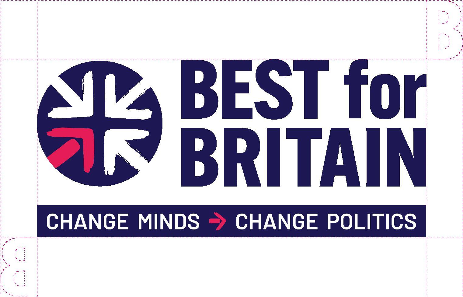
The Master logo lock-up consists of three elements. The Roundle, the type block: Best for Britain lettering and the strapline: Change Minds → Change Politics.
The master logo lock-up’s purpose is to convey the organisation’s name and mission - the core brand message - in a single graphic device. It should be deployed where you suitable amount of visual real estate to work with, i.e. Exhibition stands, roller banners, report covers, merchandise (bags, T-shirts, note books), video sequences etc…
Logo on white


Primary logo
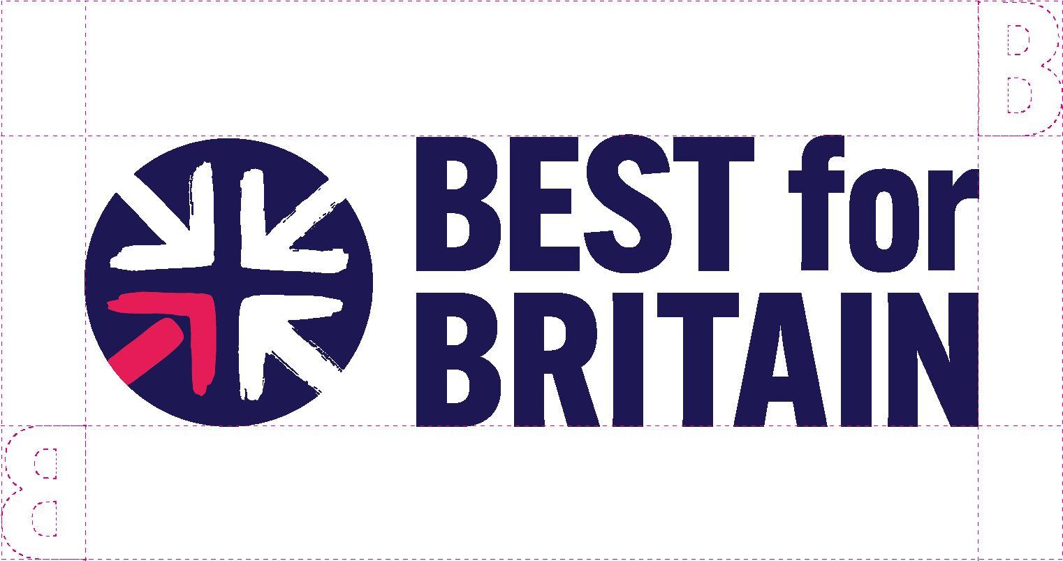
The primary logo consists of two elements. The Roundle and the type block: Best for Britain.
This version of the logo is deployed in instances where the strapline has been used separately.

For example if your presentation includes the words ‘Change Minds →Change Politics’, as a title or in the footer, the core brand messaging has been satisfied, therefore there is no need utilise the Master logo lock-up.

When using the logo please ensure that no other graphic elements encroach the safe area, which is marked with a magenta dotted line. The area is based on the width and height of the letter ‘B’ in the logo.

Master logo lock-up reversed
The Master logo lock-up consists of three elements. The Roundle, the type block: Best for Britain and strapline, Change Minds → Change Politics.
The master logo lock-up’s purpose is to convey the organisation’s name and mission - the core brand message - in a single graphic device.
It should be deployed as specified in the logo on white section, but only used where you have a dark coloured or photographic backdrop.


Logo reversed

Primary logo reversed
The primary logo consists of two elements. The roundle and the type block: Best for Britain.

This version of the logo is deployed in instances where the strapline has been used separately.
It should be deployed as specified in the logo on white section, but only used where you have a dark coloured or photographic backdrop.


Logo reversed

When using the logo please ensure that no other graphic elements encroach the safe area, which is marked with a white dotted line. The area is based on the width and height of the letter ‘B’ in the logo.
Note: In some instances the safe areas are not applicable for the reversed out logos i.e if the background is a photograph.


Logo reversed

Use the isolated roundle on comms where the words Best for Britain appear nearby. i.e. Social media posts, presentations, documents.
1. B4B Isolated Roundel Blue
2. B4B Isolated Roundel White
3. B4B Isolated Roundle Blue + White Arrows
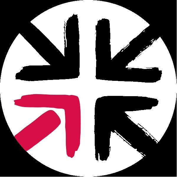
1. Use this version on white or light coloured backgrounds and substrates
Brand Elements
2. Use this version on dark backgrounds and substrates
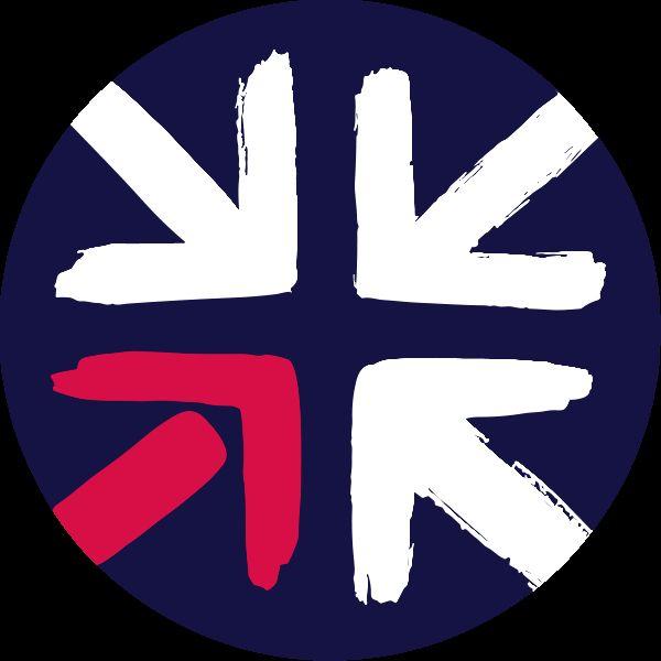
3. Use this version when there isn’t enough contrast between the arrows and the background

The arrow is taken from bottom left of the roundel and can used as a standalone graphic element, but use it sparingly.

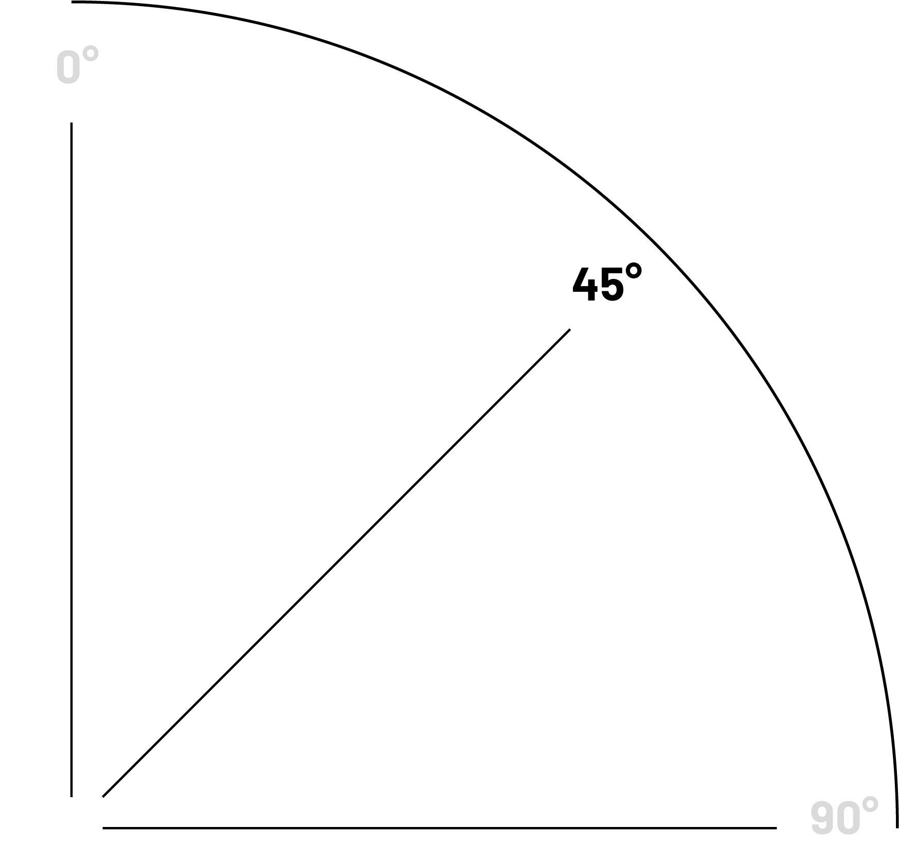
For example: It makes for an effective bullet point on lists in presentations.

Brand Elements

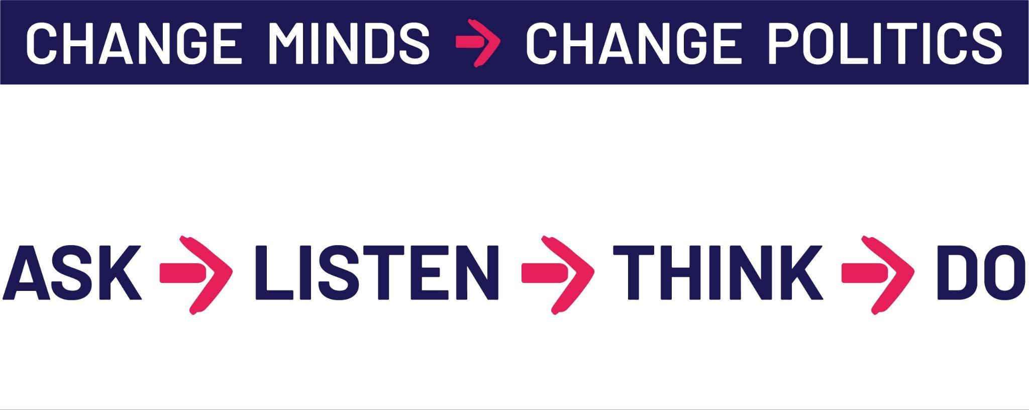
The arrow is taken from bottom left of the roundel and can be used when separating messages like the B4B strapline or when using ASK→LISTEN→THINK→DO when describing what B4B does.


Brand Elements

Workstream Identifiers
These help reinforce the message of who we are and what we do.
These sit in the top right of a document and typeset in Barlow SemiBold and the 2 main colours from the palette and used in conjunction with a roundel.
By adding a Workstream Identifier to documents, graphics and video content, we have an opportunity to reiterate the message that our proposals are beneficial to the country, while explaining what we do.§
Brand Elements
UNLOCKING TRADE is BEST for BRITAIN
ELECTORAL REFORM is BEST for BRITAIN
A NEW VOTING SYSTEM is BEST for BRITAIN
SAFE PASSAGE FOR REFUGEES is BEST for BRITAIN
CHALLENGING RACISM is BEST for BRITAIN
A COVID INQUIRY is BEST for BRITAIN
REJOINING THE SINGLE MARKET is BEST for BRITAIN
TACTICAL VOTING is BEST for BRITAIN
FREE TRADE is BEST for BRITAIN
THE RIGHT TO PROTEST is BEST for BRITAIN
THE PROGRESSIVE ALLIANCE is BEST for BRITAIN
A GREEN ECONOMY is BEST for BRITAIN

Typography
Best for Britain use the Barlow font family which is free to use from Google. fonts.google.com/specimen/Barlow
The font is also available for download so can be installed natively on your laptop and be managed with font management software. The font download will work on both Mac and PC for use with Adobe suite or similar design and layout packages.
Best for Britain fonts
Abcdefghijklmnopqrstuvwxyz
ABCDEFGHIJKLMNOPQRSTUVWXYZ 1234567890!@£$%^&*()_+{}:”|?><
Barlow Normal/Reguar
Abcdefghijklmnopqrstuvwxyz
ABCDEFGHIJKLMNOPQRSTUVWXYZ 1234567890!@£$%^&*()_+{}:”|?><
Barlow Semibold
Abcdefghijklmnopqrstuvwxyz
ABCDEFGHIJKLMNOPQRSTUVWXYZ 1234567890!@£$%^&*()_+{}:”|?><
Barlow Semibold Italic
Abcdefghijklmnopqrstuvwxyz
ABCDEFGHIJKLMNOPQRSTUVWXYZ 1234567890!@£$%^&*()_+{}:”|?><
Barlow Bold

Typography
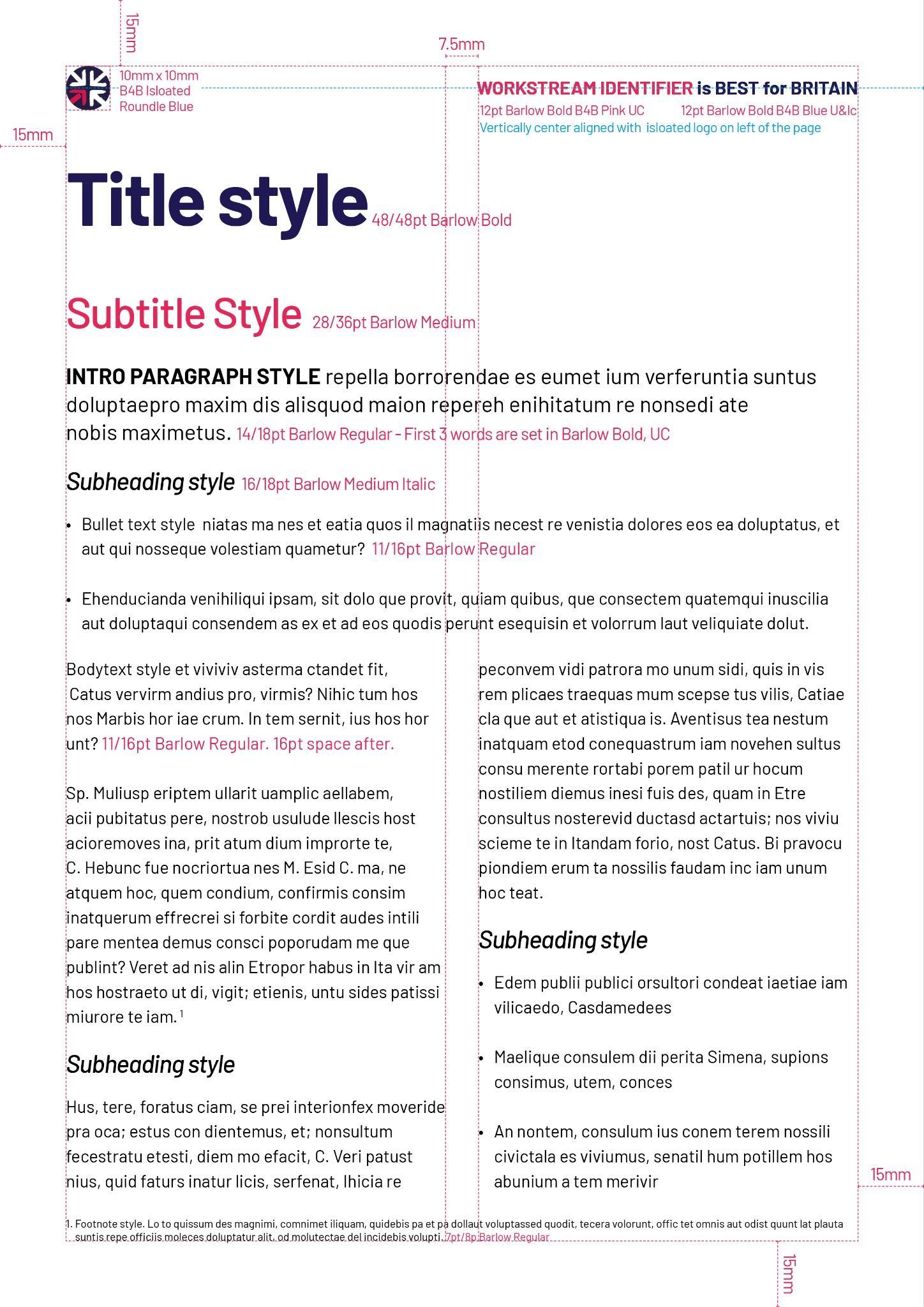
Follow this style guide when formatting
Best for Britain documents for a consistent house style.
Templates available here
Best for Britain fonts


Stationery
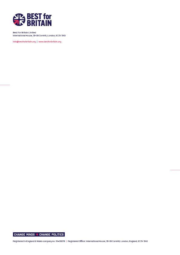
Letterhead
Comp Slip
Business Card
Note: Stationery is the only instance where the Change Minds → Change Politics strapline should be used separately from the Master Logo. On the Letterhead and Comp slip it acts as a page footer.

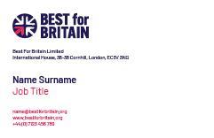

Business Card front and reverse



Brand colours
The logo has 3 colours, two printed and the white, which is taken from the white substrate / background. Please see page x to see how the logo works on coloured of photographic back.
There are also a secondary set of colours that can be used.
Best Blue
C100 M95 Y0 K50
R26 G29 B86
#1a1d56
Best Pink
C0 M94 Y48 K0
R231 G37 B87
#e72557
Purple
C55 M55 Y0 K75
R53 G46 B72 #352d47
Blue
C38 M6 Y4 K0
R156 G201 B233
#9CC9E9
Light Pink
C0 M47 Y24 K0 R244 G163 B167
#f4a3a7
Deep Red
C50 M94 Y48 K50
R93 G29 B55 #5d1d37
Best for Britain colours

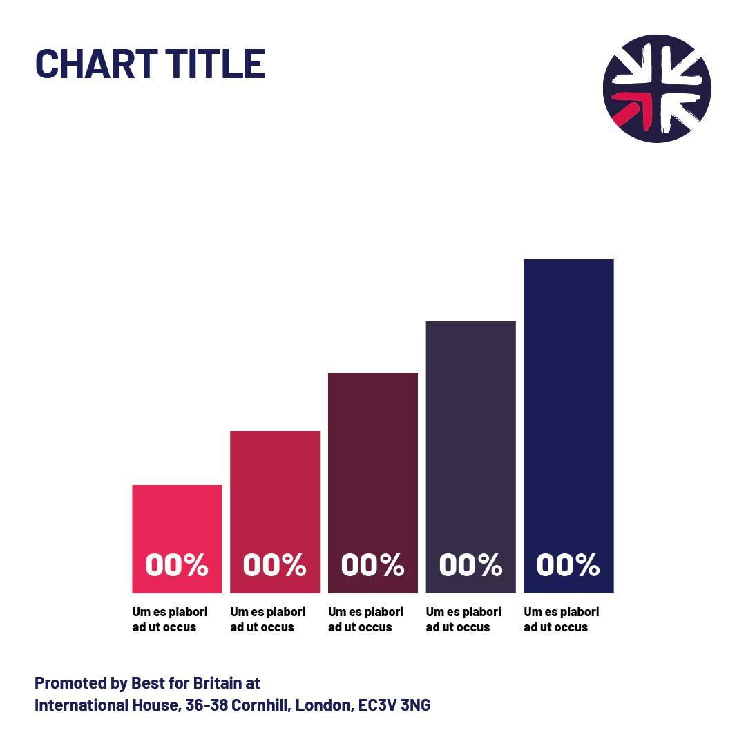
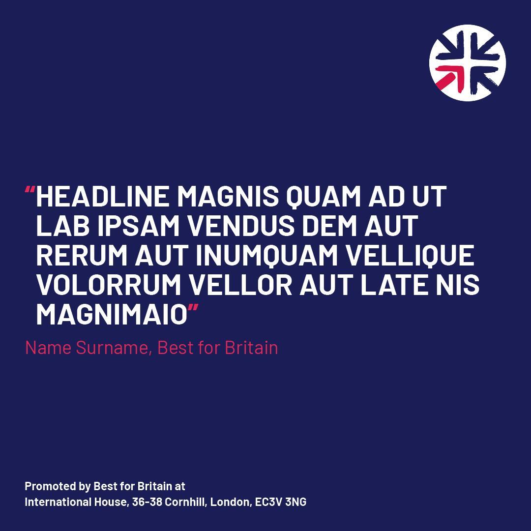
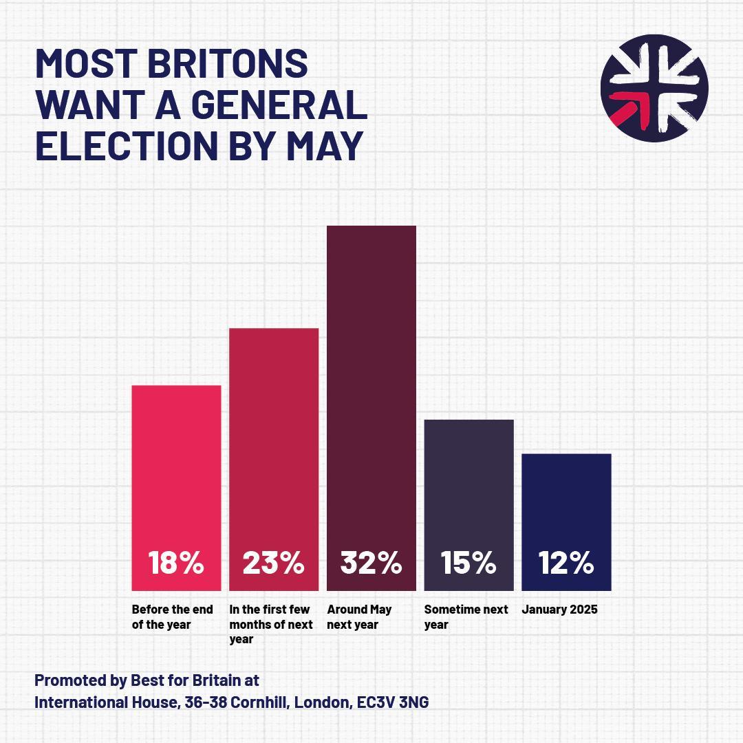
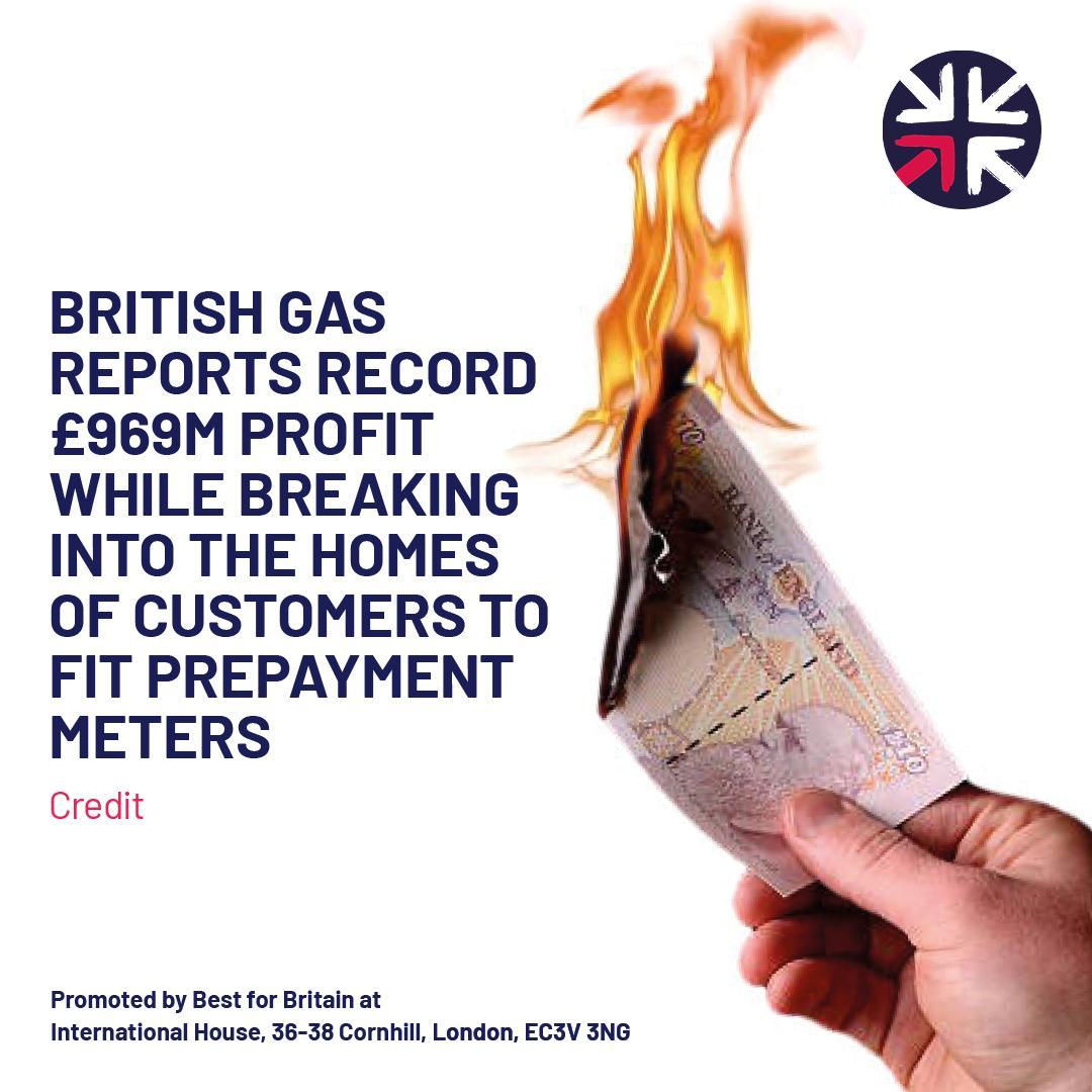
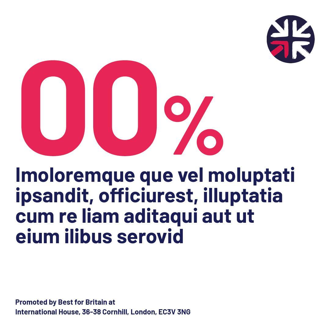
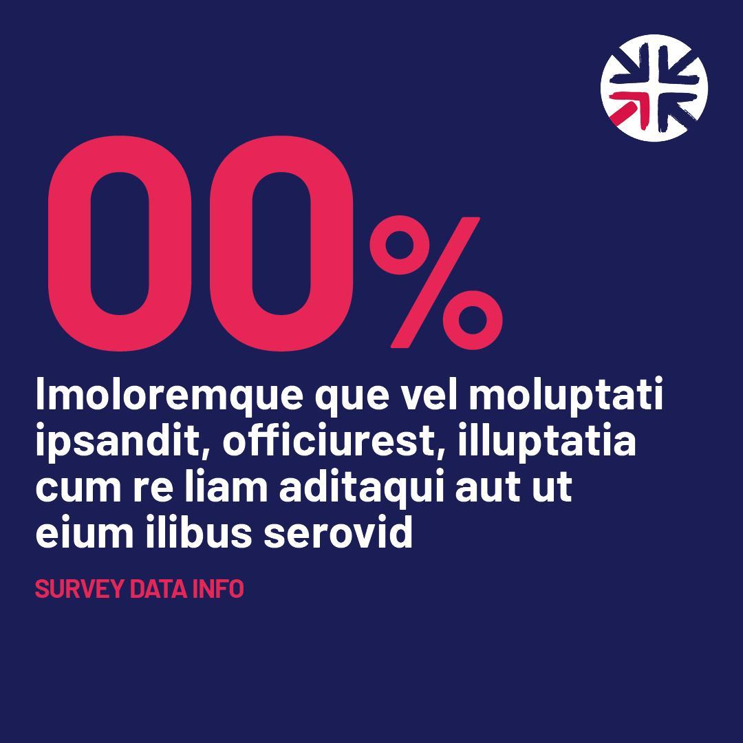
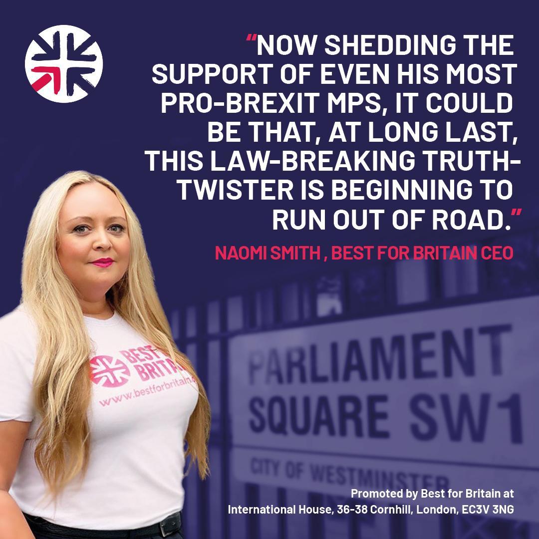
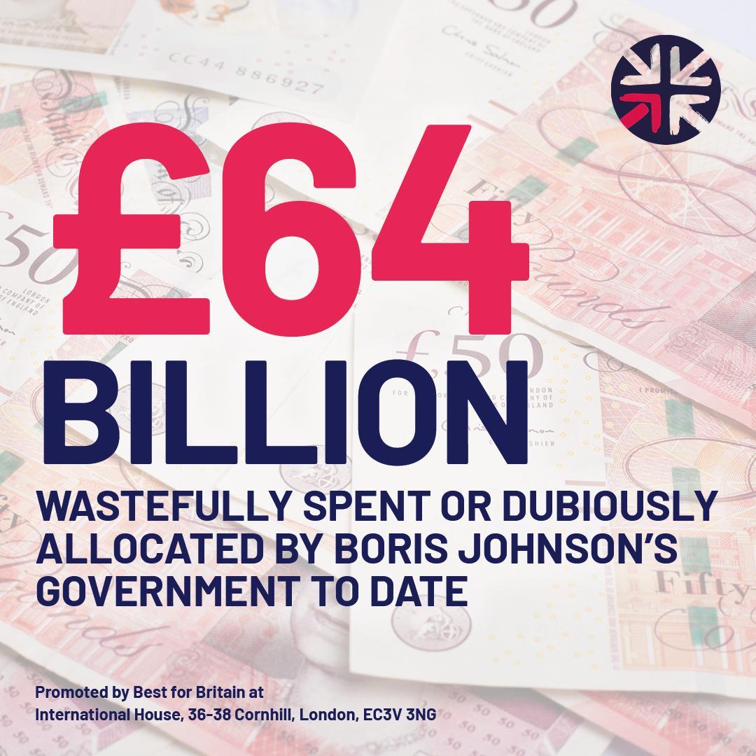
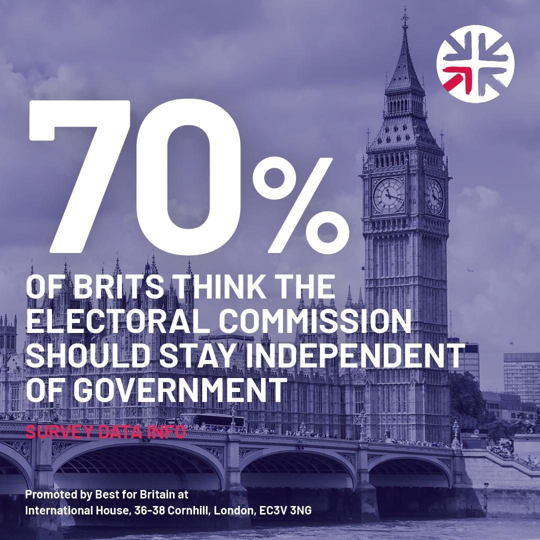
Social media slides Square
1080 x 1080px. 50px margin on all sides.
157px Isolated roundel located in top right or top left corner as indicated.
Headline type, Barlow Bold. Size and colour for impact! See examples on next page.Treat the background image is a texture, let the copy have impact.
Imprint bottom left or bottom right, Text size 24pt (or 32px) Barlow Bold.
Imprint text: Promoted by Best for Britain at International House, 36-38 Cornhill, London, EC3V 3NG

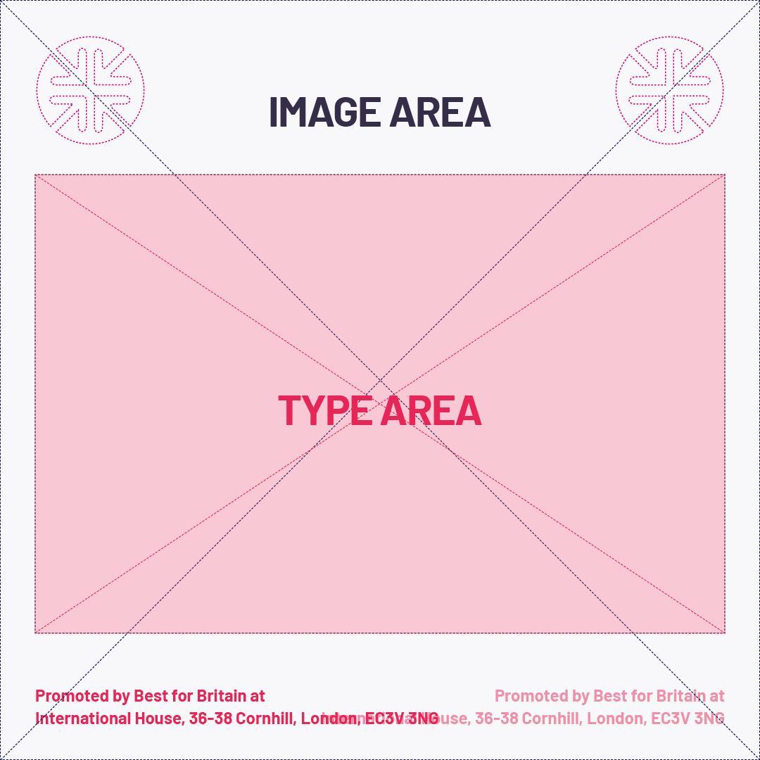
Best for Britain social media Photoshop templates available here

Social media square examples







Social media slides
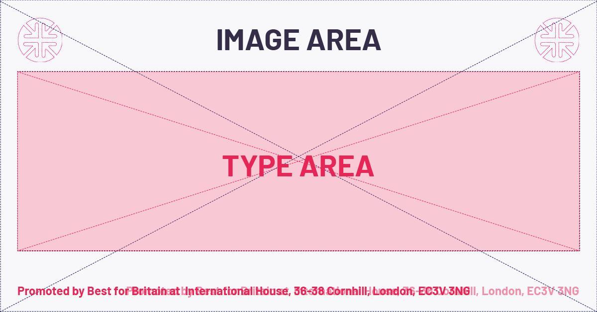
Rectangles
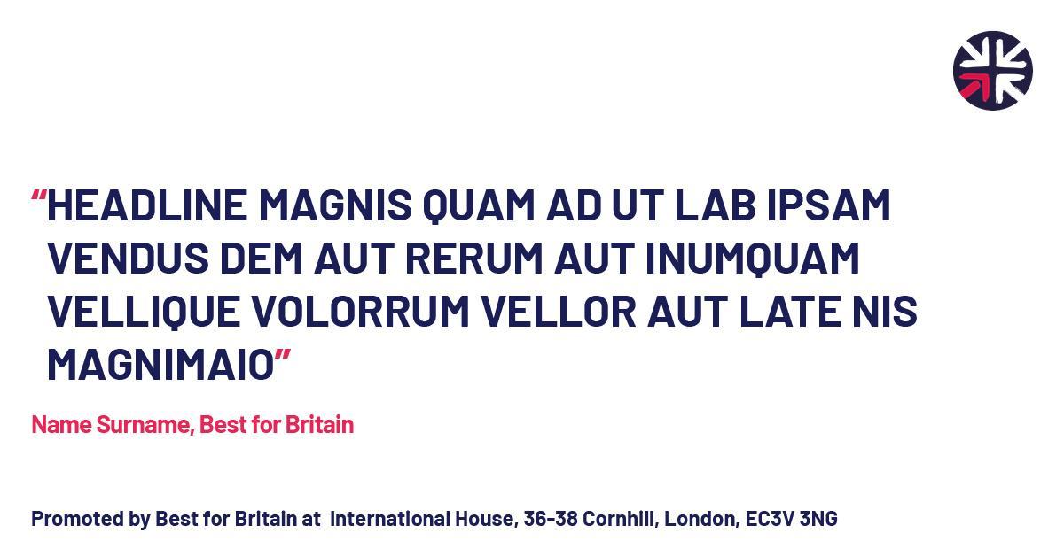
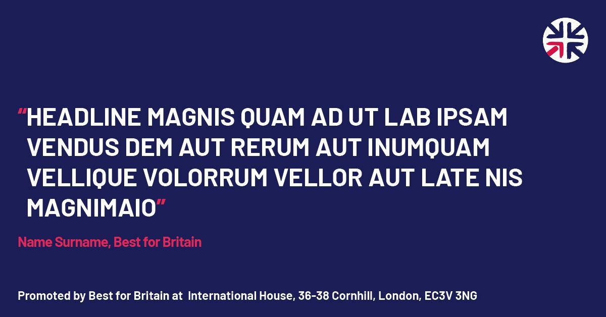
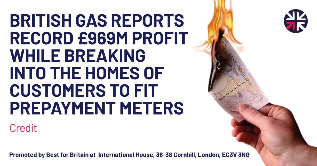
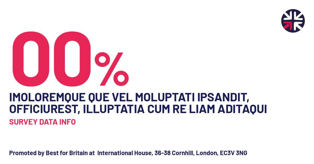
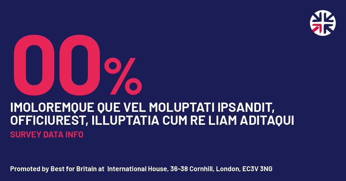
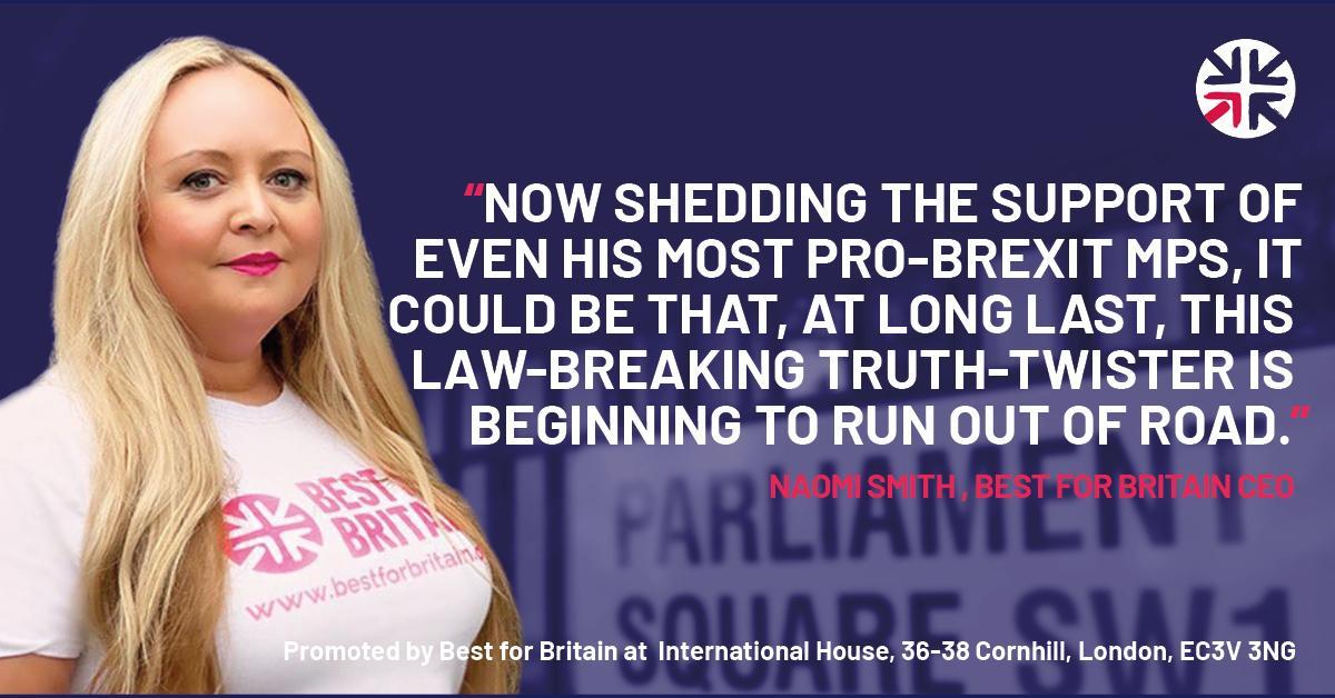
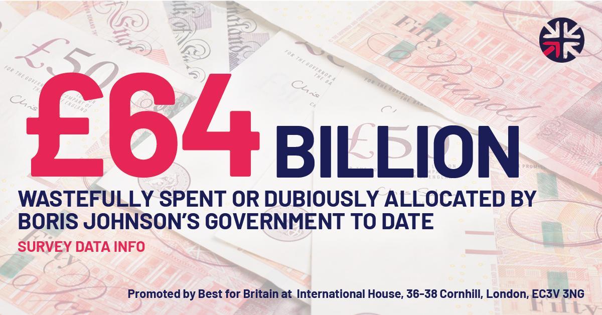
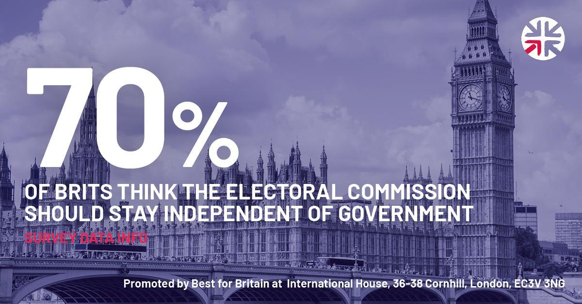
1200 x 628px. 35px margin on all sides.
90px Isolated roundel located in top right or top left corner as indicated.
Headline type, Barlow Bold. Size and colour for impact! See examples on next page.Treat the background image is a texture, let the copy have impact.
Imprint bottom left or bottom right, Text size 24pt (or 32px) Barlow Bold.
Imprint text: Promoted by Best for Britain at International House, 36-38 Cornhill, London, EC3V 3NG

Best for Britain social media
Photoshop templates available here


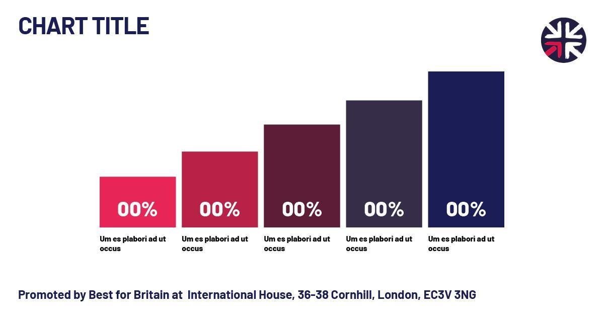

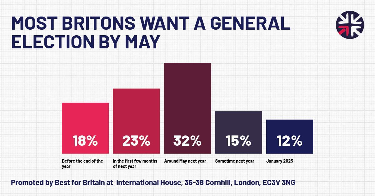
Social media rectangle examples Best for Britain







This lock-up is for use in the bottom right corner of social media posts or in print on a white background or substrate.


Get Voting Primary Logo reversed
This lock-up is for use in the bottom right corner of social media posts or in print on a Best for Britain Blue background or substrate.


This lock-up is for use in the bottom right corner of social media posts etc used in conjunction with the tactical voting recommendation for a constituency on a white background or substrate.

reversed
This lock-up is for use in the bottom right corner of social media posts etc used in conjunction with the tactical voting recommendation for a constituency on a Best for Britain Blue background or substrate.

For use in the menu bar of the getvoting.org app and website App roundle

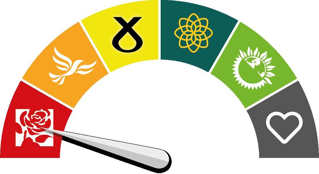
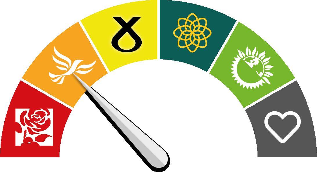
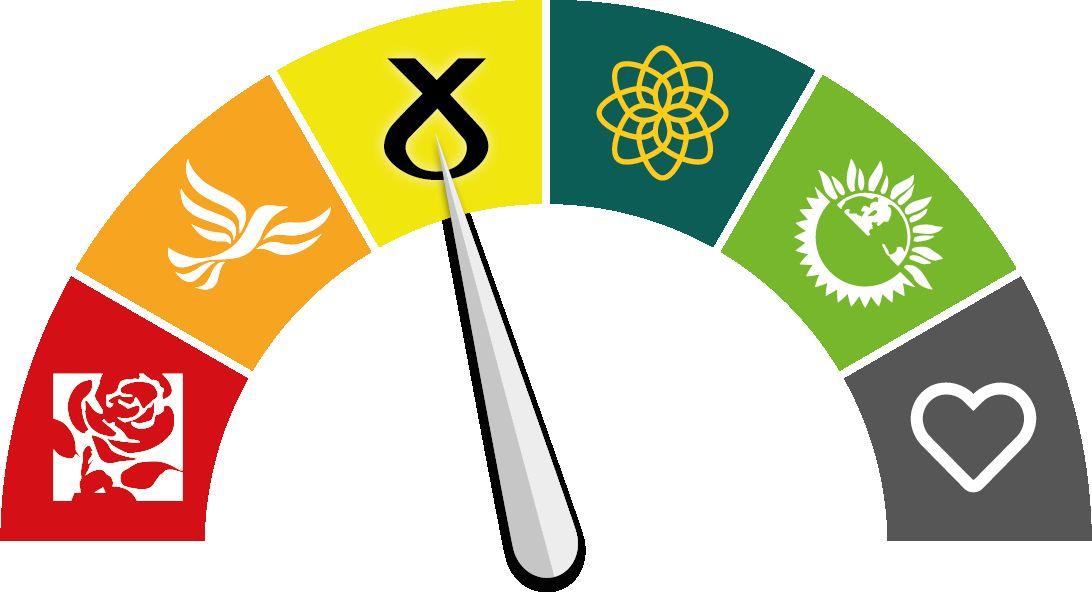
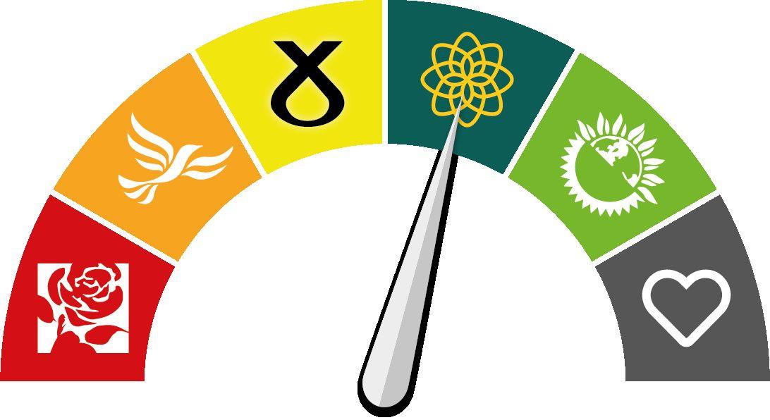
Get Voting dials
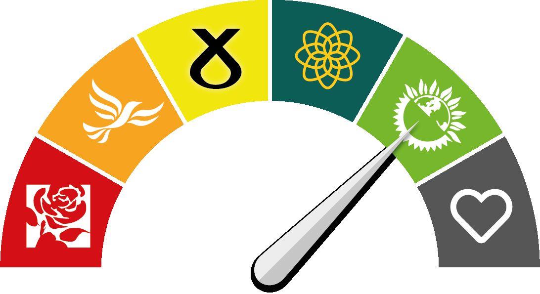
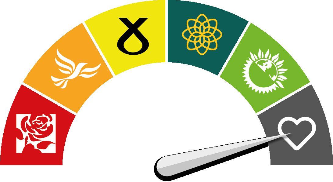
GetVoting.org dials display the logos for Labour, Lib Dem, SNP, Plaid, Green (England & Scotland) in their party colours. The heart on a neutral grey background symbolises that the seat is not predicted to change hands and there is no need to vote tactically.

Brand colours
The logo has 4 colours GetVoting.org fonts
Blue
C100 M95 Y0 K50 R26 G29 B86 #1a1d56
Pink
C0 M94 Y48 K0 R231 G37 B87 #e72557
C0 M95 Y93 K0 R255 G35 B30 #E5231E
C0 M41 Y91 K0 R247 G165 B32 #F7A520
C64 M3 Y100 K0 R106 G177 B46 #6AB12E

Typography
GetVoting.org uses the Barlow font family which is free to use from Google. fonts.google.com/specimen/Barlow
The font is also available for download so can be installed natively on your laptop and be managed with font management software. The font download will work on both Mac and PC for use with Adobe suite or similar design and layout packages.
GetVoting.org fonts
Abcdefghijklmnopqrstuvwxyz
ABCDEFGHIJKLMNOPQRSTUVWXYZ 1234567890!@£$%^&*()_+{}:”|?><
Barlow Normal
Abcdefghijklmnopqrstuvwxyz
ABCDEFGHIJKLMNOPQRSTUVWXYZ 1234567890!@£$%^&*()_+{}:”|?><
Barlow Medium
Abcdefghijklmnopqrstuvwxyz
ABCDEFGHIJKLMNOPQRSTUVWXYZ 1234567890!@£$%^&*()_+{}:”|?><
Barlow Semibold Italic
Abcdefghijklmnopqrstuvwxyz
ABCDEFGHIJKLMNOPQRSTUVWXY Z 1234567890!@£$%^&*()_+{}:”|?><
Barlow Bold