3 minute read
Branding for Downtown Largo


Challenges For Branding Downtown Largo
There are several significant challenges in establishing a recognizable and authentic brand for Downtown Largo. As mentioned in the introduction, there are multiple official names already associated with the area.
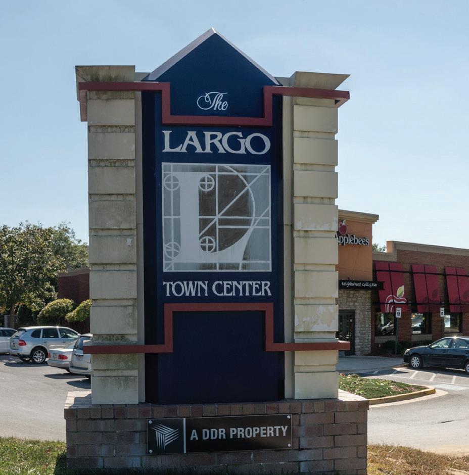
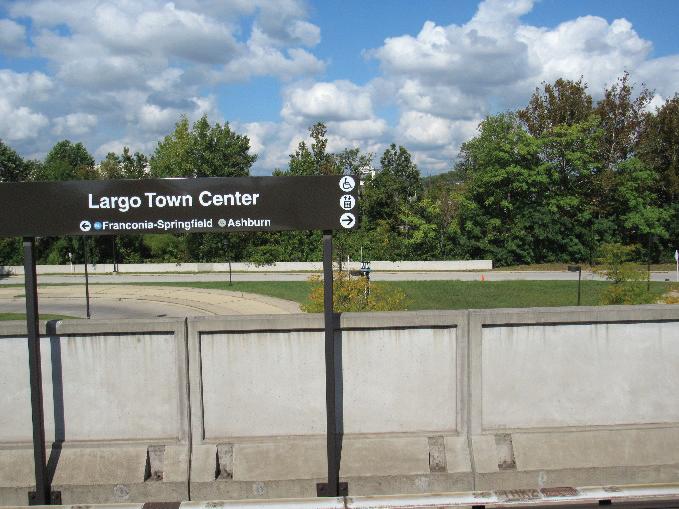
Largo Town Center. This was the name of the metro Station until September 2022 and has been used for prior planning documents, but it is also the name of one specific shopping center in the area.
Largo. This is how many local people refer to the area, but technically Largo is a Census Designated Place stretching two miles south of MD 214 between I-495 and MD 202, outside the study area.
Upper Marlboro. Many of the local mailing addresses in the study area are Upper Marlboro, although the Town of that name is some 10 miles away. The Post Office in the study area uses an Upper Marlboro zip code.
Downtown Largo. This name reflects the establishment of this area as one of the County’s downtowns.
Stakeholder and public input into the process revealed the challenges associated with the area being unincorporated: there is no directly elected local body with oversight responsibility for the development of the area. In addition, a significant number of people refer to the area in the context of landmarks such as the Capital Center and Boulevard at Cap Center that no longer exist.
In the absence of a coherent existing brand, development of the area has resulted in a confusing array of names for buildings, developments, and key landmarks in the community.


WHAT SHOULD BE DOWNTOWN LARGO’S BRAND?
The development of this strategy did not include the creation and testing of a specific brand identity for the study area. However, some powerful themes emerged about Downtown Largo that a more formal and extensive branding exercise should consider. These include:
• The designation of Largo as a major health sciences and wellness center for Prince George’s County and the development of the University of Maryland Capital Region Medical Center
• Conversations during a community workshop that focused on the idea of living in and loving Largo
• Responses from a community survey indicated people value walking and biking in Downtown Largo for recreational and fitness purposes
• The centrality of Town Center Park and Watkins Park as community spaces
• The idea that Downtown Largo is a healthy, holistic place to be
Potential Brand Components
Slogan or catchphrase
An authentic brand is captured in a slogan or phrase that immediately links an idea or concept to the place. For example, the community-generated concept that Largo is a place where people love living could be captured in a phrase such as Living Largo.
Building on this idea, the phrase Living Largo could be the core of a slogan with a dual meaning: Downtown Largo is a living place, and the people there are living a Largo lifestyle. This phrase could be developed further with variants that could be used in different circumstances to expand on the idea of Living Largo. Living Loving Largo captures both elements and suggests that people love living in Largo for everything it has to offer.
This pattern of alliteration would allow for inventive reuse of the brand by various entities as additional concepts and ideas emerge. Each successive variant would strengthen the connection with the brand while connecting its meaning to specific needs of a particular location, campaign, or activity related to the brand.
Color Palette
In addition to the slogan or catchphrase, a detailed branding initiative will recommend a strong, identifiable color palette to be used for all Downtown Largo branding.
Continuing with the example of Living Largo, the brand might be built around a color palette that conveys a healthy, livable lifestyle. As an example, M-NCPPC has a secondary color palette for graphics and publications that is composed of natural tones that reflect the intersection of nature and urban life. Using colors from the palette would effectively reinforce the Living Largo brand. In addition, the selection of a color palette such as this would avoid reference to the color palettes of the commercial, institutional, and sports entities in Downtown Largo and the immediate vicinity.
Branding Case Studies
River Arts District, Asheville, NC
The River Arts District sits between Downtown Asheville, NC, and the French Broad River. The district is an extensive collection of renovated warehouses and industrial sites now housing a thriving arts community. In addition to artist studios, the area has a strong visual brand and wayfinding system that connects the different buildings and sites, making it easy for visitors and residents to navigate.


Tysons, VA
For long-time residents of the Washington DC metropolitan area, Tysons Corner is synonymous with a regional shopping center and bad traffic. It was the quintessential 1980’s-era edge city, a rapidly growing suburban retail and office center located just outside the Capital Beltway. In the intervening decades, the area has undergone a transformation. The area is now served by four Silver Line Metro stations. There is a rapidly increasing residential population and a commitment to developing a more walkable, bike-friendly community that supports and compliments improved transit service.
In 2021, the Tysons Partnership announced the adoption of a new brand for Tysons, complete with a detailed philosophy behind the new name and guidelines for using the new name.


