arc October/November 2017 - Issue 100

Page 1

100 OCT/NOV 2017

www.arc-magazine.com

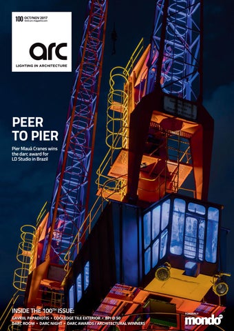
PEER TO PIER Pier Mauá Cranes wins the darc award for LD Studio in Brazil

INSIDE THE 100TH ISSUE: GAVRIIL PAPADIOTIS • COOLEDGE TILE EXTERIOR • BPI @ 50 DARC ROOM • DARC NIGHT • DARC AWARDS / ARCHITECTURAL WINNERS

FORMERLY


Darc Magazine Ad-GABIO-newv2_OP.pdf

1

4/9/17

7:09 pm

MEGAMAN® GABIO LED Pendant Louvre

C

M

Y

CM

MY

CY

CMY

K

MEGAMAN® GABIO LED pendant direct/indirect

commercial spaces. • Slim aluminum linear profile ≤19)

• I

X-joint

27–30 October 2017

Visit us at Stand 1D-B02

T-joint

Linear-joint

L-joint

MEGAMAN® congratulates mondo*arc on 100 editions!


Featured products: Osca 140 Round & Square


Because good design demands simplicity.™

British lighting design since 1997 | astrolighting.com


Cleveland House – Bath Anolis ArcLineTM Outdoor 20MC RGBNW non-optical linear luminaires were used above the public footpath the Grade Listed tunnel. The chosen luminaires had to be sympathetic to the tunnels heritage which is why Enlightened Lighting were the designers and installer, selected the ArcLine range for their low profile, non-intrusive footprint and performance that would not only make the tunnel safer but enhance the tunnels atmosphere.

CLEVELAND HOUSE, BATH Powered and controlled remotely by the ArcPowerTM 384 Rackmount, and a single ArcPowerTM 36 allowed for easy installation of the low voltage cable infrastructure adhering to the strict restrictions of planning.

HQ & Factory: Anolis, Hážovice 2090, 756 61 Rožnov pod Radhoštem, Czech Republic, Tel.: +420 571 751 500, Fax: +420 571 626 337, Email: info@anolis.eu North America: Anolis Lighting, 12349 SW 53rd Street, Suite 202, Cooper City, Florida 33330, USA, Tel.: 1-844-426-6547, Email: info@anolislighting.com UK: Anolis UK, 3 Spinney View, Stone Circle Road, Round Spinney Industrial Estate, NN3 8RF, Northampton, United Kingdom, Tel.: 01604 741000, Email: info@anolis.co.uk France: Anolis France, ZI Paris Nord 2, Bâtiment Euler, 33, rue des Vanesses, 93420 Villepinte, Tel.: +33 1 48 63 84 81, Fax: +33 1 48 63 84 87, E-mail: info@robelighting.fr Germany: Anolis Deutschland Gmbh, Carl-Zeiss-Ring 2185737, Ismaning, Germany, Tel.: +49 89 9993 9090, Fax: +49 89 9993 9091, E-mail: info@robelighting.de Asia and Pacific: Anolis Asia Pacific, 12 New Industrial Road, #02-05 Morningstar Centre, S-536202, Singapore, Tel.: +65 6280 8558, Email: asiapacific@anolis.eu Middle East: Anolis Middle East, Al Asmawi Building DIP, Office Nbr 507 5th floor, Po Box: 391 898, Dubai, UAE, Tel.: +971 4 885 3223, Email: middleeast@anolis.eu

anolis.eu | anolislighting.com


Leading Lighting Solutions


darc awards winner: Best of the Best & Live - House X, Singapore by Redbean Architects & Limelight atelier


Calling all designers! Get involved in darc awards / decorative 2018 Where: Fabric, London When: 31 May 2018 What: Celebrating the best in lighting design Awards Entry Period Opens: 1 December 2017 For more info visit: www.darcawards.com/decorative


with thanks to‌

Organised by

Media partner

In collaboration with

Supported by

darc night installation partner

Venue partner


a creative lighting exhibition at London Design Festival

www.darcroom.com


Arc-adv-okt-nov-OL.indd 1

28-09-17 12:11


PERFORMANCE SERIES

PERFORMANCE XS

PERFORMANCE S

PERFORMANCE M

PERFORMANCE L

1100 + 1150 Lumen 3000 K + 4000 K CRI 80

550 – 1600 Lumen 3000 K + 4000 K CRI 80

1000 – 2100 Lumen 3000 K + 4000 K CRI 80

1300 – 3200 Lumen 3000 K + 4000 K CRI 80

PERFORMANCE SPOT XS / S / M / L ■ ■ ■ ■

6 reflectors (silver, white, black, specular, chrome black and gold) Beam angles 20° till 60° UGR < 10 till UGR < 21 optional trimless version for installation in plasterboard ceilings

PERFORMANCE WALLWASHER S / M / L ■ asymmetrical reflector for homogeneous wall illumination ■ optional trimless version for installation in plasterboard ceilings

MBN GmbH Balthasar-Schaller-Str. 3 86316 Friedberg · Germany Phone +49.821.60099-0 Fax +49.821.60099-99 info@proled.com

proled.com


Aditi Govil Akari-Lisa Ishii Alberto Pasetti Alexander Mankowsky Dr. Alexander Rieck Ali Mahmoudi Allan Ruberg Dr. Amardeep Dugar Ana Miran Andres Sanchez Anne Bureau Anuj Gala Barbara Bochnak Barbara Matusiak Birgit Bierbaum Carla Wilkins Carlijn Timmermans Caroline Hoffmann Cashel Brown Chandrashekhar Kanetkar Christiaan Weiler Christian Klinge Christina Hébert Christopher Cuttle Colin Ball Dario Maccheroni Dashak Agarwal Dean Skira Deborah Burnett Edwin Smida Dr. Elke den Ouden Emmanuel Clair Emrah Baki Ulas Fanny Guerard Francesco Iannone Gilberto Franco Glenn Shrum Gregor Gärtner Gudjon Sigurdsson Dr. Heli Nikunen Henrika Pihlajaniemi Imke Wies van Mil Inger Erhardtsen Ion Luh Isabelle Corten James Benya Jenny Werbell Joe Vose Prof. Dr. John Mardaljevic Jonathan Rush Juan Ferrari Kapil Surlakar Dr. Karolina Zielinksa Kathryn Gustafson Dr. Katja Bülow Kevan Shaw Koert Vermeulen Konstantinos Labrinopoulos Linus Lopez Lyn Godley Malcolm Innes Marina Lodi Mark Major Martin Hofer Martin Tamke Maryam Khalili Maurici Ginés Michael Grubb Pascal Chautard Paul Traynor Prof. Peter Andres Rafael Gallego Dr. Rianne Valkenburg Richard Taylor Rozenn Couillard Dr. Rune Nielsen Sara Castagné Serena Tellini Dr. Sergei Gepshtein Simon Berry Simon Ewings Sophie Caclin Sophie Stoffer Stephen Willacy Prof. Susanne Brenninkmeijer Susheela Sankaram Tapio Rosenius Thorsten Bauer Tino Kwan Prof. Uwe Belzner Vellachi Ganesan Ptof. Werner Osterhaus Zhuofei Ren

7

www.pld-c.com

Paris

Professional Lighting Design Convention 01. – 04. November, 2017 - shift happens -

Programme out now!

170825_darc_236x333_3mm.indd 2

More than 80 paper presentations More than 1700 attendees expected Keynotes given by leading experts Exhibition of leading manufacturers Gala dinner and PLD Recognition Award Marketplace for the PLD community Excursions Pre-convention meetings Cities’ Forum Experience rooms Recognised as an official CPD event by the PLD Alliance The Challenge: Final round Social events

Aditi Govil Akari-Lisa Ishii Alberto Pasetti Alexander Mankowsky Dr. Alexander Rieck Ali Mahmoudi Allan Ruberg Dr. Amardeep Dugar Ana Miran Andres Sanchez Anne Bureau Anuj Gala Barbara Bochnak Barbara Matusiak Birgit Bierbaum Carla Wilkins Carlijn Timmermans Caroline Hoffmann Cashel Brown Chandrashekhar Kanetkar Christiaan Weiler Christian Klinge Christina Hébert Christopher Cuttle Colin Ball Dario Maccheroni Dashak Agarwal Dean Skira Deborah Burnett Edwin Smida Dr. Elke den Ouden Emmanuel Clair Emrah Baki Ulas Fanny Guerard Francesco Iannone Gilberto Franco Glenn Shrum Gregor Gärtner Gudjon Sigurdsson Dr. Heli Nikunen Henrika Pihlajaniemi Imke Wies van Mil Inger Erhardtsen Ion Luh Isabelle Corten James Benya Jenny Werbell Joe Vose Prof. Dr. John Mardaljevic Jonathan Rush Juan Ferrari Kapil Surlakar Dr. Karolina Zielinksa Kathryn Gustafson Dr. Katja Bülow Kevan Shaw Koert Vermeulen Konstantinos Labrinopoulos Linus Lopez Lyn Godley Malcolm Innes Marina Lodi Mark Major Martin Hofer Martin Tamke Maryam Khalili Maurici Ginés Michael Grubb Pascal Chautard Paul Traynor Prof. Peter Andres Rafael Gallego Dr. Rianne Valkenburg Richard Taylor Rozenn Couillard Dr. Rune Nielsen Sara Castagné Serena Tellini Dr. Sergei Gepshtein Simon Berry Simon Ewings Sophie Caclin Sophie Stoffer Stephen Willacy Prof. Susanne Brenninkmeijer Susheela Sankaram Tapio Rosenius Thorsten Bauer Tino Kwan Prof. Uwe Belzner Vellachi Ganesan Ptof. Werner Osterhaus Zhuofei Ren

25.08.17 13:27


THE ILLUMINATION OF STUDIO CITY MACAU Hollywood has come to Macau with the opening of the newest attraction, Studio City. The facade lighting of Studio City has been a single all-encompassing project for illumination Physics, from concept to completion. The lighting design and the purpose specific design of the fixtures manufactured and supplied by illumination Physics include over 12,000 luminaires for the podium and towers. illumination Physics is a project focused total service provider.

Specialists in customised lighting to suit your design

illuminationphysics.com IP2849_MSC-FINAL-SinglePage-FINAL.indd 1

2/03/2016 9:52 AM


Area

Eclipse

Eclipse

Area

Eclipse is a suspended large format fitting offering both indirect and direct lighting. Available in a number of variants with differing lumen outputs from 57watt 7600 lumens to 140watt 17800 lumen output. There are DALI versions available on request.

A versatile projector that can solve any problem in spot lighting, commercial and exhibition applications. Area has 4 different angles of focus including medium, intensive, extensive and washer. Units are available with lumen outputs from 2580lm 3000k to 5530lm 4000k. The fittings are supplied in black or white as standard, there is the option of custom finish if required.

Unit 5 Ninian Park Ninian Way, Tame Valley, Tamworth B77 5ES 01827 816333 |

sales@normagrup.uk |

www.normalit.uk |

@NormagrupUK


MONDO AD FL family 17-09-29.pdf 1 2017-09-29 10:31:21 AM

C

M

Y

CM

MY

CY

CMY

K


PROJECTS

064 Gavriil Papadiotis A profile of the Greek lighting designer who is making a name for himself in the field of photography.

P

O

Contents

OCT/NOV 2017 024 Editorial Comment 026 Headlines 028 Eye Opener 030 Drawing Board 036 Spotlight 044 Briefing 046 Snapshot 178 Case Studies 200 Dark Source Stories 202 IALD Column 204 New Products 208 Event Diary 210 Inspirations

048 BPI @ 50 A celebration of Brandston Partnership Inc.’s 50 years with a look at ten pivotal projects over five decades.

123 darc awards / architectural The winners from this year’s awards as voted for by independent lighting designers and light artists around the world.

148 darc night A celebration of the best international lighting design that took place in London on 14th September.

168 darc room A look back at the creative lighting specification exhibition that took place during London Design Festival.

176 Product Review David Morgan takes a closer look at darc awards / architectural exterior product winner, TILE Exterior by Cooledge.

188 Manchester International Festival The sixth Manchester International Festival took place this summer, taking over venues across the city to showcase eclectic works of art.

194 Lighting Detectives Held over three days in June, the Lighting Detectives celebrated its 27th anniversary with a special Forum in Kyoto, Japan.

020

www.arc-magazine.com


Discover it at

Paris, 1-4 November Booth #S04

GOBOLED 7-Pro UNLIMITED OUTDOOR IMAGE CREATION

www.griven.com

Brighter than a traditional 575W discharge lamp and packed with multiple effects and patterns, GOBOLED 7-Pro offers broad creative design integration for permanent exterior installations.

GRIVEN S.r.l. I Castel Goffredo (MN) Italy I Tel. +39.0376.779483 I sales@griven.com


PROJECTS

074 Pier Mauá Cranes, Brazil Two beautiful and sculptural cranes from the ‘60s in the downtown port of Rio de Janeiro is a record of a glorious past. LDStudio has brought it up to date and won the ultimate darc award into the bargain.

P

O

Projects

OCT/NOV 2017

082 Bahá’í Temple of South America, Chile Winner of the PLACES: High Budget category in the darc awards / architectural, Limarí Lighting Design has created a subtle yet stunning scheme to enhance the last temple built by the Bahá’í community

090 Cleveland House Canal Tunnel, UK A simple yet effective lighting scheme scooped the SPACES: Low Budget award for local lighting install company Enlightened.

096 Nova Lumina, Canada Winner of the SPACES: High Budget category, Moment Factory’s Nova Lumina is a unique illuminated night walk experiences that aim to bring people together in a new format of outdoor immersive experience.

106 German Ivory Museum, Germany A controversial subject but a magical lighting design from Licht Kunst Licht won the PLACES: Low Budget category by highlighting the exhibits through the use of hidden, glare-free light sources.

114 Twisted, Croatia Part of the Zagreb Festival of Lights program, Twisted by Skira is a site-specific object enhanced by RGB lines that are integrated into the supporting structure. Winner of the ART: High Budget category.

022

www.arc-magazine.com


2017 Innovation Award

ARCHITECTURE + PRESENTATION

WINNER

Moto - Gimbalo 130

C

M

Y

CM

MY

MOTOLUX

CY

CMY

K

Motorized Remote Controlled Lighting

All its power in your hands

r e v o l u t i o n a r y l i g h t i n g t e c h n o l o g y | controlled at the touch of a button MOTOLUX, an award winning, revolutionary lighting concept using patented technology to easily and fully control light orientation, intensity and tune the white colour temperature by a hand held transmitter or CASAMBI or DMX-512.

The MOTOLUX remote control will be able to drive the tilt movement of one or more fixture up to +/- 40°on a dual axis gimbals.

Moto-Gimbalo, available in two different sizes, incorporates the carefully engineered miniature motors, above the ceiling line in a patented design, which makes it an excellent fixture for retail and hospitality applications.

Moto-Gimbalo offers the flexibility to reorient the light and create ambient lighting scenarios in architectural spaces which are often reconfigured for different uses, while maintaining a minimalist ceiling aesthetic.

www.formalighting.com


PROJECTS

EDITORIAL

Pier Maua Cranes, winner of the darc award at darc awards / architectural.

Editorial Publisher / Editor Paul James p.james@mondiale.co.uk Assistant Editor Matt Waring m.waring@mondiale.co.uk Editorial Assistant Sarah Cullen s.cullen@mondiale.co.uk

Advertising International Advertising Manager Jason Pennington j.pennington@mondiale.co.uk International Advertising Sales Andy White andy.w@mondiale.co.uk Steven Willcox s.willcox@mondiale.co.uk

Subscriptions Moses Naeem m.naeem@mondiale.co.uk

Production David Bell d.bell@mondiale.co.uk Mel Robinson m.robinson@mondiale.co.uk Zoe Willcox z.willcox@mondiale.co.uk

Chairman Damian Walsh d.walsh@mondiale.co.uk

Finance Director Amanda Giles a.giles@mondiale.co.uk

Credit Control Lynette Levi l.levi@mondiale.co.uk arc Strawberry Studios, Watson Square Stockport SK1 3AZ, United Kingdom T: +44 (0)161 476 8350 www.arc-magazine.com arc@mondiale.co.uk

100 not out! We’ve made it to an unbeaten century and, as you will have (hopefully) noticed, we’ve made a significant change... Yes, we wave goodbye to a dear old friend, mondo*arc, and say a big ‘Hello!’ to our new best buddy arc, the international publication for lighting in architecture. Apart from a name change and a redesign, everything else remains the same. Following feedback from you,

our readers, we have kept the inspirational project articles and top

designer profiles along with the latest lighting technology insights.

It’s been a long journey and, initially a steep learning curve. I’m the first to admit that when we started we didn’t know our Artemides from our Erco’s and Speirs + Major was the only lighting design practice we were really familiar with due to their work in the

entertainment sector from where we came (mondo*arc began life as

a supplement to mondo*dr magazine, our publication for technology in entertainment). It was through the encouragement of key players in the profession such as Jonathan Speirs that we persevered and

have now reached our 100th issue with two awards programmes and an exhibition under our belts.

The reason for the name change is a strategic one. With our

sister title, darc, for decorative lighting in architecture, and our

events division featuring the darc room exhibition, darc thoughts conference, darc awards / architectural, darc awards / decorative

and the darc night party, the arc brand is a natural fit into the (d)arc portfolio.

Architectural and decorative lighting for specification is our focus

and this was emphasised in our recent darc room exhibition that was part of London Design Festival. Featuring some great architectural and decorative lighting brands, as well as light installations and a

fantastic darc thoughts design conference, darc room really wowed the crowd and even featured in Wired’s ‘Top 10 Must See Events’ at

Printed by Buxton Press

London Design Festival. Thank you to everyone that participated and

Annual Subscription rates: United Kingdom £30.00 Europe £50.00 ROW £65.00

For now, enjoy the new look arc magazine and please give us your

To subscribe visit www.arc-magazine.com or call +44 (0)161 476 5580

visited. We’d love to do it again some time. Watch this space!

feedback. We hope you like it. With your support we would love to hit a double century.

arc, ISSN

17535875, is published bi-monthly by Mondiale Publishing, Strawberry Studios, Watson Square, Stockport, Cheshire, SK1 3AZ. Subscription records are maintained at Strawberry Studios, Watson Square, Stockport, Cheshire, SK1 3AZ. Spatial Ltd is acting as our mailing agent.

024

www.arc-magazine.com

Paul James Editor


ZENO light for art

ZENO

passion for art

Light is responsible for the valorisation of works of art, favouring both the authenticity of its representation, as well as its conservation. ZENO is the professional LED projector dedicated to art, capable of guaranteeing the perfect balance between chromatic accuracy, safety and energy efficiency.

targetti.com


PROJECTS

NEWS

Headlines darc awards / architectural reaches climax at darc night (UK) - LD Studio of Brazil won the coveted darc award during darc night, the darc awards / architectural ceremony, that took place at MC Motors in London on September 14th.

New majority owner for Gamox (Norway) - Triton have acquired more than 75% of shares in Norwegian lighting group, Glamox.

John Cullen Lights up India (India) - As part of its strategy for continued growth, John Cullen Lighting has extended its operations to the Indian sub-continent.

darc room breaks the mould of lighting exhibitions (UK) – darc room, London Design Festival’s creative lighting specification exhibition organised by mondo*arc, darc and Light Collective, attracted over 1,000 attendees for its inaugural event in the heart of London. Read more on www.arc-magazine.com

Nulty opens new Beirut office (Lebanon) - International architectural lighting design practice Nulty has launched a Beirut office, its third after Dubai (established in 2016) and the London HQ (established in 2011).

Keynote speakers for IALD Enlighten Americas (USA) - Cinematographer Roberto Schaefer and electronic artist Rafael Lozano-Hemmer to open and close conference.

St. Petersburg to be centre of Russian lighting culture (Russia) - The fourth annual International Research-to-Practice Conference on Lighting Design will be held in St. Petersburg in October.

Nordeon Group strengthens (Netherlands) – Nordeon Group appoints Louis van Uden as CEO and establishes an advisory counsel.

University of Wismar and Wings Lighting Design adds to Masters programme (Germany) – The Architectural Lighting and Design Management Master’s programme now includes a specialisation in ‘Heritage Lighting’.

Martin Valentine joins Ligman as Global Design Director (UK) – Martin Valentine has left his role as Lighting Expert at the Municipality of Abu Dhabi to become of Global Design Director of the Thailand-based lighting manufacturer, Ligman. Read more on www.arc-magazine.com

026

www.arc-magazine.com


028

www.arc-magazine.com


EYEOPENER

Reflection Room London, UK

Flynn Talbot, Lighting Designer from Western Australia, with support from Barrisol, Tryka LED and Seam Design, has graced the halls of the Victoria and Albert Museum in London to create Reflection Room, an installation commissioned as part of the London Design Festival. Using the Prince Consort Gallery as his canvas, the once textile storage room has been transformed into a reminiscent Western Australian horizon. The clashing blue and orange lights mimic the sunset over the deep blue oceans and allow onlookers to make their own interpretations of the immersive colour experience. Talbot used 56 custom made panels of gloss black PVC from Barrisol, and woven within these panels at each end of the room are Tryka LED profiles

emitting vivid orange and blue hues, transforming the room into a rich, reflective space of coloured light, made with a futuristic textile that pays homage to the history of the room itself. “It’s my story that I can put into this amazing building. Everyday, the sun setting into the water, you’ve got the contrast of the orange and blue. It’s this really warm and energetic light combined with this very cool, calming blue and it just has some kind of magic to it that’s been a thread throughout my colour exploration works.” www.flynntalbot.com

Pic: Mark Cocksedge

www.arc-magazine.com

029


DRAWING BOARD

Pic: Paris 2024 (ph.guignard@air-images.net Populous-Luxigon)

Paris 2024 Summer Olympics France Ambitious plans to transform Paris into an Olympic Park for the 2024 Olympic and Paralympic Games have been officially approved by the International Olympic Committee (IOC) as it named the French capital as the host of the 2024 Summer Olympics. Populous, the International sports and entertainment design practice, and Egis, the Paris-based, international consultancy, engineering and operation group, were chosen in 2016 to collaborate on the Paris 2024 bid and have provided the necessary technical expertise and assistance required to develop plans for no fewer than 38 Olympic and Paralympic venues spread across Paris. The winning concept of Paris as an Olympic Park will see Olympic and Paralympic events take place against the spectacular backdrop of Paris’ historic buildings, streets and landmarks. The Games will build on the history and identity of Paris, as well as its experience in hosting the climax of the Tour de France, to create an unforgettable experience. The architectural design for both new and temporary venues and facilities will seek to shape and integrate sporting spectacles in the city’s urban landscape whist supporting Paris

030

www.arc-magazine.com

2024’s commitment to be the most sustainable Games ever. Populous’ involvement with Paris 2024 takes its overall major events experience to thirteen Olympic and seven Paralympic Games including Sydney 2000, London 2012, and Rio 2016. Populous is also the only firm to have designed three main Olympic stadiums. It advises on the full design and delivery spectrum, from assisting bid teams with submissions, helping master plan the major venues and facilities, to the design of the main stadium and hundreds of temporary venues needed to support modern Games. Populous Senior Principal Ben Vickery said: “We are proud to have played a part in the successful Paris 2024 bid. The city of Paris will be a magnificent Olympic Park and the transformation of some of the world’s most beautiful and historic sites into temporary stunning stages for sport will provide unforgettable images around the globe.” Populous Principal Francois Clement added: “Paris is one of the leading cities of the C40 focusing on tackling climate change while improving the health and wellbeing of its citizens. Paris 2024 will share with the world

an unforgettable and emotional Olympic and Paralympic Games, anchored in the core values and ideals of the IOC. “Populous was delighted to be part of the team turning Paris into an elegant and connected Olympic Park , delivering stunning venues in one of the most prestigious World Heritage sites.” Egis’s experience in sporting venues includes its contributions to major projects such as the construction or renovation of most of the host stadiums used during the 2016 UEFA European Championship. Outside France, Egis is also involved in several other sports facilities such as the Baraki stadium in Algiers, Algeria; the Olympic stadium in Istanbul, Turkey; stadiums in Marrakech and a stadium in the Middle East. Nicolas Jachiet, Egis Chairman and CEO said: “Our consulting teams have contributed all their expertise, their anticipation capabilities in technical and organisational issues and their project management know-how to help to bring the 2024 Olympics and Paralympics to Paris.” www.populous.com


The Vode ZipThreeTM Micro-Profile Wall Mount LED is an impossibly slim blade of light that delivers up to 2691 lm/ft (8830 lm/m) and 137 lm/W. Its ceiling wash and wall graze channels can be independently controlled so you can light a space in a variety of ways with one fixture, whether you point it up or down.

“Most Innovative Product of the Year� ~ Light Fair International 2017


DRAWING BOARD

Pic: Filippo Bolognese

Amsterdam Schiphol Terminal The Netherlands KL AIR, consisting of KAAN Architecten, Estudio Lamela, ABT and Ineco, with the support of Arnout Meijer Studio, DGMR and Planeground, has won the commission to design the new terminal at Amsterdam Airport Schiphol. The building will be located at Jan Dellaert Plein, south of Schiphol Plaza, the main airport meeting area and arrival point for passengers via Schiphol train station and the A4 highway, and is set to be completed by 2023. The spatial organisation of the new 100,500sqm terminal for approximately 14 million passengers per year, its design and the treatment of its façades, are based on the ability to link up with Schiphol Plaza, the train station and potential future expansions. Central to the design is the urban integration of the new terminal that will ensure connection with the rest of Schiphol. An overlapping area and a diversity of user flows distinguish the reception hall for departing passengers, and make a distinctive space for the baggage reclaim hall underneath the check-in floor.

032

www.arc-magazine.com

Furthermore, short and direct routes on the landside are urban integration elements that contribute to keeping Schiphol a ‘compact city’. “The most inspiring architectural and planning DNA at Schiphol is that of De Weger and Duintjer’s 1967 Departures Hall, with interior design by Kho Liang Ie Associates, which is characterised by abundant daylight, simplicity of space and an impressive spatiality”, said the design team. The large-scale terminal offers diverse spatial experiences to travellers within a light-infused environment, and the understated design allows the use of spaces to be self-evident, while not diminishing the overall functionality. At the heart of the building, a raised Plateau creates a higher ceiling for the baggage hall and gives the check-in and security control area more privacy. Here passengers have a sweeping view over an entrance hall that is superbly crowned by a latticework of light, allowing travellers to take in the Dutch sky. Passengers will be able to oversee the space

in a single glance and move freely within the space. Soaring panes of glass define the façades and provide a view into the vibrant activity of the airport, as well as a view onto the wide open sky over the flat polder landscape. Materials such as wood flooring on the Plateau and lush greenery in the large light wells above the security control area communicate elements of sustainability inherent in the design. Structural modularity and a repetitive rhythm in the façades and roof will serve the overall serenity and unity of the new terminal, while also providing excellent building blocks for any future extension. An integrity and timeless quality define this new link in the chain of Schiphol’s evolutionary development, and yet the design achieved is also distinctive and expressive. www.kaanarchitecten.com


Guiding retail light

A passion for light, pioneering lighting concepts and agile solutions for retail environments

Ansorg combines technical know-how with quality design and lighting expertise. For this, we rely on designoriented quality products, innovative light control and economical lighting technology. We apply these qualities to a single purpose: setting the scene for the goods to promote sales.

www.ansorg.com

Mondo Arc.indd 1

30.08.2017 10:21:01


DRAWING BOARD

Pic: DARK Arkitekter

The National Theatre Norway The cultural institutions in downtown Oslo are on the move. One by one, museums, galleries and libraries are relocating from old buildings and into new ones. Soon only the National Theater will be left in its original structure, despite the fact that it is suffering from a series of challenges. The time has come for a discussion about what is needed for a modern theatre to remain in the building, and whether a rehabilitation can be the starting point for a revitalisation of Oslo’s cultural center. 118 years after its opening, the Norwegian government has promised that the National Theater will have its first total rehabilitation. The government’s choice is to pursue a minimum option that will not cover statutory universal design, or the further development of theatre and surroundings for a cultural meeting place and a dissemination of theatre and performing arts within a modern European standard. The Studenterlunden park and the square in front of the main entrance appear quite

034

www.arc-magazine.com

unattractive and can feel unsafe, however, such a central city space around a national cultural institution should be able to stimulate activity, and play along with adjacent city spaces and lines of movement in the city. On behalf of the National Theater, DARK architects have made a visionary sketch based on the recommendations in a report from 2014. A vision that not only rehabilitates the building, but also the theatre’s function in a wider, societal context. DARK believes the National Theater’s challenges are threefold: a building with dramatic maintenance needs, an important urban space that offers little to its surroundings and a theatre institution with enormous area needs. The vision requires a rehabilitated theatre building and an upgrade for the best possible functionality and accessibility. The main scene is expanded and today’s amphitheatre becomes a test hall for the main stage. In addition, there are meeting areas, cafe/restaurant, library and abundance areas. To avoid new buildings that

challenge the listed building, areas underground are added to meet the need for a modern theatre. In front of the main entrance, a new access will connect the historic lobby with an immersed space for larger outdoor receptions, with a restaurant facing Stortingsgaten. On the corner of the main shopping street, the building floor is raised to expose a ground floor cafe/gift shop underneath an amphitheatre for smaller theatre arrangements and open-air events. Towards the University Square, the library and areas for theatre dissemination to children are added. The entire site becomes a stage for urban life and theatrical preformance, where the classical building plays the lead role. New city spaces are more targeted to the surroundings through new links to existing streets and squares, and by exposing the theatre’s features to passers-by and visitors. www.darkarkitekter.no


12 revolutions | 50 years | 100 patents

Clim

®

2017 LABEL OF EXCELLENCE JANUS 2017 OF THE FRENCH INSTITUTE OF DESIGN

Architect: Jean-François Brodbeck - AMRS Architectes

12e Revolution

4e Revolution Barrisol® 3D

3e Revolution Barrisol Star®

2e Revolution Barrisol® Lacquer

1er Revolution Barrisol®

World n°1 of the Stretched Ceiling w w w.bar ri sol . com

Realization: Simon Norris

Architect: Lab Architecture Studio & Bates Smart Architect: Jienarol Architecture

7e Revolution Barrisol Acoustics®

Design: Barrisol® Finland

Architect: Pulse group of London UK

8e Revolution Barrisol® Light Frames & 3D

Architect: Ateliers Jean Nouvel

Architect: Concept Consult Architects Switzerland

Architect: Benedetto Camerana

5e Revolution Barrisol® Light

9e Revolution Barrisol® Mirror acoustic & luminous

10e Revolution Barrisol Acoustic Light®

11e Revolution Barrisol® Tubes 3D

Designer: Boytorun Mimarlık

Architect: Burdifilek

Designer: Ross Lovegrove

Barrisol® Climatisation invisible - cooling/heating - acoustic & luminous

6e Revolution Barrisol Print your mind®

1967-2017

ans years


Pics: Edmund Sumner

Transmission UK Architectural lighting specialist Seam Design has partnered with lighting experts TM Lighting to light Ross Lovegrove’s installation Transmission, presented by Alcantara at the V&A as part of London Design Festival 2017. Transmission was a collaboration between Alcantara and British designer Ross Lovegrove, on display in the Victoria and Albert Museum’s Tapestries Room for London Design Festival, held from 16-24 September. Inspired by the 15th century Devonshire Hunting Tapestries at the V&A, Lovegrove created a spectacular 21-metre-long fluid and freestanding three-dimensional tapestry, which is made entirely from Alcantara, the renowned Italian material. Tactile and pliable materials, the soft undulating folds of the installation reflect and highlight both colours and forms of the medieval tapestries. The versatility of the material is highlighted in the different methods of treatment, including colouring and embellishment. Championing innovation and excellence in lighting design, Seam Design has created the lighting for a number of landmark installations at the museum since 2011. Following three previously successful

036

www.arc-magazine.com

world-class lighting designs at the V&A with TM Lighting, they embarked on a new collaboration for Lovegrove’s visionary installation to provide LED accent spots to illuminate the installation. Choosing TM Lighting is a result of their continued research and investment into a range of products that matches and often surpasses museum-grade lighting in terms of light quality and light distribution. “We’re excited to be invited once again by London Design Festival to provide specialist art lighting at The V&A in collaboration with Seam Design,” said Harry Triggs, Founder and Director of TM Lighting. “This year, to illuminate Ross Lovegrove’s Transmission, we’ve utilised our new TM Zero 150 gallery LED spotlight which provides a focused beam ideal for museum ceiling heights to beautifully highlight the undulating folds and loops in Alcantara’s unique textural material, framing scenes within the V&A’s historic tapestries, while also considering conservation light levels to preserve the delicate fabrics.” The design concept was to provide specialist lighting that would bring out the rich colours within


SPOTLIGHT

the unique fabric, which has been specially dyed to colour-match tones within the surrounding tapestries, and delicately light the top edges in the loops of Alcantara where viewers can intuitively consider the tapestry through the evocative folds of the material. The design of the artwork frames particular themes and scenes within the tapestries to view through the folds, creating an interactive experience for visitors, which merges design, creativity and art. It was therefore important for the lighting to be carefully positioned, working within tight angles to highlight the textures and faces of the frames only, and not the sides of the folds. Through a simple system, the lighting provides multi-layered experiences of the Transmission as the centrepiece by illuminating the continuous ribbon of fabric as well as the surrounding historical tapestries in the room. It’s shaped to create a continuous curtain of light that falls on the edges of the folds on both sides of the sculpture, where visitors can appreciate and experience the piece in its finer details. “The aim of the design was to not detract from the tapestries themselves, whilst focusing the attention on Transmission,” added Marci Song, Director at Seam Design. “The challenge was to feature the installation as a centrepiece and connect it to the tapestries, to create an artistic ambiance. “Whist Transmission is the singular sculptural object in the room, it also invites visitors to experience the tapestries in a different way by framing elements of their compositions through the loops. The balance of the light projecting onto the centrepiece and tapestries helps to tie these pieces together to create an immersive art experience.” The lighting makes the colours rich and vibrant, highlighting the gold thread detail that creates a beautiful undulating highlight of continual light along the top of the folds, where a 2700k warm light level was implemented to work with the dimly lit serenity and stillness of the Tapestry room. Providing a bespoke lighting solution that brings art to light, the installation sees the launch of the new Gallery 150 accent spotlight, which features snap-in lenses that allow for changing the beam width with ease and simplicity. Local dimming allows for ultimate control to set exact Lux levels, especially important in light sensitive spaces. Available with nine, 25, 36, 60 and linear spreader lenses, the ultra-narrow beam of nine degrees allows more precise control for tall ceiling spaces, typical in museums and galleries. As with TM Lighting’s full range of LED luminaires, the Gallery 150

ensures no forward heat throw or UV rays that can be potentially damaging to works of art. The design is entirely focussed on the installation and not the delicate tapestries where careful monitoring of the ambient light levels is in place to ensure levels do not reach beyond 50 lux. The 15th century tapestries are priceless pieces of art, which are therefore sensitive to UV light. This design consideration was accommodated by using the best choice of spotlights and UV levels. Warming filters were also utilised to draw out the depth and richness of the colours and textures of the fabric to create a ‘light curtain’ across the folds of the sculpture. This accentuates the continuous ribbon that occupies the length of the Tapestry Room. The result is a balance between the lighting of the tapestries and lighting for the sculpture that creates an interaction between Transmission and the tapestries, where the tapestries can be viewed in a new dimension. Sometimes their beauty and detail is overlooked, but the lighting design has brought a new way of viewing the pieces, showcasing the beautiful colours, textures and detail that invites the viewer to appreciate these aspects in a way that has gone unnoticed. www.seam-design.com www.tmlighting.com

www.arc-magazine.com

037


SPOTLIGHT

The John Hancock Center USA

038

The Chicago skyline has a new and improved king. The famous John Hancock Center now boasts a stunning new crown of light, thanks to the installation of new high-power Pixel Graze LED fixtures from Acclaim Lighting. The fixtures produce a bold, quad-colour spectrum that enables the building to colourfully highlight unique events, activities and causes, from holidays and change of seasons to supporting various charities and wearing the colours of Chicago sports teams. One of the building’s most recognisable features at night is its Crown of Lights, comprised of 552 eight-foot-tall fluorescent tubes mounted in cabinets up against the windows on the 99th floor. The colour changing process for this obsolete system was pretty simple, but at times a little scary. Building engineers would climb to an interior 99th floor catwalk, remove the T-12 fluorescent tubes, slip them inside coloured

services, to investigate lighting options for the Crown of Lights. Hanson added: “Changing out the T12 Fluorescents to LED seems like a logical, easy choice but finding something with the right output and the ability to still give bright white light made the mock up phase of the project critically important. We didn’t want to do this change out and then find out that we couldn’t get a true white effect.” Because of this, Lombardi specified Acclaim’s Pixel Graze, based on four different colour (white, red, blue and green) designs in each LED cell, which was operated via remote computer under the guidance of PG Enlighten. Lisa Bernacchi, Specification Specialist at PG Enlighten, manufacturer’s rep for Acclaim Lighting, added: “The new lighting fixtures had to be brighter than the existing configuration. However, space was not available to allow single colours to blend the way the lighting experts wanted them

plastic sleeves, and replace them. Changing all 552 tubes took about 40 hours for two building engineers. Lighting colours were changed five to seven times each year. This changed when building owners decided to replace the fluorescent tubes with new LED fixtures. Lombardi Electric was hired by building owners Hearn to design and install the new crown lighting. Doug Lombardi, president of Lombardi Electric said: “Our biggest challenge was keeping the integrity of the bright white lights and making sure the other colours were bright enough to be seen around the city.” Lombardi worked with Kyle Hanson, Executive Vice President Project Sales from ConneXion, who offer a full array of lighting products and logistical

to. That’s why we needed the Pixel Graze.” John Hancock Center’s new lighting system includes 160 LED pixel fixtures. Fixtures are located above the 98th floor in cabinets. The controller, Art 500 also from Acclaim Lighting, is located in the engineer’s office on the sixteenth floor. The project utilised 600 feet of cables between the fixtures, going to three DMX Splitters to optimise the lighting system. “The John Hancock Center now has the option of 50 different scenes with the touch of switch, which has a positive, major effect on the local community,” said Lombardi. “The lighting can now keep up with all the activities of a magnificent city.” www.acclaimlighting.com

www.arc-magazine.com


LINEARA LED indoor luminaires use light to accentuate the geometry of architecture. As ceiling, wall and pendant luminaires, they open up whole new dimensions in lighting design. LINEARA luminaires will inspire you with their high light output and light quality, coupled with maximum visual comfort. Design lengths from 1000 – 3000 mm. BEGA Lighting UK Ltd · Suite C1 · Paper Mews Place · 290-292 High Street Dorking · Surrey · RH4 1QT · UK · Tel. No. +44 (0) 1306 882 098 info-uk@bega.com · www.bega.com

Das gute Licht. For new linear accents.

BEGA_Mondoarc_236x333_10|17_LinLicht_UK.indd 1

11.09.17 11:25


SPOTLIGHT

Scott Monument UK Faced with a skyline-altering historic icon with a failed and outdated lighting scheme, Edinburgh Council commissioned KSLD to relight the historic Scott Monument in Edinburgh, with a brief to design an efficient, easy-to-maintain scheme that would bring the monument back to life at night-time. A looming, blackened giant by day, the lighting scheme was designed to reflect the timeless classical nature of Scott’s writing. KSLD opted to accent the detailed architectural features, revealing the delicate gothic spire reaching into the sky. A major challenge was the need to protect the fragile, sandstone structure. From the outset, the lighting designers chose to re-use existing lighting fixing locations and wiring to minimise damage to the monument itself. They also minimised light pollution by using unusual lighting angles. Through a programme of practical site tests, KSLD developed layers of light; this reveals forms and elements not usually visible in the daytime, in particular the many

040

www.arc-magazine.com

carvings of characters from Scott’s books. This resulted in the development of some tailored IP65 fittings in conjunction with local manufacturer Mike Stoane Lighting. A selection of fittings was augmented to optimise design flexibility, whilst minimising visual impact and avoiding invasive mounting methods on the delicate, listed stonework. KSLD selected LEDs on their specific spectral power distributions to bring the lit colour of the monument closer to the original, lighter stone colour, which cuts through the age-blackening on the monument. They also specified a cooler rendering on the statue of Scott to enhance the contrast of marble against the sandstone. Turned on in September 2016, the result has been exceedingly well received. Gentle on the eyes, the monument’s lighting scheme is a tribute to Scott’s memory and Edinburgh’s World Heritage status. www.ksld.com


E Compact luminaires Low recess depth 70 - 160mm

Uniform wallwashing Wide luminaire spacing reduces number of luminaires

Convenient alignment Gimbal suspension Swivel range to 40°

High efficiency Ceiling heights to 10m 6 performance classes

Powerful light High lumen output to 4,920 lumens

Flexible lighting design 7 precise light distributions

Flexible light for magical presentations Gimbal – cardanically adjustable Cardanic suspensions are an elegant solution for precisely aligning luminaires in shops. Gimbal recessed spotlights feature particularly precise, comfortable swivel functionality. Gimbal is also ideal for all types of retail projects due to its technoid appearance in the ceiling. www.erco.com/gimbal-r

Light is the fourth dimension of architecture

170918_en_cluster_shop_mondoarc.indd 1

18.09.17 16:14


SPOTLIGHT

Boxpark Croydon UK Constructed out of 96 upcycled shipping containers, Boxpark Croydon is the result of a creative conversation between Boxpark CEO and Founder Roger Wade and architect Gavin Elliott of BDP’s Manchester studio. Introduced through a mutual friend – Tom Bloxham of Urban Splash – and with a shared enthusiasm for shipping containers, they embarked on a joint mission to deliver a new Boxpark that was bigger and better in every respect than the original scheme in Shoreditch. Located on a prominent and highly accessible site immediately next to East Croydon Station, Boxpark Croydon is an evolution of the original Boxpark concept, with a new emphasis on food and drink. Drawing its inspiration from La Boqueria in Barcelona and Chelsea Market NYC, Boxpark Croydon’s central space is covered with a lightweight transparent roof, creating a 21st century ‘pop-up’ Covent Garden. The 40 individual food outlets surrounding the central space, and also facing out onto the surrounding streets, range in size from one to five containers, and in variety from coffee shops to The

042

www.arc-magazine.com

Cronx Brewery, to global street food, to dirty food pioneers Meat Liquor, and all day retro-diners The Breakfast Club. The Croydon scheme develops the aesthetic language of Boxpark Shoreditch – using a limited palette of raw self-finish materials: black containers, black painted steel, corrugated polycarbonate, clear glazing and untreated scaffold planks. In addition to which, largescale environmental graphics, bespoke FF+E and a simple (but highly sophisticated) lighting scheme add to the visual interest and usability of the space. BDP served as architect, lighting designer, environmental, civil and structural engineer for the £3million scheme, utilising products from the likes of Tryka LED, Thorn, Encapsulite, Whitecroft and Portland Lighting. Having opened at the end of October 2016 Boxpark has already become Croydon’s new focal point for people to meet, hang out and enjoy an ever-changing variety of food, drink and free events - including an opening two-day mini festival curated by local grime promoter Wiley and the NME. www.bdp.com


Loop Lighting right side up. Lighting upside down. Loop is a luminaire that has turned the concept of room and transit area lighting on its head thanks to LED technology. Create your composition. Search for your angle. Throw you imagination for a Loop.

fluvia.com


BRIEFING

Martin Valentine arc talks to lighting designer Martin Valentine who has left his post as Lighting Expert for the Municipality of Abu Dhabi to become Global Design Director of Ligman Lighting. What made you decide to become a lighting designer? This is very easy to answer and timely: 1982 and Blade Runner was the catalyst that set me on this path! The film blew me away and I have had a fascination with light ever since. Now, as I answer you, just two days away from the sequel coming out and my new role on the horizon, it feels like some strange convergence is happening and I cannot wait to see it. I am keeping everything crossed for the new film just looking amazing at least and the new role I already know is going to be an exciting new chapter for me. So if Blade Runner was the catalyst, then perhaps my height sealed the deal. At 6’4” in my first job in Troup Bywaters & Anders as an electrical engineer, I was the only one able to reach to change the fluorescent lamps in the office fixtures, so after having to also fix some and getting to understand the technologies, nothing else but lighting seemed to hold any interest for me any more. I began to specialise in the lighting on their projects, some of which were amazing to be part of, such as the UK Foreign & Commonwealth Office refurbishment in Whitehall. After that I never looked back.

How did the move to Ligman come about? I have known Ligman’s CEO Sakchai for many years. It just fell into place in discussing what our future plans were. One of the things I had in my role in ADM was literally hundreds of different lighting manufacturers and suppliers coming in with various products over the years. Ligman always impressed me with their ambition, but always backed up with quality and competitiveness which I could not ignore. I have been to dozens of factories in my career but what I saw when visiting Ligman’s facilities is second to none. The time was right for a move back to Europe as well to be closer to family and friends. The role that we discussed and eventually agreed not only required this as an ideal, but was so exciting to me and feels unique to have such a large company with such clear and direct lines of communication wanting to have a senior designer on board. I relish the chance to work on an international level and within all the regions Ligman operate, but also having the UK and Europe as one of the primary focuses works for everyone.

Explain your career path? I applied for the MSc Light & Lighting Course at the Bartlett School of Architecture and this really opened my eyes to how intricate and linked everything was with lighting. Shortly after getting my Masters, I spent a couple of years at Cannon Brookes Lighting & Design working on some really special and high end museum, gallery and private projects. Working with Stephen Cannon-Brookes was wonderful and I gained an appreciation of detail and preciseness that was lacking in typical building sector work. From there I joined AECOM, Faber Maunsell as it was then, to head up the formation of a national lighting specialist group. It was here that I really appreciated the opportunities internationally when Fabers became AECOM and we had interaction with many of the other offices worldwide. It was here also that I was fortunate to work on two key projects in my career, St Pancras Chambers and the Halley VI Antarctic Station.

What are your plans for Ligman going forward? I have known Craig Stead for so many years I don’t want to work out exactly how many as it will make us both feel old. When Ligman appointed Craig as UK and EU Sales Director this was wonderful news to me as I cannot think of anyone else better for the role. There will be many more announcements for Ligman in regards to the European structure and expansion. One of the things we wish to promote more in the future is lighting design education and the facilities to promote and undertake this are being planned in a number of locations. I look forward to this aspect of my role as well as the chance to work with the R&D teams on new product ranges and working closely with the lighting design community to bring them what they want. I look forward to events such as PLDC and Light+Building in which I can be on the other side of the fence for the first time. I look forward to supporting the Ligman sales teams around the globe and working in aligning local and international needs and I really look forward to the challenge of keeping up with the pace of what I know is happening.

What made you decide to become Lighting Expert in Abu Dhabi? It was a call out of the blue from a wild Scots recruitment specialist from the UAE which I received whilst walking over Blackfriars Bridge in freezing driving rain. He said something along the lines of “I’m sunbathing on a yacht sailing off the coast of Dubai at a brunch...how do you fancy coming here and working for the Abu Dhabi government big man?”. Bent double against the rain and having lost the feeling in my fingers by then, I replied “keep talking...” and it started from there! Once I flew out there and got to meet the managers at the Municipality I was really impressed with their vision and the fact they wanted to move forward with a sustainable lighting strategy that was not just paying the all too common lip-service I hear so often. What lighting designer would not want the opportunity to influence for the better the public lighting of an entire Capital City and Emirate!? What we managed to achieve with new lighting standards and completed projects over the seven years or so I was there is something of which I am proud and I hope they are too.

How do you see the future of lighting specification? This is a tough one as I know, for many big manufacturers, the idea of specification sales is becoming secondary in their future aims as compared to ‘solutions’ or in my mind just cutting out the middle-man lighting designer/consultant and offering the whole package of design, supply to end users. Whilst I can appreciate for a handful of sectors this might be all that is possible, the vast majority of projects need designers and someone able to discern, select and deliver the best for the client. So I know we wish to provide a portfolio of specification products that are for designers and consultants and this will never change. If someone wants design we can provide this to a very high quality, but I think it is important to be there for specifiers if needed. I feel that we are not alone in this thankfully and long may this last. www.ligman.com

044

www.arc-magazine.com


Professional Lighting Solutions

Aquarius Casino Resort – Laughlin, Nevada – USA Photo by: Aquarius Casino Resort Facebook page

Ligman Lighting Welcomes New Global Design Director

w date New Update Update 8/09/178/09/178/09/17

Arizona Large 2Arizona 2 AR-20973

AR-20973

Arizona Large3Arizona 3

a 4Arizona 4

a 5Arizona 5

AR-20973

Arizona Large Light Column

AR-20974

AR-20974 T2

AR-20974 T2 AR-20974 T2

AR-20974 T2

AR-20974 T2 AR-20974 T2

AR-20974 T3

AR-20974 T3 AR-20974 T3

AR-20974 T3

AR-20974 T3 AR-20974 T3

AR-20974 T4

AR-20974 T4 AR-20974 T4

AR-20974 T4

AR-20974 T4

Front view

Front view

Front view

Side view

Side view

Front view

Front view

Side view

Side view

Front view

Front view

Side view

Side view

AR-20991

AR-20991 N

AR-20991 N

W

W

AR-20992 AR-20993

AR-20992 N AR-20993

Side view

N

M

M

Front view

M

Side view

Arizona 3. This luminaire incorporates individually mounted and aimable floodlights within a ultra high impact clear acrylic housing. This modern aesthetic design is manufactured so that eachN individual floodlight can AR-20992 N M M M W W AR-20993 be specified with different beam distributions, as well as wattages if necessary to provide the perfect lighting solution for any environment. The floodlights can be aimed in different directions to highlight specific features or elements in the environment, as well as provide security when illuminating dark areas on campuses and parks. This small and medium range of high performance LED floodlight luminaires provides a modern design T2

T2

T2

T3

T3

Front view

Side view

Martin Valentine

T4

W

for demanding applications such as; recreational areas, public spaces and architectural structures. This luminiare is provided with integral drivers and electrical compartment secured in an internal waterproof driver housing. The W luminaire is pre-wired with power cord to the handhole to simplify installation. The internal floodlights are available in narrow, medium and wide light distributions. Color temperatures include 2700, 3000 and 4000 Kelvin. Luminaire has optional accessories as anti-glare visor, hexcell louvre and linear spread lens.

T3

T4

www.ligman.com/product/arizona

T4

T4

LIGMAN LIGHTING CO., LTD. info@ligman.com

|

www.ligman.com


SMITH TAIT Promoting an ‘unconventional’ approach to lighting design that sets them apart from their competitors, South African firm SMITH TAIT has been making a name for itself across its native Johannesburg, before recently setting up a new office in Dubai. Mesh Club Johannesburg, South Africa An exclusive members co-working space within the upmarket Rosebank area of Johannesburg, the MESH Club is designed to be used as offices and meeting rooms during the day, but bar and events venue during the evenings. Smith Tait used a tunable white LED linear system. The lines became a wayfinding tool as well as a method of defining the office spaces. The tunable system starts at 4000k at 7am then warms to 3000k at lunchtime then back to 4000k for the remainder of the day. The dimmable system meant the beautiful Bert Frank & Davide Groppi pendants would become the focus at night by creating pools of light to bring out the upmarket ‘bar’ feel. To manage the change from office to venue, within the same space, was no small feat, and only made possible by the tunable system.

Okapi Luxury Handbags Johannesburg, South Africa Arguably the most upmarket boutique store in Johannesburg, designed by Tonic Design in collaboration with Smith Tait. The brief was to illustrate this by way of warm, yet crisp lighting with a high CRI to bring out the vibrant colours and the feel of quality leather. Being an intimate store with a low ceiling, it was a challenge to keep the shelves and podiums bright and crisp, yet not spill to high lux levels on the floor. The ceiling was also very low, so designers needed to keep the store feeling larger than it actually was. To do this we used LED tape in the coves and circular ceiling detail to gently wash the space and create a glow. The hidden recessed track with small spots and a deep snoot, lit the products perfectly, ensured minimal glare, and kept an ascetically very clean and uncluttered ceiling. The overall effect matched the exclusive handbags perfectly.

046

www.arc-magazine.com


SNAPSHOT

Slow International Lounge, ORT International Airport Johannesburg, South Africa This is the best-designed lounge at Oliver Tambo International Airport, Johannesburg, with interiors by Tonic Design. As it is operational 24/7, with no natural light, it was important to mimic the actual time of day whilst inside the lounge. For instance, designers didn’t want the look and feel to be cigar bar at 9am in the morning. With many long-haul flights arriving throughout the day, Smith Tait wanted the passengers to get in tune with the actual time of day. To do this they used a tunable white system that runs from 4000k at approximately 4am and slowly

changes down to 2700k at 7pm. They achieved this by utilising SLE downlights that adequately covered the floor area but left the cove and table/decorative lamps to stay at a predetermined level. There is a lot of discussion in the industry with regard to circadian rhythm lighting and just how affective it is. Having talked to the staff that are on duty at 4am when the lights move up to 4000k, they are all incredibly enthusiastic as to how it invigorates them and helps them get back into the rhythm of the day.

City Of Johannesburg Council Chamber Johannesburg, South Africa The Chamber is an iconic structure that celebrates African principles of community engagement. It is the first building to kickstart the inner-city renewal program. Clad entirely of concave gold glass panels and fins, the challenge here was that Smith Tait couldn’t illuminate the building from outside, as the concave glass panels would create huge glare problems both within the building and also the heavy traffic that circles the building. The designers wanted to add colour to the building, as the surrounding area is a very

austere and dark part of Johannesburg. The way they did this was light the internal circulation passages, which shone through the exterior glass and illuminated the surrounding area. Inside the building Smith Tait illuminated the seating areas for Council members without producing massive amount of glare from mounting heights of between eight and eighteen metres. Limited fixing positions meant they relied on Soraa lamps with honeycomb louvres and beam spreaders.

Smith Tait Fergus Smith and Rupert Tait founded SMITH TAIT as they see themselves as unconventional, and want to challenge the status quo within the lighting design industry. “Too often the lighting design ends up being a ‘cookie-cutter’ design with excuses that the client cut the budget,” said Tait. “That’s not good enough! We are South African; there are no budgets, let alone clients with aspirations beyond a fluorescent tube.” The team at the firm continues to grown, and Rupert has recently set up an office in Dubai, where SMITH TAIT hope to change that market too. www.smithtait.com

www.arc-magazine.com

047


PROFILE

Brandston Partnership Inc. (at 50) was founded by Howard Brandston in 1966. Since that time BPI has worked on just about every building type that exists. Here’s ten of them, two from each decade of the 50 years, to highlight the firm’s great work.

048

www.arc-magazine.com


W

ith headquarters in New

Some of BPI’s notable projects include:

Partnership Inc (BPI) now

• Kuala Lumpur City Center, formerly the world’s

York City, the Brandston has offices in Shanghai,

Beijing, Shenzhen, Chengdu, Singapore and Seoul.

In addition to Howard

Brandston, the firm has two other retired or

retiring Partners: Chou Lien and Scott Matthews. Current active Partners are Robert Prouse, Wai

Mun Chui, Chiming Lin (who is in charge of Asia

Operations) and Jung Soo Kim, who has established the Seoul office. BPI is represented by projects on every continent except Antarctica: Europe, the

Middle East, Asia, Scandinavia, Australia, England, Japan, Mexico, and South America to name a few. Senior Staff in New York includes Won Keun Han and Julie Wang.

• The restoration of the Statue of Liberty tallest buildings

• American Museum of Natural History’s façade

lighting, Rotunda and Halls of Ocean’s Life, Human Origins, Fossils and Biodiversity

• International Finance Centre II in Hong Kong

• Master plan for MGM City Center Circulation, interior and exterior of convention center and

Hotel Aria exterior, drop off, typical corridor and guestrooms, pool deck and deck amenities.

• Chhatrapati Shivaji International Airport in Mumbai

• China World Trade Center 3A (Shanghai)

including hotel, retail podium and landscape • Marina Bay Business Financial Centre in Singapore

As the list above indicates, BPI is used to working on large, complex projects all over the world that

take several years to realise from Concept Design

through to the ribbon-cutting. But they also work on small stores, restaurants, boutique hotels and commercial lobbies.

The following is just a snapshot of their work over the last 50 years.

www.brandston.com

www.arc-magazine.com

049


The Pavilion, Expo ‘70 Osaka, Japan The mid 1900’s was the era of grand World’s Fairs. Expo ’67 in Montreal Canada was a spectacular event. BPI was selected as lighting designer for “Man, His Planet and Space”, the theme pavilion for Canada. It was a grueling task to get the lighting completed in time for the opening. Finished – lying flat on their backs – the day before the opening – the two designers pledged to each other never to take another project like this again – it was not worth the effort! A few moments later they reconsidered – “suppose they offered us the project to work on the US Pavilion for Expo ’70?” They agreed to make an exception. At that exact moment three gentlemen approached, said they represented the US Government and offered BPI the job. The adventure begins. The US Pavilion was the first air supported long span structure with a fabric roof ever built. It housed a wide variety of theme displays under that massive roof – during the day it was like being outdoors in the sunlight – at night it would be the same except it would be pitch black. The variety of exhibits went from spacecraft to baseballs and bats, gravestones and art work, handicrafts and everything that showed American life. “Now what do we do to light all of this?” Brandston recalled: “First, how do we deal with the thousands of people on the queue to enter the pavilion in a day and night setting? How do we get them adapted to the variety of spaces they would pass through based on the time of their arrival? Just think – daylight 10,000 foot candles (FC) – nighttime at best 5FC. A long tunnel took you under the roof that lighted the space to 400FC during the day and 5FC at night.” To keep everything looking natural BPI had hundreds of spotlights suspended from the roof retaining cables and the exhibit structures that lit each object and cast perfectly composed shadows as if the sun or the moon had lit them. Each shadow was perfectly aligned as if there was no roof. The highlights on the displays were just visible during the day and the shadows at night helped reveal the objects of interest. So as you walked from rear-illuminated photos of American life to spaceflight vehicles, to vintage automobiles etc. you were totally unaware of anything being illuminated specifically. You were in a properly lit room that made this brief vista of American life easy to see and appreciate.

PROJECT DETAILS Completion: 1970 Principal Designer: Howard Brandston

050

www.arc-magazine.com


brandston partnership inc.


brandston par

design t


rtnership inc.

timeline


www.brandston.com


PROFILE

127 John Street New York, USA 127 John Street was developed by Mel Kaufmann of the William Kaufmann Organization and completed in 1971. He had a history of commissioning or purchasing artwork to enliven his buildings, but he intended this one to be an over-the-top experience for the entry to what was otherwise just another typical office building. He also had the setbacks, roof and mechanical floor treated specially, solely for the viewing pleasure of people far away or on higher floors in surrounding buildings. The entry plaza was partially covered in a kind of up-scale scaffold structure with brightly-coloured fabric panels in a complex geometry. Scattered around were folded metal seating pieces, also in bright colours. By day, these areas were sufficiently illuminated by daylight, but in the evening the electric lighting was designed to have a theatrical flair to it, with spotlights aimed in a complex pattern. The highlight of the entry experience was the “tunnels� constructed of large-scale corrugated culverts and lined with colored neon. One was blue neon (shown here) and the other was red, to distinguish between the high-rise and low-rise elevator banks. This project was an early example of the use of neon as an architectural element. The entire composition was one of contrasts. From the mid-day sunlight, or the evening darkness, one entered the colourful but all-pervasive, shadowless space of the tunnels. Then upon arrival at the elevator lobbies, the lighting was an array of very narrow-beam low-voltage pin spots. Over its life as an office building, the Kaufmann Organization provided an ever-changing display of tapestries, sculptures and other art pieces to make the experience anything but ordinary. Most of these design elements have been removed, as the building was sold and has been converted into residential use a few years ago.

PROJECT DETAILS Owner: William Kaufmann Organization Architect: Emery Roth & Sons Designers: Corcia-deHarak, Pamela Waters, Howard Brandston Lighting Design, Inc. Completion: 1971 Principal Designer: Howard Brandston Photo Credit: Robert Perron

www.arc-magazine.com

051


Statue Of Liberty – Lighting The Lady New York, USA When BPI learned that it had been chosen to design the lighting for the Statue of Liberty they knew that this project demanded more than the application of their professional skills. It has meaning not only to Americans, but to people the world over. Lady Liberty presented many of the same problems BPI had faced on countless other projects. But, on a totally different plane, she created a slew of emotions that never existed on any other project. Throughout much of history the hopes of those charged with lighting the lady were limited by the existing technology of the time. BPI did not have that burden – if they did their job right the lighting should last for her next hundredth anniversary. Chou Lien, one of the principal designers, recalled: “When we came on board the statue was lighted by 76 x 1000 watt metal halide lamps. It was, to us, a very ordinary solution to a monumental opportunity. New technology would enable us to do the job right. We could make this symbol to the world look good. What did that simple goal of making her look good mean? It did not mean that it should be a lighting tour-deforce. It did not mean that it should be a theatrical event. That would denigrate this magnificent symbol. Our mission was simply to light the statue as a work of art, not to treat it as a floodlighting contract.” Doing this job right meant paying attention to minute details. The lady in question would be viewed from every conceivable angle and at all hours of the day and night. Ships arrive from ports around the world, aircraft fly into and out of New York’s many metropolitan airports, there are many sites that surround her in the New York harbour. The most important element was that she is green. And green she would remain. BPI had a full-sized mockup and tested every available light source to see which one would be the right selection. It became clear that they do not make light sources to flatter ladies with green skin! The sources that were available made her look too dramatic or too muddy. Sitting on the dock waiting for the morning’s boat to Liberty Island, it became clear that the statue looked best in the early dawn light. It was a flash of inspiration. What was needed was a light source to match the light of the morning sun and one to match the light of the morning sky. The last challenge was the torch. The flame was a dingy glow through the rear illuminated glass panels. BPI had a new torch made – a solid sculpture. This finish was seventeen layers of gold leaf so she would gleam in sunlight and radiate with the reflection of high intensity incandescent reflector lamps. Lady Liberty, now a glorious welcoming presence for all to appreciate in New York Harbor.

PROJECT DETAILS Architects: Swanke Hayden Connel and The Office of Theirry W. Despont Completion: 1986 Principal Designer: Howard Brandston, Gene Stival, Chou Lien Photo Credit: Peter Kaplan

052

www.arc-magazine.com


PROFILE

Detroit City Lighting Master Plan Detroit, USA The Master Plan to relight Detroit’s Central Business District began in 1984. It was intended to encourage a more vibrant and safe downtown nightlife. In the initial phase, twenty-seven public and religious structures were illuminated, with eight private buildings lighted by their owners who voluntarily chose to follow the plan. Howard Brandston Lighting Design (as BPI was then known) began the monumental task with a comprehensive study of the entire city. The design team identified existing boundaries, areas of activity, circulation spines, and focal points. Distinctive areas of the city were treated to underscore their inherent character. What was remarkable was that the city focused on good lighting as a solution. They saw lighting as a key element in making the place feel inviting and safe after dark. HBLDI took a team and stayed there for almost two weeks, walking every single inch of the Central Business District and all the neighborhoods. They also tried to get a feel for the activity in each neighborhood. Where there was all-night activity from restaurants and where – like the financial district – it closed up after five o’clock. A helicopter ride from the police department was also helpful in viewing the city from the air and getting a sense of the overall activity of the entire city. In any Master Plan the important thing is to keep all stake-holders involved aware that it is a process that gives them a guide to a city’s potential to capitalise on the improvement of both the nighttime luminous environment as well as the daytime environment in terms of the visual clutter that streetlights can create. A clear view of what one

might look forward to is created. The plan here establishes a hierarchy of downtown streets and reinforces the downtown financial, entertainment and waterfront districts. A conscious effort was made to preserve historic elements of Detroit’s lighting system. Reproduction light standards die-cast from the city’s 1920’s street lights will fill the gaps along the city’s main commercial street. The plan becomes increasingly contemporary within the waterfront district with a brushed aluminum fixture designed to fit the context of the nearby glass towers and existing Isamu Noguchi water sculpture in Hart Plaza. The overall plan sprang from discovering the patterns of the city’s nightlife, and its potential nightlife. And of course asking questions like, “What do you want to see?” and “What do you want it to feel like in terms of how you see it, during both the night and the day?” The lights BPI put out there are really a part of the street furniture: you see them during the day.

PROJECT DETAILS Client: Detroit Central Business District Foundation Electrical Engineer: Giffels/Hoyem-Basso Completion: Gradually completed from 1988 Principal Designer: Howard Brandston, Hayden McKay, Chou Lien

www.arc-magazine.com

053


Petronas Twin Towers Kuala Lumpur, Malaysia According to the Council on Tall Buildings and Urban Habitat’s official definition and ranking, the Petronas Twin Towers were the tallest buildings in the world from 1998 to 2004 and remain the tallest twin towers in the world. As such, it symbolises an emerging economy’s pride in its achievements and aspirations for the future. Anchoring an ambitious redevelopment of a colonial-era racecourse in central Kuala Lumpur, the Twin Towers sit atop a five-level retail mall complex, a world-class concert hall, and acres of landscaped gardens. “Architect Cesar Pelli envisioned his buildings as being a lighted beacon, visible from all points surrounding the city,” said Scott Matthews of H.M. Brandston and Partners. “On a clear day in the often hazy tropical atmosphere of Kuala Lumpur, Petronas Towers shimmers, as the sunlight is reflected off the patterned stainless steel and glass exterior,” said Matthews. “The idea was to give the structure an equally luminous quality at night.” Only the inner surfaces of the towers’ shafts are lighted, thus emphasising the spatial tension of their proximity (they are less than 50 metres apart). All floodlighting fixtures house metal halide lamps, ranging from 70W to 150W to 400W; the long-range projectors use 1,800W lamps. The five setbacks above the skybridge are highlighted by lights mounted at the apex of each of their sixteen corners, which relate to the sixteen points of a star. Each pinnacle and spire receive the light of more than 100 floodlights mounted on its five tiers. In fact there are more than 250 fixtures lighting each tower. Even so, carrying the illumination up to the pinnacles required four arrays of floodlights on the podium roof and two more on top of the 42nd floor skybridge. The five setback above the skybridge are highlighted by uplights mounted at the apex of each of their sixteen corners. Each pinnacle and spire receives the light of over a hundred floodlights mounted on its five steps. The towers have identical conventional lobbies (albeit larger than most) which are illuminated by custom glass and stainless steel pendants. Between them lies a monumental glass-fronted lobby which serves as the formal entrance to the concert hall and pedestrian path to the retail mall. Its major feature is a group of three custom chandeliers which support several tons of laminated industrial patterned glass from bundles of stainless steel tubes of varying diameters. The several thousand halogen capsules which illuminate the glass are relamped by pulling their articulated strings of lampholders up through the fixture into the interstitial space above the ceiling. The centrepiece of the project is an intimate 800 seat concert hall.

PROJECT DETAILS Owner: Kuala Lumpur City Centre Holdings Sendirian Berhad Completion: 1996 Principal Designers: Howard Brandston, Chou Lien, Scott Matthews, Jungsoo Kim Photo Credit: Jeff Goldberg / Esto

054

www.arc-magazine.com


PROFILE

American Musuem Of Natural History – Milstein Hall Of Ocean Life New York, USA Originally opened in 1933, the most recent upgrade to the Hall in 2003 includes an award-winning lighting design. As one of New York’s best-known grand spaces and home to the celebrated 94-foot-long model of the blue whale, the Hall’s classic lines and elegance where restored with cutting-edge exhibition technology and the latest scientific research on the mysteries of our vast water planet. The Hall was transformed into a fully immersive marine environment with high-definition video projections, fourteen renovated classic dioramas, and eight new ocean ecosystem displays that transport visitors from the rainbow-hued profusion of life in the Indo-Pacific coral reefs to the flickering bioluminescence of fish in the eerie darkness of the deep sea. The blue whale was resculpted and repainted to more accurately reflect the look of blue whales at sea. The original skylights have been retrofitted with a shimmering blue light effect, which, combined with an undersea soundscape, and lighting control system to modify the ambient light, creates the illusion of the whale floating in a “virtual ocean” - from ­­ its sundappled surface waters through its darkest depths. It was important to the design team to integrate a lighting system that emphasised the qualities of light, colour, and movement to work with the exhibits and architecture. The challenging aspect of this goal was to locate and integrate the equipment to be visually quiet yet provide full flexibility for the variety of

exhibition and event lighting requirements. Another goal of the design team was to recreate a feeling of a “day-lit” space, while still providing the abilities to create a sense of space that is under the sea. As mentioned, reclaiming the skylight effect was a key lighting issue. The design team treated the lay-light space between the roof and these glass panels like a very large light box. They wanted to have the light which would been seen from the visitors below to have a natural feel to it. It needed to have depth to create a similar effect to naturally illuminated skylights with clear patterned glass. By doing this, it gives the viewer the experience that the light is coming from far beyond the glass skin, that the light is from the natural world. The particular challenge that arose was specifying a diffusing material that both provided this natural depth, and allowed for the water shimmer effects to be projected onto it and viewed from all points in the hall.

PROJECT DETAILS Owner: William Kaufmann Organization Architect: Emery Roth & Sons Designers: Corcia-deHarak, Pamela Waters, Howard Brandston Lighting Design, Inc. Completion: 2003 Principal Designer: Howard Brandston Photo Credit: Robert Perron

www.arc-magazine.com

055


PROFILE

MGM City Center – Hotel Aria Las Vegas, USA City Center Las Vegas is a 16,797,000sqft mixed-use complex situated on 76 acres. One of its feature properties is the Aria Hotel: a pair of curved glass highrise towers containing 4,004 guest rooms and suites, sixteen restaurants, ten bars and nightclubs, and a casino. It also provides a pool, salon/spa, a convention centre and an 1,800 seat theatre. It is the largest hotel in the world to have earned LEED Gold certification. BPI’s scope included the Master Plan for all of City Center’s circulation, and specific lighting design for the Convention Center (interior and exterior), all Aria guest rooms, exterior lighting, drop offs, pool deck and related amenities. The 300,000sqft Convention Center contains four ballrooms and 38 meeting rooms. It includes a three-storey, 400-foot long window overlooking the pool. When constructed it was the largest glass-curtain wall of its type ever constructed in a public building.

PROJECT DETAILS Owner/Developer: MGM Resort International and Infinity World Development Architect: Pelli Clarke Pelli Architects Completion: 2009 Principal Designers: Chou Lien, Scott Matthews, Jungsoo Kim Photo Credit: City Center Lands LLC

056

www.arc-magazine.com


KKDC Product: TiMi 508 5000K Lighting Designer: dpa lighting consultants Photography: Corrado Serra

Tiffany Gallery, New-York Historical Society

England KKDC is pleased to announce our new London-based global sales office, supporting local and international territories.

www.kkdc.lighting


PROFILE

Marina Bay Financial Centre Singapore The Marina Bay Financial Center in Singapore is a mixed-used development sitting alongside Marina Bay. It consists of three office towers, two residential towers and about 180,000sqft of retail space. The grand opening was in May of 2013. The project has Green Mark Gold status. The office towers are 50, 46 and 33 stories tall. The residential units contain 428 and 221 units. Although the office towers have glass curtain wall cladding, there are metal horizontal sun-screen louvers on the exterior. By careful angle studies, it was determined that banks of floodlights could be mounted on poles and various lower rooftops and they could illuminate the louvers, and the louvers would prevent any light trespass into the interiors. So although the buildings are essentially glass towers, the louvers allowed them to be floodlit. Because the floodlights were necessarily located rather close to the building to prevent light trespass into the interior, achieving the uniformity of illumination was somewhat of a challenge. Custom diffusers were crafted to cover about 1/3 of the floodlight aperture (attached to the external glare shields). This provided a wider, more diffuse beam for the lower and mid-range of the tower. And the open 2/3 allowed the inherent narrow beam of the units to project to the tops of the towers. Even the residential towers were floodlit from a very close angle to prevent trespass and this lighting captured the various concrete balconies. The “crown” of one of the office towers is a transparent glass structure with a sloping roof. It contains indoor space that is heavily landscaped and is partially occupied by one of several restaurants in the complex. To provide

058

www.arc-magazine.com

ambient lighting, as well as to create the “glowing crown” effect, many small floodlights were mounted around the perimeter and aimed upward to light the metal supporting structure. Additionally custom bollards were located flanking each of the perimeter columns. Concealed inside were uplights to highlight the columns, but be shielded from the occupants view. The adjacent 140x50-metre park was also part of the project. It was built over much of the underground retail. The light level and uniformity requirements were quite high, and the final design included both Type V and Type III distributions. All buildings in this area are under the design jurisdiction of the Urban Redevelopment Authority (URA). BPI was provided with a very thorough document laying out extensive design guidelines for the lighting. Due to the limitations of lamp technology at the time, we applied for and received some variances to the guidelines. The exterior lighting design was subject to the very through approval process and inspection by the URA, and adjustments were made during that process. The residential towers are punctuated with horizontal bands of light which are actually the refuge floors illuminated and landscaped to be a building amenity for tenant use.

PROJECT DETAILS Client: Detroit Central Business District Foundation Electrical Engineer: Giffels/Hoyem-Basso Completion: 2010 (Phase 1) Principal Designer: Howard Brandston, Hayden McKay, Chou Lien


A display of understated elegance, Infinitas速 by Hacel is a refined LED system. Designed and manufactured in the UK, Infinitas速 is sleek and slender, precision extruded, and is available in Surface, Suspended or Recessed in both Bezel and Bezel free formats. Creating continuous lines of uninterrupted uniform lighting, the flexibility of Infinitas速 is further enhanced by Direct and Indirect lighting variations and completely illuminated corners available in a range of degree angles, offering diversity in architectural lighting design.

Our stunning New Catalogue 17 presents a dynamic range of architecturally inspired, class leading LED luminaires with superior performance. Request your high quality catalogue at marketing@hacel.co.uk or Download Now at www.hacel.co.uk/downloads

www.hacel.co.uk

Infinitas


PROFILE

Chhatrapati Shivaji International Airport – Terminal 2 Mumbai, India Terminal 2 at Mumbai’s Chhatrapati Shivaji International Airport combines international and domestic operations at one of the busiest airports in the region. The terminal’s 410,000sqm floor area and 40 million passenger annual capacity make it a huge project by any standard. Upon opening in 2014, it joined a group of terminals designed to enhance passengers’ overall travel experience in the face of increasingly crowded aircraft and extended security checks. The building’s iconic architectural feature is its 70,000sqm headhouse roof, elevated fifteen metres above the floor of the terminal’s departures hall. It’s 28 widely spaced columns and sculpted and patterned surfaces evoke the pavilions of the Mughal era, one of many references to important symbols of Indian culture. The hall’s architectural expression, materials, and lighting systems extend unbroken over 80 metres beyond the terminal’s entrance doors, to provide an inviting and expansive environment for well-wishers and family, well protected from Mumbai’s hot sun and monsoon rains. Light is used as an architectural feature to emphasise the 28 columns supporting the roof and the sculptural patterns of the ceiling and column cladding, as well as provide practical illumination. A large skylight is located over each column. It’s daylight, filtered through roof structure in the fivemetre deep cavity, illuminates translucent lenses set into the recesses of the column’s belled capital. In addition, over 200 secondary skylights illuminate patterns of round lenses set into the ceiling pattern. Daylight illumination from the combined 30,000sqm of skylight, in combination with direct daylight from the perimeter glazed curtainwall, is adequate to provide full daylight autonomy for all but task illumination in the departures hall during daylight hours, except during the July and August monsoon. An array of ceramic metal halide floodlights

PROJECT DETAILS Architect: SOM New York Completion: 1986 Structure/MEP: SOM Execution: Larsen & Toubro India Completion: 2014 Principal Designer: Mumbai International Airport Pvt. Ltd. Photo Credit: Larsen & Toubro India

060

www.arc-magazine.com

located along catwalks around the skylight wells is automatically operated by the lighting control system to directly illuminate the ceiling lenses on dark days and at night, providing a similar level of general illumination in the hall below. A small note of whimsy is added by glass dichroic colour filter discs integrated into groups of the ceiling’s lenses. They transmit the brilliant colours recalling India’s national bird, the peacock. After check-in, as in most recent terminals, the path to gate concourses winds through an extensive retail, restaurant and lounge zone. Here the architectural focus is on the amenities and goods on offer, so the architectural expression of the surroundings is simpler and more intimate than the departures hall. The retail area opens to a sky lit garden court and passenger lounge overlooking the terminal’s gate apron and aircraft operations beyond. Here passengers are introduced to the terminal’s feature chandelier, conceived as a more interesting and less institutional general light source at seating areas for passengers waiting to board flights. Their expressive form is fabricated of art glass diffusers and customfabricated ‘petals’ in several patterns evoking the opening and closing lotus blooms, an important symbol in Hindu culture and the national flower of India. Clusters of chandeliers mark each seating area down the entire length of the terminal’s gate concourses. During the day they act as sculpture, glinting in the daylight filtered through the jali screens shielding the upper portion of the gate piers’ glazing, and from the row of deep-well skylights marking the concourse circulation. At night, their wide-beam uplight and downlight glows through the art glass to cast a more focused illumination on seating and the wood-toned ceiling overhead.


OFFICIAL SPONSOR

Mondo_AprMay_20170310_b.indd 1

06/10/2017 09:18


PROFILE

Nanjing Youth Olympic Center Nanjing, Jiangsu Province, China The concept ‘Rising Ray’ is a bold statement to represent the spirit of Youth Olympic Center and encourage the youth to further advance themselves. The symbolic twin towers with their sophisticate façade design became the weaving ray toward to infinite sky. Sky beams were added for special holidays to reinforce the concept and create the iconic and timeless image. In contrast, the sculptural base was lit with simple floodlight to enhance its geometry and volume and form a still base for the vibrant towers. 700,000 small LED fixtures were integrated with the perforated metal panel façade. They were individually controlled to create the kinetic effects. Due to the unique fluid shape of the façade and various panel sizes, the spacing and matrix of LED were carefully studied for each panel to ensure the smooth transition. The difficulty is to maintain the visibility through perforated metal for tenant inside and conceal all of the fixtures and cables. A special channel was designed to house both LEDs and wiring and be easily mounted onto the perforation so there was no visual obstacle. The integration of curtain wall, lighting fixtures and mounting channels became an ingenious façade system. In order to control the enormous numbers of LED fixtures, an intelligent control system under internet platform was proposed to achieve the seamless lighting movement, energy saving and real-time monitoring. By doing so, two towers can react simultaneously and the electricity cost is only $120USD per night during normal time. The footbridge is lit with floodlight to accentuate its ring structure and embrace people when they pass through, guiding them into this venue. The adjacent Administration building has a modular panel feature façade with glazing at the front. So the concept is to make it glow. LED floodlights were hidden behind the façade panels and up-lit the triangular cutout to enhance the layering façade feature. Its façade lighting shows the peaceful planet image to echo the Olympic spirit. The whole project forms a harmony landmark for the new Nanjing CBD.

PROJECT DETAILS Client: Nanjing Hexi New Town State-owned Assets Management Group Holdings Ltd. Architect: Zaha Hadid Architects ( Nanjing Youth Olympic Center ) Jiangsu Province Transportation Planning and Design Institute (Nanjing Eye Footbridge) Populous (Administration Building) Landscape Architect: SWA Completion: 2016 Principal Designer: Chiming Lin Photo Credit: Brandston Partnership Inc.

062

www.arc-magazine.com


Visit us: Stand A3-S20 Dubai, 17 - 19th Oct Preview our new InWall and InGround Fixtures.

For over 25 years Lucent has been driven by innovation – providing our partners with architectural grade lighting and seamless project integration to create effective professional lighting environments. We are passionate about quality products, project flexibility and personal service for all our lighting customers around the world.

www.lucent-lighting.com

Product Featured: ProSpex Plus Trimless Square Pyramidal | Private Residence, Punta del Este, Uruguay Architect: Kallosturin London | Lighting Designer: George Sexton Associates, Washington and UK Photographer: Dennis Gibert

CD3369_MONDO_Ad_Oct17_SINGLE.indd 1

London | New York

04/10/2017 15:24


064

www.arc-magazine.com


INTERVIEW

Drawing With Light Throughout his career, Gavriil Papadiotis has honed his skills in both the technical and creative aspects of lighting design, however one thing has always remained constant: his love of photography.

I

t’s a bit of a cliché, but light has always played a role in how I express myself creatively.” Sometimes even the most clichéd of

statements prove true, as is the case with

Greek lighting designer and photographer

Gavriil Papadiotis. Throughout his lighting

design career, his passion for photography, and

even in his early years as a graffiti artist, ‘light’ has been a constant source of inspiration, both figuratively and literally.

“When I was 15, my graffiti tag was ‘fos’, which is ‘light’ in Greek,” he told me.

“Going through my old notebooks back in Athens, I came across a

little sketchbook I used to draw graffiti pieces in to experiment with different techniques, fonts, colour and scale.

“My older brother’s interest in street art inspired and motivated

me to experiment with different styles of graffiti, and I managed to

draw three of those pieces in public places but ironically, despite my

passion for photography, I have no photos of them, and by now they have been covered by another 100 designs.”

From these artistic beginnings as a teenager, Papadiotis became

fascinated by the technical elements of lighting and photometry, completing a master’s in Electrical and Computer Engineering at

the National Technical University of Athens. Working on a lightingrelated topic for his thesis, under the supervision of professor Dr. Fragkiskos Topalis and Costis Bouroussis, Papadiotis’ main focus was on developing an image recognition algorithm to facilitate

street and tunnel lighting measurements – a hybrid topic of lighting measurements, computer vision and programming.

“Using a camera’s live feed, the algorithm would automatically track street lanes for real time luminance measurements from a moving vehicle, instead of having to close off parts of the road and start taking stills every ten metres or so,” he explained.

www.arc-magazine.com

065


Interview

Taking pictures of completed projects, both designed by himself and his colleagues, gives Papadiotis the chance to take stock of his work and appreciate it in a whole new way.

& Lighting at the Bartlett.

“I decided that even though I loved the

technical side of lighting and photometry, it was not offering much room for creativity,” he said.

“Both my parents were primary school teachers, so I was raised in a rather imaginative environment, always seeking new ways to be creative.

“The Light & Lighting MSc seemed like the

right choice, as it introduced me to the world

of architectural lighting design and built upon everything I had already learned during my previous masters.”

While at the Bartlett, Papadiotis was awarded the Electrical Safety Council/Lightmongers Lighting

Award for ‘Best Exterior Lighting’ scheme, while his MSc dissertation on the use of LEDs in office

066

www.arc-magazine.com

“If we try to simplify a digital photo, we would

environments was published in the Lighting

pixel is represented by a numerical digit. Needless

In 2012, alongside working on his thesis,

analysis, after a certain point I had started seeing

Works, before joining Lighting Design

– a bit like The Matrix, but without the moving

as he was completing his studies, following his

“The algorithm was successful though, and I’m

full-time designer position.

for further research into utilising these kind of

in the UK and worldwide, ranging from large,

level.”

private residences and super yachts, to hotels,

it wasn’t satiating Papadiotis’ creative tendencies,

office spaces. Notable projects include Bell Court

scholarship, he headed back into education, this

Edinburgh, 77 South Audley Street – a residential

be looking at a huge array of pixels, where every

Journal.

to say, that with all this binary pixel-by-pixel

Papadiotis freelanced briefly at Illumination

zeros for dark areas and ones for bright areas

International (LDI). Initially working part-time

streams of green binary code!

graduation in September 2012, he was offered a

happy to say that it has helped set the ground work

At LDI, he worked on a variety of projects, both

measurements on a more practical and commercial

luxurious residential developments, high-end

However, while the thesis proved to be a success,

restaurants, retail showrooms, art galleries and

so after being awarded a European funded

in Stratford-upon-Avon, The George Hotel in

time at UCL, London, to complete his MSc in Light

development in London, and the Four Seasons in


interview

Jordan. After three years at LDI, Papadiotis was

documenting the creative process, from the initial

Alongside his work at LDI, Papadiotis co-founded

make the whole process more accessible to those

promoted to Senior Designer in 2015.

the lighting artists group GMT Light, to work on art installations for festivals of light.

As with artists in any field, Papadiotis cites his

upbringing in the ‘abundant sunshine’ of Greece

as a major influence, both in his work, and on who he is as a person. “Having spent the first 25 years of my life in Greece, this has contributed to the way I think, the way I see, and the way I design

with light, and has subconsciously led me to seek the sun wherever I go,” he said. “The contrast between light and shadow, created by strong

direct sunlight, is the type of drama I add to both a lighting project and image alike.”

But throughout his time in the lighting design

world, photography, and his love of the camera, remained constant. “I have always been taking photos, but it was not until a few years into

lighting design that I realised I was subconsciously putting a lot of time and effort into learning how to aesthetically and technically combine the two

things I love the most, lighting and photography.” This quest to combine his two greatest passions

led to Papadiotis trying to utilise his photography skills in his lighting design work, as a means of

068

www.arc-magazine.com

planning stages, right through to completion, to with no background in design.

“I started seeing photography as more than just a hobby, mostly because I wanted to document

my lighting projects, and when possible those of colleagues,” he explained.

“Hand sketches and CAD drawings help with

describing lighting concept proposals to another designer, engineer or lighting manufacturer.

Photos on the other hand, speak miles to anyone with no design background.

“It is not just the finished product, perfect photos taken at the end of the project, but also the ones that serve as a record of all stages of the design process.”

Taking pictures of completed projects, both

designed by himself and his colleagues, gives Papadiotis the chance to take stock of his

work and appreciate it in a whole new way. He

explained: “Seeing projects you have worked on

for many years being completed is one of the best satisfactions a designer can ask for.

“For me personally, the highlight has always been the few hours after everyone has gone home for the day when I can solely concentrate on taking

Previous Page ‘An Uncertain Start’ light art installation by Lighting Design International for darc awards / architectural 2016. Top Left ‘Seaside checkers’ at Vatera Beach, Lesvos Island, Greece. An example of Papadiotis’ drone photography, providing a unique, previously unseen perspective. Top Right ‘Mini me’ Tower Bridge, London, with scaled model. Above Left Stavros Niarchos Foundation Cultural Centre SNFCC, Athens, Greece (Lighting Design: Arup) Above Right ‘Up close and personal with a filament lamp’.


070

www.arc-magazine.com


INTERVIEW

“Cameras allow us to manipulate light and time in order to freeze memorable moments in a unique way, which bears great resemblance to how we, as lighting designers, use contrast, colour, light and darkness to create unique spaces and memorable experiences.” Gavriil Papadiotis

photos. The whole process of prepping a space to capture it at its best is extremely satisfying.

“It all depends on the type of project, but I usually begin with taking a couple of wide-angle shots that show each space for the purpose

they serve. A photo does not necessarily have to include the whole room or all the lighting effects, as it might get too busy, but it

should tell a story. Following this, I take close-up and detail shots, which can be used to explain a detail or lighting effect to a future client.

“At the end of a shoot, I like wrapping up by taking a few quirky

shots: different viewing angles that show more unique and eyecatching perspectives of a project, maybe with some sort of reflection or by shooting through an object.

“For lighting designers, capturing the exact same shot during

different lighting scene settings is an excellent way to demonstrate

how a room’s general ambience and mood can change by selectively playing up or down the various lighting elements.”

Alongside this desire to document the design process, Papadiotis believes that photography and lighting design are intrinsically linked through the experiences that they can create.

He explained: “The word ‘photography’ was created from the Greek roots ‘fotos’ - which is genitive of ‘fos’, meaning ‘light’ - and

grafí - which translates as ‘representation by means of lines’ or ‘drawing’ - together meaning ‘drawing with light’.

“Cameras allow us to manipulate light and time in order to

freeze memorable moments in a unique way, which bears great resemblance to how we, as lighting designers, use contrast,

colour, light and darkness to create unique spaces and memorable experiences.

“What we selectively choose to light, or highlight and focus on within a photo, is what we want people to experience first, by

www.arc-magazine.com

071


072

www.arc-magazine.com


INTERVIEW

guiding their attention to parts of an image

a photo (‘shadows’) in post-production to

photography and lighting design approach in

many ways to manipulate an image in order

lost.

This leads nicely to ask what the next step

selectively adjusting saturation we can focus

more intimate parts of a space, and then

left his role as Senior Designer at LDI, he

“The same principles can also be applied to

be seen as a similar approach.”

from the world of lighting design entirely,

would be played down (e.g. chandeliers

work has influenced his photography in a

a consultancy basis.

dramatically accented for a more theatrical

work with drones, capturing scenes from

will allow him to devote more time to his

dining table centrepiece flowers). Of course

perspective on a shot.

on photography of lighting schemes,

As with his work in lighting design,

capture perspectives of landscapes normally

more specialised than just architectural

style throughout his photography portfolio,

or airplane,” he said. “These views are

a different, more layered, if you like,

style, making decisions based on the

surrounds us, but underappreciated due to

realistically.”

photographed. However, there are parallels

fully capture their beauty, even from higher

actively involved within the lighting

“A camera’s dynamic range is nowhere

“I believe this is quite similar to designing.

the IALD and SLL, and he vows to continue

“I always try to properly expose for the

of a project, but it is the grand scheme of

both within the design community and to

lose details and valuable information in the

perceive. Maintaining this synchronisation

www.gavriilux.com

gets too overexposed. Always shooting in

is something that I intend to continue

or a space. In photography we have so

bring in detail that might seem to have been

the future.”

to convey our message. For example by

“My approach of first lighting the darker,

is for Papadiotis. Despite having recently

the viewer’s eyes on our subject.

adding more light only where required could

shows no signs of wanting to step away

a lighting project where ambient lighting

An area that shows how Papadiotis’ lighting

instead continuing to work with the firm on

in a dining room) while the focal point is

unique and outstanding way is in his recent

However, this slight change of course

effect (single narrow beam spotlight to

a birds-eye view to provide a totally new

photography. “I am currently focusing

perspective is everything!”

“I have recently started using a drone to

amongst other areas,” he told us. “This is

Papadiotis doesn’t conform to a particular

only accessible to those with a helicopter

photography, as artificial lighting needs

instead allowing the form to dictate the

such an integral part of the landscape that

approach to ensure that it is captured more

character of the space being illuminated or

their colossal nature, making it difficult to

Outside of this, Papadiotis remains

between the two mediums.

ground.

design community, as a member of both

near that of the human eye,” he explained.

One can focus on specific, more visible parts

promoting the lighting design industry

brighter parts in a photo. This way you don’t

things that harmonises what we actually

the general public.

highlights, which can happen if an image

between what we see and cannot see

Instagram: @gavriilux

RAW, I can then brighten the darker parts of

exploring and integrating into both my

www.arc-magazine.com

073


Pics: AndrĂŠs Otero

074

www.arc-magazine.com


PROJECT

Iron Giants The Pier Mauá Cranes take on a new lighting installation in downtown Rio de Janeiro as part of a regeneration project on the Cais Mauá Waterfront.

T

he Pier Mauá cranes have become

in Genoa, which has an important conference,

newly regenerated port area of

in Barcelona, which has an Imax Aquarium, the

an international spectacle in the Rio de Janeiro’s downtown.

At this year’s darc awards / architectural, we were overwhelmed with so many talented projects

from numerous international designers. It was a fantastic opportunity for designers from all

over the world to come together and enter into a

competition that is uniquely voted and determined by each other – a peer to peer exclusive in the

lighting design industry. One lighting designer

from Brazil, Mônica Luz Lobo, Creative Director at LDStudio came away with the ultimate darc award

PROJECT DETAILS The Pier Mauá Cranes, Rio de Janeiro, Brazil Client: Pier Mauá Company Lighting Design: LDStudio, Brazil

for the Pier Mauá Cranes lighting installation. As part of a 20 year scheme to regenerate the

Mauá Pier, the revitalisation of the Cais Mauá

Waterfront is now in its completion stages and

open to the public. Taking inspiration from other

regenerated ports such as the Porto Antico marina

events centre and nautical fair, and the Port Vell largest aquarium in Europe, along with a large complex of offices, the aim for the Mauá Pier

was not to copy them, but to draw solutions and inspiration from these examples and integrate

their multipurpose construction plans into their own scheme. During this expansion of the area, it was important that the local residents didn’t

feel it was another gimmick in an attempt to bring in tourists, but actually an area of sustainability

with the community at the heart of it. It has the addition of large spaces for cultural and leisure

activities, a shopping centre and a hotel, which are generating more job opportunities and expanding entertainment options for the city centre.

Throughout the regeneration process, there

were numerous cranes along the pier, which

were used to move cargo in and out. They were

www.arc-magazine.com

075


PROJECT

Previous Page The magnificent duo of cranes stand against the Rio de Janeiro skyline, towering over the newly regenerated pier complex. Left A close up of the orange creature against the black of the night. The transparent glass into the cabin gives extra depth to the creature and the orange light brings it to life. Next Page The two cranes lit in the firey red and orange stand out starkly against the city scene of Rio de Janeiro behind. The retro mechanical structures stand juxtaposed against the modern, smooth silver sculpture with jagged edges. The cranes present a rustic and familiar tone to the horizon and are letft as a permanent reminder of the 1960s architecture.

“Our approach to this lighting concept consists of revealing the main structure, as the animals’ legs and upper bodies, using warm white LED floods, with different intensity beam angles...” Mônica Luz Lobo, LDStudio

later removed and left the skyline clear for the remaining two

historic cranes used in this lighting installation. These particular cranes were protected by the municipality in 2016 and have not been in use for the last ten years. The two large, disused cranes from the 1960s serve as a reminder of the iconic, retro past

for local residents and visitors to the area. They are also well

recognised by the Cariocas (Rio de Janeiro native residents) and the children in the community, who frequently depict them as dinosaur or mythical creature related caricatures in stories. Keeping this in mind, the lighting designers have created a lighting concept that plays on the idea of imagination and allows spectators to draw back to their childhoods, giving

life to the metal creatures. As described by the design team at LDStudio: “It gives wings to their imagination.”

“Our approach to this lighting concept consists of revealing the main structure, as the animals’ legs and upper bodies, using

warm white LED floods, with different intensity beam angles. “We also made the most out of the opportunity of the

existent transparency of the operator’s cabins and along the crane’s boom, the ‘arms’ of the imaginary creature, using LED RGB technology that adds movement and pulsation to the characters that we are creating.”

The initial project idea of lighting the cranes came from the Director of the Pier Mauá Company, Denise Lima, who invited Luz Lobo to collaborate on the project, as they have worked closely together on previous assignments. In addition to this, the cranes are

within a very close proximity to the Museum of Tomorrow, which

LDStudio also completed the lighting design for in previous years. In this years darc awards / architectural, the Pier Mauá Cranes

team received high praise for their work, winning in the Structures

076

www.arc-magazine.com


078

www.arc-magazine.com


PROJECT

www.arc-magazine.com

079


080

www.arc-magazine.com


PROJECT

“Looking at all the other beautiful projects we were side by side with in the darc awards / architectural, being chosen was very special. All we could wish for and hope to convey is bringing meaning to something through light, and to touch people’s souls.” Mônica Luz Lobo, LDStudio

/ low category as well as the ‘best of the

lighting installations on the harbour horizon.

to-peer competition, it is a great chance for

lighting installation is the RGB technology

industry and many find it highly rewarding.

accordance to the Brazilian public calendar.

home with the two awards, especially the

by different colours, for example the Cranes

shared some thoughts with the team and

pink, November as blue, December running

“Looking at all the other beautiful projects

for national pride, the colours representing

being chosen was very special. All we could

opted to add some extra outstanding colours;

meaning to something through light, and to

images, add to the childlike concept of creating

Luz Lobo describes the initial design brief,

In order to achieve these lighting spectacles,

which was in turn very daunting yet humbling

lighting manufacturers including iGuzzini,

faith in Luz Lobo’s team and allowed them

array of luminaires. iGuzzini supplied the

Initially, LDStudio developed proposals

provided the Lemca LED Fit Brasília, and

establish light tests and compositions. Once

and the Color Blast 10° projectors.

underway with engineering and logistics,

lighting installation, the President of Pier Mauá

As always with such projects there were a few

happiness and gratitude. Unintentionally, the

the team had the support from the client from

regenerated area and have even become

and concluded with the final product.

referring to the location as the ‘place to be’.

best’ award. In this uniquely voted peer-

One of the bright features that adds to the crane’s

designers to be recognised within their own

that allows the colours to be manipulated in

“This is quite special! After coming

Culturally, the months are often referred to

surprising one being the darc award, I have

are programmed to represent October as

we are very proud with this project!

into early January as Red and Green and then

we were side by side with in the competition,

the flag are Yellow and Green. The team also

wish for and hope to convey is bringing

Red and Orange, as seen in this collection of

touch people’s souls,” reflects Luz Lobo.

these metal creatures in your imagination.

given by Lima, as being a very open one,

the team had the help from a handful of

for herself and her team. Lima put a lot of

Lemca and Philips, with each providing an

free reign of the project’s concept.

BX11, BX09, BX05 and BX03 fixtures. Lemca

for a concept that were then sent on to

Philips offered the Colorgraze MX Powercore

the concept was approved, the project was

With such success coming off the back of this

fine-tuning and RGB programming.

Company has reflected on the project with

engineering and budget hurdles, but luckily

Cranes have brought new life to the recently

day one, so they resolved the issues together

part of the nightlife scene, with many locals

It is clear the hard work has paid off, as the

www.ldstudio.com.br

Cranes have proven themselves as stunning

Top The feet of the orange creature standing strong at the base of one of the cranes. The uplighting accentuates the scale of these structures, giving them dominance over the skyline in the pier. Above The cranes boldly stand in front of a stormy Brazilian sky. Here they present a warm orange body, a purple cabin and blue arms stretching into the sky. Opposite page A close up of the crane cabins and the looped ladders that lead up to the arms. A clear representation of the beautiful lighting that interacts perfectly with each element of the structures. The orange lights are used for the body of the creatures, then accents of yellow and blue are used to highlight the additional structural parts to the body.

lighting specified iGuzzini BX11 iGuzzini BX09 iGuzzini BX05 iGuzzini BX03 Lemca LED Fit Brasília Philips Color Blast 10° Philips Colorgraze MX Powercore

www.arc-magazine.com

081


PROJECT DETAILS The Bahá’í Temple, Santiago, Chile Client: The National Spiritual Assembly of the Bahá’ís of Chile Architect and Interior Designer: Hairi Pontarini Architects, Canada Lighting Design: Limarí Lighting Design, Chile

082

www.arc-magazine.com


PROJECT

A Religious Enlightening

This beautiful, organic structure has won over the hearts of Santiago and the rest of the world. Its warm and inviting glow sits on the horizon of Chile’s capital, as a beacon for those looking for religious enlightenment.

Pic: Justin Ford

www.arc-magazine.com

083


Pics: Aryeh Kornfeld unless stated otherwise

084

www.arc-magazine.com


PROJECT

Opposite Page Interior shot showing the vast scale of the temple dome and the numerous panels used to create the structure over the metal frame work. Above Interior view from the windows showing the sun setting over Santiago, also emphasising the impressive scale and grandeur of the building. Right Upwards photo of the internal dome of the temple, revealing the highest window in the building and pinwheel effect from the glass and marble panels joining together in the centre.

B

uild ye houses of worship throughout

world. South America was the last location that

the Lord of all religions… Then, with

geographical locations. In the 1950s, Chile was

the lands in the name of Him Who is

radiance and joy, celebrate therein the

praise of your Lord, the Most Compassionate,” Baha’u’llàh, founder of Bahá’í faith

The Bahá’í Temple of worship in South America is one of the last to be built by the spiritually guided Bahá’í community.

As a faith that prides itself on welcoming all walks

of life to follow a spiritual path, this new temple of worship acts as a pillar of the community not only for the city of Santiago, but for South America as well.

Age, gender, religious background, no matter

what history or identity you carry, Bahá’í is an all

encompassing faith that passes no judgment on its

followers, but encourages a community-orientated and compassionate approach to spiritual guidance. Much like the growth of the religion

internationally, places of worship for the Bahá’í community have also been established in each

continent and all with slightly different designs

bringing something different to the architectural

was yet to receive its temple, after all other major chosen and plans were created to build the next

home for their faith. However it wasn’t until 2001 that construction began with Canada-based Hairi

Pontarini Architects (HPA) and directing designer Siamak Hairi.

Designed as a place of tranquil prayer and solace, the temple is a magnificent feat of architecture and lighting, situated at the base of the Andes

Mountains, looking over the cityscape of Santiago. The structure is reminiscent of a closed flower bud that is on the brink of opening and expanding its coloured petals for all to see. Warm lights peek

through the cracks of each white marbled wing, enticing passers-by to approach.

In essence, the design of the House of Worship was inspired by teachings from the founder of Bahá’í Faith, Bahá’u’llàh. Using a metaphor of a house

that is occupied by its legitimate owner and what

occurs when we allow the divine light to permeate our hearts: “All the pillars of the dwelling are ashine with His light.”

Much like a flower bud about to open, the structure also represents a heart bursting with light and

warmth that represents the Bahá’í community.

Much like a flower bud about to open, the structure also represents a heart bursting with light and warmth that represents the Bahá’í community

The architectural project from HPA was designed by Siamak Hairi as a singular object, inspired by the simplistic vision of a house of light, and is

composed of nine petals. The building has a steel structure covered in the interior by a translucent white marble. The surface on the exterior of the structure is formed with cast glass cladding.

During the day, the building receives dynamic daylight from the central oculus and from the

nine vertical windows situated between the wings, diffusing the light in a soft ambient manner.

However, when the sun sets across the Chilean

www.arc-magazine.com

085


086

www.arc-magazine.com


PROJECT

www.arc-magazine.com

087


PROJECT

Pic: Justin Ford

exterior, as part of the architectural concept, he was looking for a glow effect that will give the

impression of a body of light or a flower of light.” The interior lighting aspects had the objective of

illuminating the amazing architectural elements, forms and materials. With the building being

so tactile, the lighting design had to bring out

the variety of textures from the wood, marble, bronze and glass, without detracting from the

architectural structures, all whilst maintaining a discreet presence. The main interior lighting

element that creates the warm ambience of the

whole building is achieved through small elliptical distribution spotlights placed behind benches and on the mezzanine level. These strategically placed spotlights produce a grazing effect on the marble petals, highlighting their complex textures and shape.

“This project was very complicated from the beginning to the end. This was due to the very complex, and at the same time, very pure architectural design.” Pascal Chautard, Limarí Lighting Design

As with most projects, and especially with those

that run over an extended period of time, there are bound to be changes and challenges to the designs and approaches. Chautard described some of the

challenges LLD faced when working on the temple lighting: “This project was very complicated from the beginning to the end. This was due to the

very complex, and at the same time, very pure

architectural design. The lighting fixtures were

limited in options and proved difficult to achieve the desired results.

“During the lighting process, we also had to

negotiate with the engineering team, and on

numerous occasions there was a conflicting vision from the architectural team as well as with the

construction team, who had their own differing plan, that was close to the clients wishes.”

In comparison to other projects the lighting firm

LIGHTING SPECIFIED Custom bronze floor lamps, Halogen G9 70W DGA Mirum m cod 7A3347.4Y LED 8W 2700K DGA Mirum m IP 54 cod 7A353.4Y LED 8W 2700K DGA Star cod 773131.4Y with elliptical lens LED 3W 2700K DGA Tekno (bezel oval hole) cod 7831179.4Yb LED 7W 2700K Dimmable custom design bronze pendants, LED 5, 4W 2700K 20 ° GU10 Janmar lighting, Dimmable custom bronze housing, light engine LED 2700K 35W Custom bronze housing, Halogen AR111 75W/8-degrees Lutron Homeworks Control System

088

www.arc-magazine.com

horizon, Limarí Lighting Design (LLD) stepped in

have worked on, Chautard explained how this one

lighting spectacle.

was very special because it is the last of the eight

explained how the firm began their journey on the

a little bit like a modern day cathedral for Chile.”

because we were initially part of the landscape

achieved results after the hard work carried out

Siamak Hairi then approached us to work on the

ambience brought by the lighting design is really

project was ‘monastic’.

fittings completely disappear so as not to take

he wanted very warm and ambient lighting,

the building.”

as the luminaire providers to create this religious

was particularly notable for them: “This project

Pascal Chautard, Director of Design at LLD

continental temples of the Bahá’í religion, and it’s

project: “We became involved with the project

Post completion, the team were pleased with the

lighting team during 2007 and 2008. Architect

during the lengthy project. Chautard reflects: “The

temple building lighting. The general brief for the

adapted to meditation and prayer, and the light

“In relation to the interior of the temple,

away from the architecture and material fittings of

appropriate for meditation and prayer. For the

www.lld.cl


PROJECT DETAILS Cleveland House Canal Tunnel, Bath, UK Client: Trevor Osbourne Property Group Lighting Design: Enlightened, UK

090

www.arc-magazine.com


PROJECT

Illuminating Bath

A simple lighting installation from Bristol-based Enlightened has transformed the canal tunnel that runs under the Grade II listed Cleveland House into a celebration of architecture and light that belies its comparatively small budget.

www.arc-magazine.com

091


Top The new lighting, designed by Enlightened, transforms what was a dark and foreboding tunnel into a stunning display of vivid colour washes. Above The Anolis Arcline’s elegant, slim profile allows a nonintrusive footprint, sympathetic to the tunnel’s heritage. Right Fixtures were mounted in an out of reach, elevated position along the tunnel’s roof, washing two thirds of the tunnel’s arch in a controlled, programmable light.

092

www.arc-magazine.com


PROJECT

The Anolis Arcline lighting inside the tunnel provides a palette of rich colours that are cascaded along the tunnel’s length.

C

leveland House is a Grade II listed

separate occasions for the client to evaluate; the

city of Bath. Originally named

was animated with changing colours. The client

landmark in the historic English

first was a static lighting scheme, the second

Canal House, the property was

chose the second option,” explained Marcus.

designed by Georgian architect John Pinch the

It was crucial that the installation was as low

for the Kennet and Avon Canal Company.

and unobtrusive visibility profile when not in

of the most architecturally refined buildings

the general public, this required installation in a

the Kennet and Avon Canal, with a tunnel

Marcus continued: “The placement of fixtures was

The tunnel has been given a facelift thanks

by passing boats or vulnerability from pedestrians.

lighting installers, Enlightened.

the lighting from a floating platform, as the canal

Osbourne Property Group, developers of Cleveland

needed to be functional, as well as decorative. It

that would not only make the passage safer

passing boats or pedestrians. The solution was to

Elder, and build by the Bathwick Estate in 1817

impact and non-invasive as possible with a clean

Described by British Listed Buildings as “one

use. Due to the tunnel being in constant use by

connected with canals”, the building sits above

secure and safe position along the tunnel’s length.

running directly underneath the property.

a concern, because of potential mechanical damage

to a new lighting installation from local

“There was also the challenge of potentially placing

Enlightened was commissioned by the Trevor

traffic can be heavy on occasion. The lighting also

House, to provide a lighting scheme for the tunnel

had to be discreet, and not cause any glare to either

but enhance its atmosphere. They also wanted

place the fixtures directly above the handrail of

to be able to control the installed lighting to

showcase the tunnel’s unique character during celebratory events and on special occasions. The Bristol-based firm has worked with the

Trevor Osbourne Property Group on “a number of unusual projects previously”, according to Managing Director Simon Marcus, and felt

“privileged” to be asked to provide a lighting design for this historic but underappreciated

space. Wanting to aid rediscovery of its simple

industrial beauty, the firm chose to best showcase the tunnel’s vault with a lighting choice that

allowed a daily lighting state of elegant white but also made use of the latest in LED technology. “We demonstrated two lighting options on

“We demonstrated two lighting options; the first was a static lighting scheme, the second was animated with changing colours. The client chose the second” Simon Marcus, Enlightened www.arc-magazine.com

093


“It transforms the space from a dark tunnel into a celebration of architecture and light. The visual impact considering the amount of equipment used was remarkable.” Simon Marcus, Enlightened

Above The lighting is controlled by a Nicolaudie Sunlite S.T.I.C.K KE1 keypad inside the main house, configured with preset lighting states designed to best complement the tunnel’s architectural beauty.

LIGHTING SPECIFIED Anolis ArcLine Outdoor 20MC RGBNW Anolis ArcPower 384 Rackmount Anolis ArcPower 36 Nicolaudie Sunlite S.T.I.C.K KE1

094

www.arc-magazine.com

the towpath, which allowed us to keep both the

ArcPower 384 Rackmount and a single

By mounting the fixtures in an out of reach,

the low voltage cable infrastructure, adhering

to one side as possible, it allowed Enlightened to

To provide flexible and intuitive control over the

of controlled, programmable light that could, due

fully programmable, user-friendly control panel in

be used continuously with minimum maintenance

a touch-sensitive, intelligent control keypad, with

installation with the ability to transform what was

to best complement and exhibit the tunnel’s

display of vivid colour washes and chases.

utilise static colours and rainbow scroll chases.

Enlightened chose Anolis’ ArcLine Outdoor 20MC

interest from the towpath’s passers-by during

full remote programmable control of colour

enthusiastic and complimentary of the lighting’s

Having used these units on some of its favourite

adding that he was “very pleased with the results”.

would be transformative. The Anolis Arcline has an

the space from a dark tunnel into a

footprint sympathetic to the tunnel’s heritage. Its

visual impact, considering the amount of

control of the installation and also the ability to

does a project have such a ‘wow factor’ with

palette of rich colour along the tunnel’s length.

Enlightened has extensive experience lighting

non-optical linear luminaires were used above the

lit many of Bath’s most iconic sites, including

The chosen luminaires had to be sympathetic to

St Stephen’s Church Lansdown. Passionate

Lighting, acting as designer and installer, selected

the responsibility and privilege of working

footprint and performance, which would not

Marcus added: “We believe that sensitive and

its atmosphere. Marcus was full of praise for

appreciation for a building’s beauty and at night

quality, IP 67 rating and longevity of drivers”

hidden. As a proud local company we are always

Powered and controlled remotely by the

www.enlightenedlighting.co.uk

canal and footpath open during installation.”

ArcPower 36 allowed for easy installation of

elevated position along the tunnel’s roof, as close

to the strict restrictions of planning.

wash two thirds of the tunnel’s arch in a curtain

lighting states available, Enlightened installed a

to its robust design and low power consumption,

the main house: Nicolaudie’s Sunlite S.T.I.C.K KE1,

for daily utility lighting, or as a spectacular light

preset lighting states configured by the designers

once a dark and foreboding space into a stunning

architectural beauty. This was programmed to best

To meet these requirements, designers at

The lighting design attracted a huge amount of

as it provides excellent coverage while allowing

installation. With many regular tunnel users very

temperature via its full RGBNW, LED components.

striking effect. Marcus echoed these complements,

installations, Enlightened knew that the choice

“It’s quite stunning,” he said. “It transforms

elegant slim profile, which allowed a non-intrusive

celebration of architecture and light. The

low energy and long-lived LED fixtures allow full

equipment used, was remarkable. Seldom

recall favoured lighting states, and even cascade a

such a comparatively small budget.”

Seventeen Anolis ArcLine Outdoor 20MC RGBNW

historic buildings of national importance and has

public footpath along the Grade II Listed tunnel.

Bath Abbey, Pulteney Bridge, Abbey Hotel and

the tunnel’s heritage, which is why Enlightened

about what they do, the firm takes very seriously

the ArcLine range for its low profile, non-intrusive

on architecturally important structures.

only make the tunnel safer but also enhance

respectful lighting can revitalise and enhance

the fixtures, citing their “reliability and build

bring to life structures that would otherwise remain

as some of the key reasons for their selection.

delighted to show the city at its very best.”


C10 Scan to read more about C10

A multitude of options and seemless integration Please refer to our website for information about our 5-year warranty.

www.glamox.co.uk


PROJECT DETAILS Nova Lumina, Quebec, Canada Client: Corporation du développement économique (CDE) du territoire du Rocher-Percé Lighting Design: Moment Factory, Canada

096

www.arc-magazine.com


PROJECT

Light up the night The beautiful Nova Lumina night walk is a unique, immersive experience designed by Moment Factory that harnesses the natural beauty of the Canadian wilderness with a stunning light show that allows visitors to ‘carry the light of a fallen star’.

www.arc-magazine.com

097


PROJECT

I

n Chandler, for reasons unknown,

tourism offering for the city of Chandler.

filling the beaches with light as

numbering five across Quebec and Ontario, are

stars are falling from the sky,

they wash ashore. Let the stars

be your guide and embark on this mythical

voyage between Earth and Sky. Your mission is to carry the light of a fallen star along the

way and return it to the night sky. Follow the path to where the stars are waiting for you.”

This is the opening concept for Nova Lumina,

a stunning, artistic night walk experience that harnesses the natural beauty of the Gaspé

Peninsula, in Quebec, Canada inviting visitors to ‘feel and touch the natural phenomena’. The project, developed by the multimedia design and production studio, Moment

Factory, was created as part of a wider bid to

revitalise the local economy and create a new

098

www.arc-magazine.com

Moment Factory’s Lumina family of projects, now each unique, illuminated night walk experiences

that aim to bring people together to enjoy a new,

immersive outdoor experience. The first, Foresta Lumina, was created in Coaticook, Quebec in

2014. Following its success, the firm received many calls from parks around the world that

wanted their own custom-designed experience.

In the summer of 2016, Moment Factory launched

two new illuminated night walks in Quebec: Anima Lumina at a wild rural zoo, and Nova Lumina by the sea. These were followed by the launch of Lumina Borealis – a winter night walk at Fort

Henry in Kingston, Ontario, and Tonga Lumina, a night walk on the mountain in Mont-Tremblant, Quebec, which was launched this summer.


“The lighting design brings something fantastical to the space. It’s not about the enhancement of the site, but rather it’s about bringing a pure light signature, which evokes the stars.” Gabriel Pontbriand

Each night walk was specifically designed for

the closing sequences of the experience.

the local environment and culture. As visitors

luminous stick that allows them to engage

each destination, inspired by unique aspects of walk through the paths, they meet different

characters, who draw them into an immersive

adventure that lasts around an hour, providing a new way to appreciate and enjoy both

natural and historic destinations at night.

For Nova Lumina, open from 21st June to 9th October, Moment Factory were inspired by

the wide-open spaces, and the vast, beautiful

Chandler night sky. Throughout the night walk, visitors walk along an enchanted 1.5-kilometre trail, and explore the light-saturated forest

using a custom, connected object, in search of scintillating fallen stars. Encountering

playful surprises at every turn, they find and collect ‘stars’ to ‘launch into the sky’ during

During the walk, each participant carries a and interact with this very immersive experience. In doing so, the audience

become an active part of the experience.

Opposite page The Nova Lumina walk takes visitors through a forest, with several lighting installations along its trail. Top The main concept of Nova Lumina was to ‘respect the language of stars’. Above Throughout the 1.5-kilometre walk, visitors explore an ‘enchanted’, light-saturated forest, meeting different characters who draw them into an immersive adventure.

Borne out of a desire to create a new type

of light-based attraction in the famously

beautiful landscape of the Gaspé Peninsula, local stakeholders wanted to attract new

visitorship to breathe new economic and

cultural life into the local economy. An equally

important goal for the client, the Corporation de développement économique (CDE) du territoire du Rocher-Percé, was to create something that locals will enjoy as much as tourists. Because of this, respectful and seamless integration of lighting and multimedia

www.arc-magazine.com

099


100

www.arc-magazine.com


PROJECT

www.arc-magazine.com

101


PROJECT

equipment into the natural environment was of

and flooding compared to a location further

surveyed and assessed to make sure to adapt the

had to adapt the concept as it progressed.

paramount importance. The site was carefully

media features and technologies to achieve the lowest possible impact on the local ecosystem.

This seamless integration proved to be something of a challenge for Moment Factory, as Gabriel

Pontbriand, Creative Director on Nova Lumina, explained: “Working in a forest and by the sea is very different than working in a city or in

an interior setting,” he said. “The advantage is that there is less light pollution, which

allows the light effects to be more powerful. “However, the biggest challenge is that the

technology and equipment we use are not always designed to cope with the natural elements. We

also have to ensure that the equipment is properly installed to last over a long period of time and that it is as unobtrusive as possible, since the

site is also open to the public during the day.” Due to the experience’s location on the

waterfront, any equipment was made to be demountable, owing to the increased

likelihood of high winds, salty air, storms

102

www.arc-magazine.com

inland. This also meant that Moment Factory Pontbriand continued: “The initial idea

didn’t change, but how we conceptualised

and created it evolved through the different phases of the project. We had to adapt to the landscape depending on the season.

“At one point, we even decided to change the direction of the path because of the various weather conditions.”

The creative process for Nova Lumina involved

close strategic collaboration with many project stakeholders. After an intense research

and story ideation phase, the creative and

design team began to ideate and prototype

an extensive range of potential multimedia

and interactive light art zones. Gradually, the

experience came together as the story, content production, interactive prototypes and music

converged into a cohesive Lumina experience. Over several months, a large team of lighting, visual and sound designers, animators and programmers worked hard to design and

Previous Page The dramatic closing sequence of the Nova Lumina experience sees the ‘stars’ collected by participants ‘launched into the sky’. Above The project’s location on the waterfront meant that any lighting equipment had to be demountable, due to the increased likelihood of high winds, storms and flooding.


Mondo_AprMay_20170310.indd 1

06/10/2017 08:45


PROJECT

refine the interactive and pre-rendered

Pontbriand remains delighted with how it

on-site integration and testing before it was

design surpassed our expectations in part

audio-visual content, with many weeks of

eventually brought to life in mid-July 2016.

Most of the lighting for the Nova Lumina project was custom-made in house at Moment Factory, designed to ‘respect the language of stars’, in

keeping with the recurring theme throughout the night walk. This was achieved with a cold white lighting temperature of 6,000k. “Most

site design elements use lighting; the intent is to have one language throughout, the language of

stars,” Pontbriand explained. “Each zone of the

experience incorporated this idea, this language.

For example, the shooting stars, field of stars, etc.” In order to create as immersive an experience as possible, it was essential to Moment

Factory that all lighting elements had to be

effectively integrated into the landscape. “It

was important for the experience that we could hide all the lighting and equipment sources

to allow visitors to experience the full magic of Nova Lumina,” Pontbriand continued.

LIGHTING SPECIFIED Custom LED fixtures designed by Moment Factory

104

www.arc-magazine.com

The result is a mystical, immersive experience, allowing visitors to get lost in a world of light, and while there were some aspects of lighting design that had to be changed once on set,

turned out. “The final execution of the lighting because of the lack of light pollution, as well as the mist created due to our proximity to

the sea, which gave great effects,” he said. “The lighting design and effects bring

something fantastical to the space. It’s not about the enhancement of the site,

but rather it’s about bringing a pure light signature, which evokes the stars.”

The project has proved to be a big hit with

visitors as well, with almost 30,000 people

taking in the experience during the summer of 2017. And Pontbriand believes that the popularity of the night walk has greatly

contributed to its success, and in achieving CDE du territoire du Rocher-Percé’s initial brief. He said: “It has contributed to positioning

the town of Chandler as a not-to-be-missed touristic destination, and has increased the

local people’s pride in their city and region. “These results are just a part of what

drives us to create these unique lighting and multimedia experiences.” www.momentfactory.com www.novalumina.com


CCr reeaat ti ivvee LLi igghht ti inngg SSool luut ti ioonnsss

NEW RANGE OF MINIATURE, SURFACE MOUNTED WALL WASHERS New from LightGraphix is a range of high quality miniature wall washers. The minimal design of the LD95, LD96 and LD97 allow them to blend seamlessly into most project styles, and fit into the smallest of details. A choice of beam angles and LED colours provide the designer with a number of uses, which include window reveal lighting, wall washing and path illumination. The new line up utilises the same light engine and optics as our popular LD56 uplighter, which means consistent lighting effects can be achieved across entire projects. Please visit our website for more information.

T +44 (0)1322 527 629

E light@lightgraphix.co.uk

W www.lightgraphix.co.uk


Floating in Time The German Ivory Museum in Erbach, Germany, houses hundreds of intricate, delicately carved ivory sculptures. Thanks to a beautiful, minimalist lighting scheme from Licht Kunst Licht, these artefacts of a bygone era appear to float in mid-air, as if suspended in time.

106

www.arc-magazine.com


PROJECT

PROJECT DETAILS German Ivory Museum, Erbach, Germany Client: Verwaltung der Staalichen Schlösser und Gärten Hessen (Administration of National Palaces and Gardens of Hesse) Lighting Design: Licht Kunst Licht, Germany Architect: Sichau & Walter Architekten, Germany

www.arc-magazine.com

107


PROJECT

T

hrough the collection of Count

joining the project. However, Stephanie

1823), the Odenwald town of

firm, believes that the lighting design isolates

Franz I of Erbach-Erbach (1754Erbach became the centre of

German ivory carving and has exhibited its

extensive collections at the Werner Borchers Halle for many years. As of autumn 2016, a

small but exquisite part of the ivory sculptures moved to a new home in the Erbach Palace. The remarkable exhibition concept was

developed by Sichau & Walter Architects

BDA with lighting design from Licht Kunst

Licht, who came on board after the architects convinced the client – the Administration of National Palaces and Gardens of Hesse – to include a lighting designer in the process.

The concept of displaying ivory artefacts is a controversial one, something that Licht Kunst Licht were all too aware of before

“It was extremely difficult to maintain the invisibility of the space, as we had to pay attention that no light source would be reflected in the show case glazing.” Stephanie Grosse-Brockhoff, Licht Kunst Licht 108

www.arc-magazine.com

Grosse-Brockhoff, of the Germany-based the sculptures as relics of a bygone era:

“Ivory is a controversial subject. Species

protection programmes have successfully

lobbied to outlaw poaching and the procurement of ivory, which should be applauded,” she

said. “Exhibiting ivory artefacts, although old ones, did raise moral concerns.

“This is a powerful built metaphor of how

this art seems to have fallen out of time and now exists in a kind of parallel universe.” The concept for the museum, which was

already established before Licht Kunst Licht

came on board, was for the exhibition to free

itself from the building envelope and present the collection of intricately carved ivory in

darkened rooms with spatial boundaries sprayed in anthracite. The idea for this, according to Stephanie Grosse-Brockhoff of Licht Kunst

Licht, was: “to create an exhibition where the

exhibits appear to be floating in mid-space,” and “visually disappear above a certain height.”

Achieving this ‘floating’ aesthetic wasn’t easy, as Grosse-Brockhoff explained: “It was extremely

difficult to maintain the invisibility of the space, as we had to pay attention that no light source would be reflected in the show case glazing.

“Not only did we try to avoid the mirror reflections of the light sources in glass surfaces, but also

projected reflections from glass surfaces on the ceiling and walls. Therefore, all light sources had to be carefully shielded, particularly


OPEN COMMUNICATION And save on installation cost with Acclaim Lighting’s wireless dimming & control solutions.

W I R E L E S S

D M X

The Aria Wireless DMX system is a compact, local, outdoor rated wireless system. The Aria transceiver can act as both the sending and receiving point, with up W I R15 E L Echannels S S D M X to on the 2.4 GHz band.

The UDM (Universal Dimming Module) is a multi-protocol driver, allowing conversions between popular control protocols. Inputs are DMX & 0-10V, while it’s outputs are DMX, 0-10V, and IGBT digital line voltage dimming. The UDM offers maximum control flexibility and integration with all Acclaim (and most 3rd party) LED Lighting products.

Acclaim Lighting features a selection of ARIA enabled fixtures to choose from.

INTRODUCTION WELCOME Welcome to the Universal Dimming Module or effectively a problem solving device, designed to ‘fill the gap’ between differing control methods in your lighting installation. The UDM can accept various inputs and convert them into the required output: UDM from Acclaim Lighting. The UDM is

UDM Conversion Protocols* 0-10V (sink or source)

Mains dimming

DMX

Mains dimming

0-10V (sink or source)

acclaimlighTiNg . com

DMX

DMX

0-10V (source)

0-10V (sink)

0-10V (source)

* Add ARIA for wireless control.

SOLID STATE: SOLID PERFORMANCE

USA (HQ) The NeTherlaNds hoNg KoNg siNgapore


110

www.arc-magazine.com


PROJECT

“Any ivory exhibition occurs in this conflict area between cultural heritage and moral dilemma, but I believe the exhibition design at hand manages to visualise this quite well.” Stephanie Grosse-Brockhoff, Licht Kunst Licht

when located outside a show case.”

opted for individual adjustable projectors that

any unwanted reflections, the lower third of the

create the dramatic effect that they sought.

fitted with XAL edge lighting, integrated into

‘haze’ lighting, as Grosse-Brockhoff continued:

into clear glass. By virtue of the edge light, the

edge light, we just stated our requirements

of a haze that shrouds the object holders.

directly integrated it into the show case.

projectors, also provided by XAL, are installed

colour was always meant to be neutral or cool, as

on site revealed that in this spatial context,

of the show case lighting,” she added. “Initially,

less visible than black anodised equipment.

up being 5,000K, and the contrast works nicely.”

an accentuating and glare-free fashion. Larger

is a ‘pier’ that offsets the differences in light

spot and medium optic luminaires. This creates

proverbial red thread. Like luminous glass cubes,

within emerge from a sort of haze. The converters

The pier and its low balustrade are clad in red

miniature projectors are removed and stored in

a seemingly suspended path in an intangible,

The small, delicately integrated lighting was

virtue of concealed LED light ribbons in its

but Grosse-Brockhoff is still pleased with the

purpose, a groove had been milled into the

mounted inside a cabinet with a fully glazed

flank. The slanted apertures are aimed at the

“There were no corner profiles to conveniently

honeycomb louvers that shield the light sources

light fittings had to be as ‘invisible’ as

of the guard can be removed for installation

“The beauty of the light profile that we used

balustrade appears to be massive and carved from

elements, but also shrouds all the cabling and

hidden in a cavity underneath the raised pier.

immediate profile with the show case’s base,

from Licht Kunst Licht’s early involvement

a flat cable allowed us to keep it hidden.”

balustrade did go through a number of changes,

lighting elements initially led Licht Kunst Licht

“Initially, it was a slender metal frame on

cross section of the profile. However, Grosse-

been considerably more difficult to invisibly

“impossible to shield” in a way that would still

frame,” Grosse-Brockhoff explained. “Then

Because of this, the lighting design team

element, a vertical extension of the pontoon,

In order to get the right look, and in a bid to avoid

were added to the profiles, which helped to

glass panes in each show case is frosted, and

This approach also combined well with the

the base. This frosted glass dissolves smoothly

“We didn’t directly specify the fitting for the

frosting assumes a gentle brightness, evocative

to the show case manufacturer, who then

Alongside this, small profiles with miniature

“In order to support the idea of a haze, the light

in the upper corners of the showcases. A test

opposed to the otherwise warm white light colour

silver anodised profiles and luminaires are

we specified 4,000K for this element, but it ended

The miniature projectors stage the exhibits in

Leading across this visually dissolved space

display cases make use of an alternating layout of

levels and interconnects the show cases with a

the impression that the luminous figurines

the display cases are lined up on the walkway.

for both the frosted glass edge light and the

leather, and the walking surface transforms into

an accessible void in the show case’s plinth.

almost imperceptible spatial envelope, by

difficult for Licht Kunst Licht to implement,

balustrade, courtesy of LED Linear. For this

outcome: “The integrated lighting had to be

upper part of the inward-facing balustrade

hood, using glass mitre joints,” she explained.

path and house LED light ribbons fitted with

hide our lighting devices, therefore the

even from longitudinal views. The upper part

possible, and therefore particularly small.

and maintenance of the LED strips. Yet, the

is that it not only houses all the lighting

one piece. The LED converters are remote and

branches. The electrical feed, connecting the

Although the design brief was mostly consistent,

runs in the mitre joints of the glazing. Using

right through to the actual execution, the

The idea of ‘maximum containment’ of the

owing to the need for ‘invisible’ lighting.

to try and integrate all light sources within the

either side of the pontoon. It would have

Brockhoff explained that these light sources were

integrate a lighting profile within that

respect both the scenography and the brief itself.

the balustrade became a massive wood

Above The intricate ivory carvings are illuminated through miniature projectors, which serve to stage the exhibits in an ‘accentuating and glare-free fashion’ Opposite page Top The pier and its balustrade are clad in red leather, while the walking surface transforms into a seemingly suspended path in an intangible, almost imperceptible spatial envelope by virtue of concealed LED light ribbons in the balustrade. Bottom One of the exhibits uses existing historical closets, set in scene by linear light sources concealed in the furniture, almost imperceptible spatial envelope by virtue of concealed LED light ribbons in the balustrade.

www.arc-magazine.com

111


PROJECT

Above The final space, dedicated to temporary exhibitions, sees visitors off with a vew of unprocessed elephant tusks, serving as a stark reminder of the controversial nature of the artwork on display.

LIGHTING SPECIFIED LED Linear VarioLED Flex Hydra HD6 White LED Linear VarioLED Flex Hydra HD10 White LED Linear VarioLED Flex Hydra HD15 White XAL Nano Just 26 in Nano Channel 45, 60 and 90+ XAL Nano Just 32 in Nano Channel 90+ XAL Nano+ Turn

112

www.arc-magazine.com

creating a seamless, sleek element that

spatial criteria. Following the prevalent red

exhibition design – and facilitated the

lighting elements use warm white light.

Throughout the museum, Licht Kunst

virtue of colour perspective and helps to

scheme, whereby the majority of the

The final space, dedicated to temporary

and the exhibits themselves. As such,

view of yet to be processed elephant tusks,

‘contact’ with the building itself, save for

the exhibit. Ceiling mounted miniature

features unprocessed tusks, where tracks

drama. These luminaires originate from

the ceiling. This approach throughout the

lighting, but are more powerful. In order

disappear, allowing visitors to focus purely

colour, they are anodised in black, forming

One of the spaces within the museum

contents, exhibits in the periphery and in

display a wealth of objects that have been

Grosse-Brockhoff believes that this

wall. These are set in scene by linear light

effective reminder of the controversial

For this purpose, the continuous LED light

This is emphasised greatly by the hidden,

overhead part and vertically in the flanks

Licht, which underscores the contrasting

have been chosen in such a fashion as to

orchestrating the treasures on display.

minimum visibility of the light sources.

to the space is that it really reveals the

edge lighting, the pier illumination

the exhibits. You perceive the light only

closets can all be switched and dimmed

remain visually withdrawn. And this is

The dimming values of each component

www.lichtkunstlicht.com

was definitely an improvement of the

hues of the showcase plinths and pier, all

integration of lighting in the balustrade.”

This further emphasises the exhibits by

Licht employed a very minimalist lighting

materialise them through focal glow.

lighting was on the walkway balustrades

exhibitions, sees the visitor off with a

the exhibition appears to have very little

revealing the more controversial side of

in the final ‘temporary’ exhibition, which

projectors from XAL underline the exhibit‘s

with miniature spotlights were installed on

the same system as the display case

museum serves to make the rest of the space

to better fit into the spatial envelope’s

on the intricate ivory carvings on show.

a frame to ensure that with changing

uses existing historical closets that now

the centre will be optimally set in scene.

fastened to the molleton fleece-clad rear

striking final exhibit serves as an

sources concealed inside the furniture.

nature of the artwork on display.

strips have been installed horizontally in the

glare-free lighting design from Licht Kunst

of the closets. The mounting locations

exhibition scenery, while brilliantly

combine an optimum illumination with a

“The main contribution of the illumination

The display case illumination, the glass

used materials, colours, and above all,

and the orchestration of the existing

through the revealed surfaces, as the fittings

individually by showcase and by room.

something that we are very happy with.”

are adjusted to meet dramaturgical and


Visit us at Saeed 3 Hall Huda Pavilion: S3-A20, Stand 6 17 - 19 October 2017, Dubai

The McEwan Hall, University of Edinburgh Lighting design by Buro Happold

The McEwan Hall, University of Edinburgh Lighting design by Buro Happold 3D LED FLEX 100 Lensed version 3D flexible LED linear lighting system Up to 6,500 Lumens per Mtr. Design by

Tel 44 ( 0 ) 208 348 9003 Web www.radiantlights.co.uk email david@radiantlights.co.uk

Mondo October 2017 full page.indd 12

05/10/2017 11:03:39


PROJECT DETAILS Twisted, Zagreb, Croatia Client: Zagreb Tourist Board, Lumigea Lighting Design: Skira, Croatia

114

www.arc-magazine.com


PROJECT

Twist and Shout Twisted, designed by Dean Skira for Zagreb Festival of Lights, is an impressive, immersive pavilion designed to ‘experiment with people’s perception of movement’, where visitors can lose themselves in light.

www.arc-magazine.com

115


PROJECT

Top Left Skira created Twisted for the debut Zagreb Festival of Lights. Bottom Left The pavilion was designed to experiment with people’s perception of movement and their sense of space. Above Skira: “The lighting, the unusual shape of the object, the sound and the fog effect are the key elements that influence the spatial orientation.”

U

nveiled at the debut Zagreb

through it, in collaboration with iGuzzini for

process, the pavilion is made of black

Croatian capital in March this

“It seems I enjoy the idea of people walking

Constructed in sections in order to be

Festival of Lights, held in the

year, Dean Skira and his team of

designers at Skira created a special lighting installation, entitled Twisted.

Designed as a site-specific object, Twisted is

a 30-metre long pavilion for visitors to walk through that ‘experiments with people’s

perception of movement and their sense of space’.

Skira has plenty of experience in this type

Milan Design Week in 2013.

through a structure surrounded by light,” he joked.

“I was invited by the organisers to create a site specific lighting installation for their first festival,” Skira said, explaining how the project came about. “The space was

quite large and void, I had two completely

different ideas how to connect these lighting objects to the space, but in the end, Twisted

of installation, having already created the

was more interactive, and this was more

pavilion that created a spatial light

Carefully planned and discussed with

Hooked Up tunnel, a gradually narrowing

experience for viewers as they walked

important for the program.”

contractors throughout the entire creative

“The dazzling light attracted the visitors, thousands of people passed through the pavilion.” Dean Skira 116

painted steel and white lexan polycarbonate. assembled and dismantled with ease, the art object can be moved and placed on squares,

or anywhere suitable for an object of its size. Illuminated by RGB Klus lines that are

integrated into the supporting structure, the lighting is controlled with DMX Nicolaudie

protocol, meaning that the lighting scheme can be programmed to a variety of lighting scenarios. Smoke machines’ create extra

ambiance, filling the pavilion with a ‘fog’

that Skira believes adds to the experience. “The lighting, the unusual architectural

shape of the object, the sound and the fog effect are the key elements that influence

the spatial orientation, making this walk a unique experience,” he said.

The pavilion was open to the public for three days across Zagreb Festival of Lights, from 16-19 March, attracting a large number of

visitors. Skira explained: “The dazzling light attracted the visitors and during several

festival nights, thousands of people passed through the pavilion.

“Children loved it, the colours and the haze,


118

www.arc-magazine.com


PROJECT

www.arc-magazine.com

119


PROJECT

people took selfies and photos, discussing the

ART: High budget category, and Skira is delighted

And the success of the installation has led to

was a kind of experimental attempt to influence

effects, the reactions were very positive.”

Twisted going on the road, with several other

events showing an interest and adding it to their program.

“The tourist board in Pula added it to their program for an event in September, while

another lighting festival in Italy has invited us in November,” Skira said. “It seems that it will be

on the road a lot, and I like that lots of different people around the globe will have fun with it.” Alongside the success of the installation at

Zagreb Festival of Lights, and the subsequent

interest from other lighting events, Twisted came

in first place in the darc awards / architectural

120

www.arc-magazine.com

with the response that it has received: “Twisted the public by stimulating their senses and

making them question their perception and feeling of space at the same time,” he said.

Top The pavilion, made from black painted steel and white lexan polycarbonate, is constructed in sections, allowing for easy assembly and transporation. Above Illuminated by RGB Klus lines that are integrated into the supporting structure, the lighting is controlled with DMX Nicolaudie protocol, allowing for multiple lighting scenarios.

“Yes, I was very satisfied, it really turned out as I imagined and it was all worth it.”

Of the award win, he added: “Twisted ideas get original awards like this one!

“It was an honour to receive the darc award in this artistic category, and it means a lot to me and my team to know that the industry has

recognised our unusual project and the joy that it brings to the audience.” www.skira.hr

Lighting specified Klus Design 14.4w DMX GIP ALU profile Nicolaudie Sunlite Suite 2 First Class


A tribute to good design

Stormbell Design by artec3 Studio Conceived as the successor to Lamp Lighting’s most iconic bell fixture. A tribute to good design inspired by a more rationalist approach. The interaction between different types of illumination and accessories makes it possible to create different environments, making this bell fixture an indispensable element for hospitality and retail applications.

www.lamp.es


AD-[EN]-236x333h mm.pdf 1 2017/8/30 14:55:56

C

M

Y

CM

MY

CY

CMY

K


2017

darc awards / architectural

1 4 SEP TEM B ER 2 0 1 7 / L O N D O N www.arc-magazine.com

123


Welcome... The 2017 darc awards / architectural carried on the baton from the impressive start that was made by the first dedciated architectural awards event last year. Instead of a combined architectural and decorative lighting awards we have split the structure into two streams so we can dedicate more space to both of these important facets of design. The first darc awards / decorative had its own darc night in May this year and was also a huge success, bringing creativity to the usual formulaic awards night structure. The 2017 darc awards / architectural process came to an end last night (14th September) with a spectacular event in the wonderful surroundings of MC Motors in London. Light installations, street food, a free bar and a unique presentation format all contributed to a hugely enjoyable and creative evening. Eight of the light installations were then moved to B1 in Victoria House, Bloomsbury Square in central London to be displayed at darc room, our London Design Festival lighting specification exhibition on 21-23 September. There was lots more to see besides the installations. Over 40 lighting brands, a superb lecture programme (including Daan Roosegaarde and Studio Olafur Eliasson) and a unique event concept ensured this wasn’t your run-of-the-mill exhibition, just like our awards. Back to the awards and without the voters and those that entered, the peer-to-peer concept would mean nothing and I’d like to thank all the independent lighting designers and suppliers that participated. 6,000 votes and over 300 entries is a massive stamp of approval for this fresh, subversive and democratic format. We look forward to your participation in the next darc awards / architectural (as well as the darc awards / decorative).

Paul James Director, darc awards / darc room

124

www.arc-magazine.com


ILLUMINATING THE POSSIBILITIES Characterised by a slim profile and created to bespoke requirements, LED Light Sheet is a versatile backlighting unit suitable for architectural, retail and commercial lighting applications.

The 2017 darc awards / architectural trophies Designed by Light iQ, manufactured by Applelec www.ledlightsheet.co.uk ledlightsheet@applelec.co.uk +44 (0)1274 774 477

LED Light Sheet is manufactured in the UK by Applelec

MondoARC Advert October.indd 1

06/10/2017 15:58:39


www.darcawards.com/architectural

STRUCTURES / DARC AWARD WINNER: Best Exterior Lighting Scheme Low Budget

WINNER

Pier Mauá Cranes, Brazil

Two beautiful and sculptural cranes from the 60’s remain by the port area of Rio de Janeiro’s downtown as a record of a glorious past. Those big structures are located next to the Museum of Tomorrow at Mauá Square, a recently renewed area of the city that has become an important site for the city residents, the cariocas, as well as for tourists. But sadly, those beautiful cranes used to go dead during the night. These metal characters are well known by the cariocas and certainly every child that has set eyes on one of them, have related its form, shape and size with cartoons like dinosaurs or some other creature of their imagination. Therefore, the intention of the lighting, designed by Brazil-based LD Studio, is to give life to these big metal structures in way that allows people to go back to childhood and give wings to their imagination. The designers’ approach to this lighting

126

www.arc-magazine.com

concept consists in revealing the main structure, the ‘animal’s legs and upper body’, using warm white LED floods, with different intensity and beam angles, while taking the opportunity of the existent transparency of its operator’s cabins and along with the crane’s boom, the ‘arms’ of the imaginary creature, using an LED RGB technology that adds movement and pulsation to this character we are creating. Another layer of communication of this RGB technology, relates to special awareness dates like pink October, blue November, Christmas or any other colour-related special date. The freedom on the use of colour and movement at the bridge’s huge structures have made a strong impact on a lot of people that have had the opportunity to gather and enjoy the night scene by the water.

SECOND PLACE: Saarpolygon, Germany by Lichtvision, Germany THIRD PLACE: MELO, Germany by Studio De Schutter, Germany

Project: Pier Mauá Cranes Location: Rio de Janeiro, Brazil Lighting Design: LD Studio, Brazil Client: Pier Mauá Main Lighting Suppliers: iGuzzini, Philips, Lemca


69 works of art showcased with light at the open air Art Collection of Paris La Défense

LED EXPERTISE SINCE 1977

2

3

Pics: © 11h45 for Defacto

1

5

4 1 Le Pouce (Thumb) - César (1994) 2 Utsurohi - Aiko Miyawaki (1989) 3 Les Trois Arbres (The Three Trees) Guy-Rachel Grataloup (1988) 4 L’Araignée Rouge (Red Spider) Alexander Calder (1976) 5 Les Personnages Fantastiques (Figures) - Joan Miró (1978) 6 Le Moretti (The Moretti) Raymond Moretti (1992) 7 Les Doubles Lignes Indéterminées (Two Indeterminate Lines) Bernar Venet (1988) 8 Vive le Vent (Long Live the Wind) Michel Deverne (1985)

6

7

9 After Olympia - Anthony Caro (1991)

8

9

Come and see us at

The Paris La Défense Art Collection is developed by Defacto and illuminated by lighting designers 8’18’’. The works were overseen by Frenak & Jullien Architects. 200 LED projectors from LEC are used including in-ground flush embedded 2855-Meteor and 5716-Allevard, plus wall-light 4040-Luminy 4

Paris 1-4.11.2017

www.lec-lyon.com


STRUCTURES:

www.darcawards.com/architectural

Best Exterior Lighting Scheme High Budget

WINNER

Strasbourg Cathedral, France

Considered to be one of the finest examples of Gothic architecture, Strasbourg Cathedral stands head and shoulders above the skyline of the surrounding French city. Now, thanks to a remarkable new lighting design from L’Acte Lumiere, the building’s splendour is fully realised throughout the night. Strasbourg Cathedral is located in the heart of the Grande Île, an island that lies at the historic centre of the north-eastern French city and has been a UNESCO World Heritage site since 1988. The cathedral itself has been under protection as a heritage building since the late 1800s, and is one of the largest Gothic cathedrals in France, with its high silhouette dominating the city’s skyline. Still deeply immersed in a medieval urban structure, the cathedral is the symbol of Alsace, and its four million visitors per year make it the second most visited cathedral in the whole of France, second only to the Notre Dame in Paris. The lighting for Strasbourg Cathedral reveals a new facet of the church that largely exceeds the framework for the urban area of Strasbourg. Each night, the cathedral is wrapped in a soft and balanced light and shadow. This glowing light is designed to respect the edifice and urban context in which it is integrated. It does this by magnifying the exceptional patrimonial and architectural wealth of the cathedral, such as its remarkable frontages and sculptures.

128

www.arc-magazine.com

After deep consideration of the sacred and iconographic facets and meanings of the structure, designers chose to create a precise illumination, balancing shadow and light. The light is produced entirely by LEDs, and is made up of 580 lighting devices. Every projector is dimmable for the perfect quantities of light, revealing the splendour of the building, the distinctive colour of its sandstone and its intricate masonry and layers. These elements are DMX controlled by nine electrical power boxes, which allows the lighting designers to tune the luminous power and colour temperature in order to precisely match the colours of the stonework. Approximately fourteen kilometres of cable and 400 light sources are installed on the building, and the entire installation was completed without any drilling into the stone, only mortar joints – an important requirement for the project set by the heritage committee. On top of this, all of the bespoke clamping sleeves, collars, fixture corsets and luminaires were painted onsite with an accurate colour to match the stone. As a result of these considerations, the entire installation can be removed without causing any damage to the structure. None of the luminaires, except those in ground, are visible from the exterior, resulting in a balanced, quiet and ‘chiselled’ light, and a magnificent, poetic glow of the building.

SECOND PLACE: CaoHeJing Kehui Tower, China by Studio Illumine, China THIRD PLACE: Scott Monument, UK by KSLD, UK

Project: Strasbourg Cathedral Location: Strasbourg, France Lighting Design: L’Acte Lumiere, France Client: City of Strasbourg Main Lighting Suppliers: Lumenpulse, Louss, Insta, Radiant, WE-EF


Glass dichroic colour correction filters ideal for warming or cooling a light source.

Warming filters for LED lamps.

Honeycomb louvres available in custom shapes and sizes. Glass diffusion filters available in custom shapes and sizes.

LEE Filters offer a wide range of products to help control, colour and correct different light sources. Visit our website for further details.

6936 LF_Arch_Ad_CC_333x236.indd 1

www.leefilters.com sales@leefilters.com +44 (0) 1264 366245

03/10/2016 13:35


www.darcawards.com/architectural

PLACES:

Best Interior Lighting Scheme Low Budget

WINNER

German Ivory Museum, Germany

Through the passion for travelling and collection of Count Franz’ I. zu Erbach-Erbach (17541823), the Odenwald town of Erbach became the centre of German ivory carving and had exhibited its extensive collections at the Werner Borchers Halle for many years. As of autumn 2016, a small but exquisite part of the ivory sculptures has found a new home in the Erbach Palace. The exceptional exhibition concept of the architects frees itself from the building envelope and presents the collection in blacked-out rooms painted in anthracite. Across this almost disintegrated space leads a pier that offsets the different floor levels and interconnects the showcases with a proverbial red thread. Like luminous glass cubes, the display cases are lined up on the walkway. The lower third of the showcase glazing is lightly frosted and fitted with edge lighting, concealed in the base. As a result, the frosting assumes a gentle brightness that shrouds the object holders like a mist. Additionally, small profiles with miniature projectors are located in the upper edge of the

130

www.arc-magazine.com

showcase. These offer an accentuated and glare-free orchestration of the exhibits. This evokes the impression that the figurines emerge from a sort of fog. The pier and its low balustrade are clad in red leather. The walking surface is emphasised by a concealed LED light ribbon, integrated in its lateral upstand, transforming it into a seemingly suspended path in an intangible, almost imperceptible spatial envelope. One of the spaces uses existing historical closets for the exhibition of many small objects, fixed to the fleece-clad rear wall. These are set in scene by means of concealed linear light sources inside the furniture. The last space sees off the visitor with a glimpse at unprocessed elephant and mammoth tusks, thus making the controversial side of the exhibition palpable. Miniature projectors on the ceiling underline the drama of this exhibit. As a whole, the lighting designers underscore the contrasting exhibition scenery through the use of hidden, glare-free light sources, brilliantly orchestrating its treasures.

SECOND PLACE: Albert Avenue Lobby, Australia by Steensen Varming, Australia THIRD PLACE: Inmaculada Concepción Church, Spain by DCI Diseño y Consultoría de Iluminación, Spain

Project: German Ivory Museum Location: Erbach, Germany Lighting Design: Licht Kunst Licht, Germany Client: Verwaltung der Staatlichen Schlösser und Gärten Hessen (Administration of National Palaces and Gardens of Hesse) Architect: Sichau & Walter Architekten BDA, Germany Main Lighting Suppliers: LED Linear, XAL


OVO 18 UN 3.5 °

Ultra Narrow Beam Up to 59lux at 80m

Strada Mirabella 10 ∙ 46040 Cavriana (MN) ∙ Italy T +39 0376 771513 ∙ F +39 0376 772235 nexoluce.com


www.darcawards.com/architectural

PLACES:

Best Interior Lighting Scheme High Budget

WINNER

Bahá’í Temple of South America, Chile

The Bahá’í Temple for South America, located on the foothills of the Andes, is the eighth and last temple built by the Bahá’í community in the world. The architectural project from HPA Architects was designed by Siamak Hariri as a singular object, a flower of light composed by nine transparent petals. The building has a steel structure covered in the interior by a translucent white marble and in the exterior by a cast glass cladding. During the day the building receives dynamic daylighting from the central oculus and from the nine vertical windows situated between the wings, as well as diffused light from the translucent wings. The lighting design project had to fulfill two main goals: create an exterior scene that will show the transparency of the materials and show the temple as a light emitting element, while the interior lighting scenes had to generate a warm, monastic and intimate ambience favorable to meditation and prayer. Lighting interior effects also had to enhance the amazing architecture elements, forms and

132

www.arc-magazine.com

materials: wood, marble, bronze, glass, without adding new elements to the pure predominant architectural elements. Location and design of the lighting tools was extremely important. The only technical fittings that could be seen are located on the vertical bronze profiles that connect the windows to marble petals and have a custom-designed bronze housing, they create the exterior effect and light the top part of the nine petals. The main interior lighting effect, which is an indirect light, is executed from the back of the benches from the mezzanine with very small elliptical distribution spotlights, that also produce a grazing effect on the marble petals, highlighting their complex shape and materiality. The only two ‘visible’ luminaires are decorative and have been specially designed, the first one, a pendant that hangs from the marble petals, lights of the stair and the ‘reading place’. The second, a floor lamp resembling a candle, is located in between benches from the first floor, complementing the general indirect lighting effect and restoring the human scale in this 30-metre high building.

SECOND PLACE: Harbin Opera House, China by Beijing United Artists Lighting Design, China THIRD PLACE: Mathematics The Winton Gallery Science Museum, UK by Arup, UK

Project: Bahá’í Temple of South America Location: Santiago, Chile Lighting Design: Limarí Lighting Design, Chile Client: Asamblea Espiritual Bahá’í de Chile Architect: HPA Architects, Canada Main Lighting Suppliers: DGA, Lutron, Janmar


Hydroeclipse TOTA L E C L I P S E I TA LY 2 0 1 7

HYDROECLIPSE IP65 A new range of outdoor wall-mounted appliques including 10 different models of round, square and rectangular shapes. Used mainly for decoration of outdoor areas, once switched on the Hydroeclipse range creates a beautiful luminous halo, discrete and elegant, that highlights the wall texture. With a depth of just 33mm and surface-mounted, the most representative shape is the round luminaire, that seems to recreate a lunar eclipse effect.

www.puk.it

PUK_ADV_Hydroeclipse scelta_236x333.indd 1

Italian Architectural Lighting

05/10/17 16:39


www.darcawards.com/architectural

SPACES:

Best Landscape Lighting Scheme Low Budget

WINNER

Cleveland House Canal Tunnel, UK

Enlightened was asked by a Bath property developer to provide lighting design and installation in the canal tunnel that ran beneath the historic Georgian Cleveland House. The original brief from the developers specified two factors they wanted a solution for, firstly to provide practical utility lighting along the tunnel’s length that would allow for safer passage, and secondly to provide an enhanced overall aesthetic that would showcase the beauty and construction quality of the tunnel’s historic industrial engineering. It was crucial that the installation was as low impact and non-invasive as possible, with a clean and unobtrusive visibility profile when not in use. Enlightened saw this as an ideal opportunity to showcase the versatility of fully controllable RGBW LED lighting that would be able to provide simple, clean utility lighting but also afforded the client the ability to create an architectural light feature of striking impact and beauty. They chose Anolis ArcLine Outdoor 20MC as it provides excellent coverage whilst allowing full remote programmable control over the lighting colour and temperature through full RGBW, LED components. Control of the seventeen Anolis ArcLine lights was provided by the installation of ArcPower 384 remote drivers.

134

www.arc-magazine.com

As the tunnel is in constant use by the general public, these required installation in a secure and safe position along the tunnels length. By mounting them in an out of reach position along the tunnels roof as close to one side as possible allowed designers to wash two thirds of the tunnel’s arch in a curtain of controlled programmable light that could be used continuously with minimum maintenance for daily utility lighting, or as a light installation with the ability to transform what was once a dark and foreboding space into a stunning display of vivid colour washes and chases. To provide flexible and intuitive control over the lighting states available, Enlightened installed a fully programmable user-friendly control panel, the Nicolaudie Sunlite S.T.I.C.K KUI, in the main house, with preset lighting states configured to best complement and exhibit the tunnel’s architectural beauty. This was programmed to best utilise static colours and rainbow scroll chases. Enlightened have collaborated with many curators of historic buildings of national importance throughout their history, and have lit many of Bath’s most iconic sites, including Bath Abbey, for both temporary and permanent installations.

SECOND PLACE: Tunnel at Farum City Square, Denmark by ÅF Lighting, Denmark THIRD PLACE: Wave/Cave, Italy by PHT Lighting Design, USA

Project: Cleveland House Canal Tunnel Location: Bath, UK Lighting Design: Enlightened, UK Client: Trevor Osbourne Property Group Main Lighting Suppliers: Anolis, Nicolaudie


concept design

More to great lighting than meets the eye

prototyping

LED selection & PCB design

engineering support

2500lm

180lm/W power

lumens

cost

2500lm

180lm/W

perform

ance

LED selection

efficacy

heatsink design lifetime thermal resist

ance

optic

optic

emissivity

desi

gn

LOR

electronics

heatsink

- Get your lumen target - Get your efficacy target - Get light where you need it - Get the lifetime you need - Get your name on it - Get what you want

Just because a standard light engine fits your luminaire it doesn’t mean it fits your bill. With Forge there’s no need to compromise, make it your way, make it custom. We’ll manufacture your custom solution today.

300lx 150lx 50lx

call us today +44(0)1229 580000 www.forge.co.uk


www.darcawards.com/architectural

SPACES:

Best Landscape Lighting Scheme High Budget

WINNER

Nova Lumina, Canada

Moment Factory’s goal when working on Nova Lumina was to create a new, innovative tourist attraction in the Gaspésie region, as the Economic Development Association of RocherPercé commissioned the multimedia design and production studio to create a new Lumina for the town of Chandler. Moment Factory’s Lumina projects are unique illuminated night walk experiences that aim to bring people together in a new format of outdoor immersive experience. Along an enchanted trail of 1.5-kilometres, visitors explore the light saturated forest using a custom connected object in search of scintillating fallen stars. Encountering playful surprises at every turn, they find and collect stars to launch into the sky during the closing sequences of the experience. This project was born out of a desire to create a new type of light-based placemaking attraction in the famously beautiful landscape of Quebec’s Gaspé Peninsula. Local stakeholders wanted to attract new visitorship to breathe new economic and cultural life into the local economy. An equally important goal was to create something that locals will enjoy just as much as tourists. Respectful and seamless integration of lighting and multimedia equipment into the natural

136

www.arc-magazine.com

environment was therefore of paramount importance. The site was carefully surveyed and assessed to make sure to adapt the media features and technologies to achieve the lowest possible impact on the local ecosystem. The creative process for Nova Lumina involved close strategic collaboration with many project stakeholders. After an intense research and story ideation phase, the creative and design team began to ideate and prototype an extensive range of potential multimedia and interactive light art zones. Gradually, the experience came together as the story, content production, interactive prototypes and music converged into a cohesive Lumina experience. Over many months a large team of lighting, visual and sound designers, animators and programmers worked hard to design and refine the interactive and pre-rendered audiovisual content. Many weeks of on-site integration and testing followed, and finally Nova Lumina was brought to life in mid-July of 2016.

SECOND PLACE: Chicago Riverwalk, USA by Schuler Shook, USA THIRD PLACE: Niagara Falls Illumination, USA/Canada by Salex, Canada / Stanley Electric, Japan

Project: Nova Lumina Location: Quebec, Canada Lighting Design: Moment Factory, Canada Client: Corporation du développement économique (CDE) du territoire du RocherPercé Main Lighting Suppliers: Custom LED fixtures designed by Moment Factory, Christie Digital, Panasonic


a member of the Nordeon Group

Linic NX - Free Lines for Individualists Light should follow the architecture and functionality requirements. The new Linic NX provides different light modules for a variety of geometries: selectable lengths, 90° angles, cross and T-figures and transitions from ceiling to wall. The result is a variety of combination, allowing quick and safe planning with the WILA web-based configurator. More details can be found on our homepage. www.wila.com @WILA_lighting #TrustWILA


www.darcawards.com/architectural

ART:

Best Light Art Scheme Low Budget

WINNER Heart Beat, UK

GNI projects was commissioned in December 2016 to create a new exterior light art installation, Heart Beat, for the Lightwaves festival in Salford Quays. Heart Beat encourages visitors to make a connection of love or friendship, by joining hands in front of the sculpture to complete the ‘circuit’ and reveal the symbol of the heart. Heart Beat is an extension of the GNI projects light loves collection, where the team have experimented with iconic heart imagery created in various illuminated media and for various events. The heart itself is only visible from one viewing angle, and for five seconds, after people have activated it by joining hands or kissing. The installation measures 3x3x9m; when viewed from the side consists of an alwayspulsing heart beat. The beating 3D core of the sculpture indicates life and attracts visitors to explore the piece by walking around and experiencing the abstract forms from various viewing angles. When ‘heart mode’ is activated external viewers can see many different perspectives of the same sculpture. Sometimes they see totally random distantly spaced lines, sometimes swarms of angular crossing lines and sometimes fragments of the heart, or a heart broken in two pieces by the pulse. Only people drawn together at the optimal vantage point see the heart in its true form.

138

www.arc-magazine.com

The piece was conceived to be publicly accessible to all, bringing people of all ages, connections, races and religions together, with positive energy, and since its first showing in Salford the sculpture has also been shown at Lights in Jerusalem. GNI projects were moved by the public reaction to the work, seeing parents and children, young couples and older couples, friends and entire families, joining together with smiling faces to activate the heart, and the piece has also been used as a location for a marriage proposal. The suspended elements that sketch the imagery are not electrified; they are made from anodised aluminium illuminated by highly saturated narrow focused red spotlights from below. These spotlights are divided into two groups. The first group an ‘S’ shaped swathe that follows the ECG pulse, chasing to create the drama and pulsing animation, and the second group switched on by activating the heart shaped sensor pads by joining hands. The sensors are too far apart to activate alone, and cannot be activated without being joined via the visitor’s body resistance, promoting connection to each other and the art itself. All light fittings were bespoke manufactured with precise optics and long snoots to minimise their presence and any potential glare from all pedestrian viewing angles, allowing the heart and pulse to take prominence.

SECOND PLACE: Interlaced, Canada by Lightspace, Netherlands THIRD PLACE: Perfect Sunsets, Chile by DIAV, Chile

Project: Heart Beat Location: Salford Quays, UK Lighting Design: GNI projects, UK Client: Quays Culture Main Lighting Suppliers: Radiant Architectural Lighting, Nicolaudie


Xicato Intelligent Drivers (XID) for deep, smooth dimming of XTM and non-Xicato light sources Xicato Intelligent Bridge (XIB) for Bluetooth control of standard 0-10V AC dimming drivers

Xicato Intelligent Sensors (XIS) for lighting automation and environmental management

Xicato Intelligent Modules (XIM) - integrated Xicato light source with deep, smooth dimming driver and Bluetooth control

Xicato Configuration Tool (XCT) for OEM programming of XIM and XID

Xicato Control Panel software for configuration, control and monitoring from MacOS or Windows Xicato Intelligent Gateway (XIG) with HTTP API and web browser interface for remote control, monitoring and BMS interface Xicato XIMtroller iOS software for basic control and monitoring

Xicato GalaXi™ – an expanding universe of intelligent Bluetooth® lighting control Now you can afford perfect lighting, beautifully choreographed. Commissioning in hours or days, rather than weeks or months. No wires. No hubs. No central controllers. No hassles. Powerful features. Available today. Talk with your Xicato representative or authorized distributor. @XicatoInc xicato.com

AD 170927 GalaXi.indd 1

9/29/17 2:16 PM


www.darcawards.com/architectural

ART:

Best Light Art Scheme High Budget

WINNER Twisted, Croatia

The Zagreb Festival of Lights was held for the first time this year in March. The lighting installation Twisted was a part of the program, designed as a site-specific object enhanced by RGB lines that are integrated into the supporting structure. This installation was designed by Croatian lighting design firm Skira as a means to experiment with people’s perception of movement and their sense of space while walking through a 30-metre long pavilion. The lighting, the unusual architectural shape of the object, and the fog effect are the key elements that influence the spatial orientation, making this walk a unique experience. Carefully planned and discussed with contractors throughout the entire creative process, the pavilion is made of black painted steel and white lexan. It was constructed in sections in order to be assembled and dismantled with ease, and as such, this art object can be moved and placed on squares or anywhere suitable for an object this size. Illuminated by RGB Klus lines that are integrated into the supporting structure, the lighting scheme is controlled with DMX Nicolaudie protocol, meaning that the lighting scheme can be programmed to a variety of lighting scenarios. The dazzling light attracts the visitors and during the several festival nights thousands of people passed through the pavilion. The pavilion was open to the public for three

140

www.arc-magazine.com

days across Zagreb Festival of Lights from 1619 March, attracting a large number of visitors. Dean Skira, founder of Skira, said: “Children loved it, the colours and the haze. People took selfies and photos, discussing the effects, the reactions were very positive.” The success of the installation has led to Twisted going on the road, with the tourist board of Pula, Skira’s hometown, adding it to their program for an event in September, while another lighting festival in Italy has invited Skira to bring Twisted to their event in November. “It seems that it will be on the road a lot,” Skira added. “I like that lots of different people around the globe will have fun with it.”

SECOND PLACE: AURA, Canada by Moment Factory, Canada THIRD PLACE: Folded Light, UK by Carpenter | Lowings, UK

Project: Twisted Location: Zagreb, Croatia Lighting Design: Skira, Croatia Client: Zagreb Tourist Board, Limgea Main Lighting Suppliers: Klus Design


WORLDEXPO CHI NA PAVI LI ONSHANGHAI Li ght i ngf orChi naPavi l i oni n2010ShanghaiExpoaccount sf ort hebui l di ng' sul t i mat evocat i onasaChi neseCul t ur al Hi st or yMuseum.Accor di ngt ot hedesi gngui del i neofi mpor t antpavi l i onsi nExpopar k,st r uct ur aldr awi ngofChi na Pavi l i on,andont hespotvi si t ,wear r angedl i ght i ngf orChi naPavi l i on.Ener gyef f i ci entLEDf l oodl i ght sar eusedon t hegr oundt oi l l umi nat et hepavi l i onf r om t hebot t om up.Accor di ngt ol i ghti nt ensi t ychange,f acadesoft hebui l di ng t osout handnor t har ebr i ght ert hant hatt oeastandwest ,hi ghl i ght i ngbr i ght nessdi f f er encebet weennei ghbor i ng f acadesandt hesi gni f i canceoft henor t hsout hmai npassage.Fort hemul t i l ayercr own,l i ght i ngf oreachl ayer i nst eadoff l oodl i ght i ngf r om t hebot t om i susedt obet t ercont r olt hel i ghtandi mpr ovedet ai ll i ght i ngef f ectof f l oodl i ght i ngont hegr ound.

CV4E

CV3B

LK2D

OEM/ ODM av ai l i abl e gl obal s al e@s t r ongl ed. c om

st r ongl ed. com www. st r ongl edl i ght . com /www.


www.darcawards.com/architectural

EVENT:

Best Creative Lighting Event

WINNER

Winter Lights at Canary Wharf, UK

For the third year running, the Winter Lights Festival brought 30 spectacular innovative, artworks and installations to Canary Wharf, many of them interactive or responsive. As a collection the 30 pieces showcased works by some of the most inventive and exciting international artists working with Light Art today. Many of the works shown – Angels of Freedom, (Israel) Luma Paint (Germany), OVO, (Belgium) Horizontal Interference (Poland), Digital Skins (Canada) Nonotak (France), Origin (Germany) and Gregory St Pierre (US) – had never been exhibited in the UK before, making this year a truly unique experience for visitors to see works from far away, where interaction was the theme of the displays. In particular, there was also an indoor curated section of works, in the newly constructed Crossrail Station, which formed a gallery of twelve projects. Most festivals focus on works outdoors, but the empty station gave organisers an opportunity to do something very unique for a Light Festival. Liz West, (UK) presented Our Spectral Vision, whilst Marcus Lyall’s (UK) On Your Wavelength was a mindpowered laser and sound installation of over 20,000 LEDs. Max Patte (NZ) exhibited his Haze Series of illuminated works based on views from an airplane window. Phillip Mohr & Selektivton, created a truly unique interactive

142

www.arc-magazine.com

installation, Origin using the electrical capacity produced by the body. Elsewhere, Angels of Freedom, by Merav Etan and Gaston Zahr, contained a deep underlying message discouraging discrimination through interaction. Five giant wings with white halos invite people to turn into angels through the power of photography and social media. The large Geometric structure, OVO (OVO Collective, Belgium) immersed visitors in unique and beautiful light structures. Visitors were invited to put their painting skills to the test in Mateo Mounier’s Digital Skins, creating compositions of bright colour and pattern. Luma Paint Light Graffiti (Lichtfaktor feat. Helge Bomber Steinmann), provided a live painting canvas. Bringing a further element to the fore, Water Wall (Gregory St. Pierre) used a water spray screen to interact with visitors. For contemplation, The Garden of Floating Words by Elisa Artesero (UK) evoked a peaceful note, giving the impression that a cluster of glowing neon words floated in the foliage of Jubilee Park, creating a poem of transience. BLOOM by Squidsoup (UK) also had a calming effect made up of a thousand spheres of light, each bobbing gently in the wind. One piece drew attention to world issues, created by Mike Stephen (UK) and school children, Liter of Light, highlighted the need to give light to undeveloped countries.

SECOND PLACE: AKIU Night Museum, Japan THIRD PLACE: e-Luminate Cambridge Festival, UK

Event: Winter Lights at Canary Wharf Location: London, UK Organiser: Keith Watson Main Partners: Canary Wharf Group Main Sponsors: Canary Wharf Group


www.darcawards.com/architectural

KIT:

Best Architectural Lighting Products Interior Luminaires

WINNER

CoeLux ST – CoeLux

Imagine the warm light of the sun glimpsing into the room, lighting it up, illuminating objects and casting their shadows, blue-tinged by the diffused light of the sky. This is CoeLux ST: a fairly compact module, suitable for many different settings, creating an artificial window facing a luminous sky, traversed by the rays of a bright sun. The comfort of offices, meeting rooms, lobbies, waiting rooms, stores, spas, gyms, etc., and also of lifts, ship cabins and clean rooms, as well as any other room deprived of natural light, is thoroughly enhanced by CoeLux ST. No matter how large or small the space is, you will always experience an infinite depth beyond the window and a unique sense of opening towards the vast expanse of the outdoors. The main distinguishing feature of CoeLux ST amidst the CoeLux range of products is that here the sun is not directly visible. Sun rays reach the eye after being reflected, diffused, refracted and diffracted by the louvre, miming the interaction of the sunlight with clouds, water, foliage, snow etc.

144

www.arc-magazine.com

Alternatively, they may only hit the window lightwell and make it shine as stone-walls reflecting natural sunlight. CoeLux ST qualifies as a genuine window, not just a lamp. It reproduces the full depth of the sky even when the light is extremely dimmed. By properly tuning in CoeLux ST with ambient light, a great variety of morning, noon, evening and night scenarios can be achieved, successfully reproducing the experience of a real window all through the day and night. CoeLux ST is available in three versions (NAOS, TIVANO and IBLA) featuring different interface types screening the eyes from the artificial sky.

SECOND PLACE: The Blade - iGuzzini THIRD PLACE: Infra-Structure - Flos


www.darcawards.com/architectural

KIT:

Best Architectural Lighting Products Exterior Luminaires

WINNER

TILE Exterior – Cooledge

Cooledge TILE Exterior is a wet location LED system that frees light from the constraints of fixtures to illuminate any architectural geometry, scale with ease, and give designers entirely new ways to accentuate building facades without ‘spill light’ within city skyscapes. Designed as a complete IP65 rated system, TILE Exterior’s robust, modular, thin, and flexible form scales easily to cover large surface areas while a set of smaller-sized, pre-sealed Fit pieces configures easily around angles, corners and building obstacles such as standoffs, pipes and cable penetrations to seamlessly illuminate exterior architectural structures. This means that unlike other exterior products that must be cut to accommodate site obstacles, TILE Exterior has no such requirement and therefore maintains the integrity of the original waterresistant seal. Unlike traditional light sources such as standard wash, flood or grazing applications used to light building façades, TILE Exterior integrates light with building surfaces to make luminous architecture entirely possible and fundamentally changes the way light can be fully expressed in design. When paired with wide-ranging diffusion materials, such as glass, acrylic and translucent

146

www.arc-magazine.com

stone, TILE Exterior creates luminous surfaces for façades, canopies, entrances (including arches and columns) and large-scale printed graphics. TILE Exterior therefore presents an alternative and sustainable model for exterior lighting applications by freeing light from the constraints of fixtures to uniformly illuminate building fronts completely from within. The entire TILE Exterior system including light sheets, connectors, cables, and LED drivers is rated for wet location environments Moisture resistant snap connectors maintain the simplicity of tool-less connections unique to Cooledge TILE products. Proprietary IP65 connectors incorporate an innovative ergonomic cover that facilitates easy installation. Constant lumen output and high colour consistency ensure seamless illumination through exterior surface materials. Available in 600lm and 300lm versions with a typical two SDCM colour uniformity that enables setback distances low enough to fit within the available space associated with the standoffs and supports for commonly used exterior diffuser materials.

SECOND PLACE: Fenestra - Flos THIRD PLACE: Dirigo - Linea Light Group


ANOTHER PERSON’S DARK SPACE IS OUR BLANK CANVAS. AN IALD PROFESSIONAL LIGHTING DESIGNER SEES THE POSSIBILITIES IN EVERY ENVIRONMENT. LEARN HOW AN IALD LIGHTING DESIGNER CAN TURN YOUR VISION INTO REALITY. VISIT IALD.ORG AND CLICK ON "FIND A LIGHTING DESIGNER" TO REFINE YOUR SEARCH.

PUBLIC PASSAGE | MUNICH, GERMANY | LIGHTING DESIGN, PFARRÉ LIGHTING DESIGN | © ANDREAS J. FOCKE


http://darcawards.com/architectural/wp-content/uploads/sites/2/2017/08/voteclosed.png

INSTALLATIONS darc night

HELIOS

LED Linear / Architainment & dpa Helios is a stylised sequenced representation of the sun, emerging out of a total eclipse into its full bloom before slowly starting its descent into the shimmering evening sea and finally disappears into the night. The introduction scene was always considered very important and was intended to provide a contrast to the slow fading scenes that would follow, and draw the viewers’ attention immediately. Inspired by conventional light sources such as neon or fluorescent lamps, which often flicker when faulty or whilst warming up, the opening scene utilises cool white light only. Clean graphic lines of light formed into the internal volume of the geodesic dome provide

148

www.arc-magazine.com

WINN

ER

the viewer with an ever-changing range of perspectives and only when viewed straight on, will form a complete circular sun. From the outset the designers were keen to flip their dome on its side, eventually providing the full circular elevation required for the final piece. Whilst inspired by the clean lines and mesmerising characteristics of traditional neon lights, the designers very much appreciated the added benefit of full colour control of the individual LED fixtures and used it to its fullest extent. And although intentionally kept very simple, graphically, individual colours of light for each scene were meticulously identified for being as true to nature as possible.

Design: dpa Lighting Consultants (Ingo Kalecinski, Veronica Lykou, Laura Voss) Sponsor: LED Linear (Rob Anderson, Richard Oxley) Architainment (Owen Fallows, James Atrill) Equipment: LED Linear VarioLED Flex VENUS RGB Pharos TPC1 controller ISTL iDrive Thor 36 drivers


www.darcawards.com/architectural

ONE SUN

John Cullen Lighting & Speirs + Major Our world is rapidly becoming overpopulated and its resources overstretched. Some day in the near future the Earth’s ability to sustain life may be compromised to the point that we will be forced to leave - a mass migration. This will open up many new possibilities, among which will be a new relationship between ourselves and the Sun. Speirs + Major’s installation ‘One Sun’ is a simple light based structure which explores and challenges this future relationship with the Sun. Based on footage from the NASA Curiosity Rover on Mars, the sunset on Mars is recognisable but extraordinary. This prompts the question “What would sunlight feel like on

another planet?” In the images, the sunlight appears in some ways familiar, yet more distant than we are used to, invoking enforced displacement and a feeling of ‘sad sunlight’. ‘One Sun’ uses a common source of light (a ‘Sun’) in a simple back-to-back juxtaposition of sunrise and sunset. In exploring these scenes from different viewpoints in relation to the trajectory of the light source, we can begin to question the very nature of our appreciation of sunlight. A video of the installation is available at http://vimeo.com/236781682.

Design: Speirs + Major Sponsor: John Cullen Lighting Equipment: Custom variant of John Cullen Lighting’s new high output LED downlight engine 50+ Photographs: Hiroto Toyoda, Speirs + Major www.arc-magazine.com

149


www.darcawards.com/architectural

INSTALLATIONS darc night

LUMENPULSE IN THE SKY WITH DIAMONDS Lumenpulse & Michael Grubb Studio ‘Lumenpulse in the Sky with Diamonds’ is a collaboration between Lumenpulse and Michael Grubb Studio (MGS). The team looked to emphasise the beautiful build quality and controllability of the Lumenpulse products in a dome which was inspired by psychedelic drawings and seaside shanty textures. MGS hand built the dome in their office and only used ply and wool to create the structure. The lighting was controlled with realtime generative animations with TouchDesigner and worked beautifully with the Lumenpulse LED products. MGS wanted to invoke a beautiful place to sit and feel the light as it bounced off the textures, giving a sense of excitable tranquility.

150

www.arc-magazine.com

Design: Michael Grubb Studio (Stuart Alexander, Greta Smetoniute, Matt Waugh, William de Liefde-Foote, Matthew Athinodorou, Daniele Trombin) Sponsor: Lumenpulse (Peter Western, Andy Paddon, Andrew Pearce, Eve Gaut) Equipment: Lumenpulse Lumenfacade wallwash RGBW, Lumendome Medium


Yo u r partner in urban enhancem ent

© Hugo Da Costa

French designer and manufacturer since 1971

Waterfront, Belgrad Lighting design: Buro Happold Ltd

Liberty Park, New York Lighting design: Fischer Marantz Stone

Promenade du Paillon, Nice Lighting design: Coup d’Eclat

© J. Falsimagne

© F. Deladerrière

© Branko Starcevic

© AJJN Photography

9 Locks of Fonseranes, Béziers UNESCO World Heritage Lighting design: LUMINOcité

EDF Campus, Paris-Saclay Architect: E.Combarel & D.Marrec

Creation . Innovation . Design Technilum® designs and manufactures urban lighting furniture. From «ready-to-use» quality products to entirely custom-made solutions, Technilum® is considered as the specialist in responding to market needs with a strong focus on creation, innovation and design. www.technilum.com

Paris, 1-4 nov. Stand S40

171006_Publicite_Technilum_MondoArc.indd 1

Dubai, 17-19 oct. C/O Lightitude, Saeed 3, Stand D20

06/10/2017 10:59:27


INSTALLATIONS

www.darcawards.com/architectural

darc night

SQUARING THE CIRCLE & FINDING BY PURE CHANCE Reggiani & Lichtvision Buckminster Fuller’s (aka Bucky) geodesic dome tries to replicate the shape of a semi sphere with linear elements and nodes. Like squaring the circle, achieving a perfect sphere with this technique is an impossible target that ends up in a mere illusion. With our installation we celebrated all those illusions that have led to the biggest inventions in history, as well as all the unexpected findings along the way that lead to a better result than what we set out to make in the first place! The self-supporting dome was mirrored by a series of cylindrical fittings in different lengths. These mimicked the dome’s geometry, creating a negative form of the missing half and completing the sphere.

152

www.arc-magazine.com

The sphere is the perfect form, one half construction, the other half luminaires that fill the space with light. This is a metaphor for the strong synergies between architecture and lighting. Metal mesh and dichroic films were suspended from the dome as sculptures and once hit by the light create an ethereal and unpredictable world. Visitors were invited to change and adjust the lighting effects via a tablet and either chose pre-set scenes or created and explored their own illusionary world.

Design: Lichtvision (Karen Ihlau, Paolo Cocconi, Luca Carapezzi, Nidia Borelli) Sponsor: Reggiani (Stuart Gaunt, Filippo Devoti) Technical Support: Casambi Technologies (Stephen Jackson) Equipment: Reggiani Yori, partly with customised lengths and acrylic covers Casambi Bluetooth drivers and control app Photographs: Lichtvision


INSTALLATIONS darc night

BUCKY’S BUBBLES EcoSense & Nulty+

Nulty understood Buckminster Fuller’s obsession with the geodesic dome, a lightweight structure that boasts maximum volume per surface area, great thermal dynamic properties, and structural stability due to equal distribution of load, and felt it only appropriate to tilt their hats to his source of inspiration, the humble bubble. The bubble acting as a metric for the perfect embodiment of both minimal surface material and harmony between structural form. Nulty’s geodesic dome echoed the lightweight and permeable nature of the bubble, taking on the characteristics of its light refracting membrane and spreading its love far and wide, inspiring us all... and they wanted a bubble machine for the office. ;)

154

www.arc-magazine.com

Design: Nulty Sponsor: EcoSense (Jeffrey Griffiths) Equipment: EcoSense Rise F080 with 5° Laser Spot beam angle


www.darcawards.com/architectural

SNOW GLOBE

formalighting & Elektra Lighting Design Elektra conceived the dome as a giant sized, interactive snow globe. Creating a giant version of the novelty toy, and allowing people to enter, sit on the central located seat, take selfies and have feathers blow around you like some kind of well-lit version of the Crystal maze dome. The design team covered the outer edge with clear plastic, and filled the interior with feathers (over 20 kg - that’s a lot of feathers!). RGB lighting provided a fun element and the fan blew feathers up in the air. Neil Knowles, director of Elektra, describes the story: “Unfortunately things did not go to plan. The fan was too strong and it blew the plastic off the dome, and feathers went everywhere. Its safe to say we are not experts in mechanical

ventilation! But then again we never claimed to be. We’re lighting designers! “What could we do? Creatively think our way out of the problem. We still have a dome, more feathers than we know what to do with, and some nice lighting. Rebrand! Supply some cushions from Ikea, quickly put a sign on the outside saying “Pillow fight!”, allow people in the dome and let nature take its course. “It was a tremendous success, and the talk of the event. Feathers were everywhere! We received emails from lots of people the next morning congratulating us on the silliest dome, and thanking us for introducing a bit of fun to the event.”

Design Team: Elektra (Erin Slaviero, Armando Villasenor, Laura Suico, Sofia Tsintari, Daniela Cordova) Sponsor: formalighting Equipment: formalighting Frontluce, Bullet Pro

www.arc-magazine.com

155


INSTALLATIONS darc night

LIGHT UP YOUR BRAIN! L&L Luce&Light & MBLD London. A loud city. A city of lights, flavors and speed. A city for the restless, always overexposed to extreme stimuli, always in search for the rush and the excitement. Here, we felt creative and inspired. Our feelings shift so fast under the spell of the city, but do we ever take time to digest them? Are we aware of the immense beauty that occurs within our brains? What do emotions look like? Through a study of colours, intensity and rhythm of light, MBLD aspired to show the reaction of a stimulated brain, where light was our words and colour, our rhymes. Each of the team was able to visualise a ‘map’ of certain feelings, outlined with light, within a safe, dome-shaped shelter.

156

www.arc-magazine.com

The structural nodes and lines of the dome were the team’s support to create with light an interpretation of the neuronal network inside the brain. The lighting scheme was controlled by a lighting control system and DMX protocol. The system interface allowed each guest to choose between a set of scenes/lighting aspects of the dome. 42 independent RGB DMX control groups were used for the programming preset scenes with an average of 120 steps of 0.5 sec each.

Design: MBLD (Francesca Bottazzi, Raluca Dascalita, Alberto Monti, Eleni Nikiforidou, Alessandra Ravinale, Dimitris Theocharoudis, Iliana Zotou) Sponsor: L&L Luce&Light (Marco Amato, Luca Cusinato, Richard Muirhead, Federico Bevilacqua) Equipment: L&L Luce&Light Pivot adjustable RGB projectors, Goccia r Recessed RGB markers, Trevi RGB linear profile


www.darcawards.com/architectural

PLANETARIUM Anolis & ACTLD

ACTLD’s installation is inspired by the ancient concept of Planetariums, dome-shaped theaters. Through different technics that evolved over time since the Hellenistic period, the public was immersed into a celestial world that once upon a time seemed far, far away. Through abstract illustrations, the design team imagined and created the experience of swimming into the universe, exploring known planets, and eventually some imaginary ones... An experience as contemplative as it is intense that, for a few minutes, let one’s imagination float into another space, another dimension. ACTLD’s design team developed their concept staging the products of their designated partner Anolis in the framework of darc night being presented as well at darc room.

Design: ACTLD (Ana Vargas, Julie Boniche) Sponsor: Anolis (John Saunders, Ian Forrow, Simon Gooding, Muraly Kuhan, Maria Jenkins) Equipment: Anolis ArcPix,RGB and ArcPixel power, ArcSource outdoor 16MC, ArcSource outdoor 48MC, Divine 160 RGBW Photographs: ACTLD

www.arc-magazine.com

157


INSTALLATIONS darc night

STOP TO RESTART Filix & LDI

LDI’s concept began with looking into ways to create a safe place, hidden away from the world. The team explored the apparent qualities of softness and apparent randomness of a cocoon in nature and imagined it combined with the strong rigid structure of the geometric dome. These early studies lead LDI to explore ways of breaking down the rigid shape of the dome into a softer form without losing any of it’s strength and structure. Using multiples of the same object we have built up a growing, living skin around the geometric structure to keep us safe.

158

www.arc-magazine.com

The living and breathing skin pulses with a strong energy to welcome you in. Once inside the heart of the cocoon you are kept safe away from the real world. With the use of moving coloured filters and optics. Multiple light sources will reflect from these around the inside of the cocoon, creating an energising colourful light filled world for the observer. The skin of the installation will pulse strongly through the use of integrated cool white lighting within the skin. The sequence will bring on the inner spotlights highlighting the spinning coloured disks of the core, creating the moving coloured reflections back into and through the cocoon structure.

Design: LDI (Emily Hopper, Cristina Escofet, Charlotte Svenson, Kimberly Elletson, Karen Smart, Leonie Walker, Alex Bittiner) Sponsor: Filix (Marko Jurman, Andrej Pamic) Equipment: Filix RDD60 & RDD35 DECO LED spotlight Filix custom DMX controller hardware Nicolaudie SLESA-U8 software


www.darcawards.com/architectural

LITERAL REALITY Delta Light & Arup

The ‘Literal Reality’ dome by Arup and Delta Light creates a boundary between the outside reality, and an alternative reality. As the audience approach they are unable to see the universe within, all they can see are some elements of nature stretching out between the universes.

to highlight, and those they want to leave in the dark.

As the audience interacts with the space, the three elements of the dome interact with each other, giving the audience a glimpse of the hidden reality within. They can impact on the amount of visible reality, with their actions having a direct effect on the reality within. These interactions tell a story. The impact the user has on this alternate reality reveals elements of their personality. This visual impact displays their inner self, showing which elements they want

The dome was used as an exoskeleton, with a sharks tooth scrim hanging on the inside. This scrim allows for elements to only be seen when they are illuminated. The lighting of the ‘reality’ inside is affected by the users outside. Using a simple analogue system, they were able to highlight certain areas and reveal a hidden subconscious via the author’s quotes that they chose.

Despite the hard shell between this reality and our one, there is a beacon of life forcing its way through. This can be left in darkness, or lit to highlight its beauty.

Design: Arup (Predrag Stojicevic, Inessa Demidova, Jason Giddings, Anna Forrester, Arfon Davies) Sponsor: Delta Light (Andy Barnett, Jon ChristosBrooks, Mitch Patterson, Matilda Tireus Walmsley, Victoria Clifton) Equipment: Delta Light Super-Oh, Kix, Superloop

www.arc-magazine.com

159


INSTALLATIONS

www.darcawards.com/architectural

darc night

HOARE LEA’S SPECTACULAR, FANTABULOUS, LIGHT GIVING MACHINE Concord & Hoare Lea In a world moving towards unlimited technology, Hoare Lea wanted to produce something that was incredibly analogue. A dome which, whilst at first glance looks beautiful and ethereal otherworldly - is simply constructed by filters, wires, rotating fans and mirrors. Like the scene in the Wizard of Oz when you pull back the curtain to realise there is no magic - just a lot of handles and cables. To create Hoare Lea’s ‘magical’ installation, the team suspended coloured and dichroic filters, mirrors and crystal prisms from the dome structure. These suspensions were connected by pulleys to five oscillating fans which created

160

www.arc-magazine.com

a fluid movement. Six Concord Beacon spots positioned to the perimeter of the dome, cast light through a labyrinth of filters and crystals. Moving and shimmering shapes were projected onto the outer skin of the dome – bringing to life Hoare Lea’s ‘Spectacular, Fantabulous Light Giving Machine’. Emma Barr of Hoare Lea said: “The ruse we played on our peers was amusing, whereby unknown to the observer, getting too close to the viewing window switched the entire installation to darkness – our smokescreen preventing our secrets from being revealed! It was great fun to truly play with light and material.”

Design: Hoare Lea (Jonathan Rush, Juan Ferrari, Chris Fox, Martin Crick, James Buck, Brad Joseph, Emma Barr) Sponsor: Concord (David Neale, James Briggs and Lee Fowler) Equipment: Concord Beacon spotlights controlled by Casambi


New Cube Power Dynamic COBs ™

UNIFORM

EFFICIENT

WWW.LUM I NUS.COM

EASY TO IMPLEMENT

Luminus introduces CCT adjustable light sources for directional lighting in hospitality, retail, and residential applications. • CCT Tunable COBs 1800K to 4000K 2700K to 6500K • Warm Dimming COBs 3000K to 1800K 4000K to 2700K

RESTAURANT MEDICAL

RETAIL ENTERTAINMENT

OFFICE AEROSPACE

RESIDENTIAL 3D PRINTING

PROJECTION


INSTALLATIONS

www.darcawards.com/architectural

darc night

LLUMVERSACIOI #08 Tryka LED & artec3 Studio Llumversació #8 is an installation that continues the artwork series Llumversació that explores the event taking place when two colours collide, and chromatic additive interference is applied. The resulting ambiguity creates a new virtual sensation. The material used was a colour filtered, cellular polycarbonate, these materials are both simple and economical to work with, but allowed artec3 Studio to achieve fascinating light effects that interact with the audience. Through subtle programming, smooth and delicately changing light movements were created, leading the experience to morph and the light to speak for itself.

162

www.arc-magazine.com

Design Team: artec3 Studio (Maurici Ginés, Victor Vinyamata, Ramón Ferreira) Sponsor: Tryka LED (Ryan Rolph) Technical Support: Design Intent International (Lawrence Hayes) Equipment: Tryka Module 36 Rosco E-Color +


WWW.PROLICHT.AT

Let Excellence Dominate

AC LED Flexible Strip AC120V &AC230V Input Voltage

HARD WIRE AND PLUG&PLAY Options Surge protection module available Constant voltage driver solution available

Flicker free

Available white tones started from 1800K

Up to 1700lm/m Up to Ra/CRI95 ONE BIN ONIY SDCM≤3Step

DC LED Flexible Strip Up to 36Watt/m Up to 4000lm/m Up to 185lm/w ONE BIN ONIY SDCM≤3Step Up to Ra/CRI95 and R9 value up to 90 IP20,IP65,IP67,IP68 available

thomson

5001520


DARC AWARDS / ARCHITECTURAL Thanks for a great darc night!

164

www.arc-magazine.com


www.darcawards.com/architectural

www.arc-magazine.com

165


with thanks to our manufacturer and design partners


City life is a constant rush – towards something new, something better, something unknown. It’s a hunger for experience, a desire to explore the mysteries that the city has in store for us. Energy is constantly flowing in the narrow streets, spacious parks, among extraordinary monuments and modern office buildings. Light is an energy that gives drive and never lets the city sleep. Get caught up in these vibrations and start living in an urban style. Your style.

Krypton – this explosion-proof mining lamp can survive anything. Exclusively for those who aren’t afraid to swim against the current.

Saturn – an original industrial lamp that perfectly complements raw loft interiors. You know it’s all about courage.

Jasmine – personalize individual panels in any configuration to create a different lighting arrangement every time. Do not compromise your wellbeing.

Triangle – a unique system that allows you to create intricate, multi-level arrangements. Think outside the box and have fun with the form.

Cosmo FX Circadian – a unique luminaire that mimics natural daylight and armonizes with your circadian rhythm. A real boost for your daily activities.

Visit us at: Booth no S3-B12 & S3-B18

Booth no S46 www.essystem.pl


darc room shines in London

I

t has long been noted that lighting has not really been part of the London Design Festival programme. Sure, there have always been lighting elements as part

of installations and design shows like 100% Design

and designjunction, but there hasn’t been an event dedicated to lighting, especially architectural lighting specification.

This all changed when darc room, London Design Festival’s

creative lighting specification exhibition organised by arc and darc magazines with Light Collective, attracted over 1,000

Held over three days during London Design Festival, the lighting specification exhibition darc room turned the lighting trade show concept on its head with creativity and design being the key elements.

attendees for its inaugural event in the heart of London.

darc room is a curated, creative lighting exhibition in the

heart of London for specifiers and designers. The event offered inspiration and solutions for anyone involved in lighting

specification by featuring high end lighting suppliers, creative

light installations and a speaker programme involving lighting designers, light artists, product designers and architects. Paul James, director of darc room, commented: “We are

delighted with the way the first darc room was received by

the lighting community and by the London Design Festival public. Everyone who came commented on how great the

concept was and how amazing the space looked. It was a real shot in the arm to the traditional lighting exhibition.”

Light installations included ‘Sunlight Graffiti’ by Olafur Eliasson’s

168

www.arc-magazine.com


EVENT

“darc room was great. Relaxed and informal, it was nice to see more artisan suppliers mixed with big names.”

Little Sun project giving visitors a chance to leave their mark in a unique way by creating their own Sunlight Graffiti images with a Little Sun solar lamp. Light art was also provided by lighting

designers creating a series of geodesic domes

Jonathan Rush, Hoare Lea

with integrated light taken from the darc night event celebrating the best in lighting design.

The extensive speaker program, darc thoughts, included artist and innovator Daan Roosgaarde

who discussed ‘Landscapes of the Future’; Felix Hallwachs, CEO of Olafur Eliasson’s Little Sun solar light project; Kerem Asfuroglu of Speirs

Artemide, ATEA, atelier sedap, Brightgreen,

Skira; Eoin Billings; Flynn Talbot; Rebecca

DesignLED, EcoLED, EcoSense Lighting,

+ Major; Daniel Stromborg of Gensler; Dean Weir; Tapio Rosenius and Paul Nulty.

Critical acclaim for darc room was incredible

with Wired magazine listing it in its ‘Ten Must See’ events at London Design Festival.

Jonathan Rush, partner at Hoare Lea, commented:

“darc room was great. Relaxed and informal, it was

nice to see some more artisan suppliers mixed with big names. No big stands - all very democratic.” Exhibitors included Anolis, Applelec,

CoeLux, DARK, David Trubridge, Delta Light, Enigma, Exenia, Factorylux, Filix, formalighting, InventDesign, Lamp Lighting, LED Linear,

li:fy, Lightly Technologies, Linea Light, Luci LED, Lumenpulse, Megaman / Tom Dixon, Optelma, Radiant Architectural Lighting,

Reggiani, Soraa, Targetti, Tokio, tossB, Tryka LED, Turnlights, WILA, Unibox and Xicato

(a selection of which are displayed overleaf). www.darcroom.com

www.arc-magazine.com

169


darc room exhibitors

brightgreen

Factorylux / Xicato

Australian manufacturer brightgreen showed its + Collection, together with its SX Wall Lights, at the London Design Festival lighting specification event. Providing a range of four sizes and lumen outputs to suit any application – from large commercial to focused accent illumination – the + Collection offers designers unparalleled flexibility in one complete lighting system. Key features include Tru-Colour technology, deeply recessed low-glare designs to increase visual comfort, IC-rated heatsinks, universal airtight gimballing, as well as a range of interchangeable fascias and filters that open up infinite customisation options. www.brightgreen.com

Xicato and Factorylux shared a stand at darc room that featured Bluetooth (BLE) technology and wireless control via apps plus lux and movement detectors. A proximity aware beacon app, which was the subject of Stephen Elliot’s darc thoughts lecture, was also shown. The stand featured Factorylux pendants and spotlights, all powered by Xicato’s smart modules and drivers: XIM gen 4s and XIDs respectively, and the Llama Digital Situate App, creatively complimented by ‘Cocktails & Robots’ (Wired mag ‘must see event’ ), an industrial robot that mixed endless tequila sunrises via audio alone. www.factorylux.com / www.xicato.com

ecoLED

Targetti

Using the highest quality metals available, ecoLED’s products shown at darc room “frame” the light in the finish of choice to add a touch of luxury to lighting designs. Speciality finishes keep the feel of metal, wood or carbon. One such product is the Eyeconic Mini Trim member of the Zep 6 range. The precision engineered, yet incredibly discreet bezel has a diameter of only 60mm, powered by ecoLED’s highly dynamic Trimless Eyeconic light engine. It is a punchy, IP65 rated, fully controllable light source with 360-degree rotating and 28-degree tilt. www.ecoledlight.co.uk

Making its UK debut ZEDGE, designed in collaboration with Gensler, is the new Targetti LED step light capable of combining technical and aesthetic features while improving the perception of comfort in every living environment. It is characterised by perfect proportions in a very compact size. Extreme attention is given to details and on the design of the product. All the angles and surfaces are specifically designed to create a nuanced scale fixture. It is available in thirteen different finishing options both for indoor and outdoor application. www.targetti.com

170

www.arc-magazine.com


EVENT

David Trubridge

Lightly Technologies

Did you know the oxygen in every second breath we take is created by Diatom and other single cell organisms in water? One such diatom, the Navicula, inspired designer David Trubridge and his team to design a light of the same name. Navicula, featured in darc room, is the company’s newest light and has already won awards. The thin curved pieces of CNC-cut bamboo plywood create a flowing structure that also casts magical patterns. It is lit from within with a row of LED pin-point lights. There are three sizes. www.davidtrubridge.com

darc room was the public debut of Lightly Technologies’ ultra-thin LED module, Hikari SQ. At just 3mm thick, this innovative light source has the appearance of an OLED module, but with the functional light output, efficacy and lifetime of LED technology. Versatile and simple to designin, the module produces 300 lumens, is compatible with standard LED drivers and requires no heat sink or additional optics. Hikari SQ enables luminaire and lighting designers to create exceptional experiences with light. www.lightly.tech

Soraa

Stunning form follows remarkable function in fixtures engineered by Soraa around an ultra-thin profile die-cast heat sink and 2-axis rotation. Optimised for superior thermal management and endowed with Soraa’s signature quality of light, they feature richer colours, perfectly rendered whites, and clean, crisp beams supporting a wide range of applications. Track, Adjustable, Pendant and Downlight versions were all on show at darc room. www.soraa.com

formalighting formalighting displayed Moto-Ola, an alluring light fixture available in three different diameter sizes. Powered by Motolux technology, the remote controlled Moto-Ola allows users to control easily its pan and tilt movements, as well the light’s intensity and colour at the touch of a button. Moto-Ola’s wide range of configurations includes the most advanced LED technology with industry leaders like Soraa and special features like TuneableWhite. Moto-Ola is compatible with different control options such as its LaserDIM remote control, Casambi or DMX. www.formalighting.com

www.arc-magazine.com

171


EVENT

darc room exhibitors

EcoSense

DesignLED

US manufacturer EcoSense continued their meteoric rise by exhibiting their RISE projector at darc room. RISE is a scalable exterior-rated platform that delivers a full range of beam angles and lumen packages, from 300 lumens for landscape lighting to 11,200 lumens for large scale architectural lighting. RISE has an ultra-small design and is the only lighting platform that includes fixtures typically used in spot, accent, landscape, signage and floodlighting. www.ecosenselighting.com

The optimised Ness IP67, adaptable to any installation, was shown at darc room. Due to its thin, flexible profile, it offers an ideal solution for uniform backlighting starting from 20mm. The flexible design inspires a myriad of creative installs in almost any shape imaginable. The Ambient Operating Temperatures in extreme hot or cold climates adapts well from -20-degrees to + 50-degrees. This aesthetic approach can be achieved when light sources become invisible and are seamless transition with architectural structures. www.designledproducts.com

Applelec

Optelma / atelier Sedap

Applelec showed their AL.0709 profile at darc room - the slimmest unit in the Asta Linear range at just 7mm wide. Suitable for recessed installations, the low profile AL.0709 unit is used to create individual or continuous lines of narrow light. The profile can be used with a frosted diffuser or a clear 60-degree lens and is constructed in sleek extruded aluminium to specified lengths. The Asta Linear range contains high performance LEDs which are available in a variety of colour temperatures. www.applelec.co.uk

atelier Sedap has worked with Optelma to develop the Micro Blade range of invisible lighting solutions shown at darc room. Made from high-strength plaster profiles, which are integrated into the interior fabric, the Micro Blade luminaires allow the light to take centre stage. In addition Optelma showed their stunning Helter Skelter fixture. Formed into a coil the pendant is shipped flat and uncoils into this modern feature light unit. Multiple finishes, sizes and styles are available and will make a feature of any room it is installed in to. www.optelma.com / www.sedap.com

172

www.arc-magazine.com


We are the UK’s foremost designer of lighting solutions. For over 30 years, our passion for developing and manufacturing energy efficient products has seen us deliver our portfolio of lighting and controls solutions to some of the UK’s most innovative businesses.

The Zig Zag Building, London

WWW.LUXONIC.CO.UK

ACCREDITED

SUPPLIER


The Nightwalkers

T

he night describes more than a period of time, it is a

venue we inhabit. Some voluntarily, some unwillingly, we set this nocturnal scene together. Today, the urban night is far more accessible than it has ever been.

It is a socially diverse and tolerant sphere which is bustling with

activity. It is easy to forget that the colonisation of the night was a process as difficult as terraforming an inhabitable planet. Today, London shines bright on the surface. It explores its

One of the darc thoughts lectures at darc room was by Kerem Asfuroglu of Speirs + Major, applying his Dark Source graphic stories to the history London at night. Here he retells the story.

potential through a £26billion night-time economy and with

transportation reforms such as the night tube. It is a dynamic

megacity that attracts millions of people, constantly renewing itself to meet its own ambitious targets. As the majority of

London’s industries have calibrated their production methods

into financial and creative medium, the goods and the labour we deal in have become less physical and more intellectual. The lit

shop windows of yesterday have given way to office lobbies - the

ultimate symbol of modern production. It is no longer a workshop’s furnace, but the core of an office lobby which draws the eyes to its residual glow at night. The growing body of steel and glass

architecture creates a stark contrast with the historic backdrop of London. Beyond its functional purpose, light now plays a much

stronger symbolic role as a visually consumed medium. How did we get here? As much as human ingenuity and technology have made the night accessible, it was our courage and disobedience that pushed the boundaries further. The roots of London’s

diverse character can still be found buried deep in the night.

The English word “curfew” originates from the French phrase

“couvre-feu” meaning “fire cover”. This refers to a law made by

174

www.arc-magazine.com


EVENT

William the Conqueror that all lights and fires

in the factories the night turned into day more

o’clock bell in order to prevent the spread of

time, lighting was largely accessible to only the

the curfew was not simply about safety, it was

time spectacles played a big role in broadcasting

political conspiracies, which mostly emerged at

In the second half of the seventeenth century,

made an illegal act in the late eleventh century.

broader uses of the night. For a brief period,

city walls. Towards the evening, church bells

outside their houses, making them part of

hurried in or out. Once the gates were shut,

this duty was later removed in order to provide

streets. A formal police force would not come

to enjoy municipal lighting were Paris, Lille,

was this profession that guarded the urban night

and London in 1684. In some cases moonlit

disadvantaged backgrounds and often did more

early twentieth century, on nights with clear

task both physically and morally. Often corrupt,

than usual - a fact that serves to reinforce just

with the criminals, fencing stolen goods and

light conditions in our urbanscapes today.

Despite curfews and Nightwatchmen, the

lighting beautified the city by accommodating

nightwalkers at the time were a diverse group of

go out after dark. By the end of seventeenth

prostitutes and the homeless. The rich were able

dinners or coffeehouses were popular activities

bribe the officials and be chauffeured from one

became unimaginable to enforce curfew in

labourers who didn’t have a place to sleep at

activity late into the night - and of course

one of London’s darkest shadows, one that still

economy had a bearing on this decision.

go to sleep to prepare themselves for the next

breed of nightwalkers began to emerge in London:

as the ideology of labour was a deeply enshrined

held anti-aristocratic values. These ‘Bohemians’

landscape, and together with its illegitimate

political gesture. They included poets and writers

workers. Even as late as the nineteenth century,

Goldsmith, William Blake and Charles Dickens.

woman out at night unaccompanied and without

streets behind the great show of lights and growing

curfew that still exists in some minds even today.

the working class, the homeless and their troubles.

way they had done for generations: an agricultural

future and the past, much like the contrasting

and ruled by political and social elite. Our

purposeless act, but one that unveils wonder.

compared to what we experience today. People

connected, we rarely get lost or find ourselves

the day, allowing them to restore their energy for

culture of Nightwalking emerged from the

the fruits of this culture. People would retire to

street. Londoners of the past went deep under

their fragmented sleep around midnight, and

Reviews or the soothing sound of an Uber Toyota

sex before returning to bed for a second sleep.

22nd century London will look like? Whatever

with the light. With the introduction of industrial

exploring it with an inquisitive spirit, finding

autonomy over the working hours. As expected,

www.darksourced.tumblr.com

should be covered at the ringing of an eight

consistently than anywhere else. For a long

destructive fire within timber buildings. However

economically privileged. Festivities and night-

also designed to prevent the development of

the magic of lighting to the common folk.

night. In line with the curfew, Nightwalking was

some European cities began to promote

By 1086, London had already grown beyond its

city dwellers were required to hang lanterns

would ring and the gates would close as people

their neighbourhood’s lighting scheme. But

the Nightwatchmen would start patrolling the

comprehensive urban lighting. The first cities

into being until the nineteenth century, so it

Amsterdam (end of 1660s), Berlin in 1682

for centuries. Most Nightwatchmen came from

nights were taken into account. Until the

than one job. They were poorly equipped for their

moonlight, lanterns were turned off earlier

they were known for making arrangements

how detached we have become from the natural

getting involved in pimping and bribery.

Besides promoting law and order, urban

urban night remained a busy world. Common

social amenity and encouraging people to

individuals: the rich, the migrant workers, the

century, visiting shop fronts, going to plays,

to afford to risk this activity since they could

at night, especially among the wealthy. It

place to another. Migrant workers were simply

these great cities that were teeming with

night. Homelessness and affordability remain

the benefits of the newly created night-time

seeps into our world today. People who did not

From the eighteenth century onwards, a new

day’s work were considered a threat to society,

those who strongly identified with vagrants and

ethic. In general the night was a male dominated

regarded pedestrianism as both a romantic and

nature created the perfect conditions for sex

like Samuel Johnson, Richard Savage, Oliver

the suspicion of prostitution fell upon any

They were looking for a deeper truth hidden in the

justification – a clear demonstration of the moral

culture of consumerism. They sympathised with

Until the industrial revolution people lived the

Today’s London is a constant juxtaposition of the

existence defined by the harvests of the seasons

duality of its day and its night. To wander is a

relationship with the night was very different then

In today’s world we are almost constantly

were plunged into darkness for good portion of

off the grid, exploring unknown terrains. The

the next day’s work. ‘Second sleep’ was one of

consequences of having or opting to be in the

bed in the early evening and often wake up from

the skin of this city without Citymapper, Google

indulge in prayer, self-reflection, talk or indeed

Prius coming to their rescue. Who knows what

The work culture was also getting transformed

it may be, what is important is that we keep

production, the individual worker no longer had

the life in the shimmering veins of the big city.

Opposite The night scene. Above from Top Nightwalkers of the 11th century; Second sleep; Nightwalkers of the 17th century; Future London.

www.arc-magazine.com

175


It’s Cool Outside David Morgan examines the darc awards / architectural winning TILE Exterior, Cooledge’s new offering to illuminate facades, canopies, entrances and large-scale graphics.

C

ooledge has worked hard in recent years to

promote light as a material. The Vancouver based lighting company has pioneered the

development of easy to install, flexible LED light sheet for use in a wide range of back

lighting applications. Cooledge Tile Exterior is

their latest product and, as the name implies it

is their first system that can be used outside in wet locations.

Cooledge started life with a team of engineers from TIR systems and Philips who in 2009 began to develop flexible LED sheets for use

in architectural lighting. It is backed by venture capital investors

including ARCH Venture Capital Partners and GE Ventures. In 2016 the company was awarded the Deloitte Technology Fast 50T award

recognising the company as the second fastest growing technology organisation in Canada.

After various false starts their first product, Cooledge Line, was

launched at Lightfair International in 2013 where it was given the

Design Excellence Award. I reviewed the Cooledge Square in 2015 and

was impressed by the ease of installation with a simple snap together electrical and mechanical connection.

Cooledge have developed the flexibility and ease of installation of their earlier IP20 products and made the Tile Exterior suitable for outdoor lighting applications with an IP65 / wet location rating.

There are a number of ingenious design features which make the system work so well.

The 12-inch flexible LED panels can be clipped together with a custom designed IP65 rated snap connector along two sides of

the sheet to make up large areas of flat or curved light very much like laying carpet tiles or wood flooring. It is understood that the

connectors are rated to be used more than once so that panels can be replaced or re-positioned. The detail construction of the connectors seems quite delicate and they do not appear to incorporate an

elastomeric seal which might lead to long term reliability issues. The system has been fully developed to make life easy for the

installer including a series of ingenious wiring looms, complete with push on connectors, that join the power supply to the panels. All

exposed connections are capped with snap on covers to ensure that the whole system should be water tight.

A set of holes on 3-inch centres are incorporated in the panels so they can be simply screwed to the mounting surface.

Tile Exterior comes in two levels of light output 300 lumens and 600 lumens per 12-inch square sheet. A variety of colour temperatures

are available with a CRI of over 80 and two Macadam ellipse binning. David Morgan Associates, a Londonbased international design consultancy specialising in luminaire design and development and is also MD of Radiant Architectural Lighting. Email: david@dmadesign.co.uk Web: www.dmadesign.co.uk

176

www.arc-magazine.com

The Cooledge design approach is to mount a grid of medium power

LEDs onto a flexible polymer PCB material with a large surface area

of copper and to then run the LEDs at a very low drive current which enables the sheet to work thermally without any additional heat

sinking. The LEDs are set on a 1.5-inch pitch and a dot free lit effect


DAVID MORGAN

can be achieved with a spacing to a standard opal diffuser of around

it would be very useful and appears to be well designed for easy

Efficiency, projected life and rate of lumen depreciation are all better

When compared to prismatic side lit LED light sheets there are a

1.5 to 2-inches.

than for traditional light panels using multiple medium power LEDs run at conventional, higher, drive currents. Efficiency levels of

around 110 lumens per circuit watt are quoted by Cooledge allowing

for power supply losses. Cooledge power supplies are Class 2 rated in

North America with a maximum power of 90 watts. This allows up to sixteen standard size panels to be run from one power supply.

Each medium power LED on the tile is encapsulated behind an

individual clear moulded window in a design which Cooledge have

termed ‘True Temp’. Since no gel encapsulation is used to waterproof the LEDs, the colour temperature of the LEDs is only marginally effected by the clear window material.

The one limitation with the IP65 tiles compared to the IP20 tiles is

that the exterior rated version cannot be cut to size without losing their IP65 rating. In order to completely fill the widest range of

spaces, the tiles are available in four smaller modular sizes. When

used in combination with the standard 12-inch panel almost any size can be tiled based on a 3-inch module.

Tile Exterior has been developed for use in back lighting exterior

ceilings, wall panels and light boxes. I asked a number of lighting

installation.

couple of issues where the Cooledge system has some drawbacks.

An IP67 rating is available for the prismatic sheet compared to IP65

for the Cooledge product and the spacing required to achieve a fully

diffuse effect can be much smaller with a side lit panel. The flexibility of the Cooledge Tile Exterior material is of course a big advantage for any non-flat applications and the modular panel sizing should be helpful in minimising project lead times.

Cooledge describe their products as delivering on the promises made for OLED technology, having ‘the potential to fundamentally change the way lighting is integrated into the built environment’. With the new Tile Exterior version that now includes a much larger potential exterior market.

The Cooledge Tile Exterior has already received a good reaction from the lighting design community, winning the best exterior product at the recent darc awards / architectural. The system seems well detailed and is likely to be suitable for use on a wide variety of exterior projects.

www.cooledgelighting.com

designers if they had specified or were planning to specify the IP65 version on their projects and there was general agreement that

www.arc-magazine.com

177


Light is back The historic city of Padua, close to Venice in Italy, has seen a modernisation revelation inside one of its most ancient sites of historical importance.

i

Guzzini is pushing through to

more challenging hurdles to cross. As The

minimalist design and soft lighting output

its pioneering IoT technology,

penetrating natural daylight, iGuzzini had

some of the most up to date technological

the forefront in technology with on display at the Scrovegni

Chapel in Padua, Italy.

Sarah Cullen, arc editorial assistant, was

lucky enough to be invited down for the day to experience the launch of iGuzzini’s new

lighting design and technology installation

at the world famous Scrovegni Chapel, where the company has carefully illuminated some of the Maestro Giotto’s most recognised artwork from the fourteenth century.

Historic artwork is a notoriously difficult

matter to work with in the lighting world, as they pose as such fragile subjects. To tackle

this particularly famous and fragile piece of artwork in the chapel, iGuzzini teamed up with IoT specialist, WiSense.

Giotto is one of the most prominent ancient

artists of the world. Along with Leonardo Da

Vinci, his artwork is coveted by historians and spectators internationally. iGuzzini designed the lighting scheme for The Last Supper in Milan, but its next project came with even

178

www.arc-magazine.com

Last Supper is situated in a room with no

a fairly blank canvas to build the lighting

scheme on. However, Giotto’s frescoes in

the Scrovegni Chapel are lit on one side by a wall of natural light. This meant it was

tricky to implement a fixed lighting design for the room, as natural light never stays

the same gradient or colour temperature for very long throughout the course of the day.

That is why iGuzzini teamed up with WiSense to collaborate a technology-based scheme

that would measure the amount of natural light let in at any one time, and adjust the artificial LED lighting in accordance. The

new LED installations are proven to be 60% more energy efficient than the previous

incandescent lamp installations, which also gave off harming UV damaging rays to the paintings. Specifically, iGuzzini installed

the Palco Optical Revolution spotlight and the Laser Blade Tunable White invisible

source. The Palco is an aluminium spotlight specifically calibrated for museums. Its

features a flexible shell, which encapsulates breakthroughs. With a vast range of features, the Palco uses special sector optics for LEDs

and innovative Opti Beam optics to enhance the light flow emitted by traditional lamps.

Furthermore it is fitted with a DALI driver for

smart lighting management. The Laser Blade

is the first ever recessed linear LED luminaire with a circular light emission. This allows it to be entirely discreet and not detract away from the exhibit it is lighting. With credit

to the Tunable White technology, a solution

introduced by iGuzzini for some of the latest generation luminaires in its collection, the

quality of light can now be perfectly adapted to meet different requirements.

The innovative WiSense is a start up

company established in 2014, with the

aim of marketing the results of research

conducted in the Internet of Things (IoT) sector. Assigning a unique address and

adding a WSNode, which is a concentration of technology, allows any object, person or


CASE STUDY

Pic: iGuzzini

Pics: Sarah Cullen unless stated otherwise

animal to be connected to the internet. This is at

heritage site. Conservation of historical artefacts

for the Internet of Things, based on an IPv6

is described by many as an open-air museum in

nodes that can be configured to meet customer

collection of treasured sites as a whole city, with

activation functions.

Shakespeare is claimed to have pronounced

chapel, where numerous scans were used to make

completion of the Scrovegni Chapel.

Networks of sensors were installed, which allow

numerous bodies in the historic restoration and

internet browser, smartphone app or WiManager

Director of the Culture Research Centre,

the heart of the Wireless Sensor Network solution

is vital, especially in a country such as Italy, which

(Internet Protocol version six) structure of sensor

its entirety. Padua is wishing to add to the world’s

requirements by personalising sensing and

many historical aspects that need to be preserved.

This technology was implemented into the

Padua as the epicentre of art, 200 years after the

accurate measurements of the building’s interior.

iGuzzini worked hand in hand on this project with

direct interaction to take place via a normal

conservation departments in Italy.

web application. This means the devices are

Piergiovanni Ceregioli said: “The operation and

specialised assistance or information commands

witness of a pioneering moment. This is the first

The result is a “restoration of perception,” an

of experimentation; this is the first project it has

Finding the right balance between the natural

for social innovation.”

chapel proved difficult at first, but now this

projects in the general public’s interest, there

registered and adapted by the lighting through the

the corporate businesses are only invested in the

effect on every wall of Giotto’s frescoes, the levels

However, president of iGuzzini, Adolfo Guzzini

vary in accordance to the level of natural lights -

this project extremely seriously, much like they

One of the main benefits that came along with

the Directors of the museums or galleries are the

the city of Padua, that is working extremely hard

bring the knowledge and execution.”

able to communicate and be configured without

result is of a constant collaboration, we are all

to be exchanged with the sensors.

time we have found this application, after a lot

expression coined by iGuzzini.

been implemented into. Light here acts as a tool

light levels coming through one wall of the

As with many large companies working on

IoT technology means the amounts of light are

is always going to be elements of criticism that

sensors. In order to achieve the perfect lighting

project from a financially beneficial point of view.

of natural light, intensity and colour rendering

reassures the city of Padua that they are taking

thus no shadow zones or visual dips occurred.

did with The Last Supper. “At the end of the day,

this project is the international recognition for

ones that make the final decisions, iGuzzini just

to put forward its candidacy for UNESCO world

www.iguzzini.com

Opposite Page Inside the inspiring Scrovegni Chapel. With so little time to embrace the spectacle, Giotto’s paintings really come to life with iGuzzini’s lighting. A close up of Giotto’s frescoes and the arched deep blue ceiling representing the stars. Top Left Officials, including Mayor of Padua Sergio Giordani, iGuzzini President Adolfo Guzzini and Italian Democratic MP Dario Franceschini, gather to handover documentation for the city of Padua’s candidacy for UNESCO recognition. Top Right The iGuzzini lighting installation unobtrusively lining the base of the walls, lighting up the surrounding artwork. Middle Right Mr Piergiovanni Ceregioli, Director of the Culture Research Centre, talks with visitors and press of the launch of iGuzzini's lighting design at the Chapel on September 11th, 2017. Bottom Right Interior of Scrovegni Chapel. Giotto's paintings come to life with vibrant colours and shadowless figures covering the surrounding walls. iGuzzini's lights help create the 3D look Giotto was aiming for with his figures, creating a lifelike story of religious tales of the 14th Century.

www.arc-magazine.com

179


Engineering Success Zumtobel has implemented a comprehensive lighting solution throughout the new Faculty of Civil Engineering at a university in the Croatian city of Osijek.

T

he new Faculty of Civil

The artificial light primarily had the task to

of different buildings. The completion

Strossmayer University campus

the evening and night.

in spring 2016 has finally established a

Engineering on the Josip Juraj in Osijek, Croatia, is on the

way to becoming a centre of engineering

excellence. Architect Dinko Peračić called

on the knowledge and expertise of Zumtobel to help realise the lighting concept for

the building that encompasses around

10,000sqm of usable space – a construction that symbolises the rich potential of the

built environment. The lighting solutions specified in the many different areas and

rooms optimise the effect of the architecture itself, while also maximising visual comfort for students and employees and meeting stringent demands in terms of energy efficiency.

From the very outset, Dinko Peračić was

convinced that light needed to play a central role in this project. “With other university

buildings closely flanking the project on both sides, the biggest challenge was deciding

how to bring enough daylight into the new

building to create real places of encounter.

180

www.arc-magazine.com

extend the fundamental spatial quality into The plan was to make the rooms as open

and light as possible, with evening visitors guaranteed the same pleasant atmosphere as those using the space during the day. In addition, the building is characterised by different areas that each offer their own

distinct ambience. This includes everything from bright classrooms and lecture halls, where luminaires with 360-degree light uniformly illuminate the entire room, to lively entrance areas and even an

archaeological site, which is integrated

in the foundations of the building. Light

interacts with the various spatial geometries

and emphasises their unique character. Only with the right light can individuals truly

experience the architecture of the building.” The number of students attending the

Faculty of Civil Engineering at the Josip Juraj Strossmayer University has grown steadily

since 1976. For many years the department

was dispersed throughout Osijek in a series

of the new Faculty of Civil Engineering single fixed location on the university

campus, creating the ideal conditions for

the academic institution to achieve its goal of becoming the leading higher education

centre for construction in Eastern Croatia.

The invitation to tender, which was financed using public funds, was first issued in 2006.

Zumtobel has been involved with the design

and realisation of the lighting solution since 2010.

In addition to optimising the energy

footprint of the project by introducing

measures such as daylight integration, the lighting solution was subject to a number of important stipulations. The high room

heights demanded an intelligent solution to fuse adequate light with excellent

glare control, while there was also a clear preference for luminaires with a subtle

design – in other words; luminaires that use their lit effect to focus attention on the way the space is presented.


CASE STUDY

The client was impressed with the way

atmosphere that is intended to promote

particular tasks and situations.

portfolio to provide almost all of the indoor

An MPO+ micro-pyramidal optic and

ONLITE RESCLITE safety luminaire. Excellent

the emergency lighting, while the ability to

fitting catch the eye of the client. The

mean that relatively few products were

the Austrian company. Zumtobel was even

design with excellent lighting performance,

for safety lighting. The emergency lighting

solutions for the special ceiling constructions

light source. Direct, indirect and lateral

SB controller, which removes the need for

realise the exterior lighting installation.

at the workplace and at the same time

issues or problems on a central system.

generate a welcoming atmosphere and to

combination enhances visual comfort and

LED exterior lighting was a decisive factor

expansive building. The slim TUBILUX tube

ceilings and walls pave the way for a pleasant

of the Zumtobel Group, Zumtobel was

the ideal option. Even with ceiling heights

draw straight lines through the classrooms

brand, Thorn. The simple and yet elegant

circular distribution produces ample light

the special geometry of the learning spaces.

complements the overall architectural

walls and floors.

improves the overall energy performance.

energy consumption and maintenance costs

decisive role in the specification of the

management system integrates available

The architects and developers of the new

The luminaires, mounted on ceilings with

control in each of the 94 classrooms and

won over by the quality, functionality and

had to deliver enough light for the various

necessary to achieve the desired light

same time, the lighting solution also fulfils

students and staff. In addition, they needed

the modular SEQUENCE adjustable office

students and employees with high-quality,

glare control and contribute to a pleasant

offer lighting scenarios tailored to suit

www.zumtobel.com

Zumtobel could draw from a broad product

learning and concentration.

The entire building is equipped with the

and outdoor functional lighting, including

perforated side reflector helped the ECOOS

efficiency and an optimal light distribution

offer comprehensive service also favoured

pendant luminaire blends an attractive

required to meet the relevant standards

able to engineer customised mounting

producing 360-degree light from a single

solution is carefully monitored by an ONLITE

and could call on its Thorn sister brand to

light components ensure glare-free light

individual checks by automatically reporting

In the entrance area it was necessary to

deliver strong vertical illumination. This

Alongside the indoor areas, the addition of

simplify orientation for people entering the

supports careful working, while bright

in the success of the project. As a member

luminaire, with its 90mm diameter proved

atmosphere. Continuous rows of ECOOS

able to utilise the know-how of its sister

of almost sixteen metres, the 360-degree

of the new university building, accentuating

URBA LED street lighting lantern perfectly

and allows for the uniform illumination of

The addition of LUXMATE DIMLITE further

concept. Integrated controls help keep

The height of the rooms also played a

The basic version of this lighting

to an absolute minimum.

lighting for the 94 classrooms and offices.

light and enables daylight-dependent

Faculty of Civil Engineering in Osijek were

heights of between four and eight metres,

offices. Artificial light is added where

aesthetic design of the luminaires. At the

different visual tasks undertaken by both

intensity. LITECOM is combined with

its most important objective by providing

to simultaneously demonstrate outstanding

luminaire in certain conference rooms to

glare-free light.

www.arc-magazine.com

181


CASE STUDY

The Right Fit Despite being a key USP for high-street retailers, many shoppers are let down by fitting rooms because of the unflattering light that they can cast. With that in mind, Ansorg has developed a new light concept for fitting rooms, named Youzon, that provides a range of complementary lighting scenarios.

A

lthough the fitting room was

because they are in familiar surroundings.

stationary retailers with an

stores should ensure that their fitting rooms

originally devised to provide

To compete with online retailers, high street

additional selling proposition,

are both functional and experience-oriented.

many of today’s fitting rooms actually put

“Ansorg’s Youzon is a brand new fitting room

than 40% of consumers who walk into a

explained Whitehand. “The basic concept is

empty-handed because they don’t like the

eyes as the camera, the mirror as the picture

a representative survey commissioned by

background so that there are no distractions.

develop a fitting room concept that reflects

which are also used in photography, to

aspect of this new fitting room, entitled

All the lights have adjustable white light

range of lighting scenarios.

Soft light is emitted from behind the main

Europe at Ansorg, confirmed many

in close-up. Harmonious indirect lighting via

knowledge: “Fitting rooms represent a key

and provides brilliance without dazzle. The

of consumers won’t buy an item of clothing

room in flattering and uncompromisingly

“Many shoppers complain about the poor

A backlight behind the torso emphasises the

which is quite alarming when you consider

light aura opposite the main mirror gives the

value this experience brings.”

creating another shadow-free space flooded

shopping jungle, a place where customers

The light control system can create a number

they will never feel happy with their choice

select the perfect scenario for the garment

mirror image they see. “Sparkling eyes with

be adapted to the season’s collection. The

the soft yet three-dimensional illumination

atmosphere in the fitting room into account

silhouette support the self-identification

customer always perceives it as a service.

mood,” said lighting expert and Youzon

there are no illuminated touchscreens in

Fitting rooms are a USP exclusive to

fundamentally disrupt the self-identification

stores are still losing out to online retail

account and preserve the special atmosphere,

products are delivered, they can try them on

concept at the most elementary point of sale

a negative effect on the mirror image, the

www.ansorg.com

customers off making a purchase. More

concept tailored to the customer’s needs,”

store intending to buy something leave

geared to photography, with the customer’s

fitting room. This is one of the findings of

detail or frame and a neutral, uncluttered

Ansorg, and it has prompted the company to

“Ansorg has taken six lighting elements,

consumer needs and requirements. One

create a personal stage for the customer.”

Youzon, is a light control system providing a

and deliver excellent colour rendering.

Nick Whitehand, Head of Retail Northern

mirror to emphasise garment fit and fabric

findings of the survey, based on his market

reflectors adds dimension to flat structures

touchpoint for fashion retailers. The majority

Lightshower from above immerses the fitting

without trying it on first.

clear basic light.

fitting room facilities in fashion stores –

contours and adds shine to the hair. And a

the importance of this area and the added

fitting room user a radiant mirror reflection,

The fitting room is an intimate retreat in the

with soft light.

can find privacy and quietness. However,

of light scenarios, allowing the customer to

of garments if they can’t identify with the

being tried on. Light scenarios can even

clear whites and harmonious highlights,

light control system takes the sensitive

of the body and the visual separation of the

and is never domineering, so that the

process and create a positive underlying

It is especially important to ensure that

developer, Niklas Reiners from Ansorg.

the customer’s line of vision, which would

stationary retailers. Despite this, high street

process. If you take these parameters into

because as soon as the online customer’s

an interactive, customer-focused lighting

in their own homes. Even if a downlight has

becomes an inviting experience.

customer still identifies with the reflection

182

www.arc-magazine.com


CASE STUDY

Enter The Vault E-Line LED from Trilux provides quality and flexibility in Bentley’s immersive, interactive brand experience: The Vault.

T

he Bentley Studio London is designed

LED light fitting that provides consistent white

environment to that of the traditional

which are the core lighting requirements within

to provide an alternative retail

car showroom setting, placed within

a more convenient environment for Bentley

customers. The Bentley Studio London experience includes a retail space named ‘The Vault’.

The Vault has been created within Westfield’s

indoor car park and houses a selection of Bentley models that are available for customers to view, test drive and purchase. Considerable work has taken place to develop what was a car park into

a separate retail area which is suitable to display

and facilitate the sales of Bentley models. Bentley chose Trilux products to light The Vault.

Louise Burns, Head of Strategic Marketing Projects, Bentley Motors detailed their lighting brief: “We were looking for a lighting solution not only to light the space, but to provide a level of light suitable to display our product.

“Our aim is to replicate the high standards of our

dealer environment, creating a consistent light of

1,000 lux at 900mm. We chose Trilux because they specialise in high standard light fittings and were recommended to us. They could provide a linear

184

www.arc-magazine.com

light with colour rendering index 90 or above –

a Bentley retail environment. Furthermore, we

wanted to trial the Trilux lighting with a view to recommend this to our dealer network.”

Gareth Quarterly, International Key Account

Manager at Trilux Lighting described the solution: “E-Line LED delivers a high level of light and light quality to accentuate the exceptional

design and lines of the cars, while the Live Link

lighting management system allows the Bentley

consultants to flexibly and easily individualise the space.”

Burns continued: “The lighting is a major factor in making the space so successful. It lights the cars well and creates a prestige environment.

The intensity of the light attracts passers-by to

come and see what is here. As a result, we would recommend this product to our retailer network

and will add it to our recommended lighting list. Trilux have provided a professional, efficient

service with good aftersales correspondence and services.”

www.trilux.co.uk


Barcelona • Dubai • Singapore

Fitted LED design solutions – for interior and exterior for business houses and private residences, façades, parcs, gardens, museums, public spaces, churches, shopping malls, showrooms, film and television studios, hotels … above: magnetic minispot LED-LUC | below: LED-LIGHTLINE

YOUR PARTNER FOR

#CUSTOMMADE

®David Scognamiglio

LIGHTING PROJECTS

®

Visit us at:

01.11 - 04.11 Booth S32

grupo-mci.com

by TTC Timmler Technology

TTC Timmler Technology GmbH Christian-Schäfer-Str. 8 D-53881 Flamersheim T E

+49 2255 921 200 info@ado-lights.com

www.ado-lights.de www.led-luc.de www.ttc-technology.eu


CASE STUDY

Heart of Glass LED lamps from Soraa bring out the best in glass at Mika Aoki’s remarkable exhibition at the POLA Museum Annex in Tokyo.

S

oraa’s LED lamps have

“Lighting is a very important factor in

Mika Aoki’s stunning glass

Soraa’s white rendering generates the

been selected to illuminate arts exhibition at the POLA

Museum Annex in Tokyo, Japan.

To illuminate ‘The Forest That Leads To You’ glass exhibit, Soraa VIVID lamps

were collectively chosen by Mika Aoki and lighting designers Solid Lighting for their tight beam control, outstanding colour,

and crisp whiteness rendering, unveiling the truest colours possible.

“Mika Aoki’s unifying theme is

‘expressing the conditions of life’, such

as living, dying, movement, growth, and evolution, through glass,” said Hiroki

Obana, lighting designer at Solid Lighting. “Lighting is a critical factor for creating

her original, unique world. You must have

true, accurate colours to bring out the best in the glass.”

186

www.arc-magazine.com

tuning an optimal setting for the glass. gentle and soft ‘innocence’ atmosphere I wanted,” added Ms. Aoki.

“Soraa provides a consistency to the

exhibit, even when the lamps are dimmed, revealing dynamic surfaces and colouring throughout the entire environment.” The company’s lamps feature Soraa

VIVID Color technology, which utilises all

colours of the visible spectrum from violet to deep red emission, delivering warm

tones beautifully and accurately, achieving a colour rendering index (CRI) of 95 and deep red (R9) rendering of 95.

Soraa lamps also feature Soraa Natural

White technology, yielding infinite shades of white revealing warm rich tones and cool bright whites with accuracy. www.soraa.com


INDOOR.OUTDOOR.LIGHT QUALITY LIGHTING SOLUTIONS FOR INSIDE & OUT www.trilux.com/iol

MondoArcFullPage.indd 1

06/10/2017 10:29:09


City of Art The sixth Manchester International Festival took place this summer, taking over venues across the city to showcase a diverse, eclectic mix of innovative and immersive works of art.

H

eld every two years, the

their music has inspired, the band worked in

(MIF) is a diverse, artist-led

on a series of special, intimate performances

Manchester International Festival event that presents new and

interesting work from across the spectrum of performing arts, visual arts and popular

at Manchester’s Old Granada Studios.

The performances, entitled ∑(No,12k,Lg,17Mif)

New Order + Liam Gillick: So It Goes.. saw the

culture, and has previously commissioned,

band play alongside a 12-strong synthesizer

from the likes of Zaha Hadid Architects,

Music, conducted by Mancunian composer Joe

produced and presented world premieres Björk and director Steve McQueen.

The event, held over three weeks from June to July, takes over venues across Greater

Manchester, from theatres, galleries and concert halls to railway depots, churches

and car parks, transforming these spaces into locations for dynamic, innovative and forward-thinking works of art.

This year’s incarnation of MIF centred heavily on the works of Manchester musical icons New Order, who alongside predecessors Joy Division greatly contributed to the

rich musical landscape for which the city of Manchester is so widely regarded.

Alongside a major new exhibition, True Faith,

curated by Matthew Higgs and Jon Savage with archivist Johan Kugelberg, which celebrates the legacy of both Joy Division and New

Order through the wealth of visual art that

188

collaboration with visual artist Liam Gillick

www.arc-magazine.com

ensemble from the Royal Northern College of

Duddell, as they deconstructed, rethought and rebuilt a wealth of material from across their career for audiences of just 1,200 a night.

Inspired by this reinvention of the band’s back catalogue, Gillick transformed the

historic space at Old Granada Studios into

an immersive environment, creating a stage that responded dynamically to the music.

“New Order have had an enormous influence on the way I make art,” Gillick said before the festival. “Their music continues to

create new levels of intensity and control

based on a constant testing of fundamental structures. Working with them is an

opportunity to add a new layer to their unique form of deconstruction and desire.”

Elsewhere, BBC 6Music DJ Mary Anne Hobbs worked with lighting designer Stuart Bailes on a collection of eight immersive concerts


EVENT

Clark, Dark Matter Pic: Tarnish Vision

www.arc-magazine.com

189


EVENT

New Order + Liam Gillick: So It Goes.. Pic: Jon Super

entitled Dark Matter. The series of gigs,

these bulbs were my attempt to immerse

to these venues before, when you go in

Ritz venues, featured everything from

connect, very literally, the stage and

experience the music in a whole new way.”

hosted at Manchester’s Gorilla and O2 drone metal to hip-hop, freeform jazz and radical electronica, with special

lighting design from Bailes creating a new, unique universe for each artist.

Featuring a blend of traditional stage

lighting and lighting elements such as naked tungsten bulbs and fluorescent strip lighting, Bailes created a fully

immersive atmosphere for each show. Across Dark Matter, Bailes worked

with each of the eight artists to create

something unique for their performances,

the audience to take part and help to the audience,” explained Bailes.

Across the road at Gorilla, a venue located in a railway arch underneath Oxford Road

train station, Bailes sought to ‘make lots of

different architectural spaces’ and so opted for a ‘very multifunctional’ lighting rig to

cater for the varying scenarios and musical styles. Alongside the ‘usual suspects’ of

already had his own lighting scheme,

designed by touring designer Brian Kelly,

but Bailes was able to enhance this, creating further, different layers especially for his

Dark Matter performance at the Ritz. These

new elements included large triangles at the back of the stage and lighting

on the balcony surrounding the room,

alongside the introduction of ‘analogue’ naked tungsten light bulbs, introduced to add a ‘very different kind of light’.

“Along with the light around the room,

190

www.arc-magazine.com

design by world-renowned architect Frank Gehry, to Manchester’s Palace Theatre. Originally a production that started out in 1983 at the Los Angeles Museum of Contemporary Art, Available Light is

of repetition and geometrical shapes

became an emblem for Dark Matter itself.

and I like to use depth in a stage,” Bailes

for his dark, dystopian electronica. Clark

its Available Light ballet, featuring stage

LED ring at the back of the stage, which

of LED elements, including a custom-made

to an already established lighting setup.

Berlin-based musician and producer known

the Lucinda Childs dance company brought

currently in its third year of international

“The way it came about was that I knew

This was put into practice for Clark, a

Moving away from musical performances,

stage lighting, Bailes brought in a number

in some cases working with their touring designers, adding entirely new elements

you’re going to feel really different and

that the stage was not very deep at all,

explained. “So I thought instead of having

a wall of backlight or making it very clunky, we could have some sort of light object that could help us achieve this space, and bring an element of theatricality to it too.”

Following the conclusion of the festival,

the series of gigs has gained a lot of praise, both in terms of the eclectic mix of artists on show, and Bailes’ immersive lighting design. Speaking on Stuart Maconie’s

BBC 6Music show, Freak Zone, Mary Anne

Hobbs described Bailes as ‘a fine artist, he paints with light’. She said: “He’s been working with the artists to transform

these spaces in light. Even if you’ve been

touring, and presents strong themes

throughout its choreography, bringing

everyday movement into the dance world, building an elegant and graceful routine. Such themes are complemented by

Gehry’s set design, which came as a

natural progression to his already well-

established CV of architectural projects. During the 1980s, a lot of Gehry’s work

focused on industrial themes, but strived to move away from the grid, and had a

tendency to be a little more experimental. The staging architecture is comprised of a

post-industrial, almost monolithic structure, with split-level platforms that rest upon an intricate metal scaffolding structure with

a staircase on either side. The rigid staging and scaffolding reinforces the statue-like personas the dancers carry, making their approach around the stages aesthetically


Frankfurt am Main

England

18. – 23. 3. 2018

Inspired by sunlight.

Ensure tomorrow’s success with the latest illumination designs. Discover a wealth of inspiration in the world’s largest lighting showroom. Design and technology blend on a floor area of around 150,000 m2 – get ready! Inspiring tomorrow. www.light-building.com info@uk.messefrankfurt.com Tel. +44 (0) 14 83 48 39 83

SunLike LEDs return light to its natural state.

BLUE LIGHT

Conventional LED Light s p e c t r u m of su n lig

400

450

500

550

BLUE LIGHT

Attractive and successful: Design embraces technology

65882-008_LB_aesthetisch_ Mondo_Arc_106x310_SSP • FOGRA 39 • CMYK •jw:06.10.2017

The world’s leading trade fair for lighting and building services technology

DU: 06.10. 2017

SunLike Series natural spectrum LEDs

600

650

700

750

s p e c t r u m of su n lig

400

450

500

550

600

650

700

ht

ht

750

SunLike Series LEDs • Closely matches natural spectrum of sunlight • Minimizes negative effects of artificial light • Accurately renders objects in natural light

.2W 3030

6W MJT COB

10W MJT COB

Visit seoulsemicon.com to learn more about the benefits of SunLike.

15W/25W MJT COB


EVENT

Available Light Pic: JJ Tiziou

Available Light Pic: JJ Tiziou

Haxan Cloak, Dark Matter Pic: Tarnish Vision

No End To Enderby

impressive and almost regal. The simplicity

of the stage was to provide a simple backdrop

young historian of the future, who travels

complexity of Childs’ choreography, and acts

wanted everything beyond the backdrop

Shakespeare and establish if, and how,

of Gehry’s stage design also emphasises the

as a physical representation to Adams’ score, which is also comprised of multiple layers.

The lighting, designed by Beverly Emmons, complements the architecture of the set to great effect. At the beginning of the

performance, and in moments throughout,

for the company to dance in front of: “I

to appear blurry. One senses the objects in the space beyond – the images are there – but they seem to dematerialise, which is the effect I was trying to achieve.”

To mark the 100th birthday of Manchesterborn writer Anthony Burgess, author of A

the scaffolding is backlit to create black

Clockwork Orange, MIF17 featured a special

dancers, who are perfectly still, suggesting

Sutcliffe and theatre director Graham

silhouettes of the metal framework and the that they are part of the structure and

foundation holding up the second stage. Throughout the performance, the

collaboration between artist Stephen

Eatough, as they explored the writer’s series of Enderby novels in a new film work in

two parts, No End to Enderby, presented at

lighting changes occasionally from a

an installation in the Whitworth gallery.

The musical score works in sync with

been described as the writer’s greatest

stark white to a deep, disturbing red.

this lighting routine, evoking a dark and unsettling atmosphere in the audience.

Because of the performance’s modernism and unique dance style, Gehry, best

known for the stunning Guggenheim

Burgess’ alter ego, the poet Enderby, has character, and this filmic adaptation of the first and last chapters of the series

spotlights the cultural figure of the artist,

probing ideas of authenticity and posterity. The first film, Inside Mr Enderby, tells the

Museum in Bilbao, was an ideal addition

story of a school trip from the future to

design style adds another complex

offering a darkly comic study of the stark

to the creative team, as his controversial dimension to the performance.

Speaking of Available Light in an interview

in 2015, Gehry commented that the concept

192

www.arc-magazine.com

visit the fictional poet in his 1960s bedsit, reality of a living, struggling artist compared to the stale posterity of the set-text poet. The second film, The Muse, follows a

to a parallel universe in order to meet

he wrote all the plays attributed to him.

The installation draws together Eatough’s ongoing exploration of theatricality in

the creation of meaning in contemporary culture with Sutcliffe’s interest in

British literary and popular culture of

the 1960s and 70s, and his preoccupation with the self-doubt of the artist.

Shot on location in Manchester at the Royal Exchange Theatre, Old Granada Studios and on the University of Manchester

campus, where Burgess was a former

student, the films were presented as a

two-room installation at the Whitworth,

close to where Anthony Burgess grew up. Other highlights of MIF17 included

intimate musical performances from the likes of Arcade Fire and Ride, interactive shows Party Skills for the End of the

World and Manchester Street Poem, and Substance, a special evening celebrating the legacy of Factory Records founder and Manchester icon, Tony Wilson. www.mif.co.uk


graphics: Vilfredo Maria Ricci - Š 2017 Studio Due

light masterpiece

www.studiodue.com

STUDIO DUE light s.r.l. 01100 Viterbo (Italy) t. +39.0761.352520 f. +39.0761.352653 marketing@studiodue.com


Lighting Detectives Held over three days in June, the Lighting Detectives celebrated its 27th anniversary with a special Forum in Kyoto, Japan, where local lighting design students created their own installations paying tribute to the ‘heritage of light’.

T

he Lighting Detectives, started in 1990 and now in its

27th year, is a non-profit group dedicated to the study,

observation, and discussion of lighting culture. In 1999,

the group went global with its activities and held the first

Transnational Tanteidan, also know as ‘Lighting Detectives Forum’, in 2002 in Tokyo. From Tokyo the forum traveled to twelve cities, including New York, Beijing, Stockholm, Singapore, Madrid and Taipei, to host the forum and workshops.

After travelling around the world, the Transnational Tanteidan Forum returned to Japan this year to be hosted in Kyoto. Along with local

residents and students, the forum focused discussion and debate on the ‘Kyoto-style’ of light.

For three days the forum led continuous discussions and debates on

Kyoto-style light, with impromptu studies of neighborhood lighting

and design proposals. The lighting design proposals were also tested

in a round of ‘Light Up Ninja!’ where students were given the chance to create their own lighting installations in the Okazaki district of Kyoto.

Preparations for the event began as early as June 2016, when organisers of the Forum met with the Kyoto City Mayor, Mr.

Kadogawa, requesting the support of the city to host such an event. Held at the beginning of June, the Lighting Detectives Forum

194

www.arc-magazine.com


EVENT

consisted of talks based on the Forum’s common theme of ‘heritage’, both in Kyoto itself, and

in the historical cities of Belgrade, Madrid and

Mexico City; a student workshop featuring a group discussion on the Kyoto nightscape; a Light Up Ninja presentation based on a design concept by students followed by a critique by Lighting

Detectives members; and both a welcome and farewell party for attendees. All events in the

The pillars of light radiating up from the shrine grounds attracted many visitors, who came to admire the installation.

programme were held near Matsubara Street and Heian Shrine, in the Okazaki district of Kyoto.

The first talk, ‘Kyoto + Heritage of Light’, held

in the Museum of Kyoto Annex Hall, began with

intermission, foreign members of the Lighting

students. The students selected tourist and

presentation on the local ‘heritage lighting’ in their

presentations of city walk surveys by university local areas of the city and studied the lighting

environment, discussed the ‘heroes and villains’ of light, and presented ideas for improvement. Kyoto City Mayor, Mr. Kadogawa, was in attendance to

critique the student’s study. He also commented

on several lighting problems within the city, and stated his vision for the future of Kyoto. After an

Detectives each game a short, seven-minute home nations.

The second talk, held at the ROHM Theatre Kyoto, was entitled ‘Light of Historical Cities – Mexico City/Belgrade/Madrid/Kyoto’. Here, speakers Ignacio Valero, Gustavo Aviles, Aleksandra

Stratimirovic and moderator Kaoru Mende,

discussed the historical value attached to the

www.arc-magazine.com

195


EVENT

Top Students and the general public alike admire the installations along the Sosui Canal and Ohtorii Gate. Above A packed out hall for one of the presentations that kicked off the Lighting Detectives Forum.

196

www.arc-magazine.com

cityscape of their respective cities. Each member

settings, and colour lighting tones were hotly

of lighting in these respectable cities. The notion of

into the night in order to present a perfect event

was a notable topic of discussion, and is a key issue

Three ‘Light Up Ninja’ installations were created on

For the Student Workshops, held at ROHM

the Shirakawa and Sosui Stream and Otorii Gate.

group met separately to discuss the heroes and

from Kyoto University School of Architecture

as presented during the talks the night before.

held a preliminary presentation for local residents

group to exchange ideas on what ‘Kyoto-style’

the event.

lighting.

places (Suetomi, aeru gojo and Niitama Tsushima

morning discussion as each group prepared for the

lighting, while on the east side, two places (Imai

were further developed after the morning session

warm colour temperature lighting for a Kyoto-

In the evening, each group made final on-site

telephone poles, and an ocean motif is projected

and staging methods. Several pedestrians asked

a bamboo flute, singing in the background for a

nighttime illuminations.

Elsewhere, carrying equipment over the gravel-

equipment proposed for each plan. The designs

theft sensors were just two unforeseen ordeals for

noted by the students. The lighting effects from

their work at the Heian Shrine. Several Lighting

different to how they were imagined on paper.

shrine architecture, and passionately discussed

spoke of the current state, problems and function

discussed and tested. On-site testing lasted late

how important cultural assets are viewed at night

the next night.

for the nightscape of Kyoto.

Matsubara Street, Heian Shrine and Otenmon Gate,

Theatre Kyoto and Hureai Kaikan, each light

The Matsubara Street team, made up of students

villains of light, and their ideas for improvement,

Housing and Environmental Design and Ishida Lab,

Lighting Detective members also met with each

and talked with building owners in preparation for

lighting is, and reflected on the function of street

On the west side of Karasuma Boulevard, three

An afternoon session was spent rehashing the

Shrine) were illuminated with vivid coloured

Light Up Ninja event. The students’ original plans

House and Inaba Yakushi) were illuminated with

with the aid of Lighting Detective members.

style design. Green and blue lighting shines on the

adjustments to the initial lighting setup, focusing,

along the shrine approach with Japanese shinobue,

about the event, revealing a local interest in

surprising presentation.

After dusk mock-up tests were held with the main

filled plaza and making arrangements for anti-

were carefully arranged and the lighting effects

the Kyoto Institute of Technology Sakata Lab during

real fixtures surprised the students, appearing

Detectives members took a great interest in the

Placement of fixtures, distribution angles, RGB

with the students the final touches to the proposal.


COSMO The Space has never been so Compact

Low Profile Lenses for COB LEDs

Ø 50mm 10mm (h)

Ø 70mm 14mm (h)

Ø 90mm 18mm (h)

• Designed for COB LEDs with LES 6 to 22mm Ø • Full range. 3 diameters. 3 beams each diameter. • Beams: Narrow (12°); Medium (25°); Wide (45°) • Holder on request: clear transparent and black

100% Made in Khatod, Italy www.khatod.com


EVENT

For three days, the forum led continuous discussions and debates on the ‘Kyoto-style’ of light. On both sides of the vermillion coloured main

was guided through the installation, and shown a

blue lighting colours the shrine plaza and rows of

Finally, second year students from Kyoto City

shrine gate stand green pine trees, while inside

candles direct one’s eyes toward the main shrine hall for an installation with great depth.

The vermillion coloured hall also stands out in the

design, and students tried to pair this shade of red with a very traditional shade of Japanese blue by

fine tuning adjustments to the colour lighting. The

pillars of light radiating up from the shrine grounds attracted many visitors, who came to admire the lighting installation.

The designs for the Sosui Canal and Ohtorii Gate

were organised by students from Kyoto University of Art & Design. The students felt that the canal

and shrine gate were all part of the same landscape, and proposed a sequential lighting installation in conjunction with the design laid out for nearby

Heian Shrine. A searchlight washes the texture

of the river embankment, which runs parallel to Onimon Street.

Intense orange light shines on the shrine gate,

creating a dramatic pattern of light and shadow in the landscape. During the critique, the audience

198

www.arc-magazine.com

presentation of lighting operations.

University of Arts, who began their studies just

two weeks prior, were responsible for the tributary from the canal to the Shirakawa River. Original, hand-made lanterns were proposed to line the bank for a relaxing lighting installation. With

candle-type LEDs placed inside each lantern, warm colour temperature, combined with the flickering

motion, is visible through the translucent material

and creates a faint, but rhythmical lightscape along

the walking path. The team also created the world’s first test using fibre optics to recreate nishi jinnori – a special style of Kyoto dyed fabrics – with light in the Shirokawa River. The technique, dubbed

‘Nishi Jinnori of Light’, created an extraordinary waterscape along the river.

The Lighting Detectives Forum ended with a farewell party at Modern Terrace Kyoto, for

participants to view the different installations

through a specially prepared slide show, and to reflect on their work.

www.shomei-tanteidan.org

Top Left In a roundtable discussion, Ignacio Valero, Gustavo Aviles, Aleksandra Stratimirovic and moderator Kaoru Mende, discussed the historical value attached the cityscape of their respective cities. Bottom Left and Right Two of the installations from students at Kyoto University.


200

www.arc-magazine.com


DARK SOURCE

Dark Source Stories created by Kerem Asfuroglu darksourced.tumblr.com facebook.com/darksourced

www.arc-magazine.com

201


Building a brand for better marketing Jonas Foster, Assoc. AIA, Affiliate IALD, Senior Associate at HLB Lighting Design, discusses the effectiveness of branding for lighting design firms.

H

orton Lees Brogden Lighting Design is an internationally recognised architectural lighting design firm with more than 70

staff and offices in six cities. Founded in 1968 by lighting pioneer Jules Horton,

HLB specialises in interior and exterior

electric lighting, controls, and daylighting

integration. When I joined the firm as National Marketing

Manager in 2013, HLB was just embarking on a rebrand, which we viewed as an opportunity to create an entirely new HLB experience, not just a brand.

While the scope of our operations may not match yours, the

principles behind our branding efforts can apply to any lighting design firm. Below, I’ll answer some common questions about creating a brand and explore how to begin applying it in your practice every day.

I already have a logo – what is a brand and why do I need one?

More than just a logo, a brand is the sum total of the visual and

written representation of your company. Everything you put out into the market is part of your company’s brand. Regardless of firm size, from XS to XXL, you need to develop the mindset of

marketing on every level of your firm. It starts with your ‘first impressions director’ – also known as your receptionist – and goes all the way to the ‘top dog’ with the name on the door.

Having a brand is key because it allows you to be in full control

of the impression you make – and to alter that impression when

necessary. Even firms that have not engaged in branding exercises make impressions; having a brand means that impression is the one you want it to be.

I’m in. Where do I get started?

The brand you create should be an expression of your company’s mission. If your firm doesn’t have a mission written out, have a team charrette or use brainstorming tools to identify some key

focuses of your practice. Gather your team and discuss what your

work is focused on and how you want it to be represented. It could be that your work is primarily residential or corporate, so those qualities would need to be integral to your brand. Or it could be

that you do work that is sleek, modern, and contemporary – then those features would need to be present. If well designed, a good

brand ties your name with the ideals and properties you want to be associated with.

For HLB, we wanted our brand to be authentic, playful, and simple

– an experience. We knew our firm had a special story to tell – and we used that story as a guide to construct the rules of our brand identity.

We have a mission. How does this turn into a brand? Jonas Foster, Assoc. AIA, Affiliate IALD, Senior Associate at HLB Lighting Design

202

www.arc-magazine.com

Once the values and mission of your firm are clear, your internal marketing team can begin brainstorming how those ideas


IALD

HLB’s Branding Brilliance Book provides style guidelines and brand inspiration for every person working with HLB Lighting.

translate into visual and written policies. Graphic designers and

make sure everything ‘looks like’ it comes from us.

them do their work!

the style once it’s available, which is why a style guide can be so

to translate the firm’s mission and values into a brand and execute

team or consultant walk everyone through the process of applying

memorable brand experience possible, leveraging HLB assets,

team to be ‘in charge’ of monitoring the brand – brand stewards

marketing professionals are trained to turn ideas into visuals – let

Everyone in your team needs to participate in the brand and apply

The HLB marketing team was given a remarkable amount of freedom

useful. Distribute the guide to your team and have your marketing

the plan we created. We took that opportunity to create the most

the brand rules. It also helps to name one or two people on your

thought leadership, and people to translate the firm’s mission

point out inconsistencies and errors in applying the brand, and make

throughout the brand.

upholding brand integrity a team effort.

That’s great, but I don’t have a marketing team. How does this

Where do I get inspiration for branding?

Even if you don’t have a marketing department – or if that

the output is so beautiful. Your projects are invaluable marketing

rebrand, you can still make a brand identity happen.

Use photographs of your star projects as central imagery on your

projects and discuss your values and mission. This process can be as

these assets to your marketing team or consultant for their use – and

logo and a complete update to your look and feel, or just the creation

gives you the leeway to use the photos on your marketing materials

the scope, a marketing consultant can give you templates and tools

the project team when you use photos in your marketing documents.

apply to me?

Lighting design is a wonderful profession to be a marketer in, because

department is too busy with daily operations to engage in a full

assets that can speak for themselves, so leverage them visually!

It can be worth it to hire a marketing consultant to review your

website, in your portfolio, and on your marketing materials. Provide

big or small as you want it to be, from a full rebrand including a new

whenever possible, make sure your agreements with photographers

of a style guide based on your existing logo and visuals. Regardless of

in perpetuity. And always be sure to credit your photographers and

that are much easier to apply than to create from scratch. Okay, I have a brand. What do I do now?

Any final advice?

Applying the brand and distributing marketing materials is even

Start using it! Formally launching a new brand is nice, but the most

more important when you’re already busy. Marketing takes time to

brand into your work. Brand consistency builds trust and familiarity

material out in the world, it’ll be that much longer before you have

recognise you.

Plus, marketing when you’re already busy allows you to be selective

marketing documents, our letterhead, and even our awards

projects that most suit your firm’s goals. And that’s what marketing’s

That look and feel isn’t just about sticking the logo on top – we have

www.iald.org

important thing is to begin incorporating the rules and look of the

have an effect – so if you wait until you’re looking for work to put new

with your customers and collaborators, giving them a visual way to

new work on your plate.

HLB materials are all ‘on-brand’ – our internal policies, our

– reaching out to clients you most want to work with and bidding for

submissions are all developed using the HLB brand look and feel.

all about – creating the future you want to see for your business.

a library of brand colours, fonts, and rules that we follow internally to

www.hlblighting.com

www.arc-magazine.com

203


PRODUCTS

1

Newest of the New A selection of the latest lighting products.

2

Kono KTM Ansorg The surface-mounted spotlight Kono owes its name to the minimal conical housing. Unobtrusive but style-defining details demonstrate functional design. For example, the reflector retaining ring permits fast and easy change of the reflectors and provides very good glare protection. Since this is particularly important in the case of low mounting heights. The integrated driver permits an even more compact design. www.ansorg.com

1

3 4

Punto Floodlight Heper Punto floodlight family utilises Heper’s latest Hybrid technology, a specially designed optical system that combines the multifaceted reflector with an additional lens. The new Hybrid system has many advantages compared to the classical approach resulting with precise control over the light beam, perfect glare control and high efficiency. Punto Floodlight family has a lumen package starting with 410lm up to 3500lm with CCT options as 3,000K, 4,000K or RGB white. www.heper.eu

2

3

The IP Dot Illumination Physics Suitable for external use on large buildings, the IP DOTs are very robust and have an IK rating of 10 - the maximum on that scale of impacts, is considered the minimum by Illumination Physics. The integrated LED powered direct view pixel into the façade of a building is said to have paved the way for the creation of visual highlights and media walls. Notably, the connecting feature of all of the DOTs created in the range are all designed for perfect purpose and integration. As no two buildings and situations are ever the same, every DOT product has been different. www.illuminationphysics.com

4

COSMO Khatod Low profile lenses, 50-70-90mm Ø, made of optical grade PMMA, with very thin lateral profile, for COB LEDs with LES 6-22mm Ø. Each size provides for three beam angles: Narrow, Medium, Wide. Available with holder in PC, transparent and black are available upon request. COSMO lenses allow for standalone mounting by using the mechanical parts of the lighting fixture. All products meet the MR16, PAR30 and AR111 requirements. www.khatod.com

204

www.arc-magazine.com

5

6

5

5642-Button A projector Lec-Lyon The new 5642-Button A projector offers a discreet handrail LEDintegrated solution with lighting performances for passage ways, stairs or terraces. Complying with the Disabilty Discrimination Act (DDA), LEC’s 5642-Button A projector is equipped with an MA4 optic, has a 45-degree horizontal tilt, and is embedded every two meters. It offers a standard luminous flux of 150 lumens and has a large number of colours. It is IP67-IK10, has with an organic glass scratchfree, UV rays free and has a blasted stainless steel flange grade 316. www.lec-lyon.com

6

Ouro KIM Lighting The Ouro was designed to blend in naturally with the environment in which it would operate, while meeting strict performance metrics that keep pedestrians safe and secure. The sleek, contemporary style family of luminaires can scale from pedestrian walkways up to 40 feet. It is the first contemporary modern round site/area luminaire to offer up to 37,000 delivered lumens at 137 Lumens per Watt. www.kimlighting.com


13 & 14 DECEMBER 2017 Cité Centre des Congrès - Lyon - France

3 TRADE FAIRS, YOUR MEETING 100% LIGHTING !

COMPONENTS & LED TECHNOLOGIES

OUTDOOR & PUBLIC LIGHTING

100% INDOOR LED LIGHTING

CONTACT / INFORMATION Caroline Roques - Lionel Leone Phone : +33 (0)4 37 40 31 61 contac t@lighting- days.com

www.lighting-days.com


Sales and Sales support roles (various) Led Linear UK

We manage the UK distribution of LED Linear’s high quality linear LED lighting solutions. We think light. Company Overview Providing high quality linear LED lighting solutions with a background of knowledge and passion. We supply worldwide, high quality linear LED lighting solutions based on flexible printed circuit boards. Our offer is a cost effective, unique modular LED tool kit for interior or exterior linear lighting solutions with an ingress protection of up to IP68. Our international recognition and reference projects, including exquisite lighting solutions for decorative or architectural applications, stand as proof of our high quality manufacturing philosophy. With our LED products you can economically realise general lighting tasks. Based on this philosophy and the depth of our LED knowledge we are constantly working on improving products for your lighting requirements. We are happy to provide solutions with knowledge and passion. Led Linear UK are looking to add to their growing sales team, we have various roles from external sales through to sales support and administration. We have a dedicated, professional team working in a relaxed, flexible environment, if this sounds interesting and you would like to be a part of the team then please reach out to us now. We want you to join us. External Sales roles Remuneration: Competitive salary + company car + benefits + high open-ended bonus scheme. Internal Sales support and Admin roles Remuneration: Competitive salary + benefits + high open-ended bonus scheme.

Contact: Stuart.Knox@led-linear.com

ADVERTISERS INDEX Acclaim....................................................... 109 ADO............................................................ 185 Anolis........................................................... 6-7 Ansorg.......................................................... 33 Applelec...................................................... 125 Astro............................................................ 4-5 Barrisol......................................................... 35 Bega.............................................................. 39 Chromateq................................................. 183 CLS................................................................ 12 darc awards / decorative.......................... 8-9 darc room...............................................10-11 David Morgan Associates......................... 113 DGA............................................................... 89 Dial.............................................................. 183 dpa.............................................................. 207 Erco............................................................... 41 ES-Systems................................................. 167 Fluvia............................................................ 43 Forge Europa............................................. 135 formalighting............................................... 23 Fuhua Electronic ...................................... 199 Gewiss........................................................ 211 Glamox Luxo................................................ 95 Griven........................................................... 21 Grupo MCI.................................................. 185 GVA............................................................... 19

Hacel............................................................. 59 Heper Group................................................ 77 Huda........................................................... 145 IALD............................................................ 147 Illumination Physics.................................... 17 InterLumi................................................... 122 Isometrix.................................................... 206 Khatod........................................................ 197 KKDC............................................................. 57 Lamp Lighting............................................ 121 LEC Lyon..................................................... 127 LED Linear.......................................... 206, 212 Ledia........................................................... 163 Lee Filters .................................................. 129 Light+Build................................................. 191 Lightgraphix....................................... 105, 207 Lighting Days............................................. 205 Ligman.......................................................... 45 Linea Light.................................................... 27 Lucent........................................................... 63 Luminus..................................................... 161 Luxonic....................................................... 173 MBN.............................................................. 14 Michael Grubb........................................... 207 Neonlite...........................................................3 Nexo Luce.................................................. 131 Nicolaudie.................................................... 13

Nordic Light....................................................2 NormaGrup................................................. 18 P.U.K........................................................... 133 Panzeri......................................................... 67 PLDC............................................................. 16 Point of View.............................................. 207 Precision lighting....................................... 103 Prolicht....................................................... 163 Remote Controlled Lighting....................... 61 Rise............................................................. 209 Rising Dragon Technology....................... 143 Seoul Semiconductor............................... 191 Stanley........................................................ 117 StrongLED.................................................. 141 Studio Due................................................. 193 Targetti......................................................... 25 Technilum.................................................. 151 Teknolight.................................................. 153 Times Square Lighting.............................. 193 Trilux........................................................... 187 Unilamp........................................................ 15 Vode.............................................................. 31 Wibre............................................................ 69 Wila............................................................. 137 Xicato.......................................................... 139

ADVERTISING ENQUIRIES SHOULD BE MADE TO JASON PENNINGTON. TEL: +44 (0) 161 476 8350 EMAIL: J.PENNINGTON@MONDIALE.CO.UK arc (ISSN No: 1753-5876, USPS No: TBC) is published bi-monthly by Mondiale Publishing Ltd, and distributed in the USA by Asendia USA Inc., 701 Ashland Ave, Folcroft PA.19032. Periodicals postage paid at Philadelphia, PA and additional mailing offices. POSTMASTER: send address changes to arc, 701 Ashland Ave, Folcroft PA 19032


Join our award winning lighting design practice in Oxfordshire Lighting Designer - Oxfordshire Studio We are currently looking for a Designer to join our Oxfordshire Studio. The role will involve being part of a design team and providing support in the production of concept presentations, layout drawings and details, specifications etc. with the opportunity to progress within the Practice. Applicants should have excellent AutoCAD and Photoshop skills. An understanding of InDesign, Visualisation programmes and other lighting related packages such as DIALux, and BIM/Revit would also be advantageous but not essential. Excellent written and spoken English is desired. Please note that our Oxfordshire Studio is in a rural location that requires candidates to have a car and driving licence for transportation. Remuneration will be commensurate with experience and includes bonus opportunities. For further details about dpa, please refer to our website: www.dpalighting.com Please e-mail your application letter and CV along with a portfolio of examples of completed projects where you have had a significant contribution, to: Elizabeth Grundy eg@dpalighting.com. For further details about dpa, please refer to our website: www.dpalighting.com

SENIOR DESIGNER / ASSOCIATE We are looking for a creative, charismatic and ambitious Senior Designer / Associate to join our multi-award winning team. You will require natural leadership qualities and aspirations to fulfill management duties moving forward. You will also need to be an excellent communicator, able to inspire clients, collaborate with design partners and demonstrate technical knowledge with regards to lighting technology and legislation. Candidates must also have experience as lead designer in large complex projects and be fluent in both written and spoken English. Salary commensurate with experience. Please send CV and covering letter to Karen WerreyEasterbrook kswe@michaelgrubbstudio.com www.michaelgrubbstudio.com

LightGraphix Technical Sales Manager

SENIOR DESIGNERS, SYDNEY AND MELBOURNE STUDIOS POINTOFVIEW is an independent light design consultancy based in Australia, with offices in Sydney, Melbourne and the Gold Coast, with a global portfolio of diverse and award winning projects. We work on world class projects in workplace, transport, and civic with a major focus on hospitality and luxury residential projects. Due to continued success in winning major new projects we are looking to further expand our team in our Sydney/Melbourne/Gold Coast studio with a requirement for junior/intermediate/senior designers. Successful candidates will be focussed and driven to succeed, be eligible to work and live in Australia (VISA sponsorship will be considered for successful candidates), with skills in AutoCAD, Microsoft suite and Photoshop being essential and REVIT experience being very useful. You should have a passionate interest for design and architecture and have the desire to build a successful career in our industry through hard, but ultimately rewording work. As a senior designer you will thrive in a close working team and have the ability to manage junior designers, mentoring them to meet their potential and grow in confidence and creative and technical skills. You should have a strong creative focus and be able to engage in visual dialogue with lead design consultants, generating innovative solutions and translating the ideas effectively through excellent concept direction and detailed design work. It’s essential to be able to project manage, liaising directly with clients and contractors alike and have both a creative and commercial attitude to project work. Application should be addressed to mark@pov.com.au with CV and visual examples of past work in CAD or Photos and creative sketching and thinking.

C r e a t i v e

L i g h t i n g

S o l u t i o n s

LightGraphix design and manufacture lighting for the architectural, marine and display market. With over 30 years experience in the lighting industry we have built up a reputation for high quality and innovative products built in the UK. Continuing growth has created a new exciting role within LightGraphix. We are looking to recruit a Technical Sales Manager to work closely with the MD and existing sales team. This is a fantastic opportunity to work with a leading, well respected lighting manufacturer with an extensive and ever-expanding range of products. The role will include: • Demonstrating our products to new and existing customers. • Developing relationships with these customers. • Creating quotations. • Providing technical back up to the sales team. • Working with customers on custom designs. • Liaising with the design team on the development of new products. You will have a product / lighting design background with a good understanding of the lighting specification market. Good communication skills are required and you will enjoy problem solving. Most importantly you will have a keen interest / enthusiasm for lighting! The position is based at our factory in Kent, UK. Please send you CV to robert@lightgraphix.biz


PROJECTS

EXPO DIARY

Expo Diary Industry events for the months ahead

Illuminotronica 12-14 October Padua, Italy

Hong Kong Int’l Lighting Fair 27-30 October Hong Kong, China

Lighting Days 13-14 December Lyon, France

www.illuminotronica.it

www.hktdc.com/fair/hklightingfairae-en

www.lighting-days.com

IALD Enlighten Americas 12-14 October Denver, USA

PLDC 1-4 November Paris, France

Northern Light Fair 6-10 February 2018 Stockholm, Sweden

www.iald.org

www.pld-c.com

www.stockholmfurniturelightfair.se

Light Middle East 17-19 October Dubai, UAE

Interlight Moscow 7-10 November Moscow, Russia

Expo Lighting America 27 February - 01 March 2018 Mexico City, Mexico

www.lightme.net

www.interlight-moscowru.messefrankfurt.com

www.expolightingamerica.com

Guzhen Lighting Fair 22-26 October Guzhen, China

LuxLive 15-16 November London, UK

Light + Building 18-23 March 2018 Frankfurt, Germany

www.gzlightingfair.com

www.luxlive.co.uk

www.light-building.messefrankfurt.com

208

www.arc-magazine.com


The leading international magazine for lighting in architecture

Subscribers benefit from: - Reviews of the most exciting projects in the world - In-depth profiles of leading figures from the lighting design and architecture profession - Special features on stand-out products and collaborations - Coverage of international exhibitions and conferences - Bonus subscription to International Lighting Design Survey

www.arc-magazine.com/subscribe/


PROJECTS

INSPIRATIONS

#45 Hoare Lea

210

www.arc-magazine.com

Curated by


Turn static files into dynamic content formats.

Create a flipbook
Issuu converts static files into: digital portfolios, online yearbooks, online catalogs, digital photo albums and more. Sign up and create your flipbook.