DECORATIVE LIGHTING IN ARCHITECTURE #27 SEP/OCT 2018
RICH BRILLIANT WILLING LONDON DESIGN FESTIVAL SKP STORE XI'AN DECORATIVE LIGHTING IN RETAIL • RYSE HOTEL SEOUL • HANS' BAR & GRILL • VIBHOR SOGANI • VANS HEADQUARTERS
ENCALMO H A N DM A DE GL ASS I N T WO SIZES
HANDMADE MODERN LIGHTING. DESIGNED IN NEW YORK.
NICHEMODERN.COM/DARC
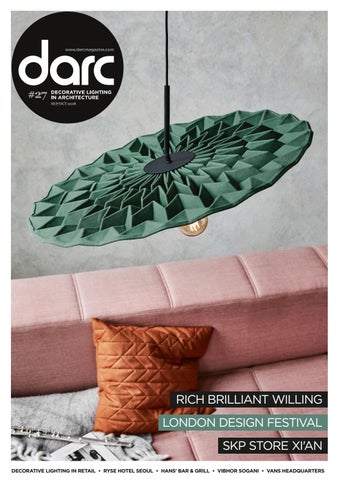
Cover: Fold pendant by Northen
Welcome HELEN ANKERS • EDITOR This issue sees a wealth of projects for you to cast your eyes over, all featuring some stunning decorative lighting elements. Our lead project comes from Michaelis Boyd and Inverse Lighting, who collaborated on the RYSE Seoul hotel. Turn to page 24 to see how the beauty of the Korean landscape formed the main influence of the hotel's design. RYSE isn't the only hotel featured this issue, we also head to Madrid where Rockwell Group worked to reinvent Hotel Ingles, turn to page 30 to read more on that; then there's Stone Designs' work on Hotel Jardines, in Tenerife on page 42 and Jeremy Maxwell Wintrebert's work on the Four Seasons Megève in France on page 48. The projects don't stop there though, this issue also includes Rapt Studio's work on the Vans headquarters on page 44 and we take a closer look at Goddard Littlefair's interiors and lighting scheme at the Hans' Bar & Grill in London on page 57. With the recent demise of department store House of Fraser in the UK, never has it been more important for the retail sector to fight back against the dominance of online shopping. With this in mind, Nulty's Director Emilio Hernandez looks at how decorative lighting is helping retailers remain relevant and create experiences they won't get online, turn to page 77 for his comment piece. On the front cover this month we have featured Northern's most recent release Fold, which will be on show at this year's designjunction as part of London Design Festival. There's plenty to keep you busy that week from all the trade shows to pop up events to showroom product launches and you can find our rundown of lighting highlights from page 96 onwards. A couple of events you definitely need to put in your diaries are our #darcthoughts talks taking place at darc room and 100% Design. You will find me in Shoreditch at darc room on Thursday 20 September, for a Q&A session with interior designer Monique Tollgard (5.40pm) on the challenges of working within a listed building and then on Friday 21 September, I'll be heading over to Olympia London for 100% Design, to moderate a panel titled 'The Magic of Illumination' with designers Lucie Koldova (Brokis); Simeon Chilvers (Cameron Design House); and Christopher Jenner. You will find us in The Forum at midday. Both events are free to attend and you will find more information at: www.darcroom.com & www.100percentdesign.co.uk Looking forward to seeing you there!
#readinginthedarc
• Two days (and nights) of lighting specification • Unique exhibiting concept in a unique venue • New location in Shoreditch, the heart of London’s design district • Part of London Design Festival • darc thoughts live stream lectures and workshops
featuring…
Media Partners
In collaboration with
Supported by
www.darcroom.com
A CREATIVE LIGHTING SPECIFICATION EXHIBITION AT LONDON DESIGN FESTIVAL
006
DETAILS
Contents
016 Vibhor Sogani
048 Four Seasons, Megève
The artist and designer shares his experiences of working with light.
REGULARS
071 Rich Brilliant Willing
Jeremy Maxwell Wintrebert provides bespoke lighting.
FEATURES
008 FOCAL POINT FOLIUM, BIRMINGHAM 010 FOCAL POINT THE DRAYCOTT, CHELSEA 068 FOLIO CaSA - Columbo & Serboli was established in Barcelona by Italian architects, Matteo Colombo and Andrea Serboli, the design firm covers a wide range of services from architecture, interior design and furniture design. 090 MATERIALS Hubbardton Forge Director of Design David Kitts and Design Developer Andy Morter talk darc through their creative process. 112 CALENDARC DESIGN SHOWS FOR 2018/19 114 SOCIALIGHT INSTAGRAM HIGHLIGHTS
016 VIBHOR SOGANI Artist and designer Vibhor Sogani shares his experiences of working with light and why it has been an engaging and rewarding journey so far. 063 MATTEO UGOLINI Karman’s Art Director Matteo Ugolini follows his own design path - creating striking decorative lighting pieces, each with their own personality. 071 RICH BRILLIANT WILLING The founding designers Theo Richardson, Charles Brill and Alexander Williams have a shared belief in the power of light to create atmosphere. 077 RETAIL LIGHTING Introduced by Nulty lighting's Director Emilio Hernandez, this issue's case studies focus on decorative lighting in retail environments.
The Brooklyn-based designers talk us through OLED technology.
PROJECTS
077 Emilio Hernandez
Nulty's Director discusses the use of decorative lighting in retail.
ON SHOW
024 RYSE HOTEL, SEOUL Michaelis Boyd 030 HOTEL INGLES, MADRID Rockwell Group 036 SKP STORE, XI'AN Syabrite 042 HOTEL JARDINES, COSTA ADEJE Stone Designs Studio 044 VANS HQ, COSTA MESA Rapt Studio 048 FOUR SEASONS, MEGÈVE Jeremy Maxwell Wintrebert 057 HANS' BAR & GRILL, LONDON Goddard Littlefair 060 PRIVATE RESIDENTIAL, USA Studio V
096 LONDON DESIGN FESTIVAL Your guide to the key lighting events happening during London's design week. 099 DECOREX PREVIEW The essential guide to lighting brands on show during the Syon Park Lane event. 103 100% DESIGN PREVIEW The interiors show returns to its home at Olympia London. 106 DARC ROOM PREVIEW Taking place in the heart of Shoreditch, the only dedicated lighting show during LDF. 109 DESIGNJUNCTION PREVIEW In its new Southbank home, the design show returns with a breadth of new content.
THE MAGAZINE
DESIGN
CORPORATE
Editor | Helen Ankers h.ankers@mondiale.co.uk +44 161 476 8372
Artwork | David Bell d.bell@mondiale.co.uk
Chairman | Damian Walsh d.walsh@mondiale.co.uk
Editorial | Mel Robinson m.robinson@mondiale.co.uk
Publishing Editor | Paul James p.james@mondiale.co.uk
Assistant Editor | Emma Harris e.harris@mondiale.co.uk +44 161 476 9117 International Advertising | Stephen Quiligotti s.quiligotti@mondiale.co.uk +44 7742 019213 Editorial Contributor | Maria Elena Oberti maria@meoberti.com
FINANCE Finance Director | Amanda Giles a.giles@mondiale.co.uk Credit Control | Lynette Levi l.levi@mondiale.co.uk
Marketing & Events | Moses Naeem m.naeem@mondiale.co.uk darc magazine | Strawberry Studios, Watson Square, Stockport SK1 3AZ, UK | Printed by Buxton Press, Palace Road, Buxton, UK | ISSN 2052-9406
#readinginthedarc
Set location: Sjølundsparken, Hellebæk.
Ved Engen, Køge.
Design to Shape light
Set location: Den Blå Planet, Copenhagen.
Flindt Bollard and Flindt Wall Design by Christian Flindt louispoulsen.com
R10745_LP_DARC_236x333_FlindtWallPGallery_AD10.indd 1
28-08-2018 14:10:11
008
FOCAL POINT
Image: Anders Sune Berg
009
focal point FOLIUM BIRMINGHAM, UK Folium is a new fine-dining restaurant in Birmingham’s Jewellery Quarter. It’s the brainchild of renowned chef, Ben Tesh and is located in a former printworks building. With a vision for serving high-quality, contemporary cuisine in a relaxed environment, Tesh asked restaurant design agency, Faber, to create a clean, neutral restaurant concept, which would allow for culinary creative freedom and not feel over-designed. “We created a palette of soft earth tones and used natural materials to create a pared-back yet comfortable feel to the space,” explains Faber’s Creative Director, Tony Matters. “The design was deliberately restrained and focussed on simplicity of composition and material. Because of this, good lighting was of paramount importance; creating an atmosphere while also focussing on the food on the plate.” The pendant silhouette pictured here was chosen specifically because it makes subtle reference to industrial style, but in a crisp and contemporary way. “We wanted to create a space that still had the warmth and character of the building’s heritage, but with a more polished feel.” www.faber.design
010
FOCAL POINT
focal point THE DRAYCOTT CHELSEA, LONDON Set in the heart of Chelsea a short walk from Sloane Square, The Draycott show apartment establishes a theme of considered, modern luxury. Sleek metal-frame, internal glass doors allow light from the hall and living areas to filter through to the dining room and are complemented by a statement lighting centrepiece from Cameron Design House. A collaboration between the developers of The Draycott, 1508 London, B3R Architects and the design team at Cameron Design House, the dining room reveals a bespoke variation of the award-winning Lohja pendant light in stunning brushed brass. Inspired by lake Lohja in Finland, the bespoke design explores tranquility, space and equilibrium with a balanced sculptural structure that changes appearance from every angle. Although the Lohja light from Cameron Design House’s collection formed the initial inspiration, the piece was tailored to the space to create a linear pendant with hidden suspensions palette. www.camerondesignhouse.com Image: Andreas von Einsiedel
011
2019 Partners
Artemide installation darc night 2018 Fabric London
The darc awards / decorative is your opportunity to showcase inspirational decorative lighting designs to your peers... Get involved and submit your product & project entries from 1st January. For more info visit: www.darcawards.com/decorative
Inspire interiors‌
014
DETAILS | DARC AWARDS / DECORATIVE
2019 Partners On 2 May 2019 the third darc awards / decorative will take place at the iconic London nightclub, Fabric. The event is set to once again attract individuals and design studios from the world of architecture, lighting design, interior design, product design and the lighting specification sector. This year's event was a massive success with over 200 entries, over 6,000 votes from designers and an audience of over 500 attendees on the night itself. As a manuafacturer of decorative lighting products, this is your opportunity to get involved in a fun and creative event, while highlighting your product portfolio to those that matter, through our three different sponsorship packages. As a designer, the awards are your opportunity to shout about your achievements and enter your latest hospitality, commercial and residential projects for consideration.
015
SPONSORING THE 2019 AWARDS
VOTING | 12 MARCH - 6 APRIL 2019
The best way as a manufacturer, to get involved in the awards, is to choose one of our three sponsorship packages: Product, Gallery or Branding. Each one offers a different level of involvement and suit different budgets. Detailed information on each package can be
Once all the entries have been submitted and verified, Independent designers are invited to vote for their favourites, making the darc awards / decorative the only peer-to-peer lighting awards in the world. This system ensures winners have been voted for by the industry rather than darc magazine's 'favourites'. As a thank you for taking the time to vote, we send designers a free ticket to the darc awards party.
found at: www.darcawards.com/decorative/sponsorship
ENTRY PERIOD | 1 JAN - 1 MARCH 2019 Everyone can enter: manufacturers & designers Entry criteria: decorative lighting products & projects launched and completed between 1 March 2018 - 1 March 2019
PROJECT CATEGORIES | Live, Work, Rest, Play, Shop
PRODUCT CATEGORIES | Bespoke, Ceiling, Wall, Floor, Table, Exterior, Light Source
DARC NIGHT | 2 MAY 2019 @ FABRIC, LONDON Taking place at the iconic London nightclub Fabric, the darc awards party and awards presentation is an atmospheric night in a truly iconic venue. Expect to see light installations and product gallery from our sponsors, make use of the free bar and wrap your taste buds around London's finest street food. All independent designers are welcomed to attend the event for free, while manufacturers are required to buy a ticket, meaning the room is filled with creatives rather than sales teams.
For more info on entering the awards and sponsoring visit: www.darcawards.com/decorative
016
INTERVIEW
INTERVIEW
Organically Grown darc discovered Vibhor Sogani at this year’s Light + Building show in Frankfurt. Here, the artist and designer shares his experiences of working with light and why it has been an engaging and rewarding journey so far.
Born and raised in Jaipur India, Vibhor Sogani grew up soaking up the richness and cultural heritage of Rajasthan. His father, a geophysicist, was tasked with research assignments in western parts of the country, which in turn gave Sogani the opportunity to travel alongside him - often staying in camps and tents in different locations for months at a time. As a result, he witnessed diverse landscapes, rural scenes and indigenous cultures. “As an adolescent I loved playing with forms and materials, creating a lot of mindless and imaginary stuff, which perhaps triggered a creative thought process, supplemented by the knowledge acquired from my travels with my father,” Sogani tells darc. Perhaps, this is why mainstream education didn’t appeal to Sogani… After finishing high school in Jaipur, a careers advisor suggested a career in design after noticing his visualisation skills. This suited Sogani’s way of thinking and encouraged him to pursue design as his primary vocation. And so, five and a half years at the National Institute of Design ensued, transforming his outlook on life and giving the designer a more definitive direction to his creative indulgences. “This is where I gained multi-
disciplinary exposure to creative fields such as films, textile, furniture, ceramics, graphics, engineering and machining, as well as insights into arts and crafts. Design was seamlessly integrated with my way of life, way of thinking and way of observing the world around me.” Post NID Sogani worked in various R&D centres for a number of large organisations, gaining knowledge on the industrial production processes, management, operations and logistics. However, he found the environments too structured and lacking in creativity and so pushed to set up his own practice. “I started with a small studio in New Delhi as a consultant; for the first few years I picked up a range of projects in a deliberate effort to expose myself to the industry and all the opportunities it has to offer. I consulted on a variety of projects covering graphics, communication, retail, exhibition and industrial design. Those were years of immense pressure because I was learning about different aspects of the profession and practice, while meeting the expectations of my clients. It was crucial and served as the catalyst in opening up my canvas of design practice combined with an interdisciplinary thought-process. This
period marked a decade of assignments that laid the foundation of what I do today, albeit in a subconscious manner.” 2006 was a turning point for Sogani, when the opportunity came to work on an event showcasing international lighting brands – this was the beginning of his lighting design portfolio. “I began playing with both light and art in the form of light installations and have worked in this area of industrial design ever since – it has been an engaging and rewarding journey so far.” For Sogani, light in a sense is formless and acquires its form from the source and material it is reflected from or refracted through. Therefore, trying to mould light into a particular expression is like trying to give shape to air. “The form of the luminaire provides a tangible story, but it is always the quality of light that guides the experience of that luminaire and surrounding space,” he says. “The process of designing with light as the guiding principle is enriching and the wisdom acquired from the process can be applied to other forms of design as well, which makes it even more important to understand. “Lighting is an interesting domain in product design and also the fourth dimension of architecture. Light is a crucial aspect that
017 017
018
INTERVIEW
1
2
reveals the materiality, depth, expanse and warmth in a space; thus, it is extremely important to have good lighting within spaces; that enhances their utility and reflects the personality of the people inhabiting them. With the layering of lighting, one can enhance the utility of a space in an intelligent manner.” Talking artistic influences, for Sogani, there isn’t one single icon or designer, yet many whose work has inspired him during his career. The likes of Zaha Hadid, Marcel Wanders, Phillipe Starck, Archille Castiglioni and Richard Serra to name a few. “Their work represents powerful ideas in a simplistic manner that I appreciate the most,” he says. “I feel we all come across innumerable sources of inspiration in our day-to-day lives, especially when we are in a relaxed state of mind. I derive my leads through observations from natural phenomena, forms in nature, and the physical environment, or a story that has an emotional appeal. There are certain inherent thinking methods that guide those observations, and I get my triggers which help me formulate my thoughts in a manner that help me translate them. This journey, which starts with a random observation or a thought, and triggers a chain reaction in the mind, is very exciting and gives me a tremendous adrenaline rush. This is always the best part for me in the journey of a specific design process or project. “As I acquire new observations and sources of inspiration, my thoughts evolve, thereby adding layers to my design language. Over the years, the pursuit of simplicity has seemed to work in my approach as a principle design argument. ‘Simple is Beautiful’ and ‘Less is More’ are the fundamental principles that guide me to
3
Opening spread Vibhor Sogani with Casa. Inspired by a Weaver bird’s nest, Casa is a tribute to the home in the natural world. A homogeneous blend of burnished beads forms a cocoon of comfort; fluid curves combine with the solidity of the lustrous beads to crearw a shape that entices observers to come closer and delve into the mysteries it holds within. The light coming from the egg shaped marbled glass adds life to the installations. This page 1&2. Beehive is a suspension almost bordering on an installation. It is a combination of stainless steel forms with bakhtar craft & goldplated bees. The light filters through these layers in a dramatic fashion. 3. The Chroma collection, juxtapose shimmering mirror stainless steel forms with an interesting combination of golden leafing. Its formations can be customised to create vastly functional lights to enticing light installations.
C
M
Y
CM
MY
CY
CMY
K
Pixo
020
INTERVIEW
1
2
work towards timeless designs that one does not get bored of. I try to make forms that appear effortless. “Simplicity is beyond fashion or individual interest, it is revealing of truth of the subject in question. It is often difficult to achieve, as it requires extensive deliberation with oneself, and a particular mastery over the craft. Maybe that is why it’s timeless, because it portrays a pinnacle of design process. Whenever I manage to strike a simple cord with my creation, be it designs or an artwork, it gives me a sense of achievement, and it is this feeling that defines my ‘style’.” A designer has to play a multi-faceted role. Right from the understanding of the project or product, to creating a tangible three-dimensional object that has a definitive function. In the process, one has to thoughtfully combine technology, ergonomics, aesthetic, function and many other factors while leading it to the market. To be able to design successfully, each time, a designer has to literally get under the skin of the client / subject and comprehend the requirements in a pertinent context.” In terms of changes within the design industry, for Sogani, a lot has happened in the last few years in the sphere of design and technology and at a supreme pace. “In the past, lighting and associated technology was very limited compared to its present avatar. Today, it is very effectively acting as the fourth dimension of architecture and rightly so. The fact is, the impact of this medium can bring about a dramatic change in the quality of architecture and its relevance. This realisation and availability of suitable alternatives is leading to the rise in demand of quality lights, energy efficient
3
1. Aura Royal is an LED based light that offers an interesting and elegant interplay of layers of gold plated and silver finish discs along with finely cut lattice work, which acts as a diffuser cutting all glare while subtly adding to the royal touch. The piece can be customised in terms of cluster size and formation. 2. Cascade is a light installation inspired by the ‘falling waters’ by Frank Lloyd Wright. It is a multilayered chandelier made in crushed copper. This LED-based light reflects an interesting and elegant interplay on vertical and horizontal surfaces. Diffused light bounces off the copper surfaces providing ample ambient light and a shaft of down light gives direct light. It is suitable for high ceilings such as atriums, hotels and corporate offices. 3. Fold is crafted from a single sheet of metal each individual fold is the result of deliberate and meticulous thought. Subtle and bold, each piece is a part of the larger visual lexicon. The mirror-finished pieces with copper leafing form an ocular symphony that can transform into a centrepiece or a corner piece in any living space.
C
M
Y
CM
MY
CY
CMY
K
022
INTERVIEW
1
sources and even lighting consultants. It is a highly positive trend and the industry is growing; there are new developments every day, in terms of material and technology. With the changes in materials and technology, one must update their methodology and practice. Also, it is the era of smart technology. The interactive interface in products is something I’m fascinated to explore. “On the other hand, with the fast paced changes in technology, and therefore design, somewhere the romance of regional diversity is lost. The cities change, the regions, even the countries change. But the visual quality of the architecture and the associated aspects have started looking so similar. At times you can’t tell where you are because it all looks so similar. I feel a loss of diversity is a byproduct of technology.”
2
Sogani’s path in design so far has been somewhat of an organic one, with the designer taking one step at a time… however, looking ahead his intent is to continue growing the collection and make his mark on the global design industry. “The collection is growing in an interesting way and a very distinctive quality is emerging in the range. Design per se has to be functional yet aesthetically stimulating with products having a meaning and not just produced for the sake of it. While remaining honest, products must convey a character to their users, and resonate within their ideology or personality. They must have a meaning of their own, which shuns the idea of mass consumption and ensures minimum use of resources. I believe this is the very least a good product design should carry forward.” vibhorsogani.com
1. Umbra, a mesmerising play of light and shadow, this piece is a testimony to exquisite craftsmanship and attention to detail. An intricately crafted mesh of curved lines form the sphere, which is the focal point of this piece. Suspend it or place it in a corner and watch your walls come alive in a whirlpool of dancing patterns. 2. India’s largest site-specific public art installation at 40ft high ‘Sprouts’, shows Sogani’s artist side. A Delhi government initiative towards the beautification of the capital, it is spread over six acres of greens surrounding the AIIMS flyover in the heart of Delhi. ‘From walled city to world city’ was the brief - the Sprouts project was initiated with the idea ‘when the seeds begin to sprout’. The intent was to depict India as a growing nation with the new age material stainless steel representing contemporary thought. ‘Sprouts’ powerfully conveys the message of growth and has defined the contemporary image of the city for almost a decade now. Together with the landscape, it has reflected upon the myriad moods of Delhi’s weather to create one of the most inclusive and motivating public memories the capital has to offer.
C
M
Y
CM
MY
CY
CMY
K
024
PROJECT
025
First Impressions Count Michaelis Boyd designs vibrant new Seoul hotel inspired by the beauty of the Korean landscape. Images: Yongkwan Kim
026
PROJECT
2
1
3
RYSE hotel is a vibrant new hotel in the creative heart of Hongdae, Seoul. Part of the Autograph Collection, the hotel aims to act as a cultural force and lifestyle hub. The design is inspired by the beauty of the Korean landscape and the alternative, youthful character of the neighbourhood in which the hotel is situated. London-based architecture and interior design studio Michaelis Boyd was commissioned to create a bold vision for the entire hotel, which sits within a building designed by SCAA, and has delivered a distinctive design concept for the hotel interiors with artistic elements woven throughout the public spaces, amenities and guest rooms. Michaelis Boyd worked with local interior design firm Integ. and UK-based lighting designers Inverse Lighting on the project and as the design developed, the space became more colourful and more materials were added. As such, lighting became a very important player in the space – bringing
warmth and light to the various colours and textures. Inverse Lighting was responsible for ensuring the architectural lighting worked efficiently with the prominent decorative lighting elements and interior design. Inverse Lighting’s Onur Sunguroglu told darc: “We were invited by Integ. to work on this project based on our existing relationship. Our involvement was limited to the public areas and as the decorative lighting elements were one of the key features of the design, we made sure that the architectural lighting didn’t compete but complemented it where there was a shortage of ambient and accent lighting.” Michaelis Boyd wanted to create a dynamic first impression for the hotel guests and so the design team created a striking feature at the centre of the triple-height entrance space - a lift, core-clad in monolithic concrete slabs of different textures, that contrasts with the perfectly cut and polished marble lobby area. A pink resin floor reflects the energy and spirit of the neighbourhood
4
Opening spread Sidenote club at the RYSE hotel features low level lighting making the most of the classic interior design. This page 1. The lobby is defined by the mix of rough and raw materials combined with luxurious detailing. 2. Meeting rooms at the hotel feature strong and bold design, reflected in the light choices. 3. The Print Lounge has been designed to suggest a grand curated gallery in red and gold colourways, with art pieces reflecting the history of Hongdae. 4. The design team drew on inspiration from the natural Korean landscape to create a striking feature at the centre of the triple-height entrance space.
Because good design demands simplicity. ™
British lighting design since 1997 astrolighting.com
000 028
PROJECT
while a large statement artwork looms from an elliptical hole in the ceiling. The floor also acts as a reflecting pool as daylight passes through the space. Simple yet bold decorative lighting elements complement the interior design throughout the lobby, which is defined by this mix of rough and raw materials combined with luxurious detailing. The check-in and print lounge have been designed to suggest a grand curated gallery in red and gold colour ways with art pieces reflecting the history of Hongdae. A long brass mesh curtain has been woven vertically through the space to form individual zones and a sense of transparency, this is brought to life with the use of architectural lighting elements. The space is split down the middle by the elliptical void looking down to the entrance lobby, while a sculptural concrete staircase circles around the perimeter leading up to the fourth floor. Moving up to the guest rooms, they feature a natural colour palette making use of green and blue tones. The main concept for the rooms was to break down the typical
corridor and bathroom box at the entrance to a hotel room. Michaelis Boyd achieved this by designing a permeable wall that is expressed in different ways across different room types. The lighting in the guest room hallways was a key consideration as part of this. In this area, strip lighting was embedded into the architectural finish rather than decorative pieces that could have led to a ‘thematic’ result. In the bedroom and lounge areas of the suites, the decorative lighting elements are kept simple and classic, with task lighting featuring prominently in the head boards and floor lights used for reading areas. Over the dining table, elegant globe pendants draw the eye and in the bathroom, inbuilt mirror lighting adds a modern, clean look to the design. The final design impression at RYSE hotel, is one that creates a one-of-a-kind experience in Seoul created by a passionate team and enhanced by visionary collaborators from every corner of the globe. michaelisboyd.com www.inverselighting.co.uk
design details RYSE HOTEL, SEOUL, SOUTH KOREA CLIENT: MARRIOTT INTERNATIONAL INTERIOR DESIGN: MICHAELIS BOYD & INTEG. LIGHTING DESIGN: INVERSE LIGHTING LIGHTING SPECIFIED: ALL CUSTOM DESIGNED DECORATIVE FIXTURES
The main concept for the guest rooms was to break down the typical 'corridor and bathroom' box at the entrance to a hotel room. Michaelis Boyd achieved this by designing a permeable wall that is expressed in different ways across different room types.
030
PROJECT
History Reinvented Rockwell Group restores Madrid’s oldest hotel to its former splendor. Images: Eric Laignel
Gran Hotel Inglés has been a landmark since it was built in 1853. The first hotel to have a restaurant, and on the first street to receive electric lights in Madrid, it became a cultural icon as well. Politicians, artists, writers, and intellectuals made it their gathering place. After years of neglect and disrepair, the derelict hotel has been renovated and redesigned for today’s sophisticated traveller by Rockwell Group’s studio in Madrid.
Bringing back the glamour, elegance, and innovation of Gran Hotel Inglés and drawing inspiration from the hotel’s 165-year-old history, the design concept celebrates the hotel’s past as a gathering place for the avant-garde and intellectuals, weaving original imagery and salvaged historic items into the design of the public spaces, gym, spa, meeting rooms, and guestrooms. The hotel is located in the cultural and historical centre of Madrid, within walking distance to
the Puerta del Sol and various monuments and tourist attractions. The Rockwell Group design team, headed up by Eva Longoria and Elisa Rodriguez, introduced elegance and sophistication to the lobby, celebrating its high ceilings with circular chandeliers, inspired by a classic English manor. Some of the hotel’s original chandeliers and columns have been restored and a central lobby bar is surrounded by a cocktail lounge with clusters of area rugs.
031
A range of seating provides gathering spots for hotel guests and visitors, complemented by mirrors, rich, gem-toned upholstery, and metal details that nod to the hotel’s heritage. A library with floor-to-ceiling bookshelves and a fireplace is a return to the hotel’s intellectual past. “From the very beginning we wanted to retain the building’s history and infuse it with a contemporary, yet timeless design and unique set of offerings,” Eva Longoria tells darc. “The project was a really rewarding collaboration and our clients at Hidden Away Hotels were great to work with.” As mentioned, Gran Hotel Inglés is located
on the first street to receive electric lights in Madrid – something the Rockwell Group duo were keen to celebrate through modern and classic lighting throughout the property as they explained: “The concept is inspired by the history of lighting and its evolution. We considered its quality in each space to enhance the mood and atmosphere. Our overall goal was to create an inviting feel through a sense of warmth.” One key consideration during the project was the lobby. The space transitions from day to night, so the designers carefully looked at the ambience at various times, from breakfast to afternoon lounging and reading to evening cocktails.
“The decorative lighting elements combine contemporary influences with nods to the Art Deco style,” Longoria says. “Most of the fixtures were custom designed to suit the look we were seeking. In the lobby, we wanted to restore the hotel’s original splendor as a meeting point for intellectuals. A custom bronze and oval chandelier adds an element of theatricality above the central bar; its grandeur draws guests into the space to convene, have a drink, mingle with locals, or work. “Restored original pendants hang above the entry and reception desk, while two custom traditional chandeliers comprised of a brass frame with handblown glass,
032
PROJECT
add a sense of sophistication and elegance above the lounge seating. The lobby’s library features embedded LED strips in the custom bookcases to highlight the hotel’s history as a place of respite for writers and intellectuals.” The restaurant is inspired by the dining room and open kitchen of a grand British country estate, with a mix of classic structures, such as oak columns painted blue, and a mix of modern and classic lighting. A custom bronze and tempered glass fixture hangs from a mirrored ceiling, adding to the sense of intimacy and casting a warm diffused light on guests. Booth seating is reminiscent of a sophisticated and intimate members’ only club. Moving through the hotel, the hallways leading to the guestrooms feature small framed photographs and are dedicated to the building's illustrious past guests, from bullfighters and writers to politicians. Inspired by the first electric light bulbs, a row of filament lamps crown the top of the elevator, while custom antique brass room number sconces with fluted glass, line the hallways. “In the guest rooms, we developed an understated, residential elegance that honours the building’s heritage. Most of the decorative lighting is again, custom
NATURE
REALISED AS CONCEPT Serip Organic Lighting draws inspiration from organic forms found in nature. The designs are handcrafted with artisanal time-honoured techniques, luxurious materials and unparalleled quality.
www.serip.com.pt info@serip.com.pt
AF_Serip_AD_Darc (sep_oct) nenufar.indd 1
26/07/2018 16:46:19
000 034
PROJECT
designed, including the brass wall sconces and bedside table lamps. A custom brass ceiling lamp hangs above the table area, while vintage-inspired reading lamps from Marset also reference the past.” The designers juxtapositioned classic decorative fixtures with modern architectural lighting, for example, alongside the restored historic chandeliers in the lobby they added recessed architectural lighting throughout. Shade pocket lighting highlights the lobby’s distressed mirrors with faded historic images of long-ago guests and famous hotel visitors. Existing iron columns are lit from the ceiling, emphasising the late 19th century detailing. “We wanted to create a home away from home – a place where guests will feel as if they are stepping into a friend’s residence,” says Longoria. “Every single detail, from the notion of the space to the level of the service, has been designed to deliver an
individualised and memorable experience. “Lighting is very much a part of that… it shapes the hotel’s public spaces and guest rooms and it has a dramatic impact on the atmosphere and perception of space. Every space has its own unique needs and requires various lighting solutions. This was especially important in the public spaces where dimmers control the lobby’s atmosphere during the day and add a sense of intimacy at night.” While Rockwell Group has worked on numerous hotel renovations, this particular project was the first in the Madrid office’s home city. “It was really exciting to work inside the 165-year-old landmark and we poured over the rich history of the hotel’s location and the history of the hotel itself to weave allusions to the past into our design concepts and details.” www.rockwellgroup.com
design details HOTEL INGLES, MADRID, SPAIN CLIENT: HIDDEN AWAY HOTELS INTERIOR DESIGN: ROCKWELL GROUP LIGHTING CONSULTANTS: BOLD
lighting specified ORIGINAL LIGHTING FIXTURES ALL RESTORED CUSTOM FIXTURES FROM GRANTLAMP DELIGHTFULL HENDRIX WALL SCONCE CUSTOM FIXTURES FROM CRAZY CONTRACT MARSET LEDTUBE HEADBOARD LAMP AROMAS DEL CAMPO DESK LAMP Opening spread Eva Longoria sits at the central lobby bar where a custom bronze and oval chandelier adds an element of theatricality. Two custom traditional chandeliers, comprised of a brass frame with handblown glass, add a sense of sophistication and elegance to the adjoining lounge seating. Previous page In the restaurant a custom bronze and tempered glass fixture hangs from a mirrored ceiling, while booth seating is reminiscent of a sophisticated member's only club. This page Antique brass room number sconces line the hallways, while a row of filament lamps crown the top of the elevator. Custom decorative lighting wall sconces and table lamps form part of the guest rooms.
Feeling the light The Secto Design lighting collection is designed by the award-winning architect Seppo Koho. The diligent handwork is carried out by highly talented craftsmen in Finland from top-quality local birch wood. www.sectodesign.fi
036
PROJECT
1
Super Luxe Light Torquil McIntosh of London-based architecture and design practice Syabrite was given the keys to the city of Xi’an for the creation of a new 250,000sqm, 20-storey, luxury landmark, SKP store in China’s former capital Xi’an. Images: Kristen Pelou
Home to more than one thousand highend global brands, such as Hermes, Gucci, Dior and Chanel, SKP features multistorey event spaces, boutique cinemas, restaurants and cafes as well as an airy garden terrace designed in collaboration with structural engineers Arup. Under the ‘Rendezvous’ umbrella, visitors find a wine bar, restaurant, art gallery and several niche boutiques. In both scale and scope SKP Xi’an’s super luxe environment is as much about creating an immersive and
experiential space as it as about creating something beautiful. The project took just under three years to complete from start to finish, with its location proving a challenge to the Sybarite team. Close to both Xi’an’s ancient City Wall’s South Gate and the region's Parliament building in China’s oldest city, the façade had to be sensitive to the surroundings and in no way ostentatious. It needed to be architecturally simple and sit back, humbly, within its environment.
To achieve this, the team took inspiration from the Forbidden City and Ming Dynasty architecture. In contrast to the exterior fortress walls; it is when you are up close to the skin of SKP Xi’an that you appreciate the intricate bas-relief honeycombed façade of brushed bronzed brass. At the heart of every SKP project lies ‘the SKP curve’. “We always want visitors to know exactly where they are without having to explicitly remind them,” says Syabrite's Torquil McIntosh. “We created the curve
037
3
2
as part of the brand identity and made it a recurring motif throughout our design. From the lift buttons to the concessions, via the vents built into the pavements outside the building, we made the curve a subliminal branding cue which artfully reminds visitors that they are experiencing SKP.” The sum of SKP’s individual parts is a truly extraordinary store, which not only offers an unrivalled 21st century shopping experience but does so despite the scale of the building, managing to successfully create an atmosphere of both luxury and inclusivity. Lighting has been used to create zones with different atmospheres - the bar and seating areas include softer, atmospheric overhead lighting in contrast to the more directional lighting in the bookstore where the lighting picks out the book covers. Syabrite also
4
designed large-scale pendant lights to act as zone-illuminators. Most of the architectural lighting across SKP Xi’an is timeless, adjustable recessed downlighting where the colour temperature correlates to the category it is lighting. When it comes to bespoke lighting, it is used in feature locations to enhance the desired mood of the space. Decorative lighting is used sparingly and for the right reasons but plays a key part in Rendezvous, a fine dining restaurant within SKP Xi’an. The two Rendezvous floors are linked by a grand staircase designed to feel welcoming, incorporating intimate areas within it to read, as well as delicate planting to create an area of calm. A dramatic cluster of lights designed by Syabrite creates a sculptural installation within the centre of the
1. SKP features multi-storey event spaces, boutique cinemas, restaurants and cafes as well as high end global fashion brands. The SKP 'curve', part of the brand's identity, makes the building immediately recognisable and features as a recurring motif throughout the building. 2&3. In Beijing Kitchen, Syabrite enhanced the restaurant's intimate feel with large, upholstered, teal-coloured acoustic discs that hang above the tables, absorbing sound and breaking up the space. Bespoke lighting hangs from the teal disks throughout the centre of the space, creating pools of diffused or directional light. 4. Decorative lighting is used sparingly throughout the restaurant spaces, but always for the right reasons. It plays a key part in Rendevouz restaurant.
038
PROJECT
3
1
4
2
staircase. “We believe strongly that less is more with lighting – it is equally important to know where not to put the lights as it is to know where to install lighting,” McIntosh notes. In Beijing Kitchen, Syabrite enhanced the restaurant's intimate feel with large, upholstered, teal-coloured acoustic discs which hang above each of the tables, absorbing sound and breaking up the space. Designed by the Syabrite team, bespoke lighting hangs from the disks throughout the centre of the restaurant and creates pools of diffused or directional light, depending on the time of day and the required atmosphere. Each of the seven screens at the SKP Cinema
– two double-height halls, two VIP halls, a kid’s hall, a theatre hall and a Love hall – has a signature geometrical stacking effect across the ceiling and walls similar to that of an armadillo shell. This design highlight connects the ceiling and the walls, with the curvaceous offset also allowing a gap for air-conditioning and subtly diffused lighting. Aside from the multi-hued Kid’s hall, each screen has its own single colour identity, such as red for the Love hall, with seats matching the walls. Syabrite looked to have the lowest light levels possible – just enough light to highlight seating and steps. The large light in front of the Louis Vuitton store is very heavy, despite its lightweight,
5
This page 1. The shoe hall's uniformed lighting blends seamlessly with its opulent shelving. 2. For the men's clothing department, architectural lighting is used to create a strong statement as visitors walk through the space. 3. Lighting design details adorn the cinema's lift lobby. 4&5. Lighting has been used to create zones with different atmospheres. The bar and seating areas include softer, atmospheric overhead lighting. Next page 1. In contrast to the bar and seating areas, the lighting in the bookstore is more directional and highlights the book covers. 2. The large custom light in front of the Louis Vuitton store is very heavy, despite its lightweight appearance. Structural calculations were required to ensure the ceiling above could support the weight.
040
PROJECT
1
ethereal appearance. Structural calculations were required to ensure the ceiling above would support the weight. “Every space had to be drawn, modelled, lit and technically – that is structurally and mechanically – managed," says McIntosh. "But with changing site conditions, the designs also had to be explained, translated and adjusted almost daily. As architects, it was our role to co-ordinate everything so that the right information reached the right person at the right time, in order to deliver the project successfully - both on time and on budget.” Lighting, combined with the use of tactile materials throughout the 250,000sqm store, has created a luxurious and sensuous environment. The large-scale chandeliers add drama in public spaces, while carefully designed overhead lighting creates the right atmosphere depending on the time of day. “SKP Xi’an is so much more than just a department store,” McIntosh says. “Despite the potentially overwhelming scale, it manages to be very intimate – which, in turn, makes it very easy to shop. Ultimately, the store offers something hugely experiential for its customers – and I think that makes it very powerful.” www.sybarite.com
design details SKP XI'AN, CHINA CLIENT: SKP ARCHITECT & INTERIOR DESIGNER: SYABRITE
lighting specified 2
BESPOKE LIGHTING DESIGNED BY: SYABRITE & LIGHTING DESIGN PARTNERSHIP INTERNATIONAL MANUFACTURED BY: THT
M O D E R N D E S I G N E D 17 5 1 M c G A W A V E
DarcMagazine_FALL_2018__VIX 82.indd 1
|
A N D
L I G H T I N G
M A D E
I R V I N E , C A L I F O R N I A 9 2 614
|
I N
C A L I F O R N I A
9 4 9. 7 1 5 . 1 5 3 4
|
W W W . C E R N O G R O U P. C O M
9/4/2018 9:14:58 AM
042
PROJECT
Chanelling Constellations Stone Designs Studio worked with ImpulsARQ on the refurbishment of Jardines de Nivaria to bring a fresh, modern approach, while staying true to the DNA of the Adrian Hoteles brand.
Jardines de Nivaria is a five-star hotel located in Costa Adeje, Tenerife. Featuring modern design and facilities, Adrian Hoteles aims to provide their guests with everything they need for an unforgettable experience. As part of a major refurbishment, Stone Designs Studio was tasked with remodelling the Jardines de Nivaria, alongside ImpulsARQ studio. The focus was to upgrade the suites, two restaurants, spa and common areas while adhering to the style that represents the DNA of the Adrian Hoteles brand. A project outside of Stone Design’s usual design work, the refurbishment began with the remodelling of the suites, which involved creating a series of elements that serve to unify the rest of the hotel.
“Lighting played a main role in unifying the different elements of the project,” Stone Designs’ Isabel Galindo tells darc. “We had a very close relationship with the client and communication was fluid at all times, which helped to keep the true essence of the project from start to finish.” The decorative lighting in the suites included a C_Ball suspension lamp designed by Stone Designs in collaboration with Spanish manufacturer B.lux. It consisted of a 15cm glass sphere and is framed in a metal structure to light the nightstands. “It was very important to us that the lighting fitted the space and the style of the hotel,” continues Galindo. “The purpose was to create something that represented the feeling we were looking for. We chose
pieces that weren’t going to be the centre of attention but played an important role in the overall design. When we began work on the project, we found many vertical and horizontal spaces, different ceiling heights, and we had to cover skylights… we wanted ambient lighting that didn’t limit us for the layout of the tables. “Lighting was really important in this project – we used it to compose all of the different spaces, all of which speak the same language thanks to the design.” For the common areas, Stone Designs, opted for multiple suspension lamps comprising vertical and horizontal structures with a larger 30cm diameter glass light sphere. The idea was for these multiple lamps to make use of the existing points of light, while at
043
the same time adapting to the layout of the space to illuminate it throughout. “La Cupula restaurant is the most important element within the complex. It was the most challenging too,” says Galindo. “Located on the Canary Islands where they have one of the most important astronomical observatories in Europe, it was impossible not to be inspired by the stars and the firmament that shelter the Teide. This is why the ceiling represents the explosion of a supernova, which at night is retro illuminated, generating a spectacular effect in the space. Tom Dixon’s lamps fall over the tables as if they were lava balls, adding a big dose of drama. “The constellations were also the inspiration behind the C_Ball collection created specially for this project. Located in the suites and the Solandra buffet area, we knew we needed something special to fit the big and beautiful space. We realised that
when you look at the sky at night and you see the stars, you see spherical lightening dots - this became our inspiration.” For Stone Designs, the architectural and decorative lighting elements perfectly co-exist, mixing classic and contemporary, timeless and elegance. “We were really happy with the end result,” says Galindo. “We weren’t sure what it was going to be like, given that this was such a different project for us. We really enjoyed the challenge and every step of the design. “We had to work around different architectural challenges that the client wanted to keep – some of which we weren’t convinced of in the beginning. But in the end, these elements helped to keep the spirit of the hotel and made us work around them for the final result.” www.stone-dsgns.com
design details HOTEL JARDINES DE NIVARIA, TENERIFE CLIENT: ADRIAN HOTELES INTERIOR / LIGHTING DESIGN: STONE DESIGNS & IMPULSARQ
lighting specified BLUX FIXTURES: OVERLAY S; IRELAND; C_BALL; KESHI; HELIOS; SPEERS FOSCARINI GREGG FIXTURES TOM DIXON FIXTURES: MEIL & ETCH SHADE IN BRASS ZERO FOG FIXTURE
It was important that Stone Designs worked with IMPULSARQ to create a lighting design that worked to separate the different spaces throughout the hotel yet worked together to fit the space and style of the hotel.
044
PROJECT
045
Creative Design Rapt Studio’s Vans Headquarters design represents the evolution of a West Coast skateboarding company to a global youth culture brand. Images: Eric Laignel
From the original Van Doren tread to the iconic racing stripe, the Vans brand is synonymous with individual expression and undeniable style, something USbased Rapt Studio kept at the forefront of its design,when working on the new headquarters - bringing the underground to the mainstage. The Vans Costa Mesa headquarters represents the brand's evolution from a West Coast skateboarding company to a global youth culture brand. Rapt Studio has enjoyed a long and successful working relationship with Vans, having designed its previous headquarters and assisted with its growth and expansion strategies. “When we were asked to re-engage, we had never really been gone for long,” Chief Creative Officer of Rapt Studio, David Galullo explains. “The project lasted approximately two years from acquisition to completion.” The brand had grown at an incredible pace and the executive team asked Rapt to study Vans’ evolving work process and to workshop, coordinate and manage a shift to a more collaborative open work environment. The hope was to streamline
communication among the various stakeholders and offer an array of different spaces to support the reinvigorated collaborative processes. The space was also designed to incorporate and exploit Vans' four brand pillars: music, street culture, action sports and art, and it of course had to be skate-able throughout. It also needed to enable collaboration along with the growth and flexibility that was inherent to the planning. “The brand needed to be ever present in the space,” says Galullo. “But we also wanted to design the headquarters in a way that would allow for the future brand to take hold; the artists of today and tomorrow; the new products and the classics, basically an ever changing gallery of the visual expression of this iconic brand. “As with any design, we work to make the space greater than the sum of its part…that is to say that each perfect ingredient comes together to make a perfect recipe. When it came to lighting we knew that it needed to be simple and invisible in places and in other areas it needed to work a bit harder. We looked to classic brands that had endured the test of time as Vans had itself. We chose
coloured cord exposed lamp pendants tied in interesting ways from Tech lighting. We created drama with a repetition of black industrial pendants from Barnlight. We had a large, custom light installation made for the library space to signal the quiet, escapist nature of the space and each desk received a custom colour desk light from Anglepoise." Merging the classic with the contemporary is a theme that runs throughout the design, the headquarters is organised around a central courtyard that connects interior offices to outdoor spaces while a custom Vans, classic red staircase becomes the literal and figurative symbol of connection between the varied groups housed within. The staircase connects the first-floor café with the second-floor coffee area and the third-floor outdoor terrace barbeque. The style of the workspace supports a range of active work styles, fostering a culture of collaboration and innovation. Concrete floors allow employees to skate from desks to meeting rooms. In homage to the brand's deep roots in music, there is a jam room available to staff, complete with instruments. Each of the conference rooms are wired for sound with Bluetooth, while the shared celebration
046
PROJECT
of art is apparent throughout with the incredible commitment to artistic expression – murals, classic skateboard art and graffiti style murals decorate the walls and elevate the experience. Fostering a sense of community, the more public circulation that rings the courtyard on all floors is outfitted with meeting spaces, booth seating (a favourite from the beginning) and places where staff can hang out and just get a different perspective. This configuration allows an employee or visitor to move through the building without traipsing through someone’s work environment. Employees are afforded plenty of individual space to layout new products, fabric samples or prototypes. These individual working neighbourhoods also give way to more shared spaces – dedicated work rooms that can retain a project team’s memory on its walls, various spaces for group meetings as well as rooms where one-on-one conversations can happen
1
2
3
4
freely and within the work environment. The use of decorative lighting is consistent, in areas that require delineation, lighting is utilised as architecture, as a canopy - a way of indicating a more intimate gathering space and plays an important role in defining each space, the main pantry is entirely defined by a dropped pendant plain that helps the eye travel throughout the space. “We chose clean, simple linear lighting for the workspace and more decorative and interesting lighting for the conference rooms,” Galullo says. “I think of lighting as that beautiful piece of jewellery you build around. It is always the shiny object in the room that will capture everyone’s attention, and when done right it makes everything seen against it look better. We created a space that was built on a mature vibe but still true to its youthful and energetic southern California roots - a space for creatives.” www.raptstudio.com
design details VANS GLOBAL HEADQUARTERS CLIENT: VANS INTERIOR DESIGN & LIGHTING DESIGN: RAPT STUDIO
lighting specified ANGLEPOISE ORIGINAL 1227 SPECTRUM LIGHTING 8" CYLINDER BARNLIGHT ELECTRIC ORIGINAL WAREHOUSE PENDANT TECH LIGHTING SOCO PENDANTS CASTOR LIGHTING TANK LIGHT PENDANT Y LIGHTING BUB SAUCER SCHOOLHOUSE LIGHTING EDUARD SCONCE CEDAR & MOSS PEARL BRASS SCONCE Opening spread 1. Spectrum Lighting Prismatic Mini Bay pendants illuminate the communal space. 2. Herman Miller Nelson pendants, leftover from the building's previous life, set against a mural by skateboard artist Tood Francis. This page 1. Each desk is lit by a classic Anglepoise Original 1227. 2. Custom-made lighting, manufactured by Land Mark Electric and designed by Rapt Studio illuminates the library. 3. A skate mural by Jay Howell of Bob's Burgers fame. 4. Barnhouse Electric Original Warehouse pendants are scattered throughout the office's coffee shop /cafeteria space.
048
PROJECT
049
Mystical Megève Jeremy Maxwell Wintrebert collaborated with interior architect Pierre Yves Rochon to bring a sense of fairytale and wonderment to the new Four Seasons Megève. Images: Jeremy Josselin, ADAGP Paris 2018
050
PROJECT
The Four Seasons Hotel Megève in the heart of the French Alps lies directly on the Mont d’Arbois ski slopes. This modern chalet builds on the legacy of the Rothschild family who set out to create an unrivalled resort experience nearly a century ago. Distinct French character, pure Alpine tradition and an intimate and inviting setting in both summer and winter define this mountain retreat. Guests can play at one of the world’s finest Alpine golf courses, relax in the region’s largest spa and dine at two Michelin star restaurant Le 1920. Craftsman and glass blower, Jeremy Maxwell Wintrebert was asked by Madame de Rothschild herself alongside the hotel’s interior architect and decorator Pierre Yves
Rochon, to take part in the hotel project. Having proposed pieces of his collection for different areas of the hotel, Wintrebert then worked to adapt them to suit the spaces accordingly, as well as realising an entire site-specific installation in the form of Crying Willow. “I imagined the hotel guests having a fairytale-like experience and I found inspiration in the natural location and surroundings of the hotel, which is high up on a mountain, surrounded by very dramatic and incredible mountain ranges. The mountains and sky are like canvases for the ever-changing light that reflects off them. The array of colours sometimes change minute by minute and can go from dark
Opening spread Cloud ceiling lights adorn Bar Edmond - the fixtures make use of free-hand blow glass, filigrane technique using brass. This page 1. Cloud ceiling lights were also used in the 1920 restaurant. Next page 1. In the hotel's entry porch a Solstice chandelier greats guests. The fixture uses Telux glass pebbles, brass and a LED light source. 2. Crying Willow in the wine cellar is a sculpture in which light is essential and which richly plays with the architectural lights that surround it.
ANDLIGHT PRESENTS
ORBIT PENDANT LUKAS PEET / 2018
052
PROJECT
1
2
grey to gold or from bright oranges to dark purples to everything in between.” Every single piece of the project – from the lighting fixtures to the glass used – is entirely handmade, which Wintrebert explains is always an immense challenge in itself. “I am lucky to work with incredibly skilled people such as the team at Mydriaz Paris, who make the brass and my team with whom I blow these incredible pieces in my studio in Paris. I was very fortunate that the clients were so open and trusting of my work and gave me complete freedom… although, that itself can turn into a challenge. “As a glass blower I always imagine the work as a sculpture first. Sometimes the work simply stays a sculpture, like Crying Willow, which doesn’t have a light source inside but which plays with the light that comes from different spotlights. Either way, the lights are all decorative so I stayed with 2700K for almost all the lights. The exception was with the Clouds pendants, which needed to be slightly warmer and for which we developed a unique temperature. Since all our LEDs are custom made, we can really research and produce very bespoke light effects. For projects like a hotel, it’s almost always going to be warm, cosy lighting. Almost all the lights are dimmable and sometimes on a program that adapts to different times of the day.” While the selection process might have been smooth and straightforward, as with most lighting projects, the actual installation did highlight some structural issues. For example, the Clouds pendants had to be hung on a sloped ceiling, which affected the hanging mechanism and actual installation. Then, the Crying Willow sculpture in the wine cellar, which is made of thousands of handmade glass threads and is almost three meters, needed to be assembled and hung inside a circular room made of glass and a metal structure with very odd proportions and underground with very difficult accessibility. But, the most difficult issues with the placement and structural
PERFECT LIGHT ANY WHERE
LUCTRA® FLEX provides good light exactly where it is needed. Anywhere. Anytime. No cables. No restrictions.
www.luctra.eu LUCTRA_darc 3d_02_2018.indd 1
22.02.18 11:33 22.02.18
054
PROJECT
constraints, according to Wintrebert were with the Solstice wall lights around the pool. “Each light weighs over 70kg and needed to be fixed through a thin marble wall, which was textured and not flat. I collaborated with Mydriaz Paris who designed the brass so they could be hung safely but handled easily for maintenance, while enduring a humid environment.” Looking back on the final design, for Wintrebert, the project reinforces his sculptural approach to lighting as a craftsman. “I believe it adds a very sensitive quality to the experience of the space and celebrates the handmade quality that is so rare in lighting, which often has a very industrial feel to it because it has been designed on a computer then made separately with very precise specifications. “I love that on the scale of a project like
1
3
2
4
this, the sculptural handmade quality is celebrated and very noticeable. I believe that the guest doesn’t notice the lights at first but experiences the expressive, creative work where emotion prevails over function and therefore becomes an actor in a part of the fairytale. “I have never before had the opportunity to propose so many different lights for one project and have them all work together,” concludes Wintrebert. “I believe the stand out feature is the 30 Clouds installation over the bar and 1920 restaurant. I was very lucky to also collaborate with chef Julien Gatillon to create the tableware collection for his restaurant, which is directly inspired from his cuisine and the hanging 30 Clouds above.” jeremyglass.com
design details FOUR SEASONS, MEGÈVE, FRANCE CLIENT: FOUR SEASONS INTERIOR ARCHITECT: PIERRE YVES ROCHON LIGHTING SUPPLIER: JEREMY MAXWELL WINTREBERT
lighting specified SOLSTICE CHANDELIERS SOLSTICE MURAL WALL LIGHTS CLOUD CEILING LIGHTS LUNE D’HIVER MURAL LIGHTS SOLEIL MURAL LIGHTS CRYING WILLOW SCULPTURE
1&2 In the spa area Solstice wall lights are used throughout. The fixtures make use of Telux glass pebbles, brass and LED light source. 3. A Lune d'hiver mural light adorns the hotel wall. 4. Soleil mural lights run through the corridors.
martinelliluce.it a.d. e. martinelli
ph. b. saba a.d. emiliana martinelli martinelliluce.it
ph. m. cardelli
PIPISTRELLO PIPISTRELLO MED MINIPIPISTRELLO MINIPIPISTRELLO CORDLESS GAE AULENTI 1965
05 - DARC - OTTOBRE 2018 - PIPISTRELLI.indd 1
03/08/2018 17:44:40
PROJECT
A Contemporary Classic Goddard Littlefair creates striking interior and lighting features at the new Hans' Bar & Grill restaurant, taking inspiration from Sir Hans Sloane's love of natural history, adventure and discovery. Images: Gareth Gardner
Hans’ Bar & Grill is a new neighbourhood restaurant in Chelsea London’s Pavilion Rd. Featuring striking, contemporary interiors, created by leading interior designers Goddard Littlefair, the new venue offers an exciting extended café-bar space and restaurant. Making use of a newly-covered former courtyard space, within the 11 Cagodan Gardens hotel, the new restaurant and bar is set to appeal to a wide range of day-tonight guests. Named in honour of Cadogan family
ascendant Sir Hans Sloane, one-time physician to the royal family, as well as a celebrated natural historian, the new 106-cover restaurant encompasses 18 covers within the café-bar, 46 covers in the courtyard area forming part of the main restaurant, plus a further 42 covers in the dining area of the main hotel building. A further private dining space, ‘The Curio’, inspired by Sloane’s love of adventure and discovery, can seat 16 guests and is located directly opposite the internal restaurant entrance.
The first café-bar space is located within a converted former news garage on Pavilion Road, where it sits alongside other converted garages either side, to form a new suite of upmarket, independent boutique retailers, from barbers to cheesemongers to specialist purveyors of wine and bread. Architectural works on this, as well as the courtyard refurbishment, were carried out by ReardonSmith Architects. The bright and airy café-bar space has a clean and contemporary feel with
057
058
PROJECT
000
1
2
a monochrome colourway, along with interesting, textured finishes, such as white slatted timber wall cladding and an original, exposed yellow-stock brick wall to the left, plus white tiling behind the bar, where vertically stack-bonded Solus ceramic tiles create a great handcrafter feel. The bespoke feature bar front is in split-faced stone, with a natural, honed grey basalt bar top, providing a clean contrast. The ceiling in this space is exposed and painted light grey, with architectural lighting on tracks and features lighting consisting of five industrial-feel brass wall lights from Istanbul-based Topos Workshop along the left-side brick wall. Alongside this, there are seven Nordlux Strap pendants over the bar, which hang from leather straps. As you move through to the first courtyard section of the restaurant, it is filled with natural light thanks to two large-scale
feature rooflights, from which green and black blown-glass Amp pendants by Holloways of Ludlow hang, interspersed with bespoke spun-brass bowls full of natural planting. This subtle nature theme extends into the main restaurant area where small pots feature throughout on the waiter stations and along the back bar. The restaurant has a contemporary classic feel and makes use of bespoke, shallow brushed brass chandeliers, which were custom made for the project by Northern Lights. Adding glamour to the space, one is situated in the wine room and the other in the rear restaurant section that follows and completes the scheme. The rear section is also the indoor restaurant entrance for guests coming from the hotel side. A Gubi Multi-Lite pendant in brushed brass hangs over a six-seater booth here, complemented by art inspired by Sir Hans Sloane and
including a series of tropical birds, flowers and feathers, painted by artist Rebecca Jewell and curated by art consultants Artiq. Outside the main restaurant directly opposite, is the 16-cover Curio lounge space, which can be used for breakfast overspill or for a further 10 covers. For Lucy Robinson, F&B Associate at Goddard Littlefair, the design process on this project was a relatively straightforward one as the client had realistic ambitions in terms of the space becoming a workable project. “The brief was to create a classically contemporary café bar and restaurant that had complementary but contrasting interiors to the hotel interior,” Robinson tells darc. “It needed to suit the Chelsea market and sit well on the newly-refurbished Pavillion Road. “We used decorative lighting in the scheme to add personality and warmth to both the
059
4
3
café-bar and restaurant spaces throughout the day. At night, the lighting scene has been set to turn off the majority of architectural lighting so that the decorative fittings really come into their own and provide the glow, sparkle and comfort in the spaces. “In the restaurant, blown glass fittings in the former courtyard space work well with the indoor-outdoor feel and hanging plants, while bespoke brass rings were used to suit the lower ceiling heights and add to the timeless feel of the panelled rooms. In addition, we used decorative lighting in black and brown for the café-bar to complement the space’s graphic feel. “The lighting is crucial in achieving a day-tonight transformation for the space, allowing the client maximum operational flexibility, as well as helping to demarcate zones and respond to the different character and feel of the three sections of the space – from the
exposed brick and white tiling of the cafébar to the well-lit former courtyard space and the more intimate, lower-ceilinged rear space and wine room.” Goddard Littlefair’s Co-founder and Director Jo Littlefair, adds: “We’re very excited about the opening of our first London restaurant project. As a design studio, we’ve built an extensive portfolio of residential developments in London and an extensive portfolio of hospitality projects outside the capital, so it’s great now, to have a completed restaurant project in the same city we work, eat and play in – and also, to have been able to do it for such a prestigious client and in such a great location.” www.goddardlittlefair.com
5
design details HANS' BAR & GRILL, LONDON, UK CLIENT: 11 CADOGAN GARDENS HOTEL INTERIOR / LIGHTING DESIGN: GODDARD LITTLEFAIR
lighting specified NORTHERN LIGHTS BESPOKE RING CHANDELIERS GUBI MULTI-LITE PENDANTS TOPOS WORKSHOP WALL LIGHTS NORDLUX STRAP PENDANTS HOLLOWAYS OF LUDLOW AMP PENDANTS VAUGHAN DESIGNS PICTURE LIGHTS
Opening page Bespoke brushed brass rings from Northern Lights were used to suit the lower ceiling heights and add to the timeless feel of the panelled rooms. This page 1. Seven Nordlux Strap pendants hang over the bar complementing the space's graphic feel. 2. A Gubi Multi-Lite pendant in brushed brass sits over a six-seater booth. 3. Holloways of Ludlow's Amp pendants sit nestled among hanging plants in the former courtyard, creating a relaxing indoor-outdoor feel. 4. Vaughan Designs picture lights highlight a series of artwork inspired by Sir Hans Sloane. 5. Architectural track lighting works alongside industrial-feel brass wall lights from Topos Workshop.
060
PROJECT
1
Reinvented Ranch Interior designers Studio V used lighting from Cerno Group to add to this private ranch's new sleek and modern aesthetic. Images: Dino Tonn Photography
Interior designers Studio V were asked to do a full renovation on a private residential client’s 1970’s ranch – complete with arches and brick façade. Seeking a sleek and modern aesthetic, with a touch of warmth for the comfort of their young family – the project took two years to complete and features bold lighting elements from Californian lighting brand Cerno.
The building’s original architecture had to be drastically changed by the designers to accommodate the desired look of the space. Full-height window glazing and clerestory windows were added to create a modern feel and all mechanical systems, including architectural and decorative lighting had to be completely altered to enhance the new style.
Studio V designers Etta Cowdrey and Caroline Schlack worked on the project, Cowdrey tells darc: “The clients had a clear vision for the finished outcome and stayed on track in terms of final selections, which made the completed project extremely cohesive. We saw the decorative lighting elements used as the jewellery of the structure and the style selections helped to
061
2
enhance the design vision and ‘make’ the space. “The combination of Cerno fixtures in the ‘Great Room’ space added a layer of warmth against the other, cooler materials. They also work to enhance the architecture. “The final design exceeded our expectations, particularly because we were working with a strict budget. By blending high-end materials with less expensive specifications, we were able to deliver a space that feels cohesive and high end. We were able to capitalise on the ‘Great Room’ experience by flanking either end of the space with eye-catching features. At one end, there is a massive walnut fireplace outfitted with a modern, horizontal firebox and at the opposite end, you see the range
3
wall, which offers a unique backsplash in a combination of slab glass and a vertical quartz installation. The decorative lighting from Cerno was a major standout at this project and guests often enquire where they are from. “If we could have further added to the project, it would have been nice to bring in specialty LED strip lighting, it’s something we really like to incorporate in our modern interiors. However, we are fortunate that the space offers a lot of natural light through the full-height windows, so the interiors become an extension of the outdoors.” www.studiovinteriors.com
design details CLIENT: PRIVATE RESIDENTIAL PROJECT, USA INTERIOR DESIGNER: STUDIO V LIGHTING SUPPLIER: CERNO GROUP 1. The Mica pendant is a cube that has been carefully deconstructed to a sculptural state. By way of the fixture’s orientation and petal material composition, it exudes a certain organic symmetry. The Mica pendant acts as a beautiful node, creating a sense of space marked with an ambient glow. 2. The way the walnut planes in the Muto light both block and bounce light makes for a very dynamic composition of light and shadow, from any vantage point. While the pinwheel form, with its repeating elements is symmetric, it appears very sculptural from any one view. 3. The Aeris is a collaboration with New York based designer Frank Carfaro of Desiron. The organic and often wild swirls of walnut grain are interrupted by rigorous slits and inlays that punctuate each face to create a beautiful juxtaposition, making each fixture unique. The glow of the illuminated wood seen through the cut slits creates a rich composition of light and shadow.
ARCHITONIC REPORT
straight to your inbox twice a month: architonic.com/subscribe
INTERVIEW
Individual Style With a passion for nature and a deep love of the sea, Karman’s Art Director Matteo Ugolini follows his own design path - creating striking decorative lighting pieces, each with their own personality.
063
064
INTERVIEW
Ugo Rilla wall lamp
Having grown up in Pesaro, a town in the Marche region of Italy, which is characterised by beautiful hills and beaches of the Adriatic coast, Karman’s Art Director Matteo Ugolini unsurprisingly developed a deep love of the sea and nature as he was growing up. At the same time Ugolini also had an undeterred love for adventure and drawing, with the pencil one of his favourite playmates! “I love any artistic and creative form and my path has always been clear from the beginning,” Ugolini tells darc. “So when I finished artistic secondary school, I immediately enrolled in an industrial design course at the CNIPA in Ancona. My noisy passion for engines and my idol, bike racer
Designed in collaboration with Edmondo Testaguzza, the Cereaunavolta chandelier
Valentino Rossi have also inspired me along the way… the saying ‘the most important thing isn’t the winning, but the taking part’, doesn’t really do it for me. “From an early age whatever I designed ended up in the drawer of my desk, but I felt the need for the things I designed to be appreciated by others. Unfortunately, social media didn’t exist at the time so there was no way to share! When I realised that, through design, I could enter people’s homes, giving shape and function to my ideas, I fell in love with it. After my industrial design course I went on to gain some work experience in several multi-disciplinary studios where, in addition to design you were confronted
with architecture, photography, interior and graphic design and projects. “However, at that time, the military service was compulsory, so I couldn’t accept any long-term work commitments related to what I had studied for – I had to adapt and instead took on more classic jobs that all youngsters do... I worked in a furniture factory, as a waiter and so on… experiences that still help you to grow and understand even more what it is you really want to do in life.” When it comes to inspiration, Ugolini tells darc that while he has always admired the imagination, intuition and irony of Philippe Starck, he has always deliberately detached himself from the work of other designers
066
INTERVIEW
Don’t Touch outdoor range
so as to avoid being influenced by them and create his own identity and something different. “I have my own personality and my own style,” he says. “What we create comes from within each one of us, it is innate and fully reflects what we are. Normally, those who contact me for a project want my style. I cannot even transmit it to other people because everyone has their own style and that’s why I work alone.” Ugolini’s transition into lighting came about when he bumped into Davide Diamantini, who he had met in previous years when Diamantini was involved in another design
project. “From the moment we saw each other again, a fantastic journey started with Karman and ever since, a great passion was born for that ‘thing’ that gives life and soul to any form… light! “Within a particular setting, a piece of furniture, a sofa or a colour are a matter of taste, but light is the most difficult thing in an interior design project because, depending on how it is used, it has the power to enhance or even worsen everything that surrounds it. Often suspended at the centre of everything, as a true hero, it is at that precise point that the lighting object must strike, amaze and
draw attention to itself in order to create the right atmosphere depending on what it wants to convey. “The goal is and always will be, to design what I like, what interests and excites me and what, at the same time, makes me feel good. The most frustrating thing is when you have to change your initial vision for an idea due to technical problems or costs. But then comes the moment that wipes out all the frustration and all the effort and hard work and you see what was once in your imagination and is now before your eyes.” www.karmanitalia.it
068
FOLIO
CaSA - Columbo & Serboli Folio is our regular feature highlighting the importance of decorative lighting in the work of a design studio. This issue we present CaSA, established in Barcelona by Italian architects, Matteo Colombo and Andrea Serboli, CaSA covers a wide range of services from architecture, interior design and furniture design.
CREC - Coworking BARCELONA, SPAIN Crec Eixample is the second coworking space designed by CaSA for CREC, the space is 700sqm of surface divided between street level and basement. The flexible working area is painted in a light pink with a long table illuminated by a suspended LED tube system, Moon by DLLUM. Opposite the table, two booths clad in plywood, internally painted in shades of green and teal, provide room for quiet conference calls. Images: Roberto Ruiz
Tyche Holiday Apartment BARCELONA, SPAIN The property occupies an art nouveau building of the Eixample district of Barcelona and was fully renovated by CaSA and Margherita Serboli to become a holiday apartment for an Italian family. The seamless flooring changes from being a white frame to a continuous satin-finished surface that brings light into the centre of the floor plan. Bell by Normann Copenhagen illuminates the dining table, emphasising the interior colours and giving life to the space. The palette of materials and colours creates a different dialogue punctuated by the two volumes that define the project, one in pink paint, the other clad in wood.
069
Residential Apartment, Born BARCELONA, SPAIN Located in the oldest part of Barcelona, in an ancient building that dates back to the 13th century, this property was transformed into a vibrant new apartment for a young Italian woman working in fashion. The highly compartmented layout originally included three bedrooms, two occupying the street side and a third one in the entrance space and placed the living and kitchen areas in the dark interior of the plot. The new arrangement overturns the original layout completely. The scheme brings back and enhances the great proportions of the ancient space, with 4m high-vaulted ceilings, huge windows and thick walls. Between the two big windows in the dining room, the golden disc of a Fold lamp, presides, designed by CaSA specifically for this project, the light is produced by Barcelona brand Metalware.
Sant Antoni Apartment BARCELONA, SPAIN The brief was to create a very masculine yet sophisticated home, using a neutral palette and focusing on different textures. A wide band around the top of the wall surrounding the living area unifies and gives character to the space, while hiding lines of diffused LED lights above the teal coloured velvet curtains, disguise the reinforced beams. The open kitchen is raised with a hidden fan in the false ceiling drop while, a small shelf clad in grey tiles hides an additional light; the rest of the space is illuminated by a ceiling beam light from ONOK Lighting. Access to the master and guest bedrooms is through two original double doors with restored mouldings, the rooms are bright and airy and feature the CESTA light by Santa & Cole.
INTRODUCING ASTER DISTINCTIVE DESIGN - VINTAGE BEAUTY
JUST ONE OF 300 NEW PRODUCTS FOR 2018 SEE MORE AT DECOREX - STAND G33A
www.elsteadlighting.com
INTERVIEW
Creating Atmospheres With a shared belief in the power of light to create atmosphere, Rich Brilliant Willing founding designers Theo Richardson, Charles Brill and Alexander Williams spoke with Editor, Helen Ankers about their design process and work with OLED technology.
071
072
INTERVIEW
Rich Brilliant Willing (RBW) is a Brooklynbased studio that designs LED fixtures for hospitality, commercial and residential projects. Through an experimental approach guided by technology, creativity and simplicity, the studio continues to break new ground in lighting design with products ranging from subtle to statement pieces. RBW’s three founders – Theo Richardson, Charles Brill and Alexander Williams met at Rhode Island School of Design while studying furniture design. As children, the three designers all shared a keen interest in taking things apart, to then learn how to put them back together, and it was a fascination with problem solving that sparked an interest in design as a career. On graduation from Rhode Island, the trio found themselves working independently within fine arts, architecture and interior design in New York. Richardson and Brill landed their first jobs as associates at
architectural firms, while Williams worked in a fine arts gallery in sales for sculptures. In 2007 the trio made the decision to share a studio in the East Village, allowing them the opportunity to work independently on projects, a move that would eventually lead to a collaborative partnership. The first project the designers worked on together saw them team up with Urban Outfitters – creating interior, store fixtures and fabricating display tables. “The first ever pay check to Rich Brilliant Willing came from this project,” the trio tell darc. “We didn’t even have a business account to cash it out to - this lead to the birth of the business in 2009.” Initially the RBW founders were more interested in creating a design consultancy and even travelled the world to pitch proposals to numerous agencies. “During this journey we were exposed to the marketing and sales distribution of larger
design manufacturers and it struck us that we could come up with our own marketing plan via direct online sales. This turned our focus to creating and designing our own brand and products.” With the foundation of RBW design studio based on the fostering of partnerships, the design team behind today’s product portfolio has since grown beyond the original founders, with Brenden Feucht coming on board as Lead Designer. Also influenced by design early on in life – thanks to his parents who both studied the subject, his curiosity with how things were made was instilled in him from a very young age. “Being the collectors they were, my parents took me to countless antique shops where I was exposed to a long history of craft,” Feucht tells darc. “Although at the time I would never have admitted it, I am grateful for the experience and believe it affects a lot of my design decisions today.”
073
Feucht’s experience before RBW consisted mostly of custom architectural / fixture design, manufacturing and vendor management. With Feucht having always enjoyed the relationship between manufacturer and designer – there is a vital collaboration there in order to create product that makes an impact. RBW is founded on a belief that light is a powerful thing. When it comes to hospitality, a warm, welcoming light is what sets us at ease and makes us feel at home. In the workplace, light sets the tone of an employee’s day. The right light lifts the mood, inspires productivity and motivates us. At home, light enlivens the little things – our morning routines or the moments we spend with friends. At RBW, the belief is that nothing is more important in shaping our sense of wellbeing than quality of light. “The magic of illumination sets it apart from working with other product types,”
the designers say. “It is so much fun to see ideas come alive when they emit light. Our design ethos is to use a luminaire to push technology and to determine what impact it has, or creates, in an environment. We focus on the intangible aspect of product opposed to just aesthetic. For example, our newest collection Vitis features flickerfree dim to warm capabilities allowing the product to stand out from the crowd. “We had some great ideas at the beginning of our studio’s life – such as the Excel floor lamp, which helped put us on the map as designers of lighting. The adoption of LED technology, while exploring its new advancements allowed us to experiment with light in atmosphere. We recognise the benefits of utilising LED in contemporary design for its potential to bring both warmth and energy efficiency to everyday life. Lighting has a transformative element once lit and catches the attention and serves
as a focal point of a room… the overall materiality suggests and creates different senses.” For RBW, materiality inspiration is based on practicality – as in how efficient the installation, construction and application is of a fixture. “Lighting should bring ambience to a space,” they say. “It has the ability to change the mood of a room and ability to draw attention to furniture – it’s colour and it’s texture. Lighting can alter and enhance the way we perceive a room. “At RBW we try to gain a different perspective when creating product by working with our end users… some of our most notable projects have been our collaborations with hospitality and interior design firms Meyer Davis and Rockwell Group. The products we created with them provided amazing insight into the way we look at our products being implemented in spaces people live and work in every day.
074
INTERVIEW
1
“We like to think of ourselves as having design personalities rather than a specific style, which allows us to draw inspiration from many areas. In doing this, we believe that our products offer a different perspective and inherently create a unique atmosphere in any space.” For the design trio, architectural and decorative lighting go hand in hand – with architectural lighting providing layers of light to support the décor and decorative lighting creating a focal point for the eye. The success of the RBW design studio stems from embracing and adopting technological advancements, pushing the boundaries of its services and product offering. The designers have invested heavily into research on OLED – an emerging source of illumination that has, until more recently, gone largely unexplored in the world of lighting design - however, they are now making their way into consumer goods. “Because their entire surfaces are visible however, OLED remains exceedingly rare in lighting applications where any dark spot would be immediately apparent,” say
2
the designers. “As manufacturing volumes increase, lighting with OLEDs is expected to become more commonplace, beginning with niche applications in automotive, aerospace and industry. While OLEDs remain at the infancy of lighting exploration, our experimentation is driven by the possibilities of lighting design to improve everyday life.” Talking more generally around advances in technology – both positives and negatives - for the RBW founders, the smartphone is by far the best and worst development in design. “While we strive to be on the front line of technology within lighting - it may sound funny to say this - but while the smartphone is the most influential tool in our lives today, the amount of time we spend on it each day – instead of being immersed in our environment – is robbing us of some amazing experiences!” Being able to be creative, experimental, individual and then seeing it all come to life at the end is, for Richardson, Brill and Williams, one of the best things about working within design and reward in itself.
Constantly looking to push themselves and find new problems to solve, Richardson, Brill and Williams plan to put more of an emphasis on public spaces over the next twelve months and how to better improve the atmosphere of these environments, which people can sometimes spend their entire days in. “We believe in the power of light to create atmosphere,” they conclude. www.richbrilliantwilling.com
1. A new dramatically draped statement chandelier combining light, translucency and fluidity of form. Vitis explores the connection of rigid and soft elements that display an attention to detail explored by master craftsmanship. Named after the Latin origin of vineyard, the vine-like structure beautifully stands out in the industrial surfaces of the venue. 2. Having earned third place in this year’s darc awards / decorative Outdoor category, Hoist x Meyer Davis sees the standard electrical cord adapted as an integral, stylish component of the pendant’s design. Swagged and offered with generous cable length, the cord allows greater opportunities for where a pendant light can be installed. The shade is available in a variety of colours and diameters, with a sconce version as well.
2018 MENZIONE D’ONORE XXV EDIZIONE
DIPHY Ma&De Collection Linea Light Group Ph. StudioPointer
darc_settembre2018.indd 1
10/08/18 10:30
Co-located with:
The Middle East’s Dedicated Interiors Components and Fittings Exhibition
EAST MEETS WEST
SEPT
2018
DUBAI WORLD TRADE CENTRE
THE S I LK ROA D
16 18
A journey from Europe to Asia.
Build your brand, showcase your interiors products and network with over 30,000+ interior design professionals, retailers and architects by exhibiting at INDEX. Covering a variety of sectors from furniture to textiles, INDEX is the perfect platform for new product launches, design ideas and innovations.
INTERESTED IN EXHIBITING?
+971 4 445 3648 | www.indexexhibition.com/enquire Whether you are sourcing premium brands from Europe, or original designs and value driven products from Asia, INDEX will have elements of each. Find a wide range of interiors on display from carpets & rugs, furniture & décor to accessories & textiles, for all your commercial, hospitality, residential and retail needs.
REGISTER FOR FREE ENTRY: www.indexexhibition.com/register
INDEX SILK RD AD 236x333 AUG14_2018.indd 1
14/08/2018 21:22
COMMENT | RETAIL FEATURE
Making Retail Relevant Nulty Director Emilio Hernandez discusses how decorative lighting is becoming more prevalent in retail spaces and how it can work alongside architectural lighting to form an experience.
To answer the question of how decorative lighting has become more prevalent in the retail arena, we also need to look at what would cause this evolution to occur. At the time of writing and researching this article the threats of the collapse of House of Fraser is fresh in our minds, and retailer New Look has announced dozens of store closures. This has sparked debate about the business model retailers are using and how department stores, concessions and highstreet retailers can stay relevant in these ever-changing times. Analysis of successful department stores and retail brands such as Selfridges, John Lewis and Bloomingdale’s all provide a common set of principles, which may contribute to them remaining strong in the current climate. It’s clear that in today’s market a strong online offering is key. However, this alone won’t keep stores open. To pull customers into the bricks-and-mortar, stores requires continuous, staged (rather than reactive) investment back into the fitout of spaces
and making the shopping experience exactly that: an experience. Experiential retailing puts the relationship between the brand and its consumers (now often referred to as guests) first and the actual act of selling second. For designers it’s about understanding the emotional connection between the brand and its consumers, and then reinforcing it. Such experiential store design seems to fall roughly into two camps: 1. Hospitality experience: where the store engenders the feeling of a bar, restaurant or hotel, and a consumer feels relaxed and connected to a lifestyle. The store inturn becomes a place to ‘hang-out’. 2. Cultural experience: where the store elevates its goods to those of museum artefacts with the aim of them being viewed as pieces of art. And again, the store becomes a cool place to hang-out and learn. The former example has started to place emphasis on FFE and in particular decorative lighting, which assists in creating the feeling of a residential or hospitality style. Decorative fixtures make a space
more ‘human’ - they create intimacy, giving a human scale to a space. A clever trick that lean and competitive retailers are aware of is adapting their stores to the way that their customers want to use them. For customers to connect with the brand, retailers require a clear brand message that is effectively but subtly applied through interior design and lifestyle image. As a practice, we are privileged to have worked on a number of retail fitouts from luxury boutiques, to the high-street giants and all with vastly varied styles and brand messages, ranging from sophisticated and classic to minimalist and kitsch. The practical and operational needs of these stores vary immensely but something they all have in common is that their brand has a strong narrative, which makes our job as designers significantly easier. I spoke to Sonia Tomic from Universal Design Studios, with whom we have recently completed a phase of the Selfridges Birmingham fourth floor renovation. Sonia comments: “Stores seem to be more
077
078
COMMENT | RETAIL FEATURE
1
2
‘lifestyle’ and experience-focussed now. Retail clients see the benefit in their interiors feeling more gracious and homelike in some instances. Spaces where customers come to interact and inhabit the brand, rather then just shop for a product.” So where does a lighting consultant fit into this equation? If the client has engaged an interior architect and lighting consultant it means they are aware of the value that lighting can add. Decorative and architectural lighting installations can be a relatively cost-effective way to fitout large premises with an impactful brand standard. If we are involved at the right stage of the project, the decorative luminaires can be made to ‘work’ a little harder, which can reduce the quantity of focussed spotlights required and create layers of light that make the environment richer. Examples of this principle being applied can be seen in the following projects:
Opening spread image: Alaïa, London – This distinctive yet neutral decorative pendant luminaire not only provides a canvas for the changing fashion ranges but also provides a consistent colour of light and quality of lit environment across all Alaïa fashion houses. The luminaire contributes to a large portion of the functional lighting within the space and the most recent version (specified in the new Alaïa flagship store in New Bond Street) uses LED light sources with excellent colour rendering. 1. Selfridges Body Studio, London – This Neri&Hu Japanese-influenced fitout provides a soothing environment using natural materials. Large, decorative backilluminated Shoji screens with textured paper have been recessed within the walls and suspended as feature pendants over the central void to provide a diffuse calming quality of light, to help increase
body confidence and dwell time. The large pendants over the escalators were installed with colour tuneable white LED lighting to enable their warmth to be adjusted on site to best suit the transition between floors within the store. 2. Youngor, China – This flagship store engulfed five Youngor brands under one roof and required a feature decorative pendant within the large atrium. Clustered suspended lines of light fill the store’s triple-height atrium – the installation provides a confident yet neutral theme of quality for the space and provides the right level of functional light, meaning no further lighting intervention was needed. www.nultylighting.co.uk
The Middle East’s premier Exhibition, Conference & Awards for Lighting Design and Technology
23 – 25 September, 2018 Dubai, United Arab Emirates
Discover brilliant lighting solutions from around the world as you network with leading brands and learn trends that benefit your business at the region’s premier trade platform for the lighting industry.
Register now! www.lightME.net/Register4
FEATURE | RETAIL LIGHTING
Light Shopping Architectural accent lighting on its own, isn't cutting it in the world of retail anymore. As more retailers aim to create an instore experience shoppers could never get online, decorative lighting is helping to set the tone and produce beautiful, ambient lighting.
SPiN Philadelphia, USA SPiN has taken the social scene by storm since first opening its doors in New York City back in 2009. Its unique take on a ping pong themed social club has made it a staple in cities around the world. Today, SPiN has grown to eight locations globally, each with a unique mixture of sports, design and entertainment. When the SPiN team decided to open its next location in Philadelphia, they wanted to make sure the design of the space stayed true to their brand. VISO supplied the Cubie cluster from their brand collection as the perfect addition to the space. The handmolded crystal pendants diffuse the light playfully and bring a fun welcome to guests right at the reception desk. The cluster features 36 pendants tinted
with VISO’s signature metallisation process. The cluster features all three finishes available in the collection including clear, amber and smoke. The Cubie is one of VISO’s most versatile pendants, able to complement and blend into different environments based on the quantity and colour composition of each cluster. For SPiN, all three finishes together create an eye-catching piece full of whimsy. The Philadelphia SPiN is designed to be a very creative and open space with an eclectic mix of wall finishes, from raw stone and brick to colourful graffiti and pop art graphics in the main ping pong table areas. The neutral mix of colours of the Cubie cluster is not only complementary to all the compositions of designs in the building but
it is also a stand-out piece that can be seen from all angles in the space, ranging from the bar to the gift shop. The interior of each SPiN location is typically designed to have an industrialsleek look with creative murals along each wall that draw inspiration from street art and Sci-Fi, creating a playful environment for guests to enjoy. “Our main goal of each project is to create an inviting space centred around ping pong that surprises guests and stays true to the city we are located in,” says Gregory Godfrey, Marketing Director of SPiN Global. SPiN has now partnered with VISO for their lighting needs in three global locations including Toronto, Austin and Philadelphia. www.visoinc.com
081
082
FEATURE | RETAIL LIGHTING
Central Market Rome, Italy Located under the Cappa Mazzoniana, The Central Market in Rome was designed by Marco Baldini of Studio Q-bic, Florence. Intended as a place for casual meet ups and business meetings with community at its heart, each stall has its own individual characteristics through the use of different materials such as wood, iron, ceramics and marble. The environment is simple and informal with each stall having ample space for fresh produce and a work area used for preparing food and cooking. Karman’s Settenani Collection resembles the wooden shelving and contrasts the white ceramic arm of the Deja-va Nu lamp and fiery red chillies. Two, white Work in Progress lights, with floral designs adorn the fish counter, while the elegant Ginger lamps illuminate the cheese counter. www.karmanitalia.it
“O”
Pierpaolo Ferrari, 2018
“O” “O”
Pierpaolo Ferrari, 2018 Pierpaolo Ferrari, 2018
Elemental Elemental Elemental
ADV2018 UK.indd 8
ADV2018 UK.indd 8 ADV2018 UK.indd 8
106 Great Russell Street, London WC1B 3NB Tel. 020 7631 5200 info@artemide.co.uk 106 Great Russell Street, London WC1B 3NB 106 Russell Street, London WC1B 3NB Tel. Great 020 7631 5200 Tel. 020 7631 5200 info@artemide.co.uk info@artemide.co.uk
26/04/18 12:17
26/04/18 12:17 26/04/18 12:17
084
CASE STUDY FEATURE | RETAIL | ECONOMY LIGHTING HOTEL
Lacquer nail salon Austin, USA Designed by Greer, a boutique Austinbased interior design studio, Lacquer is an upscale, ethical nail salon with a classic and timeless interior. The idea of Lacquer started in 2012 when founder Carla Hatler moved back to Austin from Los Angeles and couldn't find the perfect nail salon. “I had trouble finding a great nail salon that I didn't have to book out weeks in advance. The walk in salons
didn't feel clean to me, and usually only carried one brand of nail lacquer. I couldn't believe Austin didn't have many great nail options, and the wheels starting turning. I did tons of research, interviews with other business owners and location scouting - a process that took me three years. All the stars aligned and I opened Lacquer Downtown in March 2015, coincidentally during the first week of SXSW, and haven't
looked back. We now have two locations in Austin.� Neutral and light colours were chosen for the furniture and walls to emphasise cleanliness, while black and gold Mezza Luna 1 pendants from Ine-es.artdesign illuminate the store, adding a touch of personality and colour to the space. www.in-es.com
086
FEATURE | RETAIL LIGHTING
ItStyle Rome & Milan, Italy All ItStyle stores follow precise design development guidelines: they need to be able to best accommodate customers with attractive cosmetic products arranged in a perfectly ordered display that makes them easily identifiable. The wide range of products on offer, both in terms of type and use, as well as the
chromatic varieties and functional display requirements, demand high precision lighting engineering that can meet aesthetic needs. The stores boast a modern, clean style which is the result of the dominating white colour (chosen in order to not interfere with the many make-up tonalities) and of the
display solutions. The entrance and staff areas have been fitted with Linea Light's Mr. Magoo suspensions and floor lamps, which decorate the spaces with delicate, evanescent effects and soft shapes. www.linealight.com
088
FEATURE | RETAIL LIGHTING
Bucherer London, UK Bucherer, the world famous luxury Swiss watch and jewellery company, opened its largest UK flagship store in May, located in the prestigious Village Quarter of Westfield London. Bucherer has created a luxuriously refined interior for this showcase store, with lighting playing a key role in creating the perfect ambience for this unrivalled collection of Swiss watch brands. Martin Huxford’s classic modernist design, the T59 Quintet chandelier, with it’s elegant asymmetric arms, patinated brass and dark slender shades, takes a central position adjacent to the Bucherer logo on the main wall. The Quintet light creates a quietly imposing focal point and hangs above the curved VIP seating area. The entire side window of the store is decorated in a beautiful laser cut bronze screen, that consists of repeated figures of eight, a reference to the year Bucherer was founded in 1888. The impressive interior references Bucherer’s illustrious brand heritage and continues with the Art Deco influenced bronze cabinets, showcasing watches from Carl F. Bucherer, Bremont, Hublot, IWC Schaffhausen, Jaeger LeCoultre, Junghans, Longines and Tag Heuer. www.martinhuxford.com
Image: ©John Muggenborg
Galleria Teheran, Iran Brand Van Egmond was commissioned to create a pièce de résistance for a new shopping mall called Galleria in the centre of Teheran. The mall focuses on luxury brands and goods, so naturally the light fixtures designed had to reflect this perfectly. Working with local partners, Noa Studio and Architect Alireza Shafietabar, Brand van Egmond created the tallest lighting installation in the Middle East. The fixture is 28m wide and eight floors long, based on the Kelp collection, and can be seen from every floor of the mall. Finished in black matte with gold globes, the fixture contains 430 light sources. “This was our first commissioned lighting installation for a mall,” William Brand, founder and designer at Brand Van Egmond says. “An object of this size demanded new skills from everyone in our atelier, from design to production and even logistics. ” www.brandvanegmond.com
vexica.com
App Controlled LED Lighting
090
MATERIALS
091
Forging Light Hubbardton Forge has been designing and manufacturing lighting under one roof in Vermont for over 40 years. Director of Design David Kitts and Design Developer Andy Morter talk darc through their process. Images: Courtesy of Hubbardton Forge
THE TEAM David Kitts: Our team can essentially be broken down into three areas: design, engineering and prototyping. It is not uncommon for there to be a lot of crossover between areas, for instance with Zephyr, our design developer Andy Mortor did a lot of design and engineering to develop the initial prototype for proof of concept. Once he had something tangible, designers and engineers began taking the product further – pushing its limits and discovering its boundaries. Once we settled on a few distinct product designs, the prototype and tooling team work with production to ensure that the product can be made at high quality and consistent levels. LED TECHNOLOGY DK: We didn’t want to jump on the LED bandwagon just because everyone else had. We wanted to come up with a product that
solved some of the issues of LEDs (glare, hot spots and an overall ultra-contemporary/ sterile feel) while giving us the ability to utilise all of the benefits of LED lighting. Developing the Light Guide was a way for us to achieve this with LED technology. It creates a soft diffused light that is both warm and sculptural, potentially mirroring our steel. It was derived from the concept of edge lighting laser engraved acrylic, similar to that used in LED televisions and signage. The light from the LED is injected into the sides of the Light Guide plate to create one uniform light source on the top and bottom surfaces. These thin light emitting surfaces create a consistant diffused light, perfect for highlighting decorative elements and bright enough for functional applications. In 2018 our LED Light Guide has become as sculptural as it is illuminating. The Light Guide is curved and formed, becoming part of the fixture’s overall sculpture.
092
MATERIALS
1
1 2
DEVELOPING DK: Prior to the development of the Encounter table light and Zephyr dining pendant we had used the Light Guide material primarily as a functional method to disperse light from an LED. We wanted to take this material and have it become a bigger part of the overall design. The Encounter table light was the first to do so by treating the material as if it was a piece of steel to be sculpted. I developed some sketches on how the Light Guide could interact with steel in a way that could never be done with a traditional lamp. We even started playing with the graduation of
the laser etching in the acrylic material to spread the light to our desired effect. We began to prototype both the steel and lightguide elements themselves. While sculpting the steel was familiar and easy, the Light Guide was a different matter. It didn’t always react how we thought it would, so it took quite a few iterations to get it just right. Ultimately this finished element set the tone for the rest of the design. We followed up the Encounter with the Zephyr, which really highlighted how far we could push the material into behaving like steel. The Zephyr is meant to be viewed as an endless scroll that transitions from
Opening spread Director of Design David Kitts and Design Developer Andy Morter of Hubbardton Forge. This page 1. Bending and shaping Zephyr’s Light Guide material was a natural progression for the team since they do it so well with steel. 2. Forging the bones of Zephyr the traditional way. Next page 1. A member of the team, hard at work in the LED Lab. 2. A closer look at Zephyr’s Light Guide material, once used as a functional method to disperse light from an LED, the Light Guide is now a seamless part of the design. 3. Zephyr table light. 4. Zephyr table light in situ, its sculptural form and functional light are perfect in an interior or commercial setting.
01989 567416 www.fritzfryer.co.uk
094 046
MATERIALS INTERVIEW
steel to light. Although we often design with AutoCAD and Solidworks, both the Encounter and Zephyr were so sculptural that we didn’t even get them into a digital format until they were already completed. MALLEABLE LIGHT ANDY MATER: Bending and shaping the Light Guide material was a natural progression for us, as we do it so well with steel, plus acrylic and steel are not that different to shape when they are hot and malleable. We blend new technology with old world craftsmanship but with Zephyr, the material is the light – it diffuses and redirects the
1
2
3
4
hidden LED strip and can be used as a sculptural element rather than just a lens. Gradients and patterns can be programed into the laser etching formula to emphasise more light output in certain areas, but bending and handling the material needs to be done with care, any small defect on the Light Guide will show up when lit. EVOLUTION DK: Our look continues to evolve every year as we grow our line. Lighting design has always appealed to me because of that extra element of light. It really utilises my design and engineering background as we
are constantly striving to find the balance between art and technology, it’s the axiom of form versus function and in this case we can have both. We want to make this material more custom friendly and are looking to develop ways to do so in the future. We have a lot of great resources here in Castleton, Vermont that we would like to make more available to the design community. From design and engineering resources to CNC, waterjet and other equipment capabilities, don’t be afraid to push our custom capabilities. www.hubbardtonforge.com
096
ON SHOW
London’s Calling London Design Festival continues to prove itself as a must-attend event for the design world. With darc magazine once again out in force for the entirity, over the next few pages we bring you just a slice of what you can expect from various show room events and exhibitions taking place.
What: Light Bulb Moment Where: Design Museum Shop When: 15-23 September 2018 Celebrating the reinvention of the original Plumen 001, winner of Designs of the Year 2011, this installation will illuminate the Design Museum Shop’s façade. Plumen was started to lead people to sustainable lighting through pleasure not pain. By using beauty to inspire people to use efficient products. To create beautiful spaces, while helping to preserve a beautiful world.
What: Enlightened Design III Where: Olympia Room, 100% Design When: 19-22 September 2018 Connecting the Dots presents the third edition of Enlightened Design featuring Jesse Visser, Jacqueline Harberink, Alex Groot jebbink, Margaret van Bekkum and Marc de Groot. Showing their poetic and esthetic designs such as the sturdy chandelier named King Arthur, a remarkable 24-carat gold hexagon lamp and an elegant chandelier with floating porcelain waves.
What: Timothy Oulton Flagship Store Where: Bluebird Garage, Chelsea Timothy Oulton officially opened his flagship store at the Bluebird Garage in Chelsea, at the beginning of September. A manifesto expression of everything the brand stands for: heritage, innovation, creativity and hospitality, all brought together under one roof in the historic venue on King’s Road. The new 670m2 gallery features the largest retail display of Timothy Oulton collections anywhere in the world. Alongside limited editions, exclusive to Bluebird, all of the brand’s established icons are on show including the Odeon chandelier. The opening of the Chelsea gallery is the latest expression of the company which has been evolving since 2008, marking ten years since its first opening in Los Angeles. Timothy Oulton invites you to come and enjoy a glass of champagnee during London Design Festival and take a look.
What: Innermost Party Where: Oxo Tower Wharf When: 19 September 2018 Leading British lighting manufacturer Innermost will once again open its showroom doors during this year’s London Design Festival. For those attending the designjunction VIP evening on 19 September, feel free to pop into the showroom for a gin cocktail.
097
What: CDH x Geronimo Where: Old Truman Brewary When: 20-23 September 2018 Cameron Design House has teamed up with LA-based balloon artist Geronimo to create an immersive light installation in the heart of Shoreditch. Over the four-day event London and LA are set to collide, with the collaboration revealing Cameron Design House’s unique Helmi chandelier, alongside Geronimo’s bespoke balloon sculpture, for a single explosion of colour and creativity.
What: Observatory by Lee Broom Where: 95 Rivington Street When: 19-23 September 2018 Lee Broom brings his Observatory collection home for this year’s London Design Festival. The awardwinning exhibition of lighting will transform his showroom and include the latest addition - Orion in gunmetal black.
What: WonderGlass x Raw Edges Where: Orwell House 16-18 Berners Street When: 17-21 September (appointment only) Celebrating the opening of its new headquarters in the design district of Fitzrovia, WonderGlass has invited design duo Raw-Edges to curate the first installation. The new headquarters features a gallery showcasing classic and new collections as well as samples showcasing the capabilities of their WonderLab artisans. The first official launch of the space takes place during the 2018 London Design Festival, presenting collections by WonderGlass appearing in the UK for the first time including Horah by RawEdges.
What: Foscarini Rooms Where: Oneroom Gallery, Shoreditch When: 15-23 September 2018 The Foscarini Rooms is an immersive exhibition that introduces the company’s latest Colours Collection. Offering an emotional and unexpected journey of discovery through a magical house in the heart of Shoreditch, a different colour plays the hero on each floor. Foscarini takes over Oneroom gallery, plunging visitors into a theatre of colour and light through a spectacular saturation of shades.
We Design
To Change
w. w ur w ie r te e in .b
& INTERIEUR City Festival 18.10–04.11
Principal partner
ON SHOW
Decorex Preview September 16-19 2018, London, UK
A fresh direction for Decorex bar Lambart & Browne, design the new bar this year at Decorex 2018. Lambart & Browne was briefed to design a space which will provide a fresh direction for Decorex’s new bar, an evolution of the champagne bar featured in previous years and, offering a selection of botanically infused drinks. The tent-like structure will be mounted on a raised platform. Each corner will feature rope-wrapped pillars, supporting a sailcloth ceiling. Sheer curtains on three sides of the bar will offer privacy and softer ambient lighting. Inside the bar, visitors will enjoy a space adorned with decorative screens and luxurious furniture. Elegant lighting features are set to provide impactful focal points. Lambart & Browne’s design will include recognisable pieces from a number of the show’s exhibitors. www.decorex.com
The Ume Lantern Curiousa & Curiousa
Monument Collection Louis Jobst
Solo Martin Huxford Studio
The nature-inspired range was created using designer Esther Patterson’s original drawings and paintings of wild flowers and plants in the Derbyshire countryside as well as her own personal garden. The lantern comes in a choice of six prints, including flourishing gardens with peonies and irises. www.curiousa.co.uk
The Monument Collection, is designed using simplified geometric forms inspired by architectural components such as arches, columns and monoliths, with reference drawn from early 20th century design. Solid steel and glass mixed with ebonised oak and brass are some of the materials used. www.louisjobst.com
The new T59 Solo table light launches at Decorex 2018 and continues Martin Huxford's successful T59 series of modernist lighting and console tables. The design of the T59 Solo table lamp balances the arrangement of simple forms and contrasting materials to create a feeling of lightness and harmony. www.martinhuxford.com
099
100
ON SHOW
1
2
3
4
5
6
1. Mondrian Serip
2. Smykke Ebb & Flow
3. Panel Innermost
Made of bronze and glass, the Mondrian Collection is a humble dedication to the abstraction work of the well-known Dutch painter. The evident pattern in each piece relates directly to the lines resulting from the wind touching the sand, a reflection present in a luminous shape resembling the artist’s signature grid. www.serip.com.pt
Smykke is the word for jewellery in Danish, set with two individual pieces of mouthblown glass or crystal, the lamp is framed by shiny gold or silver metal balls. The Smykke collection is available in an allcrystal version with a gold or silver fitting and wire, as well as obsidian, golden smoke and smokey grey glass. www.ebbandflow.dk
Large and luxury is epitomised in the flatter format chandelier, Panel. The use of both polished and matt surfaces were inspired by contemporary jewellery as well as architectural metal cladding. Steve Jones layers a mix of finishes and forms to create this exciting chandelier with a contemporary feel. www.innermost.net
4. Apollo Elstead Lighting
5. Artes CTO Lighting
6. Riddle Bert Frank
New to Elstead’s portable collection are a series of table lamps that use a stunning combination of metalwork and marble, exuding the true sense of luxury. Pictured is the Apollo, partnering a Brushed Brass frame with White Marble inserts at the top and bottom. It is completed with a Navy Blue faux suede hexagonal shade. www.elsteadlighting.com
Artes is a series of graphic shapes crafted from brass and alabaster, with a look that’s both rich and restrained, Artes contains the latest LED technology, while the luxe materials and coordinating pendant, wall and floor models provide a cohesive presence that can be tailored to an interior design scheme. www.ctolighting.co.uk
Bert Frank’s original Riddle pendant now comes in an understated white or black colourway,featuring a perforated machined brass shade with a fabric insert, the Riddle pendant lamp casts a soft, warm light. The ideal design to position over a bedside, kitchen island or breakfast bar, Riddle is available in a table, wall and floor light. www.bertfrank.co.uk
REFI N ED, R EIM A G I N ED AND OPEN F OR REG I STR ATION.
Beauty needs space to flourish. From 16 – 19 September Decorex presents a blank canvas onto which exquisite design is curated, debated and observed. Save the date to join influential designers behind the finest interior projects in the world at Syon Park, London. decorex.com/register 8449_Decorex2018Ad_Darc_333x236+3mm.indd 1
04/09/2018 16:31
Singapore Professional Lighting Design Convention 25. – 27. October, 2018
- a smart move -
Register online now! 28 paper presentations
PLDC 2019
4 Keynote speakers
Call for Papers 1. September, 2018
Recognised as an official CPD event
Gala Dinner Moderated Discussions
Social Events
PLD Alliance Lounge
Marketplace for the PLD community
Exhibition of leading manufacturers Pre-convention meetings Cities‘ Forum
Excursions to Atlas Bar Gardens by the Bay South Beach
www.pld-c.com
180816_Advert_arc_236x333_3mm.indd 1
17.08.2018 17:23:10
ON SHOW
100 % Design Preview 1
September 19-22 2018, London, UK
darc thoughts - The Magic of Illumination 12.00pm, 22 September, The Forum darc magazine editor Helen Ankers will moderate a panel of designers working with light at this year's talks with 100% design. The panel will include London product designer Christopher Jenner, Brokis Art Director Lucie Koldova and Cameron Design House's Simeon Chilvers. The discussion will focus on decorative lighting in interior design, its transformative properties and looks at what it takes to produce the perfect lighting for interiors. www.100percentdesign.co.uk
Bolero Rubn
Aston Fritz Fryer
Eiffel Frama
Bolero’s shade is spun into shape from a piece of aluminium or steel. All of the brass and steel parts are solid, brushed and lacquered and available in black/brass, white/brass and umbra grey / steel. Crafted in Sweden and manufactured by hand with the greatest precision in detail and material. www.rubn.com
The Aston lantern with its steampunk aesthetic is inspired by a love of clock and watch design and draws on the rich engineering history of the Midlands. The Aston lantern is handmade in the UK and with endless combinations of glass and metal finishes there will always be a combination for any setting. www.fritzfryer.co.uk
Designed by Krøyer Sætter Lassen, the Eiffel wall light from Frama is available in two sizes and is a balance between construction and form. Made with simplicity in mind, the light is diffused thanks to blown opal glass, while the construction rod is made from gun blue steel that reflects light softly. www.framacph.com
103
104
ON SHOW
1
2
3
4
5
6
1. Kenny DelightFULL
2. Centauri Javy Design
3. Hyperbolic Sphere Neb Abbott
Named after the Jazz great Kenny Clarke, the Kenny table light is a modern lighting design with nero marquina marble structure. Its gold-plated body and the small intricate details in the lampshades bring a grand gesture of glamour and decisiveness. Perfect for a modern home design or as part of a hotel lobby. www.delightfull.eu
Centauri junior is the second member of the Centauri family. Named after its bigger sibling this light is Inspired by folding architechture and structural architecture its handmade plastic screen is captured with an industrial laser cut wooden structure. A small light with a big personality, Centauri is a playful addition to any space. www.javydesign.nl
Creating instant sculptural impact, Hyberbolic Sphere from Neb Abbott is inspired by hyperbolic geometry. Created from over 300 individual components, every shade is unique and subtly different due to the choices made in its construction. Available in a natural finish or the choice of six colours for one surface. www.designbynebabbott.com
4. Kon bsweden
5. Take Off Calzado
6. Lantern Small Rabbit Design
Kon is a larger variant of the original Konlampan from bsweden. The pendant features blown glass in a variety of colours and matte discs and comes with a loose tube that the customer can pull down and screw together. Kon also comes with a clear, blue or white glass black lamp holder and transparent flex to choose from. www.bsweden.com
Take Off is a handmade artisan table light made from plywood, e27 lamp and fabric wire. This creative and unusual product plays with light and shadows, allowing its user to experiment with its form by changing and discovering its potential. Take Off is 47cm in height with a 22cm diameter and made to order. www.calzadodesigns.com
Lantern is made by hand folding a single circle of Japanese washi paper, specially laminated to make it waterproof and tearresistant. The aluminium cage houses the LED light and acts like a shadow dancer, casting a series of intricate shadows on the semi translucent paper. Available in a range of designs and colours. www.smallrabbitdesign.com
19-22 SEPTEMBER 2018 OLYMPIA | LONDON
Part of Register to visit at:
IOOpercentdesign.co.uk #IOOdesign
IOOpercentdesign
designlondon
106
ON SHOW
Second installment of darc room darc thoughts heads to Shoreditch darc room will feature over 50 lighting brands at this year’s event in Shoreditch on 19 & 20 September. The curated, creative lighting exhibition for specifiers and designers will, this year, take place at the Nicholls & Clarke Building on Shoreditch High Street, as part of Shoreditch Design District and London Design Festival. A series of workshops and talks are also set to take place during the show, including darc magazine's #darcthoughts Q&A with interior designer Monique Tollgard on 20th at 5.40pm. All shows will be streamed live on Light Collective's Youtube channel, LightCollective TV. Opening hours: 12-10pm both days. www.darcroom.com
darc room: workshops Wednesday September 19
Thursday September 20
12:00 – 18:00 (3 x 2 hour sessions) Ambient Communication - Tapio Rosenius, Skandal Experience the future of digital content creation for media facades and architectural environments – straight outta Finland!
12:00 – 18:00 (3 x 2 hour sessions) Ambient Communication - Tapio Rosenius, Skandal A free co-design workshop on Ambient Communication, a new way of conveying information, aiding human behaviour and providing services through light.
12:00 – 13:00 LED Education - Jeremy Fielding, Atrium Everything you wanted to know about LEDs* (*but were afraid to ask).
12:00 – 13:00 LED Education - Jeremy Fielding, Atrium Join Jeremy Fielding on a journey through the basic concepts of colour rendering, colour temperature, flicker, dimming, consistency, spectral power distributions, control and much more.
13:30 – 15:30 Human Centric Lighting In this interactive discussion session, darc room welcomes Dr. Karolina M. Zielinska-Dabkowska RIBA, IALD, IES, MSLL to lead a discussion with fellow professionals Mark Ridler (BDP); Rebecca Weir (Light IQ); Stephen Lisk (CIBSE) and Iain Carlile (SLL). 16:00 – 17:00 Control - David Kriebel, LensVector darc room brings you a hands-on workshop where you can get to experience the latest Casambi Bluetooth based lighting control technology applied to dynamic LensVector beam shaping, output control and colour temperature. 19:00 – 20.00 Inspirations - Light Collective (sponsored by Delta Light) Light Collective and arc magazine will launch their Inspirations book, sponsored by Delta Light, based on 45 original pieces of artwork by international designers as featured in arc magazine from 2010 to 2017.
14:00 – 16:00 Connected Light - Francesco Anselmo, Arup Francesco Anselmo, will break the term ‘connected light’ down for us. 16:30 – 17:30 How to be brilliant… - Rebecca Hutchison, John Cullen Lighting Rebecca Hutchinson, will review the latest Building Regulations, consider where best to position fittings for optimum effect, consider how to layer light for added interest and flexibility of mood, review circuiting, control and integration for maximum impact and look at how to finesse lamps, lenses and control to maximise the scheme. 19:00 – 20.00 Inspirations - Light Collective (sponsored by Delta Light) Light Collective and arc magazine will launch their Inspirations book, sponsored by Delta Light.
107
darc room: live Wednesday September 19
Thursday September 20
12.00 Matt Hanbury, Lightly Technologies Addressing the OLED Lighting Paradigm
12.20 Gavriil Papadiotis, Gavriilux Lighting Design through a viewfinder
12.20 Liz West Multi-angled colour
12.40 Keith Bradshaw, Speirs + Major Not letting go
12.40 Sam Neuman, Kate and Sam Nightclub Colour Splash – simple analogue multimedia lighting installations
13.00 Jonathan Rush & Juan Ferrari, Hoare Lea Project Seed – an immersive experience in virtual reality
13.00 Paul Traynor, Light Bureau The Optic Cloak: Lighting of Architecture in Disguise of Art
13.20 Cinzia Moretti, Moretti Interior Design, BIID member How to improve the perceived value of the interior with good lighting and how this can affect human psychology
13.20 Sanjit Bahra, Design Plus Light To the Rhythm…. 13.40 Marci Song, SEAM Lighting up the London Design Festival – a test bed for experimental architectural lighting 14.00 Stuart Alexander, Michael Grubb Studios For the love of cables… 14.20 Marcus Steffen, MS Lighting Design Project Management: how to deliver a successful Lighting Design project 14.40 Neil Knowles, Elektra Light is art. Regulations and guidelines are superfluous 15.00 Mark Tweedale, Light4 Cundall The sunlight simulation experience 15.20 Chiara Carucci, Tengbom Lost in translation - Light (in) words 15.40 Ellie Greisen, Studio EG The Disney Reef at Great Ormond Street Children’s Hospital 16.00 Gary Thornton, Neolight The evolution of the modern day lighting designer 16.20 Brendan Keely / Juliet Rennie, Society of Light & Lighting A Society of Light 16.40 Paul Beale, 18 Degrees Colour in context 17.00 Vasiliki Malakasi, GIA Equation KaleidoSCAPE: an immersive, interactive experience of light and colour
13.40 Kristian Krogh, Lighting Design Collective Playful Design – 5 prompts for the next 5 years 14.00 Elettra Bordonaro, Light Follows Behaviour Aesthetic of light and social inequality 14.20 Peter Fordham, DHA Designs Tunnel Vision – managing your client’s expectations on a diminishing budget 14.40 Karen Van Creveld, University College London 10 illuminating themes – light, health and wellbeing 15.00 Mark Sutton Vane, Sutton Vane Associates Big! Lighting the world’s largest new cultural centre, Kuwait 15.20 Inessa Demidova, Arup Empathetic design for healthcare 15.40 George Singer True Beauty 16.00 Ben Rigby, Haberdashery Making emotional connections with light 16.20 Katia Kolovea, Urban Electric London Light: A non-verbal language in the urban space 16.40 Sunny Sribanditmongkol, Studio 29 Light: Identity 17.00 Bruno Falip, Nicolaudie How DMX can impact the design of LED architectural lighting installations 17.20 Alex Bittner / Karen Smart, Lighting Design International Lighting design… weighing lightly in a heavyweight construction industry?
17.20 Rosa Dogg / Ágúst Gunnlaugsson, Limelight / EFLA Diversity of light in Iceland
17.40 Monique Tollgard, Staffan Tollgard Design Group Q&A with darc editor, Helen Ankers - The challenge of contemporary finishes and lighting in a listed property
17.40 Richard Taylor, Graphic Strategy Light, design, connectivity and all the other challenges
17.55 Dan Blaker, Nulty Innovation or interpretation
17.55 Olga Tuzova, Politecnico di Milano Light in the shadow
presented by
produced by
co-located with
in partnership with
in association with
ON SHOW
designjunction Preview September 20-23 2018, London, UK Transforming London's Southbank designjunction unveils a programme of over 200 brands and launches.
Hundreds of product launches, boutique pop-up shops, installations, exhibitions, and specially curated talks programmes will be launching at this year’s designjunction. The Doon Street site will house 200 international design brands and temporary pop up shops. The Riverside Walkway will showcase a series of outdoor installations, whilst Oxo Tower Wharf and Bargehouse will host major brand activations, talks and exhibitions. designjunction will also be supporting the Stephen Lawrence Charitable Trust (SLCT) in partnership with RIBA in a year-long campaign, which aims to raise funds and promote diversity and inclusion in the design and architecture industry. www.thedesignjunction.co.uk
Celestial Pebble 9 Ochre
Spotlight ANDlight
Fold Northern
Celestial Pebble 9, is a new series of ponderous hand-blown pendants, created by a trio of female designers, and places equal importance on harmonious proportions, luxurious materials and craftsmanship. Celestial Pebble can be hung as a single drop or in clusters to create site-specific installations. www.ochre.net
ANDlight, will unveil a new product designed by Lukas Peet. Spotlight is a new pendant created by combining two aluminum shades, each shade contains a LED lamp, providing up and downlight. The pendant is suspended by a thin 1mm aircraft cable with the electrical cord gently swagging towards the ceiling. www.andlight.ca
Northern introduces the Fold pendant, following several years of research and experimentation. The designer developed a shade structured by repeating folds that brings Japanese origami to mind. The shade is made from wool treated with a lamination process and supported by an inner structure that holds its shape. www.northern.no
109
110
ON SHOW
1
2
3
4
5
6
1. Flybye Hollands Licht
2. Victoria Bethan Gray
3.BuzziSpace BuzziProp
Flybye, designed by Ernst Koning, consists of a steel shade with a purposeful shape. The shade rests on a high-quality LED tube of warm, white light. The two elements together ensure functional, direct light of outstanding quality. Because the shade is perforated, this table light also gives indirect light. www.hollandslicht.eu
Bethan Gray will present her latest lighting collection, Victoria. Inspired by her original Victoria tea set. The pieces feature a relief pattern hand-carved from Arabescato marble by Italian master craftsmen. The collection comprises a table, wall, pendant and a chandelier of three lights hung at various lengths. www.bethangray.com
Reminiscent of the tubular shape of a propeller, BuzziProp LED is an aerodynamic design with great sound absorbing capabilities. With its minimal design, BuzziProp allows your mind to travel to an uninterrupted and balanced space, for improved concentration, productivity and focus at work. www.buzzi.space
4. Arles Di Classe
5. Wastberg w171 Alma
6. In-es artdesign Ex. Moon
Tokyo-based design company and lighting brand Di Classe presents new colours for the Arles table light. Inspired by the architecture in Arles, South of France, this angular light is a modern yet nostalgic design combining Asian fusion with a touch of the French countryside. Now available in berry, mint, oriental blue and british green. www.di-classe.co.uk
Swedish lighting company Wästberg presents its new w171 Alma pendant light. Originally developed for a new co-working facility project in Stockholm. Formed of delicate concentric circles, the lamp diffuses a rounded source of light while reflecting soft waves of shadow onto the ceiling. www.wastberg.com
In-es.artdesign’s Ex. Moon, designed to create an outdoor dreamlike and romantic atmosphere, is inspired by the moon. This light reproduces its luminescent and irregular surface in all its shades and texture, through the Nebulite material (mix of resin and fibers). Soon to be available in a wireless LED version. www.in-es.com
designjunction 20–23 September 2018 Where Design Meets → thedesignjunction.co.uk → #designjunction
112
CALENDARC
On Show
A look ahead to forthcoming design shows with a strong lighting element.
INTERIEUR •
KORTRIJK
18-22 October 2018 (www.interieur.be)
HONG KONG LIGHTING FAIR •
HONG KONG
27-30 October 2018 (www.hklightingfairae.hktdc.com)
ARCHITECT @WORK
BDNY • NEW YORK
• LONDON, UK
23-24 January 2019 (www.architect-at-work.co.uk)
11-12 November 2018 (www.bdny.com)
DOWNTOWN DESIGN DUBAI •DUBAI
SURFACE DESIGN SHOW
• LONDON, UK
5-7 February 2019 (www.surfacedesignshow.com)
13-16 November 2018 (www.downtowndesign.com)
SLEEP + EAT
STOCKHOLM FURNITURE FAIR • LONDON, UK
• STOCKHOLM, SWEDEN
20-21 November 2018 (www.thesleepandeatevent.com)
5-9 February 2019 (www.stockholmfurniturelightfair.se)
ICFF SOUTH FLORIDA •
DESIGN SHANGHAI
FLORIDA
• SHANGHAI, CHINA
4-6 December 2018 (www.icff.com/florida)
6-9 March 2019 (www.designshanghai.com)
DARC AWARDS / ARCHITECTURAL • LONDON
IFFS SINGAPORE
6 December 2018 (www.darcawards.com/architectural)
9-12 March 2019 (www.iffs.com.sg)
IMM COLOGNE
EUROLUCE
• COLOGNE, GERMANY
• SINGAPORE
• MILAN, ITALY
14-20 January 2019 (www.imm-cologne.com)
9-14 April 2019 (www.salonemilano.it)
MAISON ET OBJET
RETAIL DESIGN EXPO
• PARIS, FRANCE
18-22 January 2019 (www.maison-objet.com)
• LONDON, UK
1-2 May 2019 (www.retaildesignexpo.com)
AD INDEX 100% Design.................................................................. 105
designjunction.................................................................111
Martinelli Luce................................................................. 55
ANDlight............................................................................. 51
Dezeen................................................................................56
niche.................................................................................. IFC
Archilume..........................................................................65
Elstead................................................................................70
Oxen.................................................................................... 79
Architonic..........................................................................62
Forma Lighting................................................ 19,21 & 23
PLDC................................................................................. 102
Art et Floritude.............................................................. 47
Fritz Fryer.........................................................................93
Karboxx..............................................................................39
Artemide...........................................................................83
Hubardton Forge........................................................... 87
Scabetti.............................................................................. 67
Astro Lighting................................................................. 27
In-es.artdesign................................................................113
Secto Design................................................................... 35
BDNY................................................................................ 108
Index.................................................................................... 76
Serip.................................................................................... 33
cerno.................................................................................... 41
Interieur..............................................................................98
Timothy Oulton..............................................................29
darc awards.................................................................12-13
Light Middle East..........................................................80
Vexica..................................................................................89
darc room....................................................................... 4-5
Linea Light Group......................................................... 75
VISO................................................................................ OBC
David Trubridge.............................................................115
Louis Poulsen.....................................................................7
Woka...................................................................................95
Decorex............................................................................. 101
Luctra.................................................................................. 53
Zico......................................................................................85
114
SOCIALIGHT
#readinginthedarc A roundup of darc’s highlights from Instagram’s world of decorative lighting and interior design!
1
1. @blomandblom 99 The Cape Fox, here on display during the #mdw2018 is made of discarded wooden Azobé beams. Azobé is one of the world’s heaviest and most robust types of wood that sinks in water and is stronger than steel. #funfact
2
2. @darc_mag 44 We’re celebrating #pride here in Manchester this bank holiday weekend! Sending love and good vibes to all of our followers #loveislove #wedothingsdifferentlyhere #manchester 3
3. @brokislighting 18 With a combination of natural materials such as wood and glass, you cannot go wrong. A modernist approach to tradition.#brokislighting #brokis #inspiration #livingroom #love
4
4. @catellanismith 358 The purity of natural fiberglass in a charming shape. PostKrisi F 64 #catellanismith Photo by Nava-Rapacchietta
5
5. @tightrope 199
6
@tightrope.nyc Introducing our newest piece, the Velveteen Heart. This handcrafted glowing heart light is a tribute to children of domestic violence and 15% of sales will be donated to charity.
6. @darc_mag 14 @astrolighting Atelier desk light illuminates @arc_magazine Deputy Editor Matt Waring’s desk #deskenvy #decorativelighting #interiordesign #design #lightingdesign
Artistry from Nature Navicula light
Darc FP.indd 17
davidtrubridge.com
4/09/2018 5:02:56 PM
R E F L E C T I O N S. T H E E N D L E S S C A PA B I L I T I E S OF THE VISO CUSTOM DESIGN A N D FA B R I C AT I O N S T U D I O _ _ _
FOUR SEASONS HOTEL K U WA I T
VISOINC.COM/PROJECTS
|
LIGHT@VISOINC.COM