
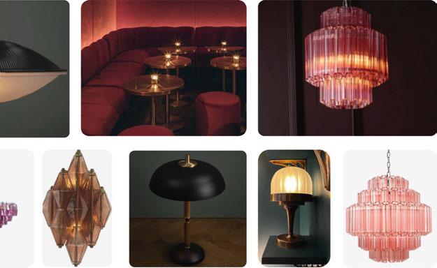
Hospitality Lighting | Bubbles | Euroluce Product Preview Defining The Circularity Of Lighting | LZF - Omma Collection | Sabine Marcelis - Ikea Varmblixt | Studio Two - The Cut & Craft

astrolighting.com
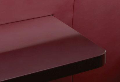
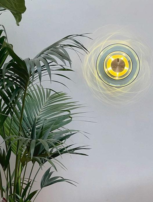
Ortona Twin wall light in Matt Black
Welcome
It’s finally here - Spring has sprung, and I couldn’t be more delighted to welcome in the milder temperatures and longer days!
That can also mean one thing in the design industry… Milan Design Week and Euroluce are just around the corner! Are you going to be there too? If so, I look forward to bumping into you and perhaps cheers-ing a cheeky prosecco or two!


Now, this issue is a stunner if I do say so myself. We have introduced another new editorial feature called Design Evolution. This is where we look at a product in its concept and inspirations stage. Then in the following issue, we will bring you part two, which presents the completed piece in all its glory! I will be chatting with the designers to see how closely the final product stayed to its original intentions, or how it developed - positively or negativelythroughout its design journey. To kick us off, we have chosen new kids on the block, UK-based bespoke lighting brand Rock and Soar founded by Alison Smith and Monica Polonio. The article looks at its product Storm and the stunning watercolour illustrations Alison created.
Elsewhere in this issue, I was also fortunate to snag an interview with Ikea! One of my personal favourite high street shops. I discovered all about its new Varmblixt collection designed by Sabine Marcelis, and the sculptural lighting pieces within it.
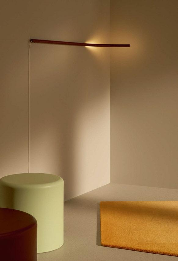
On the cover, we are featuring the beautiful Bubbles pendant from Brand Van Egmond. Designed by William Brand, this new handmade collection was inspired by children playing with bubbles and the mesmerising colours and forms bubbles take on. The new collection will be on show at Euroluce in Hall 9, Stand 205.
I hope you find this issue and all its contents an enjoyable read and a source of inspiration, and a resource to get those creative juices flowing.
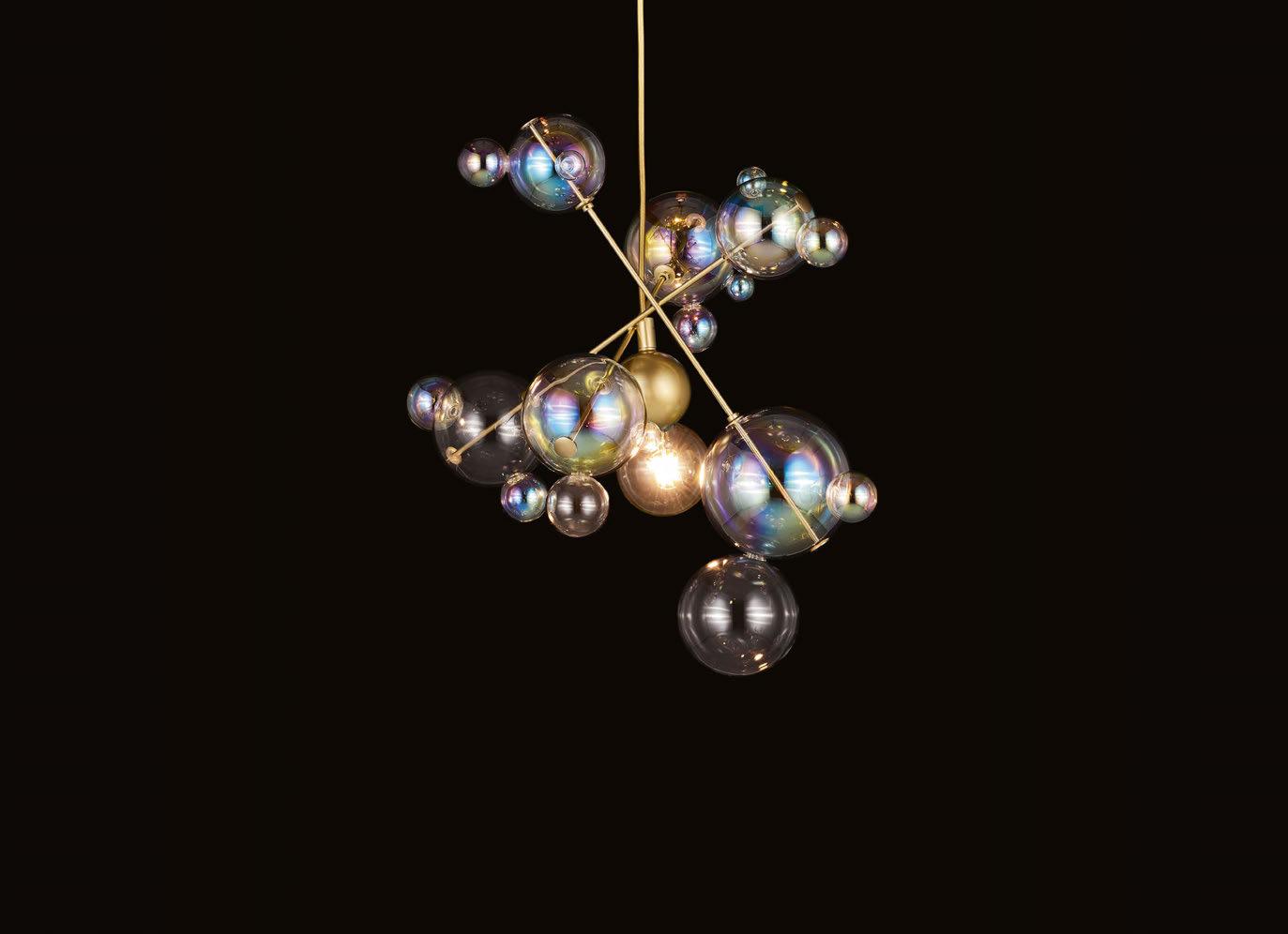
Cover: Bubbles Brand Van Egmond
Sarah Cullen • Editor
21 & 22 November 2023 Business Design Centre • Islington • London New for 2023 A dedicated area to shine The UK’s only dedicated lighting specification exhibition www.lightexpo.london darc space is a one-stop-shop for designers and specifiers looking for their next stunning decorative light fixture. To exhibit in darc space contact John-Paul Etchells on jp.etchells@mondiale.co.uk.
Featured
Managing Editor | Helen Ankers h.ankers@mondiale.co.uk
+44 161 476 8372
Editor | Sarah Cullen s.cullen@mondiale.co.uk
+44 161 476 9401
Contributing Editor Matt Waring
Media Sales Manager | Stephen Quiligotti s.quiligotti@mondiale.co.uk
+44 7742 019213
International Sales Manager | Tristan Blowers t.blowers@mondiale.co.uk
+44 7392 895771
Design
Artwork | Dan Seaton d.seaton@mondiale.co.uk
Editorial | Mel Capper m.capper@mondiale.co.uk
Jonathan Coles Lighting, a UK-based decorative brand, was commissioned by Speirs Major to create a chandelier installation for the Wash Tower of Battersea Power Station.

Finance
Finance Director | Amanda Giles a.giles@mondiale.co.uk
Credit Control | Lynette Levi l.levi@mondiale.co.uk
Corporate
Chairman Mondiale Publishing | Damian Walsh
Managing Director [d]arc media | Paul James p.james@mondiale.co.uk
Marketing & Events | Moses Naeem m.naeem@mondiale.co.uk
[d]arc media ltd | Strawberry Studios, Watson Square, Stockport SK1 3AZ, UK | Printed by Buxton Press, Palace Road, Buxton, UK | ISSN 2052-9406
006 | INSIDE ISSUE 49 Contents 035 Interview | Sabine Marcelis & Henrik Most | Ikea Varmblixt 050 Interview | Workspace Design Show | The Circularity of Lighting 056 Comment | Hospitality Lighting | John Williams | SpaceInvader 058 Comment | Hospitality Lighting | Holly Hallam | DesignLSM | Heythrop Hotel 064 Feature | Hospitality Lighting Manufacturer Case Studies 076 On Show | Euroluce | Preview 082 Calendarc | International Design Events for 2023 084 In Focus | Aldo Bernardi | Fate
008 Focal Point | Sofia | VISO | USA 010 Focal Point | Prada FW23 Menswear Show | OMA | Italy
The Cut & Craft
3 Battersea
Projects
012
Using influences from the Titanic, The Cut & Craft in Leeds, UK, has been given a new lease of life by Studio Two and Mistry Lighting. 02
Power Station
032 On The Board | Run For The Hills | Noir En Rose 040 Design Evolution | Rock & Soar | Storm 043 Materials | Omma | LZF #readinginthedarc
Supporting
Magazine
Inspiration
Proudly
The

Focal Point
Sofia Miami, USA
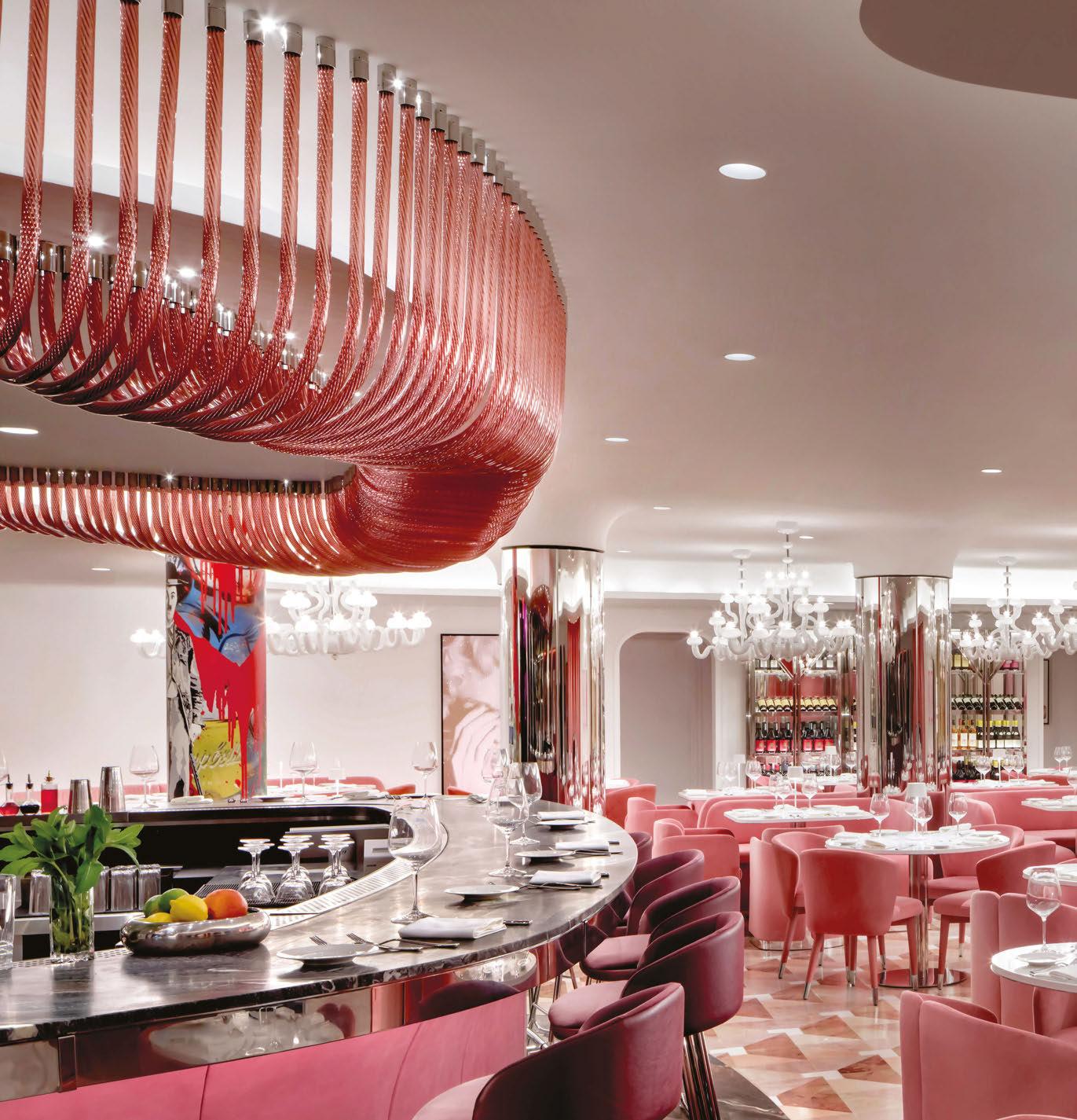
Famed restaurateur, Charles Khabouth, has opened a second Sofia restaurant located in Miami. The original, located in Toronto, boasts an upscale dining experience that is flourished by custom lighting that is design-engineered and fabricated by VISO.
Studio Munge commissioned VISO to designengineer and fabricate this unique light fixture that surrounds the full circumference of the bar, half in/ half out. The fixture sits at 158.63-inches, housing 197 acrylic tubes for the interior side, and 146 acrylic tubes for the exterior section, which is specifically engineered to withstand Miami's climate. www.visoinc.com
008 | FOCAL POINT
Image: Brandon Barré
009
Focal Point
Prada FW23 Menswear Show
Milan, Italy
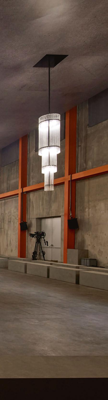
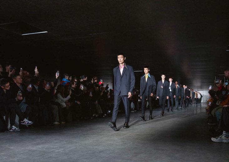
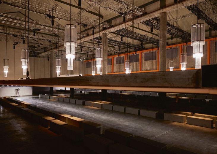
For the Prada Fall Winter 2023 menswear show, AMO conceived a scenography that transforms while the audience attended the show, altering the perception of the space inside the Deposito at Fondazione Prada. The room was left bare, filled only with rows of benches rendered with concrete. During the show, the ceiling rises, revealing an array of three-metre-tall chandeliers – designed to reference a classical shape with an industrial materiality – and then withdraws to its initial position. The proportions and atmosphere of the room change almost imperceptibly from a dark low-ceiling room to a warm, monumental salon-like space, and back again.
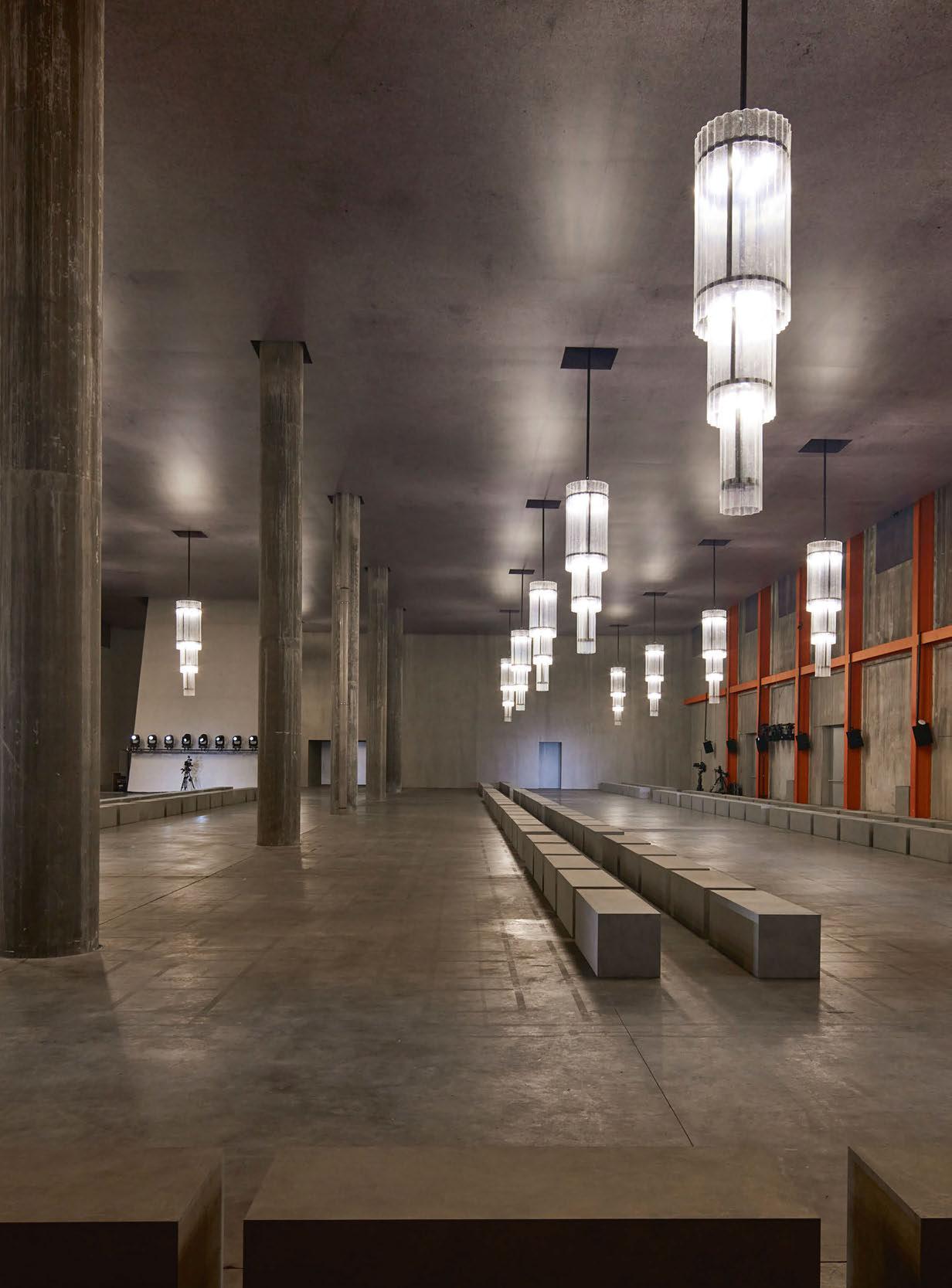
For the lighting of the show, AMO designed a handcrafted in-house installation of 20 ceilingsuspended chandeliers. Conceived as an industrial style reinvention of the classic chandelier shape, the three-tiered pieces are made of a three-metre-long and 90cm-wide black iron structure with a translucent ribbed fiberglass envelope that gently filters the light. Each of the three levels includes a group of four R7s - 400W halogen lamps with independent on/ off switches, allowing the gradual illumination of the Deposito space at Fondazione Prada.
www.oma.com
010 | FOCAL POINT
Images: Agostino Osio and Alberto Moncada, courtesy OMA and Prada

011
Revived Design
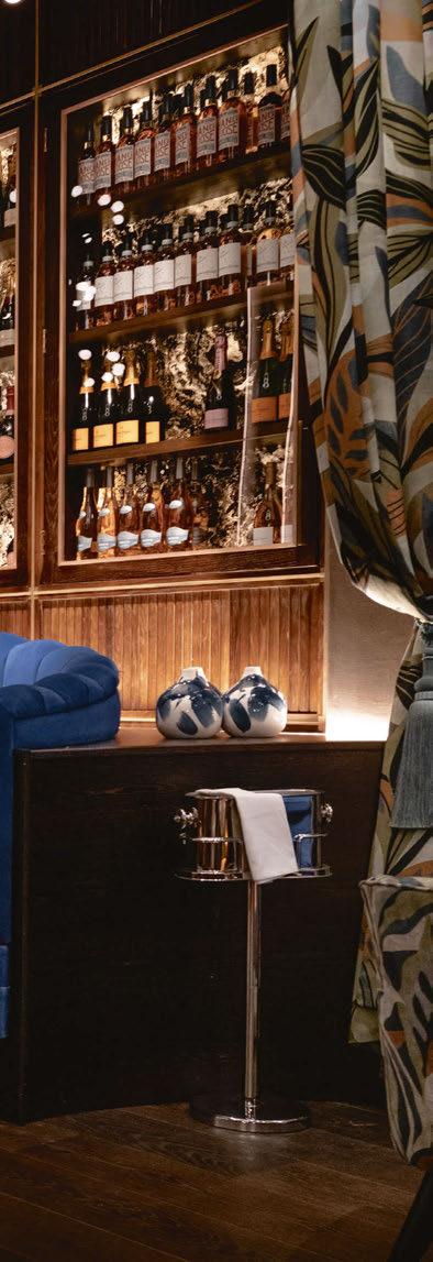
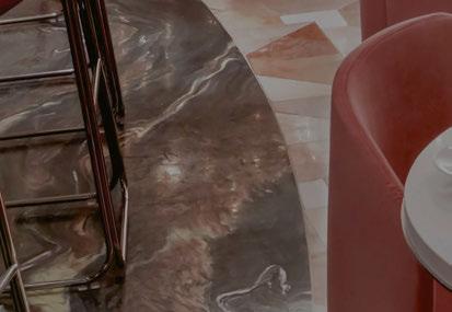
Using influences from the Titanic, The Cut & Craft in Leeds, UK, has been given a new lease of life by Studio Two and Mistry Lighting.
A historically enriched location found in the heart of Leeds city centre in the UK, The Cut & Craft opened in October 2022. The Grade II listed building, formerly known as Collinson’s Café, was famously frequented by Wallace Hartley, the Band Master of the Titanic. Using this unique affiliation, Cut & Craft’s interiors take inspiration from the elegance of the Titanic, incorporating oceanic colours, textures, and metallic qualities.
Completing the interiors for the new venue was Studio Two, a Yorkshire-based interior design practice. darc spoke with Zoe Wheatley, Director at Studio Two, about the design concept for the
new hospitality space. “Having previously worked with the owners of The Cut & Craft on multiple sites for their Italian restaurant brand, we were appointed as the designers on their most recent acquisition in the iconic grade II listed building, Victoria Quarter Leeds. The Cut & Craft have brought their signature flat iron steak and craft beer experience to the city centre, allowing them to make their mark on Leeds’s casual premium dining scene,” she explains.
“The brief was to create a beautiful restaurant that caters to an all-day offering, whilst ensuring the space can transition into a lively venue in the evening. The client was also determined to celebrate the history of
012 PROJECT | THE CUT & CRAFT
the site and use what information we had on the building to turn into visual stories. With that, we were able to create an underlying design concept around The Titanic, curated from a story of a musician, Wallace Hartley, that was invited to play as Band Master on the ship and was linked back the site’s previous Collinson’s Café as part of their entertainment team.
“The project was on site for a duration of 16 weeks, however the planning and designing of the scheme was two years in the making.” Studio Two brought Mistry Lighting on board to ensure a beautiful lighting scheme was embedded in the design. Krishna Mistry, Founder
of Mistry Lighting, explains to darc her involvement in the project: “The building is listed and there were many architectural features that Studio Two wanted to illuminate as part of their interior vision for the restaurant. This included a large feature dome that spans across the bar where they needed a specialist lighting designer involved to bring their vision to life.
Due to the historic nature of the building, the teams faced some challenges throughout, as Mistry explains: “The main challenge we found was the building was grade II listed, which gave us limitations on where we were able to mount lighting. For example, we wanted
013
to illuminate the ornate arches, but we couldn’t recess lighting within the floor. We worked with Studio Two to create a discreet box at the base of the arches to recess the uplights within. Where possible we integrated within joinery items to allow us to illuminate existing and new features of the restaurant.”
Wheatley adds: “Certain challenges arose around the M&E side of the project, as with a lot of listed buildings the traditional concrete construction resulted in a dynamic and creative lighting design, which was undertaken by Mistry Lighting, packed full of joinery illumination, beautiful back-lit features, and perfectly hidden marker lights. The end result of the design scheme is impactful, atmospheric and completely on brief.
“The brief didn’t change over time however the space planning altered slightly as we hit certain challenges with the building. We spent a lot of time before the construction phase designing and working with our client to ensure the brief was fully captured.”
Mistry adds: “We always kept Studio Two’s overarching vision in mind when designing the lighting. It was always a key element to this design
and as previously mentioned, as it is a listed building, we couldn’t illuminate every detail we wanted but we prioritised the key elements to ensure the original vision was achieved.”
Using the Titanic as a foundation for the design’s inspirations, Studio Two featured “oceanic hues, glistening water-like metallics, crafted timbers and an abeyance of inviting texture”. These details were key when it came to the team designing bespoke decorative lighting fixtures with Northern Lights to “embellish the scheme with scale and impact”.
Architectural lighting fixtures from Lucent, LightGraphix, LEDFlex, and Anolis were used to create a backdrop for the decorative fittings that took centre stage. “The key decorative features were the large bespoke pendants as you enter the main restaurant. This was in the original visual from Studio Two, who appointed Northern Lights to manufacturer the bespoke pendants as well as the decorative pendants across the restaurant. They were all designed by Studio Two to ensure the decorative lighting complemented the interiors perfectly,” explains Mistry. “The lighting played a huge role to celebrate
014 PROJECT THE CUT & CRAFT
Design-Engineering & Fabrication
Feature Bar Lighting

• Custom Decorative Fixture
• Indoor/Outdoor • Wind-Resistant • Installation Service


Project: Sofia Miami
Interior Designer: Studio Munge
Design-Engineering & Fabrication: VISO Lighting


Photographer: Brandon Barré
VISOINC.COM | +1 416.461.8476 | INFO@VISOINC.COM @visolighting |
the architectural features of this historical building and creates drama and impact. It draws attention to certain areas of the space and highlighting richly detailed elements,” she continues.
“The grand ceilings lend themselves to the suspension of large bespoke pendants, inviting you through the space. The lighting showcases the building’s exceptional beauty and allowing it to come alive at night.
“We used layers of light to create the right balance between architectural and decorative lighting allowing us to change the mood of the restaurant from day to night.”
These layers of lighting that Mistry references were an essential part of the design scheme to allow the space to be flexible between times of day and usage. Wheatley elaborates: “The ground floor restaurant and bar, as well as the reception space heavily features hidden joinery
lighting, specifically designed to create mood and atmosphere from day to evening. The spaces are then embellished with opal glass bespoke fittings with touches of brass to add a subtle glow to the landscape.
“The first floor is home to the champagne bar, which is positioned under the historic glass dome and is focused mainly on table lighting to allow the colour changing dome lights to take centre stage.
“The architectural fittings are mainly used to celebrate and highlight the historic features of the building and ensure the space cleverly transitions from day to night. The decorative fittings then furnish the scheme with a selection of materials that complement the overall design.”
The colour changing dome lighting mentioned by Wheatley was achieved using Arcsource 4MCA spotlights from Anolis. “We could not
016 PROJECT THE CUT & CRAFT
position any fittings on the historic glass dome at first floor level, which is why ourselves and Mistry Lighting opted for colour changing DMX lighting to add drama and impact for guests dining under the dome.
“Bespoke table lighting was designed to add a secondary glow to every table at first floor.”
Mistry adds: “It’s not often I have the opportunity to work with a listed building and especially one with so many original features. With other projects you can place lighting wherever you need it but, on this occasion, we had restrictions that made us explore different opportunities to light the space.
“The standout feature has to be the main dome, which is stunning! We lit the dome using a combination of beam angles from the perimeter the base of the dome to allow it to glow softly.”
Speaking on what the lighting brings to the space, Wheatley explains
that without it, their design wouldn’t have been brought to life as it was. “For us, without a carefully curated lighting scheme our efforts for the overall design concept wouldn’t come to life. Meticulously specified lighting not only adds layers and depth beyond loose and fixed furniture, but it also helps a space transition from day to night ensuring the story of the space is being told. In restaurant design, the space is more than just furniture and new joinery; it’s essential that the visual stories come to life and impact guests as a whole experience.” Typically, there are always some elements that have to be compromised or removed altogether along the project journey. For Studio Two, this involved the external signage. Due to landlord restrictions, the team were unable to illuminate the external signage, which was included in the original plan. For Mistry, she too wanted to include some external lighting. “I’d like to have explored ways to
017
illuminate the existing stained-glass windows from the outside in the evenings. It is such a beautiful feature that is effective during the day but at night, you don’t get to appreciate it in its full glory being lit from within.”
Overall though, the project has been deemed a massive success for both parties involved in its design. “Working on a unit in the Victoria Quarter was a big moment for Studio Two. Being a local site to us, we have always admired the history and beauty of this building so to be able to bring our vision to this space was iconic. The project was also our first time working with Mistry Lighting, which was a huge success as we were able to see each other’s visions from the outset,” says Wheatley. “Working with Mistry Lighting was a huge success and we have plans to work with them on future projects. We found using a lighting designer really elevated the scheme and brought our visions to life.”
www.studio-two.co.uk
www.mistrylighting.com
Design Details
The Cut & Craft, Leeds, UK
Lighting Design: Mistry Lighting
Interior Design: Studio Two
Lighting Specified: Anolis, LEDFlex, LightGraphix, Lucent, Northern Lights
Images: Stevie Campbell
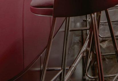
Using a unique, historic influence for the design of The Cut & Craft, Studio Two has blended tones and textures from the Titanic and the ocean to create an atmospheric dining and drinking experience.
Layered lighting played a key role in tying the whole scheme together and bringing the space to life.
018 PROJECT THE CUT & CRAFT


USA
Regan Baroni
Jaleo Restaurant, Chicago,
Photography:
www.lzf-lamps.com contacts@lzf-lamps.com
Wood touched by Light
Dandelion lamp by Burkhard Dämmer Handmade Wood Lighting Since 1994
020 | FOCAL POINT
Focal Point
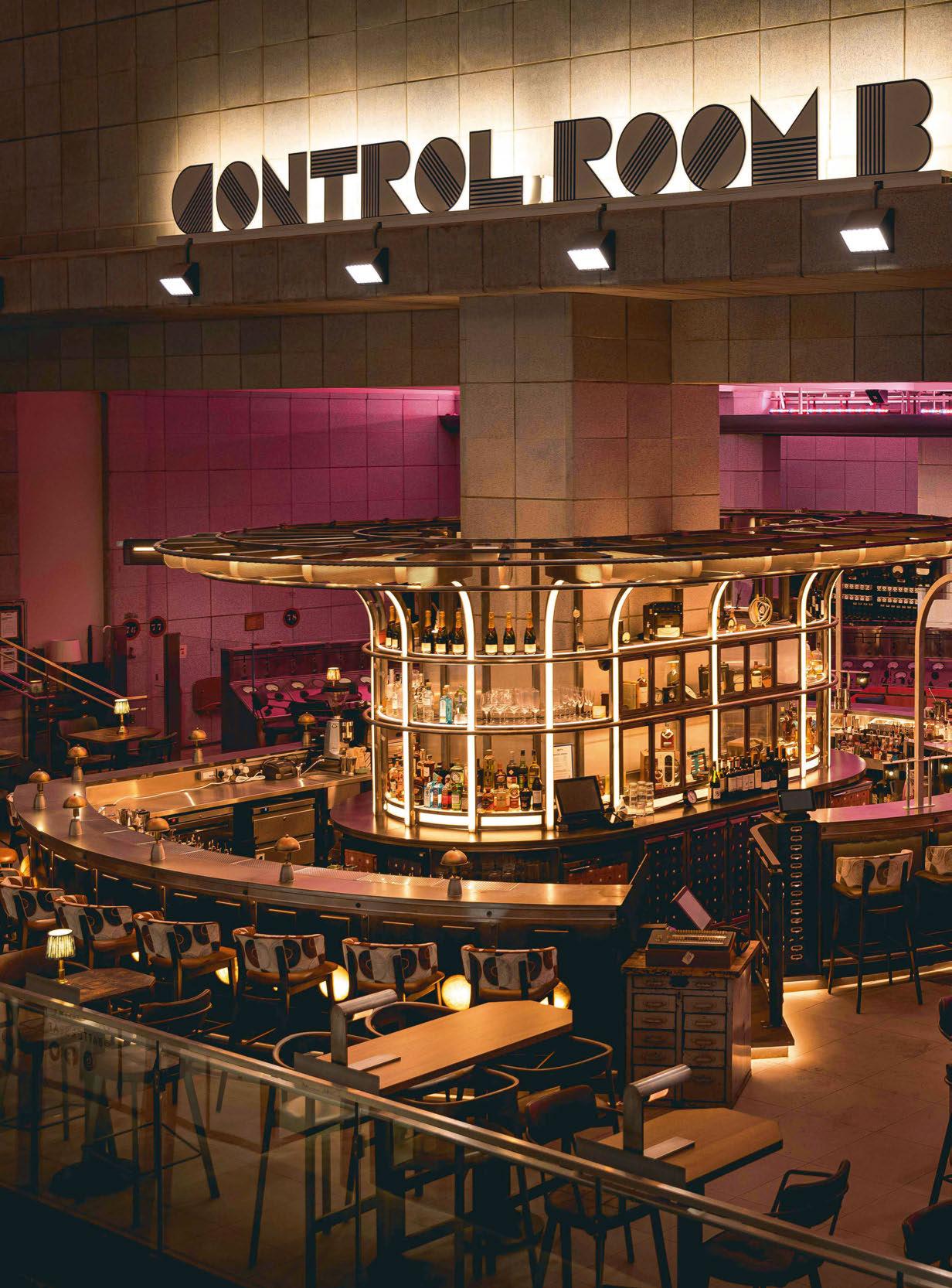
Control Room B
London, UK
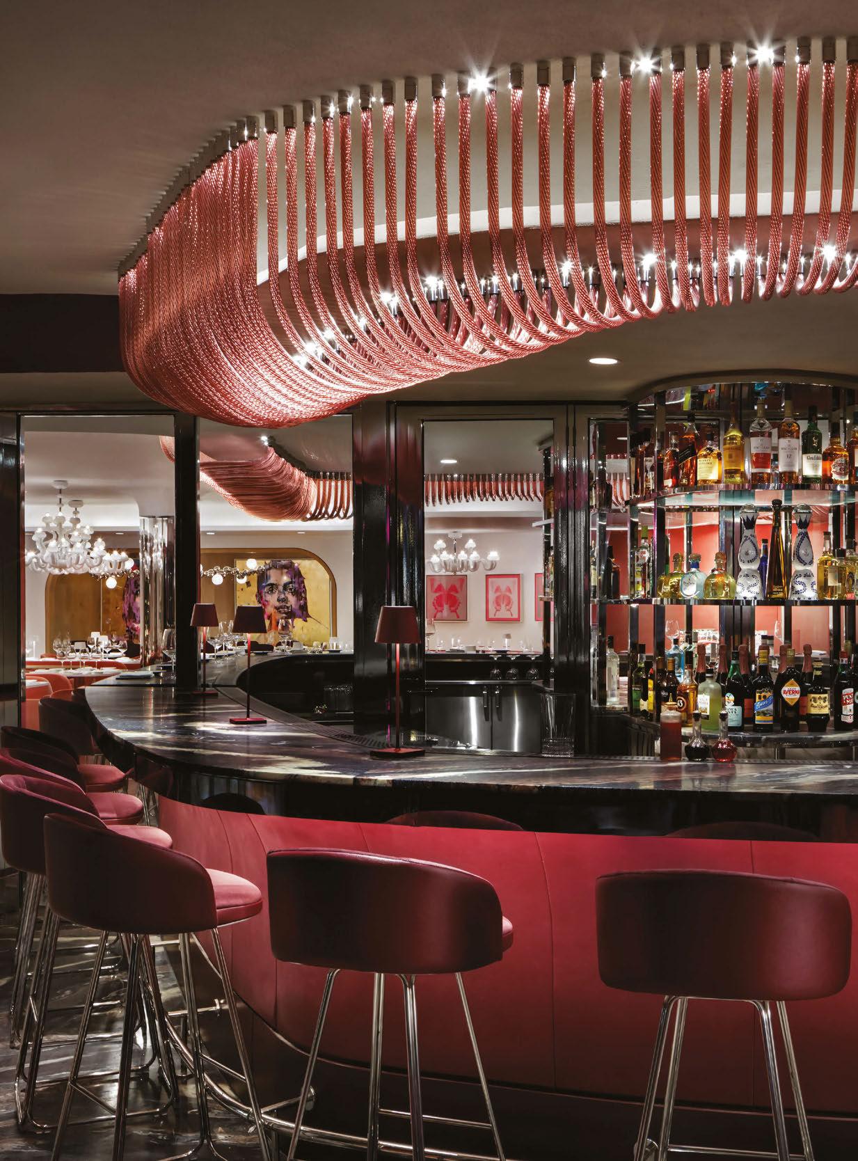
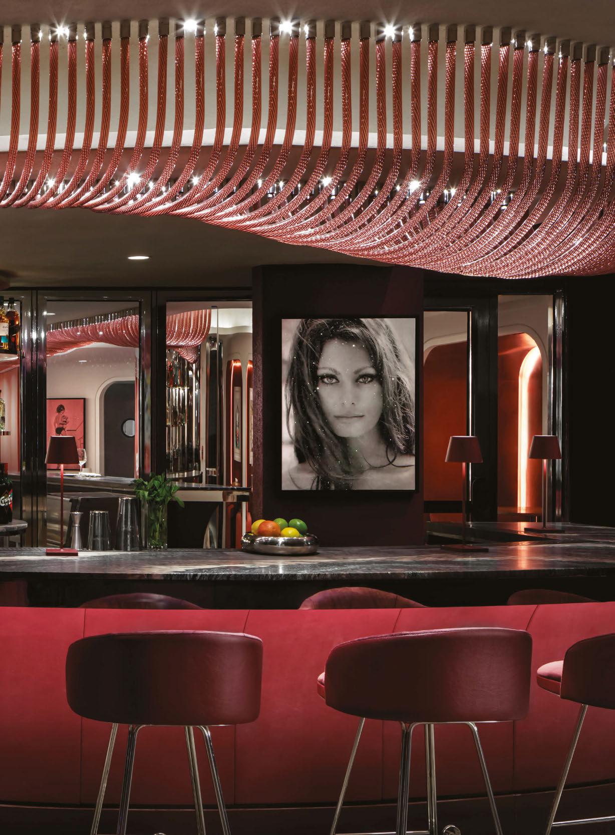
Ellis Design Studio has designed a spectacular new cocktail bar venue within Control Room B at the very heart of the newly redeveloped Battersea Power Station. Battersea Power Station is a Grade II listed, global architectural icon and one of London’s most recognisable landmarks, which has recently re-opened after a multi-billion-pound redevelopment.
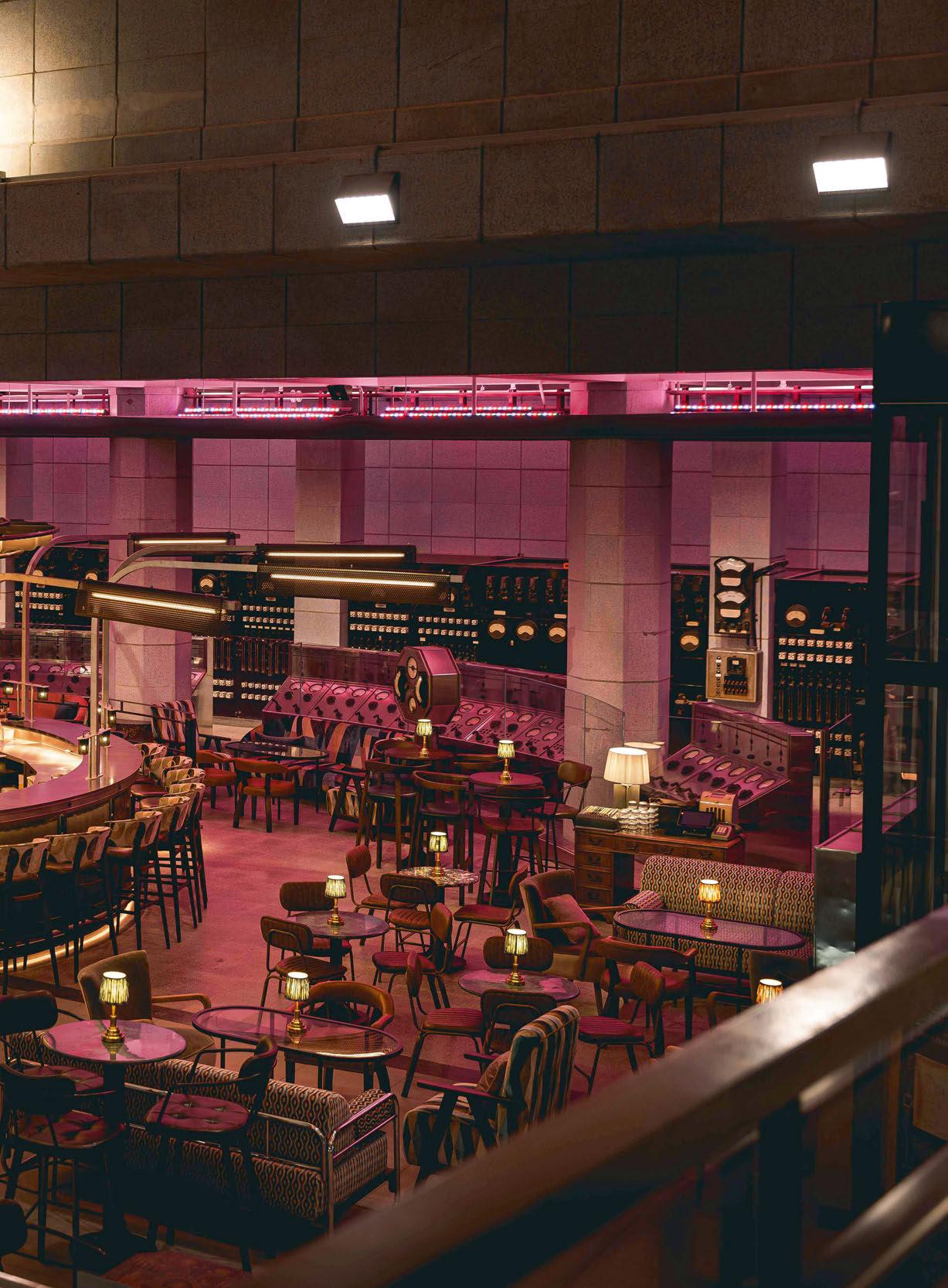
Control Room B originally helped manage the distribution of a fifth of London’s electricity, supplying power to some of London’s most recognisable landmarks such as the Houses of Parliament and Buckingham Palace. The new 4,500sqft bar is set amongst the panels of historic dials and switches of the original control room.
The control room was built in the austere Modernist style of the post-war period and the space is defined by the dramatic arc of the original stainless steel control desk, set against a backdrop of full height anthracite-coloured switchgear racks.
The design for the bar involved the creation of a free-standing turbine-inspired, metallic sculptural centrepiece, paying tribute to the character and form of Battersea Power Station’s electric, industrial history. An illuminated radial metal canopy with fixtures by Arc LED adorned with delicately perforated metal fins encircles an existing central column, lending a sense of energy, movement and permeability.
Table lamps featured are from Pooky and customdesigned and supplied brass table lamps by Ellis Design Studio sit on the bar top.
www.ellisdesignstudio.co.uk
Image: Johnny Stephens
021


register for free today clerkenwelldesignweek.com cdwfestival clerkenwell.design.week clerkenwelldesignweek #cdw2023 will be hosting a programme of lighting talks within light at the house of detention source cutting-edge lighting products from some of the world’s biggest brands at the UK’s leading design festival.
Aromas | Chelsom | Curiousa | Erco Ligthing UK | Franklite | Fritz Fryer | Jonathon Coles Ligthing | Lladró | Optelma | Studio Lloyd | Spark & Bell | Zero Lighting & more
Designing for an Icon
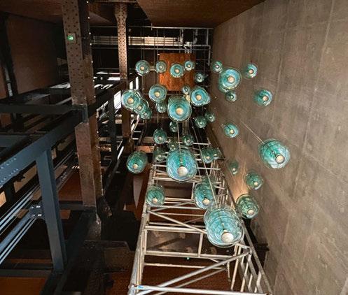
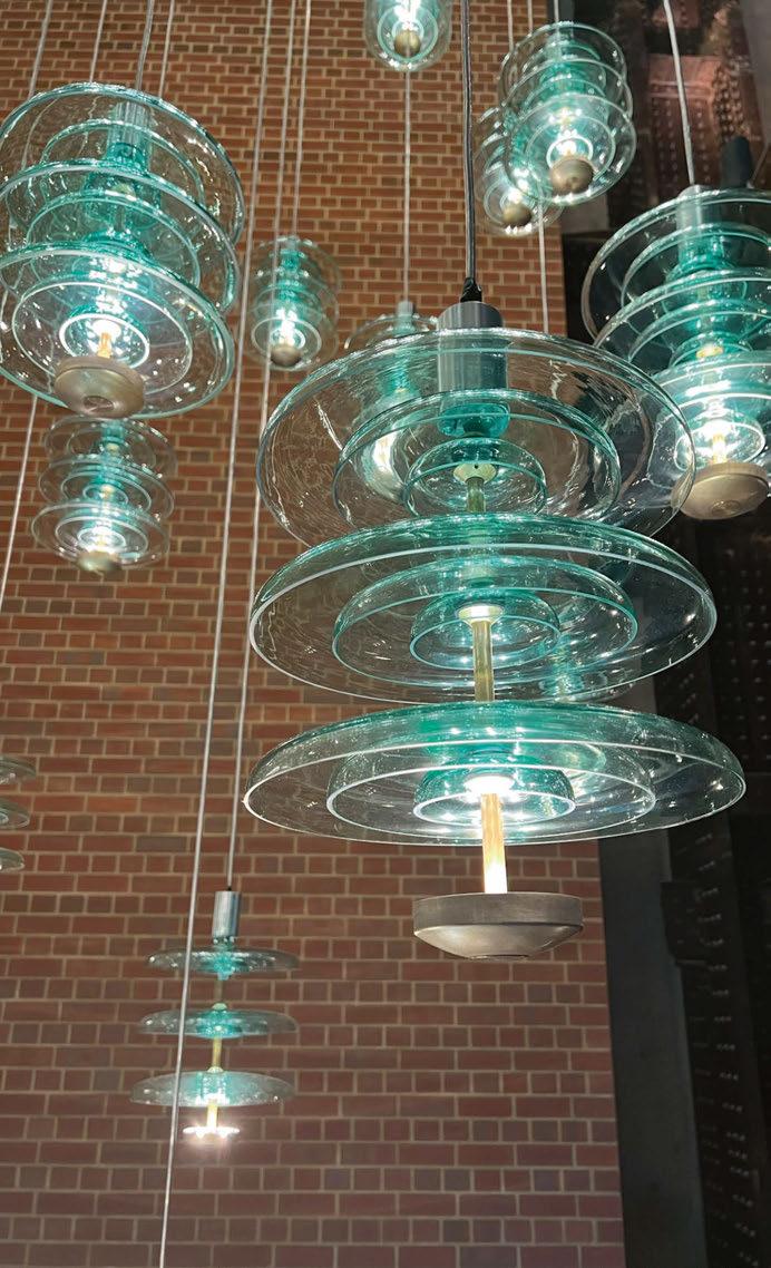
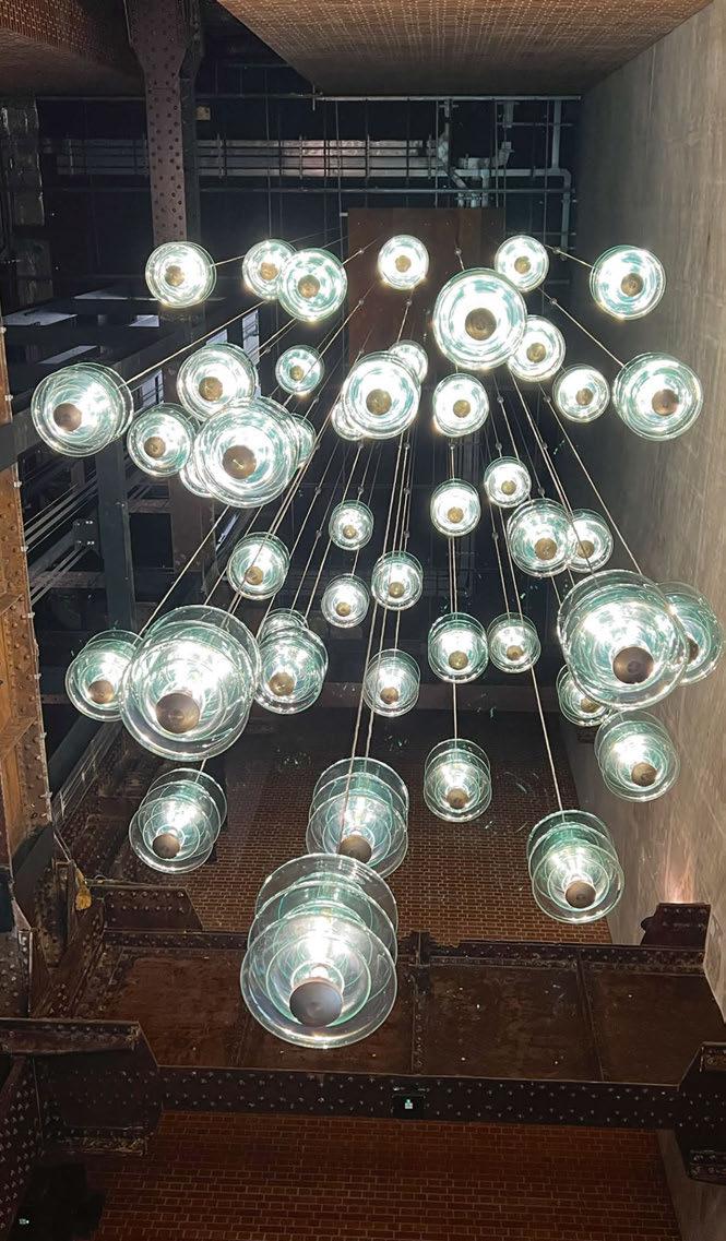
Jonathan Coles Lighting, a UK-based decorative brand, was commissioned by Speirs Major to create a chandelier installation for the Wash Tower of Battersea Power Station.
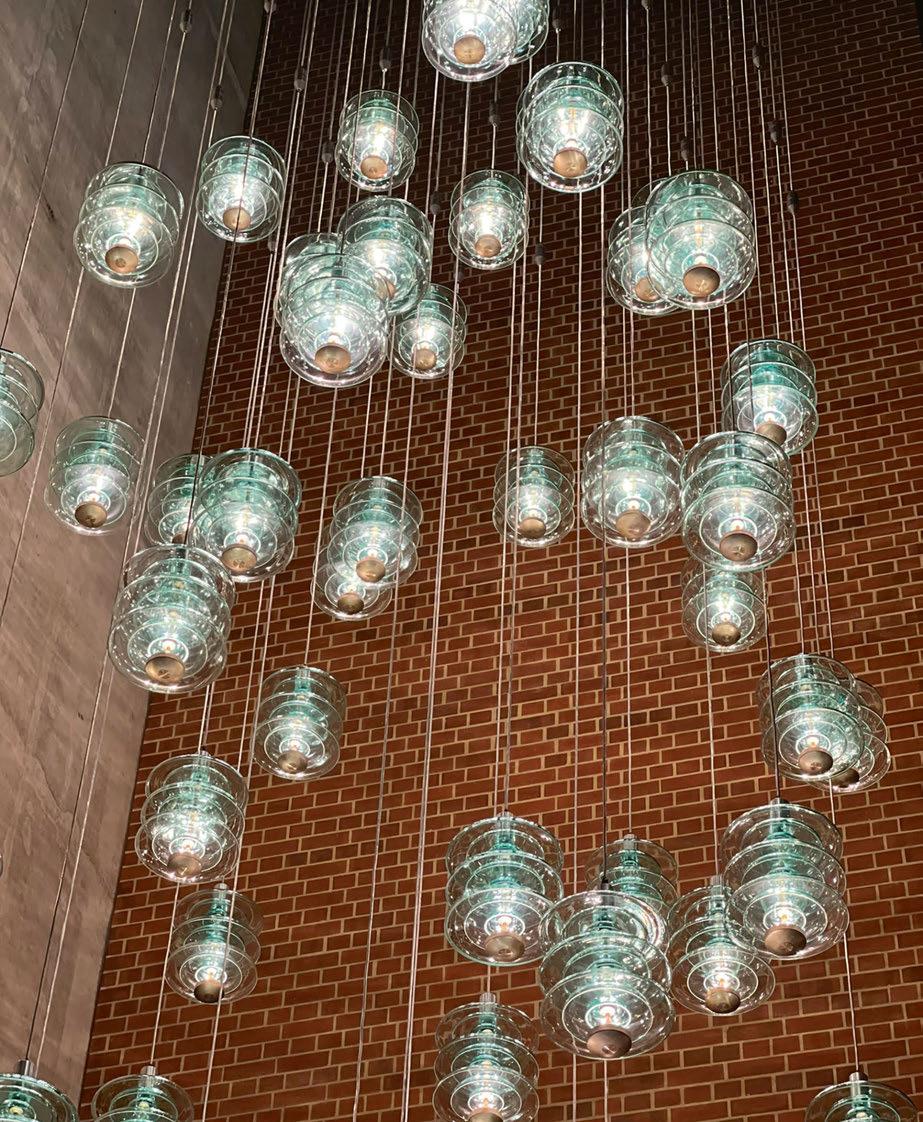
Jonathan Coles Lighting has created a range of bespoke chandeliers to grace the void of the Wash Tower within Battersea Power Station, an iconic London landmark.
Located in the heart of one of the city's largest new developments that covers 42-acres of former industrial brownfields, the Battersea Power Station is just one part of the £9bn project. The mixed-use building is home to Apple’s London Campus, hundreds of new shops housed in the historic turbine’s halls, a c.2000 capacity event venue, an 18,500sqft food hall, a glass chimney lift, and hundreds of new homes. Working across the massive regeneration project were architects
WilkinsonEyre, structural engineers Buro Happold, Chapman BDSP as M&E consultants, construction manager Mace, external landscaping by LDA Design, Andy Sturgeon as roof garden designer, and Speirs Major as lighting designer, plus Michael Grubb Studio, which worked on the glass chimney lift.
Speirs Major invited Jonathan Coles Lighting to create a bespoke installation for the Wash Tower. Speaking with Coles about the team's involvement in the project, he tells darc: “Speirs Major invited me to present a range of concepts for different areas of the Power Station in 2015. One area was the cavernous 30-metre-tall brick spaces beneath
02 3 | PROJECT | BATTERSEA POW ER STATION
Image: Mattia Balsamini

02 4 | PROJECT | BATTERSEA POWER STATION
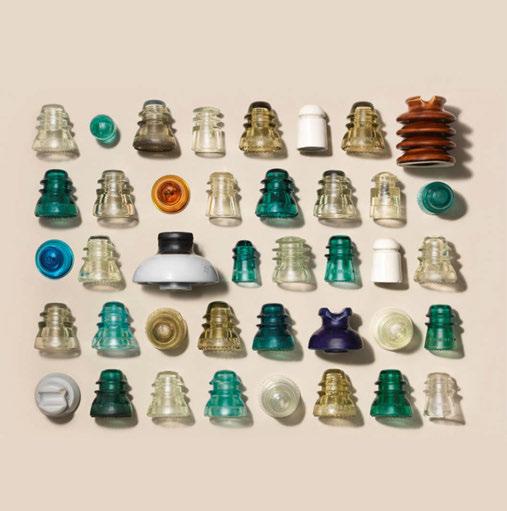
A selection of reference images, prototype creations and glass samples.
the four iconic chimneys of the building.
“We were provided with reference images of the station as it was then and historical images when in use with turbines, cables, control rooms and pipework. The enormous scale of the spaces and the machines was both breathtaking and a challenge as to how we would design a piece to work with the scale.
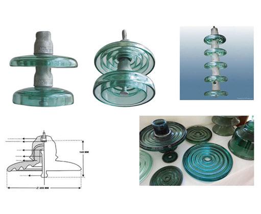
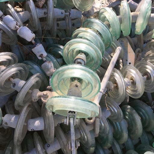
“Our brief was simple at that stage, to reference power generation, the dials, gauges, cables, and transmission. We produced a range of concept designs and presented them to the client, with the powerline insulator idea chosen to develop further.
“This was the start of a seven-year project to final installation journey.” Coles was encouraged by the client to investigate the use of reclaimed glass insulators for the light fixture’s design. Coles explains further:
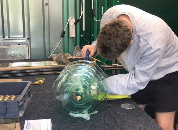
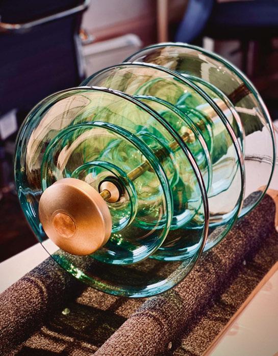
“Having sourced a substantial quantity from Spain, two samples were sent over to test. However, we soon found their weight and industrial construction made them impractical to use but allowed us to take their form as inspiration to develop our own custom glass further.”
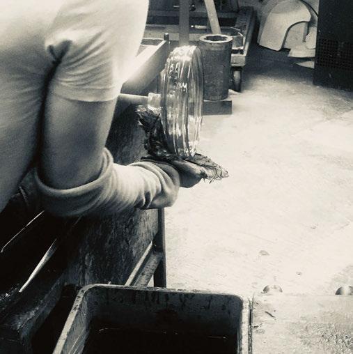
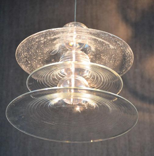
Running with this inspiration of repurposing a material or form that is not typically seen in the decorative lighting context, Coles developed his design further. “When the designs had been through several stages of development, we commissioned prototype shades from a glass blower in the UK and presented a working protype of the three-tiered pendant design.
“When illuminated we discovered the glass threw a stunning array of light patterns around the room, which is a feature we retained with the final installation.
02 5
“The arrangement of the pendants within the 30-metre space was a challenge. The installation would be viewed from below and at different levels. We wanted it to feel like it filled the space but still had a transparency, like a starling murmur or shoal of fish. We wanted a flow of glass and light that drew the eye upwards into the tower. Creating the piece as a computer model was essential and allowed us to adjust the design until it worked from many viewpoints.”
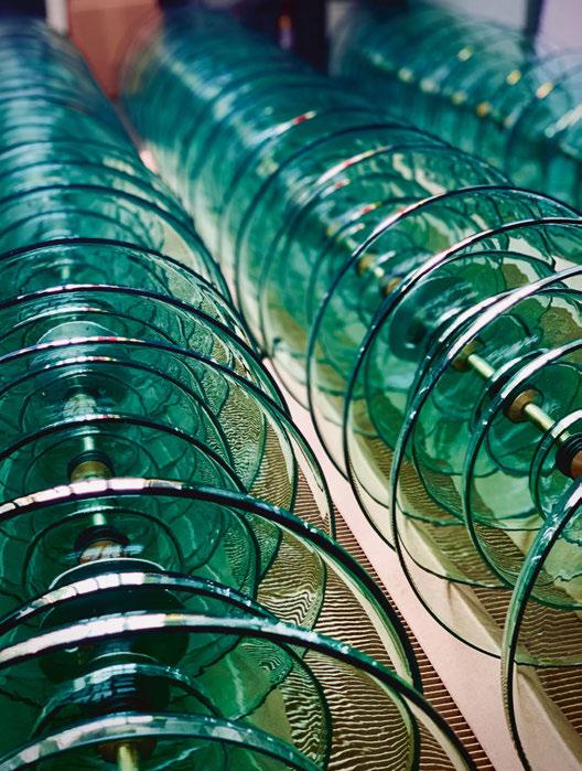
Aqua green glass was selected as the material of choice for Coles as it presented a “natural raw beauty” that he knew would illuminate beautifully. “Insulators would originally have been green due to iron impurities in the glass from their low-cost industrial production. I liked this contrast between the industrial and decorative use,” says Coles.
“We also introduced aged brass materials to pair with the green glass, taking cues from the Control Rooms levers and switches.”
The nature of the space the team were working with is very unique. As such, the weight of each glass pendant had to be carefully monitored. “We knew that keeping the weight of the individual lights as low as possible was important and keeping the whole installation below 500kg, which we achieved,” explains Coles.
“The pendant lights are suspended on custom made braided stainlesssteel cable with an internal load bearing suspension wire as well as high strength conductors.” Tried and tested technologies were incorporated into the fixture, including Cree LEDs on custom heatsinks and remote DALI drivers, all which Coles felt were appropriate for this
02 6 | PROJECT | BATTERSEA POWER STATION
ORIGINAL BTC


Specialists in the design & manufacture of unique, timeless lighting.
THE FIN COLLECTION SHOWROOMS IN LONDON | NEW YORK | PARIS | TAIWAN WWW.ORIGINALBTC.COM
type of commercial setting.
The chandelier stands out beautifully against its rugged background thanks to a minimal amount of architectural lighting introduced by Speirs Major. At low level, the lighting designers introduced industrial glass wall lights to provide guidance and at a high level, the steel beams are picked out with spotlights that frame the light installation. When asked how this project differed to others his team has worked on, Coles says: “Unusually, I would have to say we weren’t able to see the full height of the tower until the first chandelier was installed, as scaffolding had filled the space until the week before. Seeing the height was a shock and there was a moment when I doubted it would be grand enough for the space, despite our models! As the first chandelier
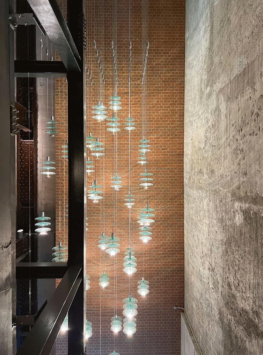
was installed, however, I could see it worked to scale and set itself beautifully against the brickwork, concrete, and riveted steel beams.” The overall impression of the final installation is a resounding positive one. “On first seeing the installation I was blown away by the reality of the scale, how it changed shape as you moved around the space and how it threw its light patterns onto the surrounding walls. I still get goosebumps when I see it each time,” reflects Coles.
One aspect Coles wishes went ahead was the pairing of installations. He explains further: “We had always wanted to pair the wash tower installations with another at the entrance canopy to the power station on the river side. This unfortunately never went ahead but, for me, might have tied the spaces together nicely.”
02 8 | PROJECT | BATTERSEA POWER STATION
Tekna lighting meets Italian leather


Off the back of the chandelier’s success, Jonathan Coles Lighting has launched two iterations of the installation at a home-scale. The Ampere pendant and wall light, released at the end of 2022, take design cues from the power station with its machined brass front dial, while the green glass shades, like the chandelier’s, pay tribute to the green power transmissions. The pieces are made from mouthblown recycled glass and natural brass machined detailing. They are integrated with long life, warm white light sources that allow Ampere to cast its beautiful light patterns on the wall or ceiling when illuminating a space.
“I would really like to credit the input of others in the design team, Hiroto and Ewan at Speirs Major and the Power Station’s vision to commission this display of light and glass. I hope it is a fitting tribute to Sir Giles Gilbert Scott’s masterpiece,” concludes Coles.
www.jonathancoles.co.uk
www.smlightarchitecture.com
030 | PROJECT | BATTERSEA POWER STATION
Jonathan Coles Lighting has created a stunning chandelier installation for the Wash Tower in Battersea Power Station. The lighting fixture took inspiration from power transmitors, using a similar green hue and rounded shape. Coles and his team has expanded on this bespoke design for the power station to create an at-home range of lights, the Ampere wall light and pendant.
Amperes wall light and pendant.
NEW COLLEC TION
EDITION 28 ARRIVING MAY chelsom. co.uk
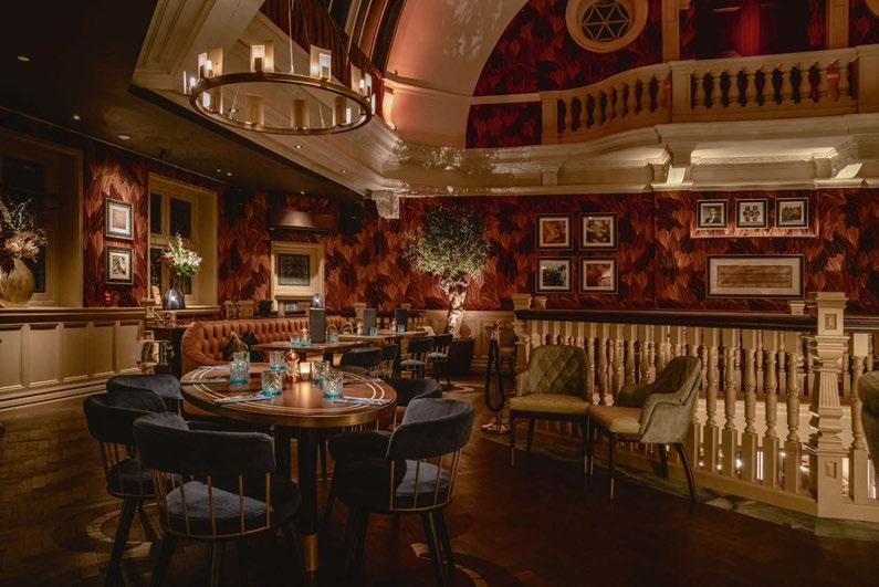
03 2 ON THE BOARD | RUN FOR THE HILLS 3 1 2
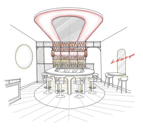
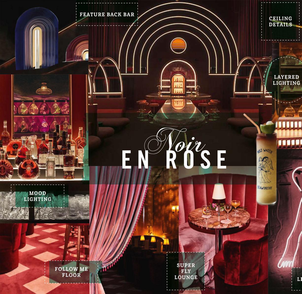
On The Board
Interior Designer Anna Burles from Run For The Hills presents their project concept for a new cocktail destination in West Sussex, UK. Working together with Nulty, the teams are developing an atmospherepacked destination.
Into The Noir...
We are working on an amazingly exciting cocktail bar at the moment, designing not just the interior of the bar, including the joinery, seating, decorative lighting and furnishing scheme, but also originating the brand, logo, signage, wayfinding, drinks menu and in-venue neon art.
Here is our original concept board for creating a super-fly, ultra glamorous, night-owls-only bar for lounge lizards, movers and shakers. Our scheme, dubbed ‘Noir En Rose’ proposed a bold clash of deep reds, clarets and dusky pinks within an atmospheric and luxurious drinking den meets cabaret lounge style setting. Guests approach a mysterious entrance, with minimal branding and super tight beams of light onto a statement door and discreet signage. Once inside, they pass through a thick velvet door curtain, and feel the full impact of the venue’s dark and moody vibes, with an uninterrupted view straight down the barrel of the venue’s hero cocktail bar.
1. Wow Factor Back Bar
The show-stopping bar takes centre stage, dressed in reflective materials and wrapped in layers of light; from soft washes across metallic tiles in the front bar arches and glitter-fleck counter tops to rear illumination of colourful apothecary glassware to the back bar, playing with the idea of using lightsheet underlighting, and soft front or rear projection on shelving to make the bottles and liquids glow beautifully. Black and brass mesh to metalwork in the bar will cast dappled shadows across the textural walls.
2. Light Play
We are collaborating with lighting design practice Nulty on the project and the detailed design is almost complete. The final design will be full of amazing light effects from our desired lighting below, onto and above the bar, to atmospheric glowlight underneath velvet fixed seating around the perimeter of the venue, to beautiful lines of light travelling up and over the back bar onto the ceiling, which can pulse and fade to the music. All of this is going to create even more of a focal point of the hero bar.
3. Chic Lighting
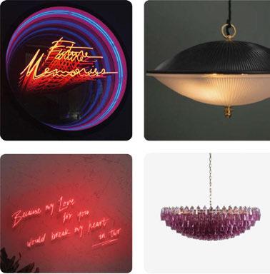
Aside from the architectural lighting, the venue will also feature a discreet collection of decorative pendants and table lamps including some gorgeous pieces from Felix Lighting and vintage style Murano glass fittings from Pure White Lines. Our graphics team have also designed some infinity mirror neon light pieces that will create insta-moment, wow-factors within some of the discreet nooks and crannies around the venue. The design is a true coming together of interior design and light artistry. We can’t wait to open the bar and shoot the finshed product.
www.runforthehills.com
03 3
Registration is Now Open
may 2-4, 2023


darc readers: Use code HDDARCMAG for your complimentary pass
The largest single destination for hospitality product discovery

Design for the Masses
Henrik Most, Creative Leader at Ikea, and Dutch designer Sabine Marcelis give darc further insight into the new collection and their collaboration.
Most has been working with Ikea since 2010 but has a rich past in the design world. After completing a master’s in Art in Design from Copenhagen University, he went on to work as a design curator and lecturer in design. He also has experience working as a cultural journalist and theatre dramaturge.
As Creative Leader at Ikea, Most works on the design, development, and collaborations for the brand. “I am inspired by contemporary art and design and connecting with people through new mediums. I have led previous collaborations including the Art Event, the launch of Markerad with the late Virgil Abloh, and the most recent collection with Marimekko, Bastua,” he says.
“I love contemporary art that has a strong link to what’s going on in our world, particularly regarding important cultural and social topics that touch and affect people. I’m curious about art that discusses
these questions in an open and interactive manner. Modern design and architecture are major inspirations for me.
“I was inspired by the Ikea brand’s strong social vision, that really wants to make things better and fundamentally improve peoples’ lives, so that a better life– no matter who they are, where they live, and how they want to live – is attainable.”
Every day is different in Most’s field of work. “It’s a great aspect of working for a dynamic brand like Ikea. My days range between meetings with colleagues, to looking at prototypes for upcoming product launches, and everything in-between,” he explains. When asked about Ikea’s designer collaborations, Most describes Ikea as a “curious company”. “[Being] open to new ideas and siding with different people in collaborations is a way to learn, develop and make things better for the everyday life at home,” he says. “When we collaborate, it always starts with a topic, something we are curious about, a challenge or a problem we want to solve. Then, we look at who we could explore this with. We expect these collaborations to be
03 5 | INTERVIEW | IKEA X SABINE MARCELIS
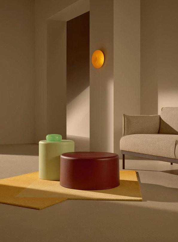
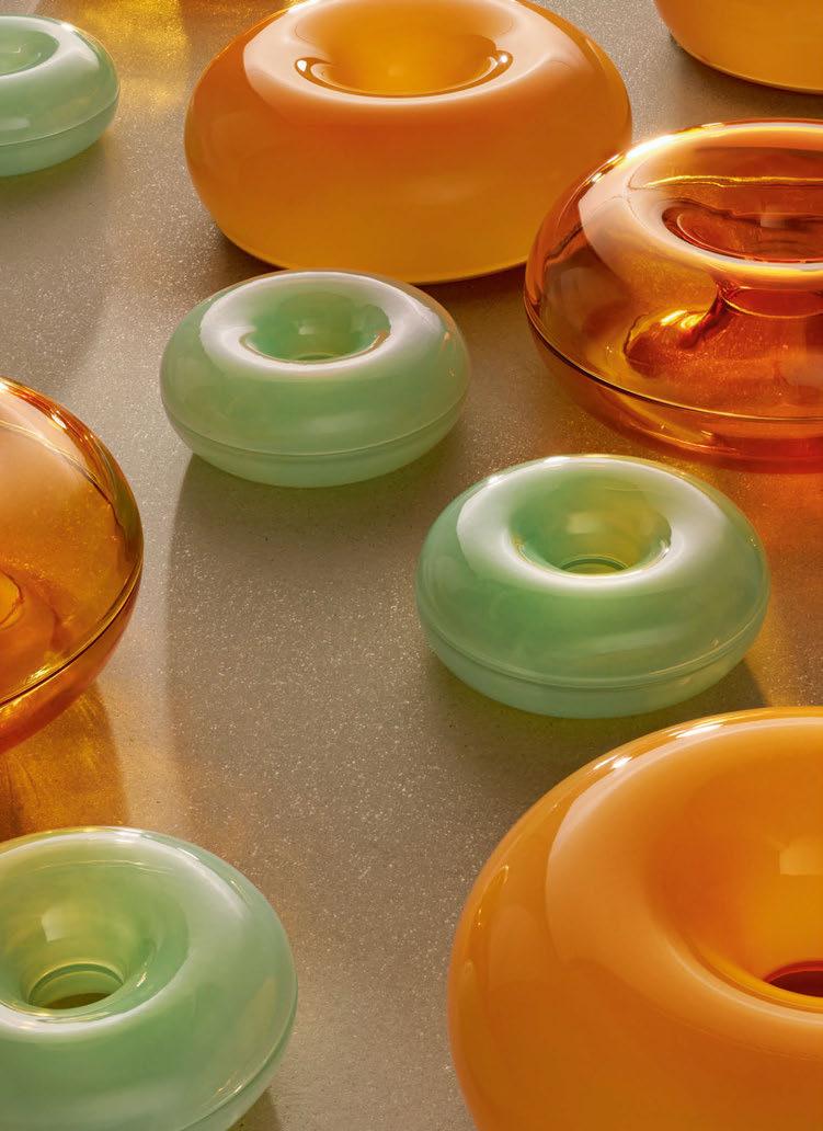
Sabine Marcelis has launched her latest range of lighting and accessories in a collaboration with Ikea. Varmblixt is a range that features decorative lighting prominently, as well as glassware, tables, rugs and accessories.
a journey of new learnings, sharing knowledge, exploring together and that in the end we come up with something new and useful, which responds to people’s needs.”
Marcelis first worked with Ikea as part of the Art Event Collection. This event saw Ikea invite five visionaries working across art and design to create works of art that double-up as useful household objects.
“From our initial collaboration, I learned a lot about her style expression and form language,” says Most. “At the same time, we were looking to make some shifts in the lighting range to make products more emotionally in-tune with our spaces. From there, we were inspired to continue working with Sabine to explore the possibilities in creating the Varmblixt collection.
“We have an entire business area at Ikea of Sweden (Global headquarters responsible for design and development) that is responsible for the lighting. Anna Granath, who is the Range and Design Manager for Lighting, was heavily involved alongside her entire team of talented product developers and engineers.”
When Marcelis was first approached by Most to collaborate, her initial response was one of hesitation. “I got a phone call one day from Henrik asking if we can work together on this collection. At first, I was wondering whether this was a good idea. Do I really have something
to bring to this kind of project? In the end, the reason I really dove in was because it was such a nice opportunity to broaden the availability of my design,” she explains. “At the end of the day, my limited-edition pieces are very expensive because they take so much time, and the materials and the processes I use. I really wanted to explore what happens on the reverse side of that, in the more mass-production world of Ikea, without losing any of the quality.”
The collection took two years in total to go from design sketches, to prototypes, to products on shelves in Ikea stores. For Marcelis, who is known for creating collectable design pieces that are limited edition, unique, and site-specific, this was a new challenge in order to translate that into products that can be placed in multiple homes.
“That was definitely a big thing for me, to create objects - not only lighting - that are really stripped back to the essence and void of any decorative elements. It’s very much about letting the light be the hero of these pieces and using very minimal materials but with maximum effect,” she says. “[They are] items that have my design language or signature on them, but at the same time, they’re anonymous enough that they can be at home in many types of interiors, which have different aesthetics and scales.
“For the lighting pieces, I normally get to work with materials that are
03 6 | INTERVIEW | IKEA X SABINE MARCELIS
very lush with their own characteristics like cast resins and layered glass. But these materials don’t make sense to use in a massproduction. It was clear from the very beginning that these items wouldn’t have the luxury of relying on the lusciousness of the material to carry the object. So, all the lighting is either made from glass or metal.”
Most adds to this: “From a sustainability point of view, it was not solely to rely on the lusciousness of materiality, but to strip everything back to essentials and with a singular gesture to make it gain its desirability. “Sustainability is a pillar within the democratic design philosophy at Ikea. It is part of looking at the entire value chain to ensure we design to fit an optimised production process from when products are created, shipped and available at the retail touchpoints.”
One of the things Marcelis was really looking forward to was the interpretations of her pieces in peoples’ homes. “It’s going to be very interesting to see how people will apply these designs in their homes. It was really important for me to also empower the customer to be creative with these objects.”
One of the lighting pieces that demonstrates this flexibility in curation is the “doughnut” lamp. Marcelis clarifies that it is inspired by her love of the shape, and not the food. This lamp can be used as both a table
and wall light. “It was quite a task to be able to allow it to be both,” she explains. One of the challenges was ensuring the wall mounting system was not visible when it’s sitting on a table. Speaking of the doughnut, Marcelis explains her love for the round shape further: “I think it’s just such a beautiful, complete shape. It has an interior curve and an exterior curve. It’s also infinite; there’s no beginning and no end. I love that because of this interesting shape you can really highlight different material qualities. For the Ikea collection, I turned one into a bowl. It’s transparent so you can see through into that interior curve, and because it’s sliced in half, it becomes a vessel. At the same time, the same shape is also a light. I really love to highlight the beauty of materials by repeating form language.”
Another piece that highlights the collection’s versatility is the wall mirror, presenting itself as a usable wall accessory and sculptural light. The mirror lamp consists of a single sheet of glass that has been partially mirrored and tinted in a warm copper-like tone. “The light is placed behind it, which creates this depth when looking through the non-tinted, non-reflective element through the light. At the same time, it’s also interacting with its surroundings because of its reflective front. I love that tension of an object that is extremely simple yet has so many layers because of its materiality,” she says.
03 7
Duality is an overall important theme that Marcelis worked into the Varmblixt collection. “I think it’s an absolutely wasted opportunity whenever lighting is designed, which is not really beautiful and sculptural when it’s not in use, because you’re going have to have it visible in any case,” she explains. “So, when it’s turned off, it should also be as interesting as when it’s turned on. It’s such a nice opportunity to be creative within that.” Referencing the white circular wall light, Marcelis describes it as a “sculptural element that is activated when the light is turned on”.
“Just like the mirror, it also has a single surface but when you look at them, it has the illusion of a folded surface. That’s purely because there is a difference in colour or a gradient in colour happening on it, which is as if there is light shining on it. So, even the illusion of light still activates the flat surface in that sense.”
Most elaborates on Marcelis’ points, adding: “As part of a long-term goal, Ikea is looking to encourage a shift in the perception of lighting as simply functional to lighting as emotional. It is designed to inspire a new interest in how light can transform the look, feel and atmosphere of our homes.
“Lighting in general is a fundamental aspect of the home and for Ikea we want to continuously design with purpose. Lighting has always been and will continue to be a core part of the Ikea range.”
During the prototyping phase, Marcelis describes herself as being very “strict” on the Ikea team. “I have to give them so much credit,” she reflects. “We kept prototyping and prototyping until those details were up to standard. I think the design process started in February 2021, and it moved very quickly.”
Marcelis had assumed that from her initial presentation of designs to the Ikea team that approximately 20% would be selected. “That’s not at all what happened. The Ikea team accepted all the ideas that I proposed and now what’s available in the stores is 95% of that presentation. There was a lot of great enthusiastic energy to make those products come to life.” Due to the Covid-19 pandemic, a lot of the prototyping journey was completed remotely for Marcelis, with designs and 3D prints being posted back and forth and lots of good communication. Marcelis is, all things considered, “super-proud” of the end results.
“I think all the products are beautiful, with really well considered details
03 8 | INTERVIEW | IKEA X SABINE MARCELIS
and smart and effortless mounting systems. They’re packaged in a crazy way as well. That’s something I still cannot get my head around. The chandelier, which takes up a significant amount of space when it’s hung on the ceiling, flat packs down into basically the size of two pizza boxes. So, hats off to the packaging team.”
Marcelis’ overall aim for this new collection was for it to be timeless. “I think my worst nightmare would be if looking back at this collection five years from now people think “Oh, that’s so 2022”, or “Let’s get rid of it and re-do the home with something more modern,” she says. “The pieces are super minimalistic, and I hope that these are designs that can fit in a student’s home but continue to work in the home for that same student when they’re an elderly citizen. Maybe the only trend if you will or change of lifestyle [we’ve observed] that we considered [when designing] is the fact that people are spending more time in their home. So, these objects are really there to enhance that experience.”
Trying to answer an impossible question, Marcelis chooses the doughnut lamp as one of her favourites from the Varmblixt collection, as it was one of the most difficult to produce. “It was really tricky to be able to get a nice equal cover of colour that looked great when the
piece is not turned on. But when you turn on the light it needs to give a beautiful glow and a good colour. That took a lot of prototyping to get right, so it’s just so satisfying to see it now - I’m so happy that it worked out.
“I cannot wait to see how people incorporate the pieces into their homes. I think that’s going to be the most rewarding part of this whole project. I love it when people tag me if they have a piece in their house. This collection is so open to interpretation.”
For Most, he too is a fan of the doughnut shape, but particularly the green glass bowls. “To put it simply, it is a collection that celebrates art and design,” he says. “My favourite pieces are the signature bowls - I love how the natural light reflects the colours and the overall versatility of the item.
“We’re all excited that Varmblixt has launched and has been embraced by many people, which is a fantastic feeling.”
www.ikea.com
www.sabinemarcelis.com
03 9
Storm
Rock and Soar, UK
Product design is a journey that moves a piece through numerous iterations before the final design is completed. This new editorial feature looks at the design evolution of a decorative light. Part one is the concept - the drawings, paintings, mood boards and inspirations. Part two will follow in the next issue and look at the final product. Did it stay true to its original concept, or did it take on a whole new life?
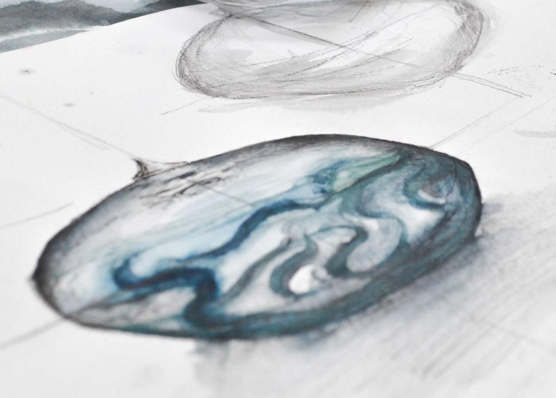
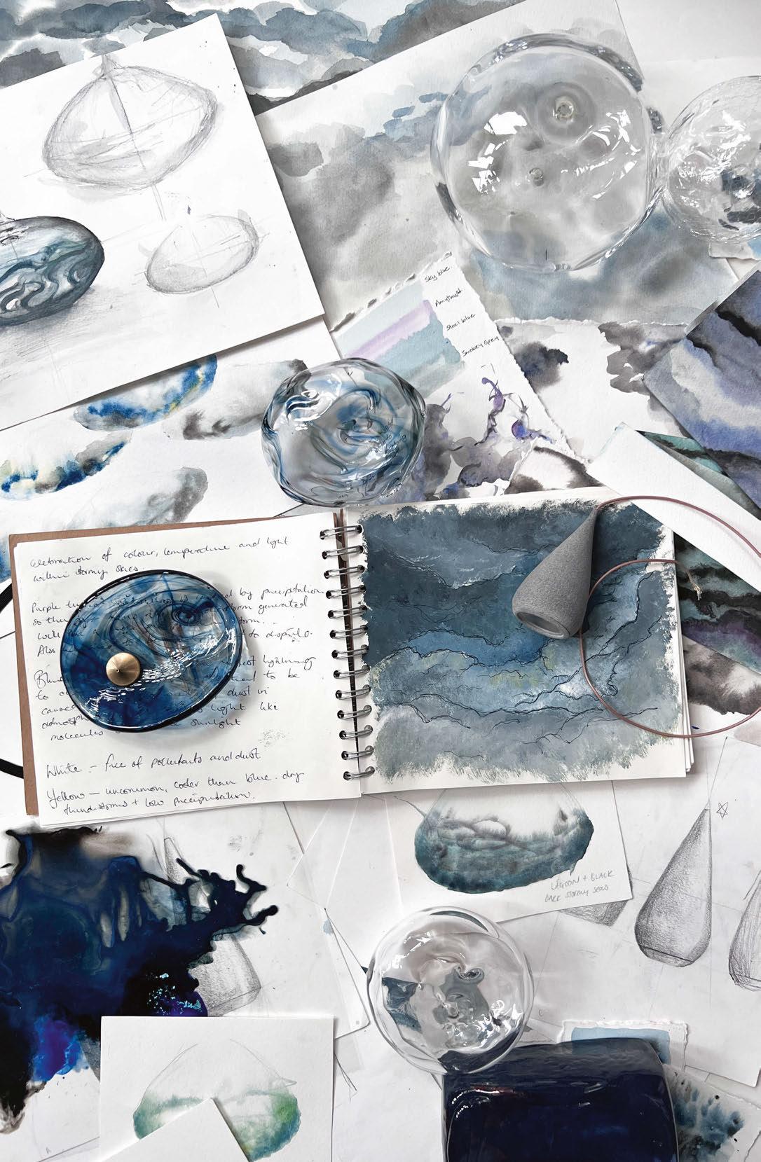
Alison Smith, Director and Designer: Our new concept Storm is a sculptural glass lighting installation inspired by the colours, textures and ‘light play’ of nature's stormy skies. We have researched colour wavelengths in the sky's atmosphere during oncoming storms, where the visible spectrum changes depending on the gases and moisture in the air, as well as the absorption and scattering of light. This research has informed our sketching, painting and material sampling.
We want to capture the storm's key elements within our installation by using materials, such as glass, that enable light manipulation, as well as controlling the projection of light with water droplet-inspired light units
that allow for functional illumination throughout an interior space. The texture of the glass will play a vital role in how the light affects the surroundings of the space and, through working with glass artist Elliot Walker, we've been testing chemical reactions as well as twisting and pulling techniques that will produce caustics that best represent sunlight breaking through heavy, saturated clouds.
We're hoping to build on the electric and powerful essence of when a storm is coming; a strong and exciting presence that will create a statement lighting feature for the luxury interior. Storm is going to be a powerful, spectacular piece.
www.rockandsoar.com
0 40 DESIGN EVOLUTION STORM
0 41
North America’s singular platform for international design. Co-located with WantedDesign Manhattan. Register now at icff.com MAY 21-23 | JAVITS CENTER, NYC darc magazine readers: Your pass is complimentary with promo code DARC23
ICFF 2023
A New Leaf
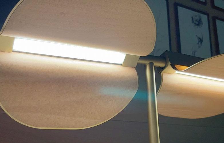
Spanish lighting brand LZF's Omma collection was designed by Eli Gutierrez. She turns LZF's well-known wooden aesthetic into a stylish family of lights inspired by trees and books.
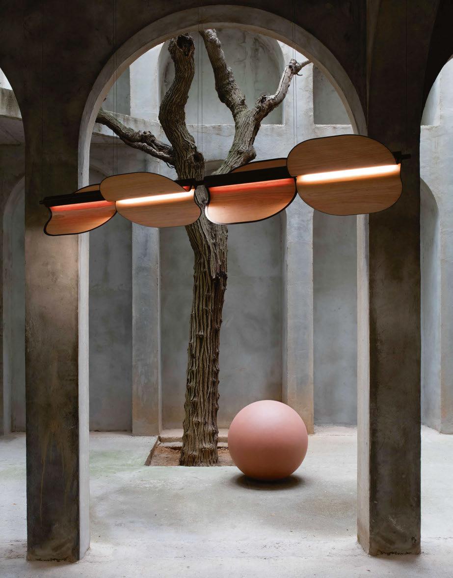
Omma is one of the newest collections from Spanish lighting brand LZF. Inspired by leaves on tree branches and pages in books, the collection consists of two table lamps in single and two-leaf versions, a floor lamp, a wall light and four different pendant configurations.
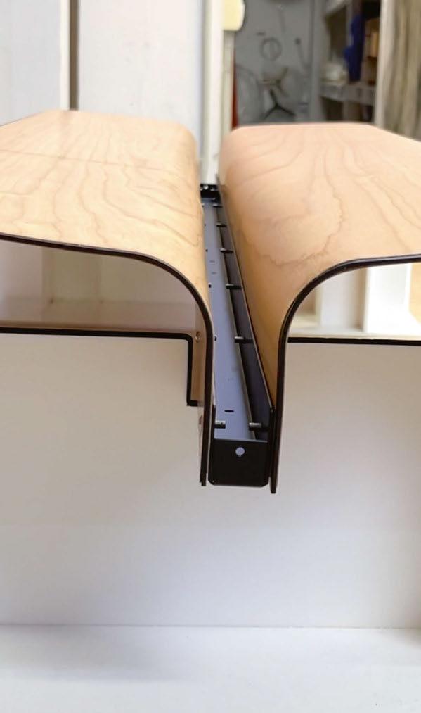
Designed by Eli Gutierrez, the collection uses LZF’s patented Timberlite process, a very thin layer of wood veneer that creates the leaf shape that seamlessly attaches to the metal branch. darc speaks with Sandro Tothill Caggiati, Co-Founder and Factory
Director, about the inspirations and creative process of the Omma collection; its name derives from an old Frisian term meaning ‘breath’. “Marivi Calvo, LZF's other Co-Founder and Art Director, often looks to work with external designers because they each look at Timberlite with a different perspective. She is also constantly looking to work with female designers, as we believe they’re a really underrepresented group in general design. You have your stars, of course, but generally, it’s much harder to break through for women,” he explains.
04 3 | MATERIALS FOCUS OMMA
Manufacturing Processes
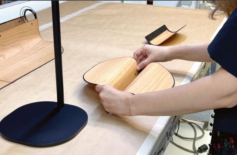
04 4 | MATERIALS FOCU S OMMA
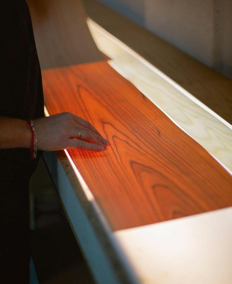
Using LZF's patented Timberlite process, very thin sleeves of wood veneer are glued to a metal frame, forming the leaves of the lamp, which disperse the hidden LED light in a beautiful warm tone.
LZF's wood finishes for Omma include natural white, natural cherry and natural beech.
Image: Pablo Fuentes
04 5
Image: Pablo Fuentes
Image: Pablo Fuentes
“Eli came from a working background with Patricia Urquiola, whom she’d worked with for eight years, Philip Starck whom she worked with for a couple of years, and Iranian-French architect and designer India Mahdavi.
“Eli’s approach to designing with us was very cool. She took into consideration our work with wood and identified a concept. She linked that wood comes from trees, trees have leaves, and trees make paper for books, which also have page leaves. When you look at Omma, it looks like an open book. So, when you think of Omma, it’s a reflection and chain of thoughts that started with LZF’s relationship with wood.” The collection’s design journey took longer than planned due to a change in the technical team at LZF during the process. “New people who came into the tech office inherited the work of previous people. And therefore, I think that in that sense, it was unfortunate because it meant that they inherited design, which had already begun and meant that any new ideas were not easy to put in. We had to finish what was started and finish it the way it was started because so much had already happened and so much development had taken place. It was
literally picked up at 75% completion.
“The new tech office started at 75%, but rather than that meaning only 25% of the development time was left, the developing time was over 50%. That was because they had to understand why it was designed the way it was. They then had to work out how to finish the designs and fix the issues that were happening with the prototypes without re-designing the whole fixture,” he explains.
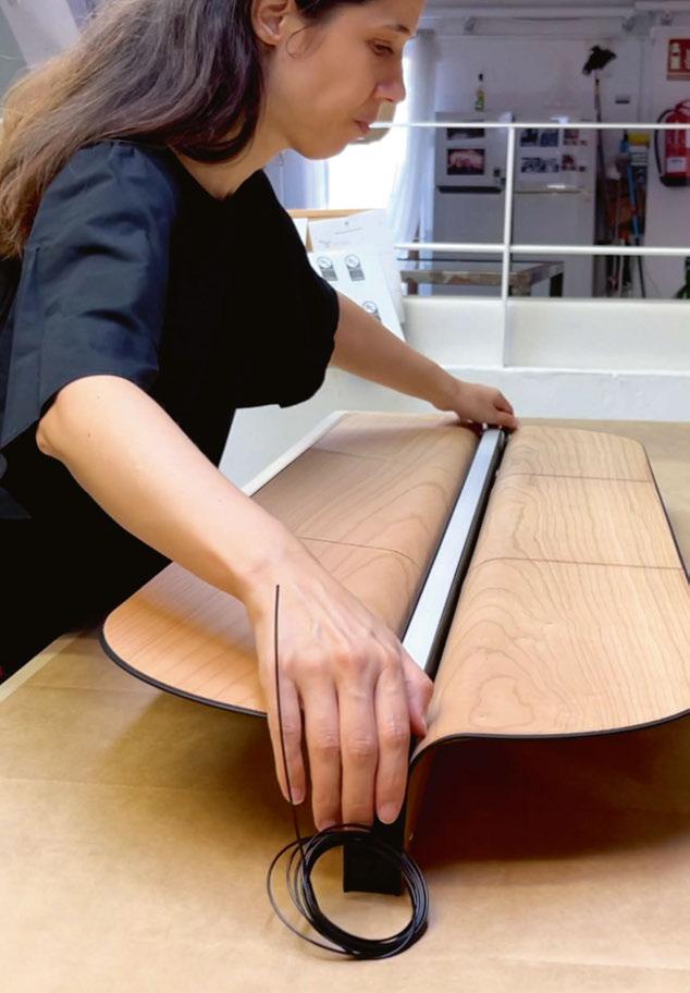
It also went through numerous prototype stages, which Caggiati describes as “hell”. “Each leaf, or pair of leaves, needed to be able to move individually from one another in order to change the direction of the light. A rotation mechanism allows you to alter the light direction to one flat beam, or various angles and ceiling projection.”
The team were eager to not wrap the wood veneer around any form or structure, yet it would act as an actual leaf. “To do that, we had to create a sort of ephemeral, light, metallic structure, which resembled Eli’s original concept. Once that happened, we had the open book form, which we needed to stick a light source down the middle of. The obvious choice was a recessed LED fixed into the lamp.
04 6 | MATERIALS FOCUS | OMMA
“When you look at the light from below, you can’t see the LED light source. The light comes down through the sheets instead. You get a great quality of light on your surface, but you can’t see exactly where it comes from. It creates a much more agreeable atmosphere. “There’s no diffuser, all you see is the natural wood and a light glowing out of it.” In order to combat the swivel movements of the lamp heads, which ensured they remained in place but weren’t too difficult to manipulate to discourage users, the team came up with a gear-like mechanism. “If they were too stiff, the leaves wouldn’t move properly, and if they were too loose, they would just flop down again,” says Caggiati. “Wedeveloped a wheel with little grooves, like a cog, that a small ball point screw would click into when the shade was turned. The challenging part was figuring out the groove depth, and we underwent three different test types to achieve this. We then had to make sure the production team were fully briefed on how tight to make these components to meet the required tension.”
Timberlite is LZF’s patented process of treating wood that allows them to use it in such thin layers. Caggiati explains a little more about the
process, however, cannot divulge the brand’s secrets: “Timberlite is about half a millimetre thick. We buy the raw veneer and then we use the Timberlite process to treat the veneer. It's not a chemical process, so it's very clean; there are no residues. Really, it's more of a process tied to art and graphics rather than industrial. We don't have to spray it or paint it and there are no solvents involved in its manufacturing. So, once it's been treated, it's very stable and you can store it for quite a long time. It also becomes very easy to then cut without cracking. This allows us to cut it on the digital plotter so we can work with many different shapes. “We have two ways of working Timberlite. Basically, we have the organic way, which are just shades, which are created using the natural veneer making the shapes. And then the metal skeleton is only there to hold the light source in place.
“Then you have what we call hard shades, which are all the shades that have an acrylic or a metallic frame, which is what gives the shape to the lamp. With the Omma, we had this metallic frame, but it had to be very light, and it had to be bendable. When we were planning on how to glue the wood to it, we decided rather than bring the wood right up to the
04 7
edge of the metal frame and have it nice flush with the metal, we decided to leave it, so the metal gives it a slight frame. “Normally, we would've made sure the wood sheet came right to the edge, but then you lose the beauty of that metal, which is an aesthetic quality. So, you get the effect of a metal frame, whether you're looking at it from the top side or from the bottom side. It was a new way of gluing or putting wood onto a structure for us in this sense.”
The collection comes in four main metal finishes for the lamp frames: gold, nickel, matte black and ivory white and is suitable for many various environments from hospitality venues to residential spaces, as Caggiati describes: “I think when you have a family like Omma, it makes it open to everything. The wall sconce is below 10 centimetres, which is a rule in the United States in the disabilities act, which states a wall lamp cannot protrude from the wall more than 10 centimetres in a public building. You've got the table and floor versions, which are good for the home. You've got the ceiling versions, which are good for restaurants, bars, and cafes. And then you've also got the Omma line pendant, which is good for offices. As far as decorating your office with a decorative lighting fixture, it works well as there's enough light on your table from the lamp.” www.lzf-lamps.com
04 8 | MATERIALS FOCUS OMMA
Taking inspiration from the wood that LZF's products are known for, designer Eli Gutierrez created the Omma family. The leaves of thin Timberlite wood that branch off the metal frames of each lamp are reminiscent of tree leaves as well as pages from a book.
Built of harmony
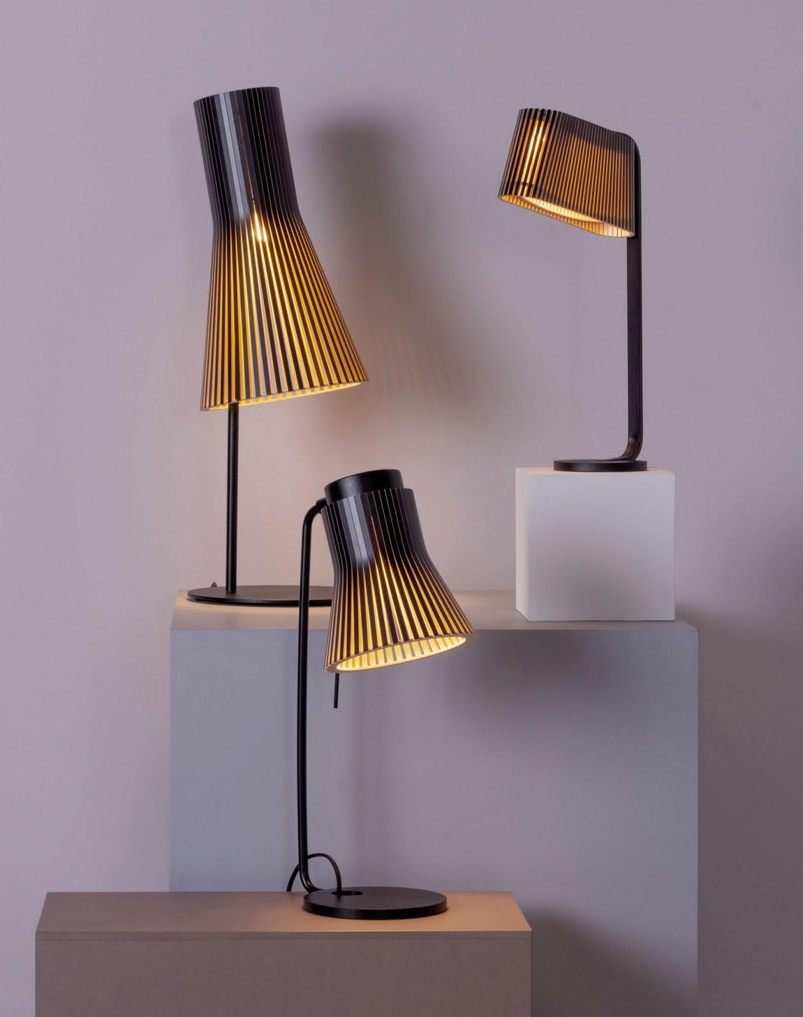
The Secto Design lighting collection is designed by the award-winning architect Seppo Koho. The diligent handwork is carried out by highly talented craftsmen in Finland from top-quality local birch wood.
www.sectodesign.fi
Defining the Circularity of Lighting
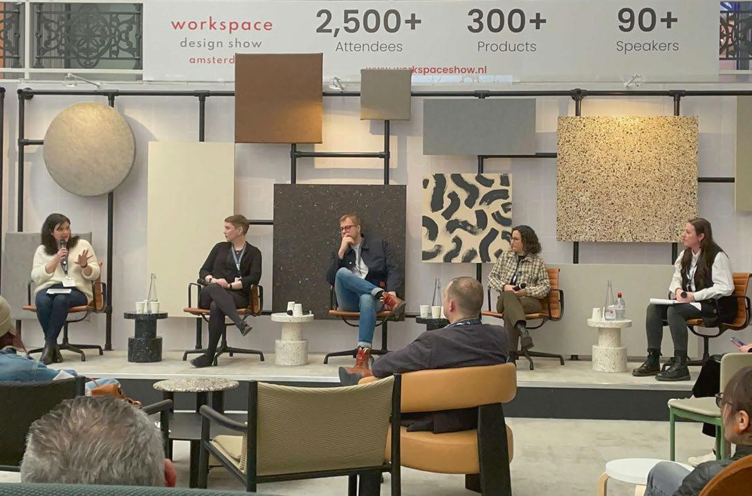
For Workspace Design Show 2023, darc magazine was invited to chair a panel on the circular economy within the lighting industry. darc’s editor Sarah Cullen sat down with lighting experts Faye Robinson, Treacle Studio; Kael Gillam, Hoare Lea; Tom Niven, BDP; and Tulin Kori, Foster + Partners.
With the increased pressures on our planet for building materials, we are now being forced to recycle, re-use and create a circular economy.
For the Workspace Design Show discussion, the panel’s aim was to give the audience knowledge and an understanding of the value of implementing a circular approach to design, that will fundamentally save the client money in the long run, and be a step in the right direction to helping the environment.
The discussion looked at three main roles within a project; the designer, the manufacturer, and the client, and what responsibilities each holds when it comes to ensuring a successful sustainable design.
Here is an excerpt of the talk, covering the designer’s opinions and comments on the lighting designer’s role and responsibilites of ensuring a sustaibable approach to a project.
To find out about the manufacturer and client’s role, watch the full panel discussion at www.darcmagazine.com/darctv.
Circular economy, what is it? It’s a sustainable approach to product design and consumption that encourages a design process, which creates something that is made for the long-term. Do you all agree? Does this definiton go far enough?
Robinson: I think so. I think it’s a starting point. Ultimately, it’s a template we need, and somewhere to begin. I think it’s going to evolve as all the processes meld together and we go through this whole process of development and understanding what that means long term. So as a starting point? Yes.
Gillam: I think that the circular aspect of design that we can look after as lighting designers is not just about product. I think that’s an important thing to start with because of course we specify objects that are luminous, right? We do that part but thinking about what happens to them after. It’s not just about what the fitting’s made of and how you use it best in its lifespan, but what happens to it afterwards? What can you do when you are done? All of which should never truly be in good circular design. So, yes, I agree. It’s an everexpanding definition of how we could do better.
Niven: Yes, I agree. What I would say is that the statement you made is very much focused on the product, whereas we are all specifiers of product. So, it is necessary the process is collaborative between the designers, the clients, the suppliers, and the manufacturers. The circular economy isn’t just about the product but it’s about everyone in the chain playing their part. And I think there’s a couple of ways you can look at it. You can look at it from a numerical, data driven, technical, percentage of components as a virgin versus reused
0 50 INTERVIEW | DEFINING THE CIRCULARITY OF LIGHT
Faye Robinson
Founder of lighting design practice Treacle Studio. Robinson is an experienced lighting designer who established Treacle Studio in 2022, which provides bespoke and considered lighting schemes for interior and exterior spaces.

Thomas Niven Associate in Lighting at BDP, Niven is an award-winning lighting designer and passionate educator. A trailblazer for sustainable design - in 2017, his commercial scheme for Land Securities UK Head Office was the first refurbishment project to be awarded BREEAM Outstanding.

material. You can quantify it, you can specify it, you can schedule it. And I think there’s another way to look at it, which is a holistic approach, which is more philosophical and more ethical, asking is this the right thing to do? Do we need to do this? Is there another way of doing it? And as Kale’s kind of mentioned, what happens to our scheme in 10, 15 years’ time, not just now.
Kori: I would agree with everyone. If we could add one more thing, I would say reducing the waste to a minimum and hopefully having something zero waste down the line in the future.
As the designer, what are your responsibilities for championing a circular approach when starting a new project?
Gillam: Where do we start? I think first it’s about having a good catalogue of information in your head. Knowing what manufacturers can offer is great, but also understanding what your client wants. We are hearing a lot more from developers - we want a net zero scheme, we want BREEAM outstanding, we want to have Neighbors five and a half, six-star ratings, all of which are great and lovely, but they come with a lot of implications as to what we can do as designers. Then, trying to explain to them that part of that is the circular economy for lighting, it’s not just your operational carbon, it’s about your embodied carbon. And we get into these deep discussions with them about what
Kael Gillam Gillam has an educational background in theatre, but is now Principal Lighting Designer at Hoare Lea. Not only is she a fountain of knowledge in all things lighting, Gillam is also one of the key members of Designers Mind, an initiative that raises awareness about mental health and wellbeing for designers in the workplace.


Tulin Kori
With a background in architecture, Kori discovered her passion for lighting in 2011. She then joined Foster + Partners in 2017, and is now Associate Partner. She has been a part of numerous awardwinning projects in retail, commercial and residential settings. Sharing a common thread with her panelists, Kori is a keen advocate of sustainable and holistic lighting design approaches.
we can do from a very early stage. And then how that translates into the final design varies wildly. I think that from a designer’s perspective, architecturally it’s probably a lot easier to discuss circular economy. It’s like, ‘I got this fabric or this material from this place, and I can very easily give you a number of kilograms of carbon equivalent,’ right? For lighting it gets a bit tricky, and I think a lot of what we do is trying to find a way to translate that into something more tangible. I feel like that’s the starting place for how we get to that part in design, it’s just education and making it easier to pallet.
Education is a large part of what you deal with, Tom. Are these conversations you are having with the younger generations of lighting designers? Is this part of your teaching courses?
Niven: Yes, but I would say, maybe controversially, some of the education needs to go to our clients as well because we are all “lighting experts” on this stage. Our role is an informant, a guiding hand for our clients when we go through this process. As Kael said, we need to have in-depth knowledge of products and suppliers, innovative techniques that are coming from manufacturers. We need to pass that knowledge on to our clients and guide them through what is the wild west of quotations and statements by manufacturers. I think we also need to be careful of greenwashing. We need to look
0 51
at it from a bigger perspective, a bigger picture. We’ve got a role and responsibility with lighting. Somewhat controversially, we are adding energy and products to schemes, which sometimes don’t necessarily need to be there. But we’re doing it for different reasons. That is the bigger picture to all of this. The most efficient way to light a scheme may not be the best way to light it for humans, but that might have a knock-on implication in increased productivity or wellbeing of the occupants of that space. Our job is to guide our clients through that, I believe.
Essentially, you must manage their expectations as well? If they want a completely sustainable building, it might not necessarily be a comfortable space to work in.
Niven: Absolutely. And Kael just mentioned it, and I know we’re all on the same wavelength here. We’re coming up against competing guidance and standards - you must drive down energy densities, you must reduce consumption, but you’ve got to light the ceilings and you’ve got to light the walls, you’ve got to use techniques which are intrinsically inefficient in schemes and there are guidance documents that completely contradict each other. So, our role is to navigate through that and guide our clients through it too.
How do you do that?!
Gillam: Well, that’s a great question…
Robinson: I think intrinsically it’s messy, and I think we could spend too much time looking for a magic answer and ultimately there isn’t one. I think for me as a lighting designer it’s trying to educate the client into understanding that lighting is an asset, if you’re thinking of it in terms of an asset rather than an afterthought of something that’s added to the space later on, we are talking about looking at what they already have existing within other spaces that they’ve got and cataloguing what they have available. These things are made from materials that are finite and we won’t always be able to get hold of them. The lighting industry has already suffered recently with the shortage of semiconductors. That’s a red flag. We need to reassess what’s there, and if anything (I’ve been saying this for a while and I do sound like a broken record), it’s trying to understand that there’s a process that happens at brief stage where all this needs to be established. It’s heavy towards the end, we’re not going to get it right first pass, but we need to put the testing in place. I don’t know if that even helps, but it’s a starting point and the earlier the better.
Fundamentally, the lighting designer needs to be part of the project team from day one. It’s not something that you can come in halfway through.
Kori: I think what the others mentioned about the brief is important
because we’re there not only to challenge the market and to understand the market, but we’re also there to challenge the brief most of the time. Without an understanding of the implications of that brief and all those guidelines that Tom mentioned, it’s very easy to say “follow all of them” without understanding the implications. So, the first thing we do is to highlight to them that to accomplish ‘a,b,c’, the implications are ‘x,y,c’. And then there’s always the budget. It’s important to give them a warning about this and how bringing in this circular element at the brief stage affects the initial budget, but then explain about the payback time. So, it all comes together.
So, the brief is key in order for the client to understand and appreciate the whole process.
Niven: Definitely. And I think you mentioned budget. It has got to be cost viable for everyone. And value engineering will just kill this process straight away.
In our job, there is an element of costing our own schemes, because we need to know where we stand cost-wise probably at the end of stage two, middle of stage three - really early on. We need to know whether we can afford this, otherwise everyone’s just wasting their time. But if down the line the thorny issue of value engineering happens, it will just destroy the scheme because you’re then in the realms of moving to cheaper alternatives and suddenly the concept of specifying the most efficient or greenest or with the best TM 66 score fittings just goes out the window. I think you mentioned it about briefing but there also needs to be a client commitment, and a budget that is set. We will always ask for budgets at the start of the scheme, there’s an earmarking and a ring fencing of a certain level to see if the quality of luminaire specification is going to make it through.
Gillam: Not to get too deep into the value engineering conversation because we could be here for hours, but I think you’re only going to have a quality building that lasts you 10, 20, 50, hopefully 100 years if you put the money into it from day one. And like the big CapEx/opex conversation, I really think it needs to change quite drastically and quite quickly in understanding that. If you are going to invest in the building early and you want to see it actually get to net zero carbon over the course of time, not every building can from day one even though we want them to (offsets aren’t really the right way through it). We are using a lot of existing buildings that need to be refurbished and cannot achieve all these very high standards that we would like, just by virtue of the fabric of the building. I think that what we need to focus on is making sure that we can make the best out of these spaces new or refurbished. And that the investment from day one is going to get you much further down the line than having something cheap at the beginning and then having to repair it at year 5, 10, 15, 20, 25… Really, over the course of building’s life, you’ve lost an awful lot more.
05 2 | INTERVIEW | DEFINING THE CIRCULARITY OF LIGHT
In the right light everything is extraordinary www.gladee.co.uk | @gladee_lighting Design Centre Chelsea Harbour Design: Xxxxxxxxxx Xxxxxx Photo : Xxxx Xxxxxx
How do you have these conversations with the end-users - the landlords, the people that are going to be dealing with the building when it gets sold on or it’s changing its whole usage? How do you convince them to ensure that the fixtures are going to remain long term?
Gillam: I have not been privileged enough to have that conversation, but our practice has a performance group where they will go and do surveys of the operational information that they get from the buildings that we have completed. I’m not sure if you guys might have something similar, but their job is to see if what we modeled at stage two, three and four has any bearing on how the occupants actually use the space – and very often it’s not even close.
www.treaclestudio.com
www.hoarelea.com
www.bdp.com
www.fosterandpartners.com
05 4 | INTERVIEW | DEFINING THE CIRCULARITY OF LIGHT
FORMAGENDA MÜNCHNER FREIHEIT 24 80802 MUNICH GERMANY INFO@FORMAGENDA.COM +49 (0) 89 414240880 THE NEW ENLIGHTENMENT PROFILE FAMILY Design Christophe de la
Fontaine
For interior designers, lighting is one of our greatest tools, perhaps nowhere more so than in hospitality design, where lighting’s ability to conjure a particular mood, tone or atmosphere is unparalleled. Light, the core element of any artist or photographer’s craft, is certainly one of ours too when it comes to ensuring a scheme has impact, not only when a customer enters a space but also from the outside too, acting as a beacon to draw customers in, aiding wayfinding or serving instantly to establish the personality of a brand or offer. What are the main trends in hospitality lighting right now? Well, we could talk about micro trends, such as using layered lighting with three or more types of lighting at once, for example, but we’d rather pull the lens a little further back and focus on some of the challenges we’re facing currently, as well as looking to the future and particularly to the major driver of sustainability.
In the hotel sector, we’re seeing increasing client demand for artful ways to strip back, re-purpose and be imaginative with existing buildings and interior fabric. The result will be that lighting design plays an increased role as a theatrical element in the form of sculptural pieces or installations, with simple and adaptable wall and flooring surface textures playing host to exciting and controllable dramatic lighting, more akin to what we see in event spaces. The converse major trend is about less, rather than more, and relates to upcycling. Hoteliers, hospitality operators and developers - at the
Wayfinding the Future
John Williams, Founding Director of Manchesterbased interior design studio SpaceInvader, discusses the future of hospitality design and the role lighting has to play in it.
sharp end of ‘selling’ spaces to consumers - are looking to speed up their sustainability credentials and reporting. When it comes to refurbishing an existing space, the onus particularly falls to interior designers, while we in turn look to consultants and suppliers for help. Would it be unfair to say that lighting design and manufacturebeyond the easy win of using LEDs - is one of the disciplines that has responded least to this to date? Flooring manufacturers are definitely the pioneers in our industry, followed by those producing wall coverings and textiles, with both furniture and lighting design lagging behind.
We still want to bring new and bespoke elements to our projects of course, so we’re not talking about the simple, automatic re-use of existing lighting. Could lighting manufacturers instead collect pieces stripped out of old projects and give us more re-use options that way?
Or could we alter the lighting temperature and brightness on existing fittings via new control elements that allow for increased flexibility? We’d also like to see much more information supplied on the materials and processes used in manufacturing each fitting, as well as hard pledges on end-of-life recycling.
In terms of energy usage, great advances have been made in daylightbalancing lighting, which emits lower lighting levels near windows and prevents a space from being over-lit, as well as colour temperature control fittings. Cost, however, remains a huge barrier with the latter,
05 6 COMMENT HOSPITALITY LIGHTING
with these types of lights one of the first to be value-engineered out of schemes. Could the lighting design industry help make these solutions more cost-effective and also provide research on long-term cost benefits, to help us win the argument on client investment?
As designers, one of our greatest bugbears in hospitality spaces is where the food and atmosphere don’t match. Think of a tapas bar where the lighting is cool and white, for example, instead of warm and rich. A great recent example of a scheme really getting it right in terms of both the type of food/drink being served and a different kind of sustainability - business longevity - is Foodwell/Firefly in Manchester, whose offer transitions from Foodwell - a bright, soft and airy Californian brunch vibe in the daytime - to Firefly, a glamourous cocktail bar, at night. This is achieved mostly through lighting and music, without compromising on two very different atmospheres. As a studio, we’re also always on the lookout for the cross-fertilisation of ideas across sectors. The shifts in the post-pandemic workplace saw the design of offices moving ahead of the game, certainly in the provision of zonal variety within a single space to accommodate not only different personality types, but addressing neurodiversity and age inclusivity too. Lighting is a key element here. We’d like to see more variety of lighting by both interior designers and lighting designers within single hospitality spaces to address different audiences beyond the median or generic.
Integrated lighting and materiality is a really interesting area right now, especially with the possibilities afforded by 3D printing. We recently created a feature wall in a wellness space, for example, which interacts with light settings - particularly the colours of dusk at the end of the day, when the effect is mesmeric. The relationship between light and materiality is another area we’d love some industry help on. When we pull together a palette for a hospitality scheme, we use natural lighting to get the truest colours. Ideally, we’d like to represent exact lighting conditions to show how materials will look in the final space, relative to the proximity and temperature of proposed lighting, especially when we’re creating CGIs. This is very difficult to achieve digitally. It would be amazing to have a physical testing space – perhaps in a showroom location? – where we could test various different material samples under a number of lighting conditions. Is that a realistic request or will we have to await programmable lighting in order to alter and refine lighting on site to achieve true fidelity to our original vision?
When we’re busy with projects, we tend to be too close to the task in hand to do more than select the best lighting currently available. It’s great sometimes to step back and think about future needs too, seeking out possibilities for improvement, evolution and innovation. It’s always a conversation. Let’s continue to talk!
www.spaceinvaderdesign.co.uk
Image: Pip Rustage
05 7
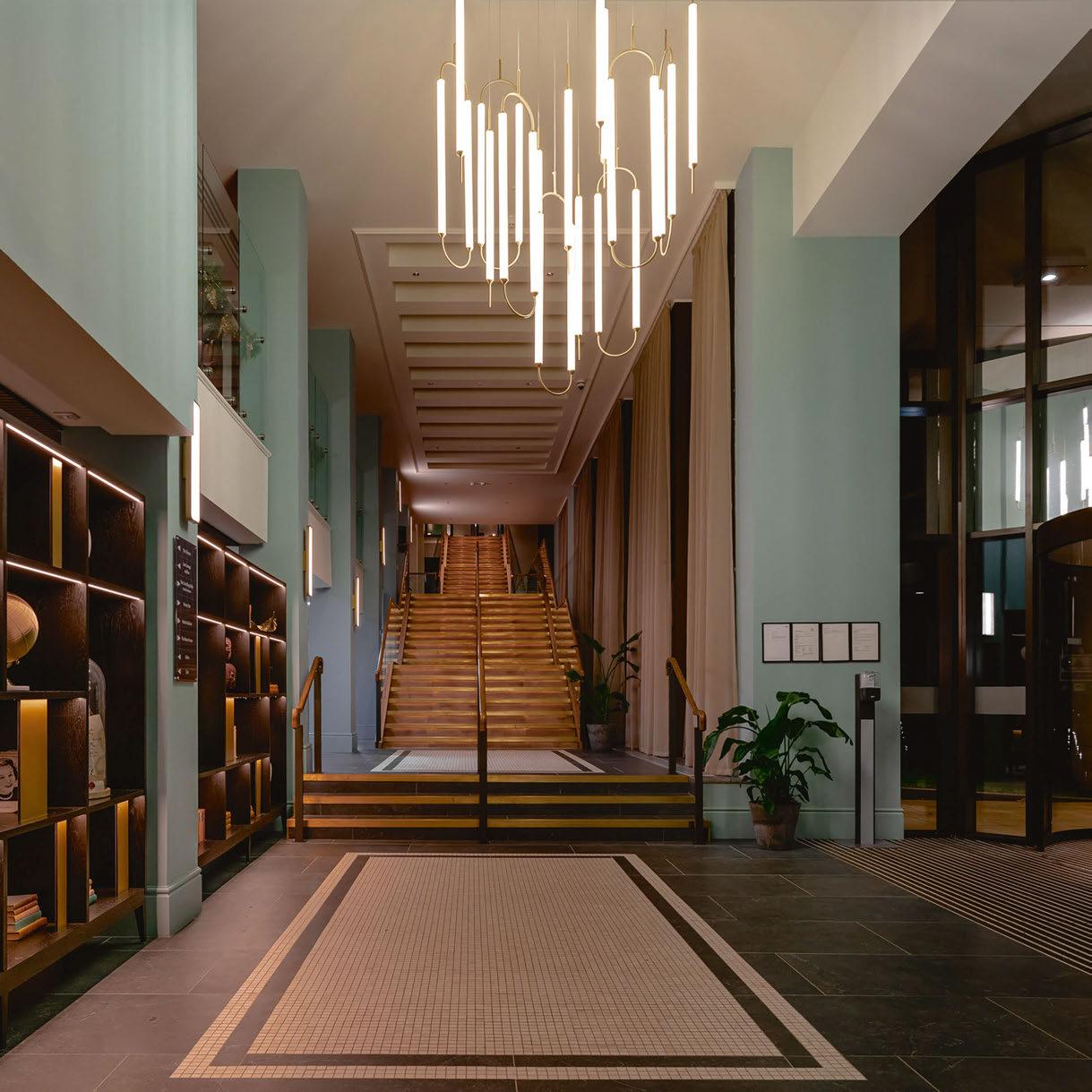
Set amongst stunning scenery on the edge of the Cotswolds, lies Heythrop Park Hotel; a Grade II* Listed 18th-century Baroque manor house. Renowned for its beautiful architecture and rolling rural estate, the property was originally built for the 1st Duke of Shrewsbury in 1706-1711.
Hospitality company Warner Leisure Hotels recently acquired the property, and we were fortunate to be appointed to complete an extensive design transformation. We studied the hotel and estate to understand its location, history and the different spaces contained within, allowing us to formulate the overall design narrative. The property compromises of a charming historic old manor house alongside a modern extension. It was, therefore, important for our team to understand how the two spaces sat together, creating a
Design for Comfort
Holly Hallam, Managing Director at DesignLSM, shares how Heythrop Park Hotel’s new lighting design harnesses the design principles of relaxation, exploration, and entertainment.
consistent and compelling overarching design that could comfortably run through the estate.
Working with the client and their operational team was a collaborative effort from start to finish. Priding ourselves on being a strategic design agency, we established a clear brief and understanding of the client’s commercial, operational and marketing objectives, as well as their desired guest experience. A key driver of the project was to refurbish this new acquisition and align it within the Warner estate whilst also creating a model for their vision of ‘hotel of the future’, providing a luxurious, modern resort that would be enjoyed by many for years to come.
We were delighted to be given creative freedom, undertaking the re-design of The Orangery, six lounges, three restaurants, two bars,
05 8 COMMENT | HOSPITALITY LIGHTING
a ballroom and state-of-the-art theatre. The overarching interior design concept was inspired by the Duke of Shrewsbury’s Grand Tour, coupled with inspiration from his close working relationship with the architect Thomas Archer and the subsequent owner, Thomas Brassey. When it came to Heythrop’s lighting design, we collaborated closely with lighting design consultancy, Nulty and bespoke lighting fabricators, Northern Lights. We often specify the architectural lighting, but to achieve the aesthetic effect of the redesign, it was important to work with a dedicated lighting consultant. It was imperative that the lighting sensitively accentuated the listed architectural features, provided focus on the key artwork and details, created a warm ambience as well scene setting for the transition from day into evening –factoring in the vast ceiling heights and windows.
We played with the lighting throughout the property – helping to set the correct tone and atmosphere for each space, whether that be creating a sense of history and grandeur with the beautifully ornate chandeliers in the Manor House, or building intrigue and anticipation with the modern Hollywood-inspired pendant in the theatre. In the Late Lounge (the cabaret theatre), the light levels needed to be carefully controlled for both the stage and public areas. We worked in conjunction with the technical department to ensure the lighting rig for the entertainment areas were effective, flexible and sufficient for the multiple and diverse acts they host on stage; including incorporating a discreet lighting and sound desk within the public area. The ambient lighting also had to be carefully considered, ensuring a soft, intimate glow that remains during the shows so that guests and waiting staff
05 9
Reception
could easily navigate around during a performance. In the entrance way, an illuminated cluster of gold disco balls produce a moment of unexpected drama, while decorative wall sconces and battery operated table lamps form a rhythmic play of light at a lower level to create intimacy within the room.
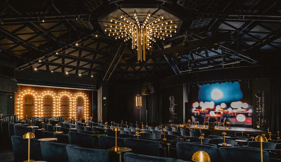
Moving onto the theatre, a dynamic environment was created that exuded luxury. The lighting helped to intensify the experience, evoking a sense of curiosity and escapism, with a nod to Hollywood glamour. Neon lights that read “Show Time” are displayed either side of the room, accompanied by illuminated bespoke arch installations that animate the space, encouraging theatregoers to engage with their surroundings. Up above, a large oval-shaped gold pendant has an equally hypnotic effect, forming a radiating flow of light that
works harmoniously with the architectural proportions of the room. Coordinated bespoke wall lights extend the circular design motif to the midsection of the room for visual cohesion, while gold table lamps bring a level of intimacy to the seating area.
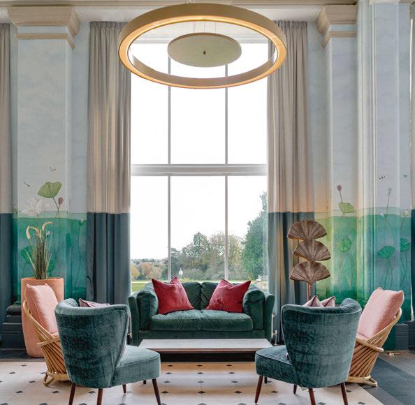
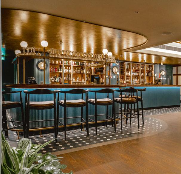
As you enter the Old House, we were conscious of the need to respect the grandeur of the Grade II* Listed architecture. We chose suitable light fittings, such as beautiful chandeliers, that worked well with the building’s historical past, as well integrated fittings that emulated or complemented the contours of the architecture, or fabrics, upon shades, that reflected the style of that period.
In certain areas of the Manor House, we were restricted from installing new or additional lighting elements because of the listed nature of the structure. We, therefore worked with the existing to enhance by
0 60 | COMMENT HOSPITALITY LIGHTING
Left: Theatre
Below Left: Brassey Bar
Below Right: The Orangery
 Ixa Foster+Partners
artemide.com Euroluce
114
Pierpaolo Ferrari
2023 - Pavilion 11, Booth
reviewing the colour temperature and ensuring the levels were correctly set.
DesignLSM has globally spearheaded interior design across the full breadth of hospitality, everything from 9,000sqm food halls, Michelin Star restaurants, to 337-bedroom hotels. Working across sectors, such as care homes, retail, members clubs, restaurants and hotels, our 37 years of experience have allowed us to cross and expand design boundaries - creating spaces that transcend beyond function to curate appealing and engaging environments for all to enjoy. www.designlsm.com
Images: Stevie Campbell
Design Details
Heythrop Park Hotel, Chipping Norton, UK
Interior Design: DesignLSM
Lighting Design: Nulty
Lighting Specified: Coach House, Industville, The Lampshade Shop, Lightique, Pooky, Visual Comfort
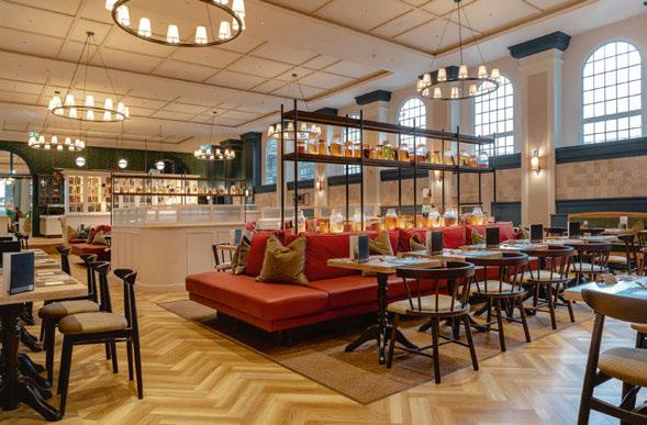
DesignLSM, created a stunning new scheme for the Warner Leisure Heythrop Park Hotel. The listed building forced the designers’ hands when it came to fixture installations, but along with lighting designers at Nulty, the teams achieved a space that encompassed the client’s desire for a “hotel of the future” while respecting the historic architecture.
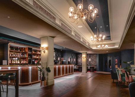
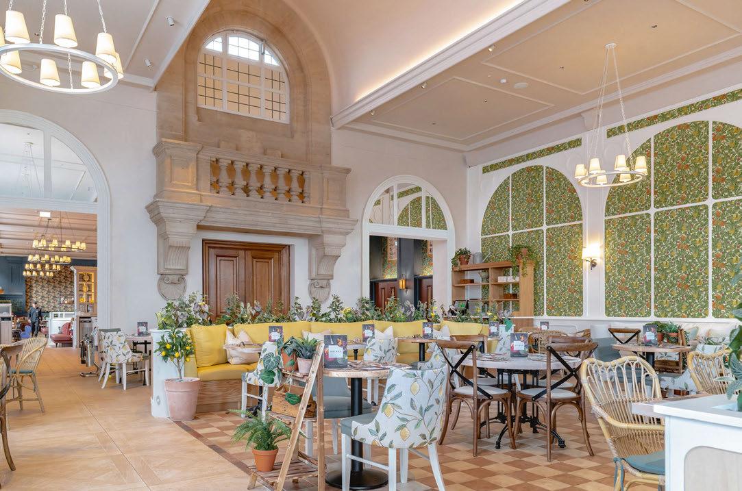
06 2 COMMENT | HOSPITALITY LIGHTING
Top & Above Left: Market Kitchen
Above Right: Late Lounge Bar
COSMIC RANGE


Collection of fittings in satin nickel or antique gold, with a choice of three colour options. Single to 12 light fittings available.


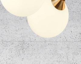

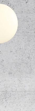
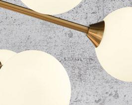
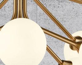
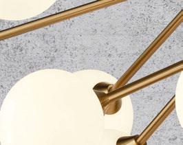
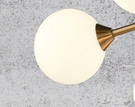
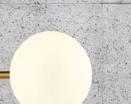
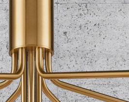
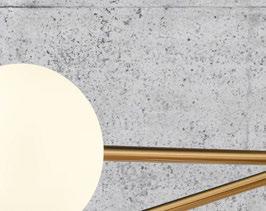
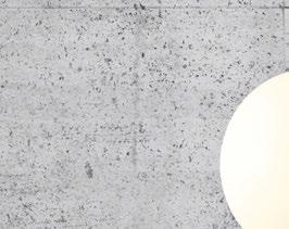
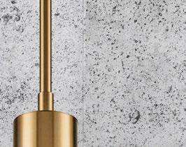
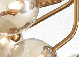
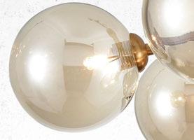
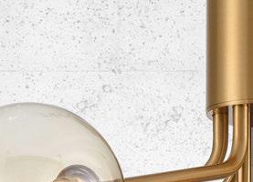

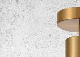

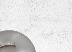
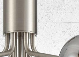
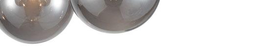
Comfort Lighting
Shangri-La Qiantan Shanghai, China
Preciosa Lighting brings peace and harmony to the Shangri-La Qiantan, Shanghai with its latest dynamic crystal lighting sculpture. The Shangri-La brand believes in “treating a stranger as one of our own” and focuses on creating tranquil surroundings amidst inspirational architecture and design. In Shanghai, they honoured this ethos with Crystal Harmony, a bespoke piece inspired by nature’s awakening every spring.
The Crystal Harmony sculpture features 45 crystal yulan flower petals and six pairs of crystal wings, all beautifully handcrafted in the heart of Europe. It was inspired by Crystal Biosphere, a lighting concept Preciosa first presented at the Euroluce 2017 exhibition in Milan. Crystal Biosphere features an automata. An automata’s mechanisms are cyclical—no beginning and no end. In Crystal Biosphere, the movement of light is set in motion, forever changing but never ceasing. The idea behind it was to bring the historical concept of the chandelier with its unique sparkling properties into our contemporary present.
For Crystal Harmony, the Preciosa engineering team crafted the automata so that the wings of the crystal birds gently move within the sculpture. The combination of sculpture and automata elevates
the visual wonder and fascination for visitors. The yulan flower petals were individually handcrafted by glass masters. The overall feeling is one of peace and serenity.
“This installation is a statement piece that draws in everyone who passes though Shangri-La’s lobby,” said Maher Akil, Preciosa Sales Manager for China. “It brings an atmosphere of tranquillity to the space and we hope that guests can carry that feeling with them throughout their visit.”
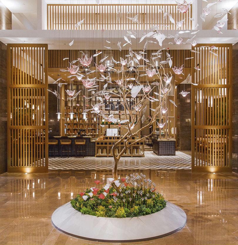
Shangri-La Qiantan, Shanghai was jointly designed by renowned international design studios Ga, Stack, Takenouchi Webb and HBA who took inspiration from nature and Shanghainese architecture and culture for the property’s design.
“It was a logistical challenge with the project designer in London, the hotel operator in Hong Kong and the developer in China, plus the lighting actually being created in the Czech Republic,” adds Akil.
“Preciosa Lighting’s global presence was a key advantage here and made for a smooth collaboration. This was a lovely project to work on and we look forward to future cooperation with Shangri-La properties worldwide.”
www.preciosalighting.com
06 4 | HOSPITALITY LIGHTING CASE STUDY
This issue of darc covers the latest in hospitality lighting projects from across the world.
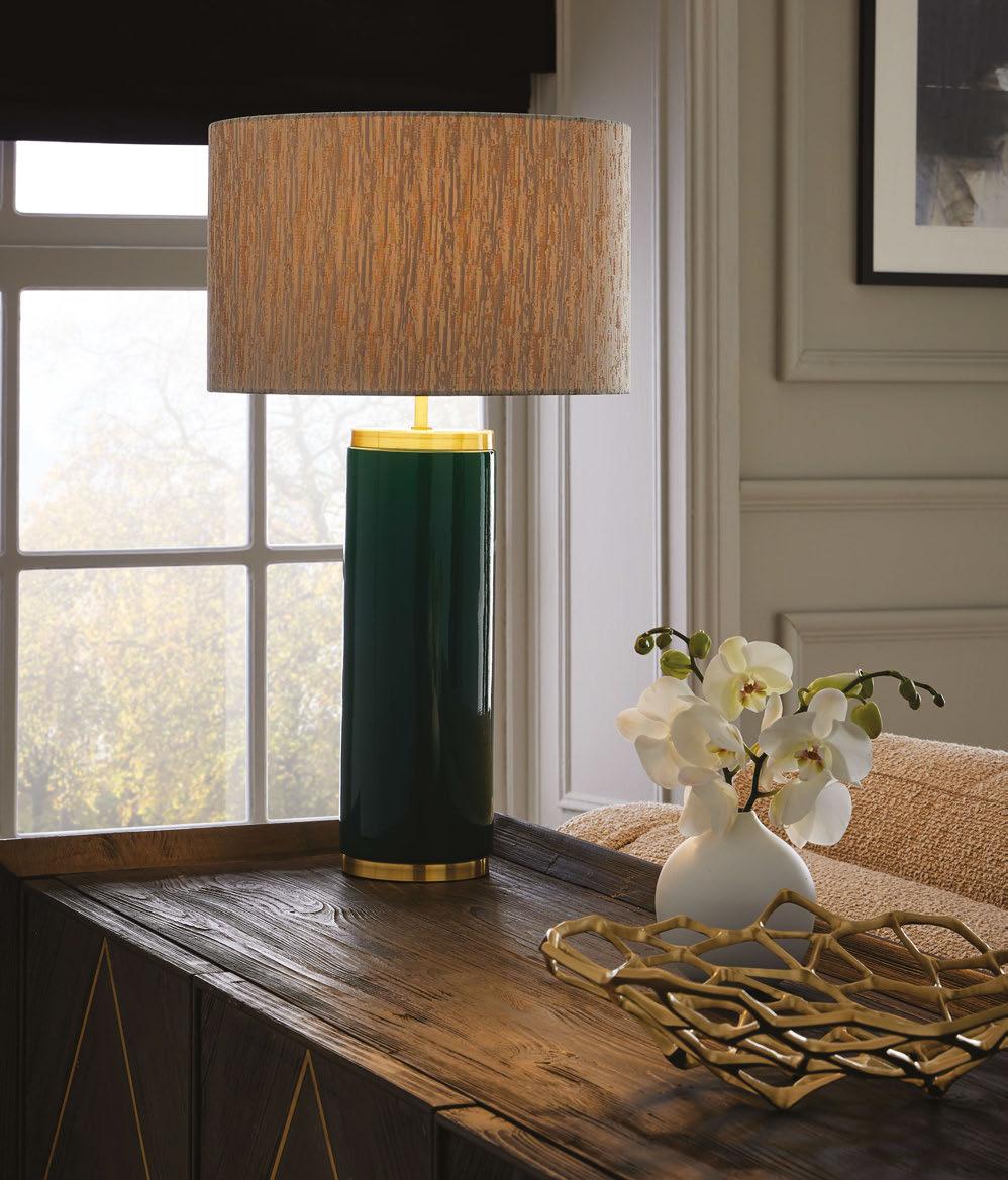
EST. 1995 Discover the complete Collection 8 at www.christopherhyde.com LONDON | DUBAI +44 (0)20 7351 0863 | sales@christopherhyde.com | Finest quality of classic and contemporary lighting to complement any interior
Beau
Shown in green glaze and satin gold finish. Also available in cream crackle finish Lampshade not included.
Radisson Blu Grand Hotel & Spa
Malo les Bains, France
The Radisson Blu Grand Hotel & Spa (part of the Pichet Group) in Malo les Bains, northern France, has just been redecorated by Advento interior designer Hervé Chaillé. Facing the North Sea, on one of the most beautiful beaches of the Opal Coast, the Radisson Blu hotel is an ode to the Belle Epoque, with lighting made in France by Designheure. Right from the reception area, travellers to the hotel are projected into the 1930s with an elegant and majestic design taking up the codes of the architecture of the period. The decoration evokes the atmosphere of the old seaside casinos with its large volumes, its noble materials, between the terrazzo floors and the brass and gilded metal pieces, and its lighting with large chandeliers made by Designheure.
The chandelier 4 Grand Carré Eau de Lumière, made to measure, enhances the lobby by covering the high ceiling with marble, textile and brass. The design of this chandelier plays with perspectives and volumes to become the masterpiece of this domed space. The reception desk, punctuated by Fleur de Kaolin Designheure pendant lights in porcelain and brass, reflects the precious spirit of the hotel through a poetic design and vertical graphics.
In the continuity of the reception area, the chandeliers 4 Moyen rectangle Eau de Lumière extend the chic atmosphere of the hotel into the lobby and bar area, using the same finishes as the chandelier in the lobby, in perfect harmony with the decoration of this area. The Nénuphar pendants further complete the space. Their geometric design responds to the abstract fresco on the ceiling and provides indirect lighting to the space.

In the restaurant, warm and soft colours have been favoured with walnut on the ceiling and pink on the walls, always underlined by white and golden brass tones.
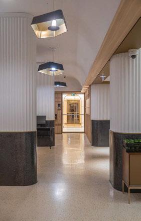
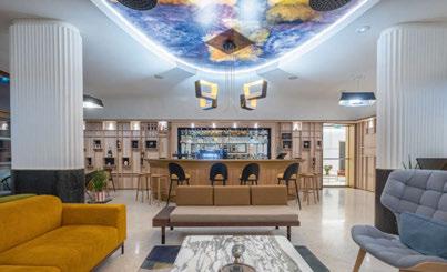
Designheure has installed its Kimono pendant lamps for the 110 rooms and suites of the hotel to complete the decor in a sober and refined way. A little air of “Couture”, halfway between Japanese sobriety and French elegance, which dresses the place with style. A tribute to cosmopolitan influences that should inspire travellers from all over the world.
www.designheure.com
Images: Erwan Fiquet
06 6 | HOSPITALITY LIGHTING CASE STUDY
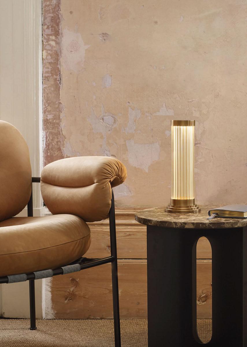
EST. 2015 LONDON - BIRMINGHAM EUROLUCE - HALL 9 - STAND 125 WWW.JADAMSANDCO.COM
Asian-Inspired Restaurant Scotland, UK
LSE Lighting has recently completed a bespoke project for a chain of UK-based Japanese-inspired restaurants, featuring a range of bespoke fittings, from decorative pendants to large-scale structures.
Illuminated strips of light make a stunning feature across the ceiling, whilst hanging pendants create a warm and modern feel. For this project, LSE created the entire range of customised fixtures for the client. A mixture of LED and profile pieces in custom lengths were fitted both as recessed and suspended (horizontally and vertically) and all set at dimmable 2700K. Specifically selected LED tape was used to ensure the restaurant had sufficient task lighting but maintained a cosy atmosphere. The team also created a stepped glass pendant for the restaurant. Formed of moulded, low-iron glass, which ensures there’s no green tinge colour. Fitted with an E27 vintage filament lamp reinforces the cosy vibe of the dining space. Custom tube pendants were finished with a yellow-gold RAL internal finish and black on the external. These were also set at dimmable 2700K. www.lselighting.com
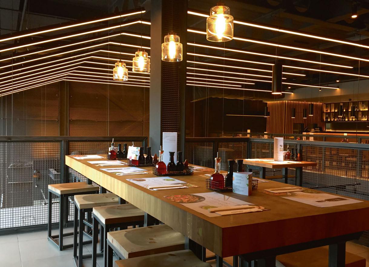
06 8 | HOSPITAL ITY LIGHTING CASE STUDY
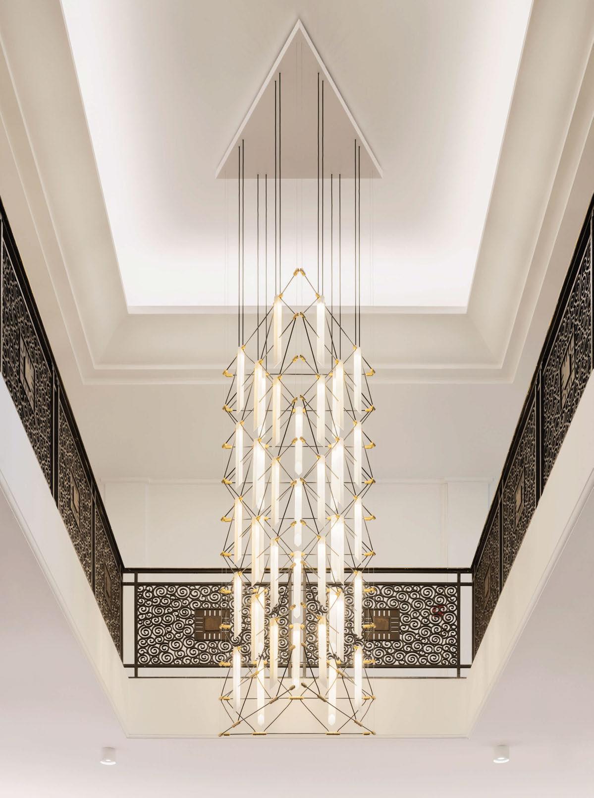
WWW.DESIGNHEURE.COM contact@designheure.com +33 (0)467 539 963
LUSTRE TRIO 5x2 MOZAIK
Designer : Davide Oppizzi
Credits : Jared Chulski Photography
Trees bending under the weight of heavy snow, the majestic slopes, and the Lapland twilight embracing the traveller. This is the magical landscape where you can find Villa Tykkyrinne, a unique and luxurious yet cosy rental holiday villa in Finnish Lapland. It is no coincidence that Villa Tykkyrinne was built in this exact spot within the beautiful Syöte National Park.
Design agency Ingman Design was responsible for the interior design and the material choices in Villa Tykkyrinne. As nature is constantly present through the large windows at every 206sqm of the villa, the entire design was carefully planned to give the illusion of living within the landscape. According to interior designer Ulla Ingman, black was chosen for large surfaces in order to fade the interior and let the Lapland twilight in, creating the perfect ambience.
Villa Tykkyrinne’s large windows open up to a beautiful landscape and create a feeling of space, and the decor and lighting are meant to create a relaxed, safe, and inviting atmosphere indoors. As such, Secto Design was the only lighting option considered by Ulla Ingman. She had followed designer Seppo Koho since his first lamp for Secto Design, the iconic Secto 4200 pendant, which came out in 1999. The lamps create harmonious light and their design language both adapts to and emphasises the surroundings, making it ideal for this project.
For Ingman, the shape of the Secto lamps reminded her of a
Laplander’s hut, again tying the design in with the Lapland-based location. Also the wood materials used for the lamps creates a beautiful continuation of nature throughout the decor. The black laminated surface of the lamps matches the large black interior surfaces, which contrasts with the soft light of the wood. The architecturally intriguing Villa Tykkyrinne needed light fixtures that spoke the same design language to highlight the sleek lines of the building, but at the same time the lighting had to be as soft as possible and not too bright.
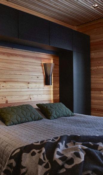
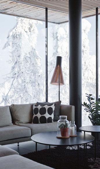
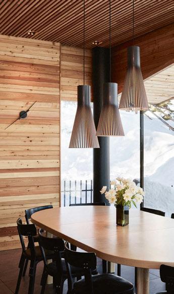
Overall, the project features pendant lamps, wall lamps, and floor lamps from the classic Secto line. This ensures a consistent design language and an interesting overarching design.
The bedroom needed an especially inviting and serene light. The Secto 4231 wall lamp’s versatility was key here, as the lamp was pointed upwards to let the light filter through beautifully. For the dining area, a set of Secto 4200 and 4201 pendant lamps were chosen to create the perfect mood for dining experiences. In the living room, the Secto 4210 floor lamp doesn’t only make a statement but also creates a soothing ambience.
Villa Tykkyrinne shows that lighting is not simply an interior design element but a source of atmosphere that ties its surroundings together, creating the desired feeling of harmony and cohesion. www.sectodesign.fi
0 70 | HOSPITALITY LIGHTING | CASE STUDY
Villa Tykkyrinne Lapland, Finland
“Something
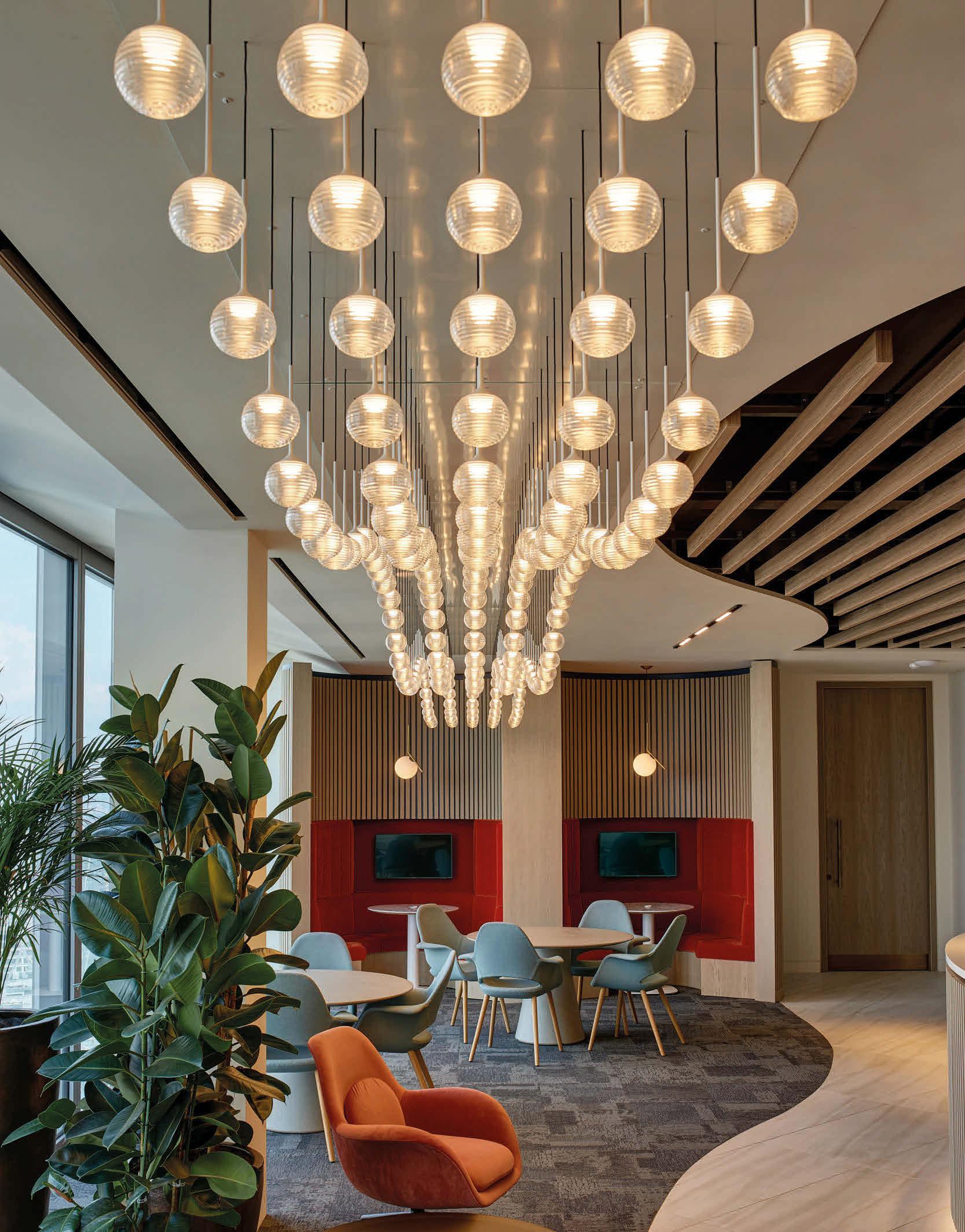
has changed” www.lselighting.com
Tenuta Soave Pieropan Verona, Italy
The long-established Pieropan winery is located in the heart of the vineyards of Soave (Verona), a land that boasts a lengthy tradition in the production of world-renowned wines. Designed in 2015 by the architect Moreno Zurlo, Tenuta Soave, the property of the Pieropan family, blends seamlessly with the landscape; the construction is set entirely into the hillside, with the exception of the façade in solid Vicenza stone. The property was conceived not only as a place to produce, mature, and age the wine, but also as a location to visit and explore, and a venue for events. The building is surrounded by vineyards belonging to the family - some of them entirely experimental - created with sharing knowledge and experiences in mind. The workspaces inside are designed to perfectly accommodate the processes undergone by the raw materials, and embellished with elements able to stir the emotions and engage the observer.
The new decorative lighting project by Catellani & Smith has brought a fresh allure to the barrique room and the tasting suite of Tenuta Soave Pieropan. The most enchanting area of the winery is the barrel cellar. For winegrowers and winemakers, this large underground room inspires the same reverence as an ancient place of worship. As you enter, two tidily arranged rows of barrels carry the eye rapidly towards the back of the room, embellished with a custom Luna Piena lamp with a diameter of 240cm and covered in gold-coloured leaf.
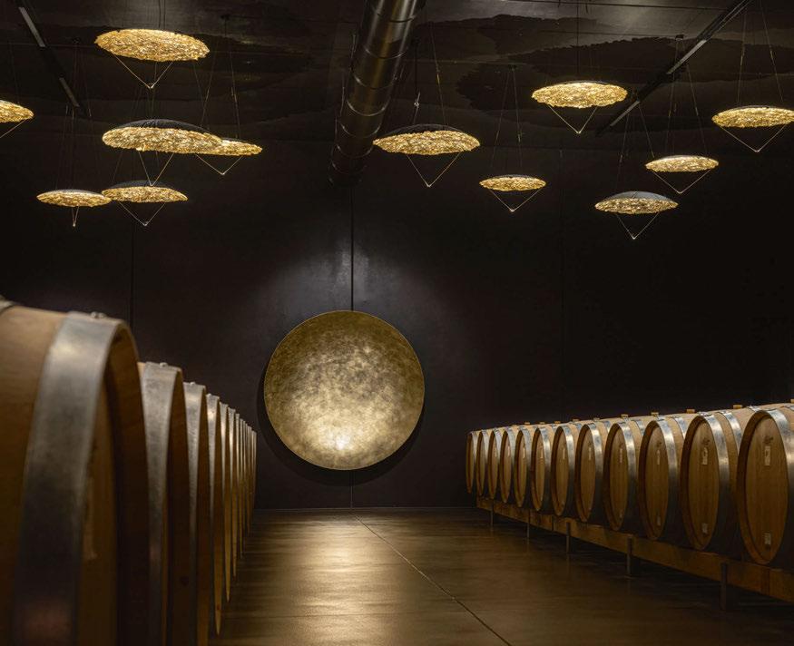
The ceiling lighting has also been conceived specifically to highlight the perspective effect in the barrique room, with the installation of a series of custom ceiling lamps with different diameters and finishes - gold and copper - designed to create an attractive interplay of reflections and shadows.
The ceiling lamps with a diameter of 80 and 120cm are composed of a dome with jagged edges and brass rods supporting a micro LED that highlights the metallic finishes. In addition, one of the walls of the room is adorned with an iron element, painted, laser-cut and covered in gold-coloured leaf, lit from within by an LED light and featuring the words “Il futuro ha un cuore antico” (the future has an ancient heart).
This is the motto of the Pieropan family, who see Tenuta Soave as “a striking new element in-keeping with tradition”. Installed in the tasting suite are the Lederam C180 ceiling models, with a white shade and custom brass-coloured painted disc: the LED module encased within the disc at the bottom directs the light towards the disc at the top, which reflects and spreads it throughout the room, while creating a halo of light on the ceiling.
The project is completed with numerous Lederam F2 floor lamps, with a height of around 200cm and composed of two metal rods, each one supporting a swivelling aluminium disc covered with gold-coloured leaf. www.catellanismith.com
07 2 HOSPITALITY LIGHTING CASE S TUDY
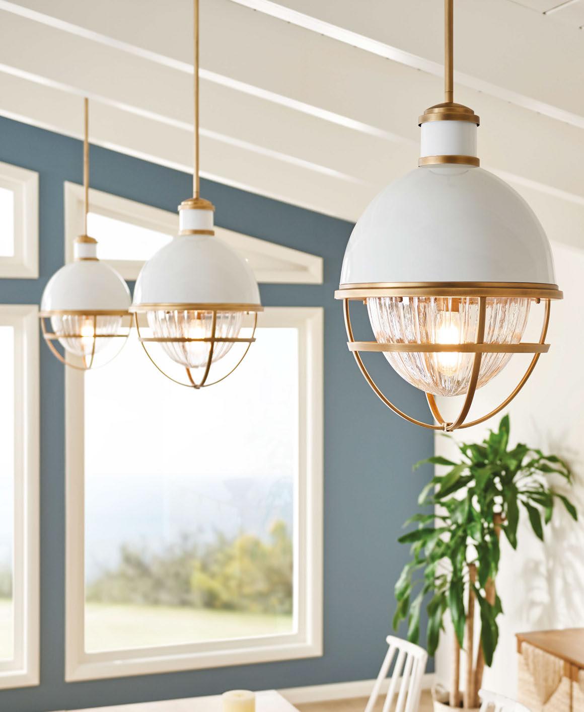
VISITOUR STAND 18-23 APRIL P11.144 EUROLUCE MILAN Model Featured: QN-TOLLIS-P-NBR DESIGN BROUGHT TO LIGHT +44 (0)1420 82377 | enquiries@elsteadlighting.com | www.elsteadlighting.com
Toko Restaurant Sydney, Australia
The Propeller Pendant light with internal copper by Duncan Meerding was chosen for the Toko restaurant based in Sydney, which is an underground venue that transports you into a unique space where lighting plays a central role to the overall dining experience. The Surry Hills restaurant was designed by Matt Darwin of GP2 Projects back in 2007 and again for the venue’s new location in central Sydney by Darwin and his team in 2022.
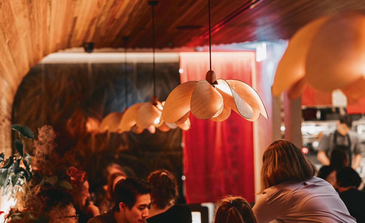
Warm glowing hues and timber tones mixed in with an interesting curved laminate timber ceilings tie together the aesthetics of the Toko restaurant’s rebuild.
Darwin had been following Meerding’s work through social media and got in contact part-way through last year about the different Propeller lights. “I showed him through video call some of the different options we can manufacture and he settled on a copper internal timber Propeller Pendant,” says Meerding.
The warmth thrown from the underneath of each of these lights is parallel to the concept of going underground into the cosy restaurant away from the busy George Street foot and car traffic.
Three of the propellers are stationed along the bar casting task lighting. Each light measures at 500mm in diameter, making them an ideal size for the overbench application.
The copper internal is shrouded by Tasmanian Eucalypt wood on its exterior. At first glance, the lights look to be fully timber, until at closer inspection the glimpses of copper show through the propellerinspired floral form.
These lights were made in Tasmania, and then flat-packed and reassembled in Sydney. The flat pack nature of this design allows for the item to be transported with ease.
www.duncanmeerding.com.au
Image: Saidie Creative
07 4 | HOSPITALI TY LIGHTING CASE STUDY
With over 300,000 Products and 3,500 Brands online, Archiproducts offers the perfect tool to bring beauty in every home, every moment, everywhere.
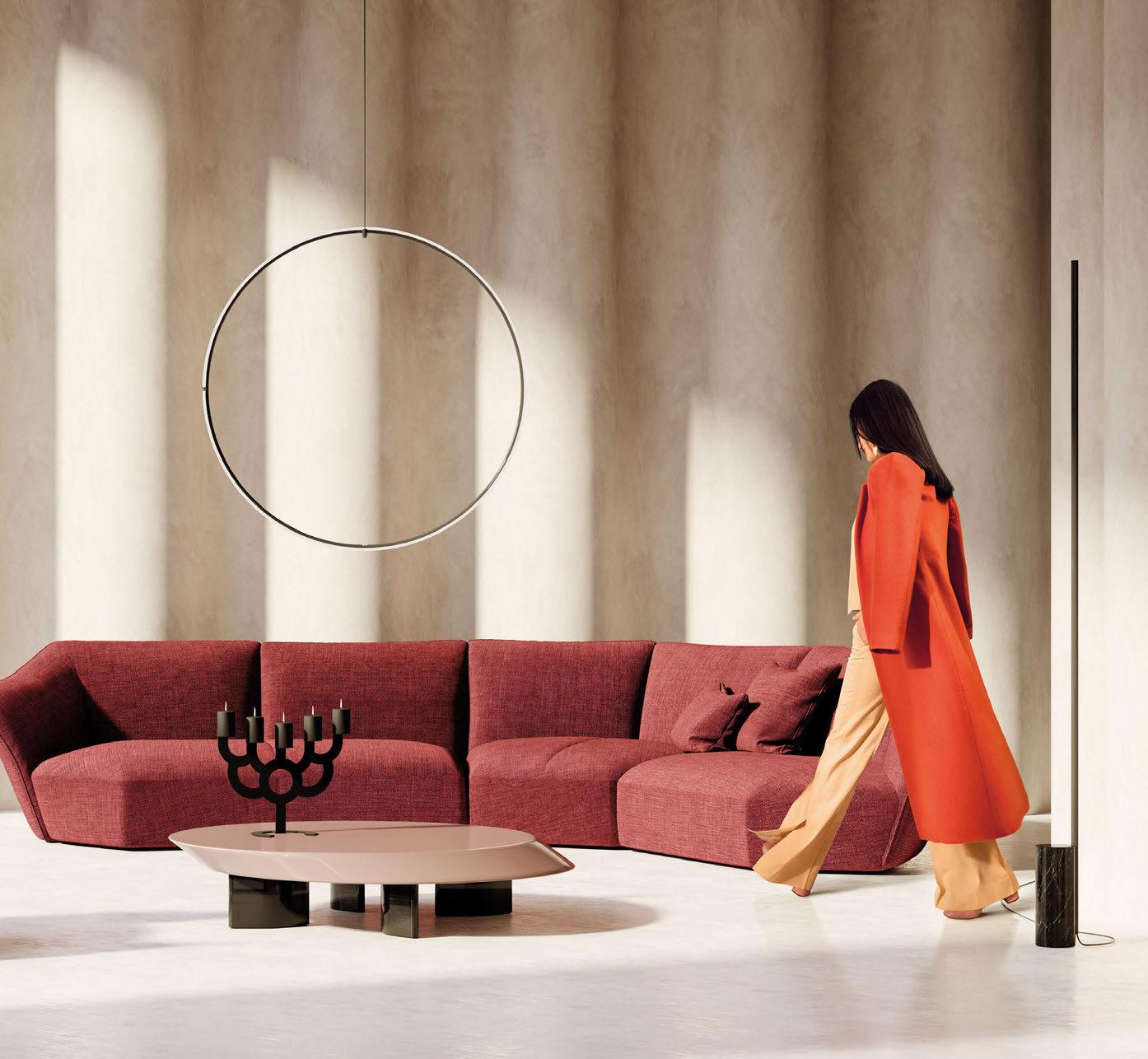
archiproducts.com

Euroluce Product Launches

Gavin Silence Leaf is a fixture comprising an LED light ring, inside of which there is a sophisticated composition of colourful leaves which, thanks to a stabilisation treatment, do not require any water or maintenance, and remain intact and vivid over time. An evocative yet functional natural cascade is enclosed in the light ring designed through Olev’s innovative technical approach. The light is designed to be comfortable for the eyes, and to improve acoustic comfort in the room through a sandwich of porous materials that make up the leaves housing. www.olevlight.com
British lighting manufacturer J. Adams & Co. presents ‘Porto’, its first portable LED table light, for its full European launch. Building on the visual language of the best-selling Flume collection, Porto marks a new direction for J. Adams & Co., combining the brand’s trademark precision engineering with the latest in portable LED technology. Featuring a completely wireless touch-sensitive light source, dimming capabilities, and a battery life of seven-hours, the Porto table light is both fun and intuitive to use. Showcasing precision-cut reeded glass and a machined solid brass base, Porto is manufactured with longevity in mind. A convenient USB-C connector can be found in the base and a seamless braided charging cable. Available in two signature finishes - antique brass and bronze - the Porto portable table light invites you to pick it up and take it with you wherever you go, whether that be inside the home or out. www.jadamsandco.com
Swedish lighting brand Wästberg will exhibit its new lighting collections on a stand designed by David Chipperfield Design. Originally launched in 2010 in collaboration with Inga Sempé, the w103 Sempé has been refined and upgraded with new lighting and mechanical solutions. Inspired by traditional machine tool lighting, the table lamp is a beautiful, versatile light with sturdy, longlasting mechanics. With three different positioning angles and an adjustable shade, it is an adaptable lamp for any environment. www.wastberg.com
Oluce presents its new Berlin floor lamp by Christophe Pillet, features the same elegant decorative presence that characterised the ceiling and wall versions. The floor lamp comprises two thick metal rings and a slender profile that encloses two discs of frosted glass. These are supported by a vertical thin tubular stem and can be rotated and directed to suit lighting needs. Berlin shows Art Deco inspiration in an anodised brass finish and a decidedly more contemporary look in a matte black finish and in the use of the LED light source. www.oluce.com
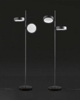
07 6 | ON SHOW | EUROLUCE PREVIEW
Porto
J.Adams & Co.
Hall 9, Stand 125
Gavin Silence Leaf Olev Hall 9, Stand 127
Ecliss Oluce Hall 11, Stand 116
w103 Sempé Wästberg Hall 13, Stand 121
Vesoi

Hall 11, Stand 210
The classic light bulb is emptied of its essence and becomes an expression of technology. It has a transparent glass body with rubber support and rechargeable base with on/off dimmer switch included. Charge duration is 12 hours via usb-c in five-hours with signaling LED also suitable for outdoor use. The vase bulb is born ready-made: a simple light bulb at the end of its usage becomes an object and lights up for other functions giving the bulb a second life. www.vesoi.com
Hall 15, Stand 212
The Symbioosa collection’s organic morphology is made possible by the use of modern technologies. It is a product of nature, developing on the groundbreaking collaboration between Lasvit and the LLEV studio, which was the very first collection to use glass forms produced from mycelium. The Symbioosa lighting furthermore respects the changes in natural ambient light throughout the day and changes accordingly. www.lasvit.com
Bubbles
Brand Van Egmond
Hall 9, Stand 205
Inspired by laughter as a child full of joy and curiosity wondering unleashed with amazement at everything. Bubbles, designed by William Brand, is reminiscent of free delight while blowing bubbles and being mesmerised by the soothing forms and colours. The result is an exploration of freedom and experimentation with materials. www.brandvanegmond.com
Hall 9, Stand 210
Presenting its new signature design, Crystal Grid, Preciosa will create a dynamic installation Crystal Beat - where design collides with music and light to challenge the viewers’ perceptions. Thanks to a specially designed technological solution that allows lighting features to react to ambient music, Crystal Beat sees a three - dimensional sound system synchronised with a spatial crystal light centrepiece, resulting in an ethereal and interactive environment. As the music plays from one part of the installation, the rhythm follows, giving the impression that the viewers are “seeing” the sound.
Designed by Preciosa’s Creative Directors Michael Vasku and Andreas Klug, Crystal Beat features layers of light that create depth and atmosphere, while layers of music draw visitors into a genuinely immersive experience. www.preciosalighting.com
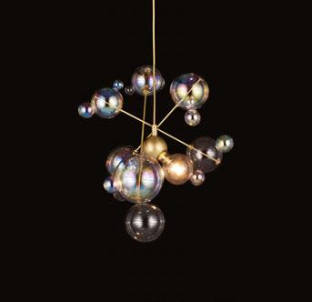
07 7
LED Bulb Vase
Symbioosa Lasvit
Crystal Beat Preciosa
Choice
Tom Dixon Hall 13, Stand 102
This year, Tom Dixon will be back with a bang with extraordinary new collections that will all reflect this year's theme of 'Choice'.
New collections showing for the first time at Euroluce will include the Puff pendants and chandeliers, Portable lights inspired by the iconic Melt, Bell and Stone designs and Cone, along with best-selling upholstery pieces Fat and Wingback, now available in hundreds of colours and textiles.
www.tomdixon.net
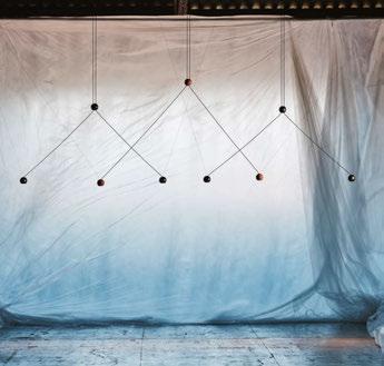
Linara
Elstead Hall 11, Stand 144
The Quintiesse collection has 200 new unique and memorable designs, including the Linara range. The natural brass finish contrasts with the matte black metal slatted shade. When illuminated, this range adds an intangible texture to the surrounding canvas. The Linara range consists of the featured six-light round pendant chandelier, a five-light linear chandelier, a tall single pendant, and large wall light.
www.elsteadlighting.com
Compass Estiluz Hall 15, Stand 110
The collection expands into a vivid, nuanced balance between improvisation and structure, control and intuition. The Compass family has a vision of formal delicacy, whose almost imperceptible structure could generate flexible geometries tensioned by the small spheres of light that make up the main visual body of the ensemble. Three is an interplay of weights and gravitational movement of the elements, and can also change its geometry and functionality.
www.estiluz.com
Mirror Formagenda Hall 11, Stand 109
Mirror is the latest addition to Formagenda's universe. The futuristic design is like a chameleon; it fits any interior and a second-space level lives in its reflection. The pure geometric shape features elegant details and yet maintains minimalistic aesthetics.
The Mirror family comes in three different formats: small, square, wide— and three finishes: clear mirror, smoked grey mirror, multicolour mirror. In combination, they float like mobiles and spark illusional worlds. Either configurations - single or in groups - Mirror feeds the inner narcissist and is the perfect selfie opportunity at Milan Design Week.
www.formagenda.com
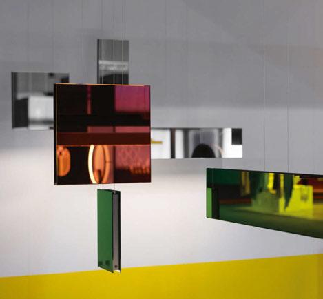
07 8 | ON SHOW | EUROLUCE PREVIEW
6 - 7 June 2023
Miami Beach Convention Center
The space to connect
250 exhibitors, inspiring conference program, Speed Networking, social events, product launches, workshops, and more
Register for free today

Stacking
Leucos x David Rockwell
Hall 9, Stand 234
Under the new direction of Abramo Manfrotto, Leucos invited renowned architect David Rockwell to reimagine the Stacking Collection, which he originally designed in 2007. The existing collection, composed of three floor lamps made of handblown glass cylinders of different colours and sizes, is now joined by a series of striking new horizontal chandeliers and vertical pendants. Contemporary techniques have been used for the new pendant lamps that nod to artisan traditions and the original Stacking floor lamps. The lighting fixtures include a set of horizontal pendant lamps in three sizes and three vertical pendant lamps with the option for a wall application. The modular glass cylinders are now slightly narrower than the original collection for a more delicate, refined look. The horizontal luminaires feature metal end caps, and dimmable LEDs offer the possibility of creating a more direct or softer light, depending on preferences.
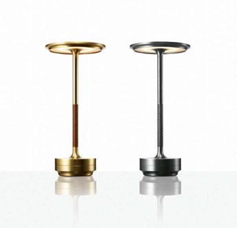
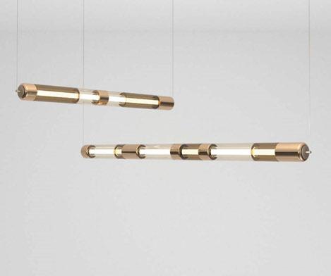
www.leucos.com / www.rockwellgroup.com
Anel
a-emotional light
Hall 13, Stand 113
a-emotional light's in-house team began with the idea of a chandelier and texture to develop this ceiling and suspension piece. With its circular distribution of light, Anel offers adequate lighting efficiency, and the surface mounting makes it easy to install. The two steel mesh cylinders surrounding the light source form a set of planes, diagonal lines, textures and concentric shapes that make Anel a piece with its own aesthetics and elegance.
www.a-emotionallight.com
Turn Craft
Ambientec
Hall 15, Stand 131
Nao Tamura has designed a reinterpretation of Turn. A sculptural table lamp carved entirely from a single block of stainless steel, Turn Craft's extreme formal purity is heightened by its elegant glossy black finish, achieved through a complex steel blackening process, used for the first time by Ambientec, which gives richness and durability to the colour. An intriguing sensory contrast comes from the fine hand-stitched Italian leather, also in black, that embraces part of the stem.
www.ambientec.co.jp
Wand
Martinelli Luce

Hall 13, Stand 118
Lightness, geometry and purity describe the concept behind the creation of Wand, a portable table lamp that is perfect for both indoor and outdoor environments.
Designed by Bellucci Mazzoni Progetti, its transparent structure supports the light source, enclosed in the cylinder in the centre, which thus seems to float in the air. Thanks to its rechargeable battery, Wand is also synonymous with freedom of installation and movement in space.
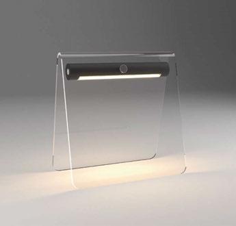
www.martinelliluce.com
0 80 | ON SHOW | EUROLUCE PREVIEW
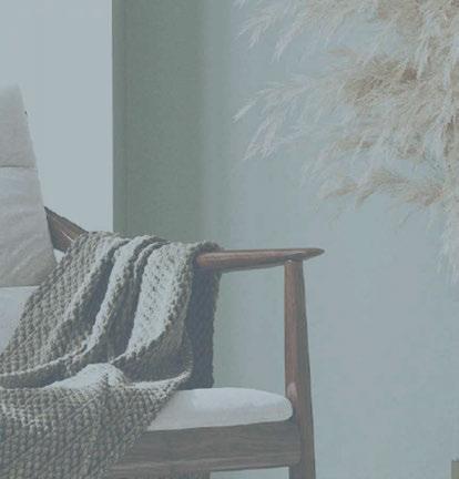
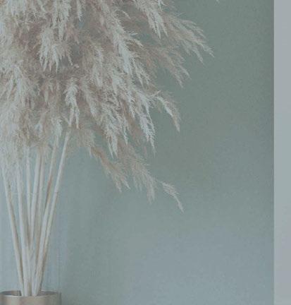

The brand-new design event dedicated to highlighting emerging design trends from the South and LATAM markets 6-7 June 2023 Miami Beach Convention Center Register now
Alldatesarecorrect attimeofprinting
On Show
A look ahead to forthcoming design shows during 2023 with a strong lighting element.
HONG KONG LIGHTING FAIR (SPRING) • HONG KONG, CHINA
12 - 22 April 2023 (www.hktdc.com)
ARCHIPRODUCTS @ MILAN DESIGN WEEK • MILAN, ITALY
17 - 23 April 2023 (www.milano.archiproducts.com)
EUROLUCE • MILAN, ITALY
18 - 23 April 2023 (www.salonemilano.it)
HD EXPO • LAS VEGAS, USA
2 - 4 May 2023 (www.hdexpo.com)
[D]ARC SESSIONS • ROVINJ, CROATIA
14 - 16 May 2023 (www.darcsessions.com)
ICFF • NEW YORK, USA
21 - 23 May 2023 (www.icff.com)
WANTED DESIGN • NEW YORK, USA
21 - 23 May 2023 (www.wanteddesignnyc.com)
CLERKENWELL DESIGN WEEK • LONDON, UK
23 - 25 May 2023 (www.clerkenwelldesignweek.com)
AD INDEX
IMM COLOGNE • COLOGNE, GERMANY
4 - 7 June 2023 (www.imm-cologne.com)
CRUISE SHIP INTERIORS AMERICAS • MIAMI, USA
6 - 7 June 2023 (www.cruiseshipinteriors-expo.com)
DESIGN HELSINKI • HELSINKI, FINLAND
23 - 24 August 2023 (www.designhelsinki.com)
HOSPITALITY DESIGN FAIR • SYDNEY, AUSTRALIA
31 August- 1 September 2023 (www.hospitalitydesignfair.com.au)
MAISON ET OBJET • PARIS, FRANCE
7 - 11 September 2023 (www.maison-objet.com)
INDEX • RIYADH, SAUDI ARABIA
10 - 12 September 2023 (www.index-saudi.com)
LONDON DESIGN FESTIVAL • LONDON, UK
16 - 24 September 2023 (www.londondesignfestival.com)
LONDON DESIGN FAIR • LONDON, UK
21 - 24 September 2023 (www.londondesignfair.co.uk)
08 2 | CALENDARC
Albalon 83 Artemide 61 Archiproducts 75 Astro IFC Clerkenwell Design Week 22 Chelsom 31 Christopher Hyde 65 Cruise Ship Interiors Expo 79 Designheure 69 Elstead Lighting 73 Formagenda 55 Franklite 63 HD Expo 34 Hotel & Resort Design South 81 ICFF 42 Intra Lighting IBC Gladee 53 J Adams & Co. 67 LiGHT23 4-5 LSE Lighting 71 LZF 19 Original BTC 27 Precosia 7 Secto 49 Tekna 29 Tala OBC VISO 15
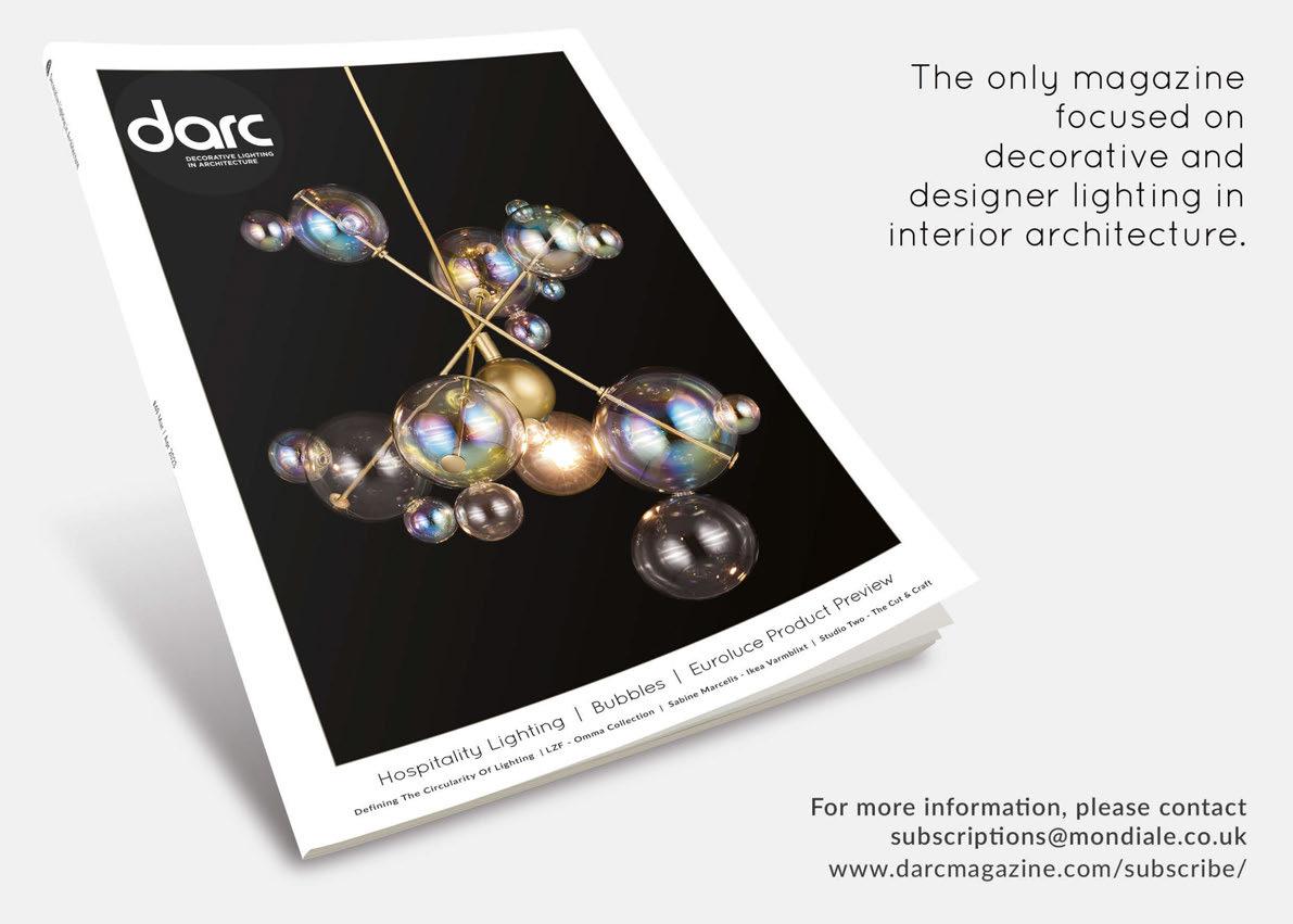
 Fate
Aldo Bernardi
Fate
Aldo Bernardi
What was the design inspiration behind Fate?
Our intent was to give the market a product that had simplicity yet beautiful finishes. We didn't invent the light bulb holder, but we certainly enhanced it with all handmade finishes, ranging from gold, platinum, copper, to delicate matte nuances.
How long did you work on the new piece for?
In 2019 we designed the Fate suspension line and in 2022 we enriched it with a counterweight, pulley and special ceiling rose.
It is hard to put a specific time frame on this, as I have continually worked on this product since 2019, adapting and creating, drawing by hand until the final design.
Can you you describe the design and manufacturing process for Fate?
We start with the design, then a model is made, which is the first plaster mold. A matrix is then made from this, and finally, production molds are made. From these comes our Fate. We then clean and place them in the kiln oven, where we ‘cook' them for the first time. When they come out of the oven, we glaze and put them back in the oven for a second time.
In the case of gold, platinum and copper finishes (and related matte nuances) the product is fired a third time. I would also like to draw your attention to the fact that they are all manual processes that appear simple, but in reality, require experience and skill. For example, the gold finish (now 24-karat and not gold-colour) is spread with a small brush by our craftspeople, (not by a machine). It must be applied very homogeneously and at the right consistency, otherwise once cooking is completed the effect won’t be as beautiful. To do this, the only thing needed is skill and experience. They are details that may seem trivial said in this way, but they tell of craftsmanship and excellent manual dexterity that gives the product an added value. These skills have been developed by gaining experience in small workshops - going "a bottega” as we say! Unfortunately, these small workshops are disappearing, so we are proud to still maintain this attention to detail and craft.
What was the most challenging aspect of producing Fate?
Crafting pottery, following the process described above, has only one difficulty: the ground used is not a dead element, it is living and, as such,
is affected by changes in season and humidity, which must be taken into account. Even the cooking in the kiln is never taken for granted; after 50 years of doing this job, when the oven opens, we can’t be sure of the final result; it can happen that everything is in order but sometimes some pieces have to be re-fired or that some pieces come out broken. You don't always know the reason, even if the operations performed are always the same over time.
What makes this pendant different to others available on the market?
It is a more refined product.
Can you describe the product in 3 words?
Beautiful, versatile, unmistakable (…for me, and I hope also for those who appreciate it).
www.aldobernardi.com
www.lightingspiration.com
08 4 | IN FOCUS
In Focus
Black Hole Extreme phenomenon


Black Hole Sound System
With the use of wireless Bluetooth technology, you can connect smartphones, computers, or tablets and enjoy your favourite music with a built-in speakers system.
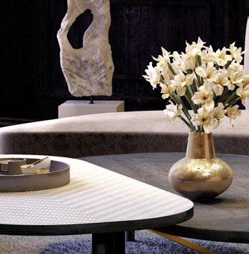
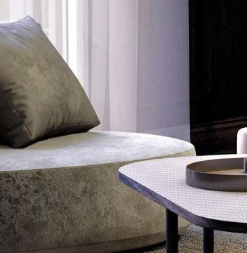
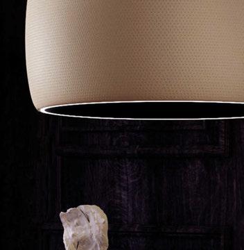

OUTPUT POWER: 4X30 W I PEAK POWER: 4X50 W I DYNAMIC FREQUENCY RESPONSE: 100 HZ - 15000 HZ +/- 3 DB; 80 HZ - 20000 HZ +/- 5 DB I BLUETOOTH VERSION: 5.1
LOOP
A light from the future, for the future; Loop is a new collaboration between Tala and designer John Tree.
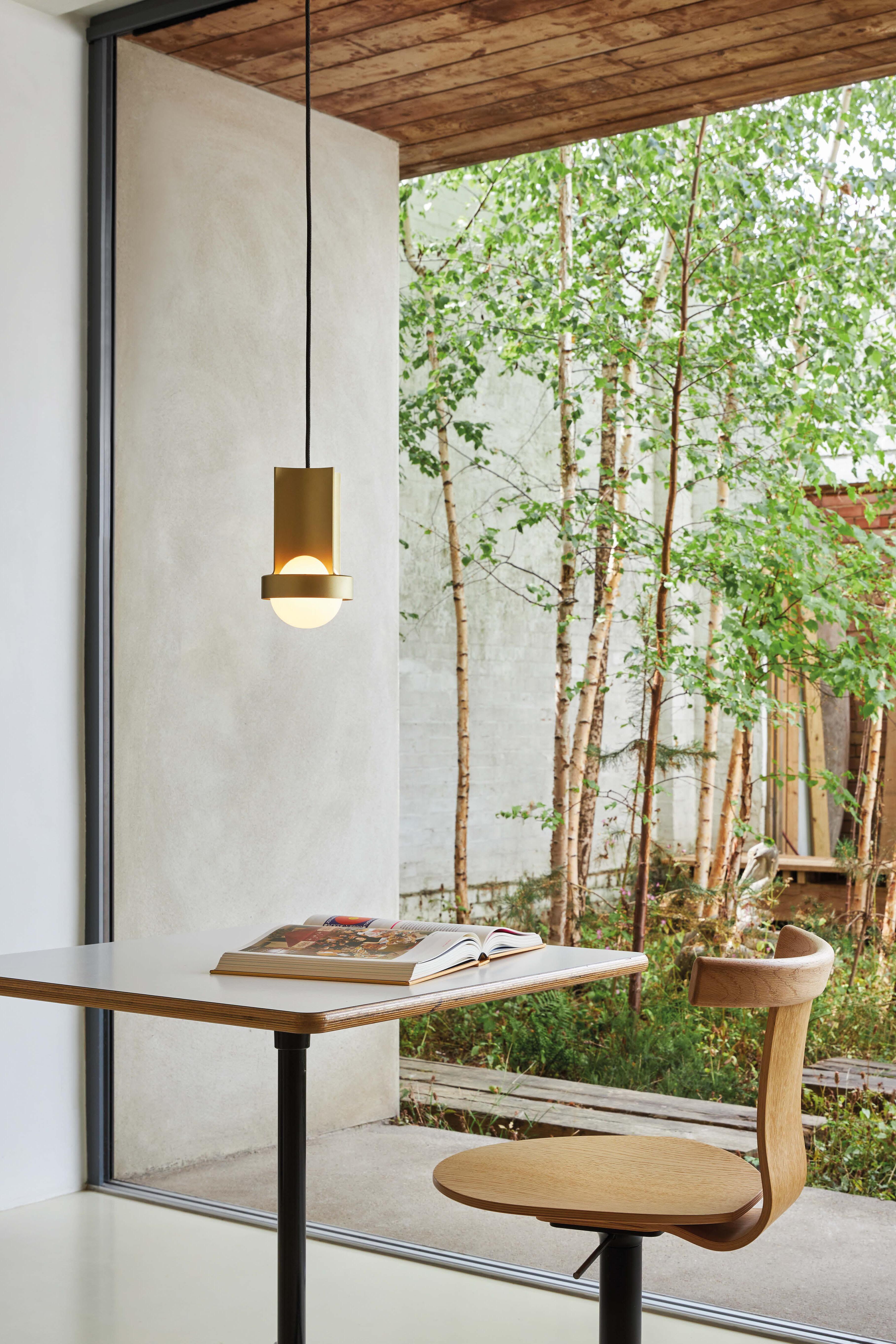
tala.co.uk
