


Welcome to our May/Jun issue!
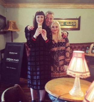
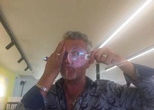
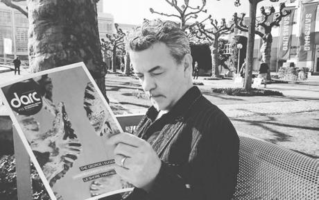
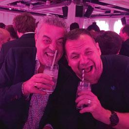
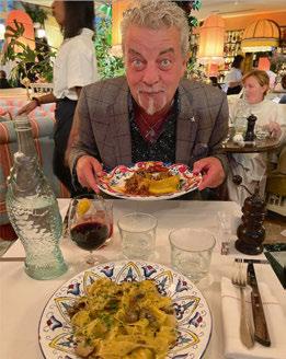
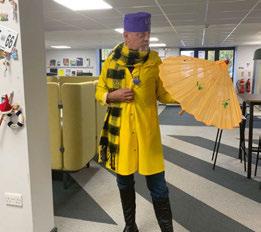
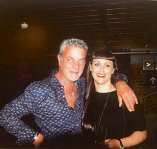
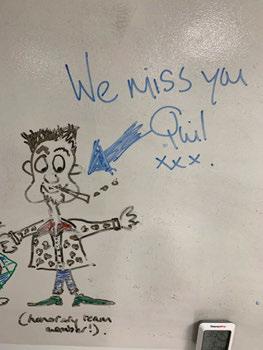
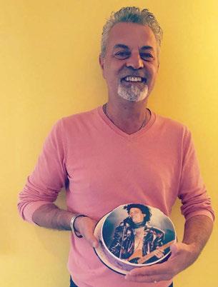
Now, you may be wondering why our Welcome page is splashed with random pictures of this old man (he’s not that old, he just hates us calling him that!) …? For those of you who might not know him, let me introduce Stephen Quiligotti. As he is more affectionately known, “Quili” was darc’s international sales manager and has been an integral part of building the magazine over the years. He is the life and soul of any party, as well as at Mondiale Publishing where he's worked for the last 24 years.
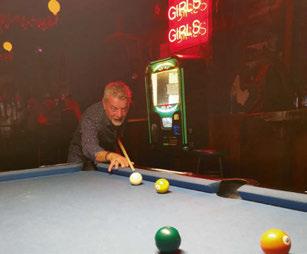
We now bid him adieu as he departs us, and the UK, for a new life in France with his beloved wife Isabelle. The pair are returning to Isa’s hometown near Cognac to enjoy a well-earned slower pace of life and enjoy each other’s company in the sunshine. For those of you who do know him, I’m sure you can imagine the void he is going to leave in [d]arc media’s office. Always one to bring a smile to our faces as we tear our hair out around deadlines, he has been an absolute joy to work with!
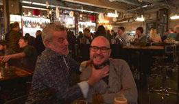
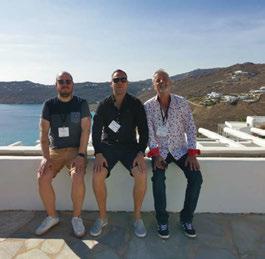
Well-known for his bright, floral shirts and cheeky personality, Quili was such a fun travel buddy. And between myself and Helen, we have travelled across the world together to attend trade shows, press trips, and showroom visits. There was one year Helen and Quili ventured to Italy on a road trip for a week - and from what I gather, they were just about speaking by the end of it despite the flat tyres and wrong directions along the way!
Quil’s generosity knows no bounds too. He always helps those less fortunate than him, withdrawing cash to give to the homeless numerous times, donating his (practically new at the time) sofa to me when I moved house, and gifting a few of us on the team free tickets to a Metallica gig to name just a few examples.
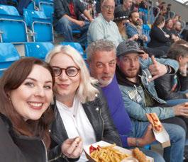
Now, before this sounds more like an obituary than a farewell, I am sure I speak for all at [d]arc media - and Mondiale Publishing as a whole - he will be sorely missed. Thanks for everything pal!



036 Interview | Robert Sonneman | Sonneman A Way Of Light 60th Anniversary
056 Co mment | Portable and Outdoor Lighting | Stephanie Dias | Sdias
058 Fe ature | Portable and Outdoor Lighting Product Guide
060 Co mment | Retail Lighting | James Poore | JPLD

062 On S how | Comment | Exhibition Design | Silka Mitchell | Istoria Group
066 On S how | Milan Design Week & Euroluce | Review
072 On S how | [d]arc awards 2022 | Review
077 On S how | Clerkenwell Design Week | Preview
080 Cale ndarc | International Design Events for 2023
082 In Focus | Rich Brilliant Willing | Akoya
010 Fo cal Point | Shylight | Studio Drift | USA
012 Fo cal Point | 405 Bourke Street | WSP | Australia
014 we lls&more
Conran and Partners has recently completed the design for an entrance experience at wells&more at 45 Mortimer Street, in the heart of London's Fitzrovia.
022 Fai rmont Springs Resort
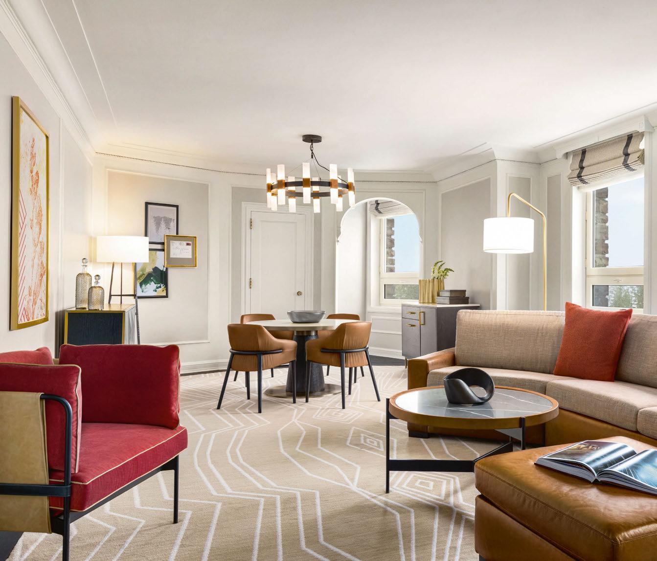
Interior architects Jeffrey Beers International has created a sophisticated interiors scheme for the Fairmont Springs Resort in Banff, Canada, using warm metallics and natural stone highlights for the lighting.
026 Claremont Hotel
Australian-based lighting consultancy ambience worked with interior architects Fratelle to complete a full refurbishment of the Claremont Hotel in Perth, Western Australia.
034 On T he Board | SpaceInvader | Sustainable Project Specification
046 Design Evolution | Part 2 | Rock & Soar | Storm
049 Materials | Alma | Original BTC
Managing Editor | Helen Ankers h.ankers@mondiale.co.uk
+44 161 476 8372
Editor | Sarah Cullen s.cullen@mondiale.co.uk
+44 161 476 9401
Contributing Editor | Matt Waring m.waring@mondiale.co.uk
International Sales Manager | Tristan Blowers t.blowers@mondiale.co.uk
+44 7392 895771
Design
Artwork | Dan Seaton d.seaton@mondiale.co.uk
Editorial | Mel Capper m.capper@mondiale.co.uk
Finance
Finance Director | Amanda Giles a.giles@mondiale.co.uk
Credit Control | Lynette Levi l.levi@mondiale.co.uk
Corporate
Chairman Mondiale Publishing | Damian Walsh
Managing Director [d]arc media | Paul James p.james@mondiale.co.uk
Marketing & Events | Moses Naeem m.naeem@mondiale.co.uk
[d]arc media ltd | Strawberry Studios, Watson Square, Stockport SK1 3AZ, UK | Printed by Buxton Press, Palace Road, Buxton, UK | ISSN 2052-9406
Photography: @manutoro.work
VOLIERE
by Bodo Sperlein
lzf-lamps.com
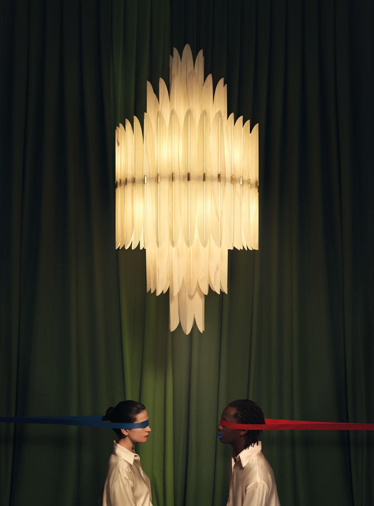 Wood touched by Light
Shylight
New York, USA
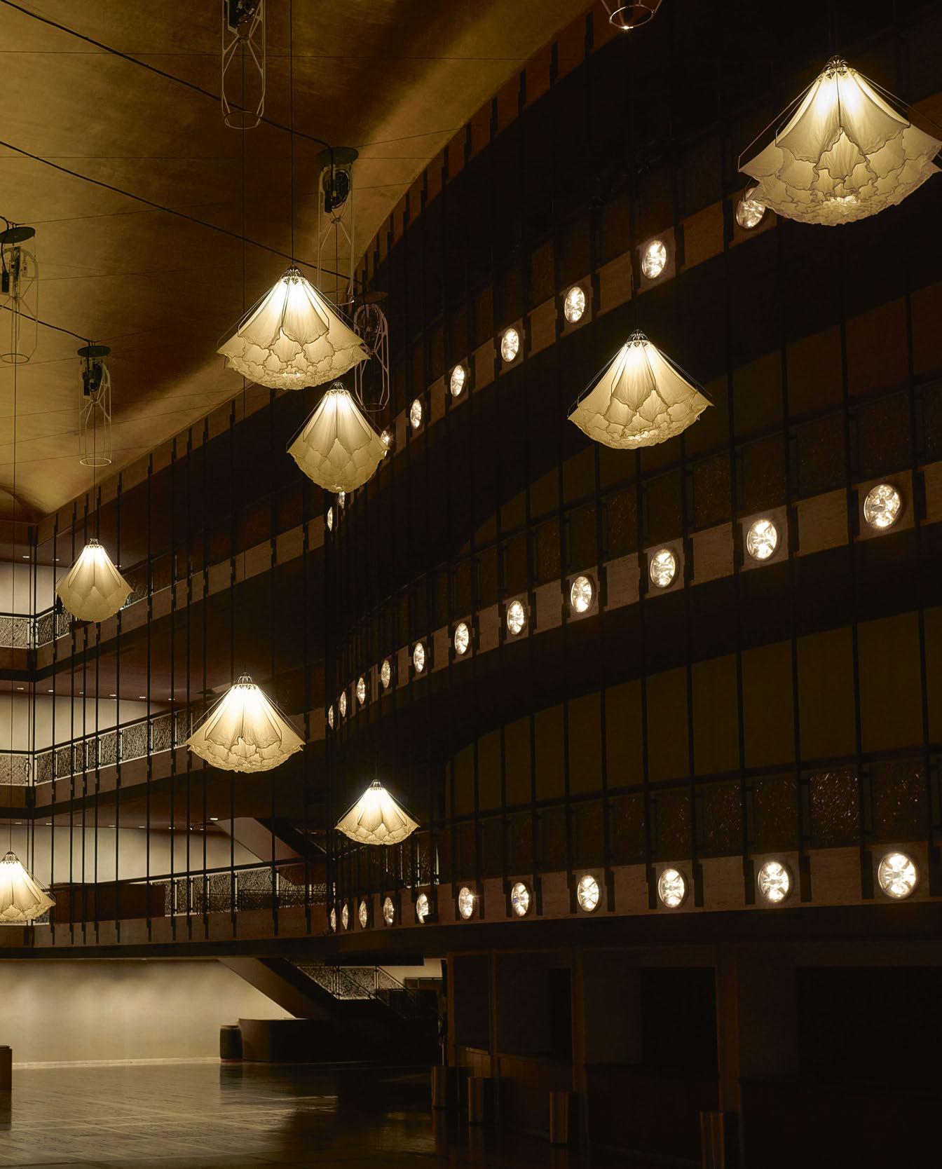
The New York City Ballet (NYCB) presented its 10th annual Art Series this year, where it invites a contemporary artist to create a site-specific work, which will be displayed during its winter season. This year, Drift’s signature work Shylight was on view from 17 January - 26 February.
NYCB was Drift’s first experience of working with a ballet company. The artists installed Shylight, a series of performative sculptures that were programmed – or choreographed – specifically to the Promenade of the David H. Koch Theater.

Shylight is a kinetic installation of light and movement, inspired by the natural movements of certain flowers that close at night. This highly evolved natural mechanism is called ‘nyctinasty’.
Shylight took this inspiration of a sculpture that unfolds and retreats to its original state to in a fascinating choreography, mirroring the nyctinasty of real flowers.
Shylight is the result of the question “How can an inanimate object mimic those changes that express character and emotions?”.
After a research period of five years, Drift created this form to visualise its concept. Shylight has become an object that is perceived to be alive because of its unpredictable, natural-looking movements: it descends while blossoming in all its beauty, only to subsequently close and retreat upward again.
Shylight is created out of many layers of silk, which causes it to move with the grace of a dancer. The movement of the work can be controlled to the millimetre and gives it a subtle choreography.
www.studiodrift.com
Image: Andy Romer
Melbourne, Australia
The Foundry combines a six-storey heritage listed apartment building constructed in 1915-18 and the adjacent 405 Bourke St Provincial Insurance House. 405 Bourke Street, which was developed by Brookfield Properties in collaboration with ISPT, involved the transformation of an ageing retail, office, and carpark complex across a whole city block from Bourke Street through to Little Collins Street.
The development goal was to construct a 60,000sqm commercial office building above the existing buildings and activate the ground plane via the establishment of an inviting lobby and thoroughfare that provides access in and across the site into Melbourne’s famed laneway network. The architectural form for the new building frames the existing heritage façade with a striking structural cantilever over the buildings and a 25-metre-high awe-inspiring entrance lobby that serves as the main commercial office entry and connection to a new retail laneway connecting Bourke Street to Little Collins Street.
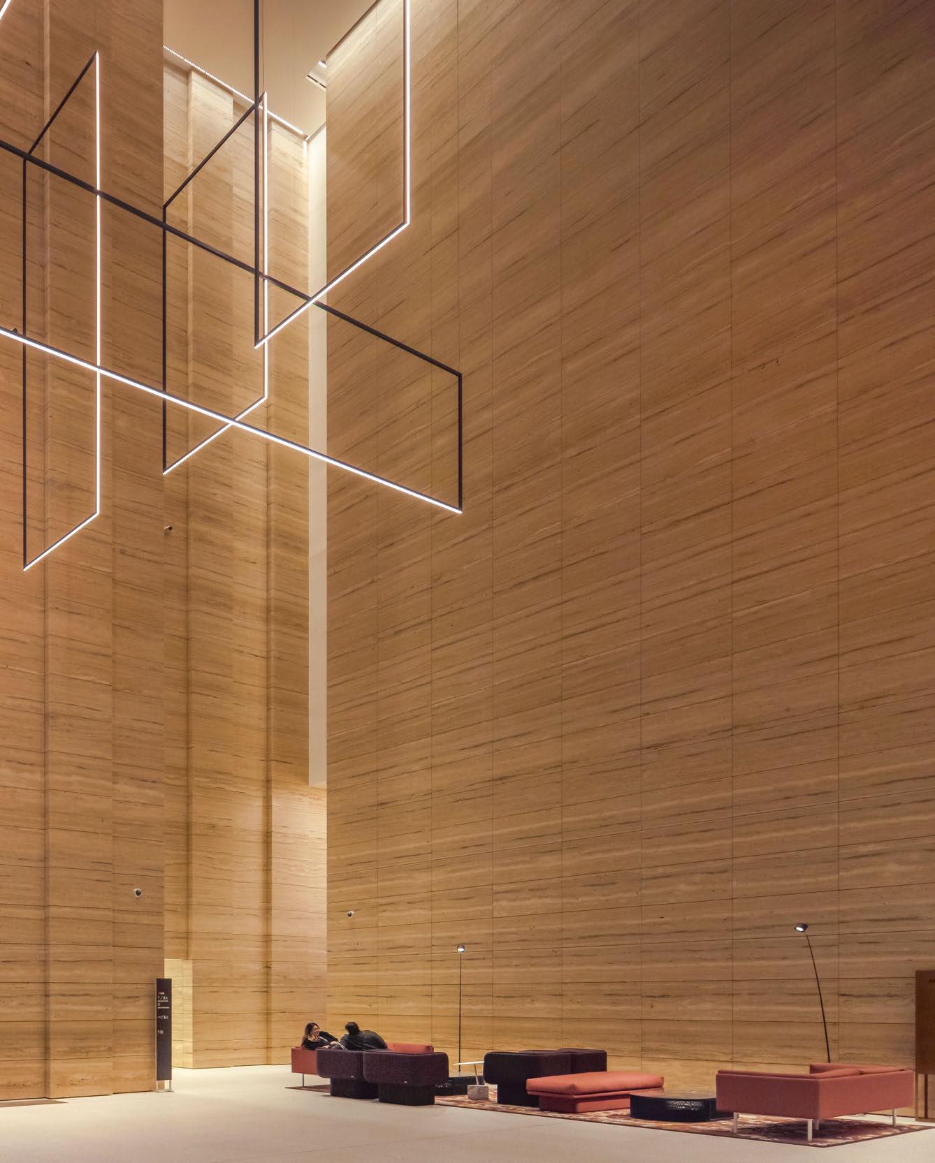
Led by Project Director Craig Carroll, WSP provided building services engineering including the lighting design for the base building. A key feature of the main lobby lighting solution is the large linear pendant. The inspiration for the bespoke pendant came from a need to express the cathedral-esque nature of the lobby. The intent was to coalesce with the vertical lines rendered by the castellated
travertine stonework, thereby having a presence without detracting from the architectural lines. Working closely with the architecture and interior design team at Wood Bagot, WSP developed the interlocking linear feature light that plays on the verticality of the space and leads the eyes into and up to the lofty ceiling, which sits some 25-metres above the viewer.
At 10-metres long, seven-metres wide and fivemetres high, the pendant also portrays a subliminal message that subtly plays on the street address. From certain viewing angles, the interlocking shapes can be read as a deconstructed number four, the rectangular shapes represent the number zero, and the five elements represent the number five, thus in a subtle way reinforcing the number 405 of the street address.
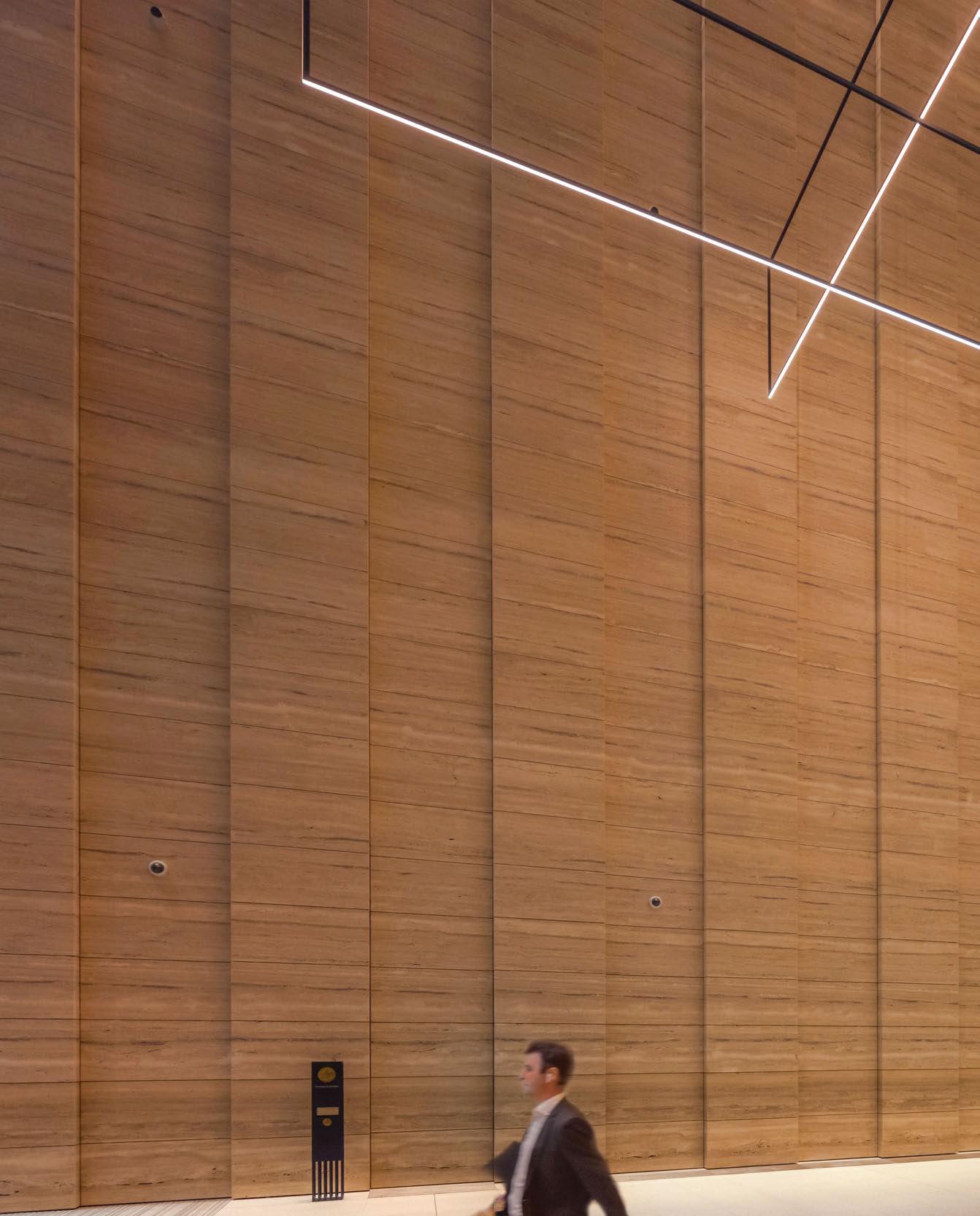
Taking its design concept to Australian-based manufacturer Lumen8, WSP’s designers workshopped the scheme and established which faces of the luminaire were to be illuminated, thereby imparting light to the vertical elements of the interior space. Additionally, the suspension/electrical cables were combined, allowing the delicate nature of the luminaire to be maintained without cluttering the ceiling.
www.wsp.com/au
Image: Jackie Chan for Erco Lighting
Conran and Partners has recently completed the design for an entrance experience at wells&more at 45 Mortimer Street, in the heart of London’s Fitzrovia.
The wells&moore workplace, by Great Portland Estates (GPE), offers tenants the opportunity to select a Ready for Fit space that can be designed to suit their needs, a Fitted space that can be designed and fitted with an in-house team, or a Fully Managed option that is completed entirely by GPE. Conran and Partners’ scheme dilutes the boundaries between work and social, as well as those between workplace and hospitality. Responding to the growing need for offices that are site-specific and
culturally sensitive, Conran and Partners tapped into its extensive hotel design expertise to design a hospitality-influenced lobby that offers a meaningful and immersive experience to users and that can be used for events, work and social purposes. The project seeks to reconnect individuals and teams with their company culture, as well as with the surrounding. The result is a clubhouse-style lobby for the modern worker.
darc spoke with Simon Kincaid, Principal at Conran and Partners,
to find out more about the team’s approach to the project. “We have successfully worked with Great Portland Estates in previous refurbishment and re-positioning projects: 200 Grays Inn Road and The Hickman.
“It is a very natural and collaborative relationship, with GPE looking for spaces and experiences beyond the typical ‘office design’ to which we bring a wealth of cross-sector experience, particularly in residential and hospitality, that suits the changing expectations of office workers.
“45 Mortimer Street is situated minutes away from one of the busiest streets in the world, which is home to an array of creatives specialising in global fashion, film production and hospitality.
“The social isolation due to Covid-19 that we were hoping was shortlived drove the idea of creating a clubhouse-like space for creativity and collaboration: A celebration of people coming together.
“The brief was for the lobby to be more welcoming, aspirational, and atmospheric than more traditionally corporate spaces and to enhance
social interaction and comfort. The client really wanted the space to be utilised to the full; to be more of a “lobby lounge” and “residents’ club” rather than just a waiting area or transient space.
“This functional brief is overlayed with the aim of integrating the site’s unique aesthetic and mood of the Fitzrovia area, which is rich in hospitality and cultural experiences, to give wells&more a stronger and more connected identity.”
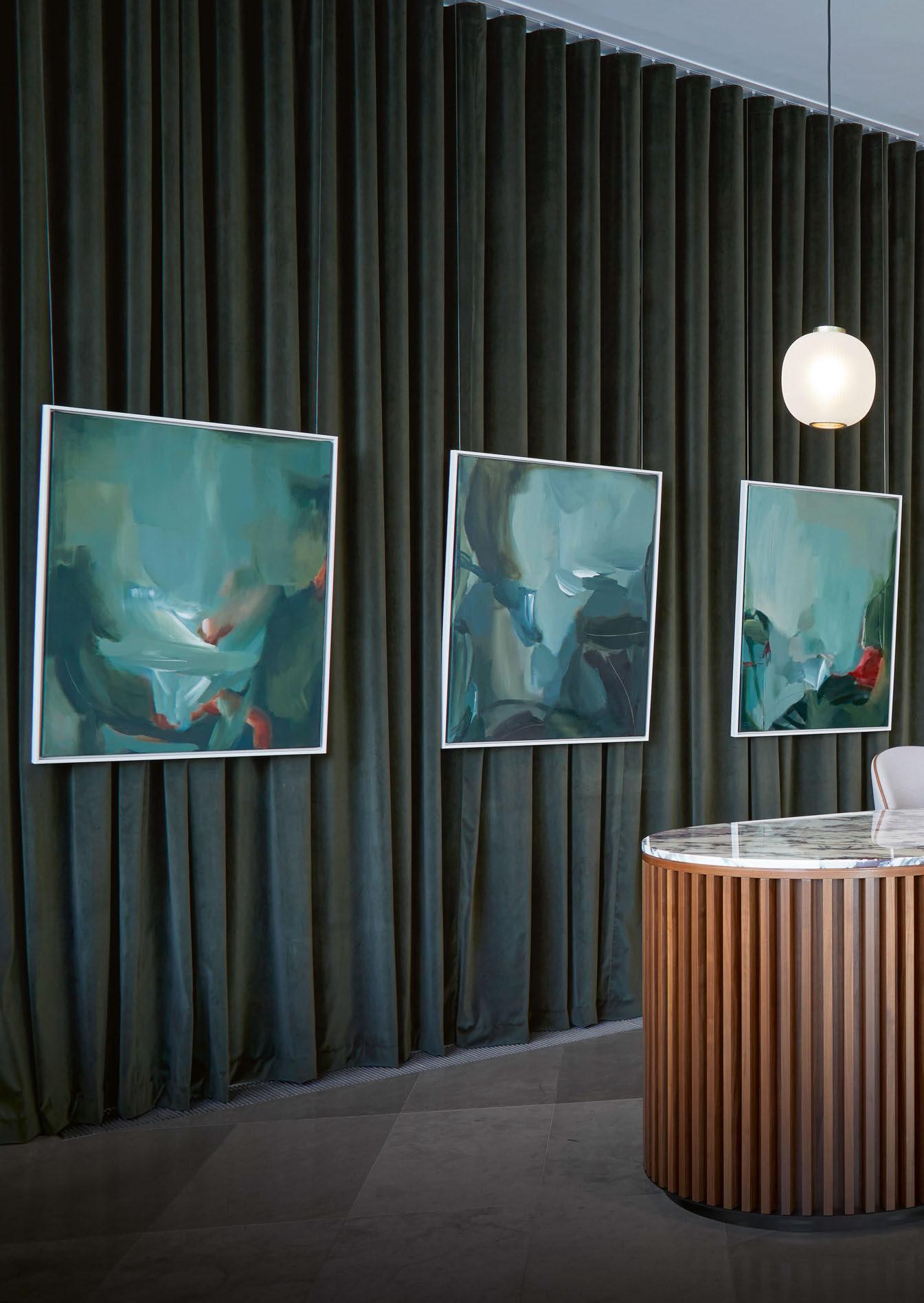
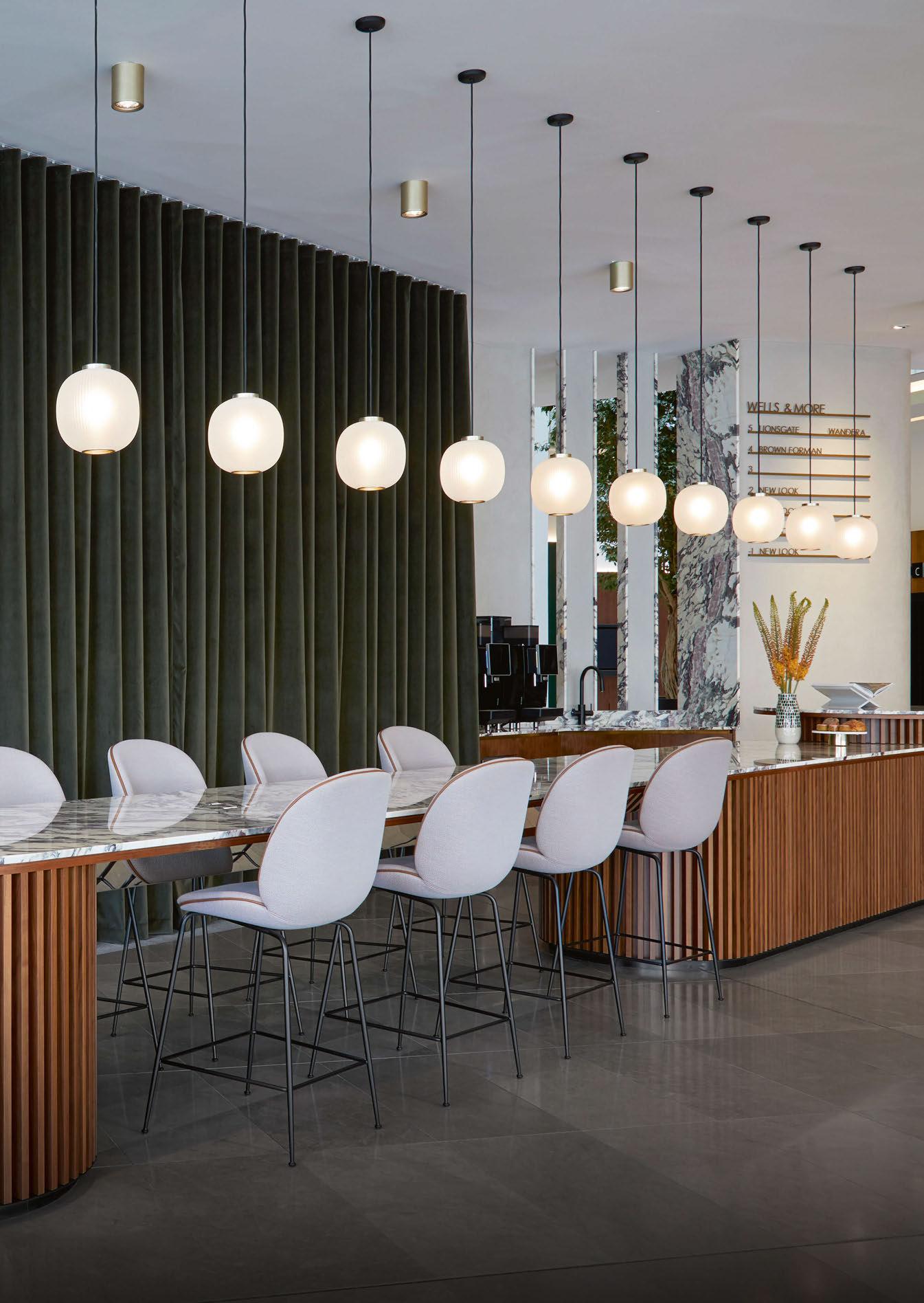
Upon entering the lobby, users are welcomed into a spacious multi-use area that doubles as a café and socialising space. The reception desk draws the eye in, creating a focal point surrounded by a soft backdrop of wavy green curtains. Hanging over the reception desk is a selection of Bloom pendants designed by Tim Rundle for Resident. The green and brown colour palette continues through the marble-framed wall openings behind the reception into a seating area that promotes individual and small teamwork. Astep’s geometric wall lights are
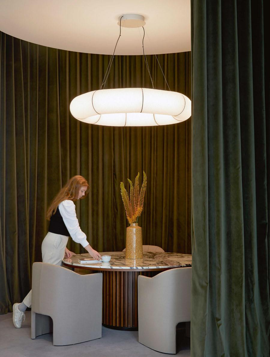
featured along with an ad-hoc planter with integrated seating. Opposite the reception, Conran and Partners crafted a series of flexible spaces using soft partitions to create semi-private areas for meetings or individual work. These include a cocooned lounge-like space with a mix of Italian and Scandinavian furniture and a roundtable meeting space. Sculptural pendants from Santa & Cole help define the spaces and create an intimate atmosphere. “The large Santa & Cole paper shades (Tekiò Circular) were consciously chosen due to scale: we wanted to define individual zones,” explains Kincaid. “The materiality is a playful reference to some of our research into the area’s history as the workshop for all of the textile retailers on Oxford Street, which goes back over a century. We were drawn to the fabric-like textural volume, which sits as sculptural elements floating in the space.
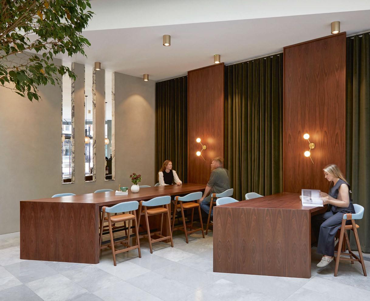
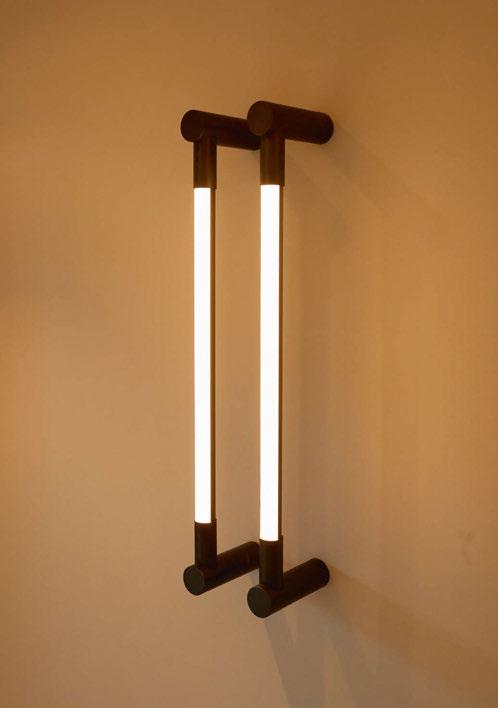
“Toward the back of the space, we have used decorative wall lights to the high tables (Areti - Zig Zag) and along the panelling to the back wall
(Michael Anastassiades - Tip of the Tongue). By placing these quite low they focus the attention at eye level and counteract some of the larger volumes. Styling items such as the Gubi 9602 floor light really help to give a layered feeling of domesticity.”
Describing the project brief, Kincaid elaborates: “This project was always a refurb rather than a redesign and it was not realistic to expect that we had the budget to ‘start from scratch’. We also had to work with some existing features such as the limestone floor, acrylic artwork, and walnut panelling. These elements became a starting point to work from and layer into. It also allowed us to create ‘wow’ moments such as the reception area, which doubles up as a café and zones within the space.
“The seating pockets are a particular design highlight as they are
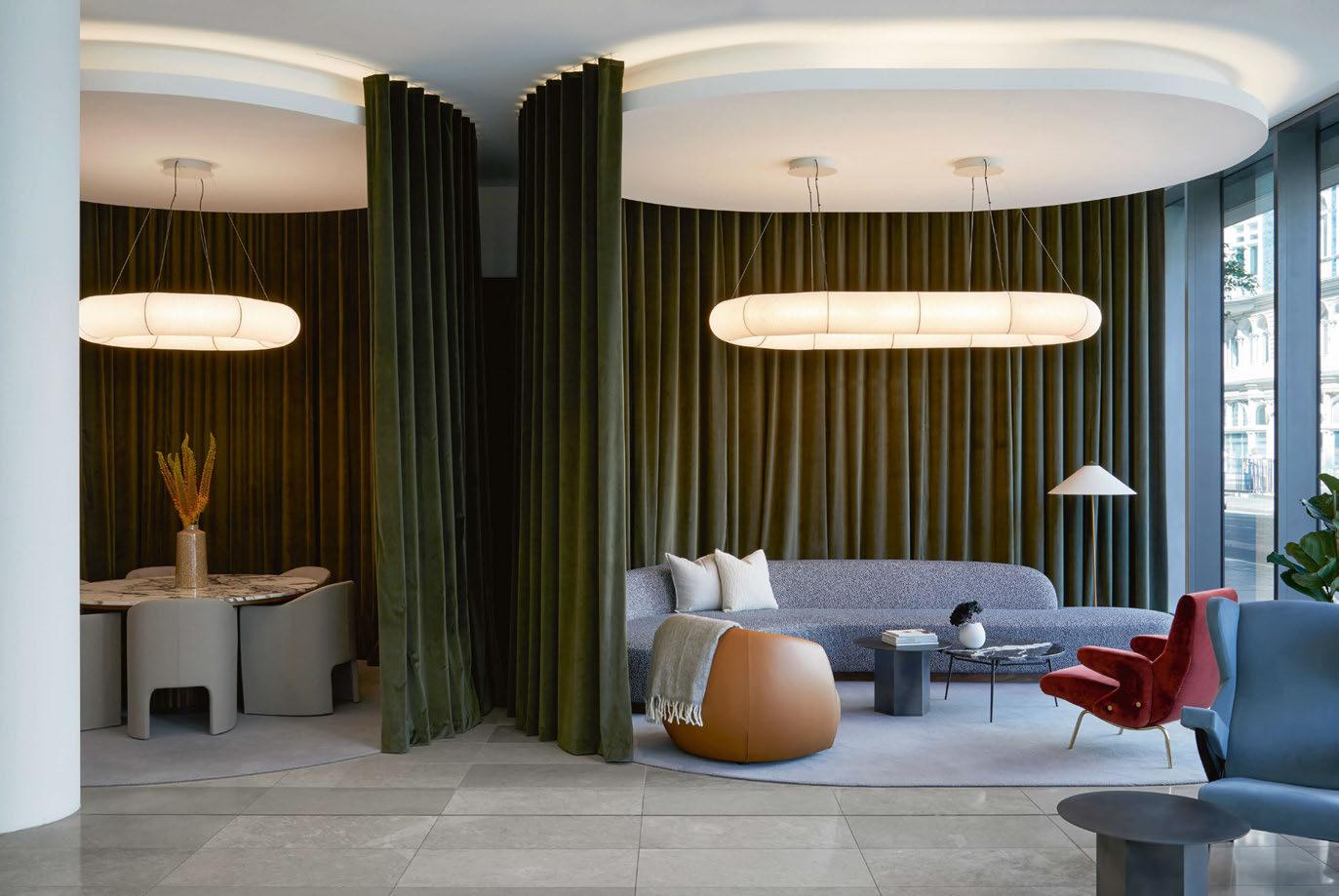
exactly as hoped with a purity and confidence to them. And, from the success that they are so well used and enjoyed by the tenants; giving privacy and acoustic comfort in spaces that are welcoming and atmospheric for breakout meetings from the workplace and to host guests within.
“Our research (and of course being London locals) showed how internationally renowned the area is. The people who use the offices can visit Liberty during their lunch break or start the day with breakfast at Langham, which is just around the corner. When we design hospitality or residential projects, we are very careful to ensure that we meet the expectations of the end user. In this case, it meant choosing individually beautiful pieces that have modernity, quality, and uniqueness,” he says.
Typically, Conran and Partners work with lighting designers on projects but didn’t for this particular refurbishment. “We developed a lighting concept and then worked with the M+E contactor and suppliers to develop the specifications. We typically do collaborate with lighting designers and see the huge value this adds in the design process, and most importantly in the atmosphere and ambience. If spaces like this are too flat or cold, it fails. “Lighting levels and temperatures have a large part to play in humanising the space and creating a more relaxing/welcoming atmosphere. Therefore, the decorative additions allowed us to express more of a hospitality approach. We were keen that it was more of a curated collection of beautiful pieces that helped to zone areas and create a feeling of intimacy, rather than coming across as a singular lighting range.”
Speaking of the architectural lighting, he adds: “We changed the architectural light fittings, which were originally gridded recessed spots. Across such a large ceiling this felt very corporate, so we swapped these for brass drum lights.
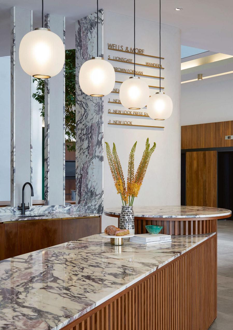
“As this was a refurb, we were not able to change the location but the change in fitting elevated the perception of quality and creates interest in an otherwise very flat ceiling. It then became the job of the decorative lights to create intimacy, a hospitality slant, and a sense of home.
“They are intended to contribute to an overall scheme, which will take guests away from the idea that this is an office lobby but a beautiful relaxed communal space that encourages dynamic meetings and flowing conversation.”
Overall, the refurbishment has been deemed a success for all parties involved, and this has been quantified by the response of people using the space. “The biggest impact and success has been how well used the spaces are,” reflects Kincaid. “Last time we visited there were eight different groups using the space – from individuals through to teams using the “curtain rooms” for both social and working scenarios.
“As designers, we often talk about people-centric spaces that bring people together, create a community and shift the dynamic of how people interact. In the words of our founder, Sir Terence Conran, ‘Good design should improve people’s lives’, and this is always our key focus.
“The lighting was one element in a series where we have carefully curated elements that intentionally become more than the sum of their parts. A peaceful welcoming space that is also appropriate to the location and users.”
www.conranandpartners.com
wells&more, London, UK
Interior Design: Conran and Partners
Lighting Specified: Areti, Astep, Michael Anastassiades, Resident, Santa & Cole
Images: Anna Stathaki
The refurbishment of wells&more at 45 Mortimer Street has transformed the entrance space into a flexibleuse area that blends hospitality with a workplace environment. Conran and Partners used decorative lighting to bring that hospitality vibe to the space and create warm layers of lighting to create a comfortable environment for its users.
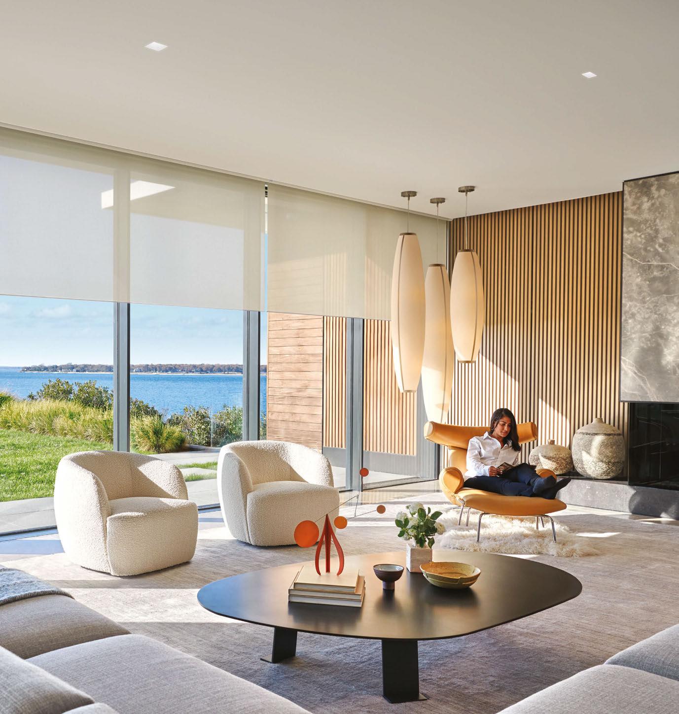
Part of a home ecosystem. Designed by Lutron.
Interior architects Jeffrey Beers International has created a sophisticated interiors scheme for the Fairmont Springs Resort in Banff, Canada, using warm metallics and natural stone highlights for the lighting.
Nestled in the foothills of Banff in Canada, the Fairmont Springs Resort is a fairytale destination. New York-based interior architects Jeffrey Beers International was brought on board to design the Fairmont Gold, privately located on the 4th and 5th floors of the main building, offering guests exclusive services and amenities. Speaking with Project Manager Pierre Josselin, darc finds out more about their design approach.
“JBI worked on a few Fairmont properties, so Fairmont introduced us to the ownership group, Oxford properties, who engaged us for the renovation of the Gold rooms and Suites, and the Crown Suite,” says
Jossein. “We were tasked to come up with a design, which respected the Mountain Grandeur of the property. The project started in early 2019, and of course went on hold for a short period of time with Covid, before being completed in early 2021. Some areas are still being finalised as we speak.”
The brief didn’t change over the course of the project, however, maintaining the client’s desires for the spaces brought with it some challenges for the team. Josselin elaborates: “How to come up with an incredible design but stay within budget is always challenging. Partnering with the right vendors is key. Also, this property, being
a castle, has many room types. We almost had to document every single room, being super organised and clear in our deliverables was essential.”
Another challenge that came with the project was access to the spaces ahead of installation. “We couldn’t survey all the suites and some ceilings came lower than anticipated so some adjustments had to be made to the ceiling fixtures in living rooms.”
For the Gold Guestrooms, JBI created custom lamps creating a mix of table, floor and ceiling lamps with finishes that reflect the mountainous grandeur that inspired their interiors. Rock crystal,
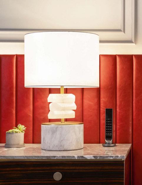
metals and leather materials were used to emphasise this aesthetic. “We partnered with Scott Lamp for this project. Reading lights with a nice Kurl detailing were from Chelsom, magnifying mirrors with slim profiles were from Astro Lighting, and custom lit-up mirrors were from MunnWork. For the Suites, we used additional off-the-shelf products from Visual Comfort.”
Both the guestrooms and the suites carried a residential quality to them. Architectural lighting was only used in the entryway and bathrooms, whereas decorative lighting set at 2700K created a warm environment throughout.
“Lighting is paramount: it makes or breaks the design. Any beautiful design is ruined if the lighting is not well-balanced.
“[The project] came out exactly as envisioned. The design fully embraces and celebrates the location without overpowering it. It feels luxurious but not overwhelming. The red accent makes it bold and memorable. It hits the right balance where the guest wants to come back time after time,” reflects Josselin.
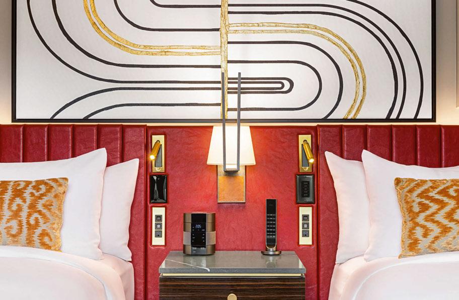
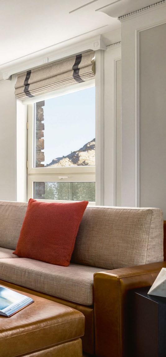
“The main inspiration came from the property itself and how one is in awe upon arrival. You can’t help but fall in love immediately, not only with the hotel but the surrounding areas and the overall region of Banff National Park. The fairytale appeal inspired the design by celebrating the ‘romance’ in the guestrooms and having a ‘crush’ in the suites. It’s a modern version of the founder’s visions, keeping the beauty of the Canadian mountainside in mind. The décor is elevated, warm and comfortable, but not intimidating, with a mix of free-standing furniture pieces and natural materials to give a residential feel. The guests arrive at their home in the mountain, a cosy sanctuary where they will be at ease and feel the love.”
www.jeffreybeers.com
Fairmont Springs Resort, Banff, Canada
Interior Architect: Jeffrey Beers International
Lighting Specified: Astro Lighting, Chelsom, Scott Lamp, MunnWorks, Visual Comfort.


Specialists in the design & manufacture of unique, timeless lighting.
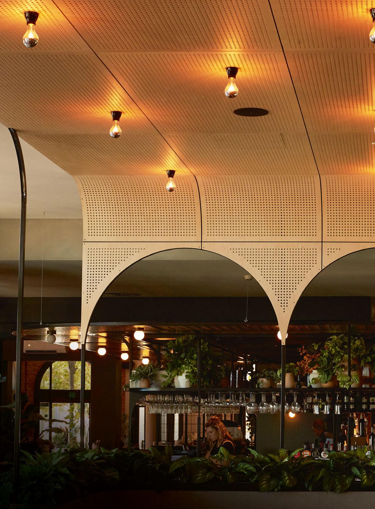
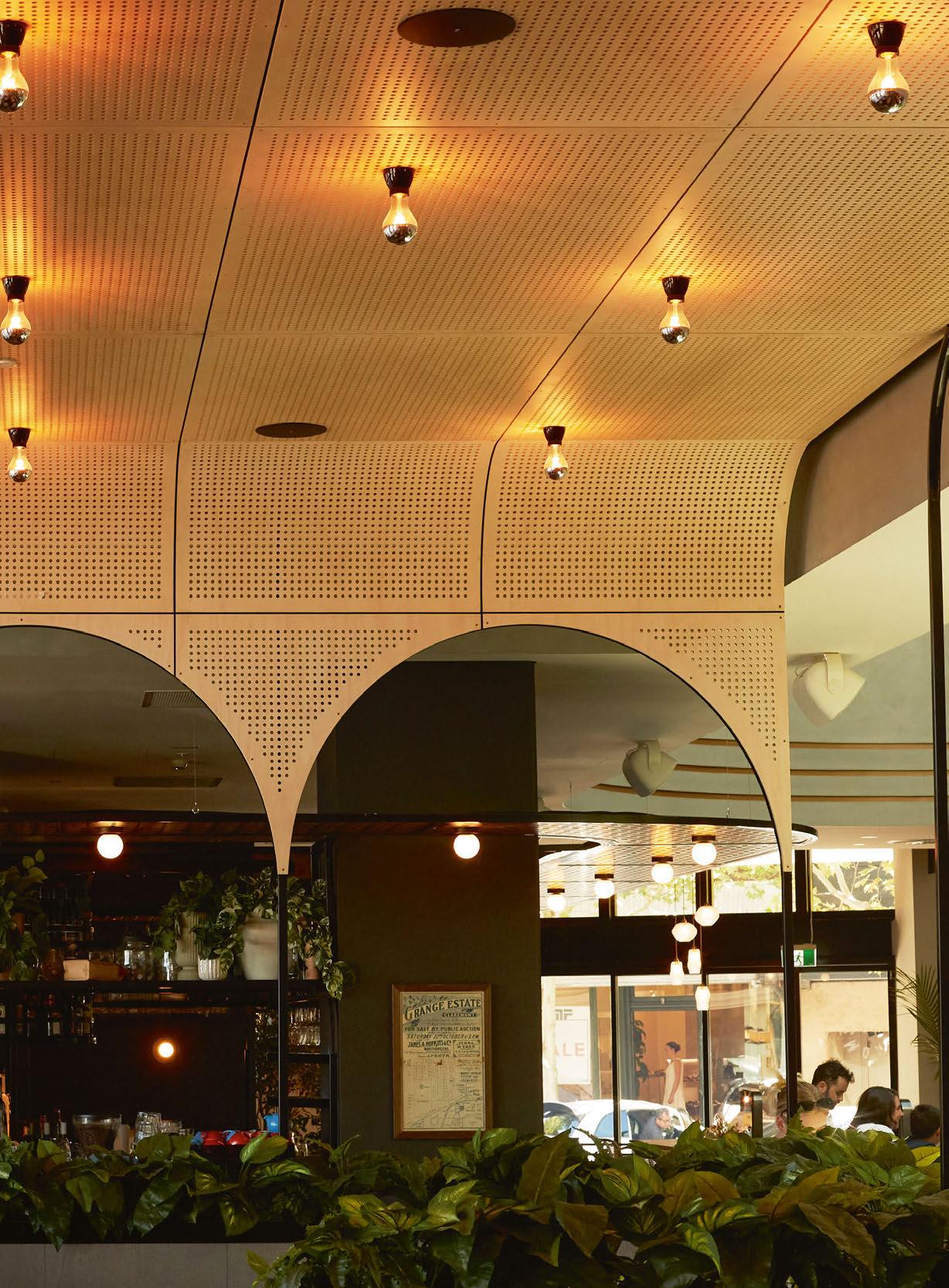
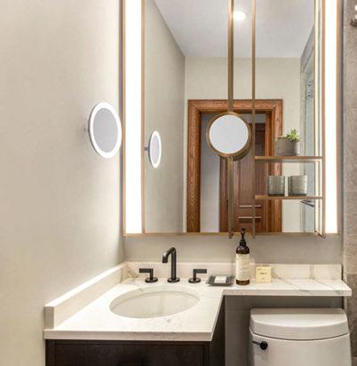
The Claremont Hotel in Perth, Western Australia, was recently redeveloped by interior architects Fratelle and lighting consultants ambience. Opening in January, the new hospitality venue aimed to be a landmark pub for locals, which included a bistro, bar and courtyard for indoor and outdoor dining, function spaces, and a rooftop bar; an all-encompassing assembly of venues within the single location. Speaking with darc, ambience’s Senior Architectural Lighting Designer Gemma Noé Pereira discusses the team’s lighting brief and execution. “Critically, the client entrusted us with a lot of freedom,” says Pereira. “We created our own brief around a venue where you can spend all day and night but experience many different vibes.
“The client was proposing a complete rebuild of the venue. It was going to be an iconic new destination in WA, with its size and scale on par with Melbourne’s Espy (another iconic hotel they have recently acquired), and the lighting design was key to the success of the interior space from the beginning.”
One of the key areas the ambience team focussed on was the main void and staircase. It was also important to ensure that there was a warm feel downstairs and a fresh and bright environment upstairs. “Our design intent was to create a series of unique spaces through lighting,” says Pereira. “Even in the open plan spaces where there are multiple seating areas, we distinguished them all with a unique light strategy for each one. These are all linked together through the use of consistent technology (Bluetooth Casambi controls) and colour temperatures. A myriad of custom lights by Symphony and local fabricators were specially designed and created for this project as well.”
For the ground floor, to achieve the desired warm atmosphere, ambience used a selection of recessed downlights and surfacemounted adjustable spotlights that were suitable for the various types of mounts (i.e., heritage walls and new plasterboard ceilings). For the majority of these fixtures, narrow beam angles were used to
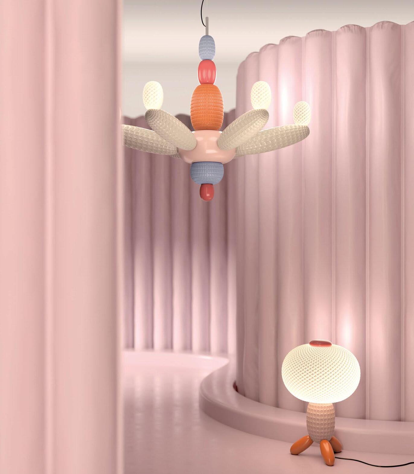
Tollgard Chelsea Harbour
First Floor, Centre Dome, Design Centre, Chelsea Harbour, London 020 8067 2123 | shop@tollgard.com
Lladró Boutique Harrods
Interiors department | Third Floor
87–135 Brompton Road, Knightsbridge 02077301234 EXT. 3370 | london-ha@uk.lladro.com
accentuate the key elements and create a sense of drama. “We utilised neon flex LED strips to highlight the curved architectural details such as the main central bar ceiling, the front bar, and the gantry,” explains Pereira. “Different decorative lights have been used for each of the areas to stand out individually and create different vibes. Spike lights and deck lights were used to highlight the trees and greenery in order to create a natural environment.
“We allowed for all the fittings to be dimmable, providing the option to set a subtle and low-level illumination in the different areas (main sitting area, lounge, bistro, amenities, etc.) and with regards to the colour temperature, all the fittings are set at a warm white 2700K.” In the main sitting area, a custom decorative installation of suspended
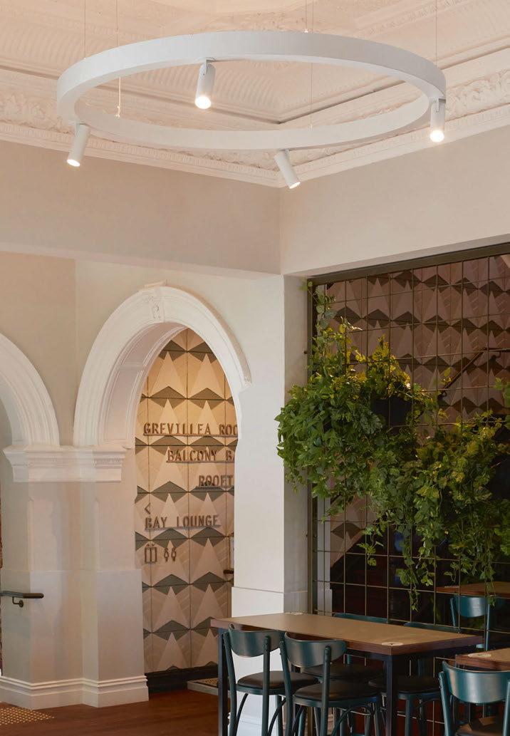
rings by Symphony x andro was installed. Flexible strip lighting is mounted to the top of each ring to softly illuminate the details of the heritage ceiling above.
On the first floor, a similar approach to the ground floor was adopted to create a common “architectural language”. However, the design intention was to be a fresh and bright space in comparison to the lower level. As such, ambience used wide beam angles for the ceiling fixtures to create a more uniform illumination.
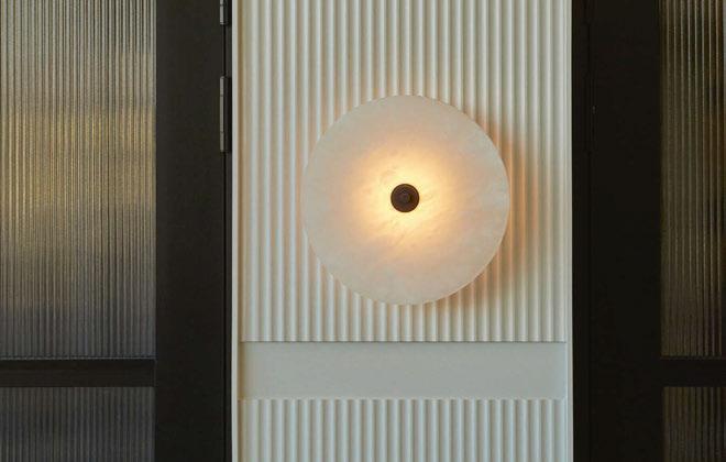
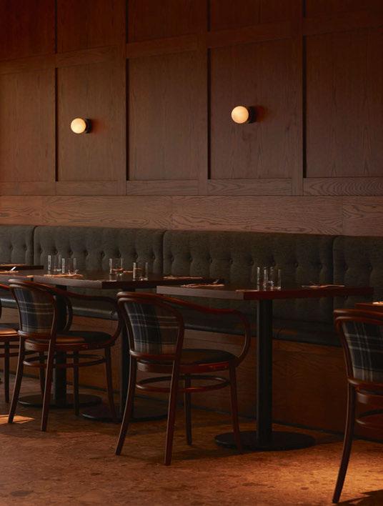
For the bistro, the team wanted to create a special environment, so they proposed silver cap LED Edison light globes with black porcelain lamp holders by Vintage LED. “In the lounge, recessed downlights were used in the ceiling and timeless Bright Beads Disc by Marz Designs
are mounted to the timber panelling, which makes the space look stunning,” Pereira adds.
Furthermore, the team wanted to create Instagrammable moments in the bathrooms using LED strips around the mirrors and on the top of each WC divider as uplighting.
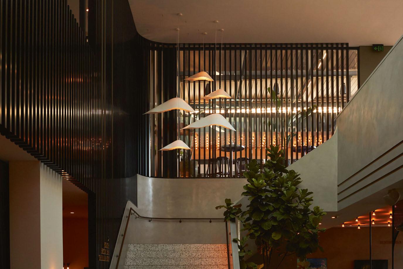
In the stairwell, Karman’s Moby Dick pendants were used in a cluster above the landing. “This is one of the hero features, which is very visible from the various areas on the ground floor and from the main entry,” says Pereira. “This cluster was a very important element we envisioned from the start of the project.”
On the first-floor balcony, multiple clusters of Perene pendants by Symphony in two different sizes were featured. In the function room,
small, recessed e-Lite Olio downlights were integrated along with various bespoke surface mount spheres and Galileo Wall Light by Il Fanale. Sual wall lights by Aromas were placed in the entry to the function space and Ginger wall lights by Joan Gasparwas fitted on the first floor balcony exterior wall.
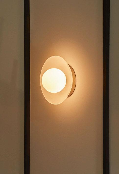
On the first-floor outdoor bar, frosted LEDs with black porcelain lamp holders were installed. These fixtures from Vintage LED were chosen to draw the attention of passers-by on the street below, enticing them to enter the venue.
Working within a historic venue brought with it some challenges for the ambience team. “We had to design our custom lights to fit the existing conditions of the building,” says Pereira.

“We also had the challenges of designing all of this remotely during the Covid pandemic.
“Designing the custom suspended rings located in the main seating areas was a real challenge given that we had to maintain the original heritage ceiling untouched. The weight of the rings had to be balanced out, and we had to calculate the exact number and position of the suspensions all while making them look good with the historic ceiling. Our colleague Nikita Kalia helped with this.”
Overall, the project has been hailed a success by all at ambience, with the venue welcoming a booming trade into its space. “We’ve had great feedback and the venue is killing it”, concludes Pereira.
www.ambiencelighting.co.uk
Design Details
Claremont Hotel, Perth, Australia
Interior Design: Fratelle
Lighting Designer: Ambience
Lighting Specified: Aromas, Il Fanale, Joan Gaspar, Karman, Mark Douglass, Marz Designs
Images: Traianos Pakioufakis
Working within a historic building brought with it some inherent challenges, however this also forced the lighting team at ambience to design a scheme that worked beautifully in its environment. Using a selection of decorative lighting pieces, some bespoke to the project, the Claremont Hotel is now a welcoming, buzzing hospitality venue for locals to enjoy.




We have several hospitality projects on the board right now, where the requirement is both to design ‘change’ into an environment to ensure continual excitement and newness, while combining this with a strong sustainability story. We’re particularly looking for products to help us resolve this potential tension.
In a post-Covid world, where people are experiencing a costof-living crisis, hospitality environments certainly need to work harder than ever. Clients are asking for experience-led spaces that offer an ‘Insta-worthy’ aesthetic and sensual stimulation for guests to help create lasting memories. On the other hand, the requirement to provide sustainable solutions is increasing, with raised expectations from both guests and clients meaning we’re conscious that ‘newness’ shouldn’t be wasteful.
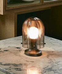
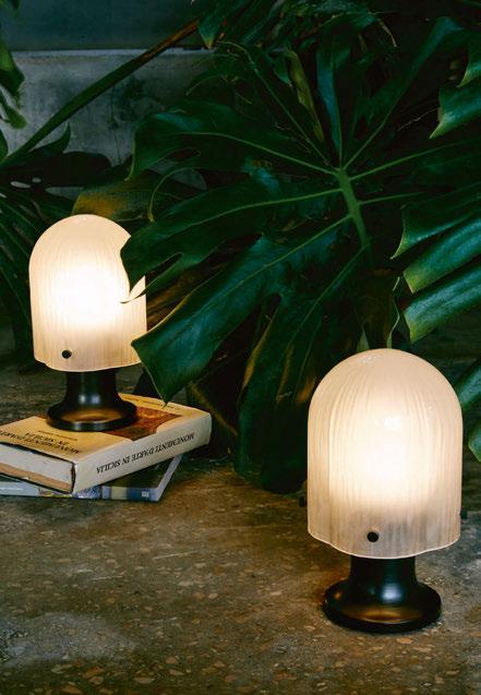
Updated menu offerings, seasonal changes and day-to-night flexibility all help hospitality environments attain that hardworking environment - and lighting in particular is a clear way to help achieve this. We love the portable version of Space Copenhagen’s Seine Table Lamp at Gubi right now [1]. Inspired by the behaviour of light and water, it features a mouth-blown, sandblasted glass shade with a sandblasted finish, supplied with a USB-C docking station, with the lamp charging to full in eight hours.
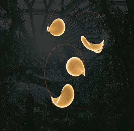
On a larger scale, the llll light [2] is an elegant and sculptural feature pendant utilising DALI technology to adjust colour temperature subtly in line with circadian rhythms. We love that the focus isn’t on its tech here and is instead inspired by nature in its purest form.
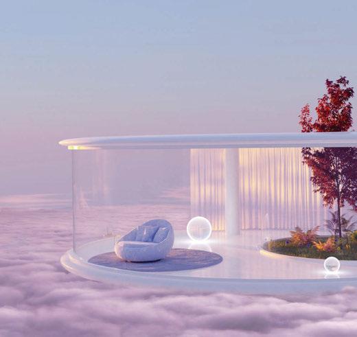
Artwork is a great way to transform an interior and less wasteful than updating a wall finish. We’re seeing a lot more 3D art as 3D software becomes more accessible to artists. Dreamscapes are a popular way to offer the sense of escapism consumers are seeking and these feel soft, utopian and optimistic. Prints by Adlunastudio via Adobe Stock [3] are a perfect example and a great opportunity to add trending colours to a space, such as WSGN’s 2023 colour digital lavender and complementary tranquil blue, both offering positivity and playfulness. We also love the fluidity of Digital Artist and Graphic Designer Maalavidaa’s work [4], inspired by colour therapy and emotion, which uses digital processes to create something that feels organic.
Although flexibility with an environment is important, that’s not to say everywhere should be a blank canvas. Being conscious of material application for future adaptability is key, while

SpaceInvader's Jenny Crossland, Branding and Graphics Associate and Ellie Beasley, Interior Designer, discuss the balance of new design and sustainability, and the inspirations they are gathering for future projects.
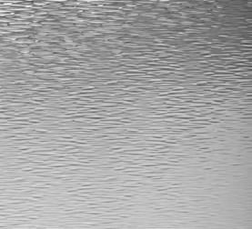

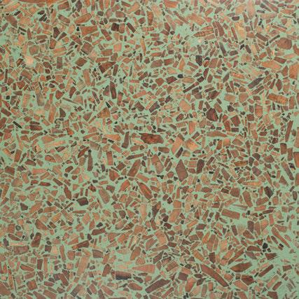
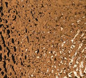
the space still needs to be driven by a design concept. We’re seeing a lot more purposeful applications of finishes at the moment, with one statement piece embodying a concept favoured over a mixture of a few. Looking to nature is a great way to find the most timeless finishes, saving more trend-led patterns and colours for areas more easily refreshed. We’re seeing a lot of products coming in to answer this need, such as metal laminates by Homapal, distributed by Formica Group [5], with textures depicting water ripples and lava. Foresso surfaces [6] made up of recycled timber offcuts emulate natural textures, and are created in a low carbon factory, which is also important for us for reporting to
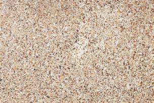

clients on a project’s embodied carbon score. The finish and contrasting texture of these surfaces lends itself to joinery pieces with integrated lighting, adding drama and texture.
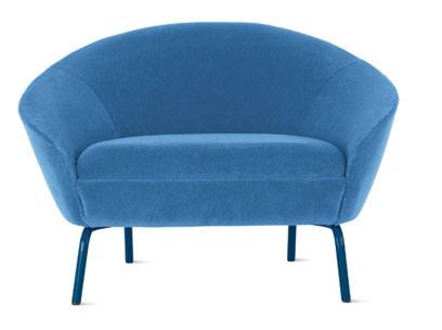
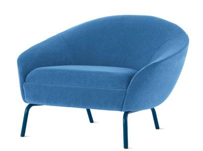
Pieces like the NaughtOne Ever Chair designed by Ric Frampton [6] also have a great sustainability story, with the chairs easily separated using simple tools in order at the end of life for recycling. This is also a strong trend – the increase in products made of fewer components, designed with circularity in mind from the offset. www.spaceinvaderdesign.co.uk
Headshot: Pip Rustage
“My career has been varied and challenged through several changes, stages, and iterations of experience. Almost everything that I have done I did because I didn’t know that I couldn’t.”

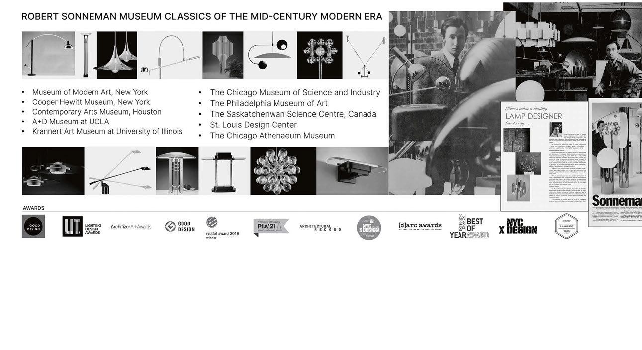
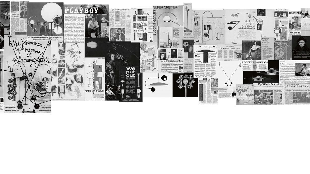
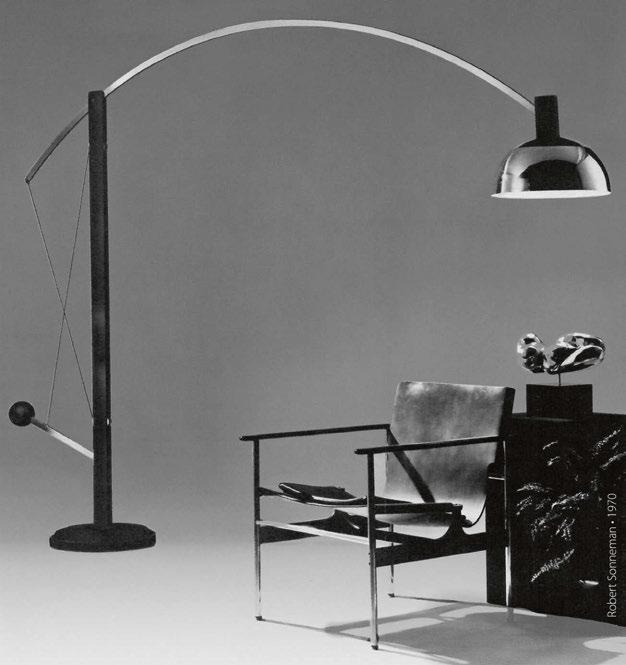
Sonneman - A Way of Light celebrates its 60th anniversary, with Robert Sonneman still at the helm leading the studio to success. darc’s editor, Sarah Cullen, sat down with Sonneman to briefly discuss his history with the brand, but to also discover how the world of lighting and indeed business has evolved over the last six decades.
child, and actively encouraged by his father to seek out inspiration in everyday life. “I got to grow up around art,” he says. “Encouraged by my father to explore my early interest in art, I took weekly classes at the art students league as an early teenager. I was always building something, from model airplanes to boats to bicycles. But my models were not built to the instructions, even when they were available. Somehow, I always sought out another approach and wanted to build it differently. They often didn’t work the way they were intended to, but I still wanted to do it another way and I guess I still do.”
Born and raised in Manhattan, NYC, Robert Sonneman was fortunate to experience a blend of both public and private education. “Even when very young, if I chose not to show up at school on a winter day, I would often seek the warmth of one of several museums that were accessible along the route,” he reminisces.
Sonneman was also lucky enough to be surrounded by art as a
Sonneman had a brief spell with the navy before leaving at the age of 19. It was at this point he first found his way to the world of lighting.
“I answered an ad for a job in a little shop on Madison Avenue selling European modern lighting and home accessories. The name of the shop was George Kovacs. I was the only employee and when I wasn’t selling or sweeping up, I was figuring out how to make something that a customer might have described from something they liked in the
store but wanted it to be different in some way.
“George introduced me to European modernism in architecture and design. His introduction to the straightforward approach to the modern aesthetic and the integrity of minimalism immediately clicked with me and became foundational to my life’s focus and point of view.”
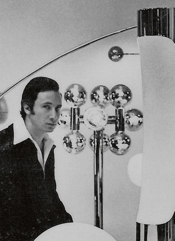
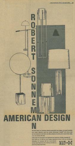
After graduating from Long Island University a few years later, Sonneman opened his first factory, aged 22. From there, he took Kovacs to market selling the modern lighting pieces he created. “One of my first designs was the Orbiter, on exhibit at the Museum of Modern Art and when people told me “You’re a great designer” I thought to myself what’s a designer? But as I pursued my creative path little by little, I realised that a designer is what I was becoming.”
Despite his early successes, Sonneman has gathered a wealth of knowledge and experience through various job roles. “My career has been varied and challenged through several changes, stages, and iterations of experience.
“Almost everything that I have done I did because I didn’t know that I couldn’t.
“Sonneman - A Way of Light was founded because of events that coalesced around a simple idea. When George Kovacs sold his company, I owned the patents and legal rights to the products that I designed for him.
“In 2003, at the urging of the sales reps to go back into manufacturing and at my reluctance to do so, I called David Littman, my longtime friend who immediately came to my studio. In that period, I was designing and licensing products for about six to eight other companies and felt that I would do the same with his companies.
David, Sonny Park (Executive Chairman), and I sat in the office to discuss another possible license deal with Hudson Valley. After only a few minutes of David’s thought he looked at me across the room and said: “Robert I will do this deal with you on one condition and on one condition only: We will manufacture these designs under the
Robert Sonneman name, and we will do it as 50-50 partners. I looked across the room at Sonny for her assessment and approval and when she indicated her willingness to go forward, we agreed and launched Contemporary Visions, which matured into Sonneman - A Way of Light.”
Looking back at some of the more significant moments in his career, Sonneman struggles to select standouts as there have been so many. “There were so many significant moments along the odyssey of my career that it is hard, in reflection, to single out which were more important than the others. Sometimes small decisions or happenings led to significant outcomes that proved to be larger, grander, and more impactful than I could have imagined or planned for. But without a doubt, there have been critical inflection points that changed our
destiny. One experience that changed our trajectory was in November of 2011. I was sitting in the studio conference room with my partner Sonny and with Nicolas, Vice President of product development. Gazing at the renderings tacked on the wall of the new products that I had designed and were ready for release for a January show, I said:
“This line stinks. It’s just not good, not important, and not the best we can do and it’s my fault”.
“I worked through that weekend reimagining what lighting should be about and what was important enough to bring to market and the realisation that it was not about decorative configurations but rather about what we could achieve with the new technology of LED. It changed everything. We had to become a technology driven company.
“I did the conceptual drawings and a week later the solid works models
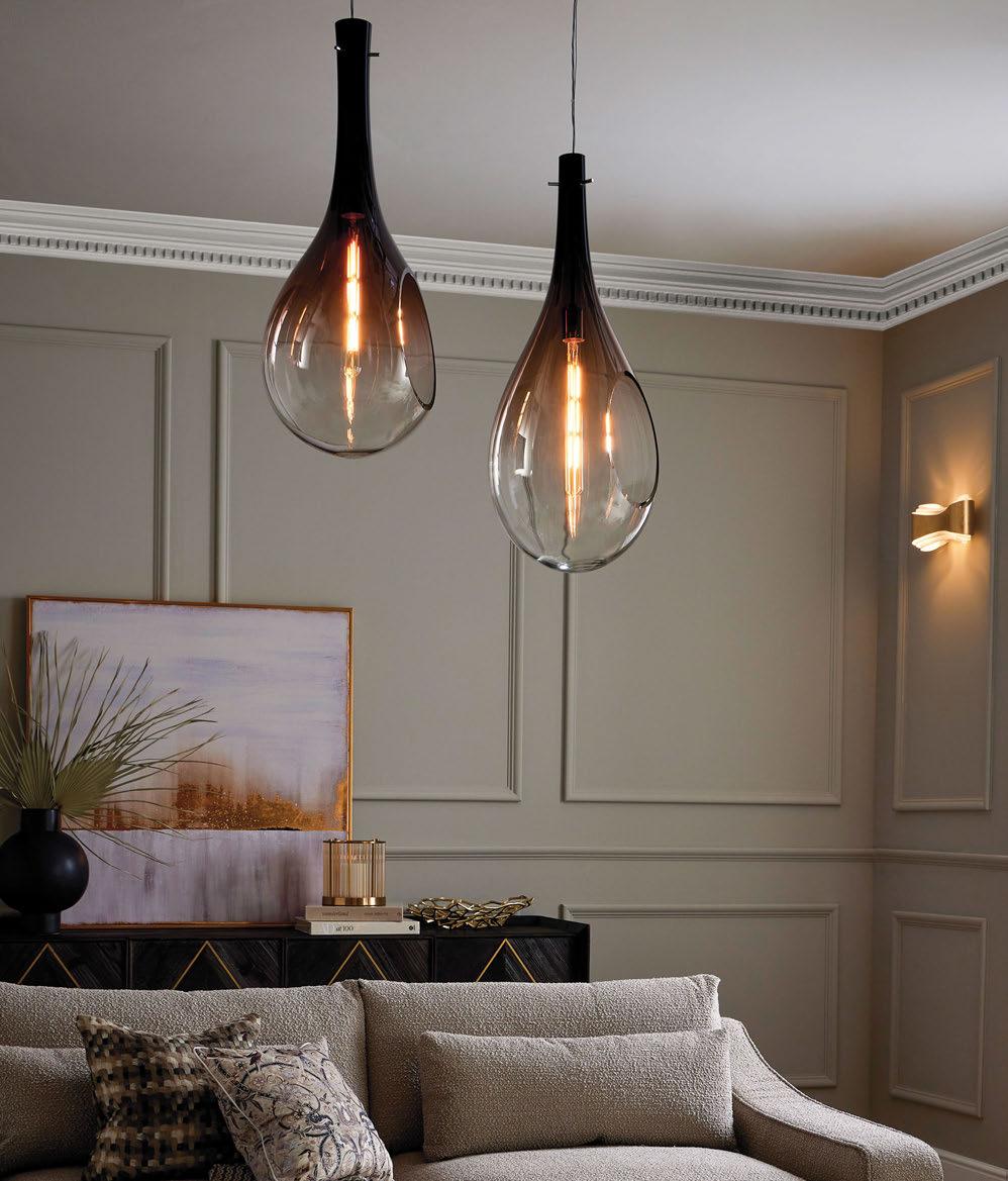
were in the factory. Nicolas and Christian, our engineer, were on a plane to make the concepts work and to build them in time for our January show. They did it and we opened to the “oohs and aahs” of our dazzled customers. The very first sale of our new design was from a national department store that placed an order for one million dollars.
“The refusal to accept mediocrity and the courage to admit and accept responsibility for who we were and what we should be could have easily been lost in the pressure of the moment and the acceptance of the mundane.
“The entire direction of the company changed, and we began to build
out our team and our vision for the future toward a single objective: Illumination from the art of Technology.”
Sonneman has been fortunate to witness and play a role in the changes of product design over the last few decades, witnessing the evolution of LED technology and manufacturing efficiency.
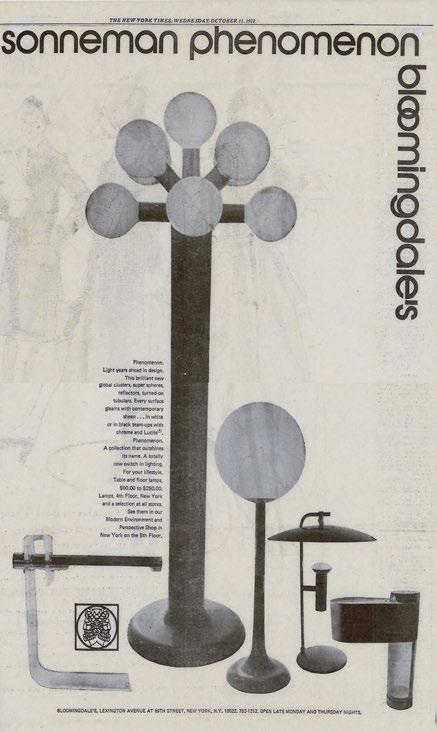
“When I began designing lighting products in the 1960s, lighting was looked upon as an accessory to the interior design and less as a focal point defining the utility of a space. The creative process during that time was all manually executed, supported by hand-drawn sketch concepts and mechanical drawings. Even our study models were hand crafted in metals, wood, and paper.
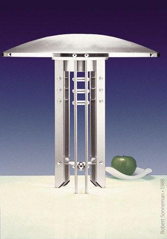
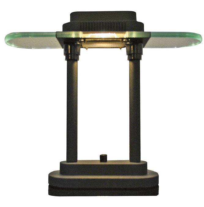
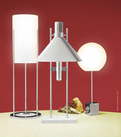
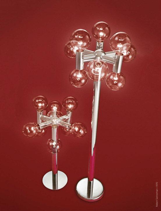
“In its early stages, designing lighting was often the contrivance of creating decorative or modern forms, to support shades and glass shapes, to hold electric light bulbs in various positions. The functional side of lamp and fixture design was defined by the target markets of the client. The idea of providing an illuminating object was much more about its aesthetic appearance than about achieving lighting performance per illuminating standards.
“In my years of designing home products and small appliances, the focus was to provide functionality repackaged to project a technical or performance advancement. Make it more modern, make it sleeker and make it look like the latest in innovation in the small appliance space.
“As a modernist, I designed furniture in the context of an architecturally modern period or school, i.e., Mackintosh, Bauhaus, Prairie, or Functionalism to name a few. It was an interesting experience that I enjoyed but it did not hold my attention with the same passion and inquisitiveness that I experience designing lighting. It is a marriage of art and design with the innovation of the new frontier of technology.
“Today we continue to draw quick sketches in sketch books but immediately go to 2D and 3D CADD to develop and visualise the creative concepts modelled with details with 3D printing and other digital renderings and modelling.
“I am a modernist driven by simplicity and functionality designed from an intelligent point of view. My style is rooted in the pathos of modern functionality of the mid 20th century and has grown with the evolution of modern architecture and design through the last six decades. I have remained committed to my minimal approach and to executing design with simplicity and the integrity of purpose. As Modernism evolved and morphed into genres of style, my vision and my approach expanded but I still adhere to the core principals of Functionalism. Certainly, technology has altered what is now possible but if anything, I believe that it has allowed us to execute innovative design with even more functionality and simplicity.” When asked what some of the most frustrating elements of working with design are, Sonneman describes any creative process as “driven by the passion of the creator engaged in the struggle to innovate creatively.”
“Imagining a vision for a specific purpose or from the abstract space of experience always challenges the creator to think differently. Design does not usually appear in its resolved state but rather in stages of development that the creator moves through to evolve as an approach to realising a vision.
“With the literally thousands of designs that I have created over the past 60+ years, I have developed an approach to the process that I have found effective but certainly no less challenging. I don’t look at a reference of another competitive product while I am trying to conceptualise a project. I look at other categories of other products constantly but when I sit to draw, I want to see nothing but a white page and I let my memory and my imagination bring lines to paper. There are lots of times that are frustrating and unresolved but there are also times when new imagery emerges from my imagination. I always seek a point of view and when I find it, the rest is an easy exercise in developing and resolving that approach.
“Advancing technology in many disciplines will change the development and experience of lighting product design. Integration into the architectural utility, form and design will continue to evolve
the unity of lighting as a system within the presence of building environments. Conceptually, the imagination of the built environment will include lighting as a dynamic component to the environmental experience of a space.
“More so than ever, you will see and experience what you light.” Sonneman believes that technological developments, alongside science, can be enablers of art and design. “Technology has enabled a dramatic shift offering a new universe of imagination and possibilities.
“Electronically generated illumination is a wave in the spectrum of energy and as such we can control, direct, and manage illumination as a component in a broad-based integrated system of energy.
“Coupled with the performance, efficiency, size and optical options, technology has changed the design, application, and utility of illumination.
“If there is a downside to technology impacting design, we have not found it. All the applications that we have applied to the design of our LED products have proven superior in performance. We have found technology help us expand and improve our product design and development. If we use high-quality diodes and high-quality controls, we have found the shift to LEDs a positive enabler of our product offering.”
When asked whether the lighting industry has moved in a direction he anticipated over the years, Sonneman references the developments in international manufacturing. “In the 1960s, lighting was less about illumination technology and more about fabrication of materials like metals, glass, ceramics, and stone. Lighting was locally made in factories with manufacturing resources all available in the New York area. As regulations like OSHA took over, and labour unions took hold, the costs of operations and materials rose past the market’s acceptance. Manufacturers began to move west to California for Mexican labour and to European manufacturers in Spain, Italy, Hungary, and Poland. As time passed, Taiwan became a manufacturing centre with great skills and low prices. Over the next 20 years, manufacturing began to move to Hong Kong and then to mainland China where it is now centred with extensive facilities and a huge supporting infrastructure. We are now on the cusp of seeing the potential for change again, but the lighting industry has yet to locate into a next collective region specifically and has spread out into numerous locations in Asia and around the globe.
“Today, lighting is about packaging technology for performance, efficiency, and integration into building systems. Form factors have changed to accommodate technology and creative potential has expanded in shape and scale with new materials and new fabricating processes.”
The business world has also evolved drastically over the course of Sonneman’s career, so much so that he cannot summarise it in its entirety. “The profound changes in the world of business over the last 60 years is too overwhelmingly huge in scope for me to address but I can certainly identify some of the evolutionary changes in doing business in our segment of the lighting industry.
“Aside from the overarching transactional digital technology that is universal to all business, lighting’s changes occurred in all the areas from conception to manufacturing and from sales and distribution through a local independent dealer network to online access to the world’s lighting products.
“Six decades ago, most lighting manufacturers fabricated their products in house. Today, there are some who still do but many more that use foreign facilities to build their products. Lighting now exists in a global market, accessible online.
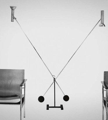
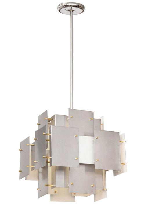
“Professionally, educationally, and creatively, we have grown and evolved as an industry to encompass new insight, technology, illuminating capabilities and applications that are expanding the world of lighting across new frontiers.
“Despite the universally dramatic changes and advancements, many things about the lighting industry remain in place and are consistently similar to the practices of past generations. We still rely on people to work with and build relationships with showrooms, architects, lighting designers, specifiers, and national clients. Great people with product knowledge, experience, talent, and commitment are still the essential element of success within the lighting industry.”
“Lighting is universally essential, creatively challenging, complex, and infinitely interesting. My father’s advice was “find something that you love to do and do it well. Allow your passion to drive your ambition. It will become your life’s work and define your identity.” www.sonnemanlight.com
Following Part 1 of this new feature, Design Evolution, which follows design inspirations, sketches, and concepts for a new product or collection, Part 2 looks at the completion.
Here, Rock and Soar's Alison Smith describes the final stages of the creation of Storm, a stunning blown glass installation with vivid colours.
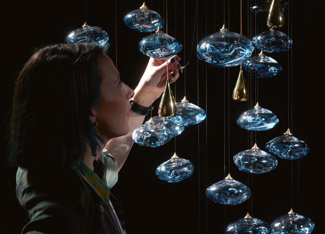
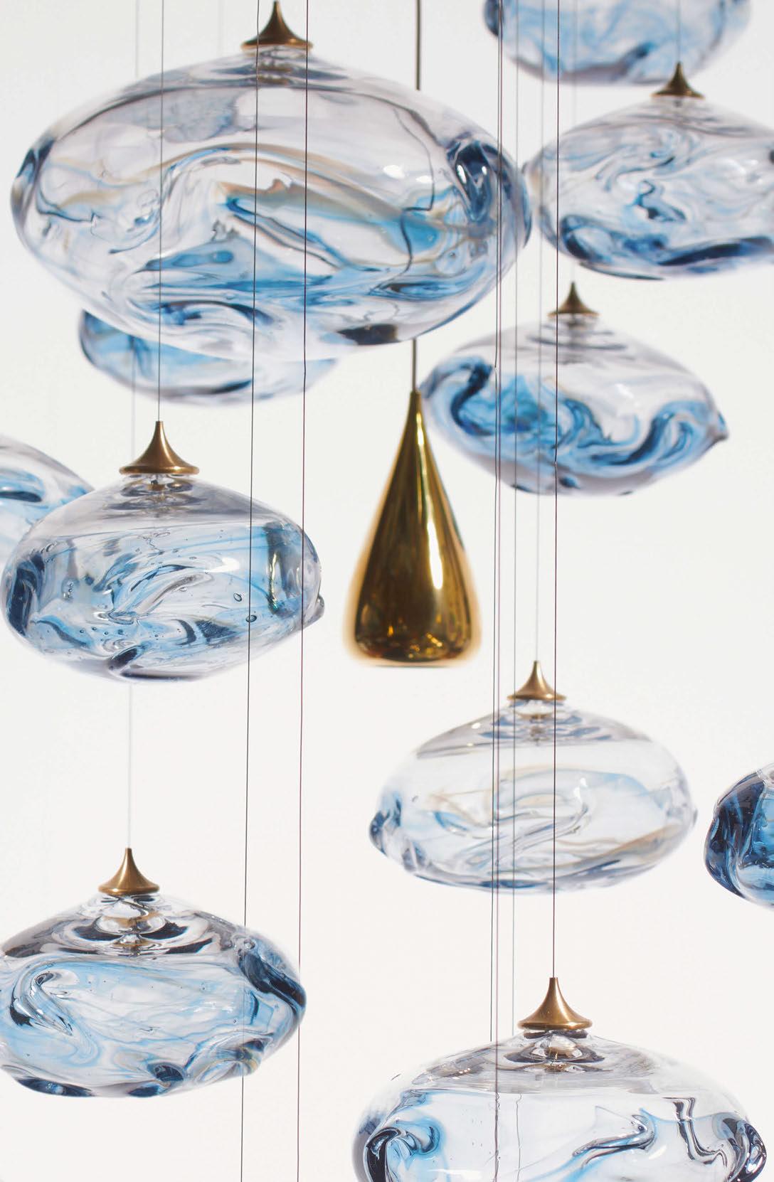
Alison Smith, Director and Designer: We are very pleased to announce the launch of our new glass lighting installation Storm, which evokes the strength, power and beauty of nature’s stormy skies. A challenging journey of multiple sketch iterations, 3D printing and testing has resulted in a beautifully handcrafted sculpture that can be tailored to suit any interior space using as many components as desired. Glass artist Elliot Walker, who turned our concepts into tangible glass forms, has ensured that the stormy colourways captured in our watercolour paintings –from steel blue to deep amethyst – have been transferred into the glass pieces. His creativity and skill have given every piece a completely unique pattern. To complement the glass, highly
polished brass droplet light units have been created to aid reflections and functionally illuminate the surrounding space; we had gone through an array of sketches to settle on an elegant light unit body that is in-keeping with the theme. After test hanging the work, we were enthralled by its powerful presence, knowing that we had succeeded in bringing the narrative to life.
Our designs are always incredibly accurate in relation to our conceptual renders due to our knowledge of materials and how they behave when using different techniques and processes. It is so important for us to be able to conceptualise in a realistic and practical way.
www.rockandsoar.com
Original BTC has teamed up with Swedish interior designer Beata Heuman to create its second collaborative collection, Alma, using the brand's signature material, bone china.
Original BTC’s latest collection, Alma, was created in collaboration with interior designer Beata Heuman. Heuman is a Swedish-born designer who established her studio in London in 2013. Her work is best known for being original and playful, which is reflected in this new lighting collection.
Working alongside Charlie Bowles, Director at Original BTC, the pair’s collaboration is the second to happen for Original BTC in 30 years, the first being with Sir Terence Conran.
“I first came across Original BTC when working for Nicky Haslam and have had an affinity with the brand ever since,” explains Heuman. “It is my first collaboration, but I was instantly keen. I like the simplicity, the
reassuringly good quality. You know they will stand the test of time.”
Briefed to design a practical collection of “go-anywhere ceramic fittings”, the design process, which took roughly a year for conception to completion, began with Heuman visiting the Original BTC factory in Stoke-On-Trent, UK. “I was inspired by the brand itself, both in terms of manufacturing processes and materials,” says Heuman.
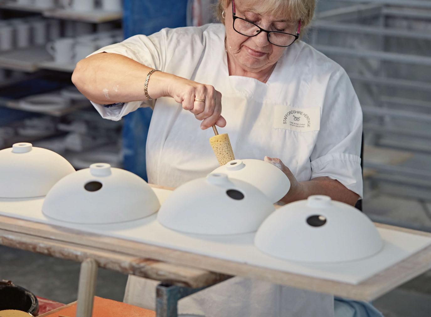
“Before my visit, I didn't appreciate how each shade was worked on by hand, lovingly passed from person to person before it goes into the kiln.” This was the moment of inspiration Heuman needed for Alma’s shade design. “It possesses an almost ethereal quality, especially when you see it worked on from clay to kiln,” she says.
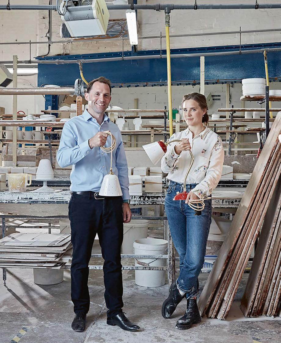
Original BTC is known for using bone china for the majority of its lighting collections. This involves a heavily man-made approach to work with the delicate material. The end result is a stunning, textured porcelain finish with a high attention to detail.

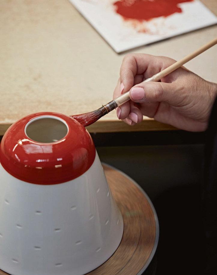
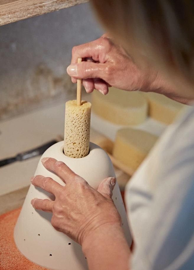
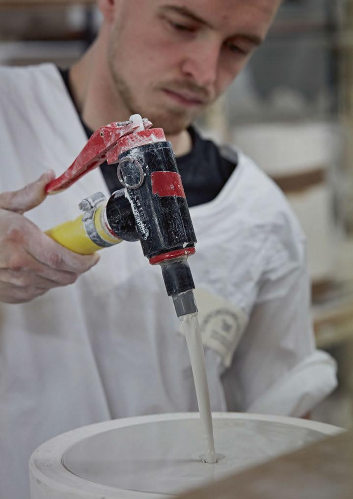
Original BTC is known for working with bone china as one of its predominant materials. Bowles explains that this is partly due to its versatility. “It was [also] the translucency that Peter [Bowles, Original BTC Founder] saw in the bone china that drew him to it. He thought it would lend itself well to be used as a material for lighting, and rightly so – bone china gives a warm, soft, ambient glow that creates a lovely inviting atmosphere. His first design for a bone china light – our classic Hector – was a great success and it went from there.”
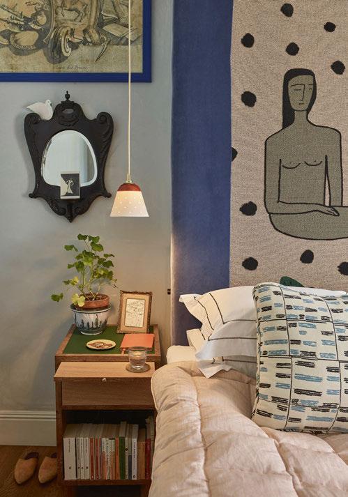
The Alma collection, named after Heuman’s daughter, presents a “sense of play and the easy nature of Original BTC”. Taking further inspiration from Mid-Century Scandinavian design, Heuman introduced a stripe of colour to the shades. “I was buying a lot [of pieces] at auction for my house in Sweden so [these lights] are a bit of an ode to those functional 40s and 50s Scandi designs in pop colours,” she explains.
“I love the combination of materials: the bone china, the brass, and the
colours - especially when they are on, and the light is reflected in all these different elements. It really sings!”
Walking us through the manufacturing process, Bowles explains how their team of craftspeople forge the pieces via traditional slip-casting. “Every step is done by hand - we don’t machine produce any of the bone china.
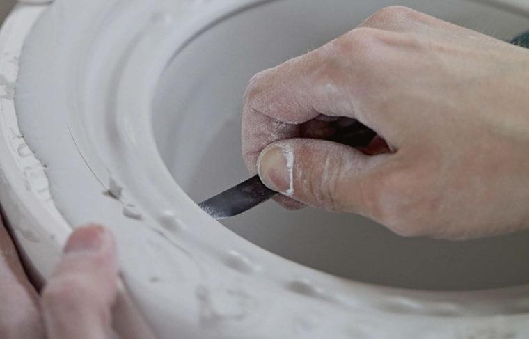
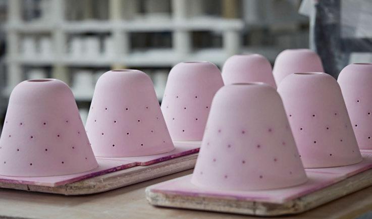
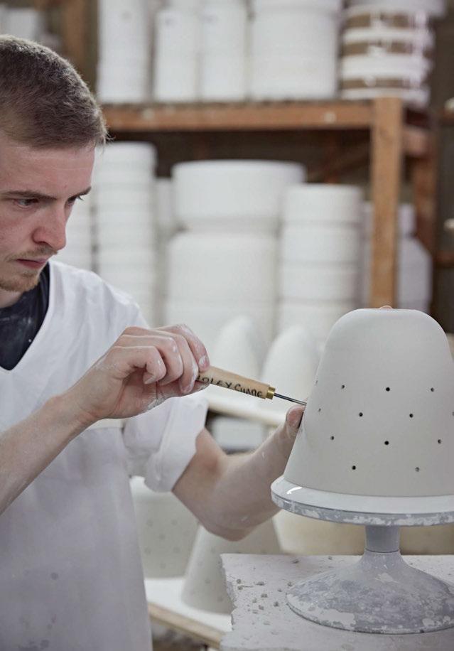
“Once the mould has been designed, we pour slip into the mould and trim any excess about ten minutes after casting, while the slip is still quite soft. The mould is dropped out of the shade, and the hole is cut in the top. Next, the 41 holes are made, then the shades dry on a rack overnight. Once dry, we ‘fettle’ (or take off the mould lines with a knife), before sponging the shade to further smooth it. Now it’s ready for its first firing in the kiln (‘biscuit firing’), at 1260˚C. Any remaining rough edges are smoothed in the ‘wobbly machine’ using small pieces of wood and ceramic. After a quality check, the shade is dipped into a pink glaze (it’s pink so we see that the entire shade has been covered)
and left to dry before its second firing. Finally, it’s hand-painted and fired a third and final time.”
Speaking of their working relationship, Bowles comments: “It was great working together - it was a very easy working relationship, we were both very much on the same wavelength. There wasn’t a huge amount of back-and-forth - it was all very much about delivering the product, which went swimmingly.”
When asked whether Heuman approached the design process differently, coming from an interiors background as opposed to product design, Bowles reveals she didn’t. “She approached it very much how we ourselves approach any design. We invited her to our bone china factory so she could see the capabilities and the skilled workforce we have there, and get a real feel for the place and the material itself. In terms of the actual product design, from there she spent time sketching and came up with the idea for the Alma table light. The finished product as you see it is essentially identical to her initial vision.
“The design didn’t change much at all - just a few tweaks, and in fact, once we’d seen Beata’s table light design, we made the decision to expand the range out to a floor light, pendant light, and three different versions of wall light.
“The biggest challenge was for the bone china factory to get the coral colour correct,” he continues. “Red can be a problematic colour in ceramics. It might look like an exact match on the glazed shade but can change significantly in its final firing. It took us over 40 attempts to get the colour mix perfect.
“We’ve not used a huge amount of colour within our collections, so it was great to have Beata’s input from an interior designer’s point of view.
“The full flavours of both our brands are so clear to see, and it’s a truly beautiful product. Just as I’d hoped - but better. She often specifies our lights, using them in unique and inspiring ways, so the prospect of her interpreting our aesthetic and values was very exciting. [The pieces] are a more luxe interpretation of our utilitarian aesthetic.
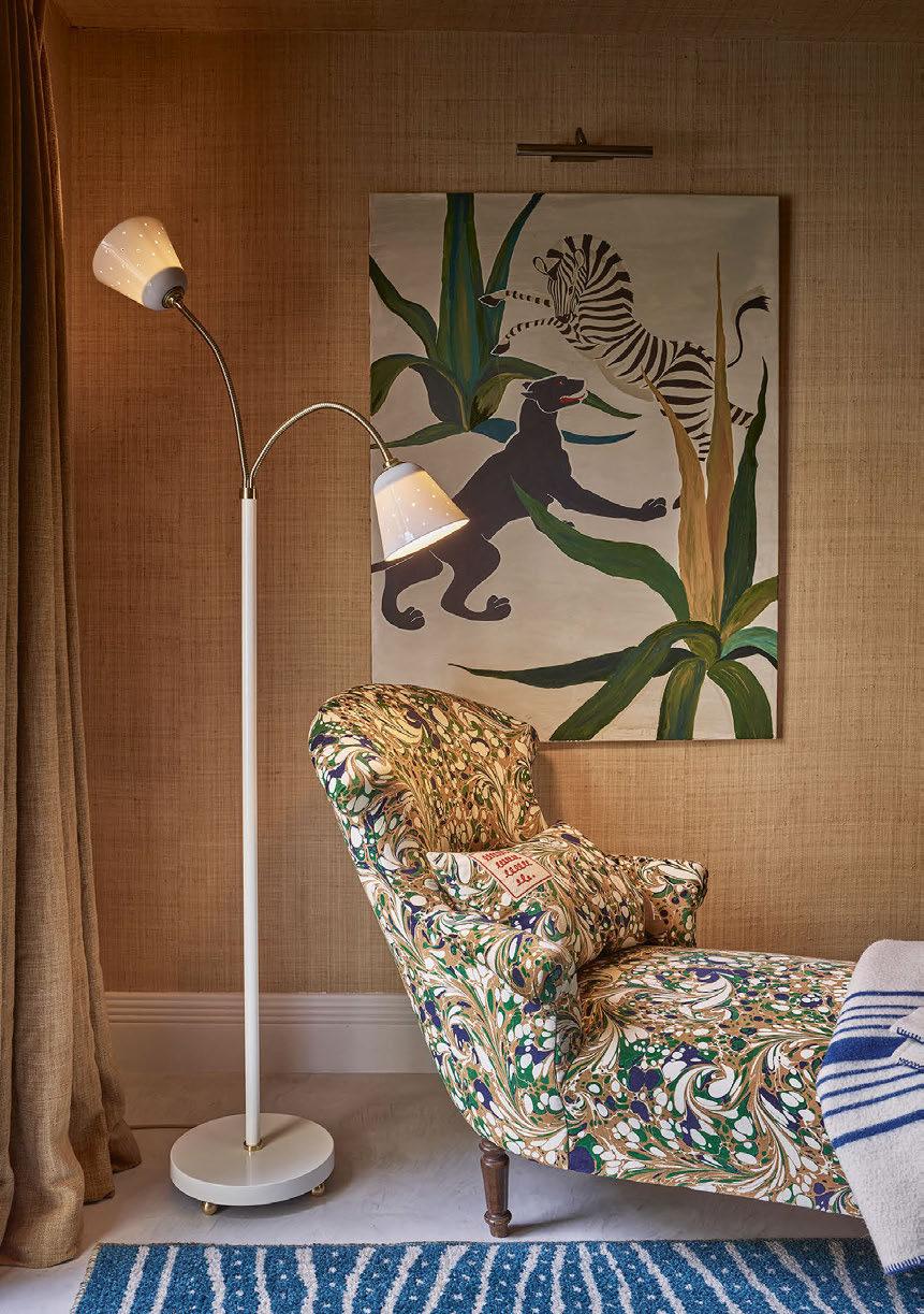
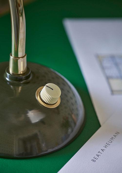
“Beata was also keen for the product to age, hence our use of unlacquered polished brass, which over time will patina and build its own character. From the dimmer and arm to the effect of the perforated shade, these unexpected details very much reflect Beata’s input and show her development of our signature details' look.”
The four-piece collection evolved from Beata’s first design, the go-anywhere table light, with its flexibility to change angle, slightly oversized shade, brass arm, and retro-style dimmer.
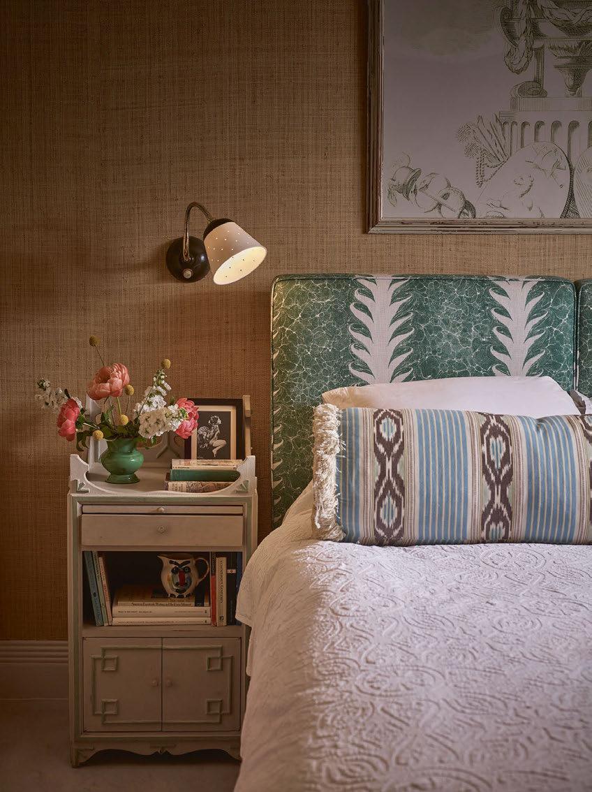
The resulting shade is one of the most labour-intensive to date for the brand, featuring 41 handmade holes, which when lit “look like little glowing stars at night”, according to Heuman. Nodding to Mid-Century Scandinavian designs in pop colours, the hand-painted shade and base are presented in three colourways. “Seaweed is masculine and moody, natural is just that, while coral is the dot above the “i” in an interiors scheme,” says Bowles.
www.originalbtc.com
www.beataheuman.com
“Something
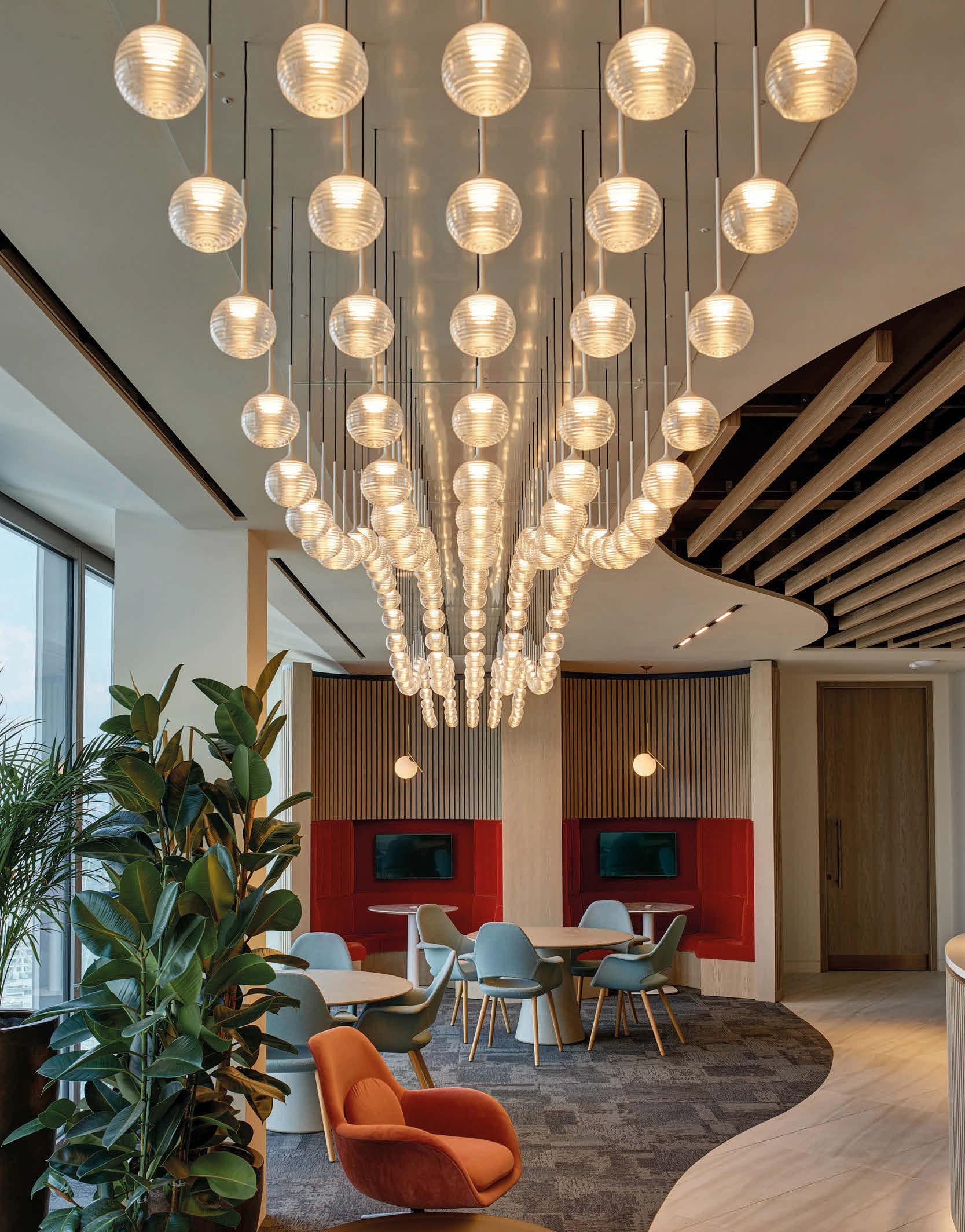
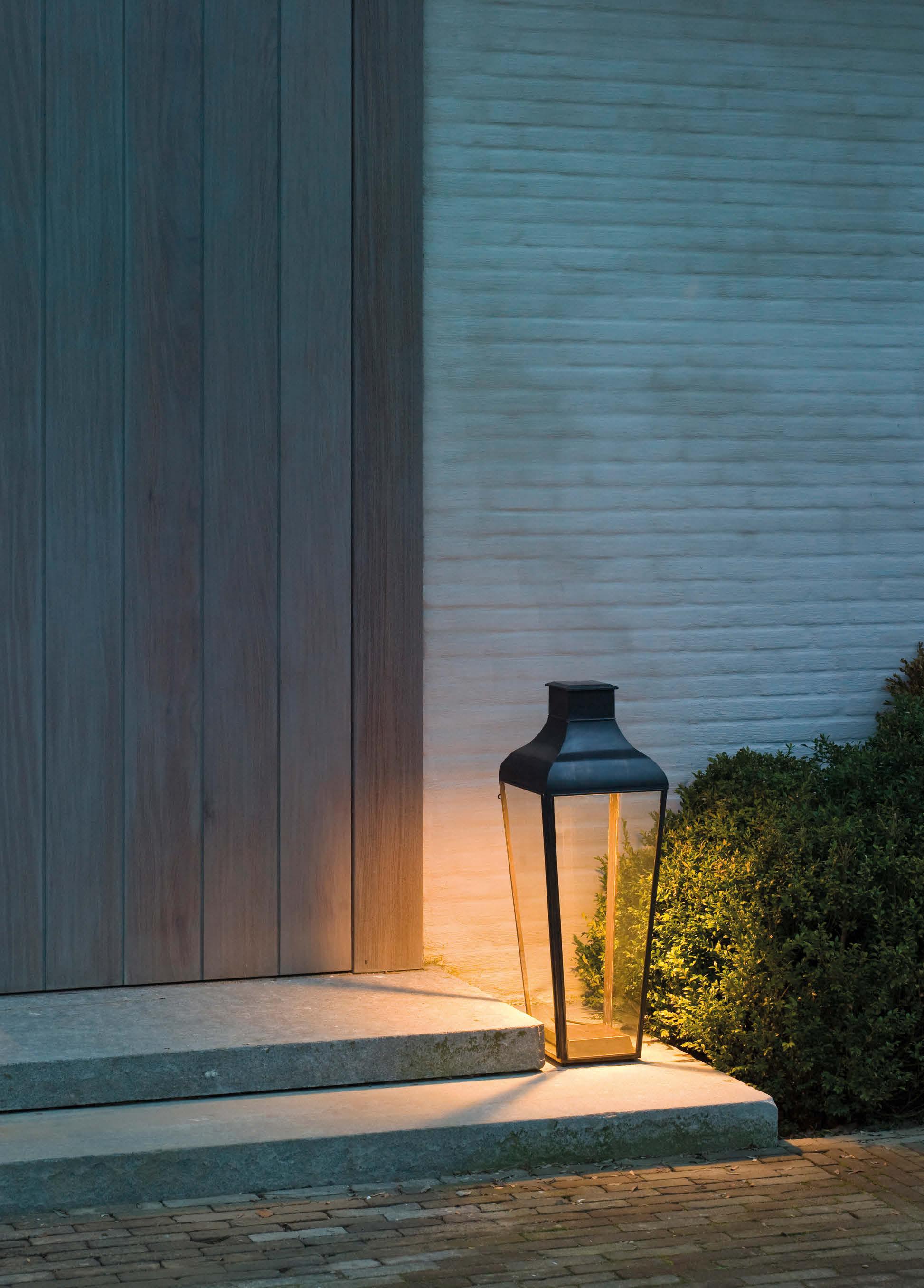
Outdoor lighting is a critical area to consider when planning an exterior space, and can really bring a design together. There are so many different types of outdoor lighting designs available now, from LED portable wall lights, table lamps, ground/deck lights, coastal, paper hanging lanterns, twist lights, fairy lights, starburst lights, robe lights, stake lights, neon lights, LED candles and festoon lights. The type you specify for your design scheme all depends on the design look and feel you wish to create. I generally design for a more timeless aesthetic, so your outdoor space doesn’t look dated after a few years, which can be a risk if you follow a more ‘trendy’ design route. A smart technique to use is to go for a contemporary/classic look. This can be as simple as the finishes or materials you choose, for example choose aluminium or galvanised steel in a matte black/graphite, chrome or dark bronze finish. You can choose from the excellent selection at Andrew Martin, for a more high-end option or try Pooky for a more cost effective solution; they both have great ranges Once you develop and agree on the design concept, you will have a clear idea of the overall design vision - from the finishes, the flooring material, walls, furniture and decorative outdoor sculptures etc. This will help you to decide the style of light to specify for the space.
Interior designer Stephanie Dias explores how to make an impact with portable and outdoor decorative lighting.
Dias is a member of the British Institute of Interior Design (BIID) and Creative Director and Founder of design studio Sdias London.
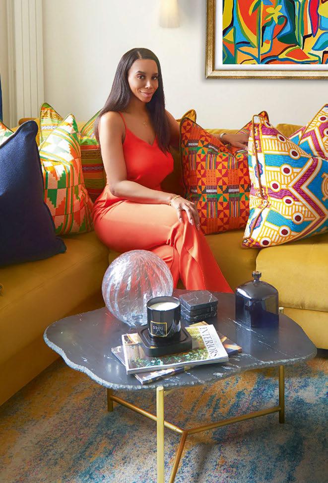
Spring design trends call for seasonal impact - use contemporary LED lanterns and LED wall lights to light up your blooming flowers and plants, which are starting to blossom. This will create a real focal point and look smart and sophisticated. Less is more, so follow a simple minimalist design and let nature do the talking. This will really help to elevate the mood created within your outdoor space.
As our world is developing and changing, our work-life patterns have evolved, leading to more people working from home since the Covid pandemic. As a population, we look at our home environments differently; as we spend more time in the home, we want to create more of a balanced work/home atmosphere. From my experience, I have had clients whose outdoor space was one of the main areas to redesign, as we are now tending to use our outdoor spaces more than usual. If you are located in busy London, no matter how big or small your outdoor space is, people are choosing to invest in these areas. Portable and outdoor decorative lighting can be used to improve all aspects of your outdoor area as well as to add functionality. Energy and sustainability in outdoor lighting are becoming critical factors to incorporate into the outdoor design. There are many designs for energy-saving options, which still have elements that can
work within your concept. Design-led portable, rechargeable and solar LED outdoor lighting is perfect for all outdoor spaces. You can even control your lighting scheme from your phone, and charge them via a USB. If going for a battery-powered light source, it is important to consider battery life and see how many hours you can use it. As the weather gets brighter and warmer going into spring and summer, your solar lighting options would also be a good choice as they will charge from the sun during the day and turn on automatically at night. Wireless lighting is a great option if you love to entertain in the garden, or patio during the evening. You can place wireless table lamps on your outdoor dining table or side tables to boost the lighting in the space. The great benefit of wireless lighting is that you can use them to transition from indoors to outdoors, making use of them in both environments. There is a wide style of options offering truly multifunctional usage.
Smart LED lights that are controlled by a timer can really make an energy difference and set the mood for a couple of hours and your outdoor lights will turn off automatically after the timer has been completed. Some have a ‘dawn to dusk’ feature, which switches on automatically, offering low-level lighting throughout the evening, and
switching off automatically in the morning. Another feature to look out for is a waterproof range. Most outdoor lighting is waterproof, however, it is good to choose one that has a more durable finish, such as again a galvanised steel in a matte black, graphite or steel finish. Check out the range of outdoor lights from Italian Lighting Centre for some great options
There are also good safety and security outdoor lighting features with motion sensors that are triggered by movement, which offer a good way to protect your home. They tend to be used on your entrance porch or rear side and garden. Choose a design that reflects the overall exterior architecture of the property, from a traditional look or a more contemporary finish.
In summary, external lighting plays an integral role in setting the ambience for your outdoor space. There are now so many fantastic designs available for portable and decorative exterior lighting, enabling you to choose options to suit every project.
www.sdiaslondon.com
British lighting manufacturer J. Adams & Co. presents Porto, its first portable LED table light. Building on the visual language of its Flume collection, Porto marks a new direction, combining its precision engineering with the latest in portable LED technology. With a design that maximises on flexibility, the light can be easily picked up and moved to change the ambience of any space. Featuring a completely wireless touch-sensitive light source, dimming capabilities, and a battery life of seven hours, the Porto table light is both fun and intuitive to use.
Minimal yet luxurious, inspired by the Art Deco era, Porto’s sleek silhouette and diffused light, provides an inviting glow to contemporary interiors. Available in two signature finishes - antique brass and bronze. www.jadamsandco.com
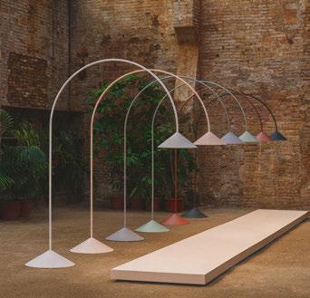
Designed by Víctor Carrasco, Out breaks down traditional architectural barriers by introducing a floor fixture suitable for both indoor and outdoor environments. Available in a range of colours, the fixture consists of two cones connected by a flexible rod that extends vertically into the air before bending over in a broad arch. Ideal for illuminating a table or communal area, Out provides flat diffuse lighting with dimming control. www.vibia.com
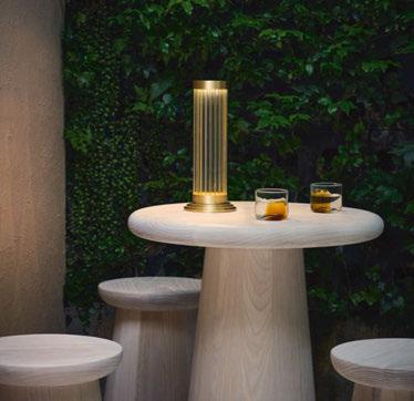
The Mid-Century craftsman style of this pendant light makes it intriguing and modern, while its grand scale gives it presence. The steel frame is almost sculptural, featuring a linear pattern that is hammered and finished in aged iron, adding to the mid-century modern feel. It conceals a sleeve of opal glass that filters the light from three bulbs, so the light it emits spreads warmly outward and openly downward.
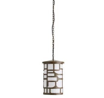
www.arteriorshome.com
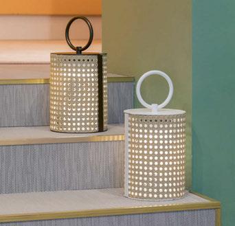
Clara is a collection of lamps created by Caberlon Caroppi. The shape of the lamp, inspired by a lantern, spreads 365 degrees of light. The lacquered metal and the natural texture, which recalls Vienna straw, are evocative of an Italian style. The waterproof straw-effect resin is also treated against UV rays. The piece is available in white or bronze lacquered finishes, with Marine Grade treatment.
www.contardi-italia.com
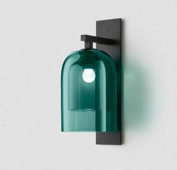
Furthering the studio’s existing library of interior fixtures, Articolo Outdoor comprises eight designs, driven by the studio’s belief in the role and power of light beyond inherent function.
Articolo Outdoor reengineers the celebrated Moni, Lumi, Eclipse, Slim, Float and Ball ranges to withstand the rigours of outdoor environments with an IP65 rating, while a new luminaire extends the collection’s narrative – Occhi. www.articololighting.com
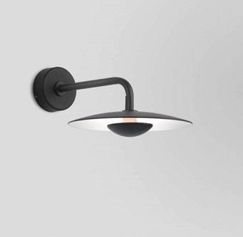
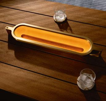
Capturing the primal ring of fire in a single machined sculpture, Vessel harnesses the bonfire glow for the table at the centre of the home or garden for the ritual sharing of wisdom, stories, and time. Each fixture features integrated LED, powered by an internal battery for wired or wireless operation, and is precision machined from solid aluminium with a hand-patina finish. Vessel is part of the new Passages collection - a series of five portable lamps inspired by movement from one place or time to another.
www.lakeandwells.com
The Ginger collection, by Joan Gaspar, is now moving outdoors to subtly light any space, with wall sconces that can be installed individually or in a cluster, a smaller version perfect for passageways and small outdoor areas, a lamppost, small floor lamps, and a new wall version with an arm. This latest design is a tribute to the traditional outdoor light casting indirect light downwards. It is available in two sizes – 20 and 32cm diameter – and in two finishes, black outside and white inside, and rust.
www.marset.com
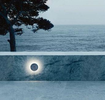
Camouflage, designed by Piero Lissoni is a round LED luminaire for outdoor wall installation. Camouflage is surrounded by a circular halo, like the magical effect of a lunar eclipse in a dark sky. As its name suggests, Camouflage merges with the wall thanks to special plates in rough materials covering the disc surface, like teak wood, Basaltina stone and Crema d’Orcia marble, other kinds of marble are available on request. www.flos.com
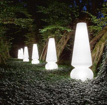
Designed to satisfy the most modern and sophisticated tastes, Marge is a floor lamp with an ironic, lively and captivating personality. With its soft and generous shapes, it is perfect for decorating terraces, porticoes, gazebos, gardens, and driveways with style.
The diffuser and base are made of white linear polyethylene and the high protection against dust and water splashes allows it to be placed outdoors.
www.linealight.com
Lady D is a pendant and floor lamp for outdoor dining inspired by the elegance and class of a crystal chandelier and Diana Spencer, the former Princess of Wales, who was of high lineage but presented herself with simple and sincere manners.
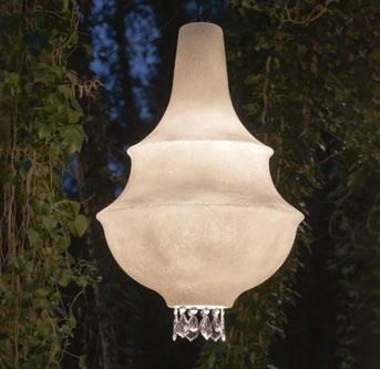
The shape of the diffuser, designed by Matteo Ugolini, gives form to Lady D and is made of a white fiberglass that enhances the silhouette of the collection, from which crystal drops are hung on the pendant version.
www.karmanitalia.it
Poore has dedicated his career to lighting and has been working in the field of architectural lighting design for more than 20 years. JPLD is an award-winning, UK-based independent lighting consultancy covering all aspects of lighting and lighting design, working locally, nationally and internationally with a broad portfolio of projects and clients across the world.
I think we are seeing a paradigm shift in retail, which has been on the horizon now for some time. Consumer habits, demands and expectations are changing, which was happening anyway but all the pandemic has done has brought it forward and created a stick in the sand from which to move forward and progress. The advent and convenience of online shopping, again accelerated by events of the past few years, has meant that consumers have started to question their need to go to a physical space in which to make their purchases. Increased high street rents, logistic and shipping costs and rises in wholesale prices coupled with a desire to achieve a lower carbon footprint have put the traditional shop on the high street model at risk.
Could it be that we will start to see more smaller central hubs - the retail equivalent of hot desk or small unit social work spaces such as incuhive or basepoint where retailers can rent temporary units?
SOOK has already started to try to push this idea with easily personalised spaces that can have short term lets. These could
darc hears from JPLD Founder and Creative Director James Poore to discover his thoughts on retail lighting and the direction it might be heading.

be for start-ups but equally the model could be applied to larger, more established businesses with “curated” hubs, which have complimentary businesses, possibly with hosts who look after you on arrival.
We have a café culture now and instead of bemoaning this we should embrace the fact that this change in the high street is here to stay and find ways of integrating it. Perhaps you will do your browsing in a relaxed café type environment surrounded by “shop windows” of your favourite brands and have the items delivered, either to your home the next day or to an out-of-town retail collection hub where you park and collect on your way home? Shops would be smaller and could have lower stock with main purchase items being held at the collection hub? The smaller unit would offer more affordability and allow the budget to be put back into the store design and experience. If we are to tempt people through the door then the offer needs to be there, the retailers and the designers that they appoint need to up their game. One of the biggest changes needs to be experiential design, sense of place, identity, experiences you will not get in your armchair, good coffee, and artisan food offering. We already design with a sense of place and local identity by taking leads from local culture, architecture, produce or even the history of a building or space.
We are all aware of the psychological power that considered lighting can have on consumers, but the lighting in a space can also help emphasise these subtle cues and details. Decorative luminaires can
also easily directly provide that sense of place. With consumers more aware than ever of the potential impact of their actions on the environment, the challenging of a product or brand’s ethical and environmental credentials has become a go-to demand of the modern-day shopper.
Clothing brands such as Patagonia offer a free repair service on its products, thus standing behind everything it makes. However, it appreciates that sometimes customers may take matters into their own hands, even offering DIY repair and care guides, or the opportunity to trade in old gear for credit that you can put toward something new (or new to you).
The Patagonia model isn’t exclusive to clothing brands though, many lighting companies offer repair and renew services. Architectural luminaire manufacturers such as Phos, Orluna or Stoane Lighting offer a repair and replace service and have adapted circular economy principles.
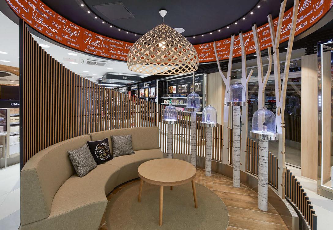
Maybe instead of having to send off articles, retailers could offer their own in-house repair or recycle service where consumers could bring their favourite items to be repaired for a small fee instead of sending them to landfill. The repair would be carried out by an authorised repairer using the original manufacturer’s materials and in line with their guidelines, even offering a warranty on the repair.
We are already seeing repairer maker cafés and repair shops cropping up, no doubt inspired by the TV programme of the same name,
bringing loved items back to life. Maybe we will see the lighting equivalent?
Companies such as Skinflint, Trainspotters, and Mayfly Vintage already restore old industrial lights and give them a new lease of life. Perhaps they could offer local workshop hubs for people to come along with their old luminaires they love but are not useable?
We have also already seen an interest in “buying local” too and maybe this ethos can be bought in to homewares and lighting retailers to offering local crafts people and artisans space in their stores. In terms of the future, technology and innovation are always at the front of pushing forward experiential retail. We already see augmented reality and interactive projection in stores and we have even looked into the creation of holographic imagery to enhance the customer experience. Imagine walking into a retail space so you could interact with a hologram of your favourite celebrity from TV or film or musical legend, living or dead? Either way consumers need a reason to leave their homes and the sanctuary of their armchair internet-enabled shopping bubble, although maybe the middle ground between armchair to shop floor of browsing in a curated retail café will provide this, or it might not still be enough.
www.jpld.co.uk
Istoria Group is a collective of creative agencies with Ignition as part of the portfolio. Ignition is an award-winning, women-owned, ethical SME that designs and produces live events, exhibitions and experiences around the world. Founded in 2007 with offices in Bristol and Indianapolis, Ignition works across eight main industry sectors, including aerospace, technology, pharmaceutical, health and education.
The exhibitions industry used to be horrifically wasteful - and it would be untrue to say the ‘build and burn’ mentality has gone away completely. Globally, approximately 32,000 exhibitions take place each year, featuring 4.5 million exhibiting companies and attracting more than 303 million visitors, meaning there’s lot of potential wastage to be addressed. If you’re thinking of designing - or commissioning - a trade exhibition stand right now, the good news is that there are plenty of ways to make the process more sustainable and less wasteful, with lots of new ideas also coming onstream.

One element that has traditionally held back advances is the initial
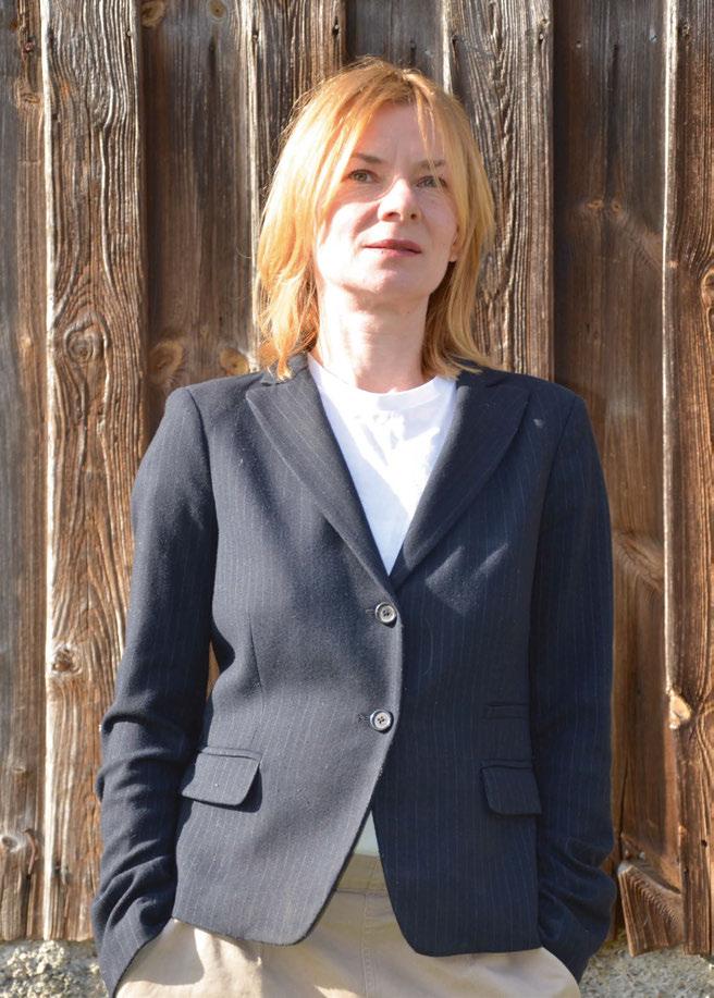
cost associated with more sustainable stand designs. Client businesses and procurement departments have a social responsibility not to go for the lowest bidder - as so many do - and to accept that the cost associated with not doing business sustainably is ultimately at the expense of the environment. Sure, the cost of a sustainable stand is larger upfront, but at the same time, if you choose a reconfigurable or modular kit, the payback becomes hugely cost-effective over the following years. As with so many sustainable decisions, it’s all about having a long-term vision.
For anyone who exhibits at several shows each year, a reconfigurable kit with a lifespan of 5-10 years can make a significant impact on reducing your carbon footprint. The other great advantage with a modular kit is that it can be adapted for other uses too, such as display areas in offices or retail pop-up installations. The best way to be sustainable right now is to combine re-use and recycling, with reuse the better option in terms of energy use. A re-usable kit made from 100% recycled materials, for example, would combine the best of both approaches. Also, with no two materials bonded together, this permits really simple disassembly and re-assembly.
Transportation is another area where energy savings can be made, through displays that fit into smaller vehicles. By using low-emission, pro-green vehicles or electric vans to transport exhibits to and from warehouses, the carbon footprint of exhibiting can be reduced by no small amount. You can also reduce the volumetric capacity of a display by using semi-rigid, rollable or tension-fabric graphics, which can be tucked away inside space-saving carry bags and graphics drums. For clients who want rigid graphics, you can design displays that piece together smaller graphic panels. Either way, opting for a lightweight, modular framework that can be taken apart and packed away with ease results in the smallest possible volume for transporting.
Lighting offers myriad innovative and energy-efficient alternatives right now, from ever-reputable LEDs to eco halogens and CFLs. Powerful and engaging presentations, showreels and interactive experiences can be achieved using sophisticated technology that’s kinder to the environment. Flat screens, interactive surfaces, and smart technology all make regular appearances at expos across the globe and come with energy-efficient options.
As exhibitors increasingly require environmentally-friendly graphic
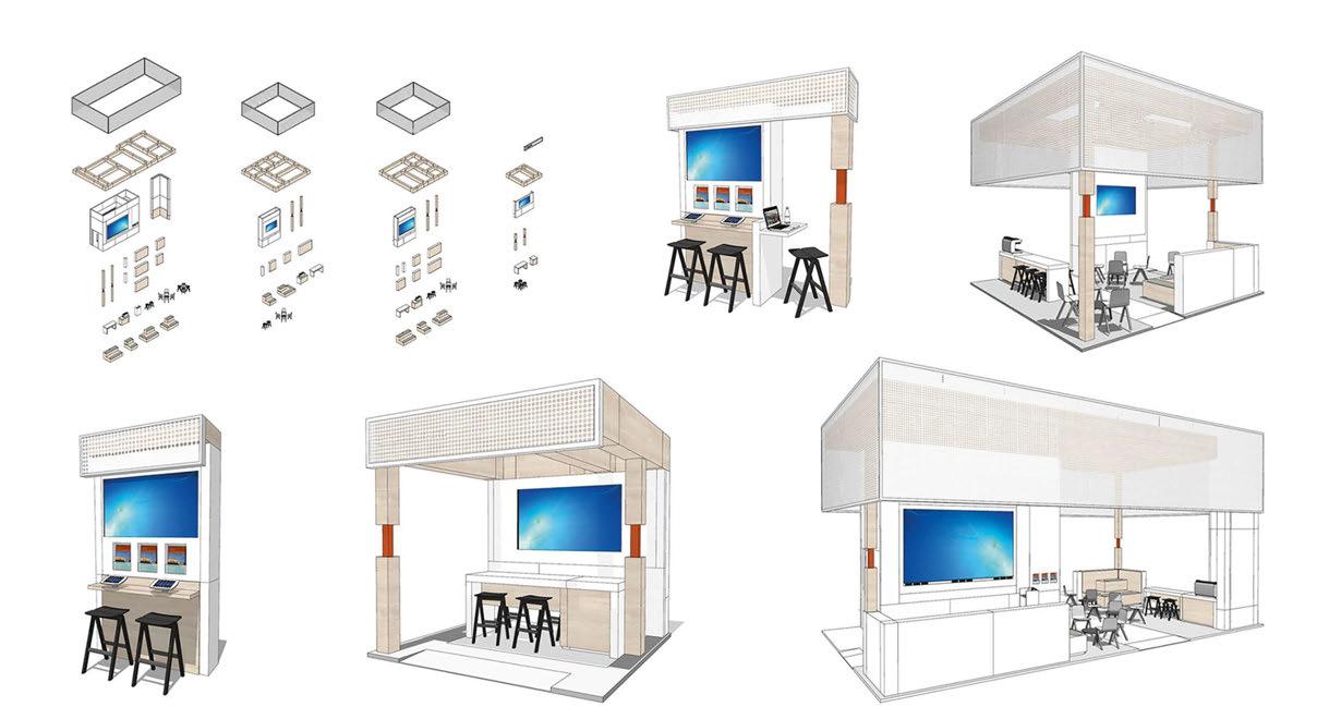

substrates to deliver on corporate social responsibility targets, availability and innovation have followed suit. Honeycomb board, such as FalconBoard and BioBoard, is a rigid substrate made from 100% recyclable material. Recycled cardboards and sustainably-sourced wood are also potential candidates for a ‘greener’ stand substrate. Printing is an area ripe for improvement. Traditional printing processes often use petroleum-based, or other solvent-based inks, which release volatile organic compounds (VOCs) when drying. These are greenhouse gases and a contributor to global warming. Offset printing alone releases around 500,000 tonnes of VOCs into the atmosphere annually, for example. At Ignition, our exhibitions arm, we encourage clients to use printing processes that eliminate solvents or waterless ink to limit any release of VOCs.
Organisers have a part to play here as well. They can demand energy efficiency standards from their chosen venue and create sustainable policies for exhibitors too, including a zero-landfill stipulation.
Although many companies who exhibit regularly have great intentions when it comes to building more sustainable stands, cost-based agendas often mean sustainability gets pushed lower on the priority
list. A ‘zero landfill’ policy would certainly focus minds, as would a high-cost penalty for landfill waste.
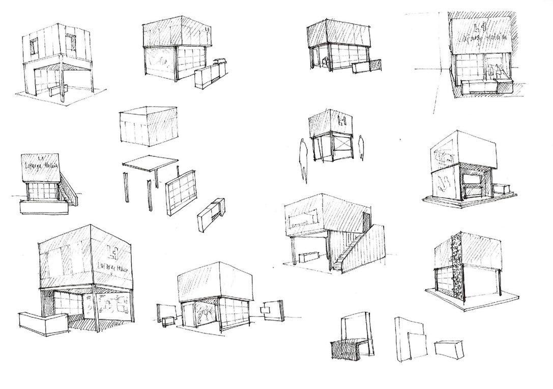
Ticketing and badging should also be plastic-free. Fossil-based plastics are leaking into our oceans, earth and water supplies at such a rate that estimates suggest that by 2050, in terms of weight, there could be more plastic than fish in our oceans. If it’s not possible for all ticketing and badging to be done digitally, some exciting alternatives are on the horizon to replace traditional paper and plastic lanyards. These include a fusion of cellulose nanocrystals from trees, plus chitin from crab shells and fungi cell walls, as created by The Georgia Institute of Technology, culminating in a flexible, transparent and completely-compostable film to replace plastics, whilst algae and seaweed are also currently being explored as viable substitutes to non-biodegradable plastics. In 2017, Finnish brand Paptic won the BioBased Product of the Year Europe for its innovative, wood fibre-based paper, which provides a real alternative to plastic packaging and plastic bags for give-aways.
Using local suppliers for food and drink products for hospitality areas can tell a great location-specific story, as well as providing a sustainable narrative through the minimising of carbon footprints in terms of produce-to-venue transportation. When it comes to food leftovers, there’s attention being paid to improving food waste recycling right now too. Innovations include the WasteMaster machine from British company Green Eco Technologies, which can process a tonne of food waste a day and reduce food waste volume by up to 80%. Reporting is really important for both commissioners and designers of exhibition stands as we move towards a more sustainable future and continue to log our progress. Each stand can now be assessed on the basis of freight, travel, mileage, and electricity emissions, whilst each show can report on overall emissions and wastage levels. Success is all about commitment and imagination plus, let’s say it again, that allimportant long-term vision!
www.istoriagroup.com
www.ignitiondg.com

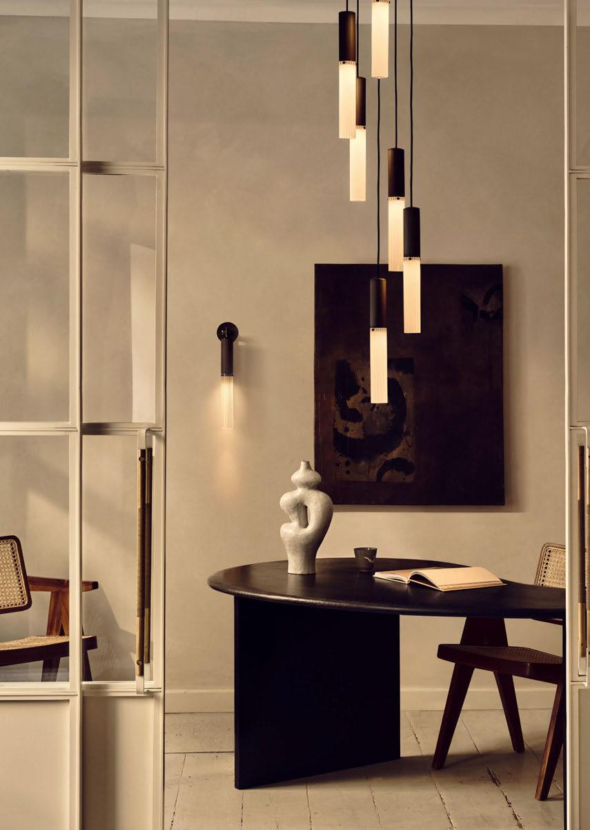
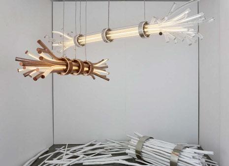
18 - 23 April 2023
Below are darc's standouts from Milan Design Week and top product picks from Euroluce. A full event supplement will be published digitally with extended coverage from darc's trip to Milan in due course.
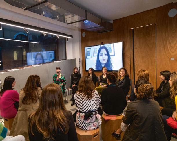
Light'in Agorá, curated by Chiara Carucci, Martina Frattura, Giorgia Brusemini and Giacomo Rossi, was a three-day event held during Milan Design Week. The project was conceieved to promote a multidisciplinary design approach by bringing together Italian and international professionals. The organisers collaborated with media partners [d]arc media (arc and darc magazine) and with supporters Helvar (platinum), formalighting (gold), Valmont Structures and LightLux (silver) for the events and gatherings.
The final evening event started with a reflection by Women in Lighting's Italian Ambassador Giorgia Brusemini. Following was a panel discussion with five countries represented by: Sabine De Shutter, Ambassador in Germany; Claudia Paz, Ambassador in Perù; Surbhi Jindal, Ambassador in India; Francesca Feltrin, Ambassador in Switzerland; Olga Tuzova, Ambassador in Russia. The panel, moderated by Managing Editor Helen Ankers of [d]arc media, discussed how their approach to the profession has changed since they took on their ambassador roles. The event was live streamed, and can be rewatched on darc tv online. www.womeninlighting.com
The concept central to its brand and the focus of its 2023 Milan exhibition –The Harmony of Contrast – combines diverse elements and ideas, challenging your assumptions. Sans Souci's new product development and design approach is part of a creative journey where contrasting perspectives meet. In collaboration with William Sawaya, the brand revealed one of its new pieces - Branchy. The collection combines inspiration from the natural world with the latest technologies to defy our expectations of lighting.
Sawaya presented the new collection to press and designers at a drinks and networking event during Milan Design Week, discussing the design process and challenges they faced when producing the collection. www.sanssoucilighting.com
Japan-based Yamagiwa celebratees its 100th anniversary this year, and returned to Fuorisalone after twelve years with its installation The Harmony of Form and Function, presenting Taliesin, a series of light fixtures designed by architect Frank Lloyd Wright. Architect Shigeru Ban designed Yamagiwa’s exhibition space for Milan Design Week 2023. His concept for the space was one that best accentuated the beauty of Wright’s lamp.
“I thought it would be ideal to use the lamp in a space with shadow, a sense of texture, and materiality, rather than in a museum-like white box,” he says. “The simple paper tube tunnel runs through the exhibition space from the entrance to the end of the room. By using the same paper tube material from the bottom all the way up to the ceiling, the tunnel became an immersive space, allowing visitors to experience Taliesin’s soft quality of light and its texture of wood without being disturbed.” en.yamagiwa.co.jp
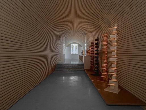
To
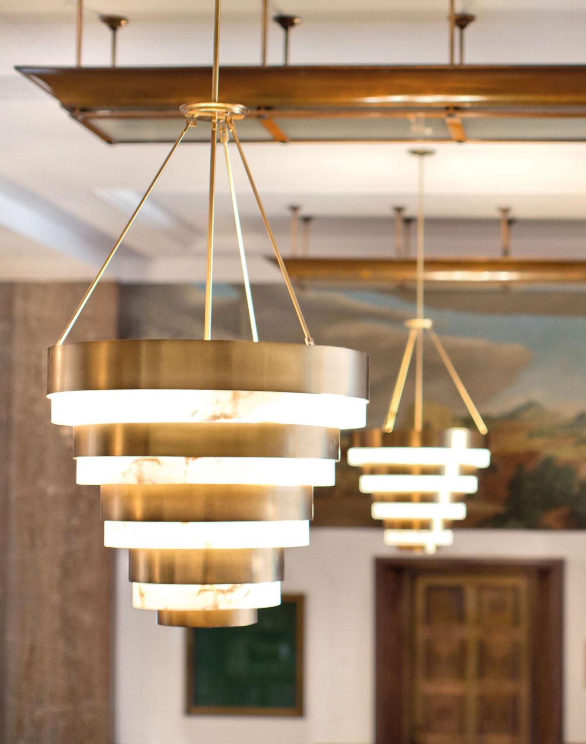
Nichetto Studio, the Italian design practice based in Stockholm, launches a collaboration with Lladró. The Soft Blown collection is composed of two lamps: the Afloat chandelier and the Airbloom table lamp. Available in a variety of colour ranges, the collection draws inspiration from the convivial spirit of balmy, sunny days when the streets are lined with performance artists effortlessly crafting colorful and intricate balloon creations.
www.lladro.com
Combining the patterns of orthogonality with the sparkle of crystal, the new lighting concept is a customisable, modular product with hand-blown crystal tubes and an orthogonal structure. Various composition and component options also help create a unique spatial impression through form and illumination. Preciosa’s in-house design team took inspiration from the unmistakable patterns of orthogonality in architecture and design.
www.preciosalighting.com
Sfera & Sfer’otto (design by Federico de Majo) are two new models of LED pendant lamps, with hand-blown borosilicate glass diffusers in two shapes (sphere and hourglass) partially painted and satin-finished, with a shaded effect. The structure is available in various colours, anodised and brushed aluminium, natural and gold.
www.zafferanoitalia.com
Designed by Paola Navone, Baggy's satin polycarbonate diffuser has the irregular appearance of a crumpled paper tube. The soft textile cord, a detail in line with the brand's archi-decorative stylistic code, supports the lamp in the suspended version and becomes a joining element for the table and floor versions.

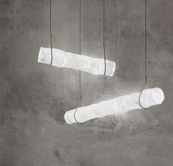
The suspended version is available in both horizontal and vertical versions.

www.contardi-italia.com
Bols is a new collection of versatile lights that are both sculptural and, most importantly, functional. The base is a simple polyethylene ball, suitable for outdoor, to which you can add up to three different metal structures to make it into a floor lamp or suspended lamp. Each structure can be personalised in three colours: black, beige and terracotta. The floor model, available in two heights, can also be turned into a plant pot or a small table.
www.ethimo.com
The Cascata chandelier, with its fluid glass panels and contrasting triangular frame, is a unique sculptural feature. The metal framework is available in satin brass, bronze, or a mirrored polished nickel, and the threearm shape is designed to work above round and rectangular tables, either as a single pendant or in combination.
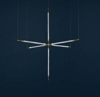
www.ctolighting.co.uk
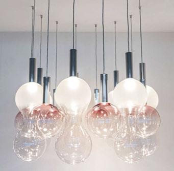




Archiproducts Milano in via Tortona 31 welcomed visitors to its 2023 exhibition, Terra. Inspired by Earth. Presenting a visual continuum inspired by nature's gradients creating a truly coherent and materially immersive experience, this year the showroom also presented a project with Studiopepe.
"Terra. Inspired by Earth" was the new design experience at Archiproducts Milano, with a project by Studiopepe and the participation of numerous international brands. The concept for this year's exhibition was based around the Earth as our home. The Earth offers true materials, warm colours, a sense of belonging. The Earth is where we demand a need for responsibility. The interior project guided visitors throughout the discovery of our connection with the earth that evokes a sense of peace; a project where nature inspires the choice of colours and materials with a careful and conscious approach to design.
The finishes and furniture complemented the interior with delicate shades of terracotta, sand and clay. Warm lighting, natural and experimental materials intensified the sense of connection with the Earth.
A large and suspended moon was the focal point of an installation that recreated the feeling of being at the centre of the universe. It was a true sensory experience exploring interconnected smart devices as well as innovative materials and their infinite applications. Comfort is, first and foremost, visual in a space created in the name of softness and continuity. True immersion in a visual continuum brought to life by the skilful combination of different materials: Warli and Interface carpets and textile floor coverings in a calming earth-tone inspired palette; the same palette for the material textures of La Calce del Brenta finishes, the three-dimensional Wall&Decò paper, precious Elitis fabrics and soft Astrid natural-fibre textiles. Pomegranate shades of the Ninefifty lava stone and Noël & Marquet three-dimensional wall coverings also contribute to the immersive journey.
Alcantara became an integral part of the walls, furniture and accessories, transformed into scenic backdrops that contribute to the visual unity of the space. Above all, the sensory experience allowed visitors to discover new horizons of design experimentation with a highly versatile material.
Connection with the earth was also found in the organic forms and minimalism of the furniture, whose fluidity recalled the primordial essence of the earth's womb.
The space is also fluid. The corridor becomes a soft, primordial alcove; the bar is housed in a curved wooden miniature architecture completely covered in fabric, while the walls include inhabitable arches that resembled niches carved out of stone.
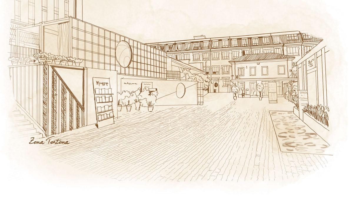
Lighting partners featured throughout the space included: Astro Lighting, Brokis, Davide Groppi, Formagenda, LEDS C4, Leucos, Lladró, Lodes, Midgard Licht, Stral, Swedish Ninja, and Yamagiwa.

Light was a central theme in a space conceived as a journey of "connection with the earth", creating a sense of comfort and relaxation. A warm, welcoming and diffuse lighting created the perfect atmosphere. The simplicity and fluidity of a blown glass lamp designed by Snøhetta for Lodes created total and functional lighting scenarios. The interlocking blown glass cylinders of David Rockwell's pendant for Leucos created layers of colour that diffuse warm light. Delicate light passed through the essential geometries and soft blown glass curves of Brokis' light sculptures. The "spun thread" of Toyo Ito's delicate fibreglass creation for Yamagiwa resembled a cocoon, emitting soft light reminiscent of traditional Japanese paper lanterns. During Milan Design Week 2023, architects, designers and distinguished guests gathered and met under the glow of the big moon at the very centre of Via Tortona 31. They discussed the meaning of 'Space', 'Colour', 'Matter' and 'Light' during the creative process in architecture and design. The talk series explored the use and understanding of materials to create shape, the impact of colours, the importance of natural and artificial light, and Artificial Intelligence. These conversations provided a moment of insight and reflection thanks to the participation of internationally renowned professionals, including: architect Cino Zucchi; Carlos Bañón - associate professor at the Singapore University of Technology and Design (SUTD) and founder of Subarchitecture Design; Tim Fu - architect at Zaha Hadid Architects, specialising in Algorithm Design and A.I; architect Chad Oppenheim - founder of the US studio Oppenheim Architecture; Marius Myking - director of Snøhetta's Product Design department; Davide Angeli - Deputy Studio Director and Head of International Business of Michele De Lucchi's AmdCircle studio; Czech designer Lucie Koldova; Barry Richards - Principal and Studio Leader of the interdisciplinary US studio Rockwell Group; designers Chiara Di Pinto and Arianna Lelli Mami of Studiopepe; architect and designer Elisa Ossino, and many others.
Technology and the smart home was also a theme touched on. In the BTicino Smart Apartment, visitors could experience a smart home where technology adds value to everyday life, by being able to control video entry, lighting, sockets, automation, temperature and security conveniently and easily via app or voice. Efficiency is also found in Samsung's air conditioning, audio-video systems and smart appliances for intelligent living.
Smart was also at the Archiproducts Milano 2023 Design Experience, debuting smart #1, the brand's first new-generation model. 100% electric, smart #1 is synonymous with comfort, sustainability and maximum efficiency. Its sculpted lines, created by the MercedesBenz global design team, result from a creative process that frees up proportions and dimensions due to its all-electric powertrain, whose design constraints are minimal compared to an endothermic past. www.archiproducts.com
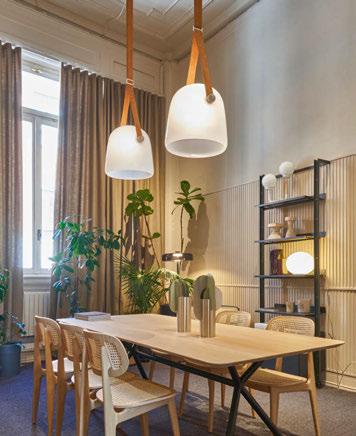
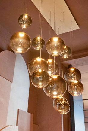
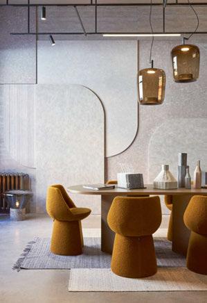
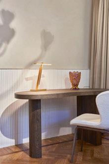
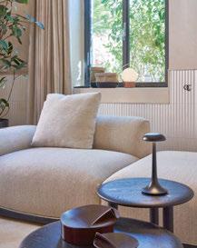
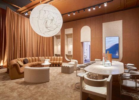
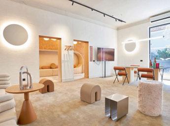
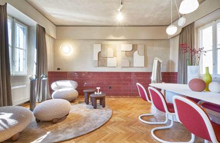
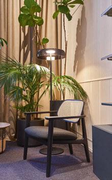
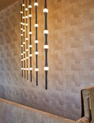
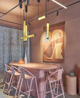
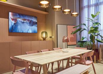
The winners of the 8th annual [d]arc awards were revealed this March at the highly-anticipated [d]arc night, held at the iconic fabric London nightclub.
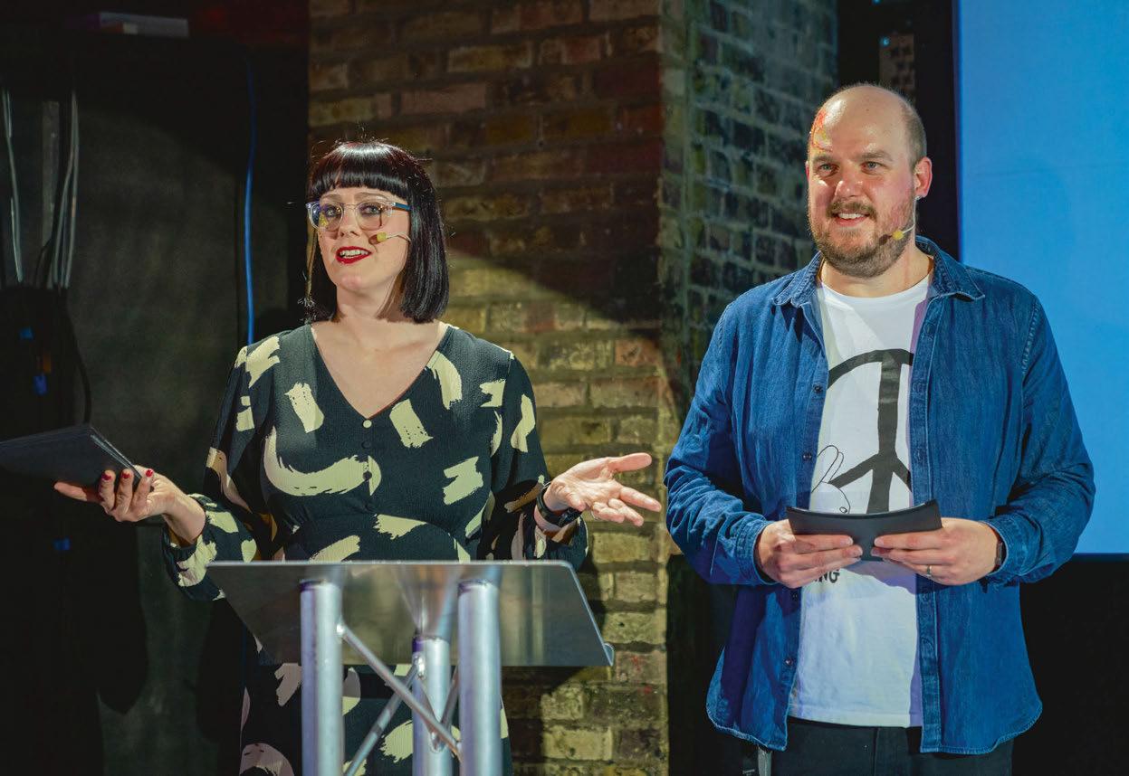
This March, the design community once again came out in force to support the [d]arc awards - the only peer-to-peer lighting design awards in the world.
Returning to the iconic fabric London nightclub, [d]arc night, the offical [d]arc awards party, welcomed more than 500 revellers, as the winners of the 8th edition of the awards programme were revealed. Alongside the awards presentation, delivered by [d]arc media’s Helen Ankers and Matt Waring, guests enjoyed a series of light-art installations, two photo booths sponsored by Linea Light, UV face painting, vegetarian street food and an open bar, with the party carrying
on until the early hours. The event was also live streamed by Light Collective on YouTube to the wider international audience.
This year, more than 17,000 votes were cast across the awards’ 14 categories, while 312 projects and 100 products were submitted. The global reach of the awards was evident once more, with entries coming from 40 countries around the world. This was also reflected in the winners, with winning projects coming from as far afield as Japan, Australia, Thailand, China, Turkey, Norway, UK, and Sweden.
Awarded the coveted ‘Best of the Best’ award for 2022 was Plas Y Brenin, UK by Dark Source, which also won the Spaces - Low Budget
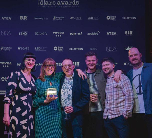
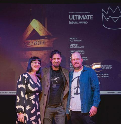
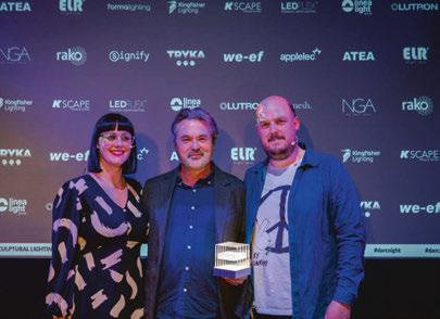
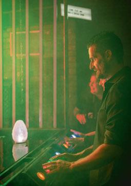
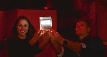
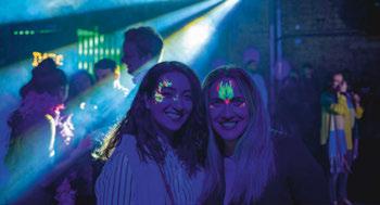
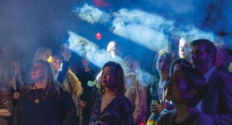
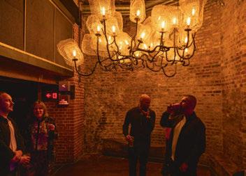
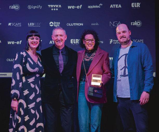
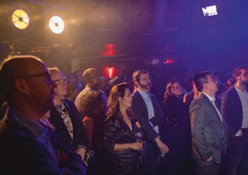
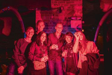
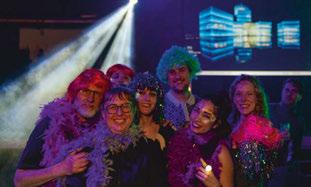
category. The ‘Best of the Best’ prize is given to the projet that recevied the most votes overall out of all the project category winners. Huge congratulations to Kerem Asfuroglu and Dark Source for this fantastic achievement.
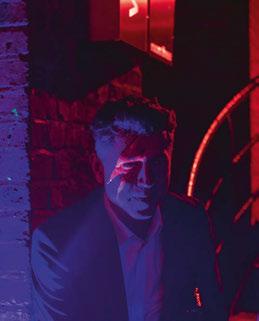
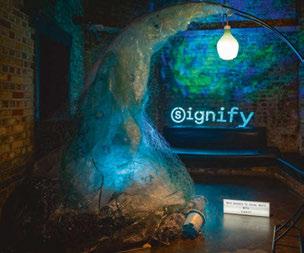
[d]arc media would like to say a massive thank you to all of our design partners, sponsors and supporters, shortlist judges, everyone who entered a project or product, who voted, and who took part in the awards process and party this year. We would also like to say a special thank you to our production partners Streeem, and to Light Collective, who we couldn’t do the awards without.
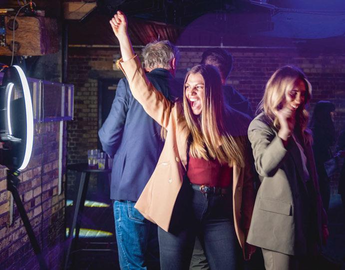
More information about all of the winners can be found in a dedicated [d]arc awards supplement, available to view online now.
www.darcawards.com
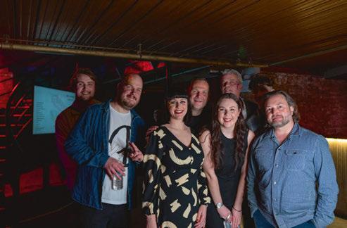
Images: GavriiLux

With over 300,000 Products and 3,500 Brands online, Archiproducts offers the perfect tool to bring beauty in every home, every moment, everywhere.
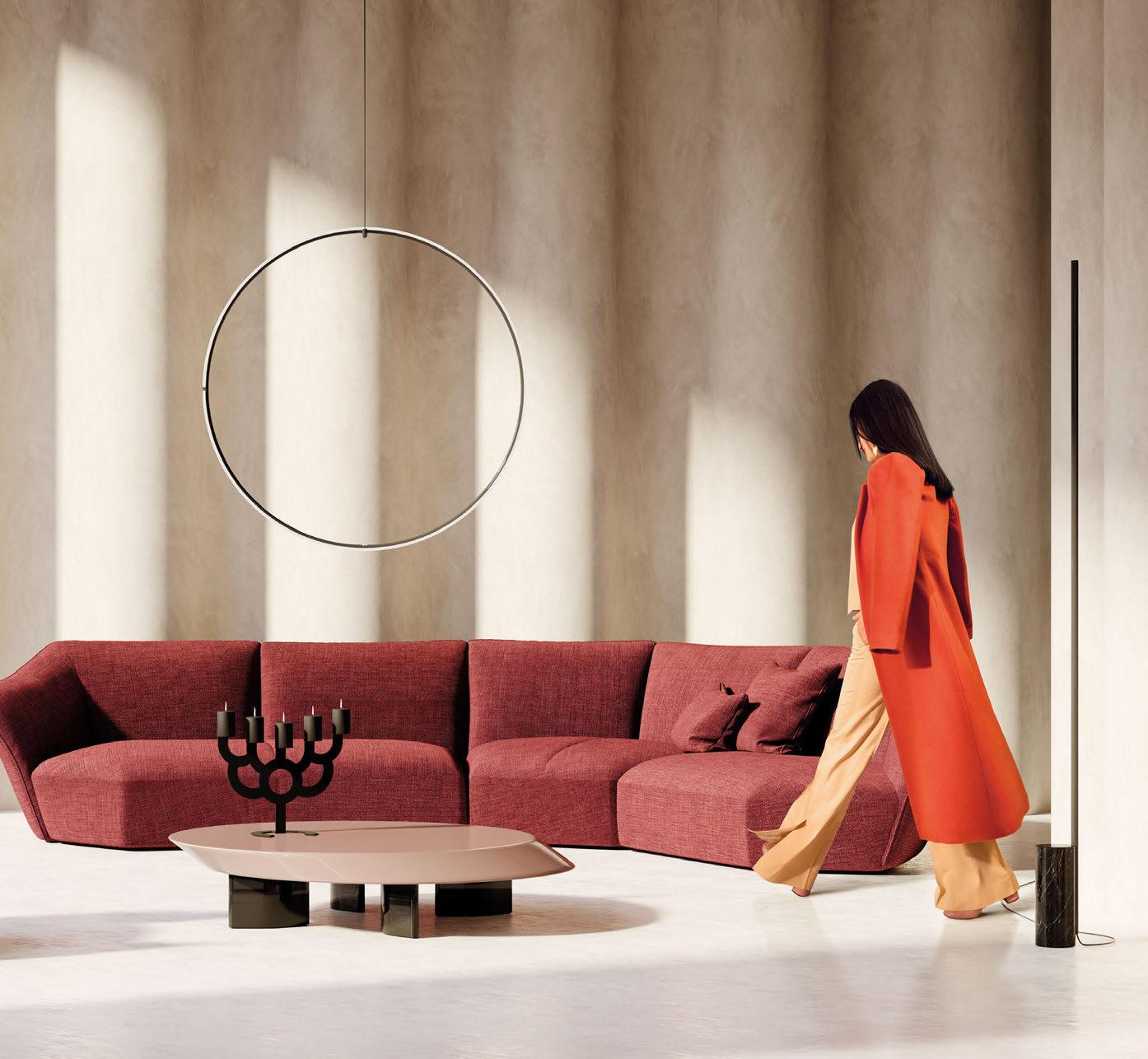
archiproducts.com

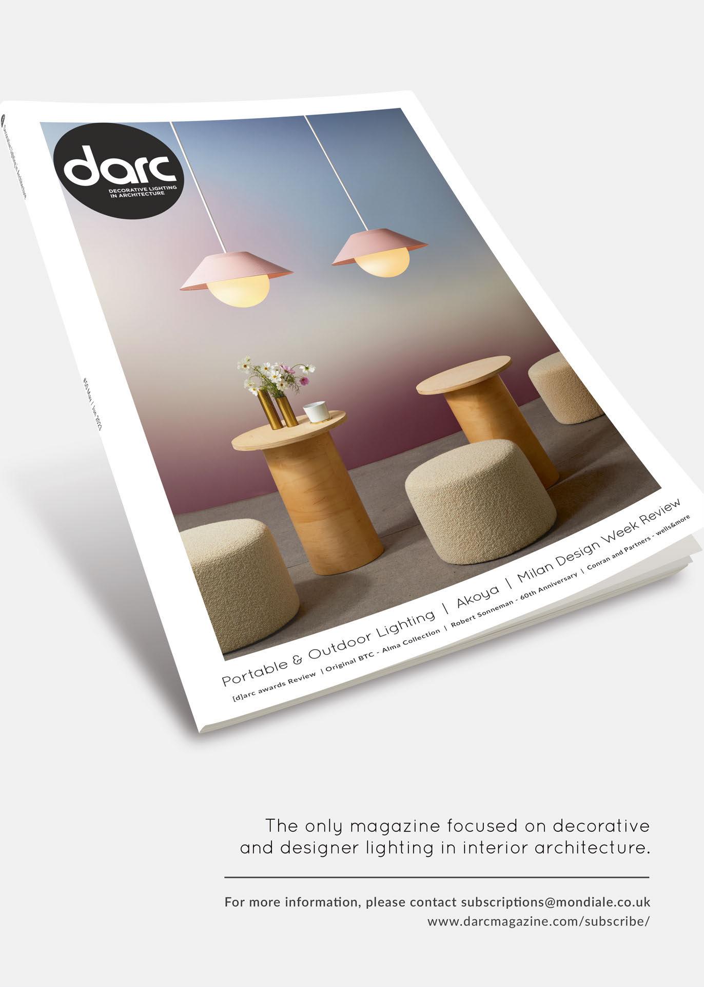
23 - 25 May 2023
Speakers: Marcus Steffen, MSLD; Susie Rumbold, Tessuto Interiors; Lizzie Webster, Fraher and Findley; Raminder Virdi, Lutron
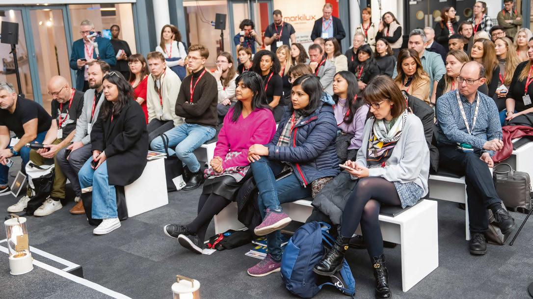
The panel of experts will look at what exceptional lighting looks like within the home; how residential projects differ to working on commercial projects and what designers should be aiming for when it comes to the 'right light' within a residential environment.
Supported by Lutron, the [d]arc media editorial team take to the stage once more to bring you the latest series of the hugely popular light-focused talks programme, [d]arc thoughts at this year's Clerkenwell Design Week exhibition, Light. Held within the subterranean House of Detention, the former Victorian prison showcases an array of leading international lighting brands and spectacular stand-alone installations. We welcome you to join us for three-days of insightful discussions and presentations, where you will take away a deeper understanding of how light is integral to every project whether big or small.
We will be distributing the latest issues of darc and arc magazines in the media gallery, so make sure you pick your free copies up!
You will find the venue at: House of Detention, 12 Sans Walk, EC1R 0AS.
Please note, unfortunately this venue does not have disabled access due to the nature of the 19th Century underground building.
www.clerkenwelldesignweek.com
Images: Andrew Gifford-Mead
13:30
Speakers: Gary Thornton, Nulty; Inessa Lomas, Arup; James Poore, JPLD; Kael Gillam, Hoare Lea
The educational international platform The Lighting Police invites everyone to participate in an interactive fun session focusing on designed and not designed light, highlighting important elements that we take for granted in our daily life and not noticing how they are affecting our health and wellbeing. The session will be moderated by four members of the advisory board of the project and at the end of the session, we are certain that everyone will leave empowered to start observing more and aiming for better lighting conditions in their lives!
15:00
Speaker: Luke Artingstall, Artin Light
Lighting designer and founder of Artin Light, Luke Artingstall sits down with [d] arc media to discuss the intricacies of his lighting design for the Yotel Vega Hotel project in Glasgow; from brief, to concept, to challenges and the end result - we uncover it all.
11:00
Speakers: Lisa Hinderdael, HagenHinderdael; Mike Cascarino, Michael Grubb Studio; Sophie O’Rourke, AECOM / GreenLight Alliance
We are all trying to be “more sustainable” in both our personal lives and in business, but when it comes to commercial projects what does this look like? Through this session, our experts will leave audiences with key pointers, or ‘questions’ to consider when working on a project for it to be as green as is realistic.
13:00
Speakers: TBC
As part of [d]arc media’s commitment to supporting the Women in Lighting initiative, we hand the floor over to an expert panel to discuss whether UK cities are truly designed for equity, highlighting good and bad examples of urban planning and lighting.
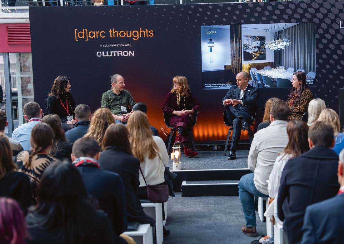
15:00
Speakers: Simon Rawlings, David Collins Studio; Graham Rollins, Lighting Design International
Leading design studios David Collins Studios and Lighting Design International regularly work together on projects. In this Q&A the two designers will discuss their work together on various Harrods projects. We'll get to grips with how the interior design schemes work together with the intricacies and technicalities of the lighting design.
11:00
Speakers: Clementine Fletcher-Smith & Philip Rose, Speirs Major
After opening to great fanfare in late 2022, [d]arc media steps inside the newly renovated Battersea Power Station and speaks to Speirs Major about the landmark’s monumental new lighting design.
Speaker: Esther Patterson, Curiousa Studio
Having been awarded ‘Best Decorative Lighting Product’ at this year’s [d]arc awards for the Wave Collection, [d]arc media sits down with designer and founder Esther Patterson to delve deeper into the collection’s design process, her inspiration, and how an ethical approach to production and manufacturing is key to her ethos.
Speakers: Farhad Rahim and Carolina Florian from Buro Happold
Does it bug you that lighting affects different species in so many conflicting ways? Considering the impact of lighting on animals could drive you batty, but help is at hand. Carolina Florian and Farhad Rahim have squirrelled away many surprising facts and are literally becoming experts in the field. They have guided clients with motivations ranging from genuine ecological care to developers wanting to ‘get through planning’, and now they will share these experiences with you.
6 - 7 June 2023
Miami Beach Convention Center
250 exhibitors, inspiring conference program, Speed Networking, social events, product launches, workshops, and more
Register for free today

A look ahead to forthcoming design shows during 2023 with a strong lighting element.
HD EXPO • LAS VEGAS, USA
2 - 4 May 2023 (www.hdexpo.com)
[D]ARC SESSIONS • ROVINJ, CROATIA
14 - 16 May 2023 (www.darcsessions.com)
ICFF • NEW YORK, USA
21 - 23 May 2023 (www.icff.com)
WANTED DESIGN • NEW YORK, USA
21 - 23 May 2023 (www.wanteddesignnyc.com)
CLERKENWELL DESIGN WEEK • LONDON, UK
23 - 25 May 2023 (www.clerkenwelldesignweek.com)
IMM COLOGNE • COLOGNE, GERMANY
4 - 7 June 2023 (www.imm-cologne.com)
CRUISE SHIP INTERIORS AMERICAS • MIAMI, USA
6 - 7 June 2023 (www.cruiseshipinteriors-expo.com)
DESIGN HELSINKI • HELSINKI, FINLAND
23 - 24 August 2023 (www.designhelsinki.com)
HOSPITALITY DESIGN FAIR • SYDNEY, AUSTRALIA
31 August- 1 September 2023 (www.hospitalitydesignfair.com.au)
MAISON ET OBJET • PARIS, FRANCE
7 - 11 September 2023 (www.maison-objet.com)
INDEX • RIYADH, SAUDI ARABIA
10 - 12 September 2023 (www.index-saudi.com)
LONDON DESIGN FESTIVAL • LONDON, UK
16 - 24 September 2023 (www.londondesignfestival.com)
LONDON DESIGN FAIR • LONDON, UK
21 - 24 September 2023 (www.londondesignfair.co.uk)
DECOREX • LONDON, UK
8 - 11 October 2023 (www.decorex.com)
[D]ARC SESSIONS MEA • MANAMA, BAHRAIN
10 - 12 October 2023 (www.darcsessions.com)
HONG KONG LIGHTING FAIR • HONG KONG
27 - 30 October 2023 (www.hktdc.com/event/hklightingfairae)
Akoya
Mayela Mujica, Design Manager

Rich Brilliant Willing
What was the design inspiration behind Akoya? Akoya was named after the Japanese word for “pearl”; the shade shell proudly reveals a glass pearl bulb. When we first started the development of this product, we were looking at traditional light fixture construction methods using barrel spider fabric shades but flipping the script by making the lightbulb, which usually hides within the shade, the centre of attention. We took that inspiration and interpreted it as a cord/stem suspended pendant that displays beauty in simplistic geometric shapes. The first iterations were parchment paper shades then later transformed into a perforated shade, looking to use a material with different properties but still alluding to the original geometric inspiration.
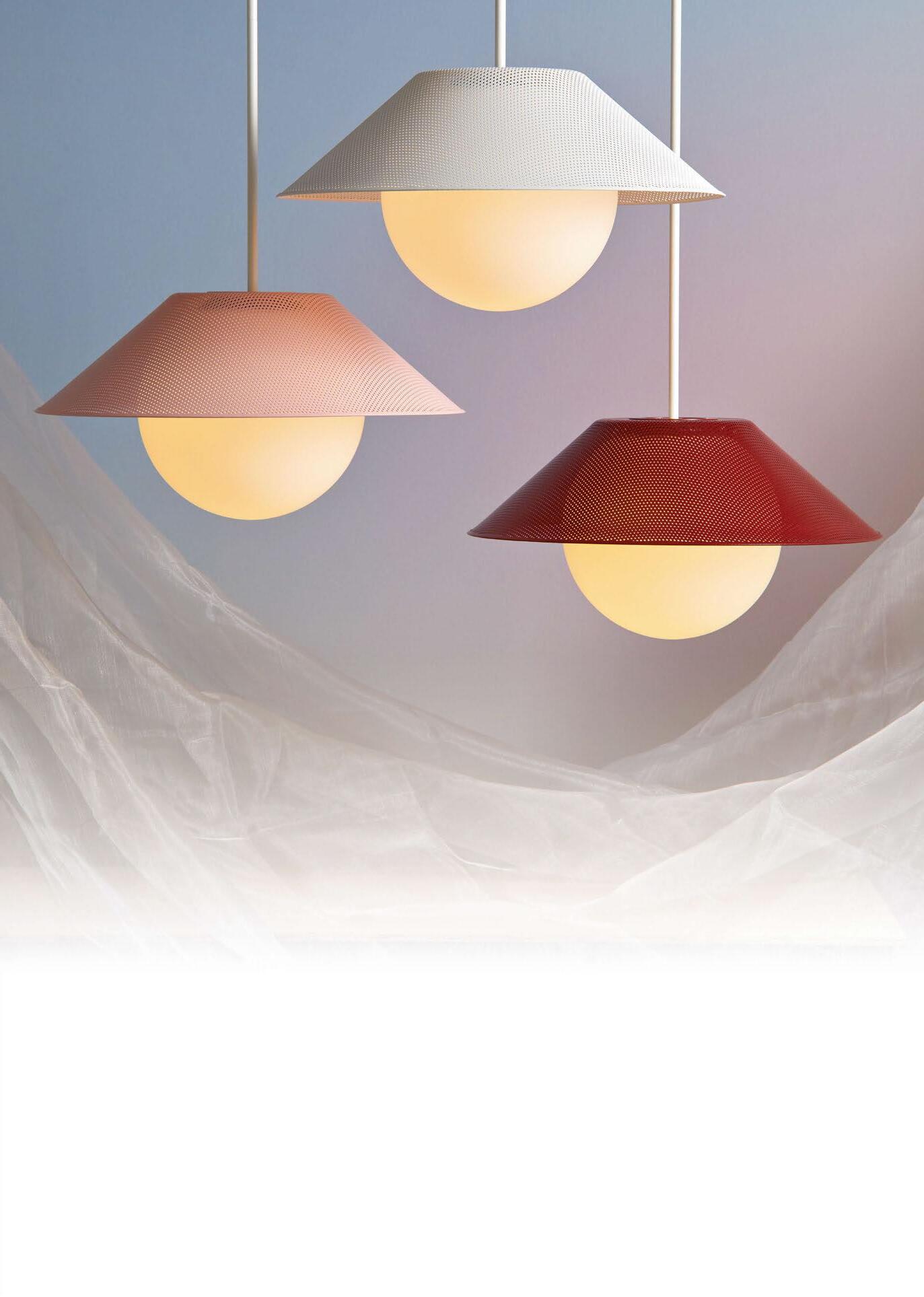
How long have you been working on the new iteration for?
The development loosely started in November 2011 and the first version of the product launched in early 2013. After that initial launch there have been some major redesigns along the way, and the most recent iteration was released in October 2022. Akoya is a perfect example of the RBW values “Committed to Grow” and “Make it Awesome”. The original pendant, designed in 2011, was a parchment shade that half-revealed the illuminated pearl globe. Later on, the design moved to our iconic perforated shade. And most recently as a result of our push for sustainability and desire to provide our clients with even more technical capabilities, we took on a year long project to redesign the fixture using Design for Manufacturing methodologies with an added focus on carbon footprint. The result was a design with higher technical capabilities (increased lumen output, easier install, less weight), more efficiently manufactured with fewer components, an RBW LED board and with shades now fabricated in North America; we’ve also cut down our carbon footprint by manufacturing closer to home.
Can you you describe the design and manufacturing process for Akoya?
The design process was an iterative activity consisting of a rinse and repeat of sketches, models, sampling and cross-functional reviews. For the most recent improvements we used Design for Manufacturing methodologies and all the knowledge we have gained since the original development in 2011. The design is composed of a machined light module with a spun aluminum perforated shade and a hand-blown opal glass.
What was the most challenging aspect of producing Akoya?
Reaching our goals of technically improving the design while reducing the carbon footprint was an exciting challenge.
Achieving a crisp folded seam was a small detail that we are very proud of, with no seams on the side. This product is unique because it allows the clients to customise the shade to their desired colour while keeping the pricing consistent. This is only achieved because we thought of the design for assembly from the start by looking at the design holistically as part of a bigger picture within our sourcing and operational workflow.
What makes this pendant different to others available on the market?
Akoya has the ability to blend in or stand out depending on the materials the client chooses and the rest of the space. Like many products in our collection, there is a joy of exploration, the design looks great from afar but as you get closer it starts to reveal more details and layers, like the perforated pattern, the contrast of material between the opal glass and the metal shade and the seam at the edge.
Please describe the product in three words. Versatile, lighthearted, delightful.
www.rbw.com


With the use of wireless Bluetooth technology, you can connect smartphones, computers, or tablets and enjoy your favourite music with a built-in speakers system.
