MILAN DESIGN WEEK REVIEW
OUTDOOR & PORTABLE LIGHTING
WELLBEING IN RESIDENTIAL LIGHTING
VOLKER HAUG STUDIO 20TH ANNIVERSARY
 THE GENEVIEVE 60cm SCONCE


MILAN DESIGN WEEK REVIEW
OUTDOOR & PORTABLE LIGHTING
WELLBEING IN RESIDENTIAL LIGHTING
VOLKER HAUG STUDIO 20TH ANNIVERSARY
 THE GENEVIEVE 60cm SCONCE
 Sarah Cullen • Editor
Bonjourno! Fresh off the heels of Milan Design Week, team darc have been pulling late nights in order to bring to you the latest edition of the magazine; welcome to May/Jun, issue #55.
I was lucky enough to soak up some of the glorious Milanese sun at the beginning of April while dashing around the city meeting with clients and checking out some stunning lighting exhibitions and product launches. Despite it not being a Euroluce year, we were inundated with invitations to events and product launch presentations. There was a real buzz in the city. As such, we have dedicated a large chunk of this issue to some of our highlights, as well as exclusive interviews with some of the biggest names in design to discuss their latest lighting collaborations and celebrations. Speaking of celebrations, I caught up with product designer and studio owner Volker Haug ahead of his showroom party in Milan, to discuss his journey from hairdressing into the world of design, plus his studio celebrating its 20th anniversary this year. Volker was an absolute delight to interview, so I hope you enjoy discovering more about his background and work as I did.
In addition to our interviews, we have collated a selection of new product launches as well as brief overviews of some of the showroom events and parties that were hosted throughout the week.
Aside from all things Milan, this issue also spotlights some wonderful international projects from the reaches of Australia and Saudi Arabia. We also bring you our Outdoor and Portable lighting feature, where we have selected some of the best products currently on the market that are ideal for your alfresco dining schemes.
Enjoy the issue! I’m off to pour myself a well-earned Aperol Spritz and dream of sunnier days to come* before we begin our work on 3d, the annual directory for decorative lighting suppliers. For this edition of darc designers, I am on the lookout for sustainable product designers to interview. If you would like to put yourself forward for consideration, please drop me an email (s.cullen@mondiale.co.uk) and let me know what makes your product design sustainable.
*At the time of printing.

021
Comment: Beatle Lindsay-Fynn
Founding Partner and Managing Director of Palladian, a London-based architecture and interior design practice, gives his opinion on maximising wellbeing within residential lighting.
024
Materials Array, Vibia
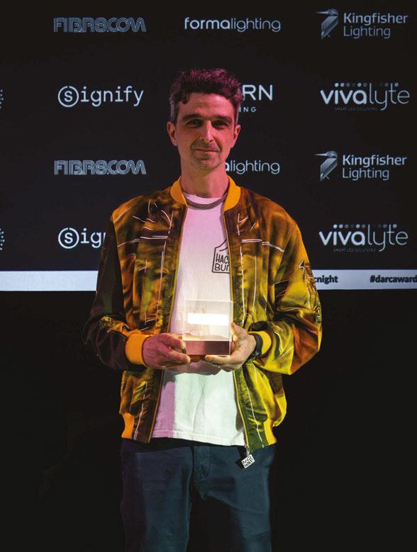
Vibia won the 2023 [d]arc award in the Decorative: Kit category for its Array collection, designed in collaboration with Umut Yamac.
030
Feature Products: Outdoor & Portable Lighting darc’s selection of decorative lighting products suited to your portable needs and al fresco dining schemes.
046
Interview: Volker Haug Studio
During Milan Design Week 2024, darc’s editor Sarah Cullen had the opportunity to sit down with Volker Haug to discover more about his journey into the lighting world and how he has grown his design studio into the brand it is today.
066
In Focus: Lunanova
Occhio presents the Lunanova chandelier, which harnesses its Luna collection’s design and technology together into a stunning ceiling fixture.
Managing Editor | Helen Ankers
h.ankers@mondiale.co.uk
+44 161 464 4750
Editor | Sarah Cullen
s.cullen@mondiale.co.uk
+44 161 464 4750
Contributing Editor | Matt Waring m.waring@mondiale.co.uk
International Sales Manager | Tristan Blowers t.blowers@mondiale.co.uk
+44 7392 895771
Online Content Creator | Ellie Walton e.walton@mondiale.co.uk
+44 161 464 4750
006
Focal Point
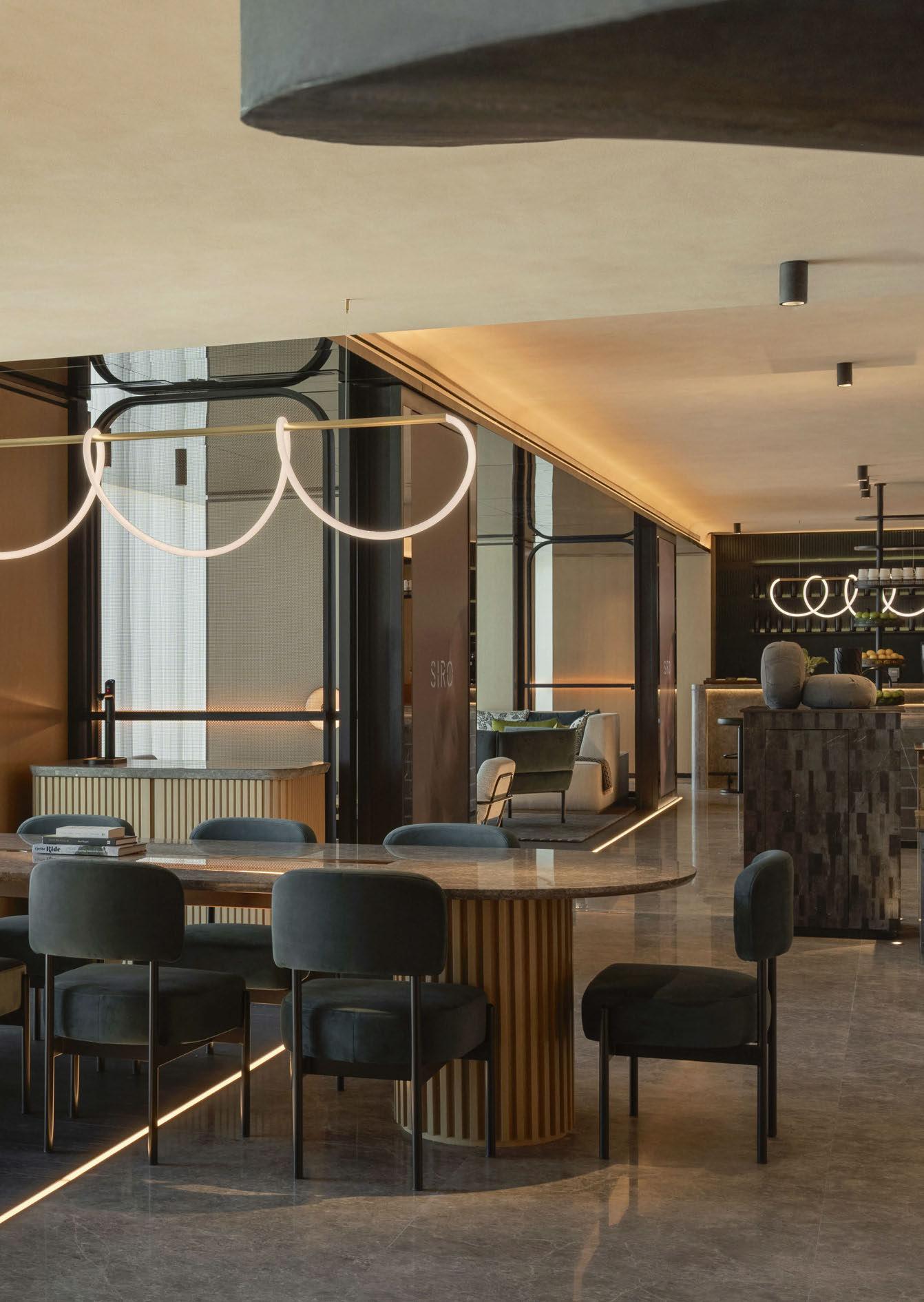
Siro, Dubai
Dubai’s newest fitness hotel by LW Design combines lighting and furniture into a unique concept that has its visitor’s wellbeing at the heart of its design.
008
Fox Friday
Melbourne-based lighting design studio Ambience is well-versed in creating vibrant destinations for some of Australia’s best independent breweries. The latest in its beverage portfolio is for Fox Friday.
014
Copper Club, The Townhouse Renowned for its edgy interiors and creative branding, Run For the Hills studio has transformed a cherished local landmark in Guildford, UK into a lavish three-floor multi-faceted club house. darc talks to co-founder and interior designer of Run For the Hills, Anna Burles, as she offers insights on its design and the necessity of decorative lighting.
022
On The Board
Erik Munro
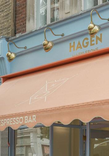
Munro Studio shares its vision for Hagen’s new flagship store in Mayfair, London. Here, they demonstrate how they’ve balanced mood lighting with overhead technical lighting to achieve the brand’s signature hygge atmosphere.
044
Milan Design Week Focal Point Crystal Beat 2, Preciosa
054
Milan Design Week Focal Point Fire, Grau
056
Milan Design Week
Interview: Paola Navone
Italian lighting brand Lodes presented Oblò, a collection of glass pendants designed by Paola Navone that take inspiration from the seaside.
060
Milan Design Week
Interview: Michael Anastassiades darc’s editor Sarah Cullen sits down with Michael Anastassiades to reflect on Flos’ Palazzo Visconti exhibition and to discuss the 10th anniversary of his IC collection in a special Golden Hour installation.
Artwork | Dan Seaton d.seaton@mondiale.co.uk
Editorial | Mel Capper m.capper@mondiale.co.uk
Managing Director [d]arc media | Paul James p.james@mondiale.co.uk
Marketing & Events [d]arc media | Moses Naeem m.naeem@mondiale.co.uk
Chairman Mondiale Publishing | Damian Walsh
Finance Director | Amanda Giles a.giles@mondiale.co.uk
Credit Control | Lynette Levi l.levi@mondiale.co.uk
[d]arc media ltd | Strawberry Studios, Watson Square, Stockport SK1 3AZ, UK | Printed by Buxton Press, Palace Road, Buxton, UK ISSN 2052-9406
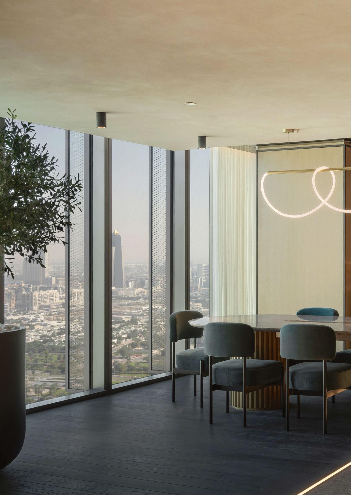
In the vibrant aftermath of One Za’abeel’s grand opening in Dubai, emerges Siro, the first fitness and recovery themed hotel in the region, by LW Design.
In collaboration with Kerzner International, Siro aims to disrupt the hospitality space with an innovative vision. Representing the pillars of strength, inclusive, reflection, and originality, Siro goes beyond a physical place, evoking compelling anticipation for attainable peak health and inspiring fitness and wellness growth for individuals and groups.
The heart of the hotel spans over two floors. Level 30 encompasses the Starting Block’(Lobby), the Collective (an amphitheater for briefings and meetings), The Fitness Lab, a state of the art gym, experience box and cycle studio. Level 31 focuses on recovery with treatment rooms, yoga studio, pilates studio, zen room, relaxation area, and changing facilities. A sculptural spiral staircase connects the two floors while also serving as the focal point of the starting block space, emphasising Siro’s ethos of balancing performance fitness and mindful regeneration.
Designed to inspire and unite, flexible seating groups in the lobby cater to individuals and groups, illuminated by contemporary pieces such as the Theia floor lamp from Marset. The Refuel Bar, a bronze metal and nordic grey stone juice bar lit by the Shiva Linear suspended light from Morghen Studio (pictured), is situated in the heart of the lobby.
www.lw.co
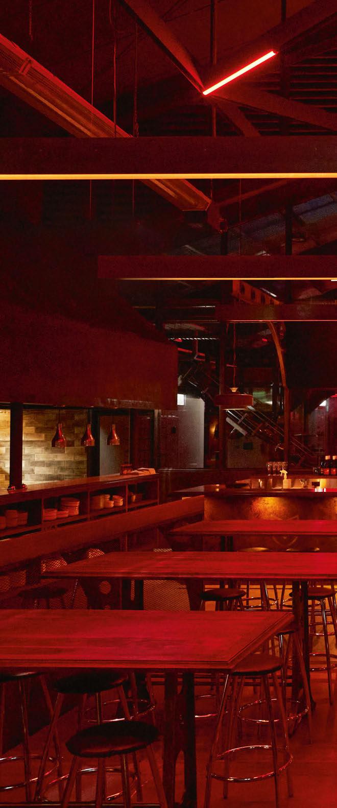
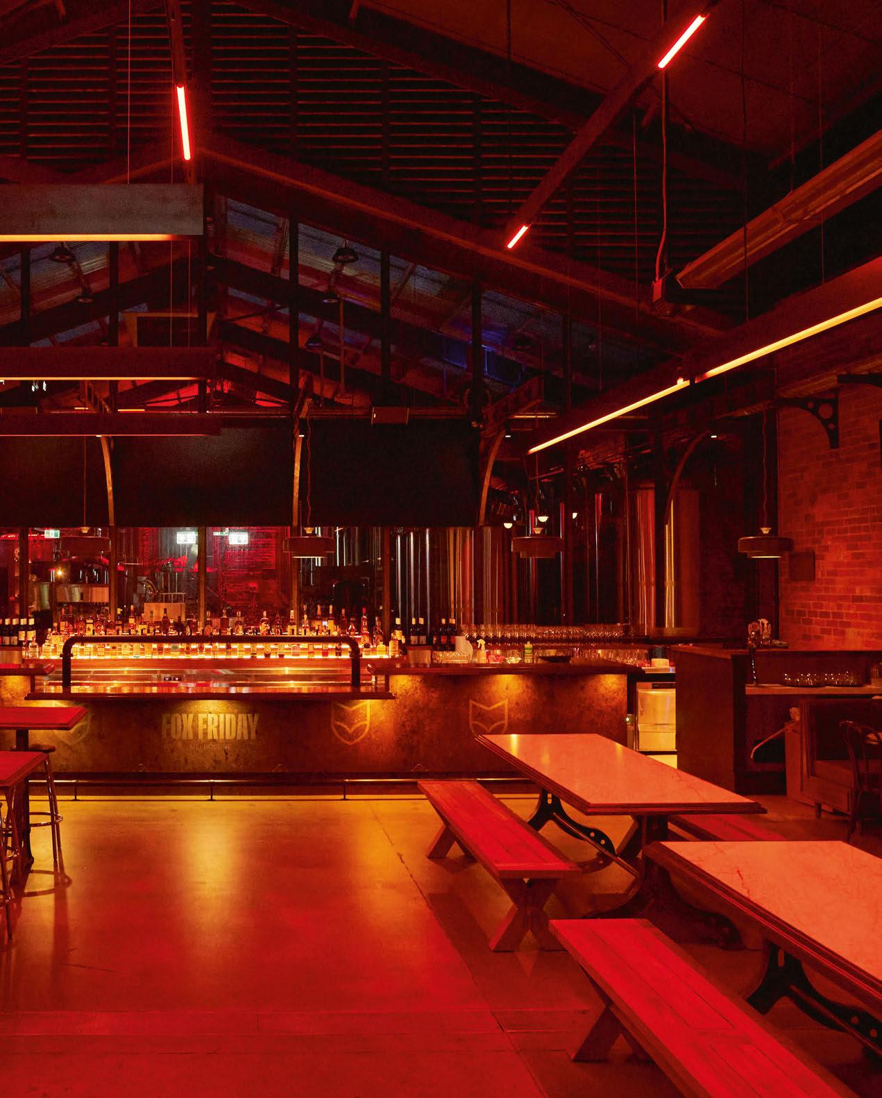
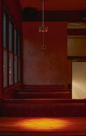
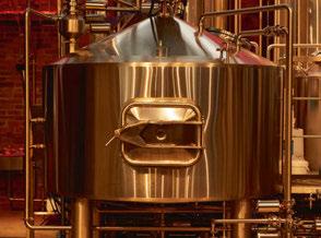
Melbourne-based lighting design studio Ambience is well-versed at creating vibrant destinations for some of Australia’s best independent breweries. The latest in its beverage portfolio is for Fox Friday.
Melbourne-based lighting design studio Ambience is well-versed at creating vibrant destinations for some of Australia’s best independent breweries. The latest in their beverage portfolio is for Fox Friday.
Working with Studio Y, which exclusively uses Ambience for its lighting schemes, the design took on the well-known industrial aesthetic that has become an international go-to for beer venues.
Speaking with David Justice, Managing Director at Ambience, darc discovers the team’s involvement in its latest project with Studio Y that took three years from concept to completion.
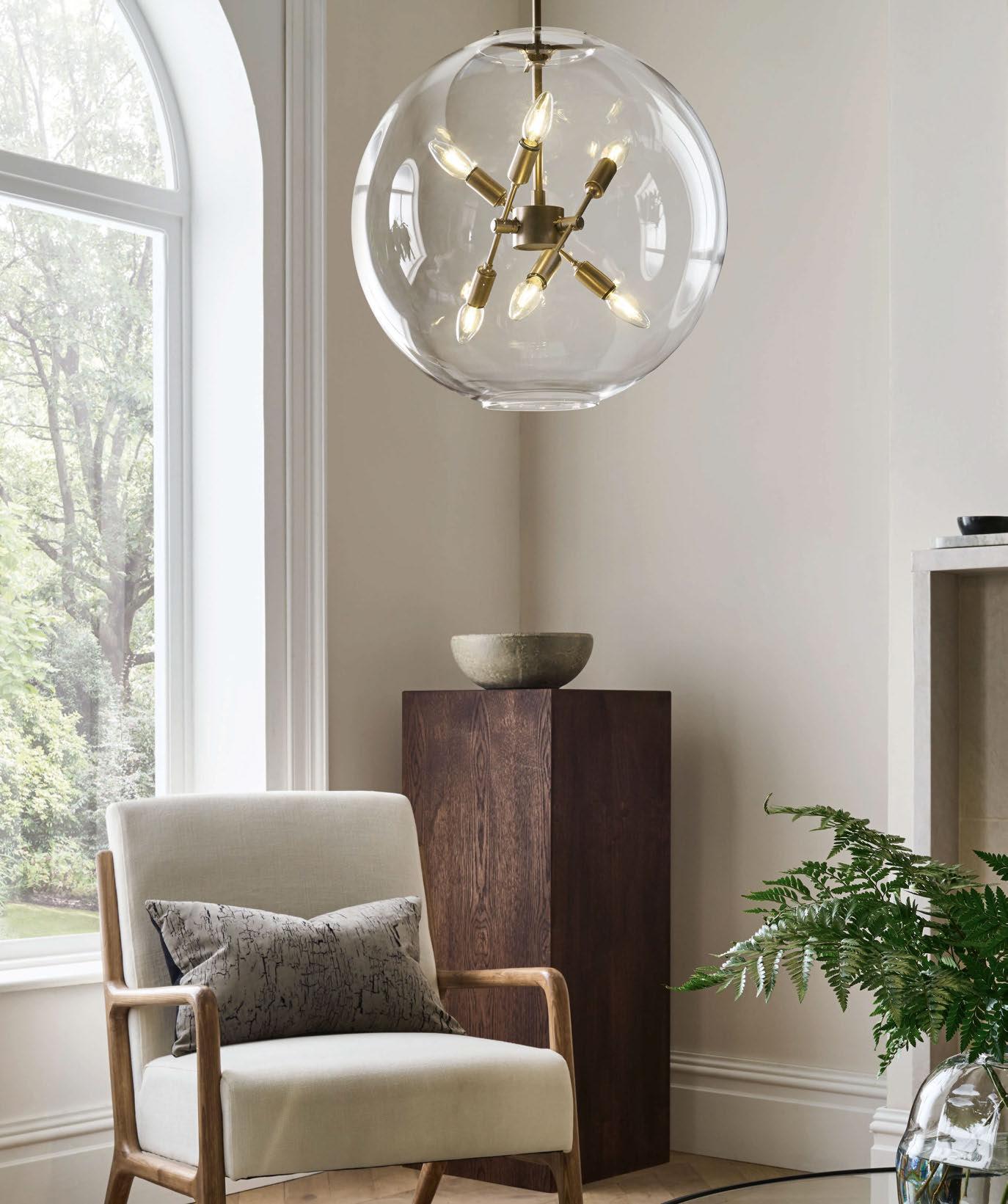
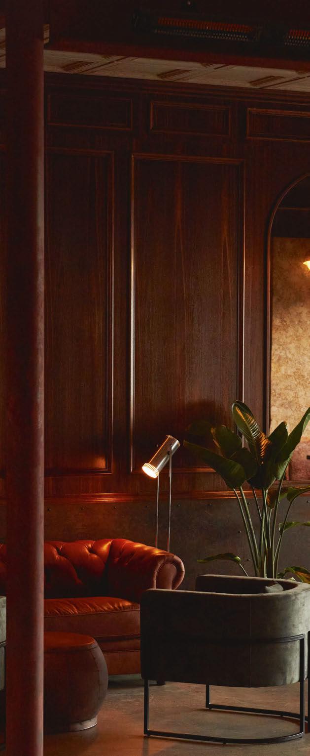
“This industrial concept, which has worked really well for breweries and has been used time and time again, I think it started off in London? I remember back in the late 2000s they started doing industrial concepts for whiskey bars with a 1920s prohibition vibe using filament lamps, and industrial and recycled fittings, and then it moved into the brewery and pub scenes.
“We were then approached by Fox Friday with a concept to create a space that feels 100 years old. At first, I was like ‘Really? Again?’. But the client was adamant as he had travelled around the world gathering inspiration and always referenced a real industrial look. I tried asking the interior designer if we could come up with something else?
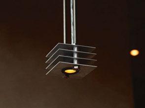
“A week later, we went back to the client with the concept of 100 years young. The idea was to make brand new light fittings but aged to look 100 years old. So, the shapes and forms of the fixtures we created were industrial and historic looking but finished in a beautiful, brushed aluminium, almost as if they had been wrapped in plastic and preserved for 100 years.
“This very quickly turned into a large project for us as all the fittings had to be customised. Typically, on previous projects that are similar, we have custom designed and created a lot of the decorative lighting and the architectural fixtures are off the shelf pieces. However, for Fox Friday we had to create everything, every downlight, fittings behind the bar, all of it.
“To do this, we went back into our record books to find manufacturers from the 1970s, 80s, and 90s that my dad used to work with all over Australia to see if they were still around and able to produce fixtures using their old tools. This is how we got everything made and they look fantastic. Even down to the screws and fixings, we wanted to make sure everything looked authentic, not like it was picked up from the local hardware store.”
The only specified fixtures the team featured included: a table lamp by Audo Copenhagen, pendants by Haymarket and Cascina, trombone


floor lamp by Warm Nordic, various linear pendants and profiles by Symphony, and tracklighting and downlights by Andro.
“The next hurdle was figuring out how to fit LED light sources into our custom fixtures with shapes and forms that were designed for E27 lamps. The size, scale and proportions made it difficult to fit the light sources we wanted, so Nikita Kalia, our product manager, had to scour the earth for particular light sources as well as help design custom light sources that would work. We then had to make them 2400K, so went through numerous prototyping and testing in dark rooms to ensure on paper they were all at 2400K. But, in reality not all the fixtures were there. Some would reflect differently; some had frosted glass and another an exposed light. So, when looking at them altogether, some may appear to the naked eye to be at a different temperature level.
“This project used a lot of industrial, custom paint
finishes, so we would test our fittings against swatches to see how they looked. And for our architectural fixtures, we used our on-site dark room to replicate various scenarios to see how the light would fall on certain surfaces and fabrics. We have lighting software that you can input different types of material in to, but it’s never 100% accurate.
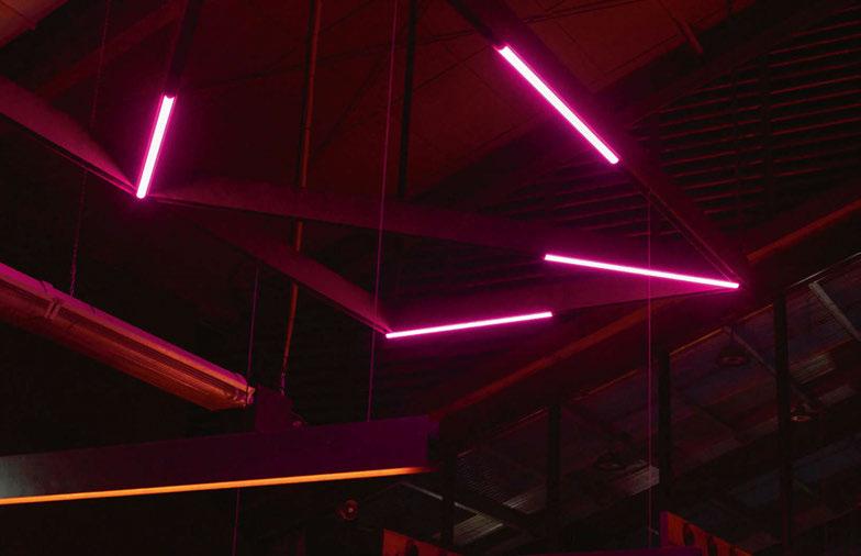
“We also added colour changing Casambi controls that gives the space that modern personality at night. And, we added filters and vinyl to the fridge doors in the takeaway area and behind the bar because we didn’t want any light source messing with the warm atmosphere we were creating.
“This happens a lot, when you create a scheme but get to site and find it’s an open kitchen with cool lights! But we ensured we used black exit signs and supplied all the canopy and kitchen lighting so when the kitchen door opens it doesn’t ruin the overall effect. It happens all the time in hospitality! If someone is walking into
“The
next hurdle was figuring out how to fit LED light sources into our custom fixtures with shapes and forms that were designed for E27 lamps. The size, scale and proportions made it difficult to fit the light sources we wanted...”

the bathroom and passes the kitchen door that opens and cold light spills through, I don’t want it. I don’t want it spilling into my space.
“We try to have a good relationship with the back-of-house staff but they’re typically resistant because they like the cool bright light. I’ve had a few incidents, let’s say, but they eventually calm down and get used to it. It’s probably why so many of them are stressed because they normally work under such bright, cold, flickering light. The warm light helps them chill out a little! Almost like human-centric lighting for chefs.”
This finer detail was also important for the front of house staff, to help lessen the contrasting transition of collecting food from a bright kitchen and delivering it to the dimly lit tables before returning to the bright back-of-house.
“We try and put ourselves in the shoes of those using the space, from retail to hospitality. I know it’s a bit of a cliché, but we try to understand everything about not only the customer journey but the overall human journey of a space.”
Despite the intricate details Ambience went into for this project, it was surprising to hear the budget was minimal. “We’ve got into a good habit of doing projects and not making any money. But actually, we do, just indirectly. It comes through designer

relationships we build. We work with Studio Y on everything now, they don’t go to any other lighting designers. And, they spread the word to others in the industry recommending our services too.
“Initially this project was like opening a can of worms when it came to all the intricacies, but when we finish a job like this and see everyone’s response when they walk through the doors, it’s just incredible. When they’re happy, it’s all worth it.”
“It was amazing,” adds Kalia. “I was super nervous about this project, to be completely honest. I didn’t think that it was going to come together in the end the way it did because everything was coming in from so many different places. If you get lost and if you don’t understand what the intention is behind the concept, then you don’t know where to go. But, if you have a clear vision to work with it just makes life a lot easier.”
www.ambiencelighting.com.au
Renowned for its edgy interiors and creative branding, Run For the Hills studio, has transformed a cherished local landmark in Guildford, UK into a lavish three-floor multifaceted club house. darc talks to co-founder and interior designer of Run For the Hills, Anna Burles, as she offers insights on the design and the necessity of decorative lighting.

The collaboration between Run For the Hills and Copper Club began after the client stumbled upon some of studio’s portfolio in a magazine. Recognising the studio’s unparalleled fusion of interior and graphic planning offered everything the client needed from interior planning, bespoke art designs, and unique branding to boot. From there the brief was clear - to create a guest-experience with technical design, operational pointers, and detailed brand storytelling.
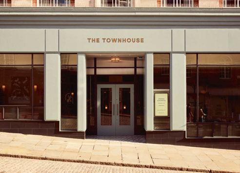
Located on the cobbled streets in Guildford’s high street this beloved building was once a tailor’s shop known as Burton’s. Now the building is open for locals to use, offering a member’s club mentality where guests can settle all day for work and play but without membership fees and exclusivity. It features expansive crittal style windows framed with a soft blue façade
and hand painted gold signage inspired by its former life as Burton’s tailors.
The client was a huge fan of heritage features and its history as a popular tailor shop; hence the new logo displays a tape measure wrapped elegantly around fabric scissors. However, the building’s most recent incarnation as a sport retailer meant most of these architectural details had been ripped out. Despite its unfortunate dismantle of the original features, this gave Run For the Hills a complete blank canvas to work with. Restoring the heritage features were predictably difficult yet crucial to the design scheme, some of which included coverings and moldings, a statement staircase and a glass lift bringing a sense of its history outside and in.
Like any interior design, decorative lighting has a
“Lots of the fittings feature prismatic and reeded glass details, which create a lovely atmospheric glow and reflections around the fitting. Other choices have very targeted light where the light source is not visible, designed to do a different job of drawing the eye to the object...”
vital role in creating an essential atmosphere. With The Townhouse spanning across three floors and four zones of function (dining, drinking, working, and socialising), lighting is key to creating a seamless transition between each zone and has a quintessential role in enhancing the ambience with both its stunning appearance and ways of distributing light. Burles says: “Decorative lighting is incredibly important in all of our interior design projects and The Townhouse was no different. Even with the most amazing FF&E furnishing scheme and materials palette, a space feels naked without decorative lighting. Beautiful wall lights, mood enhancing table lamps (both wired and portable), and statement floor lights not only look stunning, but fulfil an essential role in creating atmosphere. A scheme isn’t complete without exciting decorative lighting and getting the balance right between architectural and decorative is key to the best interiors. Too much architectural lighting can feel clinical and too technical and guests can ‘feel’ the fittings and dominance. Not enough architectural lighting can be disappointing too as decorative lighting alone can’t create some of the effects needed to highlight beautiful finishes, furnishings, and joineries. The two really are codependent.”
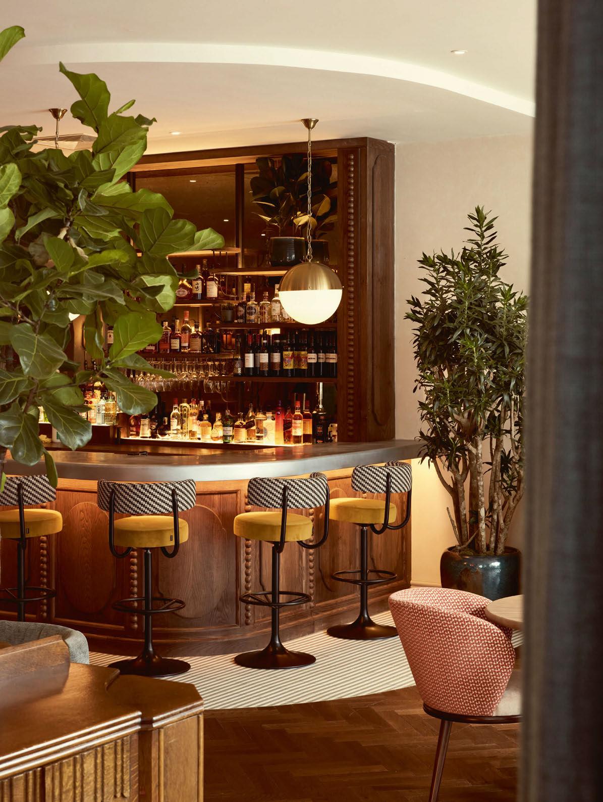
Burles adds: “Our decorative lighting choices were designed to enhance the overall style of the space, using a suite of different-sized wall lights in antique brass, bronze, and iron finishes, some featuring glass, others woven shades. Lots of the fittings feature prismatic and reeded glass details, which create a lovely atmospheric glow and reflections around the fitting. Other choices have very targeted light where the light source is not visible, designed to do a different
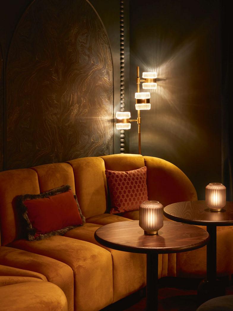

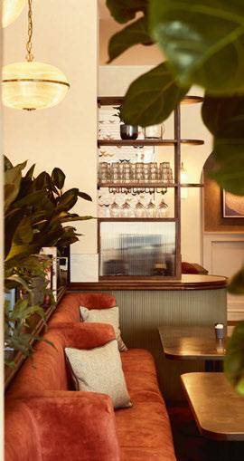






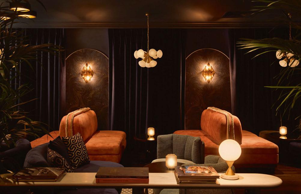
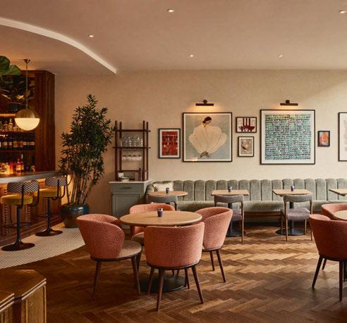
job of drawing the eye to the object the light fitting is highlighting (whether that’s a piece of art or highlight furniture). Overall, it is a curated mix of creatively sourced lights, from a mix of retailers we know and love, including some lovely vintage fittings from Pure White Lines, Murano chandeliers and Italian style Murano wall lights injecting a shot of glamour and sparkle.”
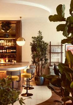
The ground floor represents a classic Coppa Club design with a vintage inspired timber cafe-bar and a laid-back cosy workspace, in a relaxed and stylish interior. Tonal textured walls layered with curated gallery art are illuminated by E2 Contract Lighting’s bronze picture lights, which set the scene on the ground floor for a fresh and inviting all day atmosphere. Designed to combine the best elements of both a workspace and a café/bar, lighting needs to ensure guests are comfortable whatever their needs. The rear ‘snug’ lounge isn’t flooded in natural light, so is lit softly by floor lamps and architectural lighting to spotlight the soft seating where guests can listen to the crackle of the fireplace. The lighting from low level table lamps and architectural lighting creates a natural flow between café-bar and workspace.
The journey continues in the brass framed elevator that gently transcends past the hand painted mural designed by Run For the Hills graphics and art team. The mural flows and changes from the ground floor’s neutral tones to a deeper and more lively mix of blue accents atmospherically lit with soft pink Murano wall lights by Pure White Lines acting as guides to the middle floor.
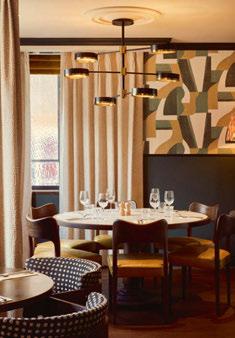
Now in the brasserie, the private dining space offers a homely and relaxed feeling for an all-day dining experience serving breakfast to late night dinners. Furnishings such as open banquette seating with contrasting rugs are highlighted by a central antique style chandelier also by Pure White Lines. Wall lights from E2 Contract Lighting add warm rays of light along with more bronze picture lights spotlighting the curated gallery art. The central stone fireplace is framed by a warm timber-stained bookcase with subtle vintage detailing, retro wallpaper with Soho House light fixtures placed cleverly around the bookcase. The nature of this space is designed to be homely and inspired by the glow of a fire therefore ambient lighting dotted around the space helps enhance the friendly and comforting atmosphere.
Burles says: “Some of the zones within the multi-floor venue, were developed during the design process - with the middle floor becoming more focused as a brasserie restaurant, with a different mood, function, and vibe from the informal ground floor. Still buzzy, but not a place for laptops, a space for food and drink
to be celebrated across the table with friends, family, and colleagues.”
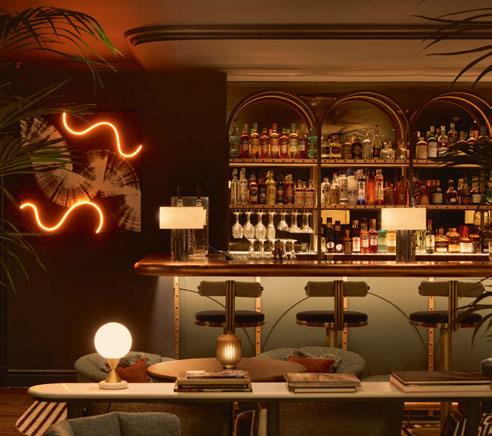
The final floor hosts a cocktail bar and lounge, a sanctuary where guests can enjoy draft pours, premium spirits, and signature blend cocktails. Nestled in the plush lounge sofas and cocktail chairs, guests can groove to the sounds from the in-house DJ under a dark moody blue ceiling. Burles describes the development of the top floor as “organic” with the design emerging with refinements in the final lighting and FF&E scheme. The statement copper bar and arched frame is highlighted in a pool of light using a combination of decorative lights, architectural lighting, and joinery to position its centrality. Alongside the bar Run for the Hills’ talented graphics team added a dramatic touch through a hand-painted canvas layered with a vibrant glow of amber neon light, which took inspiration from the staircase mural. The midlevel, warm ambience from the lighting acted as the perfect foil to the bar’s cooler interior colour palette of vibrant pinks, icy blues, and ochre yellows. In addition, the room is adorned with a gorgeous fireplace, rich velvet curtains and glows of moody low-level lighting from brass pendants and Murano glass wall lightsadding a je ne sais quoi to the overall furnishings.
“Decorative lighting is doubly powerful within a scheme,” says Burles. “It creates both a visual focal point, adding beauty to a space and is integral to the interior design FF&E scheme, adding metallic, glass and textile, material accents as well as layers of lighting. Our brief for the lighting was to create a midlevel, warm ambience, and the architectural lighting was key to this – creating pools of light and pockets of lighting picking out beautiful design details.”
The triple threat studio established another successful project showcasing its trademark blend approach of branding, in venue graphics and art, and interiors. From captivating highlight features, layering interiors, bespoke art, joinery and atmospheric finishes, the project exudes grandeur whilst maintaining a harmonious balance, further elevated by the decorative lighting.
Burles aptly concludes: “Lighting is the icing on the cake of any design scheme. A gorgeous interior is elevated into a stunning scheme with the addition of great lighting. Carefully placed and balanced lighting creates the right lux levels and tone of ambient light, which creates the right mood and energy within a space. Flexible lighting gives the opportunity for a space to discreetly morph into different vibes across the day – something which is particularly important in an all-day venue.”
www.runforthehills.com
CLUB, THE TOWNHOUSE GUILDFORD, UK
Interior Design: Run for the Hills Lighting Specified: Pure White Lines, E2 Contract Lighting, La Redoute, Light Source, Northern Lights, Oka, Pooky, Rose and Grey, SOHO Home, Tyson Lighting
Images: Toby Mitchell & Run For The Hills
Anna Burles, co-founder of Run For The Hills, discusses the importance of finding the right balance between architectural and decorative lighting in this project that aims to restore Guilford’s beloved Burton Building into a vibrant new public space.











Founding Partner and Managing Director of Palladian, a Londonbased architecture and interior design practice, gives his opinion on maximising wellbeing in residential lighting.
Wellbeing has been a key driver right across design for a number of years and probably nowhere more so than in the workplace, where employers met the challenges of Covid-19 and post-pandemic hybrid working by evolving worker-first interiors, complete with breakouts, garden centre levels of planting, quiet rooms and ultra-flexible, mission-oriented environments. In the residential sphere, however, where we operate, wellbeing can often be taken for granted. It’s as if the home, representing ‘the authentic self’, is a predesignated locus for refuge and relaxation and therefore self-evidently a place where we feel ‘well’.
We oppose this passive attitude for many reasons, but not least because home interiors are something of a wellbeing battleground right now. Many recent advances in home technology - particularly wireless and Bluetooth - generate electromagnetic frequencies, which are absolutely not conducive to wellbeing. Equally, many sustainable advances, including triple-glazed, energy-saving windows, are in danger of having a negative impact too, by cutting out the sun’s most energygiving lightwaves, especially in the morning. Then, there’s the flickering problem with many low-energy sustainable lamps, especially cheap LEDs and fluorescents. Even if our eyes can’t see the flickers, our brains can, and the repeated pulsing can have a woeful impact on our nervous systems. Electronic drivers and dimming modules in the home need to be carefully monitored for the same reason. Having a house hard-wired with on/off switches or using a hard-wired control system - as long as properly evaluated - can be a better wellbeing solution, however much against the contemporary grain.
Ensuring our homes have enough light of both the right temperature and lux/intensity levels, while prioritising health, sustainability, and people’s technological needs, is a complex ambition, necessitating informed strategies and careful thinking to find a pathway through.
At the start of a residential renovation or new interior design project, lighting designers are usually briefed to design a scheme with specifications that meet a particular budget or aesthetic, while providing appropriate washes, colours, and levels of light and taking into consideration a home’s architectural or interiors layout. Clients without lighting designers are often simply trying to generate enough artificial light within a budget, with less consideration of other factors. In both instances, the wellbeing of a home’s occupants may be of lesser consideration - if considered at all.
A home is many things, from a social space to a quiet space and a place for eating, working, and playing. Most importantly, home is where we sleep - a vital restorative action for our bodies, minds and souls. A wellbeing-first residential lighting scheme needs to take on board home-owners’ personality types, neurodiversity typology, any health issues and particular personal circumstances alongside the design brief, budget and current lighting product availability. The ideal end result is a series of personalised lighting solutions for each family or
occupier’s requirements, in much the same way people currently seek out personalised healthcare, nutrition or exercise programmes.
Light will always be the single most important element within the built environment, fundamentally driving the rhythm of life. Lighting design needs to prepare our bodies for sleep and wake us in the morning, working directly with our circadian rhythm. Regulating our exposure to different light sources throughout the day is key to promoting our overall mental and physical health and performance.
Artificial light remains a great gift, particularly for those living in darker, North European climates, enabling increased functional and leisure time over the course of a day, but the season, the orientation of each building and even each room’s geometry all have to be considered, in line with the natural course of daylight, when assessing artificial lighting needs. You might organise your bedrooms to be facing east, for example, or your living spaces to face south and west, while, to provide the best level of daylighting, the visible light transmittance of glazing should be high, with windows kept open as much as possible to absorb full spectrum light.
Solar heat gain should be considered and kept low over the summer too, however, making rooflights something of a pay-off between additional light ingress and solar gain implications.
Those with a higher budget can choose lighting control systems based on astronomical clocks, linked to light sources that change temperature in accordance with natural light, but the principles for lower budgets are the same. Residential lighting basically needs to incorporate thoughtout layering, featuring different light source typologies, including white task lighting above head level to mimic the rising sun - though the latter should only be viable from a biophilic perspective for a short period. Lighting should then mirror the move to warm white and finally amber hues as the day goes on, via wall and floor lights, reflecting both the colour and the position of the sun.
We also need to be wary of lighting that looks yellow but is in fact white, as is often the case with LEDs, while overhead grids should be avoided, full-stop. It’s certainly worth spending money on the highest-possible quality LEDS, while anyone exposed to too much blue light via laptops, tablets and phones in the bedroom would do well either to change habits or counter the subsequent block to their melatonin levels, causing a reduction in sleep quality, by investing in special blue-light-blocking glasses.
Once the optics of how these elements are approached during the design stages are aligned with the occupier’s wellbeing, any contradictions with technology and sustainability are by no means insurmountable and can create an enjoyable journey whose outcomes profoundly impact a home’s inhabitants. Further technological advances should continue to be assessed from a wellbeing perspective, so that the key role lighting plays in protecting our wellbeing at home – exactly where we need it most – is always recognised, prioritised and enabled. www.palladian.design
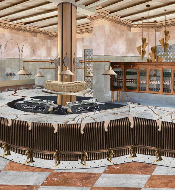
On the Board this issue is Munro Studio’s vision for Hagen’s new flagship store in Mayfair, London. Here, they demonstrate how they’ve balanced mood lighting with overhead technical lighting to achieve the brand’s signature hygge atmosphere.
Over the past decade, I’ve had the privilege of collaborating with Hagen, the renowned Danish coffee supplier and espresso bar chain. From the initial conceptualisation and outfitting of the first Hagen establishment on London’s prestigious King’s Road to subsequent boutique locations, our partnership has contributed significantly to establishing Hagen as a distinguished brand, characterised by the distinctive interiors of each venue.
Lighting has always been a key element in our design approach for Hagen. We blend Scandinavian, Italian, and British influences to infuse spaces with warmth and softness, while complementing the sleek design aesthetics. While functional task lighting is important for maintenance and cleaning purposes, we prioritise integrating indirect lighting solutions into our schemes.
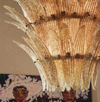

You could say that we’re allergic to conventional overhead down lighting, such as recessed ceiling spots. Instead, elements such as linen-shaded wall sconces, ribbed smoky glass hanging pendants, opal decorative flush mounts, and concealed brass fittings are carefully selected to curate an inviting ambiance. This approach creates nuanced pockets of light against darker, unlit areas, fostering a sense of drama and intimacy rather than a uniform illumination.
Of course in a commercial hospitality environment, and especially in Hagen’s espresso bars [1 - 5] , task lighting is key for the artful baristas to create their masterpieces. We ensure the workspace is lit well enough for the staff by designing in hidden task lighting preferably invisible to the customer’s untrained eye. For instance, in our first location for Hagen we sourced


tiny yet powerful LED spots which we drilled and inserted into the overhead hanging merchandising display. And now, we’re gearing up for our biggest project for Hagen yet: a brand-new flagship location, in London’s prestigious Mayfair. The property has a gorgeous listed terracotta tiled facade, which we are building on to inspire the interior foundation and palette. Our curated selection of feature lighting will include pieces with traditional silhouettes but with a modern twist, all elegantly shaded to enhance the ‘Hygge’ atmosphere. Our design will pay homage to tradition while incorporating contemporary sensibilities; modern light fittings will come and go but the timeless classics are here to stay.
www.erikmunro.com
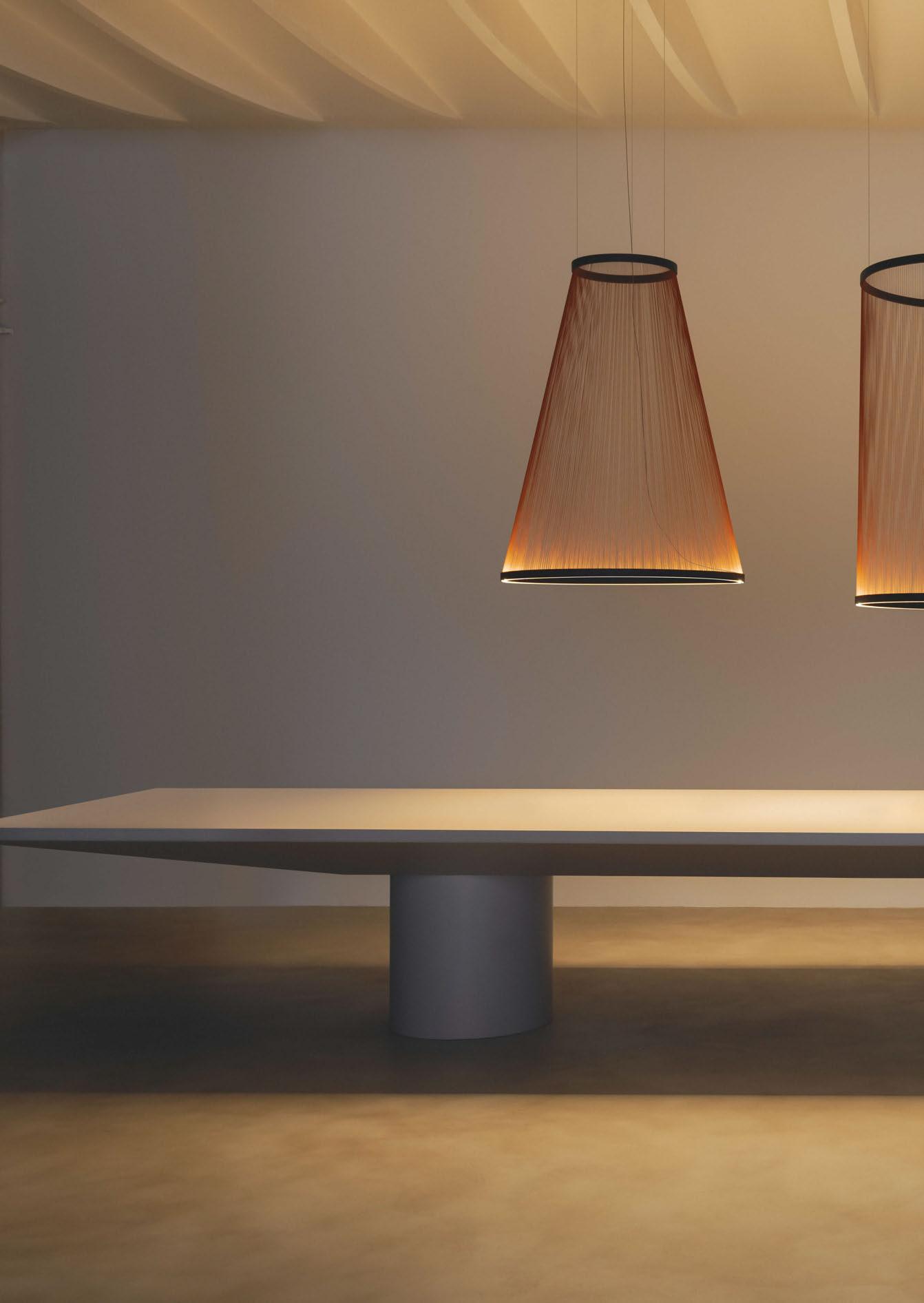
Vibia wins the 2023 [d]arc award in the Decorative: Kit category for its Array collection designed in collaboration with Umut Yamac.
This year’s winner of the decorative lighting product at the [d]arc awards was Vibia’s Array collection designed by Umut Yamac, who’s studio is characterised by a multidisciplinary approach that explores the middle ground between architecture and light.
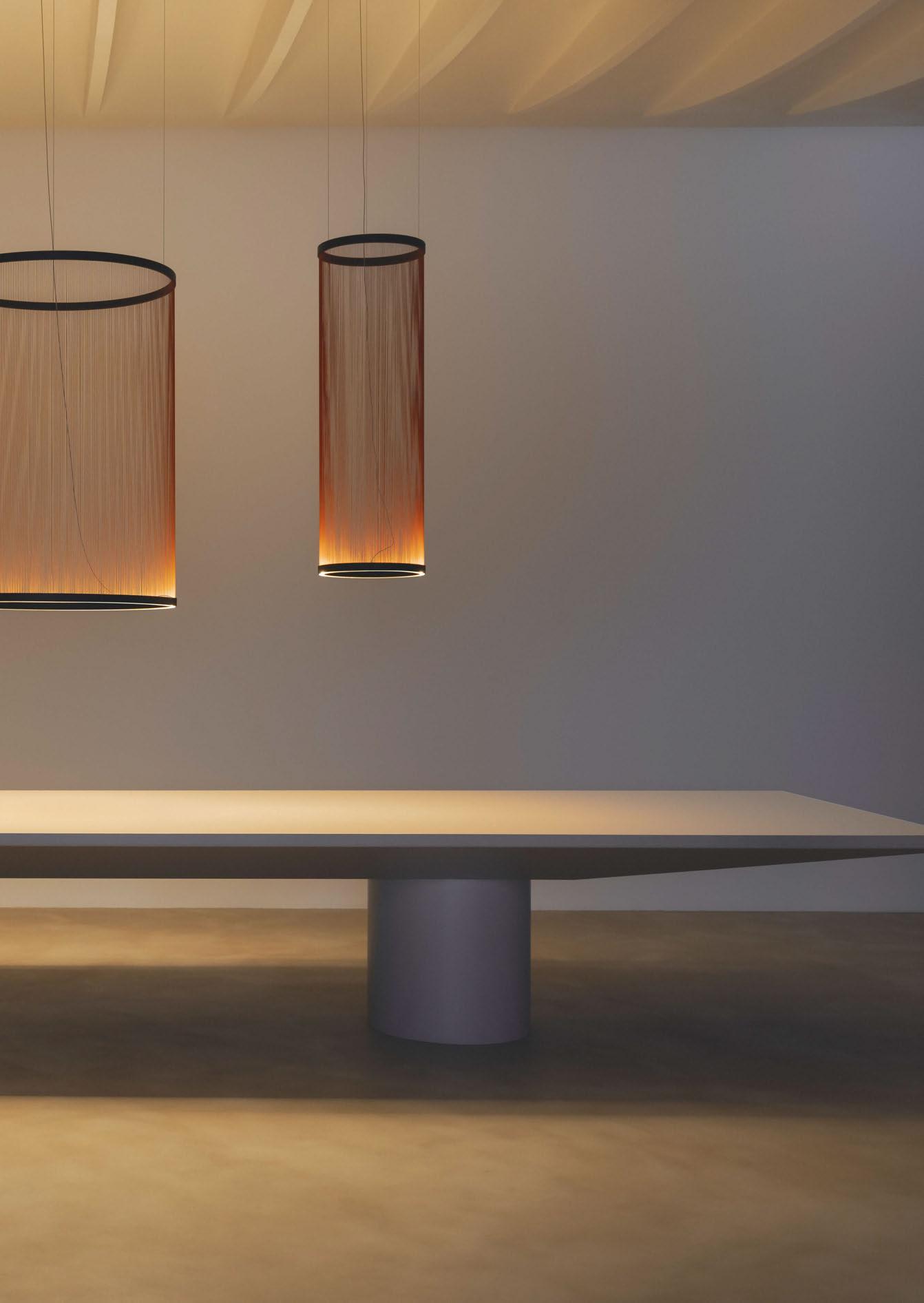
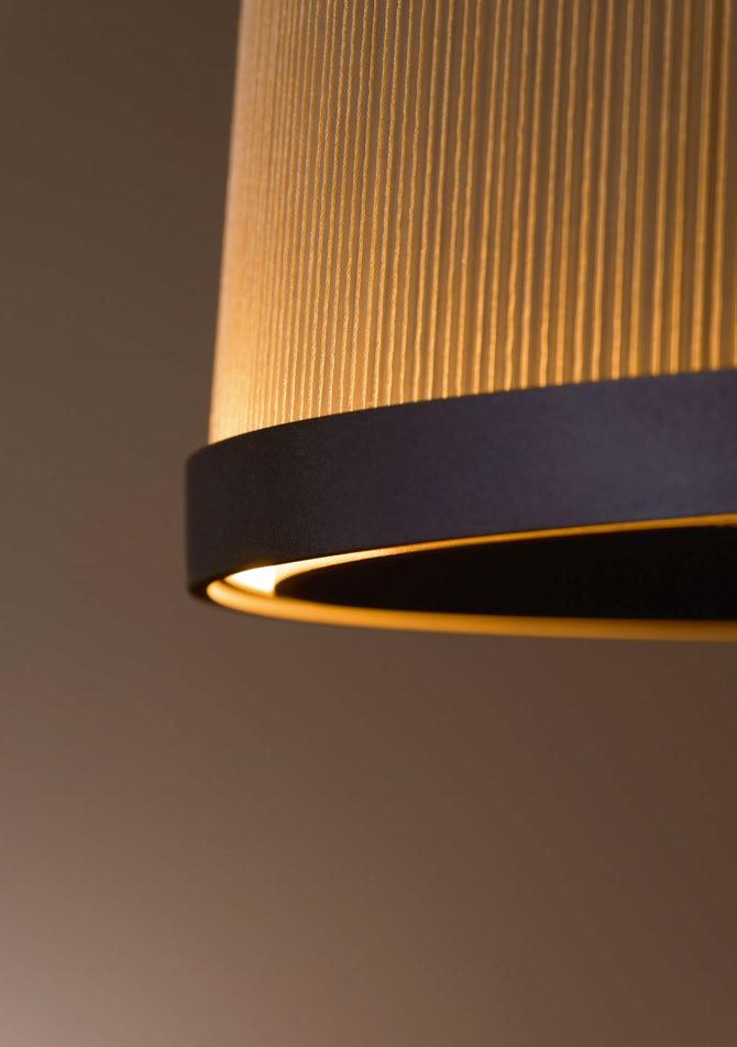
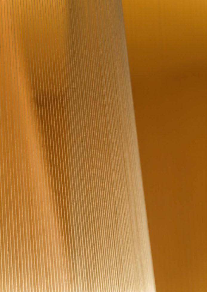
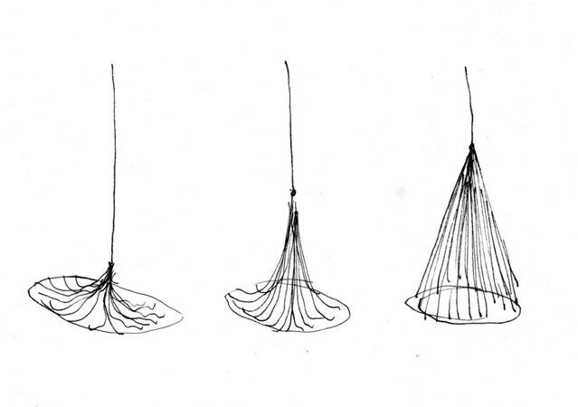
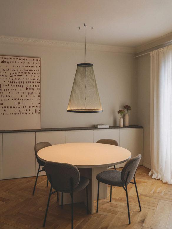
Composed of an array of fine threads pulled taut between two aluminium rings, the collection presents a variety of elegant conical and cylindrical silhouettes that shimmer enticingly overhead, evoking a sense of refinement that can be enjoyed in any context.
Yamac speaks with darc about his design inspirations and concept for the award-winning collection.
“The idea for Array evolved over a number of years, and through various projects and prototypes. Originally, we were really interested in transforming a humble material – thread – and using repetition,
tension, and space to trace spatial forms,” he explains.
“We were fascinated by the question of how little material do you need to define a volume? How can this form occupy a space without taking over it?
“The voids between the weave create a sense of transparency that means you can go quite large without feeling obtrusive. Instead, these volumes explore, reach out into the space, let the air pass through and become a liminal architectural element. With Array, we are suggesting a form without completing it, instead letting the viewer complete it in their mind’s eye.
“There were many technical challenges that related to working with thread in such a precise way. For me, the joy and beauty of the product comes from the precision of the thread and its tension and spacing, so


“We were fascinated by the question of how little material do you need to define a volume? How can this form occupy a space without taking over it? The voids between the weave create a sense of transparency that means you can go quite large without feeling obtrusive. Instead, these volumes explore, reach out into the space, let the air pass through and become a liminal architectural element.”
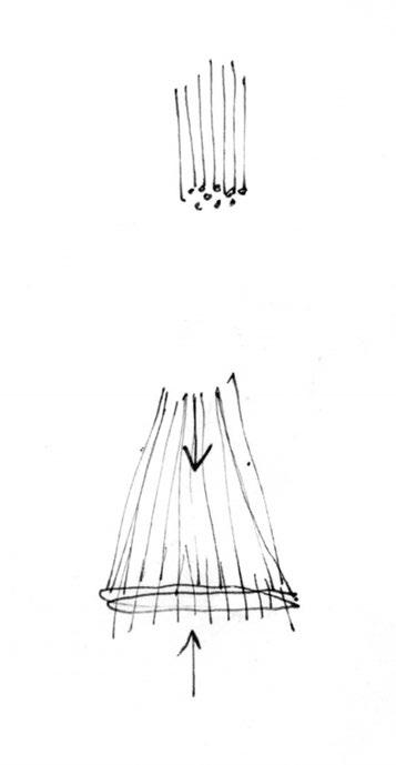
Turning to external industries – in particular fashion and knitting – Vibia and Yamac combined techniques of working with thread with their technical and industrial knowledge and experience to create the unique Array pendants.
this was a key area that required extensive research and development.
“As thread has not been used in this way before, we had to look to other industries for potential collaborators and solutions. Thanks to the commitment and work of the product development team at Vibia, the solution came from the fashion industry and a partner within the knitting industry.”
Expanding on his collaboration, Yamac adds: “The collaboration with Vibia was very natural, intuitive, and enjoyable. From the outset we had a shared vision for the potential of the collection and what could be possible working with thread in a spatial way.
“Vibia bring a wealth of experience in craft, product development and industrial processes. Also, a curious and a very collaborative approach. I think we also bring a playful curiosity and an artistic mindset with an architectural understanding.”
The Array collection incorporates various shapes and sizes, the largest of which extends to nearly two metres in height and 124 cm in diameter.
Array’s impressive scale by no means limits its use to public and commercial settings. The collection includes various smaller models suitable for residential use, the shortest of which stands at a modest 73 cm in height.
When it comes to mood, Array is as dynamic as it is intimate. The layering effect of the threads creates the illusion of movement with the shifting gaze of the viewer. In a restaurant setting, this effect is both subtle and spectacular. A series of identical cylindrical fixtures can be used to flood a long dining table with brilliant, dynamic light.
Alternatively, multiple pendants can be suspended low over individual tables, their lightweight form creating an air of romanticism that amplifies the space they inhabit.
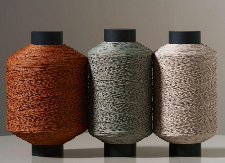
In terms of palette, Array’s matte black rings are complemented by a choice of terracotta red, sober green, or soft beige threads.
These natural tones lend an earthy richness to a minimalist interior, particularly as they interact with the light as it washes up from below in a gradient of colour.
www.vibia.com www.umutyamac.com
IMAGE: TOP LEFT: YAMAC COLLECTING [D]ARC AWARD AT [D]ARC NIGHT AWARDS PARTY ON 27 MARCH 2024, BY GAVRIIL PAPADIOTIS.
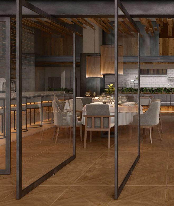

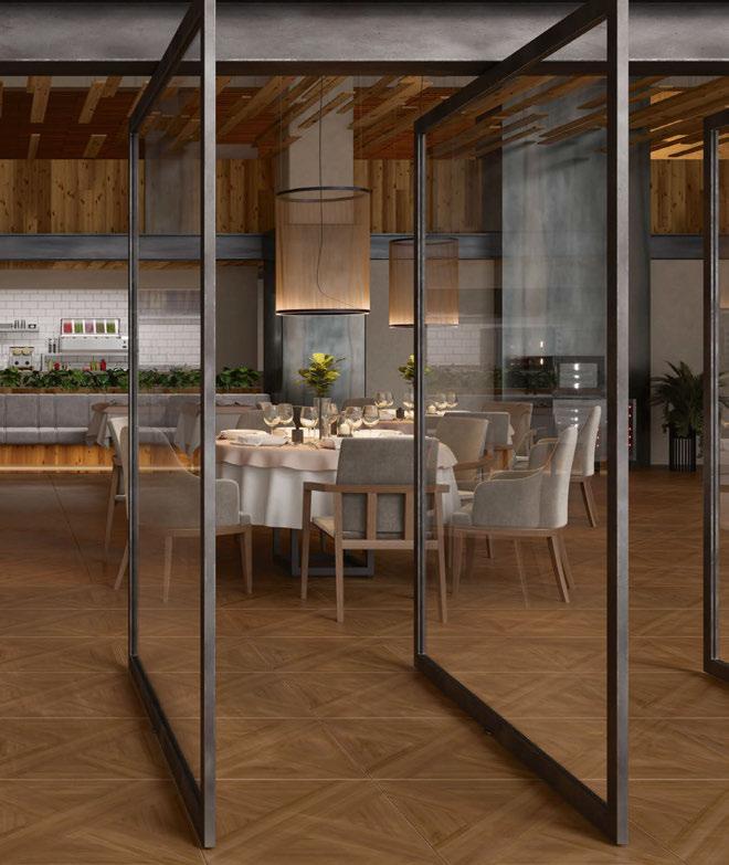
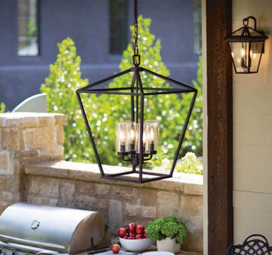
Alford Place 4 light, designed by Hinkley, is part of the Quintiesse Collection from Elstead. It has a clean and classic open cage design, providing excellent illumination from all sides. The fittings are finished in a Museum Black and the clear seeded glass shades help to provide an IP44 rating to allow it to be used outside. This range also has a larger six light linear pendant and a full range of wall lanterns, pedestals, and posts. www.elsteadlighting.com
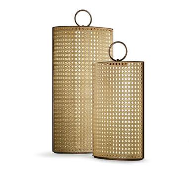 Clara Contardi
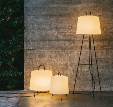
Designed by Chiara Caberlon, Clara has given the classic lantern a modern practical twist thanks to its rechargeable USB-C battery body, with a life of up to eight hours. In the medium and large versions, the light source can be removed with a handle, for use as a torch. Available with marine grade matt white lacquer or bronze painted structure, and the diffuser in Vienna straw-effect resin finish, Clara is IP65 rated. www.contardi-italia.com
Fold Out
Alma Light
Fold Out completes the Fold collection of lamps by Andrea Gelpí (Blaumel Studio). The battery-operated and IP65 rated lamp is available in two sizes: large (45cm high), and small (30cm high). The inner shade is a PMMA hemisphere that houses an integrated 3W 290lm 3000K CRI>80 outdoor, dimmable LED. www.almalight.com
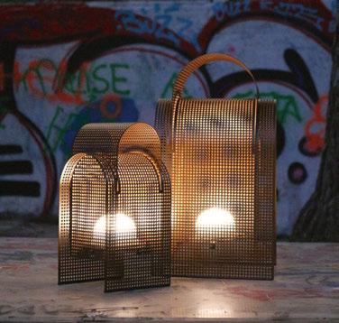
Trunk Light
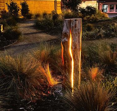
Duncan MeerdingTrunk Light is a continuation and literal growth in the award-winning Cracked Log Light series. The Trunk Lights are approximately 300mm diameter and can be made between 0.8 and 2-metres in height. Made in Tasmania from macrocarpa - a timber chosen for its rot-resistant properties and beauty. Each Trunk Light has a dot free multidirectional custom-made IP65+ light source, with options for installation in various outdoor settings. www.duncanmeerding.com.au
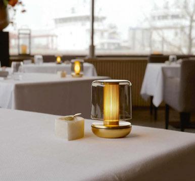
Humble has managed to capture the atmosphere of candlelight in a new wireless design lamp. The firefly that appears to be under the shade provides a subtle light accent and shadow play. Firefly is dimmable (three settings), available in two variants (bronze or gold colour) with a frosted or smoked shade. All lamps are waterproof IP65-certified. www.humblelights.com
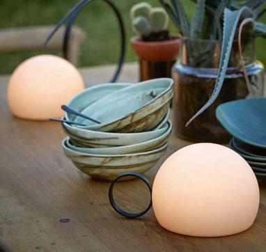
Circ is an indoor/outdoor lamp designed from a sphere of enveloping light, which dialogues with different wrought iron supports to configure the identity of each element of the collection. The outdoor versions of Circ are manufactured from a resistant screen of polyethylene, whereas the indoor versions incorporate glass. The portable model has a six-hour battery life, equipped with a charger through induction. www.estiluz.com
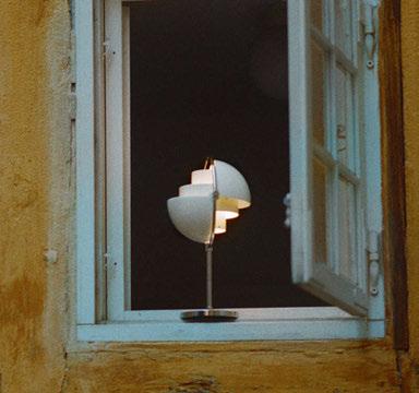
Gubi’s new edition of Louis Weisdorf’s MultiLite design reimagines the unique lamp in a portable format. Working in collaboration with the designer’s family, Gubi has redeveloped every component of the Multi-Lite table lamp in a more compact design, integrated a USB-charging facility, and incorporated a three-level, touchactivated dimmer function. www.gubi.com
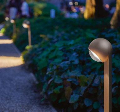
Available in glossy or matte coatings in white, black, maroon, or dune, the powdercoated aluminium finishes ensure high UV and weather resistance. Sito palo’s internal lenses provide optimal light distribution, and the head can swivel 45°. It offers trailing-edge phase cut dimming and can be controlled via the Occhio air app or can be connected directly to the mains voltage. www.occhio.com
Mia is built around an acid-treated glass diffuser, which is protected by a large polypropylene lampshade. Both are held in place by a clever wire structure. The lamps are completely waterproof allowing for a wide range of applications and making it suitable for outdoor use. The Mia series comprises multiple variations, including a small battery powered lamp. www.kettal.com
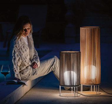
Habe Olé Lighting
Manex Bilbao Studio has designed Habe for Olé Lighting. This decorative lamp for outdoor and indoor use is inspired by columns, highlighting the eternal beauty of these structures.
Habe is a collection committed to sustainability, as its hand-braided cords are made from recycled plastic bottles, and are available in 14 different colours. www.ole-lighting.com
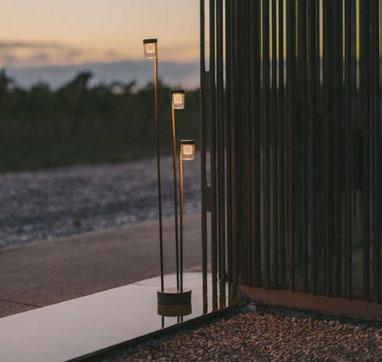
Sinia LedsC4
Lightweight and unobtrusive, Sinia radiates natural elegance and warmth, making it inherently distinctive. During the day, it seamlessly merges with the landscape like a silent sculpture with its subtle and slender profile. At night, it casts a warm glow that complements the landscape’s intent, effortlessly adapting to its surroundings. www.ledsc4.com
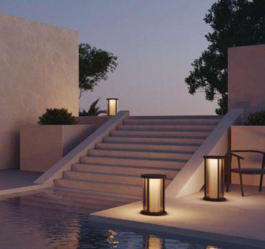
Once illuminated, Ion reveals structural elements as warm, ambient lighting filters and refracts through the tubes cascading to the base. An ability to interchange these glass tubes with opaque columns allows control over lighting directionality. With two scales tailoring to different applications, Ion presents a refined and versatile design choice for fixed mount architectural lanterns and bollards. www.rakumba.com.au
Mia Kettal Ion Rakumba Sito Palo Occhio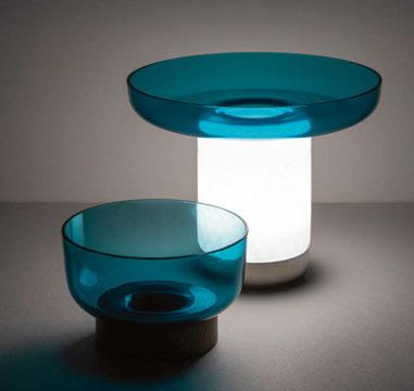
A body made from white textured milk glass, diffuses the light, creating a relaxed atmosphere, while the upper recess is home to a glass bowl designed to hold food for sharing. The bowls –and the lamp itself – are made from hand-worked glass, making them unique pieces whose texture, transparency and colour generate a special dialogue between light and food, blurring the boundaries between them. www.artemide.com
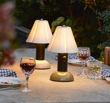
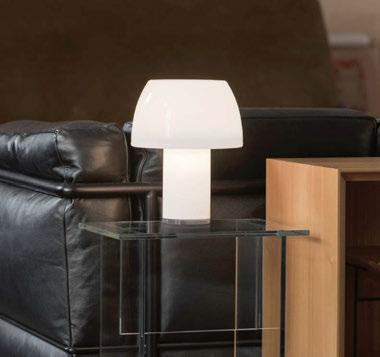
Misko Camp has a USB rechargeable battery and light intensity touch-dim system. Misko Camp is created from a metal disk, covered by a walnut-finished wooden sheet, or painted in black, which supports a blown glass diffuser finished in white. For easy transportation of the luminaire, Misko Camp includes a leather handle on the top. www.stone-dsgns.com www.usa.bluxlighting.com

Lorosae Table Nemo
Inspired by a trip by Álvaro Siza to East Timor, area of a Portuguese colony in East Asia known as Timor Loro Sae, Lorosae denotes the place where the sun rises. Through the translucent glass in different pure and brilliant finishes, Lorosae battery lamp is a rechargeable, batterypowered design that spreads a diffused light and expresses a direct connection to the country, its culture and geographical location. www.nemolighting.com
Trip Design By Us Blossom Original BTC
IP44 rated, Blossom can be used safely outdoors, allowing gardens and terraces to be enjoyed and appreciated long after the sun sets. With three brightness levels, Blossom offers a choice of illumination: from sufficient light for al fresco dining, to a warm, cosy glow afterwards. Charged via USB-C, Blossom has a 20-hour run time on the lowest setting, ideal for winding away long summer nights. www.originalbtc.com
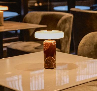
The sculptural design with polished marble and mouthblown glass gives Trip an exclusive look. There is a touch dimmer on top, which can be set at three brightness levels. The LED lamp is fully rechargeable; a full charge takes approx. nine hours, and it is available in eight colour varieties.
www.design-by-us.com
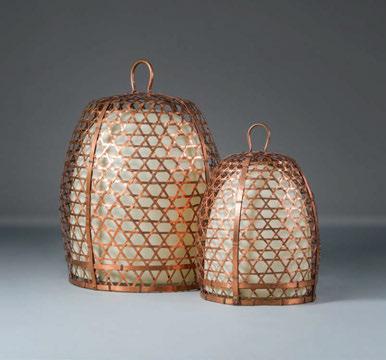
Woven copper lanterns based on cockfighting baskets. Over time, the copper will slowly patinate and become darker. Available wired for indoor use or with waterproof rechargeable lanterns for outdoor.
www.alexanderlamont.com

This April, darc headed back to the sunny streets of Milan to check out the latest decorative lighting offerings. On a non-Euroluce year, the team were amazed at the amount of lighting presentations and events happening throughout the city. Check out some of our highlights over the next few pages.
On the occasion of Milan Design Week 2024, the British/German lighting company Kaia unveiled The Empyrean, a collection born from a collaboration with GSL Works (The Guild of Saint Luke), the collective founded and directed by renowned British designer John Whelan. Presented within an immersive installation amidst Milan’s bustling core, the Cinque Vie district, this new collection embodies the shared commitment of both partners to pioneering craftsmanship and design. The Empyrean offered a singular interpretation of lighting’s evocative and spiritual essence, fusing literal and abstract elements in a contemporary expression that draws inspiration from Art Deco and sacred geometry.
In the first room, a blend of fresh additions like the Kaia wall lamp and the latest furniture design intermingle with selections from the existing collection.
These pieces, conceived to seamlessly integrate into Kaia’s portfolio, also harmonise to articulate the installation’s overarching vision.
The second room focused the attention on the collaborative efforts of GSL Works and Kaia, spotlighting the Empyrean chandelier and the Trap sconce. Here, the chandelier’s luminance danced through the space, casting shadows that played across the black mirror film, captivating onlookers.
The ambiance was enhanced by the addition of fabrics and bolted rubber flooring, contributing layers of texture to the environment. The entirety of the surroundings was bathed in a black hue, heightening the installation’s monochromatic charm and emphasising the significance of light, in alignment with the brand’s ethos.
www.kaialighting.com
Image: Oskar Proctor

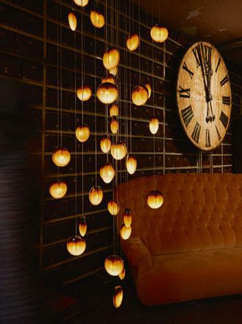

Matthew McCormick Studio
Canadian lighting brand Matthew McCormick Studio announced a new addition to its eponymous collection, Ova Amber, at the iconic Galleria Rossana Orlandi. Ova Amber, an addition to the Ova pendant collection, is the Studio’s first foray into experimenting with colour in glass -- a notable divergence from the thoughtfully muted tones of the expanded Matthew McCormick product line.
“There is a sense of calm and tranquillity from Ova Amber that is really special, even more so in person,” adds McCormick. “While we were purposeful in our approach to standardise Ova’s form, we know that glass is a dynamic material; I appreciate that every piece is slightly different for those that take the time to notice. The result is a delicate interplay between colour and light that feels almost poetic.” www.matthewmccormick.ca
Images: TMPL STUDIO
On the occasion of Milan Design Week, Giuliano Andrea Dell’Uva of Studio dell’Uva Architetti designed the new layout concept inside the Monforte Nemo showroom, using colour as the aesthetic and experiential leitmotif.
Numerous new designs were presented in the installation that celebrated the cultural heritage of the past, combined with cuttingedge technology and the aesthetic quality of contemporary design, in the true eclectic spirit of Nemo.
The outdoor version of Applique à Volet Pivotant, designed by Charlotte Perriand in 1962, welcomed visitors by immersing them in an achromatic contrast of black and white.
Green glaze in various tones applied by hand on terracotta by the skilled Vietri artisans of Francesco De Maio defined the architectural perspectives of the entryway.
A reminder of Mediterranean atmospheres, a eulogy to the craftsmanship that Studio Dell’Uva has long defended and that is now part of the designer’s architectural language. Graphic signs embraced the pure and brilliant finishes of the translucent glass of the Lorosae table lamp by Álvaro Siza.
The evocative journey through epochs of architecture and design continued in the room dedicated to LBB01 by Lina Bo Bardi.
Moving through, poplar wood and warm tones evoked the intimate atmosphere in a dining room. Sorrento by Valerio Sommella enlightened the interior, evoking the archetype of a candle holder and going beyond the limits of perception.
Pictured are Lorosae table lamps by Álvaro Siza (above) and Sorrento by Valerio Sommella (below).
Inspired by a trip by Álvaro Siza to East Timor, an area of a Portuguese colony in East Asia known as Timor Loro Sae, Lorosae denotes the place where the sun rises. Through the translucent glass in different pure and brilliant finishes, the Lorosae battery lamp is a rechargeable design that spreads a diffused light and expresses a direct connection to the country, its culture and geographical location.
Sorrento is a portable and rechargeable table lamp. An object that goes beyond the limits of perception, bringing the archetype of the candle holder into the present. A metal base supports three slender aluminum stems, the transparent methacrylate diffuser visually evokes the flame of a candle while emitting indirect light. Dimmable in three steps for an autonomy of up to 15 hours.
www.nemolighting.com
Images: Luca Rotondo


Lasvit
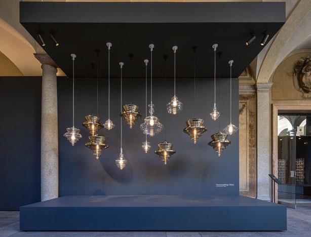
Lasvit marks the 10th anniversary of its acclaimed Neverending Glory collection with the introduction of an exclusive gold edition. Designed by Jan Plecháč and Henry Wielgus, this limited edition breathes new life into the La Scala luminaire, infusing it with the warmth of gold. A mere 100 pieces of this exclusive edition will be available, making it a collectors item.
The special edition was unveiled within the evocative setting of the Palazzo Isimbardi as part of its Re/Creation exhibition. Designers Plecháč and Wielgus shared their enthusiasm for the new edition, stating: “Where else but Milan? And with what else but a lamp inspired by the opera there? The new golden edition of La Scala is not just a celebration of the round anniversary of the Neverending Glory collection, but above all a celebration of timeless beauty. A beauty that shines with a traditional golden but unique light. We see it as the jewel of the interior.”
www.lasvit.com
Foscarini presented Habitus, an experimental project with international artists and collborators, based on embroidery and bead work. Artist and designer Andrea Anastasio worked together with Arun Jothi and Natalie Frost, the creative talents of Amal, a company founded in India that specialises in research, development and creation of embroidery made by hand for the world of haute couture.
Along the lines of the Battiti initiative in 2022, Habitus is a work of pure research: a project that moves in the space of possibilities between the idea and the product, in which Foscarini freely comes to terms with creativity, granting itself the possibility of exploring different directions in the world of lighting, without heeding
the limits logically imposed by serial production.
The Habitus project explores the world of embroidery as the expression of an ancient art and culture that are updated by Amal in a contemporary way, as Andrea Anastasio explains: “Habitus draws the gaze and the attention to these manual skills whose origins are lost in time. The modular character of the architecture underpinning embroidery and the reiteration of the gesture that produces it form the basis of this project, formulated to dress the light and to summon it to underscore the richness of the heritage of gestures layered in time that set the tone of the artefacts that are the design’s inspiration.”
www.foscarini.com
Designer Nicci Kavals took over a gallery space on Via Solferino in Brera, to unveil Articolo Studios’ first furniture smalls capsule bringing with her a flare for design that’s been harnessed over decades in the industry. Articolo Studios’ long-time collaborator David Goss from Studio Goss was behind the design, tasked with bringing Articolo Home to life in the extraordinary two-level space, well-known for its stunning arches and vaulted ceilings. The studio also unveiled its first colour introduction with ‘Accents of Oxblood’ across a new lighting collection, Rolo. The lighting collection will be officially launched in May during New York Design Week. www.articolostudios.com
Image: Thomas De Bruyne
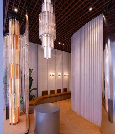
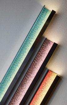


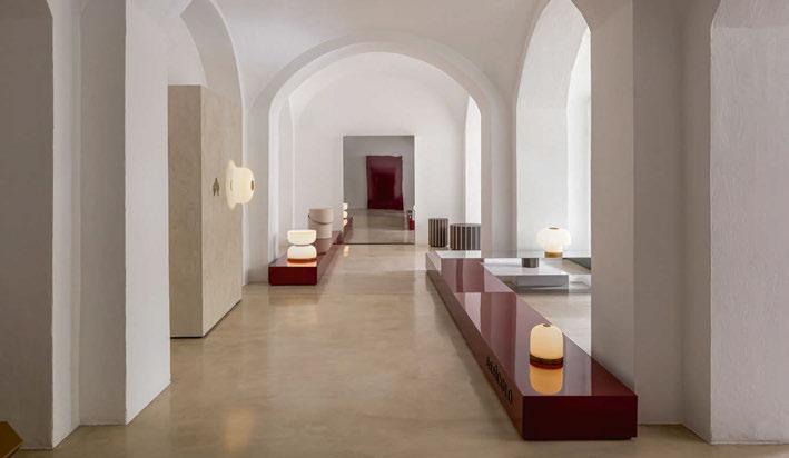
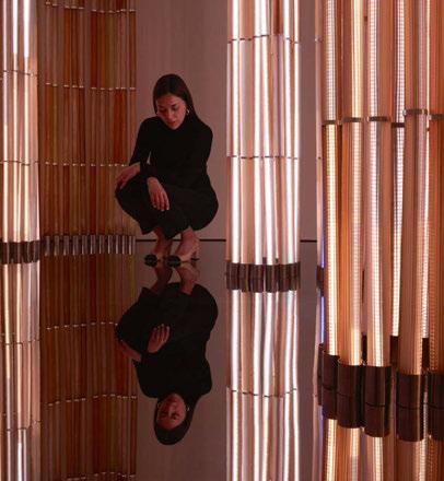
‘Endless’ was a special installation, realised by vandersandestudio, at Barovier & Toso’s showroom on Via Durini. For the first time, the Milanese monobrand hosted a site-specific project that enhanced the environments and their potential. It involved the complete transformation of the ground floor of the showroom with the creation of an immersive luminous installation at its centre. This installation composed of slender blown glass columns with light effects that turn on and off alternately, resting on some mirrored walls installed on the floor and ceiling. www.barovier.com
Verner Panton
Capsule presented a special collaboration with the estate of Danish architect and designer Verner Panton (1926–1998).
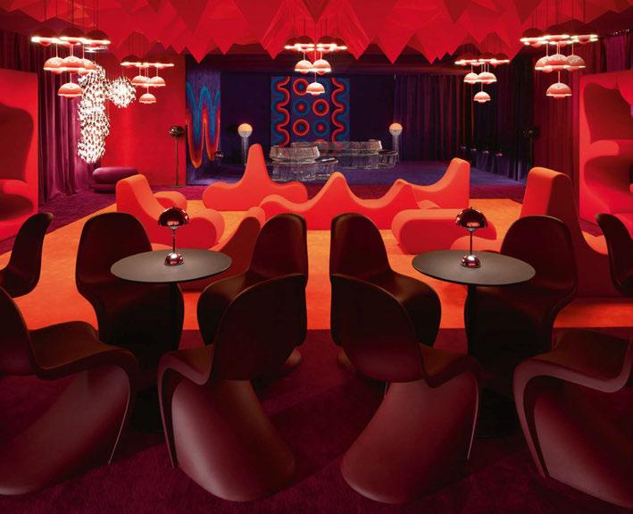
In the newly-renovated galleries of 10 Corso Como, which hosted part of the citywide design narrative of Capsule Plaza, the installation “Panton Lounge” recreated a fully immersive Verner Panton sensory experience. Produced in collaboration with the companies that proudly carry on Panton’s legacy as official licensees – Vitra, Verpan, &Tradition, and Montana – the installation at Capsule Plaza also premiered the re-edition of three iconic products: the Domino and Romantica rugs by Amini, and the Spiegel acoustic panel by Offecct.
Taking cues from some of Panton’s most visionary interiors – such as the Spiegel Publishing House in Hamburg – the “Panton Lounge” doubled as a sound experience and social space. This approach roots back to the designer’s preference for immersive environments, seeking out an emotional participation of the visitor. www.capsule.global www.verner-panton.com

The Mario Tsai Solo Exhibition presented its research results on the theme of ‘Soft Power’, featuring the full launch of the two newest works, Sparks and Soft, and the debut of lamp collection Soft in collaboration with fashion brand RUIbuilt. Additionally, Spotti Milano showcased the joint exhibition Living Divani + Mario Tsai, along with its iconic works, Mazha Light System and Light from Architecture. In 2022, the studio conducted a selfdriven research project on the theme of ‘Soft Power’. Through the refinement of ideas, material testing, technology research, and exploration
Italian brand Italamp inaugurated, in partnership with Capital Collection, its new gioiAtelier showroom located just a few steps away from the exclusive district of Gae Aulenti and Corso Como in Milan. The synergy between two leading companies in their respective segments gave life to unique spaces, devoted to beauty, which materialised into an effective tool at the service of the residential, design, and contract worlds.
In this new setting, the company chose to bring to the stage its 2024 novelties accompanied by its most representative creations in a display of great scenic impact.
Among the new novelties was the Galatea suspension by Studio Mamo, an expansion of the Nube collection by Defne Koz with a new suspension version, and expansions of the Regolo by Stefano Traverso, and Rosè designed by Danilo De Rossi. www.italamp.com
of the production process, two series of works were created: Sparks and Soft Collection.
The Sparks interacts with elasticity and oscillation to create sparkling, flickering lights and crisp, elegant natural impact sounds. The Soft Collection combines the processes of garment and industrial production, shaping elastic materials by point pulling to present natural and elegant lines and tense forms. Mario Tsai and RUIbuilt’s collaboration on the Soft RUI lighting collection, is characterised by its soft and flexible shaping. www.mariotsai.com

Masiero’s temporary installation ‘Timeless by Atelier’ was a visually stimulating creation. Located along along Corso Garibaldi, passers by were drawn to the intense fuchsia of the shop windows, brilliantly enhanced by the lighting. From the windows you could glimpse into a world of fairy-tale sparkle made up of majestic chandeliers whose vibrant reflections created a dance of optical effects on the platforms and on the vertical mirrored walls.
Atelier is a Masiero line springing from a continuous succession of experiences that make it possible to capture the formal harmony of a collection that pursues excellence rooted in the finest craftsmanship.
Metal cores skilfully forged by hand are embellished with refined finishes and materials such as glass, crystal and natural stones.
These products offer lighting solutions for both classic and
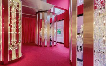
modern, residential and contract environments.
Through the Masiero customisation service, with Atelier it is possible to create unique and exclusive lighting works based on the requests of designers and customers.
www.masierogroup.com

In this year’s ‘A Life Extraordinary’ exhibition, tactility took centre stage. Visitor’s could experience a world where lighting, scent, and surface teased and awoke the imagination and senses.
On show was the new Tubelight, a modern take on fluorescent light designed by collective BCXSY. Born from a fascination with fluorescent tubes, and transcending them, Tubelight offers style and functionality and bends all the rules. Simple yet surreal, suspended yet fleeting, Tubelight sets itself apart from traditional lighting fixtures. It is available in a 1.5-metre fixed or, 5-metre flexible LED tube. Its design adapts and adorns any space to become the eye-catching narrator of all stories. www.moooi.com
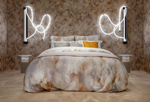
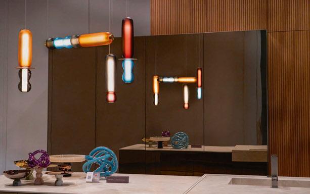
British-brand Curiousa showcased its new lights in Milan. Esther Patterson, the studio’s Design Director, collaborated with designers at Snaidero and Monogramma Studio to create a stunning Wave chandelier using elements from the latest WAVE II collection.
The design team opted for warm tones of blush, purple, slate grey, and turkish blue to complement the rich wood finishes of the ‘Elementi’ kitchen design.
A set of three pendants, made up of an Antonio, Aura Stack, and Tutti Stem, were also part of the display in Snaidero’s ‘Way’ kitchen design. Echoing the colour scheme of the Wave chandelier, with the addition of smoked olive, the pendants also feature a mix of sandblasted elements in the Stems and Bubble, offering an updated twist to the classic Curiousa design. www.curiousa.co.uk
Norwegian aluminium and renewable energy company
Hydro presented its exhibition 100R – a celebration of Hydro CIRCAL 100R, the world’s first industrial-scale aluminium product made entirely of post-consumer scrap. To showcase the material’s vast possibilities, Hydro gathered a team of seven renowned designers to create objects from this revolutionary aluminium.
Hydro put Norwegian designer Lars Beller Fjetland in charge of art direction, concept development and strategy for the 100R exhibition. He enlisted designers Inga Sempé, Max Lamb, Andreas Engesvik, Shane Schneck, Rachel Griffin, John Tree and Philippe Malouin, to create design objects made entirely from Hydro’s new recycled aluminium product.
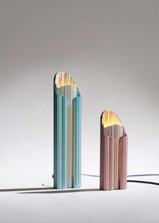
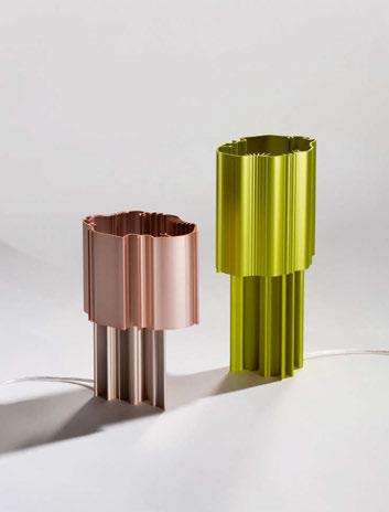
Two of the seven products were lighting, the Grotte table lamp by Inga Sempé (pictured left) and Prøve Light table lamp by Max Lamb (picture right). www.hydro.com
Images: Einar Aslaksen

Menu 1.
Conceived and meticulously curated by the London-based designer Bodo Sperlein, ‘Menu 1.’ was a transformative exhibition situated in the prestigious Brera Design district. The exhibition unfolded within the enchanting courtyard and cloisters of the Sant’Angelo Monastery, a venue designed in the 1930s by the iconic Milanese architect Giovani Muzio Sperlein’s collaborations extended to the Portal outdoor furniture and lighting collection for Weishäupl, the premiere of the S-Line kitchen block for Orea, and the latest designs from Sperlein’s collection with LZF Lamps and Lobmeyr Lighting.
Menu 1. also showcased the Voliere chandelier for LZF, and the Contourline bench. In addition to the furniture, the Portal collection, (pictured left) designed for Weishäupl, features customisable lighting options. These modular lights, whether hung, standing, or used as flat discs, offer flexibility to tailor the outdoor space according
to your exact specifications, reflecting your unique style and personality. The versatile flat disk lighting in the Portal collection serves not only as a source of ambient light but also doubles as a practical platform for showcasing your drinks and food during al fresco dining evenings.
The Toro Pendant (pictured right) marks the second collaboration between LZF and Bodo. Amidst growing emphasis on sustainability in design, this handcrafted fixture sets a new standard for eco-conscious lighting solutions.
The Mega Script (pictured far right), an addition to Sperlein’s Script Lighting series designed for Lobmeyr, draws inspiration from the graceful lines found in typography. Each piece boasts meticulously crafted crystal domes and hand-bent brass bands, seamlessly integrating visible cable guidance within a precisely milled groove. www.bodosperlein.com
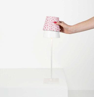 Poldina Zafferano
New accessories allow the shade of the Poldina cordless lamp to be “dressed” with customised aluminium covers in three decorations: a blue wave pattern with a red fish, a yellow lemon pattern; and a pink flower pattern. The diffusers are designed to fit the head of all Poldina lamps with a diameter of 11cm: Poldina / Poldina Mini Table, Poldina with Peg, Poldina Suspension, Poldina Wall; and the new Poldina Reverso. www.zafferanoitalia.com
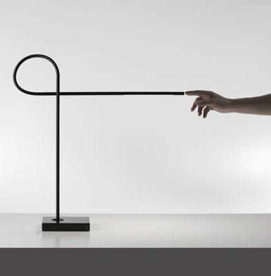
Designed by Maurici Ginés, Ribbon’s base is black marble and the arms are matte black painted aluminium, connected by a black silicone pipe. The particularly strong joint allows the lamp to be positioned along the vertical axis. The light can also be adjusted around the base, and the transformer has a USB-C port. Simply touch the sensor at the end of the upper arm to switch the light on and off and adjust the brightness. www.davidegroppi.com
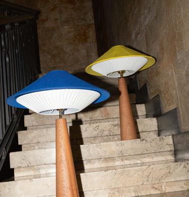
The Otto Table lamp expands the Otto collection introduced in 2023. Otto recalls the 1960s and 1970s sci-fi imagery and refers to the archetype of the flying saucer with its shapes. The lamp comprises a conical base of solid mahogany and a lampshade that combines a fabric upper part and a pleated lower part. The lamp is available in Rubelli fabrics – also used in the suspension – and four new Dedar fabrics in electric blue, lime yellow, pink, salt and pepper. www.servomuto.it
Image: Matteo D’Angelo
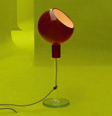
FontanaArte collaborates with Gucci for the Design Ancora project featuring the Parola table lamp, an iconic creation designed in 1980 by Gae Aulenti and Piero Castiglioni. Gucci Design Ancora came to life in Gucci’s flagship store on Via Monte Napoleone, 7. In each room, curved walls of green help blur boundaries and create a metaphysical space in which each object appeared on its own, displayed as an idea rather than just a product. www.fontanaarte.com
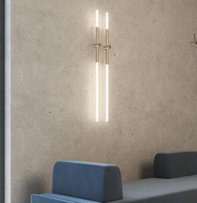
New in the 2024 catalogue are the linear wallmounted, table, and reading versions of the Bianca range.
The new Bianca linear wall light, available in gold lacquered and matte black silk lacquered finishes, enhaces surfaces with minimal yet sophisticated design. Bianca is also offered in the single or double suspension, wall-mounted, table and floor liseuse versions. www.contardi-italia.com
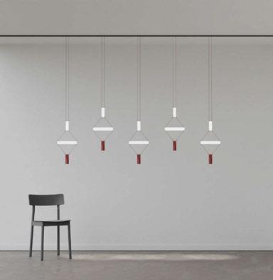
Limetry Luceplan
Limetry, designed by Alessandro Zambelli, combines ambient lighting with functional spotlights. The key element of the system is an initial rectangular module (12cm in height, 4cm in width) whose four vertices are fundamental for the connection of multiple parts: the electrical cables bring the polarities to the corners and ensure continuous power supply. www.luceplan.com
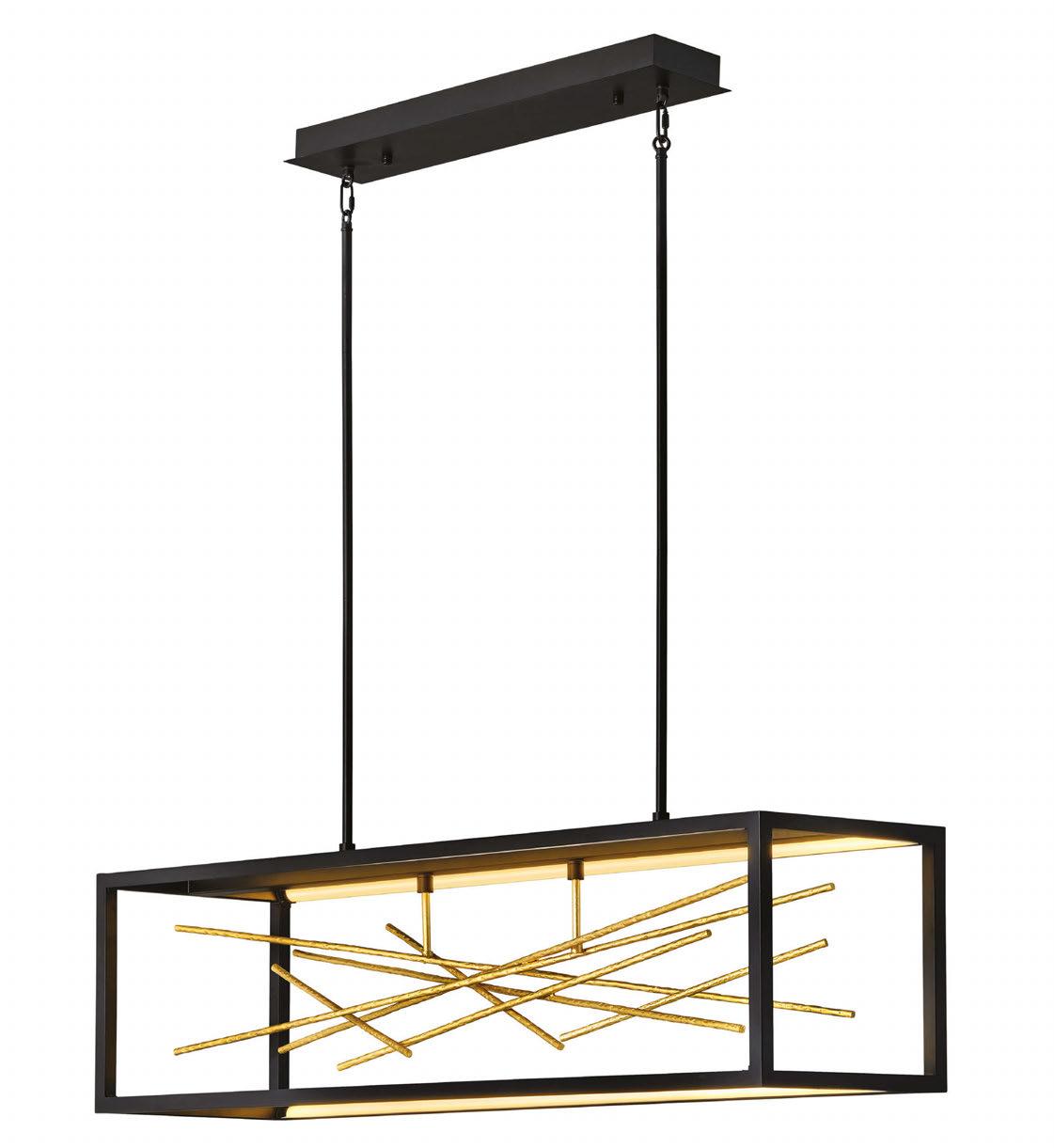

Toronto-based designer Jamie Wolfond designed Set Lamp to inspire new (yet relatable) ways of interacting with lighting. Taking visual cues from the screw thread, it intuitively tells us how to use it. With a body of threaded aluminum, the shade height is easily adjusted by rotation. An upward-facing light source bounces off a reflector shade, creating bright but comfortable, no-glare illumination.
www.muuto.com
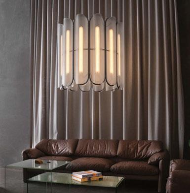
Utilising edge-to-edge connection points, the Vale series renders an exposition of chandeliers—available in configurations of three, six, and 12. Comprised of an arrangement of cast acrylic lenses braced by an aluminium frame, the Vale Chandelier, designed by Caine Heintzman, optimises functionality through its multidirectional luminescence.
www.a-n-d.com
Rakumba has joined creative forces with famed German product designer Sebastian Herkner to present Petal. Like the versatility of nature itself, Petal’s beauty takes other guises as a pendant and wall lamp in two sizes.
Petal comes in tones of pure transparent glass, and elegantly tinted champagne and bronze hues. Subtle metal detailing can be selected in gold or black.
www.rakumba.com

Architect and designer Jean-Michel Wilmotte has redesigned Sammode’s lamp, changing the iconic round tube into a square.
Wilmotte set Sammode’s CEO, Emmanuel Gagnez, the challenge of producing a ‘square tube’, which took three years of combined research before creating Quadratube.
The fixture still has all the smart features of Wilmotte’s original design, but now it also boasts modern technology and manufacturing. www.sammode.com
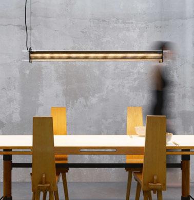
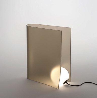
Dusk collection by nendo for Wonderglass combines warm, bronzed fused glass sheets with blown glass illuminated orbs to approximate the tranquillity of dawn and dusk – the transition between the contrasts of light and darkness. The studio’s Founder, Oki Sato, arranged this series of lamps in a gradated procession, mimicking the arc of the sun’s gradual ascent and descent across a day.
www.wonderglass.com
Image: Studio Visus
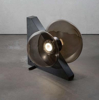
Henge unveils its collaboration with Venini, presenting the Floyds Lights series. The new lighting collection, designed by Ugo Cacciatori exclusively for Henge, includes four glass blown lights produced in Murano. The series features the Floyd pendant, Floyd W wall, Floyd Thor floor lamp with a stone base, and Floyd slide, a floor lamp with a metal base. www.henge07.com
Save the Date 20 & 21 November 2024
Join us at LiGHT 24, the UK’s only trade show dedicated to high-end lighting specification.
For those working in design, it’s the best opportunity in the UK to explore new products, access design talks, and network with those across the sector. Now into its third successful year, LiGHT 24 will take place at the Business Design Centre in London. Join thousands of other industry professionals for a fantastic two days of design inspiration.
From the publishers of:
Preciosa Lighting unveiled Crystal Beat 2, an immersive experience at Milan Design Week, which made use of its new signature design, Crystal Pixels.
A dazzling display of light and music inspired by retro gaming and early digital aesthetics, visitors were invited to embrace the present moment while diving into the past.
An extension of Preciosa’s Crystal Beat concept exhibited at Salone del Mobile last year, the installation combined retro themes of pixels, early gaming graphics and music while celebrating the returning cultural trends from generations past. It aimed to present a moment of escapism and nostalgia among the bustle of Milan’s lively Tortona district.
The installation made use of an advanced 3D sound system to immerse visitors in the rhythm of a 1980s inspired musical soundscape and RGBW lighting effects. The dynamic installation was set in darkness and comprised 400
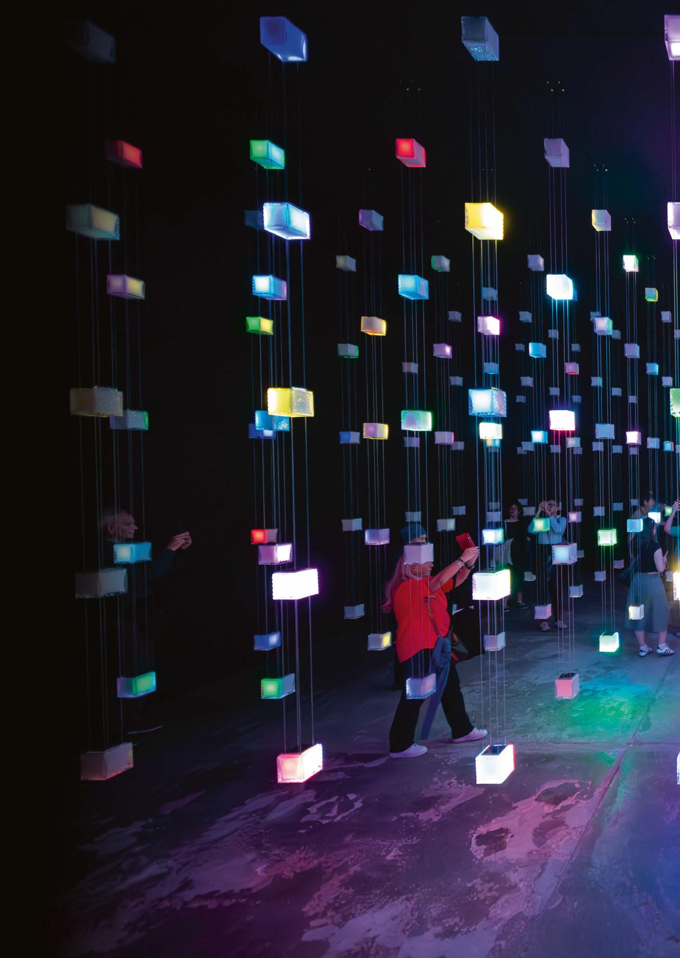
pendants that responded to the beat of the music in vibrant RGBW LED hues.
Crystal Pixels is a fully customisable lighting concept available in three sizes and various colours. Each suspended cube represents a pixel and can be displayed alone or as part of a cluster. They can be programmed individually for ambient or functional lighting solutions.
Michael Vasku, co-Creative Director of Preciosa, says: “Crystal Beat 2 is a response to the shift in the culture around us. We are all at once looking to the future and reaching back to the past for nostalgia, comfort, and experience to recoup popular retro trends. Through a dazzling display of light and music, every suspended Crystal Pixel invites you to take a graphic journey back in time, while absorbing the sensory delights of the present.”
www.preciosalighting.com
Image: Jan Dolezal
MILAN, ITALY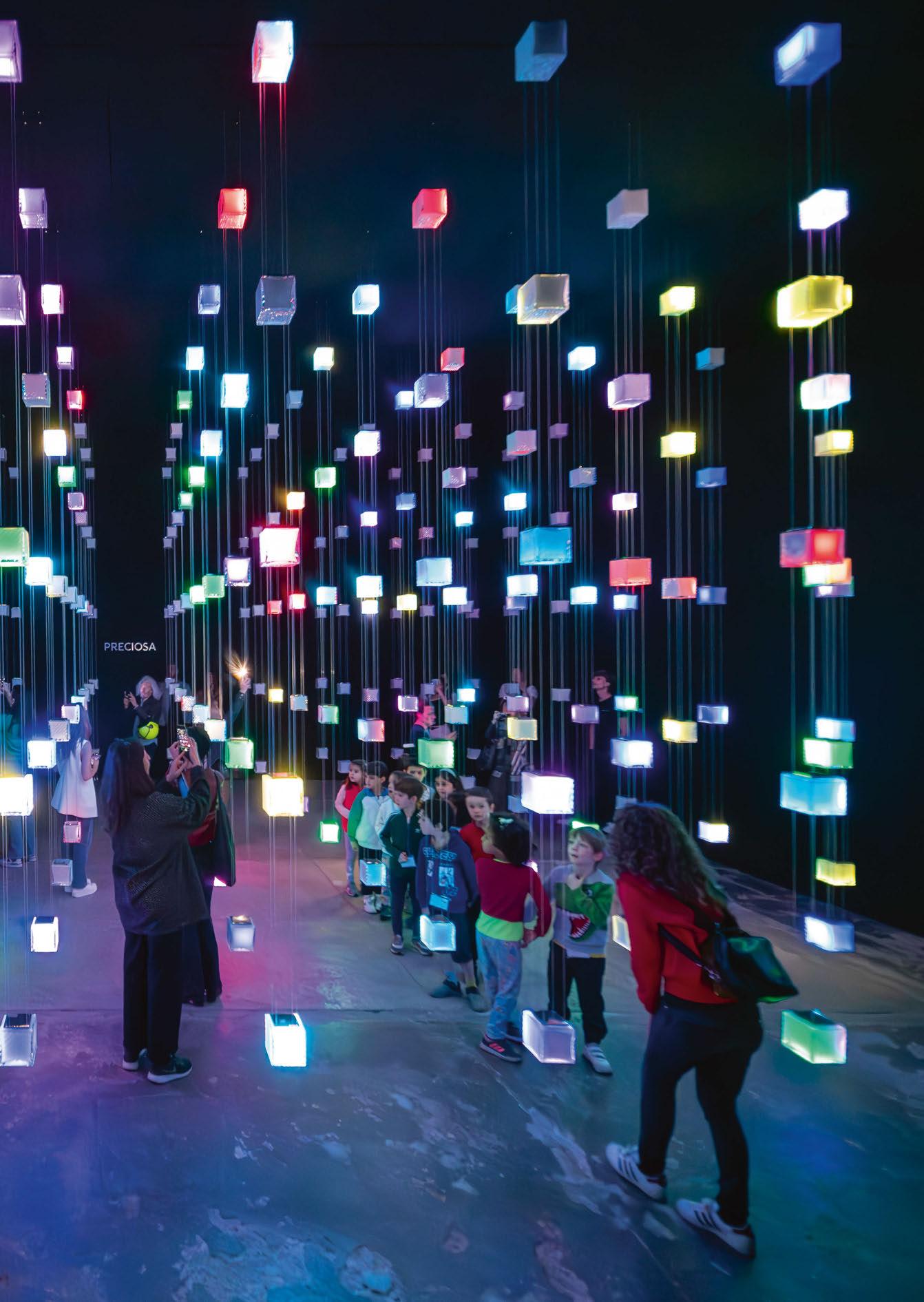
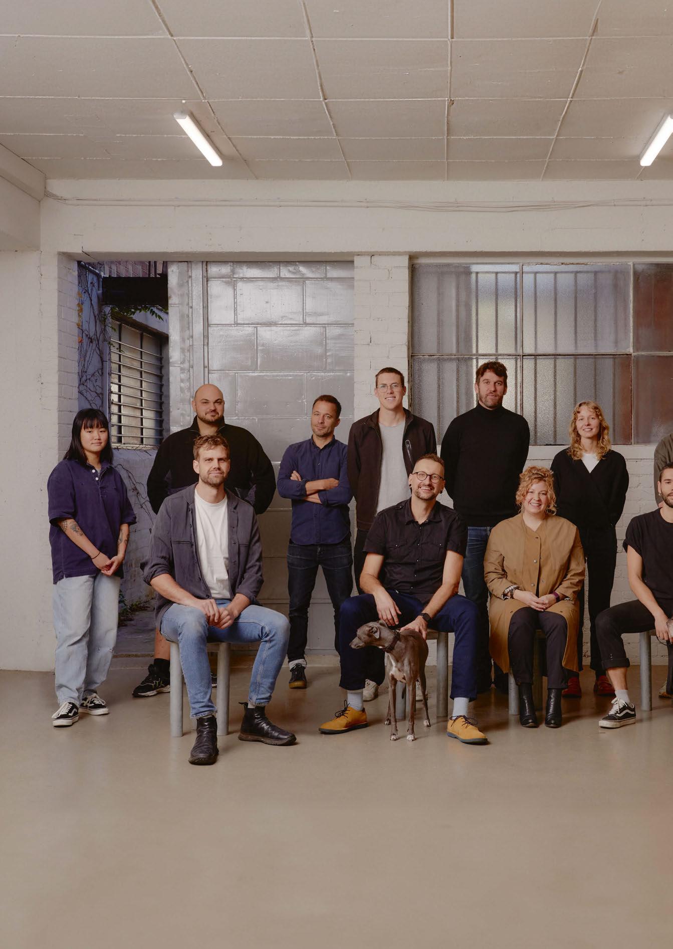
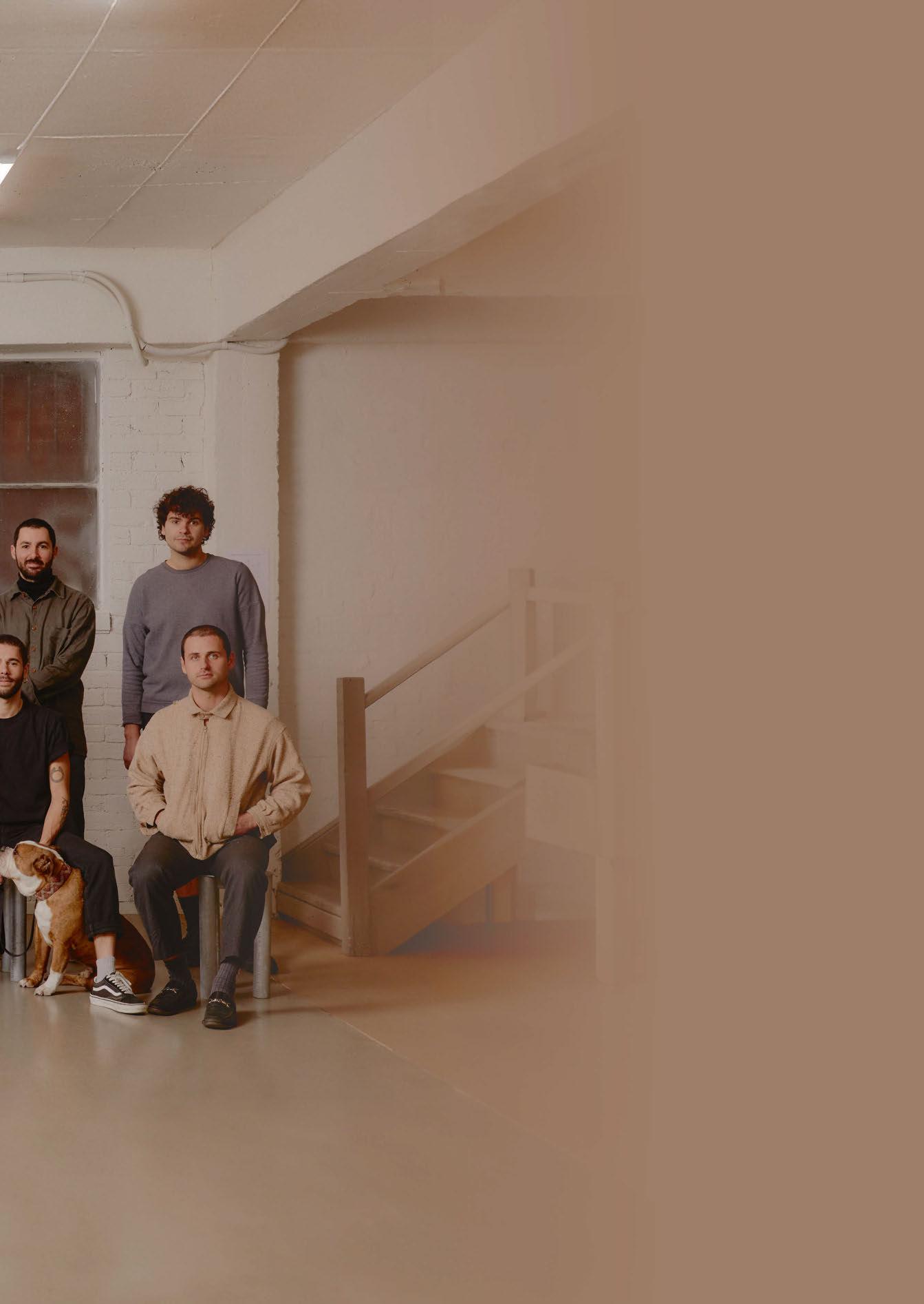
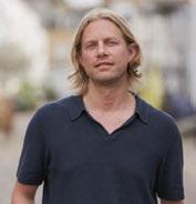
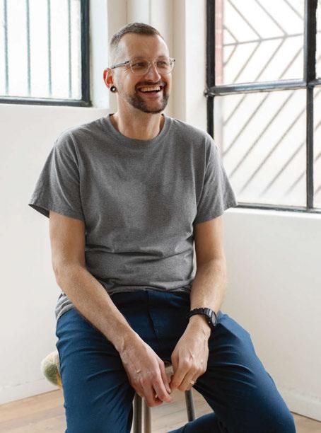
During Milan Design Week 2024, darc’s editor Sarah Cullen had the opportunity to sit down with Volker Haug to discover more about his journey into the lighting world and how he has established his design studio into the brand it is today.
Volker Haug, originally from Germany, is an Australianbased product designer that has been creating industrial, sculptural lights for the last 20 years.
Unexpectedly, Haug reveals that his first career began as a hairdresser. This avenue led him out of his hometown Stuttgart to Berlin and then to London, UK.
“I remember having lived in London for three and a half years I wanted to move on. I couldn’t see myself growing old there,” he tells darc.
“I met a lot of Australians that reside in London. So, I thought I would travel to Thailand and then to Australia to see some of these friends. Which I did, and never left!
“I remember arriving in Sydney in 2000 and I fell in love with Australia straight away. I was so happy to be there. I was in Sydney for about three months and tried to make a living there. It didn’t quite fall into a place, so I thought I’d go down to Melbourne after some friends told me I’d love it. I arrived in August, so it was winter, it was raining all the time, but things fell into place for me pretty quickly and I ended up staying. I got my residency through Australia’s skilled migration system as hairdressing was on the list.
lights, and some track lighting for the kitchen. I still remember those lights very well. They were actually pretty cool, obviously very different to my designs now, but it definitely sparked something in me.
“Throughout my whole hairdressing career, I always tinkered with lights. In fact, I made lights for the salons I worked in, and some of my hairdressing clients went on to become my lighting clients. I came to realise that hairdressing was not my real passion. I love it and did it for almost 20 years but I couldn’t stop thinking about lighting.”
The challenge for Haug then came with figuring out how to get into the product design industry.
“It’s not a job that you find in the yellow pages. These days it’s a bit different, but back then it was not as easy. Through my good industry friend Christopher Boots, I ended up meeting an amazing lighting designer, Geoffrey Mance, who has now passed unfortunately.
“I remember arriving in Sydney in 2000 and I fell in love with Australia straight away. I was so happy to be there.”
“Why Australia? For some reason I wanted to get as far away from Germany as I could. I think I managed it! Living somewhere else and being independent has always excited and interested me.”
Having put roots down in Melbourne, Haug worked as a hairdresser for five and a half years. But lighting, and the idea of creating it, was always in the back of his mind.
“Lighting was something that I had wanted to do all my life. When I was young, I was always playing with lights and switches to the point my parents had to tape them down. When I was about 10-years-old, I started making my first lighting range in a wood workshop in the Czech Republic. It was a ceiling scone, two wall
“Chris and I lived together for a while. He met Geoffrey at a university talk, where Geoffrey invited everyone to his studio – being as friendly as he was –so off we went and hours later we both returned with a job, which was amazing. We were working on these twig ball lights made from Hawthorne heads with lots of thorns in it. It was a very sculptural piece and really interesting to work on.
“Working with Geoffrey opened a whole new door for me. There was a lot of magic in the way he perceived lighting design, and he was very playful with it. It was an incredible realisation for me to see that you can actually make a living doing it. It was like fulfilling a dream. Yes, money is something we all need to make, but the chance to fulfil a dream comes first, and he showed me how to do that. He helped me breakthrough into the industry.
“We worked together for about a year and a half, during which I learned a lot of things; I also learned how not
“I am forever grateful for the shopping projects. Westfield was one of the instigators to me quitting my hairdressing job and got me into gear to become a lighting business.”
to do many things. But I am forever grateful for that experience. About another 18-months after that point that I decided to start on my own.”
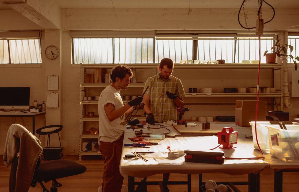
And that was exactly what Haug did. In his garage. For a couple of years, he was creating lighting pieces during the day and cutting hair in his spare room at night. He then decided to take the plunge and expand into a 20sqm studio. “The garage was running out of space, and I just needed to separate where I was living to where I was working. It worked well for a time, but you have to be careful that you don’t slip into a place of constant tinkering.
“I remember moving into the new workspace, and thinking ‘Jesus, this place is really big, how am I going to fill it?’, 11 months later I had to move because I needed more room.”
Haug’s second studio was located at an old convent in Abbotsford, which are being converted into artists’ studios as and when they receive funding. The 200sqm studio again seemed like a daunting place for Haug to grow his business and collections.
“The studio had two rooms and part of it had a glass floor, which they told me was indestructible. I managed to break the glass floor…Twice. So, I guess I proved them wrong! I was mortified. Don’t ever move into a studio with a glass floor if there are heavy tools involved!”
After a little over a year, Haug had to pack up and move on to a bigger space. It was at this point that he changed from a sole trader to a company and had two
official employees at the studio. Prior to that, he was hiring friends for AUS$10 an hour to help out.
As the brand began to grow, the team of now 20 including Haug, went on to settle in their fourth and current location at Brunswick East where Haug has been designing and creating for the past 12 years. “It’s a beautiful old 1940s warehouse that used to be owned by Worths Hosiery, which was the first to introduce pantyhose to the Australian market. When we first moved in, we actually found some leg mannequins still there, which we made into flower vases!”
Returning to the topic of Haug designing his first “lighting collection” at the young age of 10, he explains how his family were creative but in the musical sense, and perhaps weren’t a direct influence on his interest in interiors and product design. “I was made to play instruments, but never had an interest in it. None of my family had worked in design or ran their own business and it took them a while to get their heads around the fact that that’s what I was doing and are now very happy for me.”
When discussing influential elements in his life now as an established designer, Haug references the world he sees around him as a constant source. A key figure in the design world he has always admired is the late Ingo Maurer, whom Haug was lucky enough to meet a couple of times before he passed in 2019.
“I remember going to Milan around 2010 with a bag of lights on a mission to meet Maurer, and to see what Milan Design Week was all about. Maurer gave me some

The next session: 24 – 26 September, 2024 Le Meridien Resort Phuket, Thailand
“This installation really means a lot to me. The light, which is still hanging there today, really sums me up, as it’s brutal and crazy, but beautiful. Well, I’m not brutal, just the industrial aesthetic.”
really great feedback and inspired me to take things further. For example, I had a light fitting made from plastic adapters, which he liked the look of but thought if I was to change the material into something more sophisticated and increase the size, it would potentially be a great thing. I ended up exploring that idea and doing exactly as he suggested. I made the fixture out of ceramic porcelain and blew them up in size, which meant they became a very different product. The other thing I learned from him and all his books (I’ve read them all) is to keep going and never stop.”
A significant moment for Haug in his career was when his designing ventures came full circle, and he was exhibiting at Milan the same year as Maurer. “That was an incredible moment when I realised, I am in this same world as him. It made me very happy.”
Another notable marker for Haug was working with the National Gallery in Melbourne when it acquired an OMG chandelier. It’s made out of aluminium light shades crushed into a really flat pizza base shape and then anodised in beautiful iridescent colours, then bolted together into one big shade. So, roughly 20 crushed old factory lightshades have become one new big light shade. The space the gallery had was so big we had to create a larger version that was roughly 2.1-metres in the end. “This installation really means a lot to me. The light, which is still hanging there today, really sums me up, as it’s brutal and crazy, but beautiful. Well, I’m not brutal, just the industrial aesthetic.” These chandeliers were also commissioned by Westfield shopping centre back when Haug was first starting out. “I remember where I was standing when the lady called me, and that’s when my whole future changed. Westfield, being huge, needed 65 shades. It was then I had to stop cutting hair. I
already knew that point was coming soon, but this cemented that moment. I remember the day I finished, I just cried because it was so overwhelming. It was bloody scary.
“We still do some shopping centre projects alongside our more luxury clients. But I am forever grateful for the shopping projects. Westfield was one of the instigators to me quitting my hairdressing job and got me into gear to become a lighting business. And the shades are still there today. Reflecting on this, I am also very grateful to Australia, as the country provided me with real opportunity. I sometimes wonder if the same would have been if I had stayed in Germany.”
Haug’s studio is currently formed of 19 international and local employees. Each coming from various industries and backgrounds, which has enabled Haug to create a design team that brings something unique to the table, yet in line with his vision. “We make such a good team as we all have a say. I really value everyone’s opinion. Everyone has a different role in our business, and everyone is important. I’m very grateful for their amazing loyalty; many of them have been with me for many years and it’s just crazy.”
Industrialism is a constant aesthetic theme that can be seen in Haug’s work since the beginning. He likens this to his personal taste as well as being influenced by the materials that were available to him at the time. “We have explored many different materials and ways to use them over the years. Anything from glass, which we’ve only introduced in the last five years or so, to brass which I have always worked with and pushed to its limits. That’s where many of our industrial designers come in - they have such a knowledge about materials and how and what you can use them for, it’s incredible.
“Another thing we do, which is always well-received, is not
hide the materials in our products. We may polish them, for example, or seal or patina them, but you can always tell what is underneath. And with the casting, you can feel the roughness and unevenness, which adds to its beauty.”
When asked what qualities a good light should have, Haug explains that it’s always a good balance between beauty and functionality. He also believes they should be built to last a long time. To aid this, his studio provides a service for repairs and cosmetic touch-ups to ensure clients’ can keep the piece in situ for as long as possible. Not only does this allow the lights to be passed down generations, but it is also a positive approach to sustainable product design, to discourage waste.
Reflecting on his two decades as a designer and manufacturer, Haug describes the most frustrating and most rewarding aspects: “I think probably the most frustrating thing about design is if you are being copied by other people. Sometimes it can be ruthless. I never thought it would happen to us, but it has. I’m glad to say it’s not as often as other designers, but there are particular ranges that have been copied. “When I see our lights on eBay for a 10th of the price, but also 10th of the quality, it’s very sad.
“Another thing that I find difficult is the fact they can ruin your reputation. We have been contacted in the past by people claiming they have a crooked light, or it doesn’t work. So, we
ask them to send over photos to discover it’s not an original lamp, but a copy. It can ruin your name.
“Some still say it’s a flattering compliment, and we do what we can to help mitigate it. We make a racket to those that are copying, tell them we know they are doing it and ask them to stop, and that’s pretty much all we can do.”
Continuing on this moment of reflection, Haug looks back on how his studio has changed over the last 20 years, as well as his personal development: “It happened gradually. Of course, there were moments where things grew really quickly and other times slower. I remember there were certain growth bursts, which were frightening but also incredible. When they happen, it can be daunting; I would need to employ another two or three people at once. You employ them for a reason, and if it works and makes your life easier, then it’s obviously the right decision. Stick to trusting your gut and see what works.
“On a personal level, I don’t how I’m juggling it all, but you just sort of do. I guess it’s all happened gradually, and you just learn as you go. You must listen to what’s going on and what people have to say, what people’s needs are, but also people have to listen to you. Having regular meetings and involving people is really important. Together, we can do more.
“I think I’ve become a fairly natural leader. I haven’t done many leadership courses - I need to do more - but I just go with my
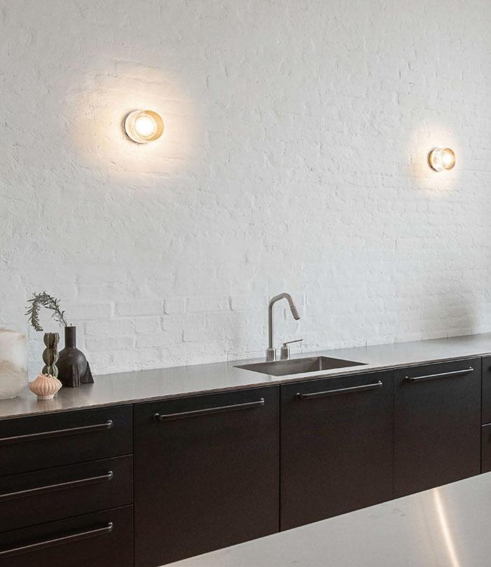
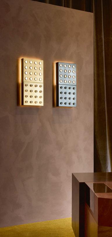
gut. Sometimes I have success, and sometimes I want to hit my head against the brick wall! But then, I have been told by some that I have been the best boss. What can I say? That’s what I really want to achieve, and if that is being affirmed then it’s a beautiful thing.
“From a design perspective I have changed the way I approach things a lot. I have worked alongside many professional industrial and interior designers as well as jewellers.
“I look at things very differently, much more critically and through a different pair of eyes. Also, more practically. Before it was like, ‘Oh, I love this, I want to design it’. And now it’s more like, ‘Okay, we want to design something that is a bit more restrained’, but restraints are there for good reasons such as what does the market need? If it’s a wall light, how much should it cost to fit a particular brief? Or what size does it need to be to fit the American market? These are things I’d never thought about before.”
The conversation turned to discussing current product trends and aesthetics. He explains that as a studio, they typically like to visit different eras and take inspiration from some of the best that era has to offer. “At the moment, the 1970s is definitely coming through. I still have the industrial boldness to it, which is really beautiful, along with brutalist elements. We like to reference certain times and the way things were done but bring that to the current day with today’s technology.”
During Milan Design Week 2024, Volker Haug debuted Me and You, a lighting collaboration with Australian multidisciplinary architectural designers Flack Studio.
During a Flack Studio project instal, a vintage glass wall sconce was irreparably broken. With the back plate already in place, Flack called on Haug to urgently design a new, sitespecific fitting. Fuelled by simpatico and shared aesthetic sensibilities, a long history of friendship, and neighbourly proximity, the rapid-fire nature of ideating, prototyping, and editing was an experience of total cohesion. The error that instigated the collaboration ultimately produced a playful and friendly design journey.
The collection expresses a shared studio vernacular, and the functional symbiosis of interior and industrial
design disciplines. Flack’s design discernment came from envisioning each light’s presence in-situ within the space; whereas Haug would see a light from all the same angles, only to push technical and material features even further. As the name suggests, Me and You speaks to the collaboration, but also to the inherent interplay of light and space — a relationship that the two studios believe is the most important decision of the design process.
Eschewing the prescriptive idea of building a collection with strict features scaled across different, singular light forms, they favoured an unrestrained approach. Through lines of instinctual familiarity, from repetition to material to colour, yielding a satisfying series of diverse styles, proportions, materials, and detailing. Foundational to the collection is a set of interchangeable wall sconces—differentiated by their varying luminosities—that are intended to be installed as individual lights, sets of pairs, or as a series. Dualities of ‘soft’ and ‘hard’ echo throughout. In contrast to mouth blown glass elements and features like rotund metal cages, there was also opportunity to apply material refinements to some of Flack Studio’s more angular earlier designs. Iterations of their original lighting for Ace Hotel Sydney— think grid-like characteristics and linear silhouettes— came to life alongside another of the new collection’s stand-out lights: Troye. The re-envisioned sconce found its inspiration in a custom lamp designed by Flack Studio for actor and musician Troye Sivan’s Melbourne home. Its edgy metal exterior hugs a hidden light source, with punchy perforations to reveal its glow.
The collection represents Flack and Volker Haug’s shared belief in the truth of materials, and their innate ability to speak for their own beauty and radiance. With this ethos in mind, the lighting is designed in a consciously limited range of brass, aluminium, glass, and fibreglass.
“It was such a pleasure working with Dave and his team from Flack. It’s just been a beautiful, easy, and fun collaboration. And, one of the most rewarding things is when the doors opened for our exhibition in Milan, people came in and they loved it. That’s when I think, ‘Wow, we’ve nailed it.’” www.volkerhaug.com
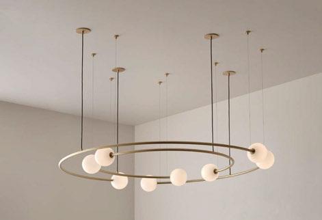
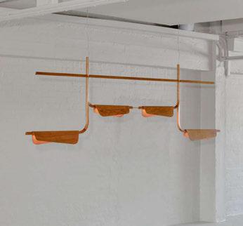
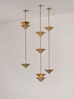
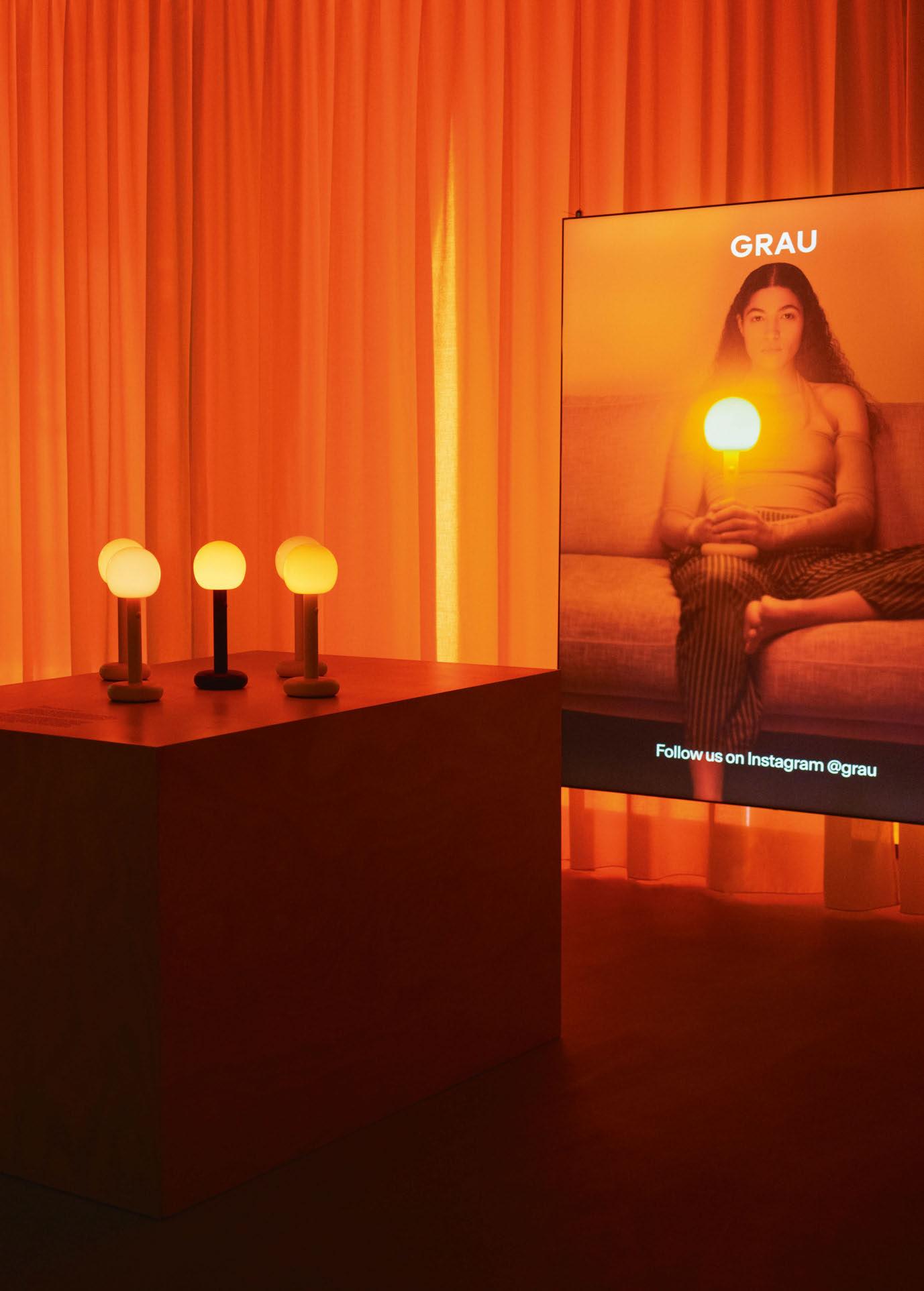
Fire, from German lighting brand Grau (formerly Tobias Grau) is the world’s first “light player”. Launched at this year’s Milan Design Week, users can click and dim through precisely composed “vibes”; these vibes are the first songs of light.
With an iconic soft design and uncompromising lighting experience, Fire reinvents the design and user experience of a classic ambient table lamp. Taking only two hours for a full charge, it provides up to 50 hours of portable light. “Fire is the biggest milestone of our work so far,” says Tim and Melchior Grau. “We are launching a new kind of lighting experience and are convinced that Fire marks the start of a new era of lighting – the era of living light.”
With scientific studies showing that the wrong light in the evening can increase the risk of mental illness by up to 30%, Fire offers a warm light, free from blue light, which enhances the production of melatonin.
Grau presented Fire in an exhibition together with ‘Bonfire’, a light installation at Via Meravigli 4. www.grau.art
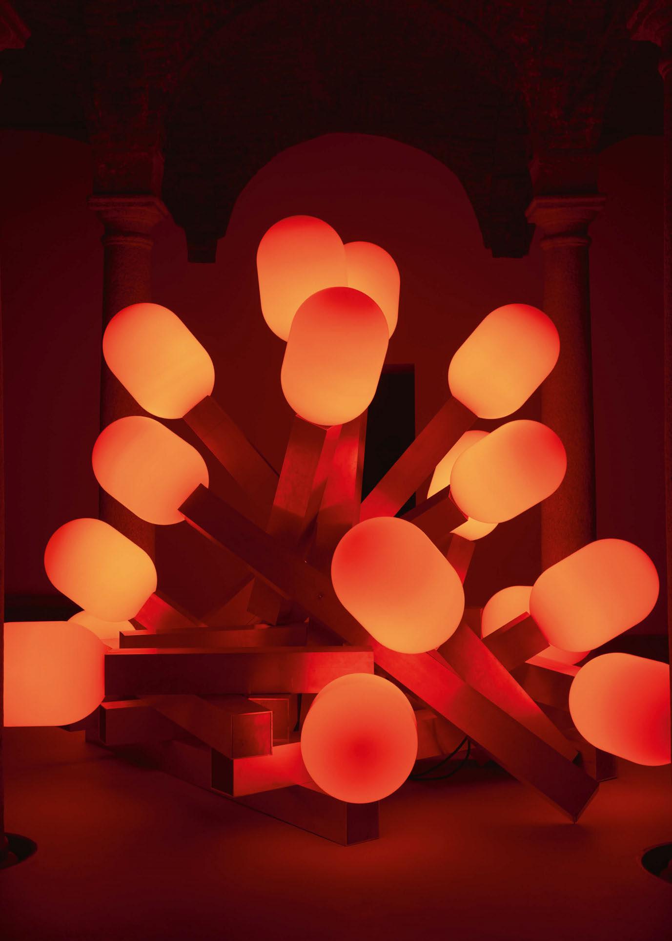
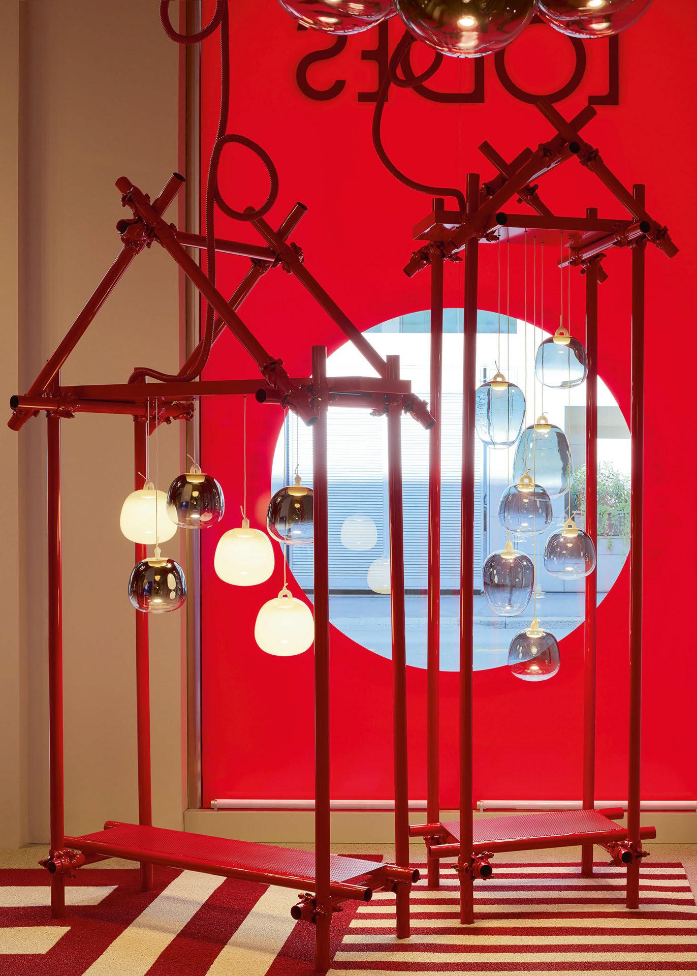

During Milan Design Week, Italian lighting brand Lodes presented Oblò, a collection of glass pendants designed by Paola Navone that take inspiration from the seaside.
Lodes’ latest collection, Oblò, is the inaugural collaboration with Otto Studio’s Paola Navone. Oblò presents an aesthetic departure from Lodes’ existing portfolio; it is both a high-performance pendant and a sculptural piece of design that presents themes of fluidity and water.
“Oblò is a delightful family of lamps that touches on the essence of the sea,” says Navone. “The glass diffuser, with its soft, rounded shapes, is suspended by a knotted cable, appearing to float in the air like a buoy. There’s a touch of surprise: the knotted cable houses an invisible LED source that illuminates the diffuser. Thus, only the glass is visible, akin to peering through a porthole. The diffuser comes in three different shapes and five finishes, three of which are hues reminiscent of the sea’s transparency. Where a single lamp serves as a playful focal point, a multitude of lamps make up a thousand different installations.
“Water is my natural element, the sea has a relaxing, almost hypnotic effect on me. It stirs feelings of delight, peace, fluidity, movement... and it always makes me wonder how to connect these elements within design.”
Oblò is a modest sized lamp that comes in three sizes and with an intense luminosity, which is diffused through the glass globe that is available in various finishes including: Silk White, Clear, Glossy Smoke, Iridescent, Azure Steel.
It features a hook, comprising a metal core coated with semi-transparent silicone. A white fabric cable, featuring a grey rubberised terminal, is tied to the hook, delicately supporting the diffuser. The knot and cable possess both aesthetic and functional significance: envisioned by the designer to resemble naval ropes knotted to sea buoys, infusing the product with a whimsical and playful spirit. Simultaneously, the fabric cable conceals the electric wiring, which, through the knot, threads into the hook, discreetly powering the LED. This gives the appearance of the Oblò floating like a buoy in the air.
Speaking of her collaboration with Lodes, Navone says:
“There is a special alchemy behind each of our projects
at Otto. It can come from meeting a person, a company, discovering a place or a beautiful tradition. This time we were enchanted and inspired by Lodes’ technical expertise and high-quality materials.
“We enjoyed recalling the simple, friendly, and universal shapes of buoys. Lodes’ expertise and technology made it possible to realise these forms using Pyrex, a highly evocative material, that was modelled and formed into soft, rounded shapes.
“The idea was to create a weightless, almost imperceptible bubble and the main challenge was to make the light source invisible. Using Lodes’ know how, we developed a hidden LED source inside the hook that lights the glass diffuser.
“The diffuser comes in three different shapes and five finishes - demonstrating the versatility of Pyrex glass in lighting design while simultaneously evoking images of the sea and the elements that float in the water. Additionally, the fabric cable conceals the electric wiring, which, through the knot, threads into the hook, mysteriously powering the LED.
“We really like the knotted cable that supports the lamp like a naval rope tied to a sea buoy, and at the same time powers the LED source that lights up the diffuser. It adds that element of surprise that is always present in our designs.”
Reflecting on the new collaboration, Lodes Managing Director Massimiliano Tosetto comments: “We are thrilled to collaborate with Paola Navone – Otto Studio on this new lamp, furthering Lodes’ portfolio to seamlessly integrate with a wide range of environments. The flexibility inherent in Oblò, in terms of compositions and finishes, was vividly articulated by the designer through a stunning colourful installation during Milan Design Week, hosted at Lodes’ Milan showroom.” www.otto.fish www.lodes.com
With so much to see during Milan Design Week 2024, darc asked some leading industry experts to collate their selection of top decorative lighting highlights from their time in the Italian design capital. Discover their findings below…

1. Oblò from Lodes
I love this light because it gives a very flexible and chic option to any pendant requests yet has a fresh look. I also love the play on the rope and the flexibility on colours and shapes. It is another example of Lodes’ strength whereby when they come up with a product they always engineer to perfection. www.lodes.com
2. Nanda from Baxter
These wall lights from Baxter will help designers and architects to specify pretty, large scale wall sconces, being able to give a diffused light and at the same time decorating any elevations within the room. I specifically love the texture and harmonic contrast between the glass and the metal details. www.baxter.it
3. Cluster Lamp from Moooi
Another example of the Moooi genius whereby you can place a pendant over any situation and that specific object will take the scene. I particularly love the futuristic look of it together with the melancholic take on the exposed light source effect. www.moooi.com
4. Tubelight by Moooi
We have been playing with tube light for a while now but, as usual, Moooi manages to take it to the next level. This new version of a tube light will help any specifiers to have lots of flexibility around the room and match it with any background. www.moooi.com
5. Visio by Masiero
Although launched last year, I went to the Masiero pop-up showroom in Brera and have to say this composition is growing on me. The society is looking for more spiritual inspiration and messages nowadays and this playful installation could somehow trigger a new way of liaising with lighting. www.masierogroup.com
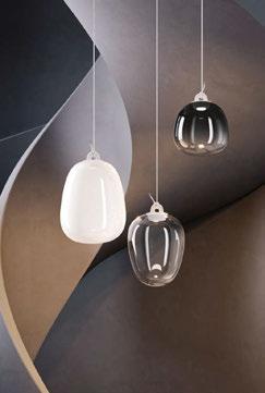
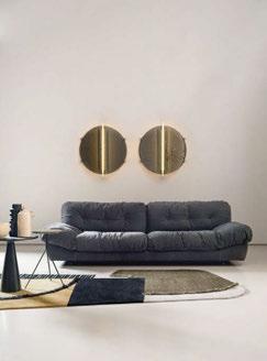
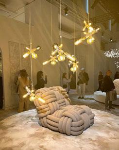
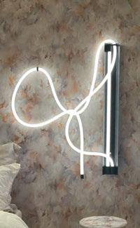


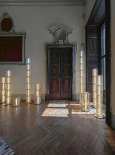

1. Hulasol
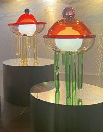
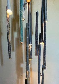

1. Studio Harry Thaler x econitWood at Alcova
The marriage of modern technology with otherwise discarded products to create products was inspiring. Studio Harry Thaler’s floor lamps, 3D printed using a material comprised of wood shavings, are both modern and sustainable. Displaying them at Alcova in a room filled with a similar powdered wood material used to make the lamps and furniture created an impressive impact.
www.harrythaler.it
2. A-N-D Column Lights at Alcova
A-N-D’s Column Lights can easily be incorporated into both traditional and modern spaces. I’m looking forward to seeing more of their work in person at ICFF.
www.a-n-d.com
Hulasol captivated me with its innovative fusion of a lamp and a sunshade, embodying charm and comfort. Its easy dimming via a smartphone app enhances convenience. This creation seamlessly transitions from daytime sun protection to nighttime ambient lighting. Its spacious shade area offers serene moments, while specially crafted fabric safeguards against harmful UV rays. www.hulasol.com
2. Joy by Draga & Aurel
Joy, showcased at the Rossana Orlandi Gallery, evokes the Space Age era with its handcrafted luminous capsule design. Crafted over years with coloured epoxy resin, it offers dimmable radiance and a spectrum of colours, enriching any space.
www.draga-aurel.com
3. Furikake Lantern, Wallpaper* Class of ’24
This charming, modular lamp piqued my interest as it seamlessly blends traditional Japanese elements with contemporary design. Its vibrant colours resemble the sprinkling of seasoning on Shoji paper, infusing spaces with liveliness and charm. Complementing historic architecture,
this lamp reflects my fondness for modern aesthetics while also showcasing a reverence and fascination for Japanese culture. www.wallpaper.com
4. Riches to Rags, Curious Boy
The pendant by Curious Boy, exhibited at Palazzo Litti, captivated with its vibrant colours, sleek structure, and transparent lamp post. Its playful yet fashionable vibe complements the historic architecture seamlessly, infusing spaces with liveliness and charm. The lamp stands as a testament to modern design sensibilities, effortlessly integrating into diverse settings with its unique aesthetic. www.curiousboy.net
5. Aloof Light, singchandesign
Aloof Light, by singchandesign, drew inspiration from European classical architecture, bridging the past, present, and future. Utilising elements like glass, arches, and intricate classical décor, it crafts lighting fixtures with a futuristic touch. Its design echoes the timeless beauty of historic structures while infusing a sense of modernity. www.singchandesign.com
3. Pulpopolis lights by Kickie Chudikova with Berengo Studio
Pulpopolis by Kickie Chudikova blurred the lines between function and art with the introduction of its removable and rechargeable jellyfish globe lights, which can be placed anywhere without the need for an outlet.
www.kickiechudikova.com
4. Paean by Sfossils at Villa Bagatti Valsecchi at Alcova
This chandelier was hanging from the ceiling in the centre of a three-floor main staircase. The raw, almost bark-like texture of the rods and the sheer scale of the chandelier lends itself to a wide range of projects and spaces. It looks equally interesting from a distance and up close.

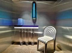
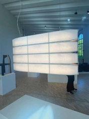
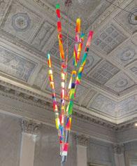
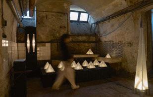
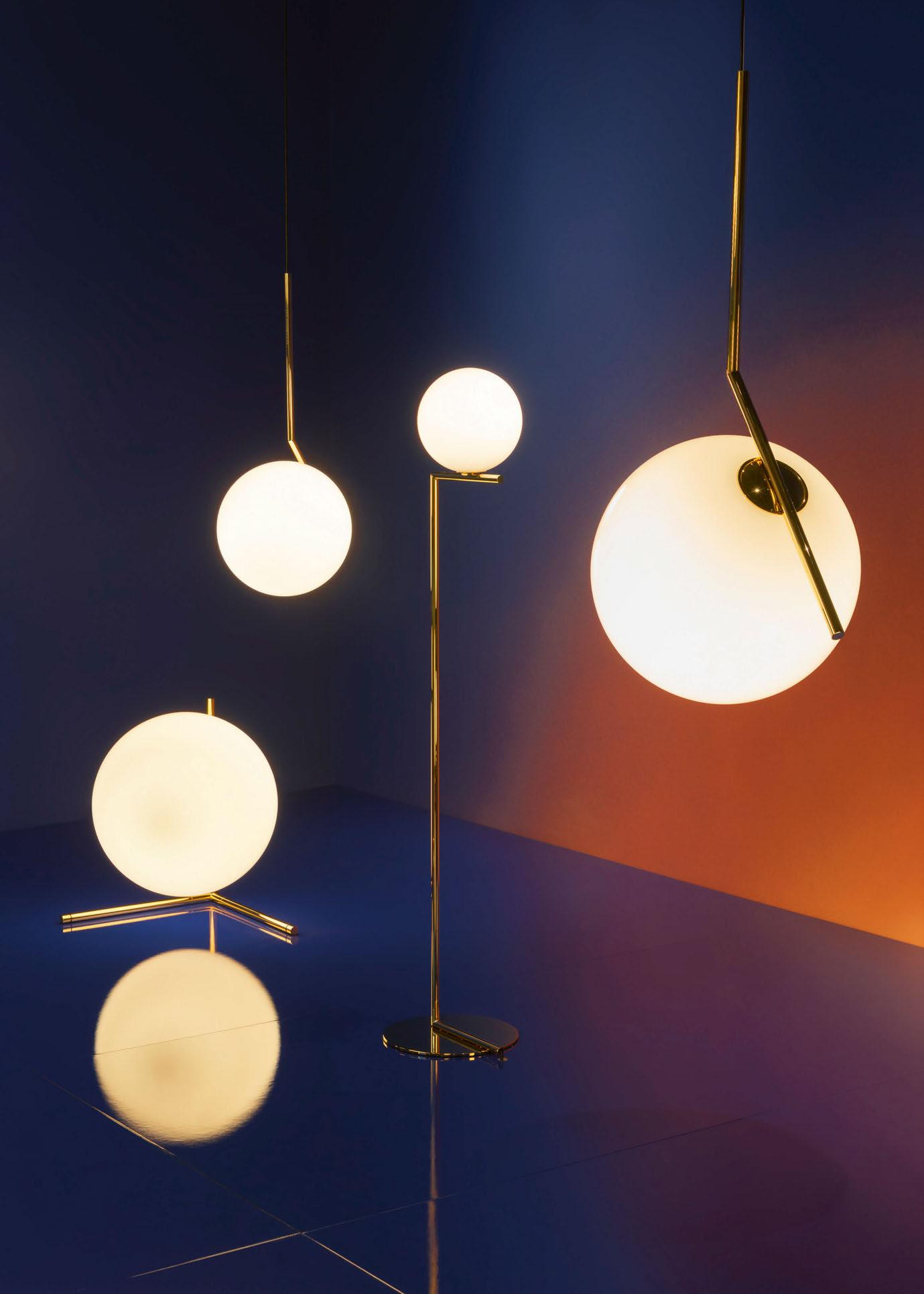

Upon returning from the busyness of Milan Design Week, darc’s editor Sarah Cullen sits down with Michael Anastassiades to reflect on Flos’ Palazzo Visconti exhibition and to discuss the 10th anniversary of his IC collection in a special Golden Hour installation.
What does it mean for you to design for a brand such as Flos?
The most important thing is, and I think I can speak for all of us creatives, is to be able to have an expression that is actually free from a lot of obligations that you have to satisfy.
The more freedom you have to express yourself, the better it is. This is why my collaboration with Flos has been such a longstanding one and one of success. I’ve had quite a prolific journey with Flos over the last 10 years and it’s almost like an accelerated journey if you compare it with a lot of other designers historically, even within flos.
There is complete trust and we complement each other.
There is a lot of understanding, a lot of room for a positive interpretation of the ideas, a lot of input that comes also from me as a designer towards proposals that I feel could be good moves for Flos’ future and I feel that’s the best way to work with a company.
Most other companies will come up to you with a brief and they tell you they’re looking for X, Y, Z, which I’m not saying is a bad way doing it, but that leaves you with no room to come up with your own suggestions of what the market could look for in the future. It’s always good to be ahead of the game. Another thing that is really fundamental is the people that you work with. Even though it’s a big company and part of a big group now, Flos never really lost it’s intimacy. Family businesses are a rarity these days, and although Flos is no longer a family business, the family atmosphere is absolutely fundamental if there’s going to be a future for the manufacturing industry, at least in terms of allowing great products to emerge.
How did your work on the IC Collection influence designs that followed?
I always operate from instinct; what feels right for me and especially in the beginning, is studying the market, studying the history not only of Flos, but also generally of decorative lighting and trying to make my own judgement and observations as to what could be a good direction and
a positive contribution, rather than simply a repetition of something that was done in the past.
It’s about capturing that moment through following your own instinct. This is how I always operated and continue to today with Flos and with my own brand.
In my view, IC was nothing revolutionary, nothing new, nothing unfamiliar. It was actually based very much on familiarity of form, familiarity of material. Spheres have always existed historically and using the archetype of a sphere, but in a more playful way, how it’s suspended, how it balances, and has a completely different relationship to the support.
IC wasn’t challenging in terms of lighting technology, and I think somehow this is why it became so popular. Everybody could have access to it. It was speaking to a wider audience and it still does. And it’s interesting how it manages to sustain that popularity.
[Another instinct was] reintroducing brass into the market, which was out of fashion. But why should people stigmatise a material and try to make it a trend or a fashion? I think it’s wrong. It should be about making people see that every material has its own beauty and place on the market, and it’s just how you use it, how you introduce it, and how you marry it with all the other elements.
More generally speaking, what do you think a good lighting product should bring to a space?
Number one, it needs to be a timeless product. Especially when everybody’s so conscious about making things more sustainable. We should strive to create products that people want to keep for a very long time, hopefully forever as long as the technology can support them.
My approach has always been never to try and shock people through leading technologies and forms, because after the novelty of that dies out from the first reaction, the product becomes very short-lived, but it doesn’t have any chance of surviving time. I think this is really the biggest challenge that all designers should face in terms of social responsibility.
What is the most rewarding thing for you working as a designer? Freedom. Anything that facilitates that is really the biggest reward.
On the flip side, what is the most frustrating thing?
People trying to push you in different directions that you don’t want to be in. I consider myself lucky that I have the luxury of turning a lot of invitations down because they just don’t feel right. They don’t seem right.
I never operated from a commercial perspective, but more through a design vision that I feel is appropriate to me, to the way that I express my ideas and also through my responsibility as a designer towards the world. So, that sense of creative freedom is really the most valuable thing.
Unfortunately, companies sometimes are very limited and they try to be very specific and push you in directions and they tell you what the market responses are. But, the market needs space and time to develop an appreciation. Also, the market needs educating as well. It’s not whatever the market is ready for, it’s how we educate the market to perceive the product in the right way. And this is absolutely fundamental, I think, if we are to create meaningful products.
What did you take away from Milan Design Week this year?It was spectacular. It was by far the highlight for a lot of people I know who I usually get feedback from after returning from Milan. They all thought that Palazzo Visconti was really the highlight of their experience in Milan in terms of a show and in terms of a presentation. For the IC collection it was about celebration rather than bringing something new, although the oversized pieces were spectacualr. The fellow contributors, Formafantasma and Barber Osgerby presented beautiful new products. But, the overall exhibition wasn’t flashy. Even though it was a beautiful palazzo, quite ornate and quite grand in every way, somehow the presentation was humble. It was not a flashy, expensive show. It didn’t communicate anything like that. It certainly communicated celebration and confidence among many other things, but definitely not a presentation to flash money. It was not about that.
The Flos team did a wonderful job in realising it and creating a space that looked effortless.
www.michaelanastassiades.com
www.flos.com
Images: Nicolò Panzeri and Luca Caizzi

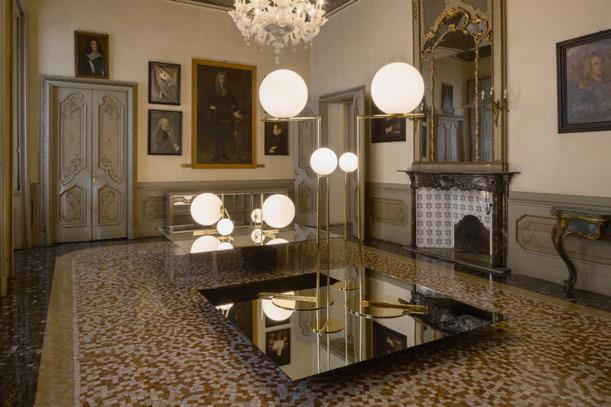


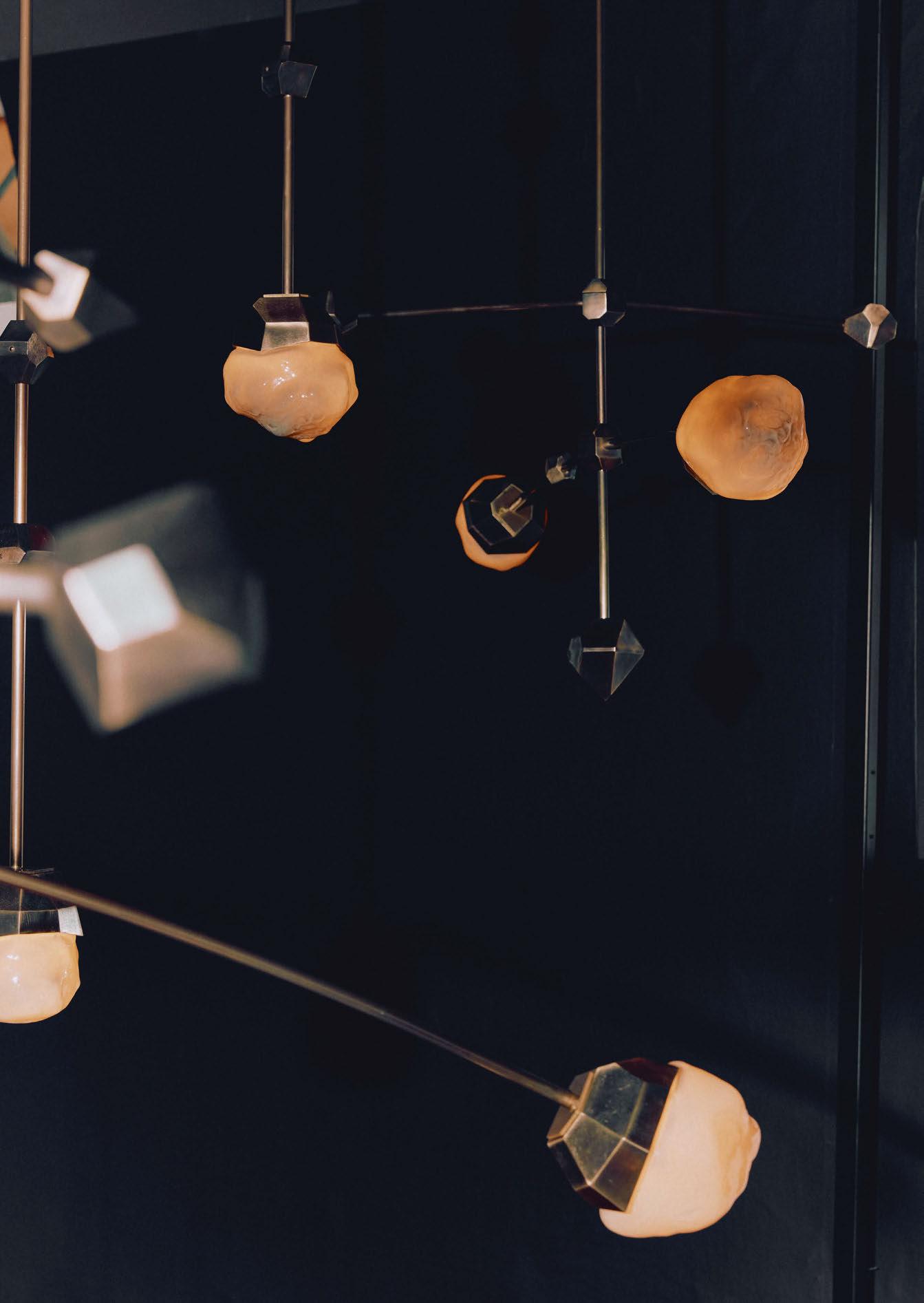
Making its debut during Milan Design Week, Crux is the latest lighting range from Australian brand, Christopher Boots. darc finds out more about its creative process.
Crux is the latest luminaire collection by Melbournebased lighting studio Christopher Boots, which was launched during Milan Design Week 2024.
“The Crux collection marks the studio’s exploration into textured blown glass. Working with local artisans [Hothaus] in Melbourne, we have been experimenting with creating textural, organic forms,” explains Boots himself.
“Crux was inspired by the Southern Cross constellation, one of the most identifiable constellations in the southern sky. Capturing its celestial beauty and symbolic guidance in a tangible form, the Crux collection combines innovative methods and materials that echo the natural wonder of the stars.”
Centred on five luminous stars in a cross-shaped asterism, the qualities of the natural wonder are reinterpreted through Crux’s organic forms, delicate suspension details and artisanal qualities, which imbue each fitting with beauty and perpetuity.
Crux’s family of pendants and sconces sees smoky, handblown glass ‘stars’ nestle into rocky, sand-cast brass cups. The delicate glass components celebrate the organic forms and irregularities of molten glass, echoing the natural wonder of the stars. In the striking pendant, each luminaire is suspended on extruded brass rods aligning to the cosmic proportions of its namesake to embody the spirit of astral navigation.
With LEDs casting a warm, inviting glow, each piece, variable in dimensions, echoes the timeless dance of
Crux across our cosmos, akin to gazing into the everchanging night sky.
“The collection revolves around the intersection of art, nature, and technology. It draws directly from the geometry and luminosity of the Southern Cross, bringing the guiding light of this celestial formation into indoor spaces through a range of forms,” adds Boots.
Locally crafted in Melbourne, Crux expands the studio’s lexicon of materials. Sustainable, textured blown glass emerges as a striking addition to the studio’s celebrated quartz crystal pieces, signalling a new direction for Christopher Boots.
“Glass has an almost magical ability to channel light, a quality that has long fascinated artists and designers. In this collection, we sought to explore how we could create shapes embodying that sense of mystery and timeless allure present in the stars above us,” says Heidi Chaloupka, Lead Designer on Crux.
The collection is a step away from the studio’s signature library of quartz fixtures. “We used handblown glass and sand-cast brass, primarily because of their aesthetics and versatility,” says Boots. “The transparency of glass and the solidity of brass create an interesting contrast that enhances the light’s playfulness. These materials were chosen for their ability to embody the ethereal qualities of light and the tactile nature of the earth.
Innovative glassblowing techniques and precision metal casting were key technologies used, and decisions revolved around balancing the design with
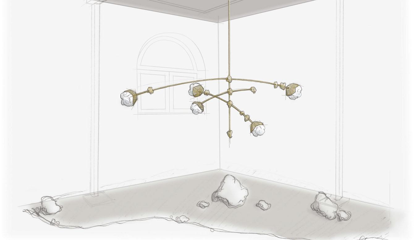
each luminaire is suspended on extruded brass rods aligning to the cosmic proportions of its namesake to embody the spirit of astral navigation. With LEDs casting a warm, inviting glow, each piece, variable in dimensions, echoes the timeless dance of Crux across our cosmos, akin to gazing into the ever-changing night sky.
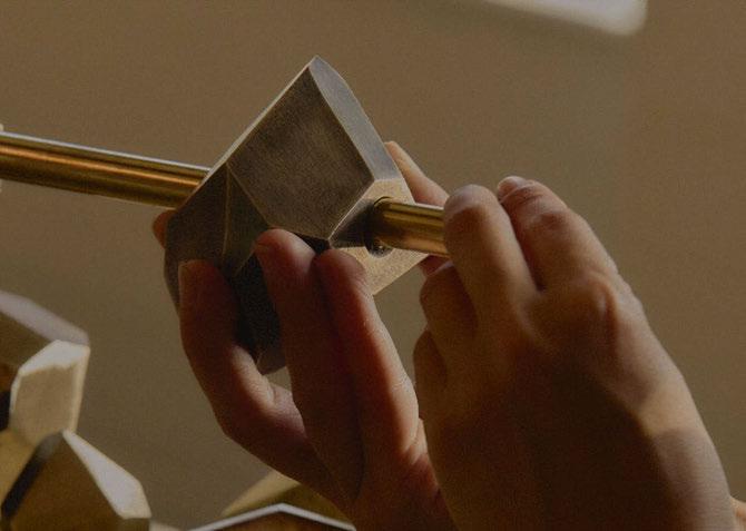
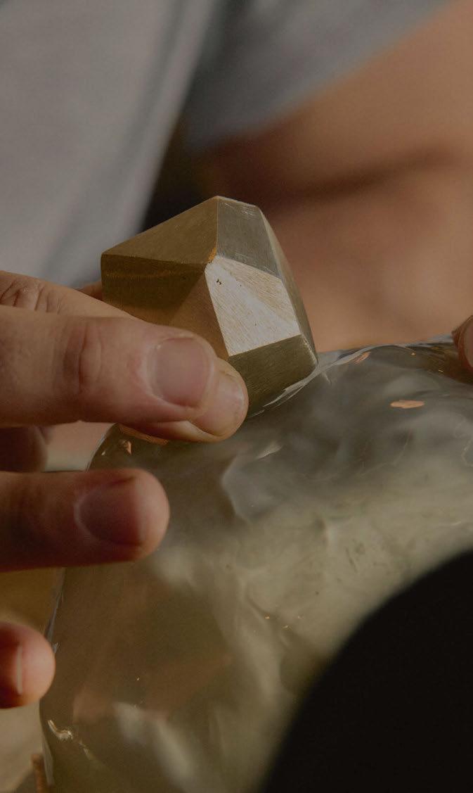
“Glass has an almost magical ability to channel light, a quality that has long fascinated artists and designers. In this collection, we sought to explore how we could create shapes embodying that sense of mystery and timeless allure present in the stars above us.”
- Heidi Chaloupka, Lead Designer.
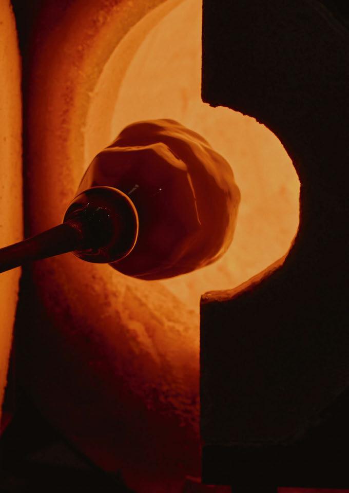

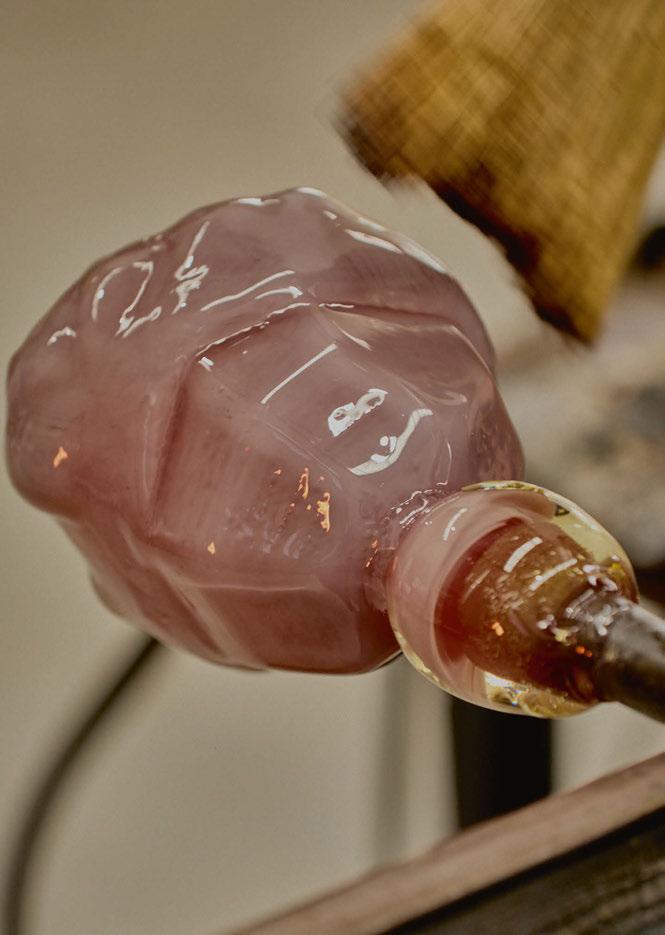
functionality and sustainability in mind. The entire process took about 18 months from initial concept to final prototypes.
“Crux is a cultural symbol a guidepost to the southern hemisphere, a testament to the fusion of art and astronomy. It stands as a beacon of inspiration, reflecting our enduring fascination with the stars.
“The collection is well-suited for spaces that demand unique, artistic lighting. It brings a celestial-inspired ambience to any room, enhancing the space with both light and artistry.
“Working with light is like sculpting with intangible materials, where every creation alters the mood and character of a space.
“The collection is ethereal, explorative, and guiding. It brings pieces of the universe to the human domain, inspiring light as the South Cross guided mariners across the oceans in times past,” Boots concludes.
Marking the studio’s inaugural solo presentation in Milan, the Crux collection preview offered a distinctive and celestial perspective on lighting design by Christopher Boots. Presented as a series of workin-progress prototypes, the installation lifts the veil on the studio’s dynamic creative process, inviting viewers to observe Crux pieces at a moment in time and follow their evolution as a final product. www.christopherboots.com


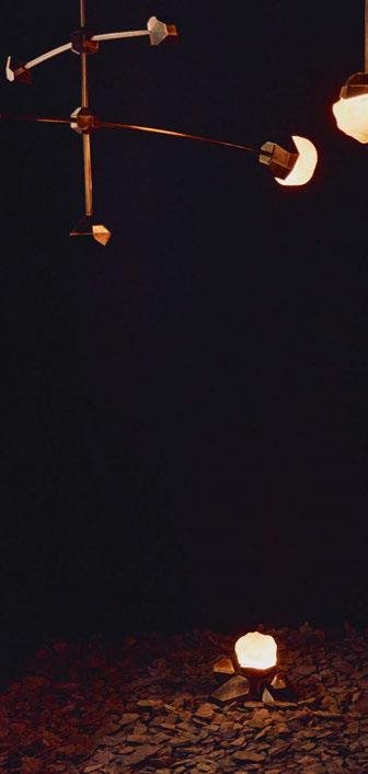
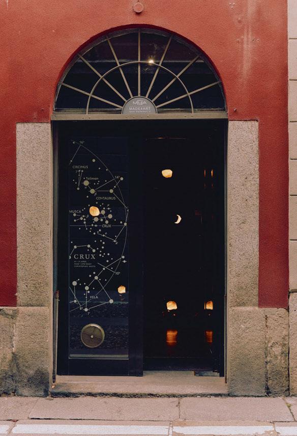
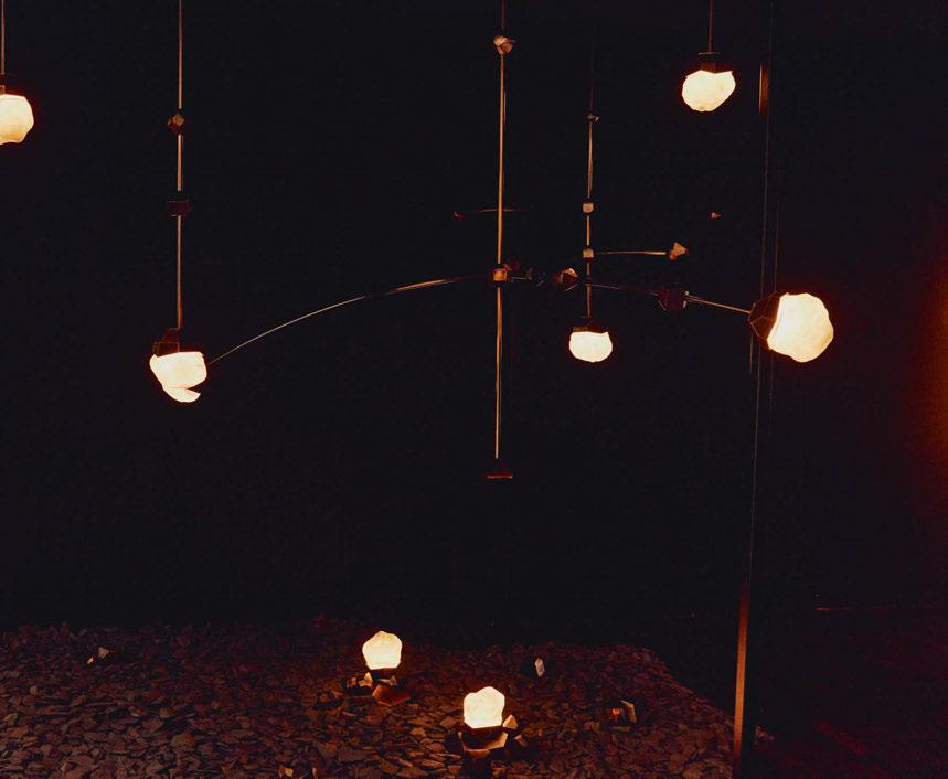
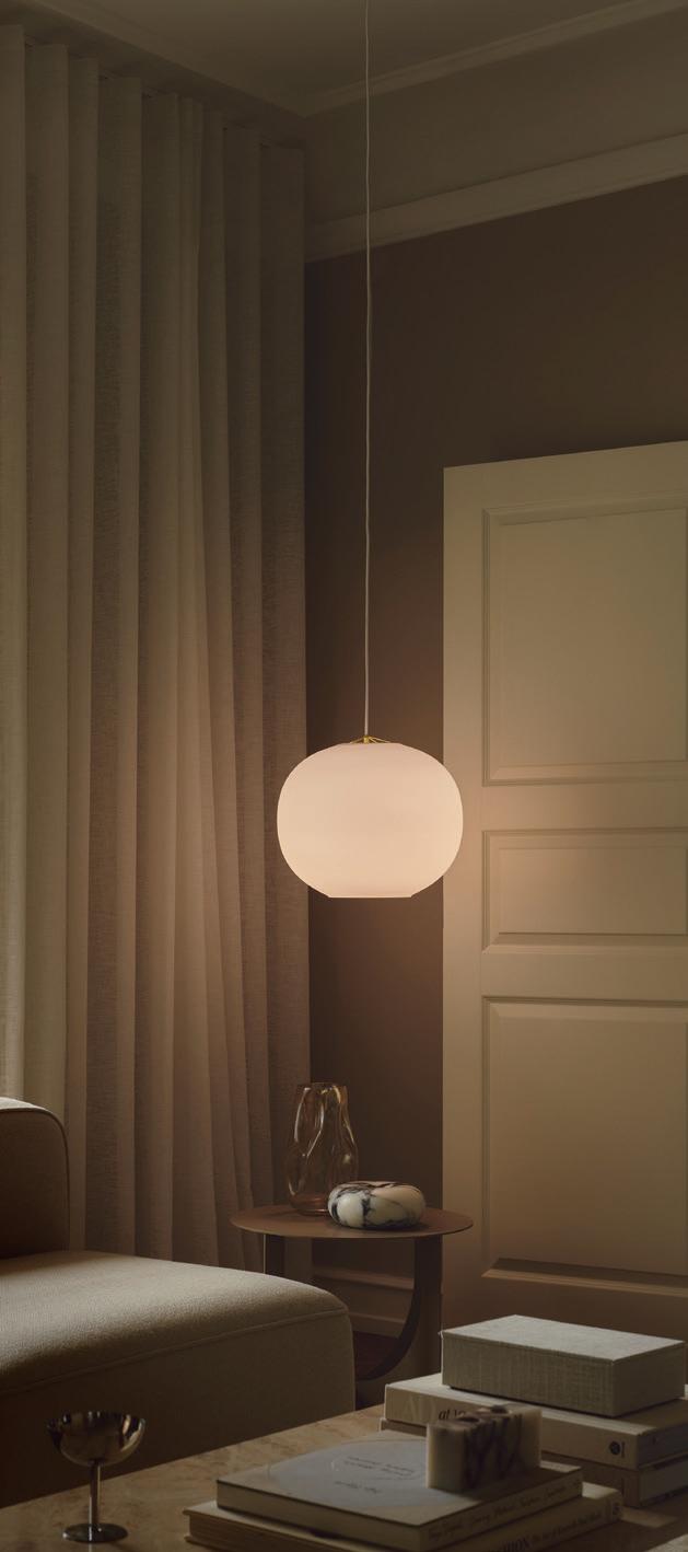
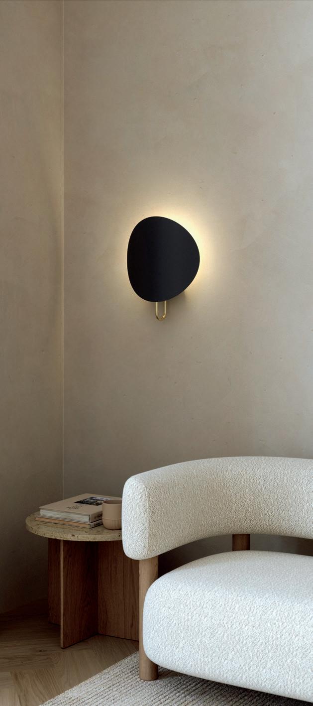
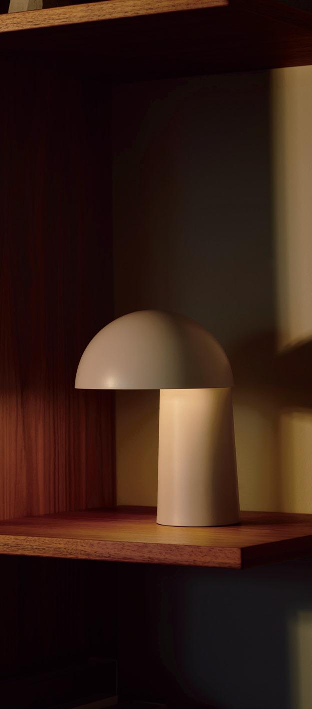

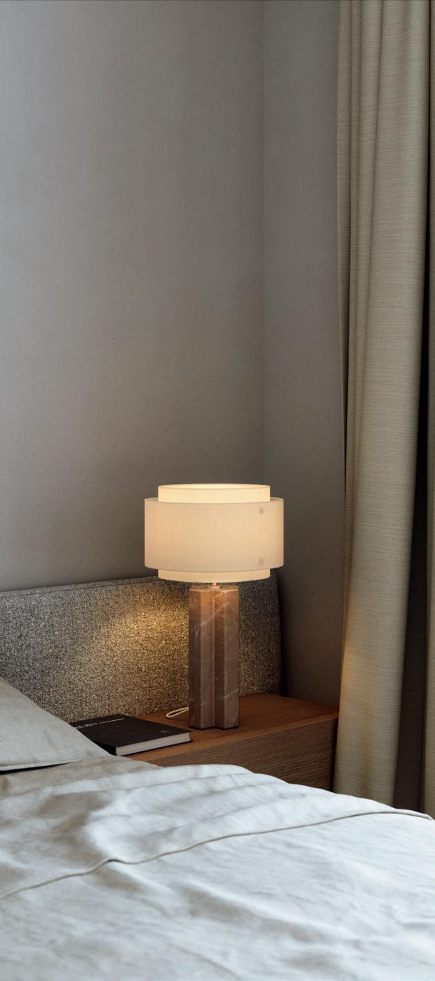


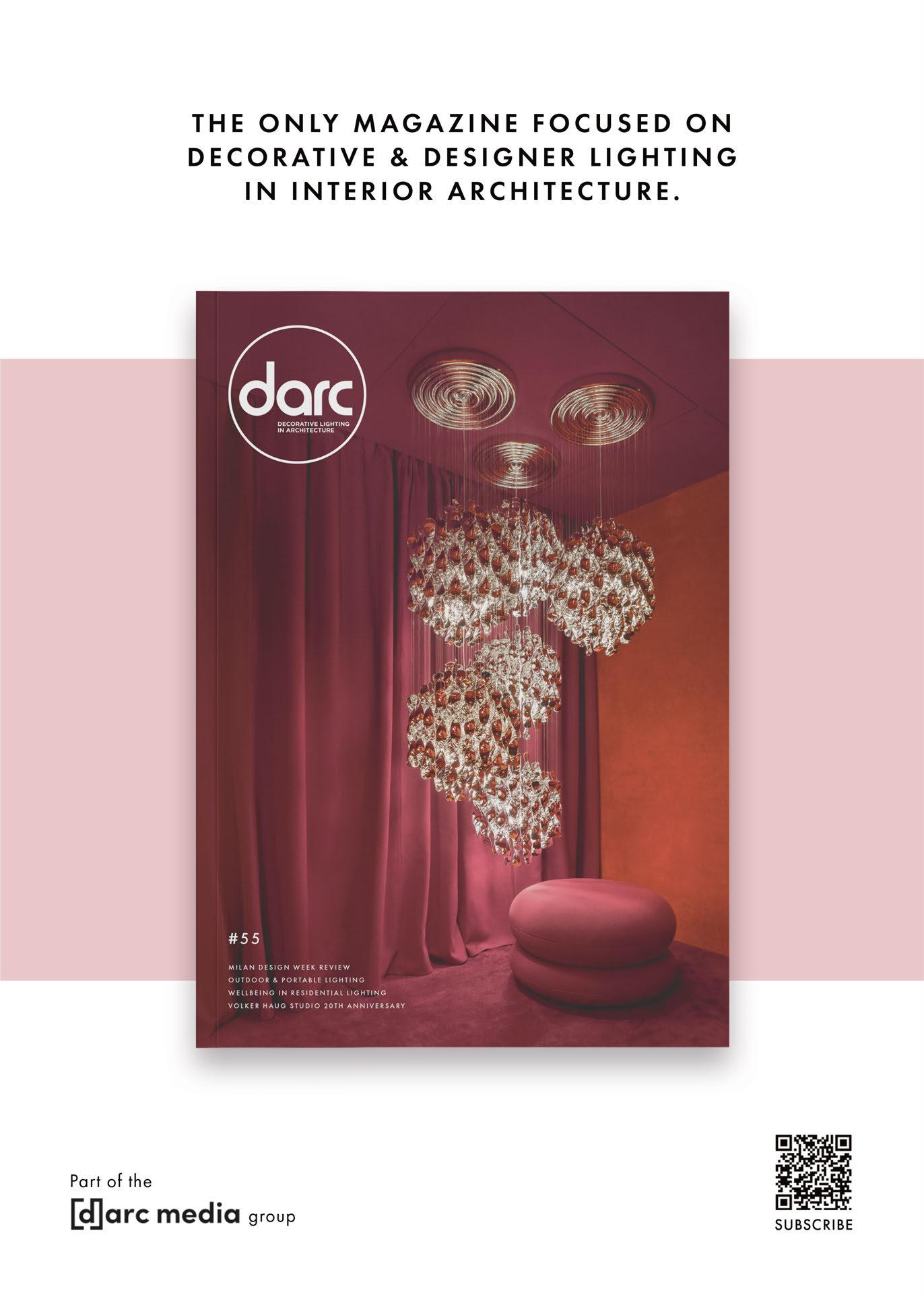
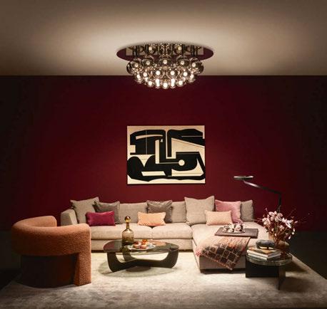
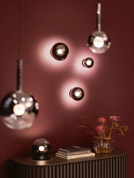
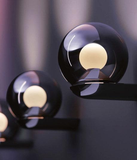

What are the design inspirations behind Lunanova? Lunanova is the reinterpretation of a classical chandelier – but of course with all the lighting expertise and innovations Occhio stands for. The spherical appearance of the Lunanova is an expressive statement and an eye-catching centerpiece in dedicated spaces. And the fascinating ‘Supernova’ lighting effect offers unprecedented possibilities to change the atmosphere with a fingertip – it’s simply magical.
Tell us about the design progression from Luna to Lunanova.
Occhio is well known for its holistic product portfolio, unprecedented lighting quality, cutting edge innovations - and its puristic design. With the Luna series we followed a more emotional, stylish design approach, of course with unique quality of light thanks to the Occhio fireball light source, which offers directed but soft, glarefree light, including colour tune and magical gesture control - innovations you wouldn’t expect in a decorative product like Luna. With Lunanova we go even further – the opulence of chandeliers is reinterpreted in the truest of senses. Lunanova combines spectacular design with innovative technology: dark chrome mirrored Luna glass spheres in various sizes are arranged concentrically on a mirrored disk. The Occhio fireball floats inside each sphere, providing powerful, directed light, controllable with our Occhio air app via Bluetooth.
What was the most challenging aspect of producing this chandelier?
Occhio follows the idea of a holistic portfolio. With the Luna series we wanted to open up new areas of application, in the sense of a new opulence. This is a completely new field for us, but not necessarily challenging, more exciting, I would say. The overall challenge has always been and always is to ensure consistent quality in design, light, and joy of useas we call the amazing options to control the light here at Occhio. That is our aspiration, that is Occhio’s culture of light.
What technologies does the chandelier use?
The Occhio fireball floats inside the spheres, providing powerful, directed light. With our Bluetooth-based Occhio air app dimming and colour tune is easy. On top of that the light from Lunanova can be moved from the inside to the outside and changed in a magical way - for spectacular ‘supernova’ lighting effects.
What makes this product different to other lighting products available on the market? There is no comparison – Lunanova is absolutely unique.
Please describe the product in 3 words Design - innovation - luxury.
www.occhio.com
Lunanova Axel Meise Occhio