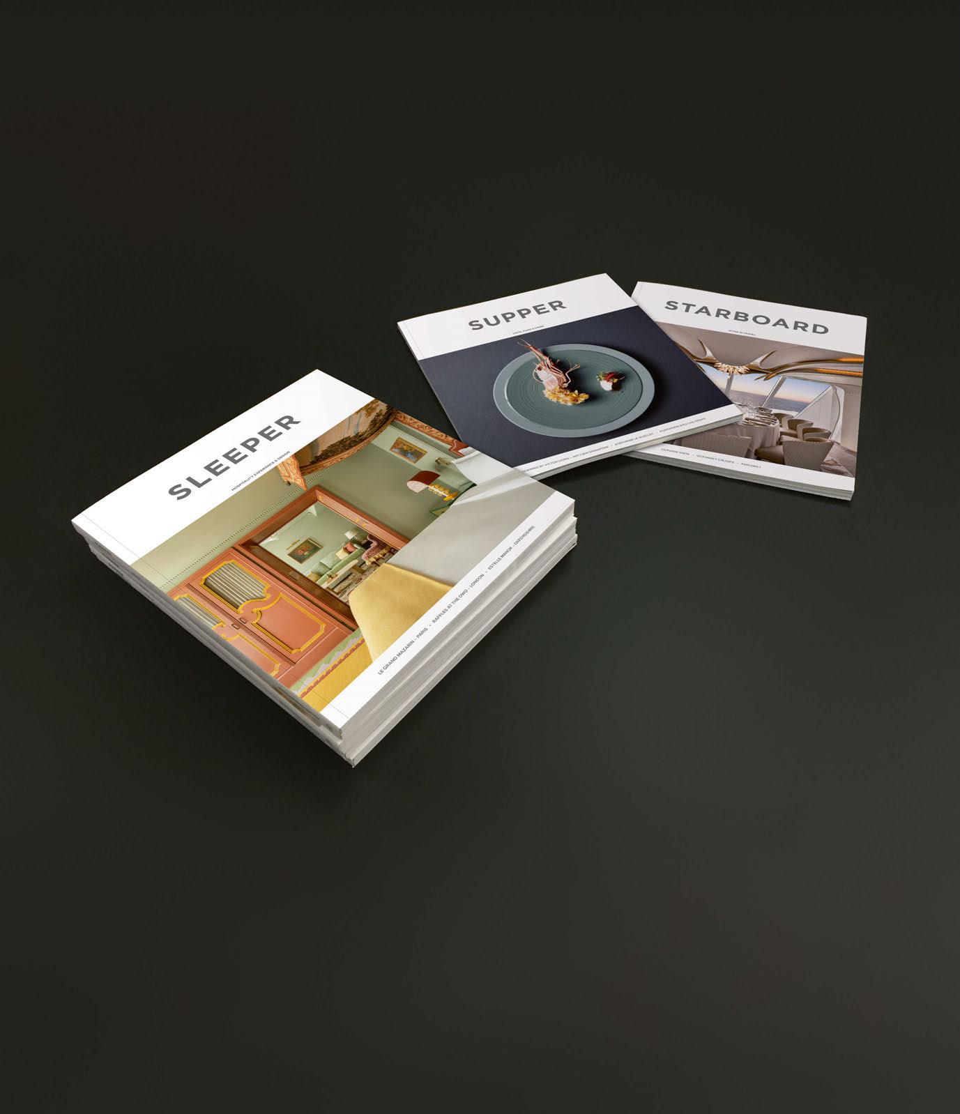
HOSPITALITY EXPERIENCE & DESIGN

LE GRAND MAZARIN – PARIS • RAFFLES AT THE OWO – LONDON • ESTELLE MANOR – OXFORDSHIRE


 Innovation meets timeless design in our new collection of contemporary lighting concepts for hospitality, residential, and commercial spaces
follow @astrolighting | astrolighting.com
Lighting designed to stand the test of time


003 CONTENTS ISSUE 113 HOTEL REVIEWS Raffles at The OWO 050 London Else 063 Kuala Lumpur Kimpton Hotel Theta 068 New York Estelle Manor 074 Oxfordshire Badeschloss 083 Bad Gastein Grand Hotel Straubinger 089 Bad Gastein Six Senses Kanuhura 096 Maldives Nobis Hotel 102 Palma LOCATION REPORT PARIS La Fantaisie 110 Hôtel de La Boétie 117 Le Grand Mazarin 122 122 083 117 © Jérôme Galland © Vincent Leroux © Arne Nagel © Simon Brown 110


004
113 FEATURES Raffles at The OWO 050 In a special in-depth review, the owner, operator, architect and design team tell all about a legend in the making. The Evolution of Crowne Plaza 132
focus shifts to the ‘blended traveller’, Crowne Plaza is taking a fresh approach to the design and development of its spaces; those at the forefront of the brand reveal the process behind the evolution. AHEAD 153
from the unveiling of its inaugural AHEAD 100, the global awards scheme puts out a call for entries for its 2024 edition, gearing up to celebrate the best new hotels from around the world. REGULARS Check-In 028 Drawing Board 030 The Lobby 045 Design Details 129 Business Centre 142 Outdoor Furniture 159 Art 177 Specifier 181 Check-Out 194 © Burak Teoman 096
170
074 © Regan Wood
CONTENTS ISSUE
As
Fresh
068
089
© John Athimaritis
© Arne Nagel

UK I USA I UAE I Hong Kong

Belgium - Oude Heidestraat 72, Bilzen
Italy
FLAGSHIP SHOWROOMS
- Via Felice Cavallotti 13, Milano USA - Beverly Boulevard 8935, Los Angeles

TRIBU.COM
SURO lounge chair by Christophe Delcourt NODI sofa by Yabu Pushelberg
 RH.COM/CONTRACT
The Hotel Maria, Helsinki, Finland
Photographer: Krista Keltanen

Create, innovate. Design.


VENICE COLLECTION
DESIGN BY LUDOVICA SERAFINI + ROBERTO PALOMBA
www.talentispa.comcustomerservice@talentispa.com
follow us




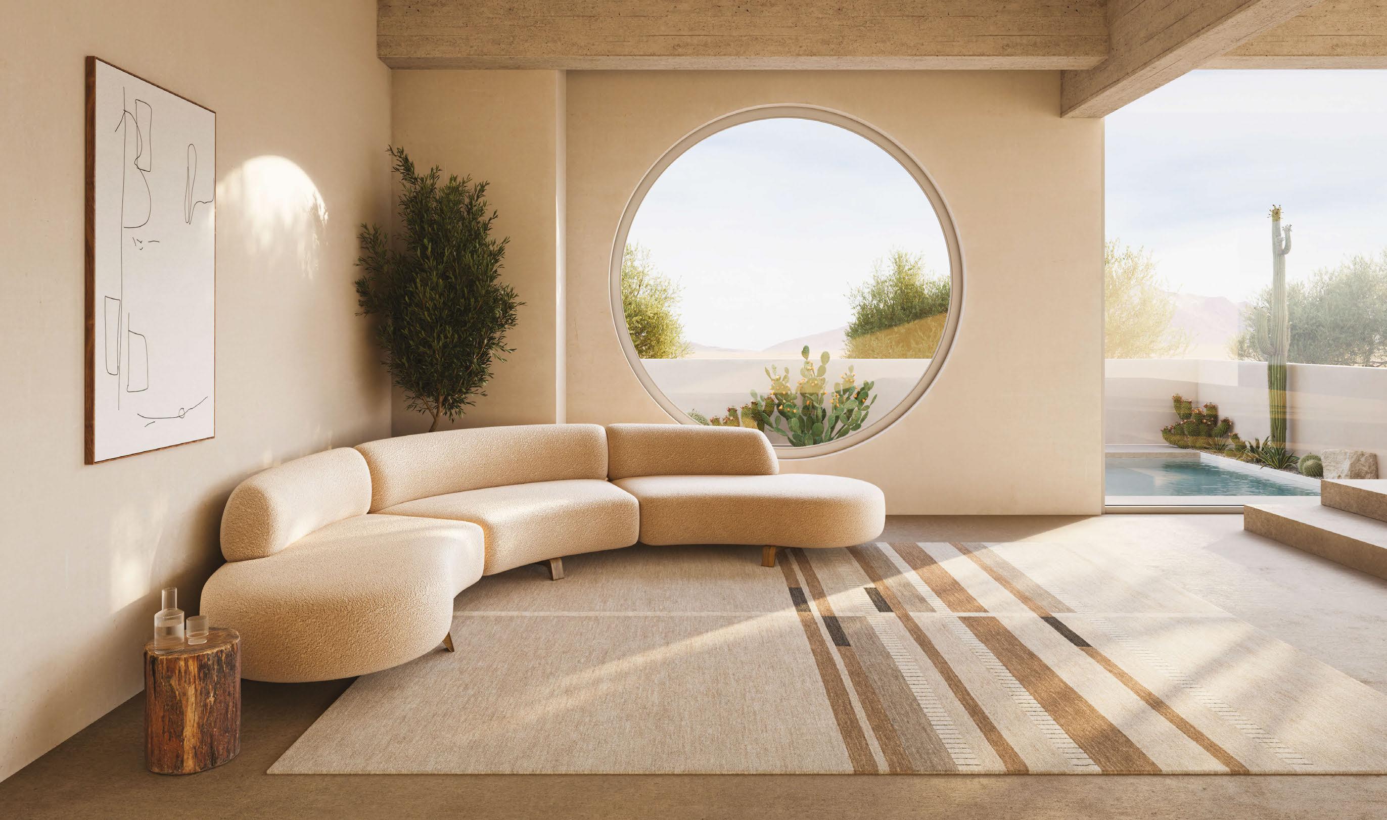
Transform your space effortlessly with the High Street rug from our Vista Collection in the timeless Ash colour palette.
HANDKNOTTED WITH 100% GHAZNI WOOL, MADE IN AFGHANISTAN.
WWW.CREATIVEMATTERSINC.COM LABEL STEP PARTNER – IMPROVING THE WORKING AND LIVING CONDITIONS OF CARPET WEAVERS, AS WELL AS PROMOTING ENVIRONMENTALLY FRIENDLY METHODS OF PRODUCTION.


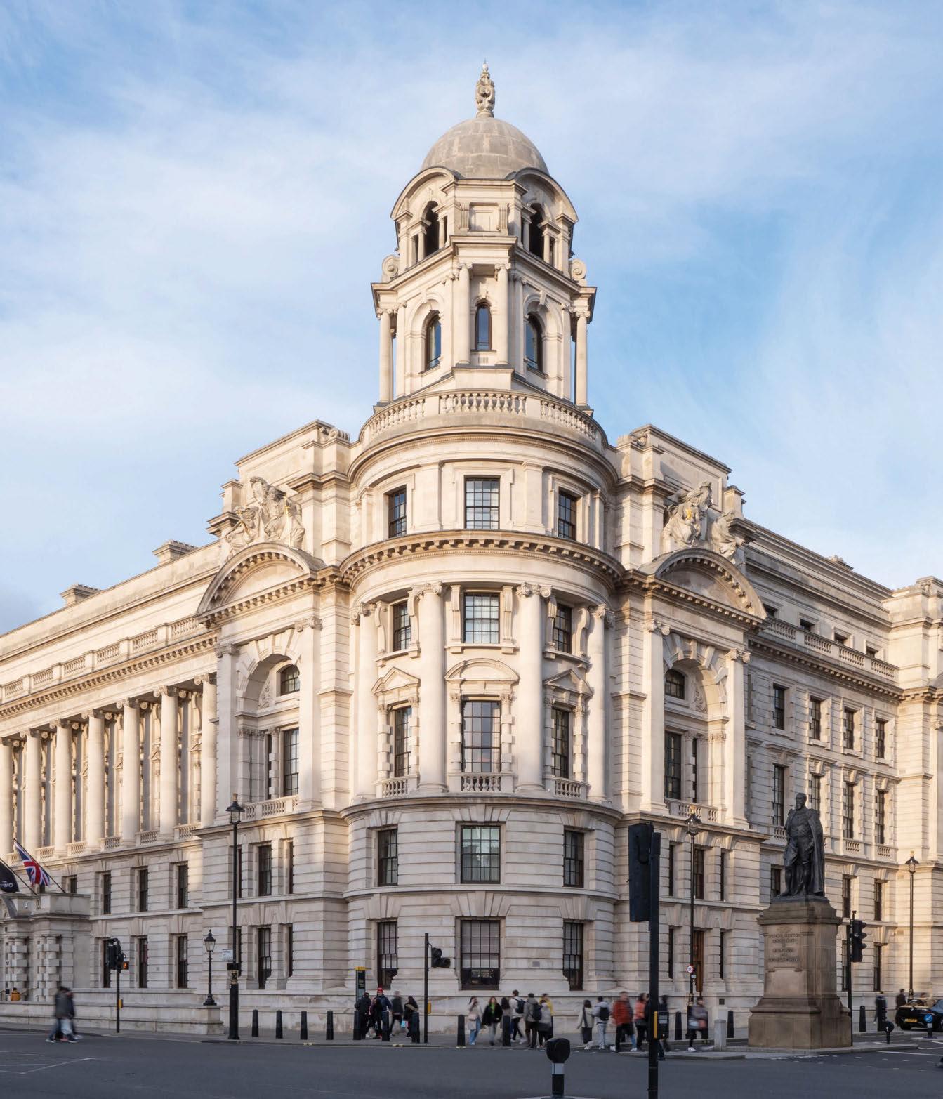

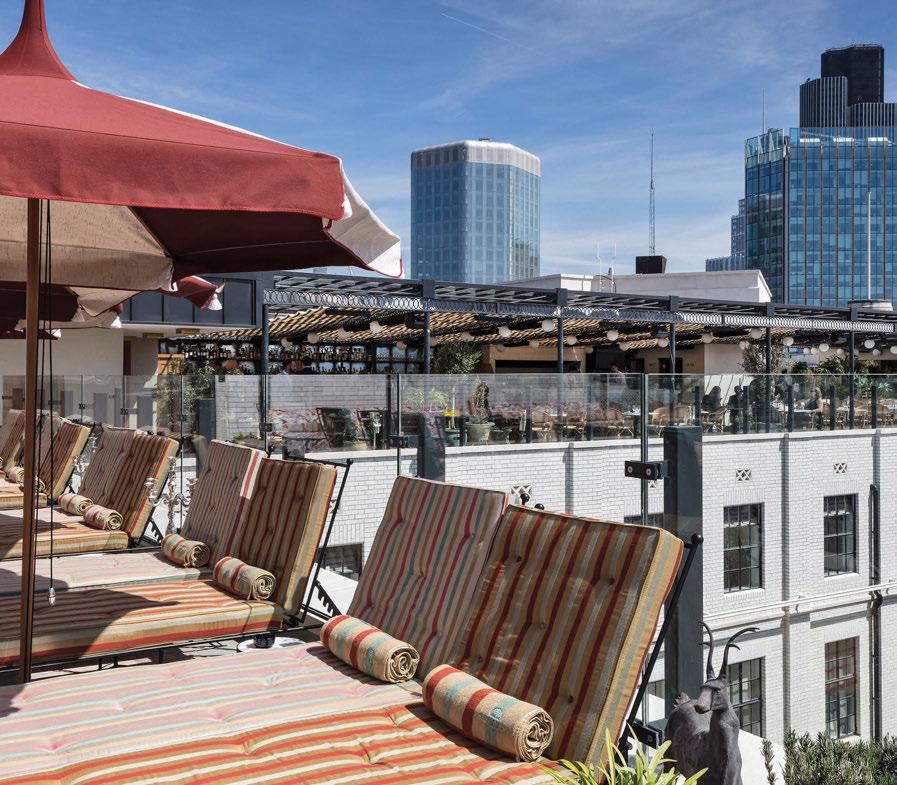
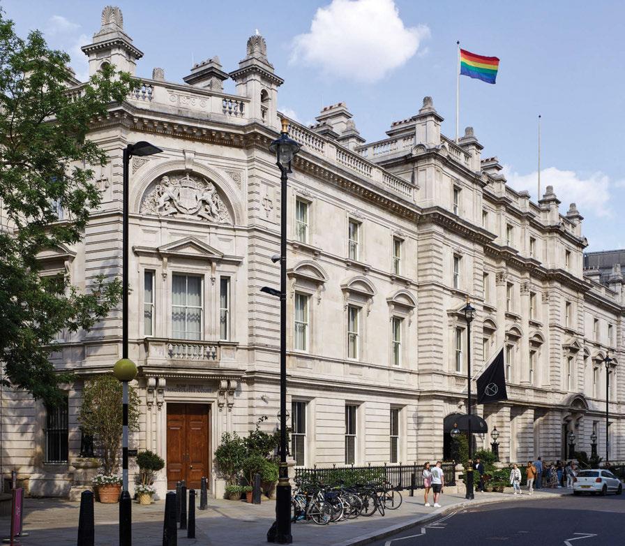
NoMad London
The Ned
Rosewood London
Great Scotland Yard Hotel
Kimpton Fitzroy
Sample tomorrow’s hospitality trends today.

Hundreds of leading brands. One box. One site.
Order by 18:30 CET. Samples tomorrow. Free for design professionals.
materialbank.eu

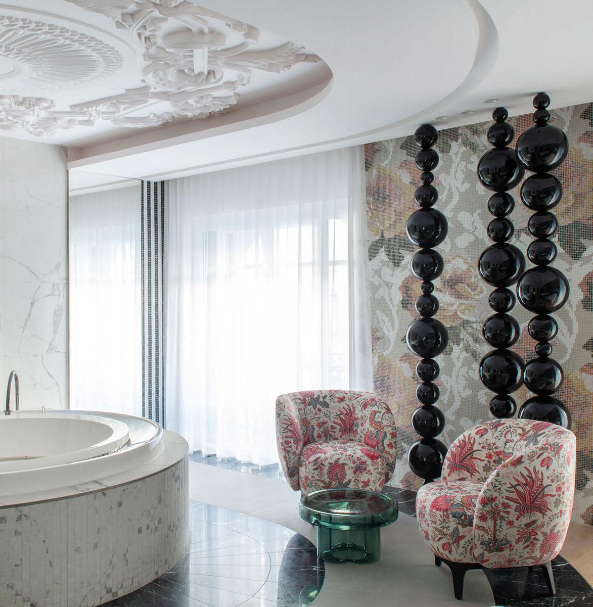
ligne-roset-contract.com
Spa–Hôtel Le Negresco, Jean-Philippe Nuel. Fabriqué en france.
©Nicolas_Matheus
Behind The Façade
As press, the Sleeper team typically see hotels at their very best – when the beds are made, dining tables are set and the bar is fully stocked. It’s only natural that a new opening should want to show off its best side to visiting media, so the signs of construction and fit-out are long gone, giving way to picture-perfect interiors in which pillows are plumped and glassware is gleaming.
While this is the scene that guests will no doubt appreciate, it doesn’t necessarily tell the full story. Behind every new hotel is an army of collaborators who have gone to great lengths to create spaces that not only look good, but function efficiently too. It might be in the meticulous planning of back-of-house to ensure speedy service; the installation of a complex cabling network to deliver power sockets in all the right places; or the upgrade of a water supply system to allow for a spa-like shower in the en suite. All go unseen by the guest, yet actually have a notable impact on the overall experience.
For this issue of Sleeper, we had the opportunity to delve deeper into two major projects, gaining exclusive access to key people to find out how and why the developments came about, and exactly what went into the process.
At Raffles London at The OWO – a project we have followed since the planning application was submitted back in 2016 – we have insight from the owner as to their overarching vision and why they ventured into hospitality. The operator explains why the landmark building is such a good fit for the brand. And the architects reveal more about the mammoth task of introducing 21st century mod-cons into a century-old structure – again the parts that the everyday visitor doesn’t
see, yet come to shape the guest experience. With hard-hat tours, before and after photography, detailed blueprints and scale models, the architects gave us a blow-by-blow account of the masterplanning involved to get the best out of the floorplate, the meticulous preservation of heritage features and the mind-boggling experience of standing beneath the façade during excavation works. Furthermore, the design teams told us how the history of the building and surrounding area have influenced colour palettes, use of pattern and selection of FF&E.
Our second in-depth report goes behind the scenes at IHG Hotels & Resorts, examining the process behind Crowne Plaza’s evolution. Following a roundtable with the design directors, the feature explains the research and development involved in creating a new look and feel for the brand, and the way in which global travel trends, lifestyle shifts and guest feedback shape everything from the floorplan to the furnishings.
While Sleeper has long celebrated the vision and talents of all those involved in the creation of new hotels, this level of insight tells a greater story than the photography on the page. Ultimately, it’s the finished result that appeals to the guest and drives revenue, but as we in the industry know, the hard work happens behind the façade.
Catherine Martin • Managing Editor
023
ON THE COVER Le Grand Mazarin, Paris ©
Vincent Leroux WELCOME
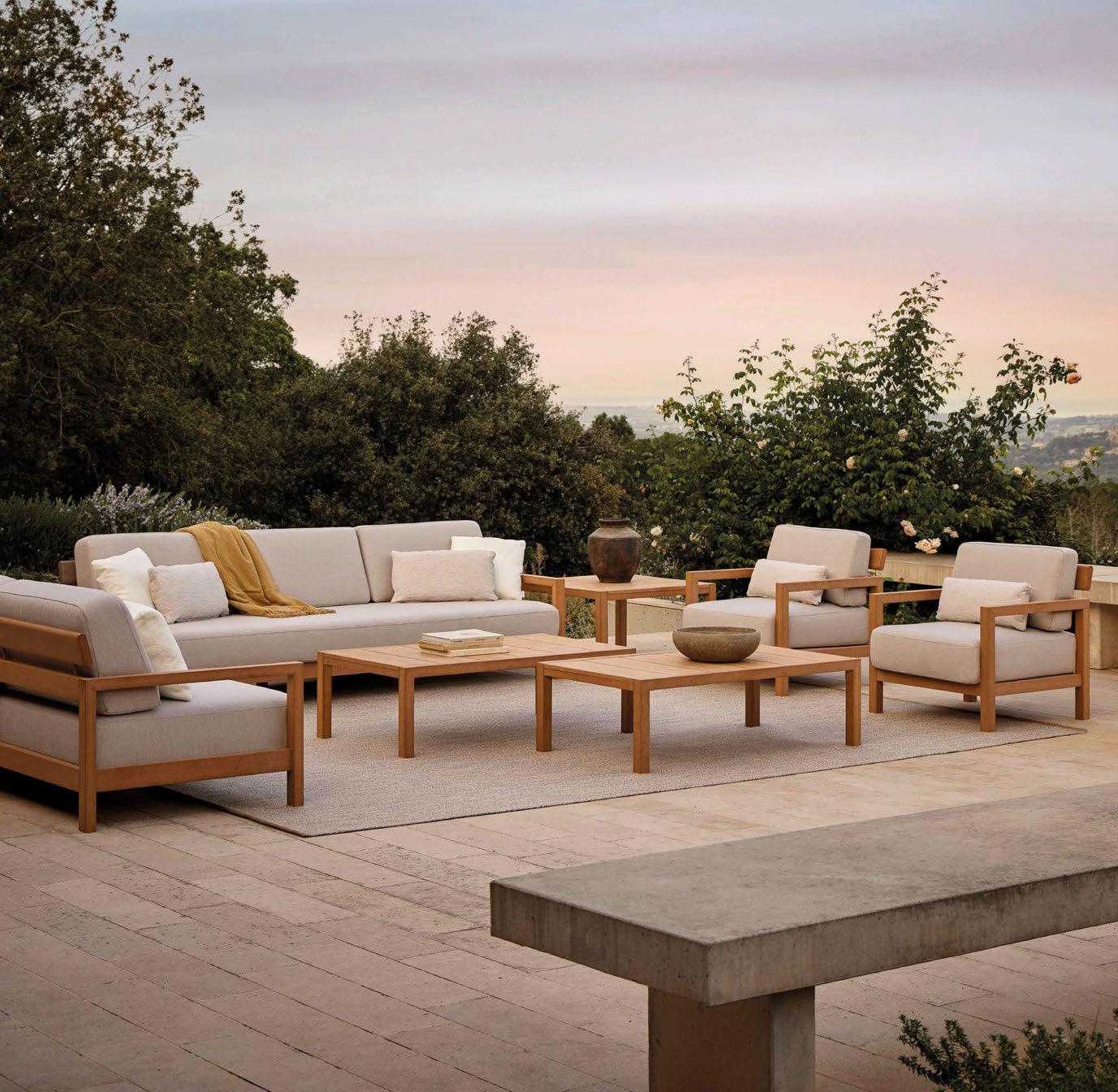

INNOVATIVE & SUSTAINABLE OUTDOOR TEAK MAINTENANCE - FREE HIGH PERFORMANCE POINT1920.COM
GUEST BOOK
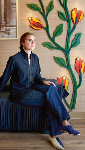
117 Beata Heuman
Swedish-born interior designer Beata Heuman founded her own studio in London in 2013, and has since built a portfolio of residential projects, as well as launching her own collection of furnishings and homeware. Having set her sights on hospitality, Heuman was approached by Adrien Gloaguen to bring her signature aesthetic to a 19th-century building off Paris’ Champs-Élysées; the resulting Hôtel de La Boétie is a theatrical escape featuring bold use of colour combined with a host of imaginative details.

068 Jun Aizaki
Born in Japan and now residing in New York, Jun Aizaki first discovered a passion for hospitality design while studying architecture in Brooklyn. Having mastered his craft at Rockwell Group, he founded his own studio in 2004, and has since designed hotels, restaurants and cocktail bars under the name Crème Architecture & Design. In the creation of Kimpton Hotel Theta, the studio channelled the Modernist aesthetic of Morris Lapidus – the building’s original architect – to create an urban oasis in the heart of Manhattan.
050 Thierry Despont
“Monumental” and “historydefining” were the words used by French architect Thierry Despont to describe The Old War Office when appointed to design the interiors for Raffles’ London flagship. Speaking before his untimely passing, he said: “The OWO will offer guests unique access to a part of history; at every turn there is a story to discover and that’s what makes it so enticing. I consider it my mission to preserve and enhance its rich DNA.” Despont died on 13 August 2023, prior to the hotel’s completion.
110 Martin Brudnizki
Martin Brudnizki is well known for his hospitality projects worldwide, but until recently, he was yet to make his mark on Paris. Now, the acclaimed designer has not one, but two new hotels in the French capital, opening just three months apart. In the Faubourg-Montmartre neighbourhood, La Fantaisie is inspired by the horticultural history of its surroundings, while in Le Marais, Le Grand Mazarin takes cues from Paris’ literary salons, with Brudnizki using his theatrical flair to bring together an eclectic mix of interior styles.
025
068
050
117
110
© Simon Brown
@SleeperMagazine
FRONT DESK
EDITORIAL
Editor-in-Chief
Matt Turner m.turner@mondiale.co.uk
Managing Editor
Catherine Martin c.martin@mondiale.co.uk
Editorial Assistant
Cara Rogers c.rogers@mondiale.co.uk
Editor-at-Large
Guy Dittrich
COMMERCIAL
Business Development
Rob Hart r.hart@mondiale.co.uk
Business Development
Charlotte Gowing enquiry@sleeper.media
Business Development
Kate Borastero k.borastero@mondiale.co.uk
Account Manager
SUBSCRIPTIONS
Visit the online store to subscribe and save across all Sleeper Media magazines.


Subscription
Sleeper
EVENTS
Commercial Lead Kirsty Studholme k.studholme@mondiale.co.uk
Marketing & Events
Olivia Mavers o.mavers@mondiale.co.uk
RESEARCH & MARKETING
Content & Research
Holly Huish h.huish@mondiale.co.uk Strawberry
Ellie Foster e.foster@mondiale.co.uk
Data & Marketing
Lauren Blain l.blain@mondiale.co.uk
DESIGN
Design Manager
David Bell
Production
Mel Capper
CORPORATE Accounts ar@mondiale.co.uk
Finance Director
Amanda Giles
Chairman
Damian Walsh
SUSTAINABILITY
Natural • Renewable • Recyclable
Sleeper is printed by Buxton Press on FSC Mix-certified paper using 100% vegetable-based inks. Magazines mailed from Spatial Global are packaged in FSC-certified wrap that is fully recyclable.
POWERED BY
Studios, Stockport, SK1 3AZ, UK Tel: +44 (0)161
•
464 4750
www.sleeper.media
records are maintained at Sleeper Media. For address changes, email enquiry@sleeper.media
(ISSN: 1476-4075 / USPS: 21550) is published bi-monthly by Sleeper Media Ltd and is distributed in the USA by RRD/Spatial Global. Pending periodicals postage paid at South Hackensack, NJ. Send USA address changes to Sleeper, c/o RRD, 1250 Valley Brook Avenue, Lyndhurst, NJ
USA.
07071,
PORTFOLIO
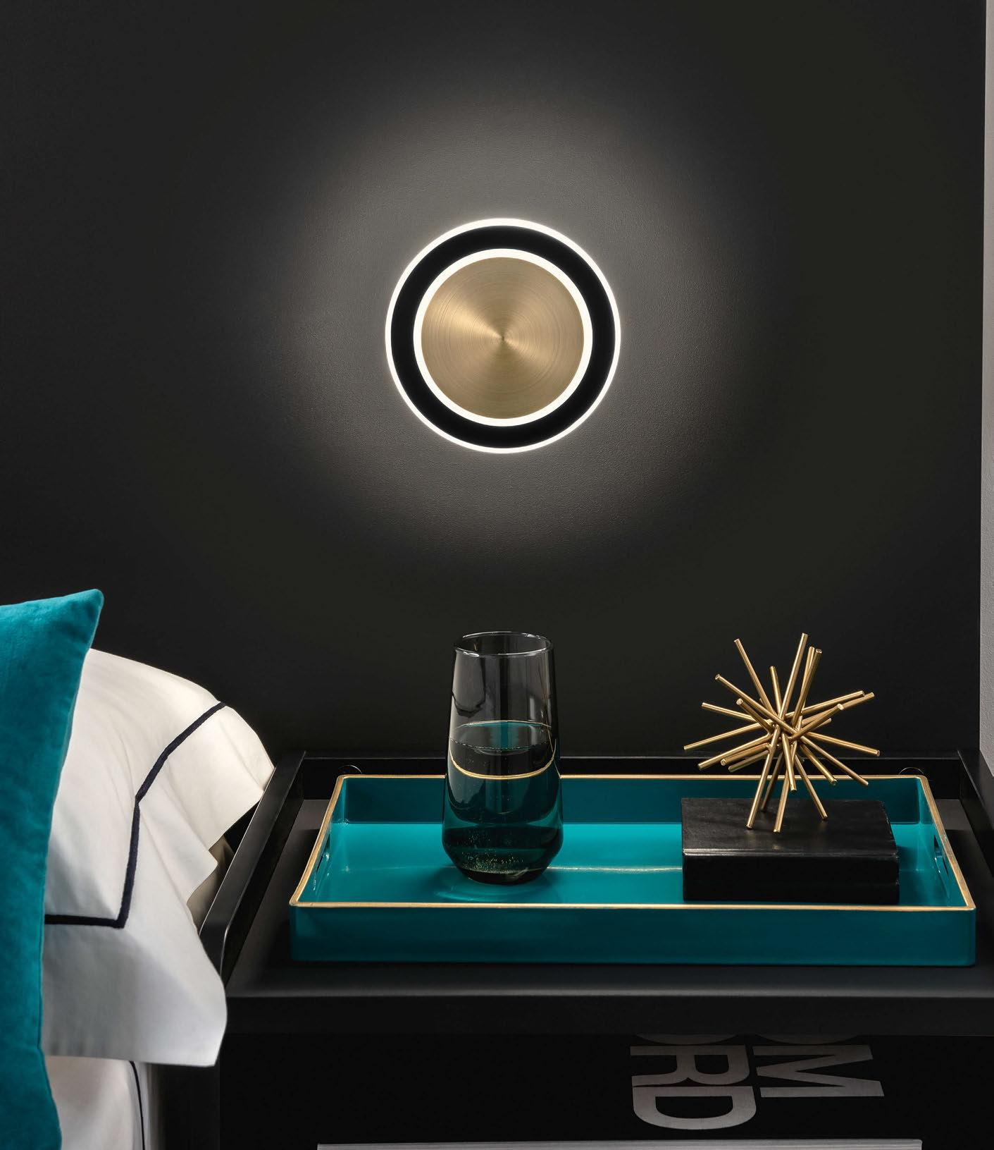
CHELSOM.CO.UK
© Daniëlle Siobhán
CHECK-IN
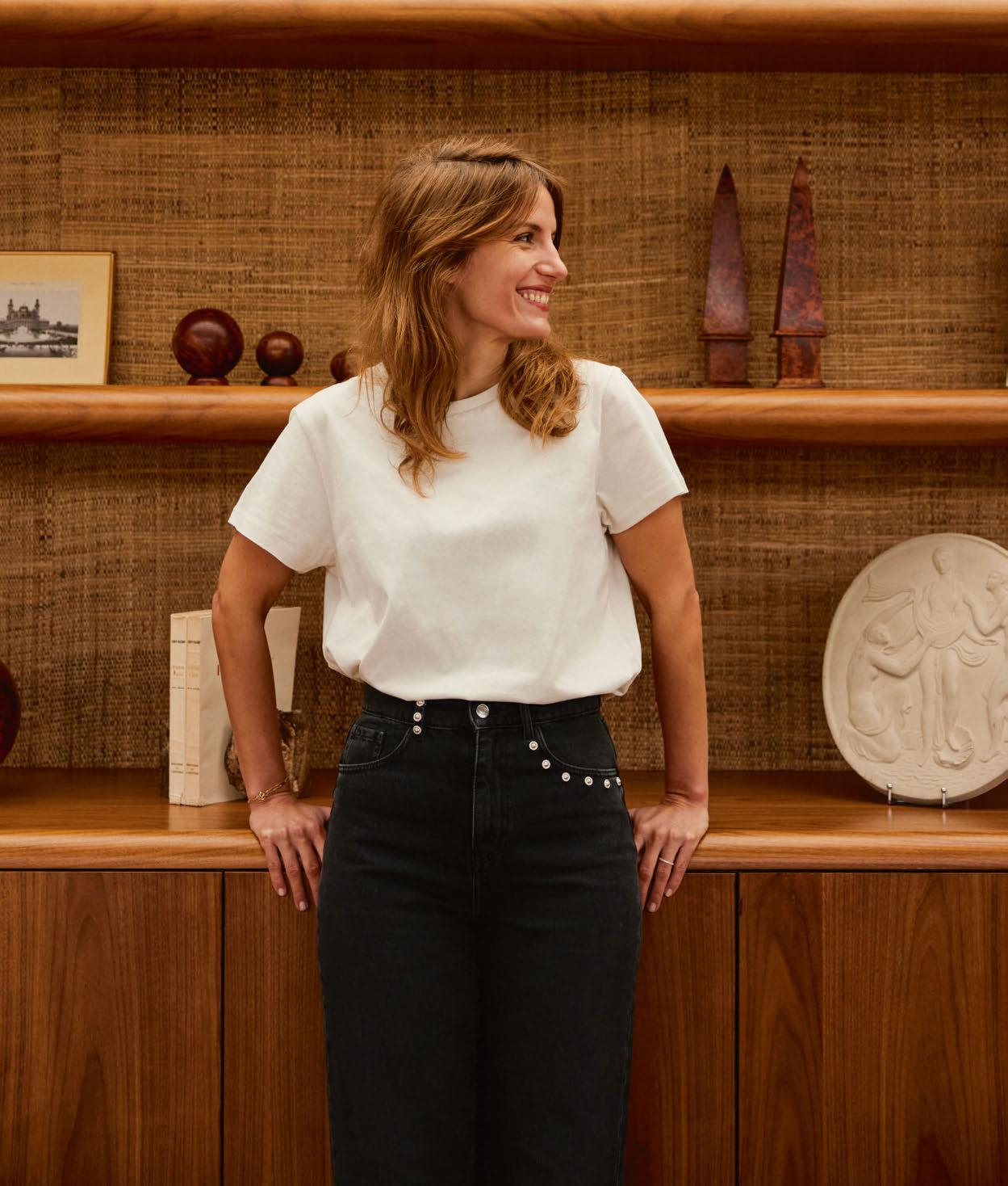
Jordane Arrivetz
Having recently completed a rooftop bar and club at SO/ Paris, French designer Jordane Arrivetz takes a fantasy break to Mexico, where sea, sand and Surrealism take centre stage.
Where are you?
On Mexico’s western coast, facing the ocean.
How did you get there?
I drove in a celadon-coloured Porsche 911; I’ve never owned a car so this is very special.
Who is there to greet you on arrival?
An enigmatic woman, like Nicole Kidman in Nine Perfect Strangers. I like the idea that a place is embodied by a charismatic person.
And who’s at the concierge desk?
I don’t mean to brag, but I’m the best vacation planner, so it’s an AI version of me.
Who are you sharing your room with?
I’m married with two children, so my fantasy is to be alone in my room for a couple of days…
Is there anything you would like waiting for you in your room?
I love personalised service, so I am greeted by a carefully-chosen novel, my favourite skincare products and a drawing by my children.
Describe the hotel, your room and the view...
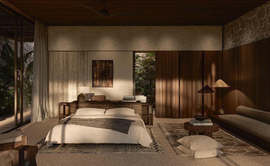
The hotel is made up of several houses hidden amongst the vegetation, connected to the public areas via pathways that wind through gardens of flora and fauna. The rooms are contemporary and minimalist with very little furniture; they are open-plan with views out to the sea.
Who designed it?
The décor is imagined by British photographer Tim Walker, who immerses guests in his dreamlike poetic universe. As in Alice in Wonderland, his creation features oversized plants, unusual characters, curious objects and magical lighting.
What’s the restaurant and bar like?
It’s an open kitchen located on the beach, where we meet around a large central counter to eat and drink, with our feet in the sand.
Who are you dining with this evening?
My best friends and family, as well as American designer Kelly Wearstler, illusionist David Copperfield and sculptor Andy Goldsworthy. Also joining us are David Bowie, Jean Paul Gaultier and film director Paolo Sorrentino. We would have a fun night for sure.
Who’s manning the stoves?
Salvador Dali, who published a cookbook in the early 1970s entitled Les Diners De Gala; it’s an opulent collection of Surrealist recipes.
And what’s on the menu?
I like meals where the table is filled with lots of small dishes to be shared. Here, they take inspiration from Japan, Mexico and Lebanon and are made in front of us using local produce.
Would you like something to drink with that?
We’re drinking delicious French wines, of course! We finish with cocktails, which are a great substitute for dessert.
What’s in the mini-bar for a night cap?
The ingredients for well-shaken Margaritas.
What’s on your nightstand at bedtime?
A pair of binoculars to watch for whales, and a flashlight to facilitate nocturnal explorations.
Would you like a newspaper in the morning?
I would like a newspaper with very local micro-news: the birth of a bird, a shooting star observed through the night and the fruits picked fresh this morning.
Early morning alarm call or late check-out? Nature is the best alarm.
And for breakfast?
No breakfast usually, but if you insist, a buttered baguette dipped in hot chocolate.
Swimming pool, spa or gym?
None are necessary when I have the sea!
029
NOTABLE HOTEL PROJECTS
Bonnie, SO/ Paris; La Tartane, St Tropez; Hotel Barrière Le Majestic, Cannes www.jordanearrivetz.fr
DRAWING BOARD
Epicon
SAUDI ARABIA
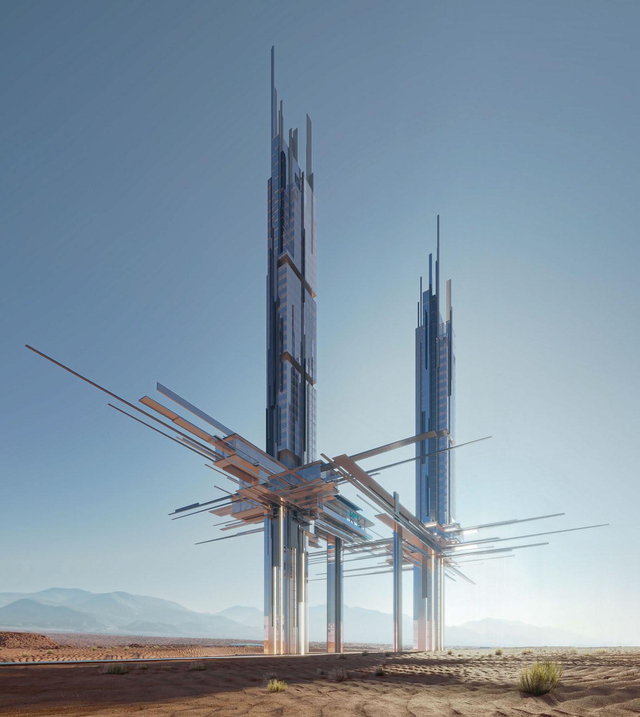
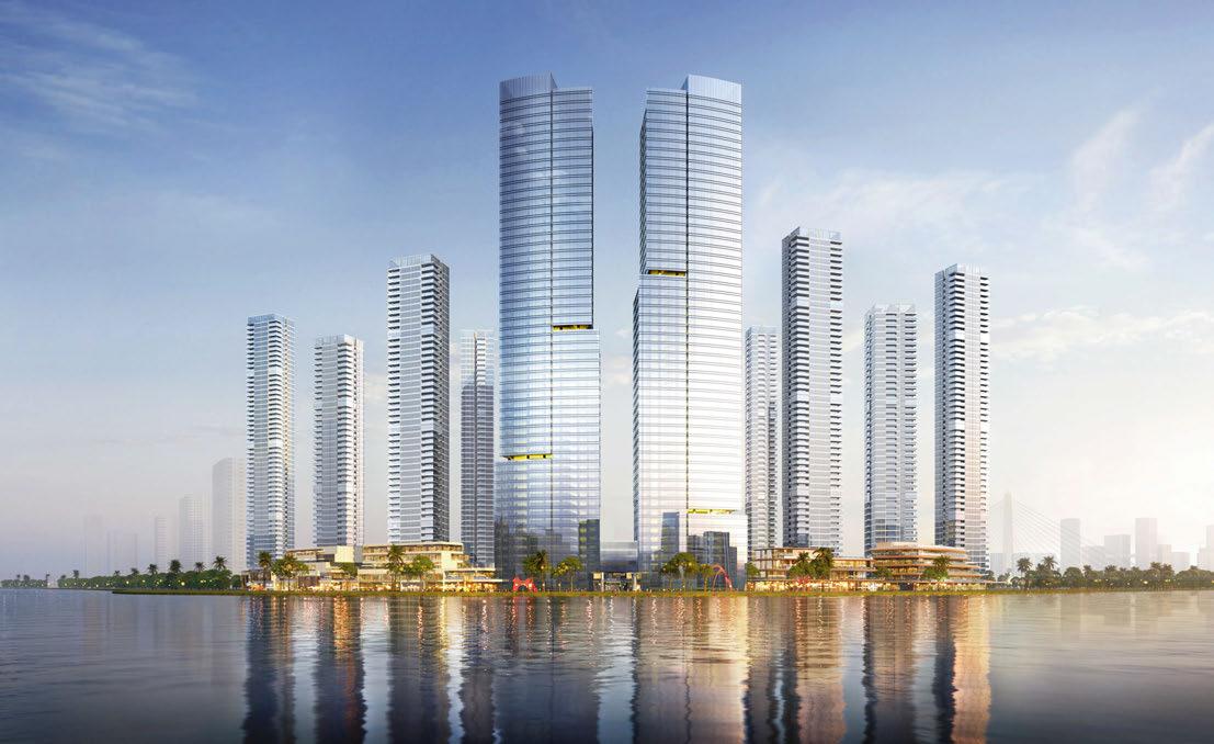
Neom – the ambitious mixed-use development taking shape in northwest Saudi Arabia – has unveiled the latest addition to its hospitality offer. Envisioned by 10 Design, Epicon rises from the desert landscape in the form of two soaring towers, one standing at 230m and the second reaching heights of 275m. Located in the Gulf of Aqaba, the luxury coastal destination will be home to a 41-key hotel and 14 branded residences, as well as a low-rise resort with 120 guestrooms and 45 beach villas.
Inspired by the geometry of Saudi Arabia’s mustatils – ancient sandstone monuments typical of the region – the architectural design balances modernity and nature, with the angular forms appearing to float above the ground to offer elevated views of the landscape. “We drew upon the region’s mineral and topographical influences to create seemingly thin, pristinely sculpted structures for the hotel and branded residences,
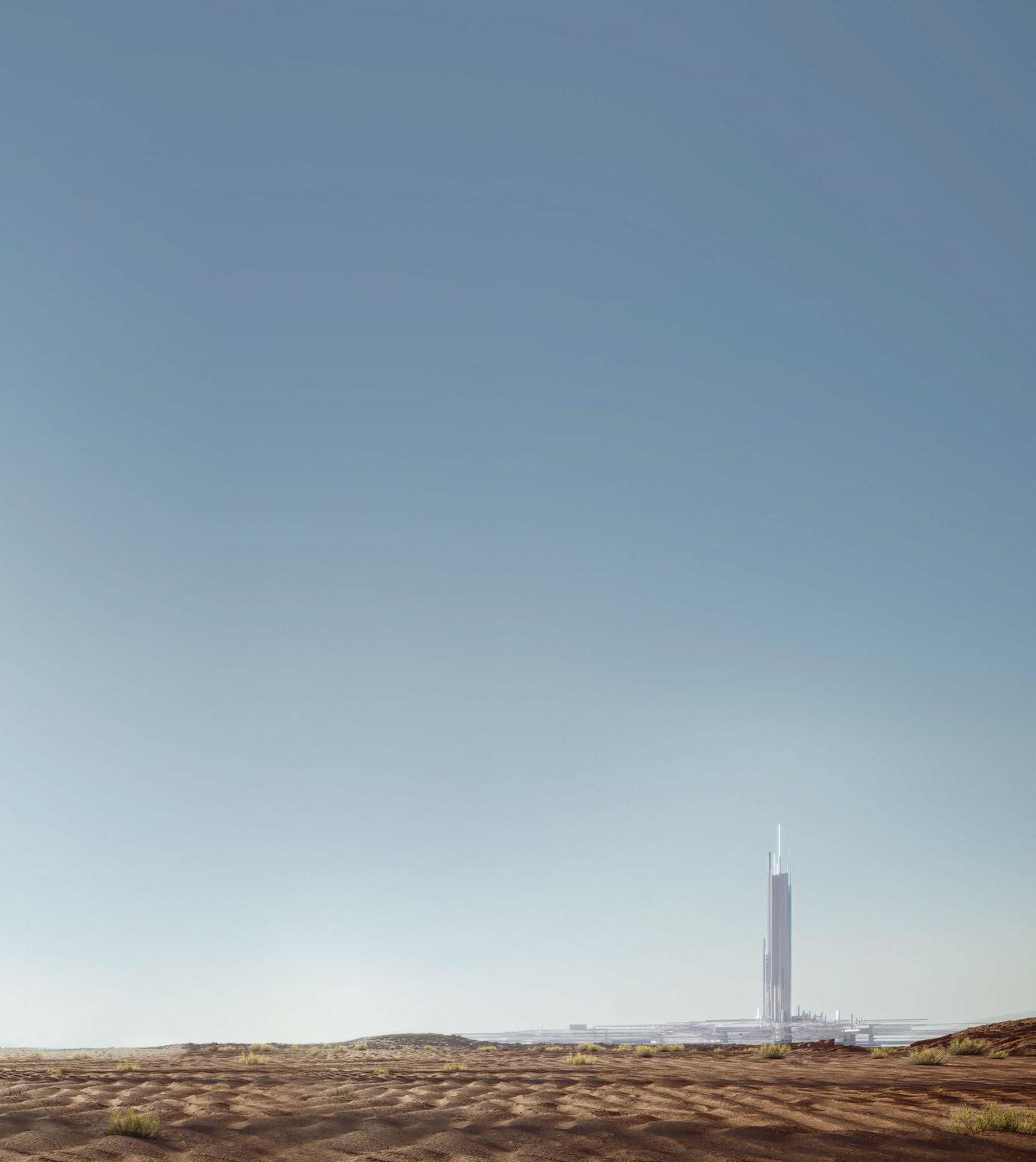
a linear resort structure on the coastline, and a series of villas carved into the landscape for an even more intimate connection to the water and rugged terrain,” explains Leonard Milford, Senior Design Principal at 10 Design. “The elegant series of interconnected structures exude a sense of movement, with surfaces reflecting light during daytime and counterbalancing this effect when illuminated at night.”
On completion, Epicon will offer a range of amenities, including restaurants and a beach club, a state-of-the-art gym, yoga studio, spa and wellness pools. For the business-minded, the development is also set to incorporate a library, lounges and work spaces.
News of Epicon follows the announcement of Leyja and Siranna, also in the Gulf of Aqaba, which will join Aquellum, a subterranean community with hotel accommodation, private residences, retail, leisure and entertainment amenities.
Scorpios BODRUM
EXPRESS CHECK-OUT
Owner: Soho House & Co
Operator: Scorpios
Architecture: Geomim
Interior Design: Lambs & Lions, Annabell Kutucu, Studio McBride www.scorpios.com
Venturing beyond the shores of Mykonos for the first time, Scorpios has announced plans for global expansion, with new outposts in Turkey and Mexico set to combine luxury accommodation with its signature beach club.
Slated to open in June 2024, Scorpios Bodrum is located within the forthcoming Maxx Royal Resort, which occupies a private peninsula in the coastal neighbourhood of Göltürkbükü. The property will feature two restaurants and a clubhouse alongside 12 private suites, each with their own outdoor pool and lounge area. It will also be home to a Ritual Space for ancient healing and immersive cultural practices.
The new offering is being envisioned by architecture studio Geomim, with interiors by Lambs & Lions in collaboration with Annabell Kutucu and Studio McBride. The design ethos will honour imperfect simplicity and the honesty of natural materials, celebrating traditional craftsmanship throughout.
Building on the brand’s alchemy of music, art, food and wellbeing, Scorpios Bodrum will offer a wealth of programming, with revolving artist residencies and DJ performances in addition to events focusing on mindfulness, fashion and the visual arts. Food and beverage meanwhile aligns with the brand’s signature culinary offerings, weaving together Eastern Mediterranean notes with local Turkish influences.
Founded by Thomas Heyne and Mario Hertel, Scorpios – part of the Soho House & Co family – is a contemporary interpretation of the ancient Greek agora, a public place for artists and change-makers to come together to collaborate and celebrate. “Scorpios has always created inspirational experiences through rituals that unite human connection with art, music and nature,” explains Heyne. “In these deep moments of togetherness, we lift each other’s spirits. This is what makes the Scorpios experience so energising and enriching.”
DRAWING BOARD 032
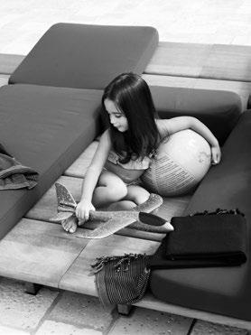
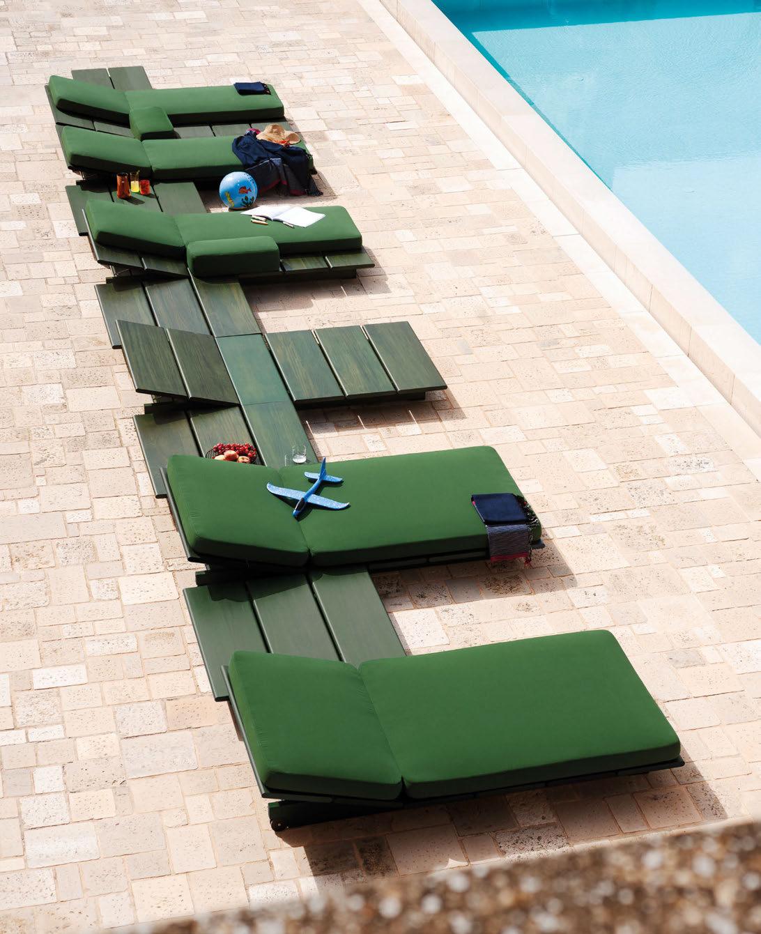
Open–Air Tales
Salone Internazionale del Mobile Milan, 16–21 April 2024, HALL 24 STAND C02/C04 rodaonline.com
Multi Form
Ferrari
EOLIE, design Gordon Guillaumier
ph. A.
Infinite MALDIVES
EXPRESS CHECK-OUT
Developer: Crystal Property Group
Operator: The Cocoon Collection
Architecture: Shigeru Ban Architects
Landscaping: Michel Desvigne www.infinite-maldives.com
Shigeru Ban Architects has released design renderings of Infinite Maldives, a five-hectare resort from Sri Lankan real estate developer Crystal Property Group.
Located within the Malé Atoll, the development comprises 44 over-water and beachfront villas designed to embrace the Maldivian vernacular and champion biophilic principles through the use of natural, locally-sourced materials. The accommodations are organised around four gardens landscaped by Michel Desvigne, who has taken inspiration from famed Sri Lankan estates such as Lunuganga by Geoffrey Bawa. Each villa has access to a private infinity pool and outdoor lounge, while the wider resort features spa and wellness facilities, as well as bars and restaurants, housed within an amorphous cloak-like structure.
“What makes Infinite Maldives unique is that the resort blends in with the sea and nature in an ‘infinite’ manner,” explains Shigeru Ban.
“Conventional resort design usually starts by designing and arranging buildings first and placing water features and vegetation after, using the spaces left between the buildings. For Infinite Maldives, we first considered the resort’s landscape design by defining the relationship between water, land, topography and vegetation. The individual buildings were then designed and placed within the landscape, with a focus on creating continuity and comfort between interior and exterior spaces, including the surrounding area.”
Ban continues: “To minimise the amount of transport and energy needed for construction and material production, we focused on using lightweight and recycled materials. Unlike many developments selling ‘sustainability’ as a label in the commercial sense, our aim was to create a place where people can relax mentally and physically, in harmony with the environment, taking in all its value.”

DRAWING BOARD 034

Borgo dei Conti Resort
UMBRIA
EXPRESS CHECK-OUT
Owner / Operator: The Hospitality Experience
Interior Design: Spagnulo & Partners
Affiliation: Relais & Chateaux www.borgodeicontiresort.com
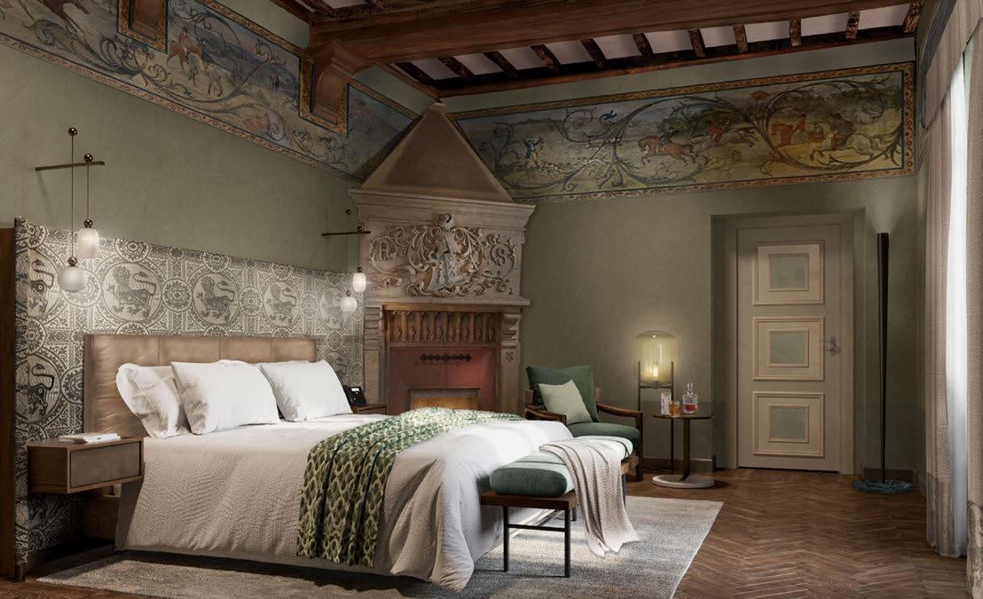
The Hospitality Experience (THE) has announced the summer opening of Borgo dei Conti Resort, a 40-key property in central Italy. Occupying a centuries-old estate Umbria, the resort spans a series of historic buildings arranged around a courtyard, surrounded by 50 acres of picturesque olive groves.
Envisioned by Milanese firm Spagnulo & Partners, the property’s design scheme pays homage to the history of the region. Interiors see a rich colour palette complemented by contemporary furnishings, while design details are inspired by the work of Renaissance painters such as Pietro Perugino and Raffaello Sanzio da Urbino.
“Using locally sourced materials from Umbria alongside traditional construction and craftsmanship techniques, Borgo dei Conti Resort is being thoughtfully restored with contemporary touches and modern furniture, whilst retaining the building’s heritage,” says
Antonello Buono, General Manager of the hotel. “The colour palette is inspired by the landscape paintings of great Renaissance masters with nods to nature throughout.”
The sprawling estate will operate with a robust food and beverage programme, comprising a fine-dining restaurant, groundfloor bar, classic trattoria, pizzeria and poolside bar – all of which are helmed by Executive Chef Emanuele Mazzella. Furthermore, a range of wellness amenities include a spa equipped with two saunas, a hammam and multiple Jacuzzis, as well as an array of relaxation areas and treatment rooms.
Borgo dei Conti Resort marks the third launch from THE following the opening of The Place in Florence and Londra Palace in Venice. Owned and operated by the Babini family, the group focuses its attentions on the preservation of historical assets that hold architectural heritage and cultural significance.
DRAWING BOARD 036
Taking care of light
Patina
TIANJIN
EXPRESS CHECK-OUT
Owner: Capella Hotel Group
Developer: Tianjin Hebei District Industrial Development Group
Operator: Patina Hotels & Resorts www.patinahotels.com
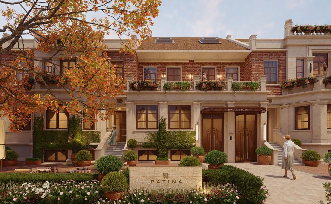
Following the success of its debut property in the Maldives, Patina Hotels & Resorts is set to land in Tianjin, marking a new venture between Capella Hotel Group and Tianjin Hebei District Industrial Development Group.
Located in bustling Hebei – known as the Italian Heritage District thanks to its Mediterranean-style architecture – Patina Tianjin will take the form of a quaint village, offering a sense of tranquility in the city.
In total, the hotel will feature over 150 guestrooms, including a 600m2 presidential villa, spread across 17 heritage buildings. Accommodation blocks have been oriented inwards to face private garden courtyards, creating urban oases that can be viewed through Italianate windows. The hotel’s design meanwhile harmonises with the history of Hebei, also paying homage to Tianjin’s history as a cosmopolitan hub, shaped by European, Russian and Japanese influences.
The arrival experience is set within an intimate drop-off courtyard, where guests are ushered into the lobby, complete with a centrepiece bar. Interspersed throughout the hotel grounds are a range of amenities, including multiple restaurants and a café with al fresco seating.
Patina Wellness meanwhile will reside in its own building, complete with treatment rooms, a gym and an indoor conservatory swimming pool. The same annex will also host spacious meetings and events spaces.
“We are excited to bring Patina’s unique vision of community and connection to Tianjin with the launch of Patina Tianjin,” says Cristiano Rinaldi, President of Capella Hotel Group. “This project introduces our ethos of fostering meaningful connections and a deep sense of community within the vibrant and historic context of Tianjin, and carries with it a social consciousness that appeals to the new generation of travellers.”
DRAWING BOARD 038
CRESCENT TUUCI.COM
OCEAN MASTER M1
TAILOR MADE SHADE
The Lana, Dubai.
Cardo ROME
EXPRESS CHECK-OUT
Owner: Aroundtown
Operator: Everland
Architecture: Fortebis
Interior Design: Saar Zafrir Design www.cardorome.com
Cardo Hotels – a new lifestyle brand that merges business and pleasure – is set to make its debut in 2024, with openings in Rome and Brussels as part of Marriott’s Autograph Collection.
“The cardo was a north-south oriented street in Roman cities, the central point of economic life, embodying a lively and energetic vision that inspired our new, all-encompassing hospitality concept,” explains Nicolas Romero Oneto, Head of Cardo Hotels. “Cardo hotels uniquely adapt to the aesthetics and culture of their city, making them the perfect fit for Autograph Collection, which are ‘exactly like nothing else’.”
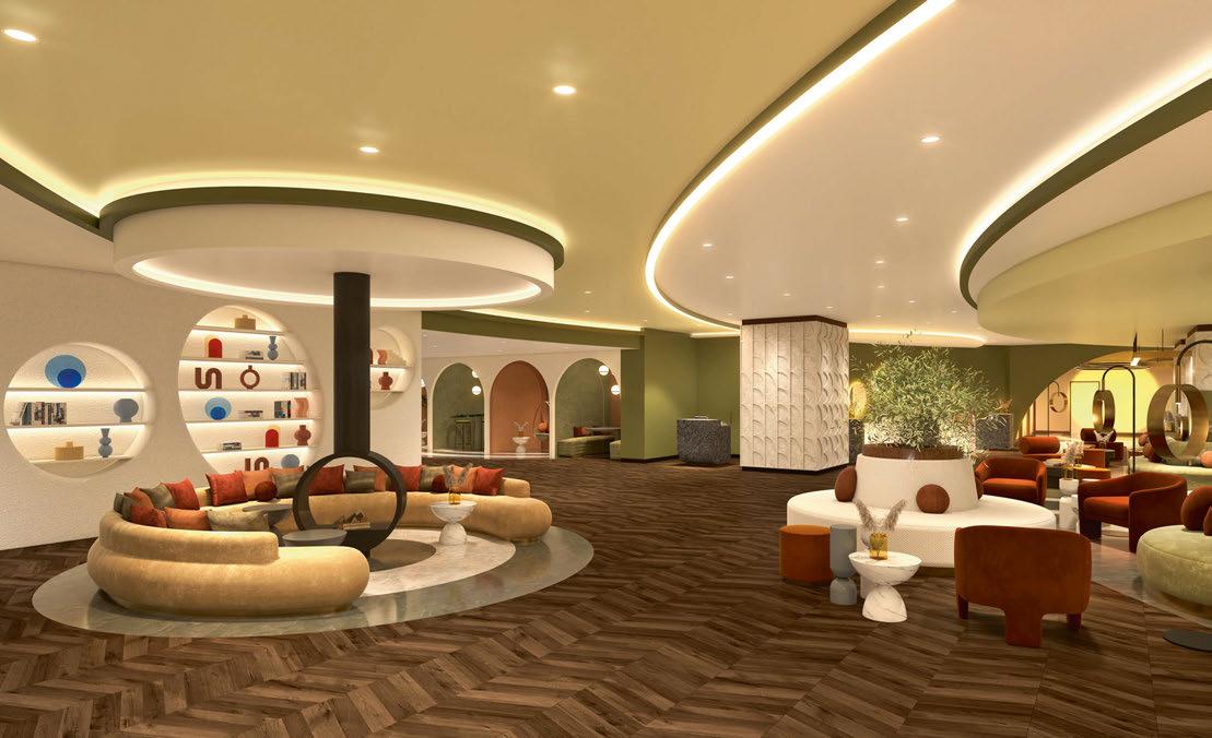
Cardo Roma is located in the bustling Esposizione Universale Roma district, occupying a building originally designed by architect Lucio Passarelli. Interiors are courtesy of Saar Zafrir, who drew inspiration from the the city’s ancient history to develop a palette of rich olive green and warm terracotta, complemented by playful geometry and dramatic archways.
“In Roman times, ‘otium’ referred to being free from commitments; our goal is to immerse guests in this tradition of indulgence, luxury and comfort, where every moment is meant to be savoured,” comments Zafrir. “The design incorporates the best elements of a business environment while offering a holistic atmosphere to leisure travellers, complete with a range of enjoyable activities.”
Along with 324 guestrooms, Cardo Roma will feature two distinct dining venues – signature Italian restaurant Vertici and seasonal pool bar Spectio. There will also be a 1,200m2 spa with sauna, hammam, treatment rooms and a fitness centre, as well as a multi-pool bathing experience reminiscent of ancient Rome.
Catering to the business traveller, the events facilities span an impressive 3,100m2, making them amongst the largest in the city and positioning the hotel as a leading destination for local and international gatherings.
DRAWING BOARD 040

The Langham
FOSHAN
EXPRESS CHECK-OUT
Developer: Parkland Group
Operator: Langham Hospitality Group
Architecture: CUEB Design
Interior Design: Chong Cheng Design www.langhamhospitalitygroup.com
Langham Hospitality Group has signed a management agreement with Parkland Group to open a new hotel in China’s Greater Bay Area. Scheduled to open in 2028, The Langham Foshan forms part of One Sanlong Bay – a ninehectare mixed-use development with luxury residences and prime office space.
Billed as the city’s first high-rise urban resort, the 160-key property will occupy a soaring skyscraper on the banks of the Dongping River, offering panoramic views of the surrounding city. Government planning in the Sanlong Bay area has focused on the creation of a green urban environment, which will see Foshan bring sustainable living with a low-carbon footprint squarely to the fore.
Within the hotel component, facilities include an extensive range of meetings and events spaces, including one of the largest ballrooms in the city, and Cantonese restaurant T’ang Court – a sibling of Hong Kong’s three-Michelin-
starred restaurant Black Pearl. The Langham’s signature afternoon tea will also be on offer, paying tribute to the British classic served at the London flagship.
Chuan Spa, Langham Hospitality Group’s proprietary wellness brand, will also find home in the Foshan outpost, offering services based on the principles of traditional Chinese medicine against a scenic river backdrop.
The Langham Foshan will join the group’s nine other properties in the Greater Bay Area, either open or currently under development.
“The Greater Bay Area is a key international powerhouse where Langham Hospitality Group enjoys a strong and growing presence with all of our brands represented,” comments Bob van den Oord, CEO of Langham Hospitality Group.
“Introducing The Langham to the first-tier hub city of Foshan is an important strategic move for us in this context, and one that will set a new benchmark for luxury experiences.”
DRAWING BOARD 042
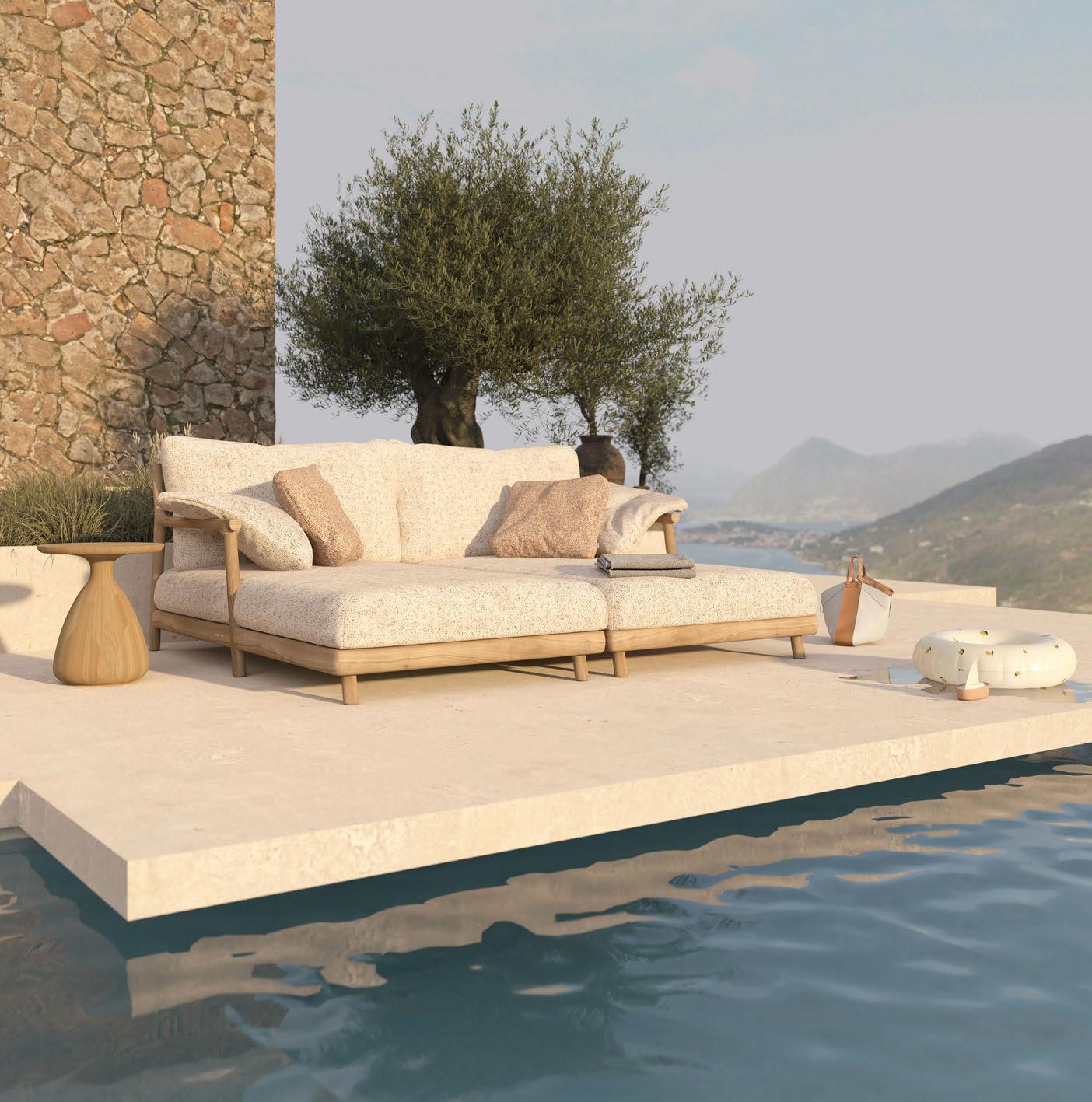
manutti.com @manutti_official outdoor luxury
Muyu. collection designed by Stephane De Winter
your wellness partner
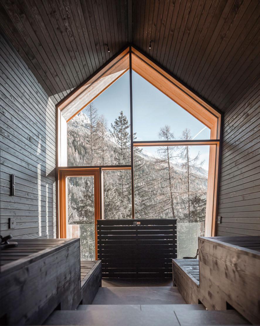
Consulting, engineering, production, installation, technical support and training are the pillars sustaining our whole work. We create innovative Wellness concepts, developing spaces and programs dedicated to health, beauty, and self-care. Because making people feel better is all that we want.
ph.: Gaia
Panozzo design: Studio noa*
Life’s a Peach THE LOBBY
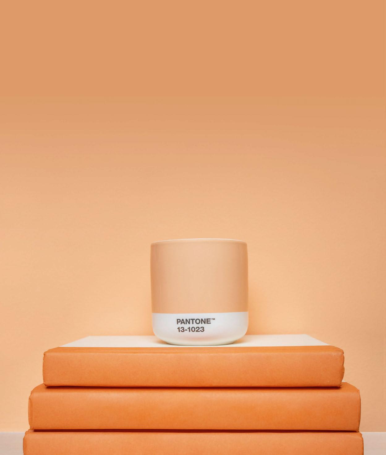
There’s one design decision in particular that can truly transform a hotel room – colour. From calming neutrals to bold accents, picking the perfect palette is no easy task. At Walker Hotel Tribeca, monochrome is the style of choice, following a partnership with Pantone to create a guestroom inspired by the 2024 Colour of the Year.
In celebration of Pantone 13-1023 – better known as Peach Fuzz – the room is painted top to bottom in a warming shade of peach. Bed linens and rugs showcase the same hue, as do amenities including a mini-fridge, kettle and espresso cups.
Described as a gentle, velvety tone, the celebrated shade was chosen by Pantone for its connotations of calm, recalibration and wellness. “In seeking a hue that echoes
our innate yearning for closeness and connection, we chose a colour radiant with warmth and modern elegance,” says Leatrice Eiseman, Executive Director of Pantone Color Institute. “A shade that resonates with compassion, offers a tactile embrace, and effortlessly bridges the youthful with the timeless.”
Nodding to the softness and sense of rejuvenation symbolised by the Colour of the Year, the room also features an array of wellbeing-focused products, including organic silk sleep masks from Clementine Sleepwear and on-theme beauty amenities from Ever Skincare and Flamingo – all to be enjoyed whilst sipping on peachy Bellinis from the hotel bar. The perfect way to enjoy a city break through peach-tinted glasses.
© Ana Paula Larrea

Spirit of Sweden
Eco-friendly hospitality projects are becoming increasingly important, with owners, operators, architects and interior designers going the extra mile to minimise impact on the environment. While in some cases this may be a requirement of planning regulations, at new climate-smart cabin experience Landet, a love for nature is the main driving force.
Landet – meaning ‘countryside’ in Swedish – is a cluster of four cabins located in a 400-hectare nature reserve south of Stockholm. “We fell in love with the region the first time we visited,” says Umberto Garabello, co-founder of Landet, adding that the natural surroundings and tranquility of Trosa made for the perfect location. “The idea of Landet is to make the Swedish countryside accessible in a modern and sustainable way. We want to share the authentic experience of the cosy Swedish lifestyle out in nature, but with all the comforts and with simple yet elegant Scandinavian design.”
Designed by architect Andreas Martin-Löf, the cabins immerse guests in their surroundings, thanks to floor-to-ceiling windows and the addition of outdoor wooden decks. Constructed from natural materials, the structures stand on simple plinth foundations that have minimal impact on the ground beneath them, creating a feeling of floating above the earth. “We wanted to show maximum respect for the environment and be able to easily return the site to how it was,” explains Martin-Löf, pointing out that the landscape is left untouched. The 40m2 cabins showcase interiors by London-based designer Tobias Vernon, and feature a bedroom, dining area, well-equipped kitchen and cosy living room complete with a fireplace.
“This is just the beginning for Landet,” conclude the project’s founders. “We have many plans for how we want to develop the concept and let as many people as possible experience the best of the countryside – in Sweden and abroad.”
A Journey Through Zannier
With a portfolio of properties around the world, Zannier Hotels is known for its enriching experiences that embrace local tradition, culture and community, ranging from tented suites in the Namibian desert wilderness to stilted villas in the rice paddy fields of Cambodia. Now, the spirit of Zannier’s collection has been captured in a coffee table book published by New Heroes & Pioneers. Entitled Zannier Hotels: A Journey Through Style, People and Experiences, the 192-page tome offers an insight into the Zannier world through detailed commentary. There’s also rich photographic exploration of the hotels, captured by Ash James to showcase a penchant for architectural spaces and atmospheric landscapes. Highlights include a deep dive into the essence of the hotel group, demonstrating how luxury has been reinvented to be more meaningful and authentic; plus behindthe-scenes stories on how the hotels are brought to life, with anecdotes from founder Arnaud Zannier and other key members of the team. Structured across six chapters, the book is a blend of natural scenery and the interior décor it has inspired, transporting readers across a unique hospitality landscape.

THE LOBBY 046
Italy’s Icons
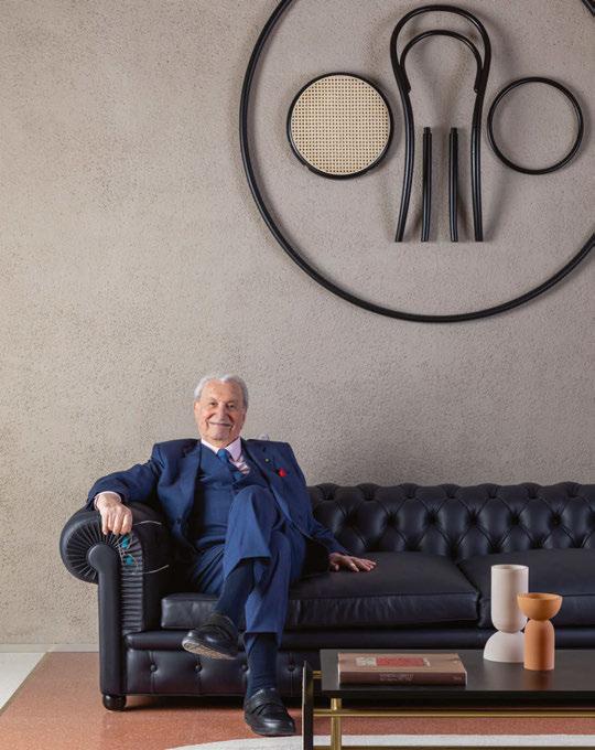
A new hotel in the town of Tolentino chronicles 60 years of Italian design.
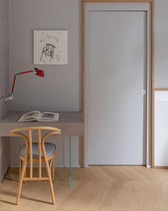
Often regarded as the design capital of the world, Italy boasts a star-studded roster of visionaries. Their creations, ranging from dining chairs to sofas, coffee tables to cabinets, have become icons in their own right, still in production decades after their original debut. Now, a new hotel in the charming town of Tolentino is set to honour such Italian greats, with interiors furnished by a range of iconic pieces.
Occupying a late Art Nouveau villa that once housed leather goods company Nazareno Gabrielli and later became the headquarters of Poltrona Frau, Interno Marche pays tribute to Franco Moschini, former patron of the Poltrona Frau Group. The entrepreneur, whose endeavors take in leadership roles at esteemed brands including Cassina, Cappellini, Zanotta and Gebrüder Thonet Vienna – of which he remains President – has had a significant impact on the global reach of the Made In Italy label.
Restored by the Franco Moschini Foundation and designed by Michele De Lucchi and Studio
Ora, the property sees each of the 25 guestrooms and five suites inspired by a renowned designer and embodying a stylistic movement of the 20th century. Based on meticulous philological research, guestrooms showcase various forms, prints and furniture pieces, chronicling the works of designers such as Marc Newson and Gae Aulenti, as well as Vico Magistretti, Giò Ponti and Achille Castiglioni.
Paying homage to their creations, the hotel is furnished with over 400 bespoke and speciallycrafted pieces. Guests can relax on the renowned Lullaby sofa in the room dedicated to Luigi Massoni; enjoy a restful slumber on the Volare bed in the Lazzeroni room; and sit back on a stylish Woodline chair in the room inspired by Marco Zanuso.
Fusing past and present, the building acts as a veritable house-museum, inviting visitors on a journey through the styles and furnishings that have shaped the history of interior design over the past six decades.
THE LOBBY 048
© Serena Eller
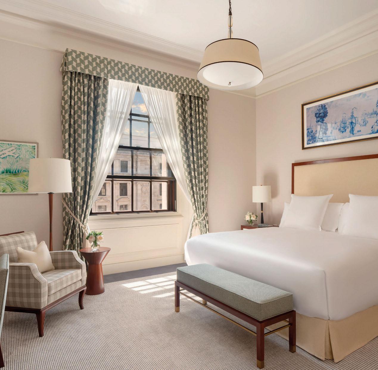

Ra es London at the OWO // © John Athimaritis // northern-lights.co.uk
Raffles at The OWO
LONDON
A landmark project in a landmark building; the owner, operator, architect and design team tell all about a legend in the making.
Words: Catherine Martin • Photography: © John Athimaritis (unless otherwise stated)
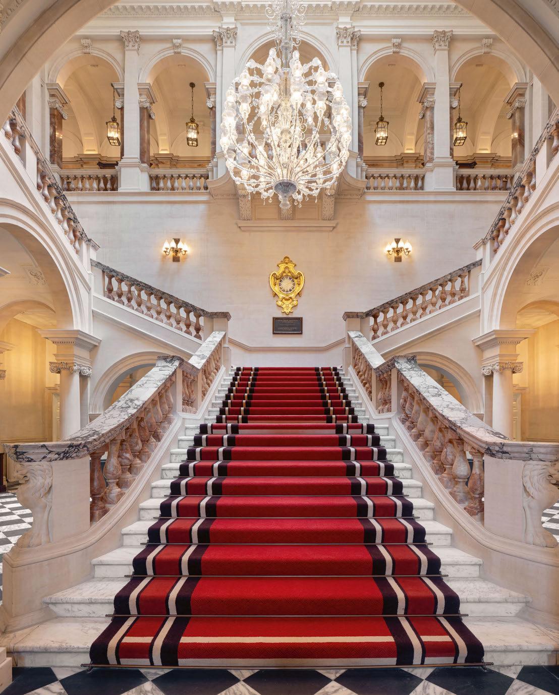
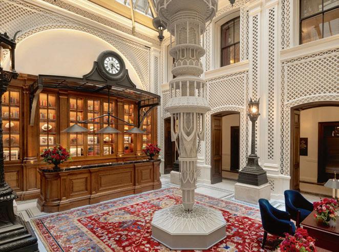
With its pink alabaster balustrades, richly veined marble and wraparound colonnaded gallery, the sweeping staircase at The Old War Office on London’s Whitehall is quite the picture. Awe-inspiring, majestic and monumental are just some of the phrases that have been used to describe the scene after the doors reopened. It was here, standing on this very spot, that the Hinduja Group fell in love with the character of the building and eyed an opportunity to create their legacy; it was here that Accor found a natural fit for its ultra-luxury Raffles brand; and it was here that every newly-appointed architect, interior designer, contractor and consultant came face-toface with the mammoth task ahead – transforming a Grade II*-listed landmark into a luxury hotel.
Of course, the building’s story goes way back. Commissioned in the 1890s as the administrative headquarters for the British Army, the new War Office – as it was then known –was designed by architect William Young. The first bricks were laid in 1899 and it officially opened in 1906, becoming one of the city’s finest examples of Edwardian Baroque architecture. In the decades since, the building has played a significant role in British history. It was a vital linchpin in the business of war and conflict; the nation’s most important leaders and statesmen held office here, from Lord Kitchener and TE Lawrence to Richard Haldane and Winston Churchill; and heroes of the Secret Service – who inspired Ian Fleming to write his James Bond novels – walked its halls. A tour with Communications Director Fiona Harris reveals all manner of facts, figures and anecdotes, ranging from the number of bricks used in the original build (25
million) and the total length of the corridors (2.5 miles), to the secrets of Churchill’s favourite spy (Christine Granville) and appearances on the big screen (Octopussy, Licence to Kill and Spectre).
RESPECTING THE PAST
The present-day story begins with the Hinduja Group, a Mumbai-based conglomerate with interests in banking, energy, technology and media. Inspired by the successful renovation of a row of Georgian townhouses to become their London home, the Hinduja family were on the lookout for a greater challenge. “Spearheaded by my father-in-law, GP Hinduja, and his brother SP, the search for a heritage property began in 2014,” explains Shalini Hinduja, who has been instrumental in the development of the project. The search didn’t take long, and later that year, the MoD announced the sale of the Old War Office to Hinduja Group as part of a cost-saving drive that involved the disposal of underutilised assets. The keys were handed over in 2016 under a 250-year lease, and then the hard work really began.
“Our goal was to breathe new life into the building in a way that not only respects its past, but also enriches the present and future of those who experience it,” Shalini continues. “The first step was to understand more about the location, the London landscape and the building’s fabric, investigating what could be done within the constraints of its Grade II*listed status. My role involved overseeing various facets of the project, ensuring that our vision for this landmark building was brought to life with the utmost respect for its historical significance.”
050
051
052
A NATURAL FIT FOR RAFFLES
The building was acquired for a handsome sum, reported to be in the region of £350 million, and its appeal is evident to anyone who sets foot in the entrance hall. For Shalini, it was the “arched openings, wide corridors and beautifully carved stonework” that made for a compelling case, and though various change-of-use options were explored, it was hospitality that would eventually triumph – a move that aligns with the company philosophy of giving back. Under the new plans, the building would be open to the public for the first time, honouring the mantra of late founder Parmanand Deepchand Hinduja, who said: “My dharma is to work, so I can give.”
With the relevant permissions granted, global hotel groups vied for the opportunity to fly their flag from the façade. “We received several proposals, but Raffles intuitively felt like the right fit for The Old War Office,” explains Shalini. “Raffles as a brand tends to exist in distinctive properties, many of which have special architectural features or a historical connection to the cities in which they are built.”
Leaders at Raffles Hotels & Resorts believed the brand to be the right fit for the building too, and could see the opportunities it would bring. “Accor had acquired the Raffles brand a few years earlier and we were looking for a location in London,” explains Anne Becker Olins, Global Chief Design and Technical Services Officer for Accor’s luxury brands. “For us, it was a gift; Raffles has a long history – the brand is as old as the building itself, so it was a perfect match.”
Omer Acar, CEO of Raffles, adds: “Raffles seeks out astonishing settings for each of its properties, and Raffles London at The OWO offers this generously. The rich heritage of the city, as well as The Old War Office building, make London a natural home for the brand.”
ARCHITECTURE THAT ADDS VALUE
With 120 guestrooms and suites, five restaurants, two bars and a spa, Raffles London opened towards the end of 2023, but the hotel
is just part of the story, occupying around 50% of the site. In all, the wider development – known as The OWO – includes 85 branded residences and a further five F&B venues. The mixed-use nature of the project required an architectural studio with experience in hospitality and residential, as well as a track record in the conversion of heritage buildings. Enter EPR, a multi-disciplinary practice with an enviable portfolio of projects to its name. Having initially been appointed by the MoD to gain planning approval for a change of use, the studio explored various options, coming to the conclusion that a hotel component would make sense for the heavily-listed heritage portion. Following the Hinduja Group’s successful bid, EPR became the lead architect, a role that required a huge amount of masterplanning to maximise the floorplate. “This wasn’t just a straightforward conversion, it was about getting the best out of the building,” explains Mark Bruce, Head of Hotels at EPR. “Where do the restaurants go? How can we make use of the heritage spaces? What is the right proportion of suites for the market? We worked hard to meet the requirements of the owner in terms of key count and amenities, all while respecting the character of the building and retaining the generous proportions associated with this level of luxury.”
In adding value to the building, EPR extended both above and below ground, achieving an impressive 31% increase on area, without impact on the façade. In keeping with the planning conditions, the three-storey rooftop extension follows the tiered proportions of the building, meaning it isn’t visible from street level. “There are 27 protected viewpoints around Westminster, including sightlines from Buckingham Palace,” explains Geoff Hull, Director at EPR. “We had to respect these and ensure that the additional massing isn’t visible.”
Below ground, four new basement levels were added to house the spa, health club and ballroom. Given the volume of the building, this was a major undertaking, involving structural
engineers Elliott Wood to create a support system that would enable excavation beneath the façade. And in the inner quadrangle, every individual cobblestone – each of them listed –had to be removed and labelled to be replaced after groundworks. There were technical challenges too: acoustics, thermal insulation and waterproofing; adding the requisite sprinkler system to heritage-protected areas; and upgrading the drainage so that wastewater for the spa can be pumped up to ground level.
For EPR, maximising the potential of the building also came through consideration of the guest journey. “It’s a government building that was built as a fortress, so despite there being three elevations, there was only one door,” explains Hull. “Our challenge was to reverse that; to create more penetration, as well as vertical and horizontal circulation.” As such, the hotel now has multiple entry points, allowing for direct access to many of the F&B venues – ideal for a property that hopes to draw in passing trade. As Bruce points out, a hotel done well has the power to change an area: “We love to bring extraordinary pieces of architecture back to life; to take a listed building and turn it into something people can enjoy.”
Involving demolition, retention and restoration, EPR describes The OWO as its most complex project to-date, revealing that it took 12 planning applications, weekly meetings with Historic England – who became valued members of the team – and some 37 consultants.
A MISSION TO PRESERVE AND ENHANCE
The interior design story is equally complex, with various studios selected to suit specific spaces. Shalini was closely involved in every aspect of the process, from appointing designers to defining the brief and guiding FF&E and art curation. “The clear mandate was to turn The OWO into something unique, preserving its rich history whilst ensuring it provides facilities and experiences that are relevant for the new generation,” she explains. “My role was to convey this vision and ensure its implementation
053
throughout every phase, working closely with the designers to achieve this.”
And it’s quite a line-up. In the wider OWO development, AB Concept designed interiors for Italian eatery Paper Moon; Café Lapérouse occupies a contemporary DaeWha Kangdesigned pavilion with interiors by Cordélia de Castellane; and still to come, there’s a rooftop restaurant and sake bar operated by Creative Restaurant Group, set beneath a curving glass extension. Not forgetting Winch Design for the Presidential Suite, 1508 London for the residential component, and Albion Nord, HBA and Angel O’Donnell for the varying interiors of the residences.
For the hotel, The Office of Thierry Despont spearheaded the design of the guestrooms, as well as the Raffles-operated F&B including Mauro Colagreco, Saison and The Guards Bar. Ably supported by his team, Despont personally took the lead, apparently delighted to be part of the landmark transformation. “When first hearing about the project, Thierry was so enthused that he immediately boarded a flight to London to meet with the owners and walk the historic building,” explains Matthew Maddalene, Managing Senior Associate at the studio. “The Hinduja family gave us tremendous support and encouragement in our work and their enthusiasm for turning this monumental structure into a five-star hotel more than matched Thierry’s. Thierry was very pleased
054
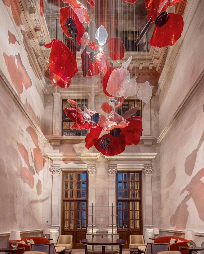
An installation by Lasvit – comprising individually-cut glass petals cascading down from above – captures the profound importance of poppies in honour of the nation’s war heroes
© Lukas Pelech
MAKE GUESTS FEEL AT HOME
IN MIND AND BODY
Share the game-changing wellness experience from Peloton BUSINESS.ONEPELOTON.CO.UK
with the project result, which was nearly complete when he passed last August.”
Speaking before his passing, Despont described the property as “monumental” and “history-defining”, stating: “The OWO will offer guests unique access to a part of history; at every turn there is a story to discover and that’s what makes it so enticing. I consider it my mission to preserve and enhance its rich DNA, drawing inspiration from the building’s classic Edwardian architecture, as well as the legendary leaders and stately rooms that are an integral part of its past.”
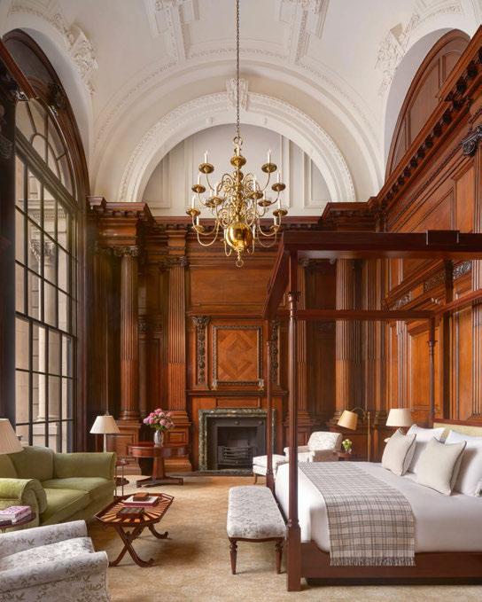
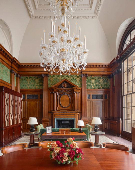
The interior design scheme is befitting of the majestic building, and showcases past and present in equal measure, an aesthetic best showcased in the heritage suites, where restored fireplaces and historic panelling sit alongside contemporary interventions. “We created bespoke soft furnishings including carpets, fabrics and wallcoverings, as well as custombuilt furniture and lighting, which give a modern edge whilst designed to be reminiscent
of the past,” commented Despont, referencing the likes of the red curtains in the corridors, inspired by the uniforms worn by the Horse Guards just across the street.
Original features that have been retained, and in some cases restored by specialist craftspeople, include stone fireplaces, mosaic floors and oak panelling, as well as ornate plasterwork and smaller details such as the brass push-plates on doors. New interventions are sensitive to the fabric of the building, such as the carpets that take inspiration from the historic grilles, or the solid brass chandeliers in the Haldane Suite, a Dernier & Hamlyn recreation based on those seen in archive photography.
Lighting plays a key role throughout the hotel, with fittings selected for their materiality, or commissioned bespoke to harmonise with the scheme: Northern Lights crafted pieces in wood and brass paired with porcelain and off-white fabric; Chelsom supplied lighting for the guestrooms; and fluted glass wall lights by Hector Finch feature in the bathrooms.
On a larger scale, Idogi created the crystal chandelier that presides over the grand staircase, while Lasvit developed a site-specific installation in honour of the nation’s war heroes; entitled Poppies, the sculptural artwork captures the essence and profound importance of its namesake, with individually-cut glass petals cascading down from above.
In all, it’s thought that over 450 companies supplied product to the development, from fabrics and floorcoverings to furniture and sanitaryware, the latter including brands such as Waterworks, THG Paris and Dornbracht. That’s in addition to the veneer specialists, stonemasons, decorative plaster artisans and many, many more craftspeople that have been part of the project.
The hotel also showcases works from a wide range of artists in a collection curated by Artiq.
“The brief was to curate a thoughtful selection of pieces that celebrate the legacy of the property, touching on stories of important people and events that took place here or occurred during
056
NEW SHOWROOM
DESIGN CENTRE EAST
CHELSEA HARBOUR
LONDON
LIGHTING FOR LIFE

the contemporary era of the building’s use,” explains Beth Fleming, Associate Director at Artiq, referencing the political landscape and wartime years experienced by Great Britain.
Weaving narratives of the past together with contemporary arts, Artiq selected licensed works from the archives of London’s Victoria & Albert Museum, as well as commissioning bespoke pieces and sourcing directly from artists, galleries and specialist auction houses. Contributing to the hotel’s design story, the art collection seeks to engage the modern guest, celebrating contemporary artistic excellence and, in the words of Fleming, “speak to London’s artistic and multicultural position”.
MAGICAL MOMENTS IN THE SPA
Completing the line-up of designers, Londonbased studio Goddard Littlefair was appointed in 2019 to develop a scheme for the spa and wellness spaces. Spanning 27,000ft2 across four levels, facilities are extensive, incorporating a vitality pool and treatment rooms, as well as
a state-of-the-art gym and movement studio. Hinduja Group has been savvy in creating a venue that is not only an add-on for hotel guests, but also caters to the luxury spa day market, and serves as a full-service fitness club with a membership model.
The relaxation and active zones are intentionally separate, with the latter operated by Pillar Wellbeing, a new B2B2C concept that takes in movement, nourishment and recovery. The fitness area is kitted out with skipping ropes, kettlebells, yoga mats and equipment from Technogym, while Peloton bikes are available for use in-suite. Taking an all-encompassing approach to health and wellbeing, Pillar offers lifestyle consultations, access to trainers and specialists, and it comes with its own F&B outlet serving nutritionally balanced cuisine.
Despite being below ground, there’s a lightness to the spaces thanks to the considered floorplan and natural palette, with a sense of openness coming from the wraparound glazing that offers sightlines to the pool below. Here,
Goddard Littlefair collaborated with Studio Peascod to design a frieze of glass and mirrored panels, etched with a wave design that provides an element of privacy.
Pillar Wellbeing also incorporates the steam room, sauna and experience showers, as well as the 20m swimming pool, reached via a spiral staircase. “A lot of thought went in to planning the guest journey,” explain Martin Goddard and Jo Littlefair. “We wanted to create a connection between the gym and the pool, both visually and physically, and the sculptural staircase was a way to do that; its organic form is a feat of craftsmanship and it also creates a moment for guests to sweep down to the poolside.”
The pool itself also creates a moment, with the double-height space characterised by a dramatic fireplace and elegant archways, some framing niches furnished with reclining loungers. The palette is made up of natural travertine and decorative stone panels, the latter carved with a three-dimensional scalloped pattern that catches the light to captivating effect.
058
Connecting local artists and makers with global brands to tell stories through art.
Creating impact with culture
artiq.co
Artist Makiko Harris in her London-based studio.
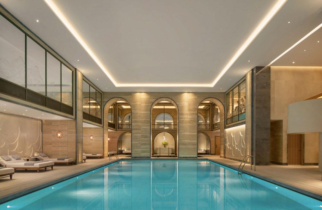
Up above, the spa is operated by Guerlain and, in the words of Littlefair, is “a contemporary response, yet matches the timelessness of the building and elegance of the brand”. The designer continues: “Luxury wasn’t just an addition; it was a foundation. Our vision was a space beyond mere opulence – a unique blend that pays respect to history and captures the essence of Raffles London, with subtle hints of its Eastern legacy.”
Feature stone, polished plaster and antiqued brass form a base palette that is reminiscent of the original materials, while soft textiles and textured wall finishes – from suppliers such as UItrafabrics and Vescom – add a richness. The guest journey has been given great consideration here too, with the experience beginning at an elegant retail space, designed to celebrate the beauty of the Guerlain products courtesy of a gallery-like display. A similar display features in every treatment room, where the warm brass tones and the soft glow of the lighting fosters a sense of serenity. Even the corridors play a part,
their stacked timber archways creating pause points in a space that is typically transitional.
A LEGEND IN THE MAKING
It’s these typically transitional spaces that have, perhaps unexpectedly, come to be the most memorable for those involved in the transformation. Eight years on from that daunting moment standing at the foot of the staircase, taking in the scale of the building and magnitude of its conversion, there’s now a sense of accomplishment at what has been achieved – in witnessing the building thrive as a destination. The final words however go to Philippe Leboeuf, Managing Director of Raffles London at The OWO, who stood proudly on the staircase to announce the official opening of the hotel. “We have been very fortunate to work with world-class partners in delivering this new destination,” he said. “I am both honoured and privileged to have been part of this historic project that has surpassed all expectations. It is truly a legend in the making.”
EXPRESS CHECK-OUT
Owner: Hinduja Group
Development Manager: Westminster Development Services
Operator: Raffles Hotels & Resorts
Architecture: EPR
Interior Design: The Office of Thierry Despont, Goddard Littlefair
Lighting Design: DPA
Art Consultant: Artiq
Procurement: Argenta, Richmonds
Fit-Out: Ardmore, McCue
Planning Consultant: Gerald Eve
Historic Advisor: Donald Insall
Structural Engineer: Elliott Wood Services Engineer: AECOM www.raffles.com
060
View
the full gallery on
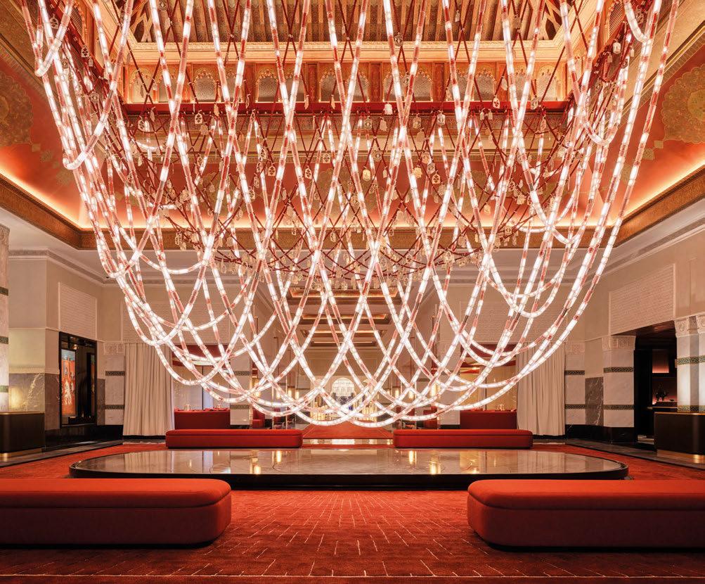
Dressed up in light
We put a piece of light and glass jewelry on La Mamounia. Inspired by the Berber heritage and designed by Jouin Manku, we created breathtaking pendant for the legendary hotel to wear for another hundred years.
lasvit.com
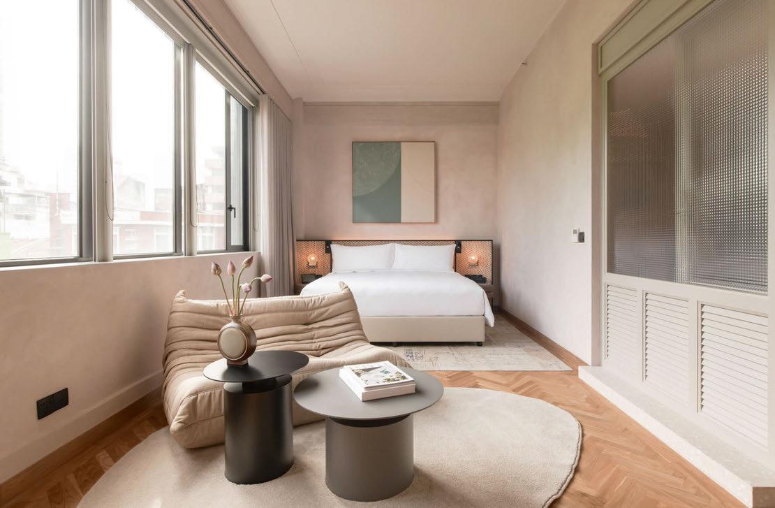 TKUALA LUMPUR
A former factory is transformed into a restorative retreat amidst the bustle of Kuala Lumpur.
Words: Matt Turner • Photography: © David Yeow
ransformative. Engaging. Restorative’ runs the strapline for Else – an urban retreat in the heart of Kuala Lumpur’s bustling Chinatown. Certainly, the work of interior designers Studio Bikin and Faizah Architect has transformed this former factory, headquarters of the Lee Rubber company, into a hotel that is engaging and restorative in equal measure. And walking into the calming ground floor space after a long and bumpy drive from the airport through the vast urban sprawl, it is immediately evident that this is something of a sanctuary from the chaos that surrounds it. Co-founders Justin Chen and Javier Perez created the hotel for travellers who want to ‘experience something Else’; those with “the desire to experience city travel at an alternative pace, sharing the benefits of living in the present and truly engaging with their surroundings”. Though a first-time hotelier, Chen is an architect-trained developer who has modernised his family’s real estate business with some savvy investments – particularly Arcc
Spaces, a series of co-working projects spanning twenty locations across Asia. His partner, Javier Perez, brings a restaurateur’s sensibility to the hotel’s food and drink offer, having launched celebrated Singaporean eateries Kilo, Raw Kitchen and Grain Traders. “Else was a fouryear project realised through the challenges of the global pandemic and inspired by the intentional traveller,” says Chen. “Whether guests are staying for a drink or for the night, we hope to be a place of renewal and escape for everyone who comes through our doors.”
The duo enlisted Malaysian design firm Studio Bikin to realise their vision, with partners Farah Azizan and Adela Askandar working hand-in-hand with local craftspeople to create an authentically Malay interpretation of contemporary design throughout the property. According to Studio Bikin, the design was conceived “from the idea that duality exists within us all – the past and present, the light and dark, raw yet refined. It’s multi-cultural, diverse, crafted and considered.”
063
Else
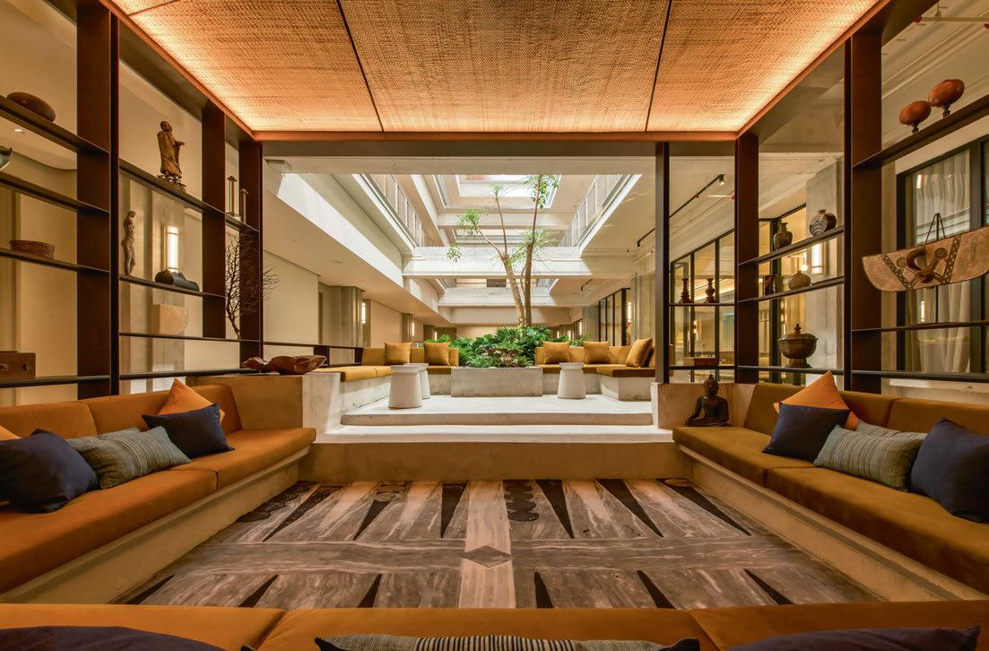
The design team have been sensitive in their restoration, celebrating the contrast between history and modernity with a series of voids that bring light into the interior
A key contribution is that of Omar Khan, whose textiles and rugs weave their way through the hotel, stitching together a multi-cultural tapestry of influences. Work by Malaysian artists such as Fauzul Yusri, Fendy Zakri, Fawwaz Sukri and Nathan Fikri are also on permanent display throughout the hotel. Sleeper’s visit in late 2023 coincided with the opening day of a two-month exhibition by Argentinian ceramicist and painter Franco Fasoli, following in the footsteps of the hotel’s first artist-in-residence, Dubai-based Eduardo Enrique.
The iconic Art Deco façade of the Lee Rubber Building, originally designed by Booty Edwards & Partners in 1930, has been carefully restored to its former glory. Looking at the concrete jungle of skyscrapers in Kuala Lumpur today, it’s hard to fathom that as recently as the 1930s, this was once the tallest building – not to mention one of the most prestigious addresses – in the Malay capital. It has a storied past, having also functioned as the headquarters of the Japanese secret police service during WWII.
Studio Bikin worked closely with Faizah Architect to rationalise the spaces within the building, which
in later years had been occupied by a hotch-potch of offices, a bookshop and lifestyle concept store.
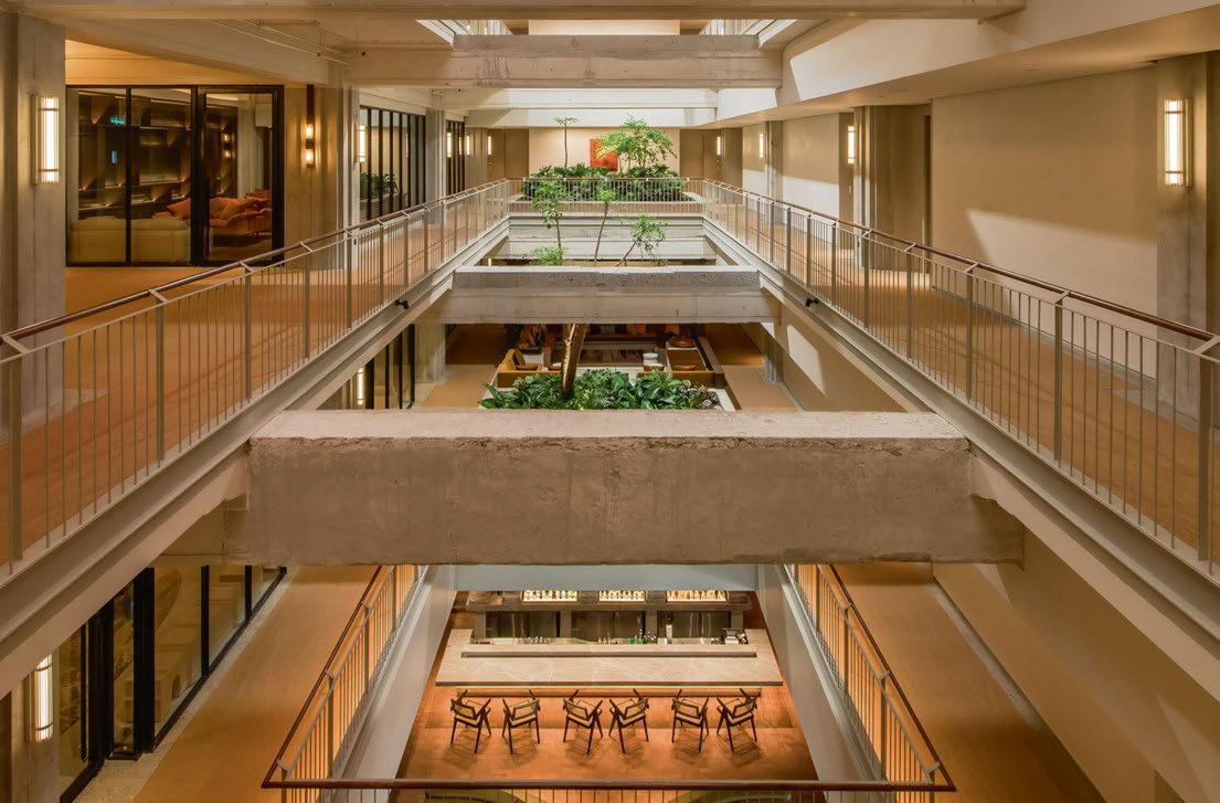
Working with a heritage building, the design team have been sensitive in their restoration, slotting rooms around the existing fenestration and celebrating the contrast between history and modernity with a series of voids that bring light into an otherwise dark interior and offer a close-up connection to the building’s original raw concrete structure, or vertiginous views down to the ground floor public spaces.
An additional three-storey modern extension has been added to the original five floors to accommodate the expansive 84m2 Else Suite with its sweeping views, a rooftop pool and the adjacent Yellow Fin Horse restaurant, where renowned local chef Jun Wong takes the helm to explore an elemental cooking concept with fire at its heart. Wines are natural, plates are small, kombucha is homemade and the cocktail menu is curated by award-winning bar consultants Proof Company. Old terrazzo benches engraved with the Lee Rubber logo have been retained and redeployed on the terraces leading to the saltwater infinity pool.
All rooms are tech-enabled with multimedia tablets
064

065
and Harman Kardon sound systems. Other in-room amenities are carefully curated and locally sourced where possible: covetable Omno bathrobes by luxurious Malaysian sleepwear company, Lulla; hairdryers by Singapore-based Dyson; hand-dyed tote bags by sustainable fashion brand Muni; and, in the suites, coffee machines by Morning, a new manufacturer established by Malay coffee guru Leon Foo.
Guestrooms are not the only part of the hotel where travellers can find peace and quiet. The main reception on the first floor is styled more like the private residence of an art collector than a traditional hotel lobby. On the floors above, there is a multi-faith space for reflection and gratitude, a library and meeting space, plus a capacious gym complete with flotation pods bookable by the hour.
Back on the ground floor, the hotel’s main bar and restaurant Raw Kitchen connects it directly to the buzzing cultural scene of downtown Kuala Lumpur. Award-winning bars such as Penrose, Concubine and Small Shifting Spaces are a
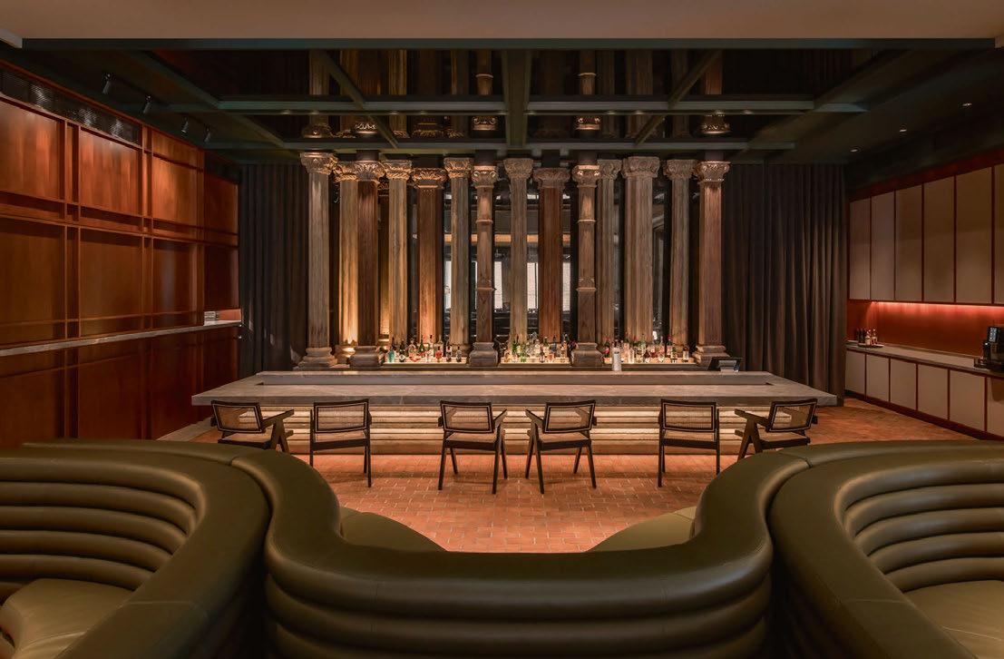
cocktail stick’s throw away, as is happening retail concept and cultural centre REXKL, created on the site of a former cinema. The vibrant Petaling Street Market – where tourists can run a gauntlet of countless counterfeit clothing vendors and hawker stalls – is on the doorstep. But Raw Kitchen complements rather than competes with its local neighbours. Interiors are organised around a series of carved antique columns salvaged from an Armenian mansion in India, framing a 16ft tropical hardwood dining table that was discovered in a Penang carpenter’s workshop and craned into place as the restaurant’s centrepiece. A curvilinear banquette arrangement meanwhile is combined with loose seating to create a flexible space that is at once intimate and atmospheric. Chef Leong Chee Mun combines Latin and Thai flavours with traditional Malay influences to create the rarest of entities – a hotel ‘all-day dining’ venue that is popular from the first breakfast service through lunch and dinner, to the last cocktail served at night.
EXPRESS CHECK-OUT
Owner / Operator: Else Retreats
Affiliation: SLH
Architecture: Faizah Architect
Interior Design: Studio Bikin www.elseretreats.com
066
View the full gallery on
RETHINK. RECYCLE. REUSE.
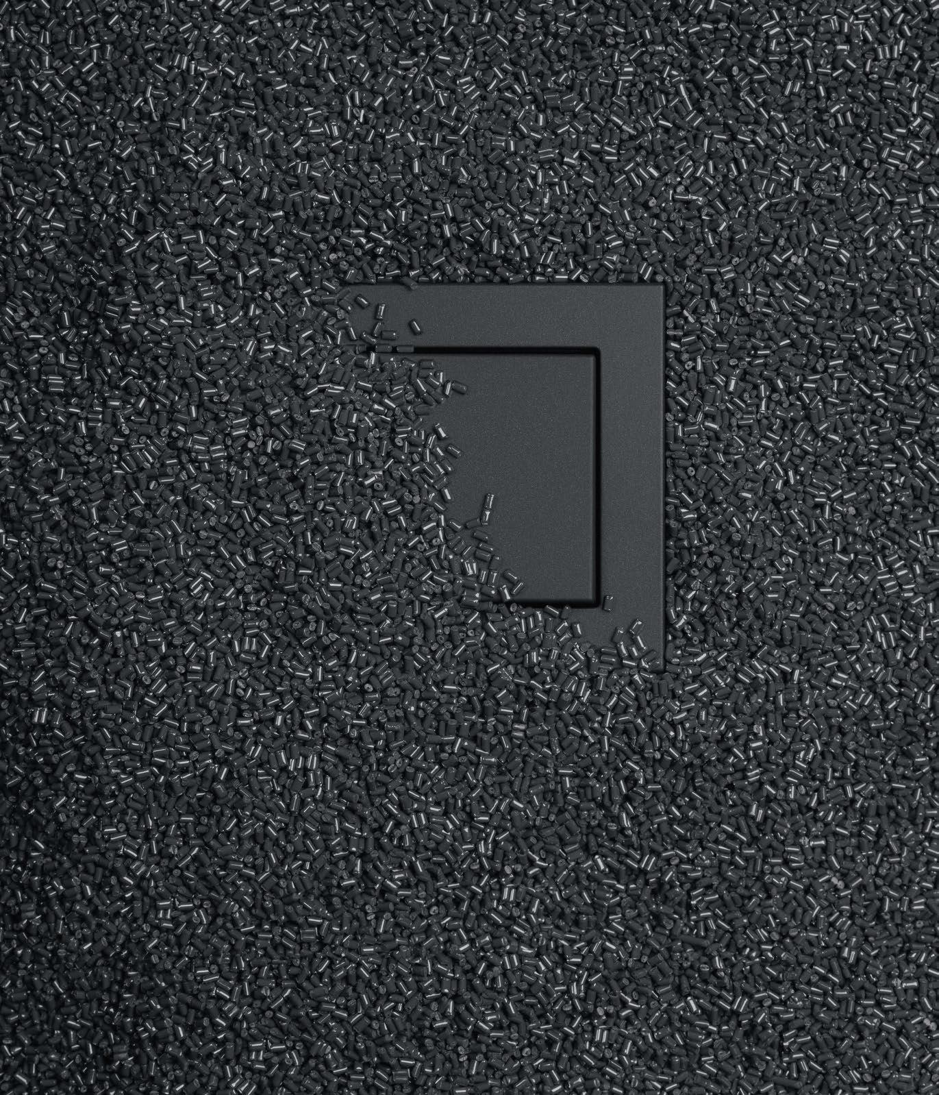
The plastic design covers and frames of the A 550, A FLOW and A CREATION ranges in matt anthracite are made from 95% recycled material*. The energy for production comes from hydropower.
* Recyclate in accordance with DIN EN ISO 14021 - sustainable, resource-saving
JUNG UK Showroom · 6 / 7 Albemarle Way · Clerkenwell · London
You are welcome to visit us by prior arrangement: jung.group/london
JUNG.GROUP/RECYCLATE
RECYCLATE
95 %
Kimpton Hotel Theta
NEW YORK
Named after the brainwaves produced in a deep state of relaxation, Kimpton’s new outpost is a calming oasis in the heart of Midtown Manhattan.
Words: Ayesha Khan • Photography: © Regan Wood
Awave of hotel renovations has been sweeping Midtown West, one of New York’s – and the world’s – mostvisited neighbourhoods. What were once nondescript select-service hotels are now being transformed into smart, design-forward gems defined by art and style: a case in point being Kimpton Hotel Theta.
The new opening sits at the tourist-centric nexus of Broadway and Times Square, so its creators were intent on bringing a calm counterpoint to the frenetic activity that pulsates beyond the lofty custom-carved doors. So much so, that even the hotel’s name is an homage to the brainwaves produced by humans in their most restful, reflective state.
Led by Highgate and overseen by Lucid – the management company’s own design and construction studio – the project has been brought to life by Crème / Jun Aizaki Architecture & Design together with Kimpton’s in-house design team. “We wanted to create an oasis that offers an unexpected escape from New York’s fast-paced theatre district,” says Jun Aizaki, Founder and Principal of Crème. “Our aim was to design a hotel that is as luxurious as it is inviting, with unique touches that add both comfort and functionality.”
Crème’s first order of business was to make sense of the existing hotel’s lobby, which Crème’s Studio Director Masako Fukuoka described as feeling cold, with a confusing floorplate. They achieved this by creating a truly special arrival moment. “The existing entrance felt very corporate so we introduced large, natural oak doors that offer a warm welcome,” Fukuoka explains. “It also introduces the handcrafted aesthetic, which is very important to us.”
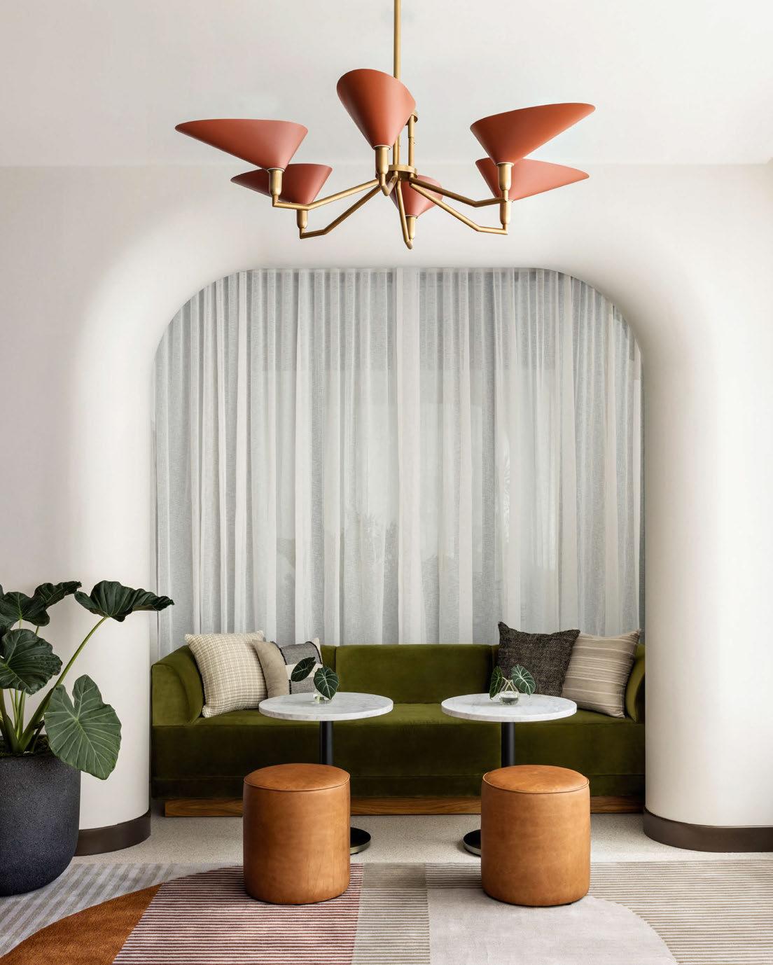
The next strategy was to prescribe a clear design hierarchy: to one side are a pair of handsome ribbed concrete reception desks backed by a vibrant art triptych, and to the right is an inviting lounge and café. Spaces are revealed in layers, first through handcrafted teak and bronze screens, and then through sculpted archways that also address a challenging architectural quirk. “The building’s structural columns were a major challenge that we solved by creating 3D sculpted GFRG portals that layer the lobby level and create a nice procession of spaces,” says Fukuoka.
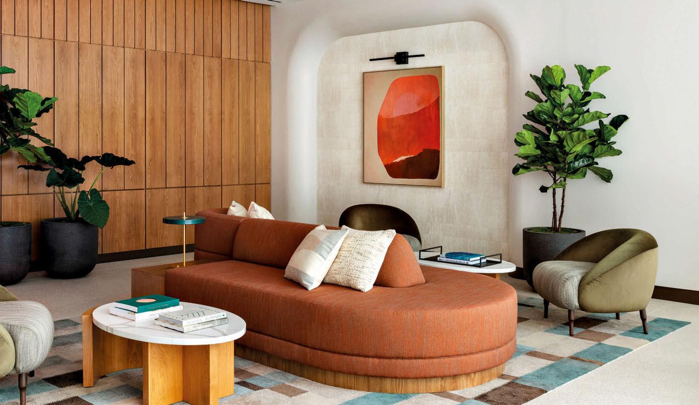
During their research for the project, the Crème team found that the building was originally designed by masterful Modernist architect Morris Lapidus, although it had none of the hallmarks of his iconic Miami projects – no ‘stairs to nowhere’ nor Art Deco flourishes, yet plenty of the right angles that he famously shunned. Aizaki opted to bring back the architect’s signatures by introducing ample curves, terrazzo flooring and Mid-Century-style lighting, furniture and artworks. Bold colour and pattern in the upholstery and carpets add Lapidus’ flair for the flamboyant, while a custom-designed communal table with a built-in magazine rack adds the desired handcrafted quality. Even the custom brass and enamel light fixtures and carefully selected greenery is in on the overarching design aesthetic.
Isamu Noguchi – another architectural great – was tapped for inspiration too. “If you think about it, Noguchi and Lapidus are opposites, so we wanted to capture a collision of their worlds,” Aizaki explains, pointing out a sculpted wall inspired by the aerial view of a park that Noguchi
068
069
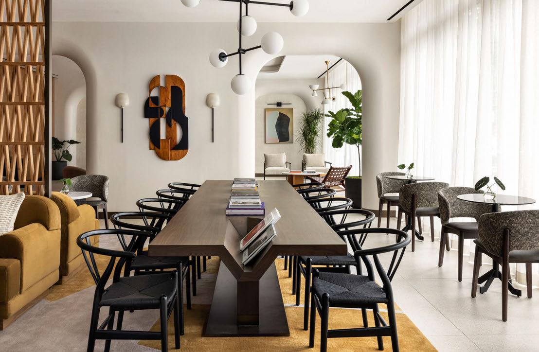
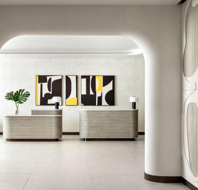
designed. He also references a timber screen that smartly hides folding doors revealing a ‘coffee window’ serving brews and pastries. Aizaki delights in the way the alcove disappears at night, successfully transforming the space for an evening setting. Alongside is a pantry-style marketplace stocked with artisanal snacks and branded hotel merchandise.
Upstairs in the hotel’s 364 generously-sized guestrooms, Crème continues the themes introduced in the lobby. Upon entry, a pop of indigo reveals the antithesis to the typical hotel closet, with hanging space concealed behind a movable mesh screen. The bathroom features diffused lighting and smartly designed vanity and shelving solutions, while the bathtub-toshower conversion required by the brand was expertly handled and, in its ethereal finishes, adds the illusion of space.
The handcrafted theme is evident through artworks too, with a unique collection curated by Saatchi Art. Working in close collaboration with Crème, the studio sought pieces that
070
Learn more at saatchiart.com/trade
with our art advisors on carefully curated art collections that tell a story and amplify your clients’ creative vision—from Paintings & Photographs to Sculptures, Tapestries, Bas Reliefs, & More.
Art was honored to be the art consultant for Kimpton Theta, New York, working closely with CRÈME on art for all the guestrooms and public spaces.
Experiences
ART ADVISORY FOR TRADE HOSPITALITY · COMMERCIAL · RESIDENTIAL & MULTI-FAMILY · HEALTHCARE
Photography by Regan Wood
Work
Saatchi
Elevate Your Guest
with Bespoke Art Collections
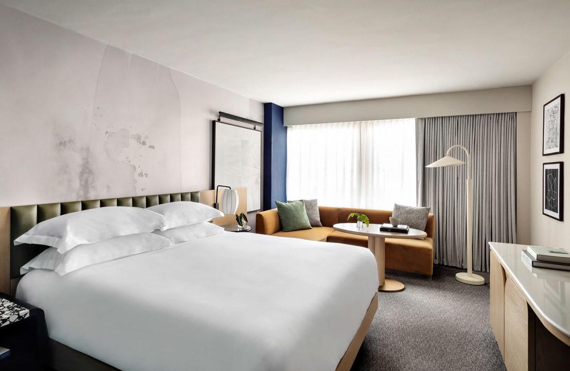
complement the hotel’s interiors, with a focus on the handmade aspect found in Japanese design. “Across the guestrooms and public spaces, we commissioned artists to create paintings and sculptures, such as a textured bas-relief wall installation, geometric carved wooden sculptures for the lounge and bespoke wallcoverings inspired by Japanese watercolours and wabi-sabi minimalism,” reveals Saatchi’s Chief Curator Rebecca Wilson. In guestrooms, these wallcoverings accompany headboards upholstered in an accent colour with subtle backlighting to illuminate the art. The breakout zone is defined by a continental-height table, which doubles as a dining and work surface. “We wanted the rooms to feel residential, so introduced layering and unexpected moments like mismatched nightstands and elements of asymmetry,” says Fukuoka.
Several design challenges germane to renovations presented themselves throughout the course of the project, the most notable being the location of the power sockets.
Crème’s solution is an attractive, deliberately asymmetrical TV desk that integrates the variations in locations with the requisite acoustic panel. “Renovations can be challenging because you have to work with what already exists; in this case, it was the structural elements and low ceiling heights and we opted to turn these into design features,” notes Aizaki as he reflects on the project. “We analysed the period the property was originally built and felt there was something waiting to be discovered. We wanted to resurrect that by connecting the existing architecture with new sculptural forms to create an experience that seamlessly ties old and new together.”
Under Highgate’s direction and with brand guidance from Kimpton, Crème has been successful in repositioning the property for a new audience. Furthermore, a soon-toopen rooftop restaurant and bar will channel the Italian Riviera amid a backdrop of the Manhattan skyline, providing the perfect place to perch with an aperitivo.
EXPRESS CHECK-OUT
Operator: Highgate
Architecture: Stonehill Taylor
Interior Design: Lucid, Crème / Jun Aizaki Architecture & Design
Lighting Design: Reveal Design Group
Art Consultant: Saatchi Art www.hoteltheta.com
072
View
the full gallery on
Colour Calling
roca.com/nu
fauc c
Nu
Nu Collection
Estelle Manor
OXFORDSHIRE
Marking a new chapter for Maison Estelle, a rural retreat in the heart of Oxfordshire redefines the English country house hotel.
Words: Matt Turner • Photography: Courtesy of Estelle Manor
We are stopped in our tracks some way before we get to the front door. “Hey guys, what are we up to today?” asks a fashionably dressed fellow who, beneath his sunglasses, looks more like the gatekeeper to the guest list of a West End nightclub than the welcoming host of a country house hotel. And perhaps that should be no surprise, since Estelle Manor is the offshoot of Maison Estelle, an exclusive London members’ club launched by Ennismore founder Sharan Pasricha in the wake of the pandemic.
“We’re checking in to that massive hotel up there,” seems the most obvious answer, given the drive we are on only leads one way and it’s hard to ignore the magnificent towering edifice at the end of said road. And ‘offshoot’ is something of an understatement, given that the country pile that houses Estelle Manor would dwarf most buildings in Mayfair, let alone the Georgian townhouse of its sister property.
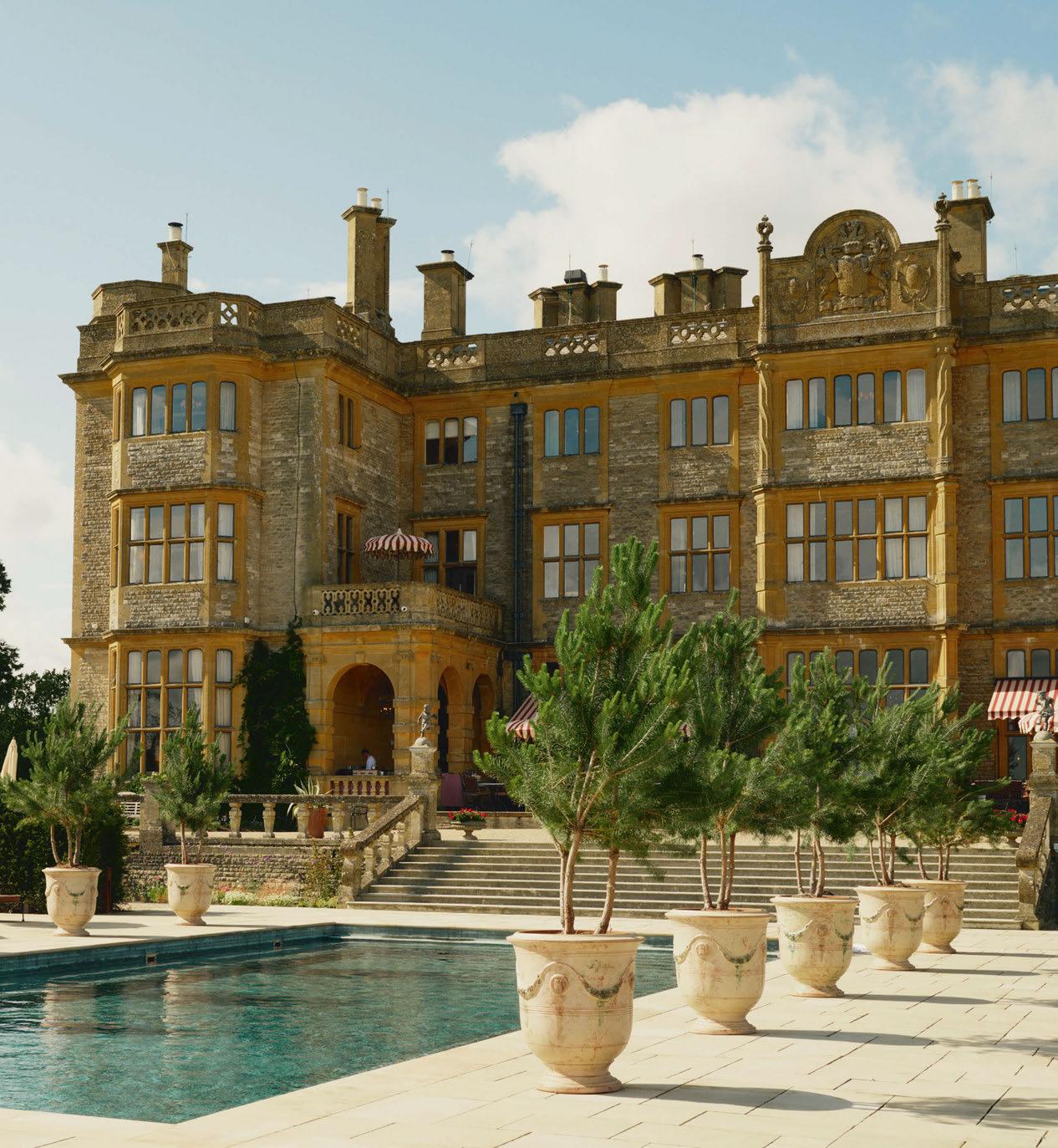
This Grade II-listed mansion in the heart of the Oxfordshire countryside originally dates from the 1770s. Formerly known as Eynsham
Hall, it was rebuilt in a Neo-Jacobean style in the early 20 th century by architect and artist Ernest George for use as a venue for hunting parties, before being requisitioned as a maternity hospital during World War II. From 1946 it functioned as a police training centre before being converted to hotel use.
The house and its grounds – a 60-acre estate sitting within 3,000 acres of parkland –are steeped in history. Those imposing stone entrance gates were designed by Sir Charles Barry, best known for rebuilding the Palace of Westminster in the mid-19th century. An ancient hill fort on the site meanwhile dates back to the Iron Age.
Now, the interiors of the main house have been sumptuously restyled by design firm Roman and Williams, working in close collaboration with Ennismore’s in-house design wing AIME Studios and Sharan Pasricha’s partner – both in life and this venture – Eiesha Bharti Pasricha. Daughter of Indian telecoms billionaire Sunil Bharti Mittal, Eiesha has played a significant role in the project in her capacity as Artistic

074
075
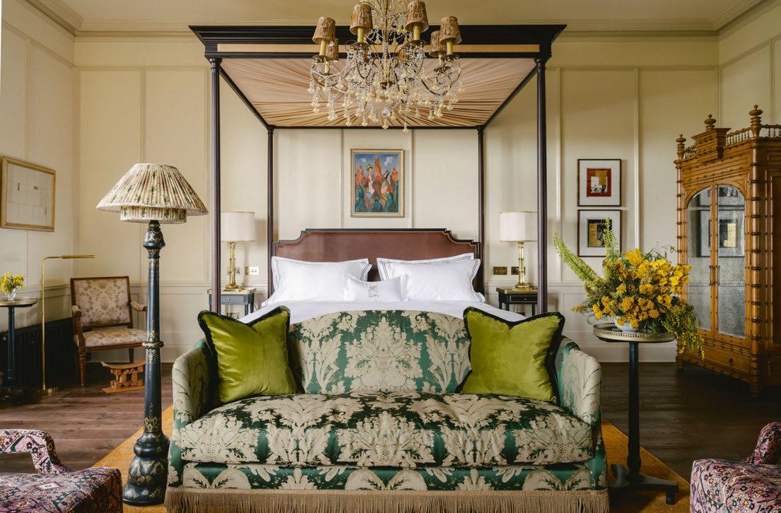
The Manor House’s 34 individuallyappointed guestrooms and suites feature vintage furnishings and 20th-century pieces
Director, not only co-ordinating the efforts of the various designers but also collecting many of the artworks which now grace its stripped and restored oak-panelled walls.
It is perhaps fitting of Roman and Williams’ background in Hollywood set design that Estelle Manor looks as much a fantastical filmset as it does a family residence – albeit one for the fabulously wealthy.
As with Maison Estelle, it is billed as a ‘hosted home’, bringing together people ‘that have plenty to say and nothing to prove’ – an epithet that might just as easily apply to its interiors. Roman and Williams may be a New York-based firm but they are no strangers to British culture and history, having been commissioned to redesign the British Galleries at The Metropolitan Museum of Art in their native city, before embarking on their first UK hotel project, Nomad London, on the site of the former Bow Street Magistrates Court.
“We aimed to collapse past and present, to redefine what a traditional British country home can be today,” says Roman and Williams. “We wanted to honour the legacy and craftsmanship of the historic design while creating a manor house that feels modern and vital.”
The project pays homage to centuries of British decorative arts, as well as the lineage of distinguished families who lived there. But this is no museum piece or historic pastiche. Modern interventions and unexpected juxtapositions have brought it back to life and infused a contemporary energy into its hallowed halls. Roman and Williams founders Stephen Alesch and Robin Standefer were inspired by classical art – the Romanticism of J.M.W. Turner’s landscapes, as well as the exoticism of 17th- and 18th-century Orientalist paintings. The y worked with Ennismore and art curator Sigrid Kirk to develop a contemporary art programme within the Main Hall, offering a contrast to the layered décor and vernacular architecture, further accentuated by Mid-Century Italian furniture.
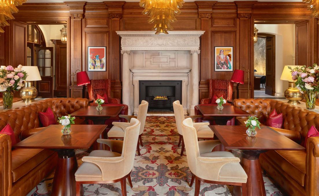
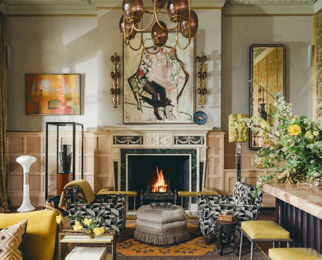
A procession of lounging, dining and drinking spaces branch out from the main hall reception: the Brasserie all-day dining space, traditional Chinese restaurant The Billiards Room, alongside a living room, library and 34 individually appointed guestrooms and suites.
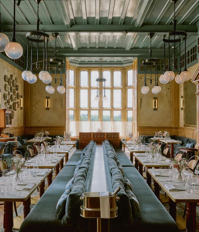
The Brasserie features handpainted mot ifs and bleached wood panelling, as well as access to a wine cave where a collection of over 5,000 bottles
076





dating back to 1939 has been chosen by Master Sommelier Matteo Montone.
Beyond the Brasserie, the South Terrace is a Riviera-inspired promenade and patio with its 25m outdoor swimming pool and cherryred parasols overlooking acres of garden. The Billiards Room meanwhile, is lined like a jewellery box as glossily lacquered as the skin of a Peking duck, with limed plaster walls and Murano glass chandeliers. Serpentine velvet banquettes in shades of Malachite green snake their way across the space, reflected in the mirrored ceiling.
But there is much more to Estelle Manor once you venture outside the main building. To the east of the estate sits The Clubhouse, originally a racquets court and gymnasium, now redesigned by Olivia Weström as a membersonly area complete with workspace and kids’ club. The g ym would kick that of an elite Premiership football club into touch, with state-of-the-art cardio, strength and training equipment alongside a class studio for an extensive programme of yoga, HIIT and pilates. The Muse onsite retail store offers a seasonally updated selection of homeware, clothing and fine jewellery.
078
A procession of lounging, dining and drinking spaces branch out from the reception, including the Brasserie and The Living Room
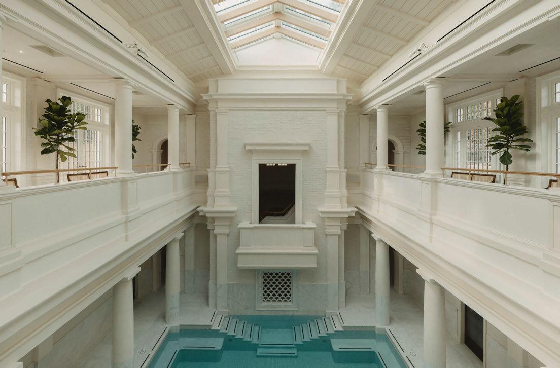
A walled garden offers a bounty of heritage breeds of fruit and vegetables, with The Glasshouse restaurant at its heart filled with eclecti c blooms and fabric lanterns hanging overhead.
In total there are 108 bedrooms across the estate, from the opulent suites of the Manor House to the more bohemian woodland cottages and stable rooms in the grounds. Vintage furnishings are pitched against 20th-century pieces bathed in warm, layered lighting. Three larger private residential properties – The Farriers, Hollyhock and Bluebell House – have been designed by AIME Studios, with multiple bedrooms, wood-burning fireplaces, spacious kitchens and freestanding baths.
As Sleeper went to press, the pièce de résistance of the property was nearing completion. Nestled in ancient woodland to the west of the Main Hall, Eynsham Baths is a 3000m2 spa and bathhouse. Its sculpted columns and carved marble details are influenced by the Roman baths of 60-70 AD, as well as classical arts and architecture, notably
that of 17th-century architect Inigo Jones and Victorian painter Sir Lawrence Alma-Tadema. The vast multi-level tepidarium bathing hall at its heart features five pools – including a caldarium and hammam – a lounge and ten treatment rooms.
An open-air hideaway bar on the east side is home to an additional hidden pool and cascading waterfall surrounded by natural wildflowers and ferns. There is a wide palette of materials – from flint stone walls at the entrance of the spa to mottled blue painted tiles in the pool – unified to create a clean, elegant environment, contrasting the rich layering of the other spaces.
With its comprehensive combination of art, outdoor activities, accommodation, food and drink, wellness, architecture and design, Estelle Manor is a total greater than the sum of its parts.
It is potentially a game-changer for the English country house hotel – much as Babington House was to the late 90s and Soho Farmhouse more recently – and much more besides.
EXPRESS CHECK-OUT
Owner: Sharan Pasricha
Interior Design: Roman and Williams, Olivia Weström, AIME Studios
Artistic Director: Eiesha Bharti Pasricha www.estellemanor.com
080
the full gallery on
View
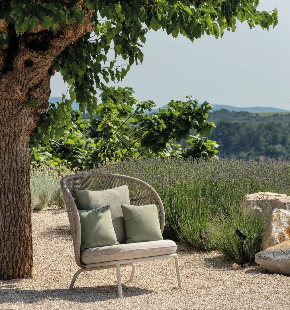
VINCENTSHEPPARD.COM
LOUNGE CHAIR Kodo cocoon
SHOWROOM Kortrijk, Belgium
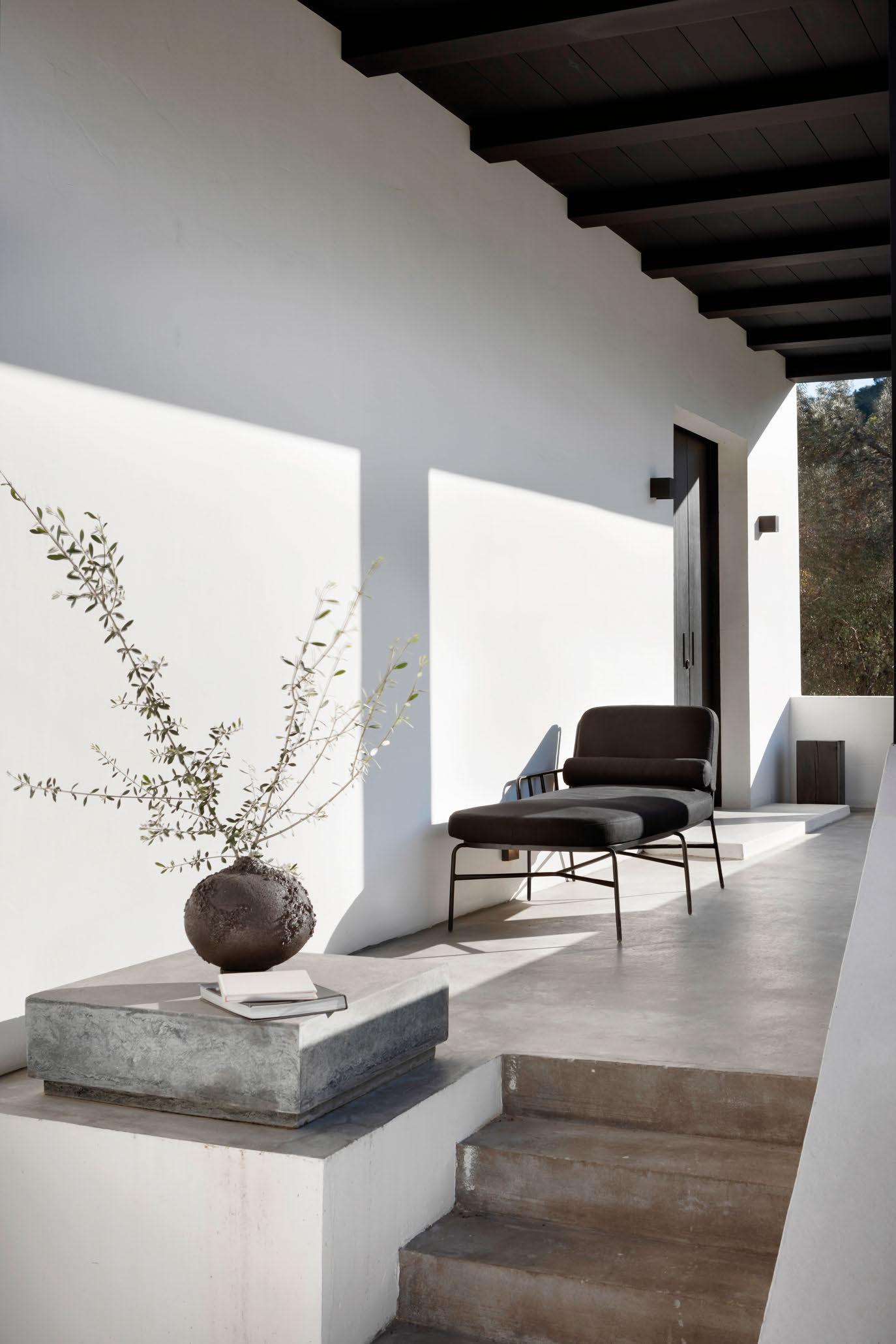


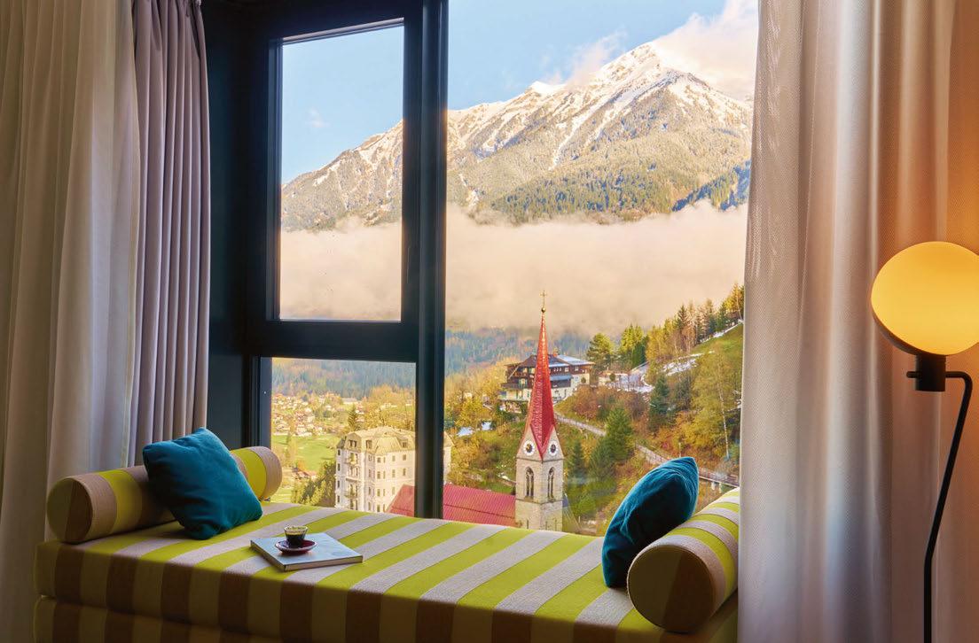
Badeschloss
BAD GASTEIN
The culture of bathing takes centre stage at a spa town hotel in the Austrian mountains.
Words: Guy Dittrich • Photography: © Ana Barros (unless otherwise stated)
Followers of the black line will appreciate a particular design detail at Badeschloss in Bad Gastein, the spa town south of Salzburg that is undergoing something of a revival. The black line in question is the tiling that marks out the lanes of swimming pools worldwide, and at the aptly-named Badeschloss – directly translated as ‘Bathing Castle’ – it features in various forms, alongside a pool narrative that flows through the hotel.
Originally built in 1751, Badeschloss sits on central Straubingerplatz, opposite the historic Alte Post and Hotel Straubinger. All three buildings had fallen into disrepair following their closure in 1991, sitting empty for decades before being acquired by the state of Salzburg. It wasn’t until 2018 that Munich-based Hirmer Immobilien emerged as a willing real estate partner, seeking to bring the property back to life as part of a wider plan to revitalise the whole resort. Alte Post and Hotel Straubinger have united to form the new Grand Hotel Straubinger (also featured in this issue), while Badeschloss
occupies the original building and a multifaceted 13-storey newbuild tower behind. Both hotels are operated by Travel Charme Hotels & Resorts, a subsidiary of Hirmer Immobilien.
At Badeschloss, BWM Designers & Architects was tasked with restoring the protected monument and designing the newbuild component, as well as crafting the interiors. The existing four-storey building has a horizontal aspect directly adjacent to Bad Gastein’s magnificent waterfall, while the tower has striking verticality; together, they encapsulate the town’s blend of Neo-Classical and Belle Époque architectural styles, with the Brutalist forms of the nearby conference centre complete with its geodesic domes. Despite this varied architectural landscape, there were concerns that the new tower would be at odds with its neighbours, so BWM opted for a concrete façade, made using a local stone that harmonises with the surroundings and will further ‘disappear’ over time. “The façade was designed as a double-skin, coloured-concrete construction,”
083
© Arne Nagel
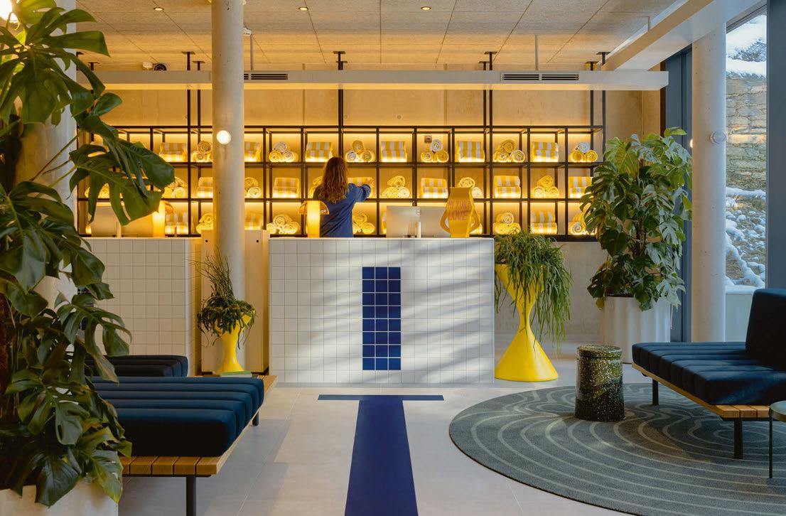
At Badeschloss – directly translated as ‘Bathing Castle’ – a pool narrative flows through the public spaces
explains Markus Kaplan, Partner at BWM. “The multifaceted panels have a lively appearance and produce shadows that make the tower look slimmer.”
Added to this are the offset sections that result in a floorplate with multiple corners, affording the luxury of double-aspect views in many of the 103 guestrooms.
Interiors of concrete and ceramic are made cosy by curvaceous furnishings, underfloor heating in the tiled en suite and ethereal curtains by Kvadrat that glide around the perimeter of the room. The 20 guestrooms in the original building are all unique and individually named and, in the words of Erich Bernard of BWM, each “celebrates the bathtub”; choose from a seated tub, a bath with a view or a room with its own sauna. Options galore to give repeat guests new experiences.
The F&B offers the same element of choice, with restaurants and bars supported by several lounges and a 64-seat terrace overlooking the square. “We wanted the hotel to reflect an open, outgoing and fluid personality,” says Bernard, gesturing to the expansive front-of-house spaces – a ‘social design’ that attracts a particular type of staff and, by association, a particular type of guest.
The Kaminbar features a fireplace and original Ardent stone floors, as well as a counter topped with hemispherical, fringed lamps to BWM’s design. The restaurant has a solid herringbone timber floor, completely restored to the liking of the Federal Monuments Office, and like the bar, the ceiling has stucco detailing, here resplendent with gleaming reconditioned chandeliers from master glassmakers Lobmeyr. Sandwiched between the two is dark furniture with edges accented in neon orange and lime. The calmer pale blue walls are a new feature.
The Séparée and other lounges feature modern, geometric lighting from Chelsom, Flos and Gubi, matched by plump furniture upholstered in soft, luxurious fabrics in bold colours. Burnt orange velvet ottomans, mustard sofas on deep blue, deep pile carpets – cosy corners after a day in the mountains.
Elaborating the black line of the swimming pool analogy is easy enough. A slim row of dark floor tiles slides between a pair of ripple-effect circular carpets, ending with the swimmer’s turning-T in front of reception. Behind are shelves stacked with rolls of yellow-and-white striped towels. The
084
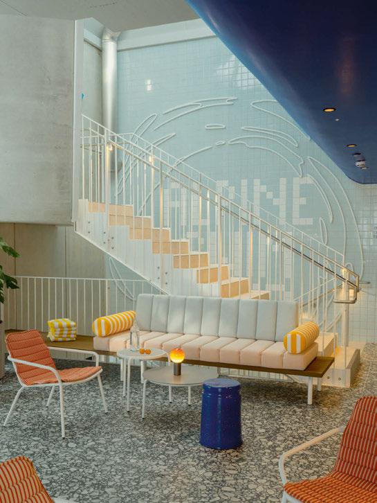
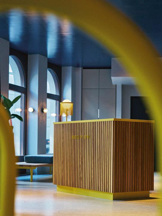
085
© Arne Nagel
yellow tubular frames of the shelves are used for ladder configurations leading down to a black ‘pool’ at the entrance and up to a ceiling mirror rippling like ‘water’ in the lifts. Ladders double as hanging storage in guestrooms, where the omnipresent gentleness of the Kvadrat curtaining is reminiscent of the lining in swim shorts. More black lines bisect corridor carpets conceived by Gabriele Bruner. Lying distorted beneath a wavy water surface, not unlike a Hockney pool image, these are cleverly disrupted here and there by the ‘reflection’ of a swimmer at the edge of the pool painted on the wall by artist Soo Burnell.
Ironically the hotel’s pièce de résistance, the 111m2 stainless steel infinity pool on its rooftop, has no such lines. It does have uninterrupted valley views, a lengthy wave of submerged loungers and an underwater, neon green lightshow. The entrance is via an automated sliding door half immersed by water that sits within an angular dome, its form borrowed from the roof of the nearby conference centre. Three
floors are devoted to the spa area. Such prime real estate is usually destined for high revenuegenerating suites, but the decision was to make this a public space. There are treatment rooms aplenty. So too saunas, steam rooms and shower experiences that could while away an afternoon. The pale concrete envelope is enlivened with pops of colour through the furnishings – the orange-framed Pedrali sunloungers being a highlight – and surfaces of contrasting tiling and grout in green and yellow, graphite and red. The name, Alpine Swim Club, etched large in the stairwell, overlooks another lounge area and the small Well-Fit nourishment bar.
The bones and bold strokes of the architecture at Badeschloss provide the backdrop to a free and fun design that has allowed BWM to create spaces that appeal to guests, locals and staff alike and bring new energy to the town. The paradox of an Alpine Swim Club and references to the bathing analogy bring a playful change of pace to the inherently conservative imagination of mountain hospitality.
EXPRESS CHECK-OUT
Owner: Hirmer Immobilien
Operator: Travel Charme
Architecture and Interior Design: BWM Designers & Architects, Atelier Peter Weisz
Branding: Moodley www.travelcharme.com
086
View the full gallery on
MEDA
DESIGN BY PETER WIRZ

Discover more at www.laufen.co.uk @laufen_uk
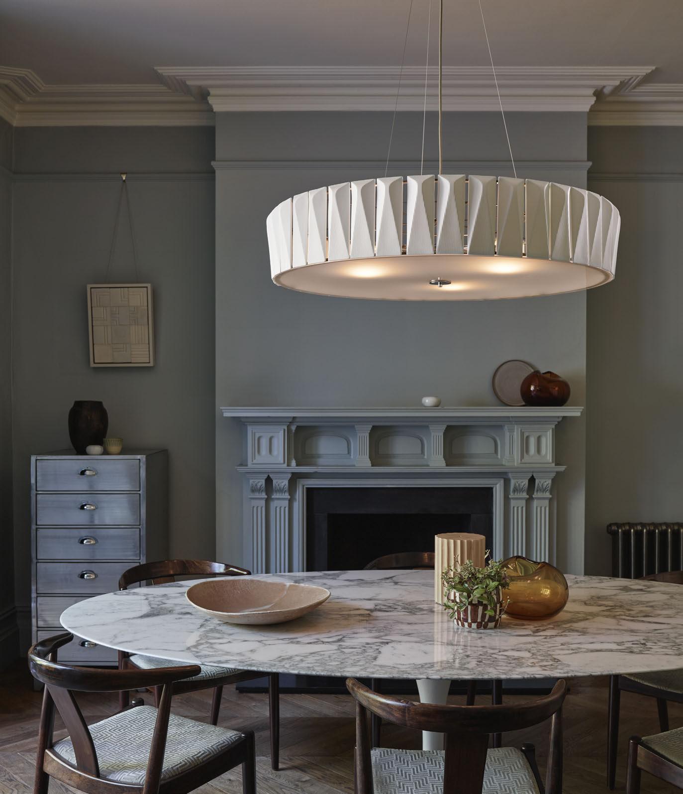


Shard Chandelier originalbtc.com Bone China Tiles Handmade in England
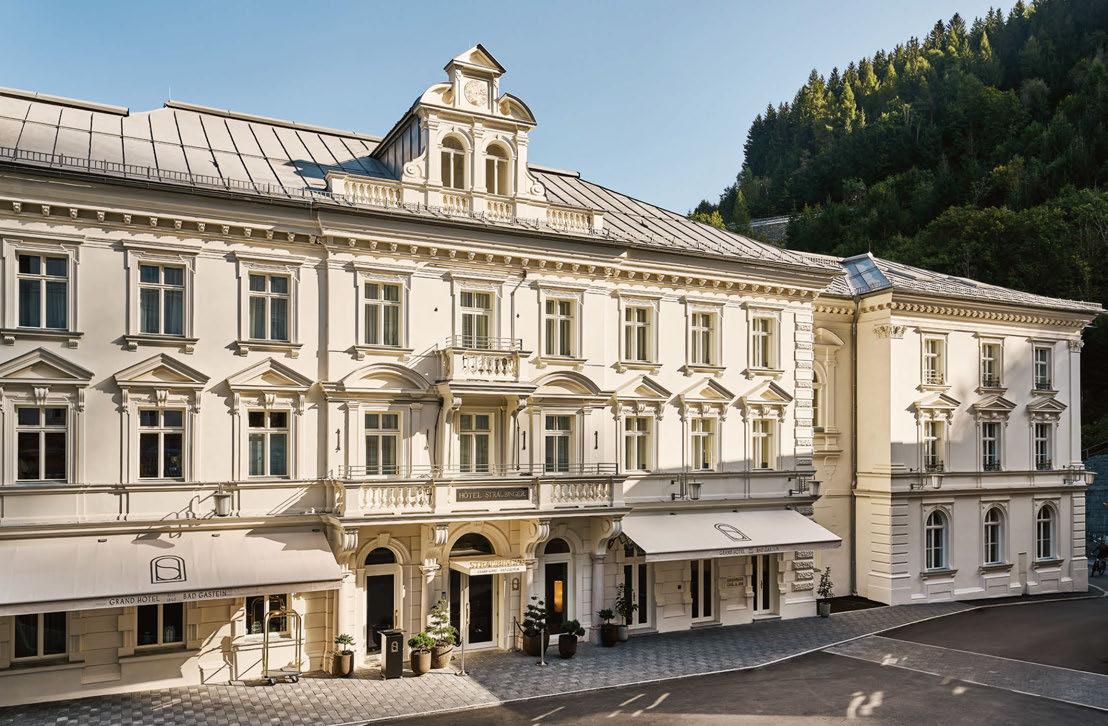
Grand Hotel Straubinger
BAD GASTEIN
BWM Designers & Architects peel back the layers of the past to reveal stories of a grande dame hotel on a revitalised town square.
Words: Guy Dittrich
Photography: © Arne Nagel (unless otherwise stated)
Dangling rather forlornly from the stucco rosette high up on the ceiling of the Belle Époque ballroom is a heavy metal chain. Beneath it, smashed atop a marble table, is a broken chandelier. Cut-glass pendalogues and sparkling crystals lie askew, yet the lights are still on. Something is amiss.
This is in fact an art installation. The centrepiece of the beautifully restored Straubinger Saal restaurant, itself at the heart of the recently opened Grand Hotel Straubinger in the Austrian spa town of Bad Gastein. The specially commissioned piece from glass atelier Lobmeyr is based on the original that was stolen during the years the building lay dormant.
The resurrection of this hotel came about when a package of adjacent buildings was purchased by the Austrian Federal State of Salzburg in 2017. Having not seen the interiors, the new owners were shocked to find that a roof had collapsed through three floors, and the restaurant’s tables still set with tablecloths and crockery. The listed buildings were totally
defunct. Across the square and part of the package is Badeschloss (also featured in this issue), which itself had suffered fire damage.
The potential of this doubtful trio nevertheless caught the eye of Hirmer Immobilien, who were quickly convinced to invest and create two new hotels, which they now operate under their Travel Charme brand. Grand Hotel Straubinger sees the combination of the former Straubinger Hotel and adjacent Alte Post into a five-star, 46-room hotel, with Vienna-based BWM Designers & Architects appointed to take the lead on the refurbishment.
“We took on both the architecture and interiors, as it is very difficult to split the tasks on such a complex renovation,” says BWM cofounder Erich Bernard. The stories behind the design, he explains, were gradually revealed as the layers of the building were exposed. And many layers there were too, given that original construction happened between 1791 and 1888. The structure was carefully stripped back to its raw state, parts of which have been left
089
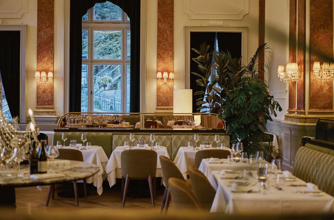
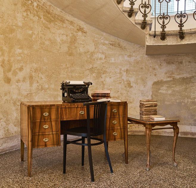
exposed to contrast with newer elements. The result is a scenography of dramatic interiors, with BWM taking a chiaroscuro approach of contrasting light and dark tones to bring a certain moodiness. Its effect is best seen in guestrooms, where walls and curtains appear to have been dipped in dark paint, with the original patina visible above the paint line.
The interiors see a clever combination of old and new. As far as possible, the historic fabric was preserved and restored – including original terrazzo flooring, exposed plaster and stucco on walls. Gothic-style vaulted ceilings, decorative murals, timber wall panelling, bannisters and deep-section doorways also nod to the building’s long history. “Everything that could be kept was re-used,” emphasises Bernard of the value of heritage, adding that it “could not have gone better with the protection authorities”. Gold leaf discovered on the top of pillars in the Saal was exposed but not replaced to avoid being “false”. Where necessary, current standards had to be adhered to; ironmongery
090
From statement pieces to classic styles
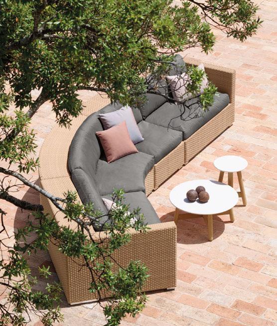

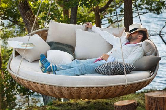

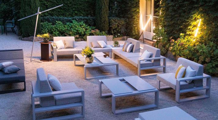
+44 (0)1279 816 001 / SALES@LEISUREPLAN.CO.UK
LEISUREPLAN.CO.UK


on the guestroom doors is original, but the doors themselves needed to be replaced to meet acoustic and fire-rating standards, for instance.
Other traditional elements are in evidence, such as the key rack at reception – a case within which guestroom keys are displayed on velvet cushions ready for new arrivals. Its relatively low height adds an openness, certainly compared to the ‘barrier’ of a typical checkin desk. Across the staircase lobby, the café evokes the ambiance of a Viennese coffeehouse, where a variety of torte and strudel line up on the cake cart. The space sees further crystal in wall lamps with delicately pleated semi-opaque pink shades accompanying extensive plantings to creating a palm garden feel.
In the lounge bar, a U-shaped stone counter is dotted with burnished bronze, while domeshaped downlights designed by BWM bring a cocktail bar vibe. Intimacy is enhanced by plush, heavy drapes and transparent curtains hanging above the bar. The venue looks on to a small lounge complete with an upright piano, furnished in a charmingly haphazard way, with small tables covered in floral tablecloths – a pattern that is also picked up in a large rug.
There are plenty of new elements, including bespoke designs for carpets. In corridors, these have cloud-like patterns taken from the
092
Heavy drapes are used to create an intimate lounge bar, while the reception features a display case of guestroom keys
© Ana Barros
Bagatelle by


FOR SAMUEL & SONS samuelandsons.com
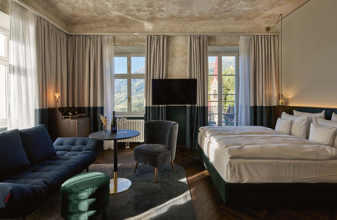
different tones that revealed themselves during the restoration process. The rope-like lighting used by the construction company has been mimicked by new LED strips hanging from high ceilings. More quirkiness is used to ‘disguise’ a speaker high on the wall of the private dining room adjacent to the Saal. It is covered by a white linen cloth, which is then topped by a small porcelain bird figurine. Far from random, it references the flora and fauna of a mural discovered beneath layers of paint and paper.
BWM had fun with pattern, too. Herringbone is found in different formats and scales in wood and tile flooring, and even used for a tabletop in the Weinkeller. This wine cellar, overlooking the vast display kitchen, is under the Saal and, more unusually for a cellar, also has a view over the valley thanks to the steepness of the plot. The form of several arched windows with similar views has been incorporated in the hotel’s own logo, repeated also in the decorative wallcoverings of lifts and tiles in bathrooms.
Any discerning hotel in Bad Gastein must have its own spa to take advantage of the mineral waters that put the town on The Grand Tour of European
aristocracy. At Straubinger this includes an indooroutdoor pool with stunning valley views. It is overlooked by a new construction, a glazed elevation covered in a lamella of thermal modified wood, which is baked in controlled conditions, the elimination of its moisture making it hardier and better suited for the Alpine climate. Here, floors are given over to saunas, relaxation lounges and treatment rooms. “The glazing gives unobstructed views while the lamellas ensure privacy,” points out Markus Kaplan of BWM. Adjacent are four spa suites each with a private sauna and more uniquely, windows right over the waterfall. The views are like no other.
The hotel works around Straubingerplatz took several years to complete, during which time, the small square was closed to traffic – a huge inconvenience to locals. Now, they have more than just their square back. They have a high-quality restoration of their grande dame, complete with respect for the past and a panache for the future. The ‘fallen’ chandelier may be a poignant reminder of recent history, but Grand Hotel Straubinger and Hotel Badeschloss give Bad Gastein a new beating heart.
Owner: Hirmer Immobilien
Operator: Travel Charme
Architecture and Interior Design: BWM Designers & Architects, Atelier Peter Weisz
Branding: Moodley www.travelcharme.com
094
View the full gallery on
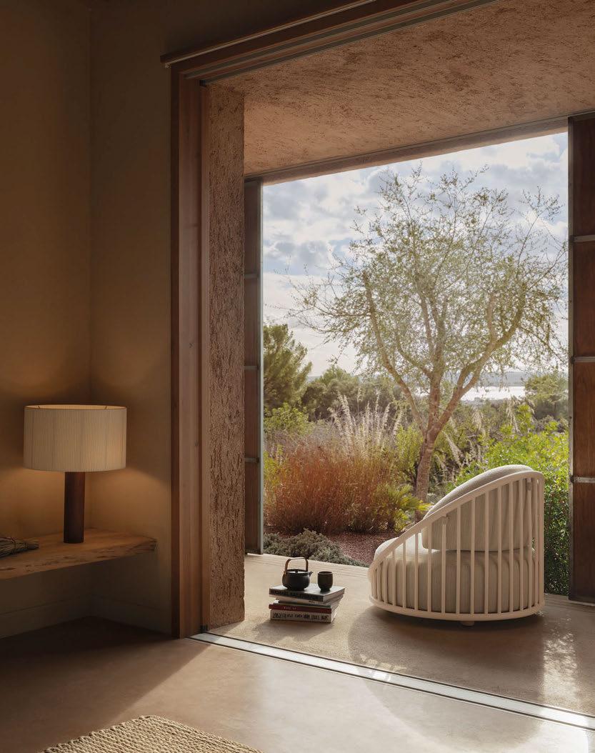
www.expormim.com
Cask Outdoor. Norm Architects
—— Photographer: Meritxell Arjalaguer ©
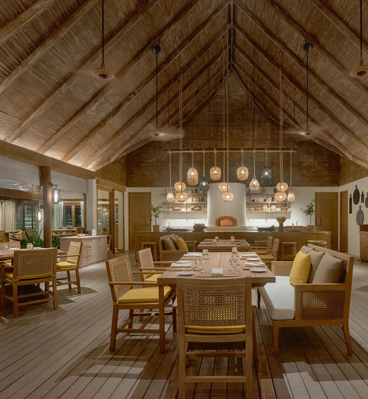
096

Six Senses Kanuhura MALDIVES
The reimagination of a Maldivian resort results in the creation of a new island sanctuary for Six Senses.
Words: Lauren Jade Hill • Photography: © John Athimaritis
Not one, but three islands make up the paradisiacal setting for Six Senses’ new island retreat in the Maldives. Located in the Lhaviyani Atoll, the island of Kanuhura is occupied by the resort’s accommodation and facilities, while Jehunuhura and Masleggihuraa – completely deserted, with no plans for development – are perfect for day trips and castaway picnics.
An existing resort known simply as Kanuhura, the property has undergone a full refurbishment to join the Six Senses portfolio, effectively bolstering the brand’s presence in the archipelago nation. Central to redefining the destination was to align with the Six Senses approach of connecting guests to their surroundings, be it culture, community or the natural world. However there’s clear differentiation in terms of design; while its sister resort in the Laamu Atoll embodies a Robinson Crusoe feel, Six Senses Kanuhura comes with a sleeker, more contemporary interpretation of Maldivian island life.
For this reimagination, Six Senses’ global design team collaborated with Bangkok-based SW Studio on the redesign of the public spaces, and for the existing villas they worked in partnership with Singapore firm Design Basis. A previously vacant plot on the island, home to one of the longest beaches in the Maldives, was then used for the creation of several new villas and a beach club, The Point, with architecture and interiors by Eco-ID.
To begin, the design team set about reorganising the public areas. “In the existing resort, each space felt very closed off – there was no flow between them,” says Yee Pin Tan, Global Head of Design for Six Senses. “We had to first reconfigure the floorplan so one space flows into another, then take out walls to let more daylight in.”
By opening up the all-day dining area, the resort has enabled guests to dine with their feet in the sand to views of the turquoise waters. Known as The Market, this restaurant is part of the island’s main hub, which now
097
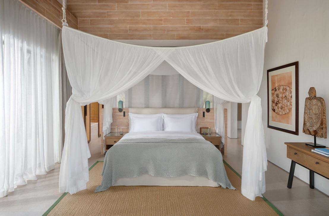
The new Beach Retreats were designed specifically with families in mind and feature an organic and handcrafted feel introduced through the interior décor
replicates the feel of a village square offering access to facilities such as the spa, Earth Lab – a workshop for sustainability initiatives, activities and partnerships – and a number of restaurants and bars. Across the resort, there are now a total of seven venues to eat and drink, each providing a different setting and cuisine. Bottega, an informal Italian serves sourdough pizzas and homemade pasta, while Sip & Sand offers fresh cuts of meat and catch-of theday cooked over fire. Scoops is an ice-cream and juice bar, and the beachside Drift eatery specialises in seafood marinated in herbs from the resort’s own garden.
As well as adding Six Senses’ signature Earth Lab to the existing spa, the wellness sanctuary has been transformed through the creation of a new entrance and opening up of the central relaxation space. By removing walls and introducing a terracotta colour scheme, the designers have succeeded in creating a warm and serene environment that is flooded with natural light. This organic aesthetic has similarly been
brought in to the existing beach and overwater villas, with billowing white drapes and the use of light wood complemented by rugs, modern furnishings and artworks in shades that mimic the ocean and its coral.
The 12 new Beach Retreats – which bring the total number of villas to 91 – were designed specifically with families in mind. The sprawling one- to three-bedroom accommodations with either sunrise or sunset views are modern in architectural style, with an organic and handcrafted feel introduced through the décor.
“Reflecting the Six Senses name, we felt it was important to have tactility in the materials we used,” explains Carol Chng, Director at Eco-ID, who were responsible for designing the villas. “Our intention was to encourage guests to reach out and touch the surfaces and furnishings. Luxury doesn’t have to be opulent; here it’s more about that handcrafted feel.”
Chng continues: “For the plastering of the walls, we asked local workers to be creative and leave their signature. We then asked the
098
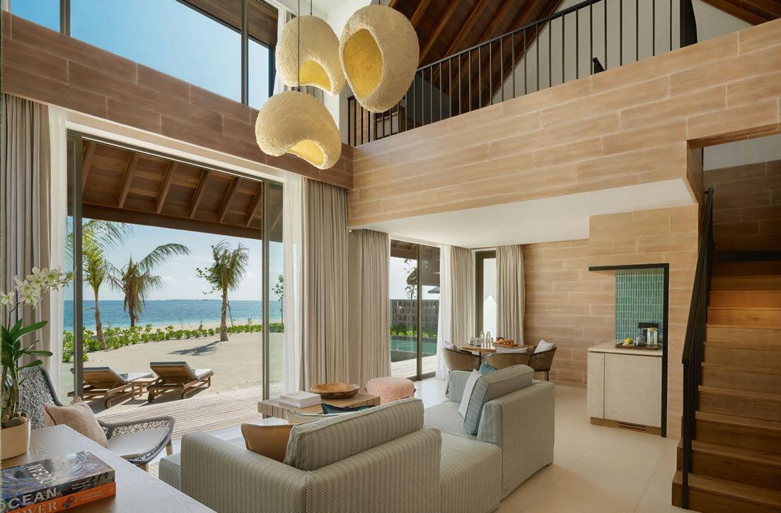
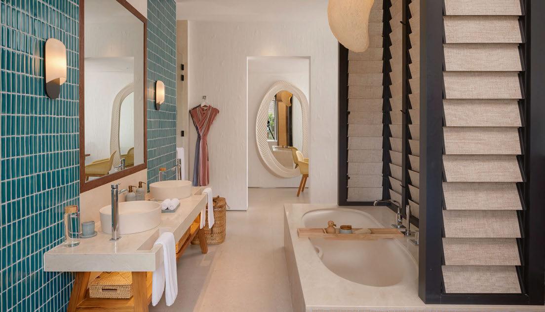
099
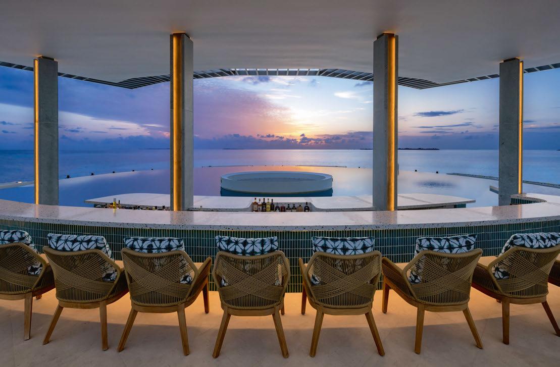
lighting supplier to use recycled seashell dust as the final finishing for the lampshades – we didn’t want them all to be the same because they’re handmade.”
Given that sustainability is a core brand value at Six Senses, environmentally friendly practices and initiatives run through the resort, including at design and build stages. For Eco-ID, this comes in the pursuit of timelessness. “The way we approach sustainability, in addition to selecting materials that are eco-friendly and energy efficient, is by designing true to local context in terms of geography, culture and climate,” says Chng. “That way, we ensure our design fits the location and stays relevant for years to come.”
Perhaps the most prominent aspect of the resort’s redesign is The Point, a newbuild beach club that sits on the northern tip of Kanuhura. Spanning two decks, the venue stands out for its elevated circular swimming pool, backed by a cocktail bar aptly named Sunset Point. This tops an open-sided tapas restaurant and wine
bar featuring interior planting and wooden furniture with splashes of red upholstery in an otherwise natural colour palette. “We were asked to look at maximising the potential of a large area of the island that was untouched, and to introduce a destination restaurant,” explains Chng. “In the Maldives, a beach club is usually on the beach, but for added drama, we elevated the pool to the second level to create an incredible infinity edge that feels as if you’re swimming out to the horizon.”
Despite the new intervention, there are still plenty of areas of wilderness to roam amongst nature. Over time, the landscaping will mature around villas and public spaces, adding to the 16,000 orchids that grow on the island, as well as the newly cultivated organic gardens that supply herbs and vegetables to the kitchen. A tour of these gardens is just one of the many experiences on offer at the resort, along with sunset dolphin cruises, snorkelling on the reef and traditional Maldivian fishing, each designed to connect guests to their surroundings.
EXPRESS CHECK-OUT
Owner: HPL Hotels & Resorts
Operator: Six Senses
Architecture: Eco-ID
Interior Design: Six Senses
Architecture & Design, SW Studio, Design Basis
www.sixsenses.com
100
View the full gallery on
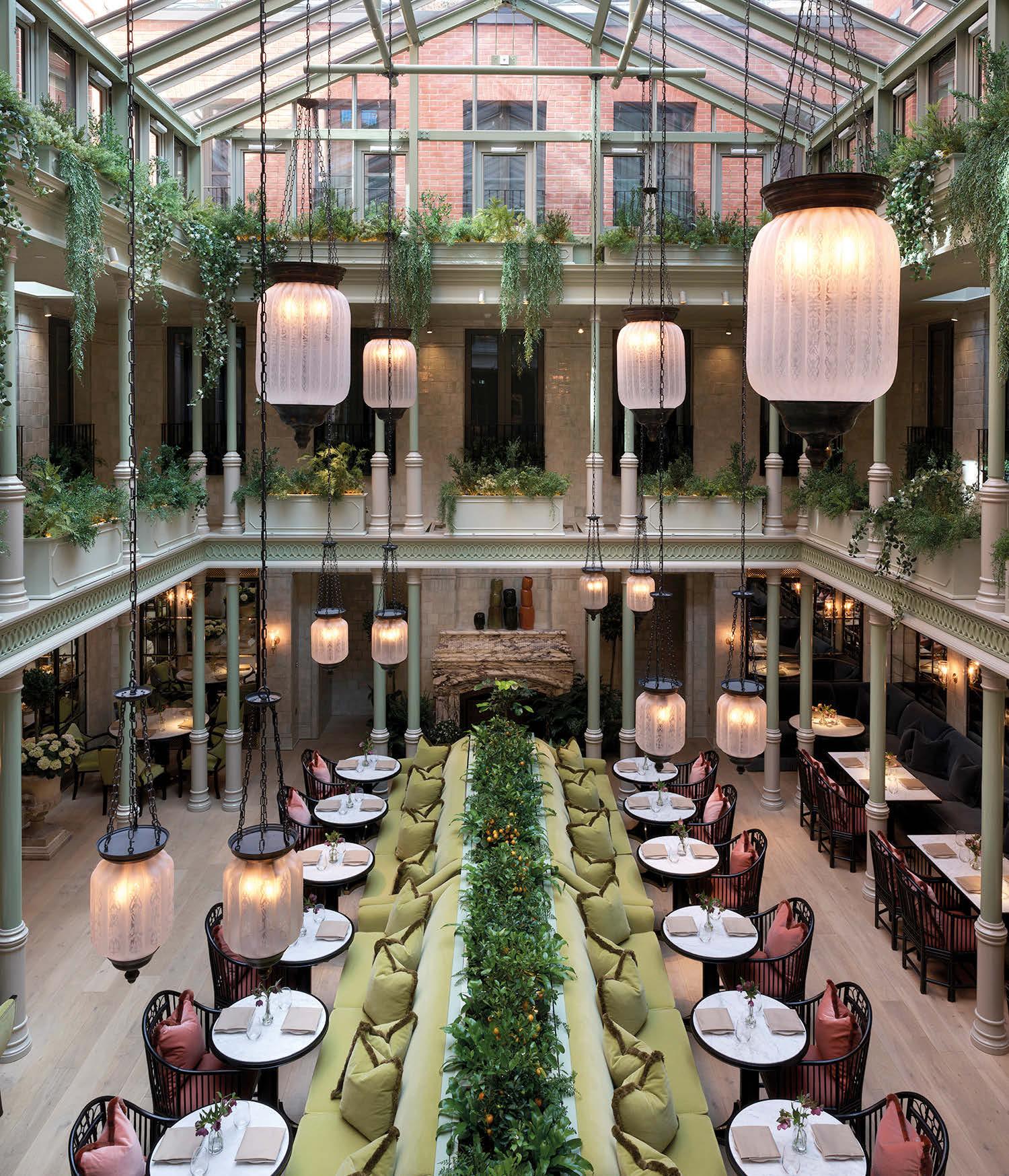
At BECK, our comprehensive range of in-house services take a project from blueprint to a luxurious finish. To discover more, please contact Vanessa Budd: vbudd@beckinteriors.com
SCAN ME!
Nobis Hotel
PALMA
Charmed by a crumbling palace in Mallorca, hotelier Alessandro Catenacci takes a light-touch approach to celebrate the beauty of the architecture.
Words: Lucy Lovell • Photography: © Pernilla Danielsson
When Helena Toresson pushed open the graffiticovered doors of a derelict palace in Palma de Mallorca, she knew this was a once-in-a-career opportunity. “It was old and crumbling but I was blown away,” remembers the Vice Managing Director of Swedish architecture studio, Wingårdhs.
The setting was secluded and serene. The tangle of streets that led to the building made it hard to find, and the only sound that filled the square was the hourly chime of church bells. Standing in front of Toresson was a Moorish mansion dating back to the 12th century. An elegant building that would have once been home to Mallorcan nobility. It was beautiful, but dilapidated; when the keys were handed over, it had stood abandoned for over 20 years.
Being one of Palma’s oldest buildings, the plan to turn it into a hotel drew attention – be it from the council, archaeologists or locals curious to see what would become of it. The towering arched doorway is intimidating, and there are no ground-floor windows through which to peek inside, so when plans were made public, people began guessing what surprises lay in store. Ancient ceramics? Secret chambers? It didn’t take a soothsayer to foresee countless negotiations, archaeological examinations and lots of paperwork.
But none of that fazed Nobis Hospitality Group, the Swedish hotel company founded by Alessandro Catenacci.
Though the entrepreneur has never had a clear strategy for expansion, he has built a portfolio of hotels through his intuition and a passion for old buildings – those that he is “charmed” by. Consequently, Nobis can be found in all manner of quirky locations. Take Miss Clara for instance, a 92-key boutique hotel that occupies one of Stockholm’s finest Art Nouveau buildings, constructed in 1910 as a girls’ school. Or the flagship in Stockholm, housed in two historic landmarks taking pride of place on Norrmalmstorg Square.
When work began on Nobis Hotel Palma, the group had already made its mark on the city with Concepció by Nobis – its first venture outside of Scandinavia. The opening had been a success, and so Catenacci was confident that further expansion on the Balearic Island would be a good move. He employed the same team: two local firms – Jordi Herrero Arquitectos and Eduardo Garcia Acuna Arquitectos – along with Wingårdhs for the interiors.
Toresson had been working with Catenacci for over a decade and the group’s mission statement was cemented during their first project together. “When we first started to work together, Alessandro said he would like an interior design scheme that will last at least 20 years,” recalls Toresson. “It is unusual for clients to make such a statement as it drives costs.” But the weighty comment threw up difficult questions. “How do you create an interior that feels new
102
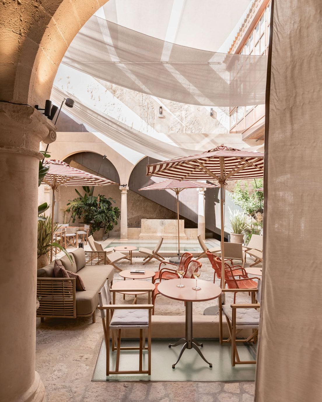
103
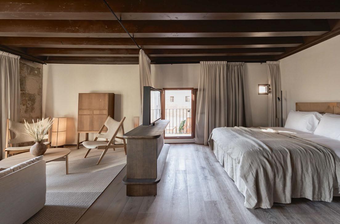
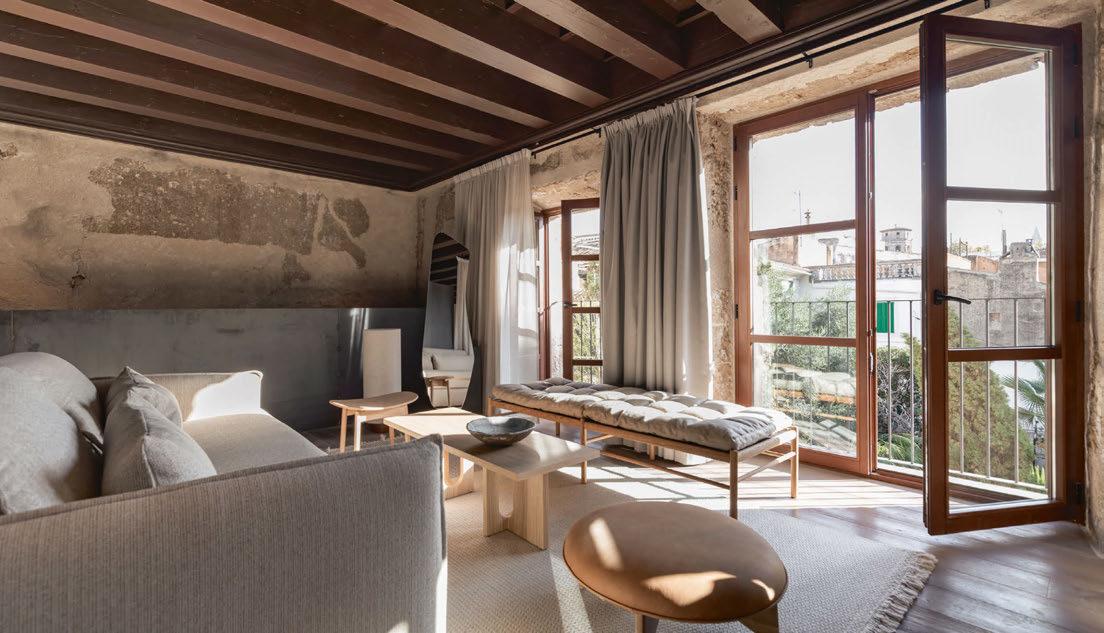
104
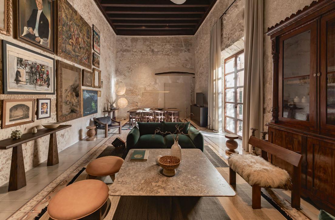
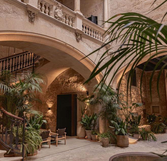
and relevant on opening, and will continue to feel new and relevant for 20 years?” Toresson asked. The conclusion? “We take inspiration from the building – its personality, history and materials,” she explains. “That’s what we bring to every project.”
At Nobis Hotel Palma, Toresson wanted to clearly distinguish between old and new, using furnishings that would contrast with the exposed brickwork. “The building is rough and raw, so we wanted to balance that with soft and crafted furniture,” she explains. More than just a design aesthetic, this approach was necessary to appease the authorities and protect the building. “When you’re working with these types of buildings and bringing them back to life, it has to be done respectfully. It’s a legacy that needs to be taken care of,” says Toresson. “Our mission was to have as little impact as possible on the original building.”
As a result, most of the furniture is freestanding. In the lobby for example, the cornicing is decorated with 12th-century script,
105

so the check-in desk stands in the centre of the room. Likewise, washbasins in the guestrooms are mounted in freestanding units, while showers are concealed behind mirrored boxes, with the original stone floors replaced after piping and wiring was installed.
In fact, if the hotel furniture was to be removed, the building would look very similar to when it was first constructed. The Mirall Bar is a perfect example. The 9m-high ceilings and rugged walls remain relatively untouched, original tiles have been gently buffed and even the bare stone blocks remain exposed where archaeologists peeled back the plaster. The room is softened by minimalist chairs dressed in shaggy sheepskins alongside curvaceous sofas by Tacchini. The energy of the dramatic ceiling is matched by an equally imposing lampshade, a custom-made 3.5m-diameter sphere that hangs overhead like a moon.
Some rooms are of such historical importance that the developers weren’t allowed to touch a thing. The Library, for instance, features a
preserved 15th-century Gothic archway. Turning it into a bedroom was off the cards so it was dressed with a pair of forest-green sofas by Arflex and a selection of art from Catenacci’s own collection.
And did the hotel hold any secrets? In the end, there was one surprise: a hidden tunnel leading to the building next door. Staff believe it was used as an escape tunnel, and visitors can still see the entrance in the corner of the spa. The little nook has been cleverly filled with an infrared sauna, set up by the Stockholmbased spa Heat. Now it offers a different kind of escape for hotel guests.
Overall, it is remarkable that a seven-year project resulted in only the most delicate of touches on the historic building. It is a compassionate approach to architecture, but also a bold one. Now, when Toresson enters the courtyard of Nobis Hotel Palma, she says she feels proud. She leaves the neglected palace reinforced, refined and ready to be reimagined in another 1,000 years.
EXPRESS CHECK-OUT
Owner / Operator: Nobis Hospitality Group
Affiliation: Design Hotels
Architecture: Jordi Herrero Arquitectos, Eduardo Garcia Acuna Arquitectos
Interior Design: Wingårdhs www.nobishotel.es
106
View the full gallery on
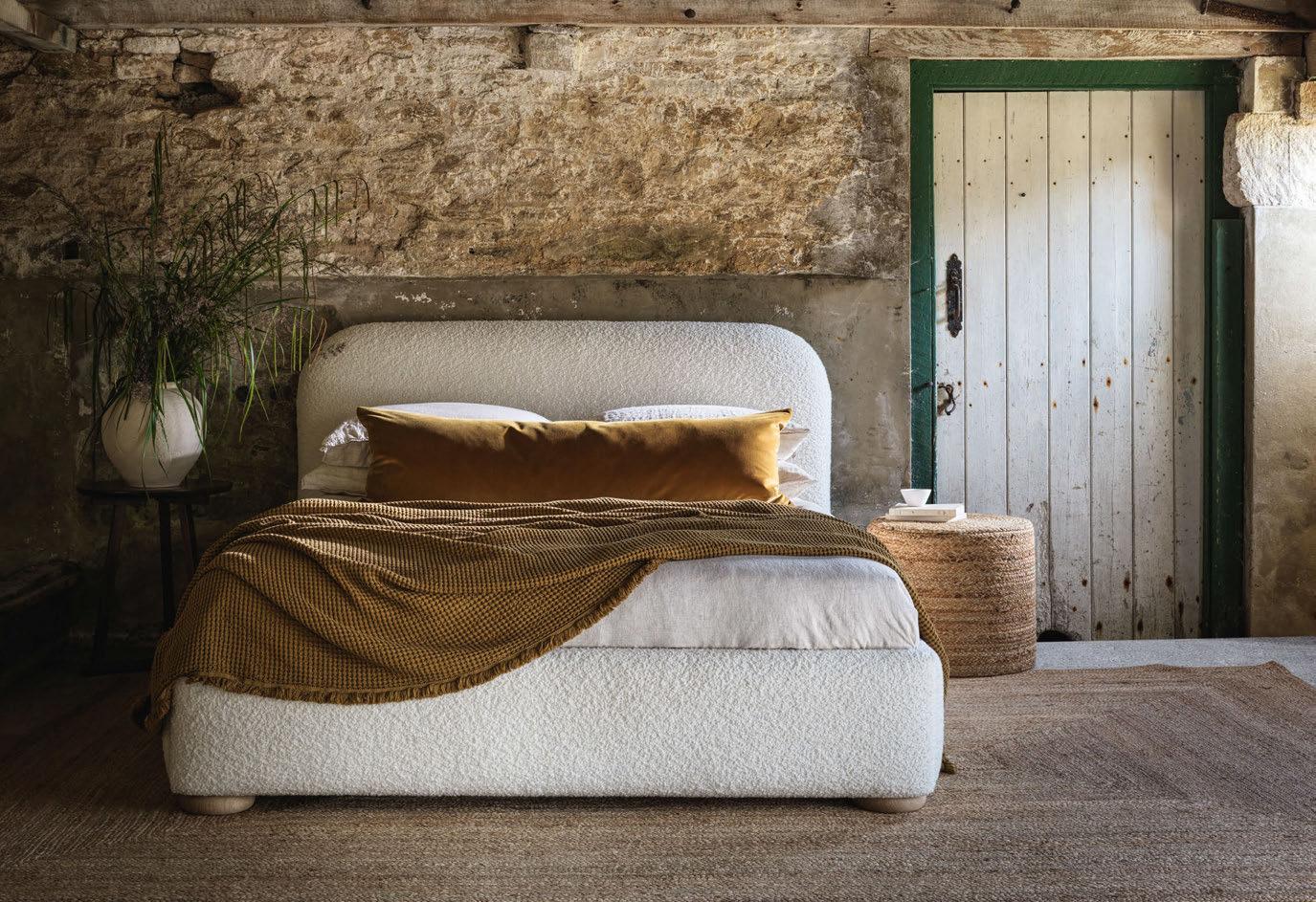
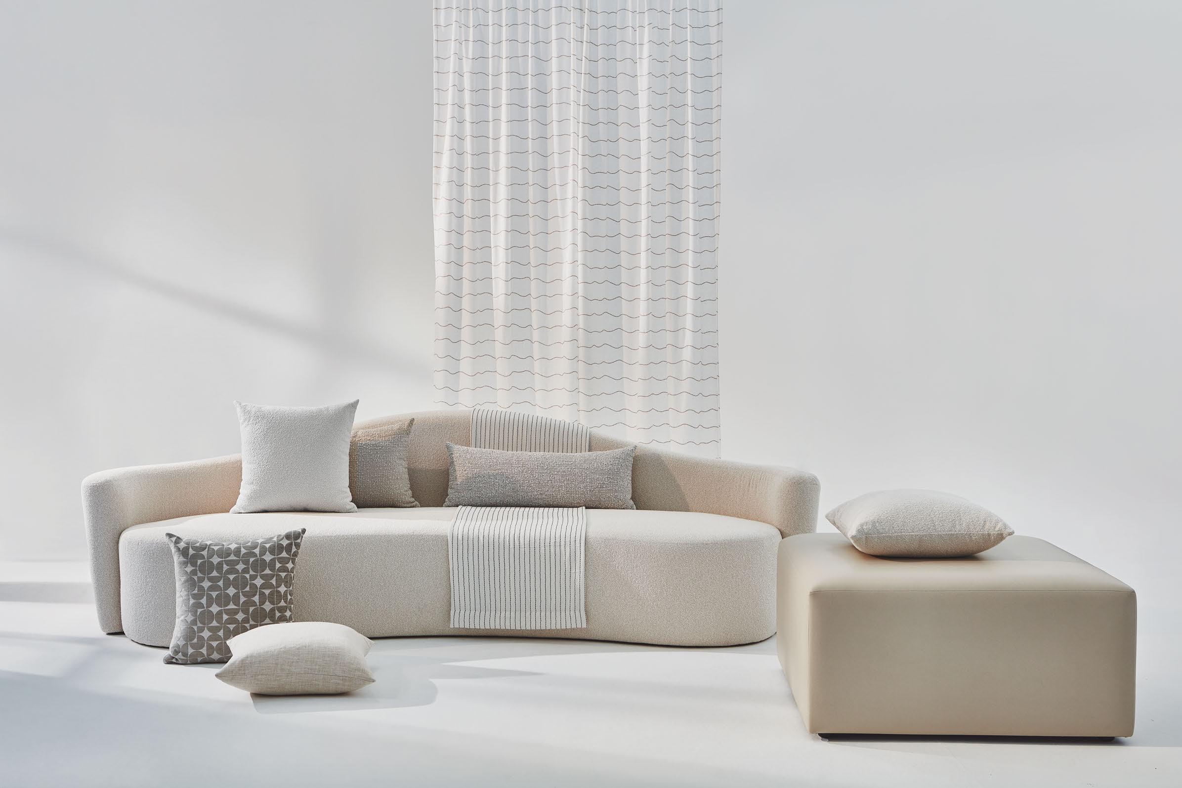
LOCATION REPORT
PARIS

Bolstered by the hosting of major sporting events, Paris is in the midst of a hotel development boom, with a slew of new openings across the city.
Paris has long been considered a hub for new hotel development, with its undeniable appeal to both business and leisure travellers making a compelling case for investment. Add in the hosting of major sporting events such as the 2023 Rugby World Cup and forthcoming Summer Olympics – the latter expected to attract 15 million visitors – and it makes the prospect of planting flags ever more appealing.
As with every major city, Paris was hit hard by the pandemic, with fewer inbound travellers equalling fewer room nights. But 2023 marked a return to 2019 performance, with STR reporting full-year occupancy of 76%, just one percentage point lower than prepandemic levels. Far more remarkable is its RevPAR and ADR growth; RevPAR reached EUR252.32 in 2023, up from EUR164.67 in 2019, while ADR hit EUR332.17 in comparison to EUR213.92 in 2019.
A whole host of hotels have made their debut over the past few years, including the likes of Too Hotel, Le Parchamp, SO/ and Zoku, as well as Hotel Rochechouart, Maison Delano and Madame Rêve. With the 2024 Summer Olympics fast approaching, recent months have seen further additions as featured over the following pages, and according to data from THP, the inventory is set to rise further. THP currently has 4,823 rooms across 26 projects listed in its database, with 12 of those slated to open before the end of 2024. Given the city’s dense urban landscape, over half of the construction pipeline are conversions or refurbishments, with owners and developers looking to upgrade existing assets.
Amongst the projects on the boards, Locke Paris from Edyn is slated to open before the end of the year, marking the brand’s debut in France. Part-newbuild, part-conversion, it will include 150 studio apartments and 1,000m2 of social spaces, with a wider garden, restaurant and atrium bar set in an 18 th-century mansion in the Latin Quarter.
Accor will add to its portfolio with the opening of Paris Montmarte Sacré Coeur, a new addition to its recently launched Handwritten Collection, while Hilton Worldwide is rumoured to be adding a second Canopy in 2027. And Minor Hotels has announced its first foray into Paris, with three properties across the city; NH Paris Gare de l’Est and the refurbished NH
Opéra Paris Faubourg opened in recent weeks, while a third will initially open as NH Paris Champs-Élysées before undergoing extensive refurbishment to join NH Collection – the group’s premium offer.
The lifestyle sector shows no sign of slowing either, with Experimental Group partnering with Foncière Saint Honoré on a 43-key property in the Saint-Germain-des-Prés district. And in the luxury market, LVMH is pushing ahead with its first Louis Vuitton-branded hotel currently under construction at a prestigious address on Champs-Élysées.
Though the construction pipeline is predominantly conversions and refurbishments, there are a handful of newbuilds in planning. CR7 – a collaboration between Cristiano Ronaldo and Pestana Hotel Group – has resumed construction for an expected 2027 opening, and Radisson Hotel Group has announced plans for a Radisson Blu in Tour Triangle, a mixed-use destination with architecture by Herzog & de Meuron. Finally, Barry Sternlicht’s 1 Hotels is set to make its Paris debut as part of a mixed-use complex with a Slo Living hostel, co-working space and roof terrace. The environmentally-responsible brand will occupy a plant-covered building in the Paris-Rive Gauche district, described by its architect Kengo Kuma a ‘green lung’ for the neighbourhood.
As with any Olympics host city in the build up to the main event, the current focus is on ensuring hotels are fully operational and maximising the opportunities that come with increased footfall. But after the closing ceremony, attentions will no doubt turn to the Olympic legacy. The fortunes of previous host cities have been mixed, with new development a careful balancing act between supply and demand. That Paris boasts a healthy pipeline, yet has not appeared in THP’s top-ten hotel development hotpsots for a number of years is good news for existing owners and operators; coupled with strong performance across all metrics, this suggests that there’s still room for growth in the city’s hotel market.
The following pages feature reviews of recent openings from France’s homegrown groups, including Leitmotiv, Touriste and Maisons Pariente.
La Fantaisie
PARIS
Martin Brudnizki makes his Paris debut with a garden-inspired hotel that marries urban life and the natural world.
Words: Emma Love • Photography: © Jérôme Galland
Wandering along Rue Cadet in Paris’ FaubourgMontmartre neighbourhood, it seems apt that this bustling, café-lined enclave once served as an access road for a series of market gardens. More recently, the street’s history – it was named after 16th-century master gardeners Jacques and Jean Cadet – was the starting point for La Fantaisie, Martin Brudnizki’s first hotel project in the French capital.
“We were approached by Leitmotiv hospitality group in 2020 to collaborate on La Fantaisie and were immediately drawn to the unique location,” recalls Brudnizki. “The brief was to create a luxury hotel that feels youthful and incorporates a playful approach that tells the story of the charming neighbourhood. Leitmotiv were keen for us to drive the design direction and, inspired by the horticultural history of Rue Cadet, a nature-based theme felt inherent to the overall aesthetic.”
Taking the environment into consideration was also key for local architecture firm Petitdidierprioux, which was tasked with re-working the layout of the existing building – previously a hotel. “The 9th arrondissement is central and touristy, one of the most densely populated districts in Paris and also one of the least green, so the idea was to bring nature back into the city,” explains co-founder Cédric Petitdidier, who added pre-patinated zinc in grey-green hues to the façade, along with large steel windows with slender mullions evocative of Victorian glasshouses.
Petitdidier also created “breathing spaces”, such as an enlarged and replanted rear garden, as well as a rooftop
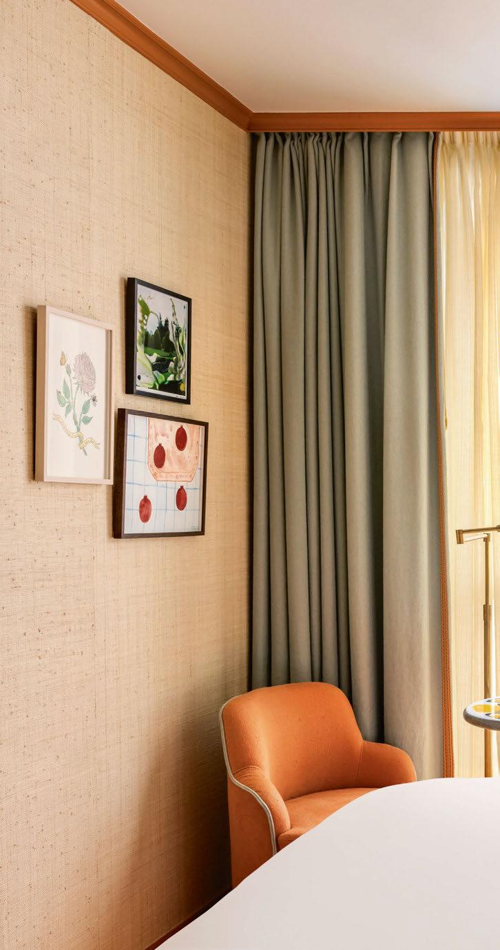
110
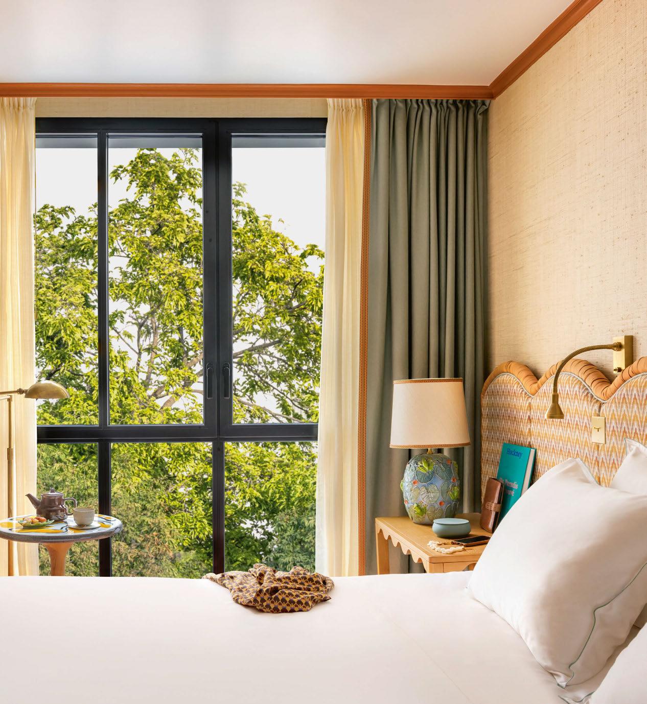
111 LOCATION REPORT

While Brudnizki hints at the horticultural theme throughout, Bar Sur Le Toit is a riot of floral motifs, with decadent rose panels designed exclusively for the hotel
bar with panoramic views and a spa in a former underground car park. “We wanted to open up the building to create a visual connection between the street and the garden, so a new corridor stretches from the front to the rear. It’s a transition from lively to calm,” he adds.
Spilling out onto the street is Le Café, which features a curving verdigris bar reminiscent of French planters and is decorated with bespoke, handpainted orchard wallpaper by London-based fine art and design studio Adam Ellis. “The theme here feels subtle in places and not overly floral,” says Brudnizki, also citing the beetroot-hue woven leather reception desk as an example of “alluding to fresh produce while maintaining practicality”.
Fruit and vegetables are also incorporated into the design of the ground-floor zero-waste restaurant Golden Poppy – a homecoming for Dominique Crenn, the only female chef to be awarded three Michelin stars in America for her San Francisco restaurant Atelier Crenn. Here, a green-framed grid of Victorian-style illustrations, again by Adam Ellis, depicts everything from apples and lemons to onions and grapes, while
the inventive menu features dishes such as red tuna tartare with Shiso leaves and banana pancakes with smoked caviar.
Other links to the botanical garden beyond include a tree growing between the tables, and the repetition of warm yellows and oranges in the colour palette throughout. “It’s a nod to the sunshine, which can be seen in the yellow ceiling of Golden Poppy and again in Le Café, where a glowing light box is displayed,” says Brudnizki. A glass extension at the rear of the restaurant lends an indoor-outdoor feeling to supper, while there are also candlelit tables on the garden terrace itself. Petitdidier reveals: “We want diners to feel as if they are eating in a bucolic landscape, far from the city’s hustle and bustle.”
Upstairs, 63 guestrooms and 10 suites either face the peaceful, leafy garden or are connected to the street via a balcony. “To preserve the privacy of guests, the balconies serve as both outdoor spaces and horizontal screens,” explains Petitdidier.
Perhaps as one would expect in a hotel that riffs off the natural world, shades of green are threaded throughout the rooms, from forest-coloured coving to
112
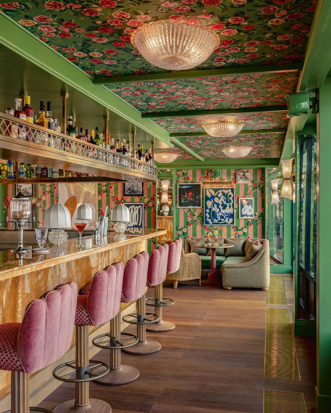
113 LOCATION REPORT
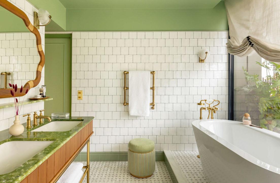
sage chairs and custom Pierre Frey rugs designed in collaboration with Martin Brudnizki Design Studio. “We used green in a nod to horticultural elements such as leaves and grass, while brighter oranges were inspired by nectarines,” Brudnizki confirms. “We have also incorporated tactile, natural elements such as rattan and grasscloth wallpaper by Phillip Jeffries that evoke a feeling of nature and soften the space.”
More overtly floral depictions can be seen in the basement Holidermie spa, where the hot-cold bathing circuit takes its cues from healing therapies and underground springs. “Inspired by ancient bathing rituals and the Turkish hammam, we wanted to introduce a primordial touch to the spa, so commissioned specialist tile company Trend to design a mosaic that depicts sprouting perennial flowers,” says Brudnizki. “The aim is that it feels blissful, with a continued use of the sunshine-yellow ceilings to signify a rejuvenating experience.”
Exploring the hotel from the ground up, what’s striking is that although the individual
spaces have their own distinct aesthetic, they all complement one another and together feel cohesive. While Brudnizki merely hints at the horticultural theme in some areas, the intimate seventh floor Bar Sur Le Toit is a riot of floral motifs, offering California-influenced cocktails against a backdrop of Sacré-Cœur and other landmarks from its grassy terrace. “Emblematic of a blossoming crescendo, the bar displays an array of intricate, decadent rose panels designed exclusively by Adam Ellis,” Brudnizki confirms. These pink and green panels continue onto the ceiling, with the same print repeated on the curtains so the inside area of the bar is all-enveloping, like a secret drinking spot few people know about. In fact, in the previous hotel’s incarnation, the space wasn’t utilised at all, as Petitdidier concludes: “We used a void in the roof to create this extra level for the bar at the rear and penthouses at the front. The idea behind the entire hotel was to build a new relationship between the exterior and interior, between urban life and the natural world.”
EXPRESS CHECK-OUT
Owner / Operator: Leitmotiv
Architecture: Petitdidierprioux
Interior Design: Martin Brudnizki
Design Studio (MBDS)
Lighting Design: Cobalt
Art Consultant: MBDS, Atelier 27
Landscaping: Christophe Gautrand
Main Contractor: SPIE
Project Manager: In Extenso www.lafantaisie.com
114
View the full gallery on LOCATION REPORT
BATHROOM ACCESSORIES SERIES MIRRORS LIGHTS WWW.DECOR-WALTHER.DE SALONE DEL MOBILE . MILAN 16-21 APRIL 2024 . HALL 06 STAND C 26 ICFF . NEY YORK . 19-21 MAY 2024 . STAND 1637


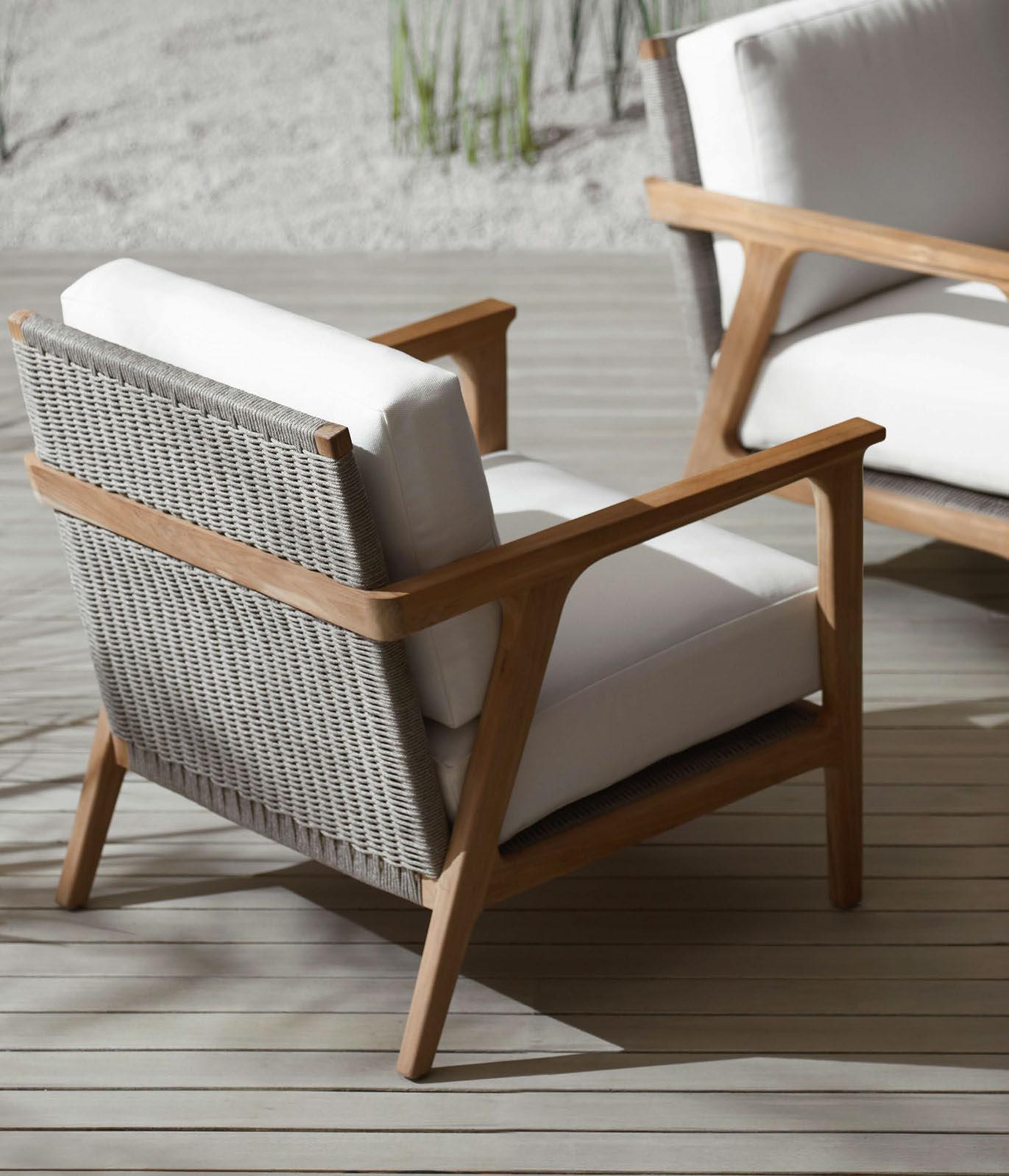


FURNITURE | OUTDOOR | LIGHTING | ACCESSORIES EXCLUSIVE REPRESENTATIVE IN UK & EUROPE palecek.com | paolomoschino.com
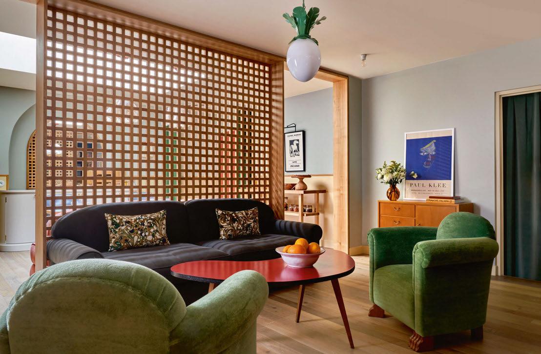
Hôtel de la Boétie
PARIS
French hotelier Adrien Gloaguen expands his portfolio in the capital, enlisting Beata Heuman to design her first-ever hotel.
Words: Emma Love • Photography: © Simon Brown
It may be one of the most famous avenues in the world, connecting the Arc de Triomphe with the Place de la Concorde, but the Champs-Élysées in Paris also has a reputation as a tourist trap.
For most people familiar with the city, the thoroughfare and surrounding 8 th arrondissement is one of the least likely areas to look for a hotel – a mindset that Adrien Gloaguen, the founder of French hotel group Touriste, hopes to change with the opening of Hôtel de la Boétie.
“The Champs-Élysées is not an area frequented by Parisians or anyone else who knows the city well,” Gloaguen explains. “The hotels that exist there already tend to be very luxurious or cater to the Middle Eastern market. In my mind there are no cool hotels, so I wanted to create one. That was the initial idea behind Hôtel de la Boétie.”
Having established Touriste 15 years ago, Gloaguen currently has seven hotels in Paris, though he reveals that there is no set strategy
when it comes to choosing locations. “It’s more of an opportunistic approach,” he confirms. “If I find a building that I like, then I buy it.”
Gloaguen’s trademark – and what ties the group together – is that not only are all Touriste properties boutique in size and accessibly priced, but each has interiors by a different designer. “I hate standardisation, so I like to work with someone new for every project,” he explains, citing past collaborations with artistdesigner Luke Edward Hall for Hôtel Les Deux Gares, interior designer Chloé Nègre for Hôtel de Beauregard, and artist Julien Colombier for Hôtel Bienvenue.
In the case of Hôtel de la Boétie, he turned to Swedish-born, London-based designer Beata Heuman. “I have been following Beata’s work for a long time and love her style. I wanted something classic but with a twist, so I knew this was the perfect place for her,” says Gloaguen, who instead of setting a brief, simply gave Heuman a tour of the space before asking her to present ideas.
117
LOCATION REPORT
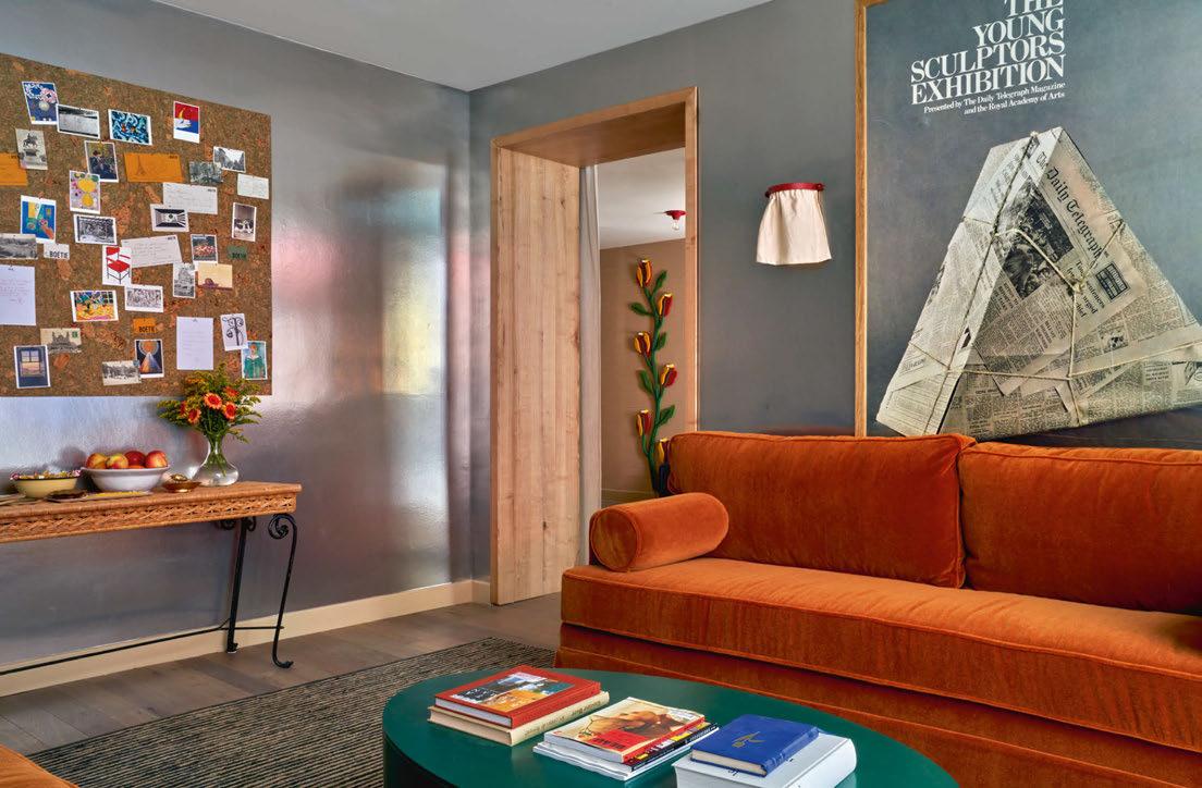
The lounge features bespoke pieces from Beata Heuman’s Shoppa collection alongside Phillip Jeffries wallpaper that reflects the movements of passers-by
Having set her sights on designing a hotel for some time, Heuman relished the challenge.
“With residential projects, the design is often centred around the personal preferences of an individual client,” she explains. “On a commercial project however, whilst you are still working for a client, there’s more freedom to create a vision as a whole.”
Heuman continues: “A hotel is about having an experience for a day or two, which means that we have been able to explore a concept and mood to a greater extent. It opens up new paths for us creatively and that has been inspiring.”
The hotel occupies a 19th-century building that previously served as a guesthouse –dressed in zebra print and gold according to Gloaguen – with few original features other than a traditional wire cage elevator that has been retained as part of the new property’s charm. For this reason, Heuman didn’t feel tied to a particular aesthetic. “I wanted to create something that transports guests away and offers a sense of escape that is fantastical
and theatrical,” she reveals of the overall look. In the 40 guestrooms, this translates to three subtly linked colour schemes: dark blues on the first two floors, biscuit shades on the middle floors and sky blue on the upper levels. The striking palette continues with bespoke baby pink bed linens by Heuman and turquoise wall tiles in the bathroom.
The bedheads, which are upholstered with flatweave wool rugs influenced by the inlaid marble floor at the Cappelle Medicee museum in Florence, are a central decorative feature. “It’s about contrast and balance,” explains Heuman. “When working with rich colours, my instinct is to offset them using simpler materials. For instance, the solid ash furniture in all rooms has a humble quality that anchors the more theatrical elements such as the headboards, ensuring the expression stays true to the nature of the building.”
Most of the lighting and accessories used throughout are from Heuman’s Shoppa collection, including the Alma wall lights, brass
118
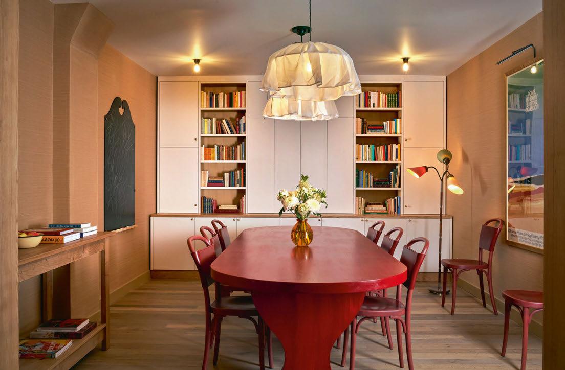

119 LOCATION REPORT
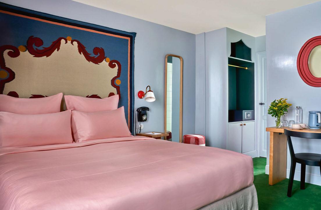
knot wardrobe handles and gingham fabrics used for cushions in the bedrooms.
Rooms come in five categories, ranging from 14m2 for a single to 20m2 for a triple, with Gloaguen noting that the single rooms cater to the many business travellers that frequent this part of the city. As such, he has also incorporated a meeting room, though its cheery interiors –with a vibrant red oval table, a blackboard and Heuman’s Paper Bag Gong pendant – are far from the typical.
The non-standardised details continue throughout. In the lobby, two tulip light fixtures climb the wall and frame an architectural photograph by Italian designer Giulio Ghirardi, entitled Cathedral Curtains. And the adjoining lounge features Royal Academy poster artwork and silver Vinyl Metalworks wallpaper by Phillip Jeffries. “Here, the movements of passers-by on the street, which can be seen through the floor-to-ceiling window, are reflected dreamily on the shimmery walls,” says Heuman of the reasoning behind her unusual design choice,
which is paired with pieces from her own collection including a bespoke burnt orange sofa, the Hampa Matta rug woven from hemp, and the Lion Chair with handcarved feet shaped like a lion’s paw.
The main social space however is the bar and restaurant, where a continental breakfast is served. At one end, a mural by Glasgowbased artist Kirsty Lackie depicts a group of diners eating, while Heuman’s Paper Bag wall lights hang at intervals between bespoke floral artworks by Ciao Chiara.
Gloaguen, who has plans for further hotels in Paris – including the forthcoming Hotel Chateau D’Eau by French design studio Necchi Architecture – concludes: “We are focused on offering good design and a good breakfast. When I travel myself, I’m not looking for somewhere with a gym or a pool. It’s not necessary.” This modest approach is best summed up by the message inside the fortune cookies in the guestrooms: ‘no gym, no pool, but a good bed’. Simple, yet effective.
Owner / Operator: Touriste
Interior Design: Beata Heuman www.hoteldelaboetie.com
120
EXPRESS CHECK-OUT
View the full gallery on LOCATION REPORT


Forest Group offers different drapery hardware solutions especially made for the hospitality industry. Whether you choose for our motorised curtain tracks or rods, blinds or manual curtain tracks your hotel guest will experience ‘the Forest Factor’. Which stands for a unique combination of smooth hanging curtains, comfortable luxury and optimal ease of use.
www.forestgroup.com
CURTAIN SYSTEMS FOR SMART HOTELS
THE WORLD BEHIND YOUR CURTAINS For more info

122
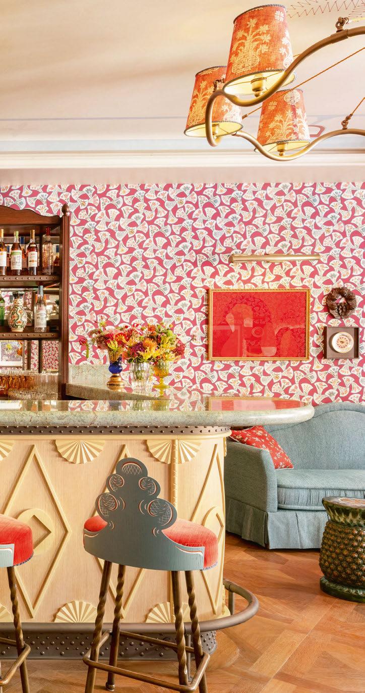
Le Grand Mazarin
PARIS
Martin Brudnizki takes the creative reins at Maisons Pariente’s first urban property, where his theatrical flair takes centre stage.
Words: Nicola Leigh Stewart • Photography: © Vincent Leroux
Martin Brudnizki has done it again. After La Fantaisie opened its doors as Brudnizki’s first hotel in Paris in July 2023, the London-based designer has repeated his success with the arrival of Le Grand Mazarin less than three months later.
The fourth property from French hospitality group Maisons Pariente, and its debut in an urban location, also marks another win for founder Patrick Pariente and daughters Leslie Kouhana and Kimberley Cohen, who together have launched Crillon le Brave in Provence, Lou Pinet in SaintTropez and Le Coucou in Méribel.
Sitting in a prime location in Le Marais, just opposite iconic department store BHV, the group’s latest five-star venture occupies three 14th-century buildings, including a hotel previously known as Villa Mazarin. All three properties were completely overhauled as part of a four-year project that involved tearing off the roof and digging three floors below ground. The finished result is a collection of 50 guestrooms and 11 suites, ranging from the smallest Classic Room at 21m2 – a fairly generous starting size for Paris –to the largest Mazarin Suite, which comes in at 50m2 with rooftop views.
Inspiration to team up with Brudnizki for the interiors came from the designer’s Instagrammable interiors at London members’ club Annabel’s, where the famously flamboyant pink seashell sinks naturally caught the eye of
123
LOCATION REPORT
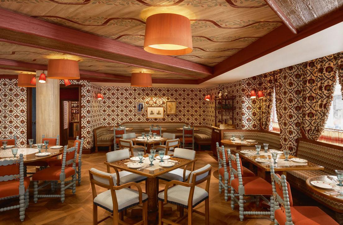
At Boubalé, MBDS worked with Israeli chef Assaf Granit to develop a design concept that reflects the heritage of the menu
Kouhana and Cohen. As each of the other three Maisons Pariente properties come full of their own personality – Crillon le Brave, perhaps the most unusual, is spread across a Provence village – it’s no surprise that Brudnizki was allowed to let his imagination not only roam free, but positively run wild to create the character of Le Grand Mazarin.
Going against current Parisian hotel trends, which favour layers of natural materials against a backdrop of understated neutral shades, Martin Brudnizki Design Studio (MBDS) has set Le Grand Mazarin apart with colourful, theatrical flair. Tapping into the rich cultural heritage of Le Marais and the historic mix of artistic figures who have called it home, Brudnizki took inspiration from Paris’ famed literary salons to create his own collection of spaces, bringing together an eclectic mix of styles with more than a touch of wit and whimsy.
The studio has stamped its signature colourful style onto each guestroom too, with pastel shades of apple, salmon pink and lemon,
as well as a riot of prints and accessories. Most of the furniture is also bespoke to put a modern spin on period styling – think antique-inspired silhouettes in a vivid palette. Patterned rugs finished with traditional yet vibrant peplums mirror the colour scheme of each space, and intentionally clash with the leopard and shellprint armchairs that sit at the end of the bed.
Behind the fun are heritage brands such as Pierre Frey and Henryot & Cie, who supplied fabrics and furniture respectively. Maison Lucien Gau provided much of the lighting, while Art de Lys has used its 134-year savoir faire to create the show-stopping tapestry canopies that hang above each bed.
Finishing touches come in the form of more than 100 bronze and porcelain knick-knacks sourced by Kouhana and Cohen from flea markets and brocantes in Paris, London and Venice. There’s also a mishmash of artworks as eclectic as the interiors – over 500 in total –chosen by Paris’ most in-demand art curator, Amélie du Chalard of Amélie Maison d’Art.
124
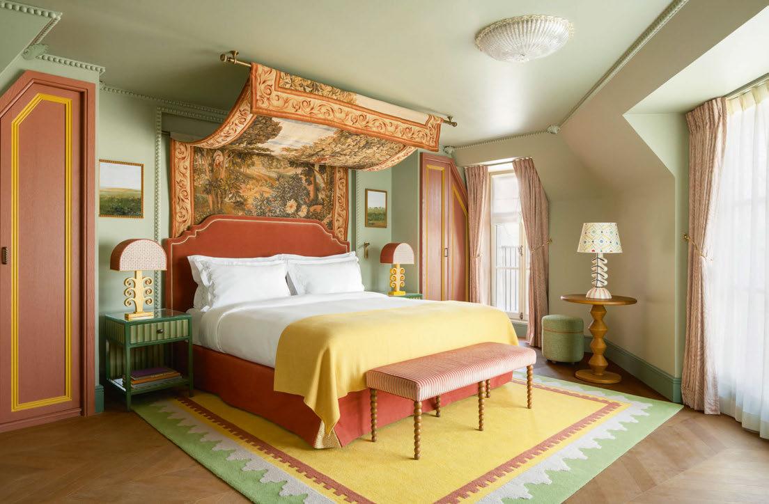
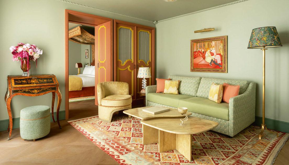
125 LOCATION REPORT
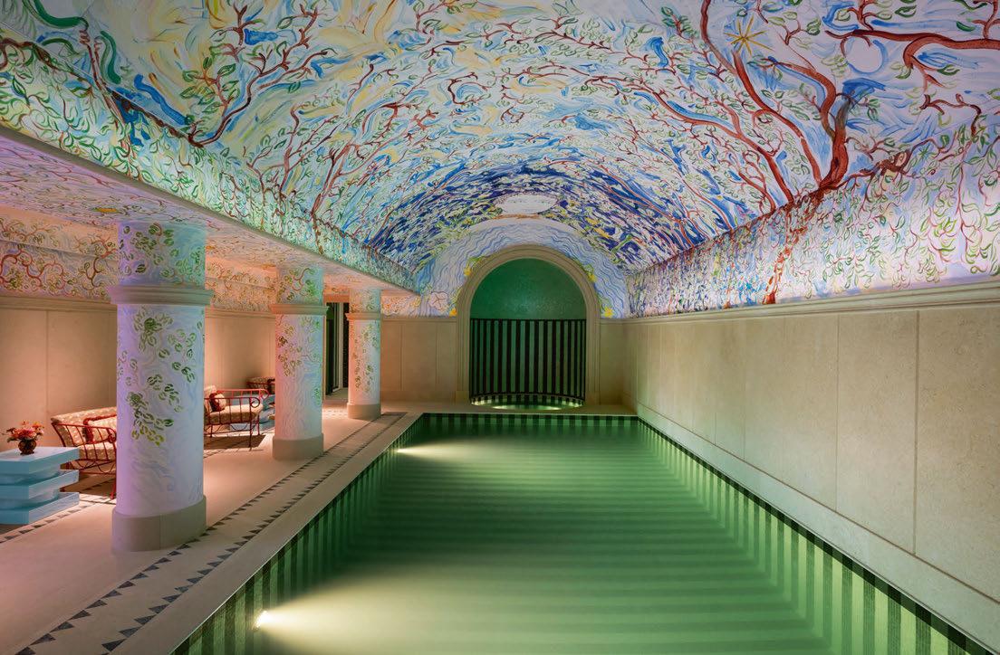
Colour has also been used to maximum effect in the underground pool, a rare addition to a Le Marais hotel. The handpainted, vaulted ceiling by Jacques Merle, chosen by Kouhana and Cohen following a search for a young, under-exposed artist, not only feels thoroughly French with its Jean Cocteau-inspired illustrations but also brings a lightness to the underground setting, with a brilliant white background, natural motifs and fresh shades of green and blue that mirror the mosaics of the pool. Postbox red seating and blocky blue tables add a Brudnizki touch of colour, whilst next door in the powder rooms, the hotel has even been given its own shell sinks from marble artisans Ildei in a nod to the swan-topped basins at Annabel’s that kickstarted the whole project.
F&B options include a ground-floor cocktail bar, an underground speakeasy, and the star of the show, restaurant Boubalé, which is drawing as much buzz as the hotel itself. Israeli chef Assaf Granit has drawn inspiration from his childhood and reinterpreted his grandmother’s
traditional Ashkenazi recipes – the restaurant’s name is Yiddish for ‘my little darling’ – whilst his JLM Group, which oversees all of Granit’s addresses, worked with MBDS on a design concept that reflects the heritage of the menu.
As with the guestrooms, a team of artisans were brought in to dress the richly layered space, from the floral embroidered fabric walls by GP & J Baker to the ceiling decorated with curves of foliage by Ateliers Gohard, whose resumé includes gilding the Palace of Versailles. The design particularly shines at night, when candlelit dinners light up the ceramics inspired by eastern European designs and handblown glassware from the Czech Republic.
Quieter soirées can be spent next door in The Patio, the hotel’s winter garden, where trompe l’oeil walls handpainted by Menorcanborn artist Sophia Pega depict a fantastical mix of unicorns, swans and horses. The walls are lit by Murano glass chandeliers from Sogni di Cristallo, adding a suitably dramatic finishing touch to Brudnizki’s bold design.
EXPRESS CHECK-OUT
Owner / Operator:
Maisons Pariente
Architecture and Interior Design: Martin Brudnizki Design Studio
Lighting Design: Douet Design
Graphic Design: General Public
Art Consultant: Amélie Maison
d’Art, Maestria Collection
Main Contractor: Artefact
www.legrandmazarin.com
126
View the full gallery on LOCATION REPORT

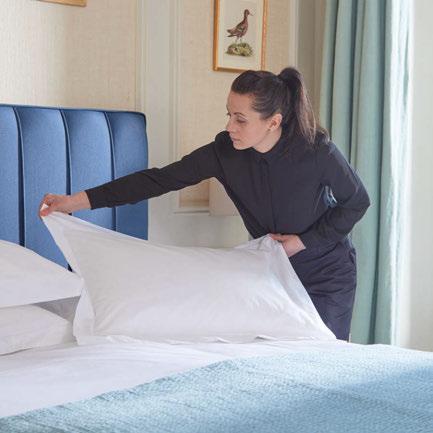
You provide the luxury stay
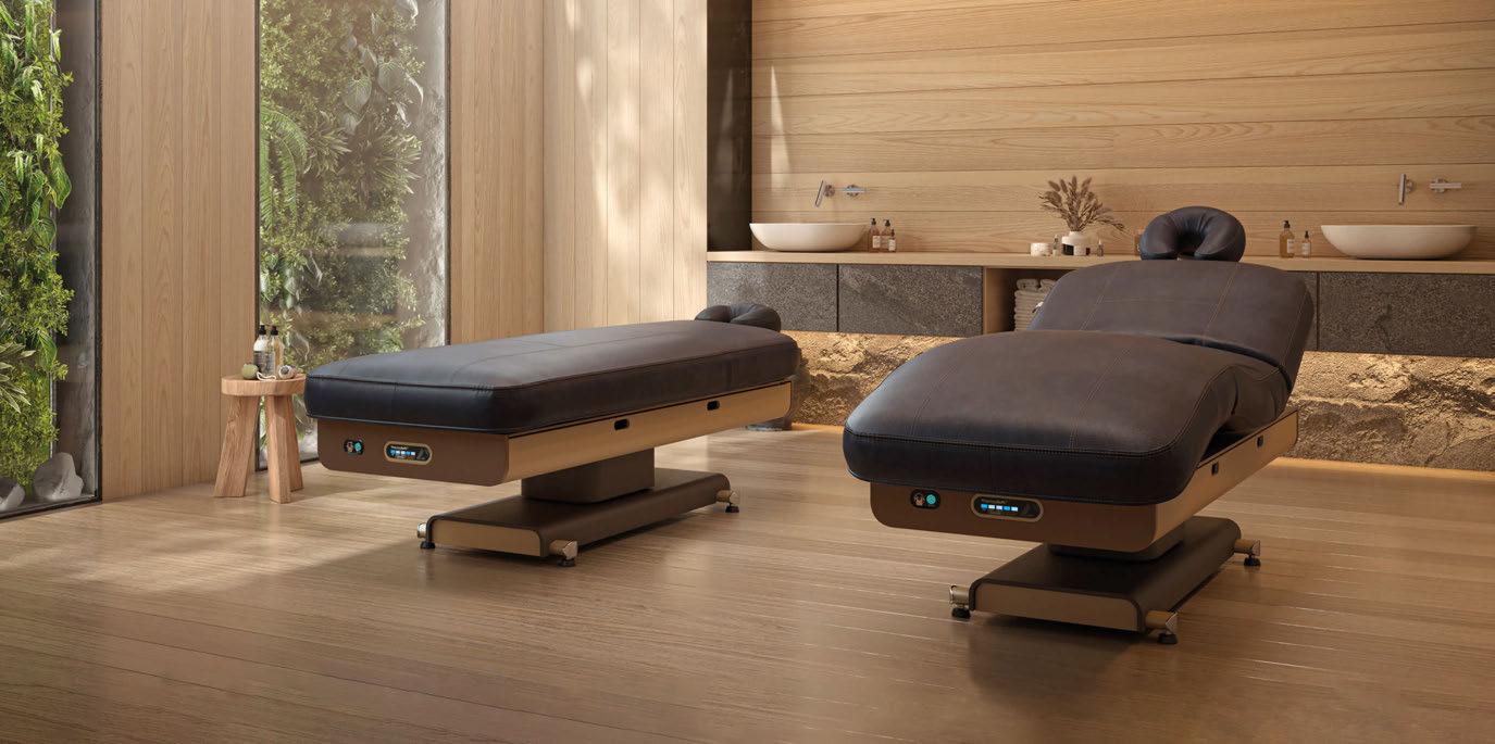


DESIGN DETAILS
 SPA & WELLNESS
Das Central
It would be quite easy for Das Central to let its snowy surroundings steal the show, but the hotel’s architecture holds its own, made all the more striking by recent renovations on Summit Spa. Nestled amongst the Ötztal mountains in the picturesque region of Sölden in Austria, the Alpine retreat has welcomed a host of new facilities that enable guests to immerse themselves in the landscape.
In addition to six new treatment rooms, a relaxation room and outdoor whirlpool, the 2,000m 2 space incorporates two newly-built saunas, a steam bath and cold-water plunge pool. The jewel in the crown however is the infinity pool, perched 17m above ground within an angular structure that juts out from the timber façade. Designed by Mika Architecture with specialist know-how from Saurwein Schwimmbad Technik and Felder Metall, the pool is shaped to mimic the nearby peaks, with its icy blue tones providing a contrast to the cosy furnishings in the spa. “We want to share our most incredible luxury – the landscape around us – with guests,” says Michael Waschl, the hotel’s Director. “With our new spa area, we have succeeded in doing just that. Here, we combine relaxation with a view. In the newly renovated spaces, the focus is on wellbeing and drawing strength from nature, thanks in part to the use of materials characterised by our high Alpine landscape.”
© Rudi Wyhlidal
Sjöparken
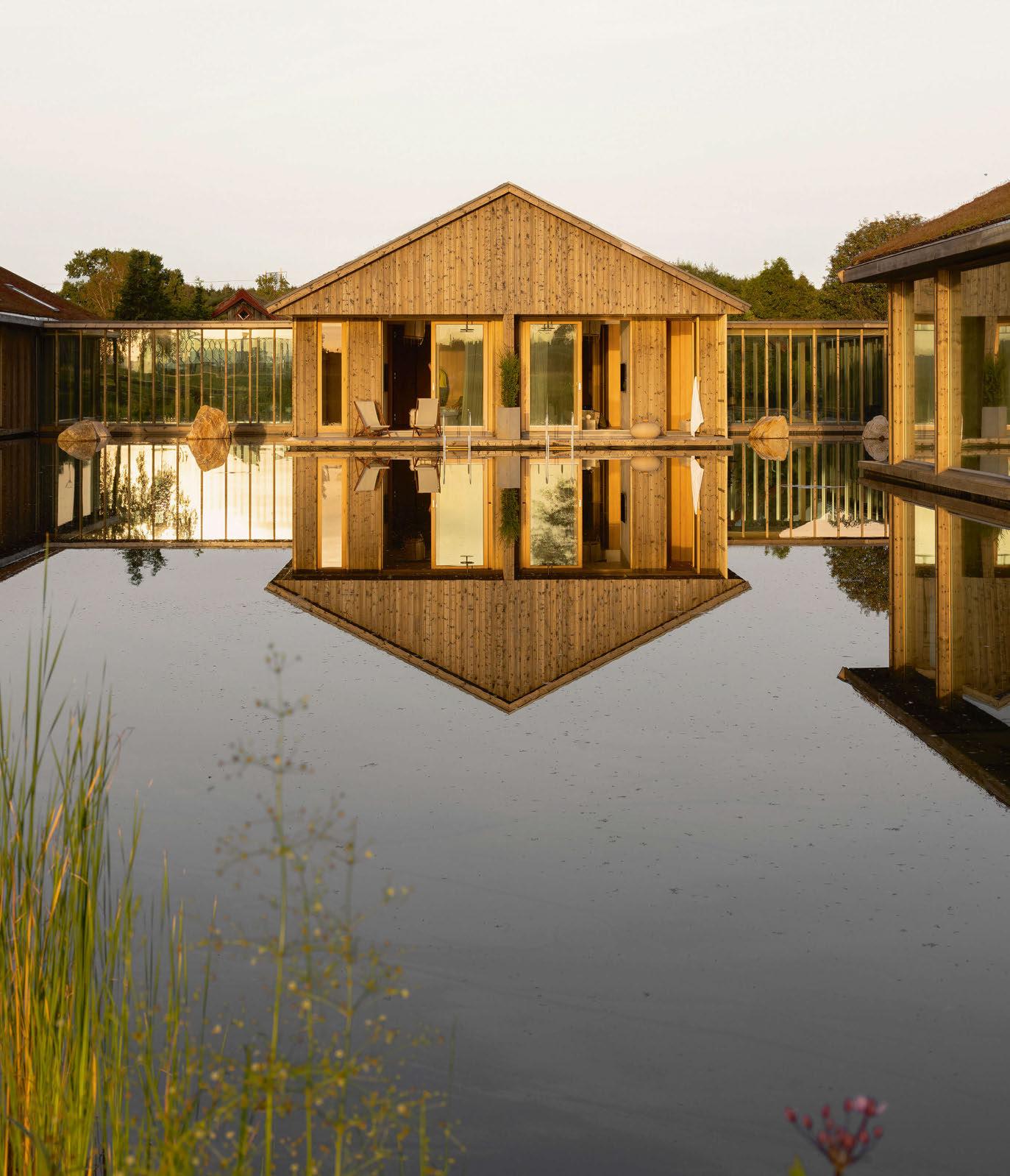
Reflecting a belief that architecture forms a bridge between the man-made and the organic, Sjöparken is a serene sanctuary that immerses guests in the beauty of nature. Set within the forests of Halland, the new concept forms part of Ästad Vingård, a Swedish vineyard home to a restaurant, spa and hotel rooms.
Designed by Norm Architects, the lakeside lodgings take inspiration from a variety of sources, marrying Nordic simplicity with Japanese design tradition, as well as a water villa typology typical of tropical resorts. The seven lodges – each with four guestrooms – feature oak cladding and green roofs that pay homage to the region’s heritage, creating a harmony with the surroundings. Glass corridors offer a visual connection to the landscape, with the glazing also serving to create mesmering reflections on the water’s surface. Floor-to-ceiling windows allow sunlight to filter through, blurring the
boundaries between indoors and outdoors, while materials mirror the elements to ensure nature takes centre stage.
“The design cultivates a tranquil atmosphere, purposefully creating a profound connection with the natural surroundings,” says Peter Eland, Architect and Partner at Norm Architects. “The comforting ambiance extends beyond visual delight, offering guests the warmth of tactile surfaces and the serenity of thoughtful spatial divisions. Every aspect underscores the commitment to wellbeing and a seamless integration with the soothing essence of nature.”
Jonas Bjerre-Poulsen, Architect and cofounding Partner at the firm, adds: “The project is all about balance. We wanted to create something that could stand out and be spectacular in the most understated way possible – that seems natural for the location and at the same time otherworldly and unique.”
LODGES & CABINS
DESIGN DETAILS
© Jonas Bjerre-Poulsen
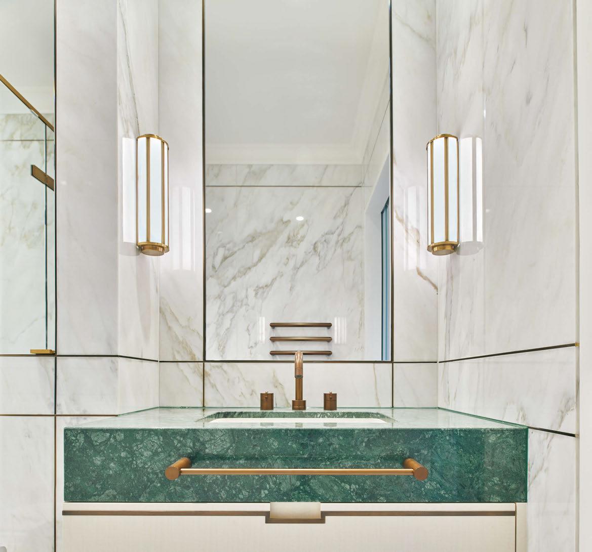
bespoke stone fabrication for over 50 years #stoneexperts #bringingstonetolife www.stone-circle.com Lansgrove | HBA Residential
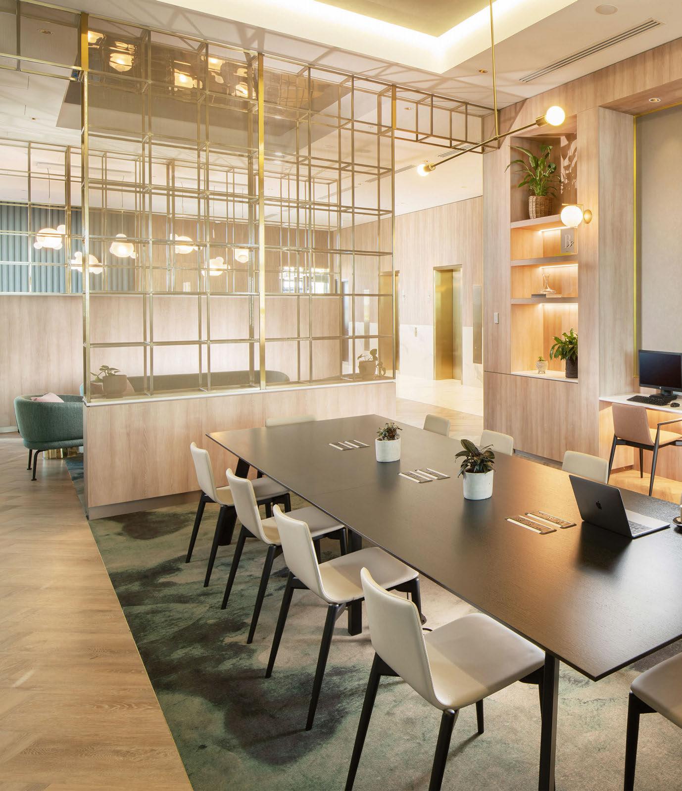
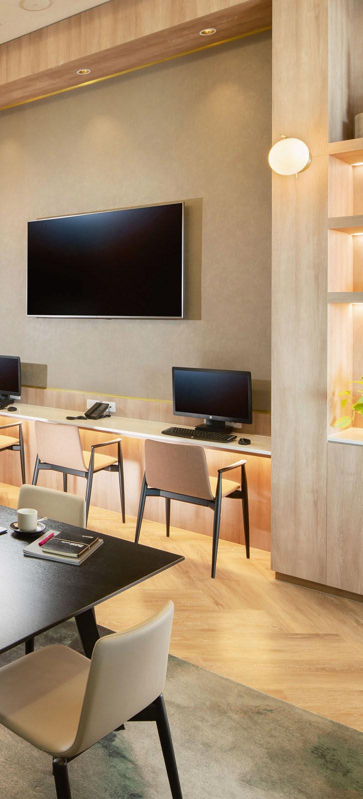
The Evolution of Crowne Plaza
As focus shifts to the ‘blended traveller’, Crowne Plaza is taking a fresh approach to the design and development of its spaces. Here, those at the forefront of the brand reveal the process behind the evolution.
Words: Catherine Martin
When it made its debut back in 1983, Crowne Plaza catered specifically to the needs of the business traveller. At the time of launch, there was a rise in demand for functional and affordable hotels with their own business centre, often kitted out with a bank of PCs, a fax machine and a printer – all the mod-cons of the corporate world. There might have been a few meeting rooms tucked away in the basement, perhaps a self-service coffee machine and a lounge with free newspapers; there was little discussion around the design concept or resulting guest experience.
However, times change. The business travel landscape has evolved significantly over the past four decades and so has the hotel industry. While meetings and events spaces arguably still lag behind the likes of spa and wellness and food and beverage when it comes to investment, a shift in the way people live their lives has brought about a renewed focus on the business traveller – who now comes with an entirely different set of demands than in times gone by.
For Crowne Plaza – part of the IHG Hotels & Resorts portfolio since its inception – staying true to its roots of catering to the business traveller while moving with the times has led to a thorough re-examination of the brand, taking in everything from the profile of the guest and their expectations, through to the design concept, spatial layout and selection of FF&E, as well as provision of services and programming, and the all-important guest experience.
133
BRAND EVOLUTION


THE BLENDED TRAVELLER
“It’s an evolution, not a revolution,” begins Emma King, Head of Premium, Luxury and Lifestyle Design for IHG Hotels & Resorts in Europe. “Crowne Plaza has seen continual progression over the years but there needed to be a greater leap for the brand’s design philosophy to ensure its ongoing relevance to today’s traveller.”
So exactly who is today’s traveller? At the start of the process, the Crowne Plaza brand team carried out in-depth research to identify changing lifestyles, attitudes and desires –factors that impact how, when and why people travel. A whitepaper published in 2022 found that the future landscape includes ‘travellers tagging leisure time on to work trips, spending longer in a holiday destination to work, or simply harnessing the benefits of advanced connectivity and a desirable destination to work from anywhere in the world’. They refer to this as the ‘blended traveller’ – with the concept going on to shape the way that Crowne
Plaza designs its spaces, as well as the ensuing guest experience. Claire Chapoulet, Head of Global Crowne Plaza, expands on the idea and its relevance for the brand: “When Crowne Plaza was created, it delivered perfectly for the business traveller of the time. Its philosophy, commercial appeal and guest affection for the brand have meant that our owners want to bring it to life in more and more locations, not only in cities and airports, but increasingly in suburban and resort destinations. At the same time, the world has changed. We live hybrid lives and the brand has moved with that. We were designing for blended travel before the phrase was even defined, but now we have established a way to design our spaces for hybrid life, catering to business, leisure and everything in between, ensuring guests don’t have to compromise when choosing a hotel.”
A series of focus groups held in both the UK and USA around the purpose and perception of the brand revealed new opportunities. “There was a lot of love for the brand but there has
been a clear change in how people work and want to use the spaces within a hotel,” reveals Joey Goei, IHG Hotels & Resorts’ Senior Design Manager for Europe. “So, the key change is that rather than focusing on the business traveller, we’re focusing on the blended traveller and their evolving needs. When people book a hotel for work, they’re now more likely than ever to add on a few days and have their partner or family join them for a mini break. We also need to consider that people may need to carve out some time to do some work calls when they are on a personal holiday too.”
Indeed, the research confirms this; according to IHG’s survey, 45% of the UK travellers surveyed plan to add leisure days to future business trips, and in the USA, this rises to 60%. It’s typical for travellers to stay at a businessoriented hotel for the work portion of their trip then move to a lifestyle property for leisure, so if Crowne Plaza could elevate its offer to appeal to this blended traveller, there was potential to capture longer stays and greater spend.
134
BRAND EVOLUTION
© Anna Stathaki
ANTONIO
ARCUGANO (VI) 36057
ITALY
WWW.TIGER-ITALIA.IT
+39 0444 28944
HALL@TIGERLEATHER.COM
FOR US AT SLEEPER SESSIONS PORTUGAL!
LOOK
MEUCCI
48/1
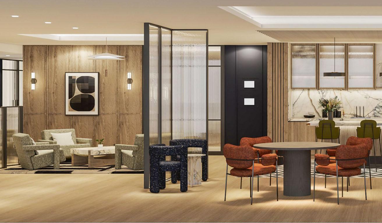
DESIGN AND DEVELOPMENT
With the results of the research establishing the target guest, the Brand, Design and Engineering teams set about defining the key characteristics of the evolved Crowne Plaza. The meetings and events component would still be a key priority, but there was to be innovation and flexibility to maximise the value of the spaces. There would also be inspiring restaurant and bar concepts catering to both work and leisure, and a new guestroom model defined by zones for work and relaxation. A close examination of the entire IHG Hotels & Resorts portfolio took place to ensure a clear point of difference to avoid overlap between brands, while a global roll-out would bring consistency across the regions.
It then fell to the design team to develop the look and feel of the brand. “We started this process eight years ago and because it was a phased evolution, we knew we needed a longterm design partner,” explains King, adding that an RFP eventually led to the appointment of Conran & Partners. “We liked their design
ethos which is rooted in Sir Terence Conran’s thought process of designing spaces for people, which really resonates with Crowne Plaza.”
Taking the lead at Conran & Partners, Simon Kincaid worked in close collaboration with King to create the environment design, considering the research findings and target guest profile. “Our involvement came in the development of the customer experience and its realisation in the physical world,” explains Kincaid. “We were presented with the brand ideas, then our role was to bring that to life and make it relevant to today’s guest.”
In a conscious move away from the traditional business traveller, the concept responds to the needs of the blended traveller. “Historically, a Crowne Plaza’s events spaces may have been chosen for convenience, value or functionality. Now, IHG wants there to be emotion involved, for it to be both experience and people-led,” continues Kincaid. “When it comes to the guest experience, no-one talks about the business traveller with enthusiasm, it’s all about the
leisure traveller. So, if we can incorporate experiential and emotive elements with functionality and efficiency, then it’s a good result for the owner, the brand and the guest.”
The team reviewed the ways in which existing hotels cater to the needs of guests, exploring everything from budget and select-service to premium and high-end luxury to assess their relevance to Crowne Plaza’s blended traveller.
“We took learnings from other brands while ensuring there’s differentiation,” Kincaid notes, adding that features adopted by some properties, such as self-check-in kiosks and grab-and-go dining, were quickly disregarded in favour of human connection. “The idea was to be more human and more approachable so that guests have a relationship with the brand,” he continues. “We wanted to ensure there’s function and purpose, but also elements of serendipity and inspiration.”
136
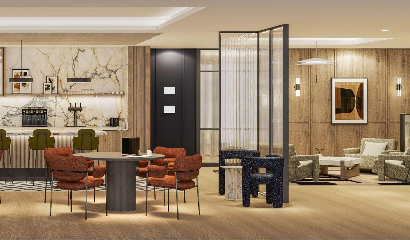
THE NEW MODERN
The resulting approach has been labelled New Modern – a design style that expresses productivity, efficiency and performance as well as comfort, warmth and relaxation, enhanced by moments of inspiration.
The design is implemented through three layers:
• Purposeful – Details that add value in a meaningful and innovative way
• Restore – Introducing elements of nature to enable guests to feel re-energised
• Inspire – Details that speak to all the senses and spark the imagination
Rather than a prescribed design that dictates every detail of the interiors, New Modern is a “tone of voice”; an overarching style that comes with variations and flexibility. The layers create a brand experience that plays out tonally through natural colours and thoughtful design, with spaces that are flexible owing to a mix of private and social elements.
MEETING SPACES
In bringing the new brand identity to life, an overarching design style was developed, taking in not only the look and feel of spaces, but layout and functionality too. “In the meetings and events spaces, we looked at ways of making it more flexible to allow for different uses at different times of the day,” explains Goei. “We imagined two fictional characters to explore how they might use the spaces from morning to evening.”
There might be an early morning yoga class, corporate meetings taking place during the day, and by evening, more of a club lounge ambiance for a family games night, a networking dinner or a lecture – programming that ensures a space is activated at all times. There’s even talk of hosting parties or weddings.
As such, flexibility is key. A rendering of a theoretical floorplan shows the optimum set-up in which an open-plan pre-arrival space can serve a single or multiple users thanks to the use of partitions and a mix of fixed and loose
“Crowne Plaza has seen continual progression over the years but there needed to be a greater leap for the brand’s design philosophy to ensure its relevance to today’s traveller.”
EMMA KING, IHG HOTELS & RESORTS
137
BRAND EVOLUTION
“The key change is that rather than focusing on the business traveller, we’re focusing on the blended traveller and their evolving needs.”
JOEY GOEI, IHG HOTELS & RESORTS
furniture. The open breakout area features meeting rooms and pods, casual dining areas and lounges – elements that have been tried and tested at existing properties. It has been a rigorous process, with some ideas – such as an arena with stepped seating – cast aside having been trialled and deemed unsuccessful. “There’s still a need for traditional meeting rooms but so many business interactions are more informal now,” states Kincaid. “In the boardroom for example, the power and tech is concealed within the table so it can also be used for private dining too – it works for both formal and informal events.”
The process has involved challenging norms too and introducing flexibility in new ways. “We questioned every element of the typical meeting room, from blackout curtains to projectors,” explains King. “On review, we came to the realisation that some our existing brand standards no longer had purpose.”
With that in mind, the team opted to break from tradition and bring fresh ideas to the meeting space. One example is transparency
– now a hallmark of the design. Rather than being closed off from the outside world, meeting rooms feature Crittal-style glazing with sightlines to the social spaces. There is the option of a privacy curtain, but the openness brings a new energy into the meeting room, making for a more engaging experience.
DESIGN DETAILS
Flexibility extends to every aspect of the new approach, including the design details. Some elements are required to meet the standards expected of a premium hotel, but there’s scope for designers to introduce a sense of place that guests so often crave. “The way we approached it was to create three material palettes – warm, tranquil and bold – and three FF&E collections – engineered, residential and contemporary –which gives the opportunity to be more playful with accents,” explains Goei, adding that there are economic benefits too. “We realise that refurbs might not happen every five years so we want to guide hotels to be timeless in their base palettes; if they do need updating, it can be done

138
BRAND EVOLUTION
HOTEL REFURBISHMENT

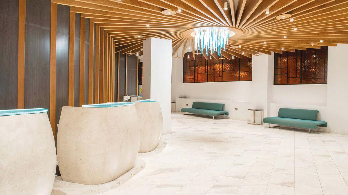

CROWNE PLAZA PROJECT
VALUE: £16,000,000
Client: Firoka Group
Form of contract: JCT Design & Build

Complete refurbishment and upgrade from a Holiday Inn to a Crown Plaza including the full refurbishment of all bedrooms, bathrooms, public areas and an extension to provide another floor of rooms.
THREE DECADES OF EXPERTISE, DELIVERING 15,000 ROOMS ON TIME, EVERY TIME, WITH ZERO CONTRACT PENALTIES. 85% REPEAT BUSINESS UNDERSCORES OUR EXCELLENCE, COMPLEMENTED BY A DIVERSE AND PROVEN PORTFOLIO.
WWW.CONNORCONSTRUCTION.COM HELLO@CONNORCONSTRUCTION.COM

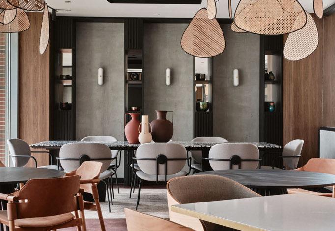
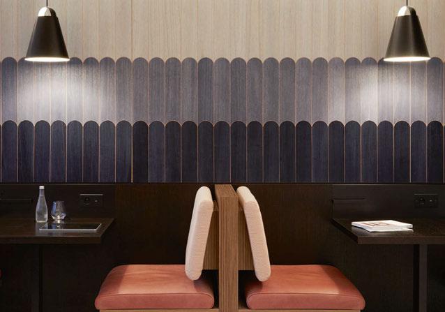
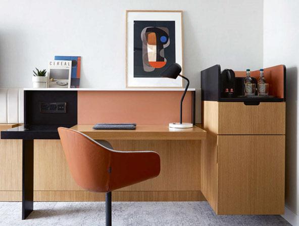
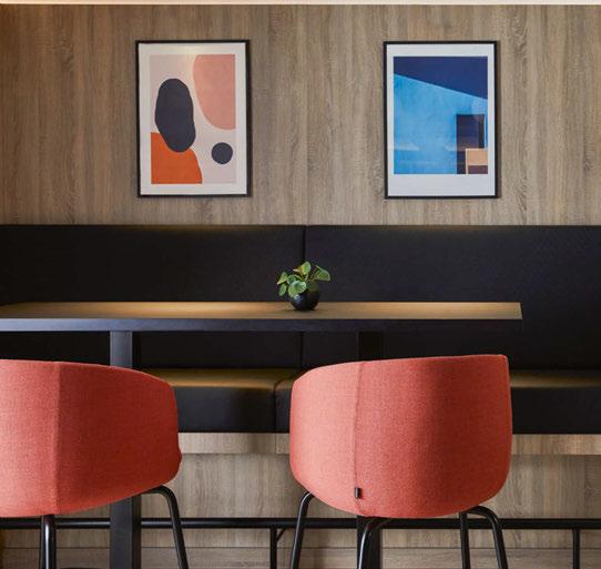
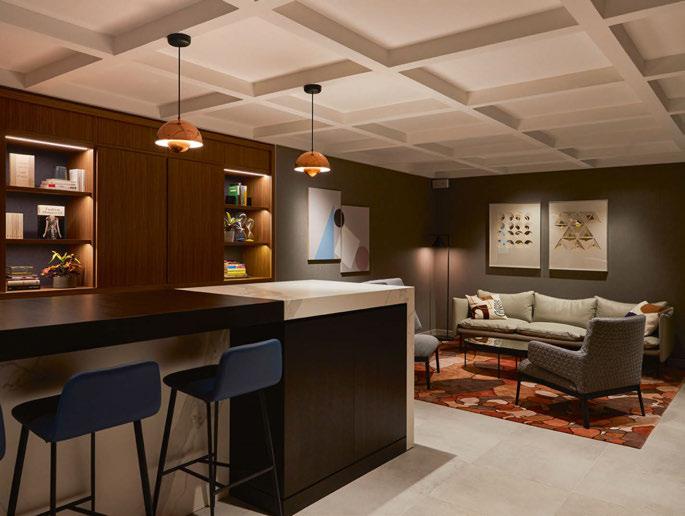 © Veerle Evens
© Piotr Gesicki
© Anna Stathaki
© Anna Stathaki
© Anna Stathaki
“If we can incorporate experiential and emotive elements with functionality and efficiency, then it’s a good result for the owner, the brand and the guest.”
SIMON KINCAID, CONRAN & PARTNERS
by updating the accent materials or furniture without the need for a full hard refurb.”
New Modern was first implemented at existing Crowne Plaza properties, with a mockup of a guestroom in London Heathrow and the public spaces at Paris République serving as the prototypes. It was an opportunity to assess how the design style played out in a real-life setting and to explore sense of place. “Key architectural components to set the tone of the space are suggested in the guidelines, which can be built on as the narrative grows,” says King. “In Paris for example, the hotel is within a Haussmann building so some of the finishes, such as the wall panelling, pick up on that design style.”
Kincaid adds: “A sense of place might come through in the joinery or the pattern on the carpet, the selection of FF&E or the artwork. There’s a reason behind it; these elements tell the story of a particular hotel.”
The prototypes were also a chance to see how the brand evolution would impact the guest experience. At Crowne Plaza Paris République, there was a marked difference, with King revealing: “We took a hotel that had a great street presence and re-energised the lobby by changing the guest journey and creating an internal courtyard; the process has been about activating the spaces and in Paris’s context has transformed the hotel.”
Crucially, the new concept had a positive impact on guest spend too. “Walking into the lobby and seeing how the blended traveller was using the space was one of the biggest milestones in this process,” adds Kincaid. “It changed people’s perception of the brand; they were dwelling for longer and staying in the hotel to eat and drink.”
FREEDOM WITHIN A FRAMEWORK
Since the prototypes were completed, IHG Hotels & Resorts has been working with Conran & Partners to draw up a blueprint that showcases the evolution of the Crowne Plaza brand,
enabling owners to make informed decisions on the future of their assets and guiding designers through their interior schemes. “The blueprint talks about the history of Crowne Plaza, its hallmarks and how it differentiates itself from other brands,” Kincaid explains. “From the research, we can tell owners exactly who the customer is, their dwell time and where they spend their money. It then shows how the concept comes to life, with recommendations on adjacencies of spaces and the look and feel of the interiors.”
For IHG Hotels & Resorts, there are practicalities behind the guidelines too. “Our projects are so diverse” reveals King. “Some are newbuilds, others are renovations of heritage properties, so it’s good to have some structure to the decision-making process and provide more guidance and examples of how the design philosophy can come to life.”
She continues: “The guidelines exist to avoid mistakes being made in the planning stages and to ensure the types of spaces are relevant to the guest profile. Just stating that a Crowne Plaza has to allocate 400m2 to events spaces doesn’t necessarily work; we need to know what type of events are taking place and ensure our spaces are flexible and efficient, operating in a way that maximises revenue and drives guest satisfaction. Everything in the guidelines is backed up by research and has been tested as to what will get the most use by the guest and the best value for the owner.”
Far from defining the length of the curtains or pile height of the carpet, the guidelines offer flexibility based on a hotel’s location, building type and context, so long as it’s within certain parameters that guarantee a degree of consistency across the portfolio – “freedom within a framework” as King calls it. That said, if owners do require a simple solution, then there’s a mandated off-the-shelf package for guestrooms with specifications, material palettes and furniture collections to adopt.
Now, the task comes in working with owners and their agencies to adopt the new look, a role that ultimately falls to Goei. “With the blueprint we have from Conran, my job is to work with owners and their chosen design firm, to brief them on the look and feel of the brand, as well as the types of spaces that make up a Crowne Plaza,” she reveals. “I can make recommendations on how to get the most value from the spaces, guide them through the process and explain the reasoning behind the concept; it’s important to get their buy-in from the outset to futureproof the asset and the brand.”
With Goei taking the lead on Crowne Plaza design in Europe and King collaborating with the development team on conversions and newbuilds across all brands, IHG Hotels & Resorts has introduced the new Crowne Plaza model to market across a variety of locations. Guest feedback is continuously collected at brand level and fed through to the design team for future iterations, and the group has been sure to communicate with owners too. “The new design style has been well received and the feedback from owners has been very positive,” reveals King. “We can come up with the ideas but it’s their investment at the end of the day; they are the ones with the power to bring change to their properties so it’s important to have them on board.”
The brand now has some momentum behind it, with recent European openings in Warsaw, Tashkent, Marseille and Budapest, and forthcoming projects in Dushanbe, Montenegro and Yalova. With so many hotel brands on the market, one that has a clear focus and characteristics that cater to the specific needs of its target guest could well make the difference between growth and stagnation, so it’s up to the parent groups to drive change. “The fact that IHG spends so much time and energy looking after its brands is really valuable,” Kincaid concludes. “There’s a guardianship, and Conran & Partners are proud to play a part.”
141
BRAND EVOLUTION
Properties showcasing the new design concept include: (top left to right) Crowne Plaza Brussels Airport and Crowne Plaza Budapest: (middle left to right) Crowne Plaza Paris Republique and Crowne Plaza Heathrow; (bottom left to right) Crowne Plaza Hamburg City Alster and Crowne Plaza Paris Republique
Hotel Construction Pipeline Asia Pacific
Asia Pacific continues to add to its hotel construction pipeline according to a new report from THP, with a total of 2,629 active projects listed on the database, accounting for 572,096 rooms under development.
China remains the most active country in the region by a considerable margin –second only to the USA on a global level – with 1,394 projects currently in progress. By comparison, second-place India has 247 projects on the boards. Australia and Vietnam also feature amongst the top ten, while Singapore climbs the rankings with new signings from Marriott’s W brand and the ongoing transformation of Marina Bay Sands, the latter taking in the refurbishment of 1,850 guestrooms across three phases.
By city, Shanghai takes the top spot for its robust pipeline of newbuilds, with 17,812 rooms across 71 projects under development thanks to ventures from Rosewood and Four Seasons, as well as multiple brands from Marriott and Hilton. Chengdu, Shenzhen and Hangzhou are also proving attractive to developers and operators; in fact, the only city outside of China to land in the top ten is Bangkok. The Thai capital is seeing something of a boom in new construction taking in forthcoming openings from Aman, Nobu and Yotel.
THP is a data service to support the design, build, furnishing and operation of hotels worldwide. For more information visit: www.tophotelprojects.com
142 CHINA 1,394 309,909 INDIA 247 38,750 AUSTRALIA 168 27,379 VIETNAM 144 46,821 THAILAND 132 30,054 INDONESIA 123 20,662 MALAYSIA 77 23,239 JAPAN 63 14,346 TOP COUNTRIES PHILIPPINES 57 15,187 SINGAPORE 25 10,627 Projects Rooms Projects Rooms 1 2 3 4 5 6 7 8 9 10 TOP CITIES BANGKOK Projects 54 Rooms 13,983 SHANGHAI Projects 71 Rooms 17,812 CHENGDU Projects 65 Rooms 14,498 SHENZHEN Projects 55 Rooms 13,908 HANGZHOU Projects 50 Rooms 10,083 NANJING Projects 38 Rooms 7,410 SUZHOU Projects 39 Rooms 8,010 CHONGQING Projects 35 Rooms 7,472 ZHUHAI Projects 34 Rooms 7,457 GUANGZHOU Projects 34 Rooms 7,119
CONSTRUCTION PHASE
Of the 572,096 rooms in the pipeline, 59% (336,796 rooms) are under construction and 21% (121,824 rooms) are in the planning stage. It is within these phases that interior design schemes and FF&E fit-outs are being planned and implemented.
GROUPS AND BRANDS
Within the THP database, Marriott International holds the greatest number of projects in the pipeline following a record number of signings in 2023, while IHG is expanding with its Crowne Plaza and Hotel Indigo brands, collectively accounting for 23,342 new rooms across the region.


342 Projects
282 Projects
232 Projects
226 Projects
185 Projects
143 BUSINESS CENTRE
OF OPENING
YEAR
VISION Projects 75 Rooms 14,540
PRE-PLANNING Projects 301 Rooms 59,685 PLANNING Projects 580 Rooms 121,824 CONSTRUCTION Projects 1,482 Rooms 336,796 PRE-OPENING Projects 191 Rooms 39,251 BRAND PROJECTSROOMS Crowne Plaza 5413,155 Hotel Indigo 5410,187 Marriott Hotels & Resorts 5316,494 Hilton Hotels & Resorts 5313,522 Hyatt Regency 4811,553 Citadines 489,453 Hilton Garden Inn 427,837 DoubleTree by Hilton 418,478 Sheraton Hotels & Resorts 399,963 InterContinental Hotels 388,964
2024 (29%) 2025 (21%) 2026 (14%) UNCONFIRMED (28%) 2027+ (8%)

INTERIOR & EXTERIOR LIGHTING | CEILING FANS enquiries@elsteadlighting.com | elsteadlighting.com
Merchants of Light since 1969
ARNO Table Lamp Quintiesse Collection
The intelligence source for the hotel investment community
SBE returns to hotels
Wyndham Hotels and hospitality group SBE are to work together on developing a new lifestyle hotel brand, looking to appeal to younger consumers by creating a new niche in the hospitality landscape.
With the working title of Project HQ, the initiative aspires to build a new brand with 50 hotels open by 2030. The aim is to create a “smart lifestyle” category of hotels and residences, which will be targeted specifically at Millennial and Gen Z guests. The new category aims to come in at a price point below lifestyle, creating a “more approachable experience for the consumers who have been priced out of the lifestyle market, and don’t feel like they have a brand that speaks to their desires in travel”.
For hotel owners, Project HQ hopes to be an attractive conversion option, aiming to revive properties with an offering that is strong on food and beverage, creating a destination for more than just overnight guests. SBE Chair Sam Nazarian has indicated that conversion costs could be in the range USD30-50k per room.
Project HQ aims not to be a new brand in the Wyndham stable, but a soft brand that will list properties under its existing Registry Collection, with SBE having a hand in running individual sites. The package of add-ons that owners can select from include wellness clinics and a range of branded dining and bar options, while there is also the intention to add a residential offering. However, rather than simply being branded apartments, the intention is to spread the brand into “underserved markets like integrated student housing, workforce housing and the like”.
For SBE, the move will be a return to the hospitality front line, after the group’s previous creations were sold in 2020.
Concurrently with the Wyndham deal, SBE has signed up entrepreneur Marc Anthony and
his company Magnus as new equity partners. Longtime friends, Anthony and Nazarian aim to build the culinary and nightlife part of SBE, which was launched in 2020 under the Disruptive Restaurant Group brand.
“When we created lifestyle luxury back in 2005 with SLS, we forged a new category,” said Nazarian. “Now, almost 20 years later we look to reinvent lifestyle again with Project HQ, the first smart lifestyle hotel brand. We feel uniquely equipped to solve for the unmet needs of the next generation who are eager to engage with culinary excellence and vibrant social spaces that we’ve curated and cultivated with intention.
“We also feel so honoured to have established a strategic alliance with the best-in-class team at Wyndham and look forward to bringing The Wyndham Advantage to owners of Project HQ hotels around the globe.”
Nazarian built SBE from the opening of his first hotel under the SLS brand in Beverley Hills in 2009, developing and evolving the lifestyle hotel concept. Along the way, he established further hotel, restaurant and nightlife brands. In 2016, the group acquired the US-listed Morgans Hotel Group and with it added the Delano and Mondrian brands along with 13 hotels.
In 2018, Nazarian sold a 50% stake in SBE to Accor, at which point the company had 22 hotels open and a pipeline of 40 hotels, a number that doubled over the next two years. The global hotel group took full control in late 2020 in a cash and asset swap deal that valued the business at USD650m.
HA PERSPECTIVE
By Chris Bown: The pandemic might have hit Nazarian hard, but with Accor in the wings, SBE’s previous hotels foray is in good shape to grow, under the Ennismore division that it helped form. This time around, the model is honed – asset light, looking for quicker properties via conversions,
and encompassing an offer that can mix in accommodation with lifestyle elements of food, beverage and entertainment.
This move also promises to give Wyndham a more attractive offer to younger Millennial and Gen Z hotel guests, something Hilton has also recently focused its attention on with new brand launches (in case you didn’t dare ask, Millennials are around 28-43, and Gen Z are up to age 27). These younger cohorts are the big spenders of tomorrow, so attracting them into a brand stable at a younger age, and cementing them into the loyalty programme, is a key strategy to ensure longer term success. Today’s big spenders will only retire and shift their hotel spending down a gear in coming years – they need to be replaced.
Wyndham has already shown it is willing to add lifestyle to its portfolio of more straight down the line hotel franchise offerings, with its acquisition of Vienna House in 2022. Now, it’s following Accor down a deeper lifestyle path.
Room without a view
Hoteliers in London are taking the lead in developing increasing numbers of hotels featuring windowless rooms. The concept, which appears to be acceptable to guests, offers the promise of opening up new spaces for conversion, including those meeting and events spaces left underutilised as the events marketplace reprofiles following the pandemic.
Latest to join the windowless move is PPHE, which recently won consent for a new hotel beneath its existing Park Plaza in Victoria. The project will create a 179-room hotel across three basement levels, currently serving as the events and service spaces of the existing Park Plaza, plus a car parking area accessible by a lift, on the third basement level. With no major structural work required, the conversion could take place relatively quickly and easily.
PPHE intends to operate the hotel itself,
BUSINESS CENTRE 145
combining operations with the Park Plaza above, and says the new space will be a “midscale lifestyle brand” that it will reveal later.
“This is an exciting new project utilising an existing asset and operations in a soughtafter location to maximum effect,” said PPHE CEO Boris Ivesha. “This property will further enhance our London portfolio and broaden our accommodation proposition, enabling us to tap into a new guest demographic whilst maximising returns. The strategy here is consistent with the group’s longstanding approach to building long-term shareholder value through the measured use of its balance sheet and tactical capital investment.”
PPHE is following the lead of property group Criterion Capital, which has developed several London hotels where it has turned windowless rooms into a positive feature. The group is now expanding its Zedwell brand around the UK, looking for more opportunities to turn unwanted offices into windowless hotels.
The first Zedwell opened in 2020, in part of the Trocadero building in central London. The 750room hotel had spent many years in planning, and was at one stage earmarked to be branded as an Ibis. A second Zedwell opened in mid2023 in Bloomsbury, having been created from a former basement car park. Criterion claims the property is London’s only underground hotel.
Criterion has just opened a third Zedwell property in Greenwich. Yet despite using space above ground, it has opted to design the 96 rooms without windows or direct contact with the building’s perimeter. Speaking at the Greenwich property’s opening, Darija ZivniAziz, head of interior design for Criterion Hospitality, said: “We focus on delivering an uninterrupted night’s sleep by eliminating external light and noise. Despite Zedwell Greenwich’s impressive all-glass exterior, its windowless rooms ensure superior insulation against external temperature variations.”
In August 2023, the group lodged an application to create a 187 room Zedwell hotel in Manchester, having acquired the Royal Buildings close to Piccadilly Gardens. The group says it has further pipeline sites for hotels.
Budget hotel groups including easyHotel and Point A are among those offering a selection of windowless rooms in some of their London hotels. Karim Malak, CEO of easyHotel, said that some guests specifically prefer them: “Interestingly, some clients want them because they’re cheaper, or because they’re quieter.”
But he noted that windowless accommodation is not necessarily acceptable in all jurisdictions. “It’s very cultural – being unpalatable for the French, and also not permissible in either France or Spain.”
Luc Boschmans, managing director for hospitality investments at Tristan Capital Partners, who are backing Point A’s expansion, told Hotel Analyst: “The guest reaction is overwhelmingly positive – for city stays, a bedroom without a window controls both light and noise pollution which aids a great nights’ sleep. But also, we are a value proposition and our windowless rooms are usually offered at a slight discount therefore providing great quality at a reasonable price point. These are often the first rooms to sell which gives us a base for our revenue management team to adjust our pricing for the remaining rooms.”
He added that windowless rooms will be part of the group’s future projects. “Our hotels are located in prime locations where the square foot/metre is expensive. Our guests value the quality of our amenities we provide along with the fantastic locations in which our hotels are set. From an ownership point of view, in terms of ‘highest and best use’, the profit per square foot/metre for windowless rooms provides a very attractive return.”
According to Savills research, pod or capsule hotels are also gaining traction. The first
capsule hotel appeared in Japan in 1979, and the phenomenon has since been tested in a number of other Asian and Western city markets. The first of this Japanese-style accommodation opened in London in 2018, and the agent notes that “a London economy-based micro-hotel can be up to 22% cheaper than a traditional budget hotel in the same area”. It says several pod hotel conversions are in the pipeline –again, a concept that does not require windows, and can therefore be deployed more easily when converting buildings from other uses.
HA PERSPECTIVE
By Chris Bown: It’s strange how a windowless room is unimaginable in some European cultures – yet in the UK it seems to be both acceptable, and gaining traction. As increasing numbers of budget hotels are built in city centres, the view from the window is hardly one worth staring at – so why not do away with it altogether?
And, as those who run hotels point out, there are customers happy to book a room without a window –so why not tap that market? If rooms can be planned without the constraint of an external wall, then so many more spaces offer themselves up for hotel conversion, as PPHE has just discovered.
Criterion Capital CEO Asif Aziz has clearly decided now is the moment to pick up tired office buildings on the cheap, and convert them to hotel use. With the Zedwell product now honed, Aziz recently acquired the Manchester site, and is buying other central London office blocks to convert the upper floors for hotel space. Expect Zedwell to expand fast – there are plenty of unloved office buildings right now.
Reshaping tourism
Key country markets are sizing up the opportunities and challenges of the postpandemic leisure marketplace, as airlift returns to more normalised levels around the globe.
146
For some, the return to previous levels of inbound tourism has been slow and faltering, despite their best efforts. China, which in 2019 was the largest country outbound market, has been slow to revive. For others, there is now a push to secure a fresh growth trajectory and grab market share. Airlift and air connectivity meanwhile, remains constrained by sanctions and conflict regions across eastern Europe and the Middle East.
A January webinar held by Midas Aviation heard how new regions such as Saudi Arabia are emerging to chase global tourism demand. Despite efforts to ease visa entry in key markets, some are still suffering. The market is not uniform, with European governments bearing down on airlines for environmental reasons, as other parts of the world are still building new airports. “China was the biggest outbound market in the world delivering significant volume into countries such as Japan, Thailand and South Korea,” said Deirdre Fulton, partner at Midas Aviation. “But it wasn’t just volume, it was about spend – Chinese tourists had the highest spend of any.”
But indications are that China will remain below pre-pandemic levels of activity for some time. John Grant, chief data analyst at OAG, warned that weak economic conditions in China are weighing on broader consumer behaviour. “The outside world does not appreciate how hard that economy has been hit – and that impacts travel.” Current Chinese airlift is at around 70% of 2019 levels. For now, it is down to Chinese airlines to try and drive demand, as western airlines wrestle with restrictions on flying over sanctioned territories and areas of conflict. “Chinese airlines are having to generate more international travel. But the market is not responding as quickly as people would like.”
Simon Westaway, strategy director at RoyceComm, said China had been a key inbound market for Australia, “and a lot
of the Chinese visitors pre-pandemic were genuine holidaymakers”. Increasing numbers of independent travellers were visiting, and he noted the Chinese were the largest renters of caravans. But while 40% of pre-pandemic arrivals from China were holidaymakers, “today it’s 25% – the mix of the market has changed”.
In Thailand, Minor International has reported it is finally seeing a strong return of Chinese visitors. Speaking in the third week of January, CEO Bill Heinecke said he expects foreign arrivals to get close to 35 million this year, beating a 33.5 million government target.
Prior to the pandemic, the country hit a record 39.9 million inbound visitors in 2019, of which 11 million were from China. Last year, Thailand saw 28 million visitors, with just 3.5 million Chinese – for 2024 the inbound Chinese number is expected to grow to 8 million.
Heinecke also noted that, with higher airfares across the board, those who can afford international travel are naturally higher spenders per head. “Airfares are so expensive now – it means not everyone can afford to travel, but those that can afford to travel are much more affluent,” he told Reuters.
Other countries are setting out their stalls, keen to rise up the rankings as an inbound leisure destination, among them Egypt. The country appears to be shaking off worries about conflicts in nearby countries, and reckons it welcomed 14.9 million visitors in 2023, with a surge in the final quarter, up 8% on 2022 despite a spike in cancellations after the start of the Israel-Hamas conflict. The Ministry of Tourism has set a target of getting the figure to 30 million a year by 2028.
Development of a new capital in Egypt is presenting opportunities to repurpose many existing buildings in Cairo, while the government is keen to push privatisation moves, not least to free up capital. In January, the CEO of the Sovereign Wealth Fund of Egypt, Ayman
Soliman, revealed plans to add 2,600 hotel rooms in Cairo, along with refurbishment of historic buildings and the addition of new green spaces. Government departments are being relocated to the country’s New Administrative Capital, freeing up older state-owned properties for repurposing. In 2022, a consortium led by Oxford Capital Group, Global Ventures Group and Al-Otaiba Investments committed to invest in converting one of the blocks to a hotel. This followed earlier comments from Minister of Tourism Ahmed Issa, who declared: “We have to double our hotel rooms, offer low-cost air travel and diversify our tourist products to achieve the target of attracting 30 million tourists per year.”
Egypt’s sovereign fund has agreed the sale of a stake in seven trophy hotel assets. The disposal will raise revenue for the government, while also encouraging the private sector to improve and upgrade the properties. The portfolio includes the Sofitel Legend Old Cataract Aswan, Mövenpick Resort Aswan, Sofitel Winter Palace Luxor, Steigenberger Hotel Tahrir, Steigenberger Cecil Hotel Alexandria, Marriott Mena House Cairo, and Marriott Omar Khayyam Zamalek. The hotels were all built in the late 19th or early 20th centuries. For the government, the disposal is part of a larger privatisation programme that so far has yielded the sale of stakes in 14 companies, worth USD5.6bn.
The buyer is ICON, a subsidiary of Talaat Mostafa Holding Group, with the deal funnelled through a new holding company, Legacy Hotels. ICON has acquired 39% of the vehicle, with an option to top up their stake to 51%, representing an investment value of around USD800m.
ICON has been backed by an external USD882.5m investment from two Qatari investors, ADQ and ADNEC. The pair will between them acquire a 40.5% stake in ICON. With the new acquisitions, ICON will now have a portfolio of 15 luxury hotels across Egypt.
Other nations fear falling behind in the race for
BUSINESS CENTRE 147
tourism market share. In America, the US Travel Association has called for more government action, warning that US inbound numbers will reach only 98% of 2019 levels during 2024. While business traveller numbers are on the rise, leisure visitor numbers are falling. “While we inch back to pre-pandemic travel numbers, other countries are actively advancing strategies to gain international visitors and are now ahead of the United States in the race to win back the global travel market,” warned USTA CEO Geoff Freeman. “The federal government can and must enact specific policies to jumpstart a more seamless, efficient and globally competitive travel industry.” Specifically, the USTA has called for lowering US visitor visa interview and customs wait times; accelerating biometric entry-exit security at airports; and increasing federal prioritisation and focus on travel growth.
HA PERSPECTIVE
By Andrew Sangster: Egypt’s Minister of Tourism Ahmed Issa said that the country had seen an 8% growth in the number of tourists since the 7 October terrorist attacks in Israel, launched from Gaza. This is an extraordinary performance and reflects the increased resilience of the global travel and tourism industry to geopolitical headwinds.
In 2023, Egypt had 14.9 million tourist arrivals, beating its previous record of 14.7 million set in 2010. Tourist revenue for the 2022/23 fiscal year was USD13.6bn, up 26.8% on the previous fiscal year. Tourists spent a record-breaking 146.1 million nights in this latest fiscal year.
It would be absurd to suggest that travel and tourism are immune to geopolitics, and Egypt has undoubtedly been setback to some extent by the conflict in Gaza and Israel. EasyJet, the British lowcost carrier that flies to Israel, Jordan and Egypt (among its destinations), has currently stopped flights to the first two countries and said there was “demand softness in Egypt following the onset of the
conflict”. In its latest quarterly trading update, the airline estimated that the direct impact of the conflict stood at GBP40m by the end of 2023.
Within Egypt the Gazan conflict has darkened the economic outlook, with economists polled by Reuters forecasting, on average, a cut in GDP of close to 0.5%. Revenue from the Suez Canal fell 40% in early January following the sea attacks by Yemen’s Houthis which diverted shipping away. And the important foreign exchange earning tourism business was expected to suffer some weakness, despite the resilience shown to date.
But this modest gloom is far, far better than nearly everyone expected in the immediate aftermath of the terrorist atrocities on 7 October. The Egyptian Government had been expecting faster growth in tourism in the final quarter of 2023, and although an 8% increase looks good, it had targeted 600,000 more tourists, on top of the 14.9 million that did arrive.
The conclusion is that geopolitics can have very negative consequences for travel and tourism but the adjacent or peripheral impact is much diminished to what was the case even just a decade ago.
When a state is actively involved in war or there is a violent overthrow of the government, then the losses inside the state can be almost total for investors. What has massively improved is the outlook for states next to instability; or indeed the ability of travel and tourism businesses to recover quickly once stable government and internal security is restored even inside a country that has suffered from major conflict.
During the past few years, hospitality has shown resilience through economic famine (the GFC), through plague (Covid) and the current and preceding wars. I’m not sure I can make a case for how it will survive the final Horseman, but the industry has shown an ever-improving capacity to bounce back from disasters. Its investment case has never looked more compelling.
BUSINESS CENTRE 148
Hotel Analyst is the news analysis service for those involved with financing hotel property or hotel operating companies. For more information and to subscribe visit: www.hotelanalyst.co.uk
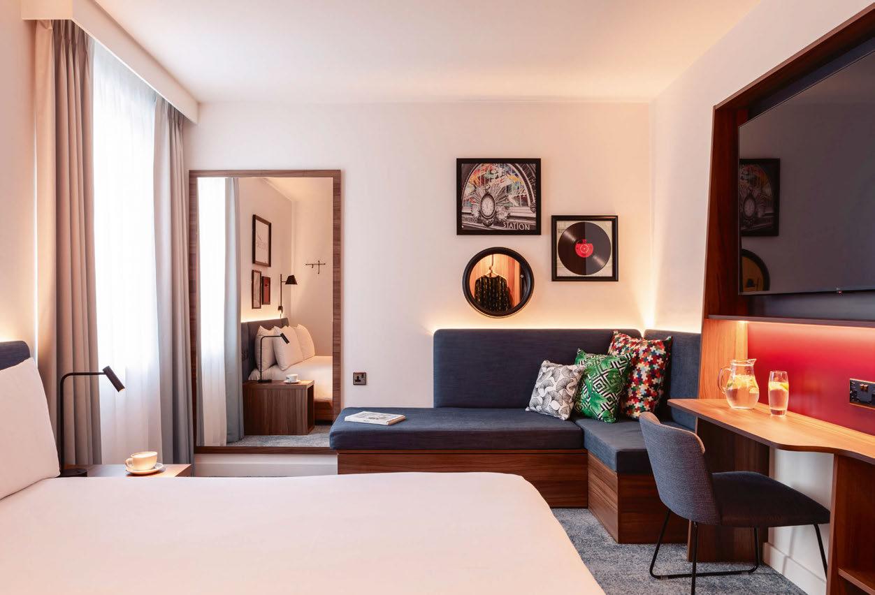 Hampton by Hilton, London Waterloo
Performance benchmarking for the global hospitality industry
1. LONDON
Helped by the holiday travel season, London hotels posted strong performance in December 2023, with room rates peaking at GBP287.25 on New Year’s Eve. ADR and RevPAR were the highest for any December on record in the market, while occupancy was the highest for any December since 2018.
December 2023 (year-over-year % change)
Occupancy 80.5% ( 5.7%)
ADR GBP208.90 ( 2.0%)
RevPAR GBP168.07 ( 7.8%)
2. DUBAI
Dubai’s hotel industry reported its highest monthly ADR on record according to preliminary December data, bolstered by New Year’s Eve celebrations and the hosting of COP28. RevPAR was the highest since January 2015, while occupancy averaged 79.2% for the month, surpassing the 90% mark on 31 December.
December 2023 (year-over-year % change)
Occupancy 79.2% ( 3.5%)
ADR AED1,060.61 ( 19.0%)
RevPAR AED839.98 ( 23.2%)
3. SINGAPORE
As music concerts continue to drive an uplift in hotel performance around the world, Singapore saw healthy growth in January owing to Coldplay’s Music of the Spheres tour. The market’s highest occupancy levels (91.3%) were seen on Thursday 25 January and Friday 26 January – with concerts taking place on both nights.
January 2024 (year-over-year % change)
Occupancy 72.8% ( 9.6%)
ADR SGD334.46 ( 3.3%)
RevPAR SGD243.55 ( 13.2%)
4. SYDNEY
Sydney hotels posted their highest monthly ADR on record in December 2023, reaching AUD776.69 on New Year’s Eve – more than double the monthly average of AUD313.27. Occupancy also peaked on 31 December (94.0%), averaging at 77.1% for the month to mark a 9.9% uplift on the same period the previous year.
December 2023 (year-over-year % change)
Occupancy 77.1% ( 9.9%)
ADR AUD313.27 ( 4.8%)
RevPAR AUD241.66 ( 15.3%)
STR provides premium data benchmarking, analytics and marketplace insights for global hospitality sectors.
For more information and to subscribe visit: www.str.com
150
BUSINESS CENTRE
1. 2. 3. 4.
Time for more.
Decorative Collection 24+
All our shown and mentioned decors are reproductions.

Always inspiring. Always up to date. Discover our new collection, featuring a unique variety of tried and tested on-trend decors, easy to access on our website or app. Our innovative rolling collection concept ensures all the latest in design and digital, and our inspirational trend capsules trigger new ideas and opportunities.
Discover the new Decorative Collection 24+ to.egger.link/decorative-collection


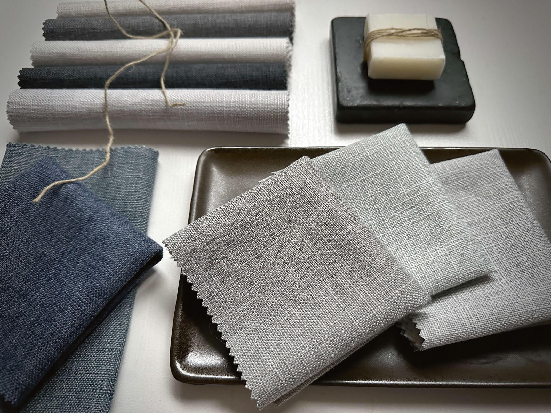

FR Fabrics and Soft Furnishings. Specifying Statement Hospitality Interiors. Request samples of our new Laon 4 Pass Linen-look Blackout 01924 436666 | sales@skopos.co.uk | skoposfabrics.com
CALLING ALL ARCHITECTS, INTERIOR DESIGNERS, DEVELOPERS AND OPERATORS...
If you have recently completed a new hotel project, it could be eligible for an AHEAD award

www.aheadawards.com
WHAT IS AHEAD?
Organised by Sleeper Media, AHEAD – the Awards for Hospitality Experience and Design – celebrates the best new hotels around the world, as well as the creatives behind them.
It is the only hospitality design-focused awards scheme with a global reach, with regional programmes in Asia, the Americas, the Middle East and Africa (MEA), and Europe.
THE CATEGORIES
There are 16 categories open to enter, taking in every aspect of the hotel. The same hotel can be entered into multiple categories.
Accessibility
Bar, Club or Lounge
Event Spaces
Guestrooms
Hotel Conversion
Hotel Newbuild
Hotel Renovation
Lodges, Cabins & Tented Camps
Landscaping & Outdoor Spaces
Lobby
New Concept
Resort
Restaurant
Spa & Wellness
Suite
Sustainability
CRITERIA AND DEADLINES
Hotels that meet the following criteria are are eligible to enter:
ASIA
• Eligibility: opened between January 2023 and April 2024
• Entry Deadline: 25 April
AMERICAS
• Eligibility: opened between January 2023 and April 2024
• Entry Deadline: 25 April
MEA
• Eligibility: opened between January 2023 and June 2024
• Entry Deadline: 14 June
EUROPE
• Eligibility: opened between January 2023 and July 2024
• Entry Deadline: 26 July
TOP TIPS TO ENTER
• What’s the story? Tell us about the design concept, the inspiration and selection of furnishings and finishes
• Don’t underestimate the power of a picture; high-quality professional photography is crucial (avoid submitting renders)
• Submit a video; videos are optional, but they do help to bring the project to life
• For conversion and renovation projects, be sure to include before and after images to show the transformation
• For further information, download AHEAD’s entry guidelines via aheadawards.com
THE JUDGES
AHEAD’s judging panels comprise over 60 industry-leading figures, including owners, operators and developers as well as architects, interior designers and consultants. 2024 panels will be announced soon.
THE PROCESS
Once entries close, judges view the entries online and independently score each project based on a set of criteria; entries that showcase exceptional design and functionality, whilst demonstrating commercial viability will fare well. The highest-scoring projects in each category are then shortlisted.
Following the shortlist announcement, the regional judging panels meet in person to discuss and deliberate the merits of every hotel shortlisted. They then cast their votes to determine the winners.
THE CEREMONIES
25 SEPTEMBER 2024
PARKROYAL COLLECTION
MARINA BAY – SINGAPORE
17 OCTOBER 2024
WEYLIN – BROOKLYN

4 NOVEMBER 2024
BANYAN TREE – DUBAI
28 NOVEMBER 2024
EVOLUTION – LONDON
For tickets, visit the Sleeper Media Store www.sleeper.media/store/
AHEAD


EVENT SPONSORS
FULL FIT-OUT CONTRACTOR TO EUROPE’S BEST HOTEL, THE LONDONER
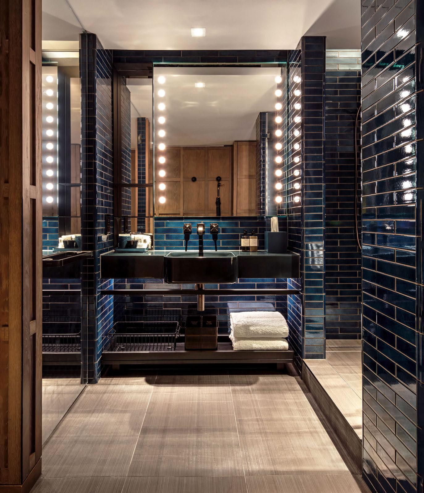
WWW.EESMITH.CO.UK

@EESMITHCONTRACTS

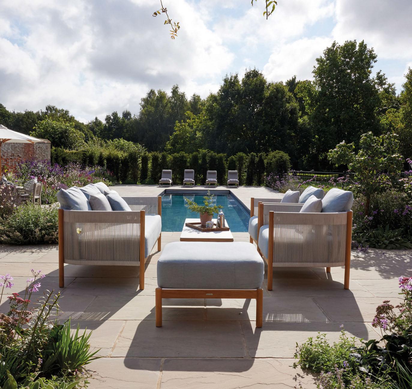


SPOTLIGHT OUTDOOR FURNITURE
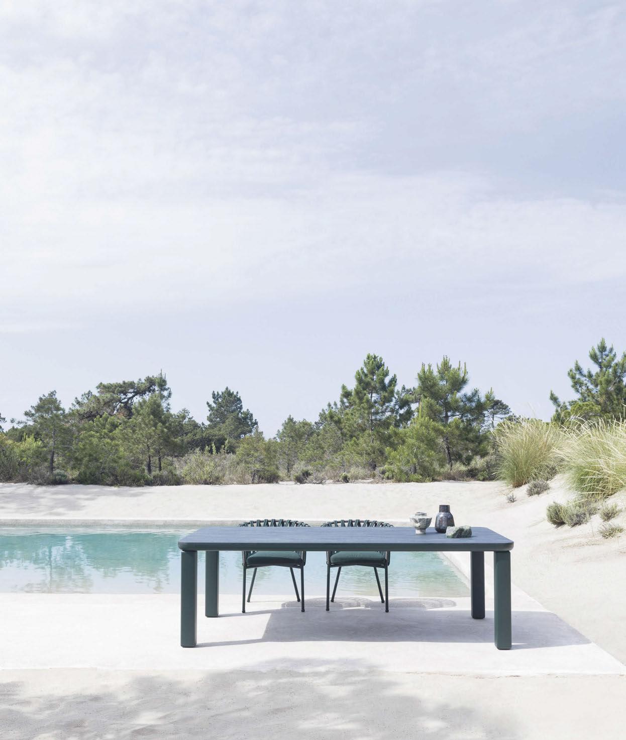
From plush daybeds and chic parasols to sustainable teak and sedimentary stone, these are the products making al fresco hospitality spaces all the more stylish.
Varaschin
Customade
The Customade table by Varaschin, designed by architect Alain Gilles, draws inspiration from the prehistoric dolmens – stone monuments typically comprising two megaliths supporting a horizontal top. Customisable shapes, sizes and materials make the table adaptable to meet diverse design needs across a range of outdoor settings. Customade is available in rectangular forms, both fixed and extendable, as well as square and coffee table forms. The aluminium structure comes in nine colour variants – white, silk grey, denim, rust, metal bronze, green, grey, mocha and black – and is resistant to harsh weather and UV. www.varaschin.it

1. Minotti
2023 Outdoor Collection
Each year, Minotti enhances its outdoor furniture collection with new shapes, materials and colours, which work together to create a cohesive identity that complements the brand’s indoor offering. Coordinated by Italian designer Rodolfo Dordoni in partnership with Minotti Studio, the 2023 al fresco range includes products envisioned by a range of designers –such as GamFratesi, Nendo, Gordon Guillaumier, Inoda+Sveje and Dordoni – in an interweaving of varying visions and cultures. From modular seating systems and square, linear shapes, to families of seating characterised by compact and curved volumes, the 2023 Outdoor Collection encapsulates the brand’s wealth of experience in interpreting open-air spaces with elegance and personality. www.minotti.com
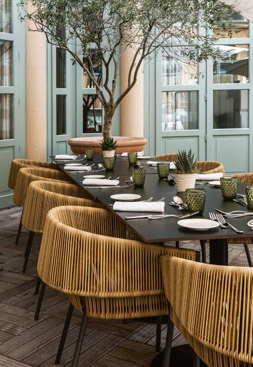
2. RH Bondi
Sydney-based designers Nicholas and Harrison Condos have teamed up with RH once again to create Bondi, an outdoor furniture series inspired by Miami’s famed Art Deco architecture. Combining the elegant curves of contemporary indoor furniture with the durability of outdoorappropriate materials, Bondi is defined by a circular bolster back, stacked teak or allweather aluminium foundation and generously proportioned seat cushions. Constructed with quick-dry reticulated foam technology, the fullyupholstered seating is both stylish and practical, thanks to its removable seat cushions. Ranging from a rectangular dining table and armchair to a chaise and swivel lounge chair, Bondi is part of the 2024 outdoor collection which can be found in RH’s Sourcebook, an inspirational design tool. www.rh.com
3. Ligne Roset Lapel
French furniture manufacturer Ligne Roset has launched Lapel, an outdoor chair designed by Italian studio Busetti Garuti Redaelli. Lapel features a carbon-lacquered aluminium structure with a woven synthetic resin backrest mimicking rattan and polyurethane seat padding. The seat cushion is also upholstered with a 100% polyester beige fabric, completing the chair’s neutral aesthetic. Made in Indonesia, the complex braiding of the backrest enhances the chair’s originality while providing comfort. The full Lapel range comprises an armchair, two dining chair options, high- and low- back bar stools, as well as dining tables made from charcoal-coloured lacquered aluminium and natural solid teak slats. www.ligne-roset.com
SPOTLIGHT 160
1.
3.
2.
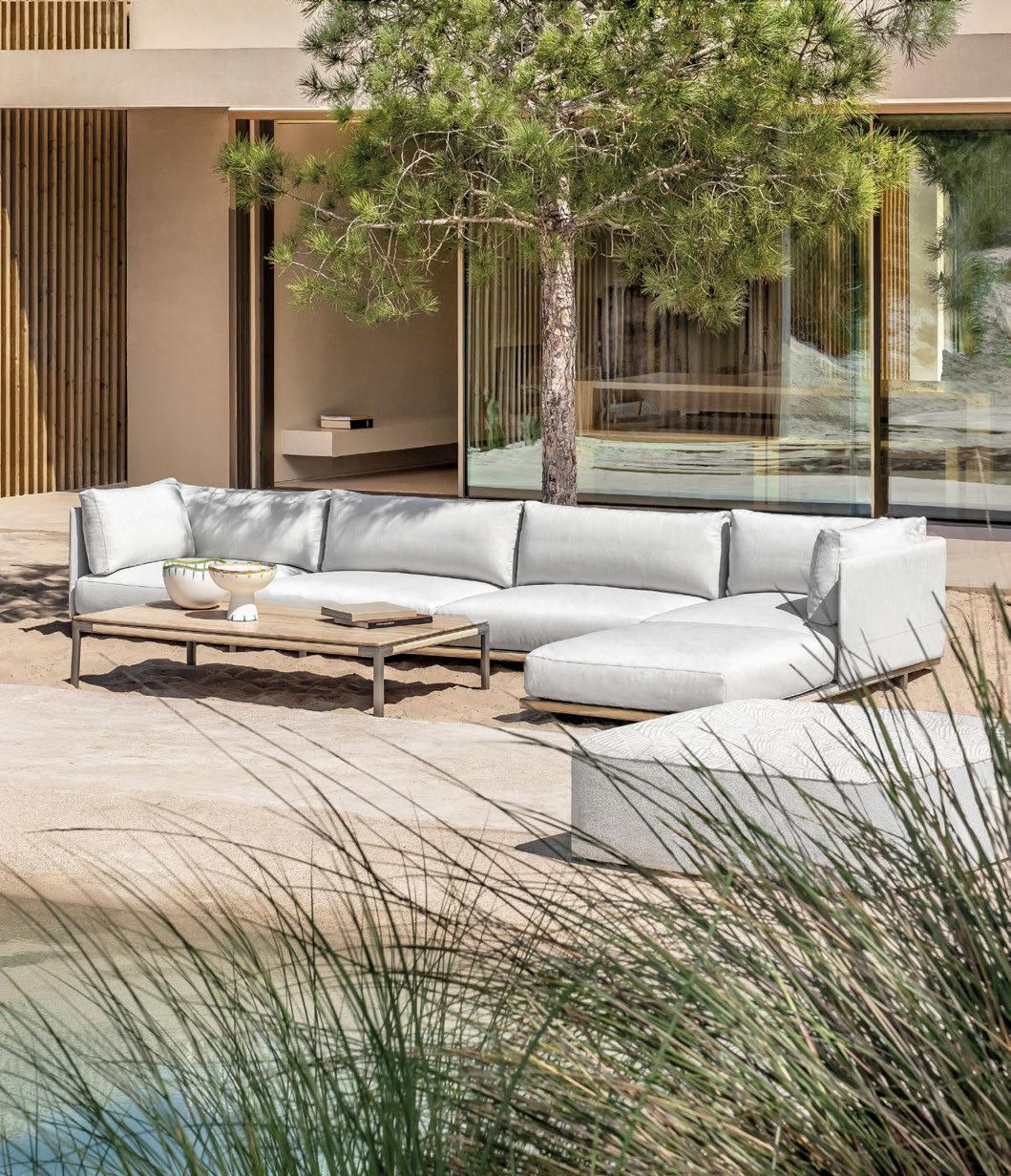 SHOWROOM LONDON / MILAN / PARIS ROME / CANNES
ETHIMO.COM
BAIA + ISOLA BY CHRISTOPHE PILLET
PH BERNARD TOUILLON

1. Kettal Plumon
Patricia Urquiola has designed Plumon, a new outdoor collection for Kettal.
The range is based on the concept of clothing – specifically dressing and undressing furniture, and sees Urquiola adopting a tailoring approach to craft comfortable furnishing evocative of faraway landscapes and cultures. The three-seater sofa and dining armchair feature a light structure, upon which tailored and padded dress is ‘moored’.
The ribbed padding, characterised by its stitching, is both aesthetically pleasing and comfortable, wrapped around the armrests, as well as the backrest.
Plumon also includes a centre table and side table.
www.kettal.com
2. Manutti Muyu
Muyu by Manutti is an ode to outdoor living, envisioned by the brand’s founder and Head Designer Stephane De Winter. The collection comprises twelve products, including lounge and dining chairs, chaise longues, a daybed and matching coffee tables. True to Manutti’s signature style, Muyu brings teak – sourced from controlled forest plantations in Indonesia and Thailand – together with light colours, opulent fabrics and subtly blended textures, accompanied by generous seat and decorative cushions.
Suitable for both indoor and outdoor use, Muyu’s teak structure ages gracefully, evolving into a natural silver grey patina over time.
www.manutti.com


3. Expormim Cask
First launched in 2021 as an indoor collection, Expormim’s Cask range is now moving outdoors. Designed by Norm Architects, the Cask sofa and armchairs have been transformed for al fresco use by replacing the original rattan structure with high-resistance aluminium. As a result, the same elegance and sharp attention to detail can now be found on a patio, terrace or by a pool. The Cask outdoor collection also marks the introduction of two new pieces both available in a variety of technical fabrics: a versatile chaise longue with wheels, allowing for manoeuvrability, and a round daybed with three plush cushions to further facilitate customisation for guests. www.expormim.com
4. Tribù Suro by Christophe Delcourt
Grand outdoor spaces call for equally majestic table settings – a notion that inspired Christophe Delcourt in the creation of the Suro collection. A striking focal point in any al fresco setting, the teak dining table features tabletop slats and subtle brass connecting elements, which provide opportunity for expansion whilst maintaining a seamless appearance regardless of the chosen length. The Suro dining table pairs well with the accompanying armchair, lounge chair and banquette, available in solid teak and aluminium. Topped off with weavings in a natural hemp or linen colour, the seating maximises comfort with a cocoon-like feel.
www.tribu.com
SPOTLIGHT 162
2.
4.
1.
3.


1. Barlow Tyrie
Around
Around by Barlow Tyrie is an elegant family of outdoor furniture, designed by Nathalie de Leval and Andrew Jones. The pair were inspired by spindle and steam-bent wood furniture, crafting chairs and sofas with bespoke soft aluminium shapes and gently curved teak arms, as well as tables that showcase subtly profiled edges. The lounging collection includes a sofa, loveseat, lounge chair and an ottoman, in addition to modular sectionals. Side tables, available in two heights, and a square and rectangular coffee table complete the collection. The dining offer meanwhile includes a table in two sizes and a stacking chair, available with or without arms.
www.teak.com
2. NOA Outdoor Living
In the heart of Belgium, 25 national and international high-end outdoor brands have joined forces to create NOA Outdoor Living. The impressive park showcases a wide range of outdoor furniture designs, spread across 12 inspiring pavilions and parks each crafted to inspire visitors, and ultimately encourage them to reflect and bring their own outdoor visions to life. As more people begin to understand that outdoor living can and should be just as comfortable and stylish as indoor living, the lines between inside and outside have become increasingly blurred. As such, NOA has become the place to go to witness how architecture, landscape and interiors can blend seamlessly.
www.noa-outdoor.com

3. Ethimo Kilt
Ethimo has enlisted Italian architect Marcello Ziliani to reinterpret the textural characteristics of the brand’s core Kilt collection, giving shape to the Kilt outdoor bed. Bringing together the warmth of natural FSC-certified teak with the delicate nuance of rope, the lounger offers a visual and tactile appeal with a design suited to a range of outdoor spaces. The natural materials used express the green soul of both the collection and Ethimo as a brand, which seeks to create a dialogue between design and nature. Highly weather-resistant in both sunlight and rain, the Kilt outdoor bed is available in single or double sizes, and can be made more comfortable thanks to optional decorative cushions in yarn-dyed hemp. The new product joins Ethimo’s wider furniture range, which fuses Mediterranean culture with a celebration of nature.
www.ethimo.com
SPOTLIGHT 164
1.
2. 3.

indoor • outdoor | residential • hospitality • commercial | chairs • stools • lounge chairs • benches • tables info@martaonline.eu • www.feelgooddesigns.eu
a feelgood environment.
Create

1. Point Kubik
Spanish designer Gabriel Teixidó has crafted Kubik, a new outdoor furniture collection in collaboration with Point. With its clear, bold lines, the range is an ode to functionality, beauty and sustainability. “The starting point for this collection was TechTeak, the new material developed by Point, which has a surprisingly similar appearance to teak but is maintenance-free and highly resistant to impact,” explains Teixidó. “When we designed Kubik, we wanted to respond to two essential challenges: to guarantee outdoor durability and to offer an ecological option. Unlike other collections, in this one it was the characteristics of the material itself that determined the final design.” For over a century, Point has embodied the essence of the Mediterranean – both in its art of living and the talent of its craftsmen and designers. Based in Alicante, the brand is an ambassador of high-quality Spanish design and a leading light in outdoor furniture design, supplying products to hotel brands across the globe, including Four Seasons, W Hotels and Hyatt Regency. The company places an emphasis on sustainability, with an in-house protocol that requires work with recyclable materials. For example, Point uses grade-A teak sourced from sustainably managed forests, as well as recylable aluminium. www.point1920.com

2. Atlas Concorde Boost Mineral
Boost Mineral by Atlas Concorde, a leading player in the global ceramic tile market, is a surface and wall tile collection that draws inspiration from the sedimentary stone of the plateau of Ardennes, the remnants of a mountain range over Belgium and France. Envisioned to bridge the gap between design and the natural world, the surfaces blur the boundary between indoor and outdoor, ensuring continuity across spaces. Boost Mineral’s texture faithfully echoes the characteristics of the original stone, traditionally worked using a technique of bush-hammering, which adds texture to stone and concrete. The compact grain is also enhanced through the markings of tools and time, which give it a three-dimensional feel, while its colour is interrupted in places through the outcroppings of minerals that have sedimented on the surface over the centuries. The collection comprises five different tones that explore the grayscale and also work in harmony with Atlas Concorde’s Boost World collection, multiplying design possibilities through the mixing-and-matching of tiles from various collections. The Boost Mineral surfaces are available in a broad range of sizes, from 60mm and 75mm modules to large slabs of 120x278cm, which can be used to create smooth wall surfaces with few joins. www.atlasconcorde.com
SPOTLIGHT 166
1.
2.


1. Coco Wolf Salone del Mobile
Coco Wolf is making its debut at Salone del Mobile 2024, spotlighting sustainable luxury in outdoor living and giving visitors an insight into the evolution of outdoor design. From 16-21 April, the brand will exhibit its most popular lines, including Largo, Porto and Coronet, as well as debut products from the Tamarindo range. With a focus on eco-friendly materials and durability, the UK-made collections are backed by over 40 years of expertise and a five-year guarantee. Launched in 2014, Coco Wolf is a creative collaboration between husband-andwife James and Rebecca Lorimer, who oversee the production of its furniture in Long Eaton, Derbyshire. www.cocowolf.co.uk
2. Palecek Casey
Palecek combines natural materials and traditional handcrafting techniques with contemporary designs to create stylish and durable furnishings. Outdoor furniture collection Casey – comprising a sofa and lounge chair – exemplifies this approach with its natural teak wood legs and frame. The backrest detailing uses hand-wrapped all-weather synthetic rope, available in a neutral taupe or black. The teak’s warm golden-brown colour gradually changes following exposure to the elements, transitioning to the silvergrey patina characteristic of finely-aged outdoor teak. Both the sofa and chair include loose seat and back cushions, with fabrics customisable. www.paolomoschino.com


3. Talenti Venice
Italian furniture manufacturer Talenti has unveiled Venice, designed by Ludovica Serafini and Roberto Palomba. Spanning chairs, sun loungers and sofas, as well as sunbeds and tables, the handcrafted collection fuses soft lines with solid wooden bases to mimic the forms of boats in water. Materials used across the range include FSC-certified teak, lava stone in a glossy ceramic finish that comes in a range of hues, and Accoya wood, an eco-friendly innovation designed to be durable in the face of water and weathering. Specially woven backs and cushions in tartan blue and beige meanwhile mimic the appearance of sails, continuing the nautical allusions. www.talentispa.com
4. Feelgood Designs Gorm
Designed by Allan Nøddebo for Feelgood Designs, the Gorm armchair is reminiscent of a traditional cane chair, born out of the brand’s rattan weaving expertise. The handcrafted shell is made from a high-quality rattan peel – fashioned from the outer skin of rattan poles – that radiates authenticity and elegance. The chair’s rounded back meanwhile ensures optimal comfort, supported by a powdercoated charcoal steel frame. Focusing on natural materials and traditional craftsmanship, Australian brand Feelgood Designs partners with select designers from across the globe to create furniture solutions that facilitate warm, humanoriented spaces.
www.martaonline.eu
SPOTLIGHT 168
2.
1.
4.
3.

Anunseengardenparkof30.000m2 ,12gardens toinspireand themostremarkable outdoordesign brands.
NOA,alushoasistoenjoy. Theultimateinternationalreference andoutdoorexperienceconcept.
Comeanddiscoverit.
NOAPARTNERS:
Kruisem, Belgium
WWW.NOA-OUTDOOR.COM
®

Parla Palm
Commercial furniture brand Parla has partnered with French architect JeanMichel Wilmotte to envision its new Palm collection. Comprising an array of seats, stools, daybeds and low tables, the range is characterised by clean lines and noble materials, making it suitable for both outdoor and indoor use.
Spanning three lines – Regular, Comfort and Lounge – all products are available with a powder-coated textured metal frame, in colours ranging from white and black to olive green, deep blue and bordeaux. The variety of finishes and materials provides specifiers with wide compositional combinations that result in tailor-made creations.
www.parladesign.com
2. Gommaire Mieke
Drawing inspiration primarily from nature, Gommaire’s outdoor products embody the natural world through organic lines, shapes and textures, resulting in pieces that harmonise with their surroundings. Transcending trends, the brand seeks to create furniture that is timeless and enjoyable for a lifetime, fusing creative design and traditional craftsmanship to introduce authentic and artisanal collections such as Mieke. Handcrafted with teak wood and wicker details, the outdoor range showcases the brand’s passion for comfort and high-quality fabrics with pieces such as a stackable armchair, rectangular bar table and double sun lounger.
www.gommaire.com


3. Urecel QuickDry
Urecel produces outdoor cushion foam made from high-grade materials, designed to be both comfortable and practical. Through a vertically integrated operation, the Indonesia-based brand oversees every aspect of production, taking a holistic approach throughout that results in high-quality products. Crafted with meticulous care, each cushion has strong sustainable credentials, utilising entirely recycled PET fibre and diverting over one-million bottles from landfills monthly. Urecel’s products are enhanced by its enduring QuickDry foam, which allows water to drain rapidly and fresh air to circulate freely, making it the ideal choice for outdoor seating solutions.
www.urecelquickdry.com
4. Fermob Oto
The Oto table lamp by Fermob is one of the latest additions to its wide range of outdoor accessories and furniture. Drawing inspiration from the form of the totem pole, Oto’s unique design comprises two 360o adjustable diffusers that can pivot to direct light in any direction, facilitating a range of outdoor lighting solutions. Designed to provide both direct and muted lighting, the product can enhance all manner of hospitality ambience. The wireless lamp, conceived by Fermob Design Studio, is available in a number of mineral tones reminiscent of earth, clay, sand and stone, including Clay Grey, Lapilli Grey, Red Ochre and Liquorice.
www.fermob.com
SPOTLIGHT 170
1.
3.
2.
1.
4.


1. Leisure Plan Kama
Kama is an al fresco furniture range that fuses conviviality and French design flair. Designed by Benjamin Ferriol, the multi-functional collection takes a modular approach to outdoor furniture, with products ranging from armchairs and ottomans to coffee tables. The Kama dyvan can be easily transformed into a sun lounger or sofa, making it adaptable to a range of seating needs, while the height of the tables can be adjusted to suit low-level dining and drinking. Kama features all-weather aluminium frames complete with heat-hardened powdercoated finishes in 15 colours, as well as an array of cushion fabrics in weatherresistant acrylic fabrics.
www.leisureplan.co.uk
2. JC Hospitality Outdoor Collection
The outdoor collection by JC Hospitality – a brand that prioritises exquisite craftsmanship above all – embodies both elegance and endurance. Led by JC Outdoor and crafted by Jonathan Charles himself, the furniture offerings blend luxury with durability through products designed to withstand the elements all year round. From the use of rattan to rope weaving, each piece exudes sophistication to ensure that outdoor living is elevated to new heights. JC Hospitality caters to a range of hospitality projects and, equipped with its own manufacturing company, controls all aspects of the design, development and production process.
www.jc-hospitality.com

3. Tuuci
The Hoxton, Brussels
Tuuci has supplied outdoor furniture to The Hoxton, Brussels, designed by AIME Studios. Occupying a Brutalist-style tower building and the former European headquarters of IBM, the 198-key hotel features a lofty double-height lobby, bar and restaurant, and a rooftop terrace which draws inspiration from all corners of Mexico. The terrace is shaded by 14 Ocean Master M1 Classic customised parasols, each equipped with alternating panels and roman valance. The modern and stylish pieces align perfectly with the hotel’s vibrant 70s style. Tucci has also supplied three Ocean Master Max Classics to complete the shading of the rooftop space.
www.tuuci.com
4. Roda Eolie
Eolie by Roda is a collection envisioned by Gordon Guillaumier, comprising a reclining sun lounger and a low table, available in two sizes. The pieces can be enjoyed as standalone items or grouped together, depending on the needs of the outdoor space. Eolie also includes a gazebo, which provides a cosy and secluded space for a pair of sun loungers, side by side or vis à vis to create a true outdoor hideaway. The wood used in the collection can be painted in three desaturated tones – blue, orange or olive – or natural, with the grain visible. The cushions, which are available in two sizes to adapt to a thicker armrest, are available in a range of colours.
www.rodaonline.com
SPOTLIGHT 172
1.
3. 4.
2.


1. Vincent Sheppard Kodo
When bringing the Kodo collection to life for Vincent Sheppard, Belgian design agency Studio Segers sought to play around with the mingling of different materials. Ceramic, industrial aluminium and tactile polypropylene rope take the lead throughout the collection, which consists of seating options such as a lounge chair, daybed and rocking chair, as well as a coffee table and dining table with corresponding chairs. Soft curves and rounded backs exude a warm and inviting feel, whilst weather-resistant materials ensure durability. With a wealth of experience, Vincent Sheppard has been designing and manufacturing furniture for over 30 years.
www.vincentsheppard.com
2. Sanipex Group – Gymkhana Outdoor Furniture
In a world where the lines between indoor and outdoor are increasingly blurred, Gymkhana presents a wide range of furniture and accessories. Responding to the rising trend of maximising outdoor environments, the brand’s products invite individuals to bask in the beauty of nature. From design-led daybeds, sofa sets and poufs to cosy accessories such as cushions, baskets and rugs, each product is curated for al fresco living and crafted from durable materials to withstand the rigour of the great outdoors. Design meanwhile spans from an organic style to a minimalist Modernism, ensuring there are pieces that cater to every aesthetic.
www.sanipexgroup.com


3. Akula Kona
Established in 2006, Akula is a leading designer and manufacturer of outdoor furniture. The Kona dining armchair stands out thanks to its distinctive heavy cross-weaving design, which not only maximises visual appeal, but also ensures a comfortable seating experience. The brand’s focus on high-quality, durable materials makes the Kona chair suited to both hospitality and commercial environments, where longevity and maintenance are key. Its robust construction and stylish appearance ensure that the armchair meets the demands of outdoor settings, offering a product that not only looks appealing but is also built to last.
www.akulaliving.com
4. Luteca Woven Resin
Luteca recently launched a new outdoor seating collection inspired by ancient Mayan craft traditions and techniques. The brand, which is dedicated to contemporary design that pays homage to the legacies of Mexico and Latin America, has developed the collection to subtly reinvent the woven Tule series, which is handmade by a small group of artisans in Mexico. Crafted to stand the test of time, every piece features a powder-coated non-corrosive inner frame and is wrapped in synthetic twisted resin chord. The range includes four neutral-toned seating options – a lounge chair, bench, ottoman and small stool –currently made to order.
www.luteca.com
SPOTLIGHT 174
3.
2.
1.
4.

PARIS | NEW YORK | LOS ANGELES | MEXICO CITY Luteca.com | @lutecafurniture
A three-day free to attend exhibition celebrating artisan skills and craftsmanship.
If you’re a buyer or interior designer, this show is the perfect opportunity to discover one-of-a-kind pieces and stunning collections.


JAY BLADES PRESENTS BROUGHT TO YOU BY SHOREDITCH TOWN HALL 15 -17 MAY 2024
Folly armchair by headline sponsor Cox London.
Register now for your free ticket
Apple of My Eye by Cox London, photo by Alun Callender
SPOTLIGHT ART

Saatchi Art
The Manchester
Saatchi Art has worked with interior designer Jenny Bukovec to craft the retro-inspired art collection that adorns the 125 suites at The Manchester. Erected on the grounds of the first registered bourbon distillery in Lexington, Kentucky, the hotel and its art are an ode to the area’s heritage and culture. “Each artwork was carefully selected to celebrate the rich history of the local community, ranging from a yellow canary bird associated with mining to drying tobacco leaves reflecting the vast farmland,” explain the team. Art Advisor Connie Kim assisted in the curation of black-and-white archival images for the guestrooms, selecting equine and intimate portraits of jazz musicians, with custom gold and amber framing and antiquated gold and brass details evoking the rich patina of aged bourbon barrels. A pastoral landscape by Saatchi artist Kelly Nicolaisen, named Roll in the Hay, leads guests to the hotel’s backyard, completing a sensorial experience through art, history and the spirit of the Bluegrass state. www.saatchiart.com

Capsule Arts
SO/ Uptown Dubai
Capsule Arts spearheaded the art curation for the new SO/ Uptown Dubai, introducing pieces across the hotel that range from mythology-inspired sculptures to architectural photography and portraits of the UAE’s leaders. One setting made all the more striking through art is the lobby, home to the immersive ‘Kaleidoscope of Nature’. Covering the double-height columns, the artwork follows the graceful flight of origami birds, which materialise and dissolve amidst a tapestry of lush foliage and Renaissanceinspired blossoms. The installation leverages lenticular technology to mesmerising effect, orchestrating a dance of images in which birds that appear to soar through the ever-changing landscape as guests move. The creation intricately weaves elements of flora and fauna into an enthralling tapestry that forges a connection between the guest and the natural world, all the while transforming the lobby into a stage where the play of movement unfolds.
www.capsulearts.com
177
© Matt Kisiday

Artiq
Splendido, A Belmond Hotel
International agency Artiq has curated the art collection at Splendido, A Belmond Hotel in Portofino, to evolve alongside phased interiors brought to life by Martin Brudnizki Design Studio. Installed across a series of reimagined suites, the artwork is displayed as a group exhibition, showcasing an ensemble of artists and their bespoke works. At the core of the curatorial process is authenticity, which strengthens the value and impact of art within hotels. This requires the agency to delve into the area’s cultural narratives, developing knowledge of local artists and showcasing their talent. One such artist is Marco Ferri, who has created a series of bespoke pieces (pictured) that combine sculptural movement and texture with a colour palette borrowed from Portofino’s splendid vistas. Collectively, the Splendido art collection tells the story of the property, the local creative community and the uniqueness of the landscape, all while capturing the essence of Belmond’s legacy. www.artiq.co

Soho Art Consulting Mills House
Soho Art Consulting has put together an art package for Charleston hotel Mills House, in a scheme that exudes Southern charm and highlights important women from the city’s history. Matilda Arabella Evans, the first female African American licensed to practice medicine in South Carolina, and educator and civil rights activist Septima Poinsette Clark, are just some of those referenced throughout. The art consultant used a cyanotype photograph by Heather Evans Smith to create a wallcovering that adorns the underside of the hotel’s main staircase and is embellished with handpainted metal butterflies, while guestrooms feature textural and patterned figurative works by two local artists. Soho Art has also commissioned a sculpture for the restaurant, whose form nods to the ornate scroll work atop wrought iron gates found across Charleston. In all, the art package blends the area’s historic charm with contemporary creative interpretations. www.sohoart.com
SPOTLIGHT 178
© Mattia Aquilla


WE WILL MEET AGAIN www.sleepersessions.com #5 PORTUGAL 7-9 MAY 2024
SPECIFIER

Creative Matters
Billow Polar
Billow Polar is a new wallcovering design by Creative Matters, inspired by the dynamic interplay between aquatic elements. Crafted using alcohol ink techniques, it captures the ephemeral beauty of nature and serene flow of water. As the alcohol quickly vanishes, it leaves behind a canvas awash with dense hues, echoing nature’s own vivid palette. Each mural is a bespoke creation with no repeat patterns, ensuring that every installation is unique. Constructed with commercialgrade materials and available in eco-friendly Terralon, Billow Polar is a durable yet stylish wallcovering option. www.creativemattersinc.com


Ultrafabrics
Sanctuary Palette
Ultrafabrics has teamed up with Pantone once again to launch Sanctuary Palette, a fabric collection inspired by Peach Fuzz –the 2024 Colour of the Year. The collaboration marries colours found in the Pantone universe with Ultrafabrics’ own extensive collection, resulting in real-world applications of the popular hues. Developed by a team led by Kimberle Frost in Ultrafabrics’ Colour Lab, the range includes a muted pink, deep maroon, rusted yellows and apricot. “The Sanctuary Palette incorporates Peach Fuzz and grounds it in a mineral-based colour palette that is warm, enveloping and conveys a sense of refuge and protection,” explains Frost. The fabric manufacturer also tasked Belgium-based design studio WeWantMore with bringing Sanctuary Palette to life using AI – the results of which are a series of inviting spaces that symbolise the comforting essence of the Colour of the Year. www.ultrafabricsinc.com
Arte
Lanai
Named after the Hawaiian word for veranda, Arte’s Lanai collection of wallcoverings is inspired by balmy summer evenings spent reclining on a rocking chair in the island state. Each wallcovering design has been handcrafted and inlaid or embroidered with rattan and raffia, before being rendered in vinyl. The collection comprises various patterns and colourways, including Kailua (pictured), named after a town in Hawaii where palm trees can be found in abundance. Available in eight colourways, the design sees swaying palms inlaid using small pieces of rattan against a background of bark cloth, a fibrous material made from fig trees. The Lanai collection also includes Kona, a cheery design of playful, loose shapes embroidered with raffia; and Mauna, made from small pieces of rattan, carefully arranged into a seemingly random pattern. www.arte-international.com
SPECIFIER 182
Reimagine Healthy Interiors with Ultrafabrics

Discover the future of design where style meets sustainability and performance. Incorporating over 50% rapidly renewable resources, Ultraleather is now updated with 10 fresh shades that inspire wellness in every space.

ultrafabricsinc.com


Elstead Lighting
Alford Place Pendant
Elstead Lighting is a British company specialising in the manufacture and distribution of decorative lighting, ranging from pendants to chandeliers. Designed by Hinkley, the Alford Place outdoor pendant forms part of the Quintiesse collection, and comes in one-, three-, four- and six-light variations. The product is formed of a precision die-cast frame, hanging arm and top loop, paired with a sealed glass roof that ensures illumination from all sides. Finished in Museum Black, the fittings use clear seeded glass shades to provide an IP44 rating, enabling outdoor use. The collection also includes a full range of wall lanterns, pedestals and posts that can be used in larger outdoor areas.
www.elsteadlighting.com
Skopos Fabrics
Encanto
Launching in Spring 2024, the Encanto collection by Skopos Fabrics presents three easy-to-use designs for contract furniture. A twist on familiar favourites, Onda is a fractured herringbone pattern that showcases a contemporary and unique texture. Other designs in the collection include a flexible small-scale check and the brand’s familiar Cuba linen design. Shades range from bright pops of colour to classic neutrals that complement all manner of furniture. The three designs are halogen-fre and Oeko-Tex 100 compliant with Crib 5 Flame Retardant backing. Along with many Skopos upholstery fabrics, the Encanto range is anti-microbial, soiland stain-resistant.
www.skoposfabrics.com
Tiger Leather Empire
Tiger Leather has unveiled Empire, marking the debut of its Iconic anti-microbial and cleanable leather. Available in over 75 colours, Empire is crafted in an Italian facility certified by the Leather Working Group, a not-for-profit organisation that assesses the environmental compliance of leather manufacturing. Rigorously tested following AATCC methodology, Iconic leather is specially formulated to repel harmful microorganisms, including bacteria and mildew. A combination of fashion and performance, Empire is a premium-grade leather engineered to exceed the exacting standards of the hospitality and contract markets. www.tigerleather.com
SPECIFIER 184
■


atandc.net HEAD OFFICE 55 Fairfax Road, London, NW6 4EL projects@atandc.net +44(0)20 7625 2042 Our automated guest detection solution discretely switches off the lights and sets back the
the guests leave their room. It
automatically turns them
they return,
if there is still a key card in the slot.
Make your hotel greener
HVAC when
then
back on when
even
■
Save tens of thousands of pounds in energy costs
Payback period is most typically less than a year. scan me OUR LIGHTBULB MOMENT WAS WHEN THE ROOM WENT DARK! audio technology & communications
■

Kaldewei
Meisterstück Oyo Duo
Kaldewei recently launched its third creative campaign photographed by rock star Bryan Adams – an intimate staging of the brand’s Meisterstück Oyo Duo freestanding bath. The new photography aims to spotlight how Kaldewei’s products combine luxury and sustainability, showcasing an elegant bath made from 100% recyclable steel enamel. Entitled Perfectly Sheltered, the campaign depicts models lay in the bathtub, with their bodies visible and faces concealed from the camera. With freestanding bathtubs often the focal point of a room, Adams opted to shoot the scene from a distance; the egg-shaped design was placed centre stage, while the framing also captures how the models’ shoulders and back subtly merge with the tub’s form. The partnership between Kaldewei and Adams was established in 2021, when the rock star first shot the Ming and Miena washbasin bowls, followed by the Superplan Zero shower surface in 2022. Together, the three campaigns explore the cornerstones of the bathroom experience –washing, showering and bathing. www.kaldewei.co.uk

CASE STUDY
Laufen
The BoTree
Swiss bathroom manufacturer Laufen recently supplied its products to The BoTree in London. When designing pieces for the guestroom dressing areas, a key challenge for Laufen was to maximise the limited space. The Val basins – designed by Konstantin Grcic – were the ideal choice. Made from Laufen’s SaphirKeramik mineral composite, the basin is sleek and lightweight with a generous bowl capacity. Laufen created a special two-hole version of the Val basin to accommodate the chosen mixer tap. “The beauty and simplicity of Laufen’s Val basin matched the elegance of the room and completed the composition for the individually designed vanity,” explains Hilda Ackermann, Interior Architect at Concrete, the studio behind the hotel’s design. Dominic Fitzgerald, COO of Shiva Hotels Group, concludes: “Conscious luxury is at the heart of everything we do at The BoTree, which is why we chose to partner with Laufen, a company that prioritises considered and sustainable design. It is important to us that our guests feel a sense of belonging throughout our hotel. As such, our rooms and suites are all full of vibrant colours, light and welldesigned touches, such as the bespoke basin design Laufen created for our bathrooms.” www.laufen.co.uk
SPECIFIER 186
the UK's leading design festival 21-23 may @clerkenwelldesignweek cdwfestival clerkenwell.design.week @clerkenwelldesignweek cdw2024 clerkenwelldesignweek.com &more Furniture Surfaces Lighti n g

Original BTC
Blossom Portable Light
Original BTC has unveiled its first portable cordless light. Named Blossom, the product unites traditional craftsmanship with the latest LED technology. The purposely petite design is inspired by the plum blossom, a beloved flower in China. Its fluted bone china shade echoes the outline of the flower’s delicate petals and is topped by a satin brass detail. Developed with functionality and flexibility in mind, Blossom easily travels from the dining table to the garden, lounge to the hallway, enhancing the atmosphere in a range of environments. Three brightness levels offer a choice of illumination, from a soft, warm glow to sufficient light to dine or entertain in the evening. Charged via USB-C, Blossom has a seven-hour run-time on full brightness, extending to an impressive 20 hours on the lowest setting. The solid and robust powder-coated stem, whose metal base comes in three colours, can either sit comfortably in the hand or on a chosen fixed surface.
www.originalbtc.com
Chelsom
Custom Ceiling Lighting
Chelsom’s custom ceiling range enables clients to personalise the brand’s original concepts to suit a diverse range of interiors. Each series is built around a core design proposal, with clients then given the option to customise features such as finish, size and scale. A number of decorative accessories can also be added to the pieces where desired. Products can be specified and purchased as shown in the Chelsom catalogue and on the website using the product references provided, then customise as desired. For personalisation options, clients can contact Chelsom’s customer service team.
www.chelsom.co.uk

SPECIFIER 188

NEW LEADS IN THE GLOBAL HOTEL INDUSTRY Try it for free! www.tophotelprojects.com
FIND
Geberit
AquaClean Alba
Swiss bathroom manufacturer Geberit has launched its new AquaClean Alba shower toilet, a simple and stylish WC with spray functionality to ensure complete hygiene after use.
THE DESIGN
Envisioned by Geberit’s designer-in-chief Christophe Behling, the wall-mounted AquaClean Alba shower toilet is characterised by clean lines and gentle curves, with an understated elegance that complements any bathroom setting.
Made from high-quality materials, the simple yet striking upgrade of the traditional WC is a costeffective investment; a bathroom fitted with a shower toilet scores highly amongst guests thanks to its enhanced hygiene functions.
The shower toilet’s straightforward functionality and self-explanatory remote control ensure it is easy to use, performing its duties efficiently and providing an invigorating cleaning experience with bodytemperature water.
FLUSHED CLEAN
The launch also introduces new technology that ensures a thorough flush. Water flows into the ceramic bowl from the side during flushing, moving in a spiral motion – an optimised powerful control of the flow that means a toilet brush is rarely needed.
Living up to Geberit’s high standards, AquaClean Alba incorporates all of the brand’s hallmarks, including quality materials, innovative design and userfriendliness, as well as offering an extensive range of accompanying services.
The ceramic WC is finished with a high-quality glaze to protect against dirt deposits and facilitate simple cleaning. It is also fitted with an automatic descaling programme that removes deposits from all waterbearing parts in a closed-loop system. www.geberit.co.uk

SPECIFIER 190


Register today at hdexpo.com 600+ exhibitors showcasing thousands of new products. Fresh insights from 150+ inspiring speakers. Meaningful connections through unparalleled networking. Don’t miss this year’s HD Expo + Conference. It’s three days of discovery and learning. april 30 - may 2, 2024 Use code DAPMSLEEP for your complimentary pass

Sleeper Media – the leading brand for hospitality experience and design. Visit the store to receive your copy. www.sleeper.media/store
193 ADVERTISING INDEX ISSUE 113 Akula 005 Artiq 059 Astro 002 AT&C 185 Atlas Concorde 035 Barlow Tyrie 158 Beck 101 Capsule Arts 179 CDW 187 Chelsom 027 Coco Wolf 167 Connor Construction 139 Craftworks 176 Creative Matters 016-017 Curtis Furniture 149 Decor Walther 115 EE Smith 157 Egger 151 Elstead 144 EPR 018-019 Ethimo 161 Expormim 095 Feel Good 165 Fermob 077 Forest Group 121 Gommaire 047 HD Expo 191 Hector Finch 057 JC Hospitality 171 Jung 067 Kettal 010-011 Lasvit 062 Laufen 087 Leisure Plan 091 Lemi Group 128 Ligne Roset 022 Luteca 175 Mandarin Stone 079 Manutti 043 Marset 037 Material Bank 020-021 Minotti 014-015 Naturalmat 107 NOA 169 Northern Lights 049 Oliver Hemming 195 Original BTC 088 Palecek 116 Parla Design 082 Peloton 055 Point 024 Quick Dry 173 RH Contract 008-009 Richloom 108 Roca 073 Roda 033 Saatchi Art 071 Samuel & Sons 093 Sanipex 041 Skopos 152 Sleepeezee 127 Sleeper Sessions 180 Starpool 044 Stonecircle 131 Talenti 012-013 THP 189 Tiger Leather 135 Tribu 006-007 Tuuci 039 Ultra Fabrics 183 Varaschin 163 Vescom 061 Vincent Sheppard 081 Waterworks 196
Ready, Set, Play
A game-changing playscape lands in Las Vegas, encouraging guests to partake in some good old-fashioned fun.
Ever at the forefront of high-energy entertainment, the Las Vegas Strip is the ultimate playground for adults. While the typical Vegas hotel might feature theatres, rollercoasters and of course casinos, Luxor Hotel is taking play back to basics – but by no means boring. A new addition sees the pyramid-shaped property ditching the likes of roulette, blackjack and poker in favour of some good old-fashioned fun. Created by Play Social, Play-Playground offers a roster of 17 games and six activations, best enjoyed with a cocktail from the bar – it is Vegas, after all. Interiors have been envisioned by Bishop Design together with branding specialist Rogue and recall the magic of childhood playtime, tapping into a powerful sense of nostalgia. The one-of-a-kind landscape is defined by hidden doors, rabbit holes and secret passageways that encourage guests to
immerse themselves in play, while seating booths are reminiscent of a fairground ride. The design scheme brings together a medley of vivid colours, bold forms and geometric patterns that captivate at every turn, featured alongside graffiti-laden walls, hanging sculptural installations and ‘fluffy clouds’ floating above. A visually dynamic lighting scheme comprising neon wayfinding and fluorescent animations completes the look. “Our intention was to craft a space that fuses the sentiments of a playground with the contemporary age,” explains Mehmet Aktash, Managing Director of Bishop Design. “To bring this vision to life, we utilised a vibrant palette of vivacious colours across various mediums –an integral element in creating an immersive experience that resonates with the playful spirit of childhood.”

CHECK-OUT 194


© 2024 WATERWORKS IS A REGISTERED TRADEMARK OF WATERWORKS IP COMPANY, LLC


 Innovation meets timeless design in our new collection of contemporary lighting concepts for hospitality, residential, and commercial spaces


 RH.COM/CONTRACT
The Hotel Maria, Helsinki, Finland
Photographer: Krista Keltanen


 TKUALA LUMPUR


 SPA & WELLNESS


 © Veerle Evens
© Piotr Gesicki
© Anna Stathaki
© Anna Stathaki
© Anna Stathaki

 Hampton by Hilton, London Waterloo


 SHOWROOM LONDON / MILAN / PARIS ROME / CANNES
ETHIMO.COM
BAIA + ISOLA BY CHRISTOPHE PILLET
PH BERNARD TOUILLON
