6 minute read
Data is Power - The Racepak CL2
Data Is Power!
Racepak has been in the datalogging business almost 40 years. What started off as a personal project to record data on Ron Armstrong’s Unlimited Hydroplane was developed into a state of the art datalogging system that is pretty well used by most drag racers. While road racers and tractor pullers had been covered off by the G2X and G2X Pro units there was never anything that the man on the street saw affordable for use on a road course. That is until now!
Racepak has developed a whole new line with a totally different architecture. The CL1 and CL2 use either an iPhone or Android phone as the screen, therefore saving money and it is also cloud based. Now when I heard about it I have to admit to being sceptical. But the more I use it and showcase it to potential customers the more I see there being a place for it. #1 bonus is that it is hugely affordable coming in around $290 US or $400 inc tax here in Ontario, Canada. And where is that place? With the huge increase in track days and HPDE events it is good to be able to quantify if one lap is better than the other and why that was the case. BUT make sure the event to are at allows you to have one on board in an operational state. Some HPDE events simply do not allow them as it is a comparison against time and their insurance does not allow that. So what do I like about it? The cloud based D3 app allows you to save your data in Racepak’s cloud server for $99 USD a year. That means you can call up a run when you are anywhere in the World and show it to somebody on your phone, tablet or touch based device. Even better is the fact that all team members that are listed on your subscription get texted when the unit is in use and you start running on the track. They than can watch you in real-time on the track map that was generated from Google Earth. Now bear in mind, running wide or missing your apex is now seen by your team-members and you can no longer deny the fact. But as the title of the article says, ‘Data Is Power’ and the more you use the CL Vantage the more you will learn. We will run a series of articles on the Vantage dataloggers to give you the basics of datalogging. There are products out there now that people rave about but I see them as driver coaches not dataloggers. To go further in this sport you need to be able to understand and read graphs. The Racepak Vantage CL1 and CL2 allows you to do that.

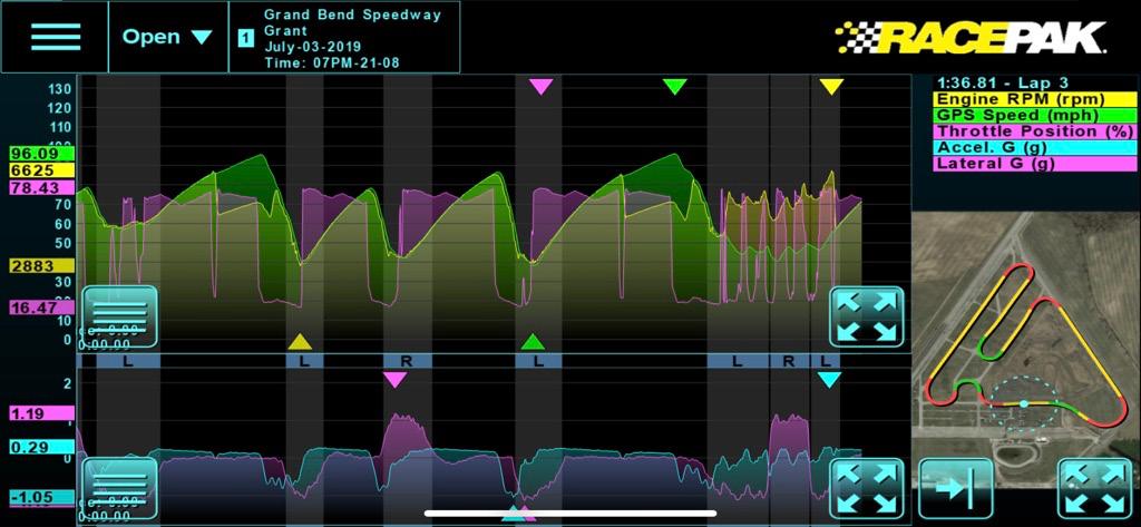
A log taken from Grant Galloway’s Honda road car at the Grand Bend Motorplex. When opened all three sections of the log open up by default. Top left, RPM, GPS Speed and Throttle position. Bottom left, the lateral and accel G-forces and Right, the track map. Each channel is color coded and shown at the right above the track map. At the left of the graphs you can see the upper and lower numbers recorded by each channel and on the graphs themselves the color coded triangles show where in the lap those numbers were recorded. Now to me, this is graph showing too much data to anylize so the next step is to choose what we see.

Removing the map does not do a lot for us but it can be easily put back in place by hitting the Map button at the right. If you want to remove channels click on the button with four lines in each of the graphs.

So what can you tell from the graph above? The D3 app automaticaly pulls the fastest lap out of your session. Lap 3 that was the fastest at a 1:36.81 as shown at the upper right. It also shows I have chosen the GPS Speed and RPM channels to display. I placed the cursor and the little blip on the graph where the rpm and speed are climbing. At the top of the cursor line are the values seen by the CL1 for the two selected channels, so Grant was changing gear at 6547 rpm. Was this where he intended to? The shift point was 6500, so pretty good. Now reduced to two channels, the graph is easier to read. By only looking at these chanels the graph is now stretched into the area the track map previously used and allowing us to see more detail. By pressing the button at the lower right you can quickly bring up the track map to see where you were. If you look closely at the background you will see bands of black and gray colors. The gray are the corners as you can see by the slower speeds.


When the track map is displayed with the graphs like above, you can see the corners are color coded for left and right as well as being marked on the graphs .

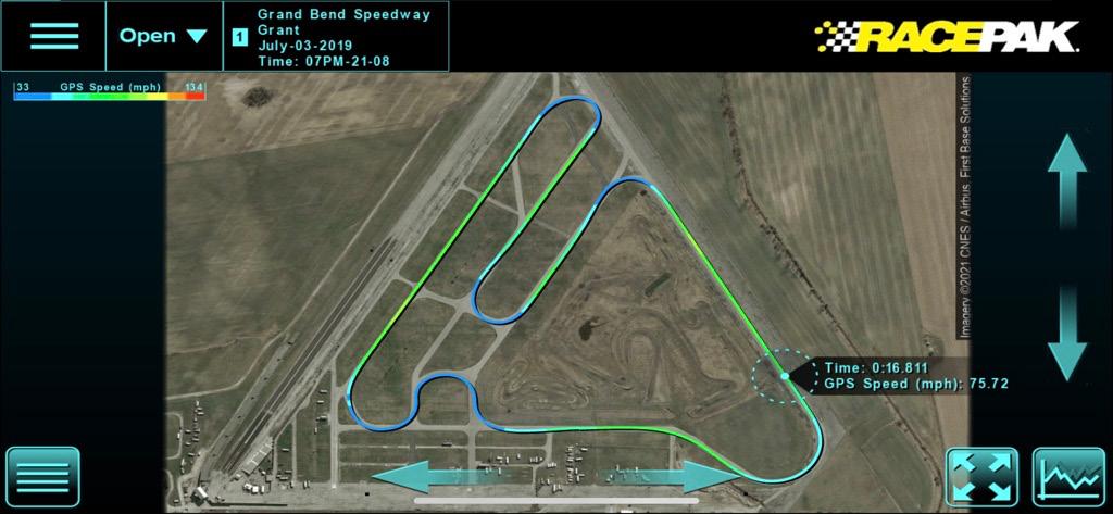
Now this is an interesting feature that comes with the D3 app. By sliding your finger along the up arrow at the right the track map becomes 3D, the higher the track the faster you were going. The color coding on the map equates to the colored legend for mph at the upper left of the screen. Notice on the two long straights how far from the corner the higher speed yellow section returns to green. Placing the cursor aound there will allow you to see the transistion from accelleration to braking. These two graphs displayed some interesting data that I not previously know. In the top one I set the cursor at the beginning of the black band on the background. The lower one I positioned it at the peak GPS Speed. By also displaying the track map I could see that the Grand Bend Motorplex was running their Track Night in reverse around the track. With the G-Forces graph shown below I could also see the speed decrease coincided with the Accel G starting to go negative, in other words braking had started.
Probably the feature I am most impressed with is the ability that the D3 app has when using the optional Racepak cloud subscription. I was returning from the Gridlife Festival at Gingerman in 2019 when I received a text telling me Grant had pulled onto the track. I was able to watch in real time as he ran his session. I could see his placement of the Honda in the corners was spot on. The weird thing was I could see that the throttle position was never reaching 100%, instead the maximum was only 88%. Why? We will tell you in the next issue.


